Transcripts
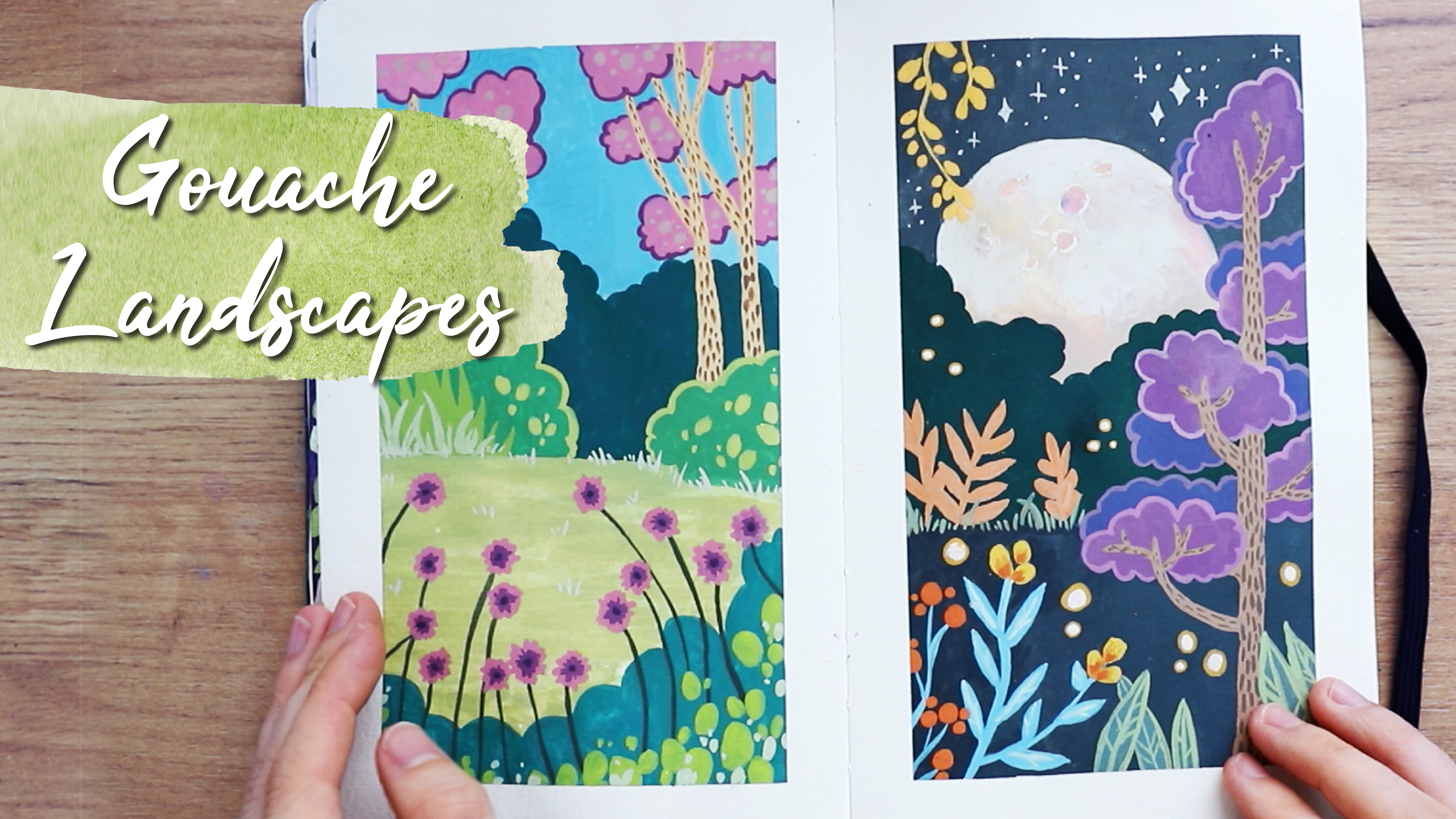
1. Introduction: Hey there in this guilt, your course, I'm going to show you how to paint thes two landscapes with wash one's this mountain scenery with flowers and the other one has this lake and some more details us. Well, we're going to paint those clouds and all those little details, and I'm going to show you step by step, how you can achieve this result and how to use wash for does to pieces. I hope that this course sounds interesting for you, and if it does, let's get started.
2. Products: But first, let's talk really quickly about the products that I'm using. I'm just using this dish that I put some wash onto very randomly all kinds of brands, and that's why I don't really should share with you what kind of pain that I'm using specifically because even I don't know that I'm just using those paints very intuitively, mixing colors until I like the colors that I see on a really recommend you doing the same. Don't worry about getting the exact same colors that I have. It really doesn't matter. Just use the colors that you love. I have these temporal colors. I also have Windsor and Newton designers. Squash Andi. I also have some art easa wash colors, and if you don't own any quash, you could use Chinese white and mix it in with water colors. But I'm not sure if you'll always get the same results as the consistency and capacity will be quite different there. But you could try to do that so it really doesn't matter what kinds of pains you have. If their high end or not as high and not as expensive, it doesn't matter. Just use what you have at home. And if you don't know what kind of pains to buy, then there are lots of schools, your courses about that as well, and lots of people who know more about the brands than me. I'm just going to show you how to paint those specific landscapes and for the brushes. I have all different kinds of sizes. I really, really love this brush. It's, uh, DaVinci Kozani. Oh, brush. I love it because it acts like it's, ah, natural fiber brush, but it's vegan, so I think that it's really worth the money, and I actually just re bought it to have two of those on, and it's a very it's size to. It's very big, and you can do all kinds of stuff with the one. I really, really recommend that even though it's very expensive for a brush, it's an investment. But I think that one is really worth the money, and I also have those cheaper brushes and different sizes. I get them at Mula, which is a store that in Austria and in Germany, I don't know if it's in other countries as well, but does a very cheap brushes, but they have really good quality, but just see, look around what you confined and try out different brushes. Whatever is best for you on. And yeah, those are the kinds of products that I'm using. Now let's get started with the painting.
3. Part 1: First Layers: So at first I'm putting down some was she tapes so that we will get very clean borders in the end. And then I'm starting off with the first painting on the right. I'm always doing the one under right first because I'm left handed and I'm going from right to left so that the paintings can dry in between. If you're right handed, maybe do it the other way around. But that's just the way that I'm doing it, because it's simpler for me and I'm doing the sky here and try to make quite a flat, lay off the color, and then I'm starting off with the one under right swell, and you can try Teoh mix the same colors as I did here, but you can also just use the colors that you like. I always advocaat for just trying to put your own spin on things. I mean, you don't have to, but you don't have to completely follow whatever I'm doing. You can see that on the left page here I'm doing kind of a Grady int. I'm making the top off the page way dark, erred and the bottom and just kind of blending that out with help off some water. So the pain is watered down on the bottom and on the right painting. I didn't really think about that because we're going to paint over it anyway, so it doesn't really matter. And then I'm using white pain that's straight out of the tube. It's not mixed with any water, but that depends on the consistency off your pain. Because I also have washed. It would really need some water to get to discrete me consistency. I'm really it's really hard to tell you what exactly consistency you need, but it needs to be kind of creamy like it is here so you can achieve the same effect that I have here. And I did that with pain that came, except that came out of the tube like that, and I started off with white. And then you concede that I used a more purple tone just at a this tiniest amount off purple to it. And then I created those clouds by at first doing the white bits and then adding in more of those purple bids so that we have different kinds off lighter tones and more darker shadow tones. off the clouds because even though those are clouds and they're white or very bright colors , they do have some shadows, and that just makes it look just a little bit more realistic. And you can see that on the bottom. I added in a little bit more of those shallow tones. And yeah, I just makes it around on. And I didn't really obsess over, making it look super realistic. Just giving it a little bit more off three D effect and a little bit, make it a little bit more interesting and then moving on to the left painting again, where the paint has dried by now. This is very important so that nothing will run into each other or bleed. I'm adding in this mountain that is in the background, and I used this purple tone and I using just slightly more water compared to when I did the clouds on a right painting. But it is still quite a lot of pain because I feel like if you use more paint with wash Dan , it will look more opaque and it will look up. It flatter. And if you use more water like I'm doing here at the bottom of the mountains. Then you will. It will look slightly more like watercolors and less like this Matt Wash effect. So I really recommend just playing around with that. And don't beat yourself up. If you don't get it right the first time, you might just need a little bit practice. And this is what we're here for. To just practice this and here on the right painting, you conceded I started with the mountain swell in a different color. I just mixed this brownish tone on I recommend. Just mix until you have a color that you're satisfied with, because you will learn that just by doing it on. And then I added in the next layer on the left painting, which is a darker tone because the mountain that is far more back, it's often lighter than the mountains that are more and next to us. I don't know how to say that that aren't as far away. Um, and I did those I tried to indicate that there are some trees with my brush by doing those horrors, nor those old vertical vertical lines on, and I did more more of those and just Ah, again, not really obsessing over making it look perfect because I want this painterly style. It doesn't have to look super realistic, but I'm just indicating that there are those trees and I'm using a very dark green tone. I believe so. I'm mixed ID with black and with wash, you always have to keep in mind when you mix colors that most wash pains will dry with less contra. So that means that the dark colors will probably dry lighter, and the lighter colors might just dry a little bit darker. So if you add more contrast while painting, there could be a good idea because you might lose it when the paint is drying. So I used quite a dark tone off this green black mixture here because I knew that this mixture might just dry a lot lighter. And here I'm using white on top of the brownish tone to add more effects to the mountains. I feel like this was maybe snow. I guess it was snow and, um, this will dry probably dry darker because it's a lighter tone, and you also have to keep in mind that when you paint on top of another color with this squash. It's not with acrylic acrylic wash, but with this type of wash. Then you will reactivate the paint that's underneath, and so you might need more layers to really get it to be opaque. Because even though the colors have already dried, you could see that when I was painting the white on top of this brown tone that it reactivated a little bit of the brown. So here you can see that I'm going back with more white again so that this is really fully opaque and that I don't have this muddy mixture off colors. But you can also play with this effect. If you want some more Grady INTs or just make everything look a little bit more organic than this is really great. But if you want to do flat layers and want everything to be opaque, this is something to keep in mind because you're going to probably going to reactivates the layers that are underneath. So I'm doing more or let's say the next layer. I'm doing this Green Mountain part here now, Andi, I'm just doing the same thing, just making ingredient down because it doesn't really matter at that point. And then I'm moving on to the left painting, and I'm just putting down some water here to get this page to be wet. And then I'm putting in the paint here and you can see that it's kind of like with water colors. It will run a little bit into the parts Werder's water. It's not such a blooming effect as it is with watercolors, but you can get to, ah, similar effect with wash. I'm sure it depends on the brand us well, and I'm just as just started with this blue tone, and now I'm adding in more green. So this is going to be a lake here, and I'm putting down the green color now and just being really careful with laying down the paint and going and horizontal lines and just doing one line at a time, taking my time on making sure that looks the way I wanted it to, because with this, it's a little bit harder to go back. Of course, you can paint over it if you mess up, but I wanted to keep a little bit of this watercolor effect, at least at the bottom, and so I was really being careful with it and letting the pain to do its thing and let it bloom a little bit. And, yeah, adding in more and more pain, just really going from light to dark as I would with water colors. But yeah, you can go back a little bit with course. So there's always this option in just in case you need it and just adding in more and more of those lines. I'm just doing that over and over again. I'm making the borders maybe a little bit darker and in the middle. It's a little bit lighter because I tend to do that with water it. That's a little bit of thigh mention.
4. Part 2: Details and Finish: and then on the right painting I am. This was dry by that point, and I was just adding in more details to that layer. And I was just making everything a little bit darker and adding in more of the details that those mountains have on a mixed a starker green tone here and you just go over this everything here hand. I was just looking at my reference picture, Werder's lights and shadows on just trying to replicate that while also making it a little bit simpler. So I'm doing that here again, just laying down more of this paint, and it's very intuitive for me. I feel like you don't have to copy the except shapes that I'm doing. Just make sure that you move your brush rather quickly so that you get this painterly effect and don't obsess over every single line. Not every single line has to look the exact same as mine do. You don't have to completely copy what I'm doing here. Just do it. Um, take it as, ah suggestion. I don't know and do it in a similar way, but don't obsess over it too much. On and at In more and more of the color. And I also added in a little darker tones to the background because I felt like it didn't really look like it fit together anymore. So I felt like I'd at a little bit darker tones and shadows here, a swell so you can always go back and add stuff to parts of the painting that you might have felt that you were finished with. But you can always go back on and make everything go together more. And then I added in kind of a blue, dark, very, very dark blue black mixture and did more shadows here. And then I just blended everything out to the bottom again. It doesn't really matter, because we're going to paint over anyways. And then on the left painting again, I did more details to those trees on also the lighter parts where the sun might hit and you can see more details. This is work wash. It's really fun because you can go back and put lighter tones on top off darker tones, something that you can't really do with water colors on. You can have in more details here, and you can always go in this direction that you can't really go with water colors, where you have to carefully planned out where your lighter tones are going to be and where the trees are going to be. With squash, you can just at a lighter green tone and ab those cheese, which is really funny, if you ask me. And then I did this beach Bay area on did this very light tone here, and I used the same color for the That's just I don't know, the State Stones, the bottom of the lake that she can see through the water because it's really clear water and she can see that. But this could also be the other side of the lake where, I don't know. I just saw this in a reference pressure and thought I added, because it that's a little bit of cute detail. Andi. I did this on the bottom, left and in the middle parts a little bit, and I just didn't really think about it too much and just made it look organic, which means it's just not very mathematical. It's not like I'm doing the perfect amount off thoughts. It's just very random, and that will make it look more organic. And then I added in more details to those trees in the background. I just added in shadows with a very dark color. Again, I think I used black straight out of the two really dark color because if you want contrast with wash, you gonna have to use a contrast in colors because again they're going to dry a little bit lighter. And I think that's one thing that you have to always consider with wash. But I really love this effect that it's a little bit last contrast once it dries. I feel like this adds character to wash, and I think that's just part of the medium, and I think that it looks really cool, but you have to keep it in mind. Andi here I'm editing just those details to this Bay area. I don't know. On here's Theis little I don't even know what those air called in English, and I just made this look a little, it warned. He tilled and I used a very thin, very smaller brush for that one, and then I moved on to the right painting again, and we are getting closer and closer to the foreground Now. Now I'm using a lighter tone again and using a lighter green. And everything has been drying at the point. Us. Well, it's always when I move on to the peace on the other side that this has already been drying because that way it's easier to get flutter colors s so that they don't reactivate each other too much. And here you can see that I'm just doing the screen part and again, really not thinking about the bottom part because I'm painting over and again very soon. And here in the foreground there, those areas are a little bit lighter on bond. I think there's just more light. Son is heading there, and I'm just adding those rocky areas that are in this great hone. Andi, I'm just trying to simplify the reference picture on, and yeah, that's basically everything I'm doing here. Just putting down this gray color. I think that I added in a little bit of purple here. I tried Teoh use the purple tone throughout the painting a little bit because I had already used it in the clouds, and I wanted everything to fit together more nicely. Also, the purple tone is on the left painting a swell. So I wanted to have this mixture off green, blue and purple tones on that's T overall color palette debt I used for those two paintings . And then here, you can see, did I added dese details in the foreground, I used a very, very dark green tone here. Maybe it's even the same color that I used for the trees in the background on. I used my thinner brush and just I did very quick strokes with my brush here, I made sure that the washi tape would stick on, and I just made those very, very quickly so that those would look very organic by not ah, putting too much pressure on the brush just very, very quick and just barely touching the paper and sometimes a little bit thicker, sometimes a little bit thinner. And that's perfectly fine. The mess here it is, the more realistic it's going to look not just made sure that the bottom would be completely dark so that this wouldn't look weird as soon as I removed the washi tape. So then again, with our painting on the right, I added in more details here with a dark tone. Again, again, this is some kind of very dark purple tone. It's, Ah, guess a mixture off black and purple. So I did does and just add it in more and more of that, really not thinking about it too much and adding in more more lines and shadows here just to try to make everything look a little bit more realistic and just to give it a little bit more detail on. I also pain that the parts that I had left white with a very, very diluted pain so everything would just blend together a little bit. And here you can see that I added in even more shadow parts made this even darker because it had already dry it and become weight brighter. Then I had painted obviously, Andi. Then you can see, did I just I just made the shadow parts even darker. And then I just blended the at the bottom. I Yeah, here. I did that because we're going to paint over it anyway. And then on the left painting, I added in just some details to this mountain in and ideal world. I would have done that earlier, But at first I thought that I would want this mountain to be totally flat. But in the end, I thought that it could use a little bit more details. And like I said earlier, it's OK to revisit parts of the painting that you felt like you were already done with, and to just make it looks a little bit more cohesive if you haven't painted it at that point and are, if you're just watching that and wants to painted later on, maybe do the mountain with more details at first. But if you're following me here, you can just add the details in now and then I did clouds here a swell. I again used pain that was straight out of the tube or a to least lots and lots of pain and very little water, just so that I have this creamy consistency so that it's easy to paint with. But it's also as a pig as it gets with quash. You always have to make sure that you have a consistency that is easy to paint with, because when it's too thick that it will be harder to control the pain because you have so much paint on your brush on the more water you at the finer the lines are that you can get . You really have to do this and to practice it in order to understand what I'm saying here, because I feel like it doesn't make any sense whatsoever if you haven't tried it. But if you have more paint on your brush, it's harder to control it. And you have to find this balance of enough pain but also not too much paint. And here on the right painting, it isn't completely dry yet. Ideally, you'd wait until it's completely dry, but I would have a little bit impatient on I. I didn't want to use my hair dryer for death, so I just painted over it. And I used a bright green tone here, and I really didn't mind too much that it blended in with the colors that were already dare , because I wanted this to blend together. I really didn't mind that because it's just this patch of, um, grass, or it's flowers that are dear and it's OK if they blend in with the background because it's a painterly style and not everything is super sharp and yeah, I don't know. I I just added in more off those lines and again, I didn't really think about where to put the lines adjusted, very quick strokes. And here you can see that I made them even Messi year and thinker at. It really didn't matter as much because I really wanted to go for that look. And I used more pigment and less pig men than I just switched it up. And it's OK that it looks a little bit messy because that was the intention that I had for that part. And here, that's still foreground. I'm just doing that over and over again. Any in more and more of that on. Yeah, I feel like I'm running out of things to say, because I feel like I've already said everything and you can see what I'm doing here, just adding in more and more of those lines. And I just built up those colors and the strokes until I was satisfied with it. And then I used a very, very bright yellow lots off white paint and very little yellow sort of this very light tune , and then I did the flowers here and I just added them randomly and again, not obsessing over the details. Just did those little tiny dots and ended more of those starts, making it look more organic, by the way, that has spread them out. I didn't spread them out evenly. So that's, Ah, rule that you can always apply when you do organic things such as plants or nature, to just don't spread them out evenly. Make X a bunch of flowers. Then there's some space in between and thin some again, the very touching, just, very, very randomly spread them out. And then this is the most fun part, if you ask me. This is so satisfying to look at, even though my tape ripped a little bit off the paper because things like that happen. But then I removed the washi tape and you can see there was clean borders that give you this really cool effect, in my opinion and make it look way more professional. And so these are the two finished pieces. I really hope that you like this skill share class. I love to see your paintings in the class project section, and I hope that you're having a nice day. Goodbye
 Visual Mind, Artist