Transcripts
1. Welcome To The Class!: Hello, everyone. My
name is Will Elliston. And today, we're painting a charming Blue
Tit in watercolor. What makes this little
subject so appealing to paint is the balance between
softness and clarity. The body is built from gentle, luminous washes, while the eye, beak, and head markings give just enough structure to make the bird feel
alert and alive. The branch stays simple and the background remains
airy and abstract, allowing the bird to
take center stage. We'll explore warm and
cool color shifts, soft feather edges, and a few crisp accents to bring character
without overworking. I've been a professional
artist for many years, exploring lots of different
subjects from wildlife and portraits to cityscapes
and countryside scenes. I've always been entranced by the possibilities
of watercolor. But when I started,
I had no idea where to begin or
how to improve. I didn't know what
supplies I needed, how to create the
effects I wanted, or which colors to mix. Now I've taken part in many
worldwide exhibitions, been featured in magazines, and been lucky enough
to win awards from well respected
organizations such as the International
watercolor Society, the Masters of
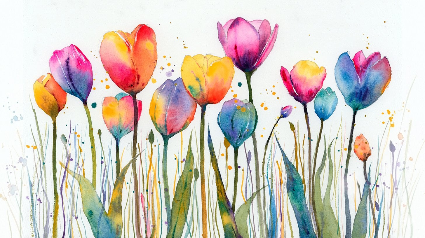
watercolor Alliance, Windsor and Newton, and the SAA. Watercolor can be overwhelming
for those starting out, which is why my goal
is to help you feel relaxed and enjoy this medium
in a step by step manner. Today, I'll be guiding you
through a complete painting, demonstrating a variety
of techniques and explaining how I use all
my supplies and materials. Whether you're just starting out or already have some experience, you'll be able to
follow along at your own pace and improve
your watercolor skills. If this class is too challenging
or too easy for you, I have a variety of classes available at different
skill levels. I like to start off with a free expressive
approach with no fear of making mistakes as we create exciting textures
for the underlayer. As the painting progresses, we'll add more details to bring it to life and
make it stand out. I strive to simplify
complex subjects into easier shapes that
encourage playfulness. Throughout this class, I'll be sharing plenty
of tips and tricks. I'll show you how to turn
mistakes into opportunities, taking the stress out of
painting in order to have fun. I'll also provide you with
my watercolor mixing charts, which are an invaluable tool when it comes to choosing
and mixing colors. If you have any questions, you can post them in the
discussion thread down below. I'll be sure to read and
respond to everything you post. Don't forget to follow
me on Skillshare by clicking the Follow
button at the top. This means you'll be the
first to know when I launch a new class
or post giveaways. You can also follow me on Instagram at Will Elliston
to see my latest works. So let's get started and capture this little bird with
freshness and charm.
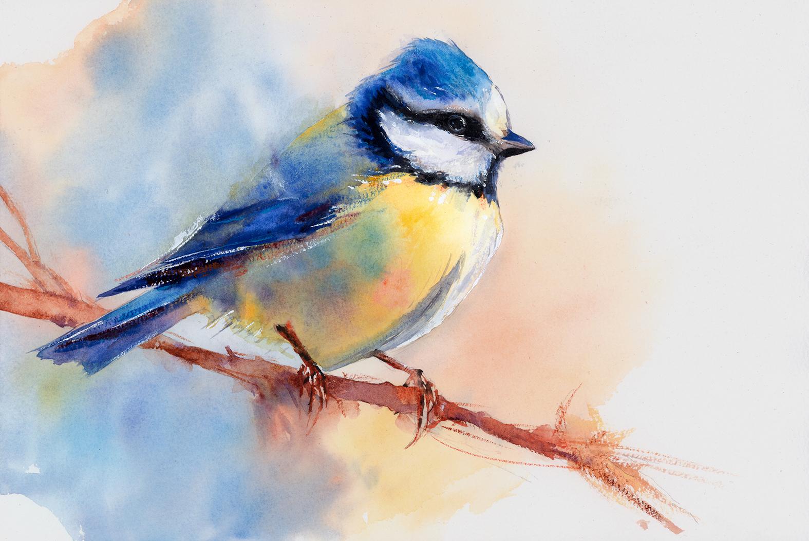
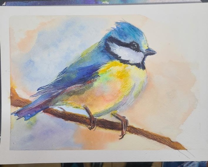
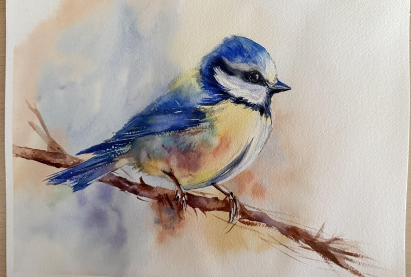
2. Your Project: Thank you so much for
joining today's class. This subject is a
great reminder that little subjects can
still hold big presents. Think of the bird as a collection of
beautifully simple shapes, supported by a soft
background wash that quietly frames the form. The blue and yellow plumage creates a wonderful
color relationship, lively yet harmonious, while the dark eye and facial markings become the natural focal point. Keep the branch understated, let the edges breathe
and allow the paint to suggest softness where
feathers fade into light. The aim is delicacy, clarity, and a joyful
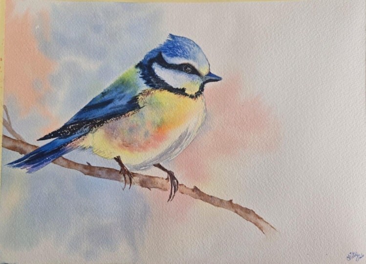
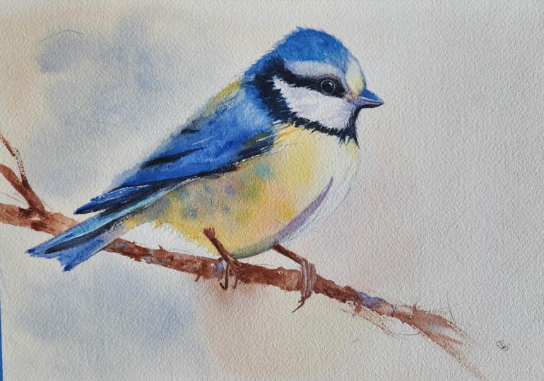
sense of life. In the resource section, I've added a high
resolution image of my finished painting
to help guide you. You're welcome to
follow my painting exactly or experiment with
your own composition. As we're going to be focusing on the painting
aspect of watercolor, I've provided templates
you can use to help transfer or trace the
sketch before you paint. It's fine to trace when using it as a guide for
learning how to paint. It's important to
have the underdrawing correct so that you can relax and have fun learning the
watercolor medium itself. Whichever direction
you take this class, it would be great
to see your results and the paintings you
create through it. I love giving my
students feedback, so please take a photo
afterwards and share it in the student project gallery under the Project
and resource tab. I'm always intrigued to
see how many students have different approaches and how they progress with each class. I'd love to hear
about your process and what you learned
along the way, or if you had any difficulties. I strongly recommend
that you take a look at each other's work in the
student project gallery. It's so inspiring to see
each other's work and extremely comforting to get the support of your
fellow students. So don't forget to like and
comment on each other's work.
3. Preparing The Composition: Let's start by breaking this down into the most
simple shapes. I'm first going to
look at the branch. Then there's a line, not
necessarily straight, but I'm going to draw it as a straight line coming down
from the head to the tail. I'm starting very
loose and going over my pencil lines
quite frequently. Then I can connect that
line to the body and start sculpting it and where the
blue meets the yellow. Then because it's
not a straight line, we can correct that
a bit now. Uh huh. There's a bit of tonal bits
here, a bit of shading. The eye is somewhere there, but at the moment, we're
just mapping it out. So now I can switch over to my finer pencil and add
a bit more pressure. But we can always go back with the pencil and correct
it with the rubber, sorry, and then back with a pencil after that
to correct it. So it takes a bit of refining
going back and forth. Of course, you can use the
template to speed that up if you just want to go straight
to the painting process. A lot of these lines here will be blended out, not hard lines. I don't want the whole painting
to be full of hard lines. So I'm going to sketch
it out and then use the rubber to kind of lighten it up so
that when we paint, we don't see as much
of these pencil lines.
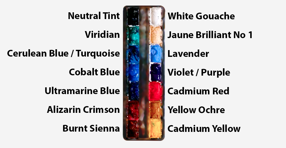
4. Mixing The Colours: For this painting,
I'm actually going to include a background,
which I'll paint first. But if you don't want
to have a background or just want to go straight into painting the bird,
that's perfectly fine. And you can go ahead to the section where we
start painting the bird. But I feel like
part of what makes this bird painting feel charming is not only
the bird itself, but the air around it. That untouched paper and the
soft washes that fade away. The openness that we'll
try and create on the right hand
side and the pale, cool atmosphere on the left, and all of that
matters and gives a emotion and opportunity
to play with. I'm mixing some warm
colors at the top, a orange color using cadmium
red and cadmium yellow. Then the blues that I'm mixing
now are just experiments. I'm using a bit of ultramarine
blue. You can use cobalt. Maybe a bit of serlean blue. There's no exact recipe. It's just what feels right when you're mixing and
playing with the pigments. Now I'm mixing my own green at the very bottom of my palate, and that's cadium yellow
with ultramarine blue. So I don't necessarily use my viridian green at the top of my palette
to create my greens. I mix my own because they
feel a bit more natural, at least in this kind of
painting I want to the moment. Now, to paint this
background, the easy way, I'm going to pre
wet the whole of the background so that we can achieve a nice
smooth transition, and it gives us plenty of time to work the pigments in
without it drying on us. So I'm using just any brush that holds a lot
of water and can just speed up the process, but I don't really want
to go over the edge of this pencil line on the bird. So that's why it's useful to have a little bit of
a tip on the brush. But otherwise, this
is pure water, and I'm completely painting
out the whole of the page. The outside of the
page, at least. Some areas, if you look at the final painting can be painted over because
they're going to be dark. So some of the areas on the wing than the
tail and the branch, they're going to be darker
than the background, so it doesn't matter
if we paint over that. But on the chest area, it's going to be a nice vibrant, yellow color on the bird, so we don't want to
paint over that. We could, of course, just go
straight in with the paint, but even I would find the paint starts to
dry before I filled out the whole area
because it's just so dry that the paper
would be so hungry and the water on the
brush would evaporate. So I always, when
I can pre wet it. Also I want nice
soft transitions where the edge of
the paper is white, using that white of the paper, and then gradually
it gets darker to create a kind of negative
space of the bird. So we're painting the silhouette of the bird by
painting around it. And that makes it quite dynamic and interesting, more three D, more atmosphere, more depth, and of course, more opportunity to play, like I said before. So you can see the three
colors that I've got ready prepared on my palette, orange, blue and green. You can explore
other colors, too. But now that it's
all wet around, we can get in and start applying this pigment
onto the paper.
5. Starting The Background: Starting with the
orange, just dabbing it, just to see how it
reacts to begin with, seeing whether it's
the right color now that it's actually on
the white of the paper. And I'm going to
use the white of the paper to our advantage here because the white
paper is one of the most important gifts
of this medium watercolor. It's something that I try
and value very highly because I don't
want to waste it. In a subject like this, the
untouched paper carries light and more beautiful than any paint could
actually achieve. That's why it's luminous. That's why it's transparent. We use the white
and the lights of the paper to give
it light and life. It's a natural luminosity. And you can see how it's kind of glowing because we again, got that hard edge around the chest, and
then it fades out. Adds a little bit of
cabium yellow now. On this side, it's not
so much of a transition. I feel like a bit of
a hard edge up there, just to break the monotony. An organic hard edge there, and then painting the back of the head and adding more
water to fade it out. You don't need to be afraid
of adding more water. If it's cotton based paper, even if it crinkles
a little bit, as long as you've
got it taped down, it'll dry out flat again, and it's actually very tough. Very rarely do I
overwork a painting. It really takes hard
work to actually cause the paper to wear away to break up the
particles of the paper. So dropping in more of the red. So far, we haven't touched
the blue or the green. But I'm adding a little bit of cabium yellow every now and again if I feel it's a
little bit too red or warm. Now we're popping
in some blue right where it touches the
left of the bird, and you have to be a little
bit careful when it comes to mixing or having orange and blue together because together, they do kind of neutralize each other and gray each other out. But as long as one of them
is stronger than the other, you'll be able to see that
it's either blue or orange. But if it's equal,
then it will be gray. You can see it kind of is
gray on the left there, but even that doesn't
really matter to me. It's just playing around
in the background. Sometimes it's
nice to have a bit of neutral muted colors. They're complimentary colors,
of course, orange and blue. So they look beautiful, however, they're mixed together. And even though you can quite clearly see my
brush strokes now, because the painting
is so wet the paper, these lines will soften out and become a bit more ethereal and elusive to that atmosphere. Now I'm breaking that hard
edge with a bit of green here just to see what happens, seeing
what I can do with it.
6. The Lower Background: I'm going to move back over to the right hand
side of the bird, start to add a bit more tone there because I just
want to see what happens on the left hand
side without overworking it. I don't want to force the image. I want to give it this
feeling of freedom. Even if it doesn't
end up being perfect, at least it'll have
that natural feeling rather than being overworked. I want to remind the viewer that of course, it's a painting. It's not a rendering.
It's not a photo. It has some kind of sol, and that may mean
that it's imperfect, but ironically, that imperfection adds
a bit of character, even if it doesn't feel like it initially whilst
you're painting it. Hopefully, by the
end, when it's all said and done, there'll
be a feeling there. So it's hard to
assess things until the very end, especially
with watercolor. And the abstract nature of this plays an important
role in this. It suggests atmosphere without insisting on a
literal explanation. So I don't know what
this background is. It could be a sky,
could be a bush, probably not a bush, actually.
It doesn't really matter. I'm just playing with colors. It's not, and I think
literal or easily defined. The soft blue can feel like cold air or a shadow or space. In fact, the reason I chose
Blue to begin with is purely because it harmonizes
with the blue of the bird. It's like a kind
of visual echo of the main accent of blue in the bird that
we'll apply later. And then usually when I
have a color like blue, for example, here, I think of its complimentary
color, which is orange. So that's why I chose orange next because it
works well together. So those are the
two colors that are the main kind of visual aspect
of the painting so far. And then we can influence those. So like you saw, I add a bit of cadmium
yellow into the orange in some areas to make it a bit
more yellow than orange. And then in this blue, I've added a bit more
purple in some areas, especially underneath
the tail there. You can see subtle
influences of purple there, not to steal the attention, but to just add a
bit of interest. I think a little bit
of blue there on the edge of the chest just
to put a bit more tone. Again, it's wet on wet, so these brushstrokes are
going to blend nicely. They won't be so muddy. I'm using quite thick. I'd say it's brown now. It's more consistency is
a bit more concentrated. I wouldn't say it's
thick, actually. It's concentrated. So you can see the particles
a bit more. And the reason I
say it's brown is because it's like orange
but a bit more muted. So I used burnt
sienna for my browns. A few touches of green there. So as I was saying before, I started to influence a
few other colors in there, just to add a bit of variety, but not to change the
whole color scheme. A warm blush of color
on the right can make the yellow breast
later feel more radiant. But none of this needs to
turn into a full environment. And the bird doesn't require a full sky or a
field or even a tree behind. We're just going to add
a little branch later, just enough to make it feel
howled within the page.
7. Starting The Branch: I completely understand
if you want to skip painting the
background and go straight to painting the
branch and the bird like we're about
to do now because the background does add
another layer of complexity, but we are here to learn, and sometimes the background can compete with the subject. So it's a good way to practice
thinking about composition and if you find yourself painting
in too much detail and don't know how to be loose, sometimes painting a
background can get you in the mentality to break away from detail and free yourself
up before we go into the actual main
focus of the painting. At least it helps
me mentally get the bowl rolling and
my hands working and thinking about
the paints and pigments before I paint
something that actually matters. So with painting this branch, I'm going to keep it
quite simple and minimal, especially in terms of colors. I'm basically just going to use burnt sienna for
my base color and then use ultramarine for
shadows and to neutralize it. I'm not going to use
black directly to make it darker because
ultramarine is, again, a complimentary color because
brown is like an orange, so blue is also a
complimentary color to brown, and we can use that to make more exciting tones and shadows. Oh when painting this in, I don't mind having
little white gaps of the paper beneath it. I'm not blocking
it out completely. The idea is to just fill out a certain section and then
once it's all even and wet, we can dab in more pigment to correct and achieve
a sense of tone. The branch in this painting
is a very good reminder that supporting elements
don't need to be boring, but they still need
to know their place. The branch matters because it gives the bird
somewhere to belong. Without it, this bird will just feel decorative or
even suspended in the air. And the little feet
need something to grip. Of course, we could have also
painted it on the ground. Maybe it's sitting
on the ground, but I feel like having it
sitting upon something, especially abluti which
we see in the trees, kind of it gives the composition
a line to travel along. So the branch is important, but it's important in
a supporting role, not as something that
steals the attention.
8. Painting More Branch: I want the branch to feel believable and lively,
but not competitive. I don't want it to start demanding the kind of attention
that belongs to the bird. So I keep it simpler
in every way. It's got a simple
shape. Simpler edges. The value structure
is quite simple. I'm not adding much detail. I'm dropping a bit of purple in now just for a bit of fun. But also, as I was talking about compliment
colors before, the complimentary color
of purple is yellow. So as you can see on
my palette there, I've got yellow and purple together so that
I can dab both of them together and mix them
on the paper so they blend and hopefully do their own unique
little thing there. So we can still experiment in these secondary supporting
elements like the branch. We can still have
hopefully beautiful color play going on. In fact, I like the warmth in the branch because it
balances the cool blues of the bird and echoes some of the warmer notes in the
chest and the legs. But again, it doesn't
need complexity. I'm using a lot thicker
pigment here as I'm defining the feet or the
claws or toes of the bird. Again, just suggesting it in
there. Not being too fiddly. You can see my brush
is I was going to say, it's either too
big or too small. What's important is that it's got a nice point to it and
it holds enough water. So ideally, it
should be as big as it can be while still
having a nice fine point. And I find that for this
branch, this is a good size. Any larger, and the brush might not have a
fine a tip as this, especially when painting
around the feet area. So even though there's
little breaks in this branch where the feet are kind of in front overlapping, likewise, where the tail
is in front of the branch, too, we're keeping
the color consistent, so there's an illusion of it going directly underneath there. These kind of supporting
elements like this branch can come across in so many of the different
paintings we paint. Whatever subject
we're painting really because supporting
elements often become stronger when we stop trying to make them expressive
in their own right.
9. Some Expressive Strokes: I'm feeling a bit too constricted and tight
because I've been messing around
with a small brush and small brush is always make me feel a bit
detailed base. I'm just going to do a few
abstract marks here trying to achieve a bit of
dry brush marking, which means I'm
using, of course, a brush with less water and when it glides above the paper, you can see it's got
a bit more texture. It just gives it a bit of energy and a bit more suggestion
rather than detail. Because, again, we
don't need detail so much in this branch. The real job of a supporting
element like this branch is it's relational to the
main subject of the bird. They can make the main
subject read better. So clothing in a portrait, a tabletop in a still life or distant trees in a landscape. These are all elements
that are there to serve the
painting as a whole, and they shouldn't
become neglected, but neither should they
steal the attention. So with this branch, I'm happy to allow
some broken color, some soft warm browns, a little reddish warmth. And I've added some
little hints of coolness. I went with purple rather than ultramarine
blue in the end. Maybe a few slightly
ragged edges that suggest natural irregularity because
nature isn't perfect. It's got that randomness to it. I'm not trying to fully
render the bark texture, and I don't need
every twig, either. I don't want it to be sharp, detail running from
one end to the other. A branch like this becomes more elegant when it
remains understated. Using a tissue to
achieve my texture, my random texture, so to speak. Also, there's something
quite nice about the diagonal
direction it creates. It gives the bird
a kind of perch, but also gives the composition
a sense of movement. Your eye gives a path for
the eye to look around. It stops the page from
feeling too static. And it helps connect
the softer blue wash on the left to the warmer
space on the right. So even as a simple
supporting shape, it's actually doing quite a
lot of compositional work. The feet and the branch together also offer a good lesson in
just enough description. We need enough clarity for
the bird to feel grounded. The feet must touch the
branch convincingly, and the branch must feel
solid enough to support them. But beyond that, we don't gain anything extra
from over explaining. Just a few warm little strokes,
few darker connections, a suggestion of grip, and that illusion is already
there, and it's enough. I'm even making it a
bit more abstract just underneath the feet there because I wanted to
break that edge. It's too clean. On this side, too, I'm making it a bit more of a gradient,
a bit more elusive. That seems enough.
There's already enough there to move on now.
10. Starting The Chest: Now it's time to paint
the bird itself. And if you haven't
paint the background, this will be where
you're joining. I'm just pre wetting some of the areas on the
head where I want to add this bright camium
yellow to begin with, just pure cabium yellow. And these first washes of the bird are
incredibly important because they set the emotional temperature
of the whole piece, really. If the early washes feel open, transparent and luminous, then the bird already
begins in the right spirit. If the first washes are heavy or too dry or
too overcorrected, then the freshness of piece already is almost lost basically and much harder
to recover later on. It's in these initial layers that we can be expressive
and capture that energy. So when I place these first washes of
yellow into the breast, into the chest area, I want to do it with some
level of confidence. I don't want to
hold back so much. But in order to have confidence, we're setting parameters for ourselves to allow
ourselves to be free. That's why pre wet the
paper to begin with, in this section so that we
can be bold and the wet on wet nature of it allows us
to be a bit more playful, and it encourages watercolor to do its own thing
as well for us. I'm certainly not trying to
solve every problem at once. I'm just sticking with the
yellows to begin with, figuring out where
I want those to be because yellows is where we get the main feeling of that brightness,
that luminosity. That initial atmosphere. The first impression
of form as well. So we're darker
at the top there, and as it curves along, I know we'll add
a few more blues, but I don't want it to
be green, so to speak. So I'm going to have to transition that yellow out
to the white of the paper. We can start putting in
a bit more color now. I'm dropping in a little bit
of that orange in there. It's barely perceptible. But it's in there a little bit. Now a bit more cabi and yellow. So we're working
it on bit by bit. So we can still be
confident even if we take it bit by bit at a time. Now, that seems like
an awful lot of red. It looks very bold, but I'm
going to repurpose it around. I'm going to dilute it and
spread it across there. So we've got pure
yellow at the top. And now, as it bends down, it kind of goes a bit darker, adding a bit more yellow to
take away some of that red, and the tone gets
a bit darker now. And even though it's dark, we're still using the lightness of the paper to make it glow. The thing I like about wet
on wet as we are doing now, is that the water gives
us more time to react. So we're not forcing
it at this stage. We can think of an area we
want the pigment to be. And then once we're generally happy with where
the pigment is placed, we can allow it to
settle naturally and allow the watercolor to create that nice natural effect. Now I'm dropping in some blue.
11. Varying The Colours: Still wet on wet technique, and notice how I'm dropping it in rather than brushing in that
blue at this stage. That's what I want
so that, again, the pigment interacts
with the water itself without
having me force it. I think a bit of yellow
underneath there, too. Underneath the wing. That blue almost looks
gray now or grayish green, but that's fine because this
is just the chest area. The main blue will
be on the wing, and adding the blue directly on this yellow
makes it look green. Naturally, blue and green, blue and yellow,
rather, make green. But again, I don't mind. I'm playing around even if
it's slightly unnatural. I'm having fun exploring
these colors because this is the expressive stage. This is the first layer. We don't need to worry
about final details. We're not trying to paint
out every single feather. I'm basically throwing
all the colors on here, blue, purple, orange, because I'm thinking more about tone than
color, actually. This is kind of a shadow
I'm painting at the moment, but I'm just using
a whole variety of different colors to do that. And of course, all
those colors blended together kind of
create a neutral tone, which works well as
a shadow anyway. To me, this is the favorite
part of painting watercolor. It allows us to begin
with something very light and alive, but gradually, it becomes more and more
exciting as we dab more colors on rather than brushing it on, just dabbing it on to allow it to flow the way it wants to, trying to resist the temptation
to interfere with it. It's quite common to feel that this first wash is more
vulnerable than it actually is, we see this chaos, this mess, so to speak, and we immediately have the
urge to want to improve it. But the best thing
we can do is to actually let it
stand for a moment. You can add more pigment
to adjust the tone, and then later on we'll reveal what it already
knows how to do.
12. Building The Tones: As you can see, I don't want
one flat patch of yellow. I want a bit of range involved. I want some places
to glow more warmly, perhaps with a slightly
peachy golden note. Then some areas to cool just a little leaning
towards a greenish, more soft, neutral shadow. And that's what keeps the
body from feeling flat. Even a very simple wash
can carry a lot of information in it if it
contains subtle variety. So I've taken a step back for a few minutes just to
see what's going to happen with that
body wash. And also, during that time, it's
starting to dry a bit, so it's about 50% dry now. So that means if
we go back to it, whatever brush strokes
or pigment we add, they'll hold their
form a bit more. So when we do go back into it, that's when we're
thinking a bit more of structure and control. We're taking the power
out of watercolor a bit. So we got to be a bit
cautious with what we do. I started with the yellows, of course, because they're
much lighter than the blues. And a general rule in watercolor is to start light
and then go dark. If in some strange world, the blues were lighter
than the yellows, or maybe it was a different bird and we had colours
in different places. I'd start the other
way, I'd paint the wings first and
then the body second. I'm adding a bit more
drops of random color into the body again because
as I was saying before, when it was wet and
wet, all the pigments blended out a bit too smoothly, and it's just done that again
as well, which is fine. It's better to give it time and see what it does rather
than force it early on. Now I'm extending it into
the shadow area of the tail. A nice little transition
from yellow to orange to purple
and now to blue. Then I'm blending
that out to nothing. This will work as a
little underlayer for what we plan later on. And when you paint
this yourself, don't worry about keeping all these drops and expressive marks on the
body exactly the same. It's just a general shadow area, all these little spots, these soft spot areas
of different color. They don't need to
be exactly the same. They don't need to be
exactly the same color, either, not just placement. You can maybe go for a more warmer feel
and a cooler feel.
13. Chest Shadow: So now that's all dried out, and that's basically
what it ends up looking after not
interfering with it again. To give it a better
illusion of form, I'm going to add a
little shadow that comes across in the center
of the bird here. In perspective, it's on
the right hand side, but there's just a little indent in the bird where
shadows are created. So now that the paper is dry, I want it to be a
slightly hard edge there to paint this bit in. I'm using the tip of my brush to make it nice and
thin at the top, and it gradually gets
thicker as we go down. Even here, it's a flat wash. I've made it a bit of variety. It's a bit green at the
bottom and warm at the top. You see there's a slight
transition of color. And now I'm dropping
in even more pigment. Again, making use of
that wet on wet variety. I think what I find
about this painting that is enjoyable to me is that it doesn't ask for a
forceful way of painting. Although if that's the way you're inclined to
paint or want to paint, it'll be great to see
your interpretation on this because we can make these tweaks as artists to make it fit for our own vision. But I find personally, it's asking for a bit more
sensitivity than brute force. It might just be a small
little bird, this Blue Tit, but it carries so much
life and so much color. There's an awful lot of character
in a very compact form. And there's something instantly
appealing and gravitating towards that strong
yellow and strong blue, especially later on when
we paint that dark eye, the contrast between the darks and the lights on the face, which will be the
focal point, really. It's delicate, but
it's not weak. There's a lot of softness
going on in this painting. I'm blending it out at the
bottom, this shadow area. A lot of elusiveness. But balancing that with
harder edges, too. And that's exactly what makes a good subject for watercolor. And even when I'm
looking at subjects that aren't necessarily
ideal for watercolor, I'm trying to think of ways to integrate those things
of variety of edges, some softness where it
might not exist in reality, like the branch is a bit
fading away at the bottom. Likewise, the bird will have areas where it's soft
where in reality, it's very textured with hairs or feathers, tiny
little feathers. Sometimes it's hard to describe these things whilst
I'm painting it. But if you look at
the final piece, you'll be able to see
the variety of edges, the balance, things that aren't necessarily
there in reality. And that's what makes it
suitable for watercolor. That more ethereal feeling that you don't achieve
in oil or acrylic.
14. Painting The Tail: So now we're going to
do a similar thing with the blues on the bird, starting with the tail and
working up towards the wing. I'm using this nice
turquoise kind of blue, Carillion blue kind of color. There's a kind of patience
in this stage that I think is very healthy and
very beneficial for painters. It might feel uncomfortable
initially that idea of patience because we're always rushing in our
day to day lives, but this is a good opportunity
to take a step back, have a nice drink, maybe a mug of coffee or tea, and remind yourself that a painting is not built
by constantly correcting. We can relax a bit more, see how it flows itself, allow us that opportunity to break free and give
ourselves permission. Paint a wash, have
a little pause, maybe respond a little bit, then another wash,
another pause. It's a kind of gentle rhythm. It's still attentive. You're still paying
attention to it. But it's taking a more
relaxing approach to it rather than
a stressful one because I remember being very
stressed when I started to learn watercolor even now when I try intimidating subjects, but one of the main things I've learned is that fear
really hinders the process. So I try my hardest to
strip away the kind of negative emotions that
come through painting something that feels
difficult or stressful. Even if that's what it is,
finding the time to, like, take a breath and slow down and accepting whatever
outcome it is, just enjoying the process of it, and we can take our
time with that. But sometimes even
with this painting, it's possible to
enjoy the rush of it. While still remaining calm, we're not painting fast
out of feeling stressed. We're painting fast
because we're enjoying the kind of excitement,
the spontaneity, the sense of freedom, the liberation factor
of watercolor. That's why it's always so interesting and exciting
to see the student gallery because everyone has
different personalities and it affects the way the paintings turn out
in unique, wonderful ways. That's what makes it so
special here on Skillshare. And that's purely about
the energy we put into it, because that influences
what color choices we might want to use or the texture
we might want to use. Whether it's a bit
more abstract, wherever it's a
bit more detailed. And that kind of thinking is particularly relevant
at this stage of the painting when we're doing the first layer,
the under layers. We're not using the tip of the brush for any fine
details yet or corrections. We're trying to get all
expressive at this part, capture that energy,
that unique energy that we want to express
ourselves and feel.
15. Bolder Pigment: Now I'm going to use a
lot thicker pigment, and I'm using cobalt blue for this as it's still slightly wet. This will allow it to blend in with a nice variety of edges, some soft, some hard. You see how much bolder
the pigment is now. Whenever I paint a
subject like this, I try not to think of
it only as a bird. Of course, it is a bird and I care about its character
and structure. But really, I also want to see it as a painting
in and of itself. I want to see it as
a set of shapes, a rhythm of soft and hard edges. You can already see a balance of hard edges and
soft edges going on. Also, the play of
warm and cool colors, the play of dark and light,
the different tones. And this is a very
helpful shift to have because it stops me from
becoming too literal, especially in the early stages. But even as we work towards
putting details in, it helps us think about how much detail we actually need to put in
and how much is unnecessary. Part of what makes the Blue Tit beautiful is the
descriptive element, but also it's very graphic that rounded yellow belly against this cool wing that
we're painting now. And then later on, there's a
dark strip through the face, the little rectangular
beak, the blue cap. Then we've got the diagonal
line for the branch. There's so many different
design elements that make it a very kind of graphic thing beyond
the subject itself. And when we look at any subject, that's the kind of thing
that we got to pick out. How to arrange them on the page. And then that will
help the bird feel more convincing later on. Because if they're
not arranged well, then no amount of tiny feather details will
save the painting. Notice how I'm using
very thick pigment here so that it almost
has a dry brush effect. So there's a bit more
textures on the tips, the tail and on the
neck of the bird. And right in between the
different layers of feathers, it's particularly dark here. I'm using the very
tip of the brush as well to indicate
the little shadows underneath the
feathers to create that illusion of
layered feathers. I see the feathers as form
first and texture second. One of the easiest
traps in painting a bird is to become fascinated
by the feathers too early. Of course, the
feathers are beautiful and they're part of what
makes a bird a bird. But if we start painting
them individually, the subject soon falls
apart and the bird becomes patchy and
loses its coherence. That's when it
starts looking a bit busy, brittle, over explained. So one of the most
helpful shifts we can make is to stop
thinking of feathers as little separate units
and start thinking them as texture that is
sitting on larger forms. And this Blutit has such
a lovely puffed body, and that softness is one
of its main attractions. So before I even think
about feather texture, I want the body
itself to feel round, light, and three dimensional, but in a kind of gentle way. We've already created that
kind of swell of the chest, the softness in the belly, and then it's turning away
into the shadowed underside. These questions that
are about form, not feather questions
as they matter first. And once that form
is believable, then feather texture
can be suggested with surprisingly little marks, just a little indication.
16. Playing With The Edges: I find a bit too neat and tidy the edge of
the wing up here. So I'm just using pure water
to agitate it because again, I want that variety of edge. I don't want it all just cut out and stuck
on like a sticker. So it might not
look like much now, but the water will reactivate the pigment and it'll blend out, and it will kind of melt
into the scene a bit more, feel a bit more connected. I'm purposely creating a kind of imperfection so that
it's more cohesive. I'm using a little bit
of cobalt to do that. And then up above, it's more
of a purple violet color, but it doesn't really matter
because it's so light. The tone we're using is so diluted that it almost
looks gray, really. We don't need vibrancy here. Just a subtle bit of toning. Of course, the bird's
covered in feathers. So we're painting feathers now, but we're not thinking
them as feathers. We're thinking of them
as light and shade. We don't need to paint feathers in this section or make
them look like feathers. We're taking advantage
of the fact that the viewer knows what
a bird looks like and that a bird has,
of course, feathers. So we're using the allusion to the viewer will see it
as feathers themselves, so we don't need to state it. We just need to indicate it. Sometimes it's an edge that
breaks slightly or the soft dry brush passage that
gives a texture of little hundreds of
little feathers, but it's actually just simple
one stroke of a dry brush. Sometimes it's the way one
wash blooms softly into the other or simply leaving an area unresolved
so that the viewer feels that fluffiness rather than
reading every single strand. A bird like this really does not need a fully described surface. And that's something that took me longer than it would meant to to figure out. I
used to render it all. I used to think that
adding little lines for feathers and details would make it feel more
alive and impressive, but it really took away
the spirit at it needs the illusion of softness
and that illusion is carried much more effectively through
restraint, actually. Using a bit of pure water and
then using a tissue to dab away some of that pigment.
So it's a bit tidier.
17. Starting The Head: So now that base layer of
the head is pretty much dry. We can go back with
bold cobalt blue now. It is pure white of the paper. And when we did the background, we painted around this so that
it would be pure white of the paper here to really make
the most of the vibrancy, because to be fair, the blue in watercolor isn't
always the most vibrant. So if we want it to be
bright and luminous, we really do rely on
the white of the paper to come through of course, there's so many different
blue watercolor pigments. Some of them are
a bit more muted, some are a bit more luminescent. So it's worth
experimenting with some. I like turquoise
and you could buy cobalt from Daniel
Smith, Windsor Newton, Cotman, Holbein, Schminke,
any of the different brands, and they'll all look
slightly different, and it's all a bit
of a personal taste. But most art supply shops have little samples,
you can see. And if you order your paints online rather than in a shop, there's some places you can go to some websites
you can visit, and you can see samples or people experimenting
with different colors. If you search the actual
pigment name in Google, you're bound to see
someone uploading all the different colors
that are available. So I have quite a
collection of pigments, and while I might
say cobot blue, it could be a mixture of
Daniel Smith, Windsor Newton, or Holbein because
I've got one in each, and it just whatever I
happen to pick up on the day and squirt it into
that tub on my palate. Likewise, with my CerleanTokoys
goes in there sometimes. Sometimes the iridescent
electric blue color from Daniel Smith
goes in there too, because that has a little shimmering particle
effect that I like. So whilst this head
is wet and wet, I'm just dropping in pigment, rather than forcing it,
I'm manipulating it. That's the way I try
and think about things. I'm encouraging it,
but ultimately, sometimes watercolor
has a mind of its own. We can see so much of the body is soft and has
lots of gradients, and that's because it's
not the focal point. It's not the main
center of tension. The head is really what
carries the character. So if the body carries softness, then it's the head that
carries the character.
18. Dark Stripe: So we've painted the blue
crown at the top of the head, and now we're going to
paint the dark stripe that goes through the eye. And this will really show
that pale cheek area, and it'll lead to
the little beak. These are the signs that
gives the bird its identity. Adding a bit of this darkness to show that contrast between
the light and the dark. And this is where
the main focal area is where we want the
attention to be. But even now, I'm being very suggestive
with my brush mark. I might be using the
tip of my brush, but I'm not taking a long time. I'm personally trying to
rush myself in this area. To keep that expressive feeling. When it comes up
to the eye area, I am going to be a
little bit careful to preserve some of the
white just so that I know myself that's where
the eye is and how big it is because if I use this dark pigment to
paint right over it, then I'll probably lose
the placement of it, the size of it, and
it'll look a bit funny. My judgment will be a
bit wrong later on. So for the time being, I'm not painting over the eye. So while I still want a
painterly feeling overall, I do know the head
needs a little more of a structural core to it. There's so much going on in the head in such a small section compared to the
rest of the body. The first thing I want
is clarity of shape. I'm looking at the shapes
and trying to match them. Blue of the crown should
feel like a simple, strong cap, not a fuzzy
cloud, for example. And this dark line going
through the eye should have clear direction and
enough contrast to make the face read properly. That pale cheek area below must remain clean enough to hold
the strong shape beside it. And these little relationships matter much more than
all the details. Because if those main
head shapes are right, then the whole body kind of becomes convincing
within itself. We could smudge out a lot of the wing or be more abstract, but the detail in the face where we want it to
be anchors the whole piece. And this is such a useful lesson in wildlife painting in general, and it even adapts to
street scenes or portraits. But each animal has its
own unique identity. We all know what
a fox looks like or how a fox differs
from a wolf or a kingfisher has that
particular beak and body rhythm which distinctly makes it
distinctive compared to this. So I always rather
place those shapes clearly than spend
my time adding small decorative details
elsewhere in the painting. But at the same time, I
don't want the head to look too cut out or graphic
in a harsh way. I still want some
areas of softness, so doing slight areas
of blending now, but I paint out the main shapes first and then play around
with them after.
19. Painting The Eye: As always, it becomes
another balancing act. There's so much
to think about in terms of balance with paintings. And I'm talking a lot about
balance in this class. I've talked a lot
about color balance, edge balance, tone
balance, detail balance. It's something to
think about while exploring your decisions. The shapes need clarity
but not stiffness, and the darks need
to be confident and strong but not overly heavy. They don't want to
be out of control. I'm not trying to overwhelm you because these things
I'm saying aren't actually rules because they can be bent and molded to
your own personal taste. So they're questions that you
have your own answers to. I'm not necessarily giving strict orders to how you should choose to
balance your painting. It can feel quite delicate
painting this section. The strong contrast between these darks and whites
carry enormous power. There's lots of little
areas of the painting that are physically
small, but visually, they change the whole
character of the painting, the eye, the beak, that little stripe, and also where the feet
connect to the branch, quite subtle, but
important to get right. But that doesn't
necessarily mean we have to make them
difficult at the same time. I'm going to go back
to the eye now, and the eye is the most important part of
the painting, actually. So I want to be extra
careful with it. And if it feels a bit wrong, I'll just paint over it again and have to come
back to it later on. But at the moment, I'm just chipping away
at it, so to speak, from the inside out, trying to paint that little ring
of highlight in the middle. The eye is so important
because that's where that feeling
of alertness sits. Even if the bird is
quietly perched, the eye gives it presence, and it's remarkable how
much life can be held in such a tiny little shape just because of our
associations with it. A good eye in a bird does
not need much at all. In fact, I'm considering
just painting over it and coming back with a few white highlights of
white gouache later on, so I have to see about that. O.
20. Creating Texture: What's important
about the eye is the right placement and a
believable, dark value. And that feeling of moisture or light
that reflects on it. So it can be very subtle. So I've painted it over now. I know I spent a bit of time painting around the
outside and the inside just to be extra sure, but ultimately, it
looked too much. So I've painted it over now, and then I'll go back with
very subtle highlights later. I just need to step back
and assess it for a bit. And the beak works
in a similar way. Although it's a bit quieter
and not so important, it provides a bit of direction, and it points the bird into
space and sharpens the head, where a lot of the other edges around the bird
are a bit softer. It gives it a little
note of firmness against the roundness of
the body because everywhere else is very curved, but we've got a very
sharp point there. But it doesn't need
to be fussed over. Again, I blocked
out a few shapes and then smudged over it a little bit then just to give
it that organic feeling. Just enough to feel natural. And sometimes the smallest little structural notes
do the most work. Is a bit of a paradox, really, because one pale wash that's very large can often
create the atmosphere, but the whole painting may hinge on just a few
tiny little dark notes. And without them, the bird
may feel airy but incomplete. Or with too many, the bird can become heavy or overworked. So the use of dark
accents like this becomes a very fine
kind of judgment. But let me remind
you that if you ever find yourself feeling
pressure while painting, I'd encourage you to just
come back to that sense of enjoyment because this bird
is not asking for perfection. And the whole reason
we're painting is to have fun, express ourselves, to disconnect from
the world and just relax and enjoy what we can
do with water and pigment. It's so much better
at the end of the day to enjoy the process
of painting than to be stressing about making
the perfect masterpiece. Because if we go that direction, it never ends, we'll always want to improve
again and again, and there'll always be another
milestone and objective.
21. Painting The Legs: As the painting
nears completion, the questions begin to
change because early on we ask where things belong
or what shapes matter, what colors need
to be established and where the light sits,
that kind of thing. But near the end, the painting usually no longer
wants large decisions. It just needs a few fine tuning, a little bit of
personal judgment. So honest self interpretation. Because the bird is already
there by that stage. Question is, does this
extra touch actually help or is the
freshness still alive? And those become the
important kind of questions. And this is often where
many delicate paintings are either protected or spoiled. If we are calm enough
to recognize that the bird already feels present, then we can often stop. Even if it may not feel
completely finished. That feeling of being slightly unfinished allows the viewer
to finish it for them. If something's completely
done too much, then it doesn't leave anything for the viewer to see
to get involved with. If we become restless and begin searching for more
finished qualities, simply because the page
still contains open, unresolved sections,
then we start to damage exactly what made the painting and the bird
appealing in the first place. So I try to become a little
more still at this stage. Of course, we've
still got the feet. We can see what's missing
or what needs to be done. But I'm a little less eager to act on especially big decisions. Like, there's no big
shadows we need to add that doesn't mean no
more paint goes down. Sometimes a final
accent is exactly right or a tiny strengthening
of the eye. We still need to go back
to the eye, actually, maybe a few highlights because we didn't
want to jeopardize nice large washes just to
save a few fine lines. We can always go back with
opaq light pigment like white quash just add that little bit of
definition and sparkle. Maybe we can lift off a few brush marks to create
some subtle textures, not everywhere, but in
a few selected areas. And these little adjustments can be beautiful and necessary, but they need to come from some that clearly
needs it rather than just kind of anxiety
that it feels wrong. There's a little bit
of a difference there.
22. A Few Pops Of Light: If you have trouble knowing
when to finish the painting, you can always step back and come back to it another time. Sometimes I do that and realize it really doesn't need more. It's fine to be left
unfinished to be unresolved, makes it more intriguing. Now I'm going back to
the eye and you can see how subtle I'm making it. But that subtlety
is still impactful, couple or three dots
of white pigment gives it that illusion of
reflective surface on the eye. One useful question here
when it comes to finishing the painting is
whether the painting already reads from a distance. So you can take a
few steps back and see the composition as a whole and disconnect
from it for a bit. If I step back and
the bird immediately feels somewhat
charming, rounded, and alert, or well placed, then everything's
already working. Sometimes I do this halfway
through a painting as well. And then at that point, any further mark
must justify itself, not just because I
want to do more, there has to be a reason for it. It must strengthen something. If it only makes
the section busier, then it's failed
and is unnecessary. Even if it's
technically accurate, even if it's there on
the reference image. Another useful question is whether the hierarchy
still holds. Is the eye still the
natural focal point? Does the body still feel soft? Has the branch
remained secondary? And if you've painted
a background, is it still soft and airy and atmospheric rather
than stealing attention? Have the colors kept
their freshness. It can be difficult to restore that freshness
anyway in the end, but these are the bigger
questions that often matter more matter more than just local corrections,
tiny little sections. And it's in this point
that we can make notes for future paintings because once we disconnect from
this painting, we might forget what's going through our
minds at this stage. So it's always in these final few areas
where we can really learn about ourselves as artists and what we can do and take forward
into our next projects. The goal is never to prove how much we can do or how
much could be done. The goal is to just capture something of the
bird's brightness, its softness and charm. And once that is
already present, the wisest thing is to simply just leave it there, let it be.
23. Final Thoughts: Welcome back and
congratulations on completing this watercolor
class on painting a Blue Tit. In this class, we looked
into how a painting can feel complete without being
overworked and crowded. How a limited number of marks
can suggest both form and softness and how the placement of the contrast determines
where the eye rests. The same principles work wonderfully for
other small birds, floral studies, or
any subject where you want one clear subject to glow
against a gentle setting. Remember, watercolor painting is not just about technical skills, but also about expressing your creativity and
personal style. I encourage you to continue
exploring, experimenting, and pushing your
boundaries to create your own unique
watercolor masterpieces. As we come to the
end of this class, I hope you feel
more confident and comfortable with your
watercolor painting abilities. Practice is key when it comes
to improving your skills, so keep on painting
and experimenting. I want to express my gratitude for each and every one of you. Your passion for
watercolor painting is so inspiring and I'm honored
to be your teacher. If you would like feedback on your painting, I'd
love to give it. So please share your painting in the student projects
gallery down below, and I'll be sure to respond. If you prefer, you can
share it on Instagram, tagging me at Will Elliston, as I would love to see it. Skillshare also loves
seeing my students work, so tag them as well
at Skillshare. After putting so
much effort into it, why not share your creation? If you have any questions
or comments about today's class or want any specific advice
related to watercolor, please reach out to me in
the discussion section. You can also let me know about any subject wildlife or scene you'd like me
to do a class on. If you found this class useful, I'd really appreciate
getting your feedback on it. Reading your reviews
fills my heart with joy and helps me create the best
experience for my students. Lastly, please click
the follow button Utop so you can follow
me on Skillshare. This means that you'll be
the first to know when I launch a new class
or post giveaways. I hope this encourages you to enjoy the quiet power
of simple subjects. I look forward to
seeing you all in future classes until then Happy
painting and bye for now.
 Will Elliston, Award-Winning Watercolour Artist