Transcripts
1. Welcome To The Class!: Hello, everyone. My
name's Will Elliston. And today, we're painting a
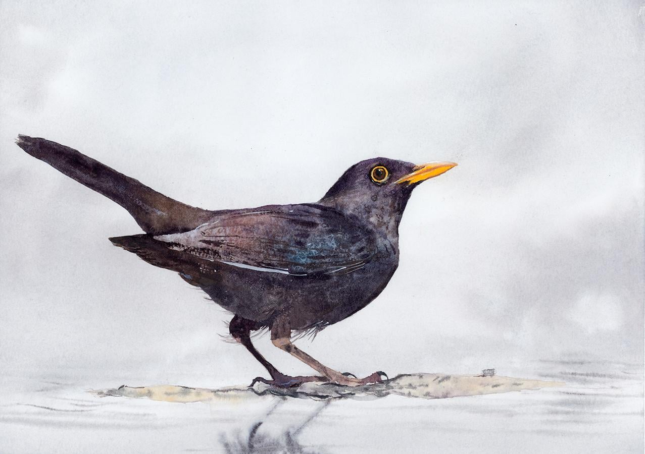
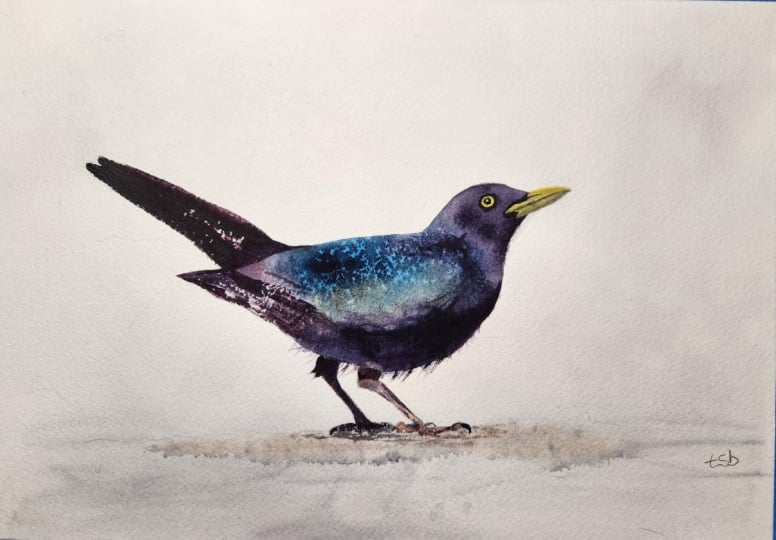
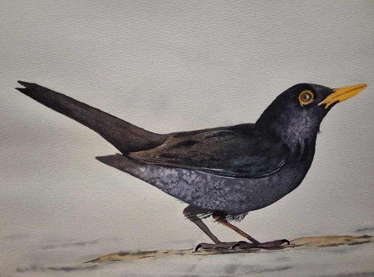
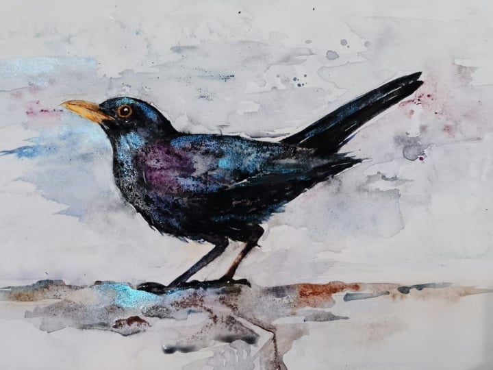
black bird in watercolor. This class is a lovely reminder
that a painting doesn't need lots of color and complexity to feel
rich and expressive. At first glance,
it seems simple, almost minimal, but there
is a lot going on, Rich, dark plumage with
subtle shifts of blue violet and warm brown, a striking yellow
beak and eye ring, delicate legs, and plenty of breathing space
around the bird. It is subtle, elegant,
and full of character. I've been a professional
artist for many years, exploring lots of different
subjects from wildlife and portraits to cityscapes
and countryside scenes. I've always been entranced by the possibilities
of watercolor. But when I started,
I had no idea where to begin or
how to improve. I didn't know what
supplies I needed, how to create the
effects I wanted, or which colors to mix. Now I've taken part in many
worldwide exhibitions, been featured in magazines, and been lucky enough
to win awards from well respected
organizations such as the International
watercolor Society, the Masters of
watercolor Alliance, Windsor and Newton, and the SAA. Watercolor can be overwhelming
for those starting out, which is why my goal
is to help you feel relaxed and enjoy this medium
in a step by step manner. Today, I'll be guiding you
through a complete painting, demonstrating a variety
of techniques and explaining how I use all
my supplies and materials. Whether you're just starting out or already have some experience, you'll be able to
follow along at your own pace and improve
your watercolor skills. If this class is too challenging
or too easy for you, I have a variety of classes available at different
skill levels. Throughout this class, I'll be sharing plenty
of tips and tricks. I'll show you how to turn
mistakes into opportunities, taking the stress out of
painting in order to have fun. If you'd like to explore
watercolor a little further, I've put together a
free guide called the ten most common watercolor Mistakes
and how to avoid them. It covers some of the challenges we all face when painting. With practical advice
to help you overcome them and feel more
confident with your brush. You can download it for free
by joining my newsletter, Will Elliston Studio Notes, where I share painting tips, creative insights,
and inspiration to help you develop
as an artist. You'll find the link in the
class description below. If you have any questions, you can post them in the
discussion thread down below. I'll be sure to read and
respond to everything you post. Don't forget to follow
me on Skillshare by clicking the Follow
button at the top. This means you'll be the
first to know when I launch a new class
or post giveaways. You can also follow me on Instagram at Will Elliston
to see my latest works. So let's get started and explore how simplicity can
create real presence.
2. Your Project: Thank you so much for
joining this class today. This painting is
all about balance, a dark subject held within
a pale, spacious setting. Rather than filling the
page with information, we allow the birds stance, proportions, and small color
contrasts to do the work. The background remains
soft and quiet, just enough to suggest
atmosphere and ground without competing
for attention. In the resource section, I've added a high
resolution image of my finished painting
to help guide you. You're welcome to
follow my painting exactly or experiment with
your own composition. As we're going to be focusing on the painting aspect
of watercolor, I've provided templates
you can use to help transfer or trace the
sketch before you paint. It's fine to trace when using it as a guide for
learning how to paint. It's important to
have the underdrawing correct so that you can relax and have fun learning the
watercolor medium itself. Whichever direction
you take this class, it would be great
to see your results and the paintings you
create through it. I love giving my
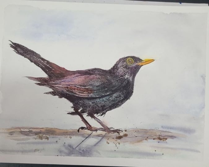
students feedback, so please take a photo
afterwards and share it in the student project gallery under the Project
and resource tab. I'm always intrigued to
see how many students have different approaches and how they progress with each class. I'd love to hear
about your process and what you learned
along the way, or if you had any difficulties. I strongly recommend
that you take a look at each other's work in the
student project gallery. It's so inspiring to see
each other's work and extremely comforting to get the support of your
fellow students. So don't forget to like and
comment on each other's work.
3. Materials & Supplies: Before we draw the
Blackbird out, let's go over all
the materials and supplies you'll need to follow
along in today's class. Having the right materials can greatly impact the
outcome of your artwork. So I'll go over all the supplies I use for
this class and beyond. They're very useful to have at your disposal and we'll make it easier for you
to follow along. Let's start with the
paints themselves. And like most of the materials
we'll be using today, it's a lot to do
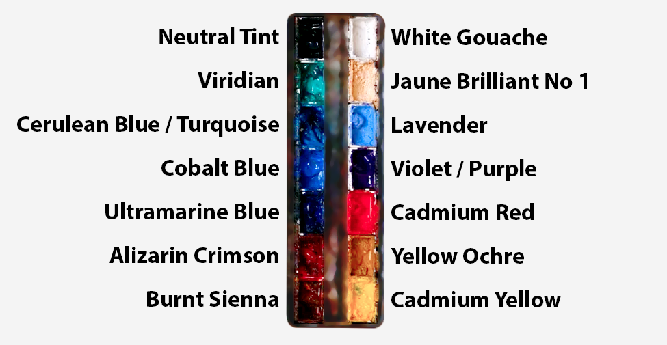
with preference. I have 12 stable colours in my palette that I
fill up from tubes. They are cadmium
yellow, yellow ochre, burnt sienna, cadmium
red, Alizarin crimson, Opramarne blue, cobalt blue,
serlean blue, lavender, purple, viridian, black, and
at the end of the painting, I often use white gouache
for tiny highlights. I don't use any
particular brand. These colours you can
get from any brand, although I personally
use Daniel Smith, Windsor and Newton
or Holbein paints. So let's move on to brushes. The brush I use the most is
a synthetic round brush like this Escoda Purl brush
or this Van Gogh brush. They're very versatile because
not only can you use them for detailed work
with their fine tip, but as they can hold
a lot of water, they are good for
washers as well. They're also quite affordable, so I have quite a few
in different sizes. Next are the mop brushes. Mop brushes are good for
broad brush strokes, filling in large areas and creating smooth
transitions or washes. They also have a night tip that can be used for smaller details. But for really small details, highlights or anything
that needs more precision, I use a synthetic
size zero brush. All brands have them,
and they're super cheap. Another useful brush to have is a Chinese calligraphy brush. They tend to have long bristles
and a very pointy tip. They're perfect for
adding texture or creating dynamic lines
in your paintings. You can even fan them
out like this to achieve fur or feather
textures as well. And that's it for
brushes onto paper. The better quality
of your paper, the easier it will be to paint. Cheap paper criinkles easily
and is very unforgiving, not allowing you to
rework mistakes. It's harder to create
appealing effects and apply useful techniques
like rubbing away pigment. Good quality paper, however, such as cotton base paper, not only allows you to rework
mistakes multiple times, but because the pigment
reacts much better on it, the chances of
mistakes are a lot lower and you'll be more likely to create
better paintings. I use archers paper because that's what's available
in my local art shop. A water spray is
absolutely essential. By using this, it
gives you more time to paint the areas you
want before it dries. It also allows you to
reactivate the paint if you want to add a smooth
line or remove some paint. I also have an old rag or t shirt which I use
to clean my brush. Cleaning off the paint
before dipping it in the water will make the
water last a lot longer. It's always useful to
have a tissue at hand whilst painting to
lift off excess paint. Also, you never know when an unwanted splash or drip might occur that needs
wiping away quickly. I also have a water dropper
to keep the paints wet. When you paint, it's
important to have them a similar consistency to what
they're like in the tubes. This way, it's easier to
pick up sufficient pigment. A hair dryer is useful
to have for speeding up the drying time and controlling the
dampness of the paper. And lastly, masking tape. And this, of course, is just to hold the paper down still onto the surface to stop it sliding
around whilst painting. Also, if you plan on
painting to the edge, it'll allow you to create a
very crisp, clean border. And that's everything you'll need to follow along
in today's class. Now let's get on and
sketch out this Blackbird.
4. Preparing The Composition: Before getting into the paint, I want to spend a little time
establishing the drawing. So with a subject like this, I think the drawing is
particularly important because so much of the character of the bird comes from
the silhouette. Once we start adding all
those dark washes later, there'll be much less room to make major structural changes. So this is the
stage where we want to be sure the proportions, posture, and general
movement feel convincing. So I'm starting on
very soft and loose. All these early pencil
lines are just exploratory, nothing set in stone. I don't want to make this into a highly finished
pencil drawing. The sketch is really just a
framework for the watercolor. I want enough information
to guide me confidently, but not so many
lines that I feel trapped by them once I
actually start painting. So rather than beginning
with the eye or the beak, we came to that a little later. I'm trying to see the bird as a few large connected
shapes to begin with. We have the main
body, which is almost like an oval or an egg shape. Then we have that small
round head coming off that. The tail creates this
long tapering kind of shape moving away in
the opposite direction. And then underneath all that, we have these very
delicate angular legs. So already, just a few shapes tell us most of what
we need to know. And that's a useful way to
approach drawing in general.
5. Bleak & Eye Underlayer: We're going to start
this painting with a very soft underlayer of bright yellow around
the eye and the beak. I'm choosing to pre wet this
area just as a safety guard, but it's not that essential. You can just go straight in
with the pigment if you want. I'm just demonstrating
the easiest option. So now that it's pre wetted, we can just drop this yellow in, and the water
already on the paper helps fill out that area nice
and smoothly and easily. And we drew in that
eye with the pencil, but I'm actually painting over the line because
I know later on, we're going to come in
with very bold black, which will cover up where we've gone over the
line with the yellow. Just adding a touch of
cabium red in there, even that's probably
a bit too powerful. So I need to smudge it around and as I spread it out,
it becomes lighter. It's more of an
orange color now. But because it's so
light and diluted, it's not an obvious orange. I can drop a bit more
cabium yellow in there. Likewise, on the beak. We don't want to make it
look too pale because then it'll look too weak when we apply the dark blacks later on. You can feel quite odd adding such strong yellow
pigments right now with nothing
else on the paper. But in context, the
dark tones later, this will still look
very light and bright. So don't be too shy. You can always
soften them later. But it's better to be extra
confident at this stage. Notice how with the beak, I'm being very careful not to
paint over the paint line. And if I do, and if you do, it's quite easy to correct. As long as it's wet, we
can have a tissue in our hand and quickly dab it off before it
stains the paper. You can even use water to
scrub off any unwanted marks. Now, I dried that
completely with a hair dryer and I've dropped some
masking fluid in there, which is quite important.
It's not necessary. I just frees us up to be more expressive and playful
with the paint later. If you don't have masking
fluid, that's perfectly fine. You can just paint around it or you can cut out
some masking tape. But as I have masking fluid, I find it easy option. I use this sculpting tool, but you can use a
cocktail stick. It doesn't have to be this tool. I don't think to move
around the masking fluid.
6. Mixing The Darks: So I quickly used a
hair dryer to make sure the masking fluid is
completely dry so that it won't break away or fall off. Now I'm going to mix my blacks. In fact, the whole
idea of this class, the inspiration of this class, was to show a way in which you don't have to use a tube of black paint to create
exciting captivating blacks. In fact, the whole
of this class, I'm not going to
touch that black pan of paint I have in my palette. I'm going to show you three
different ways to mix black. We started off with this Varidian green and then added alzoin
crimson in there. If you go back and forth, if it looks a bit too
green, add a bit more red. If it looks a bit too red, add a bit more viridian
green in the middle, you'll find this nice
blackish gray color. Next, we're going to
do blue and orange. Notice how these colors
are complimentary colors. They're opposite each
other on the color wheel. So green and red are opposite, and blue and orange
are opposite. But instead of using the
orange that I have in my pan, I'm using burnt sienna because burnt sienna is a brown and brown is part of
the orange family. So they are still
complimentary colors because it's a darker pigment, it's a translucent pigment. When I mix ultramarine
blue or cobalt blue with this burnt sienna.
Look how dark it goes. It's like a pure black, just
as dark as the black we have on the pan up at
the top of the palette, same kind of black you'd
find in a tube of paint. So it's it's not
essential to use black. You can mix your own blacks. What's interesting
about this is that all these blacks have different characteristics
because we're mixing them from other colors. The pigments from the blue
and the burnt sienna will interact with each other on the paper in an
interesting unique way. Likewise, we have the green, the viridian, and the
liar and crimson. Those are going to
create lovely effects. Four different pigments
we've got so far on our palette and it's
making the same color, but they'll interact differently on the paper in ways
we can't imagine. And that's the magic
of watercolor. That's why sometimes it's useful to experiment with
mixing your own blacks. And actually,
throughout this class, when I say black, I'm going to use some black now. I'm not referring to the black pan in the
top left of my palette. I'm referring to these
colors I'm mixing now. This third black, I'm
actually going to call a gray because it's
quite a light color because the third complimentares
are yellow and purple, but of course, yellow is
not a very dark color. So when you mix
yellow with purple, it kind of just looks like
a muddy gray or a brown. So as it went brown, I know the complimentary
color of that brown is blue. So mixing blue into this, you can see turns it into
a gray, that's fine. We can use that for
some mid tone colors. Midterm colors of the Blackbird. As we get further
into the class, I'll talk more about the use of black in paintings
in general. Because when you look
at black objects, at least in nature, you can observe that it's
not fully black. There's other colors
inside are black, especially with a black bird. When you look at references
online or even in real life, it's not a solid black. There's undertones
of brown and blue, maybe slight green in there. But we'll talk about
that later. But
7. A Soft Background: So now we have those
black colors mixed up. We can start applying it. And as always, we're breaking
it down into simple steps. I'm taking a large brush
just because it saves time, not because it's necessary to completely cover the
paper with water. I'm not making it
completely soaking wet, just enough to get
it all evenly washed out so that when it comes to
applying the black pigments, they spread out nice and evenly without drying
and creating hard lines. Having your paper taped up onto a board really helps
this because when we put so much water and pigment onto a sheet of
paper like we're doing now, it's bound to crinkle up. Even good quality
cotton paper does that. But because we have it taped up, though, when it dries, it flattens back out again. Regular wood based paper will not really flatten
back out again, but cotton definitely will. So it doesn't matter which gray or black I'm
using on my palette. I'm just applying a light
wash of it at the moment. As the papers already wet, it's going to smoothen out. We want to create
some atmospheric depth in this painting. So using very flowing
brush strokes. Another reason a large
brush helps is that we can avoid using
small brush strokes that create or ruin the feeling of that
flat atmospheric wash. If we have a hard line, it kills that feeling of depth. So we are starting off with
a base kind of wash. We can have subtle changes of tone, but I don't want any hard
lines for the time being. As the papers so wet, we won't really get
any hard lines at the moment because the water does a lot of the effort for us. At the bottom, however, that's going to be
the foreground. So you can see we've
sketched out a little bit of land on this little
pond or puddle. And we're going to
make it slightly darker than the foreground and it fades off into the distance, and that will create a
subtle illusion of depth. Notice how I'm using gray, that black as my base tone. But every now and again, I dab a bit of blue like I am now, a little bit of green, just
to influence the gray a bit. So it's beyond anything
visually perceptible. It's more subconscious
this influence. But it does have effect. Otherwise, it's a very
flat kind of gray color, but we had little touches of other pigments just to
give it a subtle change. I'm also applying
a few splats of pure water onto the
slightly darker areas to give it a bit
of subtle texture.
8. Subtle Reflections: So moving on, as the paper is
starting to dry a bit now, bit by bit, we can take advantage of each
stage of this process. I've moved to a
smaller brush now, and whilst it's
still wet on wet, I'm applying the
reflection of the legs. You can see that these brush
strokes, these shapes, these lines that we're applying,
they hold their shape, but they don't have hard lines because the paper is
not completely sodden, not soaking wet,
but it's not dry. It's in between damp and moist, so it holds its shape, but with a soft touch to it. And I've added a
few side ripples, horizontal wavy strokes. It's not so important, but that piece of land where the black bird
is standing on, I've tried to keep it
a little bit lighter, but just above the land, you can see there's a slight
bit of tonal pigment there, a little bit darker, going
underneath the legs. And now that I've got a feel for how wet or dry the paper is, I can be a bit bolder with
my pigment because I know it's not going to run
off and be crazy. I know it's somewhat
controllable now. So I'm going back with
thicker dark pigment, one of the blacks
that I've pre mixed. I've got some crinkle
els on my paper that might be hard to
see from this angle, but I'm trying when I
apply my brush strokes, I'm trying to factor in
with the crinkles because if I just swipe my brush across, it'll, of course, only
touch the peaks of these crinkles of
the paper and avoid the valleys of the
crinkles of the paper. So I have to kind of
lift my brush up and down in accordance to the
crinkles of the paper. It doesn't need to be
one long brush stroke. You can do a few
brush strokes in the valleys and a
few brush strokes in the peaks of the paper. Now I'm going to
completely dry the paper. Even if it feels
dry to the touch, I'm going to go an extra
level because sometimes when after applying so much water to a wash like
this to the paper, it'll still be wet underneath, so I'm just going to make
sure it's absolutely dry. It's a very subtle background that we just did,
but it's enough.
9. An Expressive Start: So you can see now that
we've completely dried it, because I'm using
cotton based paper and masking tape
on all the sides, the crinkles have
flattened back out again. It's a good sign that
it's completely dry. So I'm using a medium
size brush now. It has a nice point to it, so I can go all the
way to the edge, and I'm using pure
water to just fill out the silhouette because we're
going to rely on a lot of wet on wet technique
for this painting. Of course, if you don't have the masking fluid for
the eyes and the beak, you'll have to carefully
paint around those sections. If you're very fast, you could just go straight
into applying pigment and carrying the wash
forward as you go along. But I find just pre wetting the area that
you want to paint, can allow you to be a bit more playful and it gives you
a bit of a safety net. So you can see, actually the blacks that we've mixed already on the palette, that blue brown one
has already created an interesting separation of pigment in the palate itself. So I can see that's more
of a cooler kind of black, and the one below
is a bit warmer. So I'm going to play around with these two different types
of black, grayish tones. So experimenting with the
temperature difference of these grayish tones. Obviously, I've started
off with a more brown, warm temperature because black
is not really one color. One of the most important
things in this class, what I touched on
before is that I don't want to treat the bird
as one flat black shape. Of course, it's a blackbird, but when we really look
into the dark plumage, there is so much
color inside it. There are blue notes,
violet, brown, warm grays, cool grays, sometimes almost
a green shimmer. And then some areas become
very deep and neutral. And then of course, it has the reflected light
that it picks up. That can be surprisingly
colorful, too. So when I say black, I'm
really talking about a very dark family of colors rather than just
the tube of one color. That's a useful distinction
because a flat black can definitely kill form and
expressiveness very quickly. I'm trying to be as expressive
if I can right now in the initial stages just piling on different pigments and
seeing how they react.
10. A Touch of Salt: One of the most useful things with a subject like this
is to stop thinking about feathers straightaway
and looking at the bird as one large shape. If I squint at the reference or multiple references
because I take influence from more
than one reference, I might like the shape or the
posture of one reference, but I want the colors and
tones from another one. And then maybe I
want the background of a different one altogether. So I never rely on one
reference alone, really. Anyway, if I squint
at the reference, most of the body merges into
a single dark silhouette. I can see the head,
the rounded chest, the body, long tail, and the legs beneath it. But I'm not actually seeing
individual feathers, so that's what we can ignore. I'm seeing the one
connected mass. And once we have that in mind, it's a much easier place
to begin mentally. I'm starting to drop salt. I'm going to
experiment with that. It's very hit and miss with me. But I find that as we've just applied some pigment and some water and
the earlier stage, we'll give it time to
dissolve as it dries. It's usually best to leave
salt alone, but let's see.
11. Dark Underbelly: I'm already really liking
how these pigments have interacted
within themselves. I've just added
random brush strokes without even really
thinking about how it's going to end up and I'm
allowing the watercolor to do its own thing and
then reacting to the watercolor itself rather
than trying to force it. Now I know the underbelly of
this Blackbird is darker, so I'm applying more richer concentrated
black underneath. And then whilst it's
still wet up above, I can connect it so that
it's a nice soft transition. And we can work along
from right to left, although I'm being
quite spontaneous with how I decide to go about it. If I were to paint this again, it could easily be that the
watercolor has dictated something else and I'm working from left to right
rather than right to left. I'm not being so strict on
a work process or method. Birds can look
complicated because there are so many
overlapping feathers, tiny anatomical changes
or subtle color shifts, a few little edges
here and there. That's why sometimes I take little breaks to figure
out how to go about it, how to simplify, basically. How to look at all those
complex things and decide to just delete a lot of that information,
what's really essential. And the way I do that is to
look at the larger shape underneath all of those things and to see that it is
actually quite simple. And if that larger
shape feels convincing, a surprising amount of
detail becomes optional. The silhouette is
especially important here because the bird is so dark
against that pale background. And that contrast means
the outer contour that I just painted now
carries a lot of information, the shape of the forehead, the transition to the beak, the roundness of the
breast, et cetera.
12. Wet on Wet Painting: A lot of the best
watercolor subjects rely on silhouettes, because silhouettes
imply large washes like this one in which we can
create exciting textures, a variety of different shapes, being impulsive and allowing
the water and the pigments to do these things that
no other medium can do. So with that in mind, having the silhouette
being so important, we don't need to
decorate the silhouette. We just need to observe
it and be faithful to it. And then inside that
silhouette that's where we can be more playful within it. But when it comes
to observing it, we've got to think, where
does it curve gently? Where is there a little angle? What's the relationship
between the size of the head and the body?
Those kind of questions. How far does the chest
project underneath? And then where does
the tail taper. And these larger relationships matter much more than
the individual plumage. And this comes down a lot
to drawing and sketching. A lot of sketching and
drawing can be quite boring, but once you understand the
importance of a silhouette, a lot of that is done with
the pencil beforehand rather than during the
painting process itself. Of course, there are a lot of other subjects which have
a few more dynamics. Maybe it's not just
a flat silhouette. So we can be a bit more spontaneous with the brush
rather than with pencil. You can see I have lots of classes where it's less drawing focused and more
spontaneous with the brush. Just adding a few
flicks of pure water to create and encourage
exciting textures.
13. Tiny Feathers: Now, this is for me, one of the hardest
parts of a painting. Is to leave things alone. I'm really liking how the textures look on the
body of the bird right now. But there's always
a pull and a desire to fiddle around and mess
around and edit things, and that will inevitably
lose the magic. So what I'm doing
now is trying to disconnect a bit from
that to see how it does end up as it's drying
and just use the tip of a brush to add a few little feathers coming
out of the silhouette. A few tiny little details, these are the closest things to details we've painted so far, and there's not
that many of them, just a few little tiny strokes, but it gives the
illusion of detail, and it helps inform the viewer what the rest of the details could look like without us having to paint them. So adding these fine feathers allows the viewer to finish off the painting and
participate in the painting themselves without us having to add all these strokes and
feather textures everywhere. So now I'm taking a
step back to really assess and decide what
is essential next.
14. Starting The Legs: Now I'm going to start
to paint the legs, using a bit of muted red. And to do that, we can just
use a isarin crimson and then use one of our
grays to neutralize it, or we can even use a
bit of yellow ochre. And even when it comes to something slightly more
detailed like these legs, we can still think of
it as a silhouette. We can still try and break
it down into a simple shape. And all these concepts
go beyond birds. They apply to other subjects. Whenever a subject
feels complicated, try reducing it to the
larger shapes first. Forget the texture, the detail, even forget what the
thing is called. It doesn't matter
if it's a bird or a horse or a dog or a landscape, even, look at the silhouette or the shape as
an abstract form. And then often the
painting becomes much simpler the moment we do that. These legs are
another opportunity to add a bit more color. Because the blackbird itself is quite dominantly
black and gray, and we have to really use our artistic license to push
other colors into there. But these legs give us a nice easy opportunity
to do that. And now we've added that
base wash over the legs. I'm starting to drop in some of that thicker dark pigment. Again, it can be
any dark pigment that we've mixed or we can even use your tube of black if you don't want to
mix your own black. It's still wet, so these darks
blend and melt in there. And I want to incorporate
it into the body. I don't just want to
have it look stuck on, so I'm agitating into
the body to connect it.
15. Ground Underlayer: We can now take a break
from painting the bird and paint the little bit of
land that it's standing on. I'm just mixing a bit more of that dark using viridian green. Come back to that later.
Let's mix this ground color. I'm going to make
it a light brown, so burnt sienna with a
bit of yellow ochre, but I'm using a very
diluted wash of that. You can see it's barely visible, but because of its warmth, it has quite a contrast
with the muted background. It's probably the same
tone as the background, but because it has warmth, it's quite a vibrant color, it's very visible there. The whole idea of this
is to apply a thin wash, and then we can drop in some wet on wet textures
on top of that. So again, it's hard to see which areas I've
painted because it's basically pure water on
this right hand side. But I can see when I angle
my head against light, I can see which areas are wet
because of that reflection, even though you can't
see it from the camera, I'm assessing which areas
are wet and then dropping that pigment in whenever I can, I allow the watercolor
to do the work for me. That's the closest
thing to a secret. Allowing the watercolor to do most of the work
whenever possible. Trying to break
down the painting in such a way where
you can do that. When you look at your reference, think of how you can
encourage watercolor to take advantage of those aspects and
ignore the other one. Even if it isn't totally honest to the
original reference, maybe you have to invent a few things or
exaggerate a few things. When I'm dropping in
these darker drops of neutral tone on top, I'm trying to create a bit of space between them so that
it's not overwhelmed. Creates a bit of texture. Mixing in a bit of blue blue is the natural complement
to that orange base. So when it goes on top, it's going to look a bit
more gray rather than blue. Now that I have stronger
pigment on my brush, I'm painting the
outline of this ground, especially the bottom where there'll be a bit more shadow. Very subtle though. I'm not fussing with too
much detail there, creating a bit of
interesting texture. The problem with overworking
is that it loses its magic. It looks forced and even the
paper starts to break up.
16. Ground Texture: So now we're allowing
it to dry a bit more. It doesn't take too long because we didn't
apply that much water. If we mix a pigment on our
brush that is a bit thicker, even if it's on very wet paper, if the consistency on our
brush of pigment is thicker, it won't completely
dissolve on the paper. It'll only do that if the paint on our brush is
very thin and diluted, then it will spill away. But if you use very
thick pigment, like the texture of
Tofpaste for example, so quite thick, then it
won't dissolve at all. Well, the edges
will be softened, but it's not going to
suddenly spill out. And that's what I've
got it like here. You can see it's basically
holding its form, and these little sharp accents give it a little bit of texture. Not too realistic, but it gives that contrast of texture
because everything's smooth within the Blackbird. So creating that ground texture makes it obvious that
it's land and not water.
17. More Contrast: Now we've given some time
for the body to dry. We can go back on top of it. Not a huge amount. I don't want to lose all those exciting textures
the watercolor has achieved. I'm just going to emphasize some areas around the
eye, for example, it needs to be a bit darker for that yellow and
orange to pop later. So I'm just dropping in some
dark pigment around there. And as we've already established a lot of
the dark colors there, I'm going to be a bit more inventive with the colors
that I'm using now. I'm choosing to put a bit more of a purple
violet hue on top. It's still dark.
It's not vibrant, but it stops it from
being a dead black color. Because as I touched
upon before, if we simply fill the entire bird with
the same dark mixture, we might get the silhouette that we're talking about before, but we'll lose the kind of exciting aspects that
we want to encourage. Maybe instead of focusing on
details around the anatomy, we can use that as an excuse to use different colors to
distinguish different parts. So where there's a
bit of roundness, we can apply different color, the wing structure,
the subtle turning of the body, and the
sense of light. That is moving
across the feathers. What makes the bird feel
three dimensional is not that one side is light and
the other side is black. It's that there's tiny little
shifts within the darkness, and they don't need to
be anatomically correct. As you can see, we allowed the watercolor to
basically do all that. We influenced it, but
we didn't force it. Maybe a slightly cooler
passage can turn away or a warmer brown can
suggest reflected light. And then we can keep the kind of neutral darks to create the
kind of deepest cavities, like underneath the chest and the belly where the
legs are right now. Then when it comes to
the tail and the wings, maybe we can add a bit
more violet there. We've got some turquoise
kind of hints in the chest. These are all small
little changes, but together, they create
that feeling of form. I think this is one
of those lessons in painting that changes the way we see dark
objects in general, whether it's dark fabric or
black hair or a dark horse. A shadowed tree in a landscape. Almost nothing is simply black. The local color and by
local color, I mean, the natural color of an
object as we perceive it under normal lighting, neutral lighting before
it's influenced by light, shadow or surrounding colors. So the local color
may be very dark, but we still have light
interacting with that surface to create variety. A
18. A Few Accents: So instead of asking, what black should I use? We can ask, What kind
of dark is this? That helps make decisions when you're mixing your darks on your palette rather
than just reaching to the black tube. Is it warm? Is it cool? Is it neutral
or colorful soft or strong? Also, we've got to think
about transparency because some of the blacks like ultramarine and
Burnt Sienna mixed together is a very
transparent kind of black. Yet the yellow ochre
and violet lavender, which makes a neutral
color is more opaque. And you can see looking
at the bird right now, the more translucent colors allow the light of the paper to come through
almost like a glow, but the opaque colors completely block out and
diffuse that light. So you don't need to
think too heavily on it. You can allow again, watercolor to do its own thing
when they intermingle. But it's something that
you can think about, if you want to pursue that
and play around with that. Let me go on a short
little tangent here because dark doesn't
mean colorless. I think the broader idea
is worth remembering because a dark value and low color are
not the same thing. A color can be incredibly dark and still have
a very strong hue. If we think of a deep blue, it can almost be black but still clearly feel
blue like ultramarine, a dark violet can
still carry color. Or a deep warm brown can have richness even
at a very low value. And this matters
because sometimes when we need something darker, we immediately neutralize it because we tend to think
black, that's dark. Let's just paint this shadow on a face on an animal or a
landscape and use dark. But that just kills the excitement often unless we are purposely doing
a monotone painting. Or we make so many
compliment colors that it creates muddiness and the
color we want disappears.
19. The Feet: I just want to blend
the legs to the body a bit better because the legs are very different from
the body, of course. The body is broad, dark, masked, yet the legs are thin, angular and linear, that contrast makes them
visually quite interesting. I want them to feel
strong enough to support the bird,
but still delicate. The line quality matters. A thick, like uniform line can make the legs
look quite clumsy. So a slight variation in width
feels a bit more natural. And we can start connecting the feet with the ground
because the feet are important, not just because
they're a focal point because they only subtly
take the attention, but because they tell us the bird is actually
standing somewhere. If the contact is unclear, the bird can appear to float, even though we know
that's not the case, it just seems that way. I want to pay attention
to where the toes and claws touch the
surface on the ground. A small dark contact shadow
can do a lot of work there. Maybe a few irregular
ground marks can overlap the feet slightly. Perhaps one toe disappears
behind a texture. These tiny connections can anchor the bird to the
ground or the composition. This is useful in any
subject touching the ground, really, people,
animals, objects. The point of contact
carries the weight. And sometimes that
tiny relationship is more important than lots
of detail elsewhere. And like I said before, the ground in this painting
is very understated, and I like that
because the bird, of course, remains
clearly dominant. We don't need to describe a complete landscape beneath it. Just a few pale neutral washes, some broken horizontal
marks, a little shadow. That's enough to
create a surface. And I think this is
a good example of a selective finish because
the ground has a job. It needs to support the bird physically and compositionally. And once it does that, it doesn't need to
become interesting in its own right. It
just doesn't need to.
20. Starting The Tail: Now we can start
painting the tail, and I'm going to just
mix a very dark, thick black color or I shouldn't really call it black because I'm not using
the black paint. I keep on repeating
myself saying, using ultramarine blue
and burnt sienna. We can use a touch of Alison and crimson if we really want. But as you can see
when we apply it, it's going to be so thick
that it looks like black, but it's not still color because once we dilute it,
color comes out of it. But the reason I want
it thick is because it's kind of a bold
statement to tell. It helps direct the eye inwards. Maybe we can get a
few dry brush marks. But it's it's fun because when we apply
thick pigment like this, we can use that pigment on the paper to move it around
and blend it into the body. Be careful to of course, hopefully your drawing
or your tracing of the template is accurate, and we want to follow the lines. We want to be careful
to follow the lines of the sketch to keep the
proportion between the head, the body, and the tail, right, because bird proportions
are very easy to distort. Feathers can disguise
the underlying anatomy, so the body can look
large or smaller, depending on how
fluffed the plumage is. Sometimes the neck
almost disappears or the head can seem
fused into the shoulders. So instead relying on
anatomical assumptions, I try and compare
visible shapes. How long is the tail compared to the body,
that kind of thing. And what angle is it at? Those kind of comparisons
are more practical. And the beak and the tail are kind of
compositionally opposites. One points forward,
one stretches back, and of course, the body
sits in between them, and it gives the bird balance. It also creates a long horizontal movement
across the page. This is quite important because the body itself
is quite compact. And without these extensions, the painting could
feel a bit static. So the beak and the tail
open that composition. They create kind of directional tension around
the pale background.
21. Merging The Tail: Now that we've
filled out the tail, it's time to merge it and connect it with
the rest of the body. As the painting is
coming together now, you can see that even though I'm not painting
individual feathers, the direction of the brush
can still suggest plumage. Strokes along the wing can
follow the feather flow. Around the neck, swooping
down the tail as well. The chest marks can
curve of the body. These directions create texture and form at the same time. Just using a tissue to dab away because it
was a bit too dark. I want to create a bit more of a textured transition here, especially where
the wing overlaps. I don't want to completely
paint over that area there. I want to create a
clear distinction. So yes, the direction of the brush strokes can
help suggest the detail, and it's more efficient than
random mark making, as well. Be a mark should ideally do several jobs when thinking
about a painting, these jobs could be color, value, texture, direction, form. We don't need to think about all these things all the time, but we become familiar
with them because they're timeless elements of a painting that have helped
artists for centuries. Ideally, the more information
one stroke can carry, the fresher the
painting tends to feel. Of course, perfection
doesn't exist, so it's always something
that we're aiming for. We don't need to try to
be harsh on ourselves. We can still have lots
of fun feeling free. We don't need to
put pressure and limit ourselves because that's
going the other direction. I'm just taking a break from that tail area because the
wing will overlap that, so we'll have to do it on a different layer
and allow it to dry. Dark watercolor can become very muddy quite quickly if we keep working into a passage
again and again that is half dry without
intending it to. So sometimes the best
technique is to simply wait. The danger zone is often when the surface is drying
unevenly and we continue scrubbing or applying
paint because that can disturb pigment
and create blooms or damage the surface
of the paper. Sometimes we want
to encourage that. I was encouraging that in the large washer
areas initially. That's usually always the
first stages of the painting, purposely exaggerating
the texture and chaos so that we can reel it
back later on if we need to. It's at this stage now when we try to recognize
when a passage or a section needs to be left alone and sometimes it
takes a bit of hindsight. Sometimes you cross
the line a bit. I certainly do. It's so easy because we
look at our reference and we see details that
we haven't painted, so we assume we have
to and then before you know it, we've overdone it.
22. The Wing Edge: It's a lot to do with patience because patience is not only a personality
trait in watercolor. A lot of it is about
technical knowledge, waiting for things, knowing
when not to touch the paper. And that's a skill in its own right because sometimes
the next mark is correct, but the timing is wrong. If we wait 30 seconds,
then it suddenly works. If we're 30 seconds too soon, then it becomes too soft and
rotates the previous layer. This is why
watercolor can become almost meditative once
we stop fighting it. There's a lot of stress, I feel for beginners or people who have
only experimented with the medium because it's a completely different
mindset from other mediums, and we need to approach
it a different way. And by fighting this drying time and the way we interact with water and
pigment consistency, it's easy to feel
inpatient or kind of overwhelmed in a way that makes you just want to rush
and get it over with. But once we become aware of those feelings inside of us while
we're painting, we can use that to
relax, take a breath, and slow down and instead
of fighting the medium, move with it, paint, watch, wait a bit more, move somewhere
else, and then return. The process has a rhythm, and if we respect that rhythm, the medium becomes much
easier to work with. But it's not something that we originally go to their
medium thinking. You don't necessarily have that aspect when it comes
to oil paints at all. Of course, oil paints and
acrylics probably have their own way of being
therapeutic and meditative, but maybe not in such a direct
way as watercolor does. Now you can very clearly
see on the painting how I've made that line clear. I've added that darkness of the tail contrasted
against the wing.
23. Dry Brush: Another good opportunity in this class is to
practice being bold with pigment because when we mix dark colors like black
and very dark gray, on our palate, they
can look pure black, even if they're half
diluted with water, only for them to dry much lighter once all
the waters evaporated. And especially for this
tail now because I'm going to apply some
dry brush marks and dry brush marks are significantly easier
to do when you have thick pigment because
if you think of the whole idea of
dry brush marks, you're hovering the
brush above the paper. It's in contact, but when
you think of the tof, the texture of the paper, it just gliding
over the peaks and the pigment doesn't reach the valleys of the paper,
the grain of the paper. That's what creates the texture. If your water is very wet and if your pigment is
very wet, consistency, then the water just sinks into
those grains of the paper, and it's very hard to achieve a dry brush
effect like that. And it's in the name
itself, dry brush. It implies that the consistency
of paint is very thick. And dry brush is particularly
useful for plumage and feathers because it creates
broken marks naturally. Instead of a smooth
continuous line, the roughness of the paper
interrupts the stroke, and that immediately
feels more feathered. As you can see, I drag the side, or it could be the point
of the brush very lightly, but I'm not pushing
hard onto it. Too much pressure and the brush fills the
texture completely. This is one of the techniques
that looks spontaneous, but actually depends a lot on control and moisture control. I said that the paint
consistency has to be thick, but you don't want to go so far that it's too
dry and nothing happens. We're looking for that
useful middle state. Because dry brush
is visually very strong when used sparingly. Just a few broken marks
can be quite enough. I'm actually just
applying it over this lighter wash that we had before that we preserved
from the tail.
24. Removing The Masking Fluid: Now we're pretty much done
with the body of the bird, and we're going to paint
the eyes and the beak. So before I scratch
off the masking fluid, I'm just going to darken the
area a bit more right around the edge of the eye just
to boost that contrast. Because it's much
easier to do now with the masking fluid
on than afterwards. Of course, if you're not
using masking fluid, you can do it whenever. Now I have to make sure the whole areas dry before I
rub away the masking fluid, otherwise, I get smudgy lines, using the hair dryer to do that. And now I can easily just scrape off that masking fluid and see what the results like. Notice how the beak is really glowing against
the background because, of course, we
painted that yellow, orange kind of color
the very first thing. So when we applied this
soft muted background, this off white background, we didn't gray out the beak, so it kept its vibrancy. Otherwise, it would
look way too muted. Also, when I put on
the masking fluid, I went a little
bit beyond the eye so that I could
sculpt it backwards. I could add more pigment if I needed to rather
than make it too small and obviously have not enough of the light
yellow to paint the eye. Now I'm using pure
cadmium yellow at the moment to give it a bit more depth because you can see how much pale it was. When we first painted it with
nothing else on the paper, it looked very, very strong. Even from my eyes, I thought it looked
quite strong. But now that everything
else is on there, it looks too weak. So now we're adding even more
yellow pigment on there. Not painting all the way
to the top of that beak, though, keeping a little
bit of brightness up there. Using pure water on my
brush to spread it out. For small sections like this, I don't want it to be too wet. I don't want my brush
to be overloaded. I use a tissue or the sponge above to suck out a
lot of the water.
25. The Beak: Now I think we can move on to a darker pigment for the beak and
adding a little bit of camm red to make a
nice orange rather than a black to
darken the tones, just to give it a
little bit more volume and where the two beaks
meet in the middle. Using the very tip of my brush. See, this isn't the
smallest brush that exists, but because it has
a very fine tip, I don't need to use
the smallest brush. It's capable of just as much
detail as a small brush, except this one holds a lot more water and pigment
so that I don't have to keep on going back and
forth to the palette as much. Now you see I've got the
white wash in my left hand, and I'm working
directly from the tube just to add a little bit of highlight at the very
top of the beak. It's hardly perceivable. The head looks quite detailed because it contains the eye, beak and several little
feather transitions. But underneath all that,
it's simply a rounded form. So try to keep that
basic volume in mind. The skull curves, the forehead
transitions into the beak. Back of the head flows
into the neck of the body. That means the values need
to support that roundness. In this situation,
we actually have the darkness on the edges because if you think of
the form of the bird, the feathers in the middle
are reflecting that light. That's why I made the
dark side on the edges. I don't want to carve
the head up into lots of little feather
marks too much either. We used just a couple
of broad washes, and that can do a lot more
than a few feather marks, and then we can just
chisel away around the eye It's quite difficult
to undo paint at this stage. So when we keep on
painting this section, we go round and round
a bit at a time, taking the hand back to
have a look to observe, see if we really need
to make it that much smaller, then we can move on.
26. The Eye: The eye is one of the smallest
parts of the painting, but it carries a
lot of attention. And that's a lot to do with the contrast because we
have this very dark bird and then suddenly a bright
orange yellow ring. And that's what
we're painting now. We're painting the black center to allow this glowing ring. And we can add a little white.in the top of this
dark glossy center. It's a very concentrated
visual event. So the eye doesn't need to be
large to become important. When painting an eye like this, again, I try to keep
the shape simple. The dark pupil or IMS, then the colored ring around it. Perhaps a tiny little
detail if needed. Maybe you don't even
need to do that. If you don't think you can
get a tiny little dot there, Of course, with watercolor,
we need to think about the order of this process. The yellow is lighter
than the darks, so we have to make sure we
do that as an underlayer, and then we can
paint around it and then add this dark little
circle in their last. I'd say that actually the eye is the most important part of the painting because
it's a great example of how little information can create such an important
element of the painting. The contrast is so strong that it just steals
the viewers attention. And that is another thing that can translate
to other paintings. One of the most interesting
things about painting is that size and importance
are not the same thing. A tiny mark can carry
more vigil weight than a huge wash like this bright eye or a
sharp light on the beak. When adding these
little highlights, we've got to be aware of that, too, because those will
steal the attention. A single white highlight like this little dot is probably
more attention seeking than the whole of the legs and the ground that
the bird's standing on. It's again because
of the contrast with what surrounds them
that makes them powerful. That means we need to
use them carefully because if every part of the painting contains the
same maximum contrast, then all these small
accents lose their effect. So I'm using the white
in my palette now, which is whitewash to
add a few accents, but we only need to add just
a few of them, not too many. We don't want it to compete
too much with the head. And this is why
focal points often depend more on
contrast than detail. We don't need to
make an area large. We just need to
make it distinct. And in this bird, it's the eye. That's useful to
remember whenever we feel tempted to keep
adding details. Sometimes just one
strong accent is enough and if it's not enough, then that means
we need to reduce other things or we should have
reduced things earlier on. We over painted earlier on. But it's a journey and
with each painting, we learn more and more. Hopefully this class has
helped you to practice things that you haven't necessarily practiced
in other classes.
27. Final Thoughts: Welcome back and
congratulations on completing this watercolor
class on painting a Blackbird. This painting gave us
the opportunity to explore the more understated
side of watercolor. We saw how simplicity
can become a strength, how a limited subject can
reveal surprising richness, and how just a few
color notes can transform an otherwise
restrained painting. Remember, watercolor painting is not just about technical skills, but also about expressing your creativity and
personal style. I encourage you to continue
exploring, experimenting, and pushing your
boundaries to create your own unique
watercolor masterpieces. As we come to the
end of this class, I hope you feel
more confident and comfortable with your
watercolor painting abilities. Practice is key when it comes
to improving your skills. So keep on painting
and experimenting. And if you'd like a
little extra guidance as you continue painting, I've put together a
free guide called the ten most common
watercolor mistakes and how to avoid them. It's full of practical
advice to help you overcome common challenges and feel more confident with
your watercolor. You can download it for free
by joining my newsletter, Will Elliston Studio Notes, where I share painting tips, creative insights,
and inspiration. You'll find the link in the
class description below. I want to express my gratitude for each and every one of you. Your passion for watercolor
painting is so inspiring, and I'm honored to
be your teacher. You would like feedback
on your painting, I'd love to give it. So please share your painting in the student projects
gallery down below, and I'll be sure to respond. If you prefer, you can
share it on Instagram, tagging me at Will Elliston, as I would love to see it. Skillshare also loves
seeing my students work, so tag them as well
at Skillshare. After putting so
much effort into it, why not share your creation? If you have any questions
or comments about today's class or want any specific advice
related to watercolor, please reach out to me in
the discussion section. If you found this class useful, I'd really appreciate
getting your feedback on it. Reading your reviews
fills my heart with joy and helps me create the best
experience for my students. Lastly, please click
the Follow button Utop so you can follow
me on Skillshare. This means that you'll be
the first to know when I launch a new class
or post giveaways. I hope this class
reminds you that subtle paintings can still
be deeply expressive. I look forward to
seeing you all again in future classes until then, bye for now and happy painting.
 Will Elliston, Award-Winning Watercolour Artist