Transcripts
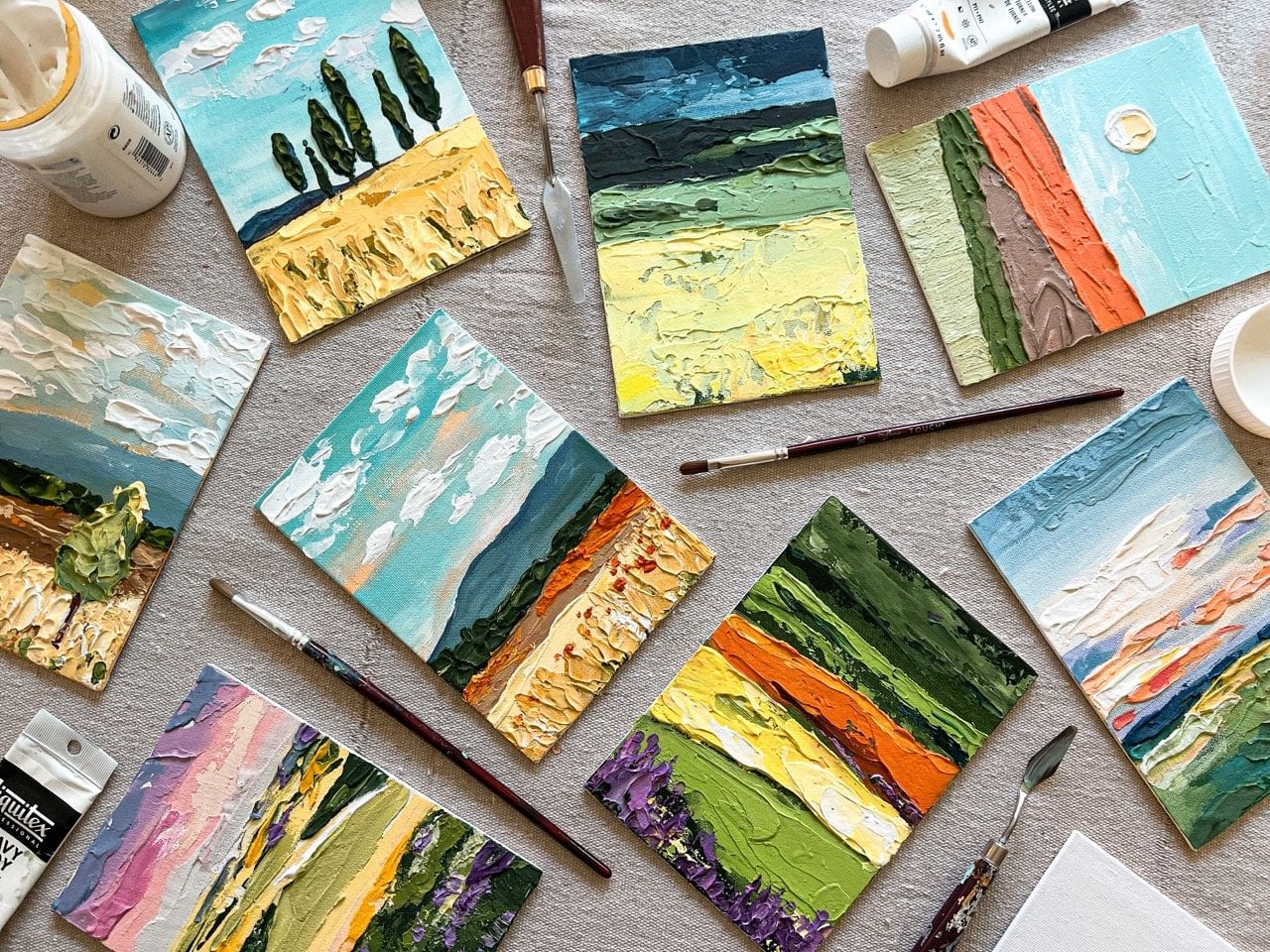
1. Paint With Texture: Have you ever wished your
acrylic paint works so flat? Well, 10 years ago I
picked up a little tub of something called modeling
paste from an art store. At the time, I didn't
know what to do with it, but I started mixing it in
with my paints and since then, I've used this medium to
transform my flat acrylics into thick chunky paints
that acted like oils. Over the years, I've
painted over 1,200 textured acrylic paintings and ship them all over the world. Welcome to art class. It's time to paint with texture. Hi, I'm Amie Murray, lifelong painter and creative, and I'm so excited to
paint with you today. In this class, I will
teach you my process using a fun dog technique to
paint geranium flowers. Don't worry, you
don't need to be an advanced painter
to take this class. There is no need to paint
perfect petals here. We will talk about supplies,
gather inspiration, create a balanced composition, combine colors and paint a beautiful finished
piece of canvas art. This class is
beginner-friendly and great for any artists looking
for a fresh idea. If you're an advanced artist, you can also use this
technique to make your paintings as elaborate and detailed as you would like. I'll be giving you a free
downloadable workbook with practice pages to guide you through each step and I'll show you
plenty of examples. To take this class, you'll
need a canvas, brushes, acrylic paint, and one
special ingredient, flexible modeling paste. You'll finish the class with a lovely painting that
you are proud of. You'll also have the
skills and supplies to make more textured acrylic
paintings in your own style. I'd love to see your work
and answer your questions. You can follow me
here on Skillshare. You can also find me on
Instagram at amielynnmurray or visit my website,
amielynnmurray.com. One last thing to tell you
before we get started, this process is fun. It feels a little bit like
you're painting with frosting. Let's gather our supplies
and get started.
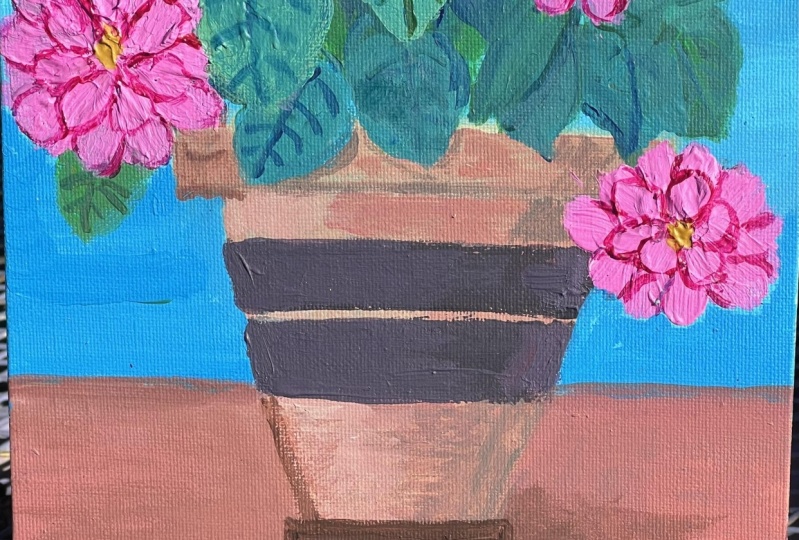
2. Class Project : [MUSIC] For our class project, we're going to be painting a geranium in a terracotta pot. We're going to paint
that on Canvas. I have some examples to show you some possibilities for
your class project. This is the first example
I'd like to show you. It's on a 12 by 16
Canvas and it's very similar to what I'm
going to be painting today. This second example
is small and sweet. This is on an 8
by 8 inch Canvas, but uses the same technique
to create texture. This is also a good example
of a painting that's not using the traditional
geranium colors. There's no reds or
pinks or oranges. If you did want a painting
that's a little more neutral, you can always paint in white and use any color
background with that. This third example
is much larger. This is a 20 by 24 inch Canvas. The composition is more complex. We have more petals,
more flowers, and a little bit more
shading added to the leaves in the
terracotta pot. This last example is on
an 18 by 18 inch Canvas. It's the most complex
composition of all. There's a lot of shading
here on the terracotta pot. Many layers of leaves, a lot of shading
added to the leaves, and a number of colors that
I used for the petals. You are welcome to
do your painting in whatever style and
whatever level of simplicity or
complexity works for you. One tip I have for
success is when it is time to add
texture, don't be shy. Glob it on, dab it on, put a ton of texture
on your painting because one thing that
makes this piece of art beautiful is the
contrast between the 3-dimensional part of the painting and the flat
part of the painting. You can share your
projects by uploading a photo to our class
gallery here on Skillshare, and you don't have to wait until you're completely done with your painting to
post in the gallery. I would love to see
your color choices or your sketches and give you
some feedback along the way. [MUSIC]
3. Class Resources and Bonus Workbook: [MUSIC]. You can visit the
Class Resources tab to find all the bonus
material for this course. I've included an inspiration
board with lots of beautiful pictures you can use to be inspired to
make your painting. I've also created a bonus
workbook with lots of pages that you can use to help you sketch your composition, choose your colors, and get
some ideas for your project. This workbook is available in either a downloadable
PDF version that can be printed or
viewed on your computer, or a procreate version. If you love to use
Procreate and would like to draw and sketch
using that program. [MUSIC].
4. Supplies: [MUSIC] Let's talk
about supplies. In the class workbook, you'll find a list of
supplies that you can print out and take to
the store with you. You'll also find links to my favorite supplies that
I like to buy online. The first supply that
you'll need is a canvas. Today, I'm going to paint on
this 12 by 16 inch canvas, and it is 1.5 inches
deep on the side edges. You can use whatever size and
depth of canvas you have. Next, you'll need paint brushes. For your background, I recommend a two or
three-inch brush. Something from your hardware
store works just fine. To paint your pot, you'll
need a square brush. This is a size 16 and an 18, but something around half
an inch should work great. To paint your petals, I recommend a filbert brush, which just means it's
rounded at the top. This is a size 12 and a size 14. Something around there should
work great for your petals. Last, you'll need a liner. This liner brush is a size 1, but something small and thin to help you
paint your stems. The next important supply
is flexible modeling paste. I prefer flexible rather
than regular modeling paste. It's just a little bit
less prone to cracking. But if what you have is modeling paste or that's
what you can find, it should work great too. You may also want a jar
to hold your water, paper towels for cleanup, and a gloss or satin varnish if you plan to
varnish your painting. Of course, you'll need acrylic
paint for this project. I want to briefly talk about
the types of acrylic paints available because
there is a wide range. The first type of paint you'll come across is a craft paint. This is typically going to be your lowest quality
acrylic paint. I'll show you an example
of craft paint and how it paints right here. The second kind of acrylic
paint that you'll come across is going to often
be labeled basic, standard or student grade paint. Let me show you an example
of that paint here. It's slightly more opaque
than the craft paint. The third type of
paint you can use, and this might be a surprise, are house paints and
this is something you could pick up at your
local hardware store. The house paints are
surprisingly opaque, meaning you're not going
to need a lot of coats. They're also nice if you
want a very specific color, if you're trying
to coordinate with your walls or something
else in your home, this can actually be a pretty
reliable paint to use. The fourth level
of acrylic paint will often be called
an artist grade paint. These are going to have a
lot more pigment in them, a lot richer color. They go on nice and smooth. The highest quality
paint that you will find is going to be labeled
professional grade. This is a heavy body, professional grade
acrylic and you can already see how different
it is on the brush. When you paint it on,
this one is emerald green and the pigment
is much richer, the color is more vibrant. It's a beautiful paint. My preference is to paint with one of these three choices. The house paints are great for coverage and for
specific colors. Then your artist and your professional
grade acrylic paints are going to give
you great coverage and a beautiful color. [MUSIC]
5. Gather Inspiration: [MUSIC] I've created
a Pinterest board to help you gather
inspiration for your project. You'll find this in the
class resources tab. But remember, you'll have to
view that from the browser, and not from the app. There are lots of
beautiful photos here of geraniums, and
terracotta pots. When I'm looking for
inspiration for a project, I like to look at a
variety of photos to make sure I'm not
copying one exactly. I might look at this board, and think I love the color
of this geranium plant, that bright purple color. Then I might look
a little further, and think this might make
a fun composition where the flowers are trailing
off the side of the pot. This is a beautiful
photo where the leaves, and flowers are a little
bit more spread out, and we can see some of the really pretty
shapes of those leaves. Sometimes I like to look at these older
botanical drawings, and see how the artist formed
the different leaf shapes. Sometimes that can help you draw the shapes a little easier
than it can in a photo. I love this composition. How you can see the leaves
facing different ways. You can see some different
shapes that they make. I like these little buds that
aren't full flowers yet. This might be a great
one for me to save, and think about painting
in my own composition. Feel free to look through, and gather some ideas that speak to you for your own project. Another great place
to find ideas for your project are
real-life examples. I have a few potted geraniums myself that are so beautiful, and I might end up
using these for some ideas for my composition. [MUSIC]
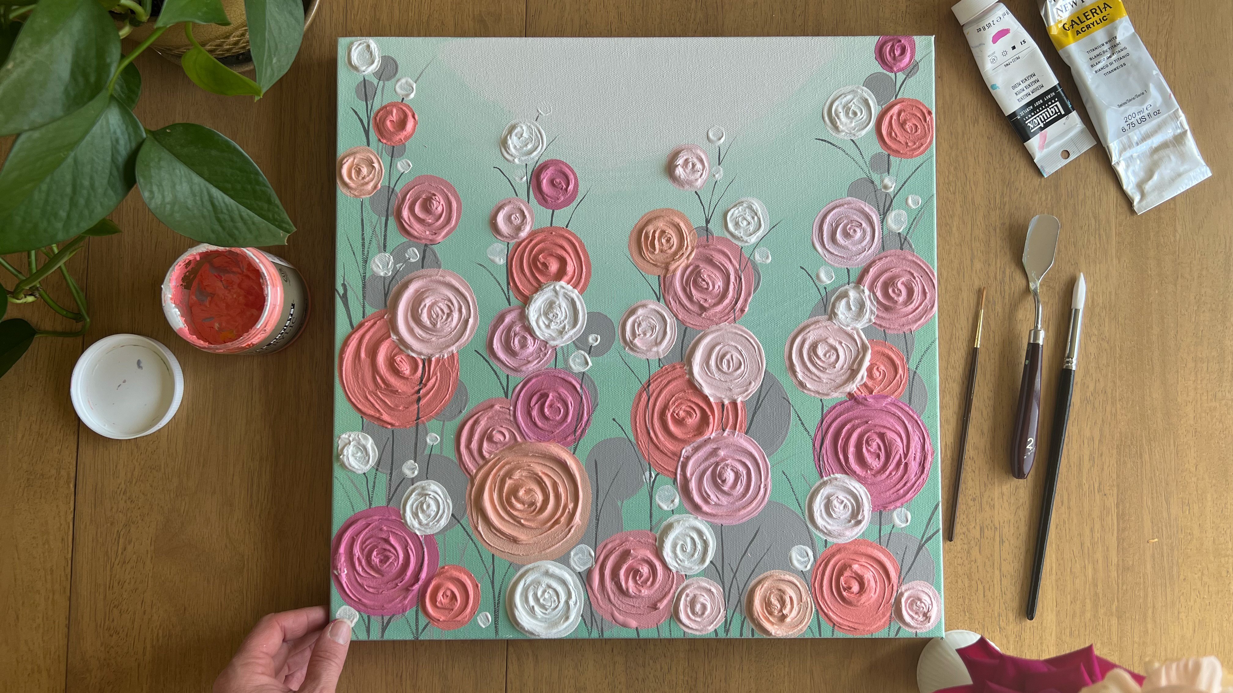
6. Choose a Color Palette: [MUSIC] I'd like to show you two ways that you can select color for your project. The first way is just to get
out your paints and make some swatches and put some
color on a piece of paper, this is acrylic paper,
but you could use any scratch paper that you have, and just try out some
different options. I used a pill rose blush
for the background. This is a burnt sienna
mixed with a little bit of white, add some greenery. Notice, I'm not really trying
to make this look perfect. Add some red on there. I'm just seeing what
colors look like together, I'm not even trying to make this look like a geranium plant. I'm just trying some
different things out. Here are some swatches I
made in a similar way, in a larger little sketch I did. Really, I'm just
playing with color, I'm seeing what
looks good together, and I'm seeing what I
prefer for my own project. For those of you who might enjoy using procreate on your iPad, I've created a page in the workbook to help you
choose a color palette, and what you can do on this
page is actually select your colors and drag and drop them into this little sketch that I've made at the bottom. For example, we can pick
our petal color first, let's do this
pretty coral color. In this painting, I like the petals to be the
star of the show, so I want them to be bright
and saturated, full of color. The background color, we want
to be a little more muted. We want it to feel opposite
of the petal color, so we can try this pretty
minty, muted, blue-green. Then we can play around a little bit with
leaves and stems and drag and drop some
green shades into there. I do like the green to be a little bit darker
and a little bit toned down so that it doesn't compete with the
brightness of the petals. A terracotta pot can
be a medium or dark, warm brown, and so we've made a
little composition with some colors right there. Then the fun thing about
doing this on procreate is you can change
it really quickly. You can play with these colors, maybe pick this pale
blush background, maybe you want your petals
to even be different colors. You can try out as many
combinations as you would like, and you also don't have to use the colors that
I've picked here, you're welcome to select
your own colors and drag and drop until you feel
happy about a color palette. These are the
colors that I'll be using today for my painting. For the background, I'll be
using a pale rose blush, for the Terracotta pot, I'm going to use burnt sienna mixed with a little
bit of white, for the leaves and stems, I'm going to use this
chromium oxide, green, and for the petals, I'm going to use this
cadmium red hue. Last, I always make sure I have white paint so that I can mix different shades
of each color. If you'd like to
follow along with me, you're welcome to
use these colors, but you're also free to
choose your own, of course. [MUSIC]
7. Draw a Sketch: [MUSIC] Now that we've gathered our inspiration
and chosen our colors, the last part of the
planning process is to make a sketch so that we have a good plan when we start
to paint on our Canvas. There are a couple of pages
in the workbook that can help you sketch if
you're new to drawing. The first page will show you some different
terracotta pot shapes that you might like to
use for your painting. The second page is a step-by-step drawing
page that will show you how to draw a geranium leaf
in two ways, and third, there is a page that shows you my method of building
a composition, starting with large shapes and working your way
towards the details. I'm going to show you
the process I use to create a sketch before I paint. You probably remember
that we saved some reference photos from
our inspiration board. I like to just have
a lot of those next to me while I'm
creating my sketch. When I make a sketch,
the first thing I like to do is actually create a rectangle on my paper and give myself a
boundary to work in. Next, I'm going to pick
where I might want my two colors to be as if the
pot is sitting on a table. Next, I'm just going to make a real light general shape of where I might want my
terracotta pot to be. I like how these leaves are all arranged closer to the pot with the petals up towards
the top of the Canvas. This has that same arrangement, so I might think about that. I might think about my leaf
shapes being mainly here, and notice I didn't
even draw leaves. I just drew a blob where
the leaves are going to go. Then I'm going to pick where
I might want my flowers. I do like in this photo how this one flower
is sticking up to the corner and it will
fill in that area nicely. From this picture, I love these little buds that aren't
quite ready to bloom yet. Maybe we have another one
coming off this side. In this picture, I like
this little clumps, so not everything
is going to be very large so we might do a smaller clump right here
to balance these out. I also might want just a nice group of flowers hanging out down
here among the leaves. We have this blank
space right here and it really feels like it
needs a little something. I'm going to probably put
a medium-sized one there. I do like in the photo
of my own geraniums how you can see
these little buds hanging down off the flowers. I think that is what makes this type of flowers so pretty. We want to make sure that we're including that on
a lot of these stems. Maybe this one has a lot of that stem and hanging
bud situation showing. Now, when I think about leaves, I actually love how
some leaves hang over the pot just to give
it a little bit of overlap. We might want a leaf tucked behind just to give
it a little bit of depth, and it's okay that
my iPad turned off. This is actually
a great point to get rid of that altogether
so that you know you're making your
composition all your own and you're not copying
directly from a photo. I think I do want to solidify
my terracotta pot shape. I do like the ones that
have that lip on top and that tray on the bottom. I'm not really erasing, this is just a sketch, so getting a little bit
darker with my pencil as I start to feel happier about the
placement of these shapes. From here, I might plan where
my stems are going to go. [MUSIC] I may also at this
point start to practice what these leaf
shapes are going to look like, and you might have noticed
on the leaf sketching page in the workbook that
there's a heart shape. [MUSIC] Then the edges are a little bit scallop. Definitely need a leaf
coming over here. This maybe is a leaf that
we're viewing from this side. I can also create a little lip right here as
if it curled up just a bit. When I look at this, I need something in this
area right here. [MUSIC] Then we can mark in our
flowers just a little bit, but these are not
painted so precisely so we don't necessarily need a
fully formed plan for these. [MUSIC] I feel happy about this sketch. I like my composition. I have some larger flowers, some medium flowers,
and a couple of little buds that
are ready to bloom. I have a good amount of leaves, but we're still keeping
it pretty simple. I think we're ready
to start painting. [MUSIC]
8. Paint the Background: [MUSIC] We've got our colors picked out, we've sketched the composition, we have a great plan in place, and now it is time to paint. We are going to start
painting the background. I'm using about a
two-inch brush. This is just a brush
from the hardware store, not specific to canvas painting. [MUSIC] The color I am painting is this
Winsor and Newton, pale rose blush mixed with
some white to lighten it up. [MUSIC] I'm actually going to paint down further than I think
my line will go, just to make sure I have some
overlapping paint there. Now, this paint has
really good coverage. But if I was using
a thinner paint, I might do a second coat
on here once it dries. One thing I am going to do
is paint these side edges. [MUSIC] This gives me the option to hang
it without a frame. Once the edges are painted, I'm actually just going
to take a tube of paint and rest this right on there so that it doesn't
stick to my table. We will let that fully dry. Now that the top of
my background is dry, I'm going to paint
the bottom third of my background in a
slightly darker shade than I used on the top part. The way that I do this
is not super precise, so if you do like to measure and have
very straight lines, you might want to get out
your ruler and tape it off. But what I do is kind of
use a paintbrush and pick how high up I want
that color to go, and this feels good right here. I'm going to put a little dot, slide my paintbrush over, put another dot, slide my
paintbrush, put another dot. You can add a few more. I'm holding this hand still, so I'm using my fingers as a guide just to slide this over. This just gives me a
rough idea of how high up on the canvas I want
to make that bottom area. For this bottom
area of the canvas, I'm using pale rose blush, a Winsor and Newton color. I am just using it straight
out of the tube for this one. To make this line, I just connect the dots. It's not going to be a
perfectly straight line, but that's okay with me. It doesn't bother me at all. If you do want a straight line, you could use some blue painters
tape to put that across. [MUSIC] Again, I'm going to paint the side edges so
that it's just ready to hang on the wall [MUSIC]. Now that the bottom of my canvas and the side
edges are painted, I'm going to rest it on
this paint tube once again and let the whole
background dry before I move on. [MUSIC]
9. Sketch on Canvas: [MUSIC] Now that you've painted your background and
allowed it to completely dry, we're going to take that
sketch that we made earlier and put that sketch
onto the dry background. Since you have already seen me create this composition and
sketch it one other time, I am going to speed
up my video and just let you watch me sketch it
a second time on canvas. [MUSIC] I don't love this leaf, so one thing I mentioned, you can erase on dried acrylic, and you can always add a little
background color back in. That leaf was too long. A [inaudible] leaf wouldn't
really look like that. They're a little bit more round. [MUSIC] You definitely have
the freedom to change your sketch as you're
putting it on canvas. [MUSIC] I am happy with this sketch. You'll notice I did mark
in the pot pretty dark, I marked in the
leaves pretty dark. But the flowers, I just
left a real light circle. There is no need to
draw in each petal because we are just
going to dab that on with the modeling paste, so just mark those
in their spots. But don't worry about
creating each petal. [MUSIC]
10. Paint the Terracotta Pot: [MUSIC] Once you feel happy about the
sketch you've made, it's time to paint
the terracotta pot. I'm happy with my
sketch and you may have noticed it's slightly different than the sketch I made on paper. But that's okay, you
can always change things when you get
to your Canvas at your painting and you can make changes and adjustments
however you would like. I have moved on to my terracotta pot and I'm
using a burnt sienna. I'm just filling it in,
I'm not really worried about shading at this point. I'm just getting a
nice layer on there. [MUSIC] When you
have a good sketch, the painting part is relaxing because you feel almost like you're just
coloring in the lines. [MUSIC] Right here I have a leaf overlapping my pot. I'm not going to worry about
the leaf as much right now, because acrylic
paint it is opaque, it will cover the layer
below it just fine. [MUSIC] I'm using a newer paintbrush, so it has a nice, crisp edge on it. [MUSIC] I'm happy with this first coat. I might let it dry a little
bit and then I'm going to do a second coat with a
little bit of shading. For my second coat, I'm going to add
in a little bit of shading on this pot, not a ton. We're keeping our painting
pretty simple today, but I've mixed my burnt sienna with some white to get
a lighter shade of it. For this painting, we are
going to imagine that the light or the sunshine
is coming from this angle, from this top corner. What that means is wherever
the light touches, it's going to be a
little bit lighter, that means that
light source would probably touch the
top of the pot. [MUSIC] We might add a little
highlight just on this whole top
section just to differentiate it from the
bottom section of the pot. [MUSIC] I feel happy
about that lighter color. Another spot where we will
probably have a highlight is the top of the bottom
if that makes sense. The light is going to hit the little rim on
this bottom part, I put a little lighter. It's too dry and you need to blend it and you
just add a little bit of your darker back
in and blend it. Another spot that
might have a bit of highlighting is this side. Remember our light is
coming in this way, so this side of
the pot might have a little extra shading and then blend into
the darker shade. You can just play with it until you feel happy
with the result. We're going to add one last
detail to our terracotta pot. To do this, we need
a really dry brush. I'm drying off my
brush extra dry, and we're just going to use
white for this, not a ton. I have a tiny bit
on my brush and I actually might even
get some of that off. Basically we want
just the tips of the bristles covered with a
little bit of white paint, and what this is going
to do is create some of that aged-weathered look
on our terracotta pot. I'm just using a super
light pressure here, I'm feathering it around. I'll pop some pictures
up for you to see what we're going for here, but if you've seen these clay pots that have
been left outside for awhile, they have this beautiful
aged white patina that covers them, and I think it's so
interesting and pretty. I'm just adding a tiny bit
of white to my brush at a time and brushing it around, so it's just really
dry on there. [MUSIC] I'm focusing a lot on the areas where
my highlights are, but also just adding
some random spots in. None of it has to
be perfect because, a worn-out clay pot is
not going to be perfect. Add as much or as
little as you prefer. Go with your gut on this, whatever you like
for your style. I'm pretty happy with that. If you feel like I did add
too much to a certain spot, you can do the same thing
with your dark color. I'm going to dry brush a little
dark color back in there. The beauty of acrylics is you can just paint right
over what you just did. We do need to do one more thing before we move on to the leaves, and that is to add a shadow. Since my light is coming
from this direction, my shadow is going to
be on the opposite side of the pot where the
light is not hitting it. I've moved my paints up a little bit so you
can see them better, because for this shadow
color, we often think, oh, shadow is dark gray or black
or something like that, but really if you look at a surface with something
resting on it, the shadow color is going to be a darker version of whatever
that table top color is. What I'm going to
do is just take a little bit of my
background color. I'm actually just going to add a little bit of
burnt sienna into it and make a darker
version of that color. I'm just going to add
a tiny bit of green, which is the opposite color. If we had our color wear
out and it tons it down. Now I have this grade
down-toned down, darker version of the
background color, and I'm going to use
that to make a shadow. When I make a shadow, I like to just
make a little line under the pot because that's where the light
will not be hitting. Then depending how far you
want your shadow to come out, I swoop it back. You can play with that. It's
just a little extra element to help your flower pot look
like it's sitting somewhere. I'm happy with my clay pot, we're going to let that
dry and then move on to the leaves and stems [MUSIC]
11. Paint the Leaves and Stems: [MUSIC] The next thing we're going to paint are
the leaves and stems. Remember, we're going
to keep these pretty simple with minimal shading so that the petals really
are the star of the painting and
truly stand out. It's time to move on to
paint our leaves and stems. For this, the main
color I'm using is this chromium oxide green, also a golden paint. Now, when I do the first
coat of these leaves, I'm not worried about shading. I'm not worried
about much except getting the shapes on there. You'll notice here I'm
painting over some stems. I'm just not worried
about those. I'm going to put
those back in later. [MUSIC] This is fun and relaxing. We're just coloring in those shapes we made
with our sketch. You'll notice I'm
using my fiber brush. It's rounded on the top and
I just scoop it around. Scooping around. None of these scallops
have to be perfect. If we look at an
actual geranium leaf, they have lots of twists
and curves and bumps and actually a really
pretty part of the plant, just as pretty as the flowers. This one I love the little
bend that comes up. I'm not going to
paint that quite yet because I will probably do that in a slightly
different color so that we can make
sure we see it. This is that little
bend I'm talking about. [MUSIC] It's time to
add this one back in. We can still see the basic
shape from our sketch. But notice it just goes
right over that clay color. Before I finish, I might want
to look at this and think, does this feel balanced? Do I want any extra
leaves on here? Feels like no leaves
wetting this area, and its because I'm going to
have a large flower there. But I might add even just a little something that's peeking out from
behind the flowers. [MUSIC] I'm happy with this first coat. We're going to let
that dry and then add just a little bit of
shading to these leaves. In the meantime, while we're
letting these leaves dry, we can paint our stems. To paint the stems,
I'm just using this little liner brush. I'm going to use the same green, but spots where you
have overlapping stems, for instance, this
area right in here. They may go back and switch up the color of that
particular area. [MUSIC] As I get near my buds and flowers, I do need to make some
choices about where the little stems will split off and how they will
meet with the petals. This one, it will have
one little bud hanging down and then a
few buds up here. Over here we are
having quite a few of these little stems
coming up by the petals. Now is a good time
just to draw those in. We can always come back later, if we had a stray pedal or
something looked funny. [MUSIC] I think that might
be good for stems. Now that the first
coat has dried, I'm going to start this
second coat on my leaves. As I'm doing this, I need
to make some choices. I'm going to pick some leaves
that will be further back. Those leaves, I'm going
to use a darker green. To get this darker shade, you can actually just mix in a little bit of the dark
brown to your green, or you can mix in
a darker green or even a blue shade just to
it a little bit darker. This one I know I
want in the back. Since it's going to be behind a bunch of
stems and petals, I'm just going to make
it a little bit darker. This is another one that is going to be in the background. Now one of these two, I think I need to pick
to be further back. I actually might make that
this one so that we can have these pretty buds and the
stems going in front of it. I'm also going to
use this dark color. You can use your liner brush
if you're a little bit more comfortable with that to show the little lip
on this leaf [MUSIC] feels good. It just gets a little extra depth to have
those darker spots added in. [MUSIC] One of the
biggest struggles for me is just saying enough, I'm done with that section, done with that painting. Sometimes I feel like I
could work it forever. Next we're going to pick some leaves that will be
a little bit lighter. These are the leaves
that are going to be closest to us
in the foreground. To make this color, I just took the green. I was using the
chromium green oxide and mixed in a
little bit of white. I'm going to just make
some choices here. This is one for sure that
I want to come up front. [MUSIC] This little fold of this leaf maybe receiving
some of that light. This is my favorite leaf. So we can picture the light
is hitting this part of the leaf and this part has pulled it up and
it's in the shadow. Now we don't want all of our
original green to go away, we want some of those
medium-tone leaves to stay, so I'm just putting a second
coat on a few of these. [MUSIC] Remember, the leaves are not the
star of the painting that is going to be those
bright beautiful petals. We're just adding
a little bit of depth with a darker green, a medium green, and
a lighter green. But we're not worried too
much about a bunch of shadings on our leaves
on this painting. Before we move on, I'm just going to add back in the stems that we lost
when we painted this leaf. I really liked those stem, so I want them to stay. I'm actually just using
the lighter shade of green right over the
top of that leaf. [MUSIC] If you're feeling adventurous, one more thing you can do is add some veins to your leaves. You can either just stick
with the middle one, which I think is really
pretty and simple. Or you can even add some
of those side veins too. Maybe we'll add a
little bit just to show you how to do that,
if you want to do that. [MUSIC] On my lighter leaves, I like to make darker veins. Those are settle on that one. Then on my darker leaves, actually like to use
the lighter color. [MUSIC] You can have fun with this. If it fits your style, feel free to add it. If it doesn't, feel
free to leave it out. [NOISE] I think it's also fine if you don't put
veins on all of them. For instance, this
leaf right here, I just love the stems and I
think if I put veining on it, it would compete with
these stems too much. I'm just going to leave
them off for that one leaf. We're going to let all
of our greenery dry, and then on to the good stuff. We're going to use
the modeling paste. [MUSIC]
12. Mix the Modeling Paste and Paint : [MUSIC] We've finally reached the part where we get to use
our flexible modeling paste. This is where it gets
really exciting. I'm going to show
you how I mix this. I just grabbed a random
old brush for scooping. You could also probably
use a plastic spoon for that or [NOISE] any brush
that you have around. I'm just going to take a
nice big scoop of this. I like to use just random
yogurt containers. This is a cream cheese
[NOISE] container. Whatever you can find in your recycle or you could just use a plastic cup or something that you
have that can hold it. [NOISE] I'm just
scooping it in there. I like to make sure
I have enough to use all at once so that I
don't have to remix it, but you can mix
more along the way. I have a good amount
in my container, then I'm going to mix my
paint in there with it. You'll need a good amount of
paint certainly not equal. But I'd say about a fourth of the amount
of paste you used, I would put about
that much paint in. As the modeling paste dries, it loses some of its opacity. If you don't have [NOISE]
enough paint mixed in there, it's going to look a little
bit see-through almost. It's like mixing a
batch of frosting. [NOISE] Actually, I'm going to add a
little more paint to it , mix that in. If you didn't add enough
paint and you put it on and you didn't like
how it looked when it dried, you can paint right
over this stuff. So you can always
add more to the top if you want a
little more color. I feel good about that. You can see the
consistency there. That is going to be
our beautiful petals, super textured, ready
to dab it on there. [NOISE] We will meet back
here with our filbert brush, ready to put this on our Canvas [MUSIC].
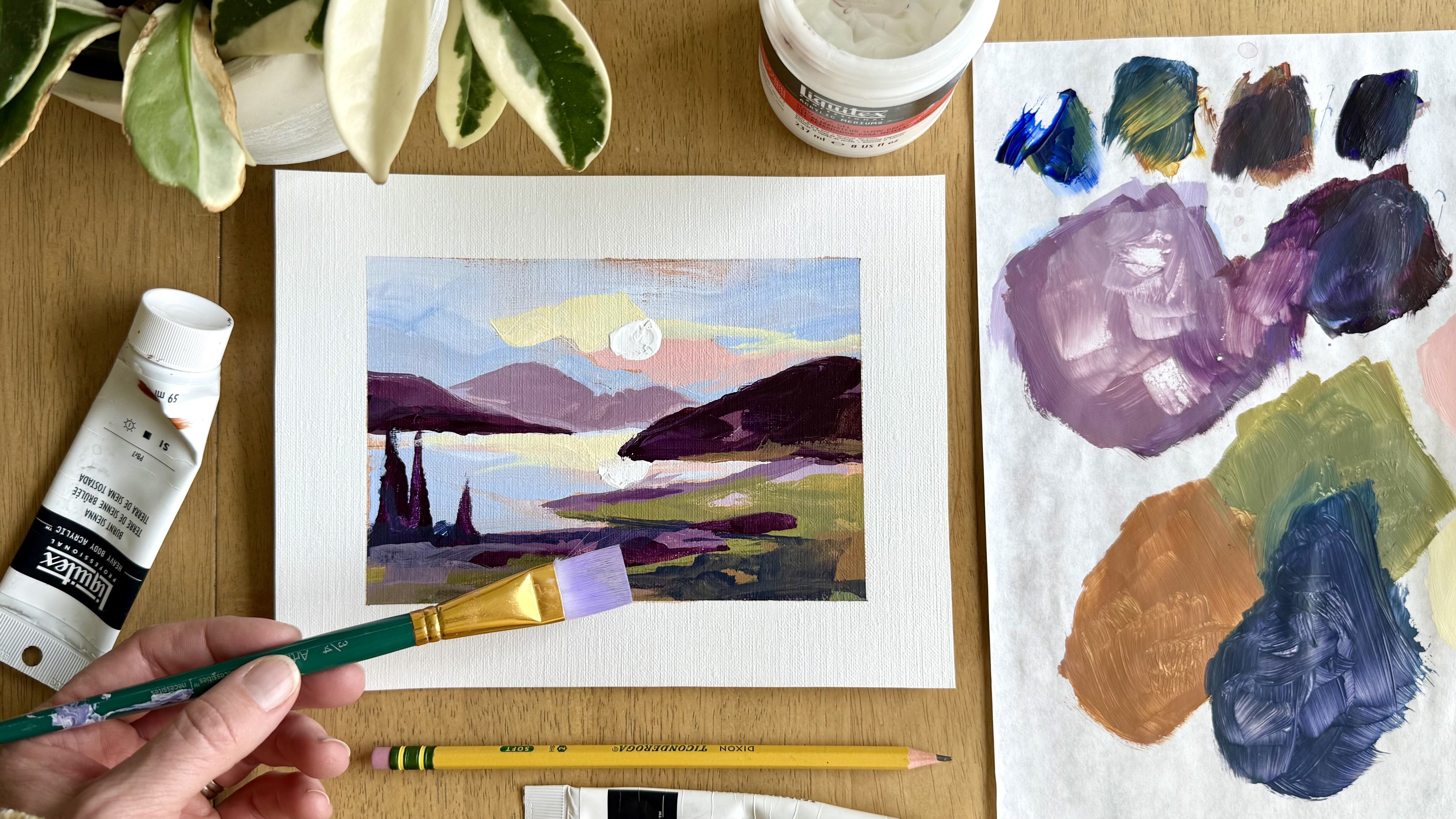
13. Paint the Textured Petals: [MUSIC] Now for the fun part. We're going to dab on the modeling paste
mixed with the paint, and make our petals
beautiful and textured with lots of dimension. I am grabbing my filbert brush. Just see how I left
all my brushes facing down in my water. That's very bad, you
shouldn't do that. Here is the process I use. I'm just going to grab
some of this on my brush, about that much, about
the size of one petal, then I'm going to
go petal by petal. Let's start with
this largest flower. We're going to jump
right into the big one. I'm going to put it
on, twist my brush, and then pull it in the direction I want
the petal to face. Notice it's not perfect, not even close to
perfect. But that's okay. We're just going to work our way around the bottom
of this geranium first. I'm just globing it on right
where those stems reach it. I'm not concerned
about perfect spacing. If you look at a
geranium flower, they are not perfect. They have petals going
here, going there. I'm making all of
my petals along the bottom with the
pointy part facing in. They're almost a raindrop shape. You put it down, make your little raindrop point
to the middle of the flower. I have found that I like to work around the outside first. You'll notice I'll put a
couple close together, one spread apart, and I'm not being shy. I am the lab in this on there. Remember we want to
see the contrast. We want to see the texture sticking up off
of the flat part. That's what makes it
really interesting. Just working my way
around the flower here. The petals on the top part of the flower are facing
the opposite direction. They point inward. Still that same raindrop shape. The side of the flower
also points inward. Just think that's where the petals would be
growing out from. We're pointing all their little
pointy rain drops inward. Now that I've finished the
outside of this flower, I'm going to make another layer. [MUSIC] Same technique. These petals are similar in size but they're not
exactly the same. Very middle of the flower. I make it like a lot of
texture and just make a really thick petal right
there in the middle. We've made a whole germanium
in just a few minutes. If I want to make
one of these buds that's barely blooming just
getting ready to open up, I'm going to make maybe
three petals on there, 1, 2, 3, and see
if we like that. [MUSIC] Same technique, daub it on, and then
pull towards the stem. One of the reasons I love
this kind of project is it's so friendly
to all levels. Sometimes we make florals and we just get bogged
down by the petals, and how they form together
and the shapes of them. But this is fun, it comes
together quickly and you don't have to worry about
making perfect petals. That is the fun of
it. You just glob it on and put it right
where you like it. I'm going to speed up my camera and finish up these
textured flowers. I will slow it down to give you any information along the way. [MUSIC] I'm trying to make this flower
a little bit different. Just a slightly different shape than some of the other ones, by making it a
little more sparse. I have one more
medium-sized flower to do in the middle here. I finished all the flowers that I marked on my
canvas with my sketch. At the end, I like
to go through and just look around and see if anything looks off to me or if I'd like to add
anything in any other spaces. I do think I want something
in that gap right there. I feel happy about this painting and I hope with the light shining
in from my window, you can see the
three-dimensional effect of that modeling paste, and how we've really
added a lot of impact to our painting in a very
short amount of time. We will need to let this dry overnight because
it is so thick, it takes a while to dry, and then we will meet
back here tomorrow to finish and varnish
the painting. [MUSIC]
14. Finish and Varnish Your Painting: [MUSIC] We are back, we've let this painting dry overnight and you'll see that this texture
is nice and dry. But it hasn't flattened out, it hasn't lost any
dimension as it's dried. That is the beauty of adding modeling paste to
your acrylic paint. If we had just done this
in paint and let it dry, it would have flattened
out even more as it dried. What I like to do after
my painting has dried, is find any spots that look like they might need a
little more paint. For instance, this looks
a little see-through. That right there might need
a little red, right here. That's a nice thing
about modeling paste mixed with paint, is you can actually also just
paint right on top of it. Anything you're not
totally happy with, you can add pain, and fix it up after
the paste has dried. I think I've gotten
all those spots. One other thing I like
to do the second day is just to add some lighter
highlights to the flowers. I'm mixing my cadmium
red with a little bit of white just to get a lighter
pinky red color and then I'm going to take this
color and put it on some of the flowers where I
want them to look like they're closer to me or getting some
extra light on them. One flower I really
want to highlight is this nice big one back here. I'm just adding a little bit
of that lighter pinkish red. I'm not being super
picky about it. It doesn't need to cover
the petal perfectly. Might even do some white. I'm just going to
put that on there. This also helps
to differentiate. There's a flower
here and a flower here and they look
slightly different. Go with your taste on this. You can add as much or as little highlighting
as you would like. I also might want some highlighting maybe just on the top petals of this flower, just to show that the sun is hitting it just a little bit. I might add a little bit
to this middle flower just to help some of
these petals pop out a bit to show that some of these top ones are receiving
some of that light. I'm not adding highlights
to every petal. I want the highlighted
areas to stand out a little bit and if
I put it everywhere, then nothing would look special. I like this. I think it gives
just a little bit of extra depth to those nice
thick textured petals. We're going to let
this dry and come back for a final
coat of varnish. I'm using a gloss varnish today. I also like to use
a satin varnish. It's a little less shiny, but also very pretty. I'm just putting maybe
a couple tablespoons of that gloss varnish
in a disposable cup. Any recycled
container works great for this and then I'm
using this brush, it's about an inch and a half and I just start
either at the top or the bottom and spread a thin coat of varnish
on my painting. With varnish I just want
to put it on and leave it. We don't want to go
back over this area as it's drying or the varnish
will get sticky and clumpy. When I get to my
textured flowers, I just go right over them. You might see the
varnish pooling a little bit and as
your brush dries, you can scoop out some
of those pooled areas. But this varnish will dry clear, so I don't worry
about that too much. I'm pretty quickly just working my way
around the painting. You don't have to varnish your painting if you
don't prefer to, or if you don't have varnish. Your painting will be
just fine without it. I like to varnish. I like the shiny coat on
top of the painting and it also protects it
a little bit from UV which can fade your painting, and from kid's hands, spills, whatever
the case may be. If I'm going to ship a painting
or pack a painting up, I like the varnish to cure for a full 24 hours before I do
anything with the painting. You can also varnish
the side edges, which I always do
just so they stay protected and match the
rest of the painting. Once my side edges
are varnished, I do just balance the
painting on couple of tubes of paint to keep
it off of my drop cloth. Or else I will have a painting
stuck to a drop cloth. Our painting is finished. It's varnished and
once it's dry, it is ready to hang on the wall. I hope that you are so proud of your art work and
I also hope this encourages you to use
your modeling paste and find new things to
paint with texture. This is such a fun process
because you really don't need to be a
professional painter and you don't need to paint
a perfect petal to have a really beautiful painting
with lots of great dimension, great texture, that can make a big impact in any
space in your home. [MUSIC]
15. Final Thoughts: [MUSIC] First of all, congratulations on
finishing the class. I hope that you would love your new texture
geranium painting. I also hope you enjoyed learning a new technique with your
flexible modeling paste. I would love to see
your class projects. Please feel free to upload a photo into our class gallery. The class gallery
can be found on the Projects and Resources tab, and you just click
that green button that says Start a New Project, and you can upload photos
of your painting there. If you'd like to share
your artwork on Instagram, please remember to tag
me @amielynnmurray, so that I can comment
and like your post. You can also follow me here on Skillshare by clicking
the Follow button. That way you'll
receive an email when I launch my next class. Speaking of classes, if you have ideas that
you would like for another painting class
or subjects that you would like to paint
with your modeling paste, please let me know in
the class discussion. I would love to create more classes that
you want to watch. I had so much fun
painting with you. My hope is that you will
take your modeling paste and use it to create many more
paintings in the future. [MUSIC]
 Amie Murray, Painter + Art Educator