Transcripts
1. Welcome to Class: If you've ever
been in Amsterdam, you've probably fallen in love with their narrow brown houses, huddle together, each one with
its own beauty and charm, at least that was
the case for me. I visited this magical city in early fall and
it was warm and beautiful but they
went to visit it again someday and to see it
covered with snow. Until then, I decided I could at least paint it and enjoy
the process so much, I decided to share it with you. Hello, my dear friends. My name is Elena and I
love to travel and paint. My love for watercolors
is growing each day. In the last four years, I enjoy so much trying out
different subjects and styles. In this class, we
are going to paint a beautiful and charming
Amsterdam covered with snow. The best part is that it's
going to be so easy and fun. While I was painting this, I thought it's almost
like a coloring book. Once you get the sketch done, you can relax and start to fill it with your
favorite colors. This is another class from the quick and easy series
that I started last year. In these classes, there are no complex techniques
or tough subjects. We are painting on a
small piece of paper and the main goal is
to enjoy the process. Drawing and painting
buildings and houses doesn't need to
be complex or perfect. The ghost to recreate
the feeling and atmosphere that initially
drew you to the place. Letting go of
perfectionism has had a wonderful impact
on my art practice. I now approach any new
subject with curiosity and excitement rather than feeling intimidated or simply
not good enough. The first step to do that is just to sit and paint whatever inspires you and find
joy in the process. Make yourself a cup of coffee and join me on this
trip to Amsterdam. In the next video, I
will tell you more about the class and
the final project.
2. Class + Project Overview: For the final project
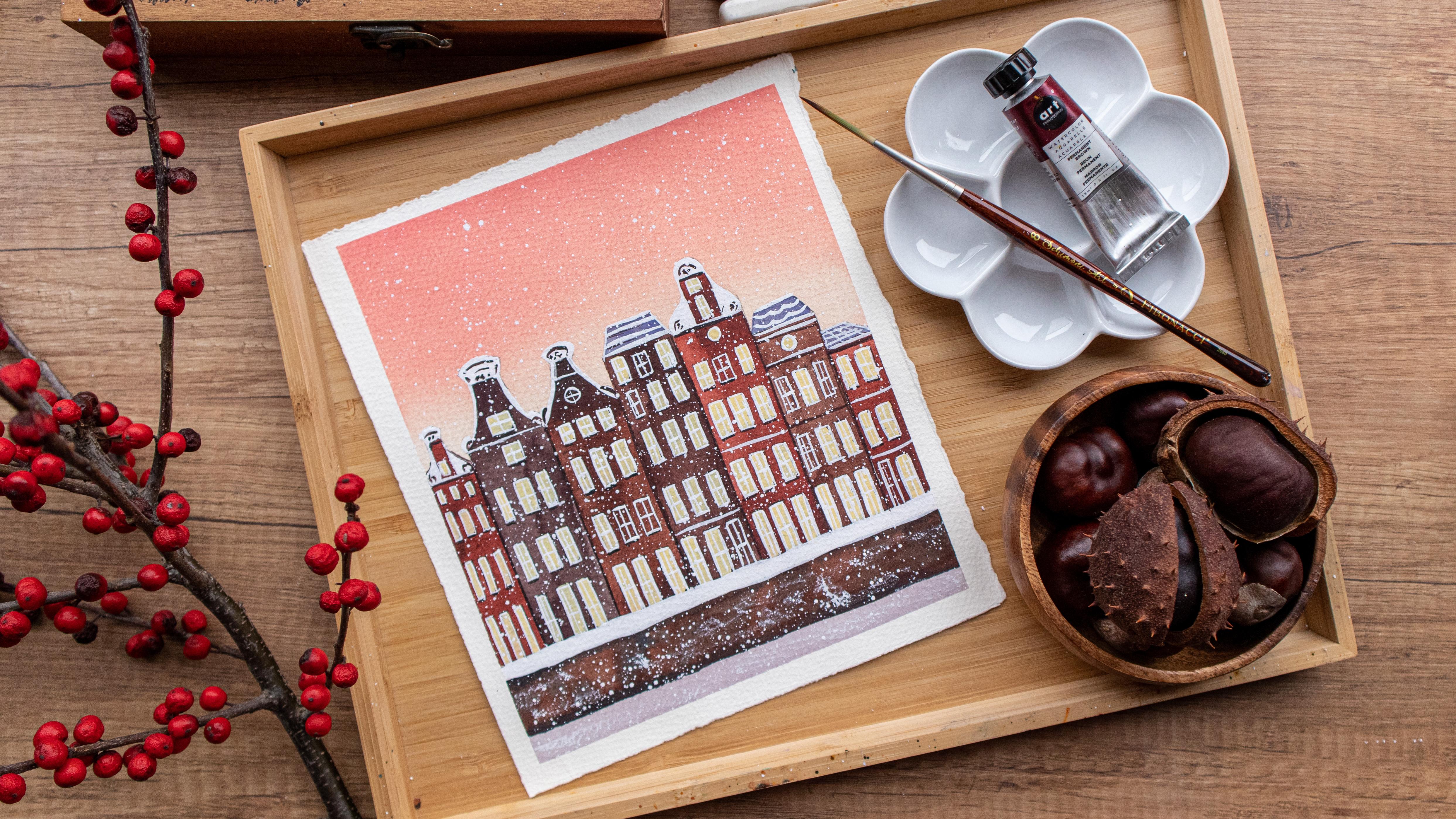
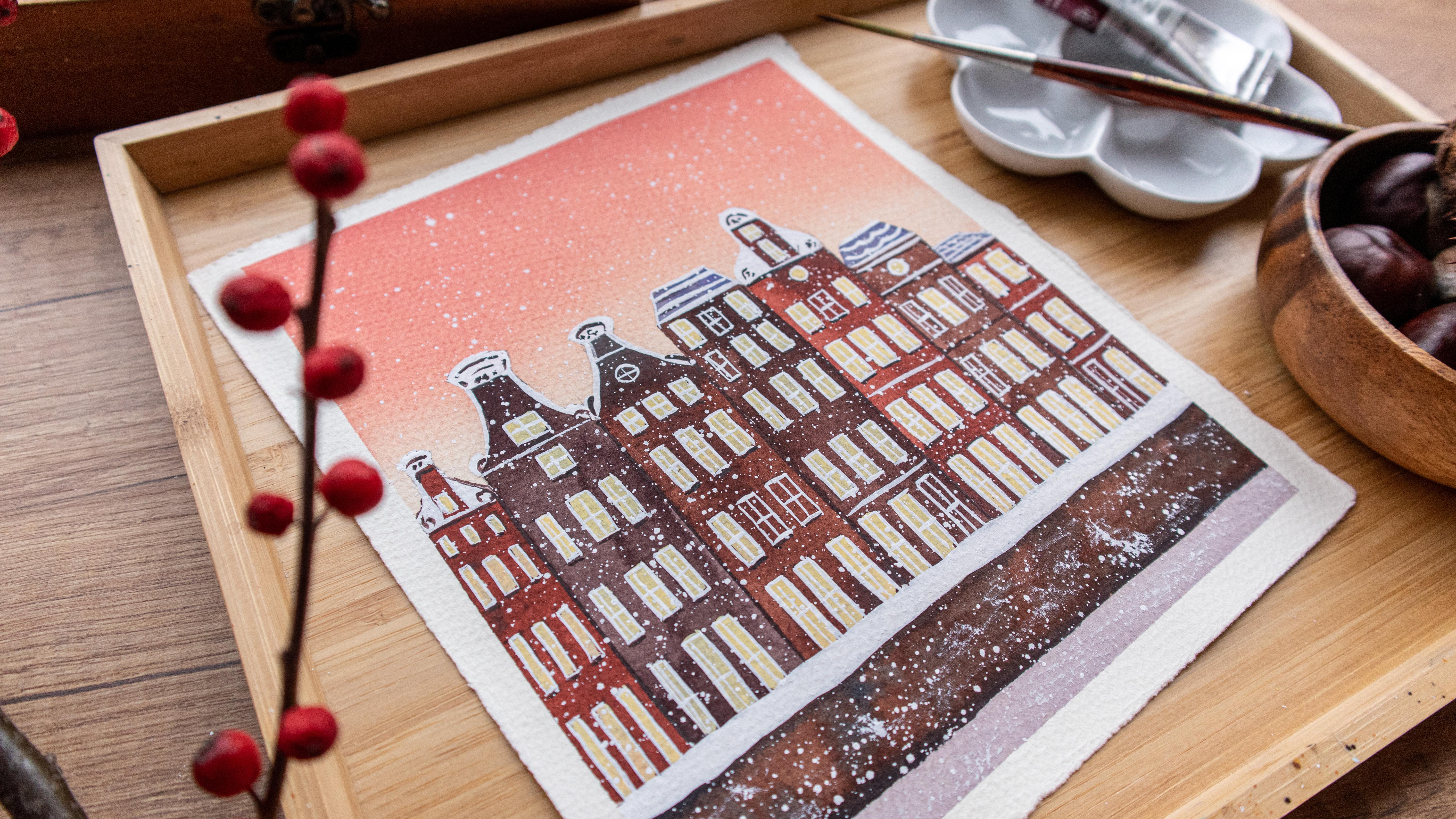
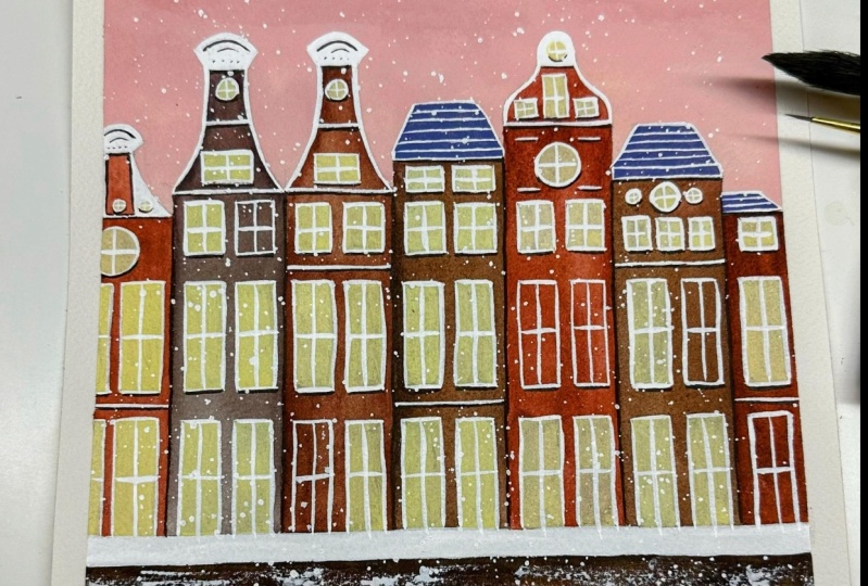
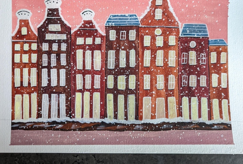
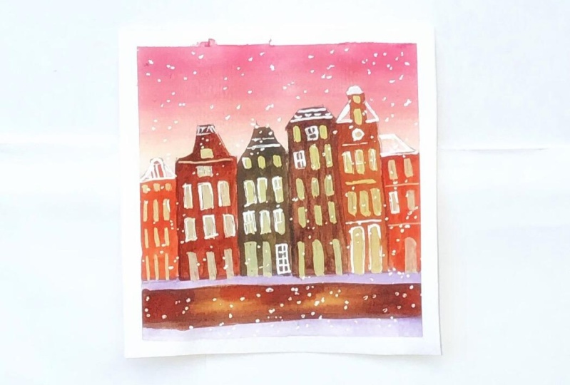
in this class, we are going to paint these
cute little illustration of Amsterdam houses
covered with snow. I will use my
watercolor for this. But if you want, you can
use gouache, markers, or any medium you find
suitable and you like to use. The process is fun and easy. The most challenging
part is the sketch, and not because
it's too complex, but because it has
many elements. But don't worry, for those of you who don't like to sketch, I will upload it in the
resources section of the class and you can print it and trace it on
a sunny window, or you can just turn up the
brightness of your screen, then trace it this way. The best part about this project is that it
has illustrative style, so it doesn't need to
be perfect at all. Once you get that sketch done, we'll start filling it with colors and you'll be amazed how quickly you'll have your
new illustration ready. Join me in the next video
where we'll talk about the materials that you're
going to need in this class.
3. Materials: In this video, we'll discuss the
materials that you're going to need in order
to complete the class. Then that's usually will
start with the paper. I'm going to use this
Fabriano artistic code, 300 GSM, 100 percent
cotton paper. I will tape it to this part
over here with my paper tape. It has the smallest size and it even has something
painted on the back. It doesn't matter, we're
just painting here for fun. As for paints, I'm going to use my art philosophy palette, and more specifically
we are going to use lemon yellow,
permanent yellow, deep, opera rose, permanent brown, burnt umber, indigo, and cobalt blue. Don't worry if you don't
have exactly the same color, just pick something
that looks similar. I will also use these
bleed-proof white. You can just use
your white gouache, we'll use it for details and for mixing
some of the colors. I will make the colors here
on my ceramic palette. As for brushes, I will use my silver black velvet size 12. You just need a
big brush that has a sharp tip so that you can
fill out the shapes easily. I will also use
this flat shader. It's a very old
brush that I have. I think I used it for
acrylics back then. I will use it to paint the
windows on tiny buildings. You're going to need to
have the same brush. You can just use your
round brush for that. It's just the shape
that it makes it easier for me to fill the
square windows. For tiny details, I will
use my Schimoni art brush. This is a liner. It has a very sharp point, so it's perfect
for tiny details. I will use my cotton towel, my two jars of water. You will also need a pencil, a ruler, and an eraser. I'm going to use
this soft eraser because it's gentler
onto watercolor paper. You might want to use a white gel
pen if you have it. If you don't, don't worry, you can paint the white
details with white gouache. Then this is pretty
much everything that you'll need in order
to complete the class. In the next video, we'll start with the sketch.
I will see you there.
4. Sketch: In this video, we'll make the sketch
for our illustration. Once again, you can find sketch in the resources
section of the class, and you'll get printed
out from there and trace it if you
don't like to sketch. I will start by drawing three lines here on
the bottom of the painting. This will be the street
and then we have something like the
bank of the river. Now we'll start with the houses. I will start with a little tiny house
over here on the left. Then I will use my
ruler as a guide for the size of the houses that
I will draw on the right. Each house will be
more or less the same. I will just vary the height. There is no specific
measurement for this. I'm just making these
really intuitively. I want to have a nice variation
in the height of the houses One one will
be taller than another. Here on the right I have
another narrow house. Now I will draw the rooftops. Once again, each
house will be with different height like that. Now, I will just draw some
details on the rooftops. I want each house to be a little bit different
than the other. This will have a
rooftop like that. This one will have more
intricate rooftop. Some of them are
really detailed, like an actual work of art. Here, I'll have
something like that, and here I'll have
a tiny window. Now, I'm making
this half circle, two more circles here. Now I will connect that
to the upper part. It's okay if they're
not symmetrical. Once again, this is just an illustration so it
doesn't need to be precise, it doesn't need to be accurate and even more,
such imperfections are giving character
to your painting so don't be afraid to let
your creativity flow, and just maybe come up with your own ideas
for the rooftops. Here, I have another one
more complex rooftop. It goes like that. Here, it has an arch. This one will be similar. Some details here at the base. Then the last one I'll have something like that. Another element like this
one, and this is it. We're already with the rooftops. Next, we want to
draw the windows. I'll draw the windows of this house over here
and then I'll use that as a guide to draw the windows
on the the other houses. I want to have three
windows on each row. I'll start with the ones
that are on the top. I'll just make three lines and then I will use these lines to guide me for all the
windows that are below that. As I go down, windows are
getting bigger and bigger, and they actually use to make the windows like
that in order for the houses to look taller when you look at
them from below. Now I'm finishing the windows and they're are definitely
not the same size, but I just tried to make them
look more or less the same. Here below, I'll have another
three windows or doors. I'll just make a little one like this one to separate
the window from the doors. Or there maybe shop windows, so they're the tallest. We are ready with this house. I will draw the windows of the other houses
in a similar way. But I will just add something
different here and there. For example, here I want
to have a round window. Now, I'm just drawing
some guides to help me with the windows
of the other houses. I'm just marking
where the windows are starting because I don't want
to measure for each house. I'll just use the
windows that I just drew to make a little mark
on the other houses. A little tiny window over here. This house is narrower
than the others, so I will just draw the
tiny windows freehand. Again, I'm not worried if they're exactly the same size, or if they have
the perfect shape. I'm just marking where the
other windows are going to be. A narrow house with
the narrow windows. Now I will just
quote these shapes. I'll have a little
window over here. I will continue
drawing the windows of the other houses
in a similar way. I'm using the lines as guides to show me where the
windows are going to be, and I just draw the
vertical lines. The last one here I'll have
just two windows per row, and we are ready. This is the sketch. I know
it has a lot of elements, but it's really easy
and simple to make, and now I will use my soft eraser to pick up
some of the excess graphite. You don't need to worry too
much about that because we're going to use intense colors. More or less, these lines
that are going to be covered. Now, we'll see you
in the next video where we'll start to
use our watercolors.
5. Washes: [MUSIC] In this video, we'll start to feel the basic
shapes of our illustration. This is going to
be the first wash. I will start by taking
some permanent yellow deep and I will mix
it with opera rose. You can just make
some yellow orange with pink or they
are called red. You have in your palette. I'm trying to mix something
between pink and orange. Now, I will add some
white gouache to it. We get these pastel
peachy color. I mix it well. I will add more opera rose. I want it to be more pink. Now with this color, I'm
going to cover the sky. Nothing fancy here. I'm just taking the
color and I'm trying to cover the entire
area of the sky. Once I reach the rooftops, I will wash my brush
and with a damp brush. I will drag the color down until I reach the
lowest of the rooftops. That's it, guys. We are
ready with the sky. I'm just going to go over it once again with my brush
just to make it more even. Now I will leave this to dry. Now my sky is dry. I'm just taking
cerulean blue hue, and I add it to the same
mix that I have over here. I'm getting these
lavender grayish color. With that I will
paint the river. I'm just filling in the shape. Now I take some permanent brown. I will place it
here on my palette. I'm taking some of
that color over here. Some opera rose, just make
the color more interesting. Now I'm filling the shape
of the first house. Once again, nothing fancy. I'm leaving the
rooftop as it is. I was just filling the
front of the house. You're going to need
to worry to make the perfect wash over here. Just filling the shape.
Try to have fun. You can also use a flat brush
for this if you have one. But I like this brush
because it takes a lot of color and it's easier to filling the entire shape
with just one loading. We are ready with
the first house. Now I'm just taking
some concentrated color and I will add it
here and there. It just makes the wash
more interesting. Now with the same mix, I will
cover this house over here. We are ready with
this house too. With the same mix, I will cover this small house over here. We'll make different mixes
for the other houses, just to make our
illustration more interesting and to have a
nice variety of colors. Now, I will prepare another mix. I'll take burnt umber and
we'll add opera rose to that. With this mix, I will cover
this house over here. Now again, taking burnt umber, I'm adding opera rose. Now I will add a little bit of indigo to make it more darker. It's brown, but it's not
exactly the same brown. Now we'll use this to fill in the shape of this
house over here. This is a nice
technique to introduce some variation of
color in your banking. Even if you need to
use the same color, you can just make it a
little bit different, adding some other shade to it. Now taking again
permanent brown, I will color this
house over here. I'm turning my board in different directions
in order for make it easier for me to fill
in the shapes without smudging the wet paint
that I have on the paper. Now filling the last house. Now with whatever I have
left here on my palette, I will just the little bit of burnt umber to it and I will
cover this side over here. This is the riverbank or
the bank of the canal. I'm just taking some
concentrated color and I will drop it
here and there. First I'm going to go just
below the line of the snow, because this is where we have a little shadow and
a little bit here. [MUSIC] Just sound brush
marks here and there. I'm just taking
some cerulean blue. Now I will add it
to the gray mixture that we have over here. Now we'll use that to cover some of the rooftops [MUSIC]. This one over here. This one over here too. Basically the ones
that are more simple, we'll cover with this color. We are ready with the stage, leave everything to dry. In the next video, we'll start with the highlights of our illustration.
See you there.
6. Highlights: Now it's time to add the highlights to our illustration and for
painting the window, so I will use this flat
shader by Daler Rowney. It is synthetic brush. I will use it because the
shape of it will make it easier for me to fill
in the tiny windows, but you can use
whatever brush you feel comfortable with. I'm just taking lemon yellow. I think it's really concentrated with just a little bit of water to make it
more thick and big. I will add just a little
bit of permanent yellow, dip it to make it more warm. Now to mix our lats on white gouache, and we're getting these
nice warm pastel yellow, it has a thick consistency, and we need it to be
opaque in order to cover entirely the color that we
already have on the paper, so I'm mixing very well. Now I'm ready to start
painting the windows. I just go, and I fill
in the shapes that I drew earlier, and again there,
another perfect shape but that is not what's
important here. You see how much
alive the house is starting to look. Now we'll repeat
the same process with the rest of the houses. I'm just filling the shape
of the windows and I will leave some of
them as they are. See my windows are not perfect, and I'm not worried about that and this is the last window. Now I'm taking
some white gouache I will turn my board this way, so it's easier for me to paint the rooftops without smudging
some of the yellow paint and I will just
cover the part of the rooftops that are
still missing some color. Again, nothing fancy here, I'm just filling in the shape. Your paint needs to be
quite thick in order to cover the pencil
marks that we have, so try not to add too much water and the same with to
the other rooftops. Now, I will fill in with
some white gouache, these white stripes
that we have over here, so this is the snow that
has fallen on the street , making it a bit thicker. Now I'm taking the
excess paint off my brush and I will just add some brush marks with an
almost dry brush here on the river and here on this part to make it
look more interesting and like it's covered
with snow here and there, so we're adding to that
winter frosty feeling. I forgot this tiny
window over here and this one and this is it, we're ready with this part. In the next video, we'll add some details to our
illustrations, see you there.
7. Details: Now it's time to add some details
to our illustration. For that, I will use
my [inaudible] art. It has a really
long and sharp tip which will help me
to be more precise. If you want, you can
use a gel pen for that, if it will be more
comfortable for you. Again, I'm turning
my board this way. I am taking some white gouache
with thick consistency. I will start to add details
to my illustration. I will start by
going around each of the windows to make
a tiny window frame. Basically, I will outline
each of the windows. I'm making some vertical lines. I will make the vertical
lines first because I don't want to change the position
of my hand to over. Once when I'm ready with the vertical lines
of this house, I will start to make
the horizontal lines. But you can make
your own process, whatever is comfortable for you. I will close those tiny frames. These windows are too tiny, so I will leave them like that. But for the rest of the houses, I will make a tiny cross inside each of them to emphasize
the window frame. I continue with the
rest of the houses. You can see how such tiny detail can add a lot to our painting. I am outlining the
round windows too. Going over to the next house. The last one. Now I will add some details
to the rooftops. I will fix the shape
or this one first. I will add some lines to the house to make it
more interesting. A line over here for this one. I'm just making this up and you can add
whatever you want. You can draw tiny flowers
or dots. It's up to you. Now for this one, I will make a line like that. One more over here. Now outline entire shape. See how good everything's
starting to look. Going over to the next one. I make sure that I have just the right amount
of paint on my brush. If I have too much, it will make a
blow-up on my paper. If I have too little, it won't make a nice
consistent line. The last rooftop, you can make your own
pattern if you want. Now, with a brown mix that
I have here on my palette, I will add some tiny lines
below the windows and between the houses to make it more
interesting and contrasting. First, I will draw a
line between the houses. These will cover the tiny
gaps that I have left. It will make the
houses pop up a bit. Then I shadow below the
roof and some details here. Just some lines and dots. Going over to the next one. Our houses are really
starting to come to life. You can just add some lines and dots wherever you feel like. Wet some thin lines
below each window. You see why I love this brush, it can make such thin lines. They are precise. Now it's time to finally add the snow
to our winter illustration. I'm taking some white gouache
and I just tap on my brush. I will add a little
bit of water to it because the consistency is too thick and I get really tiny snowflakes and I
want them to be bigger. Now you see the difference. Adding some more. You can add as many as you want. One last round. We are officially done. You see how cute and
magical this looks. It's really breathy and I
really love how it turned out. I will see you in the next
video for our final words.
8. Wrapping Up the Class!: Congratulations on
completing the class. I hope you had a
great time painting with me this cute
little illustration. If you enjoyed the class,
I challenge you to repeat the process with
your favorite city, how fun it will be to see
the different variations. Don't forget to
upload your project in the project
section of the class. I'm so excited to see
what you'll create. If you post your
project on Instagram, don't forget to tag me and I'll be happy to
share your work. If you have a question for me, just post it in the
discussion section of the class and I will get back
to you as soon as I can. Until the next class,
guys, happy painting.
 Elina Zhelyazkova, Watercolor Artist