Transcripts
1. Introduction: Join me again for another fun art project
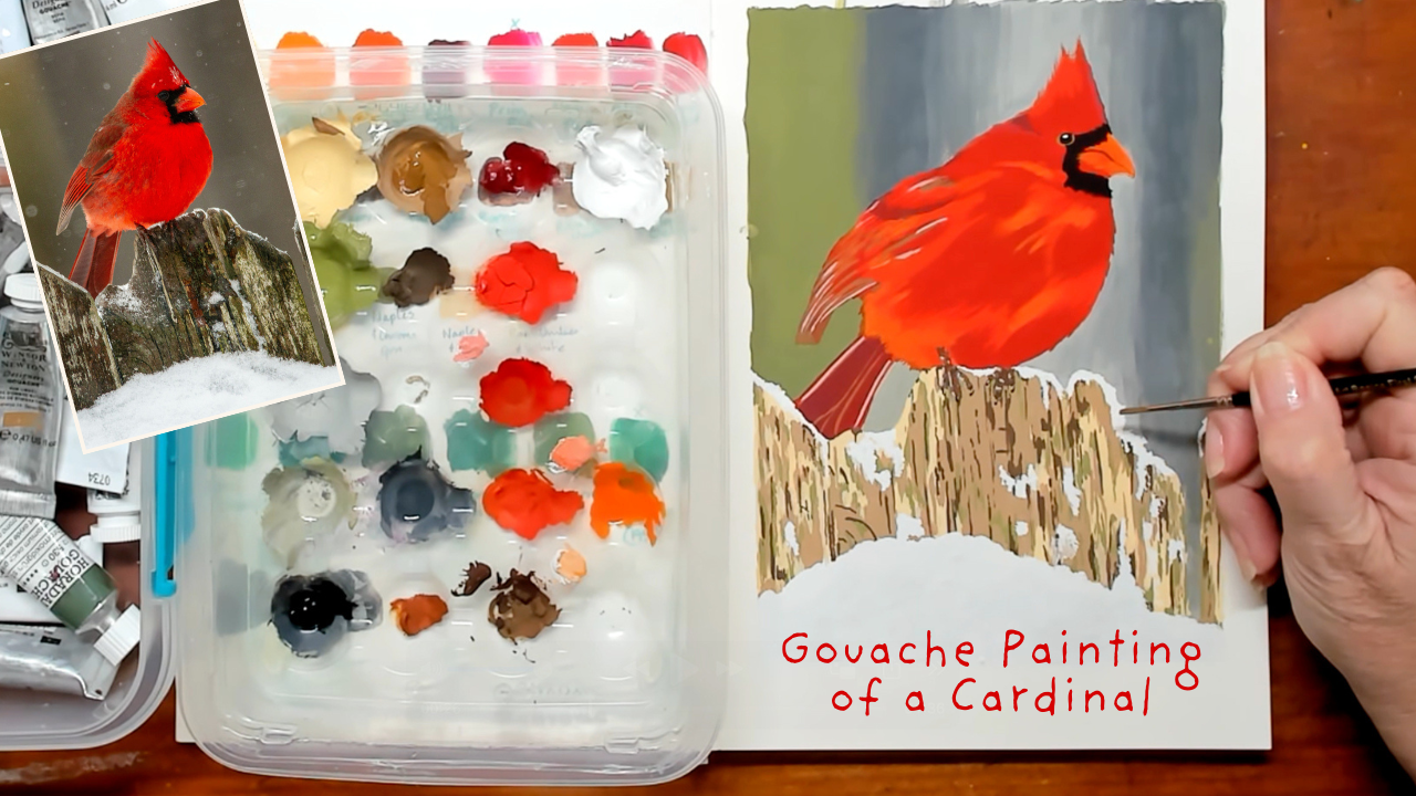
where we take Gouache, do a colour swatch, and then paint this gorgeous
little Cardinal. You haven't met me
before, my name is Jane and my business name is
misses Red's art room. I live on the Gold
coast in Australia with my husband, two
remaining chatts. They're the ones that are sort of twentiesh and
haven't left home yet, a dog, two cats, three chickens, and an aviary of birds, and an awesome veggie patch. I also teach local classes
on the Gold Coast. Grab your paint brushes
and just sketchbook and let's get in to the art room. H
2. Class Project: To do this class project, you need to have a
basic understanding of Gouache paint
and how it works. There are plenty of
videos that will teach you the basics to
Gouache on Skillshare. To begin with, you'll need
to go to the Project and resources tab and find the
image of the Cardinal. You can print off the
image as well if you want to trace the image down
onto your chosen paper, and I will demonstrate both
ways in the videos to come. This image has been
chosen from Unsplash, a website that has royalty
free images to use. The photographer is
Joshua J Cotton. Comes time to painting
the Cardinal, I would prefer you to have a reference photo on a second
screen to my recordings. This is because our printers
do not print color exact. The second screen could
be your phone, an iPad, a laptop, or a second
screen on a desktop. Of course, when you
finish your Cardinal, I would also love you to
upload in the same tab, project and resources,
so I can see your work and give you positive and
constructive feedback. The only way for me
to know you have done my class is by uploading
your work into this tab. So please don't be shy. It's also awesome to be
able to see how others have answered the same brief
in their own unique way.
3. Materials You Will Need: Alright. I'm going
a little bit rogue for the material
list for this one, because we need to
do swatching of Guache and you have got different colors
to what I've got, and we need to work
with what we've got, make new colors with what
we've got, et cetera. So the swatching of the Gouache paint will
come after this video. I'll just reach in
and grab Gouache out. So that is just an orange
and it's an artist spectrum. I've mainly got
Windsor and Newton. You use what gase
you've got on hand. So what I'm going to be
doing with all the gouache, which I'll show you, and this
isn't my entire stagoache. This is the colors
that I have chosen for doing this
Cardinal painting. So I have a lot of gouache. I teach gouache classes
on the Gold Coast. Um so I supply everything
for those classes. So that's why I have a
lot and a lot of gouache. I don't expect you to
have as much as me. Anyway, let's start about
what else we've got. Apart from the gouache,
you're going to be using several brushes. Again, I haven't
chosen them yet. These are all my brushes here, watercolor
Gouache brushes. I haven't chosen them yet, but given that we're doing a relatively a five scale
painting of the Cardinal, going to be wanting sort
of this size brush, maybe a little bit of this one, the one that rolled
off the paper here. We've got this one and maybe a larger one for
the background areas. So have a variety of your
Gach brushes on hand. I'll just leave that
one out. Paper towel, a definite must when we're
doing Gase. Have a few pieces. A pencil to draw up your
template, sorry, yes. If you're drawing up
from the template or drawing free hand,
you need a pencil. You can have anything.
This is to write down the color of each Gouache. So it can be a Bro pen. It can even be the pencil
that you've been using. Don't worry too much about that. Have paper towel handy, have your bucket of
water handy as well. And then sketchbook
size. This is the PIP. I'm not sure of the
actual size of it, but what I've done
is I have scaled this to be a four or
a five dimensions. Let's find out how
this is let's say, roughly 25 centimeters long by just over 17
centimeters wide. So right in between A five and your A four,
beautiful sketchbook. It is Do do do I should have looked
at this before 200 GSM, and it's slightly
off white paper, as well. Lovely to work on. So working on this side, doing my painting and working on this side to do all my swatching
and recording of colors, which is just as important when you're doing
a gash painting. So I will stop this video, and we will start a new one where I've got
the gash all laid out, and we're going to start doing swatching, which
is a lot of fun.
4. Sketching Your Cardinal: I so there are two ways that you can
draw up your Cardinal. You can do it like I am
at the moment where I am freehand sketching
up the Cardinal, or you can do a tracing of it. So I'm going to
show you both ways. Obviously, you can see
me sketching up here. But the other way of tracing up is not going to
be of the Cardinal. It's actually going
to be of a sunflower. So I wasn't going to repeat a process that is easy
enough for you to follow, even though the image
is a different image. So as you can see,
here's my sunflower. You will have a Cardinal that you can print
out on your printer. You just need a black
and white copy of it. So what I'm demonstrating here is that you
cannot really see the Cardinal print out on
top of my sketch paper. But as I show it up to the
light, you can see it. So if you have the opportunity, go and it's daylight, go to a window to
do this tracing. If it's nighttime,
you just have to keep showing it up to the light
and then putting it down. Now, you'll use the side
of your pencil to do this, not the tip of your
pencil because you don't want to you want to do a real messy tracing
of this so that when it comes to going
over your Cardinal, you have got everything out. So now you've got your
printed Cardinal out. And as you can see, I'm using
the side of the pencil. Do a nice, messy shading, nice and messy
heaps of coverage, and make sure you're
using a pencil that's possibly
darker than a HB. So a two B is perfect, four B is even better.
Nice and dark. I'm not looking for neatness. I'm looking for coverage. So just keep doing this going
over all of your Cardinal. You'll see me show it up
to the light soon as well. Um, I'm just doing the leaves
of the sunflower here now, but you're doing the shape of the Cardinal and the fence that the Cardinal is sitting on. That's all that
needs to be traced. Even the fence doesn't
have to be too accurate. It's easier to draw a fence
up than it is a bird. So you can see I'm looking at the image through the light. I may have been doing this in the dark or I did
it as an example. This sunflower project is one of my other Skillshare
classes that I've done. So it's a pen and ink
one using lines and dots and squiggles to create the sunflower
in black and white. So you can have a look at
that one as well if you like. So once you have done
the shading on the back, you position your Cardinal where you would
like on your page, and then with your
less dominant hand, for me, it's my left hand
because I write with my right. Your left hand will hold
the image down so that your right hand can trace everywhere that
needs to be traced. And then it's just time
to start that tracing. I have sped the video up
here, as you can see, I don't draw that fast at all. But just go over all of
your lines that you need to of the Cardinal
and the fence post, and then you'll
be able to remove your sheet from your drawing
paper and or painting paper, I should say, so my mixed
media or watercolor. Then you can move it off. I'm going to show you here, too, how to move it off without
completely moving it off your paper so that
you can check and see and make sure that
you have put in all the lines necessary
that you have to. So you'll see me with
my left hand check that I've got
everything Correct. However, you should
be able to see your pencil lines as well on. And here, you'll see
that I'm just checking. You won't be able to
see my lines here. I do show you at a
different angle. It's because of the
light and the recording. But you should be able to see your pencil lines underneath your template and onto your sketchbook or paper
for your gouache painting. So that is tracing the
template onto your paper, as opposed to free drawing. So either way is fine
because we're not doing a drawing class in getting
perfect shapes for the bird. You're doing a drawing class
for the gouache painting. Alright, so our next
move is to look at all our paints that
we've got and see what colors we need and
what colors we need to mix. So I'll see you in
the next video.
5. Colour Swatching: Okay, so when you are
selecting your swatching, make sure you've got the image
of the Cardinal up so you can do what I've done here and just get
out what you've got. Plus, I've got black
white and gray, as well, but I'm not
going to swatch them. And that way, we'll be
able to whistle it down. Like, we can choose which ones we're going to use the most of. Um, so I'm going to start up top here with yellows going to red. That should cover one line. Then I've got a lot of neutrals. So that was for the timber. Like, there's a lot of
colour in that timber. There's a lot of dark.
There's a lot of light. You can see a bit of
green coming through. So I'm going to use
two lines for those, and then the greens,
they're really minor. There's a little bit of
green in the background, but they'll go along
the bottom there. And then from that, I can choose which
colors I want to use. And I don't have to make the decision up
straightaway, either. So with that being said, I'm going to just move my
water bucket just there. It's still out of view, but I better hold onto my paper towel because I'm gonna need it. I might just also grab
a piece of paper to put over the Cardinal so I
don't get any paint on it. Okay, so I've got several sheets of just print copy paper here. So I'm just going to put them
over there, and that way, it will stay protected from
any splashing that may occur. It's not really in
any particular order. It is a naples yellow deep, so it's sort of based on
the neutral colors as well. Those natural ones. So I'm not going to sit here and go through every
color with you. I'm just wanting to give you the example of what
you need to do. So naples yell. Deep. You can abbreviate. Alright? And then I'm moving
on to the next color. Make sure you give your brush
a good wash in between. We know that gouache doesn't come out of brushes that easily. This one looks like a new tube. Okay. Okay, so I am now
onto my last green, which has actually spurted out. I don't know what
to do about that. Um, I don't even have
a palette handy. And once it's out,
it's out, okay? Let's painted down there
without losing it. It's just gonna have
to go in the bucket. Shame, but I didn't know
that was going to happen. So dark green. Now you can see that if I have used another gouache that
is not Windsor and Newton, I've actually put AS
underneath it, SCH, for Miki. I don't really know how to
pronounce that too well. So the only other
colors that I've got, which I will swatch, I'll at least swatch the gray. It's neutral gray three. Different. Oh, that's got
a lot of green on it. So I'll put that gray down. I love using this gray.
I don't know why. I do. I use it a lot. And then I've got
the lamp black, and I'm obviously not going
to put the white down, but I want to tell
you the difference between permanent white
and zinc white, as well. I just have to pull it back up, so I'll put it on the screen, as well when I say it. There's a lamp black. It doesn't matter
what black you use. Black is black. There
is differences. Like there's a warm, there's a cool,
there's a reddish one. There's a bluish one. Amp black. Let's just say is like
a nighttime black. Alright, so the difference
between permanent white, which I've got here and the zinc white here is
opacity and mixing behavior. So permanent white
is highly opaque. That's, yeah, this one, highly opaque, perfect
for highlights. Zinc white is more transparent, cooler and ideal as
a mixing white for producing cleaner and
more vibrant tints without overpowering colors. So I am going to go, not because this
one's almost done, but I'm going to go the zinc white because I'm
going to be mixing the color lot of these colors to find
those timber colors. And it'll be used for
the sand the sand. That's because I live
on the Gold coast. The snow, it'll be used
on the snow as well, but we won't see we will see a little
bit of the post coming through the snow there. So that is the big difference
between the titanium, sorry, the permanent
and the zinc white. Alright, so next
video is going to be, actually, what I've
got to do first, and I'll do it off camera. I'm going to go through all
these colors that I've put down and eliminate ones that
I just don't think suit. Something like this
brilliant green. I know that that's
not going to be used. So I will get that
out of the mix. And also, I can kind of see where I'm going to go
with my reds there. I think the flame red is
very much going to be used probably as much as
I want it to be used, it'll probably be used
with a spectrum red, probably not so much lizarin uh, the red oak is a
really nice color, too, so that could be
mixed a little bit. We'll see, okay? We'll
go to the next video.
6. Your Painting Style: A Okay, T two. I just filmed this and
didn't hit record, so we will start again. Here is all my gouache. I've just put it into a little
container so that it's not sprayed out all over the
table. This is my pallet. My palette is a
recycled container, which originally
held meat balls in. So there's 20 little wells here. And it's what I love using
when I'm doing a gouache painting both here or if
doing a plain Air wm. I like to use it
for that as well. I don't have I do have a
travel gouache as well. So I do have color that
is for travel only, but I prefer to use
fresh Gouache if I can. Now, in regards to the colors, I eliminated one, two, three, four, five,
six, seven colors. I eliminated a lot
of the greens. I only ended up with two
greens to be um in the end. And what we're going
to be doing is starting with our
background first. Just before I go to that, I just want to show you. So it is a good
idea to always look at inspiration and the painting style
that you want to do. Now, Clara McCallister, she does Gouache and oil painting. But what I love, this
is a Gouache one. What I love is that there's no area that is just
one solid color. She's very detailed like myself. So that's what draws me to her work is that even though
if you're a detailed person, you can still get away
with a beautiful painting. If I go down here and you
can see those feathers, just every paint stroke has
been done with intention. So the colors that she's used on every little area has all
been done intentionally. And then this beautiful snake, which is on a pink background, just lovely, lovely
work. The flowers. So I'm really drawn to her work because her work is
similar to my own style, and I get frustrated
with being so detailed. And when I see that, I think it's okay. I can use one of these tiny little brushes
as much as I like. However, it must be noted, I'm not teaching you a
class on my detailed style. I'm teaching you a
class on color mixing, preparing your colors and the process of doing
the gouache painting. So if you're watching this one, I do hope you have a little bit of gas experience in knowing that it's very much you
can build up in layers, but there's only so
many layers you can do before it starts picking the paint up and
taking it back off. So we start thin and we
can go to a thicker paint, but we can't go back
to a thin paint. Um, so we're going to
start with our background. So if you're looking at
your image or I'll put it up on the screen as
well just over here. We're going to start with
background because when we get to our gorgeous
little fat Cardinal, his little feathers
are going to be delicately just wisping off
the top of his head there, and we want them to be
going over the background. He does have a little
area just there, which is quite light, but
we can paint that in. When we're doing the
background, make sure that you go right up to your pencil line of your
Cardinal and the fence. Don't be afraid to go over the pencil line because then you've left that room to be able to paint the foreground in with the background
not disturbing it. So what are we looking at? We are looking at if we go from this side from
the left to the right, we're looking at I'm going
to be using the como green, and I'm thinking a bit of naples yellow deep with that mixed together to get that
oliv golden color. Then we have a little bit of
black introduced with gray. Then there's a little
bit of gray with white introduced back to gray, and a bit of dark a
bit of black again. Down here, it's very mid tone. And then there's just that
hint of that olive color, which I'd say would
have been some trees or something in the background. So a little bit of hint
about olive again over here. So we'll go, well, I will. I'm going to go from left to right because I'm right handed, but if you are left handed, please go from right to left. Work in your comfort style, work with the
brushes that are in your comfort style as well. So I'm going to pause
this video now. This is what I did. I paused the video and then realize
that I started the video. So I will pause this video, and I will put my the green, the naples yellow, and the
gray black and white in here so that I can start making those colors and
start doing the background. Really only want to do
the background once. You don't really want to have
to be going over it again, so we're going to be
doing it quite thick. And I would love to get some of those
snowflakes in as well. Don't know how we're
going to do that, maybe with a brush and water
cause water stains squash, so that might be a nice
way to be able to do it. Alright, so I will
stop this video, and I will start a new one with my palette ready to go,
likewise, for yourself.
7. Background Part 1: Alright, I'm
definitely recording. Okay, so I have mixed the chromo green and the
naples yellow deep together. It ended up being
one part green, two parts naples to
get that colour. So I'm going to
just run with it. I haven't done a test.
We can always do that. And I don't know if
that's coming up on your screen as well, but it actually looks very
much like what I want. I just want a little
bit of water. So if you do want to just
have a little bit of water, I can't put this down on
top of the actual artwork, all I do is just
dip my brush in to the water and just get it
a little bit more wet. I call it a consistency,
one, two, and three, with three being very wet, two being in the middle
and three being nothing. But these two colors were pretty juicy when I got
them out of the tubes. I juice is the
right word to use. Okay, so I'll just
move that over. See what the other thing is, I've put this border in
because that's the border of sort of the ratio
for an A four, but, um, you don't have to. You can put some washi tape
down if you want to so you get a nice neat crispedge. I'm not going for the
Cris bedge look because I will if I scan this in, I will then crop it. Might do some cards with it. So I don't need to mix
the blacks and the white. It's just this color here. Make sure I go over that line. I still feels pretty
thick, I must say. Um, then there's just that there's a hint
of dark in here, so I don't know what to do here. I should have mixed
my gray a bit better. I've got a new tube of
neutral gray and an old tube, and the new tube just ran Oh, what's it called I'll think of it and I'll put
it up on the screen. But it just I'm trying
to think of it. I can't. Yeah, all the fluid came out rather than the paint. So I'm sort of mixing, trying to get the gray to be nice and consistent
because it's very, very pasty, bit dry. Trying to keep Clara McCallister
in mind as I do this. Now, as we come up here, that color that's there. I can't open up another
tube right now, so I'm just going to go
with maybe just the gray. Dip my brush into there
and contaminate it. I don't know if I've got
any paint on there yet. Might be just separate. It's like a separator. What binds the two
the color together? Some sort of separator. Okay, very quickly,
we're going to be going into our color here. I feel like I'm using a
brush that's a bit big. I'm just going to
go over that there. How's that looking? It's looking very much like there's
lines going on. And then under here, we're going to go into I'm I don't want to
really wash my brush. I don't know if that's naughty. I get a tiny bit of black. Be really careful
with you, Black. I really should have washed the brush. I'm gonna
wash the brush. Just get the majority of
that green off there. You got to work fast here because the gase
will dry quickly. Depending on when you're doing this and where
you are in the world, we are in what should be autumn, mid autumn, but it is still really hot
here on the Gold coast. So we're still getting
30 degree days. So I'm just going to
take a bit of that gray, put it there, and just
get a hint of that black. Oh, look, so dominating. Such a dominating colour. Okay, let's get it
down. Because we wanted to maybe I needed
to have two brushes. You'd think I'd know. Gouache is very much a
paint you cannot blend. You can put layers down, but it doesn't like
to be blended. Okay, so I want to
do something there. It's very harsh. I'm gonna dip my brush straight
back into the green. I need to get rid of this linear pattern
that's happening. Make sure you go over just
over your pencil lines. We really need to be happy with our background before
we go onto the foreground. And The first bit of paint
that I put down has dried. That's not looking
too bad now, though. I'm quite happy with that. I had two beautiful magpies
outside whistling before. It would be lovely if they came back because you'd be
able to hear them. Okay, so moving on. I'm liking what's
happening there. I'm just gonna put a bit more of that gray colour
that I mixed down. And then I need to come
into a bit of the white. The white zinc, which
was a new tube, I thought would have been quite runny and it isn't,
as you can see. It's again, very
quite a firm paste. I've probably gone a bit
too quick on going light, or I need to add
some water to that. That is too dry. You'll know if the
paint is too dry, it just will not go
down onto your paper. Feel scary working over your pencil lines
because all of a sudden you're left
without those guides, but it is okay. It's going to keep happening. Okay, so I got to get more
white happening here. I'll put a tiny bit
more water. Nah. Now, I didn't do It's
actually the same colour, so I'm just going to
fill that in now. Make sure you do that as well. I don't know how
you're watching this. If you're watching it
and you're painting along with me or
you're watching it to then do and pause and
everything, I'm not sure. But, yeah, I will just continue
painting as we go along. I have to tell you a story
or two, as well, I guess. Never shy of a word, though. Okay, how are we going
there? All right, I'm just going to
keep adding a little bit more white to my sorry, water to my white because
of how dry it is. And we're right in
that gray zone now. So you want to be mixing. Oh, that's right. Did I
bring it up? Yes, I did. I did I drew the head, and then I put a little bit
more height on the head. My computer thinks that
I'm not working at it, and it just went to sleep on me. But I need the reference photo. Bit different when
you're watching a video. I never goes to sleep on you, but um if you are
doing what I'm doing, which is just recording, it
doesn't think I'm there. Oh. Gotta be careful here. Okay. There is a kookaburra
singing outside now, but I don't I think
he's too far away. I don't think you'll hear him. My microphone's too good. Okay, so I've managed to
continue with this brush, even though at first, I thought
it was maybe a bit big. I think I just needed to wash
the excess green off it. Um, come down here. Make our way back up to the top. Now we've got to start going
into the Blacks again. So adding little that little, have a look at
that for a little. Oh, that's Okay. Add a little bit of
green to that again, then, which isn't
going to be a problem. That is a definite you can see the obvious
change in that, so I'll have to go around it
again with a bit of white. But let's just get this down
because it's on my brush. Um, yeah, I'm
inclined to add a bit more of white to it again now. So, apart from just getting the excess green off my brush from mixing those
two colors together, I haven't washed or changed
my brush for the background. And yes, I could have
done two brushes, one with sort of
green colors on it, but it looks okay as it
is. I want to add now. Oh, that shouldn't
have happened. I was going to say I want
to add now the green to it, but I really need to come
down here and finish this little fence off and make sure that that
all connects together. Looks like it belongs
to the background. All I can hear is
dogs barking now. Much prefer birds. I actually just
saw my first Black cockatoo out in the wild. So I do live in the
hinterland of the Gold Coast, so lots of birds, and I know the sound that
the black cockatoo makes, and I've heard them, but I've never seen one. And I've lived here for 20
years, actually, 21 years. I'm going to go for a
bit of that green now. Um yeah, so I just
had to go down to the letterbox and was walking
back up and heard it, thought it was going
to be a white one. The white ones make
a similar sound. And to my surprise, I'm just mixing straight
green in here now, but I'm going to blend it. To my surprise, it
was a black cockatoo that flew not overhead. It was a little bit off center. And it happened so quickly that I didn't even
though I had my phone on me, I didn't have time to whip
it out and take a photo. Or a video. That's very excited and quickly
let my husband know. We encourage the birds. Lots of bird friendly plants
and trees that they love. Okay, let's have a look
at that on the screen. I'm looking at it on the
screen, looking at it down. Find that it's probably not
exactly where I'd like it, especially this bit that
I'm working on now. So I'm going to go
in with the white, which is looking very
gray now and just go over these bits here and Try and bring it back. There's a little bit
of green on my brush. I don't know if
you can see that. There's a dog down the
street that's not happy. Okay, now just work it
in with this dark color. You just don't want
to have stripes. You want it to look
pretty blurred. So lots of cross hatching
happening of the brush. Okay, I'm liking that more. No, I don't want to
touch wear. Yeah. I want to get over
there. Oh, am I gonna regret that? Maybe. Those areas just felt a bit thin as if I could see
the paper through. Okay. So very cross
hatchy style. Almost now got a dry brush
and just pushing colour down. A dry brush is going
to dry very subtly. So I'm able to try and
blend as much as I can, while paint is
still a little wet. Yes. Okay. And I think I
will leave it at that. I'm just having a look
at my reference photo. I don't have the
light coming here, but I like how I've
got the green coming in both sides very
unevenly, as well. I I play too much with that, it's just like I'm
happy with it. It doesn't have to be exact
to what the reference is. That's where we can play a bit. And this red is
just going to jump out of here and really
brighten it up. Okay. Here goes my screen again. Hopefully I'm
recording. Yes, I am. Alright, so I'm going
to wash my brush, probably wash the water, um, so that we can come back
and start on the Oh, am I going to go the Cardinal now or am I going to go this? Mm. I'll come back and I'll think about it,
and I'll let you know. We'll start new um, a new video. That's what I'm trying
to say. Alright. Okay. See you in the next video.
8. Background Part 2: Alright, so it is
actually a week since I last worked
on this project. So there's a couple of things. I'm not happy with how
the background has dried. I wanted it to be a lot softer than that and not
have those brush marks. I feel that I tried to blend the grass too quickly before, so I'm going to
go over it again. I have refreshed my palette, so I've mixed the
colors that I want. This color here is the naples and the chromo green
coming together. And then I've got a little
bit of the yellow up there just in case I want to put a
hint up in the corner there. I'm going to start
with Oh, sorry. I'm going to start with
the darker color first. So if you've got the
image in front of you, squint your eyes and have
a look at the background, and you'll find that you
can see some dark lines. And then there's
the lighter line, which is right over the top of his feathers up the
top there on his head. That light bit is also
under like between the tail feathers and
the fence and also down that little bit
of the fence there. And then you've got that
green coming in there. So I'm going to start with I've actually
cleaned my bucket, so I've mixed all these colors, and the bucket got pretty messy. So I'm actually
going to start with this dark area because that's the area that's
the least important. So this is the neutral gray with a little bit
of black added. It's probably going
to go on a lot darker than like dry a lot darker
than it's going on. And I'll try and keep it a
little bit more smooth, too. And then go over to the side over here and
do the same thing. Gouache is just not
a blending paint. You have to mix the
colour in your palette, unable to do it on your page. Okay. I feel like that's almost picking up
a little bit, too. I'll just put a little bit
in the corner as well. When I say picking up, it's
picking up the colour below, reactivating the color below. Gouache does that. As does watercolor, acrylic
paint doesn't. Okay. And then I'm not
sure whether I'll probably try and go back to a
bit of the green for there. So that's it for that. I'm just gonna give my
brush a really quick wash. It's not clean,
but I'll just get the majority of
that color out so that when I go into this color, which is quite
thick, so remember, if it's a week between sessions
for you as well, you gas, put it in somewhere
where it's dust free because you can
reactivate the gase, especially if it's
only been a week. If it gets to more
than a week, say, a month or longer, I have a travel gouache set, so it's well over a year old. It can be harder to reactivate
when the gase is that old. It still will work, but it's still a watercolor
consistency, not a nice thick,
creamy consistency. I did think maybe I should
just make the background or one color because no one's to know what the
background color is of this little Cardinal. However, I want to try
first to see if we can get the maximum effect. Okay, so now I have to
blend these two colors. So what I'm going to do is take the paint out of the brush, not entirely, but
give it a wash. And then with just
a little smidgeon of water on the brush, I'm just going to reactivate the two colors and
see if this works. It may not work,
and I might have brush strokes everywhere
and we have to go to doing like just
one color background. The other thing to also remember is we're
painting the background. When we paint in the
Cardinal and the fence, they are what is going
to stick out the most, not so much the background. I just don't want to
move forward with the background until I'm
completely happy with it, because once we put
the red feathers in, it's going to be really hard to try and not paint over them, and then it will
activate those colors. Also, when you're doing this, it looks like you're stuffing
it up to begin with, but then when it dries,
you can't see it. Um, I've got to go
this side yet, too. Okay, but I'm happier, happier. I'll say I'm happier. I've just washed the brush. Well, I didn't dipped it in
and dipped it onto that. I can see that picture
there looking a little bit. It doesn't look as
harsh in person, but on the screen, it does. And I just fear that the
screen's telling me things. Okay, I'm going to
go to here now. M. Oh. Because I don't have
anything other than a recording. Let's make sure I'm
recording. Yes, I am. Oh, gosh, I didn't
think I was then. It wasn't moving, but it is. This is really important stuff. I don't want to
forget recording it. Okay, so I haven't added any
paint while I'm doing this. I'm purely just getting the two colors to come together
from a wet paint brush. Much happier with that. Finding there's a spot
there that I'm not liking, but that can be done later. So now I'm going to
put this green in again and then try and
merge the two together. Not try. I'm going to
merge the two together. I much prefer that
over what we had. Okay. Oops, I might need to
add a little bit of water. It does not matter that I
just went straight over that border because
as I said before, I am going to be cropping
it when I scan it in. Okay, so I've redone that
little spot as well. Now I'll give my brush
a moderate clean. Let it be damp, and then get these two
areas to come together. I didn't I think of
doing this before. Sometimes you got
to walk away to actually rethink things and
work over them properly. I don't know what
I just did there. Looking at it on the screen, it's not looking as it's looking worse
than what I can see. Like, this looks really harsh, but it's not as harsh as, um, the camera is making out. My camera's meant
to be my friend. The car with really big
tread just went past. Very loud. May
have picked it up. I'll just wash the
brush quickly. Just a little rinse before
I go on to this bit. Okay, I like what's
happened there. That's all dried nicely. This is looking better. There
is a bit of light there, but what I might do is just throw some feathers
out over there. And not hating that
little bit down there, but might just try and blend those two
colors a little bit more. I put the tiniest bit of
that green on my brush, but because it's
only a tiny area, it's going to pick
up pretty quickly. Okay, that I'm so much
more happier with. All these little jaggedy
bits here will be painted over with
the fence, as well. There's a little
bit there, and I'm pretty sure the
paint is lifting. So when you put grass down, you have to go from
thin to thick. It doesn't matter
if you go light to dark or dark to light, but you have to
go thin to thick. So the fact that I've put
two I have a one, two, and three consistency, one being thick, three being watery. This here was done twice
with like, let's say, two, and then I've put
just water over the top to settle it all, and it just looks like it has started to lift the
color back off the pate. So it's okay. We're going to actually, as it's drying, it just looks like part of the
background, anyway. Probably happier
with it there than I still am with a
few areas here. But we will move
on. I'm happy with the green merging into the
gray. And this bit up here. But like I said, as soon as you start painting in the
actual foreground, that's what's going
to take the focus, and that background
will become soft. Bonus points if you put those little flakes of
snow coming down into it. I'm not sure if I'm going to. You can maybe add
just a drop of water, and it's like it
creates a water stain, but will it look like
a water stain or will it look like a snowflake?
We don't know. You can also, as long
as it's not too thick, go over it with usually
a watercolor pencil. Watercolor pencils are softer
than just a colored pencil. So I can make some
little snowflakes with water watercolor
pencil if I choose to. Alright, so I'll
finish this video, and we'll start a new one. Promise we'll start
a new one this time. This computer just
went off again. And we will start. Where are we going to
start? Are we going to go with the fence or are we going
to go with the Cardinal? We can do his feet
when we do the fence, apart from that little leg there that goes up
into the feathers. So I think we'll
go to the Cardinal next and then we'll
finish with the fence.
9. Cardinal 1: Alright. It's a bit
windy here today, so it's actually
lifting my page. I have now put down
the red ochre, the flame red, which
bursted out of the tube, couldn't wait to get out,
and the spectrum red. So that is red ochre, flame red, spectrum red. They're the three colors
that I'm choosing to do my little Cardinal in. Ignoring my favorite, which
is a lizar and crimson. I've also, apart from that one, picked three brushes which
are similar. They're similar. This one's are flat, whereas
these are the forgotten. I'll I'll put the name of them. I want to say sable,
but it's not sable. There's a name for
the round brush. So we've got a flat and
we've got the round brush. I also have a tiny
brush here as well. That is going to be for
those lines in the feathers, so I will not be using that immediately if you don't
have one of these, and you have colored pencils, leave those lines
for the pencils. I may do the same as well. I'm not going to say that
I'm not going to use them. The reason I've got three
brushes this time is because just like
the background, we've got little
areas to fill in, and I'd rather just
fill in an area, change my brush, let it keep going so that they blend
while you're doing it. Um, and not having to
wash my brush in between. It's just gonna be easier. It's a small area. The paint's not going to dry so quickly. So I chose the yellow
brush to be the red ochre. So that one, am I going to use that one
first? Maybe I will. Oh, also, with the black so the eye and this area
around the beak, we will do that after
we've done the beak, and I didn't put a color
down for the beak. What color am I going
to do the beak? That orange looks really good, which I think was of spectrum. Yes, this one. So let me just put a tiny bit of
that down, as well. For our beak and we can mix a bit of the other
color with it as well. And I can use another brush or one of these.
It doesn't matter. So the reason why we're putting
down the black, hang on. Where's my little brush going. Putting the black down
last is the obvious that if it goes over the red, it's not going to blend. But if we go right up to
it with our red paint, the black will reactivate and we'll have black
going everywhere. The other thing is
that eye is tiny. So, the one thing I
always say about an eye, whether it's a
human or an animal, is that you must
have a highlight, so I might just drop
that in right now. Now, this little
Cardinal has got two highlights going
up there and down there way too hard
for this project. So I'm just going to put
in a little circle there. Kind of wish I put it a
bit further back forward. No, it's there now. So what we're going to do for the eye, you can see that
there's that sort of that greenish color
around most of the eye. We will put that in first
and then go over with black so that you get that little highlight
there. Very hard. If you're not confident or
you don't have tiny brushes, and you've got some
colored pencils. Do the black part
with colored pencils. You won't really be able to see the difference
between the two. I tend to always use colored pencils on my gage
paintings just as a finisher. Alright, let's get
into this because I'm going to have to cut
it as I go, as well. What were we starting with or starting with the red ochre? So I've just wet my
brush, dipped it into. It's a nice consistency,
this red ochre. There's actually
colour coming through on that is far too deep. I need it to be a little
bit waterier than that. I wasn't going to be
able to spread paint around with that consistency. Okay, I've put in some
dark areas so that I can go over the top of most
of that with other colors. I might move onto this color down here actually lends
itself into those dark browns. Looking see looking
at this area here, you've almost got a bit
of raw umber going on, which I can add down here, what have we got going on there? It's maybe, again, a
bit of a raw umber. So I will add raw rumber. I won't add another brush. Let's find the raw rumber. It's gonna be harder to find. Oh, no, I just
found it. Found it. So let's add that colour,
just a little bit. Go. So that I can add that. I might add that now
with this brush. So I won't actually
clean it off. It's fine to go
straight into that. Make sure you go over
the lines as well. Don't go right up to it. Don't be afraid to go over
because we want to go over. That's why we went in on the pencil lines
with the background. So that's enough of
that color. I'm just going to sit that in the bucket. Not a good idea to have a wet gouache brush out
because they dry so fast. So better to just put
them in the bucket, leave them soaking in there, you can go back to them
when you're ready. Alright, I'm going
to go what was it? The spectrum red, and then
flame red is over the top. That is quite thick. When you're working
with one color and you haven't mixed
anything with it, it will go down very matt, very opaque, just like
Gouache is meant to. It's only when you're blending or trying to blend like I
was with the background is when you're
going to have paint strokes can be obvious. The importance of
doing this watch before to find out what
colors you've got and what colors you've got to
mix just is invaluable to the process rather
than just having a go with a colour and
seeing how it goes. Had I not done my colour
chart first, I would have, for sure, gone in
with my favorite red, which is the Alize and crimson. Try and get that red down where you're going to go over
the top with the darks. Don't try to leave white areas to put the darks of
those feathers in. You just go straight
over the top of it. The beauty of gouache. Now, to do the little feathers, you're going to have to get all the water out of your brush. Add a little bit. I might try it soon because
at the moment, the brush is too wet to
give us little flickers. I do have brushes. Here, I'll show you one.
One of the larger ones. I've got these brushes here. I think it's called a Filbert. They go to there, and then
they have extra bristles. It's good for pet hair, but I'm not going
to use that today because everyone
doesn't have these. These are very unusual brushes. We won't use one of them today. Um, But yes, we need to make some feathers up the top there and the brush
is too wet at the moment. I think I can I think I'd rather see if I
can do it with a dryer brush. Let's go down to here. I'm not going to wash my brush, just added a little
bit of water to it. So that we really
make a nice new color here and go into the
little fluffy bottom. Again, there's little
area down here where you can see feathers flicking
down into this area. So what's happened
is the flame red. You can tell where it's
sitting over the spectrum red. So I'm going to have
to go over with the spectrum to bring
the two colors together. I don't know if you
can see that too well. It's looking extremely bright
and one colour on my video. Alright, I might choose a smaller brush and then come up here and put those
big colours in. So rush has gone straight
into the water, taken So keep continuing just
going over lightly, and I'll show you how to
also do that hairline. You can almost see what
I'm doing with this now. I'm just letting it
touch the paper. Not too much. Looks like he's got a big bit
of snow right in the middle of his
little cute head. Every time I do a
gouache painting, I just fall back in love
with the medium even more. But then when I do a
pen and ink drawing, I fall back in love
with the medium. I'm very much which
one was this? This was the spectrum red. I'm very much a
mixed media artist. I don't stick to
one medium at all. I am liking what's
happening in here with him. It's looking really nice. I want to just put
a bit more of that spectrum up into his belly. Okay, so this time we
want to dry the brush, so the bristles
really are separate. Then we're not even going
to dip it in there. We're just going to dip
it on the side here. So go around the outside
or something and then with the paper towel,
just separate them. Then I've dried it too much. A little bit more. Then dry it off on
your paper towel. Now, this, I don't
know if you can see, but it's making fine
little brush hairs. That looks really nice. I
might just try that again. We do the same down here. Still a bit wet. Still a
bit wet. It's all right. There's still quite a bit
of water on this brush. Probably didn't get all the
water out like I should have. I wonder if I can do
some of that down here. That's it. Just make his
feathers look fluffy. Now, with this tail,
how well can you see? It feels like it's not
showing the color too well. Maybe the cameras not dealing
with my colors too well. What I might do is I might
stop the video and start a new one and we'll start
doing the tail colors in
10. Cardinal 2: Okay. We're going to
go on to the tail now. So I just I cleaned this brush. I don't think it
was the one that I was using with the
red ochre before. So I've sectioned off
areas of the tail, and now to, I guess,
brush across. I don't think that's
going to work. I think we just have to go down. It's a solid color, so it shouldn't show. We just need it to look like feathers with some
little highlight spots. That needs to be
brighter there, I think. But I don't mind that, and then I want to get
in here and do the same. Then this here I
actually want to blend with a bit of the spectrum red, so I'm just going
to dip the brush in I don't know if it's gonna
make any difference at all. Need to be really, really soft, not putting too much
pressure on your brushes for these little tiny,
little detail areas. Okay. Um, does that look
enough? I don't know. Ned some lighter there,
but I don't have. Let me get some white. I almost want to touch the No, I'll just put a tiny bit of
white up here. Tiny, tiny. You can barely see
what I've done there. I've put the tiniest amount. Then I'm getting this I might even use this
tiny little brush here, which is a three slash
zero, so a third. And I'm just going to
dip it in ever so gently into that spectrum red and get. Yeah, probably wasn't the
color I was going for. I kind of need it to be a
tiny bit of that orange. That's better. It's more
of a salmon colour. Now, just so that it
slides along nicely, I just added a
tiny bit of water, which is when you're talking
about a brush this size, you're adding tiny,
tiny amounts of water. And some of No. All right, so I'm now going to go back to my tiny little brush. Oh, to my hand, which is good. I'll just give
that a quick wash. Doesn't take much to
wash or brush that size. And now I'm going to
with this thin brush, go through and put the line
in and also put a little bit of the spectrum red
into the beak there. If you don't have one of
these fine little brushes, then I recommend to
use watercolor pencil. If you don't have
watercolor pencil, but you've got colored
pencil, just use that. So to begin with, I actually am going to
go with the red ochre. I just need a little
bit of water in there. Just dried out a bit too much. Okay, so this little
beak, starts down here. I've probably gone
up a bit high then. Okay, now I'm not going to
make it that prominent. It's just to start with. Now I'm going to go
with the spectrum red. And I might just mix
it slightly with that orange so that it's
not completely different. Stop. There's some black that comes over the beak, too. There's actually a little white highlight on the
top of the beak, which I'm going to have to
add. Now, where does it? The beak isn't as
obvious down here, so just get that red off my brush and go straight
into our orange. And just fade it out a bit. Um, I almost feel
that I can have a tiny bit of light orange
as well, is my white gone. There's just, like, a
reflective light on the bottom of the beak
where you can see that little white as well. Just a tiny bit of water. That's what I love about this
palette is that I can use these little top sections for just like a smidge of paint. And then I've got all
the wells as well. Okay, so this little
can't talk and paint. I don't know if that will
really show up too well. And then Okay, so what I've just done there
is really fine detail. If that's too much for you, just don't worry about doing it. Although what I
wanted to do is I wanted just a bit of a
lighter colour, as well, and adding white to that orange makes it very
much a salmon colour. So let's go with this marigold. It's probably the
reason why I put it in. I I can find it. Oops. Marigold. I am going to I might even add a little bit of it
down there, too. So I will add it to a
well. Just a little bit. And go for this brush again. So this is a two size two brush. So it's one of my oldest ones, and it's just always
been a good brush, bit of a no name brand, too, which is often
the case, isn't it? Sometimes those no named
items are your favorites. Mmm. Okay. I forgot
to add the white. Let's put a bit
of white up here, and hopefully it just
turns into a richer gold, rather than a salmon colour. Mm, it's going a
bit peachy again. Would have preferred
it to go yellow. Oh, no. No, no, no. That did not work. I
got to get that off. Okay. Got that off. So if I don't just put the
marigold down by itself, then I guess I'd have
to get a yellow out, and I don't want to
at this late stage. So let's just go with a bit of this marigold over the top
and hope that when it dries, it's just going to dry
a little bit lighter. We will see. Just be careful you haven't
got water on your arm. I dropped a little
bit of water there. Oh, dear. It's going to
paper stain. I don't know. Yes, you can. You
can even see it. Oh. I should have
just let it go. Anyway, that can be a little
snow a little bit of snow. Um, right. What else? I'm just thinking, while
I've got this marigold now. Feels like it's a bit watery. Um, where can I go with it? Let's put it down here. I just want to add some
almost highlights, but I think it is half and half. So if the little box
says is half and half, it means that it's not
completely transparent. Was that spectrum red it
got a completely black box. So it is completely transparent, whereas this one is not it's it's like
reading the fine print. So I'm never going to
be able to go over with this color and have it stand out over those
other oranges and reds. We'll move on to the
little black area next. I'm fairly happy with him. Not gonna say I'm completely
in love yet. Takes time. Okay, so I'm going to
start a new video, and we're gonna go
on to the beak. So I will put the black. I'll put more black down. And I don't need
to wash my bucket, but, yes, I will
create a new video. So I've added a little
bit more black there. But as I mentioned earlier, if you've got a
tiny little brush, we're going to put in a little
ring around the eye first. And I think we are probably
going to be okay with this. What was that one? Raw umber. We should be okay
with the raw umber. And it kind of goes from here. Where does it go? Right
up to here. There we go. So that won't take
a second to dry. I will go to my number two
round now for the black I'm going to go out here first. There seems to be
feathers going over the beak and also over up
the other way as well. And I We go. That was very scary, but I just wanted to go
around around the eye. But we have that
little highlight better to just leave it now than have to try and do it in white pencil or white
paint afterwards. Now, let's see if we
can get a couple of little brush strokes
going over this way. I'm pretty sure the
lamp black is fully. It is fully opaque. There's no transparency
in it at all. You wouldn't think
there would be. You got to be so
careful with black. It is a very dominating colour. I almost want to put a tiny
little bit of gray in there, but I just want to resist it. I do want to I need to do a bit of fluffiness down
the bottom here. I was going to say
I'd do some more red 'cause this is
such a tiny brush. I'm able to get those little
feather marks in there. This looks like a
bit of a mistake, so I need to neaten that up there and come in
here and do the same there's nothing
on the bottom, though. So I got to keep that
finish that there. Okay, so looking at that, I am 90% happy with it. I think there's maybe
something missing in the tail. And then I think
it's just a matter of putting in the post and being able to look at it
again and decide from there. Alright, so I will
finish this here, and we will move on to
maybe the post next, and then we can come back to those feathers there afterwards.
11. Fence: Alright. Welcome back. This has actually been a week
since I've done this. So like I always say, the paints will dry out a bit. I can see catair there. But these ones
I've just remixed. So these ones, you can see, is all starting to crackle and that's what some colors do. Other colours won't do that. So anyway, you can see I've put down paper towel on top of
my artwork, which is there. The reason for that is
because any splashing of water that you might do that comes near your
painting will stain, just like that
little stain there, which I'm leaving
there for the moment, but water will stain. So what I've done, we're
going to be moving on to a fence post, and I've got the colors
mixed ready for it. So that's why we've got some fresh colors here
and also this green. So over here on my chart, Naples and chromo green is the green I'm going to be
using for the fence post. The naples plus white is those white bits
in the fence post, and then raw umber and white
for the actual timber. That isn't as close
as I wanted it to be, but I'm happy to
start it with that. What I do want to do is work with three
brushes this time. So we're not going to
go over everything with one color and then
introduce the other colors. I'm going to try
and work together. I haven't mixed that one yet, but I don't actually, I don't need three
brushes. I only need two. The bits of green will definitely
go over it at the end. So I shall begin. So I don't need to mix up that. Just get my paper towel. They're both nice and watery. I might start this way
and move my way over. So pretty scattered bits
of timber coming through. We do have a little
ledge on the timber, which is kind of white, so I'll leave that so that we
can actually paint that bit white and go down past
where the snow is, as well. Mm hmm. Okay. Mixing, sorry, heading
to my light colour. I actually put a little bit of the naples white into there as well. I
didn't write it down. You can see I've done
that in my palette there. Okay, so and the good thing
about this is that they haven't the raw
umber hasn't dried, so we will be
mixing as we paint. For you and your colors, best to just mix the
colors that you've got, make a nice big or not big, but a nice amount, so you don't have to try and mix them again as we go through. The creamy color
is sitting on top of the raw rumba and
looking a bit weird. So I think I need to
make sure I've got enough on my brush so that
doesn't look too watered down. It's just a slow
process of doing this. Keep looking up at your artwork. I mean, sorry, not your
artwork, your reference photo. Don't think you know all
things about painting fences, because we need to get
those colors worked out. And I can put a little bit of darker color in as
well for timber grain. That can come
afterwards as well. So just move along
over your fence posts. And what I'll do is maybe end this video and come back when I'm near the end or ready to start the
green over the top. We got everything
happening today. We've got the birds
talking or singing. We've got dogs barking. Okay, so I'll put
those two in there. I'm thinking I will move
to probably the sepia, which is the darkest
brown I've got, and I will also move
to some fine brushes. So the green I'll
go for this one, which is a two, and the sepia, I'm going to go for this one,
which is three point 3/0. I'm wondering if that
was Sepia there. Not sure if I've used Sepia yet, so No, that's darker again. So we don't need much. Of that. I might go that first
before I go for the green. So just wet your brush first. You never want to put a dry
brush down into just paint. Always want to give a
little bit of a lift. Then there is. I've got some lines
going this way. That's going to
really help lift it. So I will continue with this and then I'll
do the green after. So I can put that brush down because I don't need that
one right at the moment. Um, I'll do all these
little edits here. Just with your darkest brown.
Make sure it's not black. You don't need black. And my
brush is feeling a bit dry, so just keep dipping it
back into the paint. Okay, so really happy with that, want to go over the what was it? The burnt, raw rumba and
the maples yellow with fineer brushes now just to not have this
looking so obvious. But I'm going to start
putting some of the green. So because this colour
was mixed last week, I just need to give it a
little bit of water again. Get rid of that
little bit there, and then just apply Little
patches of green everywhere. Just really, really finely. Don't put any pressure
down on the brush. It's got to look like
sort of a mossy green. Beautiful colour that
comes onto that, fence post. So same technique. Just go over areas
with the green, and then I'll come
back with going over getting it all to blend
together a little bit more. This is quite an easy part of the gouache painting because all the strokes can
go in one direction. The colors are just sitting
on top of each other. Alright, so I will come back when the green has
been all applied. Alright, so I'm competing with a lawnmower over the other side of the road at the moment. I've changed to a new brush. This one is just a round four. It's got quite a fine
tip on the end of it, so I don't know if that's
gonna be a benefit or not. I will also get out my two. Yeah, this one just
seems to have a lot of very long little
tips on the end. So I'm going to use these two, and I'm going to go back to the naples and the raw
umber for a minute. And just Oops. I better put some more water
on that dry so quickly. And just add some
more finer strokes. Oh, no. Okay, so I'm fairly happy with that. The lawnmower is right out the
front now across the road. I'm going to put some
neat zinc white down. And I'm going to I just saw
the top of this bit here. I should really just neaten that up because it's going to have the snow
over the top of it. So I just want to step in
here and say that I'm now applying the zinc white as snow. I'm not making it too runny. It's very much that consistency,
too that I talk about. So sort of creamy consistency. I just need to do a
voiceover because the sound of the lawnmower has just
stopped me from talking, and it would have been
too hard to edit it. So yeah, we're up to adding
the snow to the fence. And then I will come
back and hopefully the lawnmower will have gone and we'll paint the
snow at the bottom of the artwork together. Okay, so I'm going to just leave the snow on the
fence at the moment. I still want to go back and
put some more dark bits in. It's looking fence like, but it can look better, is
what I'm trying to say. Especially up here,
that's quite a dark area. What I've done is I have put
some sepia? Was it sepia? No, burn umba Burn
umba into here, and then some burn
sienna into here. So what I'm doing is
the little legs now. I didn't want to go
the same as the sepia. I wanted to have a little
bit more warmth in it. So that's why I went
the burned humble. But the burned tumba, my tube of burned tumba is very hard, so it was very hard to
get any color out of it. So I'm just going
to go straight in. And then with the other colour, I will put color over the top and make it
look a little bit more. Um, what's the word? Not flat. You don't want a flat. Don't want flat little fete. I can't talk and paint today. Okay, so I want to go in there
now with a bit more dark. I won't keep the camera
on for doing that. The next time I
put the camera on, I can see a big blob
of water just there. I've got a secret for getting rid of stuff like
that afterwards. The next time I'll
put the camera on is for doing the snow here, and then I'm going to show you my secret for getting
rid of little paint. Sorry, water splashes. Alright, so I'll
just continue back onto the fence post now. So we're on to the last bit before we do the little
touch ups everywhere. So to begin with, I'm
actually going to put down a very rough base so that the snow doesn't look
just too completely white. I'm thinking I'll
go the raw humber. So really watery. Add some more
water. Doesn't have to be everywhere,
just like that. Just so that the snow
gets a bit muddier. And I've put more
zinc white in here. I found that the zinc white
is looking quite gray, so I may have to transfer Well, go for the permanent white, find that tube of white. I do have it. I just
don't know where it is. Oh, well, I don't know
if I've got any left. So for your snow, you will just be dabbing the white on. Mm hm. You'll have to go over this
as a second layer as well. Otherwise, you actually
see your paint strokes, which is not the idea. So we'll have to let that dry
before I go over it again. But let's look, I've got a
big water spot there as well. Let's clean up that color there. So I'm going to move back to
one of the finer brushes. See how much of it
I can just pick up. And return. This is
a good lesson in how to wipe out a mistake. So what I will do
there is go over it with the brown and the cream. I just need to get
all the paint off. So I will come back when that is completely
dry so that we can go over it again
because you can see where my paint brush has been. Do I need to go to a
larger paint brush, possibly possibly? Or would it be a smaller one? Might be a smaller one just to. Alright. Okay, I will
come back when it's dry.
12. Finishing Touches: Okay, so it has
been another week since I've been working
on this little Cardinal. I have refreshed the
white as input just some more in because I need
to go over this snow. I know it looks like it in
the image at the moment. You can see what
looks like a bit of a fence coming through. But if I come up closer, you can see that it's
just messy paint strokes. So I want that to hang on. We've got to get the
Okay. There we go. So I want to make sure that that doesn't look like messy paint strokes and it
looks like snow sitting there. The other thing I
want to do is put a bit more texture
into the fence post, the timber post, because it's not looking like
it's right there yet. So what I've done, I've taken the raw rumber What I
painted this color here, very coffee like colour was
the raw rumber and the white. So I have just added fresh
raw umber to the palette. Don't mind that
it's going to blend a bit with the white
that was in there. It's still going to be darker
than what's painted there. So I'm just going
to put a few more, little scratches and markings
into there, as well. So the snow, the
fence, then the tail. I want to just improve the tail a bit, get
a bit more depth. The camera is showing
this to be very flat. I go you can almost see it
if I put my hand over it. It's it's the camera
that is doing that, so there's a lot more detail
in that than it looks like. So hopefully I can
take a photo at the end and then
show you as well. It's just red reeds really
don't like cameras. They come out not to
be the true colors. Then the last thing
I want to do is go over a bit of the
background and neat it up, make it a little bit smoother. I'm going to show
you how I do that. We do have two
little stains here. Now, I know there's
snowflakes coming down. So I'm kind of inclined
to leave that one there and even try
and make another one, or make a few more. Don't know, it's hard because the snow has got a
little bit of white in it, and it's a little bit
transparent as well. So it might be too risky to do. Um and that's about it. Other than those little
bits and pieces. So we're really just
touching up now. So for the snow, I'm going to go with a round. I was using one of the Oh, geez, I can't remember
the name of these again, talons when they're flat, but they're not but
they've still got a curve. So I'm going to go
just with a round. Put a bit of water on my brush. Because this zinc white is
quite hard in the tube. It's definitely
needing a little bit of water to smooth it
in a little bit more. There we go. So I'm just going to smooth over it, basically. So we're going to
go on to t now. I tried to blend some of the
red ochre with the white, but a drop of water rolled
down and splashed into it, and it's made it
very, very watery. So I've started again here, and I'm just adding a
little bit of this to that. I just wanted a bit
of a lighter colour. M and I don't know if
I've achieved that. I think I might have to add
a little bit more white. Let me grab my paper towel so that I don't add any more
accidental water to it. And I'll go with that. I was just wanting to
get a little bit more definition in the tail there. So looking at my reference, there's this is
really hard to do. I just think that getting these
the detail of this blend, Guash is just not
great at blending, so um it's just I don't know if this is
going to work or not. We might have to put
this lighter color down and then put a little bit more of the red ochre
back over the top of it. It's also quite watery, so it may just sort of dry
and blend straight in. When Gouache is watery, it will dry with a lot
more transparency in it. I'm really just trying to bring the tail feathers
together there. Yeah, I'm just looking at the actual camera image and
it looks very light, and it certainly doesn't
look the color that we are meant to be going for. So it might mean that I need
to go over the top of it, but it is a light color, and it's watery, so it will be okay to go
over the top of it. I'll just add a little bit more, and then we're going to Um
flame ribs probably not it. It's probably
spectrum red I want, and I don't know which
one I've got here. Is that flame? And is that
alizarin? Oh, goodness. I have no idea. It's been too long since I
use these colors, so I'm going to put
a bit of spectrum and I might add it straight
on top of this one here. Okay, adding a little
bit of water to that. And it seems like it
was I just want to get my paper towel to put
down over the rest of the bird so that my
hand isn't on it. Um, I feel like I've got stripes happening, red
stripes everywhere. I'm just pretty much
just having to go here. Just trying to get
the colour layers up. This color is good because
it's actually very close to that red ochre
when it's drying. So I don't know
what it's looking. Yeah, you almost can't see
what I'm doing on the screen. But the flame red
sitting on top of the red ochre is not too
different in colour. That lighter color
that I just put on is probably a little
bit strapping. Um, thinking there is no,
I don't want to do that. Okay, so I might
leave it at that. I don't really want
to keep going. I'll just try and knock this light color
out a little bit. Just make it a
little bit thinner and along the bottom
there as well. That was a bit distracting
how light that was. Now I can't stop. Because there's
paint on the brush. I'm finding areas I can actually apply. Okay. Et's stop there. Okay, so now we're going to go on
to the background. So just keep the video
rolling for this. There's no need to stop it. I do so much prefer
that fence post. It looks so much more natural. It probably needs
to be a bit darker, if anything, to match the colors that are
in the actual photo. But I'm not going to do that. Alright, so what I've done, I've got my small round
number one brush. I have taken the
water out of it. But it is still damp, so I'm just going
to do it again, removing the water, but
keeping a damp brush. Just move that out of the way. So what we're doing with this, I don't want to put that down
because it's a bit wet now. See this area here where you can see this gray line going up. We're going to go into that
with a slightly damp brush. And hopefully I've
zoomed in for this. And all you're doing
is just picking up that paint and just giving
it a nice little massage. Gas is not a blending paint, but when you just
apply a little bit of water to your brush and
move the paint around, it's as good as you can get to blending colors or just
blending in general. You've got to let it
dry. Once it's dry, you'll be able to see if
you need to go back or not. Do wash your brush in between. So because you're picking up
those colors, on your brush. So this area here was where the paint the grass was thinking, I don't want any more
layers going down here, and it starts to
take layers off. So I'm just smoothing that in. And by smoothing it in, I'm actually applying
a small layer of paint over the top of it. Very delicate little part
of the painting here. Up to you if you do it. Some people won't be
so bothered about it. Me being one for detail. I almost have to. I'd love to be a
little bit looser with my paint brushes and paint, but you can't fight
your own style. Not when you get older anyway. You just have to live with it. Just going back into here now, pick up a bit of that
dark and move it around. That's almost looking
a bit worse for wear. So I'm going to go
back into the gray, just wet it so I get
some on my brush. Put some down, and then
I will come back to it. And smooth it out.
So don't worry. I'm not leaving that there. I'm going to move it down to here and do the same down here. While that's drying up there, just took the water
out of the brush. You only want to use a little
brush for this, as well, because little brushes I've
just put a little mark there. Little brushes will hold
only a little bit of water. Now, I'm going to go I'm
going to go over there, but in order to do that, I need to wash my brush. We don't want gray
going to be over there. Um, That should help
that bit it there. And then I'm gonna do the
same rinse the brush again. And I'm gonna do
the same over here. I'm not going to worry about little snowflakes going down. I think that's getting a
little bit too detailed. We don't need to. Oops, make sure you will just
wash your brush in between different colors. I'm just waiting for
that that has dried, so I'll go up there now, and I might just leave the
brush. The color it is. It's just enough water
on the brush to be able to work with the paint. That looks a lot quite
light on the screen. I think I might
have to add one of the dark grays because it's looking light when I'm
looking at it, as well. It's not just on the screen. Just give it a quick blow. You don't want to
have too much water down there. That's
a better colour. That's what's so wonderful about grass and watercolor
is that you can leave your palette as
is and come back to it weeks later and use those
colors that you've mixed again. So while it's wet, I'm just going to smooth it out. And then I think we will call our little Cardinal done. Okay. I might continue on and do a few more little bits and pieces in here just to
smooth out some colors. But I think that's where
we'll call it done. Now, remember to go into your project and
resources folder for this project and
upload your photos. Even if it's like
progression shots and you've got a question or
something that you want to ask, you can ask me that and definitely tell me how you
went with your Cardinal. Um like when it's
finished and all of that, because I'd love to see
them. Love to see them. I've just noticed that
the little Cardinals got some white up here,
which is the snow. Am I going to add that or not? I'm not sure. Anyway, thank
you for this project. Make sure you write your
feedback in there as well, and show me a photo of your finished artwork of the
Little Cardinal in the snow. And I'll see you
in my next video.
 Jane Whittred, Art Teacher and Illustrator at Mrs Red's