Transcripts
1. Introduction: Join me for this fun
art class where we only use three colors
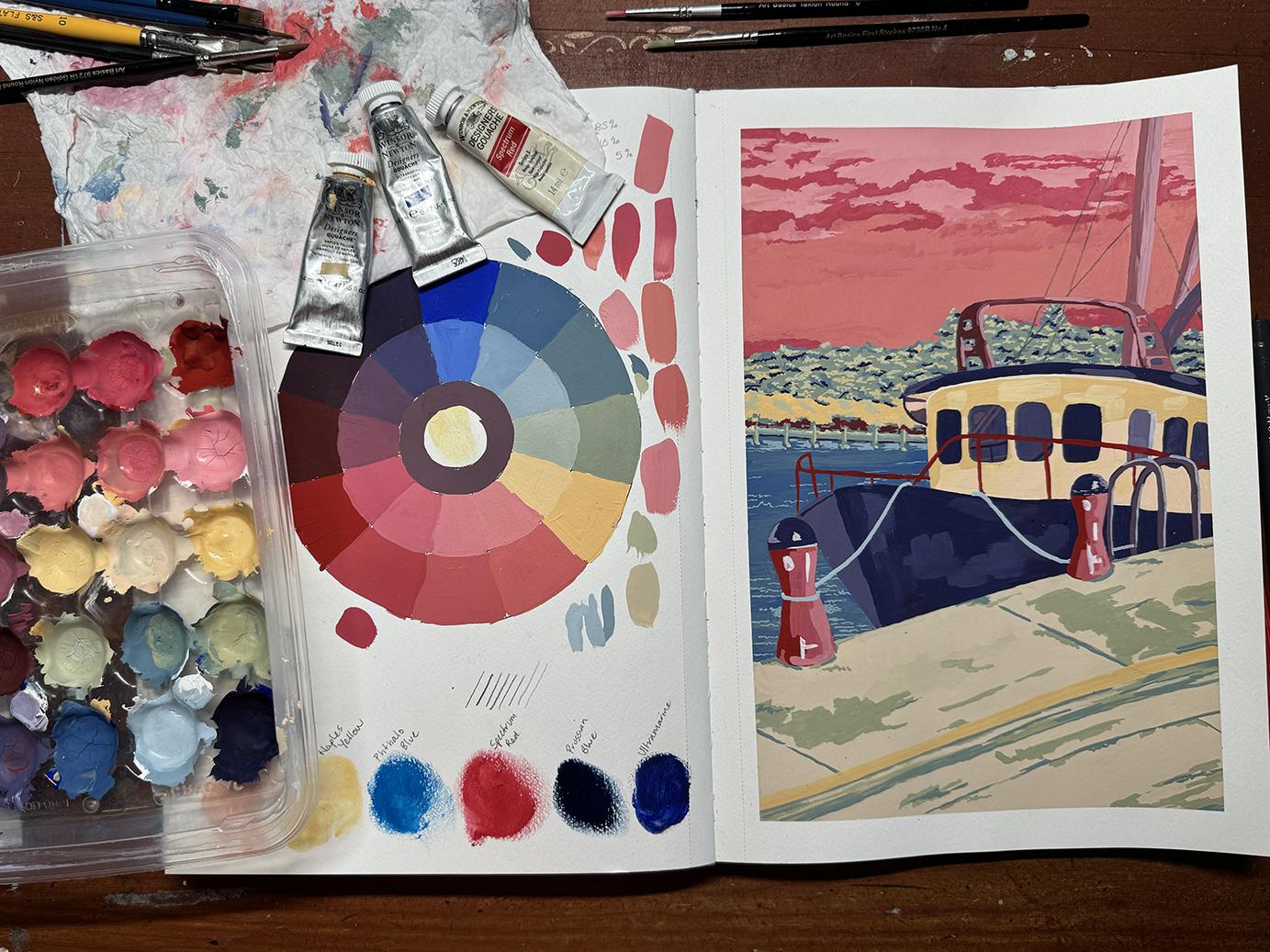
of gouache plus white. You will learn how to create a fun color wheel of all three
colors plus their tints, and then we move on
to this painting of a cute trawler in your
chosen three colors. And if I haven't met you before, my name is Jane. I live on the Gold Coast with my husband and two
remaining chatts. Have you heard of halts? They're the ones that are 20, but still living at home. Along with a dog, two
cats, three chickens, and about six avybrdsPlus I've got an awesome
veggie patch. I teach local sketchbook drawing classes here
on the Gold Coast. Grab your paint brushes and
your sketchbook and let's get into the art room. A
2. Project Description: Oh Once you have printed off your
color wheel template, we can get started. You're going to find this
color wheel template in your project
and resources tab. You don't have to know
your three colors yet. I will go deeper into explaining
that in upcoming videos. There is something so effective about only using
three colors and it actually takes a lot of decision making if you've got plenty of other colors
to choose from. I have done this method
both in Plan air, otherwise known as
urban sketching or in my studio simply
with a photograph. O.
3. Material List: I Alright, so it
doesn't look like there's very many art
supplies down in front of me, and that's because there doesn't have to
be with this one. I will explain in the next video what the
three colors is all about. But we are doing a
gouache painting today. So you will want to
have Guache paint. Watercolor it's not going
to work with, and acrylic. You could do it with acrylic, but I'd prefer you to use gouache and get to know gouache because as
I'm going through, I'm going to be talking about how Guache works, et cetera. And it works very differently
to watercolor and acrylic. So you will need to print
out your color chart. This is for three colors. You will need a sketchbook. So my sketchbook is A
four when it's opened up. And I've already done my little swatching there of
the colors I'm going to do. And then what was it
the Naples yellow actually leaked
out onto the page. But that doesn't
matter because that's where the color circle
is going to go. So that's going to go
there. We'll trace it on. And then the image of the boat is going
to go on this side. So this is a four,
like I mentioned, probably best to be a Coops. And then we've got
paint brushes. Now I've got some brand new paint brushes here that
I'm going to test. And these ones are new to me, so I will be testing them out. And I've got a selection of
other brushes here as well. You just need a selection. The largest one is a ten flat, which is not very large, but you won't need anything more than
that, I don't think. Then you need a palette. Now palette is
completely up to you. I love using these. Can you guess what they
are from? No one does. Whenever I hold a
gouache workshop, I ask people to guess what this recycled palate is,
and no one can guess. But unless you're a
vegetarian or a vegan, these are prepared meatballs. So I do make a killer
spaghetti and meatball. And I've just found the
trays to be amazing. So this is my tray, but you can use a
flat palette as well so that you can sort of
mix colors together, et cetera. But I love this one. And then, of course, you guash. Now, you don't have to
have Windsor and Newton. That's the one that
I have always used. There are plenty of
gouache out there. If you have some gas at home, I strongly suggest that you
use them just to use them up. Um, if you haven't bought gouache and you're
going to buy guache, just stay clear
of cheap gouache, like no brand and just cheap. Like, if it's $20 for
a set of 12 colors, please don't buy it
because like watercolor, gouache needs to be of am I
want to say a student grade, but more so a
professional grade. To be honest, these colors
do not cost too much. And this one right here
is a very old one, and it is still very,
very much usable. So that one would be, I'm going
to say over 10-years-old. These two aren't they
last a long time. You don't use too much
color out of them. So start buying a reputable
brand in your gouache. And apart from that, you need a water
bucket, of course. And that's about
it because we're actually going to try and not use a pencil to
sketch our sketch up in. We're going to actually
go straight into pagache. So let's get on with
the next video.
4. Choosing Your 3 Colours: Alright, let's get
into the fun stuff. The colors or I don't
know if it is fun. It can be a little bit
hard, to be honest. So what we're going to be doing
is choosing three colors, and everyone chooses
their own three colors. You do not have to find
what I've got here. And we're going to be doing a color chart of
the three colors. So there's a little dot to show you where your three
colors will be going. And there is mine there. And what we'll do
is we'll paint in each of these wheels here. Oh, pie of the wheel. We'll paint them in with
just those three colors. Then you'll mix the same amount of this and this color,
and it will go there. And then you'll mix
75% that color, 25% that color, and
it will go there, and you'll do the same here. So you'll do that for all three. And then these ones here will be those colors that
you've already mixed, and you'll go in
with a little bit of white and you'll
put the tints in. So we'll get all
nice little tints in there where those colors are. And it will be really
interesting to see what colors that you
mix out of these. I know that this light color because I
put them down here. This yellowy creamy color
and the ultramarine blue, which I chose,
which is this one. I didn't choose this
one or this one. That one I felt like we were
going to primary color. So I went with this
ultramarine blue. So I know that those two colors
are going to make greens. And so I can have a
little bit of green. With you three
colors. It's really hard to choose three colors. If you are fortunate enough
to have a color cube, I've got both of them by Sarah and A Clark. These are amazing. These are full of swatches with all different color
combinations and an image, as well to help you see the color palette that
are in those colors there. Now, obviously, we're
only doing three colors. So start with this one. I get a few out. There's
a good five or six. I'll just grab a little bunch of the cards, and
I'll go through them, and whatever colors I like in that little bunch is what
I narrow it down to. So I narrowed it down to three. I'll just cut that out the way. These two are very
similar in their colors, and then this one was
completely different. Now with this one, I was
going to go the green, the sort of burnt orange color. And the what would have
been my neutral gray. So they are the three colors
I was going to go with. But I just thought, I just don't really like
those three colors. I don't think they're
what I want for the boat. So I discarded that one. Then we got to these two. What I did with these was
look in my gouache pile, all of my tubes, and I do have many and see what colors
come close to these ones. And I did not have
a color that came close to either this bony color here nor this peach color
or this salmon pink color. I didn't have them, so I had to eliminate them as
one of the colors. But I liked the red, sorry, the red, sort of like
the deep red, the blues. I got these two blues
here and this blue. And the other color, which I couldn't because I
couldn't get one of these, I chose the naples yellow, which is this creamy
color down here. So they're the
three colors that I have come to from my little
color cube swatches. If you don't have
these and I don't expect many people to own them, you can go on to Google
and do a color swatch, and then you can go through options of
colors that you like, and then you have to
match those colors to your gouache paints
that you've got. But yes, make sure
you've got as close to the color options that you
want in your three colors, because when you look
at those ones there, that's what I had
in my Gase kit. Alright, so we will finish
this video and we'll come back and we'll transfer our color wheel onto
our sketchbook.
5. Transfer Colour Wheel: All right, we're going to do a color swatch onto
a sketchbook now. If you don't have a sketchbook or you're not working
in a sketchbook, just use cartridge paper,
mixed media paper. Try not to actually
use just print paper. I don't know if you
can pick it up, but this is a different white
to what I'm using here. So if you're going to
use a piece of paper, it is best to use another part of that
paper could be the back, which is the same color as
what we're working on because this is going to reflect
differently as opposed to this. And I have a good
example, just one moment. So this here was a color wheel that I did in
a blue, purple and green. I watched it on this
peach background, along with just on the
white paper because, and I'm not hugely
happy with this. This was done urban sketching
here on the Gold Coast. I ran out of time, but I
wanted to have the background. And everyone absolutely loved this orange sky, which for me, I just put a wash over the
top of it and was going to then put more color
over the top of it, but no, no one said do that. So we're not going to be working
on a colored background, but I'm just explaining
why it's important to do your color swatch on the paper that you're going
to be doing your painting on. Okay, so I did forget one thing when I went
through the materials list. You need a pencil to
do this transfer. So once you've printed
out your template, the color wheel template that is part of
this art project, turn it over, and you
should be able to see, as you can on mine, you can see the back of it. Now, we need to do all the pencil lines for this
color chart or color wheel. So get busy getting messy. There's no prizes
for neatness when it comes to this because this is how we transfer
onto our paper. We go over it, and
it doesn't have to be beautiful and neat, either. When you're doing
your color wheel, you can just paint in as you go. Alright, so I have done that. And then now, as long as you can use sticky tape here
or washy tape if you want to stick your page down so that you don't
move or you don't move it. And then it is just a case of going around the circles,
tracing them in. I'm not sure if you can see it. No, you can't my
circles are going down. Now, they are not perfect, and they don't
have to be perfect because when we get
onto the painting bit, Oh, that's really out of line. When you get onto
the painting bit, you will it won't matter so much that the circles are not absolutely perfect. Do put in those little
circles, though, the little dots as a reminder of where your
three colors are going to go. If you have got primary red, primary yellow, primary
blue. Look, look. You can use those three as
your three colors because you are going to get a
very colorful result by using those three colors. But if you have done
a bit of color theory before you sort of understand
what colors make what, then I'd love you to actually go outside of your comfort zone and do something
a bit different. So before I take it away, I'm just checking to make sure I can see all the pencil lines, which I can, so I can
now take that away. You can kind of see it there. There we go. I put it that way. Alright, and we're going
to have this damn naples yellow right in the middle
there, but who cares? Because I probably
will use that as a bit of a wash in the
background anyway. I don't know. So you don't have
to go over this. You can if you
want. I'm not sure if I did or not in this one. Um, no, I didn't can see a little bit of the pencil outline there. So no need to go over it. As long as you can see it, when you're painting,
that's all that's needed. You don't need anything
else. You don't need a black pen or
anything like that. Alright, so we are
going to get started on our painting in the next
video. How exciting.
6. Painting Your Colour Wheel: Alright, we get on to the
fun bit now of painting. So I've obviously put
my three colors down, got my paper towel handy. This we now don't need. And there are the three
colors ultramarine, spectrum red, and naples yellow. The one thing that I've done
that you don't have to do is put an outline around
your colour wheel. The only reason I've done
this is so that it makes it easier for you to
see what I've done. I've used a pilot pen, which is just a fine tip pen
I just have on the desk. So there is a chance
that it is going to um, run a bit, but it
doesn't matter. Now, remember, this little bit of naples yellow
leaked out of the tube. I better be careful
with it, actually. Make sure it doesn't
leak out again. So that is going to be
there in the middle, but let's just work with it. Now, the brush I'm using is a flat, and it's
a number four. So it'll be perfect
for going around here because that's
where we're doing just the three colors together. And then up here, it'll be fine like
that, as well. So not going too
big with my brush. In regards to the colors, as you can see, Ooh,
ooh. Where are you? They're just three little blobs. We can always add more, but we are going to be contaminating the
colors with each other. So, just add a little
bit that you can do. Now, the other thing
that's important, I will mark it on here. And again, you don't
have to do this in pen. You can do it in pencil. Just mark it on those
three to know that they're the ones that are
having the three colors without anything else in them. So let's start with our blue. I should have got some
white out, actually. I might add a little
bit of water to this. Probably was enough. My
bucket's off to the side. So make sure you've got
your water bucket as well. A larger bucket
is better because gas when gash in the water
gets dirty pretty quickly. Okay, I've just
grabbed the white. I forgot about the white. So we're going to just add a
bit of a tint to our blue. Not much. We're going to be doing
this all the time, though, so I'll just
leave the cap off. So take you've got put in the same amount of white as to this colour is
what I'm trying to say. So we get an even tint
throughout colour wheel. So even parts of each color All right. And then wash
your brush and just continue with the yellow, sorry, the naples yellow,
and the spectrum red. Remember, you're not having
to choose these colors. You can choose any
three colors you want. What gets really
exciting is when we get into these color combinations and see different
colours emerge. Yeah, so the blue
goes to light blue. The naples yellow goes
to a nice creamy colour. Red turns pink. Alright, so now I'll show you what we're
doing in these ones, and then I will just speed up for the rest
of the colour wheel. Just make sure you wash
your brush, nice and well, might start in this one here. So again, we're mixing even red and naples. I nearly forgot. Mix the same amount in here and then mix it
with a bit of white. So because I've got these little portions
makes it very easy now. This is where I'm going to
contaminate, and that's okay. I do feel like I need to
add some water to that. Oh, it's making quite a
pink color, isn't it? Mm. And more of a salmon pink
rather than a rose pink. By doing this colour wheel, before we start a
three colour painting, you get to really look at which colors you can place down. All right. So now I've got to wash the brush because I don't want
to do a tint first, but now I'm going
to do 75% spectrum. And only 25% naples yellow. So this was half and half. And these two are
going to be 75% red. That one's gonna be
75% naples yellow. Okay, so I might have to
put some more red down, and I will put that down here, and then I will just get a little bit, maybe
a little bit more. There's not a lot of
difference between these pinks, is there? They're kind of very much
all toned of the red. The red is a really,
really dominating colour. Not a lot of difference at
all between these pinks. That's good to know, though. It actually looks
better on the camera, as opposed to Oh, I
guess these are dry. If a gouache is dark,
it dries lighter. And if the color is light, it will dry sorry. This will dry darker, that will dry lighter. And so will this. This
will dry lighter. Getting my words mixed up there. Alright, so now we're on to
this one and then my bucket, which I'll just
bring in to shot. Is looking like a
strawberry milkshake, so I will actually pause the video and rinse my
bucket, and so should you. Whatever bucket you're using. Give the brush a bit of a chance to clean itself, as well. So this one is
going to be 75% of the naples and just a little
dab of the spectrum red. So we're going to take
pretty much all of that. I could have just
done it in there. But then again, no, I want
that to stay as it is. And then 75 25% of the red. And again, that red
is really dominating. Gosh, I feel like I should add some more naples
to that there. And this is what I love about using this recycled container is that it's got all
these little wells, and you can actually
put your paint tube up against the side of it and just wipe the paint into it. Goodness me. Amazing that I only
added 25% red. And yet it's really the same as adding equal amounts of it,
really dominating color. I wasn't aware of that,
and that's what's great about this is that you find out. It kind of means that our
palette is going to be limited, even more because we don't have a huge difference
in color range. We will see that
up here and here, though, with these colors. How are your colors going? I know the painting that
I did with the boat in the purple, blue and green. They were very, very
different colors. Okay, so that's that. I will pause this video, go and wash the bucket of water, make it clean, and
we will start. Let's go for the blue and
the naples yellow next. Alright, the color, sorry, the bucket of water
has been cleaned. Brush is nice and clean. And I might just
add a little bit more of the naples
yellow in there. That comes out of that
tube very easily. And yeah, I'll add a
little bit more blue. As well do it now while I can
ultramarine blue and cream. Let's put half and half. Equal amounts. And see whether the blue is
now going to dominate. Mm. That's made
of Marini colour. Mm. Kind of a grayish blue. Interesting. Add a little
bit of water to that. A a As in it really can't fight between the tmarin
and the spectrum red. Well, this is turning into a little bit of a greeny colour. Quite like it. Just
need a bit of water. I don't mind that colour. There we go. Yeah,
very different, very different to
the 75 ultramarine. Okay? And then I'm
just gonna dip. Mm. That's quite a big
tint. There we go. Probably I could have used
with a little bit more white. Oh goodness. I'll put it up here
so I can control it. Well, that wasn't in the plan. Look what I've done there now. Oh, well, Very nice. Really loving the colors
that we've got there. Okay, so I am onto the spectrum
red and the ulchmarin. I'm going to wash the bucket again because now we have
a blueberry milkshake. And we'll come back for
the last part of it. Very exciting. What a yummy palette this is
starting to look like. Very, very sorbet ice
cream and yum, yum, yum. Okay. So spectrum
red ultramarine. I have topped both of those up, and we've got two
little palettes left. So um I should have
thought about this. I'm going to do what have I got I've got six colors
to do. Oh goodness. Okay. I'm going to clean a couple of
the colors that are quite done like these two, because I need six, don't I? I've got two. I need four. So if I do these two, I will be right to
mix two colors there. Anyway, so I will do that now
and just pause the camera. Clean them up and get back. Sorry about that.
We are good to go. All I did was put
some water into those two little wells and then scrunch up my paper towel
and clean them out. So let's get into it. We're going to do equal parts, red, equal parts blue. And what I'm going to do,
rather than create a new well, I'm going to add the
white to these two. Is that about right?
Mybe a bit more red. This is where we're going
to get our darks happening. Deep purples. And to finish it off, I've got a Mulberry purple
going on that side. Okay, so I will just clean
this little well up. I'll show you how I do it. I'll do it with a bigger brush. Basically adding water to it. And then coming in like that. Then we get that good
old paper towel. It's nice and messy
and painterly. It comes an artwork in itself. Okay, so now we have to get even amount of these three
colors. I don't know. Like, because of
the naples yellow, I kind of feel
there's an affair. I kind of feel like it's
not going to be super dark, but the spectrum red and the
ultramarine might dominate. Make sure I've got
all that color out of that brush as
good as I can do. Okay, there's the blue
or the ultramarine, the naples yellow, and the red or I think I want
more red. Not that much. What am I going to create, yes, quite a light color. Mm. That red has dominated throughout
the whole colour wheel. And it has dominated again. With a splash of naples
yellow in the middle. And there we have three
paint colour wheel. Down there. What a beautiful
colored palette. And now we've got a grape, a grape milkshake happening. Wonderful. So now it is
time to start our painting. Now, in regards to your palette, if you go away after doing the colour wheel and starting
your painting later, everything is going to dry. Some of them will
dry with cracking, I'll just show you
another palette here. So this is a palette I'm using
for a painting I'm doing. And as you can see, it's some of the colors
have all crumbled. That just happens
with certain colors. This one here is board. You can see this
one or maybe not. It's all cracked in there. Or it has there, you
can see that one. That's cracked. But when
I go back to using it, you just add a little bit of
water and it will cream up again because it hasn't been too long since I've
actually put them in. Pardon me. So I was
constantly making colors. So I keep refreshing it. And I was only working
on this morning. That's why you can see a little bit of shine in some of them. They haven't completely dried. So don't worry if your colors
dry up in your palette, you can wet them with a little bit of water again and mix them up into a creamyness. I've got a little bit of colour breaking through here,
but that happens. That happens. Okay. I am
going to stop this video, and we will start a new one which will be the start
of our boat painting. Very exciting.
7. Sketch Trawler Up: Alright, so the one
thing I didn't mention in the materials list was some washi tape.
This is optional. So I am going to put a
frame around this purely because I don't want to
have to put a piece of paper underneath it and go
right out to the edges. If you're going to use
any adhesive tape, definitely washi tapes great. But if you don't
have washi tape, I recommend actual
watercolor tape. What's it called frog tape
or something. Hang on. I've just got to get
this. Take that lid off. But with the washy tape,
I'll measure it up. But then I have
to just put it on my clothes to just stop
having so much tack. Get a little bit of
fiber happening. Hang on, I'm gonna lean up to see where I'm
going with this. Okay, there we go. Don't let that distract you. It is kind of in the
color wheel, actually. Okay, so that's ready to go. Now, what I strongly want to
suggest for doing this is to not use the template to
trace up your artwork. I want you to be quite
free with it and sketchy. So I am going to
choose a round four, and I am going to sketch
up my artwork in paint. So I'll go go to go for a
color that I've got a bit of. I might go for this one here. I am going to add
water to it so that it really is watery because we are going to be painting
over all of this anyway. That might not be watery
enough yet, but we'll see. So I'm going to go ahead and
mark in important things. Now, remember, you've got your
grayscale and color image, which I explained earlier. And as I said, try and
stick to your grayscale one because we are not
painting a black boat. We will be painting somewhere in here. One of those colors. Okay, so just with where
things start and finish, we've got kind of there to not quite halfway,
probably there. There we go for the jetty, the top of the pylon here. This just helps keep
yourself loose and not getting lost in detail too quickly by doing it this way. Okay, so I'll just continue on. I might speed it up my sketch so that you can see
what I'm doing. And you can, at the
same time do yours. Now remember the
perspective of this. So it's going to be about
there for the second pylon. Don't worry too much about fine details that
you can do later, like the actual frame that
runs around the boat. That can all be done later. The boat is the main subject, so we definitely want to
be getting this right. A lot easier to do
this when you're not actually in
front of a trawler. I have done that. I have done a little
gouache painting of a trawler on the Gold coast, and it took me about
3 hours to do it. It was a lot of work. All right. So, I feel like I
have put in enough detail. If anything, my boat ended a bit before the actual
where the image ends. So but it doesn't look wrong. I don't know if any of
those three windows. The second one maybe
is whether that is a door or it could even be
this one that is a door. But in our boat, you don't enter from this side. You enter from the
back, let's say. I can see in the colored shot, actually, that is a door,
that first one there. So I may put a bit definition
in around there afterwards. But in regards to the railing, I'm not going to
worry about that yet, because that is one of the
last things that we'll do. Also, the rope that will again be one of the
last things that we do. Up here because I've
come short of it. I got the angle wrong. It's really important to look at your negative space and see that that was not
coming up like that. It was going out that way. Your negative space in here
also will really help you. So the negative space is the space that surrounds
the positive space. So the positive space is this
bar that goes across here, and the negative space you can see the mountains
in the background. So you can see how the
angle here is quite tight, and then the angle over
here is quite round. There's good negative
space between here. And I think that's the best
I can do for negative space. I did look at these ones here, and that this rail is slightly higher than this
rail. So get all that right. And here, also, it's not a
good idea composition wise to put a line right
in the corner. So even though well, it
wasn't in the corner, but make sure that it is just either below or
above the corner. You never want anything going
into the edges as such. So I will start a new video. That is the sketch done up. I'm happy with that. Now we're getting into the actual painting and what we're going to be
coloring with our gouache. How fun and exciting.
I can't wait.
8. Trawler Part 1: Alright. It's where the fun
really starts to happen. We've done our color wheel. We have sketched up our boat. Now, one thing that I
want to point out to you, if you look at your
grayscale image of the boat, things like the tone
or I should say the shade of this window and
this window are similar. But these two are not. They are lighter, and you've got quite a lot of reflection
happening in this one, little reflection happening in this one, where
the rail will be. And then these
three on this side are all different
shades as well. There's even a little
bit of shading in reflection up
here and along here. Down here, you've got this color is very
different to this color. So we're not going
to do something like a red bit here and
a blue bit here, but it will be more so if we
chose this dark color here, this side is going
to be more closer to the tint that we've got. All right. And the
other thing that I want to point out before
we get started is even though we've got you should hopefully have some
nice big flat brushes, we don't want to fill
in a whole area in just one color because
that tone changes. You can see that it changes. You'd be looking at
the grayscale image. So you're wanting to do some and then put a little bit of tone into it and do
a little bit more, a little bit more than this along here,
which is the gutter. Again, that is darker
than these two. And then you've got some
lines in there as well that you can put in afterwards. Alright, so we're
not going to be doing We've even got some
lovely clouds happening. So, we're not going to be putting in one big
block of color anywhere. The only, I just won't happen. This is A four, obviously,
that I'm doing this at. If you're doing A five, then
you may have had to reduce that color wheel down a little bit to fit into
a five. I'm not sure. Alright, so I am going
to just get started. I tend to work all
over the place. I'll start somewhere,
change brushes, go somewhere else,
and just keep going. You might like to start at the sky and work your way
down or work your way up. If you're left handed,
you might like to start over this side and
work along that way. I am going to start
all over the place. So I have to decide what
color I am going to do. Like the tones, the dark
sorry, not the tones. But sorry, yes, the shading. The tints and the shades. I've got to keep
remembering that. The tints is all here, where we've added white to it. And the shades we don't
have we haven't done black, but we don't need to do black.
I didn't want to do black. That would be
introducing another tube of paint, which we're
not going to do. Alright, so I have
to decide first up what is going to be
the color of my boat. And I'm really liking that 75% ultramarine and 25%
of the spectrum red. So I think and it will come out quite dark. It's
not going to be black. I don't want it to be
black, and it will also be the tops of the Oh, gosh, what did I
call them before? Those things. I can't
think of what the word is. Okay, so let's start. You start on yours. I will keep the camera rolling
so that you will see it. I might speed it up. And,
yeah, happy painting. Let's get started with this. One thing that I will add is the consistency of the paint. So when I talk about one, two, and three, one is absolutely
no water on your brush. Three is quite loose and watery, like what I'd done
for the sketch, and two is where I would
normally sit with a painting. Which is what I am
doing for this. It is now going to be
twos and twos and ones, mainly twos, and then
there'll be like, just little light washes of one, which will be no water added. It will just be straightwh. Okay, so what I'm going to do, I'm going to keep going on, but I'm not going to
record it because A, I'm not the fastest
one to paint. And to just speed it up doing what I'm
doing is not really teaching you anything apart
from watching me paint. But you're getting
on with yours. So I will just keep jumping in and doing a little
video as I go along. Okay. Jumping in to
show you where I'm at because I am going to be finishing up for
the day very soon. So I will do maybe a
little bit of the trawler. I still haven't worked out
what color I'm going to use, but I'm thinking maybe the
tint of the yellow ochre? No, naples yellow,
Naples yellow. So I'm thinking
I'll go that tint. I didn't want to
go white as it is. And also, these pylons
are not white, either. They are that blue, but I don't know, not so
keen on them just yet. But in regards to the palette, so I actually only do my Skillshare recordings
on a Tuesday, so it's going to be another week until I actually
come back to it. I will leave it as it
is. It will dry out. And like I showed you
with the other palette, when I come back next week, a week isn't enough
that it isn't going to just turn into a nice
creamy consistency again. So I will just leave
the recording running. I've just cleaned out
my bucket, as well. But I don't have much time
left before it gets dark, and I've got to go
up and put the choks away and things like that. Get a load of washing in, all those kinds of fun things. So I'm thinking
I'm going to add a little bit more white
to this one here. I've been using these two here. Um it's I'm going to
go very light color. I might start with the white and add a little
bit if I need to. Um, I might go for
this brush this time. Oh, yeah, I really
like that color. I'm just stirring around reactivating that creamy color
that was underneath there. Grass dries so quickly. It's not a very hot
day today. 26 degrees. I don't know what that
is in Fahrenheit. I'm going to wash my brush because I'm going to dip it into one of the pinks to add a little highlight
of pink in there. Yes, I don't know what
that is in Fahrenheit, but it was 26 today and
not very much humidity. So paint is drying
fairly easily. Not put much in there. It's kind of come out
to a fleshy pink. So it might be also good to note that down there that that is white naples spectrum. And then I'll put like a 5% 10%. Oh, what's that 85%. Okay, so that way,
I can come back to it if I need to mix it
again, which happens. Um so I'll leave that there. And do I like that
color? Not really. It's drying kind of
dark and salmone, so I don't know if I want to
add a bit more white to it. Um, the more white I add, the more paint I've got to use. Go on. I'll go in. It's going to get used. So yeah, we've kind
of jumped in between this color here and put
a lot of white into it. Yeah, that's a better color. That's going to
dry a bit darker. My brush has got a lot
of paint on it now, but I'll see how I go. So the tones that
I'll probably do for this is going to be bordering
on the pinker side. I hadn't really thought about the fact that I hadn't
used any red yet. Okay, there's not much
difference between the shadowed area and
the lighter area. So when I come back
to it next week, I will probably
darken this area. It will probably go a little
bit more salmon color. I'll have to just add a little touch more
of the red to it. I'm quite happy with the
colours so far that I've used. I just don't know
where I'm going to put a lot of these reds probably in the
background along here, where there is actually red pylons that are in
the background there. So we won't get too much
of this actual color, but we are using all of
its tints and shades. Okay, so I will just
leave that to dry, clean my brushes, obviously, and I keep my brushes that
I'm using together with this, so I won't use these brushes on any other projects I'm doing. They are for this painting. So that's all of these ones here and the two in the bucket. Alright. I'll see you
in the next video.
9. Trawler Part 2: Hello, and welcome back. As I mentioned in one
of the previous videos, I only do my Skillshare
work on a Tuesday. So it has been a week
since we've done it. So the palette has
dried out. Like. Creep it up to the camera. No. It's all got
little cracks in it, which is all very
normal of it to happen. The red is almost
going to crumble, but that is not a problem to have it like
this. It's only been a week. All I have to do is add water to those little puddles, the wells, and that color will start to
have that buttery or creamy, I should say, creamy
consistency again. So not worried about that. I've got more tubes of
paint there as well. One thing I'm going to
do to my painting is change the color of the what
are they called pylons. I don't know what
they're called. I'm just going to
call them pylons. I'm going to change that to red because without realizing it, I just was not
bringing red into it. Now, I could do, like, a really beautiful
sunsetty image up here, but it needs some of the red, the spectrum red by itself. So when it comes to gase and
putting layer over layer, I have applied this quite thick. So I have to be really careful. I cannot put a watery
wash down on top of this. I'm going to have
to use the red. I will probably
just put a little bit more into here so that it is fresh and apply it immediately. Not going to worry
about the tops. They can stay that color, but this has to be applied
immediately and quite thick. So I will do that now while I've still got the
camera rolling and then continue on a bit off
camera and jump back on. It's a bit crumbly.
I've put it all there. Anyway. 2 hours away. Just get rid of that
onto the floor. And what paint brush
am I going to use? I'll probably use this one. Yeah. Yeah, I will do. Okay, so I'll put a little
bit of water to it anyway. And that color. I don't know if
you can see that. You can see it's the cracks
underneath. That's right. I don't want it to be any, um, thicker than what it is. It's actually quite a good
consistency to start with. And we'll go straight over. I'm gonna need a
thinner brush, too, I think, to get
into those corners. I'll leave. I don't
know, you can see it. There's a little glow of
glue coming through there. I'm just going to fix that up with one of
the fine brushes. Likewise, for this one. Straight away, I feel like that. Even though it's
quite dark because it's going down on the blue, it still it feels better
to have a little bit of red coming into the
painting already. Alright, I'll stop
with that brush and go to I should be using
one of my new ones. Not yet. Not yet. Oh Okay. And I'm just going to put
the tiniest little bit. I'm going to grab one
of these new brushes out a tiny bit of navy
blue just in there, four, because it's not giving enough shape to
this pylon that's there, so it needs to have a
bit more shape back. Um, I will try this
little one here, which is zero, round zero. And oh, that might be a problem. Trying to add water to this
color with a zero brush. That's right. It's going to have enough
there for what I need. Like I said, even though
it's only been a week, it's not enough for
this color to really go rock hard and not be
able to reactivate it. A week is not enough. It'll dry immediately, but
it won't harden immediately. Okay, that's better
there, and that will dry to the same color
as this one here. All right, so I'm going
to keep going now. I think I was at the first layer of this when I
finished last week. It hasn't really
for the shadows, it hasn't really
come out so well, so I might start
working on this. I might put down the
blue here first. And I think I was going
to say I'd do this red, as well, which I might do, because I do like
the thought of doing the sky to be sort of like
that warm sunset look. But this can still be red as well if I choose for it to be. Alright, so I'm going to
keep going with this, and I'll keep the
camera rolling for a second before
switching it over. Just bring some
highlights into here so that it does look like
it is wrapping around. That is still wet there. So I touch that. Actually, I can't do
it at the moment, because it is still
wet and if I touch it, it's just going to mix rather than sit on top like
it did this end. So I might go under. But that was going
to be the peach. I'll stop the camera again now, and I'll come back to you when I've done
a little bit more. Happier with them now, not happy with the
color of this. So, looking back
at my color wheel. I want to include a bit
of the naples yellow, because it's really not
a dominating color. Like you just don't see it appearing both either
with the blue or the red. So I'm going to do just
straight naples up here. And then what's not in shadow
is going to be lighter, but I'll do it here. So I think this was originally the tint
for the naples yellow. So I'm going to add
more white to that, possibly a little bit more of the naples yellow, and use that. But for now, I'm
just going to go in with the same brush
that I was just using before this one here and just
give that a bit of a mix around there was a bit of
blue sitting in here as well. So it may add a little bit
of a cooler tint to it, which doesn't really matter. It feels quite thick. I can go in and do a full
color change of this now. And then I need to get on with the background just
because at the moment, I've got a lot of white
happening here and here. And I just don't
feel like I'm using the color wheel as
much as I should be. I'm not sure if you can
hear the birds outside. It is a beautiful day
here on the Gold Coast. We do live in the hinterland, and the birds are
so happy today. They're just all singing. I Now, I do have to leave at 11, so, and I'll come
back to it later. So again, the palettes
going to dry out. It's not going to be a problem because it just
reactivates so quickly. Okay, so I think I'll
finish up there, kating that up a bit. I'll finish up there,
and when I come back, I will have done the pale
color there as well. Okay, I'm back from
my appointment, and I have just had the
biggest sneezing fit. So if I sound blocked
up, it's because I am. I've got my tissues off camera, so I may need to pause
and blow my nose. Anyway, what I
wanted to do here, I'm going to show you my phone. Tommy Tommy Kim art. This is a photo that
I've saved of his. I was looking for
boats painted in Gase, and I really he's using Hiy HIMI GuachO at least
it looks like it is. Maybe it's not when I close up. But anyway, I don't
recommend HIMIGuach. Go for the tubes, please, because they are not airtight and they go
moldy very quickly. That's what I've heard, anyway. Um, it's a bit of
a gimmicky guash. But what I love about this image is how messy it's been painted. And when you look at that
and then look at mine, it is just so neat. So what I want to do now, I've got my smallest
flat brush that I own. Oh, that's a lie. Hang on. There is also I just
need to put my phone down. Make sure I don't put water on it. There is
this one as well. I think this one
came. It's bendy. So it came in one of those silly little
cheap kids arch kits, but that brush is
actually quite flat. It's not round, even
though it looks it. So I may use that one again. But yes, I'm going to
mess this up a bit here, which is going to
take all of me. It actually looks like you could almost say that it's
the boat that we're painting other than
actual image is black, and this one is the navy blue, but it's very close to
what I've done here. In fact, the whole palette is very close to what I'm doing. So I just need to mess
the cabin area up a bit. I have put in a few
little highlights already into the windows. The windows are not finished. So again, need to do that, but try my hardest, and it is hard for me. Oh. Oh, it would be great. Oh, why can I do this? Oh, because I've saved it. Um, look how messy it is. And look at the
brush he's using. That's another thing. I don't have one of those fan brushes. Big brushes, using big brushes, although he's doing a larger
painting than I am, I think. So let's get the windows looking messy like
that Tommy Kim art. I probably now follow him. I probably saved. Oh, no. Following. I am following him. Alright, so what I've
done is I've taken out a pink well there because I've got all these
pints happening. I don't need all of them.
Taking that one out, I want to do a color that is similar to that's full
naples that is with white. So that's this one here, and this one is here. So I'm going to just do another naples and just add
a little bit of white to it. And I should go to my
really hard white. I've got a really hard
tube of white here. The other one comes
out really quickly, so I don't want to be too much. That will do. Not bad thing to have a hard white at times. So I've just got to put water
to that to bring it down. And mix that up. I may
not look too different. Let's have a look. Yeah,
it's a middle color. So if you look at
your reference, there is a bit of not cat, a shine happening here. That is drying and you
cannot even see it. So I need more white. I got my paintbrush in my teeth. Alright, I might
just cut the video here and I'll come back
when it's the color I want. Okay. I have just
tried another one, and it has gone down. The problem I've got with this area is I've put a
lot of gase down because I changed the color from
that salmoni pink to this real naples yellow. So I do have to be careful
with what I'm doing here. I'm trying so hard
to mess it up. I'm not someone who
easily messes up. The artwork. But
just keep looking at your reference and
squint your eyes if you have to to see just I think I've gone
too far with that now. No, that's okay. That's right. So I've just mixed
up that next color. So I can use it. There's now three
Naples colors that have been mixed here. No adding anything else to it, although there was pink in that, so that's why this bottom color does look a little bit pink. I don't know if it
does on the camera, but it certainly does for me. Wow, I'm so messy. Okay Okay. I think I'm done
with my messiness. See how that goes.
I'm going to move on. I am also deciding that this
top rail on the trawler, I'm going to make this color. Because, again, you got to be conscious of what
colors you've got. I don't have a palette
for that color, although that could
be it with the white. Looks like it, so I might add a bit more red to that color to bring it back to there
and a smidge of blue. Smidge of blue a lot of the red, and it's got that
white in there, so it might be a little
bit lighter than that. I'll turn the camera
off for this because it may take a little bit of time
to get that color right. But then I'm going
to go onto here. And then we've got the poles. The mask. The mask? Yes, the mask. Let's just call this
the mask, my goodness. Alright. I'll come back when
I've probably done that. But yes, just be really
conscious that you're wanting to try and use all
of your color palette. Even actually, that
color is not too bad. It looks like it's
got a tint in it, but I think it's the naples
yellow that's doing that. But no, I want to
go for that one. Alright, I just thought I'd
flick the camera back on. I mixed this color a good
probably 80% red, 20% blue. It still has got um a little
bit of the tint in there, but it's really not enough to be making too much
of a difference. It's looking very
similar to that. I do have to go through
here and put some tints in, probably add some
more darks to it, as well, because this
side is in shadow. And the other side is going
to be a tint of that, which I might just go
straight into there. Just be really aware
of where light hits and that it
changes the color. I have to try and make that be the back, that be the front. Um, I can keep going. I can keep going down to here. But then the rest of it
has to be that tint. Oh, dear, my nose
my nose is running. I hope I'm not getting a cold. I don't feel like
I'm getting a cold. Okay, I need to sin it here, go along here. And down here. I think I might make the mask
to the same colour, though. Otherwise, it's
too much going on. Or should I make it white? Mm. I might. I might make it a
lighter tint of this same as what that is
going to be, actually. Yes. So what I'm gonna do, I'm
going to put in the mask here, and the rest of
it will be light. Mom Then this one, this one's dark. I might make that
one that dark blue. This one is not I haven't
really placed it well, but it is also going to be the same color
as the other one. Okay, so now I'm going to mix more of this in there
and repeat throw down. I'll keep the video running, but I'll just put
some music to it.
10. Trawler Part 3: Alright, I have done
that little bit there. I was about to do the tree
area with the color mix here. But then I thought, if
you look at the trees, they're all very
scattered along the top. So I think I want to get
the sky done beforehand. And like I said before, I'm not going to
go with a blue sky because that would
be somewhat boring. I'm going to go
some sunset colors. So probably down here. We'll get some sunset colors. There is clouds there. So I have just wet
one of the mixes. I'm not sure where it was. It's probably here or here. Um, I may as well just paint
it all in this pink and then start to go over it with a couple of
different shades of it. You can kind of paint
messy with this because the brush strokes
don't really matter. It's quite watered down, too, so very thin. Might even run out of it. I've got a painting a bit
of that mask where it went a bit wobbly
as well along here. Okay, that's running out. So that wasn't intended
while I was recording. Sorry, squeeze my face
into the camera there. And Alright, so I'm going to just mix up
a bit more of that color, and I'm really kind of out of time for my Tuesday as well. So this is where it comes
into a really good reference, like, looking at
the color wheel and a color that was mixed
over a week ago. I'm going to put red and a
little bit of maples in there. Just put my brush back in there. I'm not going to put much in
the tiniest bit of maples. Remember, the red
has been really, really dominating I still the color on this. It doesn't matter
if it's going to be a little bit different
to the color that we've got because the sky colors are going to be very
patchworky as well. Yeah, that is a darker color. I'll just add a little
bit more naples. Got my brush between my teeth. Looks like I'm
going in there with a smaller brush. Or swap now. I can't find the brush. Also going to turn
an upside down. So it's a bit close to me, and I'm not leaning over
to get to these lines. O Well, really went over then. Sometimes you'll find
your brush is just on a mission to not go exactly the way that
you want it to go. And that's what just
happened there, but it's not a big enough error. It's probably what happened
with the mask to begin with. Oh, God I've just
gone over again. Wow. You might even need to go to a finer brush
for this little bit in here. Now, of course, you're
doing your color palette. If you haven't got these colors, everything I'm referring to, you're referring to,
in your own palette. I'm looking forward to seeing
people's results, as well. All kinds of different colors. It's a fun way to paint. Breaks up the normal Okay. All right. That does not matter that that is
thicker than that. It is just going to end up being nice patchy clouds anyway. While the paint is
wet and watery, I'm just going to
go over it again. Hot summer skies. There we go. Alright. Okay, so
that's all I'm going to do today in my session. I try and keep my sessions
for Skillshare at 2 hours. So it'll be interesting
to see how you're going as well and how much
time you're spending on yours. It's always a great idea to actually note the time
that you spend on a painting because quite often you'll spend a lot
more time than you think. And you'll think, Where
is all this time gone? But you're painting. So it's an joyable task. Um, watch YouTube, listen to your favorite playlist.
Just enjoy it. So I will see you next week, and we will be tackling
the sky, the trees. Looks like I'm not
putting anything in the background there.
We'll edit that out. Like on the trawler, I've edited out the
little satellite dish or something that's on the top there. Not putting that in. I will put the rails in. I will put the boat ropes in or put a few of
the finer lines. I might do them, I don't know. Might do them with
a colored pencil even because they are
really fine lines. And I've got to
decide what color I'm going to do the
robe or the jetty. Should probably go
either pale or pink. Or this green that's
going to be in there and make it
like a real actually, like this one here, which
is kind of like quite gray. I could even go into there and go there or even these ones, the three colors together
and add a tint to it. That might be nice.
Alright. Well, I wish I didn't have
to wait a week, but I do because I'm really
loving where this is going. Alright. I'll see you next week. Or, hello, another week has passed since I have
been working on this, really liking where it's going. The palette has all dried, but none of it has
really crumbled this time, which is nice. We've had extremely
hot weather here, but there hasn't been humidity, which we will get in
another month or so. An interesting thing
that I've done here, which is always a
good thing to do is either at any stage
of your painting, hold it up to a mirror or take a photo and have a look
at it, mirror image. If it looks off, then it generally is off
on the actual painting. So this to me doesn't look off. I'm pretty happy with
how it's looking, in regards to where I'm at, but it's really nice to
be able to check that. So I'll just, maybe I
won't just leave it. We'll do that. Okay,
so do do that with any painting or drawing that you're doing
because it really helps to see if you
are out somewhere. So I'm going to continue
on with the sky first. I want to do the sky and finish
the sky before I get into the land behind because there's trees that will go up
into where the sky is. So I cannot remember
what colors were what. So I'm not sure whether this was the color or this one here. So I'm going to just wet
them all and then test them all out on this bit of paper here. That's
what that's for. I'll keep the camera running
while I do this because it's sort of if you've
taken the week off as well, you need to see where what
colors were for what, if you don't document
down, which I did not. And I reckon that is down here. It looks quite dark, so I don't think
it was that color. Might try remember not to
put water over the top. See, that one looks really.
Don't put water over the top of your painting because if you drop some paint on it. I'm gonna try that one. I don't think that's it either. It could be that one.
There's a lot more paint in that one, I'm
gonna go that one. I'm gonna go this,
which would be a little bit of the maples yellow and sort of half strength. Because what I've got
to do, if you look at the tone on your black
and white gray scale, the color at the bottom of the sky is different
to the top of sky. The color at the top is
a little bit whiter, but then there's a darker
cloud going through it. So I want to just neaten this up because it's
a bit patchy here and here, neaten this up, then put a lighter color
in the top there, and then put the darker color. The darker color can be
maybe this one here. So I want to avoid doing
that one straightaway. Definitely want it to be sort of over here so that I can put those darker colors in and
you can put that lighter. You can tint it to very light. So I'm going to add a little bit more of the naples
to this color here. But you will do to the color scheme that
you're working with. I do have a cat that
lives in this room. So if you see me
picking at the paints, that is the reason why. I'm going to be changing
the color again now. That red was very dominant. I don't know if I want
much of that going in. I might put a bit
more naples in there. I kind of want this to be the last coat of
this color, too. It doesn't really matter if
it doesn't match what I've got now because I'm
going to cover it again. It looks quite light
now, very light, but it doesn't look too bad
against that. Bit lighter. I put a ton bit more red in We have got a
rainy day today, so it might pick up on
the mic that it is, we've got a bit
of rain happening outside. I think
I'll leave it there. As it dries, it will dry
sort of to this color. Yes, so you may hear the rain hitting
the deck out the front. The gutters have never been
good just outside my door. Okay. Okay. Okay, so that color is going
to be along the top. We just need to water
it down a little bit. You don't really need to worry about finding where
it will join. I just need to change brush. You don't really need to
know where it joins here because we're going
to have clouds that actually connect
the two together. Keep looking at your
reference to see where where the dark and
the light sort of meet. And you could be on
a bit of an angle, too. That's what I
should have done. It tends to be lighter up
this end than that end. So it's a bit late now. I've already put the color in. Oh, I was a bit messy then. I'll come back to it. That should dry flat. If it doesn't, we're going to have to just put
another coat in. Okay, so now we
need a dark color. So we could be
going for this one, which would be we want sort of Almost I'm going to add a little bit
of red to this one, and I think we'll
get around there. So with these clouds, um, I'm toying up whether
I stay with this brush. You've got to make
it look like clouds. You can't just paint
blobs of painting. I just don't know whether
I want that brush or not. Or whether I go a
thicker might go a thicker thick round,
so this is nate. Okay, so you can start playing with your
other colors now as well to make them all match up. I'm going to put
some darker down here because it
actually es darker down there and then match it up with this color
and this color. But I would use around rather than a flat
for all of this. So I'm going to keep
going with this. I might not record at all, but you can see what I'm doing. Bringing the sky
colors together. Round brush. Biggest one you've
got or size eight. And, um, you just keep
merging it all together, and it will just start
to look like a bit of a cloudy day. For mine, it's probably
more of a sunset. Alright. I'll be back with
its finished result. So I'm going to
keep moving on now. I still want to do a
little bit in there, it to dry and see how it looked. But down here where
the trees are, I'm not going to touch again. So I'm going to move
on to this area here. We've got trees up the top. Then we've got a jetty, which I am going to include, but I'm not going to include. There's a boat right on
the end of the jetty, so my jetty will stop before
that boat comes into view. So this is I'm going
to work my way up, but it is sort of delicate work. So I'm probably
going to be using what have we got here a four
and a two mainly for this. I may do a little bit
of flat four, as well. It's gonna be real patchwork,
messy and patchworky. I'm going to start
with the jetty which is sort of this
greeny color here, which I don't think I've got. So I might have to
make make it in there. I'll just let the
camera roll for a little minute so you
can see the idea of it. Okay, I'm going to continue on, do these trees, planning to
do them this color first, and then introducing
a dark color. I'm not sure if that dark color is going to be here or here, because that just doesn't
feel dark enough to me. And that is just too blue. I prefer this color here, which has got a bit of
a spectrum red in it. Um, so and then it
will also go up towards or above
where the skyline is. So that sort of,
like, marries up. So I'll turn the
camera off for this and show you the results when I finish and explain
anything if I have to.
11. Trawler Part 4: I just wanted to hit the
record button again. So I have put this
color in as the trees, and now I have mixed probably
close to this color. Now, to go through, I kind of resisted this because it's far too
different to that. It's just there's just
too much of a jump. So trying to go for this color but have probably got closer to this color,
but that's okay. If I need to make it darker
again, I can do that. Um, so this is a shadow color. So it's really just you just
dotted it around lightly, don't go too hard with it. Also changed the
shape of the tree. Didn't like how it
was sort of like, flat and poking out. But you can also have some of this darker
color poking out. Just keep looking at
your reference image. Alright, so you kind of get the gist of what
I'm doing here. I'm going to stop
the recording again. Just paint in shadows and create depth is what
we're trying to achieve here. Enjoy. Okay, so it's actually
been a couple of hours since I last did this. So I just had other
things to do. But that's a good
thing about glass. You can walk away from it and then just keep going with
it when you get back. So I've just cleaned out a well and created
a new color here. So the color that I'm
trying to create is for the highlights in
the trees and sand. So it is kind of this color, but more white in it. So there is a tiny little bit of blue sitting
underneath there, which I will now mix up. That naples yellow is such
a weak colour compared to the what's it? The ultramarine blue
and the spectrum red. Like, it's got the
tiniest bit in there, but you can still see
it's got a blue tone. To that color there. It's pretty much what I want because I don't
want it to be. That's beside the dark color. I don't know. I didn't put down
the other color, but yeah, I'm going to
go ahead with that. And just in the, like, the top of the
shadow area is where the highlights and also
in the sand dunes. They are a lighter
color than um Sorry, I can't talk and paint
at the same time. They're a lighter color than this color here
that we're using. So we've got a few sand dunes, bit of sea grass, I guess. Anything that can be
around the saltiness. The rain has stopped
for a little while, but honestly, it has
not stopped all day, but, yes, it's just
taking a little break. And I will just go through this and add those
highlights pretty much where I guess I can do a
few just randomly, as well. I wanted to do them
above the shadow areas, but I don't think it's
really going to matter. When you look at the highlights, there is a bit of that
mid tone in between. Okay, so I'll finish
off this area. I've got a problem here. So this rail now has to stay, but it kind of ends and you
can't see it through there, so I need to go back onto that and put some
purple in there. And then just improve the mast, do some stuff to the boat, finish off this here
and also do this here. But I'm really loving
what's happening. When I get down to here, I'm going to be going lighter
than that for the pathway, the Jetty, the concrete jetty. Anyway, I will keep going. I'll leave the camera
on for a little minute. But I'm pretty I'm being
pretty repetitive as well. Right, so I haven't got too
much time left for today. I'm absolutely loving the
colors of that palette, though, aren't they gorgeous?
So, what have I done? I have done what's
probably enough in there. I would like to add
maybe that dark, this color here, may still
do a tiny bit of that. I've gone over the mask
and I went too far again, so I had to bring it
back and bring in a little bit of the sky again. I've moved this mask into view
through those holes there. I'm just going to quickly
do now is these rails. So I'll have enough time
to get on with that. I'm just looking at the
grayscale image for this one to see where
those darks are Things like around these windows, I could put a bit of pencil
and I may do that anyway, and I can improve these as well with a bit of
colored pencil. I mean, I'm trying to not make
it too detailed, as well. You may not get as detailed
in there as I got. So I need to know when
to just let it be. Um, I did just see the first step. Now,
where's that going? There to there. Mm. Okay. I'm gonna put that in. Bit more Or thicker, I should say. All right. Now, this dark line
along here will end up being probably should
have been boat. I know. It's got to be part
of what's going here. So that will stop this. It won't look so bad with
this bit going there. Alright, I am going to have
to sadly give it a rest now. But what have I done today? I've got the second
layer over the sky, and I'm fairly happy with
that. I've put that in. I've done the jetty
in the background, and done a few little
bits and pieces in there. So that's another couple
of hours, really of work. Anyway, that's
good. It's all fun. It's not work, is it? It's fun. And I'm really loving it. Really, really loving it. I should show the color
wheel there as well. The other reason why I want
to do the Naples along here is because you've got that
equal connection of the red, the blues, and then the creams. I would look would look wrong to do it in the blues or the reds. It just needs that light
on the bottom there. Okay, well, I will
be back in a week. And for you, it'll probably
be the next video. Enjoy.
12. Finish Trawler & Wrap: Hi, everyone, and welcome back. It's another week that's gone
by since I've done this. So I'm going to get onto the
dock or the jetty of this. Now I want to stick to the
naples yellow, mainly for it. So what I've done, I
didn't want to just go light maple, like naples. I wanted to add a little
bit of the blue into it. So sort of like roughly
between here and here. So this one was
quite like naples, and I've just wet and remixed or reactivated
this very pale, sort of like an avocado green and added a little
bit of it to there. So I haven't actually tested
that color, but very nice. So that's what I want to do. So I'm going to do that here, also in here and then here. Then for it to go darker, I will shall I add a little bit more of
the green to it, possibly. I want that yellow strip to
be just pure naples, as well. So yeah, I might have
to go for, like, a bit of a darker for where it needs it along the gutter
there and everything. But anyway, we
shall get started. So, yes, it's been another week since I've done
any work on this. I'm going to have to
go over the top of this couple of times to
knock out that dark purple, but I might be able to go over it here and I'll
know where it is. So let's hope that I
finish this today. It is going to be a broken two
hour session for me again. Just child commitment. Oh, we can see that that's
reactivating there, so it's actually turned a little bit more of
a purply color. That is fine on this coat. What I want to do while that
is drying is going into here and I mentioned that I want to add a darker
color behind there. Now I'm wondering if I do
or not, because if I do, it would be this dark purple, and would it blend too
much into the boat? No, I think it'll be fine. I just feel like it
just needs a couple of little dark areas in there just to give
it a bit more depth. So I will let that dry. I will reactivate a should be
a small I'll go this brush, and pretty much it's
gonna be this one here, which would be this color here. So I don't really need
to reactivate anything. If I went, No, that's a tint. I could do that one there, which is possibly close to that. I think I'll just stick to
that. So I will do that. Hope you're getting on with
your painting as well. Um, and I'll just
leave the camera rolling for a little bit and then come back to you once
I've done a bit more. I Okay, I feel like I'm coming to
the end of this project. I put a little bit more
depth into the back there. I don't know if I
needed to do that. I don't know if it really helps
with the depth. Not sure. So I've been back
here doing this. I put down that first color, and then I mixed a little bit of naples into what was
quite a dark green. And that's what I've been doing them the harder edges
of the concrete on. So I thought I would just put
the camera rolling again. So you can just see
this probably will be the last bit I do before I
tear the washi tape off. Pretty happy. Oh, no, you
know what I have to do. I've got to do the
railing on the boat. So I will just let the camera
roll for a little bit, and then get onto the ropes and the railing for a
little trawler. Alright, I've got a leaf blower neighbor or
something right now, so I don't know if
you can hear that. I've chosen quite a
light Fabi castle polychromo a light gray so
that I can do these rope. So where is it joining
to? Be up here. Maybe I should do
the I did test it. I can just see it.
It's very faint. Oh, the leaf blowers like literally right next
door on the driveway. And then that's all
we do for the ropes. And then when I get
to doing the mask, I'm going to try and do
that in colored pencil. The one thing you got
to be careful with with doing your colored
pencil over the top is I have put down a
few layers along here, and the colored pencil
can chip the paint off. So do have to be
careful with that. If that happens, we
usually can bring in just like water on the brush and smooth
that little bit over. That shouldn't be too bad. Shouldn't have too
much to worry about. I'll just put some
ropes in here, too, even though I'm pretty
sure I can do that there. Alright, so the red, I guess that's it's
quite a deep red, isn't it? All right. All right, had to duck out
there for a little bit. So I'm back for a wee while. So I'm going to get
straight into these um, what do you call
them? Side rails? Red, it's the one color
that if you tint, it creates another color that
we all know, which is pink. If you put white into a blue, it just makes it light blue, same with the purple, same
with the yellow, everything. Red, it will go to pink, which is very difficult
if you're painting a red rose to get the highlights, they start to turn pink. I say that because I've just done a painting that
involved a red rose. It was very difficult. I'm just creaming up this colour 'cause it hasn't been used for a couple of weeks. Reckon that should
be about right. You only get one shot at this. I don't know if that was
me spitting on it then, or it was water, but there
was a little blob there. Okay. It's not that
nerve wracking 'cause I That does not look
like that rail comes up. Oh, yes, it does. Depends on how you set. Okay, so this color that I'm going to use for the rope,
what did I say? Maybe this. That would look quite nice. I don't want it to
be green because it will end up being just
like the pavement. So I think I'm going
to go sort of like a mid why don't I just
go a light blue. That would make things
easier, wouldn't it? Let's just put in this one here. Actually, let's just
add some water to that. We may just need to
add a little bit of white to it to
make it very pale. I'll just do a little
test. Very thick. So before I use it, I'm just going to wash my brush. Otherwise, for such
a delicate area, it's just a bit too thick. Probably could do with
thinning down a bit too. Okay, so again, I've got
the lines in for the rope. Oh, love that. Love, love that. This one I could
tie it around here, but I think it would
look a bit silly. So I'm going to leave that. Okay, so let's just say
that we are finished. I'm not liking that area there. I think I might just go
back into that and paint that I've done that
in that first colour. The first wash with
the flat brush, and it's kind of a
different consistency and you can see it
all through there. And I don't want to be
able to see brush marks. I did it over there. I
painted over the brush marks. So that looks better.
There's no deep mark here to say this is the gutter. So I'm thinking I'm
going to I might even just be really
brave here and do that. Let's just darken that color
slightly and add along here. It is a new color, so
we want to be careful. So we are at the end of this. I'm very excited
to be able to take the washy tape off the side. However, we're just got to do a few lines to
support the mask. I have gone for
what is cold gray. I did a few tests down
here of the black. A Pine's gray. There's a Sepia. I didn't mind the sepia. But I've gone for this one, which is I can always
make it darker. So I'm not going to be
doing too many lines. Also, I've had to close
the door to outside, and I'm now relying on people inside the house
maybe not disturbing me. I'm just putting two
dots to see actually, I might get the trusty
roller out again. Where did I put that dot there, and I put that one up there. So if I go avoid that, don't want to go through that. Okay. Now, I know that this color is not
in our colors here, but we can make the exception for a few lines
that have to go up. This one, because
I go off the boat, I might send it up this way. So I'll start here and end here. I've never done this
with a ruler before, but it makes so much sense. Well, have you heard
that, that was the cat. And they've stopped chain sawing outside as soon as
I close the door, typically, hopping
down a big tree. Um let's get another one. So we've got that
one going there. We've got to have
one going this way. So it'll be it
will be going off. I won't be going too far off. Maybe there going in
front of this line. But behind What was that? Mm. I feel like I want to do another one
going up, close beside it. I don't think this is
achievable in paint. It's just so much easier
to do with a pencil. And the paint hasn't
chipped, either. Um, do I want to do anymore? Probably not. I think we
might leave it at that. So, I absolutely love this. I'm going to have
to do more of them. So look at that palette. Look at the colors
in it. Just magical. Now, I have been doing this
for at least four Tuesdays. So I have to be careful with this washi tape because
it being down for four weeks means it can start
to get a bit more tack in it and could possibly tear the painting
or lift the paint. So you want to be very
careful doing the big reveal. And there we have a
completed painting, three colors, and all
their mixes in between. And their tints and the
three colors together, which I actually didn't use. Did not use. But I love that. So I would love to
see yours as well. Please make sure that you put go into the
resources folder. Pretty sure it's still
called that and upload your painting at any stage and ask questions at
any stage, as well. You can send me, I'd love to see your artworks, is basically what I'm saying. And your color
combinations because yes, I've done it with
these three colors, but if you don't have
these three colors or you don't want to do
these three colors, then I want to see what
your three colors is. Alright. Well, I'll
end this video here, and I look forward to
editing and getting this class up on
Skillshare. Okay. Enjoy and happy painting cannot
wait to see your results. I
 Jane Whittred, Art Teacher and Illustrator at Mrs Red's