Transcripts
1. Introduction: Feeling stuck with a blank page? Let's break it down
into something playful, powerful, and totally doable. We're turning tiny squares
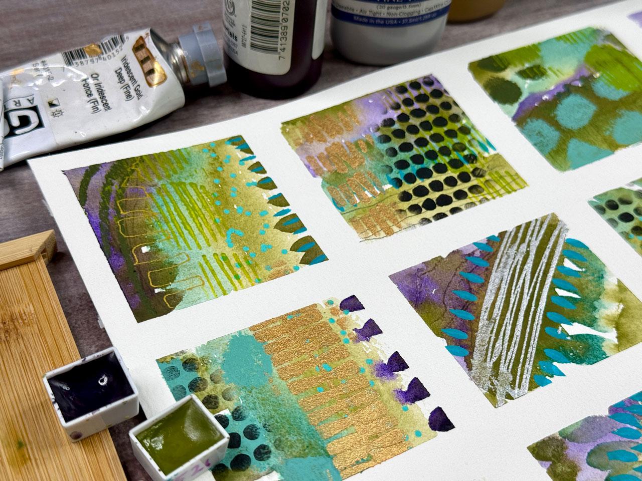
into bold expressive art. No perfection required. Each square becomes a
little world of its own, a space to try new techniques, make bold choices, and build confidence without the
pressure of a big blank page. I'm Denise Love, an artist
and creative educator, and I'm excited to bring you this fun dive into
grid paintings. Whether you're brand
new to mixed media or more experienced artists
looking for fresh inspiration, this format invites
you to loosen up, trust the process, and truly
enjoy the act of creating. We'll cover everything
from laying out your grid to building
backgrounds, using stencils and
mark making tools, and adding those delicious
finishing touches. I'll guide you step by
step, and by the end, you'll have a finished piece
full of rich detail and personal expression
and a toolkit of ideas to carry into your
own creative practice. So grab your paints, gather your favorite tools
and let's dive in. I can't wait to see what you
create square by square.
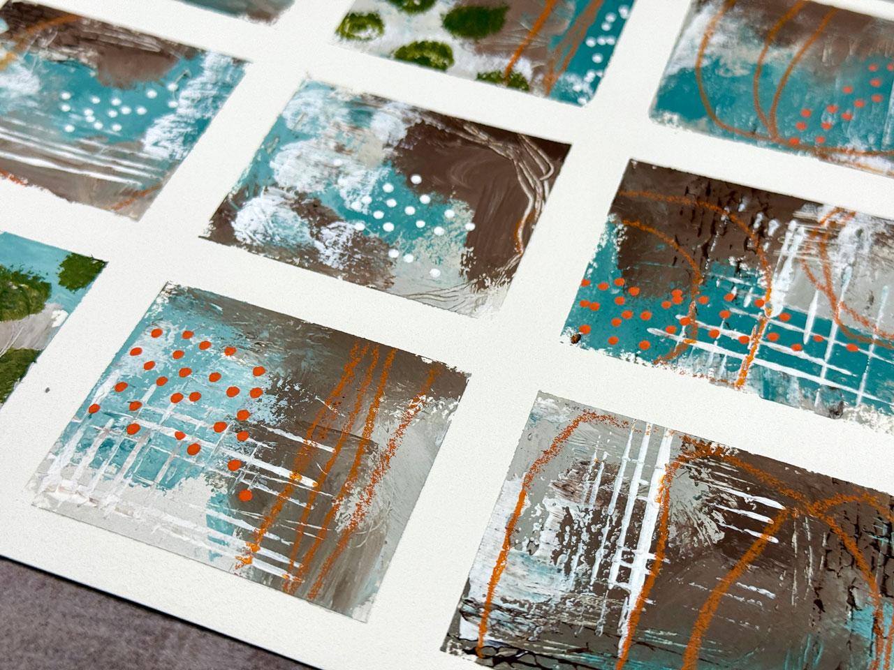
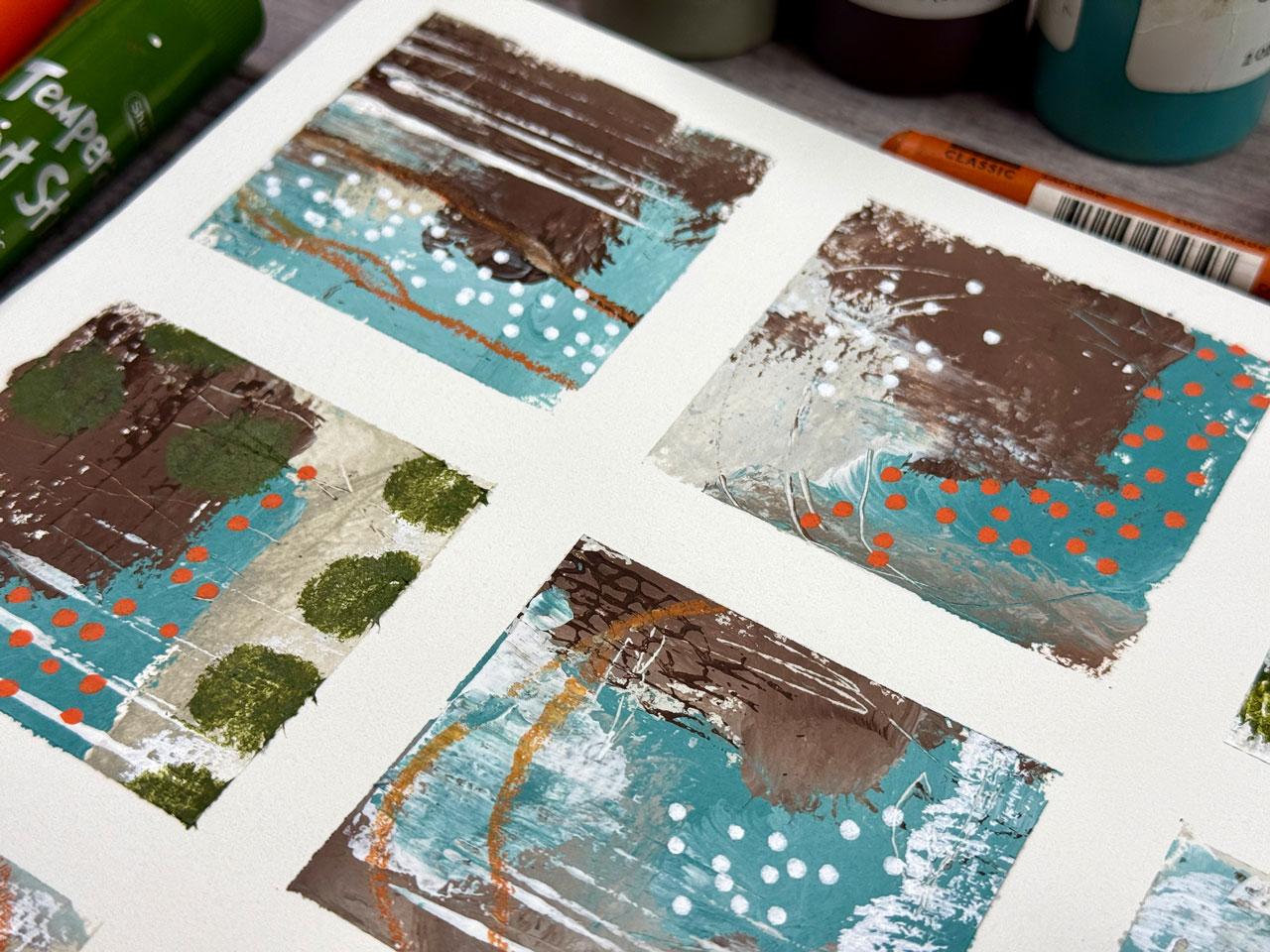
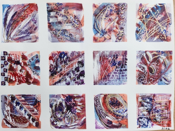
2. Class Project: Class project, you'll create a 12 square mixed media grid sampler using
layers of paint, texture, and mark making to explore your unique
artistic voice. Each square is a
mini experiment. Try different tools,
repeat motifs and play with color to build a
cohesive, expressive piece. When you're done, share your full grid or close ups
of your favourite squares. I'd love to see what you
create one square at a time.
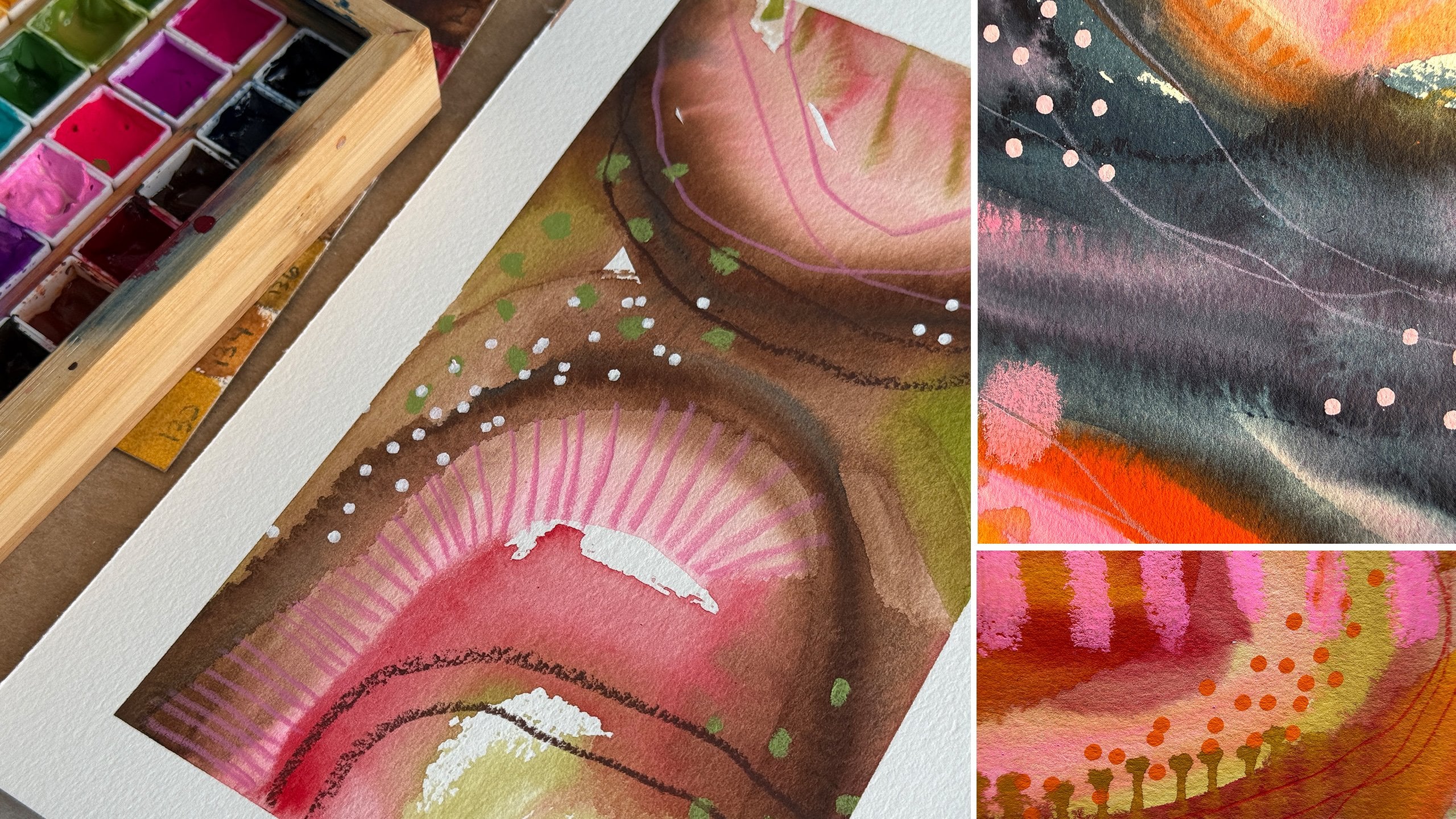
3. Inspiration Pieces: I want to start by looking
at some inspiration pieces, just to show you all the
different directions that you might could consider going
with your grid paintings. These are so much fun. I'm obsessed and these are
all the ones that I've done in the past year,
exploring color palettes, exploring different materials
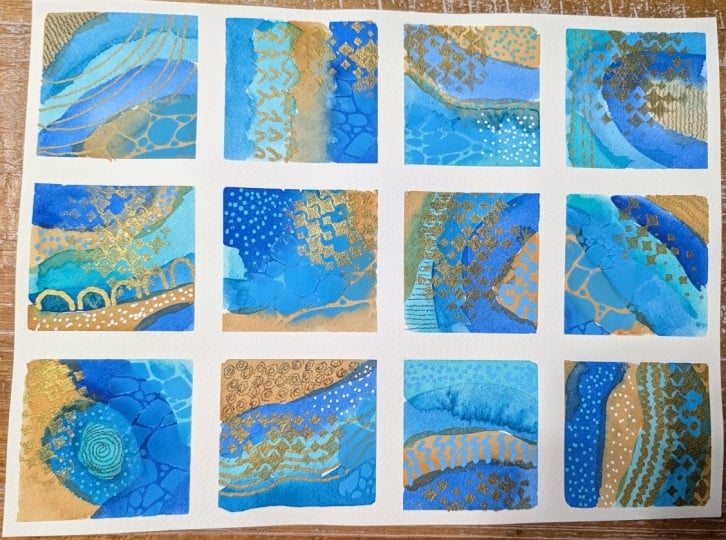
that I might have gotten, exploring different techniques, using stencils, adding gold. Playing in some mark making. These are just the
most wonderful way to explore all your supplies, especially the ones
that are really precious that you don't
want to waste because they take so little
of that supply that you can then get a feel for
how they're going to work. I just wanted to show you all of the grids that I have played
with and experimented with. I generally like to start
with watercolor personally, but some of these are acrylic
and I've got gouache. This is a gouache one, and
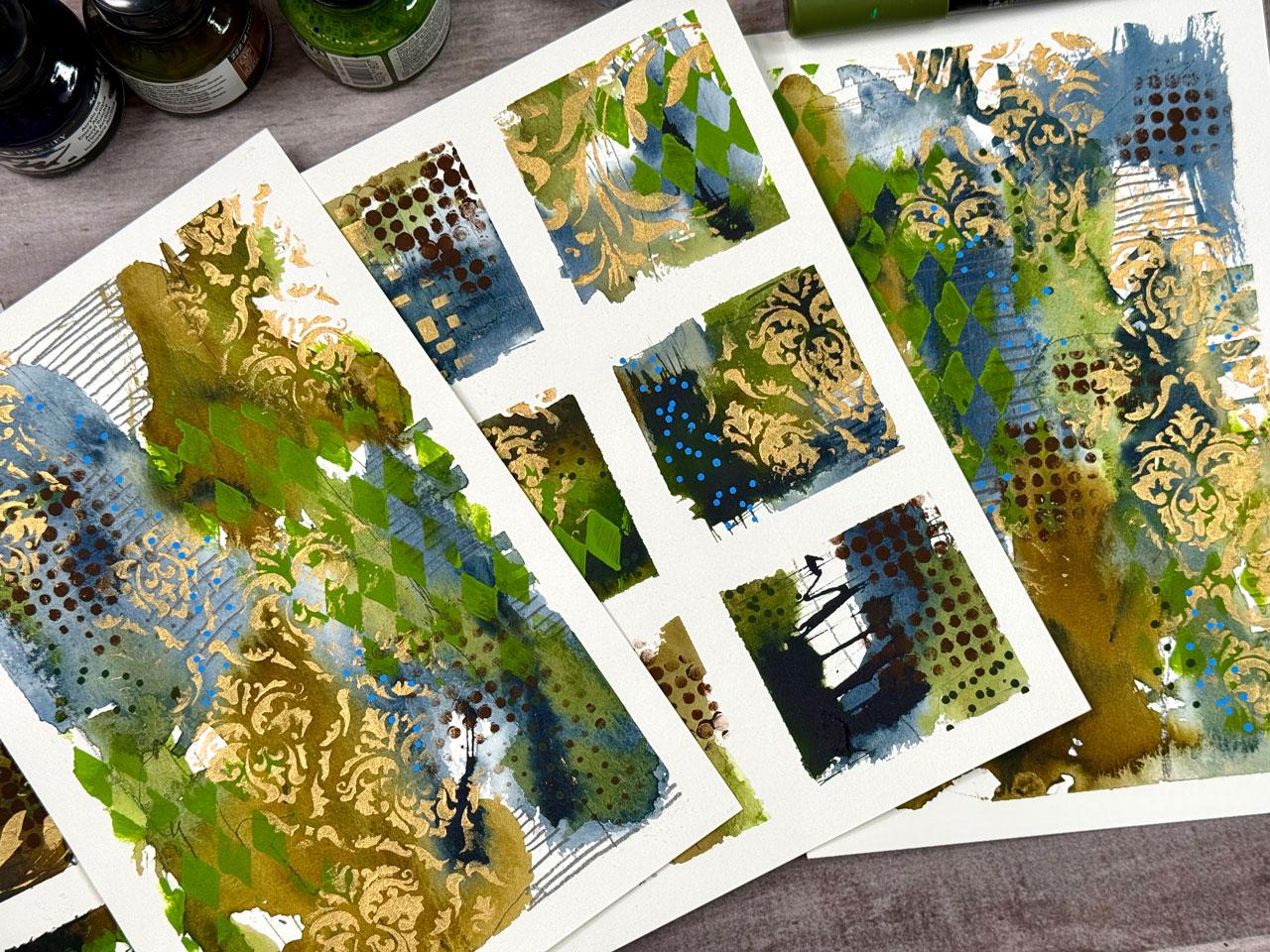
it's such a great way. This is one that I cut up
so you can do larger grids. I do like the smaller
12 piece grids a lot, but this is a larger
six piece grid that then you can cut up
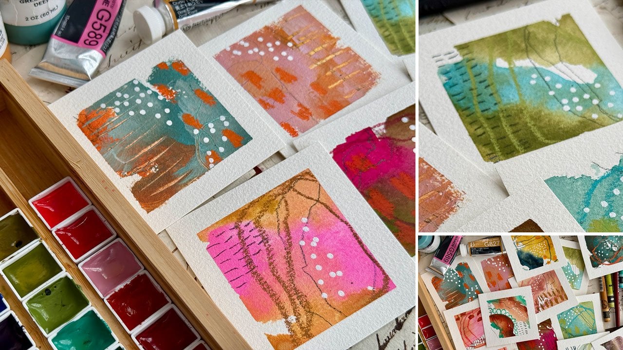
into smaller pieces of art. I enjoy the freedom and the low stress that I get
creating pieces like this, and then you can cut apart and they can be
micro pieces of art. You can frame them.
I keep them as inspiration to look back at and to get ideas for
marks and colors. I can also use them as
inspiration to go larger. So how can I use the same colors and marks and ideas and take the piece a
little bit larger? I've done that several times. I I like using gold. I like using stencils. Then how can I translate that idea into bigger
pieces of art? This ended up being for
me, a real favorite. It looks like beautiful
damask fabric or something, it's
really lovely. And then those turned out
really lovely as larger pieces. I can see these framed
and hanging as part of the decorations in your house
or something like that. See, I got on a kick with that. I love this color way. Color wise, how beautiful
these are going larger. Color wise, I like
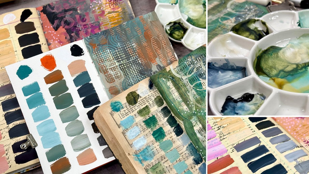
to start a lot of times using a color palette. So you'll see me, especially on all the videos that
I make on my socials, you'll see me using the
color cube quite a bit, and the color cube is
by Sarah Renee Clark. And I have all four of the ones that she has
come out with now, and I like picking
a color card and then using that as my direction for my
cubes a lot of times. And so will play
an experiment in class picking out our materials. This is a perfect way
to limit yourself. This is squash. A lot of
those are watercolor. This one's squash. Look
how bright that is. Watercolor one, of course, mixed media on top. I like mixed media work mostly. But yeah, we'll
pick a color pilot, then we'll narrow
down our supplies. And we will play and create
and just have some fun. And then when we're
done, we have the most lovely little
mini pieces of art. Some of these are so
pretty, you can even just leave the whole thing
and frame the whole thing. I also have done it where I've cut off the edge and maybe just done a cut off that side right
there and done a square, nine piece square, and
some of these are so cool. I love them. I look
back at these now. And just get a little
hit of pleasure, little dopamine there of how much fun these
were to create. I love these. Then you can
do it on any size piece of paper and you can even do
them in different shapes. Those were super
fun. And I'll leave a link to all of these
in the supply PDF. You can go back. These
are all videos that were filmed and there's a
whole playlist of these. I will put a link to
these in your supplies and then you can go watch
30 or 40 more videos. This is really fun when I
was all into the circle art, which I'm obsessed with
still, but I love this one, how it's still one big idea, but then chopped up into
little squares, super fun. I do like the damask. Sometimes more is more. This one's gouache. Look at those colors. They're almost neon.
They're so vibrant. This one's very
Christmasy in its color, like a red green palette, watercolor again
with acrylic markers and stencils and paint
and mark making. This one, I love these
purple and green so pretty. These almost look like
landscapes from ahead, we're flying in an airplane
overhead and you're seeing the different little
landscapes. I love this one. For some reason, this one's
very appealing to me. If I'm doing some new ones, I might pull out my
very favorite ones and set those up so that I
can look up and remember, Oh, yeah, I love this mark. I love this sunflower petal. I like all the details, and then that way I can remember what was my
favorite bits and parts? I love this one
because the colors are very unusual and it's kind of a gray and
red kind of feeling. Another kind of Christmasy red
and green kind of palette. Oh, I love this one,
super fun color palette. See, you get so excited looking back at these
little bit larger. 66 piece grid here. Another one more is more. And then a really big one. So this is what we'll
be doing in class. We're going to make
some grids. Maybe we'll make a few that go a
little bit larger. We'll experiment and maybe play with color
palettes and supplies. I mean, that's the
goal here is that you pick some colors and then what's going to
be the base layer? What are you going
to mark make with, and then let's have some fun. I hope you enjoy making
some of these with me, and I will link my
playlist to all of these lovely ones that
I've done so that you have plenty to go
back and be inspired by, and I'll see you in class.
4. Supplies: Take a look at the
supplies that you could consider using
for your pieces. So I have a grid here. I'll tape off grids in class, but I have a one that I kind of drawn out for you
just as an example, and I will put that
in your supply PDF. I do not get real exact when
I'm doing these pieces. I kind of eyeball everything. So I'm just wanted to let you know
that that'll be in there just to give you an idea. Painter's tape, I like having two sizes of
the painter's tape. This one is a quarter
inch tape, I think. Half inch tape. This
is a half inch tape. Get a thin tape
and a thick tape. I like the whole
bind tapes also, and I believe they come
in a thinner size. I like the thinner size for the grid part, the
part in between. The thinner the tape,
the better I feel like, but the painters tapes only
come in certain set sizes. These are the two I'll be using. It's painter's tape from
the paint store, basically. You can get artist's
tape from **** Blick too if you same thing. So
you'll need some tape. Then you'll need some paint. You can do this
with acrylic paint, watercolor guash, anything that you're
wanting to experiment with, you could probably do
it with oil paint too, but then of course, you're going to run
into dry time issues, so I won't be using
any of those. I'll be using watercolor as
a base probably and then acrylic paint and
markers and stencils on top of that because
I like the uh, differences in the
opaqueness and the translucentness of the different mediums
and how they layer. That's what I will probably
be working on today, but this is a project to experiment and play with
any of your paints. We may could do one in
all acrylic paints. I mean, it's just up for you to explore and experiment
and have some fun. So, any of your favorite paints that you want to experiment
with, you'll need those. Also gather any mark making
tools that you love. I love gold. I like
this zig postermen. It's a gold chisel pen, but I make little gold dots with the edge of
it really nicely. If you like gold dots, this one looks like my
favorite Kurataki ink in a pin form that
makes it nice and easy. What I like about
the chisel tip, is now we have
different sized lines and marks that we
can make with it, so it doesn't just have to
be a bullet point product. The chisel tub is very
versatile. I love this one. It's favorite gold. I
also like pascaPins. Those are my go to dot makers and just some extra
interest that we can add. PaskaPins, I love
neocolort crayons. They're water soluble, they're
lots of different colors. This is a particularly
good mark making element. I don't usually seal my pieces, so these don't smear on me. I also put in my supply PDF. I'll link a video on
preserving art if you want to know how to
finish art and such. I also like graphite pencils. I have Blackwing pencil and my 14 B faber castle
PitmGraphite. I like the very boldness of
these and the black wing is very similar to
the 14 B. Pencils. That's my favorite pencils. I also like acrylic markers
like the Artis and Toli arts for different acrylic
marker options besides the posca pen. I also like temper sticks.
Those are super fun. I also like the
keratakiGld Mica ink that is my favorite gold, and I use it out
of the container. It's also my favorite silver. There's a silver in this also. Which go right back
here, lives on my desk. Here's the silver, I believe. I put these into
fine line bottles. I like the fine tip one because they're very
liquidy, so they rush out. You got to practice and play, but the secret to using these is basically having it on its side, so you have more control over
how much is gushing out. But I put the gold
and the silver in the fine line bottles, and that's what I'll probably be using on a piece
or two of mine. You can easily put
stuff like this into these bottles
using a pipet. You just squeeze
it up from that, squeeze it down into the bottle, and that's the easiest
way without having a little funnel and making a great big mess, a little pipe. So definitely gold and silver. I also like using a lot
of acrylic paint on top of my base layers
with stencils. I'm using for that, mostly my Blick
matt acrylic paint. I like these because they're
nicer than craft paints, but they're not as expensive
as your artist grade paints. I also like several golds. I have some gold and silver in the heavy bodied and
the gold Mica paste, which is the same color as
my KuratakiGld Mica ink, but it's in a thicker paste
and this is my favorite gold, but I do like the golden
iridescent gold fine deep. And the golden
idscent silver fine. Those are my favorite
gold and silver. So you can see how I've
already used all that, so I got a new one. Showing you all of these so that you know
you have options. I love options. Yeah, you can use
any acrylic paint that you want for your stencils. I just happen to like those. With my stencils, I use some of these um Ink blending brushes. I just have a whole set of them. I wash these just like I wash any of my
paint brushes with a little bit of brush soap
and they just keep on going. This is what I use to do my stencils and it's
ink blending brushes. I do link all of these items
on my favorites pages. Um, and those have been
going for a good year. Like I've been using those on everything I've painted
over the past year, and they are still
holding up just fine. So those are very sturdy. I also personally like to play and experiment
with color palettes. I have a set of the color
cubes by Sarah Renee Clark. And you can get color pilots online
for free on Pinterest. You can search color pilots and just 1 million
of them come up. But what I like is when
I'm here in my art room, I don't have a computer up here. I could bring an iPad if
I wanted to, I guess, or look on my phone, but
I like holding things. I'm very tactile. I don't want
to be on a screen all day. I like to be able to sit
here and look at these and flip through them and compare them to whatever
supplies I'm using. I like being able to
hold these in my hand. For the price of these in a box, you get 250 color
pilots per box, and there's four boxes now. This is the newer set
that she's created. They're inexpensive compared
to making them yourself. I'll put a PDF to these in
your supplies and resources. I have given this away in one
of the other classes also, but these are color
palettes that I made myself with my own photography
because if you didn't know, my business has been going now for 14 years or so and
for the first 12 of that, it was photography based. I did photography pretty
much every single day, like a long project, long 314 year 365 day project. But these are my photos that I made into color pilots
in Photoshop and then sent them to moo.com and created my
own color pilot cards. The thing about these is
I got a pick of 2025, I think, is how many I made. It was $40 for 25. So when I think of the price
of the few that I got off of my own photos versus how much this color cubes
for 250 in a box are, I don't know how they're
making them that cheap because these are
expensive to make yourself. But I'll give you
these because they're mine, and they're beautiful. They're very dark and moody. My photography style is
a little different than my abstract art style,
amazingly enough. But every time I've
used one of these, they've been gorgeous
in a piece of art. So at least you have some
color palettes that you can pull from on a PDF that you can print
out if you'd like. Because they're pretty, so maybe I'll use some of these in class, but this is another option. I love these and I do link
those on my favorites page. Which I link in your supply PDF. I like giving you options. It's all about options, but I encourage you to use everything that
you have on hand. You don't need anything I'm
using. Use what you've got. I love stencils in little projects like this and
I just think stencils are fun and you don't have
to use stencil at all, and there's plenty
of places that are not going to have
stencils available like they're available
here to me in the States. Um, so you can make
your own stencils also. You can easily get
some UPO paper, which is basically
plastic paper, draw out a design and use an exacto knife and cut that design out of
your UPO paper, and then you have
a reusable stencil that you can make for yourself. But I like stencils, and so I have collected
stencils throughout the years. These are some of
my favorite ones, these little itty bitty ATC
stencils that joggles makes, and they're just perfect, the perfect size for
what we're doing. I have a lot of these
little itty bitty stencils and joggles is a good
place to get stencils. Stencil girl is a good
place to get stencils. I love these. Let
me put those here. Stencil Girl is a good
place to get stencils, and they also have
smaller stencils. You don't have to
get the great big giant ones that they have. You got a lot of options
with smaller stencils. So that's another favorite
stencil place that I use. And then, of course, there's
Tim Holt's stencils. So the Ranger stencils, there's a lot of those
that are really pretty, which I actually keep
those under my desk. A lot of times, it's a whole
a whole box of those, but, uh you know, a lot of these Tim Holtz
stamper is anonymous. A lot of those are perfect for a project like this
and punchinella, which is one of my favorite
things to use as a stencil, but it's metal ribbon that
they use to punch out stencil that they use
to punch out sequins. And you can find
punchinella usually at the fabric store in
the ribbon section because it's basically a ribbon once they package it
like that and sell it. So tons of options on stencils, but you do not have to
use them on this project. I just showing you
options. Favorite papers. So any paper any paper that
you want to use is perfect. If you want to use the Canson Excel paper as it's a nice
student grade paper, the thing I don't like
about it is it will probably tear when
you peel your tape. I have gone to the
point now where I use papers that I know don't
tear when I pull tape, and yes, there's lots of tape techniques that you can use. And the heat gun
technique is the one that I tend to use quite a bit. If I feel like I
don't want to ruin something and I want to
make sure the tape peels. I tend to use a heat gun to heat the tape up and it releases the adhesive and you're less
likely to tear your paper. But I tend to go for a paper that doesn't
tear to begin with, so that I'm not
disappointed when I ripped up half my piece trying
to get the tape off. Trust me, you'll do that
and you'll get frustrated. So budget wise, 100% cotton. I like the Bow hong
academy paper, it's their student grade paper, but I like it better than their artist grade
paper personally. I use the Bohong paper, and I've got the 12.2 by
8.3 pad. I don't know why. Um it's off on the sizes I
think they're on centimeters, but it just ends up a weird
size when they cut it. It's the closest size they
have to the nine by 12, which is a size I
like to work on. The Hana Mule paper is my favorite nicer
upper grade paper. That's my nice paper.
This is my play paper. They're both 100% cotton, and I can pretty much guarantee that any play
that I do over here, I can translate to the Hanamule
and not have a problem. I say that because if
you're using cheap paper, Kansan Excel paper or any of the less expensive
student grade papers. Once you learn how to
use it because you practice a lot on it,
and then you're like, I'm going to do a good piece
now and use the good paper, it's not going to work the same. And you're going
to get frustrated and you're not
going to understand why the paint didn't do
what you thought it was going to do because you
went to the better paper, and all the papers have their
own different properties, and whatever you learn
to work on needs to be your good paper because it's going to work different
than all the other papers. So once you find your favorite, keep working on it
and buy it when it's on sale and stock up on it, or do like I did and find a less expensive
one that you're like, Oh, okay, this one works
very similar to this. It's a lot less expensive. Talking about price wise, 12 sheets of this is about
$22 right now where I live. Whereas 20 sheets of
this is about 26 or $27, so you get more paper
and it's less expensive. When we cut it up into
grids and smaller pieces, this paper goes a
whole lot further than the one piece
of paper does. So that is most of my supplies. Anything you've got you can use, it's pull out
everything you've got, pull out all the stops,
and it's time to play and figure out and experiment
with all your supplies. Whatever it is that
you're wanting to play with watercolor, wash, acrylic paint, all
of that. Good to go. Pick out your base layers and then some fun things
for mark making, and then we'll be ready
to create some fun grids. So I'll see you back in class.
5. Watercolor Grid: Let's prep our paper
in this video, and you can use any
paper that you want. I'm using the Bao
Hong Academy paper, and it's on a block because I can't to come as a loose
paper, which I prefer. I don't like working on a block. For some reason, in my mind, the gap from the table
to the paper bugs me. I like to tape the paper on
a hardboard artist panel. And I take it off the block. I don't like working
on the block, but you can leave it
on the block and tape off your grid on the
block if you want. It's all about preferences and what's going to
get you to create and have fun and enjoy that
day at your art table. I'm going to take
it off the block, pull off the extra
little glue here. And this is an approximation as close as they have
to a nine by 12. So it's not going to
measure out as exact as, say, the nine by 12 paper,
but it's close enough. It's close enough. And I
start off by taping down my paper with the
painter's tape, and I'm kind of eyeballing
it. That's the way I do it. You are welcome to take a
ruler and get more exact. Some people want
to be super exact and some people don't care. I'm one of those that I don't
really mind either way. I do when I'm done, kind of want the white space to be even, and then if I cut them
apart, it's pretty even. So I do try for that. But I start off taping
with the big tape. That's the 1 " painter's tape. I'm going to tape it
down. I do end up using a ruler let me find my ruler. Here we go. I do end
up using a ruler to eyeball where I want to
have my separations. And because it's
approximately nine by 12, I'm going to be doing three
inch squares, basically. So I'm going to have of three
pieces of tape here and two pieces here to give
me a 12 piece grid. Then this is the half inch tape. Because I know I'm doing
three inch squares, I can basically come
at the three inch. I don't completely stick
it down firm yet because I can eyeball it before I stick it down completely to make
sure it's mostly even. Do I need to move anything.
I'm pretty happy with that. It's not perfect. I'm
not going for perfect, and then I can come down
the side here and again, looking for about
the three inch spot. Let me get the edge of
my tape here. Uh oh. I got a tape that's tearing. Weird, so it must have
a snag on it somewhere. Again, I loosely stick it and loosely stick
it until I'm like, Okay, that's good enough.
Yeah. No perfect. But you are welcome to take, by the way, this
is a paper tool, which I link these
on my favorites page because on a block, the paper, it's hard to get
off and I've tried using a knife, an exacto knife. I've tried using my
plastic palette knives, and this little paper
tool is fantastic. Anyway, you are welcome
to take a pencil and mark your grid's exact But
for what I do on these, it doesn't bother me if
they're a little wonky. But you could take a thing and mark them
exact if you want, you could use my handy dandy grid thing
that I made for you, which also is not perfect, but it's probably more even
than what I created and you can mark off and use it
as your guide if you want. Lots of choices there. Mine is just to get some
grids going and to have fun. I enjoy this process. These are low stress.
They are fun to play in. I'm going to use a color
palette from my photos. You can get that PDF on your downloads and your
supplies and downloads page. Oh, look at that with the
purple and the green. I'm like in this one
because of this teal. Let's do this one today. And I kind of feel like especially with
something like this, I feel like gold and
silver are neutrals. Black and white are neutrals. So if you want to
deviate and add some extra little
pop to your pieces, gold tends to work a lot. Silver is good. And I
think I'm going to use my halbin granulating
watercolors because this set is
a newer set to me, and I just put these tubes into it's a 24 piece Holbein
granulating watercolor. I just squeezed some of
these tubes into these pans. And then I made a little
color card of them. And since this is fairly new to me and I haven't played
with them all that much, I am going to play with those. And what I like about this is I'm not trying to get exact. I'm using this as
a direction to get me past the anxiety
of picking colors. Because once I know
these are my colors, then I can be like, Okay, what am I going to pick
those colors from? It's going to come
from watercolor. Then the next choice that it
would come from would be, what are my markmking tools? I'm going to stay within
this color range, but it doesn't have to be exact. But I can get close. Look
at that 521 there in this. I can pick out that
color array here, number 521, and then I can look at this purple
and I like this 541. And I just wrote the
numbers on the side of my pieces there, and then I like that teal color, so I can look at these and say, do I want this one
of these blues? Which one of those
blues? I'm thinking this one, which is 524. You can see even though it's not 100% exact, it's close enough, and that's my goal to get close enough so that I'm
not stuck saying, Oh, how do I get
that exact color? Here's the three colors
that I've picked. And I think that's a pretty good match for these three here. And then, of course,
I've got gray and black, so that could be any
kind of mark making. That gray could be silver. Huh. Let's keep that in mind. So yeah, there's my colors. That's the three that
I'm going to use. So we'll set those right there, and I'm going to wet those
down and get them started. And then I'm ready to
go. Now, I have at least got my first
decisions made. And what I'm going
to do here also, I'm going to use
my tongue brush, half inch Princeton oval Wash. And what I want to do is start some initial drawing
and mark making and stuff. I like a lot of these
here where I have gone multiple blocks with the same kind of
they continue on. I like that a lot. These are some of my favorite
pieces because of all of the mark making
that I've done on them that I can now
go back and refer to, and they look like
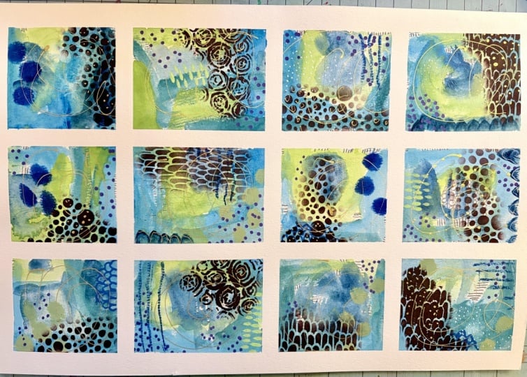
lovely landscapes to me. So on this, I've
got areas of color. I've got areas where I've
done a shape like the edge of this brush here is a shape.
I've got white space. I've got the fun shape there. I've got some that
just go through, this looks like a road now that I've got some gold in there. I like this one where
it's made shapes with the brush and
it kept going. Lots of different
little ideas there. So mark making after the fact. I want you to get creative
with this base color. It doesn't have to
be anything exact, but I want to let
the blocks merge and go through each other
and do different things. I'm just going to get started. And play, and we'll just
see where does this go? This paper eats a lot of water, so I'm going to continue dipping my brush
sometimes there. I do want a lot of
pigment and I have discovered with this
granulating water color, I can definitely get a lot of pigment that I can
pick up if I wet it down first and then
the color is rich and I've decided the
first time I tried it, I wasn't sure if I liked these whole binds
and then after that, I've tried it several
more times and I'm like, Oh, yeah, I do like these. I have decided yes, for the granulating Bhbne. I like that they have that
granulation going on in it. They just make the
colors richer. I'm thinking at the moment, I'm not really thinking
anything specific. I'm not stuck on composition. I'm not thinking
about which color I'm necessarily setting
beside the next color. I'm playing and I'm enjoying that process
and just seeing, where's this going to take us? What are we going
to end up with? Okay. Let's pick up
this third color. I never know what we're going to end up with until we're done. In the end, I could be like, not a good choice or I
didn't expect that at all. I'm thinking at the moment, wasn't quite expecting
where it's going. I have studied color
since college. Because I find it
fascinating and frustrating. I don't know, I think I'm
always trying to figure out, why is it so frustrating to me? I think some of it is because I like all the colors.
That's my problem. I can't be trusted to just pick colors and then get
something that was like, I don't know, that
matched or what have you. I get frustrated with color
a lot because I'm like, oh, let's try this and then I'm like, oh, let's
put this with it. Then I'm like, that
was a bad choice. Tell me, do you get
frustrated with color too because I really do end up all over the place
with color and then think, when I do a color card, I have basically eliminated 80% of the frustration
I get with art because now I'm not stuck in the what
color phase of it. That's my white page
paralysis part of art. Some people get stuck
at the blank page. I get stuck at what colors. I find since I have started using color palettes
to guide me, I have eliminated
almost all the anxiety that I have had in
the past with art. Now I'm just coming back on top, adding some interesting
watercolor mark making, some different elements here. Just to give me some interest and I want the water to
color to do some fun tricks, which a lot of the granulating
colors tend to do, especially if you
add extra water in there and you're doing
some fun stuff like this. This is going to give me
opportunities as we go for a mark making and different decisions that
we're going to make later. Definitely put the
layer on and then while it's wet, add some more to it. I could have done some mark
making before I even did all that if I had wanted to
my Blackwing pencils. I could still come back in
here and do some mark making. A lot of times I
like there to be some other things
in these layers, so I could come back and do a little bit of mark
making while it's wet. I could use the end of my
paint brush if I wanted to just dig into the paper a tiny bit and give me some
different marks that are going to show
up as we're going. Because this end of
the brush typically has a little point there
and this will just give you marks that weren't necessarily doesn't have pigment in it basically because the marks with the pencil
have pigment in it. So when I draw on there,
you see I draw on there, whereas when I use the
back of the brush, I'm just moving around, hopefully some pigment
that's already in there. We're going to let this dry. Then we're going to come
back on top of this with other fun mark making.
I'll be right back. All right. This is mostly
dry with the watercolors, I like to let them dry
and do their thing. And not really get
in the way of that, I'm going to use this
Tiffany blue because it looks like this later color
that I've ended up with. But yeah, I want the watercolor to do all the tricks
that it's going to do, and then I'll come back on
top of that once it's dry. I did let this dry naturally. Now I'm going to come back and
start mark making and just playing and experimenting
and just filling these in. This is perfect if you
like to draw and doodle or you like some downtime or
you like something relaxing. This is the perfect exercise to do to kind of just zone
out and have some fun. This is a more structured
piece I would consider, then we'll do a more loose piece in one of the other videos
because I do want to do more than one
grid just to give you some ideas and some
inspiration and some fun. And so now is the time
also to kind of start collecting marks that you
like and decide like, oh, I like that or I
don't like this or what is it that you
like for mark making. Some people don't like
mark making at all. And we'll do a more abstract
piece where we kind of have other things
going on with maybe less of that kind of marking, but it's just fun to play. Okay, so I got gold, but I'm kind of
thinking, you know, we had the gray in our
original color palette, so maybe the silver would
be fun to play with. I didn't shake that enough. And another thing too, especially with these
fine line bottles, you could get it started
on another piece of paper so that whatever we
end up with we intended. I like to go off into the
blue because when we're done, it makes it look like
the pieces continue. They don't just
stop at the edge, now you can imagine that they
kept going and I like that. I like that. That illusion. I don't know if I love
silver in these pieces, but if you do it, you're like, I don't
know about that. But you're like, I don't want
it to look like a mistake. Come back and do it
several more times and maybe something you would like better
a dot or whatever, so that then it was a decision you made on
purpose and not a mistake. That's my secret there. If you're like, no, not good, but you can't take it off, do it somewhere else
a little bitty, so it was intentional. I know I'm a nut. I kind of feel like this
temper stick. I don't know. I think it's because I'm
seeing these pretty teals, but I'm going to
come back on here with maybe some large dots. I'm just feeling it. Just go where the inspiration leads you. It doesn't have to be Perfect. It doesn't have to be
anything specific. It's just fun to play. This is your chance to play and to figure out what
works and what doesn't work and what would you
take with you to larger pieces or more
of your art practice? Because this is where you learn. What did you like, and what did you not like? This is where we learn these
things. Look at this color. Which still staying
within my palette. Just in case you're
looking at that thinking, Look at that. That's bold. That's finer. Fun to experiment with what your
supplies can do for you. Now you know, I can get different sized lines and marks out of that by
using different edges. Well, just put it over here in case I want to use it again. I also let's pull this out. I also like these Arctix
acrylic markers with the brush tip because
these make really cool Kind of like flower
petal looking shapes. I can now mark make
in something that's different than a dot. That's what I'm thinking there. I like the different shape. Look how cool that is.
I like that a lot. It's fun to layer that on
top of different colors in your piece to see
what had that contrast. Did you like it? Did it do what you expected?
Did you not like it? This is the time to look at
things and start deciding, did I like it or not like it that worked or
that didn't work? And then you start narrowing
down things that you like. That's how you come
across your style. Everybody's always
wanting to come up with their style and takes a long
time for them to get there. But your style is basically all the decisions
that you make in your art that you get to the point where
they're your favorite and they're recognizable, that you like to do
those in your art. That's what your style is.
It's all your favorite things that you do in your art, how are you going
to discover that? Going to make a lot
of art. That's how you discover what your
favorites in art are. It doesn't just
magically happen. It takes a long
time and a lot of play and discovery to be like, Oh, this is what I love. This is my favorite. Now I know. And sometimes I'm
looking at stuff. I like so many things, but I to this day don't think I
have a style per se, and I still have
tons of people say, I recognized yours immediately
when you posted it. Recognizable stuff and
that style changes. As you discover new things and new places that you want to go with your art and new direction,
it's always evolving. This thing is fun.
That was a fun choice. I have that in a gray because
there's gray on our piece. Do we want some gray in here? I think I have enough
of that shape. We might come back to that. Kind of thinking I
want some stencils. So this is fun to play. I'll pull down acrylic paint or two and maybe do a little
bit of stenciling on here. I could do that stenciling in, I think I am
going to do that. I could do it in acrylic paint, or I could do it in gold. So I am filling gold, and I think I might use the
iridescent gold fine deep. Because that would
be the one that most people would
be able to have access to easier than
the keratoki one, which I get online. I'm definitely thinking gold, but I'm thinking we could also have what if we do that purple? I like this deep purple matter. Let me get my palette paper. I like the deep purple matter. Because we put purple in here, and we grab a couple of
ink blending brushes. Yeah, they get stiff, but I just soften them back up. I'm thinking Itty Bitty stencils are what I'm going to
probably do today. I like this stencil here. I don't know the name, but it
is on the Itty Bitty page, but it looks like a little
bit like bowling pins, but it's pretty when you use it. I like these. This
one's dotted lines. I like this one. It's
like a vertical vines. That's pretty. Yeah, there's just
so many fun things. And you can do these too.
Oh, I like this one a lot. This one of my favorite
Edie bumpy ride. I love that one. I have
one that's open already. Let me let me find it. You don't have to I like
this one, too. Seeds. Some of these I got.
Here's the bumpy ride. Some of these I got before they officially landed
on their website. Ooh, I love this one, too. Okay, and here's Seeds. Okay. All right. I like these for this, I think. Yeah, you can just draw all these out with a
pen if you wanted to. You don't have to use
stencils if you don't want. I like stencils. They speed up the art practice sometimes when you're playing. I enjoy them. So I just go for. All right, dry brush,
dry ish paint. Then I look at this and think, where do I think I could use some extra op I'm going to
come right down through here and just do me some stenciling and
just see what I got. It went up a little
bit, but, yeah, ya. Yeah, that's what I wanted. I'm feeling it over here
too, for some reason. Oh, yeah, I like it.
Doesn't have to be perfect. I'm not looking for
perfection here. I'm looking, oh, let me put this purple down too because
I am feeling purple. Put a little purple down. Because I feel like maybe
oh could you use the EDB. How about the bumpy ride?
I like the bumpy ride. Getting paint everywhere
'cause I'm messy. I just leave paint
on my stencils. I don't really worry
about cleaning them off. That's my own
personal preference. If you want to clean
your stencils, you could have a little
tub of water sitting to the side and
you can put these into that tub until you're ready to go to your
sink and wash them off. I'll keep the paint wet. But my layers of
paint are so thin that I've been using all my
stencils for a long time and not had any trouble with
the paint being too thick. I like that. Okay. I just throw that into water until I'm ready to
go wash them off. I'm filling more gold. We could have had green. I
could have got a green one. I'm using the seeds. I like seeds. I'm going
to do seeds in gold. I'm haphazardly randomly
putting these two. There's no rhyme or
reason or exact. Why I'm putting something
where I'm putting it is just intuitive and
playing and having fun. This will give us interesting compositions when
we're done too, working in this
way, which I like. I do tend to not put stuff right in the center
of my pieces. I'm coming in at an angle
or coming in from the side. So it's very rare that I center stuff and that's on purpose, but now it's intuitive. Now I don't even think about it. It just happens. I like
that. Okay, super fun. Okay, I feel like
maybe I need a green. Like, whatever this
kind of army green is. Do I even have an army green? Mmm. I have this green. It's not really army
green, though, is it? We're gonna use it anyway. Use
whatever you got and play. If you're looking at something
and you're thinking, maybe, maybe give it a try. There's no right or
wrong. Here we go. I'm going to use
this line dot one. These are all joggles,
itty bitty stencils. I do link the joggles
small stencils on my favorites page. Okay. This was a crazy color. I'm going to say, Oh,
okay, never mind. I was going to say I
think maybe a mistake, but now that I did it,
no, it was not a mistake. This is how you discover
fun stuff, accidentally. I like accidents. I like discovering Weirdo Oh, that worked better
than I thought it was going to work things. I love that. Yes.
Yes. I like it. Oh, I really like it. Okay, that was a fun choice randomly. I feel a little bit
like I need a dot. This is like a punchinella, but in a stencil, perfect, which is many dots. And I'm kind of thinking,
What am I thinking? I'm thinking it needs
one more something like a little punch of
something. What does it need? I need a vote here. Ooh,
we could do this in black. That could kind of pull
in a fun contrast. All right. I've just got the blick matt acrylic paint that I put down. This could be a way to really pull some
contrast in our pieces, which might be good
and it might be Oh, you shouldn't have
done that moment. But you know what?
On pieces like this? Because there's a okay, that was that was
interesting. I don't know. But because these are
little tiny pieces, you got 12 opportunities to
have some really great ones. And then a few Uh oh, probably
shouldn't have done that. But maybe I know now for next time I don't like it or
I did like it or whatever. Oh, I do like it
when it's lighter. Just a little hint in there. Then like this, you
discover if it's too much or just
right. I like that. Also. Good job. I like it. Okay. Then we just
look at it and think, does it need anything else. Another thing that we
could have pulled out, which I don't think
of as much because I don't use it as much are
the little Cigno pins. UnibL Cignos. That was another fun choice because we could draw
with these pretty easily. On the watercolor paper, these have worked
pretty well for me. That could have been
in our supply list. I didn't even think of these. I don't use them very much,
so I don't think of them. But the UIBL Cigno silver, gold, and white are fantastic. I think the white and gold are the ones that I have
that I use the most. Uh, I don't even know
if I have a silver one, but I definitely Oh, yeah, I do. I got silver, white, and gold. These are these are great. The white's good if
you want to come back in and add
some white details. Yeah. So yeah, good ones. I like the Cignas. Let's just do some
fun lines over here. Like that. We could come back in with little dots PascaPen
that could be fun. But for the moment, I feel
like I could be there. I could add some more
dots in if I felt like it needed something else or lung or whatever it is that
you're thinking. But for the moment, I feel
like I'm there with this piece and we could peel the tape and just see where did we end up? We could keep on
experimenting and playing. It's not about perfection
at this point. It's about play, discovery, experimenting, then seeing when you peel the tape, what
did you end up with? And I love peeling
the tape. It's magic. I like using the blue tape
because the blue tape is visually disruptive and you can't really even see
what you've created very well because the blue
is just in the way. Then when you peel the tape and you see the crisp
edges and you're like, oh, look how good this
or that turned out. That's my favorite part.
It's the part I enjoy, maybe even more
than the painting. I always tape stuff down because whatever your favorite
part is, do that more. Makes for the best
painting experiences. All right. Here we go. Let's see what we ended
up with. Didn't work. Now I can look at
this and say, Okay, look how interesting those
colors were and how fun the mark making is and what pieces worked and
what pieces didn't work, which was more successful in my mind and which was
less successful in my mind. There's no right or
wrong answer to that. It's all about your own
likes and dislikes. And when you're
looking at stuff, what did you like better
or not like better? So I don't love the
silver that I did here. I do love the green
dot line thing that I did from that stencil. I do love the flower
petal shaped marker that I did in that blue. I do love the gold. For some reason, gold
always looks pretty to me. It shines a little
bit. I love it. I do like the larger dot pattern that randomly shows
up in a few pieces. I do like the color palette. It's probably not my
favorite color palette in the end of all the
pieces that I've done, but it was a very
interesting experiment and I love blue and green, but do I love blue and green
with a dash of purple? That was interesting the
way that worked out. Once you paint one of these, you can cut these apart and they could be little card fronts. They could be little
business cards, you could put your business
information on the back. They could be micro
pieces of art that go along with a larger
collection of what you do. I tend to save mine just like this because I
like to use them for examples and samples and stuff that I might want
to revisit later or maybe take one of these and expand that
into a bigger idea. I have that as inspiration. You could put these into a journal, could
be a journal page. You could also take particular squares and put that in a journal and make
notes about what you like, what you didn't
like, what you used. Um what went into it. You could also at this point add any additional mark making if you see that maybe a piece needs a little
more something. What is that something, it's a good time to evaluate the pieces and decide what did you like?
What did you not like? What are you going
to carry forward? That's how you get into what your favorites are
and what you enjoy and narrows it down into elements that we can identify
in your style later. This was a fun piece. We're
going to paint some more, so I will see you back in class.
6. Acrylic Paint Grid: This project, I thought
we would do another grid, but maybe with acrylic paint. And I showed you in the first project how
I taped this down. So if you skipped
by that project, go back to the beginning of that video and I tape one down. It's not about
perfection for me. It's about experimenting. This is clear gesso
that I just put down. I'm also going to
put some white gesso down because I like mixing
that with my acrylic paint. I'm working with acrylic
paints this time. This is white gesso. And the reason when I'm working with acrylic
paints that I like to use gesso is because it makes the acrylic
paint more spreadable, and it does better stuff. So I like mixing the gesso with my acrylic paint to get a better
result when I'm done. And I think I'm
going to work with one of my Princeton
umbrella brushes. I like this number six
size is my favorite. I'm working with a color card, but I've gotten off of my color choices and I
wanted to do that to give you options to show
you how I use these to point me in a direction but not have to be exactly exactly. I actually went with
some bluck matacrylic because that's what
I like to play with. It's better than craft paint, but it's cheaper than
artist grade paint and it's very pigmented
and I've been super happy in all of my art play
with it and I go this route. So I've got green, blue
deep for that tell. I've got brown for
this dark brown color. I actually went with warm
gray instead of ochre, yellow, just because you
have artistic choice here, even if you pick
a color palette, I want you to feel comfortable varying slightly if something
if you're thinking, ah, I like this idea. Don't be afraid
to kind of go off script per se and go ahead
and play and have fun. I'm going to do these just like I did the watercolor
ones to begin with, and I'm going to go around and maybe spread some
color and get it started and using
the gesso in there, the white and the clear
gives me some variations. It gives me some differences in the shades and the
tints of the color. I choose to mix with white. You could do black if you want some dark and moody
somethings in there. I basically use
the white gesso as white acrylic paint because
it's basically what it is. I don't get out a white paint normally when I get
that gesso out. And I scrub my brush around, and I've been using these
same brushes for a few years, man, they hold up fantastic. So if you want to
brush that can take a beating and keep on going, the Princeton umbrellas are fantastic with the
acrylic paints, and I enjoy using those. And they're not super expensive. They're kind of in the
medium price range, I'd say. My topi color there has
gotten weirdly chunky. But that's okay because mixing it in with these other
paints and stuff, I still am getting
just fine coverage. It smooths everything out. I love these neutrals
and this til. This tell is my
favorite color anyway. I'm not worried
about composition, but I'm not putting my starting points
directly in the center. I tend to come from the edges. That's just the way I've always enjoyed
laying color down. But experiment and play and lay color down if
you're thinking, oh, what if I do this or
oh, what if I do that? You know, if you're
having a thought, try it. Try it and just see
because then you'll know if something works or
something doesn't work or, you know, how you
could have done it different maybe the next time. And that's how you learn
things and discover, like, what you like and
what you don't like. You know, everybody paints
a little differently, and I tend to paint with my paint brush fisted in
my hand held way back. Um, it's just the way
I enjoy painting. And you might enjoy
painting closer up, holding your paint
burst like a pencil. But in doing that,
you're getting a lot of control of your brush, and for what I like to paint, I like to have less
control of the brush. That's why you see me
hold that way back. I like the surprise of
not having control. What are we going
to end up with? I don't know, but it's
abstract and I don't want it to be too perfect. I like the imperfection of
holding the brush way back. Okay, I'm feeling pretty good
about this color palette. Even though my palette there
had five colors on it, black being one
of them, so I can still come back in
with some black. You don't have to
choose all the colors on a color palette card. Keep that in mind too.
Don't get hemmed in. Oh it has to be
these exact colors. I can't match it, so I can't
use this one or whatever. Don't get hemmed in by by specific colors on
something, veer off of it, pick three of the colors, change the colors slightly if you don't like yellow ochre, make it a gray or whatever. If you're looking at
it and you think, I really think that
needs to be a top instead of a yellow, try it. That's how we have fun
and experiments and get places that we
weren't even knowing we were supposed to get
in our art that day. Okay. That's super fun. So what I think I'll do is
maybe take the other end of the brush and come in with
maybe some mark making. What I also have, too, hiding up here somewhere is a clay tool that looks like
an ice pick basically. I like it because here we go. I like them because they
got a sharp point and they'll give me a finer scrape. When I go to scrape this, it's a much fineer scraping than the edge of
the paint brush. Get creative with what you use. To mark make in your pieces. If you want a finer line, get something that looks like this clay tool that you
can get at the art store over with the clay
stuff and it looks like just a long needle
basically with a handle, which I like having the handle. We can scrub and get
some of that paint back off and it's
drying as we're going, we might get to
the point where we won't see the layers underneath, but it is fun to have
that as a layer in there. You might have a credit card
or something like that. You could use an old library
card or something like that, and you could use
that for mark making. You could use cardboard
for mark making. And we could use some cardboard. Let's do this. This is
corre graded cardboard, so it's a piece of
box that's cut, but you can see
the texture in it. Be creative in what you use. If you don't like stencils or whatever and you like something more organic like
this in your work, cardboard cardboard is awesome. Save those boxes when
you get a delivery or, that's pretty cool. Alright, that was a good
choice. Save those. And then I just
keep using these. I just put these over
back over there. We got all kinds of
random stuff up here. We've got an old card. So this is like our
super old AA card. You can use like an
old library card. We put that over there. You can come and maybe
scrape some stuff in and have some paint scrapies. I like paint scrapies, sometimes white, sometimes with color. Scrape some of that
in a little bit. Still, I'm not worried
at this point about composition or what I've got
going on in each square. What I like about these is the low stress and
experimentation. It doesn't have to be
anything when I'm done, so I'm not super
worried about it. Then when I peel the tape, I can then evaluate
what did I like? What did I not
like? What worked? What didn't work? What
compositions are appealing? Look at that. Make some
noises while you're going. Okay. So it's all
about having some fun. Listen to a book while
you're making stuff, call a friend and talk to
a friend I have found that if I'm doing stuff and
I'm talking through it, I I don't get stuck. A lot of times you tend to get stuck when you're
making art or you get frustrated or you get to
a point you don't know where else to go if you occupy your brain in a way that takes away some of the
stress of what you're doing, and then you're like, Okay,
let's just do this or okay, let's just do that
and then you keep going in a way that you
weren't even expecting. I'm loving this. I am
feeling like maybe we could use maybe a little
stencil maybe, maybe not. Maybe thinking out loud here. Maybe we need to get
our brush back out, getting the paint off of it since I threw
it in the water. Maybe we'll come back with some brush strokes
and this white. I might pull a
white out for this. I have a heavy bodied
titanium white bilqutex that I keep on my table for
times that I need more white. Instead of a gesso, the gesso is very thin and sometimes transparenty
kind of thing. But if I get white white, maybe I could come back
and do some type of splotch brush mark or
something that is different. I could do that with
a smaller brush. Those are awfully big marks, but just trying to give you
some ideas and some options. Yeah, let's do
that. I like that. I'm going to go
ahead and dry this so we can do some
stuff on top of that. All right. I am looking at my inspiration
and at the same time, I'm thinking blue and
orange is very contrasty. I might want an orange.in here. Just from some past
things that I've done and it was just
popped in my head. You remember if I
said, if it pops in your head, don't be
afraid to try it. I could veer off this deep dark orange to
maybe a bright bright orange. But I want some art
making in here too, and maybe I could do that
with an orange maybe. So this is the No
color two crayon. I like these because I don't
have to seal them later. The water soluble if you want
to add some water to them. I'm just coming in here
with some random marks and pattern and I'm going
off the square onto the tape so it's not like I'm trying to keep it
within the square. I like it when my marks go off the square
and then visually, it looks like that
kept on going, it's giving you some
visual imagination that, that piece kept
going rather than stopped an abrupt hard stop, you can imagine, what did
it do as it kept going. I like that. I like that
when I peel the tape, parts of these lines are
not going to be there, and I like the
organic feel of that. And so you don't have to
do all the same shape. You could do some lines,
you can do some dots, you can do some
dashes, you could do some circle in things
like I just did. You can go different directions. What I like about
using an element in most of the squares as I'm going is the repetition
of the elements, repeating things that then pull the whole collection
together because it's got repeating elements
or colors or things that draw it together
for your eye. Can I like that.
We will like it. All right, so do we
want? Let's do it? Oh, my goodness,
look how bright is. Okay. So sometimes I look
at things and I'm like, Oh, wasn't a good decision? But it's such a pop and contrast and it's a
contrasting color if you look at your color wheel. Blue and orange are
contrasting colors. What that means is they're
really going to pop off each other and be super cool
normally, sometimes. In this case, you can definitely see that blue popping
off that orange, giving it some crazy good
contrast, it's interesting. If you have a piece
that you're like, Oh, it's dull, I don't
know what it needs. It needs a pop of something, look on your color
wheel and pick whatever color is
opposite the main color and come in and put some
marks of that color on top of it and give it that pizze and that pop that you
thought it was missing. I like these. Doesn't have
to be on all of them. You could just pick
and strategically, you know, add it to some. Do I want to add it to any more? We'll stop right
there for a second. I've got plenty of
options and things. I want you to look around
at what you have in your art room and what you
can play with and add to. I'm almost wondering if
because we did blue, maybe a couple of these we
could do a green in there. Let's do it. I know we're veering
off of our color card, but like I said, it's
more of a suggestion, not a absolute I like how things like this help you discover other things that maybe
you'd like that you're like, Oh, didn't even realize
I would like that. Now you've tried it
and you're like, Okay, I do like that or okay. That was a wrong choice. I like the play
and the discovery. That's my thing. I do like
blue and green, though. I have blue and green
all through my house, Aqua is my favorite
color and green is another favorite that I like to mix with it. So that's fun. Maybe I'll pull it over here. Again, I'm repeating
the elements throughout the little pieces. And if I were to make this
into great big abstracts, I would do the same thing
just on a bigger size. I would spread those colors out, make those marks a little
bigger. Let's see. Am I done? Do I have enough? I feel like I need some stuff in a few of these,
maybe some white. Maybe just some little
white dots to give me some extra on some of these that I didn't
do the orange dot on. Just play pretend you are your 5-year-old self and let go of all the expectation of where you're going today
with your piece of art. Because I found out myself when I let go of
the expectations. Then I was happy with wherever I ended
up because we ended up somewhere might not have been where I would have normally
expected I would end up, but that's what makes it Okay. It's like I accepted that
wherever I go today, I'm going to be happy with that. And, man, I have so much fun at my art table now
because look at all these amazing
things I've created that I never would have
created otherwise. Okay, so we could keep going, but I feel like I'm
there for today. You could peel your tape and evaluate your pieces and decide does one of these pieces need something or
is it complete? You know, sometimes you got to pull the tape to see what
you're even working with. But generally, this is where
I like to stop anyway. Then I use these as inspiration. You can use these as
little micro pieces of art that you're including in a
collection of bigger pieces. You could use these
in your card making. If you like to make cards, these could be card
fronts or card pieces. You could put these
in your journal. You could have a journal where
you take different squares apart and take that piece down and then notate what
you liked or didn't like, what colors that you used,
what worked, what didn't work, and what you might do
different next time, or what you're going
to take forward. Um, so many things. You could use these as business
cards, flip them over. After you cut them
apart, flip them over and put your info
to hand out it, you know, art things.
Okay, look at that. Those are pretty
cool. Oh, my gosh, little mini pieces
of abstract art. So super fun if
you're working with acrylic paint or any
mix of paints or, um, would probably do it with oil paint, but then
it's not going to dry. You'd have to set
it to the side, so I don't usually
work with oil paint. But I wanted to do a
set to show you how fun that would be picking
and working in acrylic paint versus
the watercolor that we started with
in the last set. So hope you have fun
giving acrylic paint a go, and I'll see you back in class. And
7. Acrylic Ink Grid: This project, I thought, What supply haven't
I used in a while? Let's play with that? I
want you to do that, too. I want you to get experimental
and play with things that you've either hadn't played with before or
maybe they're new. Maybe you want to experiment
with them and you just haven't got to it
or what have you. I thought, I have not played with acrylic
inks in a while. Which are basically acrylic
paints just a lot thinner. I thought, let's
play with those. I like Antelope brown
by Day Ronnie FW. I like Indigo, and
then I thought, what color can we
throw in there? That could just be
a fun surprise. I pulled out olive green. I thought we could maybe
treat this as one big canvas, even though I've taped it
off and I taped one of these off in the
first project video. So definitely go back and check that out if
you've skipped around. Then when I start with the inks, I squeeze the dauber at the top to get any
dried paint out of that stem because I usually use the dauber to, paint down. So I'm going to put water down, and then I'm going
to put ink down, and then we're going
to have to let that dry, and then we can mark make. I have a pipette
available in case one of my daubers is broken. That happens occasionally. And I'm kind of thinking
on top of this, we might do some gold. That's kind of where
mine was going. So it's all about
experimenting and play and no
particular direction. We could start with
some mark making, which I'm kind of feeling
like maybe I will. And so I'm just taking my, my black wing mat pencil, which is a very bold and a soft pencil and it's very similar to the
Faber Castle 14 B. If you've got that pencil or
you want choices because you can buy those individually
and these usually buy a box. Yeah, you got some choices, but I like a very
bold graphite pencil for some marks sometimes, so just going to come
through and get some going. And just pick out some of your own favorite
mark making things. I like lines that are not
perfect and that keep on going. I like lines in a
row. I like dots. I like dashes. I like all kinds
of different mark making. Pick out whatever your favorite is and make a little
catalog of those for yourself and then you
can come back and revisit those over and
over in your work, and then your stuff will
be looking like you, things people can identify every time they see
your work pop up. So what I'm going to do is spread some water around these. Then as I'm spreading the water, I'm going to go ahead and
maybe spread the ink in the same place so the water
goes places so the water. The ink actually goes places
rather than sit still, but I still may have to come
through and help it along. Then uh we will paint with some of the
other colors as we go. Moving that around, creating some interest and
pretending like it's one big piece rather
than individual squares. Continue your lines
through the pieces. Don't just stop at each
square. Is what I'm thinking. And then I'm just going to
move the ink around also in addition to
letting the water do some stuff because no specific reason other
than just because. The things with the inks, too, you got to be real
careful, especially with how much water
you lay down. It'll take forever to dry. If you lay down way too
much water, look at this. The green could
be mark making in here of what we've
already got going on because look what that does
if I just come through and mark make in these pieces. Okay, that was a lot
of thicker paint right there that I
need to move around. Sometimes it gets thick
up in the stopper. That's why I try to
squeeze some of that out at the beginning so that we don't end up with a spot that's going to
take 12 years to dry. You know what I
mean? And we hate to sit there and wait
for stuff to dry, don't we? I know you feel me. Alright, cut a little bit, but I want to go right in here. Let's just add some
water to that. I do like going ahead and
get it to move around. Some of these, I'm like,
Oh, yeah, that's good. Some of these, I'm like,
that's a big blob. One, yeah, that's good. This one, that's a big blob. Thinking that needs
some of the blue. Now I'm just drawing
with some of the ink, too, which is, you know, kind of in our mark making kind of field
that I'm adding here. I want you to play an
experiment like this. Pick a supply that you haven't
pulled out in a while, pick some new colors,
pick something new that you just
got, what have you, and then start playing
with little projects like this and get those out again and just see What
can you make today? Where can we go with
all our experimenting? Okay, that's super dark. Let's put some green in there
and then maybe some brown. Now I'm looking at
each piece thinking, could I add something to that? Is it just a big
blab of darkness? Be a big blab of darkness. Could I add to it with a pencil or or we could drag
our clay tool, the one that looks like
a little needle there. We could do some mark making and drag through that
and just see is that going to give us
interesting marks later? Maybe, maybe. We're not going to know
if we don't try it, so let's just drag
that tool around. And see if we can make it give us something
interesting later. You'll notice this time I didn't start with a color palette and we'll see if that was
a good idea or a mistake. But I like neutrals and a color. We picked neutrals and a green. It's a good way to go with those neutrals and a
color. Today was green. Tomorrow, it could be blue. We already did a
blue piece though, which is why I thought,
let's do green. We're going to have
to let this sit and hang out for a bit and soak in and dry and do
whatever it's going to do, and then we'll see
where we're at. Let's let this dry and
I'll be right back. Alright, we are dry. And now I'm thinking
I want to do some little stenciling on here. And kind of thinking, maybe we could do the
itty bitty stencils. You can do whatever
stencils you've got. You cannot do stencils if
you want to not do stencils. But I feel like
there was a really pretty like damask stencil from the Ranger company that I might pull out,
but I think I have. So let me find that. All right. I pull out a bunch
of random stencils. Most of these are from
the Tim Holtz collection. I like them. I like this
Dam is going right here. This one's from their Stampers
Anonymous collection, and it's THs 026. My may not still be available,
definitely hit Google, check on the stampersnonymous.com
site and just see maybe Amazon and just see maybe some of these are available still
and maybe they're not. I'm feeling like this could possibly now
that I've done that, I might do that last
and I've put down my golden iridescent
gold Fine Deep, which is my favorite
of the golden golds, but there's several
different golden golds. You can play and
experiment and see. Are there any other ones
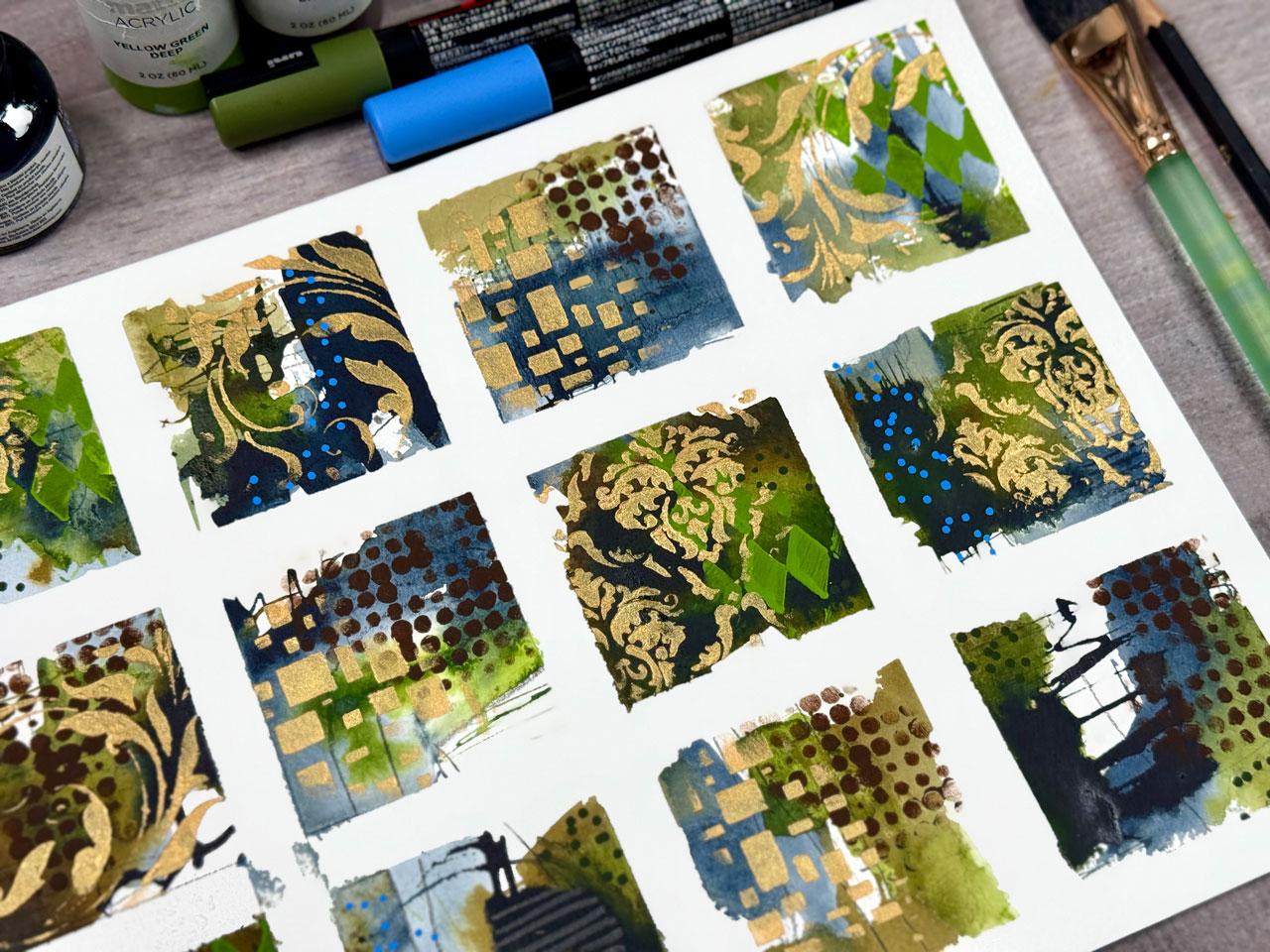
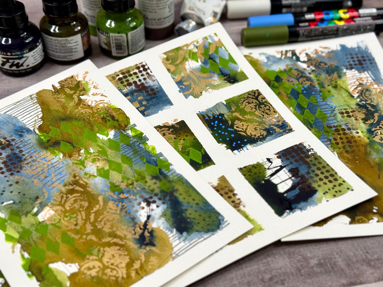
that you might like? This is a yellow green deep by Blick mat paints because I like the map paints
for stenciling. And ink blending brushes. I just have a set of these. I do link all these
on my favorites page. So if you check your
supply download list, I will have a link to my favorites page and like
this, I want to do this first. This is THS 016 Tim
Holt collection. Anyway, I link these
on my favorites page, which I'll link for
you in the supply PDF. The drier you can
get that the better. I tend to tap it out. I Yeah, so ink a blending
brush, favorite stencil tool. If it's got too much paint
versus tapping it out, you can see the
difference there. If you have trouble
with stenciling, generally, it comes
down to too much paint. So now I tap it like that on my sheet and I get it where
it's not as much paint. You can tap it too through your stencil if you feel like that's giving
you a better look. Choices, giving
your choices here. I like that. Good choice. I like this weirdo diamond set. People always ask me, do I clean my stencils of the
paint? No, I do not. I've been using all these
stencils I got and I got so many different
ones that I don't use the same ones too often, really, and the
paint is so thin, I just don't even worry
about it. It's fine. They're still working just fine. Stencils are inexpensive enough that if I had to finally
replace something, then I would, but I just
don't worry about it. I feel like I need
maybe a brown. I'm layering texture now, which is what I enjoy doing. Brown. I like
layering texture and just getting things interesting. I think the layers make
things interesting. I'm feeling like maybe a dot and I've got
this fun dot here, which is half tone circles. THs 144, it's a bit
like a punchinella, which is the stencil waste that you get at
the ribbon store. It's a bit like that,
but you can get it as a stencil with
different sizes. I love punchinla too. It's the waste from SEQins but you usually find
this at the ribbon store, you can buy a little
piece of that. Yeah, let's put Let's put some dots in
here and filling it. Yeah. See, tapping
it is a good choice. Tap it on the paper and
then tap it over here. Sometimes it's too much.
Sometimes it's just right. I don't worry about
it. Again, it's in the layers. Okay,
I'm liking that. Good choice. Tell yourself good job when you like it, too. Like, good job. That
was a good job. Now, I feel like I
need to dry that, and I'm gonna come in some gold. When I do stuff like this, I like to look at it and think, Are there pieces that I
like just as they are, and I could maybe even do
some graphite lines in it, this one, I actually
like just like it is, but maybe we could put
some texture in the piece with maybe a little bit of graphite just to give me
some extra flavor in there. But I like this one
just like it is. Then I like this one, just like it is with that
green pattern on it. This one I feel like it
needs a little more, but I'm going to come back
in. I like the damask. I don't want all of
them to be exact, but I do like them
blending and flowing. Let's go here with this. Let me throw I put these
in my water bottle, my water cup until I'm
ready to go wash them, and then I wash them
off just like brushes. So feeling like this right here. Could use some gold. And I don't when I'm
doing stencil work, I don't go square to square. I kind of randomly go in and out so that it's very
strategic. It's not perfect. It's it's not the exact
pattern in the whole way. Kind of looks like, you know, a vintage wall or some
vintage wallpaper. That's kind of the feel that
I personally want to go for. I'm going to put one down
here. That's why I'm real. Okay. That one's off a little
bit, but it's still pretty. But yeah, I want it
to come in and out. I don't want it to be solid stencil across the whole thing. That's why you see me offset them and then just do
parts of the stencil. That's personally what I
enjoy and like. I love that. We're going to leave that. I'm going to come up here
to this one, though. Just hints and suggestions is
what I'm going for usually. That's really pretty. I have actually had
some other ones. Maybe we'll try another one.
I like this flourish one. This is THs 032. Again, all part of that Tim Holtz Stamper's
anonymous collection. I like those two. I like all four of
those. I like those two. Feel like we could
use a flourish right here. Let's just do it. That's pretty cool, actually. Okay, I like the flourish. Kind of feeling like we can
have a flourish right here. Let's not get our
paint in the way, but I do kind of feel
like the flourish itself is super pretty. So let's just let's just
flourish it up right here. Oh, yeah. Oh, yeah. Oh, I want one more of these. I kind of feel like maybe maybe maybe I want
that right here. Maybe it'll come up this way. Okay, yeah, yeah.
Oh, that's pretty. Alright, I'm feeling like
we're getting close. I do kind of like
this boxy thing. This is the crafters workshop, TCW 248s as in stencil. I feel like maybe, even though I like these four, maybe this one could use
a tiny bit of some boxes. Oh, yeah. A. But I need it. See how
much fun these can be. It's just all about play and having fun and just
enjoying where you get. Let's do this right here. Without it being a lot
of stress and pressure. I feel good about that. Okay, I feel like I'm done with those. I don't link individual
stencils in your catalog, so definitely Google the ones
that I have told you these are because some of these are very old. I don't have them. I don't know that they'll
be available any longer. Um, but you can search
Googles, search Googles. Yeah, you can Google,
Damitencil and search Amazon and search Goggles
and search Stencil Girl. Those are my favorite
resources and just see what is available. Okay, I feel like?
We could maybe use something something
on some of these. Maybe oh, look at this
blue. Ooh, let's do it. See, sometimes a little
dot, I like white dots, but sometimes a little.in
a fun surprising blue is a nice surprise. Unexpected. Oh, look at
that. I didn't expect that. What they got going
on there. I mean, it gets exciting when
you see things that are you didn't see that
coming. You didn't expect it. Let's do that right in here. Yeah, so if you can only have
one paska, pick a white. If you can have a
little set of paskas, definitely a little
set of colors the colors give you fun pops of something that maybe you weren't
even expecting. Look at this green.
Let's do the green. That greens awful dark, but I could put some dark green in some of these
dark spaces here, and that could just be a
texture in the darkness. What do you think about that?
A texture. In the darkness. I like it. Okay, I do like that. Just some fun. You just look around and
think, what could I do? What could I do to add to this? What kind of fun mark making things do I have?
Okay, that's fun. I probably didn't
like it on that one, but I liked it everywhere
else. Are we there? I feel like I'm there. I like it when I get to a point
that I'm like, Oh, nothing's obvious and it looks
pretty cool and I've got enough going on in each
square. Let's see what we got. These are perfect little
mini test subjects for larger pieces, too, where you could be like, Oh, I love these colors. I love this design.
I love the layers, and then you could translate
that a little larger. Look at this, look at this. So I did switch
papers on this one. So I am having some ink that got underneath it and a
little bit of paper tearing. I went with the Honamule
paper on this instead of the Bohong I showed
you in the supplies. That was my favorite. If
you will heat the tape up, it will peel and not
tear your paper. If you've got a paper where you're peeling
and you're like, uh oh, tapes tearing it, heat the tape, and that will stop that. It lets the adhesive release. And you can see from this spot to this spot,
no paper tearing. So this is the secret
that I like to use. Comes off nice and smooth. It just is what it is.
And most papers do tear. I tend to work with
papers that I have figured out over the
long run don't tear. And still, even with those, if moisture gets up
under it as we're working because there was a lot of water I put down first, it could still catch wet
paper because I didn't stop and let the paper
basically dry overnight. Just swipe it and heat that tape up and you'll get a clean pull. These are lovely. Like, I'm
super excited about this set. These are super lovely. What Look at these and then
you can evaluate and think, did they need anything else? What did you like?
What did you not like? What did you want to repeat
and go forward with? Which one did you love enough to maybe scale up to
something else? These are super fun
for inspiration. I am feeling inspired to
maybe size this up to maybe a two piece set of something out of
this inspiration. I'm going to leave all my paints out and my stencils that
I just picked through, and I'm going to have this
as my inspiration and do two larger pieces so
I can show you how I might take this inspiration
to the next piece. I'll see you back in class.
8. Scaling Up From Your Inspiration Grid: This project, let's
go a little bigger. After looking at
all the pieces that I've created in class, now it's time to look at different pieces and deciding,
how can I go bigger? If you do a bunch of
these, which I love to do, you'll hit upon a couple
that are just like, wow, and stuff like that. Usually, when that
happens to me, let me just pull my
big stake over here. Usually when that happens, it's exciting to take
inspiration and go bigger with the ideas and just see where
can you go with that? I've got several that
I did that with, which are in the
same style as what we created in the video
that we just did. And so I'm going to show you how I went from like this to
just a little bit larger. Just because they're beautiful. I look back at them
now and I'm like, Oh, my gosh, I love these so much, and it's kind of fun
to challenge yourself to translate something in
a little bit larger piece. And you see I've had so
much fun doing that. It's just exciting to see
where did we go with that? And so I am so
inspired by this one, which looks kind
of like a lot of those. We're going
to do that one. That's the one we're
going to be inspired by. I've just cut a piece
of paper in half. This is the Hnomule paper. I tend to use either
that Hnomule or that Bo Hong on just about
everything because that's the papers after all of the years of doing art stuff and playing and
experimenting and just figuring out what I
like and don't like. That's the two papers that tend to work the best
for me and give me the results that I'm always
looking for a lot of times you're not wanting to use the good paper while you're
playing and experimenting. But if you don't
use the good paper, and you're using
an expensive, say, student grade paper,
and then you go to use the good paper and
it doesn't work the way you thought, it's
very frustrating. And so with the bow hong, it is less expensive
than a hotmle paper. So we're going to look
at this. But it's 100% cotton and it does
react very similar. So when I go to use, say, my favorite one being
the honeymule paper, I know I'm going to
get similar results. This little piece here actually
did on the Hnomule paper. These two I did on
the Bo hong paper. The main difference that I see between the two papers is I
don't think the Bo Hong is sized and the artist grade Hnomle paper,
I think is sized, the colors to me, tend to be very rich on
this and maybe just a tad lighter on the
bow Hong sometimes, and the bow hong feels texture
wise, a little different. It feels like the
arches paper to me. But yeah, they're
both still very similar and they'll
give me the results that I'm looking to get for a
more budget friendly price. If you're looking for a little
bit budget friendly but still going to let you go to the good paper later and
do what you want to do, that's how I do that. I get the Bohong and then upgrade to the
honeymule what I want. What I really love
here is the colors. I'm sticking with
the colors that we use the analogue brown, indigo, and the olive green, FW Dahler rowdie acrylic inks. I like the inks because they're acrylic paint, but
they're very liquid. I also liked the yellow green deep and the
brown Blick mat that I did with the stenciling. I also really liked
the IdscentGld fine deep by golden that we used. I've still got out
the posca pens and my mark making
tools over here. I've got everything
out. I walked away from my desk
and came back today. Now on these, what I truly love about these is I like
the gold damask here. I love the the diamond
shape stencil here. That's some of my favorite bits. I love that this
one is a lot more abstract with no stencil work at all. I really like that also. I might try to do definitely the whole thing
like this and then incorporate a couple of
these little elements that I liked without
being too much. Because the goal here for me is pretty abstract
art when I'm done. Doesn't really matter
where we end up. It's just fun
looking at these and then evaluating what
did you really love. Then what can we make
if we go bigger? So let's just go bigger.
Here's our inspiration. I'm going to set that back
here behind us and I hope I don't splash paint all
over it. Got some water. I got some water over here. I have my gray
matters palette paper for when I need to pull the stenciling
out, so I got that. I think I'm going to start with some mark making,
some pencil work. I don't know why I always open my sharpeners right
on top of my paper, but I'm going to sharpen
my Blackwing pencil. Black wing has its
own little sharpener so that you can get
a really long point. I didn't even know
that just in case you're wondering how to get
that really long point. It's a little two
part. Got to go into the one and then sharp it in
the next one. That's fun. Otherwise, I just use a regular sharpener with
my Blackwing pencils. This is a very, you can see how much longer
it makes that tip. But it's very
similar to the 14 B. Pit matt graphite pencil, which you can buy
these individually at the Diclck these are
usually by the box. But let's just do it. Let's
just do some mark making. If you're worried
about your marks being too perfect
and you're like, it's too straight or not organic enough or I don't like the way that
did or what have you, try using your non dominant hand and just just play
and go for it. It's not not about perfection. It's more about some fun, interesting marks and try holding your pencil
way back too. It's just a layer in the paint. You might not even see
these when you're done, but I do like having interesting
stuff in the layers. Okay, there we go. Let's take our brush, open our inks up. Again, I squeeze the
top little part to get any ink out of the dauber
that might have thickened up. Even doing that, I
still squeeze out some that are too
thick sometimes. I really love. This is my
favorite one right here. I love that one.
I'm just looking up at it and thinking,
how can we get that? I think I'm going to start with putting some water down
and then getting the blue out because with the ink is you want to let it go off and do its
thing at the same time, I want to move it
around with my brush. A lot of times when I'm doing especially
abstract art like this, I will come in at an angle. Don't usually start
right in the center. I'm not thinking super hard at this point about composition, and at the same time,
there's just some things that I why don't I just put
that dipper in the water? Did you see me do that? But at the same time,
there's some things that I just naturally gravitate into doing as I'm painting and coming in from the
corners and working on angles tends to be some of those features that
I do a lot of times. You can dip your paint
brush into your inks. You don't have to use the dauber to paint
with if you don't want. I like the dauber, so I let
it come off and do its thing. And again, right now,
it's just about kind of spreading the colors out
for me at the moment. It's about just getting
those going and moving and where can we go with this? What can we create
when we're done? I almost stuck that
dabber in the water, too. Oh, my gosh, we're so funny. And even though I have inspiration pieces
that we're looking at, let me tell you, it's
almost impossible for me to recreate anything that
I've already created. So it's kind of a gentle
guide more than I'm trying to create any specific piece
on purpose because really, it's just too hard to create
an exact of anything. Oh, look at that. That was good. Okay.
Let's try that. Let's do that over here. Just getting some fun marks and movement going
here in our piece now. And, too, we can
take our clay tool. Just got that at, like,
in the clay area there at the art store and maybe make some real fine marks
in here, possibly. And I could start mark
making with my pencil. But I don't know. Do I need
some more dark in here? Just kind of again, looking
back at this and seeing, do I have some of these elements
going here in my piece? What else do I need to do I
really like this darkness. That's what I keep kind
of looking back at, too. It Got to be careful though when you're
getting to the fiddle faddle where you're just
looking at that, thinking, I love
that and then you're just trying to get there and at the same
time you're overdoing it. You got to be real careful
about the overdue. Now I'm mark making
a little bit too. Yeah, you got to get to a
point where you're like, I just need to stop
before I mess it up. So I think what we're
going to do now is let this dry so we can
mark make on top of it. I do feel like I have
incorporated the feel of this, the movement, the
little organic parts that we've got just
moving around. I like the way this blue
came up into a gray. We're going to mark
make and maybe incorporate a little bit of some of our pieces that I liked with
the stencil stuff. I love how this one worked
out with the diamonds, the Harlequin pattern
underneath the gold. I don't know, we have so many directions
that we can go here. We're going to let this dry and I'll be right back. All right. This is not 100% dry, but it's a lot closer and
I can start mark making. Looking at my inspiration piece, I really like this little set of graphite lines that I incorporated in this
bit right here, and I think that's
what I'm going to do just part of the elements in here is add some
graphite line making and I've got a paint stick. This is a paint stir stick from the paint store that I use to prop my hand on my piece and it's over here off to the side, so it's just up
enough that I'm not touching my piece of art
with my drawing and stuff. But I really like the
wider piece of this to be able to put more of
my hand on rather than the little round art dial
thing that you know, a lot of people, the
mall, I think it is, which I have one of
those somewhere, but it's really long. And I don't know. I like the bigger surface
for my hand to sit on. So I like my paint stick. This thing has been going for
years and years and years, and I think at the time,
it might have been free. You could probably get these big paint sticks for $1 or two at the paint store
because I think I saw they start charging for
some of these things now, but totally worth it is a cheap hand rest when
you're working on your art. Not everything has to
come from the art store. It's probably cheaper if it comes from the hardware store. Alright, so we got a
little bit of some mark making in there
that makes me happy. I'll put some in here
'cause I want to. And how do you know
where to put your marks? There is no right or
wrong answer there. It's just looking
around and thinking, Oh, I think I'll put a mark here. Is it always gonna work? No. Does it matter? No. It's all about
play, experiment, moving stuff around, just kind of discovering what
you like and don't like. Let's put some paint out here. I was putting the lids there on my inks before I
knock them over, which I'm clumsy, and I
will knock them over. Clumsy. I'll put my hand in the paint. I'll knock stuff over. I'm
the clumsiest person ever. Okay, we're almost getting
through this gold paint here. All right. So the facets that I loved was the
Harl one pattern. I still have the same
stencils out that we had used the Harleqin pattern
is this one, Tim Holtz, T HS o16 may or may not
still be available, go ahead and you can Google that number and see what
options come up for you. Okay, so where do I want it? Maybe coming through the side. I like it when the stencils
come into the painting, but it's not square edge to
edge, it's more organic. I'm feeling like
maybe the side here. I liked it in the green, so I
picked up that green again. Oh, yeah. Oh, my gosh, look at that. Yes, yes, yes. I get so excited when
things are working out. Okay, I almost want
to go a little bit higher up here
on this one part. Like it was coming in.
Okay, there we go. I like that. Then on this one, I want to do some of that, too. Ink blending brush
is what I'm using here and the secret on stenciling is dry
brush and thin paint, and then I hit it down into it so it's not
super thick paint right here that has worked out the best for me on doing
some of these. I love the green.
There's that one. I also like the brown
half tone circles. I might throw that in there because now we're looking at it, we've gone from a little tiny two and a quarter inch square or three inch square or
whatever it is, to great Vg. These are six by nine
is about this size, 6 " by 9 ". Now we're just figuring
out how do I go up and expand these elements
for my bigger piece, looking at a little tiny
piece of inspiration. I and that's what I do. I just look at it and think, Okay, how do I spread
this idea out bigger? First time you do it, you might
think, I don't like that. But the more you do it,
the easier it gets. It's all about give it a go the first time and
then just seeing, where can you get the next time? Not a big deal. It doesn't have to be perfect. I like that. I like it. I like it. I also think, let's
just go ahead. I'm thinking too many
things at the same time. This is that DAMISk I
like so much, THSO 26. You can just Google
DaMStencils too. There's several out there with a little bit different
pattern wise, but I'm using one that I can give you the number
on because I have a few that came off of Amazon that they're not really any particular brand and
I really like them too. But I don't want to show
you not be able to at least even get a
stencil number and maybe possibly be
able to find it. But if you search Damis stencil, especially on Stencil Girl or Tim Holt Dampers Anonymous you'll at least
something will come up, joggles favorite
resources there for stencils Well, that's fun. Not going perfect here. I'm just going for fun. And then I just throw these in water until I'm ready to wash them off and I
just wash them off in the sink like I do a brush. Let scoot that where I
don't stick my hand in it. Kind of thinking,
I liked it when we had lovely texture and dots kind of and
interesting places. So maybe filling a few of
those with your paint marker. I did like the
random Weirdo blue. Just because it's a fun little
pop that you don't expect. I like those little
unexpected bits of, you know, oh, look at that. Where did that come from? That's exciting.
Randomly in there. I like that. Okay, that's fun. Then you just have
to look back on it. I know there's a
lot going on here, and I'm really big
about cutting up art. So if you get to the
point where you're like, I don't like anything at
all, don't be afraid to cut. Up your art. I'm going to show you these because I
like to show these a lot. But yeah, I take all the pieces and I'm like, I did
not love that at all, and I have a heart punch, you can get heart punches
at the craft store. You can get them on Amazon,
look up Heart Punch. And these are pieces
that I thought, Oh, these are terrible,
but look how beautiful they are punched out
in a little shape. Then you can then do little
art prompts on the back and you can have a pretty little vintage dessert
tray, dessert cup. Now these can be art prompts that you've pulled out
and they're pretty. And if you had a piece
that you didn't love, that is how you can turn that into something that you do love. I love cutting stuff
up. All right. So I feel like maybe I'm there. But I could maybe even add in some extra mark making
with my pencil possibly. I mean, almost I'm looking at it because of this big white area, and I want to go
ahead and fill it in. So if you have that desire, just ride that wave,
go for it, fill it in. I might work, I might not. You can always cut
this piece of art up into other things. I have another thing
that I like to do, which I have a class on this
in the collage section, Junkart collage you cut up pieces of your art
and rearrange it into something else that's
super interesting. Um, and that's another thing. So don't ever throw away the
pieces that you're like, Oh, that didn't work out.
Don't throw those away. Stick them in a tub and put them in the
closet until you're like, oh, let's make some collage
and pull them back out. And these can be part of your collage bits.
Okay, I like that. Okay, I feel better now. I filled in some of
the white white. So now I feel like I'm there. It doesn't have to be like big long drawn out
day of painting. It can be like, how do
we get to somewhere fun? Then I love to peel the tape. I love to see the white
edge when I'm done, so I tape everything down. I don't like working on blocks. For some reason, the height
difference working on a block from the block
to the table bugs me. I tape everything on
a wood artist panel. These are artist
panels that I'm using. I have it in several
sizes so I can then move this out of my way
if I'm working on something else and
letting something dry. Oh, look at these.
Ah, super fun. Okay. A lot of times too, I
don't want you to look at a piece and judge it right when it's done unless you love it, Love Love it, which a lot of
times I do love love things. I want you to look at the piece and be like,
Okay, that's interesting. Then set it to the
side and come back later and look at it because
a lot of these pieces, especially the ones that I have already done that were similar. I've looked at those before. And thought, Wow,
that's too much. Like this set right here. These ones that I did. You know, and I thought, Oh, way too much. But then I look at it now, and I'm like, Holy
Moly, I love this. Like, I want to frame this
one. It's not too much. So I want you, which I've used similar elements as
to what we just did. So I want you to not
be hard on yourself. And this one, too, same thing. I thought, Oh, way too much. But now look how
gorgeous these are. So I want you to not judge them. At the beginning. But save it and come back and look at it later if you don't
already love, Love it. But I love love
pieces like this. I love these, I'm pretty happy with the
different elements that I get and how I looked
at a smaller piece and upsized it to something
super fun like that. I hope you enjoy giving
us an experiment, giving it a go, playing, and just letting go of some of those expectations
and just see what can you create today and enjoy that process as much
as I have been doing? All right, so I will
see you back in class.
9. Final Thoughts: You so much for joining me in this creative journey,
square by square. I hope this process
helped you slow down, experiment, and reconnect with the joy of making art
without pressure. Grid samplers are
such a powerful way to build your visual voice, and there are truly endless directions you can
take from here. Remember, your grid doesn't
have to be perfect. It's a reflection
of you. Your play, your curiosity, and
your willingness to show up and explore. You've just created
12 little windows into your creativity, and that's something
to be proud of. I'd absolutely love to see a finished piece or even just some of your
favorite squares. So don't forget to
share your project. And if this class sparked
ideas, keep going. Try new grids, switch
up your palette, or bring these techniques into your journal or your
larger artworks. Most of all, keep creating. Say curious and trust your
instincts. You've got this.
 DENISE LOVE, Artist & Creative Educator