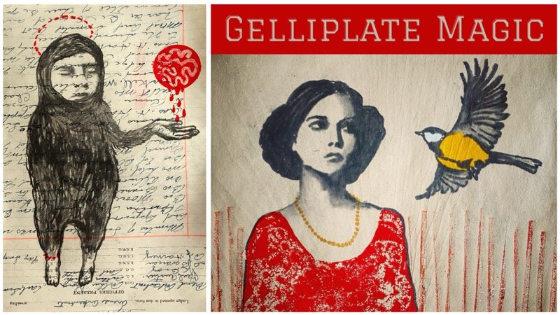
Transcripts
1. Paint, Play, Discover!: I think most artists are really familiar
with this problem. You sit down at your art table. You really want to create, but you just don't
know what to do. In this class, I will teach you a simple creative exercise that will help you to overcome that artist's block and
keep ideas flowing. Whether you feel
stuck at this moment, or you just want to learn about new techniques to
stimulate your creativity, have some fun with your art
supplies and experiments, I think you will really
enjoy this class. And instead of focusing
on one painting, we're going to up our chances
to get interesting results. And how we're going to do that is we're going to get
a big piece of paper, have some fun on
there, just play with colors and lines,
you know, textures. Doesn't need to become anything. And then we're going
to pick and choose some compositions that we
really like to work further on. Oh, I almost forgot. Hi. My name is Journey Marisa. I am a Dutch art teacher with an education
in art therapy, and my biggest passion
is to get you to create, enhance your creativity,
and have fun along the way. So if that sounds like music to your ears, then let's hop in.
2. Welcome to Class: Welcome to class. I'm
so glad you're here. Now, before you dive in, let's get a couple of
things out of the way. First of all, I would
like to encourage you to use the R supplies
that you really love. I'm using acrylics because
it's quick and easy. If I don't like anything, I can just slab on a couple
more layers, and it's gone. But I know there are a lot of watercolor enthusiasts
here on Skillshare. So if you're one of those, then just use them. That way you can still enjoy the exercise without
any problem. Second of all, if you are very insecure about your
drawing and painting, you can still do this exercise because you can just
keep it abstract. You know, you don't
even have to paint on the backgrounds
that you create. Maybe you like them as they
are. That's fine, too. But if you want to do a
little bit more on them, you can create collages on them. It's really fun to
try the same kind of collage on different backgrounds to see how that
impacts your art. That's really useful, as well. And lastly, just embrace
your own style, you know. I know it's tempting to try to want to copy the
style of the teacher. Of course, I have no
problem if you want to explore my style and
have some fun with that. It's not about that,
but the risk in that is that you're going to compare your style with mine. And, you know, I've been
painting like this for years, so it's only natural that your art is going
to look different. And that is exactly what
is supposed to happen. You know, you're you, I am me, and we all create
our own unique art. And I don't want you
to feel bad about yourself because your art doesn't look like mine.
No, it's supposed to. Just have some fun and yeah, let go of expectations. So now that's out of the way. I will show you which artipies I'm going to
be using for this exercise. Even if you are going
to use different media, I think it still can
be useful because it's always good to know about what artifes
are out there, and maybe you like one enough to try out in your own process. So if that sounds good, too, let's go to the next video.
3. Art Supplies: Before I dive into the art supplies that
I've used for my project, I want to emphasize that you
can use anything you want. If you don't like painting for finding your figures in the
second part of this exercise, then you can take your
neo color cranes like we used in my previous
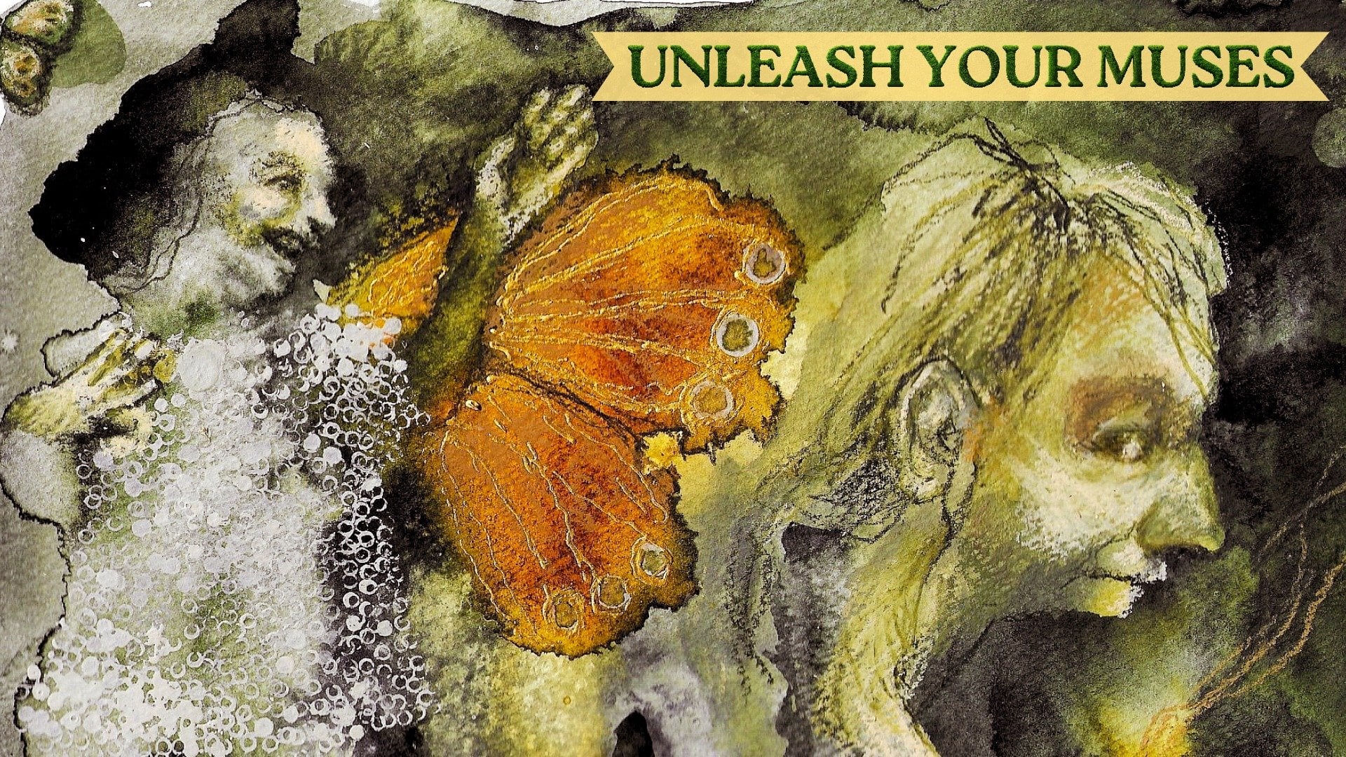
class on leisure muses. Feel free to tweak the
exercise anyway you want, but here's what I used. These are my acrylic paints. To keep it simple, I've
used one very light color. This is unbleached titanium. I use this one a lot. It's a really nice neutral color that's not as bright as white. Oh, I see, I forgot my white. I had a little bit of
white in there at the end, just think of another jar
of white paint right here. I have some paints gray, and that's really
a very dark blue. Um The one that I started
with was by golden, and this one is a little bit more intense blue
than this one by liquitex. This one is darker. So it's
good to know that difference. I have some yellow ochre,
some carbon black, and for my second, color, except for
the neural ones, I use this acrylic
ink also by liquitex. It's vivid red orange. I really like these inks. They play well with
the acrylic paints and they are more
transparent by themselves, so you don't need to make
a glaze or anything. You can just put them on there
and play your heart out. Speaking of the glazes, here's my MD medium. I really love this. I use this as an adhesive
for my collaging. You can collage in
anyway you like. But especially for
projects like these, I prefer the MD
medium because if you're working on
sturdy paper like I am, then you can take
this wedge and really press out all that
air bubbles that you will get with something like
a gluetick or something. You'll also see me
use this to create glazes so you can make your
paints more transparent. Another thing that's nice
about the mad medium, you guessed it, it will
make your paints more mad. Acrylics have a very
shiny plasticy feel to them and I'm not
too fond of that. Maybe you like it,
but if you don't add a bit of mad medium
in there and it will really soften up your critics without
adding any color to them. That's nice. Then
back to this wedge. This is a silicone wedge, which is very dirty,
but that's fine. That is perfect to squeeze out all that mad medium from
under your collage papers. If you're using them,
you don't need to. If you don't have
this, you can also use a discarded credit card
or gift card or something. That's not a problem. Then I have this
tool, the scraper. You can also find these
in your local art store, and these are nice to scratch in some textures into the paint. If you don't have them and you don't want to get
out and buy them, you can use a fork or something, anything with a bit
of texture in there. Then we have this fan brush. I really like that because while you're
painting these bristles, they will separate on you. You'll see this in
my demonstration. I will give you very
expressive marks. That's another recommendation. Then there's the palette knife, which I use in the same
way as my wedge with the paint on top of
the collage paper, it's really nice to move
around the paint and get some more texture and expressiveness than you
would get with a brush. And that's pretty much
it except for the paper, go to your art store, pick out a nice big piece of paper with some weight
to it because it needs to be sturdy to not buckle on you while you are
playing your heart out. That's it. Let's go
to the fun part.
4. Conquer the White Page: Are you ready? Let's go and
conquer that white page. I'm going to start with
a layer of collage. This is totally optional. You can go straight
in with the paint, but I really like this to have a little something on there
before I start painting. Whatever you do, don't be
stingy with your mat medium because wherever there is no met medium underneath
your collage paper, you will get air bubbles. I'm using a silicone wedge
to spread it around, but you can also
use a credit card. I think this works more
pleasantly, though. When you have a nice layer, put your paper on
there and squeeze out all that met medium
from under your paper, moving from the
middle to the edges. Really get it out there, and then just repeat
the process until your whole page or part of it is covered,
whatever you want. This tep helps me a little
bit more to let loose once I start painting because there's already
something there, and somehow that makes
me more relaxed, and I bet it will work
for a lot of you as well. So decide for yourself
if you want to take the extra effort to have
something like this. No need for nice
composition or anything. This is just something
to trick our minds, and most of it will be covered up in the
next step anyway. So don't stress out about it. Time to bring in some paint. Choose two colors
that you enjoy. One very light one and
one very dark one. I'm using unbleached titanium. It's my favorite light color, and my favorite dark
color is Pain's gray. There we go. Pain's
gray, you know? It's called gray, but it's
really a very dark blue, and I love it to pieces. Now, I'm going to
take my met medime again because I want
to make some glazes. I want the first layers of
paint to be very transparent, and that's why I'm mixing
these with each other. And I'm going to
separate part of it and dilute it even further. You can do this
with water as well, but it's safer to
do it with a medium because especially
with cheaper paints, it's going to reduce the
quality of your paint, and it can flake over time, and it's a huge mess. But if you have
the golden colors, you can stretch them
pretty far with the water according
to golden themselves. I've never tried it,
but I trust them. I start by taking my
palette knife and scraping my paint over
my collage paper. By doing this, you'll
get very thin layers. It's easier to get the thin
layers than if you use a brush or something
because you can keep scraping until
you like the effect. I would like you to see this as playground and not something
that needs to be beautiful. Just experiment with your tools and see what kind of
marks you can make. Here I'm taking a brayer, and I'm going on top of those layers of paint
that I put on before. Here I'm using my fan brush. I really love that for
expressive brush strokes because the bristles will
separate very easily. And I found this scraper
at my local art store. It gives you nice textures, and just look at how interesting it is when it
scrapes through the wet paint. Now that we have our big
areas mostly covered, let's take a brush and do
some mark making because our imagination needs some
lines to be triggered, you know, to see some things, maybe faces like I always see, maybe animals, maybe landscapes. So just you know, just experiment with it. Another thing that
will help us to find stuff in the paint is contrast. So I'm taking my
black paint right out of the bottle and I'm
doing more mark making. Again, play your heart out, but be sure to leave some breathing room because
if everything's a mess, then you'll have a hard time
to see something in there. Now I'm taking my white, and I'm going to do
some finger painting. It always gives a
nice fluffy vibe. If you don't like to
use your fingers, take microfiber cloth
or something like that. And, you know, I really like the fingers
because it's very direct. Time to bring in
your favorite color. I'm using my vivid red orange
acrylic ink by liquitex. It's very transparent, and
that's what I like about it so that I can still see
some of my collage papers. You can, of course, also
make another glaze, but, you know, I was feeling lazy, and yeah, this was just easier. Again, leave some
breathing room, but be bold at the same time. You can isolate shapes
that you're seeing, or you can cover up areas
that you don't like. You can brush through the paint that's still wet
like I'm doing right here, so it will mix in
with that white. And Walla, a little
face appeared. I can't help myself, even when I'm working abstract. Okay, let's do the same
thing in some places. Try to keep it abstract
journey. I can do it. Keeping it abstract will
really help you when you're going to choose your
compositions later on. But hey, if you see
something you really like, I encourage you to
bring it out because, you know, it's your art, and you should do
what makes you happy. Try to work in rather
light layers so that it will dry pretty
quickly because otherwise, it's going to mix in with
each other, yeah, too much. And depending on your
choices of color, that might be okay like
the colors I'm using. But if you are using complimentary colors that are opposite of each other
in the color wheel, you will get muddy colors. And if you don't like
that, then you're going to have not a great time. Here, I'm putting on a color that I'm
really not enjoying. So what you do you take
your baby wipe and you just spread it around and
take it off and it's fixed. So don't be afraid
to try out things. There's always a way. I'm going to do the
same thing here, and I'm taking some paint, and I'm going to cover it up. So that is a different
way of dealing with that. And also, try to use
the back of your brush. You get very expressive
lines like that. When we give up some
of our control, wonderful things can happen, and if it doesn't and
you don't like it, then just put
another layer on it. It's that simple. That's
why I love acrylics. Now, let's pick a
second color that you think will go well
with your color palette. I'm using yellow ochre here. I really love that color, and I think it works well. If you have experience
with working in color, then you can go nuts. But I recommend you keep it a limited color palette because that is just first of all, it's a little bit easier, and also it tends to be more emotive than
a whole bunch of colors. And when you decide
that you're done, then let's move on
to the next lesson.
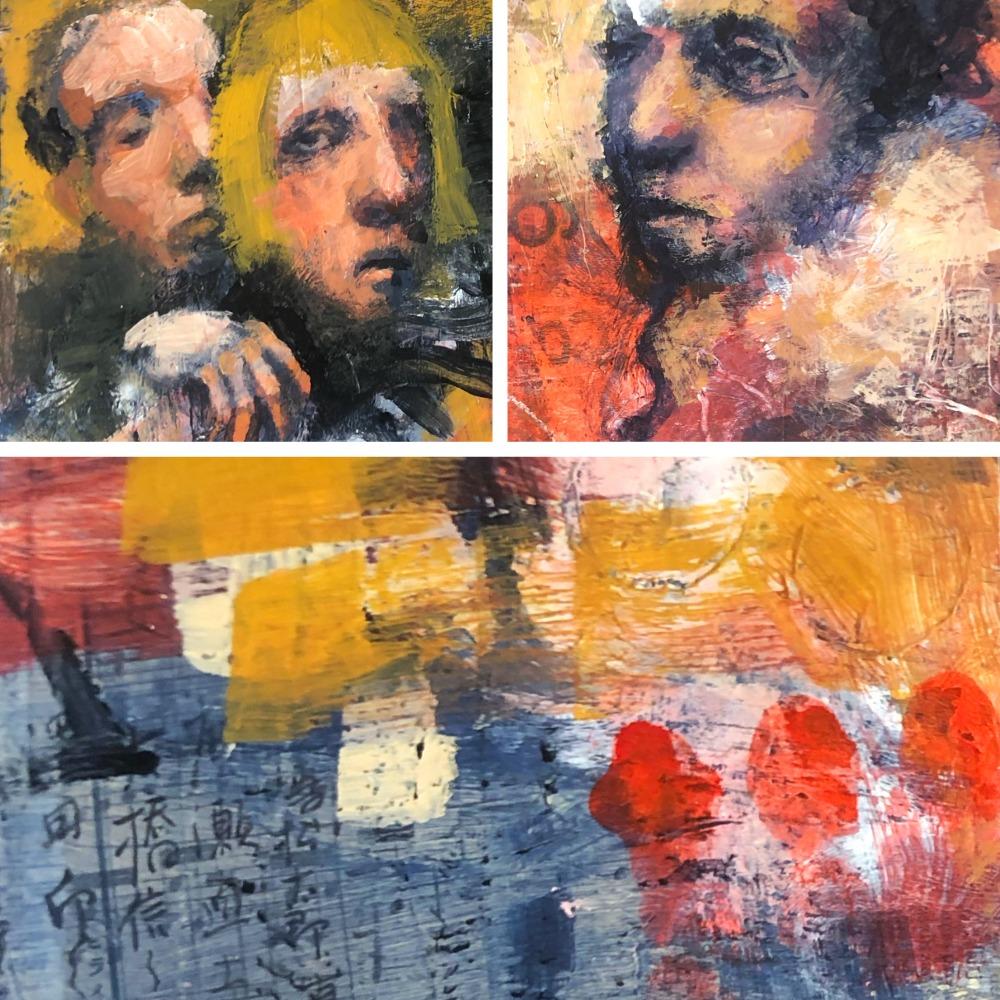
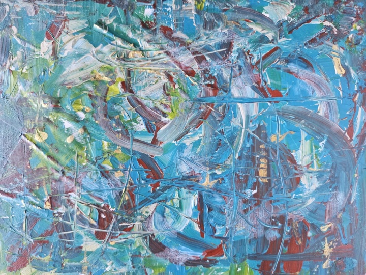
5. Mark Your Territory: Okay, so now I have
this big piece of paper with some
contrast or marks, and I could go on
for a little while, but it would become
a very long video. And you don't need that much. I saw kind of a face right
here and I couldn't resist. But I try to keep it rather abstract for
the rest of them. And now I'm just going to see if I can find a couple of compositions
that I really like. So I have two of these, you can buy these wherever
they sell frames. See, so you can really play with different compositions
right here because if I would just
start on the paper, a tiny paper, it's
kind of fixed. And here I can really discover what kind of
compositions work for me. I would like these
numbers to be in there. So this is out of the questions, but maybe you would like this. Like this figure just
speaking like that. I think I think I like this. Yes. So I'm going to
get a neocolcraon, the water soluble kind. I'm going to mark it there. So I know I need to
cut it right there. And if I want to, I can do something like this because it's too
small for another square, but I got this one. I don't even need to see
anything yet, you know? There. I don't need
to see a figure. I just like this little
background right here. Here, I could see kind
of a polar bear or something with
some sort of face. I need to be mindful of this. Let's see if I can
see something else. But I think I like I like
this waving little fellow. I don't know if it's going to become a polar bear, maybe not. But I like this composition. Oops. I need to get
all of those edges. Now, let's see if I can find something else that
I think is cool. This could become
face right here. But maybe I like something
else. Let's see. Kind of like this one.
I'm not really sure why. Because I can see figure
in this composition. But yet, I like this more, and that's really
surprising to me. And that is the beauty
of playing like this. You'll learn what you love
in a very accidental way. I never thought I
would pick this spot without this frame.
But that's cool. And so weird because
when the frame is gone, then I can't really see
it all that well again. That's awesome, right? I
really like this shape. Not sure what it
would become, but Si. And maybe I kind of like this
because I can see a couple. Here is some kind of a face that interacts with this shape, and this could become
a figure as well. So see, you don't need
to see actual faces. You just need to see
the story and you can work that out once
you have separated them. Whoops. Let's do that properly. They're water soluble,
so it doesn't matter how I do this. There. This is boring. Maybe something
like maybe I can do something with this. There. See how many you can get out
of this one piece of paper. I like these marks from the
Oh, I need to wash this. From this to scraper. I like this very much, and there's lots of
texture right here. So I think I'll do it like this. I love that I can still see
a little bit of the text. I love this texture right here. No idea what I want to do
with this, but I don't care. I have another little
interesting conversation. When you're done, find
your compositions, let's go to the next video.
6. Prep Your Backgrounds: Before we can play on
our little canvases, we have to get rid
of those borders. Because they were drawn with neocolor crayons that
are water soluble, you can just take a baby wipe
and wipe them right off. Work your way through your
pals because that way, you can just grab them whenever you want to do a
quick art project. Nothing is more
annoying than wanting to start and remembering, uh, I still have
to do this thing, where my baby wipes, you know? So just get it over with. The next step is to
take a good look at your papers and maybe
turn them around to see them from all
angles and search for interesting
figures or animals or, you know, something
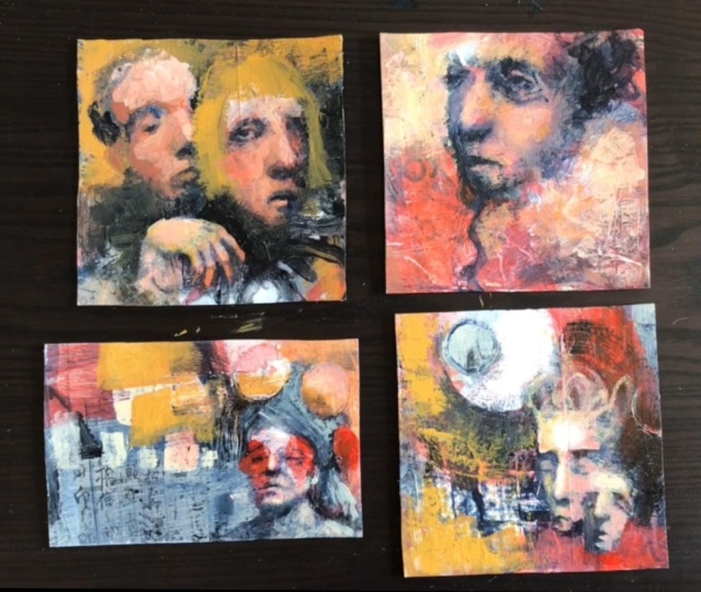
that you love about it, and then pick four of them and lay them
out in front of you. And those are the
ones that we're going to use for the exercise. Why for you, may I ask? Well, because every
time you get stuck, then just move on to the next one because when
we get back to our art, we can look at it
with fresh eyes, and then we'll see
more possibilities that we just didn't see in
the previous play session. So are you ready? Let's play.
7. Let's Warm Up a Little: I hope you found some nice
backgrounds that you enjoyed. Now, before we going to dive in, I have one more
little suggestion. And that is to not start with your favorite background because we always need a little
bit time to warm up, and I don't want you to get the feeling that you've ruined
your favorite background. So let's start with our
least favorite background. Warm up a little, and then we'll continue with the other ones that are more exciting to us. Sounds like a plan.
Okay, let's dive in.
8. Example 1: Warm Up Play Session: Okay, so I put the same
color palette on there. Maybe I'll just take
a little bit of that red orange orange
red. What was it? Vivid red orange liquitex. And I'm just going to play a little bit
more using those colors. I also have a little bit of the mad medium on there
so I can make glazes. So I think I will
start with a glaze with the tiniest bit of the paint gray in there,
maybe a bit more. And I want to put it right here because I don't want
it to be that white, but I don't want it to
be very dark as well. I try to just slowly I don't know if I
like that very much. I try to keep my
brushstrokes rather loose. I think I will mix these two unbleached
titanium with the acrylic ink. I'm trying to think in
blocks of color and value. I'm trying not to
be too precious. So this is still mixed
in with that met medium. It's like I'm sketching
with a pencil, those kind of movements with tiniest amount
of paint on my brush. That way, I can push certain certain things more into the background
using my darker value. Uh, um, I'm not afraid to let
those colors blend. I'm just trying to see what
kind of color I can get and I'm just going to put down something. Don't like those eyes, so I'm taking my paints gray and I'm covering up most of it. Oh, I do like that. So you
can just go back and forth between the dark and light until you have
something that you like. This was the one by Golden. The paints gray,
and now I'm moving to the one by Liquitex
that's a little bit darker. So I can get more contrast. Just want a lighter
value right here. Whoops, that's too too bright. So when you don't
like something, you can just take a
rag and try again. It's still too too
bright for me. Also, it's too much paint
on my brush as well, there. Yes. I'm touching the canvas
very lightly right now. I'm not sure. It happened there, so I'm just going to cover it up there. Maybe I want a little bit
more yellow in there as well. So I'm taking some
of my yellow ochre. I always think it's nice to have some variation in colors. I like to spread the
color across the Canvas. Maybe I want a bit more
light for the background. Let's see. Put in some contrast. But I don't want to cover
those letters letters, those numbers that I liked. Okay. Just observe whatever
you're doing and respond to that. There is no right or wrong. There's just play and discovering what it is
that you like to do. You can use any
color that you want. As long as your values
are making sense, they don't even have to
be correct, I think. Not 100% anyway. Oh, I think I like
this little character. It's a moody little one, right? I had fun with this one. I'm going to put it aside. Let's see.
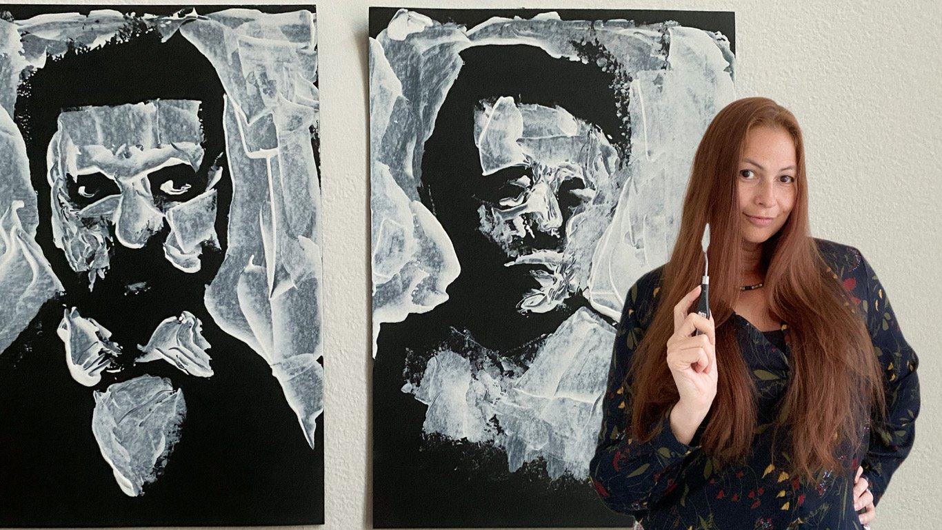
9. Example 2: A Little Bit Of Tenderness: Let's see if we can
bring these to life. I'm going to make another glaze with the paints gray
and about medium. And I'm going to try
and find these figures. The advantage of working with this type of
place is that you can very lightly start
to fill out the face. I'm pushing back some of the features by making
them a little bit darker, but it's not very opaque
yet and that's what I like because I
don't want to lose all that texture underneath
and make it very dark. I'm going to build up the
layers of glazes very slowly, as I'm doing that, you can
start to see a face appearing. It's still very subtle
and approximate. I really want to focus on
form before I go into detail. Although I see the figure
on the left very clearly, I'm not quite sure how to go about that figure on the right. I'm still unsure what direction I want the
figure to look at. But rather than obsessing over this and doing nothing
until I know for sure, I'm just going to
take a mid tone and I'm going to
start trying out stuff and I can
do this because I know that I can change
everything I want to, I would like you to be that confident as
well in your art. See here, I wasn't
sure and I just took a paper towel and
I got rid of the paint and now I'm trying a different direction just
to see how that feels. Here I'm moving the eye sockets, I'm sketching out little
face and I try to imagine the impact of this
orientation on my piece. I'm moving around between the
left and the right figure, especially because I'm still quite unsure about the
direction that I want to go and I'm trying to keep myself from obsessing over
I'm doing it right. That's why I jump around
between the two here and there. While I'm working
on this figure, I can contemplate about the
direction I want to go in. Now I'm going to try something making a bridge of the nose there
and the forehead. I even though I really would like to
express tenderness, I also want there to be some tension that will make story a little
bit more interesting. I also started a
little hand there and I would like you to
not be afraid of hands. They will tell lots
of beautiful stories, even if they're
imperfect and quirky. I'm just slowly feeling
out those faces. Here I'm going to try
and find my figures. I'm not stressing out about them being in the
perfect direction right away because I can sculpt the hands just as I
can sculpt my faces. It's the same principle. Here I'm taking a little
bit of a darker value for the bottom part of
the fingers because they would be a little
bit more in the shadow. By having those different
values in those fingers, they will seem a little bit
more three dimensional. I'm just trying to make a lighter color for the back of the hand there because that
would catch the most light. Here I'm painting in
the negative shape around the fingers
to fine tune them, keeping my brush strokes loose. I like to mix my colors on the palette and whenever it
doesn't feel right to me, I'll just adjust it. See, I'm still trying
to find those fingers. I'm taking my time.
Again, I'm painting in the negative space to
reshape the fingers. You don't need to get
it right right away. Just start and see how
things evolve and don't freak out if you're getting
it wrong first time. Just do another
layer and try again. You can go back and forth until you are happy
with what you've done. That doesn't mean that it's
a perfect hand or anything. But as long as it's expressive
and it tells your story. Here I'm doing the same
thing to the face. I'm taking my paints gray and I'm blocking in
certain areas of the features knowing
that I can still adjust my expression because
the one on the right looks very slow right now, but that will change. I will just continue with this process going
back and forth between lighter and darker values and sculpting my
figures in that way. Whenever I have a
feeling that I'm getting obsessed about details like I'm doing here
with the nose, see, it just looks off because I'm forcing
too much detail there. The I got rid of it. And that is pretty
much what I'm doing. I'm just trying out little
patches here and there. Does it look good to
me? Then it stays. Does it look off? Then I'm going to cover it with a different color or a
different value or both. I keep at it until I am happy. I think I will just let you
watch now because yeah, I think I've shared everything with you
and I can repeat it and explain every little
thing that I'm doing. But I think there's value
in just watching as well, because now you know my process, and, yeah, have fun.
10. Methodology: In this lesson, I will show you how I've been working
all along because I have edited the
previous projects a lot so that they would
make more sense to you and also so that I could
give you lots of tips on how I paint and
what I was thinking. But in reality, each time that
I felt a little bit stuck, I would move on to
another project to let it set for a while. And then I could go
back to the other one and things just flow better because I came back
to it with fresh eyes. This is just how our mind works. When we're too close and
too involved in something, we tend to get tunnel vision, and that is what this exercise is designed for to help
you cope with that. Now, I will just let
you watch for a while, and I hope you'll enjoy it. Oh B I really had a lot of fun playing
in this manner, and it's a nice way to get
yourself out of a rut. If you're annoyed by yourself by doing the same
thing over and over again, then this is an awesome way
to break free from that. It's rather liberating to just go with what you're seeing, whether it makes sense or not, like these two, for example, I really enjoyed this one. I have no idea what to
do with this spot, but, you know, I can work on
it at a later stage. If I have only 15 minutes or so to spare, on a certain day, I can just take this one
and try to see how I can work with this area to
push it back a little bit, maybe add a little bit more
collage or I don't know yet, but um, yeah, don't force yourself to solve all your problems
in one sitting and let these be projects for when you have very
little time on your hands. The advantage of working
on a couple of them at the same time is that
you'll have more of a chance to get a really
powerful one like this one. This is an absolute favorite
of mine right here. And I love all of these
for different reasons, and I'm looking forward to working my way
through this file. I hope you had fun
watching my process. Now let's go to the next video.
11. Your Turn!: I hope you had fun,
and more importantly, I hope that this exercise will help you to overcome
Artist's block in, you know, many times to come because there
will be many times. You know, that's just life. If you did enjoy it, then maybe you will find
some other classes on my profile that you also like because I focus
on this subject a lot. I would love it if you would post your project
in the classroom. If you don't want to show
all four or six or how many you are making then just
pick your favorite, and I can show you some love. And I'm sure the other
students will do the same. It's always so much fun to see how supportive
you are with each other, and I really like to
hang out with you guys. If you enjoyed this class, I would love it if you
would leave a review. Not only does it help me
to get more visibility, but it also helps me to keep building better classes
more to your liking. I just always get happy when
I see that notification, and I read your kind words. I'm babbling. I always get a little
bit nervous asking you for reviews and
class projects, even though I know that you always do it with love
and so much enthusiasm, you know, it always seems
a little bit weird to me. But I do appreciate it all, and I hope to see you there
and I'll see you in the next. Mm. At creating.
 Jerney Marisha, Helping You Create With Freedom