Transcripts
1. MAGICAL FORESTS - introduction: Hi, unclear, Welcome
to my class. In this class I'm gonna be
teaching you how to create whimsical magical forest
paintings in acrylic. And I'm really looking forward to showing you some
cool techniques. In this class. I'm gonna be teaching you
how to create intuitive, magical, drippy
pattern, the forests. These are all made
from imagination, and I really want you to
push yourselves and two, let go of perfection. It's really important to be creative and
enjoy the process. This is not about perfection, it's not about replicating
exactly what I have created. I want to teach you steps and the process that you
can use yourself to create your own style of
whimsical forests paintings. So it's really
important to remember that the way that these
paintings are made and the whole intention behind
these paintings is to work with your own creativity and
your own creative intuition. And have fun of playing
with layers of paint and seeing what happens when you add different textures
on top of each other. Different transparency with
paint on top of each other, patterns, repetition
and building up lots and lots of layers, taking away layers
again with new, new paint layers and really exploring the joy of painting, because that's what the
most important part of this process is. It should be joyful, it should not be stressful. So the most important
thing to remember is that you don't have to copy
exactly what I'm doing. In fact, the list you copy
exactly what I'm doing. The happier you will be and the more involved in the process
you'll be able to get. I'm going to show
you the techniques that you need to use. And you can then
recreate those in your own way and layout
in your own way. This way of painting, it's very random and it has
a lot to do with chance, especially when we're using
water and letting it drip. And you're adding layers of paint on top of layers of paint. Strange things can happen and you can't always
predict those things. Which means that it's going
to be very difficult for you to recreate
what I've created. Exactly. And that's good
because that's not the point. I don't want you to
paint this painting. I want you to create
your own painting. And I want you to
learn the steps and the freedom and the process so that you can enjoy
making your own forests.
2. MAGICAL FORESTS - paint talk: For the first project, we're going to be
working and getting familiar with
transparencies of paint. Because we're working in a lot of layers with
this style of painting. And if you don't
understand the difference between a transparent
color and an opaque color, you might be a little
bit frustrated with the results
of your layering. So transparent and opaque refers to how much can be seen
through the paint. Obviously a transparent paint, you're going to see
what is underneath. So it has pigment in the color, but the color is transparent. So if you're layering
on top of other things, you will see through the layers. While an opaque paint, we'll have a much better
coverage and you won't necessarily see the
layers underneath. So the way that you can
tell a transparent paint from a opaque paint is usually
on the label of the paint. So I've got two different
brands of paint TO most good-quality
professional brands of paint. Will you tell you
the transparency? So e.g. on Matisse, you'll see on the front, here's all the information
about this particular paint. This square, this black
square that you can see here. This tells me that
this paint is opaque. This is another Matisse paint. You can say the
information down here. And you'll notice that
this square is half black and half not filled in. This is telling me that this
is a semi-transparent paint. Other brands will have sometimes the
information on the back, sometimes on the front. This was a Liquitex
heavy body paint. And you can see here that
on the back of this paint, It's telling me this box
is completely clear. This means that this
paint is transparent. Sorry, usually that
will indicate on the labels whether it's opaque or semi-opaque
or transparent. So this is another liquid texts in this brand are on
this particular one. It's actually showing
you on the front. See this series for
it, this is opaque. But usually see it says
on the back as well. It'll be somewhere
written on the label. It's always gonna be
written on the label. I'm even larger
jars like this one. It's written here on the label. It depends on the brand of
paint where it is written, but you should always be able to find whether it's
transparent parent or a pill that you should always be
able to find information about whether it's transparent or opaque or semi-transparent. I'll get a piece of
paper and I'll show you the difference
between these colors. So the opacity, the opacity
is referring to the color straight out of the tube without any dilution
or water added. So I've got three
different paints here. I've got a fully opaque, I fully transparent
and a semi-opaque. And so I'm going
to show you what happens when I paste them all over this line of indigo. So the fully opaque paint straight out of
the tube and with no dilution should cover. More paint, should
cover over this indigo. And see how you can't see any of the indigo through that paint. It is opaque. Washed my brush and I'm now going to do the
transparent color. This is quinacridone magenta. I'll just get some
out of the lead. Okay? And if I paint this dam, even if I get more paint, you can see that
it is transparent. I can still see that
line of indigo through the paint with the opaque
color, it's disappeared. Transparent. I can still see through it. Now. I half and half semitransparent,
semi-opaque color. You should be able to see
a little bit over it. But sorry, a little
bit through it. Again, I'll get some of this. And we will paint
some over like this. And you can see that it does
have a bit of coverage, so it paints a
little bit thicker. I will cover over the indigo. But it's not as opaque
as the balloon. So it's a
semi-transparent color. Now, this is important to
remember, important to note. Because when you're laying
colors on top of each other, if you're working with
transparent colors, whatever is underneath is obviously going to
affect the color. Because you can see that this area in here is
now a really dark purple because we had the blue underneath and the
transparent red on top. And so now we have a purple. This one doesn't
affect it at all. You can paint straight
over and it will cover underneath this one here. It starts to affect it. It's not quite dry yet. But if I kinda smooth
that out a little bit, you will say that this square, where the blue meets the
yellow has gone green. The color underneath
that now looks green because we're layering
colors on top of each other. If you have a lot of colors
that are transparent, then the painting is going
to look very wishy washy. Alternatively, if you have
a lot of colors that are solid than the painting is
going to look very flat. So we're going to
be working with a combination of acrylic washes, solid colors, and some
transparent colors as well. Now, you can make a opaque paint and more transparent just by
adding water to it. If you dilute the paint
with a bit of water. So I'll just get a
little bit of it here. I'll dilute it down with water. Okay. If I dilute it down
and then painted over, I can make this color transparent just by
adding water into it. However, I can't make the
transparent color opaque. It's always going
to be transparent as it is out of the tube. I should say. Even if a paint another layer, It's going to still
be transparent. Okay, it'll be a little bit
of a darker transparency. But it's still transparent. If I want to make a
transparent color more opaque, I need to add another
color into it. So e.g. I. Can lighten it by
mixing it with white. And then because what
isn't opaque color, I can turn it into
an opaque color, but of course it's going
to lighten the color. If I want to change the
color to transparent, sorry, I want to change
the transparent color to an opaque color. I need to sort of mixing
colors that are similar. So e.g. I. Might be able to mix a little
bit with the salmon pink into this color to make
it less transparent. Sandwich after a little bit
down on my table brush. So if I add a little
bit of this in here, it is going to change the color slightly obviously
because this is lighter. We can mix some
of that in there. And that should help
make it more opaque. So I can make it a bit darker
by just having more red. So you can make it a bit more opaque by adding in another, another color that is opaque
into the transparent colors. So we can play around with that. But this is an important
thing to understand. So the first lesson that
we're gonna be doing is we're going to be
playing around with some transparent colors and
opaque colors on paper and layering them on
top of each other and playing around with
seeing what happens.
3. MAGICAL FORESTS - exploring paint transparency : So for this first
little demonstration, what we're gonna be doing
is playing around with transparent colors
and also practicing a little bit with
paint consistency and getting the paint
from a very thick, very thin and seeing it Romney and doing a few application
techniques to start with, we're gonna be working on paper. You can work on a
canvas if you wish, but paper is just
cheaper and easier, especially if you're
just practicing some of these techniques. This is just an A3 paper. I've just taped it up to this board to keep
it nice and steady. I have a selection of transparent
and opaque colors here. You don't have to
use these colors. These are the ones I'm
just using as an example. So the important thing
to remember with transparent colors is that
you want to be making sure that your water is
very clean because any contamination in the water is going to then
contaminate your color. Because this is an equalizer, yellow, which is a very
transparent color. You can see that, you can see the paper, throw it, and it goes on really
transparently. So all I'm doing here is dipping my brush in clean water and allowing that water to
let the paint drip down. Another way that you
can help the paint to run down is to use a spray bottle and just spray
spray down your surface. And that will encourage
the paint to run. A transparent color
is not going to get any more opaque than what
are these at the moment, unless I add white to it. If I was to add
white to this color, a little bit of
white and mix it in. It now becomes opaque and
it's no longer transparent. But I'd like it to be
transparent for this stage. So I'm just gonna
blend that in Ruby. And I'm just going to add
a few of these around. So we're going to practice with that thick
and thin layers as well. So this is quite a thin layer of color because it's a thin
layer and it's transparent. It's really, the transparency
is really emphasized. So now I'm gonna get
a different brush. And I'm going to put down and opaque layer on top of this. So I'm going to use some of the, this beautiful salmon gum. And say when I paint over
the top of the yellow, you can't see any of the
yellow underneath it. It's going to add some some
blotches accommodation. Again, I can use the water
to help it move around. This is a nice big brush. I'm gonna commit to
what I encourage these colors to run down the page and blend with
each other a little bit. Now we're going to
experiment and see what happens when we start combining different
transparencies of paint on top of each other. So I'm going to add
some transparent paint. So a transparent color
on top of that opaque. So I'm going to use that,
the quinacridone magenta. And I'm just going to
get a little bit of water to make it
flow a bit easier. Because say that this
is a solid color because it's an opaque color. And if I add a little bit
all of this on top of it, you can see some of
that color underneath. Especially if I go over
to the white area, you can see the color change and the color difference
that's happening in here. It's going to add
some pattern on here. As I pass into the transparent. You can see that this pink
color that I'm using, which is very magenta pink, suddenly starts to
have a bit of a yellow undetermined because
it's picking up the color that's underneath. Same I pulled up over here. Now, if I was to add
some of the magenta to the salmon pink, we now have more of
an opaque color. And if y was to go over, so this area here, you can see that the
color I put down is no longer affected by
what's underneath it. Because it's opaque, it's
no longer transparent. So it doesn't matter
what's underneath it. I can cover it and it's
not going to show through. So you can see this magenta. You can still see quite a bit of the white paper underneath it. This you can't. So by playing around with them, you can create some really
interesting effects. E.g. let's get a bit of this. I'll get a bit of December pink. And I'm going to spread
it on quite thick. So it's very opaque
because it's very thick. Maybe even some that are just spray some water on it
to help it move around. I can completely cover
over what's underneath it. I can weed the magenta. I pick up some of that and
I spread it over here. A little bit more water because
it's a transparent color. Let me just adjust
the camera a little bit so you can see
what I'm doing. Because it's a
transparent color. You can still see some of these lines from the
orange underneath it. Whereas this is opaque. You can't see what's
underneath it. I'm just going to keep
playing around with layering. These colors. Some of them are paying,
some of them transparent. And just having a bit of fun creating a bit of
a random composition. So I'm going to cover
either some of those spots. That idea is let these drip down like that.
4. MAGIC FORESTS - paint transparency part 2: Okay, so this is dry it
off a little bit more. So now I can again start layering different
transparencies. So I'm gonna get
some more of that. That left glute. And this is a very opaque color. So I can cover over areas of the painting
quite thoroughly. The same. We are this indigo. It's going to be
very dark, but it's, it's a very opaque color. So it's not going to show through anything underneath that. You can make a opaque color transparent by
adding water to it. So you can see how I've added
water and scraped it back. So now it's no longer opaque. I mean, now it's no longer okay. It gets a little
bit transparent. So you can manipulate the paints to work for you
in that way by adding water. So it trades for those that
are familiar with watercolor. Transparent acrylic paints work in a very similar
way to watercolor. That while opaque, acrylic
works more like wash. So it's very versatile though, because you can make them transparent by adding more
water and scraping the Mac. I do want you to
play around with just some scrap piece of
paper or in a sketchbook. Don't take it too seriously. But I do want to play
your play around with different variations of
thickness of the paint. Applying it in interesting ways. So scraping it on, painting it on letting it drip and just playing
around with layering. The quicker you
learn how to layer the paints and play around
with these opacities. The easier it will be for you to paint this forest painting. Because the whole
technique of painting in this whimsical forest style is playing around with different
transparencies of color. So I want you to experiment with making some big marks like this. Making some little marks, making your color very opaque. And then making it
very transparent. Alternating the two and
seeing what happens. And layering paint in fun ways. So I'm not, I'm
not planning this, I'm not thinking about
where the colors are going. I'm just randomly putting down elements and building up layers. Because this is just
a piece of paper, you'll probably feel a little bit more relaxed in what you're doing rather than
painting on a canvas. Okay. Let me just
get another color. So I've got this kind of creamy pink color that
I'm going to use. I'm just going to fill
in some space around. Again, this is a very, with painting in a
very abstract manner. Fill in some of the ******, create some negative space. I can add some water to this
to make this transparent. So some of these marks from underneath stay dark color. Just have fun playing with
the paint for awhile. Make some marks. It doesn't matter if you end up throwing this whole
piece of paper away. Just have fun playing with it. So I want to sort of emphasize this shape to have a bit
more of a, a tree feelings. So I'm gonna get
a nice big brush with lots of water in it. And I'm just going to let
it run run down the page. Again. I can use this water bottle to encourage it to
run a bit more, to pick up more paint
mixed into the paint. So I'm going to add
symbol painting. Play around with different
brush sizes as well. Sorry you some big brushes
and some little brushes. Just to see what happens. What kind of marks you can make. Something like this. It doesn't need to be a
finished painting that you hang on a wall or you give away as a
gift or you sell. This is about experimentation, about letting the paint run down the page,
seeing what happens, experimenting with different
thicknesses of paint, transparent or opaque, runny, heavy body and just play around with lots of
different marks. And you can also, while the paint is wet, you can use different tools to scratch back into the paint to create different marks
and different shapes. You can be really
geometric with it, or you can be very
natural with it. Play around, okay, I want you to experiment with the
paint and letting go and just being
free and having fun with some of
these techniques. And then once you're
feeling comfortable with applying the paint, and this isn't scary anymore because I know it's
a bit scary to start with. Once you've reached a point
where it's not scary, then you can look
at the next class and we're going to work
on a painting together.
5. MAGICAL FORESTS - colour palette for main painting: Now firstly, I do need to apologize for the rain
noise that you can here. I am at my studio today
and I have a tin roof, and unfortunately it is raining is this rain noise
is probably going to continue throughout
the whole video and I hope it doesn't
distract you too much. And maybe you'll find it
relaxing on ordinary, but it is what are these? So the first thing that we need to talk about before
we get started, their painting is our colors
that we're gonna be using. Now for this kind of a magical
forest chocolate painting, I strongly recommend
using colors that work nicely
next to each other. That will be able to be
layered on top of each other. Sorry, the easiest way to choose colors that fall
into that category is to look at a color wheel and choose colors that
sit next to each other. These colors are considered
harmonious colors. They right next to each
other on the color wheel. So e.g. blues and
purples are harmonious. Shifted around here we've got some reds to the oranges
or Hyman harmonious. Oranges, yellows. Also, you can consider oranges, the greens, anything
that's next to each other, it's considered
harmonious. These colors are always going to layer on top of
each other nicely and blend together nicely because they are very close to each other on
the color wheel, the colors that I've chosen on color scheme I'm
going for today is this blue-green through to
red violet color range. So I'm going to mix just
variations of these colors. And you can see I've worked out a little pellets
combination here. And that's done
using these colors. So I want you to choose colors that inspire you and
that you are drawn to. So if you are more interested
in the warmer colors, then maybe choose some colors from this side of
the color wheel. Maybe even this side,
the color wheel. You don't necessarily
have to do the same colors that I'm doing, but just pick something that you find inspirational for you. I do recommend that you
have a good variety of dark values and light values in that the combination of
colors that you choose. So e.g. I. Have this
dark reddish purple, dark indigo, and then I have
some lighter greenish blues. That these are the colors that are straight out of
the cheapest one is mixed. But these were all
out of the tube. And then this is the same
color with white added to it. So my basic color palette is going to be made up
of these colors here. These are Liquitex,
heavy body paints. I prefer using heavy
body paint, but, um, that you can use whatever paints you
have available to you. At the colors that I'm using is light blue, permanent cobalt, turquoise, quinacridone,
magenta, light, phthalo green, and indigo. This color here is a mixture
of the quinacridone, magenta and the indigo. I've just mixed
those two together because this quinacridone
magenta on its own is a little bit too pink for the color scheme
that I'm going for. So by adding that
the indigo to it, I've made into more of a
purple rather than a peep. So I probably wouldn't use
this color on its own. I'll probably use it mixed, but I'll see how I go. But this is the
basic color palette that I'm going to be using. Most of the colors
that I've chosen are all premixed colors. However, you can mix
your own colors. If you have a basic
primary set of colors, then you can mix up some
colors that you want to use based on what you choose. Totally up to you. I really want this to be
accessible to everybody, so don't feel like you
have to go out and buy new paints to
do this project. Just use whatever colors you
already have access to in your collection of paints and
just make it work that way. But in addition to these, obviously I am going
to be using white as well to help change the
values of the colors. And besides that,
that's all we need to really think about when
it comes to the colors. Once you've gotten your
color palette sorted out and you've thought about what color direction
you want to go in. It's now time to move
on to the next step.
6. MAGIC FORESTS - full painting - adding base colours: The first step that
we're going to be doing is we need to put down some base layers
onto our canvas. So choosing just three
of the darker colors. I want you to just randomly add these colors in different
areas of the canvas. I want it to look like
a patchwork of color. So don't worry about blending it or thinking too much about where you're
putting the color. I just want to
cover all the wives and get some sort of movement
and action happening. So I'm going to mix these two
colors together to create that darker purple for a
really nice dark color. Here. Wait, this layer can be quite dark because we'll be building up colors on top of it. But I want it to
be very patchwork. You might add a little bit
of white into this as well, just to lighten up some of
the areas a little bit. But don't blame any of the
colors together too much. Keep it very 30 Brandon, this is going to
create the base or underpainting for your forest. And we're going to walk
into that purple color. Just keep it as random
as you possibly can. Use a nice big brush. That's actually all
the campuses cupboard. So now you have this
random patchwork of different colors that are gonna make up the
underpainting or base layer of this artwork. So we need this layer
to completely dry. So either pump it
outside into the Sun or get a blow dryer
and completely dry it. So now we're going
to have fun building up some layers onto
this painting. At the moment, we're not
worrying about composition or what are these are painting. This is a very abstract
forest painting. So this is the
abstract part of it. I don't want you
to think too much about where things are going, but I do want you to have fun applying the paint in
a few different ways. E.g. we're going to use a
combination of brushes. You can use scraping
tools as well. This is a catalyst wedge. You could use a spatula,
a palette knife, an old credit card, lots of different
things to scrape the paint on, the
brush the paint on. We're also going to use
some water spray bottle to wet the paper, wet paint down and make
it run down the canvas. And we're just going to
have a little fun playing around with layering the paint. Now you may have to dry each layer in between
as you build it up, but it depends on how you apply. The paint will get
into that and we need to now was still going
to be using the colors. We're now pellet. But we don't want to go too light, too soon. Sorry, most of the
colors that we have down here are what's considered
a darker value color. So now we're going to come
in with some midtone values, and then in the end we'll
add some light values. So to start with, I'm just going to
add a little bit of white into the cobalt
turquoise that I have here. I'm going to get my brush and I'm going to make
the paint quite loose. And I'm just going
to see what happens when I met marks
with this brush. Because it's a
square flat brush, I can get some really interesting
sort of marks with it. And I'm going to play
around with adding this coloring in a
few different places. Maybe over here a little bit. So that's one way you can apply paint is just purely
with a brush. Now have fun. Sorry, my canvas keeps moving. Try and years smooth at around. Maybe hold your
brush from further back and play around with different mark makings and a really loose way of
applying the paint. Don't worry about
nice and neat edges. Keep them rough and have
a bit of fun with it. Another way that
you can apply paint ease again with one of these, um, I think it's just a spatula. It's a catalyst wedge. I believe it's called this one's made of silicon, so
it's quite bendy. But you could also use, as I said before, I spatula a palette
knife or credit card. And what we're gonna do is say maybe we'll get
some glue on there. Maybe we use some
of the dark color. We're actually just going to mix up a little bit of white into the indigo
color that I have here. Okay, and again, using my brush, I'm gonna put some of these
color down onto the canvas. And then using this. Spatula. I'm going to spread it around. So you can see how
the paint gets scraped off in like a
really interesting pattern. You can also put
paint directly onto the spatula sprig of the range. Maybe a little bit over here. Actually, you can even blend it in with some of this color. See how we're just building
up a nice abstract layer. We'll get some down here. Scrape it around. So you can see I'm
starting to build up these abstract tree shapes. This is what we're kind
of adding in there. But they're not round,
perfect circles. They're quite lopsided shapes
and very random shapes. I'm not trying to
paint perfect circles. We don't want a whole
bunch of lollipop trees. You want them to have
fairly irregular shapes, which is why something
like this comes in handy. Because it will help to break up that shape and make
it less obvious. You can also change
your brush shape. So e.g. I. Have this really
nice wet mop brush. So I can use this as well. I'm going to mix up maybe a bit of a light
purple using a brush like this, you can add in some blobby
shapes into your trees. You let the mixing a bit of water in your paint and
make it a bit more runny. Especially with a
really juicy brush like this that holds
a lot of water. You can apply the paint
and let it just dropped down and create these really
interesting patterns. I'm just going to love it on. Push the brush a little bit. Let that paint run down. Maybe add a little
bit more water. Maybe a little bit
over here as well. Make this one. I want the pattern to be random. You don't want it to be too precise and even see how
that creates is lovely. The rule is always stuck. Look like trunks of the trees. So I'm just going to
keep going around and building up these areas of interests by adding paint
in a few different whites. I might let this dry and then I'll come back and
show you how to use the water bottle to help
with these trees as well. I'm actually while it's still
wet, actually, you can, if you want to
break up this long, sort of defined shape, you can just use a water bottle
and spray it directly on your canvas and see how it's creating these little
splash marks and breaking up the paint on the canvas. And of course, gravity is doing its job and pulling
all the paint down and creating these really
interesting random shapes.
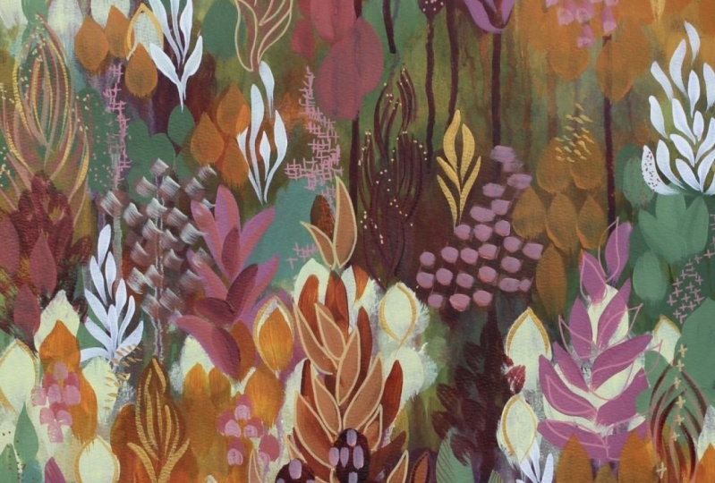
7. MAGIC FORESTS - pattern library: So now we come to the
fun part where we get to start adding details
onto our painting. So what I like to do is
I am very much inspired by nature and sorrow because
this is a whimsical forest. I like to incorporate lots
of marks and textures and details that are forests
D, and nature related. So let's, uh, leaves and really simplified repetitive
patterns that are easy to do. Small dots, little
flower shapes. And these are what
I use to build up interest and passion
into these forests. Now this is how I do it. You can choose to do
this however you'd like. You can have different
shapes than this. You can have more,
you can have less, you can have much
simplified versions. That's totally up to you. Remember this is your painting. I'm just showing you
the techniques that you need to follow the steps. But I strongly recommend
spending a bit of time with a scrap paper
or scrap Canvas, playing around with
different mark making and making a bit of a mock library fee
to refer back to. So that when you're
layering some of these patterns on
top of each other, you don't just get stuck doing the same pattern
over and over again. If you have something like
this in front of you, a reference to work from, then you can remind yourself of some different
patterns that you can add into your painting that you have may
not have used yet. And it also just
helps to practice as well and will help build
your confidence so you can do things like
this on the paper then when it comes to
painting it on the canvas, you maybe wouldn't be
so nervous doing it. So this is just a selection of little designs that I spent
maybe 5 min creating. I could fill pages and pages
and pages of these designs. You can go online and look at nature pattern references or patterns of nature
leaf patterns, things like that
for inspiration. If you're stuck for ideas, or you can just simply
go out into your garden, pick a few flowers,
a few plants, and just simplify the shapes that you see in front of you. Because these are the shapes and patterns that we
are now going to be adding onto our painting.
8. MAGICAL FORESTS - full painting - adding details: This is what you're
painting should look like. Now the good thing
about this technique and this method of creating these women school
landscapes and the whimsical forests is that
you can stop at any stage. If you really enjoy the way that this abstract Connors
composition looks, you don't have to add details. You can just leave it
as is and move on to another painting and helped
develop this as your style. I like to push it a little bit further by adding in at some, at some details of some
botanical shapes and some botanical inspired marks using similar colors to what
I've already used in here. And I'm also trying to
work from things that are further back in the composition that two things that
are in the foreground. So e.g. these little teal kind of plants that I have back here, I can use the same color
and lighten it up. So I'm just making a
lighter version of that TO by mixing
these two together. My name a little bit more
of that lighter color. I've just got a
simple flat brush. I'm just going to come
in with this color and add in some marks where I can see this bush
shape behind him here. Same thing here. I can see there'll be this
in here as well. So I'm just going to
come in with some pattern on top of it. To add a little bit of
separation and interests. Maybe I can add a little
bit in here as well. Some of that teal
color in behind here. So I'm going to come in with and adding that same
sort of pattern here. This is a really simple,
repetitive just to brush stroke. A dabbing motion. Maybe some in here as well. Okay. So that's one cat
and that I can do. Now I'm going to create
a bit of a lighter, lighter purple color in here. And I've switched over
to a round brush. And maybe on this
little one back here, I can start adding in some
of these long leaf shapes. Remember this is abstract. We're not trying to
paint realistic trees. Were just trying to get an
abstract interpretation of a forest of trees or lay
it on top of each other. Sorry, it doesn't
have to be perfect. And it doesn't have to look
like anything specific. We're just working with patterns and layers of color
at the moment. So I've now added another
layer of pattern in here. You can see how the
juxtaposition of the smaller shapes next
to the biggest shapes, the light and the dark. And these long lines building up these layers is what's
going to create the visual texture in
this type of painting. Maybe I can come
down here and add a few more in here as well. I don't want to cover over
everything that I've done. I do want to leave
some areas untouched. Let's say there's some of
this color up here as well. I like to look around
the painting to see where else this color is. So there's some up here. So I can add this
shape up here as well. And I want you to use
your own intuition and your own creativity
to decide where you put your details and where
you put add your layers. You don't need to create a painting that looks
exactly like this. That's not the point. The point is really,
this type of painting is to just relax and have fun with exploring different shapes
and patterns and trusting your own creativity to build
up areas of interests. I really liking how
that looks now. So I wanted to bring some
of these purple shapes than drips that I had
out a little bit more. So I'm going to go back and find the brush that I was using before, which is actually quite, I might actually find
a smaller version of that brush because I
don't want the shapes to be quite as large this time. I've got a smaller round brush and I'm going to mix up
a lighter purple color. Maybe we'll have a
little bit more pink in at this time just to bring out a bit of
a different hue. So I'm just mixing up
a lighter pink color. Again, I'm not showing my palette while I'm
mixing these colors because it's not
really important for you to see how I'm
mixing and what I'm mixing. Because these
paintings that you're going to be creating are going
to be different to this. It's going to be
your own artwork. Sorry. I've just got a lighter pinkish
color and I'm just going to dab that on in the same way I did
with the other brush. And I can also come in
with a spray bottle, give it a little spritz, and get it to start to run. To get this really
interesting effect. And see how this
brighter pink color pops nicely against that purple and add just
another layer of interests and pattern because
that's what we're doing. We're just layering interesting patterns on top of each other. And maybe we can add a
little bit of it over here and drop that down. You find that the paint isn't
really running very much. You can come back in and
add some thicker blobs. And just keep touching
the brush to the canvas until it creates a little bead and then it will
start to run down. And you can use the
water to just encourage it a little bit. This is set to mist as well. It's not a straight
shot of water. It is I missed of water. So it's not completely washing
everything off the canvas. A little touch of it. You
inherit a little bit as well. Okay. So what else should we do? I think maybe I'll
add in some marks on these paler areas
of tree as well. I'm just going to use the light. They look green, which
is what that is, and a little bit of white
just to lighten it up a bit, if I use the same color on
top of what is already there, once it dries, it
will disappear. So you really need to pay
attention to the values that you're creating
and make sure that you are making
them a little bit lighter than what is underneath so that
it doesn't get lost. Okay, so I've just mixed up. But like a really nice thin, fine liner brush here. And I'm going to create
some More leave shapes in a different, with
a different brush. So there are different
thickness today's ones. This is the part of
the process that I find very relaxing
and meditative. Because once I get
into the rhythm of painting these patterns, It's very relaxing
to just stand and create over and over again this repetitive natural pattern. Now filled in this area here, I might add some of this on
those other patches as well. Just need to mix up a
little bit more paint. When doing these fine details, I like to paint to
be quite watery, so it comes off
the brush easily. I'm just saying whatever done. So everyone could possibly use the lights, don't catch it. It's like a forest of plants
and trees and leaves. And some can't just
look like a patterns. Okay, so now I'm just going
to keep alternating between different colors and different
brushes and continuously building up the areas
around this painting. I might add some little
blue shapes down here. Because I haven't really
developed down here very much and I don't want
to leave it blank. Sorry. Maybe we could add
in some of these shapes. Perhaps we can go to a
bit of a bigger brush. Maybe come in with a darker,
darker indigo again. Make some big shapes on
top of the small ones. I want to create some
really dramatic dark runs, I think down in here. Sorry. Still got that indigo color. I'm going to make
it quite watery. Let's add it back in up
here where it's kinda dry, a little bit too transparent. Dip my brush into the water. Again, a nice bead of
water onto the brush. Make sure there's lots
of paint on here. See, it's not quite running yet. So I just encourage it with
just a little bit of water. See how it starts to run down. Maybe a little bit
over here as well. So I'm, I still
only working with the same colors that I've been working with the whole time. I haven't added anything new. But I'm just playing around with different versions
of those colors. And adding in patches of interesting marks and patterns and layers of color. You can really, I want you
to really have fun with it. Don't worry too much about the final result or whether it looks like something
or if it makes sense, you just need to
keep adding layers and patterns until
you're happy with it. I think this is getting
to the stage where I need to make it dry again because it's starting to get difficult to work
on top of the wet paint. So I'm going to give
another blast with the hairdryer and then see what kind of that's smaller
patterns we can add in here.
 Clair Bremner, Professional Artist