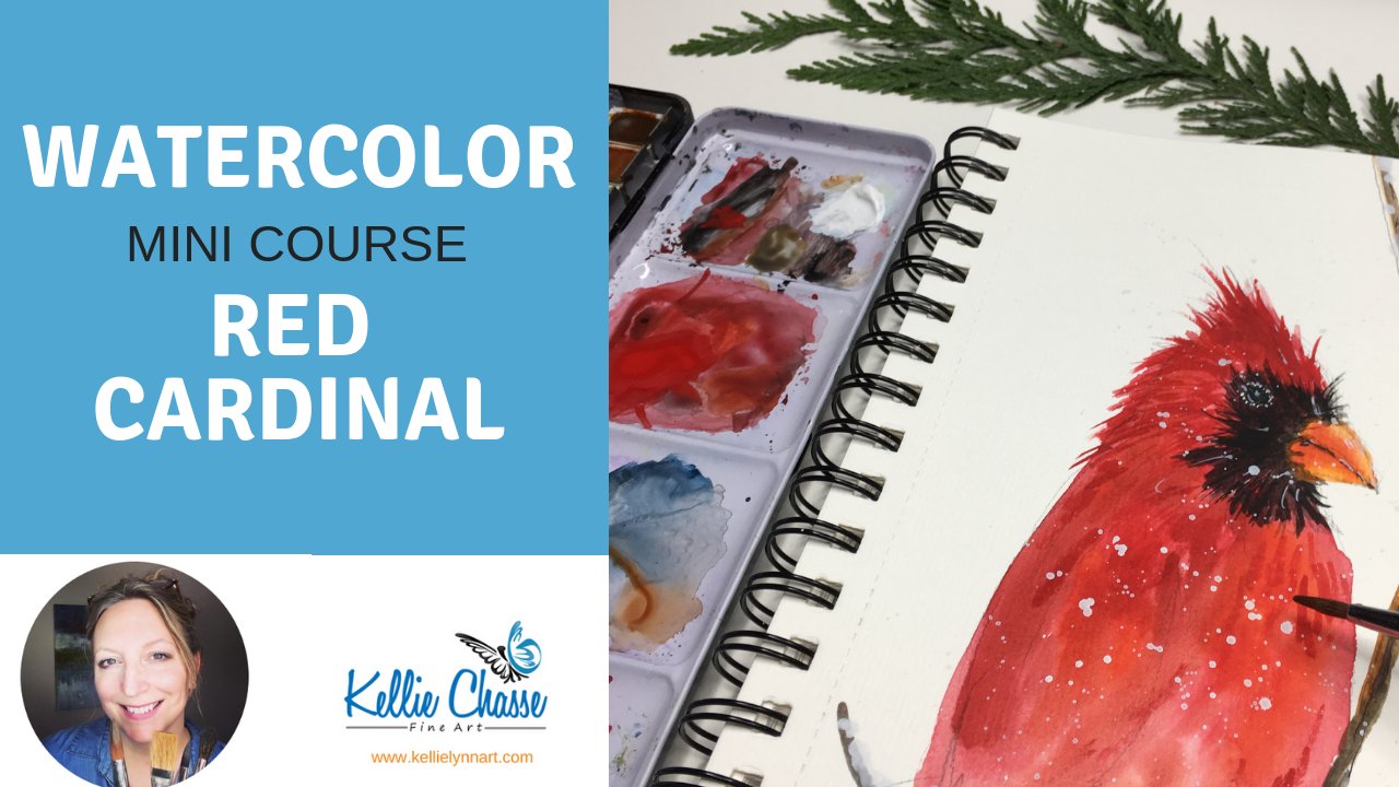
Transcripts
1. Intro Holly Berries Skillshare: Hi there. And welcome to our many class on watercolor. We're gonna be painting some holly Berries with snow on top. I'm Kelly Chassis, um, a simple living and main artist online instructor. I've been teaching online now for over three years, and I love to make these simple step by step quick and easy courses for you to enjoy. This was designed as a short little cores, perfect for those of you that are beginners with watercolor, for those of you that are more advanced but just want to do a quick little warm up painting first will lightly sketch in our holly Berries. Them will continue on to some wet and wet techniques for the background, and then we'll add some layers and gradually and get a little bit more detailed with our holly Berries, you'll learn about wash and how to use that to create some beautiful snow techniques, as well as using it for some splatter techniques. You may even choose to do a few of thes, and you can paint them as your holiday part this year. So grab your paint in your paper and let's get started
2. Materials Mini Holly Berries Class: four materials for this winter scene. You will need obviously watercolor paper, and I'm going to recommend that you use at least £140 cold press. It just works a little bit better with a wet on wet background. I'm using the art easa watercolor pad for this. It's great for warm up paintings if you're sketching or journaling. This is like a perfect little watercolor paper. It's pretty thick, so it holds the water quite well. You'll notice this is on a spiral binder, and it does have perforated edges on here so you can bend that and take your painting right out and move on to the next one, Which makes it really nice. What color cards Air? Another option. Strathmore has some really nice ones that come. A pre made the do is fold them, and they also have envelopes to go with them. So if you want, this is a holiday card. This is this is another great one to use. You will need watercolor paints. I chose to use my Windsor Newton artist quality paints. You can also use Cotman or really any type of pan paint. You can also use the two paints. But just keep in mind that the two paints air a little bit higher pigments and might work a little bit differently with the amount of water that you'll be using for this. Do you need a sketch pencil and you'll need a couple of brushes? No, it's not important. With size round works best, you just need a larger one and a small one. For some details, you will need some whitewash. This is by Windsor Newton, and it comes in a tube form, so it's nice and sick, and then you will need some water, and I would advise I only have one cup here, but if you don't want to change your water out often, two cups of water works even better that we can use one for clean one for dirty, especially when you're using wash so over ready. The next step will get started here with the sketch
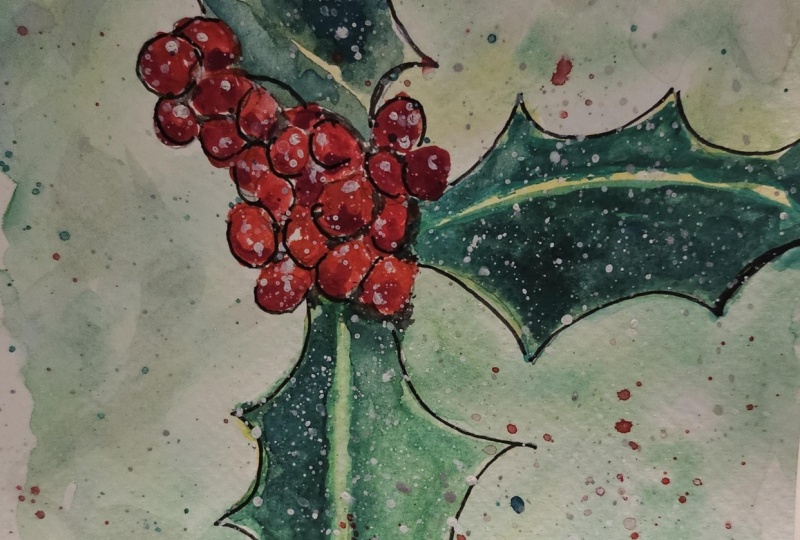
3. Holly Berry Sketch: we're going to start off our painting using a very lightweight graph bite pencil. If you have a number two pencil, you can use that. You could also use mechanical pencil. Whatever your preferences. You can even use watercolor pencils so that you don't have any type of marks on your painting once year when you're completed here. So keep in mind that when you're sketching with a pencil pitting on how dark your drawing this in, you may or may not see the pencil lines through the water color as water color is transparent. I would recommend that you take a look on Google. Maybe do some Google image ing some searches so you can get some close up views of the Berries. If you want to make these look very realistic, the one that I'm doing here, it's going to be more of, ah intuitive type piece, something that is not exactly correct. Ah, I don't even know if I have the berry shapes down going just by my memory here. Imagination. So if you are a, um, person that likes toe, have things exact, go ahead and check out that Google image. There's lots of photographs of Berries there, So I'm just gonna put in three of those leaves in here, and then we're just gonna layer these little Berries or right on top of one another. Some are in the foreground somewhere in behind. This way, we can add a few shadows to this will be adding some highlights later on. And these Berries are not all perfectly round. You can see that they have. Ah, a little non perfection to them. I always like to do that. Something that's not perfect makes it look more realistic. His nature is not perfect. And that's all you need, really. For a really quick sketch, I'm using a five by seven watercolor pad by our teaser. For this, it is acid freed's cold press water color paper, and this one has a spiral bound on it so that you can take that off if you want to do a number of different sketches. If you like to do some cards, you could also use the watercolor paper by Strathmore, which I had mentioned at the beginning in the materialist got this sketched out now and will be moving on to painting in a very light wash for the background
4. Wet in wet background: next, we're gonna start our background. But before we do that, it's want to give you in a little quick tip. I like to do this in my many courses. Hopefully, you grab a few of these new tips each class that you take, depending on what our, um, materials, what we're using and what painting they'll be dealing. But for this one, Since I'm using the little spiral notebook here, I don't tape down my painting. And what happens with these wet and wet backgrounds is they contend to buckle. So these little clips here are wonderful. You just want to make sure that you still have it laying flat before you begin so that your water doesn't run in places that you don't want it to go. So to begin, I'm gonna use This is just a 3/4 inch wash brush here, flat oval brush. And I'm going to just get some clean water and that I'm going to wet this area in around of the Berries and beliefs and because everyone's materials might differ depending on the quality of your paper. If it is Lenin, if it's cotton there, so many factors involved. You really have to just get a feel for your paper and how it's going to work with your wet and went backgrounds. So always a good thing to do is to try your paper out ahead of time, wet it down and try a couple different papers are different amounts of water to see how your paper will react. Gonna put in a very light a loose wash of pigment. Here you can use different shades of green for this. So I did the sap green first, and now I'm going to add a little bit of Meridian and you can mix and match sees. You know, if you only have one color green at a little yellow to and maybe a little blue to it, you can change up the intensity of your colors by doing just that. If you don't have the Windsor Newton kits that has all of these colors in there, you're really only the primaries, and you can still add some different different variations of color to that. But you just want some light and some dark values in here to give it that illusion that you have some other more a blurred look to it or you have some other leaves or foliage in the background. So while this is still wet, you'll see that I'm adding the paints directly to the paper, tapping in the color, and it's still blooming into the other areas with this wet and white technique. Key to this is trying not to let this dry in between adding your different colors. So if you are not a fast painter, make sure that you mix up your colors that you want to use ahead of time just in the little tray here. And that way you can work a little quicker because with the wet and what you do want to make sure that you're adding these colors while it's still wet. Now I did. You will see here I did in this little area here, a couple areas, actually, on the left. It started to dry, and you see that blooming effect that it has around the outside that ridge. That's because my underneath layer was already beginning to drive while I was still adding color to that, not concerned about it for this type of painting because we're gonna do some splattering and we're gonna add some snow to this so you can cover a lot of that up if that happens to you. But I did want to leave it here just so you can see what it does and how it reacts. Now, this is new paper for me. I haven't been using this one for a long time, so I'm getting a feel for this paper with the arches watercolor paper, which is what I usually use. It seems to give me a little bit longer dry time. Ismael's has almost like a linen texture to it, which I really like. But again, you know, your your material that you're using, everyone's going to be different, so you have to feel out your materials. So I'm gonna take my blow dryer. Just drive this so that we have a nice dry background before we begin these leaves. And you do want to drive this on a cool setting if you want to speed this process up. If you have plenty of time and you want to let this air dry on its own, that's that's okay, too. So I will usually touch my paper just to see if it's still damp or feels cool to the touch , recommend new students to touch it with the back of their hand, and if it feels cool to the touch, it still needs to dry a little bit longer. So this is completely dry now and will be moving on to our next step painting in the leaves .
5. Holly Berries Leaves: before we started leaves again. Make sure that your background is completely dry and you can grab another round brush or a small brush, and I'm gonna mix up a little bit of some cad yellow. And the reason I like to do this is just to get a nice little light layer down here first before we add the green, and this will give it a little bit of a glow. You'll have some lightness to those waxing leaves that going through painting, do a very quick little layer. Here you can see it's not real dark, but still very transparent, as you can see those pencil lines in there quite well, So we're gonna dark in this. Next. We went out a little bit of green to this, some drying that yellow, and there will be adding the green on top of it. And you can do this cheaper ways. You could actually mix the green in with that yellow, but you have a little bit less control us towards going to go. Remember, with watercolor anywhere it's wet is where your paint will go, and these do have a very fine line down the center of them. that are a little bit more highlighted. And again, I'm not looking at an actual painting, but I'm just going off of my imagination. I actually did my pictures for you afterward. Always like to do that. See if I can actually remember something the way it's supposed to be. I don't always get it right. You know what? That's part of the charm, I think. And I do remember. I just have a little bit of the lighter line down through the center here. So I'm showing you what not to do here. Usually, when you're working in especially larger sections, you don't want to outline or trace your area because what happens is that can dry before you get back to it. It's really better to go in, and you can see here where I'm adding the green and slowly and drawing that paint color out towards the edge here. Now, this is a small area, so I know it's not going to drive that quickly, But I do want this a little bit darker on the left side. Then I do on the right, so I'm gonna keep some of that yellow in the right hand side a little bit of a highlight to it for greens. Here, you can use again any type of green. If you only have one green like a sap green, which is in most sets, you can always add some a deeper blue, ultra marine blue, Just a little bit too that green. You'll get a really rich colored green to that sap green. So for this one, I just want to show you I'm going to make this one very wet. So basically just a very light washing here. And you could see how much more watery this is, how it blends. And you let the e paint do what it wants to do a little bit more. So you get a little bit more of a natural look to it versus the one on the bottom where you can see more of my strokes. Well, it's let this dry. We're gonna do the other side here and working in the smaller sections and trying to leave that little bit of a highlight down the center here and also has a little highlight around the edge. You see, I'm not going all the way to the edges of my pencil lines for this and I'm excited. I'm going to use some black Sharpie. Just outlined this afterward. Just sharpening up the edges here. Those do you have, like a little Speicher. Little point, usually on the edge of it in their last one will do the same thing here. And this is a fairly watery mixture. It's not a really dark, but you do want to have those different values in here. You want not to have all that same color. Don't you get that initial and you could just happen a little bit of that darker shade and let it go where it wants to go. Here's tap a little bit of that in there, and I'm still a little bit darker on this side here and just maybe a fuel pieces of darkness in this one. I just want straight into the blue for that deep, that is, I still have a little green on my brush. Such is to really dark in that green, and then we'll rinse this off and move on to the Berries next
6. Painting the Berries: all right. Ready to start our Berries? I will be using the colors. Windsor Red. You could also use Eliza, um, crimson. And we're gonna make a fairly dark shade here, and I'm just gonna fill in these circles. You can see some of them are a little bit lighter As my pigment starts to fade away. It's a little bit lighter. A little bit more water on here. That's okay. We want some different shades of this red in here. Dark and light is always good. And do you believe a few little spots of white to give a little bit of Ah, highlight in here? Where is gonna fill all of those n We could help it. Leave some of them so they're not touching. And we can get some dark shadows and around there afterwards, hop in just a little bit more pigment here, picking up a little bit of the ill azure and crimson in here to darken it just a tad. Was the fuel values in here just shaping these out, making the more circular. Oh, you'll find I'm using the tip of my brush on this part just to give a nice fine line. to the work, and we will go ahead and dry. This now and you will notice is I'm trying this. You see a little bit more of that variation in color. When it's all wet like that, you may not. Here, I may not see it quite as well, but the pigments will dry a little bit lighter speaking really for the difference between the two reds in here on. If you don't have, like I mentioned before, all of these colors, you can add a little bit of Remember to it. Some, even some green will dark in that red blue can make it or purplish color anything. Teoh. Give yourself a little bit of variation in those colors, but just make sure most of it is Brad's. You're just gonna tent that rebel a little bit of that color too dark in those shades A little bit for our next step will be adding some a whitewash. So really, make sure that your paintings completely dry. That way, you're white. Wash won't pick up any of the tents underneath
7. Adding Snow: Our next step is to add some snow. But before we do that, I want to give it just a little bit of shadow on the underneath of some of these Berries here. So to do that, we're gonna rinse off our brush and and get a little bit of a really a dark black or ivory . It also use ultra Marine Payne's gray. Any of those colors will work, and we're just gonna pop in a few dark areas on the underneath of some of these Berries. Your light would not be hitting underneath here. This is where it's going to be, the darkest. So we wanted a little bit darker than that read. You don't need a whole lot. Just a little touch of it goes a long way. Now we can rinse our brush off, and we're gonna go into some of the squash. I was gonna touch this on just a few of the Berries to give it a little highlight. Here, take your brush tapping on the end and give it a little splatter. If you don't have whitewash, you could also use a type of white Inca water soluble ink. You could also use maybe acrylics. Just keep in mind the acrylic wants and tries. You cannot lift it. Where is the whitewash? Is water soluble? So you can actually lift this out if by re wedding it if you need to keep in mind that it also very chalky consistency. So you may see some of that white through. It's really hard to get it all out, so you will see some residue on there. But for the most part, when you're doing these splatters, you don't have to worry about that. And then we're going to give this a quick blow dry on for our final touches. I'm going to grab a black Sharpie and we're gonna add just a few final little details to this and all right, think maybe we might want a little bit more color in here.
8. Final Details: So for some final little touches here, I want to add a black Sharpie just to make these pop. Now, this doesn't make it look quite as realistic, but I really enjoy going over a lot of my watercolors with a little pen in ink. So this is optional peace to it. But I do like to cover up some of those little pencil lines, and it just makes it pop a little bit more. And if you are looking to do something like this for a car, don't forget to try this on the watercolor cards. I would love to see your project, so please make sure that you post your finished results in the project section for me. I would love to see it. So I'm just gonna outline this here with using my Sharpie. You could also use a micro penne pasta pan. You know, whatever you have on hand could also really kind of pretty in gold with, like, a gel pen or something to So try some different, different ways and see what you like. And then I think that it's just not quite dark enough here. So let's outline a few of these Berries and is creating more of a shadow. I'm not circling the entire piece here, just just a few little strokes here and there. It's a little bit darker and there, here and then I think it is just a little bit more color. So I'm gonna go ahead and put in a few more shades. Let's try some red will do little splatter love splattering. This is so much fun. It just makes it so much more whimsical and gives gives it a little bit more dimension. I think little green in there, you know, we could have fun. You could add all kinds of different colors to this NC. Let's try a little bit more white and they got enough snow in there. It's a little bit better. And then, of course, always make sure to sign your art.
9. Outro : Thank you so much for joining me in this quick mini winter scene. Painting on. I would love to see your class projects. So what I'd like for you to do is take either your blank paper or card. Whatever you like to dio on. I would like for you to create your own holly Berries using the steps that we just covered here. Feel free to add more snow, more splatters. Use gel pens. Use the gold whatever your heart desires. So I'm just removing my original painting that I did with the perforated edges here. You could just score that and it comes off really easy on. Grab yourself a mat. As I said before, these fit a standard eight by 10 Matt, which is a five by seven on the inside. And then I grabbed a frame here. That's an eight by 10 as well, and I'm attaching my painting to the back of it, just using some double sided sticky tape. They don't actually take off the back of that cause I want to be able to remove that if I want to. Another way of doing that is adding a foam backer board. If you were. Frame is deep enough to be able to hold that, and you can seal the backing of that completely. We'll put the back on and push the little tabs down here to keep it in place. And then what I like to do is I like to have a tag printed up. And I do this through Staples are local, um, office supply store and these you can get printed off. So they are removable stickers and then place it on the back of my frames. If you have any questions during your projects, please make sure to leave them in the discussion board. If you are new to me, this is your first class with me. I'd love to have you follow me to make sure you put that blue button and you'll see any new classes that come up in the near future trying to do one a month. So I would love to see your projects. Please make sure to post them down below. Don't be shy. We want to see them. We want to check them out. We want to see how you're doing. And if you want to tag me on Instagram, you are more than welcome to do that. I would love to see your projects poster there as well. And you could do that by tagging me at Kelly chassis. Underscore fine art. It would certainly appreciate if you have a chance to leave a review that lets other students know that this is a course that they might like to watch as well. Thanks so much. And I can't wait to see your projects.
 Kellie Chasse, Artist + Entrepreneur + Educator