Transcripts
1. Intro Skillshare Painting Rocks with Watercolor: would you like to learn how to paint so fun and easy rocks? Using wire color can't seem to figure out just how to create something that looks like a rock and not just a blob of color. Let me show you some very easy tips and tricks to creating some very easy rock formations using watercolor that I I love to work with in my daily paintings. Hi, I'm Kelly chassis and I have been an online instructor here. It's kill share for over three years, teaching watercolors since 2000 and seven, and I have a very simple, easy, step by step way of showing you how to create with watercolor. And this class will go over six different ways to create some simple and interesting layers . First concept I'll show you will be some wet and wet techniques, and then we'll move on to some rocky main coastal rocks, smooth and round boulders off Rocky Island, seen near and far. Also, try a granite style rock, and then we'll do some dry brush techniques will learn the basics, and I'll show you how to create these rocks so that you can bring your watercolor landscapes and Seascapes toe life. So sign up today and let's get started on painting some rocks
2. Materials Watercolor Rocks: let's cover the materials that you will need. For this course, you'll will need water colors. Now I'm using the Windsor Newton brand here. These are artists quality brand. The difference between an artist quality and a student quality really is your pigments. So you can get a lot deeper colors with the artist quality paints than you can with your say, Cotman brand of Windsor Newtons. Um, so I always recommend, you know, using the best paints that you possibly can get within your price range. Uh, the Windsor new ones are a little bit more expensive, but really, you know, if you're just starting out any type of water color role work and then as you gain some practice and you work with your skills, you may want to switch to something more of an artist quality because they're gonna last a lot longer. And if you're gonna be selling your work, you want something that is high quality eso for colors Will you'll need for the demos. Six demos that will be doing today is you want some yellow some brown, blue, green, purple, black And then I also I'm going to show you how I use white washed Add some highlights, so any of those um colors will work in each variations or any shades, as rocks have tons of different colors in them. You also need a some water color paper. I happen toe love using these block pads, these air made by arches, and they come in a number of different sizes. But this one is a really large one here that I'm going to show you today. It's 18 by 24. Just gives me enough space so I can really show you without having to move my paper around here. But you can use any type of watercolor paper to practice with. You'll also need a brush. This one is a number two Kalinsky brush. You will need either paper towel or cloth. You also need a Sharpie and a pencil for a quick sketch. Of course, you might want to have an eraser with you as well, and then finally, you will need some water. Lukewarm water works best with watercolor, I found on. If you can grab two different classes, one you can have for your dirty water and then the other one could keep for your clean waters, you don't have to constantly get up to change your water. Says a little tip for you. All right, so let's get ready to a start. Our first set of Rock X.
3. Style 1 Watercolor Rocks: So you want to grab your number two pencil or mechanical pencil? Whatever you have, you want to make sure this is done lightly with water color. You want to be able to see a lot of these pencil lines through there. We will add some darker shades and you'll have some pen works. So a lot of this will be covered. But just tried to sketch is light as you can with us. Make sure that you have a dark enough so you can see it through your water color. This is not gonna be quite as transparent as some others. And your sketch doesn't have to be exactly the shape. But we're going to do more of a chunky style, more of a squared off style for this one, and it will move on to some softer rocks and some other ways of doing this. So we're going to start off with just wedding this area, and I really should have gone all the way over with us. I'm looking at it and I'm thinking, so I'm gonna just extend this over, um, into that right hand side here. Just what That pretend that little lines not even there and then we're going to start out with a said wedding at first. What in the area? First in this is so that we can get this nice, wet and wet technique in here. We're gonna mix up just a little bit of the yellow Oakar and where he's got tap. A little bit of that in here. I'm using my Kalinsky. Russia is I love these brushes. They are a little expensive, but my goodness, they work wonders. They are stable and they really hold the water well over a long way, and they just bounce right back up into shape. So I highly recommend them. I really, really like painting with them so little at a little bit of brown to this. Now, when you're working with your paints, you really can use pretty much any color. So if you look at rocks, rocks have a lot of different shades in them, and depending on where you were from, you will have different colors and even here on the coast of mean, depending on where you are, it's amazing all the different colors in the rocks. Some you'll find er, have a lot of Brown's Amar Tanzim or more gray. Some are most of purple or blue hue to them. So a lot of variations. We're gonna pop a little bit of purple in here, too. I love purple. It just gives you that nice sharp are nice. Deep shade for your rocks. Now, you don't want to overdo it, you know, make it too heavy. This is the first wash here. So this is going to dry a little bit lighter. Matter of fact, we're gonna take our blow dryer now and go ahead and give us a quick blow dry. So this is my little cheat. If you work with water colors, um, a Sometimes, you know, wanna wait for them to dry. You just want to get it done. So I will use my blow dryer a lot to speed up the process. You just want to make sure you're holding it far enough away from your papers that it doesn't cause any problems of your paper. Make it buckle. Er, get too much. Too much heat on your paper cause you can, um, are your paper. Don't get too hot. So just hold it at Luke. Luke. Warm air and at least six inches away from your paper. And by the way, I'm using arches. Watercolor blocks for this. They're really good to take with you. If you're doing journaling or if you're doing some plain air or just a really easy ways, you have to take down your paper because they're already attached right to the block. So they have a bunch of different sizes for that. So I use that a lot. We're gonna tap off a little bit extra heat here. We don't want too much. And now I'm going to take the brush and turn it sideways here. And we're gonna do a dry brush technique, cause this is all dry now, the background, and you can see how I can make this little scuffing motion across here to make it look like there's texture in those rocks. I'm just dragging that dry brush over Now. The key to this is not having it to Web, because then you no longer have a dry brush technique because against too watery, and then it wants us to do another whole glaze on top. So use the sparingly. Don't get don't let it go too far away from you or else you'll have it completely wet and you won't get that nice texture in there. Well, that had just a little bit more darkness along the bottom here, and you'll notice when you look at rocks from a distance, the shadow really hits that edge in the bottom and use a little bit darker down there. That's where the water is. So the water will make it wet, which indeed turns a darker. So you can see that's pretty much it. And it looks like rocks, maybe offer distance. Um, really simple, really easy to dio. We're gonna dry this again and then I'm gonna show you how I create a little bit texture in there with using the black Sharpie. We're gonna give us another quick blow dry here in that same thing, keeping its least six inches away on a nice cool setting. Very important that we dried in between. If you try to use a black Sharpie while this is wet, it's going to run on you. So here we are, close up here. So I'm gonna do a little bit of definition in the bottom here on just shaped the edges of that rock you can make around if you if you have more round rocks in your area, but there's no no right or wrong with that, you're just gonna scribble some in here and give a little bit of definition. Well, simple, really easy to do. Maybe a couple of hash marks here and there, so it looks like a little bit more texture in here. If you want, you can really square him off. They're quite jagged here on the coast. A lot of places some of half round areas, though it's mean is really beautiful. It's the different everywhere you go. Amazing so you could go smaller with us if you want really small rocks to give that illusion of more of a distance or having a little bit more chunky, little bit larger as ah, for where lighthouses aren't stuff. This is where our lighthouses are at, and it sets usually rip up the top here, so it's they're quite big. So many areas they have slabs of slate. We're finished with this one, and the next one will be doing is the 2nd 1 here in the beautiful shades of purple
4. Loose flowy rocks: we're gonna move onto style number two for our watercolor rocks. We're gonna do a very similar style to the one we did above, But we're going to make this one a little bit more rounded and we're gonna use a few other colors were more of a purple color rather than that yellow ochre color that we have in the 1st 1 So this one, it looks a little bit lighter, a little bit more airy. It gives you just a totally different look to the same type of rocks, creating it round and using a few other colors or a little bit lighter colors. So we're gonna get a sketch in some more rounded or mounded type of rocks. Most a couple of large ones here on the edge is here to see it can get an idea of Morva a boulder shape here. You know, we'll just do the same thing on the other side here. So we've got piles of rocks here, and for this one, we're going to start off by using a very light colored blue. I'm stay lavender shade here. This one is gonna be a lot of water. Not a lot of pigment to create that little bit lighter, more transparent shade of color. Here, let's start off with the larger boulders here. Fill those in first and then we'll add just a few more spots of that same color. And among some of these smaller ones as well, you'll see me not bouncing back and forth piece from try not take. I'm trying to separate thes, and they're not touching the other color. So just to a few here and there, and then we're gonna add a little bit of that yellow ocher to this. Scatter a few in here and there. We don't want this to blend through all of it. Let's do a little bit of purple. This gives you your ah, shadow areas again down near the bottom, a little bit more where it's going to be a little bit more shaded, equals. Fill it in a little bit over here, a swell now for the yellow Oakar, and where this touches it's gonna blend just a little bit. That's okay. A few other little shades of color in here. By doing that, this would deride pretty quick that light blue is almost dry already. Okay, then that is Let's go a little bit darker just to add a little bit more of the purple in here. I don't have much shading in some of that yellow, the local area again, some darker values on the underneath. Here, we'll give this a quick blow dry. Now and then, we'll add a little bit of black details with a Sharpie again. Now you can use a Sharpie or not use a Sharpie in any of these. I just happen to like that definition from for mine. But this is, you know, all optional a few little spots in here again adding some texture by just giving a few little hash marks here and there you go a little bit thicker on some of those lines to give you more separation number. This doesn't have to be a black Sharpie. You could use your micro pens for this if you wanted Teoh. Whatever you have that is, um, going to work with watercolor. And most things do as long as the watercolor is dry. You are all set to go with with most of these, but this just gives you a few light little lines. You can also use a paintbrush for this. If you want to take a little bit of black wash or make a deeper shade of purple or darker color, you could do the same thing with a very fine brush that you're doing here with a Sharpie again. The sharply just gives you a little bit more control. I think that a brush well, So there you have it. Ah, number two down and let's move on to another option of rocks.
5. Island Rocks: for this third style, we're going to paint more of an island. This is more of a in the distance, way far away. Not quite. Or the medium distance I should say those were more close up. So this one, um, knew the foreground will have some smaller rocks here and in the back will have more of that island shape again to sketching and very lightly here with my pencil. And it will do some smaller rocks near the front here, and this one is going to be our island in the back. But we'll put some little trees on there with the A pen, so we'll have a little bit of definition in here. We'll just sketch these in here with a pencil real quick so you can see them. And that's gonna be all rock ledges in the back here. That's if the schedule really quick again. Another very simple little sketch, not a whole lot of details in here. And I'm working small. This one is probably oh, maybe a three by five. Not even a three by five A little bit. Three by four. So we're gonna start again with filling this area in the back. You can use a shade of gray if you have it. A shade of black, a dark blue. This one is Payne's gray that I'm using here. For the color. We'll skip a fuel areas, leaving a few highlights in there where it's white. You could see how fast I'm painting. This doesn't take a whole lot of effort here just to give us a little bit of definition. And then for the foreground, we're gonna stick with that seem a yellow Oakar popping in just a little bit on here while it's still wet to give us a few different shades of color here. And I didn't even rinse this brush up. I'm just going in here with that same color and giving a few little touches of pain in here , and you could see the second time I went in, it was a little bit more truer to the yellow car color that I was using again. Not a whole lot of definition in here. I'm gonna popping a little bit more. That Payne's gray in here can was darker shades near the bottom. Tap a few, and here is some lonely rocks in here you have to really be careful when you're out on your boats here in mean thes rocks pop up out of nowhere. Now I'm leaving this white up. Obviously you could always go ahead once this is dry and put in a shade of blue. And here, if you wanted to make this blue water for the purpose of what we're doing today with the rocks were just gonna paint the rock areas in. So that's it for this one again. Really quick and fastest is under three minutes. So far Thes air. Great warmups for you as well. If you want to practice some smaller little sketches with your water color and we're gonna blow dry this one completely dry now and I'm gonna grab my black Sharpie again. This is a fine tip that I'm using. You can see how smallest is by my close up here, and we're gonna sketch in just a few more lines now. These are a little bit smaller because this is an island way off in the distance will give some height to this one's few rocks up on the top here and then adding just a little bit more details in here and you could create a lot more illusions of rocks If you want some smaller ones using the Sharpie down on the bottoms here. Well, it's pop in just a few of those trees. Of course, I'm just doing the black marker here. But you could also use a little bit of green in here if you want to. And a little color to this for your trees. This is more of a pen and ink style here, so we're gonna leave the color out of it for this one. The last one that we're doing well are check out the last one. We will be adding a little bit of green to it and then again adding some more definitions to these little rocks on the front. You see, you don't need a whole lot here and it doesn't have to cover exactly the same areas that you've painted. You continue to Phillies in here again, making the illusion that there are rocks in here. I'm just basically making little scribbles in the shape of Iraq. So you want to have them somewhat formed layering on top of one another. And that's again inch pop. A few little birds in here. And you've got a great little many painting here. Can you get a little bit more line work to this If you want to give it more of a ridge extending that out a little bit. So that's s so for the next one. For our style Number four, we are going, Teoh, create some rocks a little bit closer up using a splatter technique.
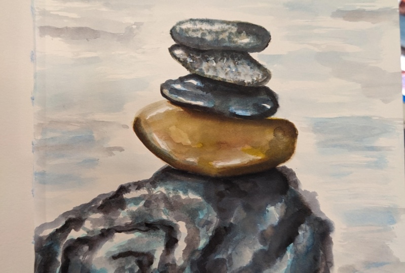
6. Granite rock: two for style. 41 to create more of a granite style rock with lots of texture. We're gonna be using some splatter techniques for this one. So once again, I'm gonna take you or pencil, and we're gonna sketch this out on this is something that I used as my photo reference here . I put this up here for you. Another cool wannabe to do the, um I think the calm caroms here, they stack rocks, you'll find it like that. A lot of places in Maine, on the beaches, even along the interstate, They'll stack rocks. Um, is really ah pretty neat to see. But, um, for this one, I'm just gonna do the square one here on the right hand side a little bit so you can see a little bit of texture in here. So, again, very light sketch. Not a whole lot of details. Just trying to get, you know, Fuga little crevices in here so that you can see where they are. And we'll follow this through with some pendant Inc again for DSM. Details in here. Maybe get a couple more deep crevices in here where the shadow is where that rock lays on top of the other rock here. It's not that we have that sketched in. We're going to start here with a little bit of very light grey or light blue. And I'm using this tapping motion this time to tap it in. I'm not feeling in the entire area here. We want to have a bunch of different colors we wanna have. I also do a little bit darker and through here. We want to have some dotting motion with this. So we're gonna just tap in trying to get the entire area wet here. Just giving a little bit of definition for that. Like Ray in here. First, we'll fill in just a few on the top of the top of that rock was very light, almost a white in the reference photo that we have Well, let's mix up a little bit deeper shade of the Maroun here. This could be either burn number or raw sienna, Raw umber, burnt sienna. I always get the two mixed up. But in any case, any type of brown will work for you and feeling, and just a few more spaces here. This is very light. Very light. Wash a lot of water with a pigment, Not a real dark pigment at this blanks. We're gonna later some darker colors on top of this and just tapping in some color where I see more of the brown in here trying to leave some of those areas very light and white. We'll give it a quick blow dry. Here. We want this part to be derived before we at a little bit more because it we don't want this to blend too much. That's completely dry. And I have mixed up some more of the Paynes grey. We're going with a little bit darker shade here. Can you could use black? You could use any darker color, darker pigment. You could use Brown. There's no right or wrong, as I said before with these colors here in the rocks, because there are so many variations in here. So now they have that loaded up on my paintbrush. Here. I'm going to just tap this and create some dots and some texture in here. Now, if I'm working on a small area like this, usually I'm using a paper towel or something to cover up. But since this is just a demo, one. I'm not worried about it, so I am just going to town with the splats here. And then you can do this dotting motion here along some of those darker areas. If you want, we can put those little dots in random, and then you can purposely put them in a little bit heavier in some areas. And you could also do a little bit of line working here if you want. Let's go a little darker in here again. That area and the bottom is usually your darkest. The light's not getting to those places where the look crevices are can continue to do just this little dotting motion or little tapping motion in here using very little paint and the tip of my brush. I've done most of this or all of this so far with just this one brush, we will add, I'm a smaller brush here with some small details for this next section. But for for most of this you can use this one brush for everything, initiating some of these little areas here, and I think I'm in a mix up a little bit darker shade of brown. It's a little bit of a red hue to it. Here, Onda will create another color variation in here that's pretty dark again. I'll have a whole lot of water with this, so if you find that you get too much on here, you can actually take your finger, and you can tap tap a little bit of that out just by lifting it off with your finger. You could also use a paper towel. Let's just tap it here, and I'm blending a little bit of it. Any Hera's well, using the tip of my finger to create a little bit of texture. Let's give that another blow dry here, Make sure that that's nice and dry before we at a few more details to this. This is Dr Gonna grab that black Sharpie again and start with some of our line work in here . Now, most of the lines for this particular rock are going at a diagonal line here, so we're gonna follow that same pattern here. This is a little bit less random than what we've done in the past, so I'm trying to actually follow the rock that we had for our our inspiration photo. But it does look like a slab of granite with all those different colors. If you guys have those granite pieces in your kitchen, this is what it reminds me of all those little thoughts and different shades and values. So next we're going to use a little bit of white wash. I have some in my paint palette here. It's already dry, so I'm going to reactivate. That washes more opaque. It's not quite as transparent or translucent as regular water color. It's got a chalky texture to it, so if you add a little bit of water to it, you can make it more transparent. So if you're using this directly out of the two, this is going to be very bright white. So I have put like Is it? Put it on the side here, Let that dry a little bit and I'm reactivating some of it so I can make this very soft color, and you'll notice that once this dries, you can barely see it because I have a little bit of water in here. Now, if you're using it directly out of the tube, it's more like toothpaste is quite thick, and you can get some stark, bright white little marks on here, and you could do that dry brush technique that we learned earlier. We'll notice I have a little bit of great tend to that. So I picked up a little bit of color and added that to the quash, which you can tend to quash. Any color can be careful of your areas where it will pick up any undertones that you already currently have in there for paints. So I'm gonna take a little bit of black here now and add a little bit more. Just found. It was just a little bit too light. I wanted a little bit more variation and color for this. I like that little bit better. Maybe he again if you have it too stark to bright to dark. Take your finger while it's still wet and you can blend a little bit of that. Obviously, if this is dry, you're not gonna be able to blend. So you're gonna have to do this while it's still wet, and you can say that really softened it just by using the tip of a finger. You can also use your brush to soften a little bit if you need to I'm gonna give that one more quick below dry. And I think I'll take that black Sharpie and create a little bit more on those lines in here again. You can fill us in Uganda. It actually, um, take your black Sharpie Makes a really thick lines. You can see where add that shadow area there. And you could also create some little dots if you want some really fine little marks and dots of black and you don't want to use your brush, you could do that with this Sharpie and making making almost like a stippling type texture on your watercolors. I will finish this up here. You can take this as far as you want. And here is our finished little piece here. Close up and and the next we're gonna do is a very quick little island way off in the distance.
7. Distant rocks: so for Stalin. Verify we're going to create that similar look to the bottom left hand corner here with an island. But this money is gonna be even further away. So I want to show you how you don't need a whole lot of details for this. So again, I'm using the black. Or you can also use the Paynes Grey. This is very thick. There's really any water to this Onda. We're just gonna make that very, um, small shape of an island way off in the distance. So we will need to blow dry. This because this paint a little bit thicker, you may need to blow dry a little bit longer. Can you want to make sure that it's completely dry before we add a little bit of details to this on For this next section, we will be using once again the white wash, the opaque Wyke wash, and I will be reactivating it again. Now I am using a very small brush here with a whitewash again. Just a little bit of water. This brush is very, very tiny, and you need to have a tiny nor to get those very small details you can also use a white gel pen for something like this, Um, but it's actually a little bit thicker than what this little brushes, and it will be a little bit more varied with the shapes of those lines. It won't be all consistent because you remove your brush from side to side. Here you can see I get some really fine lines and I get a little bit thicker line in here. So it's a little bit better for variation with a brush than with a marker for this were for a gel pen so you can see how really quick and easy I do that. It's almost like if I were using that black Sharpie, but I'm using the brush with White Wash instead. So I am a loading it up with a little bit more that washes time with a little bit less water. As as the store eyes, you may find that you need to go back in and add some fresh wash because depending on how much water you have, like I said before, it can be very transparent. It dry, so you want to be able to see those definitions of those rocks out there that's really doing the opposite. You're doing the highlights on the darker paints. Now we can add a few more in here again, make it look like it's got some rock alleges out here. So it's not completely even going just a little bit more on the bottom here. And that's really all we need for that island way off in the distance. We look at him and I'll show you a picture here again so you can see what it looks like from a distance here. And then we'll had some trees to this one. So we're gonna mix up a little bit of that sap green on the brush here again, a lot of water. I want these Furley dark, and we're gonna use that little bit larger brush again. And we're going to do this tapping motion on here. Remember, you're not actually painting trees. It's just the illusion of trees. So how far away those like they're so tying your just little spots of color. Back there, you could take your brush, and if you get the very tip of it here, using a very light strokes, you can get a little height on those trees you get a little bit more definition from the treetops back there and I'm doing is taking that paint that's really already there and just spreading it out a little bit, giving it a little bit of height going a little bit darker, shade down here in the front, casting some shadows down here and giving a little bit of variation and color. You could always add again the water down in the front if you wanted Teoh going with a little bit of blue. But that is a really seem simple, simple way to make an island way out there. You can also put little sailboat, and there you go anywhere with this. So I hope you enjoyed this little quick one and for our last one that we will do a little bit more dry brush technique with Wash.
8. Dry brush rock : no For our last Waller color style number six, we're going to create more of a dry brush technique very similar to the top left. And it has a little bit of everything in there, almost, I want to say, but, ah, we're gonna just a little different to create gray, blue colored rocks, Um, using a dry brush. So I'm gonna start out here with some grey along with a little mixture of the gua show. My brushes quite dry here because I've got the wash in there and not a lot of water. And we're going to start off with this dry brush stroke left to right, mix up a little bit more of the gua show. It's a little bit lighter still using that dry brush techniques. There's not a lot of pain on my brush at this point. And again, I'm just using the scratching motion back and forth like a little bit more blue. And the key to this dry brush is not having a lot of water in here. This one has a little bit more with the blue using ultra marine here mixed with a little bit of luck wash and I'm gonna get it a little bit darker here, so I have a little bit of the Paynes Grey. Now, we're going a little bit darker with our values here. If you don't have pains, great. Could also mix up your own gray using ultra marine blue and a burn number works wonderful. Making a nice gray shade or dark black. Now you can see here my brush is getting a little bit more wet. And I'm able to to do more of these full stroke rather than that skipping motion, which is what was happening with the dry brush. So we're gonna go ahead and do arise completely. And then I'm gonna grab that black Sharpie once again, and we're gonna create some texture in this rock. First of all, I managed a little bit more dark money. A little bit of black in here. This was really dark. This is more of a true black hair tapping off again a little bit of the extra cause. I don't want this to be solid. I want more of a dry brush technique so you can see where getting all those nice little skips in here. So if you find yours too wet. Just tap it off on either paper towel or a cloth and take out most of that water that's a little bit darker. I like that better. So once again will dry this again. Now, I would love to see your projects here, so make sure you pick your favorite one. And even if you try one a week, I would love to see it. So if you want to put a couple different projects in here, um, post those weekly or daily how whenever you get a chance to do these cause they shouldn't take you very long to Dio and you can start off with your favorite one. So I'm adding a little bit of whitewash to this now, creating a little bit more highlight that found it was just a little bit too dark. We're trying to get the highlights more to the top of those rocks, and again, it's more of a dry brush technique. I'm trying to keep it drives if you need to blow dryers in between, go ahead and do that. And while I have you here, please make sure you click that follow button for skill share because whenever I have my new classes coming out. You will get a notification. If you are following me here on skill share. I hope you like this class. I love painting rocks. I think I said that at the very beginning. And I'm thinking of doing another class coming up, maybe with either trees or sky. So if you want to leave me a some comments, give me some ideas of what you would like to see for the next one, and we'll break it down and do some more of these smaller little versions in a couple different ways. Um, yes. I had a really good time creating this class for you. I usually I'm doing full full classes or full tutorials on us particular scene. So this was really fun for me as I got to do a lot of different things for this one. Once again, I'm taking my black Sharpie here and is creating some more texture in these rocks, similar to the 1st 2 that we did with a little bit of shaping and a little bit of line work down on the bottom. So I hope you enjoyed this class. I'm so glad you guys decided to to take it. And I hope to see you coming up real soon on YouTube following over there where I do weekly videos on there as well on I can't wait to see your projects. So happy painting folks will see you soon.
9. Other options for white paint: For those of you that do not have white watch, you can also use masking fluid, white Posca pens and even, like A Inc tense pencil, which is a watercolor pencil. So I have an example of one of the rocks have done. And you also can leave that whitespace. Remember, just by using that Dr writes brush technique that we talked about So let me just show you here real quick. I've got my brush loaded up and I'm skipping some of these areas. You can see my brush isn't completely full of paint, so I can get just natural white space just using the paper, adding a little bit deeper shades in the bottom here, a little bit of purple. I'm just not going over all of those white areas just dragging that brush through. So if you find you're not getting a lot of that, skipping your brushes probably has too much pain on its too much water in there. So let me just show you here. I have quite a bit on here, so I'm not getting that nice dry brush. I take my tissue. Just hap off a little bit of excess water and paint and you could see now maybe have done too much, and you could see how it's quite dry. So there's a balance, and you have to kind of just play around with it and get comfortable with how much water and paint to paper. The ratio will give you that little skip, so here are a few things you want to keep in mind. When you're working with watercolor and you're trying that dry brush technique. Test your different brushes. That is one of the biggest things, because you're going to have some brushes that are going to have synthetic fibers and you're gonna sell. Have some that have natural fibers, and you may find a difference with just the fibers alone. You also will find a difference, maybe, with using your round brush versus a flat wash brush or an oval wash brush and see how those work for you. Some might work a little bit better than others. I find the round brushes were great for me. If you aren't familiar with some of the brushes, just just do a quick demo. This happens to be 1/2 inch oval wash, and this is by Robert Simons. We also have my one of my favorite around brushes mimic. It's a Kalinsky brush, and this one it's a beautiful brush. This one comes in a set of four, and then this one happens to be a flat wash. This is a one inch, and this is by contemporary crafts, so it's a little bit less expensive. Expensive brush. Let me just demonstrate those for you on some £140 cold press paper, so I'm gonna start out with that one inch flat wash. You can see it. There's a lot of stroke marks. It's a little bit more difficult to create that rock shape. I think with this one. This makes great for textures, grass, things like that with the dry brush. Now this is the oval Wash works a little bit better conceived. Got a nice amount of skipping with this one as well, but it's more smooth, but my favorite one is going to be the round brush, and I'll show you why. It's got that little bit of a point on the top so I can really shape the rocks a little bit better. With this one, you can see I can get more around it oval shape a little bit easier, but again they all they all will do the job. It's just what you find more comfortable. The other thing to think about is what kind of paper using are using a rough, more textured paper or a more smooth paper like a hot press paper. So let's just quickly look at a couple different papers. This is actually card stock. Paper by Strathmore ends £140 cold pressed. It's got a nice little texture. I actually love this paper. It's a fairly inexpensive paper, and the cards weren't great, but you can cut him in half and make 25 by seven paintings from it. Here's another one you can see this has a little bit different texture. This is made by our Tessa, and this one comes in the watercolor pad. Its premium is still 100 £40 cold press, but again, it's got a much different texture than Strathmore has. And here we have one of my favorite ones for texture. This is made by arches, and it comes in the full 22 by 30 sheets, and you also can get watercolor pads with this one. It's again £140 cold press paper. It's very nice quality. We have the £140 hot pressed paper, so this one is very smooth to the texture. So again, it's a little bit more difficult to get any kind of dry brush techniques with that nice texture that's in there. It's not a rough paper, and you can see the two here together. This one's really a soft, smooth one. Great for Blake Portrait's and things like that. I used the rougher texture more for Seascapes, landscapes, things like that. So those are some of the things that you want to keep in mind when you're trying out this technique and also practice lots of practice with this, test each one and see what is going to do differently. All right, so I have my Cotman kid. The first thing I want you to try out is the Chinese white, and it's a very, uh, almost a gray or blue hue to it. Some people use it to lighten your colors, but you really don't need to do that. If you just have more water to your colors, you can get a lighter shade. But If you want to turn your red maybe a little bit more pink, it will have a little bit more opaqueness to it. You can use your Chinese white, but let me show you here. It doesn't really show up, Hurley. All on top. That's one of the reasons why I like leg wash because the Chinese white just doesn't seem to really do much for me, even with it very, very thick. So another option to try is masking fluid again. We want to use the white of the paper as the white. That's gonna be the most brightest, most intense and for shine and for glow that really gives you Ah, um, a beautiful technique. So if you want to leave your paper white But you don't have to worry about painting in all those areas or skipping those areas masking fluid is another option for you is what I do is I pour just a little bit into the cap and you have to use this quick cause it does dry fairly quickly, and it will give you like a rubbery texture over those areas. You want to keep white. This is one of things I do not use very often because I find it. It's messy and I will ruin my brushes a lot. So I love to use a toothbrush technique with this seeing a beautiful splatter. If you wanted to do a little dots on your rocks, you can actually use the toothbrush just toe scratch in a few little areas in here, and you could just rinse this one off, stick it in the water afterward. Usually, most of that masking floatable come off so great technique for using water splashing on rocks. And if you have those more speckled rocks that we'd had to ride earlier and it will leave any of those areas white So you do have to let this dry, so we'll set that aside and let that dry. First. It takes a good 15 minutes or so. I try not to use a heat gun or a blow dryer to heat it up really fast, and I try not to leave my masking fluid on there for a long period of time, and the reason that I don't do that is because of it heats up really strongly. Sometimes you can tear your paper. Ah, if you have inexpensive paper. It can tear a little bit more easy. Um, so is some things to keep in mind when you using masking fluid. Don't leave it on there for a long period of time, either. If you put it on for two or three days, you may have a little bit more difficulty trying to remove it again. The better quality masking fluid seems to work a little bit better than some of the less expensive brands that I've found anyway had issues trying to get them to be trying to get the removed. So I've gone ahead and let that dry. We're coming back to it now and you can see it's a little bit more yellow. They do have the white, but I like the yellow one because I can see where my white is going to show up so I can see it on my paper a little bit better. So I'm gonna take that mixing of that Greg and Ultra Marine blue a little bit of the burn number and we're just gonna go right over that area that I use that toothbrush on that. Obviously you can use a brush for the masking fluid but use an inexpensive brush and island brush. Put a little bit of soap on it and make sure you rinse it right after because that mess people will get up into those fibers of your brush and get into the belly of the brush. What you don't wanna have happened. So I usually use inexpensive brushes when I do use a brush so I could go a little bit darker. Nice thing about the masking fluid. You don't have to worry about those areas. You can just paint right over it, and it's Ah, you can be a little bit more loose when you're using masking fluid and maybe a lot extra steps, but you can be more loose with your painting. Do a little splatter here again, with a little bit darker. Shade can add a little bit more darkness to that 1st 1 again, just skipping some of those areas that I had had the white on in the first place. And again, up here is well, just dragging that brush along. You can see that it's ah, very loose style. When you're painting these, I'm not holding my brush really tight loose on the back of the handle. You can see where I'm holding it back here. A little purple here. So you get all those different shades and the colors in your rocks this way. So I'm gonna take that and dry that to her back. This is all dry. Them asking is dry, and we're going to get ready to take off the masking fluid. All you need really is just your finger. You just rub that back and forth that will come right off. This is why it's very important to have a driving so we don't have all that watercolor dry on their You will smear some of that color as you rub it back and forth. So you see, the toothbrush did quite a bit. When you remove it, you realize how much how on there. So you may want to go back in with a little bit more color now and fill in some of those areas. If you feel like you have too much white in there, someone at a little bit more of thank purple lee gray, and fill in just a few more of those spaces a little bit more red in this one just to give again. Another, another value. Another another shade of color in here. Maybe a little bit more up in here. A swell. And you can see how fast I just do that. I don't think too much about it. Just about popping in some colors. Very loosely gophers and darker under here. And I'm using the tip of the brush again just to meet some small outlines of rocks back in here again. Another reason why I tend to like the round brushes with a little bit of a point. You could see I could get a nice line in here. Look at that dry brush over that paper. So another type of what that you can use with the water colors is with a paint pen or Posca pen. Now these we have to shake him really well, and these are permanent. So remember, once you put this on here, it's not gonna come off like water color. You can reactivate it. So this is something I usually will put on at the very end. Go wash is a little bit different because with wash, you can actually still remove it. But it will still leave you with that little bit of a chalky residue, but for the pasta pins, you'll notice if it's too stark to bright white, I'll take my finger and just this much, just a little bit, just to soften it. Me and you can use like the white gel pens you could use your micron pans. So say, using the black of the black sharpies. The white is another disturbing way to get a little bit of highlight in your painting. If you especially you have tend to maybe overdo things and you don't get you, don't leave another white in there. Initially, you can add it in there. You can soften it, so another option you could do it doesn't quite shope as well, but is again. Another little tool that you can use if you have them is a intense pencil or a watercolor pencil. Now the intense pencils will actually dry permanent. So again, keep that mind. When you're layering these things. It's always watercolor first and then your other mediums on top, because it usually the other mediums, will be more permanent, won't show up a whole lot, but you still can get a little bit of texture with it. Keep in mind with the intense pencils. If you want to soften that a little bit, you can add some water to that and that will smooth that pencil mark out. But for the purposes of texture, I'll actually like to just leave it without adding water on top of it. And you can see I can, especially in the darker areas. You can get a really nice little highlight in there again, just another little way to create some texture. Another option could do, which I don't happen to have with me is a crayon. You could do a white crown, and that will create some resist as well when you put your watercolor on top again. The crown is not removable about, so once you put it on there, it's going to stay that way because the pain is not going to stick to your paper. So get very fun. Little simple, just different ways that you can use white in your watercolor paintings. So now we could take this one if you wanted to, and just add a little bit of blue in here, and we have a beautiful little ocean scenes. Let's go ahead and do that
10. Project - Rock Painting : So I'm gonna just show you how you can take something like this, a little demo that you've done and we're gonna turn into a little painting. So this is basically your final project. But I'm also gonna show some other pictures of the ends, just some other ideas of where you can use these type of rocks and different paintings. So I have got a little mess Appear where I did my little texture and I was trying it out, and I'm just gonna mix up some very light blue. I'm gonna go over that area and they almost look like they have some little rocks on the underneath. But if you just scrub this back and forth a little bit more, you see how it will start to pick up that paint underneath and starts to blend it a little bit more. We're gonna go a little bit darker after this. I just want to get a nice light shade of blue in here. You can see again. I'm just skipping some areas. A little dry brush. Each time I go in, I might pick up a little bit darker shade of the blue. So it's nice to have all those different variations of blues in your painting for water. And you can see how pretty this looks just by leaving some white in here, you can take this as far as you want. We're gonna just walk you through a a few darker layers here and again, this is all about what you like. If you like those lighter shades, you could leave it lightly blue. We're just going to show you how we can deepen this painting a little bit more. You could also blend some of those areas may be in the rock, but you weren't quite happy with. So add a little bit of brown to this blue now, so it's a little bit darker, see a much darker that is not pretty. So depending on where you're from, your waters are going to look different in different color blues. And in our part of the world where I'm a in Maine, we have some very deep shades of blue in the ocean and in leaks, actually, and we have a lot of these rocks on our coastal shore. So remember, to rocks are different in different parts as well, so you can use your colors. If you have a lot of those real sandy color rocks or if you have more smooth rocks, those are other options for you to put into your paintings. So again I want that really dark on the underneath years almost gives it a shadow where those rocks arts, usually where it's the deepest color read up against there, a little bit more brown to that go very dark in here. I think I'm gonna add a little bit of white. Wash is just the end, just so you can see how we can add a little sparkle to this. Remember, you can always use your masking flu before you start, so if you want to add a little sparkle in your water and you have masking fluid, you can use that. You could also use your Posca pens toe. Add some white in here after to try all those things that we talked about don't have to have everything in order to make it. Make it work in watercolor. Even if you had some acrylic paints of white acrylic, you could definitely use that again. You would put your watercolor down first, and your Krilic paints would be last and keep in mind, it's going to be permanent once you put that down. Even if I wanted to add a little bit darker color on the rockets, I could do that. I don't like it, which I didn't was. Two Purple was taking my tissue and tapping that out, and I'm going at that a little bit more wet in there. You could say you could just block that. Looked it out. No, this is another cool way to make texture in your rocks to just with your tissue paper. You can see I have a nice texture and they're just from doing that. No, I have My water is come up higher than my rocks. So really should drive this at this point, so I don't get that to Messi up in there. But when I go just a little bit darker here first, and it's drying after, I would have done my tissue. It's not blunt leading up into that area. Now. I'm just gonna do a little scrubbing here just to soften up a little bit more. Get that darker shade in there. You didn't put a little rock in the water here. If you want, so it looks like coming up from underneath. You can see the ones we have way up at the top that you can barely see those. They just look like they're now part of the water. So go ahead and dried this. And now I'm going to use a little bit of white washing here just to give us some little ripples in our water can. Using that dry brush technique and using this side of my bus just using that scratching motion The tip of the coming closer If I want little waves in here, just little scribbles in their little back and forth. Remember, your washes dries a little bits going to get a little bit lighter. So it's not gonna be quite stark white unless you have a lot of pain in there. The more water you use with your quash, the more transparent is going to look. The less water, the more opaque. So is going to really show up and again. Remember, if you like a darker, you can add a little bit more depth in here by taking a really dark shade again with your old marine blue and your brown and creating some more rock formations using that line work that we had tried in the 1st 1 of the first lectures. If you get these lines to dark, you can always go back in with a little bit of water and you can soften them. You could do again a little bit more scratching with a black to get more texture in there. I like mine really dark, But again, it's all in your preference. If you like those lighter shades, maybe you want a little bit more white in here. But this is just a place to play. Have already? This is already a demo p. So it's just fun to see what you can do with it. I don't want you to think too much. This is part of learning. You try it a couple times later on. If you want to go back in and creates a more, you can do this a few times. It doesn't have to be just one and done. This is how you learn its high experiment. It makes it more square rocks rounded up on the top. If you need a little bit more of definition up here, you can add some darker values again. I want to add a little bit more different rock formations in this one. It looked to solid to me, then back to a little bit more white like that rock texture in the water. Let's go and do a little splatter in here. So I've got loaded up with some whitewash. A little bit more watery. It is tapping my brush. And you can also use a toothbrush for this part. You just gonna get a little sparkle on the water. Or even if you do a lot, it looks like maybe a splash is happening here. Maybe a little bit more in here, remember, it's gonna lighten as it dries. Kind of like the splash in there. Yeah, I remember. You have your masking fluid so you could always do that prior to starting with your masking fluid toe. Have those little white specks in there. So I hope you guys enjoyed this. I really enjoyed it. I added, This is an additional piece because of a lot of you have asked for a more full painting of the end of this project. So I hope you enjoy this one. And don't forget you can use these rocks once you've tackled these rocks in these different types and styles and you get a rock that you like because they're gonna be some things that you like about the paintings, some things that you don't. And that's how you're gonna develop your own style. So go ahead and add a few in some of these other types of paintings. I'll show you a few that I have here. So this is an example for very fine. A lot of my new rocks here have done mostly in black just again the shape of the rocks, this one of add a little bit of grass, a lot of flowers and color to him. This one is total Rocky Coast will a beautiful sunset and again some really small, little detailed rocks in this one. And then here's one with a splash and again another a lighthouse, very simplified rocks down in the front with this one. So here's the finished piece. I just went ahead and matted it up, and I can't wait to see your so make sure please that you tag me and share your finished rock paintings
 Kellie Chasse, Artist + Entrepreneur + Educator