Transcripts
1. Introduction: for so long. I try to achieve this porcelain skin effect with other color. And then I realized that I was using the raw material. Hi, I'm from Italy. I'm a painter and teacher, and this class is all about making soft, velvety skin with wash. I ever think for those materials where a lot of water is involved, So gouache watercolors thinks I love the way they paid interacts with water, the way flows and the blackness and vibrancy of those materials, and each one of them has its own peculiarities and potential, of course. So it's useful to know them to have a better idea of what to use for what results. Don't get me wrong. You're gonna find artists that make the perfect game with watercolor or any other material . But I think that washes a special malleability The way flows the fact that it has a capacity and that you can give the white which you don't have in what color all of these can be used in our van touch to run the skin. So why not to make our life easier? This class is for those who have already some experience with water based materials. So if you are a total beginner, I suggest you to study the basics first. And there are plenty of classes here and sketcher, and it doesn't have to big wash. It can be with her colors and thinks, because we're going to use quashing a very diluted way, so any familiarity with water paints materials will be fine. Also, I know that portrait. We can be very intimidating, but I'm going to guide you step by step to take you there gradually. In fact, we're going to start with some warm up exercises to understand how wash works and how to make layers on how to blend it. Then we're going to make some practice away, the serious off small hats to gain confidence and being the right skills to make a full project. He's going to be the class project, but if you want to control supposedly exercises so that I can give you a feedback not only at the end but also during the process, I think that this glass can bring significant improvements to your portrait because under the skin is a key point in Portugal and it's often disregarded and they can also give you a different perspective on how to use quashing that diluted way. So if you want to join me in this little venture and run this class and let's get started, I do.
2. Materials: in this video, we'll see what materials you need to complete this project. This is optional. Merete is full toe. Have some board to take down. You're what I call paper toe, then a palate. You can use a plastic one, but they fit in ceramic. It's even better paper towels or growth for the Russians. I use Rounds one, and I suggest you to have a small one medium one and a bigger one. And synthetic. Those big natural watercolor brushes are not ideal for this technique because they absorb too much water for the paper I'm using are short of your paper, and it's very important than the surface of your paper. This move. So look for some hard pressed, which means smooth surface. This council mix of media paper is a much cheaper alternative. I like it when the surface is very smooth and nice. Off course it back off a bit more than ash, a pencil or two I'm using on hard won and the software. But whatever pencils you have, it's fine. And this is what I want, either a razor for the wash Bates. I'm using winter in news of designer squash, but any brand will do, and we're all in going to use primary colors. So a blue, red, yellow and white finally some water. So that's all. Prepare ur supplies and I'll see you in the next video.
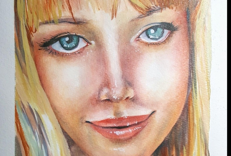
3. Photo reference: in this video, we'll see some good reference photos for our project. Have created a Pinterest board to show you what type of pictures we're looking for, and you'll find a link below on the Project and Resources section. Basically those pictures where you don't have many shadows with diffuse light. So yes, the opposite of a good for the reference for drawing where you need the shadows to better understand the form. But in this case, we need a more artificial look and light condition. Anyway, try to find models who have not too much makeup on or a two least a makeup. There is natural looking and possibly not have a for the shop. This one, for example. It's neat and high quality. I love the proportions I found. The features were unique, but this is a 3/4 view, and for this project is better to use a front of your picture. In fact, before to start any paint exercise, I want one a nice one of these pictures with you and show you something to keep in mind about light and shadow placement that we find very useful. Withdrawn. First of all, the pictures I collected show a light source that is on the top and central, so them in shadows are on the sides of the face. Underneath the browse under the nose, on the upper lip and under the lower lip. The lights are on the center of the forehead, on the sides of the browse, between the north and the cheeks and on the top part of the chin. Then there are those warmer areas that we're going to emphasize that are the cheeks, the lips, the nose, the ears and the little around the ice. I find that many portrait's lack vibrancy because they kind of missed this warmer areas. Now, the points we're going to use our doctor stones are the eyelashes, and the people's the nostrils on the sides of the mouth. Finally, there are the highlights for which will use some pure white, and you'll see how this will create a translucency effects for the skin. And I have the nose on the lower lip on the inner corner, off the ice on the central part of the islands. So this is the generous game that we're following and now take a paintbrushes because we'll start to paint in the next lesson.
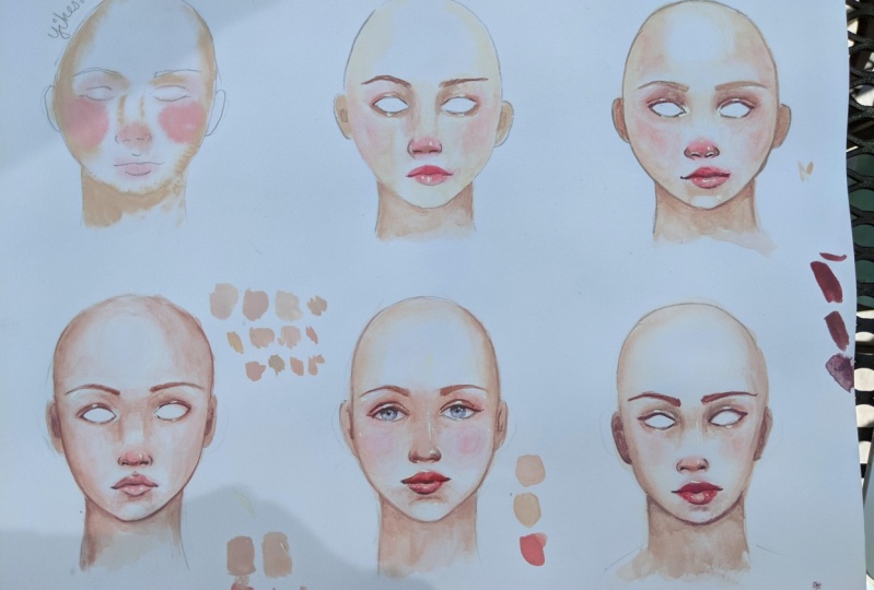
4. Skintones: In this video, we'll see how to create some skin tones by only using the primary colors. The first challenge of this entire project is to create good skin tints. I'm not going to give you a recipe. There's no one because there's no such a thing as one skin tone. So it's way more useful to show you my process and my way of thinking while I created, I want to achieve a pale, peachy skin tone because I think that it's perfect for this project. But off course you can experiment. Just keep in mind that darker skin tones are a bit harder to make. With this technique, I usually use the somatic palette for gosh that keeps the paint's wet. But the Carson picking are the three primaries that I show you in the Materials video festival. I need some white, then my primary blue, my gentle red and primary yellow simple. You should create a light inside rated pinky orange. If you know a bit of color theory, you know that you never realise the color by mixing it with its complementary. I started with the white and then I'm going to add, Although three primaries but with a predominance of the yellow and the red that gives an orange and then gradually adjust aeration. It's very important to test your color on a scrap piece of paper to check how the color is when it dries, because gosh tends to change quite a lot. This huge doesn't new combat, but look how different it is on paper. I realized that it's too yellowish in, and I need a skin tone warping based, the yellow based. So I add more red. The quantity a yacht is minimal because I need the light and diluted color. So at the cars, really little by little. Okay, now, with the comparison, you can see even better how the 1st 1 was to yellow. Now it's fine, but it's too dark for me, Middleton. Better then I can repeat this process and create a more purplish tone for the shadows, still using the same currents just this time using less yellow, unless white. If it is to purple, then I use some yellow, which is the complimentary to tone it down. Now we need a pinkish stone. So again I'm using all the tree cars, but with a red in a big oration doing dance. So I add white. And now we want a warmer tone for this pigmented parts of the face. Now that I see them or dry, I can say that this one is too dark. This one is good. A bit on the yellowish side. This is nicely pinkish. Better from the bridge is skin I have in mind. This one is no dark enough for the shadows. So we have to create another one. This looks good to me, but I have to wait for it to dry, to be sure. Now that I've decided which one off These are the right colors. I'm going to change the others or my palate will become a mess. Okay, now we'll check again. If these are good, I still miss my doctor Stone for the final details. And this time I want at any white and they are the tree colors. Until I find you I'm looking for if I'm not going to use this color So right now it's not a problem because they reactivate with water and I are ready to use whenever I want
5. Gouache basic techniques: Wash is a very flexible material, and in this video we'll see how to use this property to create nice soft grade ins. The first exercise is about the wet on wet technique that means that I Prewett the paper and then I'll go with my wet brush to create a south radiant. First of all, I wear the paper and I'm making a circle. It doesn't need to be perfect, and you can trace it with your pants. Or, if you prefer, what well and lucrative backlight to chuck. If it's a wet, I put the color Ali on the left side. Then I ran to my brush. I wipe it on a towel, and then I have the color to stay where I want to. I gently push it back with a brush, and I always work on the edge. The color is flowing so well only because I pre with my paper, don't push too much on your paper. Do it very gently and the water will do the rest. I pushed the color from outside. It's crucial that when you do this, your brushes not toe wet but slightly dump for the next circle. I want to put the color only on the edges and keep the center clear. As long as my paper is wet, I can work and push the color and still reach the stuff. Nous. But if you see that your paper starts to dry, stop working way for you to dry completely. Then what? It all again. You can't work on a surface that is starting to dry. It will be a mess for the last weapon. White circle. I use a lighter color, more like the one I'm going to use for my fortune, so you can see that with lighter colors. It's even easier to get a nice off radiant. Those exercises are also good to train yourself to be very delicate with your brush. The next exercise is wet on dry, so let's see how to bend. Wash in a dry surface with a weapon soaked in paint. Brush agreed a rectangle. Then I clean my brush, I tell you a little bit, and now I move it up and down the actual like that, and I'm jacking out the color experiment with this, trying to find the right witness on fuel brush because if it's too dry, is not going to drive the car correctly, but if it's too wet, a new margin is going to appear and the great it is not going to be very soft. It's important that you do this exercise with a life color that has some white in the mix, so you don't have to use the skin turns we created if you want to keep them for later. But use a light color with some white in it anyway, and the result? It doesn't need to be perfect. Don't worry if your radiance aren't super soft, because those exercises are made mostly for you to understand how wash works not to reach the perfect radiance from the start. - So give yourself some time to practice this. I remember that the ratio of the water in your brushing is different. Stages of the process is maybe the most crucial aspect to get this right now, we'll show you that you can use these techniques also as a second layer, which means on top of on already painted area, I started by doing a wet on wet technique on the top of the first circle. Just take in mind that what reactivates with water, so you need to be very gentle when you wet the paper for the second time, I'm picking a darker color, and I put it just on the left side. And then I softened the edge with my clean brush. Now the Western drive, the Connecticut. The second, I think, a darker color. I apply it on the dry paper and do exactly what they did with this time. You see how often it clean my brush? That's it. In this way, I added a doctor, Leah, now again, the wet on dry technique, and I want to soften just one side. And finally I painted out. And this often it you can practice these in many ways. I remember that you can post your exercises on the project section and ask for feedback so I can directly help you figuring out if there's something wrong
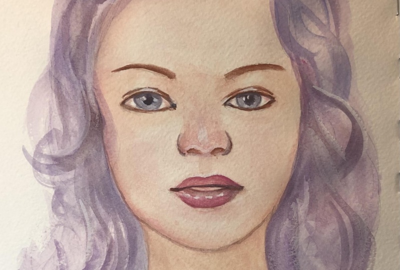
6. Practice: first head: in this video, we're going to apply the techniques we just learned on some small, stylized the heads by repeating the process multiple times we can memorize it and also experiment different things and slightly different skin tones without worries. Because this is not our father portrait and, as you can see, that aren't the eyes and the hair. So we don't get lost in the details, and we can focus just on the rendered of the skin. And after this, you'll be ready for your final painting. Too often, we don't give our staff the right amount of time to practice new techniques enough, and we can all take for granted that we should get a good result at the first try. And if not, we get discouraged with his exercise. We're trying to release this pressure, so I've created this page for you. You can print it and transfer on your watercolor paper. You can use some just for paper, but if you don't have any, it's very easy to do. Turn the page you printed, create a graphite layer with your Sophos pencil and then trace the drawing within our point , and it will just for underneath you now have a life sketch that you can refine if you want , preferably within her pencil, like an age, or to keep it light. It's important to use the same paper that we're going to use for family join so that we can test it. First of all, I'm waiting all over the face off on the eyes on the neck everywhere. It's important to be precise on the address because the car is going to flow, whereas with the water. So if I don't make an accurate edge, it will show Check back light if it's all wet from the staff. Depends all the others, so make sure you want it properly and uniformly. Now I pick my middle tone that I made earlier, and it distributed on the sides of the head, on the neck and on the other shadows areas and under the eyes and on the lips and picking the warmer color. If the river is still or what. I can go already with my warm caress on the cheeks, and I drive the color very gently on the lips. On on the nose. I put some red. I know it looks crazy now, but you'll see that is going to look nice, and the highlights will stand out more on a more intense base. I keep him darken around the eyes, but a few paper is drying, dried out well with no dryer and then wear it again before moving on with a painting. It's crucial to follow the state of the water. I know I'm saying this a lot, but it really is important. - And they keep on dark and where needed. And now there is dry. I'm using a wet on dry technique. I put the color I clean in tower my brush, and I blend. Now I'm using. The doctor threw itself created for the nostrils besides of the mouth and between the lips , and I blend it with my moist brush, - uh , around the eyes, always blending with a clean brush for the eyebrows. I start with a middle. It'll don't go to doctor soon or it's going to look natural, and I like it to have Self Duchess now, the most satisfying part. The highlights. I'm using this more brush and a big in the white directly from the tube, so I'm not deluding because I needed to be a bake. So do you remember what the highlights should go under nose and on the bridge of the nose, on the lower lip, on the corner of the ice, around the nose. So we have this nice heart. I just back on on the middle part of the island. Just a touch. Now I'm creating a liner on the face. Sometimes they do that to create the most stylized and illustration like effect. But it's to your taste and you can try different possibilities and variation here, since we have so money has to play with. - If at this point you have a richness to result or do you think you made a mess? Don't worry. It was just the first head.
7. Practice: second head: Okay. Now, with the next head, I want to make the shadows darker. But I'm still following the same process. My starting with wet on wet and using my middle zone. But you can see that I'm putting more color from the start. Yeah, By repeating the process over and over, you gain confidence and you can choose which resulted. Like better for this one. I'm using more popular Stones way . - Oh , and okay, I don't no seems to dried out. I want it again to make the checks for which I need to go with the weather wet technique as a second layer. It's very tempting to put this highlights everywhere, but it's better not to overdo it. This part is not landed enough, So I'll do it now. Always with my clean and moist brush. And I work on that edge. You see how flexible gashes? I wouldn't be able to do this with the color or with a bad paper. Okay, now you can see that I soft in it. I want to experiment a bit more with the lights us here. So I'm adding a bit of reflected light here under the nose on under the chin, but very light, like the shadow placement. But I don't like the skin tones too much
8. Practice: third head: So for the next head, I'm creating more orangey tones. If you see that the color starts to flow widely, don't panic. Clean your brush, tower it and push the car back. You can see how I left the color here with my clean, dry brush. Maybe there was too much water, so the color was spreading a lot. But as you can see, you can push it back quite easily. I like the lips not having any yardage, especially on the sides. It's more natural, since here on the upper lip is Docker. I can put a highlight nice, and I love the specific color for the lips. In general, I find this Kimpton's very nice, them a favorite. My father. I also like those life shadows on the sides of the nose, so I'm going to repeat it for the next heads.
9. Practice: 4th-6th heads: three more to go. This really allows us to be brave and experiment, Don't you think? For this one I want to try a more intense color. Okay. You want to be crazy with that? I like it, but not as much as the previous one. I liked it. This bulls and with a lot of contras. But this cheeks are really to read. So my favorite is still the third head because it's more natural and organic. For those last two I want to repeat, pretty much would have down for the third head, but still experimenting a bit with the shadows. I want them to be more diffused, like, you know, So experiment a bit with the mouth shape and the position of the highlights way. Uh, - yeah . - No . - Now that I washed them all together, I can say I like the street most. And I have now a better idea off how I want my final painting to be like So this was a long exercise. If you did a congratulations and about your much more confident now you can post it in a project section if you want. I'm here to help. Let's say let's move forward into our final painting
10. Sketch: in this video, I'm making the sketch for my final painting. I show you how I make it, and I give you some guidelines. I always start with a circle and the signature line. The length of the head is about three radios off the circle I just made. Then I schedule face shape following my reference, and the eyes need to be placed at half off the length of the head. The nose would be where the symmetry lying crosses the circle, and finally the mouth will go there in the middle, but closer to the nose. But if you prefer, you can skip this part and bring the pdf you'd find in a vessel see section and just go to your paper. I think that there's nothing wrong if you want to escape the joint part honestly. After all, this lesson is about painting and drawing. Otherwise, you can make your own drawing and shows the reference you prefer. I just this one. But as you can see, I use it only as a starting point. But then I change. It resembles that's not my goal, by the way, if you want to improve your drawing skills for portrait. I suggest you increase home class. He on sketcher is great. My sketches on print paper said that I could erase and push with my pencil without ruining my final paper where I'm going to trust for the drawing. So I have a clean sketch now, with only the essential lines off course. The drawing is so light that you can't really see it, but I suggest you to keep your very light so it won't be visible under the paint.
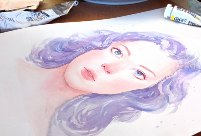
11. Final portrait pt.1: Yes, we're finally ready to paint a portrait. I've transferred my sketch on my watercolor paper, and I started exactly like in the previous exercise. I'm working bigger, so consider using a bigger brush. No, - Here . All right. Right for the eyes. I'm working initially wasn't wet. And keep in mind just a few rules on the upper part. It's darker down this lighter, the edges off the arias should be a be blended. - And for the darkest parts, I'm not using the brew but the brown that I used for my dark spots.
12. Final portrait pt.2: No. - You can see that. I never used the black other color. That is the result of my primary colors. Works much better for the overall color palette. - All right, - No . - Here . All right. Now, for the hair, you can paint it whatever you like. I start with a weapon wet, and I made a pass the color than much of the eyes. - And this time I don't care if the paper starts to dry because I like that some brush strokes are blended and others are more edgy. And I keep on doing this looking my reference from time to time. - Yeah , - okay . And finally, I'm using some white to make some strokes on those parts. I don't like too much. And to give the hem of dimension now it's your turn.
13. Thank you!: thank you so much for thinking this glass. I hope it was useful and fun, or it is one of the two. And I also hope that I proved the importance off. Take some time to practice repeating the same exercise and analyzing it during the process . Don't forget the positive project if you want, and if there was something unclear, you can post your questions in the discussion. Ariel, thanks again, and that's in the next US.
 Shamila Boffo, Teaching drawing and painting techniques