Transcripts
1. Introduction To Painting A Rainbow Cactus: Hi, Welcome. Welcome to my studio. I'm Eva Nicholas. I'm a Danish watercolors. I live in California
and I'm coming to you from my home studio
up here in Turkey, California, close to
the Nevada border. And we know I had been painting in watercolor
for about 20 years now. I think I entered
my first show in 2003 or 2401 of my first price and never looked back
since I show my work at various galleries
here in California and Nevada and contain mark. So I started teaching
watercolors about ten years ago. I love teaching and
I'm looking forward to today's class where
we're going to be painting a rainbow cactus. Yeah, there's no such
thing as a rainbow cactus. I know, but it doesn't matter. There is. Now we're going to explore some fun
and easy techniques, some that I am using a lot of times in my artwork and we're going to mix and mingle
colors directly on the paper. Trying to avoid mat. We're going to use a
thirsty brush to lift out some highlights and
also to control the water and the pigment
in our paintings. I have included tracings, a drawing, and you can
do sadness and tracing. And I also make just a
more simple tracing for you if you don't want to
draw your own cactus. So those are available for you there down
in the materials. You can find them, they're PDFs and you can just print them out. I also have a materialist for your so you can see
what I'm using. That does not mean that that
is what you have to use. You use whatever you have. And if you're a beginner
watercolor waste and you don't have some of the colors and some of the brushes that I use,
don't worry about it. It's not a problem. Just use what you have. It's about learning the
techniques best, really the key. In order to take this class, you don't need any experience. All you need is a positive
attitude, an open-mind. The rest will come. Let's
gather our materials. I'll go over what we need
in the next video and then we'll jump into
the actual painting. I hope you will enjoy and follow along once we have
completed our class, I hope that you will share your painting with us on
the project gallery page, I have included in the
wrap-up video exactly how you post on Skillshare in case you don't really
know how to do that, so that'll be there for you. So nerd skills,
Let's get started.
2. Rainbow Cactus Materials And Set Up: So today we're going to pick
this cactus in this lesson, and it's a very, very easy beginner
friendly painting. I have a drawing that I did and that's going to be available
to you as a handout. I have already gone
ahead and traced my drawing onto my
watercolor paper. I just did it in pencil. So try to be light
handed with it. I did it a little more dark than what
I would normally do, but that so that you guys
can see the drawings. I use a pencil like this, any kind of addition
number two, pencil. And if you need to
erase it a little bit, when you're tracing,
use a kneaded eraser. Don't do, don't ever use this eraser on your
watercolor paper. It's going to damage the paper. The paper that I am painting
on today is Arches, 300 pound cold pressed watercolor
paper or a 100% cotton. Now, 300 pounds is very stiff, and so it's a little harder
to see through the paper. But for demonstration
purposes I like to have the 300 pounds because it's
easier for me to lift it up. And if you paint
on a 140 pounds, which is perfectly fine, then it just gets a little
shaft of the course. It's thinner paper, but
it works just as well, so don't worry about that. And then of course
you have my palette, and I happen to use this
palette today had some yellows. I have some reds including pink and I
have a ton of blues, as you can see, I love blue. And then I have a bunch,
Anna, whatever palette, whatever colors will have, will work absolutely perfect. Do not have to have
the same colors as me. That's one of the biggest
things that students think is that they need to have the exception column you do not, yours might end up looking
a little bit different, but that's the whole point. So no problem there. I wanted to show you that if
you're just beginning and maybe you just invested in
the three primary colors, red, yellow, and a blue. That's gonna get
to just as fine. You do not need to have
a gazillion colors. And when you're beginning, it's better to start out with just the three primary colors and then add on a couple more. And then as you go
along, trust me, you will end up with a
big collection of colors if you're anything like me and a lot of the
painter said I know, but it's not necessary. So there's no need
to break the bank. Much better to have
fewer colors and fewer brushes and all that
stuff to start out with. But get inequality instead
of getting a whole bunch, but it's all student grade. He's not gonna show
your work very well. If you have three
colors or if you have 12 college
like I have here, it'll all work beautifully. And so the way I trace my drawing onto my paper
and you put also free him at this folks is for most people not a very
complicated design and you don't have to
have it exactly like me. We all know what a
cactus look like. And here you can see it's a
very simple example here. So on much smaller
five by seven, my piece of paper
here is eight by ten. Now, I always try to
paint on standard sizes, meaning that the
sizes I paint on, I can go to any framing
store or actually apply a store and buy the mat and the
frame off the shelf. I don't have to go up to the
desk and have them drag out all their Matt samples and measuring and all this stuff that's going to
cost you a fortune. It's very wise,
especially to begin with, to just hate on standard sizes. Eight by ten is a good
standard size to paint on. It's big enough, but it's
not huge and it's not tiny. So I find that this is a very, very good size to a
2D class project on, you will find a lot of
the classes that I teach, I demo on eight by
ten watercolor paper. You can also buy a block of watercolor paper
that eight by ten. Now again, back to
the transferring. The way you transfer, there's many ways you can do it. You could do it with some graphite paper
and let you have to make sure to graphite people. That's this black paper, you know, kinda
like carbon paper, but don't get cotton
paper because it has some oils and waxes in it. You don't want that on
your watercolor paper. And then you put, if you do that method and then you slide in-between here you will
use a little piece of tape, attach your drawing to
your watercolor paper just so it doesn't slide around and it's best
to just do it again. I usually do it at the top. And that way you can
kind of lift up and see if you got all the lines, if that's some method
you want to use, if you use that method, you will probably want to take your little kneaded eraser
and then kind of roll it across and pick up some
of that loose graphite that has rubbed off from
the graphite paper. That's method number one, method number 23, they're
basically the same, just depends on if you
have the equipment, you can use a light table. If you have that are
light tablet nowadays, you can buy them
very cheaply for about 30 bucks on Amazon
and other websites. If you want to go ahead and invest in that, you can do that, but you don't need to
because we all have matrix-like table
available towards what do I mean by that? I mean that we have a
window you want to do during the day time and
preferably as sunlit window. And what you do is you take off your drawing in the window
with a little piece of tape, and then you take your
watercolor paper and put it on top and line it up
through the way you want it. And then you put a little
piece of tape on that and then you can see through
the watercolor paper. And you can just
follow the lines. That's why I saved 300 pounds inches thick or too
little harder to see, but I try the best. I can't make my
drawings very dark. I were April I was able to do that drawing here
through the 300 pounds. But anyway, either way,
if you have a light, light tablet or
lightbox or whatever, you can put your drawing down and then you put
your paper on top, put a little piece
of tape up here, and then you just
have the light shine through and the same
applies for the window. So that's how you get your watercolor paper
prepared with a drawing. Alright, so that was enough
about the materials, really. Spray bottle. You always want to have a
spray bottle at hand and I already went ahead and
spray it all my colors. I usually spray all my
clothes even though I don't know him all probably I'm not I had already a
puddle of magenta from a previous painting and it's computed
completely cleaned. So I didn't want to wipe it out. Of course, our college, they are expensive so we don't
want to do that. And if you spray, you can see I got a little bit of
it over spray here. So try to be careful
with your spray bottle. You can also use an eyedropper. Some people do that and you
can also just use your brush, make your brush wet, and then kind of
driven like that. That's another way of doing it. So that was set spray bottle. And finally, we need to have, of course, some brushes. And again, you don't need
a whole bunch of brushes. I also have an old piece of terry cloth and then I
have some paper towel, Viva paper towel
that I put on top. If you put a two
or three layers on foliage on and then you might, if you have it, you might
want to have a white gel pen. This one is uni-ball
signal gel pen with gel pen up jelly gel pen. We might use that, I'm not sure. And then an old classic
card credit card, whatever. And I like to cut mine
like this on a slant. So that way you get a real
nice pointy end here. And then the two other
corners, social rounded edge. I'll show you how
I'm going to use it later as far as brushes go, I think probably my number 12, number 1012 or 14, right around there is a
good size brush here, a number a, and then
I have a number four and I have a
little number two. And I could potentially think about using an even smaller one, but it's not necessary. I had it peaked with
these little brushes, but I did find this
one reasonably and those little hairs
could come in handy. And then my good old dagger brush nowadays you can't
get them with this handle. They become either white or green handled
sore or, you know, it all depends on
what grant but this is a half inch dagger brush, my favorite brush and I will
have that linked for you. But anyway, I think
we're all set. Now comes the fun part painting. Here you can see I've
zoomed out a little bit so that you can
see my whole setup. And this is actually
for this class. I'm going to put that away, like to have little
plants here in my studio. And I have my water
control station here. That's what I call it. That's my funneled up
or terry cloth with some Viva paper towel on top of whatever paper towel
you you said it's fine. And then my palette, I have two containers of water and I usually have a third one, actually a standby precaution or I'm filming and I
don't want to have to run to the sink to get fresh water in
the middle of taping. And then of course,
you know, spray bottle and you can also use a half also big spray bottles sometimes that comes in handy. Anyway, I'm gonna
assume in a little bit so you can see better
what I am doing.
3. Rainbow Cactus 1: All right, I think we're ready. Gonna take my number
eight brush here. I like that one for
mixing my colors. And I'm going to first make
myself some puddles of color. We hardly ever
paint for this one. That's a cobalt teal from M. Graham. So let's put a puddle of that out and if
you don't have that, remember what I said. Just grab another color. Maybe you want to grab cobalt or maybe you have a civilian blue, or maybe you have peacock blue, which is this one here. So I'm gonna take a little
bit of that one out too. That's a little bit
of a brighter blue. Love that one. I loved them all. I love color period, and I already have
my magenta out. And let's see, let's get some French
ultramarine blue out. If some of that out here. And you can see
I'm moving around, I wish my colors around, meaning that I store them
around here on my palette. And what is that for? Well, first of all,
it's to dissolve all the particles of
pigment in the watershed. We don't have little
pieces of gunk because that can
really mess us up. And it also tells me the
ratio of water to pigment. We already have
the magenta out if schizo some yellow,
Let's skip this. My favorite yellow
is this one here. This one I have on this
particular palette is a nickel, a little yellow from M. Graham. It's pigment PY, That
means pigment yellow 150. That's my absolute complete
and utter favorite, favorite, favorite,
favorite yellow. And I'm actually going to put another year over here already because yellow gets polluted so easily because
it's a light color. And I have my water
containers right outside of the picture up because
I wanted to zoom in, but I always have
to one that I went up my brush and she'll dirty water and then the other one, I tried to keep it
clean so that I have clean water to work
at my college ready. And you notice TO we
had just so far we only start blues and yellow until we have a
beautiful green here. Alright, so one more color. Let's go with the year. Quinacridone call
here, that's a red that's read from Daniel
Smith that I really liked. I use that more as my true
red on my palette nowadays, I used to do quinacridone red, but that is a little,
it more pink. So wanted to discard this one. I thought, well I should switch. Now we have the red on the brush and we
have green in here. So this is just a
little opportunity for some color theory and a colorless and red and green are complimentary colors
on the color wheel, meaning that they are
across from each other, as far away from each
other as you can get. Greenish also register
primary color and green is a secondary color consisting of the two other primary
colors, yellow and blue. That's where we went
down. And the story is that if you mix complimentary
colors together, they neutralize each other. And we saw that here right
in front of our own eyes. If you see how that
green is now kind of gray-green from that
bright, bright green. And that is how that works, not only in theory
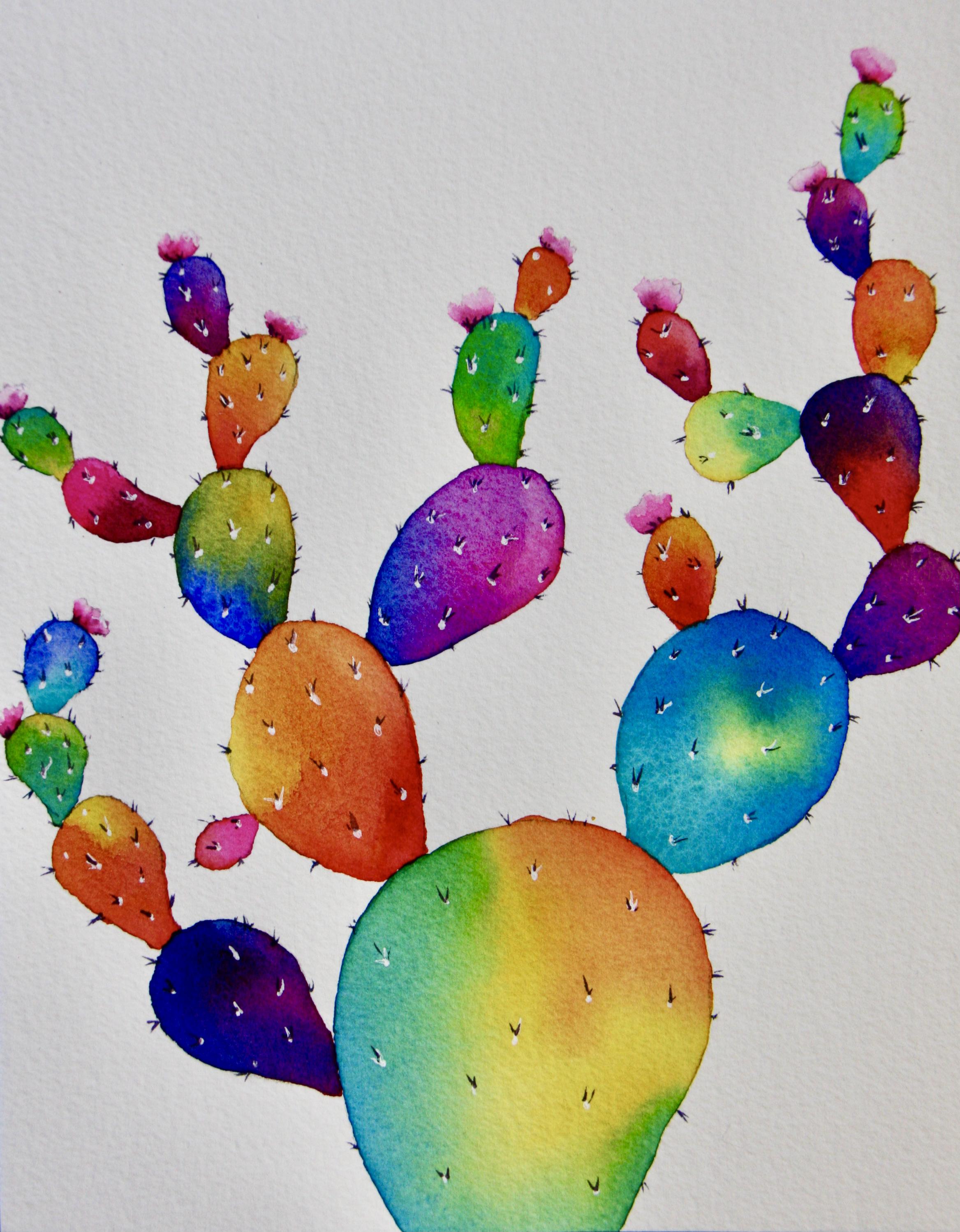
but in practice. Alrighty. So the plan with this cactus is it's going to be not a
realistic characters. Unless you wanted to do that, then you can just paint the green if that's what you want. But in this particular lesson, I wanted to just be a little bit more abstracted about
it, so to speak. It's not a realistic cactus. And here you can see I
always like to just take my kneaded eraser and
make sure that if I have some extra
little graphite from the pencil lines floating
about, I just pick them up. There's just my own
little obsession. Those are the painted with in real life they know
all about this. I just can't stop myself. So I'm gonna go with my little bit bigger brush and I'm going to put
clean water on it. This is my brush
size and this one happens to be a number 12. And the brushes, except
for the dagger brush, the brushes I'm painting with
are all from the mimics, squirrel series or collection
from Creative Market. They are excellent brushes
at fantastic prices. Can't be that
combination being water. I do like this. And then I go and just do
a little tap on my towel. They have just so that it
won't run all over the place. And I'm gonna put clean water
on almost out to the edge. I'll leave a little
tiny bit of space. And actually, I didn't
think I wanted to use this, but I think I do it also have my number 30 brush from
them created market mimics, squirrel series, just here for, and you don't have to do this. It's just, I personally hate fiddling around with little
brushes in big areas. The bigger brush you can use, the less brushstrokes can eat, the less opportunity
you have to miss out. That's my theory.
So I wanted to wet this whole area inside that big bottom
part of the cactus. And I'm gonna put
even more water on because the more
water I have on, the water will sink
into the paper and it'll already begin to go. Matt, and I want the
colors to mix and mingle. That's what I wanted to really
colorful abstract cactus. Now probably, you will
probably also have to put on maybe two layers of and just give it a little interest
sink into the paper. And now also because
I'm painting on the 300 pounds, so
it's even thicker, so there's more absorption then if you're painting
on a 140 pounds. Alright, so now let's just
go in and eeny meeny, miny Moe, let's put
some yellow on. I'm just gonna put some yellow
on here just like that. And then just be very fancy here and have a
true, true brush approach. And then let's put some
of our peacock blue in. And I'm just going
to turn my paper around so I can
get to this area. And C Now I'm going
all the way out to the edges and look at that and put a little
bit more blue on there. I'm going to put a little bit in here while it's still wet. There we have it. And now I'm just going to
let it mix and mingle. I live up in the
mountains in California, in a little town
called Trotsky is only about 30 miles from Reno. Nevada is. So the climate up here
is, of course, mountain, so that already says
dry and then it's almost high desert show
today for instance, we have moisture, the level, the percentage is only 20. So that's why my paint dries
out almost immediately. And so here, I just want to
have a little bit more fun. I think I can, I'm
going to dip my tip of my brush in that red and I
don't have my brush to wet. And I thought it could be really fun to just play with it and see if I could get
a little bit of orange in there.
How fun is that? But I didn't want the Red
Running with the green because then I'm gonna get a muddy color and I
didn't want that. I want these characters, these characters
to be very bright. Alright, that was fun. And the colors are gonna be
moving a little bit more. And the more water you have
on the faster and white are, the colors spread and move. So just keep that in mind. So you can see minus staying a little bit kind of
they don't want very fast and it's because
I should have put even more water on if I want
it to them to run more. But if you have like this, then you can control it easier. So it's all depends
on what you're after. In this lesson here is very
much about how much water, because that is the major
number one question I always get from students is how much water
on the paper for underbrush? And the answer to
that is it depends. It depends on what you
want the college to do. If you want them to really
run spread and go far, lots of water if you don't
want that to happen, if you want to
have full control, then you don't want
to wet it first. This was wet into wet and wet
the paper first and then we put somewhat wet paint
in and it moves. If I had put the paint on dry paper wouldn't have moved
or stayed where I put it. So while that dries, Let's paint another one. Now the only ones
we cannot paint are these three here that are touching because if we did that, then they would bleed
in and we would create a cauliflower and they
would want to gather, we don't want that
not in this painting. I'm going to flip it around and maybe I'll just
grab this one here. That's a much smaller one. So I'm totally fine with my number eight brush maybe
to just put water inside. And now I've already learned
my lesson that the colors, they move kind of slow but
don't put enough water into. I'm really I'm really putting
water in this one here. I'm just going to give
it a moment to sink in. Then what color do I want here? I think I'm going
to go with some of my french ultramarine blue. Such a beautiful blue, it's kind of a warm blue, meaning that it's leaning in a little bit to the purple side. So I'm dabbing some of that in here and I'll rinse it out. Then I'll go into my magenta, which I have here, and
that is a reddish purple. So let's put that on
and I'm gonna rinse it out from moving my paper around so that I can get to this area where I'm
putting my hand in wet paint there and did here just there and see because it's much much
wetter than this one was. Can you see how it runs
and mixes and mangoes? And I'm getting some
beautiful purples. And this is super fun to
do this. I like this. This is my way of painting, just written the pigments
moved back and forth. Okay, so we can let
that sit there. It's plenty wet. And then I'm gonna go
with this one here. And again, I'll put
some clean water in. And I do leave myself a little bit of a distance
to my pencil lines, if you can see that because the water does creep
out a little bit. So let's go with
the yellow here. See how that just
ran into there. Because yellow is a
mover and shaker, meaning that it moves a lot. And then here I'm gonna go to my Quinacridone call and
put that in down here. That, and I'm going to
wind up in the brush. Maybe I'll put it
a bit more yellow on the tip of my brush
and then be careful, can you see how I
have a droplet here? Try to get those
off because they're going to form and then
they're going to mess you up. Here we go and mix and mingle. And we should get a nice, lovely orange and some red and a little bit of
yellow hold depending. And I just stepped a clean
my brush and I dabbed off all the moisture
show it's almost dry and I'm going to just
put the tip of my brush. Did you see what happened? See it's showing up that excess
pigment that I had there. A brush that can do
that is called a thirsty brush and it
comes in very handy. All right, sure. Like
what do we got there? And this one is still
see her with that one was so it's still running
a lot, but that's okay. So I think let's take this one here and I
have another color. I want to get out. And that is opera rose. Want to have my opera rose, that's just a super bright pink. And this one happens to
be from whole bunch. I want to put a
little water in here. And again, I want to have enough water that
things will run for me. And let's put a little
bit of that teal color, that a lot there. And then let's put
a little bit of our ultramarine blue in
Sunnah, mixing two blues. Or there could be really fun to mix and mingle a little bit. Right? Switch over here and we'll
do another one to this one. There we go. And I'll put a little
bit of yellow in. We'll see how yellow just,
just goes everywhere. So let's try and put some opera rose in the yellow
and see what happens. It's going to give us a
different combination then with with the Quinacridone call. Right here. There are use this combination
sometimes for sunsets, the opera rose and the
needle, a little yellow. Sometimes it's also called transparent yellow depending on what brand you're
looking pretty good. I feel I have a
thirsty brush here. I feel like picking
up a little bit. It's still damp. I'm feel like picking up a little bit there to maybe
get a highlight down. And I could do the same
over here, just like that. It'll highlight. Hopefully we can do it here. Might be too wet yet like that. All right.
4. Rainbow Cactus 2: We'll carry on. And the next one I
wanted to do with this one in here too
little bit bigger. I'm using my number eight brush. I could've used my number 12, that would've been fine. And again, I want to make sure
that I have enough Warner that things will move
and mingled here. Let's go with my pickup. We do. It's another color really. And what are we going
to run into that one? How about some of our opera
rose and see what happens? So here also Rate Experiment to see how the different
colors mix and wrinkled. So this is going to create a beautiful purple,
also lavender. And you can see how I'm turning my paper around all the time. And it is show that I
do not put my hand in wet paint and also
show that I can hold my hand in a more
comfortable position. And as you can see, I'm a left-handed painter. So if you're
right-handed, you know, obviously you would want to have your Who would want to have your palate and your water
over on the right side. I'm just dabbing in a
little bit in more of the opera rose to try and
kick it up a little bit. Go with that mix and mingle. And can you see here that
has almost dried now, we got some beautiful
shade of purple here. In this one here we'll get some different shades of purple, more lavender,
because we're using a different blue and we're
using a different red. So that might be
another incidence of where it might
be a good idea. Can you see how I hold
it up and it's like it's pulling right there
outward hits the drive. So I think I wanted to
just pick up some of that extra extra pigment just doesn't take
forever to dry. So again, that was a use
of the thirsty brush. You can see here
on this one here, got a little bit, a cauliflower. I don't mind at all
whatever happens here. I mean, you really can't
do it wrong but just roll with the
punches, so to speak. But that was the cosh, the yellow I think one
of the either the yellow or the other side had to
drive a little bit faster. So that's how you get
hot cauliflower here. If we get colored flowers, you know what, It's
just part of the chunk. We're not going to
worry about it. So the next one I want to
paint is this one here, which not touching anything. And it's good to paint these two because they
both touch this one. And then afterwards maybe
I should take that little one and then they
all dry at the same, more or less same time. Show water in again, just dab in a little
bit extra water. And what are we
going to do here? Let's do some of our
French ultramarine blue, so pretty which
shouldn't run out. And then I think I want
to give it some yellow, niggly little yellow and French ultramarine blues now
gonna give white as bright green as we saw down there with the peacock
blue there we have it. And I like that. I think I might
go in and just do a little bit more blue here. On this side. Looks good. French ultramarine blue is a granulating color and you might already be
able to see that. Can you see how it kind of
granulate a little bit. And that is from the French ultramarine blue or
CEL, middle ear. So yellow is not a
granulating color. And then we said we were
gonna do this little guy. Let's do it. Just
a little bit of water inside is a
small little one. Let's see what about just putting some upper rows in here. And we can put a little bit
of the quinacridone colon. So we have two reds, more orangey red and a pink. That could be fun. There you go. I might go in here while it's still
wet, it's still shiny. Can issue that I think I
might with a thirsty brush just gently try and lift a little bit of
a highlight here. Did you see that? You don't have to do that if
you don't want to. But I thought it would be
a good one and actually maybe I'll go in and
do it here to there. So we're going to go
in and just try and lift out there just to
get a little highlight. And then we're gonna
move on to this. We want to do some red and
a little bit of yellow. A little bit here, which
very whipped in there. I think I might just dab in a little bit more of the
yellow that's going to push away the red yellows
are very pushing. The next one I want to
paint is this one here. I'm going to paint this one. And I'm gonna go with
my trip course there. Then I'm gonna put a bit, a bit of yellow in and
see that lovely color. Lime green, almost
really like that. That's a good combination. Didn't want to use
that somewhere else. Let's clean up the
edge a little bit. And then we have this one here. Let's grab that one. And again, be careful with those
little droplets. I'm going to go for that
same color combination, which I liked it so much. It just stopped my brush on
my water control station, Portia was going a
little too fast. Too much pigment on my brush
for that little tiny area. Now, let's get some of
the other yellow in there and be quoted it the
mix and mingle on their own. Even though I'm using
the same colors, they're not going to do
exactly the same thing. There's no, we're
going to be true that are exactly the same. That's why I never
worried about people copying me or anything like
that because you know what, I can't even recreate a painting myself that I paint
it because of how I use a lot of the wet
into wet technique and let the colors mix and
mingle and paper here, just use a thirsty brush. Did you see that? Just like magic, right? Yes. So I don't
worry about that. See how different they are. We had more of the
yellow and here some of the tripwire state
through here barely any. And I'm good with that. And see, I think this one here, and we'll put a little
bit of yellow in. And then let's put a little
bit off the p.band copying. That's another really
pretty combination. Stroke hold took or she that gets really rich to approach. It makes them angle. Shot
my brush and I think I need a little bit more
yellow course at peacock blue is also
a very strong color. Remember that ideal and
let it push a little bit. And then I'm going to let
it run down to one side. And then with a thirsty brush, just barely dipping the tip
of my brush and brush has to be clean and dry but not
like bone dry but wet. And then you're squeezed
all the water out of the hairs that's kind of dry. I like that. Yeah. And we're gonna do another one over here. A little bit of water in. I'm gonna go with
the yellow again and you need a minimum animal. I want to go with the red. That's the year when I couldn't call or if you don't
have that one connect on rich same pigment number of structurally different
quinacridone red looks, there's more red, more pink. Quinacridone red is more pink
is what I wanted to say. Right. So we have a couple more of these and I'm not
touching anything. So this one here and here, we haven't even used all
magenta BOD public places, but time for the magenta. And then we want to do our
French ultramarine blue. What I want you to
be a lovely purple. Clean up the edge a little bit. Mixed and mingle a little bit. Okay, I gave it a little
break and now we can paint those little
leaves or arms draw. I don't know what they're
called on a cactus that are touching other hearts. And so we'll start
with this one here. Now comes a little
bit of a puzzle, but I mean, you can
do whatever you like, but I'm thinking case, I have kind of a
blue-green here, I have orange here, so I think I want to
go with a purple. So why don't I start with my quinacridone magenta
is this one here. It's a very bright color, a little bit more on tint and
dark then the opera rose, but approach is super
bright of course. And then let's go with
the peacock blue. I don't think we've
tried that combination, so we have to pick up blue together with the
quinacridone, magenta. They're both very,
very strong colors. See them a little
bit of that at all. And then let it run together. See what happens. I just want to fine
tune my edges here, just touching there, and
let them run. There we go. And I feel like I probably need a little bit more magenta. Pick up bluish, put
it down strong. There, there we go. I'm happy with that. It is. Let it run a little bit. And you can see two very weird Can I just cleaning
up some edges. And I'm gonna make
my brush thirsty. And then I'm tipping the paper and I'm just
putting the tip of the brush in here just to soak up some of that extra pigment, you can probably see new
now that everything is dry. How watercolor they dry
quite a bit lighter than they look
right when you have them on like here
looks really dark. Well, wait and see. Once it's dry, it's going
to lighten up quite a bit, just showing up a
little bit more. They're good with that, I think. And then let's go over here and see what we
can come up with. And here, I think the color that speaks to me right
now is the turquoise. Really want to get some
true question here? Let me put that again. I'm turning my paper so that I don't put my
hand in wet paint. It wouldn't be very
good. Show here. Then the other color I think
I would want to run into this one this time is
actually the peacock blue. So they're not that different, but still different
enough that I think that would give a
fun combination. And actually here,
I might just go in and just give it a dab of
yellow right there. Why not? Here? I actually have for
the first time, actually mixed three
colors together, but I have the two
of them are blue, so they're not that
different years running in a little bit
more than a peacock blue. Let them mix and mingle. And I want them to run through
that yellow show that it turns green and it should
be quite the bright green. I would've said, Look those
two blues being so bright and show already leaning
towards the green side. Look how fun that is. I don't like to write
that one down there. Looking good. I'm
going to make my brush thirsty for dry eyes on me. And then I'm just
going to pick up a little bit of a
highlight on that side. Go see here there's a little
bit of a white edge here. And then I wanted
to take care of Go. Then we have, Let's go for
this one in the meantime. There, I think I want to
go with the red, this red. Then I'm gonna run a bloom when the blue I'm going to run in, it's going to be the
French Ultramarine Blue. Going to give me a purply
color up there and then red at the bottom there. Coining, don't do
a bit right here. Today's gonna be a little
bit more of a dark, muted purply color at the truck because I
didn't use a pink red. I used the quinacridone
coral red. I'm just going to soak up some of that extra pigment here. There. I can see a little
white spot there. What do you think so far? So good, It's
definitely colorful.
5. Rainbow Cactus 3: I think it's time
to paint this one. I'm going to give it with
a little clean water. I think I want this one
to be red and orange. So that means I'm using my Quinacridone
call with the red. Then I'm going to put
the transparent yellow in hand to load up
my brush with that. Pretty intense. And we know the
yellow just moves soon as the goods half a chance. They'll put that they make such a beautiful glowing orange and mix and mingle
while it doesn't stain, I think I want to go here with a thirsty brush and just get a little bit of a
highlight on there. Do you see that? I've got
a winch that brush out. We want to check some of
this extra pigment off. And then I do want to put a little bit
more red down here, switch more like red, red down here, there. And then it goes up
into the orange, like that edge that
could be fixed there. Okay, I like that a lot. Just for a moment. And then we have this one here. I think I want to go in
with the group in no rush. You put a little water
inside and then I think I want to go with the
peacock blue like that. And then I'll put some yellow and we have a go with
that right away. Squish. It says, drop that on. And now I just want to
get out to the edges. Let them mix and
mingle and create this beautiful bright green. And I can tell, can you tell here, see this area dried? It's not completely dry but
it's not nearly as where does that so you are getting a little bit of the same
as what I had there, but now I'm just
going to pick up this extra pigment and see if we can pick out a
little bit in here just so it doesn't make
too much of a bloom. I'm just barely having the tip of a thirsty
brush in there. Don't it's not a brushstroke. See here what happened? So let's pick that up. Why we weren't looking
for that's fine. Go and I want to put a tick up a little bit of a
highlight right here. They're the same here. Little bit of a highlight there, just so it doesn't produce. And then I think, I think it's time for a little
bit of that opera rose. What do you think? I think it's time for a little
opera rose here. And I put it like
here, up here first. Then I'm gonna put a little magenta and so we're
staying in the pink family. Make sure my ankle and I'm
just gonna fix the edge. And I might actually also lift out a little bit like that. I've also got a lot of
pigment and water on there. There's not that big of
a little pedal branch. It looks good. I like it. This one's done. Let me have one more year
and some water in there. I think I'm gonna
go with the red. They kind of go with
the quinacridone, red. And then we're gonna
give it a little yellow in the Indian
mix and mingle. And another beautiful transition
of red, orange, yellow. I'm going to just pick up here a little bit of
that excess here, this guy, Let's make that a
bright and beautiful purple. Let's do some French
ultramarine blue. This, and then let's
give it some magenta. There we go. I'm just going to lift out a little bit of a highlight
why we can on that one. Then this one here, let me use a thirsty brush
and just get some of that excess pigment
out their motor goals. So let's do this
1 second to last. And I think here a
good color would be the two courses that look
really, really good. I'm gonna start with
a truck wash up here. And then I'm gonna
run in some yellow. We should get bright, beautiful green at
the bottom there. Leave a little bit of it
to coerce the chapter. Look at that. Go. We gotta run it down
here and pick up that extra pigment with
our thirsty brush. And then we have one little
one FTR in that one. Let's do that one,
red chalk here. Then we can do what
about magenta? Don't think we've done
that color combination. So it's bluish red
and orange together. Fixed an edge that looks
nice and then you fall, it gets too dry and
wanted to just chief, I could lift out a little
bit of a highlight there. Then on this one here, let's run it down and pick
up just a little bit of that excess pigment and
maybe a highlight here. I don't know if it'll stay
with it so wet that oh, I'm back in time will tell. All right, we got
all the leaves or the pebbles or whatever it is
on the cactus palette here. And they're all
nice bright colors. We didn't get any mud anywhere. And then we have our little flowers that
we are going to paint. And then we're gonna
go in and put some of those little prickly
needles on a cactus.
6. Rainbow Cactus 4: Everything is dry now and
I'm quite happy with it. So now all we have to do is
paint those little flowers. You can see here in
this photograph that I took in the desert doing a
road trip in the springtime, probably years ago now, how bright pink those
cactus flowers are? It's amazing. I mean, they are
exactly opera rose. And so I'm gonna go with that. And you can see that I
have them spread out here. And I also want to
use a little bit, and I'm going to
use my small brush, make sure we don't have
those droplets on here. Everything we painted shell
found was wet into wet. Now we're going to
paint wet into dry, and that means
we're not gonna put water on the paper first. I think I want to
try and zoom in a little bit so that
you can see it better. I picked a couple of these here, so I have loaded up my brush
with some of the upper rows. Let me move this up so
you can see there we are rows there and show my brush loaded and I roll my brush so that
I have a nice tip. And then let's just see here, let's start with
this little guy. And so we're going to start from the bottom and we're just going to pull it up and we're going to rinse out our brush, dab it. And then before
this drives or not, we're just going to move
that pigment up there. So can you see how you're
getting a little bit darker at the bottom and then you're getting
highlights there. And actually for extra bonus, we could go in and just dip just a tip of our brush in a
little bit of that magenta. And before it's dry, we're going to go
in and just dip that there at the bottom. And I think this is good. They're so tiny like that. I think that looks really good. And that's how we're going
to paint all the flowers. So let me rinse out my
brush and then here, load it up, loaded up
with the upper rows. And then I start from the
bottom on dry paper and I just kinda go up in terms
of little strokes like this. They're going to up my brush, dab it on my paper so
that it's just damp and then I'm dragging
that pigment up. You might have to rinse
your brush again. I had to rinse my brush again, pick that and then
before it dries on us, we're just putting a
little bit of that magenta just here at
the bottom like that. Here's flour them too. And we'll just do that on all of these little
flowers that right, right, right upper rows. So just a little bit
at the bottom there, which I'll brush, dab it so
that it's not dripping wet. And then we just
pull up that color. Mine was a little
too width there, so I'm going to look that up. And then before it right on me, I'm gonna go in and just dab in a little bit of that magenta. Whoops, that was too much. No panic or when Window brush out and then just pick it up. Actually like it like this.
Another little flower. And since they are
so little, you know, there's no, there's no need to go into any more
detail with them. Make sure you get those drops on the handle, off your brush. So here, starting out with
some of the upper rows, I'm Deborah brush, clean and depth and then we just
drag that pigment up. Should we get very light pink there at the top and
before it dries, if we can get a little bit of that magenta in
the bottom there, that would not too much. And that magenta is
a very strong color. I wanted to take
over if you let it. That gets snapped. The social model,
there's a bunch of them, so we don't have to be too afraid of they don't
have to be perfect. It's what I'm trying to say. Perfectly input
imperfect because as you can see my picture, you know what they are,
they are out in nature. There is all sorts of things
happening through them. You'll insects nibbling on
them and all sorts of things, the wind, all that stuff there. And I can go over here without getting my
hand in opera rose. And if you don't
have opera rose, you just pick another
pink that you have already and just
lots of water in it. And you could put a
little bit of blue and red to make it more pink. That's how you make a pink. Pink is just red with
some blue in it. That's why we call it a
cool red because it's already moving over
towards the blue. That was a good one. See how that just pushed
in and moving right along. Clean damp brush which is kinda gently get that pigment
to spread a little bit. And then for advice, we put a little bit of
that magenta in there. It's good. And if the magenta
ranch too far, we just pick it up
here like that, winds up brush dab it. I don't want it to Dr. Watson, you can't move any paint
but you don't want it too wet because then
it runs too far. Just finding the right just
like we were talking about. I think we will talk about earlier how much
is too much water? Depends. It depends. It depends on what you want, what you're trying
to accomplish. You really want to have
the colors move well, then you're going to
need water if you really want to have the colors stay exactly where you put them well then you don't
want very much water. How much is quite wet? So just move it up. That and then a little tiny
bit of the magenta in there, too little there,
kind of like that. Basically we have
these two left there. You can still see
them, That's good. You can see this
goes quite quickly. It's just some
little tiny areas. And again, we start here bottom, kinda pull it up
When shall brush, dab it so that it's just damp, damp enough to move
that pigment and then a little tiny dab off magenta. And if it's too much, just kinda pick it up again. See what I had there. That was a drop that
ran down the shaft of my brush but I wipe my brush on the towel and went in and picked it up right
away save today. And I think this is the
last little flower. And again, just pull
it up like that. We ensure brush, dab it
and catch the edge there and just kinda pull it up a little bit not there like that. Then a tiny bit of the
magenta here on this side. Okay, Let's see what we have
now that I really liked that I think that really kind of put the icing on the cake. Well, not quite because we
are more icing to come, so we're still going to
stay with a little brush. Now, I'm going to show
you something new. We, in all those little
puddles in our palette. And now we're going to make some of those
little prickly things. I'm going to just
take my colors here. So I'm going to take the
magenta and mix it into the French ultramarine
blue to purple. And then I'm gonna
take some of my yellow and get it up
and mix it into n. Can you see how I'm getting a very dark brownish
color there. So you would get some
really rich dark. So I don't want too much
water because now I want to kind of thick paint and it
doesn't matter so much. I just wanted to dark
and dark that's mixed from all the colors that I
already have in a painting. You can't go wrong with that. You can see I can
create all sorts of different darks. That's good. A black down here. Okay, So what I'm gonna do
is I'm gonna take my little, itsy-bitsy little
brush, this one here. And it has a good tip. So we would like to, you know, it's good if you can find a
brush that has a good tip. And then we're just
going to go in and we can load up our brush
with some of these darks. It doesn't matter so much. Make sure you have a
good tip on your brush. Then we're going to go and
it's a little flick of the wrist and you see that
little flick of the wrist. And I'm just going to go in and get some of those
little guys on. It was low prickly
things that we want to avoid when we're out
there in the desert. And I do this around the edges. And I like having
different colors of these little prickly things, like caches them and stuff. And this is again, we're not talking
hyper realism here, so we're just gonna go in and do this and make sure
they're random. Some of them maybe has
three and some have two. Some maybe only
one sticking out. And I'm just gonna do
the edges for right now, show that flick of the
wrist, just the key. So don't press down too hard. I think that one was a
little if you have one that's a little iffy can kind of pick them
up a little bit. I was too late, but it doesn't
matter because, you know, you have so many
of them don't be, don't be too
perfectionistic with this. It's not that kind
of a painting. And I'm not that kind
of a painter besides, they often have a bunch
of them up there on that. And they can also be a
few MSc in front there. Anyway. Do a bunch of these
little squiggly things around the edges. Can you see how it's already
looking pretty good? And it's a good little exercise. That little flick of the wrist
comes in handy many times. And again, try not to put
my hand in the painting. It just random, random, random, random, random is a lot
harder than one thing. And when you're painting
anything that's like nature, it's usually not like super symmetrical is gonna
be a little random. And even if it is
symmetrical in real life, sometimes you get
a bit of painting. If you don't paint it like that. Okay. I went ahead and put my little thorns on my
cactus, spread out.
7. Rainbow Cactus Final Details: The next thing that we can do, and of course folks,
this is optional, but I just want to
show you is we can take our white gel
pen and we can go in and we can give it
some little dots random again so you can
see little dots like that. And I'd like to do
it with a gel pen. If you wanted to make it more realistic, you could, of course, lifted out with a little bit of a stiffer brush or we
could have masked it out, but I feel that that goes a
little too far and, you know, the lifting outer
takes a long time, which is not a problem, but it's just for demo. That would not be very fun. I'm just going to
do random again, random dots on all of them. Then we are going to
put some thoughts on the surface of these pieces
of Cactus, cactus leaves. Okay, so now I have these
little white dots spread out. And then the next thing
I'm going to do is I'm going to again
do a little flick of the wrist and do some white
little on from some of these that not everywhere, just a couple of places or some of them and they can go
different directions. So we just want to
get some they're the ones that are
catching the light. You're getting a
little highlight. And that's exactly how
it is on these things. Those little prickly things
will just catch the sunlight. And again, it's not like
a hybrid wheel is by any stretch of the imagination,
but still, you know, so character of a cactus and we don't have to
do true many of them, just a few here and there. And you know, if you had gotten your little flowers too dark and you wanted to put
a little highlight on. You can also use this
white gel pen for that. They weren't really
like a charm. So there we have it. I think I'm pretty good. And if you put them in the dark, that's a little show up more and putting
them over yellow, they don't really show
up much, just fine. Alright, I think
we're good for now. Here comes the, one
of the final touches. So we're gonna go back to
our little brush here. Adopt Catullus,
and we're going to rho naught brush in
the dark puddles. Truly, we get a nice too. And again, I want to
grab a little piece of Kleenex and make sure I
don't have those drops. And then I'm gonna go in and do some little flicks
of the wrist from these white dots would
do one you can do too. You can do three, however
many you feel you need. And just a little bit like that. And look how it really puts
the finishing touch on these little cacti here in
the darkish fairly shoe shop. But that's okay. And then he under light
and really show up. And I put some in
also where I have the white little flicks. Because then it can
also be like this one. I don't like it too much
source with a debit up. It's not as prominent and it's going to do you
don't want to press down too much and you want to have enough
pigment on that, it will flow off your brush
easily, but not so much. That was droplet to false down. A little bit of trial
and error to find out what suggests
perfect pressure in having the brush
loaded gesture right? Again, doesn't have
to be perfect. Perfect is actually bad. Just want to make
sure, I mean, picture. I'm just going to
finish doing that. You've got the picture.
I actually probably to point to look at me
doing every single one. So they got them all and
I'm quite happy with that. So the final little thing
you can do, don't have to, but can do is if
you want to give the little flowers and
little bit more detail. You can see here in my palette. See how that almost
like a dirty, dirty dark pink purplish color. And so I can use
a little tiny bit of that just to kind
of at the bottom here, right where they are
attached to the hacktivist. You can put a little
tiny bit and then a little bit up like this. Can you see that? Little bit up like that? Just a little bit. And see I'm doing it just
on the left side was all along when I lift it out a little bit of
a highlight and stuff, I had that on the right side. So kind of indicate that there's the light source
is coming from here. Think that's good. I don't know. They got a little
bit more character and I think that's
going to call it a day. Let me zoom out so you can see, I'm quite happy with that. I have one little this is
kind of like evaluation time, so I had here I forgot to put some of those
little dark ones on. I just noticed that. So let's put those on. I don't think there's
anything else. And then I like to just take my kneaded eraser once
everything is bone dry. I mean, don't don't do this
if you have any area that is still wet because
that's going to mess up your beautiful painting. And then I like to go in and just if I have
some pencil lines, it can kind of check those off. And this type of a painting, I think this one would
also look very pretty. If you went in and
used a pen and ink, you could totally do
that for this one. We're there, we have
it abstract to cactus. I think it'll look
really beautiful. Piano, maybe a girl's room look really pretty well if
you had more boy colors, if there was such a thing
anymore, given an abortion. And of course you could
put a background on. But since everything
is so colorful, I find that this is one of those paintings where I like to leave the background white. And if I had to put
a background on it would have to be
like super dark. It would have to basically
have to be black. And I would want it solid because I have all the
color transitions in here. So if you went in and did a background that had
different college, it would kind of take
away from your painting. But I think this
particular rendition of this cactus with all the
colors we have on here, looks great just as it is
on the white background.
8. Project Description And Wrap Up: Thanks again for joining me for this rainbow
cactus class. I can't wait to see
your paintings. So make sure you post them
on the project gallery page. And I get a lot of questions
about how to do that. So below the video here, you'll see there's
a heading that says Projects and Resources. Click on that, that, and
then when you click on that, first of all, you'll see
my project description. It says exactly step-by-step how to do your project and you
have just watched the class. So it's basically a painting, your own painting using the techniques that
we just went over them and to upload
your painting, you take a picture of it, just use your phone. And then over on the
right-hand side on the Project and Resources page, there's a green button that says Create Project to click on that, and that's where you
can upload your photos. And you can also
write in your texts. And if you have any questions
or anything like that, that's the place to write it. If you'd like to take a little
deeper into color mixing. I do have another
Skillshare class called mixing your own
greens in watercolor. You might find that interesting. So pop over and
take a look there. In the meantime, I will
say goodbye for now. Thank you so much again for
taking this class with me. I look forward to
seeing you soon in another Skillshare
class. Happy painting.
 Eva Nichols, Watercolor Artist