Transcripts
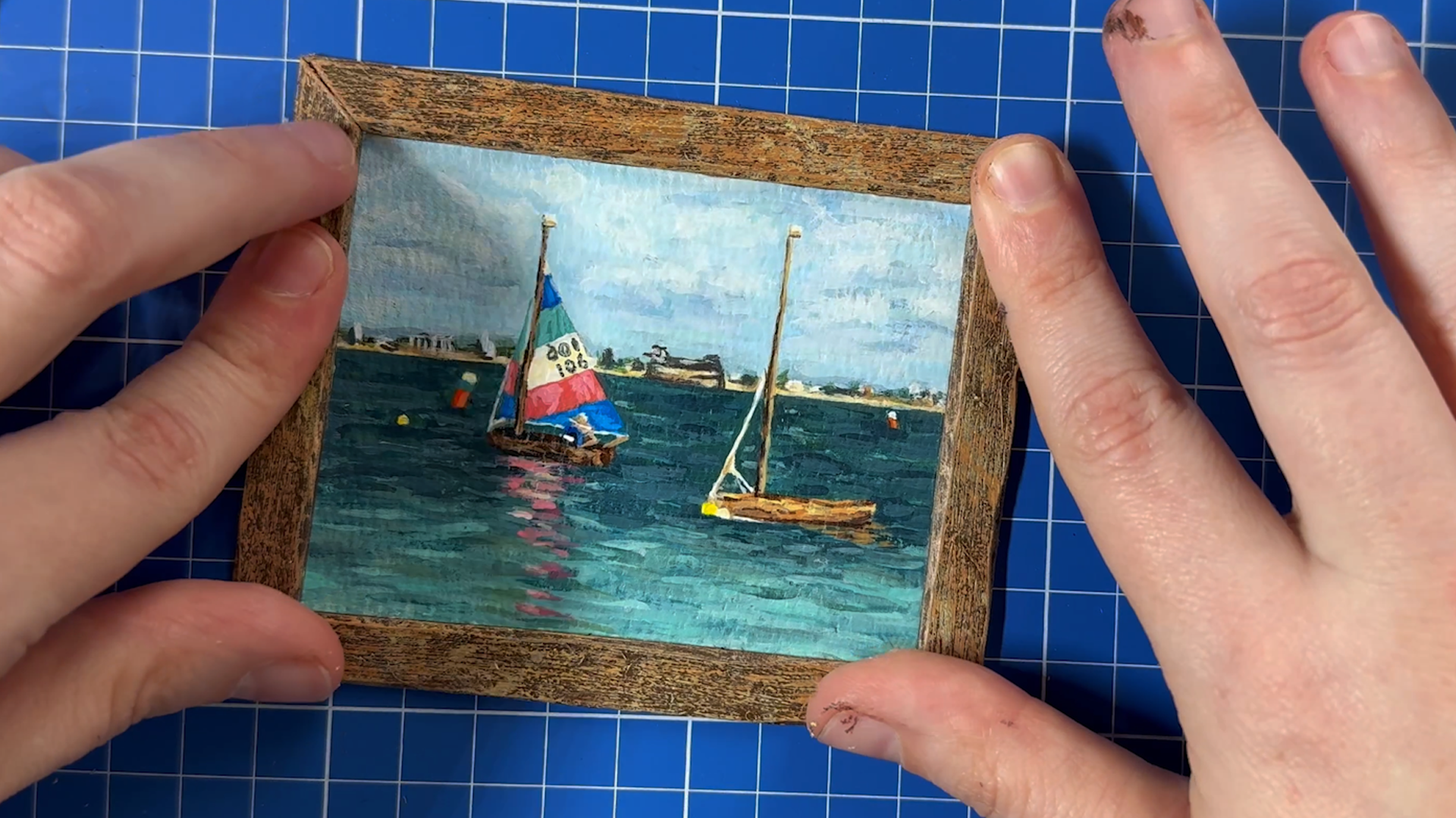
1. Introduction: In my latest stop
motion short hot mess, filmed at the Ardman
Academy in Bristol, I included several
mini masterpieces that were hand painted
by me in my set. In this class, I'm going to be walking you through the entire
process of how I approach, scaling down a reference art and painting it into
miniature form. Everything from how to scale, how to grid, doing
the underpainting, adding details,
building up the layers, to even making your own frame, and framing it up, so it's ready to go in
your own stop motion set, a doll's house, diorama, or even on your wall at
home in a mini gallery. I've not cut anything
out on this one, I've left it all long form, you're literally
just watching me paint this little
masterpiece in real time. I think it's more fun
making the miniature. Hopefully, you will enjoy painting your own along with me.
2. What You Will Need: This class, you will
need a pot of water, and rays or rubber,
some kitchen towel. Perhaps you want
something to place your brushes on to dry.
This is not essential. Some acrylic paint, a
wide range of colors, if you can, some
paper to paint on, this is watercolor paper. You could buy these
small easels, little canvas easels,
get them from most craft supply art shops. They're really good, ruler, metal rulers are great, pencil and some brushes. Nail art brushes, if you can get them because they're
much finer and smaller. Then also, you'll want a
picture of your reference art.
3. Gridding Your Reference Art: For this first step, you're
going to need a pencil. Any pencil will do. I've got
a mechanical pencil here. You reference image,
what you want to translate it onto, and aula. Did I mention rubber, you
want to rubber on eraser, you might need one
of those as well. Get one of those handy.
What we're going to do. Some people are confident, if you're confident, go for it, you might be able
to look at this and then draw it free hand
straight onto here. But I want to cater to everybody and some people
don't have that skill. We're going to
instead grid this up, and that's going to help us to replicate this accurately
in a minute form. We're going to get a ruler, and we're going to start by just measuring the actual
size of the full image. Here we can see this
is 200.3 millimeters. Now, just for ease, I might say that
it's 20 centimeters. I'm going to put a little mark here and a little mark here. Then I'm going to do the same on this side at 20 centimeters. And then I'm going to
draw horizontal lines across from those points
that I just made. This is the area
that I'm going to translate just because
it's easier to use a whole number than to work with the
millimeters as well. That is 20, so we
can write that down. 20 centimeters, so we don't
forget is that length? Then what we want to do is
we'll measure the other side. This is 26.5, which we
can probably work with. We'll keep that as it is, and we'll write here
26.5 centimeters, and then that is the
dimension that way. We want to translate
this down onto here. Now, before we work out
what we're going to scale these numbers down
to get this to fit, we're just going to
grid this image up. 20 is easily divisible by four. T divided by four is five. What we're going to do
is I'm going to put the ruler back at the edge. Just like that. I'm going
to put a little mark at 5:10 and 15. Then I'm going to
put the ruler on the other side and do the same. At 5:10 and 15. Then we're going to draw
lines across the image again. Just like this. Like that. And like that. And so you can see that now we have smaller areas of focus. We're going to do the
same the other way. So 26.5 is a bit bigger than 20. So we'll probably divide that by five. You could do
this in your head. That's probably what
I would normally do, but let's use a calculator because not everybody has
a mathematical brain. 26 point 5/5 equals 5.3. So we want to Just as we did
before breaking it down, we want to put a
ruler at the top, and we're going to
do little marks. 5.3 for the first one. The next one will be 5.3 again, so that will be 10.6
because it's 25.3. Then it will be 15.9. Then it will be 21.2. There we have got five equal measurements
going the other way. Now, let's do the
same at the bottom. We're going to have 5.3
10.6 15.9 and 21.2. Then we're going to join
those lines up just like we did the other way.
You put your rouler down. Draw a line. Line again. Draw a line again. H
and the final line. Now, this is a really
popular technique for translating images in art. I learned this back
when I was at school, and what it means is you've got smaller
areas to focus on, so it helps you to draw
something accurately when you're translating it
onto another piece of paper. Instead of focusing
on the whole image, which can be a bit overwhelming. You've now got these
smaller squares, and you just need
to make sure that this fits into the square and looks just like that square, and then all the
squares will drain up and you'll get
your full image. Now, this will probably be
good enough for most people. If you wanted to do even
smaller squares, you could. You could put a mark
halfway through each of these and halfway through
each of these and then make each of these
big squares into four, and then you'd have even
more smaller squares. But you don't need to do
that. This should be okay. And this is the amount of squares that I'm
going to use to translate it onto this
smaller piece of card. Let me just do an
example to show you. Here we've got 5 centimeters. If you wanted to
do more squares, because you weren't
confident at this scale, this was 5 centimeters, so mark at 2.5 and again at 2.5, and we can draw a line
going across this square, like that. And this was 5.3. 2.5 it's two point 6.5. About there. Then again, two point 6.5, and then
draw a line like that. Now, I didn't quite
get that straight. I was looking through the camera rather than at what I was doing. So you could remeasure that. I haven't got it quite right. So yeah, I didn't quite
measure that right there. And then you can just get rid of that line
that's incorrect. See, don't worry if
you go wrong like me. And then if you've rubbed
out too much line, you can just put the line back. Here you go. So, if you're not confident with squares
this size to translate, feel free to grill it even more and have even more squares.
4. Scaling Down Reference Art: Now we want to translate this artwork onto our
miniature piece of paper. Ruler again, and we're going to measure how big this
piece of paper is. It's not quite 10 centimeters. The biggest whole
centimeter we've got. You want to have a
bit of space around. We'll say that 9 centimeters is the maximum that we
can go this way. I'll just write that
there, 9 centimeters. I think it's the same
size both ways is. 9 centimeters square is the
biggest that we can go. Now we're going to need to
do a calculation to work out how much bigger this
side is than this side. To do that, we're
going to do 26.5, which was the distance here and divide that
by the distance here. 26 point 5/20 equals 1.325. I'm going to write that down
just so I don't forget. 1.325. There we go. Then, the maximum
distance we could do on this smaller piece of
paper was 9 centimeters. 9/1 0.325 equals
6.8 centimeters. If we have 9 centimeters
across this piece of paper, we need to go 6.8
centimeters down to get the same proportions
as the original here. I'm going to put
that there so that I remember because it's much easier to remember
9 centimeters. I'm going to just draw a line. Now if you want to make
sure you get it straight, you could put a
mark 1 centimeter from the top and then 1
centimeter from the top again. Then you can draw
a line across that is 9 centimeters long. Try and get that in the middle. I'm going to put a
little mark going up where the ends are. That's 9 centimeters. That is the length
of our painting. Then, the length going
down is going to be 6.8. I'm going to just measure
how much is left here. We've got 5 millimeters. I'm going to put 5 millimeters down here as well, like that. Then I'm going to draw a line connecting those two points. The same should be on this side because this was
a square piece of paper. Again, it's about 5 millimeters. Down here, I'm going to
also do 5 millimeters. We can connect those
two points. Like so. Then we want to use
this measurement for how far down we go. So 6.8 centimeters.
Let's measure that. 6.8 is here. B longer than that. A little bit more pencil. And then 6.8 centimeters here. Then we're going to connect
these two points. So. Hopefully you can see that
this shape here that we've created is the same
as the shape here. This image should now translate perfectly into this image. What we're going to do now
is we're going to replicate these squares that we drew onto this smaller piece of
paper for our miniature. We have got 6.8.
Let's do that 6.8, and we have got four
boxes going up. We want to divide that
by four. We get 1.7. Each of our squares going
down are going to be 1.7 centimeters in size. Let's do that 17567. Now, if you can't do the math, 1.7 plus 1.7, then just move the ruler up like this
and do 1.7 again. Then again, 1.71 0.567. And you want to do the
same on the other side. We've got 1.57, and then 1.5, six, seven. Again, 1.567. There we go. Then we will do
like we did before. Join these marks together. We just a line across,
and a line across. There we have got the
grid for these boxes. Then across our image, we had one, two, three,
four, five boxes. We now want to divide
this measurement, which was 9 centimeters by five. Let's do that. We got, we want to divide that
by five, we get 1.8. That means we literally want
to do what we just did, but going across our image. Can still see that. So we're going to do this
five times so we've got 1.8. Move the ruler again, 1.8. 1.8 and 1.8. And then we do that
same at the bottom. 1.8. 1.8. 1.8 and 1.8. And then just like four, connect those marks together. And There we have got our grid, which should match up
with our grid here. These squares correlate
to these squares. Now we have got our
big grid artwork, and we have got our small piece, which we have grid to match. In the empty space, just to remind yourself
not to paint here, you could always write down
the name of the painting or. My painting is called sea view. So t. You can write the name there. You can also use this bare paper to test colors if you want. Nothing will go to waste
and then at the end, we will cut this out neatly. Now what you want to do is you want to translate
this image onto here. What you do is you look at
the square and what's in the square and you
copy it into the box. Now, the ones in mind that
are just plain water, I could leave them
completely blank because that water will be built up as a texture when
we're painting. The more important stuff
for me is to get all of this actual subject matter from the painting
accurately here. I think I'm going to start
with this horizon line. This line is happening in
the second square down, and it's about a third of
the way through the square. This is the second box down, about the third of
the way through. Let's draw that all
the way across. Roughly where that is. Then this fort happens
in the third box in, slightly overhangs
that box there. Let's just draw that here. Tiny little bit of overhang. And f happens. Doesn't quite make it to
halfway across the box. Let's go. Sticky up. So that f goes in there. Then we've got this
little boy here, which is almost in the
middle of that box, but not draw that
in where that goes. You can see we've
got the terrain. Let's draw the water line. Going across like that, and there's key
details like this so we can make sure
that we get that in the right place. Pencil. There's a little tower here. A little tower there. B here. Bits here. Go a little
bit. Like that. Then now we want to
get these boats in. This boat happens in
the second square up and it's not quite halfway. We want to try and match
that up, and draw that here. And it comes almost
to the edge here. We want to draw that
all way across. Most to the end here
and then we've got a little boy and
another little boy. Then we've got the mast, which comes up left
of the center, and it comes up
halfway through here, so we can put a little
dot where that goes, and we can just do a
line to match that. Then we've got this bit here, we can draw that. That comes about
halfway up here, there. We do that like that. We've got the position
of that one in, and then this one, we've
got a couple of boys here, this boy intersects
on that cross, which is this bit here, and it comes up just
in the corner there, comes down and it just
cuts across here too. It looks like that. Then
we have a little boy, which is about here. And we want to get this boat in. This boat is about
a third of the way through this box here. We're going to draw that here. And then it curves up slightly to about a third of
the way through this box. We're going to draw
that like that. Then there. Then this is about
halfway through, that box, and it goes up not quite as high as
the other one did. It's actually about this high. Then we're going to draw
that in. Like that. Then the sail is here and it comes out a
bit further than this. I actually comes to here. If we do a little mark, there, and then we can join
those two lines. We've got a little character, the character crosses this line. We can just draw that in, got the arm, here. Then they've got a hat. Then this line comes a
pretty much straight, so we just draw that
across like that, and then we can join that there. Then we've got this
little sail here, which goes to about here. We can just draw
a line like that, and then that attaches to. Then again, you can look at where the colored stripes
land. Match that up. This one is just over here. Be you've actually got
the angle wrong there. So actually, the angle isn't quite as sharp
as I've made it. It's more like that.
And then this one. I like that. We could also translate this
reflection a little bit, so that comes here just so that we roughly can
see where that's happening. So I might be a little bit shorter than I've brawn
it now if you want to, you can't go in there
with an erasing, correct anything that
you're not happy with. It's like I say, I
got these angles a bit wrong on the sales. I might just do
that. Correct. Yes. Now, hopefully you
can see that we have quite accurately translated this artwork here onto our little miniature
piece of paper. Now this is ready to paint. In the next step, I'm
going to show you how you then take your
drawing and paint it. We're using acrylic paints, so it doesn't matter
about the pencil because that's all going
to get covered over. Obviously accuracy is important, but you haven't got
it quite right again, that doesn't matter we can
correct that when we paint it. But this gives you a
pretty accurate reference to paint whatever
your reference image is in miniature and accurately. Yeah.
5. Background First: I'm now going to
get ready to paint. What I do is, I like to use a china plate because we can use this
for mixing our paint, and then we can clean
it up and use it again. It's much more eco friendly. I'm going to keep my
reference image here. But like I said, my print is broken, so the colors aren't
actually very accurate. On my phone, I've got
reference pictures which are more accurate to the colors
of the original painting. I'm going to use that
as my reference. Then I'm going to show you how I approach painting a little
miniature. Step by step. What I would do to recreate
an original on a tiny scale. Let's get everything ready. I'm going to need my water. I've got some kitchen
roll to clean my brushes. If I don't need as much paint, it's an easy way to get it off. I've got this set
of brushes open, which gives me lots
of different options. It has got everything from
quite a tiny brush tip. To something a
little bit bigger, which is what we're
going to start with. We begin, I'm going to be
using this little brush, which is much bigger
than other brushes. Later on, Later on
in the process, I'm going to be using
something more like this one, which you can see is very fine. There are lots of
different places where you can get these from. I actually got these from Timo, you can get them from Amazon. You can even get
them from Arteza, they do miniature brushes. But if you can't find
miniature brushes, another thing to search
for is male art brushes, which is what these are, and they're actually really good, and they're quite cheap. If you use them and they aren't usable anymore because you clog
them up with paint. They're fairly cheap if you
want to get a new ones. What I do to begin with is I get out some colors I
think I'm going to need. Unfortunately, being
me classic ADHD. I have misplaced some colors. I have some backup
paint over here, which is another
good brand pebo, and hopefully, if I don't have the color in my ink lab paint, I'll have a pebo version. What I want to do
is I start with the backgrounds and I want
to fill out an underlayer. I'm going to try and
do this water color. I'm going to try and paint
in the C in the sky first. You can see for the
sky, it's very pale. We want to get some white. Then also, I've got this nice color called
a light blue gray. The ink lab pack is particularly good because
you get 30 different colors. If you're not good
with mixing colors, you have got a lot
of options there for just using colors
almost out of the tube, uh I do advise you to mix your own because things
will look better. Let's put a few
different colors out. I haven't used that one
yet. To begin with. What I do to start is I try and mix a color that's close
to the color that I want, so we're starting with the sky. I'm going to use this
light blue gray, add a bit more white to it. Bit of this blue here. And then quite a bit more
white to try and get some that's fairly close to that blue in the
original painting. I think that is okay
starting point. Perhaps can go a
little bit paler, but we're going to
build up the layers. You want to choose
a base color that's somewhere on the darker range
of what the sky color is. You want to load your brush up with a fair amount of paint, but not too much, and we're just going to fill
in the sky area. Everywhere that sky, we're going to just paint
that in first. This is essentially
an underclor. People call this underpainting. Some people call it blocking, but we're going to again, not too much paint
on your brush. Don't worry too much about the
edges because we are going to cut down the
painting at the end. Obviously, try and do
it as neatly as you can around things like that are the subject
of your painting. If it's not flowing very well, just add a water, but not too much because you don't want to dilute that color. But adding a little
bit of water will give you much more flow to the
paint and you'll find that it's easier to get a
nice flat consistent color. Also, don't worry
that you can see your pencil because we're going to be building
up the layers. By the time we finish,
we won't be able to see that. That won't be a problem. Now, when you're getting close
to things in your scene, you may find that
you want to switch out to a smaller brush. But because we have a critic, you can layer up. It doesn't matter if you
slightly go over the edges, but do try and paint as
carefully as you can. Little hair there. From my dog willow.
If you have pets, you'll know that
hairs get everywhere. This is not flowing
quite as well, so I add a bit more water. Almost there. Get all filled in. Where you've got something
thin like a mast like that. You might want to
just paint over it just to make sure
that you don't get a white patch when you're
painting that mast in. Because obviously the sky
sits behind the mast. You want everywhere
to be painted, and sometimes it can be tricky to get that right because obviously that's quite thin and if you've missed a
little bit like this, you might end up with
a bit of white paper. Fill that in like that.
Now we can see in the sky. There are some
slightly grayer areas. I'm going to add a bit
of gray to this blue. A really good way is to have that base color and
then slightly alter it. By adding other colors in, we've made that a
little bit grayer and now we can look at
where there's gray in our original and we can just add some slightly grayer areas in to just break up this color. Can see already how
this is concealing those pencil lines
even more because now we're layering
that paint up. Then also in the sky, there are these
slightly bluer areas. I'm going to add a bit
more of this blue. To try and get that. I
actually use Prussian blue. I think. No, I didn't. I used paints gray because this is based on an
original painting that I did. I seem to have misplaced my
paints gray in the ink lab, but I have got pains
gray in my patio. Pains gray is a great
color if you're doing scenes with sky or water. I'm going to add a
bit of pains gray because it just darkens things n. It gives you a bit
more of a shadowy color, so you can see these these slightly darker flicks
were pains gray. I'm going to not put much
on the brush at all. I'm going to just add few
little flicks of pains gray in the roughly in the same places as I
had it on the original. Because this is acrylic,
like I said before, we are going to be building
up the layers and therefore, things don't have to
be perfectly precise, but it's good to get them
as close as you can. There's also a lot
of white clouds. I'm now going to grab a
bunch of the white paint, add that in and make
this a much paler shade. We're now getting
to the point where this brush might be
slightly too big. I'm going to just
clean this brush off. This is where the kitchen
roll comes in because it's a really good way of
just cleaning the brush. Will leave your brushes point down in the water because
you will ruin your brush. I got this really
cheap brush holder, and you can just put a
brush in it like that, and then your brush can dry and anything can drip
into this tray below. I suggest now getting
a smaller brush. I'm going to go
with this one here. This is a very small point. To give me a bit more control. I'm going to load that
up with some water. I'm going to go into this
paler color that I just mixed and I'm going to Paint down. You can see that that isn't actually looking
much paler at all. I'm going to add
even more white. We find that you use a lot of white when you're
painting with acrylic because if you're
mixing your own colors, then it's really useful and you're almost always going to be wanting to lighten colors. We're going to just add in some of these slightly
lighter parts. You can see it's only very
subtly lighter this color. It's not white, white, but it is just a slightly
lighter blue gray. We're just adding this in
and I overlap sections, so I'm eating this into the colors that
are already there. You can see just overlapping.
Things a bit like this. Get some more water. I going to get even more white in there. Like this. This is a
much lighter color now. You can always use
your kitchen roll if there's too much paint
on your brush to just take a bit off and
get a smaller amount. S almost like circular
motions to get clouds. With any saw painting. It does take quite a lot of
time if you're doing it well, and it is just a case of constantly building
up the layers. You can see here it's
a bit more horizontal. What I do for that is I get a bit more water on the brush. Then I do lines of
going across like this. Then I load up with
even more water. Then I just drag
that paint across. Just break up where
there's solid color. Make it look a little
bit more cloudy. Yeah, you just want to keep
looking at your reference, looking where things
are trying to be as accurate as you can. I say, just adding
small amounts of paint, almost little circular
motions for clouds. I like to go from a
dark color to light. This is still not the whitest color that I'm going to add, but I'm gradually getting lighter with the colors
that I'm creating. We can see here. I just
building up the layers. If it's not flowing very well, just add a little bit
of water to your brush. Just give it a little
bit more flow. You can do use acrylic
mediums as well to do the same thing
to get more flow, but it is going to be
slightly more pricey. If you're just a
beginner, I suggest just working with water
and getting used to how that behaves before you move on to any acrylic
mediums and stuff like that. Because the brush is very tiny and it doesn't actually
hold that much. Fluid. You will
find that you are needing to grab more
water on your brush. Perhaps a little bit more often than you would if you were painting something a bit bigger. You can see that
the sky is starting to feel a bit more sky like You can approach your own miniature
however you want. You can copy how I'm
doing it exactly. You might have wanted
to do the base color on the s before you started
doing more detail in the sky. I just like to get
the sky done first. I'm now getting more
white on my brush, so I'm making this color even. Again, this is still
not pure white. This is slightly grayer,
but we're getting. I've got more paint
on the brush. I'm just going to dab it down. Where there's more white in
the clouds, cloud highlights. I'm just dabbing this down here. I'm going to blend it a
little bit more in the sec. But yeah, it's just a process of adding small amounts of paint and layering those colors up. And a miniature painting can actually take longer than
a regular size painting. With the miniatures I've done, I spent about 6 hours on which is quite a lot of time considering how
little paper it takes up. But trying to do something
on a small scale requires so much more care and precision that you do end up spending
a lot more time. Hopefully this tutorial
won't be too long. What I might do is now that you're getting the
idea of what I'm doing. I might just speed up the
video a little bit so that you are not sitting here for hours
watching me paint the sky. But before I do
that, I'll just say, you can go back in with
darker colors as well. If you feel like everything's
become too similar, or you feel like there's
a little bit missing. You can just add a
little bit back on top in places if you
want, just like this. The main difference between an amateur painting
and a professional is the range of colors
that you use. A lot of amateurs,
don't mix as many. Separate colors when painting. A professional might
have a sky that's built up of 20 different shades
of the same based blue. Whereas amateur painter or
someone with less experience, they might only use about
five different colors. You building this up in stages, you can never have too. But, that's it for now. I will speed through
some more of this and then I'll stop when I'm getting closer to the finishing details. Now we're getting closer to something that I'm happy with. It's not finished. What I like to do is
I have added a bit of a wetter layer there, and I like to just now just blot it off
with a bit of paper. And then get some more water. We've got a very thin
layer of paint here. It's a very pale color, and you can just add this on. We're just trying to blend
things together slightly. This is like a very
thin wash of paint. When it dries, it won't make
much difference at all, but we're just to blend our
colors a little bit more, so they don't look quite so
separate and harsh. Blo. You can see the variation
in the sky color. Like I say, it's not
completely perfect yet, but it's getting close to how I see it here
and how I want it. But now I'm going to move on to do the underpainting
for the sea. I'm going to clean off this
brush, leave that to dry, and I'm going to go back
and get this bigger brush, and we're going to now
add in the s color. The s is much more
green and darker. I've actually got this.
This dark green here. This is Rebs paint. I'm
going to add a little bit of this one and try and
mix a green I like. I'm going to use this green
and I think this darker blue. It's a bit darker
for a base layer. We want it to be a darker color. I'm going to mix a bit of this
green here with this blue. To try and recreate
this dark color here. Make a good amount of the paint because we're going to be adding white and other things to this to make all our different
shades of the same color. Add a little bit of
white to that already. Probably didn't need to do
that yet, but never mind. Then I'm going to just
add a little bit of water just to make that move
a little more easily. Then just like we
did with the sky, we're going to now
lie this down. This is our base water. If it's still not
really flowing, just get a bit more
water on your brush. Just to give it a
bit more movement. Now things like this where I've got these boys in the water. You could paint over them, but you might lose
the pencil line. If you're not confident
about placing those back in, try and just go as close
to the edge as you can. Any hairs come out
of your brush. Also try and get those off from your paper because you want those stuck in your painting. Going close to this boat, around the sail around that boy. Trying to get it as
close as we can. You can always just cut in
slightly on the edge of things again so that you don't end up with
any white paper. Then when you paint over
the boy at the end, you'll just know that You just
paint it slightly bigger. You'll paint over
the sea a little bit when you paint that in. Try and do it as
neatly as you can. If you need a smaller brush, just swap it out for a smaller brush when you're
going around things. Even though the sea is
lighter at the front, I'm still going to
put this main color underneath because with acrylic, we can build up layers. It's just good to get that
base color down everywhere. Don't put down too much water
because like you see there, it's gone a bit too thin. You want to try and get the same consistency of paint everywhere. If you find that
that's happened, just keep adding more
paint until it looks the same density as the
paint that you had before. Now I am probably
going to switch out to a smaller brush
when I go around these details because
this is p fiddly stuff. We are working on a
very small scale here. But for larger areas, this size brush is perfect. Will just fill out all of this. Like I say, it doesn't
really matter too much about the actual edges
of your painting because we're going to cut
this down at the end anyway. So I don't need to be
too perfect with that. Now, can I add a bit more water because I'm actually running out of paint a little bit there. Do make sure you
mix enough paint for the area that
you need to fill. Also, when you're working
with small amounts of paint, it can dry up quicker
on your plate. You might want to
made a mess there. You might want to use
a stay wet palette. Eyeball put an image of one of those
up on screen now, so you can see what that is. That will mean that your paint literally just like it says, stays wet longer, which
can be really helpful. It's going ad everything here. I've been a little bit messy. But hopefully it will show you that you don't
have to be too perfect with these things and you'll still
get a good result. Let's just add a bit more
paint because it's a bit too thin there. Like this. Yet, I'm going to just
clean this brush off. I'm going to go back to
this smaller brush just for the detailed areas because this area in the
middle here is also C. We want to get that filled in, but it is very tiny area, so it's going to be harder to
do it with a bigger brush. Then also this area here underneath the sales and around the
character is also see. We want to make sure that
we've painted in too. If there's anywhere that
you think you've missed, we've not done it
quite so neatly. Smaller brush will help you to just make
that a bit neater. Now we've got base color for
R C. We're going to take the same approach as we did
here and we're going to start mixing into this
bit of paint that's left. I'm going to add some
white to lighten that up. I'm also going to add
a bit of green back in and a bit of the
blue back into. We're getting a slightly
different color. In fact, I'm going
to add a bit of this Prussian blue as well. Why do I keep saying
Prussian blue is pains gray, pains gray. You might not want to mix with a small brush like
this because it does get the brush
all clogged up. When you're actually
mixing your colors, you might want to swap out
to a slightly bigger brush. Again, do what works for you because I'm working
against the clock, I'm just using the same brush. Again, just want to
fill in what you see. There's a variety of
colors in the sea. And you see these
slightly paler areas which are the waves. I'm just getting those in. It doesn't matter,
as I said before, if you're not perfectly precise with the placement of things because
this is acrylic, we can build up the layers. Anything that isn't quite right, we can go back in and
correct that later on. Essentially what I have got now is a slightly broken
up sea color, which you can see
is already looking more like the original. You can see there's also much
more blue areas in the sea. I'm going to add a
bit of this blue and a bit more of the panes gray,
got it right this time. Here, water that down a bit, and make sure to mix in
some of the original color. We get in colors that are
related to each other. Then I'm just going to
add in slightly smaller. Patches of this color, interweaving them in with
what we've already got. Again, look at what
you're copying. Use your gridded image if you've managed to print it out with the correct colors, that might be more helpful
because you can just focus on one square at a time for
copying colors as well. Also unless you're going for
a look where you want thick, try not to put too paint down because you'll
get these little bits that stick up and it will look incorrect
for a miniature scale. You want to try and
flatten out any paint that's sticking up
because it will ruin the illusion of
this being a miniature. You can see those little bits where I've put too much paint. You just flatten those down. There as well. Keep the
paint as flat as possible. Again, this is a
lesson in patience, less paint, more layers is how you're going to
get the best result. And we're going to just keep going in
like we were before, adding in slightly
different shades. I'm now going to add a
bit more green back in. I'm going to go back in and add some slightly different
small green elements. Probably doesn't really
look like I'm doing much at all, but overall, it will look better to have more shades of very
subtly different colors. Now I'm going to try and
get this foreground. I'm going to do a
much paler blue. I'm going to use some
of this and some white. Bring a little bit of this
color in. Make it paler. It's quite turquoise here. I'm not sure if
I've actually got the right color to
recreate that perfectly, but let's see what we can do. Adding much paler
blue down here. You can add more water if it's not flowing as well
as you'd like. We're going to layer
this up. Again, it doesn't need to be perfect, but follow your reference
as best you can. We're just doing strokes going across our
painting like this. If colors that you've already
laid down are still wet, you're able to blend things
together really nicely. So things will look.
Even more realistic. You can see the water at the
front now is much more pale. I'm actually going to experiment with adding a little
bit of this green. I'm hoping that that
might create a turquoise. Let's see if we can
get a turquoise color. You still see that? Let's put it up here
so you can see. I'm going to try and
make it moise green. You can see getting closer
here and add a bit of white. Go. That's much closer to
the color that I wanted. Bit more white again, and
a little bit of water. There we go. Look at that. If you want to make a
turquoise like I have here, use a very pale green that is called emerald green
from the ink lab, and I've mixed that
with Which one? I use that one. I mix
that with this one, which is sky blue
also from Ink clab, and we ended up with
some turquoise. Yeah, look at that,
much more like this. Now again, we don't want to lose the
colors we've already put down because we just want to have some of that showing
through because you want to have a little bit of
variety in your shades. But we can layer this up on top. Yeah, you like using
horizontal lines, short ones and interweaving
them for water. Yeah, if they're not blending
as well as you'd like, just add a little bit
more of your water, and then you'll get the paint to sit nicely in the
texture of the pain paper. This is a very long process and it is a little bit
of trial and error. Every painter will have different ways that they prefer to approach
things like this. If you ask five
different painters to give you the same tutorial, I'm sure they would all
tackle it rather differently. But this is how I tackle
doing my miniatures. I like to work from
the bottom up. Build up the layers. Now I'm like taking
this turquoisy color. I'm just bringing it back
deeper into the ocean, just a little bit, just to
blend the layers together. I might even just add tiny little flicks of
bit even further out. You see these lighter parts. I'll ask my little
boy in the water. Yeah, and then you can
add a little bit of water to again flatten out
any paint that's sticking up a bit too high
because you want this to all be as flat as it can
be so that it keeps that. Correct look for the scale. You can blend. Blends
bits in a little bit. If you feel like they've
got a bit too overpowering, just like we did with the sky, get a bit of kitchen roll. You can just dab off the excess
toute them down slightly. There's a little bit of
height here on the paints. I'm just going to
work that down a bit. You can see, I have lost some of the color that
was already there, but you can still
see some of it and it's very easy to
add that back in. We can even get a bit of this
darker color and a bit of the turquoise and mix them
together to get in between. Which is really good. Add a
bit of water, set flow nice. Then we can just add some
little elements of this. Again, it doesn't
really look like I'm doing much at all because
the color is very similar. But it will just
add another tone. We can always add a
little bit more of this, make it a bit darker
again, bit more green. You can see that
there's some green that links the two parts
of the sea together. We can add a bit
of that. To just give a variety and
this in between color, actually, we can pull this through into the
deeper sea as well. Where there's some
lighter areas, we can add this middle green, greeny blue to bring
that color through. Just like this. I'm happy
with how that's looking. We can again, use our kitchen roll if you want to give a
different effect dab it on. Then if you don't like
something they've done, you can just add a bit of water, but still go a bit of, still got a bit of movement. You can just still
move that pain. Try not to add too much water. I really lots of water because
it will buckle the paper. Way to get around that
would be to tape this down. You can wet this paper
first and then when it's, tap it do, wet it, and then when it's
dry paint on it and it will stop this
warping that happens. But, it's not really
essential for doing this. When we've finished, I
usually cut this out and I'll stick it
onto a piece of wood or a bit of foam core, so it will get flattened
out again anyway. Yeah. There's even lighter
color in this foreground. This turquoise, I'm
actually going to square a bit of clean white
out to add to it. I will get some of this white
add it into the turquoise, to get an even brighter color. I'm going to go even
brighter than that, I think a bit more white. I'm quite happy with
how that is looking. This is for more highlights. You may find that you've
got too much paint on your brush, get
the excess off. Don't want to have too and
then just very carefully. Do lines for your highlights. A little bit more paint. More paint again. Always add a little
bit of water. Be careful of stray hairs, like I said before on your
brush or form your pet, use the water to
blend these colors. You can bring them
up slightly to blend from the darker ocean
to the lighter ocean. You can see that there's
much more contrast in this original
van we've got here. What I might want to do
is bring some dark back into this ocean at the back. I'm going to add some
of my pains gray, and I'm going to Just put some slightly darker
little notes, little splashes of
color going across. Darken things back up. There's also some
more blue elements. I'm going to take a bit
of this darker blue. And add some, slightly
bluer bits in. You also find if you've
got boats on water, that water that
the boat sits on. Usually will have some form
of shadow from the boat, so it generally looks slightly
darker around that area, anything that's in the
water like the boys. Yeah, you just want to
variate your color throughout the ocean and make it look as close as it can to wherever
your reference images. I keep referencing the ocean. That's because that's
why I'm painting. You might not be
painting the ocean. You might have chosen to do a
self portrait or something. Whatever it is, do post a picture in the project window because I'd love to see. We should make a little
miniature art gallery, that'll be very cool. If you post a picture
there and I get enough, perhaps I'll print
them all out at home and make a little
miniature gallery, and then I'll do a bonus unit on the class showing off
all your beautiful work. So, you can see we are really starting to get
there now with this. When you get to this point,
you've got two options. You can either keep going and
get these areas finished, or you can go in and do the subject of your paintings and then work more
in the background. So Because I've already got the paint out and I
don't want it to dry up. I am going to keep
working on the sea and on the sky and then when
I'm happy with it, I will paint in the subject. Yeah, I will speed this
up so that you don't have to watch it in real time because it will take me
quite a long time to do. I tip. You can was sometimes go in there with your finger and that
can give a nice effect. Do feel free to experiment with
pulling the paint around with your finger as well. A, I'm happier with that. At the moment, I'm going to go back to the sky
for a little bit. Now, the sea and the sky are often related a link together. I'm actually going to take some of this turquoise
that we put into the sea and mix it in to
the sky a little bit. I think that's what I
did in my original. But I think whether
I did or I didn't, it's going to make
this better painting. I just want to Not everywhere, but just a little bit interweave
this color in. It'll just bring a
bit more cohesion to the whole painting. I'll just feel a bit more together because when
you've got sky and water, they are linked, and, the water reflects the sky. You will that you get some similar colors
coming across. And this is very,
very, very subtle. But it does just add something that just brings
the two parts of your image a bit more
closer into alignment. We can even use this
hybrid color that we've just mixed and bring this back
down into the sea as well. This paler part, we're actually bring a bit of that sky
color down here now. You don't want to solid color, you want to do these almost like stretched ellipse
shapes for water and interweave them with the
other colors to get that look of how water moves and the
the waves and everything. We can just have a
bit of that going on. Maybe even just a
little bit further out. To link things together. I'm going to come back in
with this darker turquoise as well break up some of this
light color even more. We will be that on top. Next to it. It's almost to show you the clouds above
and how they're reflected. You can always
just have a little bit of water on your brush, not too much at all, and
then just use that to. Make sure you're putting
that paint quite flat to the paper, so you're not going, but sticking up and also that you're blending those colors
quite nicely together. Try to recreate how
watery this looked. Obviously, a big element
that makes that look. Watery is the reflections
of the boats, which we haven't got to yet, so we will be adding
those in as well. That will really help to
add realism to the water. What you can also do is grab a little bit of paint
where it's still were. Then just pull that color th where the water is a bit deeper. But it's going to be
such a thin layer that just makes a very
slight difference, but it's not actually It's not as strong as if you were
putting solid color down. It just helps you to
blend the sea even more. Just lifting a little
bit of that color, you just put down
that lighter color and then you're just
adding a bit of water to place it back
down in the darker sea. Just like this. But it's such a thin layer of paint that it's not going to overwhelm it because you don't want to undo all the nice dark
layers you've already done. You just want to
bring a little bit of the lighter shades back. If you feel that it's too dark, you can always add a bit
more water, sin even more. Then you can wipe it with kitchen to get it
off a little bit as well. Or alternatively, you can go back in with getting
a darker color. You can just layer that
up again so you can just think there's too
much light happening. Just go in with your
brush very carefully. Just add a little
bit a bit of dark. Probably want a bit
more water for this. You just want to very carefully. Very, very light hand here. Makes very thin in
lines of color. To just break up any patches
that feel a bit too say me, can even bring a
little bit of that back down here just a little. See, That's quite good. Oh, look tiny pin. If you are mixing a
couple of colors as well. So if that's still wet, and then you're
going in with this, as well, you can really blend
things, smooth them out. This is where it's
almost advantageous to do oil rather than acrylic because obviously the
paint stays wet longer. But I'm not very
experienced with oil, acrylic is what I use, and I think when
you're just starting out it's good to master
the acrylic first, and then you can
always move on to oil later if you want
to have the ability to work have longer to work
before your paint dries out. That's looking quite good. Adding a bit more water just to try and blend
things slightly better. Water is your friend.
But like I say, don't be too heavy with it. Little and often is
definitely best. You don't want to give away. You want to keep things correct
for this miniature scale. You don't want to make it look like you've
painted a miniature, you want it to just
be accepted for the fact that it's a
beautiful tiny piece of art. If the paint is
grabbing the texture of the paper and not
looking very smooth, then that's breaking
that illusion of scale. You want to try and
you just blend out. Anything that looks a
little bit chunky or harsh to keep the illusion
of scale correct. Another thing with
painting is it's often easy to go too far
and to overwork something, sometimes it is good to step away and to have a little break, which is what I might
do in a minute. I'm just going to bring back some of that
light down here again. Hopefully, you're
grasping that this is quite a long process
of just trial and error. I think it doesn't matter how experienced you
are as a painter. You're always going to have this process of adding and
taking away with your art. You feel like you get
close and then he puts something down and it
takes it away again and you, no, I need to get
that likeness back. It is very much. A process of adding and
taking away constantly. With miniatures, it's
even more fiddly, and it will probably take you even longer. But it
will be worth it. Especially if you're
going to put this in a dolls house or stop motion set or a diorama or
something like that, just like knowing
that you painted it and all that love and care
you put into doing it, it will be really appreciated. I'm getting close to
wanting to have a break. So I'm going to leave it there, and then I'm going to come
back and work on it some more. Now, what you can do because don't want
your paint to dry out. What you can do, get
a bit of kitchen. Get a kitchen well, make
it a little bit wet. Bring it out, and then any color that you
don't want to dry up. You can just put that
over it like that, and that'll keep it wet if you're going to
have a little break. Then I'll come back to this
in a while to work on it.
6. Filling Out: I've had a little break. Now I'm back, as you can see. My paint has stayed
nice and wet. I'm going to paint
in this horizon line before I do any more
to the sea or the sky. I have this Naples yellow hue. It's essentially a pale yellow. I'll have a little bit of that. That is going to paint this pale yellow that we see
running through the middle, and I'm actually going to use
a slightly different brush. I think I might use this one. This is the brush I was using. This is different to the
other big brush I had. This was the first
big brush I had, which has got slightly
longer bristles. I think I'm going
to use this one. So I've got a little
bit more length to try and get this line in. I'm going to get a bit
of this pale yellow. I don't actually think
it's pale enough, so I'm going to add
some white to it, make it even more pale,
more white again. Okay. I haven't got too
much on my brush. I'm going to have to turn this when I do it just
because it's easier. So I'm just going to
go along that line. Very carefully. Now,
I intentionally, I'm going to say intentionally, being a little bit messy here. I'm going to show you that
it's very easy to correct. So a bit more water. I need a bit more
stronger color there, add a little bit
more paint. Okay. There we go. That is
good enough for now. Now I'm going to switch out. I don't know if that brush
was better. I think it was. It's a small difference
sometimes between brushes. Anyway, clean that
one off a bit. And I'm going to
get this fine brush back that I used before. I'm now going to do
the darker colors behind so you can see in the painting that
they're quite greeny, but also a little bit muddy, so I might need a
little bit of brown. I've got a browny color here. So here, I've got raw cN. We can use a little bit of that. I got a darker brown? Yes, I have. I've
also got burnt umber. Put a little bit of burn
umber down and mix that in. To get a bit of a
more browny green. I'm just going to paint this. Just above that line
that we just put in. This is for the foliage
that we see on the horizon. I'm going to do this like
almost all the way across, you can see in the reference. Then again, we can
build up layers and add in other details
to break it up. That's pretty easy. We got that in now. Now I'm noticing that the sandy color in
places is a bit darker, so I'm going to mix a
slightly darker sandy color. I'm just going to break up this original sand with a bit
of dk we just to make it. I have a bit more. And a bit more interest.
That looks better. Then also on this horizon line, you can see that there are little buildings and
other things sticking up. You could wait until
that's dried a bit more. That's probably the
smartest thing to do. But again, because I'm
working against time, I'm going to just add
in a few little bits. Now, I'm just going to mix a brown color to match this little block
here that sticks up, and I'm going to add that in. That's about here. Add
that little brown block in, like that. So a little brown shape here. And a little bit of brown there. It's some little brown
bits ether side of this e side of this
a little bit there. It's a little bit brown here. So I did that. Then I'm going to make
an even darker green. So I'm going to add a
bit of this pines gray to this green here and
also a bit of this brown, to make it even darker green, and I'm going to use that to break up the
green that be put behind the sand
because there are some I got there white on that. Let's clean that off. Add
a little bit more dark. Some places. It might
not even be dark enough there's some places that
are even darker than that, so I'm actually going to put out a little tiny bit of black. Clean this brush again, and then I'm going to
get a little bit of black and add that into this green here to get
it looking much darker. And then just this little shape here will work for that color. As very dark. A few little bits. Here that is. Now, we can see there I made it maybe perhaps a
little bit too dark. The way to solve that is we
can make a lighter color. Pale, gray, green, and we can just quite easily go in
there to lay on that on top. Almost cover it. To just
neutralize that a bit. Anywhere else where it feels
I've made it a bit too. I just do that as well. It's looking quite good. Now, I almost feel like perhaps there could be
a little bit more sand, so I might just go back
in with this sandy color. I may get it a bit darker
in places as well. Just pull back a little bit of the sand in the foreground. Really, this is so easy. Like I say, it is just
adding, taking away. If there's something
you don't like, you just paint on top and if something
is not quite right, you can just build up more
layer on top as well. That is the. Let's do a bit of a
lighter yellow again. Can actually go all way across because the base of that fort is this creamy color as well. In fact, we can use
this dark color that we made here to do the top of that fort because that's quite close in
the color of that. Add that in. Like that. Bit more black because it's a bit. Too black, maybe. Now, here's an example of being careful to not
use too much water. If that happens, just
get your kitchen roll, and just dog it off like that. Because too much water will make the paint go where
you don't want it to go, and that is not
very good when you are working on a miniature. It's happened again. That is because the water in that area. The paper in that area has
got it saturated with water. To combat that. Why not adding any water
to the brush here. We need to just
put a little line down to separate that
fort from the background. Also on this side. Then I'm going to get
some whitter color, add that on to the base of it. Then also it's got a little
white bit at the top here. That isn't perfect yet, but that will do for now. Then I'm also going to add in some little white details
from the horizon, these little white shapes. That's looking all right. Again, it's not perfect, but we will sort that out in a sec. Now
we're at this stage. We can look at the
sky and we can look at the water again
and see if we're happy. We can do a bit of
correction in that sky, where we went near to the horizon that
we just painted in, anything that wasn't neat. We can just go back
in with a bit of fresh paint and we
can tidy that up. By just adding a bit
of sky above it. I also want to tidy
up a little bit ad the fort because that
went a bit messy. Now, what you can also see
is it actually looks like the sky is a little bit
darker at that horizon line. It looks like I just want
to put a little bit of darker sky just where
that horizon meets the sky to blend it in a Again, Panes gray is a good
one for this stuff. If you want to add a bit of shadow to sky or water,
works really well. I will just help to separate
those lighter elements, make them pop a bit
more from the sky. Put a slight little bit of
dark sky at the bottom. I think that's looking
so much nicer. Hopefully, you agree. This whole process is a
lesson in observation as well because you think you see things correctly and then
you notice actually, perhaps I haven't quite
got that color right. Perhaps that detail
isn't correct. But you can see
that that does make the horizon line pop a bit more just by having that
slight darker blue. What we can do is we can add this little bit of white
that's here into that blue. We can go back in, put
that slightly higher. Blending. It doesn't just look
like a straight block of color going across. It's more blended into
the rest of the sky. Whilst we have that color, I might want to just add that
in a few other places. I might just quickly go back
and add a bit of that color. O points in the sky. Then to go even whter. I'm just going to work
into that sk a bit more. Just in places where I feel like I could do with being
a little bit whiter. Here there's a bit
of sky pattern, bit of cloud pattern. It goes across. You
see that a lot of the cloud information in
the original painting, the direction of the strokes
is not always the same. It's trying to replicate that. This original, I painted
quite a few years ago now, so I forgotten what I did. When I'm painting,
I get in the zone, and it's like that flow state
that people talk about. And I almost don't know
how I do the things. It can be difficult
for me to explain my process because
it just is quite intuitive and I
just I just do it. It's quite interesting
for me as well, trying to break this down
to show you what I'm doing. I had to wait for a day where I really felt like doing this. You might notice that
my skill share classes have been a little bit
less often recently. That's two reasons. One, I was in Bristook making a
short stop motion film. With Dman you may have heard of, they make Wallace and grommet and Shawn sheep and
things like that. Then also, I recently
realized that a lot of my problems
come from having ADHD. I already knew that
I had dyslexia. Never occurred to me
that might have ADHD. Someone suddenly said, I
think you might have it. I did a bit of research
with blooming. Yeah, I definitely
do. I don't know why, but the process of making a skill share class
in the format that They like it. It doesn't really work with my brain,
unfortunately. I do really struggle
to make these classes. I think I didn't struggle so
much before when I started because it was new and I
just did what I wanted, and it was exciting. Then skill share, tried
to help me make a class. It was very prescriptive. It really didn't align with
my brain and I didn't know at the time and I felt really really bad about
myself because I said, sorry. Can't take this help because
it's not helping me. Then well, I stopped
making classes. Hopefully, this will be the
first of many new ones. Do let me know in the
comments if you'd want more, what you'd want them on, and I'll try and I'll
try and do some. I need to do them every
few months ideally. Fingers crossed, I can do that. I'm just doing some stuff
with heavier water now, just to try and blend
it a little bit more. Like I was saying, it's
very easy to go too far and to lose something that you already had, which you don't want to do. So I might stop
fiddling with that for a while and get the boats in. That could be a good plan. So to paint the boats in, I need a really fine brush, and ideally I need one
with quite a brush tip. Let's see what I've got. Probably one of the
shortest tips I've got these are Taser
miniature brushes. You can see that's quite
a bit more firmness. That's a bit floppy.
That's a bit firmer and it's quite short here. I'm going to use
this one. Now we're going to we're going to start
by painting this boat in. I'm going to get a a base color for this wood of the boat. I'm going to mix a
little bit of this with a little bit of this
to get a base color. That still might be
a little bit dark, add a little bit more yellow. That's quite a good base color. I want to add a little bit of water to loosen this up because we need to be
incredibly precise now. I'm going to just clean
the brush off and then just load it up with
a little bit of paint. Now you need a really st
hand and you need to be precise because we're
going to paint this ma. What's going to happen is you're probably going to
paint a little bit. And run out of paint on
the brush. That's okay. Slow steady is best. Literally, pat a little bit. A bit more paint.
A little bit more. As soon as you feel
you're running out, get a bit more paint
because if you try and pull and there's
not enough paint, it's probably going to
start looking messy. That's about how high we
want to go with our mast. I'm just adding a
little bit more pain. I'm just go over this
base here. Mast ale bit. And then yeah, we kept
paint in the body of the boat down here. You can see where we went messy. Well, where I went
messy with the sea. Paint straight over that. And
then he looks neat again. This filled out. Don't rush. Take your time as part of the enjoyment
in doing these miniatures. Like I said, it will take you hours to do one really well. My most favorite one
that I've made so far, which was in my
short film hot mess. I just made dm that
one took me 6 hours. But I love it. I actually own the original
painting as well, so I'm going to frame my miniature and then
hang them side by side. I will be pretty cool. To have a real full size one and then
the miniature one next to. We've got that painted in. Now, there is some of the
same color in the other boat. We could essentially paint the base wood and the master
of the other boat in. While we've got this color here before we change the
color, let's do that. Here again, not got too
much paint on the brush. Paint, slow and stay as soon as you're running out
of paint, get a bit more. Then again, slow and going up. Til you get to the top cal. Then we just want to use the same color to fill in
the shape of the boat. I'm pretty much there. Again, if you've made the
boat slightly bigger than you were hoping we can correct that when we do
another layer on top. This is essentially
what we're doing here. We're now going
to start building up this wood texture
on this boat. You can see that there
are darker areas. Let's add a bit of
this brown here, make a slightly darker brown. It might be worth having a separate brush for
mixing the color because otherwise you just
get paint everywhere all over the brush,
but I'm too lazy, so I'm just using the same one we could
go a little bit darker still and then we're going to add a little bit
of water actually. Just loosen it up. Again, not too much water
just a little bit. The very carefully. Try and add that to the
front edge of this mast. This is going to be a very,
very thin line of paint. This is incredibly fd. But you don't want to
cover it completely. You just want to
catch that front edge a bit because we just wanted
to show a bit of depth. That's probably enough. And then again, on the boat, we want to we there are a little dark parts.
I want to add that. But I don't have too much
paint on your brush. Where you see a dark bit. Obviously, you might not be. If you want to paint
this same picture, I'll put the artwork
up and you can make a miniature of
one of my paintings. I'm more than happy for you
to do that if you want. Obviously, don't sell it, but if you haven't got something that you
want to reference, you're more than to
use my painting, I took this photo, I painted it, so it's all copyright to me. I'm going to use the s darker
color on the other boat to just add wherever
there's a dark area. Again, on this mast,
we've got a bit more dark on the back
edge of this mast, and it's actually even
darker than this brown. I'll probably mix the different
color for doing that. You can see, we've added a little bit of
variation in the color. Now, I am actually going to mix a slightly
darker brown again. Put a bit more of
that in because there is even darker over here. So we can add a
little bit of that. In fact, we might
want to do that, make it even darker. And then just tiny
little accents of dark. Literally just a few places
on the boat where it is mu d, and there's more
on this one that's der. Now we've done that. We could work on the lighter colors so we
could get bit of this paint. Bit of this yellow, make it a slightly lighter color,
bit more orange. And then we can go in the
slightly lighter areas, little bit here.
Little bit here. We're going to go even
lighter a bit more yellow. Then even lighter again, I'm going to use this
yellow a little bit more. Just have it is out of the tube. Added a tiny bit of that brown that was
already on my brush. And we can go in for the
lighter areas on thistle boat. Trying to show the
separate panels of wood very tiny on
this little scale. But give a suggestion. If we just water that
down a little bit. And make sure there's not
too much on the brush. We can try and add a slightly
lighter bit to this mast because the other side of the mast is actually
lighter in color. Even this mast has got
a bit of light on it. I can add that in there
and lightest part of the wood here. Add that in. L et's go even lighter still, so I'll just add a bit
of white into this here. And we will add some
even lighter bits here. Be a bit too light, maybe. I think you'll be okay. We might want to just darken
that patch down. Wait a little bit
too light here, so if we go back in and
get this darker color. While that's still wet, we can drag it and
change it a bit. Same here we can use a bit of wet to blend the wood
here a little bit more. Then I might be tempted to just use the kitchen
to block that. Make sure you're using a bit. Just that just like
before, too much water. It's a bit of paint
that's sticking up a bit and make sure
that flattened down. That's given us quite
a good base there. It's not perfect, but
we can work into this. You want to look closely at
what colors are missing. There's ready orange I'm going
to actually get an orange. That one also hasn't
been used before. Orange. What we'll do is
where there's orange here. We'll add that in. Sh we add it. Let's add it to this bit. O is really orange. Yeah. L's go Take a
bit of that yellow. Mx that down because you can see there is definitely more
warmth in this wood here. That's what we're missing, so
we just add in a bit that. Just here also on that top edge, and we can darken
this up a bit more, make it a bit more
of a vibrant orange. I just add little
tiny flex of that in. I think that looks a
bit bit more accurate. Says a little bit of
orange over here. Let's get that column in there. Then once that's down, we can go back with a more yellowy brown and
then break that orange. Sometimes you may
find it's easier to turn what you're painting. Just to help with control. Then I'll just use a bit of
this spare kitchen roll to just blow that. There we go. I probably best
to let that dry a bit before I work
into that anymore. I'm going to go back to
this boat over here and I'm actually going to take some
of this color just as it is. It's nice dark brown and try and paint where you got
the inside of the boat. So it is much darker
on that inner side. Around the little sailor. There's also a dark bit here. There's a little
dark bit running. On that mast, it's
darker as well. So we can just add a tiny
bit more up the mast. Just a little hint of the
dark wood. Just like that. Actually use a bit of this
orange mixed with that brown, to get a softer color, and we just mix this in. A little bit. I'm going to let the wood part dry now before I
do anything else. While that is drying,
I'm going to work on the sea a little bit
more around the boats. I'm going to this colors
are still a bit wet. I'm going to grab a bit of this. And add a bit. Just to get the lines of
the boat a bit sharper. So we wanted to feel like there's the same
sort of separation. Actually, the back end of this boat has a bit more
of an angle like that. So I'm just mi slightly
lighter color. Catch some waves in the
water a little bit. Separate this out
a little bit more. You don't want to
do this too much, and you don't want to
have too much paint on your brush or have
your brush too wet, but you can just a bit just add in these bits that are going to separate
out that water a bit more. I see go a little bit big there, but that's okay because
what we're going to do is once we are happy
with these bits, is we're going to get a bit of this green and a
bit of this blue, and we're just going to
slightly darken that. This time we are getting
our bush ale bit. We're going to darken
that a bit more. Then we're going to just work
straight into those areas. We just added goodness me. Got the wrong color on there. It's okay we can get it away. If that ever happens to you? Just wipe it off with
a damp bit of paper. See it's happened there as well. Yeah, you probably want to keep your mixing area a little bit
more separated than mine. To avoid that. So I'm just going to add in this slightly
darker and wetter green, green blue, just to pull it those areas
we've just added in. And then we're going
to go even darker as well. Make this a little bit. And then pull this through. Just like we did with the sky, this edge underneath the boats. I'm going to use
this darker color. Just to create a bit of shadow
and a bit of separation. I'm just using a wet brush. Drag the ends of these lines. Try and blend them a bit more. I'm just trying to get the water to basically look like how I had it
in this original. And also where we
painted the sand in. We can go in with
this darker color and try and straighten up the line where the sea meets it, just make it a bit neater. Bit here by the mast, s mist, need to just break
that color up a little bit. Okay. How's that looking? Hang it's looking okay. That's a good starting point. So The only other bits of color we need to
get down for base layer. Let's clean that off. These
little boys in the water and the sail on this ship and the character
and these little boys here. Now we're going to
put those colors in, and then we will move
on to final touches. As we've already got orange out, let's start with
that for the boys. So people in other
countries call them boys, I think, in the UK,
we call them boys. So This bit here is orange. We'll start off with a really nice vibrant and
dark orange here. Paint in, and we've got
another one over here. We'll paint that in.
We've got those in. We've also got a blue, which is quite close to the
sail of that boat there. I might add a tiny
bit of white to it, just to mute it down slightly. Little bit more. And
then I'm quite hay. I happy. Actually, a a
bit of this blue as well. I make something
not quite so harsh. A bit of a softer blue. This is going to be for the
blue parts of this sail. Let's carefully. Again, there might be too much paint on my brush, let's see. Follow the lines that you've
drawn trying carefully. Get that in. That's all right. That seems okay. There we go. Then this little bit
down here is also blue. Then the bottom
triangle on that sail. I can add a tiny bit of water. It's also blue, p.
Let's put that in. Again, anything like
this slow and steady, in or to ruin all of the beautiful stuff
you've already done. Okay, I'm pretty
happy with that. The other colors that we've got are turquoise green
on the boys here. For that, we could maybe try mixing a bit this green here
or a bit this green here. See what that does.
S. I b this blue in. Maybe add a little
bit this blue. Blue had a bit of everything. We are getting closer though. Can you see that still? You
can't actually see that. I'm so sorry. What
I'm doing here. I just am mixing to try and
match this greeny color here. I'm going to add more of this blue and
more of this green. It's not quite right. Perhaps a bit more of this and a little bit of
that. A bit too much of that. Actually, it's not that far off. Might work now if just to
add a little bit of white. Yeah. There we go.
That is pretty close. So we're going to paint
in this part of the cell. Again, don't load your
brush up too heavily. Just do a little bit and then go back and get some more paint. If you need to turn the
paper or canvas, do that. Because it sometime
just helps go neatness. And then also the
top of this sales. I'm going to add a bit of water. Fin this down. Because
if you add water, it improves flow, and
it can make it easier. We very little. That's a very thin sliver there. Now you can see, we have got a little bit of
what we were trying to avoid in between
behind this sale. We lost a little bit
of the sky and stuff. We'll have to paint that
back in in a second. But, we'll finish painting
in the other sales first. So Let's get this
brush nice and clean. Next sail down
almost looks white, but it's not quite white. But I am going to put
a bit more white out. We've got a nice clean white. What I'm going to do
is I'm going to grab a bit of that and add
a little bit of this. Yellow to it so that we
get an off white color. It's very almost
white but not quite. And then just take a little
bit of that paint off. We've not got too
much on the brush, and then we will paint
in that next sail. I've been a little
bit messy there, but we'll sort that out. While I've got this
color, I actually want to put it here as well on the fort, and then add a little
bit more yellow. Just because I felt like we haven't quite
got that right before. I'm just going to
blend that on here. I also I'm going to
add tiny bit brown. Looks a little bit more
a little bit more aged. It's a bit better than
the color I had before. Then the final part of the
sales is a pinky color. We do have a crimson red. This is crimson red.
This is a pinky red. Let's put a little
bit out there. I'm going to take a bit of this and add a bit of the white. Then we should get
that pinky color. Perhaps you want to add a
little tiny bit of orange. A little bit more ge.
That's pretty close. Maybe a scrap a bit more ge. Yes. So then we're going to
paint in that last sail. Well, that actually looks
when I put it down. And actually, This white needs to go on that little
tiny bit at the top, as well. Here. I got too
much on my brush. There I go. Okay. I can see there's also
some sort of white detailing at the base
of the sail here, we could add it. V carefully. Little white that goes up
there and also the ones. S underneath here. To make that pop a little bit. We're going to work on
these colors anyway. This is no way near finished, but that blocks that out. What we can do because we
just identified that we're missing that little bit of
while this color is still bit. Just have a bit
of s color there. Try and quickly drop
this into this gap. T. There. I seem to see that just separates
the sale from the fast. I think there's anywhere else. I don't think there's
anywhere else. Maybe. Is there somewhere else? Maybe around the sale
here we can Net slightly. Pull that color of cose. Like that. Similarly here because we're going
to paint that in. We can just add a bit
of this dog underneath this boy as well and
underneath this boy here. Okay. Also on these boys is the same sort of
turquoise of green. So whilst we've got that mixed, we'll add a little bit of
that above the orange. Just like that. Same
here. Like that. Then above the orange, we've also got white
so we can just add a little bit of
pure white this time. Just above turquoise
top of the boy, and the s over here. Then this boy here
is also white, so we could add that
now Oh, at the end. Tiny ball. And we could do a white boy here and
then add the yellow on top. We might as well do that
with this one as well. Like so. And then we've
also got the sail here. So if I just take a
bit of that paint off. We could very carefully and
paint the sail up here. Just like that. Then we get this little point
where it's been rolled up. Then we can just a little
st come down like that. There's also a tiny
white flag at the top of each of these,
can add that in. A little white black. Okay. We've also got to
paint this character. This little sailor in
the boat, actually, their head shouldn't go
up quite as high as I've drawn it so we can put
some blue around there. Let's make a sort
of fleshy tone. Use a little bit
of. Bit of this. Bit this. A bit of
that. Can you see this? Yes, you can good, good,
good. Bit of white. Bit white. Okay. And then we can just add in this
sailor's arm and their face. That. Then they're wearing a blue T shirt just
like this blue. We can put that in. They also have got a
creamy yellow hat. We can add that on their head. They're also wearing a
darker blue buoyancy ad. K. Just add that on top. I have to wait for
that to dry because it's blurred a little bit. But yeah, that is all
the details in there. We got a nice yellow, which we can add in for
those boys that are yellow. So Let's just do that. So on this one here, might be a bit too much
paint on the brush. Make sure you've got
a nice point though. Then just add a bit
of yellow on the boy. And the same on this one here. And then I think make
a slightly yellow. To add a bit of shadow. Okay. That's starting to be a shadow here. Starting to get there. I'm still not happy with the
wood paneling on this boat. I think actually we'll
use a little bit of this brighter yellow and
add some white to that. And then also add some
of this softer yellow. So we're getting a
more vibrant color. Then try very carefully.
That looks a bit better. We just want to really
break up. The color. We want to do that on
the other boat as well, but with a slightly brown color. So pale color that's a
little bit more brown. And just around where
this character is. Salad a little bit that there. We can even add a little
bit of this brown out here. Again, I want I
want more orange. I go add. A little bit
more orangy like this. I want to add that.
In the same way to this boat here, very carefully. Just a bit of separation
of planks of wood T. Add that in a little bit. And then we'll grow
even more orange. C even add a tiny bit of
that over here. Okay. And another thing that we can see is at the base of
the boat this boat here. There's actually a
bit of white stripe. So underneath the boat,
there would be a white, and we can see at f of that
just along the front here, so Again, this is going to help separate the boat
against the water line. That's probably a
little bit too much, but we can solve
that in a second. And let's go in with a bit
more of a dark color again. Add a bit more dark here. Adding a bit
separate. A bit more. Now we're at the point
where we're going to do some finer details. So I'll catch you for
that in the next lesson.
7. Adding Details: I had a clear break.
It is now a new day. I've got a clean plate, and we're going to go
onto finishing touches. This is currently how
the painting is looking. I'm pretty happy with it.
This is the original. I'm just going to add in
final details of shading, light and shade, and
reflections as well. I'm going to squirt
out some new colors. And we're going to get cracking. Now it's also a good thing to let your painting dry
and also having a bit of distance and time away
from it will help you to see what else needs doing because it can be really
easy to overwork a painting. If you're spending too long
in one sitting working on it, you may find that you've done
more than you needed to do, which can be frustrating. Putting out many of the colors
that I think I'm going to need of all the things
that we had before really. I actually think that I've got the horizon line a bit wonky. Now we could just
live with that. I feel like perhaps it
should be a bit higher here and maybe a little bit
higher here. The water. I might just slightly
correct that now. If I just mix a watery color, try and straighten
out that horizon line of the water a little bit. A bit of water as well. Thank you. Just a tiny little bit. Not a lot at all, it does
just make a difference. I think that's a little
bit straighter already. That was just a small correction
that was bothering me. Around this boy here. Just going to in the sea. Maybe here as well. Make you
bit dark around there. Okay. Yeah, I think that's looking
a little bit better. Now, because we raise
the sea on that side, we might want to also add a
little bit more to the sand. So a little bit here. Make the sand on the side. Slightly higher as well. Bring a bit more of that in. Then I also want to correct
the fort in the middle. So that's not
looking quite right, so I think it needs
to have a bit of shadow on the under side of it. And then it also needs to
be a bit darker on the top. A little bit of shadow here. This little bit here
that sticks out. And then the top part darker. It's a little bit wet there. A bit of kitchen roll. Well that off and I'll wait for that area to
dry before I do anymore. So what else can we do? There are these reflections that happen in the water here. We could just quickly
work on those a bit. I'm going to mix up. Pale pink. Actually the darker. I'm going
to do darker pink first. So in the water we've
got. This pink. So you just want to use the same texture as you
have done in the water. I just follows through a bit all the way through
to the foreground. It's just reflecting
that sail of the boat. Then we will add a bit more to this to get
slightly paler pink. A bit more white again. We got slightly paler pink. We will just interweave
this a little bit as well. See it's a little bit paler. Add tiny little bits.
With the reflection. Or it's lighter in the
middle because we're getting a bit of the white
of the sail as well. So that's looking pretty nice. We'll just add some more whites, we go even paler, getting paler
towards the middle. So in the middle
add even more pale. We also want to make sure
that we retain the blue. When that's dry, I will weave some blue
into there as well. Before I just clean the brush. I'm also going to add
a little bit of white. We've got a tiny bit of
white going in there too. Just to break things up. We'll have a little
bit of white. Catching slightly here as well. Here I'm pretty happy with that. Now we've got this
paler pink mixed. We can actually that's my dog. Willow. Shh. We can start adding this into
these pink sails to just where there's
some light and shadow. Go to yellow that down a bit. It's not quite the right color. Should just make that a
bit more yellow? Willow. We just adding in
these details where the wind is pulling the sail and you're getting some shadow
and reflection on it. Let's move on to the
other colors in the sale. We've got the blue, so we can take a bit
of this and a b, make a slightly lighter blue. We can do a similar thing. We can just add some
of these highlights. It to this. It was just
breaking up that solid color. Looking much nicer. Can you add a tiny
to the character. Character actually has
a white brand name on the poi whatever it is. We can add a bit of
detail from the hat, which was a bit lighter as well. Then on this white flag, which we made it
slightly off white, and now we can add a
little bit of white. We can get the same variation in color with the
light hitting it. See that looks quite nice. And other details we
might want to add. The little boy in the water
here has got a bit lost. We might want to
bring that back. Make that a bit bigger and then go over this slightly to
just make it pop a bit more. We also will add a bit
off white to this. Very carefully, go over that again just so that
it pops a bit. And we can do similar here. So there's a bit of white for the ropes of the
sail on this side. A little bit of white up here
and a little bit of white that runs along the base
of that sail as well. Now that the fort has
dried a bit more. I'm going to add a
bit more white to this top part and a tiny
bit of white. Lower down. Just to break out
color a bit like that. Some of these things
on the horizon could be a bit more white as well. I'm going to go over a few of those so that
they pop a bit more. A This pass of painting is essentially anything that you
feel has got a little bit lost or could be a
little bit more vibrant. You want to add those
details back in. Paint over them and make
sure that they are legible. I'm just doing all
of one color first, doing the light bits
that are missing, and then I will go back. T. Darker colors and
add that in as well. But, there's some light
bits that we're missing. Also, we could go over the
flags at the top of the masts. These white as well. They actually do need a tiny
shadow on their underside, which I think will
make them pop out too. For now, let's just
add the white. Yeah, I think that's
looking pretty nice. Now what I'm going to do is, I'm just going to work into
the water a little bit more. I'm going to mix some more of the turquoise color that
we made for the water. I just want to add some more highlights to the foreground, just to try and get a
bit more separation and just I've got this
lovely shine on the water here and
I don't feel like that's coming through
quite as much. I'm just going to add
in tiny lighter bits. Again, with water, you want
to the stretched oval shapes. Slow and steady. Be careful. Don't put too much
paint on your brush. Don't put too much water either. You don't have to be exact. You don't have to follow
your reference completely. You can just add these in a little bit randomly if you want if
you're doing water like me, and you can see
that that's already looking a bit more watery, for a bit more separation there. Essentially this top layers picking out shapes and literally
doing the finer details. Yeah. I quite like that. I'm also going to add some of
these shapes further back, but I'm going to make
that a little bit darker because we don't want to lose the depth of
the water further back. I'm just going to
make this turquoise, a bit more green and
a bit more dark. And then we're going to add some slightly lighter
bits further back. But we're just going to
again be quite careful. Just break up where
it looks a bit solid. We have also got a
bit of reflection to add here from the boat, which I'll do as well. Yeah. You can you can even where we've got this reflection here. Bring a bit of this color
in between those pinks, just to inter weave it a little
bit more with the water. I am going to bring
this color further back to just break up. Break up the sea a
little bit more. Add a bit more water. Bit too much paint on the brush there, but it should be okay. So don't do too much of this. But we will do this with a
slightly darker color as well. We'll bring in a
bit more definition inside of the darker shapes. But this is just we'll get that water feel a
bit more throughout, and what we can do is we
can just dab off the excess to just tone down those
ones in the distance a bit. They're not quite as bright. I'm also going to now
make this even darker. Bit more green, bit more dark. And then I'm going to just add some little bits of this
slightly different color. To break things up a bit more. Bring some of this forward. Yeah, we'll not interweave
these colors with each other. Hopefully, you can see
how that's working. This looks a bit more natural. You can see there's
slightly more color. Literally to get good water. The technique that
I've found is you're just mixing lots and lots of very subtly different colors and then interweaving
them with each other. Now I'm going to make
this a little bit more blue, rather than green. Then we'll just do the same. We'll put some little bits
of this one in as well. Yeah, don't try
not to overdo it. But hopefully you'll see
how effective this is. Much more of a watery feel
in this painting now. Like I say you can pull these blues across into any reflections that
you've painted, and make that feel
more cohesive. Yeah, I like that. I think the foreground water
is looking much better, but we still need to do a bit
of work on the back water, and we've also got this
little reflection here. Let's just quickly do that
reflection in the water. Just in the water, add a little
bit of brown. Not a lot. Just a little bit. It just reflecting the
hull of that boat. Just like that. And then we all put a bit of
bit of water off, a bit of dark brown. Just to separate a bit. Carefully put that here. We can even put a little
bit this in the water too. Okay. Brown here. We can also Now, use a little bit of this
blue that we've got to just break up the
brown here slightly. Oh, bit too much. Okay. Okay. Sort of what? I m I actually put a bit
of that brown back. It's trial and error, everybody. Um like I say, you can be as
experienced as you want, but you're still
going to go through this same process of
adding and taking away, and thinking, Oh, yeah, I'll add a bit there and
then being like, Oh, gosh, No, that has not
improved things, and then you just relics fine. Just add a bit more on top
and you can correct it. I'm also going to add
a little bit more of this on top now to Reduce. That shadow. When that's dry, we'll add
a little bit more of a lighter yellow back
on there as well. What we can do is we
can add a bit of this. We can mix an off
white and just add it here to just add a bit of
shadow on this rolled up sail. And we can even add a bit
of shadow on that boy. Ave a little highlight on the yellow boys. We
can use it, Tad. Shadow there. Yeah, I'm getting closer to
being happy with this. I think I'm going to use
a bit of this darker yellow to just add a bit more shadow to this
white part of the sail. I think I just want at
bit more shadow there. Bit more depth, and we haven't done the turquoise color yet. Let's just mix up a bit of this for doing the highlights on that show that sale as well, part of the sale.
Yeah, we mix this up. We can just add a bit here. Details on this sale. A looking quite good. We've still got an issue
between the sail and the mast that we're not seeing enough of the landscape
through this gap. I need to add a little
bit of the sandy color. Here in between that. Then I need to also add
a bit of sky above. Let's just mix a little
bit of sky color. Bit of this. I'm just going to add a bit of sky here. In between that
sail and the most. Yeah, I think that's okay.
Yeah, it's getting there. So I think on the horizon line, we can have a little bit more green in some of the details. So where we've got things here. I just add a bit more green. Please. Thing that has got lots of
lines we can break things up and just add a little bit more suggestion
of trees and things. That's probably enough of that. I'm also going to add
some of this pines gray. So we're getting a bluey green. We're going to also add a bit of that to just separate
some elements, like that. I'm going to use
a bit of this sky to just tidy up around the
fort in the middle as well. I'm just going to
need this fort here. It like that. Anywhere else. Add a bit more. Make sure that that color is
coming through consistently. It might not be exactly the same as the other color
I had for the sky. That's looking quite good. There's also a
tiny little bit of this yellowy color in the
reflection happening here, so I'm just going
to add a few tiny. Flex of Yellow, just to get that
looking a little bit more the same actually going to
mix in between color. Let that sail down ale bit. I'm actually going to use this sky color that
I've mixed here as well to go closer
up against this. I'll just try and neaten up a little bit to do
the same on this one. We could do it
along the sail too. And maybe even the
flag at the top, just make it ale bit
smaller. Like that. Nita, and we can just pull that color
through the sky a little bit so that it doesn't look like we have was
painted around the subject. Also in the sky, there
is a bit more cloud, so we could go in with
some more whitey color. Lets try and add in a bit of this fluffy cloud in
this middle section, add a little bit lighter
color for out there. I can see I've had a little bit too much
paint on my brush. Sticking up a little
bit. I just want to twin painting that down a bit. It's not quite so raised up. Okay. I think that's
looking a bit better. We could even do even whiter, so we could get a
bit of pure white, and then just add tiny bits of pure white and try and
blend those in as well. Like that. That's
looking quite nice. Want to do a little
bit more of that. A bit more pure white. Do a little bit of
that over here. And then just sort
of plan that in. A bit of an accident. Happens to you just have a bit of water, and then you can get
it straight back off. Again, try and keep your
paint colors clean, not like me because then you
will avoid stuff like that. Yeah, this can really enhance the sky when your under
layers of paint dry, going in there with
bright white and just adding the cloud detail just
so it pops a little bit. We've got this streak over
here. Could put that in. And then a a little bit
more detail like that. And I go a little
bit more here here. The splendid. Wiggle your brush
about blend it so that it isn't too harsh and it sits well with
the colors behind. You don't need a lot of water. You can do this to
reque dry brush, wiggle the paint around. I think that is much improved. Let's see what else we can do. I think I want to go back into the deeper sea and like we
added those light colors. I want to do the same,
but I want to do it with an even deeper blue. We're using pains gray, some of this chromium
oxide green. Then we also used a little
bit of that Phil blue, I think it was,
which is this one. We're just making this sort of. Deeper ocean blue. Then we're going
to just just add tiny little bits of
this in again at the back just to add variation and just to break up where the color
looks a bit more solid. You see that those bits I
just added quite green. So I'm going to now add
some more blue to this. Make it a bit more blue. I'm going to do the same. I'm going to add slightly
more blue accents, especially adding underneath
things like these boys, M it Nice and dark
underneath them. Do a little bit. Do a little bit here under these boats as well. You don't lose all the
highlights that you put in, but you just want to just
knock them back slightly. A little bit of it through. Just very solemn man. Probably a bit too much here. Yeah, you can almost
just wiped off with your finger and
knocked that back. Then I'm going to
just add a little bit of white to this now. And then go back through
with that as well. Now, this is very
subtly different again. Just adding even more variation
into that deeper sea. You can literally
do this forever. Yeah, the more different
shades that you're adding in, the more realistic
it's probably going to look because they are actually a surprising amount of
different colors in water. I'm pretty happy with this. Possibly can add a
slightly darker bit on this left hand side. Because I've now made
that a little bit. Si. I just dubbed off like that. And then there were also some slight reflections
on these little boys. So get the orange out. I'll just add a tiny little. Reflection on those. L et's give a little tiny bed of white. Little tiny bit of orange. Make a lighter color. We can just add
that on the side. Just give a little reflection. Me those pop a little bit more. I might actually
add a bit more of the dark orange to this one. On the other side. Like that. And then you can also add
if we mix black with brown. There are some shadows
that we can add in. So underneath the little
flags at the top of the masts, the tiny shadow. I just going to make those
pop a little bit more. And then I can also. No. Came off quite
easily. That's right. Well, we have also got
the number on that sail. I wonder whether this brush is actually going to be thin enough, but
we'll give it a go. So one. One. Not easy, but we've done that, and then above it, we have
it the other way round. That will be on the other
side of the flags that can be a slightly lighter color just to show that it
is on the other side. Let's see if we can write
that above. As neatly. I go one. And six. Sort of almost. But what we can do is
we can let that dry. We can improve that with a
lighter color paint in a sec. So what else can we do? We could add a bit of this
shadow color on the mast, just to try and separate it slightly more like that. Add a little bit
of that up here. Same on this one. This. So that it pops a bit more. If you've gone a bit too far, get your sky color. You can just correct
that paint over it. Bled out. S this black. I feel that's too intense. Or if I feel like that more
is still a bit too thick, like that. That's good. O What else could we do? We could go in with the
C color and try and thin down this CLM a little bit more. It doesn't matter if it's not
fully mixed on your brush. In fact, that is better because it will add
variation to the color, and we can just go up against
it, make it a bit thinner. Then just pull some
of that color out so that it blends in a bit.
We can do the same. On the other side,
to just try and make it. A little bit thinner. We can even do that here
if we think this is a bit. And this white line under here. We can in that out with
a bit of sea color. Pin that out. That looks good. I'm just going to bring a bit a bit of this color as well. I'm going to actually
just double on that number. She is quite dark. Hello, Willow. So we need to look critically and
see how happy we are. Is there anything
else we can improve? We could say that
there's a bit more pink in this reflection, so could add a bit
more of that back in. Pink. Oh. That M that a little
bit better. Oh. I might little bit better. Um o. Oh. Shh, baby. And then we can also.
Slightly correct. But let's get a bit
more white so that we avoid muddying our color
with all this I put here. So we get a bit more white. We all mix Willow. Shh baby Shh. No. We've got off white color. We can just that in
the middle of the six. Very carefully. Go over this. Mute down over there. Giving the suggestion, but
it is not a overpowering. We can even paint a bit
of a line above it. Oh. So give it a bit
more space here. That, that does look
a little bit better. We may now find that we want to just draw the to
that six back in. That much. We may also find that the other number is a
slight bit too intense, in which case, we'll
do the same thing. Light wash of our pale yellow, and then we're just
going to do that off. So that it's not quite
so black anymore. Let's add a little bit of shadow with this
yellow shadow here. Hap. Yeah, and I'm just
going to go in with this sea color ad this boy
at Far add a bit of firm. Yellow. Just make the boys look a little bit more vibrant. Just add a little pop
of yellow. Just here. Also here. T. That's good. What else could we do? Perhaps
use this gray on the fort. Just that shape a
little bit clearer. And then I at this one
be a little bit higher. Willow. I'm just
going to use a bit of this lighter color on
the base of the fort. A. So I actually think we can add some
darker detail here. Make sure my brush isn't too wet. Okay. I think that's good. I'm still not completely happy, so I'm going to
another break and then I'm going to come
back to this in a bit.
8. Final Details: I've had another little break
and now we're just going to be even more hypocritical. Is there anything else
that I need to improve. I'm going to get some white. I just I did this detail
on the horizon line. I want to put some white
in between the black here. That looks more like is there? I could do that here as well. On the sail in a
little bit of white. Is that some small
little highlights. Okay, pretty happy with that. Just a little bit white hair. I could do a little bit more in the clouds. Happy with that. K. Okay. Yeah, I'm pretty
happy with that. Is there anything else
that we could improve? Let's have a look. Perhaps the white tip of this boy could
be slightly bigger. Just here. No. And perhaps the line of white here a little bit more. Maybe that is a
little bit too much. As gets the sea color. We can just knock
that back a bit. Maybe we want to just Okay. You know what? I think you can keep working on things
literally forever if you want. Sometimes it can be
tricky to know when to stop and sometimes
you can do too much. I actually think that this is about as good
as it's going to get. Yeah, I think if I
keep working on that, I'm going to start ruining it. Let me just a tiny
bit more shadow. On the boys. You see, I can say that
I'm ready to stop a. And then I keep going.
Typically what artists do. Is you do just keep
going. It is good too. The more you paint
the more you'll get used to when
you should stop. I do think that we're reaching that point where I'm
actually going to start spoiling what I've
done if I do too much more. I'm going to call it a day. That's good. With it. I do anything to improve it. A You can literally keep
fiddling forever. That's it. That's
it. I'm leaving it now. So they have it. That is how to paint a miniature masterpiece from
an original reference image.
9. Framing Up: Let's quickly talk
about finishing. You want to seal
this, varnish it. I've got this, which is
meant for graffiti art. It's quite affordable. I think
this costs me six pounds. I got it from a graffiti
art shop in Bristol, but you could buy these online. I'll put links to where
you can get things like this in the
class description. This is a matt varnish. What you do is you
simply spray it. Over your painting
and it will seal it. Now you can get this
in gloss and you can get varnishes that you can
paint on with a brush as well. But I think that these are a lot easier.
They're nice and quick. Just make sure that you spray
in a well ventilated area. So outside is ideal. That's what I'm going to
do now. I'm just going to quickly take this
outside and spray it. It's actually raining here. I'm not going to go
too far outside. But we want to do first, make sure that you
shake your can lot. Then you can upright, you want to just spray
it onto your painting. Don't need too
much. You can see. Et's put coating on there. We just need to
let that dry out. While we're waiting
for this to dry, you can see it's almost dry now. Let's talk about finishing off
our painting even further. You might want to
put this miniature on your wall in your house, have a little
miniature art gallery. You might want to put
it in a doll's house. You might create a diorama. You might even be making a
stop motion film like me and want to have a painting that you have made on
the wall in a set. This may not be appropriate
for that setting. We've got scruffy edges,
there's no frame. Most artworks in your house
are going to be framed. Let's talk about what we're
going to do for that. First of all, what we'll do is we want to cut
off these edges, so we've got nice
straight let edges. One way of doing that is to get a craft knife on
a cutting mat and just use a ruler and cut
the edges off that way. I can't find my craft knife. I've been away in Bristol. I took a lot of stuff with me. I can't find things.
An alternate option if you have one is
to use a guillotine. You just put your paper in here, you can line it up
against the measurement. You pull this up, you can
just slice like that. That is how I'm going to cut
my painting down to size. But yeah, I'm just waiting for that varnish to completely
dry before I do that. Now let's talk about frames. Something that most people
will be able to get hold of. You can buy these at
craft stores quite easily and quite inexpensively
are lolypp sticks. You can even get these in longer lengths as well
if you need that. What we can do is
we can cut these down and we can make a
frame for our painting. What we'll do is we'll
cut an angle or each end. I'll show you how I'm
going to do that. I'm going to be using this
set square to do that. But if you don't
have one of those, you could use a protractor and mark out the angle that way. That is a easy inexpensive
way of making a frame. We can also add some
texture to this, which I'll show
you how to do, and we can even add some paint. If you don't want it to
be this natural color, we can make it a
different color as well. Now other options, you can go into a hardware store and
you can buy trim like this. This is meant for Dolls houses, but you can actually
get it in loads or different sizes with loads
of different designs. And edging and finishes, and you could just cut this to length and make a
frame that way. That's another option if you are able to get hold
of some of this. A third option is to
use volts of wood, which seems quite hard to
get hold of at the moment. Only go down this route if
you can get it or basswood, which is very similar
to bolster wood, and this is very light,
very easy to cut, and you can measure this and cut down to make your frame as well. There's some options on miniature scale wood that
will work for your painting. First of all, let's
cut this down. I'm just going to put
my painting in here, line it up with the pencil
lines that I had before. When we drew out our
grid at the start, I'm going to hold that firmly
against this flat edge, push down here, and then cut. You can see if we've got a nice clean edge to our
painting there, and then just do that
on every single edge. Again, line up with the original pencil line that we had when
we did our grid, just about to still see that. And then hold it down firmly. And down we go. We've
got two knee edges. Then we'll go for the bottom. Hold it down firmly. Cut the bottom, and then we've
just got this final side. Again, find the
pencil line line. Hold it firmly and then That hasn't cut quite as well, but
that will be okay. So, there we have it. We now have our little
painting neatly cut out. Discard those bits. Now we've got our wooden
options for making a frame. Now I'm going to
go with the option that I think is most accessible, which is the lollipop sticks, and I'm going to
show you how I cut these down to make
a frame and how I'm also going to
age these ale bit, give a bit of texture, and perhaps even add some paint to make
a more spoke frame. We can change the color, we can make it look like wood,
we can do ever we want. I'm going to do that now. In fact, I might do
I might go and get a few more lollipop sticks
and then I can show you some different paint options
when we do that as well. I've got a few more
lollipop sticks. Let's get cutting.
What we want to do. Push this against the square, turn it over, and then
just draw a line here. But we don't need
to go that far up. Let's go back here.
Draw a line there. That's where we want to cut. Let's do that on a few of these. Draw a line. There. Let's draw a line. There.
Let's draw a line. Now we're going to use a
craft knife and a ruler to just cut the sticks so that
we've got the right angle. Hold that ruler down firmly. Carefully. Keeping
across with the knife. Almost all the way through. Okay. I've got one there. We can use a bit of sand
paper to kitten that off. So let's cut a few more. See that they fit
together perfectly. So let's just cut a couple more Now that we've got four
lollipop sticks. We've got our first
angle cut here. We want to overlay
this onto our picture. We're going to need to now mark where we're
going to have to cut. The other ends. See that that is
going to be out here. So we put that mark there. And then This one we're going to want to cut here. This one. We want to cut here. And this one. We're
going to want to cut. What about here. So just going to overhang
the painting slightly. So now we want to draw all of those angles on. So we want this to be the shorter edge where
we've just made that mark. If we line up with that little
mark we just made here, and then we'll just draw
a line up like that. We'll do that on all of them. So I want to make sure you get it
the right way round. So you want the shorter sides to be together and the
longer sides to be together. So we can see our little
mark there, draw up here. And then this one Again, shorter sides on the same side, draw a line there
and the same here. This way round. We've got
shorter sides together and just do a line going up
here as well, like that. Now we just need to cut
the other ends and then we should have all
the pieces that we need for our full frame. Okay. So now we've got
our frame to that point. We can put our picture behind it and see how that's
going to look. Here we've got our little frame. That top just like this. Can see how how that frame is going to look
with this specific painting.
10. Aging Your Frame: Now you might look at
that and you might think, well, one, I don't
like the color. Two, I think it looks
too neat and tidy. Before we stick this
frame together, we're going to distress
it a little bit. I'm going to show you
some techniques for that. Some frames have a sloping edge on the edge that
meets the picture. To do something like that, we might want to take the blade of our
knife on the corner, just go along it like this. Just take that corner off. It's not a corner anymore. And just soft on that edge. It's got a little bit
of a slope to it. You might want to do
that a couple of times. We're just flattening
off that corner. It's no longer a corner, but now it's more of a slope leading towards our painting. If you see That might
give a look you prefer. You see before and after, you just got a
slightly sloping edge rather than a straight edge. I quite like that look,
so I'm going to do that to all of the
sides of my frame. I'm just going to slide along and just take that corner off. Do be careful not to
cut your fingers. So, here we go. I do. This one, exactly the same. There we go. Then this edge to again. Now we've got sloping edges
leading towards our painting. If any of them, don't seem
like they're sloping enough, you can always go
back and take a little bit more off to just get that sloping angle a bit more consistent across all
the sides of your frame. I look a bit strange doing this. It's because I'm trying to
see what the cameras filming, which is right in my
face whilst I do it, so it's not as easy
as just doing it, it'll be a lot easier
for you at home. Yeah. There you can see. I have just taken
off that inner edge just to make a bit of a
slope. Tidy up a little bit. Now other things you can do is you can get sculpting tools, things like this with
a point and you can just actually scratch
a texture in. You can scratch a
wooden texture. To do lines like this.
Obviously, there is some good texture there,
but it's pretty flat. This is just giving
a bit more texture. If we do a bit of dry brushing, this is going to really help because the paint will stay in the grooves and not
around the grooves. I'm going to do this on
all of my sides as well. You see that? Texture on there. Yeah, I don't have to
be perfectly straight. You want it to look natural, so Wiggily lines are actually really good
because that looks more like wood grain,
just very carefully. Scratch along the surface all the way to create
this wood grain texture. It's just going to
look a little bit more realistic for your
miniature scale. See like that? Show you before and after you
can see the difference. If you're wondering
where I got these tools, these tools were just from. Now you can leave that as it is. You could go back in
there with the knife. Perhaps you want to actually
take some little bits out. In other places. You're just making the sides
slightly less straight, and that might be a look
you're going for if you want the frame to look
a little bit more aged. It's not quite so
straight and perfect. Again, that's down to personal preference and
the look that you're going for with wherever
it is that you're putting little frame picture, whether that's in
a little film or a house or even up in
your house somewhere. I want to actually frame
this one in my house. There we have got a frame
that is now a bit age. I'm quite happy with
the look at that. Got a nice little wood grain. Before I paint it, I
want to make sure that all these corners
line up perfectly. I've got a sanding block. You could just use sand paper. But a block is good too, and we can just
sand off each end, try and get it as nice
and smooth as possible. Don't want to do too because
we just want to make sure that we're getting
any little burs, little splinters
off, but we don't actually want to change
the shape of the angle. Okay. We're pretty
happy with that. So now we're going to move
on to painting the frame.
11. Painting Your Frame : So there's my
painting plate back. I've got my actual frame here. I've got some spare bits of lollipop stick to show you
some other techniques. This one's textured,
these two are flat, just to show you some
different looks. I've decided for
my painting frame. I'm going to go with pains gray, so it's a deep dark
blue as an undercoat. And then I'm going to get a white and I'm going
to dry brush on top. I'll show you what that's
going to look like. Then perhaps on these. I can do one with some brown
to show you how we can age this and make it look
a bit more darker wood, a bit more aged, and then just show you how paint
sits on a flat one as well, just so you get an idea of
all the different options. I've also got slightly
bigger brushes here for doing this. Don't need the tiny
brushes for the frames. I'm going to screw it
out a little bit of my paints gray to start with. I'm just going to use
this. Bruh, bruh. This brush. I'm going
to use this brush. I'm just going to get a tiny bit of water as well, not a lot. I'm just going to literally cover these with paint
all the way over. Solid color of paint. Really try and get it into all of the texture
that you've made. You can't see any of
that natural wood color showing through anymore. The next one. B water. You're not going to
see the full effect of the texture that we put on until we do the final coat, which we will do when these dry. Feel free to wear some
disposable gloves if you don't want to get your
hand messy, unavoidable. When you've got something
small that you're painting, and you're holding
it, you're going to get a bit paint on your hands. Then the final edge I'm just
going to clean my brush off. I can just show
you an example if you're just wanting to stay
with more of a wood tone, so perhaps you want to
just make the frame a bit. You can literally do
really wash on top. Just make it. Look darker. We can do a similar
thing with this as well, where we'll do two
slightly different browns, so we'll pick out
the details that we've put in with the texture. We just clean that off. I'll show you, this is a flat
piece of lollipop stick. This is how paint will
look on a flat piece. I might want to do
a couple of coats, but you can see that's
a much flatter look. We can clean the brush off and show you that with
the blue paint as well. There is some flat blue. If you don't want
the brush strokes, you could try using a bit of sponge and just
sponging it on as well. That's another option. Or you just build up a few
different coats of paint. So, you can see how
that's looking. Let's just let those dry. Now that these have dried, let's start by adding a second coat of color
to the flat ones. You can see when you
do add a second coat, it looks a lot, a bit like
painting all in your house. The first coat
rarely looks great. You often see more of the brush strokes and
it looks a bit messy. Second, it looks a lot
better. Can you see that? Oh. Yeah. Second coat generally
looks a lot better. There we have that. Do
the same with the brown. I get some brown on
the second coat. You can see that
too is looking much neater and much more dense in
color and more consistent. If you just want a
plain colored frame that is how to do that. Just a couple of coats
of acrylic paint. But now let's go
back to these ones, which I'm going to do something
slightly different with. This brush is wet. Now
we're going to grab. We could go for
this big one here. Might be a good one to go for.
Let's stick with this one. We're going to dry brush some
white on top of the blue. Because I want to get
that two tone look. Hopefully, we're going to see this navy blue in all of
the grain that we created, and then the white is
just going to catch the tops of the wood. You want to stipple your
brush into the paint. That is far too
much paint there. Take off any excess
onto kitchen, you literally want
that to be quite dry. There's not a lot of
paint on there at all. Then we're literally
going to Brush this across very lightly. In fact, there still might
be a bit too much paint. Let's wipe a bit more
off. Pull that across. You can see that the white is catching some areas,
but not everywhere. So it gives you
this nice two tone, which I quite like a weathered look, more
distressed look. That's what the word
that I'm going for. So this is how we started, and this is where we're at. I'm now going to do the
same for all of them. There really is not a lot
of paint on this brush, so I'm going to have
to add a bit more. Also this brush.
Be careful because this brush is losing all of its bristles, which isn't ideal. There's a bit more paint
on that brush now, try and just catch the
top of the texture. We don't want to
do a solid color. We want to have that
blue showing through. We want to have the look consistent across
the whole frame. Lie that down and just make
sure it does look similar. The third side. We need
a little bit more paint. We just dab that off, and then we just get
a bit more going across. Try and get it. So it catches all of the nice textures that
we've made in the wood. There we go. And then we'll
go for the final piece. We'll need ale bit more paint, dab off the excess, and then pull that across. Let me go. I really
like how this looks. I think. It's got a
nice weathered look. We got a tiny bit too
much paint there, but I don't think it matters. What we're going to do
now is on this one, we're going to do
something similar. We could either go for
this lighter brown color or we could go for
a pale yellow. I think perhaps start with this lighter brown because we've got a bit of white
on our brush anyway. Literally we're going to
do exactly the same thing. Stip a bit of this
onto the brush. Probably a bit too much, just
dab that off on the paper. Then we're just going
to pull it across here. And we're going to get a bit of a two tone effect on this wood. Now we may find that
we don't like that. Actually, perhaps we want
it to be a bit darker, so we could go in
for a darker brown, take the excess off,
drag that across. You don't have to go lighter. You can go as well. We can pull that
across on the wood. But you can see it's not making a huge
amount of difference. There dramatically
different the color, the more it's going to provide a bit of drama
when you pull it across. Let's try this pale yellow, dab off the excess. Then you can see if I
pull this yellow across. It's really picking out
some of the detail now, and we're getting a bit more of that two tone color in the wood, and you can see this is just looking a bit like
more aged wood. Doesn't look quite
so neat and tidy. That is another
option and you can let this dry off and you can go in and do
another layer if you want. Perhaps you want to
go dark on top again. Maybe you want to
use a smaller brush. Literally, anything is possible, just keep experimenting
until you get something that you like. I like this one. The next job is
going to be sticking list together and putting
it around my painting. But let's have a look and see how it looks around my painting first.
Here's my painting. Let's try this little frame on. It's looking very cute. What you're thinking?
That looks quite nice. You can always if you have
done a different option, try that and see what you think. Do you know what? I'm actually thinking, perhaps the brown. Do the brown look better? Be the thing I'm thinking
with this brown. This is something
you want to bear in mind with your
paintings as well. See the brown in the boat. This ties together with that and pulls the
whole thing together. Whereas perhaps this color doesn't really do the
same job, does it? Shall we go with this? Look. See, this is
why I showed you different ideas
because sometimes what you have in your head
doesn't actually work. We're going to create this
effect on these instead. But that's fine, it
pretty easy to do. We're literally going to
go in with the brown. We're just going
to paint over all of this with the brown. It's the nice thing
about acrylic is you can just paint over something
if you're not happy. I'm going to do 22 coats
of this to make sure that we've really covered up that color that
we had underneath. Yeah, I'm just showing you this because you may find
the same thing. You may have an idea or
color way in your head. Paint it all up, put it around your picture
and actually think, I don't think it works that
well. I don't like it. When I was making my Lay
stop motion film hot mess, there was a door in the set, and it took me ages to
get the right color. I kept painting it
putting it in the set. Having a look, seeing what I thought and kept changing
it. I wasn't happy. Eventually, I landed
on the perfect blue. Let's let those dry and
then I'll do another coat. Ready for our second coat, I'm going to squat a little
bit more of this out. I'm going to actually add a little bit of this
into it as well. Just to mix it up. And
then we just paint on top. I nice. Nice solid brown coat of paint. The only thing
you'll be careful if you keep painting like this is that you are going to fill in
the texture that you made, the more coats that you add, the less that texture is
going to come through. Just bear that in mind, if you're doing quite
a few coats like me, you might end up
losing a little bit of that texture underneath. But hopefully enough
will still show through on our example here. I'm just putting that final
undercoat of brown on. Pretty happy with that.
A little bit here. Perhaps have a bit more brown. Happy with that, so we'll
let that dry again. Okay, now we're going to go
back in with this brush. It's a little bit wet, not
ideal, but it's not too wet, and I'm going to just
squirt out a tiny bit more of this pale yellow because I thought
we're going to be using. I'm going to dab a bit
of that one to my brush. And then get the excess off. And then we're going to just
pull that across like this, just like we did before. I just catching some
of that texture and getting a two tone look. Despite that. I can do that
with all the other ones. But too much paint there. I ta. Now, these aren't quite looking like this one that I liked here. I'm going to scat a little
bit more of this out. And I'm going to brush. Go try this brush from my set because this
is completely dry. Let's just clean this
one off. Like that. One. I'm going to
I can for this. What's going to have a bit of
white and a bit of yellow. To just get a whole
range of colors in this. That. I'm going to just dab
off the excess right before. Yeah, pull it across.
Oh, look at that. That is exactly what we want. Look at that that's lovely. So really getting a nice
range of brown in there. Let's do that on all of them. So, I still not quite like this. Let's put this side by side. It's not exactly the same, but it is much more wood like This example
that we did here. We didn't have quite
as darker underneath, but you can see that the frame
we've got now looks much more like a natural wood. Are we happy with this?
That is the question. It's just prior
painting over it. Yeah, I think that
looks really nice. Because it is matching
the colors on the boat. I'm happy with how
that frame looks. Let's clean this brush. And then we're just
going to let that dry one last time before I
stick that together.
12. Sticking It All Together: We're going to use my
absolute favorite glue. It's called cosmic shimmer. Can buy this from
craft suppliers, craft statch and
places like that. It's a glue that dries
clear an acrylic glue. You can pretty much use it for anything. It's
really high strength. You can use it for
paper. Use it fabric. You can even use it
for wood like this. Push this together.
Push this together. Push it, so if it's a nice
strong bond. And here as well. We'll just let that dry before
we stick the final side. Okay, that's pretty
much dry now so we can stick this final piece
of the frame in. So let's just add a bit of glue. Yeah. A bit of glue. Yeah. Yeah. I just push that in. La. I sure it all lines up. And then we just want to
let that dry as well. And then we can try
it on our picture. Let's see how this
looks little painting. Here's our painting.
Let's just sp over it. What do you think of that?
I think I quite like it. Pretty nice. If you're happy for your frame to permanently
be on your painting, you can use this glue
as well to stick it on. If you want the frame
to only be temporary, then perhaps just use
some sticky dots or some sticky tack to temporarily
stick it on the back. See if I turn it over. There's a bit of
overhang on the paper, so you can just stick
that onto the frame. I'm happy with this being a
final frame for this picture, so I'm just going to show you how I would stick this as well. I would just use a
tiny little bit of this glue right at the
edge of the painting. I right on the very edge. I do this all the way around. Describe this. I might have used a little
tiny bit too much there, but we shall see quite easy
to clean it up if we have. And then what I'm going
to do turn this around. So pain painting there. Going to very carefully
p this on top like so. And then if we turn it over, we can make sure that
we've got it on straight. So make sure it looks
straight with the frame, and then just push down
on those edges like this, to make sure that it's
really good tight seal, and then I've got these little scraps
of wood from earlier. There's any glue
that's sticking up, we can just get that out. Any excess glue
that we don't want, is just squeezed out.
Just take that off. Like I say, this glue is really good because it will dry clear. You won't really know
that it was there. Anyway. Clean that off of
this well anyway. Like that. Then just give it
another good push down to make sure you getting really good solid stick with
the painting in the frame. Can you even use this
pokey tool actually. Feel very, very
careful if there is any more glue that
you're not wanting. Use a pin or a tool like
this that's got a sharp end. Did just get any of
that excess glue out. That's just scratched. And yeah, just make sure. The everything's pushed
down nice and firm. So you get really nice. Good seal all the way around. Let's give that little bob. Little bb. Stuff on that. I mean, we go. Finished.
 Tortor Smith, Animator, Director, Artist