Transcripts
1. Intro: Have you ever wondered what it felt like completing an illustration, drawing something that looks pretty? I have. But it also was the first person to tell people I couldn't draw. All of that changed when I found symmetry apps on the iPad. Suddenly I knew how it felt. Suddenly I could illustrate intricate floral illustrations. All it took was a few simple strokes. In this class, I'll be introducing you to my three favorite sandwich wraps on the iPad and taking you along three different mandolins bio drawings using simple techniques. So let's get started.
2. Hardware: Alright, guys, let's dive into the world of symmetry APS and I'm using an iPad pro here. This is the 11 inch, third generation iPad pro with an apple pencil, But you can also use your fingers or just any stylist that you want, or an old iPod old iPad pro with not older apple pencil. You do not need the newest apple pencil. You do not need a pressure sensitive stylus it unless you want to do some Lyon variation, but it is not necessary for in this class, however, it is pretty crucial that you haven't iPod because three of the apse that I talk about or I us only the only app that is available on Android devices or Windows devices is amazing. A graph, which is the first up that I also want to talk about
3. App Introduction: Amaziograph: all right. Symmetry. APS. There's three main cemetery. Absolute. Want to talk about the first of them being amazing? A graph, which is a super simple up that is very streamlined and gives you a very much paper experience so you don't have a lot of options in terms of brush choices. I just have one in different sizes. So there's two main symmetry types that I use for four illustrations. One of them is the tumor kaleidoscope, and the other is a rotation to America. Wide a scope is a little bit easier to use on the way you work with within a maze. A graph is you have this toolbar at the top and then the main drawing area underneath. There's no undue gesture. It's just these, um ever was on top here, so the first thing is you can do is turn pressure sensitivity on and off the top here. So now it is on. As I oppress, delaying gets thicker, and now the line is Justin monoline. No matter how much I apply pressure. Or, they conceded, lines are not super smooth, there's not streamlining off the line or smoothing at all nine, putting the pressure sensitivity. Back on. You have an eraser as well and the bucket tool. So if you have the bucket tool and then the eraser, you can erase for the brushes. You have different sizes. I usually work in the very small size. Let's just get rid of that again. All right, 40 brush. I usually go with the smallest size here because that allows me to draw most detail. There's also the medium size, but you cannot change the sizes of these, so you just have a range that you can work with while you can do is change your capacity. So this is very low opacity meet impasse ity on DFO rapacity and also the blurry Gus off your life. So there's no blurriness. There's a little bit of blurriness on and quite a bit of softness, so I sometimes incorporates are these shades, but usually I just work in a solid black line. The color is, um, can mix your colors by just dragging them here and putting it on there and then swiping on top of it to add color. And then you have this color here. But again, I mostly just work in black and white. So that's all I do now. Recently, they have added layers. I personally don't stewed layers. I just work in one layer. Then there's this brush here where you can choose to enable or disable that s symmetry. You can show or high degrade. You can choose the jump symmetry type, but you can also just dig grid so it can move these points around. You can decide how many symmetries that you add, which is very nice. So you can, uh, up to 30 symmetries and start at one. And you can also do, um, some of these. There's presets where you can put them in the corners or double or divide de symmetries, but one or 2 24 18 That doesn't seem to register a 12 age six. Oh, that stuff now in the settings here, you can changes compass size so I can resize. You can clear to kind of mess. You can share it, which is also where you save it. You can't save the image. It's just always decided your cannabis. You can include transparency and include the great If you want. Andi, that's all about it. Basically. So this is a very simple app, but I quite enjoy it because it is. It allows me to just focus on the symmetry at hand and draws if I would drawing paper. One important thing to notice. You cannot rotate the canvas. You can human and re size. But if you want to rotate, you will just have to work on one of the angles, um, elements here so you can see you can really, with a lot of symmetries. It's super easy to just create a small little flower like that. So that is amazing graph.
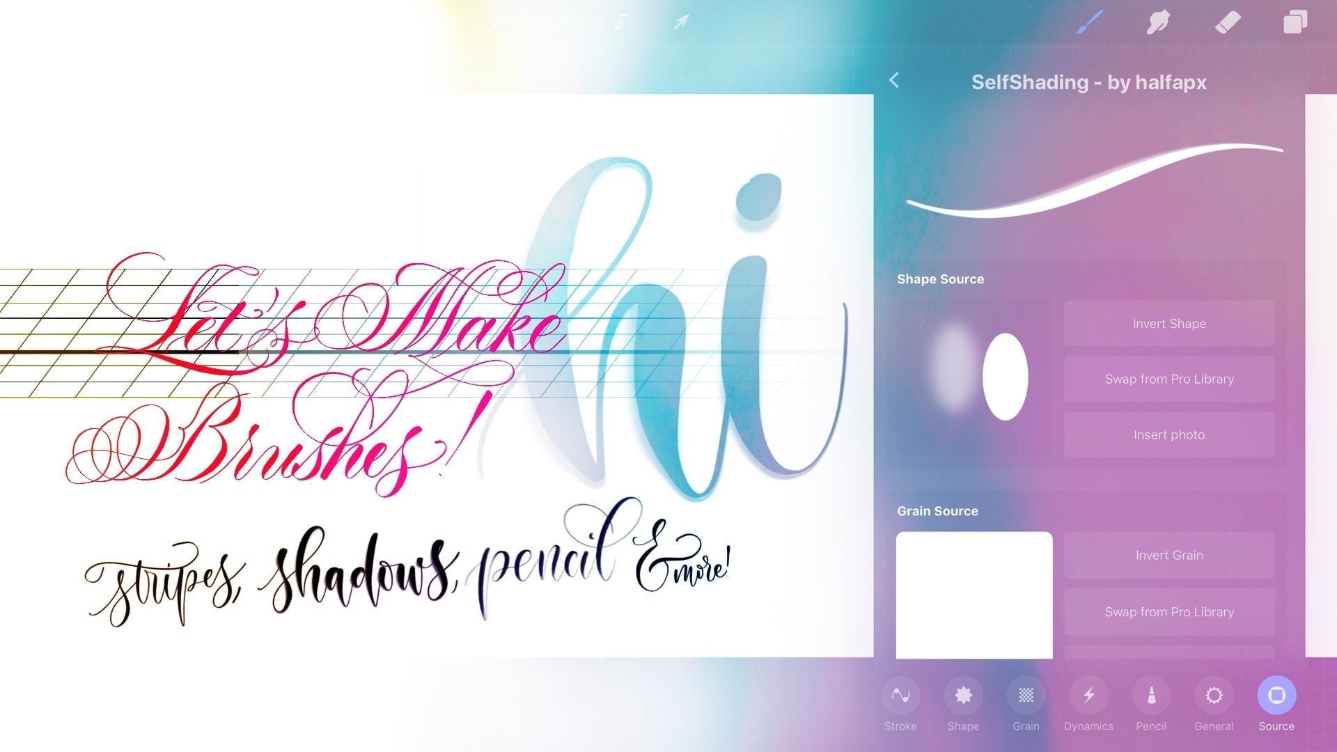
4. App Introduction: iOrnament: the next app. I want to talk about his eye ornament and I ornament is very similar. Teoh mais a graph that is just a symmetry up. It is, however, in my opinion, not as a nice in terms of the user interface. Let me just like that a little bit so you can see it better, right? So it's not as it is, not as Inter as intuitive, but it's still very nice. So Amita graph is mostly for pattern making, and there's a lot of options. I'm just going to cover the ones that I personally use most of the time. So I've been tapped a little studies button here. We can show the guidelines, but we have to disable these guidelines of We don't want to see them in our final image at the end, but I like to enable them because I like to see where I'm working. Um, and then there's a ton of the fringe options for symmetries. As with, um, made a graph, it has different patterns. The cool thing about this up is that you can change a December tree type and it will reapply all of your strokes, which is really cool. Now there's also the florals, like in amazing graphs that this is the one deed that I'm focusing on here again. It's the same thing as with rotation and kaleidoscope, and you can add symmetries. Remove symmetries on and an amazing grab and I ornament again. It will apply these same strokes again. There's also different brush options that you can do. There's one of these multi line brushes, and this one Here's a little bit of a messy, streaky stuff. There's also like, um, this brush, which is like a flat edge calligraphy brush. And in the settings you can customize your brush as well to be a bit different, like, uh that, for example, but you would have this double line. There's also a slided at where you can change how much pressure effects the line. Just turn it off from making a regular one, and you can see the range of sizes, Indies, size of slider that then there's also D. This is the capacity slider so it can see and not your pass. Aditi vibrancy, saturation saturation. It's even written there. You can have supersaturated colors or not. There's also a color way where you can choose your colors, and then there's also brightness, and you can see that you're previews will adjust based on your brush settings. Here. There's also opacity and the blurry ISS, so same kind of settings as a media graph, but a little bit more control. There's also these settings where you will have two colors at once, which is really cool, and there's also a rainbow brush option. But I will talk about that a little bit later. But this is just the basics of it as an exporting you top export image and save the image and the lines will always be present. So you have to turn the lines off, um, again in these settings if you don't want him to show up on your resulting file.
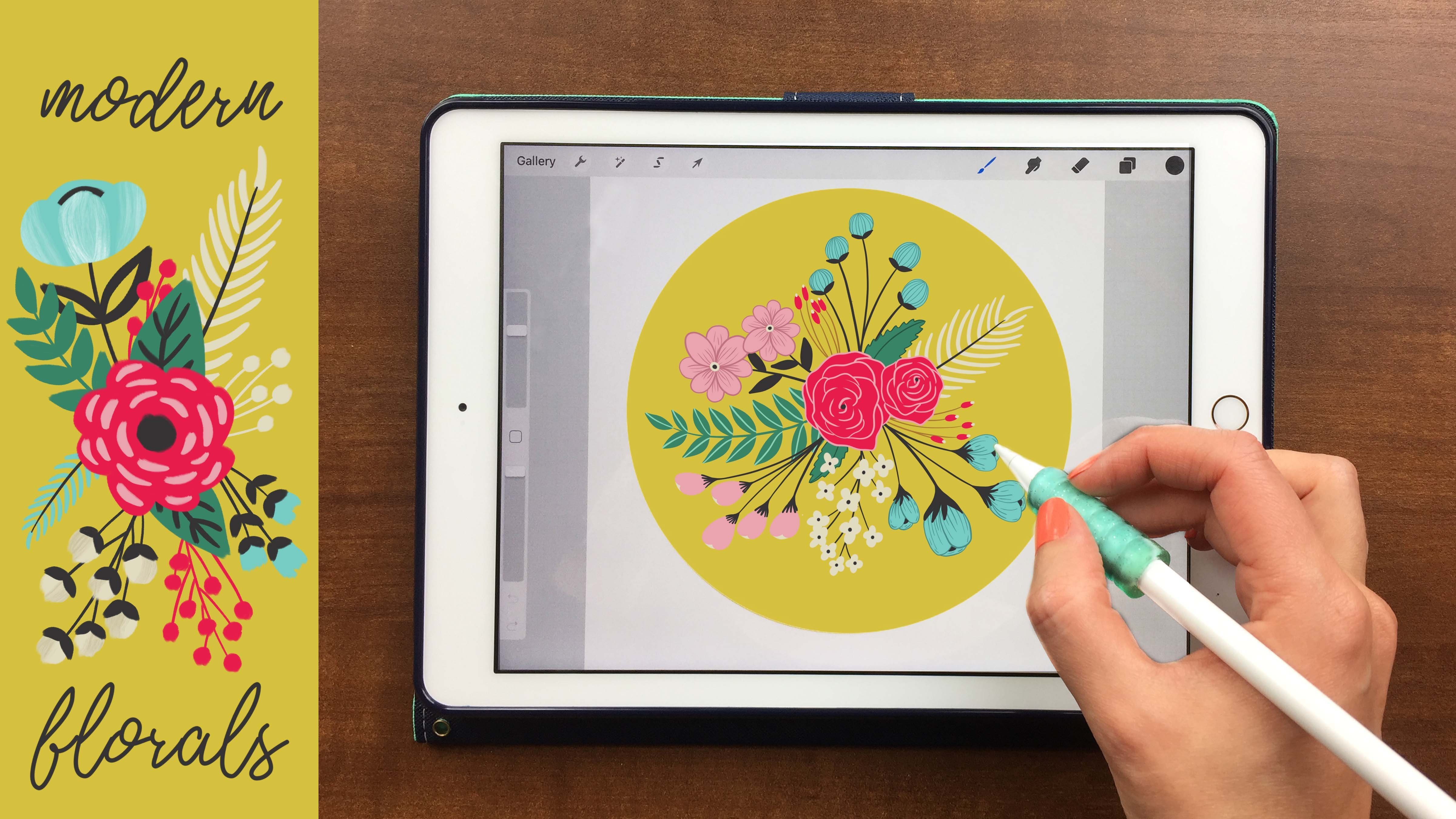
5. App Introduction: Procreate: Now the last app is procreate, and obviously procreate is the main drawing up the most people we'll use generally. So you have a lot of options in terms of brushes. I have an entire brush making class, um, on skill share. So definitely go check that out if you're interested. And here we now have a symmetry setting in the canvas. We have the drawing guys you can edit to drawing right guide and then go into symmetry. There's not as many symmetry options, so there's just the vertical horizontal quadrant and radio, which is the one that we will be talking about. And then, as you can choose how thick and opaque the lines are, and then you can also enable the rotational symmetry, which is, like so here, concede that's kaleidoscope type of symmetry. And then, if we good rotational symmetry on and we'll just rotate so that's the appropriate up on were actually staying in appropriate out because I want to show you the basic shapes that I the basic kind of stroke breakdowns that I do for these drawings that I want to teach you
6. Basic Shapes: all right, we are back and procreate. And now I want to show you the few basic shapes and stroke breakdowns that I do in my ornaments to draw flowers. And these are very simple lines. So you don't need to be out in artists or you don't need to be able to draw to make these illustrations. And that's one of the money things that I want to teach so them we want to start off with the basic shape, which is called Leaf. So I have one symmetry line here so I can show you, which is very simple to draw leave. You can see that it's really just two different strokes. There's 1 40 main leaf stroke and then you just drop parallel lines. So if I go in here and draw smaller version, I'm going to choose just a monoline brush. You can see that all I do is first turn on assistant drawings. I'm working appropriate. So do that. Did I turn on a rotational symmetry? I did turn that off. So you want to not turn on invitational cemetery? You do want to work with this any kaleidoscope. So this will create this drop shape. And then what we do is we. Sometimes I like to draw a line on bend. Just do Palo Lines, and I like to just rotate my economists a bit and you can see it's just drawing pellet lines. It's super simple, and that's how you draw the leaf. Now, the next one I call stairs on this one has a few more strokes, so you can see that it kind of looks like a stare, so we will start off the same way when did with this pedal shape. So this drop. Then we draw a line straight down and then, due to pilot lines at top, is exact. See lies, exactly lines. Then do another straight line down two lines of these one down Chu the's down. It's not perfectly straight, and that does not matter. Down two over and down to over went down and two over on day one down and then just finish up with this. And this is how we draw stairs now, the next one I call the pedal, and this is a very simple one again. It's just these basic lines, so let's do one of these again. So drawing assessed start with the floor shape again. Thorpe shape again. That meant now we draw the same type of shape, but just skinnier. And this center. And then when we do after we do tow line down, we can do. The lineup is well. We start at one of these areas and then go up Dutch and then down again, creating these Hettel shapes like that. Kind of like a lotus leaf. Now, the next one I called Crown, and this one is basically like a combination. Off stairs and pedal get a super easy shapes to grow lines to draw. Put on drawing assist. Don't drop. Let's make it a little bit of a bigger drop. Bad you one of these shapes. They go in the top to start at the bottom and aim for a line it slightly cross from the last line. Now start where these two lines meet and aimed to move down a bit. So two lines and now start released. Two lines meet on aimed for a little bit across from the meeting point to these strokes. Go back to the meeting point of civil Oh, but from the last intersecting line like that and then the final thing that I like to do is teach charging road drops. One of the main important interesting features is adding little droplets and just ease allying that just add a little bit of interest and intricate fields with. So you just need to do random lines and then at this little droplets at the end. So just create this and you can fill it in if you want as well, and then you killed also add pressure. You can see here I just your crown with varying pressure and largest at interest as well. But this is a basic shapes and building on these basic shapes. We can now draw a flower.
7. Example Illustration: Amaziograph: Okay, so I want to work in amazing graph for death. So I'm just going to that you leave these two and let's create a new tumor, kaleidoscope and go into just great and make it. Let's make it eight of the use. Um, things I like to keep it centered. I just used basic shape. The basic size I meant All right, I'm going to make it the smallest size I do have pressure on because I like to add a little bit of pressure. So I'm gonna zoom in as much as I can and start by drawing one of these drops. You can see because it is in a circle. It just starts to look like pedals immediately. Now, the next set of pedals will start where the middle of those lines and and just add another one. So I'm not closing it like enough before. I'm just starting it at the center of the last one. So they're building on top of each other and growing out of each other. I can add some rings like this, so just include a little bit off circle stuff now, verities and size that could do one of these petals like I did before with the drop in there and then do a smaller one in here that I don't close up perfectly, but then drew one of the big ones again, the big ones here. You can see that I apply a little bit more pressure at this bridge part here. I feel like maybe about in one of these rings would be nice here and then and that. And I like to grow my pedals first, draw my pedals thirst before I start filling them in. Just a have a basic idea of what the flower will look like. All right, so that's something I like now. Sometimes I will add some shading, so add a little bit of a shadow from each pedal, which adds more dynamic. So I will do that today. So choose this super soft, less a pass it e. And then go do that and choose like medium size. Start up the center again and outline all of these pedals Were some of them. Let's say maybe I could do in line of these. No, see that I exponentially after some of that on. No, let's go here. Make that this on I can see that they're just overlapping one another. And I like to draw the shading. And first, because I feel like it looks more realistic with I draw the pattern on top of it. So the filling lines, the ones I've outlined that I go back to full capacity and small side like fix these lines where I raced some. All right now, let's go back in and let's just do these shapes and I decide pretty randomly. I just go in and do whatever comes to mind. So here I feel like there's nothing else other than the classic leaf. No, it's do some of this here on meet in these lines. I just do that now. Let's fill that in with black or the circle, and then do they erase their end at a couple thoughts? No. Go back in with the brush here, just three of these. Now I do have that. Let's do a crown here. Then you can see I draw these rather quickly. I don't want you think Aton while I draw these, because I feel like it looks better if I just go with my first instinct. Now let's do one of these crowns, but let's do it a little bit more. Interestingly, by adding this little shape here, why I don't do the full oval. But just do the operable here, and let's actually draw inside of that as well, so you can add the little variations quite easily. Then just follow the basic rules again. That and then, if you feel like these lines are too far apart, you could just adding some more to me. Kill my detailed. Now let's do another one of stairs, small stairs. We've go Helen in these. That and then it's just stares one here because heaven done one yet and that we're almost done already. So let's do, um, maybe at some details here. Just because I feel like this doesn't look to perfect, because the shape of the floral off the leaf has this little cheap part here. So now we added, like a little detail ing here on Let's do another one of the crown's. But the silence do really diesel ovals. We're not working and these layers, So let's go ads from this here I'm no, Put it down touch. As you can see, it's just a variation, so I don't really know what I want to do. I just kind of go with heels, right At the moment, you can see it is a variation of the crown. Anything still see the main shape of it and let's actually do another one is black Phil Rains and do darts and then another with his pedals. And now you could call this done. But I like to finish D's off with adding some drop elements. So I just draw some lines and put these drops in in between here out of use circles just to make it look a little more organic. I didn't really think too much about where I put these. I just but, um, around the edges here and then Gross, move that out here. And then I zoom out and look at it, and I feel like there was some missing elements here, all right, I feeling dots That's good for now. So I'm going to call this done on. You can see it just takes about 10 minutes on these basic shapes, and it looks really intricate. So that's how easy it is to draw one of these floors. Let's just say this and we're done
8. Example Illustration: iOrnament: All right now. 42nd example Floral that I want to show you were going to use my ornament. And I'm just going to show knees grid lines, and I'm going to work with Let's do Looks like that is struggling. All right, So I'm gonna work with, like, age for seven, seven symmetries, seven symmetries. I'm going to work and white, So put the saturation and brightness up. And now, instead of working in white, not gonna work in white. I'm going to create a rainbow pen, so I'm gonna top one of these colors now. What I'm going to do is I tapped time. I make this quite long. So you concede all of that put the speed a little bit down. And now if I draw a line, you concede and automatically well, change colors the longer I draw well, I put ni speed up plow and see that changed it. Yeah, I think that's that's better. And I'm going to like that. I knew the blurriness because I like my lunch for Andi. Just decrease. He size differences. All right, now let's start in the center again and I begin with these The four als Onda and do the same thing. But because of color changes, you can see that it will look quite a lot different than the way I drew it in the media graph. Now I start beat by adding some he's elements and you can see the lines I draw here much simpler because they're all so much thicker now. A media graph also has us and ornament. I'm sorry I keep calling in the wrong name also has a local symmetries, which is really cool. This is the button over here. We just over here where you have a local symmetry. Basically, that's 26 and I just put this on one of these symmetry lines have at it. So now it's locked in place. And now if I draw you concede that I can have a little bit of an order manage inside off my main ornament and this is really cool. This is one of my favorite features out of all of this. All right, so I remove the other one now accidentally, But that's just do that. So start with the local symmetry where I just draw a little stars and small elements and because I am working with color. The strokes, Aiken do are much simpler. So just do a little bit of dogs, drops and just little lines. They're stacked, and I tried to keep the lines quite long. So I get most of the colors you can see are just at little parallel lines. Not that I don angry at you headed delete button, and now I work on the main symmetry again. Undo that. Do not hit the delete button. All right, start into center, and I quite like to very pressure here on. Just see what happens. Draw some of these floral shapes and then start incorporating this with the mainly mine. I can see that I do draw inside off the main shapes here is Whoa, Jason, his drops here any create these fun? Second, like florals, it's the super quick one. So let's remove that and save it at an image. And now, because we have mawr symmetries, it's easier to towards just very basic. But because we have the colors and the repeating elements, it just looks that's more interest on its more fun
9. Example Illustration: Procreate: all right. Now for the last example. I want to work and procreate on appropriate has the least, um, into catch symmetries. So it is a little bit more difficult to make it look interesting. So what I like to do is I like to incorporate flourishing and lettering. Flourishing is quite difficult at the beginning if you don't have practice. So I want to keep this class symbol. But if you are interested in learning a flourished symmetry, um, I can do that in maybe another class. But this time I just want to show you how incorporate later lettering. And I want to make sure that I have rotational symmetry Turn on for this because we don't want the letters to be mirrored when we've right. So we want them to be in a circle. So I like to create a new layer on, uh, grid line because I like to write only grid lines and you can find all of these brushes in my shop or learn how to make them in my brush making class. So I just put one of these grid lines on and the brush that I'm going to be using for the lettering is my ASM pen. She's like a brush panel and I'm going to right. Symmetry, love. - All right, so you can see it's a very so it's just a word here, you know, at a Linux earlier because I like to keep the words, um, separate. And sometimes I'll color one of them or do something else with it now because we're working with symmetry, as you can see, De method that we use before will no longer looked the same. So if we did these pedals, we have to draw each side separate because it is not wrote eating and the lower mirroring. But because it's rotational symmetry, it's a lot easier to create this flower like shapes like that. So you just go in a circle. I'm just changing my brush to a round brush. This one is called Max Week, just just a round brush with quite a big range off pressure sensitivity. And now I'm going to start zooming in and drawing drops and alternate the order that no , and this is where I make figure, make them all arounder kudos and just like work with pressure so you don't have to draw a drop he just apply pressure and after drop like that groups. - As you can see, this keeps it'll very organic looking there. Personally, I'm a big panel that, uh, sorry about thes squeaking sounds I have a screen protector on, and that just seems to be squeaking that I feel like rotational symmetry is actually a little bit harder to do if you don't do flourishing. But this is a very good drop drop practice. So you just Girardi's look drops actor Girardi's and in these groups were just draw in each direction and then go inside, adding group groups of drugs. No, and that's how that looks like. It's just using drops and a little bit of lettering. Sometimes I like to just decrease your pass ity of some of them, and so the letter extends out of it more. It's really simple to do. All you have to do is repeat dissing lines and shapes that looks really organic and beautiful.
10. Class Project: and this is how you do it. This is what all I do to create intricate floor illustrations using symmetry APs without being able to draw. I hope this class was helpful If it waas share your learnings and these things you create in your class project or on Instagram tag me at half a pixel.
 Myriam Frisano, halfapx | Calligrapher & Frontend Dev