Transcripts
1. Introduction: One of the important
painting challenges from the time of Rembrandt is
the constant question of how do we make any object look three-dimensional on a two-dimensional
surface of a canvas. This has always been
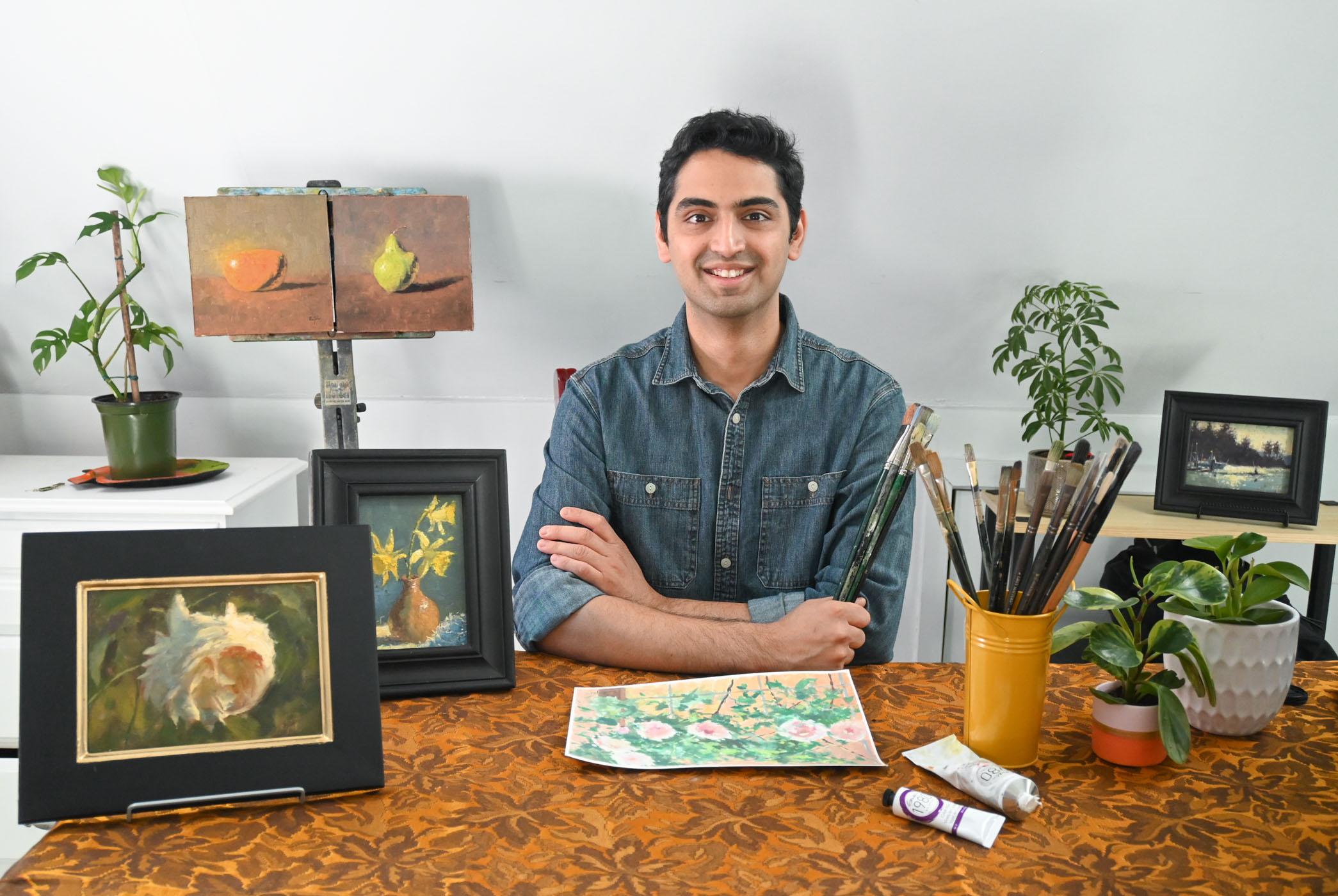
the crux of a painting. In the painting world, we call this the form. Hi, I'm Richard Shanda and I'm an oil painter
based in Vancouver. My paintings have
been picked up in many international
exhibitions and recently, my work was among the finalist
in the Art Renewal Center. As a representational painter, I'm always learning and drawing
inspiration from nature. I strive to evoke a
sense of freedom, Achieving abstractness,
true my brush strokes while maintaining
and integrity in the sea. This class is designed to
provide you the basic tools necessary on your journey of achieving oil
painting mastery. In this class, we
are going to explore the important concepts
of creating a form. A form is a basic building
block of any painting. That is what makes a
painting come to life. It evokes a sense of realism. In this section, we will look at very simple objects such
as an orange and a bear. To understand how foreign books, we will learn a
new way of seeing. Understand the
mechanisms of light. Learned concepts such
as lights, darks, and edges that will guide
you to create your painting. With these lessons, I
highly encourage you to pick any objects that are
around you and giving it a try. By end of this class, you will find a new way
of seeing things around. You. Understand some basic
concepts that are crucial to painting
any masterpiece. Develop confidence in
your painting skills with which you can
approach any subject. I am excited that you're here. Now, let's unlock
some paintings secret that all the painters
before us have used. Let's begin.
2. Your Project: Let's dive right in. Your
project is to create a simple still-life
painting with objects that are easily
accessible to you, such as an orange or a bear. Now that you have a reference
photo to work with, the next step is to
gather your materials. Please watch the next
video where I talk about setting up your workspace
that everything you need. I have broken down the entire painting
demonstration into simple actionable steps. So take time to watch
the entire video first, then try out your
own still-life. Congratulations,
now that you have your masterpiece, I
would love to see it. Feel free to upload a photo of your painting in your
project section. Some of the ideas
that you can share are your color palette
or your studio setup, your work in progress from
any phases of the project. And finally, he
assigned masterpiece. Remember your work and
inspire thousands of others as we are in this
painting journey together. You can use the hashtag, paint with Roger to share on social media so they can all
see what you're working on. You can always reach out to
me if you have any questions. See you in the next lesson.
3. Gather Your Materials: For this project, you'll need a studio easily
on a push on box, anything to hold against. For oil paints, I use a mix of pain brands from Winsor,
Newton and gambling. On my palette, I have
transparent red oxide cad red light, yellow ocher. Naples yellow cad yellow
medium cad yellow light. Ultramarine blue. Alizarin crimson, cobalt violet, cobalt blue, civilian
blue, and titanium white. I use flat brushes of
various sizes, 2-10. Make sure your brushes have a good spring so
that it's capable of manipulating and
transferring the paint smoothly onto the canvas. I use walnut or as my medium and gaps or
as my paint thinner. Here, I'm using a canvas panel which is about an
eighth of an inch. If your canvas is
slightly rough to touch, just use a sanding paper
to smoothen it out. The smooth surface
helps to transfer the paint effectively from
the brush onto the canvas. And lastly, some palette
knives and paper towels. And over time, as you do
more and more paintings, you will develop your
own unique palette, your own color choices and
style of arranging things. So please be patient with
yourself and trust the process. Now that we're all set, let's go ahead and
paint some still lifes.
4. Placement: In this video, we are going
to talk about placement. Placement helps us to see the approximate
location and the size of the orange retrospective
and to the canvas. This is totally your decision. And over time and practice. And based on your design sense, you'll be able to make this
automatic, spontaneous space. For now. You can try placing it in
the center with some room around it to paint the
background and foreground, just like I'm showing here. I'm using a thin paint of
transparent red oxide. I didn't paint allows you to make brush marks which you can easily wipe off at any time if you wish
to change your design. Absorbed the orange or any still life that
you're painting very closely and make marks
based on your observation. Your drawing doesn't
have to be exact. The entire painting
process is very flexible and you can change
the design at any time. Once we have a rough
sketch of the orange, we move on to the next
part of the process, which is to establish our ducks.
5. Darks: After we have a rough idea of where the subject
is going to be, me, move on to the next step
of establishing the darks. I mixed a couple
of my job colors to make a color close to black. I'm just mapping out the dark shapes by closely
observing the orange. Darks are absolute. Ideally, they don't have any color as nothing is
reflected off of it. The light just goes through it. The function of the dog is to give solidarity
to the form. When the light falls
on any object, it results in too dark shapes. One is when the
object is stunning, which has the form shadow, and the other is the dark
costs it on the floor, which is the cast
shadow. In painting. You have to pay very close
attention to the shape, the light bulbs, light
falling on any object. All of these forms of
Goneril shape as shown. Now that we have
established our dogs, Let's go on to add
some background.
6. Background: Now we move on to
add the background. I'm picking this particular
shade of background, but you can pick any color you like based on your design idea. The function of the
background is to give space for the object to rest. And it is not separate
from the object, but a part of it as
the edge is shared between both the
background and the object. Notice how I'm mixing paint constantly instead of
making a huge pile. This allows me to change
the color if need be, and also get better
at paint mixing. This is a simple and an
effective way to master color. Now, we move on to make
the foreground, the table, despite what I see
from the reference, and then make it
a little darker. To start off with. This way, it's easier to lighten it later than the other way around. I go back-and-forth
between the background and foreground and try to see
this painting as a whole. Instead of separating
it into pieces. Take your time and lighten or darken those areas as need be. Background and foreground
shouldn't ideally have any sharp brushstrokes because sharp edges makes the eye
linger a little longer. And my object of attention in this case is just the orange. Now, let's move on to
adding some lights.
7. Lights: Now we come to the most
exciting part of the process. Adding light. I mixed some cad yellow
and cad orange with a touch of white to produce
a color I'm looking for, which is a close match
to the still-life. Light begins where
the fun begins. And bad the form starts. There is always a hard edge. Just holds true for any object. Don't worry if your
background color seeps in the light
areas or vice versa. You can always adjust
by pushing the paint to its right place or
taking it off by brush. With the observation we know
anything that is constant in color in the areas of
light is a flat object. Hence, if you want
something to stand out, keep the color in the light
areas as flat as possible, but very minimal color shifts. Hence, at this stage
of the painting, the subject looks sort
of like that object. Instead of around Orange. And try to feel the paint onto the brush as you make your mark. This will make you
more sensitive and alert to adding a certainties
in your painting. As you can see, for the sake of the class, I've exaggerated, go the areas of light and
dark to be completely flat. There is also a
great distinction where the light ends and begins. Here. I'm taking my time to adjust any light or dark areas. And also, if you
feel like changing the shape at any part of
the object, you may do so. Now, let's move on
to study edges.
8. Edges: Now we arrive at solving
the problem of edges. There are only two edges in any subject we have
to worry about. And outside edge
and an inside it. Outside edge, because where
the form starts or ends. And the inside edge
is where the form turns in space
within the subject. Outside edge is a hard edge and an inside edge
is a soft edge. A soft inside edge
can be done by just blending the two
areas at that edge. You can use a clean dry
brush to make that blend. You can also take the background color and use
that to create a soft edge. White background color. Because the form's
turning through space or air and the color of the hair
is the background color. I usually get us hello,
I get my paintings. So Eric, Well,
that's the secret. You need to let the air inside your subject and that's where the insight soft
edge come into play. Take time to adjust
the light area before the soft edge and a dark
after the soft pitch. Now you can see that the
roundness of the orange is coming into shape by just
adjusting the soft edge. Now that we have learned
to create edges, let's study the
importance of highlights.
9. Highlight: Now let's create
some highlights. The presence of a highlight
is subject specific. That is, if the outer layer
is soft or hard to touch, since the skin of the
orange is hard to feel, you will have a highlight. The color of the
highlight is a source of light no matter what the
color of the subject is. In our case, since the
source is daylight, the hydride will also be white. I'm adding a touch of cad
orange to give it some warmed. But the majority of
the EU is white. Just next to the highlight,
the actual color. The object starts to reveal. The regional beside
the highlight tends to be a bit brighter, paler color washing up. And it gets more saturated and intense as it moves away
from the highlight. Tried to lay the paint, or tried to push the paint
based on what's required. An object such as a
beach or anything soft. We'll have a very subdued
highlight or none at all. Highlight also indicates
a change in plane. Take time to gradually
disperse the color from the high values of the white to lower and darker
values of the orange. Try to look at some
still lives around you and see where the
highlight occurs. Now, let's move to the next process of creating
some reflected light.
10. Reflected Light: Now, the next important element when creating a form
is reflected light. When the light source is hitting the object in a
certain direction, there is an equal
and opposite source that's bouncing back from
the opposite direction, which means the light from the table is reflected back onto the orange in the region not dark areas which are
closest to the table. In this case, reflected light. I'm just mixing the colors that are assembled to let table. If the table is read, the reflected light
would also be right. Try not to kill all the darks. Reflected light is
just a small part of the dark section of the area. You can experiment creating
Still Life with and without the reflected light
and see which appeals to you. This is more of an
aesthetic addition rather than a technical one. The region next to the inside soft edge will still be the darkest
part of the object. I always tried to work
throughout the canvas, traveling between
the foreground and background and adjusting
for correcting as I go. Painting is more about
a way of seeing. So challenge yourself
to see reflected light in still-life objects
that are around you. And I'm sure it will immensely help you in
your painting endeavor. Now, let's try to add some
glue in the painting.
11. Glow: Now, if I have to make
an object brighter, you cannot increase the
value of the light region. If you do, you will lose
the vibrancy of the object. The only thing you can do is to increase the value of the
region next to the light, which is the background area. To add the glow, you can use the same color
as the light region, but with the legend
less intensity. This way, you can still keep the areas often like
relatively fat, and also make it appear brighter by using this
neat little trick. Try not to kill the hard edge
where the form is starting. Like reflected light. This is also an
aesthetic addition. Based on your design
and intention. It's your choice to include it. And also to set the
intensity of the club. You need to have a dry concept of what you want to convey
from your painting. Based on that, you can decide how much glow you can add to one or many objects
in your painting. Here, I'm taking some time
to blend the background and the glow color to make it appear like a gradual change
rather than an abrupt one. You can smooth in these areas to avoid any
unnecessary attention. Now, let's move on to add some passages of air
within the object.
12. Passages of Air: The next concept, we will
be going over 58 here, where the air escapes. There is a region
at the boundary between the inside edge and the outer edge where the
air escapes on either side. Notice that the values in this region or close to that of the background
or the foreground. This process allows the subject to be deeply rooted
with its surrounding. Rather than looking
like a cutout image. The soft edge where the
form turns the passages of air in and out make
the subject very airy. The passages can be narrow
or wide and distorted. It depends on your
aesthetic choice. What you're actually
doing is softening the edge vary slightly
in this region. After you make the passage by just your hard outer edge
along the rest of the boundary correctly so that it looks
harmonious and there is a gradual transition to
a soft edge at the passage. Now, let's add
some final touches and finished the painting.
13. Finishing Touches: Let's add some final touches
to finish the painting. I will be working on
religion on the foreground, as it currently
appears a little flat. I will be increasing
the value of the foreground as it gets
closer to the orange. By doing so, I'm guiding
the eye towards the orange. Use light as a tool to guide
the viewer across the scene. I hope you noticed how I
pick and transfer the paint. Make sure you have
enough paint on your brush to make the
mark that you intend. One to transfer the
paint onto the canvas. Always remember, you're constantly pushing
and manipulating to paint. The marks must be abstract. Out of that, the
farm should emerge. You may have also
noticed that we did not draw an orange at any point. We constantly
adjusted the shape, the light and dark and
made the form up here. In this subject, the
highlight appears in only one place because there's only one plane
change happening, red light hits, e.g. if it was a bottle or a
ways off many contours, every contour change you
would have a highlight. Feel the pressure of the brush which you are
transferring the paint. By just being aware on how you pick and transfer the paint would make you a better painter. Here, I'm adjusting the
background while keeping in mind that I do not disturb any hard
edges of the phone. Even if you do, do not worry, just pick some of that light
color and recreate the edge. You are in Georgia for
paintings at all times. You can always change
it for the better. You can add your certainties. Light region with as little are many
depressions in the orange. Just remember every
little a huge change in the light region will decrease the impact it had
when it was flat. Here, I'm just selecting
one depression on top and adding some cooler and darker color of the orange. This breaks the monotony of
the flat region in that area. Even small changes
like I showed here, will appear to change
the shape drastically. Here, I felt the need to add some dark under the
orange to give it a little bit more weight so that it doesn't appear as if it's
floating over the table. One to start noticing these contexts by just looking
at the objects around you, your mind will
automatically start to rehearse how you would
approach to painting. So this is how I add
subtleties and details. At the very end of
the painting process. We now finished the painting
by adding a signature. I hope you enjoyed this lesson. Now, let's try to use these concepts in
on understood life, such as a bear and see
how we can paint it.
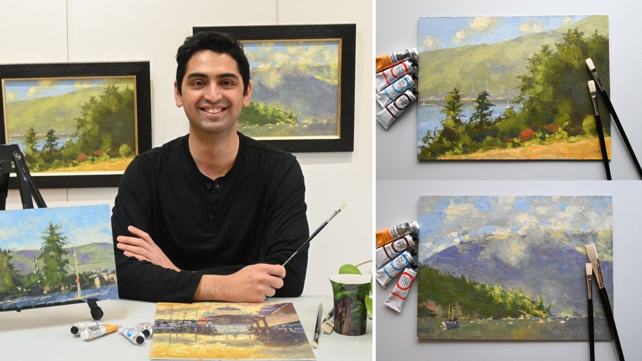
14. Introduction to Pear: I hope you enjoyed the process
of painting and orange. As we saw, you can
really break down a painting process into
simple, actionable steps. In the next lesson, we will use the same techniques so that you really understand the concepts applied to any painting genre
you want to create. I have mixed up the steps a little so that you're
able to process the flow more
naturally rather than doing it in a very linear
and restricted way. Also, as I mentioned earlier, learning to paint, this
also learning to see. So make sure to look
around you still lives, your landscapes and see how these concepts can be applied if you ever
want to paint it. Now, I hope you enjoyed
this next lesson. Let's go ahead and paint a pair.
15. Pear Part 1: Now we will implement all
the concepts that we have used to make an apple
to also create a pair. In this lesson, I will be mixing up the order in which I approach so that you're not
bound to memorize the steps are added to
C and paint naturally. First, we will be looking into
the placement of the pair. Overall basic
geometry, its shape, and location in regards to
the size of the canvas. Once the general
placement is locked, I usually stepped into creating dogs as it is somewhat
starts to concretize. My idea of what I'm
looking to create. It is quite natural to shy away from making a strong dark. However, it is absolutely
essential that you push your darks due to
extreme from time-to-time. So that you can then gauge how it can be contrasted
with the light. E.g. even here, if you notice, I have pushed my dark in the
shadow side of the pair, slightly darker than
it actually appears. This will guide me to select
my appropriate light. And then if need be, I can always lighten
my darks in the end. Then I quickly move into making a background color
so that I can start to integrate the foreground and the background and start
seeing it as a whole. When you have such a colorful
pair in the foreground, make sure your
background is somewhat neutral or less
saturated in color. This will allow the object of interest, which is the pair, to be the center of attraction, without being distracted
by the background. Take your time to
cover the background. Feel the pressure of the brush needed to transfer the paint. Make sure that the background doesn't have any hard edges. As it can draw
unnecessary attention. We can always smooth
in the background, in the areas if you
see any hard edges. Now that we have a
general idea of our pair with a good Larkin and placement along with
some background. Let's move on to
adding some lights.
16. Pear Part 2: To move to blocking in the pair, I switched my girls
to paint the light. I'm not worried about
the subtle changes that are happening in the
light region just yet. I will be laying a
flat layer of light, just as we discussed
during the apple painting. Dry to create some texture
in every brushstroke. Move and push the
paint on the canvas. Do not try to blend any
pain in the light region. Just laid on top of the other. At this stage, I'm just
making two flat regions, one on the light and
one of the dark. And this will keep
our composition very simple and stroke. Once you're satisfied
with laying in the light, Let's move to block
in the background. Now that I have gauged how light or dark my foreground
subject is, I can confidently adding more
paint to the background. Here, I'm mixing a
very neutral brown, which is slightly
cooler temperature. I invite you to explore
your own different versions of background colors and see
how it affects the subject. Take time while you're mixing
your paint on the palette. You have to spend an
adequate amount of time on your palette as
you do on your canvas. This prevents over blending and using the same paint
on the canvas, which can ultimately make
the colors look down. And make sure the
paint from your brush, rather than just
dabbing on the ballot. As you build up paint
on the background, you will get a
field so the object being surrounded by
the background air. Now quickly moved to establish
a foreground to the table. For my foreground, I mixed my dark colors along with some red to get a neutral color. At this point, I'm
just looking to cover the foreground region
without being specific. How about the color? Here? I'm going back to the
foreground to make it slightly darker
than I initially had. As I mentioned earlier, this process of painting
is extremely freeing. As you get to decide
and change the idea. At every stage of the painting, you can always go back and
forth and adjust your shapes. Here. I'm going back to adjusting my dark
shapes of the pair. As the foreground is not
the point of interest. Make sure you have
smooth edges around it. Now, as I get close to the pair, I will make the value of bit
lighter to give it a smooth, increasing rhythm to the
light as it heads to bear. To make an object
appears lit up. You can brighten the foreground
area just around it. With most of the
elements known place. I still felt the background
could be made more airy. So here I am adding more paint, also making it more cooler, as it seems to give a nice contrast with the
foreground color of the table. Make sure while doing this, you don't have any hard edges. Also, by smoothening
the area or the edge, but the foreground
meets the background. It gives a sense of continuation
from front to back. In the next lesson, we will look into adding
highlights and dissolving the inside edge to make it
look more three-dimensional.
17. Pear part 3: We're now moving to the
final part of this painting. Let's start by adding highlights to bring some dimensions
to the subject. Notice how highlights
happened in areas where there is
a change of plane. The color of the
highlight is always the color of the
source of the light, irrespective of what the
object that falls on. Now to dissolve or soften the inside
edge, the form turns. I'm just blending the light
and dark with a clean brush. You can also use a background
color to soften this edge. As the form turns in the air. You can see how by just adding
highlights and softening the inside edge of the pear starts to appear
more 3-dimensional. A common mistake I
usually find students do here is to lighten the darks
just after the inside edge. Please be aware that
the darkest part of the dark shape is always immediate after the
insight soft edge. Even if you happen to
lighten the dark region, you can always go back and
add some of the darks. Again. Be aware and feel the pressure of the
brush at every stroke. This will give you an utmost control on
how you lay the paint. As discussed earlier, give
attention to the regions. Rather light can
escape out of subject. They are key to making
your subject part of the environment rather than
it appearing like a cutout. In these endings stages. Take your time and add
subtleties wherever decided. This concludes the process
of painting the bear. I hope you enjoyed this
lesson and I've noted some key takeaways to apply
in your own painting journey.
18. Conclusion: Congratulations, we are
at the end of the course. Thank you so much for
being so patient. I'm fully confident that
these concepts will help you, no matter what subject matter it will be painting
in the future. Do remember, in painting, we are always trying
to develop a form and your ability to
see how the light hits while it moves
to the surface. This class was not only a
demonstration in painting, but also in a way of seeing. My goal is to make you wonder at all the
objects that surround you and give you the confidence to say,
Yes, I can paint it. Do remember to share your lovely painting in the your project
section of this course. You can use the hashtag, banquet tragedy to share your
artwork on social media. If you enjoyed today's class, please do leave a
review and follow my profile to get updates
on future classes. If you'd like to work with me to jumpstart your creative life and build a thriving body of work that you
can be proud of. Follow the link below
and drop me a message. So that's it. I hope this class has encouraged you to see more of
the beauty that's around us and to give it a shot at being
inspired to paint, as always, create the artwork that you're proud
of. Thanks again. See you next time.
Happy painting.
 Rajat Shanbhag, Artist | Nature Enthusiast