Transcripts
1. Introduction: [MUSIC] We're ready to
look at still-lifes on their whole new life. They don't have to be an
art form from the past. They don't have to be boring and certainly they don't
have to be spilled. Forget about all technicalities
and get ready to experiment a lot. I
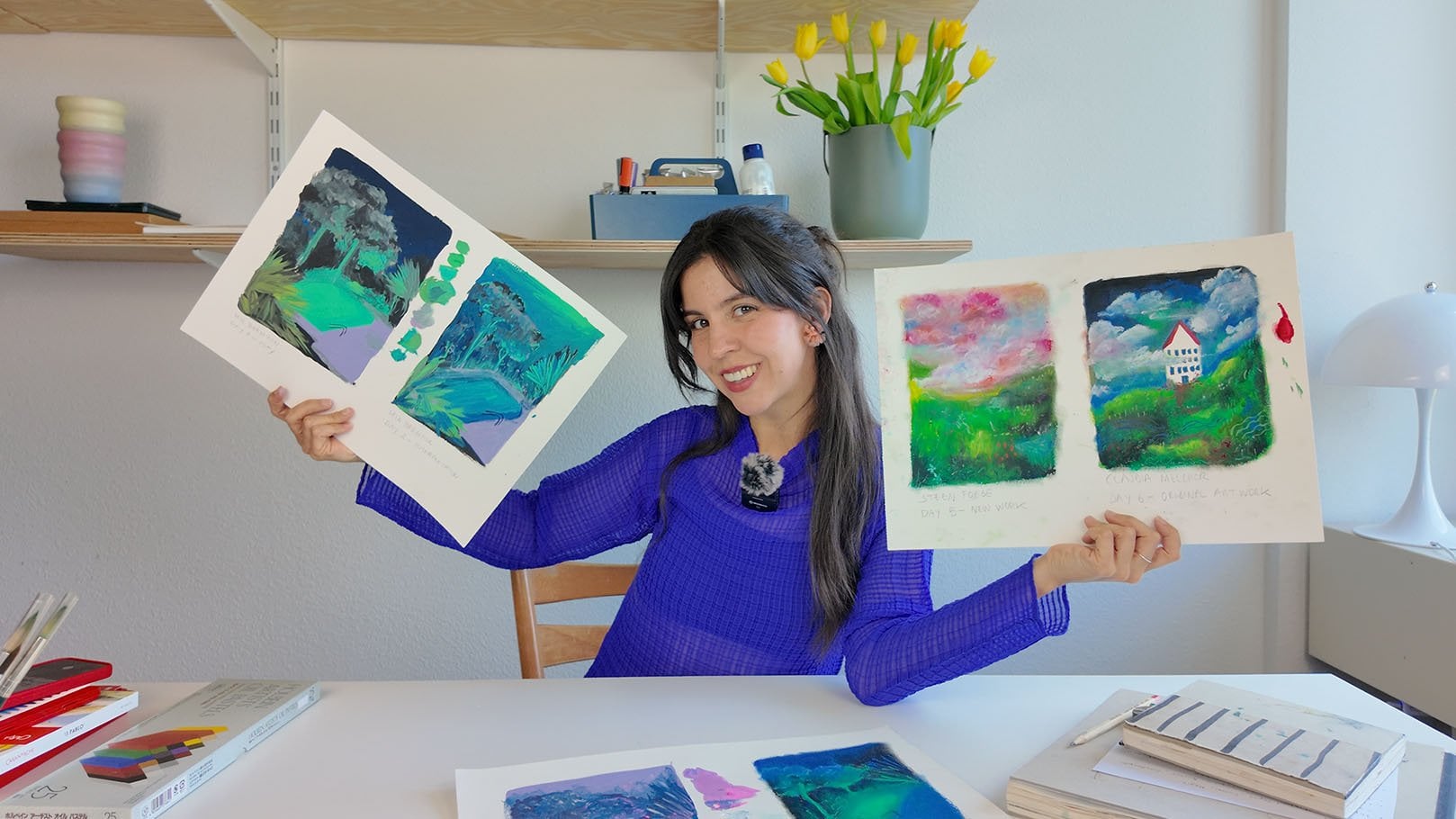
am Claudia Melchor. I'm originally from Spain and I studied architecture
for almost six years. Since university, I
started illustrating a lot and I've collaborated
with a lot of brands, including [inaudible]
for which I currently teach art workshops
here in Switzerland. My own painting style is definitely different than
the architectural alter ego. It's free of rules,
very colorful, filled with movement and
very inspired by nature. Into this class, we're
going to be creating a still-life filled
with dynamism, movement in color, and
with no perspective. You will see that by waving
goodbye perspective, we can concentrate
on things that will help us make the painting
a lot more interesting, such as composition and color. In our lessons, we will
learn how to paint loose and confidence lines,
simplifying objects, how to use compositional
rules and how to create a narrative to color in order to guide the viewer's eye
through the painting. Lastly, we will be
adding some depth and texture by using some
mark-making techniques. By the end of the class, we will have this
amazing still-life with lots of different
color combinations, very playful, very dynamic that truly represents
your world vision. I think that a still-life
with no perspective, is the perfect
unconventional project in order to illustrate the idea that you really do not
need to be an expert in order to create fun
and compelling art. All levels of expertise are
welcome to join this class. Art is and should be
accessible for all. You just need to wave
goodbye to prospective, approach the painting
process with fun, and the results will
show. Let's get started.
2. Class Project: [MUSIC] Let's talk about
the class project. The goal today is to create
your own unique still-life. By the end of the class, you will have your
own unique painting with zero perspective, super customized, super playful, and with all the elements
and colors that you chose. In order to take this
class you actually just need one thing and that is the eagerness to
experiment and to create some weird art with me. Yeah, we will be doing
a lot of testing, a lot of experimenting so some weird things
might come out of it. As for the materials that
we're going to be using, I like to say that because
we're using mixed media, you're welcome to use
whatever you have at home. Please don't feel pressured
to go out and buy anything. Just use the materials that you have and experiment with those. I personally really enjoy using gouache because
it's very vibrant, you can reuse it once it's dry. I like how opaque it is. Also, for details, I like
using some wax pastels, some pencils, but really, feel free to just take
whatever you have. With that, we're actually
ready to get started. Fetch your sketchbook
and let's get to it. If you have any questions, feel free to write them in
the discussion board below, and I will make sure
to answer them. Let's talk a little
bit more in-depth over the materials that
we're going to be using in the next
segment. see you there. [MUSIC]
3. Materials: Let's briefly talk about the materials that we will
need for this lesson. As I said before, we're going
to be using mixed media. For me, the main material
will be gouache. If you don't have gouache,
use whatever you have, acrylic paint, all
paint, doesn't matter. The good thing about gouache
is that it dries fast, it's very vibrant and opaque. I have many brands here, I have this Holbein, I have Caran d’Ache, I have Schmincke, just use
whatever you have at home. The good thing about
gouache, however, is also that when you put
it down and it dries out, you can just re-wet it
and reuse it again. My palette actually normally
doesn't look like this. It's filled with paint. I have cleaned it for you guys. You're welcome. Very
clean and shiny. Also, I normally
have a big tube of white paint because you
actually use a lot of white. It makes the gouache
more opaque and vibrant and you end
up just using a lot. So I always keep a
big tube next to me. Then as a sidekick
to our gouache, I have the Neo color
wax pastels from Caran d’Ache and some
prismacolor pencils. These ones are good for details and this ones will add a lot of texture to our painting towards the end of
the painting process. Then of course you will
need some brushes. Here I have a variety
of different brushes. This one is a very thick one, then I normally
recommend a number 8, this one is very versatile. You can use it for
whatever you want. You can make small
details with it or paint bigger areas.
Doesn't matter. If you don't have many brushes, don't worry, just use the ones
you already have at home. I normally also prefer synthetic hair instead
of the real fur. I think it's less creepy. We also have a glass with
water. The palette, as I said. If you don't have a
palette like this, you can just use
a ceramic plate. Then I have for
sketching, pencil, pen, an eraser, and a sharpener. I also have a chopstick. You will see why in a bit. We also have some scrap pieces of paper to test out the colors, which will come handy when
we're starting to paint. Then our main paper is a 300g acids free mixed
media watercolor paper. It has a little
bit of a texture, but it's not super overwhelming. I like it thick
because you can use a lot of paint and a lot of
water and it will not warp. You can also use
some drafting paper. You see this
translucent paper that you use for copying things
over and over again. We use it a lot in architecture school, but
if you don't have it, you can just use a window, your computer or iPad screen, or even a lightbox. Whatever you have is fine. Lastly, I would like for you to fetch your sketchbook
because we will be doing a lot of testing and it's nice to keep all your tests together so that
when you are lacking inspiration or you want
to remember something, you can just flip through it. I have to warn you.
My sketch book is actually not super nice. I'm not one of those
artists that keep a super pristine sketchbook, but that's what it's for, testing. That's
how it looks like. This is actually all of the things that we're
going to be needing. You can start thinking about the elements that you
want to incorporate in your still-life so that
in the next lesson, we are going to be
talking about how to destroy delusional space. You will ask yourself
what that is, well, keep watching, you will see
it in the next segment.
4. Destroy the Illusion of Space: In this lesson, we're going
to be talking about why we're choosing to ignore perspective and how this exactly looks like. I will be showing
you some examples of some artists that
ignore perspective, and by the end of the lesson, you will have understood what
I mean by zero perspective. By ignoring perspective, you
will be able to actually focus on other things that
make the painting interesting, like the composition
and the color choice. You will not feel
the need to create a perfect sketch in
order to get started, so the flow will be much easier, and you will see that you
actually do not need to depict reality 100 percent in order to create an
interesting drawing, and it will really
let your style and your own vision of the world
flown to the painting. Here are some examples
of what I mean by zero perspective
illustration. We have, for example,
Mirella Bruno. She creates still
layers or flat layers, like when you take your phone, and you take a
picture from above. This automatically eliminates the perspective
out of the objects. Also, when you look at an
object from right in the front, it just looks like a shape, so it has no perspective. Then we have Seamoon, he's a Korean artist
that creates a series of ordinary objects that
you would normally not see in a still-life. If you have a subject
that is very interesting, this automatically
makes your painting also very interesting
and out of the ordinary. Then Claire Milbrath. She actually depicts old masters and reinterprets them
in her own style. If you feel like you're stuck, you can always look at Matisse or any of these old masters as these still lines and reinterpret them
in your own style. This will also allow
you to get to know what you like and how
you like to paint. I would also like
to recommend you on Instagram that's called
Still Life Still Here. They post reference
picture every month and many artists re-interpret it in
their own style. Actually, it's a good
source of inspiration, so if you'd like to check
it out, feel free to do so. As you can see, it
is not very hard to create a still-life
with zero perspective. Throughout this class, we
will play and challenge different design principles such asymmetry versus symmetry. Asymmetry is found in
nature very often. Everything organic
is asymmetric. We are asymmetric, and it will help you create focal points throughout
your drawing by drawing attention to
one point or another. Symmetry is calmly, is well-balanced,
is nice to look at. It can also be interesting, but I do recommend using asymmetrical compositions in
combination with symmetry. For example, in this
example of Lea Maupetit, there you see a very
symmetrical base with these different
cherries that are in an odd number and a very
asymmetrical background. Also, replacement of the whole still-life
is symmetrical, and it gives interest
to the piece. Another design principle
you can challenge is scale. Scale is what makes
the objects seem further or closer
from each other. Also, it's very fun to play with something that's
supposed to be very small, make it very big, or
something that's big, make it very small. It can make your
illustration quite unique and quite fantastical. In this example
of Rebecca Green, we see different cups placed in different positions in
regards to each other, and as you can see, it gives the painting depth even
though it's completely flat. Another design
principle would be, for example, the margins. The way you frame your
painting is very important. Do you leave a lot
of white around it? Do you incorporate the margin, the whites of margin
into your painting? Do you play with white space? However you do it, it will have an impact
on the final painting. Here in this example
of Zenji Funabashi, we see how you can somehow recognize that the blue
is the background, the green is the plane, and how the things
are placed together. How would this painting, however, look with enlarging? It will look totally different. Another design principle
that you can use is, for example, the
visual hierarchy. You want to create a visual
hierarchy in your painting. You can do it, for example, with the use of color,
playing with hue, saturation, light, and darkness, you will make your
composition pop. Using colors that work
well together will create a balanced composition and using unexpected colors will
make it more interesting. In this example by Matisse
with the pomegranates, we see how all our attention
focus on this one piece. As you see, all of
these design principles are ready for you to
use and to challenge. Now, I'm going to
give you some tips that will really
from the get-go, help to create a more
flat still-life. The most important
tips in order to make your illustrations
in flat are, for example, using the same color for
the whole background. This means the floor
and the walls will have the same color like in
this example of Matisse. You can see it creates
a very flat effect, and it definitely erases
all signs of perspective. Another tip would
be, for example, to play with the scale
and the relationship of the objects to each
other like we saw before in the Rebecca
Green example. This will help you to create
depth when there is none, because we will be painting the objects without perspective. Also treating the objects as
a collage like Picasso did, could help you really read everything off
perspective and just be very graphic involved and paste the objects on
top of each other. Feel free to cut
things out and try out with this collage
technique if you feel like it. Another very important tip is to really think
about the margins, the framing, and the blank
space in your drawing. Leaving things out
wide will really help you to create a very
graphic and bold effects. Lastly, but not least
important is simplification. By simplifying the shape and
the details of the objects, you will really
read the object of reality and focus the attention of the viewer into
what's really important. You will focus on
composition and color, which are very important
for a painting, and you will not have
to worry about really just copying one-on-one
everything that's around you. Forget about reality and just
reinterpret what you see. Get ready for the next steps. We're actually going to
start arranging, choosing, and photographing
our elements for our still-life, super exciting. Let's get to it. [MUSIC]
5. Arrange & Shoot Your Elements: [MUSIC] In this lesson, we will be choosing
the elements that are going to be featured
in your still-life. You don't have to have
all of the elements, you can also just use
a reference picture or imagine them. Like for example, a car
that you wish you had, or maybe a plant that you really like but you don't have
and you want to feature, you can just imagine it. Remember, this is an
unconventional still-life. Feel free to not follow
what is normally featured and still lifes and
just think outside the box. You can also try to create a narrative with what
you are featuring. For example, all your
cat's favorite toys, your grandpa's favorite
flowers, whatever you wish. It doesn't have to be realistic, it can be very utopic. It can be whatever you
want it to be actually. Some examples that are very fun, for example, could be like this still life with cigarettes. This other one where you can see a deconstructed ramen soup. This very symmetrical mushrooms. This one that features the crazy flower arrangement
or this one where you can see a zoom in of a plant. Really also don't
worry about scale, you can make things smaller, you can make things bigger
and if your object is very intricate and very
complicated, remember, we're not doing perspective, we're forgetting about it, and we're definitely
simplifying the objects so feel free to also use very baroque flower
arrangements if you wish to. Now we're going to be choosing our elements and actually I have mine almost all
around here. Let's see. I have bought these
flowers in the market. I think they look
beautiful and I really want to paint them
also because I really, really like flowers is one of my favorite things also one of my favorite
things to paint. This is for me, for example, one of the things that
we'll be featuring flowers, maybe not in this vase. I will imagine something. Other things are, for
example, a fruit. I have this strawberries here, and also this little
ceramic bowl that I made myself and actually strawberries are one-way favorite
fruits with papayas, mangoes and you
will ask yourself, why am I featuring a garlic? Well, in the old times in Spain when they were
painting still lifes, the old masters used to just paint still lifes
of onion and garlic because they didn't
have anything else so this is an inside joke. Just has meaningful myself
to put in a still-life. We're creating a very
modern still-life, but there's still
some hidden meaning above the old masters in there. It almost fell from my hands. Remember, you can
also just include objects that have a hidden
meaning for yourself. For me, it's the garlic. Maybe this nice candle in the candle holder that
I found in a thrift shop. I really like it and I think
I was very lucky to find it and it looks super good
with this purplish candle, which also is the
color of the flowers. This vase I also found
in a thrift store. I might change the shape
or I might use it as the vase that contains
the flowers. Who knows? But I really like it, so we're also going
to be featuring this. Of course, we will be
featuring this table. Wait a minute, because there's one last element that I need to fetch that we're
going to be featuring. This is my cat. He's called
Cassie or Cassienido in long. Hello. He's very cute and we're going to try to
pose him in a still-life. You remember when I say in the beginning that they
don't have to be still, well, it's not
going to be still. We have this little cat with us. I think if we have
chosen all the elements, roughly, we can actually start. I might add or subtract some
elements along the way. But for now this is what
we're going to be using. Now let me clear the table and we're going to start arranging
and shooting them. [MUSIC] As you can see, I have cleared the
desk and now we only have the elements
that we need, minus the cat who got
bored and runaway. Before we actually start
photographing your elements, you will need a phone for this. I want to give you
a quick rundown of song composition
basics that can help you arrange the elements in a way that's
compelling to the eye. If you feel stuck, you
can always refer to this and try something new for them. For example, one of these rules
will be the rule of odds, which says that
elements that are in odd numbers are nicer to look at than elements
that are in pairs, as we can see in this
illustration by Zenji Funabashi, these three elements, they're
very compelling to the eye, you can judge for
yourself if you want. Do you prefer the
three strawberries or the two strawberries? A rule that can
actually help you place the elements in this space is, for example, the rule of thirds. This rule of thirds to say is that you can divide the page in three equal horizontal
and vertical lines and in the points where
this line intersects, you can place the most
important elements and the viewer's eye will
directly look towards those. These are rules that I use very often and I think
that it really works. So if you're stuck
and you think that your composition
doesn't really work, you can try this out. Another rule that many people
use is the golden ratio. Especially Old Masters use this. The golden ratio is this
little snail that says that if you place
the elements in your painting in this
specific direction, it will automatically
be very well-balanced. You can also use
triangle shapes in order to forward the attention of the viewer to
certain elements, like for example, Gordon
Hopkins in these paintings. Or you can use dynamic lines. Using dynamic lines will also emphasize the elements that
you want to be emphasized. Another thing that you can think of is to place
elements that have, for example, the same height
or the same color together. This will make little groups
throughout the painting and will make it a little
bit more harmonious. But remember, if you don't use any of these rules,
it's totally okay. Your eyes and your gut
feeling will tell you if the composition
work or it doesn't and rules are meant to
be broken my friends, so just break them and
forget about them. We are really doing a very
loose and free illustration. Don't feel like
you have to follow these rules is just a guideline
in case you feel stuck. Also, you can look at
what other artists do and how they approach
their compositions. I personally have a folder on my computer filled
with inspiration. I just refer to it when I
feel a little bit stuck, don't feel like you have to get it right from the first time. You can do as you wish. So now we're going
to actually start arranging our elements
and taking some pictures. I however, going to do a little stop here to fetch
the cat. Be right back. The cat, he was on top
of the kitchen cabinets, so let's try arranging him. He's quite tall. I want him sitting, but probably he will
not look at me. Cassie, stop like this. Let's put the Cassie here. Yes. Lay down baby boo. I hope this is not too much
of a hassle for you to watch. He is the most important
person in this. Actually the
narrative that I want to tell with this still life is that he jumped on the table and he destroyed everything. I'm just going to place him in a few different ways
so that it looks nice. I'm going to group the vases together and maybe
do another group here and this I'm going to hide and let us
quickly take pictures. [MUSIC] He's gone.
You know what, we're going to
ignore the cat for now because he doesn't
want to collaborate. Now he's laying on the couch. Great. So without the cat, I got two pictures with him. They're cute in movement. Looking at the camera, you
can see my setup here. One is sniffing the flowers
before. They're cute. Yes, but we haven't applied any of our
composition rules. Let's just do it now. First of all, I'm going to, as I said, group the vases. I like that this already has
a triangle shape like this. You can see from the background, we're going to actually use an odd number of
strawberries we have five. This one we're going to leave
alone next to the garlic. Or no, this one
we're going to place down here and the
garlic actually, it's just like, a
hidden meaning. So I actually want to hide him. Right now we have two groups of things and I'm
going to photograph it from different angles. This is just dead on flat. Now I'm going to photograph
them from above. I'm going to photograph them now in perspective from
a different angle. Now I'm going to try to place
this one's together with the garlic and this here also
in a triangle formation. Let's photograph. We can do also like this. We do it from the side. Just take your time and
photograph as much as you need from the top,
from the bottom. Try as many composition
rules as you want. For now, I think I
might have enough and as you can see I will need to use a lot of my imagination because the cat doesn't
want to be here. So this will all have to
come from the imagination. [LAUGHTER] For now, I
think we're going to be leaving our elements in front of us where we can
refer to them. But we already have
the pictures and we're ready to start with
the next lesson. The next lesson is actually a little warm-up
lesson where we're going to start trying out
loose and confident lines, which will help us with
the further development of our still-life. Let's get to it. Now the real deal starts. [MUSIC]
6. Warm Up: Loose & Confident Lines: [MUSIC] Now that we
have all our painting, drawing utensils
back on the table, we can start with a
warm-up exercise. Here we're going to learn how to draw loose and confident lines. For that, fetch your sketchbook. As I said before, my sketchbook
is really nothing nice. It has a little notes and
unfinished paintings, lots of things just kept
inside, lots of tests. I like to refer to a sketchbook
as something that is like a museum of your own
trial and error. As you see, you can just host anything and everything
you want inside here, and you can always refer
back to it in a later time. First of all, you're going
to want to grab a pencil. I'm going to do it
with a pen because it will be easier
for you to see. But I prefer you to use a
pencil because you'd have a little bit more
control over how strong or how thin
you do the lines. First thing we're
going to do is lines. In architecture school, I had a teacher that did
watercolor drawing, and he taught us this trick, that is to start the
line with a dot and then do a little bit of a wobbling line and ending with a dot and create little
squares of that. That's what we're
going to do. Dot, wobbly line, dot. We're going to do it quickly. The wobbling becomes
less wobbling, and the dots become
less of a dots. See, now we have this little
square where our quality of line has changed already
just by doing this exercise. Now we're going to try
to do it in diagonal. This will turn out like
a square, is okay. Now we can try to
do longer ones. Dot wobbling line, dot. It will not be straight, but you can do a little bit of the wobble and it will help
you loosen up your hand. It's just basically doing lines. We started with the dots,
we ended with the dots. We started with a line,
with a little wobbly, and we ended with
a dot. Very quick. Now we can start doing shorter lines that we also start with a dot
and end with a dot. Quick, don't look, just
draw it without looking. Quick lines. This will help you improve your
quality of line. Now we're going do a zigzag. Just keep doing this
until you feel like you've warmed up your hand. For the next exercises, we're actually going to start
sketching a little bit. Now that I have this
flowers in front of me, I'm going to try
sketching them with this technique that we just
used right now. Let's start. I'm going to be doing this
one here. Wobbly line. Wobbly line and dot. As you can see, this
line already has a different quality than
a normal sketching line. Just maybe it takes a little bit more time to get used to it and your hand really needs
a little bit of practice, but I can assure you it will help you improve
your sketches a lot. We can also do the
leaves just like that. You also don't
really have to feel like you have to finish
all the drawings. You can left it a
little bit unfinished. You see, I'm not actually connecting the leaves
with each other, which gives the sketch a
little bit of dynamism. Now, for some fun exercises, I'm sure you're asking yourself, what do you need
the chopstick for? Well, this is exactly
the moment of truth. Actually, we also need
our masking tape. I can't find it anywhere,
I'm sure the cat stole it. Oh no, the cat stole
the masking tape. I'm so blind, it's here. I put it away, always blaming the poor
cat for everything. To be fair, 90 percent of the things are the cat's fault. Let's take your chopstick
and let's take, in this case, I'm going
to be taking a pen, but you take a pencil and attach your pencil
to the chopstick. You will see this way you're
actually forced to have a loose line because you've completely lose control
over your drawing device. It's a really fun exercise. We can try to paint
another flower, maybe this big one here. Actually I don't
even see that much, but we can try to paint it. It has big leaves like this. Try to really hold
it very far away. [MUSIC] You can see it's
already super confident, these lines, and very
loose and sketchy. [MUSIC] It actually
looks very nice. Let's try another one. I'm going to try this pink
one that you can see here. I'm going to start with this
center, then doing around. We can actually only see
half circles at some point. They're pointing upward and then they're pointing downwards. Then it just has a nice little
stem. It looks very nice. It looks way more sketchy
than the first one that we did where I
was holding the pen. Now we're going to just liberate our little
friends from here. If you didn't want to
do it with a chopstick, you could actually
just skip this step and try with your left hand. In my case, I normally
draw with the right hand, so the exterior hand
is the left one. We're going to try
and paint again this purple one to compare
what happens. I don't even know how to hold the pen. I'm a little nervous. Lets concentrate.
The tongue is out, I'm sorry, I'll keep
it in my mouth. Very loose, not so confident. Definitely with less details in this one, and more simplified. It actually looks like nice. Maybe I should
switch to painting with my left hand all the time. You cannot see too well
because I have placed the other camera in a way
for a right-handed person. But look, it looks nice. I think so, I really like it. If none of these tricks
have helped for you, another thing that
you can try is to draw any object that you
have out of one line. I'm going to try to draw this little candle holder
thing out of one line. This time I will be
using my right hand. But if you want to
be extra saucy, you can really just try to draw it out one hand
using your left hand. That's a big challenge. I'm going to do it. Let's
do it in one, two, three. Could be better.
What happened here? We don't know. Let's try again. This is better,
because this one, I don't know why it
has so many bubbles. But there you see, it's also very loose and
definitely confident. What you can also try
is actually to paint without looking
down at the paper. I'm going to try to
paint the strawberry, and I'm just going to
look at the strawberry, and also do it out of one line. That's a strawberry.
[LAUGHTER] It looks funny. It looks like a horse that's got too much
wind in its hair. I'm going to try an
arrangement of many. I looked down. I
looked to the camera. No, I cannot, I need to look at the strawberries. I'll
look at the strawberries. The concentration is real. I hope I was ending it there. Hey, it doesn't look that bad. Now we can just, with our
confidence and loose hands, do some mark-making, to make it look more juicy. Look, it looks nice. This is a way to
warm up and really get the quality of
your line going. I recommend you to
fill a few pages of your sketchbook with
this exercises. They're fun and easy. You can do them anytime also
before you start drawing. To get the juices flowing, you can try out
whatever you want, as many times as you want, as many times as you need. By training your hands to have
loose and confident lines, you're actually working
on your line work, which is something that
many beginners don't have, but it's very easy to train. You see with this
very fun exercises, you quickly get a grasp of how a nice and loose
sketch can look like, and you can apply it unconsciously to your
other paintings. Once you have
finished filling out two, three sketchbook pages, we can continue
to the next step, which is to start painting your sketch by simplifying
your elements. [MUSIC]
7. Simplify Your Still Life : Now we will start with the
real lessons that will help us compose our final still-life. I have transferred the pictures from my phone into my iPad, which I'm actually going to
use as sort of a light box in order to draw over the images. Here I have one of
the only ones that I actually got with the cat on it. We're actually going to start
simplifying the shapes. For that, I'm using
this tracing paper, as I said before, you're welcome to use whatever you want or just directly draw
without having to trace. For me, it's easier right
now to show you how I simplify the objects
with this tracing paper. In architecture school,
they showed me how to break it without actually
having to get scissors. You take one corner
and you direct it towards your elbow and it
should be somewhat straight. Let's hope for that.
One, two, three. [NOISE] Not bad. Let's use this and let's do
a little bit of like this. This, as I said
before, it's one of the only ones that I
got with the cats, so let's just trace
it real quick. I'm going to start by
simplifying the shapes. You can first imagine the
shapes of geometric shapes. You don't have to really pay attention to their perspective, just really trace the shape
and think of it as geometry. Also, use the lessons
that we learned before about how to do
loose and confident lines. This will help you right
now in order to sketch very simple and
very loose lines. [NOISE] That was the
cat. Let's start. Let's start with the cat.
He has a round face. As you can see, I'm
being very quick. He's very rounded. I'm imagining where
his tail was at. Here's the eye and here's this. This could be more
or less the cat, and then for the flowers, [NOISE] we just quickly do some round shapes and
ovals, some triangles. This is the vase, it's basically a square,
the other vase. This is also rectangle. We break down the candle holder, the vase is basically like this, and this is the garlic. We have this first still-life. Now we can actually
choose another side. Maybe we can try to
do the flat lay. As you can see, this is
basically just round shapes. Round shapes and ovals. It's actually easier to paint all of these
flowers from above because really then you are killing the prospective per se. Tracing it actually helps
you break down the shapes. But I want you to really do
it quickly like I'm doing. You see, I'm not
stopping to look twice. If there's something wrong, then I just go with it. Doing it quickly
will really help you just focus on what's important. In this case, the
only important thing is basically the shape. You're doing it as
quick as you can, and this actually doesn't look like a vase, but it's okay. This doesn't look like
a candle and this doesn't look like a garlic. This is how it looks like, this one is very abstract. But it's okay. I still like it. Let's take more of the sketching paper and
choose another painting, maybe we can choose, how about this one
with the cat too. This one's fun as well. [NOISE] We break another piece and we start sketching it again. Quickly, we do the cat. He's smelling some flowers. The vase, this is
again a rectangle. We break the candle holder
into its basic shapes. We don't really look
at what we're drawing, we just look at the shapes
and we do it quickly. [NOISE] It would be nice to incorporate
the table because we actually want to incorporate
it in our drawing, and maybe the plant
from the background. This is just a bonus. This is how it
looks like [NOISE]. I also think this
one looks very nice. I really like the
position of the cat. I'm really happy with
how he's sniffing the flowers because this is basically the story
that I want to tell, which is that he jumped
on the table and then he wanted to maybe eat the
garlic or the strawberries, then accidentally, he drops the vase and everything
was filled with water. Maybe this position
of him that we have randomly selected is a good one. Then let's just try
one without him. This one is a very
typical scene. We can do it here. You see, we're really not
paying attention to any details and we're
simplifying the shapes. They're super playful and fun and they have nothing
to do with reality at all but it actually makes the
painting look very special. Squinting your eyes can really help you with the quality of your lines and how the
sketch actually turns out. Right now we're really
just doing shapes. We can do more details in the
next step where we actually tweak our scene and we
sketch the final sketch. But for now, we have all of these different variations
that we have done. We can look at them and decide which one
we like the most. I actually really
enjoyed this scene, so I think I'm going
to start basing my own illustration
on this scene here, and in the next step, we will actually
tweak it to make it look a little
bit more composed. Let's get to it. [MUSIC]
8. Tweak Your Scene: [MUSIC] Now we're going to start making the
still-life more your own, based on the sketches
that we have done before, we're going to start
redrawing it and refining it and making a
little bit more your own. We're going to be
really conscious about placing a focal point, and also arranging the elements in a way that they tell a story. First of all, let's look at the sketches that we did before. You're welcome to do many more based on the pictures that
you took in the beginning. I was happy with the
amount that I did and I clearly have a winner. So I'm going to be basing my still-life on this one where the cat is
sniffing the flowers. We're going to start making it a little bit more
our own [NOISE]. Let's put this one to the side. Fold, the one that we
don't need in order for us to see this one here [NOISE]. Very good. So this
is the one we need. Let's place it right
next [NOISE] to us so we can
actually really see. Fetch your sketch book. Here's where we're going to do the different variations and open it on the pages
that are free. For example here, and grab a pen or a pencil and
let's start drawing. So basically, I have decided that I want my focal
point to be the cat. My papers actually squarish. We're going to be basing all the composition rules
on a square piece of paper. Let's start this by drawing some little thumbnails
of it here, 1, 2, 3, 4. First of all, I'm going to
start by drawing a grid. This will be like
the rule of thirds. We're dividing the paper
in different sections. Then I'm going to do a
grid division that is similar to the golden
ratio, basically like this. Then we're going to think
about using triangles. Let's actually write it
down so we don't forget, rule of thirds, this is golden ratio, triangles. In this one, we leave
it empty for now. Let's start with
the rule of thirds. I would like to place my cat in a way that he is
the focal point. So he has to be in one
of these spots here. Doesn't exactly
have to be there, but it will be good if he was placed more or
less in this spaces. I'm just trying to
redraw him really quick. Just like that. Then another focal point
would be the flowers. As I've said before in my mind, I see the scene
as something that Cassimido just jumped
on top of the table. Then he was fetching
maybe one of his toys. The flowers accidentally fell down and there was a lot
of water everywhere. So that will be
the second thing. First, the jumping Cassimido,
which is this thing, then the flowers in
our sketch actually they are totally upright, but we can just make them so
that they are laying down. We have to think about
the size of the vase. We hear all the flowers falling. Then of course, Cassimido
was fetching something. I think I'm just going to
invent one of his toys. He has this fish thing. Actually it didn't take it as an element because I didn't think it was important for me, but in hindsight, I think it is. Now the rest of
the elements like the candle and the
strawberries and the other vase we can maybe just put in the
background just to harmonize a little bit because it's all happening in this line. So maybe we just do
something like here's the bowl with the strawberries. The vase maybe like here. Then we can do the table
in the asymmetric way. It goes like this,
the round table. Maybe it also has
like a cloth on top and because he was
jumping the cloth has moved So it's only covering
half of the table. Something like this. I feel like everything is very condensed here and there's
not enough things down here. Then we, of course, we still
have the garlic which we can choose to put down. I'm not so sure if I
will include the candle. Maybe it's too much. Let's try the golden ratio now. Everything has to move
like this actually. We can place our sniffing cat. Looks like a camel right now. Here, follow with the curve. Looks a little
strange right now. The flowers are maybe
also following this. The golden ratio actually
is nothing for me. It looks like a yin-yang and
I don't want to do this. Let's do more with
the triangles. We can actually combine
these two a little bit. Let's refine the
one that we did. I'm going to actually
use a pencil to sketch the grid so that we don't
focus so much on it. Let's start by placing the cat, looking at the sketch
again with the triangles. Maybe the cloth isn't
triangle shape. Then we have here the
round table like that. Then fallen down is the
vase with the flowers, and maybe there's
also some water that again falls in a triangle shape. So it's all looking
in this direction. The other elements, maybe the bowl is again
here in the back. I think this needs to shift
a little bit into this side. Let's try it again, but
I think this composition looks a little bit
better than this one. So let's try it again. You see slowly but surely we are refining the composition, and now we can start by
sketching a little bit lighter. How we want actually
the table to look like. Maybe like this, and the cloth really
in a triangle, and the water also maybe in a triangle but a little rounded. [MUSIC] This could be an option. Let's continue with more. Let's do a few more options. I'm still not completely happy. I think I want the cat to
really be inside the scene, so that we still haven't
figured out yet. But it's okay. We'll do as
many options as we need to. This is just about finding the right composition
and really tweaking the scene to have no
perspective how you see and really only
taking shapes. So the table is aligned, the cloth is aligned. There's no perspective
involved whatsoever. We're just working
with a general shape. Let's again do a little bit of the rule of thirds
here with our pencil. [MUSIC] I think this is the
right direction. It actually looks
nice. I just wish that his head was a
little bit more up. Maybe he's not doing this
crunching position to forward, but he's more standing upright. I don't really have a
reference picture for that, but I'll just imagine it.
So let's do it again. [MUSIC] Like this, which are two lines
that really indicate that this is the main point
and this is the table. Now it looks a little
bit smaller than here. I like this comical effect but where is he standing on
is this, what is this? You don't really understand
what's going on here. [MUSIC] I am really
starting to like this. I just really wish that the head was a little
bit more further up. No, it's slacking a
little bit of importance. So let's try it again. [MUSIC] This might need to
be a little bit shorter so that it doesn't
compete with the cat. But let's go with this one. Now, what we need to
do is actually just transfer this one onto
a sketching paper, and how we're going to do it is not by tracing or anything. We're just going to eyeball it. Let's get your sketching
paper and transfer this one that we have decided
onto the piece of paper. If you feel like you need to
do many more variations and feel free to test any of the composition rules
that we talked about. Here we mostly did the ones
for positioning the things. We didn't play that much with symmetry or asymmetry
in a way we did do the very dynamic lines
and the triangle shapes. We have some elements of
symmetry and asymmetry with the strawberries that are in odd numbers
here and there, and we for sure can define
it a little bit more once we start sketching the
flowers a little bit better. But for now I'm really happy
with this rough sketch. So let's put it down on paper and that will be
our final sketch. [MUSIC]
9. Sketch Your Scene: [MUSIC] Let's just transfer
the sketch that we have chosen as the one
that we really like onto our big piece of paper. As I said before, this is a 300 gram
paper, is very thick, and very good for
using a lot of water. Let's just start by
doing some borders. Some people like to use masking tape around it or use a ruler. You can do whatever you want. I like the organic feel of
hand drawing the border. I'm just going to go ahead
and use a pencil to do so. It doesn't matter if it's
not completely perfect. That's actually what
I like about it. We go ahead, all around, do our margin, perfect. Now, let's erase this here. Now, let's lightly
sketch the rule of that very lightly and
also just eyeballing it. Now we have it. Now we know how to place
more or less the elements. Let's start with the cat, which is the most important. He's actually in here
and goes like this. Then we just do the table and the tablecloth with actually goes a little bit
over like this. It's one line here and one
line in the back. Very good. Now we do the vase and the
flowers are going to be like here and here is our other vase for now
it's just a square. Here's going to be
placed the toy of the cat pointing towards him. Here we can place the bowl and here's
some other elements. Let's start finishing
it like this. We have done the general
geometric shapes of the sketch. Now we can actually start defining the little face of
the cat a little bit more. [MUSIC] Maybe the head could be a
little bigger and the ears too. [MUSIC] Let's leave
it like this. Then let's continue with
the other elements. First, let's do the vase with the flowers which are going to be changing a
little bit the shape. Now let's just
choose some flowers. Basically, I like all of them. Let's just do a few of them. We're going to be using the
trick that we learned in the beginning,
sketching very loosely. Then we might be doing
this one as well. [MUSIC] I think this is enough
of the flowers. We should actually
alter it so that it also looks like it's
continuing out of the scene. Maybe this, instead of
being so straightforward. We're going to also point it a little bit towards the cat. [MUSIC] Now we have a
reference. Look at him. Look there. Good boy. He doesn't really have
such a pointy nose. It's more of stompy.
Now it looks more like you Cassie. Let's continue. We were at the flowers. Very good. Now we're
going to do this vase. I actually don't like that
it has this thing on it. So I'm just going to
make it symmetrical. We don't have that many
symmetrical elements and I think it will be good. Not as high as the
cat of course. But maybe here and
symmetrical and very geometric. Like this. Then we're going to do the bowl. The bowl we're just actually
going to do a circle that's a little bit cut
and then a semicircle, so it's a little bit too deep. A semicircle like this and then we're going to place
some strawberries inside. For this, we are
going to exactly do what we did the last time. Which is paint with one line. Here we also are going to
place another strawberry. Cassie, leave us alone. Come on. Going to continue
with the strawberry. Let's just take one
as a reference. One here. Then the garlic. Maybe the garlic we just
place it here as a funny gag. Then lastly, we're going to place the toy of Cassie
Miro, the little fish. That's actually like a triangle. It will point in his direction. Then we have more triangles
like this and like this. It's like an arrow
pointing towards him. We had said that we have this tablecloth that
goes actually like here and some water that runs out of this just like this to unify
all of the things. Now we can actually
paint a little bit of the head of the cat. [MUSIC] I think if we look at it, it looks like a
nice composition. Might want to make this a little shorter
because it's still competing a little
bit with the cat. We just put it here
in the background. I really do not think that
we need the candle holder. It's already pretty full. We have this amount of
vases and flowers in it. More space around here
and it looks like this. Some space for the table and some space for the background. I think we're set to go. In the next lesson, we're actually going to
start coloring it in. We're going to try first with some little thumbnails which
color combinations we like. After that it's time
to use our gouache.
10. Use Color to Enhance Your Composition: Now that we have our
sketch finalized, we're ready to test
out the colors, which is for me the
most interesting part about the painting process. We're going to be testing them
in the same way as we did with the little sketches
so, with little thumbnails. Here you see we did a
lot of variations and we're going to be doing
the same with the colors. For that, I really recommend you to have something
quick and easy, for example, the wax
pastels or the pencils. This will allow you
to test without having to mix all
the time and you already have some pre-made,
prefabricated colors. Don't worry if you don't
have all the nuances. When we work with gouache,
we will be able to create many more different types
of colors but for now, we just want to create a general idea of the colors
that we will be using. Let's flip the page. Before we start, I
want to tell you a little bit about
the color wheel. I have painted this color
wheel just using three colors. I started by using the blue, the yellow, and the red. These are the primary colors. Sometimes instead of red, you use the magenta because it actually has a value
that will help you create the purple and all the other colors a little
bit easier, it's colder. This red is a little bit warmer. As you see, as I said before, here's the primary colors
then the secondary colors which happen when you mix
this two and two together, and from there on you
get the tertiary colors, which is the mixture of a
primary and a secondary color. The rules that you
can apply onto your painting that will
always work and will always make it pop are for example, complimentary colors. A complimentary color
is a color that's placed opposite each
other in the color wheel. For example, the green and the red or the
blue and the orange, they will always have very striking impact because
they compliment each other. They bring out the
best of each other. If you just want to have a more calm approach or you need a little bit of
calmness in your painting, I recommend you to use
the analogous colors, which are colors that are placed close together in
the color wheel, for example, these two blue
hues or these two green hues. If you need to add
another color, but you're a little
bit unsure which one, you can always follow
the triadic color rule, which is that the colors
that are this spaced together in the color wheel will always look good together. It's this one, this
one, and this one. Then you can just turn it around and all those three colors will always complement
each other a lot. Apart from the analogous, the complimentary colors, the triadic, we
have monochromatic. Monochromatic is
basically just using one color and by
changing its hue, saturation, darkness,
and lightness, you can create a lot
more hues out of it. Here you see, we started
with the red and we progressed by adding
white into a pink, same thing here, started
with the red and by adding black we progress
into a dark burgundy. From one color, you
can already have a lot of different nuances
and a lot of play. Don't feel like you need to
incorporate a lot of colors because that will just make your painting a
little confusing. It is better to keep
to a little bit of a minimal color palette and that will help you a lot to make a very coherent and
striking painting. Just use the colors that are
different for pops of color, for the elements that you
actually want to make a little bit nicer or a
little bit more poppy. Let's start by doing
the little thumbnails. I'm going to leave
the color wheel here just to remind us of
our possibilities. Then we're just lightly going to sketch some thumbnails
as we did before. [MUSIC] Make them so
they look square. We're going to just quickly trace this, the main elements. So, we have the cat, we have the vase, we have the flowers, we have the tables cloth, we have the table and we
have this bowl maybe. Let's just do this elements. Maybe we'll also do
the water because that's an important feature. Now that we are ready with this, let's start using some colors. For sure we have to actually start with the color of the cat. He's black, so let's paint in black because I really want
him to be recognizable. I'm going to make him black
in all of the compositions. Actually, if you feel like it fits better to your composition, you don't have to adhere
to the standard colors. The sky doesn't always
have to be blue, the water doesn't
always have to be blue, a stem of a flower
doesn't have to be green, you can be creative
with the color choices. As I said before, none of my walls in my apartment
are actually pink, but I really like
pink and magenta. I think I'm going to either
paint them pink or this red. Let's try them out. I think I'm going to paint
them in one magenta. We can try all of them out. In this variation it's
going to be magenta. I also think it's very striking against the
black of the cat, so we would make him pop. But this is actually
really just because I really enjoy the color pink. I wish one wall or the
kitchen cabinets in my apartment were pink [NOISE]. Now with a light one. [NOISE] One of them
we're actually going to leave blank because I want to test out how it
looks with blank space. Another one, why not green? This green, I don't
like that much. It's too neon. Let's use this one. Every color looks quite
striking against the black. I've been really on an
orange cake lately. Why don't we try orange? Let's try out these two
oranges that we have here. Maybe the strongest one. Now for the tablecloth, I think we have to start first with the background and then work with the other elements. For the tablecloth, I'm actually going to also
be using pink in this one. I really like this
monochromatic, pink, and red, and so on. I think it looks pretty fun. Maybe in this one, we use this magenta. Look good? No, it has to be something lighter. Normally, I would do something
darker in the bottom and something lighter on the
topic because I think that makes the painting read
a little bit better. But because we have
this black cat there, I think it's nicer if there's something
actually darker here, but we can try the
opposite actually. Let's try the opposite
as here in this one. [NOISE] Very good. Also I feel like maybe
with this green, this magenta could look
good. Let's try it out. [NOISE] With this orange, we can again try the pink. This is just because
I liked the colors. I'm actually, as you'll see, not really following
any compositional rules at this point, I'm just doing what
I wish my house looked like or the colors
that I actually like. If you ever feel stuck
with choosing colors, there's also many other
resources that you can do. Sometimes I used to take
pictures of the old masters or of contemporary artists
that I really like and with a little
droplet in Photoshop, analyzed which colors they used. That really helped me
gain a little bit of perspective on which
colors work well together or which unexpected color compositions
other artists use. Now let's take some yellow. Maybe here the
tablecloth is yellow. Yellow and red are also quite a striking
color combination. Here we haven't thought at all about what
we're going to do. Why don't we do a
purple tablecloth? [NOISE] We can start also by putting the
flowers a little green. [NOISE] Maybe here this green that has a
little bit more of a blue hue will work best. [NOISE] But of course it also needs something
a little lighter. I think this blue looks
very well with the pink. It's like a third quiz. Maybe it also works
with this one here. [NOISE] This is for the water. [MUSIC] The table however, I have decided to keep
white from the beginning because it actually will
help the composition a lot. It's always good to
leave something white because it will really help
to bring a lot of light in. [MUSIC] I feel like here the
table cannot be white, so we're going to maybe do it also a neutral color like gray. It's okay to repeat
colors actually. Here we're going to do the vase, the same colors here. We will have to remember that actually we will have many more nuances once we
start with the gouache. [MUSIC] We have done
quite a bit of tests. We could actually keep going
until the end of time. But let's just see what we like and what we don't like
about each one of them. I really like the combination of the pink and the magenta. I think this is it. More or less, this is
going to be the color for our wall and this is going to be the color for our tablecloth. With this color, this one
really looks very good. What I'm not so sure about
is the color of the water. Let's try out
different colors for the water with these
one's in mind. We have this [NOISE]
different blue shades, a little bit colder, a little
bit more towards the green. Feel like it has to be
something light though. Maybe it's purple. It's between this and this. Let's say half-half
will do something between these two or between this one's
here for the water. [NOISE] I really enjoy
having a dark blue as well. Actually, I think scrap it, we're going to go for this one because this painting is
a little bit more light. Basically, this and then
a little bit more of the greens, maybe this. This could be a color
combination here with this blue. Actually, I also
really enjoy this one, which is basically made
out of this color, this magenta, this olive green, the dark purple, a lot of complimentary
colors here. Maybe instead of the pink, we could add an orange. No, I think we need
to add the pink. Pink is always cool. I don't know. So many options, see this is so hard. Actually, I think I'm
going to go for this one. I just think the
magenta and the pink really work well with the black. I really enjoy the contrast. Also, they're my
favorite colors. I really like the combination
of pinks and blues. This one has a lot
of green as well. I think it's going to be good. We'll leave this here for
reference when we start painting but for now we can put away our crayons or our pencils and continue
to the next step, which is actually going to put the biggest
scholars of our sketch. There's no turning back now, be ready, see you
in the next lesson. [MUSIC]
11. Color Your Still Life: We're going to start
coloring our still-life. From now on it's easy breezy, you have already done
all the hard work. You have chosen the composition, you have photographed
the subjects, you have chosen a story line, you have chosen your colors, now it's only relaxing
and painting. As I said before, I'm
going to be using gouache. I will give you some tips, quick tips on how to use the gouache but if you
have something else, really feel free to use it. Let's just start
with the background. I like to actually start from
left to right because I'm right-handed and in
that way I don't get in my own way and I don't
get a very colorful hand. Let's just start mixing
this magenta color. I don't want it as striking as here because
actually it's a lot, but I want something similar. I'm going to start mixing. As you can see, all of my
paints are really used because I really use
them almost everyday. I'm going to mix a
little bit of red, it's all about mixing
at this stage, a little bit of magenta
and I think it's going to be too light so we might need some
black, but we'll see. First we add some of
the white because we don't want it to be
so super striking. It's running out. This is the small tube of white, that's why I have the big
tube right next to me. Let's just start mixing and
see what actually comes out. For this, we're
going to have one of these little pieces of
scrap paper so that we can actually test out which
color comes out and if we like it or not before we
put it down on the page. This right now, I see it's
way too red and peachy. Maybe for something else, but definitely not for this. Let's add some blue, Oops, now it's too blue. Oh, no, that was too much
blue now it's purple, which is also a great color, but not exactly the one
we were looking for. But actually, we have
purple flowers there, that was a lot of white,
let's put it somewhere else. Let's see what happens with
all of this white here. I'm trying then to have
a lilac like this. That's a nice color too, but not the red we were looking
for. Let's start again. Maybe we use a little bit of a colder and darker
red this time to mix. This looks more
promising, definitely. I actually really like it, but I still think it's a
little bit too striking and maybe still even a little
bit too red, too pink sorry. I'm going to add a
little bit of red to it. The mixing of the
colors is really a lot about trial and error. See when it gets too much
and when it's too little. Yeah, this is
definitely more red, maybe it's also
too strong still, still too pink to my
liking, I'm sorry, this is like the thing
that takes the longest, actually mixing the colors. You can of course
just buy the tubes done but I don't
like having that many colors and
actually creating them myself because I think it's
a little bit more fun. I think I like this one. Let's see, yeah, we're going to be
using this one, It's dark enough, but not super striking,
it will look good. As you see the
consistency is very creamy and super opaque
because we have added white, this has actually
made the paint a little more opaque. Make also sure to mix enough because you don't want to have to find
this color again, that would be torture. Don't worry if you go
inside or outside the line. It's okay, you can correct
it with the next layer, especially with a cat in my
case, because it's black. This parts around
the white table, we actually want to make very nice and clear
because we will not be painting over them so
they should be crisp lines. If you feel like you
need a second layer because you can see a lot of brushstrokes and you
don't like that, feel free to do a second layer. For me, I actually like to see the brushstrokes
and the texture of the material that has been used so I'm just
leaving it like this. Perfect. Now let's
do the tablecloth, I think that would be good. Maybe we can directly
just do a pink here. No, it turned out a little sad as you can see this
color is a little sad for. But maybe if we use more magenta and a little
bit more white, definitely putting
the white here. We're trying to save this
color and make it a nice pink. I really want
something like this, but maybe a little bit colder. We might be on the right track. It's in my opinion still
a little too purplish, maybe if we add a little bit of yellow to brighten it up, make it a little
bit more peachy. Oh yeah, I think this is
definitely a better color. Yeah, we're just going to actually add a little
bit more white. As I said, we're
using tons of white, that's why we have the big tube. That was too much, that was definitely
too much white, going to reserve this
for another occasion. Yeah, this color is perfect. We're actually
just going to make a little bit of space here and
use it for the tablecloth, which in the end is around. This was not supposed to be
this color, but it's okay, we'll correct it now. The gouache really
covers the other paint. Even though if you
add too much water, then it will actually
mix together. I would not recommend that. The cat we will paint last
because it's black and the black color is actually impossible to take out
once you have applied it. Now we can start mixing
some colors for the blue. Still a little bit unsure about
which blue we should use, but why don't we
start with this one that comes straight from the
cap, lift from the package. Very good, so this is like very,
very geometric. Let's transform this blue into something a
little darker for that is going to place
a little bit of black. Now we can actually use some of these also in the flowers. Why not? I said before it doesn't have
to be reality and it's nice to reuse the colors so that the painting has a
little bit of coherence. You see, I'm actually doing something quite nice
with the brush. I don't have any more
leaves to show you, but I'm actually putting one, the thick part down and then I'm twisting so it creates
this leaf effect. That's why they look like
they have so much movement. That's very nice. All of this huge and blues
and greens and so on. We can now continue
with the flowers. Like listen to the painting
because it's nice, but it's a little dark, especially when we
will add the cat, it will look very, very dark. You should be patient
with the drying time, because if not, the paint is going to go all over
the place, like right now. Now with just plain white we're actually going to
do the last touches. For example, this little
flowers around here Add some nice details to this flower already
with the brush. A very thin brush. For now, I think we're
done with the base coats no we forgot the cat. Let's do the cat. The cat doesn't have to be completely
black I will mix some of that dark green
dark green that we have in making dark ears
but not completely black. Black doesn't always have to mean that you paint it black. The color black itself
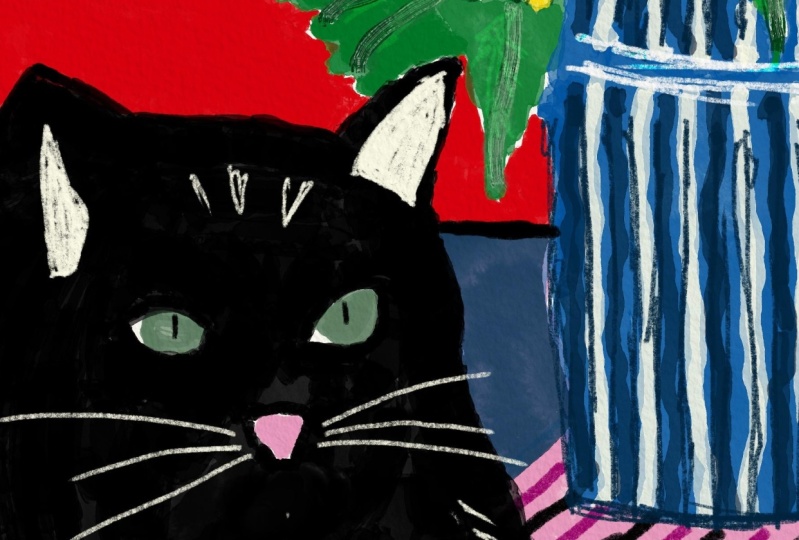
has a load of nuances. It doesn't have the white mouth, but I think it looks good here. It's a reinterpretation
of my own cat actually. I think we're done with the base colors in the next segment we're going to start doing the detailing, but please first let it
rest and let it dry, and then we'll continue with it. We're so close to having
a finished product, I hope you enjoyed this
meditative way of painting. It was really nice, you just put some music on and then you just put
the colors down. The pre-work is already
done so you can just concentrate in
creating a nice piece. See you in the next segment
where we will be adding some mark-making and textured
depth and details.
12. Add Dimension: Marks & Textures: Now that we have the
bones of the painting, we can actually start adding
a little bit of shallow, texture details with
the other materials. In my case, it's the pencils
and these wax pastels. As you can see, it's a little
flat, a little lifeless, is quite striking because we have chosen very nice colors, but it could use a
little bit more, I don't know, possess. Let's skip to it. I
think using a bit of pattern and a bit of
mark-making, lightly, light shadow somewhere, it can help us especially we also have to detail
still the cat, because he's supposed to
be the star of the show. and right now it's just
like a black shadow. But let's start with something a little bit more manageable. For example, the leaves
and the flowers, they are quite easy
to make striking. I just want to add some lines like we did
here with the gouache, but a little bit
more controlled, because of course with the
brush and the gouache, you lose a little bit control
of what you're painting. With these materials, with the pencils
and the wax pastel, you are more
controlled, which is not always a good thing, but in this case we want
to add some details. Let's see which colors
we could use for that. Going to just test them here and look how they look
in comparison, and I'm actually
going to sharpen them to make the tip really sharp so we can really make
nice details with them. For example, like this, let's put this over here. I'm just going to do some lines following the leaf,
close together. Maybe on one half, maybe on both halves. I just stumbled
upon a flower and I already made a little
mark there, but it's okay. We will use that
as an opportunity. Let's change color, maybe do something a little bit darker. This way we're
adding a little dip to the leaves just by
adding some lines. This mark-making technique
is actually pretty great because you really do not have to actually shade anything, but by just adding lines, it actually looks
like it has texture. I think this one
looks nice as is, but the other ones
could be profit from a little bit of something. Not all of them actually
need some detailing. You should also just
restrain yourself, which is really
difficult for me to do, and just let some of
them breathe [MUSIC] Doing a little bit of
shadow where the base meets the cat [MUSIC] Just to add a little bit dimension
and especially to separate his white
patch from the vase [MUSIC] We had already added some big ones
with the gouache, but some smaller ones can also just make a
lot of nice texture [MUSIC] This vase actually went a little bit under
with its very dull color, I'm just adding a little
bit of something there. Here, actually, I want to make it look
a little bit like this, and some mark-making
for the strawberries. [NOISE] Maybe with a
dark magenta [MUSIC] Now let's do this
little garlic here. For that we're going to
use dark purple actually, or indigo blue, and I'm
going to just paint it very lightly with the pencil, just like that [MUSIC] I'm layering a lot of
colors on top of each other just to give it a
little bit of dimension. You see these wax pastels, you can actually lay
it with pencils, you can layer with
whatever you want, you can layer them with
each other and they will actually create new colors, which I think is super cool, and actually super easy to
blend them as you can see. Now we have our garlic done, then maybe we can do
something with our fish so that he looks a little
bit less sad [MUSIC] [NOISE] I think I wanted
to do some pattern on the tablecloth. I think I'm going to do just stripes first to see
how it looks like [MUSIC] This also acts as some
dynamic line [MUSIC] I think it looks quite
fun like this [MUSIC] Actually, I'm just playing
around at this time. At this point, I think
the painting is actually almost ready [MUSIC] Just doing some random patterns
will make it look a little bit less
realistic and more graphic [MUSIC] but I actually think you just need to detail the cat and
we might be done. My cat Cassanido has
actually a yellow eye. Let's give him a yellow eye
and the whiskers go like this [MUSIC] We'll add some random
textures here, and I like the white
crayon against the black because it helps you actually make the
shapes out of him. Cassanido's mom was white
and his dad was actually black so he has a lot of random white
hairs spread around. He definitely doesn't have
this cute little mouth thing, but I just like how it looks. Sometimes you just
have to do what you have to do for the aesthetics. [NOISE] I think we're done, maybe his eye looks a
little bit crazy right now just like this. Just think maybe you will see the other one like from here, or are we ******* it up? Let's see, or are we
doing something wrong? I didn't want to
swear. I'm sorry. I think this looks fun
[LAUGHTER] That's pretty good. He looks like he
really did something wrong [LAUGHTER] Very fun. Now with the black, we can
add some other black details around because you remember, we didn't paint him
completely black so that we could
actually do this. Add some little small
black details [NOISE] Let's look at it
from the distance. I think that right
now it looks like it has a little more dimension, and it's more lifely, it has all these details, it's very fun, I really love it. Let's just sign
it because we are real artists and real
artists sign their work , Claudia Inr 22. This is a fantastic
piece of art, I think we're done. It looks like it has
a lot more dimension, it has a lot more texture, details, it looks very fun. There's nothing actually
that really bothers me, I just really love everything. Maybe this flower could have
a little bit of adjustment. She looks a little sad, but that's basically it. Now I think I'm happy with it. It looks super striking, it looks very fun. It definitely looks
like Cassanido did some mischief over here with this little toy and
the vase falling down, the water, very geometric,
zero perspective. We really did not have to
think about depth or anything, just the overlapping
of the elements, the color choice, and the position really
made a difference. Congratulations, you've done it. Let's go to conclude
this lesson [MUSIC]
13. Conclusion: [MUSIC] Congratulations you did it. I'm so proud of you, I'm so proud of myself. It looks really
nice. Look at it. It's just so fun and it
really tells a story. Your eye first get
directed to the cat, then it goes to the flowers, and then you start to understand the scene and what's
happening in here. I also love how geometric
it is and that it's flat, that it still has
a lot of movement. It's playful and definitely
very fun. This is amazing. I hope you're super
proud of yourself, and I hope your
biggest takeaway from this lesson is that you
really do not need to know everything about art and how to create art
in order to create compelling and fun
illustrations that really speak to you or
that are really striking. In this case, we really waved goodbye to perspective
and then we started playing and focusing with the composition rules and
the color combinations. Apart from this, we
have learned on how to simplify the octets with
loose and confident lines. We have played with texture and mark making and in
the end we have this fantastic piece of art that you can be very proud
of yourself to have. Thank you very much
again for joining. If you have any
questions at all, please feel free
to write them in the discussion board
below and don't forget to post your progress and your final result in
the project gallery. I really want to see it. Thank you very much again. If you want to know more about me and about my art practice, you're free to follow
me on Instagram, @_claudiamelchor
or on my website, www.claudiamelchor.com. Again, thank you very
much for joining me and see you in
the next class. Bye-bye. Keep still lifes alive. We did it, it's a beautiful, it's a beauty boy
[MUSIC] Cassie, what the **** are
you doing there? Cassie, where are
you? [MUSIC] Oh, no. No, don't skip. This is the coloring tool
[NOISE] flower is there. I think we're done
with the base coat oh no. Difficult. [LAUGHTER] Again, eye-catching
illustrations, no. [NOISE] During the lessons you
will be able to let it all out and the results
will [inaudible]. Again, I feel life in your
own unique and playful style. That's how you say style. [MUSIC]
 Claudia Melchor del Rio, Architect and Illustrator