Transcripts
1. Introduction: Throughout this class, I'll teach you Photography composition techniques that you can use to make more compelling, more interesting photos for yourself, your family, or your work. I'm Sheila for Drucker, owner of Earth and Sky photography. I'm an event portrait in nature photographer. And I'm very excited to share with you tips and techniques that I've learned on my photography journey. This is the first class in a four part series designed for photographers, especially beginners, who want to learn skills and techniques that will help them improve their photos. And the best part is you don't need expensive gear. Any digital camera will work. A smartphone, point-and-shoot, DSLR, whatever you happen to have. This class will focus on five compositional techniques, rule of thirds, leading lines, symmetry and balance, contrast and framing. By the end of this class, you will have a much better understanding of these techniques as you apply them while completing the class project. This class is great for hobbyists, for the family photographer, and for anybody who needs to use photos in their work presentations, the skills you learn will be a foundation for greater learning on your photography journey. See you in the next lesson where we talk about the class project.
2. Class Project: For the class project, you are invited to make at least one foetal and using one or more of the compositional techniques that you will learn in this class. Post your photos to the project gallery along with comments on what you did that was different in the photo, how you applied the techniques and things like that. You are encouraged to include works in progress, ideas and experiments. I'm really excited to see your projects.
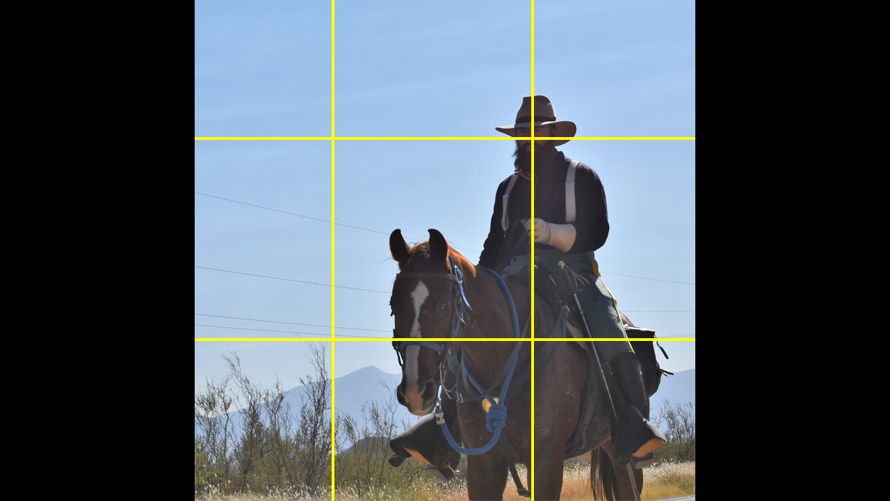
3. Get on the Grid: Rule of Thirds: The first composition technique we'll talk about is the rule of thirds. The rule of thirds developed from the golden section, a mathematical ratio or proportion developed by Greek math nerds over 2 thousand years ago. Essentially, it's a grid that divides your frame into nine equal boxes with two vertical and two horizontal lines. Most digital cameras and smart phone camera apps have a grid built into the software that you can use to apply over your screen to help you kind of get the feel for positioning your subject. Subjects are typically more interesting when they are placed to the left or the right in the frame rather than in dead center. Centered subjects can work. It just tends to be a little static and not as engaged. Let's look at a few examples of how the rule of thirds works. In a photo. The snow's swirling in the street light is the subject of this photo. The I will move about the image, then circle back to the subject. The subject is in the upper center box and the grid. The eye travels to the distant light in the center left box, then to the reflection on the rock in the lower right box. The viewer is engaged in the scene for longer. For a better connection. It's like having a conversation. The intersection of lines or points of interest. In this photo, the point of interest lines intersect on the man's face. The entire subject is the horse and its rider has a hole there. Placement to the right of the image gives them room to move in the implied direction of travel. Landscapes can be particularly challenging when applying the rule of thirds. This is one of those times when you wanna ask yourself, is the rule of thirds really applicable to this scene? Where would another compositional technique work better? There's one concept consider with landscapes and that is horizon placement. It's rarely a good idea to place the horizon in the center of the frame. It splits the image in half, top and bottom. In order to place emphasis on the sky. Move the horizon to the lower line on the rule of thirds grid. If the foreground is more interesting than place the horizon at the upper line of the rule of thirds. Sometimes the rule of thirds does not work. This can be especially true for portraits or wildlife when the subject is looking straight into the barrel of the lens, as we can see with this portrait of this doc. This is an occasion when a centered image works very well. The most important thing to remember about the rule of thirds is it's not a hard and fast rule. It is a guide. There may be other compositional techniques that would work better than the rule of thirds when control when composing your scene. The next compositional technique that we'll look at is leading lines. See you in the next lesson.
4. Line 'em Up! Leading Lines: The next compositional technique that we'll talk about is waiting lines. Leading lines are lines in a photograph that are used to draw the viewer's attention to specific focal point. Usually your subject. Leading lines can be anything, could be railroad tracks, could be a fence line, could be fallen logs, pathway, anything that guides the viewer's eye on a journey through your photograph. How do you use leading lines in an image? First, you would, of course, identify what your subject is going to be. And then survey your scene, look around and see if there's anything that might be used as a leading line. As mentioned, are there elements that you could use? Railroad tracks, path trees, even the shadows from the sun coming in. All of these things are potential elements that you could use as a leading line. Sunbeams and shadows can create leading line elements. In this photo, the rail, the shadow of the rail, and the edge of the path lead the viewer's eye to the subject walking on the path some distance away. Be sure to take your time as you position your camera in different locations, different angles, high, low, whatever. To make sure that you're utilizing your leading lines to the best to emphasize your subject. And also be aware that you're probably not going to nail the shot in one, take the photograph and we're just looking at is actually the result of several visits to that particular location, that path at the same time of day and about 20 shots. And since I was a subject in that particular photograph, I had to run up ahead and get myself in position to pose, and so on. I experimented with different camera angles, low, landscape, vertical, different settings on the camera, and different positions on the path until I felt like I had the composition. Just write. Waiting lines are compositional tool that you can use to draw attention to your subject, to guide the viewer's eye to a specific point in your image. Next up, we'll look at how symmetry and balance can be used in composition.
5. Symmetry and Balance: A symmetrical image is balanced, but not all balanced images are symmetrical. Let me show you. Cemetery is sometimes referred to as formal balance. Both sides of the image hold equal visual weight and the effect is obvious to the viewer. The three candles reflected in the glass below is a very balanced image. Also, the sand hill cranes on this landscape where there's reflection in the water also creates a balanced image. The viewer's eye is drawn through a balanced image equally without resting on 1 of interest. Visual balance bring stability and harmony to an image. And unbalanced image, however, can feel very energetic and dynamic. Once you understand why an image is balanced or unbalanced, you can purposely use this tool in your photo storytelling. The size, color, and position of an object in the frame influences its visual. Wait, let me show you. In this image the boxes centered and balanced. Like the box, the gambles Quayle is centered making this say, balanced image. Here we have two boxes of equal size and colour, giving them equal visual weight. Visual weight is perception based on the size, placement, relative lightness or darkness of a subject. This photo of birds on a feeder is balanced because the birds cooperatively arranged themselves to one each side with one in the center. There placement is balanced. All five birds are the same size and about the same light colors. This comes together for a visually balanced image. Visual weight can be added by placing objects further from the center. The right box is placed far to the right, throwing the image off balance, even though both boxes are of equal size and color. Likewise, the Two Towers in this photo creates an unbalanced image. Both of the same size and color. But the placement gives the image and unbalanced feel. The contrast between light and dark creates balance. Neutral and lighter colors are lighter weight than darker or brighter colors, which carry more visual weight. We have here a small dark box and a larger light colored box. This is a balanced image. The darker box on the left, even though it is smaller, visually weighs more than the lighter box on the right. For the same reasons, this landscape photo was balanced. The darker tree on the left is heavier visually than the lighter colored wood deck on the right. Changing the color of the boxes to red and yellow produces a balanced image due to read Being a more visually heavy color than yellow. Likewise, the red rust on the chain and this image carries more weight than the green gait. Balance and symmetry in a photograph guide the viewer's eye through the image without placing emphasis on a specific point of interest. Color, size, and placement of an object influenced visual weight. Darker and brighter colors carry more visual weight than lighter and more neutral colored. And speaking of lighter and darker colors and objects, that leads us to our next compositional tool. Contrast.
6. Contrast: Contrast is the difference between colors or tones. The color wheel is widely used in art to represent the relationship between colors. Looking at the color wheel, it's very easy to determine which colors are contrasting and which colors are more complimentary. The color wheel is organized by grouping colors together based on how they relate to one another. The arrows on the wheels in the diagram point out varying degrees of contrast. You can find this diagram in the resources. Looking at the color wheel is easy to figure out which combinations have the most contrast since these colors are located opposite one another on the wheel. Red and green is the most common. Colors can also be divided into two groups. Warm and cool. Warm colors are reds, oranges, and yellows. The cool colors are blues and purples and greens. This photo is on the cool side of the color spectrum with blue, the dominant color in the sky and water. The photo was shot about a half hour before sunset. So the golden hour warm tones are picked up by the grass and tree in the mid ground and the tan feathers of the sand hill cranes in the foreground. The contrast between warm and cool is present. However, the overall tone is very cool. This photo has contrast of warm and cool. The tan grass in the foreground and the brilliant yellow sycamore tree or warm colors in contrast to the cool green Juniper's mid ground and the cool blue storm clouds in the distance. Tonal contrast is the difference between bright and dark in an image. And it is particularly relevant in black and white images. A tonal contrast is divided into Heikki and low-key images. Heikki photos are very bright with few shadows. For example, the snowy close-up is bright with very few shadows. Loci photos have more shadows, so the contrast between light and dark is more striking. This photo of a guitar player's hand in the shadow of the tuning head creates a very strong contrast image. Colors that are next to one another are called analagous. Colors. Having few colors keeps the image simple and the effect can be quite dramatic. The colors of this galileo thermometer, or red, blue, and purple, all of which are next to one another on the color wheel. Blue and red make purple. So this works out quite nicely with the purple lighting in the background. Texture is another way to create contrast. In this photo, the rough adobe brick is contrasted with smooth and a lighter colored stucco. Blurred background creates visual texture. The sharp, focused subject against the soft, out-of-focus background. Distractions in the background are blurred using depth of field, which makes this female northern cardinal stand out against the very soft background. Contrast can be used to convey mood. High contrast images are full of energy. This shut of lightning conveys excitement and perhaps just a bit of danger. In summary, contrast can be achieved between colors, tones, and textures. These are elements that help tell the story. As you're honoring your photographic journey. Keep your eyes open for contrasts in your surroundings. Color, lightened, arc, textures, things that we've talked about. And I hope to see some of these in your class projects we've covered for compositional techniques up to this point. The next compositional technique we'll talk about this framing. See you in a minute.
7. Framing Your Subject: Framing is literally looking through the viewfinder and deciding what you're going to put on your canvas. That's just the literal definition of framing. Compositional framing is the next step. That's the act of being intentional and looking around your scene to see if there's something you can use to frame your subject within your Canvas. Well, let me show you the distant mountains and the band of orange leaves on the trees are framed by the window frame. Now this abandoned ranch house, then framed again by the branches on the upper left and right of the image. The shadow across the image and completes the frame. Within a frame. Framing gives a photo context and may imply location. It gives a sense of depth and layers. It means the viewer's eye to a focal point and possibly keeps it there. Sometimes it's what you can't see that draws attention to your focal point. In this photo. Shooting through an opening and a block wall, blocks the view of the street and houses. So we see our subject, a guy walk in to dogs, emerged from the hidden part of the scene, shooting through windows, tunnels, branches. Then in this case, a gap and a block wall intrigues the viewer. Drawing into the story. A frame does not need to go all the way around your subject. One or two sides is enough. And it can be quite subtle. This queen butterfly is framed by two vertical stalks on either side with a crude leaf above, completing the frame. When using compositional framing in your images, it's a good idea to ask yourself, is this going to add to or detract from my image? Sometimes look in through something is just clutter. Sometimes it's better to just go straight in to your subject and use a different technique. But just be aware as you look around and see what you have in your images that you might be able to use and then decide, does it add or detract. See you in the next section where we'll wrap up a few final thoughts.
8. Final Thoughts: Thank you for taking this class. I appreciate your time. We've covered five compositional techniques in this class. And you may be wondering right now, where do I go from here? Every time you line up a shot, you're making choices. Those choices are guided by the techniques that you've learned in this class. Applying these techniques, you will become a much more intentional photographer. And you'll be, your photos will be guided by considering questions like, is this image balanced? Are there elements that I can use to emphasize my subject? What colors do I see? How does contrast effect my image? How can I pull this together to tell my story? Practice the techniques from these lessons and your photos will improve. And athlete practices, drills day after day repeatedly, repeatedly, so that it becomes second nature in the game. It's no different with photography. You practice your skills and it becomes second nature. You begin to see your images differently. And that will improve your photos. And last of all, and maybe most important, don't be discouraged. Nobody's perfect at this at one time. And I'll tell you, not every photo is an award winner. That's just the way it is. But that's okay. The important thing is you're learning, you're on a journey. At some point, you're going to look back at your photos from six months ago, a year ago, and you're going to see how much you have improved. The class project will help you on your journey. Post your photos, and over time, you will see improvement. I hope you will join me in the next class, part two of this series, where I will teach you about camera settings that will help you make better photos. See you soon.
 Sheila Foraker, Learn Skills - Make Better Photos