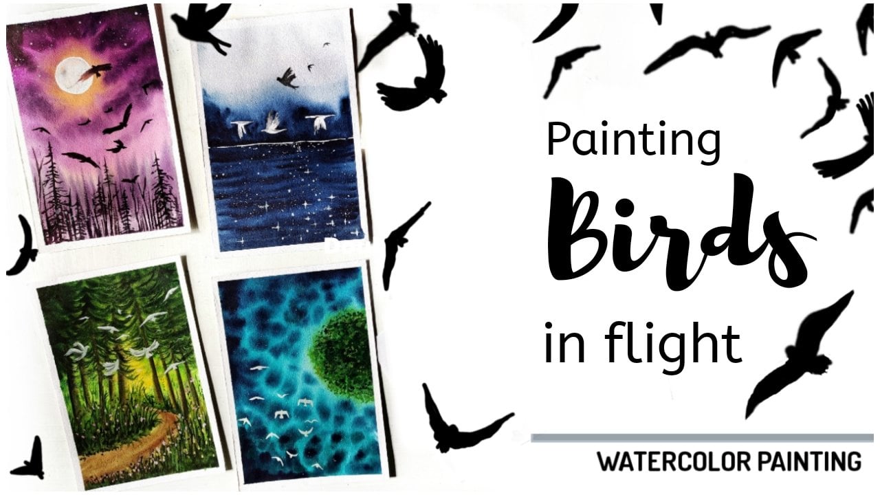
Transcripts
1. Introduction: Hi everyone. I'm Shanan subhan, the artist behind watercolors. I love painting with various mediums like Acrylics Gouache watercolors. But watercolors are my favorite. I have been painting for the past few years. You can check out my works on my social media handles. So I go by the name Whatacurls. Painting for me is like meditation. It gets me deeply focused. You take a blank canvas and some colors on your palette. And then as you dwell into the process of creating art, you see your thoughts getting expressed. And that adds more definition to your painting. In this class, we will be learning to paint these moody landscapes. So I have a thing for moody landscapes. I've tried to add a touch of moodiness to the paintings that I've tried to create. So I'll be teaching you to do the same in this class. The class focuses on bringing out a moody or atmospheric waves from the element, like Miss toward the reflection rocks, sky, etc. And this also helps you to elevate your skills and have a broader perspective on painting landscapes. I'm sure we all have something to learn and improve upon. So without any further delay, let's get started. I hope to see you in my class soon.
2. Art Supplies : Welcome back. I am so glad you decided to join my class. Okay, So these are the things that you already saw in the intersection. So before we get started, let us talk about the art supplies that we will require. So talking about the paper, I'm using Fabriano, a 100 percent cotton, 300 GSM paper. So this is hard-pressed, which means it has smooth texture. You can go with any alternative brand that is available with you. So talking about the colors, I'll be using different colors from various branch. Also I have this palette which is custom-made and has different sheet. So for this moody landscapes, I'll be mainly using the darker colors such as Payne's gray, Burnt umber, CPR, black, colors like that. So I'll be adding the names of the colors before using them. Also, we would need white gouache paint. And for mixing colors, I'm using this ceramic palette. And the color of the palette that I'm using. Now the cardboard. Some Using discard board to tape down the paper. Using masking tape. Also does tissue paper and a napkin for wiping off the extra color. Then you would need two jars of water. I'm using a small one and the bigger 11 is to wipe off the pains. And other one is to take code, clean water. And then we would need or pencil. You can either go with a mechanical pencil on a normal pencil would need scale. And it is. So this class is not very focused on teaching techniques and are getting deeply involved in the basics part. We're just going to paint and learn the techniques as and when we paint. So I'll be clearly explaining the techniques and methods that we are going to follow. So you don't have to worry about learning the techniques beforehand. Okay? You can have a look at my previous classes where I teach all the required techniques and everything about the basics. So this class will be only about painting. Alright, so let's get started.
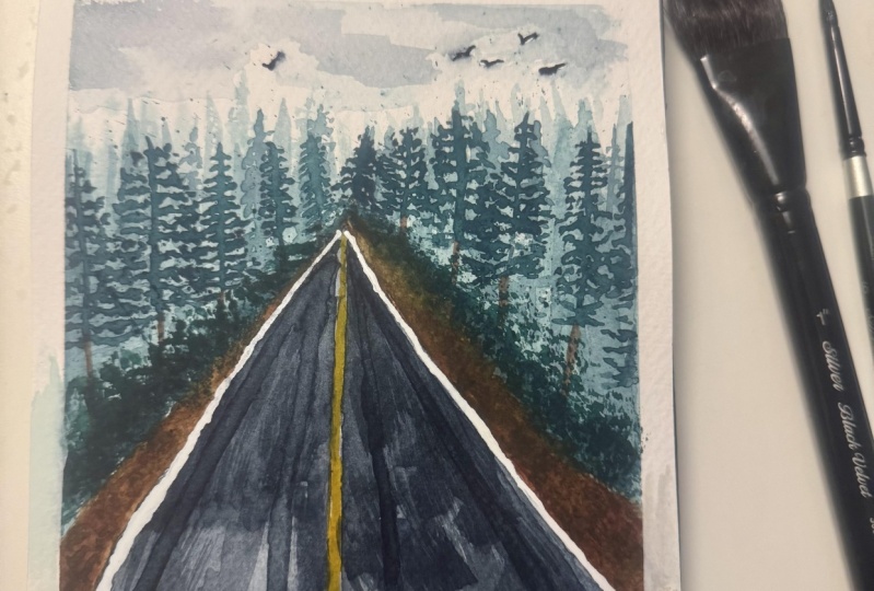
3. Project 1 - Drive through the Pine Forest: Hello again. In this chapter we will learn to paint this beautiful painting, which I have named it as so drive through the pine forest. So before starting the painting, we will dive into the perspective and the sketching part. So we will start with the sketching scale. Now somewhere in the middle of the paper, the appointment. So this is the vanishing point. And in the bottom right than left, we are going to motto dot. And then we will connect these two dots with the central vanishing point. Vanishing point is the point where the view diminishes. In this painting. The reward and the trees both converge and then to diminish when it reaches the vanishing point. So we have to imagine it before you being. Okay, let's talk about colors. No. So you need Payne's gray or any alternative Palo, greenish onboard. And alternative for this color would be mixing viridian hue and one Dumbo. Next one is CPR, alternative color mixing, black and bone Dumbo. Ok, Let's start with the first step. So I'm using those spray bottle to wet the paper. So I'll sprinkle the word throughout the paper and make sure it is completely wet. You can even go with your no large brush. I have a 1.5 inch brush, which I'll use to spread the water through on the paper. Make sure you are applying even coat of water. Next, I will use my size eight round brush. I'm going to make screen niche on Bogut lots of water to make your diluted consistency. Keep adding water drop by drop until you find that right consistency. Now I'm going to apply the greenish on something like this. So you have to mark the outline and then fill in the inside area with this diluted color. Okay? So here this is the vanishing point and diminishes here. We are going to apply the paint and you can create those spiky effect with a round brush. To depict though binaries in the background. Since this is going to be the background misty effect. So you don't have to worry about creating perfect shapes here. Just randomly applied dopings in spiky or minor. So that, you know, you get binary like effect. I'll apply even coat of this diluted green beans on both the sides to achieve uniformity. Now, we're going to go medium consistency beans. So we'll add an equal amount of water to debate it, this color mix and apply it on the painted surface, which is the binary surveys that you see your seminar flipping being the binary is your going forward, there will be another layer, which you'll be very detailed one, but as of now the base layer and this middle layer will be very imperfect and not show the A11. So I'm painting these spiky lines with my round brush. If you want the how thin and fine lines and you can go with your fine liner brush. But that's okay, I'm using this so non pointed a brush. Disruptively been door binaries. I'm switching to my pointed tip brush. So this round brush has pointed tip. Now I'm using this to create very pointed in the background forest. We are painting the lighter background because we want to create an illusion of missed the window background. So this layer, particularly the lighter and the helium 1s, will act as the misty atmosphere. I'm going to apply some.gov beams. The bottom part of the forest line that we have here. Dab some greenish amber on the three Spark so that it creates a sense of depth and adds a misty effect in between the trees. Next, I'm going to mix Payne's gray, maybe greenish onward. So this will create or darker, greenish, yellow. Okay, so now with this mix, I'm going to apply it on the bottom part, near the road line. Paint some spiky lines with the same mix. And then we are going to some pine trees with this darker color. So you see there are multiple layers of pine trees. Initially we've been paid when diluted green and then window medium range. And now it is with the darker green that this mixture of yellow, greenish, umber and Payne's gray paint really use that are out of the frame. You can paint as many as you want. But while you're painting this layer, just remember, you're not covering the background trees that we have painted earlier because that is going to give misty effect in the pimping. So yeah, we will have to preserve the background trees. Next we will be painting the reward or the pathways. So we will have to the area below this forest and only in the area. Okay. So I'm going to keep masking tape under my cardboard so that the colors flow down and it doesn't go in the upward direction. Because if it goes there, then we are going to ruin the trees that we have painted. Now I'm taking my flat brush and applying clean water below the forest area. I load my brush with sepia, which is almost like bond number. If you don't have the snippet and you can mix the burnt umber and black. Applied this color mix along the forest line. Applying the sepia on the site to suggest the ground by the roadside. I'm lifting some of the paints or New York the vanishing point because I'm going to paint the road. We're using Payne's gray. So here on the screen, very brown area. I'm going to apply concentrated though CPR to create an intense look in the ground level. Next, I'm going to load my brush with the Payne's gray. So this is more concentrated beams. I'll apply this on the road ADR on the white surface. And as we move towards the bottom area, we are going to apply very diluted pins because this is going to be the reflection of the sky. So you have to retain this white area while applying the paint. Also adding in some darker paint. Meanwhile, preserving the white areas for the reflection of the sky. Gently apply some horizontal brushstrokes. Reward needs to be darker in color. We're playing more paint there. And the idea behind doing this is to create a broad like illusion. Hence, painting white and black, no lighter and darker areas. So as to create that withdrawal and have the deflection of the sky on the rule. I'm painting these horizontal spikes on the record. This will be the reflection of trees on the road. I add some darker pillows on. Now we will let this dry and then paint the details on the bride Paypal. Moving on, we will be greenish, amber and pain DO pine trees so they could round brush with pointed tip and draw the trunk of the tree and then start adding the leaves are the branches of the trees. So here's a tip for you. So you can take another damn brush. I'm painting the leaves and the branches. You can dab some water in between that the kalos law. And it gives a nice variation in though binary. Otherwise it is going to be fully dark, right? So you're going to add some water so that the colors bleed into each other and gives out the variation in the overall look of the tree. Keep adding paint and water, barely damp brush. And then when you reach the bottom part, just dab your finger to blend the colors. Let us move on to another tree. Because it's going to be the same procedure. That is, draw the trunk and then gradually add all the branches and leaves. I DO. You can hold two brushes and the width at the same time. All you can first bin that darker colors and then go with the damp brush like I'm doing now. Now, you know the techniques, so I will let you observe my light beam. Next, I'm going to take sepia in medium consistency and been the trunk of the trees. So if you observe, I'm being, being no dollar drunks in the foreground. And as I move towards the vanishing point, I'm painting it a bit smaller in size. So here, if you absorb, the height of the trees decreases as they move towards the vanishing point. So we are painting along the road or the forest line. Okay? Next, in the bottom part of the trees we will add some failures. So that will be adding small, tiny grass like structures by dabbing the brush. Since we want this area to be darker and have a sense of depth because of the shadows of the tree. So we'll be painting in dark. And as we move towards the vanishing point, we are going to make it lighter. Because of the misty atmosphere. I'm going to do the same on the right side. In the foreground. It is going to be darker. And as it reaches the vanishing point, we're going to paint it lighter in color. So there is a gradual transition from Docker, lighter shade. So this trunk is taller than the other trees because it is closer to the foreground. And now I'm adding some branches. So that really needs to be conical in shape. So as you go towards the bottom, you're going to add more leaves to make it look voluminous. So to give it off, we learned look, you can use your damn brush and spread the colors to achieve a nice variation. If you feel that leaves lighter in appearance, then you can always go back and add some branches with darker color, make it look more prominent. Okay, Let's paint another leaf. I'm ending the trunk of the tree. On the top are adequately, I like very little leaves and branches. And as I go downwards, I'm adding more leaves. In this tree. I'm adding the lighter color first and then going with the darker color. So this is another technique to paint the tree. What the techniques ill same result. However, you can pick anything that is comfortable for you. We apply the darker color on the wet surface and apply some irregular strokes. On the side. I'm going to paint the tree leaves which are out of the frame. So you're only able to see the leaves and the branches, but not the trunk. If you notice, I'm applying the paint in very irregular and unpredictable way so as to achieve a natural, imperfect look. Because if you're going to follow certain patterns to paint the leaves, then it is going to look very pretty it to an artificial. I'm filling up the empty areas with random brush strokes to suggest some branches and leaves of the pine trees. Moving on, I'll pick up some darker green paint and splatter it on the upper part of the paper. And then I'm going to dab my brush in an uncontrolled manner to suggest some leaves. This is sort of free hand brush strokes. This is going to read the foliage or believes in Photoshop. Now, let us add some branches to connect these leaves. And they would look as though they're floating in the air. I'm using darker sepia, open the branches. You can even go with black color in the branches in an irregular form them as many times as you want. I'm not going to distribute to follow the same steps that I'm doing. You can just go with the flow and see what you can create. Let the colors do the talking. And I'm sure whatever the result is, it is going to be beautiful. Just be confident, and paint your heart out. Now I'm adding some diluted colors to bring in some variation in the tree branches. I'll take a tissue paper. I'll fold written triangular shape and place it on the rule that we have been did that is because I'm going to splatter some veins on the marked area, which is though brown color that you see on board decides. I'm loading my brush with sepia and upping our splattering the beans on what the sides of the next I lose my half inch flat brush to wet the road area. So I'm using clean water to wet the surface. Why? Because I'm going to apply another layer of paint to create a sense of depth when your reweighting the painted surface. One thing to remember is you are going to apply it what? Oh, very gently. Because if you exert more pressure on the paper, you're going to lift off some paint that are on the paper. So you have to be very gentle. Next, I'm going to date concentrated Payne's gray and apply it on this area. So I'm going to apply horizontal and vertical brushstrokes to create wet road lake effect. I'm going to preserve the white ADI in the bottom most part of the painting. As I did in the previous layer. This is to retain the reflection of the sky on the road. Again, I'm darkening the corners with Payne's gray, trying to sort of add outline to the road. I'm trying to create even my DAD on what the size. So I'm just blending or merging the two lows, that is Payne's gray on the CPR. So in this process, you might wipe off the splatters that we have created earlier, but don't be disappointed. We're going to do that. Again. I'm adding some darker color in the bottom part of the trees or the forest line to add a sense of depth. So when we add this darker color and the mist on the upper part gets enhanced. So here I'm using my fingers to blend and most of the leaves and foliage we have spin did earlier else they will have that patchy look great. So I'm using my finger. You can even use this one or maybe your issue people. I'm going to add some what is on cool brush strokes to create a sort of reflection of the trees on the door. Now we will let this layer dry and honored right surface. Okay, So the paper has dried. Moving on, we will again perform those flattering technique. So I'm placing the tissue paper on the road area and plaid rings CPR on my area that we have spin to it. Remember, if your paints are very dilute on, then those splattered dots will be bigger in size. And if you have the book onto centric pins, then you will achieve already fine and thin dots. Moving on, I'll paint a low line in the center of the root. So I'm going to outline for this using a scale. Well as ongoing earlier about the vanishing point and how it converges from the viewpoint. So this is going to be the same thing. The line is broader DOW point, and as it goes towards the vanishing point, it appears also denote and then it diminishes. Okay, so I have mock the line and I'm using gamboge, yellow. Appendices, so okay. So you can use or medium though, diluted consistency for this this replisome pick copings and then mix it with water. So you can have different tonal values of a law. So this is line is going to appear to go near the bottom part so that this new RW point. So you can lift off some of the themes. Because neon though vanishing point, it is going to diminish. Next, I'm going to take my bush beans and mix a small amount of water to make it medium consistency. Now, I load this paint in my brush and those splattered on the pine trees that we have been bid. Also, I'm adding this on the reward and blending it. Did my fingertip. So this is sort of a Tufo, rainy effect on the road. You can even use a white gel pen or white watercolor do you can go paint straight from the tube and directly apply it on the paper. I'm painting these horizontal lines to kind of bring out the weight effect on the reward. Now, I'm going to add white lines on both sides of the world. So this is an optional step. So if you're happy with the current outcome then made as a base. So in the next step, I'm going to take damn brush and gently slide my brush on the same position in one full motion. This will activate the beans. And when I'm dabbing my tissue, it will lift off, paint off from the people. So this will create an illusion of withdrawer. And this is another technique, okay? Can either applying wash paint or you can do this to lift some beans. You can go into other techniques. So I'm brightening the white borders in the corners. I add some white on the low part as well to achieve assad also based on the left. And lastly, we will add some boards. And then we'll call it done. Tiny boards with simple and easy brush strokes. So yeah, we are done. Let us remove the masking tape. Gently peel off and make sure your paper is dry. Because if it is wet, then there are chances you might add the papal. There we go. This is the final look of the painting. Alright, so I hope you like this painting. If you have painted along with me, then please do share it in the projects gallery.
4. Project 2 - Stream by the Rocks: Let us get started with the second project. So here, along with the moody atmosphere, the rocks and the flowing water add the key aspects of the painting. So let's start off by sketching the elements of the painting. 80 pencil. And somewhere in the middle of the paper, we will draw a straight line. This is going to be the horizon line. And about this from the left side and on the right side, we will draw slopes connecting this horizon main. And in the background. I will draw this for the background trees that are very easy and not so prominent. And below the horizon line. I'm going to pin these rocks. So the outline for these rocks will be the exact because I want to give it a natural look. So if you find it difficult to draw the water stream, then you can mark a point on the required area and then connect them together. Now I roughly mug the outlines of the rocks that we have in our pending. So these are not the fixed shape of the rocks. I'll be altering them in MPI. But this is just to get me a rough idea of where I have copied. So I'm drawing this. Moreover, it can be used as a reference while painting the base layout for the rocks. So you can follow along with me and create the same shapes. It is okay if it is a little bit here and there. The size of the stream appeals smaller near the horizon line. That is because of the perspective or the vanishing point. As it moves away from the viewpoint, it tends to appear smaller. So you need to remember that when you're sketching or painting, because if the perspective is wrong, you're not going to get though a painting right. The size of the rocks near the W point will be bigger in size as compared to the size in that background. The area on either sides of the rock will be marsh. Solely painting it like a sloppy area. That is it. We are done with the sketching part. Now, let us move on to pain this guy. So I will first Tibet the ADR using my large brush. So this is 1.5 inch brush by Princeton. You can use any large brush to the area. This is going to be wet on wet technique. Makes style be using a size eight round brush. I'll take small amount of a logo and I'm going to apply it on the top part of the paper in diluted form. Since we are going with wet-on-wet technique. So I'm applying wet paint on wet paper. The brush strokes are very random and uncontrolled. This is two, Hello Eloise glowing the sky and also to remove the whiteness of the paper. Next, I'm going to mix Payne's gray with the logo. So this will neutralize the bluish color in no means great. Okay, So now you see it is a brownish gray and I'm applying it below this area. Apply diluted shade of this color. Applying the pains in an uncontrolled way to get nice clouds in the sky. So here you have to avoid painting it flat because we want this nice so random effect in the sky. So that's how we are going to achieve dramatic effect in the sky. That the paints randomly on the sky part to a, to a nice variation which will be depicted as shadow and highlights in the sky due to the clouds. Okay, so the sky is done. Next, we will make some black with Payne's gray and yellow ocher mixture. And we are going to paint the background trees. These are the distant trees. So we're going to paint it with a darker color. Watercolors tend to appear lighter. After drain. This color looks darker now, but after drying it is going to give a lighter look. So keep that in mind. Whenever you want to achieve a blurring effect, make sure you're following wet on wet technique. Because in this technique that color spread really well on the paper and gives a soft edges on the paper. Paint some vertical lines to suggest though people off the trees. Adding these lines will create an illusion of the background trees. The lines are temping in, are not equal in height. Some are taller, some are shorter. So that's how the nature is, right? Okay, so we're done painting the background trees. Moving on. I will take sap green and mix it with Payne's gray. I will add a bit of burnt umber or you can even add sepia. Just our Tinto for brown color. And I'm applying it on either sides of the rocks. That is agree niche area. This looks a little light though to me. So I'm adding a darker color. That is the black color. Gently apply the paint and leave the rocks area as it is. Avoid painting on the rocks. Neon though background trees. I'm going to create these smaller spikes to create an irregular effect on the ground. So this is like a slopey area which has a smaller grasses. And and going forward I'm going to paint the trees. So you're going to fill the spaces in between the rocks. Apply paint on both sides. I have taken a very darker color by adding black. Because if I had a vibrant green, then it will not give us the Moody effect. So in order to achieve a moody effect in the painting, I'm adding these darker colors. I had tiny vertical lines to depict the grasses or tiny trees on these loopy area. Also paying these tiny lines near the horizon. I fill up the foreground area with some greens. Noticed that I'm applying green beans in between the rocks as well. While this green painted surface is still wet, I'm going to go clean water on my brush and splattered on the paper. So we will have water droplets on the paper, which gives a nice highlighted effect. So basically when you add clean water alone separate from the surface of the paper. Moving on, we will paint the flowing water in the river stream. So I'm going to apply clean water using my mop brush. So here we are going with wet on wet technique, hence wetting the paper to apply wet paint. And it is okay if you apply water on the rock because anyway, we are going to paint their dogs so it need not be preserved as such. Next I'm going to take diluted payne's gray with my size eight round brush. Apply horizontal brushstrokes with this diluted yellow. And as you are painting near the rocks or the corner areas, we will apply some darker beans because this will be the reflection of rocks in the water. So we will keep them middle area of the reverse dream, very lighter in color because that will be the reflection of the sky. And the corners will need that. Because of the shadows or reflections of Xerox. Again, it does Okay. Phew on the rocks. Next I'm going to be co-vary concentrated Payne's gray and apply on the corners of both when he was stream like this neon dogs. In order to achieve a natural effect in the reflection, I'm going to apply some vertical lines in blue and downward motion. Remember, you will be doing this only if your paper is wet. If your paper has dried up or row, it is semi wet only in some areas, then let it dry completely. Once it dries, you can rewrite it only in this area. And then maybe you can perform this vertical brushstrokes. Applying the diluted paint in the middle section, use a nice sheen on though what 0. So here in the bottom part, I'm gonna make it a little darker to create a sense of dimension. So I'm applying some darker green color. In the middle ground area. I'm going to add some tiny tree-like structures with vertical spiky brushstrokes. So this will suggest some trees. So we will repeat the same on the other side as well. Moving on, we're going to paint the rocks. So for this I will be using wet on wet technique. Let us read this area with clean water. So I'm applying the water inside the rocks ADR, to paint the base layer, I'm going to take three colors. That is violet, One downward, and indigo. I'll be painting these three colors on different areas. Now you can randomly apply the colors on the wet area. This will be helpful to add some highlights on the docks. In the next layer, we are going to paint the darker allows for the rocks. So we are painting this in separate layers because it is easier to create highlights and shadows once we have the base layer. No, not mix these colors as they might turn my LEA. So if you want to create darker shades, then you can mix Payne's gray with the alleles that we have chosen for the base layer. There's no particular method as such to pin this. Just dab the combination of these colors separately. You can even add some orange or purple. To add a dash of brightness. For the foreground base layer, I'm leaving some white spaces. Try to add variation in this layer. Also, we would need an old card to create a rocky texture. So I'll be using my old credit card. You can grab yours. Before we start this technique, we will first paint the right side of the rocks and then go with the left side. I will let this layer dry completely and then go with the second layer on. The paper has died. Now let us take black color in medium consistency because we want those shadows of the dogs to be darker. And the texture of the rocks itself is dark. So we are not taking more water. So become this darker color and start painting the rocks. I'm retaining some of the base colors as it is. So some people don't really like to use black color in their painting. In that case, you can go with darker Payne's gray to paint the second layer of the rocks. So once you have applied the darker color, take your card and starts clipping the darker colors, the way it in different directions so that it is very irregular. And naturally, this is a really easier way to bring out the desire highlight and naturally add shadows and highlights. Now you know why me being did the base layer and how it helps rendering the characteristics of rocks. You can use this technique for your Adobe things as well. Let us paint some more logs with the same technique. Believe me, even if you are doing it for the first time, you will still get it right. It isn't that easy. One or two trials and then you will get it right for the next time. Because there is no fixed shape as such for the rocks here. That's the beauty of the nature. You can do it however you want and still have beautiful outcome. So here I'm not scraping the beans in same size. It is all different because the size of the rocks are different. It depends on the amount of pressure you apply on the car to lift the paint. Painting these rocks might consume some time, but good things do take time, right? And when you see the final outcome, you realize it was worth the shot. I'm Myself amazed with how these rocks are turning out. It makes me want to try this technique in my paintings has well, now I'm applying the paint on the foreground rocks. So it is the same technique like we did for the previous rocks. I'm applying some black color on the green area just to add a sense of depth. Here's a close-up also how ice clip Dupain's. Moving on to the other side. First, we will paint the base layer. Here. I am adding Willard bond, Dumbo, and indigo on random areas of rocks. It is okay if colors bleed into each other a little bit, but not completely mix it on the paper. Little bit of bleed is Okey and I guess it enhances the beauty as well. So once you have been fit the base layer for the rocks, let it dry completely. On even though the first or the base layer is done with wet on wet technique. The second layer, that is the rocks, will be done on. Wet on dry paper needs to be dry. That's why we are drying the paper here. So we will let it dry completely. Okay, So there'll base layer is dry. Next we will apply black color, leaving some random spaces in the middle of the rocks. I'm applying the darker color in one go so that I can scrape the colors together. Now it's time to use that card. The scrapes on pillows and I didn't some highlights as we did earlier in the right side, I'll do people. So you have this great bird in an irregular and natural effect. Scraping or pulling the colors in same direction, then it is going to look no symmetrical or very artificial. So avoid doing that. So we have finished painting the rocks. Now let me add some tiny logs here ended. So I'm using my medium round brush of size four to add some tiny rocks. Now somewhere in the middle of the water, I add a small rock. So here I'll apply darker color. You can go with any darker color. Then on right side of this rock, I'm going to drop some content added color to create a nice shadow and on the opposite side. And that will automatically create a highlight in the drop. Then we will add the reflection on the shadow of this rock on water. Okay. And little bit of tweaking your and there. So this is optional for me. Whenever I'm about to complete the painting, I feel like adding some extra detail. So you can completely avoid that. The sky is never complete without flying birds. So let's add some lovely birds into the painting. So I'm adding some tiny birds. So I'll paint most of them in reshape and inverted V-shaped. Okay, So I have a detailed class on painting birds. So you can go through that if you are interested. Next, we will paint the trees in the middle ground. If you notice, I have already removed the masking tape. But after removing it, I felt like I wanted to add some trees in the middle ground. So now I'm doing that. We'll take a fine liner brush and start adding some tiny pine trees. So I'm painting this pine tree. And when I'm reaching the bottom part and just blend it with the background so that I don't have been the tongue Dando. Other parts. Okay. Trees look smaller because they are a little far from the viewpoint that gives the middle ground. You can, even being different types of trees. Paint your own favorite to anything, any, any HDRI that you like. I'm adding some bare trees as well. So photo majors, you can go with blues, grass strokes. I add some trees that are normally on this green area. So yeah. So you can remove our masking tape now. I have already removed mine. So there we go. This is the final look of the painting. I hope you liked this class. I'll see you in the next class project.
5. Project 3 - By the Lakeside: Hello and welcome back. This is the third project of the class, moody landscapes. Here we will learn to pin this gorgeous lake being. So let us begin. I have sealed the paper using masking tape on all the sides. So before starting the painting, we will roughly sketch the outlines live. We'll begin with the horizon line and draw a straight line somewhere in the middle of the people. Near the horizon. We will draw some zigzaggy lines, suggested distinct line. And in the middle of the leaf, we will draw this wetland or kind of March. So you're free to sketch in your own way. It need not be exact replica of what I am sketching on. Maybe you can add in some elements of your choice. It's totally up to you. Now let us get started with the pimping. I'll wet the paper for wet on wet technique. And I'm using my large brush to wet the surface of the paper. As usual, we are going to apply even coat of water throughout the paper and make sure you apply on all the corners. Moving on, I take Payne's gray, the niche, and one number. So these three colors we will be using for the painting. I'll take this color on my palette. Before we apply colors. We will just make sure that the paper is still wet. So I'm running my brush over the wet surface. Okay, So let's spin though base layer. I'm using my size 8 brush. We'll make small amount of burnt umber with Payne's gray. I'm applying or diluted tone of this color mix. Video card board for about 50 to 60 degrees so that the kalos flow down due to gravity as we move towards the bottom. But they will have like more Payne's gray mix. So I'm trying to create a nice gradient effect in the lower half of the people. So this was the base layer now. Okay, so the paper is dry and we will rewrite the people who came no further layers. So you might be wondering, why are we driving and again, rewriting the paper. It is because for the base layer, I wonder to have this graded effect in the bottom part of the paper. If suppose we kept building layers on the initial base layer, we wouldn't be able to achieve this nice transition. So in order to retain this I'm going with multiple layers. So gently revered the paper with less amount of pressure on the brush. If you are applying more pressure, then you might end up lifting the paint from the previous layer. So we will be in the distant trees in the background. I will go and greenish amber for this layer. If you don't have this shared, then you can mix viridian hue and burnt umber and maybe add a bit of Payne's gray. Alright, somewhere in the middle of the. Next we will mix greenish on more Payne's gray. So this will create or darker greenish color. Now with this color mix we are going to apply. So I'll apply this painting medium consistency. Since we are applying it on the wet layer, the colors will bleed and or fade. But that's okay. This is the background layer and hence we wanted blurry in appearance. So let us fill up this area with the green color. So I'm just moving my brush in to and fro motion. So we will randomly paint some pine trees, painting or state drums. And then adding some exact brush strokes. Suggests pine trees in the background. It doesn't have to be perfect by internships. This wet on wet technique gives us a smooth and blurred effect on the trees, which is ideal for pending distance objects and looping. In. Next I'm going to apply Bon Tom books along the horizon line. Will use medium consistency paint. Next time I'm going to paint some zigzaggy Jaggard though, horizontal lines to depict some irregular and naturally learn near the horizon. So I'm applying the paint so very loosely. And I'm holding the brush somewhere in the middle so that the brushstrokes are not so Control. I'm painting these tiny pieces of land on random areas in the lake. Those weren't on board, will be the base layer. We are still going to add more layers in this. Moving on, I'll pick some Payne's gray and add some shadows on this line. The area, I'll mostly applied this Payne's gray and below a dark brown areas that I have spent it. In the bottom part of the paper, I'm applying some concentrated Payne's gray. And this is the foreground though, areas. Next week we'll let this dry. So I am using a blow dryer to wet the paper because it takes a lot of time to dry. You can use a blow dryer or lateral grind naturally for some 1520 minutes. Alright, So the paper has dried. Now this is the base layer. And as you can absorb, the colors have faded to some extent. That is one of the characteristics of watercolors. It tends to dry lighter. Okay, So if you want to achieve a particular shared, then go one shade darker so that you get the right shade. So we're going to go with wet on wet technique. And hence, I'm going to apply water only on the lake area. So I'll be applying a wash using my larger brush. And for the area between the line, you can use medium or small brush to apply water. We are wetting the paper on the lake area to pin the reflection using wet-on-wet technique. So if at all we paint the shadows on the reflection on a dry surface. It is going to give us hard edges. So we don't want that. In order to achieve smooth blend, we're going with wet on wet technique. Now, I'm going to take the initial umber and Payne's gray. I'll take a concentrated mix of these colors and apply below though, bond on what area you're. So this is the darker shadow are the reflection. It adds a sense of depth and also add some voluminous in those pimping surrounding. And you could remember is avoid using any bright and no carlos because that will bring refreshing wage to the painting. You can use it only in some areas. Where do you want to highlight the brighter part? For the overall painting will only stick with the darker, neutral. Okay. We're going to add shadows on each of these round areas. So this is a really nice combination of Payne's gray and bond number. It brings out the exact moodiness that I want to achieve. Pick up some burnt umber in medium consistency and apply it or whether lined area is near the horizon. This is to add a sense of dimension and definition for the painting. Try to preserve this white area in between these measures. I'll apply the same one downward on the smaller pieces of land. So these are kind of marshes, are wetland in the lake. Moving on, we're going to apply some brushstrokes in downward motion. So I'm going to use a damp brush, describe it on a tissue or a napkin. Next, I will apply some greenish on work on the land area to have an illusion of uneven surface. So we can see the unevenness on the ground, which adds more character to the pimping. So here I'll introduce a new piece of land or a grass area in the lake as and this is optional step. If you want you if you want, you can add or just skip it. Okay. That's it for the ground on the landmark. Moving on, I will add some trees with greenish amber. I'm going when diluted tonal value of greenish mix. And as we build up the layers, I'm going to add slightly medium consistency beams. Here I'm being invaded by increase. As usual, we will first paint the trunk of the tree and then we will add some branches. So these are trees with very less only use. In the movie. Branches will do, add lots of bare pine trees. The branches in different directions. It should not look symmetrical on both the sides. Let the branches be inclined in different directions so as to achieve a natural look. The size of the trees are different. Some are taller, some are shorter. This is to keep it very draw and naturally. I'm painting the trees with size eight round brush. If you want, you can go with the fine liner or find a brush that will help you create those nice and thin trees. But I can manage with this rounded observe the shape of the branches and building. So I'm giving this dotted effect in between. Next time we'll pick some greenish on bone. In concentrated on. We will add some vertical lines randomly in between these trees. Are dense effect in no-go hadron. While the paper is still wet, we will apply some greenish envoy to have a sort of greenish in the reflection. Was Payne's gray. Now to add this greenish touch, I'm adding the umbo. You can even add the sap green mixed with black. Applying some darker paint on this tiny area. Next I will pick some Payne's gray, make sure it is very strong. As in concentrated color. We will apply this color mix in the bottom part of the trees. This adds a sense of depth and darkness in the scene. So that's how we build moodiness in the painting. You add darker tones and avoid having bright and vivid colors. I had some street and vertical lines as well. Moving on, we will build another layer of pine trees. I'm painting the trees with concentrated Payne's gray. For this, I'm using my round brush MIT pointed at you find branches. It is not mandatory that you paint a leaf pine trees. You can go with any random trees that you like. Now, I'll paint a pine tree in different style. So the leaves are all random and zigzag. So I'm adding some leaves in a scattered wave. So I always paint by increase in an irregular way. I cannot insist how much difference it makes in your painting. Once you master this technique of painting by increase in a beautiful and natural way, it is easier to come up with your own landscapes. I add some darker Payne's gray in the bottom part of the trees. This will add some dimension and depth of the beam. I will extend the trunk of these trees in the bottom part. And we will add some horizontal brushstrokes. Neon though I jump though, ground area to create a sense of partition between the lake and on-ground. In the next step we will add some grasses. I'm using a pixel flow pins gray and burnt umber. So these are kind of fun game grasses, which has a tiny dip Santa inclined at different angles. So the Payne's gray below this area will act as the shadow of the grasses. Will paint the grasses on the other packages as well. It makes them adding some definition in the shadows. So Bento grasses in opposite directions. Now let us paint some grasses in the foreground using these tiny lines. Like I said earlier, it is going to have found in like structure. We are going to Baden different direction. Next I'm going to take some burnt umber and paint some grasses on the ground area near the horizon. In the foreground, the grasses are going to be dark and in the faraway or the distant land, it is going to be lighter in color, appear. Next I'm going to beam tiny patches on the lake using burnt umber and Payne's gray. I'm applying the brushstrokes in a very irregular and Jaggard Mano. No drop in some darker color in between. To add some dimension to this. Now, I'm going to dab my brush to create some dotted effect on the grasses. To have some more dots. I'm going to splatter some Payne's gray. In the foreground part. I'm going to paint some legal grasses. This can also be depicted as a diamond plants in the foreground. Keep your brushstrokes very loose, uncontrolled, so as to achieve a natural look. Moving on, I will dab some beans in between the DRI areas. This is to sort of add some fillers or no stroke volume in the background trees. And in the bottom part of the trees, I am applying these pins gray and burnt umber mixed. Next time picking some onetime work and applying it on the ground area. All right, we're almost done with the spin. Now, let us add some birds in the sky. Just apply a loose brushstroke in two different direction. And you will have a board there. So your words need not be same as mine. And just add in some words in your own style. Or you can follow along with me as well. So here, I would recommend you to keep those eyes of the bird. Small. Lcd will look too noisy in the overall look of the painting. Painted with diluted color of the pixel, a sense of distance. Okay, So we are done with this bin. Now let us remove the masking tape, carefully. Peeling masking tapes I saw. I love doing this part. I just love doing this part. This is the final look of the painting. I hope you enjoyed watching this session of moody landscapes. If you have been doing along with me or if you're planning to paint, then please do share your class projects with me. And it would be helpful if you could leave your review or feedback for this class. I would really appreciate that. So, yeah, I'll see you in the next class project.
6. Project 4 - Moody Autumn Day: Welcome to the fourth project of moody landscapes. Here we will learn to create this moody and lovely autumn landscape. So let's get started. So I have already taped on the paper using masking tape. Now let us do a rough sketch of this painting. I'll start off by drawing distant hills on either sides of the paper. Draw it very irregularly. Don't just simply draw straight lines. I will be drawing the hill or little half of the paper. Because as we been flooded, it is going to get covered with DOT foreground trees. And rest of the sketch we will do as we paint. So next is masking the area for the exam. So I'm taking a one-inch masking tape. Then draw the shape of the sun, which is cool. You can even use a compass. Now with the help of scissors, I'll cut it out in this circular edge here. Then I'm going to stick this on to muster circular area so that the white area is resolved while painting. You can even go with masking fluid. This circular piece of masking tape on the paper. So let us get started with the painting. The first color that I use is so light gray by Sennelier. If you don't have this color, then you can use black and white or maybe Payne's gray itself. Moving on, let us wait the papal for wet on wet technique. I'm using a large brush to wet the surface of the paper. Generously apply clean water and make sure you have applied on each and every part of the paper. Next, I'm going to take my size eight round brush. I'll use this for applying the paint. So I'm going to take this light gray in medium consistency and apply the paint on the paper. Start from the top part. And they indeed all the way until the mid part of the table. This will be suggested as this guy. Make sure you're leaving some white spaces in between. This color, light gray is pretty much similar to Payne's gray. Invert a little lighter. I'm simply using this color because it was lying unused in my elbow. So I thought let me use it today. Now I'm applying a slightly darker tone on the painted area to kind of add some clouds in the sky. When the paints are wet, the colors look very bright and nice. But as they dry, they tend to look a little lighter. So mix your paint accordingly. So I have achieved this nice soft clouds. Next I'll add some darker clouds. So I'm going to take bond on board in diluted form and apply it on the painted surface. So this bond downward. When it gets mixed with the light gray, it gives a nice neutral tin in the sky. Blend this color well with the light gray. Keep dabbing your brush in order to have solved cloudy sky. Make sure you're not having brown patches in the sky. So as I'm reaching the middle part of the paper, I'm applying some water to blend colors and not have a bajillion. So here I've switched to my large brush for easier application of what we're done painting the sky. Now let this layer dry. I'm using a blow dryer to speed up the drying process. Alright, so the paper has dried. Next style will be ending the hills. So I'm going to take Payne's gray on my palette. I've loaded the pains in my size eight round brush. I have a medium to thick consistency beans here. Make sure your paints are not poetry. I will see you will not have that control the brush stroke. And I'm painting the shape of the hills. The shape need not be same as mine. Next, I'm holding the cardboard in tilted position. And with the help of my large brush, I'm applying what URL below though, the interior area so that the colors flow down in the downward direction. And for the second hill, I'm going to apply water first. And then I'm going to apply beams on the top part. So you see both eels, same result, but the techniques are different year. You can go with any technique that you want to try. Next, I'm going to apply concentrated Payne's gray on top of the hill. So I'm painting these tiny tree-like structures. Since the hills are at or distance. So we won't be able to see all the details. Hence, it is okay to just draft leaping, create spiky lines on top part of the hills. I'm applying some diluted colors in the bottom part of this hill. So as you can see, there is a gradual transition from top to bottom part. And in the bottom part. In order to give a nice blend, I'm going to apply water using my larger brush. Anyway, this area is going to be covered with the trees. You need not worry so much about creating perfect blend in the bottom part. Make stem going to take orange color from my palate. Next we're going to need though on inch or any similar she'd I'm going to take diluted mix of orange and apply it right below the heel area so the paper is already wet. And I'm going with wet-on-wet technique to achieve smooth blend. Okay, so there is diluted payne's gray, so I'm applying some orange mixed on that. And when these two colors get mixed, they give a nice brown color. So this part is not the continuation of the hill. This is going to act as the base layer for the autumn trees that we will be painting. Okay, next we would need scarlet red. So I'm going to take this mix so in medium consistency and apply it randomly on this wet area. Suppose your paper has dried at this stage. You can leave a date and then apply the scholar traits. Do not apply it on a dry surface. I'm gently dabbing my brush all around this area. So this is the kind of randomness I am trying to achieve in the painting. It but looks damn period. So I'm applying water in the bottom part. I'll place this masking tape under my cardboard, nucleate a nice day and let the pillows floor down naturally. Placing the paper directly on the table doesn't give you the freedom to do all these steps next, why you should always go for cardboard or something that is flexible, you know? Alright. The bottom part, we will apply medium consistency of sepia mix can even go with black color if you don't have this sepia. So I want the bottom part to be darker. So I'm going to apply concentrated sepia. Next, I'm going to create vertical lines to suggest the tree trunks. Just drag the paint in upper direction. Since this orange and red color has faded a little. So I'm going to add another layer of orange being picked up some orange paint and apply it randomly. I'm just going to dab it pure and there. I'm also applying some tiny blobs of beans in the upper arc. Now I'll date scarlet red and mix it with sepia. So this will give me or midtone shade. I'm going to dab this marrow niche mics on random areas again. So this painting is going to be a kind of semi abstract because the foreground trees are not well-defined and, or, you know, has the proper shape and structure. It is all random. And we are going to achieve it in a very different way. Make sure you leave some orange basis as well. Don't completely pinned over the orange area. Next, I'm going to load some pins and splatter over this ADR. These Moroni splatters bring out a sense of place and yet atmospheric effect and contributes to the overall look of the painting. You can cover the other parts of the painting using or tissue paper or any people on the same width surface, I'm going to splatter Earth's APR. Now, you can even lack of black paint. Like I said earlier in the previous chapters, the size of the dots depends on the consistency of the paint. If your paints are diluted, then you're going to get thicker dots. And if Dupain's are concentrated and tick, you're going to get my new dots. So here I'm applying mixture of both thin and thick dots. You can use this technique to paint stars in the galaxy been beings. Now, I'll paint some dots without the splattering technique, which means I'm applying it all by myself. The ship doesn't Magda really. In the bottom part of paper. I'm applying contemplated say though at you a sense of shadow. I'll also apply this contemplated CPR on the corners. I'm going to dab some more dots. All right, I will stop it. Your next I'm going to take my fine liner brush. You can use size 0 or one. So with this brush, I'm going to paint the trunk of the trees. Since it is wet on wet technique, the pillows will tend to bloom and it will give us a blurry effect once it dries. I'm focusing those straight lines into branches. Notice that I'm starting the tree trunks from the middle of the people who are not all the way till the bottom. We will do that as well for the next layer of trees. But for now, we will start the trees from the middle part. To create a sensor for distance. I'm adding 0 pine tree here. So I feel BY entries are one of the easiest trees that anyone can paint. Thanks, I'll go back to adding the bare trees. Paint the branches in different directions. Don't make it look symmetrical or row. Have the branches inclined in this direction so as to achieve a natural look industry. Moving on, I'll paint some drunk in the bottom part with the same talent that is sepia. Again, I'll add some more definition to the branches. There's no particular rule I such that we have to paint trees and this way or that way. This irregular dots, what I can see, the NADH impulse control brushstrokes that is not going to yield better results. So I will let you absorb while I paint all these branches. With all these oranges trees, I can already feel the autumn wipes. Now, I'm going to pick some concentrated sepia. With this concentrated mix, I'm going to apply some tree trunks in the foreground part of the paper. Again, I'm using a fine liner brush. Moving on, I earn around the cardboard to paint the sun in the sky. So I don't want to place my hand on the index of a is 2. This way I can paint freely. So I'm gently removing the masking tape from this area. Alright, so let us paint the sun. I'll apply water inside this clean area. So here I will use my round brush with a pointed tip. Carefully, apply water inside this area. Next, I'm going to apply orange on this red surface. So this is a light on wet again. Next time we will apply scarlet red along the edges of this circular area. Make sure you don't completely apply the red color. Right, to read him some orangeish color in the background. Next, I will drop some bond on board randomly at some areas. Now the sun looks very few holes. Next I'm going to mix orange with burnt umber. So this will give me 0 orangeish brown color, which I will apply it on the hills. Applying this will create a kind of sunlit effect on the hills. I'm painting these vertical lines in downward direction. So I'll repeat the same on the other side as well. Now with the help of my damn brush, I'm gently the uninjured or Waldo deadlines so as to achieve a soft blend between these lines. So now we can see the sunlit effect in the hills. The middle part is brownish and the corners are dark. All right, so now comes my favorite part which is spin in birds. I love adding words in my painting. So there you go. I'm painting some tiny words with simple brushstrokes. And then I will add a little bigger size bird that is an evil. So I'll first applied this. So orange and bond on-board mics. So this will give me orangeish brown color. So painting this eagle can be a little tricky. If you find it difficult, then please catch it first and then fill in the inside ADR. I like to pin board with this technique uncontrolled and with the law. I, myself have no idea how this word is going to turn out, but still, I'm giving it our dry. I believe that is how we all learn, right? But patient is very important thing. If few paint with hostile land, try to finish it fast, then you are surely going to ruin the paintings. Have patient and trust the process. Next I will take concentrated sepia. I'm going to apply this color mix on the edges of the wings. And so this will again create a sunlit effect. Next, I will add some lines on the hills to add a sense of dimension. So this is why I don't write, though. On the surface is straight. So using wet on dry technique uses so very sharp and crisp edges. I need done. So let us gently remove the masking tape from all the sides. There you go. This is how our painting looks like. I hope you enjoyed watching this session. If you have painted along with me or if you're planning to paint, then Lucia your class project with me. I would love to see your work. So yeah, I'll see you in the next class project. Until then, bye-bye.
7. Project 5 - Moody Sunset: Hello guys. Welcome to the fifth project of moody landscapes. Today we will learn to pain this moody sunset painting or I hope you're making the most of the previous projects. All right, So let's get started. I have a bound the paper using masking tape. Before we begin, let us draw a simple sketch just to get an idea of where the elements will be placed. I'm going to leave 3 fourth of the space in the upper part of the paper. And then I'll start making these random grass like structures. So about this grass level, I'll paint some tree trunks. So this may not be exactly same when we finished the painting. Alright, that is it with the simple sketch in part. Now, I'll go ahead and wet the paper. So I'll be using wet on wet technique. Apply even coat of what throughout the paper. Make sure it is completely weird. I'm using my 1.5 inch flat brush. I'm running my brush in the Leno horizontal motion just to make sure that the water is evenly distributed. Next time I'm going to take sepia. So if you don't have this particular shared, then you can mix brown. That is one term, workplace black, that will give you a similar shade. In Excel, I'm going to take my size eight round brush and lower though, concentrated paint. So here I'll be performing technique. So I will apply another coat of water making it, you know what, the the pillows floor down easily. Okay, so now I'm taking concentrated paint and applying on the top part of the paper. So hold your paper in a tilted position. Flow of colors. You are rushing down so beautifully creating nice blooms and you know, beautiful effect. Since we have a blurred, generous amount of water, the concentrated Payne's become more watery here. So we're going to apply multiple layers. I'm applying another coat of concentrated paint. Let the colors flow naturally due to the gravity. So I'm holding the cardboard with my other hand. Next, I'll gently move around my cardboard in order to change their directional flow. Now, I'm applying some medium consistency beams in the middle part of the body. Gently sliding my brush over this area to blend the colors with the background. I'm letting the paint flow in different directions by moving it around. Next, I'll take some content dated, say PR mixer, and I dab the paint on the surface. So we have this red area here. I'm just stored dabbing the paint to create an impression of darker clouds. Okay. So I'll keep masking tape and that the cardboard and let it rest in a tilted position. Next I'm going to take a yellow ocher. I'll take this color in content related to one and apply somewhere in the 3 fourth area that we mark. So this is going to be suggested as the sunset sky. So in the sky we already have the sepia pigment. So we're going to mix it with this yellow ocher and, and that will create a nice transition from darker brown, yellow ocher. Make sure your paper is wet when you're doing this. I'm applying some yellow ocher under the brown clouds that we've been bid. Next, I'm going to splatter some water droplets are on the Skype art. So I'll pick up some clean water and splattered on the sky. So you can see it creates a nice, So what do they bloom, which reflects the white area of the paper. Next, I'll be mixing sepia and black, but this is to achieve a very dark color. And I'm going to take this concentrated mix and apply it on the bottom part where we had sketched the grass right there, I'm going to just dab the paint an aldehyde or depict some tree-like structures. These colored leaves are so beautiful and oddly satisfying. It is so relaxing that I can do it all day long. And gently dab in my brush to create an impression of trees and bushes in the ground level. So you are in the bottom, I'm leaving some space and again, applying the paint to kind of create a partition and add some dimension and go painting. So you'll see these whitespaces. This will create a natural dimension. So I'm leaving some white spaces randomly in-between trying to create an abstract look in the building. And in the bottom part, I'm going to apply black and TPR mix. So make sure you're holding the cardboard in a tilted position so that the colors flow in the opposite direction. So the tree-like shapes your will act as the background. Trees. Take clean water and dab it on the black area. So you can see so many blooms in the painting. Glide some tiny details to depict some trees and add more definition to the trees that we have painted. Here. I'm trying to achieve sharp tip on ripple effect in the trees. So I'm drawing these tiny lines on the upper part of the trees. Make sure you're performing this step only if the paper is damp or wet. Okay. So I will let it dry. Even though a blow dryer or let it dry naturally. Once the paper dries, the background trees appear blurry because we followed wet on wet technique. Next time I'm going to take black color in concentrated forms. You don't want to use black, then you can make some Payne's gray and CPR that will give you a darker and similar color to black. Now with this color mix, I'm going to apply tiny bushes. So I'll paint it very irregularly. Now I'll take a clean, damp brush and apply water in the foreground area so as to allow the colors to flow smoothly and create the soft edges. Now on this red area, we're going to perform wet-on-wet technique. So I'm going to a black color in concentrated form. Divert randomly on some areas, leaving some spaces in between over the entire area so that we don't lose the background jump. All right, next I'm going to paint the trees. So first I will draw a straight trunk. And then I'm Star guiding the three branches in afford brushstroke. Paint the branch just Tim on the upper part. And as we come down, we will gradually increase the width of the branches to ask to achieve or conical shape. So this is a very simple type of tree. You can add the same kind of branches on both sides. So the branches your are almost symmetrical. I'll be filling up the middle MPA areas because this will create an impression of volume in the tree. So we will not leave the middle areas MB. Now I'm switching to my fine liner brush to add some my note and dynein paint some tiny details in the DRI for get as many times as you want. Because that swing to add extra beauty to this. Or you can, if you want, you can, or if you want to keep it simple. And you can go with that. Next. I'm going to take my size four round brush and I'll paint a slant tree in the dark, but I'm going to pin tiny branches. And then as I'm coming downwards, I'll paint slightly wider branches to make it conical in shape, like I said earlier, playing the brushstrokes in upward motion. So I had some really two curly branches in between. So avoid painting straight branches. Now I'm adding another tree in between these two trees. Bending the bottom part of the trunk picker when compared to the upper part. I'm adding tiny renters. So this tree is not as broad as the other two trees. So this is a very simple painting. Next I'm going to take diluted sepia and paint the trunk of the background trees. So this should match the color of the background rookies. It's not leaking of painter though background with lighter color and then you're adding the trunk with darker color. It has to be somewhat similar color. Okay, Now we can see the background trees. In the foreground. I will take some damn brush with contemplated pallor. Damn brush. I'm going to slide my brush on the foreground ADR to create a sort of texture. So this is basically by brush, dry on dry technique, wherein we apply dry paint on dry surface to achieve a nice texture. Now with my size four round brush, I'm adding some more grasses in the foreground. What a media. Next I'm going to pick up some themes and they'll splatter it on the foreground. Color up does plateau should be darker than the background color. So I'm going with concentrated black. Now with my size 0, fine liner brush. I'm adding some more thin lines to connect these splattered dots. All right, So we are done with the spin in. Now, let us remove the masking tape. Gently peel off the masking tape from all the sides. Okay, So this is how our painting looks. The background trees are my favorite. They look so blurry and it also adds up kind of predator to the pimping. Okay, so I hope you enjoyed watching this session with me. You have been data along with me or if you're planning to paint anytime soon, then please do share your project under projects gallery. I'll see you in the next class project.
8. Project 6 - The Candy Sky: Hello and welcome back. In this class project, we are going to learn this and yet moody landscape with lots of words. So let us get started. I have matched the paper using a masking tape, so all the sides are tightly sealed. Next, I'm going to take a pencil and a scale and mark the horizon line somewhere in the middle of the paper. So about this line we are going to paint the sky. And below this we will paint the water. This is the line where the sky meets the ground. Okay, so let us begin with the painting. So I'm first wetting the paper to go with wet on wet technique. You can either go with flat brush or any brush. So today I will be using my brush. Just for a change. A lord enough water in your brush and apply it on the paper. Make sure you are applying even coat of workload the people. So you should see to it that the water is not pooling mondo people. We need just the right amount of water to go with wet on wet technique just to make sure it is evenly distributed throughout the surface of the paper. All right, let's get started with doping. So I take my rosemary. So I'll take a small amount of rows my door. So before applying paints, I'm just making sure that it is still wet. Because what happened with this hot press paper is an awesome places, tends to dry faster. So I'm just making sure it is completely wet. Earlier I used to work with cold pressed or rough paper, misuse to remain wet for a longer time. I feel the hot press paper dries faster in the initial layer. With once you apply multiple layers it remains with. So that's the difference I have noticed while working on hot press paper. Next, I'm going to take Payne's gray on my palette. All right, so Mullin one, I'll take a diluted version of furosemide 80 and applied on the upper part of the paper depicting of pinkish hue in the sky. Like Celtic small amount of this Payne's gray mix it with rows Mondo. So this is going to give purplish or marrow niche kind of ping a slightly darker pink. I'm going to apply this right under the area we've been to the pink. I'm just dabbing the paint lady randomly. Next, I'm going to go sepia. So I applied the CPR on the top bar dr paper about the pink hue in this case. I'm trying to eliminate whiteness in new people. On this, I will apply some darker Payne's gray. So this is medium consistency pins gray. Trying to add some darker clouds. So this dabbing is absolutely random. You can dab it anywhere in the sky. So don't worry about achieving the same results. Sky could be completely different from mine. And below this pinkish area, I'm going to apply paint gray. Apply this Payne's gray mix all the way till the horizon line. And your, um, being, being the smaller dabs predict, pick some tiny clouds in the sky. So we're trying to achieve a moody sky. So I have a blame the fellows tilt the horizon line. Next I'm going to paint the background pine trees. To paint the background trees, I'll be using Payne's Gray in contemplated phone. So I will take this concentrated mix and start applying vertical lines in different sizes. So this is going to be the base layer. And in the bottom part, I'm roughly applying the beans. Lighter, darker paint along the horizon line. So I'm building these lines in different sizes to create an image of trees in the background. Next, to add some definition and more, taking my fine liner brush. So you can go with size 0, size one brush or any round brush with pointed tip. I'm the extra paint from your brush to get a nice precision while painting. Some painting straight line, and then adding these branches in the tree. So you can draw something like this, like a curvy line. You can go with zigzaggy lines, whichever is comfortable we do. You can know, paint your own style of pine trees here. And also you need not have to do this or detail trees in the background. You could keep it rough as well. But I wanted to have some defined shapes in the background trees. So I'm going with this. You can completely skip it if you want. When the paints are wet, they look very bright, but when they dry, they tend to appear little lighter in color. So this is also going to look like once it dries. Then going forward we are going to apply another layer of trees. Alright, so I will let this layer dry. I'm using a blow dryer or you can go with you can even let it dry naturally. That might take some time depending on the temperature of the area you live in. If you're living in a humid area, then it is going to take a very long. Alright, so the paper has dried. Now. Moving on, we will wet the area below the horizon. So I'm going to take what in my 1.5 inch flat brush. Make sure the water is clean. And also keep your paper in the tilted position so that the colors don't flow in the opposite direction. Gently applying the water in horizontal brushstrokes, wipe off the extra water paddles on the paper. Now, I'll take my size eight round brush. So I'm going to take Payne's gray mix. I'll be applying diluted payne's gray below the horizon. I'm applying diluted paint in your brush strokes. So we'll apply even coat of color. Hello. So now I'll be applying the shadows or the deflection of trees in the water. So I'm gently going to dab the paint. So this is concentrated beings. When you apply it on our diluted surface, it those modulus well, and we get soft edges. So here wherever that are the taller trees, you're going to paint or reflection as well. So it has to be the mirror image of the trees above the horizon. So it doesn't have to be a 100 percent the same mirror image. You can try to achieve 60, 70% accuracy while trying to create this reflection. Next, I'm going to go rose madder in diluted form and in the middle of this river area. So he ought, I'm applying this rose my dog below the horizon. Reflection of doping Skype. So next I'm going to pick concentrated Payne's gray. I play the bottom part. Some are playing what is on the line to talk to achieve a sort of ripple effect in the water. Next, I'm going to mix Payne's gray and Rose my goal to achieve my pink. And I'll be applying it right next to the Payne's gray area that we've been good. But it was my Payne's gray are two discrete fellows and they would look separated. We apply next to each other. So in order to blend these two colors, I'm going to mix rose madder, and Payne's gray and apply this. So now coping mix in between those two colors. The purpose of doing this is to add a sense of balance. So when you're performing this step, make sure that your brush doesn't have too much of water in it. Okay, so I leave this here and let the paper dry. Next, I'm going to take round brush with pointed tip. You can even go with a fine liner brush. I'm going to take concentrated Payne's gray mix and I beam second layer of clean. So this is wet on dry technique. The earlier technique was the wet on wet. That was to achieve soft edges. So here with this technique, we are going to achieve sharp and crisp edges. So the background trees are our sense of distance. So I'm going to apply this concentrated mix along the horizon line. So next I'll add some black to Payne's gray SEO or darker color. I realized that though Payne's gray will still look a little lighter and same as the background layer after drying. Now with this black and paints gray mix, I'm going to paint the trees. Pine trees are more defined than the background trees. So I'll be using the same technique to paint a pine tree, which I had used enforced project of this class. If you remember. That is I'll be applying some darker paint and then blending with the damp brush. So this will give you a variation in your pine tree. And it also adds a fuller look for the trees. I'm painting trees of different height. You can even paint some bare pine trees or trees or any kind of place that you want. There's no restriction as to paint only pine trees. Yeah. But I feel pine trees are easier ones. Also do not cover the background trees that we have been did let those trees also be visible in the picture. So when you're painting by increased, make them irregular and literally look natural. With the restricted brushstrokes, you're going to make it look artificial. So keep that in mind. As I always say, there are many types of boundaries and different trees. I have a class on painting or more than 50 types of Clay's on Skillshare. You can check that out if you're interested. So if you have Spain did a nice defined tree in the background, don't cover that up. Let that be visible. You can even add some trees. In the bottom part of these trees. I'm going to add some fellows like straight lines to add a sense of depth and volume. Alright, so this layer is done. Now we will move on and apply another layer below the horizon line. So I laid my 1.5 inch flat brush and apply clean water. So you all remember you're not applying more pressure on your brush. End up lifting all the paints that we have applied very gently are going to run your brush. And next I'll take this Payne's gray and black mixture. So I'm going to apply this color mixing below the horizon. This will help us achieve our dense shadow effect. So he offered a reflection on what we are going with wet-on-wet technique. I'm applying the beams in dotted MyNode like the ripples. I make sure the beans are not poor Greek. And the starting date go diluted payne's gray mix and being sung by native peoples. Okay, so we're done with this part. I leaped like concentrated mix of Payne's gray and black in the bottom part of the people. We'll repeat the same step as that of the previous layer that is applying darker rose madder to create a smooth transition. So here I'll smoothen the surface by applying water. Okay, So now I'm mixing Rosemary door handle, Payne's gray. So this darker rose Maddow color I'm applying next to the pins crania. Keep adding some horizontal lines in blue and for motion so that you will fill up this area. Now to avoid the patchy look, I'm going to run my brush over this so in good area so that we have nice flow. Apply dynein horizontal lines to depict repulsion the beam. And I'm gently darkening my brush over this area. So moving on, I'll be painting the reflection of the boat first because I want it to be not wet on wet technique since the paper is wet here. So I'm going to apply the reflection window. Black and Payne's gray mix you can even use or for leaping screen. Yeah, so I'm ending an unordered boat shape, your end. Once this layer is dry, I'll pin the board about this area. As you can see, there are some blooms here. So we can lift it with the damp brush and wipe it off on your tissue paper. Next, I'll take some medium consistency rules Margot and apply tiny lines oil. So this will suggest store tiny and distort their deflection of the sky in the water. Okay, I'll stop here and let this layer dry completely so that we can go ahead with the real board. I'll write the paper is dry now. Next I'm going to take concentrated mix and start painting the boat. So I will first apply the outlines in the shape of the reflection. Once I've drawn the outline, I'll fill in the inner areas with the same color. This is an image that has to be same as 2. But then I learned sitting in the board. And also add some tiny lines to doping. Let us now add some boards in the sky. So in this class project we will be painting whiteboards. So I'm going to be quite bush beans for this. You can use white watercolor or you can even use white gel pen. So I have mixed small amount of water and I'm using medium consistency pumping the boards. So I'll start with tiny bird. So this is an inverted V-shape. You can draw some simple chevron shapes, but depict the board. So you can delete some geometrical or some general shapes and try using them in your pimping. For this board. And being in those single lines on both sides, I'm connecting the middle part. So this looks like a boat. Now, I'm being, being another board in leadership and adding some multiple layers here. In the middle part, we'll add the body. I'm going to next board in an inclined line. Had another stroke right below that, the third stroke. And in the opposite direction. I'm painting another line. So we'll aim though, three lines back-to-back. Then in the center, I like the body of the board. And I quote of white paint. If you feel they don't look that great. So I'm adding another coat of paint here. So if you don't want to go with this yet. You can paint simple words, something like this. Make style pain some boards in the foreground. So first I have drawn a leaf shape, and then on the sides I'm adding some white paint that is like three layers. And I'm dabbing the brush to create a body part. And lastly, I'll add it. So I let you absorb why Liping the other words. They are all easy and I'm going to paint with similar technique. So please follow along with me. Hi. Okay, So this was the base layer. Now we are going to add some details with darker alone. That is, I'll be using Payne's gray and a little bit of this white. So I'm going to apply the beams on the edges of the feathers. Ready gently apply these details. We can use Payne's gray as well. So while I was filming this class, my camera battery got dead. And unfortunately I was not able to record the entire process of spinning these words. However, I've used the same techniques, so you can do it by yourself. And as you can see, I have already added some repulsion with white paint. So I'm going to show you how I've done this. A pen medium consistency beans and applied horizontal lines on the painted surface. So that will give us so those shinier look on the ripples. So this is how I have applied repulse some random lines. Yeah, that does it. So let us remove the masking and call it done. Generally the modern ape from all that ice. So yeah, we are done. This is how I've been in looks. These boards are complementing the overall look of the painting. I just love these white folks. I hope you enjoyed painting this. So if you have painted along with me or you're planning to paint any Xun, then please do share your class project with me under Projects gallery. I would love to see them. And I really hope you are making most of the previous projects. So, yeah, I'll see you in my next class project. Until then, bye bye.
9. Project 7 - The Rocky Lake : Hello everyone. In today's session, we will be in this league, withdrawals and plum trees. So let us begin with the class. I have dammed up people on all sides to prevent it from buckling up. I'm placing my masking tape under the cardboard. Cardboard enter treated position. This will allow the Alawis and the water to flow in one single direction. So first of all, I'll apply water wash using my flat brush. Apply even coat of clean water, drought the paper, and make sure that the water is evenly distributed. Don't let any puddles of water remain on the paper. So let me mix the colors. I'm going to take Payne's gray, cobalt blue, mix them together, and then add a touch of burnt umber. So this will give a dark bluish color. Now with the help of my size eight round brush, I have been in the sky, apply paint with horizontal brushstrokes. And then I will my flat brush to create our graded effects and pulled up into down. So you can see we have achieved a grade data Effect. And then with some diluted mix and gently glide my brush to achieve these tiny, we speak louder. I'm leaving some white spaces. I'll dab some randomly. As we move towards this end drove the paper. I'm going to apply dilute horizontal brushstrokes all the way to the center of the paper. Considering this as my horizon line. Okay? So I have not drawn in the line. So you have to assume that it is a horizon line. Next day they bond on board and mix it with this existing color mix, which is Payne's gray or blue. And next I'm going to be in the distant trees. So applying some vertical lines to suggest that reshapes. You can add in some spiky lines to depict the irregular and natural shape of the trees. Switching to my fine liner brush and painting some spiky tips and work the lines. Now we will move on to pin the elements below the horizon line, which is the water or the league and the tiny rocks. So I'm going to apply Payne's gray wash. This is very simple. Just apply beans with horizontal brushstrokes. So he thought I'm applying medium consistency beans. And the technique is not that important because we are going to fill up this area with Payne's gray so it can be wet on wet on wet Andre both will work. Make sure it does not go dark. If you have been in the water darker in color, then we won't be able to notice the rocks in the foreground plate. So that's why we are keeping it really light in color. To ensure done applying the paint, let it dry completely. I read the paper is completely die. If your paper has dried yet, then you may pause the video and painted on your own base. So moving on, I will leave it the paper to paint the trees on either side of the leg. Gently apply water. Do not apply more pressure. If you apply pressure, then you're going to lift up means that we have already applied. So be careful with this step. So next we are going to be in the trees on either side of the leaf. So I'll be using maroon color for this. So to mix this color, I'm going to take permanent brown and mix scarlet red. If you don't have permanent brown, then you can mix scarlet, red, and black or sepia. The aim is to achieve maroon shared by mixing two or more colors. Now, leave a bit empty space in the same row and apply this maroon mix to suggest row of trees. This new, so we're paying gentleness landline. So for perspective, a kind of reshape effect. So if you'll notice the trees yada viewpoint, that is, although adjacent though people are bigger in size and as they move towards the same bird, which is closer to the viewpoint, it appears smaller. So we are not painting the trees in equal sizes. It has to be in decreasing order in order to create a sense of dimension and perspective. Okay, next I will add sepia or black, but this maroon mix. And next I'll add this darker mix in the bottom of the tree to add essential depth and those shadows. But the trees and those it creates highlights in though upper part of the trees naturally. So you can see the marrow niche part visible light so that will create the highlights. And the bottom part will be the shadows of the tree. Moving on, I'm going to mix Payne's gray and burnt umber nucleate or darker, blackish kind of mix. And with this mix, I'm going to apply the shadows of these trees in the water. More than the paper needs to be wet here, because we are performing wet on wet technique to paint the shadows. If you're applying beams on a half-wave or half dry paper, then you're going to get blooms and follow flatly effect, which we don't want in our painting. Here I lift the paint along the tree lines to create a highlight on League down by pins and wipe it off on issue paper on a napkin. So this creates a partition between the real Greece and the shadows. Next I'm going to create a darker mix with the Payne's gray and bone. Right below this partition, I'm going to drop in some darker mix to add some depth in the shadow. Let the previous layer we also visible year. I will live some beans again to maintain that partition weekly. Remember your brush should not have Walker else, it will create what our blooms. So you have to make sure you're using a damp brush. All right. Okay. So we will let this dry. All right, so the paper has dried. Next, I'm going to take my size eight round with pointed tip. You can even use a fine liner. And I'm going to take concentrated Payne's gray, paint some trees in a row, painting the trunk of the trees one-by-one in decreasing order. In the bottom part, I'm dabbing some beans with my fingertips, suggests some bush like effect in the background. I'm adding in some branches on the top part of the trees. You can add some tiny tweaks and some really use or anything that you want. Him Cupid simple by just drawing some word because that is also okay. So I'm going to paint the same on the other side as well. Same techniques. Yes. Next I'm going to add darker shadows with medium consistency, paint gray mix. Drag the paint down in vertical brushstrokes to sort of achieve shadows of the tree trunks. You can do it with your fingers as well. The previously. Be also with the balloon. And do not know what I did with this darker color. Okay. All right. I will stop this year and move on to paint the foreground tree. So here we assume the foreground trees outside the frame and only the branches are visible. So I'm going to only paint the branches in irregularly in different directions. Do not paint straight lines. As it might not look natural. In some tiny tweaks at the end. So here I have painted the tree, but I feel it looks as though it doesn't have any volume. So what I'm doing is I'm just randomly adding some more branches and twigs in between to make it look a little fuller. So adding these lines will give it the same. So for depth and also our tree will look more dense. So you just have to apply some random brush strokes so that it appeals. So fuller. Ok. Next, I'm going to splatter some beams to satisfy some random leaves. So I'll cover the rest of the area with this tissue paper. Splatter the paint using your brush. All right. I'm done with the splattering. Next I'm going to dab some beans window, darker color. This will be suggested as the leaves on the branches. You can paint any kind of shapes. It doesn't have to be same as mine and myself. Not able to anticipate the shape of the mixed leaves that are being sold. Bernard, worry about that. I will also dab some metal mixed on the tree branches depicting some leaves. So you can extend the branches are bit more to make it look natural. Again, I will sprinkle some paint to create a nice texture. Now I'm going to go Naples yellow and dab it on the tree branches. So this will suggest some dried leaves in the tree. If we don't have discolored and you can mix cadmium yellow and a bit off one Dumbo will give you a similar shared. So we will add some more details and then we will stop here. So if you notice, I'm adding some darker color in the top left corner. So this is the inner part of the tree and it has to mean dense. So I'm adding some more colors here so that we don't see the sky through this area. Moving on, I'm going to pin the rocks in the league. And the techniques that I will use your really be similar to the second class project. Okay? So if you want, you can draw the shapes, but I would prefer painting it in loose tech. So we will paint the base layer with multiple colors. I'll go with blue, wireless orange, and any random color on my palette. And the color will work, cause it is nature and there is no fixed rule as such for painting the rocks, right? Okay. So initially I will apply water in the shape of rocks, which is semicircle and some random square shapes. Something like this, doesn't have to be perfect at all. So here, I'm assuming that this late happens to be a bit shallow near the viewpoint. So you can see the rocks that are half submerged in water and the other half is visible on top. Or it can even be heap of rocks. You never know. If this, all these silly assumptions and stories going on in my head, you can completely ignore that. So I'm being bingo. Combination of small and big size drops. Their sizes and shapes are not at all. Nothing is uniform yarn and that makes it look good. The fully at the end of the pimping. In the foreground, I like some medium consistency pins gray. Because here I want a little darker color when compared to the other areas. All right, so I have added all these layers. I think this is pretty much enough. I will let this dry, completely. Completely dry. Now it is time to pin down secondly or on the rocks. So I'm going to take concentrated Payne's gray, apply the paint on the drugs to paint the darker part. Unduly awesome base colors as it is. So we knew leave the base colors in the pitch. The highlight and sunlit effect on the rocks, making it look naturally beautiful. Old card, which I had used in class project boo, to create similar effects on the rocks. So in this painting, I learned we completely creating the textures using the guard. It is only for the few areas or you can completely skip it, but no compulsion I searched to use the card. So keep that ready. You can avoid it. In this class project, It's totally up to you. If you want to use, you can follow along with me. Or if you want to paint your own version of rocks, then you're free to do so. So here I'll scrape some pins with this card, giving it a sharp edged effect. I'm going videos. Some of them I'm like one-by-one to lead to absorb by light beam these rocks. It does all the same techniques. Nothing new. Sorry. Hello. Also apply some paint on this shadow of the trees. Aren't. Going back to the main tree in the previous layers have already dry. So I will add some leaves window the integral. So these darker leaves will add a sense of depth in the tree. So I'm dabbing the beans. It doesn't have to be perfect shapes, okay, just randomly dab your brush. So it can be medium-sized or Latino brush. Don't go with the larger brush. Like I said earlier, the top left part is going to be dark. Again, I'm adding some darker colors because in watercolors that pillows then to dry lighter. So you will see still lighter colors here. That's why I'm applying DACA pillows to build up the layers. All right, this looks fine. Now lastly, I will add in some tiny birds. Or you can skip the words. It's again up to you. It is your painting. Do whatever you want. There you go. We are done with this. Now let us remove the masking tape and see how this has turned out. This looks really beautiful, isn't it? I hope you liked this class project and do let me know which is your favorite paintings so far. Also, don't forget to share your class project with me. You can post it under Class Project section. Your support really means a lot to me. Thank you. I'll see you in my next class project.
10. Project 8 - Moody Winter: Hello everyone. Welcome to another episode of moody landscapes. Today we will learn to paint this moody window painting. So let us get started. So as usual, I have mosquito paper using masking tape. And now I'm picking up a pencil to draw a rough sketch. Somewhere in the lower half of the paper, I will draw to slant OR, and wobbly lines. These are not straight lines. So we just have to market Roughly. And also drawing some vertical lines. Remark the reference point for trees. Okay, So let us get started with the pimping. Now. I'm using my mop brush to wet the surface of the paper. Apply even coat of water to go with wet-on-wet technique. Here I'm applying water Ollie above this line that I have drawn. So I'm not going to apply water below this line. So this is to paint the background in order to allow the colors to flow in the opposite direction. I'm placing the masking tape under my cardboard. Note that it is not placed in the upper part. Next, I'm going to mix the colors. So I'll be taking Naples, yellow and integrate. So when I mix these two colors, it will result in a warm gray color, which I use to paint the background and these big, this one grayish mix and apply on the wet area. So here I have applied the pins and I want a very lighter wash in the upper part. So what I'm going to do is I'll take this frame or sprinkle some water. And this will allow the colors to flow in opposite direction. When the pillows are flowing in this opposite direction, you can build your cardboard in different directions so that you have a soft blended background. So if you have master paper directly on your evil, then you won't be able to perform this step. So it is better to have it placed on a piece of cardboard. This way you will be able to perform different techniques on your watercolor paintings. Alright, so I will let this dry. I'm using a blow dryer to dry the paper. The paper looks completely dry. Now I'm going to wet the paper below this area. For the white areas you'll see here, I'm going to wet this with my mop brush. Again. I'm not completely wetting the paper. The bottom part is still dry. I'm waiting or leader middle area. Since it is a winter landscape, I want to preserve most of the foreground white areas. I'll draw on board. And it medium consistency beans elaborate on this surface. Next tile, a burn downward and absent paint. Next, I'm going to make some weight with these two colors. This will give you a brownish color. I'm going to dab this mix on random areas depicting the ground area on this winter landscape. Making a diluted mix of this color and applying it around this area. Sometimes you can't just blend this sort of effect. It has to happen naturally. And all you can do is just go with the flow and let the colors do its own thing. So next I'm going to take table salt and drop the soil particles on this wet area. I'm doing this to create a nice texture and or flaky effect. And next I'm going to take Payne's gray and dab it on some random areas. So this salt will create nice texture. And I'll show you how it looks once it dries. Now we'll let this area dried completely. So when you are performing soil technique, it is not ideal to use a blow dryer. Initially let the soil to absorb all the colors. And once the paper is about 60, 70 percent dry, then you can go with the blow dryer. The initial layer has to dry naturally. All day. The paper has dried. And look at this beautiful texture that I have achieved. Next time I'm going to revert the about area. So I'm using my mop brush to apply water. Gently apply water. And I will apply another layer of steam beans to add in some depth in the background. No, I'll take this warm gray mix by mixing Naples yellow and or Payne's gray. So this is the distinct area in this picture. And it appears very gloomy. He or the absence of vibrant colors automatically arcs of gloomy effect. Painting the upper part of the sky with diluted colors to suggest some brightness and light in the painting. Next, I'm adding some brushstrokes in the foreground to add a sense of dimension. So here I will sprinkle some water, goes often these edges. You can go with the large brush or a mop brush to achieve similar results. Moving on, I'll take this raw umber and painter distinct blurry trees. So I'm using my size eight round brush. Applying the raw umber mixed on this wet surface in the shape of trees. Since it is wet on wet technique. So we will easily be able to achieve soft edges. You, so you can paint your own favorite style of fine. It doesn't have to be same as mine. Next style, this warm gray mix and paint some background trees in the distance. Don't worry about creating perfect shapes. You can add some zigzaggy brush strokes and try to keep it a regular. An external beam and the trunk of the trees with this diluted color. Paint, another tree with the same technique. Now, a public darker, warm gray, and add some definition to the trees. So I am applying another layer on the trees that we have. Spin tilt makes CO bond Tombow and add a touch of Payne's gray to get the darker brown color. With this color mix, we will add some definition to the trees. Remember, the paper needs to be damn pure. You won't be able to achieve it. If the paper is too wet or if the paper is dry, it has to be in-between somewhere late, go 60 to 70 percent wet, which is damp. Add some zigzaggy brush strokes. Distinct though pine tree foliage here and the height of the trees creates an impression of distance. So the brown tree is your, are in the middle ground and the trees in the background are further away from the viewpoint. Painting the trunk of the trees with same color. So in the paper is wet, the colors appear darker. So this is going to appear much like dominant brace. And background trees will be barely visible and act as a foggy layer. Next, I'll apply some diluted raw umber in and around the trees here to add a sense of depth in the ground. And soften these hard edges. With my damn brush. Do not apply the pins on the texture that we have achieved with soil technique. We will apply the pins outside these textures. Okay, so now the paper is damp. So I will apply some water droplets on the background trees. So here I will purposefully tried to achieve background or the cauliflower effect. And for the middle ground trees, I'm splattering some water droplets using my brush. As you can see, it is already giving us some cauliflower or draw background effect. And after drying it is going to get enhanced. When one, I will apply a water wash in the northern part of the paper to perform wet on wet technique. On this wet surface, I'm going to apply diluted payne's gray. This will act as the shadows in the snow, which helps us add a sense of dimension to the painting. I will add some darker colors as well to depict more darker areas. So in order to have a nice contrast, we should have a balance of darker and lighter colors. So here I'm doing the same by applying different tonal values. An external mix, burnt umber and Payne's gray in medium consistency. And I'll take my size eight round brush with pointed. You can even go with your fine liner brush. And with this color mix, I'll apply some grasses and bushes in the foreground. So I'll randomly dam the colors. Those are just some grasses and wishes. Next I'll draw some random grasses on the ground daily on your door, please. And also to add some more dimension and shadows in the tree, I'm going to dab some darker colors. Just a dental lab would be enough. Though it only on these brown trees. All right, so I will let this layer dry completely. And in the next layer, I'll be adding some details on the trees. I'll read the paper is dry now. So now I'm going to go on Dumbo. And we'd medium consistency beans. I'm going to add some foliage on the trees. What we painted previously is going to act as the base layer. And this will have some details which adds definition to the tree. So I'm adding these news. So you don't have to add details on the entire tree. Leave some blank spaces and only add these details on some areas, enhancing the features of the tree. So you see how beautifully it has turned out. You can use this technique in any of your paintings. There are several ways of painting pine trees. I keep experimenting and try to explore different ways of doing things. So in this class itself, I have taught several days of painting pine trees. And also I have a class exclusive for painting or more than 50 types of trees. So you can check that out if you're interested. Next, I'll take some Payne's gray and add some details in between the leaves. So this will act as the shadows in-between the tree foliage. I'm using wet on dry technique for details. Since the paper is dry. So we're going to get sharp edges. We'll add some definition to the trunk of the trees. By adding some darker colors. He has offered balance of light and dark colors. And in the foreground, I'm going to add some more details on the grasses and dab it with my finger. Makes sense. Plateaus, some Payne's gray. Sometimes watercolors can be so unpredictable. You have something else in mind and the results come out totally different. Now moving onto background trees, I'm going to take very diluted payne's gray and apply the shape of a pine trees. So after drain, you can see that the binary is barely visible. So I'm adding some definition to the next. On some random areas, I'll drop some diluted bond Dumbo. Here I paint tiny binary. And in the foreground I'm adding some more grasses and flattering some paint. So these glasses need not be same as though what I'm doing here. So I'm painting these grasses in a loose style, not very defined, or any particular ship in the foregrounds know, I'm adding some tiny glasses with born Dumbo. All right, So before I work on this painting, let me call it done. So I'll remove the masking tape. Okay. So I have removed the masking tape, but now I remember that I wanted to add though gosh paint. So to add the winter wipes to our painting, I'm going to add gosh pins. I'll be taking medium consistency and I'll splatter the white paints on looping. The white beans really be depicted as snow in the painting. You can even go with white quarter pillow or white acrylic paint. Alright, so we are done with this painting. I hope you liked this class project. And if you have painted along with me, then please do share your class project and the project section. I would be happy to see your work. Thank you. I'll see you in my next class project.
11. Project 9 - Bare Pine trees: Welcome back. In this class project, we will learn to paint this dense pine forests and these bare by entries. Alright, let us get started with the painting. I have master paper on all the sites using masking tape. Next I'm going to wet the paper. So I'll use my liner brush to wet this area. Make sure you're applying even coat of water and then I know ALL or puddles of water in the paper. Okay, so let's make some colors. I'm going to take Payne's gray and CPR. This will give me a blackish kind of color. So here I'll apply this diluted mix in the middle part. So this will act as the foggy layer in the misty forest. Lift up cardboard and move it around so that you get nice soft background. Adding some more colors here and there. So here, if you see the painting, the upper part is whitish in color. So I'll be preserving this white area for the sky and fog occurs. And in the bottom part, I'll be applying darker colors so that this concentrated Payne's gray and CPR albert blindness color. And below this missed that I have created. So here the entire bottom part will be darker except for the base layer of trees. So here I'm applying burnt umber in vertical line will also make some Romberg to give it a lighter look. So I have drawn these two vertical lines. So this brown color will act as though they're pine trees in the painting. In the latest stages of the painting, I will show you how we can adjust the shapes here. So for now, just been though two lines and paint darker allows around them. All right. So I will let this dry completely. So with the help of masking tape, I will preserve the area of the trees and create these lighter colored trees. So those types of masking tape, because we have two trees. Now with the help of pencil, I'll draw the shapes and then cut them out. Note that I'm not drawing any straight lines. There are these little bumps on their tree trunks in order to give it a natural look. So I'm using my cutting blade or a naive to add the shapes out. If you don't have this kind of blade or a knife, then you can go with those continuous is Oscar be a little messier process as it might stick to your hand. So I'll just cut it out like this and stick it on the base layer of trees. Okay, so as you can see, I have mosque in this area. I'm going to revert the paper using my large brush. Gently apply the water, but not apply more pressure as it might live the existing paint. I'm just tilting my board so that the extra water flows down. Now the paper is wet. So we will go with another layer of wet on wet technique. So I'm going to mix the colors. Same colors again, Payne's gray and CPR, but in concentrated form. So we'll take this concentrated mix and apply it starting from the bottom point. So this bottom area needs to be very dark. Also make sure to retain the foggy area that we have created with the lighter color in the center part. This will create or dense look in the forest. And with the darker color in the background are lighter colored tree will be enhanced. I'm here in the same door. I'll draw some pine trees. I'm painting the simple shapes of pine trees and try to make it conical in shape, making the tip of the tree sharp. So we are painting with wet on wet technique and your paper will be wet. Okay, So this masked area might seep in some of the colors or water. So you have to make sure your paper doesn't have excess water on it. Ends, the colors will completely seep inside the mask area. So another alternative for this would be to use a masking fluid to be on a safer side because it is completely water resistant. Towards the bottom area with darker colors. To add a sense of depth and create an illusion of dense forest. Now, taking this concentrated mix, I'm applying this on the trees that I have to be impaired. Make sure to leave some spaces in between. To add a sense of shadow and highlight. When you add several layers, it creates a sense of food. I mentioned in the beginning. Next with the same color, ALS plateaus on paint. And in the upper part of the sky, I'll remove it off using clean water. I want these dots or lean your door trees. So I'll apply water and remote off with a napkin. Okay. So we'll let this dry. Paper has dried completely. Moving on, I'll pick up some concentrated paint and paint some pine trees. Since the background is already dark, so this tree will not be clearly visible. So next I'll show you how you can bring in some highlights to the pine trees. So initially, I'll paint a tree with darker color. I'm painting this tree very irregularly with downward brush strokes. So in order to achieve some highlights in this tree, I'm going to take a damp brush. Now with the help of this damn brush, I'm going to slide my brush on this area with a little pressure so that the paints are lifted from the background. Now take a tissue paper and Abbott on the wet area. So this is going to lift off some of the paints from the paper, giving it a nice highlight. Here I'm applying water using damp brush and lifting some beans from their dry surface. This is called lifting technique. So you have removed the beans and now it looks undefined. Now, in order to give some definition, I'm adding some, I'm adding some randomly using their trees. I know it is a bit lengthy process, but I guess it is worth trying. Sometimes we are so afraid of trying new things. We don't want to step out of our comfort zone. And that makes us stick to our old techniques. I insist you to try something new. It doesn't matter if you waste papers. I'm sure refining your skills, it's more valuable than those papers. I never hesitate to try an experiment, new things. And I guess that has helped me a lot in shaping my skills. I'm not a perfectionist, need radar disk, but I'm confident enough to create these and paintings. So I'm done painting this pine tree. You can see this has a good balance of light and shadows. We will paint another tree. So here I realized it is better to remove the colors. First, I'm painting with water. I play a little more pressure because you want to live toppings here. Now, I love my issue and lift some Payne's. Doing the same thing with another tree. I agree with water. And then with the help of tissue. This will be easier in no hot press paper because there is no texture. If it is rough paper, then lifting technique is a bit difficult. Apply clean water in vertical brushstrokes, and then lift off some paint using tissue paper. Now, I'll take concentrated mix and add some definition to the trees that we have created using Greek. Painting, some foliage in conical shape. Like they always say, the binary irregularly. I mean the corners I'm adding some, use predicting the trees outside the frame. So now I'll remove this masking tape and look at this texture. The darker colors have seemed in through this masking tape, creating a nice texture, which was totally unexpected. I live some of the darker colors here. I'm just amazed with the results. Next, I'll take raw umber and extended tree trunk. I'm using my brush to paint the trunk and branches and dropping some black color here and there. And blending it with the background. And the branches and different angles. Now form these branches and add some tiny tweaks in between these branches. I'm adding some dark color patches on the tree trunk. So if you're doing that, I'm wrong, but you can use a very diluted motion was burned down all the way up till the upper part of the paper. Adding some dark patches here as well. Adding some darker colors on the sides of the drum. Sense of depth and dimension. Now I add some branches. This would be colored tree is outside the painting. So we will paint wider branches. The middle part of the tree. I had a combination of smaller and bigger branches. The original, some of the branches will be outside the paintings limb. So we will have some of their ends inside the frame. This is what I'm trying to depict. You're adding some black color on the trunk to create Apache look in the dream. I had some diamonds weeks at the end. Try to paint the branches in irregular shapes. Don't create uniform shapes here. And now in the foreground, I'm going to paint word pick the lines. To depict some tree trunks. I'll pick up some concentrated paint. Splatter doping scandal, darker area. So this will create some texture of leaves. And now I learned some words. I'll paint some lovely boards. So these words are perching on the trees. You can place them anywhere you want. I feel flying birds as well. Now I'm dabbing some, reading it with my fingertip. So this will be depicted as the leaves in the trees. And let those campaigns. All right, So we are done with this painting. I'll remove the masking tape. There you go. This is how our painting looks. I hope you enjoyed watching this class project. Class project with me under Projects gallery. I would love to see your work.
12. Project 10 - Purple Sunset: Hello and welcome back to another class project of this series. So today we will be learning to pin this moody poeple center. All right, So we'll start with our painting. I'll echo scaling or pencil. And somewhere in the center, I'll draw the straight line. So this is the horizon. So this is the point where the sky that just though land. So below the, below this line will be the reward. And about this we will paint the trees and the sky. So as usual, I have master paper and I'm applying water to go with wet on wet technique. So here I'm using my flat brush. So apply even coat of water and lead to paper so Kim some amount of water so that it stays wet for a longer duration. Okay. Makes him switching to my size eight round brush. I will be taking this a yellowish orange color. If you don't have this particular color, then you can mix red and yellow, maybe scarlet, red and yellow. So I'll premix this color so that I can have enough paint to apply on the entire paper. Before applying paint, I'm making sure that the paper is still wet. So I will just apply one CTO for water when the wet surface. So for this color, I'm applying a bit of pork belly down the vibrancy of a yellowish color. So the complementary color of this yellowish orange. So I'm mixing a smaller amount of color in a law. So adding complimentary color to any color or give you muted down color. So you can therefore, for more details, I'll apply this yellowish orange throughout the paper. This will act as the initial base layer for doping. So liftoff all the pains from the site. It will create cauliflower effect in those corners. Okay, So I let this dry completely. You can let it dry naturally and go with the blow dryer on it so the paper is dry. Again, rewording the people using my flat brush. And I'm only within the paper about this horizon line. Do not revert the entire area. As you can see, my brushstrokes are very gentle. Since so the paper already has a layer of beam, so I don't want to apply more pressure and lift the colors. Moving on. I'm going to make spores in medium consistency, which means equal amount of water and paint. And I'm going to apply this color mix on the upper part of the paper, depicting the clouds in the sky do not completely apply. The purple pins leaves them a low spaces in between. And as you can see, I'm lifting my cardboard and letting the colors flow in different directions. So if you move around the cardboard. We won't allow the colors to form these hair-like structures. So it will blend very softly, resulting in a soft background sky. Move your cardboard and allow the colors to flow in different directions. This will prevent the haley structures that you'll get in your painting. While the paper is still wet. I'm adding some smaller blocks of spins through depict the tiny clouds near the horizon. Now I'll take her issue paper, wrap it around my tongue, and press it on the paper. So this will create an impression of sun in the sky. Remember, the paper needs to be vague or at least dam, when you're performing this step, you wouldn't be able to lift any pins from our bright surface. So here you have to apply more pressure because we want to live the beans. Next I'm going to paint the trees above the horizon line, the distant trees. So I'll mix in medium consistency. So here I'm applying the underlying colors to paint the trees. So this is not the final one. I'm going to add some more as we proceed. So he organized this center point right under the sun. I'll apply some yellowish orange in order to achieve a sunlit effect. Now, I'm going to make some more black with applied in the bottom part. Those of you who don't want to use black, then you can go with Payne's gray. So here in the bottom part, it is very darker. And in the upper part of the crease, it is orangeish because of this and this. So here I'm trying to give circular shape to the sun with the help of damp brush. All right, So I let this dry completely. I'm using a blow dryer here. You can even let it rest for some time until it dries completely. I'll read the paper looks dry now. I'm going to apply another layer of paint on the same area that is above the horizon area. Apply very gentle strokes of water. Make sure you're not lifting the paint from the sky. Okay, now the paper is wet. Play an underlayer of spins to create a sense of depth in the sky. This time, I'm adding some darker clouds in the sky. So I'll mix Payne's gray in medium consistency. I'll pick up some Payne's gray and apply some horizontal stroke on the upper part of the paper to depict darker clouds in the sky. Next, I'll mix some black with this Payne's gray and applied on the top right of the paper with the same color. I'm going to apply it in the bottom part near the horizon to add a sense of depth and dense effect in the background forest. Moving on, I'll take diluted mix of this purple and Albert on the upper part of this area. Adding some more darker clouds in the sky. The sky appears darker now. It is going to appear lighter. So you don't have to worry about that on your board around in different directions so that you don't have those heavy lines in the sky. And the clouds that you may not be same as mine. Just enjoy the painting and do their thing. Again, taking this tissue paper and lifting the paint from the sun. All right, so I will let this dry on rate, so the paper has dried completely. Next, I will premix colors to paint the reflection in the water. So I'm going to mix this book will and a yellowish orange. I'll take my flat brush. Hi, and I'm going to revert the area below the horizon. Gentle strokes again. Don't apply more pressure. And also make sure that your paper doesn't have lot of water. This is to paint the reflection in the water. Now, but this darker purple mix, I'm going to paint the reflections in the water. So I'm mixing some born gumball and orange to create a brownish color. Here I'll apply a coat of this brownish color below the horizon. Cardboard, so that the colors flow down. And below this area. I'm going to dab some orange. This is going to create those and lift effect in the reflection. I'm going to switch to my round brush with pointed IP. You can use a fine liner as well. We're going to paint the trees above the horizon line. I'll be using a darker color. You can go with any color like black, Payne's gray or darker purple. I'm painting the trunk kind of branches of the trees. So these are all vertices as of now. Later on we will add the foliage window. If you want, you can try different type of trees, maybe binary or any other kind. But one thing you have to make sure is whatever you draw above the horizon, it should be seen in the reflection as well. It cannot be two different trees in the picture. Paints on bare trees. You can even draw some straight lines. Filling the bottom area near the horizon. And next, I'm going to take this orangeish brown color. So here I have a yellowish orange and brown. So I'll be painting the foliage. So what I'll do is I'll dab the colors and then I'll spread it with my fingertips. So this is going to create a very subtle foliage effect on the trees. So when you're performing this step, your fingers need to be bright. Then you will create the impression of your fingerprint. You probably don't want on your painting. I'm adding some darker colors in the middle area to a sense of depth. Because if I apply all the darker colors first and then dry it with app that allows will dry and I wouldn't be able to spread them apart. I'm adding some yellow, orange without brown or depict the sunlit effect. Moving on, we will paint some ripples in the water or the reward. So I'm using a size eight pointed him brush and load championed by bit honor tissue paper so that you don't have excess paint in your brush. And you can gently slide some horizontal brush strokes to create some ripple effect in the water. You have to make sure your brush doesn't have too much paint in it. We will create these ripples in the entire area your campaign. Wipe it off, and then you will apply this horizontal brushstrokes. I'm applying the brush stroke and go and fro motion. Combination of different sizes. Some are some very neatly. Don't rush to finish the process. Now I'm adding some zigzaggy strokes. So these strokes are very uncontrolled. Don't try to imitate the same shape that I'm creating here. Just go with some loose brush strokes and you will see some more random effect that will also work. So on this, a low area I'm using diluted or brownish purple. When I have to pin ripple on this purple area, I'll use a darker purple color. Keep doing it until you're satisfied. Make sure you don't overwork. Now, I'm adding some repulse near the horizon in the distant part of the river. I'm running my brush on the paper in horizontal brush strokes to create these ripple effect. Make some Payne's gray and add, and add some darker ripples in the water. Adding some tiny ripples in the foreground as well. Next I'll be mixing black, Payne's gray, and purple to create a very dark go. And with this color mix. So I'm going to pin the reflection right below the horizon. So this part, since the above area is darker, so the reflection will also be darker because of the shadows and all that. Now I'm adding some strokes of darker color in the foreground area. So you are under Dhaka ripples are just some more darker reflection. Then you're going to lift it up. Napkin. Now I'm adding some bolts in the water. So moving on, I will be painting the trees again. So here I will be extending the size of the branches. No particular reason as such to increase the height of these trunks. I'm doing it just like that. So it is okay if you change your mind about the composition of the beam, you are the owner of your painting. You can, you can do whatever you want with the opening. So here I'm forking these branches in multiple directions, try to keep them irregular, else it will look a little bit artificial. So here the bottom part of the trees look darker as I expected it to be. And the upper part has this foliage effect. Okay, So next time we're going to take this cutting blade. And I'll script some beans. Often people remember the paper needs to be dry when you're doing this. Lc will end up making a big hole in the paper. Okay, So make sure it is completely dry. Doing this will add a sense of highlight and also a glistening effect on the water. So if you're scared of using such sharp objects in your beam being the new, incompletely avoid that. It is totally an optional step. As alternative for this would be to apply bush beans in any horizontal line. So this scene or highlighted effect. Is because of the sun's rays. If you feel you have lifted more colors, then you can go back to this and add some colors on that. I'm applying orangeish yellow to cover up some white areas. All right. So I leave it to your and moving on. I liked some birds in the sky. All right, so I'll take this Payne's gray and mix it with opal. So basically you would need a darker color to pin numbers. I'll paint these birds with simple steps. And if you want to create those sunlit effect in the board, then you can try using a yellowish orange. So today I will be adding lots of birds in this painting. You guys know how much I love painting words, right? So when I start painting birds, I just cannot stop. It goes on and on. Okay, So in the background, or neon though trees your highlight some of the really tiny. So if you don't want to add these many words, you can skip it. Totally optional on maybe you can add one or two of them. It is after all your painting, your decision what to add and what not to add. I'm just your died and share my knowledge with you all. It is you who will be ultimately doing it. If you want, you can add some elements in the foreground, like board or a small tree. I'll add some ripples in the river. So you can see I'm not applying these straight lines. Draw this zigzaggy lines in order to depict or different sense of reflection in the water. All right, so I'm done with this painting. Okay, now let me remove the masking tape and reveal the final look of the spin. I hope you enjoyed painting this with me. Bushy area projects and the projects gallery. I would love to see them. There you go. This is how our painting looks. I hope you enjoyed learning with me. Happy painting, and I'll see you soon in the next class project.
 Shanan Subhan, Watercolor/Gouache | Art Educator