Transcripts
1. Welcome to the Class: Autumn is a season bursting
with inspiration for artists. With its palette of warm reds, deep oranges and golden yellows, it presents artists with
a rich canvas of colors, waiting to be discovered
and celebrated. Join me in this class as we explore the magic of
watercolor to pottery, a moody autumn forest scene, capturing the season's depth, warmth, and mystery in
every breaststroke. Hello, friends. My
name is AnanaNapil. I'm an artist, an art
instructor, and an author. No matter what medium
I'm working with, the changing seasons are always a source of
endless inspiration. Autumn, in particular, is at the top of my list
with its shifting colors, soft shadows and golden light. It provides a constant
creative spark. Here's the beautiful painting we'll be working
on in this class. You will learn techniques
to paint warm colours, foggy tips, and quiet
ambience of fall. In this class, we'll delve
into the importance of tonal values using them to
add depth and mo painting. You will also gain techniques
you can carry into your future verticular
landscapes to elevate your work. This class start with a look
at essential materials, followed by a walk through
of our color palette. So yeah, if you're craving
a cozy creative escape, this class is just
what you need. We'll paint a moody
autumn forest together, embracing the calm and beauty of the season
through watercolor.
2. Overview + Class Project: Hello, hello. Welcome back. So in this class, we'll
focus on creating a gorgeous moody autumn forest. It's actually a
quick one, and you can finish this in
less than 30 minutes. We'll start by having a
look at the materials, and then you'll have a look at the individual colors you
will need for this painting. I will also talk about the
alternate colors you can use if you don't have the exact same color I'm using here. With that, we are good to go. We can start with our
project right away. The first thing we'll
paint is the background. We'll create a foggy atmosphere. Then onto that, we will
introduce some trees. We will first start with
the background trees, and then we will go with
the foreground trees. So yeah, that is it.
That's a class project. It's a quick and easy painting, but a really beautiful one. It's a great project to learn about tonal values and how to incorporate them in your
painting to create a depth. We will only need full colors
for this entire painting. So yeah, without
wasting any more time, let's get into the process.
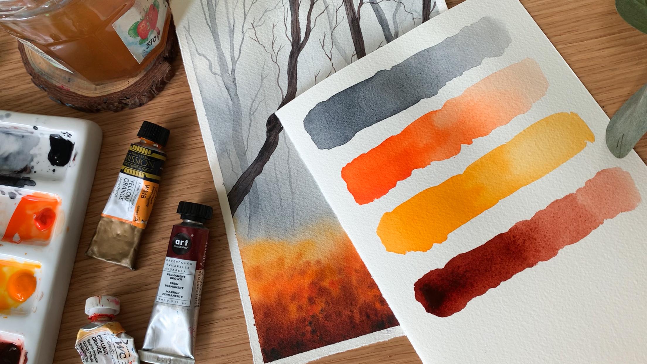
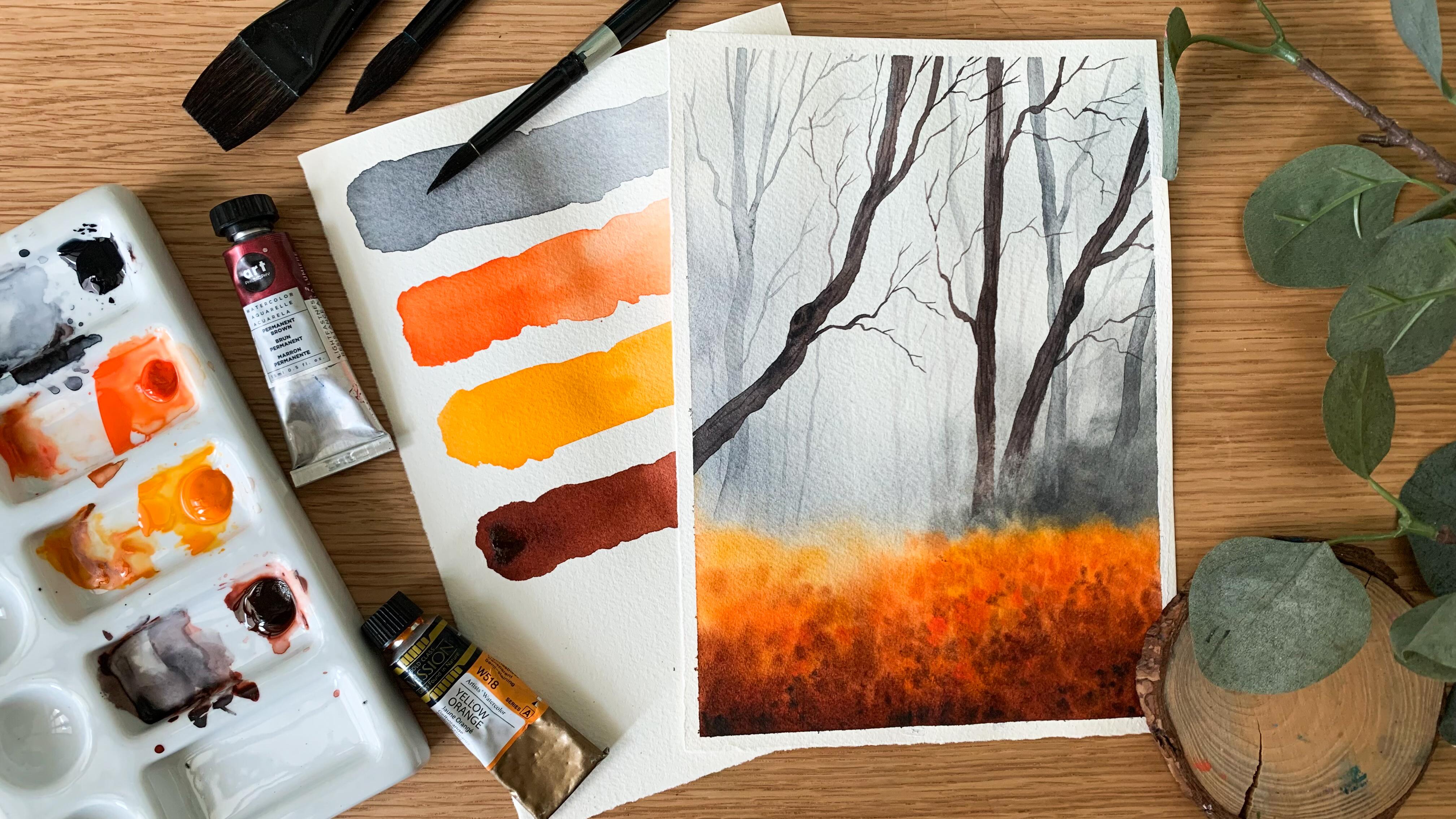
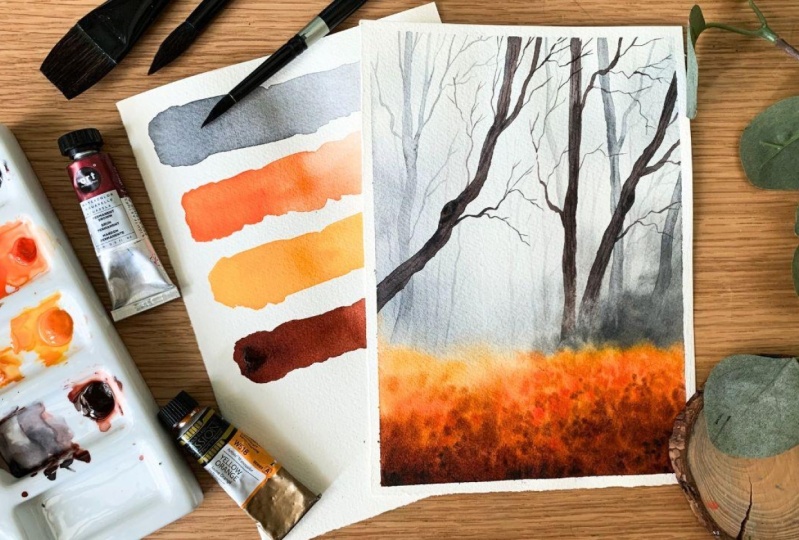
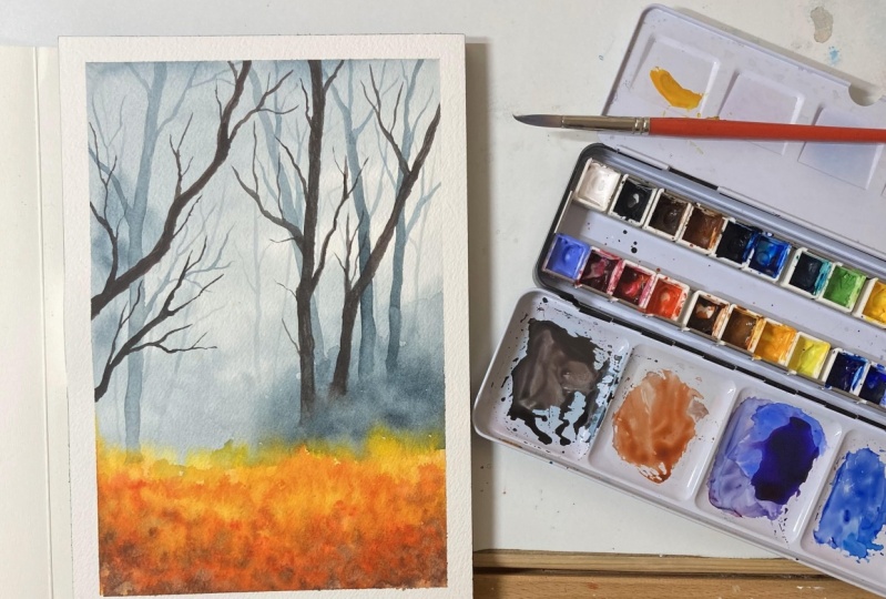
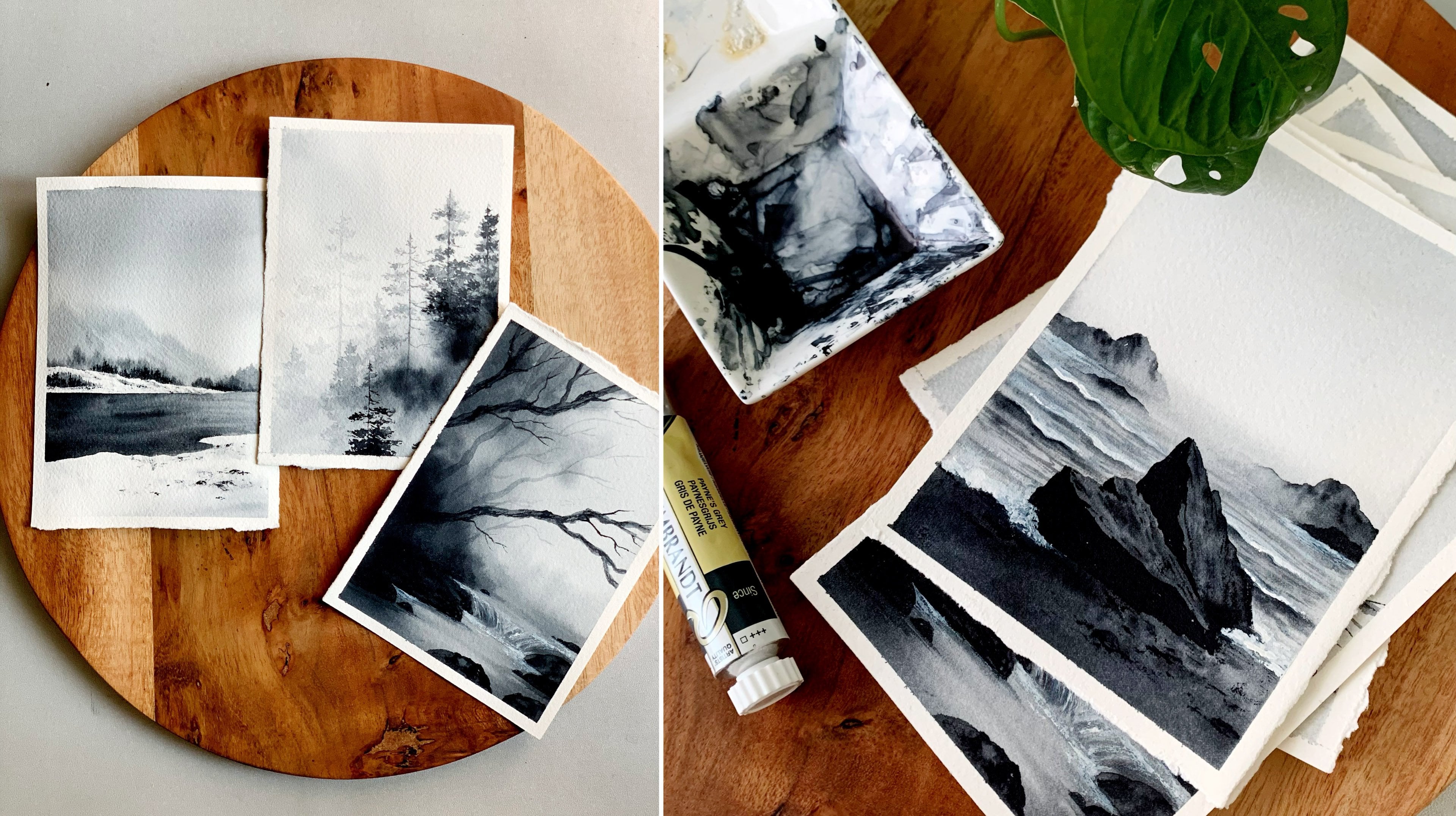
3. Materials you'll need: So here's a painting
that we're going to try. Now before we start, let's have a quick look at the
materials you will need. I will start with the paper. So for any aticula painting, the paper holds a
lot of importance, especially when we are
trying Veron by technique. And here's a paper that I'm going to use. It is from arches. It's a cold press aticula paper, which is 140 L V, and it is 100% cotton
waticula paper. Okay, so these specifications
are really important. Try to go with any artist
creed aticul paper, so that you get the best result. It doesn't need to be arches. It can be any artist
create waticula paper. Now, this one is
an A four paper, and here's the size
I'm going with. It is just half of this paper, which means it is a five. I have composed the painting
in a portrait orientation, but you can go with any
size that you prefer. It can be a bit more
bigger or smaller. Alright, so that's
all about the people. Now let's have a look
at the different colors and the
brushes we will need. I will start with the brushes. So you will need
one bigger brush to apply water onto
the background. This one is a 1 " wash brush. You can use any bigger
brush you have got. It just has to be clean when you're applying water
onto the background. Now you will need round brushes, a bigger one preferably. I'll be using size number 12. If you're painting is smaller, you can go with eight or
nine or any other size. And then you will need
two other brushes, a medium size brush, and a smaller brush
for fine detailing. The medium size brush
is size number six, and the other one
is size number two. So yeah, according to the size of your painting
you're going with, you can choose your brushes. So basically, you will
need a bigger brush to apply paint onto
the background, then a medium size brush
and a smaller size brush. Now coming to the colors, you will need four
different colors for this entire painting. The first one is paints gray. Then you will need
a brighter orange. I have taken brilliant
orange here. Then you will need
a yellowish orange and also some brown or bunsena. Okay, so these are the
four colors you will need. All the four colors are
from different brands. You can see the first
one is from Rem Brand, then have Shin hen, art
philosophy and Vigil Omission. The brand doesn't
matter. Just go with any colors you have with you,
which are nearly similar. In the next section, I will be showing you spatches
of these colors. And also, I will talk
about alternate colors, so be sure to check it out. Now, the next material you
will need is a mixing palette. We don't need a lot of colors, so any palette will work. This one is a ceramic
mixing palette. We just need some space to
mix the colors. That's all. It can be plastic or ceramic
or even a dinner plate. Now, the next thing you will
need is a masking tape to fix your paper onto your table
or onto a drawing board. This one is a very normal
masking tape. It is half inch. You can go with washi tape or pinto tape or any tape
that you normally use. Okay. The next thing you will
need is two jars of water. One has to stay clean, and the other one is to rins off the paint from your brush. For wet on wet
paintings like this, where we are trying to
create a foggy atmosphere, we will need some clean
water in between. So always be sure to
have two jars of water. This way, you can have an
uninterrupted painting process. Now coming to the next material, which is a paper towel. We will need a paper towel
to lift off some paint from our painting and also
to clean our brushes. Alright, so that summarize all the materials you will need for this painting session. If I have the same
colors I'm using here, keep them ready on your palette, or I'll see you in the next section where
we will discuss about the different
colours you can use. Okay, so I'll see you there.
4. Color Palette: Already spoke about the
colors we will need. So you will need pains grey, two different kind of oranges, a brighter orange, and
a yellowish orange. Then also some brown or Ponzina. Okay, so these are the colors you will
need for this painting. Now, I'm going to quickly
swatch each of them. Then I will give you
the alternate options if you don't have the
exact same colors. Okay, so I'm going to
start with Pains gray. This one is from a
brand called Rembrandt. You can go with any pink
grey have card. Okay. So that's a major color we
will use for the background. We'll use different
tonal values of pinks gray to create a
depth in our painting. We will start with
a lighter tone. Then we will keep on
building the color. Okay. So that's the
very first color we will need for this painting. If you don't have pinks
grey, just get one. It's a good color to include
in your color palette. This is the one I'll be using. It's from a brand
called Rembrandt. Okay. So that's a color we will be using
for the background. Next, you will need two
different kind of oranges. First, you will need
a brighter orange. This one is brilliant
orange from Shinhan. It's a really bright
and bold orange. I will swatch it out. See that? It's a
really gorgeous color. I love to use this
color for sunset skies, and it's that perfect
autumn color. You can use any bright
orange you have caught. It could be camium orange or cellular orange or
any other orange. It doesn't need to
be exactly the same. We just need a brighter orange, or you can also use vermilion. Okay. So that's the first
orange we will need. I absolutely love this color. Let me show you the tube, so you will know my
love for this color. Here it is. It is almost over. I need to get a new
one. So this one is brilliant orange
from Shinhan. Now the next color you will
need is an yellowish orange. This one is from Megill Mission. It's, again, a beautiful color, which has a yellowish undertone. See that? So first, you will need a brighter orange. The easiest one would be ermelin if you don't
have any other orange. Next, you will need
an yellowish orange. It can be cadmium
yellow, orange, or permanent yellow, orange
or any other similar color. If you don't have a yellowish
orange, it's easy to make. You will just need
to add some yellow into any of the
orange you have card. Here is the one. This one
is from Megill mission. Alright. Now the last color
you will need is brown. It can be brown or burn Sina. I'll be using brown. This
one is from art philosophy. It is called permanent brown. If you have brown, I would
recommend going with that. Only if you don't have any kind of brown, go with burn Sina. Burn Sina is a little yellowish and brown on the other hand, it's more reddish, and it will work well with
oranges and yellows. Okay. So if you have
brown, go with that. Otherwise, even
burn ina will work. You can see the
swatches here and you can see how well they
are going together. I think it's a great
autumn color palette. I'm hoping you all
have pains gray, and like I said earlier, if you don't have any kind of bright orange, you
can go with armilin. And if you don't have
a yellowish orange, just add some
yellow with armilin and you can create
a similar color. In your mix, you
will have to add more yellow and less orange. And then finally, you will
need some brown or buncina. Okay, so those are the
colors you will need for this gorgeous moody
autumn forest. I think I didn't show you
the brown watercolor tube. This is the one. It's from art philosophy, and it's called permanent Brown. It's a beautiful brown, and it's one of my favorites
from art philosophy. Anyway, that's some rice, all the colors you will need
for this gorgeous painting. Keep them ready, and
let's give it a try.
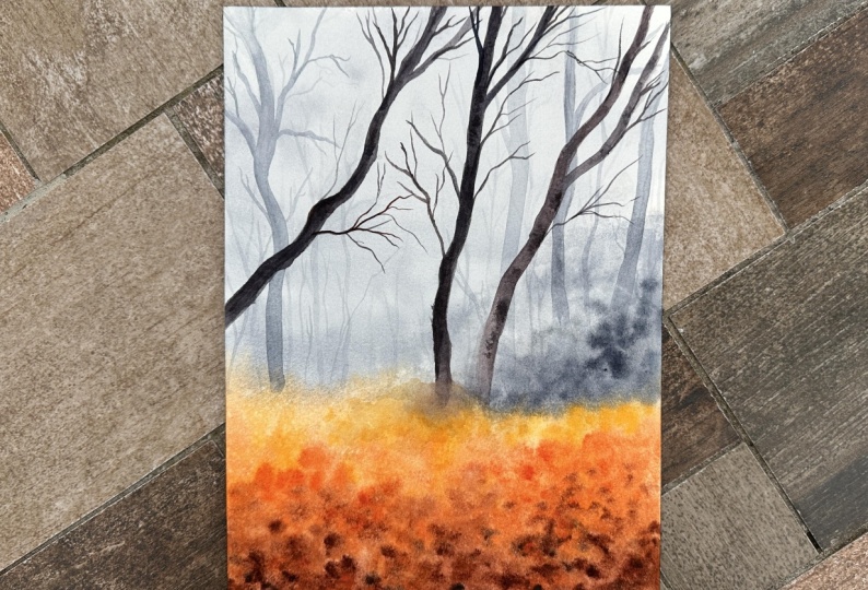
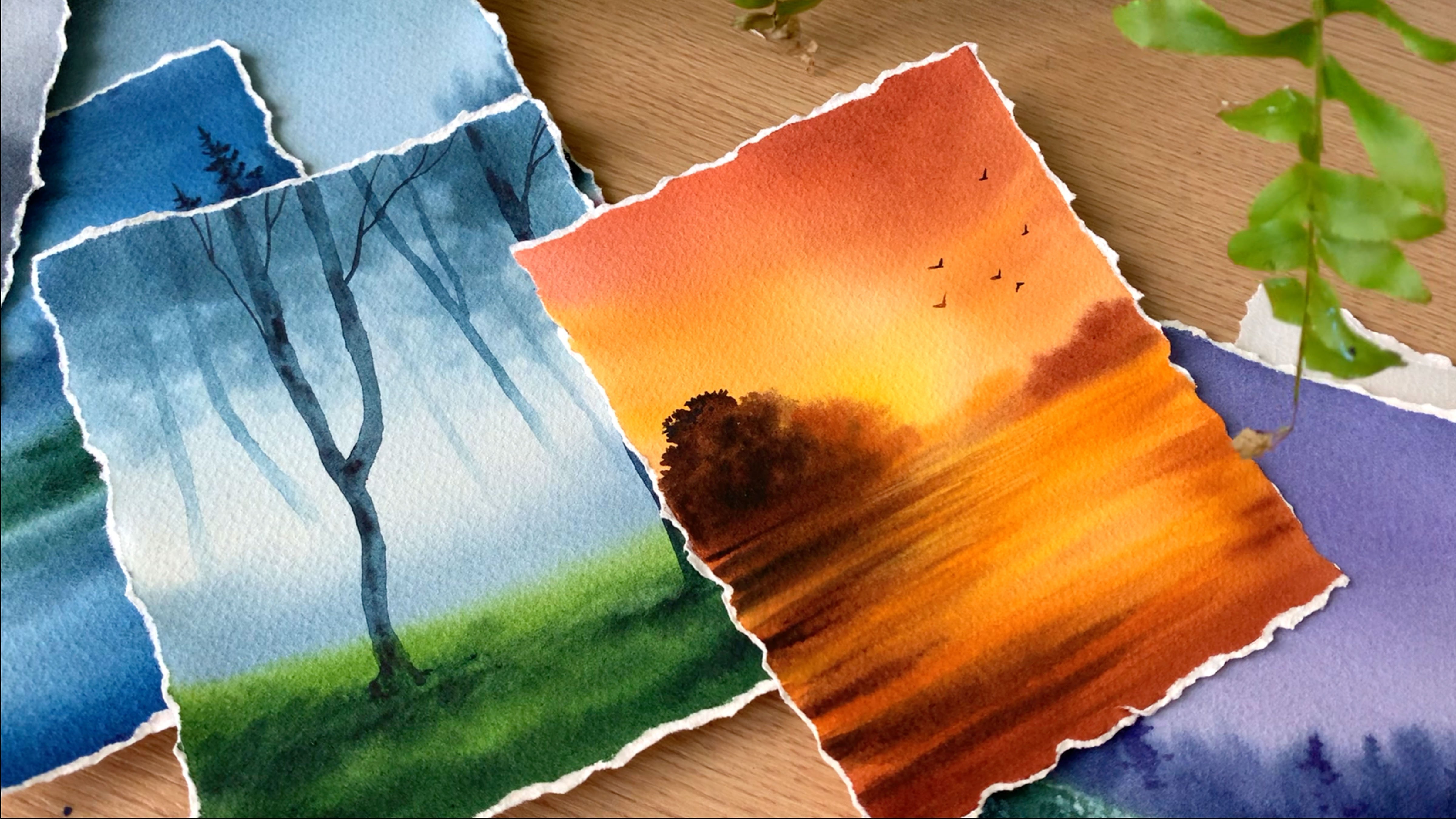
5. Painting the Background: The very first step is
to paint the background. So here is how the background
is going to look like. We will start with some
pink gray onto the sky. Then towards the bottom, we will introduce some
oranges and browns. To paint the background, we will be using Varun wet technique, which means we'll
apply a coat of water until enter a
background first. And then we will gradually
drop in all the colors. Alright, so let's begin
with the background. There isn't actually
any sketch required, but just for our understanding, we can add a rough line. Somewhere below the center of the paper, an irregular line. This is just for us
to understand where should we applying
the orangish colors. So on the top,
we'll go with gray, and at the bottom, we will
go with orange and brown. Okay, so that's only
sketch required. The rest we can add
as we're painting. We'll be adding so many
trees in the background, which doesn't really
require any sketch. You can just go with any
shape that you prefer. Okay. Now, make sure you have all the colors
ready on your palette. We'll need paints
gray, a bright orange, a lighter orange,
and some brown. Those are the colors we'll
need for this entire painting. So keep them ready on your
palette before you start. We need all these colors
for the background. Okay? Once you have
the colors ready, you can start by applying
a coat of water using any of your clean brush
onto the entire background. I'm using a bigger
white brush here. This one is 1 " brush. Go with any brush you have got, but make sure it's clean before you apply water onto
the background. And also around your brush
multiple times back and forth, just to be sure the
coat of water is even. We don't need a pool of water. We only need a nice shiny coat. Okay, so make sure your
paper is evenly wet. Alright, I will
apply a little more. It's a bigger paper. Make sure all the areas are clearly wet. Alright, so my paper
is evenly wet. Now I'm going to go with a bigger untre to apply
paint onto the background. This one is size number 12, and I'm picking a lighter
tone of Paint scrive first. Go with any bigger brush you
have got a bigger untrush. Now I'm going to apply
that lighter tone onto the background onto
the upper part. Okay. In between, you can add a color which
is slightly darker. So if you're going to
create a moody background, the color can be a little
different in between. It doesn't need to be the
same tone throughout. Okay? If your brush
is super watery, you can tab it on a paper towel and then add in the paint. Okay. My brush is a bit watery, so I'm tabbing that
on a paper towel. And then I'm
spreading the colors. Okay. So the background doesn't
need to be a clean blend. It can have some different
tonal values in between. At some places you can
go for a lighter tone, and towards the bottom,
you can introduce a medium tone. See that? I'm simply dropping
in the paint onto that wet background,
picking some more paint. It's more like a medium tone, and I'm adding that
at the bottom. On the top, I have a lighter
tone compared to the bottom. Okay, now, again,
I'm spreading that. Just to give it a better finish. Okay, so this is how
it has turned out. I will add a little more paint, then I will go at the bottom. So I'm going to go back
with the paint's gray, more like a medium tone. Then I'm adding that in between. Just to create a
mysterious foggy effect with the same color throughout, it won't have any depth. Okay. So I'm just adding
some more paint at the bottom in a very
rough messy way. Now I'm going to
clean up my brush and I'm switching to orange. You can go with
any orange first. Over here, I'm using
my brighter orange. This one is brilliant orange, and I'm adding that
at the bottom. Now I'm picking that
yellowish orange. Again, adding that onto
the wet background. So this one doesn't need
to be a clean blend. You can drop in your colors
however you want to. Before the background dries
up, that's a major thing. It doesn't matter in which order you apply the paint
or how you apply it. We are going to create a
rough messy background, but we have to apply that while the background
is still wet. So the colors will spread and smudge into each
other automatically. That is the only thing we
have to be careful about. Next I'm picking some brown, and I'm adding that
at the bottom. You can see how
messy the background is, but don't worry about it. Now for the rest, I think I
will go with a smaller brush. This one is too big
to add the textures. So I'm going to go
with a smaller brush. This one is sized into six, and I'm going back with orange, dropping in that onto
the wet background. I'm just adding some dotted
pattern in a very random way. You can see the
background is wet and they're spreading
into the background. So just keep on
adding those kind of dots onto the background, using those two different
oranges and also brown. Next time I'm picking
the brighter orange, and I'm doing the
same step again. And after this, I
will go with brown. So we need different tonal
values of orange and brown in the background to create
that autumn vibe. The only thing you
have to be careful here is about the wetness
of your background. So be a little quick and drop in all the colors onto your
background while it's silo wet. And also using 100% cotton watercolor paper
really helps a lot, especially when you're
doing wet on wet technique. It will stay wet for a
longer time compared to the sil lose paper or
the student grade paper. So yeah, if you seeds on
advancing your aticular skills, try to work on a good
quality watercolor paper rather than a student grade one. This will really make a
difference in your artwork. Anyway, now I'm dropping some
brown onto the background. You can see they are quite messy, but don't worry about it. As I said earlier,
just keep on adding some dots and things onto
the background. See that? We're trying to create
some texture here. It doesn't need to be perfect, and we have to use all those
different tonal values. Next I'm dropping some orange. I will also need to
make the bottom part a bit more darker
compared to the top. So once I'm done with this, I will mix some pinks gray with brown and I will introduce
some more darker tones. Maybe I will do
that in some time. For now, I'm going to go
back with pinks gray. I'm using a medium tone, and I'm adding that over here. I'm doing this only
on the right side. The left, I'm going
to leave it as it is. So just to create
a definition here, I'm adding some
more pink gray onto the background. Go
with a medium tone. It has to be a bit darker than the color you have used
for the background, and add that onto your
background. See that? So these are those plants
or trees in the background. Go with the medium tune and just apply that right over
that orange area. Focus mostly on the
right side or the left, whichever side you like, or maybe you can add
them throughout. You can see how it is getting defined when we are adding the landscape
in the background. You can clearly define
the top part and the bottom part. Yeah. Let's add a bit more. I'm
picking more paints gray. That looks really dark. Maybe I will just much
that into the background. Because when the
background dries, it will look a little lighter. So maybe this color is fine. By the time it dries out, it will be one tone lighter. So I think this looks okay. The major element in this
painting is the background. Only if you use the right tonal values
in your background, you'll be able to create that
moody atmospheric effect. So these tonal values
are really important. Use a tonal value, and you can see the
way how it defined the entire background. See that? So right above the orange part, you can introduce
some paints gray, more like a medium tone, and I'm adding that only on
the right, not on the left. Okay. I will add a
little more paint. And then I will proceed
with the ground. We haven't added
the darker tones. We have only used
some medium tones. Next, we have to add some
darker tones at the bottom. Okay, so let's go
the darker tone. First, I will go the darker
tone of Brown itself. Then I will add a little of
paints gray along with that, and then I will introduce
some more darker tones. So it's again, some
dots and some patterns. It doesn't have any particular
shape or size or anything. I'm just adding some dots
onto the background, and they're spreading a little. See that? So we just need
to create some texture. There has to be some
brown, some orange, some lighter tone, everything in the background to get
the right result. I will pick some orange asp and I'm adding some tots
closer to the horizon line. Okay. So technically,
it is just some dots. It doesn't have any shape
or size or anything. You can simply keep
on adding some dots onto your background,
while it is still wet, you can see how beautiful
it has turned out, so you can keep on adding
more and more textures onto the background until you're
happy with the result. I want to add a bit more
darker tones at the bottom, so I'm picking some brown, and I'm going to
mix that with pinks gray to create a darker brown. Okay. Now I'm going to add similar kind of
patterns at the bottom. So only at the bottom, I want to introduce
more darker tones. On the top, I want
that lighter orange and the medium tone of orange. So just at the bottom, I'm adding some dots
and some patterns. Okay. So that's how
it has turned out. Maybe at the bottom, we can
add some orangish patterns. They are not looking
very prominent. So I'm going to clean my brush, and I'm going to pick
that brighter orange. This one is brilliant orange, and I'm adding that
onto the background. And along with that, I'm smudging some of the
brownish pattern tsp. At some places, I feel
they are a bit too much. So while I'm adding
these patterns, I'm also smudging some of the brown patterns
at the bottom. We are nearly done
with the background. Now, just in case if you want to introduce more patterns,
you could do that. Or if you're happy
with the background, you can leave it for drying. I'm just adding a few more brownish patterns at the bottom, especially onto the left side. The right side is looking pretty good. Okay, so that is it. That's our background.
I'm really happy with the colors and the
textures we have got here. I hope you are happy with
your background, too. Anyway, now let's leave it for drying before we
go to the next step.
6. Adding Background Trees: Alright, so the background
has dried completely. Next, we're going to go
with the second task, which is adding the trees
onto the background. And for this step, we're going to go
with Pains gray. Pains gray is the only
color we will need, and we'll use
different tonal values to create the depth
in our background. Okay. So I'm going to start with a really light
tone of pains gray. I'm taking a little of Pains
gray with my smaller brush, and I'm going to
add enough water. Okay. Now let's turn that
into a lighter tone. Also keep a paper
towel next to you. Now, let's start adding the first tree onto
the background. Be sure the tonal
value is really light. Maybe you can try it on
a scrap piece of paper, and you can be sure the
color is really light. I'm picking enough of
paint on my brush. This one is size
number six un brush. Go with any of your smaller
or medium size brush. Now, let's add the first tree. You can add them
wherever you want to. It doesn't need
to be in the same shape or the same location. For now, I'm just
adding the tree trunk. We can add the branches later. Now, I have made
the color lighter, and I'm going to continue
the shape onto the top. I'm also dabbing
off the paint from the bottom to give
it a foggy look. I will add the second one. So first add the
shape onto the top, pick some water and
make it lighter. Now towards the bottom, pick your paper towel and
just lift off some paint. By doing this, the bottom part
will look a little foggy. See that? You don't need to
add any extra details there. So that's how we're
going to add the trees. This is the first set of trees. Using a similar tonal value, you can add in as many
trees as you want. So just like I said earlier, for now, I'm just
adding the tree trunk. Once we are done, adding the tree trunks,
we can add the branches. Be careful about
the tonal value. That looks a bit dark. Till it's dark. Alright.
This looks fine. So go the similar tonal value. This is the first set of trees. For the next set, we can
make it a bit more darker. So to create a depth and a sense of distance
in your painting, we'll have to play
with different tonal values of paints gray. This is the first tonal value. For the next one, we can
make it one tone darker. Okay, so add new trees however you want to and
wherever you want to. For now, the only
thing you have to be careful is the tonal value. Go with the similar tonal value and add in as many
trees as you want. I think I have added enough of trees. I will add one more. Then I will start to
add the branches. Okay, so those are
the trees with the first tonal
value of pains gray. Now on the same, I'm going
to add some branches. Then I will go the second round. So I'm picking the same
tonal value of pains gray again to add the branches. Now in a very random way, I'm adding some branches onto these trays. Add them
however you like. Try to go the smaller brush or a brush with a pointed tip. Don't make it too thick
and prominent. See that? I'm using the same tonal value, and I'm adding some branches
onto those tree trunk. So we have to
create a density in the background by
introducing these branches. Otherwise, it will look
quite plain and empty. For the next set
of trees as well, we're going to do
the same technique. We will start with
the tree trunk. Then onto them, we will
introduce some branches. The only difference
would be they will be a little more darker
compared to these trees. Okay, so this one is done. Now I'm going to go with
the second tonal value I'm picking more plains gray. Now the next set of trees
can be a bit more bigger. The ones we added
earlier were too thin. I'm going to add
two or three trees onto the right and
also onto the left. I'm going to leave
the center acts. Okay. So go with the medium tone of pin
screen and add in your tree. As I said earlier, this can be a little more thicker
than the previous one. That's a tonal value
I'm going with, and I'm adding the tree trunk. Then we can add some
branches onto this. Once you have added the tree, grab a paper towel and dab off some paint
from the bottom. So over here, we have a medium
tone in the background. We already have added
some landscape. These trees and that
background color is almost the same tonal value, so they will nicely blend
into the background. You don't need to show the
roots or any other details. They will go very well
with the background. Okay, so that's the first tree. Now I will add a
branch onto this, a thicker branch, and then
we can go the next tree. So you can see here
we have some trees in the background using
a lighter tone. They are thin. They
are not detailed. Now for these trees,
we are going to add a very light
texture, not a lot. So once you're done
adding the tree trunk, you can pick a slightly
darker tone of pink gray, and then you can
simply add some lines onto the tree to
introduce some texture. They are very gentle textures. It should not be too prominent. So go the medium tone when you're adding
the textures as well. See that? So that's
our first tree. In a similar way, I'm going
to add few more trees. I think on this side,
I will add two more, and then to at the left,
I will add one or two. So I'm picking the
seam tronal value, and I'm adding the tree trunk. So go with a nice shape to
make it look more natural. Don't just go with
a straight line. Now add in some branches. Onto this, I'm not going
to add any texture. I will add another
one onto the right, using a medium tune again. If it's too dark, add some
water and make it lighter. And when you have
the tree trunk, grab a paper towel and lift off some
paint from the bottom. See that? This way, you don't need to show
any other details. The bottom part
will nicely go with the background. That's a trick. Okay. So we have three
trees on the right side. Now, I'm going to add
another one on the left. You can compose your
painting however you like. I'm going to add the next tree on the left, just like I said. If you want to add more,
you could do that. I'm going to stop
with the next one. Then we will go with the
final round of trees. That was a bit dark. So I have added some water, and I
have made it lighter. Now I'm going to go
with a nice shape. Go with such irregular shapes when you're adding the trees. This will add a lot of
beauty to your painting. It will make them
look realistic. So towards the bottom, I have
made it a little lighter. Now with my paper towel, I'm lifting off some paint. I think I lifted
off too much paint. I will need to add
a little more. Okay, so that's my third tree. Now onto this, I will
add some branches. I'm still using my size
number six round brush. Once I'm done
adding this branch, I think I will go
with a smaller brush, which can be size number two
or any other smaller brush, or maybe a detailing
brush or a liner brush. Using that, I will add
the remaining branches. Okay, so I'm cleaning this brush and I'm
keeping it aside, and this is my size
number two round brush. I'm picking the
same color again. But it became a bit dark, adding some water,
making it lighter. Okay, so with that tonal value, I'm going to add some branches, some really thin
delicate branches. You can add as many
branches as you want. The more branches, the more beautiful your painting will be. So go with any of your
smaller brush or a brush with a pointed tip and keep on adding as many
branches as you can. I cannot tell you how much I allow the way this
painting is progressing. That moody, mysterious
effect is really beautiful. I hope you guys are
enjoying it as well. Now for the branches asphll
go with an irregular shape. Don't add them in the same way. Add them onto all direction. Okay, and add plenty of
them using a smaller brush. The more thin and
delicate they are, the more beautiful
your painting will be. So keep that in mind. Don't add thicker
and bolder branches. So the brush I'm using here is size number two round brush. It's not a detailing brush. It's a wonderful brush, and I have been using it
for a couple of years now. It's from silver brush. But if you have a liner brush or a detailing brush,
even that will work. Okay, I'm going to add
a few more branches, then we can call it done. Now we have one more
set of trees to add, which is the foreground trees. So let's quickly
finish this off, and let's go to the
final set of trees. I really hope you
guys are enjoying the process and loving
what you're creating. It's a beautiful
painting that anyone can create if you put
a little of attention. Okay, so that is the background. I will just add
few texture here. And with that, I will call it done. Alright, so here we are. These are the trees
we have added, and they're looking
really beautiful. Now let's leave it for drying.
7. Adding Foreground Trees: All right, so we have
the background ready. Our next task is to add
the foreground trees. This is the best part
about this painting. So these trees are going to define the background
and the foreground. All right, so let's begin. And for this, I'm going to go with a slightly darker
tone of paints gray. I'm going to start
with the first tree. I will add that
on the left side. Before you start
adding the trees, make sure your
background has dried completely. This one has dried. Okay, so let's add the tree. I'm going to add the
first tree over here, starting from this side and making it a nice
irregular shape, and I'm taking that to the top. Okay. So go with an irregular shape to make
it look more beautiful. I think the color can
be a bit brownish. So into pains gray,
I'm adding some brown, and that's a color I'm going
to continue with. See that? So whether you're using
burned ina or brown, just add a bit of pains green to it and go with a dull brown for your fgrowd trees and also go with an
irregular shape. Don't make it a straight line. Now I'm filling that shape. It can be a thicker tree. This one is in the foreground. All right. So that's
a basic shape. Now onto this, we can
add in some branches. Alright, I'm really happy
with the shape of the tree. It looks really nice. Now in a similar way, I will be adding some trees on
the other side as well. But before that, I will add a few branches onto this,
some thicker branches. For the smaller ones, I will
go with a smaller brush. The one I used earlier,
size number two. I think the smaller
branches I will add later. For now, I will continue
with the other two trees. So I'm going to go
with the same color. Mix of paints gray and brown, and I'm adding the
second tree over here. On this side, I will add two. See that. So that's
our second tree. Go with a similar thickness. If you warm, you can make
it a bit more thicker. You can already see the
difference these two trees made. Now, the painting has a depth. Earlier, it was quite plain. It didn't have any depth. Now, I'm going to
grab a paper towel and I'm lifting off some
paint from the bottom. Okay. Now onto this, I will add few branches, some thicker branches,
using the same color. I will add one onto
the left side, and one more onto the right,
maybe towards the top. As I said earlier, you can go with as many trees as you want. Just because I'm adding three doesn't mean you
have to go with three. You can go with four
or five or even two. Okay, so the second tree is in. Now I'm going to add one
more towards the right side. This one, I will go with
an irregular shape. I'm adding that onto the
right side like this. Okay. Now dapping off some
paint from the bottom. And then I will add some
branches onto this. So the major part
about this painting is creating a background. That's where you
bring in the whole effect and mood
of this painting. Then onto that, you have to add the trees using different
tonal values of paints gray. So once you have the
background ready, the rest will just
fall into place. Alright, so that's
my third tree. I'm just giving it
a better shape. And then I will add
some thicker branches. Okay, so the last
tree is also in. Now let's add some textures onto these trees and then
also some branches. And for that, I'm using
my smaller brush. I'm going with the same
color. It's slightly darker. And I'm going to
add a hole here and also some lines and
some textures onto the tree using a taker tone. Same I will do onto
this one as well. So it is just some lines and
some dots and some textures. You don't need to add a
lot, just a few lines and some shapes to create
a wood like texture. Okay. So onto this, I'm just adding some
lines over here as well. I will add a few lines. If you paint this too watery,
dab it on a paper towel, and then you can continue
adding these lines. We only need some light
texture. We don't need a lot. Okay, so that is it.
Those are our trees. Now, all do the same
using a smaller brush, I'm going to add some
teeny tiny branches. That's our next
task. You can add the branches however you like
and wherever you want to. Go with an irregular shape
to make it look more natural and realistic.
That's the only thing. Other than that, they
can be however you like. I'm adding the first one here. These branches will look
more beautiful if they are thin and also if you go
for an irregular shape. So if you can try to
go the smaller brush, the one I'm using here
is size number two. You can go the
detailing brush or a liner brush or any other brush you're comfortable with and add in the branches,
however you like. Okay, so just take a look
around and add in plenty of branches until you feel the background has become
quite thick and dense. If you don't add any branches, the painting will
look quite empty. So try to fill in all the gaps. Adding these branches are
quite time consuming, but they are very important
for our painting. If you don't add these branches, your trees will look boring. So don't skip this step. If you are bored and
if you want to take a break in between,
that's totally fine. You can come back
and add them later. Anyway, I'm going to quickly go ahead and add
in some more branches. I think I will add one over
here next to this hole, and there's a lot
of space over here. So adding one branch over here will fill in
all those gaps. After I'm done adding
these branches, I will need to add some
more texture on the trays. The texture I added earlier
was on a wet background, and they're not really visible. So maybe we can
add a little more. I already have some
paint on my brush, and I'm defining
this whole first. Same over here. We have
another one on this side. Next, I will dab it
on a paper towel, and then I will add some lines and some dry textures
onto the tree. These are the ones
in the foreground. So adding some textures
will make a difference. They don't need to
be super prominent. Just go the same tuna value. If there's a lot of
paint on your brush, tap it on a paper towel, and then add some dry
lines onto these trees. Okay, so this will
bring in that wood like texture. And that's all we need. We need to do this only
for the fground trees. In my case, I have
three trees over here. You will have to do this for all the trees you have
in the foreground, or whether it's two
or one or four. Looking at the painting now, I feel like the background could have been a
bit more darker. I could have introduced some more darker tones of
paint screen in between, but I'm still happy
with the result. I love the fog effect
we have created here. Next, I'm going to go
back with the branches. I'm going to add
as many as I can. I'm adding one here. So wherever you feel there's a lot
of gap in between, you can add the
branches over there. You can add them
however you want to. Go with some irregular lines to make it look more natural. Don't add them in the same way. Okay, and also try to go with a smaller brush or a detailing
brush or a liner brush. Now, I'm going to go with
one last round of branches. I will add some onto this side and maybe a
few more in between. And that's going to
be the final step. With that, we'll be
done with our painting. Okay, so let's do this. And there you go with that. We are done with our
moody autumn forest.
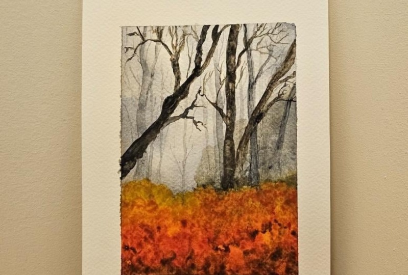
8. Wrap Up + Thank you : Alright, my dear friends. So here is our painting. I really like the way
it has turned out, especially the color palette and the mood we
have achieved here. I hope you all enjoyed it. If you haven't tried it
yet, do give it a try. It's a wonderful painting, and I'm very sure you will
get a beautiful result. Anyway, now it's time to
peel of the masking tape. Uh oh, I didn't get a
clean border there. I was hoping for a clean
border. Never mind. I will use some white
quash, and I will fix it. I'm not really sure why only on one side, there
is some paint. The rest of the
border looks fine. Away here is our gorgeous,
moody autumn forest. Beautiful ride. I think
it's a color palette. The painting is quite simple. There isn't a lot of
details or elements, but I think the colors are
bringing out that autumn vibe. If you have tried this painting, do upload your project onto the Project Gallery. I
would love to see them. And if you enjoy this
class, do leave a review. It will help me a
lot as a teacher. Alright, so thank you so much for joining and happy painting.
 Zaneena Nabeel, Top Teacher | Artist