Transcripts
1. Introduction: You ever wondered how
you can transform an everyday ingredient like coffee into a
beautiful work of art? Imagine creating stunning
floral paintings using the rich warm
tones of coffee, turning your morning brew
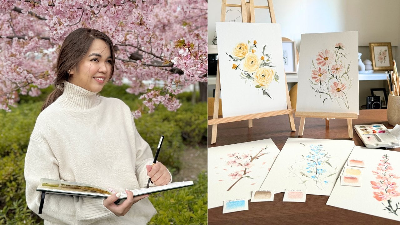
into a creative adventure. Hi, I'm Jenny Flores,
a creative coach, an artist, and a skill share top teacher from
the Philippines. I have worked with
renowned brands like the coffee bean and tea
leaf, pottery Born, Cebu Pacific, and many more sharing my knowledge and
passion for painting with them. With over seven years of experience teaching thousands
of students worldwide, I'm eager to guide you through this creative
journey and bring with you unique insights that I have gathered
over the years. Aside from teaching, I
also share my passion to my followers of almost
80,000 on Instagram, sharing insights, sneak peeks of my work, and free resources. In this class we'll explore the art of painting with coffee, covering everything
from tonal values, coffee to water ratios to techniques for
painting flowers. You learn how to create
beautiful compositions and discover the wonderful
characteristics of this unique medium. Whether you're a
beginner or just looking for something
new and exciting to try, this class is designed to
inspire you and guide you. Ready to bring a
touch of elegance and creativity to your art. Then pick up your brush
and let's get started.
2. Supplies: In this section, I'll walk you through the supplies
you'll need for the class. I'll also offer
some alternatives if any of these are
unavailable to you. First, let's talk about
the paint brushes. We'll be using a round brush in size two or smaller
for detailed work, a round brush in size eight for larger areas and more
general painting, and a fiiler brush for creating soft rounded edges and blending. These brushes will
help you achieve different textures and details
in your floral painting. Next, we need instant coffee
as the primary medium. The coffee is rich. Warm tones will be the key
to our monochrome artwork. To manage orthonal values, you'll need three
glass jars to hold the vargous coffee mixtures
that we will create. For accurate mixtures, having measuring
spoons is essential. These will help you achieve precise oasis of
water and coffee, ensuring consistent
results in your paintings. The paper, I recommend using
watercolor paper that is cold press with farely
300 GSM and 100% cotton. This type of paper
is ideal for holding the coffee and allowing for beautiful textures
in your artwork. You'll also need a glass with
water to keep your brushes clean and mixing palette to
blend your coffee mixtures. Having some tissue on hand
is essential for dabbing excess moisture and
cleaning up some spills. If you don't have these
exact supplies, don't worry. There are always alternatives. The key is to use what you have to achieve the best
results possible. Now that you are familiar
with the supplies, let's dive into
the exciting world of painting with coffee.
3. Why Paint with Coffee: Hi, everyone. In this section, we are going to talk about why coffee is a unique and
amazing medium from painting. But before we dive in
into the technical side, let me share with
you my story on how I discovered
coffee as my medium. And, trust me, it
wasn't planned at all. One day, I was all set to
paint a new composition. Everything was ready. I was getting into the flow of painting and I made
a silly mistake. I accidentally dipped my brush into the coffee
instead of water. I paused for a second staring
at the brush thinking, What have I done? But instead of cleaning it off, I decided to go with it. I used that coffee dip
brush on my painting, and to my surprise, the result was beautiful. The richness of the tones, the way it was
spread on the paper, it was so much like watercolor, but with a natural
earthy hue that gave the painting
a unique warmth. From that happy accident, my love for coffee as
my medium was born. So why choose coffee as
your painting medium? First of all, it is accessible. We almost always have
coffee in the house, and it doesn't require any
special equipment or setup. But beyond its convenience, coffee behaves a lot
like watercolor. You can create
different tonal values simply by just adding the
strength of the coffee mixture, just like you would with
water and pigments. Another reason why coffee is an amazing
medium to work with is its ability to produce
natural soft sepia tones. These tones give your
painting a vintage, timeless field that is hard to achieve with regular
watercolors. Coffee also layers beautifully,
just like watercolor. You can build up darker areas by adding layers once the
previous one dries up. One of the most
exciting thing about coffee is its unpredictability. Each batch of coffee has its unique tone
depending on the brand, rose, or even how long
it has been brewed. This unpredictability adds a lovely organic quality
to your artwork. No two coffee paintings will
ever look exactly the same, and that's the part of fun. So are you ready to discover
more about coffee painting? Let's go to our next lesson.
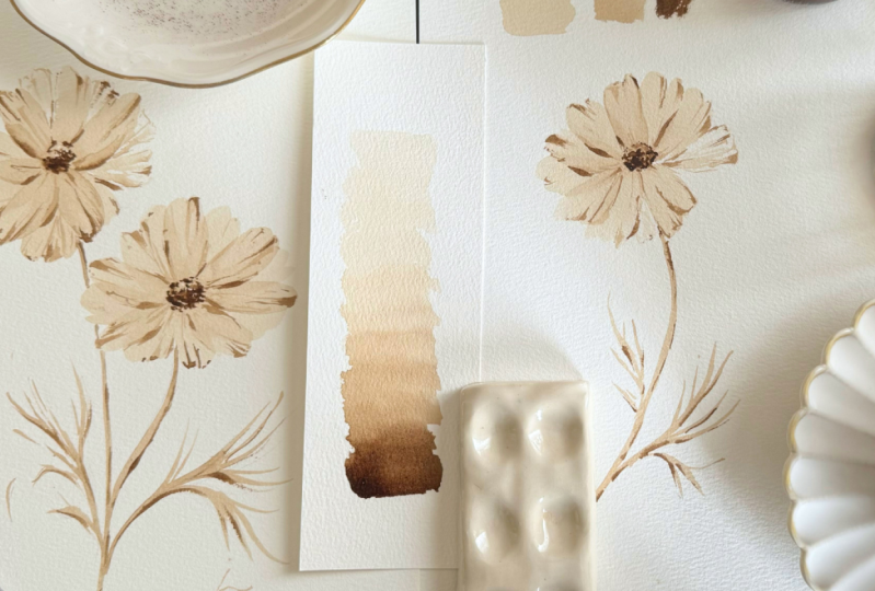
4. Tonal Values & Coffee Mixtures: When we paint with coffee, the process is similar
to watercolor painting. Just like watercolor, coffee
painting relies heavily on the amount of water
used to control the lightness or
darkness of the color. Water plays a crucial role in creating varying tonal values, allowing us to achieve depth
and contrast in our artwork. The more water we add, the lighter the tone
becomes and conversely, less water results
in darker tone. Make things easier when
we start painting, it's helpful to prepare different coffee mixtures that represent three
distinct tonal values, light, mid and dark tones. These variations
will guide us as we apply different shades and layers throughout the painting. Having these ready from
the start helps you quickly identify which tone
to use as you go along, ensuring that the
painting flows smoothly, and you achieve
the right balance of light and dark areas. To get started, you need the following supplies,
a cup of water, instant coffee powder,
glastras for your light, mid and dark tones,
and measuring spoons. Begin by labeling each of your glass jars to avoid
any confusion later on. This will keep your mixtures organized as we
create our light, mid and dark tones for painting. Next, we'll mix our
light coffee mixture. For this, you'll
need one teaspoon of instant coffee powder and
three tablespoons of water. One, two, and three. Okay, let's stir
the mixture well. I'm going to use the
back of my brush, but you can use any stir
that you have with you. You will notice a few bubbles, but that's perfectly normal. So let's test the mixture to see the shade that
we have created. Keep in mind that
each coffee brand produces slightly
different colors, so the goal isn't to
match my shade exactly, but to achieve a very light
tone in your mixture. Next, we'll create our
mid tone coffee mixture. For this, you'll need
one half teaspoon of instant coffee powder and
one tablespoon of water. Again, we are going to stir the mixture until
it's fully dissolved. This ratio creates
a medium shade, perfect for adding mid level
tones to your painting. If you find that
you need more of this mid tone mixture
for your project, feel free to double or even triple the ratio that
we have created. Just be sure to maintain
the same proportions. This ensures the consistency of the shade while giving you
more paint to work with. Adjusting the quantity
without changing the balance of coffee and water will keep the
tone just right. Okay, let us test the mid tone mixture
that I have created. This is what I was
able to produce. Again, you don't need to copy the exact shade that
I have created. You just have to ensure that the light tone is different
from the mid tone. Finally, let's mix our
dark tone coffee mixture. You'll need one half teaspoon of instant coffee powder and
14 teaspoon of water. Yes, very, very few
water for the dark tone. This mixture is highly concentrated and
might be a bit thick. So stirring can take a little
more effort than usual. The result will be a rich
dark mixture that is perfect for adding shadows and deepening the contrast
in your painting. Okay, let's test our dark
tone mixture. And that's it. Our goal was to create three
distinct coffee mixtures, light, mid and dark tones that we can easily use
throughout our painting. These variation will help us adapt shadow and highlights
to bring our artwork to life. For added convenience,
you can label the covers of your jorts as well to avoid any confusions
as you work. Having these tones ready
and organized will make the painting process much
smoother and more enjoyable. Okay, so now you're all
set to start creating beautiful coffee paintings with well defined tonal values. Let's go to our next topic.
5. Painting Techniques & Brush Markings: In this lesson, we'll explore two essential
painting techniques, wet and wet and wet and dry, as well as some fundamental
brush markings. These techniques are widely
used in watercolor painting, and the grating
is that they work the same way when
painting with coffee. Let's begin with wet
and wet technique. Wet and wet is when
you apply wet paint in our case coffee into a
surface that is still wet. This creates soft blended edges, perfect for delicate
transitions and gradients. For monochrome cosmos flour, you can use this technique
in the flower center, allowing the coffee to
flow and blend naturally, creating a smooth
and airy effect. Wet and dry on the
other hand is when you apply wet coffee
into a dry surface. This technique produces sharper, more defined edges, making it ideal for adding
details and structure. You can use wet on
dry technique to paint the finer details
of the cosmos flour, like the veins on the petals or the intricate details
of the flower center. That we have covered these essential
watercolor techniques, let's move on to the basic brush strokes you'll
need to master. Let's begin with
the filbert brush. This rounded flat tip brush is ideal for creating
smooth organic shapes. We'll focus on two types of strokes that this
brush can create, which are flat strokes
and side strokes. Flat strokes allows you to cover a larger area with a
single broad movement. Applying even pressure gives you a long rounded tip
stroke that is perfect for painting
petals or leaves. The side stroke,
on the other hand, produces a more
delicate thinner line while maintaining
that rounded edge. Both of these strokes
will be used to paint soft curve petals
for cosmos flowers. For the next set of strokes, we'll switch to our round brush. This brush is incredibly versatile and can create
both thin and thick strokes. To achieve thin strokes, use only the tip of the brush
and apply minimal pressure. For text stroke, press down the whole body of the brush,
applying more pressure. This gives you a broader
and bolder line, perfect for filling
in larger areas. When creating the leaves
of our cosmos flower, start by pressing down
for a text stroke. Slowly release the pressure
as you drag the brush to create a pointy tip that mimics the natural
shape of a leaf. All the strokes that you can create with
your round brush, both thin and thick, can also be done using
your detail brush. The main difference is that
the strokes will be finer and smaller because of the fineer
hairs of the detail brush. Because of the fine details
of the detail brush, it is ideal to use
this kind of brush to add delicate touches
such as tiny veins, intricate lines or
subtle highlights on your cosmos flower. I like to add these strokes
as veins folds to the petals, which really brings
the flower to life. It's a good idea for you to
practice this stroke as well, because it really gives a
nice effect on your painting. So now that you learn about the essential brushes
and techniques, you're equipped to create beautiful strokes that will enhance your cosmos
flower painting. Practice these techniques to build your confidence and skill. In our next topic,
we will dive into the exciting process of actually painting
a cosmos flower. Get ready to apply everything
that you have learned so far as we bring our floral
master feast to life.
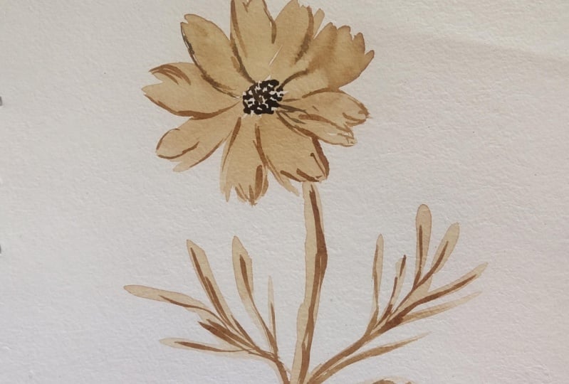
6. Painting Cosmos Flower: Now that we are familiar with the usual
painting techniques, and we also know how to use our coffee as
our painting medium. Already, it's now time to paint our main flower,
which is cosmos. I'll be using light tone
for the base of our flower. This is the lightest coffee
mixture that we have. And for the brush, I am
using this Filbert brush. So the first thing that
we need to do is just create flat and side stroke. Remember what we had
practiced earlier. Just combine these two strokes when creating the
petals of your flower. I'm going to intentionally
leave this space empty so that I can create a
very light petal later on. Now, while my petals
are still wet, I'm going to get my midtone and add some dots in the
center of my flower. So this is the shade
of midtone that I use. As you can see, it's a
little bit darker than the first tone that I used
earlier for the petals. We are going to let this
layer dry up completely, and if you're not sure
if your layer is dry, you can gently touch
it just to check. Now that it's dry, I'm going to proceed
to the next layer. As you notice, I am using
the same color for the base. So this is light tone again, and I'm going to add
another set of petals. You can put it on the areas
that still have space. So I'm still going to
leave some of the areas empty just to create
lighter petals later on. Since we use transparent or
translucent strokes earlier, we have created glazing effect between each of our petals. For our next step,
we are going to use the dark tone coffee mixture. So what we're going to
do is we're going to add another set of dots in the
middle of our cosmos flour. This is the same as the one
we initially created earlier. This is just in dark tone. Now, wait for this
layer to completely dry up before proceeding
to the next step. Now that the base layer
is completely dry, it's time to bring more
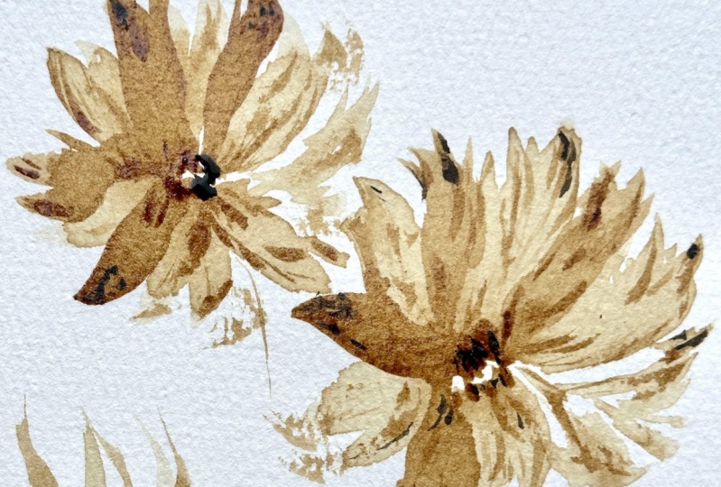
texture and life to our cosmos flower by
adding brush markings. Using our mid tone mixture, carefully add some brush
markings on a few of the petals. These markings will
help you create subtle variation in tone and
add dimension to our flour. Brush markings are
essentially small, intentional strokes that mimic the natural texture of petals. As you apply the strokes, be mindful not to
make them uniform. Nature is imperfect. So try to space
your markings and evenly to give your
painting more organic look. A common mistake that
students are doing is they overdo this
step. So take your time. If you feel unsure,
pause for a moment and step back from your
painting to evaluate. Sometimes less is more
when it comes to texture. So when in doubt, trust your instincts and stop where you think your
markings are enough. The key is to enhance
the natural beauty of the cosmos flower
without overwhelming it. It's easier to add more brush markings than to remove the markings that
you have already created. For the next step, we'll add brush markings on the empty
spaces between the petals. This technique helps bring
those areas to life and creates the illusion of
very light colored petals. By leaving parts of the
space slightly undefined, we invite the viewer to use their imagination to
complete the picture. This subtle effect is especially effective
when painting in a loose expressive
style as it adds a sense of movement and
lightness to your artwork. It's a great way to
engage your audience, allowing them to fill
in the gaps with their mind's eye while still maintaining the flow and
softness of the flower. Once you're satisfied
with your markings, let this layer dry completely before moving to the next step. In this step, we'll use our
dark tone mixture to add brush markings that
create shadows and enhance the depth
of the cosmos flower. Apply these darker strokes along the edge of some petals to suggest areas where the
petals overlap or fold, giving a more three
dimensional look. Be mindful not to make
the markings uniform by their placement and size
to keep things organic. A few well placed strokes
are enough to define the petals without overwhelming the flower's
delicate appearance. These brush markings
provide a nice contrast, bringing out the lightness of the petals and
adding visual depth. Once you're satisfied
with the shadows, let this layer dry
before continuing. And using the same dark tone mixture will now add another set of dots to the center
of or cosmos flower. These small
concentrated dots will enhance the detail in
the flower center, giving it more
structure and focus. To create more realistic look, I recommend placing these dots in just one side of the center. This technique helps
suggest a subtle shift in light where one
side is more shadowed, adding depth and concentrating a natural highlight
on the other side. To finish our cosmos flower, we'll now paint the
stem and leaves. Start by using a
meton mixture to lay down the base layer for
both the stem and leaves, apply smooth even strokes
to define their shape. This base layer will serve as the foundation for the shading
and details that follow. Once the base layer
is completely dry, take your dark tone mixture and add it to just one side
of the stem and leaves. This will create the
illusion of depth by mimicking the side effect
of light and shadow. The darker tone on one
side helps give the stem a rounded appearance and adds
dimension to the leaves, enhancing the overall
realism of your painting. Now that we know how to
paint a cosmos flower, let's now proceed to our
final class project.
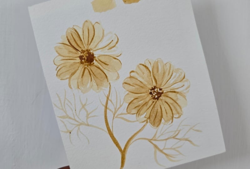
7. Monochrome Cosmos Composition: In this lesson we'll be painting a beautiful
composition of two cosmos flowers using
coffee as our medium. The goal of this
project is to create a soft monochrome painting
that captures the delicate, airy nature of cosmos flowers. Using the different coffee
tones we have prepared, we create light and shadow to give depth and dimension
to our flowers. This project will have
a warm vintage feel, much like a sepidon photograph
with varying shades of brown that bring the flowers
to light. Let's get started. We'll start by creating
a light sketch to map out where we will place
our two cosmos flowers. Don't worry too much about
the details right now. This sketch is just
a guide to help us position our flowers
and plan our composition. If you need a visual reference, you can check out the
project and resource section for the reference painting. Once you're happy
with your sketch, we'll move on to painting the base petals of our
first cosmos flower. For this, we will be
using a combination of flat and side stroke
with a filvet brush, working with a light
tone coffee mixture. Apply gentle pressure to create those long
rounded petals. And While the petals are still wet, take your mid tone
coffee mixture and add some small dots in
the center of the flour. This will allow the
coffee to blend slightly, creating a soft transition
that adds depth to the center. Let this layer dry before
moving on to the next step. And while waiting for it to dry, let's begin working on
our second cosmos flour. For the second flour,
follow the same process. Use light tone mixture to
paint the base petals, applying soft rounded strokes, while the paint is still wet, add a few mid tone dots in
the center to create depth. Okay. Let both flowers dry completely before
moving to the next step. Now that the base petals
are completely dry, it's time to add more depth by painting a second set of petals. Using the same
light tone mixture, carefully placed new petals in between the ones
we painted earlier. Focus on creating soft strokes that gently overlap
the first step. This layering technique gives a flower a fuller,
more natural look. While this second set of
petals are still wet, take the dark tone mixture and add a few dots in the
center of the flour. This will enhance
the contrast and create a more
defined focal point. The darker tone adds
depth and makes the center pop against
the lighter petals. Once this layer is done, let it dry completely before
moving on to the next step. Now it's time to bring out
the texture and detail in our cosmos flower by adding veins and
folds to the petals. Using our detailed brush and
the mid tone coffee mixture, add subtle brush markings
on some of the petals, combine both thin and
thick strokes to mimic the natural look of
floral veins and folds. These markings will help add structure and make the petals
appear more realistic. Be careful not to
overdo this step. Less is more here. If you're unsure about where
to place the markings, take a moment to pause and view your work from a distance. This will help you see
which areas still need more detail without overwhelming
the delicate petals. These areas need some
more brush markings. Just like what we did
on our previous lesson, I'm going to add a few
light brush markings here to create an illusion
of very light petal. Thise markings will
suggest a presence of a petal without
fully defining it, which actually adds a soft subtle touch
to the composition. I'm going to add
more on this area. Now I'm going to do the
second cosmos flower. Same procedure, add a few
markings on the petals to separate them from
each other and to create an illusion
of veins and folds. This area needs more. I'm so happy to see
that our cosmo flower is slowly getting
into shape already. Next, we will add depth to our cosmos flowers by
incorporating some shadows. Using the dark tone mixture, apply another set of brush
markings on the petals. Focus on areas where
shadows naturally fall, such as the edges and
underneath overlapping petals. These darker markings
will suggest depth and add more
detail to the flower, enhancing its three
dimensional appearance. Remember to keep the
stroke soft and varied, avoiding uniformity for
a more natural look. This will really help you bring your cosmos flowers to life. Of course, we are going to do the same process to our
second cosmos flower. Again, remember not
to overdo the process and also make sure that your markings
are not too uniform, so it will look natural. Now it's time to add
some darker details to the center of
our cosmos flowers. Using dark tone mixture, carefully add dots in the
center of each flower, these dots will enhance the focal point and
create sense of depth. Be sure to leave a little space in the upper left side
of the center area. This will create an
illusion of highlight, making the center appear more dynamic and giving
it a sense of light. This subtle contrast
will help draw the viewer's eye and add
dimension to your composition. To complete the look
of composition, we'll now add the stem and
leaves for our cosmos flowers. Start by using the mid
tone coffee mixture, taking your round brush and
gently dragging it down to create a smooth flowing stem that connects your
flowers to the base. Make sure to vary your pressure to give the stem natural taper, making it appear more organic. For the leaves, use midtone mixture with
your round brush, apply strokes that mimic the
natural shape of leaves, brought at the base, and slowly lifting it
to create a point. You can add a slight
curve to some of the leaves to create a
more dynamic appearance, making them look as if
they're gently swaying. Once the midtone layer
is completely dry, we'll move on to
adding depth using dark tone mixture apply markings on one side of
the stem and leaves. This darker shading will
create more dimension and make the foliage
feel more realistic. As you work, remember
to keep your strokes soft and varied to
avoid harsh look. This will help
maintain the delicate, airy style of your
cosmos composition while adding the necessary depth to bring your painting to life. Congratulations for
finishing our project. I'm so proud of you guys, and I hope you'll
take a moment to reflect on your
progress as an artist. And yeah, I'm very excited
to see what you've created. So please make sure to
upload your project on the project and resource
section of our class so I can review it and give
you some feedback. Thank you so much, and I hope to see you on our next video. A
8. Final Thoughts: Hi, everyone. We've reached
the end of our class. Congratulations for
making it through. Thank you so much
for being a part of this journey and for
completing the lessons. I hope you enjoyed learning
as much as I did teaching. And I also hope that
you now feel more confident using coffee
as a painting medium. Just a quick recap of
what we have studied. In this class, we have explored the unique world of
monochrome art with coffee. We've covered the essentials of tonal values and coffee
to water ratios. We also learned the various
painting techniques and created beautiful
cosmos composition. I can't wait to see the wonderful projects
that you have created, so please take photos
of your paintings and upload them to the project
section of our class. I love to provide some personal
feedback on your work. Remember, every artist's
journey is unique and it's okay if your work
doesn't turn out exactly as you hope
on the first try. Don't be discouraged. Practice is key, and every piece you create is a step forward. If you have any questions
or need further guidance, please don't hesitate to ask in the discussion section or
send me a Dam on Instagram. If you enjoy this class
and found it helpful, I would appreciate if you could leave a review in
the review section. Share your thoughts on how the class met your expectation, what you enjoyed the most, or any suggestions
for improvement. Your feedback is very valuable
as I plan my future class. Make sure to follow me
here on skill share to get notified about my upcoming
classes and special giveaways. You can also stay
connected with me on Instagram for the latest
updates on my work and events. Feel free to share your project on Instagram and
Instagram Stories and tag me at Jenny Flores Art and Skillshare at Skill Share. I will be thrilled to share
your work with my community. I hope you love this class
and gain some new skills. And again, thank you
so much for joining, and I look forward to seeing you in the next class. Bye for now.
 Jenny Flores Art, Top Teacher | Watercolor & Gouache