Transcripts
1. Intro Trailer: Name is Mel Sliger. I am a lead Tweedy
environment artist, and I will be your
instructor for this course. So in this course, I will
teach you everything you need to know on how to create
modular buildings for games. This course will cover a
few key number of topics, including how to correctly
plan a modular building, creating modular
assets that have a high placement flexibility, building out interesting looking buildings in Unreal Engine, creating smart shaders to
minimize texture creation, and creating a single
powerful texture for our entire building, creating fake interior shaders, doing additional
presentation and level art, and ensuring that our
assets are properly set up. The general takeaway of this
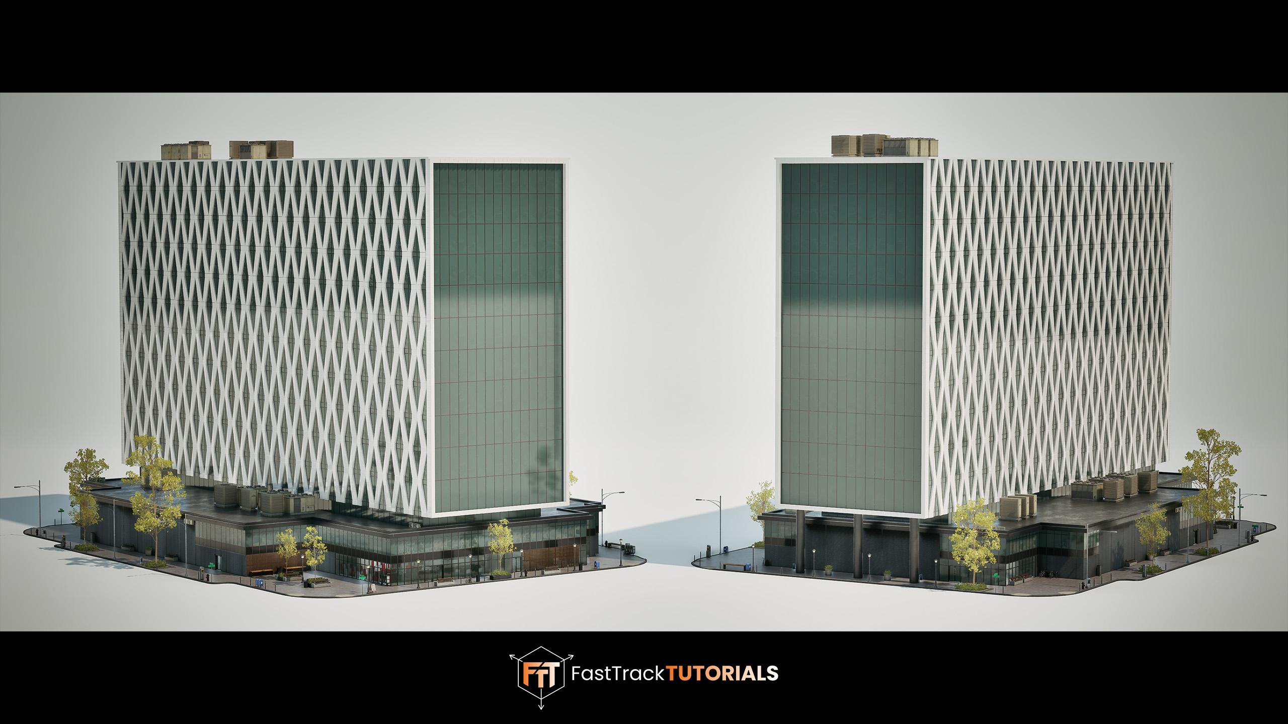
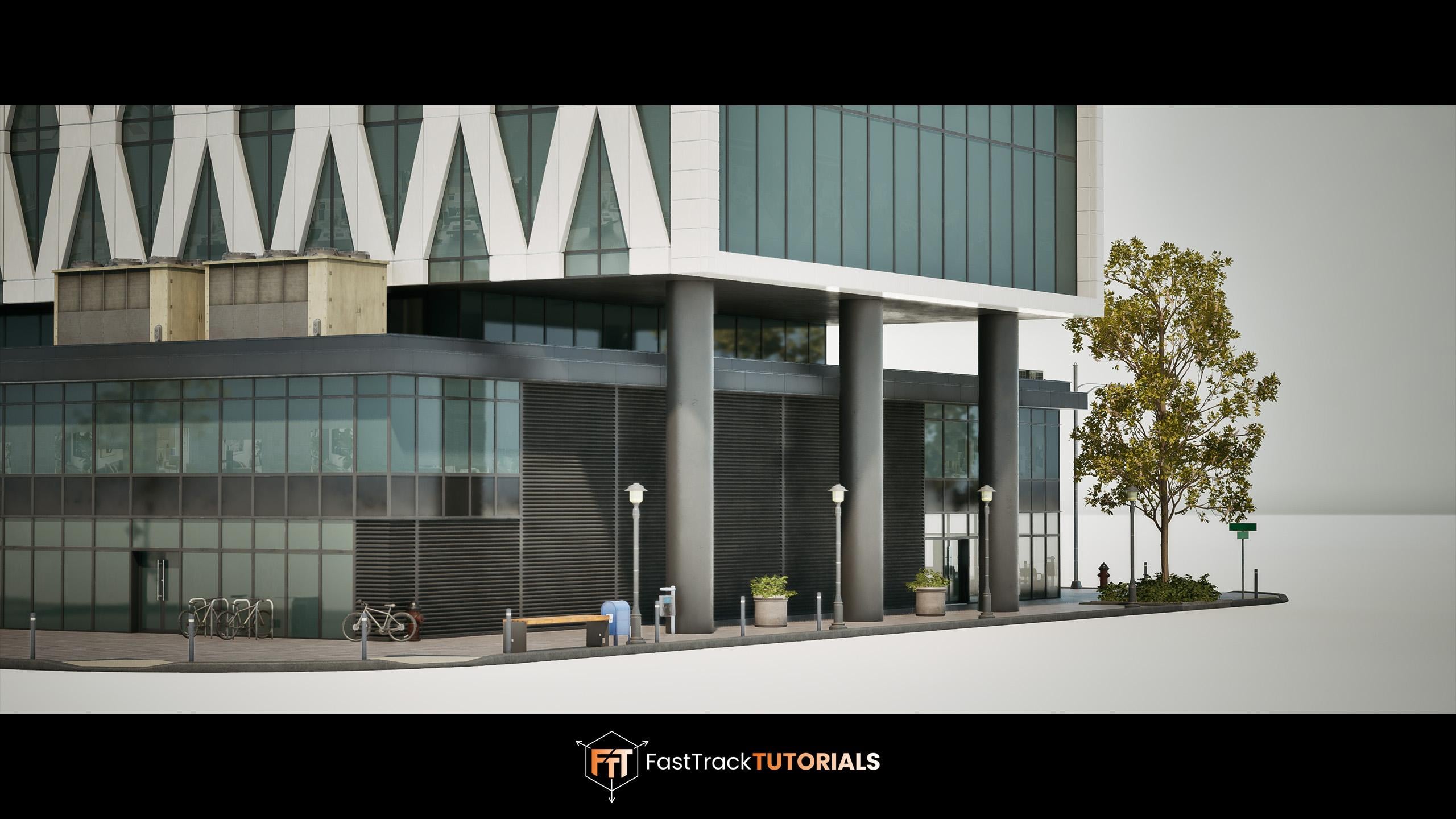
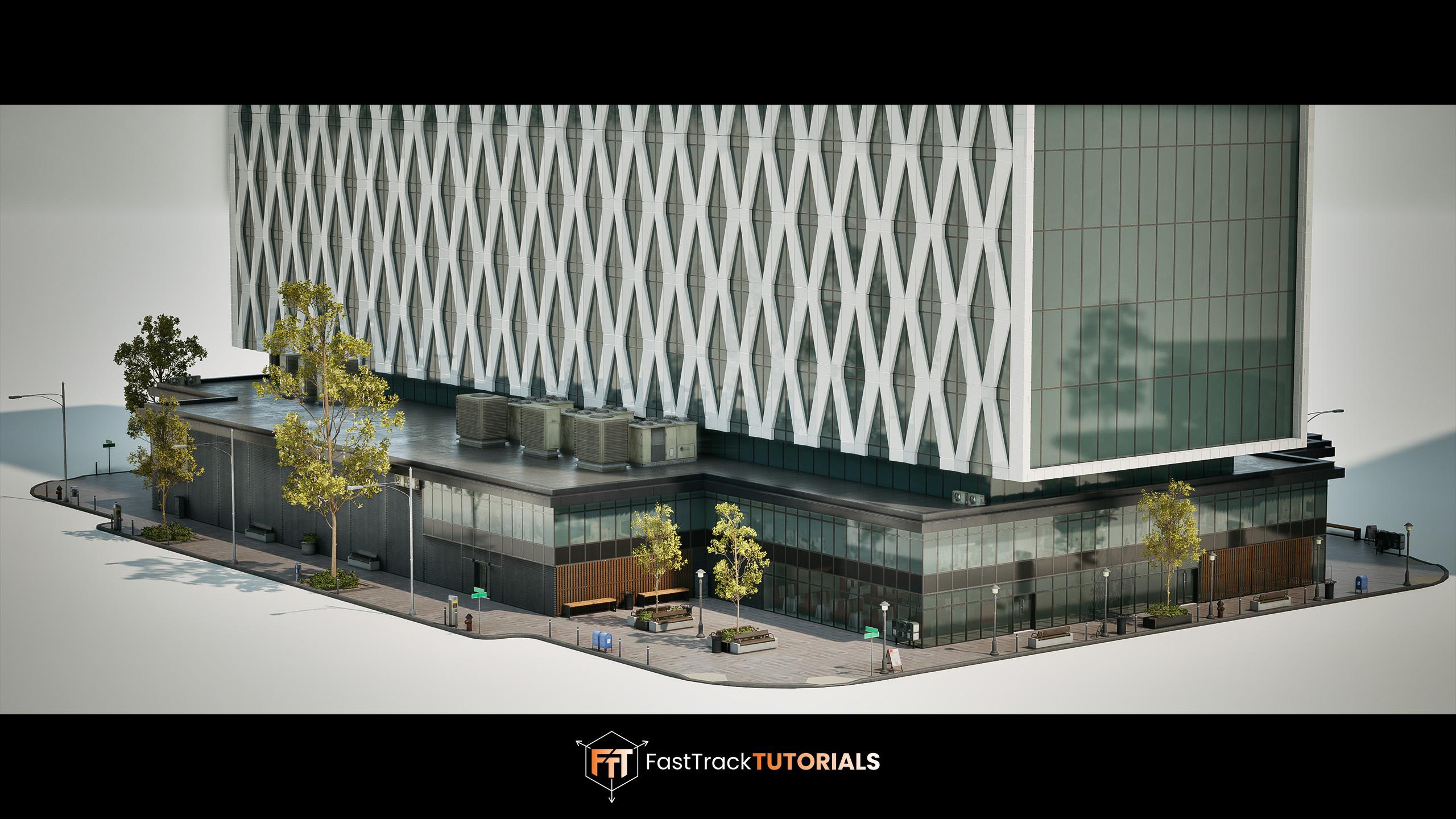
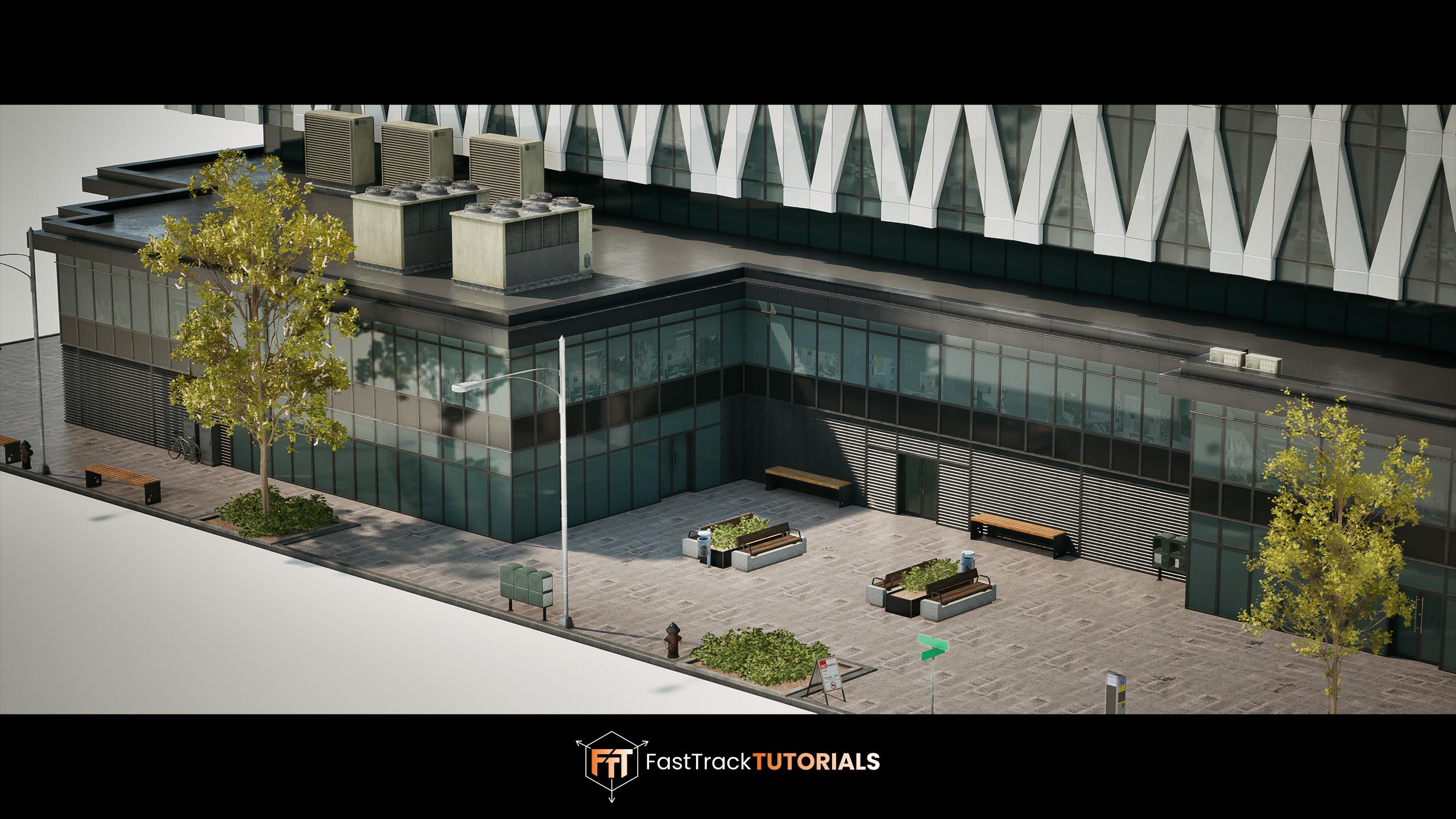
course is that at the end, you will have the
knowledge on how to create exactly what you
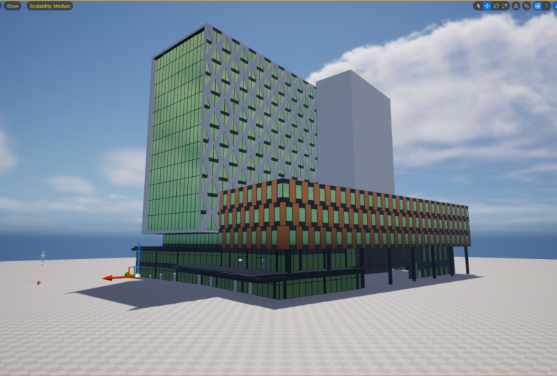
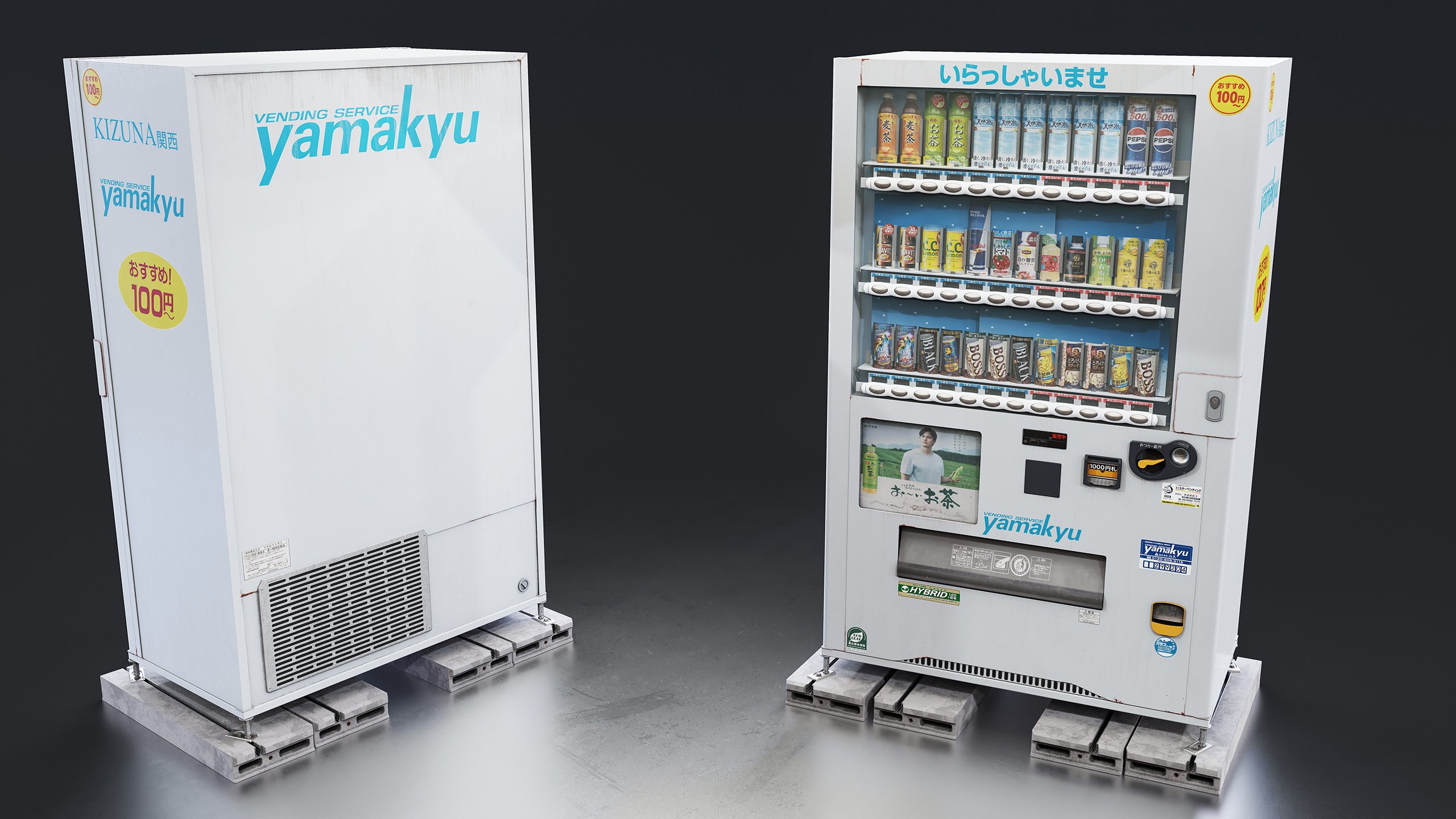
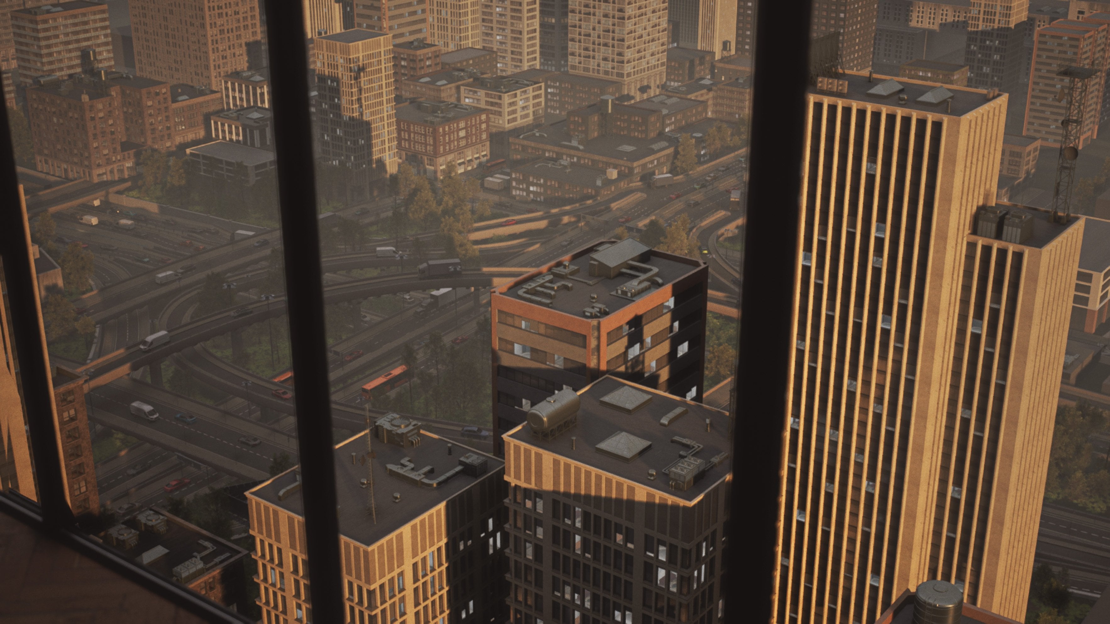
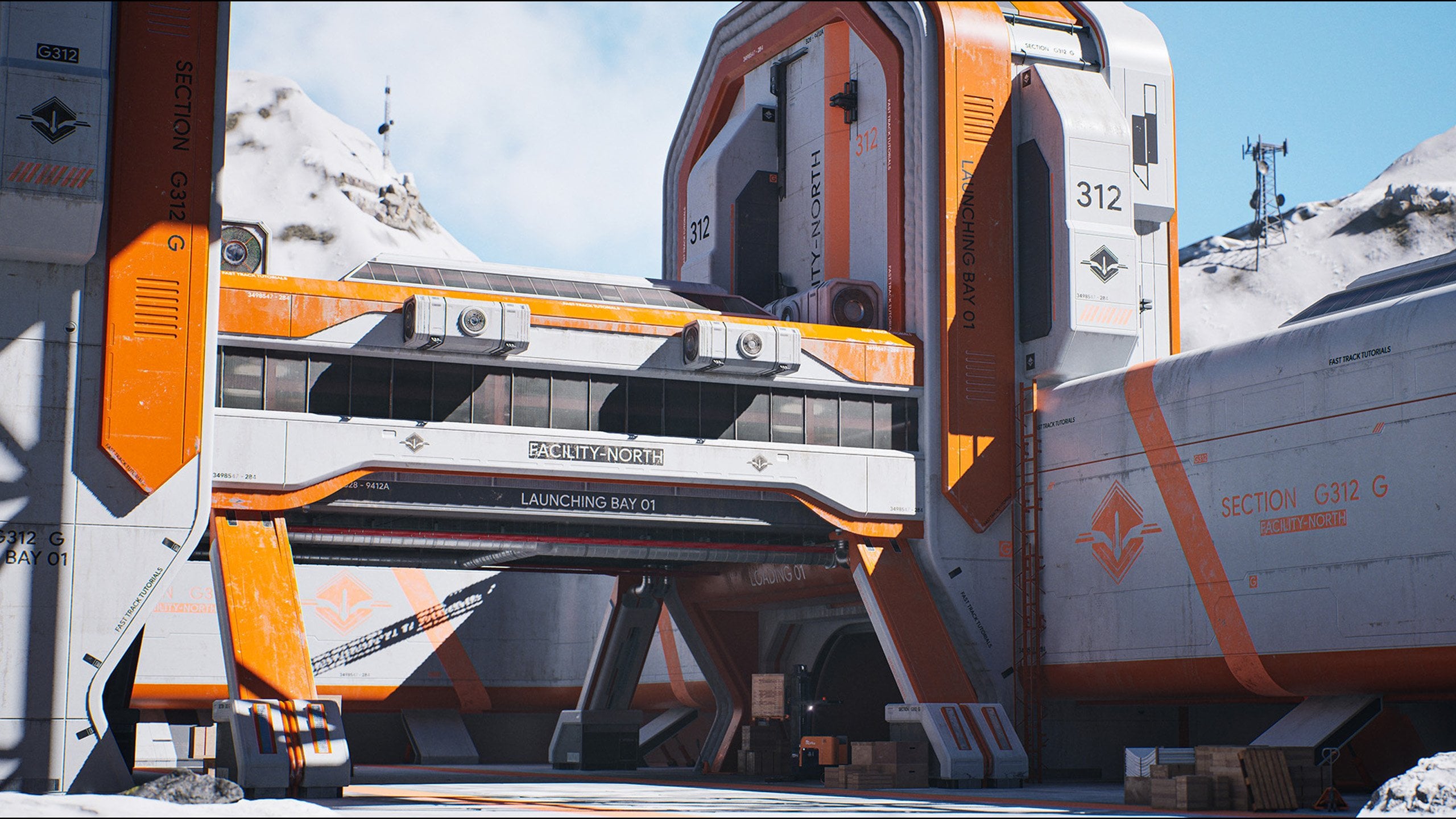
see in these images. And you can, of course,
apply this knowledge to almost any type of building
or modular project. For the modeling of this course, we will be using three IMAX. However, we are using
universal techniques, meaning that you can
easily replicate it across your
preferred software, including Blender or Maya, as long as you know the
basics of that software. For the texturing,
we will be using Substance Painter,
and of course, as mentioned, we will be using Unrealgent V for the
entire level setup. With a total of ten plus
hours of video content, I feel confident that at
the end of this course, you will have to know
on how to create module buildings and structures
fast and efficiently. This course does contain a few small time lapses for repetitive functions
and bonus content. However, we made sure
that we do not cover any new workflows or techniques
in these time lapses.
2. Gathering Our References: Okay, welcome, everyone to our very first volume on how to create modular
buildings for games. And as you can see over here on our screen, we
have a building. So this is the
building that we're going to create in
this tutorial course. We're going to go
over everything from how to create a blockout, making sure that all the
modular pieces fit together, how to create
different materials, how to create the
shaders to get like these fake interior shaders. And then also we do like
a little scene setup, although that's
more like a bonus. We're not going to go over
on how to create all of these small assets that
you have over here. They will be included
in the project file, so that's a nice little bonus. But we're just going
to use them just to make everything fit
a little bit better. And we are also going to make it that you can even,
like, go inside, althoug right now our
example doesn't have it, but that you can have a
little interior in here also. So that's basically
what we're going to do. And as you can see, the building has quite a
few interesting shapes. There is a clear definition between the ground
floors over here, which is like this modern
office type building with, like, some nice glass going on with some interesting trims. We also over here have quite
a unique looking trim, and this is actually
a unique piece. And then what we have is we have this interesting pattern
over here to create, like, some extra shapes and
just like, in general, I feel like visually, it has a really
interesting silhouette, and that's why I wanted
to use this one. So this is going to be
the modern building. And hopefully we will also
create a few more volumes where we'll go over more
like traditional buildings. Like, what I really love
is the buildings that you find in Paris or in Vienna
and stuff like that. So, having this building, the very first
thing that we need to do is we need to
do some planning. So whenever I create a building, I try to always make sure that
there is a real life copy of it because I'm
not an architect. Like, yes, I can make
up some general shapes, and that's also what I
did with this building. I made up some shapes,
but I need to have, like, a general idea and sense of what the building
is going to be like. So for that, I like to often just go ahead
and go to Google Maps. So let me just open it up here. So here we have Google Maps. And this specific building, it's actually located in
Manchester in the UK. So it's actually a place that
I happen to have visited. So if we just go ahead
and scroll over here, the nice thing about
Google Maps is that you can hold control,
and then you can, as you can see, shift the view, and it is over here. So, as you can see,
quite different. So here I kind of like ripped off one part
of the building, and then I altered it a
little bit to make it work for my use case because I want a standalone building. And for this, this is basically almost like
three buildings. Like we have our main
design over here, and then we would have another building
design next to it, and then another
one attached to it, and that just becomes
a bit too much. So this will also be a
good way to show you how that we can
differentiate between them. So this is basically
the location that we are going to use. Now, what we're
going to do is in our source files over here, and you will, of
course, get these also. I'm going to make a new folder and I'm going to make it
or call it reference. So in here, first of all, what I will do is
I will just create a very quick text
document for you. And it's quickly
called location. And just make sure that
you save this location. Of course, I do it
like this, but you can also go ahead and create
a bookmark of this. Now, next thing that we need
to do is we need to get some proper high quality
reference out of this. So over here, we can, of course, go ahead if you want. Just we will always
have this open, but it's sometimes
nice to just go ahead and create a few
quick screenshots. So I'm going to create one here. And then it will open up. Oops. Let me just do this. And I use share X in
terms of the screenshots. There is also a way
that you can turn off the labels over here. See that this looks
a little bit nicer. I'm also going to go ahead and
take a screenshot of here. And not sure if I
need it on the back, but let me just take one
more screenshot here. So that's just the general
Google Map screenshots. Now, another thing is
that we, of course, can use a street view, and I can remember that this
area doesn't show a lot. Oh, sorry, the TD view, it just completely does
not show anything. But I can at least, go over
here at the street view, and I can try and create
some screenshots. But I guess, in this case,
oh, yeah, here we go. We have some images. But this building
is not great when it comes to that kind of stuff. So let me just see if
I can go around it. Ah, around here, I should
be able to see a bit more. The reason I was here was
because there was actually a game development conference that happens quite often here. So here we go. Let me just go
ahead and get this. So this is quite nice to just
get a sense of the shape. So I'm just going to take
another screenshot here. And don't worry. I have way
higher resolution images. But what I recommend also for
your very first building, if you can, go to the location yourself
to take a screenshot, because, of course,
this it's a bit tricky. Now I kind of know
my way around. Yeah, here, see,
it's our blocker. But I can, of
course, also imagine that if you are not familiar
with creating buildings, it might be a little
bit trickier. I'm just going to
go to my top view so that I can then
go in here and drag it in a slightly
better location. Here. That's also pretty good
screenshot so that we can really see the corner and we can see how that's all set up. I don't think there's much. Like, we can go this way, but let me see if
I can go, like, a little bit further
back, maybe here. Wow, that's a very
low resolution image. That's not really worth it. Ah, there we go. Let me just notes that not
going to load in. That's unfortunate.
Okay, so let's say that we now have these few
screenshots over here. I'm honestly already
fine with that because we're now going to
move on to the next step. So first of all, let me just get those screenshots and just drag them into our reference folder. The next step is going
to be in my case, getting references
from real life areas. So you can do this
in multiple ways. Or you can go ahead and
you can find buildings in Google Maps where you can go a little bit closer to them. So like, high quality
that over here, you can zooming closing, you can really see, like, how
are the frames constructed? How is this all
connecting together? Where's the dirt
and wear and tear. But what I like to
do, as I said before, is I like to actually go
to location or at least go to a similar location
and take images there. So that is where, in this
case, SkansMtter comes in. So I'm the founder
of Scent Matter. A Scans metal, you can
get pretty much for free, some really high quality
reference photography and also three assets. So a lot of the assets
that you saw in our demo, you can actually get them
here for a very small price. So anyway, the reference, the nice thing is that
you can just create an account and you get
five free references. And each of these references, if we just go to
object reference, and we can go to the
buildings over here. So each of these references, so it's my Japan trip. We go here. These are the buildings that are
actually coming from there. They come with multiple like
8k9k resolution images. So that's quite nice.
So having these, I'm just going to go ahead
and log in, so 1 second. Okay, here we go. And I
have 996,000 credits, but that's just
because I'm the owner. So here I have a few really high quality building reference
images that we can use. They are not of that exact
building, but they will help. So I can just go ahead and I can quickly download, for
example, this one. And over here, you can see some close ups or
frames like this. So it's up to you like how
many you want to download. I don't think that one
will be too useful. I think this one will be quite useful, so let's
get that one also. These ones, I also
don't think they're too useful in this case,
for this building. So yeah, it's going to be
a general combination. So we have those. I can't remember
I had a few more. So let me just quickly
check on the back end if I can give you something
of my personal library. But anyway, what this will do is it will go
ahead and it will have downloaded zip files. And all you need
to do is just drag it in and you can
just unpack them, and then you have
all of your images. They are quite large, so just keep that in mind, because the next sap dot, what we are going to
do is we are going to throw it all into pure rev. So here you can see that
now we have these really nice let me it's opening
up on my on screen, really nice and really high resolution images
of our buildings. So that's what we want
so that we can really understand how are the
frames constructed, how is everything
fitting together and use that in combination
with Google Maps. It's going to delete
the zips for now. And let me just pass and have a look in my personal
library for this. Okay, so I found a few nice
ones that looks like that they did not make it to the
website. Um, where are you? I was looking at
it like a second ago. Now it's gone again. I am blind. Oh, no.
Wow, I'm really blind. Sorry about that.
There they are. Okay. Sorry. So here I have
some of the actual building, which are also very
high resolution images. And the reason I like this is mostly because of this image so that I can really understand
how this is constructed. I could figure it out, which is Google Maps, but it's
nice to have it. And especially for tutorial, it is good if you have a little bit more information because I assume the
people following this, they might be a bit new
to this kind of stuff. So I'm just going to go
ahead and I'm going to copy those and then also place
those nicely in here. Okay, so that's that part.
Now the next part is that we are going to use
a program called PureRef. I'm sure many of you
already know it. It is completely free. You can just go to Google
and type in Puref. And basically, you can
donate, by the way. What we can do in PURv's a
very nice reference viewer. So we can drag in all of those images that we
have just collected. And what it will do
is it will open up these images nicely sordid, and then the best thing about
it is that it will keep it all at the same or at the
real life resolution. So at the resolution that
it was recorded with, allowing you to zoom in and out into all of these
details very quickly. I'm just going to pass the video because as you
might have noticed, my images, they are
very, very large, so they take a while to load in. Here we go. So that's not done. Now if we zoom out, you can see that now we
have all of our images. So over here, of course, these images were a
little bit smaller. So what I'm going
to do is I'm just going to go ahead
and place these up here. Like this. You can also just
go ahead and you can make them a bit bigger. Just keep them similar size. Then over here, what
I like to often do is I like to categorize my buildings together for
which building is which. So we have over here
that we can very quickly move around and see what we need to create. I
think that's about it. And then we have
over here this one. I'm also just going to show
you a quick trick that once, for example, move
these out of the way. Well, it's still quite a few. Let's say that these are all the same building except
for this one. Sorry, these ones
need to go here. What you can do is you can
also just select all of it. Right click Images,
arrange, and, for example, say optimal and then it
will nicely arrange all of these images for you.
So that's about it. I know there's one in here that I have no
idea what this is. I'm just going to get rid of it. But now we have a pretty nice overview of what everything
is going to be like. What we're going to do next
is we are going to actually plan the modularity
of our building. I think that's very
important too. I can kind of do
it out of my head, but I feel like it's
important to show you how that all of this
modularity is fit together. And for that, we are going to
use a few of these images. Sadly, we cannot use the
Google Maps one for this. We can, but it's a bit messy. Yeah, over here, you
can kind of use it. So let's use just a few of them. I'm going to open up
Photoshop for this, but you can use whatever
you want. Here we go. So here we have Photoshop, and I have this image over here. Now, what I want to do is I
probably want to go ahead and scale using my cropping tool to allow for more
images to be in here. So we need to basically
get every angle that might become
a modular piece. If I just have a
look at Honestly, this one probably already is better than that other image. So let's do this one. Then
let's go ahead and get a very clear view of the
site building over here. And let's see what
else do we have? I'm just checking.
So this will be covered by the side we
don't have the front, so I'm actually going to also
add this image over here. Oh, that fits quite nicely. There we go, like the front. So we now have the
front, we have the side, and we have the base over here. I think that you be it. We
just have a look around. So yeah, we have the site. Of course, the rooftop, we're just going to keep it very easy. We're just going
to make that flat. And these sites, they can
go kind of like all around. I know that over here, there's
like a service entrance, so I do want to work on that, but I don't think we
need to do that in our planning because those
are more variations. You can see them over
here a little bit. So the way that I like to
work with this is quite easy. I like to just go ahead and use my polygon tool and
I'm going to figure out using this the pieces that we need to create
for our modularity. So I assume that when
you fold this tutorial, you do already know a little bit about what modularity is. Modularity is basically
the art of re using tree assets to create
larger buildings. So the way that this works
is if we go ahead and just use our building over here, for example, and let me
just go into my building. Here we go. So, for example, this building, I have all
of these modular pieces. So basically, instead of making this entire building as
one giant chunk of a mesh, which is extremely inefficient because one, you need
to do much more work. Two, it's very destructive
because if you want to change one
thing on a small area, you would have to
change it everywhere. Tweets highly
unoptimized because unwel engine and game
engines in general, don't like giant solid meshes. There's just a bunch of reasons why you wouldn't
want to do that. Instead, we have
something called reuse, and I'm going to just show you, like in a very simple way. So I'm going to go up
here and I'm going to set my snapping to 100. And let's say that we
have over here this trim. So we have this building trim. Now, what we do with it
is we make sure that the sizing is always
in chunks of 1 meter. So 100, 100, 100, 100. You can see here, this
one is 400 meters. This means that when we
set the snapping on, we can simply duplicate this and see how it perfectly
snaps together. And the goal is that
when it snaps together, it will perfectly transition
over to the next piece. You can very quickly
snap it again, and let's say that
now you are going to At the corner piece. Sorry for the corner
piece, I need to rotate it a bit,
but over here. So now we have a
quick corner piece. And the cool thing about
corner pieces is that they also are highly flexible, so they all work
together like this. You can then even over here, for example, rotate this piece. Go here and snap it
together like this. So like this with
only two measures, we are able to construct
quite a large structure, and it just depends on what
you would want it to make. So over here, we can, for example, do
something like this. Now, let's say that the same
with windows, we, of course, have some very simple windows,
as you can see over here, that if I would go in and here, let me just like I'm
just temporary going off the grid because this is a special case where you
want to kind of go off grid. Here we go. So here we can
also do this with windows, and even these windows,
they have a corner piece. It probably doesn't fit now because I'm not making
it the way that it should be made, in this case. Okay, yeah, it
doesn't fit nicely. I'm always a bit worried that I mess up or
something like that, because I don't know exactly
the dimensions of this. But here we now have, like,
a very simple corner. So now if this would all be
one solid chunk, that's it. But if you later want
to change your mind, you would have to
redo a lot of work. For example, what I
want to do is I want to go ahead and turn these, for example, into this piece. So I can simply drag it on, and now it has become
a different piece. Just like that. So
that's very quick. I can also go in and with
modularity, it depends, of course, on your mesh,
but sometimes you can also go upwards with modularity. For ground floors, we
don't often do that, but for intermediate
floors that need a lot of repeating like
this, you can do that. So we then can go in here,
swap it out for another piece. And just like that, we have an interesting
looking structure. And you basically just
keep going like that. So on top of this, you can
then go in and let's say, you would add a roof trip
trim, sorry, not trip. So I go in here, I
deselect my corners, and I think this is the
roof trim. Yeah, it is. And the nice thing about it
is that all these pieces, they share the same dimensions. This is important because this means that we are able to very easily just swap out the
pieces for whatever we want. Just like that, you can
go ahead and you can construct an entire
building like this. So that's a general sense
about modularity that you can reuse pieces and that they
all fit together properly, no matter which piece
you use to combine. So knowing that, if we just
go back into Photoshop, we can go in here and you
already know this one. So here, what we can do
is we can decide, Okay, I want here, and it doesn't need to be
perfect in dimensions. You just need to know
what you want to create. I want to create one
straight trim piece. And also, it's just like
the initial creation. I then go down here, sorry, and select solid color. Here, let me show you again.
Go here, solid color. And then what it will do
is it will grab your mask, and then all you need to do
is you set the opacity a bit lower so that you can
clearly see the outline. So just for me as a memory of, like, Okay, so this is going to be one of our modul pieces. Now, over here, we can do
the same where we say, like, Okay, I want to
make a corner piece. The beauty of all this is that this is an initial planning, but we are going to create blockout pieces before we
create the final pieces. And by doing so, during
the blockout stage, we can simply add more
pieces if needed, but we need to have
a solid baseline. So here I have this. Now you can then also
imagine that, Hey, I want to have a chunk that
is just windows like this. So you can go
ahead, solid color, give it a different color. Doesn't really matter.
It's just for your eyes. Although doing
breakdowns like this is sometimes also nice to
show on your portfolio. And like that, I can go ahead
and I can just There we go. Places. So now I can already
construct this piece. I can construct this piece, and we have these
pieces over here. Now, over here, I
can see a door, and I don't know if there is a better place
where I can see it. I can't really see
a better place, but it's just for us to
know like, hey, Emil. Don't forget. You
also need to create a piece that has a
doorway over here. So I can just at the angle, Do that. Okay? Maybe green is a bit more difficult
to see in this instance, so let me just make it orange. So we now have a doorway, we have a corner piece, and
we have a window piece. So that's quite nice.
And then over here, if you want, you can, for example, create a
lower window piece also. We're not going to
do that because our building we're going
to change design a bit. But just like that, B I've
already taught about it, and we're already
able with only three, four, five pieces to basically create an
entire ground floor. And then I do know
that over here, I do want to have one utility. So I'm just going to go
ahead and add that one. And that should be
already enough to do most of our ground
floor pieces over here. And then all we need
to do is create a little bit of variation
here and there. So knowing that, we can now move up to the top floors over here. And so for the top floors, what we want to do is we want to have a look and see how would
this like transition. So we definitely need
two pieces because or, you need to make one
very large piece, but I like to do two. So let's say that over here,
we have this one piece. Like the anime, one piece. And we can go ahead
and lower that. And then we do need to make
sure that when we create a transition that goes upwards,
it needs to fit together. So this over here, I can go here, but
then what I can see is that this one is
not exactly square. So actually, what I would
probably want to do, although we do this
more in the blockout, but just to show you, is I
would actually want to oh, yeah, no, that is tricky. I think we need
to have a look at the blockout, what to
do with this match, because an important thing is that we keep
everything square. So for now, let me just do this. And in the blockout, we
need to see how we are going to exactly construct that. The reason I say
that is because I never like to cut a model
exactly in half like this. Like, if this would
also be purple, logically speaking, like this, logically speaking, that would be correct in terms of sizing, but that doesn't
feel nice, does it? So we need to have
a think about that. So we have those pieces. Now, over here, we have
quite a unique corner piece, as you can see. I'm going to alter that to simplify it a little
bit for this tutorial, but I can already just go in and somewhere here
just to indicate it. I can place, I do try to make the color somewhat
separate a thing here. So we have this over here piece, and down here, I'm going to show you that this is actually not going
to be much a piece. We are going to be able to
reuse this piece up here, also down here, but we'll go over that a little bit later. Now there is technically
also a top piece, as you can see over here,
which like a top trim. However, what we are going to do is we are going to make it into a very simple cube
like you can see over here. They are all going
to basically be reusing the same stuff. Like you can see over here. Yes, if you want to taken
also, just to indicate it. That that's more going to be like the one piece that
we're going to make, and that's going to be able to run all the way along here. So we now have the top floors, and we have the side floors. Now, just for me to
cheat a little bit. I want to just have
a look because I did add some unique pieces. So here you can see,
like, utilities. Over here, you can see a utility piece that has a door in it. That's up to you if you want to add some more pieces to that. But initially, we are
not going to do that. For example, here,
there's another piece that has this rotating door. I'm not really going to
do that for this because it's a bit overkill
for a tutorial course. I made this building, of course, already before the
tutorial course. And it's also going to soon be available for sale on
fab to be reel engine. But I think we already
got most of it. The last piece is
this piece over here. See, so I knew I forgot
something. That's why I checked. And that's just over here, but that's obviously going
to be very easy. Let's say, here, three
windows. There we go. Uh Let's do this. Okay, so we got that
piece also done, and I think that should
fit most of our buildings. Now, of course,
just for you guys, what I will do is
I will save this. And now we can just go ahead
and we can drag it in here. And maybe put a bit
more at the top so that it's like the main focus point. And there we go. So we have now already done our planning. Nice. So in the next chapter, what we're going to do
is we are going to start focusing on creating
an initial blockout. We will be using
Tris Max for that, but you can easily use Blender or Maya as long as you know
the basics of those software. So let's go ahead and
continue to next chapter. Where we're going
to start by just creating these blockout pieces.
3. Creating Our Blockout Building Part1: Okay, so with our
planning now done, the next step is that we are going to create our blockout, and then something that
I always like to do, which quite cool is we are
already going to build our entire building because
it's really hard to make a blockout without actually knowing if all the
pieces will fit. So after these few
chapters are done, you will already have just like an entire building ready to go. And then all we need
to do is we need to, of course, convert it to final, create materials, screp shaders and all
that kind of stuff. But for now, so I'm
using three years Max. Let me just move it over here. However, the
techniques that we are using is not so much
about modeling, but more about learning
the general workflows. So you can easily use
Blender or Maya or whatever you want as long as you know the basic
concepts behind it. Hell, you can even use the unreal engine modeling
tools if you want to. So over here, the first
thing that I like to do is I like to go ahead and
import a scale reference. Now, what I did is I went
ahead and I placed it, sorry, placed it into the Expos folder in your
source files over here. So I can just go
ahead and it can go file, Import, Import. So this scale reference, let me just import it. What this is is that
it is basically just a simple person that
is at 180 centimeters high, which pretty much default
scale of a person. Wow, I can speak
today all of a sud. Um, next to that, I
also have an arrow. So the reason I have the arrow is quite nice is because it shows me which area is forward
facing in unreal engine. So in unreal engine, if
we look at it like this, it would be forward facing. And that's something
that we just want to make sure we have
that everything is basically just like aligned properly with the camera
when we drag it in. You very often, if
you don't notice, have it that you accidentally
have it sideways, which for a building
isn't too bad, but still I want to have
like a proper start. So basically, it's just a very
simple overview over here. Now, next to that, what I'm also going to do
is I'm just going to right click on any of these
buttons up here. I'm going to set my
grid points here, home grid from 10
centimeters to 100. So right now it is just 1 meter by 1 meter every grip point, just because we are
working with buildings. They are much larger in that sense, so this
is a bit easier. And there we go.
Okay, so easy setup, we have a scale reference,
and we have over here our building
or our grid points. The next thing that
we need to do is we need to define the
initial scale. And as I said before, the scales that I often like to use is four by 4 meters for default
pieces over here. To find that four by
4 meters, it says, the right balance where it
isn't too large and too small, but also for gameplay,
it fits nicely. And also something that's quite important
is that in games, you sometimes want
to go slightly bigger than they would
be in real life. But in real life, even this
would be 4 meters, I assume. Like, these windows look
like one meters high. Of course, this piece
would not be four by four. This one would be Well, it kind of depends
what you want to do. If you want to split up into two pieces or just
have one large piece. I'm probably going to
go for one large piece. So this would probably
be four by 61, two, three, four, five or six. So I'm going to
go ahead and just get started with the base floor. So for now, move this
little guy over here, and I'm just going to create
a simple box like this, let's go ahead and
set the value. So in the length, I want to
have it 400 as in 4 meters. Then for the width. So with width, you
have two options. Option number one is if
it is a closed building, you want to make it a
minimum of 25 centimeters. You do this to avoid
any lumen errors, like, lighting, bleeding
or any stuff like that. However, if you want to give
the building an interior, then of course, what you
want to do is you want to make it closer to real life. So that's a tricky one here. Do you want to make it
close to real life or not? Now, what we can do is we
can give an option that the bottom over here
becomes a little interior. I could even like for you guys
import some assets to make it like a little coffee shop
or something like that, as like a little bonus. But of course, honest, I cannot give you too
many assets because then the actual assets become
more valuable than the soil. But yeah, so we can go ahead and choose what we want to do. So let's go ahead and
make the bottom and interior that you can
actually go through it. But then the top over here, let's make that solid. Now, nice thing is that we actually have a
buffer zone in here. So that's really good. We
have this solid black piece, which is a good buffer zone. So focusing first
on the interior, I'm going to go
ahead and probably make it like 10 centimeters. I think still having
a little bit of tech frames to give it some
space, that's quite good. Also, I'm going to turn on edge and faces. That's easy to see. And then for the height, we probably want to go
ahead and go for 600. Now, remember how I
said in the overview in the previous chapter that often you also
want to go up and down. Like over here, we want
to go up and down. But I believe that
I also explained to you that ground floor
pieces are slightly different in which we rarely stack them on
top of each other. So we can often go at a slightly different scale like four by six instead
of four by four. The only thing that you need to do is we need to make sure that all the ground floor pieces
do fit together well. What I'm going to do is I'm just going to reset this to zero. And also, what I want
to do is right now, the snapping is in the
center on every point, but this does not often work well when we use our snapping. So instead, what
I'm going to do is I'm just going to right
click again here, and for now, I will just
leave this window open. Let's move my thing here. And I'm going to go ahead
and I'm going to go to snaps over here and make sure
that vertex is turned on. Because then all I need to
do is I need to go up here to our hierarchy,
affect pivot only, and just simply in the
middle of this pivot, drag it to the corner here, and then again, reset
over here your point. You can also mess around with the values together
to this point, but this is often a bit easier. So this is basically going
to be our point of snapping. So the next thing
that we need to do is we need to actually
give this some shape. So first of all, I
want to go ahead because this is like
a nice default box, and I already, I believe, oh, no, I don't have
my layers over. So over here, I'm
going to talk on my layers. There we go. Now, inside of Blender, this is called collections. And here inside of Max,
we just have layers, and inside of Maya, you all
at one groups, I believe. But I like to just go
ahead and copy this model. Past it over here, and
I like to already give these layers the export
name that I'm going to get. So a plain wall is always
a good thing to export. You might always just need it here and there,
so that's great. Now, when we create buildings, at least in the
production environment, we often have an ID to the name. And in this case,
this building name, the D that we have
just for example, that we are going to use it
was going to be MM zero, 0252 MM in my case
stands for main model, zero, zero, 252 is just this is model number 252 out
of everything we make. And then what I like to
do is, I like to do dash. And then in this case, it's going to be G
for ground floor. And then do underscore,
plain wall. And I always like to
do underscore 01. Go away creat Klaus. Underscore 01, just because I know that sometimes I might
end up making a few more. So this would often be like
the naming convention. If you want, you
can also just do, maybe like this, G N, I'm
going to leave it like that. So we now have this
naming convention, and when we export this file, we can literally just go in and we can just copy this name. Oh. Yeah, copy this name, and then we can go
ahead and export it. So that's how I did that. I
accidentally missed a button. But now I can very
easily also hide this, and I can just continue
with this one. So right now, this piece
is going to become, I can just add a new
layer MM 002 52g Window. Score 01 over here. So this is going
to be our window. And as you can see, this
is the shape that we have. Now, knowing that a door
is around 220 centimeters, we can kind of figure
out how high this is. So I'm going to
first define where this layer over here happens. So if we just go ahead and go
to our site view over here, you can even also
move this guy closer. And let's go ahead and
create not a line. So, let's go ahead and
convert this to add a Poly so that we can edit it, and then we are going to
just add a simple loop. So knowing that the door
is probably around here, so there would be a
frame around here. I would say that probably
what you want to do is probably want to make
a frame here and here. I feel like that feels quite
close to what we have here, although these windows do
feel a little bit longer. Now, I like to often also stay quite close to the
general frames. So I'm going to sometimes
go into my home grid, remember, on the snap settings, set this to 50 or even 25. And see, ooh, if I
go lower than that, that wouldn't look very nice. Let's see. So we have this. I'm going to probably
as you said it's to 25, move it down once. Like this. So we're going to have a frame here. We're going to
have a frame here. Then I'd like to also have
a swift loop over here. So we have a frame here, and then this is like that
thin piece of window. See, it's not really square. So we have our base, which later on we also
have a door variation, thin piece, solid piece,
and then up here. All we need to do is
also have another piece, but I feel this already
looks quite white. Now, another thing
that you can do is you can turn on your
snapping if you want. And you can just go
ahead and you can snap this all to your grid. We are in vertex mode, so we
can literally just select this because keeping
it on the grid, it's quite smart to try and keep everything on the grid like this because you might end
up with quite a few pieces, and then you might
sometimes accidentally forget that you shifted
something like a tiny bit, and then it's good to just know that you can rely on the
grid for this type of stuff. Now, next thing is that we have four windows. That
one is super easy. All we need to do is we
just need to go to Edgemde, select all of these
edges over here, go to connect and
connect settings. And you said this to
three. So one, two, three, four windows over here. And then, of course, we
do also have the ends, but we can go over
that in a bit. So we now have all
these shapes over here. These window frames, right
now, it's a blockout. So you can see that
we definitely need to alter this a
little bit later. I don't know if I have
some real close up images. Not a lot, I guess, this is the same image. So but you can see, there's
like a thick frame behind it, and then we have these
tin frames on top, and in between there,
there is the glass. So that's generally what
we're going to go for. But for a blockout, we are not going to go
through that effort. All we want to do is have the frames in the right location, have generally the
same thickness. So for now, I'm just going to select all of these
pieces over here. Add the chamfer and set the
chamfer to zero because a chamfer on a flat area
just splits up the frame. So I can set this to, like, say, 2.5 yeah, they are
quite thin frames. So let's say 2.5 like this. That looks quite nice. Over
here for the Swift loop, I'm just going to eyeball it at this point because
it's a blockout. Also, another thing is because
it's transitions over. We actually want to
go half the size because when we sit them
against each other, this half and this
half on each side needs to become one full frame. Let me just move it
a little bit more. So that's why I'm
just trying to, like, roughly just half it. Does it have to be
super precise for now, but let's do
something like this. Then here at the top, we're
not going to half the size because we don't have
it stacking on top. And here at the bottom, we
can also just place it here. There we go. So
that's our frames. Later on, our frames will
actually become like a separate piece that we
will add on top of it. But for now, what
we can do is we can go in and just
to indicate where the windows are we can actually you know what I
also want to do these ones. Select this stuff. I
would say, actually, at this point, because this
is going to become Citru, I'm going to do it
slightly different. I'm going to first select these. I already forgot that I was
going to make it Citru. Sorry about that. I'm
going to first of all, select these and
just delete them. Then what I'm going to do is I'm going to go
ahead and I'm going to probably won't work
because yeah, it just gap. Oh, no, wait, sorry, it
does work in bridges. I'm going to just
do a border select, so I have a bit of brain freeze. Select all of these
borders and just bridge them so that
they are closed off. So we have that as our exterior. Now, remember that over here, we had that buffer zone. So for the buffer zone, I probably want to go in, and I need to kind of know where my ceiling is going to be. I think my ceiling will
probably be slightly higher than the window scale. I feel like that
would be quite nice. So I'm going to actually
place my buffer zone roughly up until this
point over here. So let's say that we
select this area. And I know that from the back it will look a little bit strange. And I know that I'm using a
very slow way of selecting, but Now, at this point, I committed, so I have
to finish it like this. Having this piece, I can go to my top view in my home grid, right now, it's set
to 25 centimeters. So for these, I can
actually just extrude them, and I honestly can
just turn on snapping, hold Shift, and just
snap it to the end. So we know that that
one is 25 centimeters. So doing this, we
have the thickness up here to make sure that
there are no lumen issues, but we have the thinness
up here to make sure that it does work for
any type of interiors. Only thing that we need
to keep in mind is that whenever we have corners and whenever we have pieces
that are linked to it, that it doesn't
look strange, that you don't all of a sudden, have something like this that
is visible in the interior. If you cannot see it in
the interior, it's fine, but else it might look a bit strange. So we
have these pieces. Now what we can do is we can
just go ahead and select these pieces and also these. I'm just going to hold Shift, and I'm going to push
those in not too far. So this is just
to indicate, Hey, these are windows, for example. So that's basically
our initial piece. The only thing that we
need to do now is we just need to go in place a very quick plane.
Here we go. Plane. And you can just place
that in front of it. I'm sure you all
know how to create a plane, so I'm not
going to go over that. I'm going to push it
back a bit, and in Max, we have a cool tool, but
also in Blender Maya, where if you flip the normals, in this case, using
a normal modifier, and all these modifiers
you see for me here, you can also find down here. If you don't have these windows, you can go down here and
you can go ahead and press configure modifier sets
and press show buttons, and that's how you can figure that out, how to turn it on. That's really for like
a more beginner toil so I'm not going to go
over that too much. So we have this plane. This plane is going
to be see true, and then we have these
pieces over here. What I'm also going to do is I'm already going to just
apply some materials. So if we have a material here, it's just going to give
us more visibility when we are playing around with this inside of unreal engine. So material one, I'm just
going to call frames. Material two class C
tru material three. Glass opaque. So first of all, we have glass ci
through over here, and what you can do is
you can make the color, for example, a
little bit bluish. Then what we can do is
just this entire piece. Let's first of all,
just add frames, which we're going to keep gray. And then in the
selection, select the insides and just
make this glass opaque, which I'm going to make here, like quite dark
blue, for example. Okay, that might
be a bit too much. I still want to be able
to just read it all. And there we go.
First piece done. We can go at the Sava
scene at this point. And where is my folder? Oh, it's hiding on
my other screen. Let's go ahead and make a
safe folder for you guys. Always good to save your
scene before there's a crash. And I'm just going to go
ahead and call this by the ID name MM 00252. Just for you guys, I
will call it building, just so that you
understand a bit more in case you want to open it up before
you follow the course. So we have our
first window done. Now, before we move
on to the door, I want to go ahead
and end this chapter by also creating the corner. So for the corner, as
you can see over here, we just t to make it
go around the corner, and corners are very
often one by 1 meter. You need to be very specific. Just see here, British soap. Okay. You have to be
very specific about the corners because of
snapping reasons because corners they need to snap
very, very accurately. So I'm going to set my
grid spacing to 100, and I'm going to show you a
trick that works in yeah, it should work in our programs,
just slightly different. But it's quite a similar trick. So we have our window over here. We're just going to go
ahead and copy this. And then we are going
to create a new layer, and whenever you have
something selected, it will automatically place
it into the new layer. 252g corner, underscore zero, one, and turn off my window,
make sure to do that. I might also in this course, make a mistake where
I forget to do that, and then I end up
editing two pieces. So it looks quite simple. We just have literally a
continuation of this corner. Although later on, I
probably also want to create a corner for these
grids over here. So what we can do is we can go ahead and we can use the
symmetry modifier for this. So first of all, I need
to honestly, also, just for ease of use,
I'm just going to attach everything inside of this
as like one solid model. And then for now on the Y axis, I'm going to set this to -400, just to kind of push it there. And then I'm going to just
effect pivot only and set my pivot back to
zero. There we go. Because this is going to
be the point where we want to have our corner start
because as you can see, when we have this piece, it needs to perfectly
transition. When the corner start here, it will perfectly
transition over. Almost every piece is on the right side,
except for corners. Corners are the ones that
are often on the left side. You can do it on the right, but for visibility reasons,
I like to do left. So knowing that,
all we need to do, which is quite simple in Max is we add a symmetry modifier. On the Y axis, and
then press flip. Oh, no, sorry, we don't
need to press flip. I'm going into the mirror. You can just do that
by clicking on. Here, see now you can see it. And we need to turn
on snapping and the most important
thing is to only snap to the grid
point at 1 meter. So if we go in here and we snap it to the grip
point at 1 meter, now it is perfectly
snapped at 1 meter, and if we then rotate
this using snap rotation, you can see how it
then perfectly. See? Because of the snapping it perfectly just rotates
around like this. Now, we might
sometimes have issues, as you can see over here, where the frame in
between is too thin. There's a few ways
that you can fix that. Way number one is you go
off the grid snapping. You push it forward until you have the frame
at the point that you want. Like over here. And then what we
can do is we can just manually push this back. And number two would be
to just model the frames. So number two would be
literally just pushing it out. Just because this is
our very first corner, method number one
would literally be we have this
piece now over here, and we just go ahead and we
would grab these angles. Like this, we want to go ahead
and go to scaling and make sure that they are scaled
flat because I felt like, but it might just be
optical illusion. And we push these out. And then what we also
do is we would also go in on this side, do the same, and then also push them out,
and then on the back side, we would also do the
same, just to show you. They will push it out like this. And then what you need to
do is you also need to make sure that you
grab the back angles. But for that, it's often
easier to hide these pieces. I'm sure that by now you get it, but I want to show you
the different technique. Over here, it already works
fine. Yeah, you know what? Here, if you done add
a smooth modifier, I think that already works fine. But because I'm going to show
you a different technique, just because you
might sometimes need this technique to also do
some unexpected cleanup. So with this technique, I'm going into my
cemetery without snapping and only on one axis, make sure that you only do
it on the y axis over here. I'm going to push this in
until we get to a point here, I can see it on the corner, see? That it is just in front of it. Then all I need to do is
I need to go ahead and out and added poly and I
need to select one side, so the side that's
sticking out like this. And then if we just go ahead
and just on the y axis, I know it looks a bit stupid, but wiggle it around,
turn on snapping. Make sure that vertex is
turned on in snapping. Go down here and select
the vertex and snap it to the grid by then just moving
your cursor to the grid. And now you can see that because we wiggle it on the y axis, it knows to do the snapping
only on the y axis. Like this. Now you guessed it. Now we can select this end, wiggle it around on the x axis, and then grab the
vertex that should be exactly on the X
and snap it like this. So that's another technique to then move it back into place. And the snapping should
work totally fine now. All you would want to
do at this point is add a smooth modifier
just to get rid of that really strong smoothening
effect that often happens. And I guess if you
really want to, we don't have to
do it right now, but you can already
just grab a corner, although this corner
is quite specific, but if you have a plain corner, you can add a little chamber. That is often nice
just to give it this smoothness that you know
you're going to get later on. So 0.75, for example. And that's it. Our
corner is now done. Well, plain wall is done
for the plain wall, and probably actually
going to make that 120 5 centimeters. But as you can see,
because over here, it scales in the center. It's easier for me
to just art and add a poly and the reason I like to and added plein instead
of converted polygon is that I can always remove
it and go back to my box. But I can just go in here. And once again, vertex
is still turned on, so I can literally
snap this and just move it to that grid
point over here. I feel like for walls, it might be nicer if we
have them actually solid because they need to become
they are solid chunks. So you want them at 25. But like this, you can imagine it from the
interior if we have a ceiling up here that has
quite a nice transition. Over here, it's quite thin, but we are just going to, of course, manually add another
piece there later on. So let's save our scene. And yeah, there is a
good moment to stop. In the next chapter, what we'll do is we will create
a door piece. We'll create some trim
pieces over here. And then yeah, door
piece, trim pieces. And at that point, let's
just go ahead and already go into Unreal Engine just
to show you the placement, make sure everything works. And then what we can
do is we can create any other additional piece
that might be needed for our ground floor and already build out
the entire ground floor. And after that, we
of course, move over to the top floors. So let's go ahead and continue with this in the next chapter.
4. Creating Our Blockout Building Part2: Okay, so let's go
ahead and continue. So we got our window and corner. So I think the next thing that I want to do is I just want to go ahead and create
a door variation. And, I mean, is
it a double door? Is it the single door? That's a little bit difficult to see. But let's just go ahead and, um, seeing as we have 4 meters, let's probably make
it a double door. So in these cases,
what I like to sometimes do is
just go to Google because I forgot and a
double door was 160. Let me just double door size. I'm doing this on
my other screen. So yeah, okay. So doors
are around 80 " high. Which in what most
of the world uses is 200 ish to 220 centimeters. That's often for, like,
just generally for doors, kind of depends where
you are in the world. And the width is around 60 ", which is like 150
ish centimeters. I'm from a centimeter country, so I will be using those values. So first of all, let's
just go ahead and create a box over here, and we're going to
make the length. Is that the length, the length. Although in this case,
length is height, I believe, so 200. And I'm gonna make
it a bit bigger. Oh, no, wait, that's
not. Sorry, 150 I like this. So it was the height. I'm gonna make it
a bit bigger, 220. Oh, that just hit. In that case, I'm not
going to do that. 200 Yeah. So on to on. So let's just
leave it at this bar. The reason why I want to make it a little bit bigger
is because in games, often the camera needs a little bit more space to get
through the door. However, in this case,
since I do not think it is worth like completely changing all of the framing
and stuff like that, I'm just going to kind of stick to where we are over here. So I'm just mostly going
to focus on the width. So what we can do with this
is we can go ahead and set this cube turn on snapping to, for example, the grid over here. And it's moving back so
that we now know that it's exactly in the
center of this piece. At this point,
let's just go ahead and select our window pieces. Oops. Contra V, copy, new layer, Mm 00252. Uh, door on score 01. Let's the door. Oh, of course. I've not been typing.
That's awkward. On the score door, there we go. And then in the corner,
we have our cube. I'm just going to
quickly drag that into the door so that all that we have left now is
just this doorway. Okay, so for the doorway now, there's a few things
that you can do. You can place an
extra frame here. In which case, we have
these two thin windows, or in this case, you
can go ahead and you can just literally
change the framing. Like that often happens also, where they actually change the window framing
specifically for a door. To keep things easy, I'm just going to change
the window framing. So all I'm going to do is I'm
just going to go up here. And change these two frames. I think that will look
more than good enough. So we have done that. Then
over here we have our plane. Let me just go ahead and quickly place a swift loop in
between the frames. Like this and then
just delete that part. So now all that we
have left is this, and all we need to do for
this is we need to go ahead and just delete these
faces over here. You can do a quick selecting the borders and just doing like Capli basically making
sure that it's kept. And this is basically
our doorway right now. Now, of course, what
we want to do is we do want to create a
quick blockout door. Right now, this frame, especially
if you look over here, there's quite a lot more thickness going
on in this frame. So just for the blockout, I will make this
much nicer later on. I'm going to go ahead and
I'm going to push this out, and then later on, I also
want to have a check about, like, how does this actually
look for the interior? Do we want to have, like,
anything in the interior to make up for this
strange extension? But I believe that
this extension does usually happen quite often. So it's something that
we need to kind of, like, have a look at. After what you can, for example, do you put like a trash can here and here and
stuff like that, or like some plants to kind of, like, fit it better
within the level art. So I'm gonna push that out. Now, the doors itself. Oh, I don't have to
cube anymore, do I? Oops. The doors itself are 60, which is 50, 75 centimeters
wide, in this case. So I'm going to go 75
centimeters for a single door. And for the width, shall we do? No, it needs to be a bit
thinner. Let's do five. No, three. I mean, 3 centimeters does
feel quite thin. I'm gonna go 4 centimeters. I feel like in real life, it's actually like five or
something like that, but for now, let's just do this. And sadly, we do not really have any
reference of a door here. Now, I'm going to
just have a check. And for example,
over here, this is like more automatic door. Do we happen to also
that your utility door? I was hoping that we
had some reference of a normal real door, just because usually
working on reference, as I said before, it is quite
a bit better to do that. What I'm going to do, however,
just for the blockout, we can refine it later on
because in the blockout, I do kind of want to move
along quite quickly. Like, I don't want
to spend too much time on a single door, so I'm going to convert to add a poly and I'm just
going to out of memory, make a basic door, which is basically
having this piece, and let's say the back for blockout insetting
this there we go. So we have a door
frame. Doors very often have the
bottom to be higher. This also helps for when
people accidentally kick against the door and stuff
like that. So we have this. I'm also going to select
these two over here, and I'm going to
make those a bit wider because I want to have a more interesting
handle for this. I'm going to grab a loop and scale it flat
probably somewhere along here. I'm just going to add
an additional frame that's also going to be
quite thick like this. And now we have these pieces. We can go ahead and
we can just bridge them together like this. And then what I want to do is I want to go
to my side view, and just to give
you another trick, which will use it more. I'm not sure if
we will use more, but I'm going to use
some spline molding. So I go up here into shapes
and then just grab a line, and I'm going to make
quite a white here. So I just hold Shift
to make, like, a nice, large and straight
spine like this. And this will be like our door handle once I'm done with it. And these door handles
I like when they are quite large,
something like this. Now, all I need to
do is I need to bend the corners because I
want to make it a little bit more like a
round indication. I can simply select these two corner
vertices on the spine, go to fill it, and
then click and drag, and that will make
them nice and round. Oh, over here, it's broken. That can sometimes
happen with spine. Sometimes they don't
perfectly align. In those cases, various
ways that you can fix it. Let me just first do
this one over here. Here, see. You can also
see that over here, it's not exactly perfect. So, okay, one way to fix it is you basically do it by hand. Oh, I don't know
why now is broken. That's strange. Let
me just try and undo that. There we go. So one of them is
fixing it by hand. You basically select these
loops and you just like scale them and move
them and rotate them until they fit nicely. Another way, although it rarely works is that you
can right click Convert to spine to basically
and then do reset X form. So you go to your utilities, reset X form, reset selected. And then convert to spine.
I was going a bit fast. And that often resets
the transforms and in this case,
it didn't work out. Another way or you can redraw the spine or what
I'm going to do is I'm actually going to
draw a rectangle because rectangles very often
do not have any arrows. So I'm drawing a rectangle here. I'm converting this
rectangle to a spine. Then I select this side
and I just delete it. So now we essentially
have the same shape. But logically
speaking, this shape should be much more Correct. Where I do this, see, and now this is more perfect. So in this case, I'm going
to use this technique. Of course, you can also
model it without splines. There's just so many
ways to do this. Anyway, I have a spine. I'm going to art in Trez
Mexico the Sweep modifier. In blender, it was
slightly different. But all we need to do here
is apply the modifier, click on a cylinder, and just change the radius
to what we want. Like this, you can also
change the segments, but I don't care too
much about that. I'm going to move it
here and I'm going to Push this a bit further back. Let's make the radius
1.5 centimeters, maybe. Oh, one comma five. Et's go ahead and just look
at it without isolation. You can turn on off your edge
and faces to have a look. I'm going to make it one
comma two, probably. No, one comma three. I know I'm a bit picky,
but there we go. So that's just a very
basic door that we can push over, push open
and stuff like that. I will have some reference of
a door a little bit later. But for now, having this door, let's go ahead and just
grab another plane. And just place it like normal, on the art and flipping
the normals around. There we go. So we have
plane. Easy does it. Um, I probably want
to keep this intact. So what I'm going to do for now is I'm just
going to go ahead. I'm going to
duplicate this door. Up here, you can mirror the door and you
want to mirror it on the Y axis. Now, good practice. Turn on edge your faces. Uh good practice
when you do this, let me just move it over
here is that you go in your utilities and reset the X form on them and then
cover them to add a pool because sometimes it flips the normals when you mirror it. It doesn't happen on the
latest versions of Tres Max, but on all the versions,
we did have that issue. Now, I'm going to go ahead and because these
are all new models, let me just apply the
frames, apply the ctruGlass. That's enough for
that. There we go. So that's just a
very simple doorway. We can go at the safe
and having that done, we now have a doorway, normal piece, Corla piece. I'm going to go ahead
and focus on the trims. We do have these side
pieces over here, but I want to then first move into unreal engine just
because I don't want to keep waiting too long to play around with the
pieces we actually create. And then we can just add a few
additional pieces to this. So for these pieces, quite unique looking top trim. So first of all, let me just save my
scene, moves over here. Let's use the window as
our reference and create a new layer m00 252 dash T of trim trim underscore straight underscore
f4m for 4 meters. So that's a little
bit longer name. But because trims are used
all over the place often, you don't really want
to dedicate it to like a G or to like something
else. Oh, sorry. I see here that I did change
my name in convention. And if I do it without
thinking about it, then I rather just stick with whatever I was thinking about. So G, and then we do it. Sorry, ignore me.
So that's done. Let's now go ahead
and create our trim. So the important thing
is, of course, yes, we want to make it 4 meters. Oh, that's a plane.
That's why it stopped. We're going to go ahead and
make it 400 centimeters. Now, the width and the
height is relative, I would say, but I try to
still keep it even numbers. So right now for the height, if I do 100, is that too much? It is quite thick, and
we're also going to have this lip on it to
make it feel thinner. So I think 100 might be okay. For the width, it
needs to basically, if we have it sitting here, we need to choose how far
we want this to stick out. And honestly, 100 also
feels correct there. If we stick it out,
probably at 100, I think that will work best. So at this point,
what we're going to do is you can change the
pivot or just to show you. If you want, you
can set this to 200 and set this one to 45. I know, that does not quite. So, I guess, 40, was it? Here, at 40. Now, technically
it's also already at the correct position
without changing the pivot. So that's another way of doing it just in case
you want to know. What I'm going to do
for now at least, is I'm going to move it up
over here. Oh, it's 25. I want to move that back a bit. 30. 25. There we go. Yeah, that feels a bit better. I like to always at
least have the back as one line on stuff that
goes on top of it. So what we're going to do now is convert this
to an added pool, and making the strem
is quite easy. We just need to define that
very first connection point where we're going to
extrude this out. So let's look at
it from the side, and I'm going to go for I want to make sure
that it really doesn't feel like a cube,
so probably this. And then over here, let's split this
exactly in half. So let's just place a
single connect here, and then it will place it
exactly in the midpoint. And we can delete this. Let
me just quickly bridge these. Okay, so this is what
it looks like now. Um, Yeah, that's sadly we
cannot see much out of that, but I do feel like there's too much overhang between
this and this piece. So I am going to now
push it back a little bit to go off the
grid, but that's okay. We are allowed to go off grid, especially with trims because
trims are often the ending, so they don't have
to fit as well. I'd rather have
them visually fit correctly than anything else. I feel like that might work. Let's move this maybe,
like, a little bit forward. Yeah, you know what?
I feel that that will work well if we go for
something like this. So let's say that this is
like a straight piece. For now we're just going to leave it very basic like this. Later on, we're gonna add
all these construction lines and maybe even some lights
and stuff like that. But I think this
will work. Yeah. Okay, cool. So let's
go ahead and just reset the position over
here down to zero. And this point, we can also
get rid of our window. So that's the trim
piece. Let's save it. And now we also need to
create a corner piece. Again, same technique. We copy it. M00 252. Why do I keep doing
it without typing? Mm 00252 Ts Trim corner underscore 01, just
in case we have. Also, sometimes you
want to have corners. It depends on your building, but sometimes you want to
have corners going like this, and sometimes you want to
have them going like this, that this is the site
you look at versus this. In those cases, you can also go ahead and change
the naming, for example, to be or convex or
convex or Con hull? No. What was it?
Convex or Oh, my God. I forgot. Convex or
something else? Concave. That's it. Convex or concave. And Cave means inside and convex means on the
outside, basically. Or you can just do what I do, which is like normal and invert. That's how I like to do naming, because I feel convex and stuff is always a bit overcomplicated. Anyway, what we're going to
do with this piece is we are going to go ahead
and set the Lx, let's just set the pivot point. Over here. I'm just going
to set it to this corner. That's no problem. So set
pivot point over here, and I'm just going to
reset that to zero. And for this one, so
there isn't a lot of space in a one by 1 meter. So that's something
we need to think. And also, we are not
exactly on one by 1 meter, so we really need to rely on
purely data, so to speak. So what that means
is I'm going to go in here, effect pivot only, I'm going to set my pivot
specifically on zero, 00 at this point because else this will
not work properly. And then I'm going to
symmetry it. Y axis. And I'm going to snap
this turn a vertex to the 1 meter point
and then rotate it. And if calculated, I don't
want to say mathematically, but like logically
speaking, at this point, it will perfectly fit because we are exactly at the 1 meter
point where we rotate it. So at this point, all
you need to do is let's go ahead and art and add a ply, for example, create a
quick chamfer over here. I'm going to make this
a little bit thicker, although we are later on
going to maybe change it. So let's do 2.5. And after that, I'm just going to add a
quick smooth modifier just to make sure that
it's all flattened. So we now have this
one and this one. And we can just apply
some trims to it. There we go. Okay, so I would say our main pieces
for now are already done. Of course, not the top
trims and everything, but just for, like, the base. So what I'm going
to do at this point is we are going to export this, and then we're going
to have a look at it inside of wheel engine. So in expots let's
go ahead and make a new folder called I'm just
going to call it building. You can call it by
the ID if you want. Now exporting is
extremely simple, so I'm just going to show you one because it is a bit time consuming. I will
just do this one. At at my studio, we do have normally automated
scripts to do this, but sadly, I cannot
give you these scripts. So I basically select the model, and I copy this name. I then just go Export Selection. Oh, I'm in a wong folder. Here we go. Sadly, that means I cannot copy the name anymore, but I'm just going to
then wide it back. Once you export to
this folder once, it will save your it
will save your location. Trim corner underscore
01, and that's it. Like default setics are
often totally fine. So smoothing groups on. Toby Smooth doesn't even matter. Davidson doesn't matter, and
preserve edge orientation, keep it on and just press okay. That's all. So now
at this point, you can just move
on to next one. You double click to copy name. You select, make sure that you don't export the
scale reference, and see now it
remembers the location. So now I can just go ahead
and keep exporting that. And because this is a
very boring process, I'm going to go ahead and pass the video
until this is done. Okay. That's all. The
exporting is done. And now what we're
going to do is we're going to move to nil engine. Now, in Unwil engine, I
will give you this scene. It's a very basic scene, similar to default scene, but it has a slightly nicer
presentation for later on. Of course, if you want, you can also just go new level
and create a basic scene. Doesn't really matter right now, but this is the
preview scene that we will use for the final building. So that's why I wanted
to just use this. So having that done,
over here, I have, like, a folder that I will
clean up later on that just has a bunch of additional assets for you guys to use, but we will go over
that in later chapters. Going to start by just creating
a fold over a building. So MMO of course, if
you have a project, you might want to call City, whatever the project name is, but that's up to you. 00252. No, I'm going to do
this. 252. And I'm going to explain
to you in a bit, but I want to double check
that the name is correct. 252. Okay. So why do
I keep this short? I do that on purpose
because Unreal engine has a character limit
of 255 characters. It's a hard limit. You
can go beyond that point, but then bugs might occur. And Unreal will
really scream at you. Also, if you make
anything for, like, the fab marketplace, you're not allowed to go
over this limit. So it's good practice
to try and keep your folder names as
short as possible. So I'm going to keep it
short instead of calling it MM 00252 building. And then because under here, I need to have more folders. So we have this. Now I'm going to have a
folder called assets. I'm going to also
create a folder already called blueprint, which I will explain to
you a little bit later. I'm going to also make a
folder called textures. And I'm going to make a
folder called materials. There we go. Blueprints
comes later. That has to do with the setup
of our see through glass. But for now, because
it's a blockout, just in assets, drag
in your meshes. And in the FBX export, the only thing that
you want to do is, um I'm not going to
turn on Nani now. Once again, the reason
for that is because we are going to work with
glass and stuff like that. So for now, leave it off. But I'm going to go
in my advanced and make sure that combined
meshes turned on. If you don't, you
will get a lot of junk of separate meshes
and stuff like that. Next to that, everything over here should be
fine by default. So let me just go ahead and
import that. Over here. Awesome. So what we now have is if I go ahead
and drag in, let's say, our window, and I'm
just going to reset it to 000 and F to zoom in. So this is now our
window piece over here. So as you can see, it created three materials, so
that's quite nice. Because these are
default, I'm just going to go ahead and I'm just
going to open them, and for now, we can use these
except for the ctrou glass. So over here for the
frames, I'm just going to Max always creates
random colors. I'm going to make it like
a slight grayish look. And then I'm also
going to right click and add something
called a constant, which just a value at
0.8 into my roughness. So basically, I'm making
the roughness a bit dull, but also not too dull. Now I can go ahead
and I can copy this and paste it also into
our glass opaque, like this. But then for the glass opaque, let's go ahead and
turn this into already more like a dark
greenish color just to indicate, like, hey, well, not completely green,
something like this. And let's make a value of
the roughness to zero, sorry, to zero.
That's too green. Sorry, I want to go a little bit more just like dark
here, like that. That just feels a little
bit like it has glass, but it still has
some greenish tones, bit like Ove I'll see
that glass is like these greenish tones to them.
So that's for those two. And as you can see,
that works right away. Now, for the glass over here, this is a material
I'm not going to create just because I
have this material, and I always use it, and it's been years
since I even created this material, but I'm
going to give it to you. And it's just this one. So it's something that I didn't
even create myself. It's just I believe I
followed tutorial myself. The only thing I apply to is
some roughness variation. But honestly, it's just a fairly basic seed room material
with fonel in it. And for the rest, you can have some control
over the glass color. You can add a bit of
roughness variation over here using a grunge map, but it's not great. And then it also add some dust, which just controls how
strong the opacity is. That's all. So all I want to do is I'm just going to go
ahead and this material. For now, I will move this to our building because in here, I will later on clean it up. And then I'm just going to right click, create an instance, and just call this MI for
material instance underscore, glass on the score, Citru. Now what I can do is I can go ahead and
open up my window, and I can also actually
do that for my door and my corner over here. And I'm going to go
to my materials, glass Stu and I can just go ahead and press
the little arrow button to apply this specific
material. There we go. Let's save this. And one
last thing I want to do is quickly go into my
glass and make sure that two sided is
on because for now, we just have simple planes. So let me just add that two. Okay, great. So the
reason I don't want to have nanite is
because Nanite does not support strom materials. This also why we need to
do blueprints later on. Here I apply it. Well, it
technically does support it, but it will break the mesh. So just trust me, don't use
cetrow materials on nanite. It might feel like
it is supporting it in the latest versions of
unreal, but it really does not. So we now have this
piece over here. You can go into your material
instance of the glass. And let's check
here glass opacity. Here, I can make that like 0.8, which makes it a little
bit harder to see. And the dust roughness, that one does not do much. I think at this point,
I'm just going to leave. Like, you have some dust amount, but right now it just doesn't
show much because well, just because of the lighting and just the way
that things work. So right now, we just
have a pretty good, nice setup going on. These materials are going
to be removed later on, so for now, I'm fine
with leaving them in. So we have our class here. We can set the
snapping now to 100 and say that this is going to become that corner that
we have over here. That's like a nice
place for a corner. What you would do is two ways. Right now it's already
snapped to 000, which means that
it's on the grid. I could literally just drag
in this corner and it will also snap to points of 100. So if I do here, see it snaps and I can
move it over here. Another thing that I can do
is I can simply duplicate this Cttrav and drag in my
corner in the static mesh. One thing to remember,
if you do that, the name over here will change. Now, nowadays, if we had it before where we did this
for an entire building, all the names had changed and we wanted to change
them back to, like, the actual
static mesh name. Honestly, nowadays, you can
literally go into AI and ask, Hey, write me an unreal
engine script for PTN, for which you can go down
here to PyTon that will replace the name in the outliner with the
name in the static mesh. It will write you a
script and it's done. Personally, I don't
care about that name. It's it's not that important. So having this done
we now have this one. Let's say that we want
to have over here, a door like this. So that's a pretty nice corner. And then over here, if you want to have another
glass window, I would duplicate
this, place the glass, and I just need to
rotate this 90, and keeping it on the grid, I can simply snap and it should perfectly snap
together like this. And then we know that
we did a good job. So this point, we
can just move this over over here like this. Now, you might guess, Okay,
what about the trims? So we can also go ahead
and we can work on that. Let's say that we grab both, a corner and a window, or honestly, you can
even grab all of it. Yeah, let's grab all of it,
duplicate it, move it up. Drag in your normal trim, and it will replace the trim. Then over here, it
should have a corner. I think this is the corner. Just drag in the corner.
There you go. Perfect. Done. Maybe for your frames, just to make it easier to see, we're going to make it like
quite a bit darker over here. And I'm going to also make
it a little bit more shiny. Let's say 0.4, for example. Just to make it a little
bit easier to see. And then I also realize
that over here, I want to actually have a
different material for this, which is going to
be like dark glass. But that's something that we
can focus on in our final. It's not really
needed right now, but it's up to you if
you want to add that. So like this, what
we can do is we can basically just continue and
keep building something. So over here, at this point, it would be also good if you
just use these areas here or even better is that we use
our Google maps over here. External layers. To see how
we are going to make this. Now, we are just, of course, working like a straight view, so we're basically
working like this. And because I slightly
altered the building, I'm going to cheat a
tiny bit because it takes some time to figure out how you want to
make the building. And I'm going to have another building our old building as
like a little cheat cheat. You are Wait, I'm
in the Wong folder. Sorry, I need to go here,
and I actually need to also do something in
your building folder, create a folder called scene. And for this scene, I
want to do a save as. So save current level a scene, and I'm going to call this
building for you guys. To make sure that this building opens up when you
open up the project, you can go to project settings, maps and modes, and you drag
in the building in here. That way it will always
just open up this scene. So as I was saying
is that I have this, and I will go over that later. I'm not just using
it as a cheat seat. Trust me, I'm also just using it to explain
to you something. So over here, we have
this large building, just to give us a
general idea of, like, what we want to create. And over here you can
see that we create just some interesting
looking areas to give it some more
visual interest. Now, over here, there is a
corner piece in these corners. So that's also something
that we want to create. So that's why it's good to see. But what you might
have guessed is, Whoa, Emil in case you don't know how this works,
what did you just do? You literally just dragged
in an entire building, and it treats like
a single mesh. That's called level instancing. And that's something
that we are also going to use with this specific piece. So the way that that
works, it's quite simple. We want to go ahead and
we want to, um, Copy. Wait, I can do that much easier. Copy the pieces over
here of our building. We then want to right click level and want to
create a level instant. So a level instance is basically having a level
inside of a level. It allows us to then very
quickly drag in this level. It's also easier
to then edit and navigate all in one level, and it's great if you have,
like, much larger scenes. For example, if we
have an entire city, each building would
just be its own level, and that makes it that the actual city
scene does not have like tens of thousands of objects in there that you all need to, like,
manually select. So if you quickly want to
move something around. So I can go ahead
and press Okay. And I can this one, for example, LI for
level instance, underscore m00 252, for
example, and I can save that. So now it's in the level
instance. Now, very important. At this point, I can no
longer just click and dit. What you need to do in this case is you need to right click, go to Level and press
Edit. And that's all. Now you can see
that we are now in the level instance and
we can edit this level. The only thing that's slightly annoying is that
everything around it becomes a little bit more
white, but that's about it. And then when you want
to be done with it, so let's say that I
do move something. Here we go. I move something. When I press exit, it will ask you, do
you want to save it? Make sure you press yes
if you want to save it or no, of course,
if you don't. And just like that, are you are able to very
quickly do even oh, sorry, it's Wong one. You are able to
literally just drag in giant scenes and
structures like this, and they are basically
their own scene. You can even open them
up into their own scene. You can just right
click or sorry, you can just double
click and open it. Yeah, let me just quickly
save it just to show you. And you can see that
there's no lighting. That's important. You
want to make sure that you do not put any lighting in this scene because else you run the risk of
having double lighting. But here you can see
that this is it's scene. I have all of these pieces over here that I can just edit,
all that kind of stuff. But again, so for now, what I'm going to do
is I'm just going to go into my scene and building. And we are quite at quite
a late stage right now. So all I'm going to
do is I'm just going to as a reminder, make one screenshot like this. I'm just going to use this as a reference because
in a tutorial, I don't want to
spend too much time prototyping, so to speak. And, of course, I already
made this before, but you do want to
take your time into, like, just doing
the prototyping. But all I'm going to
do is I'm going to give you or myself, I would say, these two
reference Images so I remember, okay, how did I make the base? And it's up to
you, of course, to change the route how you want. The only thing I
recommend is try, especially in games and when
you make buildings to add a little bit more
visual interest than just a square because
just squares, even though it happens
a lot in real life, it's a little bit boring. So we always try to just, like, give it a nice silhouette. That's the general thing
that you want to think about is that when you
have your building here, let me just do like this. Like, over here, like, okay, I have my main building. So instead of it
just looking like a simple rectangle here and a
simple rectangle like this, well, like this, whatever, not very interesting, but now you can see, look
at this silhouette. So we have something
sticking out, another sticking out over here. Then we have just the
usual chunk going down. Then over here, we have, again, some sticking out,
and it just visually, it just feels much nicer to have I know I'm
drawing my mouse, so it doesn't look very good. But visually, it just has much nicer silhouette like
this and that reads better. So at this point, I'm just
going to save my Puref scene. And in the next chapter, what we'll do is
we will start by actually constructing
the ground floor, creating those additional pieces like you can see over here. And also, I will show
you how to make, like an inverted
corner over here. For the rest, there isn't too much special stuff going on. But yeah, I just want
to go over that. And then after that, we can move on to the actual top floor. So let's go ahead and continue with that in the next chapter.
5. Creating Our Blockout Building Part3: Okay, so in this chapter, we're really going
to focus on just finalizing our ground floor
along with all of our pieces. So over here, in our
reference, as you have seen, I just got a quick
reference here just to get a general idea of the
shape I wanted to get. However, you can,
of course, also just go in here and have a look at any shape
you want to create. That doesn't really
matter. It's up to you. So the first thing that
I'm going to do is I want to probably create
some utility pieces. And the reason I want to do
that is because, for example, over here, you can see that
it also has a corner shape. So I'm going to create
two of these type of corners probably one with
glass and one without glass, well, semi glass, I should say. So but I quite
like having, like, these utility areas where it's just like these metal
walls with, like, an interestingsign, and
it's up to you what type of design you want.
Now, I don't know. Over here, I have some
reference, I believe. Um I said, Car remember. You can also go for these
type of panels, if you want. I just want to have something a little
bit more interesting. The only thing I
need to take care of is the anti alysing. I swear I had. Huh? I felt like I was very sure I had some type of
reference somewhere, but sadly, I do not, it seems. In that case, what I'm going
to do is I'm just gonna find some reference on Guru maps. So let me just drag
this over here. So, the utilities
are probably roughly around this area.
Think over here. So that would be quite good
if we are able to check. Okay, so here, I
guess, they use glass. But I swear, like, I must
have had the idea from somewhere to do that in
our previous chapters. And I'm pretty damn sure the
idea was somewhere here. So, give me a second. Yeah, maybe doing something with these pills might also be
interesting on the back. That's something I
want to just, like, explore later on.
Ah, there we go. I knew it. So, yeah, we have these type
of utility panels, and that's kind of what
I wanted to create. We're going to make them a little bit more beefy than this, because else there is some
pretty strong anti alysing. So let's use this as, like, our base reference. I'm just going to
go ahead and have that on my other screen, and then let's go ahead
and switch to TDS Max. So for this, we have
our window, probably. Oh, it looks like it's
hidden. Here we go. And for this window,
the utility pieces, because I want to have them
only at the semi part, we will have a plain wall, but I want to have them only in this lower
part over here, and then we will have the
normal windows up here, and I think that
will give some type of like an interesting
transition. So knowing that, I can go ahead
and I can copy my window. New layer MM, zero, 0252g window underscore 02. Yeah, because we don't
have another one yet. And you can see
for these pieces, they are quite simple where
like against a flat wall. So we don't need to
make any type of special frames or
anything like that. All I'm going to do is I'm
just going to go ahead and probably delete this, I'm going to go ahead and select all of these phases,
delete those, then go to border select and you select all of the
empty borders and just press Cap Poli to cap them. And you know what? I can just literally
delete this over here. I'm just going to
get rid of this. I'm just basically
filling in the shape. Over here. Select this outline and let's just do
a quick bridge. There we go. The reason why I took a little bit
longer for this is mostly because I'm also
thinking that if I push these on top of here, they will stick out quite far when we do any type
of transition. So that's something we kind
of need to keep in mind. Or what we can do
is we can push them inwards and then
have the ends here. I think I'm leaning towards that solution just to make it
look a little bit cleaner. So what I mean with that
is for these shapes, I'm going to and
a cool trick is, you can select bi angle, and you can do the
same, of course, any type of three moon software where we can just quickly
select this entire angle. I'm going to move this a
bit further back over here. Let's start off select bangle. And Um, I'm going to, I'm going to completely
extrude this back. It will cause an
issue over here, but let me just first do that. Here we go. So let's extrude it back probably up
until this point. The issue that it causes
that you can see over here, it's not connected, so
we need to just, like, do a quick connection
because else it can sometimes result to some
messy looking jumtre. So we have this. I accidentally
did not push this back, but to be honest,
when I look at here, it does kind of have a
trim along the bottom. So it might actually be a
lucky accident to have this. And I'm just going to
keep it at same thickness just because our frames are
also at that thickness. So now all we need
to do is we just need to create one
of these panels. So if I go to my side view, let's move this guy over here and I'm going
to use a line. As you can see over here, it's pretty much like a triangle, so I'm going to
make it straight, then up, then have
like at an angle, and then back again because I want to make it quite thick. So it would be something
along lines of this. So straight then up, then at an angle, then straight. And then just close
down the spine. For these ones,
I'm just going to quickly fuse them
together so that they are one point. There we go. Now, if you want
you can also just create more of like a
hollow area in here, but you need to be a little
bit careful about it. But I do think I want that. The reason you need
to be careful is because it might introduce
some more antializing again. And I will explain in a
bit what I mean with that. So let me first just create another shape where I
do something like this. Then I go up here. Like, that's another type of
shape that you can create. The only thing I want to
do is I want to overhear, move it up and
down a little bit. So let me just No,
I don't like that. Let me just push this one
further back in like this. There we go. So anti alysing, let me just explain that
to you after I have completed this piece over here. So yeah, we're just going to go for something quite
simple like this. Let me just delete
this back piece. So this just have the
other way at the end. Then art and at a ply, select this side, and let's
set this side to 400. There we go. And then what we would do is
we probably just, like, go ahead and do this. And let's say that if you
then copy it a bunch of time, I just want to see what that
looks like from a distance. So, okay, super quick side
angle because of the analyzing because I just want
to quickly explain to you what the hell I'm talking about in
these type of cases. So let's say that we have
a plain wall over here. Now, anti alysing is basically
like a flickering effect sometime that you
sometimes get if you have a lot of thin shapes
really close together. Showing it while
also recording is a little bit tricky
because also we have, like, it's highly situational and we have a bunch
of effects going on, but I'm just gonna try my best. So let's say that we have,
let's see, oh eight. I mean, something that's like 20 and we need something
that's quite thin. The goal is that if you have
something that's quite thin, let's say five, let's do
three, for example, like this. Yeah, okay, let's
just go for this, and then for the depth, we're
going to go for like 400. So we have this shape over here. Now, nothing too special
about the shape. I'm going to give it
a quick material, and I'm going to turn
off my snapping. However, there are a few ways of anterizing that
will show up later. One is that if you
have these thin shapes very close together, and especially with
lumen nowadays, it will cause some anterizing. And here you place these
very close together, which looks totally
fine up close, of course, but for a distance, it will start to
flicker. Another one. When you have these
shapes and they have a slight rotation to them and are then close together. Here, let
me just show you. I'm sure all of you know
what antalyzing is, but I just want to show you when are the most common
cases that we get them. So with these cases over
here, that looks fine, although already
when moving around, you can see that you get a
little bit dizzy almost. However, from a distance, I know it's a bit tricky to see, but you can see the
flickering effect. See that? I hope that you guys can
see it on the screen. But basically,
depending on the angle, it has a flickering effect. And especially here
from a side angle, let me just see if this. Here you can definitely see like from the
side angle where Here you see, where
it just starts to create this little bug. Now, in those cases, you have,
of course, the argument, Yeah, but it looks
good up close, and my model is only up close, but you need to keep
in mind that if you're ever going to
make any screenshots or even have gameplay where your character
is further away, it needs to handle any type of use case without
looking buggy. And that's why we want to
be careful with, like, placing these frames
really close together. And that's why over here, we always try to just
make everything like a little bit ticker, like
you can see over here. Now, having these shapes, what I'm actually going to do is that's one
thing I don't like. So let me just
quickly delete these. So the thing that
I didn't really like is that I want
to go down here, and I feel like I
want to just have another shape moving down. Let me just move this here. Something like this. And
that it is still hollow. That's totally fine
to have it hollow. But I think something like this just feels a little
bit more interesting. The only thing is,
I'm probably make it a little bit
thinner, I would say. Yeah, let's make
that a bit thinner, but then we need to go to the side view because
we need to push this stuff up because else
it will have a wide angle. And yeah, I'm mostly
just eyeballing this because you're never
ever going to be able to see like these tiny thickness variations
or something like that. So I'm going to push
it up over here. And like this, I can
just go ahead and I can, for example, do this with a
number of copies, like this. Or what you can do is you
can go to tools array, and then just press preview, and then when you
preview it here, you can set the amount, and then up here, you can change the Y axis or the Z axis. Sorry. And here, C.
So I can basically just set this to a point
where they're touching, which would be like
ten point, something, something, and then
you can just go ahead and you can add to the count. So I can do this.
Add it to the count. This one needs to
be nine comma five. Oh, no, right, I need to
have this initial one to be a little bit lower. And now make a ten. No, 98. There we go. Nine com eight, so they're like, kind of stacked on
top of each other. And you can see that we
actually hit it quite nicely up here so it's quite close.
That's a lucky accident. So there you can just
press Okay, and now these become their own
individual assets. So at this point, I'm
not going to alter this. You can use the FFD
box modifier to, for example, if you
have these pieces, you can like an FFD two by
two by two, select the top, and then you can move all
of these models as if it's one model down to
perfectly align it. The reason I don't want
to do that for now is because right now there's such a minimal shape
issue here that it's more eco to just keep
everything original when we are starting to add a bunch
of additional pieces. So basically, with
this piece done, it's quite important
now that we just go ahead and we already
test this out. So I do need to quickly select these and just let's
add a frame material to them. There we go. So if
I just go ahead and export all of this,
file export selection. Where is my expos folder? It is here. So G window underscore 02. And we first want to check before we move on to this
because we're going to create a bunch of shapes
like this and we don't want to have this effect that
you have over here. Let me just also get rid of
all of these test shapes. So let's import
our second window. Yeah, that's all same
settings. That's fine. And I'm just going to go ahead
and in here because we're in a level instance level edit. I want to go ahead and
turn on my snapping, duplicate this once,
and drag this on. And here you can
already see that we do have some small issues. However, those issues can sometimes also come from
editing a level instance. So if we go ahead and save it, now you can see that they
don't happen anymore. So at this point, I want
to move further back. And this is kind of nice,
what I see over here. So basically, what's
happening is moving further back because we place them
quite close together, but they're quite large. It will just look
like a solid panel. And that's better, as you can see over here, that
looks quite good. That is better than
having them still look as individual panels and having actual
issues with them. And if we go up close, like the stuff that you
see over here where it feels like it's shifting
out, that's just lumen. That's something that's
quite difficult to avoid. However, when we have paper materials, that
will become less. It's more like if you have
very shiny plain materials or low poly meshes, lumen sometimes messes
around with it a bit. And I also like it over here, like it properly
closes things off. So that's also quite nice. I do see over here that we
have a tiny hole, it seems. Ah, that is because
over here, this mesh, it seems to have not
pushed back far enough. That's something I do
want to fix because that could cause some
issues later on. So I need to probably
select all of these. Let's add an added pole to them. And then from a side view, select all of this and just
push it forward a tiny bit. And that should already
do the trick for this. Uh, I'm not breaking
anything, white. Well, we'll see you soon enough. Because moving it forward might also cause some issues
with the frames, but let me just re import. Yeah, here, you wouldn't
be able to see it because I'm not actually
moving this frame forward. It's important to keep
anything that you see in the front very civil. For now, I'm happy with that. Like that looks good.
We got this stuff. Don't know what's up
with the windows, but, um, ace, don't know what's
going on with the windows. That's weird. Let's
added to levels. I guess the materials have messed up a little bit,
but in those cases, what you can do is,
let's select this model, and we can just,
like, art frames. And I'm just gonna convert
this to add a pool, and then just like re art this. Of course, right now,
it's not too important, but I do want to keep
things somewhat clean. So I can now re art my material, and that hopefully fixes that. And once we've done this part, what we're going to
do is we are going to also add now those corners
that I was speaking about. And they are always
a little bit more annoying than the usual corners. But it's pretty much using the same
technique here, input. Huh, that's honestly surprising why it is causing those issues. Glass opaque and the frames. Okay, worst case scenario. Going to show you, although
it's not super important now, is you can just select these
pieces and detach them. Just for the blockout
like in the other one in the final,
we would fix it. But if you have some
type of material issues, because sometimes Unreal does get confused when
you are applying a material multiple materials
to a same connected mesh. Although I haven't seen
it happen often lately, it seems like that,
in this case, that was causing some issues. So another thing
for you to know. Now we are going to
work on those corners. So let's start with just
like the normal one. So we have Anhydal here we go. So this is our normal corner. Sadly, we cannot just
use this corner and flip it around because
this corner is like this. And we need the corner, although probably
I have guessed it to be exactly in
the opposite way. And we want to also have
it still start over here. So in those cases, you often just want
to go ahead and grab the window in this case. And apply it, and I'm
just going to make name corner 01 underscore
INV for invert. That's how I like
to often do this, just to associate the corners a little bit better together. I'm going to merge all
of this stuff together. Just for ease of use. And I'm going to go
ahead and I'm going to set the position to four -400 so that it is at
the correct position at 000, just like the previous corner. Effect pivot only, snap the
pivot all the way to 000. And now, it's the same
thing with symmetry. Only this time, we are
going to on the Y axis. It's a snapping, snap
your point again, 1 meter further, but this time, rotate it this
way. There you go. So that should
correctly transition, and you need to make
sure that over here, if your grid point is aligned with the
outside of the model, it should have the
same over here. But I'm sure that
you notice that. Like you shouldn't have this or some type of weird in
the midway sections. Now, having this
done, the next thing that we need to do is
we need to, of course, double check, like, Okay, does the actual pieces here of
the corner look correct? Right now, I'm not too picky
because, again, blockout. Like, for example, here on the back side, it's
not filled in. But because we go to just
remake most of this anyway, especially corners
because the windows will all need to be remade,
this is already fine. So we have corner 01 invert. And now what we also need to
do is because we are going to create like some shapes
over here and over here, we need to have two
corners that have these utility panels
over here also. And after that, we might
also want to just go ahead and create a
door in one of them. So first of all,
let's save my scene and create the
other two corners. But for that, we
can have this, copy this one will be corner 02. Make sure to turn off
your other window. In this case, just going
to select everything and press isolate because
it makes it easier when I have a lot of
models to then go into the attach settings and attach list and just
attach everything. Basically, that's your goal,
attach it all together. Again, go through
the motions -400. Effect pivot only
pivot, zero, 00. At this point, to
save some work, I'm going to already copy it. Place it into another
layer for the invert. So corner 02,
underscore, invert. There we go. So then now all we need to do
is we have this one, in which case we
can symmetry it, YXs snap it one point further. Oh, sometimes you might want to turn on flip for it to work. I know. Oh, sorry, I move the model. Make sure to click once on the symmetry so that we're
actually changing the mirror. And then a nice 90 degrees. At the smooth modifier. That's wide the way just
go into the invert, Invert, symmetry, click once. Move and rot it. So it's not that
difficult, of course. It's just you want to make sure that over here in the corners
and everything, it's all nicely aligned, which this one seems to do. And this one seems to it's
a bit in the tin side, but I'm going to ignore
that for now because I don't want to spend
too much time on a detail I'm going to remove. So we got the
corner pieces down. We got a straight piece
done. Let's just add one more door piece over here. And then over here, we should
be able to actually create every single piece
from that point on. Yeah, so that's nice. Awesome. And the one thing that I'm not going to make is like this large revolving door piece that for tutorial
feels a bit overkill. So let's have a look if we can use our previous
door over here. We might be able to
just simply reuse that. Let me just go ahead
and copy that. And I guess we'll just
literally call this door 02. Here we go. Turn off
the previous one, and then I want to go
into my window 02. And I want to steal
all of these pieces. Let's go ahead and copy that
and move it to door 02. There we go. Okay, cool. So we got these pieces
now for this door. You can see over here
that we actually already pushed it
back a little bit, but I'm just going to go
in and select by angle, select this angle,
turn off snapping. I'm going to just push this back in a little bit like this. And then over here, we mostly just want
to cut pieces out, so let me just get rid
of the glass over there. And sorry, let me
just isolate this. It looks like it's already
pushing out far enough. The only thing is that I
need to give it a back wall. But for this one, I want
to be slightly different. I want to get rid of oh, turn off bi angle of this one, and these three, and this one. And I think everything
else, I want to kind of keep and then over
here with the doorway, I want to probably like just make it fit a
little bit better. But this should
already do the trick. Need to clean this up a little
bit cleaner. There we go. Then just doing the
border select over here and then Capli
that's usually what I do. And for these pieces, it's fine, but on a quarter, you cannot really do that. So I'm going to get rid
of these side angles. And let's also get
rid of this stuff. We don't need any of that. Honestly, for a blockout,
I'm just gonna be lazy. I'm just going to go ahead
and go art a quick box at the back and call it done
for, like, a back panel. Yeah, so if I just create a box, especially because
these pieces will most likely also not be
visible from the inside. Let's go ahead and convert
this box to add a poly, snap the bottom, snap the side. For the top, we want to go let me just move it
inside here. There we go. And I'm going to snap
this side to 400. And then all I need to do
is just place a swift loop inside the frames so that we can hide it and
just delete the font. There we go. Easy does it. So all we need to do
now for these pieces, I'm just going to go
ahead and I'm going to select all of them. Luckily, they're
all called line, so I should be able to simply select every line over here, wiggle, wiggle to make sure
that it's correct. It is. And what I'm going to
do now is I'm just going to go ahead and
merge these together. Sorry, isolate.
Convert at the poly, select one, attached list,
merge them all together. At this point, I
am going to go a bit faster with that
suf because normally, I do this stuff
within like a second. And of course, in
tutorial in beginning, you want to go slow,
but at this point, I want to move along. Now, with these pieces, I could go in and I could, like, art swift loops like this
and then remove them, but that feels a
little bit slow. Another thing I can do is I can simply go to my front view, create a quick box inside
the frames again, like this. Push this box inside of here, and then we simply
have our frames, and we can go to compound
objects P Boolean. Make sure to turn on
remove only visible. This will clean up some
of the vertices that are leftover and press start
picking and pick your box. And then it does a
boolean where it basically cuts away anything inside of the box and then
convert this to addipol. Slago quick way to do a door. Of course, if you want,
you can change the door, instead of having it glass,
have something else. I myself will most likely make this opaque glass that you cannot see through
or something like that. But that sells in the doorway. And I think that marks it. No, almost that
almost marks it it. I need to have a trim that
is also an opposite corner. So here we have a trim straight. And all I need to do
is let's copy that. But that's a very quick one. Scopy the corner name. Gonna go ahead and call it
corner zero score invert. Oh, I guess I accidentally
did not move it, so let me just do
that. There we go. And the usual, we
are going to set, in this case, -200. Effect pivot only,
Snap Pivot 2000. Add again, a symmetry modifier
on the YXs, click once. Move it. Oh, make sure snapping is on. Even though over
here, you can see that pivot is not on the center. If you just move it on
the Y axis and then snap it over here to the grid, that still snaps it to that 10. And then what we can do
is we can move here, and we run into our first
issue with these corners. And that is because it
is not in the center, it is not hitting the end
over here. That is bad. That's not what we want, so good that we actually come across it so that
I can show you. And it's just because yeah. The trims they often stick
out and stuff like that. So it's up to you to define where do you really
want the centre to be? And I wanted to have it stick
out on the other end also. So what we do is we have over here our straight
piece, quite easy. I'm going to go
ahead and copy that. And I'm just going to go rotate this and turn on snapping. I'm going to snap this in this position over here because this is
what it would look like in unreel We have this
piece, we have this piece. And you guessed it. It's
really easy at this point. We just art and add the pol, select all these
sites and turn on our vertex snapping and simply on the Y axis,
snap the vertices. Because if this is correct, then in unreal, it
will also be correct. So now we can delete this, turn off the straight
piece, and now we have a correct corner
piece just like that. Be see that's quite
an interesting look, but it should be fine. Um, I'm not I need to check because you can see over here that
this sticking out, it feels a little bit
unnatural here see. The pieces are not
sticked out correctly, but I need to check how it will actually behave before I
want to make any changes. So I'm going to save machine, and I'm going to
just pass while I go through the effort of
selecting the name, selecting the model, export, export selection, and do that whole thing with
all of our new pieces. It's boring, time consuming, so let me just pass
until that is done. Okay. So that's exported. And now it's a
quick little trick. Well, it's not really
trick that you can do is you can
literally just select all of your FBX files
and just write them in, even if you already
have them imported. You don't need to import
all the individual ones because the ones that are new will
give you this pop up and the other ones
will just be re imported. And since there are no
changes, nothing will happen. So we now have this. So now let's go ahead
and test some stuff out. So we have this wall. I'm going to go
ahead and I'm going to well, first of all, what I'm going to
do is I'm going to go to settings and press Add thumbnail added mode. This allows me to rotate
the thumbnail so that I can actually see what these
corners are like, because right now,
that's a bit difficult. Oh, and we also need
to create a plain wall still with just these effects, but that's going to be very
easy. So that's press done. And now my thumbnails
have slightly changed. I'm also going to actually go
in and I'm going to select all of our Well,
mostly new pieces. So those are these. And I just want to make sure that over here,
everything is correct. So we have our frames
glass of bake, and I want to have
this class citr. But I don't know what
this material is. It's probably just like
a leftover material. So for now, I'm just going
to throw in some frames, frames and over here. Okay, yeah, No, wait, class citrus supposed to be
something else. I forgot. We already have this class, so we can apply that one. Sorry about that. There we go. That looks correct
now. And let's go ahead and make sure
that we save our scene. So where we were
grabbing this piece. We already copied it,
and we are going to start by an inverted
corner over here. Well, that already looks nice. Then we're going to go
ahead and copy it again. And now let's switch this
back to our window piece, rotate it 90 degrees
and snap it over here. And then we would copy
it again and this time grab our second corner
over here. Looks nice. Copy it again, switch
back to a window piece. Do this, and then we have our
let's say with the doorway. Then we have another
window piece. And let's say that
at this point, I would want to turn this into a solid wall so we can
go over that in a bit. First, what I'm
curious about is if our inverted corner over
here worked correctly. So I'm going to
copy that and grab our trim corner
invert. Okay, yeah. I mean, it works, so that should be fine
if I now go ahead and switch it to
a straight piece. Then I guess I don't know
what Oh, yeah, here, see? Yeah, so something is wrong. Because over here,
as you can see, it does not properly snap. So I knew something felt a
little bit off in that sense, and the offness is over here, as I imagined, where this
needs to be pushed back. That is quite interesting, and I think the issue is a mistake on my part. So
I'm sorry about that. And the mistake
is that I assumed the pivot point to be
here for this piece, and that's how I
snapped it while the Pivopoint should
have been at 000. So I do apologize for that. All I need to do is
just reset this to 000, and then I'm just
going to copy it. Throw this one into
the invert trim. I already know that it's
correct on that side. Here we go. And
then for this one, I now want to rotate and I'm going to
snap to grid points. Snap to disc grid point. One, two, three, four. That is how it's supposed to be. I'm sorry, everyone. So I'm going to now then actually just
select all of this. And with our vertex snapping
turn on, first of all, on the Yaxs, wiggle little bit, and then just click
on this verts and snap it together like that. There we go. So now
that should be correct. So it is still a quick
fix to just invert. And hopefully you will also
learn from my mistakes. I guess that's actually
the biggest thing because you learn most
things from making mistakes. So I do hope that
actually, funny enough, you still make some
mistakes in this process, just let you learn how
to deal with them. There we go. Perfect fit. And now this one can have, again, a corner like this. I can just quickly grab one of these corners and this would
nicely move along over here. Let's go ahead and save scene. So at this point, that seems to work quite nicely. I'm going to finalize
things by having one long while and then I'm going to
leave the chapter there. The next chapter, we are
actually going to do the actual level
art for this piece. So for the long wall, we have our normal plain
wall and our window two, because I want to know, I do not want to keep those two, I want to
keep those frames. I don't know if I want
to keep those frames. I I don't keep those frames, it would just be like
an extra tin frame, but then over here, it
would properly transition. If I do keep the frames, there would be like a
cut in between here, but it will look a bit nicer. I think I want to keep
the frames because over here there's Oh, yeah, over here, there's
technical Weady a cut. So we actually want
to improve this a little bit later on
because here you can see that there is clearly
like a cut on that side. So in the final, I'm
going to improve that because it's almost
like over here, when it that's actually strange. When it transitions
over into the door, I guess it's a
door. An Hidal? No. Ah, it's the door. So with
the door, there's a frame. So we do want to also have
that on our windows over here. Just to make it very quick. Just to make it look
nice in the blockout. You can just go ahead and
you can push this down here. I don't need snapping
for that. There we go. So we have our frames over here. And now what I'm going
to do is I'm going to probably, like, save this. Let's just quickly export
it before I forget. And then I'm going to
copy it into a new layer. Contras, Contra V. I don't know why did Contrac
that is an unreal thing. Contrave I just mean in
Max copy, new layer, and this is going to be
plain wall 02. Here we go. Okay. And all I have
to do for this stuff, I accidentally created a camera. Not my intention. No idea
where the camera is. It's probably hiding in In here? No? I have no idea. Okay, we will come across
that camera later. It doesn't matter. I
just want to kind of, like, move this thing along. What is going on
here? Plain wall 02. Oh, because we separated
out those messages. Okay, just ignore me. I am not thinking straight, but what I'm going to
do is I'm going to Alt, hold Alt, and then
I'm going to drag. And then I release Alt and
then I release the drag. So that I basically select
all of these pieces. And then all I need to do
is just go to the top, Deselect the backsides
because I do want to keep those and delete
this. There we go. Now, at this point, I'm going to bridge these pieces because I cannot collapse them because of the way that this is created. So for now just bridge them. Takes a little bit longer to do. But then all I need to
do is just push it back, create a quick phase,
and then we are done. And then in the actual
final, we will, of course, make this geometry
much cleaner, much nicer. And normally I would
already do parle. I would make parts of it final. The reason I'm not doing
that now is because you guys learn more by me just starting with
a blockout first. So we have this piece or
these piece over here. I'm just going to
deselect the top, and I'm just going to
go ahead and I'm going to bridge that if it works. Let me just isolate this.
Push it back a bit further. Ah. That is interesting. I must have accidentally
isolate it. I must have accidentally
kept some stuff selected, so I now deselect that, and now that works a
little bit better. So we have these pieces, but bridge should
work. There we go. Don't know why that didn't
work the first time. I know that at the
bottom and top, we have some leftover
vertices that are not connected,
blah, blah, blah, blah. I don't care right now
because that is all just like Wile We hidden.
I'm just going to grab this. Grab the bottom
part. Push this up. It's another part over
here. Push this up. I'm going to delete this, and
I'm going to with this one, probably delete it two. And then just for m, no, I don't want to I
don't want to edit that. I'm going to leave
it. I don't think you will really notice
any issues with it. So I'm going to leave it,
and then for these ones, I'm just going to export it. So plain wall 02. You can also merge these
pieces together if your scene is starting to slow down because of the amount
of objects we have. But let's import plain wall 02, import, and also Window 02, we need to reimport. And there we go. Now we have these nice
similar sized frames. And then at that point, we
can just duplicate this, throw in a plain wall. And, of course, later on when
we outweigenalmos to this, it becomes quite
a high poly mesh, but because of Nanite we
are able to kind of, like, play around to that and have
that a bit more flexible. Like this. Awesome.
So next chapter, what we're going to do is
we are going to define the actual length of
our mesh and the width, which kind of corresponds with whatever we
have on top of here. And then we kind
of go from there. So let's go ahead
and continue with this in our next chapter.
6. Creating Our Blockout Building Part4: Okay, so in the
previous chapter, we went ahead and
we completed all of our ground floor blockout walls. So now what we're going
to do is we're actually going to do the level after it. Sorry, hiccup. When doing that, I first of all, need
to kind of, like, figure out the length and the width that I wanted to make. Sorry, guys. I had to passe. I actually managed
to get a hiccup. The second, I press record. So yeah, length and width. Now, of course, it's
quite relative. It depends on whatever
you wanted to create. If you want, you can go
ahead and you can, like, count all of these windows over here or
something like that, and assume that the four meter
window is like this piece. Or what you can do is you
can just kind of, like, eyeball it, which is
what I'm going to do. So because we don't have
top floor pieces yet, I'm simply going to
start with a cube. So I'm going to go
in my, honestly, for this, you can literally
just use a classic cube. So classic cube over here. You need to move
it a bit further. And I do want to have it over here sticking out on both sides. And my idea, which I don't have over here,
is that on one side, it sticks out a bit
further and has some pillars to kind
of, like, support it. I think that will be quite cool. And the other side, it's just because over here in real life, it also, as you can
see sticks out. Also, you can see
a lot of elements where this kind of sticks
out and that kind of stuff, and I think that will
be cool to have. So I'm going to start by just figuring out
the width first. In which case with everywhere you look is
like let's say, one, two, three, four,
one, two, three, four, one, two, three,
four, one, two, three. So let's say four, eight, 912, 24, 2016. And that correspond here, one, two, three, four, five. Let's start with
16, just to see. So let's start with
16 to 20 meters. The My is so let's do 16. And
then we can go from there. So comparing this to
our base, because, of course, with 4 meters, 4
meters is still quite a bit, so our buildings are a little
bit larger than real life. I think I actually
want to go for 20 because I feel like else
we have very little space, do anything interesting
down at the bottom over here because what
would happen is here, just by using snapping, I
would definitely want to have some space over here
because of what they just have some flat roof areas. We also have that over
here, as you can see, like quite some large
flat roof areas. And in my case, as you can see on, I believe
this is the backside, I'm also having flat roof
areas on the other side, even though there's a building
in real life over there. So having it at this sides, we have some space to work with. Now, next thing, what
we're going to do is we're going to go
for the length, and that one is quite tricky. If I would, for example, look over here at this, I would say that this
length is like one, two, three, let's say, four times as long. So let's start with 80. That actually feels
quite nice. 80. So four times as long
as the width, 20, 40, 50, 60, Yeah, 84 I knew that. I'm totally not bad at Mt. I actually am I
felt MT in school. But let's say that I
would want to have it, like, stick out just a
little bit over here. Is that too much? No, that feels like enough. And then over here, it would
stick out quite a large bit. If you want, you can also
give it some height. I don't really care. It
doesn't matter for now. I'm just gonna make it
like 20, for example. There we go. And it would
technically also be floating a little bit like this later on, or maybe
even one more. I don't know. Now, probably
something like this. So let's for now not do the floating part just
so that I can measure it. But let's go for
something like this. So nice cube, we now kind
of, like, know what to do. So the next thing is going
to be some basic level art. Now, we already have made
this section over here where I quite like that we have this commercial front over here, and we are also going to, like, play some assets here to make it visually
more interesting. And once we've done that, it kind of just moves
over into the utility where normal customers don't
really go into these areas. Maybe we are going to make this into a closed door later on. So what we can do is we can
right click edit our level. And yeah, I quite
like to have it like some plain walls here
just because in real life, you can see over here, I felt that looked quite
cool to just have some really strong
plain wall areas like this. So what
I'm going to do? Is over here. Now,
at this point, I could move back,
but as you know, we only have one corner
and that corner has glass. So it would all mean
creating an extra corner. Or what I would do is
I would just kind of, like, do this, where now, which is what I'm going to
do just because I don't want to make too many pieces is now I just transition over, for example, into some windows. Like this. I just want to make sure
that you know what? I want to actually continue
this a bit further. So let me just create one, two, maybe over here. Oh, no, wait, because we
also only have a door. So, you can make extra pieces. I'm just not going
to do it myself just because it's a tutoil. But else I would
totally make, like, a corner piece for this and
also a door piece for this. Yeah, so I'm going to
move this one here. I have a feeling my
unweel is lagging, but no way it would be lagging for something like
this. There we go. And what do I want to do? I want to push this
one out further? Yeah, I don't want
to make it even. So I guess I'm going to
push it out a bit further. And then we have our
inverted corner over here. That does leave very
little space. Hmm. Or what I can do is I
can move all of this, that we have four, but
then it would stick out. Yeah, that would stick out
quite far, to be honest. I am going to do that. Let me just go ahead and
select these pieces over here. You know, it takes a
second to select them. And here you can see also
with the anti alsing that you can imagine
on these walls, it would start
becoming quite strong. Now, there is a limit to
what we can do, of course. Like, at one point, you
will get it a little bit, but we can try and avoid
one, two, three, four. Yeah, let's do that. And then over here, I'm going to make it
shorter like this, so we have a bit of a
ticker body near the end. And at this point,
I'm going to actually continue with our normal
windows, probably. Let's rotate that. So we have our normal window over
here and over here. And then at this
point, I probably want to already give it our normal corner and push
it along because remember, I want to create
some pillars here. Well, in the worst case, we might just make it a
little bit longer. But for now, let's do this. Let's now go in and Move this. Then let's go ahead and grab our like a door, for example. Yeah, let's do a door, and then let's push this and
maybe do another door. I want to, like, just go a bit heavy on the
doors on this side. Or do I want to have
where the pillars are? Would I want to have some
of that shapes again? Yeah, you know what that might be visually a bit
more interesting. Or maybe entire walls. Okay. Then this one will probably
also want to be tire wall. So wall, wall wall
wall and wall. So we have some walls here and there will
be like tick pillars, because my logic is that if you have very thick
pillars, of course, that's normally fine,
but you would want to avoid placing those tick pillars right in front of entrances. So that's the general
logic I'm going for. So if I do this, and
then on this side, we want to have it
probably quite thin, I will let's see. So there's like a
corner store here. There is like a very large like restaurant
area on this side. So let's now over here, just already use one
of these corners, so there's going to now be some normal utilities or some
normal stores over here. So we have this one, and
then we have a doorway. And I don't think we need to
do too much on this side. Only thing I'm
wondering is that's a little bit too thin for
my liking, to be honest. And since we need
to one, two, three, four swaps of space, anyway, what I can do is I can
just swap this one out for one of these over here. And then over here, just nicely transition over
to normal stores. So this one we want
to make quite large. I'm going to do, I'm going
to do something interesting. I'm going to make it probably
up until this point. And then let's create a
corner and then right away, invert the corner. There we go. So that we create a
small gap in here. And then for this invert corner, I actually want to turn this
into a second variation. And then let's go in. So right now, like, yes,
I'm looking at references, but I'm also just thinking
of something new. I'm not just because it feels a bit too much
like cheating if I just look at what I made before without having any
tart behind it. So we then have some
thin area over here. I think that's quite
nice. And in here would maybe be one
with like a door. And over here would probably
be also like a door. So we have just like another, quite large restaurant here. And then here is, like, again, like a loading dock or
something like that. And then we have
our invert corner. And probably at this point, we would switch over
to let's try a door, actually, to like a
normal area over here. Yeah, I feel like
people could make this quite a nice
looking entrance still. It's quite close to
the utility walls, but I don't think it
will be that disruptive. I'm actually going to
make this a bit wider. Yeah, so it now sticks
out a bit wider, which gives us a fairly
interesting syhouet on this side. And then it will have
just our usual corner. And then we'll continue
on into normal windows. So you can definitely
see, we can definitely add more pieces
to this if we want to. I'm not going to, but
you can make this visually more interesting
by adding even more pieces. Maybe I will include some of those pieces that I created for my previous building
because the metric should be aligned, as far as I know, but it
can be 100%, but we'll see. Or maybe I make it as a
timemp as like a bonus. I'm going to make probably
one doorway here. And then at this
point, it should and I'm just going to grab
those top corners because we're done. Hmm. Would it be interesting
to not have glass, but to have some
utilities on this corner? It doesn't make
much sense, though. Like this will be our
main angle, probably. That is a lot of glass. So we probably want
to not have it like transparent glass at the
bottom over here completely. Just trying to have
a think of, like, what we can do to make that
visually more interesting. Definitely, like they did
something like over here, and I kind of, like, did
the same in here with, like, a unique piece. Um, what can we do to
make that interesting? Maybe we can just
turn it into Yeah, let's probably turn
it into a corner. I think that will probably be the easiest thing
we can do for now. So we just create a corner And I guess the corner would have a nice door. That makes sense. And then why the way Oh, that's so nice mode
snap rotations. If you make a slight mistake, you can just instantly
move it along. So these corners over
here, right now, we are going to
run into an issue. I'll show you in a bit. And the reason for that is so I'm just thinking if I want to add
some utility walls here. The reason for that is because
a corner is only 1 meter. So over here, we move
everything up 1 meter. But then over here, we move
everything up 1 meter, and then another meter
which makes two. So we might want to balance
some a little bit out here. You can see that it
just doesn't quite fit because of these because
especially over here, this all of a sudden just
has become a two meter wall. So unless you replicate that same effect somewhere else, it might
cause some issues. But what I'm going to do is
I'm going to, first of all, because I just need to
get a baseline fit first. So we have this. I was going to actually turn this a little bit more into,
like, a utility thing. From here, here, and then
over here, it would move. So now we know that
we kind of, like, need to go one, one, two meter angle needs
to be in between here. That is a little bit annoying, to be honest, but then it would also be two meter angle here. So, Just thinking about what I could do. If I do this. Because it's nicer if we
can just find a fit rather than needing to scale objects because that always
becomes messy. But if I do this and then
go here, look at that. Then we compensated for
that little bit of scale, and it even gives me a
very interesting look. Nice. So now it all still
snaps and fits together perfectly like this.
And I quite like that. I think that looks quite nice. Yeah, I think we have we can make a corner
store over here. We can make like maybe
quite a large store here, quite a large, little
restaurant here and definitely like some
more restaurants here. I would probably even
add another door here just to really fit that in. Okay, cool. So what
I'm going to do now is I'm just going to go ahead
and we'll save my scene. I'm going to Tilapsplacing
these trims, because that is just
very time consuming. So let me just go ahead
and Tilap starting now. Okay, so the trims are no place. Now, what I want to do just to close things off, and
then in next chapter, we will probably continue
with the top floors, is I want to give it
a roof and I also want to give it like some
very simple interiors. Now for this, you might guess
it's not very difficult. So we are just going to use the modeling
tools for the roof. Usually, nanite and
stuff like that, it doesn't like giant meshes. However, in this case, because
it's extremely simplified, large mesh, it should
not cause any issues. So over here we have our cube. Let me just start by
making it the same again. And all we want to do
is we want to make sure sort of snapping. All we want to do is we
want to make sure that the thickness is 25
centimeters because lumen requires a minimum of 25 centimeters of thickness
to avoid any light bleeding. So I'm gonna make the
25 and just kind of, like, place it up here. And now I'm going
to move it down, and it's up to you where you
want to place the ceiling. So to me, it makes sense that the ceiling would
be a little bit down. Like this is probably the end, but that's a little bit
too deep, I would say. I'm going to probably make it over here that
there is, like, a little lip along our trim, and then over here we
have the actual pieces. Now, let's just hope
when someone is walking on the roof that
they don't trip and fall. So we're going to go ahead
and select our Added Poli, like, we've done before,
right? Yeah, yeah, we did. So yeah, just in the model, and then you can
select the measures. And else there are
so many tutorials on the basics of these tools. So I recommend maybe
checking those out. But they are very easy to just very quickly create
some additional pieces. I'm just going to stick
them in. That's no problem. The only thing I'm
going to do over here is I'm going
to push this back, and I'm going to place
an extrude over here, and then another extrude
because I need to have basically one extrude per area. That needs some
additional shaping. So now we can push this
back. There we go. Then over here,
you can always go ahead and also place
an Insert Edge loop, which we need it over here
and we need it over here. It's press done. And then we can select these
two shapes, Extrude. There we go. Select this
one, extrude that out. Make sure that it just
doesn't stick out on any of the other sites
or something like that. And then over here,
we can extrude this. Place a quick loop. You cannot press
Enter to accept. You don't have to press the
Done button, another extrude. And here, what we can
kind of do is we can simply select these verses
and just move them a bit. That doesn't really
make a change. Don't worry about the UVs. We are not going
to have any issues with that because we are going to use world space or also
called triplanar UVs, which do not actually require any UV unwrapping for
most of our pieces. So there we go. If you want, you
can quickly look up the frame mesh and
just apply that. We have a nice roof ready to go. So we can go ahead
and save that. Now, also for the interiors,
as you might have guessed, we can just go ahead and we can make this however we want. So all we need is
some interior walls. First of all, for the roof,
we can reuse this roof. So we can contra
contravt, push it down. To the point where you
would want for example, your ceiling to be
or whatever it is. So I often like to just push
it down to a point where it feels like on the inside
that it looks quite clean. And I'm okay with having, like, a little layer around here. However, this is still
how much is this? That's 4 meters. So it
doesn't have to be that much. Let's make it a bit lower
like this. There we go. And then we can just go ahead and go into our modeling tools, create a box this
time, 100 here, and we make the depth, 25 centimeters. We
can accept this. And like this, you can just
map out your interiors. So I would make my interior. Let's see. This would
be quite a large area. Of course, you can have also interior walls and
stuff like that. Let me just go ahead
and move it over here. So, of course, we are not
going to do too much. I think only in one area will we actually make something
of the interior. So I'm just going to start
by just having some, like, a simple wall,
go from here to here. Then I will have another
area maybe from here. And this walls so to speak, it's not a lumen bearing wall
instead of load bearing. So what I can do
is I can make it actually 10 centimeters. Like, it's just like one
of those in between walls. And that just gives me a
little bit more area to play with where I go here. And then maybe like some
of these lower areas, I might just not make citru. So let's say we have
another wall here. So that creates
here on the corner, like a nice area for like a little restaurant or
something like that. I'm not going to do much
more than this for now because I don't know yet if
I will even make something. Then over here, it will just
make another corner module. Then over here, let's just
also make one that goes from let's see from Oops. Poly dis points. I can barely see my pivot
points to move. Yeah, let's do that.
And then there's, like, let's say, a warehouse
or something like that. We have over here, but
what I'm going to do with these ones is I'm going
to make them see tru. And then over here, if you want, you can have maybe
like a corner store. So just in case we are going
to do something with it, even if we are
going to later on, just make it not see true. It all depends on when I
make my final screenshots, what I want the
angles to look like. If it looks a little bit
boring with having it just being C tru or being opaque, sorry, then I will go
ahead and make it. See through with
some stuff in there. It's going to push
this beyond here, and I should be able to
simply duplicate this. I on purpose, don't want
to extrude this because I want to keep the shapes
simple and easily editable. And like this, there we go. Just uses the same shape,
but that also works. Awesome. So now
you can see here. We have a little interior. For all of these boxes
that we have over here, we can apply our material, which is display. There we go. Here we go. So now we just have that frames material in here, and I think that will
work quite nicely. Awesome. We can exit
and save everything. And now with some proper
lighting, we can preview it. And I think that's a very solid
base to get started with. There's some visually interesting
shapes on all angles. Over here, we would
have this piece, which I'm going to make
probably 120 Oh, not 80. Sorry, on this
angle, make it 80, no 40 Yeah, 40 looks quite nice. Let's do something
like 40 for that. And then it's like floating
a little bit, but we'll see. Okay, so in the next chapter, what we're going to do is we
are just going to go ahead and focus on all of
these top pieces, which is the less pieces, but they do have
quite specific shapes and make it all fit together
and stuff like that. And once that is done, we are just going to
go ahead and again, set it up in the reel, make sure that everything is
looking correct. And then we can finally turn to turning all of the
models into final models, applying some materials, and, of course, creating
the materials. And then we're going to work on shadow and all that
kind of stuff. But that comes a few
chapters down the line. So let's go ahead and continue with this in the next chapter.
7. Creating Our Blockout Building Part5: Okay, so with our
ground floor done, we are now going to focus our attention to the
top floors over here. So we already planned
this out, of course, so there isn't really
that many surprises. I'm gonna go ahead, I'm
going to start with, like, a simple introduction, which is going to be like
one of these windows. And after that,
we'll do these two. Then also over here, we
have this corner piece, but we are going to
slightly alter that, but we'll see how in which way that's we're
going to do that. So leave that to me. First of all, we need
tres Max over here. Sorry, I had to adjust
my screen because for some reason, it wasn't
showing everything. So, okay, simple piece is
going to be four by four. We are not having any
interiors on here, so that makes it a
little bit easier. They're all going to be
just fake interiors. And we are just going
to go ahead and just create like some
simple window frames. So for this, let's just create
a new layer MM 00252 dash. I often do F for first floor, but kind of you can
do a Ts for trim. I'm just doing F for first
floor. It's no problem. Dash Window score 01. I think that's already
more than enough. There we go. Okay.
As always, a box. It's gonna be 400
by 400 by 25, 400. Well, 425 by 400, in this case. There we go. That's that piece, and
we need to go ahead and set this to 200 and this one to I'm just gonna snap it.
I always like to snap it. It's a bit easier. Open this up. Snap by vertex. And then we can just snap Oh, make sure to turn off
a fact pivot only. Then we can make sure. Come on, to snap to the
pivot. There we go. Okay, cool. So we
have this piece. Now, we don't really
have to do much for the blockout for this and even later on for
the final also, because all we
need to do is just convert this tune at
the poly over here. Actually, we could
have done this step without converting, but well, I'm going to have Yeah,
I guess three windows. No four. Three or four. They are quite large pieces, so I don't know if
four becomes too thin. I'm going to try out four. I worst case, we
just switch it over to three. So let's try out four. Then after that is done, we are going to go
ahead and we are going to chamfer these edges. And when we chamfer it, you can see over here, because we are chamfering it
on a flat surface, they will basically
just split the bevel. Let's make that for
now, probably like two. After that's done,
I'm just going to go ahead and I'm
going to select. This, and then I'm
going to inset it to create like a corner around it, which you
can also make two. Oh, two is a little bit. No way, two is
actually probably fine because we are going to,
of course, copy it over. So this will become double
as tick. There we go. And now we just have
these pieces over here, which we can push in for
now, just to indicate. Say, I need to check to see if the chamfer is going to sorry, if the thickness is too thin or not and all that
kind of stuff. I'm going to for now, just
quickly add my material, so I need to load in.
That's the only thing. Max is always so slow
when it comes to loading in materials.
I don't get why. But yeah, let's just go ahead and make it like this,
and there we go. That's already number one.
Let's go ahead and save sin. So that's that one. Now let's move on to where are
you? These ones over here. These ones have quite
a specific shape. And also, we had to
figure out with, like, the top and bottom, like, how are we going to properly transition this in which way? I personally am tempted
to make it like here. I'm personally tempted to, like, have it end here, but have
it end here, basically. So this is going to
be like one piece, and then also have it end here. So these are quite
thin pieces like this, and then they just keep
transitioning over. The only thing that I
need to think about is that I want to
stretch that out over a four by four meter
instead of what over here. You can clearly see
that this length over here is much longer
than this height. So I'm going to alter
the design a tiny bit to make sure that
that works correctly, because else it just nothing
is going to fit properly. And I don't like that. So let me just go ahead
and create another box, and let's go and turn on
my snapping on vertex, because then what I can do is I can just quickly snap from here to here to here, and then instantly have, like, the correct box already set up. So this one is going
to be I'm just going to copy the
name, Window 02. And then Window 03, we
are basically going to make after its wreway also. So these pieces, they
are sticking out. So I probably, the base will probably be these windows over here, and then
this sticks out. So knowing that, the
first thing I'm going to do is I need to define where our base
layer is going to be, and I want to have
that somewhat even. So let's convert
this to added Poly. Let's go to our home grid, and let's set this to 50. Basically what I'm talking
about is this line over here. I want to make sure
that it is somewhat even so that it's just
like a little bit cleaner. But if I look at this, that normally would be
fine over here, like it's quite thin, but
we are stretching this out. So my question is, do I want to go thicker? I think I want to
go a little bit. Let's go 25. And let's see. So we have 25, 50, let's do 75. I think 75 is probably
the best one. Sorry about that. Turning
on my grid snapping. Yeah, let's snap it
perfectly to 25. So that's probably going
to be our baseline, and that's probably
what we want to end up using for everything. So over here, we
are going up, down. Technically, this one, down up. No way. We cannot
just invert that. No, we cannot, but
we'll look at that. So okay. Line here and then
nothing in here, which means that at this point, all I need to do is I need to go back to 100 grid is I need to set how many
windows I want on here. And as you can see, there should be like
a line in the center. Now, basically, we have one, two, three, four, basically. Here, one, two, three, four, but we might alter these
windows a little bit. So for now, just take
it as a grain of salt. We're going to go ahead
and select these. We're going to
again cha for them, and we can set that again to two like this to keep
it a little bit thin. And then I guess we can also
select this entire piece. Inset also at two,
again, keeping it thin. Turn off my snapping. So right now I'm talking a bit slower because there's always
a little bit of thinking, and I want to already do
the thinking before trying. So we have this. Now, this piece over here
would basically be one module. But as you can see, that
is a little bit longer. So that's what I'm thinking
about that we need to figure out the nicest
way to do that. For now, I'm going to go even though
these have, of course, like angled shapes, I'm
going to go, first of all, for flat shapes just so that I know what the hell I'm making. And these are going
basically here if we just have a box somewhere here, I would argue it
would go up until probably like the
half point over here. No, I'm not in the
right orientation. I'm going to make this
perfect later on. Let me just first create a
shape and then go from there. So we have this piece. Set this back to 25.
Turn on snapping. So let's snap this to the grid here and this to the grid here. So that's probably
like one piece Oh, no, I once made a joke that
one piece like the anime, and now every time I
have that in my mind, I never even watched one
piece. I like anime. Don't get me wrong,
but I just don't like the insanely long ones. I'm gonna go from my left
to my right over here. And you know what? I also
want to then for this one, snap it quite
accurately to the top. Oh, over here. Okay, so we got this piece, and then all we need
to do is move this up, and there will be like
a line in between, although later on we will
make it a bit cleaner. So we have this. And for now, I will snap this to
the top over here. But what I'm thinking
about is right now it does look too
thick, actually. So I'm just gonna
go in my addi pool Look it needs a
little bit of space. Yeah, let's do this, but
then let's set these ones. One lower, 25, um, Hmm. I'm just gonna
increments of ten. Yeah, doesn't have to
be too perfect right now. What does that look like? I feel that looks better. And then these ones,
they are basically transitioning over
up until this point. And then the next
point would have this and then transitioning
back into that end. Can all those notifications
go away? That's annoying. I normally turn them off, but they seem to
keep sneaking up. So basically, it
would go like this. Yeah, and then we have a
cut here and cut here. I do notice over here that my windows feel a
little bit larger. But for the rest, logically speaking,
this looks about fine. Only thing is that this joint, it definitely is sitting
on the window frame. And right now we don't have
that, which I don't like. So I am going to
probably just go off grid a little bit for this. Or can I stay on
grid? Let's see. I mean, technically, if I go
to ten, I can stay on grid, but I'm just going to snap
this probably somewhere here. There we go. I think
that feels a bit better. And then we have these pieces. And for these ones, just
because there is a gap, I'm going to go off gut
a bit. So we have this. Now I'm going to just give
it the shapes that we see, which is that this one is
being snapped back over here. Then this one is being
snapped back here, but then over here, this stays as a center line
and this one is snapped back. So essentially, all we
need to do is we need to, let me just convert it to Adi polish that I can
select this one. Turn off snapping,
I need to place a cut from here to here. And I'm just going to isolate this because it's easier if
I already split this up. Another cut from here to here. Then select one side, and let's go ahead
and detach it. There we go. So that we
have two sides like this. And then this side over here, I need to very slightly move out just to give it that
extra bit of space. And don't forget to just
quickly bridge these pieces together. Here on the inside. Okay, so this one over here, it will this why I like grid snapping
because with buildings, almost everything is often
symmetric and highly accurate. So this one we need
to snap here and that will transition
over to this point. And at this point,
it's the widest, and then this point over here
just transitions back here, I need to probably do
it on the side view, back to the grid like this. So that loose roughly
like the shape. About the thickness,
that's something that I want to check
in in real if we want to make this stick out
a little bit less or not, but we're going to go
over that a bit later. So we have these
shapes over here. Now, all we really
need to do is, let's go ahead and duplicate it. For now, just of ease of use. 1 second. Let me make this
window bigger. There we go. For ease of use, I'm
just going to attach it. And I'm going to go
up here to mirror, and I'm just going to
flip it on the Y axis. And I always like to
throw on a reset X form. The later versions of Max, do not flip around
your faces anymore, but sometimes when
you mirror it, it used to flip around the
faces which causes issues. Now, we can just go
ahead and we can once again do
Snapdoggle this time, snap it to vertex, wiggle it around, and
just snap this vertex. Over here to the end. And that should align perfectly. Yeah. Okay, cool. So that's basically our first
window over here. Now, I'm just going to go ahead and I'm going
to copy this. Throw this into Window two, or, sorry, Window number three, 03 over here, and
snap to grid points. Let's just go ahead and
select Window three. Let me just set this to 100. All I'm going to do
for this is I'm going to It's a bit of a pain because of the meshes are separated
and nothing is in the center. But let me just
effect pivot only and just set it to zero, zero, zero. That basically resets
all of the pivots of all of these models
to zero, zero, zero. And now what we can do is we can go ahead and
with snapping on, turn on Window two, I can just snap it four
times over here. So now we have this
window over here. So if I have a look at
this, logically speaking, can I not just I'm
actually going to attach these for
trying this out. Can I not just grab this? Have it exactly in the
center of the pivot. Or you can rotate, but literally just flip it on the Z axis. Ha ha. That's lucky. I
can remember this was much more difficult when I made the
previous building. So I probably, like, right now, handled it a bit better with the four by four than I did before. Should fixed it. So yeah, we have like this
in between piece, so that should already
fix that kind of stuff. Over here, this would not really work because
as you can see over here, it's like a half window. So that is something I
did not think about. So we are going to
have this in the end, and then we're just going to
have this chunk over here. It's like the end piece. So right now, that's already
should kind of do the trick. So I can just go ahead
and in Window three, I can set back to No, not there. 200, there we go back
to zero, zero, zero. Save acne. The last thing I'm going to do is I'm just going to apply some materials to this. So we're going to have
frames and our going to have white plastic. So these pieces can
become white plastic. And these pieces are just your usual window
frames like that. Here, because we didn't
merge it together, that's a little bit easier. Is going to be frames and
windows, there we go. Okay, so that fixes that. So that one is done.
That one is done. The base one is done.
Now for the corners. So for the corners,
um it kind of depends how we are
going if we are going to have any type of
traditional corners or not. So in this specific building, I don't think we
will have any type of traditional corners, which is like that
literally goes around, and then you can just
continue the building. But you can make
this if you want, of course, just using the
exact same technique. Instead, let's make a
probably 1 meter by half a meter corner in a
slightly different way. The only thing that's
annoying is this area over here where it needs to met
together in multiple ways. But let's first of all, go over here. So we have a box. Let's turn off my snapping. Oh, um, m00 252f. I am going to call it corner just because I need
to give it some name, and I don't like
name trim for this. So 1 meter What do
we want 2 meters? Let's try 1 meter, and then if it doesn't
stick out enough, then we just make it two metres. That shouldn't be a problem. So length, 1 meter, height, 400. The width, I think, 50 centimeters is
quite white with fact Pivotoni let's go ahead and snap this over here and then just set it
all back to zero, 00. Just to be able to see a little bit
better what's going on, I am cooked already create
this seam over here. But at this point, I
actually don't really care how precise that is. So let me just create a
quick swift loop like this. So swift loop. Not just
gonna quickly chant for it. And these need to
transition up and down. That's something
to keep in mind. So let me set this to 0.5. And that means that I want
to select this piece and this piece and only bevel
or extrude these in. I'm just going to use
the bevel modifier because that makes
it a little bit easier for me to also
give it some angle like this over here. And then over here, we kind
of want to keep it straight. Now, I don't really want to
keep it straight like this, so I'm just going
to delete the top And then with this top, I can scale it flat and then
just set it back to 400. And now it's perfectly
straight, and I'm just going to cap the ply. Excuse me. I said, cap the ply. Thank you. And do the same over
here because you want to really make sure
it's like a flat edge, else, it just looks
weird later on. Zero. And cap. Okay, so that's basically
going to be our shape. Now, for the corner piece, normally we would
do corner pieces around the corner here, but in this case, in this case, so I don't really want
to do an end over here. In this case, it's
going to be tricky. The reason it's
going to be tricky is because as you
can see over here, these are all
perfectly 4 meters. But then around
here, in this chunk, it all of a sudden moves
along to this side, but I also don't know
the length of this. Um, so I think the
safest thing to actually do is that we have another corner piece that's
an end piece over here, and then over here, we just
attach another corner to it. So the way that that's
going to work is I'm going to, let's see. I'm going to copy this
move it into a new layer. The thing is that
in the blockout, you will almost not see anything about this. And that's
the annoying thing. Don't know why it didn't move. So basically, all it would be, technically, in this piece is that over here, there
would be like a bevel. But not on this side, no. So only on this
side, there would be like a bevel to indicate, like, Hey, this is the end. So I know I know that's
a bit of a tricky one. So for now, let's
leave it like this. We're just going to see how
that's all going to work out. So at this point, I want to
go ahead and save my scene, and I'm going to once
again pass the video to quickly just export these
pieces to Unreal Engine. Okay, so I went ahead and imported it into unreel already. So let's just go ahead
and get started. Why the way, probably
the most difficult part. So first of all, this
building over here, as you can see, I
hope you can see, it has also some windows
in between here. So we first of all need to
kind of figure out here, see what to do with that, because 4 meters would
be a bit too high. Now, I had the idea of
just kind of, like, cheating a bit and where
we have, for example, a chunk like this where we have this window
that two things, one thing I already see that we are not going
to be able to do that, which is that we
can scale it down. Works. No, wait, actually, we can
do that. We can do that. The reason why we can
do that is because we are going to use
triplanar materials. The only thing is that we cannot have an interior shader on here, but I'm not at all worried about that
because I wouldn't want to have a fake interior
in these windows anyway. Another piece would
be that you simply keep it at the same scale, but then later on you
just place a cube all the way along here
to mimic having, like, one of these pieces, or you could even
literally do this. Where you don't duplicate
it and just, like, hide it inside of your building, that all works also. So it's up to you how
you want to do it. I'm going to wit with my
snapping scale snapping turn on. I'm just going to go ahead
and snap it like this. Is not too high? No. That looks good. Now the cool
thing is, so cool thing, something that I remembered
now is that over here, we might want to have a
corner for this piece, just because else it's going to be a pain to properly move it. Oh, my God, so many
notifications. Even though I lit whenever
I start recording, I like to turn off everything, but somehow they
always slip through. So I'm just going to go
ahead and quickly grab this piece because creating corner for something this basic, it's not difficult at all. So let's go ahead
and duplicate it. Call it corner 03 for now. And remember that
these type of corners, I'm going to go along
the other side. So I'm going to go ahead
and effect pivot only, and I'm just going
to set my pivot to what was it over here, 400. There we go. Snap it back. At the quick symmetry modifier. Don't know my max feels
a bit slow today, but that might just be like
some type of recording bug. Snap to grid points and make sure I'm
inside of my mirror. I'm just going to
move it 1 meter. Rotated 90. And then I'm just going to go
ahead and smooth it. And yes, this is
quite thin right now. I guess what we can do is
we can add a quick added poly just to select
this and I'm just Oh, turn off my snapping. I'm just going to make
this a little bit thicker just to indicate for
now or later on, like, Hey, we're going to make
this sticker. There we go. Copy the name. Come on. Copy the name. Thank you. And let's just
quickly export that. Sir, this is, again, one of the reasons why you
always make a blockout first so that you can
actually think about it. Like, for individual assets, making a blockout
is less important, although I would argue, when
you build an environment, you want to often build
it in blockout stage. But outside of that, for buildings, I feel like blockouts are
pretty much a must. Like, you need to
be very experienced to do it without the blockout, and even then it requires
a lot of planning upfront. Okay, so I'm going to duplicate my window and just attach this, and I'm going to set it. So first of all, what
I want to do is I kind of want to make sure, if we go to a top view, if it's not broken, there we go. That this building is kind of like at the
position I want it to be. So I'm going to probably move it a little bit further back
so that it's in the center. So we have this.
And then up here, I probably want to
extend it out later on a little bit more so that we can have some of those pillars. For now, let me just go ahead. Switch back to our normal view. So having this view, we are going to have everything kind of stick out a little bit, which means that down
here, we probably also want to create a corner. But for now, all we
have to worry about is if we probably, let's say, move this over here
to start with, and now I'm going to
switch over to snapping. And we're first going
to go ahead and create the most difficult
piece which is the front so first of all, I want to just make
sure that over here. Um, yeah, that's
not an amazing fit. Let me see. But it's also not too bad. I think we can deal with
having an overshoot like that. So let me just set this
to roughly the center. It's a bit difficult to see, so that feels much like in
the middle. There we go. Okay, so the most difficult part is going to be this
corner over here. So I'm going to
start. Let's see. So we have a corner to which
would be moved like this. And for now, I'm going
to still be off grid because everything is basically going to be aligned
to this corner. So I want to make sure that
this is somewhat correct. So let me start by
just moving it here. And, of course,
there is going to be some moving around
and stuff like that. So we have this
corner over here, but I also wanted
to, that apply. So if I duplicate
this, another corner. So now apply to another corner
and then rotate this one. A, let me just rotate
it this way, probably. I don't think I can,
I cannot snap this. Well, I can snap it by
degrees of ten most likely. There we go. But not
by degrees of 100. Let me just hide
this at this point. So this is going to
basically be the corner. I can see over
here that we would need to transition the corner, but that's fine for now. This is just in the blockout.
So we got this piece. Then next to it, logically speaking,
it would wide away. Oh, I can see that
our window tree is flipped around. We'll
go over there two. It would connect here,
but then over here, I would not have a corner. Huh. But then over here, I would not have a corner. So how are we going to
nicely fit that in? That's going to then
be the question. Well, if I have this stuff, and honestly, I feel like it's also sticking out a
little bit too much, so I would want to
probably push this back in somewhere over here. So I'm just having a think about the corner because we have these metal frames down
here, which could work. So technically, if we
would, for example, copy this, no, wait, copy one, select corner 01. And then one time, it's a little bit
annoying where we need to fit it exactly. But then if we just set
the snapping to ten, snap snap. Oh, no. Because it's 25, so I need
to set snapping to five. Move it up. Does that look that
looks quite solid to me. I know that over here they
have like an ending down here. However, if we would, it will be very annoying to
make something like that. It will basically mean
putting something over here, but I'm not even sure if
that will look better. And then over here,
we would again we will kind of switch it around
and move it over here. But then over here, it just looks a lot less clean. So I don't think I want
to make that trade off. So I think for now, and I believe I also did that
in the previous building. We can technically even check how I did it in
the previous one. But of course, I'm
not making that one. We're making our own building. So let me just drag in
the sample building. Yeah, here, see. Here they
are also overshooting. And, of course, this one
I made even quicker. So there is, like, even some
bugs and stuff like that. So knowing that, I'm happy with just like even making it a cleaner version than it did
in the sample building, where if I'm just
going to go ahead and undo this if it's just there, it will properly transition
along with our windows, so we can just here, see that we properly
transition along. So we have those
pieces over there, and this will later
on become white. Then the inside is just
going to be one of these. You set them back to one. Yeah, I cannot do this
with snapping on. But then over here,
as you can see, we might cast some issues, but those are issues that we can kind of fix with some scaling. I'm not too worried about
that because this is, like, an isolated issue. And you see how far back I want to make
it probably this far. So I guess, it looks
a bit strange, but I guess this is
going to be our corner. So knowing that, let
me first of all, start, is this actually aligned? I think I would like this
to be aligned over here. So let me just, um
copy these values, paste them in here that it
properly is aligned, one, two, three, four, on that axis. And now I can go off
my or let's say, on the grid point,
one, two, three, four, five, here, nice. Now we are somewhat on the grid. I don't know if it will
be very useful later on, but at least now I
can have these things and I can just go
ahead and copy them. Snap, copy them, snap,
copy them, snap. Ist, I can also see that my windows are
probably too thin. Like, I want to have
probably three windows. So I move this along
to this point. Then over here, we
would essentially have the same setup where we
can select these pieces. And for these pieces, I don't think it's
going to work, but if I set minus
one in the scale, yeah, that just
completely messes it up. Okay, in that case, I just
need to do some manual work. So this one over here, because I just want
to snap it along. I'm going to on the Yax
sets to minus No, not YXs. On the X xs, set
this to minus one, which will basically perfectly
snap it or flip it around. These pieces over here, I rather avoid doing any type of YX or minus one scaling
and instead just rotate them because scaling always
feels unnatural to me. And then let's go ahead
and set snapping to ten. There we go. That should have
snapped correctly. Okay. And then down here, this piece will just become a ceiling. So I think that takes care of the most annoying
part of our building. Now something I've also seen. Oh, we are quite
over time already. I think I'm going to split
this up into two chapters, everyone, just because I want to keep the
chapters quite short. If we just switch this
along, it was flipped. Here, see if I go over
here, see, it flipped. So let me just go ahead and fix that and then leave it there. And the next chapter,
we will just finish the actual blockout of
the entire building. All you need to do is for
window number tree over here. Remember how I said, sometimes it flips around
where you do mirror. So I'm just going to
reset the X form, convert this to add a ply, and export this again. Sometimes it can be a
little bit more stubborn, but usually this fixes it. So let me just go ahead
and save my scene also. Go in here, reimport. There we go. Okay, cool. So that fixes that. These
ones are still aligned. With these buildings,
which is important. We don't want them
align with this. So let us at this point, pass the video, and
the next chapter, we are going to
finally finish off the entire blockout
of our building, tweak some little
things, and after that, we can probably get started
with the final models. So let's go ahead and continue with this in the next chapter.
8. Creating Our Blockout Building Part6: Okay, so let's in this chapter, finish off finally our
blockout building. So if we just go ahead
and go over here to roughly or guess how
high we want it to be. So if we just go I'm just
going to grab, you know what? I'm going to grab these
pieces over here. And let's see. So let's say one, two, three, four, one, two, three, four, one, two, three, pretty much four, like almost one,
two, three, four. Actually, no, no,
I'm just going to control H because
I realized that we already checked roughly how high we want it to
be, which nice. I pretty much all
lines up in the end. So over here, I'm going
to go ahead and also already duplicate
this, swap it around. Oh, Wong selection. But I feel like that's
already starting to fit quite nicely over here. The only thing that I do notice is that over here we
have a double one. While over here, we do
not have a double one. Huh? I guess because
I flipped it around. It was actually slightly
wrong. We can fix that. That's no problem, but something that I did not
completely think of. So I was thinking a bit
too easy when I just said, like, Oh, let's flip it around. Oh, that means that it's one
of these pieces right here. We want to move this part. Um, yeah, we want to move these parts
and these parts around. Shall we do that now? Yeah, you know what?
Let's do that now. So let's go over here. So we have over here
our two windows. Just hid. No. I like this window. And I'm
just gonna go ahead. I'm going to set
this to, was it 600? No. Not there. I messed up. Sorry about that. 600 over here. Yeah. So this would basically
end up like this. So we need to swap those around. I'd say probably the easiest way to do that is we are going to select the back, detach it. And for the back, we're
going to affect pivot only make sure it's in the center
and just rotate that one. Oh, and let's also fix
those materials over here. There we go. So that kind
of takes care of that part. And then for these parts, I'm just checking my screen
and how they flow over. Could I technically
also rotate it, but then move it using vertices? They would need to
be flipped around. So I'm going to detach
this one over here. So essentially, having this and let me just
effect biivot only, it would mean that
this part goes here. This part goes here. Yeah, and that should properly
transition it. In which case, I'm
going to turn on my snapping at my vertex level, wiggle the YXs and then
Why don't you work? We go the Y axis. There we go. And snap this over No, I think it needs X
snap it over here. Yeah, over here. And
then this one, again, we got the Y axis,
and this needs to be snapped over here. There we go. That
should make more sense. Okay, so let's go ahead and
now with these pieces done. Let's just affect beef only. Oh, no, I'm not
going to do that. I'm going to just attach it. I was going to, like,
snap them all to zero, but because we are
already outside of zero, that wouldn't make much sense. So I'm just going to go
here, Satispector 200. Okay, so that should
have fixed that issue. Let me just go Window 03. See, that was just a
miscalculation on my part. I apologize. But it's
not like we lost. Well, we barely lost any
time because I had to do it anyway. There we go. So now we have, like, tin and it just keeps moving
up the pieces. I would like to, of course, have some space between these pieces, but let's not focus
on that right now. So that looks all
correct right now. So that would be the end, which means that
for these pieces, I'm not missing anything, white? No, because those
transition properly. Then for these pieces, we
would go in and at this point, using probably, like, a ten,
flip it around like that. Does that look good? Yeah. And I think later on,
if we have, like, a nice angle like that, this one is a little bit
higher, to be honest. I feel like but I
feel over here, one, two, three, four, five,
six, seven, eight, nine, ten, 11 inch, one, two, three, four, five, six, seven, eight, nine, ten, to be honest, yeah, let's do one more
because over here, you can also see that
they end going, like, into a part, and I feel like
that feels more logical. So I'm just going to
Arts one more over here? Oh, God, that's 1,000. Do you mean to do that?
One here, one here. Move these up. I think I'm
going to leave it at this. And then we have this
one case in which case, I'm going to snap by
ten. There we go. Okay. I think that's going
to be our final height. So another one is
that over here, I just want to quickly go in, and I want to turn this into
three instead of four seams. Now, it's a little bit
annoying to do this, but I'm just going to
quickly create a box. It's like the correct
layer. Here we go. Create this box, and now I'm just going to
go ahead and set the segments to have
three over here, because that's why I
can kind of, like, measure like, Hey, where
does it need to be? And then for this one, I'm just going to go in and
I'm going to delete this Bridge this this and this one. And actually, let's
just double click it in this press control backspace
then to get rid of it. And for now, although
I'm not going to make it exactly precise, just move these on the lines of our sample cube,
and there we go. We'll have switched that around. So you can go ahead
and save that. Yeah, that feels
quite a bit better. Okay. Nice. So let's
just fill in this space, and after that, we
can basically just push everything to the back. So these ones are still at the correct scaling,
only at the top, and hopefully we it will reach
out in quite a nice way. Now, it also feels like
a giant glass wall, but when we have the different
agerias that will kind of, like, break up the
shape a little bit more with different curtains
and stuff like that. Okay, so let's see how
far do we stick out? That's not too bad. Um, for you to make
it not noticeable, let's grab a few rows like
this. Still off snapping. And I'm just going to go
ahead and I'm going to first of all scale it
by hand over here, then go up here
and make this 0.9, five, no, seven, no, six. There we go. So we only need
to really do that once. And as you can see, you will not be able to see
the difference at all, so that should be fine. Okay. Awesome. So at this point, actually, let me first of all, just do these pieces over here. So we have one there
and one there. And let's just go
ahead and transition this all the way to the end. I go to speed things along
by selecting a few more. And then near the end, what we will do is we will, of course, go ahead and close things off. So now let's select one. Ah. This is too far, so I guess we are forced to
kind of, like, end it here. But I'm not too worried
about that because we're going to make the structure
with, like, the pillars, and that structure will
kind of almost, like, indicate why the pillars are there if the windows
don't go as far. So for now, let's just go
ahead and select these pieces. Rotate them 180, move them. There we go. Okay? So that's the base foundation over there. Now at this point,
I'm going to select these pieces and then
I'm just going to group them for easy placement. So because this is all just going to repeat over
and over and over again. And then what we do
is we basically grab the front and then also
move that to the end. So there's a lot of
symmetry going on. Play some pillars, and
then we are ready to go. Although we still do need
to make the roof trim, but for that, we can
use this trim also. Let's go over that in a bit. Contra G. And now let's
just go ahead, then. Duplicate it all the
way towards the back. And then we can also see what it looks like
from a distance. Definitely, the window
frames need to be thicker, but that's something that we're
going to do in the final. So this one I'm going
to probably push out, up until this point or one more. Now, I think I'm going to
do up until this point, because then now we also have this piece over here
that will stick out. So at this point, we can
just carefully select this. And I believe, wait, because we use the
corners at the bottom, we cannot just quickly
select them in our outliner. So it's a little bit slower. Let me just pass this because
this is going to take a while because none of these pieces I can
properly select, since we already use them
in many other places. So let me just pass the video. Here we go. Control G it. Duplicate move it over here. I also just realized that we are not working
inside of the level instance, but that doesn't matter because we can just copy
it over later on. So that's a perfect
fit over there. Then let me just quickly create a base so that we know where the
pillows need to be. Let's go to our modeling tools. As always, a box
with a depth of 25. No with a height of 25, except I note over here that I feel like we
have some collision issues, but we'll go over that later. For now, let's
just um let's see. Do we have, like, a bottom side? I believe that we want to have
this pretty much aligned. So I'm gonna do
something like this. And just move it. You know what? Let me make it a bit thicker, just to make it
fit a bit better. It's a bit annoying
to move it all the way to the other
side, but there we go. And move and accept
tiframe material to them. There we go. That
looks nice. Okay. So over here, what we'll
have later on for now, we'll just use this
one as a placeholder. It's gonna be like a cylinder, and let's see. Let's
make the radius. Let's try 80. I don't know yet, but let's first of
all, set the height. 600, 800. Oh, it's really high. 900? Okay, 900. That's
kind of cool, also. I just did that by accident, but no, 80 is too much. Let's try just 60. What is 60, 70 maybe? Yeah. Yeah, let's do 70. So over here, we
have the pillow, and basically what will
happen is we'll place that one probably roughly
somewhere here, 'cause like we need to
scale down a little bit. Like that. Does that
look nice? Maybe three. Feel like in the end, we had to scale
them a little bit more after all, I think. Let's see. Do we
have some reference? Here, here some good reference. Yeah, so the pillars are quite
thin. It's three of them. It's quite close to the end. So I'm just going to use that
as like a reference point. For now, I'll also let you
drag in. You know what? Let's drag in a white
material for now. Yeah, maybe give it
a bit more space. Yeah, let's do that.
Okay. Awesome. So all we need now is
a ceiling or roof. Sorry, roof. No ceiling. Ceiling is on the inside. Um Yeah. That one is another one that
we need to have a check at. So over here, it
basically just has, like, it ends here already. Although it ends with,
like, a final piece. I don't really like
that, of course. I'm just going to chef
cheese to ungroup this. Excuse me, Chef G. There we go. The question is, how will
we properly set this up? So, this one over here would ironically just be
another corner. So, oh, wait, we use corner
two on every single one. That's a bit dumb of me. So these would be normal
corners, actually. Wait, let me just get
this all makes no sense. I'm just going to select
every single corner, which by this point
is a massive amount. I'll do that later. I first want to have a think
about this, actually. I will just swap them later
on all out for, like, normal corner and
then only on here, switch them out for the rest. Um, so if we do a
corner like this, but then it would all of a
sudden become basically twice as thick in here. I don't know. I don't
know. I don't know. Or what we can do is we can use our existing corner and maybe
do something with that. Basically just
having to think what would be nicest to do? Well, this one, to
have it stick out, I don't think that
would be nice. What if we rotate it maybe? That looks a bit better. But then our corners, I don't think they would work. Yeah, that wouldn't work with
our corners in that case. But also, just rotating it is basically like
what we do over here. Or what we can do is we can literally just
leave it like this. That's another option. I think what I'm going to do is
I think I'm going to add like a very thin roof trim on top and probably
leave it at that. So if we go ahead and grab
over here a cube, for example, let's try this idea
where basically we maybe even at this point, I'm not sure how that will
look, but let's just try. I'm going to, let's
add a material. And let's see if when we
add, like, a very thin, just rooftop strip that kind of like hits until
the end over here. Because at the bottom, we also have this
stuff sticking out. So it doesn't matter
if over here, it's not or it's also
sticking out at the top. Let's first have a look at this, see what
that looks like. I have the urge at this point to stick it out up until here. And then probably
also here at the end. Yeah, I feel like that reads
a bit nicer. Let's do that. I think that is probably
the best what we're going to get without a lot
of additional work, which I'm not
really in the mood. You can, of course,
if you want, create your own type of trim, whatever you think
will look nicest. But I feel in my case, I'm just going to go and go for, like, a flat roof like this. There we go. And I
feel, if we now go, actually, I have Oh, no, wait, I don't have
any cameras here. Just save my scene. I
can go in and I can go to create camera
here, cinematic camera. Let's select this camera, and I just because this is
like a really intense Zoom, I'm going to set my
Zoom to probably like 50 and my crop settings to 2.39 to give it like that
cinematic look because here, or see for buildings,
that cinematic look always looks quite nice. Maybe go 30 because Yeah, you can see that it also quite
a lot changes the shape. Like right now on 50,
it feels a bit longer. So yeah, I think
50 is probably the best. So let's do that. I think that's quite
nice. So let's for now save our scene. And I think we have a pretty solid blockout of our building. And then what you can
imagine is, of course, you can imagine all of
the additional things. Where are you around it. Yeah, just drag this one. Here, you can
imagine that we are just going to have a chapter
where we'll just, like, place all of those additional
little things around it, and then it will
read quite nicely. Yeah, I think
that's pretty good. That's also this building
end up being a little bit higher here, one higher. And over here, I end up also doing something
with, like, a trim. But I think what I like over
here, it's a bit better. So let's go ahead
and save our scene. So now, at this point, all of our blockout pieces
are pretty much done. It might not look great
because we don't have any materials or any
high definition yet, but the basis is there. So what we're going to do in the next chapter
is we are going to start by finalizing
all of these pieces. Which most of it is quite basic because we are basically going to create
one window frame, and we just need to
place that all around. So there might be some
small time lapses included in that process just because it's
extremely repetitive, but all of the important
stuff is now done. So let's go ahead
and continue to the next few chapters,
finalizing these models, creating our materials,
then creating our shaders instead of in real, and then things start to
come together quite quickly. So let's go ahead and continue with this in the next chapter.
9. Creating Our Final Assets Part1: Okay, so with our blockout done, we are now going
to get started by creating our final pieces. For this, we are
going to start with, like, a simple window. And the key thing that I want to do if we just go ahead
and go to Max is focus on the frames
because that's pretty much like 90% of
this specific model. So I'm just going to go
ahead. I'm going to grab our very first ground floor
window. It's like a base. So my idea or my idea, what I often do whenever I'm creating any type of building
is that usually I have, like, a template of frames, and these are the frames
that we will use everywhere. By using them everywhere,
exactly the same, we can ensure that the
thickness is always correct, and we can ensure that
just the general quality and everything is
always also perfect. So for this, yeah, we need to create a frame. Now, the detail of these
frames is up to you. You can go very detailed
with having like a frame with like a rubber seal and all
that kind of stuff, see if I happened to have
some decent close ups, or you can go a little
bit more simple, which is probably what
we will be doing. Um, Ah. So here you can see, so here, these frames are
slightly different where they have like this
quite intense lip, and then there's something
also on the inside. I am going to balance
that out a little bit just because we cannot really have something
on the inside when the inside T radically doesn't exist, if
that makes sense. So I'm going to have
them on the front. But having a frame going along
here that's sticking out, we could do something like that. So here at the
bottom, it seems to stick out, and here at the top. So for these frames,
I first of all, just want to create something
that holds the glass. It can be quite simplistic, but let's get started
just with that. So if we go to our top view, right now, we are not going to do some type of weird extruding. We are literally just
creating a single frame. Oh, let me just go to my
correct layer and then reuse this frame over and
over again. You know what? I'm going to put this
into a new layer and call it frame so that we can have something
highly reusable. So first of all, over here, we need to figure out
the final thickness of our frames because that's what we're going
to use everywhere. So over here with
this thickness, if I go quite far
into the distance, I want to just make sure
how well it holds up. As you can see, when
we move quite far, it does hold up, but it starts
to flicker a little bit. So I probably want to
make the thickness a little bit thicker
than what we have now just to make everything
match a bit better. So that's why it's always good
to also just double check this inside of unreelEengine. So over here right now, the thickness is
eight point here, let's make it
eight, for example, because I feel like eight is a nice amount of slightly
thicker than before. Then also, we need the
thickness from this side, and I'm going to want to make these frames
work on both sides. So I want to make them on
this side and on this side. That's something
to keep in mind. So we want to make the thickness probably a little bit thicker. So let's go for six. You can see that over
here, we made them quite thick on this side, but, yeah, we need to
figure out with the glass. Because over here, you
can see that here, the meets the eight. You can see that over
here, I probably want to have the glass from the same amount of
distance away from the frames on this side
as I wanted on that side. So eight is a bit too
much. It's twice seven. And I also probably want to make the glass a
little bit thinner. I feel something like
that looks good, see? So these frames over
here in the back of they just naturally will become
a little bit thinner. So knowing that, the next
thing that we need to do is we need to do something
that actually holds the glass, which we're going to
create on the side, and then what we're
also going to do, sorry, is we are going to
add some weight to normals. For now, you can just kind
of, like, leave this at, like, a base height that
isn't really an issue. I'm going to go ahead and going to convert this to add a ply. And first of all, let me
just go ahead and select these corners over here
and let's add a champ. So we are going to use
weighted normals for this. If you guys don't know
what weighted normals is, I do recommend that
you look online, but I'm going to give you
a very quick explanation. But, yeah, I recommend
just looking online on the general
concept behind it. Even on VASc toils, our YouTube channel, we
have a video about it. But basically, what
weight normals does is it manipulates baffles
to make them seem hypol by manipulating
the smoothing and creating some type
of a buffer zone. So basically what we'll
do is the smoothing, and this is just a modifier. It pushes a soft smoothing
this side and this side, which creates a buffer zone
exactly here in the center, which makes it appear as if
it is very nice and round. So just to show you that, if I just go ahead and go
to my weighted normals, one thing I cannot do is I need to quickly alter my
smoothing group. So for now, ignore this. We are going to
focus on this later, but I just want to show
this is what I mean. See, right now, if I turn
off my edge and faces, because we added
this type of bevel, the smoothing makes it seem like it is a very
nice and high poly model, even though we actually didn't
add in that much geometry. So now, at this
point, it's up to you how details you
want this to be. For example, you are making
this not for unreal engine, so you're not using Nanite, you would probably
want to keep this, like, quite nice and simple, and you might even
on these sites littered on these sites where
we would have our glass, you might even just
create a texture, for example, however, we are not going to
do that, we are going to add a double connect here. I am going to make it a
little bit thicker like this. And then what I'm going to
do is I'm going to select the bases over here, and I'm probably going
to just bevel it. Same as we've done it yesterday with a
different with a trim. Sorry, yesterday for you guys, it might even be today.
For me, it was yesterday. So I'm going to do
something like this. I think that will
work quite fine. Then I'm going to
go ahead and I'm going to delete, actually, select this and press onto I, delete everything else,
flatten this out. And this time, I
am going to make the geometry a
little bit cleaner. But before doing that. Actually, not before doing
that. Let's do that now. Let's add bridges like this
to make it a bit cleaner. And then I'm going
to add some bevels, but it's actually easier
if you do this now. There we go. So I want
to add a bevel here, here, here, and here. They're going to be
very, very small bevels, but I feel that we'll add a
little bit more Interest. Now, another thing
that you can do. So right now, as you can see, we have quite a bit of geometry. And the way that we control these smoothing groups
is we manipulate it using our smoothing
groups down here. Inside of blender,
you cannot do this. Inside of blender,
what you do is basically have heard shading
and smooth shading and using those two or
sometimes using literally separating the heard
faces, you control this. But over here, we have
smoothing groups. So basically, what we can say is in our polygon is we can set
the smoothing group to one. That basically tells
the model, Okay, everything is going to
be very soft looking. However, we cannot
use weight normals on a piece that has this really
strong straight edge. However, we want to keep this strong straight
edge because we are going to place it in
many different ways. So what we would do is we would select the piece we
want to keep soft, which are these ones, contra I, and then turn off the smoothing. So now we have no smoothing on the top and a lot of
smoothing around the corner. If we now add the weight normals and press U smoothing groups, you can see that now, it gives me this
really nice effect. So knowing that, you can
probably guess that if you want depending on
how it will look, you could get rid of, for example, these two phases. What you can see is that now
we have a hard edge here. So we would want to go in and we're on turn off
the smoothing here. Now you can see that the
smoothing still happens, but you did save
two little bevels, and now you can see
that it looks a little bit harsh like here. Sometimes this harsh look is actually desirable,
like in our case. So I wanted to give you the two. The other one pushes it
out a little bit more, but it does make
your geometry more complicated, which
I didn't want to. And then over here,
from a distance, it also reads that harsh
line a little bit better. So we now have this second, T frame over here. Let me just make it a bit bigger because we're going to
create a few frames. So we now have this frame. Now the next thing is
that we also want to have a frame that kind
of goes into the base. So having this completed, and also by the way, you can try to turn on
snap to larger face. That's often for very
large, long edges, we'll give you cleaner
result as long as you do not have any
cylinders inside of it. So we have this one, and
glass can go inside here. Now, let me just rotate this. We also need one that
kind of fits like this. But as you can imagine
it's going to be very, very simple because
all we will need to do is let's convert
this to add a Poly. Let's go to our side view and simply place an edge or
connect in the middle here. Delete the bottom, and
now we have that one. So that's basically going to
be the thickness for that. I'm one sec. I'm going to They probably want to make
that a little bit thicker, but it just depends on
how we use it later on. So I'm going to select
this bottom piece, and let's move it
down a little bit. And then let's just go
ahead and bridge it. So these can also all
be like harsh cuts. So I can go now in here, select this bottom phase, turn off any smoothing, weight the normals again,
use smoothing groups, and also snap the largest phase. So we can now already
with these one pieces, we can create all of
our outer frames. We can create all of
these center frames. And the last one that
we wanted to do is we had this one over here, which had a it's not
so much an L shape. It's more like it's a base
frame that has, like, a piece sticking out
of it on the side, and I think that is a
cool detail to have. So I'm going to go
ahead and I'm going to copy this because
I still want to have that base frame to hold
all of our actual glass. And I'm going to just go ahead
and convert to add a poly I'm going to place
a double connect. Yeah, I'm going to
make a pretty tick, but let's do something
like this. You know what? I can actually also to scale this flat to
make it a bit cleaner. A nice thing if you want
to just evenly scale it. Just go to Vertex
mode and then you can even still scale it on whichever axis you want.
Probably something like this. So at this point, we are
going to push this piece out. And I think that
already does it. Now what we need to
do is we do need to create some bevels
where we want them. So I'm going to go
at them creating some bevels or chavls, whatever you want
to call them here. Let's make it 25. No, I want to make them a little bit bigger just
because it's a building. And in a building, those bevels kind of get lost sometimes. Let's do something
like this. Once again, select the outer edge. Press clear to
make sure that you don't have any weird
smoothing groups, and then press one, contra I, clear, and we don't need
to do anything else. Weighted normals, snap the largest face and
smoothing groups. And I think that pretty
much takes care of all of our frames already because it will also take care of
the frames over here. So as you can see, that's
a very quick way of already creating all
of these pieces. Now, as you might have
guessed, here at the back, we do have some thickness
on these frames because they are technically fake,
all of these pieces. But for those, we
can literally just use cubes to basically
compensate it. So we now have these
frames over here. The last thing I'm going
to do is I'm just going to for this one, snap the pivot to one of the corners and then just
set this nicely to 000. Okay? So these frames for now, you can kind of place
them somewhere over here. Then we basically
decide like, Okay, I want to use them
for this part, so I want to go ahead
and start placing them. I, I was going to say you might sometimes want to
already UV unwrap them, but we are going to do so much scaling that it
doesn't really matter. And also, we are not
going to use real UVs, but I'm going to show
you just in general, how to do basic UV unwrapping
for this kind of stuff, although it's very easy, but we'll go over that in a bit. So I'm duplicating my frames and throwing them into
my correct layer. And now it's honestly just a matter of
placing this together. So I'm going to start
with setting this to 400. And then I'm going
to start by setting all of these to like a baseline. So in this case, my baseline is quite important, actually, now that I remember, because it has to do
with our snapping. So over here, you can see that I already placed
this at the end, and all of these are
properly aligned. So I'm just going to turn off my vertex snapping and
literally snap these huh? Oh, sorry, grid snapping
is not turn on. And literally snap
these over here on the final end so that
they are properly aligned because we want to make
absolutely sure that we are not changing the outer outline of our modular pieces
because remember, those are all being snapped. So if we change them, they
need to be changed everywhere. So knowing that, now
having this one done, let's convert this
to add a Polly. Now I can move quite quickly. So I can now go in here, snap this all the way to zero. I can then go ahead and I can
go rotate this 90 degrees. And then the movement,
snap it to zero. Remember, because my pivot
point is already here. I can go to this one and
this one can go all, this one can go all
the way to the top, which is going to become 600. So I'm still using all
these even values. Now, at this point, I'm going to for this
one, center my pivot. And the reason I
want to do that is because I want to go
ahead and rotate this, although I could have
just mirrored it. Now I think about it, but okay. I want to rotate this
exactly at the center. And then what I need to
do is I just need to move my pivot again because
I need to have my pivot on one of the
corners and make it 400. Here we go. And then we have this one for which I
can once again copy it. I'm just gonna send
my pivot. Rotate it. In fact pivot only, move it over here
and move this down. There we go. Okay, cool. So that's already the
outer frames ready to go. Now, remember that over here
we have this transition, but that should not really
matter for the frames. The only thing is that
this transition had this on the way it
had it below it. So this one over here
is a unique frame, but that just means
that for these ones, I'm essentially just need
to because we already had the most like the correct
position and a tiny, tiny bit of offset where it's
not perfectly symmetrical, does not really matter for
these type of buildings. So I'm going to just place this. Sorry, my screen's a bit slow. You know what I'm going
to do is I'm going to go I just turned off Unweel
engine because I have this buck whenever I'm
recording and I'm doing unweel along with three years, Max, it's causing some
weird issues often, where the frame
rate is dropping. But anyway, so I
have now this frame. Now, our first issue. Our first issue is now that
technically over here, we are having Z fighting. It's hard to see, but if
I would, for example, can I I'm trying to select the
actual frame, there we go. Here, you can see that
they are exactly aligned, which can cast some Z
fighting sometimes, which is not something
I really want. So we have two options for this. Option one, which is a
bit more time consuming. And personally, yeah, I
only do it if I need to make something highly
adequate is that we move this down, then
we select this, and we like perfectly
align it like this so that's only just centering
and then in here, we need to push this
one all the way down. You basically just go in
and you align it properly. However, I want to show you the lazy method because often
when you make buildings, you might need to
make them at, like, very, very large volumes. Oh, wait, here you can
see the Z fighting. And when you make them
at such large volumes, you start to learn how to do
stelf a little bit quicker. So all I'm going to do is I'm
going to select this phase, and I'm just going to go over
here and not that one and set the Zaxs No, sorry, not the Z axis. The X axis down like a tiny bit, like 0.04, for example. And just doing that, you can see that now we are just in front of the C fighting, but you will never even notice that tiny edge unless you are literally
looking at it like this. In which case it's
already difficult to see. So we can do the
same on the inside because we need to remember
that on the inside, we are able to have
some interiors. So I'm going to make this -6.9 506 comma 95. I always forget that. Oh, so you will need to get used that. It's going to be a little bit sorry, I'm going to make it 96. It's going to be a
little bit annoying to work with such
large measures. That is something
to get used to. Z fighting over here on this top does not matter because you
will never ever see it. So let me just anhidal. So now this frame is
also now kind of like fit together to avoid
any type of fighting. And now I can go in.
And what I like to do is often literally just
align it with the here with, like, the grip point,
as you can see, There we go. And that's just
going to be my alignment. I know a bit lazy, but it's also quick. So
that's the difference. Now, what we're going
to do is we are going to go and also place
these horizontally. But once again,
then you will have some Z fighting going on. Oh, my screen is very slow. We'll probably do
a restart in a bit because it's just
behaving a little bit too slow for comfort whenever I copy or something
or something like that. So I feel like somewhere
that's just like a little memory leak or
something like that. But anyway, so here we can
rotate this 90 degrees. That should over
here still give me, let me just move this on. There we go. Should still
give me no Z fighting. But then, as you can see, well, you can't let
me just hide this. There's going to be some
Z fighting again here. In which case, I'm going to
for this one select this, and also you can often choose to go the opposite
way where you can actually push it out, but
I don't like doing that. So I'm just going to
go 0406. That's all. So I just need to keep
it in mind a little bit. 69 or 96, sorry, 94. And that usually already fix it, especially because
we are going to have some very simple materials
on this kind of stuff. And worst case, if
you see an issue, then you just go in and you
fix it. That's about it. So I'm placing this
nicely in the center, selecting this end, and I'm
going to make these 400. And that fixes this frame. This frame up here is
going to become this one. So I'm not going to
do that for now. And the top one, and the stop one
is going to become the other frames. So
that's already it. So now we can just go
ahead and grab this frame, rotate it, set it to zero. Move it over here. Now, this one is slightly different
where there is always going to be
a little bit of space. But what we can do is
we can simply select this so I think I
need to select one. What was it 004? Sorry, I forgot. Minus zero comma 06 and 694. So this one minus zero
comma 06006 on both sides. And at this point, although
you cannot see the back, I am still going to Add. That's six. Sorry, I'm just
remembering the number 694. There we go. Okay, so
that should fix that. What did I see here?
Okay, never mind. I thought it was a baffle, but it's actually
just the end of it. So let's go ahead and go on
this side and set this one to Oh, Wong axis, 400. There we go. Okay,
so that's that one. And I do like to keep these
things over here closed, even though technically,
you can remove them, and it would save
some polygon count. But Nani does not
really like open faces. So it can cause some issues. So it's just nicer to
have it closed like this. We are then going to also
place it here, there we go. And now, all we need to do is on the
back side, we need to, like, define where we want
to have the polygon count. I'm just going to
double check how we end up how we end up doing
the there we go. The insight over here. Oh, actually, you
need to align this. Okay, so we are basically
still keeping it quite thin. That's good to know. So I'm just going to go ahead and I'm going to then create a box that will kind of, like, follow those shapes. Just go in and create
a box over here. I'm probably going I could use snapping,
but I think for now, I'm just going to move it here, and it was going to be a
width of 25, length of 400. And well, the height does not really matter because
we're going to edit it. So let's start with this,
convert to add a poly, affect pivot, internal snapping, snap it to this corner. You know what actually no, I'm going to snap
it to this corner, but I need to be careful that
I do actually snap it to the correct one because then I can just set this one to 600, which will
automatically align it. And for this box, quite easy. So at this point,
we're just going to go ahead and we are going to start by snapping this down. And then over here, we are basically going to push this back in front of the glass. So I'm going to For now, let's extrude this down. I'm going to extrude this down. Let me just hide this. Hide selection because I need to basically decide how
far to extrude this down. But I think I want to
do something I guess, and then over here this side, let me just wiggle
it on the X axis, and I want to then move
this to align with the outer frame which
currently it does not do. Now it does. Okay,
you know what? No, I think then I need
to snap it until here, because else, we might
get some Z fighting. I don't think that these frames over here is going
to be an issue, but else we can
always change that. So having that now if we select the front and
turn off our snapping, we're just going to
push it back behind. Oh, so it's it's the blockout
below it, I believe. Oh no, I thought the blockout below it was causing
some issues, but I guess it did not. So here's going to be like
the glass, you can see. So we are just pushing this
just behind the glass, and that should look
correct from most sites, or at least from all the
sites where we can see. So we're just going
to save my scene. And then what we're going to
have is we are going to just have a Well, you know what? Why not just use this as
our fake glass panel? Yeah, we can do that. So I'm actually going to move
this forward a bit. So this will just become
a fake glass panel, and the backside is
just going to well, you're not going to
be able to see it. So it might just also be glass, but you won't be able
to actually notice. Or what we're going
to do is just switch it around for a different for, like, the frame material
or something like that. So that fixes that. This frame over here, which is currently it's like
a one sided glass panel. That should be fine. However, what we are
going to do is we are not going to have this inside
of our original model. And the reason for that is because transparency does
not work with nanite. However, I am thinking
about this panel over here, which is actually this
one here at the top, for which we do want to
have a different material. But speak, luckily,
look at that. It already is perfectly cut. So we've done that. Now for our glass panel, I'm not going to go in and even art that because we are going to art that inside
of Unreal engine, and I will show you in
a bit how to do that. But I think at this
point, this is a pretty decent looking setup. So we have all of our
frames ready to go. So what I'm going to do is
I'm going to export this, and I'm just going to show you, like, the general setup with glass on how we would
approach something like this. The first thing that we
need is we do now need to have our final
proper materials. So I'm going to go
ahead and going to add frames to everything. And then over here
with this one, I'm going to have
my glass opaque. And for this one, I wanted
to have glass black, for example, make that. Of course, if we notice
that are any issues with our materials being attached
to this piece over here, we will detach these vases. And UV unwrapping
comes a bit later. So that's already
all the materials. We can go ahead and save At this point, we can also grab our blockout probably
and just delete it. You can keep it if you want.
I just I'm not going to. What I'm actually going to do is I'm going to do
a saves for you guys. Normally, I don't do this, but, of course, maybe you want
to have the blockout. I will call the
old one blockout. I'm going to save building
underscore final. There we go. So that's also clean. And then we can just
do an easy export. Export building. This was G window 01 over
here and just replace it. Okay, so let's go into reel. Show you how an actual
blueprint setup works, and then we will finish
this chapter of there. So here we have our building. Just move this. And
if we just go into our not this one in here. We have our building assets, and I can find my g01, let's just re import that and let's press reset
the FBX for now. So over here, if we
just open this up, double check that it looks
correct, which it does. And all I'm going
to do is we have our frames, which is
already attached. I'm going to just
quickly duplicate this. All the glass on skblack and apply that to that new
material that we placed. And I'm just going to make
this a little bit darker, and I'm going to make the value to zero to make it like super, super shiny. There we go. So glass black, done, we have the fake glass
and we have our frames. And you can also, of
course, if you want, drag it in here so that you
can see the difference. So here you can see
that now we have some really nice
looking frames that are working quite well
are quite robust. And here you can also see the difference over
here between like nice final frames
versus the blockout. Of course, you could argue
if your building is from a very far distance like over here, yeah,
then don't bother. Then just keep it at
the blockout stage because you will not be
able to see any details. But I assume that
we are literally going to be able to walk
up close to it all. So, how are we handling these windows over here?
Not too difficult. So in blueprints, we are
going to just right click, create a blueprint class, Blueprint class, sorry,
class and actor. And this is going to be
A I forgot the name. M00 252g Dash
Window clusive one. Sorry. Um, I just rename my model. I think I had it right.
Yeah, pretty much a right. Okay, so just name
it the same as your static mesh and open it up. So in here, all we need to do. And the reason we are
doing this once again, is because Nanite does
not support transparency. However, if you separate
your static mesh from your glass or any
transparent material and then combine those
together in a blueprint, you are still able to just
dragon drop them instantly. However, you can make one of them with Nani turned on and the glass with
Nani turned off. So what I can do is I
can now just go in here. I can drag in my static mesh, and it will just place it
perfectly at the root. Then I need to go
ahead and I need to grab just like a plane
or something like this. But I can go up here to
art and I can add a plane. Because again, transparent
glass does not really use UVs,
most of the time. It depends, of course, but
in our case, it does not. And what I can do
is I can just make sure that that is kind
of like in the center. And all I need to do now, if you want, you can, of course, export the models from Tris Max, but I personally feel that's a bit overkill when all we need is
just a simple plane. So I can just go in here
and slightly clip it altogether. There we go. So we got that. And then if we just go into
our materials, we have our glass see throw
over here. We can save that. So now, let's say we find
our model over here. To make it nice and optimized, we can now just enable
Nante because there is no longer a transparent
material in it. So how are we going to
replace that? You might ask. All we need to do is we need to go into our level instance. We are going to grab this
and select our blueprint. And then what you want to
do is you want to press Shift E. What that
will do is it will basically select every
instance that has this specific mesh
because a blueprint, you cannot just drag
into your static mesh. That doesn't work. It's
a different thing. But if you just press Shift E to select all of these pieces, you can right click Replace selected actors with
your selection. Oh. Done. Now they are replaced
with the actual blueprint, as you can see
over here, we have a transparent glass,
but more importantly, if we go ahead and go to our Nanite visualization
and triangles, you can see that now
our mesh has triangles, but the glass has not, which makes it nice
and optimized. You can go ahead and exit
this if want and save. So that's basically
how we are going to go about creating all of
these final pieces. So in next chapter,
what we'll do is we'll basically
just continue on with this in creating all
of these final pieces. I will do that in real time. However, honestly, most of it,
you can kind of just like, skip because there
isn't really much going on except for when we create
some special pieces here. So for just placing frames,
I might time laps it, and then I will do in real
time just these quick, like placements over here. So let's go ahead and continue
with this in next chapter.
10. Creating Our Final Assets Part2: Okay, so we are going to
continue with our pieces. And basically, at this point, let's go ahead and see
what's next. Oh, sorry. This stuff needs to be in this folder into the I can't see it because
of my microphone. And my microphones right
in front of my face, and I cannot see
part of my screen. But I wanted to just check. Okay, so we have window
one, Window two. I think, let's just
do Window two, and then we're just going
to go upwards, basically. So Window two over here,
it's basically like Window one only it has
these frames over here. So all we need to do
for this is let's just grab probably one of these frames and
move them over here, and everything else can
essentially be deleted. And then if we go to Window one, we can just do
Ctravi to copy it. Oh, this is really annoying
that I cannot see it. It's white below my microphone. There we go. Okay,
cool. So we have this. We do not need this one, and we do not need those sites. Let me just triple check. Yeah, yeah. So nothing here. Just completely empty,
stuff like that. So with these, you know what? You can pretty much
just like all three of them. And then
just move them up. The weight and normal
should stay intact, so that should not be an issue. I'm just going to go
ahead and I'm going to push it probably up
until this point. There we go. Now, we do need to have some
thickness over here, and right now we have
these frames over here. It's up to you if
you want to keep those frames or if you
want to turn them into, like, flat pieces, for example. So for example, over here, a quick thing that you
can do that you can do. It's a bit annoying
to select them. Mane, let me just
select them like this. There we go. And then she
spreads control backspace. But I feel like no,
something is wrong. What's wrong with
you? Why aren't you selecting my etches? That looks like a
bug, to be honest. Let me just know
that. And try again. So isolated. Let me
do it like this. Click, click, click Control
Backspace. Thank you. That's all I wanted. So that creates like a flat
panel over here. And we needed to,
of course, also, push this all back in
and stuff like that. So I'm going to do that, and I'm going to also
for this one over here.'s turn this one also flat, but I'm just going to
do it on this side. Because the top, but yeah, that creates that issue.
Let me just do this. That should do the twick. If we just select those loops around it. There we go. And then these pieces over
here, Oh, by the way, I press Alt X to sometimes go into this transparency mode, makes it a bit easier for
me to see what I'm doing. So I'm just going to go ahead and just going to merge it and, like, collapse it and then
just place it somewhere. That's all, just to keep
it a little bit clean. So we have the top
and the bottom. So the reason I wanted to do this is because I wanted to push these
pieces probably, like, a bit further in because
we need to be able to have them up
until like this end. And then over here
with these frames, because we basically have
this frame go around here, which is a little bit annoying, I'm just going to
keep the frames. Like, I don't think that's
really going to be an issue. So what I'm going to
do is I'm going to go in and select all these. I'm going to art
and add the poly. And then the goal
is that at the top, we want to select just like
the back side over here, and it should have selected everything where I
can now here see, I can basically just push
this all the way in, and I'm going to push it
just yeah, behind it. And I want to get a little bit further behind it just
because I need to place a cube here in case
that there's any type of piece that we
can look through, at least we are then kind of like saved from it
and covered it. So that basically
creates the base frame. Now, next thing I
want to do is I just want to have a
look and see that it does read nice the way
that we have this shape, even also from every angle,
like the bottom angles, the top angles,
does it read okay, which it seems like it does. So that's nice because
that means that, itty just use blockout
as our main mesh. So I'm just going to go ahead
and reset this one to zero, but I'm going to push it
further in over here. At this point, I can also just go ahead and cover it to add a Polly push this further
in here. You guessed it. For this side, wait, let me just go to my side view. Here, actually, you
know what select all of this and just push it
a bit further back in. I'm going to move this
one down over here. I think that already
does the trick. I know that over
here like this angle over here is a little bit thick. So you could if you want to
make it a little bit thinner, but then you need to push it down to kind of balance it out. But I think that does the trick. So at this point, these sites over here, they are a little bit annoying, so I'm going to delete them. Normally, I would keep them,
but just in this case, I want to just delete these phases because we're going to have some
other stuff around it. Like I said before, Nani does
not really like open ***, but if the shape is
extremely simple, then it rarely
causes any issues. So all I'm doing and just in case I'm also
adding bevels here, and here is I'm going
to add some Javas. And then we can later
on, we can still, of course, close the phases. So I should mention that I am later on just going
to close the phases. Um, you know what? I should not have needed to
remove that one, these ones. So now what we can do is we can basically cool this, Caple this. You might be like,
Oh, no, but Emil, it's like a giant
gone. That's not good. It's like, Yes, techie
and you can, if you want, go in and, like, do like
cuts and other stuff. In some places, sometimes it's nice to have
it in some places. But honestly, real,
when you import it, it will automatically
triangulate. No matter how clean
your geometry is, it will triangulate.
That's just how it works. And in many of these
cases, it is totally fine. Like, you can triangulate it, and then when it becomes an
issue, then you can fix it. Okay. So in my case,
I have these pieces. I'm going to select
this outside except for this end over here
because we don't have bevels, and I'm going to add
a smoothing of one, contraid and then clear it so that we can add
the weighted normals, use largest faced and
use smoothing groups. There we go. Now we have this nice
round mesh ready to go. At this point, all we need to do is we just need to go
ahead and go up here. Push it up, make it that it, kind of, like,
touches the bottom. And for now, what I'm going
to do is I'm just going to go ahead and I'm going to just
copied a bunch of time. I know that you can use an
array modifier if you want. It's up to you, but I'm just a bit lazy, so
I'm just doing this. Up until this point over
here. No, wait, sorry. Way lower. I forgot that
that point. No, wait. Does that point become?
No, it does not. Okay. Whoops. Let's go a bit
lower. There we go. Okay, so we now have
these frames over here, and this last one is it Uh I feel like it's not worth
having that because we are going to have
a cube behind it. So I'm just gonna remove it. And, technically, if you
want, you can, of course, select all these pieces and you can just move them up a bit. I think, yeah, in
our case, right now, the way that we constructed, because we have these frames
next to it, we can do that. But I'm going to
do it quick way. I'm just going to select
this, Deselect the bottom. Go to modifier list and add
an FFD two by two by two, which allows us to
then select the top, and pop, there we go. Fixed. Convert EdPl. But, oh, no, wait. Sorry, I don't want to
convert to Adipoli. I kind of want to
keep it just in case I want to ever revert it, because we are going to have
a bunch of other pieces. I'm now going to just create a very quick box.
From here to here. It's going to be quite thin,
but it's mostly here to just block any type
of errors that might have gotten in here. So let's convert to Adipol. In a side view, let me just
push this back. There we go. Double check over
here that it is clipping inside of the
tops, which it is. Perfect. Okay. Awesome. So
we got that stuff done. Now all we need to do is
just select pretty much But these pieces and just
add the frames back. Here we go. And that
should be enough. Like we can just make this
frame color that is nice. If you want here at the bottom, you could add some bolts. I'm not going to do that just because it's
a bit overkill, but with Nanite
you are able to do that without any real
performance hit. So for now, I'm just
going to save it, and that should finish that one. Awesome. So that's
another one down. So we have this one, the
trims I will do later. So we have a plain
wall over here, which that looks wong. It's a bit weird. Yeah, okay. I have no idea what's
going on there. Was that in here also? Okay, weird issue, but
it does not matter. So we have our plain wall, and basically we just
need to move it up. So what we can do is we
can hear that for now. Yeah, so just moves up, right? So we can delete this. We can grab Window two, copy it. Throw it into our plane wall. There we go. And then for this, so nice thing now also with all these individual
window frames is that we can literally
just delete them. And we don't have any, like, weird issues with them.
We can just delete it. We can delete the
bottom one also. And then for the top one, we need to move this
all further back. Which point for this, I'm going to change design
a bit because there's no way we are going to be
able to see the back white. Yeah, we pretty much
never see the back. So of course, in this context, all I'm going to do is I'm going to go ahead
and select the back, turn on my snapping and
just on the x axis, snap it to vertzs and then
also snap it to the top. So that is going to be
basically our back. That means that for this one,
we can literally delete it. So we have now our back frame, and then all we
need to do is for this top frame over here. Let's turn over snapping but Oh. Let's get rid of
all of that stuff. Select the top, and this one can just be pushed a little bit
further out into the abyss, where we cannot see it anymore. I do want to later on
check to see if this, I worried that this does
become an issue where it just doesn't feel
logical to have it. So here it's a quick fix, but with the other one, it's a little bit
more annoying to fix. So here all we need to do It's always the last one
that messes up, is that we can just, like,
get rid of it like this. Okay. And that would fix that. Let me just quickly
first move to this one. And all I'm going to do here
is I'm going to go ahead and probably push it
beyond this point. This one also just push it here where it's like
in a nice buffer zone, and then I'm going
to simply copy them. I'm going to make the base
at the ground floor level. I'm going to make
the top snap to those other vertices
that they are still aligned here, also. Yes I know that looks a bit like a jumbled mess inside of here, but we won't see that, so it does not
matter in this case. You can work super super
clean, but trust me, if you are working
in production, you are not working this clean. You need to make content fast, and that's what I
want to teach you. Like, I will teach you, of course, the right
techniques to do it, but I will also teach you, a little bit of the cheaty ways, the cheating that
you can do to just produce content faster while
still having it look good, which sometimes are
important because everyone is fighting over getting the
best portfolio to get a job. So having that extra
bit of time because you know these little techniques
is always useful. So that one is now
officially done. And while number two over here, all I need to do for this one. And here now you can see
that we have that FOD, so that's actually
good because I can now probably delete it. No, I cannot. I can delete it. I highly doubt that you will
be able to see a transition, but just in case you are able
to see it for some reason, I'm going to not delete it. Instead, I'm going
to convert it to Adipo and I'm going
to copy this. Let me check the side view. Here we go. And then for now, I'm just going to
move it up like that. I can live with that.
Like that's one at least it shows like as if
that it's meant to be there. So that's that one. And as you can see, I'm someone that always
likes to keep the model separate just because I find
the editing bit easier. It does slow down your scene
a bit, but that's about it. This plain will we
never even used, but we'll just keep it in
there because who knows? Maybe you might need to
use it for something. So at this point, as long as you
just have, I know, the frames material on there,
yeah, that's about fine. We did not create
anything new here, but just in case, let's just apply
the frames on here. So, next one is we have
door one and door two. I'm going to start
with door one just because it's a bit easier and
then move on to number two. The only thing is
that with the doors, what we actually want to do
is we want to make the doors as a separate model
that we can open it. So that's something that we
need to keep in mind that for now, this was a blockout. I will actually go ahead
and I will place this into a new layer called
doors and hide it. So those doors, they
currently do not exist. We'll go to that later on. I need to find some reference,
all that kind of stuff. So for this one, you guessed it. It's going to be very simple. We are going to for now, quickly just attach
everything together. That becomes one piece
that makes it just a bit easier for me for
the blockout to see. And I'm going to grab
Window 01, copy it. Drag it into door 01 was what
we are going to work with. There we go. So now
that we know this, all we need to do is we
need to grab these frames, and we need to kind of place
them in the right location. Why is that double? There's
a double frame here. That does not make any
sense. Give me 1 second. Let me just undo this
because I'm a bit worried that there might be a double frame in
here for some reason. No, there's not. 1 second. Let me just delete all of this. Let's try again.
Maybe I just had Oh, wait I had, of course. Because I couldn't
see it on my screen, I had Window one still attached. Does not matter. Right
now, we have done this. We can push this one until it just hits the door
frame over here. Same with this one.
Push it in over here. The center one. Let me see what it looks like. So this is what it looks like. Do we need a center
one? I feel like not. I feel it actually
would feel more in place when we do
not have a center one, especially because
architecture wise, just having all of a
sudden, like a beam in the center with nothing supporting it that feels even if it's a window
that feels a bit off. So I'm going to actually delete that and I'm going to
stick it like this. Let me just move this to
the side so that I can see. And then for the back wall. So I like how that
looks over here. And honestly, I'm fine how
it also looks in the back. As long as we make it
look nice and clean, that should be no issue. So knowing that I'm
going to first of all, for this side over here, you can pretty much just go in and just place
a swift loop in the center like this
and just delete it. Oh, no, sorry, that
does create over here an issue because we moved
this a bit further back. So in that case, just for now, push these in. You might think,
like that is weird, but it's such a tiny push that you won't actually
notice any of that. And also, what is more important is that you're you are
doing it in the center, so there isn't any type
of snapping that needs to happen in the center
over here. You see? You'll never notice.
So we have done that. Now what we need to
do is we need to push only this outside back Mmm. What would be the
best way to do that? Because just splitting these up, I feel would not
be the nicest way. But if I, for
example, just place a cube that I have very
perfectly aligned, then that can serve as some type of buffer.
So let me just do that. Let me first of all,
just select the layer, create a new box over here. Converts to add a
pool. Let me just very quickly make the box roughly the size that it
needs to be like this. And then what we can do is we can go into our box settings. Oh, I already converted
that to addi ply. That's my bed, but it
doesn't matter too much. I am going to start by
selecting the back face, turning on my snapping, and I'm going to snap that the
vertices over here. Select this phase,
turn on my snapping, snap it to this one, and select this phase and
snap it to this one. There we go. Select
the top face. That one is a bit
more difficult. Why are you not working? I know it's difficult,
but you should still Oh, wait, there are
no vertices here. That's why I need
to at least place a single loop where I
want the vertice to be, which is probably going to be a, somewhere along this line. Now, we can still not snap
it because there no way, there is a verte.
There is a erzi. It's just that I forgot
to turn on snapping. Sorry, I'm quite
forgetful today. So we got this partan. Then
I'm going to go ahead. I'm going to place a loop here. And this loop itself, because I want to make
this super super acrid, I'm also going to
snap, which again, does not work because there's technically not a loop here. Just but I want to make it very accurately so that you don't
really notice any issues. So let's snap this now
over here, too, Versi. Okay, so I got this. Now we need to have another
loop that is ending here. So that will snap to that end and
probably also a loop that is ending on
the other side. So now we can grab this cube. We can extrude this. And we can snap it over here. Then place another
swift loop like that, snap it down here. And now the last
thing that we need to do is we can simply extrude this down and
reset this to zero, zero or just to zero, sorry. So that basically has a very, very accurate looking piece. Now, all that we
need to do is we do need to create some bevels, and I do want to create
some bels here at the end. So I'm going to let's see. Um create the bevel
here, here, here, here, here, cause I want
to not, of course, create it on every single side, but just like the sides
where you can really see it. Oh, not there. No,
none on the bottom. I think that should
do the trick. Everything else can stay flat. So let me just add
the quick chamfer. It's okay that over here we are adding a chamfer that does not really show or look weird
or something like that. I'm going to do so comma five, make it a little bit bigger
so that's a bit cleaner. And once that is done, let me just isolate this. We are going to,
first of all, set smoothing to one on all of them. And then on these back faces, including this tiny little
bevel piece over here. Let's just set that
back weighted normals, use largest and smoothing
groups, and there we go. Okay, so that creates
the back door frame. Now over here with this one, we just need to add the weighted
normals and make sure to also turn on smoothing
groups and largest. It will adding edges might sometimes break
your smoothening or your weighted normals, but it does not often break the position of your
smoothing groups as long as you place the edge in an area that's 100% one smoothing
group, if that makes sense. So basically, if
you place an edge that crosses two
smoothing groups, it will break the
smoothing groups. But if it's only on one over here like the
single smoothing, then it does not break it. Yeah, the kind of
stuff that I sometimes forget that I need to
mention because to me, it's very normal, but yeah, I get that not everyone. It's like that. Okay,
so we have that. Now, over here with the glass, we are just going to have
some multiple panels, so that should be fine. So this one is
already ready to go. So we can delete
it, save our scene, and continue on with door
number two, most likely. So we have door number
one. For door number two, I'm just going to delete
those doors again. For now, I'm just going
to go ahead and I'm going to attach this together. But honestly, I don't think I don't think I even
need a reference. So let me just copy
door number one and drag it in number two. Yeah, here. I don't really need a reference
because all I need to do is I need to push this all further back
in and then create some frame so let
me just over here, delete this one, this one, this one, and this one. Oh, and it also does not
have any frames anymore, but I will let me have
a think about that. First of all, I'm
just going to go to plain no to Window two. I'm going to select
now this one, this one, and all of these. Make sure I select everything. Copy it. And throw
this into door. Sorry, number throw this
into door number two. Okay, so now we have door
number two over here. Do I need those? Yeah, I think I think I want
to keep those frames. So we're going I need
to have a check and see how we are going to
nicely represent that. Because over here it's one in. So over here, like
you technically don't really see any issues
except for the top over here, but I think we are going to just alter the
design a tiny bit. I'm going to start by
just selecting all of these frames over here,
which takes a second. I'm just going to uh I'm going to do it
over at this point. Convert to add a poly this one
I want to probably remove. So let me just do this.
Let me isolate these. Let me just attach them because I'm basically just looking for a more manageable
way of using this, deleting this final
one over here. And then for this
one, we do want to later on art like an FFD. But for now, let's first also over here, convert
to add a pool. They were already at the poly so I didn't technically
have to do that, but force of habit. Okay, so we have these.
Now, for these ones, I'm just going to now art FFD
because I feel that you are not going to notice Oh,
you might notice that. Yeah, you are going to
notice that effect, which is a bit of a pain that
just means that we need to add probably like
some nicer sorting. Let me just delete the FFD. Because, first of
all, what I wanted to do is I wanted to push this one, like, back in here somewhere. And then the center frames, we might want to also
make those solid. Push that further back. That is that is a bit of
a pain, you know? That positioning is
a bit of a pain. Another thing that I could
do is I could just, like, sneakily move this down a bit and make the door a
little bit different. Probably here. Let's put it somewhere
in the center. I feel because then
at least you won't really notice as much. Let me just move
this out of the way. Yeah, you won't really notice
as much that there is, like, a scale
difference going on. So if I place this
in center and then move it also over here, Push this one a bit further in. And then we have that
side door over here, which by the way, these frames in
our original door, we need to clean that up also. So that's something that
I also want to clean up, but I can do that for one
door and then copy it. But for now, let's just,
first of all, also move. No, you know what these
ones are allowed to stay. These ones are allowed to
stay completely like that. And our question
is, do we want to keep the frames
over here or not? But then we definitely do need to move them further
back anyway. Let me just start by
actually, first of all, over here, cleaning
this part up, which I was pretty sure that
we did that in the door. But I guess I made the original
doorway a bit too bad. I think I was moving
a bit too fast. There we go, so just
the weighted normals with the usual settings. Okay. So we got that, and then we have, of
course, over here. Let me just go to
the front view, this panel for which I can just quickly cut a hole in
and then also just, like, bridge these
pieces together. For this one, I
know that we don't really need to
have any interior. So that's at least
easy, although we do want to make it look
somewhat clean like this, but that's probably
as far as we go. Let's move this a bit up. So that's the base structure. Now, over here, what
we want to do is we want to go ahead and again, just get rid of the frames up
until, like, the top point. So for now, for this one, it's easy because this
one does not need any thames on any side. The other one, it becomes
a bit more difficult. Why do I have these loops for the measurements? Here,
so we can do this. Let me just sent them my pivot, push these down and reset
these bits to zero. And these go up until
this point, probably. So let me just snap that. You don't really see that I'm snapping it, but trust me, I am. There we go. And all we need to do
for this is we just need to get rid of these
etches over here. So we can just control
backspace this. And here also. So
that now looks clean, I hope. No, not yet. These ones over here need also just a complete stripping of these and then also need to
push the back further in. We have this and then
we go to our side view, select one side, and then this needs to be
pushed inside of that cube or whatever
we have in the back. Actually for these ones,
we need to do the same. These two over here,
let me just add a pulley The only thing I
want to do is I want to make sure that they
are not clipping in any strange way because, of course, there is
a doorway over here, so we still have
always like this little trim around the door. And in this case, because
we moved it down, the door could actually
lower a little bit. Like that. But having like a thin strip like that, it's actually normal. That happens more often in real life. So I'm not
too worried about that. So I think that pretty much
does it for this piece. And then all we need to
do is we just need to go into our original piece, but I'm a bit
worried to just copy the pieces that we just used because we are only stripping away some of these
bases over here. So what I'm going to
do is we need to strip out these sides and
this bottom side. Let me just add a poly. And let me just push
this. 1 second. I need to get rid of
the measurements. Let's push this one up until probably like
this point over here. Center pivot. And now
let's push this down, and I'm just going to
set these to zero. Yeah, you can see,
I'm just adding a very quick added poly just because it's faster
right now to do that. Snapping them. There we go. Okay, so those are the
pieces that we are going to then convert, which I guess we
can also already do within this added poly. But I only want to
convert them on one side. That's something that always makes it a little
bit more annoying. I'm 1 second. Let me just edit
them individually. Go to place a swift loop in
the center, in that case. Yeah, you can, of course, do one and then copy it
and stuff like that, but just because I'm very, very careful about the position, this is why I'm doing
them separately, also, because if it is very
minimal work to do two, but at least I can be sure that the position is
completely accurate in the long run that will save you accidental issues
that you need to fix. I cannot merge them like this because then they
are collapsing too much, so I'm just going to do this, and I'm just going to give
it a quick cut like that. Once again, don't forget I
just use AldX to turn on X ray mode so that I can see that when
I'm drag selecting, I don't extant need drag
any vertices behind it. So we have that. And I'm just replicating
this on the other side. Sorry, I was silent for so long, taking a breath because
it's actually quite exhausting to speak nonstop, especially when it's just doing the same thing over
and over again. But, so we now have those
panels ready to go. So the last one would
be that in here, we do have this one panel, which is a little bit of pain. But I assume that we can use the same technique to get rid of those measurement
loops that we had before. Here, if I push this in here, you should not be able to
really notice anything. So I can push this in here. I can go move it. This one can go to 400. This one can go to the center. And I know I said before
that I would not use this, but just to show you how you could do it just
because I'm interested, is I could just move
this up like this, then set my pivot
point to, like, a very, very specific point, which is going to
be in this case, the most like the end I
don't know how to say it. English. This point. Left side of Bev
Point, don't judge me. I don't It's not
my first language. So I can go ahead
and I can then push this and move it up here,
which should align. And in this case, also
because we don't have any alignments going towards
other modular pieces. That did save us a little bit of time and
then push this back in here. So we now have a flat end and a place for our
glass at the top, which means that this one is now also completed. Okay, cool. So we have our window.
For this chapter, Window two is done,
Window one is down, plain wall, plain wall, one and two, door one and
door two are also done. So what we're going to
do next chapter is we're going to focus on our corners, and then we're going to also focus on the top
floors and the trims. So let's go ahead and continue with this
in our next chapter.
11. Creating Our Final Assets Part3: Okay, it is time to continue on with our
corners over here. And for these corners, honestly, I think I can let you just
remove it because all I need to do so this
one was Window two. The Window two, this was. I can just go ahead
and copy this. Oh, move this out of the way and send
this to Corner, too, because corners, they are mathematically sound
so over the top, but they are just, like, quite straightforward
on how to create them. So we got these
pieces over here. Now I'm going to go
ahead and normally, I do like to keep it
all in one place. Technically, I can still
do that because over here, these are just grid points,
so I can move it down here. So what I can do is I can add a symmetry modifier
on the Y axis, click once, do the usual
rotation like this. And this time set vertex points, and just on the Yaxs
here, push it like that. I know. Okay, fair enough. I guess we do need to snap it together. That's strange. I thought that
should work, to be honest. Oh, there we go. Oh, of course, because I didn't place the
pivot at the very end. I placed it in the center. But this should be correct, because all I want to
look for is that it ends exactly on this edge over here. So this
should be correct. Okay. And this way, everything still
stays separately, which personally I like. I can then go in and I can everything has
weighted normals. No, I need to clean
up this piece. So I'm going to
start by just doing a quick convert to add a poly. Let's get rid of that one. And yeah, I basically
just need to make a corner, and
that's about it, right? Let me just check. Yeah,
I need to make a corner. And I do not want to
make a corner over here. It feels very natural
to have them like this. All I need to do is create
some bevels. So corner bevels. I'm going to get started with
grabbing like one of these, and they should have and seem in between,
they do. Perfect. Let me just know
that. Let me just go ahead and copy it over here, and I'm going to get rid of. There we go one of them. Sent on my pivot. So basically, for this corner that I want, it's a bit annoying
because, of course, we have a different thickness. But logically
speaking, 1 second. Let me just go make the
thickness a bit thinner for now. That helps me think a
bit better. There we go. So if we rotate this 180, that will push over here. If I make this a bit longer, I can then just again do a symmetry to also push it
over to the other side. So if I do now a symmetry, I think on the x axis is fine, but we are going to flip it. Now you can see that
we have over here. And now if I rotate
this, there we go. That's basically what
I was going for. Then I need to first of all, move this into a location
that fits like this. And I want to Oh, I was expecting that it should that I should
move stuff around, but to be honest, that's
already quite accurate. So we kind of just like,
leave it like this. There we go. So now we have, like, a proper ticker corner. I guess the only thing
that you want to do is if you want, you can change the thickness of it by going
into the symmetry. There you go see and you
can change the thickness, but I need to
isolate it because I cannot really she here, so let's make it like this, that it's like a second. Let me push it back a little
bit more like that so that it's really like a
thin corner because I don't want to just
make it super thick. Think something like
that should work. And then we can add
and added poly. Then over here, I'm going
to get rid of this line. Yeah, you won't be
able to see it anyway, because I want to just create a quick bevel all
the way around it. Here we go. Chamfer. Bevel
chamfer, doesn't matter. It's all the same. 0.3. Let me see how that looks.
Can I go 0.5. Because 0.5 does feel
a little bit better. Let's do 0.5, and
then we can just arterwight normals and
snap the largest phase. And I need to S added poli, I need to select all of these. Why are you not selecting? Okay, let me just
convert to added bool. Maybe that works. There we go. Selecting it,
smoothing group one, ta I, and clear the
smoothing groups. Weighted normals, snap
largest, use smoothing. There we go. So that
one is now done. We can, for example, hide it. Now, for these pieces, all
we need to do is we need to add some quick chmvos. So here again, zero comma
five. It's often fine. And then again, weighted normals and I guess that we do need to add again
new smoothing to this. So I can just go ahead
and I can sit, here, see. So the smoothing kind of messed
up because of the bevel. So let's just add new
smoothing, smoothening. Sorry. There we go. Height
selection. Zero comma five. Once again, let's select this. One smoothening clear weight at normals and snap
theice face a smoothing. Excuse me. Did I miss something? 1 second it cons to
I looks correct. Normally, when that
happens, it means that I missed like a loop, but it seems all fine. Oh, wait, because
the top is not it looks like a bevel because of the seams, that's so annoying. This top over here, it's flat, but because we still
have the edges there, they just feel like
they have seams. But I'm not to worry
about those extra edges. Like, it's got to be such
a minimal polygon count. I'm not going to work
and clean those up and stuff like that. Not for now. So this is glass. For this one, I just want to have some very, very thin bevel just
to kind of like, not even that. No,
this is class. I'm nitty going to just
add a smooth modifier. I will keep it hard
because we are going to hide all of this stuff. So we should not need anything. And later on, what we can
do is we can also use that corner module for all of the other pieces. So
that's also quite nice. We made it once, and then
we can again just reuse it. One contra clear, weighted
normals. There we go. Okay. So we can just
move on to this one over here. Circle five. Move it down, select
all of these faces, smoothing group one,
contra I to invert it. And no smoothing groups,
and there we go. Okay. Now for these
ones over here, that's going to be very long if I need to do them one by one. So I'm just going
to first of all, finish off with this one. And then I'm just going to merge those together and then do them. But, let me just first
quickly finish this. Oh, made the same mistake again, where the bottom side over here, there we go, needs to be
flat. Hide selection. And then all that we have
left is these pieces. This back panel over here, you can just press one
smooth and then hide it. And honestly, for these pieces, we can also just weight at normals and just set
the same settings. It should still
even with symmetry, it does not break any of those
type of smoothing groups, so you can often just re add it. It's just that it breaks the
weighted normals itself. For this one, convert added
ply just in case isolated, and I'm going to then
attach them all together. Like this. And then
all I need to do? Oh, that's handy. Looks like it's already
selected everything. And then if I just
deselect the sites. Okay, well, I need to do that. But if you want to
do differently, you would just do this and
then deselect it like this. Does the exa exact same thing, so cannot speak English
because it's morning, and then I always need to,
like, warm up a little bit. Although, funny enough, my
job is literally speaking. But yeah, let me just go ahead and set the smoothing
groups correctly. There we go. No,
not there we go. I forgot, which is quite an
annoying one that over here, technically, you cannot see it, so you can just leave it, but
I know when I look at this, it just hurts my
eye, so I prefer to just at least on the flat areas, give it some proper smoothening. And then we're
also done with it. So we have done, this
one, there we go. And now we can add
our weighted normals. Right click HDL, No,
and there we go. So there is our piece. At this point, we can just
go in and we can here, let me just quickly
set the pivot point. Well, basically there, maybe I can get away with
already snapping it. Nice, instead of needing to reset all the pivot
points to that position. So, there we go.
That's now done. If you want, you can
also just quickly, like, center your pivot
points that they are looking a
little bit cleaner. But that is our corner. And now we would also need
to create an invert corner. But what I'm going to do
is I'm just going to go ahead and do yeah, honestly, I think you guys won't mind if I time naps this because it's the
exact same process, just the opposite way around
with all of these corners. So it's a little
bit time consuming. So I'm going to just
time nlap this. What I'm going to do is I'm literally just
going to steal, of course, the corner that
we created from here. And for the rest, there's
nothing different. We are literally just
going to symmetry it. This one is a lot easier because there's a few less pieces. This one is just a bit more annoying because it's
like the opposite way. But once again, we can
also use that corner here. So there's going to
be no difference. Let me just kick
in the quick time laps just to move things along. And then after that, we will
continue with the windows. And then, yeah, we also
need to do these corners, but those ones are so specific that I will just do
those in real time. So let's go ahead and
continue with the time labs. I I three times time.
12. Creating Our Final Assets Part4: Okay, so with our corners done, we are now going to focus
on the top floor windows. So let's just start with, like, an easy one, which is this one. And honestly, for most of that, we are actually
going to just steal. Here, we are going
to steal this one, this one, this one, this one, and Well, I think, let's for now just grab one because we need to
move it around anyway. That's all, if it thinks so. Yeah. So Scontrav copy. This needs to go to Window one. Drag it in there. There we go. And then all we need to do is
for this top one over here, which the BV point
is still at the top, you are going to be at 400. Yeah. For these ones, again, just select them 400. 400. There we go. Sternal snapping. I'm just gonna place this one pretty much in the
center over here. And over here. There
we go. Very easy. So yeah, we do have some
thickness over here. Oh. Excuse me. Not sure where what happened
with that last one. Okay. Okay, I guess I'm
deselected accidentally. Let me just move that over here. You know what's weird?
I actually feel like I'm not energetic enough, but to be honest, validity
just moving out some word Cs. I cannot be super
energetic about that. So okay, we have this. We wanted to have
some thickness. So what I'm going to do is I'm just going to
reuse this bat, and I'm going to
select bi angle this, grow one, contra I and delete everything
else. There we go. Get rid of this, and then
we'll just use this as a box. And we're going to bridge it. And the nice thing about this
is that we can already use this phase as our fake window. There you go. So that
should work nicely. So that's already that one done. Very easy, as you can see. Now we are going to go
over to the next windows, which are slightly different, but we pretty much want to
copy these ones over here. Window 02, and Window 02 seems to have one
center and one on the end. But it's a little bit
abstract where the center is. This one is in my
center point I'm sorry, the pivot point is in
the center of my frame. So I should be able to for
this, let me move them. There we go. And then just
copy and also move one here. So that fixes those. Now
we also need one sideways, but we can for that
just use one of these. So let me just copy
that over here. Place them somewhat
in the center. And remember that for this one, I'm just going to give
the tiniest movement. And then on this angle, I can set this to 400, which should align them correctly on both
sides over here. Okay. Awesome.
That already takes care of that blockout
pretty much, if I just double check. Yeah, so we can delete that. And now what we have is
we have these pieces. So these pieces right now, where is my reference?
Here it is. So if we have a look at this, you can see that we have some
really nice soft bevels, and these bevels are
actually looking exactly how you would
want weight normals look. So the shapes are already correct because
I replace those very, very specifically, although
we do need to make sure that we keep space between
every single piece. Like, over here, there might be a case where we don't
have enough space. So what we're going to do is, first of all, just go
to add some bevels, and then what we
will do is we will add some additional spaces. I'm going to we are going
to mirror this white. In that case, I'm going
to only work on this one. I want to start by just
resetting the X form. The reason I want to do that is because whenever I add JM fos to a model that I moved the
vertices along a lot, then what happens is that you can sometimes
get some errors. So if you start from
a blockout and you want to add weeightenmoc it and it's not an extremely
simple shape, it's just good practice to
just resetting your X form. In blender, it is called
applied transforms. And in Maya, it is
delete history, just to, like, clean
everything up. I basically need everything
except for the back, I need to have bevels. And I believe I can
literally just select all of this at the same
time at the top view. Art and at the poly over here. The only one I want
to really keep in mind is this one over here because it's whenever you have something that comes into
such a sharp corner, the bevels don't
always look great. But I'm going to cham for them. And I want to make
this quite large. Maybe I can even
go all the way to 1 centimeter over here. And here, this is
what I mean, see. So it doesn't work
great on this side, but then we just manually
alter it a little bit, just to clean it up
a little bit more. But for the rest, that
looks quite good. So we will do this.
And to alter this one, let me just go to my side view. I guess what I want to do is just artificial What second? For some reason my
Okay, that's weird. For some reason, I
cannot completely move. You see, I can only
move the one axis. I have no idea why it does
that? That's very strange. But this one we should
not need to move, so I guess for now, I will just ignore the
bug We, that's right. This most of the time,
it's a weird bug, but it often happens
with the added pole. If you just convert
the added pool and just individually edit it, then it should normally be fine. So don't be too
stressed about if you have a weird issue like
that. So we have this. I think at this point,
I can just go ahead and start by adding my smoothing groups for which I just need to select the back, clear it, select the front, add one, weight normals, and there we go. Okay? So, the only thing
that I'm a little bit worried about is maybe
this pinching over here, as you can see the smoothening becomes quite strong in here. Now, because it's
such a strong angle, that is quite difficult
to be honest to fix. Basically, because we're
also going into a triangle, which smoothening does
not usually like. Now, what we can do
is we can try to, for example, create
Oh, not like that. Let me just isolate
this. Two more loops to create some type of,
like, a buffer zone. But also, I'm not too worried that it will
cause any issues. But I'm just going to see if you can create a little
buffer zone if you want, you can even Oh,
turn off snapping. You can even move
it around a bit. Like the only thing I'm worried
about is that over here, I don't really want to
select any type of, like, create any type of edges. Maybe create one edge like this, but as you can see how strong
the smoothing starts there. If I now art where
weight normals, you can already see
that smoothing. Here, it's a bit hard to see,
but it stays quite strong. So what I want to do for
this here, if I remove it. I guess adding it
back is better. Anyway, what I want
to do for now is I just want to see how it
actually looks in unreal, because it's hard to judge from Tres Max because Tres Max shows smoothening as
really dark angles, but in unreel that does
not happen as much. So I'm going to go
ahead and sorry, my voice broke up for a
moment. I'm gonna go ahead. I'm going to place
also a loop here. And once again, I need to
isolate it because I'm unable to properly place a loop. Come on. There we go. I'm going to move this one up a bit and place a loop here, and then add some
weight normals back. There we go, let's just
see if that will work. So we got those done. Now if we go ahead and have
a look at the reference, we need to make
sure that at pretty much every intersection, it has some space between it. Now, over here, I don't
think we have that. I think this one perfectly
aligns with the side. So I'm going to go ahead
and I'm going to for now, yeah, I'm going to
select all three of them. Go to my added pool. Maybe just do it
from the side view. I'm just going to
give it a little bit of additional space here. We don't need space in these areas because we
already have it, but we do need to also move
a little bit of space by Oh, we have that bug again, that it does not allow me to move
it down from the side view. Here we go. Like a little
bit of space here, and that should
be enough to make everything show up nicely. So let me just save my scene. And then what I'm
going to do is, so for this one, I
want to copy this. But because we now
created some space, I cannot use vertex
snapping anymore, so I'm going to do
it quite specific. I'm going to with a copy, oh, covered added poly
because you cannot really attach often
on an added poly. With this copy, I'm going to
then snap my pivot to 000. Like this. Then I'm going to mirror
the guy on the Y axis, and it will keep
the pivot at zero. Well, now it's right.
Now it's not zero, zero, zero, but you
get what I mean. I'm going to reset
the X forms to make sure that we do not
have any flip faces. Set this one now to 400, which means that
now there should still be some tiny bit of space, perfect, and then just add
my weighted normals back. Yeah. Okay, that looks correct. So I was just double
checking in silence. So that should do the
trick for this one. We can go ahead and
we can save it. And now for Window number three, it was just basically the
same, but we are inverting it. Looks like that Window three is already how you
say it, one piece. So I can for now
move that over here. And if we just grab Window two, copy it. And there we go. So now that becomes
Window three. And I believe the only thing
that I did here is I'm going to convert that pool is I
switched these two around. So let me just attach
this and no, wait. I did not just switch them around. Yeah,
yeah, yeah, I did. Sorry. I did switch them around. The only thing is
that my pivot point. No, I should be able to
just easily do that. Let's just effect pivot
on is set these to zero, and this one is already to 400. So that means that this
one should become 200. And this one should
also become 200 and that swaps it around
correctly. Yeah. Okay, easier than a out. I forgot that that's all we did, but that also works great. I hope that the space in
between here is not too thick, but we'll see how
that looks in real. So, that's it. Yeah, easy. So we have that one
also done. There we go. So now, all of our
windows are done, so we are going to
move on to the corner. Let's just quickly finish off this corner just
because it's very easy. All we need to do is just save our scene and steal window one. Let me just do quick copy, throw it into corner
three. Yeah, corner three. For now, let's just move
this out of the way. And I'm just going to
go ahead and just do a quick symmetry on the Y axis. Turn on my snapping and
make sure it's only snapping to grid
points. There we go. And we are going to
snap it like this. Double check. Yes, that
looks correct. Okay. We can go ahead and
convert this to add apol. Then we have these two pieces for which we just need to
add our weighted normals. This one, which is going
to just be our window, so we can just keep it hard. And then we have this one for which I'm just going
to go ahead and add a quick bevel or chamfer. Seal goomaFV has been our usual go to. So let
me just keep that. And over here, I want to I cannot select
it for some reason. Okay, does not matter. Then I'm just going to go ahead and press smoothening one. Clear. Convert the added
pool. It's just the bug. Sometimes it just
really does not like you selecting inside
of an added pole. It's a bit annoying, but then we just quickly convert
it and move it like this. And then same over here.
We just want to go ahead and it's like the base. It's really an optical illusion. Like you keep
thinking that there is actual geometry there, but it's just flat. But okay, we are going to
unhide, and there we go. So that is our corner. All we need to do now is
we need to quickly steal. I cannot really just move
this to zero, probably. So let's just move this
to sorry, not zero, zero, zero, but we're going
to move it on the other side. So technically it's like
from zero to minus one. Cracked. So let's grab
corner, this one, control to copy, move
this into our sorry, not window one,
into corner three. There we go, and it's already in the perfect place, luckily. So all you need to do is
just set this one to 400. And that should do the trick. I do notice that over here, it's a little tiny,
tiny bit offset. Let me just see if I can
very quickly fix this. Let's go to top view. And all I'm going to do is oh, turn off snapping, move
it a little bit forward. There we go. Okay. Awesome. So that corner is also
done. We can delete it. And now, let me just quickly stop the
chapter here because then we can do these corners and these trims together because they feel like they kind
of fit together. And then in next
chapter, we will also just end the chapter
with having everything imported into unreal
and setting it up so that we can then move
on to the materials. So let's go ahead and stop chapter here and
continue with that.
13. Creating Our Final Assets Part5: Okay, so we are now
going to focus on our corners and also our trims. And what you can see with this
is that there are a lot of construction lines both
horizontal and vertical. So I do want to get these
into the actual jom tree. So this one over here, that is basically these pieces. And I want to crap the one before we turn to
corner, which is this. Now, what I'm going
to do for now is I'm just going to go
ahead and get rid of that little segment
that we made, I should say, because I want to place all of these
etges at the same time. So let me just go
to our side view. And let's set our grid
spacing probably to like ten. And I want to put one edge probably like nicely
on the grid like this. We can go ahead and
we can snap it. There we. That's
already you start. That's no way,
that's not correct. I forgot from which side
that we were doing this. Um That side. Okay. Sorry about that. So I need to go
to the font view. Yeah, yeah. That feels
a bit more logical. Okay, I'm going to then
place it basically at 20. That's still like a little
bit of a width away from it. And then the next thing that we need to do is we need to just create some horizontal segments. The only thing is I
need to, of course, make sure that when
we transition over, they are still correct. So let me just go in. Yeah. So what you
can see over here is that if we would make this
modular on top of each other, there would also need to be
something here at the base. So that's basically what
I wanted to mention. So first of all, we're
going to go and choose how much width
there is in there. I would probably say
something like this. And then we just need to keep in mind that
here at the top. We need to also create one. But usually, I actually
don't like doing that. The reason I don't
like doing it is because then the transitions become sometimes a
little bit messy. Another thing is that
we can basically move this down and then place an additional
segment here so that they go in between. And to do that, I
just want to create some very quick measurement because we are off
grid right now. Oh, let me just set
the right plane. Yeah, since we're off grid right now, that's a
little bit annoying. But if I just go in here, create a cube, convert at a poly, place a single connect
in here. Like this. Then if we also place this
cube or box at the top, doesn't need to be
extremely accurate, but let's start with
just placing it here. And then if I go in and I'm going to just
select these segments, and I'm going to move
them down over here. Do I have it correctly
selected? I do. And then all I need
to do is just place an extra Supoch loop
in the center here. There we go. That
should fix it, Rick. So that's just like sometimes there are so many ways
that you can do this. And I'm someone that often just uses different models
to measure things. So I use cubes and
stuff like that. That's just how I work.
Other people work by calculating it
with actual numbers, but I'm not a MT person. So this is basically
the way I do it. And at this point, what we can do is we can just
go ahead and turn these into our ChEVAS
and then bevels. So for this 1.5, uh, yeah, that works well. So let's do 1.5. And then what we can do is
we can pass four. And the only thing that
I'm thinking about now is where to place
all the bevels. So first of all, we can sorry, I say bevel, I mean haves. So first of all, let me just select this because then I can invert the selection, and I can at least already Make sure you have
everything slack. There we go. I can
at least already go in and I can create
a bevel over here. And I'm going to make
it not that deep. I also by the way over here, you can see that right now the bevels are not
correctly placing. You want to set this to
local normal so that they extrude inwards based upon the phase direction -0.9. Like, Okay, so that
will probably work. Then I need to before
I place my bevels, I need to see, so the top and the bottom
need to transition. I need to open up in Reel. Sorry. Here we go. Yeah, I closed in
reel for a bit, but I basically
need to just have a think about where the
transitions happen exactly. So this is just a big cube. So this is what I mean,
because over here, we have these really
sharp transitions, so I want to make sure that
the back over here is sharp. Yeah, so the back
needs to be sharp, and then we can go around here and the top needs to be sharp. That's good information.
Then I know what to do. Which is basically over here. If I just select that, contro double click, delete the back. Here, Control double
click, delete the top. Control double click,
delete the bottom. Now what we can do is we
can go ahead and we can select this bottom edge, skated flat, set it to zero. So now we are just going to
use the same techniques that we used already multiple times
before doing the blockout. We're just going to snap
all of this together. And then also here
here on the side, we are also going
to flatten that. And then for this one, Oh, I guess because I can only
select one edge at time zero. So for this one,
because, of course, we do have these
edges over here, and having these
edges over here, when we do a transition, there will be a gap, basically, because we are perfectly
transitioning it into a frame. So basically what you will get is you will
basically get this. It's up to you if you want that. If you don't want that,
another technique. Is that what we do is we
simply flatten them out. So let me just I will do that just because I want to show you two techniques. I don't really care
about which one we use. So, of course, the first
one is just leave it. Basically, you make
it flat on the side and that should
kind of filter out. The second one is that you
place an edge over here, and you basically
then flatten this out to its correct position, which would be I just turn
on my snapping on vertex. You would flatten
it out like this. And these edges over here, you can control how you want
to place them here or see. Like this, by placing an edge, you can control if
you want to have them like this or if you want to have them the way Trias
Max thought about it. Again, that's up to you. I think this probably looks
a bit nicer to me. There we go. So you can also
do something like this. It's a bit more time
consuming, of course. So it's basically a matter
of selecting these edges, and I will only do
like these ones, and then the other one, I will just pass the
video for a moment. Yeah, so this, you snap
it to the side and then you just keep
cutting them like this. The only thing is also that
when we place our bevels, then it becomes something that we need to be a little bit more careful about
because, of course, whenever you have triangles,
bevels and stuff, especially in small areas can sometimes break
things a little bit. It's something to be
aware of. Like that. Let me just quickly pass the
video and do this also to the other side. There we go. So both sides are now ready. And then what we can do is now we can focus
on the bevels. So first of all, let's
just go ahead and bridge these ends over here. And down here, you
can see that I place a quick single bridge here because then I can do a
border select around it. These select the ends
and then do a bridge. Over here, there we go. So o, that does not triangulate the way I
had hoped, to be honest. In that case, just because I'm quite picky with how
I want to force this, I'm going to just bridge
these pieces individually. And that's why we can
be sure that it is all correctly
placed. There we go. And now here, we
can just, like, do a board of select
on all of these, and then we can just
deselect All of these ends, and then we can bridge them. I said, Bridge them? No. Do we not want to work for some
reason? Let's do one by one. Okay. I'm not sure why it
is complaining so much. We can, of course, like,
manually change this. However, I don't want
to spend too much time. I was just hoping to
make it quickly clean, but it's not really
worth the effort if it means needing to spend an additional 10
minutes just doing it, because we are not going to really see much of this anyway. So, okay, we have
these pieces now. Last thing, as I said before,
is going to be bevels. So we want to have definitely
bevels on the ends over here and on all
of these insides. So the end bevels, So what I probably want
to do is I probably want to have these inside bevels, a little bit bigger than
the ones over here. Or what we can do
is actually know we can also just keep
that a hard face. Let's do that. Let's
keep that a hard face. Now, let's think about how we can do some smart
selecting over here. If we would select
faces instead of, meaning to select all of
those individual bevels, we can select faces we can
hold Shift and then click on Edge and then it
will convert to edges. But then it seems like I
do miss these corners. So that's a little
bit of a pain. So there might, these ones
we can, double click. It's just that because
we now have triangles, I cannot do the best selection. And also here above these, we don't want to have any bevels along this point. Or this? Okay, yeah, that's got to
be a little bit annoying. I guess all I I will just need
to go ahead and then we'll need to quickly select
all of this stuff. And I guess what I will do is I will do quickly
selecting by hand. If I think about it more, there will probably be another way, but by the time I
finish thinking about what would be the
fastest way to select it, I have already
selected everything. So let me just quickly pass and do, like, a
selection like this. Okay. I did a selection. I mostly was able to speed up a little bit just
by double clicking. But yeah, for rest, it was a
bit of an awkward position to do any proper bevels. Let me just turn them off here. And it should do the trick. So now if we just
add some chenvs maybe zero point, let's try 0.3. I want to make them
not too small. 0.4, but also not too big. Both of them, not too
small, not too big. So over here, you can see that that creates a tiny
bit of messiness, but it's something
that we can fix with just some target select, and the rest will all
be in the inside. So the rest should
be pretty much fine. Yeah, I think we got it. Okay, so let's just press Okay. And then for these
ones, because we need to make sure
that this is flat, you can use a target weld. Like this, to very quickly
merge them together. And any program has
this type of welding, so that should not be an issue. I think the only
thing really, that the techniques that we are
using different in Max compared to any other program is going to be the
UVNapping because Max has just such powerful
automatic UVN wrapping tools, at least for
buildings that, yeah, we already got use out of those or we are going to
make use out of those. Once I saw something, this one. Actually, let's
merge it like that. Again, you might learn that it all needs to be
perfect, but in the end, it technically does
not need to be dead perfect because Unreal
can fix a lot of stuff. And the way that I often
work is worst case, I just, like, sorry, I don't like this. Worst case is that
we fix it after. That's what I was going to say. Okay, so we got that stuff done. Now, basically, we
just need to go to our side view,
select all of this. Let's start by just creating one smoothing group
for this contra I, clear smoothing groups, and then I just need to go in
and select my angle. Oh, set the angle much lower
like ten or 15. There we go. Ooh, yikes. 1 second. This is Geez, this
is broken on Okay, luckily, not everywhere.
It seems that here. This is something
that can happen when you forget to
do a reset x form. As you can see, I
forgot to do it. And now I need to kind of, like, clean up the mess. Or I just mis selected etches
that is also possible. This one is a bit tricky, so let me just see. I guess I can just merge
it and then flatten it. So that now looks
somewhat. There we go. That looks somewhat like
how it was supposed to be. Just merge this also or not. Merge it here. Okay, so
that fixes that one, and then up here, probably
the same like this. And then this one needs to
be cut Because luckily, in the end, these
are all just rt ses. As long as you know
where to place them, there shouldn't be anything
special happening. I'm going to move this bit
to the side. There we go. Okay, that should not be any weird visual
arrows at this point. Let me now just go in, select these inner sides
over here and over here. And this one I might want to, I might select this or I might want to
select a single one. I think I'm going
to do a single one. So I guess at this point,
we can just select by angle or turn off
select by angle. I will do those.
Wait, I can do them. No, I will do those separately. I was going to say, Oh, I
can select this by the side, but then it will
just select all of those pass on the back also. And you can, of course, then deselect those,
but honestly, it's not going to
be that long to select these few phases. And now, if we go to the site, we can just drag select
these final view. See, this one
definitely requires a little bit more work to turn on the weighted normals
just because it has all of these supporting loops. But then it is also done. So now if I go ahead
and clear this one, weighted normals, snapped
largest and smoothing. Let me now just
check. So over here, it is still causing some issues, but it's actually
almost it makes it seem like there is
here, let me just check. There's no smoothing group here. There should be
smoothing groups here. These all have smoothing groups. So I guess they somehow after we made the bevel
or something like that, I don't know they slipped
through the cracks. Over here, you can see
what happened is that it is not properly aligned, and it just caused some issues. Now, in this case, I'm just
going to merge them together. Yeah, and that's the only
one where it happened. That's a little bit of a pain. I'm going to merge
them together, and I'm going to
place another cut here because what I want
to do is I kind of want to mimic the way it
looks at the top, which is essentially no wait, that's essentially like this. There we go. Okay,
let's try it again. So we had all these pieces. Let's just make sure that we add a single smoothing
group to that. But here also. And here, let me just quickly check by going out of the
edge and faces. Yeah. And then what
you can also do is while you have your
Alipoli selected, if you just press this button
to show the end result, we can now always go in
and we can just very quickly add the smoothing group just to see how that looks. And definitely, it does not look better if we have a
smoothing group there, so we're just going to
nicely leave it like this, which from a distance should
blend in totally fine. Like, I don't expect
any issues in unreal. So the only thing I want to do is I'm going to
select all of these, and maybe there's also now
an issue on this side. Like over here, it's
slightly different but still good enough. So let me just double
check to make sure that it does have correct
smoothing groups. Yeah, that's interesting
how much it changed, even though we didn't do much. Worst case, you can
always always you can also always symmetry it. But in my case,
almost almost there. I forgot to place two small
bevels, it seems here. So let me just add those
select this entire area. And just for now, we
want to make sure because the smoothing broke that we select this
and now by angle, select the inside and clear it. There we go. Let's turn off our edge and faces and
double check our work. Okay. That looks good, and that will also read really
nicely with these bevels, so it will be a
really strong reading of seeing all of these
effects over here. So with this one done, we can, first of all, save sin after all of that messy work. We can copy it, move it down. And for this one, let me just first of all,
this is the block out wt. Yeah, let's just
get rid of that. Let's have a look
in reel and just see how we handle it here. Okay, so over here, we need to keep transitioning that
line on the corner, essentially, and give
it a nice soft corner. So over here, to keep
transitioning that line, we do have the edges, but we need to be extremely precise with the
movement of this. Another thing that
we could try to do. For that, I need
to first make sure how large or how
thick this piece is, one, two, three, four. Okay, so it's exactly
50 centimeters. Then what I can do
is I can go ahead and try a symmetry modifier on the Z axis, it seems. Rotate that like this, and then just push it
back until we are okay. Yeah, that actually makes sense. We move it like that. Then let's try the
Y axis 1 second. No, that wouldn't
make a difference. So this does transition it
around. So that's correct. It's just that the end would
need to be like that end, so I guess we can
just cut it away. Yes, we can cut it away, but I just need to be very
careful about this corner. That's all I really want to say so that we
have a clean cut. But I think that's
still worth the effort. And also, this is actually
quite a cool design over here. If you don't like this design, you can try to play around
with your symmetry. Until your design is
gone, but then, yeah, you lose some issues,
but I'm just going to leave design because
I think it's quite cool. So what I'm going to do is
I'm going to grab this. I'm going to convert to dipole, and I'm going to delete
everything but this. And then the only issue
with these pieces, because this will
still be a 1 second. Let me just get rid of this. This will still B, I cannot speak a correct piece that should fit
exactly on this end. However, because we
are at 50 centimeters, we need to make sure
that it's exactly at 50. And for that, we will
need to probably also clean up and merge
some stuff together. So I'm going to go
ahead and I'm going to snap to grid points ten, 20, 30, 40, 50, there we go. So now it is exactly at 50, and as you can see over here, it does create
some small issues, but these issues
should be fixable. So first of all, over here, yes, it has a bevel, but over here, we will transition it
over into a top piece. So the bevels should
transition over. So if we just leave it here, that should technically
be correct. All I want to do is I just
want to select these edges. And if you want to see how
many edges you have selected, can believe I only
now show you this, you can go to the plus,
configure view bots, statistics, and turn on polygon count, triangle count, vertex count, total plus selection, and show statistics in active
view. And then press okay. So now we can see over here we selected one Vertic
and here two. I know that I need to collapse
this for it to look clean. Over here, it's also
to collapse this. And with these pieces over here, you would feel urged to actually get rid of
these few phases, but I don't think that
will make much sense. I'm just going to
select all of this. I'm going to go to my weld
and my weld settings, and I'm going to weld it
at quite a low level. This will just basically weld anything that is overlapping. I think we are already correct
at this point, actually. I think all we need
to do is we just need to do like a cap poly, and I guess this caple
could use some support. So I'm going to just place, let's say, two cuts here. Oh, I cannot loop around there because of the way that
this is constructed. There we go. Now it works. It does mean that we
have some extra rz, so let me just collapse that. There we go. That should
already be enough. You can connect
more if you want. Like, if you're worried about this edge over here, you can, for example, go in, turn off my stabbing and
connect an edge there. Well, this edge over
here, you can just kind of like merge it
in there if you want. I'm personally not
that worried here. I'll do this one just
for the sake of it, but this should
already be correct. So at this point, we are going to
select this etche and we are going to stop it before we go to the straight area just
because that will be a pain to then else clean up. And we can go in here and we are going to make it, what was it? 0.5. There we go, so
that creates a bevel. And then over here,
it's up to you if you want to how you
want to merge this. I can, for example, just merge it down there,
and it should be fine. And now my hope is that we
did not change too many of the smoothing groups. That's my hope. So I'm
going to go in here. And I guess we need also
smoothing groups down here. Yeah, let's select
this stuff for now. Let's go and grow our selection. I I didn't do exactly what I wanted,
but it's close enough. So we can grow our section. Don't worry, we are going
to deselect the rest later. Is all of this broken? 1 second? I'm just worried that, all
of it is broken. That is. That is unfortunate. Okay, in that case, just
clear everything. I was hoping that it wouldn't all be broken, but
it seems like it is. Then we are just going
to select by angle, and now we are just going to clear them once
again one by one. So we have this one, this one. This one is going to be a little bit stranger.'s
turn off by angle. I guess logically speaking, this is the part that
we need to unsmooth. And then I can go in here, and I guess I need
to again select by angle to select
these and then the end this has somehow become such a complex piece
that is kind of ironic because I expect it to be like a
very simple piece, but just with all the smoothing, it just becomes a little bit
more complex than expected. Let me just move down here. I hope that this is not
making you guys too dizzy. The guns are zooming in
and out. But we have this. Now let's turn off bi angle, and then we're just
going to quickly select these ends, and
that should be it. So yeah, sometimes
stories are a bit boring because the tutor just needs to go through the
process of selecting stuff. But it will all help
towards the end result. Although I'm sure there are
better ways of selecting it, but I'm old school. I just select, and that's it. So let me just quickly
thewight normals and see if that did the
trick for all of them. So that looks correct over here, it seems like we
have some etches, but we will see if
that impacts anything. I do not think it will,
because it will be invisible. And then here we
have the end again. Okay. Yeah, so that
corner is done, although it costs a little bit
more effort than expected. We can go ahead and
we can save sin. I'm now going to go
back to 100 in my grid. And having those
done, we are now going to start with our trims, which are going to
be quite simple, one trim, and then
traditional corners. So for these trims,
let's go here. So yeah, you can see
that there is definitely there's like a trim
on the bottom side. There's a trim here on the side, and then there's some
construction lines and also over here. This almost looks like
it's kind of like a lip that's sticking
over a little bit. So we might want to also play around to that to
make that all work. And then here at the top,
it's also sticking out. So let's start with this. Yeah, so we already have
the base cube that's fine. I'm going to go for my loops, and I'm going to
place, let's see, one loop quite close. Somewhere here, a loop. Actually, you know what
I'm also going to do just to make things a bit
easier this time. I'm going to delete any type of faces that we do
not need bevels on. So we have one loop here. This one over here
can already go away. We will have one loop probably
somewhere along here. We will have another loop
somewhere along this point. And then we would have some
construction loops. 1 second. I'm going to move this
one a bit further down. Yeah, let's now work on
some construction loops for which I'm going to
make them quite large. Yeah, so these should be
like quite big panels. So one, two, three. So I'm just going to go
ahead and go and make it. Honestly, I think like one. Fine, but then we do need to
have something at the end because else that would not work well, just like
we had last time. But since this is 4 meters, all I really need to do is I
just need to grab this edge, turn on my snapping
to grid points and just kind of move it over here. And then, oh, yeah, sorry, need another edge and just
kind of move it over here. That already splits it up evenly because we only
have one edge this time. So we have one, this one, this one, this
one, and this one. Let's just do the
usual hAMFos on them. And then later on
we're also going to do some extrusions so I'm just sometimes
navigating my reference. These look quite thick, so I'm going to
probably start by 0.5. 0.6 maybe, or seven. I'm going to go at 0.7, but
what I need to do is I need to go to my side view here. And over here, this one, I
need to, turn off snapping. I need to move it down a bit because I want to have some
space for this top one, which I'm going to
extrude out a little bit. And maybe also at
the bottom side. Here, let's also
move it a bit there. Okay, so we got those. Now what we can do is
we can just select all of these pieces Seriously? Okay, Max, fine. I'm just going to select it like this because it is causing
me some selection issues, because you cannot really double click when your selection
gets interrupted. I don't get why it did that. I believe you can use
old double click, but honestly, I forgot. Which is funny because I've been using Max for more
than ten years. But after a while, you
just get so used to your usual workflows that
you just forget about like, all that tiny stuff, it's honesty, it's not
that important in the end. Yeah, so I'm going
to bevel it again. Oh, on Local normal.
Make sure to do that. Here we go, push it in. That's actually
quite a nice level, -1.5. That looks good. Here on the side,
just delete all of those tiny extra pass
it sometimes creates, and then you can just
select it scaled flat. And this one is
going to be at 400. And again, here selected, scaled flat, and this time it can just be at
zero. There we go. So that they are properly
placed together. Now we are going to
go ahead and we are going to extrude some of
these panels up here. And I think I just
want to make that like a simple extrusion like this. Delete the site. And if we
just go to our site view, we do want to create
bevels going. Let's see, where do they go? So over here on the sites,
we don't need them, but I just want to make sure
that this one continues to the end because I'm worried that else it will
give me some issues. And I later on
also need to place some bevels on these
panels over here. But I guess that one can wait because the panels
that we are now giving bevels are not
connected in any way. Like this. Quick chamfer. And this time we're
going to go for 0.03, probably of four. 0.04. Yeah, let's do
four. I think that will be fine. Okay, cool. So we got that one.
And then over here, we also have this panel. But for this panel, I was
hoping if I could kind of just cheat and just actually, mostly for this
one, I was hoping that I could cheat and
just push it out a bit. Like this and maybe here,
also push this one out. And this one just to kind of, like, make it stick
out a bit more. Because this is here you can see over here also,
it's such a thin edge. If I need to go and do an
ctire extrusion on it, I feel like that's
just a bit overkill. So let's try this for now. I think that is already fine. I'm going to place quite a large bevel
on my main corners. So that's why I want to kind of, like, keep those separate, including the back corners, by the way. Let's also do those. Like this is really like a stand alone mesh. So
that should be fine. 0.7. So that's going
to be quite a large. Okay, that's maybe
a bit too large. 0.6, soft bevel. There we go. And then next to that, we need to also again, do the annoying
selection over here, for which I sadly
don't think I have a quick solution still except
for just selecting it. You can see some
messiness over here, but we will just go in
and fix that later on. Let me just quickly select this. And again, we are just not
going to select the outsides. Or the insides, I should say. Just to make that all
stand out a bit more. Trying to properly select, but it's being a I was
going to say a word, I'm not allowed to say.
It's being a pain. That's what I was going to
say. It's being a pain. Okay. Those are already
up there. We don't need. I don't think I'm just double
checking that I got all of those little corner pieces. Because if I forget those
last time I forgot one and it's such an annoying
thing to need to clean up. But that all looks
to be correct. So for this one, we're
just going to go for quite a small barrel
at 0.3, probably. Actually, you know
what 0.2 maybe even. It's 0.25. There we go. Okay, that places bevels there. This one over here just collapse
it and that fixes that. Then it's probably also
in this point collapse. And this one. There we go. Okay, let's just go ahead
and select everything. And I'm going to set one
smoothing group to get started. I know that we don't
have a face yet, but I will do that later on. So one smoothing
group to get started, and then all we need to do
is we said this to ten. This time, the selection
should be a little bit easier just because it
goes all the way around. So really all we need to do
is just select these pebbles. And move it along
here. There we go. I think that's already
it. So let's turn off the smoothing for that and everything else
should be fine. I'm just going to cap
my poly here and here, ensure that these ones
have no smoothening also. Then I'm first going
to just quickly add some weighted normals to double check to make sure I
didn't forget anything. Nice. See that looks really nice
and clean. I like that. The only thing is that
sometimes what you want to do is you want to give it a
tiny bit of variation. So if I, for example, go probably only at the
top view like this, you sometimes want to just give it like a tiny bit of, like, variation like this to
make it feel a bit more organic because nothing in real life is perfectly straight. However, of course,
things like metal are able to look almost
perfectly straight. So take it with a grain of salt, but, like, this is
really large meshes. So I'm just going to move
it down a little bit, move it and just this
one I already moved, but maybe a little bit more, just to give it a little bit
more of an organic shape. But don't overdo it because
we are using this mesh over and over and over again so many times in a row that if
you make it too strong, you will very clearly see that there are repeating issues. And that's not what I
want. So over here, I'm just going to place
a cut here and here. And I'm going to place
a card here and here. I'm doing this
quite specifically. As you can see, I'm
basically trying to support the most fragile areas so that they do not
run into any errors. And all of the other
pieces in between, they will just be triangulated by unreal engine when we import. So my hope is by doing this, that you don't really
see any drastic issues. But also, these are faces that we literally won't
be able to see. So in that sense, they are just really
not important. They are just blocked off for the sake of
Nant, basically. That's why they are there.
So our math is now done. Before we turn to corners, let's just do one last check. Yeah, that seems to
be totally fine. No, almost almost totally fine. See? That's why we check. Although I don't think
this is so much an error. Yeah, it's not an arrow. It's just like it's just
three years MX being three years Max with their extremely strong
smoothening look. So we can go ahead
and save this. And now we have our corners, so all we will need to do is just make a quick copy of this. Trow it in here. Let's
create a corner. I'm going to start
by just affecting my pivot only and
setting it to 400, then setting it back to zero. And for this one, the
annoying thing is that the symmetry will most
likely break our normals. So that's always a bit painful
when you are working on a mesh that has some
really strong normals. And also, why is it not
there we go, snapping. Uh, that's not correct. Let me just hide
the previous one. Oh, because I have it also on the X. I was
already thinking, Geez, what did I do
wrong this time? Nah, never mind. I did not do anything wrong. It was just in a weird position. Okay, so it looks like that we can get rid of the
blockout at this point. So this is our mesh
that looks fine. I like that it has, like,
this extra detail over here. That's like a lucky
benefit of doing these type of meshes. The only thing
that we need to do as always is we just need to place a nice, large bevel. I'm going to make this
probably even one. Here we go nice large bevel
on the corners like that. And yeah, at this point, everything is probably
again a bit messed up. So what I'm going
to do is I'm just going to set smoothing to one. And I'm just going to
quickly again by angle, set the angle to something
like 15, just something low. And you want to once again go in here and just loop it around where you don't
want to have any smoothening. And for the experienced artists, you guys must be so boring
in seeing me do this, but I'm mostly doing this or
keeping this in real time, just for the people
that really want to follow with every
tiny little step. But, of course,
you can literally just pass the video
if you don't like it. Oh, pass the video. You can move along.
Sorry, with the video. I mean, here we go. I think that already does it. Nice and quick, at least
this time, wait at normals, turn off my snapping and just double checking,
yeah, over here. Well, it looks
logically correct, so we'll see how it
looks inside of in Okay. Cool. Yeah, that works for me. Let me go ahead and save it. And finally, drum roll please. The very last piece. We can go ahead and copy
it. Throw it in here. Once again, oh, I have a random
camera that I don't want. Once again, I'm going
to affect BivdOly, set it to 400, switch it back. Let's convert to
adipol and let's go ahead and symmetrize
it on the y axis. Let's go ahead and set it to
100 and flip. There we go. Blockout can go away.
We have this piece. Let me just turn on
my edge and faces. Let's go ahead and convert
this to add a pool. And once again, we
now have this chunk and we can go in and over here, honestly, for this one, if you want, you
can get rid of it. I don't think that
one really adds much. So if you want to
save some time in selecting, depending, of course, on how cleanly, this is beveled. There we go. Control Backspace. Yeah, there we go. So
we can get rid of that. There we go. That just saves a little bit of time, at least. And then double
click. Make sure that you loop nicely around it. Again, HEV at one, it was. There we go. Great. Okay, cool. Let's just go ahead
and select all of it. Finalize things by
adding our smoothing, which is going to be let me
just still select my angle. This one, this one, and this one, along
with the sides. I think that's
actually already it. Yeah, so this one is quite
simple. Weighted normals. Turn off edging faces to
double check your work. And I think we got
a people. I think that's about it for
all of our pieces. So those are now all done. Now this chapter end up being quite a bit
longer than expected. So we're going to divide
it a little bit different. We are going to in
the next chapter, show you how to
do some automatic UVs just in three years, Max. Although we are not
going to use it, I want to show you in the
beginning of chapter, and then we are going
to export everything to Unreel in Unreal, set it all up. And then what we can do is we can move on to the next chapter, which is going to
be about materials. So make sure to
save your scene and let's continue w
14. Creating Our Final Assets Part6: Okay, so with all of our
assets now finally done, what we're going to go
over now is we are going to go over some UVNmpping. Now, what we will be doing for this building and what often
is done for buildings, except if they have
very specific textures like trim sheets,
or, for example, brick walls that need to end at specific places is we are going to use something
called triplanar or worldpace mapping
inside of nw engine, which basically means
that it doesn't look at your actual model UVs,
but I still, of course, want to show you that if you
do use these techniques, how we would go about this. The first thing, let me just
go ahead and create the box. So why do we need this? I'm sure that you know, but if I just create a box that is 400 by 25 by 400 like this. And I will just go
ahead and I will quickly snap it into,
like, a logical place. There we go. Okay, cool. So funny enough, a
square box like this is already correctly UV unwrapped just
because it's a plane. So if we go ahead and apply because we need
something to see, I'm going to apply
a checker texture. Just give me a
second. Here we go. And let's set the tiling
to like ten by ten. There we go. Perfect. Okay, so here we have a checker texture. So our general goal is that if we would go
ahead and later on, use this in a modular fashion, the textures need
to transition so perfectly, like,
really, perfectly. If you have a model that has, like, a bunch of stuff going on, not like a simple
cube like this, and your texture is slightly offset or it's
not properly placed, then of course,
what you will get is that when you use this
in a modular fashion, it does not nicely
transition over, see? So if I just turn off like this, Okay, it's really
hard to see, but the cube is a little bit larger. It's just that I made
such a small change, you don't really notice. So let me just go
ahead and do this. There we go. So you can clearly see that you have
some UVN wrapping issues. So the rules are quite
simple for this. Your textures, if we open it up, they are always in a
square box over here. Your goal is to make sure that at least the pieces that
hit these ends over here, so they're ends that
need to become modular. Often, those are the left
and right, and if they are, um, like top floor walls, it would also be the bottom top. Those pieces need to exactly hit the end over
here, as you can see. So, of course, whenever you
have a piece like this, what you could do
is you could just make sure that it is
placed correctly, and you can also use
some snapping tools, for example, to just make
sure that everything is, like, snapped correctly in here. Now, I'm not going
to go too much over the UV unwrapping for this, but if you go ahead and
let's say that here, let me just select this phase. Let's say that this is the
phase that we want the URNap. Then usually what you can
do is you can go in and you can do a where are you? So I usually use a different
tool for Unwrapping, but I just want to
show you the base Oh, wait. Sorry, it's on this side. So over here, we can
do a planar mapping. And then with the
planar mapping, what you want to do is you want to go ahead and
you want to make sure that it is aligned on
the x axis over here. And then what it
usually does is it perfectly maps it into the cube. Once again, if you want
to use other techniques, and also these sites over here, they don't so much
need to have any type of why can I not select you Dg? These sites, because
they are often hidden, you don't need to spend
too much time on your UVs. You can just do something very
quick, like, for example, a box unwrap or
something like that, that is just like set in center. And if I just go in and Geez, why are my tools
not working at all? That is strange.
Okay, that's awkward. For some reason, my
tools are not working. Come on. There we
go. Okay, weird. Yeah, so what you can
do is you can just, for example, quickly scale them. It's okay that these
don't transition perfectly unless you
are able to see it. So on corners, we would want to transition this perfectly. And next to this, I would say that the technique
that we are going to use. Yeah, so, yeah, you
can snap, of course, also the corners of your vertices, whatever
you want to do. In Tres Max, you really
don't need to do this. I'm just showing this for
Blender and Myer users. But even you guys can often
do automatic unwrapping. So instead, what we do is we use this beautiful
amazing tool, one of my most
favorite modifiers. And if I go down over here, it's called the UVW Map. Basically what the UVW
map though does is it unwraps here
just set it to box. It basically unwraps based
upon the world location. So you can see here a box, and you can see that it has
a length width and height, and it just takes
the length width and height from your model. Now, if I go ahead and
just set this also to 400, you can see that over here it even around the corners really nicely transitions because it just basically takes an
image from this side, this side, this side, up, down left, right,
all those sides and then unwraps your model. So it's really, really powerful
also for other pieces. So using this technique, the transitions are also
very easy as long as you keep the length
exactly the same. So what I mean with that is, let's say that we
grab over here, I'm just going to
use my floor window just because it's a
little bit easier. So I can go in here. Let's say that I
select all of these. Now you can see
we have all these messy UVs and
everything like that, but we can literally select
all of these models. Then we can just add a
very quick UVW wrap. I have no idea why it's
not in my Let me just configure my modifier
set and just add it in here. Oh,
it should be in here. Hey, there it is. I'm blind. Sorry. So I grab
my UVW modifier. I go to a box, and then I always like to set it exactly
to like even numbers. And now you can see that it
unwraps perfectly like this. And this unwrap should
take precedence. So what we are going to
do in terms of tiling is we are going to tie it
inside of unreal engine. We wouldn't want
to tie it in here. Uh, even though over here, you can set this to two by two, but it can just create unneed difficulty or introduce bugs or like weirdness
with taxa density. So it's better if we handle
that inside of Unwel engine. So you can imagine this is literally all that
we need to do. So because all of our pieces
are exactly 400 by 400, we have such a nice way of just very quickly altering this. You might be
wondering, like, Okay, so what about our corners?
How do we handle that? So with those pieces, what I usually like
to do whenever I have this UVW map is I like to actually set
the gizmo over here, and I like to snap it to
the center over here. And at that point, we can literally
copy this modifier. We can, for example, go to, that's not the best
corner to show you to this corner over here. And usually, if you select multiple assets,
you cannot paste it. Quick trick if you just
quickly art and add poly, then you can right click
and you can press Paste. And now what it will do
is it will basically paste these UVW
maps also at 000. So having that done now
if we, for example, select Window one because
everything is at 000, and the calculations
happen based upon the actual world
inside of TS MAX. So it's not based upon the
location of this model, but on the location
of our selection, you can see that
now it perfectly transitions over like this. It's a very quick
way that we can just quickly add some UVs,
all that kind of stuff. And that's basically how we handle corners
and these pieces. So this goes very, very quick. So at this point,
all you really need to do is you just need
to select your meshes, in this case, you can
just press paste. And that already handles the UV. So as you can see, it's
extremely powerful, extremely quick to just UV
unwrap all of these pieces. I'm not going to apply materials to it or
anything like that. Reason for that is because some of these should already
have materials, although it doesn't look
like it, but we'll see. This looks quite
messy over here. That is just because we
have multiple models. They all have their UV space, but it should still
properly transition. So you shouldn't need
to worry about that. Sometimes, depending on if the
model has a broken X form, it has some bugs, but that rarely happens. So I'm going to even over here, set it to zero, and you
can see that over here, if I go to my actual UVW map, the main one is set to zero,
and that's what we want. So I can simply go in here, apply this to all of them, and that should do the trick. In worst case, if
this doesn't work, what you can do is you can just merge your model together, and then you can
apply your UV map. That's another way of
just quickly doing it. So there are a few ways
that you can handle this, but in my case, I'm just
using this technique. And also, it's even so
easy that internally, we have automated
scripts to do this. So the scripts literally just
do outer UVNmppingV easy. Yeah, the poly. This one has a lot of models,
as you can see. So in those cases, sometimes it's easier to
just merge it together just because it does
slow down your scene a little bit when you
have a lot of models. But in my case, MPC should be able to handle
it, so I'm not too worried. Oh. There we go. And even on these corners, it will work totally fine. There we go. Oh, wait. This could be the issue with the reset forms that
I was talking about. It seems that over here, this specific one has
messed up a little bit. Oh, yeah. Here they seem to be It should still be
fine, to be honest. Like even if you have
it in a wrong location, it should still look correct. So I'm going to for
now just leave it like this because since
it's worldspace, I'm just placing it at zero, 00 just to be extra sure that everything
transitions over. But often you don't
even need to do that. Often, you can
literally just place it into location like just on here. So, honestly, it's a
very robust system, and I'm generally not too worried about that. So
I'm going to save this. Now, what I will do
is at this point is I'm going to export
it to un reel. I know that we still
need to make some doors. We will go ahead and
work on that after this. But for now, let's
just go ahead and actually get this all into reel, make sure that it's all working before we do any more work. Of course, because this is very time consuming
to export manually, I'm just going to go ahead
and I'm going to pass the video and just export everything into
our Expos folder. Sorry, one last
thing that I almost forgot before exporting
is that we do need to go ahead and make sure all of the correct
materials are applied, but it shouldn't
be too difficult. So for this one, it
mostly just meant, I'm just going to go ahead
and converts to oh, not copy. Converts to add a ply. It meant that this needs
to be class opaque. Yes. I can hide selection, and these can all
be frames unhide. Okay, so yeah, that fixes that. Over here, apply this one. Height selection,
select all of these, frames unhide all Sorry, I just basically means
applying the correct stuff. Because I don't
like those boxes, I'm just going to also
convert this to addi poly. So we have these ones,
and then for these ones, we want to have these
panels to be our glass or white plastic,
sorry, white plastic. Let me just make that a bit
whiter just to indicate. Height selection, frames. But the frames already
technically should be fine. It's just that in case I
somehow added something extra. I just want to be extra
sure that it's all correct. So I'm just quite quickly. Apply all of these materials. And at this point, I'm quite confident that
everything is correct, because we did not make any specific changes
to these pieces. And we already applied the materials when
we did some testing. So just double checking my work. Yeah, I don't
foresee any problems in worst case, maybe these ones. Worst case, we just simply
go back and we just fix it. So that's not really
that difficult. Okay, there we go. So now let me just go ahead and
pass and export this. Okay. So now we are going
to go to our unreal scene. And we have our assets, and what you can do is, well, actually, you can just
select all of them. Right click and reimport. Ya, our final models
are finally done. And I'm just going
to reset the FBX because we're just going to
have a clean slate for this. So let me just press
that a bunch of times. And then that's the
cool thing about this that we made this
blockout, but instantly, it will just all be
transformed into final models just with
the simple reimport. See? Now we have all of these
nice construction lines. Everything is looking
nice and clean, and we are ready to move
on to the next stages. The only thing is
that of course, we need to apply some
glass in our blueprints. We need to set up
some blueprints. So we are going to do that now. I'm just double
checking everything. Yeah, so we're going to do
that now, and after that, we are going to
work on our doors. Over here, tiny issue, I guess, which is that this one over here is
clipping with the bottom. But that is something that we can fix in the actual level. So I'm not too worried
about that right now. We can fix that a
little bit later on. So having that done, let's start by setting
up our blueprints. So over here we already
did one blueprint. Now I need to go ahead and I
need to select a few more. A cool thing that you can do is. So this is Do you can
also right click on here. And then what you
can do is you can go to Asset Actions and press Create Blueprint using this and just place it into
your blueprints folder, and then it will
also by the way, just create a blueprint and open it up and already
place your model in there. So that can sometimes
save a bit of time. So I'm going to go ahead and
do that for each one that needs some glass or
that needs a door. Because doors we also want to have a blueprint so
that we can easily open and close things.
This one we already did. So I guess that's already all of it. Nice,
not too much work. So, that's done. I'm going to go my blueprints, and I'm going to open up our previous window
that we already did. I'm just going to
copy that plane that will hopefully
save some time. Well, here, I have a corner.
I can paste the plane. Yeah, let me make that a bit bigger for you guys that
you can easily see. And then it's just a
matter of placing gane. Again, you can also do
this in Max if you want. But I feel like this is also even more
optimized to just use the default engine plane.
It just takes a second. And I can imagine that if you
have at one point, we had, I believe it was like 80
pieces in a single building, and then it becomes a bit tedious if you need
to set it up for every single one. 1 second. Let me just recopy that
plane. Oh, no, wait. For these ones, I can
actually just copy these pieces. Space
them in here. Because all I need to do
is just move this one. Forward. Scaled a bit so that
it falls within the ranges. This one I need to rotate because we were
looking at the back. You can notice that in this class because it looks a little bit more citr from the
back than the front. And now we can just go
ahead and copy the window, paste it in here, and you
might have guessed it. In this case, we need to also slightly alter
it because it's a door. So we can grab one
here, one here. There we go. Save, compile. We can just close and we
don't need to compile all of them because we can
just press Save. And next, you might
have guessed it. We just need to go ahead
and edit this level. We have here this is corner 01, so we basically go Shift E to select all of the
corner zero ones. It accidentally placed it into not the blueprint
folder I wanted, so let me just quickly move
them before we change this. And then here we have corner 01, right click Replace
with corner 01. Same over here, doors. So Shift E, the door
is easy to find. So right click
replace with doors. Then over here we have Shift E, the invert corner,
right click replace. And finally, we also
have a door over here. Although we didn't
make any changes yet, we can already just
replace that Perfect. So those are now all
replaced and ready to go. I can see over here
also, by the way, a bug but that's just floors. Let me just go into my
modeling tools. Yeah. So now, when you get materials, you also start to see a few other bugs that you
might want to fix. But in general, that looks pretty good
and straightforward. So we start to get quite a nice looking
building out of this. So what is next? You probably guessed it, we are going to work on our door. So let me just save this, and we're going to switch
to three years, Max. We have saved a door over
here, as you can see. But let's go ahead
and first of all, collect some proper
references of a good door. Okay, so in the same
location where we were, so there is our building, I went ahead and I found
a pretty decent door that we can use as reference,
you can see over here. So nothing too special. But yeah, let's go with this. The only thing that over
here that's interesting is you have this, like, system over here
to open the doors, but we might also want
to just add that. I think it looks visually
quite interesting. So what we can do is
knowing that and we know roughly the width
of a door that we need. Let's get started with the base shape. So
for the base shape, We are basically
having over here like this additional cube
that we're going to add, and then we just have
like our normal shape. And over here for this, we are actually just going
to use our existing frames. And then we're just
going to, like, slightly alter them to push it all out and make it a little bit more logical
because even over here, you can see some
construction lines, see? So basically, these
side frames over here are a little bit larger
than these inner frames. So we can just do that
and then go from there. So let me start by creating a very simple bot
Object section, which start by creating
a very simple box. There we go. Let's
make it four by four. Let's turn off snapping. I
don't need snapping for this. Something like that.
And for the height, we are going to make it, what
was it 220? Oh, no, wait. We made it a little bit smaller. I forgot 197. I'm just going to make it 200. No, that's not going to
work with the frames. Fine. I'm going to go a
bit lower. There we go. 198. That's the one that
we're going to go for. Okay. Let me just turn
on my edges and faces. So having this one done, all I need to do is let
me just isolate this, convert to an adipol and I
want to have on this side, quite a strong rounge chamfer. So I'm going to increase the amount of segments I
want to have in between. I'm just going to push this
out maybe to like 2.5. Now let's do two because we
need to have a little bit of more space on this
end. There we go. And then all we need to
do is on these ends, just create a very
quick chamfer, but this time, just a
normal bevel, basically. Like that. That's already
it for this piece. If you want, what
you can do is you can add a few segments, but I would be very
careful about it to give it that little bit of
imperfection where you can, like, I'm not going to go in this direction because we need
to have a door against it. But if you want,
you can just, like, kind of make it a little
bit less perfect like that. And then it's just a matter of selecting the top
and the bottom. Clearing the smoothing groups, and everything
else is just going to become smoothing group one, and then we can just
do weight to normals. As you might see, I'm not
going to turn on snap to largest face because when
we have something round, I don't know if you
can see it here, it doesn't look as good, like it looks a little
bit less smooth, which I in this case, do not want to happen. Smooth over here. So we got
that piece done. Here we go. Now what we need to do is we just need to grab some frames. So if we just go ahead
and look up our frames, we basically just need this one. Yeah, that's all we need. So I'm just going to go
ahead and copy this frame. And throw it into
my doors layer. Here we go. So at this point, what I'm actually going
to do is I'm going to set this to a
correct position. So first of all, let me just quickly
snap this to vertex, and I want to snap
it down over here. That should be good enough. And then I'm going to
go ahead and I'm going to just snap this to 000 because that makes it
a bit easier for me to then alter this frame also. So for this frame,
as you can see, that is a little quite
a bit too thick. So I'm going to first of
all, change that a bit. Let me just go to my front view. Something like this. Let me
just convert to add a poly. I'm going to push this in. And also, I'm going
to make this like a little bit thinner
because it wouldn't make sense to have it so strong. Let me just go ahead and
let me center my pivot. And I then wanted to go in and I wanted
to just quickly move. This door doesn't have to
be absolutely perfect, but just move it
roughly so that I know if I just
affect pivot only, go to snap this one also to grid that I know exactly the
position I wanted to have. There we go. And in this area, I'm also going to
just snap this one. See? So now we know exactly, Okay, let's not go
further than that, and at this point, we
can kind of move this piece out of the way.
We don't need it. So now we know roughly
where our door needs to be. And we also for this one, need to place it in
front of it like this. If you want, you can also do like a cheeky bevel like that just because
it looks a bit nicer. But I'm going to do that after I finish placing
everything else. So we have a bottom piece. Now, of course, we need a top one good to
miss my side view. Here we go. Top piece. And all we need now is also just some side pieces.
And don't worry. We are, of course, going to
properly scale them later on. And we also going to add some additional befels to them
and stuff like that. But for now, Sorry, my goal is that on the height, it's correct and on the
side, it's correct. I'm going to push this one all
the way down. There we go. Send the pivot. Rotate. And move it somewhere over here. Okay. Awesome. So we know that these pieces over here are going to become
the thickest ones. So with these two pieces, we can go ahead and we can
add and add a pole. And mostly on like
the side view, we are just going to give them
a see let's do for the N, let's do it without the bevel. Let's give them a little push. Let's see. Okay. That works. Now the next thing
is that this one, in real life, as you can see, I'm just now going to work
on the thickness of a DML. So this one becomes Oh, we have to back again that
it doesn't want to move. Let me just convert to adipol
and try again. There we go. So this one becomes
little bit thicker. I guess up until this point. And then these frames are essentially all the
same thickness. But to be honest, I feel like
the current thickness is a little bit too thin. I feel it should be probably
roughly around that side. Maybe I should have done
that before copying. And it's up to you, you can measure all of
this if you want. I'm just going to eyeball it. Because if I cannot see it, then I doubt anyone else can. Well, that sounded arrogant. I mean, if I cannot see it, then it's probably fine for, like, most people to also look
at it. That's what I mean. We can now save this, and all that we need to do
is we just need to go out and create the handle over here and also the keyhole. And I think that we already have a pretty decent thing going, and we need to just add some quick bevels,
but that's about it. Okay, so for the
door frame, also, what we need to
think about is if we want to give the
different material, but that can come a bit later. First of all, we have
over here this detail, looks like just like two cylinders and like
a side cylinder. Sure. That isn't
really a big issue. Let me just go ahead and start
by placing a simple line. Looks like the line is a
little bit more at the top. And it goes down. I'm mostly
eyeballing this, of course. Like, these can be in so
many different shapes. It does not really
matter too much. I'm going to then have the line, and I'm going to add the
sweep modifier to turn it into a cylinder. And I can go ahead and I can set the parameters to
lower down the radius. Let's move this a
bit. Maybe 0.8. Oh. Zero comma eight, fine. Also hood. Let me check. Also, what I'm going to
do just because it has quite a few segments
in the interpolation, you can just lower it down
because we don't need that many. A bit overkill. Let's make a bit ticker. Let's try one. No, even in real life, it's a
little bit ticker. So let's do 1.3. I think 1.2 is the sweet spot. Two. There we go. Okay. And then in real life, it is basically, first of
all, pushing out a bit. Yeah, I gets like that.
And then it is also hovering over the glass a little bit,
basically like this. And then all we need to do maybe move down a little bit
more is we need to grab another line that goes
from the center point over here to pretty much like
the center over here. There we go. You can copy
this sweep modifier. Paste it in here because they do look about the same thickness. No, they look slightly
thinner. These ones. So I'm going to make
them like 0.1 over here. And also, if we just go into line and press show end results so that we can see the cylinder, I'm also just going
to push this out. And now it's up to you, like, how detail do you
want to make this? Even here, I cannot really see much happening
between the door, so I'm not going to
bother with that. But in here, you might want to, for example, make a cut and then like a nice
bevel around it. I do think that that would be something that's quite
nice if we just create it. So I'm going to start by, first of all, making sure it's
roughly at the same space. And for this, I
guess I do want to make the spacing quite accurate. So I'm going to
move this one down. Then I'm just going to use
a quick line and just click Hold Shift to straighten
it and then move this up. This way, I have a very
quick measurement tool, as you can see, and
now we can delete it. So we have these two pieces. Although, honestly,
now I think about it, we might even want
to symmetrize it. But for now, I'm
going to go ahead and select these two
Contra V to copy them, and then I'm going
to also select now with the copy still
selected our main bar, and then I'm just
going to isolate this. Because all I want
to do now is I want to use a Boolean function, so I can go to my
compound objects, pro Boolean, remove
only invisible, and then we can
just start picking. There we go to create a very quick Boolean function in here. We can go ahead and convert
the stone and add a pool. And then mostly what
we want to do at this point is we want to go ahead and we want to
just kind of, like, clean things up by
using a target weld just to make sure that
everything kind of fits. So if you have vertices that
are very close together, you can also just
already weld those, and the rest we just
need to cleanly move. So at this point, I am
going to probably use a symmetry modifier in a bit. First of all, I'd like to
always weld it at, like, a low level because then what you see is that
all of a sudden, we are, Oh, I missed one. It is also welding together
vertices that we were not able to see
because they were so close to another
vertice, it felt like one. Then over here, I'm going
to just go ahead and I want to be very careful because
this is a cylinder. So we want to make this
super, super straight. We cannot do any triangles. Oops. We cannot really
do any triangles on the cylinder because when we convert this to
weight normals, it will very quickly show that. But as you can see, that
already does trick. Over here, this one,
I'm going to delete it because you are just not
going to be able to see it. And then we have this shape, and all I'm worried
about is that over here, it might cause some issues with the chamfer that
we're going to place next. But that's just a
matter of seeing. So let's create a chamfer and probably make it
about this stick. So over here, it
was not too bad. I guess what I'm going
to do is I'm going to probably make it a bit wider at this point. And also just carefully
move it a little bit because I want to just be able
to really show that bevel. You can see that this one is also double verts,
but that's okay. It shouldn't cause any issues. And if it does, we will
just merge it down. And also be careful
because I am, of course, only moving
it on one axis, so I do double check
to make sure that it's not broken on
any other axis. At this point, I can
just send on my pivot, and I can just add
a quick symmetry, and I want to add asymmetry
on the Y axis over here. And after that, just
add the weight normals. Oh, forgot to add one thing. Sorry about that. Quickly
converts back to adipolium. I'm going to select
the top and bottom, hold shift, and
convert to etches. A quick hem fdlsa Not too big because this
is quite solid metal, so we want to not
make it too soft. There we go. Now, over here, we can see some
issues that is most likely because of
some double ertzes. Let me just first of all, do
a very quick weld like this, and let's see if
that works again. It works better, but it's
not quite there yet. So I'm going to just go
ahead and preview final. And I'm going to start
by just merging here, see, this one, and
merging this one. That already looks a
little bit cleaner. And we can probably also
do the same up here. Then of course,
because technically, I already removed technique, I did already remove the
symmetry, so I can do this. But that should kind of do
the trick. There we go. And then as you
can see over here, you can just
basically see, like, a small bevel happening. We might want to just double check and make sure
that over here, we move it really into place that it is
visible like this. There we go. And that just
adds a little bit extra. But over here on this side,
I'm not really gonna do much. Um, Should I. I
can show you guys. Like, it's not gonna
take that long. Normally with doors and
stuff like that, yeah, you do not want to push in too many details because
it's a building. You want to just kind of,
like, move along quite fast. But just for the sake
of the tutorial, just to show you because
booleans are quite easy. If you just create a cube, again, pro boolean it. Start picking and just pick
the cube that was scared. You convert to adipol, you grab the end, hold shift, and convert the edges, and
you add a quick chav to it. The only thing that
I would say is that what I did not check I did not check if there were
any leftover vertices, but there are not. So as you can see,
that that's the trick. I'm going to delete the back and then do
weighted normals, because whenever you
don't have a face, you also cannot mess up
with weighted normals. Then let's just go ahead
and just drop this one. In here, there we
go. Easy, does it? Perfect. Okay, so
that's the door handle. Then the last little detail we need is going to be like
this tiny little keyhole, but that's not going
to be too difficult. And we're also not
going to, like, make it too complex with, like, actually having little
the key thing in there. Like, you can make a unique
texture for that if you want, but it's not for tutorial. It's just not really
worth it to do that. So keyhole, it's somewhere in the center, so I
guess somewhere here. We start with a
very simple cube. Convert to at the poly, delete the backside because
this is such a smart model, I don't think Nanite
is going to complain. I'm just going to
select one edge and just quickly ring it. And I'm going to add
a quick chamfer. Maybe make it a
little bit rounder. There we go. Select the front.
Convert this to an edge. Another quick chamfer,
but this time, it's just a normal
bevel. There we go. And I guess if you want, you can also clean
it up a little bit. Over here, just
to make sure that the triangulation is not
going to go too crazy. When we export this
to Unreel although I don't expect too
much because also so unreal triangulates it, and then nanite completely changes geometry on
top of that also. So that's that one. That's
not very difficult. Now, all we need to do is create the key extrusion
which is going to be, probably like a cylinder
somewhere along this size. Just make sure that
the cylinder is in even value of the size
that we have one edge Oh, sorry, one vertice on
both sides over here. We're going to move this
forward, convert pool, delete the back side, and we probably also want to delete the front
side for now, but let me just
first move it a bit. There we go. And
then all we need to do is we have this
end over here, and we simply extrude
this probably this far, delete any back faces. Here, I'm basically just
trying to replicate that area. I'm going to make this
a little bit rounder. I'm going to like a
tiny little bevel here, just to smooth it out
and maybe also create like a little bevel here. There we go. And if you
want, you can also play some bevels here if you want
to make it a bit smoother. But for now, let me
just do a quick capli. First of all, I feel like
it's a little bit too large. I'm just going to
scale it down a bit. See, it's going to be
such a small detail. That's why you don't want to go too crazy with the details. So I have this. Now, what I'm going to do
first is, give it the bevel. What chamfer. Nothing
too large like this. Then we're going to inset this at quite a small
level somewhere over here. And then I'm going to
select these bottom ones, and I'm going to
move those back up. Let me just quick Target Weld, this because we're gonna turn
it back into a cylinder. Alright, I forgot that I
did some scaling on it. So I might need, like,
a few tries to get it. Alright? There we go. And now what you can do is
you can kind of, like, do another inset. That should be fine. And if you really want to turn this
into a perfect cylinder, because right now it's
not completely perfect, you can go into your
modifier list, type S, and grab a Sparify
which will basically turn it into just like
a perfect cylinder. Just nice little modifier. I'm just going to go
and push this in, hold shift, push it in again,
and push it in like this. I'm basically just creating
some type of shape here and adding a quick chamfer. There we go. And just
some weighted normals and that should do the twig. So that you just have type S, some type of shape, doesn't
have to be a keyhole, but at least now there's
something there. Awesome. So we are pretty much done with
the door at this point. We want to add some glass, but that's something
that we once again are going to do in reel. The only thing with this
door, which will be easier is if I just
merge it together. So I'm just going to go
ahead and isolate my door, select the back panel. I'm going to go ahead and attach everything and make sure
that the pivot is at 000 because we want
to do that so that we can basically open and
close the door over here. So that is our door. We can go ahead and
we can export this. The only thing is
that for the pivot, no, we should be
able to mirror it. So let me just go ahead and call this 52 door underscore 01. There we go. That should
be a good enough name. I completely forgot something. I forgot to add some materials. Let me just quickly
add a material here, and let's add a
different material just for these bits over here. So I'm going to make that Like bare metal or chrome or whatever, it's
going to be called. And just quickly apply
that and now export it again. Door 01. Okay. Perfect. And all we need to do is we just
need to set it up in here, for which I have my folder. So I'm just trying
to find door 01. There we go. That
should all be fine. So door 01 over here. Right now, we just have s
15. Creating Our Materials: Okay, so we're now going
to focus on our materials. And for this, we're
actually just going to make one material, but we're going to use some
smart material tricks or shaded tricks inside of unreal to turn it into all of the
materials that we need. So just to keep this easy, because I assume
that most of you will use substance painter
more than substance designer. So we're actually going to
make it in substance painter, just to include more people. Now, for this, we need
one simple thing, a plane because we need
something to have material on. And just one note
that in the plane, make sure it's a default
plane and that it is tilable. So basically, that the
corners are exactly on the end so that we
just have one square. I already went ahead and export this because we don't
really need it. And then inside of subs painter, we're going to go ahead
and create a new file. PBR metagraph is totally fine. We're going to go in
and select our ports, and in here, I just
have our plane. We're going to make the
resolution nice for K. Why not? OpenGL? Because I'm used
to working on OpenGL. I know that in unreal, it's direct X, but it will
automatically convert. So at this point, that's about it. We can
just press Okay. So I just need to move my
microphone down a bit. And one thing is in my
texture set list over here, this is going to be
our material name. So this is going to
become plane plastic. No, I will do metal. Metal, plain metal. And from here we are basically going to go ahead
and create everything. So the creation of
materials is quite simple. In designer, it's even simpler. But basically, what we want to do is we start
with the height map, which is very minimal
in this case. And then what we're
going to do is with the base color
roughness map, and most of the stuff
that we're working on happens in the
actual roughness map. So that's where we
want to focus on. And then later on, inside of unhel we're also going to add a bit more roughness variation
on top of everything. I can just go ahead
and I can delete this. And honestly, you can do
folder structures if you want. You can add a folder and
call it I know material, but we need so little stuff, it's just really not needed because it's almost
a plain material. I'm just going to go
ahead and go in here and add a sorry, in here, go in here
and add a fill. And this is basically
going to be our base, and we are going to stack
different height map variations on top of each
other because yeah, most of it really happens in the roughness with these
type of materials. So I'm just going to go
ahead and call these ones a let's start with scratches. Then I'm just going to alt
and click once on my height, and then it will
deactivate everything except from height, I'm
just going to move it down. One thing I am going to actually
do is at the very base, it's call this base, I'm going to just go ahead
and I'm going to set my base color a bit darker and my roughness a bit shiner because s is very difficult for me
to see what I'm doing. So we have our scratches. We go up here and we add a black mask. And then all that we need
to do is we need to go in here and find some
initial scratches, which I want to have
very, very minimal. So here, how about this? Now, that's too much
dust. Let's scroll down. So here we have a few, so
we have some shavings, which is nice because we
can use that also, those. But I'm just looking
for, like, very, very tiny scratches.
That's some marble. It is here, but I'm
probably just a bit blind. Where are you? You can
also type in scratch. Mmm. Yeah, you know what? I'm going to use this one, which is too over
the top right now. But what I'm going to do is you can go down here and we can, first of all, turn off
the dust. There we go. Then we can go ahead
and we have also spots. Yeah, let's get rid
of those two so that we really only
have the scratches. I'm going to set the
tiling a bit higher. And then I'm going to
set the quantity. Mm. Like, the thing is that this is, of course, procedurally
generated. So if I set the quantity lower, you can see very clearly that
there is some repetition. So we're actually going to
set the quantity higher. I'm going to make my
scratch length a little bit less and maybe also make the width a little
bit less over here. And then what we're
going to do is we're just going to blend this out. So I'm going to now go up here in Mfax and I'm going to
add another fill layer. And I just want to grab
some general grunge map. Maybe go from one of the
classics like crunch map 001. Let's drag that one in. And what I'm going to do with this one is I'm going
to set this two. I guess, multiply is fine. And then let's go
ahead and play. Now, you know what I'm gonna do, subtract. Oh, that's art. Sorry, I always use
my scroll wheel because I forget which
one I should use. Subtract. There we
go. Right? Yeah, so it was just subtract.
Okay, fair enough. And then over here, now
I can kind of, like, just control a little bit
more. I was scratches. Maybe set the tiling to two. There we go. That feels a
little bit more random. So even though we
have these scratches, it feels random and now what you can also do is you can go in and maybe lower down
your scratch quantity. I'm gonna atually set
my length a bit longer, and at this point, all I want to do is I
want to go in and set my height to be very subtle. Like, I want these
scratches to only just show up when we are a little
bit more up close. Somewhere like this
looks quite nice. Cool. So now what we can do is we can just duplicate this layer. I call these bumps. Yes, I'm making this material
out of my head. Feel free to, of
course, Luca line for reference if you want
to make a material, but this one is so
extremely simple. There isn't much reference, but definitely go and
scans metal.com. We have a bunch of references. So I'm going to get
rid of these bumps of these materials, and I want to just
get like some specs. So these are shavings. These are spots. So there
are two ways that we can do. We use these shavings over here. Or what you can do is
you can use, like, one of the dirt ones. But since the dirt
ones are so basic, let me just go for shavings. Funny enough, most
of these that you see over here are
actually created by me. I worked together with Adobe
to bring those to you guys. And also another cool
trick is that if you hold Alt and you click
all your black mask, it will just show
your black mask. So I can now go in here and
I can get rid of the dust. And here we just have,
like, some specs. You set the tiling to, like, two and I can play around with this. And now if I just
press M to go back to my material, look at that. We now also have some specs. So I think that's
already enough for the general surface because we didn't really want
to do too much on it. You sometimes feel
tempted to add some large scale like warping or something like that to make it
feel more organic, but this actually doesn't
translate well into games. So we're not going to
add some soft warping. Instead, everything is now
going to focus more on, like, the on the roughness. So first of all,
we have our base. Right now, I'm working on
just like a dark base, but later on, we are going to switch this to a
more lighter one. So that's why I'm not
really going to do much yet on my collar, but I am going to now
go ahead and call this. Roughness variation 01. We just set it to roughness for now we can just set it
all the way to Dull. Again, a black mask, and
we are basically just layering on different
roughnes effect. So I'm going to start
with like an overall dirt as you can see over
here, here, see. That already starts
to feel quite nice. And if we just go in
and set the balance down a bit because I don't want to have this
dirt everywhere. I also sometimes
like to double check if a tiling of two looks better. It does not. So let's do one. And now in here, I'm just going to play around
with my roughness. To make it quite subtle. And I'm going to balance
up a little bit. There we go. So that's
layer number one. Then we're going to go
ahead and duplicate this, and now we are going to go
for some let's go for, like, some general I
don't want to have too much direction
because I don't know in which context
we're going to use this. So maybe some smudges work well. Like these fingerprints one, yes, they are fingerprints, but often at, like, a very large scale, they just look like giant
smudges, maybe two. No, you know what? I'm going
to go for one over here. Let's see if I can just
play around with it. For now, let me just
say it to lower. And I can see over here
that I want to invert it. So let me just click on
it and go to invert. There we go. Because
I want to have them mostly focused
around those areas. But no way, so I should
not invert them. Sorry. Or should I. That's confusing. I am, I'm going to invert
it. Sorry about that. No, I changed my mind.
I'm not going to. There we go. Sorry, I was just
removing too many details. So let me just lower this down and also play around a little bit
more with my balance. So I'm just really going
to go for subtlety here. So we have these. Let's go ahead and duplicate that again. By the way, we can call this 12. And now the next one, we can go ahead and call variation three. And for this one,
I'm going to go and see if I can do a
slight horizontal leaks, but I need to be
careful with it. It really depends if we are only using
it from up to down. But I feel like just having
some of these leaks, this is one of my
favorite ones to use, also made by yours truly, just saying, Here, let's
do something like this. And after that, let's see
if we can now just also, so I mean, that is pretty good, but I think I want to make everything a little bit duller. We are also going to
be able to control all of this later on
inside of the engine. But for now, I want to make
a base a little bit duller. And you might think
like, Okay, why not just lower down the base? Because often it looks nicer if we make a duller by just throwing a bunch
of stuff on top. Well, I know that doesn't
make sense in order, but I'm just going
to call this Servo. So by throwing a bunch of
stuff on top, basically, what we're doing is we have
the natural glossiness that you might get from the very
original clean version, and then we are just
like introducing some general variation. So I'm just going to, let's
see if this one works. And that just makes
it feel a little bit more natural by
pushing that stuff in. Maybe I might actually
have that one on the top. No, I don't like
this grunge map. I'm just gonna go for something
a little bit different. Maybe some that's too strong. Maybe these ones. Mm. No, we need something that's a little
bit more like overall, just one that's like, will, like an overall dirt effect. Maybe one of these that are
a little bit more grayish. Grayish often works well
for like an overall effect. Yeah, there we go. That
works better. There we go. Now you can see that we already get quite a
lot of information. I am going to go to my
base and just make it a tiny bit less. Here we go. Awesome. So we have
our roughness. We have our bumps,
which at this point, you can still see, but we, of course, want to
balance this inside of Unreal engine to see if
it really works well. We don't need a metallic
for this one, per se. In Unreal, we can talk
on that if we need it. So what I'm going to do now is I'm just going to
go ahead and make this a pretty basic
white like this. And then what I like to do is I'm just going to go ahead
and I'm going to art a anchor point because I don't know if I ever
want to change this color. So I'm going to now
have a layer on top. Called base variation.
And in here, I'm just going to
reference my anchor point. So the anchor point basically makes a copy of this texture, and it will paste it in here. But the nice thing is,
if I change this one, it will also change in here. So logically speaking, if
I now go in here and add a I don't even need to add
a filter, add a levels. And in my base color, if I just turn this to luminance or luminosity
to make it darker, I can now make this darker. And then even if I
have this one changed, it will still stay dark. So logically speaking,
if we go ahead and add a black mask and now add something to give it
some variation in there. Let's say here the charcoal one. Here, you can see that now
if I would make this red, we still keep that
variation in there. So I have this one. I think that works quite well. But I'm going to
make this extremely subtle so I'm going
to start by just, like, just pushing it out, and then you can
even on top of that set your make sure that
you're on base color, set your excuse me, had to cough for a moment. Set your opacity over
here down a bit. See? So it's just gonna be
like quite subtle. And that's already it, honestly. So, for now, this is fine. We're going to go
ahead and create a folder called textures. Here we go. So we
have a text folder. And what we're going to
do is we are going to, first of all, let's
save sin always useful. I'm going to just call
this plain metal. And the reason I say plain
metal because look at this, metallic, tick, now it's metal. So that's the beauty
of it PBR textures. So we can do that also in doing reel to very quickly
swap it around. That's why we literally
need one material for an entire building, and it's also very
optimized doing that. So I have over here if we
go to our export textures, we can set our output
directory to our text folder. Now, you can go for PBR
metallic roughness. It will basically export
every material individually. Or what you can do to keep it more optimized for your game, even more, is you can
go to output templates, and I'm just going to call
this building tutorial just because I already have so many of these type of materials. And then what you want to
do is you want to have a base color, normal map, and then you want to
have a special map that combines roughness, metallic and ambient clusion. So the first one, which is
base color is just RGB. A norm map is also RGB, and then we want to have an RGB, and you can even have an RGB A if you want to have
something else. All we need to do is just
get rid of these names. And in here, the dollar sign, you want to go ahead
and grab texture set. And then you want
to say underscore base color. So what will happen? The texture set, remember
how we set that texture set? It will be grabbing
that name and then saying underscore Base
Color. So I can go in here. Normal and in here, and this one is dependent
on what you want. So I want to have a ORM map, occlusion roughness
metallic, red occlusion, green roughness and blue metallic it helps you
remind which maps you used. We can just drag in the base
color and set RGB channels. We can drag in the a normal map or you can grab this one here. Norm map direct X
should also work. Normally, you want
to have some baking, but it should still
grab everything. And then we want
to have occlusion. So that is our ambient oclusion, which technically right now has nothing, so it will
just be white. But it's just there. Then we want to have our roughness map. And then we want to
have our metallic map. There we go. That's all. So we can now go in
settings and in here, select your building tooth
out template, sorry. And I personally am a
fan of TagaFles except for height map files because for height
Map you need 16 bits, but often for the rest, TGA files, they are a
little bit more optimized. So often working with those
is a bit easier for your PC. And now you can see that it
has exported a base color, normal, and an ORM map. So with that done,
we can go into Unreal Engine and
in our textures, just for the sake of
it, let's make one called plain underscore metal. There we go. And now, if we just go ahead and drag in these textures, that's
all we need to do. Drag in, it should detect
the nome map automatically. You can see very simple, but you can at least,
double check and make sure. So here you can
see in the no map, it's really hard to see, but you can see, like little dots. And the important thing
is that you can see that they look like
they are standing up, which is what we want
because remember that we are exporting using direct XTS
Max or sorry, threes Max. UnwelEengine uses direct X. The only difference between open GL and direct X is that the green
channel is flipped. If you for some reason feel like your norm map is flipped, you can always go to textures
advanced and in here, you can go ahead and
press flip Green channel. Just go ahead and save my scene. And I feel like I
have a memory leak because my PC is extremely slow, so let me just quickly close. Max, maybe that's causing
some issues. That's fair, so. 1 second. Okay, we are back. I had to quickly
restart some programs. Don't know what that was.
Anyway, so in materials, what we're now going to do
is we're going to work on our master materials that we can properly apply it
to our textures. For this, we're just
going to go ahead and right click and
create the material. And I'm just going to call it building
master, for example. And then what I also want to do is also I want to double click it and I want to already
import my textures over here. So this material is not
going to be too difficult, but we need a few things. First of all, what we need is we need control over our tiling. For this, we just
right click and we can add something if we type it in called the
texture coordinate, and this basically controls
the coordinates of our UVs. We then also need
to do something which we will be
doing quite a bit, that's if you hold
S, click once, and then you will create
a scalar parameter. Which I will call tailing. A scalar perimeter
basically allows us that when we
expose this material, we can control these controls. So because we would not
make a new material for every single material
type, like dark plastic, white plastic, no, we
make one master material, and then we just
control some values in it to turn it into the
material that we want. So I can now go ahead and add
a multiply and basically, I'm multiplying my
texture coordinates with my tiling value, which by the way needs
to be set to one. And basically, the
higher I set this, the more tiling will happen. So I just plug these
into my UVs like this. Next stop is that I need
to have control over my base color because right
now we only have white. This we again, multiply, and we just plug in the RGB into our base color with something
called a constant t vector. A constr vector is
just a very fancy way of saying a plain color. We do need to right click
and convert this to a parameter to expose
it, as I said before. So this one we call
color Olay, for example. And you want to set the default to white because remember, this world multiply
white often means that nothing happens while darker means that something
gets overlaid. There we go. So daredy
controls our color. Honestly, we don't need much
more for our base color. For a norm map, we
really don't need a lot, so we can just plug
it into our norm map. If you want, you can create
the scale parameter. Call it normal strength and
set the default to one, and then add a note that's
called flatten normal. If you plug in your normal in here, with your normal strength, it allows you to
control the strength of your normal just in
case you guys want it. Now, we have our ORM map. This is the most important one. So occlusion, we don't have any occlusion on this
because there is no depth, so we don't need that one. But we definitely want to have control over our roughness. So first of all, we create a scale parameter called
roughness amount, and then we create a power note. You can also use
a multiply note, but often I find that power
power nodes are a bit nicer. They just pack a punch.
Let me say it like that. So we have a power
node over here, and I guess, in this case, maybe multiply is
better, actually. We'll see. So we start
with the power node. Sometimes what I do
is I literally have a power and then multiply node. But I didn't, it's not too complicated for
you guys, White. So now multiply it in here, and we call this let's
call this one roughness. Punch. Basically this is like controlling the
contrast the power node. But if I now have also
a roughness amount, set this one to one. This one will control
the actual intensity. Just set both to one. So basically, we can give
it a pack of a punch, and then what we can
also do is we can set the roughness amount.
Well, I need to check. Ah. We're going to play
around with these values. I'm not sure. I think 0.5 was
the default. Looks like it. But I'm not completely sure. I forgot for a moment. Sorry. So anyway,
that's the roughness. Now, we also don't
really have a metallic, but what we can do is we can set a scale peimeter we call metallic in here
with the default to zero, and just make it easy, set
the slider max to one. The reason you
want to do this is because metallic can
only be zero or one. It cannot be Well, in between, we'll make
it PBR inaccurate, and going above it,
we'll just invalidate it and it will blow
out your material. So now what we want to do is
we might want to just add a little bit more
roughness variation on top of this because, of course, if we're
going to repeat this texture over
and over again, just having the same
roughness variation might feel a little bit boring. So what we need for that
is we need a grunge map. Now, I will, of course, go ahead and just import a bunch of them because I
already got them. But just to show
you how we actually got them is very simple. We literally got painter, and here we have our texture. We just add a very
quick fill layer. Don't need to change anything,
add a black mass to it, and call this one grunge
under score 01, for example. Then you grab a grunch. Let's do this one, the cop web. You Alt click, make sure
that the grunch cracked. And then all you need to do
is you just need to go ahead, you need to right click
and you want to then go in and export
this mask as a file. So we can export mask as file. Set our texture, and then we can call this
Grunge underscore 01. And for the image format, we can just go ahead and
we can set this to also Taga save, and that's all. So now it should in a
second, there we go. Show up grunge 01. And then if we go into our
building, textures grunge. We can now drag this in. And there is your
grunge map over here. This one does seem to have
some weird issues with the compression that could
just become that over here, Oh, no, wait, let's not do that. The settings are not great. Um, you shouldn't
be able to see it, so it might just be
this one, but let me just have a quick check. So here it doesn't
make too much sense. So it might just be that TGA, for some reason, is
breaking in this instance. So let me just delete that, and you can just go in
and let's try that again. Let's this time EpotmsterFle,
and then you can try, for example, a PNG
file over here. I'm just going to call
this T underscore. We need to do this
later on anyway. But the reason I do it
now is because sometimes, UnwelEengine gets confused
where we remove the file, but because the file
name is identical, it doesn't properly update. So let me just import it now. No, that's quite strange. Then it might just be it shouldn't be a limitation
of the compression, but no, none of the
compression seems to work. In that case, what
we're going to do just because I haven't had this before or maybe I
have had it and just never noticed it
is we'll use it. And if we notice any issues, then we will go
ahead and fix it. Okay, so fine enough, yeah. So, it turns out because these crunch maps over here,
I inputed before. And yeah, it seems that
we have the problems. So these problems
just don't show up. It's just that in
this specific one, I pushed the limits a
little bit different. But these are basically
just a bunch of crunch maps that I
will give to you guys. Yeah, let me just go
ahead and crunch. For now, just move them in here. There we go. So I guess we can just for
now ignore the issue. But anyway, we are going to go ahead and open
up my material again, and we're going to
grab one crunch, but we can always just
change it around. So let's grab this one. Then what you want to do is we are going to create a note, and basically this note is the WorldSpace nose note
which we're going to use. And this note allows us to basically UV unwrap
this across the world. We are actually also
going to use over here. In which case, this section
over here will change, but I sort of don't judge me forgot that
we were going to do that. But still still good
that I showed you. So that's why I'm
going to leave it in. So this note is called world
Aligned texture over here. And all this no needs is
it needs a texture object. Now for this, you need to do
something quite specific. So we have our texture sample. We now first need to convert
it to a texture object, and then to a parameter
and call this crunch. If you do a parameter first, you cannot convert it
to a texture object, and then you need to
drag it in again. So what we can do
is we can do this. Then the scale peimeter that's
what calls grunge scaling. And because this is laid
out over the entire world, you often need to set the
tiling quite large to like 200. So we now have this grunge map, and all we need to
do is we need to, for example, multiply this, and we need to then also add a start with a power
node where we are grabbing this texture to scale parameter called grunge power. Set the amount to one. So that we basically have
control over our grunge, and this is what we drag
into our roughness. Now, over here,
nothing too special. All we need to do
is we just need to quickly convert these
two text shore objects. Text Shojet and text
Shobject and I crashed. Okay, that never
happened before. Let me just restart.
Okay, we're back. So this the one I'm
going to twice. I'm going to try and break
this link over here. Now, I feel a bit bad
because I forgot one thing, and now my question is, should I leave it in?
And I think I do. Because I showed you
how to do this Oh, sorry, I bumped into my mic. I showed you how to do this
optimization over here. I feel it's important
for you to know, but one thing I forgot is that a texture object can only
handle a single channel, which means that we
just very quickly need to export the roughness. So bit awkward, I'm sorry, but I'm still going to
leave it in just because I want to show you that
optimization part. So what I'm going
to do over here, honestly, at this point,
you can just grab, for example, just like the PBR metallic
roughness method and just delete everything else. It's swine. Or what you can do, just because I want
to do it very quickly is I'm going to go
into my output. And because we only have a
roughness in my building, oh, God, where are you?
Building tutorial. We have over here the ORM map, and I'm just going
to go ahead and I'm going to convert this to a simple RGB called Roughness, just because we don't really
have any other map anyway, so that makes it a
little bit easier. And then I'm just
going to select my roughness. There we go. And we can quickly export it. There we go. So
sorry about that, but not very quick
to swap it around. We can just go at
the reimport this. Actually, sorry, not reimport. We can drag it in here. There we go. And now we have
our roughness. Easy does it. So with our roughness now done, what we're going to
do and technically, doesn't it can be gray scale
and then turn off SRGB. Sorry, default. Not sure what that is. That
has nothing to do with this. Yeah. I thought I pressed
something wrong, but yeah, so gray scale, turn off SRGB, and we can just drag
this one in here. Okay, so basically, me save my seam because
last time I crashed. Yeah, yeah, I don't care
about arrows right now. I can right click, and
now I want to convert to a text sho object,
and then perimeter. Call it base color,
and that's that one. Here again, convert
a text sho object, parameter. Base color. Normal. And I think this is why we crashed last time because we had one
channel selected. So texture object and
perimeter roughness. So nothing else
changes about this. The only thing that
changes that we don't need the
texture coordinates, but we still need
the tiling one, and we set this to like 200. So now what we need to do is
we need to, first of all, create a create duplicate a world aligned
texture over here, plugging our base color
and plugging the XYZ back into the multiply and
the tiling into texture size. Want to do this also
for our roughness. Plug it all in
here. There we go. And for our normal map, we need a slightly
different one. World aligned normal is
the one that we need. Give it some space. There we go. But for the rest, it's exactly
the same type of note. And now, basically,
we don't need to worry anymore about
any type of UVs. And over here, I on purpose, make the tiling different
for my grunge map because I want to tile it
over a larger area and just, like, play around with it all. So this is already
our base material. We can now go ahead
and we can save this close it all down, maybe just save
the entire scene. Here we go. And now in our
materials, we can right click. We can create a material
instance, and we can call this. Um, for example, black frames. And then what we can
do. And technically, you need to call it here. I will try to do that now, but
I always do it at the end. MI for material instance. That is technically
the correct naming. Like here we did it MI MI let me just It's just that I do this always later on because I have an automatic
script for it. But yeah, it is technically good practice to
do it right away. So we have our
black frames here. Now, let's go in
and in our assets, see everything that needs
to become black frames. These ones do not need to become black frames.
These ones all do. So we can go in and
plug in all of these. Look how much we are actually
using the black frames. I'm going to have a
slightly different one probably for these
corners over here. So at this point, I grab
my black frames and I just replace them on
all of my models. Takes a second. But
then what we can do is we can just control all of this and go
from there. Great. Save our scene. Here we go. So with that done, we can go ahead and open
up our black frames. And here we can see all of
the controls that we have. So let me just go ahead and
mostly just turn all of this stuff on and also
turn on the grunge map. So first things
first is we have, of course, our color control. You can see that if
we set this dark, we can really see the
grunge map strong. So I'm going to go ahead and
going to probably set this, I think that is
quite a nice level. So you don't want to
go all the way to 100% black because that
is also not PBR valid. You want to make sure that
you're always sitting a bit above it,
something like this. Then over here we
have our tiling. So our tiling, right now, it doesn't do too
much because most of our grunch is being overpowered by the
grinch power over here. If I set this to zero, here, now you can see the tiling, and the larger we set this, the larger our tiling will be. So for this, I'm
going to probably just leave it at 200 and all you want to do is you
want to see if you can see a little bit of
norm map details. Yeah. Let me just set this
a little bit smaller. Let's go for wow,
maybe all the way 50. And then we can also over here
set our norm map strength. You see now you can
really push this if you want to bring it out. It's a bit hard to see, but I'm probably going
to set it to two. It takes the annoying
thing is it takes some time to fade
in and out here. Let me just make this a
bit larger because it was really difficult to
see it. There we go. So norm map strength
two or minus two. It's a bit difficult to see. I think minus two, that
we need to do to set this because it also flips the channels around if
we set this in the wong one. But knowing this, Oh sorry, here, this is minus two. Minus two seems to be correct, but I'm actually going
to go -1.5 probably. Anyway, that just adds a little bit of sketches,
maybe minus one. Let's start with minus one. So now we have our
grunge power over here. And this one, you can see, we can willy if we up the tiling, it becomes quite large. And we want to make this like
quite large overall tiling. And then also for
our grunge map, I want to try and go for something like a little
bit softer, probably. Maybe something here, like this one or
something like that. Like, it needs to just be like an overall softness
that I want to capture. Oh, won one and set the
crunchie bit larger. Okay, that's a bit too large. It went a bit faster. Let's start with 1,000. Something like
this. Now, you can see that crunch we
now it's too strong, and all we need to
do is the trick that I showed you before is in our roughness and because
we have a grunge power. A roughness punch over here, we actually don't really
set that to anything. But if I set that one to one, it seems actually to
mellow out our grunge. Yeah, you know what that
might already do the trick. Else you want to just
like out to multiply to have roughness, sorry, a grunge power and a grunge
amount. But let me just see. So roughness punch, let's try. Yeah, if I set that to. And I'm also sometimes looking
at the sphere over here. 0.5, let's go for
like 0.8, I think. I feel like that
looks quite nice. So let's go for
something like this. I think this is like
some nice base values to get started with. Here, you got to see
her on the sphere like that has an
interesting look to it. So I'm quite happy with that. So just like that, we have
created our master material. Now what we can do is we can go ahead and we have
our black frames. Maybe call one black trims. Go to our assets. And like this, we basically just go in and we are starting to set up every single material. I know that this
chapter has been going on for quite a long time, but I think it
will be nice if we just finish it all
in one chapter. So we have over
here black trims. As you can see these ones in the frames because
they're small, it's nice to have them
a bit reflective, but here they are
a bit too much. So the first thing I'm going
to do is I'm going to go in, and I'm going to make it even, like, a slightly
darker value, even. And then I'm going to
go in and I'm going to set my roughness to one, but it's mostly my
roughness amount over here that I want to set A bit higher. And I'm
just going to see. So let's start with 1.5. And these often go
hand in hand with also our grunges over here. Although if I see
my grunges now, I can see that maybe make
them a little bit after. So I'm basically
just like seeing to just like reel or sorry in pain that we
kind of balance it all out. What I notice here is also that this is my
overall roughness. And when we set it a bit duller, it does not seem
to look as nice. And often if we set
our roughness punch a little bit lower and then push our roughness amount back and
then the power over here, I'm going to I am going to
art just in case a value, where over here we have
our grind with the power, and I'm just going to
add another multiply, and I'm going to
scale a perimeter it grunge amount. Here. And let's just go ahead
and set the grunge amount to one by default. And let's see if that hopefully gives me a little bit more
control to balance things out. So the first thing I see over here is that my grunge tiling, it's a little bit too large, which actually causes
a low resolution look. So I now have this. So now if I go in and maybe
for my roughness, power, sorry grunge power,
I set it quite high, and then I'm going to
set the amount to 0.1. That already lows down. And then if I now go in here, let's keep the
roughness punch 0.1. But I should be able to
now let's push this out. Um, I think that's a tricky
one. That is a tricky one. Ah, let's see. It's mostly
16. Creating Our Fake Interior Shader Part1: Okay, so in this chapter, what we're going to
do is we are going to go over how to
create fake interiors, which will add quite a
bit to this scene here, specifically, especially with these fonts over
here because this, of course, it looks very
boring, very plain. Now, don't worry.
We're not going to go too complex because literally, the amount of complexity
you can get in this, you can make an entire
tutorial course just about fake interiors. What we want to do
is we basically have if we just go over here, not that one, um, there we go. This is basically what we have. So we have this
four by four grid that has various
different interiors. And I just use AI generation for them just because it's
nowadays, much simpler. And this Baski will
be shuffled along every single window using
some smart shaded tricks. So first of all, what
I'm going to do is, I will be using this
one just because it takes quite a while to
generate this kind of stuff. But, of course, I'm not gonna
leave you into the dark. I'm going to show you
how to generate it. And for that, we have
this funny thing. So basically, these
are just a few colors, and I use it because
we are going to use Google nano banana Gemini, Googen nano banana
for image generation. However, this will also
work on Chachi CP. It will work on almost
any image generator that is a little
bit more advanced. We basically have this to give
it a sense of perspective, because as you can
see over here, we want to really
have the window, and we want to look from the window and look
inwards into the room. And often by giving it a
little bit more depth, you get that feeling of, like, that there is
actual depth going on. Now, we are not going
to do any type of parallax for this
specific interior, so we're going to
keep it quite flat, but we are going to
have some overlays on top to make it
feel quite glassy. So how would we go
about generating this? Now, that is not too difficult. And also, we are going to
add some curtains to this, but bear with me. So first of all, if we go ahead and let's go
to Gemini over here, then what you can
do is you can go ahead and press Create Image. Now, we're going to drag
in this perspective. So I already got it for you. If you want, you can
make it yourself. Doesn't really matter. And, create image again. And then we need to
give the description. So for the description,
I'm going to go ahead and I cannot really
do this while talking, but we're going to go for as
an explanation attached is an image that uses colors
to indicate perspective, I need you to generate a hyper realistic image
of an interior matching a strong a long perspective FOV that sometimes also works. Make sure to not use the
colors of the attached image. This is, again, because
else what it will do is it will think that it needs to take the colors into there, make the interior
populate it with furniture and have
the perspective as if looking from the outside. I I'm a bit worried that it
will add some window frames, but without any window frames or glass, something like that. And we're just going
to go start with this to see if it even captures it, and then we can
refine based on that. So we give the
second, and it should generate us something Okay, that actually takes
longer than normal, which kind of sucks
because I have ultra, so I'm supposed to have it
like a very, very fast. Let me just pass the video. Okay, so although
it's still loading, it's finished, but that is, of course, not
exactly what we need. So we are going to
change it a bit. Attaching color
indicate perspective, I need to generate a
hyperlistic image of an interior room matching the long perspective field view. So the perspective is there. It's just like, Yeah. O maybe I'm just going
to get rid of that, and I'm just going
to go ahead and make the room look now,
you know what? I'm going to do this. Let's
have AI figure it out. I was going to say,
you can be like, Oh, make it look modern, make it look homey, make it look like classical. You can
do all of that stuff. But I'm a bit
worried. So for now, I'm just going to go ahead
and passe again and leave it as little information as
possible because after this, what you want to do yikes. Okay, that definitely
did not work. Then having the windows and stuff end up quite well. So
I'm just going to do this. Indicates we need a hybrid
of an interior. Room. And also, because I'm worried that it might
get a bit confused, I'm just going to drag on my reference image
again and try again. Yeah, as I was saying, so what we want to do later on is
we want to just say like, Okay, create the variation,
create the variation. Just keep saying that to get all those different
room variations. Yeah, that's the
tricky thing with AI and tutorials that
I always need to, like, play around
with it for a bit. Attaches an image that uses colors to
indicate perspective. I need to create a hyp
realistic image of an interior living room matching the matching the perspective feels a view of the
attached image. Make sure to not use calls
in the attached image. It's not Well, it might sort of do that, but
it doesn't do it a lot. Make the interior here,
let's change this. Plenty of furniture and have the perspective as if
looking from the outside in, but without the glass
window frames and glass, make it a single room without any let's make it a single room. Let's just see because
once we have one, we can use that as
a base reference. So we just need to get it to generate one
that's a bit decent. Or, technically, of course, I could cheat, and I could
literally just, like, drag in one of these
images and say, like, Oh, here is another reference image, but I don't want to
do that because you guys might not have that. So of course, I
will include this, but still, so let me
just pass and try again. That's still not quite working. So at this point, just
because, like I said, AI is still unpredictable and getting exactly
what you want is I'm going to go
ahead and I'm going to keep playing around with this
prompt for a little bit, and I'm going to get back to you when I have, like, right prompt. Another thing that you
could do is we could, for example, here,
let me just try this. Just to kind of, like, fake it. Take a screenshot of that, and then let me just find it. Drag this. Oh, no, sorry, let's first drag in
the perspective one. And then the screenshot. The
perspective is very long, a very deep room. Like, I'm really
trying to push back, No, we need a perspective. Uh To give an example
to give an example. Let's try this. And else, what I will
do is I will lit it just off cama chi playing round with it a
bit until I figure out which prompt is correct. It is sadly still not
quite getting there. So I'm going to pass the video, and I'm just going
to play around with this prompt until I get
exactly what I want. Okay, finally, I got it. So basically what
I did is I started the new chat because
the previous chat, it was just so stuck
in that one design. So over here, I basically
did the same thing. This time, I went for the text. Please generate for me a detailed interior room full with furniture using the
perspective image attach. So that one is quite simple. Do not use the
colors of the image. Again, same thing. They are just there to show perspective. And then I just changed
the goal a bit. The goal is to generate a detailed interior
room of a home. The room is very long in
a pinched perspective. And that seemed to do the
trick because it gave me this. But of course, it's
not very nice. So then what I did is,
Okay, make it modern. It made it modern. I said, Remove the window
in the back wall, make the room without windows. At this point, it
kind of is fine, like this would be
good enough already, although technically
having two sofas doesn't really make much sense. So then was like, Okay, add a doorway to the back
wall. I didn't do well. And then I was like, Make the back wall a square arch that shows
the kitchen behind it. And over here, now we
are getting quite close. Now it can be, for example, on the right side place a TV
instead of a sofa like this, and you can kind of edit. And once we have one,
then it's literally just a matter of,
create a variation. So we just need to get
that one version ready, and then we can go from there. Okay, did not understand that. Then what we can
do is we can just quickly download this
image over here. And what I'm going
to do is I'm just going to go in and
I'm going to just Do something like this.
Create another image of it. Drag that in and be like, the sofa that is marked
with red lines and replace it with a TV
and some cabinets. Because even in my original one, you can see that it
is very similar. See? The rooms are
quite similar. It's just like these ones are actually pretty
much identical. Yeah, pretty much are identical. It's just like the lighting is slightly different,
stuff like that. So we do not need
too much for that. I don't know if this is
the generation or if it's really it really likes to keep the symmetry in it.
That's quite strange. So it's like it's
twining over here, like it is twining
to create the TV. But remove the
sofa on the right. Let me just see if that works. Wow, it really does
not like that. Okay, fine. Then we're going
to take out the big guns. Let's drag it into Photoshop. And everyone should have
this automatically with their Photoshop subscription
unless you pirated it, but I cannot help you with that. Let's just go ahead
and generate and say, remove sofa and
replace with cabinets. Let's just see if we can
literally just force it using Photoshop to just
get rid of that sofa. And also like that over here, the painting is a bit weird. So let's just see. But I
find that the Google AI, it's very often not easy. Like, they really just don't
want to get rid of the sofa. That is interesting. I've never had that before. It's quite unpredictable. Then let's just do this. Remove and click. Let's see if that works. Like, let's literally just
completely remove it. Oh, my God. Wow. It really, really hates to remove a sofa. That is so weird. Okay,
um, Okay, finally. So I did some testing, and it so right
after this, I said, Do not make the room asymmetry, make the left side and
right side completely different and no
more than one sofa. And it finally did the trick. No idea why it was so difficult and also
for the other AI. So AI just sometimes is a little bit unpredictable,
I would say. So at this point, we can
go ahead and we can, for example, save this one, and I will just do one row. Yeah. So we are going to just
drag it into the folder. And now you can say, um need different variations from
this change furniture, colors, but keep perspective. Something like that. And like this, we can just hopefully, if it doesn't, again, do any weirdness, add
more variations. So as you can see, yeah,
we need to do some, I guess it's called prompt engineering or
whatever you want to call it to basically get it
to a point where we want, but it's just that initial
point that is tricky. And hopefully after that,
it's going to give us a break and give us
something much more logical. So let me just again
pass and see how it looks. There we go. So that's already
good enough, see? So now we can go ahead and
we can download this one. Now, I hope that we
can just say again, and maybe it will again do that. And else, you can
just copy this. So at this point,
you can just keep repeating it over
and over again. So I will go ahead and I will probably do, like,
four of these. But, yeah, you will need
to spend some time because you need 48. You
need 16 of them. But here, so small
variations is fine. Like it's more about having
these different calls because they are going to
be quite difficult to see. 1 second. So now I'm just like, make a completely different
variation this time with chairs instead of sofa
or except of a sofa, just to see if it also gives me one with a
little bit of chairs. And after that, we are
pretty much at least done for this one. There we go. Cool. So what I'm
actually going to do at this point is just because I
feel like these generations, they do not fall in line with my original living
rooms over here. I'm actually just going
to go ahead and I'm going to also create 16 of these. So we have four, so I'm just going to basically keep
asking it for more. I'm not going to record
that because it's literally just me saying again,
again, again, again. So yeah, I don't feel
like that is needed. So let me just go ahead
and at this point, pass the video until
we have all of them, and then I will show you
how to set them all up. Okay, so that took
about a few minutes, but it is now done. So I now have a bunch. Here we go of images,
16, to be precise. So these images, they are
all perfectly square, so it's quite easy as
you can see over here, we just want the
four by four grid. I'm just going to use this
one just to show you. But you can drag in the image, and often it's already fit because it needs
to be 512 by 512. Else, you simply can
go up here and you can scale it and mess it up, but you can scale
it to 512 by 512, and then you can
just press okay. And then you basically just put it into one of the corners. Okay. And now, at
this point, I can, for example, go in and I can drag every
single one of them. And I can simply
dig them in here because our texture
is four K. So we are simply dividing four K
into four, which is five self. And you then just want to
place them nice on here. It is very, very important
that you do place them exactly perfectly divided
in, for example, 512, 1024, 2048, whatever
you are going to do, but I recommend doing this one just because you want to have a
lot of interiors. So that's quite
important because else, the actual shader will not work. So if you are off by, like, a couple pixels over here, you might be able to see those lines into
the other interior. So that's why you want
to make sure it's accurate because we are going to do some mat to divide it. And when I say we, I
mean, the computer, we are just going to play
some notes together, but still so I can go up here. There we go. And then another thing that
I want to do is right now, all of these rooms, like, it's as if they have nothing covered
in front of it. But often what you would
get is you would get like window blinds and stuff like
that in front of this room. Okay, so now what
we're going to do is to add our window blinds. We first need a quick texture
just to generate something. So I'm just going to go in here, and I already went ahead and create the prompt because it was giving me a bunch
of strange results. And I basically
said, create a flat, sorry, that should not be white. Create a flat
fabric texture that you would see on curtains, but completely flat
without any waves. I know it's very specific,
but for some reason, it just couldn't work whenever I used the word window
blinds and stuff like that. And our goal is that we
are basically going to have those overlaying over here. And then what we're going
to is we're just going to cut out in the areas
where we want them. So first of all, let
me just see here, something like this,
this is already fine. So I can go ahead and let me just download this,
throw it in here. And then if we go
to our Photoshop, we have this little
texture over here. I'm just going to go
ahead and I'm going to go to my image adjustments, and let's go to my
levels and see if I can make it generally, a little bit more whiter. And don't worry later on whats going to so
we're going to have control over the lightness
inside of unreal engine. So we have this one,
and for this one, what you can do is
you can kind of just, like, copy it over
the entire time. It doesn't even need to
be til, to be honest. I'm just going to right
click and I'm going to merge these layers. Copy them like
this. There we go, right click and
also merge layers. So the way that we're
going to do it, you can do this
in multiple ways. So one of them is you can have it more like curtains where, for example, you
place them over here. Another one is
where you can make them longer window blinds as if they are in
an office building. Another one is that you can
just make them halfway. So what we're going to do
is basically we are just going to kind of
play around with it and get a bunch of
different variations in here like this. Let me just make this I do
try to make it somewhat even. But you guess it.
Once we've done this, what we can do is
we can go in here, and basically we end up creating this materials so that we have something
like this where we have, all these different
window blinds that are just kind of, like,
covering over. I just want to be quite
precise with what I have. So over here, I'm going to You know, for example, this one, then you
can go ahead and press the lead to
add it to our mask. If you are not adding anything, then just make sure that you have that you press X
to flip the colors. And of course, yeah, I'm
doing this quite quickly. You can make this much nicer. Yeah, because here, my
scaling is a bit off, that kind of stuff,
but that's okay. For now, And this
also adds just, like, again, some additional
variation into everything. So yeah, you know what? I'm just gonna do this in
real time. It's a bit boring. I know. I'm sorry. But then, uh, at least it's done. And then what we can do
is we are finally ready. We have done all
the preparation, although we do
need to generate a mask from these window blinds, but that's no issue at all. Let me just go make this a
bit better. There we go. And then what we can
do is we can finally go into reel and actually
create our material. So it really depends also what type of building
are you making. If you're making an
office building, you often see these type
of things where they are basically like dring down. And also, you can make
this as nice as you want. I'm going to make this
very, very quick. But you can make this
like you can make this look very
nice and pristine, even just like properly generate like
interesting textures for it and stuff like that. But in my case, again,
it's a tutorial. If this would be for a
client project, yeah, we would spend much more time making sure that
this is correct. But I don't want to have the
runtime for this tutorial be 50 hours just because I want some
perfect window blinds. So that's the general
logic behind it. There we go. Awesome. So we now have these. All I'm going to do is
I'm just going to go ahead and I'm going to
set my opacity down a bit so that it's still
like you can see through it like a little bit,
for example, over here. And what I'm going to do is I'm going to make
the initial one. Let me just see if I can
just do some brightness. Actually, yeah, let's also
get rid of the contrast. The initial one, I want to
just make it not too strong. Let's do something like
this. Okay. Awesome. So we have these
pieces over here. Now, what we're going to
do is we are going to go ahead and save this as
our first interior. If you want, you can also make a tilabletex of your
window blinds, but you would still
need to make this mask, so it doesn't make too
big of a difference. T underscore living underscore, Rooms underscore zero,
one, for example. There we go. And then I saving. Okay. And now what we can do? And I did it as PNG. You can, of course,
also do it as TGA. I kind of forgot about that, but it does not really
make a difference. I'm going to make a black mask. So for some reason, saving is extremely slow. There we go. Now it's done. And I'm going to go ahead and I'm going to select that mask, and then I'm going to
place a white mask on top and just turn
off my window blind. So that we have this
mask over here, which we can then save again, living room 01, underscore mask. There we go. Okay. Awesome. So we have those
pieces. Now, all we need to do is
just go into reel. And if we go into our textures, we can go and make a
folder called interior, and I'm going to go ahead
and I'm going to drag in these two textures over here. So, what we're going to do
now is we are going to get started by actually
creating our material, which is most of it
happens with UVs. So let me first of all,
save my scene to make sure. And in next chapter,
we will focus on creating this final material.
17. Creating Our Fake Interior Shader Part2: Okay, so in the second part, we are going to work on
our actual material. So we now already
have, of course, imported our interior textures. So in here, I'm going to go
ahead and in my materials, I'm going to make
a folder called interior underscore master. Another thing that I'm going
to do is I'm just going to quickly create a new folder. Called instances, and I'm just going to move
my stuff in there. So you want to make sure
that if it says material, do not move it, and if it
says instance, do move it. There we go, just to make
it a bit more organized. And later on, we
will also go over, like proper naming
conventions and all that kind of stuff,
but that comes in a bit. So okay, we have our
interior master over here. Let me just it open up on
the one screen. Here we go. So first of all, what I'm going to
do is, of course, I'm going to import my
textures. Where are you guys? Interior over here
and our interior map. Like this. Okay, there we go. Then I realize that I want to export one more map just
in case we need it, and that's the one just
without a curtain. So let me just quickly also
save a copy on this one, and this one will be T
living rooms 02 and safe. Then we can go to reel.
And we can import. And we can also drag
that in. Okay, awesome. So we have these
three. We don't really need to expose them
because we, of course, already have or we already know that this is
all we're going to make, but if you want, you
can write, click and convert to Peremptor. So at this point, I need to
make a small confession, and that is the following
thing that we're going to do. It's a lot of quite
complicated marched logic. I simply would not be able
to explain it to you. The reason for this is because I know how to do it just because I myself also sometimes
follow tutorial courses, and I maybe like alter
them a little bit to make my own but the extra mat
of splitting this up, it's always the same, but
it's something that I'm not at that technical point that I would be able
to properly tell you. So I just wanted to
be upfront on that. So first of all,
what we're going to do is we need to right
click and we need to add something called
object position. And we want to have this
over here worldspace. So, of course, yeah,
this basically just controls the
object position. I can tell you that so
that basically it will randomize based upon each
object position AUV map. So that one, so is quite easy. So now we're mostly just working on the randomization factor. So in here, at a component mask, and a component mask
basically allows us to select a specific channel. So we are just going
to bring this in. And the reason we
are doing this is because I believe
that this notes, the input data, it needs to
be converted into a float, and a float basically is a value because else we cannot use
some of the other nodes. And we need two values for this. So now we're going to multiply. So I'm trying to explain
this best I can, but it's quite complex. We're going to
multiply it over here. And we want to multiply it
using a constant two vector. That's quite a new one
that are both set to 0.01 and 0.01 and
plug it in here. Sadly, I am not completely sure why we
are doing this function. And then the next function
is mostly just coordinates. So we are having a dot product, and this note I'm also
not super familiar with. But then we have, again,
a constant two vector, and we need some very specific
coordinates for this. So the first one is
12 command 9898. The second one is
78 comma 233002. I'm not a MT person, so I would not know what to do with it. Then we need a sinner, scene, whatever it is
called, note behind it. And then another multiply. So, these are all these
are really weird values, so I'm quite curious about it. And this value, I often
just put it in here, but you can also do scale
parameter and call it a value. So this value, just
because scale parameter is easier to see is four, three, seven, five, eight
comma five, four, six, 875. That's quite specific,
don't you think? Fractional frac in between there and then we are
multiplying this. So now I know again
what we need to do. So this is just generally to calculate the different
object positions and then give it a different
UV map based on position. So we are going to multiply
this using a scale perimeter. That's what we call
interior amount. And that one is quite easy
because we have 16 interiors. And then a floor and a floor
caps the values, I believe, to like full values, like one, two, three, instead of
1.005, something like that. Okay, now something I do
know a texture coordinate. And then we're going
to multiply it using a scale parameter
that we'll just call scaled unscore UV, for example. And for this one, we
want to have it at 0.25 because this
is the multiple. Remember that we
have rows of four. So this is just like one point of that force that
we are scaling up our UV to basically only
grab one square over here. We then need to
divide that yeah, we post divide in No, sorry, divide needs to go
into the floor, I remember. So we need to divide the
floor into a constant that is four to once again indicate that it's rows of four over here. And then again, cap it by
adding another floor in between here. There we go. And then another
note that I'm not completely sure what it
does is an FMT node. But I believe that it once
again just switches stuff into a floor because we would need
another constant over here. And now we are appending
these and appending just means do I need a pen I think I need
append factor, not many. We are appending these,
which means that we are basically just like
merging these together. Or the calculations
of these values. And then we multiply, and we are multiplying this
in A and B becomes 0.25, which just references back
to this one over here. With an art and art, and we are now adding this one, actually the bottom one together with our
texture coordinate. And I believe at that point, that's the UV calculation. Now if I drag it
in, it should give us one node. It's
easier to see here. See? So now it's split
it up into one node. And so basically
this area over here, it's mostly just calculates the random position
in the world. And this area over
here basically splits up our large UVs into a single UV and then also
places it into the center based upon the values dded here. And then, of course,
we have our UVs. Now, at this point,
it's going to be quite easy because
now what we're going to do is just the logic of making these interiors actually
look like glass. And for this, what
we're going to do is we have our let's see, we have our curtains
and our mask. I still feel like my curtains
should be a bit darker, but we can work with that later. We add to larp, and this is basically like a blend
note, like a mask. So we are lurping our before curtains with
our after curtains. But actually, let me add the power node because
with the Power node, at least I can control
the curtains strength or the curtains brightness
a little bit more. So scale peimeter I
know you said curtain. I mean blinds, but let me just stick with
curtain at this point. So we lurp A and
B using our mask. Right now, I need to just
add a one minus note. One minus litty, just
inverse the mask. That's all it does,
because I need to invert it for the larp
to work like this. And having that done, we are now going
to lurp on top of this another linear interpolate, fancy word, with a glass color. So we do a constant vector, and we convert to Brampton
call this glass color. And I have a specific
color that I always use. Let me just find
it, which is like a bluish tone
color. There we go. This one. So hex 3948 48ff, or you can just,
of course, copy. It just creates like
this slight blue stone, and you might see
it often if you look at thick glass
from the side, like you can see, like
this refraction happening. So I'm lurping this at the top. And then finally a
scale perimeter. A glass blend node. Set
it quite low at like 0.2. And what this one
does is basically it will push this color, this flat color on top. So we are basically
using this node. We have control in how strong the interiors are shining
through our glass. That's basically all
we're doing here. So we throw it
into a base color. And then for the roughness,
just a scale pemter roughness amount because
glass is quite clean. So I'm going to
actually set this quite low to like 0.1 or
something like that. Yeah, glass is quite
clean, but you can, if you want, throw in,
again, like, you know, one of those world
space crunches if it is very subtle, but
that's up to you. So that is our logic over here. So now what we can do
is we can save this. And now what you should be
able to see if we go to, uh I always forget where
to. Oh, right, here we go. Down here. Now you can see that basically on
just one piece, it clearly shows just
like a single interior. So, done. Wasn't too difficult. It's just that I feel a bit awkward because I just
cannot explain most of it, but that's just how
it is sometimes. So I still know how to do it. I'm now going to go ahead
and in my interior master, I'm going to create
a material instance. Call this interior glass 01 and just move
this into instances. And this is a good one
to just start with. So let me just open up
this glass over here, and we had our original glass
opaqe and we can swap it out for our interior
glass Serra one. There we go. And then what we need to do
is we need to open. Let me just save it.
We need to open this. And the first thing
that I notice is over here that our UVs
are not correct. So remember, our UVs
for this do need to be exactly like
within the square. And I think that
over here, we did some stuff because it is from the blockout
that is broken. So that's probably going to be the next thing that
we're going to do. I will first just fix this one. So let's open up Max
Okay, here we go. So all we need to do for
this is we just need to go ahead and we need to add a
Honestly, for these ones, just add the UVW map and set it to a box and
just leave it like that, or you can make this 1400. But the key goal is to
make the front 400. All these backs over
here, you cannot see. It will show the interior, but you cannot see that.
Basically all you need to do. So over here, I guess the reason for
this is because remember that this one we
put at the center to make everything
transition correctly. However, Windows, they
should be exactly within the cube for this
to work because else we are technically
shifting around the UV, which doesn't matter
for tiilable textures, but it does matter
for our windows. So I can now for now
will do this one, and then I will do probably like a quick time maps where
we just fix all of them. But here we go Window one. Why, that was a really
loud sound for my PC. Let me just lower
that volume a bit. There we go. And I
need to find it. Here we go. Right
click and reimport. And there we go. So now
what you can see is that every interior
is different. See? And then what we
also, of course, have is, we have these
interior pieces here. But what I'm going to do
now is work with my values. Although don't touch the scaled UV and this
value over here. I'm going to get started by just setting my curtain brightness. A bit down. And I want to set
my glass blend quite high. So let's do 0.15 so that, because we don't have the
most amazing interiors, I don't want to make
the key focus point. But you can see over here, that already starts looking
quite interesting. It's just that the
curtains over here, it's not really working
with these long curtains. In the end, it just feels off to have those
combined with the rest. So I think what we want
to do is we want to kind of go with
like a single one. Let me also just
make my roughness, 0.05, like something
really shiny over here. I think that will be quite nice. And, of course, you can change your glass color
if you want to go for more bluish tones, for
example, you can do that. I'm just going to
stick with this. And my glass blend, let's do 0.03, probably. And you can still
play around with the curtain brightness
and stuff like that. To make them stand
out more or less. But I think something like
this will be quite nice. Yeah. So what I'm going to do at this point is in a time laps, I'm going to one in
here on my curtains, the ones that are
super long like this, I'm just going to turn them into basically these
versions over here, just to add some more
visual interest. I just want to check if
that this one over here, if that feels correct. I think it does. I
think that is fine. So we can go ahead and we can play around with
that a bit more. The only thing is that, of course, we have
these window frames. So you might want to have a
think about like over here, you can see that we are slightly overlaying over
the window frame. Now, it's not the worst
thing in the world. Like, you won't really notice it too much, but if you want, you can fit this exactly to the window frames just
to make it a bit nicer. And I believe that
these window frames are quite even across the board. Although over here we have one, two, three, four, while
here, we have one to three. So yeah, play around with
it. It kind of depends. So for now, let me just go ahead and kick in the time laps to do those few elements. Oh
18. Creating Our Fake Interior Shader Part3: Okay, so as you saw in the time laps of
the previous chapter, I went ahead and I set up the UVs for everything,
and I also export it. And on my corners, I set the UVs still
to 400 by 400. Usually, what I actually do
with corners is I actually don't show interiors because
that doesn't look very good. Instead, what I like to do is a cheeky way is we
go to our instances. We have interior glass one, and then we can go ahead and we can duplicate this and call this interior glass 01 score. Opaque. And all I'm
going to do is here, let me just use that one as
a good example here, corner. We have our glass. Let's just go ahead
and apply that. So here you can see, like this the interior does
not look very good. So instead, what we're
going to do is we're just going to go ahead and
set my glass blending really, really high, like this. And my curtain brightness
I can also see. No, you know what? I'm
not going to change that. Set the glass
blading even higher. 0.0, like three or
something like that. It's almost impossible to
really look through it. And from a distance, you
don't really notice that. Like, yes, you
notice the interior. But here, maybe like 0.05. Oh, sorry, 005.
But for the rest, you don't really notice
that anything is wrong. So that's basically
what we want to go for. Now, there's a few more things like for example,
these ones down here. I actually want all
of them to be opaque. But because we are also
using them up here, we need to select them
and then set them. But that can come as
part of the level art. For now, let's go ahead
and grab our let's see, we've done those two all
of these pieces over here, and finally apply
our final class, and then we can go from there to see how do we want it to look? The one that is always
a little bit risky is the ones up here if
they look good or not, but let you start by just
doing the normal glass on all of them, except
for the corners. Here we go and then
opaque for the corners. And once you made
this, you can use it for all of your
buildings, of course. Or you can also go on YouTube
and you can go for, like, a little bit more advanced that has parallax,
it's called Edit. What that one does is
what you see in games, is that when you look
at it from the side, it feels like that everything
is moving a little bit. But for now, we can go
ahead and we can save this, and that is our windows. You can see that here,
especially over here, that already feels
quite a bit better, just having these different
windows going on and all that kind of stuff
that feels a bit nicer. So that is it for these areas. Now the next thing
that we need to do is we just need
to quickly go into our actual interiors
and actually, only interior one and the mask, we can re import that. There we go. That also fits that a little bit better.
So now if we go over here. Now, it's also up to us if
we want to, for example, play around also
with the glass here, something that sometimes works, but it highly depends
is to also add some more opaque glass in here so that you can see that some of them are a little
bit strong or not. The reason is because
this front, of course, it's a tricky one because
there's so much stuff going on that you don't always it
doesn't always look very good, but that's something
that we can do in our polishing phases. So I would say that
at this point, I'm pretty much considering
our interior shade done. Now in the next chapter,
what we're going to do is we are going to get started by doing some
additional level art. It's something that I
already showed you in the example building
that we have. But I just wanted to
include that instead of just like copying over the
stuff that I already did, although would be way less work for me to do that, but still. So here we have our
example building, if you go over here, end
up being a bit bigger. You can also see
that interiors and here can you see that
over here that I made it actually opaque
completely from the font. But, yeah. So with
these buildings, especially because we're
in a giant white void, yes, it looks nice, but it's
always missing something. So here in this
example building, especially also that we
don't have an interior yet. I want to just go
in and I want to just place down some assets. So we're going to focus
on that just like we are going to use
these existing assets. I'm not going to go over
on how to make them. That's not what this
tutorial is about, but we are going to
nicely place them around, maybe create an
interesting accent like you see over here
and just in general, make it all look a
little bit nicer. All of that is going to
become a bonus chapter. So there's a few things that
I will do in real time, but most of it will
be time lapsed, and I might just narrate over it or there will be
parts of music in it. It just depends because it's technically not really part
of creating a building, but I still feel like it also is part of
creating a building. So, awesome. Like, so far, we already have a really
interesting look. I can see over here,
That's actually a bug. Never noticed that. Okay,
so that looks a bit weird. But anyway, ignore that one. This is our shining
presentation, and it's starting
to look quite cool. Like, it has, like, nice, beefy, good silhouetO everything is kind of, like, fitting together. So in next chapter,
what we're going to do is we're
going to level art. I'm going to replace some
of these window materials. I'm going to also over here, fix some of these
issues down here, and then on the side maybe work, like, make this maybe
white, stuff like that. So we're going to do a
bunch, stuff like that. We have, after that, one
more real time chapter in which I'm going to
clean up the project, show you how to
properly set up Nant, how to make everything nice and optimized and with correct
name and conventions, just to really close things off and create a few
cool screenshots. So let's go ahead and continue with this in the next chapter.
19. Final Polish And Setup: Okay. So we have finished our bonus chapters in which we did a lot of level art
and stuff like that, and I think it is looking pretty cool, you can see over here. And I also did some environments on the inside, like interiors. But, of course, my
goal was more to be able to see something
from the exterior. In the sad reality is
that, to be honest, I cannot give you
too many models because it wouldn't
make sense to give you $100 worth of models
for a $30 tutorial, which technically,
I already did. But anyway, I just created a few basic interior assets,
something like that. That the windows
don't look too empty. And over here, you can
see that I just turned this into a solid window, and for the rest, there's
not too much going on. But yeah, there is some quite nice looking
level art already. So what I'm going to do now at this point is I'm going to, first of all, play
around a little bit more with the
quality settings. The issue that
often happens with heel is that when you go very, very far away from an asset, things like reflections and shadows and everything,
they kind of, like, reduce. And that's what you
can also notice over here that if I go
out of my camera, look how far away we are. Even though we are
technically zoomed in. So first thing I'm
going to do is I'm just going to go to my
post effects over here. And then here we have our
lumen global elimation and then you can over
here set a few distances. I'm just going to add
an extra zero to that just because this
should be nice render. Here you can see, see, that
makes quite a big difference. The final gather quality
doesn't often do much. Yeah, it doesn't really do much, so I'm just going to
leave that because it does add less good performance. One thing I just
want to do is I feel like I almost feel like
it's too much right now. Let me just see. So we have
this one Let's do three. Let's do 5,000. It has to
do with like the floor. Because right now, the
thing that I'm trying to also avoid a bit is over
here, the interior. It doesn't look quite as nice. So let me just go
with my lumen GI, and let's have the
scene a bit larger. That seems to work,
but it might be a bit too much because you cannot see the
background changing, and that's not
what I want to do. Um, let me try. 1 second. If we go nine, there we go. Nine seems to do the trick. And trace distance, we can
just set very, very high. Because over here, of
course, my goal is to just get like a really
nice screenshot of this. I'm not as worried about performance for this single
scene, because, of course, if you make a larger
scene, you would not push it as much, but then you probably also not have the same
type of rendering. So I feel that our settings
are now pretty much correct. We have our reflections. Yeah, it looks like setting the quality higher
doesn't do much. Max roughness to trace. Let me just see if
that, that does make some changes, but 10. Okay, yeah, hear. So that makes actually
quite some changes. But let's just set to 0.5. I sometimes literally just
like to see what looks best. But I think 0.5 is
actually like a pretty nice in between balance. So for now, let's just
leave it at this. I think that's fine. We're just going to
go ahead and stop. One more thing, I have
to film grain over here. If you want, you can turn
it on to give it a little bit more like a
cinematic grain effect. But I personally, I'm going to keep this super, super clean. Awesome. So okay,
we have done that. Now, one smart thing that I just very quickly
want to do is we, of course, have our level
instance over here, but I want to go ahead and I
want to actually, this one, I want to place into
the level instance, but all of the assets,
I'm just going to make a new level instance
out of just that. So let me just very
quickly cut this one, edit this level instance, and paste it in here and save. And then we are going to select all of our meshes
that we placed. There we go. Right click
Level create level Instance. New level instance in
the correct scene? Yes. And I will give the same name underscore props, for example. There we go. That's
just easier later on for some moving around and
all that kind of stuff. So having that done, now let's just go ahead
and go a little bit more over the general optimization
and organization. This is basically a
checklist that I like to do before I ship any
type of product. One of the most obvious ones, which we haven't actually
touched upon yet, is if we go to it
lumen and for example, the triangles, you
can see that we have almost no lumen
basically activated. That's not so good. That's
also bad for performance, but also um sorry, anite. It's also bad for performance, but it also makes the
lumen inadequate. That's why I was
talking about lumen. So that's quite an easy one. All you need to do is, first of all, these
materials here. I don't think we
need them anymore. Let me just quickly go
into my content folder. Right click and
update redirects. The reason I do that is
so that these materials, although I think, yeah, they are still giving me some references. It's mostly the frames.
Updating redirects basically means
that if you moved around assets
within your folder, but they are not set to
the correct location, it will basically allow you to update that so that
you avoid any errors. But anyway, I have all
of these measures. I can simply select them because none of them have transparent
glass in them now. I can right click
Nant and just press Enable Nante. And that
already fixed it. If you just save your
scene and now you would go to your Nanite visualization, you can see over here, we can see that now Nanite
is nicely visualized. Only thing is that
over here on our, if you just go into our assets, I noticed that also
for some reason, all my pavements are
not with nanite on, so I can just go ahead
and enable Nanite there. And just like that, you can
go in and also do it for, like, these assets, for example. However, that's kind of
like my fault for not yeah, let me just sort by
setting measures. That's kind of my fault for not having all of these assets. So I can go ahead and I
can select all of them. But then I want to double
check because I feel like some of these assets
had glass in them. This one had glass, which
is just not set up for it, but that's okay if one of them. And this one had some glass. So I can turn on Nani for these, but for everything
else, I'm just going to kind of,
like, leave it. And also, although I need
to move it later on, these assets have clearly
glass but these do not. So I can also go in here. But I don't, of course, want to spend too much
time on these type of assets because that's not
what this tutorial is about. So we got that stuff done. I can go ahead and I can exit. And I can also now go in, let me just go back
to the lip mode. And for this panel, yeah, it's attached to here. I can also find this box. And actually, you can find
all of these boxes over here. Right click, Nanite
and also Enable. A, what you can also see over here, especially
when we're close, see the lighting looks very
nice and clean at this point. Another thing that I'm going
to do is I want to make my interiors a
little bit brighter. So let me just go
to my main view. Oh, one button. And that's the view from
which I'm going to work. We can go into our materials
and we have our instances, and let's open up these two. So first of all,
we have our glass. I'm going to set my glass blend. Here a little bit higher, maybe 0.05, that I can see
those interiors a bit better. And in my opaque one, let
me just see if I can also. Yeah, that still does
not look quite as good. Let me see if I can set
my roughness amount. If I set it to zero,
that's a bit too shiny. 0.5 0.1, 0.03 maybe
Okay, fair enough. I guess we were already at
the right value for those. Let me just save
that. Okay, cool. I also like the little
roughness on here. I first started, it was
a little bit too strong, but it's actually
looking quite nice. So we have done those also. Yeah, this is, of
course, a far shot, but we're going to
go ahead and go for also some different shots. I want to just check something. If I go, that's a tricky thing with the field of view looks really
nice in here. But if I set this
a little bit less, I on purpose duplicate my
Gamma and move forward. I know it doesn't look the same, but I want to see if it improves the shadows
and reflections enough because we are so far away with the other one
that it's worth it. No, that's not worth
it. See? Like, it just doesn't have that
nice feeling to it. So I'm actually
not gonna do that. I'm gonna leave it at the
same camera actor over here. Okay, a few more general things. And that is that over here, often, let's say that
you have your mesh, what I like to do is I like
to go in my textures and make sure that the textures
have a T underscore in them. I usually have this plugin. Let me just check
what it's called. You can get it on
the fab marketplace. It's called Simple
Asset Naming tool. And with this plug in,
I'm just going to use it, but you can literally just
do a manual renaming. Here we go. So now restart it. So I'm just going to
show you this plug in, but you can, of course, just right click and you
can press rename over here. But you will love this
plug in if you make a lot of tools or a
lot of environments. So if you go to Window and you grab it as simple as
that naming tool, all I need to do is I
basically select all of my textures that don't
underscore and then press Pi. Then for new name, I do And then over here in
the Pat one I do new name, which is T underscore, source name, then
you can preview, and you just need to make sure
that it has T underscore. You can even in here,
change it if you want, and you just press
rename. That's all. So it's really nice
to just very quickly and properly rename all of your assets and
that kind of stuff. And that's why I never
really do this in the very beginning because I'm just so focused
on other stuff. I always in the end just
quickly go in here. And this is going to be
SM all of them, yeah. So you can go pick SM for
Static Mesh, preview. Then over here, you can also,
for example, if you want, you can change
these names if you want them more descriptive. I personally don't really care about it for now,
but there we go. We can just rename it, and it will also
save everything. So that's really nice. And then over here,
well, these are two. So here I can just,
like, MI underscore. And again, rename MI underscore because it's
only two materials. This one needs to
be M underscore. Changing materials
sometimes takes a bit longer and the frames. So it is showing in references, but yeah, it's showing in a
level instance reference. That makes me a bit
worried that it's probably somewhere in there. It's still referenced. And if I delete it, it
might cause some errors, but of course, it might
just be totally fine. So it's up to you like we are pretty sure
that this all works. So I could delete it
just to show you guys. So let me say that I delete it. And just in case in my replace references to make
sure that it's all correct, I can call it Black what was it? Sorry, I forgot the name
of our own material. This is called Black Trim. Okay. So I can go to
my material instances. No, sorry, material. The let. It's probably because
it's a material, it doesn't like it.
Hm, that's annoying. Then I'm just going to grab
the building master one. Over here, just to give it something and replace
references and press okay. There we go. But see,
nothing has changed. So now, at least we have also
cleaned up that material. And I guess at that point, yeah, Blueprints. You
can also go in here. Oh. And these would be called you pick BP for
blueprint on the score. Source name, preview,
blueprint, okay, name. And there we go. Okay,
that's the next stop. So we have done now our Nant, and we have done our
renaming properly. We have already done any
of our issues with, like, transparency, so that's already covered because we did
that in the beginning. The last thing that you
would probably want to check is you want to check
your collision. So you can go over here to
it and play a collision. I want to make sure that your collision is
somewhat acrod. Now, the cool thing is
that because we are pretty much only
creating square shapes, we don't really have issues
when it comes to collision. Maybe maybe over here, you can see that you
technically have an issue. But basically, all you would do if you feel like you have
an issue with an asset, here, so we can go to
our player collision. And let's say that
this is the invert. For example, over here,
you can go in here and you can check your simple collision. So this is what it
is like. I'm just going to show you
this one as example. I'm not too worried about the
other ones because Turkey, even this, I don't
care too much about, it's just if you want
to be very accurate. So two ways that you can fix it. Way number one,
first of all, remove your collision is that you go down here to autocvex
collision, Apres apply. And then what it will do
is it will try to make a more acud collision
based upon your shape, which as you can see, oh, wait, it's not this one, so it's
probably somewhere over here. I assume we used it. Huh. Well, I'm just going
to drag it in. See? So that's often fine. But if
you want to go even cleaner, you can, of course,
in three years, Max, make a custom collision or
what you can do if you remove this collision is you can go up here to box
simplified collision, click it, and you can
actually scale this. Move it over here or
wherever you want it. Like if you want your focus
to be on this front piece, actually. So this is fine. Contras Contrave and you can just duplicate it and
also move it over here. And that's even cleaner. The only annoying thing
is that as far as I know, you cannot copy collisions and
throw them into a new one. So if I go in here, press
paste, Oh, wait. Huh? I forgot. Oh, yeah,
yeah, you can do that. I'm thinking about
something else. Well, anyway, good. Fixed. So the reason
that this Oh, yeah, this is now updated, that it didn't look like it was updated was because of this
corner over here. These ones. But honestly,
for these ones also here, if we just go to our simple
collision, it's so basic. Like, often what I do is I
just remove it out of convex and just apply a quick convex unless I need to do
it for a client, and then I need to make it
much more cleaner, of course. In general, this is fine. Then over here, we
also have these. Let me just add it, which seem
to not have any collision. So let me just here, see. So you can go ahead
and even though it is a cylinder, doing a capsule, I mean, it works, but you need to keep
track of, like, the bottom and top parts, and else you can
also just do a box. And often when the
player walks against it, you won't really notice
that kind of stuff. Okay, so that's
basically just like a quick breakdown
for our collision. Here we go. I guess the last thing that
I sometimes like to check is if you go
to your buffer, not buffer of visualization. Wait, I think it show I have a shortcut for it.
That's the annoying thing. So I'm trying to find
it without shortcut. Visualize a mesh distance field. C, it's set to contra F.
So mesh distance fields, basically what they are is
they are a way for Lumen to calculate what your mesh looks like so that it
properly bounces off. So as you can see, this
is looking very clean, but sometimes you might have issues where the mesh like
over here has a lot of holes, although even this
is not that bad yet. In those events, what you
want to do is you want to go, for example, to your mesh. And although it's
more expensive, so take it with a grain of salt. Like, you don't have to do this unless it's causing issues. But you can go to LLD
zero, build settings, and then here you can increase your mesh distance wheels
to, for example three. If you press apply, you can
see that that increases the calculations for lumen and make it a little bit
more accurate so that the light bounces
off it correctly. Again, it rarely actually
causes you any issues. I'm just going to control F
again, so it should be fine. Now, in here, we also
over here, these walls. Ah, these walls are
probably the frames. So those have now become white. That was the one that was
the reference. Yeah, see? That was the reference.
Okay, fair enough. I forgot that we even applied
it to these baseballs. Anyway, so for these walls, although this is already, like, quite interesting, you can go ahead and you can input, of course, a plaster material. I'm not going to do that
because we're not going to walk inside of here. So I'm just going to go
ahead and I'm going to duplicate this and call this MI. Um, plaster, for example.
Let me just apply it. And all I'm going to do
is I'm going to make my color not too white, and I'm going to
make my roughness. Let me just go
into the Oh, wait, that's the wrong one,
contra D. My roughness. I'm going to make it quite a White. Yeah, like that. That should be fine.
So we have that. And then what we can do
is we can for it looks like these walls and these ones. Yeah, because these are floors. We can squarely grab
those for now and just add some white frames to
them. So that's the issue. Because we did not apply those materials to the
actual static mesh, it doesn't show up
when we remove it as an arrow because we kind of
just dragged it on there. Okay, that's spicely shiny. But I think that's
a bug because it physically should not Oh, it should. Wait,
that's white frames. I need plaster. There we go.
That's why it was so shiny. It was a well dingle, huh? That does not make much sense. But let me just
quickly check these. Here, these ones also just
like quickly drag them on. That's fine. We're gonna
exit. And there we go. Our checks are done.
So at this point, we now have our fancy
looking building. So a few things that we can do. I want to go ahead and finish
this chapter off by just doing some cameras and
some final screenshots. So I'm going to cut
the video here, and that will be like the outrod to just
create those things, and then we have a really nice looking building
to get started with. So let's go ahead
and continue with the final chapter next.
20. Outro: Okay, welcome to the
final Outro chapter. So as you can see, we have
an awesome looking building. We got some level art around it. Everything is ready to go. We even have a quite nice
looking clean looking scene with all of the assets
properly set up. So what we're going
to do in this chapter is we are going to
play some cameras, take some nice screenshots, and I will also show you
how to do some very quick, like, penning video type stuff. So for this, all
we need to do is we have over here
a camera actor, we'll just call it
CAM underscore 01. And I want to go ahead and
want to duplicate that. Let's go to Camera
two. And a cool thing. So now that we have
our level instances. So this building,
it's really cool for me because I can put some information text
on the right side. But for you guys, it might be
a little bit empty looking. So what you can do a trick that we often do also with
assets and stuff like that, is if we just move
this out and we grab both our level instances
and just copy them. We can. Oh, and I note
that I need to also change that we can go over
here and we can, give it a double sided look. 1 second need to. I
accidentally moved it the wrong way. That's annoying. Another thing that you can do, but is you can go to your window viewpot create another viewpot
that you can move around while changing this. But I'm just for now, going to move it over here. I'm just checking, like, what would be the most
interesting angle. Maybe like angle
that's a little bit, like stronger like this and now have it just fit
just in between the views. Maybe something like this looks quite nice. And
also the cool thing. So these are level incisors, which means now over here, you can see that these
windows are not correct yet because we just never
looked at that site. But when we change justice, it will change it everywhere. So first of all, I need
to move this around and I can see over here that luckily, this is
still in a group. That means that if I go
for my opaque class, I can add it instantly.
Exit and safe. And now it will also
be applied, of course, to the other building
because it's level insets. So here you can see that. Okay, so we have these two, and now it's also very easy for you if you want to temporarily
hide it like this. So that's that one. Let's go ahead and now do Camera three. And for Camera three,
what we're going to do is we're going to just
focus on some close up. So we go a lot closer here, which is nice
because it gives us a bit better resolution
and stuff like that or resolution bit better
reflections, I should say. I'm trying to nicely fit this
into the spot. There we go. Let's see what will be another? Something that I often
also like is to have this like over the
top angular shot. I'm just seeing if there's
interesting reflections on one side or the other side. Mm. I know that is dizzying, but or maybe here. And what I can also do
with this one is I can, for example, try 30 millimeters. Or maybe, like, have
it a little bit at the top. No, you know what? I'm just going to go for, like, a maybe like a view like this. There we go. Let's just
do something like this. Let's go ahead and
duplicate this camera, number five, which I'm
going to go back to 50. And for this one, sorry if
you guys get dizzy by this. That's I'm trying to
move it simply here. And this is also
quite a nice shot, like having these
big pillars and stuff like that
and just in here. Then later on when
we do this shot, what we can do is
we can maybe also, rotate the lighting
around to shed a little bit more light on the
trees and stuff like that. But actually, this
one is quite cool. I like that one. Maybe some, the tree is a little bit
in the way, in this case. Maybe, like a low angle shot like this would
be quite nice. And then what you can do is
you can do another shot, but that you literally just hide the tree because I
think this is also quite a nice looking shot over here somewhere in
this direction. But we will just
like, either hide the tree whenever
we do this shot. So you can go in here
and just very quickly, like, go into your
level and just hide it. And you should be Oh, no, wait, you need to
delete it for that. That's a bit annoying. Then
I'm just going to contra exit to cut it,
exit, save Contrave. So now I can just quickly
hide this shot just to see also What I want to do and maybe change the
trees to something else. I can also now see a
small bug that I want to fix over here, which is that this panel, let me just go to my modeling
tools is sticking out. So this is also while you're
doing your screenshots, you can often find like
little bugs that you want to fix and stuff like that. So we have this one except. And we also have
this one for which I'm because you are not
able to see it anyway. I'm just going to move it back. Yeah, okay? Let me
just exit and save. And let me just quickly check. So at this point,
let's say this is going to be our shots, maybe actually one
more shot that I feel like we don't have
enough is going to be like a top down
shot for which we're going to, like, Why not? No, actually, because,
you know what? I'm not gonna do that
just because we didn't add anything to the ceiling. So, okay, we have
these shots now. So what I then like to do is, I like to go in and I
like to, of course, have a look at shots
and see like, Okay, is there something that
we are missing over here? Like, is something that we
can improve in general? Gonna go ahead and
unhide for now. Actually, no, for these ones,
I'm not going to unhide it. Okay, so looking at this, I feel that this area over here, feels a little bit too empty. There's nothing going on here. It's a little bit too boring. So I can go ahead and go into this level and see if I
can maybe just add, like, some extra pieces in here to make it visually
more interesting. Maybe I can do, first
of all, let's do, like, a Yeah, that's the
only thing with keeping level instances
separate is that you get this annoying view in
between here sometimes. It is something you
learn to just look past, but just something to know. Here, let me just do this. Maybe have also some
Well, you know what? Maybe actually grab one
of these things here. That might be nice. And
let's have a bicycle, just kind of like
leaning against it. Let's see what else can we do? What else can we do?
Let's just check. So it's more like
on this stretch over here that I
want to maybe here, put like a fire hydrant like that and maybe add some benches, sorry, just to fill up
this space a little bit. So here and here,
There we go, see. And that already feels
a little bit better. So I can exit and save. So like that, I like to
just go in and investigate every screenshot to
make sure that it is visually interesting enough. Like over here, this also
feels quite flat this area. So maybe just the same
technique where I just add a quick bench
or something like that. And also, what I need to do
is actually with these ones. I need to move it up a tiny bit. There we go. So I can
just go ahead and edit. Let's say replace also a bench Somewhere here. Of course, this one is now rotated, so that makes it a bit more
annoying to art changes, but I don't know if this
adds something, maybe. Let me just add some
visual interest here. Okay. What else can we do? We can throw in a
little one of these. Maybe throw in a quick bicycle that is sitting on the corner over here. Like that. Yeah, of course, the
nature of buildings is that sometimes it is
just quite a large space. Also, over here, what you notice is that the world
space, of course, doesn't work when we are
rotating our building, something to keep in mind that it probably isn't that
noticeable from this shot. So that's why I'm
doing it. But not to use this building as your main
building for taking shots. So that already now also adds a little bit more
visual interest. We can go to number three. I don't see any bugs. The only thing I would
probably do here, let me just quickly check. Yeah, I'm going to make
my transparent glass a little bit less transparent. So here we have a citro glass just because I don't want to
see the interior as much. First of all, I'm going to
make my glass color maybe a little bit more bluish. And then my glass
opacity. I can make 0.9. Oh, wait, even one.
I'm going to 0.9. I think it's the
dust amount that is. Ooh, actually let's turn
off the dust pretty much. And then yaks,
let's not do that. Then let's try 1.2. Let's do 1.2, tone this color down and then
make it a little bit bright. Try to be a bit more careful because I don't want to
now all of a sudden, at the very last moment, mess up the loop there we go. I feel like that
looks a bit nicer. So I just made it a little bit darker and harder
to see through. Okay. Of course, yeah, there can be very small things that would be nice to
art on every screenshot. I'm not going to do too
much, but for example, here, I felt like
you just get ideas. Oh, this one is very difficult. S of, like, Oh, let me just art like an
aircon unit over here, for example, that kind of stuff. I have two aircon units, and then if we go
back to our view, Ex. Yeah, you can combine the
props in the building. If it's too annoying
for you to preview. I didn't realize it was going
to be this annoying to see. But okay, so yeah, we
have this view over here. I'll always say
that's like, Yeah, maybe we can make this metal or this material
a bit more dirty, but for the rest,
there isn't too much. Maybe if I just go Contra F. Oh, sorry, Contra F Contra
D to check my roughness. That's pretty shiny, so I
don't think much will happen. So I'm fine with that. This one also we now have
nice amount of assets. I don't see any direct issues, except maybe for some tiny
bit of ant alysing over here. But with that one, once we take our
final screenshots, we can go up here to screen percentage and
set it a bit higher also. And that will render everything
out a bit better, see? So we just like
set the resolution output a little bit higher. But because it also
slows down our scene, for now I'm going to
just turn that off. And there's also some console
commands that you can use. This one, we, I
guess, did not use. Yeah, I guess camera
six we did not use. And we went for Camera
seven over here. In which case, we can hide this. And at that screenshot, we might be able to
just quickly be like, Hey, we're hiding it and we're just replacing
it with, like, a like a small tree, but even that doesn't
look that nice, then we're just going
to leave it like that. So we'll see for now
just let's do contra H. So I think our screenshots are pretty much ready
to go at this point. Yeah, I think
that's ready to go. Nice. So for our screenshots, I'm going to for now turn off
that building over there. The way that that works
or that I like to do it is quite easy is
we just go up here. I like to set my screen
percentage now a little bit higher
to probably 100. And then in my high
resolution screenshot, instead of me setting
this multiple because setting the multiple can
cause your engine to crash, I like to set my screen quite large because I
have a four k screen, and then if I go Max like two, that should already be enough. Make sure that when you
take the screenshot, press G to go into game mode. Do not have anything else
over here like selected. So I can now go in and I can go press capture and
give it a second. Okay, give it a long second. I guess two is already
a bit high when I'm already on four K because it means an eight K screenshot. Yeah. So, see? That's what I mean
that sometimes it just becomes a
little bit too high, so I should have just done one K. But not to worry,
we are already back. So let me just quickly
screen percentage at 100. Like here, we
already doubling it. So that also adds a
lot of memory stress. So at this point, this is
already looking super clean. So I'm just going to go
ahead and press capture. And now you can see that
because it basically just captures this resolution,
it's a lot cleaner. So here you can see
that we now have our high resolution
screenshot ready to go. One more thing that
I did forget to do, which I want to probably
do on the other cameras. It probably doesn't make
that big of a difference. But if we go, for example, we camera two, doesn't matter. I will do that per camera. So let me just first here, take a nice screenshot
of Camera two. Now let's go to Camera three. And that is that, you won't
notice it here, also, but can go to your camera
in the focus settings, set your focus point. That basically allows you to, in some areas, give it a
little bit of depth of field. But because we are looking
at such a giant building, you simply won't
notice too much. So we can go ahead and
now have this one. It's more if you do
like hyperclose ups of assets and stuff like that. So you can take a nice
screenshot here. Another one. Another one. And
then for this one, we are going to hide that. Make sure you are
back in game mode. And also, you know what? I feel let me just
quickly. Oh, wait. That's why. I need to
hide my other building because it was causing a lot of reflections do not show up. It should have been
fine on the other end just for this one. Over here, also, you can
see that the shadows are a little bit jagged, which is something I'm a
little bit worried about. I'm honestly a bit
surprised about it. Even if I set my screen
resolution higher, so for this one,
I can try to do. If I go to my lighting over
here, let me just do here. And then my light, if
I scroll all the way down and you need to
drop down your advanced, we can go up here to tracing. I sent it to disabled
for this scene, but I can sell it to enabled, which works a bit better here, but also it does remove
some other shadows here. But that's like the trade off, but that does work a
little bit better, and then we have some
tiny issues here, but we'll just see
how that looks. So if we now go
ahead and capture, and then we now have
our images over here. Yeah, those are still
very nice looking images. The only thing is that
for this one, I wanted to rotate my light a bit. So let me just delete that one. Go back to it, which is here. Let me just move
this out of the way. I'm going to go into
my light again. And this time, I forgot
which axis on the No Yeah, let's do on the Z axis. Let me just drag
and rotate this. Until I have a nice
lighting angle. And I can press Contra vets to copy it
back in case I was, like, worried that
I moved it too far. Let's do something like this. And then we can just make a
screen a bit bigger again. And take another screenshot. There we go. Okay, and then just to make
sure that you have your original scene back paste in your original
lighting over here. Okay. Awesome. So these
screenshots are now made. Now, I'm going to go ahead and set those up also in Photoshop. But before we do that, just to very, very
quickly show you, if you want to make
some type of, like, nice penning video or trailer,
super easy way to do it. If you go up in your scene, I'm just going to make a
folder called trailer. You can simply right click, go to cinematics level sequence and scall it like whatever
you want, 01, for example. And all you have to do is you
need to grab your camera. This is Camera three
and drag it in here. Go out of Camera three and
make sure that you can see it and that you can
select it and go out of world position and go
into object position. Now, if you just hold
Control and scroll, you can then use
this red bar to move this to become a little bit larger, select
your camera again. And all you need to
do is just press this little key
in the transform. Move the transform further, and then just simply move your camera to a point
where you want it to be over here and
another transform. And now, what you can
see happening is, although you do
see some popping, which I will show you later on, is that if I now bes G, and I save this
and I press Play. You can see that over here, it does create some new shadows. Also, over here,
these issues over here with the shadow distance, we need to go and
turn off over here, our tri shadows for these ones, because that one was just
for that specific view because tree shadows
from this distance, they don't really work as well. There are some console
commands that you can use to increase
it but to be honest, I forgot the console command, and in rate racing it often just us doesn't
really work well. So since it's just not needed because we
can literally do this, let's not go over
that right now. But just because it's not
part of this tutorial course. Anyway, now you can
see that now we can press Play and we can have
this, nice zooming effect. And then if you want to go ahead and turn
this into a video, all you need to do is go up here to render this into a video. What I like to do is
this, I like to set my settings to 60 FPS
and a four k resolution. Then I can always
downscale later on, and you can set over
here a directory and you can set a file format. So I already set my directory, and let's call this Cam
underscore 01, for example. And at this point, I just want to make sure that you
save your entire scene, and then you can
just press Render. And then what it will do
is it will capture video, so I will pass
until that's done. Okay, that is done. So now you can see that
you get an AVI file. Now, this file is
almost always corrupt. I don't know why unreal has
in his mind to do this. But often when you launch it
like it does seem to work, but you can see over here, this is not the actual
quality of the file. That's just that
normal video players are unable to properly,
get these files to work. So instead, what you
want to do is there is this program that is
called hand break, which I use even for
my tutorial courses. It's basically
compression software. It's completely free. You can just type in hand
break in Google, and you basically dragon your file in here, and
this is what I tend to do. So here you can even
see that it is corrupt. I like to then
just go down here, and I like to go for
professional or Production Max, which basically gives me, like, the highest possible output, but in NPFore format. So I can now go in here. And I can paste this
in here and just call it Cam one again, and
then I can press start. I'm going to pass
the video before pressing start because it takes so much resources
from your PC that it might slow down or lag
my video recording. Here we go. So that
should have now output a proper and before format.
You can see over here, see? And that is the actual quality. So, oh, that was a little bug that you need to be a
bit more careful about, because, yeah, with Lumen, there's always some
flickering going on. However, with this, some ways
that you can fix that is, for example, not going
for 50 millimeter, but like a camera that's
a little bit closer. But in general, that's
a way that you can just create some of those views. And at that point,
you can just throw them into your editing software. So I would say that
at this point, I'm pretty much done. You can see over here
we have a texture, memory budget issue. Don't worry too much about it. It just means that all of our textures over here are
still in four K resolution. So all of these are like
a four k resolution. If you ever want to
optimize that, very simple. You go into your texture, you go into compression
and advanced, and in here, if you set this to 2048, you can see that it will now render a maximum
resolution of 2048. Or you can set this to zero
and goes back to 40 96. Anyway, this tutorial course is, of course, about buildings. We will soon be also releasing a tutorial course on how to create entire cities in which we go much more into the
optimization aspects on larger scale environments. But yeah, I really wanted to
focus here on modularity, smart material use, some
additional level art, doing some different shaders
and stuff like that. And I really hope that you
learn something from it. So I quite enjoyed
making this course. I think it's has a
nice timing behind it, not too long, not too short. So I hope you enjoyed this course and that you
learned a lot from it. If you did, please feel
free to leave me a review. If you had any issues with it, please feel free to reach out. We have a Discord server
that is quite active, and I hope to see you
in the next course.
 FastTrackTutorials, Premium 3D Art Education