Transcripts
1. Trailer: Welcome, everyone. My
name is Mel Sieger. I'm a lead three environment and prop artist working
in the game industry, and I will be your
instructor in this course. Now, we have created quite
a special course for you that I like to call
an introduction to being a prop artist. The goal of this course
is to teach you what it is like to be a pop artist. Various fundamentals
that you should know that will give you a
detailed overview on how to create high quality tree
assets while teaching you all of the techniques you should know if you want to
become a prop artist. This course we'll start with a detailed PowerPoint
presentation in which we will do an
introduction to who I am, discuss the main
responsibilities of prop artist. What the day of a pop
artist actually looks like, some key focus points in
becoming a pop artist, how to craft a good portfolio and various workflow overviews. After this, we will go over in detail and in real
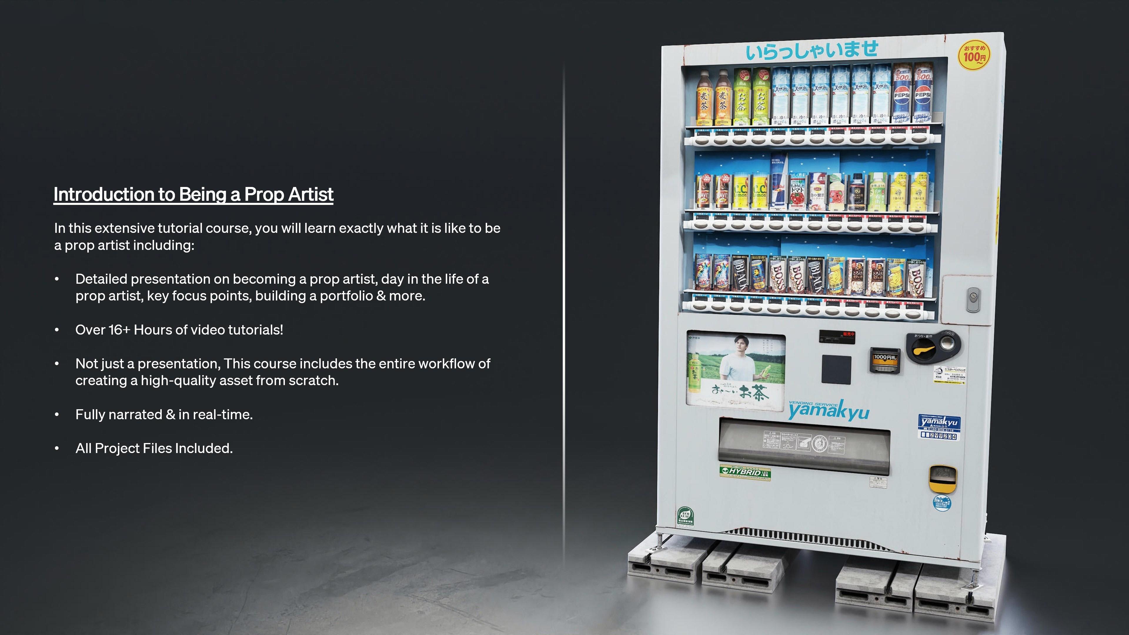
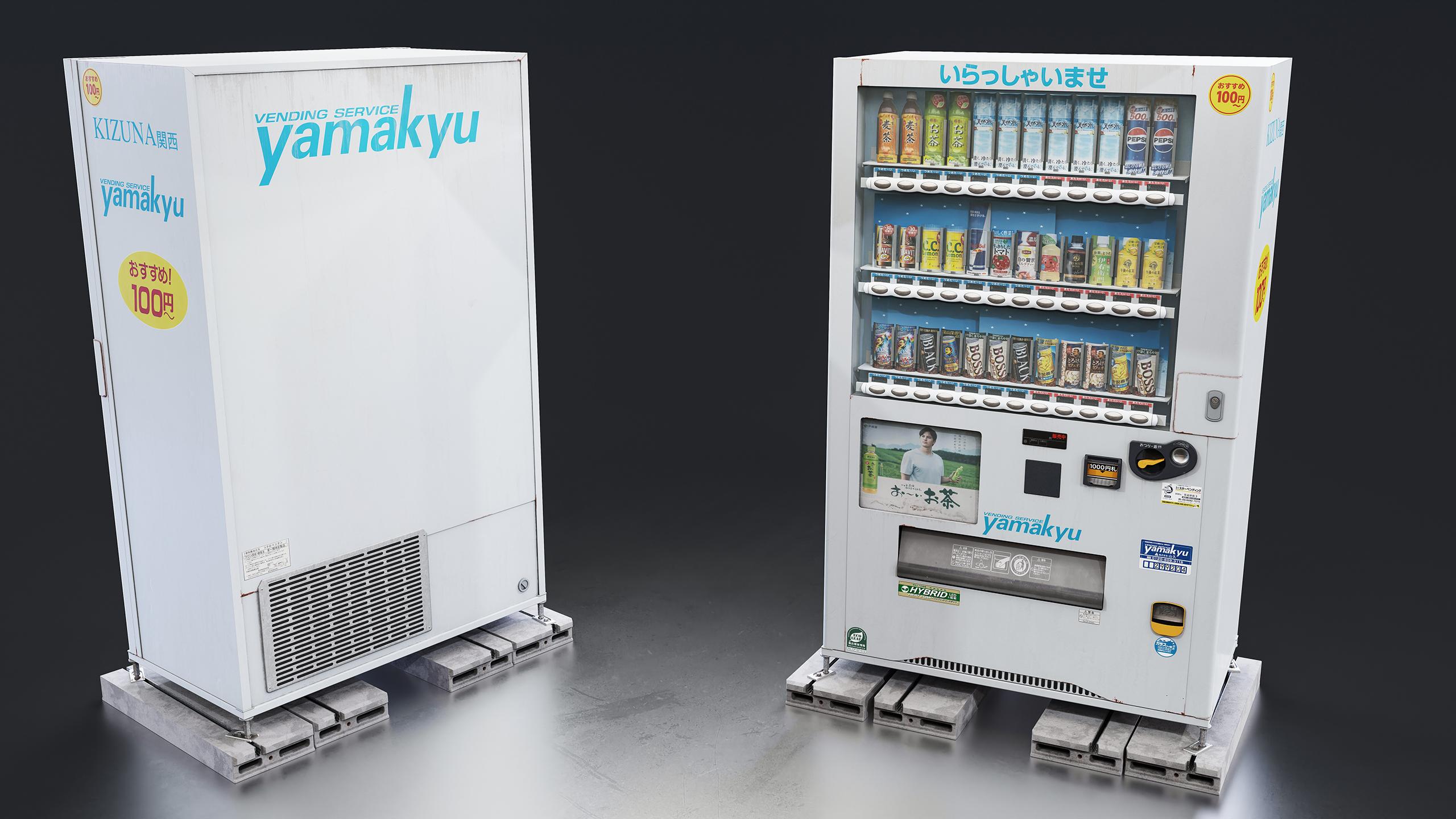
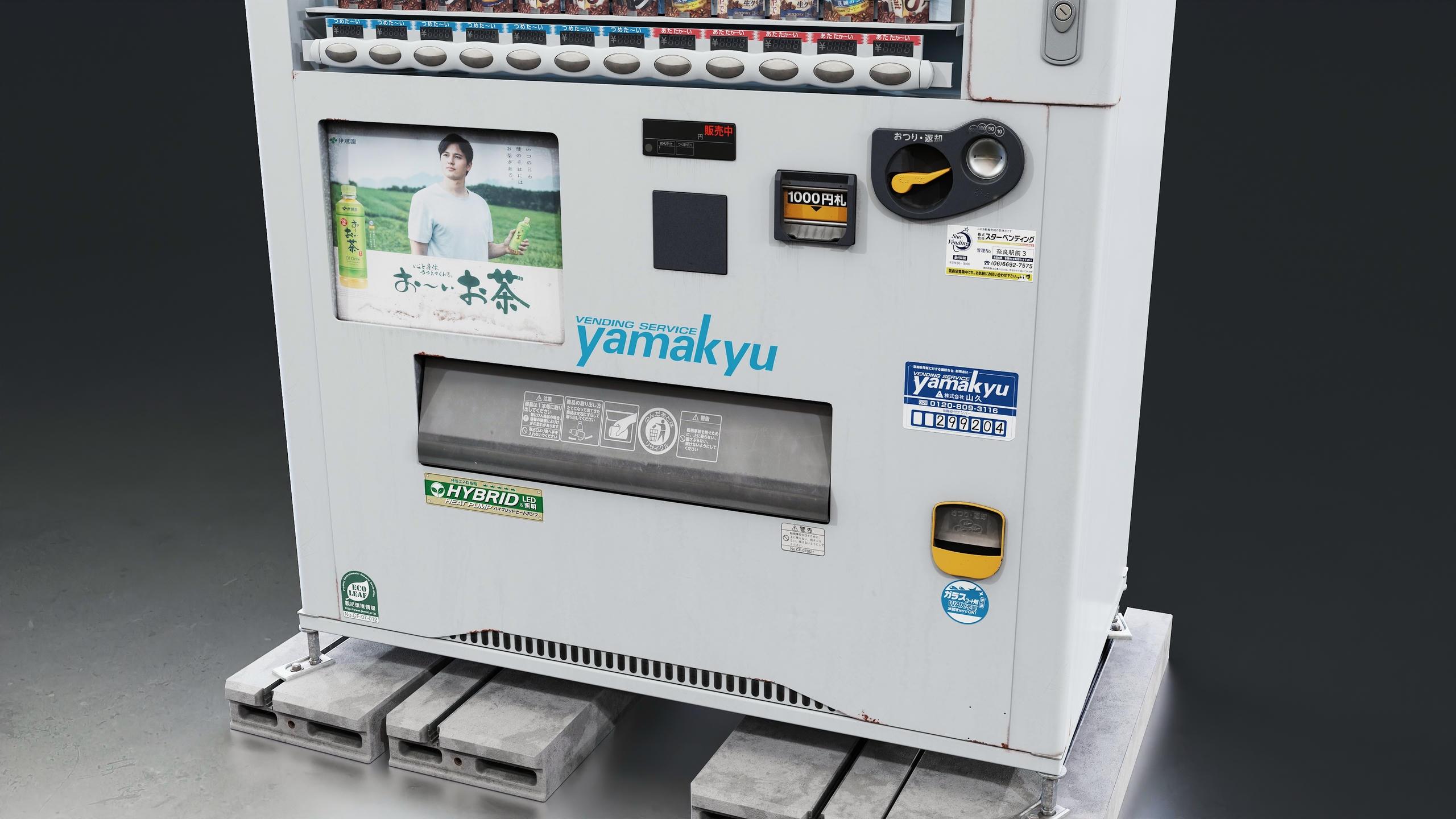
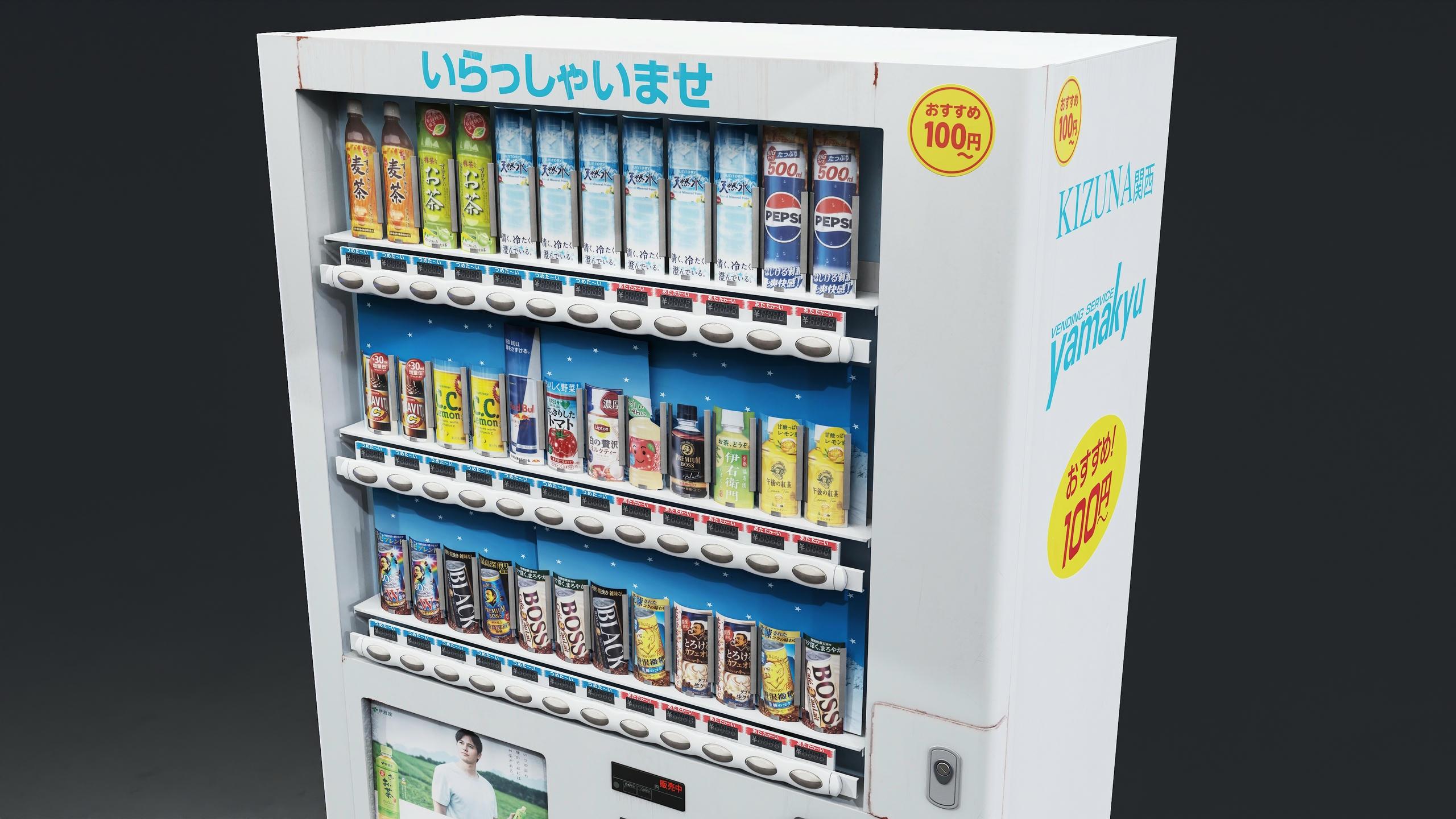
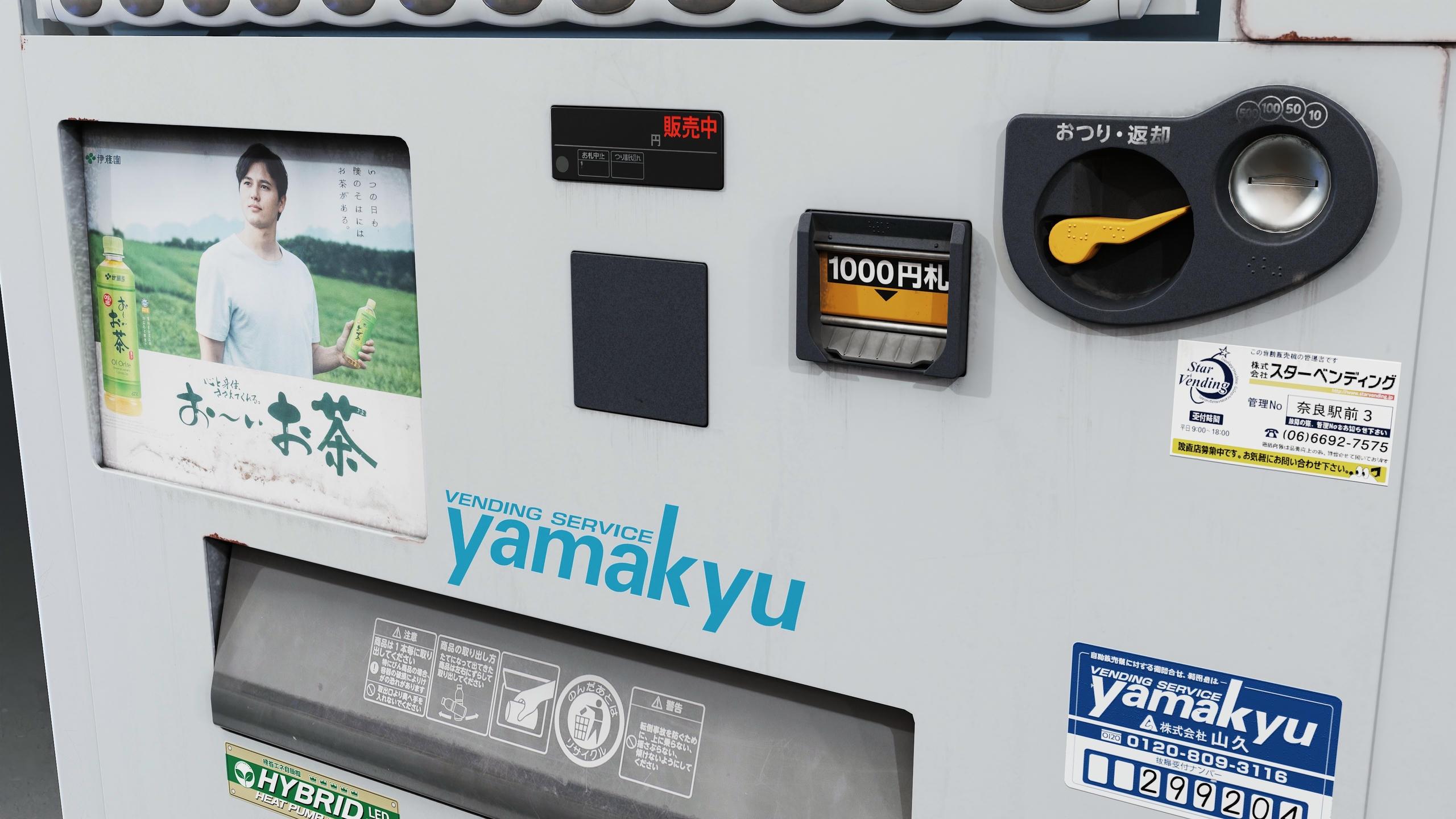
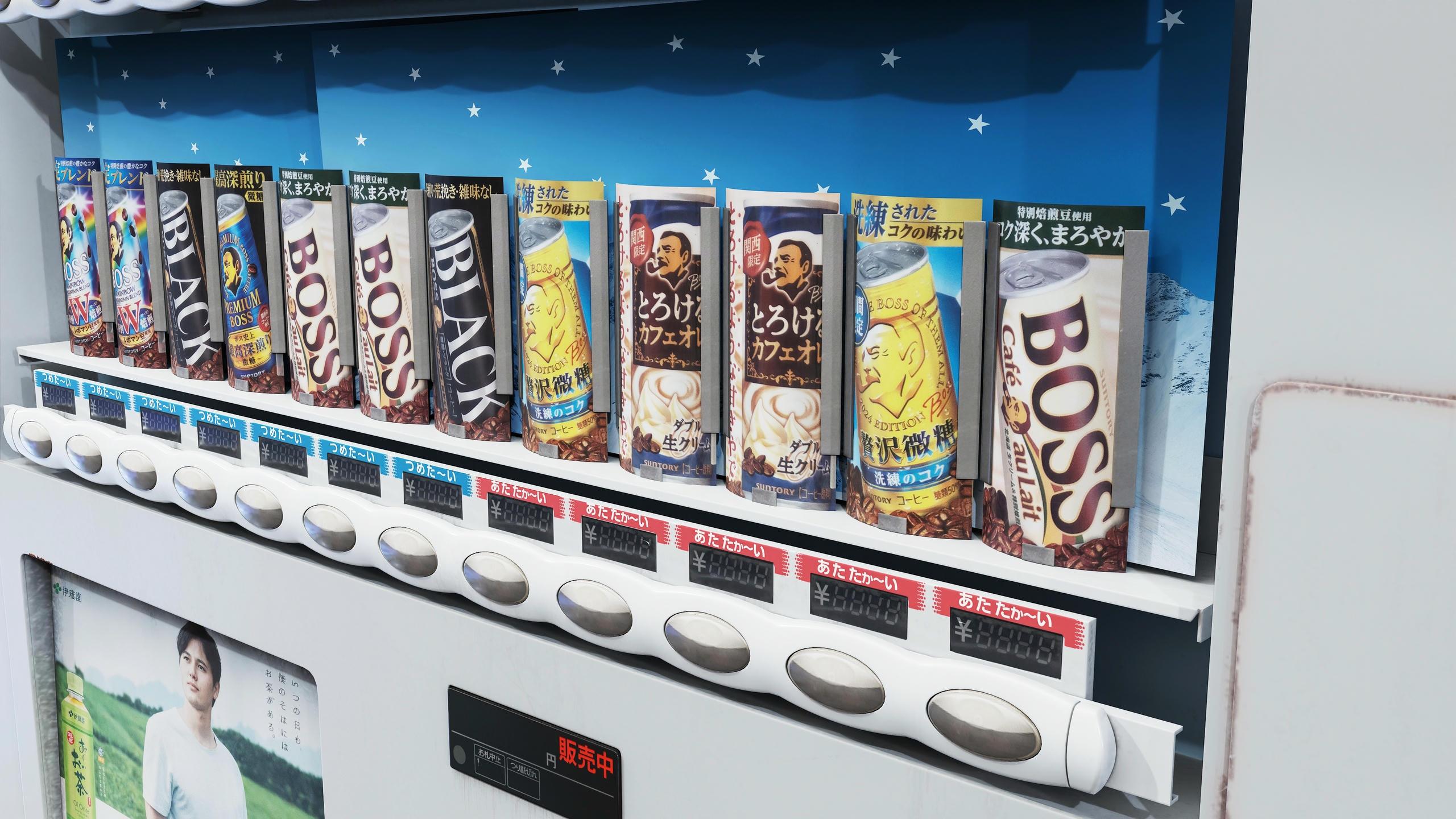
time on how to create a high quality game ready three asset of a Japanese
vending machine. During this time, we will cover various techniques from
gathering references, creating blockouts, doing
high to low poly modeling, doing weighted normals model baking and creating unique, high quality textures and
many more techniques. The way that you
should think about it is that at the
end of this course, you will be able
to create exactly what you see in this trailer, and you can apply
these techniques to almost any type
of three asset. With a total of 16 plus hours of video content in this course, it is considered
quite a large course. It is not intended to be an introduction to
the software we use, so we do expect the
artists to have a basic knowledge of the modeling software and
substance painter. But I feel confident
that this course will teach you a wide range
of useful skills. This course has also
been done almost completely in real time
and is fully narrated. There are only a few
very small time lapses on super repetitive parts. And we've also added
keyboard registrations that you can see which
buttons we are pressing. This course will come also with out generated subtitles in
English, Chinese, and Spanish. We hope that you enjoy
this course and that it will have a positive
impact on your life. Once again, my name is
Mil Sligas and thanks for
2. Essential Information: The main responsibilities
of a pop artist. What I want to go over in this course is I want
to not just show you modeling techniques
and what you need to know to be a pop artist, but also just in general, what does the job look
like and how does it feel? So the exact responsibilities can change from
position to position. So take this all with
a grain of salt. It highly depends on the
company you hire for because a pop artist can work in many different industries
from film industry, mobile industry, game industry, a bunch of different stuff. So, of course, one of the most important things
that you'll probably be doing is creating
trey assets, which can be used to
populate an environment, but they can also be used for product design and
stuff like that. The goal is to often
create assets that follow the arc direction
or an asset brief, and an asset brief is basically just like a quick brief with some references on what
you need to create. As a prop artist, you
often also want to integrate TD assets into game
engines or other software. You often also want to create
blockouts for outsourcing, although this is more
if you are working for studios that
are working with outsources than you are often the very first step before
it goes into outsourcing. Next to this, you also
often want to assist the environment art
department with custom work because
next to props, sometimes you might also
be making other stuff. For example, when I was
working on DDvision even though I was a pop artist and I was making a lot of props, I also sometimes had to
go into the environment, and I had to create
a special plaza, like some extra planters and some highly specific assets
for that specific location. And next to that, you also often need to do
general bug fixing. But this comes along
with many types of studio jobs that when you're
working on a large project, especially for game
projects, at the end, you will often go in to a
bug fixing stage where you but also many other
disciplines like the environment artist and lighting artist and
technical artist, you will all work together
to do general bug fixing. So what does the day of a pop
artist actually looks like? So pop artists usually receive something
called a request brief. A request brief is
basically in our case, when we were working at Ubisoft, it's basically just like a PowerPoint page that
has a little bit of information on the asset like the name and how it
needs to be constructed, along with a bunch
of reference images, and it's up to the prop
artist to then go out, find more reference images and
actually create the asset. Next dish, you also
often work with task managers like
Jira and ClickUp, especially on larger projects where you need to
manage your task, set it to in
progress, of course, complete it to down, request feedback, and all
that kind of stuff. So there is actually also
a little management site to just being a pop artist. It's not only creating
three assets. So once the brief has been
received by the pop artist, they often first
focus on creating a blockout and integrating
this into the engine. This way, the
environment artist or level artist can already use your asset inside the engine. Of course, everything I'm explaining is more going in the direction of
the game industry. However, a pop artist
can also, of course, be a product designer,
in which case, you wouldn't probably
work with game engines. But from now on, just keep in mind
that I'm mostly focused on the game
industry in this sense. So once this blockout has been approved by
a senior or elite, often with blockouts, you
don't the way go to elite. It's often just like
your senior artist that will just have a quick look
and be like, e, that's good. The pop artist then focuses
on creating the final asset, following the general
art direction or concept art or references
that you have received. Once this is done,
they will import the final asset into the
game engine and overt their blockout to make
sure that it's like a very smooth swap where the blockout has been
replaced by the final asset, and you, of course, need
to make sure that it complies with the
technical guidelines. This can be everything
from collision, correct material setup,
correct settings, a bunch of stuff like that. It highly depends on whatever
project you're working on. Then you end up with a bunch of assets like you
can see over here. So all these assets
were game assets created for environments
or for other projects. So the key focus points when you want to
become a pop artist. So I wrote down a
few focus points. Of course, there are
often a lot more, but, of course, the
first one is modeling. So you need to have
extensive knowledge in the various modeling
techniques like height to low body modeling,
weight to normals, how to use trim sheets
and stuff like that, because one of your main jobs
is creating tree assets, and for that, you need
to be able to model. Next to that, texturing
is also a very big part. So you need to have
the ability to create high quality textures for whatever field
you're working in. So if you're working
on stylized projects, of course, you need to be very
good at stylized textures, and if you're working
on realistic projects, you want to be very good at
creating realistic textures. Now another important one that's sometimes overlooked
is UV mapping. So especially when
working for games, you often have limited UV space, as in that the textures
cannot be super large. You cannot go for four K
textures and everything because then it's not optimized and the game will run slow. So you need to be able to make clean and optimized UV maps and have a good understanding
of textual density to make sure that everything
is looking correct. Now, next, you also need to have a really good sense of shape,
scale, and composition. So having a strong sense
of shape, proportions, and composition allows you to be able to make assets
that really fit their real life counterparts or their concept counterparts
and make it all believable. Like, I see a lot of younger or beginner artists do this where they don't
quite get the scaling of it. They get the general
scale of the asset. But all of the details
that go on top of it, in this case, the little
locks and stuff like that, they might make it too large
compared to real life, or they actually are
details that are too small. So you need to have a
really good sense of, like, Okay, so these
are the proportions. These are the
general silhouette, because even if you can see
here where they cut it out, you can see that even though
it's a cube and a box, there is an interesting
silhouette. There's some high
differences in here that just generally make everything look a lot more interesting. Now you often also
need engine knowledge. And for this, I'm talking
mostly about game engines. So even though
you're a pop artist, having knowledge of
game engines and the integration of
assets will put you in a strong position because when you are a pop artists
work on production, they will often ask
you to actually import these assets into a game engine
and set them up properly. This is not something
that you would just hand over to someone else. And finally, as with pretty much any job in
the game industry, you need to be good at
teamwork and communication. So as a prop artist, you often work with
various other disciplines, including concept art,
environment, architecture, art, level art, level design, and technical artists,
and also a bunch more. And you can imagine
that if you're working with so many
different teams that all need something
for you and all need you to do something
in a specific way, you want to make sure that you have good communication skills and that you also have
a sense of teamwork, that you understand that,
hey, it's not just me. We are work on a big project. Everyone needs to work together to be able to finish this. Let's go to the next
one. So finally, I want to go over just how
to craft a good portfolio. So when you want to
cat a good portfolio, I'm going to show
you a few examples on art station for this, so it's not so much
about the slide. But a few key points is that you want to focus
on the job that you want. For example, if
you want to become a realistic pop artist that
you work on realistic games, don't just have stylized
work on your portfolio. In general, if you want
to become a pop artist, don't have things like
character art on their stuff. Environment art is fine
because pop artists, they are often overlapping, but don't go way outside of your boundaries when
applying for a job. I sometimes even see
pop artists that have just sketches that are drawn. Like, if the sketches are
tied into an trey asset, fine, you can include it, but don't just have
unrelated stuff. Next this, also, what I
see is that pop artists leave their old work
on for way too long. So of course, as a pop artist, you're working, you're growing, you are becoming better. But what you need
to understand is that studios and recruiters, when they look at
your work, they judge you by your worst piece. So if you have a bunch
of really good pieces, but then you have just
this really old piece that's a few years
old, just remove it. I know it sucks,
but it's something that you need to go for
quality, not for quantity. Next to this, you
also need to showcase multiple disciplines that are
important for pop artist. So, of course, a
pop artist, yeah, you want to show that you
can make really good asset. Especially in
texture definition, you often want to show that
you cannot just do one thing. For example, if you are very good at
creating metal textures, also show other stuff. Still show assets with, like, wood textures or
concrete textures or plastic, stuff like that. So you can see quite a
nice range that yeah. There's some really nice met but there's also some
concrete in there. There's even, like,
just some more branding and fabric in
there and wood in there. So it just shows that when
a studio wants to hire you, they are confident that you
can do a wide range of stuff, and not that the moment you get one single asset
that has wood on it, that your quality
drops dramatically. And finally, as I said before, it's quality not quantity. A recruiter and
studio rather sees two or three really
amazing projects, then ten or 15
mediocre projects. So really focus on pushing that quality and
getting all of that out there. So what I want to do now is
I just want to give you, like, browsesin so to speak, and I will find a few profiles just to give you some
inspiration on what I think is a pretty good
pop artist portfolio. Okay, so I just went
through art station, and I just clicked on a bunch of portfolios and
kept the ones that I like. Of course, each portfolio
is slightly different. Some artists, for example, try to go more in disciplines
of environment art. But what I'm going over here is not so much the
quality about the art. Of course, make sure that you get the highest
possible quality, but more the
structure of the art. So first of all, we
have Lisa Blight. So Lisa Blai actually
used to work for me or still works for me. Sorry. And basically
in her portfolio, Aldose is now moving
more into um, environment art, she
started as a pop artist. And what you can see is that
it's really focused on like, okay, I have a few
really good assets. He can see quite a good camera, which is just a nice hero
asset, where she clearly, showcases how she can do, like, little micro details with still various surfaces and also shows a bit of the process. Now, in her case, she also
has a modular building, which is often also, even
though you're a pop artist, pop artists sometimes will also need to work on modularity, so that's also
quite a nice one to show that you can do
some larger assets. Next that, of course, she also has some actual work that she did for scans matter. So this is some of
the work she did. And if you happen to be able to already do
some commercial work, then that's great
because you're basically getting paid to work
on your portfolio. And next this here
another one where it's just another very
dedicated portfolio piece that is quite a
cool looking radio, where she focused
more again on like Wi storytelling
material definition. So what she's trying
to do is she's trying to really show
like, Okay, so look, I can create complex models in terms of the
modeling department, but I can create also
high quality textures. Now, next this, because she's moving into
environment art, you can see that and scanning, you can see that she
also has some scanning. So again, also shows that if you want to do multiple disciplines
within your field, because a prop artist
can also kind of become a scanning artist
or an environment artist, it's okay to show those things, but always show a majority
of what you're focused on. So, Lisa, she's more like an environment scanning
artist, so she has, like, a lot of scanned assets over here and even some environments, and she does have
already A experience. I'm just going to
go through this. Last thing I would say
is next to this, also, make sure you just have a
decent overview over here. I see a lot of artists
on their portfolio just writing nothing
into their summary, but it will give a very quick
insight into what you like. And then on the About page, next to the summary, make
sure to have a contact email. Sadly, with ArtStation, you
do also get a bunch of spam. And if you have
happened to work on productions, feel free
to just add that. It's quite nice art
Station to be able to quickly see that
for hiring manager. So here we have another
one Santiagomante, again, someone that
worked for me. But you can again see that
he really focuses on, showcasing a few really
high quality hero assets. And for the rest, he showcases professional
work that he did. So he actually recently boast this like only
three weeks ago, where you can see
that he just shows high quality assets and how he produces it. Here's another one. I believe that this project was actually a project
that made me hire him because it was really nice because it's an asset
where you can see, like here, some fabric
and leather stuff. I can see some metal stuff.
I can see some mood stuff. So it all just kind of comes together where
I'm like, Okay, so it's also pretty complicated
modeling that shows me enough to be confident
that he's able to create various
different types of assets. I believe here he also did some environment art.
And that's the thing. I want to show you just pop art, but pop artists
often do also work on environments because
it's quite close together. And then here is, for example, some of the professional
work that he did. Now after this, I will go for people that do not work for me. So these are just
portfolios I found online. So, of course, it's
all credited to them. So first, we have
Paolo Sanchez Ferro. I hope I said it
correctly. So again, just a portfolio, of course, she has a bit of experience. Not all of them in
here, I believe, do have that, so I want
to give you wide range. But again, it's very clearly for the hiring
manager, shows like, Okay, individual assets and hiring manager can
quickly be like, Okay, so that looks interesting. I want to quickly have an eye look at it and
see what it looks like. Now, one of the
projects that caught my eye was definitely
over here, this Lwnmower, even though it is only hipoly so it's not
technically game asset, but I really like
the presentation. It's a really clean,
strong presentation that clearly shows the detailed
modeling of an asset. Now, next to this over
here, another one. This name is Oda Abuzad Abuzad I hope I say that correctly. But basically, here, again, you can see that yes, he has a specific style
where it is really more like that metal
cyberpunk type style. But he basically just shows a few high quality
assets that he created. You can see that his work
doesn't go back too far, where it's like,
years and years old. And it gives a very good
overview of, like, Okay, so he is really good
at detailed modeling because this kind
of stuff that's a lot of detail to bask model, and he's really good at creating metallic textures
and just metallic details. And next that, you
can, of course, also have a look and see, like here, you can see that
he did some fabric assets. So it gives you a
sense of, like, Okay, if I'm hiring
manager, now, of course, if we work a lot on
highly sculpted, wood organic style stuff, then he might not feel
like the right fit. But if we work a lot on, like, sci fi stuff and everything,
then this really stands out. Another one is Jerome Busat. I hope I can say that correctly. So here, also, very nice. He has a few key hero assets,
and that's all he has. Well, Act has quite
a few, to be honest, but I believe he's been doing this for
quite a while because the quality of these assets is really high qualty but it
shows some really nice stuff. So he basically focuses on
not having a bunch of assets, but just like working on
a few little projects and giving it a really high quality and really
high presentation. So here you can see that he
went the extra mile with the asset where he doesn't just create a really high
quality asset, but he even, like, adds some realism by having it on the
floor and like, measurement tapes and some nice presentation,
as you can see. Now, of course, yeah,
this is really, really nice presentation
in that sense. If you are a junior artist, I definitely don't expect
something like this. This is more like,
if you will, like, senior artist, in that sense. Here again, really
nice presentation, really nice hero asset. He did create a little
environment around it. So from a hiring perspective, it could even tell me, like, Oh, so he can probably also
do environment art. And it's nice that he also shows some wire frames and just
some really clean renders. I will like this portfolio. Again, it's completely
different discipline, very different
types of shapes and materials where he focuses more on, like,
metallic materials. So this portfolio
really shows me well, like, Okay, this guy can do a lot of different
disciplines. I see some environment art. I see some really
high quality wood, high quality metal in there, some more sci fi stuff. Also some really complex
modeling, of course. And all of that combined, like, it gives me great confidence that he is a pop artist
that I can rely on. Of course, these people, they are probably already seniors. I guess we can go to the
about, and then we can see. So yeah, he's even already
a lead at this point. So the quality, I'm not
talking about because yes, the quality is extremely high. I'm really focused
on explaining to you the type of elements
that you would like to see. Me when I would be hiring the type of elements
that the focus on. Now, here is something
a bit different. So here you can see that
this artist he really wants or is or by
the a weapon artist. So weapons same with, like, Max and sci fi and
stuff like that, it's a highly
specific art style. If that's all you like
to do, of course, it's more difficult to
find a job in that space because there are quite a bit of people
that want to do this. But you can see
really well that he really pushes on that
to show, like, Hey, look, I can do complex modeling in the range of
Scifi and weapons. I'm really good at material
definition for weapons, like the metals and
stuff like that. And in this case, what tells
nice is that he gives, like, a little breakdown, which although hiring managers wouldn't really care about
that at the very beginning, it is something that
when they start taking a deeper dive
into your portfolio, it's nice to see some breakdowns for them to understand, like, Hey, he actually knows technically how to
make this all correct. Now, of course, a very
famous one is Francois Lieu. I hope I said it
correctly. So yeah, he really is an
amazing pop artist. He focuses, especially
on vehicles, but on really, really
high quality tree assets. The reason why I pick
this one is, again, it's a bit mean that
if you are looking at this because it's an introduction
to being pop artist, yeah, these portfolios,
as a beginner, they're just unreachable
in terms of quality. But it again, just shows
a really nice range of, like, Okay, what is he good at? He again shows the range of lay. I'm good at a wide
range because, yes, I do vehicles, and vehicles
are very complex models, so complex that it is
often a unique job, especially on racing games, like when I worked
on Force Horizon, it was a unique job position
to just make vehicles. But it also just shows
in general, like, Hey, I'm good with complex modeling. I'm good with various
types of materials. I'm good with, creating, like, all these different
definitions and styles. And also, he also does some breakdowns and
stuff like that, as you can see over
here. Again, very nice. He even has some
engine breakdown to show various engine
setups and stuff like that. Now, of course, that's
a little bit much. But again, it's more that
when I look at this, even though these are
a lot of projects, you could with
something like this, already get away with, like, one or two high
quality projects. Personally, I like
to always see three. I think I guess 3-4 is for me, like the sweet spot of, like, quite different
style projects. So if I would go in here, it would be like the boat, maybe actually some of the
little boxes, maybe, like, one of these vehicles,
and one of these more, like, smaller assets
like this one. That would give me, like,
quite a nice overview to be like, Okay, so he can do, like, various little things, small, simple assets, but
also more complex assets. Again, we have John Joe Hamas, I have a lot of trouble
with names lately. So here, he definitely goes more in direction
of environment art. But what I want to
showcase is, again, that you can very clearly
see that as a pop artist, he focused on some hero assets. So these are quite famous, like 2000 likes, as you can see. But basically, the
focus point was like, Hey, I'm a pop artist. I will make a very high
quality swede pop, in this case, two
of them with, like, some nice rendering behind it, some really nice
material definition, and just like a lot of
storytelling on the textures. And in this case, he also made a little presentation
scene, which, again, is very appreciated and puts
everything into context, and stuff like that is
just very nice to see. We also again,
multiple disciplines. Like here, he showed
some metal with, like, some branding and plastic. A lot of storytelling
goes into these assets. And just in general, it all just kind of combined. I do see here that
he leaves work on for quite a long time
for like seven years. I personally would not do that. Like, there is a point
where it becomes too old. However, what I can also make the argument is that
he's a senior artist. He doesn't have
to prove himself. I know that sounds a bit
harsh, but basically, once you get to this point and you have so many good
pieces on there, yeah, you don't really care
too much about your art work. But we are targeting
towards juniors and, like, people who aren't
even a pop artist yet. And the final one
will be Manual Bondi. So here, again, what I really like about
this is that it's hyper focused on just showing a few different assets,
as you can see. So it again shows like something quite
different, like a piano, which is quite a
common one because it shows how you work with wood. Just like in basic presentation
scene is also often fine. And then it also
shows, like, Oh, no, but I'm also better with, like, some more complex modeling
where you can see that you may like a radio system to do
some more complex modeling. And you can also see like, No, but I'm also
good with, like, doing some more metallic stuff, in this case, with a gun. I'm not sure these assets, yet. They are His portfolio
is already quite a bit old because the last piece
is from three years ago, but that also gives me a good
overview to show you like portfolos that are
not constantly updated because by this point, he probably is like an
intermediate or a senior, but his portfolio still shows more in direction of junior
or the intermediate. So that's nice for me to
be able to show you like, Hey, so as you can see, there are various aspects. It again, goes down to what I've been telling in
the PowerPoint presentation. Where you really want to go ahead and you really
want to focus on showcasing what you want
to show a hiring manager. If your dream job is to
work on realistic games, then yeah, you want
to showcase, Okay, so I want to work
on realistic games, go over, like, what are the games that I really,
really love. You might not make
it there away. Like, that's very difficult to get your dream job right away. You need to often take
a bunch of steps. But for example, let's say, I just take my own
example because I'm currently talking of script, and then it's easier to
think out in my head. For the division, for Ubisoft, in general, I was like, Okay, Ubisoft, what do they focus on? They focus a lot on
urban environments. It depends on you if you want to do SScrit or if you want to do dedivision which modern
so my folks like, Okay, so urban environments, a lot of assets
that are man made. You know what I'm going
to do? I'm going to make something that you
can find in a city, like well, over here, for example, like the gas tank. Like, that's a really
good one. It shows metal. It shows text definition. It has, like, an interesting
shape. But you know what? I also want to make a stab in case the Assassin
Grid team wants me. So I will also work on
something that's more like wood and a little bit more
organic in that sense. And like that, you can kind
of make a visualization of, Okay, what do I want
my portfolio to imply? Like, what do I want to
show that I'm good at? And then just focus on, like, some really good assets. And a key point also is that if you are in limited
time, let's say that, no, I need to find a job fast, which a lot of people
have currently, then try to find assets that
combine multiple components. Instead of having one asset
that only focuses on metal, although it's nice, you can
also focus on, like, no, I need to have an asset
that has elements of metal, elements of wood and elements of plastic, for example, in it. So if you can find a really
high quality asset, yes, then spend a little
bit more time on making that asset amazing. But that way, you can often have a few less projects on your portfolio while still convincing the
hiring manager that, Hey, this is a good pop artist. This is someone I
want to work with. Okay, so I will stop
rambling at this point. What we will be doing in
next chapter is we are actually going to gather
references for ESET, and then I'm going to show you multiple disciplines
on how to actually go from start to
finish in creating a tree asset, the things
you need to think about. We'll have a bunch more
PowerPoint slides in between at some chapters where
I really explain to you, like, all of the elements that
the pop artist would need to know in order to become
a successful pop artist. So let's leave it here, and we will go over that
in the next chapter.
3. Gathering References: Okay, welcome to Chapter two of the introduction to
being a pop artist. So in this chapter, as I
mentioned in the previous one, we are going to go over
reference gathering. So throughout the
next few chapters, we will actually go over on how to create the Twitty assets, the multiple
disciplines that you can use when creating an asset and doing the textures and actually setting it
up in a game engine. The backbone of any
asset is reference. It's extremely important. I really cannot stress
this enough how important it is to
gather good references. Now, if you're working
in a studio environment, you might get a concert art or you might get some
reference images already, but you always need to do
additional research yourself. You cannot make something
from one single image. Because just in general, unless you're maybe a senior, then you can maybe bullshit
your way through it, but it's something
that's very important to just know what you're
making and following it. So shame you plug. Let's just go ahead
and go to scanmta.com because I'm actually a really
big fan of references. So we have a massive
reference database over here for both
materials and objects. So I already, of course, have in mind what we're going
to create. It's editorial. I already know everything
that's going to happen. But let's just act
like I don't know. And let's go ahead and
go over here and scanned matter and to the
object references. So here you can see
that we have a bunch of different object references. I highly recommend that you use this if you want
to create an acid. There's a bunch of
cool stuff in it. And I recently went to Japan, and I'm in love with these little vending
machines over here. And I have a bunch of really good reference images for that. Also like how to show leaks
and dirt and stuff like that. Um, I'm a bit worried
because there might still be some arrows on the website where it kind of squashes the images. But here you can see, it has some really nice
shapes, references, different materials
with some metal, with some plastic, a
bunch of stuff like that. So that's something that we will create. But
you can go in here. You can find something
if you want to go, for example, for
a bit more basic. Let's say that you are
a very junior artist. Stuff like this is great. Like, it's a bit more
basic. It's like, more a cube and that
you focus more like texturing over here
again, like these three. Like that is quite nice
artwork to create. So there's a bunch of
good references here. Of course, next dis, what you can also do is you
can also just go to, for example, Google. Here we go. And if, for example, type in
Japanese vending machine, what I like to do is
if you go to tools, you can go to size
and set the size to large so that you get
some larger images. However, the difference
between, for example, Google and what we have is that, yes, you can see some
nice images in here. Like, this is great, but we
really focus on close ups. So we show you like
every little detail, which you often would not see. The best thing that you can
always do is just go outside to the thing that
you want to create and take images yourself. That's the absolute best.
You cannot always do it. So, for example,
what we also love to use in the game
industry is Google Maps, where we just literally go
into Google Maps and we just find an asset there. For example, with D division, we were making Washington, DC. So we often had to
go into the city, look at Google Maps and
then create items there. Yeah. That's often
ones that I use. And what you can also do
is you can also often use ArtStation for inspiration, especially in the texturing
department to just get inspiration of what
you want to create. And, of course, nowadays, you can also use AI if
you want to use that. Now, we are making
an existing asset. So AI is a bit of an overkill, but you can
definitely use things like mid journey, for example, or even hATTP or even
Cray is another one. And by this point,
there are so many. So various ways to
get references. All I would focus on is that you make sure that you
get various angles and close ups so that you are able to really know what
you're creating and ideally get them all from
the identical same object. Because if the object is
slightly different and you start mixing and matching
different details, it might not always
come out logically. So okay, that one
doesn't really work. So here you can see
that, in this case, Google isn't the best,
but it definitely here, it does show some nice close
ups where I can at least see what everything looks
like, again over here. I can see number
plate and the side. So it is good enough. But try to find high resolution,
high quality reference. So in my case, I can go in here, and I'm just going to
in our source files, what I will do is I will
make a folder called Oops. References. There we go. And, of course, I will give
all of this to you guys. And over here, I'm
just going to go ahead and I'm going to use my credits. You get free credit. So
all of this reference is essentially free
for the first five, and it will give you all
of the different images. So let me just go in
and all of these, all of these vending machines. And then we will decide
on our her references. Okay, so I got all of the
reference images here. Now, probably one of the most favorite programs for any artist is a program
called Pure Rv, which is completely
free, and PureRef is amazing to basically
view your references. So you can just download
it. It's a program. And let me just open
it PureRef over here. And it's a really awesome,
flexible reference viewer. So over here, just a window
that you can drag all around. And if I just go ahead and just select all of the images
that I just downloaded, which are actually 49 and
really high resolution because we are taking our
images at nine K resolution. So it might take
a while to open. But I will also include this file along with
the individual images, and it just gives you
an easier overview of all of your different images. Let me just pass the
video and let it load in so that I can really
show you what I mean. Here we go. So if we zoom out, you can see that all
of the Ms are here. And nice thing is
that they are all at the full resolution. They always stay in the
full resolution here, so I can zoom all the way in. And you can see
that the resolution dynamically does update
to make it faster. And I can see all of
these tiny details. Now, that's freaking
amazing to me. That's why I really love this high quality
references that I can see all of
these tiny details. So our goal is to figure out what's going
to be our main reference, and I really like
this white one. Kind of look, see. Yeah, here. Actually, for the yellow one. Oh, no, wait here. I do have
a fill for the yellow one. They are quite similar, but you can see that
there are differences. The reason I don't like
the yellow one is because there's so much
empty space around. And as a pop artist, I want to make it visually
as interesting as possible. And for this one, I feel like the reference isn't
quite as good, but we can still use a lot. So in here, you can literally
just drag in these images. So I'm just going
to go ahead and since this is going to
be our hero images, let me just keep those into,
like, a separate place. And these are probably the
ones that we'll mostly use. Look at that. I love
good references. And also, of course, in my case, because
I took the images, it's just a memory from
when I was in Japan. So that's another
thing. But okay, cool. So here, these are
definitely going to be our reference images or
our hero images, sorry. And then we have all these
additional images over here in case that we need
some additional details. So with this asset, this is
what we're going to create. I quite also like
having the concrete. So I'm going to create
like these concrete slabs for which I will funny enough, I will use a different
technique than the actual vending
machine vending machine. Yeah, it's called
the vending machine. Drink machine, vending machine, just because I want to show you various
different techniques. And then this is going to be
our hero asset that we're going to create with all of
the nice little details. So, the first thing
that we need to do now is we need
to go ahead and we need to create a
blockout for our asset so that we have a general
sense of what we want to, um of the general shape and proportions and
all that stuff. Sorry if I sometimes lose
my train of thought. I've been doing this
for a long time, but still English is
not my first language. Also, cool thing about
this one is yes, some of these are physical, but a lot of these are
actually like just images. So what we can do
is we can probably use AI to actually just
generate these images, and that way, we don't have to, like, generate all of the different bottles
and stuff like that, which is just, like, a nice, quick thing for me. Of course, feel free to make all of the
bottles if you want, but it's just for
me, bit overkill. And also over here, like
we have this frame, I'm not going to create
whatever is behind it. I'm just going to
make that black, just a bit more like
you can see here. It will just save us some time because it's
still tutorial. I cannot go extremely in
depth with all of it. Okay, awesome. Let's
go ahead and go over to the next chapter
where we will start with our blockout.
4. Creating Our Blockout Part1: Okay, so it's ready to
create our blockout. So as I already mentioned
in the very first chapter, our blockout is here
to basically get the right scaling and the right proportions
and already get it into the engine to hypothetically have it being
used by other artists. But in our case, we'll
just end up with already the general shape
in a nice blockout team. This will give us a definition
of the core shapes. So in this case, this
would be like, of course, the general it would
be these buttons. It would be over here the key
system and also the latch, I think you call it
from which you take your items and also the legs along with, like,
the concrete blocks. So there's just all
the core elements that really make up this shape. It's something that I want
to create into the blockout. Now, blockouts can come in various quality differences.
Let me say it like that. Now some people what
they do with a blockout is they literally just
make a cube out of this. Like, that would be
everything just a cube, and they might write the
text vending machine on it. However, what I always like
to do is I always like to already make my blockout a little bit more detail
that I can at least recognize the asset when
I would be placing it. And that's often the goal I
go after with a blockout. Now, I do understand that most of the stuff I
do in a blockout, I will have to remake anyway. But my focus point
is just first to really get a good sense of
how this model is structured. Okay, so let's jump into TS Max. I just had to open the door, so I'm a bit out of breath, but let's just go ahead
and jump in here. Now, I'm using TS Max. Honestly, this course is not so much about teaching
you the program. It's more about teaching
you the general workflows. So if you are
proficient in Blender, you can still
follow this course. If you're proficient in Maya, you can also still
follow this course. The only thing I, of course,
ask you is that you do have knowledge on how to create T D assets within whatever
program you want to use. For the rest, all of the
workflows I will use, you can replicate them
in any other software. Oh, here we are. And what I always
like to do is I always like to import
a scale reference. Now, I've placed
the scale reference over here in the say folder. So what is a scale reference? It's basically I just
input it, here we go. It's a person. So our specific scale reference that
we use for scans matter, it's a person of 180
centimeters high, and then it also has an arrow
that is forward facing. Forward facing, in this case, means for unreal engine that
we know which direction is facing because it's
the ironic thing that no matter what three
d software you use, the actual forward facing
angle is different. In this case, it's
literally right right in three is max for
some reason, it is front. But yeah, you would
often think like, Oh, no, wait, it's front. But then you can see that you would actually have
the Wong rotation. So having a scale
reference like this, it's extremely useful because you don't always have
exact dimensions, and sometimes you
need to eyeball stuff, and that's
where this comes in. Now, a few extra
changes that I want to create in TSMC, specifically, I want to go over here to my
Cofiga viewpod statistics, and I want to set
total and selection, and I also turn
on triangle count and say show statistics
in the active view. Press okay. This way, I can see my polygon
count and everything like that in here just
to keep an eye out. The next thing is
that my dimensions, right now, if I just
right click, for example, my snapping or any of these buttons and
go to my home grid, it's now set by ten
by 10 centimeters. Yeah, this asset does have
a lot of micro details. So over here, if you set to 100, you will have one by 1 meter, but it's actually a
little bit too much. So I'm going to stick
with ten for now. That should be actually
fine, but I still wanted to show you that depending on
how large your asset is, you might want to
go up and down. So next thing is that
I need to figure out the actual dimensions
for the vending machine. Now, for this, what
I can actually do is I can just go
ahead and go to Google and go for Japanese vending
machine dimensions. Now, ironically,
because it is Japanese, a lot of them are
probably not in English, or sorry, when you
look up in English, you might not always
get the right ones. But if I just often go
to images over here, I can at least get, like,
a general sense for, like, the size of
a vending machine. Now, I just want to see one that actually these are more like
Western vending machines, and they are often a
little bit thinner. You can also see that compared to our reference over here. And by the way, I'm
using Right Click to just move this
window in and out. So I need to find something that's a little bit more like with acro dimensions. So what you can also do
is you can also go into, and then you can
often find vendors. So over here, we
have Fuji Electric, which are actually
one of the makers of these vending machines. So my hope is that I can
kind of, like, click on one. And then over here, I
have the here we go. Height is 122. Oh, sorry, that's the bottle capacity. I need the actual dimensions. There we go. So the height
is 1 meter 83 by width, 1 meter 26.5, and the depth is 80 centimeters because it's all in minimeres that
I'm just converting it. That is, I feel like
that's pretty good. Of course, take it
with a grain of salt. We're like, we have the
ability to change it a bit. But let's just go
ahead and create a box or a cube, whatever
you want to call it. I'm going to set from default shading to edges and
faces over here. Since we are now Wi
starting into the modeling, I will also turn on my
keypress so that you can see which keys I'm pressing just
in case you find that handy. And now with this box,
I can go in here, and then this is centimeters. So let's see the
height over here was 18 3 centimeters here, see? So it's pretty much slightly
bigger than a person, but ours is also
set on concrete. The width is let's
see, in this case, width means depth is 80.5. Here. And then we have the
length, which is 126.5. Okay, so this is now
our vending machine. Looking at it like this, and if I compare it with
my reference over here, I would say that it's
a little bit too white for my liking
when I see this. So what I'm going to do is I'm actually going to
go ahead and push it back to probably 100. No, that's too little. So here now I'm mostly
eyeballing. It's here. See? This feels a
little bit better. The side view it feels a little bit white also
compared to my reference, because, of course, I'm not
looking at the exact model, so I'm going to go
for 70, maybe 65. And yes, I'm taking a lot of time literally just
working on, like, a cube, but that's
because this is the most important part to
get the definition correct. And I feel at this point, that's a pretty
good place to be. And then we have
some legs on there, and we also have the
concrete blocks. So let's go ahead and
first focus on that. Let's focus on getting these
concrete blocks in here. Then we will get the legs, and then we at least
have the correct height, and then we can go from there. So the concrete blocks, I'm just having a look at
what they look like here. I'm not going to make it too complex yet because
that will come later, but I do want to
make the size right. So I'm going to go
to my top view, and I'm just
pressing W for that. Again, right now, I will tell you a bunch of the
buttons I press, but this is not an introduction
to Tres Max course, so just take it with
a grain of salt. I'm going to go
for something that feels about white for the scale, and I can see that
there are about four of these blocks under here. So I'm actually going to
make this a bit wider. And then there's
some space. So let's make it 30 centimeters wide. And let's see if I would,
for example, just, like, copy this here, you
see, that's too white. I need to go a bit less.
Let's go for something like this because I want to
basically be able to put two against each other here and two against
each other here, and then still have
some space left. There we go. See?
That feels like it kind of fits whatever
we have here. Okay, cool. Now, at that point, we have this one
piece over here. Looking at it, I would say
that it's probably a bit wider just hitting your foot so that you can trip over
it if you're not careful. Something like
that. So I'm really just going by feeling here mostly because I'm
not going to look up exact dimensions for
something as basic as this. Then I'm just going to give it the general shapes that
we try to capture. So I'm going to make an dipol and I do do this on
my other screen, but just so you
know, I am checking, I'm going to place a segment. It's not exactly in the center. It's somewhere here,
place a segment here, and then what you can
do in well, actually, tree moding software is you
can add a bevel or Chamfer, and on a flat edge,
it will just create this little here we go. Gap. So something like this, and then I'm going to
place another loop here, another one here. Another one, let's
see, here and here. And I'll go over in a bit why
I'm making these decisions and another one
from here to here. So basically, what I'm doing here is I'm just
placing this layout. So I want to push this forward, push these in, and
push these forward. Now, that's going to be it for the blockout just to get a general sense. So
I would go in here. I would push this
forward like this, and I will leave it at that. Of course, there's some bevels and stuff like
that, technically. I'm then going to go ahead
and I'm going to select, sorry, this one and this one. And these look to me like
they are simple bevels, so I'm going to use
a bevel modifier. And I'm going to push
this out and then give it just like a There we go. And I do want to already get the general depth of this size, because I will most likely just start altering this
asset once it's done. And then over I want
to place another loop. Let's see here, something
and another loop. Probably like here. And then
these ones and these ones, you know, let me move
this a bit further back. There we go. For this one, what I'm going to
do is I'm also just going to go ahead and
I'm going to create a bevo modifier, push that in. But in this case, I'm just
going to push it all the way back because I kind of want to just have
that go to the other side. So we have something like this. That should already be enough. Like, technically,
these pieces over here in the blockout,
they are round. So you could do that, but I don't want to do that
yet because then it's more annoying to
reverse that later on. I have something like
this that I feel is fine. I'm just going to add a
very quick smooth modifier to just make these edges hard. You can use whatever
technique you want for that. And then I'm going to send them my pivot exactly to the model. And the reason I'm doing that is because then I can do asymmetry. Here we go to quickly flip it around so that
it's on both sides. That's all. Convert at a pool. And now it's just a matter of having a look
at our reference. And it looks like the
front is lined up, but then interesting,
the back is not, so I guess they are
actually a bit smaller. Yeah, that is actually
quite interesting because they definitely don't look
that way, but that's fine. That means that I need to
just go in on the front. And one of them is kind of
like sticking out here, which actually makes me want to see now that I
have these details, I can see that I want to push some stuff and I'm just going to go to my top view a bit further in and out
here and there. There we go, because I forgot that we are sticking over
it. So we have one here. Then we have another one
that's, like, right next to it, and maybe give it like
a small imperfection, of course, in terms
of, like, the shape. And then we have
another one that is just sticking over it here. And I'm just going
to give it again, like a slight movement
in the space. And you know what I'm
going to do with this one? I'm going to give it
like a tiny rotation. Of course, later on we will
just replace these again, but just for the blockout. There we go. Maybe
also this one, give it the tiniest rotation, and then make sure that over
here, it's not clipping. Yeah, I think that
looks pretty good. So that gives a good sense
of our initial position. And then what we want to
do is let's go over here. And if you can play
stuff on the grid, it's always nice to
keep it on the grid. In this case, it's too high. What I can do is I can quickly go to my grid and set it to 5 centimeters and push it back. I feel that that that's a pretty good height,
I think for the legs. Awesome. And I'm
going to just set this back to 10 centimeters. So at this point, let's actually save a scene. So I will save this as vending machine blockout over here. And it's just in
your safe folder, as you can see over here. Okay, cool. So let's go ahead and let's start
with the legs now. So I'm just going to create
this base shape and then the actual leg is
just like a cylinder. We can define that later on because it's such
a small detail. There is, of course, a
limit to how detailed I'm going to go for
something that's very basic. I'm going to start
with having Well, I'm actually going
to make these rings, and the reason I want to make them is because they actually slightly shoot out on the top, which is
quite interesting. So I'm going to start
with the cylinder, get rid of any of
those segments here. And I want to kind of look
at it from a distance. Ah, that's interesting.
So they leveled it out. Well, we're not going to
do that, that there was an actual height difference like that, but that's cool to know. Yeah, so they shoot out. Here, let's make
this a bit bigger. Probably something like this,
you can still see them. Yeah, let's do
something like that. I think that's quite nice. Let's push this up a bit
to make it a bit thicker. Oops, I didn't
mean to move that. So we have this. Then I'm just going to go ahead and I'm
going to duplicate this. And this one looks
like an eight cider on our reference or
six. No six cider. I'm just checking over
here. So I can do this. I can go ahead and just push
this all the way back down, move it in, and then just
scale it down to give me. And also add a smooth modified just to make it extra sharp. I think something
like that is fine. So now all that we need to do is we need to just create this, which for my case or sorry, in my case, is just going to
be a simple cube for now. But I do want to get the general dimensions of the cube, right? That's always quite
important to me so that I don't need to
mess with that later on, because right now, my
focus is really on like, dimensions, dimensions, make
sure everything is correct. And later on my focus is going
to be on details, details, and then you don't
really want to get lost out of that focus,
so to say, so to see. So to say, so to
see, so to speak. Sorry. Ah, English. Funny enough, I actually
speak more English than I speak Dutch because that's
my native language. But, yeah. I feel like I want to make this
all a little bit bigger. I know, just something
feels a bit off. Maybe make this one a little bit bigger and then this
one a little bit wider. And I often, as you can see, want to show it from
a further distance. And also something that's
important to know is that in game assets, having really thin
microdtails might actually cause technical
issues like antasing where you can just see it
like little flickering because or you can barely
even see the detail. So sometimes it's something that you kind of need to
have with experience. You want to make things a bit bigger than they
are in real life, just to make sure that
it all kind of, like, looks correct, and
that it feels correct. I'm going to go ahead
and I'm going to do actually know what, added poly on this one, and I'm going to
center my pivot here, and then I'm going to
attach the other pieces. The reason I want to do that
is that the pivot stays the same because then
what I can do is I can just simply rotate it and it will already
rotate on the right axis. So I can go here. This
one is probably here. They would probably always
want to keep access to the bolts, so they
wouldn't just like, get rid of it, at least
from the front pieces, but on the back pieces, no,
also on the back pieces. On the back pieces,
they also do this. But here you can see that the back pieces actually
overshoot a little bit. So that's something that
I do want to work on, let me just first Move on here. Yeah. Like, here, that's fine. So could we do that? I
think, you know what? I think that's actually fine. Let's just alter it a little bit like this.
And there we go. Okay, cool. So we now have the height and
everything like that. So now what we're going to do? Let me just check.
We're at 20 minutes. So in the next chapter, we are just going to define
the final base body, and then the blockout
is pretty much done. We're going to throw
it into real engine, do a quick setup, and then
we'll take it from there. So let's for now, finish this chapter and move
on to the next one.
5. Creating Our Blockout Part2: Okay, so let's continue
with our Blockout, specifically the main body. So the most important
thing that we need to define is this line over here. We need to kind of figure
out the height for that. Now, for this, I want to
have a look and see, like, I can remember roughly how high it was because
I was standing there. But yeah, as you can see over
here, it's a bit tricky. Normally, if there
are, like, people in the image, it
would be easier. So here we can see,
like, the vehicles, but it's at, like,
a different angle. So it is quite difficult
to figure out. But we do have this fencing. And if we know that the vending
machine over here is 180, and it pretty much reaches
just above half yeah, actually, I don't
know why I even need the fencing because it
reaches just above half. So what I can do
is let's just go ahead and convert
it to an Ad poly, and let's place a single
loop exactly in the center, and does that reach
just above half. So what I can do is I
have this tool over here where I can draw like
a rectangle over here, and I was hoping that I
can then move it down. Yes, so the top part is higher than the bottom
part by a little bit. Like, it doesn't
have to be exact, but that means that the
top part needs to kind of, like, there we go,
move down here. And that kind of makes
sense because then the payment portal over here, it's roughly where
his hands are. Okay, so that's the most
important line that we have. Now the next thing I
want to do is I want to basically define this
cutout space over here. And for that, I'm mostly
just going to eyeball it because it's all over the
place, even in the model. So we have one here that
looks pretty decent. And then we have a bigger one
here, bit bigger, probably. Yeah, I feel like if you want the nice thing about
this is that you can also literally just scale this and you can
just move this here, and then you can
kind of, like, line it up to see roughly how
big you want it to be. Okay, so and lining it up here, I can see that I want to
probably move this back a bit. And then we have another
one that's roughly here. Of course, you can
also import this image and you can put it on a plane
and everything like that. But that is something
that you learn very, very early on
because it's easier, but it's actually
something a technique that professional artists don't
really use that often unless it's a really complicated specific asset that
happens to have a side view like hercles or
weapons and stuff like that. So, okay, so we have one here. We have quite a white one here. And I'm just basically
defining other loops. So then over here, we have the advertisement plane, which probably it's a bit wider. So I would say
roughly around here, that's the advertisement plane. So we can actually put a fun fast tracttorial
advertisement in there. That might actually be overkill. But we could. Let me say it like that.
Then we go down here. And then we have
over here we have our thing where we
get the drinks for, let's say, from here, and that's quite wide,
so roughly here. Let's start with this because
else we get too many lines, and then it might be a
little bit confusing. So first of all, actually, first of all, let's do this one. We have over here the center. I'm just going to go ahead
and I'm going to push this back for now probably
up until this point, and then go to see
how that feels. Seeing this, it actually
feels like the width, this actually does
feel a little bit wider that I put now
that I look at this. So what I want to do is I'm just going to go ahead
and I'm going to, first of all, 1 second. This is past that point. Yeah, I'm first of all, going to define the shapes, and then we are going
to just alter it. See how that's why it's important to have
Blockout so that we can just define all the
shapes and then alter it. So I'm going to
push this one and then we also have from here, roughly not to the end to here, push this one in
over here. Okay. It's a bit hard
to see. But yeah, I definitely can see that
what I would want to do is I would want to make
this over here. Let's see. Let's
make this a little bit wider until Yeah, I think that feels
actually quite good. I probably don't want to make it too much wider than that. Our advertisement panel
feels a little bit. Let's go to the Oh,
that's our top view. Sorry. Let's go to a side
view. A little bit small. Sorry, it's a bit annoying
when I have that one there. So I'm going to move that
in a bit. And let's see. So this is our
advertisement panel. It feels a bit like it
needs to be a bit wider. Just to keep my jomtre clean, I'm just going to select this entire line
and then push it. Like that. And I also want to push this one down a bit to give it a
little bit less space. There we go. Okay, so that does the advertisement panel.
I think that's fine. Just want to make sure
that over here that this panel still feels like
it has a pretty decent look. So let me just move this. So if we do here and here, it's very, very close. It's ironic that it's actually
not exactly in the center. Oh, I didn't mean to make
a screech out of it. So, this does feel about fine. Let me just make this
selection. Yeah, you know what? I think that's fine, but
something feels off. I think maybe it just
needs to be a little bit more push down a little bit. There we go. Let's
do something like that to get started with. Okay. I feel that at least that puts the main
pieces into a right spot. So now at this point, I'm
just going to go ahead. I'm going to move this over to my other screen just to make it a bit easier. But we're going to focus
let's first focus on, like, the bottom piece, and
then we'll go from there. So the bottom piece because
it's quite specific. I do want to already
define that. So what I'm going to do
oh, sorry, almost forgot. Just select all
of this stuff and just push it back a bit. See? Easy. There we go. Then
we just have, like, a slightly bigger
gap. That's all. So, okay, this bottom stuff, yes, that's what I
was going to do. I'm going to go ahead
and I'm actually going to select the entire bottom, and I'm going to
detach it like this. And you know what I noticed is that it almost feels
like a tiny bit smaller, but I want to be very careful. So I'm going to actually
just only move it by hand to make it a bit smaller instead of doing,
like, a scaling. And then we might
want to move the legs a little bit more later on. Okay, let's go for
this and then also for the top let's push this
down in here for a bit. And then if we just
isolate this selection, we can just go ahead and select the top and just bridge it. So we are just
bridging it across to basically fill that polygon. Now, once that is done, we have over here this piece, and I want to let's see, it starts here and then goes up and it goes down
just beyond this. Wow, although it feels very Japanese that it's not
often all straight, but definitely makes
things more interesting. So I'm going to push this
further back like this. And then I want to yeah, is there a way that I ideally,
so we have this piece. I want to make it
exactly in the center. So I'm going to actually use a target weld and I'm going to weld for now these
pieces together. And the reason I want to
do it is because then I can select this. I don't need to select back. For now, I can select
this and I can place a connect and then place two connects
and exactly see move them based on the center. So I can start by let's see, moving them, probably
somewhere here. And then I can select
the bottom piece and I can move that nicely up. See? Nice. Okay, so we
have this piece now done. We do have these
ugly vertices here, which I'm just going to I like to keep working quite clean. And now that we have
this piece over here, I believe that the
back does not have. Yeah, see, the
back is just flat, which means that all I
want to do, in this case, I'm going to Sorry. Let me just push this back like this so that it's quite far
back until you cannot see it. I'm going to place one
quick swift loop here, and then I'm going
to select this and press collapse or welt
whatever program you're using. There we go to basically
merge it together. And once that is done, we can, in our case, I believe, yeah, we should
be able to just kind of, like, bridge this
across for now. We're going to make
it nicer later on, but we'll bridge this across. So then now we have
something like this. Oh, no. You know what? No. Sorry, I'm
not going to bridge this. I have a way easier method. I'm going to go ahead
and because these ones, they need to be merged down, so I will just simply scale it because we need to create
a detail there anyway. So I will scale it, and then
I basically make it flat. Or you can use, like a plan or something and then
collapse it here, so that it's one words
here, one words here. And now I can just
bridge it across. There we go. So I already made it a little bit more cleaner. Cool. So that already creates
that very specific detail. I'm going to actually
push this up a little bit more like this. And I'm also going
to push these ones. In a bit. Okay. And then we are just going
to keep moving up. So the next one
is this sighting. Do I have a side angle? I do. Perfect. So yeah, it
basically goes in, and we are just going to
create a little shape in here for which I'm going
to go to my side view, and I'm going to use a line. So a curve line, whatever you want to call
it. I'm going to use that. For now, I'm just going
to make it let's see, straight up until here. Then push it just
beyond our shape. Push it down probably like this. I think that already does
enough for the Blockout. And inside of three Max, you have a really nice modifier, which is called the
Sweep modifier. And in here, if you
set this to be a bar, you actually able
to or you are able to basically using
the shape here, see, create like this outline. Over here at the top, you can control where
the pivot point is. So I want to set this
to the left center one. And basically, what it
does is it makes sure that it places you
can see over here, I places the shape on the
very end of our curve. Now at this point,
I'm going to well, I like to add an
added pole on top. You can, of course, collapse
it to an added pool, but then you can no
longer edit this line. But by adding an
Adipol modifier, which is the same
as an added poly, you are able to
basically still edit it. But then if you need to, you can even still alter the sweep or
alter the line on top. It just something that is a little bit cleaner
in terms of working. So we have that shape also done, just because it's a
very specific detail, I'm going to make this
a little bit smoother. There we go. Just because
then in the engine, it will just feel a
little bit nicer. And why not? Let's also do
that here. There we go. Okay, cool. So we
have that one done. So let's move up, move up. Sorry. So over here, we have just our advertisement. And for our advertisement, all I want to do is basically
it goes to this little lid, and then I'm going to
just extrude this out, select this entire
ring around here, and then I'm going to extrude based upon the local normal. And every program has this also blender where you can extrude
based upon local Normal. I'm just going to push
this back in to really give it that depth feeling. Um because I will
most likely alter this entire body and because it is such a big detail
in our shape, I am going to very
quickly go in here. You know what? I'm going to
do, double click, sorry. Double click instead of just one edge to
select this loop. And I'm going to make it a
little bit rounder, also. Let's actually make
it just, like, still quite simple. There we go. Just give it a little
bit of roundness. I think that will
look quite nice. We're going to add
the whole plastic and the plastic that you can
see over here also later on. So we have that one. Here there's, like,
a quick panel. So let's just, first of all, yeah, let's focus on that panel first, and
then we can do the rest. I'm going to just extrude
the panel from this body. So just 1 second. Let me see. I'm going to want to probably. Now, you know what's
pretty much here. Let's place a line
here and a line here. And the panel goes
until, just the end. So that's nice because that's
exactly what I have here. So I'm just going to go
ahead and extrude this out. There we go. 0.5, that feels like
a good extrusion. So that just shows like, Hey, there's going
to be a panel there. We have some small details
that we'll create later. But first, I am going to focus on this more larger part here. So let's first of all, see if we can have a look on the insight on
roughly how it looks. Looks like there's like a
little lip going around it, just like with our
advertisement. Let's see if we
have anything here. Oh, yeah, you can see that
there's definitely like a box, and there's even, like, a light. Which quite nice
because then we can do that light also in reel. Okay, so lip around. Yeah, that should be fine. Let's go select this. And we will use the same
technique as we did before. So just select the center, and let's move it roughly here. Then move it back
probably up until here, and now just select this line, and we're just going to go
ahead and we are going to extrude this along the
local normal again. Push it in not too far. Actually, no, I
think for this one, I do want to push it in further. Let's push it in
by 4 centimeters, and that should be
enough to, like, place a light and stuff
like that there later on. And, of course, later on, all these corners
are going to be nice and round and all that
stuff. So we have that. Now let's just go ahead and
create this button row, and then we can go from there. So this row, you
can actually here, it's on top of the system, but it's almost like
it's stuck on top, but then behind it
is a metal bar. But that metal bar seems
to be I don't know where. It's interesting
how it is built. So that metal bar seems
to it holds stuff. But where's the connection for it? That's what
I want to know. I want to know how
it's connected. I guess it's just
connected in the back. Yeah, here, see? Yeah,
here, in the back. So we are just also
going to create like some back connections
or something like that. Let's go ahead and start by
going to our you know what? Let's go to our side view. And the most important thing
is that we just create that initial bar and get it
up to the right scaling. So we have this. I'm going
to place this just below it. It is still in view
that it gets cut off. Same here. I do want to later on place this
exactly in the center. And it feels a bit thinner,
something like this. It's quite difficult to see. Like, for me, it's fine,
but maybe if I give you guys some ambient occlusion, that it might help better. No, I think you guys kind of
just have to deal with it. Like, something I can do
is I can if you want, but it's not like you can reply. I can make this a little bit darker so that it's
a bit easier to see. But yeah, we'll see. Yeah, that's always
fun that I say, like, Oh, if you want, not like you're going to reply, so I need to kind of, like,
make the decision myself. Okay, so we have this
metal bar going over here, and I feel like it's going
to be quite thin this bar. So it's going to be quite thin. Later on, it's actually not
even going to be a solid bar, of course, the backsides
are going to be pushed out. So let's say we have
something like this. And then for now, just
because it is a Blockout, I'm going to place
two connections probably a little bit further
away from the center. Then I'm going to HEMFOT there we go at
quite a low level. And I want to go
ahead and I want to wait, let me
just isolate this. Select these two ends and
just make it very basic. I'm just going to push
those in. There we go, just to kind of, like, indicate that there's going to
be something there. And now, this shape, this shape, it is quite soft. I would say, I do
want to capture that. And then it has, like, these
cylinders inside of it. So it's quite an
interesting shape with a lot of bullying stuff
and everything like that, but we're not going to
focus on that quite yet. So first of all, let me just isolate this. I'm
going to go in here. I'm going to make a box that is so I'm just looking
at my reference, so you might sometimes
hear me fall silent. So I have a box. That's pretty much in cater, and then I want to
push it out quite to the furthest point
that I can see over here because we are going to
create some dents in there. Okay, I think something
like that is quite good. Now, the next thing
that we're going to do is we're going to move it from let's say this point. And for now, I'm not too worried about this one to have it
exactly in the center. That's something I'm
going to measure when I create my final piece. So now I'm just eyeballing it. To this point, here we go. And now this will also indicate actually the actual sizes. So in order to know that, I kind of want to make sure that all the sizes are correct. So, let me just isolate that because we will not
have this many drinks, I believe, but we should
have at least some drinks. So let me just go to, like, a top view. And actually, I'm going to turn this into
a sphere because that's what I'm going to
create later on. Oh, sphere. I'm not talking about sphere. Sorry, I'm talking
about a plane, and I want to go to my
front view, actually. So where this ends, the very end is also where
the last product is. So let's just create
a plane like this. I'm going to turn on my snap
rotate and rotate this 180. And for now, I'm just
going to move this here, but it's, of course, going
to be moved back later on. So, okay, so we have
one to three rows, and actually, do they
have the same height? I need to check because it kind of throws you off where it feels like it's
not the same height, but that's just because
the products are not the same. Yeah, here see. But the height is
pretty much identical. So they all have
the same height, which means that we
kind of need to, like, be able to fit this in here. What you can do for this is you can use an array modifier. If you go to tools
and an array and then select preview and
just do only three or two, three, and then I can move it on the not Y axis on the Z axis. Yeah, you know what? No,
wait, because the top one. So this one would want
to become a little bit lower. No, no, wait. I like this space. I like this space here also. But then here, it's
supposed to be Oh, no, yeah, yeah, it's
supposed to be fill. That's correct. That is
correct. Sorry about that. Because of course, this one, there will be a light
here, but yeah, this one is fine
to have it filled. So I think that is fine. So then the size is already,
let me just press Okay. I just want to make sure. So these ones will be small, small, but then these
ones logically, yeah, you kind of would
want these ones to be bigger like this to
have a bit more space. So it would almost be
like this moves here. And this moves kind of like down here to even out a space. I think if you just do
this, that should work out. I'm going to make these ones
a little bit smaller here. And I will just leave these floating here just so
that I know the location. Okay, cool. So we have this. Now, since we already have
this piece over here, oh, I forgot about the height
difference. That's my bet. The height difference
because it is set. You have the amount over here, and then you have
another bar here, which I can actually make now. It looks like that for the bar, I could actually
just use this one. So let me just shift rotate this to basically clonee it and rotate
it at the same time. Make it a little bit
thinner over here. And for now, let's
push this back in. And yeah, we have the
pricing just below it. So let's move this actually
a bit bit further back even. Okay. For now, I'm just going
to leave it like that. I'm not going to make,
like, a bunch of stuff because it's internals. And now for the
width, let's do it. I think that's still
fine. I think that's still enough amount because all of these vending
machines here, see, they're all different. So I feel like we should not be too hold up on the
size of the drinks, but we do want to focus on
the width of the drinks. That's the important
thing, the width. So I'm going to move this down. And here. I think we got it. So, awesome. What I'm going to do now is
I'm just going to give it a little bend because we need to have this for
our Blockout anyway. So it doesn't matter if I just make it now or make
it a bit later. I'm going to find
the bend modifier, which every Tweet
software also has. And then on the right
axis over here, I want to give it a little bend because
this is what it also seems to look like in
here where it's here. See, it's like a bend and it
has like a little holder, but the holder we
will, of course, create later. That's
not really needed. And then we can just
add an array modifier. Preview it. But this
time, we're going to go to the Y axis. And I want to give it, like,
a little bit of space. Six comma five maybe? No, seven was in the
end, the correct one. I'm going to add a bunch more, and I'm going to just
push this yeah bit back in six comma nine,
little bit more. Less six comma 85. There we go. I feel like that's, that looks quite nice and stacked, has
a bunch of stuff in it. So let's go for
something like this. And now we also know all of the buttons and
all of that stuff. So that's also great. So we have these ones that we have
over here this text label. I'm going to go
ahead and already make that because that will allow me to better see how
to make this side panel. So these ones, I'm going
to make a bit thinner. They are going to be stuck
right after this metal panel. Let's convert this
to add a poly. This one is going to move down a bit that there is a
little bit of space left. And at that point, I
can create a connect. Might be easier if I look at it. I might not be easier if
I look at it like this. Let's move it up for now
because I need to be able to see where the connections
need to land. So I'm going to go There
we go. 11, it looks like. One, two, three, four, five, six, seven, eight,
nine, ten, 11. There we go. So we have
now the connections here. As you can see, it's a bit difficult to see if
they exactly line up. Yeah, they pretty much do. They are not identical in the
center, but you know what? That's good enough
for me for now. So what I can do
is I can go ahead and not sure what I did there. I can select all
of these phases. I'm going to go to inset
and inset settings. And an important thing is
that I want to sell it to buy polygon, because this way, I can inset each polygon
phase individually, and probably guess
what I'm going to do. I'm actually going
to first define their height. Like this. Then I'm going to scale, and because my scaling over here, I can scale each individual one, make sure that in scaling, you have this one set
to I forgot the name. Use Pivot point center because
it will use the center of this PivPoint and make sure that you just have the
normal scaling on, and then you can do this. Then I'm going to
actually move it down. Do I want to move it down? Yeah, I'm going to move it
down a bit to make way for the text and then just
push it in a bit. Um, No, soy. Let's not move it
down yet because I need to first alter this. I keep forgetting that we keep moving stuff around
for measuring. But that's Blockout are often always a bit
more messy because, yeah, you're just playing
around with things, making sure it goes cracked. And now I can see that I also don't need to
move it down anymore. Cool. So I have
this one, and that also means that now I
know that over here, I need to have 11
connections, I believe. There we go 11 connections, which will give us a shape
in between each point. So these points all
need to go down, which means that we need to have it's always a bit of calculating and messing
around with things. Those points need to go down, which means that we need to have a double connection yeah,
probably like this. And if we then just press Contra I to invert
the selection, I guess, in the end, it could have it doesn't really
matter which one is faster. I feel like selecting
it would probably have been faster, but oh, well. Multiple ways lead to Rome. So we have now these
center connections, and we want to kind of,
like, push those in. There we go. To already just, like, create that general shape. And then here at the end, I'm just going to go ahead
and I'm going to h Actually, I'm gonna push it
out, and then it's probably easier if I literally
just select the sites, and I just quickly
chant for them. Here we go. Don't worry
about this clipping. I can just select
this and collapse it. Okay. And then over here also, so we push this out a bit more. And then we just
again jam for it and it will just keep
the same settings. And we can again collapse this. Now, just because this
is such a focus point, what I'm going to do is I'm just going to
select this site, and I just like to
often press bi angle, and then we'll just
select the entire angle. Hold Shift to convert
this to edges, and I'm just going to alter
the quick chamfer here also. Nothing too crazy.
Just something like something like this. Now, would I be able to maybe
already Nah, you know what? I'm going to make that
as a different model because it just Oh, and because it's instanced
it will also show up here, but that's not really
needed for now. Okay, so for the model, I
just need something oval. So what I'm going
to do, it's oval, but it can I see the
Yeah, it's oval. I'm just going to for now, make it very simple
with a sphere. I can make it really nice
later on because there are some depth details
and stuff like that. So just make a sphere, scale it. There you go. Oval.
And move this in. I'm going to, uh, push this back in
so that there's a little bit more
space like this, and then I'm going to
convert this to add a poly. And just to make my life easier, I'm going to delete
this back face. And then for the font phase, push it in and just give it
a quick bevel just to again, like I want to really push homes quite a bet that these are quite smooth looking shapes because I think it's
important to just already show that in the Blockout and that we have the general
positions, correct. Now, now the nice thing
is that if you copy this like this and you know
that you're going to copy it multiple times, you can actually set
over a number of copies. So if I set it to like ten, you can see that it
will just copy over. Now, of course, because we did not use the exact copy settings. Over here that it
feels a bit off, but that's just because
it's a Blockout, so we'll fix it later on. For now, I'm just going to do this because I also don't want to spend an insane
amount of time on this. But often what you want to do
is if you make a Blockout, although in production,
you cannot always do this. Production, sometimes you need to make a bunch of blockouts, but it's nice for me at least that right after you
make a Blockout, just instantly go
ahead and also create a final model because then it's all still fresh in your mind. I think that pretty
much clears up this entire structure over here. So I can just select
this only duplicated. Just do quick height
selection and delete the old one n hight. Select this again.
Duplicated. Height selection, delete old one nhight. And for these ones, going to move the pivot down. Oh, sorry. Sometimes with the pivot, when you
move the pivot down, you need to just quickly switch your scale because
else the scale pivot, which is a separate one,
does not move down. I'm going to move this here. And I think that pretty
much shows that. Okay, cool. So we
got that stuff done. Now, the last thing that
I'm a bit worried about, I want to make sure that
it's sticking out correctly. So for that, we are going to do something that we
need to do anyway, which is that we'll place
our glass pretty much. So for the glass, it's just going to be
a very simple plane. There we go. Nice. That actually fits
really well. Cool trick. Yes, you can rotate this,
or you can just add a normal modifier to
kind of swap it around. Now for glass, I do
want to go ahead and just have a separate
material for that. So I'm going to go in here
and I'm going to make a new material called
glass and assign it. And then you want to I like
to often make it a little bit more in the bluish tone. And then if you go down to your where are you
transparency over here. I'm going to just
go ahead and set this quite transparent
to like 0.7. And if you want, you can also
play with your roughness, which gives a bit of shine, but that's not really
needed as much. There we go. So now you can see that we can just
kind of look through it. If you right click, go to
Object properties and turn off, show frozen in gray, you can unfreeze it, and
then you would be able to no longer need to accidentally
select it, for example. But I need to unfreeze it for now
because I want to go ahead and also duplicate this
and place it here. There we go behind that bar. Okay. Awesome. So the next
thing that we need to do is we just need to
go ahead and create these key things or key things. Oh, what the hell do we call it? Money things. I forgot
English words, sorry. This one, I'm not going to
really focus on right now, so I'm just going
to focus on these. This is quite a specific shape, so that's probably one of the first times that I'm
just going to go in. I'm just going to make a
quick screenshot of it. And if we just go
ahead and go into Max, let's go ahead and create
a new material and just drag in that screenshot into your base color over here. And now I'm going to
create a very quick plane. And what you want to do with
the plane is quite easy. Just look at your
screenshot resolutions, which is, in my case, one, three, four, three by 916. Apply. Oh, sorry. 916 by 1343. There we go. I'm just
basically applying this, and now all I have to
do is just while it is in the correct orientation. Sorry, hards Rotate it, and now I can just
scale it down. I think I accidentally
scaled it into the minus. No, I did not. Okay. Sometimes that happens that you accidentally scale
it into the minus, but we can scale it down, and if you want, it's up to you in which orientation
you want to work. I'm just going to work from
my left view over here. And then in my side view, I'm just going to go
to default shading. Oh, wait. I don't
want to not left. I want to go from my
right view. There we go. And then I'm just
going to right click and I'm going to again, go to object properties, show
frozen in gray turned off, and I'm going to
go at the freezes. This way, I cannot
accidentally select it, and I can very
quickly just create a line because I want
to do this quite quick. So I need to move it back. Freeze because my
line is placed on 00, zero, and if it's
not moved back, then you cannot see your line. So it needs to be
behind the grid, and then you can just
freeze it again. So line goes here. What you can do with
the line is you can click and drag to make it smooth And I'm just
going to kind of, like, drag this
around. Over here. And just to show you cool trick, I will make this
corner sharp because what you can do is if you
select, let's move this back. If you select this edge, there is something called a fillet, and a fillet allows you to
basically round corners, see? Just to give you a bit
of extra knowledge. Let's turn off my
snap rotate and just give this the
general shape already. I might Let's also right
click and set this to Basier corners so that I can
actually control everything. I'm just thinking if I
might want to already give this shape like the final shape so that we
don't have to do this again later on. I
might already do that. I want to then just pay extra attention to make
sure that it's extra close. And what I also want to do is I want to go into my
interpolation over here, which basically the
segment amounts. And what's is quite
a bit higher. I don't like this
part over here, so I'm going to right
click Basier corner, which allows me again to
move individual pieces, right click Basier corner or
individual lines over here. Points endpoints, I mean, sorry. And I want to just doesn't have to be identical, of course, but I want to make
sure that it at least feels quite similar. There we go. Okay. I think
that looks quite good. So what I can do now
is I can just use an extrude modifier because
it's a close shape. I don't need to use
sweep on a close shape. And now you can see that
here we have a rough shape. I'm going to duplicate
that for now. And the reason I want
to duplicate it is because I'm now going to kind
of mess up the shape again. So I don't want to
mess it up too much. I'm going to move this here. I'm going to
basically eyeball how it is placed and then the
scaling and stuff like that, which is roughly
if I have a look. Yeah, there's going to
be like a line here. Then we have this, and
then it just sticks out. I think, honestly, there we go. I think that's quite good. Okay. Now it is time for
some simple booleans. So I'm just going to go to
my side view, isolate this, and let's go back to my
wireframe over here. And we are basically
going to Boolean, which means that we are going to subtract one shape from another, and we're going to
boolean some spheres. So first of all, let's make
the biggest one over here. Give it a bit more segments. It's quite strange how it
is placed because it is in, like, nothing is in
the center here, which I'm someone that likes to work very
accurately in terms of, like, positioning, but that
always feels a bit strange. So we have this one, and then we have another
smaller one, which roughly goes around here with very little
space between the two. That's for the coin holder. So, cool. So you have
these booleans over here. What you then want to
do is you kind of want to go in and just make sure that they stick out
on both sides and make sure that you don't
have a bunch of polygons on this
angle over here. So this is a giant end gun, but this is one of the few cases that we actually want
to have the endgun because it will give us a
very clean boolean function. So we go up here to
our create menu and to compound objects and then
use the pro Boolean one. And always make sure
that in advance options, turn off or sorry, set this to remove
only invisible. Subtraction is already
the correct one. And now you can see that
we can just click it. And tada, that's
already subjected. Now, what I'm going to do is I'm actually going to go ahead and only select this phase, contra I, delete
everything else. The reason for that
is just because now I have a little
bit more control, so I want to extrude this in, and then it looks like
it has like oops, a little angle over
here like this. And then what I'm
going to do is I'm just going to go ahead
and extrude this in again and give it more like
a soft bend like this. I guess, just for the sake
of it being a Blockout, I could very quickly do this, just to kind of like
indicate, like, Hey, this is a piece that has, like, a money thing over here. But I don't know. It's just
something and then maybe, like, place another loop here to kind of, like, soften out. It's just something. I'm
not too picky about it. Over here, for this
one, I again need to, like, give it quite
a thick extrude. It technically has like
this piece over here, but we're not going to
bother with all of that. And this shape over here, let's focus on that
some other time. When we actually make the final. So we have something like this. And then I'm just going to
also do a Capli and then here, finally, I'm also going
to push this out. Giant end guns for now, it's fine because it's
just like the Blockout. What I might also want to, I think I will need to
push this back in now and already cut this out from
our vending machine shape. But what we can do is we c
6. Setting Up Our Blockout In Unreal Engine: Okay, so as discussed in the previous chapter
in this chapter, what we're going to do is
we are just going to very quickly import this
into UnreLEngine. Just have a basic setup. Now, the final renders of this asset will probably
be made in marmoset. However, there will be a
chapter where we will go on how to properly set it
up into Unreal Engine. So what I want to do is for now, I just want to very quickly just get it in there to a point where you would be confident to then just give it
to our level artist. So our asset already has the separate materials between
transparency and the rest. Now, what we are
going to do is we are going to go ahead
and just at the top, double check that
the asset is set to 000 because exporting
the Unreal engine, Unreal engine will place
the pivot point at 000, which is this cross over here. Now this already looks fine, like we already placed it in the right position by the
way, so that's great. Now what we can do is we
can go ahead and export it, and I already made
a test export, but you want to
go ahead and call it vending machine or
something like that. Do not use the word blockout in it because we are
going to later on overwrite this with our
actual with our final asset. So for now, it's going
to be vending machine, and you can just export it as a normal FBX with
these settings. Like, these are the
default settings, so we can just go
ahead and export. So unreal engine. For now, I already just have this
very basic scene setup. And basically this scene, it's a scene that
we often use to just very quickly render assets. What it does is, as you can see, it
makes a render scene, for example, for small assets, medium assets, and large assets. And you can switch between
this in our levels note. If you don't have
the levels note, you can go to Window
and levels over here. We're not going to really
go over that kind of stuff because we're only
focusing on engine setup. But let's just go ahead and I assume that this is
probably medium asset. I want to go in here. And
in our asset render sine, I'm just going to make a
new folder called assets. And in here, I'm going
to make a folder called vending machine for now. So having done that, let's go ahead and find our I'm navigating on
my other screen, our vending machine FBX, and we just kind of want
to drag that in here. Now, we're not going to
turn on Nani just yet. And the reason for this
is because we have glass glass is transparent and Nani doesn't work
with transparency. So we would later on need to switch or switch
out in a blueprint. But what we do want to
do is we want to go to Advanced and make sure to
turn on combined meshes. If you don't do this, it will
export every single mesh that you have in TriSMx as an individual piece. So
we really don't want it. We just want to have one
vending machine mesh. Can go ahead and
press Import because we already did all of
the scaling correct. Now at this point,
if I would delete this and import this, you can see that we already
have our vending machine. I'm not going to use
snapping, by the way, when I drag it in just to
make sure that it's correct. So there's just a few
very small things that we want to do with this. First of all, I just want
to have a default material. I'm just going to
go right click and go the material, call it gray. Underscore master. Oh, this actually. That's good. So, this means that
our part is too long. Unreal agent doesn't like it, where you have really
long folder names. So what I'm going to do is
I'm just gonna rename this before we go too
much to vending. This way, the part is
a little bit shorter. And if you want to overhear,
I can also go ahead and rename this to render. That's basically a
part size limit. I guess I already reached it, which I didn't really realize. So sorry about that. Anyway,
once you rename folders, you do always want
to right click and fix up the redirects, just to fix any weird errors. So anyway, over here, yeah, vending machine for now, I'm just going to create a very simple gray
Anscomster material, I'm just going to go
ahead and open it up. All I need to do in
here is I need to go ahead and add
a scale peremter. You can do that by
holding S and clicking on and calling it roughness. And I want to set this to 0.8. This basically what this
will do is it basically just controls the general
roughness of our scene. If I would set this to zero, you can see that it
becomes very shiny. We don't want to have it
super shiny, so we do this. Next, we are going to
right click and type in constant and select a
constant three vector. Constant vector is just a color. Now, of course, I'm not really
going to go over on how to create entire materials
inside of wheel engine, but we create a color. Then we convert this color to parameter so that
we can expose it. And cult color. And just
drag this into base color. What I mean with exposing
it is if we just save this. Nice thing is that often in nulegine you want to work
with material instances. So I can right click, create a material instance,
and call this gray. Now, if I open this up,
you can see that over here because I expose it, I
can control the color. So I can say how much I want the roughness
and color to be. Like I said, we're going to
keep it very basic for now. So we have this. I'm going to just open up my
vending machine. And I'm just going to drag in my gray onto the vending
machine like this. Now, we also have a
glass, and for glass, what I'm actually going
to do is I am going to import a glass material
that I already have or plastic material just because creating glass it's quite a bit more complex and it's
not really worth it. Especially when you
work on projects, you often have the
technical artists make a glass material. So if we just go into
materials and master, here I already have
like a glass material, and I'm just going
to very quickly create the material
instance for that. And I'm just going
to call the glass. We will organize this all
a bit nicer later on, but it's easier for me to
go over that late, like, at the very end than doing it now because else there's
too much back and forth. So I can just drag this in,
and that will be my glass. So as you can see, now we have
this already ready to go. If you want, you can go into the glass material, and
you can, for example, control the although
the glass opacity, I guess, the dirt
amount. Here you go see. So we can make the glass
a little bit more dirty. Play around with the roughness, but I don't see too
much needed there. So for now, I'm just
going to leave it. Okay. Awesome. So
we now have this. Now, what you can also do is have this camera over
here that I can kind of, like, have a look at my asset. I'm just going to move
the camera a bit. And I first of all, want to go into my gray because everything is a
little bit too white, so I'm just going to push
that down that color a bit. There we go. And if you want, you
can even go in and you can like multiple of them. But to be honest, the lighting
actually isn't very good. So for now, I'm just
not going to do that. So okay, cool. We have our
vending machine now in here. The vending machine should also have very basic collision, which is out generated. For this, you can go to It over here and then click
on the player collision. And for now, that's fine.
Like, we are going to go over on how to do
better collision later on and all
that kind of stuff. But as you can see, the
vending machine blockout is now into Unreal engine, and it is ready to be
turned into final. And also, in this
case, multiple people can or multiple people, your team members can go in and they can also already
place this as. One small thing. That's
just technically. Technically, we need to
create a blueprint from this now in order to then have people properly place the
asset because later on we turn this into a blueprint.
You can do that. You can just click
on your static mesh, Asset actions, create
blueprint using this. That's fine. That's
literally it. So now the blueprint is
already ready to go, and I could, for example, delete this and just place
the blueprint. That's up to you, but of course, that's a bit overkill for just an tutorial to go over already during
the blockout stage. So our asset over
here is ready to go. I might want to just
lower my fork a little bit. That's a bit too much. D four. There we go. Okay.
And I think at this point, we can close off the
blockout chapters. So what we're going to
do is in next chapter, we will have, first of all, a little PowerPoint presentation
game where we go over the different techniques to
turn this into final model, and then we are going
to start the process of actually turning this
into a final model, which is still quite
a lengthy process. It's going to take a few hours because it's quite a
complex model still. So let's go ahead and continue with this into the next chapter.
7. Creating Our Final Model Part1: Okay, so let's get started with turning
this into a final model, which is going to be
quite a big chapter, but it's also very fun chapter. So what we're going to do
is, like I said before, we are going to have a chapter
about weighted normals, and we're going
to have a chapter about doing the
height to low pool. The main body will basically
be high to low poly, while over here,
these concrete pieces will be weighted normals. So again, just to get, like, a nice warm up and
get things started, let's actually start with
just the concrete pieces. So what I can do
is I can just go ahead and isolate
this over here. And we already did,
like, a decent blockout, so we can actually use part
of this blockout already. So so let's go ahead and turn this into a final model with
weighted normals. And this is really perfect
for weighted normals because all it has is
like a smooth edge, and it has some details over here with,
like, the concrete, like, lip from the mold that
has been standing up a bit. But that's stuff
that we can actually do in our final texture. So first of all, what we need to do is, let's go ahead and define, to which extent we created this. So I'm going to always, when I do my blockout, still double check all of the proportions and make sure that everything
feels a bit correct. So this is correct.
This is a piece here. Yeah, it does need some
bevels on this side, but I think that we
can actually use this base mesh
quite well already. I even created already,
like a side live. So, okay, let's first of all, just create like this
piece over here, which is quite an
interesting shape. So I want to start with that. Let's go to our
which view is it? On our font cheeses. I have no idea which view it is. Oh, wait, sorry, it this view. I don't have the same
thing sec Perfect. Okay. Sorry about that. So, Okay, for this, because
it is quite a specific shape, I'm just going to
simply use a line, and I will only
make half a shape because the other half
we can just mirror. So I'm going to go and
simply draw it out. So it goes a bit like this. It doesn't have to
be perfect because no one is going to
notice if it is, like, slightly off center or
something weird like that. Something in that direction. I think that will
work quite well. So we have this shape. Move it over here.
And the first thing I want to do is
because this is just going to stay as
a separate model. Of course, we're going
to cut this stuff out, but I also want this as like
a separate metal piece. So I'm going to add
a Sweep modifier. And a nice thing is
that you can just right click to reset everything
to zero in Max. Sure many of you already knew, but just in case you didn't I'm going to
make it quite thin. Not too thin, so probably 0.1. The reason I don't
want to go too thin is because else from a
very large distance, it just won't look very good. So we have something
like this. Now you can kind of choose where
you want to place it. So I'm going to stay with
probably a position like this. And then I'm going to add a
symmetry modifier to this, or you can use a
mirror modifier, whatever tools you have. It is quite thin, and I
want to keep it quite thin because the reason it's thin is because it does have like these little bolts. So basically, they put the bolt down in here to basically
lock it in place. And then at the top,
they kind of just make it not harder. I forgot the English word. Sorry about that. Okay, cool. We have something
like this. Now, there is very little space between these concrete
ends and this metal. That's actually quite nice
because I want to make one of the sides a
little bit longer. So I'm just going
to go ahead and, you know, from right, I'm
going to go to my left you. There we go. I think
I prefer left. Nah, never mind. I
preferred right. Oh, well, for now, let's
just move this in. Okay. And all we need to do
now is we have this shape, which I'm going to have
stick out a bit here. Now, this shape actually
wouldn't use weighted normals, just because it is
so thin and small, it would be a bit overkill to use weighted normals
or something like this. So I'm going to go over
that a little bit later. I'm going to art and added poly and I'm just
going to select this, and I'm just going to
push this to the end. Now you can see that, oh, huh. I guess I accidentally No, that's quite that's
surprising, actually, that it move that. I'm just gonna move this back. It's fine. I'm just curious what happened with the mirror
or if I mess something up. Okay, well, it still looks fine. So as I was saying,
with this thing, it has some weird smoothing, so I'm just going
to add a smooth modifier just to make it hard. And now all that we need
to do is we do need to cut out this piece over here. So for that, what I can
do is I can probably, you know, at this
point, it might be better if we just
mirror everything. I'm just going to delete
one side because I also don't really
trust what happened in that Original piece. If I'm Oh, I'm at an angle. That's what happened. That's
honestly, surprising. A quick way that you
can simply fix that. I don't know how it happened,
but just delete all of the *** except for
the front vases and then just hold
shift and then move. I think what probably
happened is that I Oh, no, here see? That is definitely straight. So for now, I'm going
to leave it here. I think it is these edges over here that have
moved at an angle. Just for my own sanity, I'm going to move it back
just because I want to keep it a bit more
clean looking. But yeah, but just basically
gonna work only on, like, the side view over here. So what I'm going to do is I'm going to just
go in and you know what? For this, I can pretty
much just use a cut tool. I guess I need to
be on my right. There we go. And we're gonna clean up the
jom tree in a bit. But for now, just
simply cut it along, probably up until this point. And along here. Then
this one over here, I want to kind of move
it down a little bit. Oh, sorry about that. Accidentally moved it
a bit. There we go. And that should basically
fix that point. Here for the top points, what you can do is
you can just, like, add a quick swift loop if it allows me to. It does
not allow me to. It doesn't matter. Then
I will just do this, and I will just move
this further in. Okay, cool. Sorry about that. Now what we can do is we
can isolate this piece, and we basically want to
just make sure that this is our closed off. So I'm going to just select all of these edges and then just deselect the Oh,
sorry about that. I was not in edge mode.
I was in border mode. Press three to go into
border mode and then go to Edge mode and then deselect these edges and move
them out. There we go. And because we do a
mirror after this, that will kind of clean
up everything itself, but I do like to collapse
these pieces over here. So as you can see,
in general modeling, I won't go super slow. The reason for that is just
because we need to do a lot, and else this model
can turn from a six hour modding session
to a 15 hour moding session. So I want to at least
keep that in mind. Oh, okay. We have this shape
here and I'm going to also show you an interesting
way to not have weighted normals on
that specific piece. First, what you want to
do is I want to start adding some additional elements. So we do have this
hole over here, and then we also have the
round corners over here. I'm going to start with the hole just because I want to keep my geometry clean
before I move on. To breaking it or
breaking it with bevels. So I'm just gonna
move my cursor here and use this to kind of judge the center and place a cylinder,
well, wherever I want. In this case, it would be pretty much in the center over here. Yeah, it feels like
it is in the center. I'm going to make it actually
a little bit bigger. Like this. And I'm going to make the segment
site to probably 18. I don't need 23.
That's a bit much. Now, all I need to do is I need to go ahead and do a boolean, so we can select our main mesh. Again, go over here to
create and compound objects, pro Boolean, and then don't forget to turn on
remove only visible. And then what we can do is
we can pick the cylinder. So this is just a standard
boolean function. You can use it in whichever
way you like to use booleans. So I'm going to move
this in like this, and then I'm going to actually
extrude this in a bit and here we go. Push this in, and I'm going to give it a
little bit of a bevel. I'm just trying to kind of,
like, copy whatever I see. In that initial shape. And I think for this one, I also want to just continue
it all the way to the end. That's just an easy
way to basically also deal with any type of embiot clusion or
something like that, that it will just naturally become darker just
because it goes inwards, which is something
that we will keep in mind later on for texturing. So I have this now done. Of course, over here,
there's no nice jom try yet, but we are going to
clean it up in a bit. First of all, what
we are going to do is we are going to
select these corners. And we're going to make
them nice and round. I do want to actually double
check to make sure that my here see these bevels, they are a little
bit too far in. So I'm actually going
to push those back a bit because they just
felt a bit too much. Okay. That's good. So sorry, let's again select. There we go. And now let's just
go ahead and add a nice chamfer and we want to make this
chamfer with, like, a few segments, for example, three and then move it out. If you sometimes
have some weirdness, you can also try to
go from uniform. Oh, not try to,
for example, quad? Oh, no. Okay, I
guess, in this case, radial or uniform are
the only ones that seem to work quite decently. So we're going to
make this nice round. And honestly, I think
this is already a pretty good roundness. So I think at this
point, we have no, we need to have a
small bevel here, and then we have all
of the main elements. So all I want to do is
have a small bevel on this side and this side. Again, this is just going to be a harsh bevel of two sides. I'm going to go back
to uniform for this. I think something like
that looks quite good. And now we have all
of the main elements. So what are we going to do now? We are going to go ahead
and we are going to start by cleaning
up the geometry, and then we're going
to start by adding our actual weighted normals. So first of all, to
clean up geometry. Over here, I can
already foresee issues here because I want to
bevel this later on. But for now, let's just use a target belt to kind of
merge that altogether. But my real focus is on
this part over here. So we can actually
make use of all of these segments over here
by just connecting them. I don't like this connection, so I'm just going to go
ahead and pass back space that basically only
gets rid of the loop, and I'm just going to nicely
connect these pieces up. I don't want to do
massive pinching. When I say pinching,
I mean, for example, that I push everything
to this point like this. You don't want to do
that because that could cause smoothing issues. And just in general, it's
not a clean way of working. You are allowed to, of course, pinch a bit like that,
but in any case, since we need to connect all
of these segments anyway, I'm just going to
get rid of this. It is also better to just connect it like this
because then it's win win. They both need to be connected, and now they're both
nicely connected and also give off nice geometry. Again, I'm going to get rid of that one and replace these
connections over here. Like this. And then
this one here, that one we can kind of pinch. Okay, so that's now
quite nicely connected. Now over here, I need to
just this one should be more fine to do a little bit of pinching just because
it is a small corner. And we're going to
bevel it also later on, which going to give a
little bit more space. I don't like this loop, so
let's just get rid of that. And then this one can
actually just connect like this. This one also. I do always like to work
clean with my geometry. It just makes everything better. It might take a little
bit of extra time, but just in general,
it's good practice. And also, something
to keep in mind, and by the way, I
see a bug happening here, so we'll fix it after. Something to keep in mind
is that for weight normals, you can work quite a bit more
messy with the jom tree. However, when you do
high to low poly, you want to work much more
cleaner with jom tree because you need to add a
lot of supporting loops, which will go over what they
are later if you don't know. And adding all of these loops, if you keep breaking
your geometry, it just wouldn't work very well. Okay, over here, so there
are a few small issues. We have over here an issue
that the bevel is not great, but we can actually just, like, manually push that
out a bit more. And because it's concrete, that should actually look fine, especially once we
are other bevels, Yeah. So yes, it looks
like a little bit angled, but that is actually
something I'm happy with because
just in general, it makes it feel organic
for the concrete. So it's like a win win
situation that's in. Over here, here,
something is going wrong. It probably has
to do with, like, those issues that we
had with the angling. I don't know where it happened, but what we can do is
we can just delete, select and delete these pass. And then select them again and then do a proper extrusion. So oh, I know what it
is. I know what it is. It is that we angled this. That is not very smart of me. I completely forgot that
we angled that one. So many of you must have
said, like, Oh, Emil. What are you doing? We
already know the issue. In my case, sorry about that. There was a day between the previous recording
and this one, and I honestly just
forgot about it. So anyway, that
should now be fixed. I hope that the angling is
also not too bad over here. Let me just very quickly fix
this by simply moving it. So let me just quickly
let's move this back. And then over here. In general, also. Yeah, that's also fine. Okay. I think that
pretty much fixs it. So sorry about that, everyone, but that
should be fine. Okay, so now what we're going to do is we're going
to add our weighted nomals. I tend to just add them
directly on the match, but if you want, you can add and added ply just to keep
it a bit cleaner. So the nature of
weighted normals is that basically what
we need to do is we need to add bevels on every edge that we want to have
looking smooth. I'm just going to
isolate this again. The reason that we want to do it is because we are going to manipulate the smoothing
in just a little bit. So I will show you. We are going to
manipulate smoothing to make it appear hypolon. We do this using a modifier. So we have this mesh over here. Now, for now, let's just
go ahead and first of all, select every angle that
I want to have a bevel. So it's mostly just
these angles over here. The top angles, I also
want to have a bevel, but I'm going to focus
on that a bit later. Over here, I also
want to have bevel, but I want these bevels
here to be a little bit thinner so that
they look sharper. So essentially, you have control over the
thickness of your bevels, and the bigger your bevels, the smoother your
mesh will appear. So keep that in
mind, especially if you're doing something with,
like, metal and stuff. For now, for
example, in my case, my only focus is going to be on selecting the pieces that I want to all
have the same size. So you can see it these ones. And this all makes more
sense. You know what? Actually, I'm going to deselect these ones because they
are too close to the edge. This all going to make sense in just a bit, so bear with me. But I'm someone that
I'm a visual guy. I like to show you
instead of just, like, explain to you. So we have over here
these meshes selected. All we need to do
is just are henfer. And in this case, not
too large, here we go. Let's rehenf
something like this, and let's make it Wow, for uniform, that's
not very good. Let's see if try sometimes, if you feel like
that you're having really weird issues
with your mesh, what you can do is you
can go ahead and you can go over here to utilities
and reset the X form. So that kind of reset
transforms of your mesh, and often it might
also fix a few bucks. So if I now do another chamfer, let's see if that
hopefully fix something, fixed a bit, but not quite. I'm going to now go ahead
and I'm just selecting a few more edges that are
looping all the way to the end. We can optimize that later on, but it's better to do that now. Here we go. To make everything just
work a little bit cleaner. Here, see? You can
see that here, that quickly loops
around a lot cleaner. So, let's just see if I can actually select this
one in the end. Here. Yeah, okay, that
loops also a bit cleaner. The only thing that's a bit
annoying is that, you know, if I just get out of this bevel, it is these ones over here, I think, that are
causing some issue. Yeah, that does look better. We need to, of course,
fix a bunch of issues. This mesh, it hasn't gone
Amazing in terms of, like, how clean the baffles are, but that's something that
we can fix in a bit. So I think that's probably
at a pretty good point. So let's just go ahead
and press Okay, for now. I know that doing the X form, you do lose your transforms
and stuff like that. Another thing that I quickly want to is I want to
just press Centre A, go to weld and
your weld settings and just weld it at
quite a low level. Let's say, 0.1 or 0.2. Now I can also do a target weld, and I'm just going to do a little bit of cleanup
by here or see. I don't like these
floating vertices. They never end up
doing something good. And for the rest, I also want to move say these pieces down
a bit because I want to, of course, make sure that my
bevels do look quite good. Okay. Um, maybe push this one down a little bit
and this one up a bit. That's the annoying
thing that around these areas where we have roundness and booleans
and stuff like that, bevels often do a
lot of pinching, and it just means that you
kind of like need to go in and do a little bit of cleanup to make it all
feel a bit better, see? I'm just in general, adding some slight
cleanup because it has so many just floating
vertices that I don't really need in the end. And it's just a bit
cleaner to work with. Okay, so we have those. Now we're going to go
ahead and also just quickly add a bevel here. Mm. I know that this is probably going to already cause an issue, but let's add the bevel here. And let's make the
bevel go to the top. That should be fine to
push it all the way to that sharp corner
here. And let's see. So we have a bevel here,
and that also kind of like let's go around
these two pieces. Make sure you do
accidentally do not accidentally select
the wong pieces. Yeah, see, I feel like I
selected something wrong, so let me just deselect that. Okay, I think those are the
last bevels that we need. So the reason that
I want to do this one separately is because I just want to make it a little
bit thinner, like that. And now it's up to you, also, if you want to, I can
actually live with that. Yes, it's a triangle, but
it's actually quite clean. And yeah, there it also did
not give me any issues. Okay, so we do have
also over here. I think I'm going to just like a very small bevel on this side. Or shall I just do
it on everyone? Well, I cannot do everyone
just because of the thickness. But here, let's do
this. Yeah. Let's make this one a little bit bigger. And let's make these
ones, very small. This is also what I
was talking about in the PowerPoint where if you
have very small details, it just keeps adding a lot of extra geometry
for very little to see, because you need the bevels in order to make
things look good. There is another way that I'm going to show you
here, of course, to kind of mediate that issue, but for the rest, you
definitely do need bevels. I'm going to just connect these. And also, I'm just going to connect all of these
things up over here. O Sorry about that. And I think we are
at a good point. So, awesome. Now, basically, we
have this modifier, which called the weight
enormous modifier. I just gonna turn
off edge and faces. Now, here can see that we have
a mesh without any bevels, and when I add this
weight enormous modifier, it just completely breaks it. The reason for this
because bevels, you can see as like
a buffer zone. So basically what happens
if I go here and I add it, you can see that
over here, although I've forgot to add
the bevel there, it creates almost like a nice
shaded buffer zone where there is a specific
flat going to go here. Yeah, there's a specific flat shading going
this direction, a specific flat shading
going this direction. And then it kind of all comes together into
this smoothing, where it kind of smooths
out those two directions, which gives it the
appearance of, like, a high poly model. And that's basically
what weight normals are. Now, you can see over here
that as soon as we go over from bevels to hard
edges, it looks very bad. Like it completely breaks, but we do have control over this because we
have smoothing groups. What you can do with smoothing
groups is we can go to our added poly and we can just leave the weight
normals on top, and I'm just going to
turn on my edge and face. We can select everything
and scroll all the way down to smoothing groups and
then set this to group one. If you are using
blender or Maya, you basically switch between hard shading and smooth
shading in this sense. Now, once we've done
that, we can go over here and we can select. Oh, I cannot double
click Selected. We can select the
pieces that we want to have looking with a hard edge. Like that, and we are just going to turn off
smoothing group one. And if you want, you can set
it to smoothing group two. But usually, I
just leave it off. Now, also, as I said before, I forgot to add a bevel in some quite important areas because I was so
focused on the front, I want to have a bevel here, but don't have bevels, of course, on open sides,
like you can see there. So I'm going to
have a bevel here, and I did have the
bevel on that side. So let me just go ahead
and chant for this. I'm going to make it a
bit bigger. There we go. Okay, so now if we go
to weight normals, still not a lot has happened, but if you turn on
use smoothing groups, what it will do is it
will basically focus. Sorry, I think I broke my smoothing groups by adding
that additional bevel. Let me just very quickly here. You can see if it's broken by having these multiple
pieces that are just empty. So one. And typical thing is that it
happens during the tutorial, which is something that
I normally never forget, but when I'm talking,
I just forget stuff because you're talking about
one thing, and then, yeah. Anyway, so now one and two, and now if we go to
our weight normals turn edging vase so that
you can see better. Now what you can see is
that this has stayed hard. And because we, of course, have an actual mesh
sitting on top of it, that just completely
hides it quite nicely, while everything else
looks quite smooth. Over here in these bends, it does sometimes if you
don't have enough geometry, it does give you
a little bit of, like, a smoothing issue. Now, what you can
do is you can ty, but it doesn't often work to go to weight normals and
press Snap to largest face. Snap to large face
actually often does break cylinders even more. But it does help also in
very large flat areas. Here, you can see
it a little bit. Yeah, you can see
that over here, for example, I did, like, improve
things a little bit improve things a
little bit more. So it's up to you which
one you would prefer. Now, because we have
a lot of these bands, I'm actually going to go
ahead and I'm going to use, yeah, you can play around with the blending,
if you want, also. I'm going to go ahead
and leave that off. I think for this, it's fine. Because what we also need to keep in mind is that
when we have this eventually inside of a with a texture inside
of the engine, you won't notice very
small smoothing issues like that because
you have normal maps and everything
else on top of it. So I think that's a pretty good way of showing you already how
to do the weighted normals. There are a bunch of tutorials
online also created by us show that go more in depth over how to use
weighted normals, but this is the
technique that we will be using for this
specific piece. Now, at this point,
all we need to do is we just need
to do a symmetry. So I'm just going
to actually move it here a bit to the center, select these two measures
and do a symmetry, and I want to push the
symmetry out there we go. Sometimes when we
have very thin edges, I don't know if we
can see it here. Now, we can. You want to
play around with your weld. Yeah, the weld
threshold over here, if you have any issues,
because when was it this one? Oh, yeah, sorry. No,
it was this one. The s01. The slice along
Mirror threshold. So if you have very thin edges, it might break, so then you
want to just set it lower. My case, I'm just
going to keep it to 0.1 because I don't
have that big issues. So we now have this symmetry. I'm going to just go ahead and convert this to an added ply, and the first thing
I'm going to do is I'm just going to get
rid of this centline because that will
also fix any issues that we might have
had with any angling. And let's not forget to just add a new weight normals on here. And this piece over here
doesn't need to weight to normals because it is
just like a strong mesh. And don't forget to turn
on use smoothing groups. So that piece is now
done and ready to go. Here, you can see quite
a difference between the final mesh and the
blockout mesh, in that sense. So what we can do now is we are just going to
leave it like this. We're not going to actually
also place them over here. And the reason we're
not going to do that is because we first want
to go ahead and UV unwrap this and just prepare it so that we are re
using the texture. I'm not going to make four
different concrete textures because that would
be waste UV space. They all look very similar. I can rotate them
around to basically have the back texture also sitting here at the front and
a bunch of stuff like that. I do see I forgot, like,
a little hole at the top, but in my case, I'm just
going to leave that. I feel like it's a
little bit overkill to do an entire Boolean
function on that right now. I am, however, going to
organize things a bit more. So at this point, I'm
going to use layers, and every program has a slightly different
variation of this. But in this case, we use layers where I want to select
the other pieces, create a new layer,
and I'm just going to call this block out. And that's why I can just turn
them on and off like this. And the other pieces over here, I'm not going to art
because we might replace them. Okay, cool. So that is our weighted
normals overview. Now what we're going to do is in the next chapter is
we are going to just complete the entire body over here and just
complete the entire model. So let's save a scene and continue on to the next chapter.
8. Creating Our Final Model Part2: Okay, so in the
previous chapter, we completed over here
the weight enormous part. So we're now going to go ahead and start on the main body. Now, for the main body, you might be tempted
because it looks like a giant cube to make
it out of giant cube. But this is how it rarely
works with metal in real life. Instead, what you should do is you should
look for paneling. So often many metal objects they're all made out
of panels because you wouldn't just cast something in solid steel unless you
have very specific reason. And this vending machine
over here is no different. You can already see
the lines over here, so you can very clearly
see that over here, this front piece is
a separate panel. The side pieces over
here are separate panel. This top piece is
a separate panel. And then if we go, for
example, to our side, here you can see that the
panel kind of stops here, and then we have a panel to this side that ends on the back. And here you can see that here they kind of join together. At the top, they
end on the back. At the side, they
end on the back. At the bottom, they
end on the back. It has an extra panel
here and a back panel. So we actually want
to construct it in the same way that it has been constructed in real
life, in that sense. So what I'm going to do for that is let's focus first on
the bottom piece because the bottom piece is quite clearly just like a chunk
that is made here to, to support a lot of weight. So that one I will
probably just make solid. Even though technically
in real life, it also is not solid, but it will just make
it a bit easier. So can we use this one for that? I think we can looking at it. Now, even though we
are using a hipole, I do want to often use bevels just because having
hypoly with bevels, it pushes the quality even more. So I'm going to add
some bevels here. I'm just double checking. Like, the size is
correct, right? Yeah. Yeah, that should be fine. So then, honestly, for this one, I don't think we need to
do much different than, first of all, getting
rid of all of these unneeded
segments over here. There we go. So it's basically
now just a cube and selecting everything, and I'm just going to go
ahead and art the Chafer. And I hope that it doesn't have any smoothing issues.
No, it does not. And I also want to go ahead and look at it from a bit of
a distance so that I can make sure that the bevels
are small, not big. Let's do 0.25,
something like that. And if you want, funny enough, you can arterate normals ts, and that would here with the snap the largest face that would already
look quite good. But what we're going to do now
is we are going to push it a bit more by turning
it into a hypol. Now, what I want
to do is I always like to actually make the
hypol before the low poly, but I work in a
very specific way. So you could go in
and only make the low poly completely first
and then the hypol. However, I like to work
in a non destructive way. So let's say that we have
this piece over here. I'm going to go ahead
and start by creating a new layer called HP for hypo. Now, instead of adding this and let me just get
rid of the weighted noms. Instead of adding this
to your added poly, I like to always just
add a new added pool, and in here, we are going to
art our supporting loops. So right now, what will
happen when we turn this into hypolF the
people that don't know, not sure if you should be watching this completely because you do definitely need
to know a little bit of, like, the basics of tree moding since this is not an
introduction to trees Max. But if you would add
smoothing to this, so hypol basically adds a lot of extra geometry while also
smoothing your geometry, basically make it appear nicer, smoother, everything like that. So let's add a turbo
smooth modifier. And what you can see is that because I didn't
add any support, here, see, it just completely
smooth everything out. Now, that might look nice, but that's definitely
not what we want. So we need to add something
called supporting loops. I go back to my
dipole and I'm just going to turn off this
show end results, I can now go with my swift loop, and I can add a loop
here, a loop here. And basically on every edge, I want to add a nice
loop, not too close, because the closer you
place the loop to the edge, the sharper it will appear. But now what happens if
I turn on the result? Oh, let me just sorry
in Turbo smooth, I'm just going to turn
on Isolate display. There we go. That's better. Now what you can see
is that it kind of blocks the smoothing until
your supporting loop. That's why it's called
the supporting loop. So now it all looks like
a little bit softer. And also, these bevels also add, again, like a little bit
of extra softness to it. Here can see in the back
where we didn't do it. That's the original one. And this is what
it looks like now. And basically, we
are just repeating this process over and over
and over and over again. Not the most interesting thing, but it does make your
model look quite nice. And once you eventually make
a low poly and bake it down, it's quite a satisfying result. So I'm going to just go ahead
and place this everywhere. It doesn't have to be
identically perfect. So take it with a grain of salt, but just kind of like
place the edges. Well, it's really
hard for me to say. I can't just say a millimeter away because it
depends on the mesh, but it's something that you will learn and you
will play around with. Sometimes the smoothing is quite intense because you
have such a large asset. In that case, go ahead and place a few extra segments in here that will give a little
bit more buffer zones to cleanly smooth the mesh and also avoid any
smoothing issues. So now you can see
the difference. And here you can also
see the difference between weight
normals and hi ply. So here, you can see
that it's quite close, although it's hard to compare
a cube with this shape. But yeah, it just has that
extra bit of smoothness to it. So we have this
piece, and honestly, I'm fine with this
piece because we're not going to look below it
or anything like that. So now we are going to get
started with the paneling. So for the paneling,
I'm going to start probably by doing some corners. So you can see here that
we have a corner Here, it's quite like a smooth corner that kind of, like,
ends to the side. I always like to
start with corners. It just makes it easier. So for that, what I'm going
to do is I'm going to go ahead and go to my
top view over here, and I'm probably going to use
a line modifier for this. So I'm going to hold
shift to just do, like a sharp cut. Because I do not yet know
exactly how big I want it, because this is mostly
just me eyeballing it. And it's okay to do that because these corners are in real
life also a bit messy. Messy. Sorry. So, this
corner over here, it basically ends until, well, technically, it extrudes
out, but you know what? I'm Yeah, we can probably
make that detail. It's a bit more annoying, but we could make that just
add it a bit more. So this side one over here, it probably goes up
until this edge. Let me just move this up so
that I can actually see. No, it's one edge further. Wow, it's another edge further. That's always hard
to see from the top. Okay, so this one basically ends up in this edge over here. That's fine. And
then on this side, I'm just going to
navigate to my side view. It is quite far in, probably somewhere along
the lines of here. Okay. So we got that piece done. Now, because I want this
to actually be a panel, there's a few decisions
that I can make. I can use a sweep modifier, just trying to check
to also basically loop around here because well, looping it around here, what
I can see over here is that this is probably another panel that actually is like
the inside panel. And that's probably what
we want to do also. So I'm going to m yeah, I'm just going to use
a sweet modifier. I'm not going to do like an extensive modeling using splines or anything like that, because it is still
quite a basic shape. So we have the shape. Let's go over here, and the first thing
that we want to do, actually do this in
top view because else I wouldn't be able
to see it is a fill it. Oh, sorry, I need to have
good reference for this. There we go, fill it to make the corners a little bit around yeah, I think that's a
pretty good panel. The reason I want to really spend time on this
one is because this panel will basically link
everything else together. So it is a surprisingly
important panel. This top module over here, I'm going to so cool
trick or cool trick, easy trick is that
if you have this in your default layer and you don't want to scroll all the way
down to your blockout, simply select your
mesh and just create a very quick new layer
and then drag it into, like, your blockout mesh and
then delete the new layer. So now I can do this, basically. And that's what I want
because I want to just be able to properly
move this around. I'm going to now create a
sweep modifier from this, and I'm going to
set in this case, the Sweep modifier
in the center pivot. It's done edging in phases. Reset this to zero. And at this point,
I'm just checking. There is, like, a metal
chunk in between here. So I've seen these before. They are basically
just like this. If we just create a very
simple box, they are a box. They're often exactly square, so I'm just going to make it
four by four, for example. And they kind of just, like, stick them in there
just to do like, get the correct height. So I can also do that. I'm going to make
it like quite thin. And I want to kind of, like, stick this out a bit. Here we go. I'm going to
convert this to add a pole. I'm going to select this side, and I'm just going
to press ring, and the ring basically just
selects all of the edges. I'm going to give this a quick
round chamfer like this. And I'm going to select
the top and bottom face, hold Shift to convert the edges. And over here, oh, no, wait. Hypol. Sorry, I actually use weight normals way
more than I use hypoly. So I'm actually going
to add and added pole. And then while having
these faces selected, instead of just adding edges because we broke our geometry, we can just add an inset. And here you can
see, see the inset basically becomes
a supporting loop. All you need to do
just to make sure that it doesn't break is place a cross or a
square like this. I don't even care about
these loops over here because we are going
to remove those anyway in the low poly version. So all I care about with the hypol version is
that it looks correct. Because the hy poly version
is only there for baking, the jom tree can be
super messy for it. It's just that when
I was talking about, let's add some supporting loops. When I was talking
about working clean, the reason you want to work clean is because you do need to remove all of that geometry
later on in your low poly. But we, of course, have a
very quick way of doing it. Isolate display,
iterations to two. There we go. Oh, that's annoying that my
isolate button is so close. So, okay, we have that shape. Then we have this one, and what I'm going to
do is I'm going to alter the position
a bit over here. So that will, of course,
alter all of the positions, but I think that is
better to do it this way. And then for the sweep modifier, let's go in and make it
a little bit ticker. Yeah, I should have made it
ticker before moving it. That's to 0.3, so 3
millimeters thick. I think, of course, that's thicker than it
would be in real life, but that at least gives us
something to play with. And I just want to kind of
move this so that I can still see that square piece over here. Okay, so we have that piece. Now, here at the top,
it does push out a bit, but that's something that
we're going to work on later. And here, they basically
make this panel, they stop the panel there, and then this is probably
our original panel. But if I go to the site, the panel continues all
the way to the top. So if the panel continues all the way to top, they
probably have like, yeah, it's probably one panel that goes
all the way to top, and then over here,
they don't stop it. They just push it out. It's a bit hard to see. And this is just like another
panel that links to it. So they only push it
out at this very top. And then over here,
of course, yeah, it just goes inwards, but that's a different panel
that we are going to create. That's something that's just
important to keep in mind. We are not going
to add bevels to these pieces because they are
already super super thin. So I think all I need
to do is just art see, add a pole, select the top, and I'm going to just
turn on my blockout push my top panel here. Now, most likely, at the top, of course, I don't
have pictures of that. That's a bit difficult. I need to have a look and see because here it
has like a top panel, but the top panel will
probably fall below here. We can figure that
out by looking at this panel over here. So this panel kind of connects. So for now, let's leave the
top because I just don't know exactly yet how
it's going to work out. I'm going to push this back to kind of still fit our blockout a
little bit better. There we go. Okay, so we have this
piece over here. I can just add a swift loop where we did our blockout also. Let's isolate this. And I'm just going
to push this out, and that's basically
going to be our panel. And then over here,
what you can do. I like to actually just select the entire loop just
to keep it more clean. I can add a chamfer. Oh, see, this actually happens because of our X forms not
being correct. So what we need to
do is at this point, we will lose our speed modifier, but we are going to go to the utility step and
reset our X forms. Then if we convert this back
to Adipol and try again, it should I should
at least Normally, it would clean it up. I don't know why
this time, let's try to use a single loop. It's a bit more messy,
but I guess in that case, in this case, that,
if we do uniform, yeah, it looks a bit cleaner. Okay, so we did a single loop, but that does mean
that over here we have now these edges, which I'm going to just push
all the way down up there. I'm a bit hesitant to
already add a bunch of cleanup loops to this piece because we are going to
make this hypol in a bit. So we have this piece over here. I'm not yet going to turn
it into hypol because I need to know how it all works together with the other panels. So instead, I'm going to go over here to my hierarchy
and sent on my pivot. This way, when I
move it over here, I can do an exact mirror. So we have a mirror
modifier up here on the Y axis and just make sure
that you don't clone it, but just like alter
the original. And I'm going to push this one. Up to this point, let me just turn off
my block out because, again, it depends on this little piece over here that is kind of
like sticking out. Also, if you find it
annoying to find your pivot, you can always just effect pivot only and just push
the pivot down. And this way, you
can kind of zoom in. Here we go. And we can
push that pivot in. So I think having
it on this side, this length, that's
totally fine. All I'm going to do
now is I'm going to go ahead and I am going to
turn on my blockout again, and I'm going to place a loop, although it's hard to
see at this point. I felt like the loop was
not straight and it's not, so I'm going to
just double click a select loop and
just scale it flat. And now, what we want to do is, let's just select
this side over here. It's a bit annoying because I kind of want to do an extrusion, but I cannot do it correctly. Another quick trick
that I can do is I can place a loop here. When you work with
really long meshes, you sometimes just
kind of, like, use a little bit of cheats. So I can place a loop
here and basically place it on top of just
below the other loop. And then this way, it's easier for us to just
push this out and then clean up that last connection.
So I can go in here. I can go ahead and
I can push this out until the end, like this. And now what it will look
like it will look like this. But at this point, what
you can do is we have now, of course, a loop over
here that's a bit unclean. And we have also over
here broken jumtree. So it's a bit annoying because
it's such a long match, but just cut it all
the way from there to there and from here to here, let's hope that that's
connected correctly. If we now just go ahead and select these and
just collapse them. Make sure that you
look over here in your C segment that it
is collapsed to one. That's why you want
to expose that. For people who forgot
how to expose it, you can go to plus,
configure view pots, and then statistics
and turn on total and selection and make sure it's
turned on into this view. Anyway, so now we have
this panel also done. Here we go. Okay, so these
two panels are done. Now what we're going to do is we are going to probably focus on let's focus on the
top panel over here. So the top panel or side panels. Hmm. It's a bit difficult
to see how they are. So this panel is definitely
overlapping here. So I'm going to Yeah, let's focus on the
side panels first. So the side panels,
they basically start here and they loop
around until the very end. Then over here, we do have
like that connection corner which we'll make in a bit. So let's turn off our blockout And we can still use
it to this point. I'm going to use
one of these sites. And basically, for
my side panel, again, I'm going to use a line. But this time I'm going
to just place the line behind the original panel. And that's actually
what we want to do. Before, actually, sorry. Let's select these two pieces. Move them here because that
makes it easier for me to know where to end my lines. Something like that?
Okay. Let's try again. Let's go ahead and set our
side panel roughly here. And then we have a
top panel later on. The only thing that
I want to make sure is that the top panel, I want to know how we are
going to do this round piece, but I have a good idea for it. So we are going to push
this probably here. And then it is not
too long of a part. Yeah, that's already too long. So we are only just
going to kind of, like, lip it around, and it's lipped
around with, like, quite a sharp edge.
So that's fine. That actually makes things
easier than working with round edges. Like this. Now, oh, I cannot copy
my sweep anymore, so let's create a
new sweep modifier. We want to push this
to, like, the end. So I'm going to set my
pivot there, reset it. The panel width was 0.35, right? So because I do like to keep a fairly universal
panel thickness. Field for 0.3. I'm just going
to go for 0.3 from now on, just because it is a
bit easier to remember. Okay, so we have this
panel over here. So what we can do is we can
place it into position, art another added poly and just nicely move
this all the way up. So what I had in mind for, like, the top piece to basically continue this panel is that
what we are going to do is we are going to
kind of extrude this over to create a
little lip on there. For now, we can just
leave this here, but we would need to also
create an extrusion. Yeah, going in here. So,
let's not leave it in here. Let's move it down a tiny bit. Probably at this point.
Push it up again. Like, I'm not too worried
about the thickness because we are working with
such a thin piece. And now I'm going to
delete this edge, and I'm just going
to extrude this edge out because I don't want
to have overlapping faces. There we go. Again, you will need to get
used to working with, like, really large or long
matches like this because any tree moding software
doesn't really like it. You can see over here
that when we extrude it, it created a little
pace over here. So I'm just basically
deleting that. And after that, I'm
just moving this back a tiny bit like this. Now I'm just going
to select these erzes and I'm just
going to collapse them so that it becomes
basically one mesh like this. See? So now just the
mesh that nicely, I think I need to do that one. Now just a mesh that nicely
loops around it over here. Okay, so you can add a smooth modifier just to make
it hard smoothing for now. But these panels we can
basically use on this side, and then we can also use
it on the other side, going to already do that. I'm going to center the
pivot, duplicate it. And clone it. You
can technically also already clone it right
away using the mirror, but I like to I know, I just like that visibility
of checking it myself. Okay, so we have these side panels over here that already works quite well. Now for these top panels, just because and I
probably wanted an act, yeah, I should have maybe done this before we
copied it, but okay. I'm going to loop
these panels around. So I think I just want
to do the entire panel. I'm going to have
the entire panel. I'm just going to push it up. And then what I'm going
to do is I'm going to not do it the entire way. I'm going to do it probably
up until this point, and I'm just going to
do a simple extrude and extrude it by
the local normal. And then you cannot
do it too far, but I'm going to here, see, I'm going to push this until it hits that
other panel over here. And then over here, it does like this stupid
butterfly effect. But if you press Alt x, you can go to X ray mode, and I'm going to just
select these pieces, collapse, and all of these
pieces collapse also. Just make sure that
you don't accidentally select anything behind it. And there we go. I
think something like that will work quite well. And this also often is happening in real
life where they just, like, cut a piece
of the panel out, so I can kind of
just, like, leave it. So we got that one, and the only thing I need to do is I do need to duplicate this. But because you already did
some work on this piece, the only reason I'm duplicating it is because I need
to know the thickness. So I'm going to Here we go. I'm going to push
this all the way up. There we go. And I can
basically get rid of this. So I'm pushing it up, and
we're going to go again, from this point to this point. Yes. No. I think I want
to, in this case, go all the way to the side because it will have another panel just kind of
like sitting on there. And I can kind of see
that it even has, like, here the top piece, what it does here, it is almost like the top piece
is just laying on top. It's a bit difficult to see, but we're not going to do that. That feels a bit overkill. So I have this piece, and I'm going to do a nice extrude
settings, Local normal. And just push it until
it kind of like hits that other panel AldX
and let's collapse it. And you're always
welcome to then move it a tiny bit more
just to make sure that it covers that other panel. There we go. Okay. Cool. So we have these panels. We
have these panels over here. Now, having that done, we are almost at half an hour. So what I'm going to do is I think I'm
going to end it up with, like, the front panel. So the front panel actually
feels quite simple because it's just like a panel that is sitting in the front, and then we are overlapping
it with something else. I'm going to, let's just
grab this piece over here, and then let's go to my
front view, no side view. That's stop view. Uh, Alright, that's really
difficult to even see. I'm just going to add a line, but as you might notice, it's a bit difficult to even see what I
was hoping to see. See if I can go to
default shading. Default shading does work a bit better because all I need
to do is I just want to know where to end this
panel because I want to end it roughly at
the same place. Here we go. So I have this loop, and the reason we're just
going to place it quite close together because then
naturally once we smooth it, it will create a natural seam. And that's exactly
what we are going for. I lost my selection. There we go. Yeah,
you know what? I think that
actually works quite well. So we have this piece. I can just copy the sweep from one of my other pieces by just right click
and copying it. Then I can go to
my line over here, right click and paste it. And I want to set the
pivot point this time, correct, the opposite way. And I believe, so yeah, that basically
loops around here. So we now do an added poly, and we can just kind of, like, push this from one side
to another. Over here. Honestly, that's fine.
I actually like that. Like that arts and
interesting detail by having a little gap there. And I'm going to add
a smooth modifier. And then inside here, we
will have a different panel, although probably in real life, the panels kind of like warp around it
and stuff like that. But now we basically have like this nice chunk going
all the way around. And then to finish
this chapter off, what we can do is sorry, on this side, we do need to make this
look nicer on this side, actually, because as
you can see over here, it has like this
angle on the back but I should be able to now
just do a box modifier. On second, I'm just
going to select only these pieces that I
actually can see what I'm doing. And we're gonna have
a box modifier. For now let's go
from here to here. Let's make the height
again, come tree. And it needs to align exactly, which means that I actually
need to put it here. Let's convert this to
an dipole already. Because I'm just having a think about the angle over here. So yeah, I loop
this around here, but I want to push that down. But in order to push it down, it needs to kind of
become its own piece. So what you can do
is you can ty to select these three
edges over here, and there is a mode that
I almost never use, which is called break or split. I think it was called
split actually. And then, if I select
this, there we go. So now we are basically
splitting this up. Doesn't look amazing, but
hopefully it will give me a good sense of how I
need to approach this piece. So usually what would happen is these pieces would sit in, like, a angle like this, and then they come in,
but I don't like that. No, I don't like that at all. I think essentially the issue is this top piece over here. So I feel like what we did is we created the
top piece over here, but then this piece
would not work well. I'm just going to temporarily
move it here so that I can so that it's
easier to manipulate. So essentially, this
piece, it would come here. Like this. Then it
would push down. And then what it would
have is it would have this angle piece, and then this stuff would
basically be pushed further in like this, and this angle piece would
be pushed over here. Then this piece, what it
would do is it would have this chunk over
here, that's fine. But basically, it would not really have a top piece because the top piece is being
used by this one. I think I'm okay with that. I think let's just remove
smoothing for now. I think I'm okay with just
deleting this top piece, but it's a bit difficult
to see because here it does seem to
loop around on this end. That's why it feels a little
bit confusing to me exactly how it is constructed
to loop around. But let's just see Yeah, because then connects like that. Mm. I'm just basically
deciding, what do I want more? Do I want to have it as like a connection seam
probably over here? Because like, yes,
we can, of course, make it exactly identical, but that's a bit
overkill for a tutorial. So I'm trying to find, like, an easier way
to kind of, like, handle this while still
having a high quality. I think it's probably easier if I if we do something like this, where this end over
here, it will, of course, become
smooth because of a hypol and that our
focus is more on having, like, a really nice
transition over here. So I'm on purpose, even
moving these pieces apart a bit like this because we
will have a panel behind it. I think that's probably
the best way that we can approach this specific piece. Um, there is, of course, here, like a little
angle difference, and that's because we would
need to place a loop here, but we don't have enough or it's too thin of a space
to place the loop here. And if you go to our site view, here, see? Going to place here. Oh, that might be
a leftover piece. Oh, no, not leftover, but just push it back
in. There we go. So now it's like a
more clean angle. Let's just turn off isolate
and just double check. So we now have an angle
here, and then here, we would also need
to place a loop. Sorry, on this side, to further push this out. There we go. That
technically would solve most of our issues. But then over here, it's again, like the geometry
is not very nice. So what I'm going to do is I
can place a quick loop here, and then I'm just
going to connect. These pieces. After that's done, you can double click
and you can get rid of the messiness of the loop
by just passing back space. And having this connected, it's up to you if you want
to just leave it like that, or if you want to do
some merging over here. Same over here, like I
will probably also just to keep this clean because
these are such thin meshes. Loop them around here. Okay, so that takes care of
this piece and this piece. Luckily, this piece is just like a carbon copy on the other side, so we can essentially just
fill up this space over here. I don't think we need
do we need this loop? I don't think we
need it anymore, but I can see that
it loops around, and then it goes, Oh,
yeah, loops over here. I'm going to just only
leave it on one side. So I just did the back space for the other side. Yeah, here. Se it's quite annoying, too, with such a long
thin mesh to work with. I'm going to leave it. The reason I want to
leave it is because if I merge it
together like this, it will be really
messy with high poly, but if I just place a
simple connect like this, it looks fine, so
we will optimize that in our low poly later on. Anyway, where were we? We were selecting these pieces, doing a bridge
selecting these pieces. Probably if I do a bridge now because it is an
extra loop here. That's a really thin line. I don't like that. I'm going to place another swift loop here. Same technique where
I target welded like this and then get rid
of that extra loop. There we go. On that side? Oh, it has a leftover Verz Let's just get
rid of that also. See how difficult
it is to select. But, luckily, we only
need to deal with these panels for a short bit, and also they are very, say, the shapes are very basic still. Just trying to get the shapes to fit the way that
we want it to fit. That's always like a
bit of a tricky thing. But I think that
should be quite wi. Now, over here, I'm
going to push this back in and then I'm going to add a small extrude to basically push this
all the way to the end. So that's fine. Now I'm going to again center this one and maybe
like a quick smooth modifier, and I'm going to again mirror
it delete the old one, select these sites over here, move this into the center, and then we can just do a
very simple symmetry on the Y axis and flip them around and then just
carefully push them. Because the mesh is a bit
annoying to work with, you might want to go in and just manually while being
very zoomed in. Attach it like this. It's okay if it's not exactly perfect. There we go. Okay, so that takes care basically of these
sides and these sides, and when we smooth it, that
will all look correct. So we already start to have
a pretty decent front side. Now, what we're going to do at this point is we
are going to move on in the next chapter to continuing with
mostly the paneling. I think that will
be the next chapter we'll finish all of the panels. Yeah. And the bottom
panel, and after that, we're going to take
a little break, and then we're going to continue with the more smaller asset. So let's go ahead and continue
with this in next chapter.
9. Creating Our Final Model Part3: Okay, so let's go ahead and
continue with our body. So we are getting
pretty close with just basically having all of
the body parts here done. So we did the side
and the back panel, and now or, sorry, side panels and front panel. So for the back panel,
pretty much what we're going to do is it's just
going to be a solid panel. I can see that over
here, there's like a slight difference,
which we can also make. That's like no effort. I'm going to go ahead
and also something that I did off camera is I just dragged these pieces into the hipoly part so that I
can turn it off like this, just so you know. But basically, let me just go ahead and
create a simple box. This happens when you
have a layer hidden, but you're trying to
create an object in it, then what it will do is it
will give you an arrow. So you just want
to kind of press this layer button and
then it will work. By, yeah, that's all.
Quite a bit three AMX one oh one, so to speak. Okay, so we have
over here a panel, and all I need to
do with this one, I don't even care that the
thickness is too accurate, although I could, let's make the thickness acrid just
in case, there we go, 0.3. And as always working
with such large panels, it's a little bit annoying in terms of the camera angles.
They don't like it. But all I'm going to do is
I'm just going to go ahead and make sure that it is touching the inner
side so that we have no, like, holes or something
like that later on. You also see, I
just push it out, and then I push it
back in just to make sure that it is touching
everything correctly. And then over here, as I said, we're going to have a
slightly different panel, so I'm probably just going to
leave the height like this. And then I just kind of want
to duplicate this panel. I do see that over
here, there is like I think this
is from the back. So I want to kind of put
this on the panel itself. So I'm going to like here, we have a touch, basically
the bottom side. Then I'm going to
for the top part, have it overlap
slightly like this. And with this piece, also,
what we're going to do is, as I said before
during the planning, we are not going to make
anything behind this. So what we'll do is we
will basically just, like, create this grid pattern, but we will most likely do
that in hypolO we will do that inside of substance
painted during the texturing. So I'm just going to push
this panel back a little bit. And that pretty much it
takes care of the back. The back honestly
isn't that special. So we have the back, we
have the sides ready to go. We have the tops over here. One thing I do realize is that these pieces over here should
also be in the hypolylayer. So let me just quickly select those
because at this point, I probably want to
turn on and off some layers a little
bit more. Yeah. See this is like
one of those cases where it's a bit
annoying if I would have to go all the
way down like this, just to drag it
into a hypo layer. So then it is nicer if you just quickly create a new layer
and then drag it in. Once you get
efficient and all of that kind of stuff, it
becomes quite fast. So what we have now is we
have the let's have a look. Okay, so this is like
the general module, so we're probably going to
focus on the bottom part, which also has this
interesting detail over here. And of course, we need to start cutting out a bunch of
pieces from our panel. I'm going to have my blockout. Oh, sorry, my default and my blockout. And
let's have a look. So the bottom panel, we cannot use the
blockout piece for this, so we're just going to go
ahead and create a new one. I'm going to go ahead
and from my side view, so I'm just double
checking this. So this panel, I think it is actually slightly
overlapping on it. Here, see? Very slightly, it's overlapping over the top. So that's something
to keep in mind. And then over here,
it's also well, no, over here, it's
just basically touching the other panel, okay? So slightly overlapping over the top and then touching
the other panel. Let's keep that in mind. I'm just going to make
a small box first. I'll just make it a little
bit more manageable. Let's turn off the default. Zero coma t in terms
of the thickness. And yes, so here,
slightly overlapping. Let's convert this to addi pool it also has a round corner at
the top, as you can see. So that's something we
also want to keep in mind. For now, what I'm going to
do is I'm just going to go ahead and move
this piece down, and it looks like that's
pretty much at, like, the same height as the rest. And let's see. Make this
piece touch the end. Slightly. There we go. And this piece, I guess, logically, if we
make it straight, it would just be aligned
to have some other angles. But these panels, what they tend to do with metal panels is they
can still move it. So you might want to move
it slightly like this. However, the reason I'm
not going to do that is because even though that's
easy to do in real life, in tried it might be a bit annoying having it
slightly off center. That's what we had with
that concrete piece. So I'm just going to keep
it straight for now. Maybe I later on
decide to move it, and I can show you a cool
trick on how to do that. But for now, let's
focus on this. Oh, first of all, let's just
go ahead and over here, make a little round edge. 1 second. I'm just
looking at my reference. I feel like that's a
little bit too small. There we go. That feels better. It's not giving me any, it does give me a tiny hole, so I'm just going to push this a bit further
back in like this. There we go. Okay, cool. So we have this piece. Let's go ahead and start
by creating probably the bottom intersection
because this is just something that's
going to be moved up. And then what we also
have is we, of course, have all of these cut
out shapes over here, for which we will create
new panels later on. Let's go ahead and
go to our default. No, sorry, blockout one. And let's go maybe to,
like, the side view. So something that does happen is that now because
I made this round, what it will do is
it will no longer allow me to properly
place any loops. Few ways that you can fix that, but one of the easiest
one is to just add a cut from here to here. And on the bottom
side. And that should. Oh, no, wait. Sorry about that. I forgot that that you need
to go all the way around. Because normally I use
a different technique, but I want to kind of give
you guys easier techniques. Normally, I use like
a technique where we use the cut or the
connect functions. But anyway, now that we
go all the way around, you can see that
now we have kind of like fixed dist topology. And if you also want to
fix the stop topology, which might be just a
nice thing to have, you can also just
place a cut from here. Because basically the
looping, the swift loop, it always wants to have quads
in order to there we go, in order to be placed. So now just nicely be
placed all around. Go. Okay. So having that done, let's just isolate these two. Let's go to my side view, and first of all, I'm
going to place a loop. Let's see here, one loop here, one loop here, here
and here. Okay. I just realized that I never had to place the top loop because, of course, we're just
going to move it up. So that is that one. Now it's a bit, it's actually quite
tricky to see, but I guess we can also
just go from this point. I'm going to place a loop here, but what I want to do is I want to just go
ahead and scale it flat because it
was warped a bit. So we have one here at the top, one here, one here, here, and in these corners,
There we go. So that kind of takes care of the main holes and all
of the other ones. Yeah, we do need to have
a cut out for that. But I guess I only
want to do the cut out when I actually already
created these pieces because I don't know yet exactly what the
size is going to be like, except for
maybe these two. These two, I can probably do
cutout, but you know what? Let's just wait with that
until we get to that point. So having that done,
we can, for example, isolate this, and all we
need to do is just delete. This one and there we go. And this one. Oh, and this. Yeah, that you do the trick. There is this weird loop over here, which we
really don't need. And over here at the top, we
also don't need these loops because they already cut out. Oh, no, you know what?
No, I'm going to leave those because I want
to bridge them. So let's just actually
bridge this stuff by selecting the uh,
what is it called? The borders, and then
we can bridge it. So I just came back from speaking Dutch
for a couple hours, and now all of a sudden
my English is just not working very
well. So, okay, cool. We now have basically all of the holes that we need to have. We do need to have some
cutout here and there. But I think for
now, this is fine. These ones in the end, I can
remove. Looking at them now. And it's better to
always just have as little geometry as possible if you don't need the geometry. But I do want to keep
everything in quads. I'm not going to merge
things together. All I'm going to do now
is for these panels, they very clearly, well, these ones have quite
a large round piece, but these ones also have
quite a clear round one, and I want to have this
as actual geometry rather than having it only in the hypol just because it seems to be for such a large asset, it seems to be
quite a focus point to have the nice round edges. I am probably gonna
set my segment amount to h two. Let's see. Yeah, let's do two. I
don't want to go too high. That also makes it a
bit more annoying. Let's do 13. Spreok. And then these
ones will probably become one or one comma two. Um, no, you know what? Actually, just one. Yeah,
actually a bit less. Zero comma seven. Yeah, zero comma seven.
That feels right. Okay. So that's basically this
front panel. Ready to go. I don't think we need
to actually add Oh, no, wait. Sorry, that
is quite smooth. Yes. Actually, it's
really smooth. So we should add definitely some additional smoothing here. And this one, I also
want to add smoothing, but of course, it reaches
all the way to the top, so I'm just going
to double click, but then I'm going to deselect these extra few edges over here. Let jam for that and make
it a little bit rounder. Also at two is probably fine. There we go. Bit messy geometry, but for the rest, that should be totally fine to work with. So, oh, and we can
also over here, we can do quite a clean connect, but I'm going to go over that a little bit later
because first of all, what I want to do is I
want to know where all of those other holes and
everything need to be. But my focus right
now is going to be on this bottom part over here. So let's just go ahead
and create it first. Oh, I just inverted that. So in this case, what I want to do is I probably
want to just go ahead and create a new plane xi, not a box, but the plane. I see something is wrong here. This one is down.
This one is not. So I do want to straighten
that out like this. Yeah, actually, that is not
correct. Sorry about that. I have no idea what
happened there. Hmm. I mean, it's
not a difficult fix, but that is quite
strange, to be honest. Essentially, what I can do is I can just very quickly measure. So I think this is
the correct one. So I'm just going to place a
very quick box here to here. And then all I have to do is
place the box on this side, select this, and push
this piece over here. There we go. That's now fixed. Not sure what that was, but OL. Now, what we're going to do is we're going
to place a plane, as I said before, from this bottom piece to
the other bottom piece. There we go. This plane will just
kind of like sit inside. I think that's honestly enough. However, I don't know how
much depth there is in there. Actually, there's not
a lot. No, the plane is literally sitting behind it, so we can probably
just also do that. So let me just go ahead and
move this plane forward. I'm just going to add
a normal modifier to flip it around. Mm. Yeah, I think that's fine. What I'm basically
thinking about is this. Of course, we have this
little lip over here. However, I'm not sure if it's just that I
cannot see it or if it's that these planes
are not properly aligned. Oh, yeah, yeah, we do have it. I guess once we actually do
the texturing and the baking, that will come out better
because it's a little bit difficult to see from here,
but that should be fine. Let's go ahead and convert
this to addi pool and just going to move this
down a little bit more. And now all that we need
to do is we need to create these cut or these
circle details in here. And with that, what
I'm going to do is I'm just going to do some very simple
Boolean functions. So I'm going to add a cylinder. These boleons are going to be
a little bit different than the other ones just because
we need to turn this into hi pool, but
I will show you. So we have this
cylinder over here. Just make sure that you have
an even amount of sites, in this case, 80 so that you
have one point on this side. Oh, sorry, not yes,
sorry, yeah, 80. So one point on this side and one point on the other side. It's converted to an added poly. I'm just going to
delete the center faces because all I
want to do is I want to hold Shift and move this up and hold Shift
and move this up. Where are you? There you are. And then all I need to
do is I need to go ahead and, select this, CtolI. Not sure why it is flipped, but I can just flip it back. Now, convert at a ply over here, let me just quickly
connect these. So I messed something up, but I'm not sure
what I messed up. So over here, let's just
quickly connect these and same over here. Also, if you just want to very quickly connect stuff together, you can just flatten
it like this using your skeletol and then
just press weld at like a higher level like this and then it will
automatically connect. Okay, push this out
because with booleans, you don't want to
have open faces. What I'm going to
do is I'm going to go ahead and I'm
going to do a symmetry. And flip the symmetry around until we have
something like this. Okay, so now a Gold trick that
we can do with Booleans is that we do actually need
to turn this from a plane. Initially, I was
thinking of, like, No, wait, we don't need to
turn this into a cube. Um, there are two ways that
we can do these booleans. If we do a cube, then what
we would do is we would essentially place the boolean
here until the other side, and then we will
place two loops here. If you place loops inside
of your boolean object, those loops will also be
translated onto this. These are supporting loops. However, in this case, and I think we will get to a point where I will
show you that technique. But in this case, what we
can do is I just need to, first of all, scale it properly. I need to Yeah, we just want to have this
along the entire range. So let's start by just
placing one here. And then let's go ahead
and do an array modifier. Let's preview that.
Let's place this down. I think that's a
pretty good amount. And then just continue it onto the other side.
Think that's okay? So we can select all of that. And push it until it's
in the center over here. And then what you can
do is if you want, you can also just quickly
isolate this attire piece, select one of them,
go to attach. Oh, they are sorry,
convert dipole. It's because they are instances. Convert to adipol because you cannot attach an
instance to itself, but if you convert dipole,
it breaks the instancing. A instinct just means
that if you change one, all of them change, and
I'm going to attach that. Okay, cool. So we have a plane, and
we have our booleans. Now, if we just
select our plane, we can do a compound
objects pro Boolean. And in this case, I want remove only visible, but I want to try and in turn on I cannot even pronounce
it, make quads, basically. And then select this. And now, as you can see,
what that will do is it will add a bunch of supporting
loops already around. It's not perfect, but it is often good enough
for our use case. So we can do this, and you can play around with the quad size also, if you want to make them. Oh, that's I guess at three, it was already pretty
much good enough. So now we have these
booleans over here. Now what I'm going to
do is I'm going to go ahead and you can see that
there are a few errors still. I'm going to my face
select and having all these inside faces over here, I'm just going
to delete those. So we basically just
end up with this plane. And now, with this plane, I do need to quickly go in and, you can see that we
have a few messy areas going on that I want to fix. And often it's easier,
honestly to just delete the pass and just redo
them to fix them. Although, to be honest,
there are more problems than I kind of expected, but you will notice that's always how it goes
when you make it toil. That's when everything
goes wrong. But that's okay.
Here's another one. Okay, cool. So what
I'm going to do now is I'm just going
to go ahead and I'm actually going to
select these pieces, and I'm just going to
do a very simple cap poly because this piece basically will be completely
replaced in the low poly. It's something that's only in the high pole in the low poly. It's literally just
going to be a plane. So because of that, I
don't worry too much about how clean it all looks. So I just need to do
this one manually because it is connected
to a point here. So let me just bridge
this and it's like this, and we can do, like, a Cali, and now we can also do Capolia. Um, yeah, here's
another one. Okay. So we got all of
that stuff done. I think I didn't miss any. So now I'm just
going to go ahead and select all of the verts. So go to Vertex mode, contre
and just do a connect. And this will
basically just connect everything up to make sure that it's all connected and we don't get
any weird issues. At this point, you want
to just kind of go ahead and here we go. Do a border select on everything except for
the outer border. And now what you can do is
you can push this in by holding shift to create
a supporting loop, push in again, hold another shift, as you
can see over here. Now for this one, we could hold shift and we could
insert it like this. And at that point,
you can probably also just do a cap poly. So having that done, I want to now actually
also go on the outside, although I'm a bit worried
about these corners, but we'll fix that after. And then you can
also again, hold Shift.'s hold shift again. And one more shift. And that should be it. So
now if I turbo smooth this, and let's go to Edge faces, here, let's set the turbo
smooth like to three. So we have a few
tiny issues still. Let's have a look over here. I guess we just have a little
bit too much pinching. So I can just move
this up a bit. Sometimes I just
want to turn off my toe was smooth and just add like an
extra segment here. Let's turn off our
at your face again. Let's ignore those corners. I'm first just looking
at the centers. Okay. And now over here, we just need to fix
the corners because, of course, the corners do
need supporting loops. For this, honestly, it's probably easier to
just do it manually. You just place a loop here
and then loop it around. That's quite a classic trick to get some supporting
loops around the corners, and it is also quite fast to do. There we go. And now we have a corner. And that's
pretty much it. Now if we go here, you
can see that now we clearly have this detail. And I think that's
looking pretty good. Okay. Awesome. Let's go
ahead and save our scene. And I think we're
finally at a point where we can start with
the inside panels. So for the inside panels,
as you can see over here, there's a panel right away here, but there does seem to be
space on the other side. Now, I might just
take the liberty of kind of not doing that. Yeah, here, the panels are
also very, very close. So I'm just going to alter
the design a little bit. I want to make this quite flexible because I
want to reuse it. So what I'm going
to do is I'm going to go to my front
view over here. I'm going to create a box and make the box roughly the size of the
panel that you want. Now at this point, I'm going to go in and right click Convert at a pole and delete
one of the vases. And you can also
go ahead and just press the normal modifier
to flip the normals. Now, don't worry, we are going to add some depth to this box, but I first want to
kind of place it here. So to add depth, there's a very nice node that we can use, which
is called shell. And you can also, of course,
find your modifier list. And all Shell does is it
adds a shell, basically. I'm going to turn the
outer amount to zero and the inner amount to
0.3. There we go. So now we instead have this box. We can go ahead and select the added poly and turn
on the show end results. And that way we are able
to basically move this. And you know what? I do want
to actually move it to give it like this little
lip around everywhere. Because I think that just makes
it feel a little bit more logical that it wouldn't
be exactly connected. So I'm just focusing
on that first. Okay. Awesome. And because
we made it in this way, we can instantly also just
use this on the other side. The only thing I need to know is I need to know the
depth of this, and for that, we had a blockout. So if I just go ahead
and go to the blockout, there we go. That
was about the depth. And now we can simply
duplicate this one, again, go to Adipli and we can just turn on the show end results and we can
just move this down. For this one, I'm going to
go quite close to the top but the only thing I want
to make sure is that, of course, during
these round pieces, we don't see anything
weird clipping. And it's okay for
this one to not have round corners because
you won't really notice that since
we're going to add some advertising and everything
like that right after it. So we have this. I can select the front face, and this one is going to
be quite close like this, and we will just have
our advertising here, and then we're just
going to have a glass panel in front of it. I know that over here,
they're advertising it kind of like angles back. I think we could do that, actually, without any effort. There we go here. So
a bit angled back. I think that actually
looks quite nice. So we got that one done, and because I altered
it quite a bit, I'm just going to use the
original shape over here. And you guessed it. We're just going to do the same thing here. But this time, I want to give it a little bit of
space on this end. But of course, there needs to be something there to hold this. So we're going to give
it quite a bit more space at the bottom. So let me just first figure out the sides to give those
also a bit more space. H And then here at the bottom, we are just going
to move this down a little bit more than
we normally would. I remember when using it that
it was not that far down, so probably something like
this will work qui well. And then, of course, just having this
thing in front of it, and we are going to make it quite difficult to see through, that will all help to make it all fit together
a little bit better. Yeah, that should
be fine. I'm not even sure if we are going
to make it transparent. I think we might just want
to fake it, to be honest. I don't know if the other
ones have transparency. Yeah, they do. I guess it makes
sense because you want to see where your item has dropped, but we are still
going to probably not have it that transparent. Okay, so that is all of
those indented panels. Let's have a look around. Because it does look
already quite a solid box, like you cannot really
see through it. That feels quite good. Now, let's have a look
at our reference. So we have down the
front panels. I want to make this panel still
in this chapter. And also here on the side, there's this side panel over here that I also
just want to place. I think that will be
quite nice if we do that. So let's start with
just the side panel because that one is
not that difficult. I'm just going to place
a box roughly here. And, of course, when
we smooth this, that we all fix it, but I am going to
actually give it a little bit more space than I would on the other panels
because I feel like it is like, just a separate attachment. Push this up. And also, it's quite difficult to
see, but there's like this. There's something going on here. Maybe I guess the end is round. I think that's what I'm seeing. Here. See, even with so
much amazing reference, you still don't quite are able to see
every little detail. But let's just go
ahead and do that. I'm just going to
make the ends round. I think that alone will
already be enough. It's kind of like showcase
this in a nice light. And I'm going to
make it quite soft, the roundness, as you can see, and then just get rid of one of these loops because
when we turn this into hypol that will look
a lot more nice round. So we can just push this
all the way to the top. You know what I think I'm
actually going to Nah, yeah, I'm going to align it exactly
with the top over here. I do see over here there's
like a little metal bracket, but I don't think I'm
going to need that. Sure, like over
here, what I assume is that there is
a mechanism here to open up the doors
and stuff like that, but we are just kind of going to hide it by just
having this panel here because we
don't need to have the door open or
anything like that. Now, finally, we have this
side panel over here, and I think once that is done,
all the paneling is done, and then all we need
to do is turn them into actual hypole models. So for the side panel, you
know what I'm going to do? I'm just going to copy because this panel already
has that entire bend and everything, so I'm
just going to copy it. Let's isolate this,
and I'm just going to basically select these
loops over here, place a quick double
connect like that, select it, control I and
delete everything else. And also, we can also get
rid of this. Here we go. And over here for
the top pieces, we are just going to
bridge them like that. And the bottom
pieces also bridge. Here we go. So now
we have this piece. Let's just go ahead
and center it. Oh, sorry, center the pivot
and then place it over here. I'm gonna have a
look at my blockout. Now, a cool thing
that you can do. Of course, we could manually
push this out by hand. We can even, like, try
to do this and this, but it doesn't always
line up exactly. So what you could try
doesn't always work, but I do like to try it is that there is a
modifier called push. And basically what the
push modifier does is it pushes, as you can see. Looks like in this
case, it sadly pushes it in both directions, which is a little bit annoying. I was hoping that it would
go just in one direction. Yeah. But it was worth a try. I do like to try it,
and I like to keep that stuff in because
it might work for you. It just highly depends. In that case, what I'm
going to do is I'm going to just
manually move this. And I'm going to move this, and I think that
is already enough. Let's have a look. So
this one is sitting at the bottom here. It pushes in a little bit. And in this one,
I'm just going to use my blockout as reference. Top, I can see that it's
not exactly straight. So let me just select
these pieces and just flatten them. There we go. I guess there was like a slight
angle in our in our loop. So we have this,
and then over here, I also want to push
it back in a bit. And all I want to do
now is I'm just going to make the corners round, and that should do the
trick for these ones. So cha for it. And just like in real life, let's
set it to two. There we go, make it quite
round corners like that. Awesome. And then, of course,
we have the lock later on, but that's going to
be a separate model. So I think that
works quite well. I think we now pretty much have all of the paneling ready to go. So what I'm going to do at this point is I'm going
to stop this chapter, and in the next chapter, I will go ahead and turn
these into hi polis. However, I will time lapse that because it's a
little bit overkill. So what I will do
is just to show you all I'm going to do with
these panels is if I have, for example, this pedal, I'm going to often select the front, in this case, over here. And I'm often going
to just select the back panel like this. I'm just going to do an inset. And with the inset, I'm just going to give it like
a little inset like this, and we are going to
keep it quite sharp, so quite close to the edge. Sorry, one thing.
Make sure to do it on an added poly because I'm trying to explain
to you as I forget. But on the added pole Tin inset, and then on the side,
one, two loops. And then in this case,
the edges are round. So now if I would
turbo smooth this, isolate this play and set the
smoothing to, for example, three, you can see that that
gives a nice round panel. When we have panels with
corners, for example, over here, we are just going to use that same technique
as we used before. Here we go with the panels where I would art add
poly and I would, for example, Oh, yeah, it's a bit more
tricky to do it here. There we go. I would just
do a corner like this. And also, you might want to just place a bunch of segments, and doing these segments, you can simply select all of your edges, place or connect. There we go. And
like that, you can very quickly create
some segments. So that's what
we're going to do. So in next chapter,
quick time laps. I'll just play some music, and we are going to go ahead
and turn these into hypols. After that, what we'll
do is we are going to focus mostly on the
front on creating all of these components over here and making sure that we can also finalize
that final panel. So that final panel down here, we are not yet going to
make that one hypol. But, yeah, that's going
to be the focus point. And after that, we
are pretty close. And we just need to
create those buttons, which is a lot of duplicating, and these are just
plastic holders. And, of course, we're
also going to have the legs over here,
but that's about it. Let's go ahead and continue
with the next chapter.
10. Creating Our Final Model Part5: Okay, so with our main
body now pretty much done, we are going to focus on all of these little elements here at the front because we
need to know that so that we know what to cut
out and stuff like that. So I'm going to get
started probably with, like, the main one, which is going to be
this one over here. So for this, as you know, we already have this
piece which I on purpose already made
quite close to final. So what I'm going to
do is I'm just going to go ahead and I'm
going to copy that. And I'm going to throw this. Let's just throw it
quickly into a new layer. Throw this into the hypole
there we go. Let's isolate it. And let's have a look.
So as you can see, yeah, over here, it pretty
much just has a bevel. It has some smooth edges, and then the center
is something that we do want to focus on
a little bit more. So what I'm going to do is I'm going to remove the centers. Now, you can also
just select a edge, and then you can just
press the grow button to grow whatever
is linked to it. So that's often an easier way
to do some quick selecting. So this is our center.
That's totally fine. The only thing over here is that it is a little
bit too hypol. I guess I just accidentally are too many
interpolation points, so I'm just going to go
ahead and move that. There is this thing
where you can have this dot ring where it will basically just select
every other loop. But I want to then
make sure, see, I would at this point over here, I would probably not want
to start looping it away. Probably at this
point, let's see. Yeah, here, if we
didn't do backspace, Yeah, I think that looks
a little bit better. We also don't need that one,
so we can get rid of that. And I think yeah, I think that works.
Okay, awesome. So we have this piece over here. Now what I'm going to do is let's just get started
by first of all, doing a hit select, and I go to deselect
these centerpieces. I'm going to add a quick jam here because I feel like
it's quite important to just have a very clean
bevel. That's interesting. Let's go ahead and first all. Oh, okay, I already
see the issue. So over here, it
looks like that I did backspace and
not contrabgspace. Backspace gets rid
of just the edge. Contrabspace, gets off the
edge in line. Can happen. Basically, you just
go to selection. So it's a nice trick. If you go here to edges, I'm going to set the edges
to two and press select. What that basically does is it will select any
vertice that is connected by only two edges because vertices are often
connected by three or four. This automatically
basically selects all of the messiness, but it does select any end gons. So I do want to just make extra sure that I get rid of those. Or, of course, if you want,
you could also just Undo. But in my case, it's always nice if I can just quickly show another technique. You never know who
is watching this and might really appreciate
it. So, there we go. Okay. Now, as I
was saying before, we have over here our Edge, let's give it a little bevel. It can be quite a strong bevel. I think something like
that is quite nice. So now what we're going to
do is we are going to focus more on the part over here. So, for that, you know what? Let's focus
on this one first. I'm going to select this part, and I just need to have a check. So first of all, because as you can
see over here, like, yes, it goes nicely around
then it goes inside here, which that's no problem.
That's really easy to do. The only thing that is a little bit less easy
is that over here, it has like this roundness
and I just want to figure out the best way to capture that. So let's first of
all, put it in side, and then let's go scale it in. Think let's make it maybe
a little bit stronger. I think something like
that will work quite well. Now I'm going to
add a swift loop probably somewhere here. And then over here. So basically, we have this
part up until this part. So basically, this
part over here. If we just go ahead and
delete it, and then push it. Oops, and scale it flat. And then over here, let's
go ahead and bridge it. Now, for this piece, I want to go ahead and well, you can just press make plainer. But if you want, you can
also just do the scaling. So now we basically just have this piece
cut out over here, that should work quite well. And then over here, we want to have
this quite round. Actually, we want to have it round almost to the very end. So I'm going to see if
I can handle that with just a chamfer or if we need
some other type of trick. So Janva basically just hits
it up until this point, which usually would be fine. You know what? There is
an angled edge here, so I could probably
work with that. But then you know what? Let's just see. So there is like this angled edge that basically goes up
until this point, which then yeah, that
reaches quite close to it. So I'm going to go ahead
and I'm going to let's see. Let's select this piece and
the angled edge goes here. So the angled edge goes in, but it basically also goes down. So I'm actually going
to extrude this in. And then I want to just add X. I want to do a
target belt like this so that we get this
extra didn't mean to do it. So that we get this extra edge, I then move this one to
be pretty much flat. And then if I just
weld this together, I'm hoping that yeah, over here, it needs to have a little bit more of like a cut. Let me just for now, I'm just gonna split
these two edges because I want to basically Here we go. I want to basically weld
this together over here. Let's just do a collapse.
Let's move this back. So then here we need to
do another collapse. This becomes just like
a simple cap ply. I have no idea what
happened here. I guess I maybe I
messed something up. Let me just clean that up. That shouldn't have happened.
Let's get rid of that. But it does bring
my point across. I just don't know
what happened there. So now that that is fixed, let's move this in.
I think that works. Okay, awesome. So then
over here, for now, just do a Capli and then what we can do is we can kind of just, like, connect these pieces up. Let's go here, and
then there we go. So we connect these pieces up, and that should be pretty good once we actually
turn it into hipoly. So the other side is honestly quite easy because we
basically just grab, let's say, up to this
point over here, and we can just do a simple
extrude on the local normal. Wow, that's quite
a local normal. Maybe I can do it as a group. You know what? I'm
not going to do that. I'm going to do it from
the side view because it clearly does not look
as good as I'm hoping. And I'm just going to stop it
just before we, of course, reach this other wheel over
here. So we have this. It's fine to have edges here because we're going
to loop that round. So I think that will
actually be quite all white. All I'm going to do
now is just do, like, a cap poly, and I think
that looks quite good. Let's just go ahead and connect all of this
stuff up because we do want to give it a somewhat
decent connection. I'm going to connect
this one here. Yeah, you know what? I can
just connect these ones. That's not really big deal. Because we're just going
to do an inset anyway, so we don't have to keep this insanely clean the geometry. There we go. Okay. Awesome. So
with that done, once we actually turn
this into hi pold, I think that's gonna
look very nice, but I'm on purpose
leaving the outside like a giant end gun because it just makes it easier to
deal with that. We are now going to focus
on the key hole over here. So for that one, it seems like, again, we do like an extrude, but this time, the extrude is less deep, probably
something like this. Let's scale this in And let's give it a
little lip like this. Now, over here, I feel
like this one actually has quite a strong soft
smoothening around this area. There's also like these little small details that you
can see over here, but honestly, I'm just going to do those in substance painter. I'm not really going to bother trying to select all of those. Sadly, for this stuff, I cannot select it
because of the Ng, so I just need to kind
of do it manually. But I think it will look nice
if we just at least have one bevel there so that it becomes a little
bit extra smooth. So we don't just need
like a simple normal bel and do something like
this so that it looks extra smooth. So,
okay, we have this. Now for the keyhole,
I'm probably going to go ahead and just make
it as a separate mesh. I think that will look
a little bit better. So it looks like a sphere, pretty much a hall
sphere that's inserted. And then over here, we just have a little
shape that goes into it, and that's probably as
much as we need to create. So let's go in, create
a quick sphere. I'm going to go ahead
and it's 32 segments. Can I go for 18? I want to see if I can kind of line up the segments,
but I, of course, forgot how many I used. 26, that would feel weird. I think it was 22. Nah. Well, it doesn't matter
too much if we cannot line it up exactly the way
that I wanted to, because we would be scaling it out a little bit more anyway. Let's for now stick with 22
because I also don't want to such a massive amount of polygons to something
this basic. I'm going to go ahead
and I'm going to rotate it ternal snap rotation, rotate it 90 degrees
so that we have a more cleaner
surface to work with. And after that is done, we
can just go ahead and convert this to an dit Poly, thank you. Go to the top view
and just delete. Oh, that's a bit stupid. I did an uneven number. There we go. 24. And let's go ahead and
delete half of it. Now, the other half over here, we can just kind of like
scale this in like this, and that should be fine. It might look a bit strange,
but it should be fine. And I'm going to also go in and I'm going to
select the outside, push this out a little bit, and then extrude
this out like this. And, of course, to normal to
basically flip it around. So at this point, I'm going to go in
and I'm going to kind of maybe it's easier if I
do it from the side view. I want to nicely place
it into the center. And get these edges quite close, but not too close because
else you can clearly see that it's a different
segment amount. But my hope is that if
we go here and once it is a hypol that you don't really notice that these
are two different segments. So that is something that you will really see
when you have the hypole. Now, we need to create
this shape over here. And for the shape, we do kind of have already
shape there. So we might not need to do
a whole Boolean function. We might be able to simply
grab these until yeah, up until here, do
quick HNF on them. Look at it from a
slightly larger angle. Yeah, I think that
will work nicely. So we have that. And
having that done. Yeah, I know that over here, it has, like, a little
lip and stuff like that. I'm not sure like we could potentially art that by
doing something like this. Maybe move this one up also. There we go. But I
don't want to go too overboard because it's such
a tiny detail to have. While from a distance, it will be quite difficult
to even see that. So I think that will
look quite nice. Let's just go ahead and
turn this wide away into a hypole so that I
can actually show you because it does not
look nice in terms of what we're looking at now, but it's more like it can
look nice with a hypole. So let me just go ahead, and I'm going to you want to be a bit careful where you
place these loops because you don't want to
place loops like this, as then it will break the
roundness of your shape. So in my case, I'm actually just going to go ahead
and I'm going to do quite a bit of manual work. Here, you can see,
because I just want to keep all of those
little etches intact. Um. And here I didn't mean to go like that. Okay, let's see if we
now do a turbo smooth. Where does it break? It definitely does not like those edges. I can see that now. Hopefully, if we
just kind of, like, smooth them out, because I'm really not in
the mood to do, like, a very extensive fixing on it because it's
such a small item. Yeah, there is just
this little bit of shading still going on. And I wonder maybe just getting rid of this
might already be fine. It might be fine, but if we
swap things around a bit. So over here, let's just go ahead and place
a loop like this that should not impact the shape as much as doing vertical loops. Because now basically
we are still clamping the shape down just in a
slightly different way. We are not really worried as much about the vertical lines because we assume that
the horizontal lines, as you can see over
here, they kind of keep everything still close shape. Don't know why I have so much trouble with
this one corner. There we go. Okay,
and that should work. There we go, see? So that now
feels a little bit nicer. So we have this shape. Let me just turn off
the default one. There we go. And now, for this one over here, I believe that we're
also done with it. Yeah, because these are
going to be non map details. Also the Bar Briar I hope Brill. I don't know. I forgot the
word in English for it. But yeah, that all
looks quite smooth. There is quite a
smooth edge over here. But you know what?
I can probably just do that in norm map by making the edges a
little bit softer. So again, let's go ahead
and do an addi pool. Let's select this and
let's do a quick inset. There we go. And once
you done it said, I want to keep the back open because it just makes
things a bit easier. I'm going to place a
cut here, a cut here. Basically, I'm separating this
into different divisions. And the reason I
want to do that is because I'm going to do
automatic connections, and automatic connections
are not always the best at understanding where you should and should not connect
without breaking the mesh. So by dividing this up into little sections
like you see here, it will lower those
effects a bit more. So now if I would, for example, go over here to this phase and hold Shift to go to vertex, I can press and
connect, and you can see that now it
automatically connects. If we have double connections, like we can see over actually
over here and over here, you can kind of
just remove those. So let's just go
ahead and let's see, we need this one, this
one, this one, this one. Well, shift, connect.
I'm not too worried, of course, about
double connections. It's more if they are really
stretching quite far out. Here you can also see that here, it didn't connect it the way that I would
normally connect it, but it might still
be good enough, and else I can always
add some extra edges. So for now, let's introduce
a bit more encons back just because
sometimes encons do actually look a
little bit better than having these strong
triangles and stuff like that. Yeah, I'm fine with that stuff. I'm not fine with
this one over here. That looks a bit
bad. You'll see? Because these are so thin
and against each other, that's what will
happen is that it will just give really
harsh smoothening, which is not something I want. So that makes me wonder if
sometimes automatic is faster. Sometimes you actually
realize it's not faster. In this case, it's still faster. But this is still for me. Like, of course, I did
some playing around. But this specific shape
is the first time that I make this shape,
pretty much in my life. And then you always want
to go figure things out. But yeah, this one, maybe. It should be fine. There we go. Okay, so for now,
let's go with that. Let's go ahead and add a loop at the end and here. Over here. For this one, I want to
make the loop a bit bigger, as I mentioned before,
just to make it all a little bit smoother
in those areas. And I think for
this one, because, of course, the geometry
is a bit messy. We just want to
manually place that. And now we should be able to also place another loop here, which can be less messy. I'm gonna probably
place one loop in the center over here. And I'm going to select bi angle and just
select this angle. Oh, that's too much. Set this to five in
the angle select. Select this angle,
and I'm just going to go ahead and I'm
going to do an inset. Oh, take some double vertices. So let's just go
ahead and select everything and just weld it at, like, a very low level. See? We went 931-927, and now that is also fixed. So that just happens sometimes. Okay. I'm going to go
ahead and I'm going to probably ended here. For this one, we kind
of need to check and see how the edges respond because it's
such a specific shape. I would not want to accidentally break the flow of the geometry. So let's go for this. Oh, no, there definitely needs
to be another loop here. Let me just isolate
this one piece. And then over here, I'm
going to place a loop here, here, here and here. And I think if I now just go
ahead and do a turbo smooth, isolate this play, set
it to like two or three. Let's see. So that
is now quite smooth. So there's a little arrow here. This one over here, I
end up seeing well, there's a tiny,
tiny arrow there, but I don't think it's that bad. And over here, we also need to add some additional
supporting edges. So here we can just place a very quick edge like
that. And you know what? I can even just connect
it. There we go. So over here, there was
a little arrow here, but maybe by simply
connecting this, that will kind of,
like, pull it away. And if that doesn't work, what you can also do is you can also just place additional
loop around here. Here, see, and that
kind of fixes that. The last one was over here. I wanted to merge this
already at this point, because by merging it here, it is kind of Ooh, never mind. I was hoping that it would look a bit cleaner, but
let's try this then. Yeah, I think that's not
going to look very clean. Another thing that you
can do is you can go from this point and then all
the way like that. Yeah. I think that is more
than good enough. I don't need to go
too over the top. I feel like over here,
there is probably on the inside that it requires
an additional loop. And technically, although
you can barely see it, it would be nice to
also have a loop here. And here. Here. Yeah,
but then over here, it starts to get some issues, which I do not like. So you know what
I'm going to do? I'm gonna cheat a bit and
see if we can literally just stop it here and see if because it's so hard to
even see that part. Yeah, I think that will
work a little bit better. So here I'm just going
to go ahead and I'm going to place a loop here. Yeah, that should be
fine. Okay. Awesome. And now, of course, we have the hypol but it is sitting inside of
it, which actually, by seeing this panel,
we will be forced to kind of move it a
little bit more here, but that's fine because that's also what it looks like here. So I guess we just
here we move it a bit. And that will also help us with this panel to see where
we need to cut it out. I think that's the next
thing that we will probably do to probably just go ahead and do a pop up
cut from this point on. So let me just isolate
these two pieces. We have a back face over here, but that backface
is a little bit annoying when we need to
do a bunch of cutting. So what I'm going to
do is I'm just going to go ahead and I'm going to set my angle to five and just select this backface
and just delete it. We will revisit that
a little bit later. And over here, I'm just
going to go not for my left, but for my right view. And I'm going to go
ahead and I'm going to. Just do a rough cut. That is totally fine. And then, of course, go ahead and
just also connect up. Oh, I need to probably do that. Yeah, let's isolate that a
little bit more by hand. Cut here, cut here. Here, here. And for now over here. Awesome. And then what we can
do is turn off angle. Let's just delete that part, and that should be
hidden behind it so we can now see our actual shape. See? That all feels like it fits together quite
nicely. That's nice. Okay. Awesome. I'm going to
go ahead and I'm going to, let's focus on this piece, but I hope that we already
kind of created it. Here. Yeah, we pretty much did. So let me just go
ahead and copy this. Quickly throw it
into a new layer and just drag this also
into our hypoly. Oh, and this one can
also be a hypoly. There we go. Turn off default. So we have this shape. Let me just go here and
kind of move it into place. So the shape seems to already be quite close to what we want. But I can remember that
we did this quite fast. So what I'm going to
do is I'm going to go ahead and get rid of the extrude and the pool and all
of that kind of stuff. And for now, let's just
move this over here. First of all, we need to
make this way more round. A board. Let's go to hi pool. So I'm going to go ahead and
I'm going to just create a simple cylinder
as a guideline. So we have a cylinder.
I'm going to make the sides probably like
24, a little bit higher. And you just want to
find a natural flow. So here I can see the dis
point here at the top. And then at the bottom,
something like that, that feels like it works quite
well. Let's push this out. And then over here for this one, I'm going to probably for now, let's try to just do a smooth
and then go to Bezier. So that kind of resets
it because I want to go in there you go. Where you want to do
perfect cylder you often just need to work
with keeping things very, very straight at an even length because s it often
messes things up. So here, again, I'm going
to go smooth and then I'm going to go Basier
because it just reset it, and then I can see if by just
doing some simple scaling, I could move things Yeah. Okay. This one, I'm going to then make a
little bit rounder and this is a little
bit more straight. Okay, so it goes
quite smooth here, and then here it right away becomes soft, so
let's do a fill it. Let's make this a baser
corner and see if we can but then she moved
this a little bit more. Okay, so it goes around here, and this one is quite straight. And then here there is another very soft bit like it's Wi. It's just a piece of plastic. You can clearly see that. Um, I'm not so sure about
this piece, though. Yeah, that feels better.
Okay, so we have that. And then here at
the top, of course, it becomes nice around for which I can probably just
do like a double, fill it like this, and
then select these two, and then you want to do a
fuse and then a weld and that basically welds it all together
into one singular point. Maybe rotate it a bit,
make it a bit rounder. I think that should work. And then we do
have these ridges, which will only
be in the hipoly. And of course, these bumps, we are not even going to
do those in the hypoly. We are going to do
those in painter. But I think that gives me pretty good look for
what I'm going for. Now, I'm just going to go
ahead and place it here. And yeah, that's quite nice, where it's just before
that looks good. So what I'm going to do is I'm just going to go ahead
and I'm going to extrude this and yeah, in terms of the thickness, it looks like it's
pretty much like just a little bit all at the same
line or a little bit thinner. It's a bit difficult
to see exactly. Oh, no, it's actually sticking out just a little bit more. So what I'm going to do is
I'm just going to oops 0.55. Yeah, you know what?
At this point, I'm just going to art and
add a ply so that I can actually do some
more manual editing. And also, let's go
to our edge phases. This interpolation, it's
a little bit too intense. So let's go back to
our line and just show the end result and set the
interpolation Oh, wait, sorry, I cannot do that with
an added pool because you cannot go back and change segments when you already
edited the added pole. I think that looks, that's a
little bit of a better flow. I'm just going to go over here
and just lower the amount. There we go. And there? Yeah, I think that
will work quite nice. So we got this piece. I'm going to go
ahead and I'm going to add a quick bevel to it. Like that. And I think at that
point, we are ready to just turn it
into a high pool. So for the cleanup, I'm not going to do too much. I think I will just
place a loop here and here here and here and here, just to kind of, like, give. It's a little bit more support when we do our smoothening. But we can in the low poly, we can actually, like,
properly clean it up. So we got this piece. It should not have a back. Oh,
it does have a back. Let's just delete the back. And let's go ahead and
add another added pool. And we're going to
have a let's see, a swift loop here and here. I don't think I want to have a swift loop
in the center of the bevel. So I'm just going to only
select these pieces. Oh, and just go ahead and
do, like, a quick inset. Oh, sorry about that.
I'll select those. And I want to push it a little
bit further. There we go. And then over here, I will need to go in and I will
need to just do a very quick collapse. And let's do a
quick turbo smooth because all of this
is already smooth, so we should not need to do
any type of segments there. Yeah, there was a tiny bit of, like, weird smoothing
going on here. But that's probably just because of these
segments over here. You could even try to literally
just remove them here, and that already fixes
that a little bit better. I think, oh, there are
some more segments here, but that connect using by setting the iterations higher,
that can also be fixed. I think that looks pretty good. Yeah, I like it. Awesome.
So we got that part done, then at this point,
we are pretty much, we are done with this piece. So in the next chapter,
let's just go ahead and focus on these three
elements over here, and then we just go from there. So let's continue on
to the next chapter.
11. Creating Our Final Model Part6: Okay. So now that we have
done this piece over here, our focus is going to be on
these three little pieces. Now, these two are extremely simple because they're
literally just cubes, but I do like how smooth the metal is that
goes around it. Same for this one. This one
is a bit more interesting. So it's a bit difficult to see. Now, you can see over here
that this is actually transparent. We are
not going to do that. The reason we are not
going to do that is because just in general, for such an asset for us to also then start working
with transparency, it just becomes a bit
messy because they are separate materials that are highly specific and to add additional dirt and
everything on top of that, it's not for a beginner. So over here, I found another one where
you can really see, like, on the inside
what it looks like. But for this, it's up to us,
what are we going to do? Are we just going to remove
this transparent piece? And create the inside, or are we just going to make
this transparent piece, but basically have
it not transparent, but then you cannot
see the inside. I choose to just remove
the transparent piece. So that's what I'm going to do. I am going to move
this one over here. There we go, just to make
it a little bit easier. So let's use this as
my main reference, and let's get started
with that piece first. I can see over here that
this was pretty much like the width we went for. So if I just isolate that, I'm not going to
reuse this piece. I would just want to create
a new clean piece first. But I am going to use this
as like a size reference. There we go. Let's make the
size a little bit more even. So I'm going to go 8.3
and 1.95. There we go. Okay Let's push this back and let's just go ahead and isolate this
one piece over here. What we are also going
to do is I'm going to already change the location. So if I have a look on our
reference, which is here, it is pretty much just at
the straight part over here, and then it just has a little
bit of space in between. Yeah, that should be fine. Am I still happy with the size? That's something I do
want to figure out. I feel it's a little bit
white, to be honest. I'm going to push it
back a little bit more. There we go. I think
that's a pretty good size. Okay. Awesome. So let's just
go ahead and get started by blocking out this
shape over here. So I will probably make
this out of two parts, like the outer part and
then the inner part. Let's go ahead and get started by converting this
to an added poly. And for now, here,
let's just it will probably need to be
pushed inside a bit. So I'm going to just,
like, leave it over here. And let's get started by placing a connect and do
like a double connect so that it's exactly equal.'s 82. And then down here, it
will basically bend down. So we do also have a loop here. And what that loop will
do is it will push this piece over here back and then it's going to also create a nice round edge over there. And then again, we will have
a loop probably around here. And then for this one,
push this back over here. And then, of course, what
we're going to do is we are going to smooth
this all down. So for now, let me just delete probably this
entire piece over here. I'm also going to isolate
it at this point. Oh, and let's just
get rid of the back, because the back right now it just going to sit in the way. Here we go. So we
can just go ahead and select these tree over here. You know what? No.
Select these two, even. Let's push this back. So as you can see over
here, so we also have basically this indent
going in here. And I do want to kind of, like, capture that effect also. So basically, this
one will go up here, which should already give
us a pretty good insight. If I just go ahead and
add a quick bridge here and then ar a
quick bridge here. See? No, that is not
is that correct? Up until this point, it goes back, so that's correct. But then a little bit lower. We kind of want to then
push it forward a bit, again, which is
quite interesting. It's sort of slack by angle. So I'm going to go ahead. Let me just also bridge this because that makes it
a little bit easier. Even though later, I'm
going to remove it. Push it forward a bit again. There we go. Yeah, this
is a very thin edge. That's something that we do need to be a
bit careful about. But even here, it's like
it's an extremely thin edge. So I think that's a pretty
good look at this point. And then we have this
gap going let's see. Yeah, so we have a
gap going in here. So that's like an additional
mesh that goes on it. Knowing that I will probably
go and place a loop here. Oh, that's a bit annoying.
Let me just quickly extrude this because I want to
know where a loop here is. See? I just often
use extrusions and stuff like that to kind
of, like, measure things. So we have that, then I'm
going to push this down. That's weird that didn't
create an extra loop. Let me just go ahead and delete the faces
and then push it down. Now it does create an
extra loop. Also fine. So we have this, and now what I'm going to do is I'm going to delete this backside and I'm
going to then extrude this. It's a bit of a roundabout
way of doing it, but it's more
because I'm thinking while trying to also
while also doing this. So we have this piece over
here and I'm going to then push this out. And I think that should be it, at least for this
shape over here. So what we have now
is we can over here a cali and here ta capl. Then for this shape, I'm going to leave
this open because I first want to add
some smoothening. So we do have a
smoothing here and here. That's actually very extreme. So let's make that quite strong. Like that. Okay. This one will
probably be covered by the hypol so we don't
really have to do that, but we do need to go
here on these corners. Let's make it a little bit less. You know, set it to
two. There we go. So nice round corners. Let's see. Go in these
little details again, they will just be done
inside a substan painter. And we have this and we
basically push it in. The only thing I feel is that it's a little bit too
deep, to be honest. So I'm going to probably
just select this piece and just move it all
in a little bit. Yeah, that feels a bit better. I'm just going to also
look at over here. I mean, it is quite deep, but this shape over here needs
to be a bit, there we go. Like that. Okay, and this
gets pushed further in, and then we have
this another mesh, which it's a bit difficult to exactly see what
it looks like, but we are going to
focus on later on, it's probably, like, just
like a lip going in here. And then here, this is a
place where money can go in. So what we're going to do is we are going to create
that receiver, and then we just have
like a little panel that will have some
advertising on it. But for now, let me just
first complete this piece. So it goes down. I think we are ready to just add
some smoothening to this. All I would say is also, yeah, we need to push this back. But I'm also going to go
ahead and push these back. And then over here,
we do need to have, again, some soft edges, but for that, we first
need to bridge this one. And bridge this one, but I don't want to
connect it there. I want to connect it to the back because the back
doesn't have a face, so it will work a bit
better this moving. This one is going
to be in the way. Basically, if we try to
make this round now, it will just not work well. So let me just see if just
pushing it up is enough. And let's just add a chamfer. Yeah, there we go. Nice. So smooth, smooth, smooth. I think we got everything now. Awesome. So at this point, I'm gonna go ahead and well, okay, let's just connect this. Not sure if it's
gonna be bad or good, but if we're now going to just add the weighted
normals at this point, we can just weighted normals are supporting
loops, I mean, we can now just add an extra at the poly and let's
place a loop here, a loop here for this front, because the pieces are
quite round, why can I not? Because I'm pressing the
Wong button. That's why. Just for reference,
my microphone is in the way of my visibility for like 10% of my screen
and my entire keyboard. So if I sometimes
press Wong button, that's the excuse
I'm going to use. So anyway, over here, let's do a quick inset. I think that's probably
the easiest way to deal with these pieces. I'm okay with just leaving that. I'm just going to go
ahead and cut this down along down and along. I think we already have
enough loops here. We want to have a loop here, a loop here and also a loop
at the bottoms and the sides. Now, over here, what
I'm going to do is I'm just going to
manipulate it by hand a little bit because the
loops are a little bit too far away for my liking. And then I can
place a manual loop here and then also
here, let's just, uh I'm going to probably
end it here just because I'm a bit too bored to need to move the loop all the
way around the ring, so I'm just going to
connect it like this. And let's see. So that loop, it goes over here. That's actually not really
what I want to happen. So I'm just going to
go ahead and I'm going to deselect it on this side and on that side
and just push it back a bit. Does it have to be perfect? I can also the over here. Now, you know what? Over
here, I can push it. You'll see a bit
further back. Okay. I'm going to place a manual
loop quite close to the top, because as we said before, the top is going to probably give us a little bit of issue. But if we do this, that should
be smooth enough that it wouldn't be any big issues
or something like that. This one loops all
the way around there. I do not like that. That
does not work well. And also over here, there is some geometry that's
a little bit messy, which I'm just going to very
quickly clean up just for the sake of keeping
things organized. And I was going
to, I'm going to. So Col trick. If you do
a quick cut like this, it will break a loop
exactly where you want. And then since you
need to be there anyway to do some manual work, then you can just clean up. So if I do a cut here and here, I can push a loop like this. And then I can just for
that last little piece, give it a manual cut. And then just get
rid of any of, like, the leftover pieces that might
not have been very nice. Not sure why I add the loop there because we
don't have a bag, so it actually doesn't
really matter too much, but now you know, I'm going to also here
need to push this one in. Yeah, sorry this
is taking a while. Just placing loops, it's
quite a boring task that, not a lot of
excitement happening. I want to have a
loop around here, but it looks like it's
also one of those where it just is a bit broken. But honestly, we
can just end it. Oh, no, wait, sorry,
we cannot end it. We need to move it around here because else we
don't have a nice bevel. So we're going to not end it. We're just going to wrap
it around like that. Okay. So we have all
of the loops there, maybe place a quick cut here
and here. And on the bottom. And I think at this point,
I'm just going to throw on a turbo smooth just to see
what it all looks like. So first one that I notice
is that I forgot to place, let's do double loop
somewhere here. And also, this loop
should also kind of continue down the base. So what I'm going to
do is I'm just going to place a loop here and then just target welded to this side. You know what? I need
another loop here. Yeah, actually. At
first, I was like, Oh, shall we do it by hand to
keep it clean but honestly, it would not make a difference. So you wouldn't notice it if it does clean or not
clean in this sense, because I'm just going to
merge the tops together, and the tops end in
like a flat piece. And a flat is always a
safe zone for smoothening. Okay. I think that
looks pretty decent. Here, one more Loop around here. There we go. Okay. Awesome. So we have that. So now
what we are going to do is we are going to focus
more on the inside. And for the inside,
if I just have a look at it, Yeah, okay. So I'm going to basically eyeball the
inside a little bit. And then we can go from there. So first of all, I'm just
going to make this lip, which pretty much looks like cube, but it's
slightly angled. That's pretty much
it. So let's go. And because it's all like
a solid mold of plastic, I feel like we can just kind of push it inside
of the actual geometry. Let me just move this
in at these points. I'm going to go ahead
and push this stuff all back and push this
stuff quite far down. And actually, this one,
I want to move a bit up. But I do want to push
this down because I don't want to be able to
look behind it, basically. So this will create, hopefully, like this thin edge
that we have over here, and then we have these
ridges over here, which we can also create. I'm also going to actually
know what I'm going to move this a bit more in and then push it
further in because here, there's going to be
the mechanism where we have that money
kind of goes in, and that's just something
that I will create a Disney. But for now, let's just
delete this phase. Honestly, we can also
delete those side faces. You cannot see them, but I just invert my selection
to select them, and you do the trick. So let's go ahead and
create two connects. Probably like this. And then
let's go ahead and create another two connects
a bit closer. So now what we can
do is we can and I'm going to just do this
from the side because I want to keep it
all nice and angled. Let's go to IR mode. I'm going to push this
out, and I'm going to align the top angle, I think. Why should we just do this? Ah. Now, I feel like
you want to kind of align the top angle. Yeah. I think I still I know it's probably not
like this in real life, but I want to keep that
top angle really flat. So I'm going to probably go
for something like this. And then what we can do is
we can select these edges, and we can just kind of,
like, chat for those. Like this doesn't need that
much geometry. There we go. Yeah, we also have these ridges over here for which we can choose to do it as a model or we can choose to do it or sorry, as part of the model or
as a separate model. Honestly, it will just be so much easier if we do it as a separate model
compared to needing to, like, properly split up this entire model and make the changes and all
that kind of stuff. So I'm going to just be a
bit lazy and do it that way. So I'm going to grab a line just because
we are working from an angle and then
it's easier for me to Basically place a
simple line on this angle. Move it here, add a very
quick sweep modifier. With a thickness, I think 0.1
is a pretty good thickness. And then I can also push it out. Probably going to push it out. Let's do 0.2 to push it out. And then this side over here, let's go ahead and nicely
bring this down a bit more, it's at a slight angle. And then over here, we want to just go ahead
and jam for it. And you know what? I'm also going to just
add one small bevel here just because it's
a hypol piece anyway. I think we won't even
have this entire thing in the low poly I
think in low poly, although it is still
quite visible, but yeah, we might
just then not have it. I'm going to delete
the bottom face, and I'm just going to turn
this into a very quick hypol. So let's just add added ply. I'm going to give it like quite a big smoothening like this. Select these insights
and inset them h push them down. And here we have some messiness, but we can just collapse that. There we go to clean it up, and then also just push it down because else
it will not give us a correct smoothening
I'm going to add one more loop around here, and I think that
should already do it. Yeah, there we go. Okay.
Awesome. So we have this one. I'm going to go ahead and
I'm going to place it. Let's see. There's one at the very let's make one
at the very beginning. One in the center.
You can see I'm not gonna do it like
absolutely perfect, but I think this is fine. And then we will also
have one that's a bit more near the end over here. But that one, of course, we need to add some small
adjustments to it. Mostly that I grab this
piece and I'm just going to push it back. There we go. And same over here. Okay, awesome. Let me just hide that panel over here because that's a bit messy. So we have that stuff done. Let me just select it and isolate it again so that we
can work on it a bit better. Yeah, this one, at this point, I can also turn this into a hi poli because I don't think we are going
to make any other changes. I want this to be extra smooth, so I'm just going
to place only one edge here just because in the actual here we go. In the reference, it's
also a very smooth edge. I think that's what it is, because everything
else is smooth, so we can just do
this. There we go. Okay. Awesome. So next is we
have these ridges over here. Now, you can see that it
has a lot of little ridges. We're not going to do
that. In the hypole we are just going to do that
inside of substance painter. So all I need to do, basically, is I need to have
a very simple cylinder. Like, I am going to simplify
design just a little bit, because it's not
like I'm making an exact digital double
or anything like that. And digital double
just means that it is identical to real life. So it's just it's not slang, but just a matter of saying. Yeah, I'm going to go in. I'm going to make this 18. Added ply, push this
from here to here, select this and contra
I and then delete. And I'm going to kind of
move this just a bit up. I do want to leave a gap here, but we're just
going to text that later on so that you
cannot look through it. I'm going to make it a little
bit bigger because, else, it's going to be quite difficult to even
see the mechanism. And I'm going to move it
forward a little bit. Just move it up a
little bit more. There we go. Okay, awesome. And then also I want to have another one of these,
but of course, they are not going to be
textured the same way, just to have some type of
detail here at the top. Okay. Like that. And now, all I need to do
is I'm going to create that little
advertisement sign with the 100 yen text on it. I'm going to move that
probably somewhere here. And I'm going to push that
and I will displace it here, but let me just
have a quick look, see if there's by any chance, a slightly different angle. If I can see how much it
is angled, for example. Mm. Yeah, I don't think I have any
really good angles. Yeah, you can see
here that there is quite a bit of space at the top, actually, that
might also be nice. If I move it up a
bit and then add an insert to basically add
another line like that, And all I want to do
is, you know what? I'm going to angle
it a little bit, because I just want
to have this all a little bit closer together. So let's do that. Let's select these
two, and let's do a nice little fillet or
something like that, just to make it all
is that too smooth? The fill a bit went a bit crazy. But honestly, I
think that's fine. So we got something like that, and now all we need to do is, I think we just need
to do an extrude. I don't think you are
going to be able to see bind it anyway, so it doesn't need any depth
or something like that. And a nice thing also is that if I I have this and I push it. Here, let's hard and quick at a poly. I push this
all the way down. It immediately allows me to texture behind it that
you cannot see it. Push this way all
the way in over here, this one over here. And, of course, well, you don't even need
to use non modifier. You can also just select
all of the faces, and in the edit elements, you can flip it, and that will
flip the elements around. I want to over here, there is like a double loop. Let me just get word of that. An artiquiTurbo smooth
and isolate display. It technically doesn't even need the turbo smooth, but oh well. So we have that. We have the money thing. Um, I'm not sure how much
I like how high it is, so I might want to
still push it down. Yeah. I feel like that
looks a little bit nicer. I think that's enough, at least for this little detail. So we have this now ready to go. Now, what I'm going
to do is I'm just going to go ahead and just quickly hide the site so that
I can select everything. Right click on night
A and I'm just going to have a look at how
deep it goes inwards. Yeah, honestly, that is
actually already quite good. And I believe that we already put it into
its correct place, which we did, yes. Awesome. So we have that one. Now, for these ones, they
are just simple cubes. So all we need to do is let's go to our your side
view over here. The first one, I'm going to
go ahead and place it here, and it's going to just
be like a small screen. And the screen is
sitting just above. And I'm mostly just
eyeballing this. I feel that's a
little bit too large. I feel like we want to make
it a little bit smaller. Yeah, I think that
will work. So we have a small screen for which we're literally not
going to do anything. We're just going to push it just above this shape over here. Maybe we are just going to
give it a few round corners, and then we'll just
turn into hypol. So let's push this back
in, delete the backface, ring it so that we select every corner
and let's just go ahead and there we go displace or
make it a little bit round. And honestly, I think
that's already it. At this point, all we need
to do is we need to just add a quick added poly and start by adding a
quick inset like this, along with two supporting
loops and a turbo soot. Isolate this place at to two. I guess if you
want, you can very quickly place a cross
selection here. And just add a few
additional loops. There we go. Awesome. And now this one it's pretty
much the same thing. It's just that this one is
going to be exactly square. So let me just move this down. And just in the added poli we should be able to
still just edit this. I'm going to let see, it needs to actually be
a little bit smaller. So I'm going to push
this back, push this in. I'm going to very quickly create a box and make sure
that the box is say, ten by ten, and that allows
me to quickly then go in here and make sure that it is exactly square without me needing to create an entire new
model and stuff like that. There we go. Not broken. Looks a little bit
broken, to be honest. Yeah, I think that we
certainly do need to redo our edges because it
is a little bit too broken to be copied over. But let me just quickly do that. Cut, cut, cut, and cut. There we go. Two
little loops here, one, two, three, one, two, three, turbo smooth,
isolate zero. So you get quite efficient
at it after a while. I'm going to move
this one also only just above the shape. And it looks like
we kind of want to place this probably
like in the center. Like that. I think that will
work quite nicely. There should be like a cube still here that I'm
going to delete. So we have these pieces here. Let's end this chapter
off by just placing a nice cut out in our panel
for these few pieces. I think that will be
a good moment to end. All of this is now already
long broken, as you can see. It looks like that I am able
to move this one safely, but I need to be a bit careful simply moving my vertices
around at this point. Here, you can already see that it starts to break
quite quickly. Yeah, I think that's about it. I'm going to go in and I'm
going to place a cut here and then I'll just connect
this. Another one here. I'll do another one for
now here, don't worry. I'm going to make these all
perfectly straight in a bit. Okay, so you can
simply select these, make them perfectly
straight by scaling them, and then moving
them into position, which is going to be very
close to shapes over here. There we go. That one was
already placed correctly. This one can be placed
correctly like this. And this one I cannot
see where the end is. Oh, I was way off. Just connected like this. And I think that's all of them. This did not have
a backface, right? No. So I should be
able to just kind of delete these.
Yeah, that works. And in this case,
for these ones, I do need to select
them and just extrude this out because
we are not covering it. We are just, like, having
a panel, basically. Let's do this. And yeah, we do want to
make this nice round just because it seems to be like I
really like the look of it. That's basically why
I want to make it. You can probably get
away with it by not doing it as actual jom try,
but I don't like that. I just want to make it a bit nicer so that if we happen to have some
super up close shots, that they will still
work quite well. There we go. That should do the trick. Yes,
it as some messy geometry, but we can clean it up later on. We now have these
few pieces also done if I turn off
my edge and faces. So that's looking pretty good. Then in the next chapter,
what we're going to do is we're going to focus on
this little guy over here and on this inner
panel over here. And I believe Oh, no, and we also need to do the log. But after those things are done, we are pretty much ready.
With the front side. And then all we can do is just, like, some finishing
touches like, Well, of course, you need to
create the buttons, but I'm talking more about, like, finishing up this panel. So let's go ahead and continue with that in our next chapter.
12. Creating Our Final Model Part7: Okay, so we have now completed over here
all of these elements. So now what we're going
to focus on is over here where you can
grab your change, and after that,
we're going to go and do the lid over here. Now, for this, the shape, it's not too difficult. Only this bottom
part over here is a bit annoying. So
let's have a look. So we have a blockout but it doesn't quite
match the shape. So what you can
clearly see here is in our blockout that this
one is quite round, while this one over here,
it's a little bit less. So that is something that I
want to kind of keep in mind. And also, of course,
it moves up over here. So let me just
isolate my blockout. And let's go to our
top or sight view. Let's turn on the frame because we should be
able to still use this, but just go to alter the
box a little bit more, but I do want, of course,
keep the same size. So I guess it was
not exactly square. No, it definitely was not. Or maybe it is. Let me
just scale this up. Yeah, you know what?
It was so close. We are just going to
make it exactly square. I feel like that is a bit nicer. So we have this shape over here. Let me just move it to the side. And first of all,
we need to define the general flow of things. I'm going to go in and let's art and add a poli and I will
just stay in my side view. But basically, just
go to Edge mode, and I'm just going to select
these two corner edges, and as you can see over here. And we are going to start
by doing a simple chem fond a bunch of segments. I do want to actually
sometimes check on the outside to make sure that the segments are not too much. And then what we're going to do is this one is
going to basically push until we have a
little straight piece, and then it just
goes quite round. I'm going to give it a few
more segments. Like that. Now the top segments over here, I probably want to make
those rounds after I altered this design over here. Let me just move this forward. And to alter this
design because, of course, we already
have now segments here. I probably would want to
go in and I would want to place a few cuts. So if I just place a cut here, here, so that will move up. And we could cha for
it, but you know what? I'm going to place another
cut here and here. Then Ooh. Doesn't have to be exactly
straight. Continue these cuts. But what I do want to do is I'm going to get rid of the back because the back will just
be in our way. There we go. So we have these cuts now, and now we should be able
to just kind of, like, carefully move these up. Oh, yeah, it definitely needs
like a cut in the center. Place another one in the center. Um, I think I want to move
it up a little bit more. And, of course, later on, when we turn on the hypol this will all become
extra smooth. But we do need to
always make sure that the lopoli is quite close to the hypol because else it will create strange artifacts if
it doesn't match as well. Let's go to the side view
again, and let's do a chamfer. And this time, it's
gonna be, you know what? Maybe I need to
do this in a few. I think something like
that will work quite well. Now, over here for this one, and maybe also for these ones, what I'm going to do is I'm just going to move this a little bit further out like this. And let's see if I can simply do another champ on here just to
make it all a bit rounder. But this time,
it's just gonna be a single chamfer or Barro or whatever
you want to call it. Um, or double. I don't really like
this dip over here. That's the only thing
where I'm like, so I think double is fine. Well, let me just go in and quickly no, you
know, it's this one. I know it's very small details, but they bother me. I think for now, that should be fine. Yeah, that should be fine. Okay, cool. So we have this. So now what we have to do is we do have this front
over here also. And for that, I think
it's best if we just already like place a mesh and
then later on extrude it. So I'm just going to
go ahead and I'm going to place a cut
from here to here, and that should already give
us this mesh over here. And I believe that
I could already just extrude this out
because when I extrude this, the only thing is
over here this little point. Let me see if I have. There we go. That's
a better angle. So this point, I just
need to make sure that it doesn't because
right now we are extruding it away from the face. So something we need
to keep in mind. But for now, let's just
focus on extruding this out, and we want to go ahead
and we want to make this also a bit bend. So let's go to our top you and kind of do the same
thing where we just push this out over here, you can see that the
bottom gets a little bit too messy for my
liking with that. In that case, another trick that we can do, although, yeah, it should work for this one, is, first of all, I'm
just pushing it out so that I have a bit
more space to work with. And let's start by
connecting these. I guess they really didn't
like the connection. I was hoping that the
engons would just kind of, like, deal with it, so to speak. But it seems nuts,
so let me just place a careful grid here. But when we do a grid like
this because it is uneven, we sadly can no
longer do it by hand. So then what we do is we
kind of move over into modifiers to create
a crack band. But it's always risky
because you never know how modifier reacts
to a single plane. But it's a nice trick. So when you select a polygon, you can go ahead and
you can just add some modifiers that will
only work on selection, including the bend modifier. Here you can see that
the bend modifier now only works on
this selection. I think it's the X, the X axis. And now you can see that we can instantly give it
this little bend. Now, over here, yeah,
as you might notice, it's a little bit scooted, but that should be fine in general because we are
going to merge it down. So that's actually yeah,
that should be okay. Something like, something like this should work quite well. And also, you can click
once to go into the Gizmo, and I might even be able
to Ah, that's too bad. Okay, I cannot rotate it, but I can art another adipol and then it will still
remember my selection. And I'm just curious
if I do this, and move it a bit if that
might look a bit nicer. I think it actually does. Okay. And then over
here, for now, let's leave this one
because first of all, what we need to do is we
kind of need to do an inset. I'm just going to get
rid of these podgons because right now,
they're just not needed. And I'm going to
select this stuff. Yeah, I will do
an inset on this. I kind of want to do
it at the same time, but I just know that there's
going to be issues here, but we'll just see. First of all, let's
just do an inset. And just focus over here on making this the
thickness that you want. So I will do 0.15. It's probably a good thickness. Press okay. I'm just going to move this quite
a bit for the back. Nice thing is that if you select with different modes,
like, for example, your border mode, it will still remember your
selection like this. So we got this. Now, I'm
going to pretty much, that is still good enough. I'm going to push this back and I guess there will be like a
lit in front of here, so we won't be able to see
it, but we will be able to probably see this bottom. And I wonder if I could
I don't think so. I don't think if I do this. I mean, it's not as
bad as I expected. What if I then
scale it out a bit? Honestly, not as
bad as I expected, but I do feel like we would need to have
another line to kind of, like, push it further back. Let me just move
this further back because here, move
this further back. Then this one, let's move
it down because yeah, we're pretty much
working on something that has such a
little visibility. I'm going to move another
one or another line here, and then deselect just the top pieces because
I just want to grab this and I want to
kind of like move it down. Like this. And if we want, we can
even move forward a bit art a quick cha to really
drive home that is like, oh, uniform try, maybe. I think now it's really
starting to pinch. But, here, here, if we
do using triangles that, yeah, I think that
will work quite well. So we have that going
out. That's fine. I do see over here
that there's, like, some very slight bumps. Um, You know what? There is a little bump here. We can add that one, but I
don't want to go too overkill with this because it can
quickly complicate the shape. So I'm going to
go ahead and add. I think C want to do that
with these. Here we go. I want to go in and
just add one of these and maybe then add a
very quick chamfer. Yeah, where do you
like that. There we go. Okay, so we got that one. Um, I think that's about it. I think I'm just gonna
keep this straight. And once we turn
this into hypoly that will look
quite a bit nicer, which is probably something
that we're got to do now. I know that yum try is
quite messy right now, but I feel like that it
shouldn't really be an issue. I'm just doing a triple
check. Just give me a second. I'm not very happy about
this stuff, still. Let me just move this
also on one line. Let's see, does
that feel better? Yeah, that does
feel a bit better. Okay, let's go with this. And now let's go ahead and
add another added poly, and we're going to just
turn this into a high pool. So let's add some
supporting loops. I think here we want
to do a double loop but have it still quite
far away from the edges. Here another loop. Let's make this one a bit
smoother and another loop here. This one, we sadly won't be able to just flatten it because
that will probably, here, see it will
mess with the shape. Let me just see if I can move it from the furthest point
here and then flatten it, and then yeah, here, see, that doesn't
really change anything. So that's good if we do that. Over here, yeah, we
have this insight. Let me just see if we
can solve it with, like, a simple inset. And since over here, it also
didn't really work out. Let's also do an inset
on this end. Like this. At this point, it definitely
is, like, overlapping, so I'm just going
to go in, and I'm just going to collapse
these pieces. And I'm also going to place
a quick, if it allows me to, a quick loop Come on. It sometimes has some trouble to define where the edge needs
to be. A quick loop here. I also will need a
loop on this side, on this side, and
then over here, I'm just going to go, Oh, I don't know why after a while, you just get blind
to a material view. So I don't know why
that was open, sorry. I literally did not
notice because it's just not where my focus is currently. Okay, we do need to have
something going around here. Then over here, it
kind of takes over. So if I could just merge this together and then get
rid of this part, Merge it together,
get rid of this part. What do I want to do with this? Let's just see how it reacts. This pinching it
will most likely not give us a good look,
but we will see. Then we have over
here, we do have a supporting loop already, but we kind of need to alter it. It's probably easier
to alter it than place a brand new one since it
is on a straight line. So I'm just going to
go ahead and move this deselect the part,
move it, deselect. I like that. And I think at this
point, let's just go ahead and turn on
turbo smooth and see if we are missing something. So the inside, yeah, the inside, I'm
honestly fine with. The outside is also
pretty nice and smooth. And over here. Yeah, you know what? I'm
totally fine with that. I think that will work fine. So now all we need to do is we have this
little lit over here, but we are going
to keep that very, very simple just because it doesn't need to be
anything special. I'm going to probably use a
line for that. And let's see. I'm going to move the
line probably up until this point that you don't really or you cannot really
see too much outside. And I'm just going to manually trace around the
shape because the lid will simply just be
embedded into the shape. Here we go. And
we're going to do a quick extrusion Let's
done on edge faces. Let's do 0.20 0.1. Yeah, I think 0.1 is
fine. So we got this one. I kind of do want to have
some segments here because I feel like there is
something here, but it's a bit difficult to see here that the lid is kind
of like pushing forward. You know what? I'm going to do
that in a slightly different way, I think. So we have this. I'm going to actually scaled
up a little bit more. Let's add and added poly
and get rid of the back. And place a cut along
here so that we basically now are able to place a
cut freely at this point. And I'm going to place a
cut freely here and here. And let's see if we
can literally just move this edge
forward like this. I think that alone should
already do enough. I'm going to then select
these edges here, and I'm just going to cham
for them to give them a little bit more
smoothness like this. And maybe let's
also just cham for this edge because it is like
a soft piece of plastic. I wouldn't want to give it like really hard edges
or something like that. And let's see. So we would place this here, which we want to
angle a little bit. Yeah, you know what? I do
want to angle a little bit. But let's first of all,
just turn it into a hypol. So for the hypol
version on this one, I think we can again just
go with a simple inset. Make sure to add
a new added pool, which is something
I often forget, and then I end up wasting
a lot of time by needing to clean up the
original, but I will. There we go. So not. So we're
gonna keep it quite sharp. We need to place a cut like this and like this in order to
keep the corners intact. Same over here and here. And let's go in and
place a double loop, and that might
already do the trick. Yeah, yeah. Okay,
that works well, it seems so we have
this sitting in here. Let's push it forward
a bit. There we go. If I turn off ation faces, I think that looks out fine. Awesome. So we have this. I'm just going to go
ahead and move it into the correct location, and we're going to go ahead
and turn off isolate. And let's also turn off
our original blockout. And I need to just
double check right now. Because the locations
have moved a bit, and it looks like if I
look at my reference, it needs to be a bit
around this point. Turn on ancient faces here
because we have this lid here, and then it will be
just outside of it. Yeah, that looks good. Awesome. So let's just go
ahead and finish things off by cutting it out, and then we can move
on to the next. So for this, I was
wondering if we can okay, sadly, we cannot do a swift
loop, but that's fine. Honestly, with this one, I
can reuse this one over here. But it's such a thin edge
it's probably better if we do actually do a cut. So I'm just going
to go ahead and I'm going to, first of all, place a cut here. And that allows me
to a little bit more accurately cut
along this side. And I'm also going to
place a cut, um, here. And I believe at
this point, it will just be in the back so we
can be a little bit more rougher with our cuts
like this that goes down, down and like that. And as you see, if I delete it, that seems to work
quite well. Nice. Let's just isolate this piece because I do want to clean up
the jum tree a little bit. To keep it a bit more intact. Yeah, let me just doesn't
have to be super clean, but I do want to at
least have it connected. And also for these bonds, yes, technically, they are connected, but it doesn't really count. They need to be
properly connected and not connected by an
etche on the same line. That feels to me
always like it is the same as just
having only two loops. And this one, I'm just
going to move over here, and then this one, oh,
it's already correct. And I think that works. I do notice over here that Techy there is like an
edge around here. But in my case, I'm
not going to do that, just because that
feels a bit overkill to exactly trace around
this entire shape, and I think that will
not look as good. So what I will probably do is in paint I'm just going to place, like, a normal edge around it. So that is that one done. Awesome. Now we have arrived at the last piece on
the front, I think. No, still have the lock. But let's focus on this one
first. And let's have a look. So yeah, it's
basically just a lit. That's fine. The inside,
we already have. So we have the inside, so it
would be a lit with, like, a mechanism at the let's see, mechanism at the top. And the mechanism looks
like it's just like a cylinder that has, like, a little gap, and then it becomes a thinner cylinder and then
becomes bigger. I think that should
not be too difficult. So let's first of all, focus on the cylinder mechanism, and
then we can go from there. So let's go in and
create a quick cylinder. I cannot see where
it is, here it is. There we go. And I'm just having a close look at A, this poly a bit too thick. I think something like
this should work. So, this cylinder,
essentially, it hangs. I don't know exactly where yet, but let me just, first of all, run it all the way
along the other side. And let me just check
from a distance. It's done of edges and faces. Yeah, that's way too thick. I don't like that. Because
we are going to have a thick piece later
on. That feels better. Okay. So yeah, we have the cylinder,
and then in the center, what it's going to
have is going to have a place where it
becomes a bit thicker. So let me just place a double
connect in the center, and let's push it back in because we don't want
to have it that big. That should work quite well. Then what we will have is we're going to go ahead and
probably just do, like, a simple extrusion on the
local normal There we go. What I'm going to do is I'm actually going to go
ahead and I'm going to just add a little
bit more detail. I'm going to go and
do a very thin edge, and then I'm going
to press the plus, and that will basically add an additional extrusion on top. And I'm going to make that almost as thick as we want it to be. And then another plus. And then, again, a thin one. I know it's probably overkill, but I had the idea of just, like, pushing that one I. Oh, or extruding it in. Not too far, but just that
we have enough shape. And then for these ones, we can actually also
go ahead and we can make these ones a little
bit more bevelled like this. Just to give it something there. Once I've done that, oops, I can select these
and these edges. I'm going to have
another connect. But this time the
connects are going to go quite far until they are
at the end, like this. And then I'm going to only
leave these two connects open, and I'm just going to
add a quick chamfer I think 0.1 should be fine. And Let's do a quick extrusion down. And I'm going to also
bend it in a bit so that it's a little bit easier
to see because where you do an exact extrusion down, unless you're looking
at it from the side, even with baked normals everything, it's a
bit difficult to see. And also, there's some phase here on the inside,
which you can never see. So I'm just going
to go ahead and I'm going to delete those also. I think that makes up a pretty okay tiny piece that you will probably
never even notice. But let's just start with
something like this. I guess let's turn it into
hypolilway before we move on. That one is quite
easy for this one, so I'm just going to
place a loop here, here, here, here, here, here and here. Another one here, here, here. Here in the center.
Sorry about that. And also here in these centers, which I know are a
bit annoying to see. And you can, of course, also use connection techniques, but right now, they're
not that annoying. So it's still fast for me to just place everything by hand. Like this. And turbo smooth
it. And there we go. Okay. That's fine. Now, let's go ahead and see. Can I happen to use
the blockout one? Yeah, we have this
line, so you know what? I'm just going to
steal that one, throw it into a new
layer so that I can properly drag it
into my hypo layer. And let's see. Let's only select these
pieces over here. And I'm going to go
to my side view, and I'm going to start with
just like a simple line. And I want the line. So over here, let's do I have? It's a bit difficult to see, maybe on the other images. Pretty much everywhere, it's
a bit difficult to see, but I feel like there is a straight part sticking out
in front of the cylinder. However, as you know, we also want to go
ahead and we want to push this just out. So what I'm going
to do is actually, I'm going to move my
cylinder back a bit. Then we have our line. So
I'm going to move down. Let's move it up until that
point and forward a bit. And it looks like it is
quite close to the edge. So I'm going to
do this and Yeah, it is just straight,
but then it does. It has like a little
lip around, I feel. It's a bit difficult to see, and you probably
won't even notice it, but I think it's
just nice to have something around over here. So I'm just gonna do an inset. Oh, I'm gonna go ahead and get rid of all
of that other stuff. I only care about the line. A little inset like
this. You know what? And then let's also make
an inset going up a bit. I do want to make
sure that this inset is exactly straight. Okay. So we got that. Now, when you place an inset, while we already moved it, this tends to happen over here. Easy way to just fix
it is to just oh, I guess, not in this case. Normally, easy way to fix
it is to scale it flat, but for some reason
that didn't work, but you can also just
go to the front view and pretty much just move it. There we go. And
later on when we turn this into an actual geometry, then we will then we
can double check. So I'm going to go
ahead and I'm going to place a nice fillet here
to make that actually. Yeah, let's make it, like,
pretty much just pure round. I'm going to fuse and then weld these centerpieces
that it becomes one piece. I'm gonna do another fillet. Here to make that round and another one here because I
feel like everything should be pretty much like
a soft roundness. Oh, that's very sensitive. Let me just see if
I can carefully because I wouldn't want to make it super round there we go. I think that works quite well. Now the next thing I
need to do is I need to add a sweep modifier. I'm going to move
the pivot point. Wait, let me just
first reset this. I'm gonna move to pivot point
on the inside, I think. Yeah, I would want to do that. And I'm going to basically
move it here because this is the most important spot where I want to
make sure that it, like, pretty much
intersects with it. Let's do that. Okay. And for the thickness, what
do we have now? Width of two. Let's do 0.25. I think that should be fine. And I'm gonna go ahead and I'm going to move this
all the way up until This end over here, just in front of it so that we have still a tiny gap,
but almost nothing. And let's art and add a pool. Oh, let's select it up until
this point. There we go. And let's go ahead and
move this again over here. There we go. I think that will
work quite well. I think now if we
just turn this into a hipoly it does have
these non map details. But again, those ones I'm just going to go ahead and do
in substance painter, because they are
such specific Like, I don't think it's really
worth doing it on here, even for close ups. Yeah, I don't think it's
worth it to make it as actual geometry and
to keep it in geometry. So having that done, let's go ahead and isolate
this one, add another dipolar. We're just going to go ahead and make it hypole. We don't really
have to do that on these ends, maybe
here at this part. And maybe over here on the
side and also give it, like, a few segments in the center, just to catch up. Just turn on turbo
smooth, isolate display. There we go. I think
that works pretty good. Let me just turn off my view. Also, what we can do at
this point is, if you want, you can just select
your entire hypol and just add one material to it so that it all feels
a bit more connected, and then it's a bit easier
to see what it looks like. I think that looks pretty good. So since we're at 30 minutes, I think it's also a good
moment to take a break. So in the next chapter, what we'll do is we'll finish these logs and I guess
we can also finish, like, the back grid over here, that's litty plane, pretty much, with, like, some bevels. And I will also add this
little detail over here, but I will not add a cable. Yeah, I think I'm not
gonna do the cables. You can, of course,
do it if you want, but not for me, and I think after that is done, all we need to do is just feet, and then we are pretty much
done with the modeling. And then, of course, need
to turn into the low poly, you unwrapping, all that stuff. But for now, oh, I keep
forgetting about the center. Of course, also need to do
the buttons in the center. So let's go ahead
and continue with all of this in the next chapter.
13. Creating Our Final Model Part8: Okay, so let's go
ahead and continue. And let's just start with just something a little
bit smaller and simpler, which is this stuff over here. I don't know if
this one up here. We'll probably just
go ahead and do that inside of subs painter, but I feel like not
even having it, because what I think is that there used to be an
old system in here, and then they just placed
the metal plates around it, and then they did
a new key system. So I feel having the old one
also, it's a bit overkill. But let's just go ahead and
let's go to our front view. And it starts off quite
simple, as far as I can see. It's literally just a Cylinder. Let's make the sites a bit more. Let's do 24, probably, and make sure that
you have a point on this side and on this side. Um, I do notice I don't think
it's like a fill cylinder, but I'm sure that we can
figure that out in a bit. So let's just convert
this to an dipole. I'm just going to delete a bunch of these here, let
me just move here. I was just going to delete
those center lines. Sorry. Sometimes I move
faster than I'm talking, and I'm going to
delete the back, so that basically we just
have this as a general shape. Yeah, that is quite
a bit rounder than what we have
in our reference. But it also looks like I can
literally just scale it. And that kind of seems
to already fix it. The only thing that I
don't like is, of course, I think I want to probably
do like a symmetry because else I cannot be sure that it's exactly identical to the top, but let me just sorry. Sometimes it
accidentally switches to a different scaling mode if you press the scale
button too often, but you can just change it. I think that is correct. So let me just symmetrize
it on the Y axis. Next, I'm just going
to go ahead and I need to scale this properly. So it's quite close to the edge. I pretty much in the center. I think that will
work quite well. Yeah, that seems
to be quite good. So let me just go ahead and
use this as a base shape. I'm going to get rid of these
center lines over here. And we're just going
to go ahead and this can literally
just sit on top. So that's quite nice.
We don't have to do any kind of weird cutting
or something like that. The shapes around it
are quite specific. This line over here, I'm probably not going
to do it like that. That feels a bit overkill. Instead, I'm just
going to change it up a little bit more. Let's start by just
doing a cap poli. Oh. Why don't you work?
Capli. There we go. Then I want to go ahead and
I want to select this edge, and let's start with just like a simple chamfer because it looks like it has
quite a strong one, so I want to have this
in the actual geometry. Once that is done, I'm just going to go ahead
and I'm going to do an inset. And then for my line detail, I'm just going to here, let's have an inset like
this and then press a little plus again to have
another inset, and I will probably also
remove it in the low poly, but for now, I'm just
going to leave it here. Let's do something like
this. And then, of course, when we smooth this out, that
should look a lot softer. And I think at this point, this bat is already done. I'm just going to add a
quick added poly and I'll already go ahead and
turn this into Hi, Poli. So we have one here. And because I want to
have this very soft, I'm just going to
have only an edge here and one over here that
is also quite far away. And for the rest, I'm
actually going to also place a loop in the bevel. And you know what? Let's
also place one here, here, here and here. Maybe place a quick cut along just to give it
a bit more support. Should already do the trick.
If we just have a look, see? So that definitely will
bake quite nicely. I'm going to push this
a bit further in. Yeah, I think that
feels totally fine. So here, it's a cylinder with
like a tear drop effect. And then inside of it, it has another cylinder that
has, like, the actual key. We should be able to make
that without too much issue. Only the teardrop effect
is always a bit annoying, but I have an idea
of how to do that. I'm going to start by
just drawing out a shape, and it looks like the
shape needs to be quite large, something like this. And in this case, because we need to have a teardrop effect, I'm going to set the sights
a bit higher, maybe 30. Because I'm more focused
on the bottom side that it has more than
enough geometry. 32, maybe 42, yeah, let's do for 42,
something like that. Okay. I'm going to
scale down a bit. That was a bit too big. Let's
go for something like this. Now, what we're going
to do is I'm going to delete these centers. I'm going to select just
this phase over here, and I'm going to go ahead
and do a soft selection. As you can see in
the soft selection, you can already see that it
automatically comes with, like, more of like
a tear drop effect. Only thing that we need to
figure out is the file off, and we want to have
the file off to hit probably around the center. I think it needs to be a
little bit less. Like this. And I know that it is perfectly straight in the reference. Now, we could have
a look at that. I'm checking if this is, let me just first turn
off soft selection and see if we want
to have it straight, and else, I'm going
to change design. So you can press M plainer. And that basically makes
it straight like this. O And so that's like the first
design that we could do. And the other design was
where we just go back and we actually make it like a more
smooth or teardrop effect. And I think I actually
prefer that one more. So I think we actually
want to push it up a bit and just give it, like, a small effect like this. Like, it's a little
bit more simple, but I think it just reads
a little bit better. So it depends how acra to
real life you want it to be. But I'm going to go for
something like this. And let's turn off
soft selection. And then I'm going to push
this in because it's like, quite a thin piece that's
sitting on top of here. And let's do a cap poly. It's a bit difficult to see. Do we have some Oh, we cannot see that one, sadly. I guess I mean here, this one is, again, like
they are all different. That's why I'm not
really too bothered about getting the exact shape, but I do want to
have a look and see. Oh, this one is
pretty much the same. So do we have some
type of close up for that? Oh, yeah, here. So it kind of goes inwards, and then let's do this one. This one feels like it's
a little bit easier. So it goes inwards. It looks like it also goes
inwards onto the back shape. So let me just go in and start with a simple
cylinder and do a boolean. And it's not too
close to the side, so something like this. And then this one, we do
want to go a bit lower. So let's go for, like, 18 maybe 24 because everything
else is already quite hipole. So we have this, and I kind of want to
cut this piece out of both these sites. So let me just duplicate my cylinder and right click Height selection.
Then we have this one. And first of all, we're just going to go
ahead and we are going to do a compound objects, Pro Boolean, remove only visible and pick. So
that's number one. Then we have this one over here. Now, of course, we already
did some supporting loops, but in this case, we are just going to later
on just optimize it again. And what I'm going to do
is I'm just going to go ahead and also do
P Boolean here. Oh, sorry, make sure you unhide. The other pieces. So pro
BollionRmove, click. There we go. So that one basically goes
all the way to the back, and then we can create
our own piece next to it. Let me just isolate this. So for this one, yeah, I think that's
already good enough. So let me just
convert to ad pool. Only thing I want to do
is I want to overhear, and I want to push it back in so that it is sitting in
front of our back panel, just in case that we
want to make a texture. We don't have any
weirdness going on. And since we already
broke artpology, we can just as well not add another dipoli just
have it in here. Have another inset
here. Like this. And I guess in this case, it's too dramatic that
we cannot leave en guns. So I'm just going to play some connections Here. And if you want, you can
also just cut all the way. Oh, wait. Of course, because of that line,
it doesn't cut it. Let's just see if
there's already. Yeah, that was kind of
expected, to be honest. Let's go ahead and then just
place a more precise cut. I'm just going to place a swift loop here
and here because that's honestly easier
to cut it that way. And if you want, you can go ahead and select
these pieces. Shift vertex and then
just do a quick connect. It seems to be fine except
for this part over here, which seems to be one of these connection points where
we would probably want to just place a connection here. And here, breaks. It's still a little
bit. Also, Oh, no, wait. I'm not
going to do that here. I was going to say
there is a trick where you can use a slice, and sometimes you can literally just place a cut like this, but I have a feeling
that that would just break it more
or not in this case. Okay, in this case,
I feel like, yes, there's a tiny arrow here, but honestly, you're
never gonna notice that. So, yeah, you can place a slice along there, which would help. Then we have this
final piece over here. Convert to add a pool. We can just delete the back, and all we need to do
for this piece, I believe is to just
turn it into hipoly. So I'm just going to
go ahead and I'm going to a addi pool, inset this place a loop, here, here, here and here. And for a bunch of this stuff, what you can also ty, in this case, because it's quite even is you can
delete this phase. And instead of using
the connect technique, you can place a few
bridges like this. So that's another common
technique where we connect it. But depending on the
amount of faces you have, it is a bit cleaner. You then do a border select
and you just basically delete these two, and
then you just bridge it. And you can see
that sometimes it bridges quite well
and sometimes not. So let's see if we
also have a well one. Yeah. But of course, we have an uneven amount of
segments between the bridge, and that's why it is starting
to connect like that. If the segments
were exactly even, then it would be a
lot cleaner, even. So let's turbo smooth
it, isolate display. There we go. Okay, so that's
the general key hole, like this. Let's save our scene. So now all we need to
do is create a key, but that's literally
a cylinder with a bevel and an
insertion in the end. So it doesn't look
too difficult. Let's go ahead and
create a cylinder. Of course, don't have it
go all the way to the end because then all of that nice work that we
just did would be wasted. Here we go. Convert
this to add a ply. I'm going to get rid of that back face just
because I don't need it. And I'm going to go, let's see, let's push this out just over
it. Something like this. I need to start with a very simple chever like that. Now, the next thing is, that's a bit annoying that I did
not do a good connection. Depending on your segments, this can go easier or less easy, but I want to place a connect
here and a connect here. I guess it's still fine. Normally, if you have a
good amount of segments, you can also have exactly two loops already
here in the center. In my case, all I need to do is I just need to inset this. And here, see, I'm just going
to inset this like this. Looks like I'm going to scale it in when looking at my reference. And the only thing
I want to do is over here for these pieces, I'm going to target
about them because I, of course, want
to make sure that everything is exactly straight. Although it does have a
roundness to it. You know what? If we are going
to have this only in the hypoly the
actual keyhole, we might actually
cheat a little bit. So we can have some
roundness here, and what we are going to do
is we are just going to make the hypole force this to
be very, very smooth. So I'm going to go do
this. I'm going to scale them down a bit to
give it a slight bevel. And the reason I do
this is because then it will read a little bit
better in high poly because a high pool or low poly high pole baking
or the other way around, it always looks at the front,
you can see that over here. When we bevel it, we can see the front
a little bit better, and we can see all of
these shapes a bit better. So I think that's already fine. That's more than enough
for what we need for this. So we're going to go
ahead and turn this into a high pool. So let's start by placing
some support loops. Also one over here. And to here. I'm going to go ahead
and place an inset here, and I think I'm just going to do an entire
inset on this side. And like I said, because I
want to force this smooth, I do think over here, I will probably need a loop because this stuff
needs to stay straight. So let me just connect this up And let's see if I now do
a turbo smooth, here, see? That's what I meant. Where
basically we are forcing it to smooth completely round because we don't add
any supporting loops. And at this point,
you can, of course, if you want to rotate it a bit, just to make the key look a little bit more
visually interesting. I think that's good enough. Let's go ahead and
save our scene. And next, I want to end at least this chapter with
just creating this back panel. And after that, we
will have another chapter which is a
bit larger where we are just going to create
the entire inside structure. And once that is done, I'm pretty sure our model
is ready to go. So first of all, back panel. Super, super easy because
we're not going to create any of these
actual details in here. We are just going to
go ahead and well, I'm just gonna
start by just like a simple box. Here we go. Edges and faces. It looks like that
the box is actually quite a bit larger
because it's sticking out just above the other
panel and just below. So let me just quickly
convert it to added pool. So it looks like it's well, we changed the way that we
made this a little bit more. And also, I feel
like we did make everything a little bit higher. So I'm going to actually
probably keep it to this height. I do want to keep it
above this panel over here because that gives
a nice separation. Push this one until it's just touching and
then this one just in front of it. I think,
something like that. And it looks like
we had two etches, which have, like, a sharp bevel. Like this. And then the bottom two
edges have a round one. So we can go in here, chem
for this one, but this time, add a few segments
and also make it a little bit less large. There we go. So that
seems to be our panel. And yeah, so for these details,
it is technical to you, so I can see because having this into the doing
this inside of painter, like, it might still be a little bit annoying
because the patrons, they are at a different size. So what we are going to
do is we are just going to change up the
design a little bit, but you could also go
ahead and actually make this into hypol by just
cutting it all out, similar to how we
did it over here. Or you can use a
technique which is called floating geometry
technique, where basically, please I'm not going to go over it now because that's not
what this tutorial is about, but you can look
it up on YouTube, for example, where you basically have the jom tree
floating on top of it. And once you bake it
down because it bakes down exactly from
the straight end, you won't be able to
notice a difference, and it will still bake
in those details. But yeah, I'm sorry, I'm just not going to
go over that right now. We have so much other
stuff to do still. It would be a bit overkill. So all I'm going to do for this one is I'm going to
well, delete the backface. We don't need that. It's
called an inset over here. And place our supporting loops. There it is already around, so I don't think we need
to do anything there. Hopefully, that's
already enough. Mm. I think I want to
place one loop here, one here, here, and then, um, let's just place a few connection points because it's such
a large tin panel. There we go. Yeah, that feels like it reads a
little bit better. Okay. Awesome. So the
back panel is now also ready to go and
we have our log. So then in the next
chapter, well, we have this little hole over here that we also want
to do, but for the rest, we are just going to go ahead
and focus first of all, on the front, and we'll continue with everything
else after that. So let's go and continue
on to the next chapter.
14. Creating Our Final Model Part9: Okay, so let's go
ahead and focus. Let's do the center
first over here. So we're going to
focus on that one. And after that is done, then we'll just wp
up the small stuff like the feet and the back panels and all
that kind of stuff. So for the center,
yeah, you know what? I'm first going to
create just like this back infrastructure
over here. Let me just have a look
and see our blockout. I'm just going to
hide that plane. So I think this one and
this one I can reuse. And this one, although
I might not reuse it, I still want to
just kind of like, keep it so that I have
something to look at. Let's turn on IHP
as my main layer, and let's isolate this. Turn on edge and pass. Okay. So yeah, we have
this initial panel, and all I'm going to do is
I'm going to make it quite basic where I'm
just going to make some brackets at the end. Over here, you can see that
they do kind of, like, cut it all the way to
the side over here while here they kind of end it. You can do that if you want. I'm just not sure. Um,
yeah, you know what? That's not handy. Let
me just quickly move this to a new
layer. There we go. Okay, so yeah, I'm not sure if I would like the look of that. So I'm going to just keep it a little bit
more nice and basic. I'm going to go ahead and it kind of depends
how much you can see. So over here, of course, yeah, you can barely even see
something behind it, but just for the sake of
pushing the quality a bit, I am going to make this piece the way
that it would be made in real life,
because in real life, they would not use a
solid chunk of metal because metal or aluminum or whatever they
use, it's expensive. So what they would do is they would have
something like this. Oh, let me just turn on a smooth modifier because
that looked very strange. They have something like this, and then what they
would do is they would basically place, let
me just do a ring. A thin edge here and
another thin edge here, and they would just
cut out the center. And that's basically
how they would deal with these kind of pieces. And the reason why I want
to do that is just in the event that we are looking at it like this from this angle, that you can at least see that something is slightly different. So that's why I want
to focus on it. Now, I'm just going to go
ahead and then bridge. Sorry, I need to deselect
these center lines, and then I can bridge
this together. And honestly, that's
why the for this one. So what I want to basically
do is to create that bracket. I have, like this
quite general idea. Let me just see if I
can do it this way. So if we just go
ahead and duplicate this and rotate it 90 degrees, let's move it here. And I don't know yet how far I want to move
it, but we'll see. And let's push this in
to be below the bracket. So I kind of want
to just, like, re use this piece over here. Now, there are various
ways that we can do this. What I had in mind was to actually just use
a symmetry modifier. And the nice thing about symmetry modifiers
in side of trees, Max, is that you can
just click once on the symmetry to go
into the mirror. You can actually rotate it. Now, right now it's broken. This is because we need
to reset the X form. So it looks like it
just messed up a bit. So let's reset the X form, and let's also just center
a pivot just in case. And now it should work better. So if I now again
do it, here see. So we can basically rotate this. I wanted to basically get
a bracket similar to this, where we have this bracket
that sits to this side, and then what I wanted to do
is another symmetry modifier and this time on the y
axis and flip it around. Make it a bit thicker
so that there is an actual spacing in between. There we go. Basically
have a bracket like this. And if you want, you can also
add some bolts in the back. Not sure if we need to do that because
you won't be able to actually see the bolts, but
you can definitely do that. Here, down here, you can even, I think, see, like,
one of the brackets. But, yeah, this was
basically the idea I had, and then maybe on the top view, if I just ask add a poly, I want to make this a
little bit thinner. And then I'm just going to
select both of these angles, and I'm just going
to push this in by scaling it because I don't want to make it too thick or obvious or
anything like that. And let's just do
a smooth modifier, and let's see how that looks. I think that works quite well. I'm just going to go
ahead and turn off isolate and let me just
hide this selection. You'll see, you will
barely be able to see it. But having this, let
me just push this into the actual back so that
it is at least connected. Yeah, I think that will
work totally fine. So let's go ahead and
turn this into a hi pool, and then that one is already
done, quite nice and easy. But then again, it's also just
like a very basic bracket, so it shouldn't need
to be this difficult. And I'm just there we go. That's all of those sites. Then here, and I'm just
gonna also place a bunch of segments along this side because it's such a long
bracket. Hey, you know what? Maybe two here.
Let's do turbosmoot. I feel like I'm
missing something on this side. Let me just check. I don't know, I guess it's
just like this line over here, it needs to be a
little bit closer. Yeah, that looks a bit better. So that probably
means that over here, we also want to move it
a little bit closer. There we go. Okay,
that's that one. And then for this one, let's just isolate
it alone because it probably has a backface which I do not care about,
let's get rid of that. And over here, I also don't care of these ones, so
let's get rid of those. And now we can art it at a poly. And let's start by
just having it. One here, one here, here, here, here, here. So just basically all of these corners we kind
of want to cover. Then we have this corner
here where we need to see, we need to clean up
that final edge there. But that's not
really a big deal. I need some line here and here. Let me just quickly
connect this. Connect this line and this
line at the bottom also, connect this, this,
and this one. And let's do a quick one here. Let's have a look.
Turbosmooth it. I see that I forgot to place quite an important
loop on this end. And you can also always just stay on the at the podium
and just turn on and off the final just to see
if it isn't becoming too smooth because we do
not want to have it too smooth since then it
will look very good. But I think that should
actually be fine. So we have that one also done. There we go. Okay,
so what is next? Let's go ahead and focus on
the pricing information. I think that's a good
one to focus on next. So for the pricing information, I just want to see from the side what it
kind of looks like. I think I want to simply
push this down a bit, and I don't think
I need to create any infrastructure
in the back for this to that will indicate how it is all made or
something like that. I am going to go ahead
and I'm going to move these pieces a
little bit forward. So it's going to be just like
a very thin lip like this. And we might even in our final lopoli literally not
have any of these details. In lopoli we will probably
just have a simple cube. So I'm just looking at
my reference right now. But honestly, there
isn't too much to say. I'm gonna actually move it
down a little bit more, or there isn't too much
to do, I should say. Yeah, there is like this
separation in the center. I guess that these things
are modular themselves, but we don't really
need that separation. So yeah, not much to say. I'm going to push
this back as far as I can to make it
extra thin like this. And I think then we can already also just turn this
into an dipole. So for these ones or turn
this into a hypoly I mean, let's make a This
I'm going to do a double loop and
also loop here. It's probably still faster
if I just literally by hand, do some clicking
like this instead of trying to automate
the entire process. Because in the end, yes, it might be a
boring thing, which makes it feel longer,
but in the end, we're only spending maybe
like ten or 20 seconds just placing some loops, which isn't that much time
when we consider that this entire model
takes us hours to create Here we go. I probably forgot something,
but let's just add the turbo smooth and
see what I forgot. Oh, no, I might not have
forgotten anything. Okay. Then I guess that's
already is. Awesome. So, we got that one also done. Nice. So we have arrived at
probably, like, the buttons. Let's just focus on those first, and then after that, we can do these whole
brackets over here, which are a little
bit more details, but not that difficult. And, of course, we need to
do these little holders for which we need to create
also a slight system, but that should also
not be too difficult. Um, okay, so since these
buttons are one of the main focus
points when you look at this type of vending machine, we do want to make sure
that this looks extra good. I think what would be
best is if we literally create like one
section of a button that we can then just
duplicate over and over again over here because I want to also do some booleying so I can just make one section
really well and just, like, have a nice boolean and just make it
all ready to go. And then we just duplicate
it a bunch of times. And then all we have
left is at the end, we would just have
one unique piece that we could litty over here. We could literally end it here, and then we would just put on
this little cap at the end. So knowing that, I do want to go ahead and
use my block out here, but I mostly am just
using it for the size. So let me just isolate this one. And let's go to our side view. So it is like, it's basically
round on all ends. I probably still want to
make that using a box. For now, I'm just going
to drag the box here, but I also here you can see that
everything here is uneven. So I'm going to make that
a little bit better. So we have this height, and I actually don't care about
the thickness for now. So let's just go ahead and
convert this to add a pool. So yeah, you can see
we have, of course, a dip like this for
the smoothness, but we also have some
roundness on multiple angles. So let's first of
all, just create the dip for which I'm going to go ahead and
let's create a Yeah, let's do a sing or connect. Select both sides.
We need to make sure that we work very even. Yeah, I'm going to
make the dip not as deep as we had it before,
something like this. And then select the center line, and then we're just
going to chant for it, which are binch of segments
that are also even. That's not It's removing
it a little bit too much, so let's just go ahead
and push it up a bit and then gener. Yeah, there we go. That
feels a little bit better. So we got this over here. And then later on, it will
be duplicated over here. But later on here, you can see that
this is quite harsh. But what we can do is we can just remove this cent lline to give it
like a softer bevel, but we do that after we have
combined everything already. So that creates quite a
nice soft edge there. Now the next thing that
we want to do is we need to also make it a little
bit around on this end. So I'm going to start by just creating a few
connection points. No, you know what? I'm
going to start by creating one connection point.
That's probably easier. And then push this
quite far out. Then we are going to do the
same technique where we just chamfer it down like this. You can see that
over here, it did create some double lines, but you can just post
control back space because those happen to be the last lines
that are selected. So we now push this out, and if you still
want to alter it, you can go in and you
can, like, here, see, move it a bit, like this,
and we have it round. Now, all we need to
do is we need to create these or select these top pieces and
make those also round. There we go. I think that works well,
and then I would get rid of this line and this
line because they're too close and not really needed. There we go. I think
that feels nice. So we got this
piece ready to go. And then, of course,
the backside, I guess we would also
want to make this round. That makes sense to me that this would be round and then it
would be attached. So this is kind of like
what it would look like. So we got that stuff done. Now, next thing that
we need to do is we need to add the button to it. Can we just steal this button? No, it's not enough poi boons. In that case, we're just going to go ahead and
create a new one. So we want to use a cylinder? Yes, we want to use
a cylinder for that. Yeah, let's make it
roughly this size. Uh, 24. I think I want to go
for, like, 34, probably. I want to make it a
little bit smoother. And we do want to make it oval. So let's go ahead
and make the size. Perfect oval is this because you can see
because down here, it was saying 100 and
then a scaling of 200. So that arithmetically
makes it the perfect oval. But it is also a little
bit too large now. So I'm just going to scale
this back down. In here. So one of them will
become our boolean. Now, to make your life easier, try to not have this mesh
exactly on the edges like this because then you have these really thin edges that
you would need to clean up. So I'm just going to go
ahead and do it like this that they're still
quite a clean cut. And I'm just going to go ahead
and duplicate this because one piece I want to turn
into the actual button. I can then select
this back piece, and let's do pro Boolean, remove only visible,
and just pick this one. We go. So we got that done. Let's just isolate this so
that we can have a look. You can see that we
have quite a bit of messy vertss right now, but we can go to
selection, again, set the edge to two
and then do a select, and then you can
just press control backspace to already
get rid of those. Now for the other
ones, because we want to make this quite clean, that's why we spent so
much effort to just make this piece wide away that we
are going to duplicate it. I want to kind of
like merges together. Here, this one
cannot quite reach, so you want to sort
of merge it to the closest possible phase. But you do want to
be careful because there is roundness into
this entire shape, so I want to make
sure that I'm not pushing it so far that it breaks the nice roundness
that we might have created. So here it's like pushing
it just to the limit. Okay. And then for the
few that are still left, we can do a quick
connect or cut, I mean, like that. Okay. So we got that.
Now the question is, do we want to have
a bevel on here? But I feel like the smoothening alone should already be enough because it is quite close
together, everything. So I'm just going to go
ahead and at this point, I think it is ready to go. Technically, this site
over here on the low poly, we would want to do
something like this, and then we would
collapse it down. However, that is a bit
annoying the hypol. So for now, that's just we will just
clean it up later on. I don't think it's going
to take that long. The only reason why I give
it more tart this time is because every cleanup
is going to cost us a little bit of
extra time if we do not properly think about this
because we are going to, of course, merge this together
and everything like that. I just want to select all of the vertices and do a quick weld because it looks
like that it has some overlapping vertices. So that should do the trick. And now here, see, now you can see that we can
place a swift loop. So we got that one done. Now, I also want to No, wait. I don't want to play swift loops on the ends because those are going to become
merged together. The backs also don't need any. So I guess all we need
is we just need to have a quick manual loop going around here because else it will break
the shape too much. And this one I want to try
and place quite accurately. There we go. And all I need to do now is I just need to do a
quick turbo smooth, but just ignore the sides. I want to see the center. Nice. Okay. Perfect.
That works well. And now I'm just
going to get rid of my turbo smoot over here. So we got this piece over here. Now what we need to do is we
need to create the button, and after that, we can start
the duplication process. So this button, we can basically just move it also in here. I'm going to scale down
just like a tiny bit like this just to give it a little
bit more of like wait here. Let me just turn on Turbo
smoot for this one. There we go. To give it like a clear
edge around it, still. And for this button,
yeah, we move it in, and this button does have
some roundness to them. Yeah, you can see.
Actually, you can see that this actually
even bends back a bit, but we're not going to
go through those levels. But this button,
I do want to make this button stand
forward a little bit. And we can do that quite
simply by Oh, no, wait, here. Perfect. That actually
does have the same effect. So it was just optical illusion. Let's go from this point and then extrude this out
and then scale it in. I think that's fine, and I guess you know what we're gonna do Shift and convert
this to an edge, and then again add a chamfer. Like this. So envas are really your friend when it comes to this model. And I'm just going to get
rid of that final one there. And also, in this case, I'm going to also add a bevel just because it looks
very soft. Here we go. So we add the bevel, and I
think that you do the trick. The backside we can delete. We're not going to see that, and we're going to do
it added Polly. Although I do realize that
probably we will actually lose these added poles
the moment that we are going to merge
it all together. But let's just add a
turbo smooth over here. And oh, let's just isolate this and
let's have a nice look. Yeah, I think that
reads quite well. So we got that piece
done and ready to go. Now, let's just go ahead and temporarily get rid
of our turbosmots. This one I can probably keep. Yeah, this one I can keep. It's just the back one that
I'm going to merge together. So right now, I want to
let's turn off the default. I want to move this here. And I'm just going to move one here because I don't have
it in the back like this. And then we have one,
two, three, four, five, six, seven, eight, nine, ten of them. So we can move this
till this point. And then what we Oh,
actually, sorry, I'm going to make
my life a little bit easier by getting rid of these side panels because
else I would have to remove those later
when we merge them. So let's get rid of those.
Quickly, I'll also do it here just to keep it
consistent. There we go. And now we can go in, move it, and set it to
ten of them. There we go. A bit like this. So you can see, there is some slight
changes over here, but I think I would rather alter the pricing
than these buttons. But honestly, if I look at it, I feel like I could just move them, and that
should be enough. So give me 1 second. Still need to
select all of them. Let's go to a side view. Here, does that
feel a bit better? Yeah. I think I think it's fine if
we just find like a slight balance
like this. Yeah. Okay, I think that works. So
all we need to do now is we need to just merge all of this together and then get
rid of that centerline, and then it should
look nice and smooth. And we need to create this
little end gap, also, which can then go to both sides and then this is already done. And we're not going to
duplicate this this time because we would do
that later on, of course. So first of all, go in here and I guess all we
need to do is just go ahead and do attach and just attach all of
these pieces together. Now, once that's
done, we're going to go to our vertex mode. We're going to go to weld, and we want to set
this to probably not big enough that you get
rid of any supporting loops, but still big enough that every single piece over here is welded and then press okay. And then for this one, simply
get rid of the center line, which will automatically
smooth it out. And then when we turn
on a turbo smooth, it should all look quite nice. Not sure why I'm
doing it one by one, when I can also just do this, but and you will know soon enough
if it didn't weld correctly because
then you wouldn't be able to do a
double click on it. Nice. See? That's looking good. Save scene. And now for the end cap, we do need to go ahead
and work on that. I'm going to go in here
and just do, like, a simple cap poly for now
and also give it a edge. I know I'm doing this
on the added poly, but I will just keep that in mind when we turn
this into a low poly. An inset here. Let's see. Does that still give us a Yeah, that is good enough quality. And this one it's
gonna be a new piece. And I'm just thinking
because I think it's just a cube where we basically round the entire corners and
then round the sides, also. The only annoying thing
is that, of course, it needs to line up
identically with this. And that is a bit of a pain. So I'm just thinking
if I can use this technique or
use this piece. So something that we
could try to do is, let's grab let's see. I think I need to
grab this edge. Let's select this edge and then right click
and there is here a create shape and
then press Okay. So what that basically
did is it created a line exactly following this shape and following the
amount of segments. So if I would now
extrude this line, you can see that
Oh, that's strange. It's not supposed to do that. Let me just reset the X form. Convert make sure to say
convert edible spline. Huh. It usually doesn't do that. You can add extrude and then add a mesh and then push
it out like this. It's just a bit
weird that sorry, add added pole and push out. It's just a bit weird
that it did that. So this takes care of part
of it, but, of course, now what we have is that
we would want to also make the smooth on this
side over here. Now, my idea that I had not sure if it's going to work is
to just do a cap poly. Does that work? There we go. And then just add like a
giant chamfer on here. It's a bit buggy. Let me just convert it to an added poly and
reset the X form. Be always like,
when you work with lines, it's a bit messy. And what I can also
what I also want to do is I probably want to go
ahead and select one and do, like, a dotted ring
and just there we go, get rid of, like, some of it. Maybe I can even
get rid of more. Yeah, let's do that.
So it's a little bit more manageable
in terms of geometry. So we select that and
do a HEMFR let's see, quads, no triangles,
not much better. Maybe radio. Yeah, I
guess we are just pushing the limits a little
bit of what we can do, which is annoying
because this is clearly not the way that it
looks over here, because here it's also
around in this side. Now, there is a way
that we can do this, which is basically just doing
some type of a boolean. And I do think I
want to get it just because it is quite
an important piece. So if I just go ahead and
select the line here, select line down and
then Control O, sorry, then click and drag. Like this. And then over here,
you can just kind of like merge this together
to make it one shape. Then we have a shape that
we can use as a boolean. So we can go ahead and
we can extrude this out. There you go. And you
want to make sure that you just cover one entire side. And then if we have this piece, we should be able to just
do compound objects, pro Boolean, remove only
visible, as always, and just there we go.
Cut it out like this. The only thing I don't like is that it's not enough segments, so I need to go into
my line and set the interpolation to bit higher. Let's do 14 and pick
it again. There we go. Okay, so that's already
a little bit softer, and I can also then
push this out, which is what we were
going to do anyway. Convert this to add pool, select this side,
extrude this inwards. Like this and extrude
this in like that. There we go. Okay, so
that will be smooth. And then the last thing would be that this corner over here, we also want to
make that smooth. Of course, we now have
quite messy geometry. We do need to keep at least one connection
because s often it breaks. Like, that is fine,
but if they are very close together in order
to do a proper bevel, it's often cleaner
to just connect them to at least one end. I guess like that. And
I'm just going to go ahead and select these
faces over here, convert this to an edge, and let's try one more chamfer. Yeah, that's really annoying. It's really broken
in some places. Let's do contra a weld, and let's do a weld here
that looks like that. We had some duplicate vertices. And let's go in, and we
need to kind of, like, connect everything because
it's already broken, and then I don't really trust
trying to mess with that. So just on the horizontal side, except up until probably
this point because else it becomes too many etches where
we need to place a bevel. Let's go ahead and connect. This. I'm going to
get rid of one of these edges because
it's a bit overkill. 1 second. I'm just
going to isolate this. And continue these to the end. Ironic that the little endcap probably ends up
being more difficult than the entire
rest of the model. But let's do
something like this, and then we still
have this phase selected so we can convert
them again to edges. I'm going to just in case
you do reset X form again, just to make extra sure. And let's see. Can we now
chant for it? There we go. That already looks
a lot cleaner. Now it's just a matter of
seeing how far we can push it. So we also have radial, no try, no quad. Okay, so we can really
only use uniform. The only thing is
that over here, it looks a little bit strange
where it is not smooth. So I'm going to go in and I'm going to basically
here smooth is a bit less. And I want to only select this center line here and let's just
get rid of it. And also, here, see, merge together some of
these broken places. But I think, honestly, for something this small,
that should be fine. I guess, a quick
trick that I can show you if you are a
bit lazy like me, and the jump tree is
not quite or white. You can go to freeform, and you can select the softened brush and set
the size like quite small, like zero comma t or
something like that. And then you can basically
click and it will Oh, maybe set the strength
to zero comma five. You can click and
you can kind of, like, smooth it out a bit. Like here. And then
I do see that here. The jum tree is a
little bit broken, so I'm just going to do some
quick welding. There we go. And I think that should
kind of do the trick. So sometimes just working with less geometry,
it's just easier. So I feel like
that should do it. I'm going to go ahead
and art and add a pool and I'm going to
turn this into a high ply, which means I basically only need to place
edges here and then everything else should flow
quite nicely like this. There we go. Okay.
And you guessed it. Center pivot, duplicated. Add a quick mirror. Place it here and also here. This one can also
have a turbo smooth. And there we go. So that is
that piece, pretty much done. So the next one would be, Oh, here, you can see that's
actually quite a bit ticker, but we are just not
going to do that. I'm just going to
leave it like this. I think that's fine. The next piece that we have to work on is these pieces here. But since we are already at 36 minutes, I'm going
to end it here. And in next chapter, we are
going to work on this panel and also the holders
for our branding. So let's go ahead and continue with this in the next chapter.
15. Creating Our Final Model Part10: Okay, so it is time
to first of all, just create this
piece over here, which is just going to be
a simple slab of metal. I do know that over
here, they have a bunch of different
holes in here for the connection
points and stuff like that. We are not
going to do that. That's such overkill for something that you're barely
going to be able to see. Of course, it makes total
sense from the perspective of creating these metal panels. It even saves money
doing it that way, but it's not what
we are going to do. I'm going to make
this one probably as long as the metal bar
that we created here. Something like this? It's
pushes forward, also. We need to make it a
bit larger and stuff. And we need to have a
just above our pricing, probably somewhere over here. I think that will
work quite well. For the height, 0.5. Oh, wait, that's not
the height, sorry. Here, 0.15, I think,
because, of course, here it is extremely
thin, but in three D, we always want to
make it a little bit thicker because if
something is too thin, it actually starts
giving you arrows. So I think something like
that should be quite alright. And then what we're going to do is we're going to go ahead and convert this
to an added pool. I want to push this
back in select the front and move this
to the right thickness. Do I happen to have a more
angled version, by any chance? Oh, no, that's a very
different design, so that's a bit annoying. Okay, then I'm just
going to eyeball it. And my eyeball is
saying somewhere here, just in front of
everything else. And also, here, I do notice now that maybe this one
is a little bit too thin. So I'm just going to
very, very quickly. Here, because we should
be able to still keep the high poly and move it out. There we go. Okay. Anyway, I was
working on this one. I am going to go ahead and seeing as we need basically
a bend on every angle, I'm going to show you a little
trick, super simple trick. So if you just go ahead
and select all of these phases over here, then what you can do is
you can do an extrude, but just simply set the
extrude to bipolygon and then it will just do an
extrusion out for each polygon. Now here, it seems
to give me an error, and the reason for
that is probably that I need to reset my X form again. And now if I try
again, there we go. Now it's working because
things like extrude are very sensitive to the
reset X form stuff. So we now can do
an extrude again, 0.15 seems to be fine. And then, in this
case, for this one, it's going to be quite
a thin extrusion down. For these angled ones over here, it's going to be a bit further. And I'm just following
your reference. So in the reference,
this one is quite a bit lower over here. And then for this
one, it's actually going quite far up like this. And I need to move it forward
a bit now. There we go. Um let's see. Do I think I want to move
it a bit further up, even somewhere over here. Okay, that's pretty much it. Now, all we need to
do is we just need to give it some angles, some round corners,
stuff like that, although they are
a bit of a pain, to be honest to do
on such a thin mesh, and then still need
to clean it all up. But I'm going to
start by just over here, angling these in. For the round corners, I'm just thinking if it
is worth even doing that. To be honest, I don't think it is worth it because it's gonna just make it more complex when we want to
turn it into a hypol. So instead, what
we're going to do is we're just going to use the height map or
sorry, the height map, the hypol to make it feel all
a little bit softer by just basically having a bit
more or bit further edges, so I can speak. For some reason, I
always fall into, like, deep concentration
whenever I'm just placing a simple edge,
which is a bit silly, but Oh, well, that's
also over here, just already a few because I just know that that's going to cause issues later on. Another one here, here. To here, to here. And should that
already do the trick? Let's just see isolate display. Yeah, here, see, that's already gives me more than enough smoothness
for what I need. And over here,
yeah, it has, like, a little bit of, like,
weird smoothening going on. I guess the only thing I need
to do is I just need to add one more loop on this side and probably
also on the other side. Oh, no, on the
other side, it did. Yeah. Awesome. I think that's
already more than enough, so that should do the trick. So we got that piece also done. So now all that we need to
do is we need to create these just one of
them, honestly, one of these holders with also just like a
plane in it for, like, the piece of paper
and stuff like that. And then this part is
also pretty much done. There is some paper that
you have here behind it, but I think we are just going to do that in a
slightly different way. We might just place,
like, some simple planes there to give it some more
branding and advertising, but let's focus on that
a little bit later. Oh, for these ones, we should be able to
actually just grab one of these because that
one was already fine. And let's just add this
to our hipolylayer. Oh, it's annoying. I'm actually gonna do a little bit of
cleanup, if you don't mind. Yeah, let's just get rid
of's select all of these. Throw them all into the HP and get rid of all of
these empty layers. There we go. Okay, so
we have this piece. It's already actually in
pretty good location, maybe a little bit further back. And it kind of depends, most likely, we won't be
able to even see the back. So what we want to do is
we probably want to just create these little holder
pieces here and there, and that should be enough. So I might be able to
actually use this one. Let me just copy this and convert that
copy to an editable poly. Move it down. Let's do this. I'm
just going to add then a quick shell on both sides. You know, let's do
0.15 on both sides. And I'm just going to go ahead and let's
go to my top view. Just trying to think of, like, the easiest
way to do this. Add a poli let's push
this out just like a little bit. And also here. Now, if we go back to
our original added poly, we can just get rid of Oh, I don't know what
happened there. Our original Added poly. Come on. There we go. We can get rid of these pieces. Oh, and then this
added poly would, of course, not work, so we
need to actually delete it. So we got this, and then
we also want to have a little lip at the bottom. Give me a second. I'm just going to alter it a
bit more because basically, I like to have this lip, and I'm just going to
hold control shift, and I'm just going
to push this down and then clone it to the
same element over here. And then you can also just
quickly bridge it up. There we go. So we have one
element just sitting there. It might all be a little bit
too. Oh, I used that shell. Um, I might want to just push it all
in a little bit more. And then, you know, that's just by hand because at this point, I accidentally edit it. It's using the added poly, so I'm just going to go
at them manually by hand. Do this. Bridge, bridge. Move it in a bit.
Like, at first, I was like, Oh, we're
going to make this really complex and
stuff like that. But honestly, I think literally just doing
this is already enough. I think once we have this, like, from the side here, there's no way that you're
going to be able to see, like an actual
structure behind it. So I'm going to do this. And then I'm just going to give it another added poly
and just some very simple turning it
into high poly. So here, And here. Let's also do center
one there. There we go. I think that's already
enough, something like this. Okay, so that basically
takes care of those pieces. And later on what we will
do is we are going to basically create like a texture that is just a
bunch of branding, and then we will alter the UV. So for now, we're not
going to copy this. We're not going to copy
it up because all of this is just going to
reuse the same stuff. So I think at this point,
we have those things done. I know that there
was on the back a tiny piece that I do also
want to quickly create. And after that, I'm
just going to have a quick look to see
if I forgot anything. But I'm going to make this
back piece quite simple also. So start with just like
a simple cylinder. Yeah, push it into the back. I don't need that many
that much geometry, so let's start with 18. And let's convert this
to an added poly. First of all, delete the
backface Push this in. Let's give it quite
a white trim. Push it in like this. I'm going to select probably upper
tilde and just do a connect. It's basically the
same as doing a cut. And push this in further. I think that already
is it for this piece. Now, all that we need to do is just turn it into a hipole. So again, loop loop And for these pieces, I'm just going to
go ahead and I'm going to probably inset them. And I just want to give them a bit of a
cleaner connection. I think that's
should I do Trick. So let's just go ahead and
turn on isolate display. I need to add one more loop, but I cannot do that completely because then
it will break the flow. So I'm going to manually
art a loop like this. There we go. Easy, does it? Just have
that extra little bit there. And then finally,
what we need to do is we need to create our leg, and I believe just
do a double check. So we have the shuttle where
you can get all your stuff. Of course, we have the body. We have the coin systems, money systems, those
extra thing advertising. The top buttons we have completely with
the pedal behind it, pricing panel and
the support panel along with the advertising, and, of course,
the entire inside, so that will take
care of all of that. We have also the key hole. There is not really
anything on the center except for that extra
line which we got. So I believe that's pretty much at, like,
the right point. The only thing is
that over here, this one is supposed
to be in the hi pol, so I do need to move that. Oh, and this one
also. Sorry. So I did notice missing that one. So let me just here,
move this in here. To lead those, let's unhide to make sure that I don't
have anything hidden. Yeah, I got the
things over here. This one, I can remember it
had some ridges, actually. I'm just checking if I want
to make that, you know, hi pool or no, I'm going to do that in
pain, so that's too small. Yeah, I think that's about it. Cool. So all we have
left is our legs. So let's go ahead
and save our scene. And let's go in and see how much of this we
still need to make. I'm going to set my rotation axis back to zero for this one, just to make it a bit easier. And for the rest, the shape,
it's not too difficult. It's just like a disc, square. Here, it does have
some non map details, but we can do those later. And then it also has these classic bolts that
we have over here, which we can also
create and maybe then we can even later on, although we will not texture, we will only texture
like one bolt, but later on we could
potentially place those bolts also in some
places just in the back, just to add a little bit to it. And then, of course,
we have the leg. Okay, so let's go ahead
and start simple. Turn on my hipoly. I'm going to go ahead and
create a cylinder. And I'm already
going to position the cylinder a little bit better so that I know exactly the size. I think that will
work quite well. So the cylinder is, as I said before, very
easy. All we need to do. I'm just gonna make
it a bit bigger is turn this into hypol. Just going to be
a plain cylinder that's more than enough
because honestly, the feet are such
a small detail. Like, you won't be able
to see much of it anyway. Then I'm going to
duplicate this. And this is going
to be a six bolter. So six sides, scale it in. Push it down probably
up until this height, and it's also scaled in. We can have a look
at our blockout. Maybe we can move our
blockout a bit so that it becomes a bit easier to just
do all those measurements. But let's for now leave it up to this
point and first of all, continue on with the lag. So for the lag, I don't actually like the
size of my blockout. I think it was a bit too wide. So let's go ahead and
actually create a new cube, scale down, and
I'm going to make that a little bit thinner. Let's do something like this. And let's do another blockout. Yeah, I think that
will work well. I'm going to go ahead
and I'm going to just create a double connection. By up until this point, another connection
probably roughly here and another
connection down here, that all that we have left is
just this piece over here. And I'm going to go
ahead and I'm going to just extrude this down, collapse these pieces,
create a quick Capli here, and then I'm going to
go ahead and select these backsides if I can. There we go, and just
do a very large japa. Like this. And let's just
connect these ones up here. Okay, so we have
that stuff done. We do need to create a bevel around here, but first of all, I have a feeling,
although it's hard to see that these ones
are pushed back, so let's just do that too. And also over here,
these ones Oh, I need to do a reset
X form on them. There we go. These ones
also want to become a little bit more smooth. Okay. Good. Let's select
by angle, five, select this top piece, and then convert it. And let's add a quick chamfer. Ah, again, some issues. Let's see. What are the issues? I think, in this case,
yeah, double vertices. Let me just do a
quick weld at like a low level. And let's see. Does that already fix it, or do I need to also do
a reset X form? No, I think that fixes it. There's only here,
like a tiny Uh error where I just need to
push this a bit back. But I think that's already
it for the low pool. I'm not yet going
to turn it into a high pool because I'm
measuring everything out, still, all that kind of stuff. Definitely, there is
also a hole in here, which I do also want to create. So what I'm going
to do is I'm going to probably just use
this as a boolean. That's why it's good that we
didn't do it as a hypolet. I'm going to scale
it to be slightly bigger probably as the bolt, something like that,
and just move it down and let's just
go ahead and art a compound object pro Boolean. Oni visible, there we go. And just push this down. I think that should already be enough. Of course, we're going to
clean this up in a bit, but first of all, we
now have this one done. So now we also need
to create a bolt, and we need to create a piece sticking in between
the bolt and the rest. So for the bolt, I'm
probably going to let's see. I'm going to make it like
one of the simpler ones. And noticing that I'm going
to also actually here, make this hole a little bit smaller like that. Okay, so for this bolt, as you can see, the bolt, yeah, it's also six sides,
and it has always like these little edges
that are shaved off. So we can quite
easily make that. All we need to do
is just select top, and we can do a chamf
on our actual vertices. And as you can see that
very quickly just creates some small triangular edges. Then often you want to just select the bottom ones
and just push those up a bit because they are
not at the same size. And at that point, if you want, you can also then go in, do an insert and then
push it in like that. And on top of that, we will also have no, sorry, we cannot use this one. We need to use this one
because it still has segments. We also can place this. And inside of painter,
we will actually do those ridges because
that's a bit overkill for such a tiny mesh to spend a lot of time on
using the hypol. Also, for the bolt, almost forgot that when you
have a bolt like this, you often want to
go ahead and you want to do a symmetry modifier. On the opposite direction, there you go to
also have it well, on the opposite
direction like this. And then you can also
still see some of these details a little
bit, everything like that. So let's put much
it for the bolt. I'm going to go
ahead and probably already turn it into a hypol. Let me just quickly
go to the added poly. Turn on show end result and
this pushes down so that you can clearly see that
it's going through. And yeah, so turning this into a hypol is probably
the best next step. So first of all, let's
place a loop here, here, And on these ends, I think what I will do
is I will actually inset these phases because
I want to keep a little bit of space
on those triangles, but we do want to keep
those triangles intact. So we inset those phases. And then what we'll do
is we are going to, let's do it like a
quick connection so that it makes it easier for us to place
supporting loops. Here we go. And let me just quickly check
already the turbo smooth. Because of course, I
cannot place loops around here because that would
break the bolt formation. There are often multiple ways that you can create
these type of bolts, and I tend to always just go wherever I
feel like with them. But normally I of
course reuse bolts. I wouldn't create them by hand because you make them once. But if I just add an
inset here that might already except for this cut, which we can also quite easily
keep by just doing this, might already give us
good enough connection. Um, Well, it's more like this. I want to kind of keep this
point in if I just do this. Yeah, that keeps the point in enough that I'm happy with it. So let me just isolate
this and just do that. It's a bit messy, but at least it's quick compared to,
like, doing everything man. Here we go. Okay, I think that will
work totally fine. This piece over here, it does not really need a high poly, but I guess what we can do
is we can just go ahead and convert it to an added poly and just
delete the top and bottom, and then just add
the turbo smooth. There you go. Just for the
sake of having it there. And then what we have is, yeah, we have this bolt here, but I'm just going to
go ahead and focus, first of all, on getting
this stuff in here. Yeah, it's quite a bit smaller. And it also needs a tin base. I guess something like this, and then let's make
it a bit thinner. Push these in and let
me just center this. I think that's already enough. And then for this one, let's just get rid of
the turbo smooth. I want to move it. Here, let's do a cali, and let's also do
a quick champer. Oh, I need to reset
the form on it. Okay. And I think that already gives
us enough detail for what I'm going for. Let me just add and add a poly, do a very quick inset. And this time, I also want to overhear where the bevel is, place another loop just to
really keep that bevel intact. So we got this one, and
I know that there's like a double knob over here. We can do that without
too much issue, but let's first of all,
turn this into a high pool. I'm just selecting the top and the bottom face and then
doing an inset, also. And we'll smooth it. And let's go ahead
and move it up, move it in a bit,
and then just move these ones up. There we go. And for this, we can also
copy the way that we turn it into a hypol and we can directly paste this on here because it's an identical mesh. So then pretty much
all that we need to do is for this one, we need to also turn
it into a hypol, but that's again,
not too difficult. We're just going
to inset the top. But in this case, we do need
to keep the edges intact. So we inset the top we add some corners. And at the bottom. And then hopefully we don't
need to connect those. So let's just have a look. Yeah, it looks like we're lucky. We don't have to connect
those, but I do want to place a few more loops here. And finally, the
very last model, as far as I know,
of course, yeah, you could also make
something below here, but I'm not going
to do that because you're never going to
be able to see that. And for tutorial, that
would be overkill. I am probably going
to, of course, use this model for scans matter. But still, let's
add and add a poly. Let's start with like an
inset here two loops. Another inset here. And let's see. Let's place a Ah,
that's surprising. I need to do some manual
cutting because it doesn't like this giant gun,
which I guess, makes sense. And also here,
make sure that you cut it down because else, it will not keep that
corner properly intact. Let's start with
something like this, and we'll go over
the rest later on. For now, I'm just going to place some loops in all
of these locations. Let's weld this together here. And do we want to have a bottom? That's also a question. Like, do we want to
bother with that? Because that's just well, I don't really care
about extra geometry, but it's extra effort. So let me just delete
that because I don't think we will ever get in a situation where you're
gonna even see it. Over here, I probably
want to do another inset. I can see that it does break
a little bit in these areas. Let me just see. I need to merge all of this together and all
of this together. This one needs to be merged
here and this one here. I think that works. Not sure. Let me just quickly
do a turbo smooth, and it looks like it does
have some arrows here, so we want to turn
off the turbosmoot, but I think most of the arrows are just me needing to place an additional cut here and here. I think that should
already be fine. Let me just do a final check. Yeah, I think that's
a nice looking leg. So, we got that done. We got all of these pieces
over here, ready to go. I guess if you want for this, although we used it for
weighted normals, of course, because it is going to be baked
down in a unique texture, you can just kind of, like,
turn it into a hypol also. That is not really an issue, and it will still push the
quality just like a tiny, tiny bit, probably
not a noticeable bit, but it's still you never know. And better to just spend a
few seconds doing this now if it will improve the quality than to be
disappointed later on. Here, the loop, for some reason, doesn't get placed, so I
need to check that in a bit. Just finish placing
the other loops. Okay. Why are you
not being placed? Because you have random vertice, and probably all have it on the other side because
we mirrored it. There we go. Now it should. No. Oh. Let me just go to selection
and just select by two. Just double click this. It seems to be working fine. Come on. It was supposed
to be a quick thing. It's always frustrating when you just want to do
something quick, and then it ends
up taking longer. I'm just going to manually
connect up these ends. And I also need to
place two loops here. Connect them up on this end. And it's do the same over here. That's where the arrow was. Here. Hmm. That is a bit messy. Let me just place another
connection point like this, but collapse. There we go. Okay. Turbo smooth it. Nice.
Nice and smooth, also. So I think we're ready to go. I already did a
check on everything else before we started
with our final leg. And I don't see
any other issues. So I think we finally
have a final model. It doesn't look like
a final model yet, but we got all of
the elements of a final model, and that's
the important part. And everything
also seems to have all of their high polis turned on all of the turbomots and everything like
that. So, awesome. Gonna go ahead and do
a final apply material on it so that it
becomes one material, and that's looking great. So having that done, we are now done with the general
model creation chapters. Now, in the next
chapter, we are going to turn this into
a low poly model. However, that is literally
a timeless of me. Removing the added poles
and merging some vertices together or removing any supporting loops
that are leftover. That's literally it. I don't feel like I would need to go
through that in real time. And once that is done, we will move over to the
UVNwapping chapters, and then we're going to go
over the baking chapters and then finally the
texturing chapters. So for now, let's finish
things off here and let's continue by turning this
model into a low poly model.
16. Creating Our Uvs Part1: Okay, so with our low poli done, we are now going to move
over into UVN wrapping. So UVN wrapping is quite
a repetitive task. So part of this chapter
will be time lapsed. But, first of all, I want
to give you just like still a proper
narrated introduction. So for the UVN wrapping, now, as you probably know, you can do this in any Tree
modeling software. Max, Blender, Maya,
doesn't matter. And if you are using Tres Max, and you want to do it in TS Max, I recommend using a
plugin called text Tools. In blender, you also
often need to plug in, and the Maya UVN wrapping tools are pretty good
already as a base. What we are going
to do, however, is we are going to use Rhythm UV because Rhythm UV
is a lot faster. It's a lot more flexible in order to make these UV unwraps. But for that, we need to do
a little bit of preparation. So the first thing I want to do is with my model over here, I made sure that I made a new
scene called Underscore UV. I wouldn't normally do this when I'm just creating an asset. I would just keep working
in the same scene. This is more for
you guys, so that we separate the
modeling from the UV, and later on we will have
another scene that's really like everything coming
together and the final. Um, at that point, we need to go ahead and
we need to export this. So I guess that's
the first or first, the next thing that
we're going to do. So for our exporting, we basically only want to
export the low Poli version over here because we need to
import it inside of Rsmv. So I can go ahead to
file Export and I can do Export Selected.
Oh, it's already here. I'm going to call this UV, but what I want to
do is I want to not have this as an
FBX, but as an OBJ. I always personally export
to sum UV using an OBJ. And the reason why I do
that is because the FBX, if we even have a small
issue with our geometry, it tends to just
completely triangulate the entire model, which
I really don't want. I want to keep those quads
because we need to later on, use this mesh as
our baking mesh, basically, for our hilobly baking. So we can
just press Save. In my case, I will do a preset that is Maya, but
you can just do, like the default,
basically, save for OBJ. You don't need anything
special like that. There we go. So
that's now exported. Now, what we're going to
do is we need to give you a little overview of how that
we UV unwrap our pieces. And for that, there's a very important thing that I
want to show you first. And for that, I want to
do a quick test bake. So it is about how to avoid
seams from your high ply to your low poly on
your edges because it will dictate how we UV unwrap
everything, basically. So first of all, over here, I will just use
this mesh as like a sample. You know what? I'm going to select everything, and I'm just going to
do smooth and out of smooth because I forgot
that I want to turn it on. And let's just go ahead and temporarily
export this one piece. And honestly, you can
this one I'm just going to export as FBX. And I'm going to
call this low poly on the Scot test. Here we go. And then here we also have
the hi ply and just make sure that isolate
display is turned off. And just ignore this part. I'm doing this
because I accident needed a reset X form on it. So here, let's just
delete Turbo smooth. Convert to add a pool. When you do a reset X form, you cannot just keep building on top of it because it
will break your model. I'm going to go ahead and
export this as my HP test. Safe. Okay. So why am I showing you all
of this in real time? This is because it's also
a little introduction into Resume U V. Although
we will go over, as I said, part
of it is going to become completely real time. So here inside of Resume
V, I'm using 2024, which has quite a new updated UY compared to the
previous versions. I personally love
the 2022 version. You can actually download the
old versions if you want. So it just means that I might sometimes need to a
double check myself where exactly the UY
is because there are currently not a lot of tutorials
out there on the new UY. Anyway, let's just go ahead
and start by loading, and I'm just going to go
ahead and I'm going to load in my LP test over here. Blue means that the
normals are flipped. However, it also shows it
basically means back facing. Don't worry about
that because remember how we removed the backface. So you have this model, and if you are used
to UV unwrapping, then what you would want to
normally do is you're like, Okay, I need to save space.
That's all I need to do. I need to save UV space. However, with this model, I'm going to show you
what happens if we, for example, would save space. So in this case, I'm selecting the model by going
over here to select, and I can press
the Unweb button. Now, because this is a very
thin edge going around it, it is able to basically cover this edge without any
stretching because you don't want to have
stretching on your UVs because your textures
are also stretched. Now cooling of rhythm
V is that with spacebar and your mouse,
you can do a lot. So with Spacebar,
right mouse button, I can rotate this to make straight left mouse button or spacebar left mouse
button, I can move it. And I can also spacebar
middle mouse button, I can move it in this way. Sorry, scale it
and move it, yeah. So I'm just going to for now just leave this mesh like
this because it's an example. So what happens now? I have done this mesh and I'm going to go ahead
and file and save. So what it will do
is it will actually just overwrit your FBX file. So keep that in mind. You're not saving some type
of special file, you literally just
overt your FBX. If we go into marmoset,
and over here, I already have, like, a
basic bake turned on, and I'm using marmoset
often for baking just because the quality is
often a bit better, and it's a little bit more
visually nicer to look at. So what we have here is we have our hypol which for some reason, did not export the turbos moot. Let me just check. That
sometimes happens, although my export settings do show Turbos moot, don't they? Hiboly test, yes.
It has turbosmod. That might just
be a little buck. So in that case,
what I'm going to do is very quickly
convert it to add a pool with the
turbosmod. Export it. Hypol test. And then a little trick is that
after that, here we go. You can just undo it. That's it. So that's always a quick way. And now, Mom said it well
out update, and here we go. So here we have
this hipoly model. It might be a little
bit difficult to see. I can go ahead and just for you. Make my sky completely black so that it's a bit
easier maybe to see here. So we have a nice round hi pol, and then we have our very harsh looking you'll
see low poly here. So let's just go
ahead and direct this into high, this into low, and then in my low poly, set my cage, which
doesn't need much. Just the cage is basically here. I'm going to go
over this later on, of course, during
the baking chapters. But the cage is here to make
sure that it will engulf your entire hypol so that every detail of your
hi ply is being baked. So what's next? I'm going to go ahead and do a
very quick test bake. Test, and I'm just
going to make a PNG. There we go. So at this point, we literally are doing
a height low poly bake. I'm going to turn off my high. That will just hide it, but it will not literally turn it off. Set my baking motor offline, and I'm just going
to press Start. When I preview the material, it will apply the norm map, as you can see over here.
And what do you notice? I hope that you guys can see it. You should be able to
see it when I check. You can see that there
is this harsh seam, and that doesn't look very good. And that is because we didn't
split up our hard edges. So it's the same deal
as weight normals, pretty much, and that is that you need some
type of buffer zone. So as you can see over here, there's no hard seam because
this is a really hard edge. However, there is no buffer
zone for normap and you can see the buffer zone
as the padding over here to smooth it. So essentially, what we need to do in these
instances is we have, up here, you can go between Face select and
all of that stuff. Over here with this one, we
want to place another seam. So press C to place
a cut or a seam. So that now this hard edge basically creates a
buffer zone in the edge. So you can almost
see this is like your bevel in using
weighted normals. Now there's one more issue, and that is that this line, if we do this, if
we just move it, this is an incredible
amount of waste space. We don't really want that. So what we're going to do is we are going to place another seam just to straighten
things out a bit. So I'm going to
place a seam here. And probably also a seam here, just to straighten it out. And now, if we have this piece, you can try to unwrap it, but it will probably
still look like this. What you can also try, although having it like
this is fine, honestly. But what you could
also try is you could try to go, do we have it here? If you don't have any of these
windows on the right side, you can go to
window, and in here, you can see all of the windows. Um let's see, Misk
transforms. There we go. So here in transforms, we can go to straighten
and we can use this button over here to straighten
our rectangles. Now, this will straighten it. In this specific case, later on, this is a
great way of doing it. But of course, right now,
that's a very, very long piece, which might lower our
resolution a bit, but it should be fine
for something small. It's just a demo. We will make this really clean later on. So ideally you would want
to have them, of course, roughly at the same length so that you can kind of
split them up better. You can, of course,
if you want to always displace
another seam here, but the more seams, the more
they might become visible. Here, let me just
split up this one. Now, I'm just going to do a
very quick automatic packing. I can literally just
go up here and press this little button
fit. Just press. Okay. Oh, sorry, don't
have only one selected. So everyone. And then go ahead and
then just do like an automatic packing.
There we go. I'm going to scale
this up. Hot space. There we go, just because I
need to show you an example. So now we have placed those seams around here
on our hard lines. If I now save again, and now go back over here
and do another bake, what you will see
this time, if I bake. See? Now it is nice and smooth. Of course, if you go
extremely, extremely close, there will always be a seam
because there is a seam. That's the whole point
of it. But the moment that you move a little
bit further away, even if I make this
quite shiny over here, you can see that it all has
a very nice smooth edge. And what you can also imagine is that when you
add your textures, you will be able to
see that even less. So that's the general
concept behind this that I used to always
have a sentence for it. Hard edges means splitting and soft edges
means no splitting. And when I say splitting, I mean by cutting it, basically. So having showed you that, now let's go ahead and
actually open up our model. We are going to
UVNwp a few pieces, and then after that, we
move into the time labs. So we can just throw this away. We don't need this one.
We can go to load. I'm actually going to go ahead
and I'm going to get rid of all of those low
polen hi pole tests, and I'm going to use my UV one. So with this model, okay, I don't know why
such extreme smoothing. The first thing I want
to do is that you don't have any blue objects, which I don't have, that
means that they are flipped. If they are, just
reset the X form inside of Zbah or applied transforms inside
of Blender and Maya. Oh, no, sorry, Maya,
it's remove history. Oh, they all use the
different techniques. So that seems to be
fine. We do have some extreme smoothing
going on here. So let me just here, let's not go to
high poly low poly. That's a bit strange.
I'm going to go ahead and just for our UV one. I think I'm just going
to set my smoothing to just smoothening modifier, sorry, but don't press anything. Basically, everything will be heard shaded or hard smoothing. Let me just go ahead
and try it again. So OBJ and maybe
there's some type of setting that I missed. Well, now smoothening groups
should not give an error, so we can just go
ahead and export. But what you can see
is that now it's also nothing here
is triangulated. See? Well, except for the parts that we
triangulated ourselves, but you can just press Reload. Uh, that's strange. Let
me try one more thing and Nelson need to have a check because it normally
never does this. So it might be something that has to
do when I just updated. So let's turn off
smoothing groups and normals because all I need is
I just care about the data. I don't care about
smoothing and all that kind of stuff in this
case. There we go. Okay. So, for some reason, it was exporting something
that it did not like. Anyway, so we have these pieces. Now, the next thing I
want to do is I want to go up close and
look for bugs. I think I already see
one, these kind of bugs. Basically, when the
jumtree has been broken, just a little bit too much. And it's really
difficult to see here. But here, basically, it's about overlapping,
overlapping geometry. So what I'm going to do,
I'm just going to go ahead and delete those. And I think I want to just
place a cut like this. This and this. I think that should
fix that one. So you want to look
quite up close because if we don't
fix this now, we basically have to ignore
them until we finished UV, and then we would have to
go in and fix it again. So it's something that
you kind of want to just do an extra double
check, make sure. But usually, we don't have a lot of arrows
because we, of course, make sure that we work in a clean manner to avoid those errors while we
do our actual modeling. So I think that
was just like, one that slipped through the cracks, but the rest seemed to be fine. So at this point, our model
is pretty much ready to go. We can go ahead and we can
do one more final pot. By the way, RSU V
does have plugins that you can literally
switch between them. I just don't have the
mean start right now. So, to be honest, lately, I just Oh, wait. I turned on, I think I accidentally had normals
turned on again. Let me just see. Oh, no, no, no. 11? Reload. Yeah, I had my normal turned on. Sorry about that,
guys. There we go. Okay, so yeah, the Rhythm v does have plug ins to
switch between them. I sadly lately, I'm actually not doing that
much modeling anymore, and that's why I
don't have Install. So with this piece, I already
showed you how to do it. But let me just show
you like, in general, how I would go about via
wrapping this entire piece. So we select a piece, and I like to press isolate so that we are only
looking at that piece. In this case, I'm just going
to go ahead and double click here and I'm going
to press C to place a cut. And then I'm also going to
just place cuts in this case, just before the round pieces. That's often like a good place. Like, at this point, you can see that I'm doing this
a little bit quicker because I no longer
need to explain it. At that point, we
just do a UVW web. If you want, you
can even do, like, a very quick pack like this, just to place it
all in one line. And I'm already happy with this. I'm going to leave it like this, and I always like to press space and just move it
outside of our square. And then I can press show
again to show everything. So everything in our square is basically that we
remember, Okay, everything plays in
there, we still need the UVNmp. So that's that one. Now, here we have one
that has a smooth corner, at least doesn't
look smooth now, but it will become smooth because just like weight
normals, it has a bevel. So if we just go
ahead and isolate it, as you can see, it's such a basic shape that
has a smooth corner, so we can literally just unwip
it excuse me, Unwrap it. There we go. And
that's already it. So that's already
done as you go see, because the line around
here, it's very short. So without any distortion, you are able to notice or you are able to
just UV unwrap this. What you do not want to see, I think I can oh, no, I cannot move it, I believe. What you do not want
to see is that you can see red because over here, we have distortion turned on, which basically
means that if there is extreme stretching, it will show it in
the direction of red. And if there is overlapping, it will show it in the
direction of blue. So that's just something to
keep in mind. Overlapping. I'm not sure I say that
right about overlapping, but we want to focus
on red, basically. So that one is
already also done. Very easy. Just move
it out of place. Now let's go for one
that is a little bit more complicated
like this one. So this one has a
bunch of stuff. So over here, as you
can see, uh, sorry, I have I think a
setting turned on that I Yeah, here, there we go. I still had an old setting
turn on from previous times. So over here as
you can see, like, yes, we have an edge here, and then it becomes smooth. However, this not edge. This row, it's way too white. If I would go in and
I would I'm well, that's actually a really
annoying way to show you. If I would go in and
I would let's see. Okay. This is
difficult to show you, but trust me, it will not be able to loop all
the way around. I can show you,
but first of all, what we need to do is we
need to do some selecting. So over here, when we do a
double click on our faces because this geometry
is a little bit broken since we have all of
these connections over here, we need to do it a
little bit more by hand. So that's a really, really nice feature of rhythm. If you select one
edge in hold shift, it will basically go to your cursor using
the shortest part. So you can see that over here, by me just moving this, I have a lot of control into exactly where I want
to place my edges, no matter how messy jom tree
is, but even more important, no matter how hypol
the jom tree is, so ism UV is absolutely amazing when it comes
to also hypole models. And that's why we
often use them, because we often
work with scans, which are very hypoly
hundreds of thousands, and then we still want
to UV unwrap them. So we're also going to go
around here and see to cut it. And now I can kind
of show you this. So normally you
would be like, Okay, so let me just unwrap
this as one piece, but that wouldn't work because
if I show you now, here, you can see all of this
distortion because it is too there's too much space
on this row over here. So what we need to do
in that case is even though it's a smooth corner and we wouldn't want to cut it, we still need to place a cut. So we are going to place
a cut pretty much like the furthest away from the
best point of the camera. That means that if you
look at this model, this edge over here clearly
is like your hero edge. It's the one that you see first, and it's the one that
will look nicest. So we are just going to go
ahead and here, place a seam. At that point, I'm also
going to place a seam. I want to place a seam
in a hidden location. Now, this model is often shown from a bit of like
a side or top view. So I'm going to go all the
way down here and over here, I'm actually going
to place my seam. Even though it's
on a round edge, I feel that that will be a lot more difficult to see, see? Because you almost
never really see it. Now over here, we also
want to place seam. And in this case, I'm going
to place it at the top, because again, when you
look at it from the top, you can barely see this seam, because you always
want to try and hide your seams because
there is always some even if it's very slight visual
defect in those areas. So we have that done. Now, if I would, for example, go ahead and select
this again and unwrap, you can see that now it
has become two pieces, and now there is no more
distortion going on. For this piece over here,
I can also unwrap that Oh, why does the unwar button not
always work and place it? Now, for this piece, as you can see, that
is quite round. No, it's no issue to have
round pieces in your UVs. However, you do want to be a little bit careful with
it if you, for example, have a really
specific texture that has patterns in it, because, of course, if the texture is straight and
your UV is round, it will show warping. Actually, I can
literally show you. If you go up here
to checkerboard, and I need to make this a bit
larger so that you can see. This, if you can imagine, UV with a pattern like this, it will show as having
a nice straight UV. In RsmUV, you can go, and
if you don't have it, it's in Window and then it
is in what was it select? No, it is just in
the Misc transforms. I might have already
shown you. I don't know. I forgot. In miss transforms, we have a straighten,
and then over here, you have a rectanglize
polygons vertically, and that will
straighten your eeland. And now you can see that that
already looks a lot nicer. The only thing that you need
to be a bit careful about is that sometimes it
causes distortion. So you don't always
want to do it, so just keep that in mind. Now here we have
the centerpiece. So I'm going to show
you another technique. I'm really like pushing
in a lot of techniques into short bit before
the time lapse. What you can do here is
if you go to your select, and if you then go
ahead and go into your Where are you? Select. Am I blind or What's
going on here? I literally just turn it off.
And now I cannot see it. Huh? I must be really blind. I am very blind, guys,
because it is in select, and then it's like
a selection tool. Gimme second. 1 second. Oh, yeah, I am very dumb. We are in element select. We need to be in polygon Select. Oh, God. Sorry about that, guys. So yeah, if you go into
polygon select, I mean, then over here we have
the polygon magic wand, and we can set that to planar. And what that allows us
to do is it basically allows us to select
planar faces like this. And it will place a C if you press C on the end
of your selection. So if you press
C, and now select away you can see
that it will have placed a seam over here. So I just want to show you that. Now, if we just go ahead
and go to our edge mode. So this one is a little bit more tricky because there's a
lot of stuff going on. I basically want
to give it a loop. I'm going to probably
go around here and press C. So it will
loop all the way around, but then over here, it cannot deal with
this kind of stuff. So I'm going to see, here, I need to go around here. And this inside part, I'm going to separate
that completely. There we go. So what it should now where are we? Here we are. So over here, we have placer seam here,
so when it unfolds, it should loop nicely
around over here, and then it gets to this point. And then this point,
it kind of also needs get rid of this
edge here like this. Now, we come with a slight
issue in that over here, this is such a very obvious
edge that needs to be smooth. So I kind of want to also place a cut here because
these two edges, they are going to become
very, very smooth, so we want to again
separate that. So now if I go ahead and just select everything that was left and just do an unwrap's
move it over here. Let's see what we have. So let's get back to that piece later. We have the center. We
have this chunk here, and we have this center
chunk on the inside. So over here, it seems to have gotten a little bit confused, and I think it is
because of this edge. I think what we want to do is probably because this
needs to be smooth anyway, we want to go ahead and
place a seam here and here. And let's see, that shoot. If I just unwrap this one, so that becomes one piece, and then this one over here, that already fixes that. But then over here, for some
reason, oh, that's why. Because I missed
this tiny polygon. C. There we go. Now, it should do a
pretty decent unmap. Over here, you can
see that, yes, we do have some
stuff sticking out, but that should be fine. The only thing that
you want to make sure is that it is not overlapping. However, what you can also
do is you could just cut it here to keep it a
little bit more clean, where we just, like,
separate it out. That's up to you
whatever you want to do. So this piece is now also pretty much ready. It's unwrapped. Later on, we, of course, need to pack everything together, but that will not be done
during a time lapse. We will do that in real time. So I can show and I can
move this also over here. Over here, we have another piece that I just want to explain one thing about, and that is there is
some thinking involved. So over here, technically, there is a hard edge,
as you can see. By rules, we would
have to split that up. However, it is such a tiny, tiny edge that I feel that it's complete overkill
to split up and to add additional UV space. So what I'm going to do is, I'm just going to
do a quick unwrap. And that's already, like, fine. Like, you will never
notice such a tiny seam, especially when we have
our textures on it. So the way that we
did this technique, we are going to do it every single panel that you see here. We are simply going to
split it all up like that. And these UV
unwrapping techniques, we will go ahead and
we will also apply those to all of the more
complicated pieces. I guess the only thing that I will do is just for you guys, let's just UV unwrap
something like this. So let's go ahead and do that and then leave it because it is quite a bit of polygon, so I want to just see if we find anything
special about that. So over here, what I would want to do is I would
just double click here, and as you can see,
you can hold Control, by the way, and just get
rid of all these edges. Oh, I have left supporting
loops, but don't worry. You can remove
supporting loops without altering UVs later on because control back space
does not alter UVs as long as the shape doesn't
change inside of trees max. So I'm going to press C and
now you might think like, Oh, yeah, but there's
a hard edge here. Yes, but remember, we have
a button in front of it. You are never ever going
to be able to see it. So we are just going to
leave that because I don't want to introduce more space. I do not, over here, I forgot some supporting loops. So that's something I'm
going to fix later on. So basically, we
now have this cut. This right now it's
basically a giant loop. So what we do want to do is
we want to place a cut in the back because the back is a place that at least
you don't really see. I'm actually going
to place the cut at the lower end of the back because that's
even less visible. Shooter where they do
the trick, honestly. If we now go ahead and just
select everything and do unwrap move it
out. Look at that. That actually looks
quite clean over here. And then, of course,
we have all of our centre pieces which we are
going to work on later on. Seems that we have Oh,
yeah, wait, sorry. This is the side pieces. Yeah. Awesome. I feel like we are missing
some, to be honest. Oh, here we go. They are
overlapped. That's why. Don't worry about overlapping. We are going to, like,
fix that later on. So that's already
unwrap very easy. Now, again, you can
just go ahead and save, and then it will over white
your FBX using these pieces. I think that's a
pretty salt overview of doing our UVOmpping. So I'm going to go ahead and
just UV unwrap this entire model and then using a Taps
which is some nice music. And then after that,
we will come back and we will go ahead and in
real time with narration, do the actual packing
because that's where Rhythm UV really shines, where the packing is
so much better while also being automatic compared
to any other software. So let's go ahead
and cotter with that in the Taps basically.
17. Creating Our Uvs Part3: Okay, so we now have
our general UVs done. And before we go
into the packing, we do need to go ahead and
do some bug fixing because I found some issues that are a little bit too bad to leave. And also, I found
some vases that we end up removing
in the high ply, but I forgot to remove
them in low poly. So having this done, I'm just going to go ahead
and I'm gonna save. And most of this is just me
remembering where they are, and for zoo, like
a general check. In my UV scene, I'm going to go ahead
and in the low poly actually select the old low
poly and just delete it. And then I'm just going to
go ahead and quickly re import the new one. So the UV one over here. And just input it as an eligible
bool. That's no problem. There we go. If you
want, you can just quickly throw on a
smooth to reset it. So a few issues.
One really bad one, which I have no idea what
happened is with this one. And I think what
happened is that this used to be the
hypole I guess, and somehow and then
we collapsed it, and then it broke
because if you collapse a hypol while it has
isolate display turned on, it completely breaks the mesh. So I'm just going
to go ahead and I'm just going to very quickly copy my high poly mesh and just
throw it into the low poly. Now, just go outside
of isolate display. I want to delete this one. And then for this one,
just go to get rid of this and the
smoothing groups, and that looks a lot cleaner. So once we import that, that should already
fix that one. Now, next to that,
we also had a bunch of ones where, oh sorry, I'm no longer in resume v. I'm going to go ahead and convert everything to add
a pool to make it easier. So this one over here, I accidentally include this one, but I don't want
that, so I'm going to delete it because that one is actually going to do
some different branding. We have a bunch of
faces, you can see here, where they ended up
not being needed. So, for example, all these back faces and
stuff like that, you will never be
able to see them. And I'm not going to waste all my UV space on something that I
cannot even see anyway. There could be an argument that Nanite doesn't like
open back faces, but Nani doesn't
like open back faces inside Unreal, at least. If you don't do this for Unreal, then this doesn't matter. Nani doesn't like
open back faces that are directly visible. So that's still a
difference in there. So I'm basically going to
go ahead and get rid of any back faces because
that all saves UV space that I might not need. I believe that this
one also had Yeah, this one, I believe I said No, no, this one did not have a
back face. Let's have a look. So these small ones
seem to also be fine. I remember that this one
had a lot of issues also. Let me just go ahead and contra A it and just do a quick weld. Okay, so that was not the issue. Then maybe it was
actually the other one. This one. So I just
want to double check. Make sure that there aren't
any really obvious issues, but it seems heres,
duplicated vertices. There we go. So that
one is now also fixed. All this stuff over
here that went fine. This one went fine. Oh,
yeah, here, this one. This one had a lot of back
faces where I believe I can pretty much get rid
of anything behind it. But before I remove it, just while having
the face selected, you want to kind of
like heres, see? And then you want to deselect any faces that you
can very clearly see, like those faces, and everything else can
pretty much be deleted. Over here also, once
the label is on here, there's not really going
to be a way that you can see these few backfaces. It's small, but it will
still save some UV space. So those are done. For these ones, technically, you can not see the
faces behind it, but because it's
one chunk inside of our unwel engine, I
think that's fine. This one over here, again, oh, sorry, where they did it. Sometimes a bit
difficult to see. So that one doesn't
have a backface. Does this one have a backface?
Yeah, this one does. But once again, that is not needed because
you're never Oh, no, wait, you are. Never mind. I'm gonna leave it because
you can technically see it. And I know that then this vase right behind
here, you cannot see. But because it's all one chunk, it's not gonna take
up so much UV space. So I'm not gonna
bother with that. These pieces here also had
back vases, I believe or not. No. I can't remember some
of these had something. Maybe this one. No. This one did have. No, it's so difficult to see. But I still want to
just double check it all to make sure because
these are such large panels. And also something that I
need to do is we do need to do a resolution test
because these panels, they are basically just
like long straight panels, and I need to do a
test to make sure that we get enough
resolution out of those. Because else what
we need to do is we need to start
splitting it all up. So that's something
to keep in mind. Okay, so, oh, yeah, here, this one, I can remember. You had an entire backface
which was not needed at all, because you will only be
able, well, okay, I guess. Technically, up
until this point, it is not needed, 'cause you can still see that tiny
bend, but that's about it. Oh, and this one also
over here. Oh, else, no. But it does have
these side panels, which I also don't need. Honestly, do I even need the bottom and top
panels, if I look at it? No, I don't, wait, I only need the top
panel I don't need. The bottom panel, I do need. Over here, there was
another one. These pieces. In the end To should
also not be visible. Yeah, because if I turn
off isolate display, you cannot really see them. I could make the argument that over here, this is visible, but what I'm going to do is I'm going to place a quick loop here and a quick loop here. This does break UVs probably. Oh, no, no, wait. No, this
should not break UVs. But I'm going to
go ahead and just select all around here. The lid. There we go. So that will again, save
quite a bit of space. And inside of here, yeah, I am just gonna keep
those. That's no problem. So, I think that fixes
most of the bugs that I saw Was it this one?
No, this one still had. No, also not. So that's also fine. Yeah, I
think that's about it. So having that done, you can go ahead and save, and we are just
going to export it back again over the same OBJ. So here we have OBJ, yes. Turn off that smoothing stuff. And let's do a quick export. And now inside of Rsm UV, we can just go ahead and
we can reload with UVs. And then we have
this piece again. Now, we just need to
check to make sure that the pieces that
something is broken, in this case, this one
over here, it is flipped. The normal is flipped, so that's something
I need to fix first. Let's go in here and
let's do a reset X form. That should already fix it. But yeah, that should
already fixed it. You don't have to flip
the normals again. Let's export that again. Let's try again.
Reload WGI Vs. No, I don't need to
save changes. Okay. I turn off. I forgot to
turn off the smoothening. But before I do though
I just want to double check that there wasn't anything else left. Let's see. So this piece, I'm just going to select
these pieces because then I can kind of see, like,
where are the arrows. Okay, that seems to be fine. So let me just
quickly export again. But this time, turning off the smoothing and let's go ahead and reload with
UVs. Okay. Awesome. So let's go ahead
and select this one, and we're going to just wait, it's still, yeah,
yeah, it's correct. Isolated. Looks like that actually it ended up
generating some UVs. So what I'm going
to do is I'm just going to go ahead and
select all of it. You know what? I can
literally just select everything inside
this box because that's why we move
everything outside of it. Isolate. With this, when
it already has UVs, I just like to go
ahead and press the weld button over
here on the seams, which will turn it
into one solid chunk. And that makes it a bit easier for me because I want to be able to by hand or completely
redo the UVs. So I'm going to select
the top and the bottom, and then I'm going to
place one seam here, and that should do the trick. So if I now do it unwrap, we should have a
nice straight piece and those pieces also. Awesome. So that's also done. Let's show and move
this out of the way. I think that's about it. I just wanted to triple check
these pieces over here. Yeah, it seems to be
correct. Okay, cool. So what we can do now is we can get started
with the packing. I'm sure that you can see
over here, by the way, that there's a little bit of
redness from the distortion, but because this is
weight normals and because it is going to be
quite a plain texture. I'm not worried about
that in that area. Way. Everything is now done. So time for the packing. The packing comes in two stages. We are mostly going
to do it automatic. However, then what we do
want to do is we want to go ahead and balance some of it out where we want to make some scaling smaller in
order to save resolution. I'm going to go over that,
well, pretty much right now. So first of all,
what we want to do is let's just go ahead
and select everything. And I want to go up here
into my Misk transforms, which remember, you can
find it in your window. And I want to press this button. What this button does
is it basically aligns all of our panels vertically. And since we mostly are
working with vertical panels, that just makes it a
bit nicer to work with. Then if we just go ahead and
let me just go over here into my packing settings. Where are you packing settings. What I'm going to do
is I'm going to set the padding to four. Here and the padding
is basically the distance between the panels. And for the orientation, for now we can go ahead
and keep it to automatic. It means that some of
them might rotate, but they will only
rotate by 90 degrees. Over here, you can probably
press 90, but for now, let's just try off
and we'll see, Oh, is there a way to anhydra? There we go. So I'm going to go ahead and first of all,
press this button. So what this button does is
it will rescale everything to properly fit based
on its correct scale. What I mean with that is
that right now, for example, this piece, it is way larger
than even this piece. That doesn't make
sense, because then the taxodnsity between these
two will be very different. And when I say taxodnsity I basically mean that
the resolution of this one will be much higher than the
resolution of this one. When you're texturing, you will be able to see that difference and that breaks the
overall quality of it. So I'm going to go ahead and
go up here and press fit. Okay. Never mind. I need to go ahead
and first of all, do a pack. Where are you? Give me 1 second because I
cannot find the setting. Scale, I want to go ahead
and packing scale initial. I don't want to keep the scale. It's over here. Keep
average taxa density. I believe that was the one,
so let me try another pack. There we go. I'm just
got to double check. Make sure that that is correct. So that doesn't feel
Oh, yeah, yeah. That is that line.
Which is way too large. There are some packing stuff and everything that we
need to do later on. For now, Squattin
set this to four. I'm going to go and the
rotations are correct. Just because they move
the settings around, I just want to quickly
check this one. I feel that is more correct. So this one is follow the
average textil density, basically, just
keeping the average based upon all of
the island scaling. And I feel that that
is a bit better. But I want to make
extra sure because I don't recognize this
specific setting. So I just want to double
check, of course. But that looks about are white. Like, everything seems to
be in a correct scaling. So what I'm going to do now is time for some optimization, and then we can again do,
like, a proper repack, but you can see
that the repacking actually works quite well. The only thing is
that I'm not used to having so little small pieces, but I guess if we
really look at it, there aren't that
many small pieces. But what I do want to
always like to do is just double check by selecting it to get a general
sense for the scaling. But that seems to
all be logical. So if you have, for example, this panel and compare
it to this one, here, I can literally
show you even. You can see that the
scaling matches. So that's something that you basically want to keep in mind. You know this. Now,
let's go to our edges. I'm going to split this
one in half because this one is creating
one massive line, and I want to try and avoid, like, extremely long lines. Like I don't want to have them longer than the
actual machine is. And the actual machine
is basically like this line over here. I
think that's the only one. So now if we would go
ahead and, for example, do another pack, Did
I not select it? Oh, sorry, there was a tiny, tiny edge still left there. Let's try again.
So another pack. Here you can see. So now it is split up a
little bit better. So the next thing that we need
to do is we need to focus. First of all, why
is the packing not going all the way to the top? Accuracy is high
iterations we do in Yeah, you know what iterations
we can do now. Iteration, basically,
how many times will it calculate the packing density to make sure that it
is absolutely correct. Now, the only thing I
want to do is I want to in moved it. So now it has
become this button. So this button basically scales
everything up correctly. And I feel like that my padding
is a little bit too much. Might be my margin,
but I used to do four, so I'm quite surprised about
that. Now, you know what? I'm going to go for
That's bedding to three, and then you can
do another pack. And here you can see that now the spacing is a
little bit less. People always like to
leave a lot of space, but I feel like often it doesn't need that much space in between. So the packing now
is going quite well. First of all, I'm going to go ahead and
select my element select, and over here for these pieces, for example, I'm going to
start scaling things down. So right now, the taxodnsity is perfect along our entire mesh. However, some pieces simply don't need this much resolution. This one, you can
barely see anything. And the reason for that is
because if we go over here, we are also going to just have some planes and stuff like
that for the branding. So there is very little
taxiC behind here. So I want to go ahead
and for these ones, I want to hold sorry,
I need to re select. I want to go ahead and I want
to select all these pieces. Hold Space Bar, and I'm just going to scale
them down a little bit. Not too much, but
just a little bit. So, yes, you break taxa density, but you break it in
very calculated places. Same over here for this one. Whatever is behind here, you
won't be able to see that. And we really need
the resolution. So I'm just going to go ahead and lower that one also down. Another one is, for example,
here at the bottom. I'm going to lower that
one down quite a bit because you're also
not going to see that. And for the back panel, so the back panel, of course,
you're going to see it, but it is quite a plain texture
as far as I can remember. Here. So there's very little going on except for some leaks. So because of that, we do technically have
like a sticker here, but you could even have that sticker as an
alpha if you want to. In my case, just to really
save the resolution, I'm going to scale it down
just a little bit like this. Then we have the top
panel over here again. Going to scale that down just because you won't be
looking at it too much, but also not scale it
down too much because, yeah, we still want it
to look somewhat nice. Then what we are going to focus on is we are
going to focus on the pieces that have very
tiny non map details. So for example, here, you
can see that these pieces, they have quite small
non map details. So in those cases, I'm going to just go ahead and I do want to select the entire amount. There was one more here
because I do want to I like to keep textil density correct
based upon the entire scale. This one, we also
want to scale up. This one, we also want
to scale up because they all have these nor map details. So I'm just going to
make those a bit larger. The same for this
piece over here, and this piece has a
lot of text on it. You know what this piece,
to be honest, also? Yeah, at that point, I can just well scale up this
and tie up piece. So, yeah, you need to kind of, like, keep in mind, and it's something that
comes with experience, which pieces might need more and which pieces might
need less resolution. Um, this piece will
have a lot of text. But yeah, you know what
like the site also. And I'm just having
a quick check. There will be a lot of
branding on the front, so that's something
that's for now. So we have these
pieces. Nice thing is that we actually
have a lot of space. So even if we scale
these up like this, it won't matter too much. The front panel over here, I actually want to go ahead
and scale that one up a little bit more also just because it has so much branding. And this one also, it has quite a bit of branding, so
let's scale that one up. At the bottom here, we have quite a lot of non map details, let's scale that one up a bit. And there's no real, like, specificness
to scaling it up. I'm just basically
doing it by feeling. And I'm also going to scale
up you know, it's like this. I'm also going to go
ahead and scale up this one because Act I'm going
to scale it up quite a bit because it's a TI piece that has a lot of a very small text. So else if we don't
scale this up now, what will happen
is that the text will just become blurry, and that's not something
we would want. So I think that's about it. There's a small here. You also still have
some norm map details. So let's scale that
up. There we go. And I think all of the side
panels and everything, this back panel over here might also be scaled up a
little bit just because it has a lot of little
non map details. I think that's about
it. So basically, keep looking at your reference, see which pieces
you might want to scale up and which ones not. This one over here might
also want to scale up a bit. And once you have that done, you can do another packing. But this time in the scale, we want to go ahead and
want to press keep. So what it will do
is it will keep the scale that we
have set over here. And that should be
corrected if we now do another pack here, see? I kept these pieces to be a little bit bigger.
So that's great. I think at this point,
that's pretty good. Let's just go ahead
and fit it now. There we go. Fit it. And yes, there is some
empty space left. Now, it's up to you that probably if you do
everything by hand, so you can click,
and you can start moving things around.
You can do it by hand. You can probably get an even better quality in
terms of resolution. For me, I'm going to kind of, like, leave it at this point. I feel like this is enough. I do maybe want to, like, scale this one up, but they can literally
do that in here. There we go. I think in my
case, this is about enough. I don't need to
go too overboard. The only thing is that
maybe maybe these side panels that we have over here, and it's mostly just like
the main panels that we I would then also need
to go in and select these. I think if we just scale
these up a little bit, that should still
be able to pack correctly to give us
a good resolution. So let's try another pack. See? So here, basically, what happened is
that it was not able to pack everything in correctly because we scale
these pieces up. So then what we can
do is we can be like, Okay, so these side panels are probably the least important. Let's scale those down
and try another pack. See, and we're getting closer. So like this, you can keep balancing it out
until everything is able to fit correctly. Let me just pack this. Let's see if we can set
the iterations a little bit to four and the
accuracy to higher, see if it can maybe. So it's getting
there. It seems to be having a bit of an
issue with this one. And I believe what
is this panel? So this is the back panel, so we wouldn't want to
lower that one much more. And now I'm just
going to go in and just manually see if I can maybe fit some stuff because
this is what is this. Here, this is the
insight over here. We can definitely lower the
scale of these quite a bit. So over here, I will also
lower the scale of this one. And let's see if that alone was already enough to pack it. No, it still has this
large chunk over here, which is a little bit
of a pain to work with. This one, we can
Oh. What was it? Hold Shift? Oh, no. Sorry, I'm just
gonna use this one. I forgot the shortcut for it. This one we can rotate. But this one, this one is
a little bit trickier. Um, I'm going to make the side panels probably
a little bit smaller. And then maybe make the top
panel a little bit smaller also and the bottom
panel even smaller. Also, we have actually
this panel over here, which you won't be
able to see also. So let me just make that
quite a bit smaller also. And having done that, I actually made it
so small that I believe that I can make the side panels a
bit bigger again. Let me just see if
that works. No, yes. Okay. Awesome. So
now we have it. So now, basket was able to pack everything nicely together, and I think that's about it. So our packing is pretty
much done at this point. What I'm going to do
now is I'm going to go ahead and just do a quick save. So all of our UVs
are now correct. So one thing that I do
like to do just to end this chapter with is like, yes, you can improve it if you want more. I'm going
to leave it at this. But I want to make sure
that my resolution is actually enough. And the way that I basically
do that is by going, in this case, just
into marmoset. It's a very quick I wouldn't
say old school trick. It's just a very quick trick where we just import
our mesh over here. I still has some weird no
maps, so let me just do this. And we basically
just want to throw on a simple texture on it. I believe that although I
normally do something else, but marmoset over here, it does have some textures. You want to have a
texture that has quite a specific pets one to it. So let me just find a material. Normally, I just
track something in. It doesn't have to
be anything special. Like, for example, this is
some leather, for example. I can just double click
it, and it will download. And then I can
also just go ahead and apply it to our
model over here. And I want to go in my texture, and I can set the tiling a
bit higher to, like, three. And basically, all I want to do is that when I look at it, pretty much up close, it doesn't feel extremely
low resolution. That's the general goal. So
actually, set it to one. Because we can do some
tiling, but, of course, what tiling does is it does
like manipulate the UV. So it's just something to very quickly check
and make sure that here you can also clearly see the textil density now between these pieces and, for
example, the top. But I think in general, at the four K resolution,
this should be doable. This one is quite low
resolution down here. We might want to go ahead and just scale that one up a bit. And down here, I
think we can also scale those up since we
have the space for it. So let me just finish
things off by doing that. So Let's see. Here
we have those. I'm just going to move
those out of the way. And I'm also going to go and select but of this. I'm just going to
deselect these pieces. So these are all the
legs, I believe. Oh. Let me just also move those. Nice thing that you can do is you can also
just select this, and then you should
be able to do a pack, and it will only pack. Oh, wait. It does
pack like that. That's annoying. Let me just
move this out of the way. There we go. So because it tries to pack around
whatever is in the shell. But that's a bit annoying
because we are trying to, of course, work with
this a bit differently. This one, this button over here, it will just fit it
back to the shell. And now, basically we
have these pieces. So what we can do is we can scale this all
up a little bit. I'm going to set my I know why I cannot set my padding because we already
moved it back. I'm going to pack it slightly different because I need to create basically
a bit of space. Oh, I keep forgetting the
stupid shortcut. Sorry. There we go. So that just
scales it up a little bit more. I think that will look nice. Here we have some tiny pieces, but I don't think Yeah, I'm not gonna bother with those. I think that is pretty good. So at this point, I
would call my UVs done. Let's just go ahead
the file and save it. That is now correctly saved. And then if we just go into
our three years Maxine, we can delete the old one, do a proper import. Import the UV one. There we go. And if you want, you can just add the
smooth, and this time, just add a normal outer smooth.
Convert there the pool. And what we're going to
do in the next chapter is we are just going to prepare
our model for baking, double check all
of the smoothing, and then we're actually
going to go ahead and bake our seen or bake our model. So let's go ahead and continue with this in the next chapter.
18. Baking Our Texture Maps: Okay, so let's get started
with the baking chapter, which is actually one
of my favorite chapters because you will see the
model come together, like the final low boiling
model with all the bakes, everything is coming
together really nicely. So, for that, we need
to do some preparation. So first of all, easy preparation
is I want to turn off my extra face and
make sure that there is no overly dramatic, weird smoothening going on. As you remember, we didn't outer smooth, and that is good. That's what we want to do. But I want to just make
sure over here, this one, for example, remember that
here we need weighted normals. So let's add the weighted
normals to that one. Then there were some
pieces like this one. If your mother can handle
weighted normals, just add it. It will improve also the baking. So this one can handle
weighted normals. This one probably does not. So this sharp edge over here, I actually did want to keep
this this edge smooth. So what I can do is I
can do it manually. So let me just go
ahead and, you know, I think I want to First of all, select all the way around it. Also, why am I doing
this so difficult? I can just select this
grow and grow again, and then select everything
that's remaining. So if we make this
smoothing number one, control I and clear
Oh, no, sorry, and do outer smooth on the rest because we do want to have
some smoothing down here. Then do weighted normals, but this time, press
use smoothing groups. What it will do is it will
keep that smoothing intact, but it will still outweight
normals to our bevels, as you can see over here. So like this way, we can
control the general smoothing. I Maya, this is
more difficult to do in blender also,
but in blender, you can split the normals, I believe, in order to
create any smoothening. Here, all I can remember, I believe it was on this one, that we had to do some cleanup over here where we had
some additional loops. I'm just thinking how I
want to do this cleanup. I think I could
technically just collapse. But then this does
not look very nice. So we would want
to then add like a cut here and let's
just end the cut here. I know that it might look ugly, but it is technically correct because technically,
everything is connected. And then this last to see although it has a
lot of connections, it has a clean connection going towards the back like this.
So I want to do that. And I believe actually there was also an extra edge
loop. Here we go. These ones, control backgspace will not have edited the UV, just so you know, because I'm not changing anything
to the geometry. I'm just adding to the geometry
in a very careful way. So we got those done, I think. Oh, wait, this one over here can also use some
weighted normals. And I believe that
that's about it. Yeah, everything else
seems to be totally fine. Okay, so smoothing is done. Now, I like to use
this technique, which it is an old
school technique, but I still feel like
it's the best technique. And that is that I want to use an exploding technique in
which I basically move the high poly and low
polyps away from each other in order to avoid any weird occlusion
or baking errors. Now, there are many
ways you can do this. Like nowadays,
marmoset and painter, they have like ways
that you can add specific naming to your models in order to bake it separately
and all that stuff. But then you would need to
add naming to your models. And I'm not really someone I just don't want to
do that, basically. So what I like to do
is I like to have my hypool lowpol turned on. And now I'm just basically selecting both the hypol
lopoli and moving it apart. I only need to do this to a few specific pieces,
just so you know. So we have this piece
over here that I just want to keep separate
from everything else. Probably over here our leg. Let's also keep that separate, but we can leave it like this. So we're going to go
ahead and do this. Only thing is that
later on, we do need to move this
all back again. Here on the inside,
it's up to you. I'm probably going to leave
it here because then it creates a bunch of occlusion on the inside to
make it look dark, which is what I want because we don't have a nice
looking inside. Pretty much all of
this, we can leave. The only thing is
that over here, these pieces, I also
want to move those. And the whatever it is
called the plane over here, I'm going to create a new
layer and call that branding, and then I'm going to turn it off because we don't want
to include that one. We're going to do a bunch of other stuff with
that later on. So I think, all
of that can stay. So all we need to do is just go to probably our front view, and I'm just going to do a
quick click drag and then also deselect everything except
for these centerpieces. And I want to go
ahead and move those. Move these ones apart
and these ones. I don't want to have any
interaction within these pieces. And if we would have
left them here, we would have gotten
occlusion on the back, so that's why we are moving
it. I think that's about it. Everything else can
kind of just, like, stay in its own location.
That's totally fine. So that's the technique done. So our low poly is pretty much
ready to go at this point. Let me just quickly over here, set the colors to just like
the same wire frame color. You can do that
simply by over here, selecting color just because
it looks a bit better. So I think my low
poly is ready to go. Yeah. Awesome. Now,
for our hypol, we still need to do one thing, and that is that
we need to go in and we need to turn off
the isolate display. Normally, I use a
script for this. However, sadly, that
script, right now, it's no longer working
in three years Max 2025, which means that
we would have to go in and manually
kind of, like, get rid of all of these
turbo smooth segments. So basically, all you
want to do is with your Turbosmod you want to
leave the turbos mood on, but make sure to turn
off isolate display because you cannot export something with isolate
display turned on. We have seen that
bag in the past, and then what I tend to do is, like, I tend to turn it off. And then I just like to hide it. And then at one point, there
will be only one thing left. Just make sure that when
you quickly click this, you don't accidentally move
anything because everything needs to stay exactly
in the same location. So since this is quite
a repetitive thing, I'm just going to
pass the video. This one here is already
done because, yeah, you don't need to see me
clicking this button 50 times. Luckily, we don't
have too many assets, else, I would go in
and probably, like, use ChaiTP to write a script to do it for me
or something like that. But for now, yeah, we
don't need to do it. Wait and almost,
you can leave on. Let me just pass the video, and I will come back when all of these are turned off.
Okay, here we go. So that is our hi pole model
also completely prepared. Wow, that's a lot of
iterations on that one. Let me just lower
that a little bit. I felt like that was a bit
overkill for such a hi pole. Okay. I think that's
all looking good. So what we're going to do
now is we are going to go ahead and at this
point, save our scene. We can still use the UV scene, and we are going to
start by exporting. I'm going to start with my
low poly. Export selection. And we're going to
call this simply LP. Go to make it FBX this
time and press safe. And it should be all correct, all of these settings, so we
can go ahead and press Okay. Nice. And now for the hypol, remember how we had a
small issue where for some reason it did
not export Drbosmot. I don't know why it does that. The normally never does that, but I'm just going to very
quickly convert everything to an added poly and then
I'm going to export it. It's called this HP.
And once that is done, I'm just going to go
ahead and undo it. So that's a very easy quick way to avoid any issues like that. There we go. See,
now it's all back. And then we can save
our scene again. So we have a high poli low poly. Now, if we just go ahead
and go into Mm set, let's go ahead and give it
all a brand new overview. So let me just get a
new scene. There we go. So I'm using Mom set baking. You can use the same
techniques for painter. The only thing that I personally like the
cage in Mamo set more, although painter has
been catching up, but I find like
it has the baking in Mamo set is slightly
higher quality, and it's also a little bit more flexible to use,
just in general. Because the model that I
want to texture inside of substance painter later
on is going to already look exactly like our
completely final model. However, if you have this,
if you want to do that, you would have to baking
painter, export the maps, import the new medal, apply the Babs, all
that kind of stuff. And it's just a
little bit overkill. So but use whatever you want. I'm going to go ahead and Imams, quite easy, we press
little bread icon. I'm sure that many of you
already know how it's bake, so I'm going to not really
go too in depth over it because there are so many
videos, but it's super easy. We're going to drag in our
high pol and our low poly. Give the second the load
because the hypol is, of course, a bit large. There we go. And drag the
hypolen high, low polen low. We're also going to
turn on the hypol. And now, if we go into low, we want to go ahead and adjust our cage because right
now it's way too strong. And in general, we kept our hypol very
close to the final. So we're going to basically, you don't want to push your cage far out because then you
might start to get issues. So only as far as you
feel like it's needed. Over here, I can see, like, a tiny issue coming out here. I don't know if
this can be fixed by just moving
this a little bit. Now, see. I think the issue has to do with that it actually collapses
into each other. That's often a geometry issue. It means that we don't
have enough geometry in that specific part for the cage to be able to push things out. Same over here. Over here, you can see that
we actually need to see, push it out a little bit
more to get those details. And over here there
are also some issues. Now, part of these issues,
if I just have a quick look, can be fixed directly
inside of Mamset. But give me a second because I still need to check
everything else, make sure that the
cage is not too large. And no other issues. Okay, so fixing those issues. The first thing that
we can always try to do is paint in the offset. So if you're painting
in the offset, if you click on the area, you can see that
over here, it paints the cage out a little
bit further like this. Oh wait, sorry, I
need to let me just clear it because I think I
actually want to go for white. There we go white,
which pushes it out. In this case, over here, pushing it out does
not seem to work well. Actually, in general, it doesn't
seem to work quite well. Another trick that we can do. So let's say that pushing it out probably does
work over here. Let me just Here, see? Over here, it seems to
work on these ends, where it kind of
covers the base. So we can definitely leave that. Over here, all we
need to do is just add a little bit
of extra geometry. So we're going to go ahead
and go into our low poly, and we see that
here was the issue. I'm just going to like a quick
swift loop here and here, and that hopefully
helps that one. Over here, I'm just going to go ahead
and place a connect. Like this, and that will
hopefully help that one. So let me just go ahead
and export this again and see if that fixes
some of the issues. It might already instantly fix the issue that we
don't have to do any offset painting or
anything like that. Go to Mm set. Here it seems to have mostly fixed the issue, and here it has completely
fixed the issue. And this issue is still
correct that we painted it. So all we need to
do is maybe we can now I think I need to
go for black value. Let's try that and just see if we now bake
and see how it goes, then we know if we
want to fix it or not. So we have a hypol low poly
now pretty much prepared. I can now hide my hypol. And in here I am a baking mode. I like to go to offline so that I just press
start and it will bake. The next thing is that I need to create a
new folder called textis and in here, I always like to make
a folder called bakes. And this is why I
like to leave all of the bakes. So we can go up here. And in the output, we can
go to bakes and we can call this vending. Machine. And we want to set this
to PNG, in this case. That is often one
that works the best. I'm going to go for 16 samples, and I actually want to bake
at eight K resolution. Now, in this case, I'm going to start
at four K because I don't know yet if
there are any bugs, but I like to often bake
higher and then reduce lower. And normally, back in day, it was bake at four K
reduced to two K or one K. But since I sometimes also
make assets for cinematics, you sometimes want to
push it even more, and it's easier to
go down than up. So let's start with four
k. In the configure, we want to have a normals, object space normals,
not position y, curvature, ambient occlusion, and we can turn off
the material ID. All the other maps
that might be needed, we bake inside of
substance painter. And I will tell
you later on why. So for now, I'm going to
go ahead and I'm going to only do the normals and
the ambit seclusion. And let's start with our
very first test bake, which is often very, very fast. Now, we can go ahead and
press preview material, and this is our
initial test bake. So that's looking
very, very nice. It has, like, this nice
softness going on. It has our
ambideclusion in there. Let's go over here
and let's have a look it did create a
little seam down here, but not, it's not to a point
where it's bad enough. I'm also going to lower down
my roughness because there, in general, wouldn't be
that much roughness. I think in general, there isn't that much resolution
on these bolts. So I might actually want to go in and just alter
those a little bit. Everything else seems to have rendered out quite nice.
Let's go over here. So that in general, seems to be fine also over here. Our panels have
baked quite nicely, quite softly. Let's
have a look here. That seems to have given
me a pretty good result. The only thing is that
I can look through it. I believe that we
actually end up not making any back faces over here, which was a little
bit dumb of me to do. But that is something
that I can just, like, cheat it to
fix it a little bit. I'm going to go ahead
and first of all, let's have a look over here. So over here, like, it's also baked the keyhole
in quite nicely. And all of these shapes. So let's start by just
fixing things one by one. First of all, is that
if I have a look here. Yeah, that's just me
being Willy Willy dumb. I just completely forgot
about it. Not really issue. I can just go ahead
and and place a plane pretty much behind it because it's something that you are not really even
gonna see, I would say. So I'm going to move this
all the way forward. Over here, we actually need
to push it back further. So let me just go ahead
and set this here, and we're gonna make that
like a separate plane. So, let me just move it
here. Push this back. Okay, so we have that plane, and I'm going to make
another plane over here, and this one again, push
it all the way back until it just hits the backside. And there we go. And for these ones, all I'm going to do is I'm going to select the
entire texture over here. I'm going to do UVW map on web, which is basically the
traditional texturing tool of three Max. And I'm going to go ahead
and go into face mode, and I just want to select if I can turn off Ignore backfacing so that they
can actually select it. So we have this one over here, which Of it's been a while since I did this
the traditional way. So I'm going to go
ahead and I'm going to do just like a flatten
mapping over here. There we go. And this one
also flatten mapping, which actually, I
could have just used this tool over
here. Sorry about that. I wasn't thinking
about that because, yeah, I always use
to plug in normally, but I don't have it installed in the latest version
of T Max right now, and I don't want
to introduce also an entire new tool to you guys. So we have this. We can
just place it in here, and then we can basically texture it later on.
That should be fine. Or if you want,
you can literally find a flat area like this, and you could overlap
it over here, but that might be
more prone to bugs. So for now, my three
Max host. There we go. For now, let's just
leave it there. So that will fix that issue. Another issue that we had
was over here, these pieces. I felt like they were they
weren't quite matching up to the resolution that I
had in mind can happen, especially like the floor. So I'm just going to see I think what I want to
do is I'm just going to pack this all a
little bit better. Because even though I want to
not spend too much time on wpping just because it's
quite a basic topic nowadays, I do want to do this
right because it's very, very important to get this right the first time because it's way more annoying
to go back in later and try to fix any issues. So I'm going to go
ahead and I'm going to 1 second. Let
me move this here. Nicely pack all
of this together. I know it doesn't go
super fast, but here, if we just do let's
start with this piece, and then the other
ones are going to become packed together in
their own little area. Serve these ones. Now
pack these ones together. And you just mostly
note it in the AO. Of course, like I said, yes, I am going to bake at
eight K resolution, but that doesn't mean it should only work at
eight K resolution. That's a very different thing. You always want to make
sure that your models look good at least at
two K resolution. And this one, it will most likely also look
good at two K resolution, although it will be slightly on the lower end feeling wise. But that's just because I
choose to go for a such a, I choose to not go
for two taxi maps, but two taxi maps
would still also read as two K taxi maps would also
read as a four K taxi map. So it's not like
it's going to be a performance
difference, per se. There are very other things
that we could also do to further improve the resolution, but we're not going to
bother with that right now. That's going to be
a little bit too complex and not for
this specific course. Here, let me just
move these out of the way so that we
can scale them up a bit more. Oh, I forgot these. Okay. So let's go ahead and collapse all of
this. There we go. So that it just
becomes one mesh. Now let's go ahead
and go back into Mm set, continue checking. So over here, that end
up reading quite nice. Here, also, that's just
one of the things that when we do lowly or high
pool to low poly baking, even if we place the seams
at the correct place, if there is not
enough resolution, then it can often still break. So that's why I'm also just
focusing on still adding a little bit of extra resolution
to some pieces because I rather want to make sure
that they look correct. Then there is like this
very small difference in taxodnsit because you won't notice that difference, per se. Let me just move this a
bit closer here, see. This line over here,
it's just too thin. It just wouldn't read that well. So then it's better to just scale it up a bunch like this. Okay. And this one, of course, does read well because we already scaled it up. I feel like this, it's a
little bit on the low end. So let me just go in. I do still want to be careful because if we make
this too much, then you start to really notice the texto density differences. But I will during texturing
make sure that that doesn't really that
is not noticeable. You're not going
to get like all of a sudden large
textures and very, like, small textures
and stuff like that. The general etches
over here, nice. Like, those all seem to work
quite well over here also. Like the edge is a little
bit harsh on the top. That's probably because we
scaled the top down a bit. But I don't think I
want to change that. This one reads quite nicely. The bottom reads quite nicely
and the sides over here. All these details down here, they have also included
in quite a nice way. So you don't really notice that it is
not actual geometry. Let's go over here
to the buttons. The buttons are doing good, too. And over here, there is
some small seams here, and that's because here
we did not place a cut. I thought that it was not going to be such a big difference, but I do notice it quite a bit. So I guess that's the last
thing that we want to change, and then we are pretty
much good to go. So I'm going to go here. Where are you? You are here. I'm going to place a
cut, in this case, just a break on that end. And after that,
you can select it, and you can just move
it apart a little bit. I'm also going to
place a break here. And I still like at this point because I don't want to
redo too much of the UV, I want to be a bit careful,
of course, about it. And I'm going to
place a break here. Okay. So those are
now also placed. And yeah, we don't have a
huge amount of resolution, to be honest on
this entire piece. But I also don't see
any place where we would potentially be able to
add more resolution to it. So I'm just going to leave
it now because I don't think it's going to
be that notable, especially once we
have a textures, because we are looking at it, of course, from this distance. So I think at this
point, we kind of, like, push it as far as we can. The only way to push it
further is to, of course, have higher resolution, which
we will bake in just a bit. So having that done, let's go ahead and convert
everything back to an adipo. And now we can just go ahead
and we can export this. And sometimes, yeah,
sometimes for small stuff, it's faster to actually
do the UVNwpping inside of your modeling software instead of going all
the way back to is Mv. So I'm just going to
go ahead and save. Now, over here, this is just because we moved
some stuff around. So if we now go ahead and just double check that the cage didn't change,
should not have. No. Was there issue here? Yes, I know. It's a
bit difficult to see. I'm just gonna just
in case I'm going to set this to white. No, I think it's just optical illusion
or something like that. Like a visual bug,
I should call it. So I think that's
fine. One more thing. We have one more issue, and that issue is that we have flipped normals in our hypole. See? I only I just
noticed that over here, some of these
pieces, the normals in the hypole are flipped. It's a bit difficult to see, but you can definitely see by if you press call back face. Here, you can see that
they are switched around. I'm going to go
ahead and I'm going to go into my hypoly over here, right click object properties and turn on backface culling. This way, if I now go to Edge
faces, it doesn't do that. I was hoping that
it would show it, but I think the turbo smut or something is causing it
to not really show as well. Yeah, you don't
really notice it. In that case, it's
a bit annoying. But basically, we
want to go ahead and reset the X form on it. And then we want to go
ahead and then just, like, re art the turbo smooth. You can also see, like, a tiny, tiny issue over here. There we go. Let's fix
that issue right away. That means that becomes a little bit more difficult
for me to see. This piece is correct. This side panel does
not look correct. So let me just go
to the side panel, delete the turbo
smooth, reset X form, and then we will have to cover it soon at a Poly if we do that. An reopsmod back. Oh, turn off isolate display. Please be careful that I
don't fall into that habit, because we have now just
been always doing that, so I might forget. Um, everything else
seems to be fine. I'm just really looking for, like, that weird lightness. Those pieces are correct. The back panel, I'm not
sure if the back panel is Hmm. I don't think so. No, I think the back
panel is correct. I think it's just like
it feels lighter, but I think that's
just the lighting. So I think it's only those, too, so let me just go ahead
and having that done, select everything. Let's
save our scene first. Always before we do this, and
then convert everything to an added pool let's go ahead
and export it. It's a hypol. And undo that. And
when it loads in, it should give us there
we go, correct panels. I think that's correct.
Awesome. So everything is now pretty much fixed. And we also exported
our low poly. Correct? Yes, yes, we did. That was what was
causing those issues. So at this point, we can
height our high pool, and I'm going to now
set this to eight K, and I'm going to also turn on
the normals and curvature. And first of all, I'm
actually going to save my I will just call this baked scene and place
it into the bakes folder. There we go. And let's do
a full large scale baking, which again, is like, it's
very fast inside Mom set. And give it a second. There we go. Okay, awesome.
Let's have a closer look. So now, with eight K
and full resolution, you can also see that
it reads even better. Over here, also, like it reads very nice and smooth
and everything like that. So that is quite good. And it's good that we added
that extra resolution. So these pieces are correct. I do feel like this
is, to be honest sticking out a
little bit too much. So that's something
that I'm just know it. I will not fix it in here, but I'm going to fix it later. There's also, like, a
tiny error, it seems. But is that error in here? I don't notice it in here, so I'm just going to
leave that for now. Yeah, everything looks
very nice and smooth. Over here, it has
baked those shapes. It didn't do a super
amazing job at baking them. That is something that
we can focus on now. So if we go into our low, we can paint the screw, and painting the screw
basically allows you to tell the direction
of the normals. So if I go ahead and
paint this here, this means that it will instead of trying to bake
from this angle, it will make sure that it
bakes from this angle, and that should usually give you a slightly better result where you're trying
to bake details that are only in the high
poly, also into the low poly. All of this here,
super nice and smooth. Awesome, great. Over here, it also baked it in quite
nicely. It's very convincing. You can barely even see that
it's not actual geometry. And everything else seems
to have baked splendid. Yeah, I think, over here, the skew is also a little
bit off, actually. So I'm just going to go
ahead and paint it again. And I'm just going to
drag these to make sure. See, I can pretty
much just go in here and drag this attire. Now, you know what?
You know that. I'm not gonna do
that because it's also grabbing pieces
that I don't want to. There we go. Let's bake
this last bit or fix this last bit. Okay. So that's done. These
Man now reading better? Yep. Those are
reading also better. I can see a slight arrow there, which is a bit of a weird one. I honestly don't know where
that arrow is coming from. Like, it seems something
that we can paint out. I'm just a bit
curious that maybe it has something overlapping, and I want to make sure
that I have nothing overlapping because that
could cause issues. And this is exactly what
I mean. Look at that. No idea how? But that stuff definitely does not need to be there. Here, it's that ring. So that would have caused
also quite a bit of issues. So it's good that we
figured that out now. So let me just re export the
low poly one final time. So that would have fixed
that. The back is fixed. I think that does the trick. Let me just save my scene. Go in here, and all of the
skewing should still be baked. So let's just do one more bake, and I will pass the video
until that is done. Okay. So let's have
a closer look. Yeah, I feel that already now
looks a little bit better. In the end, I guess, yeah, it would have been nice if
maybe we made it as geometry, but I'm not gonna really bother with that
right now over here. That has also baked a little bit cleaner,
so that's also good. Okay. Awesome. So
that is now done. So what I want to do to finish this chapter off is
to actually create our final model that
is ready to be put inside of substance painter. So I'm going to go ahead and
already save this scene. And now, because, yeah,
every issue is fixed. The reason I'm so
paranoid is because every issue has to be fixed
before we do this stuff, because s going back is
again, quite annoying. It's doable, but
it's just annoying. So at this point, let's go ahead and copy our lowly and place
it into a new layer, which we'll call final. So I'm now also going
to go in here and I'm going to do a save as on this one and call this vending machine
underscore final. But that's just for you
guys, so that there is like a separation between them. I'm then going to go ahead
and I'm going to move all of my pieces back into
their correct placing. But that's not really
what I'm excited about. I'm excited about the fact
that we are now going to basically place
everything correctly. So we have Oh, I should have maybe not moved
that. Let me just check. Yeah, I was just above it. So pretty much here. Actually, I can probably
measure it just by doing this. Okay. So we have that. We also have a branding. And since the branding is
still in the right place, that makes it actually
very easy for me to move this correctly. It is too low. So I actually need
to move this up a bit to give it a
little bit more space. Think. Let's just go to
the front side view, move it a tiny bit back over here until
it's in the center. And I think that does
a pretty good job. So I'm now going to go ahead and also these back
brackets over here. I realized that I only made one of them, but I want to have two. So I'm going to place
one here and one here and just do like a
simple copy. Okay, cool. Now, for the branding, again, we are just going to go
ahead and we are going to from the side view, praised this branding, and I think it was
something like 11. There we go. So 11 of these
little branding pieces. I know that they are not
identically aligned. I think what I will do
is I will just go ahead and only select them to select everything else
and make sure that at least the center
one is aligned. That's quite important. Because now here
it feels aligned, here it feels more aligned, and then in the center,
it also feels quite good. We can always change the branding later
on because it's not part of what we are
currently focusing on. So having that done, we don't have a
blockout anymore, but I want to go ahead
and I want to just select that entire
structure over here. And I'm going to have a look, and you can see that
these ones are higher, so that is something that
we want to also focus on. I'm going to move this one
up up until, let's see. So we have, that is
actually a bit tricky. It's probably up until, like, this point here seems good. And then those will become
a little bit higher. And then the last one is
going to be in the center pretty much like this. Let's see what that looks like. If I now go ahead and turn off, yeah, I think that
feels quite good. Again, this is something
that we can change later on. I'm now going to go ahead
and just very quickly. Even though the
branding is going to be something
completely different, I'm just going to push this up just because it's
like a placeholder. And also something
that's quite important that I want to do is
I want to make sure that my branding has a
separate material from everything else
because in marmoset, or sorry, in substance painter, it reads materials based on like each material
becomes one texture. So I want to go in here.
Call this branding and just apply that
and then contra eye it to select everything else, and that one should still have the correct vending
machine material. Awesome. So we got
those things done. Now what I'm going to do is
let's just first of all, focus on the feed over here. Sorry, let's focus on just the panels, which
give me a second. I'm just looking at it. And I'm going to like, Oh, do that whole like
slight rotation stuff, moving it a little bit. Also placing it beyond
this part and maybe like a rotated bit back. And over here. Now, another thing
that I want to do is I want to go ahead and
turn on my snap rotate, and I'm gonna rotate it 180. Move this one here.
And I'm also going to probably rotate this one. Just like 180. Sorry, let
me just center the pivot. Sadly, centering pivot doesn't
Oh, yeah, it does work. I was thinking that it probably wouldn't
work because yeah, here, because of
this piece here. For some reason, it Mmm. It should have it.
I'm just going to go up here and press
this little plus sign. Basically, what it
does is it makes sure that the pieces
stay combined. Normally, it doesn't actually complain that much
about the stuff. Oh, sorry. I cannot do that because this piece
needs to line up. Then I'm just going to
go ahead and I'm going to do it with this one. This one is actually the most
logical one to also rotate. So let's rotate
this. And for now, let's focus on actually
placing the legs, and then I know exactly
how and where I'm going to place everything else. So we have the legs. I'm gonna rotate those a little bit to the side and then move it into, like, a nice position. Same over here for this leg, I'm going to rotate
it a little bit, place it into nice
position. Copy it. In this case, I'm going to
leave it a bit like this and see, move it here. Copy it again. And this one I'm going to place probably
like something like this. And then what you want to do is you want to make
sure that over here, these pieces, we now
turn off snap rotate, that they are
somewhat aligned with the legs because that's how
how it would go in real life. They are attached via leg, so I'm going to basically
play around with them until they are all
kind of, like, lined up. So something like this
will work quite well. This piece over here,
I'm going to move it out a little bit like this. And this piece, I think
it's already quite good. We have the leg going. You know, also move this a little
bit to the side. There we go. So we
have a leg going here. And I guess we need to
actually, for this one, move it and rotate
it a little bit. There we go. That
looks quite good. And in this one I'm also going to go at to rotate a little bit more so that is more like
aligned to the other piece. I think that will work.
I think that will work. So we have over here this piece. And as I said before, Oh, God. I had the low poly turned on.
Doesn't really matter now. It's just dumb of me that
I had a low poly turn on. But as long as the
final is correct, the other low poly, we
have a backup of it. I'm going to push this back because, as I said before, like, I feel like it was not quite at, like, a distance I wanted to. And at this point, I
think we pretty much have a final looking
vending machine. Look at that. And of
course, we have some glass. But for the glass, all we need to do is just create a very simple plane here, and here, if it's There we go. And I'm going to add a
glass material to those. Actually, for now,
I'm just going to add materials so that I
can see what I'm doing, even if it's
something like this, which I know looks silly, but it's just that I can
properly place it into position, which is roughly here. This one needs to be moved
a bit further forward. And then we can go ahead
and we can apply our class, and I think that is
pretty much our final. So we can go ahead and
we can save our scene, and we can export this as an
FBX and call it ending Oh, actually, no, sorry, we
are going to export it as the vending machine because I remember how we did
for the blockout. I always seem to
forget that one. So we can go ahead
and now export it. And now, if we go
into our bake scene, we can quickly drag in this final locoli Let me just turn and hide the
entire baking stuff. So we have the vending machine. And with the vending
machine, we have our glass for which
we can go ahead and go to transparency
and set this to Ditter. And then here you
can see that I can instantly set the transparency, and also over here
19. Creating Our Texture Maps Part1: Okay, so with our
baking now done, our goal is now to basically start with the
texturing process. And for this, I
will first of all, load in the model into sub spranter because we will be using sub spaner
for texturing. I'm pretty sure anyone that is currently
doing texturing in industry uses sub spaner
although there is some tools like Mary and
technical phone shop, but yeah, let me just go
ahead and create a new scene. And then for the
template, normally, we have a custom template that just makes everything a
little bit more accurate, but just for the sake
of this tutorial, I will use the PBR metallic
roughness template. And then for the
file, we want to go ahead and we want to grab
the vending machine file. And document resolution,
we can go four k, norm format OpenGL because
MamastTbek bakes in OpenGL, and painter bakes in
direct X A through note, Unreal engine also works in
direct X and unity in OpenGL. So it's nice how they just
decide to change everything. Then in the Import bake
maps, you guessed it. We can go ahead
and we can select our maps over here,
and we can press Okay. And then it will automatically
assign those maps. Oh, no, wait, sorry,
I will not do that. Yeah, it will not assign them, but you can very easily select them. Let me
say it like that. So we have the normal
worldspace ambient occlusion and curvature. Object space and worldspace is the same thing,
just so you know. And then when you
move around, we will get our asset over here. So the way that texturing pretty much always works is that you want to work from
large to small, just like you do often with blockouts and with
general modeling. We are going to start by
defining our base materials. That is the large
part in this case. And once we have defined
those base materials, we are going to work on
defining all the branding, and after that, we're going to dive in and we're going
to add small details. So these can be things
like little leaks, as you can see over
here, like little leaks. These are going
to be like little well, more directional
scratches, I would say, because
in the base material, we will add some
general scratches. I'm not sure if I'm actually
going to do anything like this with like all the
scratches, but we can see. And especially like here, I can remember on the
side. No, on the back. Here on the back, it
has like some leaks. But in general, we
are going to keep this asset quite clean. We are going to make it a
little bit more dirty than this because I just want to add some paint chipping and
stuff like that, just to add some
visual interest. So throughout this process, we might actually go in and find some different
references, also. But just to keep that in mind. And after we have done all
of those small details, then it is going to be a
back and forth between marmoset and painter to
basically polish everything. But you need a good foundation. And for that, you need
to base materials. If you don't have a
good found there, you are often going
to mess up quite a bit later down the line where
things just aren't working. So, first of all, in here, we have our text chat list. If you don't have
any of these panels, you can always just
go to Window views, and in here, you can
find all of them. And I'm going to go ahead
and turn off the glass, and I'm going to turn
off the branding for now because we are only
focused on the main body. Branding will come
quite a bit later. The next thing I'm going to do is I'm just going
to go ahead and improve this general
scene a little bit more. So if we go up here, we have over here
in our display, I we have our Environment map, and we can choose some
slightly different maps. So often, there was this one
that's like studio timoco. I think that was the one. Although unreal scene
is actually new, which also works quite well. But I think I'm going to
go for studio Timoco. Like, it's quite as
strong as you can see, but oh, it's frozen a bit. Yeah, it's quite a strong one, but you can also basically control the intensity of
your shadows a bit more. Studio soft white, actually,
also is quite nice. I'm just playing
around with it to see which one would work best. These ones over here, I would avoid because they
are way too orange. So I I would go for,
like, some more soft. So soft one, low
contrast two bags. You know what? That one
actually is quite nice. That one is new, so I
haven't used it too much. We don't use it in a template,
but that's quite nice. You can also go ahead
and turn on the shadows, and if you want some
shadow paste, but yeah, that it adds some shadow, but as you can see,
computation mode intensive. It does. It's not worth it, so I'm just going to go
ahead and get rid of that. Post effects, can I
make this a bit larger? So in our post effects, we mostly just want to go
into our tone mapping, and we want to set our
function to sensitometric. So that one over here,
it just gives us a bit more control
over our gamma, and it will make the tone mapping a little
bit more realistic. We don't need any
color correction because that would kind of offset any colors that
we might be adding. We want to make sure
antialysing is turned on. And at this point, anything else for now, I'm kind of fine with
it. Maybe have a grid. That would be nice here, to have our grid so maybe
make it a bit spider, so that we can have a There we go. That feels a bit nicer. I'm just going to go up Yeah, we don't need
anything like that. I think this is
probably about as much as we want to
change. There we go. So now we just have a base
scene set up over here. And our no maps are working quite well, so
that's also great. So now what we can do is we can click on
our vending machine, and oh, sorry, our no maps
are not working great. I was just happening to look
at this one edge that had weight normals in it because I accidentally added it
to the branding tab. So let's go into
vending machine, and let's add them in here. That will actually make
quite a big difference. I was not paying
attention. We go. I was already thinking
like, Oh, the AO feels a bit less, but
that looks better. To bake the additional no maps, which is going to be our
position map mostly. Yeah, we don't really need
any of the other ones. I'm just going to bake them
in here and I'm going to press use low Polis high ply, and four k is more than
enough for position map. The reason I want to do
that here is because position maps need
to be 16 bits. However, everything
we bake inside of Mamoset is often eight bits. Now we can set it in
Mmset to 16 bits, but that means, needing to
keep changing the bit rate. So it's easier to just do it here because now
it's already done. Even with all of the additional pieces
that we have added, a position map just goes
from the bottom to the top, so positions don't often
matter too much in that sense. So having that done, we
are now ready to go. So I'm going to save my scene. And here, I'm going
to do it in saves, and I'm going to
call this vending machine text for texture. So what are we going to do now? We are going to work
on our base materials. So pretty much a lot of
this is metal and plastic, which makes it a
little bit easier. So I'm going to go ahead
and find a really nice. I think this is
quite a good shot to give us a general
overview of the metal. Most of the metal is going to be in the
roughness variation. There isn't that
much surface detail. And also what I need to
keep in mind is that I have a lot of
template materials, but sadly, I cannot
use those right now. I'm going to get rid of this base layer because
we don't need it. I do want to go up here into our smart materials and find
just like a base metal, but it needs to be one
that you guys also have. So, we want to go down to the so it takes a
while to load everything. So since I cannot really find any nice materials in
here to start as a base, let's just make one ourselves. I think that's also
pretty good as practice. So let's go ahead and
create a new folder, base painted metal. And first of all,
what we need is we need a base
material over here. And let's turn on the
roughness and the metallic. So this base material, let's just call it base
doesn't really matter. Looking here, it's
quite a whitish color, but it does have a very, very slight, I
guess, bluish tone. So that's something I
want to kind of capture. So let's make it a bit blue. Something like this, I
think, will work quite well. That's quite right. Um, Oh, wow. This sky has, like, no roughness response.
I don't want that. So let's just go in here and
let's just switch this back to studio Tomoko because at
least with studio Tomoko, you can very clearly see
the roughness response. Only thing I do want to do with this sky because
it's a bit intense, is scroll down to
our tone mapping, set our exposure and
our gamma up a bit. There we go. So that is
not like too intense. And mostly what we're going to do is later
on we're going to balance this based
on what's it called? Mamas Tolbac. Okay, so
basically our roughness, because it is painted metal, it's honestly normally
not that shiny. However, the base, I do want to make
quite shiny because I see it as like a brand
new coat of paint. I think that's the word for it. And then what I'm going to do is I'm going to go ahead and I'm going to add some
roughness variation to this. So for this, let's go in
and start with, like, the first one roughness, variation 01, hold Alt and
just click only on roughness. That way it will only
select the roughness. And let's say this
one a bit duller. Now, all I really need
to do for this is I need to go ahead
and add a black mask, and then I can go into
my textures over here. And all these grunches they kind of come
with Oh, no, sorry, these ones here do not come
with what's it called? With subset painter.
But you can actually download them from our
profile or marketplace. Down here, these ones come a
subsprinter, and ironically, I actually made a bunch
of these that are available in the core
subs painter version. So I believe that this
one is quite good. This is crunch dirt, tin. And what I want to do with
these crunches is I'm going to go ahead and I'm going to
use a triplanar projection. And I'm going to set my tiling quite a bit higher.
So let's say five. So here, see, that now adds a little bit of
this micro detail. You can play around with
the contrast a bit, which I'm going to and then I'm going to go in my
roughness and going to, you know, I want to have
this very, very subtle. It's just like some general dirt and stuff like that
that came on top of it. Then let's duplicate this. Let's call this roughness
variation. So two. And for this one, let's go ahead and add something
like smudgy, I think. Mmm. I think I feel like fingerprints are
a little bit too intense. You know what? I
have a cool idea. Let's grab these leaks over here, and I'm just
going to go ahead. I'm going to turn on my color because the
cool thing that you can do with the
triplanar, in this case, if we set the tiling
back to one is I can basically scale this. And coincidentally,
these crunches, they happen to have leaks
at the bottom and the top. So I can literally
just make this as if I'm already placing
something interesting here. And I think that will
actually work quite nice. So if I do that and
then in my roughness, I'm going to make these
leaks a little bit thinner, so that we can just see them, but I am going to here. So we can see the leaks, but they're a bit
low resolution. So I'm just going to go ahead
and just as a little cheat, you can add a filter and
just add a sharpen to this. Yeah, there we go. That
feels a bit better. And I'm going to make my
roughness a little bit less. So I want to have this quite
subtle that it just has some general licks and grunges and stuff like
that. I quite like that. Now what I'm going to do is
I'm going to go ahead and I also want to have
maybe something like a little bit more shiny, maybe. I don't know. Do we
want some scratches? There are scratches here,
but these scratches, I'm not sure if they are shiny, but we can make them, like, a bit shiny. There is, of course, also, like, some very small
grunges over here, but they actually
have color in them. So we are going to go
over that in just a bit. Let's start by. We have
a pretty solid base. Maybe make the actual base
a little bit shinier. There we go. Let's start by adding a little bit of
scratches here and there. So yeah, in general, you want to really take your
time with this. Like, you want to make
sure that this is a really solid base material. So I'm going to
go for scratches. I'm going to set the
color again to red. And then in here,
I'm going to just go ahead and I'm going to find a nice these ones are
scratches rough. I want some the scratches, they look like very
subtle, very thin. But I know that there is a scratch generator
inside a painter, but I never like
the look of that. So let me just see
how much control this one gives me because it does give me quite
a bit of control. Let's set the scratch
tiling to be quite yeah, like that, quite small. Scratches width can be
quite a bit thinner. The length, I want
to have a bit less. Um Actually, I was already
fine with the dirtiness. Scratch masking. I think I mostly just want to have
this scratch Let's see. Let's remove the spots, and let's remove the dust. I think something like
that will work quite well. Now let's go in and add
another fill layer on top and probably make this a multiply because I don't just want to have
scratches everywhere. So I'm gonna let's
see, let's grab this. So I look at thumbnails. I don't look at names.
So grunge charcoal. And what we can do
with this one is we can go ahead
and we can maybe, like, set the tiling
to, like, five. See, and then we
can add some bonds. You can also hold Alt click on the mask and then you can
just preview the mask. So let's actually
do tiling of three. And maybe let's invert the
selection, there we go. So if we invert it a bit. I'm just playing out tiling, like, sorry, I'm just playing with my contacts
a bit more because I want to get a bit
more sketches here. I'm just basically here. See, adding some subtle
sketches here and there. I'm going to go ahead
and add another sharpen to at a very low intensity, just to push those scratches
out a little bit more. And now in here, let's go
ahead and set our metal. And I want my metal
completely to one. So metallic is almost
always zero or one. Something can be metallic
or it cannot be metallic. There are some exceptions, but that's the general flow. I'm going to set my
roughness a bit higher, and then over here, we're
going to go for, like, some slight grayish scratches. Now, seeing this, my
roughness is higher. I'm going to go
ahead and because it's a little bit too
intense for my liking, I am going to cheat a little
bit in terms of the metal. I'm going to first of all, in my base color,
lower the opacity. Oh, wow. It's literally
overpowering. In that case, what I want
to do is I want to go ahead and first of all,
in my metallic. I'm going to lower the metallic. It's funny that I just
said like, Oh, no, roughness is zero or
one. That's true. But I still go for,
like, a visual style, and I didn't realize
that they were going to be so incredibly strong. So let's do something
like this. And now my I feel like my Oh,
no, wait, it is working. For a moment there, I felt like my transparency wasn't
really working. I guess then it is
really just like, part of the metallicness. Yeah, it's the metalness that is starting to
add the sketches. But I think that
looks quite good. Like, see, it's just like you can barely see
the scratches, but when the light hits it,
that's when you see them. And that's kind of
what I wanted to get something in that direction. I'm going to start with that. Next, I want to add
like some it's very, very slight general dirt
in the grinch maps. And after that, we
do like, of course, a bunch of localized dirt. But let's start with that. So very, very light dirt. Let's add one more. It's called General dirt. Also, what I'm not
doing is I'm not going to add any of this
dirt over here yet. That's something I
want to do at the end. So General dirt, let's give it a slight like brownish
color like this. Maybe actually also
make the roughness, like, a little bit duller. And let's go ahead and give it a black mask and let's see, something that's quite subtle. These ones could
be quite subtle. They're like some scratches. What are they called
grunge quacked deep. If I do a triplanar
on this, I do five, and by the way, in
case you didn't know, the reason we use triplanar is because it
doesn't look at UVs. I will just look at
the general position. That is quite nice. I'm just going to go in
and I'm going to see if I can Yeah, let's do the transparency. If I can actually make it work, and then if it does, then
I will work on the mask. I need to add some
sharpen to this one also, because you can see that we
are really pushing the limits here of what we can do
with such a large asset. Let's go for, like,
a tiling of tree. And now tone down
our general dirt. That works quite well. It's just that the roughness, it's a little bit too strong. Yeah, so let me lower that down. Okay, so I think that
works quite well. Now what we need to do is we definitely need
to break this up. So I'm going to go
ahead and I'm going to add another fill on top. Let's make it multiply,
and let's just alt click on our mask so
that we can see it. It needs to be
something quite soft. But I often like over here like these smudges and
stuff like that. They often work quite
well. Let's try this one. It doesn't really matter
which one you use. It's just use what? Use something, basically. So I still want to,
of course, give it. Like, I don't want to break
up all of the grunges. So this one might not be
the best one, to be honest, looking at it, because
it's very clearly, like, wait, maybe
if we invert it. Yeah, here at arts,
it removes too much. So let me do something else. Let's try these ones, the wipes. Okay, that does seem
to work a bit better. So if I turn this off. Okay, so works better, but now I probably want
to set my base color a little bit stronger because it's kind of
removing the effect. So let's do something
like 60. Maybe 55. Okay. I think that
works quite nicely. So I would say that
for at this point, having our base metal, that's a pretty good point to be in. So what we can do is we
have a base metal now, and we can now go ahead and move on to
probably the other metal. So let's start in
the next chapter with our base plastic over here, and then we'll move on to, like, metal, aluminum, and
all that kind of stuff. So let's continue with
that in the next chapter.
20. Creating Our Texture Maps Part2: Okay. So we have done a
quite nice metal over here. Of course, it looks like
a blockout from here, but later on we are going to add some little leaks
and little stuff. For now, let's go
ahead and actually focus on the oh,
sorry about that. Let's go ahead and
actually focus on the plastic over here. So for the plastic, yeah, it's pretty much like
just a black plastic. I should have close
ups. Here we go. Of course, something that we do need to keep in mind
that these images have ISO. So all this grain that
you see over here, it might be slightly
in the plastic, but it's not most of it. It's not actually in the
plastic and it's just ISO. So yeah, there isn't,
too much special. It's pretty much the same as
what we have done before. So what I could actually do is I could literally just duplicate my base metal and call
this black plastic, because it's all about
just roughness variations. Of course, some things
we are going to change. For this base metal,
I'm just going to go ahead and go out a black mask. This will basically make sure
that it doesn't show up. So here we have
our black plastic. Let's turn off general dirt. Let's remove scratches. And let's start with just
like our base over here. And what I'm going to do
is I'm just going to go ahead and I'm going to start by making this quite dark. You
want to be a bit careful. You don't want to make
this extremely dark. The reason for that
is because in PBR, nothing is pure
black or pure white. So if you push it down to dark, then what will happen is
that it will actually become technically
invalid in terms of PBR. So trying to
replicate this part. Of course, with just
like a plain colour, that's a little bit difficult. So I'm just checking
if maybe it has a little I'm just checking what kind of tones
it has in there. So sometimes I like
to set my collar, like a little bit to have
a slightly colorful look. And then I just basically move up and down my collar slider to see what kind of tones it
could potentially have. And I feel like it
actually has a bit more like a slightly bit more like a
purple, pinkish tone. So I can then go in
here and I can start with start with
something like this, but we definitely need to add quite a bit of work to this. So for my roughness,
I'm going to set my roughness quite low. Like, this looks like quite
a dull looking shape. So let's start with
something like this. Now, I do want to get some of that graininess and
surface detail in here. So what I can do is I can
go ahead and I can add a, let's add another
I think we can do, another layer, call it grain, so just duplicate our base. And this one I'm going to
make probably a little bit a little bit
darker like this. Add a black mask, and
I'm just going to add, like, a general noise in there. So there are a bunch of
different noises in here. I need to find it. Where are you? Let
me just type it in. White noise. There we go. We can go ahead and
we can add that. And as you can see
that we'll just add a bit of greenness. Just to set the amount
quite low, maybe two. I think two is like a
pretty good amount. And then what you can ask
is you can play around with your contrast. I alt click. It's a bit difficult to see, but I can play out
my contrast to make it a little bit less, as
you can see over here. So it depends on what
you want to achieve. Let's start with
something like that. I'm not quite happy yet
about the base color, but let's first of all, start layering
some stuff on top, and then we can
go back in and we can balance it because here, you can see that
the base color here definitely looks quite
a bit different. So for the roughness variation, we can pretty much just go ahead and use a similar
roughness variation. The only thing I want to
do with, for example, this roughness is I'm going to set the tiling quite small, maybe 15, because, of course,
the plastic is quite small. And I'm going to go ahead
and then in my roughness, I'm going to make
it quite subtle. So this just adds,
like, a little bit of shiny roughness to it. And then this one over
here, this is the leaks. I don't Those don't
work anymore for us. So let's go in and grab something that's a
little bit more generic, maybe some smudges or
something like that. Let's see, we have wipes. Where are those
fingerprint ones? Here we go. Let's try, like, just one of the
fingerprint ones. I can just alt click
even and just like this. Let's do a tie player projection and set this also quite small, like 15 or something like that. Yeah, see, it is quite
repetitive, as you can see. But what we need
to keep in mind is that this is all on the
very small component, so it won't feel as repetitive. So let's go for
something like this, and I'm going to
go ahead and make these. You know what? No, I'm going to make
these a bit more shiny, but I'm going to make
the previous one a bit more like duller in our roughness than our
original roughness. And then maybe going to
our base, and in my base, I do want to set the original
roughness now a bit up. So here, it just requires
quite a bit of playing out. And in my grain, I'm going to only have the color in my grain. I notice having only
the color in my grain, then I do want to
probably play out my balance a bit more. Okay, so we have a little bit
of that color in our grain. Like, we're starting to
get the plasticy feel, but it's not quite
where I want it yet. So we have a slightly
duller roughness, and then this roughness,
which has, like, the smudges, that one becomes a
little bit lighter as if the people
have been touching the surface quite a
bit here and there. Okay, so we got
something like that. What I'm going to do just
because I need to get a better visualization
for things is, let's go ahead and also
make this a black plastic. And then I'm going to go into my base metal, and
in my base metal, I'm going to go into polygon select element select
and already just like, select some of these pieces that are going to
become our base metal. So I can probably
just already go in and just like this
one, this one. I don't really care about
doing everything yet. I just want to have
my base metal. And then I have also
my base plastic, and in my base plastic, I can go ahead and
I can select this because it's very different reading it from here because now you can
see that here that looks a lot darker than
it originally looked. So that's why you
often want to kind of put it in context.
Where are you? There you are. And knowing this, if I kind of look at
it from the side. Now I'm going to let's see. I feel like it's in the end, it actually ends up
being a little bit more maybe like a
yellowish color. Let me just turn off my grain, trying to get that
base color, right, which is proving to be
quite difficult to get it. And I don't want to
go too dark because I know that it's
inside of mom's set, we will probably end up
needing to push it up again because moms lighting
is a little bit more acurate. Now, you know what?
I think I'm again going to go back
to my bluish tint. Yeah. Yeah, here, see? Now I'm starting to get
more in direction I want. So let's go for a very
slight bluish tint. Then we still have our grain. And I'm just going to
copy this blue colour, paste it in our green colour, and then let's make
this quite dark. So this just shows
a little bit of, like, that graininess in there. You need to make sure
that it doesn't look too much like it's like I'm replicating the ISO because that's not what I
want. So we got that. And then what we have is
we have a roughness shine. I'm going to make my base
roughness, I believe, I think, a little bit
more shiny like that. And then we need to balance out these additional
roughness pieces. Uh, see if I want to
kind of, like, Here. Balance out the
contrast. I don't think I like this grunge map over here because I'm
looking for very, very soft details, and I feel that right now this is
not giving me what I want. So let me just try
a different one. Maybe here these
wipes over here. Yeah, that could probably
be a little bit better. If I just do some
wipes. Yeah, see? That's already feeling
quite a bit better to have, like, these smaller
details here. Yeah, that reads a bit better. And then we have our
second roughness, which is going to be the smudges which I'm now going to
make a bit more intense. Okay. That reads quite well. Now, what we're going to do is let's have a look and see if there's any additional
types of dirt. So we have some general
black spots here and there. And I think I can also
see some very slight like sketches that are darker
actually on the plastic. So you know what? I'm going to still duplicate
our original scratches, throw those in here. But this time, let's get
rid of the metallic. Let's make the roughness duller. For now, let's make
the color pitch black because I need to
see what I'm doing. And let's just turn off those breakups and start
with our scratches concrete. I'm going to go ahead
and I'm going to go for let's do probably triplanar
and set this to like five. There we go. So that
already gives me, like those tiny
scratches I want. You know, set the tiling
maybe a little bit less and the scratch quantity a
bit. Something like that. Just some, like, very
small scratches. I don't think in this case, I need the grunge breakup because there are already
so little ones of them. And then we have a sharpened. So having that done, we might want to actually
just in the base color. Oh, it's mostly in
the roughness, also. Let me just in the roughness. Let's see. Actually,
you know what? It does look quite
nice when it's shining Shined up a little bit. Let's make that like a
little bit like this. A bit stronger.
Yeah. You know what? Let's go for Dull.
So here we go. So we have, like, a few
very slight scratches. We are struggling a little bit with the resolution
at this point. So it's something
to keep in mind. And then over here we
have a general dirt for which we can get rid
of the original ones. So I want some
general dirt, but I also want some little specs. So general dirt and some specs. For the specs, I
had in mind to just have some very
slight white specks. Let me just focus on that first. So let's grab a dirt two is often one of my
favorite ones for this. And for dirt two, if we just
go ahead and set our tiling, I don't think we need
triplanar for this. Like 15. See, I adds
like a bunch of specs. And then what I can do
is I can play around with my balance and contrast. And in here, if we
just have it only in the color, the specs, and then we can use the obst
over here to give it like some subtle variation over here. I feel that right now, I'm just going to set it a bit stronger so that I can see. I feel that, first of
all, I need to add a sharpen to this. And then after that,
I need to also add a fill that is set to multiply because I want to break this up
a little bit more. And let's grab something, let's grab a classic,
which is crunch map 001. I just need to kind of
see with crunch map 001. Let's do this 15 you need to see that it
does properly break up. I was playing with
my levels a bit. You can also play with the seat of your
grunge to kind of, like, break it up until it's
at the point that you like. I think something like
this looks quite good. So now having that done, we can lower our specs again and maybe maybe in the roughness,
make them a bit shiny. See? Just a little
bit I think that might add some general
visual interest. Set our base color opacity
strength probably to like ten, and our roughness
is a bit lower. Of course, we're doing really small micro
adjustments right now, but just remember that we are probably going to need to
alter that again later on. But it's getting
there. So we got that. So the last thing
that we want to do is just some general dirt for which I feel like we
want something like splodges. What is this one? Grunge stain spots. I don't use these ones often, but they might actually
work quite well. Uh, this one looks nice. Crunch spots dirty. Did I make that one?
No, I don't think so. Let me just go
ahead and try that. So I also for the tie player, tiplner is a very
expensive thing to use. So basically, when you
are using it a lot, you will end up slowing
down your scene. So I'm going to actually try
and not use it too much. I'm going to in this case, you set the tiling because
for these little spots, tie planer isn't going to
make much of a difference. The reason why you
would want to use triplanar is over here
with these spots, if we would use triplanar, you can see that
they just continue on perfectly on seams. That's basically the
reason why we use them. So it really depends when we are playing
around with everything. If we notice any issues, then we'll use it in this case. But for now, I'm just going
to go ahead and I'm going to again break things up. I'm going to break it
up with, you know what? I think again, just
going to go for Grange Map series
one set to like 15 Alt clicks that I can see. Maybe this time invert it. I'm just playing around
with the amount, and then I need to set this
to multiply. There we go. So that's like some splodges. And in this case, I believe
that they were actually going to be like darker
than the original. So I also need to set the
roughness darker. There we go. But still give it a
little bit of, like, a brownish slight
slight brownish tone. I'm gonna set my base color
to 100% so that I you know, something like
this and then play around my roughness a bit more. There we go. So that
has some dark spuges. I think for now, that feels
quite nice in terms of metal. Here you can definitely
see it where just seems to feel quite nice. I'm going to just go ahead
and turn it on and off, and I can see over
here that this one, I'm going to because
it's quite overpowering, I'm going to see if I can
art to sharpen just to, to make that all feel
a little bit hier ply because we are
pushing the limits. And then sharpens our
friend to kind of, like, push it a little bit more. I think something like
that will work quite nice. So from a distance, it just
looks like nice black metal, but then when light hits it, you can see that it, X has, like, a lot of texture and detail and
everything like that. That is working quite well, and we can also replicate
this plastic later on for our yellow plastic. And for those ones, we are just going
to, like, make it a bit more shiny and stuff. Let's now continue exceeded
to a very easy one, which is just some
aluminum for which we can mostly just use an existing one. So here we have, like, steel, but there should also
be here, aluminum. Alright, this is brushed
aluminum. I don't want that. So let's go into
our aluminum base and where it says
finished brush linear. We are going to go for we are going to go for
probably a rough finish matte finish rough, which gives us like
this rough finish. And then if we just set
the brushing intensity down quite a bit, and
the warming's fine. Here, you can see it better
if I show you like this. And then we have our scratches, Let's turn off the scratches. So here you can see
that we have quite a nice clean aluminum that still has some
interesting variation in it. The variation is quite small, so we can also set the scale so that we can see
it also on like, smaller assets like here. And for the scratches, the scratches are they
are actually quite cool. I'm going to just go ahead
and I guess over here, it uses the roughness channel. I'm going to set this at least the effect
channel to roughnes. I'm going to lower this
down so that it's just like quite subtle scratches, but they do push our
metal a little bit more. I think that works quite well. So, um I'm going to call
aluminum underscored shiny, I know very good name. And let's just go ahead and
select this part over here. And it looks like that
we can also use it here. This is more comb, to be honest. So we want to probably
make this Comb, but, we can make this one. And this one over
here that looks more like a painted metal again. That is just
slightly more shiny. So what we can do
for those is, well, we have literally
a om over here, so we can probably just use
that see how that reads. So that reads. I quite like that it arts this
solar variation already, that I don't have to work or do a lots
of stuff with that. It's just that in my betty coolor I'm
going to make this all. Yeah, let me just
turn this off first. I'm going to make this
all a little bit lighter. I'm going to get rid
of the green surface. I don't think it will add much. And then here we have
the purple surface. And then what I'm going to
do just to push it out. I'm going to, first of
all, press C and go into my base color just to
see how light it is. And let's add a layer to this. I'm just going to call
it Histo for histogram, and I want to sell
it to pass through. And then on here, I'm going
to add a filter with a, Histogram, no, let's not
add the field, sorry. Let's add just like
a simple levels. And with the levels,
if we just set this to the base color and
go to luminance. Here you see, we can now set it up and because we
said to pass through, it will basically apply to
all of the measures below it. We do, of course, need
to make sure that we then add a mask here. But my general goal is that I can make this here a
little bit lighter. Go into my cob, and
now add a black mask, and then here we get selected. And I can see that
stands out quite nicely. The only thing is that there is some serious grain on here. And I guess it has to do
with this the base color, it's using a fractural sum,
which creates the grain. I think I'm going to
just going in here, set this to like 24. Hopefully that will fix it or lower down the
grain a little bit. I can also try and play around with the min and max levels. I'm just trying to
figure out, like, where does the general
grain come from? Yeah, let's set the global
opacity a bit higher. No, that's actually too much. I don't think there's
much that we can do. So in that case, all I'm going to do is I am
going to just lower my roughness amount a bit
if it allows me to do that. Sorry, here's the
roughness amount. And that's why it will
read a little bit better. So we low down our
roughness mount, and then we can go
into our Hcrum scan. We can actually end up
making this a little bit darker, like that. I feel like that
reads quite well. It reads about it reads slightly brighter than
the actual aluminium. So I think that works well.
So we got those pieces. Now, we also needed the slightly different painted metal that you can
see over here. So for this, we can just
go ahead and we can duplicate our base painted metal and call this 1
Gray painted metal. Again, just a black mask, and that will over white
our original black mask. And then we can just
go ahead and for now, select this piece, go
down here into our base, and this one is going to become probably something
in this direction. I'm going to set the roughness
for this a bit higher. And then I'm going to also set the roughness higher
on our grunges to essentially minimize
that roughness. The scratches over here, I'm going to make those
a little bit smaller. So let me just set the tiling of those like three or
something like that. So I want to not have
as many of them. And I'm going to go into
my black plastic and I'm going to steal the grain. So let's duplicate the grain layer from our black plastic. But and let's set that
over here above it and give it a slightly different,
interesting texture. I'm going to set this grain. I'm going to make it a
tiling of like four, probably. There we go. And also, what you can
do in your white noises, you can literally just
change the paste over here to tone it down
quite a bit because I want to have it
only just show up. I think I need to make my base
color a little bit darker. Hmm. I think something in that direction
works quite well. Of course, yes, it
does not read the same yet because we still need
to do a bunch of stuff. And, of course, we don't
have that grain on it. I'm also going to go ahead
and set my roughnesses here a little bit less or so set the tiling of
them a little bit more. But it's more about,
from a distance. I want to make sure that
it reads quite well. Let me just from a distance, play around with the
grain a bit more. Let's make it it's a bit darker. I think for now,
that works well. So we got the plastic done. We got those done. Over here, this is just like
the same plastic, but then again, that
we just duplicate it. And yeah, we definitely need to also
work on these buttons, which are quite
interesting look. And I guess the
button material will also become the material
that we have on here. So for now, let's finish
this chapter off, put some cleanup by
having these pieces, and I'm going to go ahead
and I'm going to just start selecting all of my meshes
that might need these pieces. So make sure that any of these layers over
here are turned off. And we're going to go
ahead and we are going to go to our lemon select, and I'm just going to Alt click
to click on the mask that makes it a little
bit easier for me to see what I need to select. So I need to select this
back, this insight. For now, let's select this
insight over here also, but we are going to
change that later on. This all of this is all
just painted metal. This one on the back uses
a slightly different one. Over here, we can also the
backside of this plane. And yeah, this is pretty much
it is all the same metal, so that's quite easy to be able to just
select all of this. This back over here, it
has too much branding. So I'm going to
actually focus on that one separately. So
that is that one. Actually, this
plastic over here, we can also use on
these trips over here. So there's a lot of reuse there. Now, for our black plastic, it's Alt click, and our black
plastic needs to go here. Here, this is a screen, so I'm not going to
select it there. Oh, there's actually not
a lot of stuff that has the black plastic on
it when I look at it. I know that this
is gray plastic, but I'm going to cheat a bit, and I'm just going
to also make that Black plus M to go
back to our material. Uh, you know what?
No, I'm not going to do that because it
actually is too visible. We have our sorry, I'm just going to do that
for the gray painted metal. We have our aluminum shiny. So for aluminum shiny, we have those front pieces, and the legs are going to be completely
different material. I want to make those galvanized
metal that are going to be a little bit
more advanced. So I guess aluminum shiny for
now is also already fine. Chrome is also fine because we don't really have
anything with chrome. And then we have a
gray painted metal, which I do this backside
and technically, I think I can also make it here, but I'm thinking of maybe
making this back panel the same material as our feet. So let's not do that also. So I just want to
play around with it, see how it works out,
all that kind of stuff. So I think for now, press M, that's already like a good base. So let's go ahead and continue
on to the next chapter. Oh, sorry, almost forgot. These pieces over here should
also be metal. There we go. So in the next chapter, we
will go ahead and we will focus on this plastic field
that we have over here, and then we will just slowly continue on with
the other pieces. Over here, this also
is pretty much just like quite a specific
plastic look. So that's why I'm also not
selecting it just yet. So let's save a
scene and continue on to the next chapter.
21. Creating Our Texture Maps Part3: Okay, so in the
previous chapter, I said that we would work on the plastic over here
and for the buttons. But actually, I forgot
that this plastic, we need to alter it because
this is citroplastic, but we want to go for
more like fake plastic. That's a little
bit more complex. So we're going to leave
that until the end. Let's first of all,
just finish off, like, the more easier materials. Um, so let's go first of all, let's just do some
low hanging fruit, and let's start by this
yellow plastic over here. We're not going to work on, like this lightness
and stuff like that, just a pure yellow plastic. But that's very, very
easy because we can literally just re use the
black one and alter it. So we have black plastic.
We can just duplicate this. And it's called yellow plastic. And then all we need
to do is just create a new black mask and
we can go in and, um, going here, let's
see, it's this one. This one over here also
has that fake plastic. So for now, I'm
going to leave it. So we have this one,
and we have this one. And technically this
back panel here also. And these other pieces are
going to all become like the fake plastic. So I
think that's about it. Yeah. Okay, but let's use this
one as like our reference. So all we need to do is
let's go into our base. Let's turn off our
grain for now. And for our base, what you can do is if you have
it on the same screen, you can go in here
and you can press this little checker button and you can grab
a color from it. And not exactly the color I
want, but it's getting close. Let me just There we go. That feels a little bit better. Of course, the colours are
not going to be super acro, but it's more that you get
close to it, so to speak. So we have this plastic. Then we have our grain
for which I'm going to go ahead and I'm going to
just copy the color code, go to the grain and
paste the color code, and then just make it
a little bit darker. So I'm just looking
at my reference here. You know what? Yeah,
so this is all dirt, so we do want to
focus on that later. I'm not going to do that. I think I don't want
grain for this one. I think the grain just feels
like it doesn't really fit. Also, I want to have it
a little bit shinier. I feel like this plastic should be a little bit
shinier like this. And let you then instead, work on the roughness. So we have our roughness
variation one, which I probably want to
go ahead and make it a bit bigger 20,
something like that. Okay, Roughness variation two. Which, you know, let's
make that a bit shinier. And let's make roughness
variation one, also a little bit
shinier because we make everything basically
a bit shinier currently. We have over here our scratches for which I want to
probably make our scratches actually go a little bit
more in the white direction. There we go, see, so
that's a little bit white. And we probably also want to
go ahead and we want to make it a little bit smaller. Let's set my scratch
tiling down. We set the scratch
quantity up a little bit. There we go. So scratches. And then our general dirt, it's basically just some
specs for which we can once again set this up a bit.
So let's make it 20. And then in our grinch
map, I'm going to go ahead and I'm going to
just tone down the grunge. And these ones, I want to
again make it like here, let's just copy paste that color code that
we made before. I'm going to make it more
like a dark orange color. In general, you know
what? I'm going to go into my general dirt, and I'm just going to lower the intensity amount a
little bit in the opacity. I think that's a
pretty solid start. Maybe maybe make it a tiny
bit more yellow. There we go. Just make stand out with. But I feel like that feels quite good. So we got that one done. Now, let's go ahead. So that one is done. Later on, what
we're also going to do, are going to, of course, work on the branding,
and that will be a very large part of this
asset, doing all the branding. And during that time,
we will also work on these bits over here
and the screen and stuff. Let's go ahead and focus
our attention more down here on the concrete
and these pieces. Now, for that, I want to have some galvanized metal for
these pieces over here, and I want to have some actual
concrete for these ones. I'm going to use although
this is not galvanized metal, but we'll kissing I'm
basically going to use photogrammetry texts for this because doing this using the standard taxis
inside painter, it just doesn't it just
won't look good, basically. So let's just go ahead
and go to scans Metal. And again, you can make a free account and
you get free credit, so you are able to
download this stuff. So first of all, we're
going to go to metal, and I'm in the
services category, by the way. Sorry about that. Metal. And I want to I will, of course, include this so. So let me just I'm just going to call it
dons in our texts folder. Here we go. Let's see. We need some galvanized metal, and this might also be
nice for the other one, but I don't think we need that. This one is quite nice. That's
a good galvanized metal, but I know that we have
another one, this one. No, I'm going to
go for this one. Eight Ks overkill. I'm just going to go
for four K textures, and I'm just going to go ahead and drag it into
dons and let me just extract this of course,
that's happening off screen. Now the next one was going
to be we need some concrete. And for that one, I want to have a closer look so concrete. And just looking
at my reference. It's a really rough concrete, almost like bunker
style concrete. This is no, that is too rough. This one, that
gets pretty close. It gets pretty close to it. But let me just, of course, give everything a chance. Now, that's too much lines. This is too much like plaster. Uh, yeah, I think that that
one is probably, like, the best one to go for.
Do you know this one? Oh, this one's also pretty good. Captured in Italy.
But you know what? I think that this one
still feels a bit better. We also have this one, I guess, but I think this is going to be the one that
we're going to use. So let's just go ahead and
download this one also. And I will just quickly
extract it in my folder. And let's just get
started with the metal. So all you need
to do is you need to go ahead and then
go into your texture. And in this case, we only need a base color, normal roughness. And we're just going to go ahead and we're going
to drag this in here, select all three of
them and set them to texture, and
just pressimport. And then, of course, we are going to build
upon this texture. It's not just like
this and it's done. So I'm going to go in and I'm going to create
a new folder. Make it galvanized metal, and then I'm going to
create a fill layer, which we'll call base, and we want color, roughness, metallic, and normal. Galvanized metal
is still metallic, as far as I can remember. There are some materials
that have exceptions, but I don't think galvanized
metal was one of them. I'm just going to go
ahead and just drag in these three textures. Once that is done, I'm going to probably use triplanar mapping for this. Would that be safer? I feel like that might be safer, but Okay, that's actually
giving me arrows. That's interesting. Let's
set this tiling to five. Okay, then the arrows are gone. So it was just a random arrow, I don't know. Four, maybe? Yeah, I feel like four
feels quite nice. Then we're now going to just go ahead and we are going
to alter some stuff. So we have a base over here. If I said this metallic,
no, you know what? Maybe Governance Metal was one of those that
was not metallic. But I do like over here
that it is metallic, so we are going to
just kind of like alter it to make it metallic.
Let me say it like that. So we have it now
set to metallic. I'm going to go in and I'm
going to add a levels. And let's start with
having the levels on the base color and oh, in the luminansal set there. I'm going to push
this one up a bit, basically to balance out the base colors so that they are a little bit lighter because when something
is metallic, you want to make it quite white. You can also go to C,
and now you can see in our base color here that
is quite a white color. The next one is going
to be our roughness, which is going to be
quite important also. So let's add another levels. And this time, send
it to the roughness, and I want to make this
one a bit darker and actually clamp those
nice shapes a bit more. Let's see. And then what we're going to do is
we're going to add the roughness
variation later on. I think that works quite well. I feel like my norm
is a bit too strong, so I'm going to go
into my normal, even though technically
this is acre to real life. It's just that sometimes even real life doesn't work well in this shape because the real
life one was captured on, like, a very large surface area. Over here, the normal
looks, for example, fine. So that's quite nice. Yeah, I like that.
Cool. So we have that. Now let's add some
roughness variation. That's probably the first one. So roughness and this one is going to be a
little bit duller. Let's a black mask, and let's then find just, like, a general grunge that we can use something, something nice. Um, I want something quite
soft because with metal, you always want to
kind of, like, avoid those really, really
harsh etches. So let me just try this one. Also, I'm going to go
back to push mode. And for some reason,
oh, never mind. Sorry. I was going back to
brush mode, but, of course, we are currently
editing the crunch man. Triplanar. Let's do like ten. Yeah, you see, it has
a slight visual error sometimes that we
don't have in UV. But in UV, we need to go for 25. So let's just use UV for now. I think that's fine for
something like this. Playgrounds with our contrast. Maybe have a look at my
roughness. And let's see. So here, let's make
this a bit duller. Yeah, I think that
reads quite I think that reads quite nicely.
So we got that one. Now, we also have over here, this would be like a base metal, which is slightly different. But it's basically our
aluminum but duller. So I wonder if we can get
away with using uh this one. No, that's really more painted. Okay, then we're
just going to make a unique aluminium for it. We can also use that aluminum on these little top
pieces over here. So we got this. Nice.
I think for now, that's fine. That's
a solid base. So let's go ahead and add a mask and only apply this
to our bolts over here. And also, let's apply it to
the centerpiece over here. Then for the other
one, I'm going to get my aluminum shiny, duplicate it, move it to the top and call this
aluminium underscore. Dull. And we end up with quite a few
materials in the end. I didn't expect to
end up with this many. But yeah, select this. So this is aluminium dull, and I'm going to go ahead
and in my aluminium base. Let's make this
quite a bit lighter. Let's make this one
quite a bit more dirty. So I'm going to set my brushing intensity higher like this. Let's set my scratches
over here a bit stronger. There we go. And then I want to set my
roughness down a bit. It works pretty well, but I
do want to kind of, like, match it a little bit
closer probably to the same color as the
galvanized metal. So we probably want to go ahead and go actually
for more of, like, a Yellowstone here. See? If I do yellowish stone, that blends in a little
bit better, I feel. It is quite a bit lighter
than our galvanized metal, but I guess, even here, it is quite light. It's not exactly matching up what I have over
here, to be honest. So let me just see if I can at least balance
it out a bit more. I'm gonna set my
roughness a bit lower. And in my aluminium base, let's set my roughness
also a bit lower. Um, But in general, if I go into my base
collar, let's just check. Where's my base
cooler. There you are. We cannot really
go much lighter. So most of the stuff
that you see here, it's because this is metallic. So the only way that we
would be able to alter it is by basically turning
off the metallicness. But I don't think
I want to do that. I think I'm just going
to keep it metallic. And for now, I think, personally, I'm quite
okay with this look. So I'm just like making some very small
final adjustments for now. And you know what? I want to probably grab a tiny bit of that
galvanized metal. Now, a cool trick that
we can do is we can just honor base art anchor point, and anchor point basically
allows us to reference it. So I will call it Galf. And then if I go in here
and add a base color, I can go into my color roughness and select that anchor
point in both of them. And then basically here. I will reference the
original galvanized metal. But then what I had in mind is to just have it like
a very slight overlay. So if we go, for example,
in our base color, you'll see, we just tone
it down a little bit more. And then also in our roughness, set that to 50%, basically a bit higher. You see? I feel like that it makes
it blend a bit better because we have one really
hyperrealistic rough metal, and then we have
one that right now, it's just not as realistic, but I want to keep my
basis still quite good. So that's quite nice.
Now, having that done, first of all, let's save Asin. We can move on to the concrete. So we have a rough concrete that has quite a bit of serious, like, blackish,
maldish dirt on it. So we're just going to focus on rough concrete with
that initial dirt. But you can also see a lot of
leaks and stuff like that, which we're not going
to focus on just yet. We will do that
when we do, like, a manual dirt pass,
which comes a bit later. So as always, let's
import our base color, normal roughness
of our concrete. There we go. Let's make a
new folder called concrete. At our base roughness,
normal plug in. These textures over here. I J Mo does that look
quite different? Maybe because of the tiling. Let's set it to triplanar
again and this time, set the tiling to,
like, 15 or something. No, that's too much.
105. This to me, almost feels like I accidentally
downloaded the Wong one. Or it's just like, Oh, no, no, I didn't
download the wong one. It's just it's something
you don't quite see. We like you see it in painter. Is that good enough? That's the question.
Especially over here. Like, I'm a bit disappointed at the general resolution of
the concrete over here. So let me just see if there's maybe something a bit better, that we at least do
some AB testing, which just just testing
it a little bit. That feels a bit too strong. That could also work this one, but we would need
to work quite a bit on adding a bunch of
stuff on top. This one. Let's try this one, but it
is a bit too yellowish, but we might be able to
just push that back in. So let me just try
that one also. So let's just input base
color, normal roughness. Oh, sorry, I think
I mis clicked. There we go. And let's try that. So we have a base color. Normal roughness. I feel like initially that
will read a little bit better. If we now go in and
let's start with adding a filler, sorry, filter. Wow, filter, then add
an Hs and in here, let's see if we can push
this a little bit more towards the gray concrete. I'll set the lightness
a little bit lower. Yeah, I'm just basically
saturating it quite a bit. Okay. So let's say
that we now have this initial gray
concrete over here. Now, I want to probably also
add to sharpen to this. So let's add another filter because this is one of
the pieces where I should have probably scaled this
up a little bit more, but that I just didn't
really realize it as much. So yeah, we have some sharpening on here that
already works better. Then what I'm going
to do is I'm going to have let's start with
some high noise. In just the norm map or
in this case, height map. And so if you add
some high noise, but like a black mask, it's basically just
going to be like some general dirt noise that
we can art on top just to give it a little
bit more of like that high resolution hyplypl. So spots no, let's
try like a dirt one. I'm just trying to wait
for the here, dirt five. Let's try that. So
let's try Dirt five. Ike Alt click, and in here, I need to make a
few adjustments. So first of all,
let's do triply. I feel like triplanar
is breaking. Don't know exactly
why, but Okay, at lower levels, it
seems to be breaking, so something to keep in
mind. Let's go for ten. Then what I want to do
is I want to go ahead and you can also see
here set the scaling, if you want to go even lower. I'm going to add another filter, which is like a sharpen
again to push that sharpen. Here, see, now that's already
adds some high noise. Now, we need to kind
of break this up, so let's add another fill and break it up using a grunge because it's a little
bit overpowering. Let's do the grunge
charcoal one. You do that one and
set it to, like, five. I'm not gonna do a triplanar
on something like this. Here and I'm going to set this
to multiply. There we go. So that just adds like some
general roughness there. Then next, what we're going
to do is we need to add some of that
blackish dirt first, and we also want to
have some light areas, but we can work on
those also in a bit. Let's start. Yeah,
you know what? Let's start with the light
areas. Start with lightning. And actually, before I do that, I want to see if
the current Bricks are, like, dark enough. Yeah, they seem to be there might even be a
tiny bit too dark, so let me just set the lightness up like a little bit
more. There we go. Okay, so lightning areas,
again, a black mask, and we want to give it, like
some quite soft lightning. Maybe let's try Grunge map 001. Why are you so slow? It's not like it's that big
of a graph yet. Let's set this to, like,
three. Play around over here with my balance. So something like that
will work quite well. And then all we need to
do is in our base color. I'm just using my skull wheel. So probably divide or I
also want to see if well, lighting, no, I want
to see if overlay. Now, let's probably do divide. So if we set this to divide, that will just inherit the texture below it while
adding the lightness, and then we can go
over here to give it some transparency to
not make it as intense. So we now have some
lightning going on. Then I'm going to go ahead
and I'm going to duplicate this and for this one, I'm going to have
collar and roughness and set the roughness
to be quite dull. And this is going
to be very dark. So let me just set
this back to normal. Dark crunches. I actually have a bunch of concrete grunges I just want to see which
ones would work best. Let's try this one, actually. No. I can already see
that that's bone br. This one is a little bit. This is actually also concrete crunch that
we might want to just, like, play around with
a little bit later. But so it's something
to keep in mind. Mmm. Come on, give me something that
What are these ones here? Crunch dusty powder. That might actually work well. Let's do that one and
let's set this again to, like, a tiling of five. May we do triplanar tiling. Y, in this case,
triplanar trailing seems to be broken again. Honestly, I can't tell
you why, but well, let's do, let's move it
somewhere like this for now. I don't like that because here
you can see that clearly, without triplanar, it is
breaking a little bit. Let me just move
the triplanar down. Oh, that seemed to move. So yeah, you can clearly
see that there is some type of little
bug going on. But let's start with
something like this. So over here, we have,
like, our darkening. I'm going to make this more like a slight brownish darkening. And yeah, we want
to make it quite a bit duller in our concrete, and then we are going
to go ahead and in our base color just lower down the opacity to give it some of those darkening
properties to start with. Let's start with
something like this. Then lastly, here, let's
call this darkening. Then lastly, what I will do is I will duplicate this again. And I like to call this OCC, and this is something normally I would
only do at the end, but because it's
such a big feature for this one, I'm
going to do it now. Let's go over here into
our SMAC materials, and I want to grab a
dust occlusion note over here and apply it. Because this note,
if I just alt click, it will basically wherever
we have occlusion, it will just add a
bunch of that dust, which I feel like in this
case, we could really use. Here like this. And now I need to just make this
quite a bit darker. Still, I feel like over here, we want to probably not
just have a plain grayness, but rather if we could just grab our base and
not a anchor point. In our OCC, what we can then do is we can go
to the base color. We can reference
this anchor point. I need to call it,
called base concrete. And after referencing it, I can still in the
luminans down here, I can make it darker. See, and I feel
that that actually reads a bit better than just having that plain color
that we had before. So let's start with
something like this. In the concrete, I'm
just going to go ahead and I'm going
to add a black mask as always and select
just the concrete. There we go. So that's
an initial concrete, not happy with it yet, but
it is just like a start. Actually, I'm going to make
the darken a little bit less. Also, this aluminum over here, we were going to use it also on these little
slides over here. Like that. Oh, and we were going to use the galvanized
metal on the back. Which I think once we
add all of our non map details in here will
also look quite nice, but we might want to scale
it up a little bit later. So that is those details done. So yeah, I think that for now, that's quite alright
to get started with. So let's save our scene. And in the next chapter, what we're going to
do is we're going to focus on that fake
plastic over here. And after that, I
think after that, we are ready to start
with the branding, which is going to be
quite a large chapter, probably like multiple chapters to get all of this
branding out here. So let's go ahead and continue with this in the next chapter.
22. Creating Our Texture Maps Part4: Okay, so we're now
going to start working on one that's a
little bit more tricky, which is going to be the lit. Sorry, I was in the Wong one over here because
I already did some research into the lit over here and also into these
buttons over here. And essentially what
I want to do with that is I'm going to
cheat a little bit, because having this lit, it's going to be quite
tricky to replicate that, especially because it is
technically transparent. However, I don't
feel like the need to try and make a
very complex material when we can kind of just
like with all these images, maybe project something
like this directly on it. So that's what I
basically had in mind. So what I want to do we
have this one over here, and we also have this one over here that is
quite straight. The only problem with
this one is that it has quite a bit
of reflection on it. But if we can alter that a bit, then I think we
can make it work. So if we're just going
to Photoshop, over here, I already loaded in this one, and I want to load in Sorry, let me just find the image. From the front, I guess
that is this one over here, because these images are
quite high resolution, so we should be
able to at least, alter it or use it. And I'm going to go
ahead and I'm going to just start by just doing, like, a nice little selection over here, sorize it, control
shift I to invert it. And that's lit number one. And you can kind of see
the resolution difference, why I chose also this one. So also over here, because, of course, yes, this lid is not
exactly the same. So what we might want to do
is we might want to alter, but I think we're
going to go for this one, looking at it. The only reason I grab the other one if just
give me a second, Control shift I, right click layer from background so that we are
able to delete it. For this one, I just wanted
to see that if I go into filter and camera raw filter to basically make alter things,
let me just zoom in. I was wondering if I can just, like, lower down the highlights, which does seem to work
quite well if we do that and then essentially add some
noise reduction on here. A bit like this. Tiny bit of sharpening and
then also maybe set the exposure a bit higher. Yeah, playing with the shadows
doesn't really do much, but I am going to set it down. Something like this. But yeah, it's hard to beat this
resolution, to be honest. I don't know how much
resolution this is, but if you just select it
and then go to file and New, it shows you, oh, normally it shows
you the resolution that you have selected. You can also just go
to image Crop Image, image size. You have 1,400. So for a four K
resolution texture, I think that's going
to be too little. So for now, let's
just hide that. And let's just
focus on this one. And while focusing on it, I'm going to move this down. We don't need this
one to be square. I'm just going to go
ahead and I'm going to There we go,
select it like this. And then what we
can do is we can go to our selection
mode, right click, free transform and start by just doing a simple one
where we just hold control, and I'm going to
push this out over here because all
these side details, I don't I don't
want to have those. So I'm actually going to
push this let's push this up probably up until
this point over here. Maybe up until this one. Here. I feel like that. It does have a little bit of
stretching, to be honest. Yeah, it does have a
bit of stretching. So I'm gonna let's
transfer it again, hold shift and just, like, push it back in a bit like this. And then I'm just
going to crop it out. So that we don't need
to see that part. Okay, so we got that part done. Now, over here these sites, I'm going to see if we can
just use the new generator fill Photoshop to kind of, like, get rid of those. Here, let's just do
this. Let's generate the fill and just
press generate. We don't have to enter anything. And my hope is that doing
this, it will just kind of, like, continue on the texture, which will make things a
little bit easier for me. So let me just give
that a second. Yeah, that works quite well. And then also these
pieces over here, I think those are not
going to work very well. So let me just also
go ahead and do that. For the text, I think
we can leave the text. It's just something
that I need to check. If it ends up not
looking good enough, then I will remove the text, but if it does, then
we can just leave it. So there we go. That's actually I love
the generator fill. That is always quite
nice. I'm just going to go ahead and
merge these layers. If I just have a
look, so what will happen is we will
push this on there. But this is, like, the wit does not really match
it, to be honest. So in order to kind of,
like, mediate that, I'm going to cop it to
the top, like this. And then I want to up until
this point over here, I want to kind of, like, try to do another generator fill. My hope is that it will just
basically at the bottom, it will have this
interesting detail, which we can still project
on here, I assume. Yeah, I think so. And
then it will kind of, like, just continue up nicely. That is not great. Let me just try number
two. Number two is better. So if we just do number two, then select this and try
another generator filter to get rid of this text because
that makes no sense. You can already
notice that there is a difference in resolution. This sadly happens because
the generator fill often generates at a low resolution when you're working in
high resolution images. Yeah, let's start with this. I'm going to merge these two together of
just a generator fill, and then I'm going
to go to filter. Let's do sharpen and let's do smart sharpen to see if I
can kind of like sharpen it. To give it a slightly more
like a slightly closer effect. Uh, it doesn't look great. Another thing that you
can do is you can try to, for example, you know, we
can already just merge this. You can try to do it
in smaller sections. If you do it in
smaller sections, it often does give you
better generation. So that's something that
you can also try just because I don't like
all of a sudden having it go to this well,
low resolution feel. Even though we are
going to, of course, also add a bunch of extraects. But here, see, that already
works quite a bit better. So if we just continue
that a little bit more, I know that it takes
a little bit longer, and I know that we're
doing this while not knowing exactly for sure yet if it's going
to look good enough. But let's just work on
this to get started with. Number two. Yeah, here
it does seem to at least generate over,
which is quite nice. Yeah, here on the site, it's
also a bit low resolution, but I think that we can kind of, like, play around with that. So basically what I want to do with this I want to just use some warp mapping
to get this better. I need to fix that part,
but I can fix that later. Let's first do one
generator fill here. And then hopefully
when we are like some reflections and
all that kind of stuff, it kind of comes out better. And then also what I
can do is over here, I can still add these details
into the actual norm map, but that is part of the
branding phase, essentially. Okay, so, let's say
that we have this. Let's go file, and
let's merge these. Let's go to filter
and just again, click on the sharp
SMAC sharpen, sorry. And I'm going to go
ahead and I'm going to do probably let's start with a patch tool where I'm going to select
this and move it out. And that's what kind
of like here, see softly patch it all up. And my hope is to clean that up. Also, just out of curiosity. I want to try and Oh, sorry, no, out of curiosity. I want to try and do
Nah, that doesn't work. Okay, I think for now, although I do want to
fix this last bit here. Mm. No, you know what? I'm gonna leave it,
I think for now. I think for now,
let's just try this. Let's first try, and
then we can continue on. So in my dens folder, I will save this
file, save a copy. Dons JPEC I mean, it was an original JPEC so
it doesn't really matter. Let's call this gold shoot. I don't know if that's
the right word for it, but that's the word
I'm going to use. And now, if we just go in to marmoset and import
this texture over here. Let's go to the top and
create a new folder, and we'll call this transparent
plastic. There we go. And let's start by just
litty dragging this on here and setting it
as the base color. And as you can see over here, now it created that
transparent L if we just go to our gizmo over here, we can play around
with the scaling. And we can basically, try and somewhat get this working well. Here. And then, of course, later on we can mask this out. It's quite a bit darker than
I expected to be honest. But it does seem to
work quite well. Surprisingly, even though it is darker, I can change that. So let me just scale this
a little bit flatter, push this down a bit. Let's go for something like this that feels
quite straight. That feels like from a
distance like that would work. If I just throw this into
the transparent plastic one, and then what I'm going
to do with this is also I'm going to
add some roughness, of course, to make
it a bit more shiny. Here we go. Just some
initial roughness. I think that's about it. We want to, of course, add
the roughness variation. But first, let's go in here, let's add a black mask, and let's just
mask this shuttle. So it looks like it
even got the sides. Normally, it doesn't often
get those quite well. So I think that actually
feels quite nice. Now, let's add some
balancing to it. I'm going to get started by
adding a filler or filter. Why do I keep saying
filler? That's weird. HSL, and I'm going
to add an HSL mode. And I'm going to set the
lightness up a little bit. Ooh, see, that feels a lot
more transparent like that. It feels like it's really yeah. I like that. That's nice. I'm quite happy about that because I was a
little bit worried that it was gonna look
like ****, to be honest. So, okay, so we have
this. I quite like that. Maybe I'll just for
good measure, sharpen. Here, sharpen. And
then what we're going to do is let's add
a roughness variation. But honestly, at this point,
we have so many of them. I can probably just let's see, which one do I like the most? Let's go for, like,
our yellow plastic. Crap you guys, and
duplicate the layers and just move them here.
Select number one. So layer number one, we
need to make it a little bit more soft like that. And layer number one, I want to actually make it probably shiny. And layer number two, which is Oh, no, you know what? If layer number
two is like that, then layer number one is
probably better off to actually become a little bit dull. Yes, and layer number
two is this one. So let's go ahead and
do something like this. I quite like actually
having these fingerprints. If it is triplanar, which it is, I'm going to have the
fingerprints somewhere here because this is often where you would mostly touch it. And I'm going to for this
one, see if I can do this. Can I maybe invert
this? There we go. I think feel like inverting it, that makes it feel more like
some extra fingerprints. So I think that already
works quite nice. I think it looks very nice even. This bar down here, I'm going to make that um
let's make it in the center, something like, maybe we can do. We have the whatever it's
called galvanized metal. Sorry. I forgot the name. No, let's do gray metal. Let's do gray metal. And then in the center here, let's get rid of it
here in the center. You know what? Here, let's
get rid of it also here, and then just pass it up again. Carefully drag it like this, and then don't forget
that in the back. You want to deselect the back over here because we don't want to
have that included. Okay, so we got that. Now
let's go for aluminum doll. Let's try that one. Yeah, I think that might work. So let's just start by just
selecting the entire thing, and then I'm just going
to deselect these areas. I feel like that actually
fits quite nicely. So it kind of like fits
with the general texture. Now, over here, we also have
this effect of these ones. So what I want to do is in
my transparent plastic, we have over here our shot, and I'm going to go
ahead and I'm going to duplicate this probably. Call this paper money
plastic, for example. First of all, in my
transparent plastic, I need to go in and I need to select these treatings over here because ls
will never show up. And for the paper money plastic, honestly, we probably
can just warp it. At least I'm hoping that we can. And then that we basically
just like we could, of course, use many other ways, but
what I was hoping for, you see that we just,
like, kind of select this. And honestly, if I
move it like this, it even looks looks quite nice. Only this one does not
seem to actually work. Let me just make sure
I have it selected. There we go. Now it works. So we have this plastic. Now, let's try to see if we can maybe scale down
because if we scale down, we get a bit more
resolution out of it. Yeah, I'm gonna also set
this roughly here because then we instantly
just make use of the texture because if we
have it, why not use it? And I think that the
taxi works quite well also when we combine it
with everything else. Let's see if there's nothing.
Yeah, the other side. Now I think this
is totally fine. Let's start with
something like this. I'm just not sure if instead
of transparent plastic, I want to make these bits. Uh, more like the aluminum
doll, for example. Where are you? Aluminum doll. See if that maybe looks better, just because then it has a
little bit of shine, see? And I feel like it would
be nice to just have. So we have those,
and then over here, this is just going
to be branding, so we don't need to worry
about that right now. Another one is that
we have this stuff, although we would need to
create some new branding, but we can probably
just once again, use the same technique. So I'm really milking
this one texture, but that is totally fine. Let's again, duplicate the shot. Um, change, I'm
going to call it. And for this one, I
want to start by just, like, rotating it
a bit more flat. And this one is
going to be here, and let's just I'll wait
till I need to push it out. Are you going to Is it that I don't have it correctly
selected? Let me try again. There we go. I didn't have
it correctly selected. So change. Let's push it here. That one feels a bit less, but that's probably just
because we don't have the text on it with the non map detail, but we are going to
add that later on. So for now, let's see. Can I maybe do something
with this darkness? No, I think it actually
looks nicer if we just don't add any of that. Let's start with this for now, and we're going to just work on that one a little
bit more later on. So those are now already completed. That's
looking quite nice. So what I'm going to do is I'm just going to go ahead
and save my scene, and I'm going to now, this is going to be
interesting with the branding, work on these buttons over here. And I'm just checking if I can maybe also do the same
technique where I kind of just, like, rip it off.
That would be nice. I'm just checking what kind of buttons do we have
and how up close. So we have these ones over here, which are a little bit
more unique, I would say. These ones which are
actually digital, but if we do digital, then I'm not sure I want that. That might
overcomplicate things. Yeah, so we have
the unique ones. Or we can I feel like
I like the Trish ones. Ooh, this is a great image. This is perfect. That's
exactly what we can use. So let's go ahead and
go back into Photoshop. And I'm just going to find that image that I just
had in my reference. I think it was here?
No, sorry, this one. There we go. And we can
also definitely use that. So I'm going to start by
just doing a little crop. And they pretty
much are the same. So I'm just going to do one. We get an art
variation on top of it later on using dirt
and all that stuff. So we have this one over here. I'm going to add a very slight if we just go to
camera raw filter, noise reduction to it.
So let's scroll down. Sadly, I don't have to
raw anymore to do that, but that would also kind
of be unfair to you guys. If I literally just
have a raw file, that is, like,
absolutely perfect. I'm going to make it a
little bit brighter. And maybe No, you know what? I'm going to keep
the shadows because I want to keep that
darkening in there. So let's start with
something like this. And this one will be applied
a little bit different. So let's do a save a copy. Textis duns. Let's
call it button. And now, if we go in here, we can just import this. And this time, I'm going to
go a little bit different. And I'm going to add a layer over here and
call this buttons. And I'm going to do
projection mapping. So go up here to the
projection mapping, and then we want to have
this only in the No, wait, sorry, I want to
copy the roughness because we can only
set these settings on. So we have color and
roughness and just set the roughness for now at
the exact same value. And then for the color, drag
in your button over here. This direction over here. And what we need to do, also, quite important is
we need to go into our mask and using
polygon select, just imagine that you're
selecting these buttons. And then once we start painting
it, they will show up. So we have our buttons,
projection mapping. Let's go in here, and all that we have to do is we kind
of have to line this up, but we want to we need to be a little bit careful about the outer
edge, I would say. Just wondering if
it might be easier if we do this in the two D mode, but I need to see here
are our Buttons, I think. That's for now try TD
to see how it works. So you can just hold Alt to scale this with your
right mouse button, and with your left mouse button,
you can rotate it a bit. And middle mouse button, again, you can move it a bit. I'm actually really
surprised how close without actually following our
reference we got to this part. Let's start by doing an initial
paint like this and see. So we don't have a huge
amount of resolution. In general, it does
work quite okay. But let's first of all, add a levels and set the
levels to luminans. No, you know what?
No. Let's add an HSL. Let's add a filter with a HSL. And the reason I do
that is because then I also have control
over the color. Here, set this up a bit, and then it set the
color Ah, you know what? I think color is fine, but I'm going to
set the saturation down a little bit like this. And then we definitely
need a sharpen. So this is just us having a limited amount of
resolution, sadly. So of course, in eight
K, this will look great. But in four K,
which we have now, it already looks
quite a bit low. But it's not bad enough
for me to go through the effort of actually
applying this back, so I'm just going to add a
little sharpen over here. And these buttons are
really, really shiny. So I'm actually
going to also go, have a look at our
roughness map over here. I'm going to go
ahead and make these actually quite a bit shiny. So I'm going to add my levels again and this time affect
the channel roughness. I'm going to set this quite low. Of course, we still have
other pieces on top of it, but just in general, it's about just
lowering this down. And I'm going to go
back to my H shell. I'm going to actually
make this quite a bit lighter because when you have something
that's really dark, it really stands out, and then you notice also the resolution. But like this, it I feel like that would
work a bit better. Now, I'm gonna try a trick. Don't know if it will
work, and that is to add a tiny blur and then sharpen. That's slur. A blur. To basically see if we can
actually get away with just making it very low resolution, but that it feels
still intentional. Is to 0.05. There is always like
this little clamp that we need to get past. Here 0.06. And then
we sharpen it. Let's see. Does
that look better? I think it looks Okay, not as perfect as that one, but I think for the buttons
that should work nicely, just checking if the
blur actually helps. I think the blur I don't think the blur
actually helps enough. So I'm gonna leave it. I'm just going to only
use my sharpening. And for now, let's just go
ahead and first of all, just paint the other ones. Here we go. Okay. Yeah, I feel as long
as we don't go at it this up close unless we
are exporting at eight K, I feel that that
still is good enough. You can, of course, if you
want to go all the way back in and scale up your UV, rebake and then import it again. And then what you would do is you would literally just drag all of these meshes
into one folder, right click on the folder, and create a SMAC
material of it, and then in a new scene, just apply that SMAC material back. But we are not
going to go through that effort that
is a bit overkill. So I think the general
plastic right now that is looking quite good. That
works quite nicely. So the next thing that we need
to do at this point, yeah, we have the scream but that's
part of the branding is, I think, go over
to the branding. Yeah, I think that's going
to be the next logical step. So in the next chapter, branding will come in
a few different parts. So first of all, what we need
to do is we need to go in and generate all of this
branding over here, and then we will be using AI for that just to save some time. Also need to go in
and generate like little no map details and all that stuff that
comes in next part. And these branding over here, we will do that once
our actual machine is completely done
with texturing. This kind of stuff over
here, we might be able to literally just grab
it from this texture, even though it has a little
bit of reflections or we can grab various brandings over here from the other pieces like this kind of stuff that looks also
quite interesting. So let's go ahead and dive in with that
in the next chapter.
23. Generating Our Branding Part1: Okay, so it is time for
our branding chapter. Now, this chapter, it can
go in many different ways. And actually, lately, since the past few years, we
have some new ways. So it used to be
an absolute pain to do branding because
often what it meant is that you had to just redo
the entire branding because you or didn't have
a good enough reference. Like you only had, like, a
side reference like this, which wouldn't be good enough to generate any
branding out of it. So you would have to do
it completely by hand. And if you were
lucky, you do have some forward facing branding, but it might not be
high enough resolution. However, this is
where Li AI comes in, and we are just going to use good old hat GTP
for most of this. So basically, what
we can do in that is let's grab this
one over here. Essentially, the way that
it's going to work is you're going to just take a
screenshot of your branding. It might not work
for all of them, but it's something we
want to work with. So let's just take a screenshot. Just like this doesn't
have to be perfect. And there we go. I opened
up in my outer screen. So now if we just
go into JetTDP, essentially, what you want to do is you just want to
upload the image. I do think you need a
subscription for this, but it's really useful to have JettDP subscription
in general. And just say, like,
generate for me a flat branding sticker without background in 1024
X 1024 resolution or sorry, PX resolution. Let's start with this and
then make sure it looks identical to the image
to the reference image. I upload it. I will also upload more other images for which
I want the same to happen. So we can do
something like this, and then it will start
generating that. While that is generating, let's just go ahead and
go into Photoshop. And a Photoshop, let's
make a new 40 96 by 496 resolution
image over here. And the reason we
want to do that is because we are still
going to create an atlas. Basically, all of these
pieces over here, we are going to just place those on this atlas so that we can quickly use them
for any type of painting. Of course, as I said, for example, for these
kind of pieces, you could also try and just literally rip them off the image, especially
for this one. This one is exactly in center. However, it still
has a lot of grain. So if you can do it with AI, it is often a little bit easier. So let's just go ahead
and see takes a second. So that's the only thing
that it is a bit slow. I can go ahead and
already over here, also, just take a screenshot. This is still quite a
time consuming process. So do keep that in mind, and it also means that I will probably time lapse most of this because I'm just
going to show you how we are going to basically
place it all together, and then I'm just going to
collect all of the branding. And also, later on, we can also do that
with all of these. So that's really nice
where we just take a screenshot of for example, one of these branding
pieces over here, and then just have it generate
a flat piece of branding. So that is going
to be very nice. And the stuff that is behind here that we can
also consider to do, like, looks like some
mountain view or something like that to quickly generate
something for that. S, I'm using JetTDP Wow, that was not even close. Oh, wait. It did not upload my image. That
is very strange. Let me just pass the video so that you
don't have to wait. Okay, now it seems
to have worked. That was quite strange.
I had to restart my entire browser just
to be able to do this. As a tip, if this does not, I would say it, work for you, you can also try Crea. So here I already
wanted to Crea. Crea is basically tool
that allows you to use pretty much every
image generator. And in this case, I would say that
you can, of course, use the hechTP here. But also Sea Dream is the
one that I used here. That one also works quite well. And also, you have nano Banana, which is the recently
released Google one. So you can also use
those. Oh, sorry. One browser. But in this
case, this one is working. So basically, all we need to do is we just need
to download this. And then if we just go ahead and it's okay because I
have multiple screens, so I need to, like,
drag it in here. Now we have a nice high
resolution sticker that we can put here in the corner,
for example, like this. And then we can just go ahead and continue on
with the next one. So the next one I
also already got. So let me just drag it in. And then the second time
Wow, really cannot speak. The second time, you can
just go ahead and press, please do the same
with this one. And this time here, because the image should show up and then it can
actually read it. So now it will just go ahead and it will generate it again. I'm just going to pass the video until this
is done just because it's a bit time
consuming. Great. See how nice it is? Yeah, I
would just be difficult to even match this doing
this actually by hand. Like, it just going
to take so long. So that's why it's really nice to use AI for these
kind of things. So at this point,
we can once again just the only thing is that it didn't remove the background, but honestly, that's
not the biggest deal because let me just
drag it in here. We do want to remove backgrounds because they can literally paint on the stickers without needing to do any
type of masking. So we can kind of just
like, have those in here. And in this case, let's hope if we just steize it just the select, yeah,
that seems to work. Oh, no, sorry, the
select almost works. Over here, it's because
it's too white. And over here also,
we need to kind of, like, just manually. But the rest seems to work
good enough. Okay, cool. Two, Don, a bunch more to go. So basically, what
we're going to do now is we are going to
kick in the time laps, and we are basically, yeah, generating this one
we already did. We're going to
generate this text. We're going to
generate these No way, these stickers, we
probably are not going to do because they would
need to be on the glass. That is a bit overkill.
I know how to do it. You can just basically place a plane with a unique
texture in front of it. Going to generate this
one, this text over here, the 100 yen stuff with these shapes and everything
we're going to generate. We're going to generate
this text over here. We're going to generate
the coin text over here. This entire panel over here
we are going to generate. Down here, this one,
this information stuff, we already have the chute. We're going to
generate this one, this one, the coins over here. We're also going to generate
I think maybe in the back, there's another one that
we're going to generate. And then also over here, I'm just going to
see if there's a bunch more, for example, this one that I
would also generate because I just like to really throw in a
bunch of branding. I think it will make
everything quite a bit more visually interesting
by doing stuff like that. If you want, you
can literally do, like an entire side
branding, that's up to you. I'm not sure I'm going
to do that, just per se, but it is something we
could consider Yeah, and maybe actually
we will actually do this one I quite like. So maybe we'll use this
one for the generating. So let's go ahead and just
yeah, let's start with that. Let's dive into generating
all of this branding, putting it in here,
removing backgrounds, and then after that,
we will go back into the real time version
where we will apply it to our model.
24. Generating Our Branding Part3: Okay, so with our
branding atlas now done, we have these two over here. This one saved as a PNG and
this one just as a JPEG. We can get started by actually applying it to our textures, which is going to
make everything look hopefully quite nice. So let's go ahead and drag
them in. As a texture. There we go. Now, the first
one that I'm going to work on is let's start with the
simple one, which is this one. So for this one, we
are just going to use a normal warp modifier or
sorry warp unwrapping. So I'm going to
create a new folder. Going to call it branding,
and we want to have this on top so that it is basically overlapping
on everything else. And then let's just start by dragging this one in
into the base color. Now, we have the base
color for this one. We can still do
also a roughness, and for the roughness,
we're going to make it quite a bit shiny. And then for the rest,
let's just go ahead and actually scale this a little bit that it all fits quite
nicely into our shape. I think something like
that will work very well. Actually, you know what?
I'm gonna not make it shiny. But guess it's paper. So I'm going to just
make it like this. Throw this into the
branding, and then what we're also going
to do is we're going to add a black mask and then just have only this one
plane over here. There we go. Nice. I'm going to reduce the contrast
a bit by just going and adding a filter
to our top and get our good old HSL note over here. No, you know what I want to do? Since I want to do contrast, Uh, actually, you know what, the lightness also
does the same effect. But you can also use the levels. So let's maybe also just
add the levels on top for good measure and make sure
that when you do base color, sell it to luminance
because else, you're not really
controlling levels. And then just play around like the middle slider
something like that. And then, of course, we will
have glass in front of it, and that glass will kind of warp the image a little bit,
so that will look nice. Now, the second
one, what I want to do is I'm going to
do a normal layer. So, of course, you
could also use this whole warp
projection on this. However, with so many logos, it's going to be a bit slow. And I don't really
like that. I want to just move along
quite quickly. So by just doing one layer, calling master
branding like this, I can just go ahead
and I can go into my projection mapping over here. And if I scroll down, I can drag in my
branding like this. And as you can see,
it's also transparent. So that's nice because we
did it using that way. Then I'm going to
for my roughness, let's set it to like 0.1. Yeah, something here.
I think that's fine. Like we can alter the
roughness later on also. And now let's get started
with a small one. So let me just grab my
reference over here. So we do also these pieces. They do have a sticker. So I'm just going to give it
like a tiny bit of, like, a height and then hold S. And I'm going to
start by placing this one over here, quite large. There we go. And make a size. Also for our Alpha, lets you set the hardness
all the way to one. So that's basically
here, when we paint. Oh, that's strange. Give me a second
because it is still giving me a background which
is not exactly what I want. Instead, here, I'll show you a little
trick that we can use. Let me just do that. So instead, let's go ahead and when
we do our projection, let's not have any height
or roughness and only focus first on the base color. So it was somewhere here, right? So we basically draw
out this base color. And then what we can
do is we can add a quick anchor point to this
called master branding. And then we have over
here a fill layer, master controls, for example, and we don't need color, but we want to
have, for example, our height to be a bit up and our roughness is going to
be a little bit shiny is. And then in our black
mask over here, we are going to add
a fill layer and reference the anchor
point of master branding. And tomatically because
this is in a mask, it will convert it to grayscale. And then in here,
if we just have a base color and set
it to luminance, just push it all the
way up like this, and then it will
automatically basically become a mask, see? And then what we can
do is we also can blur it a little bit or
do whatever we want. Here, let's set the
height quite low. And I think in general, we can also later on art
roughness variation, which we also want to
do we want to also later on art like
some fading and stuff where the stickers are not this perfect. So let's
start with this. I'm going to for now turn off the mask controls because they will slow down when we paint. And I'm going to now, let's go to projection mapping, just get started by
painting everything. So we have one over
there at the top. Then we have this text, which was quite a big feature. So it was somewhere over here. You can also just carefully
rotate it to make sure that it is roughly all in the center
and stuff like that. And I'm just double checking
my work before I let go. No, I want to. Oh, it's a little bit more,
something like this. That feels a bit
better. There we go. So we got that one done. This one has that
stuff in there. We have this cool logo. That I'm going to place. I'm going to make it
a bit bigger than in real life. Something like this. And this will later on Wi I will add so much to our
model because that's just how this one seems to
work quite well to just add a bunch of different branding. So we have this one over
here. You pump certified. Then over here, we have, like, a little warning
sticker that I want to make a little bit smaller,
something like this. There we go, little
warning sticker. If you accidentally
paint outside of it, you can always just or normally, you would be able to
just paint away from it. In that case, I'm just
going to enjoy it. Sorry, I do it a bit too far. Here, I will just paint a little bit more careful because
for some reason, the feature I usually always use doesn't seem to
work. But there we go. Painting more careful
is also fine. This one can go under
here. There we go. And I have also this eco leaf. I want to just see where I will place that, but I
will do that in a bit. First of all, let's
have somebody here. This quite interesting and
prominent information logo. Like that. Then
down here, I guess. No way. That's the pump. So I'm going to actually
put here, you know what? I will put this one.
But this is text. Text, you would think you would think that text
is always, like, a little bit somewhere more
visible, somewhere here. I think it's also quite nice
by having this round piece, and then all of a sudden,
this text is just kind of, like, stuck on there. Need to be a bit careful that
I don't hit the other one. There you go. I think that
will look quite interesting. So we had the over here, we wanted to do some branding. I'm going to instead have
this eco leaf because I don't think I generated that specific one because
it was too low resolution. So let's have the eco leaf here. And let's see,
we're going to have also this 100 yen text. So I'm just zooming in so
that I can see. Like this. Let's make the size bit smaller. Nice. So we got that one. We are going to have
some text up here. Let me just move it. There we go. Just enough
resolution for it. And then we also
have some text here, which needs to be like
just in between the lines. Nice. Again, just enough
resolution for it. So we got that one also
done. Awesome. Awesome. So over here, we also have
this text, essentially. As you can see that we kind
of, like, want to place here. So we have some
red ones, and then we have some blue ones. I think I just am going to
Nice you make it go round. The only annoying thing
is that here, see, it's not quite fitting. That's a little bit frustrating because the text needs
to fit in this case. Let me just see how
far can I push it? Because then we will just need
to alter it a little bit. Yeah, we will need to basically make it a
little bit longer. So that's something that
I'm going to do at the end. First of all, let's see.
So we have got that one. Oh, yeah, on the
side view over here, you have also a bunch of text, and I wanted to also add that. So I'm going to have a nice, large round sticker logo, although I want to make sure that that sticker
logo is actually similar size because
they wouldn't just have exactly the same
sticker at different sizes. So it's just like
that little bit of extra tart that goes into it will actually
make a difference. So we have this one, and then
we have the Kizuna text, which will go a bit
larger probably here. And then below it,
we're going to have the logo again, like that. And then below that,
we are going to have this pretty large sticker. You know what? No, the sticker is not exactly in the center. And also, there are
some weird lines there, but we can just
get rid of those. Let's see how is that. Yeah, I think that works a
little bit better. So let's just make this
sticker over here. Now, if you have something
that you want to get rid of over here,
we have these lines. We can also just use
the eraser tool, quite a classic,
but hey, it works. So let's just click
erase and click also. Oh, damn, there is some text
over here that I missed. That's the only thing
that's really annoying with this is that when
you miss some text, you have to basically
redo the entire thing, then unless you can manage
to line it up exactly right. It gets a bit like this. Yeah, and I will just like
only do this bottom text. Then, technically, it
should still be fine, and I don't have to
redo everything. There we go. Only over here, I'm going to get rid of
this little bit also. Okay, so that's the side text. On the back, we
will have just like a simple warning sticker. Which was this one over here? Oh, that's I'm surprised how much resolution
that actually has. I'm very honest. You zoom
in, make it a bit bigger. Yeah, we could have actually just scaled the back down
a bit more, I think, looking at how much
resolution it's able to get from this text. That is quite
surprising. But nice. At least that helps.
So we got this. And then now what we can
also do is we can also just, like, take some creative
liberties where we, for example, also put the logo
on the back over here just to make it make the back a
bit more interesting. And then later on we also
have some nice leaks going down it and
stuff like that. So we have that stuff. This side view
let's give it just like I know it
doesn't make sense to such a have a phone
number all the way at the bottom. But why not? Let's just start this
because we have it anyway. Here, the sites end up having actually less resolution
than the bag. So we got that one done, and let's now have a look at it. Here, I feel like that
already arts quite a bit. So all we need to do now is, Oh, and I forgot to
generate a screen, but that's something that
we can focus on later. All we need to do now is we
need to also for the text, go into our branding
atlas over here. And we have this one.
I'm just going to go ahead and I'm going
to create a new. Let's make it only 1024 by 1024. That's more than
enough. And I'm going to copy our layer and
paste it in here. Free transform.
Let's move it down. So essentially, we
are just going to make it all a little bit longer. First of all, there's this
really faint outline, and I think that was just
like a leftover from when I removed the white text. Oops. Sorry. Miss clicked. So I'm just going to go ahead
and I'm going to get rid of that because that would have
been in the way anyway. Okay. And then
essentially this part. Actually, we can do
it for both of those. These parts, what we want
to do is we just want to go ahead and using
our move tool, simply move them further out. No, sorry, almost. These part, yes, along with
the bottom side. Like this. So let's move those a bit
further out, like this. And then over here again, these parts along
with the bottom side, let's move these out also. Now, before I'm
going to go through the effort of filling
all of this stuff in, I'm just going to make
a very quick save and embody it into
substance painter. Branding score 03 is this one. Because I want to make
sure that, of course, it is actually working.
So let's do this. And then we have our
master branding, and we can just replace this. And let's go in here. Oh, that one is not
using our correct metal. Let's quickly go to base metal. And click that to make
it white. There we go. And now we have a
master branding, so let's have a look here. Let's make my text
a bit smaller. So the text need to be
pretty much like this, and seeing that, we actually need to go a
little bit further, and that's why we check. A bit annoying, of
course, because I now no longer have
this selection, but we are going to just
clean up the rest later. First of all, just move
this all a bit further. And let's do another save. And let's just reload this. And after reloading,
just drag it on again. See? I think that is
going to work fine. So now that we have done that, all we need to do is go in here and fill up this space
with the correct blue colour. I think let's first
of all, try this. Like, it doesn't have to be
absolutely pixel perfect, although over here, it does
need to be a bit better. Mm. Yeah, I don't
really like that look. I'm going to go
to my eraser tool over here and just
at a very low level, see if I can here, make it a little bit softer. And now over here also, Let's go ahead and
fill this space in. This one works a lot
better also around the corner. Same over here. Let's just go ahead. And I'm
just on purpose avoiding that very soft edge that
is on the very end. I just think that will not look good if I try to add that. So what I actually going
to do, I'm just going to get rid of that
entire soft edge. And here the soft edge is
a little bit less strong. So let me just go in and, you know, in this case, I'm
actually going to Oops. I cannot. 1 second. I need to get rid
of it, actually, I'm going to get
rid of this part. I'm going to fill in this part and also this part over here. And then over here, we do
need to add something, so let me just see if
I can litty by hand. Fix that. I think that
works totally fine. So let's just go ahead and
save this one last time. PNG, Branding 03. Here we go. Reload this and reassign this, and that should do the trick. So at this point, what we can
do is we can go ahead and we can drag this in here. Looks like we have just enough resolution,
so that's good. So let me just redo that. Um, so I'm a stickler
for details. I want to make this
area red, actually. Here we go. But we pretty much
only have to do this one, so I can just now
move this along. I can see that it
doesn't perfectly match, actually, so I might need to
here, let me just know that. I think I do need to
actually manually by hand, move things slightly to
make them look correct. One, two, three, and 45 I think we need like six
of them or something. Let's do. Let's do this much. Like the red label
basically means hot drinks while the blue
label means cold drinks, which is such an awesome thing in Japan to have just in
like a vending machine. I'm going to move
this one down a bit because else the tax
is cutting off too much. I just continue on
finishing the rest. And hopefully that
will look nice once we're done,
which we almost are. Then, of course, we need to do some general masking, also. So we got this one now done, and now it's more like, we want to only have this
on the front face. So what we can do is we
can just go ahead and add a white mask this time on here. And although it does actually mean that in
the master controls, yeah, basically, I want
to do a white mask, but then what it
happens is that in the master controls, it
will just remove it. So instead, I'm going to have
it on our actual branding. I'm going to have a white
mask on our branding. And then what we
can do is we can just using the polygon phase, click away those sites
and the inner sides, I guess we need to leave, but that is kind
of fine because it is going around quite well, because this is just
normal map details. I cannot just get rid of that. So we have that now, but I think the taxi, that works quite nicely. I'm quite
happy about that. We might even I was going to say we might
even flip this around, but actually, if
we flip it around, then what will happen is that
the text will be reversed. So let's not do that. But I like it. That's
looking quite nice. So now what we can
do is we can also turn on our master controls, which now give us a little bit of a height
and stuff like that. General, in my master branding, I'm going to go in and I'm
going to add a filler, and I'm going to add an HSL, and I'm going to just set
the saturation down a bit because I feel like this text right now it's
way too perfect, of course. So by setting the
saturation down, that should fix
things a bit better. Now, in our master control, we also have an issue that
over here we have some texts that height map is
not working well. So what we can do is we
can go in and we can add a paint layer and just call this height remove and if we go in our text, we want to go ahead
and we want to just get rid of this height, but that does mean that
we need to probably add it back or we need
to add roughness, sorry, back in later on. But for now, let's grab basic hard brush and get rid of the height on the
pieces that we don't want, which is mostly just this text. Yeah, you see, now you can see that the text is willy just as if it's part of the machine. But we can just work on
that a little bit later. So for now, let's
get rid of this. I see over here that I missed
a tiny bit, but honestly, I don't mind that, because I think that might actually
look quite interesting. Over here, we also
have some issue with this one where the height is
just not reading very well, so I'm just going to
get rid of it, also. That just makes it easy. And that's the
difference between using hachTP and this was the one, where I was like,
Oh, you know what? While waiting, I'm using
a different AI generator, and it just creates
so much noise, which is not nice. But our branding has now been placed, so that's
really, really good. Now, what we're going to
do is in the next chapter, we will move on to
adding non map details. These are going to be
like the little briar over here that you see, Oh, we also need to, like, add some little lines
and stuff like that, and these little knobs. Over here, we have some stuff, and also down here, we're going to just, like,
balance everything out. And after that is done,
we basically have the really solid
base foundation. And then what we will
do is we will start focusing more on actually, dirtying this up, making it
more interesting looking, adding some like leaks and dirt and all
that kind of stuff. So that's going to be
a fun few chapters. So let's go ahead and continue with this in the next chapter.
25. Adding Our Normal Map Details: Okay, so let's go ahead and start by adding a few
small norm map details. And once that is done, we
can finally get started by, like, probably setting it up
inside a substance painter, just so that we have a subs
patter Mamaset I mean, just so that we have, like, a slightly better
view of things. And then we're gonna start
with, like, final tight shops, adding dirt and
everything like that, adding our screens and just
a bunch of stuff like that. But first, let's go all the way to top and create a new folder. Call it normal details. And let's start by a simple fill layer and like to call this up. So this is basically anything
that is standing up. Select only your height, and
I'm going to set my height really really strong
right now just because I need to be able
to see what I'm doing. At the quick black mask. And now, let's get started
by just doing all the pl. I don't know if I say it
correctly in English, but let's just go ahead
and start with that. And I'm just going to keep
it quite nice and simple. So here, let's start
with this one over here. There is a pretty
strong se me see there, so something to
keep an eye out on. I'm going to go ahead
and grab a basic heart, brush and make it quite small. But as you can see, these
are like little knobs. So I want to go to my Alpha. And if I just go
in here, there is this very classic
Alpha that I'm sure many of you already know called
paraboiled or paraboiled. I don't know, but it is in here. This one, shape para Boloid. I don't know. Okay. Anyway,
I want to get that one. I'm going to set my
size is a bit smaller. Okay, so that does
give us some dots. So if I just go click,
click click, click, click. Yikes. That does not look very good. Let's just try it again. Let's just start with two, and I'm actually going to
push my height a little bit less because it's a
little bit too intense. And then we have, one, two, three, let me
try that again. Sorry. 1 second. Because I want to kind of get
the spacing, right? So one, two, one, two, three, space,
one, two, three. It's correct, but it is like, not even close to
being straight. One more time. One, two, one, two, three, one, two, one. Then here two down one. Almost here, two, down
one, here, two again. And down one. Let's start
with something like that. I'm just going to lower
my height a little bit more. There we go. I think something like that
for now is more than enough. I'm going to make my size
a little bit larger, and I'm just going to
go ahead and over here, hold Shift and click
to art some lines. There we go. So we add some
lines there. Let's see. Then over here, we
have a few more. So I'm going to make it
small again. Click, click. Click, click. And click. No, let's do like this. And then we have another one that's roughly at this height. Like that. So I'm just going
to do small ones like this. I know that we have
these pieces here, but to be honest, I feel like they are a
little bit too strong. So I think I'm actually
just going to create to take the creative liberty
of just not having those. I feel like that might actually
be a little bit better. We do also have, some of
these decals over here, which I do want to get
some of that in there, but I'm going to do
that probably as like a final polishing
phase because we are kind of pushing it right
now with our timing, and that can come a
little bit later. So First of all, now here, let's make this a little
bit smaller. There we go. I'm going to go one,
two, three, four, and then we have three like this and two up and two down. There we go. We also have
this shape over here, but I'm first going
to focus just on any other texts
that I might need. To be honest, I think
that's actually everything. Okay, yeah, since
that's everything, then we can now just
focus on that one, which pretty much the same shape because it's
not like we have the resolution to do like a really intense shape
so I'm just going to Oh, and I'm not going
to have this on the corner because we
have a seam there. I will not look good, so
it's often just better in that case to just
slightly move it. So I'm going to have
one here and one here. There we go. Those
are also now done. I think that's about fine. Technically, we also
have some dots here, but I'm not sure if we
really want to do that. If we want to, like, get
some of these pieces in. But if you want, you can
just go ahead and here, let's duplicate the layer
and call this down. Add a black mask and let's
set the height down. And also, I'm going to give it a black color just so
that I'm able to see it. So it looks like there's
just one here, one here. Sorry, let me just one here and I'm just going
to hold Shift. But then I release
shift before I click. That makes it a little
bit easier for me to estimate the spacing because I'm just doing
this quite quick. I don't really want to
go too over the top. Okay. I don't like that. Let me just I'm going to make a
slightly different design. Just mostly because I just
cannot get it straight enough because I have
no reference lines, but like this, I do
have reference lines. And that is pretty much fine. Okay. Awesome. So we got
those ones also done. Now, remember that also we already have these non
map details over here. However, we do need to add some darkening to that,
but that comes later. Here in the back, however, we have all of these
shapes over here. Now, what I could
try to do is I could try to ask haiti Petoski
turn this into black mask. So for this, what would be best, is it that we place it
on a square over here? Because, else, KetiTP might
not be able to understand it. I'm also going to go ahead
and we're going to let's see, from this point here, I'm just going to
cut these pieces out like this and rasterize it. Oh, sorry, console shift I
because that makes it a little bit easier for me to then
do a free transform. And essentially but
make this already, a little bit more straight. I think something like
that should already be enough for JettTP to
understand what we want. So let's just go ahead
and do save a copy. And we're going to go
ahead and make this a JP and this is going to
be what's called grid. Let's go to GDP. And I want to see find my file. Here we go. Okay, in this case, what I'm going to
do is I'm going to go ahead and I'm
going to go for, can you turn this into a black and white mask of
showing the, what is it? Panel grid, something like that. And let's just have it uploaded
and see if this works. I'll pass the video
until this is done. And actually, while
that's going, I can also see that there
are some bolts in the back. So we can already
just go in painter. Let's go to the back over here. And since we already
have this selected, you can just as well put a few. So I'm actually going
to go at in the up. Let's place one here, one down here, one up
here and one here. So that a bit upper so that it actually hits the
frame. There we go. That just adds a
little bit extra, and that should be fine. So I also since I'm
waiting anyway, I'm going to go in my master
control height removal. And at this point, let's
set our brush back to basic heart and also get rid of the height on this
back logo over here. Great. Okay. So that is done. Let's go ahead and have a
look at CheTP and perfect. Got to love it. So I'm
just going to go ahead and import this into substance
painter over here, just as a normal texture. And then in our down channel, we can simply go in here
and we can grab a Hmm. You know what? No, I'm going to actually
do this as, like, a new layer because I want to make some extra
additional changes. So we're going to go
ahead and grab this probably as a mask over here. And I'm going to start by just making the collarett
and then in our mask, we want to go in and we
want to invert this. So let me just do a quick levels and then just press invert. There we go. That will make it a bit easier for us to
now scale things up. You'll see so we're moving it, scaling it, cutting into, like, a pretty decent
place. Here we go. So yeah, we have our levels, and then all I need to do
is I need to also go in and this one is going to
be in no map details, but make a folder, and let's call it grid. And place it in here.
Now, first of all, in the grid, we're going
to do a black mask, and then we are only going
to select the panel, but, of course, we still
have some red behind it. So if we just select our
mask and add a paint layer, and then just having
the normal hard brush, we can essentially just go
here, click hold Shift. Oh, sorry, press X to switch our colors
to black so that it actually paints
black and not white. There you go. So we got that one,
and now we can go in here and we can
go ahead and set the color to be
quite dark and then set the height to go inwards. Just like that. Make the height not too strong. But yeah, so hopefully
that will read quite well. And you can, of course, play around a little bit
more with the dark color, but that's something
that I want to wait for until we are inside of marmoset. So I think that is
working quite well. Another thing that we need
to have is that over here, we have like these
little coin details. Come on, do I have a
close up? There we go. We have these little coin
details and stuff like that. I really do want to
have that on also. But I can remember that I did actually create a
image for this. So let me just
have a quick look. Yes. Here we go. So this one, um, turn this Japanese text and coin icons into also a
black and white mask. Let's see. This one will
be a bit more difficult, but let's see if it can
understand what we mean. So while that is going, let's not just wait around and actually keep working on this. So I think what
we're going to do now is let's actually
in the meantime, set up our mom's at scene. Now, for our mom's head scene, I am going to supply a scene
with you just because I spent a lot of time
prototyping that scene and actually going
over in a tutorial, like on how it's set up, I
feel it's a bit overkill. So I have placed it
in your safe folder. It's called vending machine. It's just a momset toolbx scene. And that's the one
that we're basically going to use just
to preview this. So if I just load it up, I will go over the scene. There we go. I'm not going to
update right now. So in this scene, you
have over here a camera. So image came over here. So it's basically a blank scene. All it has it has a shadow caster that also
in the roughness map, it has just some
like here some of these little little
roughness details make the floor a little
bit more interesting. Then it has one camera. It has some fog to make the
background a bit softer. And for the rest.
Oh, yeah, sorry. For the rest, it also has this. It has a sphere that is set
to Invisible to camera. So if I turn this off, here, it's basically a sphere and the sphere has an
emissive texture on it. This allows us to basically
get some light from the top. I'm just going to go
ahead and I'm going to set this back to
Invisible for camera. And for the rest, it just has a sky which has basic light. And then it has a main light
in the front like this. And there's a back
light, which is like a rim light and also another
back light from the bottom. But that one I'm
actually going to delete because we don't
really need that. So that's basically the scene. Not super complex, but, yeah, it's something that
you need to really figure out to get the
best view from it. I'm using the scene, and I'm going to go ahead
and go to Export and import our vending
machine over here. What I always like
to do when I have scenes like this is I
like to first of all, of course, have my
main vending machine, but I like to often set it
you set it to the center, and then I like to duplicate it. So we have this
one on the center, and then if we duplicate it, and for the duplication,
I'm going to just go ahead and rotate
it to see the back. This way, in one
view, as you can see, I can instantly
see the front and the back and I'm
able to basically then also move around with my
camera and just in general, make sure that everything
looks correct. So we have our glass over here, which seems to already
work quite well. You can go into your
transparency of your glass, play around with it. I'm going to turn off
use albito Alpha. Not sure what that is. Let
me just get rid of that. And I'm going to
make it a little bit of, like, a bluish tone. Oh, Wong button. Bluish tone, and that's okay. I feel like it's not Oh, yeah, yeah it is
doing something. It's just a bit more
difficult to see. So let me just make
it a little bit more like a light blue. And then tone down the opacity. It starts with
something like this. So we have that. Our
branding can just be white. And then, of course, in here, we have a vending machine for which we need our occlusion, metalness roughness map,
or Bido and normal. First of all, norm map,
we're going to flip the Y. The reason we want to do that
is because when you export a normal map by default
from substance painter, it comes with direct X normals. And the only difference
between open GL normals and direct X is basically that
the Y channel is flipped. Then the next thing
that we're going to do is we are going to go ahead and At the embiotclusion that we baked into
the embiotclusion. There we go. That way
the art something. Now, at this point, let's just go ahead and check back in, and that is pretty damn amazing that it
was able to get that. So yeah, AI has its bad things, of course, but it also has some really nice things that can honestly speed up your workflow. So I'm going to go ahead
and I'm going to download this, drag it in. And let's go into painter, and then what we can do is, well, first of all, actually, I just realized that we need
to input it in hot shop and press contra I and then save it again because else it will
be the one way around, and then we cannot
stamp it on here. So this is going to be
stamped inwards, I guess. We'll see. Let's
just see which one works best. Now, a let's do up. Let's do up because we are using a different
technique for down. So let me just drag
in this texture, and we're just going
to do a simple planar or projection mapping. Throw it on here. Only for it to decide that it
does not work again? No. Okay. Weird. Um,
let's just try this. Let's very quickly try
to save it as a JPEC. Let's make it call it coins. And if that doesn't work, then I will use a
different technique. But it is definitely texture, so it should
technically just work. I don't know why it's being, I don't know why
it's being in pain. Okay, no problem. Just doing simple
projection mapping and again, make it
as like a mask. Oh, that's not a
lot of resolution. There is more resolution
in the coins, but yeah, in general, I guess this is one
of the things where I forgot to art resolution. So what I'm going to do, since it doesn't have a
lot of resolution, I'm gonna only have
the height on here. It go inwards, actually. And I'm going to
twine the sharpen. If that still doesn't
look good enough. Well, we are going to just
check it also tiny sharpen. We are, of course,
also going to check it inside of Momset, but then I will just leave it. If it's not good enough,
then it's better to not try and lower
down the quality of your model just because you have one thing that's a
little bit low resolution when you can kind
of just hide it. I do 0.02. There we go. Let's make it, like, quite soft. But yeah, I'm not super
happy about this mud. I think what we can also do is we can also literally
just, like, paint this on that
might honestly be a little bit better if we
do something like that. So you know what? Yeah, let's literally
just do that. Let's go ahead and go into our not our branding,
transparent plastic. And down here, we have
to shoot and what I'm going to do is I'm
going to go ahead and I'm going to add a layer. Go to make it or call it coins. So as you can see, we
are now basically also starting to go a little
bit more back and forth, where I'm just jumping
from one thing to another. I hope that's okay. This is we need to alter this because it's a little bit too dark and
everything like that. So let me just go
ahead and alter this by starting to
crop it like this. Next, I'm just going to go ahead and right click, oh, sorry, right click and layer
it from background so that we can edit it and
then do a free transform. And I'm going to see
if I can place is a little bit more in front
of the camera like this. Next, what I'm going to do
is I'm just going to go filter and my camera raw filter. And let's set the
shadows all the way up, or not all the way
up, but mostly up. Highlights, set highlights down, set exposure up a little bit. And let's also go down in our sharpening and do a quick noise
reduction. Press okay. Again, I don't know if
this will even have the right amount of resolution, but it's worth a try, I feel, because it's still
quite a big focus point. I can go in here. I'm just going to call it coin
text for, like, texture. And let's just quickly
drag that in and let's hope that something like this
works. So we have this one. I'm going to turn off
the change button because we're going
to now replace that projection mapping, and let's do only color
because we were going to wait, I think we did add
some roughness. So let's do something like
this. Let's have a look. Let's set my hardness on
my Alpha all the way up. It's a bit difficult to see, but does that read well enough? I'm going to turn off
my non map coins. I mean, it does read, but, man, that is a low resolution. Let's make it a little bit
bigger so that we can at least get a little bit more
shape out of that. And else, what we
might need to do is we might need to
actually consider altering the actual shape, but we then would go ahead
and do that at the very end. I wouldn't want to
spend time on that now. At an HSL node, and let's just make the
lightness a bit stronger. Maybe saturation down a bit. I don't think I want
to play with McHugh. For now, let's
leave it like this. I'm not completely
happy about it yet, but it is looking a
little bit better, but let's leave it for now. So, okay, awesome. We have these things
over here done. Now as I said before, we are going to work on the
refinement of everything, and I want to start
by just like I actually adding our
very first dirt pass. And after that, we'll do, like, a screen pass and
stuff like that. But first, let's finish this
chapter off by exporting our textures and importing
them into MomseTolag. So I'm going to go
ahead and I'm going to make a new folder. That I would call final. And in here, I'm just going
to export it as four K, not as eight K because
I first of all, need to just very quickly
keep balancing it. If you export it eight k, subst painter needs
to completely upscale your entire texture, and it's just going to be
extra slow because then it doesn't need to downscale
it, all that stuff. Only select vending machine. And in our global settings, we can just do PBR metallic
roughness. That's fine. PNG is fine, and we are
already working at four K, but if you want, you can
just set it to four K, and let's go ahead
and export that. There we go. Nice, quick export. Now, the moment of truth. So here we are our MmseHo much do you think that
we will need to edit? So we have our base color. We have our metallic, we have our normal, and
we have our roughness. So this scene is more
accurate in general, compared to substance painter. So everything that
we can see here, this is just mostly the
more accurate version. I'm going to set my glass
transparency down quite a bit more because it's
hiding too much. And in general, it's
a decent start. Let me just go
ahead and go here. I want to play around with
my lights a little bit more. So we have over here
our main light. I want to make that
not too strong. And then we have
our back rim light, which is probably
coming here at the top. Yeah, yeah, basically that light it boost up the
sight a little bit. Also just lower that a bit more. Next thing is that we
have over here our map, and in my ambient occlusion, I'm also going to lower
that a little bit, probably set to zero at five, because I don't want to have too strong of ambient occlusion. So, in general, you can also
rotate your sky, by the way, to get a more favorable
angle. It's a good start. Like, definitely, a bunch of
this stuff is way too dark, so that's something
that we need to fix. I'm not happy with the coin, so that's something
we need to fix. I'm surprised that
the resolution over here is actually
surprisingly bad, which does not really make
much sense because in here, Oh, yeah, the resolution
isn't amazing. Okay, then that is just something that we
need to keep in mind, but it's also it's so you need to go so up
close in order to do that. So I think that's okay. I'm
not too worried about that. For the rest, I guess
that the white color. So let's just go ahead
and actually do, like, a proper render. And
then we ended there. So I'm going to make a
new folder called images. Copy this folder location. So let's go into
render over here, and then set the
folder name down here, and we can go ahead
and just call this 01. And I'm going to go for,
like, a nice four K render. JPEG is fine, and
I'm just going to press Render and I'm going to pass the video
until that is done. Okay, that finished rendering. And then we can have finally
our very first proper look. So here we go. I think that's already starting
to look promising. So that's quite nice. So especially if
we look up close, yeah, the concrete
needs some more work. We're gonna go ahead
and change that. But in general, I feel like that actually
the white color, it's pretty damn solid. I want to boost up the roughness variation
a little bit more. Over here, this is a little
bit more too intense colors, and of course, a little bit
too black in other areas. The plastic looks
amazing. Really nice. But, of course, because
it's literally an image. So that sometimes just works. Over here, like, yeah,
nice advertisement, all the branding in general, like it ads a lot,
so that's great. So in the next chapter, what
we're going to do is we are going to start by
balancing out our colors. After that, what we're going
to do is we're going to do an initial dirt bass where
we add some genertd dirt, but also some manual dirt. I actually also want to add
these norm map details then. And after that, honestly, we're just going to go
back and forth a bunch. Like, we want to
add some rust here. I'm going to go and
find some reference on art station of other artworks to get some general
inspiration for the textures. That's always a great way that you can get some inspiration. A bunch of stuff for us to do. Also, over here, this panel,
it's a little bit too shiny. We're going to, like, tone
that down, that kind of stuff. But for the rest, I think we are starting to get at
the Willy sold point. So let's go ahead and continue with this in the next chapter.
26. Adding Dirt And Grunges Part1: Okay. So what we're going to do is we are going to
start by balancing out our materials based
on moms because Malmoset is more material aquart
compared to substance painter. And essentially, it's
just going to be me having a look at this image, having a
look at this image. And some quite obvious
things that you can see is that it's way too
black over here, so that's something
that we need to fix. I actually like the paint color. I might want to make my lid over here slightly more lighter. I'm going to also
add some darkening over here to these
panels down here. I'm going to on the oh, yeah, you can see it, but on
the back side over here, I'm going to make this a
little bit less shiny. So we're just basically gonna go back and forth until we have some quite close materials
when we compare them together. And that's honestly about it. I think, actually, yeah, the the orange material
is pretty good, although I'm not the biggest fan of how it ended up looking
like. I still it's fine. It's just like I know it has
that something is missing. I feel like it's a
little bit too harsh. But, oh, wait, there's a norm map line that we
need to put around that. Let's start with that because else I will forget since
it's such a smart thing. That might actually
be what is missing. So let's just quickly
go to non map details. And in the down button, we might be able to
just use this one, although it does have a
material, but you just see. Let's grab a basic soft brush and make it really,
really small. And then, oh, sorry, press X to go to
the right color. Yeah, and then place it. I think that might
actually work quite well. So let's go ahead
and just go around. Hold Shift. And all I'm doing is just
tracing around here. And then later on I'm of
course going to get rid of the the normal details
on the orange areas. Oh, I didn't like
those last two. Let's go a bit
closer to the edge. Basically just
keep trying to put my brush exactly on
the same location, which means that it is only just overlapping on the orange. There we go. And
then let's go ahead and grab our polygon select, and then we can just set
this to black and then click once to get rid of that. There we go. I think that
might already work quite well. I'm a bit worried
about the darkening. But let's for now just see how that looks like
a little bit later on. So, time for the balancing. I have my reference
on one screen, and I have the image
on the other screen. So first of all,
we have over here that our base plastic
is way too dark, so that's something
that we need to fix. Let's go to our black plastic and let's just set
our base up a notch. Then let's go into our grain. Let's set that one up a bit. Let's see. I guess something like this should
probably work well. Then we have over here our lid, and I want to go ahead and
see transparent plastic, shoot HSL. There we go. Just a little tick to make
it a little bit lighter. Also, over here,
there's aluminum here. I want to make it just like a
tiny bit, tiny bit lighter. So we have our its
aluminum shiny. That one is actually
it's almost good. The aluminum shiny. Only thing I want to
do is I just want to lower my roughness amount
a little bit like that. But where is the painted
gray painted metal. There we go. That's the
one. Let's go to our base. Push it up a little bit. And let's also then
go into our grain. Also push it up a bit.
Okay, so that's one. And let me just check what else? So, so we fix those issues. The paint is fine. I think over here at the base, it's a little bit too
shiny, the metal. And also in the back, the
metal is also a bit too shiny. So let's just go in here and let's have our galvanized
metal over here. And then we have base and in our levels in our roughness levels. I'm going to let me just
quickly press C so that I can see it's a bit better. I'm going to make it
a little bit whiter. White means less shiny,
something like that. Then on the back side,
we have this panel. And for this panel, I want to make some changes. Let me just go ahead and
create a fill layer. I'm going to call
it panel variation, and I'm going to have just
the roughness and metal. Let's see if we set
our metal to zero. Okay, so we definitely
want to keep our metallic. But let's then just only
play out with our roughness, where we set our roughness a
little bit lower like this. And the only thing that I'm bit worried
about is that over here, we, of course, have quite
a nice roughness texture. So instead, we have over here
already an anchor point. Let's just go ahead
and in our roughness, set the galvanized anchor point like this and then
play around with it. So let me just go to C for
roughness. Here we go. You still keep some of those
roughness details in there. And I'm going to
add a black mask, and I'm going to only
select this panel. There we go. So
hopefully, toning that down works a
little bit better. I think it's also a
little bit too dark. So what I'm also going to do
is in my panel variations, let's add a color. Set the color lighter, and I'm going to set the
base color to Actually, that doesn't do much, does it? Oh, no way, it does. It
does. You know what? I'm just going to set my slider a bit up in
my opacity slider. I think that already is fine. So we got that stuff done. I feel like also that
black details inside. IT was in here in this grid. I'm not the biggest fan of
it, so I'm gonna go ahead. I'm going to see if I can make
it a little bit less dark. And maybe also play
out with my roughness. I guess we do want to
keep it completely dull. So actually, that's actually
good what we did now because having it
completely dull, it will come out a
little bit darker. And then if we don't play
around to the collar a bit more, something like this. Okay, so we got those
pieces all done. Um, let's see what
our stickers look like if we go into
our roughness. Okay, so our stickers,
they actually have quite a nice looking
roughness already. So for now, I'm fine with that. But just seeing if there's anything else before
we move on to the rest. So the orange, honestly, I'm quite right, or fine
with the orange color. Oh, yeah, darkening inside of
here. And that's about it. Yeah, darkening inside of there, and then we have a
pretty good balance. So as you can see
it doesn't take too long to balance it later on. Now, because this stuff over here is done in
the actual no map, there isn't really an easy
way to add darkening because, yes, you could use the AO, but it won't give
the same effect. So I'm just going to go
ahead and going to let's go yeah, you know what? I will just throw it
into non map details. Make a new fill layer. Color darkening. Set the
base color down quite a bit. And let's add the black mask. And this time, I want
to go to my Tudvie because it's just a little
bit easier over here in the Tody view to select a basic hard brush and then to just start painting it
in, set the right size. And I'm just going to go ahead
and I'm going to do this. It's a bit slow, but I want
to do it on all of them. And because it is
a little bit slow, let me just go ahead
and pass the video until this is done because I'm sure that you are not
going to learn anything from me doing this. Okay, so that is now done. Good. And that pretty much looks as dark as
it is over here. But let's just check because
it probably didn't go for fill darkness.
Let me tone it down. And that's also in
the roughness aa, set roughness all
the way to doll. So we got that one c done. Awesome. I think then at
this point, Oh, 1 second. There's some arrow here. I guess that the
darkening accidentally end up being also on
some other pieces. Let me just go ahead
and just do, like, a select like this and then deselect Anything else?
Just to make sure. Also, we can just
actually alt click. Oh, wow. I guess it just bleeded over into
some other pieces. So I'm just deselecting anything that is not that one
panel. There we go. Okay. Awesome. So that is done, and I think we are now at a point where we can
do another export. Make sure it's correct.
And after that, what we can do is
we can start with let's start with doing
our very first dirt pass. So let's go ahead and just file. Let's first of all,
save our scene actu. And then we can
just go ahead and export these textures again. And I still have Momset open, so I can go over here. And in general, let me
just actually for now, I'm just going to turn off
that back vending machine. I don't know why
machine is so slow. That's a bit strange, even though it's mom said it
shouldn't be that slow. But we can kind of, like, just let this run for a second. And I feel like
the plastic might need to be a little bits
like a tiny bit brighter. Yeah, for rest, that everything else seems
to be quite right. Yeah, now the denoising
end up working. We can set the denoising lower. Yeah, I'm going to make the plastic slightly
bit brighter and maybe also a tiny bit in
the direction of yellowish, but that might also just be fixed simply
by setting our sky, for example, over here, to something that is a little
bit more yellowish. Japanese apartment. That would be funny
if that one actually works really well. No. But yeah, here you can
see that if we go ahead for a sky that's like a little bit more
yellowish like this, it does also solve that. But for now, let me just know that because I do want to keep my previous sky just because it's one that we've used a lot. Let's turn on my other
vending machine, also see the panel at the back. So let's go in, and the very last thing
is I'm going to go ahead and in our black
plastic in our base. Make it a little bit lighter. But you know what? I'm not
I'm gonna stick with blue. I think I just like
the bluish stone a bit more, so a
little bit lighter. And then also our grain. Don't forget to
also said that one. There we go. Alsome. Okay, so we
have those things done. The only thing I
would say is maybe go a little bit less blue. Now that I look at it,
because when we go lighter, it also the blue stands
out a little bit more. I think that that's pretty good. Now, what we're going to do we just going to dive
straight into the next one, which is going to
be that we want to do an overall dirt paths. So when layering dirt, which is quite important, although it is quite
a clean scene, you can see still like
a bunch of, like, little leaks and little occlusion dirt and all
that kind of stuff. Over here, there's even
some rust details. So what I want to do is I'm
going to, first of all, do an overall dirt, which is basically just
like some generators for, like, some occlusion dirt
and stuff like that. Once that is done, we
are going to focus on just doing some general dirt painting, like leaks and stuff like that. And after that, we will focus on each individual component. For example, over here,
you can see that we have some heavy leaks and some
rust and stuff like that, so we want to focus on that. Definitely, the concrete
is something that we need to focus on
quite a bit more. And then in general, over here, we also do I
have a close up of that? Here we also have, like, it's
a little bit like rusty, and I quite like that,
but what I want to do is I want to also
push it a bit more. So at this point, let's
add our overall dirt. And then in the next
chapter, I will also have some new references for you guys online just to give
us some texture inspiration. But for the Ova dirt, the overall dirt is basically
just something that will be on the entire model. I'm going to create a
new folder and call it dirt and grunge. And in here, let's start with a simple base color or a base color fill layer
that we'll call OCC, which stands for occlusion dirt. We're going to go
ahead and make it like a bit of like a brownish
color like this, set the roughness quite low, and also set the
metallic to zero because dirt is not
metallic, like this. And what we can do is we
can add a black mask, and we want to go up
here to our mask sorry, our smart masks, and we're
going to go ahead for a very simple dirt or
dust occlusion over here. You can go ahead
and Alt click and then you can see, kind
of, like what it does. So I'm looking more for, like, these little micro details. So I'm going to go
ahead and going to set my level down a little bit here. I just want to really get these
little details over here. And I'm, of course,
also going to just, like, paint out some areas. So something like that, you can also play around
with over here edge masking, which will show here, see how much of the edges. So let's make sure
that we don't get any really strong edge effects. You can try to use triplanar. Sometimes that
looks a bit nicer. Not in this case, I guess. And if you want, you can
also use a custom grunch. So we can always check. I like to always just
quickly check to see if there's maybe a grunge that
works a little bit better. So when you turn a
custom grunch over here, you have a custom grunge slot, and if you just
drag something in, you can see how that works. So we can go in here and
just try like a few of them. The only one that I hear, like a few of these dirty ones. I just wanted to see if there
was something in here that, I had some visual interest,
but to be honest, like, where is that
I forgot where that, this one, Grange leaks or no. Crunch dirt. That one actually works quite well if we just
play around with the balance. So let's see. So before, after, before,
after before after. I quite like over here
on the larger areas, you do see something a
little bit more interesting. So I think I'm actually
going to go for this one. I'm just playing around a
little bit more my contrast and my balance like this. And once you're happy with it, what we can do is
we can then just add a paint layer on top. Oh well, actually,
we can first of all, just go to our scene and
then we can go ahead and give it like
the right color. Something like this. So it's
still visible on the metal, but it's also still
visible in here. And now, Add click. Let's add a quick paint layer, and I'm just going to paint out the areas that I
don't really like. For this, I'm just going to use any brush that has
some text shelf. Course, you guys might
have a lot less brushes, but you can get so many
of these brushes online. You see? And I'm just basically
in some of these areas, pating it out so that it
really only stays left in the corners like that. For here also, I'm just gonna
go ahead and, like, here, lower it a bit in the centers. You know what? I might want to keep it there.
Let me just see. Yeah, I'm gonna
keep it in there. Um, that actually also works
quite nicely in there. So someone else is
going to keep that. Over here, it probably won't work as nicely. Let me just see. Yeah, that's a little
bit too dirty, and also it has too much of that game texture feel.
Let me say it like that. So what I'm going to do is, why doesn't it
work? There we go. Paint this out over here. And you know what? I'm
just not going to have it. I'm actually going to
use my polygon sect, and I'm just literally going to deselect this entire area. That's just a bit easier. And then over here,
I want to also uh I think I want to paint it out like
this because later on we are going to have the screens in which we want to have some dirt. So it's nice to already
have some dirt in there. Although I do want to probably
just have a quick check. Yeah, I think that's quite nice. Only first of all, let's paint it out where
we have the screens. We don't want to have
overwhelming dirt there. And then also at the bottom,
I'm going to just, like, paint out quite a bit, but I will do that after. Here, screens. Now,
make my brush a bit bigger but set
the flow a bit lower, and then I'm just going
to go ahead and I'm going to maybe set the flow a bit higher. Here we go. And let's paint
that out. I'm okay with having some
occlusion dirt there. That's already looking
quite a bit better. Over here, I'm just also
going to paint out. I'm not even sure if
this reads quite well. Mm. Yeah, I think I'm not going to
have too much on it here because we're going to
have a rust and everything, so we will probably add
some manual dirt in there. The same will
probably happen here. Like here, this is way too
overpowering for what we need. So what I'm going to do
is I'm just gonna go aha, and I'm going to
deselect that one. There we go. And over here, we added some dirt down here. But we already had
that kind of dirt. So I guess what we can also do is we can
also just kind of, like, at least in the center until we cannot
really see it anymore. Just get rid of some of
that over the top dirt. But it's okay to kind of, like, leave a bit of dirt
around the edges. It's a bit annoying to
paint this one out, but it's just to a point where you cannot
really see it anymore, because you're not
going to be able to look all the way
inside of here, so it should be fine. And it's also not like the
dart was dead visible. This one I just
don't like to see, so that's why I'm
painting that one out completely. There we go. Okay, so backside, we have
some dirt around the panels. That's totally fine. And at the top side, we
also have some dirt. I think that that is a pretty decent occlusion dirt layer that we
have over here. The roughness is quite dull. I kind of wish it over
here it was maybe, like, a little bit stronger. You can always try to
add a levels on top. See if you can push it
out like a little bit. Maybe let's call it to be like a little bit more. Oh,
no, no, you know what? No, I don't want to do it.
I think that that is good. So that's quite subtle, but that's what we want
for this initial layer. So having that done, now what I want to show
you is I want to show you how to do a little
bit more localized that, which is going to be like
leaks and stuff like that. So for that, let's
create a new layer and call this Leaks
underscore 01. And the reason I do 01 is, of course, because the
leaks make it a black mask. They will look
different depending on which material
we paint them on. These ones are
specifically going to be for the white
material over here. So here you can see
some, like, quite obvious leaks going
on, small and big. I'm going to go
ahead and show you. So with this, I
often use Alphas. So I have a bunch
of Alphas here. The alphas that I use, I will just give you
a bunch of them. The tricky things
like these are not included in the standard
substance painter, but they are just very
important in general to use. Because if I go here to my projection mapping,
and for example, drag in one of these leaks
over here, that's again a bug. That the leaks don't work. Let me just see and fix that. We were able to get around it normally, but not like this. Like this, we won't be able
to get around it properly. So I will just
have a quick look. Okay, so yeah, this is
quite clearly a bug, which is bit annoying. So but I did start of a workound and the
workaround is to create a layer and call
this leaks mask. And then we go ahead and
we at an anchor point. And then in here, we just
reference the anchor point. I know it's annoying workaround, but I don't know what
else to do because this very I'm 1,000% sure that this
used to work totally fine. But anyway, because now we have this leaks mask over here, we are now able to
drag in our leaks, and then you can see that
here we have some leaks. So I will give you
guys a bunch of these. Usually, where I find them is I literally
just go, for example, to r Station Marketplace, and I just look up
like leak crunches. Another classic one is
to go to texts.com. And then if you go
over here to library, they also often have a
lot of decals over here. And although they did change it, there are leak decals here. And nice thing about these
leak decals, actually, a bunch of them are what you like this is basically you just apply these leak decals to
a 1024 by 1024 texture, and you just turn it into a gray scale or into a
black and white mask. You can even ask AI
to generate these. So there are various
ways to do it. There are many, many, many tutorials online
on how to do it. In my case, I want to
more focus on just like, instead of just teaching
you how to create a mask on how to actually
use this stuff all properly. So this one over
here, these leaks look quite close to
what we see over here. So what you can do is you can then have this
projection mapping, and you can kind of place
it wherever you want, so I'm going to
place it over here. And let's set my Alpha to
be like a nice soft alpha. Oh, it doesn't have the
correct mask 1 second. So we can apply this
and set this in the base color to 0% over here. And now it works. So you see now it just
uses these leaks. So here we can see that
we get some nice leaks, and then we can go in our color, and we can go for something that's a little bit more in a direction like a
reference over here. So now, you can go in and you can say,
for example, okay, like, Hey, I want to have quite a
long leak here like this. And I do want to fade this out. So maybe I want to
fade it out by just having to be careful because, of course, I don't want
to get rid of that leak. Here, let's have a leak here. And then if we just
grab something else, um, there's something
to add to those leaks. Also, what you can do
is on top of this, if you want to start
layering stuff, which might sometimes be nice, you can add paint
layers on the very top. And the reason you
might want to do that is let's say
that we have well, this is annoying
because it's an angle, but let's say that we
have a paint layer on top and we grab uh say something
like this over here. Then what you can do is
you can go ahead and you can paint in it, but you want to
set the paint over here to linear drag art. Are you painting? Did
I do something wrong? Oh, yes, I do something wrong. The mask needs to, of course, be above
the paid layer. Sorry about that. Yeah,
let me just paint it out. Anyway, as I was saying, now, by having linear Dutch art or
you can also do stuff like, for example, Max ten, you can start layering effects. Just give me a second because
I don't like this one. I'm going to go for, like, I want to just have
something quite subtle. This, for example, here we go. Yeah, I can go ahead and
I can paint this stuff, and I can also always just set this stuff to Linear Dodge art, which even if I didn't have
these leaks over here, it should not replace
them but paint them on. See? It basically
adds them to it. And for the rest,
I'm just trying to figure out why
it does not paint. It might just be that here, the details might just be
too subtle. There we go. It does paint a little bit, but the details are being
a bit of a paint where they're a bit too subtle to
properly paint. There we go. So now you can see that
we have some very, very slight paint
leaking like this. I'm going to go ahead
and I'm going to See, let's make it a
little bit darker, but then in my opacity, I want to just tone that down a bit because I want to
have this quite subtle. So let's do sevity, for example. And in my roughness, let's not make it,
like, completely dark. So like this, we
can add some leaks. Now, we can go ahead and then go in and do this a
bunch more times. Sorry, I just need
to go to my leaks. You can keep adding paint
layers and just setting them to art if you are worried about
overwriting anything. But this is mostly
if you want to stack multiple leak Alphas
on top of each other. So in case since
I'm not doing that, right now, all I'm doing is just going to entirely new section. I can simply go in here and
I'm basically just looking around and grabbing
some good Alphas or going to texts.com and
grabbing some good Alphas. Yeah, for example, this one, and I quite like having the of having that
one somewhere here. We might also have some
resolution issues, actually. I'm just thinking that what we can do is we can
add basically a levels. And then in the levels,
we can push it. But then what we can essentially say is that all of
the layers here, all of the layers above the
levels are not going to be pushed by the levels, except for the one that
happens to be already in the core mask and all
of the layers below it. So if I now add the
paint layer below it, then what you will
notice is that if I go here this is, of
course, way too strong. But now, because this
levels is just above it, we can push only these details. These ones over here
are getting pushed automatically because we
did them in the original. But I think that's a
pretty good system for now where we can
keep everything into the same layer mask
because I never like to go a little bit go too overwhelming with the amount of paint masks and
everything like that. I think I've just been
rattling and talking to Mike, so let me just actually go ahead and start by painting
something here. That one is a bit too
dark or a bit too strong. I just want something
that's a little bit lower. Here, let's do
something like this. And then we basically
paint that one in. Actually, you know what
I like this one more. There we go. We paint
this one in over here. And then we switch to something
like more leaky brush. And then what we can do is we
can add another fill layer. Actually, let's make sure that we set both of these to art. And then over here
with the fill layer, we can just add some
leaks over here. I need to quickly check and
see why my scene is so slow, but I will do that because
we are now pretty much at a good point to
end this chapter. And see now we can use our
levels to push it in and out. You can also always go
in, and if you want, you can use your race tool at like a lower level
to kind of get rid of some of these. I'm just wondering. Oh, I guess we still
painted it in here. There we go. So let's get
rid of some of these. Overspilling. There we go. And then we have a little
bit of leaks like this. And then, of course,
we want to go in. We want to balance them
a bit. In this case, I will probably like tone down the base color
a little bit more. But at this point, let's just
go ahead and do an export, just to see what it looks like, and then we will
end this chapter. And in the next chapter,
we are going to go ahead and just place
a bunch of leaks around, and then we'll just keep
jumping back and forth, adding a bunch of
different types of dirt. So let's just first of all, export these textures over here. And then in marmoset, to have a more like close up look to see if it
actually looks nice. Also, what we can do in Marmo
set is we can go up here, and in the viewport, we can
set the samples to 25, six. And what that will do is
it will slightly quicker render until you actually,
let's say one to eight. It will slightly quicker render our samples and then it
will turn on denoising, which allows us
to see everything a little bit clearer,
a little bit quicker. Here, see? So now we
can see that we have these little leaks over here,
and that looks quite nice. Awesome. So, we now
have done that. Let's go ahead and continue on to the next
chapter where we will start by populating our model
with some manual leaks. And after that, we
will also start by doing some little
Russ and stuff, which will also involve stencils like this that I will give you, and we can continue from there.
27. Adding Dirt And Grunges Part2: Okay, so what we're going
to do now is I just want to first go over on how to create a few different
dirt elements. And basically, the reason I want to do that
because after that, I want to do time laps because
just painting in dirt, it's very repetitive
and time consuming. So first of all,
what I wanted to do is you can see over
here rust like that, and I also want to get some general like rust chips and
stuff like that in there. So for this, actually
we have, like, a default rust which ends up being pretty close
to what we need. So if you just go ahead, create a folder,
it's called rust. And if you just
go to your normal materials, type in rust. There's this quite
strong red metal rust, but at very low levels, it might actually give us similar to these
details over here. So that would be quite
useful if we can just use this instead of needing to
use a scanned material. Oh. Maybe we should use a
scanned material after looking. I can't remember
it looking better, to be honest. Let me
just have a quick look. So if we go to surfaces, and let's type in
Rust Oh, Psearg. So in here, we also
have this one. Yeah, to be honest,
I think this one actually might look
a little bit nicer. So let's just use this one. I'm going to go to dons. I'm going to make this four K
and let's just download it. I'm not sure why that is
so slow. There we go. And I'm just dragging it
into our dons folder on my other screen
and extracting it. And then we can just
use this as a base. So import the base color, normal roughness, as always. Texture, import. I'm going to get
rid of that rust, and I'm just going to
create a simple fill layer. Call it base rust, and I'm
going to grab my roughness and normal tick tick and tick. There we go. Let's set this
to quite a small tiling, maybe like ten is. I'm not sure if I
want to do triplanar. I feel like triplanar does
feel a little bit nicer. I do see over here, we
have quite a sharp edge, so we didn't have quite
enough resolution in there. Maybe we should
have done a bevel, but it's also not that bad. I'm going to add the filter
and just make it an HSL, and I'm going to make this
a little bit more like a reddish rust because
that's what it looks like. And I'm going to make it also
like a little bit darker. Ah, make a bit more darker. Set the saturation up a bit. Something like this
as just like a base. That's fine. So we
need two things. We need a general generator, which will add a little bit of rust on some of these
corners over here, but we're going to
be very specific where we want to have this rust. And on top of that, we're
going to do manual painting. So first of all,
for the generator, let's go ahead and add a we can pretty much just add a
black mask to this rust. And if we just go
into a smart mask, I don't think I want to have
just my normal occlusion and feel like that
might not work as well. There are rust generators here, but they don't actually
do what I want. So we have another one
that is occlusion strong. Let me just try
that one out first. Hmm. I guess the issue is that I need to
have it both on the edges and I need to have
it both into the occlusion. Now, there are these
generators where you can add a generator on here in which you can basically
set like a curvature like this and you can play
around with it a bit. So that's one way of doing it. And then if you just
add another generator, and this time you add
an ambient occlusion, Oh, and invert it. You see it like this.
And if we just go ahead and set these
to linear art, that does create
this general effect. The only thing is
that it never seems to do a nice breakup. Now, we can use a
texture over here, and I believe that using a
texture in this context, I don't use this one
often, to be honest. Normally, I just drop
a generator on here. But let me just see
if I go ahead and grab this as a texture, yeah, it does do some breakup, but we need to kind of, like, play around with the
general scale and contrast. So I think we can make this
work to get it a bit nicer. I think I need to set
the overall contrast down and the balance. Oh, we cannot really
go much lower. 0.005, will that work?
Okay, so that works. So that's the overall
contrast down, and it has, like, a little bit of
breakup. That's quite nice. I do want to just in case, always try a few different
dirt grunges just to see if I'm gonna say average, just to see if this might look a little bit better
and stuff like that. No, you know what? The
previous one was quite nice. So we have this
breakup over here. Now what we need to do is we just need to go
ahead and go into our ambit clusion and
kind of use the same one. I think that will be best. So here we have a
gana texture input. And if we go into our texture, we want to grab 2.2 min
basically zero and zero. So let's go down
here, 2.2 minus Oh, here it actually
does not do as much. Let's invert it. Oh, wait, sorry, taxopstin needs to be on. Yeah, here I do need to
break it up a little bit more. Can we do triplan? Will that look nice? No, that does not look nice. I'm gonna make my scale quite
a bit smaller for this one. Set our global
balance down a bit. So it's just going to be like
some very slight details. Something. I think
something like this is a pretty solid base
to get started with. Now, let's go into
our actual base rust. And I'm going to also add a levels just because
sometimes using a levels allows me for a little bit more
intense controls. Like this. And then I want
to go back to my HSL, and I'm going to actually
lower down the saturation. There we go. Now we get
in the direction where the rust feels a bit
more believable. So we got that. Now I'm going
to probably tone it down on just a base color like a smitch maybe like
zero point or sorry, 95 in the opacity. And the next thing
that we need to do for this is we just need to have still some general
breakup also going on. So I'm going to go ahead and add an additional fill to our mask and just do a
very simple grunge map, something to break
it up even more. And let's try one of
my favorite ones. Where are you? The
cobweb over here. And for this one,
I'm going to do a triplanar and set this
quite high, the tiling. So 15, something like that. I want to also just play out a little bit more
with contrast stuff, and then I'm going to
set this to multiply. Mm. No, I don't like
this kind in this case. Let me try something that has a little bit more
micro noise in it. I will also just go to my mask view because
that just makes it a bit easier. Let's see. It doesn't quite capture what I'm looking for, to be honest. Like it has too much breakup. I need something
that's a little bit more soft and noisy,
to be honest. Let's try, like,
something like this, and Play on my contrast. Yeah, that's a little bit
better to what I want. Yeah, I think that works quite
well to get started with. Now, I need to go ahead and I need to now
because, of course, over here, it's quite a bit less, so I'm going to push this in a little bit more to make it
a little bit less obvious. I'm going to set my
global balance to 0.03, two, Let's play
around them in scale. Here we go so very, very subtle. And then over here, also
the global balance. Push it up a bit. So it's just going to be like some very
subtle looking grust. And I just want to set the saturation up
a little bit more. Just make it a
little bit more red. Rust is always one
of those things, it's a pain to get white, but once you have it, then
you can just, like, reuse it. I'm going to set biobasy
down to 85 probably. And let's get started
with something like this. So I'm going to, first of all, create another folder, and I'm going to call
this auto rust. Oh, that's not the folder. Sorry. Folder, auto rust. Throw this base rust in here. And I'm going to go
ahead and I'm going to in the outer rust, add a black mask. Then grab a brush and just
grab something that is, again, quite soft. Let's see. There we go. And with
this, I can kind of, like, go in here and paint
the rust where I want. I think I want to
go for something a little bit more stronger. And I'm going to start with
something quite simple. So I'm going to start by
just painting in the rust, kind of like a bit
around here like this. And then what you can
do is you can set your flow a little bit lower, and then we can go in
and we can press X, and we can also
paint out the rust in areas where we
do not want it. So let's say that over here, we want to have it a
little bit less. He set the flow a
bit lower again. So I'm just going to
paint it in a bit more. We are able to just slowly get rid of some of these areas and also
art these areas. Let's say that over
here, I want to have it fade out like that. Instead of having like a sharp
cut, then you just, like, click a bunch of
times, and like that, you can slightly fade this out. That's one way to just add
this initial rust like this, and that's kind of
what it looks like. We want to probably balance
it out because I do see some more orange
glow around here. But let's first of all, just
like I will do a small area, and then we will move
over to the next part. So over here, let's
say that over here, the rust is kind of like done. Like we don't want to
have it too rusty, so these areas, we want
to have some rust. And then let's say
that down here, we also want to have the rust buildup start a little bit more. So I can paint this in and
have it go a bit around here. Maybe we have also go up
here a little bit, see? So that's just like
the initial generator. Now, let me just paint
a bit more. Here we go. So that's quite nice and subtle. Now, let's say that we want
to add a little bit more like a stronger punch in
there, stronger detail. The way that we're going to
do that is we are just going to I'm actually not going
to duplicate my base rust. I'm going to add
an anchor point. The reason I want to
do that is because I might change this
rust later on, and else I would have to
duplicate the changes. So this is called base rust. Now if we just go ahead and
add a new layer and call this rust underscore chips. And I can go in my base color
roughness and normal and just simply reference the base rust anchor
point in all of them, and they will automatically grab the correct channel like this. Now what we can do is we can
go ahead and the black mask. And this time, we're just
going to go in and we are going to use our
projection mapping. Now, most likely we still have
the bug that doesn't work, but there's something that
I want to share with you. And that is that there
are some stencils here that I made myself. So we got this one here. We got this one, this one, this one, this one, and this one. These
two are my favorite. If you want to know
everything about rust and how to create theetencils and
everything like that, actually just simply go to YouTube and look for
fast tract tutorials. And I have two tutorials that I made quite a
long time ago that go much more in depth
because here you can see that I spent in total, like, more than 40 minutes
just talking about rust. And that's why I'm not
going to go over this right now because it's
quite an in depth topic. But this will teach you
exactly how to create these stencils,
how to paint them, how to art rust, how to create an entire rust, and how to create
like a very nice and realistic rust
texture over here. Hours because we
have so little rust, it's going to be more basic,
but definitely check it out. It's literally just called
creating realistic rust in substance painter and using anchor points to create glow effects in substance painter, which itself will also just go on how to create some additional glow
and stuff like that. So basically, these stencils, let's go ahead and input them. And you guys they are in the Aarons folder into a
folder called stencils, and you can just
go ahead and use it freely however you want. Now, you can see over here,
we still have that bug. I assume that it also
over here doesn't work. Yeah. That's quite annoying. But let's go ahead and create another layer and call this, um, Russ chips mask. I'm quite sad that
we have a buck like that white when
I'm doing it toil, because, yeah,
that's just too bad. Anyway, we have the chips
mask, and then over here, we can add a field layer
and we can just reference that Russ chips mask, and
that should do the trick. So now if I go in here, projection mapping,
make sure that you set the base color
opacity to zero. Now let's go in and grab
one of my stencils. So the way that this is going to work is let's actually
grab a different one. They look very low resolution,
if I say so myself. That's strange because they
are four K resolution. It's almost like they
didn't load in correctly. But let's just go ahead
and see how they work. So over here, we have
the stencil brush, and then let's say
that you want to have some little chips
right around here. We can go in, grab
a smaller brush, and we can literally
paint in these chips. See? Now, as I said before, for some reason, these
look quite low resolution. I'm just going to double check
yeah, this should be fine. So Okay, so I guess
it looks like that. The reason is is because before in previous versions
of sales painter, it basically shows this texture as its full resolution texture. However, now it
shows the resolution relative to the
resolution of our model. And I guess it makes sense
because then it shows, like, what we can and cannot do. So in that case, we are just
limited by this resolution. Makes sense because, yeah, we already didn't have that much resolution,
to be honest. But basically, you can now go
in here and create some of these little chips
on your texture. If you want, you
also have this one, and this one is quite
nice because it can basically create
like a bunch of, like here, see where like, kind of, like,
breaks up like that. And it's, of course,
up to you. I'm not going to do that one
because it's too intense, but it's up to you to choose how many of these little chips
and everything you want. So we can go in and we can basically throw
out our texture. Oh. We can play around to this. We can also grab the different
ones, like over here. And let's say that over
here, you want to kind of, have a little bit of,
like, a chip like that. And maybe then over here,
break it up a bit more. You can create really
small details like this. In our case, because
we work with such a large model,
we can, of course, not make them too small, but it is something to keep in mind. So at this point,
all I'm going to do is I'm now going to
just refine our rust a little bit more to give it
a little bit more of like a glow, which isn't
too difficult. So first of all, we want to have over
here our initial rust, and I'm going to actually
make it a little bit darker. So let's set the lightness
down a bit more like this. A bit too much. There we go. And now for a glow,
we basically need to get these masks and get
these masks over here, but we happen to
already have them. Although I believe that
I just need to check. So we do need to have an
anchor point on this one, because this one is actually painting where we want
to have our rust. So let's add another
anchor point here, and out rust mask is fine. Now if we add a fill layer, it's called this
glow, for example, and we can go in here and we're
going to make it for now, just like a strong orange color. We then want to art
the black masters, and we want to d
two fill layers, and they are both. So let's set them both the
top one to linear Dutch art. One of them is going to
be our outdo rust mask. Well, that doesn't look good.
What was the other one? Base rust. Base rust comes from where does Base
rust come from? Oh, wait, Base rust is
like the actual texture, which we do not want.
Sorry about that. Let's start with
just like having the rush chips. Let's
start with that. And then this one, I guess,
it is the correct one where we want to have
our out rush mass, but we are going to push
it down quite a bit. I almost feels like
we need to invert it. That's that's a bit strange. Let me just check. So if
I Alt click here, Oh, because I painted it in, yeah, yeah, yeah.
That makes sense. That makes sense. So this is just because we have
our generators on here. So essentially, and
then I painted it away. So essentially, I need to have
another anchor point here, which is called Rush generator. Let's start with this one. So we have the rush
generator in here. So now we have basically both of these rust masks
in this one layer. And then what we
need to do is we need to have one
more fill layer, and this one is going to
be the outer rusk mask. And I want to set this stuff
to There we go to multiply. So now we essentially have
the final mask in here. I do notice that we
have some ugly rust here, but we can paint it away. So having this final mask, all we need to do now is we need to go ahead and
we need to blur it. So we're going to go
in and Add a filter. And let's blur this to give it quite a little bit
of, like, a glow like this. After that, if you of them
also add the levels and the levels basically
allows you to then push the blur out
a little bit more. And now we basically
need to subtract whatever mask we have below it. Sadly, because we have three of them, we kind of
need to just, like, copy them and then paste
the effects on top of it. And in this case,
for these effects, we need to go in and we
need to just alt click. We need to invert all
of them, I believe. No, not invert all of them. It makes it a bit
annoying that we have this additional mask. So basically, we have this
one and we invert it. See, that's basically
the glow that we want. And then we want to
remove the levels. The only thing is
that for this one, let's also invert
No, not invert that. Let's go for well, I do want to probably invert it, but I want to set my blending
mode to something else. Maybe multiply. Okay, I
think that did the trick, and we don't need that last one because that last
one never existed, technically, so we
can get rid of that. So we got that stuff done. Now let's go in
and in our levels. Hmm, the blur is quite strong. Oh, it's out of saving. 1 second. I'm just trying to
get like this right balance, but we have quite low
resolution to work with. This does not seem
to be correct. I think over here I
want to also set this to a different mode. There we go. What is this? I just use the scroll wheel. Subtract, Art subtract? No, not art subtract. It's inverse subtract. That's the one that
I end up using. Okay, so we do have this glow. Now, now if we just play
around with our blur, No, that's not working
the way I wanted to. I quickly checked off
camera. It was multiply. I guess I just overlooked it. Yeah, that makes more sense
that it was multiply. So let's just alt click. So we now have this, but we still are not subtracting
these pieces. Now we are. So that
should do the trick. So now let's again, play
around to the blur. Let's make this
color a much more stronger like orange color. Like that. And it's mostly
just going to be tweaking. I know that it doesn't feel like there's a lot of logics to it, but the reason is because, yes, the methods are standard, however, we had a bit of
annoying thing with the masks. But the resolution completely changes any setting you ever do, and that's the tricky
thing about it. So now we have this glow, which is starting to work quite well. I'm just going to
set the opacity a little bit lower over here. And I'm just going
to, first of all, quickly go in here and
I'm going to get rid of some of this rust like that. And I also want to get rid
of the rust a little bit more over here because it feels like too much
of a straight line. And let's start with this. So we now have our base rust, and I want to export this to Mmmset so that
we can balance out. We have our base
leaks over here, and I think with just those two, we can do most dirt
painting already. Yeah, because here in the back, we have some leaks,
and that's about it. So let's go ahead
and in next chapter, we are now going to export
it, but in the next chapter, we are going to focus on painting in a
dirt and after that, we will just do a
chapter where we will focus more on the concrete. And well, we have the rust
for our legs over here, and also we will just do some polishing
and stuff like that. And then we are getting quite
close already to the end. So for now, let's
export this and see if the rust looks somewhat
good also in Mum's head, because that's an
important thing. So let me just save my scene
and export these textures. And then a marmoset, by the way, I'm just going to turn off
Photoshop because it's a bit too slow. Here we go. So this is what it
looks like a marmoset. Let it just load
for a little bit. And I feel like over here, our rust is a little
bit too strong. Like, it's nice, but it feels a little bit too
fuzzy and too strong. So first of all,
let's go in here. Let's start by just
lowering the saturation. Like that. And then
also that fuzziness. I'm just not really
happy about that. I think what we can
do is we can simply go in and play around with our global contrast
for both our curvature and our There we go. I think our amb deglution
actually needs more contrast. There we go. So a little bit
less fuzziness, like that. A little bit less strong effect
than our glow over here. I'm going to set the
blur a little bit stronger and play around
with my levels a bit more. I do want to bring that out
just like a tiny, tiny bit. Let's see. So that would
have fixed that fuzziness. And I think just like
the leaks are fine. I'm quite happy
with those. I think then just for
general visibility, I'm going to set the
base rust opacity down. It's a little bit more
to probably like sevity. It's the one more export. See if that works a bit better. Yes, I can already see
that that's a bit lower. It's a little bit
dark, to be honest. Let's go into our HL, and let's set the
lightness up a little bit. But when we set the lightnes up, also the redness comes out, so then we want the boost our saturation down again
because we want to kind of, like, balance against those two. It's getting there,
it's getting there. Actually, no what? No,
I think it's there. We might la go in and add
some very small changes, but I think in general,
if we do this, that gives quite a nice rust. The only thing is that yeah, the fuzziness is still
a little bit there. So that's something I want
to probably just go in. And if we go into
our embitclusion, and just in our
actual grunge map, let's see if we can here, apply the contrast also to our grunge map to
make a bit stronger. And then what we need to do
is we do need to then go back in here and again, also play around
with our contrast on our actual generator. And I think beyond this point, it's literally just a matter
of maybe like painting out. I think it's what's
over here, to, like, paint out some
additional details just to really make
it nice and strong. And we can do that
because we don't need to make everything rusty, so we can really
just focus on making this one rusty area. Quite nice. For painting out these
type of details, I love to use the
charcoal fill brush because it's like a very
square, sharp brush, as you can see, and it's
great to just, like, paint out some of those over the top strong or fuzzy
details like this. Okay. Awesome. So
that's now done. So let's go ahead
and continue on to the next chapter
where we will just do some general dirt painting everywhere to make this
look a little bit nicer.
28. Polishing Our Texture: Okay, so with the rust
and dirt painting done, we now have some
quite nice overview. Like, it's subtle, but
that's what I want. Like, to have
something that's just looking really good,
but it's still subtle. And yeah, I will like how we now have these little bits of
dirt here and there and, like, little chips of
rust in the corners. I think that works quite well. So what I want to do
now is I want to go and focus on each
individual component. So we're going to start from the bottom and then
kind of go to the top. At the bottom, of
course, we want to focus on improving
the general concrete. So that's going to be our
first focus point over here. So I'm going to go ahead and for my dirt
and grungesF now, I'm just going to turn it off, and let's switch to the concrete and let's
have a quick look. So the first thing that I noticed that the concrete
over here on these edges, it has some interesting
non map details, especially over here,
you can see it. And that's something that we
can quite easily replicate. So let's go into our
concrete folder. Make a folic cal details and start which just like a
simple fill layer in here. Concrete etches. I think is a pretty good one. And I'm just going to
only have the height on, and I'm going to set
the height in the plus. So 0.08 or something like that. Doesn't matter so
much right now, but I want to add a
black mass to this. And now we just need to get
like quite a grainy brush. So let's see, something
that's a little bit grainy, maybe like dirt, too. I'm going to say it's quite low, and I'm just going to click and hold shift and then do another click because I'm
mostly just, like, trying to see And I'm
trying to on purpose, place this just in front of the seam so that we don't have
any issues with the seam. So let's see if we now
push up the height. It works, but we don't
have too much resolution. I'm going to go ahead and let me just turn this
back to a black mask. Let's make this a bit bigger. And let's see if I can paint it by hand because
sometimes by hand, it does give that more
organic feeling to it. I think that works. So
I'm going to by hand, paint a few of these
etches over here. And then what we're going
to do later is we are just basically going to
paint out some etches. I do not like it
on these corners. I think I want to kind of,
like, avoid it over there. So let's have an edge
there. Let's go to shift for this one.
An edge there. And then maybe also along here. I cannot paint straight
enough for that one. Let me just do shift. Let's see, an edge there.
Maybe also something here. Yeah, I think that will
work quite nicely. But just kind of like faded
out along these edges here at the top. Just
go to get rid of that. Something like
that. Now I'm just going to make this brushre
a little bit bigger. I'm going to set the flow lower, and I'm just going to press X, and I'm just going
to basically in some places, lower the amount. Just to give it a bit more
or yeah, more variation. So let's start with
something like that. Now the next thing is
that, yeah, this concrete, when the sun is shining on it, it is quite white. And if we have a look
over here in our image, which I have on site, I feel like we want
to just in general, brighten things up a little bit. So let's go to our
base concrete. And then in our HSL, I'm going
to just set the lightness up a little bit like this. And let's see, we
have a high noise. Lightning over here, I'm going to go ahead
and for that one, I'm going to actually
just set the opacity. That's easier to just lower
down the opacity a bit more. And I'm going to
in my grunge map, probably set the tiling
less to maybe like two to make it a
bit larger also. Okay, so we got that, and then we already have some darkening going on over here and some OCC dirt going on
over here. That's pretty good. I can see, definitely
some rust in the center, which is something
that looks quite nice. But I think in
general, the center right now it is more here. The center is also concrete. So we are going to
fix that first. Let's it's a concrete. In our concrete, I'm going to just select the UV map this time and then
click on the Center. That's an easy way to just get rid of just this
entire piece of here. And then in our
galvanized metal, I'm just going to add it again. And then in our duct and
grunges we have still our rust. So I'm going to in our
probably in our auto rust. Let's ty that. Yeah. Okay, so that seems
to work. So I'm going to but we don't have
the resolution. So what I'm going to
do I'm literature, going to paint it to make it essentially like a
little bit darker. And then over here, I'm
going to on purpose, down here paint it a bit more to give it that effect
as if that it's leaking and I painted a bit less on the top, like that, see? That just gives like, a very quick and
easy leaking effect. Same over here, just like paint the entire thing on the edges. Yeah, it's too bad that we just didn't have
the resolution here. Something that you can,
of course, always fix, but sometimes it's just
not worth fixing it, especially for the
toil. So we got that. Now, another thing that I wanted to do is
I wanted to also on our concrete in
our concrete edges. Let's just go back to dirt
two, while there you. Over here, I wanted to
also add some edges. So I'm just going to hold shift, run that kind of like along it. Oh For this one, can I just do it here? There we go. And if you want, you can then also again set
the size and then just set the flow to break up some of these edges
just a little bit. But it's not going
to be that visible, so I'm not too worried about it. Okay, so we got that
done. And then let's see. We have our OCC dort, which is quite good. But I think what I want
to do is I just want to add a quick sharpen filter to it. There we go. And in general, also
to our base concrete. Set to sharpen up
a little bit more. And see, six. Let's try a tiling
of maybe like eight. I think that that will work quite well if
we just start with that. And let's go into our darkening. Let's add a paint layer, and let's just grab
like a soft brush, and I'm just going to
go in and I'm going to if I can, it's
a bit difficult. Try and paint in some darkening specifically under the
machine like this. Yeah, so that's basically
our darkening look. I'm just going to paint it away on these ends a
little bit over here. And let's now, so I'm going
to set this darkening, of course, a bit
lower like this. And then in my paint, I want to just go ahead and set that a little bit lower also. Maybe bit more so that it
doesn't look too repetitive. Okay, let's start with
something like this. Now the next thing
is that there is some rust buildup
going on our legs, and that highly depends if
we are going to do that, because, of course,
the rust buildup, we are repeating the legs. So if we add too much of that, it will be very obvious
that it is repeated. So I'm just going to go
ahead and go in my rust, and I'm going to go let's try just using the
outer rust for now. Switch to a better brush. Yeah, that's quite strong
Russ, to be honest. I'm not sure if we
want to do that. I think I'm just going
to leave the legs clean because most of them are actually also clean,
here you see. So there is almost nothing. That's like a tiny, tiny bit, so you can set the
flow very, very low. And if you want, you can just
add some here and there to basically give it some
faint color variation as if the rust is
starting to begin. I think that's probably the
most we want to do with this. But again, try to
keep it very generic. Try to not have
any unique shapes because those shapes will be replicated onto other areas,
which is not what we want. Maybe also over here. Here you can even make it
feel a little bit more like a leaking effect just by
painting it down a bit. There we go. So leaking effect. Just to have a bit
more on the top, even though you will
probably never ever see it. And I think that will
work quite nice. Another thing that
I'm not completely happy about is that in our
normal map details over here, we have this one, but it's
just too black, basically. So what I'm going to do is I'm
just going to go ahead and I'm going to duplicate this down No BC for no base color. And what I want to do is for this one, let's
just alt click. For this one, I'm going
to get rid of the Oh, press X. I'm going to get
rid of any details here. And then for this
one, I'll click, I'm going to get rid of anything except for those details, which actually is
pretty much nothing. That makes it a bit easier. So now here, we only
have this height, and now we can also control the height to not
make it too strong, for example,
something like that. So let's move up the ladder. So let's add a few
non map details for these bits if we can. So we have this up over here, I'm just going to duplicate it. It's gonna call shoot shot I keep changing the name for it, but again, I'm going to go
for basic hard brush on this. And initially,
what I want to try is that I simply place see, I'm trying to find
the right location. Place one let's see here in
center and here in center. And then the idea was that
I add a filter with a blur. To see if that already gives
us a good enough effect. The other effect was
that I'm going to go in here and try to
find an alpha that somebhat matches
this specific shape, but to be honest,
I don't know if we have any that are getting
that close to it. Which is why I just wanted
to try this other technique. Yeah, I don't think we
have anything to close it. So let's just see
instead of a blur, you can also try a slop blur. Oh, slope blur. Never mind. Ignore it. I'm thinking of a wong program. So let's just try this. I think what might be
nicer is if we make it a little bit less, let's paint it out a
little bit less large. But for us, these details are going to be a
little bit more subtle. Something like that. And then I set the height amount
a little bit less. Also, let's just see looks what that looks like inside of
Momset if it works, then great. If not, then we will just remove it and not use it at all. So for the rest, most of this stuff I'm
quite happy about, like we have also some nice dirt going on
here, so that's also fine. Let's go over here and make this text quite
a bit less strong. I think that's a good
next thing to do. So we have our branding
with a brand in control. Oh, sorry, in a
branding control, I'm actually going to
go ahead and I'm going to also in here. Here, let's do a height removal. Let's get rid of any height on these text bits and
these bits over here. That does not need any height. And we have over here
a master branding. So in here in my mask, I'm going to go ahead
and I'm going to grab a let's go ahead and grab
a pretty soft brush, and I'm just going to like
a low flow start fading it mostly by following the
reference over here like that. And we can do the same over here where it starts with just like and mostly like, fade it in, like,
some specific sites. So think something like that. Now, let's indo that one a little bit because
it was a bit too strong. I'm just gonna make this
brush a bit smaller so that I can add a little
bit more detail on here. I think something like
that will work quite nice. Okay, so we got
that one also done. Great. Let's see. What is next? Yeah, of course, we have our
screens that we want to work on that also have like
this text on them. But I think we actually are just going to go ahead
and we are going to make them make the
screens off, basically. We're not going to
have anything special. So before we move
on to that, yeah. Okay, let's just
work on the screen. So for the screens,
what I want to do, let's open up Photoshop. And in our square text, we're going to go ahead
and we're going to take a screenshot of that Yen amount. So I'm doing this
on my other screen, and I'm messed up accidentally. There we go. That's correct. And then what we can
do is we can just ask GDP to basically turn this into some type of branding. Maybe I actually
have a closer shot. Yeah, even though it's
at a slight angle. Here, that should look
a little bit better. And then it might also
be better if we oh, and that one is cut
off, of course. But we should have this really
close up one. Here we go. Perfect. Let's go ahead and also let's use this one instead because it's
a high resolution, which also makes it
easier for ChetTP to understand what
we're talking about. So we have these two. We
can go ahead and just do a simple save on this. And in the ardens I'm
going to call this value, for example, there we go. Here we go. Just for the sake of not
wasting a lot of time. I basically asked it already in JetP turn these screens
into a texture at list, not just the text, but
also the class effect because I want to have
the clas effects, and it did a really good job. Actually, I think it just
released a new update. So that's ironic that now
it's quite a bit better. So, but, of course, all of our other stuff
is already great. We can go ahead and we
can just import this one. Let's make a new
folder, I guess, under our Dort and no map
diesels. It's called screens. And in here, let's make a
new layer efect Screen bad. Oh, no, you know what?
Do I want to do that, or do I want to throw it in? Where was it under branding? Because branding has Oh, no, branding does not
have roughness control. For some reason, I it in mind that branding has
roughness control. Sorry. So we can go in here
and we have our screens, and we throw this
into our base color. And then in our
roughness, we want to make this roughness quite shiny. I'm going to just have a normal basic hard
brush over here. And I'll start by
Well, this one, it's a little bit annoying
that it's actually not quite matching up in
terms of the scale. But what I can do is if I go see if I can be a bit sneaky. If I paint this in over here like this, can
I then just go up? And I carefully here paint in our branding. No. I want to make sure
that I don't touch that bottom line because then that's the end of the
screen. So there we go. See, can I just paint this? Yes, looks like we can. That saves us going into
Photoshop to fix it. There we go. And then here,
you can just kind of, like, paint out these lines. If you want, you can
even literally use a Clone Stamp tool to make
it more equ over here. We have the Clone
Stamp tool, and we can just make this very, very small, like this. And we can press
V And like this, we can do clone stamp, although it doesn't
seem to work quite. That's weird. That does not
seem to work very well. Of course. Well, then we're just gonna do it by hand. Why not? Not like you will be
able to see much on such a small level.
So we got this. Of course, in our screens,
what we can also do is at this to add a mask. And let's start by
just selecting this. There we go. Very
nice. Bright screen. We need to add some roughness details
and stuff like that. But first of all,
we want to go ahead and we want to fill in
these screens over here. So we can still use
the same layer. The only thing is that now
let's go into our two D view. And find this row. Like, it should be
here somewhere. Oh, of course, it's
literally here. And we can do the same thing. But this time we are going to
go for the one that is off. Ah, I think that this
time we cannot get away with having this
Like I will tie. Oh, wait, of course, it doesn't paint because we don't
have this selected. Just select this
shape over here. But it looks like that, yeah, we cannot get around this part because it will
paint in the bottom. In that case, we
certainly do have to go into Photoshop import this. And it just means that
for this one up here, I'm going to give me 1 second. I need to check first. Okay, so the top
part is about fine, so we just need to push it
down in the bottom part. So we can just go ahead and
we can select this area over here and just do a
quick generator fill. Here we go. Number
two seems to be fine. So we can just go ahead and
do another save a copy. And this is just I
will just call it Yen. I'll just save it as HAPEC. Of course, it all feels
like it's going a bit slow, but normally you go through
this very, very fast. You just make a split
second decision, you do it, you move on, and that's kind of how
it normally works. But because it's a tutoilTs are a little bit on the
slower side of things. Anyway, we can now go in here. Oh, of course, I
accidentally moved it. Like this, and we can
basically just paint it in. I'm going to master
this out later on, so I'm not really worried
about not painting it exactly. And then alt let's move this And just keep doing
that. And after that, we just need to do
some basic masking. So I think what I will do is I will go ahead and I
will pass the video. And all I'm going to do is, as you can see over
here, I'm going to paint this in, and after that, I'm just going to paint
out the backsides just in our screen mask,
just going to remove those. So let me just pass the video. Continue with that. Okay, so that now is also
done, as you can see. So yeah, I just basically
paint in these numbers. And I think for
now, that's fine. The only thing that I'm going to do is I'm just going to add a quick filter with an HSL, and I'm going to make it a
bit lighter. Here we go. There we go, make
it a bit lighter. And I think for now,
that's also pretty good. So we got those
details also done. What is next? So we have got our screens. I guess, I also don't know
yet for the back panel, if we want to make the
back panel lightly blue. I think that might actually
be nice if we just do that. But what we can
do is we can just have our base painted metal, and then we have a base,
and that's just duplicated. Scalar blue. And
I'm going to make this one you a bit blue. Add a black mask. Then all we need to do is
just go ahead and select this one polygon in
the back. There we go. And then once we have
our actual branding, that we're all just like nicely gum together, in that sense. The next thing,
let's have a look. So I want to probably if I
have a look at over here, our text, I want
to probably make these stickers a little
bit more desaturated. They are a little bit too perfect and clean
and stuff like that. So I'm going to go
in my branding, and we have our master
branding over here, yes. Let's just go ahead
and in our HSL, let's set the saturation
down just a little bit more. Something in that direction. We got that one done. Let's
have a look at the sides. You can over here,
see some little dens. That's something that we can actually also do if you want. So what we have in
normal details, we can add another fill layer called dense because
it's quite easy to do. Set the height and just
set the height down. Add a black mask, and there is this I
forgot the name of it, but it is quite
high up over here. I was not a cells,
crystals. There we go. Crystals. And if I
just click here, see, that looks like this. So what we can do is we can go ahead and we can set
this, for example, to like a tiling of
Let's do. Let's do four. Then I'm going to set my
balance down to only have, like a few little
dents like this. Then we basically add
a filter on it with a blur. There we go. Like this. Now you can see that we have created
these little dents over here. We can go ahead and play around with our
height to make it not too strong, like this. And finally, we want to
go ahead and we want to know what's in our dens, we can probably just go. Now, I'm going to Aa folder. I'm going to out the
folder called dens. I was just thinking
of maybe, like, making the mask directly
inside the dens, but with the blur, it
might cause some issues. So just make a folder,
make a black mask, and then we're just going to
go for a very soft brush, see? I like that. In the areas where you
want to have some dens, You can just go ahead
and you can paint it. And then, usually, there will be some dents
available there. I'm gonna do that one. That
one doesn't look as nice. Yeah, so it will be like
at the bottom where people accidentally kick against
it, maybe at the side. Over here, I do want to
have it on the front, but I want to be quite
careful with it. And I'm also going
to make the dense intensity a little bit less. So it's just going to be like
some subtle dens like that. So we have that done. Of course, what we are going
to do at the very end, we're going to have a little
polishing phase where I will fix things like the coin
holder and stuff like that, but that's mostly just
going to be time lapsed. Over here, I feel like this aluminum can be a
little bit more lighter. Yeah, because if we
look at the base color, it's not as light
as it could be. So let me just push it up a bit. There we go. Okay, so we got
those details also done. Are starting to run
out of work, I think, which is a good sign because it means that we're getting
close to being done. Of course, there's a bunch
more stuff that we can do. Like, we can really refine this, but come on, guys, it's tutoril. I feel like I'm already
pushing it quite a bit, especially because we are
at like 14 or 15 hours. So yeah, it's something
to just keep in mind that take it
with a grain of salt. There can be much more
micro details and stuff, but it's just a matter
of spending time, keep looking at your reference. I'm going to in my
white painted metal, we have our scratches over here. I'm going to add a very
quick paint layer and I'm going to remove the
scratches on the back. Because they are
way too intense and too obvious, like that. And I think, Oh, and I'm also going to remove
the height from our signs. So let me just go to our branding and mass
control height removal. Let's just deselect here. We want to make that
nice and flat like that. Lastly, I was going to add
a little bit of, like, roughness variation
to our screen. So we have our screens here. So let's add roughness. The variation, only roughness, make it a little bit
duller, like this. Black mask and just throw
on some type of grunge. Something smudgy, probably would like fingerprints would be nice. If I can find it, here we go. Here, some like fingerprints. Let's set the tiling, maybe to like five or
something like that. I'm just gonna alt click. Oh, tie needs to be way more 15. There we go. Nice. That actually looks
spicy and good. Stone it down a bit, and
I'm going to actually invert so that the fingerprints are the ones that
are showing up. There we go. So we got
some general fingerprints and stuff. That's also good. I feel like we're missing a
little bit of leaks here, so I'm just going
to very quickly in my leaks paint in some tiny
leaks just like the bottom. You need to find something
that's quite small. Maybe this one over here. It's not really
painting much, is it? Let me see if I can do it here. There we go. Now it's painting. Maybe add some more longer
streaks in the center. I'm just gonna paint it
out on the black areas. Don't really want
that. There we go. Just some very subtle leaks, and art like a or let's remove over here on the sides so that it
doesn't stick out too much. Okay. Awesome. So I think that's a pretty solid place to be for us in next chapter to
start focusing on branding. If you want, you can add some dust or
something on the top, but I'm going to not do
that because in my logic, this is standing outside, and
when it's standing outside, the rain would not allow
for dust to build up. I'm going to save my scene, and just for fun, at this point, let's go ahead and export
it as an eight K texture. So it's export textures. And just over here, set them to eight K and press Expot and I'm going to pass because this
is going to take a second. Here we go. And now I loaded in the eight K texture and you can see that here. That
looks quite nice. It has a lot more detail now. So at this point, let me just make one
more screenshot, and then we're going to start
on the branding because, of course, right now, without having all
that branding, it just doesn't feel complete. So I'm just going to
make a screenshot like this and show
it to you guys, and then after that, we'll
move on to the next chapter. Here we go. I think that's looking pretty realistic,
if I say so myself. Yeah. The concrete the darkness on the concrete is a
little bit too much, but that's just,
like, general polish. And, of course,
yeah, that stupid key holder thing we need to fix. But it's, like,
those micro leaks everywhere that's like
the little rust going on. Of course, this texture is
not super high quality yet, but we will also make close
ups and stuff like that. Architecture image, this image. Awesome. I think we are at
a pretty good stage where we are going to move over to creating all of the branding. So in next chapter, we will continue by creating all
of these branding pieces. And after that, we are pretty much done with at least the modeling
and texturing stage, and then we are going
to integrate it into unreal in a proper way. So let's go ahead and continue with this in our next chapter.
29. Creating Our Final Branding Part1: Okay, so we're now going
to work on how to create all of the branding pieces
that we have over here, along with just a little
bit of, like, a background. Although this background we will probably generate separately because there isn't much
for us to give to Jet TTP. So for these pieces, let's go ahead and we need
to start by going to hothop. It's pretty much the same
way as we did the stickers, but we need to be a little
bit more careful about these pieces that they
do come out correctly. So if we just go over
here, essentially, we have a bunch of them
that are duplicated. So I'm going to
basically just take screenshots of the
ones that are not. And then I'm just
gonna drop that into Photoshop. Let's see. So we have those ones, and pretty much the
only other ones in this row is these two. Just drag that in. I'm dragging it in preki
in the background. So over here we have
also these two. And now, it kind of depends, I don't know if CJTC P
is able to read all of these in one single piece, or if we need to
basically split up into, like, Well, hopefully, let's hope not one per bottle, but I don't know in which way we need to split this all up. So we'll see. First focus is on just getting and these are pretty much just like these two. So we have, like, the T's. Although these technically
seem to be actual bottles, but we are, of course,
just going to go ahead and also
make those labels. And also the Pepsi. There we go. So having those done, we can go ahead and
we can start by nicely placing these
next to each other. It's roughly like the
same sizing, also. And then the important
thing is that we also get rid of any, like,
background stuff, so that it so that we really drive the point
home for JETTP Like, Hey, these are just
loose branding pieces. These ones I need to scale
up a little bit better. And also they are a bit longer, so you know what I'm
going to push those here. I guess for like that
those background elements, we can just have that's like
a quick separate texture. So let's rasterize
all of this stuff. Start by for these ones,
we can just kind of, like, delete the
center over here. Same over here.
Just give it like a quick separation so that it doesn't think it's the same labels or anything like that. For these ones, I'm
doing this quite rough, but It's basically just cut away some of these parts. And I assume that
basically what will happen is that Chachi tip
will fill in the details. At least that's
my hope for this. That it can just
clearly see like, Hey, this is a bottle, okay? I need to go in and just
replicate that part. There we go. Uh, the red bull
is actually a filled label, so I don't want to cut away
anything else from that. That lemon drink is so sour. I tried it because you
also use it if you like, need to get a little
bit more not healthy. I forgot the word. But if
you are about to get sick, that's a good time to
drink that kind of stuff. So Yeah, I miss Japan. But a little personal dream of me and my
girlfriend is that we basically live half a year in Japan, half a year in Europe. That's the absolute
ideal, so to speak. For these pieces, I'm not sure. I guess just cutting
this away is probably best. There we go. And something like this. So let's get started by
just seeing if this is good enough for
hATTP to generate. So again, in our textures
and dons Here we go. We can go with JPEC branding
cut out and save that. And now in GTP, we
can drag this in. And I would probably say, like, please generate for me a texture atlas with
each individual drink. Branding like you see
in the images here. Please generate for me
a flat texture atlas with each ding exactly like you see in the images
in the images here, in this image here. I think something
like this, make the texture 14 96 X 14 96. I don't really care
about the background. We are going to
cut it out anyway. So let's try
something like this. It's probably going
to take a while, so I'm just going
to pass the video. Okay, so sadly, TTP was not
quite able to understand it. Like, it got somewhat close, but I think it just doesn't
have enough resolution. And just for good measure, I also tried it using
nano banana Pro, which was just horrible. Like, it just doesn't
understand at all, what I mean? And Cadream. So yeah, nano banana is great for, like, pumps that are not image based. That just means that sadly we need to go in and
we need to kind of, like, manually by hand do
a few of them at the time. So I'm going to go ahead and
I'm just going to try one, and if it works, then I will, of course, time lapse it. So here we have this one. Let's go ahead and Cora CKtraV. I think to be safe, because these are quite important, let's
start with just two. And we can always just,
like, have less branding. So here we have two
of them. Press okay. Yeah, that resolution,
let's see, what's our image
resolution here. 496, let's go for 2048. Resolution because it
cannot quite reach 496, but at 20:48, it should be able to give us, quite
a nice resolution. So let's try this and let's
go ahead and save a copy. I'm gonna probably
create a new folder called um drink grading. Not grading. Branding.
There we go. JPEC drinks
underscore zero, one. There we go. And let's
give that a try. So we have our drink branding. Let's add this. Do the same for this one. Image. Please do same for
this one, make it look like the reference
image and high quality. Let's see if that works. And I'm going to pass the
video because again, this often takes like
one or 2 minutes. Okay, so now it
finished with this. I'm mostly worried
about this text. This text over here
feels a bit iffy, but I guess it's
because over here, it's also quite
difficult to see. Yeah, here at the top. Yeah, it just doesn't create
the same look. That's probably
the issue. So what we will do is we'll
just keep refining. We'll say, like, please make it look almost called to
the reference image. Flat, something like this. And in the meantime,
what we can also do is we can also have
a look and see if potentially we are able to
maybe rip the images of here. Because, yeah, these are well, these are actually actual
bottles, a lot of them. So that makes it a
bit more difficult. That is a bit tricky. Because the only high
resolution we have is this one. So it's more like depends
on how we are going to. Like, we can, of course,
flatten this out. So I can show you just while that's generating because it's not like we have
anything else to do. So let's say that we
have this one over here. I'm just going to go
ahead and cut it. And paste it back into place. So with this, the first thing that we
would do is we would, of course, do probably, like, a manual cut like this. Here we go. Control shift I and just
delete everything else. So that's step number one. Step number two is that we can try to right
click, free transform. Oh, sorry, we need
to for that part, we probably need to first
create some type of a shape. Here, let's create
a simple red shape because then we know where
we need to fit it into. And now we can right,
click, free transform. We can move this around until at least the corners
hit the end like this. Then we can use this tool over here. I forgot
what it's called. But basically what it
allows us to do is it allows us to twine, kind of, like, flatten
this stuff all out. It's not amazing, and I know
that there are probably, much better tricks on how
to do it in Photoshop, but I personally
am not the best in Photoshop because I just
don't use it a lot. I'm not an image editor. Something like this. If you can then again select the
shape, and this time, you can shift I delete so that now it becomes pretty
much a straight image. And at this point, we
could try and see if we can use a generator fill to basically get rid
of these pieces, but I have a feeling it's not
going to understand that. So I can just go ahead
and generate that. And in the meantime,
check over here. Still Okay. Wow,
that's even worse. Yeah, so I'm afraid that we have to do this quite
a bit more manually. In which case, I'm definitely
going to do time laps. So here you can see that
now that did actually work. Yeah, that worked quite well. Let's do something like this. So we have this one so we can
go ahead and merge layers. Now, another thing
that we can do. So we could try to use
an upscale on this, and I will show you
what I mean with that. So of course, you can go to filter and we can
reduce the noise. However, we could
try to make use of Crea and in this case,
for the upscaling. So if I go in here,
call this Upscale test. The only thing is that
during upscaling, the text might not
always be amazing. Here we go. And then rea,
you have an enhancer tab, and this is also
free, by the way. And we can drag this in here. And I want to go ahead
and let's start with just like a rea
enhance over here. And you can set the AI to be a little bit
stronger, probably. And it will do
four K resolution. I'm not going to do that. I'm going to go for
two K resolution, maybe set the sharps
is a bit stronger, and then you can press submit, and then it will do an enhance, which often works quite well. Now, while waiting for that, we can also try some other
enhancing over here. So topaz it's a very
expensive model, so it's quite slow and often actually
doesn't do too much. But I want the upscale V one often also does do a
pretty decent job. So let's just go ahead
and also enhance that. And just for the sake of it, let's also use topaz over here and just do another
enhance just so that, oh, that was Fok
resolution Mega. So now you can see that here.
You can see the comparison. And here you can see that looks like this one just
completely destroys it. That's why, as I said before, it doesn't always seem to work. This one, I assume it should show me something because if this is
literally the result, then that's literally nothing. Let's try loading
in this one first. This one, yeah, here, see, AI just doesn't
really work for this. Just to download
this one because oh to see if it actually
worked. No, not. No, sadly, enhancing
doesn't work, but it is something
that you can ty. We could Ty topasGenerative. And maybe if that works, I
could potentially use it. But if that doesn't work, then always what you can do is you can go ahead and place
this back in here. We can go in filter and just use the camera al filter tools in which we mostly
just want to go down, set some noise reduction in here and also just play around with your sharpen at the same time. And we're going to make this
quite small, of course. So maybe also set the see, set the shadows a bit
higher, something like this. And then the general idea
is that this one will become like a little bit
smaller, like over here. And you basically want to just replicate this for
every single one. So that's another
technique that we could try out if I would go in and just before we do a time that's where we do all
of this, save a copy again. For now, I will just save
this upscale test over here. Because all I want to
do is I just want to go into Tris Max. Oh, while I was waiting for Tres Max to start,
it looks like that. This upscale seems
to be pretty decent. Here, it does add some AI
jumble here at the bottom. But what we can do is
we can go ahead and we can drag this one
into Photoshop also. And move it over here and
just only select this part. Control shift I and just delete right click
rest, everything else. So these are the
two side by side. So what we can do is
we can just save this, and then we can
basically do like a test. So I'm
going to save this. M over here. Then we have our
vending machine, and all I'm going to do. So it's a bit slow because
it's still loading. Whoa, that's way too slow. I don't know what's
happening here. I think something is
just a bit broken. Let's go ahead and
make a new material. Actually, you know
what, let's just use the same branding
material that we have. And I'm gonna drag in my
upscale test over here. And then just for these two, I'm going to add my
unwrapped UVW modifier. Then up here instead
of checkup pattern, and we can do the upscale
test that we can actually select or see what
we are unwrapping. And we can just do a
very quick unfold. Or not unfold. Let's just straighten that because it didn't
really work well. I can scale this in like this. Here, I'm also just
going to straighten it. You can use whatever unwrapping
you want, of course. I'm not really going
over that right now. Is it not upside down? No, it is not. The only
thing that we need to do is after we
have created this, that's art and add a pool and we need to push
this down because the scaling is a bit too much. Here we go. And I guess then this one you
also want to kind of push down a bit. That's okay. Like, it won't alter
the textures too much. And then just do a very
quick export again. Yeah. File export selection. An exports vending machine. Over here. Let's
go into marmoset. And then all we need to
do is in the branding, we just need to go ahead
and drag in that one piece, which I'm just navigating
to now upscale test. There we go. Let's
have it go here. Set a bit at the angle and let's wait for it to load,
and then we can choose. So the left one is
the AI upscale, and the right one is
the original one. So if you have a look
at this, to be honest, the right one seems to
be a little bit better, but I just want to make sure because it might actually
that I'm mistaken. Okay, so the AI upscale
seems to be better. See? But also, the effects
are quite minimal, and it does also introduce
some other weirdness. So it's up to you
what you want to do. I think I'm going
to go ahead and I'm going to then just
use the AI upscale. But I do want to, of course, just make
this kind of straight. So in the next
chapter, what we'll do is we'll basically
go ahead and use this workflow
where we will make it square and we will throw
it into the AI upscale. We might want to just
throw it into AI upscale when we have a bunch of
them at the same time, just to save time
and go from there.
30. Creating Our Final Branding Part3: Okay, so I finished
the general branding that sadly took way
longer than I expected. A few things that you
might have noticed inside of the time laps
is that I just went and used AI to generate an image or some mountains
for the background. And also for the upscaling, Crea didn't work, so I just
used the neuro filters. You can just go
filter neuro filters. Well, we can just
ignore this part. But then in here, there
is like this super Zoom. For the rest, I just did everything that we
have been doing. Some of these end
up not generating the sites were not able to
properly generate away, but we are just going to hide that in our actual geometry. And for the rest over
here, we need to see how bad this
background looks, and else we might just
change the background. But first things first is we
just need to get going and actually apply these pieces on our models that we have
a general visualization. So in here, we can go ahead
and go inside of Tres Max. And for the branding,
we are going to apply this branding, which I pasted in
our ardons folder. But this time, I
saved it as a TGA, just to make sure that I have, the full resolution quality. Oh, that's a bit slow to assign. Oh, wait, because eight K. I made the texture eight
KF now, of course, go to go ahead and
not do that later on, but for now, I just wanted
to get something in here. So we have 1 second. I
need to actually check. One, two, three, four, five, six, seven, eight, nine, ten, 11, 12, 13, 14 and five long ones. Seven, eight, nine, ten, 11, 12, 13, 14, one, two,
three, four, five. Sorry, one, two,
three, four, five. So pretty much everything else. For now, we can kind of
get rid off. There we go. And for all of these things, let's just go ahead and literally do them all
at the same time. That's probably the easiest way. So we have all of
these. We can add UVW rep, select all of them. Let's just press contre
A to select everything. And I'm going to
start by just doing a simple quick peel and then a simple
straighten selection. And that will basically
straighten everything. And now we can set this to
our drink branding over here. And you'll probably guess
how this is going to go. Like, we're going to
select them one by one and just move
them into place. Now, here, let me just do this one just because
it's a bit easier. I'm going to go ahead and
also or actually Taps. Now, I'm not even
gonna timelapse. I'm just going to
pass that because literally this and then later on what we need to do is
we just probably need to do some scaling,
but that's about it. So let me just pass
this until we have done every 11 by one and just, like, nicely placed it into
the corners like this. I know it's going to be boring, but let's just go ahead
and continue with this first. Okay, here we go. So I have nicely
placed all of those. Now, the next thing that we're going to do,
and by the way, some of these, they will need a mask like over here that we
want to kind of cut it out. That's something that
we are, of course, going to work on in just a bit. I'm going to go ahead
and I'm going to just scale the ones
that need to be scaled, which is let's start with
these ones over here. So let's add and add a pole
and I want to basically scale them the same amount
roughly up until here. And these ones over here, we need to scale
up a little bit. So also add a pool yeah, these ones are going to be a
little bit longer like this. Awesome. So we finally
have those pieces done. Now all that we need
to do is we also need to duplicate these shapes. Here, let's just do
this, and then let's just copy it a bunch of times. We might need to still go in
and manually adjust a bit. And basically, I'm just
looking at the top pieces to make sure that those
kind of like line. Oops. I don't know
why that happened, so and after that, we can finally go
ahead and we can place them all into place. And then our branding
pass is done. Our textures are
pretty much done. There might need to be
some very small polish. But then we are basically
ready with our model, and then all we
need to do is just integrate it into Unreal engine. And then this tutorial
called Sazdum, which I'm a little bit happy about because we
are way overtime, like almost double, if not triple overtime
from the expected time. So but I wanted to just make this still real time in in depth instead of just doing like
a bunch of time lapses. So I do hope you
guys appreciate it. I know it is going a bit slow. Yeah, let me just
duplicate them. For some reason,
duplication is really slow. I think because I have
a lot of programs open and then Tres Max tends to have like this
little memory leak sometimes. But I don't really want to
close all of the other stuff. So now I'm just
basically going to replicate these
pieces over here. We can get rid of
these swans over here. So in order to replicate this, yeah, we need to kind of move some stuff around. So
let's start with that. So I'm not too worried about having them not in
the same position, but I do sometimes want to place like a
few next to each other. So I'm going to basically
move them by rows. So we have this one,
which definitely needs to go up here. This one, which goes next to it. These two go next to here. All of these need to go up. This one also needs to go up. And this one needs to go down. Okay, so let's go
to our side view. Let's turn on default
facing and also some default shading
and some edge and faces that they can kind of
see where I'm placing it. So for these ones,
I want to have a double one pretty much here. This one I'm going to move here. This one I'm also
going to move a bit further bit back like that. This Lipton one is
supposed to go to the top. Same with these ones over here, because we just want to
focus on the s right now. Then we have this gold one, which is showing twice. So let me just move that here. Then we have the black one then there is this
boss one over here, for which I'm going
to go ahead and I'm going to place
two of them, also. And then another
No, you know what? Then I'm going to
place this one here. And then another
black one. I know I'm very creative that even this I copy from our references, but well, missing something. No, so I guess we just
want to duplicate this. There we go. Okay, so
that's row number one. Row number two, we
need to first of all, make sure that this is
correctly placed at the bottom, and row number two has, let's get started with these. Et's move these out of the way. So two of these. After that, two Cs lemons. Then we have the red bull's quite nice that creates some
drastic height difference. You see, this liptan also
needs to be correctly placed. Then we have the little
can of tomato juice, which is quite random, but okay. It's a tomato juice, and then we have
the apple juice. Oh, you know what? I'm
going to do the laptin first just because it's closer. There we go. So apple juice. Then we have the these. Let's just do these
two. And then over here we have the lemon. Let me just move this
a little bit further. The lemon one, and
because we removed one because it just
wasn't the right shape, we can just have
another lemon one. And over here, these
ones are quite easy because there
are a lot of reuse. So it's basically
Pepsi and Pepsi. And on the other
side, we have Well, I'm just going to
swap them around. They don't have to be
exactly in the same order. We have this one which actually feels a little bit
stretched, to be honest. But I don't think it's notable, but we definitely need to
have a cutout mask for that. These ones. And then it's
just a bunch of water. There we go. Awesome. We have ourselves, a
pretty fully stacked. Here we go. We have ourselves, a pretty fully stacked
vending machine. That's looking quite nice. Okay, so our branding
is now done. At this point, we can
pretty much save our scene. And I think all of these we can now export. We have the glass. Let me just turn it back on so that it does
properly export. So let's go ahead and
just export this as a final vending machine. And then all I want
to do is I want to go ahead and also quickly
go into Photoshop. And in here, I'm just going to go ahead
and I'm going to hold contro Shift and just click on every single one because we already did a cut
out pretty much. And this will basically just
select all of these pieces. Oh, I forgot to do
one more thing, but I will do that
in just a bit. I feel like 1 second. Let me just do this a
bit more easy because something is not
going correctly. Just select everything.
I guess it's regardless of the
generator fills. Duplicate all the layers, right click, merge all layers. And then if you want, you can it even just do blending
options on this. Color overlay, make it white. Like that. And I'm going to also make this entire
piece over here white. So let's have a
white color here and everything below that is
just going to be black, see. And now we have that cutout. So if we just go ahead and
save this drink brnding, TGA, drink branding,
underscore mask. There we go. That
we'll fix that. Now, quickly, before I forget, I need to just go in here
and I'm going to create those back panels
that we have over here, just like the bottom. So let me just go to wireframe,
create a quick plane. And I'm going to
move this plane, let's see, from here. Probably up. We'll see. It depends on it on
how it moves around. I'm actually going
to give it a few diagonal segments like
this just so that I can add some interesting
movement and turn this into, oh, sorry, not final. Throw this into
the branding one. Turn off the glass, and let's
apply our branding to it. UVW map and just do, like, another welt
straighten it. And I'm just going
to, first of all, just map this correctly, and then what we can do is we
can go in and we can alter the shape so that it is still mapped also correctly
in that sense. Quick trick. If you have multiple segments like this and you want to just map it out, you can use an FFD modifier. So if you just do FFD
two by two by two, it will evenly scale
it so that here, see, it gives us a bit of
a more correct scale. So we have these
pieces over here. I'm going to go ahead and
I'm going to select one. Then duplicate it and move another one forward
and select another one. And at this point, I'm
just going to go in and I'm going to here, I'm going to move these a little bit forward
and maybe down a bit. Like that. Same over here, just like give it
just some movement, as if they are a little bit loose because that's kind
of what it looks like. Also in the reference here. And also, let's do
these points over here. And now what we can do is we
can just go ahead and we can duplicate this and move it up. And this time just to
give it some variation, I'm going to go ahead
and I'm going to mirror this one and also reset my form so that it doesn't flip the
normals accidentally, and then move this
one over here, and then move this
one over here. There we go. Turn
on our glass again, and now it is done. So now we can go ahead
and we can export this. The final vending machine. Awesome. Sava sin. And let's go in marmoset, which we'll need to reload. And then over here
we have a branding. So for branding it's
going to be quite easy. We don't really need a
roughness or anything like that because it's going
to be so well plain. So we can just go ahead and
just art our drink branding. And then we can also go into the transparency set this to cut out and apply our mask and
turn off use Albedo Alpha. So that will have
cut out the shape. And if it didn't it means, oh, set this to the R channel. There we go. Now, it
has cut out the shape. So that should give
us our branding. You can go over here
and you can just, like, lower the intensity of the colors a bit
if you want to. I'm going to make the
roughness quite dull looking. Not too dull, but
still quite dull. And the next thing
that I'm going to do is I feel that overall, it has a little bit
too much contest. So I'm going to go in my
final branding over here. And let's just add a General, here, let's do brightness
and contrast level on top. And let's start by
just like toning down that contrast a little bit. And maybe also add the hue
and saturation on top and just tone down the
saturation also a little bit to make it feel a
little bit more washed out. I just save that There we go. Okay, so we've done that also. Now, let me just post it here. In our vending machine,
our occlusion, I feel like is a
little bit too strong. So let me just tone that
down a little bit more. And I'm hoping the only thing is that those little
brackets over here, they are technically they
are a little bit too white, like they stand out
a little bit more. So that's something that we
want to fix with polishing. But then in the next stage
or in the next chapter, we are going to just
do a time lapse of some general polishing, and it's going to
be quite basic. But before I make the decision, I just want to make
sure that there isn't anything very large
that I'm missing. So I'm going to go ahead and
I'm going to go up here, and in this case, let
me just make a really, really high resolution screenshot, and I'm just
going to render that. And I will pass, and we will see if we have
everything in place, basically, and also what we're going to change in next chapter. Okay, so I got the image. So here is, like, just for fun. This is our old image.
Then we went to this. Quite subtle, but the changes are there, then we went to this. And now we have this. Okay. Nice. So this is a very, very high resolution image, as you can see, so we can
really see every little detail. So what I want to do just in this chapter to wrap things
up is I'm going to show or we are going to
talk about what we are going to change in
the future chapters. Or the Tip chapter,
future Timeless chapter. So let's start with just, like, I have always my
reference over here, so I will drag it in
and out if needed. But let's start at the bottom. And honestly, if I look at
the bottom, yeah, okay, the legs, the materials is not identical, but
I kind of like it. It's nice. It's
fine. The concrete. I'm going to lower down
probably like the darkening on the top of the
concrete a little bit. And honestly, I think
that's about it. I like that we now have a
little bit of rush there and that we have these little you'll see these nice little
normal details. They come out quite nicely. So then we move up a
little bit over here. Only thing that
might be nice is to add some fake
darkening at the top, but honestly, we
already have a shadow. So I feel like, yeah, that might actually
be overkill, to be honest. Let's not do that.
It's overkill. Definitely, I'm going
to go ahead and I'm going for the UV
unwrapping with this one, basically what I
will do is I will place bevel here to turn it into weight normals
instead of high to low ply, and I'm going to place it into an empty space in our UV unwrap, and then I'm just
going to update that. This way, I don't need to
do an entire rebake and I can just basically do a re texture on just
this one piece. Going to get rid of these
knobs. Don't work well. Even though it looks
interesting in real life, just doesn't look interesting
here. I quite like this. It's quite weather,
but I am going to work a bit on
the glass material. Well, work on it, balance the glass material
a little bit more. So that's something
I also want to do, but that's just
inside of Mm set, just to get a little
bit of, like, these reflections that
you can see over here. Okay, moving up, this
is all quite good. Maybe maybe I'm going to make the orange a
tiny bit lighter, just like a tiny speck.
That's about it. Theoretically, you
could also add emissive textures to this, but I'm not going to do that. I think for this, it's fine. Like we kind of got it in a
place where we want it to be. Same for, like, the text. The text is a little bit
more faded in our reference, but I think it's fine
to leave it like this. The only thing is that I'm
going to make the text a little bit less
white, probably. Let's move up. Then we
have over here rust. Yes, it looks
slightly different, but I think it still looks quite interesting
for what we got. I quite like having these
scratches over here. So I'm going to go ahead and
I'm going to just add, like, a few more darker scratches, specifically on the corners. That's very quick
and easy to do. And then over here,
we have just like our dollar values and buttons. That's fine. This is white. I'm going to turn
this into, like, this type of plastic
that we have over here, and hopefully that will
look a little bit better. Let's see. What else? Maybe
I feel like there might No, actually, is there
enough contrast? I feel like there is still a little bit
too much contrast, or, like, the colors are
a little bit too dark. So I might want to just, like, play around with
that a little bit, but we will see how that goes. This is quite nice. Having
these labels like you'll see, it really fills up nicely. So I'm quite happy about that. What else? What else? Yeah, you can definitely
see that it's flat, but honestly, I feel like
it does art a little bit. Over here, this is quite nice
where we have this piece, but it kind of does feel like it is part of the general thing. But if you want,
you can do a cut out on there and on
this one over here, just to cut out
those few pieces. I might just very quickly
make a mask for that, but I'm not too picky for
it. Moving on to the back. So that was already
it for that side. So moving on to the back, yeah, we just have like
it's a simple panel. Like, what do you What
do you want for me? That's all fine. Over here,
we have like these leaks. I don't see the dens. Oh, yeah, wait here, I can
see the dens a little bit. So I guess it depends. See, yeah, here. You can
see like little dens, so that's actually quite nice. So we have that.
And for the rest, I think I'm just going
on to add like a very, very slight color variation
on these large panels just to give it a little bit
more like interesting color. Like even over here,
you can see that there's some very
slight color variation. And I think that's about it. I think at that point, I'm going to leave it just for this asset. And then what we
will do after is we will move on into setting this up into Inhal engine where we don't have to do
a lot, to be honest. All we have to do is just create a custom collision just because I want to show
you how to do that. And after that, it's just
a matter of importing it, making sure that all the
settings are correct, applying some materials, and
then we're pretty much done. So, awesome. We
are getting there. Okay, so I'm going to go ahead and I'm going
to continue on to next chapter where we will do all of those small
little changes.
31. Setting Up Our Model In Unreal Engine: Okay, so we have pretty much completed our model
and our texture, and I think it turned
out really nice. So here is the latest image. And you can see,
yeah, we got, like, a lots of nice micro details,
nothing too overpowering. I didn't want to go for, like, a post apocalyptic
vending machine just for something like that
was quite realistic. On the inside here, it could use a little
bit more lighting, but for the rest, I'm
quite happy about this. So what we're going to
do now is we are going to start by setting this up
inside of Unreal engine. Now, for this, there's a few
things that we need to do. First of all, right now, we have just exported
an entire chunk of our model to one FBX. However, glass does not work with nanite
and unreal engine. So what we need to do is we just need to turn off the glass, and now we need to export
this as our vending machine. So let me just find
the export folder. File Export Selection, then just overwt our original
vending machine model. That's no problem. There we go. And
the next thing that we want to do is we just want
to also select our glass, and we're just going to
export that separately. So we can call that
glass. There we go. Okay. And I think at this point, that's already IF three is Max because everything else
is pretty much set up. So now what we're
going to do is we're going to nicely set up our model inside
of wheel engine. So the first thing
that we want to do is we just want to
go ahead and re embot there we go, our model. So this is now our final model, as you can see with all
of the little details. And we want to go
ahead and just drag in and import our glass. Now for the glass,
just turn off, build Nanite and make sure that combined
message is turned on. And for the rest, we don't really need
to do anything else. So, cool things first is that we have our
vending machine over here, and let's just start with,
like, some basic settings, which is to turn on our
nanite there we go. And then the next thing that
we probably want to do is we also want to give it some
collision because right now, if I just give you a look, it will probably use here, it uses out generated
collision, which, as you can see,
it's not the best. Now, there's a few ways
that you can do collision. You can literally do it
manually inside of TS Max, basically by creating
collision mesh that you give it the
naming convention, CX underscore, and
then the collision. But just Google, if
you want to do that, it's not needed because we
pretty much do have a box. There's a few more. If we go to collision and remove collision, another one is that we can use
collision and auto convex. And in here, you can basically play around with your settings and get an out
generated collision that is often a
little bit closer. You know, if I just
turn on collision here, you can see it. But like, yes, it's closer, but also it's not perfect. Now, another one
that's a little bit more manual, but
for simple shapes, it's quite easy to
use just remove the collision is to simply go in here and we are going to
create a box collision. And then to select
that collision, then we can move it, but
you can also scale it. So what we can do, oh, but turn off snap scaling or
anything like that. So what we can do is we can
simply scale this collision in like this until it fits
pretty much exactly our shape. And something that not
a lot of people seem to know is that you can
have multiple of these. So we can go ahead and we can even select it
Contra C contra V, and then we can
literally just duplicate it and move this down. And then all we need to do is, of course, here at the bottom, the collision doesn't have to
be identical to the shape. It's more that when a player
character, for example, walks over it, that there's
actually some bump going on. Because you can see that
we have some rotation. There we go. And then we can just
CC Contrave it also to this side. And that's
pretty much it. If you have a look
over here, see, now we have more than accurate
enough collision. I guess the only
thing is technically, over here, there's some space. So if you want, you can scale your collision down so that
it does that the space. That could be nice.
I don't know. Well, actually, often, if you
have a gun and you shoot, it doesn't use
play or collision. It uses a different collision. But it could be for
those kind of cases or if you have a game
where you are very, very small and you
need to go under it, then you might want to
go a little bit more. Precise. But that is basically our player
collision setup. Now, the next thing
that I want to focus on is I want to focus on our distant field lighting to make sure that the
settings are correct. So what is this that
if you go to IT, buffer visualization, sorry,
the buffalo visualization. Sorry, I think Show Advanced. Oh, God, there are so many.
Where were you lighting? Give me a second. I normally
have a shortcut for it, but I want to show you
where it actually is. Should be visualized.
Oh, yeah, here it is. It's called mesh distance field. So if you click that, essentially what you
want to make sure. Oh, quite difficult to see. Let's go to unlit mode, is that your mesh distance field looks very similar
to your model. What this is is
this basically has to do with lumen and
real time lighting. If this model is very broken up, like you see holes in
this mesh distance field, the lumen lighting might
not be as accurate. The way that you can
fix this if that happens is by simply
going in here, and then if you scroll down
to your LOD picker and then, sorry, LOD zero and
build settings. In here, you have your
distant field resolution. If I would set this to zero, maybe I can replicate
it being broken. Now, I'm 0.1. I'm just trying to
show you what I mean, but like here over here, it already is a little bit much where technically
it would work, but the resolution is not great. So basically, when
you set this higher, it will more accurately
represent your model. However, something
to do, keep in mind. So here, see, now it's
even more accurate. And if I set this to like five, you can see that it will here, even more accurate like this. However, the higher you set it, the more expensive your
model becomes to render. It's very minimal, of
course, for one model, but if you have 1,000 models,
then it starts to show. But honestly, one is enough. Like it just needs
to have a very, very rough general shape presentation of your
asset. We've done that. Since we have nanite, we don't need to do any type of LODs or something like that. You can also double check
your nanite by going, let's go to it mode. And let's go out of the
distance field mode. You can check nanite by just going to Nanite and triangles, and now you can see that over
here, it just has nand on. Nothing too special.
So at this point, we have a vending machine, and remember that we made
it into a blueprint. This is why we did that
because we want to then open the blueprint and want to
drag on our glass like this. And then we can
just go ahead and save and press compile.
That's all we need to do. But this way, because
the glass is not nanite, if we now go to Nanite
you can see that the glass still separate
from the model. As I said before, transparency
doesn't work with nanite, but this technique
you can use to still have as optimized as possible. Let me say it like that. So even though your assets have glass, you can still have it
very, very optimized. So, I guess, at this point, we want to create some textures. So what we can do is we
can go over here into our texts folder and
create a new one, and we'll call it
funding Machine. Now, in this one,
let's go in and let's import and just go to final. We're going to import over here, so it does export a height map, but we are not
going to need that. So we're going to
import these textures. Now, something that
I would like to teach you is that usually
inside of Unreal Engine, you wouldn't import
every individual texture because that is very expensive. Instead, what would
do if we open up substance painter, here we go. We use something called channel packing. So let's
go over that first. So if we go to file
and our expo textures, I'm going to create a new
folder called packed. Copy that and place this
into our source location. Oh, we could have
just gone there. And what I want to do is I'm going to go for Taga
files in this case, just because I don't
need it to be PNG. And then if we go to our
output templates, right now, we are using the PBR
metallic roughness template. If we go to output templates, and let's create a new
one that I will call, I'm just going to call
it unreal packed. So in here, now we can set up control on
how to export our maps. So the very first one it's still the same, which
is our base color. You about to go ahead
and in the input maps, click on the Sorry, not
click on the base color. Over here, just go for RGB plus A and then click on the Base Color and just turn
it into the RGB channels. Now one thing is
sometimes or sometimes, often what they do is they
put the emissive map, if you have one into
the Alpha channel. So you can just select that
into the gray channel. And then in here,
basically what you want to do is you want to click
this dollar sign, and you want to
select texture set. So the texture set,
which actually, I can just remember over
here, it will be this name. So vending underscore machine, and that will then
become the name of your texture plus base color. So in this case, if we go
back here, Out templates. I call it unreal packing, white. Oh, here you can
see that they also already use. But
here, unreal pack. So here we can do
texture set over here, underscore, base color. And then what basically
the naming will become vending underscore
machine underscore base color. So that's for the text set. Now the next one would
be for your normal. And for this, what
you want to do is you probably want
to go ahead and grab the normal
direct X over here. So if we just do a simple RGB because we don't need
an Alpha for a normal, we can drag in this
one over here, because this converted maps, basically what it
will do is it will combine all of the
normals together. Now, I'm going to
go ahead and call this taxiset on
the score normal. Like, I believe I'm not
100% sure if it's this one. Liti, this is something
you set up once, and then you just never
touch it anymore. But it could also be
in the input maps. But we'll see, I
believe it's this one. Now, the next one
that's actually the important one that
I want to talk about, which is our packed maps. So if we go ahead and go
for RGB and A, let's see. We need an embiot clusion,
a roughness metallic. Yeah, we only need
RG and B over here. So what we can do with this is we have control over
the individual channels. Now, each channel is a gray
scale, but as you might know, ambient eclusion is gray scale, roughness map is gray scale, and metallic map is gray scale. So essentially, because
they are all grayscale, we can put each map into
each individual channel, and that way we are
basically saving the space. Instead of having three
textures, we only have one. So I can go in here and I can
set the ambient occlusion. I believe I need to do
the mesh map over here. And then I want to have
the so AO and then, let's say, the
roughness comes after, and then the metallic
comes after that. And what we can do
is we can call it taxi set, underscore ARM. So or A, ambient
occlusion or ORM. I'm going to do ORM. That's what I usually do. So occlusion roughness metallic. And this way, we only have three textures
instead of one, two, three, four, five,
and if you would have an emissive, it
would even be six. So having that done, you can now go, Oh, it resets, so let me
just select that. You can go in here
and you can find your unreal packed
sets pack the taga. And now what we can do is we can just go ahead and
we can export this. There we go. So now, as you can see, we
have a three textures, and all that we have
to do is we have to go inside of real engine, and we can drag these three
in because the rest is glass, and we also do
have the branding. So we do want to go in
right click and create a new folder, call it branding. And for that one, I
just want to go into my addons, drink branding. And here, again, what
you can do is you can place the mask into
the Alpha map. In my case, just because I
don't really want to open up photoshop since it's
just a quick look, I'm going to go ahead and
just import them separately. Just a little cheat on my end. But basically, now that you
have these textures done, one first thing is
this mask over here, it is an eight K mask that's way over Kilformblack
and white texture. So if you want to lower down the resolutions of your text in engine to make
them optimized, you can go down here
to compression, and then you can set the
maximum text resolution. For example, 512.
And even at 5:12, it still reads totally fine. For the drinks
branding over here, we probably are okay with 40 96. And for the vending machine, usually you would
sell it to four K or even two K. But in my case, because I want to
push the quality a bit for this specific render, I'm just going to
leave it at eight K. Last thing is that in your
vending machine over here, if it comes from
painter, you don't really have to flip it around. However, if you, for example, import a norm map
that's open GL, for example, from
this is not correct. I can already see
that I selected the Wong one, I think on. No, actually, no, it
might be the correct one. Anyway, so what I wanted to
say is that if you import a norm map that is not direct X, but OpenGL, for
example, for Momset, you just want to go down here into Advanced and
you want to press the flip green
channel just like we did inside of Mamaset. I think this is the correct one. I need to check. It's
difficult to see from here. Yeah, I think this was the one. It's just that it looked a bit flatter than I can remember,
but it should be fine. So that is it basically
for norm map. Oh, and, of course, make
sure that the norm map is imported in compression
settings as a norm map. So with our textures done, we can now go into our
materials and master, and we are going to create
a master material for these textures that can handle both the branding and
just our vending machine. Now, this is just an
extremely basic material. There's literally nothing
special about it. Let's just right click,
create a new material, and let's call this asset
underscore master, for example. And all I'm going to do
is I'm going to drag in my vending machine textures
in here. There we go. Then I'm going to just
nicely separate them out. And the first thing I
want to do is I just want to right click
on them and I want to convert them to parameter
called base color. So this is to expose the map so that we can
change them later on. ORM. And over here, normal. For the ORM, if you want, you can even make it
more descriptive, where you call it ORM, and then you do bracket, AO rough and metallic like that, so that it's a little
bit more descriptive. So what do we need to do here? We need to just go
ahead and just drag in these slots over here. So for the base color,
can go to base coolor. The normal can go to normal. And then over here, the
roughness, we have the ORM. So roughness is
ambitoclusion, over here. G is roughness and B
is metallic like this. And now all we need to do is we just need to also make
this a little bit more compatible to work with
our branding material. So pretty much for the
branding, of course, we have this parameter here, so it will replace the
texture of the branding. But for our branding, we don't actually
have a roughness map. So what we want to do is we just want to create
something called a static switch parameter and
call this a roughness map. Let's set the default
value to true. And then if it is true, it
will grab which one is it? The green one, I will
grab the green one, and then we plug this
into our roughness. If this is false, if you
just hold S and click on, you create the scalar peremter
which is just a value that is exposed and
call it roughness. And if it is false, we
have it on like this. So let's set this to 0.8. So because roughness is a gray scale, just
having a value, zero basically means black
and one means white, so we can literally just control the roughness using this
one value over here. And honestly, that's all
we need. If you want, you can also technically
add a multiply. So if you right click and multiply and plug in your
ambit occlusion in here, and then another scalar pemter AO strength that
might sometimes be nice instead it's
to one to just have some ambideclusion strength
in here like this. And then what we can
do is we can just save a scene. Here we go. And then if we go
into our materials, technically these instances they should be in the
materials folder, rather than in the
masters folder. And you can right click
create the material. I called vending machine and
move this one also in here. And then we have the vending
machine, which technically, we don't need to
change anything, honestly, because
everything is already set. We can just right click
and we can duplicate this and call this branding. Oh, one thing I
completely forgot is that we do not want to have a
normal map on the branding. So go into your
asset one over here, and then we have a
norm map over here. And what we want to do is there isn't usually
a default normal. So static switch parameter. Normal map over here. And if it is true, it
will use this one. And if it is false, what I want to do is I want
to import a default normal. I don't think I have it in here. To be honest, let me just check. So I need to go
here. Normally, I have a folder with
like default map. So let me just go ahead
and create a new folder. And that often has
a default white, a default normal,
default, all of those. There is, however, I if
you show engine content, yeah, I think engine
content, it was. Then in here, there
should also be a normal. So we might actually be
able to use that one. You need to check. So here,
base flat and normal. So this one actually
is inside the engine, so we can drag this
onto our material, so we can actually get
rid of that default, force of habit to create
a default folder. And this because it's a flat normal, we can
just plug that in. That means that when
we set the norm map, it said it to by default, if we set it to false, it will just not show a norm. Now next thing is that we
probably then also over here, we have our embit clusion
and we have our base color. Our embit occlusion, we
should be able to turn it off using just this
node over here. So the only thing that
we need is a metallic. So we can go ahead
and we can add a static switch parameter. Call it metallic map, D fatru
and just plug this in here. And this one can again be
a scale parameter where, if a metallic map is
false, Oops, metallic. We can just set this
one, but we want to set is 20 in this case, because often when we would
have no metallic map, we would also want
to just turn it off. But this way, we have control
over all these settings. So let's revisit our
material over here. We have the vending
machine material and the branding with. So now if we go
into our branding, we should be able to basically
turn these things all on and we should be
able to just say, like, Okay, no roughness
map, no norm map, no metallic map, AO
strength is set to zero. So that should reset
all of the maps. And then if we go
into our branding, we should be able to drag in our drinks branding over here. And the last thing that we need is we need to have a mask. So if we just go
ahead and open up our asset master
material over here. And then in the branding, I can just use
this mask for now. Normally, you would
want to make it a bit cleaner if you are
making hundreds of materials by having just like a default white
mask, for example. But having this mask, I
can convert to perimeter. Garlic mask, and we
can simply drag this. Well, you can do the RGB
or just the red channel, drag it into our opaste mask, which right now here,
let me just turn it on. And if you go into
your asset master, what you want to do
is you want to set the blending mode
to mask over here. Now, something that's quite important is that with the mask, we also need to make sure that we have it completely white whenever we don't
have mask because, of course, our base materials,
they don't have a mask. So again, add a static
switch perimeter. Has mask, and if it is true, it does this, and
if it is false, it will be a constant this time because we don't
need to expose this, and we want to set this to one. And if you plug that in,
it should by default, as you can see, just
be completely Fine. But then if we go to
our branding over here, we turn on the hairs mask, it should, you'll see
nicely cut out that mask. So essentially, our materials
now done, as you can see, just nothing too complicated, mostly just some switches and some masking, stuff like that. And now if we just open
up our vending machine, we can start by just
applying our textures. So we have our
branding in the top. You can see the name down here, and we have our vending machine. Like that, we can save sin, and this is what
we currently have. Now, as you can see,
that's very shiny. That's because of a few reasons. The first one is that I want to go into my
textures over here, and in my ORM map, I want to turn off
SRGB. Like this. And then I just need
to quickly go into my master material
because it did valve it. But SRGB, it slightly changes to
colours, which we don't want. So I'm going to select
my ORM, go in here, and I'm just going
to apply it again, and then you will see that
it changed to linear color. Now the next thing I
want to do is that the roughness map often
gets read a little bit different in unreal versus substance painter and marmoset. Now, you can alter all
of this in painter, but often it's itty just
like a slight value change. So if we go ahead and
we add a multiply, in our roughness
over here before we go into the switch and add another or actually just use the same scalar perimeter for the roughness because
we can just reuse this. We can then save this. And that means that now if we
go give the second, open up our vending
machine material. Here, you can already see that now the roughness has changed. So this is already looking
much more like it because we switched the What did we switch? We switched the SRGB. But now you can also go over
here in the roughness, see, and I can just, like, you
know, I said the five, it's completely done, I
can just go ahead and I can change the roughness amount. So, honestly, one, actually, now is quite decent for
this specific scene. This scene has been balanced out to also be accurately
representing our mom's scene. That's why it happens to
already line up quite quickly. But now we have this
scene over here. Now, there's sometimes
a very slight issue, as you can see over here, where the tracing is causing
some non map issues. Now, technically, one way
that you could fix that is it's specific to
this scene, by the way. So it's only this scene. One way that you could
fix it is by selecting your area lights,
and then down here, you want to turn off
ate race shadows, but this can also cause some issues sometimes where
they don't look as nice. So let me just see
Now, in this case, I'm going to disable
it also because our glass traced shadows do
not work well with glass. I'm just going to
disabled. I was going to say that there is another
thing that you can ty, which is that you can go down here to your
console commands and do dot Shadow dot Is
not denoise or bias. Sorry, I forgot it. Shadow rate racing, norm bias, no. Give me 1 second. Oh, yeah. So yeah,
it was correct. So R rate tracing dot normal
BAS And then over here, if you said it's to a
higher value like two, it will kind of
gets rid of any of those rate race errors. However, in my case,
I'm still going to turn it off
just because else, this is way too dark
and it's not going to actually add
much to our scene. So, we now have our scene
pretty much set up. So we have our model, we have
correct collisions on them. We have correct
materials on them. We have a nice camera
over here that we can set the camera. And although in the camera, we want to set the fork a
little bit less like this. But I think that's actually
looking really, really nice. So we got a properly
set up asset over here in the Unhel engine. I would say the only
thing that I would maybe balance if I would actually be using this in Unuel engine, is I would make my concrete
a little bit darker. That's about it. But you
can now also go ahead and if you want here. Replicate the same
scene as in Mm set, although the lighting would need to be changed a little bit. But I'm pretty sure
you get what I mean. You can play around with
this, but this is more about, just a general setup. Inside of real
engine. There we go. So I think that's about it. I think we have a really
nice looking asset, all real time rendered
and ready for gameplay. I would, of course, make
it only maximum four K resolution if you actually
place this into a game. But I think this is
looking really good. And I think this also gave a very solid overview on how to create high quality assets
just completely from scratch. So I hope that you enjoyed
this tutorial course, and I hope that you
learned a lot for it. And we will be making a bunch more introduction
courses like this, also on environment art, lighting art, technical
art, a bunch of those. So look forward to those, and I hope to see you
in the next tutorial.
 FastTrackTutorials, Premium 3D Art Education