Transcripts
1. Introduction: Hi there, I'm Torryn. And in this class, I'll take you through
the basic elements of starting a modern calligraphy practice using a brush pen. We will cover the supplies,
postures, pressures, and strokes needed to form
each letter and learn how to write the entire alphabet in a simple modern
calligraphy style. By the end of this course, you will be able to create beautiful writing for
all sorts of projects. Whether it be quotes for display in the home, invitations, birthday cards, journal titles, or Blackboard advertisements. There are so many uses
for your new found practice. So join me and some letter
loving friends in this class, and I hope you enjoy every
minute of the process.
2. Welcome & Supplies: Hi there, I'm Torryn
and welcome to this beginner friendly
modern calligraphy class. I'm here to introduce you
to the basics of learning to write beautiful modern
calligraphy using a brush pen. Thank you so much for
coming to learn with me, and I hope it helps you to enjoy this fun creative practice. Before we get
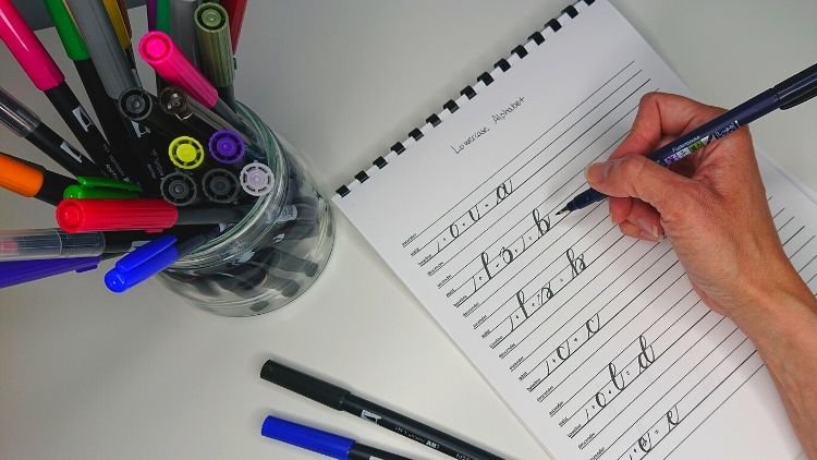
started, I'll let you know the supplies
you're going to need. Firstly, we need some paper. Dot grid or lined paper
is best for practice. You could just use
regular printer paper if that's all you have around and you just want
to get started. In the resources
section of this video, I've provided all three
of these. A dot a grid and aligned PDF that you
can print out onto paper. If you didn't want
to buy a work pad, then we'll need a brush pen. My recommendations are the
Tombow Fudenosuke soft tip, preferably. The pentel sign brush or a Pitt Artist brush pen. These pens have a
nice flexible tip that is easy to achieve. Thick and thin brushstrokes
in just the right places. And with those and a nice
flat surface to work on, we're ready to get started.
3. Anatomy of Calligraphy: When holding your pen, you want it to feel
as comfortable as possible while
positioning your hand a little further up the
barrel so that it touches the paper at about
a 45-degree angle. When you hold the pen
like this up further, it means that when you're
putting more pressure on it, most of the side of the brush tip is actually
going to touch the paper, which will give you that
nice thick down-stroke. When writing, try to use minimal movement
in your wrist and really tried to
relax and just use your elbow and shoulder
to make your strokes. I'm now going to show you the basic structure of
modern calligraphy so that you have an
understanding of what each element is as we
go through the class, starting with our baseline. This is the level where the
base of our letters sit. Now most of the
time this will be straight and even
along the words. But as you develop
in your practice, you might like to start
including staggered baselines. It looks something like this. This is known as
bounce calligraphy. The midline or sometimes called the x-height or waistline, is where the main part of our
lowercase letters finish. Some letters, however,
extend above this line, so we call those ascenders. So the top line represents the level where those
letters finish. Other letters extend below the baseline and they
are known as descenders. So this final line at the bottom represents the level where
they generally finish. Upstrokes are the
thin lines that are created when your hand is
moving in an upward direction. Downstrokes are the
thick lines that are created when your hand is
moving downward towards you. A swash is the flowy
extensions from letters, which we will only be
touching on in this class. Once you feel ready to learn more about flourishing
calligraphy, I have another video coming where I will teach
you more about this. I love that with modern
calligraphy, nothing is absolute, it is an art form and
that means you can adapt all these things to
suit what you like the look of. The fundamentals are important to
know when starting. But then as you develop the
tweaking of these elements, I think are what will make your
lettering more interesting.
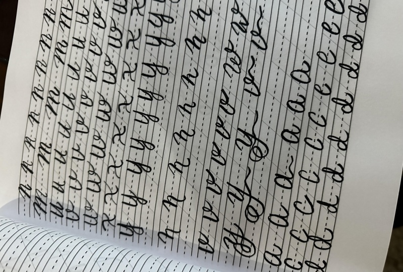
4. Basic Strokes: These practice strokes are the building blocks of what modern calligraphy
is made up of. By practicing these
on a regular basis, you will build muscle
memory in your hand for the strokes and movements
needed to create each letter. You'll also see your
writing look more consistent as you
develop a rhythm. How to create each
turn and look. So here are the
eight basic strokes you'll want to practice. The Upstroke using
very gentle pressure to make a stroke moving
in an upward direction. The Downstroke using a firm pressure to
create a stroke moving downwards in direction
towards you. The overturn. Combining a gentle
pressure, moving upwards, curving over the top into
a firm pressure downwards. The Undeturn
the exact opposite. A firm pressure, I'm
moving downward, curving around the base into
a gentle pressure upwards. The Compound Curve. Combine the last two
turns to form one unit. Gentle up, firm down, and gentle up again. The Oval, starting near the
midline with a firm pressure, curving down, then
transferring into a gentle pressure to bring the next curve to meet the top. The Ascender loop, starting with a gentle
pressure near the mid-line, curving upwards and
looping down into a firm pressure downstroke
to the baseline. And lastly the Descender loop, the opposite to the last, starting with a firm
pressure near the mid-line, curving around and
looping up into a gentle pressure to
meet at the baseline. Now that we have done
our basic strokes, we can move on to learning
about the lower-case alphabet, which are broken
down into groups of letters that are
similar to practice.
5. Lowercase Alphabet - Compound Curve Letters: Starting with the letters
that contain compound curves, like from our basic strokes. Going through these
letters together feels easier to get a flow happening as you're practicing the same basic stroke in
each letter over and over. So starting with an overturn
and then a compound curve. Remembering to keep in
mind those pressures of gentle upstroke and
firm on the downstroke. The m is very similar. Start with an overturn, then another overturn, and
then a compound curve. The letter U uses
similar shapes. It is basically the reverse
and you're doing two underturns linked together so underturn, and then another underturn. The letter V uses the
underturn basic stroke. And instead of ending
it where we did before, you continue up and form a little loop to
end that letter. The w is very similar to the v you're going
to do one underturn, then another underturn that ends in that same little loop. The letter X is a bit
different to the others. I feel like it's still
a compound curve, but it's just really
stretched out and elongated. So the first stroke is
a thick downstroke, a stretched out compound curve, and then a light upstroke
to cross that x. The last letter in this
group is the letter Y. And this starts with
an underturn and then a descending loop to finish off the tail
of that letter. As you can see, I'm practicing each of these letters a few times to really get the hang of each letter and
how it should form. But by mixing up the sizes and placements of
those compound curves, you can really make each
letter look very different. So this is what
I'm showing here. I'm adjusting
slightly the spacing and the length or
heights of each curve. And it really makes
a big difference. So this is where you
discover what you like best. Now we've finished this
first group of letters. We can move on
to the next group, which focuses on the oval shape.
6. Lowercase Alphabet - Oval Letters: Using the oval-shaped
from our basic strokes, we tweak it slightly to be the main focus of this
next group of letters, starting with the letter a. Now this is your
basic oval stroke, but the bonus is you don't
need to worry about it meeting up perfectly at
your starting point, because as soon as
you finish it, you will add a nice strong
underturn right on top of it. This forms the letter a. Now for the letters c, this is your oval basic stroke, but just don't connect
the two ends together. The e is very
similar to the c, except your starting
point just curl slightly inwards
towards the downstroke. Now for the letter
D, this one uses the complete basic
letter oval stroke and then combines the
ascending loop next to it. The g feels exactly
opposite to that. So I start again with the
full basic stroke of the oval and then put the descending loop right next to it to form the g. The q starts with the full oval stroke and then bring it down
strokes next to it, and curl it back upwards
on itself to create the tail and kick of the q so that it doesn't
look like a backwards P. Now we have the letter o. I like to almost break this
oval up and start at the top, near the midline in
a downstroke that curves around and up
using gentle pressure before it swings into
another little loop at the top that will then
be able to connect to the letter next
to it when you're writing. Here is some variations
of those letters. And by just changing
simple sizes or placement can really change
the look of each letter. After you feel confident
on these letters, we can move on to the letters that contain ascending loops.
7. Lowercase Alphabet - Ascending Loop Letters: Now we practice the letters
that have ascending loops. And our first one
is the simplest, which is the letter L. This is a lot like your basic
stroke ascending loop. But when you reach the bottom, you'll be up turning
it so that it's ready to connect to
the letter next to it. Letter b is for some reason
my favorite letter to do. And this starts with
an ascending loop and then adds a reversed oval. Or maybe even you
could describe it as an overturn that has a
crossing exit stroke. The next one is the letter f that starts with
the ascending loop, then continues in one motion up to the midline where there's a small loop that forms
the crossbar of the F. The next letter is
the letter K. This starts with the
ascending loop and then brings a loop out
from the middle and then a little leg that kicks
down beneath the baseline. This letter, you can
do several ways. I'll show you some
different ones at the end of this group. For the final ascending letter, we have another one of
my favorite letters. This one is letter
H for some reason, And I'm sure I'm
not alone in this, but the word I write constantly, if ever I'm mindlessly
writing is 'hello' It's just the h that
seems to flow out of me when beginning to
practice calligraphy or even just testing a pen. But yeah, I love this letter and it's one of my favorites. So starting with
the ascending loop and then a compound
curve right next to it. Now to show you some variations
of each of those letters. Next we can take a look
at the letters that have a downstroke as
the central focus.
8. Lowercase Alphabet - Downstroke Letters: I grouped these letters
together because I feel that the downstroke is
quite prominent on them. The first letter
is the letter I. This is very similar to the
underturn as we practiced, and then it just has
a dot on the top. The next letter is
the letter T that has the long downstroke
or the stem of the T, and then a thin crossbar. The letter J is a descending
loop from our basic strokes, and then with a dot on the top. Then this last letter
is the letter p, which starts with the
strong downstroke and ends in one of those
loops that we did for the B. So it's kind of like an overturn that crosses over
at the exit stroke. Here I'm showing
some more variations of these particular letters. You might see one that you
like more to practice here. Once you've tried these ones, we can move on to
the final group of lower-case alphabet letters, which mainly have a
focus on the upstroke.
9. Lowercase Alphabet - Upstroke Letters: These last letters in this group don't really fall into
the other categories. So I just call them
upstroke letters as I feel they are quite thin and rely on the upstroke
to start each letter. This first letter
is the letter R, officially the strangest letter to be riding in calligraphy. Lots of different ways to do it. But this way is my
personal favorite using the soft upstroke into a loop that's on top of the midline and then bringing it down into that under turn. Then for the letter S, starting with that
thin upstroke, then curving your way down
and over to form the s. Now for the final letter, the letter z, a letter, I feel that is like no other it does start with
this soft upstroke. It can be sharp. You can do a sharp version, or you can do this
soft flowing version. I personally prefer
this very curvy one, but it is up to you and there are lots of different
variations. So do keep that in mind. Now, during your practice, you might want to keep rotating the barrel
of your pen every so often just to stop the tip from getting
bent out of shape. Now this alphabet that
we've gone through, It's a really nice simple one
that I use to get started. There are an infinite number out there and every one
can be different if you slightly adjust sizes and the placement
of these elements. I'll show you a few
different variations of these last few letters. And then we can move on to
the uppercase alphabet.
10. Uppercase Alphabet: The uppercase letters
are usually where a few fancy elements
come into play, but this one in
particular is still a pretty understated style
and is great for beginners. So feel free to
watch me go through the full alphabet and then give it a practice
and see how you go. I hope you found that
easy to follow along with and that it helped you out with your capital letters. And now it's time to move on to connecting letters
to form words.
11. Connecting Letters: Now we're going to
talk about connecting letters in your
calligraphy to form words. Most connections probably
feel pretty natural. And I think mainly your
instincts come into play here. But a few examples. I'll show are how different pairs
of letters connect. Most connect with a
diagonal upstroke. It's not actually one
continuous line though, as we usually take our
pen off between strokes. It's just giving the
illusion of a connection. This kind of connection can be
seen in the letters ni, do, or to, as I'm showing you here. Another kind of connection
is where a letter ends at the midline
instead of the baseline, like the o, the v, the F, or the w. And what I like to do here is add a little loop join. But sometimes
certain letters just won't benefit from that
kind of connection. So the letters o and F, I find a little bit on
the trickiest side. So what I do here is I
keep my loop on the O. And then when I'm going to
attempt the loop on the FBI, cut it short and don't loop, it just meet the tail and I think it just
gives a neater effect. So sometimes you just have to go with what you've got
and what feels right. It's not a steadfast rule that os always have to
have an exit loop. Things like that
to be considered. You can always get rid
of the loop on the O. And you could do
the loop on the F. Instead, it is
completely up to you. When the letter W
connects with an E, for example, you could just meet it right
next to the loop. But I personally
prefer to connect it. So when I'm doing the
w on the exit loop, I will just bring it a
little bit lower to start my e straightaway and make it look very continuous
through there. Then it's very
similar with the V, the exit stroke of this you can just meet it up
like in this first option. Or you can bring the
vs loop and actually connect it right
up to the midline where you're about to
start your next letter. And I just personally think
this looks a little bit neater and more legible as well. Then lastly is when letters
join from a descending loop. Now you can just keep it simple where it's
going to be by itself. So you just finished
your descending loop and draw the next letter
right next to it. This is your first option. The next option is to
draw the descending loop. But instead of ending at way, you would normally just
lift that exit stroke slightly so that it's ending at the beginning
of your next letter. So that, that there's a seamless connection there between the loop and
the next letter. I personally think
this just looks really nice and connected. And it gives you that
feeling of it all being a continuous motion
through the word itself. Something special that I love
to do with my calligraphy is actually not connecting the descending loop
to any letter. So to leave it floating
beneath your word, and by not being connected, it becomes more of a
feature and really an intentional arty
element to the word. Now I'm going to end this
connection clip by showing you some words that
I've put together using all those elements
that we've just discussed. And now I'll see you
in the following clip to talk about our
class activity.
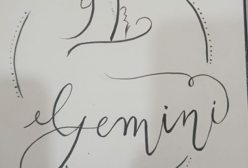
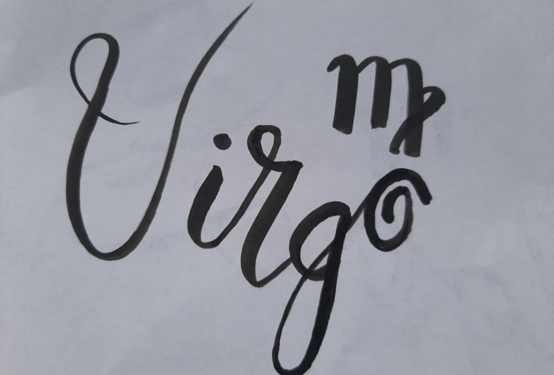
12. Congratulations & Class Activity: So now that we've
gone through the alphabet in this style and you've practiced
connecting letters together. The next thing to
do is start writing words. So as the class activity I would love it if you would go ahead and create
a piece where you write your star sign using what you've
learned in this class. I'll attach mine as a reference and can't wait to see
what you guys create. Please post a photo
when you're done on here or even on
Instagram if you prefer, don't forget to tag me with @torrynmarieart so I
can see your progress. I hope to see you again in a future class and
really hope this will help you in
whatever way you plan on using your new craft. Thank you so much. I hope you had fun.
See you next time.
 Torryn Marie ♡, West-Australian Illustrator