Transcripts
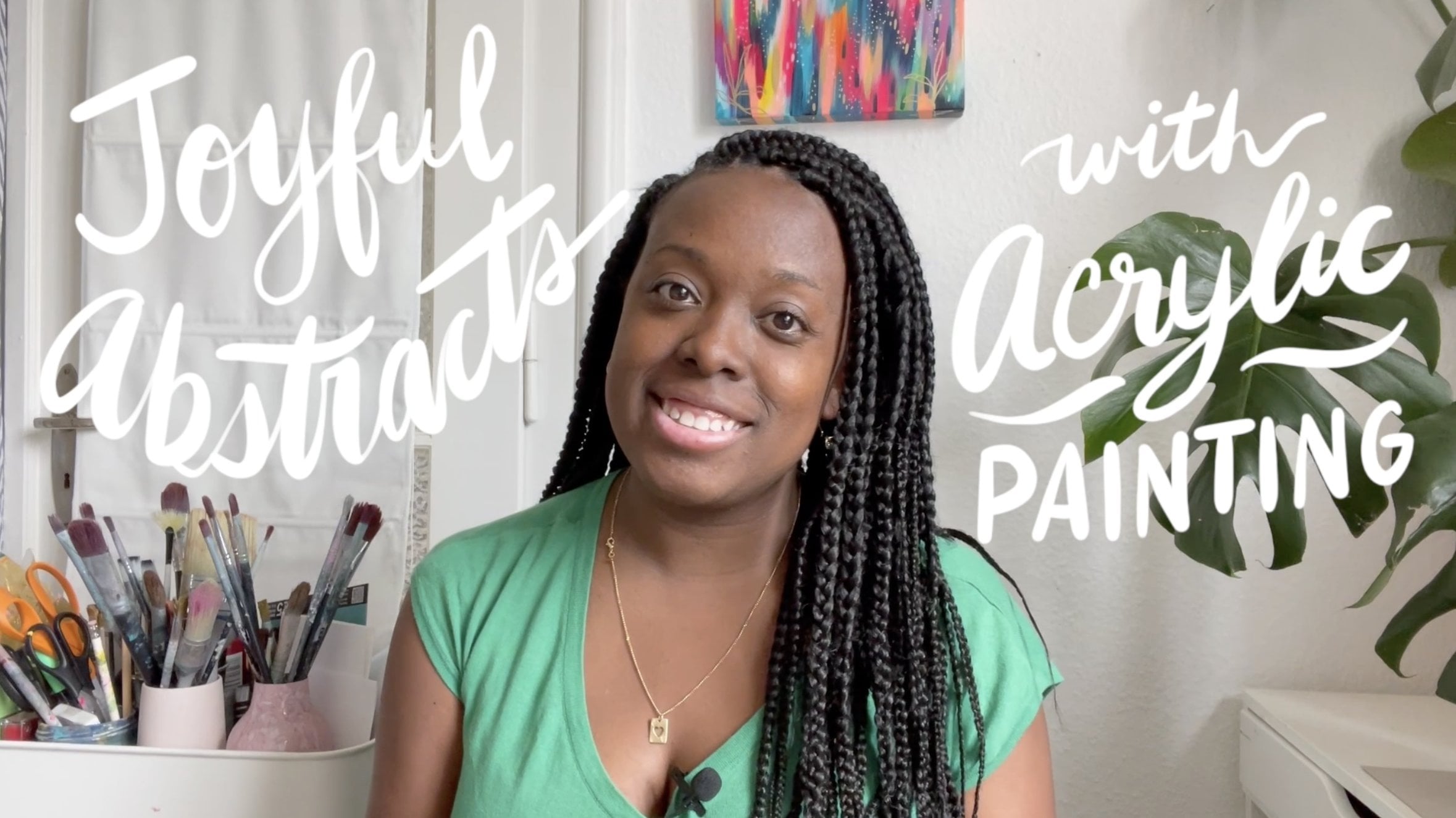
1. Welcome to Modern Blooms!: Hi, I'm Jessie Role, and welcome to Modern Blooms. An acrylic journey into
abstract floral painting. If you've ever wanted
to paint in a loose, expressive and creative way, then this class is for you. Together, we'll explore abstract floral
painting with acrylics. Rather than focusing on realism or painting every
petal perfectly, you'll learn how to capture the feeling and beauty of
flowers through color, shape, texture, and
expressive brushwork. One of the things I
love the most about abstract painting is the freedom it gives us to experiment, trust our instincts, and create something that
is uniquely our own. Throughout this class, I'll
share my process while encouraging you to
make creative choices that reflect your
personal style. We'll complete three
quick projects together. First, you'll paint a
single expressive flower and learn how to
simplify floral forms. Next, you'll create
an abstract bouquet exploring composition
and layering. And finally, you'll paint an
abstract field of flowers, bringing everything together in a vibrant landscape full of
movement and atmosphere. A little bit about
me, I'm Jessie Role. I'm an artist, teacher, author, and the creative director of the colorful lifestyle brand Eta V. I've built a career as a commercial artist with
abstract art leading the way. Whether you're a beginner or simply looking to loosen
up your painting style, this class will help you build confidence and enjoy
the creative process. Feel free to follow me on
Skillshare to be instantly notified when I post a
new class or freebies. And please do share your work in the class gallery so that we can all give you your flowers. So grab your paint brushes and your favorite colors,
and let's get started. I cannot wait to see
what you create. Oh
2. Single Flower Intro: Hi, friends. In this project, you will be creating a
single abstract flower using acrylic paint. This project is all about learning to see
flowers differently. Instead of focusing on
realism or perfect details, you'll be exploring
shape, color, texture, and
expressive brushwork. Think of this flower as an interpretation
rather than a copy. As you paint, I encourage you
to make your own choices, choose colors that excite you, experiment with
different brush marks, and allow yourself to simplify the flower as
much as you'd like. Remember, abstract
painting is about capturing a feeling
or an impression. If your flower looks different than mine, that's a good thing. The goal isn't to
recreate my painting to perfection is to
create your own. And that's what helps us
build confidence as artists. Use me simply as your guide. When you're finished, upload your project to
the class gallery. I would love to see
your color choices, your brush marks, and the unique details you chose to add. And with that said,
let's get going. Our first project
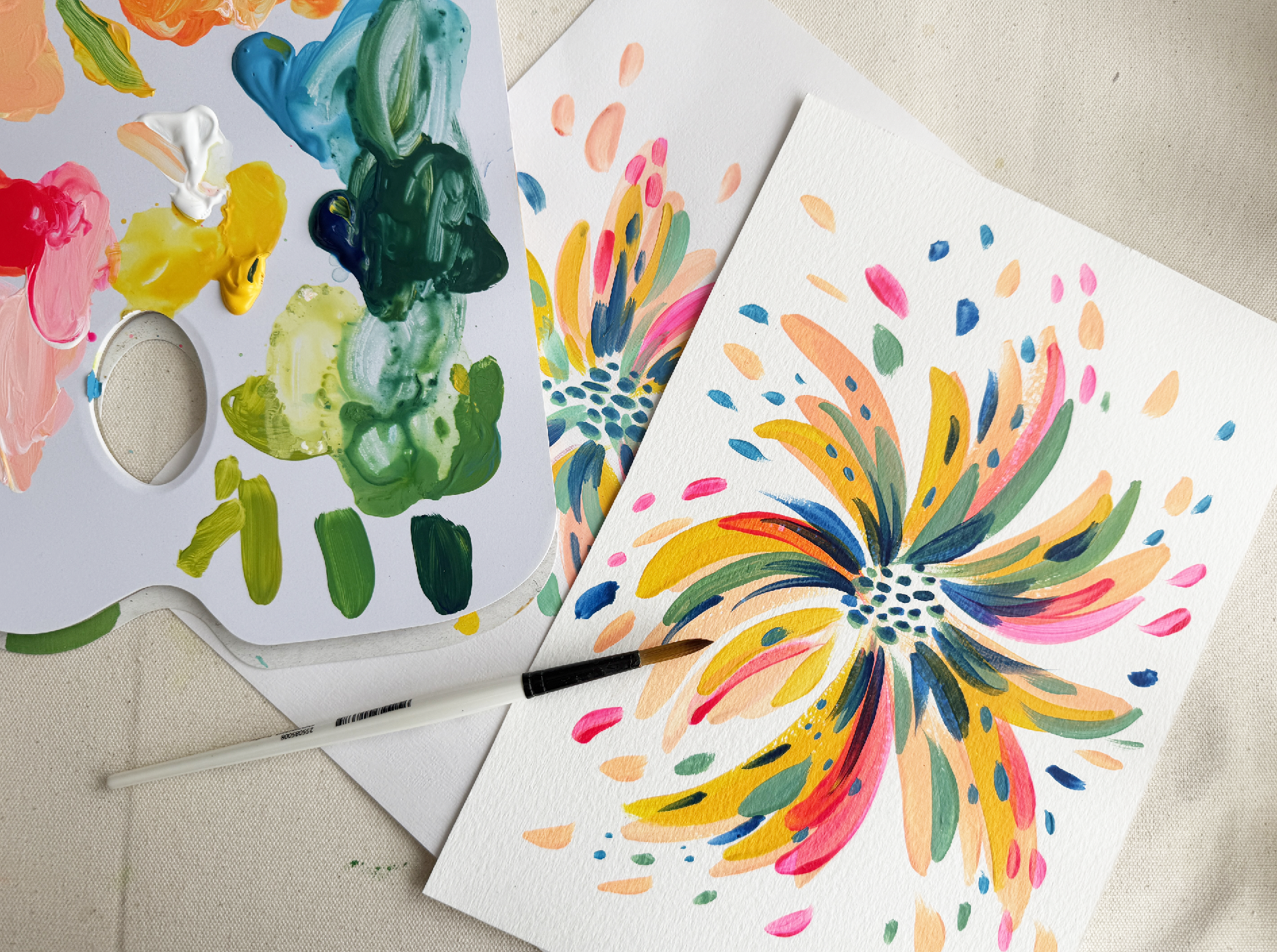
will be to paint a quick and expressive flower. When given a closer look, our lovely flower
here looks like a burst of brightly colored
and layered brushstrokes. And the reason why
I wanted to start with this project
is because it's the perfect way to
get warmed up and let loose in terms of
painting expressively. Now, when it comes to
expression or abstract, I try to think of the emotion
I'm trying to convey. To me, when I see a flower, I think of joy,
optimism, whimsy. And as you can see
here on our flower, there's freedom in the
movement of the brushstrokes. You can see they're
kind of pushing out, moving they're free, they're
going where they want to. And so in this exercise, we're going to just really
kind of trying to hone in that energy of expressing
freedom and movement, joy, optimism, and whimsy. Now, let's go over
the materials.
3. Single Flower: Materials: For the materials, I have first and
foremost, acrylic paint. You can use any acrylic
paint that you have on hand. I personally I am
going to be using the EtiV multisurface
acrylic paint, which is my personal
paint line that I have. But like I said, any paint
any brand of paint will do. I will kind of just go
through the colors, though. That'll help you know
which ones to grab. So I have a nice cadmium
yellow medium hue, a fluorescent pink. A Prussian blue. Mine's not quite as deep as Prussian blue, but if you have a Prussian blue on hand or any kind
of blue, that'll do. Turquoise blue and
titanium white. If you're new to acrylics, here is some general
information. So acrylic paint is a fast
drying water soluble paint. It's made up of a
polymer emulsion, which means it's very
durable when dry. It's a very versatile paint, so it can be painted on
many different surfaces. And because it's water soluble, we use water to
clean our brushes. You can also add water to
the paint to dilute it, which makes it more transparent
and easier to manipulate. Now, when it comes to acrylics, there are generally two types of acrylic paint that we work with or that I
tend to work with, which is basic acrylic paint and heavy body acrylic paint. So for this project, I'm going to be using more
of a basic acrylic paint. The difference is pretty much
that basic acrylic paint, it has a medium viscosity, which means it's not that thick. It is still you're able to move the paint across the
canvas quite easily. It's easy to blend. It's a great price point, and it's the perfect
paint for learning. Heavy body acrylic paint, it's a thicker
paint, which means it's a high viscosity paint. When it comes out of the tube, it's just a thicker consistency. And it really allows you
to get those nice thick, creamy, brushstroke
marks in your work. It's a higher end product, and that is definitely
reflected in the price. I tend to use heavy
body acrylics more so whenever I'm working on
commissions for clients. But for this project,
I will be using a basic acrylic paint. As for brushes, I have two brushes for
this first project. I am using they're
both round brushes. The first one I have is
simply Simon, size eight, and the second one
that I have is from SastrnGrin here in town, but it's a round brush
as well, size four. So pretty much the idea is
you want two round brushes, one that's larger, and another one that's
smaller to where you can get some
nice details going. I also have my water to clean my brushes
and a paint cloth, as well as a palette
sheet to mix my colors. And then I will be
painting on paper today. So I'm going to be
painting on Kansen, acrylic paper, What up? You can find a shopping list of all supplies in the
Download resources. And you can also snag
two freebies that I created just for you at
atavi.com slashMODBlooMS. I've created a floral
abstraction worksheet and flower inspiration board to help you with your projects. Okay, so I think
that we are ready to go ahead and get started
with mixing our colors.
4. Single Flower: Color Mixing: Now, to mix my colors, I'm going to go
ahead and kind of just clear this space
out a little bit. And I'm going to grab my
lovely palette sheet. And before I start
mixing colors, I do just want to
quickly show you. So here is the piece that
we're going to be painting. As you can see, there are five colors represented
here on this piece. So pretty much most of the
colors I'm going to be using are the colors
straight out of the tube. However, we're going to only need to mix two colors
for this project. So we're going to mix this nice hot coral color
that we have here, as well as the soft green. Okay. Gonna get my
paints back over here. Now, I'm going to
go ahead and start with my titanium white. Go ahead and place that
right there in the center. I'm going to next grab my
cadmium yellow medium hue. Put some of that over here, followed by my fluorescent pink. Next up, Turquoise blue. And last but not least,
my Prussian blue. Okay. So pretty much
these five colors. Usually, I also add,
like, a magenta, but these are pretty
much the colors that I always use when color mixing. I feel like they produce
quite vibrant colors. Once mixed properly,
they're just perfect for creating a nice,
lush, vibrant color. And so we're just going to mix
our two colors real quick. I am just going to
go ahead and use my brush in order
to mix my colors. I'm going to start off by mixing that lovely hot coral color that we saw in the
example piece. So whenever I mix colors, I like to start with the
lightest color and then slowly add my darker colors
little by little. So I'm going to go
ahead and start with the titanium white. Pull that out over here. And I'm going to
now pull in some of that lovely cadmium
yellow medium hue and mix that in until I
get a nice pale yellow. Kind of like this. And I am now going to
snag just a little bit of my fluorescent
pink and mix that in. So that's kind of giving
me a pale orange. I want it to be a little bit more coral, so I'm going
to need more pink. Okay. I think I'd like a
little bit more pink as well, so I'm just going to
keep, like I said, mixing in those colors
little by little. And here's what I've
ended up with. I love it. Might even snag a little bit
more of that pink in there. But feel free to mix
it to your taste. And that's the
color that we get. It's very nice. Okay, so I'm going to go ahead
and clean my brush. And next up, I'm going
to mix the soft green. Okay. Now, for that, I am going
to start with the yellow. Okay. Just kind of
put it right there. And I'm going to
take a teeny bit of the turquoise
and mix that in. No, I'm really just mixing
this in little by little. 'cause I don't want
it to get too teal. If I mix in too much
of that turquoise, it's going to start
to turn teal. I do want it to be green. Okay, so I think I'm
liking this green here. Kind of like that. And next up, what I'm going to do
is I'm going to snag just a tiny bit of this
white and mix that in. Little by little, what we're
doing is creating a tint. We're changing the
tint of the color. Okay, like that.
That's nice and soft. Okay. And that's the color
I've ended up with. Actually might snag a little
bit more of that blue. There we go. All right. And those are the two colors
that I'm going to be using. I'm even, even looking at this, I might even just
snag a little bit of the Prussian blue to
see what that gives me. Oh, yeah, that's nice. That kind of gives me
a softer hue here. Okay. That's really nice. Okay. Okay. I'm pretty
happy with that, but feel free to play
around with the colors. You know, you can mix purples, if you want to mix the
fluorescent pink with a little bit of that turquoise
blue, sky's the limits. So I'm going to go ahead
and wash my brush, and I will see you guys in the next video to get
started on our flower.
5. Single Flower: Base Layer: All right. So I went ahead and got myself some fresh water before getting
started on our painting. Now, before we get started, let's quickly just
observe our subject here. I may look like the brushstrokes are bursting from the center, but they're actually
swinging inwards. So even though it
looks like this, I actually achieved this
look by doing the opposite. So the brushstroke starts
on the outside and it swoops in to the
center of the flower. Okay. So that's kind of what we're going
to be doing here. And as you can see, there are curves in the brush strokes. These curves here, those are what gives our
flower movement. So they just kind of visually create the effect that the
flower is alive and moving, maybe blowing in the wind. And so we achieve that with these slightly curved
brush strokes, and so that's what we're
going to be doing. Now, I'm going to be starting
with the bottom layer, and as you can see here, we
have lots of colors going on. But if you take a closer
look, the bottom layer is this nice hot coral here. So we're going to start
with the hot coral, and then we're going to move
on to the two middle layers, which will be the yellow
and the fluorescent pink. All right, so let's get started. Now, this is just for
practice. No worry. You know, if maybe you're a
little hesitant at first, this is just a nice way
for us to warm up and get our expressive
abstract juices flowing. So no pressure to create
something perfect. We're just going for trying to really capture that
movement in our piece. That's what this practice
is all about. Okay. All right, so let's go ahead and get started
with this base layer. I am going to snag some
of this lovely Hot coral. Now, it's been sitting
here for a little bit, so it might get a little dry. So I am going to dip my
brush ever so slightly, just a little bit in the water, kind of just just
the tip of my brush. And I'm going to add that to my paint just to kind
of loosen that up a bit. And I'm going to go
ahead and get started. Okay, so as I mentioned, we start from the outside, we work our way in with
our brush strokes. I'm going to show you the first brush
stroke quite slowly. Start out, bring it in. Now, when I bring it in, I'm kind of pressing. And then at the
end, as I release, I give it a little tiny flick
of the brush at the end. Okay. Kind of like that. And
that's my first petal. Now, I'm going to move my
way around the flower, and we want to kind
of make sure that, like, our brushstrokes
are different lengths. So we don't want them all
to be the same length. We want some variation in there, so it feels more like
an organic flour. Okay. Now, I am I just
keep adding some of that water to my
paint mixture because I really want my brush to really
glide across the paper. But what I think
is really lovely about this type of
paper is that I get that nice toothy
brush stroky effect, which is really lovely. Now, I did add a
little bit of white into my hot coral because I think
just like a little differentiation is really nice. And I want you to really
loosen up with it, really test out doing
different lengths. As you can see, this bottom one, I've really let it
go a little bit longer than the others
just 'cause it's nice, it creates some
interest for the eye. And as you saw there, kind
of this last one, like, really explore making
a confident movement. Don't overthink it. This is
really an exercise in flow, following a shape, letting
the organic shape take place, and letting go. I am obsessed. This is already just looking
really lovely, I feel. Since I do already have
this hot coral on my brush, I am going to go around and add just some little markings that are kind of as if they're
coming off of the flour. And I'm achieving this
by just lightly adding short little brush
strokes around the flour. And I'm moving in
the same motion. I'm going from out to inward. So I am going to
let this layer dry. While this layer dries, I'm going to wash my brush. If you have a hair
dryer on hand, you can go ahead and use
that for quicker drying. Next up, we are going to layer
in with the yellow paint.
6. Single Flower: Middle Layer: Now that my first
layer here is dry, I am going to go in and bring in our next layer, which is
going to be the yellow. Now, what I love
about the yellow is that it's just going to
add a nice highlight, a nice little glow, a
visual glow to our piece. I'm not going to now, we're not going to want
to really, you know, we're not going to
want to cover here, let me move the sideways so we can get a little bit more light. We're not going to want
to cover our work here. We're really just
adding layers on top. So I guess I'll just
go ahead and show you. So, like, maybe, for example, I bring one in here. So as you can see,
I just layered it over the top part
of this section here. Let's see where else can
I go bring in a piece up here and a piece up here. Now, remember, I'm starting outside and working my way in. Okay. Now, what we want to make sure is that we can still see
that orange underneath. So it's really just adding a nice little fun
warmth highlight on top of our base layer. And a. And that's it. So that was all the yellow
that I plan to add. I'm going to let the
yellow dry and next up, I'm going to go in with
the fluorescent pink. Now that my yellow layer is dry, I'm going to go in with
the fluorescent pink, and I'm going to do
the same thing as I did with the yellow layer. Just kind of add in some of those little little
highlight moments and just slightly
layering those on top. And I'm just kind
of moving my way around kind of looking at maybe areas that need to be broken up with
color a little bit. Yeah, I really like that. And I am going to go ahead
and start to push out some of these little marks on the edges, just like we did with
our first color. Always making sure I start on the outside and work my way in Okay. I like how it looks. Okay, so that is looking great. And now we are going to move forward with
our two top layers, and then our lovely
flower will be complete. I will see you in
the next video.
7. Single Flower: Top Layer: Now that the middle
layers are dry, we are going to finish by
adding the top two layers. I'm going to grab some of this lovely soft
green that we mix. So I'm going to grab my brush. I'm still using
the larger brush. And let's see if it's still
might need to remix it. It's been a while
since I've touched it. So let's see. Let's just pull in
a little bit of that white and the
turquoise blue in there. And she's back. Okay.
Fabulous. Okay. And okay, so now I'm
going to go through, and this layer is
going to be kind of a little just lighter than when I say lighter,
I mean thinner. Like the brushstrok is going to be a little bit more daintier than what we had in
the other layers here. Because what we're
doing is we're kind of starting to build our
way towards detail. So I'm going to
go in and kind of just lightly press my brush from the outside to the inside. So just going ever so lightly. And when you press lighter, you get a thinner brushstroke. Okay. Kind of like that. Okay. And we're doing the same thing, just kind of adding those, like, little dashes where
you feel like you need. Now, I really want you to, like, I really want you
to hone in and try to take some creative liberties
here wherever you feel, you know, like there's an area that needs a
little bit more love. If you're really
loving this color, and you want to add
more, go for it. Now that this piece is
this layer is on there, I think I'm going
to let this dry. And while I let
this dry, I'm going to switch to my smaller brush. And I'm going to
add some details. Alright, so using still
using this green, I'm going to go in and
start to add some of these little round ovals to
the center of my flowers. So I'm just gently
dabbing my brush. Since it's a round brush, when I gently dab it, it gives me a nice
little oval shape. And you can play
around with making some of them bigger,
some of them smaller. Okay. I think I like
that, just like that. And now that I have
this smaller brush, I might just add a few of these little smaller
flourishes in the green. And I'm going to now go ahead and switch
over to the blue. Now, for the blue, let me show you the
example we're gonna be kind of doing something
different this time around. Okay, so as you see, what we have been doing
is that we have been, as you know, taking our brushstroke from the
outside and moving it in. But for the blue, we're
actually going to be starting in and moving out. And we're also going to be using shorter brush strokes as well. So the blue is really just to
add detail, some contrast. I am going to start
with my larger brush. I'm going to grab
some of that blue. Okay. And I will add just a little bit of water to that just
so it really flows. I really want it to I don't
want to I think, yeah, it's nice if it has, like,
a little transparency to it just a little bit. Helps it flow.
Okay, so here I go. As I said, I'm going to go from the inside. Go to
work my way out. Very, very short and
very light touch. Okay. Just like that. Okay. And as you can see,
this really just brings our peace to life. Okay. H It's really lovely, really nice. Love how this is looking. Okay. All right. Now, I think, while that dries, I am going to grab
my smaller brush, go in and add some detail to
the center of the flower. I'm not fully covering
the green dots, I'm just adding a little layer that's slightly offset
from the green. Now, looking at the
flower, I feel like this space is a little
empty right here, so I am going to maybe bring in I think I'll just
bring in, like, a little maybe, like, some of that hot
coral color from the beginning just to kind of fill that
space a little bit. Sometimes we have
to edit as we go. But that's just a
personal preference. If yours if you are happy
with yours, go for it. Don't worry about me. Valla.
Okay, that's much better. Okay. I'm gonna bring in a little yellow layer
as well just to keep it a little consistent. And there we have it. Now, I'm looking at it. I'm like, oh, maybe I
could add You know, I think I might just
bring in a little bit more of this Mm, maybe I'll just use some of
this turquoise, actually, 'cause we haven't used that yet, and I think that
could add a nice little extra color in there. And I'm going to
use a small brush, and I'm just going
to kind of add really small dashes. All right. And my friends, we did it. Here is our first project, this beautiful,
expressive flower. I am really curious to
see how you guys did, so please post in
the class project. Probably what I will
do with this now. This can probably
actually looking at it, it would make a great
repeat pattern. I'll probably scan this into
the computer and create a pattern for it to
be used on fabric. I think that'd be
really gorgeous. But it could also just
simply be beautiful framed on the wall
or given as a gift. So I hope you guys enjoyed
this first project, and I will see you for
project number two, which will be a lovely bouquet. So I hope that this
first lesson kind of got you warmed up and a little bit more confident with your brush strokes as we
go into this next lesson. See you over there.
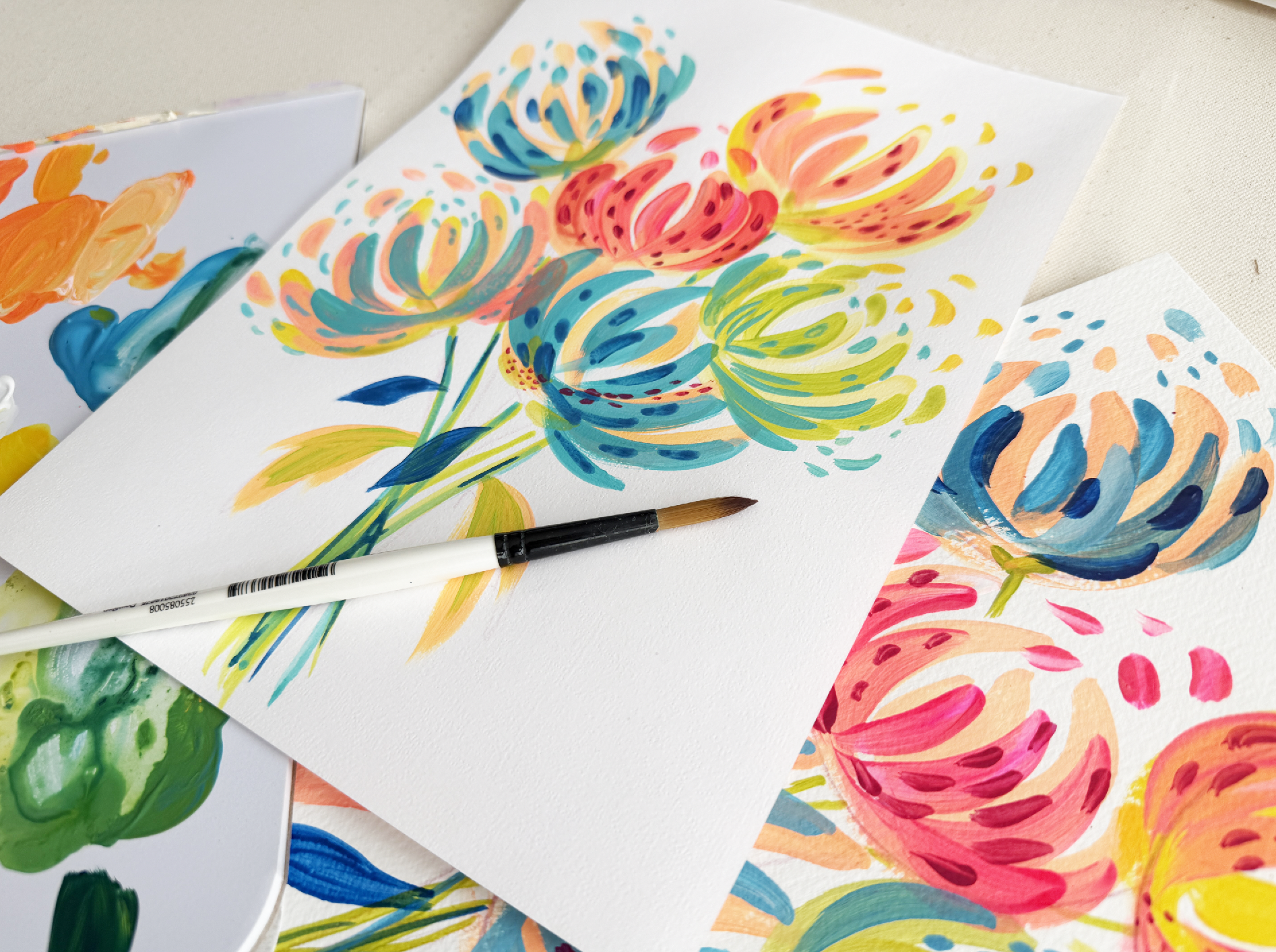
8. Bouquet Intro: Now that you've painted
a single flower, it's time to create
an abstract bouquet. You'll combine flowers, leaves, shapes all into a
balanced composition, focusing on movement, color, and energy rather
than perfection. Youths the techniques
that you've learned, but I really also
want you to trust your instincts and explore
your own creative ideas. Each abstract bouquet is going
to be completely unique. So this is actually the
perfect opportunity to develop confidence in
your personal style. When you're finished,
share your project in the class gallery so that we
can all celebrate your work. Our next project is going to be creating this beautiful
abstract bouquet. And when we give
this a closer look, you may notice that
we will be using the same brushstroke technique as we used in
project number one. So as you can see,
we're going to be using that same outward to inward swooping technique as we did on the first project. And I think, pretty much, um, you know, we have
in terms of color, we're going to be
using the same colors as we did for project one. The only difference is this
time we're going to be adding in a magenta to get these nice deep details
here on our pink flower. So we'll go ahead and get to remixing some
of those colors.
9. Bouquet: Color Mixing: Now, just reminder,
the colors I will be using are titanium white, cadmium yellow, medium hue, I have my turquoise, although I already have some
turquoise on my palate, so I am going to not
need to add anywhere, but a little bit of
the Prussian blue, which I already
have on my palate. This time around, I am going to be bringing in some
of that magenta. So magenta, just a little
bit I don't need too much, and I will top that off
with the fluorescent pink. Okay. Now, for this piece, we are only going to be needing
to mix two colors again. So this time around, we're going to start again with our lovely hot coral color. So let me go ahead and bring this over so we
can get that mixed up. So remember, that was taking a little bit of this
titanium white, bringing in that cadmium
yellow, mixing it in there, and then bringing in
our fluorescent pink. Now, remember, you
can add more pink or more yellow based on
your personal preference. I tend to like mine a
little bit more pink. Just feel like it makes
it a little warmer. Okay. And here's the color
I ended up with. Gorgeous, gorgeous. And
for my second color, I am going to go ahead and just clean my brush real quick. For my second color, I'm
going to mix a lime green. So for the lime green, it's going to be similar
to that soft green. But this time, we're
just going to add to the tiniest bits. So I'm gonna pull out
some of that titanium yellow or not titanium yellow, cadmium yellow medium hue, and snag just a bit
of that turquoise. Mix it in. Okay,
it's looking good. I think I can take just
a little bit more. Mix it in there. Gorgeous.
Now, the more yellow you have, the more lime it will be. The more blue you add,
the more closer to a teal you'll get. So just go to add a little
bit more yellow in there. And it's perfect.
It's looking great. And there it is. All right. So now we can go ahead and get
started on our piece.
10. Bouquet: Sketching & Base Layers: Oh. Now, for this piece, you are going to need a color
pencil or a plain pencil, but I tend to like to
use a color pencil whenever I'm doing my projects. So I have a What color
is this? Let's see. Kind of a maroon
color pencil on hand. And if we look at
our example piece, we can see that we
have six flowers, and they're all kind
of bunched together, all reaching for the sky. And what I really love about
this is that I don't know, it feels alive. It
feels effervescent. It feels like you just scooped
up a bunch of flowers, ready to give them to someone. I really just love the energy. And so for this piece, we're really just
going to kind of also still be focusing on getting
that movement in there. And with our color pencil, pretty much what we're
going to be doing is creating a little
guide for ourselves. So we're going to lightly
kind of sketch a U shape kind of like
a wide U shape, kind of like a
bowl, if you will. And we'll sketch six of those very lightly just so we know where our flowers are
going to be placed. Alright. So I have my
trusty color pencil, and I think I'll start
kind of up here. Now, impressing a little harder just so that you guys
can see it on camera. Usually, I would kind of go
in with a lighter touch. So that's one. That's two. That's three. We got four. Let's do five over here and six. And I made sure to
leave some space on the bottom so
that I can kind of feed my flowers down. Those are going to get
painted over, but it's just an idea to know where
they're going to go. Alright. So I think we can go ahead and get started
on our base layers. For the base layers, I'm going to get started
with, let's see. I have the same two
brushes as in Project one. I'm going to get started with my larger round brush size eight, and I'm going to get
started with the hot coral. Now, these pieces are
all going to have different they're going
to have different bases. They're not all going to
have the same color base. I think I'll do
maybe three of them with this hot coral base
to it or maybe two. Let's see. We'll
see how it goes. So pretty much we're going to be approaching
this the same way as we did the last project, where we start on the outside, we press and we bring that
brushstroke into the center. I'm just going to
simply do that on the two outer sides
of my first flower. Now I'm going to go back in and add another
brushy swish in there. And I'm just going
to keep adding them, pressing and releasing it, kind of giving it a
nice little flick as I get to the center
because it adds like a nice we get a nice
movement happening at the end. We get the nice little
brush stroke texture there. So I really like how that looks. And I think for, you know, I think I'm going to go
in and just kind of start adding since I have
the color on my brush, I'll add a little bit of these little
effervescent moments. And I guess I will
go ahead and bring this color in also
for this flower here. So I did get a little aggressive with this
line, but that's okay. Okay, so yeah, this is going to be my base
layer for this as well. So I'm going to try to cover
up some of those lines. Okay, bring those into the
center swish, swish, swish. Kind of like that.
It's really nice. And I think maybe also
for this center guy here, we'll go ahead and do
the same Swish. Swish. Now, we're not
overthinking this. This is abstract,
it's expressive. We're really just letting our hands kind of
do that brushwork, but we're not overthinking it. This is not about realism. It's really just about capturing that feeling that effervescent
feeling of movement. Okay, well, those dry. I'm going to snag
some of this yellow, the yellow as it is. And I'm going to dipping my breast just a little
bit in the water just to loosen up that
yellow a little bit. And I'm gonna do the
same thing. But I'm going to bring it
to this flower. So swish swish and make sure
you're really bending it, exploring getting very wispy
with with the movements. Okay. And maybe I'll do this guy over here. Beautiful. Just gorgeous. And
for the last one, you know, maybe I'll
make a light green. That could be pretty
if I just pull some of this white off to the
side of my green. I think the base let's try that. I would like to
invite you to use whatever color you wish
for this last flower. If you want to experiment with a completely different
color than me, that is very much so encouraged. And I'm going to add those
little hits of effervescence. Also, I forgot to add a little effervescence in
yellow to this guy up here, so I'm going to go ahead
and bring some of those in. Now the goal about this it's
to not overthink, right? So that's why I'm moving kind of quickly because I'm wanting to kind of go with the flow. I'm not overthinking. I just want this
to really capture. I want to capture that wispinss, that freedom, that organic
feel in the flowers. And so we don't you know, if we're too careful, and then it's not
gonna feel as organic. Okay, so I'm really liking
how that's looking. I think while these
guys dry right here, I'm just going to go
ahead and start to bring some stems
down to the bottom. So I do have this light
green that I had before. I'm going to add a
little bit of water. And just gonna kind of bring a little bit of it to
the base of this flower here and lightly
bring the stem down. Now, I'm not going to be able to see the stems for all of this, all of these flowers because it is a bouquet,
so some of them, you know, theoretically
are hidden behind the flowers
in front of it, but I will, you know, kind of create suggestions. So I'll pop that there. Let's imagine it
continues down here, draw a line and
bring it down, Lila. Okay. Going to move
to my next flower, which is the center flower, but I'll just kind of
do a suggestion there. This flower up here,
bring that down. And this guy over here. Perfect. Okay. So this is
looking very lovely. So far, I think now I will
go ahead and wash my brush. And I'm gonna go
ahead and start to, you know, since I do still
have some of this green mm. I was going to go ahead
and finish the stems, but you know what? I think I think everything is
looking quite dry up here, so I'm ready to go in
with my second layer. I'm going to bring some of that hot coral onto my yellow pieces
as the next layer. I might even make it
just a little bit more pink just to get a
little differentiation. I have my hot coral mixture
right here and I'm pulling in some more of that pink just so we get a
slightly different variation. Adding my little bit of water. So it really flows. Honestly, I could use more pink on there. I think I really want
to I really want to warm those warm those up. Oh, so much pink. Okay. Yes. Alright. So, so we're going to start
with this yellow flower here, and I'm going to
add my next layer. Now, I'm not going to completely
cover all my work here. I just want to add a
layer on top, right? So I'm going to kind of
just overlap and swish it down and towards the
center, just like that. And I'm going to add some
little fun moments up there. I really liking that. Mixing a little bit more
pinkinF my next flower. I'm going to add the layer up here to this other
yellow flower up here. Gorgeous. The beauty
is in the wispiness. Okay, now for the next for this, like, center flower here, I think I'm going to I want this one to be more
of the fluorescent pink. So I am just going to
take the pink as is. And I'm going to Just go ahead and bring
that in there like that. That is gorgeous. I love that. Okay, I'm going to
now let this dry before going in and bringing in some of those cooler tones back into this piece, because right now it's
feeling quite warm, and what these cool
tones are going to do is they're gonna bring some more contrast
back into the piece. So I will see you in the
next video once this dries.
11. Bouquet: Adding Cool Tones: Now we're ready to bring in some cooler tones to our piece. I'm going to move my palette over just a little
bit so you can see some more of those cool
colors that I have on there. I will be starting
with the turquoise. So I'm going to
bring some turquoise into this flower here. I think it'll add
a nice contrast with this warm orangy base. I'm going to bring some
turquoise onto this guy as well, and a little bit onto
this one. Let's see. I think I'm going, let's just take some of
that turquoise, as is straight out of the tube. No mixing to it. I am going to add just a tiny bit of water to this mixture here. And I'm going to do
the same thing as this next layer starting on the outside and bringing those brush strokes. And now I am kind of being a little bit
more wispy with it. Ooh, what if we added a
little white to that mixture? That could be really
nice, just to get a few different
variations of the color. Yes. Very nice. I love that. I'm going to let that dry. And I'm going to
bring some blues down into my bottom flower here. Now, remember, we're not completely covering
that base layer. We want it to shine through. We're just adding this
extra outside layer on top. It's kind of like it's all
overlapping is the idea. Okay. Jado. So pretty. I might even add, like, a little short one
on the outside. Yeah, like that.
Okay. Really love. Love the movement. Now I'm going to add some blue here and
to this sky, as well. Adding some water
to loosen it up. Okay. See how much that
blue just really adds. Gorgeous contrast and, like, almost almost
dimension to it all. And for my last flower. Really playing
around with shape, size, thickness, all of that. Keeping it wispy, bending it around that shape. Okay,
pretty happy with that.
12. Bouquet: Flourishes: I'm now going to switch
to my smaller brush. And I'm going to go
in and kind of start adding in some little
details and wispiness. So I have my smaller
size four brush here. And because I really want
this paint to glide, I am dipping my brush ever
so slightly in my water. And I'm going to start
with that magenta. We haven't used the magenta yet. Pulling just a little bit of
that out and I'm going to go in and kind of just add
these little dashes, bringing them also down towards the center and bending them along the shape
of my brush strokes. This is just so beautiful. This painting is actually
quite sentimental to me. It's a painting that I
originally painted sitting at the kitchen table with my husband's
grandmother in Brittany, France, by the sea. And it was just a really
wonderful moment. She loved to color. She loved coloring books
and color pencils. And so we always had little art sessions
where we would sit together and make art. And so this is one of the This is inspired by one of the pieces that
I painted at her table. The peas actually went on to become a stationary
line here in France, so I thought that
was really cool. Okay, I'm taking this
taking some of this down this magenta down
into this bottom flower. Okay. Doing little dots.
Just gorgeous. All right. It's looking good. Go to wash my brush, and I'm going to bring
in some of let's see. Let's go with the
turquoise next. It and I'm just going
to add some details. Bring that water back into my turquoise just
so that it glides. I'm just going to bring
in some smaller moments. I really adds to everything. I bring it down to
my greener flower. Add just some small little hits. Gorgeous. Same thing here. Okay. It's beautiful.
And you know what? I think I'll kind of bring a little bit of this turquoise down into the stem as well. Okay, it's really nice. Going to wash my brush, and I'm going to kind
of snag a little bit of that Prussian blue that I have left over from
my last project, and I'm going to inject
that into a few of these flowers just to add
some nice, gorgeous contrast. I really just love the boldness that that Prussian blue brings. And I'm going to add
a couple of leaves. So I'm going to use
my Prussian blue and just kind of paint in a couple of leaves. Now, I'm pressing,
letting my brush fan out a bit to get that leaf shape. And I think I'll also think
it could be pretty to add a little bit of that hot
coral as a leaf, as well. I'm gonna do a different
shape this time. Experiment with
different leaf shapes. It's kind of pretty.
I really like that. I'm gonna let that dry. But other than that,
our beautiful bouquet is complete, quite in love. Maybe I'll add a little bit of that Prussian blue in
the stem, as well. I'm so happy with
how it turned out. It's gorgeous. It's
effervescent. It's beautiful. I'm going to definitely
frame this one hanging in my home as a nice reminder
of a loved family member. But, yes, I hope that
you guys were able to loosen up and continue working on
layering those colors up. What's really cool about these projects is that we're kind of seeing how to layer color
without making a muddy mess. But also just by doing
simple brushstrokes, how we can get a nice shape that translates to read flour. So Curious to see, please share your piece
in the class gallery. I would love to check it
out, see how you guys did. Also, if you used a
different color palette, I would love to
see that as well. I'm actually thinking of trying this out using
blues and purples. I think that could be
really gorgeous, as well. And I think we are ready for project number three.
See you over there.
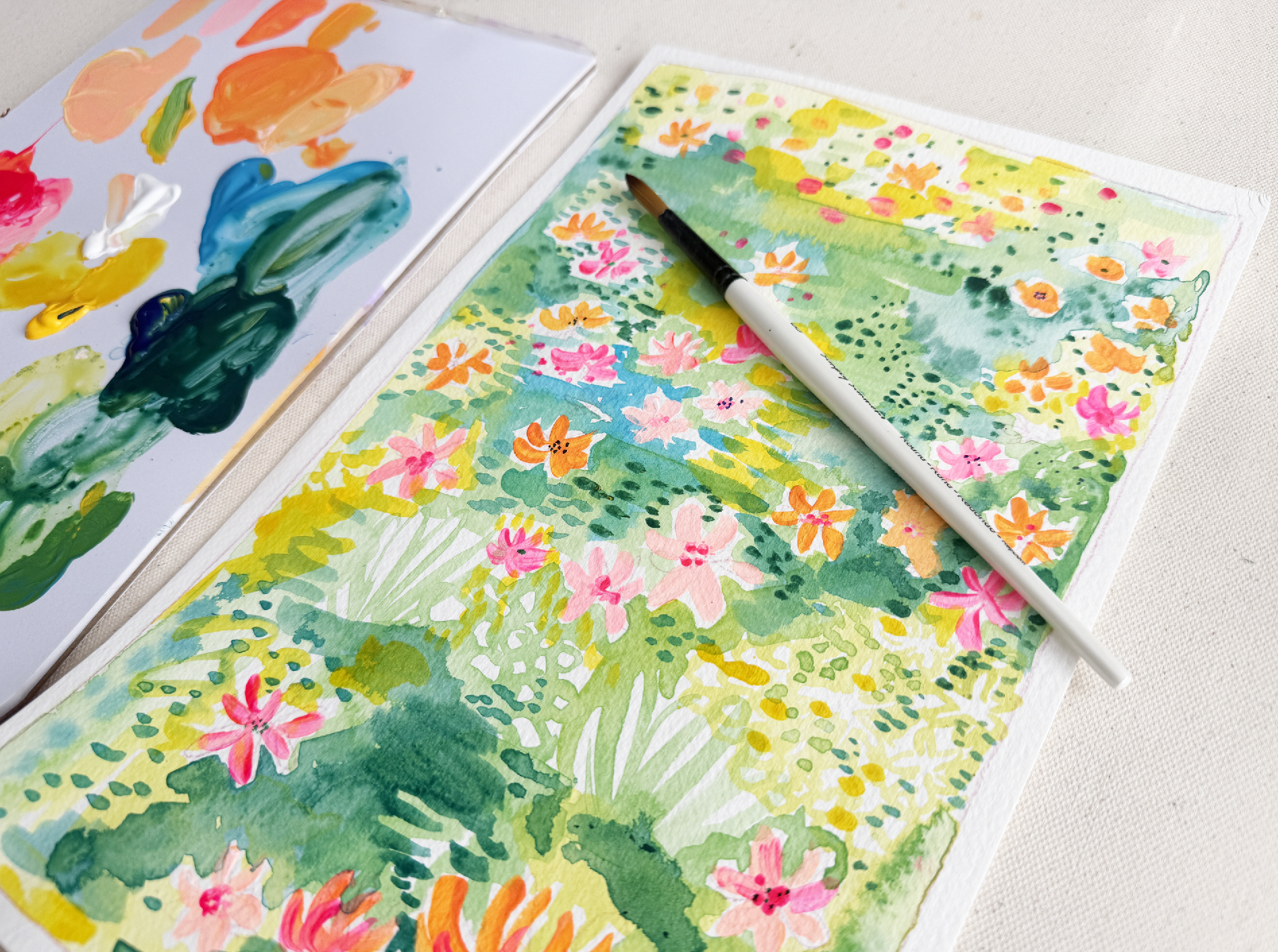
13. Field of Flowers Intro: For our final project, you'll create an abstract
field of flowers, filled with color, mark making, and a whole lot of atmosphere. Now, this project really
asks you to let loose. As you paint, think about
the mood you want to create. Perhaps your field feels
bright and joyful. It could also maybe feel soft and peaceful or
bold and energetic. Let your color choices and
brush work tell that story. When you've completed
your flower field, head over to the class
project gallery, and along with your
previous projects, upload them into the gallery. I would love to see how
your creativity and confidence developed over
the course of this class. We are now ready
to get started on our abstract field of flowers. Here is the reference image that I'm going to
be painting off. This is what we're
going to be creating. So just to quickly
walk you through, what we're seeing here
is kind of imagine that you are looking at a
vast field of flowers, the most important
thing to cull out here is that the
flowers that are in the foreground
that are closer to you are going to be larger. The flowers that
are in the center, the midground of the
page will be kind of slightly smaller,
more of a medium size. And then as you look
off into the distance, just like in real
life, the flowers get smaller and smaller
the further you look away. So that is the only
type of I suppose, that's the way that
we're going to approach this so
that you still so that the brain
visually reads that it is a field of flowers and that we're looking
off into the distance. Is that the most
important thing is that the flowers in the
foreground are largest, midground, they get smaller. And as you get off
into the distance, you can see that these flowers
actually just turn into little dots and
suggestions of flowers. So I think we are
ready to get started. You will need to
grab a color pencil. And I am going to walk you
through the materials. They're pretty similar
to every Well, they are the same as
the other projects, but color pencil,
brushes, water, cloth. Acrylic paper and a palette. And then the colors I have
on hand for this project, I have my fluorescent
my fluorescent pink, my cadmium yellow, medium hue, titanium white, turquoise
blue, and Prussian blue. Gonna go ahead, pop those onto my palette and get
those colors mixed up.
14. Field of Flowers: Color Mixing: Go to start with
my titanium white. Followed by the turquoise blue. Cadmium yellow fluorescent pink, and the Prussian blue. Okay. Now, for this piece, as you can see, I have a
few oranges happening here, so I'm going to mix this
kind of hot orange, kind of a yellow orange and the lovely hot coral
that we love to use, as well as a few greens. So I'm going to
start with my worms. I love to start with my worms. First up, I will mix our classic hot coral,
titanium white, cadmium yellow, and pull
that pink in. Perfect. This time around, I'm also
going to mix a pale pink. In order to get that pale pink, I am going to pull out some of this titanium
white and mix it just with a little bit of that
fluorescent pink to get a nice pastel pale pink. It gives me a color like this. I'm not sure if that's focusing, but it's really nice. Okay. And I'm going to also
mix up an orange. And for that, I am simply
going to just be kneading. Let's see. Let's take out
some of this yellow and mix it with equal parts
of the fluorescent pink. Okay. Looks pretty
good. Oh, yes. It's a nice hot orange. And honestly, I'm thinking I might even want a
slightly maybe deeper. I'm not sure at this
moment, but I think I think this is really This
will do. This will do. I can always just keep adding
the fluorescent pink to it if I wanted to
get a little deeper, more in the pink realm, but I'm pretty happy with this. And I will just snag a little bit of that cadmium
yellow and mix it off to the side of my orange
that I mix just to get kind of this pretty yellow, orange color because we want options for our
field of flowers, so that is why I'm
making sure to mix all kinds of lovely shades. Alright, I'm going to go
ahead and wash my brush. Now, feel free to use whatever colors you want
for your field of flowers. Maybe you want yours to
be more cooler tones with blues and purples.
That'd be so pretty. Okay, next, I'm going
to mix a few greens. I will start with kind
of a lighter lime green, so I'm gonna pull out
some of that yellow. And I'm going to
snag just a little bit of that turquoise
blue, mix it in there. And we have a gorgeous
lime green. Really pretty. And next, I'll mix
a darker green. So I have some yellow
already pulled out here. So all I'm going to do
is just add more of the turquoise than I had
the first time around. And pretty much just kind of
add the turquoise blue to the yellow little
by little until you get the desired color
or color that you like. It's all about
personal preference. Okay, that's really nice. And I would like to even try
one with this Prussian blue. So take some of that yellow and snag some
of that Prussian blue. And I get a nice deep green. Ooh, it's really pretty. It's like a nice forest green. Okay, so I have
just mixed up one, two, three, four, seven colors. And now I have a
lot of options that I can use for my
field of flowers. So I think we are now ready
to go ahead and get started.
15. Field of Flowers: Sketching: Before we get started, I
do want to just kind of show you the beautiful water
color effect happening here. So these are acrylics, but what I like to do sometimes, if I kind of want to create
this watercolor effect, I just add a whole bunch
of water to my paints, and it kind of I let it pool
and dry in different areas, and this creates a nice
watercolor esque effect. So we are going to be
exploring that today, which I think is
really exciting, something a little different. I'm just going to simply
take my color pencil here, and I'm going to
quickly just sketch a little border or barrier. You can, of course, do
this with painter's tape, but I'm not being too
precious about it. I'm just kind of getting
that border on there. I am going to go ahead and
kind of just kind of starting off by sketching a
few of my flowers. So I'm not going to sketch all of the flowers in the field, but I do want to kind of put a few anchors just
so that my brain has an idea of how the
composition will be built, where the larger flowers is, where the midground will
be in the background. So I'm going to just kind of loosely and lightly sketch a larger flower for
the foreground. Just being really
loose about it, making it more just like
a suggestion of a flower. Okay, so these are kind of
my larger foreground flowers that I want to make
sure to call out. And these will be the ones that I'm gonna probably paint first. So I have like a nice
little grouping down there. Now I'm going to, you know, maybe, I'd like one over here. And I'm going to kind
of start working my way up, but as I work up, I'm going to make sure
my flowers are just slightly smaller than
this grouping below. And really just kind of be
loose with your shapes. Think of a flower field, how sometimes when you have
these little wild flowers, they're kind of bunched up
into little groups, right? So that's kind of
why I'm sketching these somewhat in
little clusters. Okay. And let's see. I think I love the
idea if we had, like, a nice little wildflower
cluster over here. Very pretty. And I think I'm going to bring
these around to the back. So let's get these smaller
little suggestions of flowers as we
work our way back. And the ones in the back should be the smallest flowers, right? The rest of those,
I'll probably achieve that with little mark
making, stuff like that. So
16. Field of Flowers: Adding Flowers: Ready to get started
with painting. I think I will start with my larger brush.
Always love doing that. And I'm going to
kind of start with these statement flowers
right along the bottom. So I'm gonna go for
that lovely orange that we mixed earlier. And using those same techniques as we did on the other projects, I'm starting outward and swooping my way
towards the center. Feel free to put
your own spin on it. Okay. So there's my
first loose flower, go to one with a little
more pink in it. I definitely don't want these all to be the same color, right? So I'm kind of
really play around with adding different
variations to flowers. Okay. And I'm not worried about following the
guideans too carefully. We're just keeping it loose. It just needs to suggest flour, but it doesn't have to
be a literal flower. Now, I'm just alternating
all of my colors. Gorgeous. Okay. Now, as I'm starting
to kind of move my way up, I'm probably going
to have to switch to my smaller brush soon
because I don't want the brush strokes to be too
thick as I get closer to the I think it would be lovely if the little clusters I'm gonna have a little gripping of
flowers right up here. So I think I will make those
kind of not the same color, but similar colors just
because I think that could be a cute little way to show that they're
all the same flowers. But yes, my brush is definitely starting to get a
little too big. So I will need to switch over to my smaller
brush very soon. Okay. Okay. Beautiful, beautiful. I'm going to go ahead
and wash my brush, and I'm going to
bring in my smaller, more detailed size
four round brush. And I'm just going to
go ahead and continue. Okay. And as I start to work
my way to the back, they kind of become less
flowers and more little blobs. Just a suggestion of a flower. Now, by adding
water to my brush, it does allow me to
kind of paint with a lighter touch in the
back because the paint is thinner and is just kind
of dropping on to the paper. I don't have to press as hard, which is what makes
the brush fan out. Okay. I'm really just keeping
these brushstrokes wispy. Okay. I really like that. And before I start adding
my painterly background, I am going to bring
in just some of that fluorescent pink as is
straight out of the tube. Kind of add some
more pink moments. Okay. Okay. What I love about this
is you can kind of see the movement happening here. We have these flowers in the front and then
they kind of start to dance their way back
and off into the distance. So you see we can
create some movement, by the way in where
we place our flowers, visually creates a little
trail often to the distance. Okay, I think I like this
is a pretty good base. So I'm going to go ahead and wash my brush,
and we are next. We're gonna go and
get started on adding in our lovely water coolory
painterly background.
17. Field of Flowers: Background: Now that we're going
to get started on our pin chilly background, I did go ahead and
switch out my water. Just that way, it's less murky, and I can use it
more just to get a cleaner background mix. So I am going to get started with let's get started
with this light green. I'm going to dip my
brush in my water. I'm going to actually
pull a little bit of the titanium white into
my pale green mixture, and I'm going to mix, mix, mix. Now, like I said, we're going for kind of a
watercolor consistency, so I am going to really
thin my paint out. Okay. And pretty much, we want to just kind of
start bringing our paint in. Loosely, it's grass, right? So we're not going to be
too precious about it. It's just to add the
suggestion of grass. And I'm not going to
fill it in everywhere. And what I'm doing is,
as I add the paint, I'm going back in and dipping my brush back into the water. And I just keep pushing the existing paint
that's already. On my paper around
these flour sketches. And I'm pretty much like, just letting it sit there,
and I'm gonna let it dry. And that's what's gonna give us that gorgeous watercolor effect. So, I don't want to put
the same color everywhere. I want kind of little
patches of grain. So go ahead and play
around with adding maybe, you know, you don't have to place it exactly
in the same place, but just different areas. Okay. Now, in this area, I think I'm going to play around with
keeping the background white but kind of sketching a flower. So let me
show you what I mean. I'm going to lightly
sketch a flower. Well, I guess not sketch.
I guess I'm painting. So I went ahead and
painted a flower shape, and I'll do a smaller
one as well next to it. And I'm going to simply
paint around it. So kind of implies
a white flower. And I'm going to also just
leave some areas white. We can imagine that these
are maybe by leaving these little I'm just kind of painting organic
small organic shapes. And let me pull that
closer so you can see. That's just a suggestion of little white flowers. Okay. I'm going to let that dry
and I'm going to just keep bringing this pale green color around dipping my brush back
into the water and pushing the existing paint
that is already on the paper around the flowers. Okay. And whenever we're
looking at a field, as we go further off
into the distance, as we go further off
into the distance, the colors get lighter. And so I do want
to make sure that this whole back
section is lighter. So I'm going to take
this lighter green, and I'm going to make sure
to put this in the back. So, yes, we have some of the
lighter in the foreground, but I am going to be bringing in some of those darker greens and layering them over
the lighter color. But I do want to make
sure I pull a lot of this lighter green into
my field in the back. And I'm just loosely dancing
the color around my flowers. Keep it loose.
Wherever your brush wants to go is where it goes.
18. Field of Flowers: Middle Layers: I'm now ready to
start adding in some more of these middle
green layers. So I'm going to refreshen that lovely green that
I mixed up earlier, and I'm going to add
a healthy amount of water until it's a
little transparent. And I am going to go
in and start adding that in some of these emptier
areas of my flower field. Going to dip my water in my
brush my brush in my water. Sorry. And I'm going to continue pushing those
colors around my field. And it's okay to go ahead, go in there and connect with other that lighter green
color if you want to overlap. That's kind of the idea. And I'm going to kind of do the same thing as I did before
with the lighter green. I'm going to leave some
of these whiter areas. Okay. And go ahead and even explore moving your
brush in different ways. Like, this could
suggest a plant. I'll do another one
over here where I kind of loop my brush a little bit. Feels kind of like a
plant like leaves grass, just the suggestion of greenery. A Okay. And I just keep adding water
to my lovely mixture and bringing all of these. This lovely grain in there. Now, as you can see,
what I'm starting to do is that since I do
have this green, I am starting to
add little dashes, little mark making moments on some of that first layer
that I already painted. This is really going to be
about building up the color. I'm alternating, using my brush
vertically, horizontally. I'm not being too
precious about it, really wanting this to feel
organic and painterly. So, you know, I'm just
really using a light touch. Okay. Now, I am going to bring
a little bit more of that green up into this space, but I am going to
kind of reserve that top area to still mostly be
that lighter green color. I will dance some of
this paint up there, but not too much. Maybe just by doing
small little marks, just the suggestion of some
darker areas of grass, but we want to really reserve
that for lighter colors. As you can see, I'm
painting this quickly because I'm not
trying to overthink. I really want this to be an
exercise of taking kind of these ideas that we got from our first two
projects and really just letting our brush
have a little fun, dancing it in between the objects because by putting these flowers
as our guide, that kind of allows
us to have fun. There are no rules. We're just filling in the space
between the flowers. Okay. I like that. I think it's looking
pretty good. I'm now ready to add
in my next layer, and I would love to add
some more of, like, a blue, maybe bring some of that turquoise in to start to bring in a little
bit of contrast. And I think, let's
see, I'm going to mix some water
into my turquoise. Okay. Now, I kind of have this area in the center where
there's not much going on. So I think I'm going to introduce
my turquoise over here. I might mix a little of my
green into the turquoise. Just really play around
with kind of mixing all these lovely little colors
you have on your palette, playing around to get all
types of different shades. I love that. It kind of makes a suggestion of a pond almost. It's really
beautiful. Bring some of these deeper colors
into the foreground. Maybe start playing with that deeper green
we mixed earlier, which was the yellow
and the Prussian blue. So what I really want
you to do right now, it's like a freestyle. Have fun. Start mixing in some of
those deeper colors, bringing them to the foreground. Okay. This is really nice. Okay. Right. So I'm just really going
through adding some of these more rich colors in there, which is creating a nice
contrast in my piece. A Now that I'm bringing this darker
color to the top, I do want to make
sure to water it out since we are kind of
off in the distance. And I'm keeping some of that white showing
through, as well. It's gonna keep it
nice and bright. Okay. I love painting these
scenes. They're so peaceful. I came up with this composition. One day, whenever
every now and then, I do kind of these free little
free painting sessions. Kind of came up with this idea. Every month I do a 1 hour
studio session, a live, kind of like a live
painting session, and where I just kind of make something
up off of the spot, and this was the result of that. So I thought that
I could, you know, it could be a good idea to kind of teach it in a
more formal way, but still keep it
loose and natural. O. And the inspiration is after looking at a field of flowers here in Strasbourg, France, I was
walking in the park, and it was at the
beginning of spring, and all of the
little wildflowers, the dandelions, the daisies. They were all popping
up all over the field, and so I was inspired
to snap a shot. Okay, so yes, this is how it's looking now that
we've added some of that turquoise in there, some of those deeper,
richer colors. Feel free to add little
dashes throughout And this creates a
lot of movement. Wherever you feel like a dash needs to go, that's
where you will put it. Okay, so I'm going
to let this dry. And once this dries, I'm going to go back
in with my yellows and also kind of maybe
take before well, maybe before we bring
the yellows in, we'll stick with this darker
color and kind of dance a few more suggestions of
flowers up through this area. So let's go ahead and
let our piece dry.
19. Field of Flowers: Flourishes: Now that my piece has had
a little time to dry, I am going to go back in with that Prussian blue mixed with a little bit of that yellow. So I have my deep green color, kind of like a deep
lagoon blue green color. And I'm just going
to bring some of these little mark making dashes up into the higher
part of my piece. I'm keeping them
all together like little clusters using
just the tip of my brush and I'm staying in
that area where I have all of these
other little flowers, so I'm staying on
my little path. And I'm just adding
these little tiny hits along the way. Very nice. It really just adds
a lot of interest, a lot of visual
texture to the piece. A lot of expression
feels painterly. Okay. Loving this. All right. Gonna wash my brush. And next, I'm going to bring
in some yellow for warmth. So I'm kind of kind of look
around, look at these areas. I think where the yellow is really successful
we'll be kind of in these lighter areas on top of the light green, the
pale green color. So go to do the same thing. Gonna add some water to
my yellow mixture to my yellow paint and really
just thin that out. And what I'm going to do? I think I'm going to do a little test on
this area over here. I'm just going to kind of drop in a little hit of
yellow on the side. Okay. And let's see. I still have some wet
paint happening here, so I'm going to try
not to overlap with that darker color because I
really want the yellow to stay a true yellow. Gonna kind of maybe bring some hit over into this area
where I have a lot of white. Okay. I'm going to bring
some more over here. Okay, really dancing
the yellow kind of over the lighter,
more white areas. And I feel like the yellow just really warms the piece up. Okay. All right. Bring a little bit more
up this way. So pretty. All right. And maybe, like, a little down here. Okay. I'm really loving that. As the background dries, I am going to kind of
just add a little teeny, teeny, teeny bit of detail to
the centers of my flowers. I'm going to use my smaller
brush and kind of just take a little bit of this
fluorescent pink and, you know, alternate
before, you know, bringing just extra
little swishes inside of existing flowers, just kind of adding a layer. You can take it, add
centers to your flowers, maybe a few, so it's
not too perfect. It's nice to keep a
little imperfection. So pretty. Okay. Just kind of adding
little hits of the color around. Okay. And yeah, I think this is
looking pretty finished. I think that something
great about this is like, let's say you have metallic pins on hand or even gel pins, you can really still keep going, adding your own personal touch to the centers of the
flowers or to the grass. But I think this is such a fun abstract project
just to kind of show you not only how to take this style into a different
type of composition, but also to turn your
acrylics into watercolor. I just think it's a really
fun, beautiful project. So I would love to see
what you guys created. Please upload your
finished piece into the project gallery, and I would love to check it
out and cheer you guys on.
20. You Did It!: Congratulations on
completing the class. I hope you've enjoyed exploring abstract floral painting and discovered how fun and
expressive it can be. Along the way, you've created three projects and practice
simplifying shapes, experimenting with
color and texture, and developing your
own artistic style. As you continue painting, remember that there is
no single right way to create abstract flowers. Keep experimenting,
trying new ideas, and trusting your instincts. This is where the most exciting
work is going to emerge. If you haven't already, please share your projects
in the class gallery. I'd love to see your paintings and your unique interpretations. And if you enjoyed this class, leaving a review would
be greatly appreciated. Make sure you're following
me on Skillshare to be notified of when any new
classes come your way. You can also check out my
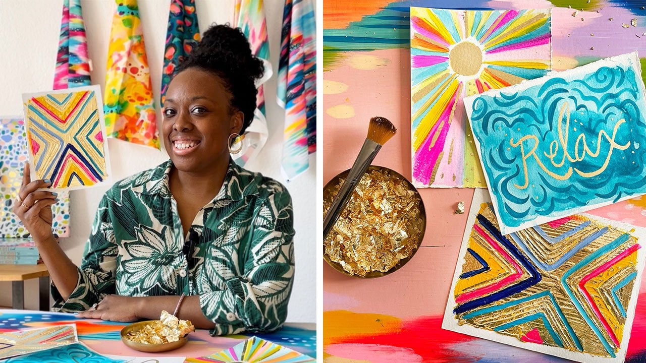
other Skillshare classes, such as joyful abstracts, where we paint a
bright rainbow esque abstract or
mesmerizing metallics, where I teach you my favorite
gold leafing techniques. You can also follow
my creative journey on Instagram and Substack. Thank you for painting with me. I really hope this class has
inspired you to approach abstract painting with
greater confidence, creativity, and curiosity. Until next time,
happy painting. Oh
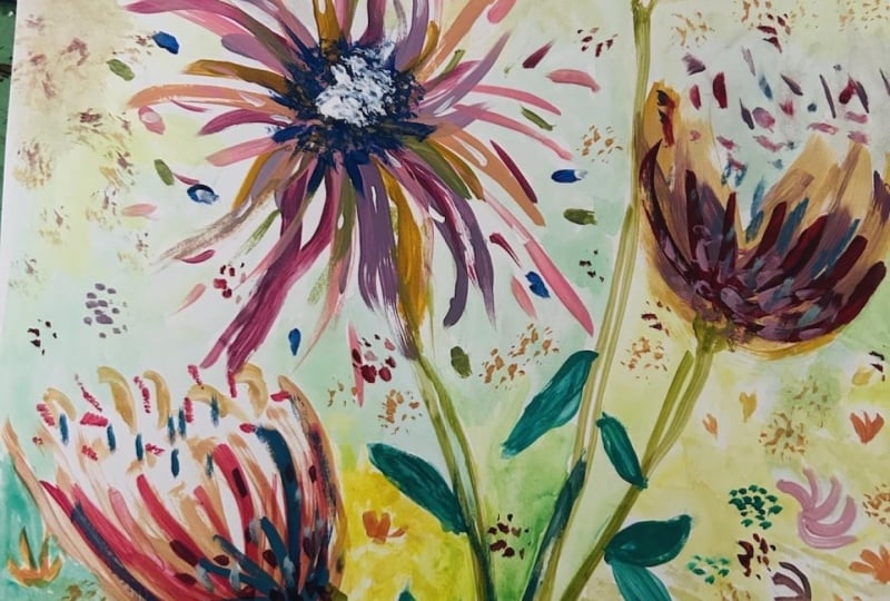
 Jessi Raulet / EttaVee, Artist + Author + Business Owner