Transcripts
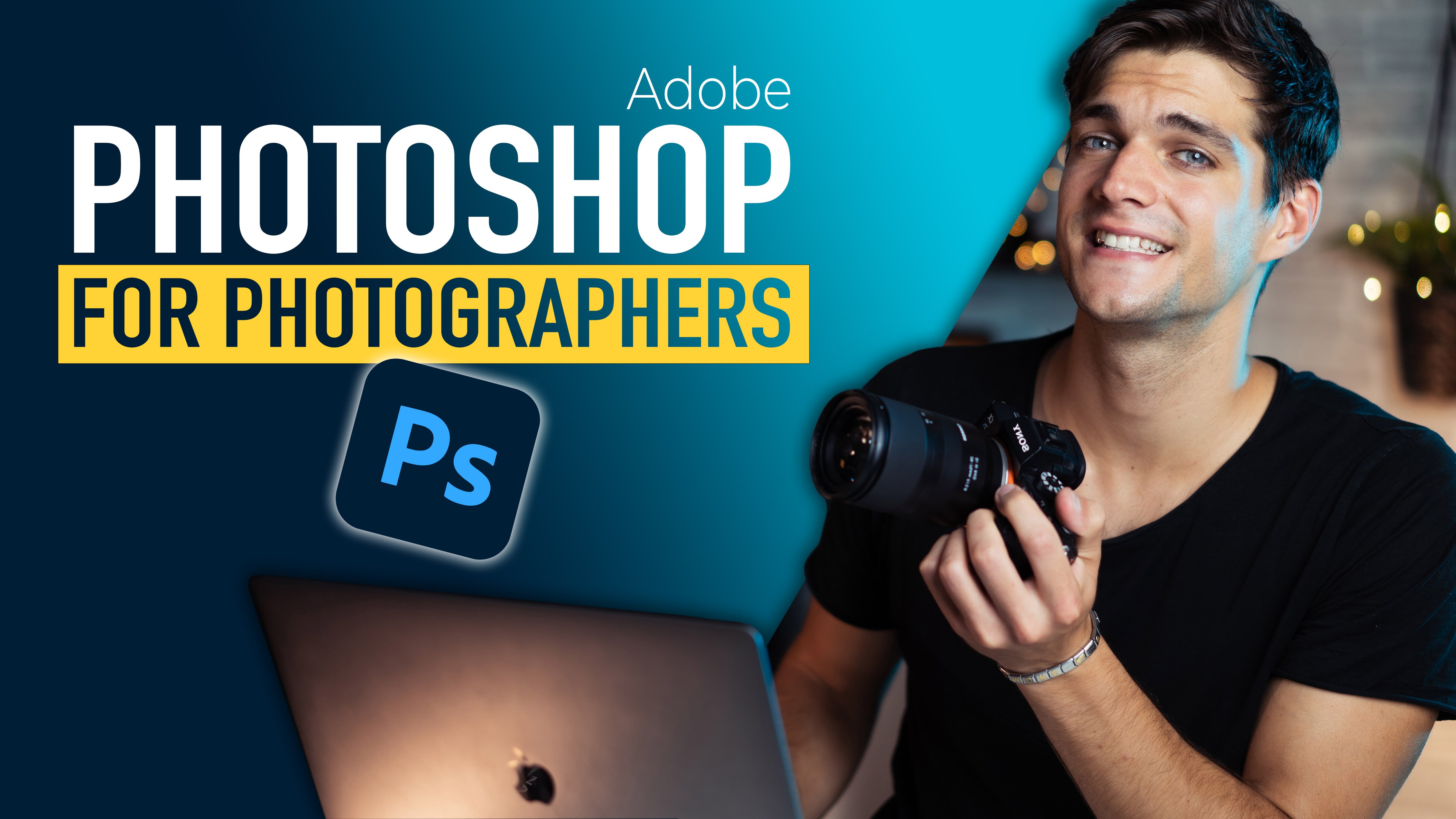
1. Introduction: I'm Simona, I'm 25, and have a big passion
for creating things, especially photos and videos. I come from a very small
village in the north of Italy. Probably, like you, I had a general interest
in photography, but with no clue where to start. I thought I needed to
spend a crazy amount of money to buy
all the equipment, and I just couldn't afford it. I was just randomly
shooting with an iPhone 7 while I kept seeing incredible shots
on IG taken with phones. If they can do it well, then I can do it as well. I started studying photography
and practicing for months and years
just using this. Fast-forward today, it's
almost impossible to recognize which photos are taken with a camera and which ones
are taken with an iPhone. Inside this course, you'll find everything
you need to know to take your pictures
to the next level, just using the smartphone
that you have in your pocket. I'll show you how to set it up in the best way possible using specific apps and suggest
extra pieces of gear. We'll dive into some
basic art photography, and I'll show you how to
frame correctly a picture. Things that will be very useful
even when using a camera. I'll show you how to
manage the lighting properly while also creating
depth in your shot. Obviously, you'll
learn how to edit different styles of photos
just using free apps, composition, colors,
effects, everything. There is a part dedicated
to the mistakes you should avoid and also
some bonus material.
2. Apps you should use: Hi, guys. Thank you very much for joining
me in my courses. [MUSIC] This lesson, I want
to show you all the apps that you need to install in your phone in order to
take these great pictures. As I mentioned earlier, there's no problem in
Android and iPhone. All these apps are free and
available in both systems. They offer premium features, but I've never used it. You just need the basic
ones, no problem. If you don't want to
download these apps, but you prefer to use the camera of your phone is not a problem, although there will
be many differences. One thing that you need to
do is to activate the grid. You will find it in
any camera settings, it doesn't matter the
smartphone that you have. Let me show you how to do
in the iPhone right now. To activate the
grid in your phone, you just need to go in Settings, and then search for
Camera, and then Grid. It will be very similar
in any Android as well. Just to make it clear, the grid are these
lines that you see that divides basically in nine
different parts the camera. The most important app that
you need is Lightroom Mobile. It's like a Bible for
photographer, absolutely a must. The key point of
this app is that it allows you to shoot in DNG. What does that mean? DNG
is different from JPG, and both are format
of a picture. A DNG is a much bigger file. It can reach up to 20, 25, even 30 megabytes, while
JPG is very small like 2, 3, 4, 5 megabytes. [MUSIC] This means
that inside the JPG, there is much less information
than the DNG files. Therefore when we are going
to add in the picture, we're going have more
information inside the DNG file. Let me give you this example. When we add in JPG files, we have colors
that go from 1-10, and we can choose only
the integer number, for example 1, 2, 3, 4, 5. When we're going to
add in a DNG file, we will be able to go, for example, 1.2 or 1.3 or 5.4. We're going to have
much more information, much more variety of
colors that we can choose, when we added the colors will just look much better to do it. How do you set this DNG
extension inside the app? Let me show you right now. The first app that we
can see is Lightroom. As I mentioned,
Lightroom allows you to shoot directly from
the app itself. To select the DNG, we need to go here on top, click, and then select DNG. For one side you have JPG, and then from the other
side you have DNG. Select DNG. Another amazing feature that Lightroom has are the profiles. These are presets.
Basically a set of colors and settings that you can apply to your image in
a very quick way, just with one tap. Let's dig into the app, so I can show you better. Lightroom allows you to
shoot not only in auto mode, but also in professional. This permits to control
the shutter speed, the ISO, the focus,
and much more. However, just use the automatic. It's really good
inside Lightroom. Of course, it allows you to put a timer or to set
a different ratio. If you don't have it already, activate the grid even
inside Lightroom, is this button right here. Whenever you're going
to shoot a picture with the camera
inside Lightroom, you will have all these
picture inside the app itself. You won't find it in the normal camera roll that
you have in your phone, but there will be whole here. After you shoot a picture, you have all these menus on the bottom where you can choose a lot of
different features. Some of them will be blocked if you have
the basic version, but many will be available. The different menus
allows you to modify the light right
here, the colors, and even each single one the effects like
texture clarity, dehaze, vignetting
details, optics, geometry. But don't worry, we'll see all of them later
on in the course. In the top-left corner, you see all the information that you use to
shoot the picture. One of the thing that I
want to show you right now are the profiles right here. These are real-time preset
inside Lightroom that allows you to modify directly just with
one tap the image. Many of them are
really, really good. After you finish to
edit your picture, you just need to go
into Share button. Here, you can click Export as and choose the settings
that you want to export. For example, if you want to have the image quality 80 percent, 100 percent, based
on how big you want the image or the file type. If you want a JPG, TIF, DNG. If you've finished
to edit your picture and you don't need
to retouch anymore, I suggest you export in JPG, so the file is a
little bit smaller. However, if you
need to edit more, I suggest to use TIF or DNG. These are bigger
files that allows you to modify even
more if you need. After you clicked Export as, you just need to go on
Export to Camera Roll to export the image in your normal camera
off of your phone, or you can even share
to somebody else or share to email or open in
other apps from here directly. The next app that you may
download is Snapseed. Snapseed has many function
and features inside. The one that I like the
most is called healing. This allows you to
remove people or objects or any mistake that you have in the picture
in a very quick way. But let me show you
right now what I mean. Inside Snapseed, which
is made by Google, you have the chance to open any pictures that you have or
even shoot with the camera. But we're going to
use Snapseed just to open a picture that we have
already in our device. For example, let's
take this picture. I use Snapseed all the time to remove people from an
image that I don't want. We go in Tools,
and then Healing. Once we're here,
we can zoom inside the picture and we see that
the brush become smaller. We just need to
drag our finger on the top of the people and
automatically will be removed. This is really a powerful tool. Let's do another one.
Here, and then he's gone. Let's do this group of people. Here, drag your finger on top, the spread brush will appear, remove it in just a click. This is it. Inside the app, you can find many other tools that we'll see later
on in the course. The last app is called
Lens Distortions or LD. This allows you to create some great effect
for post-production. For example, adding
the sun or sun rays, or add rain, add
clouds, and many more. Let me show you inside the app. The last app is called LD, Lens Distortions, which
is this one right here. This one allows you to
take any picture that you have from your camera roll and apply on top
different layers. For example, let's
have a look on this picture that you might
have seen on my Instagram. What we can do is apply
a sun, for example. Because it's coming
from this side, I'm going to apply this
sun on the right side. A little bit smaller,
exactly right here. Then I can apply
even another layer. Click plus on the new layer and then we find, for example, soft light, which are sun ray, then we place the sun
ray where the sun is. We can do something like this, then we can modify, adjust the softness
in direction. The direction might be
here, this length, shorter, longer, or the threshold where we increase
the number of sun rays. Then when we're done, we can export it directly
in our camera roll. The free app doesn't allow
you to export in 100 percent. But if you want to share it on Instagram and
you don't have to print it in a bigger size
is more than enough, even 85 percent, which the
free app allows you to do. As I mentioned, all these apps offer really a lot
of features inside. These are just the general ones. But later on in the course, I will show you exactly
with examples how to apply these cool
effects in pictures. I'm really conscious there
are a lot of apps out there and you may have
found some better ones. However, I think these
three are extremely important and they contain everything you need to
create great pictures. We don't go in too crazy
and finding too many apps. I wait you for the next lesson. Chao. [MUSIC]
3. Suggested Gear: Now I want to show you
what gear do you need in addition to your phone in
order to take great pictures. First of all, let me say this, you don't need anything. All you need is just your phone, especially when you're
shooting landscape. However, when you
shooting inside, you can buy additional props
to make it more interesting. The first accessory that I
will buy is a ring light. It's extremely
useful when you're shooting inside
because it creates a beautiful light
exactly as the one that you see on my face right now. Usually, USB powered, you can attach a power bank or even to your computer
as I'm doing right now. For example, when
you turn it on, it has different lights, either yellow, white,
or even in the middle. This is a phone holder. So what do you do usually is
you attach your phone right here and then on a tripod and then you
talk to your phone, you take video,
whatever you want. Probably my favorite accessory of all of them is this
one, is the GorillaPod. This is basically a
tripod that you can put anywhere and you
can move the legs, rotate them so you
can put in grips, you can put in the hand drills, you can put in anywhere, literally wherever you
want you can put this. The brand of this
is called JOBY, and it's probably
the top one for smartphonegraphy and it's really amazing because the
quantity is great, but the price is
really reasonable. For example, you can put
the tripod like this, and then with here, you can move and you place
the phone right here. You can place it horizontal
or vertical as you want. It's perfect for vlogging. When I'm like this,
I can just go around and film some cool stuff. Not only about this
brand is really, really cool because
it's modular and you can attach two extra arms. What you can do with
two extra arms you can attach a microphone,
for example, the Wavo still from JOBY amazing quality,
extremely portable. You can unmount it and
then you place it here. Maybe if you want to
keep your phone on landscape mode or depending how you want to make the video. You can keep it like this so you have the microphone right there, phone you can attach it easy. Not only, we can attach even one extra arm
on the other side and the thing that I love is this small light
still by JOBY, it's amazing, it's
extremely bright, you can charge it very fast. There you go, and then
you can increase or decrease the intensity of the light and I love
it. There you go. It's called Beamo, and
you can attach it and as you can see, it's
really amazing. Watch, so good for goggling. You can just stay
like this and I can make all the videos
that I want with high-quality and great light or everything that
you need really. One more thing that
you can use is the tripod with a remote. This tripod comes
with remote as well, with a phone holder that
you can move around, and this has many function and you can even
increase the length. You can literally put it
as a tripod like this, very long, and then you
attach the phone right here, and is preferred for taking videos for TikTok or for any behind
the scene that you want, of course, you can place
it vertical as you want, and it's amazing,
it's unbelievable. You can attach the two arms on the side even in this one, and it stayed like this. What you have to do is
you just need to press record and don't care
about anything else, the sound is going to be good, the light it's going to
look good, so that's it. Such an amazing tools. You can also use it
as a selfie stick. It goes very long
and then like this. One more object that I really like it's called the Lensball. It's basically a lens
that allows you to take pictures in a very
creative way, let's say. With your phone, you
take pictures like this. I want to show you some example. What it does is
basically reflecting the picture upside down so you can create
very cool effects. You don't need this
and it's very heavy. If you need to walk for a
long period of time or if you need to travel and
you can't leave your luggage in a hotel, this is pretty heavy. These are some example of images that I showed
with the Lensball. The last accessory
that I want to show you is useful when you're taking pictures
inside, especially. These are simply fairy lights. It's exactly the ones
that you see right here, or even right there. Usually, you just need
to put some batteries inside and you can bring
these literally anywhere. Very light, very useful, and allows you to create
even depth of the image. But we'll have a look at
this later on in the course. All of these accessories
that I showed you are absolutely optional. But it makes a little more interesting the picture,
this is all for now. Thank you for listening, I'll see you in the next one, where we're going to
talk about composition. Ciao.
4. Composition: Today we talk about composition. The first rule that we need to follow when we
take a picture, is the rule of thirds. You may have heard this before, but what does that mean? Do you remember the grid that we activated together before? This grid divides
the image in third, both vertically
and horizontally. In other words, you will
have nine different boxes. But what are these lines for? When we have several subjects
or even one subject, we need to aim to put
this subject either in one vertical line on one of the intersections of
the grid we do this. Instead of putting the
subject in the center to drew a better
composition of the picture. Even if I put the
subject in the center, I can use the rule of
third in the background. For example, if I'm shooting
a picture at the beach, what I can do is to
put a third of sky, a third of sea, and a third of sand. But let me show you
some examples so you can understand
better this concept. In the first example,
I want to show you the suspended bridge in Venice. The subject is placed on the top horizontal
line of the grid. As you can see in
the second example, my friend is placed on
the right vertical line. The rule is exactly the same even for
horizontal pictures. In this case, Elena is
placed on the left line, all along the left line and
he's watching on the right. Even in this picture when I'm walking in Casa Duomo in Milan, I'm placed on the
left line all along. Not only that, if
we have a look at the grid more or less
1/3 is the pavement, 1/3 is the Duomo,
and 1/3 is the sky. This is why it's called
the rule of thirds. If you have a look at
Sant'Ambrogio church in Milan, is the same exactly thing. It's 1/3 of the pavement, 1/3 of the church, and
1/3 of the top or sky. Let's have a look now
at this last example, this is exactly a
perfect composition. As I mentioned before, you can divide three
different elements of the image in thirds. On the top in the
first third there is a sky and some clouds and making it even
more interesting. In the second third,
in the center of the image, there is a sea. Then in the last third, there is a grass of the path. Plus there is the bird, despite is not in
the crossing lines, is exactly on the right line, so it makes it good anyway. One more photo, and
this one I'm placed in the intersection in the bottom left of the grid as you can see. It looks great the
composition, not only that, also the horizon in this picture is placed on the top
line of the grid. In addition, the other
subject of the picture, which is the dardoodle, the little rock with the hole is placed
on the right line. This is why it makes
a great composition. Now we talk about leading lines. Is a technique that we use to make more interesting
the composition and to draw the attention of the viewer towards a
subject that we want. We're using natural, artificial lines like buildings, floats, rail lines, handrails, everything that has a line to draw the attention
to the subject. For example, let's have
a look at some pictures. In this first, we see that
the subject is clearly sun, but I use the buildings on the right and on the left
and also the ground. A little line that you
see on the center to draw the attention directly to the
sample cathedral in London. This next example, I'm in Leadenhall market
still in London. If you see all the market and all the lines are
pointing towards me, despite these in the background, your eyes goes directly towards the bottom center
of the picture. Once again, you can
notice then I'm placed in the center of the
bottom line of the grid. The last thing I want to
talk about in composition is lead room or lead space depends on how you
want to call it. Is a technique that
leaves space in front or in the direction of the subject whether it's moving
or stationary. For example, if a car is moving
in this way in the image, I'm going to leave space
in front of the car, not in the back. But let's have a look
at some examples again. In this picture,
Elena is walking towards the left of the
picture and as you can see, I left space in the
left of the picture. Let me tell you also
that Elena is placed on the right vertical line of the grid and he's walking
towards the opposite side. Let's have a look
again at this picture. I'm walking towards the
right part of the picture. Again, I left space on that side because I'm
walking towards it. Now let's have a look at
this stationary example. I'm not doing any action, I'm not moving, I'm not walking. There's not a car. However, I'm faced towards the
left of the picture. As you can see, I'm placed on the right vertical line and I'm watching the left
part of the picture, which is the peak of that mountain that
you see right there. Also, you should notice the
horizon of this picture is exactly on the top horizontal
line of the image. These are the three main
rules that we need to try to follow when we take
pictures or with our phone. Just to recap, one is
the rule of third, try to place the
horizon either in the top horizontal
line or in the bottom, not placing in the middle. Or when you have a
subject or you only have two subjects try to place in the intersection or along one
of the two vertical lines. The second one is leading lines. Try to find natural elements
such as railways, handrail, or whatever you want that
draw the attention of the viewer towards the
subject that you want. Lead room or lead space. When I'm walking
towards a direction, leave space in the image
in that direction. If you're shooting the car, if you're shooting
someone moving, leave space towards
their direction. If you have a stationary subject that is facing
towards a direction, place the subject
on a corner one of the two intersection and leave space on the direction of you. Later on in this course, I will show you some of the common mistakes that beginners do and that
you should avoid. Even about composition and everything else that we're
going to talk about later. Thank you very much
for listening. I'll see you in the
next one. Ciao.
5. Lighting: Hi guys, welcome back. Today I want to talk
about lighting. Lighting is a key
element for photography. Sometimes it's really
difficult even for professional photographer
to control the light. But today, I want
to try to explain briefly how to control the
lighting in your phone. If you shoot on
external, outside, it's really key to shoot
during sunset or blue hour. By blue hour, I mean, the very early morning when
the sun hasn't risen yet. Why do we do this? We do this because at
midday or 2:00 PM, the sun is very harsh, is very high, therefore, our eyebrows will make
a shadow on our eyes, which are always the subject of the image when
shooting a person. On the other hand,
when we shoot eternal, in a protected environment, we can control the
light in a easier way. Usually, if you don't
have professional light, you have to use a window. This is the best way to
take great pictures, both for personal
and for product. When you are inside,
the best way, if you don't have
professional lighting is to use a window. But when you use a window, make sure that the sun
is not hitting directly your subject that
you're shooting unless you want to create a
particular effect. Basically what I
mean by that is that when the sun is hitting
your house inside a window, try to not place the subject
directly towards the sun. Stay in the shadow,
inside the house, inside the room that you are. First, let me tell you what is a highlight
and what is a shadow. When we have an image, all the light part are highlights and all
the dark are shadows. The one in-between
are called midterms. When we shoot a picture, especially when we are
inside or outside, it could happen that we have a very dark side and
a very bright side. This happens, for example, where we are inside a
dark room and we were trying to shoot outside
where it's very bright. In this case, it is very difficult to capture both
shadows and highlights, especially using our phone, which has a small sensor. The difference is
that a camera has a bigger sensor and allows to capture more shadows
and more highlights, a better dynamic range. Our goal when we take a
picture with our phone is to try to capture as many highlights and as
many shadows as possible. Sometimes if the
image is too dark, the shadows will be
completely black, so we're going to lose details. On the other hand, if
the image is too bright, we are going to burn
the highlights, so we're going to lose all the
details in the highlights. Our phones allow to control the light in
several different ways. One way is to use the app
Lightroom that we talked before in the pro mode and
control manually the light. This is the most difficult way. Let me show you the
easier way which is using their normal
camera or even Lightroom. We just need to tap
on certain parts of the image to control
automatically the light. When we open our camera
app or even Lightroom, this allows you to tap in
the place that we want, whether it's in the
shadows or whether it's in the highlights to adjust
automatically the exposure. Usually every smartphone
is set on automatically. That means that the software will adjust itself
to the exposure. However, when it is like this, if the shadows are too dark, we can tap on the shadows and the image will
bring up the shadows. If we want to tap
on the highlights, this will darken all the image. When we're like this but we
want to control it by hand, you can tap on this spot
and then darken the image, dragging down your
finger or lightening up, dragging up your finger. However, even if you
are in this position, when you're going
to move your phone, it will adjust automatically, so it won't remember the
settings that you put. However, if you keep
pressing on one point, the iPhone will
automatically block the focus and the
lighting that you choose. Again, if you want to
drag it down to darken the image or drug it
up to lightening up, it would hold these settings. Even if you move, it won't
adjust automatically. It will always keep
the one that you put. This image is a bit
difficult and this is why, this area is very dark and
this area is very bright, so because the sensor of the iPhone is very small
comparing to a camera, it won't capture both
highlights and shadows. As I mentioned before, when we shoot with Lightroom
mobile in DNG file, we have more data
inside the picture. In this case, it's easier to bring up the
shadows if they are too dark or bring down the highlights if
there are too bright. When we shoot with a normal
camera of the smartphone, it is very difficult
to bring down the highlights or to break up the shadows because there
is less information, therefore, when his burned or when you're too dark
in the shadows, it's just lost, detail lost. On the other hand,
with Lightroom, with editing, we can
adjust a little bit, but it's always better to shoot the best we can
on the firsthand. Okay, guys. Thank you
very much for listening. I'll wait for you in the next
one when we are going to talk about depth of
the image. Ciao.
6. Depth: Today we talk about depth of the image
and how to create it. Usually when you walk outside, you have different layer. Even if you don't notice. For example, there's a
person in the foreground, a building and then
a bus very very far. In a picture it's very difficult
because it's a 2D image. We don't have that depth. But there are some techniques on how we can recreate this depth. Through the focus of the image and the
aperture of the phone, we can blurry either the
foreground or the background. When we place an
object very close to the phone and we have our
focus to the background, these objects in the
foreground will be blurry. Or on the other hand, we can put the focus
on the object that we have in the foreground and
blurry the background. Let me show you some examples. As you can see in this
photo of Florence, we have different elements
and different layers. In the foreground you see for example the top right corner, the leaves are blurry because they're very
close to the phone. Then you see all
the other plants. Then there is the city,
the cathedral and in the very background
there are some mountains. This is what I mean
by different layers. In this photo of Venice as well, you see that the two
columns on the right and on the left are blurred
because they're very close to the phone. While the suspended bridge
in the center is unfocused. This great depth in the image. As I mentioned, the second
option that we have is to blurry the background and
keep in focus the foreground. For example, in this image, we have these little trees. They are in focus and then the background
is completely blurry. This is why the plants were very close to my phone and the
background was very far. Therefore, I just kept the focus there and
blurry the background. How do I do this? That's the real question. What I need to do when I'm
on the camera is to very, very simply tap on the object
that you want on focus. For example right now, if I put the finger right
here on my phone, if I want my finger on focus, I just need to tap on my finger. If I want the
background on focus, I just need to tap
on the background. Then the phone
automatically will blurry the one that
you don't want. Even in these other
example as you can see, I had the focus very
close to the brush, so my phone was very close to brushes and then in the
background was simply blurred. Another option that I love to use to create depth or lights. For example, I can put
a light very close to the camera or even further
away than the subject. In this case for
example, in this image, you see this lamp right
here that is blurry because it's further away
from me but creates depth. Let me show you
some more examples. In this image, the subject is in focus but in the
background as you can see, there are some Christmas
lights right there. They're just not in focus. You don't notice them, but they create depth in the image. They create different layers, as I mentioned before. In this other example, I use a lens as a subject and then a small candle one or two meters away to create
depth in the image. As you can see, my subject is in focus while the light
behind is blurred. Another option is to
use these slides very, very close to the camera
in the foreground blurry. Then having your focus on the subject a little
bit further away. For example in this picture, I use some Christmas lights
in the very foreground. Blurry, so you can't really
see much about the lights. But then you create
depth because the subject is in the
background in focus. It's always good if you can create depth already in camera. However, when we're
going to have a look at less distortion, one of the app that
I told you before. I will show you how
to add layers on top of your image in a artificial
way in post-production, so we can create
even more depth. But for now, that's all. Thank you very
much for listening and I'll wait you
in the next one.
7. Mistakes you should avoid: [MUSIC] Hi, guys. Welcome back. Now, I want to show you all the biggest mistakes that you should avoid as a beginner. In all of these past lectures, we've seen composition, lighting, where to
put the subjects, how to create depth. But sometimes it's
really difficult, even for intermediate
or professional to create the right image,
the perfect one. Let's start with
composition errors. In this first picture
which looks cool, there is one big mistake. I'm facing towards the
right of the image. However, the spaces on the left. This doesn't make any sense,
it doesn't look good. Another mistake in this
picture is that I'm not exactly in the intersection of the right and
the bottom line. To correct this image would
have been better if I will stand along the
right vertical line, I would've had to
face the outer side or have space on the
front side of the image. In the second picture, still looks good,
color looks good, the sun looks great. However, I'm too far, right. I'm still the subject
of the picture, despite I wanted to show
the background as well. But I should've stayed on
the right line of the grid, as we mentioned earlier. Let's have a look
at this picture. The sunset looks great, but there's reason huge mistake. First of all, nothing is on
focus, everything is blurry. What's the point to post a photo that is
completely blurry? The horizon is not horizontal. Such a huge error, and so many times I see
this on photos posted, even on Instagram or wherever. I mean, he's fine if
you're not a professional. But it's pretty easy to put the arising juice straight and
it doesn't take much time. Let's have a look at
this next example. If you're not focused and
you don't know about this, you might think, okay,
this looks good. There is a good competition. The sky, the color is okay. However, let me tell you that the horizon
is in the center. What did we say earlier
is better if the horizon is on the first line or the
second line of the grid. Let me try to crop this image so you can understand
the difference better. This way we're going to have
one-third of this guy and two-thirds of the
mountains and the snow. As you can see on the left is the before and
on the right is after. It looks much better. [MUSIC]
In this next example, everything looks pretty good. The subject is not really
on the intersection., however, what is the
biggest mistake here? The highlights are blurred, the image is too bright
where the rocks are. In this case, we
would have had to adjust it when we're shooting the picture because
now it's too late. We lost the detail of the rock in the
center of the image. Therefore, even in
post-production will be basically impossible to
bring back all the details. If we have had a camera, maybe you could have just
a bit of these highlights. But here we can do anything. You just blur. You
can't use this picture. Even here when we have
a look at this picture, the composition looks great. There is the subject,
which is this donor. On the lower level,
there is a hand, there is a tree which
is noting focus, there is the London
Eye on the back. However, the sky is blurred. Even if with too high
window exposure, we should have shot with
lower exposure or bring back the highlights
in post-production if there not blurred too much. Let's have a look
at another example. This picture looks quite good. It's not bad. The composition
could've been okay. However, it's too dark. We adjusted the
exposure on the sky. The sky is not blurred, however, the shadows
are too dark. We don't have any detail, is completely bad, Pitch black. This is a problem,
it's not okay. In these cases I
mentioned to you before, is very difficult without a
camera or just with a phone. When we shoot from
a room inside where it's very dark and there is another side which
is very bright, is difficult because the phone doesn't have a very wide range. Either you blur that highlights or either you
lose details in the shadows. Another really, really
big mistake that I see, is way too many people inside a photo or way
too many subjects, way too much going
on in a picture. Just try to keep it simple. Let's have a look
at this picture. Right now you see myself smiling they're on a picture at a composition could be okay. There is one-third of the sky, there is the buildings, the church, the people, the grass, the shadow. There something probably is a building, I don't
know what it is. It's just too much, way way too much. I went I have looked
at this picture, I don't know where to look. There are people, there is me, there's a church
or the buildings. Just too much. Keep it simple. Maybe wait five minutes
that these guys are gone, or maybe try to get only the church instead
of the building as well. Tried to go away
from the shadow. Just too much, keep it simple. This next one, we're talking
about leading lines. As we notice, there
are lots of things going on and it couldn't be
fine if there was a subject. But in this photo,
there is not a subject. All the lines that are a lot of lines and your eyes is lost. You don't know where to look at which one is the subject, maybe is the lab, maybe
you or other people. Maybe is the top floor, maybe or the shops downstairs. There's just too
much everything is pointing towards a point
where there is nothing. This is a wrong use
of leading lines. I showed this picture and we're just a mistake. I
just won't use it. It's really fine
to make mistake. You just need to
recognize them and try to avoid next
time when you shoot. But during the shooting is totally normal to make
lots of mistakes. You've just seen
post-production and you won't use certain picture days. You notice they have mistakes. Let's have a look
at this picture. I really like this picture
is taken from the bottom, so I ask different perspectives. There was a taxi,
there're a lot of reflections around
their colors are good. I already edited this picture, but there is something
that bring distraction inside a picture
which is probably the testing that you
see on the left. How about we cut this taxing? We just keep the
one in the center. So we try to eliminate
all the distractions that you've seen
in the picture and just keep the subject. You should consider that
every image that you shoot, every picture should
have a meaning. Try to think when you shoot, what does that mean? What just communicate
to me at this picture? Do you want to say
something when a picture, doesn't have emotion,
does it have a subject? Try to ask yourself these
questions when you're shooting. The last big, big, big mistake that beginners do is to edit too
much the pictures. You're going to be very careful
when you edit it pictures because it really makes or
breaks the picture itself. There are a few elements, they are very dangerous
when editing. I'm going to show you
later on in the course, right after how to edit colors, details, exposure, and everything in the
following lessons. There are four elements very dangerous that
you need to avoid to push too much
further on texture, vignette, clarity, and dehaze very dangerous. Don't push them too much. Keep it very simple. For example, this
picture looks very good, but it's edited way, way, way, way, way too much. Instead, what about this? Much less edited looking
great, good composition, good subject, nice depth of
the image. There you go. All right, guys, these are the biggest mistake
that beginners do. I hope you learned
something today. I hope you will try to
avoid these. Try to think. I know that a lot of elements
things, to think about. But sometimes try to watch
back this video maybe or keep it note and tried
to avoid all of this. Then you're going to be
shooting great photos. I'm sure about this.
8. Editing pt1 - Composition: We are now entering
in the last part of the course,
probably my favorite. We're going to talk
about editing. Editing is a very
complicated and wide area. I could literally talk
for hours and hours. However, there are some
elements that I want to teach you to make sure that
your pictures will look good. Remember to shoot
the pictures with the DNG format with
Lightroom Mobile, the built-in camera app, not the camera that you
have in your phone, but open Lightroom on
the bottom-right corner, there is the camera
inside Lightroom, shoot with it and set DNG file. If you don't remember
how to do it, go back into lecture Number
2 and you'll find it. Editing is absolutely key and it can make or
break your picture. With editing, we can turn
a very ugly composition, very ugly picture, into something acceptable,
something more interesting. But on the other
hand, we can make a beautiful picture
looking so bad. But don't worry, I'm going to teach you everything
you need to know. It happens very often that
when you're taking a picture, you don't have
everything perfect. The composition is not perfect; Details are not perfect. However, what you can
do is trim the picture. The first thing to do after
you've shot the picture is to adjust the composition
and the cut. In other words, just trim your
photo, let's dig into it. Once we have shot the picture, first thing that we need to do is to adjust the composition. We go in the crop menu, with the help of the grid, we try to adjust following the
rules that we set earlier. For example, here we
have the subject that is in the intersection
of the two lines, and we have their
horizon on the top line. This is good already.
In this menu, you can also choose
which format you want, which is the thing that you need to understand at the beginning if you want to use it for Instagram and the
vertical version is, for example, five ratio seven. Or if you want a
story, it's 9,16. Or if you want a scare
it's one by one. Here you will adjust based
on what you're choosing. Let's leave it original
at the moment. I'm going to adjust
it a little bit. I'm perfectly on that line and the horizon is
perfect. This is good. Here we can also straighten. In case the horizon was
not straight already, we can adjust it and
rotating right or left, make sure to avoid
these bad mistake. Here you go. Here in this menu you can also rotate
left or right, depending what you want to do with the photo
and how you shot it. Here you can also flip it
horizontal and vertical. Usually, I use the flip when I need to match my
Instagram feeds. It doesn't happen
often, but it happens. Once you're done with the trim, the crop and rotation, you just click okay. Then we go in the next one. Very important, the light. You go in the light menu. Then the first thing
that you need to do is to readjust the exposure. Be careful when you do this. Try to not burn the highlights, but show the shadows as well. You need to find the right
balance. This is okay for me. Then we go in contrast, be very careful even when
you're using the contrast, try to stay between
20 and minus 20. Don't go too much with the contrast and don't
go too less, of course. I'm going to put
now around 12,10. Then we need to adjust
the highlights. In case when you
adjusted the exposure, the highlights were burned, you can try to bring them down here a little bit or a lot, depending how you want the
picture and how you shot it. In this case, I'm going
to bring them down. Then with the shadows, we go a little bit higher, so we're showing more details. This is maximum, but maybe we show a little bit less to
create a bit more contrast. Then we have the
whites or the black. This acts a little bit as the
highlights and the shadows, but they have some differences. In this case, we want to bring down
the whites or up. This is the effect that it does. Play a little bit
with those as well. I'm going to bring
them down a bit. Then up or down even the blacks. In this case, when you're
bringing up the blacks, you add details on the shadows and the blacks
doesn't become black anymore, but it will be a bit gray. After you've chosen the format, cropped the picture, and adjusted the lighting, we are ready to go in
and tweak the colors. But this will be
in the new video. Thank you very
much for watching, I'll see you in the next one.
9. Editing pt2 - Color: [MUSIC] In this video, we're going to
talk about colors, still part of the editing, still very wide area. Some people study
and do only colors. That means it is very wide, it's very complicated, and there are a lot
of combination of colors that can
be nice together. Let me give you this
example right now. As you can see this composition, you see a teal right there
and an orange right there. Teal and orange they stay
together very nicely. This picture looks pretty
good and can be one of the thousand of combination
of colors that we can choose for our pictures. The first thing that we need
to do when we are editing the colors of a picture is
to adjust the white balance, or some other people
call the warmth, as you may find on Instagram. What does that mean? Basically, when we're looking at a picture, we need to figure it out
which one is the right white. What I mean by that
is that the white in a picture can be
a little bit too blue or a little bit too yellow. This is why professional
photographers use these cardboards. What they do is before
taking pictures, they adjust the
white balance with the white cardboard
based on the subject. In the pro mode in Lightroom, you can adjust the white balance or you can keep
it automatically. Don't worry, keep it automatic. It's pretty good in Lightroom. The best practice is to adjust the white balance
directly when shooting. But if you don't do that, we can adjust it also
in post-production, in editing inside Lightroom. Let me show you how to do it. To adjust the white
balance we need to go in the color menu, and then drag on the right, the temperature to make the warm feeling like
the summer light, or to the left if you want to
have a more winter effect, blue or night effects,
as you want to call it. Then we need to
adjust also the tint, make it more green
or more magenta. It's totally up to you
as you like the picture. Then we have the vibrance
and the saturation. The difference between the
two is that the saturation affects the whole image,
the whole colors, more and less,
while the vibrance affects only the colors that are more present
in the picture. When I drag it
down, for example, now here there's a
lot of green and yellow is going to go down while the gray in my hood is
not really affected much. Also, the color of my
skin is not really affected because you're not really present in the picture. While if I drag it up then you see that these
colors, they go up a lot. [MUSIC] One more option that we have to adjust
the temperature is to tap on this dropper on the
right side of the screen, and then we need to
move the circle and the pointer toward the
white of the image. In this image, it
doesn't really work because we don't
have a pure white. We have just my hood but this is gray it's not really white. So we don't use the
dropper this time, but we just drag it
automatically where we want it. I like a little bit
warm for this picture. This could be okay, and then I want to
increase a little bit the vibrance, and this is it. Let's have a look at
this other example. First thing first, we
need to crop the image. Try to have a nice composition. Yeah, this one
looks fine already. Then what we need to do is
we go in the light menu, adjust exposure, maybe
decrease the highlights, increase the shadows a bit. [MUSIC] Then we go in colors. What we do first, as we said, we adjust the white balance, so we need to figure out
which one is the right white inside the image and
adjust as we like it. For example, if we go
on the winter side, here's your winter, but I like a little
bit of warmth feeling because there was
a lot of sun that day. Then we need to adjust the
tint and the vibrance. This tint is already fine. I'm not going to
touch anything here. We go in the vibrance, increase a tiny
bit the vibrance. After we have adjusted
the settings, it's time to dig into
the real colors. Let me show the possibilities that you have inside Lightroom. Now, we go in the
real color tweaking. We need to tap and mix [MUSIC], and then here we have the HSL, [MUSIC] where basically
we can control the hue, saturation, or luminance of every color that we
have in an image. For example, these mountains
are green and yellow. Let's go into yellow and drag the hue towards
the oranges. As you can see, all the
yellows becomes orange, and if we drag the
yellows towards the green all the yellow become green. At the same time, we can
use the saturations to desaturate the yellows
or saturate them. [MUSIC] Then the last
one is luminance. It's also referred
to the yellows. So if we drag it down, all the yellows
will become darker. If you drag it up, all the yellows will
become brighter. [MUSIC] In this case
for this picture, I want to drag the yellows a little bit towards the orange, desaturate them, and
lightening up a little bit. Let's go for example,
in the teals, we can drag it down or drag
it up and it's going to affect a little bit this part of the image, not
too much though. [MUSIC] Let's take
the orange as well. We can drag it down and
we are going to affect this part of the image or drag it up to change the colors, desaturate them, and
apply maybe illuminance. There you go. [MUSIC] We
can also look at the reds. Usually, what I do, I just tap all the colors
and see what it modifies. For example, this
part also affects the sky just a tiny bit. One more option that we have is to tap on this center here, tap on the color that we want, and drag it to change
the colors or the hue, and also we can go in saturation down here and the luminance
doing the same thing. For example, if
we want to remove the saturation from this part, we go in saturation down here, click, and then drag it
down if you want to remove or drag it up if you want to increase the saturation
of the yellows. As you can see in this part, it selected the color that you selected, so you can check. For example, we go
here in the mountain, and we can drag it down to decrease the luminance
because we have selected it or increase it. Then we go in
saturation and we can tap, decrease or increase. Let's go back to the HSL. [MUSIC] Let's modify
again as we want it. Maybe just like
this, looks fine. There you go. Let's have a
look at another picture, another example, and then
let's change the colors. First thing first, I
want to touch the blues because I like the sky
to be a bit more teal. We go and drag on
the left and then we drag down to saturation
and the luminance as well, just a tiny bit, and then
we go in the oranges the lower part of the image and maybe we modify it
towards the orange. Yes. Then they saturate
a bit and then maybe increase the luminance or decrease depending on how
you like the picture. This is already pretty
good with the colors. This is before and this is
the after, before and after. I'm happy with this. Let's have a look at this sunset picture, which is a bit different
than from others. For the light, we need to increase the exposure
a little bit. Be careful to decrease
the highlights so the white the sky will be
burned, as we said already. Maybe increase the
shadows a bit, and then we go in colors. Adjust the temperature. Do we want it more winter
or more summer vibes? Let's keep it winter this time. Then we need to modify the tint. Because it's a sunset, maybe we drag the tint
towards the magenta. [MUSIC] Yeah, like
this, I like it. Then the vibrance increase it a little bit and the
saturation as well, just a tiny bit. Then we're going in mix and
we try different colors. Let's go for example, in these purples ones and
see what is the effect. For example, here we
literally have a lot of options depending on
how we like the sunset. This is a bit unrealistic, but if we go on right,
this looks great. Then we can increase
the saturation and increase also the
luminance or decrease it. Not too much because we're
going to lose details if we decrease too much like here
in the center of the image, so let's leave it normal. [MUSIC] Let's have a look at the other colors as well
and see what they do. This is literally
what happens during the normal process.
You just try. Try and error, and then you'll find
the right composition that you like and you're
going to stick with it. This looks pretty good
already, so I'm fine. Have you heard the word preset. What is a preset? A preset is a set of
settings that you choose directly from
another picture or from a different creator, or that you've saved by yourself that you apply
directly to an image. However, they don't
work for every picture. Different conditions,
different sun, different lightening
doesn't allow to apply a preset for all the
pictures that you have. For example, I have different
preset created by my own because I know which one I need to use for a
different set of lighting, different set of colors,
different sets of situation. There are some general
preset that can make little tweaks on an image and can be used in
different situation. Buying the preset online
can have different prices. You can also find them for free. For example, as we're
going to see in Lightroom, there are already some profiles that they're amazing
and they are free. However, if you want to
modify your pictures more, you may consider to
buy external ones. Talking about preset and the profiles that
Lightroom offers, here's what we try to do. We have this image it
looks pretty good. We just need to crop it. Maybe we do like this, so the subject is in the
bottom and then the village is on the top line of
the grid. We're good. So we click "Okay", and then we just go to
the profiles and we can play with all the presets
that Lightroom offers. I really liked the
modern number 8. So let's go with this, and already the image
looks so professional. The only thing
that we need to do after applying the profile
is to play with the light. In this case, we just need to increase a little
bit the exposure, and this is the result, before and after.
It looks amazing. It took me probably five
or six seconds to make it. As you've seen, modifying the colors means
trial and error. Sometimes you just need to try them all drag and see
what's the effect, and then you'll find the
right combination afterwards. One thing that I do very
often is that when I shoot pictures in the
same location with the same angles with
the same light, I just need to modify one
picture and then copy and paste the settings
with slight adjustments. If there is a day
that is cloudy, even though the light
might change a little bit, the colors will most
likely remain the same throughout a day or
throughout a few hours. So just modify one
picture, copy and paste. For example, you're
going to take 15 minutes to modify
one single picture, but then if you have 20, you just need to copy and paste, and it's going to
take five minutes maximum to copy and paste
in all the others 20. In general, keep in mind that finding the right colors
is very difficult, takes a lot of practice
and a lot of time. I know that it's not easy,
but just keep doing it. Just try to train your eyes to see which colors look
better together, and maybe do some research on
lights which are the best, which are the teal and orange or which are the
combination that work. Okay, guys, this is all
for now about the colors. Thank you very
much for watching. I'll alert you for
the next lesson where we're going to talk about details and we're
going to finish the pictures that we started. Thank you. Ciao
10. Editing pt3 - Details: Hi guys. Today we're going
to talk about details inside Lightroom as we're
going to see there are two different menus,
Effects and Details. We need to be very careful with these settings because they
can break the picture. Some photographers
they even say to never use clarity and texture, but honestly, I really like it. Let me show you how to do it in a proper manner using the
photos that we edited before. To edit the effects and the
details inside Lightroom, there are two menus called exactly like this,
Effects and Details. Let's have a look at
the Effects first. We have different sliders, either Texture, Clarity,
Dehaze, Vignette, and then the following
ones will be activated after you decrease or increase the Vignette like this and this will be activated. Texture. As I mentioned
already at the beginning, one of the biggest
mistake that beginners do is to increase the Texture
and increase the Clarity. These picture looks awful. This is the before
and this is in after, be very careful with this. Just to increase maybe a little bit sometimes
and the Clarity. Both Texture and Clarity
increase them a little bit. However, if you want an effect
more like dreamy effect, you can decrease the Clarity. You have this blurry
but not blurry. In this case it
doesn't really match. Let's increase a
bit the Clarity. Then the Dehaze works very well when you have
some cloudy pictures. When you have some foggy images, you can increase a little
bit to have more details. In this case, we
don't really need it. Let's leave it zero. Vignette, sometimes
it's very helpful, but if used too much, it can become really heavy. What we do here, we decrease
the Vignette because in this picture will look good and decrease also the Midpoint, which means the center of
the Feather of the Vignette. We just decreased the Vignette a little bit and the
Midpoint as well. This is vignetting effect
when we increase the Feather, you won't see anymore. It blends it within the picture. The picture is almost done. We just need to go in Detail. We have different option, but we're going to use
just the Sharpening. What does that mean?
It's very simple. It makes the image a
little bit more sharper. But be careful because if
you increase too much, it will bring up the rumor, which is basically the noise
that you see in the picture. You see. We're going to increase just a
bit the Sharpening and this is the final result. Before and after. Let's have a look
at another picture. We're going to the Effects menu. We can increase the Texture, the Clarity may be a little bit. Be careful, as I
mentioned before, you don't need to
go too crazy with the clarity and even with the
texture don't go too crazy. Keep it simple, keep it low. Then you can decrease
maybe the Vignette. Midpoint as well, also
the Feather maybe. If you decrease the Feather, you will want to see the
vignetting as a circle. If you increase the Feather, you will see less the difference between the vignetting
and the center. When we go in detail, we can increase a little
bit of Sharpening, not too much and this is the final result before and after and I'm
pretty happy with this. Let's have a look at the sunset that we already modified before. We increase the
Texture a little bit, increase the Clarity as well, and maybe decrease the Vignette. by decreasing the vignetting, we're going to have more
focus on the center of the image and decreasing the focus of our eyes of the external parts,
even the Midpoint. In this case, because
the vignetting makes a bit darker the image, we can go back into Light and increase a tiny
bit the Exposure. I think this is enough
for the Effects. We go in Details and increase the Sharpening
a little bit. This is the before and
after for this picture. Looks pretty good, isn't it? This is how you finish the pictures with
Effects and Details. For this lesson, it's all. Thank you very
much for watching. I'll see you in the next
one where we're going to talk about the two apps, Snapseed and Lens
Distortion that I love to use for
post-production.
11. Magic Apps: Snapseed: In this video, we are going to have a
deeper look at Snapseed, which is a Google app, and it's free both
for Android and iOS. I'm going to show you
all the main features that I use pretty
often I would say. Sometimes happen that I shoot
pictures with my camera, I edit maybe with Photoshop
desktop and Lightroom. Then I like to import
these photos in my phone and then add some details with Snapseed or
lens distortion. Let's dig into the app. So after we open Snapseed, you can choose the
picture that you want from your device or either you shoot a
picture right there. For example, let's have
a look at this picture. Here we have the
possibility to open the Tools menu where you can
find all these information, all these different features
that Snapseed offers. The first one is Tune Image, where it allows you to modify all the basic settings
of the image; brightness, contrast,
saturation, ambience, highlights,
shadows, and warmth. Basically are very similar to what we've seen with Lightroom, so I'm not going to
go through these. I already edited this picture. The next menu that I want
to show you is details. I really like the
structure of Snapseed. Usually, I like to put it around plus ten or plus 15
depending on the image. One effect you can do with
the structure is to remove it all to create these dreamy
effect in a picture. It depends on how you want it. I like to have some
structure in it. Now, I want to show you two of my favorite menus,
selective and brush. In the selective menu
that I use very often, allows you to click on a part of the image and select by
zooming in with two fingers, pinching in and pinching out a bigger or smaller parts of the image based on
color and luminance. What does that mean? Basically, now that I clicked
here on the sky, is going to select all
the parts of the image. They're very similar with
luminance and colors. Then once I'm here and I selected with the
red dot right there, all the red part is selected, I can drag it up or down
to increase brightness, contrast, saturation,
or structure. For example, let's
go in brightness and then I drag my
finger on the right, slide on the right to
increase the brightness. Then you can see
in the circle is green because I'm
increasing the brightness. If I slide on the left, is going to become red. So I am decreasing the
brightness on the selected area. Let's see with zero now. What I can do is to click
on the plus button on the bottom to add another
selective filter. For example, right now let us go on the green part on the grass. Here I can pinch in or pinch out to select more or less area. But as you can see, selecting only the greens and not the
beach, not the yellows. So any of here, and even here I can do the
exactly same thing. I can increase the brightness,
decrease the brightness, or even decrease the saturation, or increase the saturation. It's totally up to you
if you want to select some parts and modifying only a little part
of the images. Next menu that I want
to show you is brush. This is a bit complicated. Let me try to be as
clear as possible. We have different brushes. Each brush has a
different function. When we go in temperature, for example, as
we've seen before, we can change to warm as yellow, or to cold tones as blue. How much we're
changing depending on the number that we
have down here. For example, we have plus 10, so it's going to change a lot. If we can go plus five, we can go plus five or even
decrease the temperature. That means going
to the cold tones. For example, let's select
minus 10 temperature. Then I can zoom in or zoom out to have a bigger
or smaller brush. Let's zoom in to have a
smaller brush and let's paint on this rock to
make it more blue, to have a cold tone. Just need you to drag your
finger like this and color the image that you're
modifying with these settings
that you just put. The same time, you can do the exactly same thing
with the other brushes. For example, if
you want exposure, if you want to increase
the exposure of the bottom of the
picture, you can put, for example, exposure 1.0, maybe zoom in a
little bit and then increase the exposure of
these part of the image. Of course, now it doesn't make any sense because I already
edited this picture, is already perfect, doesn't
need anything else. But if we want, for example, to darken only a little part
of the image with the brush, we can go in Exposure, go in minus, for
example, minus 0.3. We zoom in on the left part of the image where all these
people that I don't want to see and then we just
paint on top of it. This is the before and
after of this part. As you can see, I darken
a little bit with the brush that part of the image that I didn't
want to be too bright. At the same time, you can do the exact same thing
with saturation. If you want to remove some saturation from a
single part of the image, you can go, for example, minus 0.5 and then remove the saturation from
this part of the sea, which I don't want
to be too blue, I just want to be more
white, more without color. This is the difference
that you see. From blue, look at
these part of the sea, from blue to gray to
white, without colors. Let's have a look now
at the healing menu, which I showed you before
already a little bit. The menu that I showed
you before is healing. As I mentioned before,
you just need to zoom in. If you want to make
the brush smaller, and then drag your finger on top of the people that
you want to remove. Maybe twice to remove
everything that you don't want. With people, could be pimples, could be imperfection
of the photo. Snapseed is pretty good, but sometimes you need
to do it more than once. For example, here
these people are gone. There you go. This
is the effect. You can keep going keep
doing it with older people, with patient, and then you can create the
perfect picture. You can use the
exact technique for, for example, removing
pimples from the skin. Like look at this picture, I did it just with Snapseed, and here's before and after. It's pretty easy. Another fact that you can use is vignette, is exactly same as lighting
as we've seen before. You go in TOOLS
and then Vignette, you drag to the left if you want a black vignetting or
you drag to the right, if you want a white vignetting. Then we have the export menu
that allows you to either save their original photo with
the changes that you made. So you won't have
the original photo, you just have the one with the adjustments or
either you save a copy, so you can have both the
original and the modified one. Save a copy and it's going to apply all the effects that
you applied, and this is it. The last thing that I want to show you is double exposure. It is pretty difficult
to understand how it works and to
put into practice, but I just want to give you some examples of what
you can do with this. Let's start with this picture. What the double exposure does, is that you can put a picture
on top of another picture, reducing the opacity, therefore you're going to see both of them. Let me show you. So we start with this
one and then we go in tools and double exposure. Here we add a new picture, we choose the picture
that we want. For example, this one and then it's going to add on top with a lower opacity
than normal, so you see both picture. For example, right
now I'm just going to zoom the top image. This looks pretty good. What I'm going to do is you can change the opacity
of the picture on top so you're going to see more or less of the picture
on the bottom. Let's leave it like
this for example. This one looks pretty good. What I can do is I go in Crop, select the format that I want, 7.5 rotating vertical, which
is the Instagram format, and then click "Okay". This is the final picture,
before and after. It's pretty cool. We
export it and we're done. Let me show another example. Let's start from this picture, which is a silhouette of myself
that I did during sunset. We go and then we put a double exposure and
then for example, let's add the sunset
that we edited before. There you go. Looks
pretty good. Isn't it? Export, Save a Copy,
and there you go. This is all for Snapseed. Thank you very much for watching and I'll see you in
the next lesson, where we're going to talk
about lens distortion, an amazing gap for
post-production [FOREIGN].
12. Magic Apps: Lens Distortion : Hi guys. In this video, we're going to have a deeper
look on Lens Distortion, one of the three app that I
told you in the beginning. This is a free app
that allows you to add different layers on top of the image that
you've shot already. For example, if we want to
add a reflection on the lens, or maybe you want
to add some sun or some sun rays, or fog, or rain, or clouds, this app is really
really useful to add artificial effects on top of what is your
original picture. Now I want to show you
a few example on how to add a sun and sun rays
in a proper manner. Let's have a look at it. This is the app, Lens Distortion. When we open, we need to choose a picture
we want to edit. Let's pick this one.
I posted this one on Instagram so you can go and
check it out if you want. I'm going to show
you how I edited it. The colors in the
composition is already made. I'm just going to show you
that with Lens Distortion, you can add a lot of layers
on top of the picture. Many of them you have
to pay to have them. But you've already enough in the free version to have
fun with your pictures. For example, right
now, in this one, we noticed that there is the
sun that is coming this way, although you don't see it, we can add a fake sun to emphasize the lightning
coming from that side. For example, right now,
I'm choosing this sun, placing on the right side. This is already
looking pretty nice. Much better than before. But if you want to do even more, we can add another
layer and then, for example, go in soft light
and then tap the first one, which are sun rays. Drive the sun rays where
the sun is and diminish, zooming in the circle so
it becomes a bit smaller. Positioning the right side and then you tap on the soft light right here to access all the
settings for these sun rays. For example, we tap
"Direction" and then we can move the sun
rays where we want. For example, right now, I want it to go
very close to me. For example, like here, I already like
this picture a lot so we could export it already. But just to show you, you can literally modify the sun rays as
much as you want. If you want to make
them more bright, if you want to change the color. For example, we're going
temperature and you can make them more yellow or you
can make them more blue. Of course, this is not real. You need to try to simulate
the real conditions. Otherwise, no one will
believe at this picture. For example, if you
go in threshold, you can increase the
number of lights that is coming out from the
sun or even diminish. If you want to shorten the rays, then you go in length and you decrease the length of the
rays or increase if you want. There are literally
a lot of options. Let's have a look
at another picture. I shot this, in the Jurassic
Coast in UK with my phone. It was pretty nice.
It was a golden hour. This is why the picture
looks already so good. What do we need to do
here is very simple. Because the sun is
coming from this way, we are going to add a little
sun coming their way, just to fake it. There you go. I'm already done.
This is edited. Here, before and after
it's pretty done good. Let's have a look at
the third example. This is the Glasgow Cathedral. I was inside and the idea
that I got is to add a soft light coming from this window like the sun
is hitting from here. Let's see if it works. There you go. You just need to put the circle
right there and maybe a bit smaller and then you go and control may
be the direction. Let's go and illuminate the subject that is here in
the center of the picture. We can change direction, see where it goes. This app detects automatically
the highlight in the picture and creates the sun rays coming out
from these highlights. These are already good enough. Not only sun and sun rays, but you can also add snow, frames, and clouds. This is another old picture, I just edited the
colors a little bit. But I want to show you that if I want to emphasize the storm, I can even add some snow. For example, let's get this
ethereal snow here on top. It's already looking pretty
good and I did nothing. But let's add another
layer just for fun. [MUSIC] We take this
one for example, and we can increase the
dimension and if you want, you can also edit different
settings as we saw before. For example, the softness. If you want to make it less
naked, less sharpened. This is the effect as the snow was very
close to the camera. That is added in
post, it's not real. This is the before and after. You're looking pretty
good. As you can see there are a lot of options
that you can put together. In this example now, I will show you
different combination of different elements that can
look good in the picture. For example, in
this picture that I posted on Instagram,
we have many, many options of
combination of sun, sun rays reflection
that we can add. Let's have a look
at few examples. Here, let's add, for example, the sun on
this side of the window. No one can really
tell that this is a fake sun unless
you know, for real. But eventually, we can
modify the colors, the opacity, the brightness, the contrast, the softness, everything we want to make
it as real as possible. In this case, for
example, it's too yellow. Let's make it a little
bit more white. Or let's diminish a
bit, the brightness. This looks pretty good.
Let's add another layer. We go in luminary, we take anything that is here, and then we put it on this side. Looks pretty good already. We can increase the
blur intensity, the brightness, the opacity,
everything that we want. Even here we need to change
a little bit the temperature because the sun is a little bit more yellow than
the reflections. Let's increase the
warmth of this legacy. This looks pretty good.
Let's make it again. We cancel these two layers
and we make it a new one. This time we're going to add only some soft
light. The sun rays. Let's place the sun rays here on the left part of the image. Like this is fine. Then we go in direction and
we modify the direction, maybe a little bit more on the left. That
looks pretty good. Like the sun is entering on this side, illuminating myself. Even here, if we want
to make it less long, we can decrease the length or even increase the length
based on how we like it. In this case, we can put
another legacy, for example, on the left side to simulate an object that
is in the foreground. We can increase the
blur if needed, or change the color. Even this one looks pretty
good. Before and after. Let's have a look
at the third and last example from this picture. Let's add the soft light, the sun rays on the right side
of the picture this time. We decrease this circle
to make it less impactful on the picture on this side and then we modify
the direction, for example, going to the left. This looks pretty
good. Then we make another layer and
we add an eclipse. It's like we simulate
a reflection on the lens, for example here. This looks pretty
good. This is fine. Then we click if we want
to modify the colors, the brightness, the opacity. I'm going to bring down the
brightness a little bit, and then even the opacity
a little bit down, and then maybe the saturation a bit down so we
make it more gray. This is more than enough
before and after, looks good. After we finish with the editing of the pictures
we can export it. The basic version
of Lens Distortion allows only 80
percent of quality, which is still enough for
Instagram or for social media. If you want to print this photo, maybe you should buy the
premium version or you should edit the picture
on the desktop version. Once again, remember that it's the best practice is to add all the elements that
you want when you're shooting directly without having to add the post-production. However, these apps
are really useful if you want to make an
image more interesting, I'll see you in the next video. Ciao [MUSIC]
13. Optional Apps: In this video, I
want to show you some optional apps that could be useful to enhance the
quality of your photo. Whether is about creating
different effects, apply filters or both. Some really cool compositions. I am using an iPhone and some of the following are only for iOS, but the majority are for both. Nevertheless, I'm
pretty sure that if they're not
available right now, they'll be downloadable
pretty soon. Same concept as with Lightroom
and lens distortions, the majority of these apps have a limited free version and a premium one which requires either a membership or
a onetime purchase. Now keep in mind
that I barely use these apps because
I tend to create my complicated edit and compositions using
Photoshop on desktop. Obviously, they can be much
more useful for you if you don't have Photoshop or simply
don't know how to use it. But yes, it requires some
time to master these apps as it is with Photoshop and
any other editing software. I see a lot of people on
the Internet on Tiktok, on IG doing some crazy
things with these apps. I'm just going to give you an overview and I won't
go in depth about them. The first app that I
suggest you have a look, it's called Picsart, and it's probably the
most used app for creating incredible composition
just using an iPhone. Yes, it's main Photoshop
for smartphones. Some people have
literally exploded on social media because of
their creation with Picsart. Lots of different
possibility and features they just take time
to master as I said. When you open the app, you have already
a lot of options among different templates
and actions that allow you to make your photo same as the ones in
these templates. We can scroll down and see
what's going on right here. If we want to do, for example, this photo, you can see the
before and after already. But then when we click on it, you see that there is original, crop, fits, stickers,
mask, and noise. These are all actions
that the app will take on your original photo to make it like the one that you
see on the template. Let's have a look at
another template. Let say for example, this one, I don't
know. Let's try. This one does crop,
motion, and film FX3. Let's pick, for
example, this photo. Let's put it right here. There you go, apply. Then the app will do
the magic itself, and then you can move
around even for shadows. Of course, everything
is customizable and you can move them based
on your liking. There you go. This is
the end of the template. Obviously, you can start with
your own image from zero and play around with all
the features like filters, stickers and lots more. You can find also
some retouching tools that uses AI to fix your skin and apply auto magic tricks through your face. Let's
have a look at them. For example, we're going plus we create a blank canvas using
any photo that you like, and then we go in retouch and then you can do
a lot of different things. For example, you can smooth
the face, let it charge. As you can see I lost probably three or four years of age. Can both use auto or manual. You can see I have now a
baby face. There you go. It's pretty magic. Used a lot by girls, not much by men, but it's totally up to you. I highly suggest checking it out and if you want
some inspiration, you can check out
@arianteo on TikTok, IG, and YouTube. He literally became famous, thanks to his creation on
Picsart and he's really amazing to do some magic
with a smartphone. The second app that I want
to mention is Crystaliq. It applies kaleidoscope
lens effects or mirror or broken glass effects
within its built-in editor. You can customize those
of different parameters, pick how many repetitions, displace, aberration, control
of the blur into edges, and lots of other cool stuff. You can also do the same thing with videos, even this one. Check it out. The third
app is Photoroom. The main feature of
this app is that it has built-in
background remover, that is pretty
solid I would say. It's super useful if you need to do some product photography, if you own a business, or just want to have some
fun posting some objects. Even here you can start from
templates and to be honest, they're very well-crafted and they could be used to create some serious beautiful
compositions for product imagery, profile pictures,
collections, e-commerce, magazine covers, podcast covers, YouTube thumbnails,
discount badges, and lots of other things. Next app is called SCRL, and it's fundamentally an
editor for IG multi posts. Do you know when you have
these beautiful posts on IG that have photos within the posts
that matches when you slide. Well, this app allows to create carousels with Instagram
multiples feature. You can freely layer your
camera roll pictures across multiple frames
in your Canvas to create better stories and
increase your engagement. For example, if you have a
landscape photo and if you don't want to sacrifice it
and post it vertically, you can use this app to create a perfect carousel and showcase the same image across multiple single photos
in the same post. The next one is called
Unfold and creates beautiful and
engaging stories from minimal and elegant
templates, stickers, or text. I use this app many
times because it allows me to frame
the picture as I want and therefore enhance its qualities before
posting it on stories. I can also put many pictures in a single post
and modify text, stickers, and dimension. This is very useful when
you're going out for a shoot. You have, let's say 10 pictures and you'd like to
post in your stories, but you don't want
to post them all individually to avoid
******* off your followers. What do you do? Use Unfold to put multiple
stories in a single canvas. There are lots of apps
that do the same thing, but this one has a very
unique and elegant style. If you have, let's say, eight photos you want to post, you can use a frame
of three twice, and then a frame of two once. You have eight photos but
in three stories only. The next app is called Mojo, and it's basically the
same thing as Unfold, but in this case, you can add some animation to your stories. You can use videos in a more compelling and
storytelling way. Now it's totally up to you. Some people prefer Mojo, some people like
me prefer Unfold, because it's more basic
and minimalist let's say. Next on the list, which is not really
a photo editing app, but it's more for planning social media post and
it's called Unum. Even here I use it
just to plan my grid. You can connect it to your IG or simply at
photos on the go. This is my go-to app
to plan the grid, not fully satisfied as I'd like to change
a few things and the free version
I have so I have only a limited amount
of posts there, but it does the job. Until I find something better, I'll stick with this one. Then last app that
I want to mention is called Capcut and until now it's the best
free video editor for mobile that
I've tried so far. I tend to edit my
reels and Tiktok on mobile whenever there's only
some basic editing required. Everything that requires a little bit more
complicated edits with overlay, with keyframes, with masking, with music, or some other stuff, then I use Final Cut
Pro on my desktop. But this one, honestly, it's pretty, pretty good. If you don't have a professional
editor on your computer, if you didn't have a computer, then this app has also
keyframes as masking options and allows to create
beautiful composition that almost looks like films. This was the last
app of the list. Thanks a lot for watching and I'll see you in the next video.
14. Portrait Photography: In this video, I wanted to
show you how you can maximize the potential of your smartphone when talking about portraits. In particular, I'll
show you how to take dramatic black background
photos just on your own. First of all, let me tell you something that you should avoid. If you have a modern
smartphone that has the 0.5 function, the ultra-wide camera, you absolutely need to avoid it
when talking about portraits. This is because very
wide-angled cameras, they'll destroy your face, they'll squeeze your
face in this way, and then you'll just look bad. This is the same
thing with cameras. When you want to take
a beautiful portrait, you want to avoid some wide
lens like 16 millimeter, or 14 millimeter, or
whatever you have, the best way is to wherever
35 onwards millimeter, which equals to 1x
of our smartphone. Even better is to use a
longer lens, let's say, a 70 millimeter, which correspond into the phone
of a two pair zoom. So never use 0.5, never used wide cameras, but try to use the two pair
function on your phone. However, don't go
over the normal, the native zoom of your phone. Let's say, when you
open the camera, you have 0.51 or 2x on
the camera of your phone, don't go over that, don't zoom in in a picture because that's a digital zoom, and what it does is basically
just trying to picture. It's much better to use the native zoom like the
one that you see there, for example, two pair, and then crop in in the
picture afterwards. Never zoom in more
than the native zoom, but crop the picture in post-production if
you have to do so. This will retain the
maximum quality of a photo. Imagine this, two pair
is maximum quality, the more you zoom
in or the more you crop in, you lose quality. But it is better to crop in instead of zooming in
with your fingers, this is a general rule. The next thing I wanted
to talk about is how you position the light, and this is key in photography, and what I'm goings to say works both with camera and with phone. The goal is try to
enhance our face shape, and therefore you don't want to have flat light in
front of your face. Instead of having a light
in front of your face, you should have it placed at 45 degrees towards your face, and even when we
have a ring light, that's the biggest mistake
that almost everyone does. What happens is that
the majority of people use the ring light like this because the phone holder is exactly in the center
of the ring light, and this is okay, but if you want to
make it better, we should have the ring
light coming from this side, 45 degrees in front of our face instead of having
flat in the center, because this will enhance our face shape and we'll
create some beautiful shadows, for example, here, or maybe with our eyes, with our nose, with our cheeks. Instead, this should be the right setup for
perfect photos. We have the phone right in the
center at my eye level and then the ring light coming 45 degrees topside on my face, and this will help a lot
creating beautiful images. Now, I have a big light right there that is flattening out, but that's also the concept. Because the light is
coming from this way, then you can see that there
are some shadows here. Instead, if I would have had the light coming
directly in the front, would've been a flat face with not much movement and would've
been very interesting. This is why you
always have the light 45 degrees towards my face. This is the same thing
if you have a window, never shoot a portrait
in harsh light, unless that's the effect
you want to obtain. As we said before, blue and golden hour
are the best time, and when you have a window, don't stay exactly
in the front of it, but just try to have it on the side 45 degrees,
if possible. Next tip for portrait
is always try to stay as far as possible
from the background, at least two or three meters. This way, you'll be able to blur the background and therefore
create depth in the picture. Even if you need to create, for example, your headshot, try to not stay
attached to the wall, but stay two or three
meters further away, depending on the style
of picture you want to achieve might be worth having
a plain background or not, and that's totally
based on the situation. You can buy some basic paper
on the color that you want. It could be useful also
in product photography or you can use different type of background, for example, like this one that you have
as a wallpaper right here, could be cool for photography, or just maybe in your house
and when you are outdoor, or use plants, use
whatever you want. But consider also having a plain background when you're
talking about portraits, that's helped
focusing directly on the subject without being
distracted by what's around. With all this being said, let's see how we can take a black background
dramatic portrait just using our smartphone. Well, the first thing
that we need and the only thing that we need
is a strong source of light. In this case, I will
show you how to do it with just a ring light, and as I've shown you, we're not going to use
it in front of our face, but we're going to use it 45
degrees towards this way, and it is also
really important to have the key light extremely close to your face because this will create smooth shadows. I'm going to use
also a fill light. A fill light, it's
something that stay on the opposite side
of the main light. The main light is
coming this way, the fill light is
coming this way, and I'm going to use a
teal color with this one. Then the third light, we're going to use
a yellow light on the back that is going to help us separate even more from the background and have
this kind of glow, yellow glow that you see
right here in portraits. Another very important
factor is staying at least two or three meters further away from
the background. Let's start setting it up. We can have this one right here, so we're going to
set the colors, this ones will be yellow, and this will be blue, and this will be white. Cool. Then we're going to set up the phone right here
and there you go. First is going to be the setup. If you are alone and you want to take your own self portraits, then you need to have
something to take the focus and to manage
the light first. To simulate, there was
your face, and to do this, we're going to use a
white t-shirt because our skin is pretty
bright so we're going lock the focus and the light on a white
t-shirt on this stand, but you can use
whatever you have. This will simulate my face. Then on the phone,
we're going click on the t-shirt and drag up and
down to manage the light. But first, we need to
turn off everything else. In this case, we're going
to use two pair as always, then we're going to
keep pressing on the white t-shirts to lock
the focus and the luminosity, and then we drag down
with the finger to then find the right spot so the highlights
are not blurred. I think this looks fine, then we remove the holder. [NOISE] We're going to
place ourselves here. Then with remote or the Apple Watch like
I have right now, we're just going to control
the phone or you can put a timer in your
phone, up to you. Taking this original photo, we're going to import
it into Lightroom. So we go into plus from camera roll and then we
pick the one that we want. I pick this one, and then we are going to make
it right crop in, like so. This is very zoomed in. The first thing that I
want to do when we edit a portrait is
decrease the texture, which will result in
a much smoother skin. We decrease the texture, like so, and this is already
much better than before. This is before and
this is after, if we look at this area
right here in the middle, and then we're going to increase
the contrast a tiny bit. Maybe going to color and drag the tint towards the magenta
so it has a better skin, and then maybe we decrease
the vibrance a tiny bit. Then we go back in light and
see what this lighters do. Here the highlights
could be bumped up, maybe plus 10, there you go, and then the shadows, we leave that minus
10, and there you go. Now, eventually, this
picture is already finished, there's not much
that I wanted to do. However, if you have the
premium version of Lightroom, we can adjust it even more, so we go in selective
and we create some radial filters on my eyes. We zoom in and then we
decrease the filter until it's covering
only the eye. Yes, there you go. Then we're going to increase
the exposure of this, and then because
I have blue eye, I might want to drag the
temperature towards the blue, and then in details, we increase the sharpness
just of the eye. There you go, and then
we'll click Okay. Then we're going to do the same exact thing with the other eye. In selective, we have another
radial filter right here, and then we increase
the exposure, then temperature
towards the blue, there you go, and increase
the sharpness of the eye. That's pretty much it, and this is before
and this is after. If you want to
correct your face, you can just go into
Snapseed, and with healing, you are going to remove all
the pimples that you have, or the imperfection that
you have in your face, that's totally up to you. If you have someone that is
helping you is even better, and everything you
need to make sure is to have this ring light as close as possible to your face before it
enters the frame, and then you're going
to click on the face, and then keep pressing
to lock the focus, and then drag down your finger until
everything else goes black. Yeah, that's it. Now to obtain the best result
is always better to rotate your head and your face
a little bit towards your key light instead
of doing the other side. Look at my face right now, now my eyes are not
as bright as before, whereas if I look
at the ring light, then it's much better. I'm much lighter in my face, plus this light
here on my side is helping to create depth and to create a little
bit of movement, same thing with the back one. If we turn these off, it's going to be the
exact same thing, but a little bit more
dramatic and with less depth. With this photo is
exactly the same concept as we did with the previous one, so we're going to take the image and put
it in Lightroom, and then this time, I want
to show you how you can copy the settings from
the previous one and then apply to this one. We go in Lightroom, from Camera Roll, and then we pick the
photo, click Okay, then we go into previous
one in these three dots in the top right corner and
we click Copy Settings, then we click Okay, then we go in the second
photo, three dots again, and then Paste Settings, and this already pasted
into settings from before. But because I previously used
some selective function, then I need to zoom in and drag these radial filters
on top of my eyes. There you go. This could be already
a great result. If I want, I can crop it
a little bit in, like so, so I can have my left eye on the top right corner of the
grit as you can see here, then we click Okay, and eventually we can play around with the colors,
the temperature, or the tint, I think I
like this one a lot, and then I drag the tint
towards the magenta. This is the final result, we got before and then after. I'm pretty happy
with the results. As you can see, I just
use a simple ring light, and by controlling the light, then we can obtain some really, really
impressive results. I hope you enjoyed this video, and I hope you're
going to try to take your own black background photo. Thank you for watching, and I'll see you in the next one.
15. Creative Photography: When it comes to
creative photography, the most difficult part is
imagining what you want to do. It's really about
the visualization of something that
you'd like to create. Many times what happens
is that you have something in your
mind, you try it, and then something
else comes up and it's even more amazing
than the original idea. Other times instead,
the idea you had in your mind turns out
to be pretty garbage. Imagining a portrait, it's much easier than
imagining something creative, something that goes
beyond what we see normally in our daily life. The beauty of creative
photography is that you can use a lot of different prompts to create beautiful
compositions. For example, paper foil. It's something that you
have in the kitchen that could be very
useful in photography. Let's try to take
a shot of a watch just using paper lights
and a couple of lights. Now, I want to show
you how it can take creative photos of this watch simply using a
watch, some fishing line, our smartphone,
an iPad holder or something that can help
us make the watch float, and a couple of lights. The first thing is
I want to attach this iPad holder
here so we can then use the fishing line to make
the watch float like this. Then next thing will be to open this paper foil and
place it on the table. I think this could look fine and then we
place the watch here on the iPad holder and we
find the right distance. This could work. Then everything we need to do, we just need to use
two colored lights. In this case, these
are not lamp, but you can use anything
you feel like bad lamps, or if you want to
buy cheap options, you can get some gel on Amazon that you can place in front of your light and will make
your light colored. In this case, I'm
just going to use some classic
complementary colors, which is blue and orange, teal and orange, but you
can use red and green, or blue and yellow and other types of colors that
can look good together. I'm just going to place the red one on the
bottom right here, and then with the blue one, I'm just going to move around
and see where it looks good and then where we
can place it to then snap a picture
with our phone. Now I'm just going to turn
off all the lights around. Once we opened the camera, you want to have a look with the other light and see
where it looks good. I think here it looks fine. We place down the
light and then we play around with the intensity maybe. Also, we can rotate the
phone so we can go closer to the table because
the camera is on the upper part of the
phone most of the times, but really depends on
the phone that you have. In this case, here looks good. Then I'm going to
just a few pictures, even if the phone is moving. It's best if it's not moving
so let me try to fix it. This looks fine. Then we tap on the watch and
maybe we decrease a little bit the
exposure and then boom, we snap a picture. We can do the same thing
also using Lightroom. We open the built-in camera and then we go
close to the watch, tap for focus, and snap a picture. That's pretty much
it. Now, let's have a look at how we can
edit these pictures. To edit the first picture, we're going to first import
the photo into Lightroom, if you've shot with
the normal camera. We go to Lightroom, you click on Import Photo From Camera roll, and then you pick your favorite. Then here we're just going to touch up a little bit of light, maybe increase the contrast, increase the exposure a tiny
bit and the shadow as well, so we see better the watch. Then we're going to try
increasing the clarity maybe and see what happens. A tiny bit like so but
decrease the texture. Then let's see what happens when we change the temperature. This is a good color, I like it. Then we go in Mix and
maybe we drag the hue towards the blues right here and then we check
what the orange is. I like this one. Let's see if this
will saturate them. No, we'll leave it like this. That's pretty much it. Then I want to see if adding a vignette will create
a beautiful effect. Let's see. Probably, yes. That's pretty good. The focus now is really
on the phone and this is the before
and after. Not bad. Eventually, if you want, we can use Snapseed to remove this little
lasso right here. We export the photo and
then we go in Snapseed. Then we open the
photo and then we go in Tools, Healing, then we zoom in and we
try to remove this part. Now you can take
your time doing it. You click Okay and
once you're satisfied, you just export it again. That's the result
for this picture. Same story if you've shot
directly in Lightroom. We're just going to
pick the picture. As you can see here,
it looks burned, but because this is a DNG file it's much bigger and therefore, we can drag down
the exposure and probably bring back
all the details. Let's go in Light. We drag down the exposure
and there you go. Everything is back. We can do the same
adjustments as we did before or we can
do it differently. That's totally up to you. I'm going to increase the
vignette a little bit. There you go. With
the midpoint, nice. Then I'm going to drag
the exposure up a tiny bit and this looks sexy
already, before and after. Not bad without even touching
colors or nothing else. Even here, same thing as before. If you just want to
remove the fishing line, you can just go
into Snapseed and operate with the
healing function. This is the final result. One more thing that I love
to use in my photography are fairy lights and are
the ones that you see here, here, down here. They're very cheap,
but they're very useful in lots of
different situation, and I think you can find it
on Amazon per pack of four for 10 bucks or a little
bit more, but very cheap. I have them in my bedroom, in my YouTube Studio, and I can also use them in some photo shoots with
people to create depth, but not only people, they
can be used also for any type of photography
including clarity photography. Keep in mind that whenever any type of light
is auto-focused, it will create a
beautiful effect like the one that you see right
here and, therefore, you can play around with both foreground and
background of the picture. Let's say you have a
subject in the middle, you can use fairy lights very close to your
camera or phone so they'll be auto-focused creating an extra layer
in the foreground. You can do the same
exact thing but put in these slides in the background like what's happening here. Concept for creative
photography is literally using whatever you have
in your daily life, like simple objects that if put together will create a
beautiful composition. In this case, I just bought
some colored paper and I used some makeup from
my girlfriend to create a fake IDV at home, with nothing but a ring-light. Now it's definitely not a
picture that you would put as a main advertising
of a huge company, but if you're a small business or you just want to have fun, this is pretty good already and can definitely enter
your Instagram feed. Then you can use one of the apps that we
mentioned before, to maybe create even
better compositions starting with a template
or creating your own. You can match your feed
colors or your business mood. There is another trick
that can be useful in product photography
which is simply using two white papers around the object and by staying
very close to a window, and simply dragging up the exposure like we did
before in the last video. You can achieve a perfect
white background photo. Even if it's not perfect, you can always
touch it up and use local adjustments in Lightroom or a Snapseed to
make it perfect. For this next example, I want to show you
how we can take a cool picture of this
camera with the cage. Now it could be any
auto type of object. I picked this one because I think it could be
interesting and it looks very professional even though there's really nothing
more than a camera. I have the white table, but to make it more dramatic, I'm going to use a piece of black plastic just on
the top of the table, and then I'm going to
place the cage right here. As always, I have around 2-3
meters from the background, and this is a black
background because I want to have this dramatic effect. Even in this case, I'm going to use two different lights, with two complementary colors. I'm using these two-night
lights and yeah. We're going to just
keep teal and orange, because it's a
combination that works 99 percent of the times. We're going to place
it very close. Now, that's pretty much done. We just need to grab our
phone and try to snap a picture of this scene while turning off all
the other lights. Once I'm here, I can use the normal camera or always
better-using Lightroom. For the normal camera,
we just click two pair, s and then we tap on the
camera to get the focus, and then we drag
the finger down to decrease the luminance and
then we snap a picture, boom. Now in this photo, there's
not much that I want to do. But if I want to touch
it up a little bit, I can import the photo
in Lightroom again, and maybe touch up a little
bit the lighting or if there is any mistake or maybe if
the image is not straight. We go into Lightroom, we import from camera roll, then we're going to
adjust, to cropping. As I expected, it wasn't
perfectly straight. We're just going to make
it perfectly straight, and then we put it
in the middle like so trying to maybe
respect the rule of thirds by having 1/3 of the table and 3/3
of the background. Yes, this looks pretty good. Then let's operate a
little bit with the light. We increase the
contrast and decrease the exposure a tiny bit. Then maybe pick up the shadows. Then we go in color and mix, and maybe we modify the blue a little bit towards the teal, and we desaturate
it a little bit. Very nice. Then maybe we can
increase the clarity a tiny bit and
decrease the texture, and decrease the vignette
as well. There you go. This looks pretty good. If we want we can remove all these little
dots using Snapseed, or if you have the premium
version of Lightroom, we can use the selected function
to create some range of filters in this area
and just darken it up. We're going light
and we drag down to exposure, there you go. This looks fine already. We export it to camera roll. If you have a little bit of budget and you'd like to invest in something that could help
your product photography, your creative photography, I love absolutely love
the smoke machine, which I have here and
I think is around $30 or $40US on Amazon. It's pretty cheap, but
I use it very often. In this case, I want to
spray some smoke around and see what we can do
with our smartphone. Even here, we tap on the camera, then we drag down the exposure
and we snap a picture, boom, there you go. That's pretty much it. We don't even need to edit too much, but let's see how we can maybe
touch it up a little bit. We import it in Lightroom if
you haven't used it before, and then we're
going to just touch up a little bit the light, so increase the
contrast maybe here. Then let's see what happens
with the highlights. I like it a little bit more, then we decrease the shadows to make it even more dramatic. Then we go into effect, we decrease the vignetting
because I want the focus to be in the center, like this. Then we increase the
exposure a tiny bit because the vignette made it a little
bit darker. There you go. I think that's pretty
much it and not much that I want to do before and after. Once again, creative photography is all about imagination. If you think you don't
have enough imagination, then let me tell you
that you're not alone. It's normal, even for me, not having many ideas out of the box is absolutely standard. But also let me tell you that the majority of people just copy what they see outside and
they add their own touch. Trust me on this,
even if you try to copy everything you see, you're always going to
end up with something slightly different than
what you expect it. Because it's very difficult copying paste the
same exact thing. My suggestion, especially if you are at the
beginning, is this one, open TikTok or IG Reels or
YouTube and watch 10 videos, not 11, not nine,10
videos, and then you stop. Pick three of them and try to copy at least one of
the ideas that you see, just with things that
you have at home. Try to make it your own, try to take action, because that's the
only way you can develop ideas and you can train your brain to see and to visualize what the
result could be. The majority of the
ideas that come to my mind are there
because of the process, and because I'm
trying things out, and then oh, another
idea will pop up. Oh, maybe if I put this one on the other side and I
didn't think about it, then something will happen. Just train your mind, and then your brain
will start seeing more compared to what you see
right now without experience. This is really key. I hope you enjoyed this video. I'll see you in the next one.
16. How to Start a Photography Business: In this video, I'd
like to introduce you a few key concepts that could be very helpful
in case you'd like to start earning
doing what you love, or like it happened to me, transforming it in a full-time
activity that is now generating a much
higher income that I would have ever imagined
in a few years back. The reason is very simple. I started making videos and
taking photos only for fun, just to share them with
friends and family. This last bit is where
the magic happens. By posting it online, you're going to dramatically increase your chances
to be asked by someone that you already know to create some content for them. Yes, you probably never land huge multinational paying
clients as your first job. Instead, it will be
probably be someone very close to you
that will ask you to take simple
photos or videos of their small businesses
or even better, you propose yourself to the small activities around your place, wherever you live. It could be as simple
as, "Hey, John, I went to your restaurant the
other day and I loved it. I'm starting out with
photography and if you want, I can take some
shots of your dishes to post on your social
media for free." While it's very difficult
to land paying clients at the very beginning of your career if you're
shooting with your phone, it's much easier when
you doing it for free. Here it comes down to you. The hard option is waiting until someone comes to you
and ask your services, or easier, you start proposing yourself in a very
informal and chew way. I absolutely know that it is
very embarrassing at first, but listen, what could be the worst thing that could ever happen while you
propose yourself? The public just blindly tell
you that for the moment they prefer to stay as
they are, and that's it. Obviously, you need to start with businesses
that don't have amazing pictures already
because then if you you and you take picture with
your smartphone and they're not very good, then it doesn't work. Don't go for the biggest chain of your city as they
probably already have marketing gauges who're taking care of all
of this behind them. Instead, you can go to
smoke businesses or friends and just ask them nothing
to lose trust me. However, if you feel
too shy to go and ask, there is an easier yet
less impactful way to build your portfolio. I mean less impactful because the emotions that you feel while asking is extremely beneficial for your development
and future business. Sooner or later, you'll have
to deal with these things, so better to be as early as possibly and learn
as much as possible. Anyway, the second
birth is to create content on your own with
things you have at home. This means finding
whatever objects, person, or landscape to
create content with. Despite my pretty
solid portfolio today, I keep doing these
random on-page shootings just for myself to
strengthen my expertise, to expand my portfolio, to learn new things and
just because I love it. For example, quite
recently I wanted to create this Gucci
campaign at home, just with my phone and with things that I had in the house. I wanted to challenge
myself and doing this helped me pushing the boundaries of my
creative thinking. Now that we have understood the first key concept on how to start creating a portfolio, we need to apply the
second key thing, that is the one that is
blocking the most people and this is posting
everything you create online. This is how I started
my career and it's the cheapest way to get
your first paying clients. One of my biggest job for a Mercedes Benz Hong Kong arrived from a
request of a friend. He was an influencer in Hong Kong and he asked
me to shoot a video for him with the new service
that Mercedes was offering. That was the very
first time that I saw the effect of these
posting online thing. To be honest, I didn't start
like ten years earlier. It was maybe about six to ten to 12 months since I
started posting constantly. Yes, with time I saw some pattern that kept
repeating while getting jobs, but keep in mind that
these things take time. Therefore, the
earlier you start, the easier it is to see results. Imagine you own a business, you have plenty of things to do. You're launching a new
product that took you ages to develop and you
should be proud of. The very last thing
that you want is to hire a random guy
that made you a good price to take some pictures of your products that
will look [NOISE]. Instead, I'm pretty sure that you absolutely want someone you trust and you know that
they'll do an amazing job. This is called safety
and it's exactly what everyone is looking in any kind of cooperation.
Guess what? It is achievable by showing
consistent result over time. If a person sees you posting two amazing videos
per week online, no matter the platform,
whether it's Facebook, Instagram, Tiktok, YouTube, LinkedIn, Snapchat, whatever, if they constantly
see your creations and your style is related
with their business, there's a very high chance that they'll think
about hiring you because they saw
a radian to have proof of your amazing talent. Thanks to the use
of social media, we are infusing trust into
Joes who see our content. But this happens only if you maintain
certain consistency. Find people to delegate. It is difficult and
social media are an extremely powerful
tool to connect our work to someone
who's looking for it, even if we don't notice this. But here's the problem, the majority of people keep their amazing work in their hand disk and
never publish it. Well, in this case, there is zero chance that
people will start noticing you. I'm extremely aware how difficult it is to start
sharing your work online. Loads of doubts, thoughts
about people criticizing you, the self-confidence that tells
you that you have nothing interesting to share and that your work sucks and
so on and so forth. There's only one solution to all these problems together, just do it and stop caring
about anything else because other peoples'
critics won't pay your bills. To be very honest, I've had no one
criticizing me directly for posting photos and videos
online. What's the problem? As long as you stay humble, there's nothing to worry about. Someone might do it behind your back but first of
all, you'll never know. Second of all, same concept, they won't pay your bills. Well, on the other hand, if your problem is
not about fear, but time, well, it's
even easier to solve. Make time based on
your priorities. If monetizing your passion
is not a priority, that you probably won't
make time for it. You are in full control of your actions and
organization of your tasks. Indeed, it does require an
incredible amount of time, but my experience has
proven that the time used was simply invested
and not wasted. Well, this being said, the third concept is exactly
this, time and consistency. There's absolutely no reasons
why you shouldn't make it, why you can't make it. The only reason could be
because you just give up too early or not put enough effort
throughout the process, which means not dedicating
time to mastering your craft. I don't want to stay
too long on this because the concept
is very simple. You start and based on the
amount of effort you put, you'll make it sooner or later. The only thing that could truly stop you is that you give up. Now that we understood that we need to
create a portfolio, post it online and
be consistent, how do we actually start
making money out of this? Even in this case, the
concept is pretty simple. The more solid
your portfolio is, the more leverage you have to charge higher amounts
to any type of client. There's no way I can tell
you how much to charge your client because it really depends on loads of
different factors. But let me tell you this, after you've completed
some free gigs, you can start looking
online how much a photo or videographer charge per their
service and based on that, you can start proposing prices. This is very much associated with the type and the quality of work that you do and most
importantly, your region. If you live in India, probably the prices of
these services will be very different than from New
York because the lifestyle, the style and loads of
different things are very different from two
different countries. I'm pretty sure you can find creators that post
online their price list, so start from there and then
it's all about adjusting. You can start low then increase every time the
amount you ask and when you'll start losing several jobs because
the price was too high, you have probably found your
sweet spot for that moment. These can change at anytime
and we'll gradually increase once your confidence and portfolio become
stronger down the line. One more thing that you can do, which worked quite
a few times for me, it's asking directly
to your client a rough budget to have
for that project. You can also ask them an
indicative price of what other videographers proposed
for different services. Don't be afraid to ask. Well, with all these being said, the final question is, can I make money just
with mobile photography? My answer is absolutely yes. But yes, there's a but. Getting external clients
to pay for photos and videos with the
phone is not impossible, but it's definitely difficult. The best way to start
getting paid if you have only a mobile phone
and don't actually want to invest in the
camera is actually building an audience in
whatever niche you're in. Then would be much
easier to get brands that will pay your
posting services. Not directly for the
content creation, creating and taking
photos or videos. One clear example
is Jordi Koalitic, who is a genius content creator who's been probably making a fortune thanks to his phone transitions
and mobile creations. You could be the next Jordi, which means exploding in
a very short period of time and start earning
loads of money on the spot, or which is easier, you won't be like Jordi, but you'll be like
the majority of us by first start doing
free gigs around you, for you and for others. Second, posting
these things online, while also third, putting a lot of effort and doing
it consistently. Then there will be
time in the future to talk about pricing strategy and in-depth market analysis that will help you
boost your sales. But I think for the time being, this is more than
enough work for you. Before ending this video, I'd like to mention
one last thing, that is probably the
most important comparing to anything else,
believe in yourself. Let me tell you
again, believe in yourself. I'll see you
in the next video.
17. Bonus: Tips and Tricks: Welcome to the last and bonus
video for this course. First of all, if you've
reached this point, it means you are
really committed to increase your
photography skills. Thank you very
much for watching. I'm really proud of you. I want to tell you few
tips and tricks that I use every time to increase my productivity when
shooting photos. How do we shoot real photos? How do we shoot photos that
look different from amateur? One of the biggest difference is finding different angles.
What does that mean? Many people when they shoot, they just take out their
phone and they shoot pictures right from
here without moving, without stepping maybe
forward, backward, right, left, just take
pictures like this, in the eye's perspective. Yourself, you should
try to bend down, try to take pictures from below, very close to the ground, or maybe try to shoot pictures
from the top, like this. Try different angles, try
different perspective. Don't shoot only one picture, but shoot multiple one. In the same spot, if you find a building that
is interesting, there's a car that
is interesting, there's a landscape
that is interesting , try different angles. Maybe put an object
in the foreground, or maybe stay very
close to the ground, maybe take one at
the top, take many. After, on the editing side, you're going to choose
which one works the best for you Instagram feed, for your Facebook, or just
which one you liked the best. For examples, here you can see some photos where I shot
very close to the ground. Actually, if you haven't
looked at my Instagram feed, I would say 90% of
the photos that you see there are shot
very close to the ground. One of the reasons why you do
it is because first of all, you have a different
perspective. The second of all, is easy
to find leading lines, railways, hand rails, fences, rails, buildings, roads, street, anything can
be good for picture. Anything if used properly, can be interesting in a picture. However, you need to be careful because
you have to try to eliminate all these elements that create distraction
in a picture. If there is a person extra, try to eliminate every object
that is not purposely in that picture and also try to give a meaning to every
picture that you shoot. Try to capture emotion, try to describe the picture
when you're taking. Don't just go and just
[inaudible] Take a minute, try to think about this. Another tip that I can give
you when shooting with your phone is try to
shoot through things. For example, if
you find a fence, try to shoot through that hole, try to shoot through that fence, because the fence and the
object in the foreground will be blurry while the
background will be on focus. You're going to create
depth in the image, as we talked before. Another example that you
can try is to take flowers, like anything or
any other object, and put it very close to
the camera like this. In this case, at the same time, this object will be blurry, but the background
will be on focus, and you're going to
create photos that will be much more interesting. Try it. One thing extremely important when shooting with your phone, you need to clean your camera every single
time that you're shooting. Very time it gets dirty, when you put it in your pocket, when you're using with the
hands, maybe you touch it, maybe you don't see it, clean the camera every
time with a t-shirt, with a piece of cotton, with literally anything that you have and you
find in your pocket. All right guys. Thank you
very much for watching. I know that throughout
these videos, I've given you a
lot of information. Feel free to watch back all
the videos that you want. If you don't remember something, feel free to go back. Feel free to message
me on Instagram. I try to respond to
everyone. One more thing. When you're asking
me a question, try to be as specific
as possible. It is not because
I'm a bad person, but if everyone would ask me, can you teach me photography? It's way too difficult,
and it would require me too much time. So please, if you
have any question, feel free to reach out, but be as specific as possible. Show me one of the
picture that you've shot and ask me
something specific. For example, how about
the composition, how about if I do this. Try to take your time asking me the question because
if you write me hi, and then I need
to reply back hi, and then you write
me the question, and then I need to go back, its going to take too much time, and it won't be possible. It is not respectful from other people that are
waiting in response from me. Once again, It would be really appreciated if you could share
any picture on your story. If your learning anything, if you're taking picture
using these steps, feel free to tag me both in your post
and in your stories, or even on TikTok,
wherever you want. Thank you so much again, guys, I'll see you in the next one. Ciao.
 Simone Ferretti, Professional Photo/Videographer