Transcripts
1. Hi there!: Do you have someone special in your life that would appreciate a mega card or little
mini scene that you do. And if so, you are
in the right place. I'm going to show you how to
make an eight page mega card or what I'm calling Azim, it's like a mini magazine for someone special
in your life. This card can be
for any occasion. I'm doing one for Valentine's
Day and Father's Day, but it could be
for Mother's Day, a birthday and anniversary
or just to say, you care. Hi there. I'm Laura. Are getting an artist
living in loan, OK. Texas. I illustrate books,
paint murals, and have work in galleries. I created the comic
strips glitter, Bill and Greg, and I'm a member
of the Texas cartoonists. I illustrated the
book net strips, the world's first comic
strip knitting book. I talk about art on panels and work as a presenter
at literary festivals. And I also teach classes on
comics and graphic novels. I'm always painting and creating in my studio by the woods. It's my happy place. This is an easy
project that gives you a fun intro to using
mixed Media techniques. I'll show you how to
assemble the paper into a Xen and how to use simple supplies to
get great results. We'll talk about using a
limited color palette. I'll also show you tricks to get the text placement just right. And we'll work on making every single page personalized
for that special person. Nothing says you're
important to me, like a handmade card. I remember when I
was a little girl, I love getting parts. In fact, I still have some of the cards people gave
me when I was younger. They meant a lot to me. It made me feel seen and it made me feel special
and it made me feel like someone knew me and
cared enough to take the time to get the paper and write this stuff and look at the envelope and go to
the post office. So those things mattered to me. And now you can create that warm feeling
for someone else to. Each page of this
gene will be about your special someone in the
things you love about them. This class would also be really fun with a glucose friends. So throw a card
making party one. Alright, We'll get started
in the next video where I'll talk about supplies.
You'll join me.
2. Supplies : Okay. Let's talk about supplies. I'm guessing you already
have most of these things. The first thing you're
going to need is paper. If you just want to make this
a quick and easy project, grab typing and copy paper. The easiest simple paper
will work just fine. It will buckle a little
bit on the paint, but it won't be
that big of a deal if you want to step up,
I have a little bit. Use a paper that's more mixed media friendly, like Grumbacher. That's what I'm using here. One of the things I like about this particular pack is that it has side edges where
you can pull it out. It's kinda serrated, so it's
a little easier to pull out, but if you don't have
that and it just has a spiral and you just pull it out and cut it with
your scissors. You'll need staple a stapler,
scissors, pencil, pens. I'm using a variety of
things in this project, anywhere from Sharpies
to plain old markers. My favorite pen for lettering
is the Tombow Fudenosuke. I think that's how
you pronounce it. The Tombow, Fudenosuke, a pen. They have a hard and a soft. I like them both. A more in-depth look
at the supplies, look below in the class
resources and I go into more in-depth descriptions of these supplies down there and you can print it
out or take a look. Okay, moving on,
you'll need paint. Anything works if you'd like working with
a thicker paint, uses thicker, thicker
squeeze out too. If you'd like a
thinner body acrylic, just use a cheaper craft paint. Either one works, brushes, water container
and paper towels, glue and glue sticks. I'd like to have both
a glue bottle and glue sticks for different
things I'm gluing in. There is a collage
element to this project. So you can have some
printed scrapbook papers or old magazines that you can repurpose by pulling out pages. You definitely need an eraser. The eraser helps us form
the backbone, the stapler. So you've got to use an eraser. And then as a final option, you can use some wax paper
to stick between your pages, but you don't have to have that. Next. You'll learn how to
assemble your card.
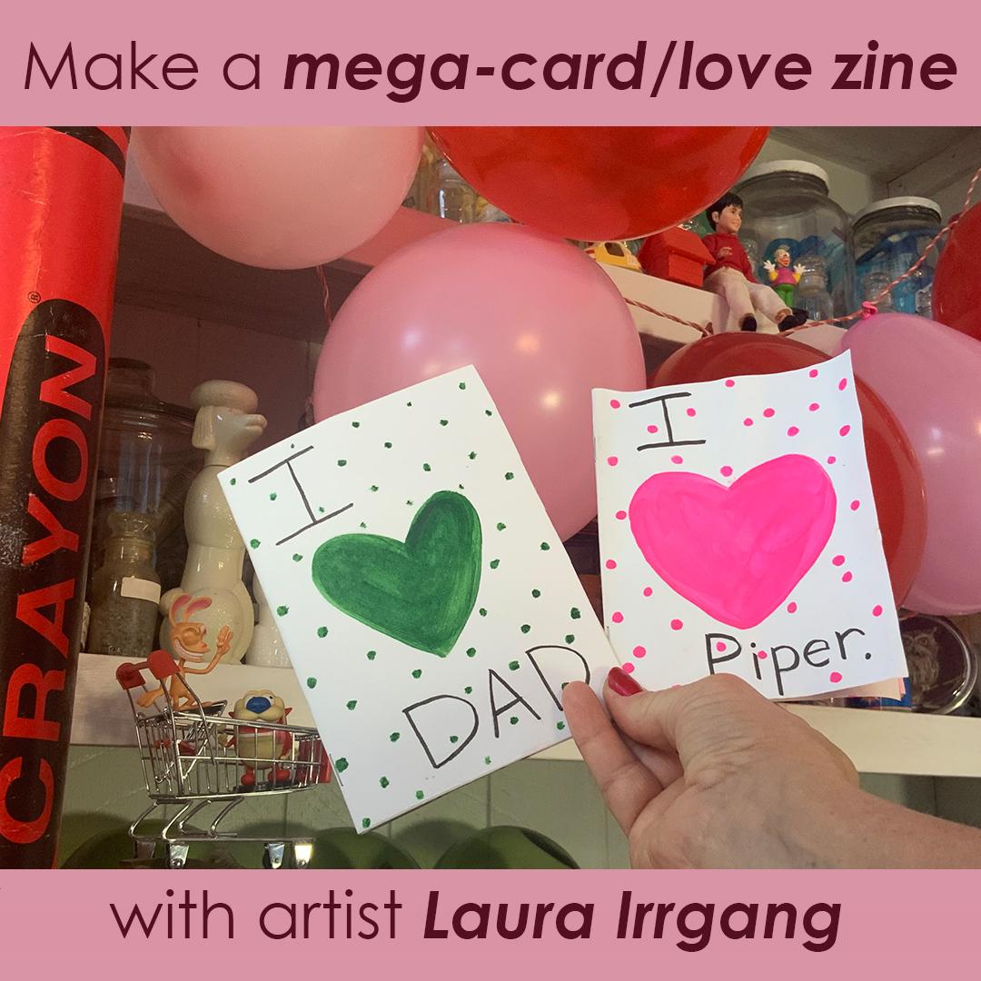
3. Page 1-Cover : Now we're ready to start
working on your cover. Here is what it's going to
look like when we're done. This is the Valentine's version. I made this for my
daughter piper. I'm going to show you
another version that can be used for Father's Day or
Mother's Day or any holiday. But in this series, I'm going to show you
an alternate option for Father's Day, and I want it to be
green about earthiness, hunting, camping, fishing,
that kind of stuff. So I chose green. I want a monochromatic
color palette, meaning I just want one color. I want to use a limited
color palette where we only have one main
color for Valentine's, I'm using pink, the dads
card, I'm using green. I want a heart shape
for the cover, so I can use pre-made traceable cookie
cutters like I've got here. Or we can make a heart template. I'll show you how to do that. I'm using a stiff piece
of paper from a magazine. You can use a cereal box card, stock, whatever, draw,
a half heart shape. You've probably been doing
this since kindergarten. And then get your
scissors and cut, cut, cut, cut, cut,
cut out that shape. You can hold it up
next to your car to get it about the
right size you want. If you don't like the shape of the heart, make another one. It's very fast, very easy. I'm going to try out
my cookie cutters. I've got a bunch of different
sizes and not one that fills up most of the card. I like the size
of that template. So I think this one let's see. That one. The next one. Yeah,
that one's about right. Now. I'm going to put it in the middle and I'm going
to trace it with a pencil. I want some space
on each side that's equal in about the same on
the top and the bottom. Just enough room to write the
letters and words I want, okay, so trace it
with your pencil. Tracy, Tracy, Tracy. Now, I like to write,
oh, that was my cat. Did you hear my cat high Trixie. I'll make you a card next. Now. Pink, just pink for this one. I really want that bold pop,
a Valentine's goodness. So I'm going to get some on my brush and I'm going to
trace the outline first. I find this makes it easier to stay in the confines
of the pencil. I also flip my card upside down because this is the position
we write and it just, it seems to be easier
for most people's hands. Now. Just fill it in, just fill it into you don't see
any white and you can make it leave it
kinda brushy or you can make it a little
smoother like this. When I'm done, I was making sure that wasn't going
through to the back. When I'm done with this, I like to blow dry it. I like acrylic to be completely dry before I
move on to the next steps. So I just blow dry
the heck out of it. I'm putting my hand
up as a barrier so that I'm not blow drying my paint because I still want to keep using that little
puddle of paint. So I use my hand as a barrier
when it's totally dry. I'm going to sketch out
my letters and pencil. You can skip this
step if you want to. But I think it's nice to
go ahead for the cover, at least to make sure your letters or
where you want them. This is for my daughter,
Piper. I love you, piper. Now I'm going to use a
pen to go over the top. This is a Fudenosuke, a pen by Tom though, making sure it doesn't
bleed through. It's okay if it bleeds
through, we can fix it, but I was just curious. You can use a Sharpie. You can use a plain old marker, you can use a pencil. I got to bloop of
paint on there to see my bloop, had it on my hand. It's not that big of a
deal, we can fix it. And then I just try
to carefully go over my lettering like that. Now, I've got a drop
of paint on there. So instead of trying to
cover it over with white, I could do that
to obliterate it, but I'm just going to make
that a design element. I'm going to call
that a happy accident as my beloved Bob
Ross would say, much, I love him.
He's just great. Okay. I'm just going to use
a bunch of little dots. I'm just kinda
putting them in there randomly around the edge. I think I like that
better anyway, it gets more graphic interests and not just a plain background. So see in the eye next to Piper, I just covered up
that mistake I made. And I think that's why
I like how that looks. I'm going to dry it again. Dry, dry, dry. The blow dryer. If you have it on high, we'll
want to make your paper blow away because that's
what blow dryers do. So you kinda have to hold down an edge with your
fingers or something. Make sure it's extra dry. I think this is a great tip. Anytime you use acrylic paints and you have multiple
pages or layers, just make sure you've got it
super dry before moving on. Okay, now I'm gonna show
you another version. So the dad card using our
green limited color palette, I'm going to do the same thing. I've got a heart. I'm going to fill it in. I'm going to blow
dry the first heart. Then I'm going to come
back in and I'm going to use in the next video, we'll work on page two, which is your dedication.
4. Page 2 Dedication : Next video we'll work on
Page to your dedication. Okay, here is what the
dedication page looks like. We're looking at the
panel on the left. I wanted to establish when our relationship started and
since this is my daughter, I chose her birth date. I'm using three ovals on the left with a
white background. Here's what it'll look like
for the Father's Day card. I made it a little simpler and I made the paint
a little thinner. But you get the general idea. Personalize it for your
special person and the way you want to get started. Find a background paper. You can use scrap paper, you can paint something, you can use something
for a magazine. I like to put it
inside the booklet. Haha, no one can see this. I leaped little jokes
for myself and my art. I trace around the outside
edge and then I trim it, trim, trim tram, tram,
tram, tram, tram. I'm not particularly precious about this part of the process. I just stick it on there. If it looks a little too big, I shave a little off and you can measure meticulously
if you want to. That's just not really my style. Then we're going to glue this. And I like to use
real glue for this. I just kinda like that. It gives it a more
saturated background and kind of smushed
around with my finger. I use an old magazine or a piece of scrap
paper to do this on. If you do it directly on your table and get your
table table dirty, and if you do it on
your card or your Zane, you're making it can make it sticky and it can make
the pages stick together. So I just do it somewhere else. Then I line it up with the inside fold and smash it down with my fingers and try to get a lot
of contact there. Okay, give yourself a nice
square root of white paint. And we're going to
paint three long ovals and this section brush. I just kind of eyeball it. If you want to
draw an outline in pencil first, that's fine. But I just like to
paint it in like this. Again, I tend to work from the outside and then
paint through the middle. You get a little more paint on your brush and draw another
one, painting, another one. I kinda think of it as
drawing with paint. There you go. You can stop here if you like
the transparency. You can see some of the
heart background in there. If you like that, leave it. That's a neat look. I decided in this project I wanted that layer
to be thicker. So what I'm going to do is
blow dry the first layer, remembering to hold it down
or it'll go flying with wet paint and you don't
want that, go clean it up. I've done that several times, but you probably
don't want to do it. So blow dry, blow dry, blow dry, and then come back on top with another
layer of white paint. I'm going to show you a trick
to get your text align. Just write folded piece
of paper the same size as your page and hold
it above your ovals, mark the edges and
draw them in on net scrap paper to see
about where they'll be. Kinda use my fingers to pinch the size and then
write it on the side. Then try out your texts. See, it was too long
initially when I wrote mama. Mama loves Piper, so I erased it and I tried again
with smaller text. This time I knew about
where to put it. So you just write out what you want and you can
practice and erase until you make it come out
centered within that oval. This really does help a lot. If you want to write
it in pencil first on your actual card or
Xen, that's fine too. But when I skipped that step, when I do the practice page and then I just go straight onto
it with marker or sharpie. Again, I'm using the
Fudenosuke a pen here. You want to be sure
those ovals are super dry if you try to write with any kind of marker on top of even slightly damp paint, it's going to tear at the paper and it can
really mess up your pin. I don't know if you've
ever done that before, but if you've ever
tried to use e.g. a. Sharpie on wet paint. It coats the tip of the
Sharpie and then it smears, it smears and it can also lead paint on the
tip of your sharpie, rendering it useless when
you want to use it again. So dry that paint. A minute ago, did you see
me fanning the paper? I've found it
because I wanted to stick my guide on
top and I didn't want to stick it
on wet ink because that could smear it to dry, dry, dry before the next letter. And I added some hearts just because it's Valentine's day. Alright, here's the dad version. Same thing. Cut your scrapbook paper or your painted paper or
your magazine page, whatever you want to use, using a monochromatic
pattern or color. Glue it on. Go again
with the white. This time I used a
smaller dedication page, so I only did two. And this time I liked
the transparency. I like to see that kind
of Gangnam print behind. So I only did one layer. Same trick. Practice your text. This time I'm using a Sharpie. You're almost done
with this page. I think a dedication page
is always sweet to have. Okay, now we're gonna
move on to page three, which is all about things
you're special person loves.
5. Page 3 -You Love... : Okay, We're on page three now and we're gonna
be working on a page that describes all the things you're
special person loves. The page on the right
is our page three. It's going to be all
about the things are special person who loves
for my daughter Piper, I decided to
concentrate on foods. It can be anything, but I decided to go with
food for her category. I'm going to show you a
look at what I chose for the Father's Day card to it
was more general categories, just things like camping, fishing, coffee, sin roles, mom, I went broader on this one. So kinda spend some time making a little shortlist of
things you might like. I think anything 4-6
would look good. A good rule of
thumb is to go with an odd number that just tends
to look a little better. So I met with five. The first thing you do is, Who's your folded
paper trick again, make a folded piece of paper, that's your rough draft. Get your lettering right, then start sketching
out your objects. If you can't remember, e.g. what a piece of pizza or a
piece of cheese looks like. Pull it up on your computer, find a picture in a magazine,
something like that. We're just trying to go very
easy with these sketches. We're not trying to
make them perfect, just give the
impression of a food. Okay, Now get your real book and go ahead and draw a
very light outline. I use that pinch
trick again where I take my fingers and I pinch the size it was on my
rough draft and then use my fingers to get that
size about the same. So I just do a very light drafts so I know where I'm going
to be putting things. Now, we're going
to paint this with our monochromatic color scheme. I'm only using pink and white. Think of the dark pink, the bright pink as
your darkest color. And obviously white is
your lightest color. Mix up a whole bunch
of different shades. You'll be amazed at how many
colors you can mix with. Just pink and white
or green and white, just one color and white. I wasn't trying to be overly precious are
perfect with this. I just wanted to have a loose, fun feeling of these foods. Another thing I was going
to do on the pizza, that's a little silly, but
she loves pepperoni pizza. So I was going to turn the
pepperoni into hearts. Just another thing to carry over that Valentine's Days theme. Keep cleaning your brushes
off in-between colors. Every time I switch from e.g. dark pink to white, I go wipe my brush off really good
on some paper towels and then I switched
it in water and I dab it off again so I
don't have water dripping. You will be amazed at
how your brain can deal with things in a
monochromatic color scheme. Obviously, artichokes aren't
pink, pizza isn't pink. But when your brain sees things
in one color plus white, it almost reads it
as black and white. It'll just make sense. I promise. Blow dryer, blow dry, blow dry, get nice and dry. I decided to go with a
pencil outline on these. I just wanted to give a
little more definition and a little bit more
movement in line. So I just went over there outlines and then
add a few details. Refer to your rough draft to get your text placement and write it out to make the letters
a little fancier. I'm making the vertical
lines a little thicker and adding serifs. Those are the extra
little tags on letters. I think of them like the hat
or the feet to the letter. Right now. I went ahead and on my practice page made some labels to see
where I wanted them. I decided to go with
all caps here and label each individual food item. I just like to list
stuff and label it. Alright. I did something really similar on the
Father's Day page, Dad Labs, here's
my nice drawings. I've already got them going. In this one. I decided to treat a lot of these drawings more graphically by starting with an outline. I used a little bit of water in my pile of paint to get
it a little more fluid. And I'm going with
a pretty basic outline for some of these, e.g. the coffee, I painted that
in, like dark coffee. But for a lot of these, I'm not going for a
lot of gradation. I'm just kinda working
in lines with the fish. I'm adding on. My details are kind of just
drawing with paint here. Couldn't do a little
bit more with scales. I think that's fun.
Again, I'm not using a lot of shading,
just line work here. I think I'll use a little bit of shading on my cinnamon roll. But again, starting
with an outline, I diluted my paint
with a little bit of water on the inside of the cinnamon roll
for a lighter color. You can also mix it with white. Here we go with mom again
outlining her features, drawing on a little
necklace there, outlining her face,
putting in some hair. Like I did with the other page, I am going to blow dry. And then I am going to
use my pencil to label. I'm going to write dad loves
in a more bold fashion. Honestly, I wish I'd left a
little more space that dad loves if you do yours tried to leave a little more
space at the top. That wasn't maybe the
best composition, but I'm still pretty happy
with how it turned out. Again, make the verticals
thicker and add little serifs. Those little tags can think of it as feet or hat
when your letters. Then I wanted to
do the labels in all caps just because it gives a little bit of
differentiation between the dad loves and then
the individual labels. We're ready to
start on page for. This layout focuses on
sentences and shapes.
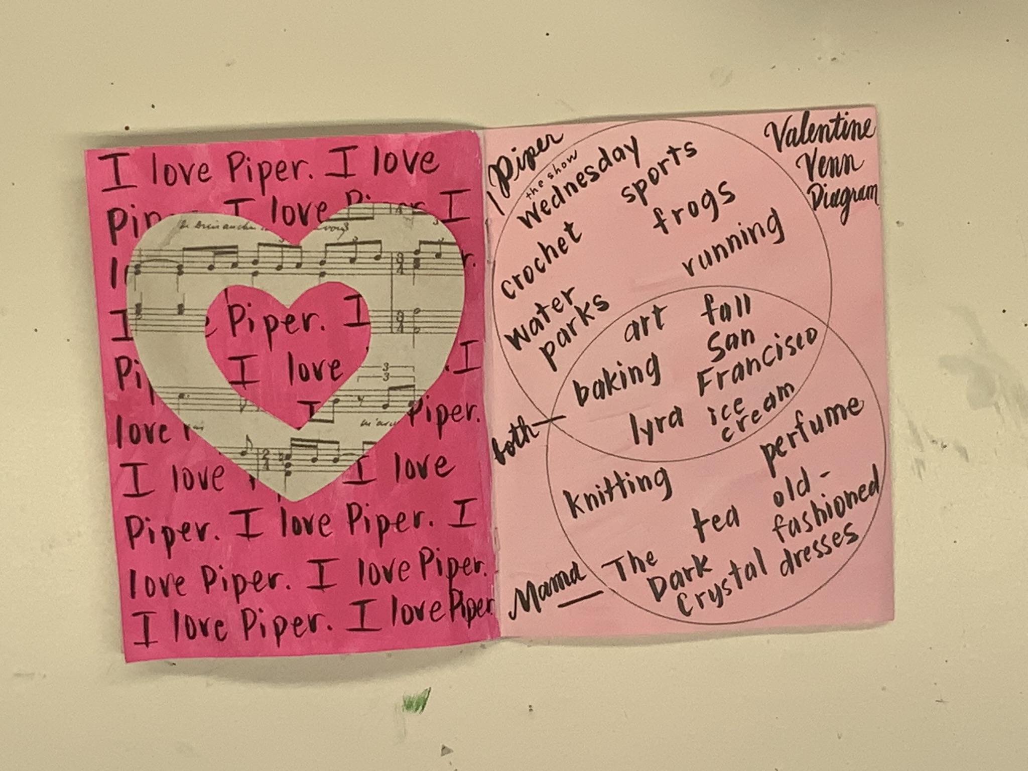
6. Page 4-Sentences and Hearts1: We're ready to
start on page for. This layout focuses on
sentences and shapes. Remember when you were a
kid and you had to write sentences on the chalkboard
or in a notebook. I remember having to write. I will not talk in class about 100 times on
notebook paper. So maybe if you were
super well-behaved, you didn't have to do that, but I have strong memories of that. So I wanted to have that feel of compulsive obsessive sentence
writing in the background. And on top of that,
a silhouetted shape. Here's what it looks like
for the Father's Day class, I went with a tree
outline instead of heart, and I just liked the phrase, Dad is awesome over and over. I just think that's
kinda fun and it gives me flashbacks to elementary. So here's how we
prep the background. I like to put a
piece of scrap paper behind and then I start
with one bold color, starting carefully along
the seam right there. And then I work outward. For this page. If you have a really
bright or lighter color, go ahead and use it as it is. If your color is really
dark, like the green, probably cut it with a
little bit of white. You just want to be
able to the black ink on top of this when you're done. Now just blow dry, blow dryer, blow dry, and make sure
that's really, really dry. Now, we're going to start
our sentence shape. The shape that goes on top of
these sentences is a heart. I want it to have a
big heart outline. And then I want to trace in a smaller heart inside of that. I'm going to cut out
the outline first. Catechetical. Cut snip,
snip, snip, snip. I like the music. I just thought it was kind of a romantic touch, like a love song or
something like that. Now I'm going to find
a smaller heart shape and trace that inside. I'm just kinda playing
around with placement here, trying to figure out
where I'm going. Oh, I forgot an important step. I need to cut out the
inside of that heart. So now I'm going to do sentences and I'm
going to write it. I love Piper ILO, Piper, I love piper
over and over and over. I'm trying to not have it be exactly the same
on each line, e.g. I don't want every single
line to start with the word. I. Just try to space
it out a little bit. You can always this test this
on your scrap paper first. I tell you your hand
is going to get tired. Did your hand cramp in school? I remember when I used to write notes by hand all the time, my hand would cramp in school. Okay. Take that heart, cut another little heart
out of the inside of it and just glue it on there. You're done. That thing you're going to do with a Father's Day card
is very, very similar. I went ahead and painted
two sides of the page here, but you can do one or two sometimes I find
it easier to work all the way across the spread if both of them are going to
be a background color, you can make your own choice about how you'd best like to do that and just make sure
you're always blow drying it. Okay. I sped this up because I'm just
doing the same thing. Lots of texts and scrip dad
is awesome, dad is awesome. Then I'm going to cut out
just a real rough tree shape. And then another smaller
tree shape on the inside. I just drew this one with
my hand and cut it out. I like to use my glue stick on a magazine or
a piece of scrap paper. You have to be careful with
these species fuzzy shapes because they're kind
of delicate so you don't want to tear the paper. I like to gently hold
down the outline with my finger on each
new part of the shape. And then you're going
to flip it upside down and center it
over the sentences. Press down lightly and make sure this is dry
before you move on. If not, you can
accidentally glue both of your pages together
and you don't want that. In the next video, we start page five, which is the band diagram.
It's a really fun one.
7. Page 5 -Venn Diagram: Alright, page five,
it's a really fun one. It's a Venn diagram. A Venn Diagram you as well. It's two overlapping circles that show similarities
and differences. One circle represents you and the other circle
represents the person you're giving the
cartoon. In this example. Here are things
that only I like. And down here are things
that only Piper likes. In this section
where they overlap. I list things that
both of us like. I think it's fun to have a
visual representation of where our interests,
me and diverge. And depending on the
theme of your card, you can make these
themed with your dad. You might keep these
only to do with camping or fishing
or the outdoors or whatever you all
have in common, if you're doing this
for your best friend, you might make it
about places you visited or vacations
you've taken. If it's your mom, maybe you have things you
do together like garden or bake or things
you don't like it. So I already have a prepped
and primed background color. I use light pink for this. Now I'm going to use a
cup or any round thing to make two circles that overlap. Try to make the portion
where they overlap come in about equal so that you
have two equal sides. I'm going to label these for the section
that's about piper. I'm going to put it on the
top for the section about me, it's going to be on the bottom. And then where we
overlap or both, I'm going to label
in the middle. And since it's Valentine's
Day and it starts with a V, I'm also going to call this one the Valentine's Venn diagram. You can just leave
that label off other ones if you're not
interested in doing that. I just thought it fit for this. Now, in the top section, put things that only your
card recipient likes, things that you're not fond over maybe aren't your favorite. And then when you get
to the bottom section, put things that you like, that you're special person
maybe isn't crazy about it. It's the way, the
ways we all differ. Then in this wonderful
sweet spot in the middle, list the things you
both have in common. I think that's nice to see this. It's just, it's just
kinda fun and so personal to each person
you would make this width. Same thing with the
Father's Day card. Make two outlines of circles
and have them overlap. Fill in your stuff, fill in those things
that you're crazy about. The dad might not like, like Tinder, maybe that
doesn't like video. Whistler is maybe
daddy does not have a sweet tooth that he
doesn't like to bounce. Okay, What do you
all have in common? This can be funny. They can be silly, they can be food, they can be show's. Try to get creative with this, spend some time making
a good list and maybe even ask other
people who know both that. Next we'll work on page six.
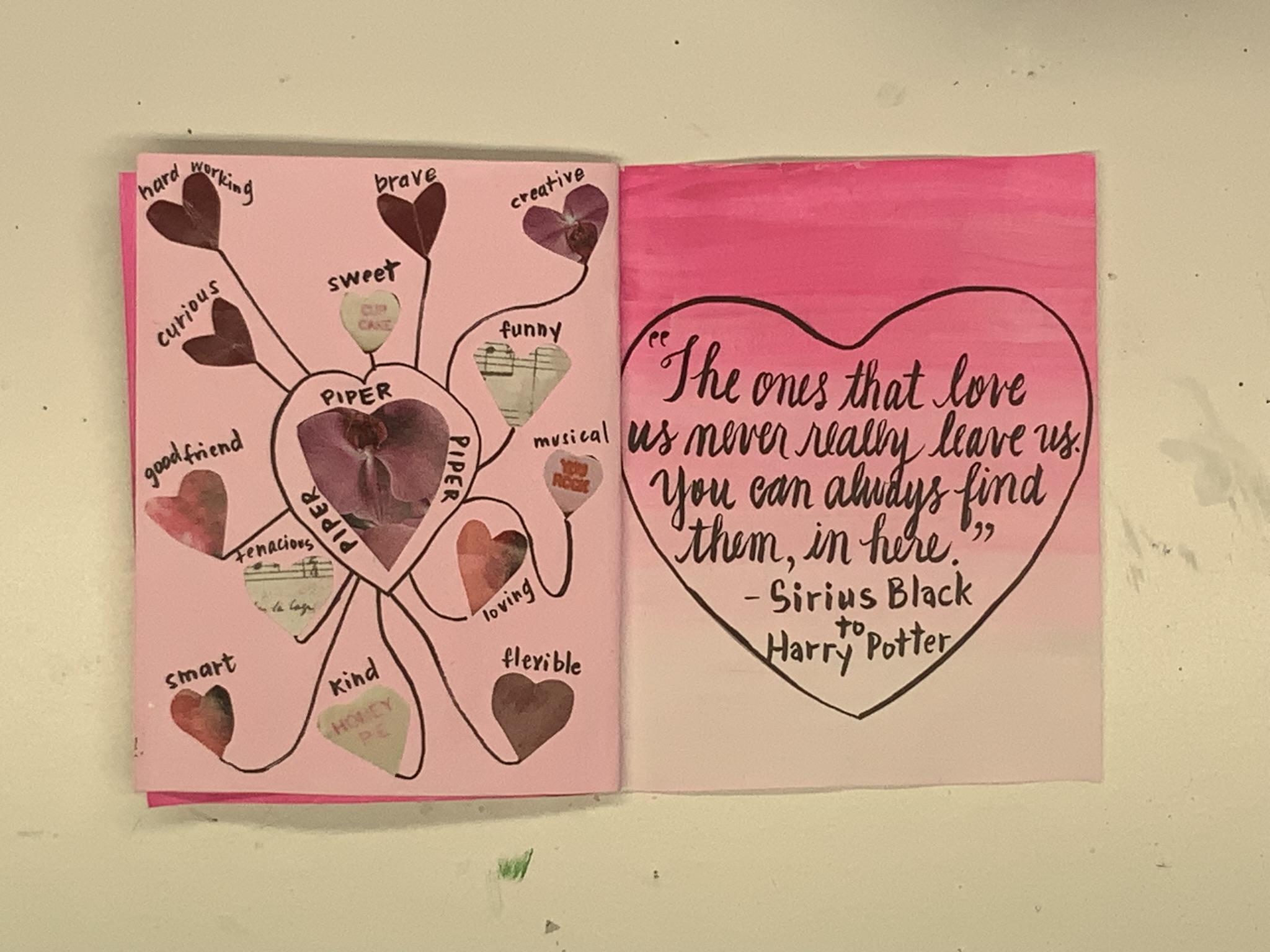
8. Page 6 -Brainstorm: It's time for page six. It's going to be a
visual brainstorm about your special person. Have you ever drawn one of
those brainstorm bubbles where you just scroll down lots of ideas really
fast and then connect all of those with
bubbles of other ideas. It's kinda like that. We particularly want to
use a shape that makes sense for our holiday
or occasion, e.g. this is a Valentine's Day card, so I chose the obvious, which is a heart shape. If you are doing a
Mother's Day card, you might choose a flower if your mom likes to garden or
if it's somebody's birthday, you could use balloons
or maybe slices of cake or little gift shape or
Bose or something like that. Just try to make it
fit your project. For the Father's Day card, I chose little
green trees, again, keeping everything
monochromatic, one color or a couple of shades of one color
like multiple greens. Okay, put a piece of
paper behind your card, protect the other layers, and paint this one a light pink. The Father's Day card, I was going with a light green, then blow dry, dry, blow dry until it's all dry. That's why we blow dry. Now, we're going to have
lots of little pieces. So for my Valentine's Day card, I'm taking literal hearts that are on some
scrapbook paper. I love these little Smarties. They tastes so weird,
but I loved them. Then I'm going to use scraps, a magazine paper, I
found a lipstick. My cut some hearts out of that, cut some parts out of flour, get a whole bunch of them. Now, I'm going to do
one in the center. This is gonna be my
main pepper heart and I'm gonna glue it on. Now I'm going to start
going on a whole bunch of other little
hearts around it. And I'm going to
think qualities that I really love about that person. Think about things you really
like about your person. You can make a list
on the side or you can just write
them directly. Again, when I'm working
with glue like this, sometimes I work on a scrap magazine page or
something like that. Sometimes with little
stuff like this, I just hold them in my fingers. I think that's a little easier. Now, I'm going to write Piper, Piper, Piper, that's the
person getting my card. I'm going to write
her name all around that center heart and
draw another line. Now, I'm going to connect all these other hearts with either straight
or squiggly lines. So they all lead
back to the middle. Now, I'm going to start
writing qualities of hers. I like, like sweet,
smart, funny. Each heart that can expect that big one is going
to have a label. It's gonna be some
quality I love. Unlike about her. One of my heart's
was sticking out, so I used a little bit more glue to tacked down the edge again. Make sure all your
qualities get labeled. Smooth down all those hearts. For the Father's Day card, I went with some wonky trees. I just cut them out by hand. I used pages from a magazine. I think this was
a Texas highways and I literally used pictures of trees that I cut trees out of. That's kind of Meta. Again, glue everything on. Whoops, I tore that one, some have to mend it a
little bit. Same thing. I'm going to write. Dad, dad, dad, dad, dad around the center. Then I'm going to connect all
of these trees with a line, little squigglies this time. And I'm going to write traits
like and love on each tree. I like how personalized
this project is. Now we're gonna move on
to page seven, a quote.
9. Page 7 -Quote : Okay, Now we're on page seven. It's going to contain
a quote that's appropriate for your
special person or occasion for Valentine's Day. I wanted to quote that
was going to be about love and appropriate for
a mother and daughter. So I chose a classic
line from Harry Potter. For other holidays
are occasions. You may already have
a quote in mind that you can actually use
something the person says, or you can use a song lyric. It's important to both of you. But if you don't have
any ideas, that's okay. Hit Google and type in
Father's Day quotes. It's about mom's birthday
quotes, things like that. If your person has a
special interests like camping or fishing or sewing, you can look up quotes
about those things too. This isn't ombre background. We're going to go from a dark shade of pink
down to almost white. I like to do with darker
strip and then a lighter strip of pink and then work my brush back-and-forth
in-between them. Darn it. I hate it
when I spill paint. Then I start from the lighter
end and work my way up. I clean my brush off and
then just try to blend them. If a spot it looks streaky
or not quite right? I just keep blending
a little more of the in-between color until I have a nice fade
from dark to light. Alright, we're going to use this same heart-shaped
cookie cutter I like to fill out almost
the whole space here. Do the same trick we did before, where you write out your quote
or your poem or whatever you want and practice
that placement first. I've done this a long time
so I can kind of eyeball it. But when I first
started doing this, I had to try to bunch of
times draw in your shape. I did it with a pencil first and now I'm gonna go
over with a pin. And remember you can always turn your page to help you
get a better angle. Sometimes it's just
easier to draw that way. Now, I know calligraphy, so I was trying to write this in my absolute prettiest
handwriting. You do not need to
know calligraphy. We just want to make
sure the person can read this really well. And I think it makes
it look a little bit more literary and special if you can write it
in your fanciest handwriting. I decided to put who was saying these things in the book just to jog
someone's memory, but you can also list the author or the book
it's from, it's up to you. We're getting close
to the end and the next video we're going
to work on the back cover.
10. Page 8 -Back Cover: Okay, We made it
to the back cover, page eight. So here we go. This is your sweet
final farewell. Mine reads, there are so many
things I love about you. I thought that was a nice
way to wrap up the Xen, but make it personal to you. Thanks for being my mother, the world's best friend, My dad is absolutely incredible. Okay. I like the idea of these little loved drops raining out of a cloud and my
Father's Day card, I had to count how many words that would be in that sentence. And then I made that
number of balloons, Not balloons, heart
for a birthday. You could do booze
these balloons. You can even use it, candles
on a cake from others day, maybe a bouquet of flowers or that spell it a
message, whatever. Just make it personal and fit
your limited color palette. Remember, we're
still working with them, monochromatic
color palette. All right, I decided to
make my raindrops first. I was afraid if I came
in, painted them later, they I don't know. Maybe it wouldn't
line up or something. Sometimes when I'm doing
things that are lines, I like to do it
before the paint. There we go. That
looks pretty good. Now, it's going to get my pink, nice puddle of pink. This time I'm going to
use a much smaller brush. These are much tighter hearts
than we've painted before. So I want to make sure they're going to be
a little tight ear. Again, when paying hearts, I'd like to outline the
outside and then fill it in. So kind of around the
outside and fill it in if you want to turn your page
around, that's fine too. I just like to brainstorm
sometimes on these, let's see, for birthdays, I
liked the idea of maybe little gift boxes or
something like that thing. Birthday presents
stacked up at a party. Okay. Almost done with this. As always, blow dry
though guy dry, dry and then blow dry some
more. I can't count the times. I think something's
dry and then I realize it's not something I'm
going to write on. I touch it, I switched
my finger into it. And a lot of times
it's still a little tiny bit damp or
wet in the middle, so you've gotta get
it totally dry. You don't want to
ruin your markers. You can practice on scrap paper. But since each of these hearts
just contained one word, I felt confident in
just writing them. I'm writing left to right. Make sure you make
your little trees or hearts or whatever
in a logical order. So that is they read, there's
little separate rows. There you go. In the next video, I'll go over a few final tips and tricks to make sure
your project is a success.
11. Tips : Alright, I'm going to
share a few final tips and tricks for this project. I like to give my cards are
my MiniZinc in an envelope. You have to do this if
you're sending them really, but it's also a nice touch. If you're doing it in person, you can just hand them over, but I think it's a nice touch. Here. I found a
really pretty shade of pink in a magazine. And obviously this is from
my Valentine's Day card. I'm refining the heart
shape a little bit. I'm going to glue this
onto my envelope. I think it's just like
having a little butterfly, a lighting on the paper
or something like that. It's just a nice
small extra touch. You could use
different things here. Even store-bought stickers or anything I touch up glitter. I think it's just
fun to embellish it with a little
extra something, maybe a bit of washi tape. If you were using your
Father's Day card, I would probably go with a little pine tree,
just something simple. You can also experiment with different envelopes at most office supply and art supplies, stationary stores, you can
buy colored envelopes. I like to really nicely ride the recipient's
name on the cover. You can also do to and from, or you can make an
extra elegant if you're doing a whole address. Now, this is a good
tip when you're doing any mixed media project that
involves paint or glue, even a lot of glue sticks
and some of these pages, I cut strips of wax paper to put between the pages as
I'm working on this, I take them out before
I give the card, but this keeps any acrylic paint from sticking while
you're working on this project. We're almost done. In the last video, I'll
wrap everything up.
12. Wrapping up your Project: Thank you so much for
making a Zoom with me. I really hope that the special
person you give it too. I hope it makes them smile and I hope it made you feel
good to make it too. If you want to, I will love to see your project
in the project gallery. Please upload it. I really liked seeing these. You can upload pictures
of the whole thing or just your favorite spread or
page or something like that. If you upload it to Instagram, please tag it with at-large
or gang so I can find it. To follow me. Look in the upper left-hand
corner of the class, you'll see my name and
the follow button. Just click it. That's
all you need to do. Then I want to show you how
to share a class project. Look at the bottom of
the video and there's a tab called Projects
and Resources. Click that, then click
on Create a project. It's this green
button right here. Click Upload image
and click anywhere from one to however many
images you want to upload. You can pick your favorite
from this class or you can show pictures of every
single page you did. Then when they're loaded, you can add a project
description if you want and click publish. That's it. If you liked my class, please leave a review. It actually really helps
me as a teacher and it also helps other
students find the class. And as always, if
you have questions about anything, just contact me. I'm happy to help. I really like to help you with
every step of the project. So just let me know what your thoughts are and
you have questions. If there's anything
you'd like to see me teach a class on in the
future, just let me know. I'm really interested
to hear your thoughts and you might see that class and your future
more than anything. I just want you to
keep making hard, keep creating art for your happiness because okay,
I'll see you next time. Bye everybody.
 Laura Irrgang, Artist, Author, Illustrator