Transcripts
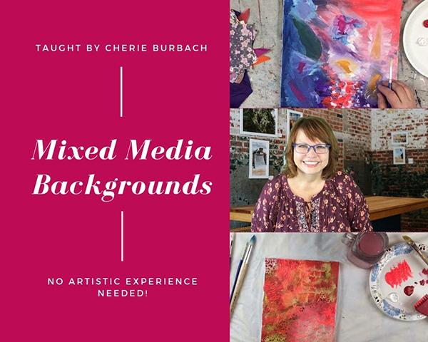
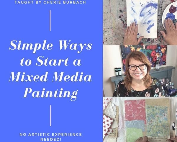
1. Intro to Mixed Media Backgrounds: I mixed media artist sharing Burbach and welcome to this class about creating mixed media backgrounds. I've got 10 different backgrounds and I'm gonna show you and you'll see the step by step progress and hear all the details about what I'm doing to put all these layers of texture and color onto the painting. The best part of this to me is that the supplies that I'm using are very inexpensive because I think art should be inexpensive and we don't need to always buy really expensive supply. So I'm gonna show you a variety of really just things you can find anywhere dollar store around your house that will help you create, create some really cool, uh, effects on your paintings. So I've got 10 different examples. Let's get started.
2. Shelf Liner Bubble Wrap Fluid Acrylic Paper 1: two starts. I have an eight by eight inch canvas and some Naples yellow paint, and this is regular body acrylic. And very often I like to start a canvass just with whatever leftover paint I might have from a previous picture. In this case, it's yellow, and I'm putting it on with a large paint brush. And I'm not thinking about at this point the end picture. And what I mean is, I'm not worrying about if the end painting that the completed painting that I'm gonna finish is gonna have yellow in it. I don't even think about that. What I want to do is just get a start on this canvas, just get it activated in going, and the way that I choose to do that is just by getting some paint on their in this case, I am putting that same yellow on the sides. Canvases like this that have those thick inch sides are really great for a variety of purposes. They stand on their own. Um, you can put him on a show if you can hang them, So I like using these types of canvases, and it's small enough where it goes on Ah, lot of different surfaces. You can fit it in even if you don't have a lot of wall space. So I'm using the yellow just to put paint everywhere, including the sides, because I like to complete when I'm doing a painting. I like to complete all the surfaces of the canvas, and I'm going to do that, and then I'm gonna let it dry. Now that it's completely dry, I have a collection of texture tools, starting with bubble wrap. This is bubble wrap that just comes in packages. I have some shelf liner. This is something you can get at the hardware store or the dollar store, and I have actually a variety of different shelf liners. Um, I'm showing the different textures and patterns on each of them because they all have a little bit of something different on them. They all will put your pigment on the canvas in a slightly different way, so I like to have a variety of different types of shelf liners. Take a look when you go to the store next time and just see the different types of shelf liners and the different weaves because each one of those ads something interesting to your canvas. So now that the painting is completely dry, I'm gonna start with that bubble wrap. I like to save bubble wrap from packages. I generally don't buy it. I usually whatever I use in my art, I like to make it inexpensive and easy. And so if something comes with bubble wrap in it, I grab that bubble wrap and I save it for when I want to do some texture on a canvas. So now that I have my small piece of bubble wrap, I am using two different colors. Now, on my palette, one is a lighter green and one's kind of an orangey red. And I'm gonna take the green and lightly brush it over the bubble wrap with the bubble side up. So what I want to do is catch all those little bumps that have, um, the bubble wrap. So on the other side of the bubble, wrap is a flat, um, surface on the side that I'm painting on is the side with all the bubbles, and I want to just do a light coat of paint. I don't want to douse it in paint because then you won't pick up the pattern that is on the bubble wrap. So a really light coat of paint, Um, something that just brushes over the surface. And what I want to do is just take that bubble wrap and place it, um, on the canvas and just gently press it in. I don't want to rub it. Just press it when I pull it up. Then it has that interesting pattern on it. So I'm using the bubble wrap, and I don't need to reapply the paint because there was enough on there. So I put that bubble wrap on another part of the canvas and parecen and again, and it had more than enough paint on it to create a new pattern.
3. Shelf Liner Bubble Wrap Fluid Acrylics Paper 2: So now I have the red paint, and I am brushing it on that blue shelf liner again. I am brushing it on the top of the shelf liner, meaning that there are two sides to the shelf liner. One of them has a slightly more ridge on it than the other side, and that's what I want to use to create that texture. Much as I did with the bubble wrap. I'm brushing it on to the side that has the actual we've on it and the texture, and it's a light coat that you need on. They're not very much at all. Once I have a light coat, I do the same thing with the shell finer that I did with the bubble wrap. I press it in. I do not rub it. I just press it gently into my canvas, and I make sure that I get all the paint. Ah, that is on there and just pressure precedent gently, and then it creates that really nice, interesting pattern. Um, and now that I've got the paint on there, I don't need to reapply. I can again press it in on a different side of the canvas. and get the benefit of that pattern on the other side. And I'm doing the same thing that I did with the bubble wrap in that I'm taking a paper towel and just dabbing the edges of this pattern because I wanted to blend in with the entire canvas. So now I have another shelf liner. This has a different we've and a different pattern. This shelf liner has again a slightly raised pattern on one side than on the other. And when you're using this type of shelf liner, you really kind of have to look for the ridges because that particular shelf liner has, um, really it's very similar on one side than the other, but one side is definitely more ridged, that society that you're gonna put the paint on. So I'm using the same type of process. I put a light coat on that you can see when I flip it over. It has just on one side of the shelf liner, a light coat of paint. And now, since I have kind of that yellow that has no pattern on it yet, I'm gonna put the shelf liner rate in that section of the canvas and again I press it in. Um, I don't rub it. I just put it on there and press it. And again, I put it on another piece of the canvas because it has enough paint on there where I don't need to reapply it. Now that I've got these layers on here, I want to make sure they all dry before I add anything else.
4. Shelf Liner Etc 3: after I've given it a few moments to dry and it's acrylic paint, so it dries very quickly. I then look at some of the paper that I have, and this is when I begin to look at my canvas and see what I like about it, what I feel like I need, um, on their what I feel like maybe needs a little bit more, um, interest and texture. And when I'm doing a background like this again, I am not thinking about the final picture. I'm really just thinking about what's happening on this canvas. The colors that are coming together, the patterns. Right now, I have a lot of different colors in a lot of texture, and, um, I'm again even as I'm choosing papers I'm not thinking about, well, does this paper match with the paint that's on there? So I am just kind of choosing paper and different types of elements based on what I feel. And I've got a collection of book pages, music sheets, um, a tissue paper, and this is not Arctic artist tissue. The blue that you see on the left, the tissue that I have is actually just the regular like wrapping paper tissue. Um, and so I have a collection of different things, and I have Gel Medium, which is a regular gel gloss by Golden Brand and a foam brush, and I'm brushing the gel medium onto the canvas, and then I'm brushing it onto the back of that book page. And then I adhere the book page to the canvas, and I put a thin coat of gel medium over the top. This helps protect it, and it also helps when I then put another layer over this canvas. Then these book pages remain crisp. It doesn't get muddied then, so it helps every every layer stay unique and true, which is really, really important when doing mixed media backgrounds, mixed media paintings. So now I have a music sheet, and I'm doing the same type of process and putting a little bit of gel medium on the canvas and then a little bit of gel medium onto the music sheet and then a thin layer over the top to help protect it. So now that I've done those first couple pieces, let me speed up the video a little, um, and show you that I'll continue doing this using a scrapbook piece of paper and the same type of process where I put a little bit of gel medium onto the canvas, a little bit on the back of the paper and then a thin layer over the top. Now you'll notice with that artist tissue. I did not put gel medium on the back. That's the only piece of paper that I have there I'm not doing that with, and that is because the tissue is very thin and it doesn't need additional gel medium on the back. When I get through all the layers, I let them dry and gel. Medium takes a few moments to dry, so I would give it you know, enough time, maybe an hour, to completely dry before you move on to the next layer. When I have all these elements, the next thing I'm looking at is color, and for this I'm using fluid acrylic and amusing golden brand in two different colors. I have kind of a teal and kind of ah yellowy gold, and I'm looking at the colors on my canvas. I'm looking at what I like and don't like about it, and right now I am looking at just tryingto get a coherent look to my canvas. I've got a lot of different pieces, a lot of different colors, a lot of texture and pattern, which are all great, and I like them. But now it's time to pull it all together a little bit, because before I add my final components to this picture and really start working on the actual painting, I want to make sure that I have a base that gives me a good starting point for my picture.
5. Shelf Liner Etc 4th Final: so to me when I'm looking at this, the one thing I need is color to kind of pull it all together. And when I'm gonna put the next layer of color on, I'm not worried about the colors that are underneath. What I'm looking at is every new layer is a fresh start. In a way, I'm building on the previous layers, but I'm not covering them up. I'm using the elements that are underneath to continue to add interest. So when I'm looking at this collection of items that I have on there, I like the texture. I like the different pieces that are coming on there, and I'm thinking the teal is the next color that I want to put on there. I just like Teal, and I like how it's going to go over these previous layers, and that's my thought process. I'm using my fingertips and just brushing it on very lightly. Now you'll notice sometimes that paper is peeking through more prominently than other times fluid. Acrylic is really great for building layers of paint. You can put it on very thinly on some of the pieces, and you can put it on thicker and it has a lot of variety to it on certain edges. I am taking the paper towel and just wiping it slightly, and I mean dabbing it. And so what happens then is that fluid acrylic pulls everything together and make some more uniform, but at the same time allows those previous layers to come through, which is a really nice effect, because when you look at this canvas than you have so much to look at, there's a lot of different pieces. There's a lot of components, a lot of interest, and this gives you a really great starting point. Then when you then go back and you want to create an actual picture over this background as I'm adding the gold, I'm also using my fingertips because I like that it doesn't add brush marks. I'm just kind of smoothing it over with the gold. I'm adding some fingerprints, and I like the way that that comes through on their. It adds another textural element, and I like how it kind of mimics the bubble wrap that is underneath it. And so again, these two colors, even though they look like perhaps on the surface, they wouldn't go together. They helped pull everything together. Color is a great unifier when you have a lot of different texture and a lot of different papers and elements underneath. So since I like the fingerprints of the gold, I'm also using those with the teal and I'm just blotting the paint on there. And since I have a layer of teal already underneath it rubbed gently, I am now putting another layer over it with fingerprints. And you can see in some of the places the teal is darker and some it's lighter, and it provides a lot of interest on this picture. And again, I let everything dry. Um, fluid. Acrylic dries very quickly, but, you know, I give it a good maybe 10 15 minutes to make sure everything is completely dry. And then I'm looking at this picture, and I feel like I really like the dark blue that is happening there. I like that, um, tissue paper that is underneath there, and I like the paper. And so I have a stamp that I got at the thrift store and I have some blue stays on ink. I'm gonna use this stamp toe, add just a little bit more interest on my canvas, and I, like, stays on ink because it goes over all different types of surfaces. It'll go over that fluid acrylic. It'll go over everything that's underneath at the John Medium, the paper and all of that. And so I dab my, uh Inc over the stamp. And then I just press the stamp into the canvas, and I'm putting my hand on the back of that canvas to make sure that I get the edges of the stamp. Now it comes through in different. You know, I've added the ink in different levels on that stamp, and I like how that comes through. I like an imperfectly look because that's kind of how mixed media is. And so I like that first passed through with that stamp, and I like that it's pulling together some of the other, um, edges of the blue. It's kind of adding, you know, the, uh, shelf liner blue, and it's like it's really coming together and pulling it all together, and I really like that since I've got the stamped inked, I'm also adding a little bit to the sides. Now when I go through and finish this picture. I might cover that up. I'm not sure, but since I have that stamp ink, I'm gonna see where else I can add some off the interest. And so I put another piece of it rate on the front. It does pull all those elements of blue together. And when I'm looking at this final background, I am interested now, in adding a final picture, I see how the blue comes together. I see the elements of yellow and gold popping in there. I like the Thiel and all the different shelf liner, um, patterns that we have on there. So when I'm doing a picture like this and really creating this background, that's what I'm looking for is the final when I get to the end And I think, Okay, this background is complete. What I'm looking for is just now do I have a background that I wanted, then work on and create a final picture. And at this point, I do
6. Paper WIth Words Starting: so I have two canvases. These are 28 by 10 standard size canvases, along with some gel medium. In this case, I'm using Golden Brand soft gel gloss and a phone brush. And the first thing I'm doing is just prepping both of these canvases. And to do that, I take the soft gel gloss and put a thin coat over each canvas. Ah, very often when you buy a canvas at the store, it is very dry. It's been in the packaging, and your paint and paper and whatever else you have to put on this canvas will not be accepted as well unless you do something to activate that canvas. In this case, what I'm doing is putting the soft gel gloss on in a layer, and that will give it a starting point when we add all the rest of the paper. I've printed off several sheets of paper that have various flower names in various positive messages. Happiness, love, flowers. Um, you know, that kind of thing. And I am using these as the base to create the first later for my picture. And I am just ripping the paper. Um, randomly, I'm not, um you know, making it perfect. I'm not planning it out. I'm just kind of ripping each sheet and ripping the words. And the words are all different fonts, all different sizes. My goal in putting these down on the canvases is to just create some interest on this first layer. I want the words to be a subtle element there blow black and white, and when I put the color over the top of them, these words will stand out in a very unique way. Now I have printed out words on pieces of paper. However, you could also do this with book pages, music sheets, magazine pages, the goaless toe. Have, um, you know these black and white elements as the base for our painting, and they're going to be subtle because, well, eventually put color and subject matter over the top. For now, though, I am just ripping them and placing them on the canvas. To do this, I put a thin layer off the soft job loss on the back of the paper, and then I press that paper into the canvas and trying to keep away any of the bubbles or ridges that would happen now If you do have a couple of those in there, it's really no big deal. It actually helps add a little bit of texture to your canvas, but if you're concerned with that, you know, try to keep it really flat, Um, as possible. In fact, one way that I'd like to smooth out these pieces of paper is to use a spatula. This is a spatula I got at the dollar store, and I use it on Lee for art. And what I do is I start in the middle and I smoothed out the paper from the middle, and that way it helps get out any of the bubbles or ridges that might be happening.
7. Paper With Words 2: on the paper. So I'm gonna continue doing this for both canvases. And one reason I started with two canvases is because when you're doing a project like this where you have a lot of different pieces of paper and you're gluing a lot down its sometimes easier to just have a couple of canvases and start several at once rather than doing one and going back and doing another, especially if you're trying to paint in a series. So I am going to speed this up and show you how I place all the pieces of paper as I place them. What I'm looking for is some interest, and and I'm trying to vary the pieces of paper. So someone putting upside down, someone putting sideways, I just I want there to be some interest. And the purpose of these words is not so that somebody can read them clearly, um, on the picture, there really just background and they're meant to be subtle. So that's why I'm putting them in various positions so that when you see this picture you'll see a peak of this word. You'll see another word stand out. It won't be something that you walk up to and read, you know, like a book or something. You just it'll be subtleties, Um, and as I'm putting the pieces down, I'm kind of looking at it like a big puzzle. I'm looking for areas where there's some extra white space so that I can place down the piece of paper and I'm placing them randomly. And I'm trying to vary the fonts and vary the positions of the pieces of paper so that everything is covered and everything has some, you know, a little bit of white space, but it's a lot of wording, and so then when we go ahead and we put color over this in subject matter, all of the's great words will be in the background. But they will be something that influences the picture. When all the pieces of paper are placed on the canvas is, um, I wait until it dries, and it needs to dry completely, so I am going to give us, at least in our to dry when everything is dry, I then add two different colors. In this case, I have kind of a light seafoam green and a brighter green, and then I add some soft gel gloss because again, we're working with soft job loss to my palette. This time, the soft Joe glass will be used as a way to thin down this paint. And the reason I want to do that is because I want to keep all these words in that we've placed down in the background, and I want them to be subtle. But yet I don't want them to be completely covered up, either. I just want some pigment to go over the top and now to start adding color and in order to keep the color, um, you know, at the front and keep those words in the back, I am using a soft job loss to thin down this paint. So the process that I used then to thin down this paint is that I take my soft job loss and then I add it little by little into one of the paint colors, and I keep doing that until I have the color consistency that I'm looking for. So I'm gonna do that with the green, and I use one phone brush for that. Then I add some soft job loss and do the same thing with that kind of seafoam bluish green . I've chosen these two colors just because I like them. Um, I don't really have I'm not trying to match them or anything. Um, as I said, just put a little block down. As I take the next color, I again take just a little bit off the soft joke loss, and I put it into the paint and I mix it up and I try and just mix it so that the soft job loss is mixed thoroughly throughout the paint. Now you'll see, especially you can see on that green that it really is thin down quite a bit. Um, it it almost becomes translucent. And that is the look that we're going for.
8. Paper With Words 3 (final): then once you've got your paint on Ah, your canvas ready to go? Since we're working with two canvases, let's make it easy for ourselves. Let's put both paint colors on both canvases. Um, so what I'm doing is brushing the bottom half of each canvas with some of that lighter blue , and I'm putting a really light coat on there, and you can see some of the words show through a little bit more than others. I'm really just brushing it on until I have the level of pigment that I'm happy with ongoing slowly. And I'm adding it little by little to both canvases. Um, I don't want to add too much at first and then run out. I don't wanna have to remix this. I'm really just going slowly and adding it, little by little until I feel like I have the right amount of paint. When I get the blue added to my satisfaction, I start working on the green and again I put that on the top, and I go over both canvases again and the green. I just spread on very thinly, and I just go back and forth, Um, looking at the level of paint. Looking at what I have on there, I just want to make sure that I have pigment that covers everything. But, you know, isn't glommed on, isn't you know, to dark in spots? I really just want a thin coat because for this background, I want there to be some wording in the back in a thin layer of pigment over the top and the thes two elements will give me the starting point for whatever picture I want to put over this. If I want to put flowers over this, if I want to put ah ah, girl, if I wanna whatever the subject matter is, it will invoke kind of, you know, this feel of the these lighter colors and the wording, and so it will invoke, you know, springtime and flowers and lightness. And that's what a mixed media background can do. It gives you a starting point for what every else you're gonna put on there. Now I am going back to the blue and then going up to the green and kind of just blending the center line. I'm just going over the middle piece so that it looks like both these colors have a meeting point, and the blue just kind of comes up to the green. It isn't a stark line, but it blends together.
9. Paint and Artist Tissue Beginnings: So I have here some regular body acrylic and some artist tissue. I'm using a regular canvas and a paintbrush. And to start with, I am just placing that acrylic paint. Just however, I feel like just in little blocks of color, starting with that purple. And I'm just trying Teoh, you know, play a little bit and get some paint on the canvas just to start out. At this point in the picture, I'm not thinking about the final version. I'm not thinking about the layers involved. I'm just playing, getting some paint on the canvas and covering that white space. And I chose colors that were, um, just pleasing to me. For whatever reason, I didn't over think them. I didn't worry if the colors went together, and as I'm starting this canvas, I am not thinking about using all the colors or what I have to do to cover the canvas. I'm just kind of feeling it out and playing a little bit and putting that paint on the canvas. As you can see, I'm using the brush in a different way, and I am seeing how the paint goes on in thicker spots and thinner spots and as it goes on in thinner spots Ah, I'm able to see how it picks up the ridges and the patterns in that canvas. Now I'm using the hot pink ah, which is really a fun color, and I'm using it with my fingers. And I'm doing this just because, First of all, it's a different technique. It it puts the paint on in a different way. It has a different look to it, then just using the brush and the fingertip technique is, you know, really fun. It helps you really get into your painting in a different way. It is a different experience, and so the paint will go on differently. Then, if you use a brush, it goes on smoother and it tends to blend a little bit more, and then you can use fingerprints and dots and things like that, and I really, at this point, I'm just again feeling it out. I'm just trying to cover the white space, and I'm not thinking about whatever the final picture is gonna be. I'm not even thinking about if these three colors go together, I'm just basically pushing that paint onto the canvas. So while I do that. Let me talk about artist tissue. That's what you see to the left. I have a little pile of in here in different colors. Artist tissue is very different than the tissue paper that you get. And let's say the, um, wrapping store or, you know, the drugstore where you're going to buy it to wrap presents. It's not the same type of tissue. Artist tissue is much thinner. It bleeds more. It goes on a canvas really well, with either a gel medium or with having paint already on the canvas. And that's how I'm going. Apply it here. So I've continued adding paint, and I'm adding a little bit of white onto that hot pink that I've placed on there. Now I'm ready to add that artist tissue, and because I have that paint on there, I'm really just using the paint and the stickiness of the paint to press that artist tissue onto my canvas. I'm not using a gel medium or a glue or anything else. The tissue will adhere to the canvas very nicely, just with a layer of paint, um, underneath it and the tissue. I'm just choosing colors that I like for whatever reason. Again, I'm not overthinking it. I am kind of painting the edges of the tissue to just kind of have them blend in a little bit. One thing artist tissue does is it pulls up. Um, you know the color that is around it, so if you put it over another color, it will allow that to bleed through. And then also, if you paint the edges or use moisture and water on the edges, that will allow the color that's on the artist tissue itself to bleed. So it has a couple really nice effects. It looks different than paint, and it allows a different type of texture to go on to your canvas as I add that Greenpeace of artist tissue, I have a paintbrush that is watered down so you can see I've used it over the top. But it's watered down, and so the artist tissue goes over. But there's just a slight coating of paint over the top, which is a nice effect. I think
10. Paint and Artist Tissue Finishing: I'm continuing to add the tissue. And as I dio again, I'm not thinking about the final version of this picture. I'm just trying to create a background that will allow me to move forward with whatever I decide to put on this picture as the central component. He knows the central subject matter of the picture. Right now, I'm just using artist tissue and colors and paint that just make me happy. I'm just I'm just drawn to certain colors. I'm drawn to using certain pieces of the artist tissue, and that's all I'm going with. At this point, I'm allowing this process to continue without overthinking it. If I put a piece of artist tissue on and I end up covering it with paint, then Ideo. If it goes on and you know I don't like it, I can always covered up later. I'm not even thinking about any of that at the moment. I'm just putting tissue and layers of paint on in a way that pleases me. So now that I have that first layer done, I've given it some time to dry. This is really important because, um, any time you are doing a mixed media painting. You need to let the layers completely dry in between each layer. You need to give it time to dry and cure, especially if you using ah, gel medium or something else. I have on this canvas all water based paint. And so it dried very quickly as I looked at the canvas and I turned it to one side and decided where I wanted to continue. I, um, going back to paint now. And I'm just looking at the canvas for the second layer and just seeing where I might be able to add some additional color and some additional texture. I'm kind of following that pink that's on there and dabbing now the blue and light blue over it. I like the dots and the texture that's happening there, So I'm just kind of following that. And I'm really going with whatever I feel is happening, like, I am just not gonna over think what I want this final picture to be. The reason I'm doing that is I feel it puts you in a good headspace to then continue with art. If you overthink it, I feel like you're not getting all the benefits of what our conduced, which is to allow yourself to go to this place in your mind in which it kind of your subconscious kind of takes over. You kind of just relax into it. And I feel like your art is different. It is more authentic then if you're trying to force a certain painting or force the brush strokes. So I am just continuing with the blue. I am just looking at the different colors and what I have on the canvas right now. I'm liking the way the white and blue combined together. So I'm continuing that, and I'm moving forward with just again putting another layer on wherever I feel. There needs to be more interest. I'm not overthinking where I should put a piece of paper or where I should put some more paint. I'm just kind of I'm just kind of going with it and looking at what I feel like maybe the canvas needs. I'm adding that white paint as a way just to kind of glue down. Um, and it here, another piece of artist issue in this case, the green. And I'm looking at the different colors I'm seeing. I'm liking that kind of pink up in the right hand corner, and I'm drawn to that red piece of artist issue, and I am putting a little bit of paint on the edges in order to adhere it on. And I like the way it goes with the pink that is in the upper right soon ominous. Speed things up a little bit so you can see the final layer in the final layer. I'm looking for pattern and color and seeing how it all balances out, I'm looking to see how I like, um, the different pops of color. I'm adding some pattern to that upper right where I like to the pink so much I'm adding another piece of paper on the side, and I am just trying to see if I have enough texture and interest in this painting as it stands right now, this background, where I can then move forward and put the main components of my picture again. I'm only thinking this is a background. I'm not thinking anything final in this picture, anything can get covered up, but I'm using all of these colors and texture pieces as a design element to give me inspiration and I'm putting hearts on there and I'm thinking mawr now about all the different pieces that this painting contains. I continue working this way until I feel that I'm happy with the background. As I look at the picture, I know that this is not a complete painting. It is a background. And when I go back to this canvas than it will inspire me to create whatever I want to create on here as the main components of this picture. That's what the purpose of creating a background like this is. So I do it until I'm happy with it, and I keep working it until I feel that the background is done.
11. Tissue Lace Paint & Paper (Supplies & Starting): So here I have a canvas aboard. This is something you can get at any craft store, any hobby store art supply stores. And it's really just a piece of wood that is shaped like a canvas. And it's really great for things like mixed media work. It's sturdy, and it holds up really well toe all the different layers that we put on a mixed media canvas, especially when we're starting with paper which were doing with this project. And, as you can see on the back, there looks just like a canvas. Um, has about 3/4 inch thickness. It's rough on the surface at, which means it's untreated. If you see that you can get canvas boards that are treated and Jess owed and prepared. And I like using rough surfaces unfinished because what we're just covering this with paper so we don't need it to have a special finish on it. In fact, you know, unfinished board or wood panel actually works really great for adhering paper. I have a collection of papers starting with that map that I have on there and some tissue paper. This is tissue paper that you get at the store that you wrap presence in it is not artist tissue, which is something different. Artist issue is much more. It's it's pliable. Regular tissue is much more stiff, So I like using regular tissue sometimes, and I like the pattern on that one with the red hearts. I also have some music pages. I have a little doily hum that I picked up from when we went Teoh um, you know, breakfast that was underneath my coffee cup, and I picked it up and took it home because I thought it would look interesting on a mixed , meaty canvas. I also have just a little bit of other random papers. I have some book pages. I have a dictionary page that had already been cut into Ah heart and I also have some scrapbook paper. These pages happen to have the same pattern on them, but in different colors. And I kind of like that. I thought that was an interesting, um, feature of these three pieces of paper. And as I'm looking at everything, I'm seeing that thes colors really do go well with the colors that are in the map. So I like this combination of papers I really chose it randomly. And as I added to my canvas, I'm not gonna be thinking about trying to match things or trying to create a certain pattern. What I'm going to do is just take these papers and adhere them as I developed the canvas as I see fit. So I'm gonna start with using some gel gloss. And this is Golden Brand regular gel gloss. I like using Golden Brand for this, but you can use any type of job loss. Ah, that you that you have. I use a foam brush for this piece of the process, and the first thing I do is just put that gel gloss onto the canvas board.
12. Tissue Paper, Lace, Paint, & Paper Part 2: putting a thin layer of gel medium onto the canvas board really helps prepare it for all of the paper that we're going to adhere to it. So now that I have placed that thin layer of gel medium onto the canvas board, I'm taking the map and I really just have, um, a piece that I've ripped off. Um, when I am using this paper, I kind of look at it to begin with to see what the texture and color look like. I like the one side of it with all that green. However, I like the other side much better. It has a lot of blue. It has a lot of design elements in it has much more an interesting look to it. So I then flip it over and on that green side of it, take the gel medium and place a thin layer on to the paper. And since we've already got that Joe medium on the board, I then at here the paper just flat onto the canvas and I try and smooth it out. I generally start in the middle and work my way out of to the edges of each piece of paper and I put a thin layer, then of gel medium over the top to protect it. Now that I've placed the first piece of paper, I grab the next paper and this is one of the scrap of papers. So I do the same process I put to the gel medium on the back of the paper, and then I just adhere it to the front of the canvas. In this case, I am using the straight edges of that piece of paper, and I'm putting it up against the straight edges off the canvas. But you don't have to. You can, you know, have rough edges up to, um, the the edge of the canvas. You could do it, however you want to do it. I thought since I had those straight edges, I would just take advantage of that. So now I'll speed things up a bit and you'll get to see how I adhere all the rest of the meaning papers. As I am doing this, I'm using the same process. I put the Joe medium on the back of the paper, and then I adhere it right to the canvas. Then I put a thin layer again over the top of the paper. As I'm choosing the paper, I really I'm just choosing pieces that I'm drawn to. I'm not overthinking. I'm not looking at something And then thinking while this would be nice here or, you know, I'm really just looking at this layer, only I'm not thinking about the finished version of this picture. At this point in time, I work this picture kind of like a puzzle. That's what this first layer is all about. I really just fill in the pieces until I feel like I have the layer completed and I don't again think about the end product. I don't think about whether these pieces of paper are matching whether they go together. I really just kind of do what makes me feel like this is appropriate. I really like that final piece of tissue on there. And so with this, um, first layer done, I will give it some time to dry
13. Tissue Paper, Lace, Paint, & Paper (Part 3): for this next piece of the project. I'm using fluid acrylic fluid. Acrylic is acrylic paint that is thin down by the paint company, and it is highly pigmented, which means that if you were just thin down acrylic paint on your own, it might appear watery or the color might not be as strong as the unum diluted paint and float. Acrylic is not like that fluid. Acrylic looks just like the full version of acrylic, except that texture is more fluid and more watery. And so it goes over things like paper really, really perfectly. And it works great for mixed media work. I have a paper plate as my palate, and I have a large paint brush. And really, my goal in this layer is just to get some paint on this layer and just really start incorporating these papers into the overall picture. Again. I am not looking at the final version. I'm not thinking about the final version. I am just creating a background that I like, and that's the purpose of this project. So I have put some fluid acrylic on my palette that I really just like again, my my choices are our paint colors that I really enjoy. So I'm not looking at the different colors that are on this canvas right now and trying to match them. I've chosen a red kind of a Titan buff, which is that cream color, a darker blue and a teal. And I start with the red and I just kind of ad paint in the areas that have the edges of the paper. I'm really just trying to pull everything together and just start creating the overall background and making everything cohesive. Now there might be areas where I leave this paper open and exposed, and there might be some where I put the paint over it. When I put the pain over it, you will be able to see those paint like those paper layers through there, which is really lovely, Um, and so I'm going to just kind of go through the edges with this red paint. Just look at what I have so far. I take a step back and I use a water bottle. Always have one of those. Handy really helps you in your mixed media work, and then I take my paper towel and I just dab the edges of this paint layer. Ah, and I try and just incorporated in in this manner. I want the edges to not appear so stark. So I'm feathering them in, and I'm kind of twisting the paper towel as I blot on there and you can see on some of it. The paint has covered a little bit more, and on other times I'm wiping it. And so I have a different look on there. I find that putting a layer of paint like this really helps bring everything together. Ah, you can have papers that are all different hunt, textures and colors. And yet a layer of paint will just kinda help pull them all together. And so I really like developing the paint layers this way and really just seeing how it all just brings everything toe life and and has it come together? So I moved on to a few more colors. Now I have used a little bit of the red on that right side of the canvas, a little bit of that darker blue and a little bit of the teal. And now I'm taking that Ah, water bottle and just squirting. Ah, little bit on there just so that I can feather in some of the paint just so it doesn't look so stark. And as I pull that canvas up to the camera, I can see that the pain is going over the paper layers in this case, the music sheets on the bottom right, but yet also allowing those details of the music's sheet to come through, which is really exciting. And one thing I like about mixed media. So now I'm using the, um, the Titan buff, along with that darker blue and just kind of blending. Then I'm taking some teal and just blending as well, and I am really just trying toe just now, Have some fun paint. Um, you know, get into the process again with this layer. I am not rushing it. I am not thinking about the final. I'm really thinking about what I like about each piece of this process. So now this second paint layer is all about just kind of pulling everything together, seeing what I like and don't like about things, seeing how the colors are coming together. This is all part of the process
14. Tissue Paper, Lace, Paint, & Paper (Part 4): And now that I've put a layer of paint on their in different thicknesses and in different places now I'm gonna give it some time to dry When that paint layer dries. Now I'm ready to do some texture. And for that I'm gonna use a variety of things. I have to start with a roller stamp. This is a stamp that goes through ink. In this case, I'm using stays on ink and the roller then goes right into the ink and I roll it to get the ink on each end of the stamp. And then I just put that stamp somewhere on the canvas. I'm choosing places on the canvas where I feel it needs a little bit of texture. And I'm going right up along the right side to start off with. And I like how that looks. I like the pattern that that created on there and without Reinking the stamp, I use it again in the middle, Andi heading to the left side of the canvas. And I don't need to re ink the stamp because, of course I have enough on their So now that I have that on there, I want to move on to the next thing. So here's the next item, and this is a rubber texture tool. It really just has kind of a rough, um, edge on it. And this will help me create a little bit of texture with paint. Now, you can use a variety of things for this type of thing. You don't have to buy one of these tools. You could use a, um, spatula that you cut off the edges with. You could use a rubber brush that you cut the edges off with. Really? I'm just looking for an item that will give me kind of that rough texture and something that I can use with paint. So to use this texture tool, I take some paint on my fingers, and in this case, I'm using the Titan buff, and I really just rub it on the canvas on choosing a spot of the canvas that I feel needs a little bit of highlight and a little bit of texture. And I'm just putting a thin layer, Um, on that area, I'm just rubbing it in with my fingers. I'm choosing my fingers in this case because I wanted to be a smooth surface since I'm using the texture tool, which will add some rough texture. I want the surface of the paint at least to not have brushstrokes, and I'm using my fingers for that. When I have a thin layer on their, I take my texture tool and I drag it through the paint. This allows the pattern of that texture tool to come through. And then I take the texture tool again, and I drag it through the paint again, going in a different direction. I am just trying to create a pattern using the paint layer, and when I have done that, I then take the paper towel and again I feather the edges. I wanted just to flow nicely with the rest of the things happening on that canvas.
15. Tissue Paper, Lace, Paint, & Paper (Part 5): So now that I have those items on the canvas, I'm moving again to my stamp pad and some ink. And I have a different pattern stamp and I have some grey stays on ink. So I am using the gray. In this case, since I have that dark black on the pattern on the right and a little bit in the middle, I think the gray will add a nice touch overall and not compete with the stamp that I have going on the right there. Those lovely hearts which I I like and I like how they kind of go with the hearts that are on the left with the tissue paper. So I want that to stand out and I want to the gray to be a little bit more subtle. So I'm taking the pattern stamp. And, um, I the way that I work this is I put the stamp down and then I take the ink pad and I just move it over and patted down on the stamp. Um, and I try and just cover the entire texture of that stamp. And when I choose an area to place it down and I just press the whole thing in and hold it there for a moment. I just pressed to make sure it gets all the edges. I'm really choosing an area of the canvas in this case, the upper left that I feel needs a little bit more interest and needs a little bit of life to it. And so I press it into that left edge and then I do the same thing with the other stamp that I have. I gently pat that ink along the top of the stamp, just making sure that I cover the entire surface of the stamp. When I feel it's good and inked up, I then take that stamp and I look for a spot on my canvas that I feel needs some interest. I am not trying to compete with the other things that I have on this layer. You know, I've got another stamp on the upper left. I have some paint, I have texture. So I'm not looking to compete with all that. I'm looking to just enhance this background so that it has enough interest. So I'm looking for a spot where I can do that, and I see that there is a spot, really kind of in the middle lower portion that I feel could use a little bit of interest. And that's why I'm gonna place the stamp. And again I press it on there. I don't rub it. I just press it once, and I used some pressure and put it onto the canvas. And then that pattern from the ink comes through. And so now that I have all these different pieces, it's time to give it some time to dry, to take a step back and to really let this whole entire layer kind of subtle and dry before I add anything else.
16. Tissue Paper, Lace, Paint, & Paper (Part 6): when the layer has completely dried. I go again to look at the canvas, and right away I'm drawn to those red hearts that are on the left. And I think I want to add a little bit more of those types of hearts. So I take another piece of the tissue that I have just ripped. Um, and I take the Joe medium. And because this tissue is so very thin, I don't need to put gel medium on the back of the tissue as I would if it was a piece of paper. You know, if it was scrap of paper, I would have to put some gel medium on the back so that I could then adhere it to the canvas. In this case, I am going to just put the Joe medium right on the canvas itself and then place the tissue over the top. And that will be enough because it's so thin. And then again, I will place another protective layer of the jaw medium over the top. So I choose the bottom of the canvas the bottom center, because I think that's where this little bit of red heart interest will really look nicely and I just press it on there and put a layer over the top again. I am thinking about this layer in terms off the balance and what it needs. We've got a lot of things going on your e of paper and texture and what I'm looking for is just to finish this background and really see what this background might need. So I take the Titan buff and again with my fingers. I just blend it onto the canvas. What looking to do is really just, you know, create this canvas, this background that is going to be ready for whatever picture I happen to put over the top . I'm using a little bit of teal as well and seeing how that blends in and I'm going over areas that I feel like need a little bit of highlighting, needs some cohesiveness. I'm not looking to cover things up necessarily. I'm looking to pull everything together, for example, on the right there. I love those hearts that I have placed on there with the stamp pad, but I don't want them starkly on there all the way. And so I'm putting some paint over the bottom portion of that in order to really have it come together and really blended nicely and make it look like every piece of this background is part of the picture and not something we just stuck on at the last minute. And I'm turning my attention now to the top right of the canvas, taking a little bit of the darker blue. I think you know this. There's a lot of light going on in that top part of the canvas, and I feel like it could use a little bit of of dark to balance it out. So I'm taking the darker blue, just putting it on lightly with my fingers and then using that Titan buff to help it Blunden, because I wanted to be a little bit of a balance and have it be a little bit darker. But I don't want to just stick the blue on there and I feel like the blue alone, without the balance of the Titan buff, makes it look a little bit too stark on pulling again the paint down with my fingers and pulling it over that area where I added the texture because I like the way that paint floats over that kind of Titan buff area where I had added the texture tool and that design element that I had placed on there. So I'm just blending this paint in and really getting to the point where I wanna get this canvas ready for whatever picture I'm gonna place on top of their, um and I'm rubbing the painting.
17. Tissue Paper, Lace, Paint, & Paper (Part 7): I let that layer dry. The layer needs to completely dry before I add anything else. Once I do, I add a little bit of more fluid acrylic to my palette, and I then begin to look at this canvas and see what it needs and doesn't need. Has a lot harder texture has a lot of things going on, but I feel like it could add a little bit more texture. I like the idea of adding a little bit in those areas that are a little bit plainer. And so I'm taking a piece of shelf liner and just cutting a little piece off. Now, at any point during this picture, I could stop and then say This background is done. You know, there is no rule on how long you need to work on a background. You just complete it when you feel like it's It has everything it needs. Um, I am continuing to work on this because I feel like it needs a little bit more and it will . There's no rhyme or reason. It really goes by what you feel is appropriate for your canvas. I'm placing a paper towel down on the canvas to protect it. And then I'm taking a wide paintbrush in that new, darker teal fluid acrylic that I have placed on my palette and in putting a very thin layer on the shelf liner. And I'm really just putting enough paint on so that I pick up the pattern that is on the shelf liner I'm not worried about, you know, dousing it in or having it cover every inch because I'm using the shelf liner as a means to put some texture on my canvas. I'm not looking for, you know, perfection. I am looking to add interest. For that reason, I'm also going to the teal, the lighter teal in this case, and I'm kind of putting it on one edge of the shelf liner, and I'm going to see how that looks on my canvas. So once I get a thin layer on their I take the paint and I flip over the shelf liner and I press it in. I don't rub it. I just press it onto the canvas, and in this case I'm using a paper towel just to press it all in. So I remove the shelf liner and then I can really see what kind of pattern has developed. I really like what's happening with their. I have a little bit of the teal coming through. It's subtle. It doesn't look stark on there. You know, it doesn't look like something I just placed, and it looks out of place to me. This this goes really nicely now that I have, Ah, the paint on that shelf liner already. I then place it on the top left of the canvas, and I do not need to reapply the paint because there's enough on there. So when I placed that on the canvas, then I begin to look at um, if I need to feather anything out, if there's any blobs of paint that I don't like, and I take my paper towel and just kind of smooth everything out. I liked that shelf liner and what it did to the canvas, so I'm using another shelf liner. This one has a different pattern, different texture, Um, and I'm gonna add that to the canvas as well. In this case, I've decided to add a little bit of teal with a little bit of Titan buff, so I have a really light teal happening on there, and I just put a very thin layer. Ah, fluid acrylic on the top of the shelf liner, and I fill it in as much as I feel that I need to and I use the same process. I take that shelf liner than I place it onto the canvas and I press I don't rub it. I just press it on and then remove it, and it creates a really nice level of texture, really nice pattern. Then I put it on the right edge of the canvas because I really just want to get a little bit more on there. And since that shelf liner is already filled with paint, I can easily do that and then taking a closer look, I get to see the pattern that's developed.
18. Tissue Paper, Lace, Paint, & Paper (Part 8): as I look at this canvas, I see that I like all the texture and color happening, but I feel like it needs a little bit more, Um, in terms of the dark and light balance, and I'm looking at adding a little bit of lace. I love adding lace, two canvases. And when I look at how I'm gonna add lace, I really just kind of play around with it. I, you know, position it in different places and see where I might want to place it. Um, I get laced from all different types of places. Thrift stores, um, rummage sales. You know, there's always some kind of sewer or crafter who is getting rid of a bunch of lace that they have kept. And I love using all different types of lace and really with a canvas. He don't need that much. So you confined lace in a variety of places. I trim it to the edges of my canvas, and it doesn't mean I will always use lace across the entire edge of the canvas. But in this case, I really like those two pieces of black lace along the top of that canvas. I think it really blends nicely with the rest of the things going on there. I'm using Gel Medium for this step, and I take a foam brush and put a fairly thick and I mean a little bit thicker than what we've used in the past for the paper layers. Because we're hearing lace, it needs a little bit more to stick to the canvas, and so it'll be on there for good. And so I use a little bit more of a layer of Joe medium than I would have used for the paper layer, and I place that right on the canvas. One thing to note when you're using lace or some kind of textural element that, um, is going to be on the top of this canvas is you want to place the Joe Medium on there so it sticks. But you do not want to place Joe medium over the top. In the previous layers, we placed gel medium over the top of paper, for example. Now you'll see me at hearing that edge and giving it a little bit more. Gel me, I'm just so it sticks. In the previous layers, we adhered gel medium over the top of paper. The reason we do that is so that the laters remain clear and not muddied. When we have gel medium over there, it creates a protective barrier. And then we can place things like another layer of paper or ink or paint without it blending into the paper below. It kind of floats above the gel medium, then really adheres this lace really nicely. And so I'm gonna do the same process with the, uh, lace for the second piece. Again, I'm using a little bit of a thicker layer and, um, just going right across wherever I'm going to put my lace and then I place the lace on there and have it in a position where I like, and I just press it'd to the canvas again. I am pulling up the edges and just putting a little bit extra on those edges just to make sure that they stick and that they don't come up
19. Tissue Paper, Lace, Paint, & Paper (Part 9 Final): while those air drying I'm turning my attention to the bottom right of the canvas. Have a couple pieces of lace. I have a white piece, Um, a pink piece, these air both in Ah, you know, pieces of lace. And then I have still some lace left over from the piece that I used above, and I'm just positioning it and trying it out and seeing where I like it. I'm looking for a balance of texture and color in this step and looking to see how I might , you know, want to place them. And so I'm just dry fitting them on there. And when I feel like I have a place ah, that I like. I'm gonna adhere them with gel medium, just as I did with the other ones. Sometimes speed this up a bit so you can see my process. I just place them where I feel the need to go. And then I trim them up eso that they're at the length that I want. Then again, I place that Joe medium in the spot where each piece of lace will go, and I'd hear it in the same way that I did with the pieces of lace above. I'm positioning them in the place that I feel adds the most value and balance to the canvas . In this case, I like that pink that is on the bottom, right, Because it really does kind of go well with the red and the pink in the center. And I like how that all balances out. So now that I have that, I turn my attention then to the bottom left of the canvas and I feel like it needs a little bit of ah, highlight. I like the paper elements that are in this background, but I feel like I'd like to put a little bit more of the paper on the top of this background on the top layer. I have that heart still that was left over. It is a heart that was cut out from another project that is a dictionary page. And so I like the look of that paper. And since I've got this kind of theme of hearts going, I have the tissue paper that has the hearts and the ink. I then decide I'm gonna put that in the lower left using the same process putting gel medium down, putting it on the back of the paper and then putting it over the top. In this case, since it's paper, not lace, I do put that, um, gel medium over the top of the heart. This canvas has come together nicely. I like what is happening, but as I look at it, there's a one final thing I want to dio in the center of that canvas. I feel like there's a lot going on in. It's maybe a little bit too confusing, as I think about now what I want to do with this background, I might want to put an image in the center. I want might want to put some wording, and I feel like it needs a little bit more cohesiveness again. I'm gonna turn to paint to, uh, add this type of cohesiveness. I'm using the Titan buff and with a thin layer of paint using my paintbrush, this time just placing a thin layer right in the middle. I'm blending it until I have a level of paint that I like, but of course I am going to work very slowly, so I'm not going to just plop this paint on there as if it doesn't go. I'm taking a little bit of the water just a little bit too thin down so that I can blend this all in and feather it in so that we can still see the earlier layers of texture and color and paper, etcetera. But we also have now a place where we can put some wording where we can put an image. And again I'm going back and forth and just working really slowly until I feel like I have the level of paint and color and texture that I desire.
20. Brayer, Spatula, Fluid Acrylic Starting: for this background, I'm starting with an eight by 10 inch canvas. These air canvases that are readily available at craft stores and art stores, big box stores. You can really find them just about anywhere, and they come out of the package very dry, so they usually require a couple different layers. Um, but I'm gonna start by using my Breyer in order to cover this canvas and really to get the early stages of the paint layers happening. For the first few layers, I'm using fluid acrylic in a variety of colors, and I've really just chosen a few colors that appeal to me. Um, not intentionally. These appear to be fall colors, Um, but really, they're colors that just drew me in for whatever reason. So I haven't orange and kind of a gold. Ah, green, another darker orange and a red and these air colors that I just I feel like I just want to start the canvass with now when I am starting a canvas in this way and starting this background, I'm not thinking about what the final picture will be. I'm not worrying about this color scheme and how it might play into another picture. I'm really just working on each layer in the moment as it is, Um, and I will create a background that will then inspire me to You do a different kind of picture, and I might use the same types of colors for the picture, and I might not. So I really leave myself open for that in using my Breyer. What I do is I dip the Breyer in this case, two different types of paint color, and I'm keeping one paint color on one side and one on another, and I'm lightly just dragging that Breyer over the canvas. And what it's doing is picking up all the little dry, you know, ridges off the canvas, and it creates an interesting texture just by dragging that, ah Breyer across. So I do it very lightly, and I did my Breyer in two different paint colors, and I do the same process. Some of the paint blends in a little bit and comes together, and some remain separate, and I like this for the first layer
21. Brayer Spatual Part 2: I give that first layer a few moments to dry, and it's fluid acrylic, so it drives very, very quickly. And after a few moments, what I do is I grabbed the spatula that I have. This is a spatula that I got at the dollar store that I use for only painting, obviously, and I use it to apply paint in just a different way and to get it on the canvas in a different way. So I'm going to the one color that I didn't use in that first layer, which is that green, and I'm really just using the edge of the spatula just too lightly dabbed the paint on wherever I feel. It needs a little bit of color and greenery. I'm going to the places that are mostly white and haven't gotten paint yet, but I'm also kind of dragging it over that first layer. And because it is fluid acrylic that paint goes over the other plant the other paint without it blending in, and so it creates a separate layer and together the first layer and this green layer, then create another color any time it goes over one of these other colors that's in the first layer, which is an interesting characteristic of fluid acrylic fluid. Acrylic is very thin, but it's pigmented, meaning that even though the texture is very water, like the paint itself is full pigment and it's the same as Ah, you would pull out of a regular acrylic bottle and it's done by the paint company. It's really, really lovely to work with, and I like working with it, especially with mixed media, because it goes over a lot of different layers, and it creates a lot of different textures and effects that are very, very nice to work with in this layer. What I'm doing is then taking that kind of golden color and I'm using my spatula again, and I'm really just playing and trying to move the paint around and develop some pattern, and I'm again. I'm using the edge of the spatula. I'm not using the whole surface. Just the edge toe lightly Get the pain on
22. Brayer Spatual Part 3: again. I give it just a moment to dry, and it really does take only a moment with fluid acrylic. Now that I've got those 1st 2 layers happening, I like the starting point that this campuses at. So I'm looking at those white layers, You know, those white pieces of our canvas that haven't been touched yet with paint. And I'm using a paint brush for this. And I have just a flat paintbrush, um, that I'm using with the red fluid acrylic. And I'm also using a paper towel, which is really handy toe have when you are working with mixed media because you blend the pain, do you feather it in, um, keep ah, water bottle in a paper towel handy always when you're painting because they do come in handy. And really, what I'm trying to do is just now finish this base layer. You know, we've got 12 layers on their that have some texture and some color, which are really great, but we want to cover this canvas. We want to get this to be a complete background. And so for that I'm looking for any white space that's on the canvas, and I'm using the red again in fluid acrylic and just going through and covering the white spots
23. Brayer Spatual Part 4: again. I give it just a moment to dry, and it really does take only a moment with fluid acrylic. Now that I've got those 1st 2 layers happening, I like the starting point that this campuses at. So I'm looking at those white layers, You know, those white pieces of our canvas that haven't been touched yet with paint. And I'm using a paint brush for this. And I have just a flat paintbrush, um, that I'm using with the red fluid acrylic. And I'm also using a paper towel, which is really handy toe have when you are working with mixed media because you blend the pain, do you feather it in, um, keep ah, water bottle in a paper towel handy always when you're painting because they do come in handy. And really, what I'm trying to do is just now finish this base layer. You know, we've got 12 layers on their that have some texture and some color, which are really great. But we want to cover this canvas. We want to get this to be a complete background. And so for that I'm looking for any white space that's on the canvas and I'm using the red again in fluid acrylic and just going through and covering the white spots. I'm going to speed it up then so you can see me finish this layer. And again, I'm looking for any spot that has white and just trying to cover all the white. Now with the remaining red paint, I use the paper towel as a way to feather in the edges of the paint, so it's not real stark, so it all kind of looks like it goes together. After a moment of just letting that dry, I pull out a few different colors of paint to in fluid acrylic, another red and another kind of shimmery white and then another paint color in this really vibrant pink. This is called fluorescent pink, and it is in regular body acrylic. Regular body is the acrylic paint that you see, probably the most. It's available in big box stores and hobby stores and art stores. You see it everywhere. Ah, it has a little bit of ah, deeper thickness than the fluid acrylic, and it's probably the most common type of acrylic paint since it's still acrylic. Of course, it dries very quickly as well. So to start with, I'm gonna work with my paintbrush and this is just a flat paint brush. And I'm going for that shimmery white just because it really pulls me in and I'm going to the edge of the canvas. And I'm really just kind of playing around a little bit on putting that paint on there just to see how it looks over these previous layers that we created. Once I get a layer of white on that I like, I reached then for the red. And I use that on the edges of this little spot I've created so that it blends in a little bit. And it goes with the rest of the background that we've started in the rest of the layers that have been started, and I blend all that together
24. Brayer Spatual Part 5: and now I'm using a different tool from the dollar store. Um, this is a rubber brush that you would use for things like, you know, putting butter melted butter on your pastry. Um, it is, ah, brush that I have cut the ends off of. And so the edges, I have, ah, texture. That gives it a really rough kind of edge to it that I'm going to use in different ways to create texture on my canvas. The first way that I'm using this brush is to dip it into the regular body Acrylic that really hot pink that you see to the right, and I'm just blotting it onto the canvas That way it picks up the edges of this brush and leaves a lot of dots and circles and marks that are really kind of rough in nature and really to me go well with the rest of the backgrounds that, um, the background texture that's on there. So, you know, I start in the right bottom part of the canvas, and I get it to a point that I like, and then I go and I take that same brush and I moved to the upper left, and I'm using a different motion with this brush. This time I'm taking the paint and I'm dragging it in kind of a circular motion right across that left topside. And I keep going until I have a level of paint and texture that I like.
25. Brayer Spatual Part 6: Now I'm moving again to the paintbrush, and I would go to the fluid acrylic. That's that lighter kind of shimmery white, Um, and also the red that I have on my palette. And I'm starting with the white, and I like the shimmery whites that is underneath that layer on the right hand side of the canvas. And I wanna have some ballots on this canvas. So I added to the upper left and I put some of the paint on there. And then I just used my paper towel to kind of feather it out a little and to control the level of paint that is on there. Then I moved to the fluid acrylic in red and again using my paintbrush. I creates a little bit of some dots. I just brush the canvas lightly with that paintbrush just to place a little bit of marks on there, and I'm really doing it to mimic the other kind of dots that we have on the lower right. I like what's happening on this canvas. I like kind of that, um, circular fluid motion that you see with the paint, and I want to just, you know, copy that and really repeat it so that this canvas has some continuity and it really begins to come together. So I'm going to speed things up a little to show you the final, um, marks that I'm making here on the canvas. And again, I'm just mimicking that same type of movement where I'm just brushing the canvas lightly and creating a little bit of dot a little bit of just a small block of paint so that I can create the background that I'm happy with.
26. Paint, Shelf Liner, Bubble Wrap, Fluid Acrylic Starting: to start. I have a canvass board. This again is an untreated board that we're gonna add a lot of layers to this. So I'm not worried about the surface of the board. I'm gonna start this background with paint and I'm using regular body acrylic paint. What you can see to the right, I've chosen colors that are in a sketch that I did using my sketchbook, which you can see underneath the paper towel. There are a little bit to the left. Ah, this sketch Ah, basically was something that I worked on. I had some leftover water color paint and I used it on my sketchbook. And then later I went over that ah page with some marker and sketched out an idea for ah, canvas. So in this case, I'm working on this background with an idea in mind. I don't always do that. And ah, the final picture of this background may be different from what I've sketched out, but I'm using the initial sketch as inspiration for the background. So to start a mimicking those colors that are in that watercolor sketch on the left and I'm using regular body acrylic paint in purple and pink and a little bit of yellow. Those are the colors I see in the, um, sketch from the watercolor. And those are the colors I want to start with again. I'm using that sketch just is inspiration. Um, even though I have an idea in mind for this picture, it may be totally different. I may have totally different images on the actual picture. What I'm using that sketch for is really just inspiration for this background. I'm gonna speed it up a little bit here for you so you can see me filling in this board. And my goal in this first layer is just to get paint on the entirety of this canvas. Now, canvas boards are very dry, so as you can see, I'm going over a little bit. Um, you know, putting on initial later on and then going over it again. So I'm putting a lot of paint on this canvas because it needs a lot to really soak in and cover that first layer and really just cover the entire surface. I'm not thinking about a final picture here at all. I'm really just trying to put the pain on and blend it and put it on in a way that is pleasing to me. Um, you know, I do have the inspiration of the watercolor sketch to my left, but it's really just inspiration. I like the colors, and I like the shading in that sketch. And I'm using that as inspiration for them. The regular body acrylic that I'm putting on the canvas panel here, the canvass board. And I'm blending. I'm not, you know, worried about the final picture. Here it all. I'm really just wiping it on. And I'm using a, um, going back and forth left to right, right to left. So I'm using that horizontal pattern. I'm not trying to really get crazy with different types of pattern and texture here. I really just want to cover everything and give it the final first layer on this background .
27. Paint, Shelf Liner, Bubble Wrap, Fluid Acrylic Part 2: I give that first layer. Ah, enough time to completely dry, and this is very key with doing any kind of mixed media background. In order for the layers toe remain crisp and interesting and not muddied and smeared. You really need to let everything dry. So I used regular body acrylic, and that dries fairly quickly. I really only need to wait a few minutes for this first level to really be dry. Now that it's dry, I'm using the same colors again. I have that purple and the pink and the yellow, and I'm using kind of a wide brush, and it's very dry Bristled. This is an old brushes. You can see it's gotten a lot of use, and I'm using this brush with those same colors that I used in the first layer. Teoh provide a little bit of texture, so I'm going to use shelf liner for this, and in order to put the paint on there, I am just gonna brush it on lightly on the one side of the shelf liner that has the ridge and you can see really up close there. There's one definitive side on a shelf liner, always and that's what provides it with the little stickiness that works for your shelf. So, um, when you're using shelf liner, you can feel it. One side is a little bit smoother than the other. Use a side that is raised because that is the side that's going to give you the texture, and that's what you want. I'm choosing to use the same colors that were in the initial layer because I want to provide some interest and get some pattern on the background. But I'm really just sticking with that initial inspiration pieces, faras colors, that inspiration sketch that I had with the watercolors. I like the purples and how they turned into pink and yellow, and I liked how those all flowed. And so I'm using those colors still again in the final picture, this mate may all change. I mean, I may use different colors and have different images, but for the background, that's what I like. And that's what I want to keep moving on. So I'm taking that purple, and I'm really brushing it on very lightly. You can see some of the spots have a little bit more paint than others, but I'm focusing on just kind of brushing it over just in order to pick up that pattern that is on that shelf liner. You don't want to get it too much on there, because if you have too much paint when you press that shelf liner on to your canvas, it'll just be a big blob. It won't be the nice, distinct pattern that is on the shelf liner, so I start with the purple and I cover the entire shelf liner and then I go to the pink. And this is because I just want to add a little bit of, um, you know, color variation. That first layer has so much blending and color variation, and I really like it. And so I'm trying to mimic that, but with pattern and I'm putting the pink on their again lightly. I'm not trying to press it in. I'm not trying to blend the pink into the purple. I'm really just kind of floating it over the edge of the shelf liner now as I work because I'm working with acrylic paints, even though I haven't let it dry for a very long time. That purple has had a few moments and so it's a little bit dry, so when I put the pink over, it won't get to muddied in there. So you know you can experiment and play with that. But using acrylic paint is really a great way to work quickly because you can, you know, work on one thing. It will dry. You can work on the next thing. I don't need a lot of drying time, which is really lovely. I press the shelf liner down on the canvas, and I really just blot it with my hand on, and you could see it comes through the other side. So getting your hands studies always a little bit fun, right? And I press it on there just to make sure all the paint gets on the canvas. And as you can see it, it leaves a subtle texture behind. It has a definitive, you know pattern, but it does mimic the other colors, so I like what's happening there with the canvas
28. Paint, Shelf Liner, Bubble Wrap, Fluid Acrylic Part 3: again. I've given it enough time to dry, and you can see the pattern that's developed on the canvas. I just really love it. I love how that is playing with, um, the colors that are in the first layer. You'll notice that I put the shelf liner down in a way that the pattern of the shelf liner goes opposite of the way that I have the brush strokes on the first layer. So I did that by design. I want to add some interest in this canvas using different pattern, but I want to keep the color palette limited. Now that I've done that, I have this really fun large bubble wrap. I got it in, you know, a package. And of course I kept it, and I've already used it once on something with purple paint. As you can see the shelf liners a little bit purple, but that's completely dry. That was a previous project, and since it only you know the shelf liner could be used a couple times, especially because this is very large shelf liner, and so the pattern won't get muddied. If you already have a little bit of paint on there from a previous project. You can get a few uses out of it. Um, since I use the colors that you know, the purple and the pink in the previous layer with the shelf liner, I'm gonna go for the yellow that I haven't used yet on on this particular pattern layer. And again, I'm doing it really lightly. I'm trying to just pick up Ah, the pattern of the shelf liner. So I'm brushing it on very lightly. And my goal is to cover the surface that I did not cover with the shelf liner. So the shelf liner was all kind of concentrated on Ah, that right side of the canvas. And I'm gonna put the show the ah, bubble wrap on the other side of the canvas so that I cover this entire layer with ah pattern. When I feel I have a good amount of paint on the bubble wrap and you see me turning the canvas and that's why I'm gonna place that bubble wrap. Um Then I go ahead and I flip it over and I press it into the canvas on the spot that I want again. I just blot it. I don't try to rub its I don't try to move it at all. I want to pick up that pattern as much as possible. So I give it a moment. I press it on there and I laugh. Allow for the paint to transfer to the canvas. When I pull up the bubble wrap, you can see the really lovely pattern. I get really excited by this kind of stuff, You guys, and you can see that the bubble wrap goes on not just with those large circles, but within each circle is some pattern as well, because of how the paper, the how the bubble wrap crinkles how the previous paint layer on that bubble wrap affects that, um, application with the yellow. So all of that adds some interest to our canvas, which is what we want. Now that I have the bubble wrap on there, I'm going to need to let it dry. But before it completely dries, I wanted just dab some of the areas that I feel have a lot of paint. Some of these little patterns have, um, you know, really a good amount of paint, and I don't want that much pain on their I want enough paint, so it adds some texture and interest. But I don't want a big lap of paint. And so what I'm doing is using my paper towel and I'm going over the bubble wrap in those areas, I feel have a lot of extra paint and what I'm doing that is dabbing on the canvas and moving the paint, really just to feather it in. And I'm feathering it in within the area of that pattern where the bubble wrap is and also moving it to the left and kind of incorporating it into the rest of the canvas so that it begins. You know, we were beginning to make one complete background here, so it's not just little pieces that were adding, but we're really now building together and, um, you know, creating one background, one cohesive background. So that's why I feather that in, and I try to move the paint just a little bit to the left in order to really get it to blend together
29. Paint, Shelf Liner, Bubble Wrap, Fluid Acrylic Part 4: I've given this layer a few minutes to dry and it when it's completely dry. I really take a look at the canvas and I turned it two different sides. I wanna You don't look at it from different angles and to really assess where I want to go next with, um, my backgrounds. And again, even though I have that sketch on the left, which is my inspiration, I'm not thinking about the final picture yet. I am thinking about this background and what I want to add and how I want to create this interesting background that then I can go back to at some point and add an image. Maybe add the images that I have in my sketch, or maybe add something else entirely. So I'm looking at that inspiration sketch. And really, I'm just trying to get ah feel for the colors and the blending and how that can then, um, inspire the background that I'm working on now as I'm looking at this canvas, what I notice most prominently is that there is a lot of lightness on that top portion with the yellow, and there is a lot of darker elements on the bottom, which I like, So I'd like toe ADM or that darkness. Um, the dark color to my canvas and I'm using a purple ink in stays on Brand stays on is a brand I like to use because it goes over a lot of different things. It goes over paint like this. It goes over paper and things like that. So I have a stamp that is a roller stamp, and it has kind of a little heart design on it. I really like the stamp. It's one of my favorites. So I get that stamp good and inked up. I let it go over the stamp pad a few times, and what I'm thinking is I'd like to add this pattern to the canvas to incorporate both this light part of the canvas and the dark. So instead of going over, you know, just the kind of yellow area or just the area on the bottom. I want to incorporate them both together. So I'm gonna drag that ah stamp now that it's inked up over the left side of that canvas and I just go all the way up, start at the bottom where it's already a little bit dark, and then I add it all the way up. And so I have enough ink on their where I don't need to, you know, reapply. Um, because it's really just enough to go over from top from bottom to top. In this case, I'm gonna give that just a few minutes to dry. And now that I've done that, I am ready to move on with some fluid acrylic fluid. Acrylic is acrylic paint that is thin down by the paint company, but it's fully pigmented, so it has the consistency of a watered down paint. But when you put it on, it goes on like a full pigment paint. So it's really lovely to work with, and it provides some nice color and even texture and pattern. Uhm, and the way that I'm gonna apply it now with this canvas is to kind of put it at the top area and drip it down and let those drip ease happen. Um, I'm putting a paper plate underneath the canvas, even though I'm working on my painting table. Fluid Acrylic drips in this matter can get a little bit messy, so I want to make sure I have some, um, something underneath the canvas that will protect all the dripping paint. I run the fluid acrylic, this case in purple again on mimicking those colors that are in the background. And I run that fluid acrylic rate along the top of the canvas and just kind of hold it and let it drip down on its own. And now that it's done that, you know, I kind of let it go and see how far it goes on its own. And then I see if I want to help it at all. And what I do is I take a paintbrush and I put just a little bit of water on it. And then I put it at the top so that it gives it a little bit more fluidity and it can drip just a little bit farther. You see the paint going down a little bit farther now. Adding the water in this way is also kind of an interesting way to add different levels of color. Um, and what I use is it flat brush for this and in the process of, you know, adding that water to the top. I'm also blending the paint that is going on there. So I like that effect, and I really just hold it until it goes until where I'd like it. Some of the paint goes all the way down to the edge, and some of the paint stops mid canvas, which is perfectly fine, and I like the pattern that has developed with that. So as the paint drips off the canvas a little bit, I kind of take the paint brush and just smooth it at the edge. Andi just kind of blended in at the edge. This is not something you need to do, but I just felt like it would be a nice addition to this background and kind of mimics what's going on at the other end of those drip ease.
30. Paint, Shelf Liner, Bubble Wrap, Fluid Acrylic Part 5: Now that I've done those purple drip ease, I move right on to the next color, which I have, which cut, which is kind of in iridescent gold. So I'm mimicking the yellow, but I'm really adding a little bit of shimmer to it with this gold. And I like how that will work with the purple layer. That's below it now. I did not wait for the purple drips to dry. I don't feel it's necessary. You could if you wanted Teoh for the purposes off this background that I'm creating, I really just wanted to put the next layers of drips on there. And if they got into the purple and mixed somehow, that was fine with me. Because, um, you know, I'm I'm trying to add different layers of texture and color, and part of that is blending them so that they, um, can become one cohesive part of the background. So I'm doing the same process. I'm using the same paintbrush, the one that has in fact, a lot of the purple on it. And I am going along the edges off that gold and really kind of, you know, helping the paint along, adding a little bit of water. So it flowed down to the edge of the other side. And I'm using the water again with that same paintbrush, just a feather in some of the edges on what was the bottom of the drips. And that's on the left side of the canvas. And I'm just going over a little bit with water just here and there. Wherever I see Ah lot of paint, Um, and I'm trying to just kind of move it along and help incorporate and become part of the overall picture. Now, every one of the layers that I have used has incorporated the three base colors that were in the inspiration sketch the purple, the yellowy color and pink. And so I'm ending this drippy phase with some fluid acrylic in. It's really kind of a fluorescent pink. It's light, but it also has some brightness to it, so it contrasts nicely with the other colors that are on there, and I'm dripping dripping it. Really instead of on the edge like I did with the purple and the gold. I'm really stripping it in the middle just wherever I feel. It needs a little bit of highlight in a little bit of additional color. And again I'm using the paint brush with a little bit of water just to kind of help things along and just to incorporate it and then down the paint in some areas and move it along in other areas. And I just put the paint on wherever I feel. It needs a little bit of that brightness on a little bit of extra color, and I dab the paint, the paint that's on there with a little bit of water, just dab it lightly. And when it's all on there, I'm gonna give this whole thing just a few minutes to dry and to really put it aside. And now that I've gotten into this point, I really like the background and that is the purpose of this whole project. And so I'm gonna leave it and I'm gonna put it aside. And then when I go back to it later, I have this background where I can start and I can put an image on their or a quote or something, whatever it ISS and, um, I look at the colors and the design in this image, and, um, it will inspire me then to create ah, painting from it. And with that, I call this background complete
31. Cardboard 1 Starting: Sometimes I like to work on canvas or board, but I think to really challenge yourself as an artist, you need to experiment. So for this project, I am using a piece of cardboard. This is a piece of cardboard that I just got in some package, and I just put it aside because I think cardboard or these throwaway materials are a good way to experiment and to really play with different techniques and see what you like to do in order to create texture. Um, it's really important for mixed media work to really look interesting and have a lot of depth. And one thing I liked about this piece of cardboard is it had those ridges on one side. They're very slight, but I think they will work really nicely when I'm adding paint over them. So to start, I have some regular body acrylic in a teal in a white and kind of a lilac color. I have it off to the left there. There's some already on my palette and to start things off, I'm really just going to start with my fingers. First I go for the color that just draws me in hand not unusual for it to be something in the blue, which is that teal color. I just liked it and I went for it, and I'm using that to start off with using my fingers because I really like the texture that is already on this cardboard and adding paint with my fingers will then allow the paint to going really smoothly. I can feel the texture of the cardboard, um, as I apply the paint, and that helps add really another element to this experience of creating a painting. Part of doing these mixed media backgrounds is to really get yourself in the mode to create and be free and be open to whatever image might come up on the canvas. Whatever images in you to get painted on that canvas very often, I hear from people that are wondering how they start or they get stuck a lot and I never get stuck. And I think one reason I don't really get bogged down when I'm painting is I really just allow myself to start in a way that, um, I'll be free and just not think too much about the end product. I think in doing that It allows me to just go with the flow and enter a different kind of mindset where all the worries that we carry with us every day are pushed away. And we really are just focusing on the paint and how it is blending on the canvas. So I'm doing that with this piece of cardboard. I got some ah white on their You've seen me put a little bit of fingerprints on there, just, you know, putting my hand on the canvas and just dabbing it. Now I've got some water and I'm using that to thin the paint just a little bit now on, I'm using a regular body acrylic, so it's a little bit thicker. And since I've got those ridges with that cardboard, you know I have a little bit built up in the ridges, so using that water will allow me to smooth it out a little bit without adding additional paint to the canvas. So I'm gonna speed this process up a bit so you can see me apply the rest of the paint the to this initial layer. I'm now taking that lilac color, and I am both blending it a little bit with my fingers and also pressing my hands into the cardboard to get the fingerprints on the canvas. I like both of those techniques when it comes to applying paint. I like the way that looks. And I'm really trying to take that lilac and lighten areas that I feel are dark, Um, and also fill in the areas that have not gotten any pain treatment yet. So that is my process. When I'm doing this, I am dabbing it on there and then just kind of blending it and really again, going with the flow of being very loose and open. You see me now, adding the white in fingerprints, and that is just really dabbing that white on with my fingers, and it helps add some brightness to the canvas in the middle and along the right side. Um, when I'm doing this first layer, I am looking at this layer as a complete layer. I'm not thinking about the next layers that are coming up. I really just want to see what you know what's developing here, and if I like it and then I take a moment and really just assess everything and look at it and see if I want to add anything else or if I like what is happening. And when I do, I just put it aside for a moment to let it dry.
32. Cardboard 2 Texture: When I've given it a few minutes to dry, I then reach more some fluid acrylic. This isn't kind of a dark purple color, and I use that to apply it to a shelf liner. Shelf liner is one thing I use constantly in my art that you know, they have a lot of different varieties of shelf liner, a lot of different textures and patterns within them. And you can add some interesting looks to your art. With, um, I'm using the fluid acrylic to add a very thin layer off paint to the shelf liner. And when I have that on there that I feel is at a level that I like. I then take the shelf liner and I press it into my canvas, and I just press it down into the canvas. Which in this case, of course, is the cardboard. I want the ridges in that shelf liner to pick up the ridges that are in the cardboard, and when I feel that I have that pressed in there on every inch that I'd like, I then remove the, um, shelf liner very carefully, and I just take a moment to look at, see what kind of pattern has developed. I like all those little bumps and ridges on there. I think that's really interesting, and I think it goes well with the first layer we put on there. And since I've already got the paint on that shelf liner, I then press it into another piece of the canvas, going in a different direction. Um, and I don't need to reapply because there's more than enough paint on there. Now I've got a texture tool. This is something that you can buy at the craft store art store. It is a a rubber tool that has kind of these little ridges on the edge. And they're great for adding some design and texture to your canvas. Since this cardboard has those lovely little ridges itself on there, I want to take advantage of that, and I want to add some texture that really compliments that. So I'm gonna take that white paint and just dab the rubber texture tool through that paint on the long side. So you see, I have a nice application on there, and what I'm doing is just dragging it along the canvas. So what that paint then does is it picks up the texture that is already in the cardboard, and yet it also adds another layer of texture with the tool that is being used to apply the paint. So I drag it across the center and then take a look at what I have there. And I really like the combination of those two things, like the darkness of the paint that was added with the shell flaring liner and then also the lightness that is now added with that center white Ah, highlight. For the next step, I'm moving again to fluid acrylic, and I have this really lovely blue color, and I'm choosing colors that again I'm drawn to. I'm not overthinking at thes colors match or anything like that. Um, the color palette that I have are all colors that I just really like, and I like to use thumb, and that is my only rationale and choosing them. So I did my fingers in the fluid acrylic, and I add a few fingerprints and kind of get started feeling the paint on the canvas, feeling what I want to do next, and I just rub it in, then on the sides and kind of fill in some of those areas that haven't gotten a paint treatment yet. And as I do, the paint kind of picks up one of the, you know, colors underneath it. It blends really nicely fluid. Acrylic is something that goes over layers really, really well. Whether it is paper or other paint layers or even lace, it really picks up a lot of different things that's under underneath it, and it really helps the picture come together, and I really like using it. For that reason, you can see the blue, then blend with that white that we just placed on there. So I'm both moving my fingers back and forth to blend it and also just kind of dabbing somewhere on there.
33. Cardboard 3 Inks: Now that I've done that, I want to add some texture again and again. I'm going back to that kind of dark purple fluid acrylic that we used earlier with shelf liner I'm again using shelf liner, this time in a different we've. So the pattern is much different, and I am kind of mimicking what is happening with the shelf longer than with another type of shell finer over the top. So I'm taking that darker shelf of the darker purple and placing it on the shelf liner just really lightly. Um, putting a thin coat on this particular shelf liner has one edge that is just slightly raised over the other side. So if you use this, you really kind of have to look and see which side is more raised. Um, so I'm rubbing it on that side that is a little bit more raised than the other side. I'm also adding a little bit of the lilac that we used in a previous layer and that is in regular body acrylic thes two types of paint then will react really nicely together. And they both are in the same color family. So, um, I'm then placing it over the canvas, and I decided to it kind of diagonally just to add a different type of pattern. We've got a couple patterns going horizontally and vertically, And now this one's gonna go, um, kind of on a diagonal, which will be a nice compliment when I dab that shelf liner on there. Then I just pull it up and, um, you know, look at what type of pattern has developed. And again, like the other time I use the shelf liner. I give it one more time, since it's already got the paint on there. And then I take a moment just to look at what's developed, and I like that crisscross pattern. I like the darkness over the white, and I'm really happy with it, So I'm ready to move on. I give that initial layer Ah, few minutes to dry again. These are all acrylics. They dry fairly quickly, so you don't have to wait very long. But since I have a lot of things going on with that later, I wanted to make sure they all dried so they wouldn't become muddied. Now that I've done that, I have some ink. This is India ink and I've got a couple of different colors. And again I'm mimicking the same colors that are in the paint layers that we've added. So I'm starting with some blue ink, and I like using in for a lot of different purposes. In my art, I like to use it over the top. Ah, sometimes on paint layers. In this case, I am just putting it lightly on my canvas and with my finger. I kind of moved it over those lovely ridges that are on the court cardboard. And now I'm taking a paintbrush, and I'm just brushing it lightly. Now this paintbrush that I'm using is very dry. It's very old, so it has, ah lot of really interesting ridges on it. Now that I've done that, I'm adding a little bit of water, and that allows the ink, then to flow in different directions. I'm picking up the cardboard, moving it around from side, decides so that in can kind of flow in different directions, and again, it's allowing me to add some interesting texture and pattern to the background that I'm creating. And now I'm taking the red in that ink and just continuing to play and adds some texture and color. I like using the ink dropper, the actual application tool that comes with the bottle of ink to apply the ink because I think it adds Anel a different kind of element that you don't get with a paintbrush or your fingers. Even so, I put a little bit of the ink on there, and then, since I have a little bit of kind of a lot of different pooled areas of ink, which I really don't want, I want it to be one ah, solid layer of ink on their I take my paper towel and I just blot it. Now you'll notice I highlighted the paper towel because it has in and of its health and interesting texture on it. And when you apply it to ink in this way, then what happens is the ink on your canvas picks up whatever. Ah, pattern is in your paper towel, so that adds another layer of texture
34. Cardboard 4 Building Layers: and I continue working this way, adding just a little bit of pattern with the ink and really just kind of playing. As I'm adding the ink. What I'm doing is looking at you know, where I think this canvas then needs some texture, some color, some contrast, things like that. The purpose of adding each layer of paint or ink or texture is really just to keep building and to get to a level that you're happy with when it comes to that background that you're creating. Now that I've got some ink on their I really need to let all this dry so I let things dry and then I really take a minute. Just just assess everything just to see what I like and don't like about my background so far, one when I'm looking at it as it is right now, one thing I don't like is how dark it is. You know, if I'm gonna add some wording on here or an image, I just I'm not happy with how dark it all is now. I like some of the colors that are going on in the texture, but to me, I feel like I need to lighten this up. And for me that means adding a little bit of white. Um, so I add some white to the left edge. I had just a little bit of regular body acrylic and also some water because that will help me thin things out and get a feel for things. I am putting it on with my fingers again. I just want to again pick up kind of the color and texture we have underneath. Pick up some of the ridges that are in the cardboard, but at the same time not necessarily cover everything but build on it. And so I've got a layer white on there. I like it, but obviously you need to do something else. With that, I add just a little bit more white to the right kind of center area of the canvas. And when I feel like I'm happy with the level I've on there, I then go to add some texture again, I liked what what happened with the combination of that cardboard and the ridges with the texture tool that we use earlier. So I'm gonna use it again, and I'm going to then drag it across this piece of cardboard. So it picks up the ridges, enter in the cardboard and then leaves another interesting texture behind, especially because now we've got that ink underneath there. And now the white is going over there. Ah, that area, and it really leaves interesting patterns that are really filled with depth. This process is all about building, building, texture, building color and some mixed media backgrounds really only go a couple different layers, and some go several layers, so you really just kind of have to feel it out. As I am looking at this canvas, I am looking at the ink layers that are underneath, and I really like them and I want to add them again. I want to kind of put them back in on top and continue building. And so I take the red ink. And now that I've got the white that is not completely dry, I'm able to add that red and that it's blending. Then, instead of just sitting on top of it, which a normal layer would do because we're gonna usually let everything dry. I kind of want to get the ink on their before totally dry so that it can blend in there and create something different. I'm dragging of a spatula across because it's able to pick up the ridges that are on the right side of that cardboard. So not only my smoothing out and blending on that left side. I'm picking up the ridges that are naturally in the cardboard and what we're working with to create this background.
35. Cardboard 5 Adding Lace: now that I've given it quite a long time to dry. Actually, at least in our, um I am looking at the canvas and you can see in my palette there. I'm going to black and white these air both regular body acrylic. Ah, when I get to a certain point it of a canvas, I love to add both dark and light into a canvas. There's no better way to do that, then with black and white. And as I'm looking at the canvas, I like those lighter parts where the pink and the magenta are, but I feel like it needs a little bit of balance. And so I really like the idea of adding a dark element to the canvas, so I have a very dry brush. The bristles are really, really dry. It's an old brush. It's perfect for working on something like this piece of cardboard because, as you can see, it picks up those ridges that are in the cardboard, and I have really a light layer of paint on my paintbrush. For this, I really just wanted to pick up you know, those ridges and also add that dark elements. So I'm dabbing the paintbrush in the black, but I'm not putting a ton of paint on that brush. I want there to be a light touch to this, and I continue adding the black until I feel like I just have the balance and I'm looking for and I feel like I have enough. I'm going especially to cover the edges. And I'm kind of moving the paintbrush, then to the right, in a really light touch, so that it kind of moves into the picture and becomes, ah, cohesive part of it. But the main element is that dark edge on the left. So a speed things up a little bit so you can see me finish this layer of black paint. And again, I'm working very lightly. I'm adding a little bit of the paint and then moving the paintbrush inward so that these edges that I am painting black are really with a light touch, and they're blending in to the rest of the background. Um, I'm liking how this dark paint is covering the things that we did before, but then you're able to still see all those layers of texture and color underneath. It's really building on it really quite nicely when that layer has really just a moment to dry. Um, I then look to the white that I have on the can, the palate. Rather. And I looked to see where it might be needed in that canvas. Um, you know, I like the areas of dark and light on their but there are some areas that I want to lighten up, Um, and help that black really blend in with what I've got going on here. So to apply the paint I have Really? What's a Dabir? Um, it's something that is used a lot in stenciling. Um, and I'm using this because one of the ways that you can create texture on a canvas is really just to use a different kind of applicator application technique. You can use your fingers a brush. Um, you know, the texture tools. And so I'm using this little Dabir because in conjunction with the ridged surface that the cardboard has, I think it will work really nicely together. So as I dot ah, the paint on there. It really, you know, goes over the top, picks up those little ridges, and I like what's happening and so I really just have a light touch. I kind of move for move over some of the dark areas and again I move inwards so that it all kind of blends and becomes a cohesive, uh, elements. I give it several minutes to dry. Ah, cruel. It doesn't take very long, but I wanted to be totally dry before I move on to the next step, which is what I'm doing now, and that is adding some lace. Now I love adding lace to a canvas, and I've chosen colors of lace that really mimic what's going on in the picture. So I have a little bit of pink. I have some white. I have black, a little bit of blue lace, um, and in different sizes. And what I'm doing is just kind of dry fitting it on there. I'm getting an idea about where I might want to place this lace, and I'm just kind of playing around and moving it to one side and another side and seeing how I like things best and where I think the lace will go and ah, look complementary to the other layers that we have on here any time I put lace on a canvas . I use gel medium for that. And so what I have is regular gel medium in a gloss. Um, and I use Golden Brand. You can see it to the left, and they use a phone brush to apply it.
36. Cardboard 6 Blending Ink and Lace: using gel medium when you're doing when you're applying, lace is just a little bit different than other types of elements that you're adding on your canvas because generally you don't put anything over the lace. At least I don't. So what I do is I place some gel medium on the canvas and I use a generous amount. And what I mean is I would use a little bit more than I would typically use for paper, because with the lace it has, you know, it's a different textural element. It's going to stick at a different rate than let's say paper. And because there's nothing going over the top of the lace, I really want to make sure that it stays down. And so I put just a thin layer over the canvas in the areas that I want the lace to go. Then he had just a little bit of more little bit mawr of the gel medium. When I determine which spot it's gonna go in and I added directly on that spot, then it place the piece of lace down, and I just kind of pad it down. I'm going to speed things up a little bit here so you can see me put the rest of the lace on. What I do is I take that piece of lace and I cut it to where I want it to fit. And then I put the jaw medium on underneath it and press it in, and so it it's very simple. Then you just need to give Give it a moment to dry. Um, and I continue adding the pieces until I feel like I have everything on there that I really want to be on there. I like those lighter pieces of lace that are going on there, and then I really like how that black piece of lace, which is a little bit thicker and, of course darker, really blends with, ah, the rest of the painting. So I like that all coming together like that. Now you'll see on the bottom. I am putting gel medium over the edges of the lace and then also on the canvas because I want that final piece of lace to go over the edges that are already there of the lace, the other pieces and also to be on the rest of the canvas. So I've kind of layered the lace on there, which you can do That's perfectly fine. And, um, of course, since I've got a lot of glue happening on here, a lot of different things trying to dry. I need to step away from it from a moment and let it rest. So I like what's happening with the lace. I like the dark in the light elements. And as I'm looking at those lighter pieces of lace, I think that I'd like to incorporate them a little bit more using ink and especially since we've used ink on the previous layers. So I really just take that in cadaver and I place it over the top of those lighter pieces of lace. And then I take water and carefully spritz just a little bit, just so that in kind of blends in with the material of the lace and then also blends in with the cardboard and I dab very lightly so that it takes the moisture off. But it doesn't really remove all the ink, so it just kind of all blends in the ink, then takes on the pattern that is in the lace, and it provides a really interesting element of texture on the canvas, so I like what's happening with that. So now that I've done that, I take some white ink and I do the exact opposite. I put it over the darker piece of lace, and again I put it just a the top because my goal in doing that is just to have that lace incorporate into this canvas and not look really stark. And so I place it at the top edge. Ah, just the same way as I did with the lighter pieces. And again I use just a little bit of water. I'm very careful as I spritz and I take my paper towel and I dab and then I give it a second and take a look at it. And then I reapply. And I'll continue doing that until I have the Level Off Inc that I really like and that I think works on this picture
37. Cardboard 7 Pulling In Base Colors: I like that when I add additional water to that ink, it really does blend in nicely with, um, the lace. And it really takes on the pattern of that lace. I think that looks really cool. And so I continue doing that until I feel like I have a good amount on there. And until I feel like it really just kind of incorporates the way that I'd like. So, you know, I like the top piece. I like what happened with that, and I decided to go down a little bit and go into more the sender of that lace. And that way I feel like it kind of all blends, and it gives it a nice shading line. Um, that is done with ink and lace rather than paint, which I think is interesting. And again, I use the water and the paper towel, and I continue that process and I have a light touch when I'm doing this. So when I'm putting that ink on, I have a light touch. When I'm spraying the water on, I use a light touch, and then when I'm dabbing it, I do that because I don't want to douse it. I don't want toe put a blob of ink on there that I can't retrieve. I really want to work slowly and get the level that I want. I like what's happening with the canvas, and I wanna work on that right edge of the canvas and really, um, highlights those ridges that are in there. And so I have some regular body acrylic in a very thin paintbrush, and I'm just dragging that regular body acrylic over, um, the canvas and over those ridges that are in the cardboard. And I'm using kind of that same kind of circular, you know, smooth motion that I used when I applied the ink in the early parts of the picture. I'm working slowly and just adding a little bit of paint just to get some color and some interest in there, and I'm really I'm just feeling it out as I look at that canvas. I see a lot of white in there, and I like how that Thiel is going over it. And so I'm lightly just continuing to add more teal, because I think it adds some riel balance to what's going on with the rest of the canvas, and I like what's happening. I take a moment just to assess, ah, the color and the texture that's happening in the design of it. And as I do, I like that. And so I want to incorporate that into other areas of this canvas. And so I'm moving to the left, then of the canvas and really adding of the similar motion, but in noting how the teal then blends with those darker colors on the left. And I like that. And now that I've got that initial layer on with the very thin paintbrush, I want to make some of that, but with a very wide paintbrush, and this is kind of a fan brush. It almost looks like a little Ah, woman's fan, and I am using the same kind of motion, but with a different color of paint, going back again to the lilac. So I'm mimicking those same colors that were in the early layers and just using that same fluid motion and adding lightness and color to an area the canvas that I feel needs it and then using using the same paintbrush without rinsing it, using a little bit of the lilac and then a little bit of the teal and you can see me put that on the left hand side. And again I'm working just to add some more color and some or interest in just taking each step in as it is and noting how each way that I apply the paint and we've had a lot of different ways in this particular background how each way interacts with those original ridges on the cardboard, which was the inspiration for doing it. Doing this background on this piece of cardboard how this fan, ah, brush works with the cardboard how the ANC work to how the fingerprints work at etcetera.
38. Cardboard 8 Texture and Color: At this point, I haven't really added any collage materials. Um and so I will I have that Just a little piece you can see on the left a little piece of paper from a book. And it has a verse on it that I really, really like. And I want to add that to the canvas. And so now that we've got these initial layers on the canvas, this verse will stand out a little bit more, and I want to put it right in the center. This is a verse that's really meaningful to me. And so I take, uh, the gel medium. And because this is a very thin piece of paper, I don't need to put any gel medium on the back of the paper itself. I could just put a thin layer of gel medium on the canvas and then a thin layer of gel medium over the top of that piece of paper. I give that gel medium just a moment to dry, and I want incorporate that paper into the rest of the canvas. And so I go back to my shelf liner, the wider kind of square pattern that is on that we've of that shelf liner and I continue the theme of the darker purple in the fluid acrylic. Um, I've used that same color on every every piece of shelf liner Ah, that I've added. And so I used it again, and I place a then layer on that shelf liner, and then I want a place that rate over the area that has that piece of paper. And I'm using that to help help the paper blend in with the rest of the canvas. You're still able to see everything that that paper says. It's just that now it becomes more cohesive part of the picture. So I put the shelf liner onto the canvas. I dab it on there and then I pull it up and then I can see the pattern that is left behind , which is again really lovely pattern. Um, and I can't help myself. Um, I since I have those areas of the regular body acrylic in the left, I go ahead and I add the fluid acrylic over. Ah, the top of that Again. I don't need to reapply it. It's got enough on there. And so I press it into the left part of the canvas, and then I pull it up and I get to see what kind of pattern is underneath it. And again, I'm mimicking the same ah shelf liner that I used earlier, which is a different we've. It's very small. It has a different type of design on it than that square shelf liner, and I'm using the fluid acrylic in purple on it. And so I like the darker element on there, and I'm just brushing it on lightly. I'm still using kind of, ah, really rough, bristly brush for this because that helps really pick up the edges of the shelf liner when I do that, and then I take it and apply it to the canvas, and I'm applying it to areas I feel like need a little bit of texture, needs some of that darkness with the dark purple, and I'm also cognisant of how, ah, which direction I place that shelf liner on. So I press it this time on top of the other shelf liner that I just added, because I think those two together add some nice texture and that, you know, adding it in that direction also kind of mimics what's happening with the ridges on Ah, the cardboard. And so that works together to add some more texture as well. And then, as is my habit, I like to then place it again on another piece of the canvas, going in a different direction. And I do that in the upper left. The next thing I think this canvas needs is both a little bit of lightness on it and a different type of pigment, you know, different type of look, different type of texture. And for that I'm using oil stick oil, stick our oil paints, but in stick form has a different type of oil on it, and it dries very quickly. So I take at first my fingers and I apply that white oil stick on there, and I brush it in with, ah, then a paintbrush. And so I do that to apply the, um to apply the paint. I like how the oil stick goes over again. Those ridges that are in that car board those ridges in the cardboard have provided so much for us in terms of texture for this canvas, and I am blending it in and you get this really smooth texture with that oil stick that you just don't get with another type of pigment. Oil's really would do work really uniquely.
39. Cardboard 9 Oil Sticks and Pulling it All Together: So the oil stick, you'll see me taking the paper towel and rubbing the edge of and the paper towel then takes that initial kind of dry edge off the oil stick. And that's why you have to do that, um, to get the oil stick going, I then take the teal um, which is a favorite color of mine. I use it quite a lot, and I blended up into the white and also then work into the middle of the canvas and really get some texture and color going into those darker areas as well. I'm gonna speed things up for use. You can see me, then work on this oil stick layer. And what I'm doing is putting a little bit of the pigment on. I'm applying it with my fingers, um, and really taking advantage of what those ridges on the cardboard can provide in terms of texture. And then I'm just using my finger to blend a little, and I am going really working slowly in in real time. I'm not the sped up version in real time. I'm working slowly and really just trying to determine which colors might work together. Which areas might lead. Need a little bit more texture. I'm now using that kind of peachy color that little orange and I love the pops of orange and how they go with the pink that's already underneath there from the ink and the teals of the oil stick. I like how the pattern that we put with the shelf liner shows through. I like how the lace shows through. And then I take that oil stick and I rub it over some of the pieces of the lace again to incorporate that in. I like how. Then this picture really is kind of showing those ridges with the cardboard, and you can see it really, um, mawr definitively at the end. And I like how that is showing through and the colors and the pops with that green that is happening, the brightness that that adds, and then taking that purple kind of oil stick and then going over that white piece that's in the corner and really kind of helping that to blend in and really making it again more a part of the other picture of the other elements of the picture. So as I taken everything that's happened with this oil stick layer. I really feel like I'm at the point now where my mixed media background is complete. I feel like I like all of the different pieces that we've added, and I want to then put it aside because I know that this wasn't inspire me then to create a painting over this again, I might use an image that I might create over this. I might create a quote over this. This is a background then that feels complete to me. And I like the different layers that we put on it. And I like how everything has built on ah, the previous layer. And so I'm at a point where I'm happy with it and then I call it complete.
40. Paper and Fluid Acrylic Starting: One of my favorite ways to start a mixed media background is to use a canvas board, which is what you see here. This is a board that you can get at craft stores and art stores. I'm seeing them more and mawr around in the big box stores as well. And some paper when I am choosing paper to start a canvass, I really don't worry about if the papers match if they go together, if the colors go together, anything like that, and that's what I've done here. I've just grabbed a couple pieces that I like, and now I'm ready to prep this canvass board, and I'm using regular gel gloss for this golden brand, um, and a foam brush. Now you'll notice that I put the regular Joe gloss over the top of the entire canvas board , and that's because when you get aboard like this, it's usually very dry, and it's untreated. And, ah, the layer of gel medium will then help everything else. Stick to that board. It'll just gives it a place to really settle in, and we'll stick so that it will remain part of the picture and it won't come up Ah, what I do then is take the paper, which is a little bit thicker. I'm using ah, scrapbook piece of paper, and it's it has a little bit more of a thickness to it. Then let's say a book page, which you'll see me add later. So because that paper is a little bit thicker, what I do is I take the gel medium and I put it on the back of the paper, and then I put it over the top to protect it. I'm using a paper towel toe Work also, and you'll see that I have just wiped the edges of the canvass board off because when you have a little bit of gel medium on their, you don't want it to build up the gel. Medium dries clearly. But if you have ah, you know a gob of it on there, it will dry just like that. So if you have any of that on your canvas board, you want to make sure that you wipe it off so that it remains, ah, thin level of ah of gel medium. And I'm adding the second piece of paper and doing the same type of technique I put the gel medium on the back of the paper than I put a thin layer over the top to protect it. And when I'm saying protect the paper, what I'm talking about is the next step of this canvas will then be the next layer, which will be color of some sort. So when I add the paint onto these papers, it will float over the top of the paper. It will not seep into the paper, Um, and that allows each one of these layers to remain distinct. And that is what gives mixed media canvases and mixed media paintings, the interest and the levels of texture that they have. Now I'm gonna add some music sheets. Um, I really love using music sheets in my artwork. And in order to do this, what I do is I add just a little bit of additional gel medium to the canvas, and then I put a layer of gel medium again, a very thin layer over the top. Now, I don't need to put gel medium on the back of this piece of paper because the paper is very thin, and so it really doesn't need it. It sticks perfectly fine just going right on the canvas like this
41. Paper and Fluid Acrylic 2 Adding Pigment: When I'm adding papers like this, I work it very much like a puzzle. I trying fill in pieces of paper on that canvas wherever there is an opening. Now, on this particular background, I'm not gonna fill the entire thing in with paper. I'm gonna leave some spots open. Um, that's because I like the wood grain. I like how that looks. And I want to add some paint in the next layer over that wood grain. In the meantime, though, I have another book page. You know, I had a music sheet, um, before on that left side, and I've got a book page, and the book page is also very, very thin. So because of that, I'm able to just take that book page, rip off the piece that I like and put it directly on the canvas. And then again, I put a thin layer of John medium over the top to protect it in the spots that will remain open on this canvas. When I add the paint, it will float over the top of the wood, and it'll highlight that wood grain. But again, it won't seep in because I've got the gel medium over the top of it. So the gel medium really does add a layer of protection over everything you put on there. Even if you leave the wood grain open. Even if you put um, some lace on here, whatever you put on here, paper paint, it will allow the next layer that you put on to be separate and distinct, which is really important when I'm creating a layer like this. I look at the overall balance. I look at the colors and the textures and the, you know, the patterns that are going on. And that's how I determine how I will continue putting things down for that layer. So for this one, I like the two pieces of paper there at the top, and I add two of them kind of to the bottom left there. And I like how that brings balance to that initial layer. Um, and now that I've got all these papers on here, I like where this is headed. I don't feel like I need to add any more right now, and so I'm going to give this maybe about an hour to completely dry. You want that gel medium to really be dry before you add the next level of whatever you're gonna add paint or texture on their you wanted to completely dry so that the next layer can just kind of float over the top. Now that it's dry, I'm ready to move on, and I'm going to use some fluid acrylic, which works really well with paper. So what I have is an Indian yellow hue in fluid acrylic, and you really just need a little bit. Just that kind of dab is plenty fluid. Acrylic is very, very thin, but it goes a long way and it's fully pigmented. I also have a queen. Ah, Crotone nickel azo gold, which is a really lovely color. It looks very dark on there, but when you when you see me apply it, it has a lot of gold underneath it. So it'll go really lovely with that Indian yellow hue. And when I add fluid acrylic because it is fully pigmented, it goes over, you know, in a really nice kind of even texture. There's no watery spots to it. So even though the texture itself is water, like the application is fully, fully pigmented, as if you were using regular body acrylic. I start with a paintbrush to add the Indian yellow hue to the top of the board and you'll notice I like the paper. You know, that's at the top there. So I really want to keep it open for now. I may at some point as I'm building this picture, whatever it's going to be on here decide to cover that up. But for this background, I like the fact that those to pay paste pieces of paper on the top are open Now on the bottom part of the picture. I'm taking that, uh, Indian yellow hue and I'm going over the book page and I'm gonna go over that music sheet and I take the paper towel and I dab the edges of the where the paper kind of meets the paint. I want that paint to blend with the paper. I wanted to become a cohesive part of the picture, and so I kind of just feather it in that way. I use a paper towel and water quite a bit when I'm painting
42. Paper and Fluid Acrylic 3 Bringing It All Together: I like using the fluid acrylic over the book page and over the music sheets because I like that those words still show through. And I like that the music notes and the words on that music she show through, but that it also becomes part of the picture and becomes more cohesive with the rest of the elements on this layer because of color. So now I have, you know, added an entire layer of paint with a paintbrush. But for the next step, I'm using my fingertips. It allows me to add paint in a different way. It allows the texture toe look different. I'm able to apply it in a different way, and I like the balance of what the fingertip application does versus the paint. And so I like how this is. This darker color is going on, and you can see it has a lot of gold underneath it, so it's not brown. It doesn't cover things up. It really just builds on the previous layer that we have on there, in some cases, on dabbing the paint on their. In some cases, I'm blending it more with my fingertips. I'm really just kind of going with the flow and seeing how how I like the application on there and what I'm looking for at this point in the background is I am ready to see if this is, um you know, at a point where I want to, then paint a picture over it. I'm looking at the balance of the depth of color. So these are the things I'm kind of looking for When I'm developing background like this. I'm working with my mainstays of water, uh, which I used in a sport bottle and then a paper towel. And I use the water and the paper towel to control the level of pigments that I put on the canvas. I really want to work slowly. I don't want to put a bunch of paint on the canvas and have it cover things up. I want to build on the previous layers and not cover them. Now, one thing I like as I'm looking at this background is I like the darker element on the bottom of the canvas. I like how that color is bringing everything together, especially the music sheets in the book page. I like how that becomes all part of the background, which is what it's supposed dio and I like how that's happening. I also though, like the color at the top. I like that the Indian yellow hue at the top really still shows that wood grain. Um and it allows the papers that I have on there to really come through as well. So when I'm looking at this, what I look for is is this background ready to be put aside? And I feel that it is because now it can dry. And now I can then develop a painting at some point in the future from this background and what I'd like to do is create different backgrounds that I can then go into my studio at some point and pull one out and decide to then create a painting from this background will give me inspiration. All the elements that we did with these very few layers have developed this really interesting piece that I can then work from, and it gives me a starting point for my painting
43. Ink and Fluid Acrylics 1 Starting: I have a canvas for this painting, and I'm starting with ink. Specifically India ink. I like working with this quite a lot, and I've tried out a lot of different brands. The one that I like the best is Dr Martens. Bombay, India. Ink. I use it in a variety of colors. Typically, I use it at the end of a project because it adds a really nice level of color. It really goes over other layers of paint and paper and things like that really nicely. But for this project, in this mixed media background that I'm creating, I want to start with it. I really just want to get some deep lines going. I want to create some color that will be long lasting and kind of poke through on all the layers. And that's when India ink does. It really adds, ah, level of color and pigment that you don't find with other types of paint fluid, acrylic, regular body acrylic and things like that. Now that I added that initial layer of ink, I'm spritzing just a little bit of water, and if you do this, make sure it's in a place where you have some room and be very careful with the water because if you put a big splash on there, that Inc will go flying off your table and you might end up with some ink on your floor or somewhere you don't want it. So be really careful and use a gentle touch. I like using water just a little bit too thin it down just so I could spread that ink and get it going on this layer because that's what I'm doing is just creating this first layer . And I'm really just playing with the design that develops with this ink that's on here. I start with the blue because I really just like that color. And now that I've got a little bit of ink on my paintbrush, I let it continue to flow off. You know, the edge of the canvas and to really go with it and to just take whatever I have on that brush and to move it around the canvas. I take notes of how the brush leaves a pattern behind with the bristles, and I like the way the ink is dripping. And so I let that continue and I can't help it along. And this first layer is really just about playing and getting a pattern on here that I'm happy with, something that will start this canvas so that I can create some more layers and create a background that will ultimately prepare, um, me to do then a final picture, because that's what backgrounds are all about. Now that I have this initial Ah, bit of ink on here and I'm not even gonna call it a full later yet. But this initial step of the blue ink, I see that I've got, um, some different levels of ink. You know, I have, ah, some lighter spots and some spots where the ink is really concentrated. And there's also some spots of water, You know that where the ink is really, really watery because I spritz the water on there. So I want to get some of that up. I don't want to remove the ink, but I want to make it so that I can move on to the next level, um, of ink and the next layer off pigment. So I just take my paper towel and I lightly just hold it over for a second. I don't even, you know, blot it or anything like that. I don't want to smudge it or ruin whatever I did on that first. Later, I just want to kind of pull up. Ah, the remaining moisture so that when I add the next bit of ink, it doesn't all get muddied and become just a big mess. That's really important with mixed media in general, but especially when you're using different types of pigment, different colors and, you know, let allowing just either enough time to dry or using the paper towel just to kind of take up. That extra moisture will really help you out when you're doing this type of project.
44. Ink and Fluid Acrylics 2 Working With Inks: I have a canvas for this painting, and I'm starting with ink. Specifically India ink. I like working with this quite a lot, and I've tried out a lot of different brands. The one that I like the best is Dr Martens. Bombay, India. Ink. I use it in a variety of colors. Typically, I use it at the end of a project because it adds a really nice level of color. It really goes over other layers of paint and paper and things like that really nicely. But for this project, in this mixed media background that I'm creating, I want to start with it. I really just want to get some deep lines going. I want to create some color that will be long lasting and kind of poke through on all the layers. And that's when India ink does. It really adds, ah, level of color and pigment that you don't find with other types of paint fluid, acrylic, regular body acrylic and things like that. Now that I added that initial layer of ink, I'm spritzing just a little bit of water, and if you do this, make sure it's in a place where you have some room and be very careful with the water because if you put a big splash on there, that Inc will go flying off your table and you might end up with some ink on your floor or somewhere you don't want it. So be really careful and use a gentle touch. I like using water just a little bit too thin it down just so I could spread that ink and get it going on this layer because that's what I'm doing is just creating this first layer . And I'm really just playing with the design that develops with this ink that's on here. I start with the blue because I really just like that color. And now that I've got a little bit of ink on my paintbrush, I let it continue to flow off. You know, the edge of the canvas and to really go with it and to just take whatever I have on that brush and to move it around the canvas. I take notes of how the brush leaves a pattern behind with the bristles, and I like the way the ink is dripping. And so I let that continue and I can't help it along. And this first layer is really just about playing and getting a pattern on here that I'm happy with, something that will start this canvas so that I can create some more layers and create a background that will ultimately prepare, um, me to do then a final picture, because that's what backgrounds are all about. Now that I have this initial Ah, bit of ink on here and I'm not even gonna call it a full later yet. But this initial step of the blue ink, I see that I've got, um, some different levels of ink. You know, I have, ah, some lighter spots and some spots where the ink is really concentrated. And there's also some spots of water, You know that where the ink is really, really watery because I spritz the water on there. So I want to get some of that up. I don't want to remove the ink, but I want to make it so that I can move on to the next level, um, of ink and the next layer off pigment. So I just take my paper towel and I lightly just hold it over for a second. I don't even, you know, blot it or anything like that. I don't want to smudge it or ruin whatever I did on that first. Later, I just want to kind of pull up. Ah, the remaining moisture so that when I add the next bit of ink, it doesn't all get muddied and become just a big mess. That's really important with mixed media in general, but especially when you're using different types of pigment, different colors and, you know, let allowing just either enough time to dry or using the paper towel just to kind of take up. That extra moisture will really help you out when you're doing this type of project.
45. Ink and Fluid Acrylics 3 Paint Layers: So now I'm switching colors and taking the green ink, and this is a metallic green. It's very light. Um, it's a color that I really like, and I like using it. In contrast with that darker blue I'm making some hearts in the right hand side. And really, what I'm doing with this ink is just kind of again playing, creating some patterns. I'm taking a look at how the ink flows on the picture, how it pools, how it goes together with the previous amount of ink from the blue. All of these things I'm taking into account, and I'm really just trying to get some pattern on there, doing things that I know will help create a background, which is the point of our project. So I'm working with, um, the ink, and I'm just moving it around as I feel like again. It's very much like playing, and I'm not thinking it through. I'm just enjoying the process of working with ink and creating the backgrounds. Now I'm using the cap from the ink, which is the, um, dropper, you know, that you use in order to get the encounter. But if you wanted to, you could use a paintbrush as I did with the blue layer. You could, you know, even use your fingers. You could use a variety of different things, Um, to get that ink out and moving around the canvas. I like using the dropper that comes with it because it gives me some control, and I also typically use ink on a top player. So for that reason is I continue working with that dropper rather than another you know, phone brush or another paintbrush or something like that. So now I'm switching colors and going to the red ink again. I'm using the dropper just to apply it in a way that has some pattern. I'm using this Inc to provide all the base layers of pattern on this particular picture. This is different than the other steps that we used with other types of products and pigment. What this in clear will do is it will show through on the other layers that we create. And so I'm using the dropper just to move the pigment around. Just add a little bit, um, of pattern. And again, I am using just a bit of water. Ah, just squirting a little bit of water on that left side and then holding the canvas up in order to move the ANC around. And then I'm taking a paper towel and just blotting lightly just on certain spots. When I'm blotting, I'm looking for just pools of ink that are just kind of sitting on there and, you know, not adding much. We don't want a blob of anchor. At least I don't for this background, I want the ink to stand alone and to add some interest. And so I take the paper towel and I just lightly blot over it. And once I do that, I really kind of examine what I have going on on the canvas. Once I have the ink on to where I like it, I give it some time to dry. I wanted to thoroughly dry before I add anything else to it, and so now that it's dry, I'm ready to move on, and I'm ready to add some pigment in a different form. What I'm choosing to use next is regular body acrylic, and I'm choosing colors that again, I just like, for whatever reason, I'm not choosing these colors based on the in colors. I'm not trying to match them or see if they go together. Um, my process involves just really kind of doing what I feel and going with my intuition when it comes to painting. So I'm using the regular body krilic in a variety of colors. I've got a hot pink and teal and, you know, like a little light purple and green, and I really just now looking at the palette that is on the right there. I like that collection of colors, and I'm looking at this canvas as if it's a fresh, you know, layer. I don't try and match it or try and work on the layer based on what's beneath it. I really just try and use that, uh, pigment that I have and the new colors to go forward and and create something on that layer because it's a new individual layer. I'm starting in the upper left hand part of the picture, and I'm using the light teal, mainly because I really like, um, the lightness of that color. Um, and so I am choosing a color that I think the ink will show through and the pattern and, you know, all of that that we developed will show through blood now, uncovering that canvas and getting some paint layers on their
46. Ink and Fluid Acrylics 4 Adding Reg Body Acrylics: So I put a little bit of the paint on there. And then, as my method, you know, usually goes forward. I usually use a paper towel, and I'm doing that here. And I try and just control the level of pigment that goes on by using the paper towel some of the speed things up a bit and show you than the process that I'm using with the darker Thiel. It's the same type of process. I put a little bit of teal on the right hand corner, and it's a little bit darker than the previous teal that I used. Once I put a little bit on there, I take my paper towel and I wipe a little bit off just, um, to control the level of paint that I have on there because I still want that initial layer to show through. And now that I've done that, I have come to a point where I feel like I want to add a little bit more texture on this particular layer. So I have this, um, packaging that I got out of a, you know, just something I ordered and it came in the packaging and it has these nice ridges on it, and I want to use it as kind of a stamp. But I want to use it with paint. And what I'm doing is brushing that bright pink onto this little packaging peace. Um, and I just want to put a light layer on there because I want the paint to pick up those ridges that are on it. Once I get a little bit of paint on there, I press it into my canvas and pull it up. And what it does is creates a little bit of texture with this pattern that is unique to this packaging piece. So once I have the paint on there, of course I don't need to reapply it. And I do the same thing in the upper right and going a different direction. And then I feel like, Okay, let's put some in the middle because I feel like the middle really needs some interest in there again. I don't put paint additional paint on there. I use whatever is left on there, and I use that and I put it in a direction, you know, kind of right across, and then one more time I do it over. Ah, the want the spot that I previously did. Really? Until I feel like I have used up whatever paint is on that little piece of packaging, I'm gonna speeded up again for you just to show the next step. And what this step involves is really just filling in the white. Anything that's left it with white. I want to add some pigment to So I start with that light green and I use the same process again. Where I had a little bit of pigment, I control the level of pigment with a paper towel. And then I moved to the center. And with that kind of lilac light purple, I do the same type of thing. And I just keep working like that until I feel that I have the layer completed that I want . And I still have some white left. Um, and I'm leaving the white on a couple areas because I wanna prepare it for the next step, which is using fluid acrylic, and so I allow it some time to dry, and when it's good and dry and nothing is coming up, then I'm ready to move on to the next layer, which is using fluid acrylic. So the fluid acrylic goes on that pallets. I have kind of a reddish You can see that I'm using right now and I start in the left hand corner. And the purpose of this layer is really just to go over the canvas and remove any little blots of white. So we're gonna completely make this coverage with different color instead of leaving anything open. You know, our background is gonna be complete once I get color throughout the canvas. And in doing that in using the fluid acrylic, what I am doing is controlling the level of pigment so that I have the color I want, but that the previous layers are allowed to show through in the way that I think is, you know, acceptable in the way that I like. And so I am just continuing to put the pain on their and control the paint using water and a paper towel. And I continue working like this. I prefer to use this method rather than just, you know, putting a bunch of paint on. I work slowly and kind of go little by little this way, and I like doing this just because it allows me to get the most control as far as using color and pigment color so important to me. And, um you know what? I'm working like this. I want to make sure I have the color with level of color that I want. I want to have the subtleties of the previous layer. And so this is why I choose to work this way.
47. Ink and Fluid Acrylics 5 Finishing: I'm gonna speed things up again just to show you the final steps again. I I am using the red, and it's kind of a cherry red. It's really a pretty color off that fluid acrylic. I'm using my dominant hand, which is my right hand and also my non dominant hand, which is my left hand. And I like to vary it a little bit because the brush strokes look different when you're using different hands. So that's one technique that I use. Um, now I'm looking at that center piece. You know, that little bit of white, and I am using my fingertips just to put a little bit of again the fluid acrylic in that center spot. I like how fingertips do not leave a brush stroke behind, but they leave your finger marks behind, which I really like. And so I'm using that process to again create some texture and then also filling in the white. You've noticed that I've kept those hearts that are in the right corner there because I really like them and I've kind of kept them without putting additional layers on top of them. I want them to really show through, and then you get an idea of how this painting in the background has come together
48. Spatula and Bottle: for this project. I'm starting with a dark teal in regular body acrylic. And I have a spatula and amusing that spatula just to add the paint onto the canvas. I'm using the kind of the sharp edge of the spatula, not the flat edge, for the most part. And I'm using it just in this kind of circular wavy almost s a backward s like motion. Um, my goal in using the spatula and this color is just to get a first layer of paint on the canvas when I start a canvass, that white is really, really intimidating to me. So I like to start with a color of some sort even when I'm doing a mixed media background. Um, and as you can see on the palate, I have a couple other colors, um, you know, ready to go on there. But I'm starting with the teal because that's a color I just really like and I'm drawn to it. And so I don't over think it and I just take that color and I place it on the canvas using the spatula. My movements in placing the paint on this canvas are very fluid and kind of play like And you know, there's not a lot of thought as faras what a final picture might be, or even what a design might be. I'm just kind of playing into it, getting the feel of the paint, allowing that to transport me to this place mentally, where I can create and be loose and be open to whatever comes next. So I've placed one layer of paint on that canvas, and now I'm taking the yellow. It's kind of like a Naples yellow, and I'm still using the spatula. So I'm not worried about having a distinctive layer, meaning that I'm not worried about that first layer of teal drying. Um, would normally you'd want to let every single layer dry, but I'm still on this first layer in its entirety. And so I am taking now later of the yellow and mixing it in wherever I see white. Um, you know, I'm not trying to mix in the paint as faras blending it. I'm really just letting happen. Whatever happens, I've got a little bit of white on there as well, and so I'm mixing that in and just kind of placing it on there and allowing the paint to do whatever it does. I'm using the same fluid motion. I'm not restricting what the pain is doing or how I am placing the paint on. I'm just kind of trying to cover up all the white spots. And so I'm focusing on the yellow and a little bit of the white and the Thiel. Now I've switched to some red and I'm using it, really, Just as an accent. I like how that red goes on there and adds a pop. Um, it contrast really well with the teal now that I've covered up that initial white of the canvas, I want to add a little bit of texture and pattern. I'm dipping that bottle into the red and then just placing it on the canvas just with a little turn. Ah, very light touch. And now that I've done that and added those circular elements to the canvas, I'm really just kind of smoothing it out with the spatula. I want there to be a pattern, but I don't want to look stark and not cohesive, so I'm kind of just feeling it out. And what I'm doing is adding a little bit of paint and with a light kind of feathery touch and just smoothing out a couple of the edges. And with that, this first layer, this background is done. I like where it is, and I'm calling it done because I feel like now it's ready to add something on it. Now I'm ready to begin a picture. So this mixed media background is really all about color, a little bit of texture. I've got a little bit of design, and it inspires me to move forward with a picture. Now I'm looking at what I could put on there. I'm turning the canvas around and I am letting it completely dry, of course, because now that this background is done now, I'm ready to move forward and put some kind of painting on there. Ah, girl on, you know, image of some sort. Ah, phrase, Something like that. And I'm looking at it from different angles and deciding how I want to proceed. But this background in it of itself is complete.
49. Fluid Acrylics, Ink, and Paper Dry Brush Design: for this project. I have an eight by 10 inch canvass board. Ah, this is a board that you can find it art stores. I'm seeing them more and more at craft stores. But if you can't find a board like this, you can always use a piece of wood. I like using canvas boards like this because, um, you know, they look like a canvas. They have, Ah, the back that looks just like a canvas. So you could attach. Why your hangers to them toe, Hang up your paintings there. Untreated, which means the rough on the edge. And that really helps when it comes to starting a canvas with paper, which is what I want to do for this project. I have a wide selection of paper here. This is a typical pile that I just keep off to the side, and I have some music sheets that air from an old hymnal. Ah, and I have a book page from the Bible. This one's from the Psalms. I have some scrap of papers in really ah variety of different patterns. Um, and the scrap of papers are lots heavier than that thin Bible page. And so I I'm kind of showing you that you can really use just about anything when it comes to putting paper on your canvas. Um, you know, the thicknesses don't matter. The STAH hills don't matter. Doesn't even matter if they match. I always tell people to start with just grabbing things that make you happy first, you know, papers that you like papers that appeal to you, colors that appeal to you, that type of thing. And don't think about the rest for now, when you're starting a picture. Now I am gonna add this paper on here, but I kind of want to get started with a little bit of pigment first. So I am choosing fluid acrylic. For this, I have some Titan buff, which I put on my palette, and I've chosen a variety of different reds and the fluid acrylic works really nice in conjunction with paper and other elements, especially when you're doing some layering. So I have my fluid acrylic on my palette, and I have a very wide, uh, kind of bristly brush. This is a very old brush. It is one that has seen a lot of use. I'm really just using it because that bristly brush really helps with getting some texture on my canvas right away. You can see how the bristles respond to both the fluid acrylic and then also the canvass board they really pick up. Um, you know both of those elements. The canvas of board is very rough. The fluid acrylic is really, um, watery. And it goes on really gently and nicely. And so it's not coding the canvas in the same way that regular body acrylic would work. And for this, you know, just getting started. I like the texture that is building with that. It's important when you're adding pigments to your canvas is to really understand how each pigment goes on and what it does for, you know, building the overall look of this background that you're creating. I'm kind of just working organically. I'm just, you know, I'm not worried about ah, final picture here at all. I'm not even worried what this backgrounds gonna look like. Backgrounds when you do them should really just be free form. And, um, you should have the mindset that you're really just playing and you're using it to see how paint interacts with the surface and how certain pigments work together. And that's what I'm doing with this. And I'm really loving the kind of rough look of these reds on here when I'm placing the paint on here. Also, I'm not, you know, thinking about whether you know that that read, that I just put on that orangey red goes with the other reds that are pink or anything like that. I'm really just feeling it out. Um, I also I'm not thinking about the overall design of this background yet. I really I'm just working to get paint on the canvas and really to cover up the white area .
50. Fluid Acrylics, Ink, and Paper Inky Design: I think it's so important to give yourself a positive place to begin. And when you're working with a background like this, I think that putting some paint and now Inc As you can see, I have ink in red. Uh, putting that on the canvas and just kind of playing and getting started can really just help move you forward and help cover canvas. And then in the process, you'll see the interesting ways that different types of pigments interact. So I've placed a little bit of ink. This is India ink and carefully. If you could see I've got escorted it with the water. So it goes. You're squirting water on your canvas. Always make sure you have room and that you squirt gently so the water doesn't make the ink fly everywhere. But what I'm doing is watering that ink down a little bit and just kind of holding the canvas at different angles so that it flows and creates a design on its own. And I'm using red because I like the building of the red over the fluid acrylic reds, and it really only takes a few moments moving your canvas this way and that watching the ink kind of run in different directions. Always make sure when you're working with think that you have a lot of room toe work, meaning that you have protection on your table. You know you're not right next to the furniture you know Inc can splatter. It's wonderful to work with, but you do have to be careful, but it has a really wonderful effect, as you can see. So once I get the canvas kind of moved around here and there, and I see that pattern that's developed with the ink. I just take my paper towel and I dab off the excess. Now I'm not trying to dab away the ink or to make the ankle away. When I'm trying to do is just get all that extra stuff. Excess moisture that is on there and the excess ink that is on there that would just run off, Um, and not, you know, soak into the canvas. I'm trying to just have this canvas prepared for whatever the next step is. And so, um, with that with adding the fluid acrylic in the ink, I give it a moment to dry
51. Fluid Acrylics, Ink, and Paper Paper Design Elements: ink and fluid acrylic both really do not take very long to dry. So it's really only a few moments that I'm giving this, but I run my hand over and make sure that there are no parts coming up. And the reason I want this to be totally dry is because next I'm gonna add some paper and with adding gel medium to a canvas of it's not totally dry. You'll reactivate the ink and fluid acrylic and you know kind of smudge everything. And you want clear layers, Um, and not muddied like Messi layers. You want them to be clear so that each layer floats over the previous one. To add this paper to the canvas, I'm using gel medium and a phone brush gel Medium is golden brand, and it is regular gel gloss, and I am just wiping lightly on my canvas, the gel medium. And then I'm taking my music sheet and placing it over that spot where the gel medium is, and then I'm putting a light coat, really just a few swipes over the top of the paper to protect it. Now, on that paper, it was very thin. That music sheet and so it did not need any additional gel medium. However, if you have a thicker piece of paper like this scrap of paper that I'm working on now, ah, you would need to put just a thin coat on the back of the paper in addition to putting the gel medium on the canvas and then again the same process doing a small amount over the top of the paper. When I put this gel medium over the top of the paper, it helps seal everything in so that anything I add on top of this paper now will protect that layer, meaning that if I put paint over this, the paint just floats over the top. It doesn't sink into. The paper doesn't seep in. It doesn't become runny. Ah, if I put ink over it, what? Whatever I put over the next layer, it protects it so that these layers then become really crisp, a un really build texture. It's really important with mixed media that you do clean, crisp layers, meaning that you're not really muddying everything. It's so much more interesting to look at when you have a lot of different pieces in a lot of different layers that float on top of each other rather than just kind of, ah, smeared up mess. And the way to get clear layers is to first of all, let everything dry layer by layer and also to use stuff like gel medium where you get that protection over things like paper which normally would really, um, you know, allow paint to soak in. And so this will just allow the paint to float over whatever we put next over this canvas. Now, speeding this up, you can see me continue adding the paper. And when I'm choosing paper for this canvas, you know, I've already got the base of this reds underneath, so I'm not looking to cover the entire thing. I really just want to add pieces here and there, and I do it wherever. I just feel like it needs a little something. I want that red to poke through. I wanted to be the base layer for other layers, we dio, but I also just want to develop some you know, texture and interests. And that's what the paper provides. When I'm choosing papers, I don't worry about things matching. I don't worry about them going together. I really just grab whatever I like, whatever appeals to me and I go from there and I think that is a good way to handle all these different layers when you're making choices with colors and paper and pigment types. So now that I have the that layer, I have let it dry and I'm running my hand over it so that I can tell that it's completely dry again. It's, you know, another layer. You just need to leave it, leave it some time to completely dry so you can move forward. When I get to this point, I turned the canvas from one side to another. I look at it and at different angles. And when I look at this canvas and this is how I decide that I'm complete with when it comes to a mixed media background, when I look at the canvas, I feel like okay, I can put this aside and come back to it and it gives me a starting point. Then to create a picture, I'd be able to work on a painting from this point. You know, all the backgrounds that we create, they're all going to be different and they're gonna be different levels of, um, layers and texture and color and paint and all of that. But when I look at this one, I feel like, OK, this works for me. I can put this aside when I come back to it. Whenever it iSS, I feel like, well, I'll be able to go forward and create a painting. And so with that thought, I call this done and move on to the next project.
52. Final Thoughts on Creating Mixed Media Backgrounds: So now that you've seen those 10 starting points for mixed media paintings and the backgrounds that I created, I hope that it gives you some ideas for things to use in your own art. As you can see, you can use a variety of different items and really vary them for each painting. Every painting that I do is completely different, and I like changing things up and using different things. I'm really just kind of using whatever I feel like or whatever. I feel like the picture might want or need a lot of this. And let's not discount. This is about really just enjoying the art process as well. Creating these mixed media backgrounds is something that you can do when you don't have a lot of time. It's something that you can do when you're not sure what you want to paint. You know it's it gets you in the mode of creating and making different marks on your paintings, making different textures, and I really find it a soothing way to end the day sometimes, and I hope that you found it fun as well. And so I'm curious to see what you're all creating, so go ahead and post your projects in our class and thanks again for creating with me
 Cherie Burbach, Artist, Writer, Poet