Transcripts
1. Introduction: Painting magical
watercolor scenes is such a mesmerizing
experience. Whether you're using
traditional watercolors or painting on your iPad, there is something
truly rewarding about capturing those misty
watercolor effects. I've always enjoyed painting
such landscapes on paper. The way the watercolor behaves, the misty effects, the flow, the soft edges, and the blooms, it has always fascinated
me. But you know what? We can achieve the
same results on our iPad. Yes, that's true. Hi. My name is Disha. I'm a commercial illustrator primarily working
with watercolors. And recently, I started
diving deep into procreate to replicate the organic and realistic watercolor
effects digitally. In this class, I'll be
showing you how you can bring that misty effect on your iPad using some custom
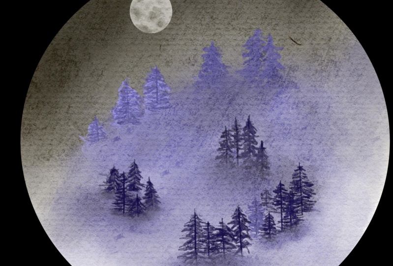
brushes in Procreate. I'll walk you step by step
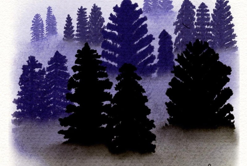
through painting a peaceful, misty forest, using
a special set of bonus brushes I've created
just for this project. These brushes will
help you achieve that layered misty
effect that gives so much depth to your
scene. But that's not all. I've also included
a bonus lesson in this class in which I'll walk you through how
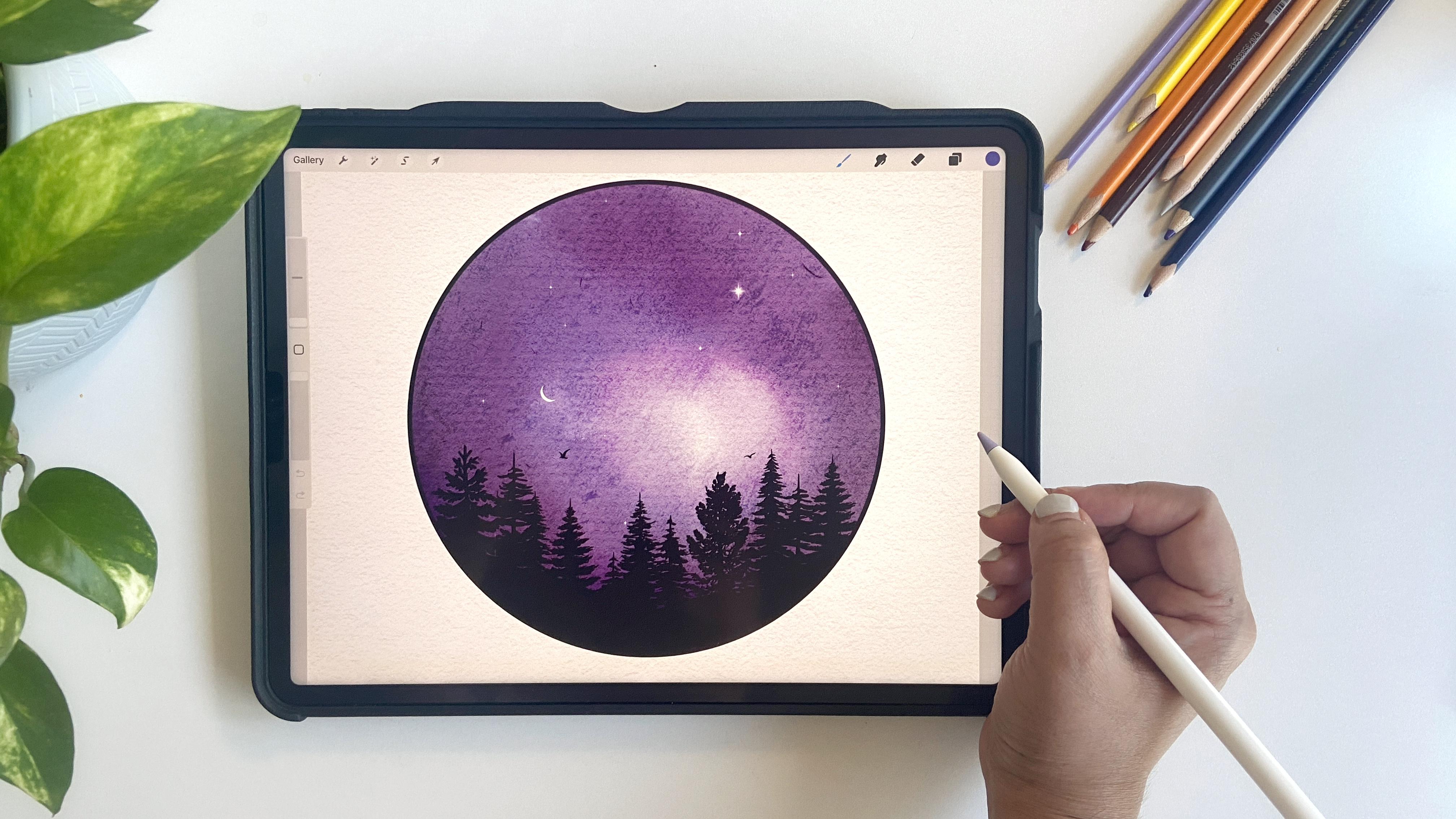
to create a beautiful, magical night scene using
my enchanted brush pack. This brush pack is
designed to make it easy for you to add
some pine trees, twinkling stars, and that
magical nighttime atmosphere. Whether you are new to
digital watercolors or you have been using
procreate for a while. This class is perfect
for anyone who's looking to capture the beauty of
nature in their artwork. You'll learn to
create not just one, but two beautiful scenes
using those brushes. By the end of the
class, you will have the confidence to bring
even more magic to life. Are you ready to
create some magic? Grab your iPad,
your Apple pencil, and let's get started.
2. Class Resources: Okay, so let's talk about the resources that
come with this class. First, you'll get a
canvas that is 10 " by 10 " at 300 DPI. This is a watercolor canvas, and as you can see, it
has a nice texture. If you go to the layers panel, you'll notice a
paper texture layer on the top and underneath that, there is a paint here layer. You don't need to touch the
paper texture layer at all. You can directly start
working on the paint layer, and then keep on adding new
layers as you progress. In case you feel that the
paper texture is too grainy, you can adjust it by
going to the group, swipe, left, to unlock it, and then play around
with the settings. You can reduce the opacity
of certain layers if needed, but personally, I
love the texture, so I won't be making
any changes here. Moving on, let's talk about the brushes included
with the class. These brushes are a part of my new enchanted
forest brush set, and you'll need all three
of these for this class. The first one is misty
background brush, which creates a foggy
and misty effect. The second one is
the blend brush. We'll use this one to soften the edges and enhance
the foggy look. And finally, there
is the Pine brush, which is a modified version of Procreate's default
little Pine brush, which I think you can find
under the drawing section. And you'll also get
three color swatches to get started
with your project. You can download
all these resources via the link in the
project section, or you can also find
the same link in the PDF that is provided
in the resources tab. Let's move on to the next lesson and see how these brushes work.
3. Brushes Overview: Now I'm going to show you
how each brush works, starting with the misty
background brush. Let's pick a blue color and set the brush
to around the size. This brush is
pressure sensitive. If you apply light pressure, you'll get very light strokes, and if you press it harder,
the strokes will darken. Like so. You can also adjust the size and opacity based on your needs. Next, we have the blend brush. I like to keep the
mist effect as is, but if you want to
soften the edges, further, you can use this
smudge tool with this brush. Select the smudge tool, pick the blend brush, and blend the areas as needed. It's very subtle,
but perfect for enhancing the cloud
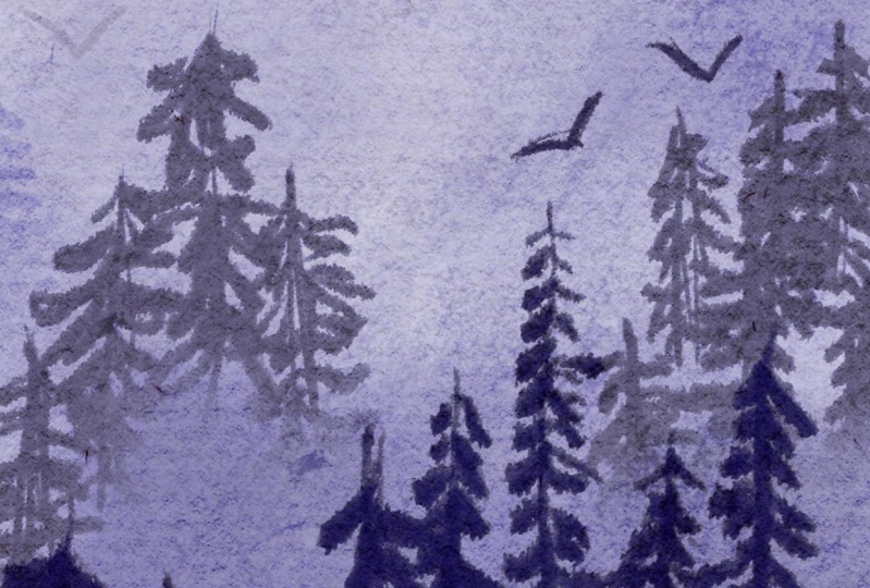
defect in our painting. Now, coming to the pine brush, this one is used to
create the pine trees. I have set the size
to around 30%, which I find works well on
this particular canvas, but feel free to adjust
it as per your needs. Now, let's see how we can paint the pine trees.
It's quite simple. We just need to understand a few basic shapes that can help in drawing
the pine trees. The first and most common shape
is a triangle, like this. Then we have another
type of tree which is more oval and with branches
mainly at the top. There is another one,
which is very dense tree, which we can make triangular, but with slightly curved
corners at the base. Lastly, we have a
thinner tree with fewer branches compared
to the others. Something like this. Now that we have got
some basic shapes, let's reduce the
opacity of this layer, and on a separate layer, practice drawing some trees. We'll start with the main trunk, making the base a little
thicker than the top. For the branches,
you can simply use random strokes like this. As I go down, you'll notice
the branches get a little bit longer toward the
bottom compared to the top. I'll just leave it here for now and let's move on
to the next tree. For this tree, I'll make the branches straighter
than in the first one. You can draw them facing
either upwards or downwards, following the shape
we sketched earlier. For the third tree, I'll
make the branches drooping downwards, somewhat like this. I think I'll just
leave it there. Finally, the last one
is a thinner tree with fewer and less
dense branches. Like so. That's how we
can draw our pine trees. Now that we are familiar
with the brushes, let's move on to our next lesson and start painting our project.
4. Misty Forest - Part 1: A right now that we have got the hang of painting the
trees and the birds. Let's move on to our project. I'm just going to clean
up the layers here since we don't need
so many right now. What I suggest is that we
start on this base layer, and as we progress, we'll keep adding new layers. I've also included some monochrome swatches
in the resources, which you can download
and start using. First, I select the
lightest tone from the swatches and using the
background misty wash brush. And before we begin, let's just check the brush size. I think we can increase it a little and then we
can start painting. Make sure you're on the
right layer and just begin by randomly making some
light strokes like this. You may not see much right now because the
color is very light, but this is just the first wash. Next, I'll create a new layer and move to the second tone. This time, I'll paint just
like the first layer, but leave the top at
a little lighter. We are going to build
up the layers and as we do the top will
remain a bit misty. That's the effect we
are aiming for here. Something like this. Now, I don't want to see
any harsh spots, so I'm going to
use blend brush to soften them slightly
using the smudge tool. Not too much, just enough
to smooth things out. Now it's time to add some trees. I'll rename the previous
layer BG one for reference, and the second one as BG two. We'll create a new layer for the trees and
rename it as trees. For the trees, we'll
start with light tones, and if you have seen misty
forests seen before, you'll notice that
the distant trees appear lighter than
the closer ones. This is the natural depth we are going to achieve
in our painting. I'll use a second color and the pine brush to
add a few trees, maybe three or four
coming down in this area. We can actually sketch a quick guide layer to plan
out where the trees will go. Something like this, making a slope to give a hint
of mountains far away. Now, I'll draw a
few vertical lines for the trees here and there, adjusting the size as needed. Don't worry about
making them perfect, since this is just a
guide layer anyways, and we are not going to use
it in our final paint thing. I'll reduce the opacity
of this guide layer for now and create a new layer
for the actual trees. We'll rename this layer again. Let's test the brush size. I think 30 seems good here. If you feel your
trees are too dark, you can always reduce your
layer opacity to lighten them. I'm going to paint
the trees using the same techniques that we learned in the previous lesson, making some shorter, and also varying the distance
between different trees. I'll add some more trees here wearing their
size and style. They don't need to be perfect. Just keep in mind, some are
closer and some are farther. Once I'm happy with
how they look, I'll blend the bottom part
to create that fogy effect. Using the blend brush again, gently smudge the
base of the trees, at just the brush
size as needed. Just enough to soften the
strokes without overdoing it. Next, I'll remove the guide
layer since we don't need it anymore and blend
it a little more. If any part looks too dark, you can always use the eraser at lower opacity
to lighten it up. With smuch tool on, I'm going to long press the eraser to select
the same brush for era. Lower the opacity. This looks good so far. Now let's add another
layer for a darker to.
5. Misty Forest - Part 2: Now it's time to add more
layers in our forest. I'm going to create
a new layer and I'm going to name it as BG
three for reference. For this layer, I'll use a
third color in the watch and apply another misty a
light layer, nothing too. And then just blend it just
like we did previously. Next I'll create a new layer for the second group of trees. Let's call it trees to. Let's see how this color
looks. It looks too dark. I'll switch to a lighter shade. To make a balanced composition, I'll mark down the tree
barks in some of the areas. Maybe some over here. And some on this side
in this portion. I think it looks good, so we'll start drawing the branches just
like we did earlier. As these trees are
closer to the viewer, so they need to look a
little larger in size. I can select and
resize them if needed, but just being careful not
to distort them too much. After that, I'll smudge the base again for
the foggy look. That's it. We'll continue
the same technique, adding one more background
layer to complete the scene. A.
6. Misty Forest - Final: Now it's time to add
a few more layers. I'll start by adding another background layer
and name it as BG four. I'll pick a darker shade using the background
misty wash brush. But this time, I'll
keep the stroke smaller since we don't want
to cover too much area here. I think it's looking
at a little too dark, so I'll lighten it up. No too. And we'll use this
much tool again to blend it. Next, let's add some trees in the middle and a
few on the sides. Actually, let's start by adding
trees on one side first. Then we can decide if
we want to add more. Let's call this layer
as trees three, and we'll use a deep almost blackish purple
shade this time. Again, going with
the pine brush. One great thing about using multiple layers is that
you can experiment, see how things look and undo
or remove layers if needed. I think this shade
looks too dark, so I'll switch to
the third swatch, or maybe a little bit
darker than this. This brush tends to appear a little darker than the others. That is why we are seeing darker tones whenever
I'm using this brush. I'll just increase the
size of the brush, not too much and start
painting the trees. I think 30 is the perfect
size for the tree. If you want to draw all your
trees on the same baseline, you can enable the
drawing guides. To do that, go to
the wrench icon, select Canvas, and then
turn on the drawing guide. You can also adjust the size to help align the trees neatly. Personally, I prefer a more
organic look in such scenes, I'm not going to use the guides, but in case if you
want, you can use them. And now it's time to
smudge the bottom. I'll use the missed
blend brush again. But this time it
will be more gentle. We don't want to
overdo the smudging. I think we can add
a few more trees, so I'll create a new layer. Use a slightly darker shade and add some more trees
in the foreground. I'm going to add two
or three more trees on the left for some balance. I think the trees look
a little tilted here, so I'm going to use the transform tool and we'll rotate it a
little like this. Now using this smudge
tool with a smaller size, I'll gently blend the
base of the trees. The final step is to
add one more layer on top using the same shade and the background
misty wash brush. I'll apply a soft
tone to this area. It looks a little messy. Let's merge that out. If you're not happy with
the placement of any part, you can always go
back to that layer, and for example, I'm not
thrilled with these trees. I'll select this layer and move them slightly
until they look better. This looks perfect. Finally,
let's add some birds. You can use the different
shades for them. I think I'm going to go with the mid tone for one bird here. For the birds, you
can simply draw some tiny V shapes just to
give a hint of them flying away in the sky like so
and make the other one a. Maybe over here. T. Our magical forest is almost done. There is just one more
thing I want to show you how you can add a
frame to your artwork. You can use a free form
selection tool for this. I'll walk you through
it step by step. If you're worried
about making mistakes, simply go ahead and duplicate the file
before you continue. To do this, go back
to the gallery, swipe left on the file,
and hit duplicate. Now, let's work on
the duplicate file. First, we need to
merge all the layers. Once that is done, let's select the free form
selection tool. And draw any shape
you would like. You can create an ellipse. You can also use a rectangle, or you can also draw a
random shape like this. After drawing the shape, just go to the feather and
increase the feather to above 15 to 16% to
get that softer edge, and then with the
three fingers swipe down and select cut and paste. Hide the original layer, and you'll see your
painting cut out in a nice beautiful
frame like this. You can use a circle
or a rectangle in a similar way to create
a frame for your sea. Now, in the upcoming lesson, I will show you how to
create a night scene starting with a circular
frame and premade stems.
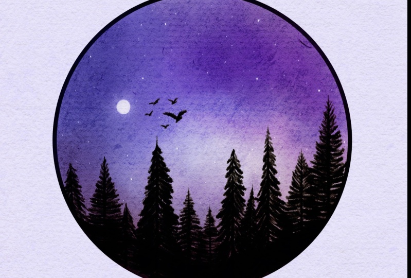
7. Bonus - Magical Night Scene: Let's create a beautiful
magical night scene together. In this lesson, I will be using the premade stamp brushes, but feel free to
draw the elements free hand just like we did
in the previous scene. If you would prefer,
you can also use the enchanted
forest brush set, which is now available
on Skillshare. You can find the link of the brush set in the
class description. Let's get started. First, create a new document and
start with the frame. You can use one of the
premade frames that come in the enchanted brush pack or draw your own using
any inking pin, I'm going to use
the technical pen here with the dark color
to draw the frame. Create a perfect circle by pressing with one
finger like this. Once you have created the frame, let's fill it with white and create a new layer above it. Then apply a clipping mask, so everything you paint
stays within the frame. Next, we'll paint the night sky using the purples and blues. I'm going to start
with a purple tone and adding it with
a misty wash brush. Then I'm going to use
a different shade. Leaving some areas intentionally
white for contrast. Let's add a dark tone on the
right for more variation. Maybe a little more purple
on the top. Like so. You can see I'm not
touching this white area just to add some
galaxy effect here. After that, I'm going to use a blend brush for subtle
transitions between the colors. Let's create another layer, and then again, apply
a clipping mask. And let's add some trees. You can resize and position
the trees however you like. I'll try to add several
different trees to create more depth and
interest in the painting. Making some larger
and some smaller. As you can see,
I'm just adjusting the size of the trees as needed, and you can also do that later. Also if you create all the stamps if you put all the stamps on
different layers, that becomes easier
in case you want to remove one tree and
replace it with another, that is also possible. And here you can
use any inking or any solid brush to fill
in this forest area. So far this looks great, let's add some
stars and the moon. For that, I've chosen a
pure white shade here. First, let's do one thing, create a new layer and
apply a clipping mask. You don't actually need
a clipping mask for the moon since it's
just one stamp, but it's okay to add it anyway. I have two moon options here. I'm going to pick the first one. And place it right here. Yeah. That looks good. Now, let's add some stars, I'll create a new layer and
apply a clipping mask again, or maybe just pull it
below the moon layer. I'm going to select the star stems and you can just temp them right
there onto the canvas. Here I'm using the largest size, and you can see we have
added some stars over here. Next, let's add one or two
individual stars for that, I'll create another layer. There are several stateps available for the stars as well. I'll pick one and
At just the size. Let's make it a
little bit smaller. This looks good. What I'll do is duplicate this star layer so we can add some
gaussian blur. I'm going to take the
bottom star layer. Make it slightly larger. And then align it with
the top star layer. Then going to the adjustment
using the gaussian blur, will add a soft glow
effect like this. If you want, you can duplicate the layer again to
intensify the globe. And that's how we create a magical night scene
within a frame. You can use any
shape whether it's a square diamond or
whatever suture design. In this brush set,
I have included a few shapes along with some silhouettes
that you can use. If you want to, you can even
add a bird to the scene. Let's pick a bird silhouette
in the blackish tone. And let's place it
here or maybe here. Let's add one more. There we go. These projects
are quick and easy to create, and they result in
beautiful scenes. You can share your work as
a PNG or any other format. And if you're interested, I have a short eight minute
class where I show you how to remove the extra backgrounds from the digital
watercolor artwork. You can check that out
if you would like. I'm really excited to
see what you create. Please do share your projects
in the project gallery. See you in my next class.
8. Final Thoughts: Thank you for taking this class. I'm really glad you
made it so far. I cannot wait to see
what you have created. Please do share your projects
in the project gallery, or if you can, you can
also share them on Instagram and tag me at
the Rate mark the shop. I will be happy to
feature your projects on social media and
in my newsletter. If you have any questions, you can leave them in the
discussion stab in the class, and I'll be happy to answer
them as soon as I can. Also, please don't forget to leave a review for the class. It really helps the class to reach more and more students. That's all for now. Keep
creating and see you next time.
 Disha Sharma, Artist & Illustrator