Transcripts
1. Intro: Hello and welcome to this tutorial where I go through the Excel pivot table. The pivot table is a useful tool for analyzing, calculating, and correlating big data. Within Excel. Tutorial, I'm going to show you a large pivot table and create a pivot table and populate the fields. I'm also going to tell you they do refresh pivot data and apply filters to a pivot table. And then I'm going to show you how to use pivot charts, insert a slicer, and so our timeline. And then lastly, I want to go through end-to-end process of how you build an interactive and dynamic pivot dashboard where you can look at trends and you can analyze big data in a very effective and very clean and concise way.
2. 1. Launching a pivot table: A pivot table is used essentially to summarize, sort, re-organize, group, and do law to kill it. Calculations on data that is stored in a table. It allows us to transform column and two rows and rows into columns. The pivot table is a useful tool for summarizing and analyzing huge databases of big data and taking, looking at macro trends and extracting information as we see fish. It was one of the most useful tools in Excel for dealing with big, big datasets. So in this tutorial, we'll look at how do we actually launch a pivot table. So in order to have a pivot table, what you need to have is underlying data. So that is a big dataset that has various fields, which is these columns here. So when we talk with fields, we mean transaction ID or a date. These columns here are all separate fields, and then here are all our values. So in this online dataset, what I have is sales data for various products that are present in column G. And I have different fields such as purchase type, sales, Daesh city, salesperson, the transaction ID. So in order to launch a pivot, one of the ways that an entrepreneur, which is a select all that data. So if I, if I go to the first column and press Control Shift and go right and press down. Now select all the data here that I want analyzed within my dataset. Then within insert, I can select pivot table. So here, because I've already selected data at that dataset is already, is already selected for my pivot table. And I can select where I want the location of the pivot table here. Then the bottom, I'm going to put this pivot table into a new sheet and then simply click OK. a new sheet opens on rename that she's Pivot Table 1. And here you can see that, well, actually no data is returned because I haven't actually designed my pivot table here. So what you initially get is this to build a report choose fields from the pivot table field list. And this here is your pivot table fields. So we launched a pivot table here. At this stage we've, this is how we've launched a pivot table.
3. 2. Building a pivot table: The next step is to design your pivot table and to build larger pivot table. And at this stage in the process, you need to ask, what question do you want answered by your pivot table analysis? In this example, here, looking at this underlying data, I want to analyze the performance of each individual salesperson. So the first thing I'm gonna do is take the field sales person. I'm going to drag that down into my rows. Here I'm returned each unique value that exists in the salesperson field. So there's eight, a different salesperson. So although we have 56 different salesperson entries into the data, only eight unique values exist, and that's why I'm get returned here. The name of each salesperson, unfortunately want to know is how much revenue did each salesperson generate? So here in a second field, I have a field called revenue and arm drive that into the values and by default, it'll return the sum of the revenue for each salesperson. On a format that I'm quite quickly know we have a picture of what a salesperson is, how they're performing and how they're selling. I'm going to add in my add one, add something about how many units they sold. So that's the quantity field here. I'm going to add the quantity field here as well. And so straight away now I have the quantity of units sold and the revenue. But I want my 11 know what products they did each cell. So again, I'm going to bring this into rows and I'm going to put that on there, the salesperson. So here we can collapse and expand these by pressing these plus and minus icons in the left column. So if we collapse all of these, I can straight away see here. Or if I look at Katie Walsh, I can look at it, press this option, I can see the total revenue should generate ICSI, the quantity she set of products is old. But now we can also see the different products will have an even more microanalysis. I can see as you sold one hundred and eighty, one hundred and one hundred and eighty nine items, for example. So quite quickly and quite easily, the pivot table has allowed us to get significant insight and draw significant conclusions from this huge dataset.
4. 3. Refreshing a pivot table : So one thing you need to be mindful about, blown using a pivot table is refreshing our underlying data. So what we mean by that is what happens if the data that is behind your pivot table gets updated? So let's look at this current lesion. If it's Patrick said 416, sum of quantity sold, that's the soma for our units that she is old. But if we look at our data and machine eighth is Patrick, we update some are for quantity values here. 200. Intuitively, we can tell electron aids was patriotic. Sum of Quantity should change. But when I flip back to my pivot table, name is Patrick still read 416. So our pivot table hasn't has not updated. In order to refresh our data, we have to right-click and we need to select Refresh. I'd only after we select Refresh, where we've refreshed our pivot table. Will the actual data be updated in our pivot table to reflect the latest sum of quantity sold in the underlying pivot data. So it's very important. Anytime you update or add to your online data, it's very important not to forget to refresh your pivot data.
5. 4 Filtering a pivot table: We can filter data similar to how we would normally filter data by using this drop-down at the top. And we can exclude and various factors within it. In addition to the ash, we can add a filter in the pivot table fields menu here. So I can add a filter here. If I want to filter by city, I can add up filtered air. And is filter appears here at the top. And I can easily filter my PivotTable that way.
6. 5. Reviewing underling data: A handy trick with PivotTables is by double-clicking on the value that we want to check. We can generate a report with the underlying data from it. So here we have Katie watches, 2641, revenue sum. If I wanted to see what data was underlying dass, das value, I can double-click on this and that value. And in a new tab, this will generate a, a report with all the values that were import into my pivot table. So this is essentially an abstract of this data here. Dash was then put into the pivot table here, and then by double-clicking it, I got these values here. So it is quickly when I want to analyze the actual underlying data, offers specific value. My pivot table, by double-clicking on the value, I'm able to generate this report.
7. 6. Pivot Charts: So now that we have our pivot table ready and we have field's selected. We may want to represent some of this information in chart form. And wanted a very handy tools that exist within pivot table and its pivot chart. So we can generate this chart in our PivotTable Analysis tab. And by selecting pivot chart, then this menu will appear. And it will give us the option of selecting what type of chart we want to pick. So if we are, say we want to pick a pie chart, this will automatically insert here. So here I have a chart that represents all of the values by salesperson. So each of these values represents a, represents wanted to salespeople. And as I look at my pivot table, and as I filter my pivot table here, discharge will automatically update. So if I filter my pivot table and I felt that are in Jewish Michael's miss. I'll get just Michael's manage. Likewise, if I filter just all of thing. So as you update your PivotTable here, your this pivot chart is pivot pie chart will automatically update. And we can and we can also filter in the actual chart itself. So under here I salesperson, I can go I can select dish, the salespeople I want returned, or I can select just the sales byproducts. So I can say I just want to know how many markers each each salesperson sold. Again, this will just filter ID information and, and just wishful derived information. And British bring it diets, just bringing in the product that we specified here. So, so again, and we can have multiple charts at the same time, so we can insert a. So again, we can add a tag.
8. 7. Slicers: Pivot table allows us to insert a slicer. And what that slicer does is it's a handy mechanism for navigating and controlling your pivot tables query. So how do we generate in a slicer is in PivotTable Analysis. There's the opsin option to Insert Slicer. And here we can select by which field we want the slicer to be broken down by. So I wanted to certain and in a slicer, which, which is done by the city of each sale. So I insert a slicer and here I get a list of all the various cities that sales took place in. What is laser is is effectively a button whereby I can select and see all the sales dawn in a particular city. And I can do a byproduct, I can do by and person. And as I click it true, I can quickly update my pivot, which will in turn update my pivot chart. And I can see a breakdown of the sales by city. So it's a very effective way of navigating through your pillage query and generating reports as you see fit.
9. 8. Timelines: Another tool which we can use to quickly filter and analyze information is the insert timeline option. So within pivot table analysis and alertness filter section, we have the option to insert timeline and what Apple generates. So when I do that for here we have an ordered a in the same state, so it'll take automatically detect dates. And I'm going to select sales aid. And what that does is generate this timeline box, which will allow us to analyze when sales are made on a specific day. So if I click on toward a match, my pivot table will automatically update to the sales made on the torta match. Like why do I like the sixth March? It'll automatically update. So that's a very handy tool to use when you want to quickly toggle through the days and get the, get data relevant to a specific date.
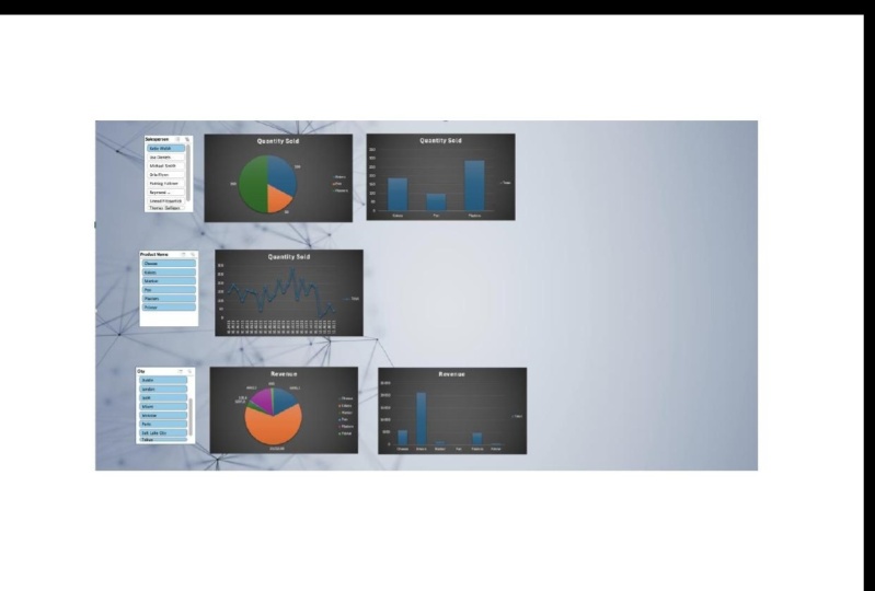
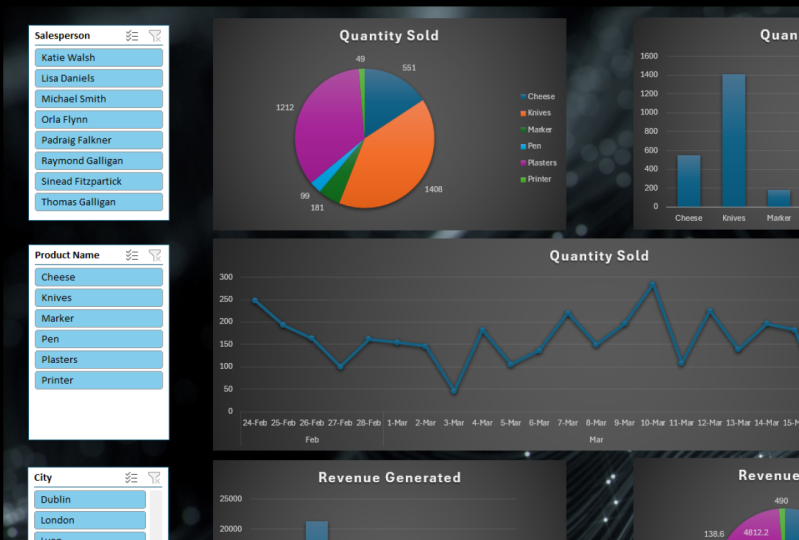
10. 9. Build a dashboard Pt1: So now under tutorial, I want to bring together all these skills and I want to create interactive and insightful dashboard that easily allows us to assess the data information here. So we're gonna do this from start to finish. So we have the same dataset we've been walking over here. And I'm going to, first of all, in certainly pivot table in a new, in a new tab. So I'm gonna serve as a pivot table. I'm going to select my data here, my underlying data, and I get my pivot table. I'm also going to add another tab which is called dashboard. And here's where we're going to include a series of interactive charts and tables that will allow us to analyze that data and, and update it with filters and slicers and quickly allow us to do analysis of that data. So because I'm doing this, because I want a really interactive and modern-looking dashboard. Or for steel much you can do is insert a picture which will act as the background for my dashboard. So I'm going to go to Insert and then just like stock images. And I'm going to just pick something that's not too noisy and doesn't take away from my chart. A Bosch adds a bit of and adds a bit is cham to the dashboard. So please look like something along the lines of this. Now too noisy. And I'll just spread that out or over the main picture to dashboard. So they'll act as the background to our dashboard. So I want to include a series. What do so now I have to ask is I will go, what do we want to tell me dashboard? So the first thing I want to analyze in this analysis is I want an interactive chart that breaks down the products sold by salesperson. So I wanted to know the units sold. So my value here is the quantity, quantity sold. And I want it broken down by product, some slack and product name and my rows and disk it will give me, this will give me the pivot down by use to generate that chart. So with this pivot table, I'm going to generate a pivot chart by selecting pivot chart for Pivot Chart Analysis. Our PivotChart Analyze and select Pivot Chart. And the first thing I want to with a pie chart, and I'm going to insert this. And I want to remove these in order to clean up chart. I want to hide all buttons on chart. I don't want to give it a title, so this is quantity sold. I also want to know what are the actual labels here to tell me what the sales are included on the chat, I'm going to click on this Add icon here. And I want Data Labels Ornish. And, and I'll corners both those outside the end to keep it looking clean. And again, that chart there are locked point a basic so I'm just going to pull it with a slightly more modern design. So just with the hash there. And then I also want a bar chart to support this. So I want to visuals, I want this pie chart and I want a, I want a bar chart I'm going to add and I'm going to select my pivot table. And I'm going to add another pivot chart, which will be which will be my columns clustered column chart here. And again, I don't want those few buttons included. And I want to give us a tie also quantity sold. And here I have the quantity sold analog of that. In order to design for learning, is that the same as a similar design to what I had? And here we have the quantity sold, a broken but product. But what I wanna do my analysis by sales person. So what I'm going to use is the slicer to do dash. So what I have here is in my pivot table analysis section, I'm going to Insert Slicer. And the slicer will be based on salesperson. And let me finish. And here I have a Slicer where I can select all my data and instantly my visuals will be updated when I select the parson. So that's going to represent the first line of my chat, my dashboard. So one, bring these chats, I'm just going to copy them. Control C control V, copy and paste the straight into my, my dashboard and get us the four-step my dashboard.
11. 10. Build a dashboard Pt2: So we want, want to add some additional additional graphs and parameters into our dashboard. So in addition to this, I'm going to add a graph that shows me the trend line of sales by date. So I'll do that. I'm going to move or copy my current pivot table tab. And I'll create a copy of this at the end of the, I end up this worksheet. I'll call it pivot table. And I want to update, I wanted broken down by date. I want to look up products sold by date. So I have to update my pivot table with the show fee it by selecting Show Field List, I want to update my pivot table. I'm going to take out the product name because that's what's going to be my slicer later on. I'm going to add in the sales day in my row. I'm going to delete this slicer. And I'm going to insert a slicer based on the product name. And I'm going to delete these graphs. These are the owner graphs. And this one I want is a line graph detailing the products sold by the data are so long. So I'm gonna go to Pivot Chart, Analyze. And I'm going to go insert pivot chart and line chart. And I'll put this in next to my slicer. Again, I want to hide all buttons on chat and one of the two quantities. And again, I'm going to update this then this format I want to format it is cherished. I want it to be slightly slicker design, so we'll go with this. I'm going to select both and I'm going to bring those into my dashboard. And it will pop these, the end here. I'm going to draw it. Cannot discipline. And I'll stretch this one out. And again, you see here, I can easily see the trend line of each product being sold and what the quantity is. So this allows me to identify trends in sales and more product or seven and again, reminder dash, whenever you want to go back to not specifying from your product is clear or filter. And that updates.
12. 11. Build a dashboard Pt3: And I want to include so this is the dashboard as is, and no one include some geographical data on it also. So want equivalent of this product sold. The derivative of this data appear at the top, but I want it broken down by city and instead we're trying to quantity. I also want to return, I want to return to revenue generated as opposed to the quantity of units sold. So again, I want to make a copy of my pivot. So I'm going to do that by just copying the tab with the pivot. Great that Gabi. And then I am updating this to update in the fields, but it might diverge. So I'm going to show Field List. I am taking it the quantity instead, I want the revenue as my value. And I said, I don't want the sale stage here. I want the product name included in here. I want to take a boat, this a chart and this slicer. And I want to insert another pivot chart. And I want a pie chart. And doing the normal height all buttons on a chart. I want to specify here that it is revenue, January it and I want it to match, I want the format to match my previous what's already in the dashboard. And I want data labels included. So here you can see the revenue generated. And I want to also want a bar chart in here as well. So I'm going to PivotChart Analyze. I'm Zach, my PivotTable, I'm going to pivot chart analyze and I'm including pivot chart. And I want a column chart, clustered column chart here. Potent that in next to us. Hide all bones. Update the title, update the design. So design. And here, cause I want analyte by geographical location. The slicer that I include is the slicer for my slicer that includes city. So I'm going to pivot chart, analyze, Insert Slicer, and the slicer I'm selecting is city. And here I have a, I can then analyze my revenue quickly based on the City's. So I want to go ahead and drag this in to my dashboard control C, control V. Drag this down here to the bottom. And then we have a very dynamic and I sub chart that will include quantity sold for salesperson and see a trend line here. Based on each product. We can look at the sales per geographic location. And based on each product.
13. 12. Outro: And that concludes this course on the Excel pivot table. Hopefully you've learned a couple of things about the uses and benefits that it has. Pivottable is a very useful tool and it's helped me a lot of my career and I'm sure they'll help you and yours. I've, to consolidate your learning. I've included the data, the underlying data that was used for these tutorials, what I would recommend is maybe downloading that dataset and try and add these techniques with the pivot table for yourself and try and consolidate your earnings alley. Thanks a million for taking this tutorial. And if you'd like to leave a review or check out any of my other classes, please feel free to do so. Thanks.
 MS Excel Skills, Microsoft Excel Skills by Michael Smith