Transcripts
1. Course Structure and Outline: Hi everyone, and
welcome to the course. Microsoft Excel, learn
pivot tables in 30 minutes. For those who don't know me, I have more than 20 years
of experience in teaching. I'm a founder of the pro
coding Education Center. Additionally, I'm a
professor at University where I teach students
programming and data science. Excel is one of the
subjects I teach there. In this class, you will learn
all that is required to make use of pivot tables
and pivot charts in Excel. The knowledge you
gained in this course will give you a
competitive advantage in the job's marketplace and skyrocket your
personal development. This course, you will learn to create and manipulate
Excel pivot tables. Apply value filters to get different data insights to group values and
Excel pivot tables. To use calculated fields and
items to summarize values. To build pivot charts. To insert slicers and create dynamic dashboards to find different trends in data that can help you
in decision-making. To apply different styles to your pivot tables and to
adjust pivot table layouts. The materials are hands-on demos and are made to keep
you engaged with downloadable workbooks
that you can use to explore and learn
at your own pace. Working along with me, it will help you
reinforce key concepts, the skills you gained
through the course. We'll take your analytical
skills to the next level. This course is not
an introduction to Excel and is not suited
for absolute beginners. This course is right for you. If you already have some
experience with Excel, you would like to master
the most powerful tool, Excel pivot tables. Let me know if you
have any questions and if you want to
learn more about Excel, follow me so you'll be the first to hear about
my new classes. Thank you and I'll
see you next time.
2. Before We Start: Before we start with
the masterclass, I have a few important
things to share with you. In this course. I'm using
Excel version 2016. What does that mean? Well, if you're using the
same version, you're fine. But if you have
some other version, what you see on
your screen may not match exactly what I'm
showing you, my computer. Some features may
not be available, especially if
you're working with the previous version of Excel. The second thing, this
course is made for PC users. If you're a Mac user, you can also apply all the key concepts that I covered here. But keep in mind that the
pivot table interface varies across platforms. The third thing, all
the exercise files I'm using in this course can be found in the resources section. I advise you to use them and practice while you're
listening to these lectures. The last thing, if I'm
going too fast for you, you can slow the video
down to half speed. Just find the icon in
the bottom left corner. One X is the actual normal
speed of the lecture. If you put it to 0.5,
it's half speed. On the other hand, if you want to move a
little bit faster, you can also speed it
up by moving at faster. You can put 1.25 here and so on.
3. What Are Pivot Tables?: In this masterclass,
you'll master one of the most powerful tools in
microsoft Excel, pivot tables. What can we do with PivotTables? Pivottables allow us
to quickly summarize data located and
arrange or in a table. You can't make pivot tables
from all kinds of tables. The table must
contain fields with a limited number of
different values. Let's jump to an example. Take a look at this
sheet with sales data. You have column headers
along the top, like year, month, product, salesperson,
country, and so on. Down under you have
rows of records. With this data, you can
do many different things. When you make an order, you
can enter a new record. Or if you want to
change in order, you can edit an existing one
or deleted if you want to. But if you want to find
out how much money you've generated in each country
on a specific month, or who is your best salesperson
for a specific month. You can't easily get this information from
an ordinary table. This information is hidden
somewhere in this data, but without using pivot tables, it is gonna be hard to get. This is the case when
we use pivot tables. Now, I'll pause the
recording and do some magic. What you see now
is an example of a pivot table received
from this data. The great thing about pivot
tables is that you can change your layout in a second and choose other data
to be summarized. In the next lectures,
I will show you all the magic I used.
We'll see you there.
4. How to Create Pivot Tables in Excel?: Now I will show you the magic I use to create the
previous pivot table. It's not complicated at all. You just need a few
clicks and that's it. Let's get started. The first thing in most
time-consuming one is to decide what you want to summarize
within the pivot table. Do you want to see the
revenues by year or by month? Do you want to break it down by salesperson or
maybe by a country? When you decide what
you want to show, then comes the easier part. In the first step, I will use this range and
formatted as a table. It's an easy thing to do. Just click on any
cell in this range, choose the Home tab. And in the style section, click on the option
Format as Table. Choose the style you like. You can select the range
where your data is. In our case, the range for
our table is from A4 to A320. Our table does contain headers, so this needs to be checked. The first step is done. Your range became a table. If you want to see the name of your table, you can
do it this way. Click on the Design tab and
in the properties group, you can see table name. The name of our
table is table one. We can change its
name to yearly sales. Don't use spaces in
the table name and don't forget to save the
file after you named it. Now we can create a pivot table. Again, click anywhere inside our table and choose
the Insert tab. Here you can choose one
of the two options, recommend pivot tables
and pivot table. If you choose
Recommended PivotTables, you can select one predefined
pivot table from here. And it's all done. Personally, I don't
find them very usable. So let's choose
the other option. This option pivot table is more interesting and more
customizable. Let's click on it. A new window opens. First, we have to select
where our data is. We will choose the
table we have just created a named Yearly Sales. Second, we have to choose the location for
our pivot table. You can put it on the same
sheet, but it can be messy. So I will choose a
new worksheet option. I will leave this field, add this data to the
data model unchecked, and after that I'll hit
Okay. What has happened? First, Excel has created a new sheet for us
minus called xi2. Second, look at the
top of the screen. You will have additional tools
here, pivot table tools. And third, I have some parts of my pivot table
on the left side, one on the right side, I have a window
where I can choose different fields
for my pivot table. Do you recognize these fields? These fields are the
column names of my table, year, month, product
salesperson, and so on. Now we'll use these
fields and place them into one of these
four sections below, you have the following sections. Filter columns,
rows, and values. Here's an interesting thing. If you click on a numeric field, it will be added to
the value section. If you click on
some other field, excel will try to guess in which section to put that field. It's great and very helpful, but I prefer to have
complete control of where my fields should be. So let's uncheck all of them. If we want to see
revenue for each month, we can simply place
the month field and the row section and then drag revenue and drop
it into the values section. Now I've got revenue
broken by months. Congratulations, you have
created your first pivot table.
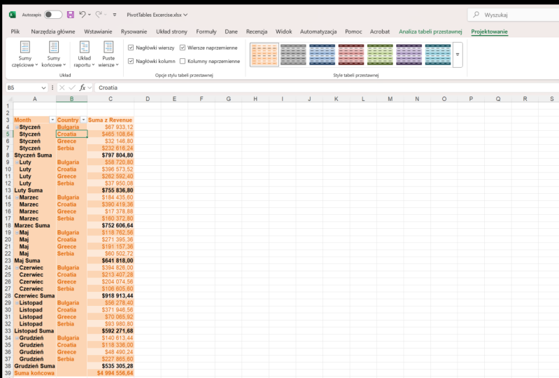
5. More About Creating Pivot Tables: We have created our
first pivot table in the previous lecture. Here it is. Here we have our nicely
created pivot table that shows revenue
broken by months. What if we want to change it? Let's say we want
to add products. What should we do? It's very easy. We'll do the following. If the pivot table field
window has disappeared, I can make it appear again. I will right-click
on any field in the pivot table and choose
Show Field List option. In pivot table
fields window will be shown on the right
side of the screen. Now, we can choose a
product and place it in the column section. And
look at the result. We got a nice summary of these 300 and more records just by dragging and
dropping one field. It's amazing. Was
it complicated? Not at all. The most complicated part is deciding what you
want to display. That's how you can change
the data you want to show. But what if you want to change
some part of this report? Let's say that you want to
hide these grand totals here. You can do it this way. Open the Design tab
and open grand totals. If you want to hide grand
totals from rows and columns, you can choose the option
off for rows and columns. If you want to return them back, you can click on, on
for rows and columns. What if you want to
change subtotals? You can click here and
decide if you want to show subtotals and where
do you want to show them? Now, let's imagine you're at a meeting and you are presenting the data from this pivot table, revenue broken by
products and months. The person who we're talking
to is interested to see total revenue broken down
by countries and by month. What should you do? Your first uncheck the products, find country, and put it
down to the column section. And you have another report. Great. Using pivot tables, you can dynamically show any
summary you can imagine. It will take you only
a few seconds to do so. Isn't that great? Imagine that you
don't know how to use the pivot table and you are presenting the data
from a regular table. And the person asked to see information broken
by some other field, would that be possible
to do in a second? The answer is obvious. That's the reason you are
learning PivotTables. Now, try this by yourself. Experiment with fields, see what you can get when you put
fields in a different section, gain some confidence here, and I'll see you in
the next lecture.
6. Group Data in Pivot Table: I hope that you've
played with pivot tables a little bit and that you've learned how you can
create different pivot tables. In this lecture, we will do the grouping of
pivot table data. Let's begin. Let's look
at our pivot table. We have the month which is
placed in the row section, and revenue is in
the value section. I'll get rid of
the country here. I wanted to do the following. I want to group months
in different quarters. January, February, and March
will represent one group, may and June another one November and December
will be in their group. Someone's are missing,
but it doesn't matter. This is just some fake
data for the exercise. I will select months that should belong to
the first group. Those are January,
February, and March. I will click on the Analyze tab. You can find the group section. Here you have the
following group selection. This we will use
to create groups. Then if you want to
remove the groups, you have the Ungroup option. The third option is not
available to us right now. It is available to date fields. Months are not date fields. Dates must contain
day and year two. I was like January, February, and March, and click on the first option,
group selection. Now I have one group for
my first three months. Before the group name, you have the little minus sign here. If you click on it,
the minus changes to the plus sign and you
don't see details anymore. You can then click
on the plus sign to expand it to see the
details and so on. Look again at those groups. We have one group for these three months in each other month represents
a different group. Now I will select the months that belonged to
the second group. Select them. Click on the Group
Selection again. I will do that for
the third group. Now, look at the
names of my groups. I don't like them. How
can I change them? I would like to call the
first one quarter one, the second quarter two, and the third quarter for. You can click on the first group and you can go to a formula bar. There. You can write a new
name for it, quarter one. You can do the same
for the second group and write the name quarter two. For the third. Let's change
the name to quarter for now. Let's see The great thing
related to printing. If you have the last quarter extended and the other
quarters collapsed, it will be printed the same
way you see it in the report. That's really, really great. Notice one more thing. Look at the row section. You'll see another
month inside it. That additional month represents the groups we have just created. And we've reached the
end of this lecture. See you in the next one.
7. How to Format Data in Pivot Table?: We've created a pivot table and learned how to group
pivot table data. In this lecture, we'll
see how to format it. We will work on the
same pivot table we created in the
previous lecture. I'll put the product
field and the columns, salesperson and country
and the row section, country is under salesperson and the revenue field is
in the value section. Now, look at the
numbers in our table. They represent currencies and they are not properly formatted. We can format those numbers
in two different ways. The first one is the
not-so-good one, and the second one
is the right one. Let's first see the
not-so-good One. We can simply select
all the cells with numbers that we want
to format differently. We can go to the Home
tab in the number group, find the formatting we want
to apply here, and that's it. This way, we are applying formatting to the
previously specified cells, and it works in most cases. But if you modify your pivot table and the number of rows
or columns changes. In some cases, the
new formatting won't be applied
to the new cells. That's the reason why
this is not so good. The other way to format data
in the pivot table is this. Let's first change our
pivot table a little bit. Let's remove salesperson and country and add the
month to the rose. Now let's go to
the value section. Here we have the sum of revenue. Let's click on it. Now we have a new window
with different options. The one we need right now is this one value of
field settings. In this window, we can change
the name of the field, how to summarize the value. And below we have
a number format. Click on the number format. Now you can put the
currency marker here, the number of decimal places, the symbol you're going to use, and the way you can
display negative values. Now you can hit OK twice, and now your data is
properly formatted. Now you have learned
how to format data in the Excel PivotTable.
See the next lecture.
8. Calculations in Pivot Table: In this class, I will show different calculations you
can do with PivotTables. Let's move month to the rows and revenue to the
value section. We have some numbers
and what Excel does with the numbers
is to sum them. Here you can see what
if we don't want it? What if we want to have
the average values? Will go to the value section. Click on the sum of revenue and click on the Value
Field Settings. Here I can choose
average instead of sum. Instead of a sum. And average value will be shown. If you want to have
both averages and SMS, you can add additional
revenue to the value section. Now you have both the
averages and the SMS. Nice and easy. The next lecture, I will show you
some cool tricks. Can't wait to share
them with you.
9. How to Find Data Trends Using Pivot Tables?: As I promised, here are two
cool tricks you can use. Let's say we have the
following problem. We want to check out what's
going on with our revenue. Does it increase or
decrease over time? How can pivot tables help us? Here comes a solution. Let's start with
this pivot table. Here we have month in the rows, revenue and the values. Let's add another
revenue to the values. Click on the second revenue and click on the
Value Field Settings. Now, select the other tab. Show Value As and see
what we can find here. Click on the drop-down list, Show Values As and find
percentage difference from base field is month. That's clear. But here in the second box where we have a few different options, we can choose for our base item to be some particular month, or the previous or
the next month. If we choose, let's
say February, we will compare all other
months with this one. Here in this example, let's use the previous month. After that we'll hit Okay. Now we can see the revenue
trend over the months. Our data shows that we had bigger revenue in January
than in February. Then February was better
than January, etc. Now comes up the question. If you examine the data, you can notice a very big
change between May and June. Now let's say that you
are interested to get more details what has
happened in June. You can find it out easily. You just have to drill down. You can double-click on June and a new sheet with a new
table will be generated. This table will contain
all the data that makes up the value we have
just clicked on it. We'll get all the data related
to June, and that's great. Here's another cool example
where this can be useful. Let's add salesperson
to the rows. Here's what our pivot
table looks like. Now, let's say that every salesperson can
see his or her own data. But it's not allowed to see
the data related to others. If you want to see the data
for January for Tom Smith, you can just click here and you'll get the new
sheet with his data. You can send the
support to Tom Smith. Very fast and easy. I hope you liked
these two tricks. In the next lecture,
you will see how to create pivot charts. I'm so excited to see you there.
10. How to Create Pivot Charts?: First, we'll remove
salesperson from here. Now, let's start
with this lecture. If you want to
create pivot charts, you can do it in
the following way. Click anywhere in your
pivot charts table. Then under the Insert tab, find pivot charts
and click on it. I can use any of these. Now I will select a clustered
column and click Okay. That's it. We've created our pivot chart
based on the pivot table. Let's further examine
what we have here. We've got months on the x-axis
and revenue on the y-axis. Here's another great
thing about pivot tables. If I change something
on the pivot chart, my pivot table will be automatically updated
and vice versa. Let's see. Here you can see that we
have this red sum of revenue to it comes from
these values here. If we get rid of it, everything will be automatically updated. You can try to update
the pivot table. Let's add product to the rows. The chart automatically
updates isn't a great, very easy and very useful. Here it is our
first pivot chart. I'm proud of me that
you've come this far. I can't wait to see you
in the next lecture.
11. How to Filter Data?: And finally, it's time
to filter our data. I will show you two
different ways to do that. You may have noticed
this section filters. We have never used it before. Now is the right time to do it. Let's first add
product to the filter. What has happened? Our pivot table has changed. We have the filter field here. Here, we can choose how
to filter our data. If I choose this product, euro cream, only the data-related to Euro
cream will be shown. Now I can get rid of the filter. Instead of one, I can
select multiple items, for example, Euro cream
and menthol sweets. Now you can see the
values in the pivot table and then the pivot chart
have automatically changed. I can do the same
thing on my charts. I can add the third
value here on the chart. And again, the
result was the same. Pivot table and pivot
chart are updated again. Great. That was the first way
to filter our data. Now I will show you the second
way to filter our data. We'll do it using slicers. Slicers are interactive
dashboard like elements used to Filter
Pivot Table results. I'll remove the
previously added filter. Now click anywhere in your pivot table and choose
the PivotTable Analyze tab. In the filter group.
Find Insert Slicer. This will open the
filter slicer window. Here you can select
the fields you want. I will select a year
and click Okay. Now you'll get your
slicer with a filter. You can move it anywhere and do different
cool stuff with it. If you click on the year 2019, it will show the data for
that particular year. If I select the year 2020, the data related to this
year will be shown, etc. Again, not only pivot table but also pivot chart
will be updated. If I want to select two years, I can do it using
the Control button. Using the Control button, I can add the third
year as well. You can add additional slicers. I'll choose analyze. Then Insert Slicer, and choose a field
that is not a year. Let's add a product
for example and hit. Okay. Now you have two slicers and
you can combine two of them. You can choose a product, let's say euro cream. For a year. I can choose 20192020, order to remove one of the
years and play with it. That's it. You learn to filter the data. Great.
12. What is Analyze Tab Used for?: Let's see what else we
can do with pivot tables. First, I will show you how to easily remove all the filters. Right now we have filters here for the year
and for the product. If I want to get rid of
all the filters instantly, I have to open the analyze
tab and in the actions group, I will choose Clear,
then clear filters. Now my filters are gone. As you can see. What if I want to move my
pivot table elsewhere? I have to do the following. First, I will select the table. I will click somewhere
on the table, and then on the select option, I can select sum of its parts
or the entire pivot table. Here I will choose
entire pivot table and select the other
option, move pivot table. I will click here and
choose a new location. I can use new worksheet
or the existing one. I'll select New
Worksheet and hit Okay, Then the result, I will have the new sheet
with my pivot table. As we use the option move, our pivot table will disappear from the
previous location. And that's it. You've learned
how to quickly get rid of filters and how to move your PivotTable. See you
in the next lecture.
13. How to Design Pivot Table?: In this lecture, I
will show you how to change the design
of our table. I will click somewhere
in the pivot table, select the design tab, and select the style I like.
I will select this one. You can select the
one that you like. What I find useful is to check
this Banded Rows option. As a result, I will have
every second row highlighted, which makes them easier to read. The last thing I'm gonna
show you is a report layout. If I click on the
reports layout, I can choose one
of these layouts. Compact, outline, tabular. If I want to repeat
all item labels, I will choose this option. If I want to remove it, I will use do not
repeat item labels. And that's it. That's all for this masterclass. I would like to congratulate
you on completing it. You made it to the
end and I'm sure you learned a lot and I hope
that you enjoyed it. I'll see you in
some other course.
 Dr Ana Uzelac, Associate Professor at Belgrade University