Transcripts
1. Introduction: Many of us want to greed without any pressure
on transplant, what are unable to do so as
we are unaware of the start, even if the stock, we are not sure how we get
enjoyed the whole process. So this is the class for you
where you are going to not only enjoy the process of
painting with watercolors, but also work with only a
few sheets in everything. Hi guys, I am ready biomass than August instructor
mothers to share P tilde bracket one or o53 buses where we not only manufacturing,
I mean sketchbook, I press briefings,
brush roles and much more by also
have options of participating in workshops
or lifetime answers to these classes to
cross on www.phi.com, we start by preparing our
people for heavy washes. Then next is knowing more about Carlos and testing
them on the paper, as well as making
the sheets in case not available with the
colors. We already know. A quick practice exercise followed by stepwise
final painting. All the paintings that you are doing along with
me is real time, hence can be followed along. In total, we're going to paint 14 days with an upload
every alternate days so that you can get the
perfect amount of time as well as arrest
for the next painting. We're going to cover various subjects over the
next 14 days, like mist, animals, sunset, clouds,
landscape pints, calm water reflections,
et cetera. Intention is to not
only unwind the stress, but also a lot of options. Kingdoms of single shape
to shape three shape, or using only on
limited palette to create many beautiful paintings. As you can think of. If you want to relax today, come and join me in
the next session from where the stock-out with
thyroid detailing of the class.
2. Framework: We start out by understanding how to
prepare your people ask, this class is going to be
all about your heavy washes. Basic techniques. I'm moving on to the
final practice exercises. The class overall is going
to run for Adobe PDF. Or if he ordinate D, I'm going to upload
one cactus session. And the final weight, the idea of the class is
not to bombard you with lots and lots of gallows,
brushes, things, etc. It's only about just
enjoying the process. Focusing on the goods of water. Carlos, I'm partnering
with this beautiful me.
3. Materials Required: It's time to discuss
all the materials that we need for completing
all these paintings. The first is a tissue, is I always say in Watercolors, tissues in your best friends. So keep or all of tissue handy. You can also have any kind
of cloth or tissue for yourself which is reusable
as well as you can wash it. Then is our palette. I usually have a small
palette like this, or I may have another palette where there
are five to six wells that some good enough for all of our paintings as we are going to paint with
a limited palette, which means two to three
shades that we are going to consider for each of the paintings or even
lower than that. Hence, this kind of like oh, six or seven wells palette
is great. About Colors. Yes, I have a lot of colors
as well as I have tubes. Now, usually Colors
come Into way oneness in gigs like bees and
another in tubes like this. So you can have either
these kind of cubes or you can have gates which you can
be used for your paintings. Brushes. Of course, you can see all lot of brushes
along with me. Though one is 1.5 inch
of your wash brush. This is very, very important and there's the most
important one till now. Then there's a size
for the Vinci brush. Again, a very important brush. The Da Vinci Castle
Nao mop brush. Very important, Russia. Okay. This is the Vinci brush. Again, this is an important one that we are going to use
for all our paintings. These are kind of
optional brushes. I must say only one thin
brushes. Good to go. So you can have all
of these That's great enough in case you are not very confident using the tip of these
kinds of brushes. As we are always not sure that we will get a
great outcome or not. Hence, some ideas, keeping a thin brush buyer's
side is helpful. Two jars of water, one for washing your brushes
and another press supply. I will have one pencil and
then I will have small eraser. Any kind of reserves, good. So keep any eraser. Oh, Ph Martin's
bleed proof white. This is optional again, I had to pay a whitespace. The for that reason
I've kept it orals. You can even mosque and
so you can either use a masking fluid or you can
use white paint like this. You can also use white quash. The most important
of all is our paper. Now, many of you are using
only arches, 300 GSM. But I got a great
option some time back. It was Nano people, 100 per cent vector, a big gun, gelatin free. So many of you do like to only go for these
kinds of paper. And hence, I just
thought to give you a good insight into it, it is 300 GSM, 100% cotton mold made, as well as its IPO size. So whenever you cut
the paper into half, you'll get a size like this. You just need to use the same size or you can
cut it even a bit more. But I guess A5 size is the most ideal size that
I love to go head width. As you can experiment a
lot with a five sets. That's from the
perspective of the paper. I am keeping one of
these bachelor's handy. I sometimes need
to just pull off the paper from the acrylic
board that I have. Now, why is this
acrylic board here? Okay, the acrylic
board is helpful and sticking the
paper to the surface. You can also keep
a scale by oocyte because keeping a scale handy gives you all leaves you with lot more opportunities and
helps you in the painting. Would go ahead and have
or trimmer for my sites. It helps me to just
round off my paintings. You can see how I did
round off my corners. Once your paper is dry, I usually eat out
of the corners. I go ahead and rounded off
with the help of this tremor. You can have this orals evenly, but it's just an option that
you can go ahead with. Okay. If you want to use
them as postcards, you can also do it
on postcard size. People. I would leave
that up to you. But for me this is a good size. And see you in the next lesson, we are going to deep dive
a bit Into, are taking
4. Basic Techniques: I am pretty sure that most of you know the
basic postulates, which is like a flat wash. We are going to do right now. One of the sheets, which
is mine, bright blue. You can use any shape for this. I usually do cross swatch. This is one of the most important aspects
for our first painting, as well as on multiple paintings that we're going to
do in this class. This would come to your argues. Though we tend to ignore this part and most of
us are third party. This is very important
in case you were starting out with your
watercolor journey. The whole class as well, pump meditating
with watercolors, which means even
the smallest step, like just applying your colors to your people by using a brush, is an important step. Because this is all about
process and progress. It's not about achieving
your final results. Hence, continued with
this crossmatch, move your paper a bit, you're in there and you
will get an even wash. Let us eat this to
try out now and move to our next top part. Here, we're going to
create a gradient. The gradient will be created
with the help of water. So we're going to
use two colors. That is blue, orange, green. Blue is towards the top, which is my lighter value, as I always say. And then here's my forest green, which is my darker value. And I would be
applying it towards the bottom only with
the help of water. I mean, mixing it in the
middle and let it flow. The colors will flow into each other and give us a
beautiful turquoise. I have also explained this in our next TO practice exercise, how to make cobalt turquoise. But along with it, I just want to show you how
beautifully colors can merge into each other when you have
enough water on the people. Right now, the water is
not enough and hence, the colors will not
move it to each other. We have to apply
some more pigments, as well as some more water to leak the pigments
flow into each other. Watercolors have
always been about flow and how the water moves. Because water comes
before we say colors. Hence, water is the
only source which makes this whole process
really, really amazing. As I say, watercolors
are magical and the magic lies over here. When you do your paper, you can so that the water is moving
towards the bottom here. And I will just use my brush to blend it with the background. My people is wet. I am using a 300 GSM, hundred percent cotton
Arches, paper, hutches, as well as your Nano people
are the two options that you usually see me using in most of my paintings are
handmade people, which is around 400 or four for TGS and that can be also used. This last part is all about
creating variegated wash, which means that
I'm going to use variety of colors
to get this wash. The colors are majorly blue, hence, you will not see a
lot of difference in it. But currently, I am using a non-3GPP blog post I
have used my ultramarine. Ultramarine is
lighter as well as it has got some amount of
your granulation in it. You will not be in
a position to see macho granulation once you apply your indigo or else even if
you apply your Payne's gray, though I have told you
that this would be simply water moving
into each other. But this particular part I have dedicated to creating
textures with what? Yes, we are going
to just plot of water to create a
lot of textures. It is a very, very important step for our future paintings. You will observe how
we actually paying our viewer and the
bird in yellow. So we ready, it's going to
be very, very exciting. There are a lot of textures
that we will understand. One is black, drink your water, and another is touching
your brush on wet sofas. How your paints
can create magic. I would request you
all to walk through these three quick
and small exercises before starting out
with the painting. As there is a lot
and lot of energy, as well as understanding
which you can do when you paint only
these three exercises. I guess. That is it. And I will just go heads
plateaus some water. Now, when might be photos on lot wet as well as next plan, my people is not so good. You can see that
the pigments which shift from the place where
we did splatter to water. You can also do this with
the help of your salt. Though I haven't used it
much in any of my paintings, but that's also an option
which can be excised.
5. Prepare your paper: Prepare your paper.
First of all, go ahead and soak your paper
for two to 3 min and a tree having water or another tab for a period of three to 4 min, arches, 300 GSM hundred
percent cotton ball made paper usually can be
sold for ten to 15 min. But I do understand
that all of us are not using arches for safe side, two to 3 min is enough. Above all, the papers
should not lose its size. Many of us are not
aware about the sizing, which means that every
watercolor paper will absorb less colors or
allow the colors to be seen on top of the paper that will prevent your
painting from looking up. The second method is
to apply water on both the sides and just put it on top of an acrylic board. Exactly the way we
are doing right now. This will have EPO paper moist for a longer period of time, which we usually need
during the summers or in the places which
has a really dry climate. Though this seems to be
a really small step, but it plays a vital role
in all our paintings.
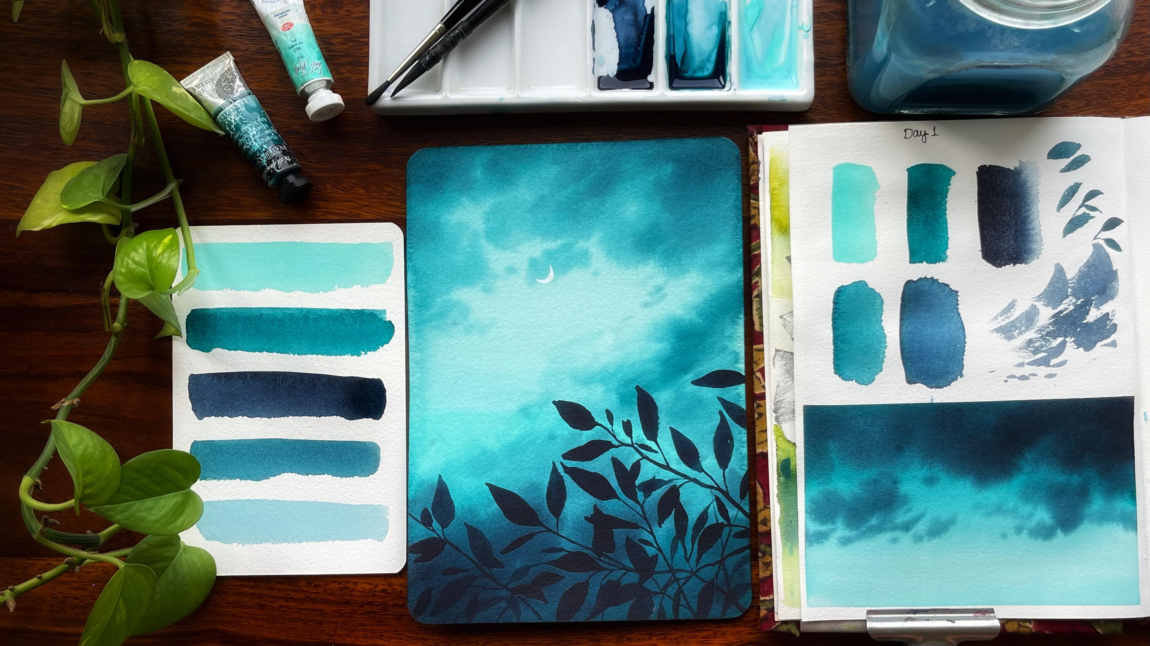
6. Day 1 - Evening Love - Practice: Onto our D1 and it's not
clear the bar that I have. First, let's understand
all the colors that we're going to
use for our painting. First and foremost,
is our main shape, which I'm going to
use from my nice. The second is my turquoise
tail from the brand Sennelier, have been my cool too. Gallows form many of my
watercolor paintings. Along with it, I would
be using indigo. Let's test all
these colors while we just experiment
with our painting. See how it works. So this is the shade
that you will be using. The second shape that
I'm going to head with, his, my turquoise tail. This is the turquoise
tailored shape that I'm going to use. Then is money. Either you can go ahead with
the Payne's gray like this, which has a bit of blue in it. You can see the blue
side as I take it, a bit more light,
you will see that I get more on the
blue side. Okay? So this is the shade. If you now do not
have any turquoise, how do we create a turquoise? I would go ahead and like
to tell you how you create it in case you do not have this Payne's gray
goo head with ENCO, as I have told you, the shades you can
always create by mixing. And turquoise is one of them. I am taking some of my tailor blue and we'll mix some
of my dark green into it. Can you see a shade which is closer to the one that
we are using right now. In case you mix
your other blues, maybe end on 3D in blue. Let's see how it works. And I have a dog ring with me. I will add the star cream. This mix is a bit different, but still we get something closer to
the one that we need. I'm adding a part
of blue more into it and a bit more green into it. You can always prepare
your shades like this. How do we approach a painting? This is something that I'm
always think before I paint. For this one, I like to use my sketchbook to
understand exactly how I'm going to add
my Carlos and how I'm going to add the
page on top of it. Though, your final
painting doesn't require any kind of taping down, but this small part, it's always good to tape down
and have some clear edges. Do I would leave that
decision up to you. But since the colors lot and we are walking with
good amount of water, taping down will be a
good idea for this one. Once you are done
with taping down, run your fingers along the edges of the teeth so that
there are no gaps. Our final painting is only
about heavy. Wash his hands. I'm going to prepare to
PayPal bit differently. I had with some
of my mint green. Now you have to understand
this is a bit opaque in color. And because it is opaque, I have to use only a
grid of it while I paint or else I will not
be in a position to go over it and paint my kids. Okay. This is how I go about it. And I am going ahead and adding some of my
turquoise blue. You will see more beautiful
turquoise coming up. The main idea is to
create good blending. At this point in
time where there is a seamless color movement from the lighter value
that is majorly on West to the darker value
which is your turquoise. Like a gradient wash, we are going from darker
to lighter value. Of course, gradient washes
with two different shades. If you are using a round brush, you have to go over
a particular space more and more what happens
is with a round brush sometimes you'll get these lines and we really don't want
that for our painting, but I do believe that less is
always more in watercolors. So if you are using
glass fragments, you are using soft colors. It would kick your pattern
impact compared to if you are bombarding your painting with loads and loads of colors. And that's what we're going to explore in this painting today. Because this is all
about heavy washers. Hence, this kind
of a gradient is our basic for the painting. Once we have added this, let's just move it a bit so that the colors move
into each other. You can see colors are moving. Now. Once my colors have
moved around of bed, I would let this dry off
in case you plan to, of course, paint any kind
of your darker values. And toward what we can do
is we can mix a bit of a dark value on the top and
give it one more shade. You see how beautifully it has blended with each
other all the colors. You don't see any shade
moving here and there. For this, you need 100%
cotton paper in case you plan to get all colors
or shades like this one. If you want to click create it. I'm so happy to see this one. And the last part is all
about creating your class. Now, if you want to create
any kind of clouds, you are basic approach should
be to paint your clouds. Like I always loved my directional clouds and I
use my brushes like this. Now, if you are using
the tip of your brush, you will get smaller clouds. If you are putting some pressure and then
lifting it up like this, you will see bigger
clouds coming. Let's use the same method
for creating the clouds. So either you can go ahead and use your goal
or those Payne's gray with your
turquoise to create Oreo darker value for
painting the clouds. Though this class is not
oriented towards clouds only. For taking an exceptional
clouds class, I would ask you to
go ahead and check out my other classes for clouds. In the meantime, if
you have more water or more colors in your brush tapped off or dab it off on a digital. First of all, many
alternatives of every color, whether it be in the
goal or Payne's gray, or you do not have
the turquoise, you can meet the turquoise
and then use it. So keep all these color
options available with you or whatever color is close
to the one that you have. You can use that in case you use a bit of white
in total costs, you will get a mint color
that we're using now, once these clouds are done, I would let this dry
off and show you exactly how I paint my leaves. You have to just put pressure on your
brush and lift it off. Now this is not a great one. Let's just go over it once more. Again. Let's just put a pressure, go over it once more. Let's just put a pleasure
and go over it once more. Head and paint some more
leaves with our smaller brush. If you are painting leaves
with your smaller brush, you can get as you want. And do always go
head and they re your size and as well as
the shape of your leaves. Because that's very,
very important. Again, I would go ahead and just these leaves propose
As always the case. So go ahead and
practice a few leaves before you painted over
the final painting. If you are using
your smaller brush, it's absolutely fine. You can control a lot in terms of your shape
and size as I see, your brushes to decide a lot
in terms of the shape size, as well as the orientation
of your leaves. So do choose your
brush diligently. You can use a size 468, whatever brush is sortable. The oocytes for like this. Pick up your brush. Use the tip of your brush. I need some more
paint on my brush. Let's go over it once more. Touch your fully loaded brush, wet the paper and you can see the magic automatically
happening. You will see how we are done
with a very simple leaf. You do not need to be an expert for painting these leaves. So it's absolutely fine if you are not aware
of how to paint it and how exactly to get it something similar to
this as perfectly fine. I understand the
clouds once more what we have applied the clouds
only in this particular part, but for our painting we would be adding the darker values
towards the bottom, as well as darker
values towards the top. Once we are done with that, we would go ahead and
draw these leaves. You can see that I
did draw a bird that really helps me to give
a sketch, an outline. Or whether it, of
course I can go and then start with my painting. And hence, this is your day one. I'm super excited. Let's go ahead and start
with our main painting them.
7. Day 1 - Evening Love - Painting: I've already prepared
my paper and now it's time to start
adding the colors. We're going with
the lightest value, as well as mixing a bit
of a turquoise Intuit, mint plus some of the turquoise
so will give us a sheet that looks really amazing
as well as superb. It gives that glow that we
need for this painting. You will know that we
are going ahead and doing a limited palette excise the limited palette
exercise gives us a lot of opportunity to
play with the values. Values. Also, I am not actually changing
to a large extent. I would be creating three to four shades in total and finish the
whole of the painting. I am doing across swatch
that is from left to right, and then from right-to-left. This way I can really cover
the whole of the paper, as I did tell you
initially only that this mint color does have some
amount of porosity in it, which means that there is
good amount of white in it. And hence, if I apply
it in a large quantity, what happens is that this
paper will become more and more opaque and hence we can go ahead and paint over
it for the Cloud spot. The paper sizes A5, as I have already told you, you can go ahead and even
use a smaller paper. But an A5 size is ideal for
all these experimentation. They will help you to understand the painting as well
as paint over it in a better way compared to
if you are going ahead with already smaller
paper that gives us soul leaves us with lesser opportunity to
experiment and understand all the shades as well as
clearly depict the clouds. We're going ahead and adding
some of our turquoise towards the top area as well
as towards the bottom media. The bottom area, of course, would be way more darker. When we start
applying the clouds, you will observe that. And even the top ATO will be one or two more shade darker
than what you see right now. Frankly, it's just a
gradient that I'm trying to get and I love to
play with colors. That's another thing.
Playing with Carlos really help you to get a great balance. And you are not actually
going ahead and fighting with one of those or
trying to do something that is being instructed to you. If you start playing
with watercolors, you start partnering
with that medium. And when you start
partnering with the medium, really helps you to calm down, meditate, as well as it brings you to a
position where you start loving and falling
for it completely. I'm using my DaVinci peptide
brush to add these clouds. I am creating more of
the turquoise clouds. If you do not have turquoise, you know how you
can actually make a color that is closer
to the turquoise shade, which you also right now. As well as not only the top EOB, we'll be even working
on the bottom area. The bottom media, as
I did instruct, you, would be way more darker compared to what
it is right now. The middle area I have created lighter and the people
will clue that way. The blue of the watercolors is practically inside the people. Which means that the
more you leave it white or the more it is, lesser in terms of the
pigment on top of the paper, you get a beautiful
outcome that way. Going ahead and
using my brush in all round motion to
cover larger area. You can also load
your brush with more pigments for
covering larger area. Using either at Indigo orals. You can also go ahead
and use Payne's gray for this taco value
towards the bottom. The clouds that we are continuously painting
are absolutely loose. There is no control
that we have over that. It's just that you
have to understand one-third of the people
should remain as white. Andres two-thirds you can
cover with the clouds. The top part should be a bit less compared
to the bottom part that you were having in terms of the darker value
of the clouds. We're not going to work
much on the middle part of the painting as I want
it to remain white. Or you can say the
color that we have already applied
over it and rest, I'm going to clean up the sides. Now, why many of you might be asking that
I'm cleaning this up. It actually gives us
an opportunity to not have any solid
cauliflower effect or it prevents the background. Background is that your paper is wet and the waters
in and around it, because the water is
in and around it, it starts flowing back into your painting at which
leaves per cauliflower effect for too few areas of the painting
with excess water. Hence, this kind of a particular thing can
always be avoided. Finally, I guess this is the last area which I'm
covering a bit more. And then I guess
I would leave it at this stage except
the bottom area where I plan to add some more
of my indigo and turquoise. That's it. I'm pretty happy with
how it has turned out. And keeping the clouds
lose really helps me to bring a lot of
flavor to my painting. It shows that there is lot of confidence that you have
in your brushstrokes, as well as you can
really pull up a beautiful painting with only few strokes
and a few colors. It not only helps you to develop on your
watercolor skills, but also helps you
to meditate and concentrate only
on a few sheets, which leaves you with a lot more opportunities
to create way more beautiful paintings
compared to if you are going ahead and using
lots of colors. Like you're paying,
yellow, orange, etc. Which I have also used over the past many years for
many of my other paintings, but for landscape over a few years have
realized less is more. As you can observe, that
my people has remained wet for really a long
period as I did apply water on the
product side as well as I did wet the paper
really, really well. This is one important
aspect of heavy washes. If you can quit the people well, it will stay wet for a
long period of time. But do understand
that we do not want to wait the people so that it loses its size in hints two to 3 min of waiting
the people is good enough. Like your paper
dry out completely and then start with our leaves. Leaves and something
that I always, always love to paint. But as we all are starting out and we are new to
watercolor painting, I would always like to
go head and structure. Giving a structure to our painting is
practically sketching. It really helps you to
lay the framework of exactly where you want to go
ahead and add your audience. I would ask you to just wait
for a few minutes before I start adding my page and
then go ahead and paint. The basic background of our
painting is already ready. Whatever now we are doing is majorly to deal
with the detailing. Detailing is really setting
the tone of the painting. We have added minimal colors, and this detailing will only
be done with the help of a mix-up either turquoise
and indigo orals. You can also go ahead with
only indigo or Payne's gray. I would leave that
decision up to you. It's just a dark color that we need to add four to four pounds. All the detail
that we usually do is majorly to do with
the foregrounds. Foregrounds is something that we always observe and
it is close to us. And as per perspective, we have to add those
details to our painting. I am adding a few more leaves. I will continue adding these
leaves and it would be a bit of a long process. And on the left as
well as on the right, I would add more and
more of these you use. So it's a continuous process. I will say that you can also continue adding
it along with me, but I know that the paper is not shining anymore and
you practically can't absorb how and where exactly I'm
adding these cleaves. This is something that I always
like to avoid or I don't like to tell you or put you in the dark during
this particular part. But yes, patients is
something that I always, always see in watercolors
is very important. If you have the patients, you will be rewarded well, so keep the patients and once I start
painting our leaves, you can see exactly how
why I've structured it. It's basically in bunches
that I'm structuring it. In view of the places
that are more than a few of the places
there are less. And we keep
structuring our lives. I would like you to observe towards the top
right-hand corner, you will have one jar of water
which is completely blue, and one jar of water
which is still white. Though in this
particular painting, we do not need another
fresh supply of water. But many of the other
paintings where there is a re-weighting
method or you need that fresh supply of
water for going ahead and adding another layer of
water in a few places. I think during that
particular phase, it's important to have
another news source or another new place where you
have water kept for yourself. I have this thing as
an exercise and I do it pretty regularly
for all my paintings. I keep two jars, always, always handy as I used 30 reading technique
where you often for many of my florals as well as landscape and urban
sketching paintings. In view of the years, I do need to rewet at
least pretty often for painting either the
bushes or the trees, etc. We're done with our drawing
now and it's time to start adding the darkest
value to our painting. You will absorb that. I always go from lighter
to darker value. There is no way you
can get back in watercolors if you apply
the darkest value forced. Hence, all the foregrounds
and all the details that we are doing with the darkest
value is done at the end. From here on wards, I
would say it's all about meditating and it's all about keeping your patients and or testing or so to completely only paint leaves as well as branches throughout
the next minutes. Yes, it's the only thing that we are going to
add to our painting. The tone of the painting
is called the set. It's just the detailing
that I've told you is left. Once we detail this part, the whole blue and the beauty of the
painting comes together. What I usually mean by
meditating with watercolors is going ahead and completely concentrating
on your painting. This is a slow
process and you can develop many skills
at this level. First of all, concentrating
and working with only one single
shade helps you to not only develop our patients, but also helps you to understand one single
shade in a better way. The process of
painting the leaves is absolutely slow and that's
one of the reasons. So naming the classes,
meditating with watercolors. You really, really need to have that patience
and that level of understanding of
changing the shapes and sizes of a particular
subject itself. We are working with
one single subject, but creating so much of randomness and that
one single subject. I am going ahead and creating the shapes
and sizes of leaves, showing that there
are few leaves which occurs in nature as munches, whereas there are few leaves
that are also saintly or are single occurrence
on a particular branch. This is something that we
all should keep in mind when we are working on any
painting that depicts nature. Though, if you go ahead and
work on urban sketching, it is way more structured as it is man-made most
of the buildings. Hence, the possibility of
randomness is we much lower compared to when we are going ahead and painting
waterfalls are skies, painting any kind of
hills, mountains, etc. All of this can be won't lose. And the approach can be way
more easier, I would say, as there is so much of beauty as well as there is so
much of n, painting. All of it. Lose landscape has been one
of my go-to subjects always. It motivates me till date to paint all these loose branches, leaves then some
foliage, et cetera. Though, through this
painting you will see that we are going ahead and structuring few places
where there are bunches, as I've told you, audio and
there will be few places where we are not structuring
at much and killing it. More loose with one or two
leaves here and there. As we progress through
hole of these voting days, you can see more and
more of animals, boards, etc, getting added into our lose
landscape paintings, which we are doing right now. It is going to be a bit more rough sketch
oriented though. I am going to give you with the kind of stencils
that you can always use tracer and then use it for
sketching your subject. Orals even show you
the easy way to go about sketching these
different subjects. All of this put together is
going to be really exciting. And I am very, very happy to share these 14 days along with you as well as paint
along with you. I would request you all
to continuously update on as well as upload your projects
in the project gallery. It really helps me to
understand what more I can add an incase you are
finding anything difficult to post it in
the discussion section, I would reply back to all your
queries as soon as I can. Everything that we are
doing that is starting with our weighting
of the paper to finally adding these
leaves. All of it. Real-time, which leaves you
with a loan for partial d and which really creates the
working condition of painting. Along with me in each
and every painting, I have added an
initial part which is majorly dealing with how and what are the
colors that I'm using, as well as a quick
insight into how to paint loose yet not
lose your control. This is something that
I have learned over many years and I know that it might look very
easy initially to pay all the clouds,
these easy leaves. But when you really put your
paints and people together, it might not be or really,
really easy process. It does take a while and I
know that you guys can do it. If you are there along
with me turn now, you are doing amazing. You are doing great. Believe me, you are one of
the persons who have followed their heart and our
learning something new, which is already are
greater inside and a great work that you are practicing on a regular
basis for yourself. Now it's time to continue painting the branches
and understand where exactly I want to paint or add more
leaves here and there. It's a small inside. Most of the work has
already been done. It's regular. Quick thing that
we want to do as of now and then have a final
painting ready with us. Your paper dry off before you pick it off from
the acrylic board. Acrylic board, of course, as I've told you have to
keep the people where for a longer period of time
or holds it together. It doesn't allow it
to buckle so easily. And there are way more good
things about using your code. I hope that all of you have done this process
and you did not tape down your paper doing this
particular painting as it would allow you less time for the class compared to what we
have to work that out. Till now. I did tell you a lot about your
foregrounds and backgrounds. But Harvey shore of what
exactly we want to do. This is where the whole
inside of the project is for us developing a contrast
and tap is most important. Now, developing this contrast
of costs worth it sometime, the process of adding
all these values, the process of creating the backgrounds,
foregrounds, et cetera. It's something that takes
quite a good amount of effort, as well as you have
to be efficient with your time with the CD. So what you can understand this, how you can work in layers. Layers means that currently the first project is only
about working with two layers. But as we progress through
the other projects, you will see more layers
coming up and how you can only consider the subject
that you want to paint, but still have a beautiful
layer for your background. I always like to
change the value. That is your lighter
and darker tones as you have seen
for the background. It is basically to take your
painting to annex level. This can be even done with
the help of your pencil, paper or whatever
you want to do. You can have a thumbnail sketch initially and then go ahead
with the final painting. All of this put together. You can work it out in that way. Or else you can
also go ahead and paint exactly the way
I have shown today. Initially, you can start out
with a small painting of how you want to lay
out your Clouds, as well as the background. And then just practice
simple leaves. Simple subjects like These basically help you to develop
a lot on your skill set. Initially, none of
us are best friends with watercolors
and too many of us, this has really, really
challenging task. I have learned from
so many students of mine that this was challenging. Watercolors is so challenging. I don't get the exact result. I really don't have the kind of painting
that I wanted to, or maybe the subject
don't fall in place and there are so
many other reasons. But when you start practicing
it over and over again, you will get to know
that even small, small aspects of these
watercolor painting can really change a lot in terms
of your painting habit, as well as how you want to
walk through your subjects. I think that is it. Let's move on to our next part, though there is no
order or paths to this. Maybe some small
details here and there. And then we are completely done. We would take out
the people from the echolalic board with the
help of a spatula orals. You can also go ahead and let the paper dry
off completely. It will automatically come
off from the acrylic board. We will go ahead and paint or both tomorrow with
the same color sets. So I do not want you
guys to go ahead and change the color pattern
that we have right now. In the meantime,
you can see that I'm painting a moon
with the help of my white gouache or any kind of white opaque paint you can take to paint this. There will be reflections
of the boat into the water, as well as that is more
towards so let's wait for it. We will have a
practice session as well as I will give you worst. And so auto tracing method in
which you can work at Rome, that it's easy for anyone, even if you want
you to watercolors, it would not be
an issue for you.
8. Day 2 - Into the shadows - Practice: So guys, I'm back
when the second day. But the floss practice exercise, this practice exercise is all
about creating the water. Now water and
reflection is something that I'm going to
tell you in detail. Tool this practice, OK, Let's first start with how to paint this water
and how to paint. This is not an absolute
calm water goddess. Quite some went in the water. Because of that,
you will not find an exact reflection of
the board onto the water. By the way, I'm using 185 GSM, hundred percent
cotton arches people in my sketchbook that you
are absorbing right now. This one is from
vibrant parcels. And I have been using vibrant bustling sketchbook
only for really, really low. As we do. Customize these sketchbooks, you can have it for many of your exercises depending on
what kind of paper you like, you can always get
it accordingly. I will go with the lightest
value for the stock. So I start off from
the lightest value on the top and take it
towards the bottom. Though this is not the exact reflection of the painting that
we are going to do, but it is something
close to what we will be doing in
our final painting. Let's continue with our work. And I am just being good. I really loved this
taping down of people as it gives
me such clear edges. I have been pretty vocal about
adding these washi tapes whenever it is needed on
your sketch book has it prevents posture for your
paper from buckling much. And secondly, what it does is that it gives
you all the orange, the second, good, but
never, ever taken off. So people, this
is something that I am very happy to
tell you always, always, whenever you go ahead
with any kind of painting. The top part is majorly
area of the sky though you can paint the area of
the sky or may even go ahead and just get it over. I am going to apply a
darker shade of this value. This was already existing
on my palate and that's my, I'm going ahead and using the same palette
to add the colors. As I go towards the top, it becomes lighter and lighter. Lead it blank. Now, if you have lots
and lots of water, what you can do is just take it off with
the help of tissue. That tissue is
very, very helpful. Whenever you are working
on a watercolor painting, ages comes as handy as possible. I will continue doing this walk. And since my paper is too wet, right now, I can't walk a lot. Okay. This is the Payne's
gray that I'm just mixing with tailored
turquoise, which I had. I have already told you how to make this Taylor turquoise, the darkest values
towards the middle. And then what I will do, I will just meet these ripples. You can put a gap like this and go ahead with the top
part of the painting. It's easy, simple. And it really requires very less amount of time
to paint these ripples. Okay, let this dry
off a bit before we go head with our spacing and adding
some of our darkest value. Darkest value is
majorly or Payne's gray or whatever you
have with yourself. You know what happens sometimes
is the indigo is really dark and hence we're using that particular Indigo
for our painting. Sometimes you do not have 0 very dark indigo
available with yourself. You will go ahead with
the lighter value of Payne's gray or which has
some amount of blue in it. Or I'm adding the darkest
value towards the bottom. This is, as per the
rule of perspective, there is atmospheric effect. And as you go farther
away from your eyes, you are going to see that all the lines and
everything becomes way more dark than what you have usually absorbed
in your painting. I know that this
is not the class. We're going to discuss
everything about painting. What is a reflection? I have a separate class for it. If you are someone who
loves to paint water, I have watercolor, ocean waves, and two of my other classes that I would be getting
one more class on painting. Only quarters. I think that is
something which I have not explored much in detail in any of my audio paintings and any of my classes which
would be coming in. So maybe the CEO or sometime
you will see that coming up. Finally, this has become really, really dark, which I
don't want to use. Let's just go and
try that once more. When something
like this happens, you can always pull it off
with the help of humor. It's okay to go with one or
two of these lines like this. Then I will just add
very thin, thin lines. That's enough to show
that we are going from our darkest value to the
lighter value on the top. As well as you can see that
this is no more a calm water. There is lots and lots
of movement in it. Hello with it. In case you want to
show a line like this where your
values change or you want to just show that this
is the area that I want to denote for my clouds as
well as for the sky, which is majorly your
horizon line that differentiates Skype
tribunal water on land. This way you can
always go ahead, had just change it up, but you can add any
kind of clouds, or even you can
add some foliage, mountains, etc, anything, anything and
everything is put together. Again, I'm going to
clear out this area. Let's understand the
colors a bit in detail. Though. I know that we
have already discussed these colors that we are
going to discuss right now. This is the first mink Carlo, which time going to use. For my painting. We will be using some
amount of particles with the mint color like this. Okay. Go ahead. Some amount of indigo color. Or you can even add things to the already existing
Taylor turquoise. And then the darkest value, which gives me Julie York. This way you are going to add more colors and you can see, oh, very nice effect
over here on the left. While this place is
getting dry it off, what we can do is we can go
in and paint a small book. Supposedly that
precedes my vote. Hi, I have a small
line over here. Okay. This is my small book
that I have with me, some reflection to our boat. Now, there are various kinds of reflections that you can
always go head and had, but how reflection would
be exactly this way. So my water someday your and my reflection would be
also induce similar. It can be longer, it can be shorter
depending on the angle of the T. So the r of the T becomes very important at
this point in time. It all depends exactly when you are teaching though
photograph that is morning, afternoon, evening, night
when swear but it is. Okay. Now, I would go
ahead and just had a very small reflection
of what is called. Hence, you have to show
the ripples of the water. There's a person also that's sitting for this vertical apart. Now you have the darkest value, which is your indigo. To show the shadows
of the board, which is darker just
in an area around it. We are going ahead and adding a bit of these will review it. And this is a very
small and easy exam. Of course, you can do it on
your own and check it out. How it works for you. For me, it's easy to explain, but yes, send it directly comes on people and how you do it. It might be a bit tough. So it's all practice
and once you practice, you will get a hang
of it for sure. Okay. That's it. Now, let's remove
the tape and have a look at how would
the two exercises. This is something which
is easy yet interesting, and I can tell you
it would come really handy for all your
future paintings. Okay, now, sticking to my hands. Hi baby, loved when
these exercises, before I go ahead with
my final painting, always, always, you know, this is something that I do for my future projects or for my future painting or
thumbnail painting. And an understanding
of how this works. I will even upload this particular portion of the drawing on the
resources section. You can go ahead
and trace it back. If you're not aware
of how to trace it, I will be explaining
it in the next part.
9. Day 2 - Into the shadows - Tracing: Let me tell you how we
can go ahead and erase this entire sketch from the painting or wrong from
the photo that you have. Using any kind of
hoping to go for EBS which far or what you can usually
see what exactly was. Just keep continuing
making these lines. There's this need to have a rough idea about
where exactly. I always believe that free
hand drawing is better. But for many of us who are just starting out or quick rough sketch like this may be helpful for going ahead and
painting any subject. This is the kind of
the rough sketch. That's what we have. It's all about the
shadows which you can go ahead and the reflection. The shadow would be here. But as the reflection would be. And what are you going do with now on the backside of this? And so like these, go over on a piece of paper. I will just show you
how exactly you can you go over it either with
a pencil or DePaul point. You will see these coming up. Once you see these marks, you exactly know that you
have grease down the subject. I will go ahead and now upload
in the project section. You can get this in the
project section and trace it in the similar
manner for your painting. Orozco heard your free hand drawing for your final painting. Okay, see you in the next lesson when we are starting
with this painting.
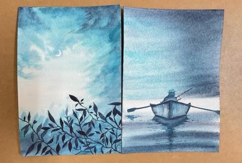
10. Day 2 - Into the shadows - Painting : I'm super excited to welcome you for the day do over here, I will show you exactly how
you can draw your board door. You can also research
from go mentor, or tracing as I have
shared it with you. But this is all pretty free hand drawing that I usually do. I make a line and now
I'm going to head by extending across line
on both the sides. I just want to check
that whether they are equal or not on both sides, I'm checking the same. Once they are, I will
go ahead and just add another line joining
towards the middle bottom part. Of course, painting boats is not very easy nor making
them as easy, but are small and simple
process like this can really help you to ease out
on these difficult subjects. You can always do a
free hand drawing. I always advocate for
free hand drawing. But when you are starting out on your watercolor journey
or your sketching journey, it's good to even
trace and start summer this dark and the
progress is most important, as I always say. I think over the time that you spend for your sketching
or for your painting, you will be in a
position to understand how to draw and how you
can add values, et cetera. Okay, in the meantime, my vote is almost Ready. I'm extending on both the sides. That is the left
and on the right. This is a person who
was rowing a boat and going into the shadows
of the background. That's one of the
reasons of meaning this project as into the
shadows, it's my favorite. I can deal with
minimal basic colors, few sheets, and
some brushstrokes and can frankly
achieved so much. It's just as drawing with the, it's a lot of time because the background
is really simple. That is hardly much
to do in that hand. Once you are done with
the background ending, the board will take awhile. So be there. Hi, I'm Doug. You if
you have the patients, you will kneel this painting. There is nothing
tough about the whole of drawing a person in this whole of the vote was the most difficult
task for me. Believe me, I'm not a person who does much of portraits or ADD Much of people in any of my urban sketching or else
in any of my paintings. So this was a real
challenge for me. I will not deny that. I did not look it
as a challenge. I was very happy to draw percent whatsoever we eat is
I did not think that. Okay. Is it going to balance my main thing or nor
will I painted well, I have so much of insecurity about adding
people on my main thing. I just went with. Going with the flow is very,
very important. You will have your failures. But even if you try, you will succeed some
time or the other. So this might not be the first meeting where
you will succeed. But in the second
painting you might go, in the third meeting,
you might watercolor. That's why it's all
about patients. Patients and patients as
this is less forgiving as a medium compared to any other medium
that we work with. Whether it be quash,
whether acrylics, but the most beautiful
and magical medium that I have come across. In the meantime, you will
see what I've done is I have mocked out
these small points. And then I did draw a
small semicircle on top. I have gone ahead and added
another smaller semi-circle. The person is wearing a hat. That's how I am going about it. No D dealing of
the face, nothing. He is facing his
path towards us. That's a good party. No. If I had to literally
take the face, I don't know how
I would go to it. Now it's more about
adding those new details, some, maybe one line, and then making it
a bit more sharper in terms of the image, etc, that you want to
go ahead and paint. I would highly recommend you to go ahead and try
it out on your own. If you don't get it, please do referred to
the trees town image, had it on your painting
and you can nail it. But first, give it a
try and give it a shot. I'm telling you you would be very happy if you
do that for you as is this whole painting
that we are doing, all these whole of the
series that we had doing is all about
making progress. It's all about
enjoying the process. It's not about getting the perfect and beautiful
outcome that we always see. Every artist. You have to let yourself, you have to get into. Rid of the day on
a regular basis. That's all I'm trying to add or make you follow as a habit, as a quick way to
de-stress yourself, as well as align your
personal goals of maybe painting or doing something more creative
with your daily routine. I have added good
amount of water. You already know how to
prepare your paper now. Just add that water. Once you have added the water, we're starting with
the lightest value. As you have always seen me starting with the
lightest value. In most of my other classes, we start out lightest value going ahead to the
darker values are very, very important role
as we progress, we are working with the
mid and low turquoise. But even while we work with this meant
anti-node turquoise, we have to make sure that
our paper is really wet. The colors flow
pretty evenly on it. You know, water does
all the job on its own. We hardly have to do anything. It's just that we have to be there to hold those pigments, to touch that brush with
the paper and rest. Everything would be
magical and coming out in a way you
could have expected. One important reason of having this acrylic poodles so that I can stick my people on it
and move it as I want. Now, many of you might not have this kind of acrylic board. You can do it on any other boats that
is available with you. But make sure it's not cardboard or any kind
of wooden board oral. So much of water mites, Porlock. And although we'd walk around
on those kinds of poses, work on it and then clean it very well with the
help of your tissue. Once your painting is completely dry and let it be under the sun. Well, you know, it's
very hot summers that has already hit India and we are right now
almost boiling to be frank. But still, let's try to protect our board
and beautiful things that we own for creating our
paintings is most important. And that's one of the
reasons I always say never, never leave your brush in water or else your brush
can get spoiled. So brushes are made out
of wood on the back, as well as your water
can seep into work. That's one of the
reasons if you leave it in water for a
longer period of time, water will seep in and
it would crack it open, which we usually don't want. Let's go with our darkest value, which is the most most
interesting step right now. You can either use Payne's gray, you can directly use Enrico oral Smith's your
Payne's gray and indigo with a bit of turquoise. Exactly the way you
absorb me right now on the left
side, cool painting. Okay. I guess I'm good with
how it is turning out. Right now though, your
sketch might look of it. Light right now. As we have gone ahead and
added layers of water, hospital as paints,
let it dry completely. And once it dries,
you would be in a position to see
those grid marks. Orals might have to go over
it once more girl with your pencil marks and then
you can paint on top of it. I would go ahead and start with the bottom area
after I'm done with the top part of the sky, which I think I'm pretty happy. Now, it's time for the
bottom area going with the same mix of our turquoise and indigo
orals. Turquoise and paint. The paints with that
I have is pretty much on the blue side. That's one of the reasons
that wherever you are painting with Payne's gray
that has lot more blue in it. It is more look-alike
or theoretical rather than just the Payne's
gray, which you observe. Okay? This part is
very important. Goal IS I always
say this painting is not everything about
water and reflections, but my water is not come. When your water is not calm, you need to add some amount
of reflections or ripples. Now, reflection is
majorly of the object, all the subject which
we are trying to paint. So you need to understand
there are two things. One is painting the
water with the repulse. Exactly the way we
are doing right now. Start from the sides and go towards either on the left
side or on the right side, you add more thinner lines. These are kind of
England locking repulse that we are
trying to make. You can even also
anytime though for dose or paintings of many other
artists who do the same way, orals even try to come up with your own different way once
you are more experienced. I guess. This is something that I always,
always encourage. You will have your own ways. Don't try to just copy or have an exact
copy of everything. Try to get something
of your own into word. Even if we'd be all photograph, I tried to change a
bit while I paint. It really helps to make that painting your own thing. My boat on every site. What do all the job. I have just added the colors. I am letting my water
walk along with me for getting this painting
as beautiful as possible. Dead by what happens
is you are partnering with most beautiful medium,
that is watercolors. You are not only
working on your own, but even trying to let
water work for you. Yeah. Why walk walk
walk yesterday? If water can also look for you, you will often see me
cleaning the edges a lot with the help of my tissue as I don't want any backup. All my repulse that I did paint Claudio have the honor
to a lot extent. Because of which I
have to go ahead again and add some
more darker values. Right now, my brush has
less amount of water compared to what it had
during the initial goal. As well as my people had
lawn for them. Currently. My people also has less water. Has most of the water I did take off with the help of my
tissue on the sides for typo, there was extra water. It all came out. The whole of the people is less wet compared to
what it was audio. Finally, I guess I am pretty happy with how the whole
thing is working out. And let my paper
dry off after this. As I say, always and always do not allow any
cauliflower effect because there are loads
and loads of chances in this kind of painting to come up with a
cauliflower effect. Exactly how you
see on my finger, how much I clean and how
much I walk around with, but it just happens. Let's go ahead and add in order to meet that
cauliflower effect. Not add lots and lots
of flavor into RPT. Okay? It's not funny. Let me tell you, it's not a good place to be in right now. But when nothing works, I just make the font
of the situation to make myself feel a little
bit more good about it. Blending is so great and
most important task I continue with my blending and you can either do it
with a hypothesis. Round brushes I'm going
to hand with my appetite, doesn't see brush
to do the same. Along with it. I do make sure that I don't
get any kinds of lines. I don't want to absolve these
kinds of lines on my paper has I want the whole
of the painting to be absolutely smooth. Blending it with clear water. I do have two jars of water
always ready with me. One clean supply for
washing my brushes. I did. We went to my people
and all on bit of color here and then so that the left side of the globe in Florida, this lesson visible. That's the whole
intention of going ahead with this next
year of the grading? I wouldn't have gone ahead with it if there was no background. So you can follow. If there is no background,
please, please, please don't go ahead and
do this solid layer again. We're pretty happy with
what we did earlier, which means that our first
year was good enough. We do not need another
day or over here. I did allow good amount of time for this layer to dry off. And now it's time
to add the boat. Boat again is a very, very important part of
the whole painting. All of my painting practically
runs his own time. So, yes, this is most important. We are going with
the darkest value on the top and then washing our brush to get
the lighter value. Usually what happens is
once you wash your brush, there is some amount of pain that is left out and we will be working with that
amount of paint that's left out on our brush. With my darkest value for
the corners of the boat. On the right, I'm walking with at least two to three
vacuoles in the board. Right away you can see
many of the bonds are in the darkest value and some of the bonds are pretty
much in lighter value. Note that title value is again, or mics off your mic, as well as your
Taylor turquoise. While you keep adding all these lines as well as
you had Watteau pains, etc. Make sure to change your values. The more you'll
change your values, the better would be your outcome is being used
for long period of time. There will be lot of wear
and tear because of that. And if there is good
amount of wear and tear, as we're using the board for
a longer period of time, we need to even show
that on our painting. The more we can relate to what it is to be more realistic, the better would be an
understanding by spectator. Or a spectator can relate to your painting
in a better way. This database kind of boats that are available to yourself. So what is the kind of
goal that you're using? This is a simple
board which gives us, and the horse are ones that you are painting on the left as well
as on the right. It is being used by every
war to help the board sale. Of course, my particular
role is going ahead and fishing along with
it as that's their hobby. So we're going to also
add it into our painting. Most of the time, I love to imagine things. Why I love to imagine? The more I imagined, the more I can put
it down on my paper. If you can start imagining the scene
that you want to paint or a particular photograph
that you want to paint from and how
you want to paint, it becomes really easy
for you to put down your particular brush to your people per group
begins to your people. When you paint the board, there are 23 things that
I want to tell you, the clusters that you
are not going to add, Carlos, at every place. Yes, this is the first thing we have already added
a background layer and what we are now going to do is only touch upon a few places. Highlight those acres. Now highlighting
the ADLs is very important because the
highlights actually tell us that the focus off the painting has to be
on those eight years rather than it being on every place of the painting where you were
adding your planes. So this is something that I
have learned over the years. You will have to understand
where your focal point, focal point is a very,
very important subject. And in case you
understand that exactly, you want the spectator to really focus on this
particular part. It would look, if you see the whole of the
painting is kept really simple,
including the sky, water, and everything
we are not having much except this board, which is Hulbert,
highlight that. Now we are going to start and focus only on our
shadows and reflection. Now, if the reflection that you do has a part of shadow in it, which means that
just under the book, there will be a shadow which is way more darker than the reflection that
you were painting. And hence, you will need to actually differentiate
these values. The first value
that you are adding is all mixed off turquoise, yellow and your paint scree, but more of turquoise studio and very less amount
of Payne's gray. Whereas when you just
touch it in an n Now, the place where your ****
is lying on the water, that area is majorly more of your Payne's gray and less of the
yellow turquoise. These are kind of understanding that you need
to have when you paint. Otherwise, you know, the
boat was as if it's laying some light somewhere different and we don't have any idea
why it is lying there. You add the shadows or tell, you add the reflection, it doesn't come out well, what we want to debate asks for the rule of perspective
and ask for an understanding that
I have gotten numb. I think water and
reflections are one of the most tough subject. But if you approach
it in an easy mono, just the way we are
doing right now. You can frankly name any
kind of thinking you want. I have a small bleed on the left part of the
board which I am cleaning with the help of
this pointed flat brush. And I have been using
these pointed flat brush for many of my
other paintings to, it comes really handy when
you have to pick up any color or just a blended or take off, anything from the paper. It's the best what? Picking up the colors, I think that's what I have been doing over here to adding
some more highlights. As usual, my paper is still wet, which means that wherever
I am trying to add any highlights in the
bottom shadow ADM that will move around a bit, which means that move, I'm
hoping when someone ligand, and hence it will
become a bit more blurry than what we can imagine. Adding a bit more line and some more of the darker
parts for the boot area. Then I will be using my dry brush technique to add the wear and
tear in my board. Dry brush technique
comes very handy when it's all about
adding this wherein, you know, when I was adding this color for darker
value, it was just fine. Accidentally became soda. Overall, I'm really
happy that this accident happened because the painting has done very well after that. So these smaller accidents
to keep happening. And sometimes when you
look at an artist and think that they might have
done it intentionally. But there are a lot of
times when things are unintentional and
watercolor has all in it. So it's proudly or medium which has so
much to give to you. You can ever think about it. Okay, my dry brush technique, because here I have taken off all the extra Carlo
on my tissue. Going ahead with my dry brush to add some lines here and
there on the board, cutting edges of my paper. And here it is, the weighting is done.
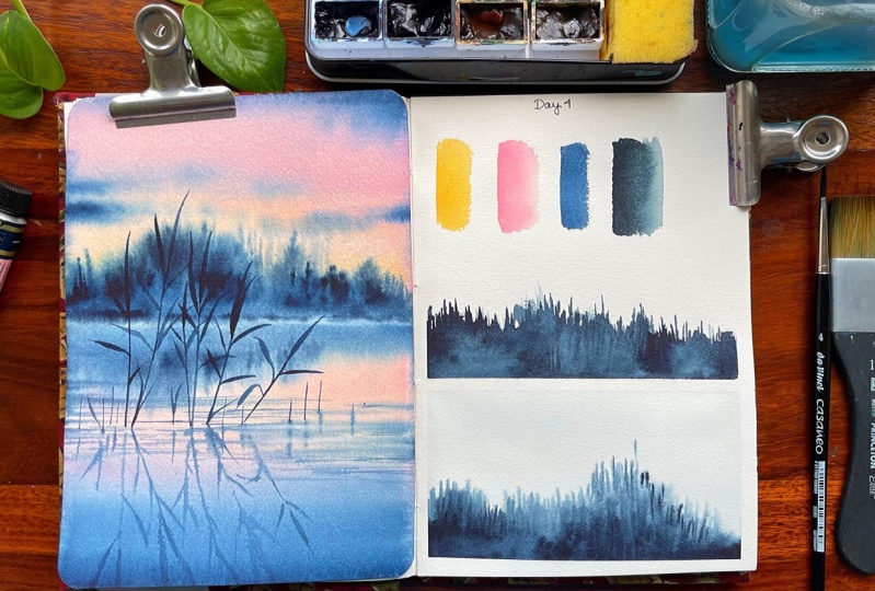
11. Day 3 - A Snowy Landscape - Practice: Hello guys. Let me introduce you to all the sheets which
we will be using for our team to fosters the
role of luck to you. You can also use
helium has an option. The next is my dream. You can see it or you
can also go with this, is that the yellow-blue? And you can have this keynote and I even have an option
of my heart Romanians. So I would leave that
decision up to you. Which one to choose? That for? My worldview, hey,
don't clean blue and I will have our darkest
view which Payne's gray. So Sheets, which I'm going to
use for my painting, it has a bit of blue
in it as I see. So yeah, these are usually the shapes
that I'm going to be. Basically what we would be
discussing are two things. The first is our dimension
that I have a week. You'll still get the rectangle
that I would be making. The outer rectangle, is it on? The inside rectangle
is around 7 cm, so 12 by seven is frankly, the size and shape
of this the same. You have to repeat a voyeur. Of course, these
two lines will be around 0.3 and 0.3 centimeter. Again, this is also around
0.32, 0.4 centimeter. That's the whole of the estimate which we
have for these windows. Restless start
with the layering. Layering is a very,
very important concept and we're going
to touch upon it today. Why layering is? Why important, you know, if we can work in layers, we can work with values
and values becomes the world around me are going
to play with only values. In this case, you can create a lot of views
on P for yourself. I know that and you might
have done this even on how old your class
or somewhere else, maybe someone else you
would have done it. If you want new to watercolors, then I guess this is something that should and must learn. I am taking two sheets that
are somewhere in-between, which is my unknown tree. And then here's my
royal blue or try to, as I say, Hi, I'm mixing these
shapes and colors. Once I have mixed these
sheets and colors, I would leave that ledges, pick up some more
of these shapes. Yes, I am pretty happy
with how it is going up, but I guess it is way more
powerful than we expected. So some amount of colors
is very important. Now, I am not doing much in this and domes
of flat wash, etcetera. You guys already know about it. We have learned about black wash during our techniques section. Yesterday technique
section is pretty small, but I've kept this time
as there is usually a practice exercise
which we go ahead and follow a repeating
that we are doing. These practice exercises
comes very handy when you were starting out or even at
any level are as an artist. Because these practices,
it really helps us to understand exactly what
we're trying to achieve. How are we getting cheaper
and what can be done and what all come in the void
of this series. Let this dry off. You will see that might
be but as buckling of it as it is a 185 to
seven people where it is. But when working with this, 100% gotten 300 GSM, they both. So I do say that for
all the sketch books, it's great to have
a 185 GSM because I don't do a lot of heavy
washes on my sketchbook and I like to keep it small
as I can get it anywhere I'm traveling or going to a location
that I wanted to paint. So keeping all of that together, love to keep it as binding
effect is let it dry off, and then we will come
up with our layers. Let us start with our
dating technique. It's a very, very simple
and easy technique. You can pay some
angle and train blue and add one portion
of your role. You are prime fluid
to go ahead and you can keep this powder sky in going ahead and making stuff. Though, this is the easiest
way in which I can explain. That's one of the reasons
I'm considering mountains right now for painting the spot. You can also consider any. Now, this is a bit of a problem. Why? I did not have a pool. Now since I did not
have a pool of column, what happens is that
I will not have the same kind of wash that I
wanted for this whole layer. We might have to go
over it again like this so that we can get an
even worse now 40 leering. I feel that even washes
something that hype always, always look forward to. Without an even wash
you frankly cannot. Neil, layering technique
and we are going to use that very often
in our next painting. Though. Initially
when I started, I thought that I would
add suddenly I didn't did my window, etc, etc, etc. But when you are seeing from a tough place to live like this, you will not see much
of that and did or much of all of this
in this dance piece. So all those things you
do learn in the course, and that's why I see
progress is most important. What do you learn as
most important rather than what we finally
get as an outcome? There's lots and
lots of learning. That's always there. Anything thing which
we don't like this, they are drying off and
we will go ahead with another dark blue and then just with some darkest value because this is
maximum three layers we want even for our window. So I would like to show you
all of this article, okay? Okay, Let's go ahead
with the next layer. Now, it's so simple
layering technique that I would be using. I will add some time
out of my indigo, Payne's gray in color and
just make one small 32. So let's go ahead. And I think this look like
a mountain, this fit. Yeah. Happy to do that. The wouldn't they
put his absolutely. Try you can scan because
it's too hot and then DO what's happening is that
my paper is drying 30 days. What once was all great
people want anything. Gsm is now drying up very, very quickly for me. It also depends, you know, where exactly you are located, how is the climate, etc. Depending on that,
you should always do your people choice
task than only going ahead with what someone
might have said you, okay? This is what you should
be looking forward to, but that's not how we decide on the people that
we really want. Okay, I guess I'm great
with how this looks. Of course you can go. Now since this is as
this perspective, you can even make a
few lines like these. In the areas where it would look completely like data trees, It's account this mountain. Now, these kinds of things
are very simple, easy, and I know that all of
you might have done it. It's just that we
want to practice it a bit before we go ahead
with the final painting. That's all. Let's just let it dry and
then we will come back with our last layer of the clouds
or window glazing pot. I stopped with our
mask every day. Only Payne's gray
for this layer, you can also go
ahead with guinea on top of your choice movie, even more Prussian blue, whatever you choose, like What. So I will cover that's
absolutely okay. How I usually up high, please my brush like this, where my hand is on
the table completely. And then I start operating or start painting
with beverage showcase. So this is how he looks. And what we usually do is we use the tip of the same hash to go ahead and feed some
swollen stiff the tip. One of the reasons
I use it much. So let's just stick to hold. This key is the closest to us. That's one of the reasons
I am going ahead and making it way more detail compared to
what we did earlier. The last one. See the people is trying
to source so quickly. That's why I tell you
that know a lot of charge what you want to walk
around with for paper, with what core teachers is. But 100% cotton is absolutely
mandatory as I always say. But see what works for you in terms of the
climate that you live in. This is something that
I hadn't realized. What are these yours when I have been painting that it totally depends on the kind of climate
that you want for your PT. Okay. I guess I'm pretty happy with how this
has worked up. Let's remove the tape. I would request you guys
to go ahead and just m This one's what it would
really help you to East rule. Don't make spark
pretty easily though. I, I always say that there is nothing
in the next painting. Justice window you
need to construct, which will practically be
the heart of the painting. And you'll have everything over here in the
lightened value. Because this is
lighter value and this is taco value
automatically there is a contrast and depth which you have done for your painting. And the whole composition comes
together in the same way. And my whole focus in this
painting is over here. If you see, I am not focusing on any other
place for the spot. They'll outside though. This knowing climate as well
as though it's snowing scene or the landscape that I watched from the window is
most important. At this point. Let's just remove the tape
at an angle and have a look.
12. Day 3 - A Snowy Landscape - Painting: Guys, as we continue with today, I must tell you that there
is some existing colors on the board and I did allow the people to wet
because of which the gallows have started coming from the board on
top of my people. Now I am going ahead with
all of my 3M Blue Horace, you can even read some
amount of your pride. Even tailor blue is cool. This is one of the easiest
sheets that you will co-pays scared in any
kind of a palette. That is your surrealism blue. I'm going ahead with some
about off my Payne's gray. As I've told you, the Payne's gray is Pi half
is more bluish in shake and compare it to any other
Payne's gray navy that you can get from other companies, but this is from
Magellan mission, cool, That's why I have replaced this particular
color foreign go. Yes. I think that's an option in which
you can always size. It. Always depends what
kind of colors that you have for your palette. And all the colors also depends on the company from which
you are purchasing. So of course, you can have any shape that's
available with you. And these are basic blue sheets that are available
with painting palette. Many of you have always asked me what's the other sheet
that you can use, you can eat shouldn't do. It's just a gradient
which we want. And there should be enough
water on the people so that the colors work differently or we do not get
any of these lines. And getting the lines is very common in many of my
paintings when I started out, I was not sure why I'm
getting these kind of lines. Either there is not
enough blending or I do not have enough
water on the paper. What's the problem of
getting those lines slowly? What I've realized is it's also about how you move your paper. That as you might
have quite an amount, colors on the paper, but you have to allow the
people to build or you have to move the people
so that the color is automatically flow
into each other. We need to allow
water to do its job, as I always say in watercolors. And even for this
particular painting, the rule remains the same. Ok, now, when I am
drawing this window, you can also go ahead and
draw this in the beginning. That's up to you. But for this particular window, it's a simple exercise. We are going ahead and watching the whole
scene from the window. And it's a winter scene
so we can step out. That's the beauty of
the whole painting. I feel this was one of the
most beautiful painting. This was one of the initial
one or two paintings that I created though
the order of the class, of course, is always
very different than when I start creating the
paintings for any class. Because for me it's more about an experiment to understand
how we work it around. And if I like a particular
project when I paint, I again repaint it
recorded for you guys. That's how I learn from
my mistakes or iLearn for myself how to work around whether I am drawing
this window anyway, simple way, just that you have to remember
there should not be any randomness why windows
are created by people. And hence, the
whole mechanics of creating the width should be
absolutely based on scale. It should be equal the left
side window as well as the right side window on the right side when I'm
creating three lines, as well as on the bottom part, I would be creating three lines. And in the middle part
will remain same. That they will have some gap to show that
data window panels, which are usually they
are in any window. And then there will be some
lines connecting in the very, it's a simple and easy exercise, just that the measurements
might take some time for you. Now, the measurements also, so many of you asked me, you will let us know exactly
the way she went to note. Of course, you have that
during the initial part where I have given the exact measurement
during the practice excess. But for me, the
measurement all depends upon the kind of
paper that you use. If you use a bigger size people, of course the measurements
will change if you're using are much more
smaller size people than what I am using, you will have again
this measurement. So these are something
that you can of glosso, go ahead and take care of lines, lines and lines. But the best part about
this painting is that you do not need to worry
much about these lines. They are most
structural on bases. We are not doing any
free hand drawing. Thereby you can use or scale or any other object which can
treat these straight lines. Also, it's a possibility
to go free hand. As I always say, we are starting out. Hence, we do not want
ourselves to get boarded with the process of creating with three hands are doing
freehand line drawing. It's difficult during
the initial days. Hence, I tried to provide who put the easiest of the
possibilities or with all the sources that
can be used for continuous painting or for continued work with your
drawing and painting. While I continue working
for the backgrounds, backgrounds is very simple. There is a small horizon
line that we need to make. And then there will be some who layer of mountains
in the background. So one is called lighter value and another
is a darker value. As always, the foreground
mountains on darker in shape, whereas the background mountains
will be lighter shade. This is all to do with your glazing or whatever
you want to say. Though we're not going to
learn a lot for this painting, yet there is quite an
amount of layering which we are going to follow
even for our window, as well as for these
mountains and foreground. While you do not all fall on
the sketch at this level, but you can always download the photograph from
the resources section. Go ahead and even to
reset if required, I have already shown you
how to trace any kind of a sketch from
the last exercise. Lightest value of
the Payne's gray or the indigo if you are using
both of them alternatively. And then I'm going to the
right and extending it. My graphite fonts that I have all the people is pretty light. I always go head with a very
light pencil, like to wedge. Now, there are various grades or your graphite pencils
that you get, starting with edge
to edge, edge b. Then two sp3 HP
Forest be like this. It goes beyond that. I think I have to eat HP. So there are various ways in which you can go ahead
and keep your pencil. Whether it be light or dark
or it all depends on you. But for me, I
really like to keep my graphite mouths light as watercolor is a
transparent medium. Hence, the graphite
mouse will be seen if I do not apply
the lightest value, okay, darkest value
for my foregrounds, there are some patches where
I find the sum of the logs, as well as the plants which
are dead on the left, as well as all the right. Or if you see, I follow a very simple process
for larger area coverage. I just paint on my brush
to sit on the paper, which means that I'm
applying more pressure. And if I have to allow it to create something
or are smaller lines, I press it very likely. This though might not be
very important as a step, but for me, I feel the
space very, very important. When you are, again,
beginning with watercolors, says I will visit
these other pips, which becomes very handy and important in your
watercolor journey. How to use your brush is
one of the very important than major exercises that you should always
look forward to. For any artist, I love
to place my whole hand on your particular area. I mean, on a stool
or whatever it is, or if there is a table whatsoever
place you are painting. Even if you are painting on a board in an outdoor location, I like to have it a bit
broader compared to having it smaller with this that allows my hand to have a
three-movement. At least my hand can have a
free movement the structure, and it becomes way more
easier to draw the things. I would request you wait for 5 min and see how White create
the foreground mountain. If you carry along with me, it might be a bit
tough to realize it. You might end up with
a higher number of your strokes, just five-minutes. You can also, even with
simple few strokes, you can create beautiful
mountains and foregrounds. I am a strong believer of the fact that
less is always more. I have been saying this. In other words, paintings do for any kind of
a limited palette. You, unless it has to be more. You are working with way
more or less colors. We're working with only a
limited number of sheets, so it's a lot less
messy as well as the wound concentration is on just the process of creating. We are not here to understands and so much of progress which we need to make, okay, There are so
many other thoughts that we continue
having in our mind. We have to do this,
we have to do that. And finally, I
should have almost everyday we do not
create masterpieces. So keep that in mind. All the days will not be saved. So many days where I do urban sketching and
I'm not happy with it. Believe me. I am like, okay, this is me who created it. I do it. I'm happy with
how it turned out. So It's kind of expressions
do happen and these kinds of incidences do happen with every artist
whom's whoever using. Hence, don't get bogged
down by all of it. Now, I have a
beautiful mountain, in fact, two liters of
Mountain ready for you. You can see how easily we created a few
brushstrokes sometimes. So we deplete the
brush more flat, which means more
pressure was applied. And in some areas We did
not apply more pressure. I would like to create
an awesome grasses. Now these classes you will
usually see or some dried plants for any kind of mountain
scape that you absorb. We are trying to make
it more organic. You can also use a size one brush for adding
decent size two brush. I'm using my optimal
brush for this. Of course, Optimal has been
the force law forever though I loved the Vinci
brushes more nowadays. But still optimal
holds its place, as I always say, it's from a SCADA. So many of you have
asked me about it. It is a size six brush and it has got a
beautiful, nice step. And I have been using
this brush for many years now for many of
my other classes, you would have observed
this brush? Do I know? I do. Stick to smaller
brushes for thinner lines, but this still
remains my favorites. Sudan. Many brushes which
I don't have too few. I think it resonates with us
as well as we associate with those brushes more compared to any other brushes set you
on these kind of things. It looks a bit more
Gracchi store to call it, but we all do a few
brushes which we all love. And it doesn't depend on whether it is expensive
or not expensive. It's just that we have one locked with those
kind of brushes. Adding my list for the window. You can go as you
want for this part. Why I say this, you can have
literally very broad strokes for handing this
part of the window. And I would say that half of pool of color
while you paint this, what happens is if you
don't have a pool of color, the color will not remain
same for all the ADRs. And you might have to go head with two or three
layers of sheets. When you paint along. Though, I am mixing and matching my colors as I really
like to do that. At this point in time, I am not sure whether I
will be painting with this one single chain
or whether I want to mix more shades at
this point in time. So going in a very easy
and simple manner is also good to go head width by
having a pool is of course, nice when we say flat
wash. You can go ahead with an absolute black
wash at this level. One thing that I have seen
for myself, initially, I might think that, Okay, I want to change the values of the colors or I don't
want to do a flat wash. But eventually, as we
complete the painting, you might see it just
like a flat wash. So sometimes going with the
flow, I enjoy painting, but overall, it ends, you end up doing the same thing, but maybe in toward
three layers. So I always see when you paint, it's more about the flow. And we are less restricted
with what we want to do. Be less restricted
with what technique you of all when or how you
are blending your colors. Go with the flu and understand
what you want to make. Enjoy the process. I am so much thoroughly
enjoying the process. Do I know that I have
to do a flat brush, but there are many
places where I'm just applying some columns randomly. It's random. It's just a thought
that came to my mind. Okay, Let's try more of the darker values in
this place, this. And then we will see how we
blend it with the background. There is nothing
else that goes in my mind when I paint
so many times. So I feel that I should have followed a
pattern where painting, but there's no pattern. There is freedom. There's so much of life, and the creative journey altogether spreads
so much happiness. It's not limited to any
boundaries which makes it even more
interesting for anyone. So don't be limited
by boundaries. If you are limiting
yourself by boundaries, you will not evolve
when you're stuck. I feel this way strolls tiny, and evolution takes a long time. At some point in time, you might be going ahead
and copying a few others, which may not be your style. But overall, as you continue
with your journey, practice, practice, and practice,
you will see how this tab has a lot
to lot extent. And every now and then, I'll style is evolving. So if you find someone who is
maybe some weight loss due style don't get
bogged down because your style is
changing regularly. And same goes for the other person's
style to its evolution. The processes more
like an evolution, I would say in creative journey, What you end is something very different than
from where you started. Hence, the start and the end
are really not what we do. Journey that we look forward to dry off now and then we
will start with our secondly. Of course I'm using my size
four brush and frankly, I'm just trying to understand
where to start from. That's something which
I always follow. I start from the area which
looks so pretty easy. Go ahead and paint because I'm
more comfortable that way. I am placing my full handled the table brain, these areas. I'm very comfortable even with the brush that I'm
painting with. In case you are not so
happy with the brush, you go ahead and paint. These cells. Select
a smaller brush so that we can keep
pop out of the window, has some empty as you saw me doing it right
now. Empty, no weight. Of course, we have already
applied the color on it, so I don't want to go into
the same color which we have from heel to be frank, I have leanness
to explain except the glazing technique or what you can see the
layering technique. Layering technique is basically
creating various values. That's one way of looking
into Word when you are working with the
monochrome oral. So if you are working
with a lot of colors, glazing helps you differentiate a particular area compared to the last video which
you have created. It not only creates depth
in your painting part, it also helps to
actually highlight a few places in the subject that you want to go
ahead and paint. Now, that's all part
of what we usually do. And glazing. Glazing is a pretty
vast subject, or if you see, even learning
is a very vast subject. This particular painting
has gotten way more layers. But if you are working
with any plurals, they're layering
usually goes 2-3, all yours, and it goes till six to seven
layers of its own. And then you can frankly get, or beautiful light
and shadow effect. These effects are usually seen in mainly floral paintings. Though that's what not we're dealing with right
now and hence, our learning is way more easier. We do not have any kind of
light and shadow effect. And this, we are going ahead
with four simple part, though this takes a long
time as we progress part, it's completely free flowing, so go ahead and paint
mixed up off your blue, any blue of your choice. It can be even in doctrine blue. You can make sausage really
input and entree into. You can work with
three basic colors which pipe to use
for this painting. Either at least
radium blue or you can go ahead with any kind of bright blue that
you get in Sennelier. Then you can go ahead with
our darker shade of it, which is major,
the indigo or so, it can be Payne's gray. There can be two to three
sheets which you use. Another shape which you
can keep for yourself is either a cobalt
blue in launching DO crucial room whatsoever you prefer, you can create them. Let me leave it for yourself. You can even use our terminal. So irrespective of
all the shades, what I want as a very
light shade for yourself. I'm ready to own shape
for yourself and, or darker shade for me. That can be your right glue. It can be an entree into the last adopters value
is my Payne's gray. These are the three
sheets that I could be using ready for
creating the painting. And this way, what
happens is you can restrict yourself to
not only a few shades, but you can explore
a lot more in terms of concentrating
on your painting and not getting too much into the color
mixing color choices. And there is so much of
muddy effects that many of my students have completed
my audio sections that okay, we are not getting
the same colors, we're not getting
the same effect. Is there? Some other way that we can approach
it with color theory, of course, comes very handy if you are working
with color wheel. If your work with color wheel, those things come handy. But overall, you know that
it also leaves so any big nor with a lot
more questions and a lot more to understand. And rather than focusing
on just going with the flow of the
painting and just enjoying whatever you do. My whole point is that you should enjoy what
you're doing right now. If you are not really
enjoying what you were doing, that That's not a great idea, that's not very much
fun thing to have. And hence, I think you should start enjoying rather than
getting too much into, as I said, don't get too much into the measurement
of the windows, don't get too much into. Just understand that
there has to be two rectangular boxes and those two rectangular
boxes have to be equal. If those two rectangular
boxes have to be equal and you have to
place it in the middle. You exactly know how you can
use your skills to do so. So these are simple, simple things which
all of us know. The measurements,
maths, simple maths, these things we do not
need to each awesome. It's just basic consensus can
reuse what do we call it? Rate. Hence, we are progressing
with more colors. And I am super happy with
how this is turning out. Do there are few dots which
you see on the top part. I don't like it. I will convert them into words. This has always happened even in many of my
previous paintings. I get something
which I don't like. And if I get something I either converted into pods
are some polyhedron, anything that's, that's
possible in that space. So use your space or diligently if something
like this happens, those happy accidents, it
was meant to be there. That's why it's there. So I take it that way it
is meant to be there. It will happen automatically. There are forces
which will help you to play better. I would say the last two paintings,
what we read to when I had a lot to explain and I was trying to be way
more into the painting, but this particular painting high wanted to do for myself. And I want you guys to
also do it for yourself. Enjoying joined, enjoy
it as much as you can. There is a lot less to paint. It's only the layers
that you need to go here and let it dry and
again add another layer. So there are various
viewers because of which this
painting looks a bit more on longer compared
to the older buildings. And I have kept it real time
as I want you guys to be painting along with me rather than leaving it or
parking it later. This is something that I always see in each
and every class. Keeping it real time
is important so that you all can join
me and I want you guys, I can't wait to see your projects in the
project category. The last two days have
been really amazing. I have enjoyed all the projects that you guys have uploaded and I'm looking forward
to the current project. Once the part gets dried off, again, we are adding
another layer. Now I'm going with the
bigger brush because I was just tired of that
smaller brush. We had to use a smaller
brush it puzzle window panes and I really
did not have any choice. But now when I have a choice, I will go ahead with mythical
brush and the ductus value. This is where values
come to a lot. Extend into absorb. It. It really helps
you to understand how to work around
with the colors. I have explained the values
in the exercise section. Please go ahead and
have a look at it. I don't want you guys to be
struggling at this stage, but the y-values, we
have created the whole of the painting and
everything looks so amazing. Finally, we're only adding a few more details or making it a bit more
darker, lighter. So why do I even go ahead
and feel like a challenge? It's really easy. Just that we have to
be a bit more into it. And you have to
just follow simple, simple instructions, rest, rest, everything will get in line. I'm telling you the major
important part is already done, which was the middle part. And that was so
simple because if you have obeys
layer or the ready, your sky and your
SWOT is saying, We're not going to
change anything. In that case, you
just need a base and go over it with various
values and go down. Let's convert the
dots into books. I only have the middle part
as the body of the bird. So going ahead and just
adding these two small, small lines to show that
there are words in. Okay, Cool. Absolutely. If there are any
bleeds, leads are good. I will not deny. But at this point in time, I do not want it
for the inner part. What happens is
toward this painting, there are so many layers
sometimes wonder is not as strong as it should have
been just like a people. And it takes us a
while to realize that once we are done
with the paintings and close that and yeah, I also realize it later. I'm going ahead with one
more darker shades for the middle part of our window. Once we are done with this
middle part of the window, we are going to
just make corners as round so it can vary or more settled
economies, I would say. And then have a final
look at our painting. I am super happy, excited to finish
this off for me. This was a pretty big
challenge for me. He was not an easy one. But once this is done, I can tell you you
should be proud of yourselves and
patio back and say, you guys have done
something, read today. Try this even for other
photos if you find it on any of the sources
like Pixabay or Unsplash. These sites do have
photographs which can be used without hassle because you can use them for your
paintings references, go ahead, use it for
your painting reference and try something else
and the background, all of that, I can
leave it up to you. Now. Try with a monochrome
sheet if you want, try with the neutral tint black. Those are either not some of the beautiful colors
which can be used. Finally, buh bye and
see you tomorrow.
13. Day 4 - Soft Beauty - Practice: Let us discuss how the catalyst, which we are going to
use for this painting. And my first Carlo
is Naples yellow. We are going to use
three major sheets. One is our Naples yellow, the second is our
brilliant link. You can have thought
Carlo as your organelles. You can also go head width. Screen. The second column
is our brilliant pink. This is a bit opaque if you see the transparency is not much. And hence you should be a bit more careful
when you use it. Do not use it in large quantity. It will become really tough. Will manage the opacity. Holloway's. Okay. So either you can have indigo, which is really
dark like this one, or else you can also go
head with Payne's gray, which has more blue in it. So I would leave this decision
on what to see the blue. You can extend it a bit
and then you can see more. So these are basically maximum sheets that can
mean for this painting. Now, let's go ahead
and understand how do we paint our bushes. So when you have
people like this, if I want to make pushes, I usually on the first floor, I call with some of
my strokes like this, which are basically
round and round up and down like whatever
you do go head width. So this is rounder now. You will get some
foliage one week. But is this enough? I don't think so. And since this is not enough, we will go ahead and start adding some of our
darkest value. I will change the values. In this case, I will go towards the bottom, change the values. We then want to talk, again, change the values of it. You see how things change. But still my edges that
you get on the top will be hard edges compared to what you can get engaged who are
doing any software. It's kind of a painting. I will have, I will actually
have another robot that is below and where we are
going to discuss how do we paint wet on wet technique. For this case. I'm adding some goggles. Okay. Let's continue. The point is, right now, it's very,
very hard in India. That's one of the reasons. I'm trying to go very quickly. You can view of the edges you can make plunk in Adobe
are going ahead with this, is you can have any flat
brush of your choice and then start making some
lines not flat brush size. Can you really want to go
ahead and use I'm using a flat brush half an inch
and I dip it in some water. You can use it like this
also to get easy lungs. Now, I can dip this in my
Payne's gray and kick. This way it becomes
more easy and quick. Okay, so there are
various approaches which I'm showing you
most of them over here. And you want to now not
have such dark places, are just such dark areas
towards the bottom. You can of course, remove
it by using only water. See how I am using
water to my advantage. You can remove,
remove, you can add. You can do whatever you want. With the bottom left you have the complete area
that we have developed. Or you can see the
complete area of the foliage is so different now compared
to what we started with, it was more like a flat wash. And now this has so much more dimension
into it and get into it. Some of the pieces are darker, some of the pieces are lighter. And hence this looks way more beautiful when you
add one more thing, let me add some water. Water can do that. Three, Marco, this
point in time, what do we apply this
down here is how we create foliage
that is wet on wet. Now, if you have a lot of
water at this point in time, my paper is not as good. In fact had a lot of water. What happens is that my
paints will only become blue. So I really don't
want either back. And hence, I will just go
ahead and remove some of my extra water with the help of any flat brush that
is available to you. And just take it
off on the tissue, the tissue placed on
the right side and hence head with my brush. Using the same
kind of technique, even work on this part. But here it becomes way more easier for me to work this out. I will want you to watch of
clot is so nice on this one. Okay? Now, let's just have this value. Okay? We would always use a flat brush like this. They will also become Florida. The best part about best point above this
technique is that anything that you
apply will become a bit like really
works in our favor. Nothing becomes really strong or nothing is like
that hard edge, which we don't want
in this painting. And now all the values in few places and just take
off all the extreme. Another thing that you can
do is you can go ahead with any of your brushes, which are these kind
of smaller lines. I feel the bottom part has a lot more intensity
than I would like it. Actually, this is
kind of painting. You see, this is the one. I already have dark values, so I will use some of my water. It would just be okay. When I'm picking out
the Carlos, I'm good. I'm getting the sign of
these kind of areas. It's okay. We will
just eat standard of m then if required, we will pick it up
with our brush. And now again, I see the values have changed a
lot more than required. The paper is drying up. That's one of the reasons we can't work on it any further. And hence we have to
leave it at this stage. But I'm pretty happy with how the whole of this part
has done out there. Remove the tape now, see how whole thing works. So you have loan two
techniques today. One is how to be
foliage on wet-on-wet, and one is wet on dry out. What are the values of the
foliage to what extent? As well as use a flat brush
to make this foliage. I guess that's it. For this particular session, we will go ahead and start
with our main pages. Now, you guys should remember
that we will be using blending as one of the most important techniques
for our background. Cautious. And I don't, you guys
already have learned a lot about blending and
how to blend it well. Use a very simple trick. Use water to blend if you are unable to blend it
in this hot weather. So using lot of auto actually
helps to glycocalyx season. Okay, Now let's walk Hard
cover the full painting.
14. Day 4 - Soft Beauty - Painting: Hi guys. I'm back on D4 and this time
we're changing our palate. Yes. You are going
to go ahead with some soft, beautiful colors. One is my Naples yellow and another of his
brilliant pink. You can even see the
brilliant pink on my desk when mixing
a bit of Naples, yellow into the brilliant
pink and then adding it. Though, I do understand that the brilliant pink is a
bit opaque in nature. So if you add on a lot of brilliant pink in
the first layer, what will happen is you will not get the blue that you
want to add later on. So these are basically three shades which you are
going to operate with. One as the Naples
yellow than another. Here's the brilliant thank,
and the third one you can choose either has
indigo, orange, Payne's gray has been my go-to sheets for good number of times. And I think keeping it simple and restricting
ourselves to really low number of shades
and something that always looking forward to hand, you can see simple color's
getting added on the paper. It's simply going from left
to right and right to left. There is no rocket science. I hope you are all enjoying it. I am making it as
simple as possible. Going forward from here, we are going to actually
paint a lot of things. Have changed my
palettes so, you know, that could become
more yellow as we go forward to tomorrow
and the after, hence, the ready, we're
going to do a real blast. Yes, my colors are going to
change to a large extent. It would be in
yellows and browns. So exactly, you know, that we are going to paint something more brilliant
and beautiful. Okay, going with my Da Vinci, but I brush and adding
a bit of clouds. Now, when you weren't
doing this clouds, as I always say, take off the extra
paints on your tissue. Tissue has been
your best friend. You can see that I'm doing it very regularly as
am going forward. Do. I keep my tissue on
the side and I use it for, has many different kinds
of work as I want. But one of the major
works in this case is practically taking off the
paint from your brush. Do make sure you do not get
any backgrounds on the side. And if you'll see I go very
slowly into the painting, which means that I'm going
with more calming colors. And as I progress, I go with blue. Now the calming colors for this particular painting
is my yellow and pink. One of the painting is coming together already
because of that one. I know that in the
last painting, we did sketch an OT and I
did tell you to visual and then add the window as well as it should have a
bit of a 3D effect. But here again, we are
going just like that. We do not want to add anything. Just make sure the middle
part is a bit wide where we want to
add our foliation. By the way, my paper is already dry and I'm going with
my second layer, right? Yes. Again, work in layers. You ought be aware how I live. And I really don't
want to get into that. We have already discussed it in Harvard from painting three. And there was a detailed lesson. If you are still not very
sure of how to layer, I would request you guys to please go ahead and
have a look at it. While we're here,
we are only going to concentrate more
about changing the values and painting the foliage and the
horizon **** long with it, how to lift out your colors? This is something that many
of us are not aware of. And the point is all the
colors you can't lift. Now when there is a lot of stealing this off your
color which you are using, you will not be in a
position to lift it up. But when there is low
amount of staining, then you will be in
a position to lift out the colors very easily. Some of my brilliant pink, you can see this dark
water on my paper. That's one of the reasons. If even I add some
good amount of colors, they don't turn very vibrant, nor I want the look and feel of this painting
to be vibrant. I want to look and feel
of a painting to be soft. And very, very interesting. Yes. Having a soft look is something that I'm
looking forward to. Not only for this painting, for many other paintings that
we will be doing in future. The soft look frankly, helps me to calm down a lot
and it's really meditative. And you even paying. You do not need to think about how I need
to hold my brush, how I need to add the clouds, or how do I work with all of it? You have to just go, just pick up some
colors on your brush, half of it people and allow
your brush to do the magic. Blended, blended, blended with
other color that you have. That's it. We are not here to change much. By the way. In the meantime, I have added a bit more
interesting clouds. Though my clouds
are not like a lot. But there is some, you can see, again, I'm putting my brush with
some amount of pressure. And then you can see I'm
extending it towards the top. So this you have to also do while your paper is wet
or else your colors will not move into the top part of the sky and we will not get the required
tombs that we want. Oh, no, blending the bottom part with
the white of the people. Now blending brush,
I always keep it. This street brush
comes so handy. Whether it'd be blending, whether it be adding your
paints on the paper. I do change a lot in
terms of the values. But this values which you see
changes that first of all, I will have some gap
value and my brush, I will just wash the brush and again start
adding the colors. The brush still has some
amount of things in it. And those means I'm using for the other parts wherever
I want to change the value. Adding the bottom part or adding into the bottom
part the water and do the bottom part
so that I can add some of my water ripples. Though these ripples are not exactly how we did last time. I'm not going to do
that in this case. It's just some of the ripples
that we're going to add. And then we're going to add some reflection of the plants, which we're going to
paint him as we progress. What I have usually seen
as the Naples yellow doesn't react with a
blue to give any dream. Nor the pink will
react with the blue, it will give a bit
of poeple maximum. Overall, both of these
colors are pretty safe to be used for your blue painting. Now, I'm changing the body. They'll color that. I'm going ahead with ease. Integral orders. You can also go with
your Payne's gray, as I see because fueled
the Payne's gray card pretty blue in there. Colored pigment or color. So you exactly know
that this can be used up and I have been
pretty vocal about it. Has we have gone through
documents or initial paintings, adding some of our darker values and just getting a
few lines over here. Now, these lines, as I see, always do not need
to go ahead and add a lot of brushstrokes or just go
with a lot of places. You just see. Also part of use more small lines or dots here
and there. And that's it. Your work is done. My paper is still wet as I have gone ahead and
added a lot of water, even on the backside
of the people. The backside of the people. When you add some
good amount of water, it helps it to stay wet for
a longer period of time, going with my thinnest brush. Now, as I want the trees to
be looking longer and taller. Once these trees become more and more
visible to our eyes, which is in a bloody, yet I would say an
effect where you can absorb a few trees and still eat cell becoming
blurry in the distance. Why we can use this
kind of approach? Because what we are looking at right now is at a distance. When something is at a distance, you will never find a lot
of the dealing into it. That's something which
I love to always, even for many of my paintings. For any far off object, not add a lot of, I would say, colors into Word
or even dimension into it. Less dimension is good because
that way it will operate. Adding some of the
reflection now towards the bottom part of this
foliage that we have added for actually denoting our horizon line of the
sky and the water aging. Now, many of you are not sure
that whether we should put our horizon line on
the top or whether we should put a horizon line
in the middle or the bottom. I usually keep the bottom medium or large or the
topic a bit larger. That's how I always
go about it though. Initially when I started off, I was not aware about
all these simple rules. And as per the rule of perspective or the
golden rule of thirds. You have to place the painting or place your horizon line
on the major focus area. Either on the top two quadrants, saw her on the top
three quadrants. On the bottom three
quadrants, stats and data, rather than placing
it in the middle and even drawing
the horizon line just in the middle
doesn't work that way. In case you are not aware
of these smaller concepts. I would request you
to go ahead with my audio classes where I had
discussed the ruler over he'll do it is not required
that you can read upon it or you can have a look at my earlier classes where
I've explained it in detail. It would be really
helpful when you even approach any of
the other subjects, whether the landscape
or whether it be any kind of urban sketching, it will come really handy. My paper is still
think that's one of the reason I can
contribute working on my foliage somewhere
or the other, sometimes I feel that
I should not be given so much opportunity
from the paper to play with us and we'll keep playing
with it and never ended. Now working with
some clean water. This is something that I
have always loved to do. In the last class about clouds. You would have seen
that I have worked with my clean water to
bring some grasses. And now I am using it to
actually go ahead and make this bloody effect
along with it for my dollar lines or
for the foliage. You can also go ahead with your wash brush and add
these kinds of trees. This is something that I
really wanted to show you. So even going with these
kinds of trees help rather than always going with a thin brush to
add these foliage. I'm in, you want
to work quickly. These kinds of brushes
really come handy in there. Okay. I guess now I am very happy
with how it has turned out. So I will progress a bit more now towards the bottom area. I guess this area
near the horizon has to be one lighter
near the water. What happens is either
there is missed or you will not be
in a position to see a lot of far off areas and
hence are usually observed this kind of white
regions in many of our photographs or
many of our paintings. Hence, I would like
to also add it to our painting as we progress. Time to create some depth, even in the reflection
that you'll solve. I'm going with my
thinnest scratch. Either it can be size zero, size one brush at this
point in time to add these bloody effector lines and then just adding it or
taking it downwards. Though it might look that
you are going with the flow. But frankly, this name looking
more so naturally to me, I had to literally struggled to understand how
all of these are created and how naturally
you can pay me something, which I have learned over
the years by solving many, many photographs, by
traveling to reuse places where I want
to discover it. And soon I would be even
traveling to dazzling. So that's another place
where I feel that I can also more to understand
how to paint nature. These are, these
are the things that I do for myself as an artist. Absorb, absorb and absorb. Going with more blues. Now is the time to
meet these lines. Of course, these lines
will not come handy, believe me, we all can't
make straight lines. There is one simple rule
of making the street line. Always, always try
it on paper first, which is your rough paper
to see if you are getting these kind of straight lines. Why don't usually happens for
anyone who's starting out, we tend to go slow with
these lines and hence, the lines move here and there. Either we will move
up or move down. So that is something I want
you guys to practice before going ahead With
these lines further. Fine. I guess I'm pretty happy. Let it dry and I would go
ahead and make some lines. This is the small plants that you sometimes absorbed in places like these that trope up or even their various trees which crop up during
the rainy season. Yes, you have a lot
of rainfall and then if they are even plants, we would go head and
fall into the water or actually it just
water and water and around and hence you can
see plants knowing with it. So that's the kind of situation which we
have gone ahead with. Hi, I'm adding or
using the tip of my brush if you observe
and then extending it, pressing it a bit in the middle, and then again lifting out the pressure to make it
thinner as we go on. I am just making these
smaller leaves of the plants in and around the lines that
I've already created. Either you can wait as
of now for a few minutes and then have a look at it, how I completed in the final painting or else
even continue working with me. I would leave that
decision up to you because the painting changes
a lot as we progress. And as we progress, as the painting is also
changing according to the mood or according to the perspective theta
times where we do not only look at a particular
photograph and work, we also use our own observation, or we use our own
thought process into it and make it work. By the way, while we being told with our darkest
value as of now, I was just thinking
about this question. Have you ever asked yourself, why do you work with
watercolors? Now? What does watercolor
help you to achieve and why we should continue
working with watercolors. For me, it's always
been not watercolors. I have fallen in love
with this medium, but when I asked
myself this question, It's like I love to walk with this medium because of it's
not only the randomness, it's just very simple. I touch my brush, which is ordered with
pigments to all wet paper. And that's it. You'll see the magic happening. Water, does it stop? I have been pretty vocal
about these small, small aspects of watercolors
in many of my classes. But do ask yourself
these questions. It's very calming process
for me even when I paint, when I get those simple
colors on the paper, it just makes my day. I am not thinking about
the final painting. Believe me, this was one of the painting which
did not go well. I was not sure that even
I would be including this in the class or not or
whether I have to repaint it. But going with the flow
made it look so beautiful. I was never aware that
it can make something beautiful if you
only think about the process and make
your own progress, it never depends upon what you continue to
walk around with, what Pinterest is so easy
to walk around with. Good. I had some tough
techniques into it or older the painting so
that it looks my own. When you're painting from a photograph or loading
even from a teacher, it really doesn't matter. What should matter to you. Words, are you happy
while you paint it? How are you going
with the flow or not? Are you enjoying
the process or not? So those are the things
that I always feel. You should think about
it when you are on the progressing in your
journey of watercolors, if you weren't
enjoying this medium, All I can tell you it is the most rewarding medium
you can ever think of. I have always perfect. And frankly, you can
also feel the same once you get into a few
other reasons too, which I want to highlight, one is helps me to translate the world on
the people as I see. So what it does to me
is I can put whatever I see in the world or whatever I see in an allowed me on
the people very easily. I don't think about
boundaries or restriction. Painting wild as per
my imagination of what I see can be excised
pretty well, right? And I go beyond infections. I find satisfaction in simple Blooms is just planning
helps me to come down. Love in all the
splatters that we do, which is going to come up as
we progress in our painting. That's why I think I, and we look forward
to the journey. There is no final destination. Imperfections are good. As I say. Less is more. Going with some of
my clear water to add lines or just
read the place of it. Once we are done
with the weighting, we will start with the
process of padding these. Smaller plants, even
though towards the water. Why are we adding
this now That's a good question in water. Whereas reflection and this
is more towards the gum, what do we have less ripples
and hence there would be more of reflection that we
need to go ahead and add. Hopefully. This is very, very easy process, but make sure that your paper
doesn't have lot of hotel. If you have lots of water, these will become blooms. And we do not want
blooms at the stage. We just want the
perfect amount of water for getting a
bit blurry lines. I will continue doing
the same process. Has the progress just not
made sure if your people is dried or has is drying up as I'm that this is hot summer and when I
recorded this class, it was quite sometime back. I happy recording the class
almost for 1.5 months now, as I did not like all the
content that I selected, so I had to go head and not
not select a few of them. And then again, repaint of you. Making a few of them a bit more colorful compared to all the tools that we have
been adding till now. I don't like adding
only the blues. So, because it's sometimes
a bit dumb, though, I love painting with a bit of turquoise
and all turquoise. Really nice. My data, my mood a lot. Yes. I guess that's all. We have less left now. You should be very happy
and proud of yourself. That is hardly anything
that we are left out with, except a few lines that I
would be adding once we are done with this reflection
with my thinnest brush. As always, this is pretty much all repetitive
and nitrate if process so you can
continue working with it. And that's all along. Let's finish off. Now, I am super happy
and excited to finish the painting and make those rounds sites
for the gardeners. Adding lines. Now, this is something
that I told you. You should always
codebase pause, try to just go head and whose
cornered off people are. Just practice on a rough paper. This doesn't come automatically. It takes some time all you need some time
to develop the skin. That's the only thing I
would like to tell you. These lines are more visible and hence what you can
absorb it that I am also making it
going a bit slow. Slow is the key at
this point in time. What we have done those pretty quickly and floss through
the entire process. The last time we did
it, did all of it. But over here, I
would request you to the homepage with the process. Okay. That's it. I hope you have
already gone through the practice part where we did discuss a lot about
painting the foliage and I'm painting
these straight lines. Yes, that's the only instead working through
the exercise rest. I think everything you
guys are aware of, I do not need to teach much. In this case. You have already gone ahead
with other exercises, tools. So you are well equipped with a lot of
knowledge that we wanted. Have a final look
at your painting. I think that you're already
very proud of yourself. Make sure you're not
adding a lot of lines, like lots and lots of things in the whole painting
will go for cost. We want the colors of the pink
and the yellow to be seen. If you even do it, you can always go
ahead and take it off with the help
of your flat brush. Lifting out your colors is very, very important and
it will come very handy in many of your
other paintings. I can guarantee on it. Once you start out with
this lifting technique or what happened is at one point in time I wanted to do this, the pink thickening in
every painting, the red. That's also not a good way
to go off all going hands, but I would suggest you is only left out when it is necessary. You can not see those
lines in the right side. And hence I'm lifting out the EDS to make it
a bit more visible. My favorite part of rounding
off the corners has come, I can't wait to
meet you tomorrow where we are going
to paint abroad.
15. Day 5 - A Cute Bird - Practice: Let us discuss all those sheets which we need for this painting. My go-to and favorite would
be the Naples yellow. Of course. If you don't have this, you can use yellow ocher with Indian yellow
or Marlene in it. I would say that
usually keep the glue. That means what this painting, I would be using very, very less amount of orange. So if you want to
even give them this, you can give it a mess. You can use burnt sienna
in case your bones CNR has some amount of your
trunk red in it, then I think you can
keep this also on this, this is Glen CNI. You see how beautiful
and pretty it is. It has overdosed
underlying reading it. It's the pigment
that they have used. You can see how
beautifully it blends. The last one that you
can go ahead with ease your Payne's
gray or indigo. Because what I want is this is Payne's gray that
I'm showing you. Now. What happens with
this is you can create as many
sheets as you want. No, I will not discourage you from using or taco value waters, which maybe somewhere
around the CPR. And you can also go ahead
and use the CPR if you want. It can be CPR. It can be any other
dark shade of brown. I will not tell you to
use particularly CPO this as I want you guys to just go ahead and
see for yourself. The first one is about
here, splattering. Now, splattering, I think
you have already learned, so let's just go ahead
and do a real small size. In this case, what we
will do is we will just apply with large
wash over this part. And you already know
about labeling. So I'm not going to touch
upon the planning part. In this case. I will go
ahead and apply the scene. One scene in the second quarter. What I want to show you is
if you open these plateau, there is a different
effect that you get. And if you do not
splatter and you sold, that is a different effect which you will get
politics to school. My God, the deepest
started coming. Yeah, I did not use my fingers to them through
the juices and it's like, okay, there's a simple exercise. Let's do it. I have done a flat wash. You
guys can also go flat wash and keep it handy
just for kids to play sheets. And then we will
see how it looks. In the first quadrant. I'm adding some salt. Okay? And we'll see the magic happen. Let it be, okay. Now, we will go
ahead and oh my god, the challenge. But that's okay. You will see how this works. And here I am adding some of
my water for the textures. You see, these two
are very different. And now let's go to
our third quadrant. Again. I will go ahead and lie or real flat wash and start creating textures. Very easy. I mean, this, this is a really easy process
of creating textures, just that we should be
conveyed how we do it. And usually what happens is here much not aware of all these. And then we take away
something very different has been done for
something very March, which we know has been done. So this is a CDC amazing. I'm taking more and
more interactive way. Okay, now let's go ahead
with a thinner brush. I'm taking some darker value. Any darker value is good. As of now I'm taking
some of my color. It's been using Revit, brown. Hi, we'll show it
shows in two ways. Okay, go ahead. This is well-ordered crash
and whatever do is I will start adding some
dots like this. And these are going to deal
with and they just fly to protect it and see how this
texture works in this case. And then if I touch my brush, it would be a bit more darker. Dots will also be smaller. As this is more
controlled approach, whereas this was not
such a control approach. If you touch your brush
who are wet surface, this becomes not so
controlled approach. If you are doing these
platters, not so control. And if you are doing
with the brush, of course it's way more control. Now, let's go ahead with
our fourth-quarter. Anything that you would be doing is seriously not much difficult. As I always say. It's just a bit of practice
and then you click Done. You guys know all
about watercolors. Okay? Whatever do. This has become
more like a bloom. Let's go ahead and
drop some more. You will see the textures, see that extra, which
you get with the sword. This has randomness, of course, but it actually gives a very different texture compared to what we
get with us. Plateaus. I like the one with
the slider is more compared to the one
with the sword, though, I will not deny
that you can not use salt. Of course, you solve for any of your other paintings
too, and try it out. Now let's, Let me go head. This is these are the
kinds of lines which you add if you are going
ahead on any surface, it will show that you have
some amount of extra rows. You see how I'm
creating texture. You can even do some
dots here and there. Alternatively, I like to use these lines which
shows why grasses, well, and I wouldn't be
using these techniques. Even invite next section, which is basically your
findability for your d Phi. I hope you guys have enjoyed 34. We have changed the
power to create instead. Now though we will be back to
some more beautiful blues, turquoise, etc, as we progress. And there will be some
change to the palate, which you can see
as we progress. Against. This looks perfect. Over here. You can, of course weight
and then remove the DV, can see how these pictures
have gone on for you. Let's remove the
beam at an angle and how we'll find, look at it. You can see my painting
over here and how I have applied this plateau as well as these lines technique
to poke it out. You can also use this control like drops methods for
a few of the places. Rest, I guess. I'm happy with how it is done. So let's go ahead and
okay, that is it. And see you in the next
session where we are going to discuss everything about how to work this painting.
16. Day 5 - A Cute Bird Painting: I have already told you all the colors which we're
going to use though. I think that I did
with the yellow, but I guess that's okay. You can use in yellow
of your choice. There is no particular that you should go ahead with Naples. Yellow is better, but if you
want to also go hand with Indian yellow gamboge or
any kind of intense yellow. That's absolutely cool
because we do not have any kind of boo-boos in part and hence
there is no problem. Once you have
applied three yellow that is starting
from the darkness, trying new on the job, taking it more and more
lighter towards the bottom, you can see that there
is lot of water on my paper and hence
the colors for club, I have tried to actually
put something a bit higher. And hence the colors will flow towards the
bottom pretty easily. Why even at the bottom
you can apply it. There will be brown or burnt sienna which will be
coming up hello with it. This whole part is only dedicated to how
to create textures. Now creating text shows
is something that we often don't learn in
many of our paintings, but it's a very, very important aspect
for your landscapes, cityscapes, or even
if you want to paint any kind of floors,
windows, which card? We'll now I take you will find a lot of help
in those cases. Right now. It's only about blending. I'm just using some polls here. Longus, my love for Naples,
yellow can't nibble. And hence I'm going ahead and adding some
impulse here, though. I tried to restrict
to three colors, but this was just
going a bit overboard. Sometimes I do go over top of what Khafre to restricting
myself seeing the colors. But all I can say is you can
use Naples, yellow, orange, burnt sienna, as well as the
last one is your indigo. Indigo can be used alternatively
with your brown so that you can
actually be a lot of colors in case you are
going ahead and using CPO, that's also absolutely fine because we would be
missing though indigo with one CNOT to get the
CPR or darker brown shade. Hence, I think we're
good right now. I'm just taking off
all the extra water. This is something that
I have paint editor very often for heavy
washes, they will be back. And we do not want backgrounds. Backgrounds, and
sometimes we might have to go ahead
with another one. Moving on forward a bit comes really handy during this case. It happens so pretty easily, which use your blending but
you don't get those panics. Lines on will not get any bleeds on any
cauliflower effect. As you have already taken up either the extra water or your colors have already
motion to each article. What else has really
partnered with you? The whole thing
has come together. I'm playing simple choice
and very small things. Even on good blending, just applying some
columns for the water. Having different colors for the textures really helps
me to calm down and relax. It's not about having
a masterpiece. And I always feel that for me progress has been
really important. All that is, I do not go head and create something
exceptionally. Wu Han accepting these small, small things off, not creating. Great. Come on. We've partnered. He's having one good day and the other case would
be the normal asset is normal life for us to write every day on good things
to keep happening to us. But most of the days
are good if you find happiness in real
small things as you see, by the way, I'm going with the darkest value
for the bottom area. The color of 13 on hasn't
gotten bit of red in it. And hence cell because
that is all red color and it becomes more
bright and beautiful. If you don't have this, that's absolutely fine, but
ever been seen as available. But if you use that, I'm using up on CNN from
measuring machine code. And you can use, and we go to create
various colors of your darker values in terms of CPR or any other
shape that you like, do clean out the edges. As I always say orals, there will be backgrounds
and need a reference. So I have told you
once before also and I d by treating
this again and again, so many of you have
experienced and then you guys have shared
your job experience with me that we
do get blood cell in this particular if he
wishes that the only way out. Now, what I've seen as either
coin but layers are red, so go ahead and
clean up the water. If you've ever seen the site, I think you can also do this. I don t need to explain
much Kobe here. And I have applied some more
of my bond sienna over here. Though this looks more
like read through, do not need to add
that I will leave me It's not required at all. I told you I went with the flow and this painting
and then I was like, Okay, we need to have so many columns do we
really need qualified? But I did not want to change. So video work together
as it was called eaten. And I really love to painting
and wanted to share with you guys this
particular one in Tao. Currencies. There are times where we do change our
palette to a great extent. And here changing the palette really doesn't need
much of sheets. Though. When you're using
bright and vibrant shades, you always, always
go with the flow. I have seen that
normally for myself. And if you just train your mind to only
restrict to a few sheets, it becomes really
difficult to restrict. That's where I want
our brains to be. Watering and understand
that we do not need all the sheets to create one or two or three
or as many as 14 pay. We just need a few of them to create the whole Laura
beauty out there. Going with my thickest brush. And once I have added the sheet of Naples
yellow towards the top, you will see you're not
reading is getting washed out. Even if I have added some orange or it
will get washed off. But what they ended up only
a few sheets which remains. And the dominating one out of
them is your Naples yellow, light shade of orange, which can be again
replaced with bird Sienna. Last two sheets which are
dominating is your bones. And I'll mix of brown or else, or mixed off your indigo
plus you are once you know, which gives as many shades
of brown as you want. This is my most interesting part where I start creating
that texture. I'm starting with a
taco value that is ohmic software in the goal with some amount of
fuel burnt sienna, and start adding these
small online store. There might be a North Florida
at this point in time. So they become a bit
more like rules. But that's absolutely fine. Even if they're not a
booms, That's okay. Blooms are good for us. As I've told you. I am making a few lines as well as sometimes
I make a few dots. So it all depends
how you want to go ahead and mix your colors, as well as how you want
to add your strokes. Strokes is something that you
had to learn over the time. Sometimes it will be
smaller and larger. Now, one important aspect, whenever you are
creating textures, there has to be lot of mixes. If you see for the colors. Yes, there has to
be ordered mixes in terms of the various
sheets that you create, as well as in terms
of the stroke. If you'll realize there
has to be lots and lots of different kinds of strokes that we apply for
creating the brain thing. I'm going ahead with. Simple size one,
size two, brush, whatever is available
with you for this part. As I don't want all
complete blooms to go and take over the entire
part so it gets going because smaller
brush helps us to right now protect
ourselves from actually creating any kind of
difficult part which you might have to walk. I guess. That's, that's good.
Towards the bottom. Of course, it has to be most dark as it is closer
to us and it would be way more detail than
what we are applying for pumps when you get
towards the horizon like Frankie, I have a little to
actually teach over here. There is so much less
in terms of teaching. It's just observing
and painting. Frankly speaking, when I
was making this grasses, I was in a stage hall
meditation to be frank. I was just doing one single thing without
any thought process. I was just going ahead
and adding these smaller, smaller lines, dots
here and there. There was nothing in
terms of thought process. It was a calm mind. And I went with the flow. This is something
that I must tell you. No, not think much
about direction, about strokes, about it. There are a lot of
things that we do in watercolors, as I say. But keeping all
of that together, I do want you to get lost in these strokes and in these
aspects of particle. I want you to think beyond that. I want you to work beyond that. I want you guys to. Understand colors or
understand painting beyond it. That's one of the
reason restricting yourself to few sheets
is always good. Like do not have much of a mess. Do not have much of a
hassle in your mind while you create creativity, as I say, and as I
have been saying, is all about flow. It usually comes sometimes
it at times when it does it. So those are the days where I always look forward to
a few tutorials online. I loan from those tutorials, I read up about a few
others to get there. So there are a lot of
times I refer to any book. And all these things helps me to actually seal through because all of these are
not exactly seen. V2 have these where we are not doing great or we're not
happy with our clinical work. I think on those teeth, this part becomes
very important. By the way, I did
splatter clear water. There is another way
to create extra, which I've shown you
is flattering, so on. Now, these are various ways in which you can create texture. But I, one of the most important thing
that we're going to do in this painting is only going with clattering of water. I'm not using the salt because the salt cannot be
controlled much as they do allow the pigments to move away from that
particular place where you did add the salt. But overall, what happens is, we are never sure of how exactly our painting
we're covering. And hence, it gives me
a lot less control. Hence, I guess this
is a better way. Now, going with your
blending again, for the top area, I don't know what went
into my mind when I'm blending again a bit width
my orange and Naples yellow. Oh my God, the Naples yellow. I have used anything. I guess the colors were fading away since we had
a lot of water. So going with another
layer is all his great. That's why I told you initially
when I was adding yellow, I was like no, this
is not what I want. I wanted pulling equals and orange and the blend of
that Naples and oranges. So beautiful. We really do not want other kinds of yellows to
support us in the process. Okay, some of the
lines here and there, and then we are going to
add some bigger dots. I will use, of course,
the tip of my brush. You do not need to go ahead
and use such a thick brush. But overall the
painting is dry now, that's one of the reasons, even if we had some
lines at this stage, it is not going to spoil
your painting anymore. Adding a quick line. Now, this line is
basically for your board. Now, this board is very, very pretty and we're going to walk around with
only two sheets. That is your dark
brown as well as your proud neoliberalism and
sienna and your diagram HE, that you create from indigo. And I just loved the
fact this watercolor gives me so much more freedom
to not only do as I want, but there is so
much randomness in this medium and unforeseen, I would say things
came the whole medium, which brings love and joy to me. I just feel so much more like myself when I
understand this medium, I guess that's what R does
to you in case you are leaves you with we much
more understanding, love and freedom towards
whatever you want to do. Ow, kay, adding a few lines
here and there. Do not worry. This is basically a
fence that we are drawing and is a big logo food. In that sense. There's some beautiful
blooms which has happened when I was actually
painting my sky area. And keeping the
middle part has wake, the blade UC, It's so amazing. The orange and Naples yellow
and then the worldwide which flows in the papal
point in time, the lower part was becoming
more and more dry, and hence there is a
bit of cauliflower, but I'm loving it for
this particular row. Grasses spot altogether as we wanted some textures
and automatically got it because of this whole activity of adding
another layer of colors. From Gradebook, I
would go ahead with full structure as you see it, audio and then breaking it
into two smaller parts. One is the head part, which is absolutely small. And then as the body, I am not thinking much about double it
because it is closer, but I'm going to use only the brown shade
to create the board. Hence, there is not much of detail that I'm going
to add in this course. If you want to create with your blood, it's
absolutely fine. Gray swatch board from the painting that I've
uploaded in your T5. It's easy to trace. We have already loaded in our D to enhance you can apply
those same process off. Going ahead and working
through this sketch part. As I say, use EPO is
a vehicle with you? Yes. Many people have told me
that tracing is not great. I don't trace usually in
most of my paintings, but it's not that you can't do it when
you're starting out. Always, always use whatever
is available with you. You don't need to be
hard on yourself. Being hard on yourself is not doing justice to
your creativity. Being current goes up
this beating yourself up, and that's what I
want at this stage. You have to be very mindful
of how you progress in your journey
and you have to be happy while you progress
in this journey. We are people where, where we get stuck, even in this model things sometimes what happens
is we just feel that watercolor is known the
medium for us or this is not all that I can
walk around with. As there are so many small, small difficulties
which we have phase so we don't want to
walk around with it. But believe me, once you
start working with it, you will literally
fall in love with it. Going with my darkest
value of brown. And this brown is
basically a weak software, burnt sienna and some indigo. You can also go ahead
with sepia as MC. You have to make some
of your sepia with burnt sienna and you will get
a color or shade like this. Then going with my smallest
brush to paint my board. Once I'm done with the painting, I will go ahead and add the
pins, adding the fence. It takes a while as there is this lines which I need to draw and not great at
drawing straight lines. I know and believe me, it's not that it came to me
pretty soon or it came to me. All of a sudden. It needs a lot of practice. And hence, I always say that to draw what ever
you want to paint. Drawing really helps to Leo framework for
your final painting. This framework will help you or support you during
your whole journey. You will not mess up
at any point in time. And even if you miss up to
an extent, it would happen, it is not going to purely take away or
painting or you will not end up just not liking
that painting it on. Okay. Finally, I'm making the tail of the Cloud and
while I go towards the top, I will still add some him out of my watercolor on
the head and peak. I guess. This is a type of leaf at this stage and
collect music follow. And then we will just cut our edges and have a
look at the painting. We're almost done. And next day we're going to
walk with the same palette. And painting or
somebody of PupCo's. Tracing will be bit more easier. Though. I would outline the joint that we are going to do
as well as you can step by, swallow me in my drawing, rounding off the edges
and you can have a fun look at the painting
now. See you tomorrow.
17. Day 6 WildLife Exploration Sketching: We are at six and I'm, I'm very excited to teach you this particular
painting where we will be painting or somebody on. One important aspect
of this painting is also particular techniques that we have learned in the
phi will be applied. Only the sketching I
will be explaining in part one because
I want you guys to understand how high
sketch and how I usually draw a structure of anything
that I want to paint. But you have the option
to go ahead and reset from the photograph that I have uploaded in the
resources section. And I would highly recommend
you guys to increase it if you are not aware
of how to trace it. I have explained the
tracing method in the D2. So go ahead and check out the
tracing method in the two. And then let's get started with this beautiful process
of creating this Ahmadiyya. I have made cause small structure which is
majorly an egg shell. This is just to understand where I want to place
my sound would do. You would see that
I'm going ahead and just adding easy
and simple lines. It's not that I'm going
very quickly at this teach. This process will take
about ten to 12 min. And I would recommend you
to do it on a raft people. If you weren't happy with
the rough paper sketch, then you can finally
trace it home though, painting people good, whichever you want
to go ahead with. What happens is if
you erase the people or if you release a lot on
this paper, it becomes tough. And you will get monks when watercolors is all
about transparency, then you will not be happy
with how it turns out pens. I thought that it
would be great if you do it on a rough paper
and then family tree. So don't go final
painting paper, which is basically
a watercolor paper, 300 shares some hundred percent. Got it. Okay. I have done a structure. Now. The structure is
very easy if you see there are two lines
intersecting that I did, one versus smaller line for the face and one
was a longer line for the body in an
L along that line, or you can say along
that line only, I have started adding
longer lines now, these longer lines are
more to do good practice. If you are not someone who has practiced a lot
in terms of sketching, you will keep meeting goes smaller and shorter lines
which would end up being broken at various
places and you will not get the exact look
and feel which you want. So It's okay, I understand. It's a process of learning
and you will also learn in the process
of making the sample. Do you try to make longer lines? Try to have a good
sketching lines wherever you are doing. And then I'm going ahead and adding the body of my
sample DO on the left. You will see that my body
we're done are pretty huge compared to what I
thought that it should be. I usually step back half to seven to 8 min or
10 min on following. Whenever I have done, I would step back, relax. And then again to Dawn
back to my painting. If I think that somebody
has turned out pretty fast or it is not exactly how it looks or how
I want to paint it. Then I would go ahead
and edit it a bit in a few areas wherever I
think it is necessary. And how to find a waning
greedy would make. Just to keep in your
mind that there should be four legs that you are going to add and there would be some horns on their head. Somebody, That's it, rest. Everything is simple because painting part of this is
practically very simple. It's exactly how we
have painted the bird. Only the part where we
are drawing is difficult. I would say not difficult, but yes, we have not
done it in the process. We have not touched
upon these objects much in the audio paintings. And I am really taking you to a much more higher level compared to what we
have done earlier. But believe me,
Tomorrow's painting is going to be very, very simple. We are going ahead and having
something absolutely simple in terms of water colors
or whatever we are doing, you will just love it. Something back with
turquoise, etc. So do not worry. Simple simplicity is the
key, as I always say, We are not here to create
or difficult paintings at, on each and every day. And I'm not a person or
I'm not someone who is an advocate of it though I have much more
difficult classes, which you can always access. I paint florals, etc. Which car? We more difficult. What
do you observe right now? But I do understand that you do like to
paint a simple stuff. It is not about creating masterpieces that I
always, always say. It's like Maslow,
easy, relax and enjoy. Okay. I guess I'm just erasing a few parts and then again
adding a line here and there. But I think it's necessary, but my lung has gone absolutely out-of-focus
and out-of-order. I am now making a straight line, as you can see, and then going ahead and
joining it to the bottom here. But the body has
become really huge. On the left side. While you go the furthest left, you have one leg and
after that other leg, histone are pretty big. This is not a very
correct approach, but I just added two lines. If I don't need some part, I will erase that out
later on because I still don't know how I want to
balance this painting out. In few places. I just leave one or two extra
lines here and there. Okay, going ahead with
some of our horn. Now, you can also start adding these horns to
your sample ideal. And this is just a
very rough outline of exactly where I want
to add these horns. Frankly, every time, whenever I add any kind of structural or any kind of framework to my painting framework is
majorly the sketching part. As I always say,
offering vocation, very, very important for
your final painting. The most important point that I look forward to in that
sketches are balanced sketch. That's it. And whenever I am even adding
heat, the smallest, smallest details I just tried to add forced the rough outline exactly how and where I want to place these particular thing. Maybe even a small hole, how I want to place it, how exactly where exactly these things should
be walking up. And hence, those are the point, as I say, which is important even in any kind
of sketching that you do. I have been an
advocate of sketching, freehand line drawing,
but along with it, I do understand when
we are starting off, we do like to sketch
much, believe me, when I started out at about
four to five years back, I didn't want to sketch so much. And I was just going ahead and randomly painting anything
that I wanted to paint. It was more to do
with landscapes. But as I progress
and this journey, I realized the
importance of sketching. And sketching is really important for a
watercolor artist. If you know how to sketch, well, believe me, half of your walk or half if
your job is done. I'm just going to
hand and finalizing a few videos which is
necessary for the by deal. I think this looks nice
and good as of now. And then I guess we will
just extend it a bit more where we go
towards the bottom and join it to the
head of the samadhi. Okay, great. I guess this is it. There is nothing
much more from here. It's just the outlines that you need to go ahead and erase it. Always light outlines if you're directly doing it on the paper. But I would request you not to go ahead with
directly on your paper. Or if you're very, very
confident with your sketch, then please go ahead
directly with the paper. Otherwise does not
pay very simple BOD or you might have
to just Google, had flaws to ward off people and then finalize on
the watercolor movies. And I really don't want you guys to spoil your
watercolor paper. That's one of the
reasons I have pain. I think this point
again and again. I'm almost done
with the painting. So this is the time where a step back and just
absorb my painting. I go take a small
water break or break, come back to my painting and see whether it is
balanced or not. I'm not painting a cluster drawing right now
whether it is balanced. Because unbalanced sketch
is very important. And you can only get it once you take this one
break for yourself. Forums. What happens is when
you are in the process of creating and keep creating. Why do we need to break? Whatever is done
is good and we do not see the need of any second opinion or
a second look at it. I have already installed
a few of the areas. And what I'm doing right now is I'm going ahead and
making it smaller. If you observe that I'm
going slow at this moment, I do not want to just take out the balance
that we have in the sketch. But still, I feel that we might have to
reduce it further. The body maybe or yes, exactly. I told you that we have
to reduce the body. Now. You know, the legs were looking
far off from each other. And that's one of the
reasons I did this process. I am making it a
bit more smaller and thinner while we go head and then I would add the legs so that way
it gets more balanced. Now, these things you will only having these
things don't come so naturally are these things don't come over one single
day. It takes a while. So be patient with yourself, not only with the
watercolor part, but we even patient
with us sketching part. Again, as I always say, all these things are a process
and it takes a long time. So do not try to
fast-forward your process. One can pass for
potato and journey. It takes whatever time it
is going to take time. Always say, keep at it. That's most important. I feel that keeping antigen you really helps us to focus and progress with the
painting or with exactly how we want to shape our way towards any
kind of a medium. Rest of, I'm happy with
how it has turned out now, it's time to start painting.
18. Day 6 WildLife Exploration Painting: Okay guys, so all the
colors that you will also see next would be similar to
the five, what we have done. And then let's see how the water is on the
surface of the people. You can see that I don't
have a lot of water as I could be doing more of a
gradient wash in this case, for this particular painting. And the add-on Carlo with this painting is
Decennial your orange. Now you can have any
orange bio side. You can also make some amount of yellow to red to get an orange. I would leave that
decision up to you. I'm using the pulse yellow right now to create a gradient tool. This is more like just going
ahead and adding the colors, seeing what looks bright, what looks nice. Nothing like that. I have something in my mind while I'm even painting
her background. Only one thing that I always, always like to do for my background is
creating one part of it, more as white or keeping the
white of the people pump work as it helps me to create that beautiful mist
in the background. So that's what I
would be even doing or repeating as a process
for this painting. You guys have pretty much all
of the planning process and I know that you are
excellent with it. I have lost apply a light
wash as to what we saw. I'm not sure how much
darker I want to go. So it's always a
great idea to go with a lighter values and snowy add all the values as you progress. It is very important, or you can say the values becomes really important
at this stage. Now, all the values which you see at this stage
is majorly though, orange as well as the yellow. The yellow is basically
the top part. And only I am changing the value of this Naples
yellow and orange to get Coca-Cola that we like adding some of my
burnt sienna into it, and then a bit of indigo
to create that taco value. While we go towards the bottom, I really find that few
colors are absolutely fine. When you have so many colors, there is a chance
of getting confused with the colors and the less
focused on your painting. So I can only see
simplicity is the key. The most simple. You keep your paintings or somewhat
easy you keep it. It's easy to go or
is easy to follow. I think that way you can not only keep a
track of your progress, but also be more into
the painting and enjoy the process rather than getting so confused with
all the side things like, okay, which color to apply? How many colors can I make? What are the values
should be created with so many columns wide
as muddy mixes. So there are so many
questions which crop up in a watercolor painting
at that point in time. There is another thing
which I can suggest you do is you should be well-versed
with the color theory. Now, color theory is
something that you get to learn yours. Believe me, third aid, wherever I have to go
ahead and paint something, I always try out
my Carlos in cause separate people and understand that whether they are
mixing correctly or not. If you really want to understand this part of color theory, you can go ahead and check out my last class about
painting clouds. And then I have explained a bit about color
theory and how high follow these paintings for
vibrant clouds and sky. So I have a particular way
of choosing my own colors. You can see how I do
and then you can go ahead and even work on
it if you also like. Similarly your
pattern of colors. Now, going ahead with some
browns now, rounds and rounds. I think over here, it's more about just
applying the colors, the darker value that we're
creating for the bottom area. I'm pretty happy with how it
is turning out, but always, always go head and
to your outer edges as we do not want
any backgrounds. I keep mine tissue pretty handy for this one
single reason. Going with some more yellow now, now this yellow is
basically your Naples. Yellow has told you earlier, adding the darker value. Believe me, at this
point of time, I am myself not very
watching a stage. I would say when I know that exactly how I want to take
this painting forward. Every time, even when
an artist is painting, the half-life thought
process going and then mine, I had one thought process
which I did that I want to keep her part of it as white
and rest of the parts, I wonder why, although
they'll go values, when, how much I
wanted to add in terms of the darker values for the yellows is something that high to need to
judge for myself. Adding now the brown down, the brown adds flavor
to the painting. And that's where I always say that every time
I keep searching for that particular color which adds that PUT
to the paintings, which I was not happy with, that I was not getting it at the first row height
applied the yellow, I applied some orange
in the bottom, but I was Suzy not happy
with how it was turning out. So I wanted to try
something more than this. I would say the area
where you keep on trying, where you keep on trying to get a perfect mix is
something that I always, always look forward to
and I really appreciate each one of you who was
also trying to do that. It's not important to always get this perfect colors to
get the perfect mix, but you have to fight to get it and try is most important and phi is what makes a
good progress and what? That means your painting
look even more pretty. Thankful. Add some birds in her. This is the most
interesting part. You have only done
it in the five-year, meaning what we have
done in the bike. I'm going with a bigger
brush right now. And as we progress,
we will make it. Keep adding these small maps. Like you absorb some
straight lines. Some of these browns, though it is becoming more like that, That's
absolutely fine. Initially are people
whose mortal back. Because of this, you will
find more of clones, but as you progress, you will see it
taking some shape, as well as the
textures will come up. A smaller rationale
so that I can make these mano marks in
view of the ETS, I'm making these
straight lines and some of the places it has
just a few dots you are. And this would be a bit of a time taking process as we are going to
make a lot of marks and a lot of lines here and
there as you want it be also, some of them will be
lines and some of them will be more like mocks it. Why do I go towards the bottom which is
just in front of me? I wouldn't make it more
bigger or you can say, I would make the marks
a bit more longer, as well as d, d 0 compared to the one that I have on
the top because they are farther away from us now the right atmospheric
reasons because of which we don't
make it that way. I would be explaining it photo hopefully in
the next video. Overall, you can observe as
we go towards the top area, these lines are becoming
smaller as well as less in number compared to the ones that we have
towards the bottom. So what's the bottom? There are lots and lots of
process that I want to show. And as we move further away, I want to make it more like
a misty kind of a view where everything is not visible or we just see more
of the somebody. The atmosphere altogether
is very calming and nice. So that's what I want to
convey with this painting. Moral understanding of the
painting is very important. What we really want to
convey with the painting to the person who is actually absorbing it
or having a look at it. That's very, very
important for me. It's important to give
those come and nice wives, which just makes you
fall in love with how very simple and
very easy kind of an aspect like painting
or small or easy animal. That's what it is all about. I don't have much to
explain at this stage, you can continue
painting along with me. You will see that I'm
using mostly though darker and open to flight
openness urine there. Once this layer dries
all we have to also go ahead and add a bit
of our crosses, which would be majorly with
burnt sienna as well as for the dark brown you will absorb
because these are more of blooms and they will
become lighter. Wants to be Budweiser. There's a vast difference
that you will observe. Now. The paper has dried off
and you can see it has tried at least one or two
sheets like go with them what you did also fairly always, whenever you are painting, make sure that we go one
or two shades darker than what you expect
your painting. Good turnout. Yeah.
After it dries off, the watercolors always become
more and more lighter in value as it is more of a transparent medium
which we have. Okay, That's it. Let's go ahead with some
Oberon sienna mixed some dots. As I told you, these would
be the classes that I see and I'm going with a very
easy and simple process, few dots here and there without tennis
brush that we have. And then we will create a few
lines attaching those dots, which will basically
look like your grasses. It's time to add
some darker value. That is your dark brown grasses. And once we have
added those top crown crosses than his background
is already sick. No major important part which
is the subject, that is, as somebody who needs
to be painted and we are going to play in
part very, very soon. I hope that you guys
are super excited to do that is more
of a black color. Contact me, I'm going to
add on to some value. You can have a pool ready
with yourself that would be even better while you
paint the sample deal. Right now is just some more of lines you can
see I'm waking up arrow or grass like a bit
thicker part on the top and then extending it
to me one line which is attaching it to
the background or it is majorly to give a
grass field or look, or you have these wild grasses and want to actually
catch an angel. And I always agree to the
fact that captioning is most important while you continue on a journey where you
want to paint nature. Nature is absolutely random, as I always, always see, and nature has its own beauty. We want to keep that beauty
even in our paintings. So all of that I tried to
make in every meeting. Let's start with the thinking
of the somebody over here. As I see that it is
less to explain because we are going ahead
with one single color. It is necessary to go ahead
with a smaller brush. Please go ahead with a
smaller brush and variable, it's important to go
with a larger brush. With a larger brush, I think when you are
painting the body, you can switch your brush to a larger brush company to
what you're using right now. Or else your ideas will keep
trying and you might get these batches or marks which we really don't
want for your painting. First approach, as
I did tell you, was to go head and
have a pool of color and use the same
color, then have somebody. That is another approach. You can go ahead and mix
a bit of your sheets, which is going
ahead with some of your sienna initially and then just mixing it with
some amount of your drum indigo to
get a darker value. Now, these value changes tree don't impact the
subject a lot part, a lot about the artist, I would say because you are becoming more and more
experienced and hence, whence you, once you
start doing these small, small changes in your painting, you will see how
much beauty and how much in terms of values. In addition, it has
two you're painting. It is so much more original
word is so much more, I would say pretty in this way because the atmospheric changes will be there and then
was very changes. I mean to say the mist is there every place and every point wherever you are
watching the video, you will not see exactly
the same color and shade off brow or altered darker
value that we want to enhance. Its great. We'll just go ahead and change
the value y. I now blend my color of the leg with though, what am ATO that Islam
majorly the class Len part. As I wanted to get blended completely
with the background. I don't want it to stand
outside of this background. That's very, very
important and keeping a blending brush
handy in this case. So thumbs to a lot more use. I know that I have made
you work a lot and this painting and you did lots and lots of changes in terms of the drawing you a
lot about how to paint, how to change your values, how to create that
beautiful background of mist, etcetera. With that, I do try
to even give a bit of an insight into how we can actually adjust our painting with what we observe in nature. So I hope that these are a few good lessons
that we can take forward even in our
future paintings. Ever you are going ahead
and doing any kind of watercolor art work or any kind of landscape or seascape,
whatever you wanted. The model is way more exciting. The reading with a
turquoise color, I am going to tell you
how to paint water. And it is going to be something fairly very
amazing. I have. I've tried this
out a lot of times and after I take
get a hang of it, I thought to actually share
the secret with all of you. I like to teach. And that's one of the reasons
whatever I see or whatever I get used to or I understand
well in watercolors, I really like to share that part with all my
students that I have. Either np on Skillshare platform or either it be on
any other platform. This is something that
has always been there. I love to teach and it is so
much comes from within me. I hope that you're enjoying it. Please continue waiting. And it is slow process. So enjoy this little process sometimes that has lot more fun and enjoying this slower process
and going with the flow, I am adding the music right now. And then we will go head handle, just add some round
shape on the corners. That's it. That is nothing
much that is left. So see you tomorrow
in the next painting.
19. Day 7 The Ripple Practice: Let me show you all the colors which we
need for week seven. This is similar to all
the sheets which we had in the earlier sessions maybe started out wanting to end the similar way we will be using those similar
kinds of colors. I'm going with my turquoise. This is a beautiful shade from the brand
sending your hand. Let me just do it
this way as we have only two particular shades
this time, which is day-long. Took Weiss. And I have an auto Carlo, which is one Payne's gray. Okay, this is my Payne's gray. You extend it and you get that
beautiful blue shade that we usually don't see
all the Payne's gray, but this has a beautiful shaded and am very happy
because of that. As it has a very beautiful
blue shaded at 0 k, it has an underlying do with it. Let me now go ahead and
start by adding some of my water on the bottom part. If something like this happens, just go ahead and take it over. They have offered tissue. Okay, cool. Now, this looks perfect. Beautiful to me if you absorbed. No. I think there's no law at all. You have to go ahead
and just add one layer. Once you have added
this layer of water, I will do a very simple process, some cool shade of the
turquoise and Payne's gray and start adding this color towards the what's
the bottom media, how we do it this way. So I will just go ahead and just make it more and more as
we go towards the top. So he's talked with
the lightest value. Okay? Now you can even use leaves
some gaps in between. That's, that's what I would
always prefer doing it. So you can encapsulate this. In case one auto school
with some fresh water. You can create some
lines like this. Another way of creating that way you can start
creating depth in it. Okay? Now there is a ripple effect that we
need to create right? Now. If there is a ripple effect
that you need to create, I have a really easy process, so you just need to do this motion that is
your house so good. So if you are not aware of this, just try making these kinds
of circles with your brush. And then we will
apply the same thing. Go ahead. Go from the right at
it in the middle. Yes, go ahead. Go from the right
editor in the middle. I will take some darkest
value. From the right. In the middle. High, we'll make it a bit
more broad or this one. Cool. And then make it like this. If you want the mic
around like this, you just know what the kind of ripple effect
that you need. We are going back. Now. This is the kind of
effect that you would get for your reports. You can always always go ahead and clean up a few
places if required. Just exactly the
way I'm doing. Now. Sometimes with a layer of water and take it off
on a tissue like this. Cool. I am very happy with
how this has turned out. I guess this looks good to me. And what I would do is I would
go with my smallest brush, which I have available for school with our
smallest brush now. Okay. Cool. Okay, cool. This looks good. It's just this. We can make more ripple effect. I guess. This is it that I wanted to tell you all the
ripples front of you? Let me tell you how
exactly I would like to paint the trees. Now there are two ways to do it. They actually multiple ways
in which the fine please, if you're an angel, I usually make a straight line like this. And then this week I am not going to
have a lot of lines. While I go towards the bottom, I will just finish it. This way. Not only you can go head and restriction on Moodle show spot, what you can do is
you can also have smaller and thinner boundaries
or you can say pine trees. So it's a function is
actually it's fine. So yeah, that's what it is. Let's go ahead and
try to link one. Pretty easy, right? So no difficulty in
making any of these. Just that while you paint it. Makes sure that you
are extending it. This looks good, right? That's what we're going to do. Another effect that you
are going to work on. And it is a very simple one. You just take a
square like this. Any square, just apply
some water on it. Even wash. You can see on a small square, stay for any stroke
pains if you have. Those is for the background. Pine trees. You can take it from the top or the bottom or from
bottom to top. If you do it like this, you will see that on a dry surface it
comes out like this. Whereas when you do it this way, on wet surface, they will
become more like blooms. When they become
more like blooms, they would appear like trees. These are basically your four
or five different effects that we are going to
explore. This painting. I hope you like the session. It is D7. Let's start with
our painting now.
20. Day 7 The Ripple Painting: So guys, this is the seven, which means that
we are more than 50% of the days are done. This is a very, very interesting exercise,
as I did tell you earlier. I'm going ahead with
my turquoise color, which is the Taylor turquoise
from the brands and alien. Now this dado turquoise are
different for various brands. I do have this Taylor turquoise, even from Daniel Smith, but that is a bit more
green oak compared to the blue that I
get when this case. Okay. Now, I have a mixed of this Taylor turquoise as
well as Payne's gray. I'm going to work with these two shades mainly
for whole of the painting. You will not observe me adding
any more paints anywhere. So take it easy. Take it slow. It's a very simple
and easy process. Believe me, it's just a bit of time which is required
for painting this. Otherwise, you already know all the ways of painting water. It's just that this is a bit different than
what we have approached. All you going with
straight lines now from the top as well as on the bottom and
leaving a few spaces. Which is why, though,
I don't think that I retained a position
to give them buy it for a long period of time as we are going to
make ripple effect. So that way we are adding the darkest
value towards the bottom. As we move towards the top, what happens is that there is a distance between these
ripples that we observe, as well as they become
more lighter and lighter. The things which are closer
to us appear or deeper and values and darker compared to the ones which are
far away from us. So that's how it is. My paper is still
wet and right there, what I'm trying to do is
reflection of the top area, which is majorly the background of the trees that I'm
observing from here. I would be making simple
and beautiful pine trees. Yesterday I was coming
through dazzling. And frankly it was raining. It was raining through
out the entire job time we are coming from the place called as new job by Goody
Two, Darjeeling. Of course, these are
really small town in the hillside off the
first finger area, which is basically the
eastern part of India. And I was absorbing the similar kind of an effect which we
are going to paint. Believe me, it was so magical. I can tell you I've seen what
I painted a few days back. Justin run off my eyes. They're rare layers of
mountains that I could see. Their mystique points
that I was observing. It was raining,
there was missed. And it was so beautiful. I was so stunned with the
whole process of nature, how nature has its
own beauty and how much you can get
immersed into it. We actually stopped at a
very small space and had some d where it was
raining if it is pretty cold right now over
here as it is raining. So yeah, nature has beautiful updates for us and I think Anita
has its own beauty. If you can start capturing it, if you can start observing is nothing is better than that. Going ahead and adding
some of my lines, yes, I did apply the reflection
and then I did not like it, so I did merge it
with the background. These things do keep happening. I think in every painting I see, I tried to have a flow. I tried to grow very
step-by-step process, but it doesn't happen that way. As I do understand that all
the process which we do, all the paintings that we do, I'm not bound to be happening in a way that we had
thought it should go. Because of the
watercolor medium, it is very unpredictable. And because of its
unpredictability, we have to always, always wait for its magic to
continue happening for us. Okay? I guess that is it working with the
darkest layer on the top? And once we have applied the
darkest there on the top, then I would go ahead and let the paper
dry after a while. Once the paper is dry, we will go ahead with our darkest value
for the bottom area. I have applied one
more layer of water. Now I'm mixing my Taylor
turquoise with the Payne's gray, which I have already applied. Applying an even coat of wash in a way that none of the water actually takes off
the colors from the people which like the
first layer to not take off. So that is something
you should always keep in mind while you
apply this layer. Go with a very, very
light hand while you are adding base layer of water on top of which
we are going to paint. This is the glia two, and we have already
applied layer one. Most of the paintings
that we're doing in this case is only concerned with two layers or maximum it is done in
one single layer two. So while we are trying to keep
all the paintings simple, that is something
that we learned from each and every one of them. I could have captors
just simply misty binds, but I just fell that there is so much more depth if we create Misty Pines with
these ripple effect. And it was just perfect, I think for this kind
of an occasion when I'm traveling and when I see everything in front of
my eyes is Pear Deck. Oh, there is a scope
of these things also happening And then there's the scope of these
things happening. I should also take
it out in front of you guys and you
guys should also try out what I see from nature. Maybe you guys can also see
all of it as you progress in your watercolor
journey and be inspired more and
more by nature. That you also start capturing it in your
own beautiful wave. Just read the brush and paint. There is so much of freedom. There is so much of love, as well as I would say. It gives me so much
of empowerment. When I can just paint anything
with my stroke of a brush, I can see anything
I can paint that. That's something
which is so much helpful even to my inner
being and inner soul. It helps me to satisfy myself to see the
world in my own eyes. I don't have to actually
rely on photographs. Something's really, really
amazing, I would say. Okay, I'm going ahead and
making a few more lines now blending it a bit as I feel that paper
is drying up a bit. So whenever you are doing this exercise and you are
getting any hard edges, I think you can also go ahead and just blend it
with a blaming brush. Finally, there are one or two
lines that I want to add. Do try these lines with
your practice part. Because if you are
not practicing, you might not get these
small spherical shapes. And I want you guys to actually go ahead and have
these shapes in place. Because that would really help you to create this
painting in a better way. Okay, adding the darkest
layer towards the bottom. What happens is as
we keep painting, the layers do go on becoming
lighter and lighter. Sometimes it's good to go head and sometimes add these
layers with a thinner brush. Thinner brush really
helps to create that depth and darkness which we need for any part of the painting. Okay, I'm cool. I would let my people
dry off after this. Or at least just go
ahead and check that the top part of this
area is dried off. Once it has dried off, I will again apply a layer of clean water on the top area. Yes, there is the ordered
nude of clean water. That's one of the reasons
you should always, always have two jars of water biocides whenever
you are painting. If you have two jars
of water buyer's side, what happens it is, it becomes really easy and simple for you. Rather than always
going ahead and again, changing your colors
or just washing your brush on one
of the jars and having a clear source
of water in the atom. Okay, Cool Guys. Let's go ahead and make
some of our trees, which we want over here, dropping in colors and
making these lines. You see how beautifully
these lines are coming up. Yeah, I am very happy
with how these lines are working and they looked like binds and few
of the places. Of course you can
go ahead and add a few drops which are broader and Baker and the other spaces, you can go ahead and start. Adding these lines for
the background trees. Now, background trees
are more blower in nature because of the
atmospheric conditions. That is, it is one, it is far away from
us and there is moist missed
everything in the air. You even have some clouds
in the air because of which you cannot see
it very clearly. All k going on the right. And then again, adding this shade of our raw
Taylor turquoise. I will allow the people
to dry off again. Go ahead with clear water
layer towards the bottom. Now why I'm adding this? I want to add the reflection of my pine trees into
with the background. Pine trees which I've
painted is blurred. But the foreground, pine
trees will be detailed. I have to add the
reflection of that into the water as not
part of the water is all lot more calmer
compared to what we observe in right now where
there are some reports. Okay, this is something
that I have learned that calm water has
more reflection. Come back to the waters
which are moving. Moving waters have
less of reflection compared to the calm
waters which you absorb. So whenever you are painting, just absorb your water. How you want to actually
paint your water. Water C, etc, is a huge and vast subject which has so much of
learning in itself. Believe me, if you want to only study that it's enough
for a lifetime. I have kept my reflection
of the trees into the water a bit plot as it is. Not very close to me, as well as there is a bit
of movement or so keeping it or bit blower is
always a great idea. One straight line and then
a few dots here and there. We are not going to make
all of these pine trees. I mean, healthy in a way. Like there are not a
lot of the Senate. I'm trying to keep it a bit lesser in terms of
the foliage that we have. There are various kinds of pine trees that
you get in nature. And this is one which I wanted to showcase
in this particular painting. Believe me, I do have a
misty pines painting tool, which is going to
come up very soon. And that has mood
of blues in it, as well as mountains, etc. A lot to do with textures. But they're, the pines. Shape is way more
different than what we are doing in this
particular painting. Okey now is more often metadata. And I treat a
process, I would say, you have to go head, just absorb how I
add these trees. And simple, easy manner. Going with a few
dots here and there and making of fuel
lines, and that's it. B, we'll add some
lines and dots. And why did they go
towards the bottom? We will make it a bit broader. Pine trees appear in 187
different species in nature. And they are usually
conifer trees, which are of various
shapes and sizes. Along with it, they
have the smallest, which is called as
Siberian dwarf pine. And there's a tallest, which is 81.8 meter tall. And it is ponderosa
pine located in the southern Oregon
row national forest. So you can actually see the kind of pints that
appear in nature. There are so many of them, and we frankly can go ahead and paint any kind of them
that appears in nature. You do not need to stick to one single kind and which
you'll paint binds. Sometimes. They are more broader in the middle part and the goal way more skinnier
as it comes down. And some of them are way
more skinnier in the dark. They become more broader
towards the bottom. So all of these to
depend on the kind of pine trees or the area that you have gone and you're
checking it out. Or you could say, as you know, I'm endogenous. So I was just looking up and understanding the kind of pine trees that
we get over here. They are mostly evergreen
pine trees known as droopy. The conifers. Blonde is reading font in
huge numbers over here. Along with their term, there are some bamboo trees
also which you'll see in the regions like gushy
on column Pong antigenic. These are all small hill
stations are over here. The most interesting layer is the one that we are painting. Right now. We have already set the
mood of the painting. We are good with how the
tonal values have come out. Many of you might get confused
with the tone values. It's basically the lighter
and darker sheets, which we have used for the background trees as
well as for the water area. It's just that I'm
trying to protect the water area from
any kind of thoughts and marks because of which I
am using this tracing paper. Now you can use
any kind of people place your hand on top of it so that you don't get any lines
or marks and those areas. I'm very simply going
ahead and painting finds, it's not that every
day I paint binds. That's one of the
reasons I might not be the best at
painting finds. What I tried to observe
and understand are do is just have something which is similar to the one
that I want to paint. I always say this. We do not need to
make masterpieces. Yes. Everything
will come together. Not going or concentrating with one single aspect
of the painting. Or getting more obsessed with painting Pines
only in a painting. Having overall look and feel of the painting
is most important. I always say this, a balanced painting is very different compared to
if you were just going ahead and focusing on one single aspect of watercolor painting
for me over here, the most important
part is the report, which I absorbed
in the foreground. I will not deny that these
trees are not important, but yes, the unmoored often addition to the major subject that we have, all the added. Finally, it's time to
just have a look at the final good and beautiful
painting that we have added. And I'm so happy
with it right now. Okay. Let the paper dry off
or if you want to just go ahead and paint a few
more here and there, go ahead and do wet. Have a final look at it? I can tell you you
will be really, really happy with it. Blending of the bottom area. As I observed, that the blend
is looks like just a line. And I did not want that. So blending it in a bit
of a length so that this looks more organic in nature and there are no
lines that we absorb. As I did tell you in
my last painting, it's time to go head. Just step back, relax, and then think about
how we want to progress and our next part here, it's not important to
add a lot of details. Important part is to understand that too we even need
these details are not. My painting might be
a bit different than the one that you
have come up with. So make sure that none of
the dealing also spoiled. So less is always more. I think these lines basically
shows me that there is this superficial top
layer and it gives more depth in the
water area space. Key. Guess. I'm happy
with how it is now. Time to allow your paper
to dry off after this. Have a final, final, get it now it's the final, final, final outcome
kind of thing. Cool. Meet you tomorrow again, where we are going to
change our palette and work with some yellows
and Payne's gray.
21. Day 8 A Simple Sunset Painting: Hi guys. I'm back with your IQ. And more than 80 per cent
of the paintings that I've done super excited to
teach you this one. I have already prepared my
people and added 0 small sun. Or you can even do masking tape or masking
this part of the sun. I would leave that
decision up to you and then start out with
your Naples yellow. The colors that we are using are absolutely the same ones that
we have used in our day. Six, as well as D5. So there is no change in the
color palette, and hence, I did not actually add any
session where you are going to practically learn something
more about color palette or practice something very different
than what we have done. My paper has a lot of water and hence my colors are
flowing into each other. But frankly speaking,
sometimes I'm really not happy with the blend
and you will absorb that. How many times I will blend
as part of the people so that I get shade or color, which I really like. This is something that I
have learned over time that everything you start
off with me now, turn out exactly how
you want and it takes a lot of time to
practically get there. I'm going ahead and adding some more colors
towards the top part. It is basically
your Payne's gray. We are majorly working
with three colors. That is your nipples yellow. Then you are sending your
orange and your Payne's gray. Those are the colors that
we are using that split, what we will be using even
throughout the painting. If we need any kind
of darker values, we will be mixing some amount of orange with Payne's gray and getting that darker value or brown or something
closer to that. You have to always
go ahead and test these colors before applying
it to the final paper. I am using my acrylic
bar to move around. You can see the colors are
flowing into each other. Practically this
particular painting is all about unpredictability. Now why do you say that something which is
unpredictable has lot of meditative or
lot of insight into it. Because something
that you cannot control is where you
get to learn the most. The medium is water, and I cannot control water. Hence, that is
called continuous. We do partner with this medium. I'm not trying to control it, but I'm just trying to help and get a shade or color or frankly, the plane which I like, as well as which the water which is there on the
people can give me. But do you think that after
doing this, I was happy? Really not. So what
I did was I applied some water towards the
bottom part or towards the area of the Sun pot and just washed out some of the
ideas which I did not like. I have been doing
this for pretty much many of these times, but usually you
don't have a look at it because these are usually the failures that
we all have and failures and never shown
in a perfect painting. But I guess it's absolutely fine to even show
the other side, which is sometimes
the failure and we're not happy with what
we exactly do. Going ahead and adding
mix of Mycenae, we are orange and Naples
yellow which you observe. And then blending it
with my Payne's gray. I am again adding
some more Payne's gray towards the top part. You can see all the colors are not moving into each other. They are separated
from each other. That's why I told you that I would be applying
a layer of water, hand washing out, rid of it. I do these things. I do
these things very often. You know, water has a lot of role to play in
all our paintings. Whenever this happens,
you need to take out this extra water which is there on out tissue
or something. Now is the time where
I would say that I am going to create the magic
which I could not do till now. So not happy with it. I'm adding a bit of yellow in it though that is not required, but it was just for my
inner satisfaction that I have that brightness
in my painting. Naples yellow is good enough for all the paintings and you can very well absorbed
that I'm blending it only with the Naples
yellow that you see. Again going with
my Payne's gray. And this time the Payne's gray into the color
that you also, where the plane will
be super amazing. Believe me, I am only concerned about the
plan that we are going to get in this painting and we are going to get it only
with the help of water. I did not get it in the Costco
and I had to try again. Has you also do Here it goes medially concerned
with the bottom part, and that's one of the reasons I could get it easily
compare it to. Maybe paintings that we do. But overall, what
I can say is you can like something only
when it touches your heart. And this really does. Once we completed it. You can continue
adding the color exactly the way I
am doing right now. Continue with ad, ad an ad. The gallows have
some orange towards the top part and the Naples yellow
towards the bottom area. Though I am now
blending though ADL good some of my Payne's gray again because
my bottom part in and add my son has to be again, a taco in value. And hence going with this particular sheet was an
ideal way to go about it. Now I'm going to add
some amount of my Payne's gray into
the bottom part. You can also use any
of your other blues, like Prussian blue, etc. If you don't have this blue, Payne's gray with yourself. I know that some of the Payne's
gray are pretty dark in value and you might have to
go with indigo in that case. It's absolutely
fine but illegal. I don't like to use
much as sometimes it creates those muddy mixes
with the Naples yellow. Always, always try your
colors on the board before you go ahead and apply
it on your final painting. Never, never take this option or a bunch and ready to go ahead and just try it on
your final paper. You'll have to see the blend. Now, it's something
that I am in love with. I'm mixing my standing
glute orange and my Payne's Gray to get a
color that you also, right now on the people, you have to try mixing both of these colors to get this kind of shade and continue to add
it till the bottom area. You can go ahead and
make some amount of your paints gray while you
go towards the bottom. Even while you paint
the simplest Dr. things like a small hill or
an area of the ground. You can always go ahead
and change the values, which is majorly sometimes adding a bit of a darker value. Your mix of cellular
orange and Payne's gray, or else add more Payne's gray and that makes them
less often we run. So these things can
always be ordered and you can go here and
change it to ketones. Better outcome. I have made this
bottom area a bit more lighter than what I
thought initially, I would make it as I have
an adult LEO or false. This ****'s coming up. Hands going ahead TO with
one more likely value is better for this solid here compared to when we
are adding the next layer. Again, remember that the colors will bleed away to a great
extent when you paint. So whenever you are
applying the ears, make sure that you are applying at least one or
two shades darker value. I'm adding a small branch. This is basically a
branch of a tree. Again, are small framework
for the tree before we go ahead and make had the final BOD with the
help of our brush. I always say that you do not need to go ahead and paint like, Oh, excellent, the open door who has yours and years of
experience under the bed. But what I always understand is how buffing book
ready for yourself, having a broad set for yourself. Don't try to approach things blindly and get frosty
to put the medium. Tried to have a bit of
sketching handy with yourself. That way, it becomes
really easy for anyone to go head and don't
have a good find love. I will start adding
these smaller lines with the help of my size
to size one brush. You can also go ahead and
use a thinner brush for adding these lines that is
majorly for your branches. I think most of our
work is done frankly, because the major part
was this blending, which I don't know may
not look very ductile, whereas initially, but believe
me, that's the background. And that one he said
someone took the painting, which is majorly meditative
and its own nature. That's the theme of
the whole class. And hence, I had to go head
with it and create something that really touches everyone
in terms of the painting, as well as it really creates that kind of home environment, as well as feel for each one of you to go ahead and
try it out on your own. Okay, I guess branching,
branching and branching. That's what I'm going to do now. And then go ahead and add
some amount of foliage. Foliage or branches, etc. are all done in real time. Hence, you can follow along, as I always say, that I love to add
anything in real time. Real time gives me that a
possibility to help you understand a lot more
about painting hand. It really creates that UP. And stepwise explanation
really helps. So each one or everyone of us to go ahead and
try it on our own, adding a few more
branches and making it darker in a few areas
wherever it is necessary. Once this part is done at these smaller leaps in terms
of thoughts and small, small areas have
started covering. I think these are just
two small leaves. If you continue working
with this brush, it would be a bit
difficult for you to come continue working on the dodgy ideas and
we might have to switch brushes in a few places wherever it isn't as strict. As explained earlier,
switching my brush to cover larger area TO disease, just to cover that area. And then I'm against switching my brush tool, the smaller one, so that I can actually show that there is a cluster
of leaves here and there. It's not that the whole of
the tree has got a lot of police and he is very loose, but fewer places
have n clusters. And that's what we need to show. This morning. This whole branch is scantily. The foliage is really
scanty in terms of the ATO that we have in green, as well as you can see
mutually or brown bottom. You finish it. I always add some smaller leaves towards stop punishing areas. These are thinner and smaller
leaves compared to what we have usually done for our binds, as well as we will
be doing quite well. Binds painting coming soon, very soon, changing the palate
to hold blue altogether. And then there would be more of things that
would be coming up. I have lots and lots of
them in my original. It's just that we have to share the day and just
continue painting. This journey is super amazing for me and I
hope that you are also enjoying it with so
much less complexity in terms of the color
mixes, et cetera. We hardly have much of difficulty in terms of the
availability of two colors. I would say you can have
any kind of Carlo with yourself and start out
with the sum paintings. So don't just think
that you need to have only these sheets for your tryout with
whatever is available. As I see, that integral is a good replacement
of the Payne's gray. If you are not having that, sending your orange can
be even gamboge orange or any other owners that are
being pulled with two nipples, yellow is something
that you might have to go ahead and try it out. The orders, you can also
mix a bit of white Major, the titanium white into your yellow to get a color
that is lighter in value, but it would be more
on the opaque site and hence Naples yellow
is not that obeyed, though there is some opacity
and will not deny it, but It is way less
opaque compared to what you can get with
this kind of a mix. So yes, all of
this put together, it's easy, simple, and
maybe 25 min is max. What do you need for
the whole of painting? It's time to add some detail
branches here and there. And I'm using my size
one brush for doing it. You can also use a
size zero brush. I immediately loved
using the size one, size two brush for all
these detailing pods. And it comes really handy
to me. It all along. Now it's time to step back
and understand if we need to anything any further or it's okay to go ahead with
only what we have. Last part is to add the final Hill for the bottom area of
this is again leading. I am mixing the color, which is my Sennelier orange, as well as some of my Payne's Gray to get
all colors like brown. And once I have that color, I'm mixing it with Payne's gray while ago
towards the bottom. Once I have added all
the colors, some, I would go ahead and just
let it be a bit more room. I would say you have
to leave it for one or 2 min till the people is in a condition
which is semi wet. So semi wet is basically
a condition where it is not completely wet and
it has got a lot of water. Had no it isn't a condition where you have like Absolutely Dr. April and splattering at this moment becomes very
good at this stage. Why? You will get nice
and beautiful blooms. You have already
tried it while we were understanding
the techniques part. And again, we are
doing it now to get those blooms for our bottom
area of the painting. I'm pretty happy with
how this has turned out. Now. And once this part is done, you can go ahead
and add a bit of Payne's gray in any of
the areas where you think it is necessary so that you can have various
values for the water. But see, complexity is not the idea for this
building as a whole. To keep it simple, easy, interesting, as well
as meditative walking. I am a true believer. Again. I might
read and get that. Do not try to create
masterpieces everyday. Just try to get into
a habit of painting. And habit of painting is very, very important compared to
what we usually try to do. It really is relaxes our
mind and it helps us to be stress-free invoke
old way of working. It's done adding
some final details. Like the people in
Bio something teeth before you head out. Adding some colors for the sun, I am taking off
the masking fluid. If you have had no masking
fluid and it's only though. I mean, any kind of people that you have
had it on majorly, just like the washi
tape that can be used for masking
any particular area. Adding some Naples,
yellow, white, and orange to create the Sun. Believe me, I did
not have much of an idea exactly how I
want to work with it. I'm using some of
my core shadow. You can have any kind
of an opaque white, maybe titanium white for
adding in this portal area. You already know why I am using so adding a bit of quiet as I see in
planning and withdrawal, as well as a bit of orange
towards the bottom. Even know, I can still see
that my paper is wet hands. Adding some splatter
is not a bad idea. Going with somewhat flatter in a few areas and ending it on a high note with lots and lots of textures only with
water, have a final look.
22. Day 9 Serene Jungle Painting: It is the nine. Wow, I mean, we are already
all know what Dina is. Something that I have just
thought of initially, but now we are left out
with just five more days. I hope you are enjoying it. I've already prepared my
people and now I'm heading home weeks off my medium blue, as well as in don't treat now, you can also use any other
color like your home. Bright blue button usually
see is royal blue. And I'll mix off your blue. So these are the options
that you can always size. Well, you add the colors. You can also hide or pinch
off your ultramarine. I will show you how
exactly it looks, but my major three
colors carved, the Selenium blue, green, blue, and indigo,
or paying screen. So I will leave that
decision up to you. If you mix a bird of your
ultramarine and added, it would look like this. Now this is something that
I would leave it up to you. You really don't need it. As I always say that
whatever we see, we don't need it always. And that's absolutely
fine if you are getting only hubbard of your cerebrum blue and a laundry or whatever I'm
weeks that you're using, I'm good with it. If you're also using
Prussian blue just to replace and gone through
in blue, that's also great. Have a lighter or darker
value makes that said, I think which we want
for our painting. Rest. There can be multiple
mixes which you can use, multiple colors that can
be used for any painting. We are not going to get
into those details. We are trying to stick
to just a few shades to create a painting and enjoying the process of
creating a bleeding. As I always say, I'm going ahead and adding
some more colors on the left and on
the right just to show off cloud-like effect. It's not that my paper is really or has a lot of water in it, and hence my colors on one
becoming bloom anymore. So that's what I am keeping in my mind
though they're flowing, but the flow is limited. And hence the planning. I have to do a lot with
the brush that I have or else the blend is
not smooth enough, which I really want in
most of my paintings. And I really want to have
that kind of always when we are working through the
paintings and you've seen it in the previous
painting to that, how much anyone can struggle
if there is babbling? Yeah, Even, even a very simple
of the exercises which is majorly or simple
variegated wash or simple blending can be tough. Pan may require
lot of hydrations or moving your colors,
whatever, et cetera, who weren't there to
get the exact mix, which we would have thought
that or which we will always want to have
foreign kind of painting. The bottom area is
majorly though, color of the lake. I'm going ahead with England. As you can solve right now. These other two major
Carlos has, you have seen, one is usually in blue
and another is you are adding the influencing new for the darker
parts of the clouds. As I didn't mix all the colors that I did
already applied initially, but I really liked the
blend right now where there is some amount of quite that we have preserved
from the people, as well as the darker values are flowing from this side towards the middle bar onward still bottom part of the horizon line, wherever you want to call it. So let the colors
flow. Always do. I have food was more tape on the top areas so
that my colors move. You can always see these
kind of things happening. And I also added, added for my own advantage. I think some of my darkest
value towards the bottom, I'm not going to show
triples, etcetera. I'm going to keep it
very simple. Believe me. Even the trees are going
to be very simple, except 12 or three of them, which we are going to detail a little bit in
terms of pine trees, rest all the trees. Whatever you are going to paint, is going to remain as
simple as possible. Okay, adding my
darkest value now from the top towards the middle part. Once this part is done, then we would go ahead
and start cutting some more of power darker values towards the bottom and
let it dry completely. Now something that I've learned
over time is we have to work on layers for
getting a final outcome. You cannot have just wet on wet, wet on dry for a
particular painting. Always some mics off your
wet on wet and wet on dry. I can pretty much
perfect at them. So that's that's what PDS said. Every time I paint, I like to have that in my
mind while I paint until 80 off our beautiful
trees or backgrounds. This is my favorite. When I touch my brush, wet people and Carlos
move on their own. We're just trying to give
a direction to our colors. Rest. Water is doing its work. I think this is the moment of truth and happiness
together that I feel. I'm not controlling
what Eleanor, I'm controlling the colors, but it is producing
its own magic because water is the main medium which creates this magic. And when water is
doing all the magic, I can actually take
a back seat and just witnessed this view
does happen on its own. Multimedia is basically
the area where I will have the trees and hence
I have marked it with darker values as
you have absorbed. My favorite is not very wet, has to see that we
have been working at least eight to 9
min now on this paper. And hence, it can't remain wet for a really
long period of time. So many of you have
been asking me about which people is the best. I would say there
are a few peoples that I can let us down for you, which are majorly your hunches, then go to Saunders, handed me 100% cotton hand. Even though Fabriano
hundred percent cotton, these are all the best of the peoples that are
available in the market. In case you are going ahead
with handmade people. Yes, the colors,
the shapes though, blooms, etc, might not work evenly because
they are not mold meet. Now if it is one weight and
prepared in particular, I would say I'm in machinery. What happens is there is
equal to mt of water spread, which happens on the
surface of the paper. Whereas if it is handmade, then it is not evenly spread
on the complete people. And hence, there are a lot of differences which
all of you guys see. One of the major
reasons of wanting, suggesting or 300 GSM hundred percent cotton
paper is the same. You will get the
best of the outcome. On top of it, there is or there is a sizing
that's been done for that paper would
help children or any other medium that
particular company uses. Even Lana people
is a great option. And I have been using
data people for many of my paintings in this
particular series. It's completely vegan and for everyone who doesn't
want to go ahead and use gelatin or I mean, they do not want to use
any people which is not, I would say
environment friendly. So yes, nano people
is a great option, so we'll hit with it. These are majorly some of them grade papers
that you can use. No, I'm not saying
that you can not walk around with handmade paper. Of course, you can walk
around with handmade people bought your final
outcome before, from what we usually see or what you are
observing right now. I'm going ahead and adding a few trees and then dragging
it with my blending brush. This is a very simple exercise, as I always say. Finally some more lines and then blending it with my painting brush on
this smaller brush, Tacitus, almost John, summing towards the bottom area where
one or two drops of nodes, etc, is perfectly fine. You can use a flat brush
like this to pick up your colors or just ignored the horizon
line in a better way. My paper is completely dry now. And once my paper
is completely dry, I'm going ahead with a very light wash off my
city in blue and in non-3GPP to create
misty mountain, which is there in
the background. And I can only see clouds
covering the bottom part of it. I've seen these
misty mountains in my recent trip to
dazzling and believe me, it all looks the same. They are so beautiful
and so pretty. You can put in as
this beauty with your eyes and thin.
Start painting. I think that inspiration that
I got from their relates to this painting so much that I've just taught
to introduce it. Now, if force from within me that this painting was
there in front of me had, I was witnessing the beauty of the adjourning with my eyes. It was exactly the same. There was no difference in it. Hence, going ahead
and hug and adding some more darker values and few of the
areas, as you know, it's great to alter the
values in some of the areas wherever it is necessary and then the paper is already wet. So what blending
with the background. I'm adding a few
more smaller bushes or smaller trees on the left and in the middle
with my darkest value, which is either a Payne's gray or whatever you have
available with you. You can use it for me.
It's Payne's gray. I'm working at home
with it to create this value and then just
blend it with the background. I commonly use two
brushes in all the cases. One is my blending brush that is usually having offers
supply of water. And the other one
is the one which is more Theodora and I'm using
it to paint my trees, etc. Oh, okay. Now going ahead and adding a pine tree
towards the bottom, ADL, I am not going to go head
and the tail, everything. Hence model, broader
strokes and broader. I would say the columns that
it's applied on the paper initially and then just adding the darkest value to
create pills, water drops. I think somewhat thinner
lines for the pine trees. One or two of these
pine trees will be absolutely detail and
the rest will be face. And believe me, I'm not
going to detail everything. And that's what this painting is all about going with
this simplicity. Less is always more
as I always see. But here it's more about
working with simple, simple lines and
working with simple, simple exercises
like going ahead and adding some textures to
the bottom of this tree. Wherever you are drawing, we will go ahead and just drop some splatters,
put power, water. It's done that way. So overall, what
we are trying to actually achieve is
something simple, easy, nice, soothing
to our eyes, as well as it has
way less number of shades than we would
actually prefer to use. We get so much confused
with so many colors, show so many sheets, muddy mixes, color theory. Let's keep it simple, and let's keep getting into the progress and enjoying
the watercolors, rather than getting into so much of complexity, I would say. The more complex your
colors are or the more complex to actually go ahead
and make your painting, the more difficult
it is to continuity, enjoy or basically
continuously enjoy, even on small and simple stroke. For me, just making these simple straight
lines is an enjoyment. As I'm not going to detail
everything I told you. There will be one or two
crisscross lines for few of the pine trees and
rest of the pine trees will be innovation
pull straight. Mano has just simple,
simple lines. Lines has everything lives as all the story and the snake tag. We are not going to do
anything. What did we say? I don't have much to explain. Now, going ahead and adding one or two
lines here and there. My God host, which is majorly the pilot is kept on
the top and hence you can see me
pitching the colors. Now. Again and again would, um, they're going with
the darkest value and then equals plateau. Simple way to create those textures shows us something that I have been
actually enjoy creating. And you would see these shows in four to five paintings that we have done it
and now so many of us want to only create
textures with salt, but believe me, there are these, These are creating textures. This is just one of them. And we will explore
more and more as we continue to get into
more and more classes. As I release, I will tell you
how to create textures in various different ways and
how to even mosque a few, a few years and even
create texture. So all of those things we
are going to explore slowly. Right now, let's just focus
on the current painting and finish it off as we are
so close to getting it done. I hope all of you, I'm pretty happy with how it
has turned out. You can see these drops
of water here and there, and how it has
changed All painting to dry off and then have
a final look at it.
23. Day 10 Forest & Reflection Painting: I've gone ahead and
started with my last step, which is majorly
carving out the sides. But let's have a look
at this tutorial from here. Oh my God. We're working on t ten
and foremost is to go. I'm starting by
preparing my people and then I'm going ahead
with my teal blue. Blue is very beautiful
color has a movie C, and we can find its use in so many places that
I really can't tell. Now Heuer, today I'm going to play only with tomato
for my background. Something that I have not done
much in my previous video was playing with what really helps us to understand
watercolor in a better way. Just Derek your board
here and there. Once you know what's the
top and towards the bottom, the pigments workflow
want to ask the people, or D has water in it. You can see most of the
pigments that I've added. He's in the middle part, two section, the people. And now I am going ahead with either you can go with
ultramarine orals, you can go ahead with
pain gone through Zoom. These are two of my go-to colors for any kind
of looping thing. Lots and lots of
loans, believe me, there's a huge chance that
you will actually make the whole of the people
blue while experiment. And these are few things that
we need to keep in mind. Always, always try
to preserve a bit of white people that you have. Do there is lot of that
we're going to add. And I would love
to know that there will be some amount of white
only which will be left. And what is to talk with
the news that you see. You can see me clearing out comfort of the space from
the middle of the paper. And then I would go ahead
and clean my brush again. Of course, most of
the parts that I did clean up a bit from the top area as it
goes only and only blue. And we really wanted to keep
some space for the whites. So these kind of cleaning and this kind of changes
you can always do. As well as the beautiful
background which we have created for this painting is
something that I am so happy. And believe me, this is not that in every
painting we get it. I had no try this
two times, rightly, this painting to get hoard all this kind of homemade
Stan, beauty and background. Continue adding these lines. These lines are
practically the ripples that we want to show
in the water area. Yeah, there are a lot
of paintings that we did in terms of the waterfall. Then your areas of sky. Except probably because most
CVR working with landscapes do not deny that we have worked with port as well
as sample, do you? Those things. We have also
a lot more than that. Yes, we concentrated on
all of the other areas. Cool to always go ahead and clean up a bit of a
space wherever it is necessary so that you can
paint on top of it as well as I will always go head with clean supply of water
wherever it is necessary. You can see that my
water is flowing. I told you that I'm going to experiment with water
more in this painting. And this is one of the paintings where we are
experimenting more with water. Everything lies in water
rather than watercolors. For this particular painting. Though, this is our
first layer and as we progress to
a hunter layers, it would become very
different hand, you could be working
with more rough weight on for my tall grass and wet on wet pin
joint this process, believe me, every time
we don't get to do it often for on our paintings and most of our paintings
are more restricted. We are not going ahead with the restricted approach
for this main thing. We are going ahead with
her Freehand or together. And I want you guys to
make your mistakes to actually understand
that watercolors keys are different
ballgame altogether, the more you experiment with it, the more it is going
to reward him. I have added a horizon
line and I'm checking whether my people is
completely dry or not. Once my peak, what
is completely dry, I would go ahead and start
adding a bit of rock. Now, this is a rocky
area that I want to add. And above that there
would be trees as well as on the left and the right
side there will be trees. As I always say, sketching is basically
your framework. And once your
framework is ready, most of the work that you
do becomes way more easier. You can always do a
thumbnail sketch if you weren't very confident
of how to go about it, orders download
the image and then just do a tracing of the image on paper or
on the final painting. And that would be
really, really easy. I have shown you how to trace in room one of the projects. I think it was a second-order
thought project that we did where we did apply
our tracing method. Going ahead with how hard that is mutually my
inequal Payne's gray, whichever you're
more comfortable with or whichever is
available with you. I'm fascia applying the color and then blending it
with the background. Using clear water orals, whatever water is
available with, you use that water for adding
the colors and then again, add a few darker values
and some of the areas. Even my hook, I would
like to add contrast. Now being fueled videos, I would make a taco and few of the areas I
would make it like. Now, this contrast
is going to add basically the depth
in toto painting. Of course, it is wet on dry method that we are
working in or out right now. But you can also go head width, call wet on wet method. First, you can
apply the water in the area where you want
to make it darker, like go and then go ahead with
your colors on top of it. Don't just eat. Yeah, I wanted more dark
and handsome going ahead with cold wet on dry method compared to what went
on with my talk. You can see a lot of loans
which are coming up and down. A few of the areas
which are more darker compared to the other
atheists which are lighter. Now this is a simple
yet interesting process of creating. Europe's
pretty funny. I was soccer painting rocks, but when I did this painting, I got one standard. That rocks is a very,
very simple way. Or you can practically do it
in the easiest of the ways. I was just trying
to add some lines, but this did not work on
this particular people. Maybe have to try it out on other people or it's not going to work with the witness
that I had on the paper. So all these things we
have to keep in mind. I tried to use some my
spatula to walk around with it or you can use any sharp object
of backoff your brush, whatever it is there
to add these lines. In case it works, it works. If it doesn't work,
it's absolutely fine. You can just leave it
and let it not work. We can go ahead with
another layer of dark value to make it work. Just picking up a bit of the
color in few other areas. And then I'm going
ahead with some of my darker values to meet those
lines as I have told you, as it did not work with
maybe your credit card also, you can try to pick up, though Carlos and
few of the areas. It all depends on
the quickness of the leave any kind of paper
that you are using. Sometimes it works and
sometimes it doesn't work. If it doesn't work nor get disheartened and you have tried, That's the most important
aspect as a whole. We see enjoy the process, whatever you are trying to keep enjoying that part
if you enjoyed that, but believe me, most of the other things will
automatically fall in place. We have added though darker values and now
we're going ahead and having the lighter
values every time you alter the values you
create to create. A lot more interesting
to your painting. This is something that I
have learned over to yours. And I always say that never go with a flat wash
for the background, going ahead with a
flat wash or even walking with her initial
layer is good enough. But as you progress in your
journey of watercolors, it's important to mix what the techniques that as wet
on wet and wet on dry. I didn't know few more lines for the lightest value that
we have. Your dislike. This value is back to clearly differentiate things
all like OPAT, often off from the
dock low value, which is majorly packages. So the ETL, which is what I did, the shadows, they ETL, which is what angle the light. Going ahead with the
definition, whole life. This is all very,
very important. The Becker, you refine
your horizon line, the better would
be your outcome. I'm waiting my
background a bit more. Again. Of course it's
still clear water, which I always have with myself. So one jet of water
is always clean, as you can see on
the right-hand side. And one jar of water is used
for washing all the brushes. Of course, you can see
everything that is laid on the right-hand side as
I'm a right-handed person. Hence, I organized my stop, whether it be watercolors, whether it be my jar, it's happening all along
the right-hand side. Otherwise, jobs that you might
have some happy accidents. We have already created. These lines are in our
row last activity area, or you can say in our last few paintings where we did go ahead with
our background. And I did use these kind of lines for
creating the background trees. And as we progress in between, more definition to this layer, though the whole painting
might look a bit longer, but it's just the layers in
which that we are working. Now, layering is
something that I have lowered more from the
florals activity. Florals usually we go ahead
with one or more definition. And the definition happened
is passed in Iraq. Five to six small videos, different kind of layers that we have to one single
floral painting. There are many of you who might have already experienced
that, even in landscape. Or there might be many of you who might not have
experienced it. And this is one of these
where I am trying to explain exactly how you can use your lettering technique
even for your landscapes. I did even apply an
even coat of wash for the bottom here with the
head Paul spiking of water. Once I've applied it, I'm going ahead with the
darkest value right now. Of course, to keep in mind
that you need to actually imitate the exact way in which you did
create your own rocks. So the darker value
of the rock will come and the lighter value
of the rock will also come. Again, my water is
one absolutely calm. There is only off. It all went in it though there are ripples and
because of these ripples, we will not get the
exact reflection of the trees or off the rocks
into the water area. Whatever you are
painting will be practically somewhere
in-between on better image, on a floor effect
that you'll see. You can, of course, go ahead and always
try to upload and then use it for
your painting area. Why did you being
able to both make sure that I can
start from the right and one will start from the left-hand column
to put solid lady up. They'll broader areas would be on the left or on the right. While we go towards the middle, we are going to make these
lines more and more. A lot of my people to
completely dry off. And now I'm going
to head with three. As you can see, this is majorly
procreate of your lines which are in the full
crowd and those will be majorly our foreground trees. See that I'm going ahead with a very light value to
create these trees. Of course, I would be even having more darker
value trees to, you will have to order
the values of the trees. Once again, creating that depth, you will get trees are computing the distance and you
cannot see them properly. Whereas another few trees are lot what storm, full ground. Hence you can see them properly. The I am using a size
zero, size one brush. You can go ahead with any auto panache that
is available with you. Even on liner brush, I will show you how to
use it for your tree. Working with a
liner brush becomes very easy because it has those two long area
of the brush that can really handle these kind
of effects pretty quickly. So going ahead with
a liner brushes, always a good option for
the background trees. It would take less
than amount of time compared to what we
have been doing. Hold your brush. I have already yes. To explain at this
point in time, you can go ahead and create
these trees of case, really meditative and a
very nice experience. So. Just keep making
these trees are in case they haven't
come out or turn out. Well, in the initial few weight feel like in the initial
few times, do not give up. I can tell you that you do a great job as we continue
working on this process. So continue working
on these trees and finally, have a look at it. I'm pretty sure about it. You guys will be in a
position to nail it. And let's now create
some of our pints. Of course, my pints are really scanty exactly the way
we have painted earlier. I'm not going to have
a lot of foliage into what you might have a bit more foliage
compared to the others. So continue working through it. Let's have a look at it. Once we are creating
all those dip pen, all those deeper and
lighter value changes. Now this value change
is something that I have also learned
a lot over time. And whenever I'm working
with the background, I go with the lightest value, making with mixing some Carlo and into it and making
it a bit more darker. And then again working on it, adding some more color
pigments into and making it darkest as such like
Bihar doing it right now. With them mixed up my industry
as well as so Payne's gray or in the code to
create depth for this tree, I even ordered the
values of my pine tree. So altering the values
of your pine trees really have to show that effect that their values and few of
the ideas that would be darker values and ideas. And hence, you can practically see how beautifully the
wall painting or turns off. I'm going ahead with
the darkest value of the tree towards the top area. And once I have had some top
area with the darkest value, I would go ahead and just
hide the bottom where I'm going to of course,
paint my reflection. The reflection will be
on horse softer naught, which means that I will
not have any hard edges. In that case, if I do not
want to have hard edges, it's important to go ahead
and just wet it again, which means that there
would be orthogonal. And I'm going to create
all those lines and all those effects that we have created for the top area
into the rocky part. I'm adding a few portions
of the area and then going ahead with
my darker value. Then again, I'm going ahead and writing a few ADR going with the darkest value as my people will be dry pretty
soon and hence, reading a bit of
the EN going ahead, he's all better
option as off now. I think I'm pretty happy
with how it has turned out. These are just the finer
details that we are adding. But believe me, what is done is very pretty and
all I'm looking forward to is that new guys are enjoying the process of whether
it be creating the trees, are playing with the water. More creating that
beautiful background where there is a
blend of your team, blue and white of the paper. I'm not looking forward to
a final, beautiful outcome. What I really want from
you guys is to enjoy this process as to
learn a bit from this process and really
take it forward. And any of your
future paintings, all your lawn install
ways that can be used, working in layers
so that you can do a beautiful future
floral painting. All of it put together, I think is what the
whole learning, or is the whole process of learning that we
look forward to? I never look forward to any journey as a
final destination. As I always say that watercolors doesn't have any
final destination. It is the journey that
you need to enjoy this, the part that you take. You will have a shorter path and you will have a longer path. So you might be one who has a really short path
or you might be one who hasn't paid long path. What? I feel that every one of us can paint
completely and hence, you should continue
working on your skill set. Enjoyed this course,
and never give up. This is something
that I always say, just don't give
up in the middle. The one most important
reason of giving up always for anyone in
watercolors is to people. If you have 100% cotton paper, you will never give up. But if you do not have
that kind of people, you are bound to give up
at some point in time, which are really doing
one for any one of them, knew who had an always, always keep hundred percent
cotton paper for yourself. Okay, let's have a
curved out sites and let's have a look at it now.
24. Day 11 In love with Pink Painting: I have already prepared
my paper and this is the 11 while three more days to
go and we are done with it. Let's start with
the lightest value. And the lightest value for this particular painting
is quinacridone coral. It is from the
brand Daniel Smith. And I am in love with
this color to be frank. But you can replace it with
any other pink of your choice or you can replace
it with an orange. You can even replace
it with scarlet, red, or any color that doesn't give any muddy mixes
with your pillow blue. Now, the blue is the next
column that we are going to use and post that we are
going to use Payne's gray. These are the only
three shades that we are going to use
for this painting. And it is a limited palette
exercise as you already know. I'm just trying to
create our background. And this background
is going to be very subtle and lines in a way that there is a sunset
which is happening. Orals. You can also say that the sun is setting in-between two trees. And the tree that I
would be painting will be after my B blood rise of blending is the key in this painting. Now, most of the main
things that we have done, either we have gone ahead with very simple aspects
of watercolor autos. We have allowed water to do its job and literally
played with water. Again, in this painting, we are going to somewhat
experienced the same. One is blending of the
three colors status, your quinacridone coral
than your teal blue, as well as your Payne's gray. Payne's gray and blue moves
into each other very easily. Whereas when I was
experimenting with this color, that is quinacridone coral, I understood that
it doesn't move much due to which you have to practically do a lot
of blending on your own rather than
water doing its job. There are various colors are various shades or radius
pigments that are available in across various sub brands
which do not move much. So what I mean by that is, even if it be used
as watercolor, you will not see
much of movement of that color mixing up
with another sheet. And hence what happens is we have to do most of the
mixing and the states. Therefore, the
practical blending that usually happens with the help of water is limited to an extent. And hence, most of
it is done by us. So do recognize these
kinds of shades that would really help you to understand the colors
and a better way. I am also experiencing all this now and then every time
that ever I am painting, but it's okay, these things do happen and these things will keep happening in our paintings, whether it'd be watercolor. I mean, of course this particular medium is most important where we
are working with water. But yes, there are some
limitations so which we always see through and there
are a few colors where we will see most
of this limitation. I keep moving my acrylic
board here and there. Sometimes I just move it from the top and sometimes
I move it from the bottom, sometimes from the sides, so that the colors
blend on its own. And water does a far
better job at blending rather than doing the
blending to a great extent. Having said that, still, I know that there will not be much of movement
that I've absorbed. And hence, I think we blending with the
colors is most important. I go with the lightest value initially even for
the Payne's gray. And as I think that the
colors are more lighter, I go ahead and add
the darker values. Now, it's time to add
mighty yellow, blue. Yellow, blue, of course, is a beautiful, beautiful color. And I have been using this color in many of
my other paintings too. You would have
already experienced that in the earlier paintings. Okay. Time to see that soft blend. I am Soccer of these
soft blends, yes. I know that there
are a lot of times where we love to give up. That's a time where
you need to hold on and just be with it. Believe me, at this
point in time, if I would have
seen this painting, I would have literally
given up because the painting done not exactly donor the way I wanted it to. So what I did was I
tried to just blend the color in the middle part where I was trying
to create that. Up and the blend or it did not happen the exact way I
wondered, and hence, it was good to just make it all smooth blank and just let it work as three different colors
merging into each other rather than working on its own with the help
of water, et cetera. So those are the smaller
aspects of watercolor, maybe, but they play a
huge role when it's more about covering a
lot of your people, or when it is all about getting those small and simple as
well as easy and soft blends. So here I will just have
a look at it now and keep twisting and turning my sheet wherever
it is necessary. But do make sure that your area is not covered by any of your
blues are getting covered. Just take it off with the
help of your clear brush. And it's time to just blend, blend and blend a bit more. I am using my round brush to blend it and it's absolutely
fine Sometimes, yes, people do use round brushes
are not for blending, but they're flat brushes
mostly for blending, which is a better idea of
costs for blending because you get real smooth
blend all very quickly. So that would be a quick tip
if you are starting out. I think a flat brush can
really help you to get all good blend of
color initially. Okay, going ahead with some
of my darker values now, and in the top area, I'm going with my Payne's gray. Again, Payne's gray is a very, very beautiful color. Believed me, guys. If you are someone who has not fallen in love
yet with this color, I think it's time for you guys to really fall in love with it. It's all very pretty
and amazing shape. Okay, time for you
to just create that white light or maybe you can see the
area for the Sun. Though this just went a bit Optum what I wanted
it to and hence I am just making this area a bit more darker with the
help of my go-to color. Again, I'm just making it more and more darker
with the help of my color, whereas I just wanted that
area to be a bit more white. So covering it,
again, not exactly, the whole area should be white, but it should be somewhat
white and there should be a light like appearance. Okay. What I did was when my
people was semi wet, I did go ahead and
pick up though, one color with the
help of my tissue, like the way I am doing
right now from the paper. I will again pick up some of the area with the
help of my brush, as you will observe, now, I am using my damp brush to pick up the colors
from this area, as well as I am going to make it more and more
white as my son is here. I would be even using a
white goulash for my son. And use your fingers to
just blend wherever it is. Sorry. I do it very often, believe me, it is a great help. Always. Using your fingers to blend because you
just see a small line. I don't know why it
is appearing barrier it's appearing and
if it's appears, I don't like it because it's mostly beautiful soft
approach that I have. So using my fingers to just tap off some of the
ideas and blending it. Your fingers can be also
used to unrelenting. You might not
renewing it so often, but I use it very often. I use even my hands
to blend it some at some places wherever
it is necessary. Okay. Adding a small line for the hills are the mountains
bar that you can say. And now drawing the two trees, now freezer something that
comes pretty easy to me. But if you are not
someone who is very good at drawing trees or it doesn't come
naturally to you. It's great to just draw
a framework of the tree. And once you are happy with
the framework of the tree, please go ahead and just add the colors around the sun where we are going to
basically paint our sun. It would be more of coral and some amount of
your pillow. Blue. Along with it. I would be using my Payne's gray for or purplish shade
like this for the tree. Whereas you will absorb that when I am newOrder
area of the sun, it would be more in
the same color of the coral as well as some
amount of Taylor Blue. So that blending is
coming later on. But first, let's just complete the hill area going with the darkest value from the
sides and in the middle, in and around the sun, it would be lighter value. I usually go ahead and add my falsely or even for the
mountain slope bit lighter. And then when I'm more confident about adding
the darker values, I start my Payne's
gray and again, start adding from the sites that died do not actually
spoil my middle. Going ahead with some of
my dado, blue to yellow. Blue again, is the shade
which I love to use. And you have already
heard a lot about it. But it's never enough. I think this whole blue part is something that I have
literally fallen in love with. This whole series has practically made me
fall in love with this. Blue's more and more
the Payne's gray blue than more of
your Naples yellow. This small and easy
beautiful landscape where we are using the coral, whereas we're using
it with the blue, we are not using any yellows, which is usually seen when
there is a sunset or sunrise. Hence, I think the
mortgage of the colors, the beauty of the colors, everything that we
aren't doing in this particular series is very different than what we
have been using earlier. And it's all a bit, we are, I would say it is
way more different than what we have been
practicing for a while. It's good to be different
part along with it. You should always
keep in mind that we will keep our basics correct. Or else making the
whole painting go for a toss is easier. I always true, first
of all, always, always try your colors on
a blank sheet of paper or see that they do not
create any muddy mixes. Because that way you will
see guarding also from practically doing
any kind of problem, are lining up and do
something which is more messy when you were finally
doing your painting. This is a very, very
important tip and it can help you in many
of your future paintings. Always, always when you are painting in and around the sun, go with the lightest value that you have chosen
in your painting. For me, it is majorly the
girl and I'm blending it with the poeple that we
have created, the purple. You have seen how
I have created, I have mixed Mike when
I could on coral, went ahead with some teal
blue and then sample our Payne's gray to create this
practically darker value. Of course, we could have gone ahead with only Payne's gray, but I wanted to have a mix of all these sheets together
for our jaw area too. I'm only going ahead
and painting along the predefined area or the
line that we have for meat, which acts as a framework, as I have always told
earlier in my paintings, the framework is the
most important aspect of our watercolor painting. If you have a good drink more than your final painting
is going to turn out, well, believe me or not, I was initially never
convinced with the idea. I went ahead with
all loose landscape, but over time, I have realized that has an
importance of sketching. And to an extent, we all should
practice sketching. That really helps us to see through any of our
painting much more easily than if we are not
practicing sketching it all. So it takes away, you have to practice, practice
and practice to get there. And it's okay if you
are feeling too. We all feel, but overall, we should try and get a
hand at our sketches. Going ahead with smaller, smaller dots for this. Scanty are very, very less foliage fine
of a tree and there is only foliage towards the
top area of the tree and very less leaves
towards the bottom part. That's the whole
idea of the leaves. And let's keep
painting the leaves. I think this is one of the most meditative paths
that we can ever experience. Painting your trees,
painting your leaves, going slow, and just enjoying the process
is what I would. Always see to each one of you, of course you are not console vignette top-down as I wanted you guys to have a loser approach ad
how I paint my leaves. So that's how you are
absorbing it or not. What you see right now is
majorly about detailing. And all I'm trying to do is
to just create those beauty. I have switched my brush
from size force TO size one. You can also go ahead
what size zero brush. If you want to just create
a few dots here and there. So there are smaller
and bigger dots and areas which we want
for our word leaves. And we want to show our
lives in a better way. So I keep switching my brush. But again, if you are someone who wants to have broader leaves, you
can go ahead with it. But the whole
painting of this is majorly something
that you would get all feel offered
once you have the smaller as well as bigger leaves both of them coming together. Okay, going ahead and
on with the stem or you can say basically the
trunk of the tree and adding that trunk, I did go, this is something that I have always
fallen in love with. I love to add this tree trunk. And this tree trunk
is going to make the whole painting looks so much more beautiful,
aesthetically pleasing. Okay, Rest. Let's continue working on it and let's just fold and luck
with wherever we are doing rather than thinking
about how the whole painting is turning up and shutting
all the other voices that's, that is usually they're in
our head and in our mind, looking forward to only
the final outcome, how it has turned out, etc. Let's concentrate on
enjoying the process. Let's just be there and try to do what we are doing
right now in a better way. Okay, continue painting and then let's go about our areas. But before you do that, make sure that your
paper is completely dry. As well as I would
go ahead and add a small bit of sun or which
I'm going to show you next. Taking some of my white
gouache for this area and then marking it with the help of my
wife. Short the Sun. Though, I think the white was pretty much
enough, but still, I want to mark that
particular area with white and
blending the sides. Would they have
both? My damp brush. I'm someone who loves to
not have any hard edges. And for avoiding that hard edge, it's good to go head with
a damp brush for the same. Okay, Let's have a look now.
25. Day 12 Cherry Blossom Painting: With only one single
column that is neutral tone for the
whole of this paintings. So let's go ahead and start with our groin and
then painting. So guys, some nice painting
is all about your painting. A small flower. And believe me, this is one of the most beautiful ones
that you can paint. Let's draw this flower. It's beautiful cherry blossom, which you usually see. What I usually do is I
will draw a small circle. Now, how do you draw
a small circle? Either you can draw it with
the help of your past. But when you draw with the
help of your compacity, sure that you have a masking tape while it
is towards the bottom. So let me show you
how you do it. So this is your masking tape. If you see, we
will take a bit of this masking tape and
mask out the small area. And we'll go head so
that we don't get those. That's all. First,
let's mark this area. Okay. So let me get a bit
more swallow fun. This looks fine to me. Let's go ahead and
mark this area. As I did the view. Now we will remove the
masking tape. This way. You can secure the space and not even get any
hole and the people. Let's go ahead and start
with our drawing now. Again, it's a five
petaled flower. Now when it's a five
petaled flower, it becomes really easy for
us to draw all these things. Now, let me place where
should be the middle? The middle part somewhere
should be here. If my middle part
has to be Jordan, rest of the petals as
to flow according. Let's just walk our first petal where I usually
mark it as lines. So this is my first slide. Let me remove this palette. This is my second
line somewhere here. This is my third
line that I see. And this is another
line that I see you. And this goes as the fibula. Let's go ahead and start with our whole this is done. Now let's go with
our second one. Now, this particular
battle would be a bit different in terms of
the shape. If you see. It would be more compared to the one
that we had straight. The same logos for this one. Okay. I have another backup
which comes over here. So now what happens in this
battle is we have to show that this particular loop has an underlying liver,
something like this. Okay? And let me show this. So this has to get over it because this is
forwarded correctly. If you see something like this. Now when it's afforded bathroom, then we have to make sure
that we show that for let's just again tried okay. I have tried it. It is again coming up. Now. Let's again, I got this. Finally, we have
this last petal, which is also the
way they did see. Okay, so this has a bit of
folding as well as this has I will see again this
has forwarded from here. If it's folded, you will
see less code this area where as you will see more
of this area, ordinary. Even in the petal, we have to work in
the similar way. Okay. This line is gone. Let's go ahead and all
the lines that we had. Easy, not much
tough. I would say. Let's go ahead and have
the stem and the line. So my stem comes from here. I hope you're
following it a time, keeping it very easy and simple. There is hardly any difficulty. I'm just making two of my stems. And here there are two parts of the flow rule that
we are adding. Now you can even trace
it and get it corals. You can follow how I am
working it out right now. Okay. I guess this is it. Now we will have hopefully, let's, let's see. So this is how it is. And here there will be like long lines which you can
of course make it now, or you can even make it as we progress so that you may
not be much of a problem. I don't mind stepping
and I draw an issue. Now is the time to practically
paint your main subject. We have done all
heavy washes on this, but we don't need a heavy wash right now for power flow
of pandas for sure. We don't need it. So
either you can use it for your final painting
or you may not even use it. Let's just mask orbital. Okay. I am done with
my masking far, No, Let's go ahead and start with our middle
part of the painting, which is majorly how to change
your known values, etc, and how to work in Florida
with one single color. I'm using my neutral shade for
this big thing altogether. Let's go ahead and
understand how to work with one single
color for this painting. Okay. So I have started with a very, very light wash on my
various parts of the roles. You will see that
some of the box I can have darker and some of the
plots and we have lighter. It's not. Row one. You can go ahead
and paint along with me. As I see, the magic
lies in layers. So we will need some
layers for our flower. Do not get worried
about the fact why are we getting so many views, etc. We will have various yours
for this part of the Florida. Let's go ahead and again, work on another petal. Now what I will do, I will work on this
part of the faculty, whereas high enough planning
to work on this part at all. Just keep working on it. Again. This is not twisted, so go ahead and paint
this part first. I will come back to the
other parts later on. You can either blend it with your water those exact
week I'm doing right now. I'll just leave it. That's also fine. You know, as I see that though, letting tactically
has a lot in itself, let's not forget that
we are going to lead to a great extent and
that's absolutely fine. So this is the first part. Let's go ahead and
have darker layer. I'm going on my first straddle. I was checked before and I
go head that it's trying. Guys, this is not the ultimate
class workflow rules. And if you are looking for
an art class on flow rules, I have flow rules where
you learn in seven days. I have two more classes where
I teach only about floral. So they don't know
when all three classes which are available on Skillshare that you
can go ahead and check for flown spot. This is still wet, so I am not going to touch
this more as it is. Let's go back to our painting. Let's make it a bit more darker. So that y, which is
just adds a central, it can be seen. Let's go ahead and again,
we'll get that out. Okay. I'm going over here. And it will also go over
things darker lines. Exactly the way
you saw me doing. And some helium and what
happens in the processes. So make some lines of code. And you went, in this case
just on the side and handing this I guess I am pretty much okay with
how this is turning up. Having the whole
part in livers and layers have like
all the stories. So yes, this layer
results are going to speak by story
of the painting. Making sure that I
don't have bad news. Okay, So this is the hard
one which either not once picking up like Carlos from their
rest I guess is good. So this looks fine. Let's go ahead and again. From here. Yes,
this looks perfect. Let's go ahead and again, add I don't think much when I add yours, It's just that it comes
very naturally to me. Just blending of it offered
and working with the rest. But if you were starting out, this might not be
how you walk around. So you'll have to experiment a lot with either wet
on wet, wet on dry. What it will be your way of scores style of
painting initially. So that's absolutely fine. You can try this for
one of your ways, which is wet on wet, wet on dry. So this is a wet on dry method. If you want to try wet on wet, has told you there are
seven different styles of painting over seven
different days that I have as a class, please go ahead and
check that out. You would be really happy. I guess I had to walk
around with it. It's easy. Hack. It has seven
different florals given. Okay. I guess this
looks perfect for me. I'm just going comfort
with the sides. As you goes off. Again, taking a live mix. I always get an adrenaline rush when and where I'm
painting my florals. Why? Because maybe I'm in
so much love with florals are every floral is very different than the one which
I have painted earlier. Maybe that's the reason. So every time I try
to play in florals, I go, I tried to implement
a different style. I tried to experiment. Because of the time, I'll say that I have
also launched a lot. So over the years, like you experiment and
the new loan or pay in terms of how you want to
paint your florals, etc. Okay, now going ahead in the middle part and
just making it. For this part too dry alphabet. In the meantime, you just add more Orleans. Now you have to start adding
coolants wherever we can. Variable is already dry. Just go ahead and
drop your for-loops. I'm making this area
a bit more darker. And then the bull head with some white wash lines for
completing this part. Go ahead and again try to add
a bit more darker values, a few of the ideas. So let me just try this. This Telco, you blend it. So that's how I will get a no. Go ahead. Some more lines. Few of the areas where I feel
it is very much necessary. Let's try this and will have no, Let's go and start adding. Converse with you. Once this part is done, I think that we'll go ahead
and work with our wash. Now, we'll start with our wash. It simple. We'll take some
mode and just start adding our lines in good quantity. What I've learned during the times where I was
experimenting with the whole energy doesn't lie over your florals is something that you would keep learning. The staff keeps evolving. We keep changing a lot, and that's how it keeps working
for all of us. I guess. That's it. I wanted to paint.
What I will do, I will add some more. In the middle part. I think it's
necessary, That's it. Once this is done, we'll go ahead and
add the background. Now for my background, I can go ahead and just stick planting
buffers to my board. It will become really easy that when we will add the background, once the background is done, we will go ahead and with
darker layer of this. I don't know whether my
flow is still dry or not. That's one of the
reasons. This way. You just stick my P float. I'm not leaving any font. Let's go ahead and
stick up equals board. As we did on both
sides alone for auto. This way it would become pretty simple when we keep adding. Carlos. Finally, we are going ahead and adding more
of our mortal on the sides. I guess that's it, which we won't be
doing right now. So let's not complicate it more. And let's start with
our darkest value. I'm using the same nucleus
shade for my background's too. Okay. I'm going pretty slow
in this case right now. If you observe, then. Okay? So this is it that we have in terms of the flower or the middle
part of the flower, which I wanted to explore. I mean, the background part, which is in the middle mostly and that I wanted to explore. So it makes sure that you don't have a lot of dark values
API where all the paper, because that's not our intent. As I always say. The darker values on the sides
meets your flower pop up. And that's something which
I have always loved to do for my paintings. Okay. Go ahead. Use them. They're not going to have taco values everywhere
to a large extent, but most of the places wherever
I feel it is necessary, I'm going ahead with it. Even one single shade
can really do so much. So you can think you
have the power of using so many sheets
when it comes to flow roles or watercolor
or anything which can only do so much of
magic in your paintings. The magic is cracking a width you in the magic doesn't
lie anywhere else. It is only with
you that it lies. So make best use of
it as I always say. Okay, I guess this
looks fine to me. I would let this paper dry off
before I go with this bot. Now it's time to add
our darkest value for the lid off the stem. Majors, go head with
my darkest value. No. I won't start applying. First to check that it is
completely dry or not. It's a very simple process. You will go ahead
and keep adding this one single sheet to do. Nothing much pride and
nothing much to explain. It's exactly a flat wash
like we have partners. All you are in
many of my classes as well as in this class
I've told you about how to deal with Ladies kind
of washes that we have seen. So let's just add this. Now. Simply go ahead and
make these lines. This painting is really simple. Just the initial part of how you make of your role
might be a bit more. And then once you
are done with that, it becomes really easy as
you don't have much to do posts that are simple
background, where you are, what your values are, and they're going ahead with your darkest
value for your branch. And we see less is more. You are going with
a single color, though this was a limited
palette exercise. So I just went ahead and
put two of your sheets, which is majorly our lacO value. That is nutrition. Nutrition. I forgot the name altogether. I didn't know why.
But yeah, it is. Then you pretend and now going ahead with some amount of wash, those are at max two
colors which we didn't need for computing
power painting. You want to alter
the values of bed. Of course, it's always
great to order this part. I really want to do that also for you can also leave it that that
is something you, you may bring a lot more
interest in your painting by doing all these
small, small changes. But I do realize many of
you are first timers. And our understanding this, this kind of painting
for the first time. So accordingly,
you can decide for yourself Just a couple of the colors from cash and then taper from the
colors from my passion. This is another way
of working this. Okay? So we have two different
ways of working it around. I guess I really like
how it has turned out, so continue working
on the Branch. No. Let me again get a bit more
darker than what we observe over here
because I just feel that this has turned
out really light. Rest. It's time to get
back to our branch, which is connecting our
flower to the stem. Just go ahead and complete this. Finally, I think this
looks exactly the way I wanted it to and I'm not going
to touch anything further. I am so happy with how
it has turned out. You don't need to touch it more when you weren't
happy with something. Let's go ahead and just give
the sides of the thrombi, which we always do know what is going on in here. Removed it. I don't know
what happened in that case. Now, you can have a
look at our painting.
26. Day 13 Evening Delight Colors & Mixes: Hey guys. So let's just discuss all the colors which we need
for completing the painting. I'm going ahead with the
lightest value tuple first, which is mutually
my Naples, yellow. So this is what we
need as a color for the first file that
we need for our D. And next color, of course, is orange because
it is a subset. So there has to be
warm shades than this. Orange is pretty long. I would go ahead with
the French ultramarine. And I have a beautiful French
ultramarine from the brand. Winsor and Newton. Of course, I have been using this
financial coming in for quite some time
and I'm pretty impressed with how
the grand vision and French ultramarine is. One thing that you guys
need to be aware of this, that the French ultramarine always has a gun
vision of its soul. So you can use that for
even diluting watercolor. Painting. The lab sheet that we are going ahead with
ease our integral. And this is one of my
favorite sheets that I am consequent for this painting. This is indigo orals. You can go ahead
with Payne's gray. So both the sheets
are perfectly fine and great to be used
for our final painting. Okay, now let's just understand
what happens is that you can see I have this kind of particular color
sheet that I have made. Now with time, we
don't realize that the color sheet card that
we have made and sort of what pigments and how do they
react with other colors. What you can do
with either you can refer back to the tubes that you purchase or maybe any tube like this where we have used the turquoise and
not all your sheets. And you can see the kinds of pigments that
it is made out of. But slowly, steadily, you
can see that everything, whether this out and maybe
it's a possibility that we do not see how exactly the
colors react with each other. In that case, what I always
say to everyone else, to see how these colors
react with each other. We are having this particular
shape that is from yellow. And I will go ahead with orange to see how it
works with each other. This is very, very important and we need to see how the colors move around each other
and what are the sheets that you can really get in this, this is the darkest value
and then heat is mixing. Supposedly I'm mixing the
color over here somewhere. You can see the sheets
that it creates. Okay? So this is one of the most important part to
check in every painting. I'm going ahead with
my Naples yellow. And I would again go ahead just to see that they are not producing
any kind of magnets. You can see that I'm not getting any kind
of lacking it can, this is very, very important that they went to each
other pretty easily. And it is not giving me any kind of flags
for my painting. Let's try to blend it a bit. Let's see if we're getting, we're not getting the
green that we usually get. Other colors does move
into each other easily. Do not produce that
green which we use. Okay, then next
color is our orange. I'm going ahead with my orange and some amount of my
paints grain to it. Either you can use
Payne's gray or else you can even
use Home Depot, as I've told you. So I would leave that up to you, what you want to do, and you can see how beautiful she coming
up in the middle. Let's add some orange. Because it's, it's
kind of brown. Then I get to be here somewhere. But not exactly brown. Orange into goods sold
very well for us guys. They are also not
producing any kind of muddy colors or it's becoming black or
something like that. No, they easily mixing
into each other. The last one that I'm
going ahead with, this dark orange, some amount
of power blue into it. Now, this is a very, very important experiment
that all of you need to do. Just to see that I am
not getting the black, which usually everyone gets
or some kind of a dark color, which we do not like it. The ugliest and sunset, we will not like to have it. So finally, you can
see all of these, how they are mixing
into each other. Once it is done, you can have more
permutation combination. You can mix the yellow with even this particular shape
that is your pains Pre-R&D. This is particularly
Payne's gray and you can even
use in the course. So both of them,
you can make sense. Check how it goes. You can move with all
orange, with yellow, orange with blue, orange but your base gray
and check on that. You can do this
experimentation with each and every color
and have a look at it. Let's go ahead and start
with our painting now
27. Day 13 Evening Delight Painting: Few have taken any classes. You know that we have
painted thought of sunsets, but believe me, I can
never get enough of it. And hence, I just
taught to, again, get hold of sunset along
with some beautiful florals. Many of you have painted
the last one where we did do sweet and floral painting
with a monochrome flower. And I hope you have enjoyed it. If that's the case, then I am pretty sure about it. You would even enjoyed
this painting where we are working with Tony sheets, which is basically your
Naples yellow than some ultramarine and orange as well as some
more Payne's gray. So these are the
major sheets which we have dinner on four sheets. But that was the minimum, which I've taught
that you can go ahead with a sunset
painting took they can be as less as just to shade
or three shades, some hints. It's up to you how you infer a particular photograph or a painting or whatever you see. But for this particular
painting of mine, I just thought that this
would be enough to start out again with what you can replace
with ultramarine with it, I would say is some
amount of hinged on three new or you can also
go ahead with cobalt blue. These are the other sheets
that can be used as an option. Going ahead with some Naples yellow first
and then some blue. Now what happens is
with Naples yellow, it usually doesn't
react with any blue and doesn't give me
any kind of Coke. Money mix that on many other
kinds of Naples yellow, which is that in the market
and do my captain tribe is to **** on a particular paper before applying it on
the final painting, I have been predictably on apart this process from earlier. Whatever sheets,
whatever color that you are choosing Detroit on a paper. Never go blindly. Any color sheet, etc. On the final thing, thing, because if you do that, then you might be actually going ahead and
creating some mistakes. I'm pretty sure the blending, the color mixing, etc. By now you guys agree with that? I do not have any doubt
because you have taken all the past 12 days. And in these 12 days we have learned a lot about
color mixing, about how to create
clouds, how to paint, March, everything, lending, etc. What do these mean? Focuses, so do not
create muddy mixes. In the exercise that
you see before this, I have actually
gone ahead and mix these colors to see that we are not getting those
multiple existing case. We're getting those metal mixes. Then frankly speaking, we
will not be in a position to achieve the best outcome
on the final paper. And that's what is a major important intent
of this whole session. We should be in a
position to create particular bank or any
kind of a sunset, sunrise. What ever you want
to create without any money mixes and
without creating those darker values
are darker tones. They should always
remain warm and nice. Whenever any spectator
is having a look at it, they should be in a position to feel that warmth
of the sunset. And that particular thing only comes with a
bit of practice. You have to actually
create shades to see how they marching with each other will
articulate eating. So what happens is
sometimes you may own a particular Naples
yellow chroma company, which might not go help with 0. Particular blue, the ultramarine
blue and your Naples yellow is not going creed
part on cobalt blue and your Naples yellow
might work better in case the yellow
content or wrong, that is a lot of mix of
payments in a particular shade. Supposedly that they have taken four or five particular pigments to make a particular sheet. What happens in this case
is when you mix that particular color
with oh, painting, you might get much cough muddy mixes as they have lot of pigments and we don't
know how these pigments are. Like three to four pigments
are going to react with another pigment that
you are introducing. So those kind of things you may avoid and single
pigment colors are all these great and going ahead with some orange
and towards the top, you have seen me
adding some amount of my new mixed with some orange. Of course, you can take any kind of food
that's available, whether it be ultramarine or
whether it be Payne's gray, anything that's
available, just use that. Payne's gray with some orange and you will get a beautiful, She always tilt your board to get colors moving
into each other. That's very important
as I always say, I'm using today Lana people. And I'm pretty happy with how the whole
painting is turning out. Why of this paper is wet. I'm going ahead and having some topical values
to which the bottom, this is a very quick, easy, less hassle the time. If a painting, it's just the florals where you
might have to draw it. Now while I draw my florals, you might find it to be a
bit difficult to solve it, but do wait a bit. I have the fun painting
coming up from here. You can see are real close
up of how to go about it. If you want the placements, I just find the blending is not enough for the columns
and not enough. And hence, I'm going ahead with one more sheet of these
colors, which is measured. As I have told you, I gave you the absolute freedom of using any new data is available
on your palette. Just see that With
Gold, Naples, yellow, that's still really important part which you should
look forward to. Some more orange for
the backgrounds. And once this is done, then let your paper
dry off before you go ahead and draw
anything on top of it. You might want to even
erase a few parts because initially we are
normal rate what the drawing, or just going rid of
the hand altogether for the different florals that
I never suggest to anyone. You know, going ahead with a pencil sketch always
gives us a framework. This framework really helps us to or push us to practically
give a better luck. Once, I guess, lose or over, then you can see how
this has taught me to create some flowers
now in the back out. Now what happens
is when you apply your wet brush to wet paper, these florals will
become numeric and they will appear faded. Effect quite it will give us a page is kind of an
effect in the bank. So there are background
florals which cannot clearly visible
the arbitrary constants. So much more gentle and it
looks so much more relatable, I would say UP or see any kind of background or
any kind of photograph, you will really find these
kinds of things happening. Right now. It's all
about sketching. You might be in a position to see clearly as I've
told you earlier. So wait for a few more minutes. Menu start with solving. However, anything my photos, then some very, very
close up view on it. Once you see that knows a few of you will be
in a position to actually frame your florals. Florals. You can also
go ahead and download the photograph for all
resources section, and then start sketching
your florals at this moment. I don't have much to
explain at this point in time because all your
florals needs to be random. So there will be few florals and there will be
few bucks that I would be adding for this
particular plant alone with it. Just remember one thing. While you create these florals, we whooping, mixing
a few colors. So that comes as a
secondary option. But right now, it's
important to create that randomness back with
very light tracheid milk. Though, I know that we will be working more with
Payne's gray and orange. I never keep black with myself and I always
create a darker value. I do not like to use black, but you can also go ahead
with black if you want. It's a choice up to you. I don't like to use the
keyword for and why valid. You will never see any kind
of black in my palette. That's something
which I have never kept and I wouldn't have
been like to keep it much. You can always mix all the columns and what
you get is a black. So practically you can make
it at any point in time. Whenever you are doing
any kind of field sketching on whenever
you are in your studio. And hence, let's add this framework and
start out with our thinking You can see a close
up view right now. And starting with
my Payne's gray and with the mean total,
which is on the top. Now along with it, I will
go ahead with some orange. And orange would really help
to create these values. And I love to create
various values when it's about
painting of flour, or it's about painting space. Now, these various values create a lot of depth and
intent in your painting, as fun as it shows some
maturity of an artist. When extent these might not be coming very naturally
to any of us initially, but believe me once wing it and once you
start working with it, it is just in you and you stop making something
more and more beautiful. Okay? So basically and orange
colors that I'm using, as I've told you, you can use black and orange if you want. You can also go ahead with any other darker blue,
indigo and orange. So those all things
can also hook. I'm only filling the spaces which I have created with
the help of methods. Now, this is a very
simple and easy process. It's just that you need
a very thin brush, maybe a size to size one brush depending on the kind of the size of people
that you are using. As I say, I have been using people which is a bit smaller than a five over and
I'll make five size. You can either go ahead with the same size which
you see on us. You can surely create your
own size may be in six or eight for where you might
have to change the size of the brush while to use it
for your final painting. Much to explain. Can't
be sure about it. You have already learned a
lot in the past webcast. If you have not covered
all the 12 days, I would request you to
cover all the trappings before you go ahead
with the next one. In the next one, we're
going to actually work ahead with granulating
watercolors. For granted, eating watercolors, there are a few important. Next, I will let you know
and how they usually work. We will do a quick fix size the phone going ahead
with the final painting. I'm painting, I will not see is exactly replica of what
you exactly one y as. Granulating
watercolors work very differently than how we want. The misty forest and all which is very easy to create with granulating
watercolors. Had, I have realized this. That is why we are going ahead
with whole mystique castle kind of painting for defaulting. And I wanted to introduce
it even in the last day. I don't want you guys to get into the process of
generating watercolors. It's a try. You can even create granulating
watercolors on. You're usually ultramarine blue is a granulating watercolors. Granulating watercolors too, which are available
in the market. If you are Vedic know
with watercolors, you might have one or two already available
in your palette, which can be used for
the final painting. A lot of patients at this
point in time and hence, I would ask you to
just be patient. Working on it has you
need to work on small, small details and finish
off the flowers that are about three flowers
and then pull it up but sappy have added
to the spot the painting. Continue doing that
along with it. You will get to
understand that the more you paint the petal
come you will get. So it's all about practice. I genuinely and always see this to each and
everyone who has been following my classes or workshops for me
please do practice. Practice really changes a lot in any kind of painting that
you want to go ahead and do. Finally, I guess it's
time to continue working on this and then have a final look
at how it has gone down itself from meat,
some loose patches. Many of you have asked me
how for wiping my branches, painting consciousness one of the most easiest
spot, I would say. You can just add branches
in any direction you want. Let's try to cross over. I mean, we do not want to
cross a lot into each other. They should not be
lot of intersections. As we want to keep it
simple, easy, and beautiful. Simplicity has caught lot
more complicated though. I will not deny that there are a lot more complicated
paintings which I told you. Many of you might have seen
in my audio projects to add, I have future paintings
which are also coming up and classes lined up where we are going to paint
something more complex, but approaching it in a
easier way is most important. Let's have a look at it
and I hope you like it
28. Day 14 The Castle Painting: One of the most important
characteristics, soft watercolor is
getText shop and surprising texture
or different kind of texture that we
look in watercolor. And we have also used it
in many of my paintings. So within the series, like drawing or creating the
background for the board, had non perfects that we created with the help of water and with the
help of things. But this particular painting is more focused on
granulating watercolors. Now, what exactly is
granulating watercolors? Pigments are basically
the colour appearance. Now, there are various kinds of pigments which impure in nature. And the major leaders
Alice and CP on gamma. And these are more about
the organic pigments, which means, but today, we have lot of
man-made pigments, which are majorly called syntactic or synthetic
organic payments. Whatever you said,
they appear as clumps so you can print them out with the help of
some mechanistic. As a result, when you break it, there are of different
shapes and sizes and it varies from one bank may
go to another pacemaker, as many of them are making their own kind
of synthetic payments. As a general rule, whenever you have
smaller pigments, which is majorly in your tails, or quinacridone evenly moves on the people and hence
get all very even wash. Whereas you are going
ahead and using in-kind or your larger pigments, the gift more of
triangulation and the just move in clusters. Larger, or I would say heavier and irregular
size pigments give you majorly the granulation which is needed
for your texture. That obviously, there
are various ranges which are available
in the market in terms of this granulation. Like today, I'm
using two colors, which is mine, blue,
genuine, neutral tint. These I already had
from quite a long time, but I did not use it majorly
in any of my audio painting. So because I was not sure
how I can control it. Over here, it's more about
going about the midst and creating those textured
effect, creating a castle. But with the missed, it becomes easier to have that uneven of pigments on the paper. Anyways, I need that
and even pigment on it, written movement
of the pigment on. With this, it becomes easier as these pigments are going
to move us for their choice. They are way to cluster
for their choice. I don't have much to do when it, and I really liked the fact that it has more freedom
to move on its own. I don't need to
control anything. Yeah, sometimes. So these randomness really
gives me a lot more happiness. And you can easily
see that I'm just applying these two colors
sometimes like a value, which is my mind, as I
did tell you earlier. And then I'm using my new
truck and initially I use to apply. I don't mind. Let's go ahead and
understand a bit more about generalization
on watercolor paper. I would be but has a lot of
role to play when it comes to your job granulating
watercolors on smooth surface, supposedly you are
using hot press paper. They tend to move as
they please and hits. It becomes very difficult
to understand how and where they're
forming the clusters still the water completely
evaporates from the people. But on a cold press or a
rough watercolor paper. Dispersion or the movement of
these pigments is way more. Even. The pigments tend to fall in the crust and
valleys which you see. There are traps and the crust which is
there on the paper, at least on the rough, as well as on the
cold press paper. They move in eight. Good morning can be
compared to the others. Okay. So by now, you already know the difference between our student grade paint and an artist grade paint. Now, when you choose a
granulating watercolors Then you will of course, get less granulation status. This amount of pigments
in a student rating, there is more of a filler
and binder into wet compared to if you choose from
all artists wave pigment, where there is more of your
pigments and the less off. Any kind of filler. Of course, binder is always said and
there might be hunting, which helps in more
even dispersion of the colors on top of people. Let's understand a bit more about our triangulating looks. Has we are using
this, then we can do. While I continue telling
you more about granulation, I would ask you to
concentrate on how I am actually going ahead
and sketching this. I have used three lines
while I sketch the castle. Now, of course the castle, we'll have some
shapes, sizes, etc. Now, this castle, you can also choose from your experience or from any photograph
that you have taken or you can have
reference photo. But if you're starting out, I would request
you to go head and look up for this particular
painting inverters section that can be used as a
reference for your drawing. Though you might not be in a position to see
it very clearly. As I always say
that I'm drawing, you might not see
it very clearly, but once I start painting, you would be in a position
to see it more clearly. I would like to give you a
quick list of what kind of granulating watercolors which
might be available with you Once you have any of these. So it becomes a bit more easier
to complete the painting. Those is French ultramarine,
which is there. And you can use
French Ultramarine when extent even Prussian blue, sometimes manually
tom selenium glue or any other blue like your
drum, neutral tint. So these are, of course, Neil Jordan does not blue, but this is our normal
kind of black color, sometimes even Payne's
gray or two gametes. So you might have to
go ahead and check all this in your page or
the base which you are using or understanding which of them will granulate and which of them will not
run it along with it. That is a huge list of
Daniel Smith watercolors, as well as White
Nights watercolors, which you can go ahead
and access and check. So these are two of
the brands which have real whitelist of
granulating watercolors that you can choose from. So do go ahead and give it
a shot on, give it a try. I think you will
fall in love with granulating watercolors
to its thing. And I would tell you to check, I'm pretty sure at about it. That creates way more
better texture on its own, rather than applying any
all-party techniques. I am not saying that you
should not apply techniques. You can always go
ahead and apply our techniques to have
a better outcome. But if something is
given or weekend too, something just on its own, It's great to go ahead
and use it, right? Okay, Now, let's now
continue with our words. Don't drink and understand a bit more about
our calculation. Now, that is a possibility that even after checking
everything you're under, you might not have the granulating watercolors
with yourself. There is something called as grand meeting medium
on granulation medium. Now, this helps to really meet your watercolors
more sedimentary and the effect on the
people is more texture. Usually you can do with this liquid solution and apply
opening of that quality, wash off that on
top of your people, and then apply your colors. You can also add a bit of
this into your job well, and then had pause, squeeze out some of your
paints from the tubes, mix it, tried to apply
it on the paper. Once you have mixed,
trading with yourself, that will help you to get this granulating wash which you have been wanting to create. Okay? Now, one thing is keeping your palette different compared to what
you usually use. Now why I say this
is that sometimes these granulating medium or this particular fluid will
contaminate oil wells. And maybe when you use even
in your future mixing it would be a bit more difficult
to get that cleared wash. So sometimes it does stay
and I don't want you to actually get into
that kind of place. Hence, it's great to always keep it on a
separate palette, wash it, and not use
it for your painting. Okay, right now we have
started with our painting. I'm using a very thin brush. You can see I'm
mixing some darker. As for less likely. Of course, some mixed ease
your mind non-genuine blue, as well as your new treatment. You can directly use some Mayan blue first in a very light wash and then just mix it with
your neutral tint of it. So these things, you
can always alternate. What I would like to always
tell you is go head and keep altering your colors and
medium or more, a bit more. Now, that would really help
you to understand the medium. Not only it would help you
to understand the medium, it create text as well as so it creates more depth and
understanding of the painting. You would as a mature artist and you have more
experience in the fields. So it comes in that
kind of thing. We see depth is something that I always
see you need to Creek. We will even could
be he'd come missed. I'm going ahead with
the darker values towards the top
side and I would be altering the lighter
and the darker values file we have coming to
which the bottom here, I always keep a blending
brush pretty handy. Notice blending brush
helps me to blend the colors while I continue painting and going
towards the bottom. As well as its promise
me some time to not allow the people
completely dry up and ketones darker or I would say dry marks and I
don't like those. Try MCC, sit tall
and hence suck. I like to keep it really
soft and easy and nice. It has beautiful
FU Ben, I see it. Of course, it's all
complete personal choice. When I would say that I
do have hard edges and I do have these dry marks when
it comes to float all sorts. You saw them kind of paintings. Why not continue painting? You can see some of the areas
I just adding my brush. Now, this wet brush really helped me to keep the people wait As I
pointed toward you. And not only that, it also helps me to apply the colors in any area which I want and I can
leave some other space. So gifts that soft, misty kind of perfect, which I really want. Now I'm going ahead and applying the darker values while I am
towards the bottom. Here. Of course, this is
really easy painting. I would not benign. That is a lot to understand
about triangulation. And I have tried to cover as much as I
could and we would be understanding a bit more about the watercolors granulating
and how you can choose them. Depending on the brand of
the things that you use. And define your watercolors
which are granulating or which has the characteristics of groundbreaking,
becomes really simple. Sometimes you will find them, or sometimes you will
find them pretty easily. Along with the labels, it is mentioned on
top of the tube. Alternatively, you
can go ahead and always download the color
chart of that particular track where you will find all
the properties of each of the pigments that has been
used to prepare the color, as well as what
are the properties that they have sometimes called granulation
if it said yes, which means that there is
a granulating property. If it's a no, there is no
grant-making property in it. I continue painting on the
left as well as on the right. You can solve pack. I am getting my values
to a great extent. In few of the places I'm adding a lot more darker values
and few of the places I am. Altering your values
becomes very important. Then we have to show the message as well
as some of the shows I am creating on my own by
adding a few drops of colors, darker areas and lighter, or keeping it like REMFuel thing So I would give you three
to four steps that can create granulation in case you are not having any kind
of convicting watercolors. Now, this fall off, this series has been
concentrating on how to draw. But this particular session
or this particular painting is more concentrated on how to create your
granulating effect. Now, always place
your feet flat. Now, placing your
paper flat doesn't allow gravity to do its effect. And hence the colors will
not even be with each other. Therefore, what happens is It's kind of force granulation
effect, which you can get. Another we are forcing it is
that you have applied lot of water into your pigment and then you just apply
a wash. Again, apply more of
pigment on the paper out where you had like any less amount
of pigment on here. So you are practically
forcing more pigment and changing no worse compared
to what you had on. The third way to do this
is backwards and blooms. We have already done rooms. So audio in our painting, the bird, as well
as painting though, in that we have seen
how we can worse all kinds of granulation
with the help of loops backwards, no doubt, which is majorly or cauliflower effect
can create some kind of textures as well
as the Andhra, more to do with the, we can absorb these
granulation as some of the pigments might move here and they are creating
those kind of things. But having said all of these, these are just a few ways
in which you can force, but it's not bad. You will naturally get kind of granulation
which you absorb right now on the paper as I am using more of
granulating watercolors. In that case, you can
use translating medium. As I have told you
already know this, your paper has taught
me that that's the best what I can see, splattering motto, creating
the blue backgrounds. Everything is just an
option. I would say. It is a kind of
force that we are trying to do for our paintings. But yes, that's,
that's not like it. That is not how frankly, we can create the best
of the granulation. Having said all of it, I would like to conclude
for my granulation is that one thing you
cannot control and granulation is practically how the colors are going to move. You can even absorb
that on my painting. Few of the places have
more of mind lou, and there is less of texture. Whereas some of the
places have more of your neutral tint
and more texture. It is all how your
colors on the paper, to be frank, if you
are just a beginner, I would say this might be
a bit difficult for you. That's one of the
reasons we have done all our 13 days with
normal watercolors, not looking into any kind of granulation or special
effects, et cetera. Whereas this one for more experienced
and advanced status might look very
easy. For beginners. I would really ask you to
take it as a challenge and do some textures, artworks, et cetera, with this, believe me, it is worth investing on one or
two sheets of it. I did during my initial. And now I am using that
particular tube or the colors or for any kind of paintings that
I'm making right now. As I'm more used to work. You can see one of my classes between about two or
three years back, which was more about oceans
and treating the waves, which had a bit of these. And I used it for the
skies or for the water, but not in exactly the
way I'm using right now. Hence, a sense of maturity
is certainly required. But no one can stop you
from playing around. In this watercolors are
in this particular area. And hence, I would ask you
to continue working with it. And I hope you like okay, getting out a few areas and just changing the values,
creating the lines. At this point in time, we are frankly kind
of done it a few of the places which are
more from not done much, since we are using
a thinner brush. Hence, it is taking a lot
more time than we can expect. Let's finish off
one of the towers, off the castle and blending
it with the lack of value. What was the slide to
which the bottom and just extending the
top making online like would there so that it looks more like
a gasoline pumps, it becomes more organic. Let's continue to
finish off a few of us where we think we
can apply the color, but the lighter
or darker values. But if you want to fly, you can continue doing it. And hence, keep
altering the colors for showing the depth. One of the towers over here, Steady flat brush tool, just pick up the colors. Now, this is still
kind of change, which I always say, oh, this is kind of input points that I say you can always
talk to your painting. This really helps you to frankly alter the values
and create that exactly. But you have hydrate because it's a lot of time to
leave and I'm again, I'm drinking it
because I really want you to understand as well. And I want you guys
to get a hang of it. Having an absolute mind
blue areas and again, adding some of our neutral tint. A mist is treated well, extending on but
with the help of my thinnest brush
towards the top, I felt money back. So creating any
kind of texture or creating some lines
for the forest area, which you said towards the
bottom becomes more easier. Again, the tenants friendships
we have been using the finished freshener
taking time to be frank. Some of you might lose patients
at this point in time. You have already done or not, keep your patients
and you will mail it, believe me, you will need it. So don't, don't lose. At this moment. It's going to be wonderful
once you finish it off. Again, in areas where
it is more darker, removing some of the colors
becomes so important. And it is, they're
only in my mind, sometimes I think people
can keep working. You should know where
exactly to stop. That's something which
I have told myself and it is a very important
point to stop. If you know exactly
where to stop, you can try Lee Neil, any kind of painting you want. Okay. There are times
where I do some kind of mistakes and you
can see that I have found a dark value right now. But not telling your audience that you have gotten
stuck like this, you can always pick
up your paint, blend it with the background. That way, you know, it becomes very easy for any one of you or even
for me as an office to blend my colors and have an organic outcome rather
than num seen that okay. It has not come out well or it is not grade
something like that. Lastly, never be scared or obtaining kind of
mistake second week. This is something that I have
learned over many years. I think it's around
four to five years that I've been continuously painting and doing every day. Some other stuff. I can tell you that do not, do not be feared
about watercolors. If you feel watercolors,
watercolors is going. If you start factoring
with this medium, as I've told you always, you are going to enjoy
this medium like a pro. So continue your journey
with watercolors and keep painting to submit your projects
in the project gallery. I can't wait to see all your projects as well
as to leave me or feedback. I would request
you all to please see me or feedback
is a great source of motivation and I can
add more classes or had more paintings,
which interests you
 Dhritikana Nath, Watercolor Artist and Instructor