Transcripts
1. Introduction: Watercolor painting has
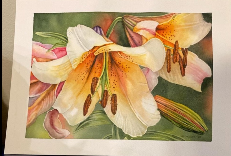
brought a sense of calmness to my life and has taught me
patience in every brushstroke. It's a relaxing and
expressive medium that allows me to bring beautiful
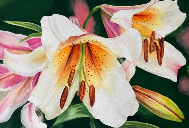
floral designs to life. Hey, I'm Chris, an
artist who finds joy and inspiration in
watercolor painting. Over the years, I've explored various artistic
techniques and mediums, but watercolor
remains my favorite. You may have seen some
of my artwork online, or perhaps you've attended one of my classes on Skillshare. In this class, we will be creating a stunning
lily painting. Whether you're looking
to decorate your home, gift a personalized piece or enhance your
artistic portfolio. This class is for you. This tutorial is perfect for intermediate and
advanced painters. As well as beginners ready to take their skills
to the next level. I believe that the skills you
will learn in this class, such as layering,
color blending, and softening will
be transferable to many other watercolor
projects in the future. We'll start by going over
some basic information about the symbolism of lilies and
their role in art history. Then we'll discuss the
correct mindset for longer and more challenging
projects like this one. Finally, we'll dive into mixing colors and
painting the background. Next, we will focus
on adding layers to create depth and detail
in the petals and leaves. I'll share tips and tricks for achieving realism
and vibrant colors. By the end of this class, you will have a beautiful
lily painting and a solid understanding of fundamental watercolor
techniques. I'm excited to guide you
through this process and share the techniques that
I've found over the years. If you're ready to
start painting, grab your watercolor paints, brushes, and paper,
and let's get started.
2. Project and Resources: I've prepared some helpful
resources for your project, which you can access in the projects and
resources section. There you will find a PDF
file containing a list of the supplies I used for
this particular painting, a reference photo, and my
finished painting to guide you. Line drawings are available
in different sizes that you can print and transfer
into your watercolor paper, allowing you to choose the size that suits
your preferences. Painted this on a 16 by 12 size. Additionally, there are work in progress photos that will help you follow the process and
focus on specific areas. Feel free to explore
these resources and use them to create your unique
and beautiful painting. Please don't hesitate to
share your progress shots and the final painting
with the class in the projects and
resources section. Also strongly recommend
that you take a look at each other's work in the
student project gallery. It's always inspiring
to see others work and extremely comforting to get the support of your
fellow students. Don't forget to like and
comment on each other's work. Lastly, I highly recommend, especially in this class, watching each lesson before
you start your painting. This will help you get
a better understanding of what to expect in each
part of the tutorial. If you find this class helpful, I would greatly appreciate it if you could leave
an honest review. Your feedback will
help me create better content and assist other students in
deciding whether to take this class.
Thank you in advance.
3. Lillies Across Art History: Lilies have been
celebrated for centuries, not just for their beauty, but also for their
deep symbolic meaning. In ancient Greek mythology, the origin of Lilies
is said to be divine and closely
linked to Hera, the Queen of the Gods. It all started with a
clever trick by Zeus, Hera's husband and the
king of the goods. Zeus wanted his mortal son, Hracles, who we often
known as Hercules, to gain divine strength
by nursing from Hera, even though Hracles was born
to Zeus and a mortal woman. To accomplish this, Zeus brought the infant Hracles to Hera
while she was asleep, allowing the baby to nurse
from her divine milk, However, Hera soon awakened and realizing what was happening,
pushed Heracles away. As she did, drops of her milk
spilled across the heavens. Those droplets of divine
milk created a brilliant, milky smear across the sky, which we now know
as the milky way. But the story doesn't end there. According to legend, some of Hera's milk also
fell to the earth. From these sacred drops, beautiful white flowers emerged. The very first lilies. These lilies were not
just ordinary flowers. These exquisite flowers
symbolize purity, beauty, and the
divine connection between the heavens
and the myrtal world. In Christian art, the lily is often associated with
the Virgin Mary. The connection is
deep and meaningful. Lilies, especially
the white lily, have long been seen as symbols of Mary's
purity and holiness. In religious art, lilies often appear with Mary in scenes
like the annunciation, where the angel
Gabriel gives her a lily to announce she would
be the mother of Jesus. During the Renaissance, artists like Leonardo
Da vinci and Sandra Botticelli
included lilies in their works to
convey these themes. The delicate petals and elegant form of the lily
made it a favorite among artists seeking to
infuse their works with both aesthetic beauty
and profound meaning. Art Nouveau embraced the
lilies elegant form, incorporating it into decorative designs
and stained glass. Across various
periods and styles, lilies have
consistently been used to convey themes
of beauty, purity, and spiritual
significance, making them a timeless and
beloved motive in art. Those of you who
are interested in artemanc may also be familiar
with L enorman cards. In this deck, card number
30 is the lily or Lilies. The lily card is rich
with meanings and connotations that often revolve
around themes of purity, virtue, peace,
tranquility, maturity, wisdom, as well as family,
ancestry, and sexuality. Understanding the historical
and symbolic significance of lilies enriches our appreciation and approach to painting them. I hope you feel a
bit more inspired. Now as we transition to the
next part of our tutorial, let's explore the mindset
needed to capture the essence of these remarkable
flowers in our artwork.
4. Mindset: Before we begin painting, I want to emphasize the
importance of correct mindset. Painting lilies and
light requires patience, perseverance, and willingness to experiment with
various techniques. Throughout this journey,
remember that it's not just about the final result, but the joy of painting itself. Each brush stroke is an opportunity to learn
and grow as an artist. I encourage you to
embrace the process, take your time, and enjoy every moment of
creating this artwork. We won't complete this painting in one setting. That's for sure. It's perfectly normal
to take breaks, step back, and return
with fresh eyes. This approach not only helps maintain the
quality of your work, but also allows you to appreciate the process
you're making. Here are some key points
for the correct mindset. Focus on enjoying the act of painting rather than stressing
about the final product. Each brushstroke and technique practiced adds to your
growth as an artist. Think about setting
small achievable goals for each painting session
to celebrate your progress. Understand that you won't finish this painting
in one setting. Taking breaks is
essential to maintain high quality work and
prevent frustration. Be patient and
trust the process. Plan your sessions and
take breaks to let the paint dry and to return
with a fresh perspective. Strike for consistent practice rather than perfect results. Mistakes are part of
the learning process and can lead to unexpected
and beautiful outcomes. If you're not familiar with some techniques and you would like to
practice them first, keep a sketchbook
or practice sheets to experiment without the
pressure of perfection. Advanced projects like this
one can be challenging, and it's normal to feel
frustrated at times. Maintaining a positive attitude helps you overcome obstacles. When you encounter
difficulties, step back, review your work, and approach the problem
with a calm mind. Preparation is key to success. Before starting, gather
all necessary materials and create a
comfortable workspace. Before you apply the paint, take a moment to consider your small goal and what
you aim to achieve. Can be something as simple as applying one layer to one petal. That's it. Keep
your goal in mind. Be open to changes and
adjustments as you paint. Sometimes the painting will take a different direction than
plant, and that's okay. Adapt to the flow of the painting and
trust your instincts. After each session,
take time to reflect on what you've learned
and how you can improve. Every painting is a
learning opportunity. Consider creating a visual
progress log where you document each stage of your
painting journey with photos. This log can help you track
your improvements over time and provide a visual
reference for future projects. Take notes alongside
your visuals to capture insides techniques explored
and ideas to refinement. With these key points in mind, let's now begin our painting
journey. Happy painting,
5. Masking: Let's begin by masking
out the main shapes. The outline of the lies is not difficult and it is possible
to paint around it. If you don't have masking fluid or don't want to use
it, you don't have to. I like the comfort of not
worrying about the main shape, so I'm going to mask it out. I'll be using Windsor
Newton's masking fluid with a yellow tinge, which I always use and have
never had problems with. Here I have an old cup. This is a piece of soap. And here's my old brush just
for applying the masking. Never use your good
brushes for this. We will also need water. I'll start by puring some masking from the
bottle into an old cup. Then I will quickly
close the bottle. If masking in the bottle has contact with oxygen
for too long, it will create clumps. It's best to keep it open for as short a time as possible. First deep the brush
in water and then rub it several times
on the piece of soap. This creates a protective
coat that will help keep the bristles in good
condition for much longer. Now with the soap applied, Dep the brush in
masking fluid and start applying it to the
edges of the main shapes. Do this very carefully. Don't hurry and try to
create smooth edges. Remember that the edges
that you create with masking fluid will define the
edge of your main subject. Try to keep them as
smooth as possible. Smaller elements like this
leaf can be covered entirely. For bigger shapes, it's enough to apply the masking
just to the edges. Be very generous. A layer of masking
fluid should be thick. If it's thick, it will be
easier to remove later. If it's too thin, it
might not protect the shapes well and could
be harder to remove. When it comes to the
leaves at the bottom and the stem, you have a choice. If you like, you can
mask them out and then paint those shapes the same way as we will be
painting the flowers. However, I decided not to
mask out the leaves and the stem because I know the
background will be green. Green is a color that
is very easy to lift. The leaves and the stem don't
have many light colors. They are mainly highlights. In this case, I
thought I could use the lifting out technique to create what I call ghost shapes. This means I won't be painting the leaves as we normally would. Instead, I will
create their shapes by lifting off the paint
in the highlight areas. Adding some colors
were necessary. If you're not sure what to do, you can take a break now and watch the part
with the leaves. Then you can decide whether you want to follow my technique or mask out the leaves and paint them later in the usual way. I think the way I
created the leaves adds a bit of a
mystic feel to it. Those subtle shapes are
not very prominent. They blend with
the background and create a nice cohesive
hole with the background. Painting them in a regular
way would probably connect the leaves more with the flower than
with the background, they would be more prominent. So it's really a matter
of personal choice. By creating them this way, I put less emphasis
on the leaves. In the class resources, you can find an
illustration showing exactly where I
applied masking fluid. I think it will help you apply the masking in the
correct areas. When you finish, dep
the brush in water and rub it on a piece of soap
several times to clean it. Now, let's wait until the
masking dries completely. When you're ready, we can move on to painting
the background.
6. Background: Now that the masking
fluid is completely dry, we can start painting
the background. Let's first prepare some colors. I'll start by mixing winds or yellow deep with permanent rose. This mix gives a nice, red, warm pink or orange, depending on the proportions. We will use these colors
a in this painting. I want to keep it more
on the pink side. I will use this color to paint the blurry pink shape
in the background. We will also need
greens, of course, I will be using my
standard colors, which I use most often, green gold for the
warm light green, and windsor green yellow shade
for a rich, vibrant green. On its own, windsor green
yellow shade is too strong, so I always mix it with either green gold or something
else to mute it a bit. At the top of the mixing space, I will also keep paints gray, which will help me create
dark shades of green. We will need a lot of paints gray for this dark background. The flower petal
in the upper part divides the background
into two shapes, which is always nice because it allows us to manage
smaller sections. Let's start by painting
the upper part. Begin by applying a layer
of water to this area. We will be painting wet on wet. Always use this technique
if I want to achieve a smooth background with nice
smooth colored transitions. It's the easiest way to paint
such a background without getting an overwork to look
if you follow a few rules. First of all, apply
a lot of water. It's better to apply more
water than not enough. The paint needs water to
spread freely on the paper. I'm using a size 12 brush here. The size of the
brush also matters. You cannot use a small brush because you will quickly
get an overworked look. The bigger the
brush, the better. This area should be glistening. If you see paddles of water, try to spread them
across the surface to maintain an even
wetness in this area. Now, pick up the reddish pink
mix of winds are yellow, deep and permanent rose and start by painting the
pink shape in the back. I'm adding slightly more permanent rose to keep
it on the rose side. Oh. Next switch to the
worm green with more green gold and
less windsor green. Apply this color in
the lightest areas. If you use dabbing
motions with the brush, just dabbing it on the
paper several times, you will release more paint than with the regular
brush strokes. I often use this technique to release more paint from
the brush to paper. The paint will slowly
spread in the water. Try to keep the shapes a little
distance from each other. Now start adding
the darkest green, which is a mix of the two
greens and paints gray. Don't force the paint
to move with your brush or try to blend the
colors with your brush. The colors will blend
naturally on their own. Our task is just to
transfer the paint from the palette to the paper and apply the colors
in specific areas. In a minute, we will start
tilting the painting, and the colors will
blend on their own. In the darkest places, I'm using more
concentrated paint. This gives us a darker tone, but concentrated paint
also spreads less, allowing us to control the spreading by adjusting
the concentration. Once I finish adding the colors, it's time to tilt
the painting in different directions to make
the paint move on the paper. During this process, the
colors blend smoothly. We're not using a
brush for this. We only use the brush to remove any excess gathering
on the edges. I found that many students often say their backgrounds
look overworked. I think the reason for
this is that they use not enough water and try to blend
the colors with the brush. Often when the paint is
already too dry for blending. As a result, instead of a
nice smooth background, you get a lot of brush marks creating that overworked look. To avoid this, you need to use more water and
more watery paint, also bigger brush and try to resist the urge to blend
the colors with your brush. Use your brush just to
drop the colors onto the paper and blend them
only by tilting the paper. Also, if possible, try to paint the background
in one layer, especially if it's green. A second layer on the background may disturb
the previous layer, no matter how dry it
was and create a mess. This is especially
true for green, which is very easy to lift off. If it's a green background, paint it in one layer. That's what we're
trying to do here. Remember that the
paint will dry paler. When it's wet, it
should be darker than your intended result color. Janet Whittle, one of my
favorite watercolor artists, and my first inspiration, once said, if it's right, when it's wet, then it's wrong. This means that if
the tonal value of the color looks correct to you when the
paint is still wet. It will be incorrect when it dries because
it will dry paler. That's why we need to use a bit darker paint at the very beginning to get the
result we are aiming for. Tilt your painting
until you see that the paint settles down
and stops moving. If you notice any larger paddles of water gathering on the edges, remove them with a
clean dumb brush. While this area is drying, we can start painting
the next one. Make sure you have enough
paint on your palette. I always think I have enough, but usually during painting, I have to prepare more. I'm always surprised by
how much paint I need, especially when painting
something dark. As you can see, I use a different brush for
preparing colors. It's just a cheap flat brush. It allows me to pick
up more paint quickly, and it's easier to prepare
colors with it because it's not as soft as my regular round
brushes for painting. Now start again by
applying a water glaze. Begin in the upper right corner. My water isn't clean anymore, but that's okay since the
background will be dark anyway. I'm applying the paint up
to the area under the butt. I won't be able to paint the rest of the
background in one go, the entire background, so I'm wetting a smaller, more
manageable section. Start by applying the pink. Notice that my pink areas are initially much bigger than
in the final painting. That's because I know that
when I apply green around it, it will spread and push
some of that pink. I want to make room for that. If I applied a
smaller area of pink, the green might push the pink too and the pink
might disappear. Now switch to dark green and start applying it
from the upper part. The petal there divides the
background into sections. We want to keep the
continuity of the background, so try to match the dark tone of the green to the dark green on the left side of the petal. Again, use dabbing motions with the brush to release more
paint onto the paper. Notice that my color is
really dark but not dry. The paint consistency is
not creamy, not battery. There is a lot of water. I would say the
consistency is milky, perhaps slightly more
dense than masking fluid. It's fluid, but you can feel
that it's not creamy yet. Apply dark green and lighter
green with more green gold. Try to control the spreading of the paint by adjusting
the consistency. If you see that the paint
is spreading too much, it's a sign that you need
slightly thicker paint. For example, ad the pink areas, I'm using thicker paint
because I don't want the green to spread and completely
cover the pink. In other green areas, I may use slightly
more watery paint and allow it to spread freely. While the paint is still wet, I can add more paint
to darken the tone. The paint that I'm adding
on top of the paint already on the paper has
a thicker consistency. Oh. While I'm adding the colors, I'm also tilting the painting to encourage the paint to
move and colors to blend. Now we can continue
applying a water layer at the bottom and finish painting
the background there. I'm starting by
applying green gold. This time, I'm keeping in mind that there are leaves here, so the colors I'm
applying will also be the colors of those
leaves more or less. On the left side, I'm
also adding some pink. It's okay if it
blends with green here and create neutral colors. Add some darker green in the small spot
between the petals. Now that we've applied the
colors to the background, tilt the painting again so that all the colors
blend naturally. When everything settles down, let it dry completely. I suggest leaving it
to dry naturally. But if you want to speed up the drying time
with a hair dryer, wait until the sheen is
gone from the paper. This is how the painting
looks after this stage. When the background
dries completely, we will paint the
leaves and the stem. Oh. Oh.
7. Leaves and Stem: The background is
now completely dry, and we can begin
painting the leaves and stem or creating
them, I should say. For this stage, I will be
using my scrubber brush, although a regular round
brush will also work. In fact, you will
see that I will switch to a round brush shortly. The idea now is to use
a clean damp brush to lift out green paint from the highlighted
areas on the leaves. If the green is not moving, then your brush still. However, be extremely
careful because, as I mentioned, green is very, very easy to lift out. You need to find
the right dampness of your brush, a sweet spot. Gently wet the area from where you want to
lift off the paint, dab it with a paper towel
and reveal a lighter spot. B. I've noticed that my
scrubber brush leaves two harsh brush marks due
to its stiff bristles. Here I've switched to my
regular round brush size eight, which is very soft. I'm gently wetting the areas from where I want to
lift out the paint. This brush works well for green. For many other colors, it might be too soft. Now, imagine you're
painting the light. The more paint you lift out, the lighter the
area will become. We may leave those lighter
areas as they are, but I think they might not look good because they
would be a bit, so we will also apply some color to blend
them with the rest. On the stem, we just
need to lift out a little bit of paint from
the left end the right sides. The leaf on the right side has two distinct highlights
on the edges, so we want to leave them off. They meet at the
tip of the leaf. Additionally, there is a
lighter reflected light at the bottom of the leaf. M Now with a slightly
darker green tone, I want to add some shadows. But be very careful here. Remember that green is
very easy to lift out. So when you want to
apply more color, do this quickly and in
just one move if possible. Apply the paint quickly
soften the edges and finish. If you fiddle too,
you might end up lifting out the paint
instead of applying more. On those lighter areas
that we've just re, I'm applying green gold just
to add some green to them. These areas will
still remain lighter, but they won't be
almost white anymore. We want to add some
green to blend them in. Let's gently and quickly add some green to other
parts as well. T That's all for the leaves. I think they look really good. Now I'm going to use this rubber masking pick up tool to remove the
masking fluid. You can use your fingers if
you don't have the tool, but I prefer using it. Remember earlier when
I mentioned that masking fluid should
be applied thickly. This is when it's applied
in a thick layer, we can now remove it
almost in one piece. We can leave the beginning and then peel off the rest
easily like this. The masking fluid is off, and now we can move on to the next part where
we will soften some edges and apply masking fluid again this
time to the statements.
8. Softening the Edges, Masking the Stamens: When we remove the
masking fluid, sometimes the edges are not
as smooth as we would like. This depends on how careful
we were during application. If some edges are
not smooth enough, this is the time to smooth them out before we start painting. For example, this edge of the bd could have
been a bit smoother. It's not bad, but I just want
to demonstrate the idea. To smooth out the edges, I always use a flat scrubber
brush with stiff bristles. With a slightly damp brush, tease the edge gently. When you see the
paint start to smear, dab it with a clean paper towel to remove the activated paint. This technique helps us to smooth out the
edges effectively. Now, before we start
painting the flowers, I think it's a good idea to apply masking fluid
to the statements. It would be quite difficult
to paint around those shapes, so masking fluid will
allow us to paint freely without worrying too
much about those elements. We didn't apply masking fluid earlier when we
were applying it on the edges of the flowers because the staeens are connected
to those edges. This means that if we had applied masking fluid
to both at once, when we remove the masking, we would also remove
it from the stamments, because they are
connected with the edges, which wouldn't make sense. That's why we had to
divide this process and apply masking fluid to
the stamens separately. Again, be patient and precise. Take your time with
applying the masking fluid. It's better to apply
the masking fluid inside the shapes
not up to the edges, rather than going over
the pencil lines, if that makes sense. If we go over the pencil lines, we will create
thicker boundaries, which can be difficult
to refine later. On the other hand, if we
apply masking fluid inside the pencil lines
and overlap with the colors of the petals
of what's around it, it will be easier to remove the paint with
a scrubber brush, create a smooth edge, and adjust the
statemen if necessary. Hope this makes sense. Of course, ideally, we
always want to apply masking fluid precisely
along the pencil lines. Leave the masking fluid
to dry completely, and when it's dry, we will
start painting the flowers.
9. Yellow Layer: The masking fluid is dry, the statements are protected, and now we can start
painting the flowers. The entire white area may
seem quite overwhelming. To alleviate that feeling, I think it would be
beneficial to apply as much color as possible
right from the beginning. Let's start with the
yellow in the center, which is the most prominent. We can see yellow not only in
the centers of the flowers, but also at the back of
the petals and on the bud. By applying yellow
to all these areas, we will cover quite
large sections, and the white paper should not be as overwhelming anymore. My paints have already dried, so I'm spraying them
with clean water. This is also a good moment to change the water in
your water container. At this stage, we want to keep the colors as clean as possible. I'll clean the left
side of my palette and prepare winds or yellow
deep on a clean surface. This will be our
main warm yellow. I'll prepare plenty
of this color. We'll also need Windsor yellow, which I use as my cool yellow. When you mix a warm color
with its cool counterpart, like warm winds
are yellow, deep, with cool Windsor yellow, you get a neutral
shade of that color. The same principle applies when mixing other warm
and cool colors, such as warm ten blue
and cool windsor blue, or worm Windsor red with
cool quinacrodon magenta. All right, the yellow is ready. Now I'm placing my brushes close to the shapes
I'm going to paint. This helps me to judge which size of the
brush I want to use. I initially thought I would need a smaller size than the one
I used for the background, but since the shapes
are quite big, I feel like a brush size 12
will be suitable for this. Wet your brush and pick
up the warm yellow. Let's start from this area. We're painting wet and dry, which many of you find
easier than wet and wet. Will mainly use wet on
dry for this painting, but in a few places, we will also employ
wet on wet technique. After applying the paint, rinse your brush in water, and dab it on a towel to
remove the excess water. With a clean tu brush, blend away the
color on the left. Now pick up yellow
again and apply generously in the
center of the flower. Keep the paint in a
milky consistency. The color should be strong,
achieving full saturation. Because we are
painting wet and dry, we need to work
fairly quickly to avoid unintended
drying of edges. If edges start to dry in
places we didn't intend, we can try to smooth them out, but ideally, we want to keep everything
wet until we finish. It's important to
use a big brush at this stage because if you
use a too small brush, we will get too caught
up into details and won't be able to cover
large areas quickly. We are not focusing
on details now. Our aim at this
stage is to apply yellow wherever we see yellow. This forms our base. Around the middle of the petal, we can transition
to winds or yellow, a cleaner, slightly
cooler yellow. This variety in yellow shades will add interest and
freshness to the petals. Somewhere around here when you apply yellow to
half of the petal, inser brush and
with a clean brush, start blending away the yellow. The brush doesn't
have to be dump. It can be moist with
some water on it, as this will help move the paint and create
a transition from a darker yellow tone to
the almost white paper. We're aiming to create a
smooth transition here. Though it doesn't need
to be perfectly smooth. With the wet on wet technique, we could strive for a
perfectly graded wash from yellow to almost white. However, with wet
on dry technique, it may be slightly
more challenging, but perfection isn't necessary. The reason is that we
will add more layers here so any blooms or hard
edges can be covered up. The most crucial aspect is
where to apply the yellow. Follow the reference
photo closely and concentrate only
on the yellow areas. Let's repeat this process
on the second flower. Here, the yellow is
concentrated mainly in the center and fades towards
the tips of the petals. Oh. Use a fairly wet brush
to blend away the color. It's perfectly fine if this very pale yellow layer
covers the entire petal. This will contribute to the
worm feel of the petals. I'm aiming to leave the
whitest areas unpainted. But if I accidentally
paint over them with this, very pale yellow, that's okay. I would have a very
light, creamy color. I'm painting very
freely right now. You might have
noticed that I'm not overly concerned about
the pencil lines. I'm enjoying the process of applying the paint
and blending it out. That's my small goal
for this stage. Applying yellow in the yellow
areas and blending it away. That's all I'm focusing on. I'm not worrying about
anything else right now. I know I will add
more layers later to refine the details
and tonal values. This base layer gives me a
sense of accomplishment. I see some yellow on the
pink petal. No problem. I'll apply yellow here and quickly blend the color
with the wet brush. Oh. Oh. Yellow here. All right, let's do it just a little
bit of yellow here, and then I'll move on
to find another spot. Forget about perfection. We just need some yellows
in specific areas. A touch of warm yellow here and there on the back of the petals. Very light wash. Lastly, some yellow on the bud. A light wash blended away. That's it. This is our first yellow layer,
base, mission accomplished. Now let this layer completely. In the meantime, let's move
on to the next lesson. We we'll talk about
botanical gray.
10. Botanical Gray: O H In this short lesson, I would like to talk about a
color called botanical gray. Botanical gray is a
versatile color that adds depth and realism to
botanical illustrations, such as those of lilies. Let's explore how to mix and use botanical gray effectively
to enhance your painting. Botanical gray is
a neutral color mixed from the three
primary colors. Its name comes from
its popularity among botanical illustration
artists who often use it in very detailed
botanical illustrations. Myself used it a few years ago when I was more into
botanical illustration. Of course, I'm using it now because it's a very,
very helpful color. Here you can see some
of my older works. If there is a section
in a painting with a neutral color that is
difficult to identify. It's somewhere between
gray, brown, beige, or creamy color, perhaps
leaning towards green, yellow or blue, but you're still not sure what it is
and how to mix it, then botanical gray
is your way to go. It can be a huge help. To mix botanical gray. First, think about the colors in your painting that you
have already used or you know you will use
later and try to identify whether you have
primary colors among them. Think about red,
yellow, and blue. For example, in
our lily painting, we have already
used two yellows, Winds are yellow, deep, and winds are yellow. One of them can be an ingredient
in our botanical gray. It doesn't matter which one. What matters is
that it's yellow. Have already used permanent
rose in the background, and I know I will use it
on the flowers as well, so permanent rose can be the second ingredient
in our botanical gray, and we still need blue. We've already used pines
gray in the background, which is actually
a very dark blue So this could be our
third ingredient. But if for example, we haven't already used any blue and we're not planning to use
any blue in our painting, then just for the purpose
of creating botanical gray, we can use any blue
from the palette. Paints gray is actually
quite dark and I probably wouldn't use
it for botanical gray, so in this case, I would replace paints gray
with ultramarine blue. The reason we're looking for primary colors we've
already used or are planning to use in
our painting is to maintain color harmony
and cohesiveness. If we used a totally
different red, yellow, and blue than the
ones in our painting, they would also create
botanical gray, but it wouldn't match well
with the rest of the colors. Now when we have the
three primary colors, we can mix them together, and the resulting color
will be botanical gray. Start with a very small
amounts of paint and gradually build up the intensity until you get the shade
you're looking for. Let's now examine why botanical
gray is actually called gray and explore the
mechanics behind mixing it. This is important to
understand because it can help you tremendously in
mixing tricky colors. Let's take a look at
a simple color wheel. Here we can identify
three primary colors, red, yellow, and blue. If we mix these three together, we will end up with
a neutral color. It can be gray, it can
be something brownish, creamy, beige, or something
along those lines. But it will be neutral. But why do these three
colors create those shades? Take a look. If we mix yellow
and red, we get orange. Orange is a complimentary
color to blue. If we add blue to our mix, we will neutralize the orange. If we mix yellow and
blue, we get green. Green is a complimentary
color to red. So if we add red, we will neutralize the green. Finally, if we mix red
and blue, we get purple. Purple is a complimentary
color to yellow. So if we add yellow, it will neutralize the purple. The idea is that we are actually mixing
complimentary colors, which, as we know,
neutralize each other. In botanical gray, we mix three
primary colors instead of two complimentary
colors straightaway because this process gives
us another advantage. We can shift the resulting
color more towards blue, yellow or red, depending on
the amounts of those colors. Because we use colors that we've already
used in the painting, we will always keep
the color harmony of colors by not introducing anything new unless
it's really necessary, such as when there is no
blue in our painting, but we must paint something
with a neutral color. The fact that we can shift
the color depending on the ratio of its ingredients
is very important, helpful and worth understanding. We can start by mixing the
three primaries to get a neutral tone and
then add more red, yellow or blue, depending
on the shade we need. Sometimes when I need a really neutral gray like
steel gray or bluish gray, I will take a short cut and mix burnt sienna with
ultramarine blue. Alternatively, burn
Siena with cobalt blue for a different tone or
burn Siena with pines gray, for a very dark brown or black. Now let's come back
to our painting and see how we can
use botanical gray.
11. Applying Botanical Gray: The yellow wash is now completely dry so we
can continue painting. At this stage, we can apply some neutral grayish color
of the shadow to the petals. When we were applying yellow, we could have actually
applied gray at the same time to create transitions from yellow
to gray straightaway. But that would be
too much to handle. There's no need to make
our lives more complex. We divided painting the
petals into stages. First, we apply yellow. Now we can apply gray, and later we will refine
the colors and add details. For our botanical gray, we will use our yellows. Here on the palette,
I have a mix of winds are yellow deep
and winds are yellow. We can use both of them.
That's a good start. Then let's add permanent rows, and we also need blue. We've used paints gray
in the background, which is a very dark blue, but that blue is too dark, so instead, I will
introduce ultramarine blue. At least two colors that we've already used in
painting are enough. The third one usually has to be added with discretion because it often happens that we don't use three primaries
in one painting. Now I'm mixing
these three colors until I get a neutral
worm base color. You can see how
the color changes depending on which
color I'm adding. Also notice that I keep
this color very watery. It has to be light in
tone because we want to build up the tone on the
paper with thin layers. Now we can apply this color either using the wet
on dry technique, like we did with
yellow or wet on wet. It doesn't really
matter because we can achieve similar results
with both techniques. I applied yellow wet on dry, so here I will show
you wet on wet. I'm first applying a water layer on the left side of this petal from the left edge up to that lighter white stripe
running through the middle. I remove the excess water
with a clean dam brush. And now I can pick up
just a little bit of that botanical gray and apply it along the middle
section and on the left. Because there is
water on the paper, the paint will spread and create that super
smooth transition. I don't have to work
with my brush too much. Let's repeat this
on the right side. In wet on dry painting, after applying the paint, we need to quickly
lease and blotter brush and then smooth out the edges
quickly before they dry. Here in wet on wet, we have a bit more time to work because the
paper is wet and smooth edges are
created naturally on their own when the paint
spreads in the water. Can just slightly direct the paint with the
tip of the brush. We can also drop in some yellow. White flowers reflect colors
from the surroundings, so we can drop in some
colors from other petals, the background, or the leaves. This will create a
nice cohesive hole. Notice that the tonal value
I'm using is very light. We don't want to go too dark
and destroy the effect. The petals are light
and catch sunlight, so we have to be careful. Now let's move on to
the petal on the left. Here I'm applying the water
not on the entire petal, but more or less in the
area I want to paint. Pick up a little bit
of your gray and apply it along the bottom edge
and on the right side. Notice that in the place
where I didn't apply water, I was able to create a hard edge to suggest
that cast shadow. I'm adjusting the
color of the gray by adding a bit more
permanent rose. Again, notice how light
those layers are. Now let's move on to the
bigger petal on the left. Begin by applying a water layer. This time, leave a dry gap at the bottom part where
we can see highlights. We want to paint
around that highlight. This illustration shows more or less where I
applied the water. Now, pick up your gray mix. I'm adjusting it slightly by adding more ultramarine blue. Start adding the gray
from the left side, the paint should
spread in the water, creating a very soft edge and blending smoothly with
the yellow underneath. At the bottom, paint
around that highlight. Leave also a small
gap on the edge. Add a slightly darker
tone on the right, behind the stems, and on the left side if you feel
it's a bit too light. Now I'm going to pick up
windsor yellow deep and add a little bit in the shadow area because I see it
in the reference. I'm also painting long stripes. The yellow shouldn't be too
watery because it would spa. I noticed even some
green in the petal, so I'm dropping in a
touch of green as well. It's a reflection
of the green leaves and background. Okay, great. That's all for this
petal at this stage. Let's move on to another one. This petal is even bigger so
to make it more manageable. I'll start by painting
the side of it. I'm applying a water layer on the left side and starting
with warm yellow. Now I will transition smoothly
to my botanical gray. I'll try to leave some lighter
areas for the highlights. Now, I noticed more
green on this petal, so I'm adding a bit more
of this color as well. As you can see, it's a process
of constant adjustments, and it's also art, not math, so I never worry too much
about perfect colors. I can get similar colors, but it really doesn't
have to be exact. At the end of the day,
it's my painting, and nobody will be comparing
it with the reference photo, except, of course, you and me. Other viewers of our painting
will just see the result, and that's all that matters. I feel like I need to add a
slightly darker tone here. Now on the other
side of the petal, it's a bit more tricky because we have to paint
around the highlights. Here I'm painting more wet and dry with a very watery
paint consistency. Thanks to wet and dry, I can create those sharp edges. If I decide that I
need smooth edges, I can always smooth them out. With wet and wet here, I would only get soft edges. I've also adjusted the color slightly by adding
more permanent rows. And the final petal
in this flower. Here I just want to paint this nice shadow on
the curled petal. I'm trying to mix a neutral gray with our three primaries. I started with ultramarine
blue and permanent rose, which gave me purple, and I'm mixing in a touch
of yellow to neutralize it. It's all very watered down
and very light in tone. Start by painting the edge of that shadow in an arc shape. Then quickly rinse
your brush and blot it and with a
clean dum brush, blend away the other side
towards the tip of the petal. I feel like there
should be a touch of more yellow on the edge, so I'm dropping it in and I'm trying to blend
it with the rest. I also noticed a
bit of pink here, so I'm lightly dropping
in permanent rows. I also want to add a bit more yellow here
and blend it away. Now on the second flower, I want to start with
this prominent shadow. This is one of those colors which is quite
difficult to identify, so the botanical gray
works perfectly here. It's like a light brown,
warm, base color. I'm starting with winds are yellow deep and permanent
rows to create orange. Now I'll be adding ultramarine
blue to tone it down until I see a similar color to the one from the
reference photo. Again, remember it's art, so it doesn't have
to perfectly match. Paint this nice round shape first and then blend
away the edges. Now, use a strong mix
of windsor yellow, deep with a touch of permanent rose and
paint the next shadow. Fill also gaps between the stems and blend away the
color on the second petal. The petal in the first
flower is steel wet, so now I want to dry
it with a hair dryer. I don't want to disturb the petal while I'll paint
the second flower. I want to add some of our g, which is now more
brown than gray. Apply the color
and smooth it out. I see more pink here, so I'm applying pure
permanent rows in a very, very light tone, very water mix. I can also see some yellow, so I'm adding that too. Everything is very light
like washes that I can quickly blend without
leaving any hard edges. Add more pink if you want it
to be a bit more prominent. Also add more yellow
if it feels right. When the paint is drying, I can see that the
high sheen is gone. The paint is just dump. I'm using a clean damp brush, and with just the
tip of the brush, I'm lifting out some
lighter stripes to create some textures
on the petals. We're almost finished
with this part. B patient. There are only
three small parts remaining. First, this wavy shape
in the upper part, this is very easy, start with the gray, and then add a bit of
pink and yellow, a simple wash wet on dry. There are also two
small petals left. Let's start with this one. Begin by applying a light
tone of permanent rose, running your brush through
the middle of the petal. Now add warm yellow
at the tip and at the bottom and try
to soften the edges. Paint also this
petal in the back. Use our gray and permanent rows. Add more yellow where necessary. Apply those basic colors and. That's all for this part. I hope you're happy with
your result so far, and you still have patients because we're in the
middle of the road. Take a break, may be
finished for today if you're tired or
paint something else if you've had enough of this and come back
with fresh ice. In the next part, we're going to use more permanent
and apply it to the lily in the back on the left side to the back side of the
petals and to the butt. Oh.
12. Initial Pink Layer: This stage took me
around 10 minutes, so it shouldn't take you too
long to finish this part. I will be using a
brush size ten. I'll clean a part
of my mixing space so that I can prepare
clean permanent rows. Now, here is the permanent
rows and above it, I will have winds
are yellow deep. Let's start with a light
pink layer over this area. Just a simple flat wash. Notice that I left a small gap
close to the pencil line. Now, let's add just a little bit of pink to the
petal in the back. After applying the paint quickly rinse and blot your brush
and blend away the color. We'll be painting wet
and dry in this part. I want you to really
relax and paint freely without worrying
about perfection. Just have fun and
enjoy the process. The next petal has
quite a lot of pink. I'm starting with
a very light tone. When I apply it and
soften the edges, the paint will still be wet, so then I can add a darker
tone in a few places. However, this is just a
very basic pink layer. We're not thinking about the details and finalizing
the petals yet. We'll be adding more
details in the next parts. Now we just want to apply
pink everywhere we see it. Notice also how it interacts with the yellow
from the previous layer. That's the beauty of
transparent water colors. It's also something you
should always keep in mind. When we apply layer upon layer, they interact with each other. You need to know how
one layer affects another in order to
avoid muddy colors. We know that pink
applied over yellow will create a warmer shade
of pink, orange or red. But the same pink applied over
green would create brown. On this petal, try to pay
attention to that light edge. I think this petal is really
beautiful and leaving that almost white edge will add more interest
and character here. We can already suggest some tonal values with lighter
and darker tones of pink. The pattern on this petal
looks almost like a feather. Try to recreate that. Uh finish this flower with a soft pink
blush on this petal. Now, let's paint
this small area. In general, I can
see purple here, so I'll use a mix of permanent rose with a
touch of ultramarine blue. After applying this color, while the paint is still wet, let's drop in a
little bit of yellow. Now, with a clean damp brush, try to lift out the
paint in the highlights. This is the first base layer. We will deepen the colors
here at a later stage. Finally, the flower
on the right. Start by applying permanent rows and then transition to
winds or yellow deep. We want to apply a
variegated wash here. A variegated wash is a technique where two or more
colors are blended together on the paper to create a smooth transition
or gradient between them. We created a variegated wash earlier using two
separate layers. First, we applied the
yellow layer on the petals, and then in the next stage, we applied botanical gray, creating a smooth transition
from yellow to gray. Here we are creating a variegated
wash in the same layer. It's good to remember
that in order to create smooth
color transitions, the paint must not be too dry. If it's too, it will dry too quickly,
creating hard edges. It's easier to create a variegated wash with
the wet on wet technique, but as you can see, it's also possible with the wet
on dry technique. The key is the
consistency of the paint, which should be quite watery, so it doesn't dry too quickly. In the upper part a yellow and pink and blend the colors
towards the tip of the petal. We're almost finished. There is also the bad that
we have to take care of. Nothing complex here,
just as before, pick up a very light tone of permanent rose and apply
it on the left side, running it through
the middle part. It's just a suggestion of color, not the final color. We're building up the
tones slowly while maintaining this beautiful
transparency of colors andity. Now we can dry everything
with a hair dryer. When you're ready, we can
move on to the next part.
13. Initial Green Layer: This part is even shorter
than the previous one, and it's very easy. We want to apply an
initial green layer on all green elements. The green I'm using
here is a mix of green gold and windsor
green yellow shade, which are the greens we also
used for the background. Let's start with this
leaf on the left. Apply a light green
wash and transition to a slightly darker tone
closer to the flower. Now pick up a darker
tone of green, adding a bit of paints gray, and with this darker tone, run your brush
through the middle. That's all for this leaf. Paint the smaller leaf below with the same
dark green mix. Use the same green
to paint the stem. The stem has a high
light in the upper part. Leave that area unpainted. After applying this green, add more paints gray to
your green mix to create a darker tone and apply this color running your brush through the middle of the stem. Making the middle
part of the stem than both sides creates an
of ness for the stem. Now, let's concentrate
on the color of the bud. Besides the green, I want to
apply also different colors. I think I'll start with
winds are yellow deep. I noticed a different shade
of yellow in the middle, so I'm now picking
up winds are yellow. And finally green. We're using the same
greens all the time, just in various proportions
and tonal values. Make sure you blend
all the colors, creating smooth
transitions between them. While the paint is still wet at a darker green tone
at the bottom side. In the upper part, add more green gold for
a warmer green. This is my painting
at this stage. I'm pretty happy with how
it's unfolding so far. I have to say that the size of the painting is really
enjoyable to work with. We now have the base for all
elements in the painting, except the statements,
of course. This base layer is a
great starting point. After this stage, it's up to you how much detail
you want to add, how precise you want to be
in the upcoming layers. Generally, how you want
to finish your painting. In the next part, we will finish the pink flower
on the left side. Oh.
14. Finishing Pink Flower on the Left Side: Now the fun part begins. I like the stage because
now that I have the base, I can slowly and calmly
build up each shape. We will be painting
each petal one by one, slowly finishing the entire
painting section by section. I'll be using a brush
size eight now. Let's prepare some colors. We will need permanent
rows. That's for sure. We'll also need windsor yellow deep to deepen
the yellow parts. Next to permanent rows, I'm also placing pines gray. A mix of those two will give
us a neutral dark purple. Let's begin with
this pink section. We have to deepen the
pink color so pick up permanent rows and applied
over this entire section. Now, I think we could introduce one more color, permanent
lysern crimson. Paint a darker stripe running through the middle
of the pink shape. If it's not dark enough, add a touch of paints gray. Next, use a more
concentrated permanent rose and apply it roughly in
the corners of this shape. No. Then fill the gap with a lighter tone of pink. I think that's enough. Now pick up a very
light purple tone created by mixing
paints gray and permanent rows and apply it
along the edge of this petal. After that quickly
blend away the color. M. Also add a tiny bit of purple between the small green leaf
and the deep pink petal. Leave the white edge unpainted. We will smooth it out later
with a scrubber brush. Now let's move on
to the next petal. I like to start with the most prominent elements
that stand out to me. Here it's that
deep purple shade. Use a mix of paints gray and permanent lysern crimson and apply the color to
the darkest area. Next, pick up Windsor yellow deep and apply
it at the bottom. When this warm yellow
meets the dark purple, they should create
a nice brown tone. There is also quite a lot
of pink on this petal. So apply permanent rows. At this stage, we're trying
to finish each element, so pay attention
to tonal values. In the upper part of this petal, the pink is lighter
than in the lower part. Try to that in your painting. In the upper part, I can
also see some yellow, so I will drop in
that color too. Now when I compare
this petal with the pink section we
painted earlier, I can see that the bottom
of this petal should be der as the tonal value is
as as that pink petal. I'm adding more
brown to the bottom. There is that tiny section
between the petals, so painted with a dark green. For the next petal, I need to prepare more of
this dark brown color. Let's mi the winds are yellow, deep, paints gray,
and permanent. You should get a purplish brown. Apply this color in
the darkest places. It's good to apply the
darkest colors first because this sets the
correct tonal value scale. We already have light tones
from the previous layer. By applying the dark tone now, we create a range
from light to dark. Remember we can always adjust middle values
as we proceed. Create a transition from this deep dark brown
through warm yellow, to pink, and purple. Don't worry about
any imperfections. They will add more interest and the natural
look to the pedal. Apply yellow followed by
purple on the edge in the shadow area and blend away the sclor leaving
part of the edge. Add deeper tones of purple
and pink, if necessary. Apply more intense
pink in the upper part and the yellow in the
middle. Blend the colors. Here is another way to create an interesting neutral color. If we mix purple with green, we will get another
neutral shade of gray. I will use this color
here to paint the shadow. H The tone is too light, so I will add a darker
tone until I see a higher contrast between this shadow and the
white petal above. Now switch to warm yellow and apply the color in
the yellowish areas. Switch to permanent rows, and after applying it, blend it with the yellow. Now use our dark brown to
paint the darkest areas. Switch back and forth between the dark brown, yellow and pink. Areas like this can
be tricky to paint because we have to deal with
a few colors at a time, but it's important to
stayed and patient. B. On this side of the petal, I will be using the neutral gray resulting from mixing
purple and green. Paint around the highlight. Don't worry about
leaving a hard edge. We will soften it later. Remember that the colors
will dry slightly paler. Make sure that tonal
values are dark enough. Adjust the colors and
tones if necessary. Apply a very pale yellow
in the highlight area. Apply a deep pink color
to this small section. Then mix permanent with
paints gray and use a deep purple toned
down by a touch of yellow to paint the
shadow within that shape. Now let's move on
to the last petal. Here I'm starting with
yet another kind of gray. This is a mix of
permanent rose and green. As you can see, there are many different ways
to create gray. If we stay within the
same color palette, they will all do good because we're using the same
colors all the time. Here I'm applying slightly
more pinkish gray in the top part and transitioning to a more greenish
shade at the bottom. While the paint is still wet, I'm dropping in permanent rose and even a touch of yellow. I'm adjusting the
colors as I go. M. Soften the edges with a clean damp brush. Use a more concentrated, darker pink to paint the dark
pink stripe in the middle. Add a touch of yellow
to paint the shadow. There are a of colors
within that small shape. O darken the shadow on the left, if it's too light and soften
the edges in the end. I dried this petal
with a hair dryer and decided that it's too light compared to the previous petals. I bravely decided to
apply one more layer. I started with deeper pink, and then I added a touch of
yellow to a a warmer tone. Finally, I applied
a mix of green and purple on the left to
darken that whole side. I also use the scler to darken the shadow on
the previous petal. After drying everything
with a hair dryer, we can take care of the
hard edges and highlights. I will be using my
scrubber brush now. Deep the brush in
water and remove the excess water by dubbing
it on a paper towel. Now with a clean damp brush, gently rub along the edge. When the paint is activated, remove it by dubbing that
area with a paper towel. This way, we will soften some of the edges
and also create highlights or lighter spots
that I can see in the petals. A scrubber brush is
such a helpful tool. It simplifies creating
some effects. I worry less about
making hard edges because I know I can soften
them with a scrubber brush. If I apply too much paint
in a highlight area, I know I can lift it out
with a scrubber brush. There are many
things that can be corrected in
watercolor painting, and I think it's
a myth that it's a very difficult medium
to fix mistakes. Most mistakes can
be easily fixed, not all of them,
but most of them. Our first flower is completed. I'm really happy with
how it turned out. Now I have a good
news and a bad news. Which one you would
like to hear first? The bad news. The bad news is that there are still two
flowers and a bad to paint. The good news is
that they will be easier to paint. I think so. After painting this flower, you may be tired, so take a break if you need to. When you're ready, we will
move on to the next part where I will show you how to paint the back parts
of the flowers.
15. Back Parts of the Flowers: Let's start by finishing
this small section. I'll be using a size
six brush here. Mix permanent rows with paints gray to create
a muted purple. If there's a bit of yellow
in the mix, that's okay. It will just mute
down that purple. It's not a saturated
purple that we need here. Apply this dark purple around the highlights and
then soften the edges. Add a darker tone of di smuted purple if you
feel it's too light. Once you finish, dry this
section with a hair dryer, if you went to d in
the highlight areas, use a scrub brush to
lift out some paint, and that's all for this section. Now, let's paint the back
of the flower on the right. I will start with
a size eight bruh, but I will switch to
a size as needed. Begin by applying
the dark purple mix in the darkest areas. Here I switched back
to size six because size eight was slightly
too big for this detail. Paint this long dark line and the dark elements
near the stem. Use a clean damp brush to
soften the edges to create a smoother transition between this dark color
and other colors. After painting these
dark elements, dry them completely
with a hair dryer. Now switch back to
a size eight brush. We will paint larger areas. Prepare a mix of green gold, winds are green,
and paints gray. Start with a warm green, mainly green gold, and apply it from the
top of the flower. Transition to yellow, as you move lower,
and then to pink. Apply a dark pink
tone in the middle of that section and add a
stronger green at the top. Paint over those dark elements. This build up of color will slightly darken
those darker areas, and we will achieve a smoother
transition between colors. Pick up winds or yellow deep and apply it in the
more yellowish areas. Use a darker pinkish purple
to deepen some areas. Now use a mix of green and pink for the upper
part of the flower, start with a light tone and adjust with yellow
or pink as needed. O. Let's dry everything
with a hair dryer now. Finally, add some small
details with a size six brush, and the dark mix of
purple and green, add darker lines to create a clear distinction
between sections. These darker tones suggest indentations while shaded
areas create rounded forms. Paint two parallel
lines running on this petal and darken
them if needed. H. Finish this section
by lifting out paint with a scrubber brush from
the edge of the flower. This creates a nice highlight and softens the
edge of the flower, making it look more natural. You can also create
highlights in other areas. With this, we finish the spart. Now it's time for a break, and after that, we will begin
painting the main petals.
16. Deepening Oranges: In this part, we're
going to work a bit more on the centers
of the flowers. I'll be using a size tan brush. At this stage, the centers have only a yellow
initial layer. This is great because now
when we apply deeper tones, the yellow will show through and give us that nice warm glow. What we want to do now is add more oranges and
darken the tones. Let's prepare a lot of windsor yellow deep and also
permanent rows on the side. Here at the bottom, I'm cleaning this area and preparing a
dark reddish brown color. I'm staying within the
same color palette and mixing winds are yellow, deep, permanent rose,
and paints gray. Let's begin by picking up an orange mix of
yellow and pink. Start with the area
between the petals, painting wet and dry. While the paint is still wet, drop in a touch of dark brown. Now, switch to winds or yellow, deep and finish this
section with this yellow. We can now adjust this area. I think adding a bit
more permanent rose and shifting the color to a more reddish orange
will look nice. At this point, we can compare this small section with other sections in
terms of tonal value. For example, the pink
area on the left has a pretty similar tonal
value in the reference, and it's also pretty
similar in my painting. I think it's all good. Before continuing,
let's quickly dry this small section and wait
until the paper cools down. Now we'll focus on
the big left petal. Again, let's begin
with an orange. This time, I want
to be slightly more careful using yellow than p. My orange is just one tone darker than the yellow
I already have on the paper. I think I need a bit more
pink near the center. It always amazes me how
dark we can go and how dark we should go with watercolors to get
the tones right. Try to blend away the color, not letting the paint
create a hard edge. Oh I can compare this area
with the previous petal. Now the tonal value of these two petals in this
area is almost the same. Looking at the reference photo, I can see that I
need more contrast between these two petals to
make a clearer distinction. I have to add a slightly
darker tone now. Use dark brown near the center to darken
that area even more. Again, smooth everything out. This is not the
final layer here. Once this one dries, we will also paint the
darkest indentation, but we have to do
this gradually. Now, try to repeat this
process in the second petal. The general idea here is
to deepen the colors, make the yellows deeper, add more orange near the center, and gradually darken that
c. We're painting wet and, but if you prefer,
you can also paint. It should be easier
to blend the colors. Here I'm thinking about this elongated diamond
shape in the middle. I'm applying more
permanent rows here. I think that's enough
for this petal. I also want to apply
more yellow and then drop in some orange
on this petal above. I can see that the edge
of this petal is lighter, so I'm leaving a gap
along that lower edge. To finish this flower, let's also add more yellow
to the petal on the left, and while it's still wet, drop in more orange. In comparison with other petals, this one looked a
bit unfinished. I thought it should have
a bit more color to it. Now we can move on to
the second flower. Begin by applying
winds or yellow deep. Use the highest now and make the yellow
the intense you can. Try to stay from that
orange shadow below. Leave a small gap there. Blend away this yellow color. Now pick up a very
concentrated permanent rose. It should be more concentrated because we want to apply
it over the yellow, but we don't want it
to spread too much. At a touch of brown
near the center. Now with winds are yellow deep, and a little bit
of permanent rose, deepen the colors on
the bottom petal. E cleaner yellow behind the statements and
blend away the colors. Now we can dry everything
with a hair dryer, and in the next part, when everything is
completely dry, we will finish
darkening the petals.
17. Final Darkening of the Petals: No. When everything
is completely dry, we can finally add the darkest
elements to the petals. I'm thinking about this
deep dark indentation in the middle near the center. Because there are
hard edges there, we couldn't paint this earlier. With wet paint, we wouldn't
get those hard edges. Now that the overall colors
of this petal are fine, we can focus on this dark
element with hard edges. We'll be using the
same dark brown, which is a mix of
winds are yellow, deep, permanent rose,
and paints gray. Let's begin by carefully
painting the dest part. Because we are now
painting wet and dry and using more
concentrated paint, this dark tone should
remain dark enough. Switch to an orange mix
and continue painting. Blend away the colors. Darken the areas
near the center. Apply more permanent
rows in the center. You see how we're building
the tonnel value and the color with many
transparent layers. The colors are now
really intense, but at the same time,
they look fresh and not. Now, let's repeat the
process on the other petal. Again, start with
the dark tone and transition to an
orange mix of windsor, yellow, deep, and
permanent rose. Add more permanent rows in that diamond shape
and near the stamens. Blend everything away. Notice how each thin
transparent layer also affects the color of
those almost white areas. They are not white at all. However, if we leave almost white paper in some
areas in the highlights, we will achieve the effect of white petals because of
the relativity of colors. I think I want to apply even more dark orange
near the center. Oh. Now pick up a dense consistency
mix of permanent and the dark brown and paint the dark spot
on the other flower. Now clean your brush and
pick up a thick consistency of winds are yellow
mixed with pink again. We need thick consistency
because we want to achieve very deep tones
here with full saturation. Apply this red color roughly
around that dark brown. Now pick up just winds
are yellow deep and apply it around the red,
creating a transition. Finally, clean your
brush and with a moist brush, blend
everything away. This way, we've created this
fiery center of this petal. L et's dry everything
with a hair dryer now. And when it's dry add orange to the left side
of the petal above. We wanted to match the rest of the petals and create
a nice cohesive hole. Use a very watery
mix of the brown and yellow and apply it
to the petal in the back. If we darken it slightly, we will push it a bit
more to the background. Pick up more concentrated
permanent rows and gently add some pink marks. Because the color is
more concentrated, it shouldn't spread too much, but it should create
nice blurry edges. Now it's a good time
to take a break and come back in a
moment with fresh eyes. We will take an overall look at the entire painting and identify
areas that we could at.
18. Final Adjustments: Now I want you to take a
good look at the flowers and identify any areas that you
think you should adjust. I'm thinking mainly about
areas that either need more darkening or where you want to intensify
or add more color. For example, I want to darken the shadow on this
petal to create more contrast with
the white petal in front and push this
one more to the back. I also want to add a bit
more pink to this petal. I think this curled petal
also needs some more color. With a light tone of our brown, which looks like a very light
tone of a muted purple. I'm painting the darker line running through the
middle of this petal, and then I'm adding yellow at the and more
permanent at the bottom. Notice that I'm
painting very freely. I don't worry about
perfect shapes. I just want to convey
the overall feel of it. I'm even holding my brush very high so that my brush
movements are looser. When the dark tones are
applied to the flower, I can see that many of the shadows are
slightly too light. For example, this shadow here. I'm applying one more thin layer to make the tone one step, and I'm blending
away the colors. I do the same with this shadow. I feel it should be
one ton darker in comparison with all other
elements in the painting. I don't want to exaggerate, so I'm adding really
light layers. I feel like this area
should be much darker. In fact, in the final painting, it's still too light in comparison with the
reference photo. But I was afraid that if I
applied too dark a color, I would destroy the effect. It might have been too dark
and I might get a dirty look. Besides it's my painting, and the photo is
just a reference. I don't have to follow
the reference exactly. If everything looks good
to my eyes in my painting, then I don't have to strictly
follow the reference. Oh Finally, just a little bit of
darkening on the left petal, and that's all for this part. Now we can dry
everything completely. It all looks pretty good. Of course, if you like, you can work more on the petals. There are a lot of details, a lot of textures. You can see that I still
have some pencil lines marking the areas
where there should be some lines or folds. But it doesn't mean I have
to paint all of this. I'm assessing the overall
look of the painting, and at some point, like right now, I decide
that it's enough. I don't have to go
into more details. The painting looks good now, and I'm happy with it. When you dry everything,
we can move on to the next part where we will
be using a scrubber brush.
19. Softening the Edges, Retrieving Light: In this short part, we will
be using a scrubber brush to soften some of the edges
and create spots of light. Make sure that everything
is completely dry. Keep a piece of paper towel in one hand and your scrubber
brush in the other. Deep the brush in water and remove the excess
on the paper towel. With a damp brush, start softening or
fixing the edges. For example, here I went a little bit over the middle part, so I can gently remove that
overlapping paint by rubbing it with a scrubber brush and then dubbing it
with a paper towel. Just realized that I should change the
water in my container because I might transfer the color of that
water to my painting. We want clean water and
a clean brush because we will also be creating light spots and they
should be clean. Make sure you have clean water
in your water container. Let's soften this edge. Notice that softening the
edge of the paint where it meets white paper creates
a glowing light effect. When the edge is sharp, we have a harsh cast shadow. But if we soften that edge, it not only creates
a softer shadow, but also enhances the
illusion of glowing light. I'm gently creating some
light spots on the edge. On the next pedal,
we can also remove the paint to create those
beautiful light spots. It looks like we are
painting with light. Create a high light running through the middle of the pedal. On the right side, we were painting around
those highlights. We didn't worry about leaving hard edges because
we knew that we would beautifully soften them now and create a
fabulous light effect. We can also lift out some paint from orange areas to
create those highlights. This is another shadow that
meets with white paper. This is a perfect area to soften that edge and create a
glowing light effect. Let's also bring out some highlights on
the second flower. With that, we can
finish this part. With took good care
of the petals. Now they look really beautiful. The only thing left
before painting the stamens is to add
those n dark dots. M.
20. Dark Dots: For this part, I will be using
a smaller brush size six. We will be painting those
dark dots on the petals, so we need a dark color. Again, we will mix
permanent rows, winds are yellow,
deep, and paints gray. Keep the mix pretty
concentrated. The paint shod have a
creamy consistency because this will allow us to achieve
dark dots in just one go. There is no risk of
overworking this because those are
really tiny areas. Now, following the pencil
drawing, the reference photo, or just your imagination
and intuition, paint those dots to add more
interest to the petals. Don't hurry. Take your time. Try to make each dot different. If they are too similar, they would look unnatural, Vary the size and the shapes. I initially painted
two small dots, and then I went over them
again to make them bigger. I'm also using this
dark color here and there to darken some
areas even more. For example, I applied a bit of that dark tone near the center again to make
that area even darker. Of course, I quickly
softened the edges. From this angle, you can see how smooth my color transitions are, even though I was painting
mainly wet and dry. This is because I was
using enough water. I was able to blend away the colors quickly and
blend them together. Wet paint wasn't drying quickly, so I was able to
remove all hard edges. Besides we applied a
few very thin layers, and each layer also
smooths out the previous one and hides
all imperfections. That's why in the end the
colors look so smooth. Oh. On the second flower, the dots are more reddish, so I'm using more
permanent rows here, mixed with a touch of
winds or yellow deep. With those dots, we have
finished the petals. I hope you're happy
with your achievement. It was a very long process, but I think it is
really worth taking all the necessary time because it's a really
beautiful painting. Now let's take a break
and in the next part, we will paint the bud.
21. Bud: I know what you're thinking. You forgot about the bd, and you thought that only statements were
left. I know, I know. This painting takes
a lot of time, but that's how I paint. If you want to achieve
similar results, unfortunately, there
are no shortcuts. We have to do everything
step by step with patients, and in the end, we
will have a beautiful painting.'ll be using
a brush size six now. We will need various colors, dark brown, a mix of pink, yellow, and paints gray. We will also need green gold, winds are green, permanent rose, winds are yellow, deep, and a dark green mix of
green gold, winds are green, and paints gray, so all the colors we've
been using so far. Let's begin with
this dark brown and paint the most prominent
dark lines in the middle. Now switch to permanent rose and continue painting
with the color. Add green gold to that
middle section of the bud. Now with that dark green, start painting the lines
at the bottom of the bud, Switch to permanent rows and add a bit of
that color here. Now come back to green. This time, e a mix of green gold and windsor green and
continue painting. Switch back and forth between darker and lighter
shades of green. Use green gold to paint
warmer green stripes. Start painting individual
lines that will result in that characteristic
look of the bd. Leave unpainted gaps between
those lines for highlights. But if you accidentally
cover the whole area, don't worry we can always lift out the highlights with a brush. Near the petals use more
permanent rows and yellow. The colors of the bad
generally transition from orange, brownish, pink, on the left to
green on the right, with some yellows in the middle. But of course, you
can use any colors. You may want to paint the
entire bad with just green. That would be
absolutely fine too. Paint the stripes on the entire
bat with a lighter tone. Try to establish first where those stripes should be
with a lighter tone, and later, you can
always darken them. Now with a darker tone, I will be darkening
those stripes while still trying to keep those places between
the stripes lighter. The bottom side of the bud
is generally than the rest, but the bottom edge
is slightly lighter. There is a reflected light that helps to create an
of a round form. Now, build the tonal values of those stripes by
adding more green, pink, orange, or
whatever is necessary. A When you're happy with the tonal values, dry everything
with a hair dryer. When it's dry, use a
scrubber brush to lift out some highlights from
those lighter areas in between the stripes. We're not only softening
the edges now, but also creating
those highlights that will eventually form the
nice texture of the butt. O. Finally, I decided to apply a unifying glaze
on the left side, and for that, I'm using
Windsor yellow deep. I'm applying a transparent
layer of this color on the left part of the bad
and blending away the yellow. This adds a nice yellowish tone and reflects the colors
from the flowers.
22. Small Leaves and Stem: We're almost there, really. We're very close to the end. Now let's finish the small
leaves and the stem. Use a dark mix of green gold, winds are green and paints gray, and paint two stripes like this. 00. Now, clean your brush and
with a clean tum brush, blend away the upper
side of each stripe so that the upper edge is soft while the
bottom edge is hard. Paint a similar single stripe on the smaller leaf and also soften it towards
the upper part. Next, darken the middle part of the stem with a darker green. Make the stripe wider at the bottom and narrow
it towards the top. Now let's dry everything
with a hair dryer. When everything is dry, use a slightly bigger
brush size eight. Pick up a warm shade of green green gold and apply a unifying glaze
over the leaves. Apply more of that green near the petals and keep the tip
of the leaf lighter in. Apply a unifying glaze over the entire smaller leaf as well. Now, let's also apply a
unifying glaze over the stem. Use a mix of green gold
and windsor green. After drying everything
completely with a hair dryer, we can also lift out some
paint to create highlights. It's not necessary, but I
think I want to do this. I especially want
to lift out and soften the highlight at
the top of the stem. Now we can finally remove the masking fluid
from the stamens, and in the next and the final
part, can you believe it? We will finish our painting. Oh. Oh.
23. Stamens: Oh. I Welcome to the final
part of these tortures. I promise this is the last one. For painting the statements, I will be using a
brush size six. Let's begin by applying a yellowish green color
to the filaments. I'm using a mix of winds or
yellow deep, and some green. Use more yellow near the center and more green
towards the anthers. Don't paint
individual filaments. Apply this base color
on all of them. In the second layer, we will add shadows and make clear distinctions
between them. Dry everything
with a hair dryer. Now use a mix of
windsor yellow deep and permanent and apply this
orange color to the ans. While the paint is still wet, drop in some of our dark brown
mix to suggest the shadow. Repeat this process
and all other ans. Here, I'm leaving an
an unpainted edge to suggest the highlight. After drying
everything completely, we are now ready to
add the details. I'm preparing a dark green
with our mix of green gold, windsor green, and paints gray. With this dark green, paint the dark shadow
between the filaments. Now pick up a lighter green and continue painting
with this green. Paint the main filament and add more dark green if needed. Apply this dark green also to the edge and near the anther. This should create a round form. You can also lift
out a highlight. Now before moving on,
dry this filament. Paint other filaments similarly changing the colors accordingly. Some of them are
more yellowish with more orange near the
center of the flower, while others are more green. Reflect that in your painting. After drying everything, use a scrubber brush to lift out the paint and create
the highlights. Now, prepare a dark
mix of yellow, pink, and paints gray. This time, add more
paints gray so that the resulting
color is almost black. Now use this black
color to paint the darkest parts
of the anthers. I know your patience
is running out, but instead of regular
brush strokes, use the spling technique. Apply, many short
brush strokes or dots close to each other
to create this texture. This way, we can
create an illusion of pollen on the anthers. The surface will not be flat, but will have this nice texture. At this stage, paint only the
black, the darkest parts. A When you finish, use a mix of yellow
and pink to apply this brownish color to the
ans to unify the shapes. Try to the color
using more yellow at the top of each and making
the bottom part slightly. A an With that, we could finish this painting. But I went one step further, but I didn't record it. I can only tell you about it. If you take a closer
look at the anthers, you will notice that
each of them is covered with one more
layer of tiny dots. This is not very important, but I think it creates
a nice texture effect. If you still have a bit of
patience, you can do this too. I think it looks really nice. Now we can finally call
this painting finished. That was a really long project. I usually don't make such long tutorials because
I know it can be tiresome. It's very overwhelming. It also takes really, really long time to
edit all the videos. It takes a really long time
to edit such long tutorials, especially if I'm painting
on a bigger size. But this is an example of
a more complex painting. You can see how much
time it takes and how much patience it requires. If you enjoy the process instead of focusing
on the result, if you break it down, if you take breaks, it's always a very
pleasant journey. In the end, you have
a beautiful painting. In the last part, we will make a summary of
what we've learned.
24. Summary: Let's summarize what we've
covered in this tutorial. We explored the symbolism
of lilies in art history. We discussed adapting
the right mindset for longer and more
challenging projects. We learned how to
effectively use masking fluid and create
smooth dark backgrounds. We practiced various
techniques such as wet on wet, wet on, and softening, applicable to any
watercolor painting. Discovered how to build thin layers of transparent
colors to achieve depth. We explored botanical gray, including how to
mix and apply it. We studied techniques for
achieving light effects on white petals and understanding
their true colors. Thank you for joining me
on this creative journey. I appreciate the time
you've spent with me. I encourage you to give
this painting a try, even though it's
really challenging. It was enjoyable to paint, and I'm pleased with the result. If you've already completed your painting,
congratulations, well done. I'm really proud of you, and you can be really
proud of your result. Thank you very much for
watching and happy painting by
 Krzysztof Kowalski, Watercolor artist