Transcripts
1. Introduction : [MUSIC]. Watercolor is emotional
and atmospheric. Hey, I'm [inaudible]. I'm a professional illustrator, working both traditional
and digital media. But my passion is watercolor. Over the years of practice, I came up with my own
way of drawing flowers. I really like when
they look realistic, but the drawing process
doesn't take much time. The flowers are
fresh and bright. The success of an illustration
depends of many factors. A choice of subject, a preliminary research sketch, composition, color combinations,
drawing technique, and finally, small, but important final touches. There are a few step-by-step
processes in this class. They're clear and
easy to follow. It's perfect for you if you already have
watercolor practice. In case if you are
a beginner artist, some points may seem a
little difficult for you. But from the other side, you will learn a lot. Not only about
watercolor flowers, but also about
painting technique in general. Let's get started.
2. Tools and Materials : [MUSIC] First of all, let's talk about the
materials we need. Watercolor can be used
in cuvettes or in tubes. You can even use
children's watercolor, up to you, it's okay. Several brushes of
different sizes. Squirrel or imitation
of medium size, Kolinsky brush is
slightly smaller, and thin brush for
the smallest details, and big one for
wetting the paper; any form, flat or around. A pencil and eraser. Watercolor paper,
it's best to use cotton paper or at least
70 percent of cotton. We need sheets of various sizes, both small and quite large. We also need paper for drafts. It can be simple office paper. We will draw on it only
with pencil, not paints. It is also convenient
to use a tablet, something solid that's used to attach paper with paper tape. I have one small tablet
and the large one. It can be used for an easel. Paper napkins, palette. I use small ceramic plates from the IKEA store and white
gouache for tiny details. Two cans of water. I keep the water is always
clean in one of them for wetting the paper and wash off
the pigment in the second, it must be constantly
refreshed. That's all.
3. Basic Techniques: [MUSIC] Let's figure out what techniques will be
useful for us in our work. To begin with, I'm preparing
the paints to work. Watercolors in cuvettes must be moistened with water
before painting. In this case, it will be
easier to take the pigment. I will choose all the greens
from my palette for doing the exercises and learn how they interact
with each other. I also use yellow ones. I love adding some
lemon to green. The colors are ready
and let's get started. I'll do washes to see how the paints lays
down on the paper, how it brews and dilutes with water and mixes with
other pigments. Take the brush that you feel is the most comfortable for you and the exact paper that you will use for
your illustrations. Great, if you open draw on this paper and know
it upside down. But if it's new paper and you are using it
for the first time, it's good idea to
study it first. [MUSIC] Of course, we will draw
petals and leaves, dried. Try to add different shades to create colored transitions. It looks more interesting
than monocolor. The reverse situation
when we need to bypass some object,
leave it untouched. I'm covering the negative
space around the subject. Try different brushes in this exercise to feel which one is more
comfortable for you. This is the branch I got. [MUSIC] The next skill that comes in
handy is drawing thin lines. It's also useful to check what lines your
brushes can leave, not only thin one,
wide,thin, different. For example, I know about
my stuff that I can control the movement
of this brush well. It's elastic, this is
a Kolinsky imitation. I can control it
almost like a pencil. But this brush is softer, it seems to be a
squirrel, I think. In this case, it is
more difficult for me to control the
accuracy of the lines. But it holds water well. Therefore, this
brush is perfect for watercolor washes and that one to draw the
shapes and details. Speaking of details. Another trick that comes
in handy, little dots. I make them with
the thinnest brush. This trick is often used to draw the hearts of flowers,
stamens, for example. The same with whitewash. I need another piece
of paper to show some more tricks that
we will be using. Look, for example, I've drawn some background and then I dry out the brush
and remove the pigment. This allows me to highlight
the desired area. Usually Kolinsky brushes
manage these best of all. First with the brush and then
bring it out with napkin, and remove the pigment. [MUSIC] The last exercise. This is a wet on wet technique. I always test new paper for
myself before starting work. The last illustration in this class will be done
with this technique. Wet the paper, and
draw something on it. Put dots, for example, lines. Explore the behavior of
paint on the wet paper. Try to feel how much of water in the paper and in the brush
is comfortable for you. It's also useful to
know what traces each of your brushes leaves. For example, this one leaves
such a sharp and it's shape. I often use it when
painting greenery. But this is another
font. Do you see? Try to do it, and
learn your brushes. [MUSIC]
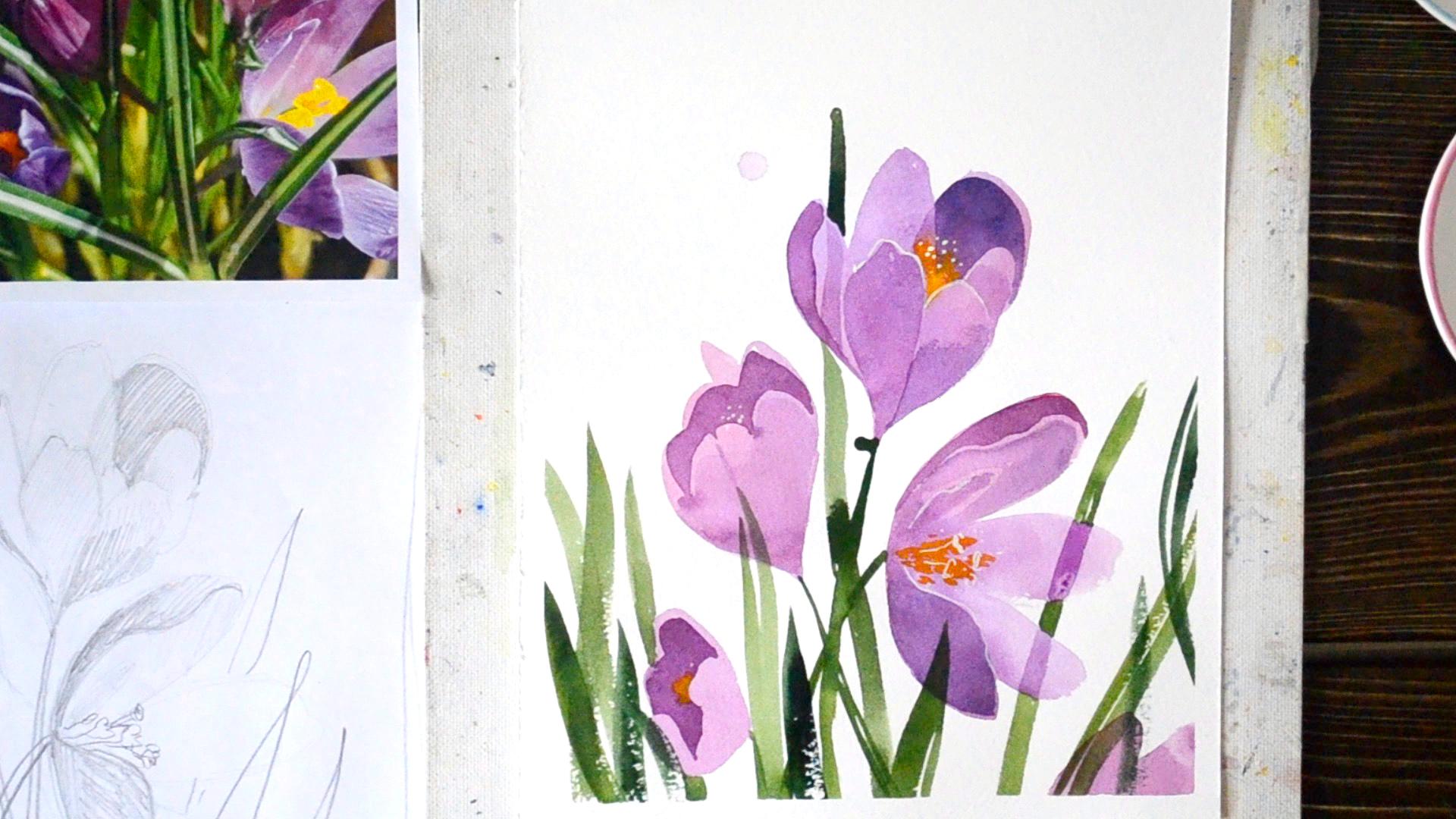
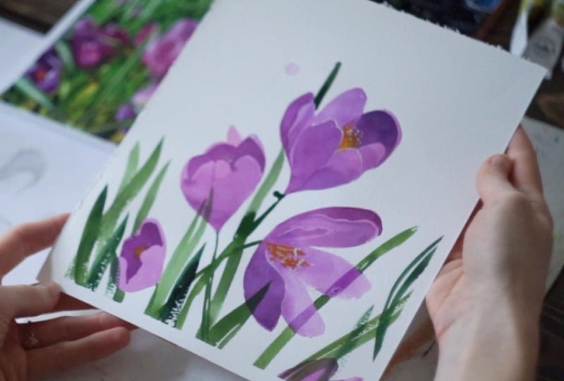
4. Crocuses. Part 1: [MUSIC] Well, let's
start drawing. I chose crocuses for the
first illustration and these are the very first flowers
I usually see in spring. I took this photo
last here while walking through the
botanical garden. The third thing we
will do is to try to figure out how these
flowers are arranged. When drawing it's
important to learn how to emphasize the main thing, find and determine the center of the composition where
the eye falls first. I decided that this flower
would be the main one. I place it in the center
of the composition. I'm drawing on the
draft, not right now. This is a pencil
preliminary sketch. The illustration itself
will be on different paper. I'm looking at the photo and trying to catch the
shape of the flower. Only outer quarter. Don't think about how the
flower is arranged inside. This is the general
shape of the flower, and now I need to find
the main shadows. I see the clear shadows here, and I see the shadows here, and there are two
petals in the shadow. Not so intense, and a little
darker here to the bottom. The border of the petal
is slightly visible. The goal of the step
is to understand how the lights and shadows are
located in the flower. Ready. The next flower. I see this movement in
a circle and repeat it. I can't see the flower here, so I imagined what it could be. Now, I'm looking at the shadows. I take a soft pencil to the
lines will be more visible. The shadow is here, and the light shadow
is on this petal. This petal is
completely in shadow, and I don't touch these two petals as there
is no shadow there. It's important to simplify each piece to a shape that
you understand clearly. If you manage to do
this with pencil, it will be easier
and clear to paint it with watercolor.
The third flower. It's not the main one, I drew it in less detail
than the previous is. At first, I'm interested only the outer shape
and following it. These free petals are
on the same line, and this one is a
little bit upper. The shadows are
pretty complicated, I'll try to simplify
it as much as I can. I think that's enough. I will also take this
flower in the composition. It has such a strange shape, and the shadow, and I can see the small
yellow pieces here. My sheet of watercolor paper is slightly smaller than the draft, I'm drawing its border in such a way that the main flower is
approximately in the middle, and I'll another
pink flower here. Speaking of leaves, there are quite a lot of
them on the photo, but I will take only a
few for illustration like this. Well, I've completed my pencil sketch, my research process, now the shape of each
flower is clear to me, the shape and location
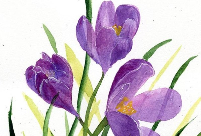
of the shadows too. Let's move on to colors. Let me remind you that it is better to use
watercolor paper made from 100 percent cotton
or at least 70 percent. I'm fixing the paper
with paper tape. I start by choosing colors. Let's choose several shades
close to each other. Now, I'm using the dilute tone. This is the first layer, it better not to
be too saturated. Translucent is better. I find them
approximate middle of the paper and begin to draw
the shape of the flower. After such a detailed
analysis of shape, lines, and shadows with a pencil, I can draw with paints without a preliminary
pencil sketch. But if you feel that
pencil lines will make you feel more
confident, sure, draw them. See, I'm adding
different shades to the field to make it more
picturesque and interesting. This stain is ready, I leave it to dry and move
on to the next flower. Remember to add the
different shades. The far petal will be
a little bit lighter. A couple of light strokes
with the brush to create the feeling of another
flower here. The next one. I keep in mind that these free petals are
on the same line. The last one. The first layer is finished, now I have to wait till
it's completely dry out.
5. Crocuses. Part 2: The next step is shadows. I am looking at my
sketch and drawing the shadows of the
previously learned shapes. Wait a minute. Attempting to remove this
stain completely may result in an ugly large stain. I'm doing my best to just make this spot as
light as possible. I'm looking at the shadows and trying to repeat
their shapes. I still don't understand clearly what to do
with this petal, therefore, I will move
on to this shadow. Each shape is clear to me. This shadow helps define the shape of this
and this petal. To continue, I need to wait for the paint to dry because
this edge should be sharp. Now I need to define the shape
of this petal. Add color here and
go to the water. On this petal, the shadow starts
approximately from the middle. I'm blurring this edge and
making it darker here. The intersection of two petals, I leave here a thin
line of light, and it's time for
the yellow hat. Look, if you pick up a very intense yellow tone then it can be opaque and coloring. Look how it works. I'm removing some pigment from the edge to keep the
color flowering here. Done. Move on to the next flower. Leaving a thin light line here, this is a petal thickness. Next. I'm removing some
of the pigment here, and adding a yellow, creating a beautiful
color transition. To continue, I need
the paper to dry. Let's move on to the leaves. I am going to create the feeling that there are a lot of them. First, I'm drawing flower stems. Then I begin to paint
the leaves with light bold movements
of the brush. Look, the leaves have a
light stripes in the middle. It's great to show these
features are aware, they're made of two halves. The leaves behind the
flowers help further emphasize the shape
of the petals. Add a few leaves
of a darker shade. Now a small but
important moment, look, away the leaf is
placed behind the petal, I'm drawing the shadows. This effect appears in sunny weather delicate
petals look translucent. It's important not to overdo
it with the intensity of the color and so as not to steal attention from
the main shadows, it's better to underdo
than to overdo, remember it. Now, I need white goers to
add bright light details. Glare on the petals. But only in the foreground. There is no need to do it everywhere. A little bit of highlights
in the heart of the flower. By the way, you can
use a white gel pen or acrylic marker to draw the
thin and tiny details. Here we can even see individual elements. I emphasize on the petals
of the foreground, don't touch the distant ones. The clearer they are to
us, the more details. I think it's time to stop. Here are the illustrations
we have got.
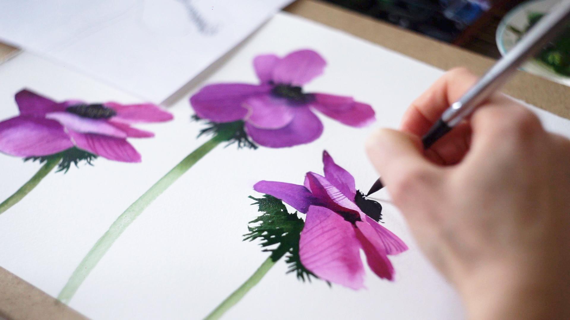
6. Anemones. Part 1: The next flower of what
we will draw is anemone. When we were
shooting this video, it was winter and frost outside, so my beautiful flower was a little damaged during
transportation. Luckily, I have a few photos and I will use them
as references. You will find them in the
attached class materials. Let's look at the flower
from different sides. I'm going to draw it from
three different angles. Now let's try to
arrange them on paper. I'll probably start
with this one. The paper size is
slightly larger than the standard A4 paper and I'll keep that fact in
mind doing the pencil sketch. I choose a very large paper size so I could draw the
anemone in full-size. I'll place three flowers
like this, here and here. Let's start. I keep in mind that the draft is a little smaller than
the illustration itself so I can draw
close to the edge. [MUSIC] Look, if you are drawing
from a printed photo, it's convenient to draw
axillary lines for yourself. Draw the middle line and see how the petals are located
relative to it. When I draw from life or
from a photo on my phone, I usually do it by imagination. [MUSIC] I noticed that this petal almost reaches the middle line, and the next one starts, and one more here. The outer quanta is ready. The heart of the flower. Now I'm starting where
shadows are located. In the classical art school, this is called finding a
big shadow and a big light. I see the shadow
around this petal. It seems to outline the shape. This is the shape of the petal. There is a shadow too but not as intense as
the previous one. It turns out a smooth gradient from the shadow under the
petal to the light one. Thus, I emphasize the
shape of this petal. Let it be even darker
and more saturated here because the
petal each is bent. It is also important
to emphasize the border between
these two petals. The shadow is here. It gives the impressions that this petal is on top
of the other one, and the same is here. Now I have a clear
understanding of the shapes of the
petal and shadows. Then moving on to the
illustration, [MUSIC] I keep my light and
shadow sketch in front of my eyes and lightly draw
the shape of the flower. This is the heart and petals. Pencil line is barely visible. I draw only the outer quanta. [MUSIC] Done. Anemones are wonderful. Their colors are
bright and saturated. It is pure pleasure to
paint them with watercolor. These are the distant petals. I pay less attention to them
and more to the front ones. I'm using different shades to the field to make it more
interesting and beautiful. [MUSIC] While the entire
field is still wet, I'm painting the heart. A rich dark indigo is needed. I put a small dot to check
how the paint spreads. It's too much. I
have to wait a bit. Meanwhile, I am working
on the upper part of heart and the paper is
already dried here. Fluffy part, I'm adding
pigment very carefully a little bit at a time so
as not to overdo it. It is better to underdo. Remember because it is easy to add and it is almost impossible
to remove the excess, and this is a delicate moment. Let me show you again. I waited until the paint dries out and begin
to draw shadows. I'm looking at the
photo and at my sketch. [MUSIC] The colder shades are demeaned in shadows. Ultramarine violet, for example. [MUSIC] Look stripes are clearly
visible on this petal and I'm trying to draw this
unique feature of the flower in
my illustration, and the same action
on this petal. Only the pigment is
more pink and diluted. [MUSIC] While the paint is drying, I will work on and
the detailing of the flower heart, dark spots. The combination of the
blue background and clear small dots creates
a sense of volume and there are
yellowish-white dots here, they help create a
fluffy volume effect. I need to white
quashed paint them. Some dots are slightly
larger and brighter. Some are barely visible. It's done. The flower
is almost ready. It reminds to draw the stem. [MUSIC] It looks great when the tone
here is more saturated. Anemone leaf color is
darker than the stem color. The leaf has a rather
complicated shape. I don't strive to
draw it perfectly accurately but only try
to catch its character. Look, the contrast
between the petals and the dark leaf helps emphasize the petal shape and
create a sense of volume, and petals come out
to the foreground and the finishing touches. Ready. Let's move on
to the second anemone.
7. Anemones. Part 2: Let's choose the photo
reference for the next flower. It seems to look great if this one be here
and this one here. [MUSIC] The flower will
be located in this area. It can be difficult to find the right place
to start drawing. Look, I noted the top petals
are on the same line. [MUSIC] It becomes much easier to find a place for the heart and start
drawing petals. [MUSIC] The main contour is ready. Let's see how the
shadows are placed. I see this petal needs
to be emphasized. Here is its shape. [MUSIC] I'll leave
this place untouched. There is a light shadow here [MUSIC] and a darker area here. [MUSIC] This petal is
entirely in shadow. [MUSIC] There is a
saturated shadow under the petal [MUSIC]
that goes to zero. Here is also a light shadow. Look, this petal is now
emphasized from all sides. I haven't touched
the back petal yet. I think it's okay to
leave them as they're. Leaves. I think this
petal looks too big. [MUSIC] That's better. [MUSIC] Done. I figured out and clearly
understood for myself how to draw the flower and
move on to the illustration. [MUSIC] I'm looking at my draft and at the footer and gently drawing the general
shape of the flower. In fact, I am not even sure the pencil lines are
visible in the video. [MUSIC] I can start painting. [MUSIC] Add different shades of purple. [MUSIC] I'm drawing the heart
very carefully, starting from the center to
feel how the paint spreads. I am adding the
pigment little by little so as not to overdo it. [MUSIC] Now the important point, look, I am wringing
out the brush and removing the
paint in this way. [MUSIC] This is a petal we were talking about
in the pencil sketch. [MUSIC] Let's try to create a
relief over this petal. Now I need to wait till the
paint is completely dry. [MUSIC] The next step is shadows. [MUSIC] I am adding a violet
to the darkest place. [MUSIC] Now, I need a rich
indigo tone to paint the details
of the flower hat. [MUSIC] My brush doesn't
have much water. [MUSIC] Look while drawing the hat, I also emphasize the shape of the petal in the foreground
in the same time. [MUSIC] I am moving on to the greens. I look at the hat to determine
the location of the stem. [MUSIC] The stem is darker at
the base of the flower. [MUSIC] Leaves. [MUSIC] The
dark rich color will help push the petals ahead. [MUSIC] Add some final details. [MUSIC] Light dots on the flower hat. [MUSIC] Let's solve. This
anemone is ready. Let's move on to
the third flower.
8. Anemones. Part 3: [MUSIC] The third anemone will be located here a
little higher than this one. Let's study it as well
as previous ones. I noted the line where
the petals are arranged. Here it is. This is the heart. The task of this
step; this sketch, is to simplify the flower
to understandable shapes. This is the line of the
petal that protrude forward. This is a light spot and
an intense shadow here. Here is also a shadow. It emphasize the beginning
of this petal and here. The fore petal is also
slightly in shadow. It helps to highlight this
place in the foreground. There are leaves
under the flower, but I will not draw them with
a pencil because it is easy to draw them immediately
with paints. Let's start. I'm gently drawing the
quanta of the flower and moving on to colors. I took the dark indigo. Note it's too olive, now the dark tone will
spread but I need to leave the light and touch tone at the petal
on the foreground. I wringing out the brush and making this
place almost dry, then the dark paint
will not flow there. Now I can paint the heart. The first layer is ready and I need to wait
for the paper to dry before continuing [MUSIC]. I think you already guessed what the next step is. Of course, drawing shadows. I want to make it even
darker here in the depths. Look, here is almost the same
dark tone as in the hat. Move on to the greens. Stem, and darker leaves. It's done. The next
step is adding details. Let's work a little
more on the hat. I want to make it fluffy, and some white details. On the petals too. Ready. I'm looking at
the old picture now. It's important to look
at the illustration from the distance to see
the places to improve. I want to make the shadows
a little darker here. Well, I think the
illustration is ready. We've got a great
job. Take a look. Of course, you can
draw only one anemone. It will look
something like this, or you can cut out
a white anemone and use it to decorate
gifts for example. In a word, turn on your imagination and
enjoy creativity.
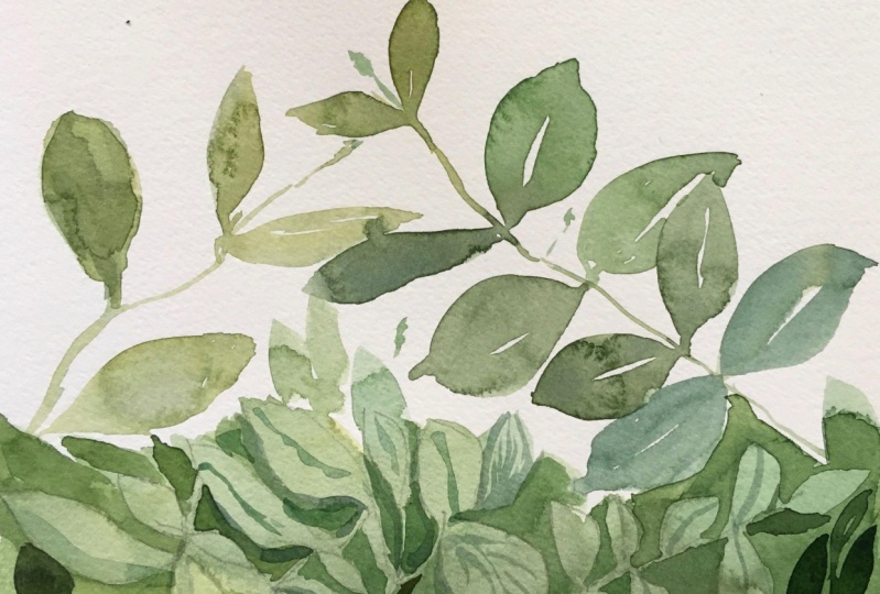
9. Greenery. Beautiful Background: Moving on, let's
explore the greens. Often we see a lot of greenery,
not individual branches. Drawing this can feel
like a challenge, but let's take it step-by-step. I'm sure you can handle it. The size of the
illustration will be the same as in the first
crocus example, mark it on the draft. Here is the borders
of my illustration. I will try to create a feeling
of abundance of greenery. Watercolor is always
about feelings. To begin with, let's choose
one branch and draw it. I hope the line is
visible on the video. [MUSIC] One more branch. By drawing, I study
shape and character. Pay attention to the curves, the shape of the leaves. They may vary depending
on the angle for you. [MUSIC] I'm drawing a curved
line here that give me impressions
that this also leaves, a lot of leaves like this. The sketch is not finished yet, but I moving on to watercolor
to paint the first layer. [MUSIC] I'm looking at my
sketch and the photo and trying to express
my feelings about it. [MUSIC] The tone of paint
is quite light. They say their first layer, it shouldn't be too dark. I'm drawing without a
preliminary sketch. If you feel more comfortable with how can lines then
do it, of course, I use different shades
of green to make the greenery more picturesque. That's great when there are
color and tone transitions. This two leaves are combined, so it's okay if the bend spreads and the
border disappears. [MUSIC] This branch is ready. The next one, and the photo, these two branches
touch each other, but type of photo
slightly move them away from each
other a little bit. [MUSIC] Now I just going to feel all this area with
shades of green. [MUSIC] On cotton watercolor paper, the paint spreads beautifully, even if the brushstrokes
are chaotic. But it's important
to remember to keep the edges wet until
you finished filling. Don't let them dry out. The secret of a beautiful
rich watercolor tone is a lot of pigment
and a lot of water, and perhaps the highest
speed of movements. Then the paint
spreads beautifully. [MUSIC] Yep. Done. While the
watercolor background dries, we will think over
the next step. I return to my sketch, look now I need to
highlight the main thing. There are lots of
different leaves twigs on the photo and a soup power over an artist is to be
able to generalize and highlights
from the multitude what is really important. I choose a few branches and draw them, ignoring
everything else. Do you know what,
perhaps it will be okay to immediately draw
on my illustration? If it's not clear right
now what I'm doing, please I would tell
you to try them and you'll understand
everything I promise. Here is another branch
I'm going to draw. [MUSIC] We will deal
with the branches and now the important point, I cover with the second layer, everything except
these branches. Negative space. I leave the branches untouched. This process requires
good brush skills, so the one that you feel
and can't control well. [MUSIC] This is especially a
challenge in places where you need to leave
thin stem untouched. But you can do it,
believe in yourself. In some places, it is
convenient for me to fill as to draw a contour
and then fill it. [MUSIC] Look here, I accidentally
haven't noted this stem, but it can be fixed. I'm removing the excess
pigment by the squeezed brush, that's better. The next step is the third layer of paint, these are the dark branches
in the background. Here you can focus
on the photo or just come up with the shape and location of these branches. We don't have the task of
redrawing each leaf exactly. Watercolor is emotional, it is important to create the right expression
to show your vision. [MUSIC] We don't need a lot
of dark branches, just a few are enough. Okay, let's stop and take a look at the
illustration from a far. I want to improve something, to emphasize individual
leaves in the foreground, I'm creating a shadow under
the leaf to move it forward. First to put the
color and then make the board soften and
go to transparent. Little by little the
volume is appearing. Look due to the first
layer was not monocolored, but with variation
in shades and tones. We have good the filling of the play of lights
and shadows on the leaves and three layers of paint have created
a sense of volume. Such greenery can be an excellent background for
lettering, for example. You can do it digitally or
cut out the words like me. It can also be a background
for delicate white flowers, for example, snowdrops
or any others. I painted the flowers with
watercolor and cut them out, so I can play with
the composition. I really love this
trick. Just try it.
10. Greenery. Pistachio branches: [MUSIC] I sit down at the easel to draw
the next illustration. This is not necessary, you can draw as usual. It's okay. We're filming this class in the incredibly
beautiful studio, and I want you to feel you
our atmosphere and mood. It's awesome. In general, drawing on an easel is
a special pleasure. If you have never tried
it, give it a try. Suddenly, you'll like it. I don't have a photo reference
for this illustration, but there is a bouquet
of the statute twigs. I will take one branch and put it next to my
sheet of paper. I'm going to draw
it in a full size. I need a brownish tone in
order to paint this thing. It can be read ocher
or natural sienna. If you feel more
comfortable doing a preliminary pencil
drawing do it, but I offer you to
trust yourself, trust your hand, and paint straight away. The first layer is translucent, I don't use saturated colors
and I prefer cold shades. I'll show you later why. Choose the brush with
leaves traces of a suitable shape similar
to shape of a leaf. Remember the exercise I gave you at the
beginning of this class, we were exploring the
possibilities of your brushes. Let the movement
be light and free. Pay attention to the
slope of the leaves. It's not always the same, try to catch in
each of the plant. Please keep in mind that the tone of paint
is translucent. From time to time, I twist my branch to
spy on the good angle. These branch is ready. I break off a piece to find
suitable for the next one. For example, it looks
quite good here. I still use diluted translucent watercolor,
it's important. This branch is also done. I still need to
draw here and here. Please note that
the leaves can be located at different
angles as here. If you hold the brush a little further than you are used to, then your movement
will be freer. A little more
inaccurate but freer. Try it and you may like it. I'm looking for another branch. The first layer is finished. To continue I need to wait for it dry completely or dry
it with a hair dryer. The second layer will be more saturated and I'll use
warmer shades of green. I'm painting over
the first layer, not paying attention
to it at all. It's like you are drawing
on a blank paper again. Use different shades of green. The main idea you did
the first layer is translucent and cold because it has farther away from us, and the second layer is
brighter and warmer. Oops, too much water. I need a more saturated tone to confidentially cover the
first layer of paint. This one works well. I took the other brush to add variety to the shape
of the leaves. They're very similar, but
a little bit rounder. In my opinion, variety in
shapes, shades of green, saturation of colors makes greenery looks more
natural and interesting. Here, place the branch
somehow in this way. The paint is quite
thick here, you see. It reminds to fill in the upper
part of the illustration. I rotate the branch so its location is different
from the first layer. As you can see the process is
meditative and repetitive, but the movements are simple,
understandable, relaxed. As for me it's a way to
relax, get distracted, and eventually learn how to
paint a nice illustration. As a final touch I want to
add berries on the branches. Sometimes smaller leaves stay on the branches and go to flower
shops with greens together. No much, just a few places. It's important to understand
that a lot of berries will make the illustration
look more decorative, and this is not good or bad. It's just your choice of how you want your
illustration to look. I think that's enough. Look, you can take
even large paper. In this case, the illustration will look even more impressive. It's also a beautiful
background to show something, some object or an illustration. You can take beautiful
photos for social networks, show your creativity
beautifully. Mimosa looks good too. Let's look at more examples
of watercolor greenery. Here are the leaves of
the forget-me-not-flowers are drawn in exactly
the same way as I've just showed you. There are two layers of watercolor and different
shades of green. Together these creates a
feeling of the rest green mass. On this illustration, this is most scary by the way. The greenery is drawing in the way from the
previous video. The color spot was drawn
at the first layer, and then the shadows were drawn on top of the second layer. The technique is very similar
to the one we used here.
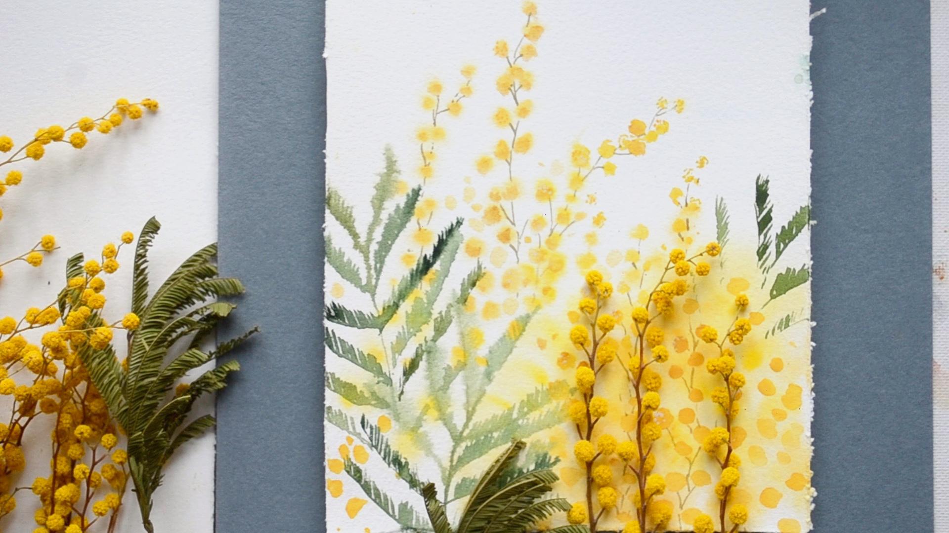
11. Mimosa. Part 1: [MUSIC] The next object of my adoration and
research is mimosa. An incredible smell
fills the hall when I bring a bouquet
of mimosa inside, I wish you could feel it now. Delicate fluffy flowers, a perfect of
painting wet on wet. It will be a gentle
and sun illustration. The size of the illustration will be quite small like this. I'm looking for a
beautiful composition laying out mimosa branches
directly on paper. It seems that this composition
looks pretty good, I just don't like this leaf. That's better. You'll
find the photo of this flower composition in the attached materials and
can use it as a reference. When we paint in a
wet-on-wet technique, our acknowledge of how paint behaves on wet
paper is critical to successful
illustration exactly on the paper that you're
currently using. Therefore, before starting work, it would be great
to take a piece of the same paper and
try on it the colors, the techniques
that will be used. Let's do it. First, I
wet the paper well. This is not an illustration yet, this is a draft. I give a little time for the water to soak
into the paper. I see that mimosa twig
consist of a fluffy balls. I want to understand what combination of
paper moisture and pigment in the
brush will give me spots of the right
sizes and color. I'm following the region
of the arrangement of these balls like this, and here is the twig. Moving to leaves, let's find
a way how to draw them. The task of this stage is
to understand how to draw realistic mimosa leaves
in the easiest way using exactly your
brushes and your skills. It's great to add
different shades of green, it looks natural. After I figured out how I will draw the
elements of the flower, I can move on to
the illustration. Perhaps you noticed
the common step of all processes in this class. Before you start illustration, you need to do preliminary
work in order to clearly understand how you
will draw the illustration. This greatly
increases the chances of drawing a successful
illustration. I will use three
shades of yellow. I wet the paper thoroughly. I want to leave no
borders around the edges. When we wet a large
sheet of paper, it's important to fix it
carefully so it doesn't deform, but when the size is small
and the paper is quite thick, it can be moistened
without deformation. I'm waiting a bit for
the water to soak in. I'll start from the place
where a lot of flowers, it's okay if the paint
spreads intensively here. My goal here is to create
a large yellow mass that feels like it is made up
of many spots element. There are different
shades of yellow here. When the spot is ready, I'm starting to paint
individual branches. If you feel that the paint
is not spreading enough, try adding more
water in the brush. Still, I need to moisten the paper again to
get fluffy balls. You need to catch the
moment when the paint spreads exactly as you want. There is too much here
and too little here. I'll wait a bit and try again. Nope, it's still hairy,
and yes, perfect. I'm trying to repeat the arrangement of the
balls on the branch, and another branch. Here the paper has
already dried. Remember I didn't dry
moist in this place, and I can add a second
layer of paint, it no longer spreads well
or it spreads much less. The base of the
flowers are ready. In the next video, I will start drawing leaves.
12. Mimosa. Part 2: [MUSIC] Well, now I am
going to add some greenery. [MUSIC] The paper is still slightly wet, the watercolor is slightly
spreading and I love this blue effect but if your paper is already
completely dry out, don't worry, draw leaves
on dry, it's okay. [MUSIC] Let's add some dark touches. [MUSIC] I imagine this leaf is
behind the flowers, so I'm not painting it
entirely but only in places. [MUSIC] I like the way the leaves look. Some were clear,
some were blurry. This creates a sense of depth, like on a photo. The mimosa balls are dry and now I'm going to
make them voluminous. I'm using yellow ocher
and my brush is semi dry, this allows me to keep the
fluffiness of the balls. [MUSIC] I want to add some
clear touches here, this helps to create
a sense of volume. [MUSIC] I need a diluted color to
add transfusion spots, creating the illusion of an abandoned soft
mimosa flowers. [MUSIC] Well, moving on to the details, let's take a closer
look to the branch and study it's structure. I'm trying to repeat
the structure. [MUSIC] Quite a few final touches
with white gouache. [MUSIC] This place looks empty and
I'll add some more spots here. [MUSIC] That looks good. Look, we managed to create
a feeling of a large number of flowers while keeping
lightness and errorless. I like how this illustration looks on the dark background, that can be useful
when you are taking photos for social media or
framing your illustration. The combination
of watercolor and real flowers also looks great. [MUSIC]
13. Final Thoughts : [MUSIC] Congratulations, you've watched the entire class. I'm deeply grateful
and proud of you. To be honest, while I was producing this
class, from filming, video editing, writing,
and voicing to publishing, my personal life has
changed irreversibly. I didn't want these
changes, but they happened. The fact that this
class is published and you're watching it is
great happiness for me. Thank you for your support. There are no words to describe
how much I appreciate it. Send me your watercolor flowers, any question, or
just a few words. I feel the warmth of each of
you from all over the world. Thank you. Art heals.
14. Bonus 1 Forget-me-Not Flowers. Part 1: Hey, I'm Lgobanitas and I
love forget me, Not flowers. Since I was a child,
I admire them. Take photos, draw paint, and even grow them. Today I invite you
to paint with me. There is an easy to follow
step by step lesson. The first layer will
be painted wet on wet. Then we'll take a small brush. I know many people love
painting with a small brush. It feels like a meditation. We will paint flowers
and greenery. The third step is to add final touches, colorful
and saturated. Okay, let's start. It's better to use good
quality cotton paper. The size is not big. So we will paint the
flowers in their real size. We need various shades of blue. I have ultramarine
cullum and cobalt blue. It is not essential to
use exactly the colors, choose from your color palette
in either pants or tubes. It doesn't matter, we just
need 23 or four hues of blue. Let's take a separate piece
of paper and try them all. Put the colors next to each other to see how
they look together. This is ultramarine blue, this is cobalt blue. Carefully mix the paint with water and cullum blue look. If I mix ceruleum with some
pinkish color, for example, quincrdon pink, it gives a beautiful color that
is perfect for painting. Forget me nots, let
me show it on paper. Here is cerullium
blue and ucrdon pink. Mm hmm. Okay, I love this color. Mm hmm. And we need
some yellowish and orange for the centers
of the flowers. I'll say it again. You are free to use any hues
of blue you have. Just be sure there are
variations among them. What about brushes? We need a big one, any shape to wet the paper. A medium size one, and a couple of small brushes, one for blue and one for yellow. We don't have to wash the brush every time
we change the color. Okay, let's prepare the paper. We will wet it so it's easier
to fix the edges. Mm hmm. Moisten a big brush and
wet the paper thoroughly. It's essential for the
paper to work well. Wait a minute to let
the paper absorb water, then start working
with watercolor. Finally, just take
paint and leave marks. This big stain is
about the size of one flower with
five little stains next to each other
resembling petals. Make some marks more saturated. Use various blue colors and
vary the amount of water. Don't worry about right or
wrong shapes or arrangements. Even if the paint spreads more than you
expected, that's okay. It's just the very first layer, semi transparent and will
become pale after drying. So just leave marks and enjoy make a splash to help
ourselves feel more free. You know, I don't have
one photo as a reference. I have several photos and
videos on my phone photo, Forget me, not flower
suits as a reference. Since we don't
intend to redraw it, we just use it as a guide. Okay, I believe that's enough. Let's dry the paper. We don't need the paper
to dry completely, We just need the
surface to be wet. Look at this. The surface
is not wet, it looks mad. Now, the second layer, Try not to make each
flower too complicated. Keep the shape of petals simple. You can look at your
or just follow me. Forget me. Not flowers have
five petals, that's all. Remember to vary the colors
and their situation. I'm painting above
the first layer without paying much
attention to it. I allow one flower to
be behind the other. Don't leave the same
distance between flowers. They shouldn't form
a regular pattern. Have one group of
flowers, then another. Keep in mind that the flowers can be arranged in various ways. We may not see all the
five petals in some cases. Some may still be bands
not fully bloomed flowers. Some flowers appeal while
others are more saturated. Look. Here is a tip, while the paint is still wet. Let's take a tissue
and the paint. In some places, it helps to add volume and make the flowers
look more interesting. Try to touch only one
or a couple of petals. Place some flowers near
the edges of the paper. It creates the feeling
that it is not a bulkhead, but rather flowers in nature. And remember to paint buds, they usually have
a more lilac hue. Okay, it's time to
paint the greenery. Choose a green color. You personally, like
I'm taking olive green, it's quite warm and bright, and mix it with brown. The tone is not
saturated, transparent. The stem should have
a more greenish hue. Next, let's add leaves. Take a different green color and maybe a bigger brush
to paint more leaves, then add darker tones. While painting with water, coll is good to use
varying shades. It makes an illustration look more picturesque
and interesting. Don't be afraid to paint
green all the flowers. That's perfectly okay.
15. Bonus 1 Forget-me-Not Flowers. Part 2: Now look, forget me, not flowers have a
bright yellowish center. Let's add it to
our illustration. This is cadmium lemon. Its saturated tone
gives an opaque color, and this is cadmium orange. Avoid making all
flowers the same, a yellow on every flower. One mm hmm. Okay, now to the third layer, adding a saturated
or even dark tone. To add extra depth
to our flowers. Use little water
and lots of paint. And vice versa. Very and splashes, paint, water. Okay? And dark green touches. If you believe some flowers are too separated
from each other, it's possible to unite them. Now, you know? This is an endless process, to be honest. Okay,
let's finish. It always happens then. When, when I first think
the illustration is done, there are some
touches to be added. Oops, you know, enough. Enough. Enough enough. Let's finally stop. Okay. If you painted with me, I will be more than happy
to see your illustration. Share your artwork with you
can tag me on Instagram. Thank you for having
me today and bye.
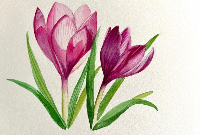
16. Bonus 2 Paintitng Pink Flowers Pattern in Sketchbook: One day while enjoying a
family walk in the park, these beautiful flowers
caught my attention. I was captivated by their unusual colors
and fascinating shapes. Fortunately, I had my sketchbook and colored pencil with me, so I quickly made a sketch
later back at home. I couldn't resist the pleasure of painting them
with watercolor. The entire painting process
took about an hour. In this video, I speed up the
footage by ten times so you can witness the magic of
watercolors in just 6 minutes. Personally, I love
watching similar videos by other artists and I hope
you will enjoy mine too. If you do, please give it alike. And I'd better to
keep my speech. Let's dive into the painting.
 Olga Bonitas, Watercolour girl