Transcripts
1. Presentation: Welcome to this new class, "Mastering the Carbon Stick Brush
In Procreate". I'm Maurizio De Angelis, a professional illustrator
based in London. I publish a number
of courses so far, but this one is specifically
designed for those who wish to master a simple
yet powerful technique. The subject of our class
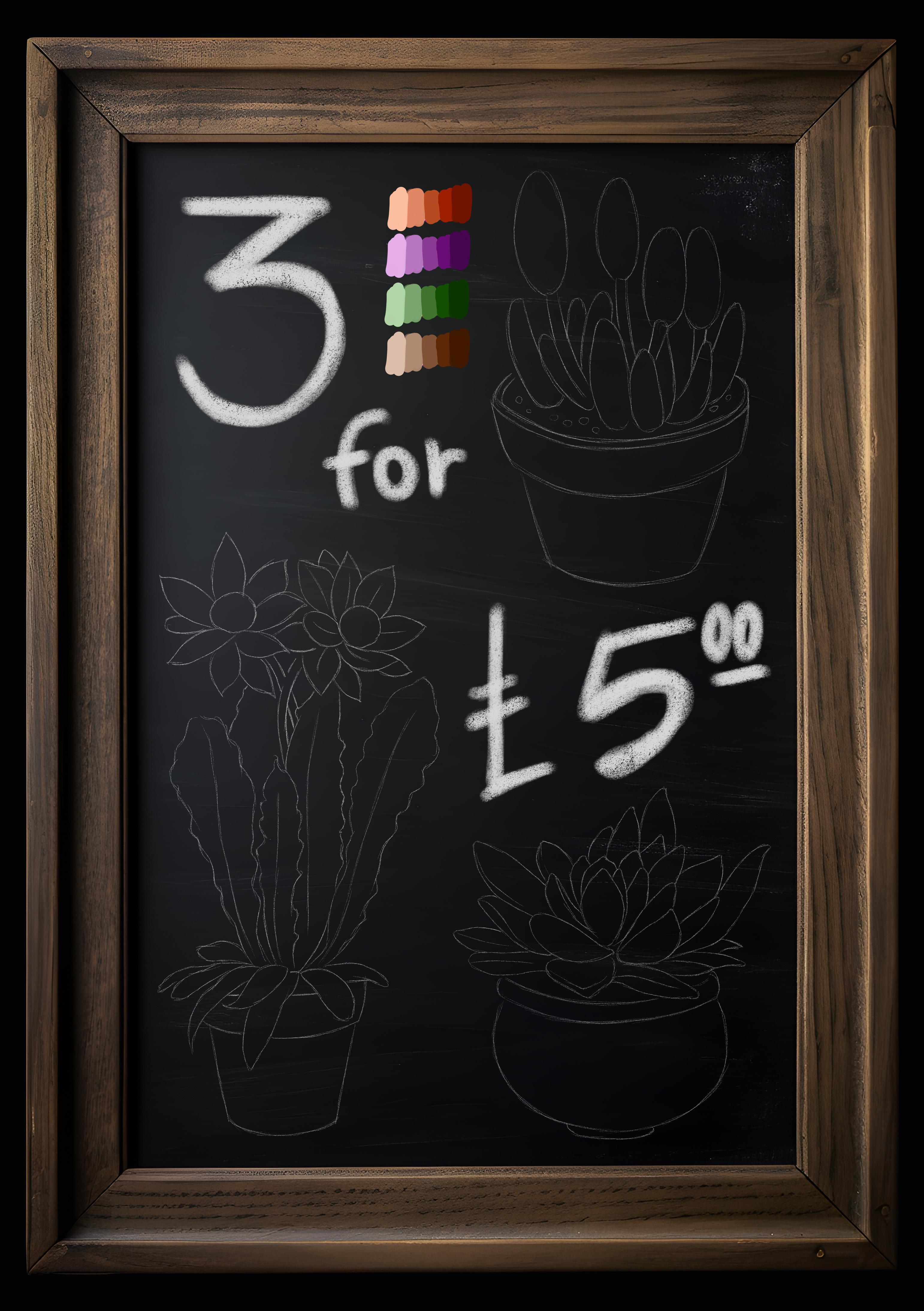
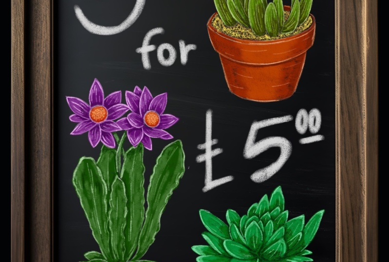
is a vibrant sign along the Columbia flower market in London that offers
an incredible deal. Three succulent plants for
five or five pound nodes. With this call in mind, we'll look at how to color
these small plants here. Start by setting
up the canvas and adjusting a few brush settings,
then we're ready to go. It's okay if you're
a complete beginner. We learn this method
step by step, keeping it simple
and consistent. Because we want to attract
people with our sign, we want to use a catchy, lively and colorful style. I feel the cable stick is a wonderful brush that is both evocative and
visually appealing. We'll begin by breaking down the composition and
then paying the leaves, the boughs, the petals, the stems, the compass, and ultimately the stamens. Once we finish our illustration, we can play around with
color changes and tweak some adjustments until we
find a nice combination. It might seem like a
lot, but don't worry. By the end of this class, you'll be able to use this brush confidently and create
your own style. So let's get started.
2. Setting Up the Canvas: Okay, welcome to this course. In this class, we'll make a vibrant sign like the
ones you see at markets, shops or pubs, usually
advertising a deal. And we'll do it with
a carbon stick brush. In this scenario, we
imagine ourselves walking down London's
Columbia Road Flower Market, where you can get three succulent
plants for five pounds, which vendors call, or
a tener for ten pounds. I have a friend who
works there who told me that such a deal is
impossible to find. But whatever, because we
want to attract people, we want to use a style that
is catchy, fun, and colorful. And I believe the
carbon stick is an excellent brush that is highly evocative and appealing. So let's get started.
What do we have? We have a background, which
is the slate and the frame. A drawing done with
a white pencil, and finally the palette. We'll begin by
painting this flower here using this purplish
color for the petals, green for the leaves,
and brown for the vase. Okay, the first thing
that we want to do is to add a new layer. We need to choose
the carbon stick, which is found under charcoal, and then carbon stick. We simply need to make
a couple of changes. We want to lower the scale of the paper
to around half of that. Around 17% would be great, and then we click done. Now if I grab this color here, I can test the brush
and dy is quite large. I'd like to lower
the brush size to roughly 2% With 2% we
get something like this. Another thing that I want to modify is the tilting option. Because when you
paint with the pen perpendicular to the
screen, it looks like this. But when you tilt the pen, brush stroke becomes
larger, which I don't like. If I go back to the
carbon stick settings and select the
apple pencil tamp, I can drop the size to zero, which will turn off
the tilting effect. Now if I paint or light this, the strokes are identical and that's something
that I want. Okay, I think we
are ready to start. In our first lesson, we're going to paint the leaves.
3. Leaves: Okay, in this first lesson we're going to paint the leaves. The thing that I want
to do is to create a new layer and
rename it leaves. We'll be using the
green palette. I don't want to start
with the darkest color, but with the second one, I push and hold to
select the color. Now that I selected the brush
and the appropriate layer, I can begin painting
the leaf here. It's probably best as
you leave the opacity at 100% and the size to around 2% The way I want to color this is to follow
the surface of the leaf. My goal here is to entirely fill the
area in this fashion. Yet I still want to sense the
roughness from the brush. It doesn't have to
be too intense. Let's say this will
be the first coat. Now I want to do the same
thing with these leaves. Going to speed up this
process because otherwise the class would be too long and you will get tired quickly. The procedure would be the
same as with the first leave. Therefore, we'll paint
the remaining leaves with the intention of
following the surface. Now using the same method, we'll paint the shorter
leaves at the bottom. Again, we try to follow the
orientation of the leaves. It's perfectly fine if
you don't manage to paint the smaller parts,
cavities or corners. Remember, this is
an illustration done with a charcoal on a slate. Like in real life, a charcoal or a stick is not a tool that can be used to
get super precise artworks. The result is clearly
less precise, but that's the beauty of it. Obviously, if we
were looking for a highly polished or even
photo realistic illustration, maybe the carbon stick would
not be the brush to use. Now that we have done that, we'd like to continue
painting on the same layer, but we'd like to switch to the third, the one in the middle. We'll ignore the
darkest color for now. With this color, we want to add a brat mainly on the
left side of the leaf. I don't want this to be
a continuous treatment. Instead I want to modulate the pressure in order to
simulate the shape of the leaf. We can move the drawing layer on top of everything to
make it more visible. But it's better maybe to reduce the opacity of this
layer as it's too distracting and possibly
change the mode to add. Now we want to make sure you
re select the leaf layer and then we can continue shaping
the area in this manner. I can now continue
on to this leaf. And using this concept, I'll paint the remaining leaves while slightly
spinning up the video. Now it's time for the smaller
leaves at the bottom, and here it's more about making the tips of the leaves brighter. Now that we completed
the second phase, we can move onto the second brightest color and select it. But this time I want to drop the brush size to 1%
and set the capacity to roughly 75% or 76%
Around that amount, we want to create a perimeter with a smaller and
brighter brush. But as you can see, the line is not a continuous
and steady line, but rather a number of
lines that are added one on top of each other with a
variety of pressure applied. That's the way you
want to get if you want a line that is dynamic. And it also makes sense
to select a price at, for the perimeter because
we're painting on a black or extremely
dark background to make the image
stand out Again, I'll continue with
this technique for the remaining leaves. So make sure to adjust
the pressure applied to the screen and draw an
extensive number of lines. The same idea applies
to the smaller leaves. Now that the perimeters
have been completed, we can add additional. As to the leaves
with the same color. The idea is to always follow
the surface of the leaves. We want to add these shorter
lines here and there, but not really randomly. But rather by envisioning the three dimensional
shape of the leaves, and inserting these
lines to indicate a change of direction
or a bump or a vein. This approach will give the illustration a
sense of dynamism. Because the outcome
is not realistic, it will create the feeling of a nice and engaging
artwork even more. You can also notice
that they are slightly less intense
at the perimeter lines, which is intentional
because you want a more visible border and more
delicate features inside. Now we can repeat
the process with the remaining larger
and smaller leaves. Then you can go back to the other areas and add
some lines as you see fit. Now it's time for the darkest
color in our green palette. These color will be
used cautiously, mainly to define places in the shade or where
they are cast shadows. I'll start here. You would expect to
see some darker tones. Once again, I'd like to use this new deeper color to slowly define the
forms of the leaves. You can see that it's
not very present, but it serves a purpose. Now we can have a darker area, since the left in front casts shadows on
the one behind it. Then I repeat this process
for the smaller leaves. This is the type of
treatment I believe is appropriate for these
types of illustrations. Now we're going to
apply this color here. But first there's a little
trick that I want to show you. I can duplicate this
layer if I select it. And Sw duplicate will duplicate the layer resulting
in two identical layers. You can see that the
colors are now stronger, you can see the difference. If I toggle the
visibility on and off, because I like the effect, I want to merge these two layers together by pinching them. Moving on, I can use the
brightest green in our palette, create a new layer that I
can rename it into leaves, highlights, because
the light source is coming from up here. We want to use the
brightest color to simulate the reflections, also known as specular lights, resulting in the brightest
spots of light on the subject. At this point, I would
put this color here. Here, maybe here. You don't want to overdo it, it's just a splash of light. Consider where the
brightest light would fall and then
add some colors there. As you can see, it's fairly
simple, but rather effective. We can focus on the left side of the leaves because that is where the light is coming from. But we also want to add some strokes around the
mid line of the leaves, just a tiny amount
on the right side. I know it's tempting
because coloring is quite relaxing. Don't overdo it. Similarly, I want to create highlights for the
younger leaves. I can now remove the arrow. Now I only want to show you the difference that
highlights can make, which is fairly significant. And you can see it for yourself. If I show and hide the layers, I did this on a different layer. I said I don't want to
duplicate the highlights as the result would seem
untidy and aggressive. The highlights are the very final touches and they are pure. And it's good as right now
that the leaves are done, were ready to paint the
vase in the next lesson.
4. Vase: In this lesson, we're going
to paint this little vase. I think I'm going to
put the palette on top of things to make
everything nice and clear. To paint the vase
behind the leaves, I can select the
background layer and then make a new layer,
renaming it vase. We want to approach the vase in the same way that we
approach the leaves. I'll choose the
second darkest color, return to full opacity, and then set the brush to
2% With the color selected, we want to create
the first layer of color. The base layer. We want to follow the
surface direction as we did for the leaves. In this case, I want to mainly follow the horizontal direction. I don't want to paint underneath the leave because
we would see some brown coming through since
the pat isn't quite opaque. But I do want to paint
around the leave as we were doing this in real life and
not in the digital world, something in this style. Nice and simple. This is also a common brownish, reddish shade
equivalent to sanguine, which was a popular color
during the Italian Renaissance. I believe I may now
drop the brush size to 1% since I want to paint
the rim of the vase, and I may need to be more
exact and attentive here, I can also paint the other side. I can probably return to
2% and feel this space. And that's it, I
think it's fine. And as we progress, I choose the color
in the middle. Because this is a
cylindrical shape, I know from experience
that the light will fall around
this place here. Keeping this in mind, I want to begin coloring around this area, maintaining a
cylindrical orientation. Then I want to shade the color
towards the darker side, easing off the color here. And on this side now, a little closer to the rim, the light is
translated a little. Because we painting
on a different plane, it catches the light in a
slightly different way. Only now that the major
orientation has been established, I can paint vertically. Since I also want to disturb the consistency of
the stroke direction. It's a matter of mixing and matching in different
directions, but not randomly,
but with purpose. Now I'm ready to choose the
second brightest color. Reduce the brush size to 1% D, opacity to about 75%
With this color, I'd like to add some light along the rim and
towards the bottom. Then using a more
delicate approach, I'd like to shape this section to give it a
cylindrical appearance. My goal is to add
volume to the vase. Now, using the darkest color, we want to create some shadows. Which is an important
step because adding these stone will make the
artwork stand out more. I'd like to begin
just under the rim of the vase where you would
expect to see some shadows, darker colors just
behind the leaf, possibly a litter here as well. And then underneath this leaf, which is just in front
and rather obvious now that the drawing is hidden, I can see the actual work. And you can see that the
vase is not well defined. So I want to reinforce these margins with the
darkest color selected. At this point with
a brighter color, I can best outline the
shape of the vase. Doing so with a lighter cala
is definitely a good choice, given the black background saying treatment along
the rim of the vase. But now I feel like this area here has to be better defined. When I hide the drawing, I want to quickly switch
back to the darkest shade. Now, just like we
did with the leaves, I can duplicate this layer
and see how it looks. I believe it looks very good. You can see that it's filling the composition and
becoming more volumetric. Perhaps I can drop the opacity a little bit and then merge
the layers together. Right, the last stage for device is to add
some highlights. I'll make a new layer, rename it appropriately,
switch to the brightest color. And start from the rim with
just a tiny bit of color. Nothing major probably here as well, and just a touch
along the perimeter. And the vase is
officially finished. The next lesson we're going
to paint the flowers.
5. Petals: In this lesson, we're going
to paint the flowers, focusing on the petals. First, we have the drawing
here and we want to add the new layer called flowers
or petals. It's up to you. We use this set of
purple colors here. Like before, we pick the second darkest color and approach the petal in
the main direction, which in this case is towards the longest
side of the petals. I think I can set the brush to 2% And I'm going to paint the rest of the
petals in this fashion, as well as I did before. I'm going to speed
up the process slightly so that the lesson
doesn't get too long. Now that we lay down
the first color, we can continue on the mid tone, which is the color that lies in the middle
of the gradient. I want to focus on the tips
of the petals because you might imagine there is a
variation in tone towards them. That they are darker,
closer to them. And also because
petals are nested, so there would be some
cast shadows involved. Let's do this for the
rest of the petals we've done. Now it's time
to add some details. I'll select the second
brightest color. Drop the brush size
to 1% and reduce the opacity to roughly
75% With this color, we can begin defining the outer perimeter
along with the mid line, as well as adding
some minor details along the surface of the petals. The idea here is to differentiate the treatment
from petal to petal. We can modulate the pressure at some shorter or longer lines. Basically, we want to add some dynamism to the composition while maintaining
a great balance with what has already been done. And with that in mind, it's time to paint
the remaining petals. No, it will be on the flower. This is it also. This
step is now done. It's time for a darker
shade, as expected. We want to use this color
to identify the area in the dark as well as the
cast shadows naturally. I want to start
here because that's where I expect the
darker tone to be, because the light is having difficulty reaching
those nested sections. As I did with the
brighter tones, I want to incorporate
the color along the petals to balance out the presence of
the other shades. Again, we want to be in
charge of the composition. We don't want to
be carried away by the fact that we enjoy
coloring or shading. It's rather tempting
because if we hear, it means that we like
what we're doing. But once again, we have
to find a balance. Now some darker turns
on the other flower. With that, this
process is complete. We can now add the highlights. I'll create a new layer and
rename it Flower highlights. I'll grab the brightest color, making sure the brush
size is set to 1% I'm going to use this color to add the smaller reflections, the brightest areas
on the petals. In this case, it's best to hide the drawing
because I want to be able to see the effect I'm adding without being distracted. Just for reference, the light
is coming from this side and you can see the striking
this area of the petal. And as we did before, we can add this round of
description to each petal. Now that this is finished, I can erase the arrow here. We can now duplicate the
layer off the flowers, which I forgot to do earlier, but it's not a big deal
because we can do it now. It doesn't make a
huge difference. But I think I'll
keep it so I can pinch the two layers
together into one. I can see there is a small
here which I can remove. I can use the era to
with the same brush. So the carbon stick, which is obviously too large and just fix
around way is needed. With this minor adjustment, the petals are now completed. In the next lesson, we're going to quickly paint the stems.
6. Stems: Before continuing
onto the stamen, which is the focal
point of the flower, I'd like to quickly
paint the two pedicls, which are basically the stems. I'm going to make a new layer, rename it into
stems or pedicials. As you decide, select
the color here. And this is going to be
a quite quick process. I'm going to make a base color like we did for the other parts. I do the same for
the other pedesal, then I can switch to the
second color and use it here. Since the stem is
curved so it's bent, I want to focus and
insist mainly around the area and slightly less towards the
bottom of the stem. The effect will provide
a sense of curviness. Now, I can do the same
on the other stem, even if this one is facing the opposite
direction just a bit. Now I'm thinking about using the darkest hue to add
some darker tones. Perhaps outlining the distinction
between the two stems. Something like this,
with very few strokes. Finally, using the
brightest color, I want to brighten
the lights here. And you can see that
even a few lines of color make a great
difference visually. And lastly, some cast shadow from the paso
onto the stems. And I repeat that for the
other stem, and I'm done. In the next lesson,
we're going to quickly paint some compost at
the base of the leaves.
7. Compost: Okay, before painting
the two statements, I want to resolve this area
here in a rather quickly way. If I choose the
background layer, I can make a new layer
and call it compost. We don't have a color
palette for this section, but it's not a
significant issue. I may choose the
darkest brown and then change it to something
similar to this color here. It doesn't have to be the same. I just want to
differentiate the tone even if it's not that
noticeable. As you can see. It's almost as dark as the background and maybe
you can't even see it. But that doesn't matter
because we know it's there. I'd like to do this
bit here as well. Even zooming in is really
difficult to notice, but what I can do is to
brighten this color. Anything in the same region is fine with the circular movement. We want to break up the
regularity of this area. We want to give the impression that something is going on. Something along this line here. I'm going brush hat. Now, I'd like to add some smaller brush strokes here so that
something stands out. This is it for this small space. In the next lesson, we're
going to paint the stamens, which is the central
part of the flower.
8. Stamens: Now it's time for
the statements, but we don't have
any color for them. Here there is a trick. I can use the selection tool to select one of these watches, three fingers down,
cut and paste. And we have a new layer
now we can duplicate this layer and move them
slightly with the move tool. At this stage, we can
choose hue and saturation. And just cycle the hue lighter
to select another color. You can even experiment
with the saturation slider. If you want something
more vivid and vibrant, I suppose I'll go
with an orange, reddish shade for the
crowns or stamens. Now that we decided
on a new color, we can pinch the layers together and return to a single layer. Now I want to add a new layer
right behind the petals. You can call it
crown or stamens. For this element, I
want to start with the second brightest color and paint in a circular pattern. Which we saw briefly
when we created the compost starting from
the outer perimeter. We'll work our way to the center of the statement in
a circular pattern. You can see how this approach organically creates a texture and our brain is
immediately forced to picture a mass
of small pistols. But it's actually something
completely different. Then the other statement can
be done in the same manner. Now that this is finished, I'd like to use the third
shade, the meat tone, and use it to emphasize the user perimeter and
darken it slightly. I'll do the same
with this flower. You can see that
with this treatment, I was able to produce
a texture that is pretty different from
the other pieces that make up the plant. The same brush,
the carbon sticks, but a different shading process. Now, I can re, select the previous shade and reduce
the darker tone a little. I could even try the
second darkest color to further define the boundary. Finally, I'd like to add the new layer for
the highlights, which we may call
crown highlights or statement highlights. Depending on which
is more appropriate, we may now choose
the brightest color. But first, I'd like to duplicate the crown layer and
see how it looks. I definitely notice a change. Perhaps I could lessen
the opacity of the layers slightly to make it less intense and I can
pinch them together. With this price color, we can just generate
some spots of color. Therefore, I want
to make something like this with a
circular movement. You press it first, then reduce the
pressure as you go out, given the impression that these elements are disappearing. Okay, now we can do that
for the other statement. But the feeling is
resembling a pizza, actually, maybe a
pizza, Margherita, which is tomato mozzarella
and is actually delicious hungry.
What time is it? Anyway, this is our
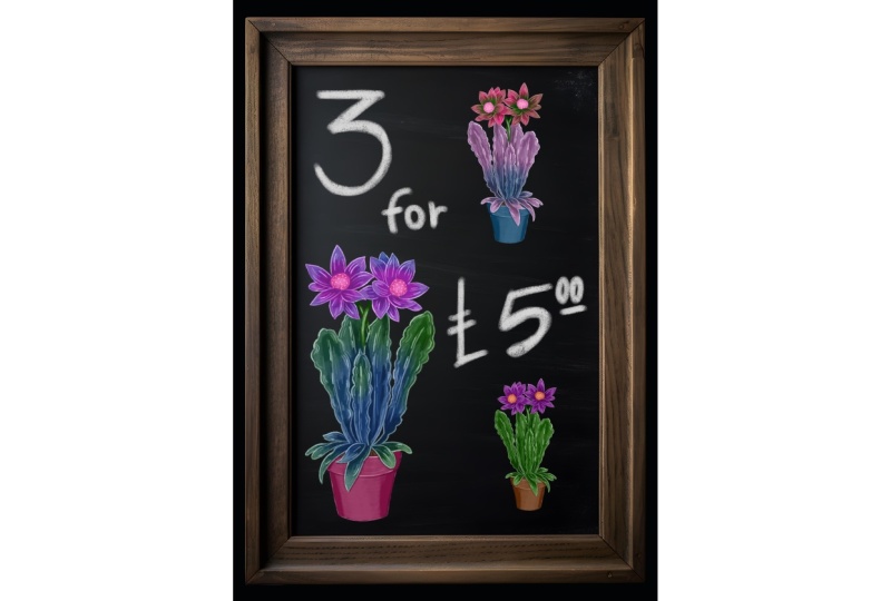
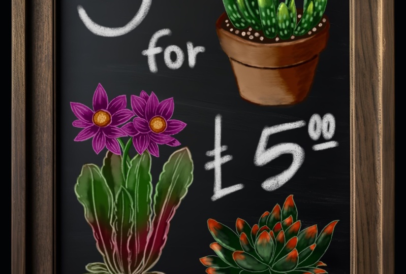
lovely succulin plant. And our painting session
is now complete. We'll perform some color and finalize the artwork in
the next final lesson.
9. Retouching: Okay, in this final lesson, we'll clean up the layer
stack a bit and go over some color adjustments
and retouching. What do we do now? We
can surely integrate the highlights to the
correspondent counterparts. Now we want to look at
lustration and say, maybe I don't like this color. I can duplicate this layer. So we have a Bakup. In case something goes wrong, go to hue and
saturations and say, maybe I like this color better, or maybe this one. You basically make
an artistic decision based on your feelings. You can change color or make it more intense using the
saturation lighter. Once I'm satisfied
with the changes, I can delete the copy
that was made previously. Now I'm thinking
about increasing the saturation of the
elements because I think they need to be more colorful
and I just want to copy them first so I
can see the change. Now that this is completed, I may feel tempted to
change the colors, so I'll change the use. With the twist, I want to show you something slightly
different, but very powerful. I can duplicate the leaves. I can choose a different
color for them. Could be any color you like. Could even be a plant
from another planet. Now we have two layers
on top of each other. If I make a mask, you can see that
a white layer is being created and linked
to the layer below. You can use the same
brush, the carbon stick, by increase the brush size
before you begin painting. The mask layer works
in such a way that painting with black hides
a section of the layer. Painting with white reveals
a portion of the layer. Now that I'm painting, it
looks as if I'm erasing, but in reality, I'm only hiding the area of the
layer in question. Using this technique, you
may produce something rather interesting and the
possibilities are truly endless. Again, you can use hue
and saturations and say, let me see now what
color works best. Then you make your own choice. This specific example, I'm interested in keeping
the hues authentic. I may use a type of
brownish greenish tint. I can do the same
for the petals. I duplicate the layer. I create a mask. I adjust the hue slider again, this time to a light
blue, which is wonderful. Now painting on the mask layer, I can cover the tips
of the petals while revealing the color underneath.
That is the principle. Another trick is
to blur the mask, which results in a
more uniform gradient. To achieve this, pick the mask and go to
Filter Gauschenblir. Then by sliding to the right, you may increase the
level of blurness. At this point, you
can experiment with the hues again until you
find a pleasing combination. For the sake of this video, I'd like to go back to a more
traditional color scheme. So I can do this until here. As part of the class project, you can now paint the remaining
two plants on this page. And you may expect
a similar result if you use the same method. I hope you enjoy this and to see you again soon.
Goodbye for now.
 Maurizio De Angelis, Scientific Illustrator and 3D Modeller