Transcripts
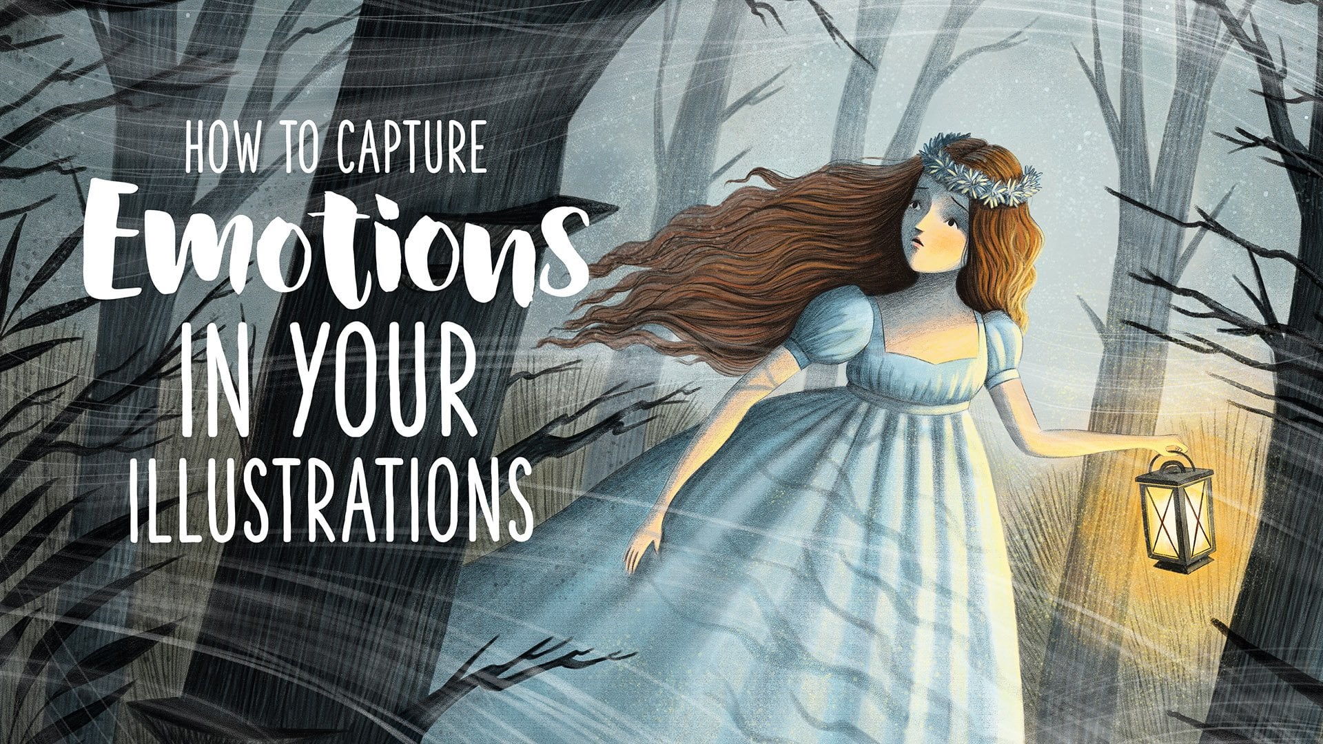
1. Introduction: Hello, I'm Ramona Kolinski, a New York Times best
selling illustrator, specialized in
children's Illustration. Nested in the charming
city of Potsam Germany, over the past years, I've had the privilege
of bringing the magic of storytelling to life through illustrations in over 20 books. My journey has encompassed a diverse spectrum from crafting board books
for the tiniest tots, creating all kinds
of picture books to breathing life into
the vibrant covers for young adult readers. Let me take you back to
the beginning when I first decided to dive into the
world of illustration, I vividly recall wrestling
with a torrent of questions, which medium should I use? What style best conveys
my artistic voice? What subject matter
should I focus on? And the biggest question of all, how can I translate
the vivid visions in my mind into beautiful,
evocative illustrations? My early attempts in illustration were
marked by uncertainty, aimless journey with
no clear path ahead. Hours of work often
unraveled as I struggled with ideas
that shifted mid stroke. Achieving the
illusive right look for my drawings
proved challenging. Creating harmonious color
palettes was a mystery for me. After countless of hours, the finished
illustration often fell short of the vision that
I had in my imagination. The dream of becoming a professional illustrator
felt unreachable. Thinking about this years later, I can't believe how easy
this all has become today. In this course, I'm
thrilled to share with you the very toolkit that I
developed over the years, a toolkit that will empower
you to create illustrations, brimming with atmosphere,
narrating captivating stories, and stirring emotion
within your viewers. My goal is to equip
you to convey your unique stories
through images and to provide you
with a well defined, easily navigable pathway
to create an illustration. After working
through this course, you'll possess the
skills to turn your visions into captivating
tangible artworks. Our journey will begin by
delving into the art of ideation and dissecting
the structure of a compelling illustration. We'll explore the
significance of sketchbooks and how you can
train your creative muscles. I'll guide you
through each step of my personal illustration
process from scribbling tiny thumbnails defining
the perfect composition, sketching colo selection, and finally painting
the final image. Along the way, we'll unravel the secrets of design principles
like image composition, shape language, the
importance of color theory, and the artistry of
character design. By the end of the journey, you'll not only hold a
finished illustration, but also possess the
right tools to create captivating children's
illustrations and create a portfolio that
will spark attention. So let us begin our
creative voyage.
2. Influences and Inspirations: When you start thinking about your influences
and inspirations, take a look at your childhood. What did you like to
spend your time with? What made you happy, and
what were your interests? I remember being fascinated
by all kinds of stories, especially the fantastic
tales by Michael Ender. I love diving into the boundless adventures of the never ending Story or into the wisdom of Momo and the escapes
of Jim Button. Later on, as so many of us, I was sabound by the wizarding
world of Harry Potter. Even today, as an adult, I still love reading the
books or watching the movies. The profound influence
of these stories continues to shape
the very essence of my creative work today. In my illustrations, I revel
in the art of juxtaposition, blending the ordinary
with the extraordinary, infusing the mundane
with a touch of magic. Beyond these
fantastical narratives, I always loved spending
time in nature, and I still draw a lot of my inspiration out of
the natural world. Every year, my heart leaps with joy as the first
snowflakes of winter softly cover trees and houses and create a magical
winter wonderland. I also love traditions like baking cookies,
decorating the house, and the coziness of sitting
inside with a hot tea and watching the kids as they play in the snow
and build snowmen. I love to capture the
seasonal shifts in nature, as well as the
different activities and traditions and
my illustrations. I think there's so much beauty
in these small moments, and appreciating them can make
life so much more joyful. But it's not just the
landscapes and seasons. I also always had a
special bond to animals. Long walks with my dog around lakes and through the
forest and ride through the fields with my horse have
the power to draw me out of daily life and allow me to fully embrace the moment and
appreciate nature's beauty. In my journey as an illustrator, I've come to realize the profound importance of nurturing these sources
of inspiration. I've learned that sometimes stepping away from
the drawing board, immersing yourself
in new experiences, and indulging in the
activities you love can be the very thing that
breathes life into your art. So take a pause, reflect on your own
unique influences and springs of inspiration. It does not need to be nature, animals, or seasonal
traditions like it is for me. Maybe for you, it is big cities, science, or historic events. Whatever it is for you, let these elements nurture
your creative soul. By doing so, you'll ensure
your artistic path remains true to you and also that your illustrations
resonate with the viewer, because only then they
are truly authentic. And after all, let me tell you, there is nothing more
disheartening than creating something that fails
to ignite your excitement. Strive to craft a holistic
portfolio filled with illustrations that reflect your personal essence
and your interests. And this, my friends,
is the surest path to sparking emotion and inspiration in those who view your art.
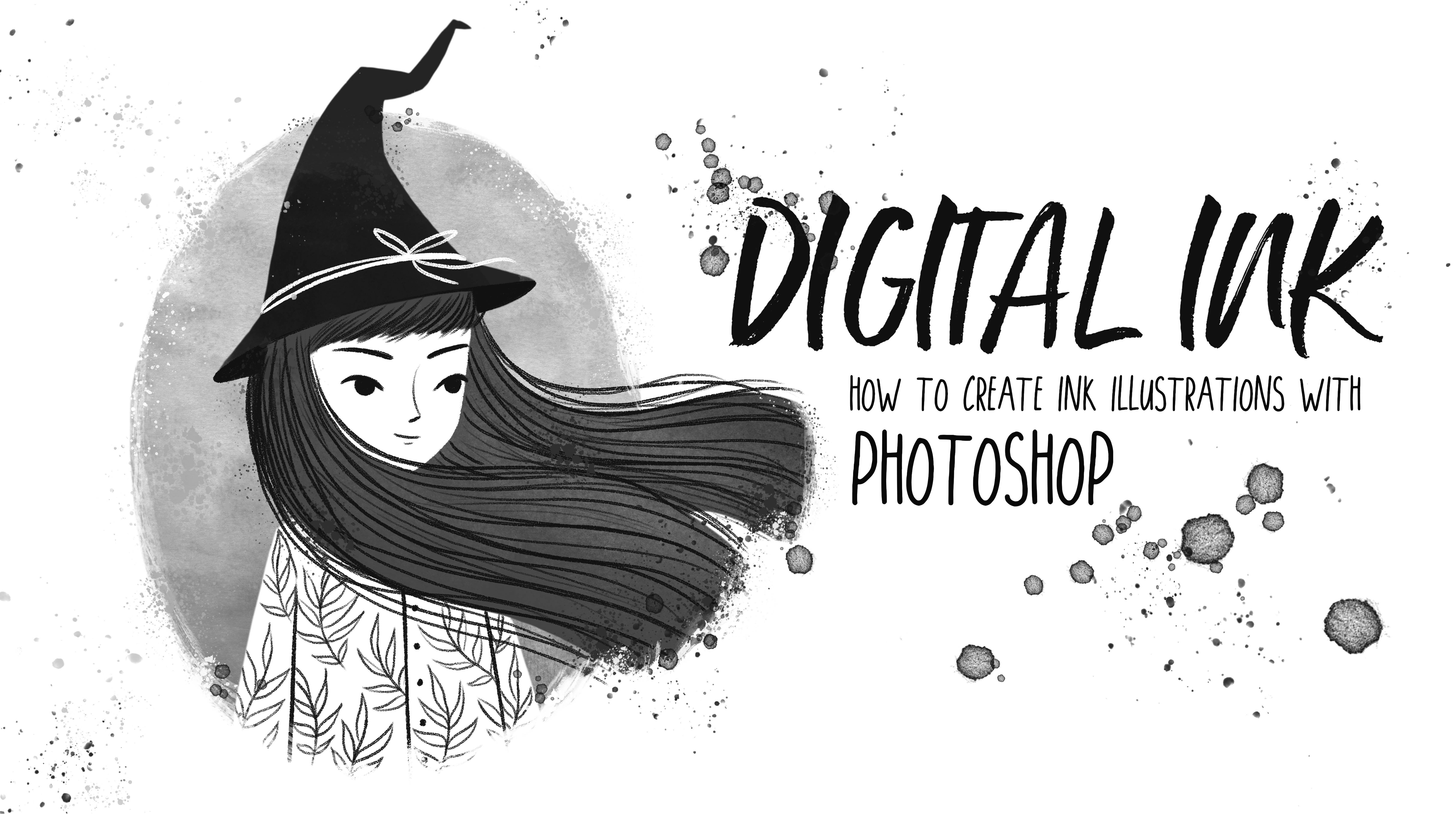
3. Materials: In this course, we'll dive into the fundamental
principles of design and illustration that form the basis of
captivating artwork. While I personally guide you through the digital
realm using Photoshop, I want to empower you to embrace the medium that resonates
most profoundly with you. The beauty of art lies in
its boundless possibilities. Everything I
accomplish digitally can be replicated
with analog media. If you find yourself at the beginning of your
artistic journey, I encourage you to embark
on a grand exploration, a whimsical adventure through
a myriad of techniques, tools, and artistic mediums. Dip your brush into watercolors, sketch with vibrant
colored pencils, experiment with the
tactile feel of pestils or try yourself
in Photoshop or procrd. As you experiment, take a
moment to observe yourself. What feels like
second nature to you? Which medium seamlessly ushers you into the creative flow? Do you emerge from your
artistic endeavors feeling drained or invigorated? Even working digitally, I've discovered that dabbling with real paints and
pencils can infuse your illustrations with
a unique vitality. And remember the journey of creating illustrations
extends far beyond the final image. Equally important is that you
enjoy the process itself, finding that illusive
spark of inspiration, sketching out your thoughts, and finally bringing
your vision to life. The magic lies not only in the destination but in
every step along the way. And here's the secret. There's no need to confine yourself to a single
medium or technique. Combine the digitfinss of your sketches with
the tactile richness of analog final art or chart a reverse
course if you like. Explore the harmonious
combination of watercolors and crayons or the striking
contrast of markers and pastds. You can shape your own
purses however you like. Enjoy the experimentation,
and in the process, uncover the medium
that speaks to you and create an outcome that you personally find
aesthetically pleasing. I
4. Ingredients for a Good Illustration: Creating a successful
illustration involves a combination
of artistic skill, creativity, and thoughtful
decision making. These are the five
most important points that contribute to a
good illustration. A good illustration always has a clear and
compelling concept. Before you start drawing, you should ask yourself, what story or message do you want to convey through
your illustration? A well defined concept
serves as the foundation of your artwork and will guide all your creative decisions in the process of creating it. Do you want to tell a joke, create attention for
a special topic, tell a story, show a fairy
tale in a different light? What do you want to say
with your illustration? Effective composition. Composition is the arrangement of elements within
your illustration. It plays a critical role on how viewers engage
with your artwork. A strong composition
leads the viewer's eye, creates a focal point, and establishes visual balance. Consider factors like the rule
of thirds, leading lines, and the use of negative space
to create a composition that captures attention and communicates your
message effectively. Colors have the power
to convey emotions, set a mood and
enhance storytelling. Choose your color
palette carefully, considering the atmosphere and the emotions you want to evoke. Harmonious color schemes
and well balanced contrasts can elevate your illustration and create a lasting impact. Attention to detail. The devil is in the details, and small elements can make a big difference in the
success of your illustration. Pay close attention
to the intricacies of your artwork from textures to shading to precise linework. Details can add depth, realism, and character to
your illustration, making it more engaging
for the viewers. A successful illustration tells a story or evokes emotion, whether it's capturing a
fleeting moment of joy, conveying a sense of wonder or depicting a dramatic scene. Your artwork should connect with the viewer on an
emotional level. Think about the narrative in your illustration and how it resonates with your audience. In addition to these five
points, remember that practice, experimentation, and
continuous learning are essential for growth
as an illustrator. Developing your
skills and honing your unique style will contribute to your
success over time. Keep pushing your
creative boundaries and never stop exploring new
techniques and ideas.
5. Ideation: Ideation is where
you give yourself permission to let your
imagination roam free. Allow your mind to leap
beyond the boundaries of the Mundan and to
explore different paths. Don't try to pick the one
perfect idea right away. Rather, give yourself
the room to experiment. Try to see failures not
as stumbling blocks, but as stepping
stones to innovation. Go back to your personal
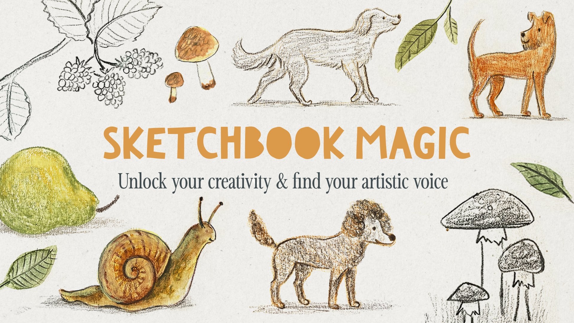
influences and inspirations. Keep a sketchbook where
you scribble down ideas and concepts that flow through your mind
throughout the day, like a diary, interesting or moving moments and
situations of your life, thoughts and new
things you've learned. This sketchbook is just for you. It is not about making beautiful drawings or
showing it to anybody. It is purely to think
through ideas and concepts, to make quick sketches that you can come
back to later and maybe explore further and create a full
illustration out of it. If you have a general
topic or idea, you can do a quick
brainstorming. A single thought can
spark a chain reaction, igniting a sequence
of related ideas. This process of
challenging assumptions and pushing the boundaries of conventional thinking
can oftentimes lead to unexpected and
creative solutions. To help this process, you can create, for
example, a mind map. Mind mapping is a
visual technique that starts with a central idea and radiates outwards with connected thoughts,
concepts, and associations. It's like creating a visual
rout map of your thoughts, allowing you to explore related ideas and uncover
unexpected connections. To spark your imagination, you could also use
visual prompts. Use images, illustrations
or photographs and let the visuals guide
your thoughts and inspire new concepts that
spring from the emotions, stories, or scenes
depicted in the imagery. Spend a few minutes
each day with these techniques and to scribble
in your idea sketchbook, and soon developing
captivating concepts for illustrations will
come natural to you. Creativity is like a mass. The more you use it, the stronger and more
effective it will become.
6. Moodboards: Once you have a concept or an
idea for your illustration, it can be very helpful
to create a mood board. Mood boards are
an essential tool in the creative process, especially for artists,
designers and illustrators. There are visual collages that capture and convey
a specific mood, atmosphere, or a theme through
a collection of images, colors, textures, and
sometimes even text. It helps you establish the mood, emotion, and atmosphere you want to convey in
your illustration, whether it's a whimsical
children's book or a dark and mysterious scene, a mood board sets the tone
right from the beginning. To create a moodboard, I oftentimes use Pinterest and create a new
private board there. Or I create a new Photoshop file where I collect all the images, colors, and reference
photos to build a clear image in my head of how my illustration
should look. It helps me to find the
right color palette, specify my idea,
and it's great to have all the references at
hand once I start painting. You could also do the moodboard analog or create a folder, do whatever fits right for you. Creating a mood board ensures
that your illustration maintains a consistent and
coherent visual language. When you gather images and elements that harmonize
with each other, you are more likely
to create a piece of art that feels balanced and
aesthetically pleasing. Colors play a
significant role in evoking emotions and conveying
messages in your art. Moodboards assist in selecting a color palette that aligns with the mood
of your illustration. By arranging color swatches and images with dominant colors, you can see how they interact and make informed decisions.
7. Character Design: A good character design is essential for engaging
storytelling. It resonates with
the audience and contributes to the visual
appeal of an illustration. Character design is
a creative process, and there's room for
experimentation and personal style. In this video, I want
to give you some tips on how to create a
successful character design. First, create a clear and
interesting silhouette. It should be distinct
and easily recognizable. If you only see the silhouette, you should already get a sense of the character's personality. A clear silhouette
help se viewer to quickly identify and
connect with the character. If your character appears in several illustrations like
in a children's book, consistency is essential
to avoid confusion. The character's
features, proportions, and overlook should remain
stable throughout the story. The character's visual design should reflect
their personality. A character's facial
expression, body language, and clothing can say a lot about their personality
and emotions. Again, consider your
target audience. Round, simple shapes,
a friendly face, and bright colors appeal
to young children. To make a character's role
in a story more obvious, you can use symbolism
and iconography. Symbols like a crown
for royalty or a Stoscope for a doctor can provide instant context
and understanding. Strive to create
characters that are memorable and leave a
lasting impression. Unique features or quirks can help to make your
character stand out. Avoid stereotypes and be aware
of cultural sensitivities. Research and cultural
understanding are crucial when designing characters from
diverse backgrounds. Pay attention to visual
hierarchy and ensure that the most important elements of your character
are emphasized. This can include the
character's face, key Sosas or
distinctive features. I think designing a character is a bit like doing thumbnails. I do quick and rough sketches, try out different proportions, clothing, and facial features, and as always, feel
free to experiment.
8. Illustrating for Children: Illustrating for children is
a form of storytelling and a powerful way to nurture their creativity
and imagination. A children's illustration should be approached with empathy, enthusiasm, and a genuine love for inspiring young
minds with art. When you are
creating artwork for children's books or other
child oriented projects, always try to keep the
age and development stage of your target audience in mind. Illustrations for
children should be clear, simple, and easily
comprehensible. Try to avoid clutter and overly detailed artwork to not overwhelm the young viewers. Children are often drawn to
bright and friendly colors. A vibrant and visually
appealing color palette evokes positive emotions. The characters in
your illustrations should be relatable and endearing so that children can connect with them on
an emotional level. Clear facial expressions and body language should be
paid extra attention to. If you are illustrating a story, the illustrations
should complement and enhance the narrative and
help to convey the plot, emotions, and
character development. Try to avoid depicting unsafe
behavior or situations. If your illustrations
include any products, activities or settings
that children may imitate, consider safety implications,
especially editors and designers will pay close
attention to these details. Children have rather
short attention spans, so it helps to
make illustrations engaging to heart
their interest. Create illustrations
that encourage exploration, curiosity,
and imagination. Hidden details or
interactive elements can make your artwork
even more captivating. If you are working
on a series of illustrations for a book or
some other kind of story, consistency in style
is very important. It helps to create a
cohesive visual experience and makes it easier for the
children to follow the story. If you are including text, choose a child friendly
and legible font. The text should be easy to read and have a good contrast to the background and should not obscure any important
details of the artwork. I always try to represent
diversity in my illustrations. I think children's books should reflect a variety of cultures, backgrounds and experiences so that children can see
themselves in the stories.
9. Shape Language: Shapes are an effective form of communication that you can use to enhance a specific mood, atmosphere, or emotion
in your illustration, or to underline the
personality of a character. It is a powerful tool that influences how viewers perceive and connect with your art. Sharp and angular
shapes, for example, can be used to show tension, danger, or add excitement
to your illustration. You can even use this
effect in nature. Sharks are powerful
and fast predators, and they have triangular sharp
shapes all over the body. You can use these sharp
angular shapes in your character design if
you want to draw a villain, for example, maybe he has spiky shoes or his body form
looks a bit like a triangle. Think of the Iv witch
in fairy tales. She oftentimes has a pointed
head and a sharp nose. In contrast to that,
round and soft shapes communicate comfort, warmth, harmlessness, approachability, gentleness, and
sometimes vulnerability. Take a look at this koala. He is basically a
big fluffy ball. His ears, eyes, nose, and ovary body shape
are round and soft. This is why we perceive
koalas as harmless and cute. I oftentimes use round shapes in my character designs
for children's books, since round shapes especially
appeal to young children. Round and soft shapes add
to the approachability of a character and can help to make a character look more
cute and friendly. The arrangement of shapes influences the overall
harmony of your composition. A carefully considered
interplay of shapes creates unity
and coherence. A chaotic clash on
the other hand, might disrupt the visual flow
and confuse the narrative. But be aware, too much unity can make your
illustration look boring. That's why it is
important to have unity to create a coherent look, but also add a little bit of variety to make it interesting. When you use shapes to
create a composition, also think about the
lines in your image. In the left image, I use soft and organic shapes
combined with horizontal lines. This creates a calm
and peaceful scene. On the right image, I used triangular shapes and
included many diagonal lines, which makes the image a
lot more exciting and can even be used to create a
sense of tension or danger. So be aware of the impact different shapes and lines
can have in your design. Use them carefully
and with intention to communicate a specific mood
or emotion in your art. When you create a character, base your design on
a specific shape to underline their personality.
10. Composition: Here are a few tips and
guidelines that might help you in crafting the perfect composition for
your illustration. The rule of thirds, divide your canvas into a
tick tuck toe grid. Place key elements
along these lines or at the intersections to create a dynamic and visually
pleasing composition. This rule instills a
natural rhythm drawing the eye along pathways
that enhance engagement. Use the power of lines to guide the viewer's eye
through your image. Lines can be explit like
roads or rivers or implied, such as the outstretched
arm of a character. These lines serve as
visual highways directing attention to focal points and creating a
sense of movement. Achieving balance doesn't necessarily mean
perfect symmetry. It's about distributing
visual rate evenly across the canvas. A well balanced composition
imparts stability while intentional imbalances can
evoke tension and intrigue. Varying the scale of elements adds depth and visual interest. It juxta position of a
small figure against a vast landscape or an oversized object can create drama and emphasize importance. Introduce layers to
your composition, just like a stage
with different depth. You could, for example, place your subject in the foreground, a supporting element
in the middle ground, and a backdrop in
the background. This adds complexity and
depth to your image. Select a focal point that
serves as the heart of your composition surrounded with supporting elements that
enhance its significance. This emphasis ensures that the viewers know where to
direct their attention. Remember that mastery
comes through practice. If you have
difficulties to create good compositions,
try master copies. Look at how other
illustrators compose their images and do
quick studies of it. Also, experiment and take risk. Over time, creating
effective compositions will become easier and
second nature to you. Let's take a closer look
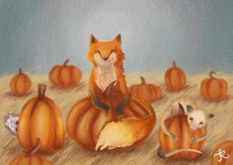
at this illustration. When I tried to figure
out this composition, I tried to place my key
elements, the girl, the pumpkin, and the village
on the intersections of my TikTok to grid and
applied the rule of thirds. The rule of thirds also
applies if you have groups of elements like
the birds in this case. Somehow, groups of three
or other uneven numbers most often create
a nice dynamic. This can apply to
houses, leaves, plants, cars, animals, or any other
elements in your image. I also wanted to create a nice
flow in this illustration, which I achieved with
the curved road and also with the ovo round shapes
of the hills and trees. To bring your
composition together, it can help to frame your image. In this case, I use the
trees and bushes for that. I think the character
would appear a bit lost without this frame. The falling leaves add to the ovoy movement and
dynamic of the illustration. And at last, we have a clear darker silhouette
on a lighter background. Her hair is the darkest spot in the image and therefore
creates the highest contrast. The retina clothing
and the pattern of her skirt also add to making
her the main focal point. In contrast to that, the
landscape and village in the background is much
softer in contrast. The colors are more washed
out and we see less detail.
11. Thumbnails: Now that you have an idea
for your illustration, created a mood board and learn the principles of
good composition, we are ready to start sketching. To develop our illustration
concept further, we start by doing some thumbnds. Thumbnds are small, rough
and quick sketches. Doing these tiny
sketches allows you to quickly explore multiple
ideas and concepts. You can experiment with
different compositions, layouts, and visual elements to find the most effective approach
for your illustration idea. At this rough stage, you can already start thinking about where you want
your focal point to be and the placement
of key elements of your image to achieve a
balanced composition. Before I start with the sketches for a picture book, for example, I always create a little storyboard with very
small thumbnails. This way, I can plan the
flow of the story and make sure that there is a nice
variety of close ups, landscapes, spot illustrations,
and full bleed spreads. But I also do thumbnails
for single illustrations. The first solution is most
often not the best one. I always try to explore all kinds of different
perspectives, compositions and layouts to get a creative solution
for my idea at the end. Thumbnails are really fun. You don't have to
draw any details yet. Keep it rough and simple. This way, you can feel free
to take risks and experiment. When you start sketching, it might be helpful to already add some values
to your drawings. You can keep it very
simple and just stick to three or
four gray tones. Doing this, you can
already set the mood, time of day, and lighting
situation in your image. It is also a great
tool to figure out your composition more and to already set a
clear focal point. Make sure that your character or focal point has the highest
contrast in your image. It should either be
a dark silhouette on a light background or a light silhouette on
a dark background. Just make sure the
silhouette is clear and the viewer can immediately
see what's going on. Especially in the beginning, it helps to keep things simple. Have a clear foreground, middle ground, and background. Most often, the things in
the foreground will be larger and much darker than
the things in the background. You can easily create depth in your illustration by making elements in the
background lighter and maybe even a
bit more blurry. That's also how we as
humans see the world. Atmosphere makes it that
things in the distance become lighter and
also a bit bluish. Elements in the foreground instead have much more contrast. They are darker and
have sharper edges. This step is very important to do before you
start with color. If you have not figured out
your image in graytons, color will most likely
not make it better. If you are working analog, you can do this with a quick
pencil or watercolor sketch. You can use this sketch later as a guide for your
final illustration. And trust me, it will
make the process much easier because you have already figured out
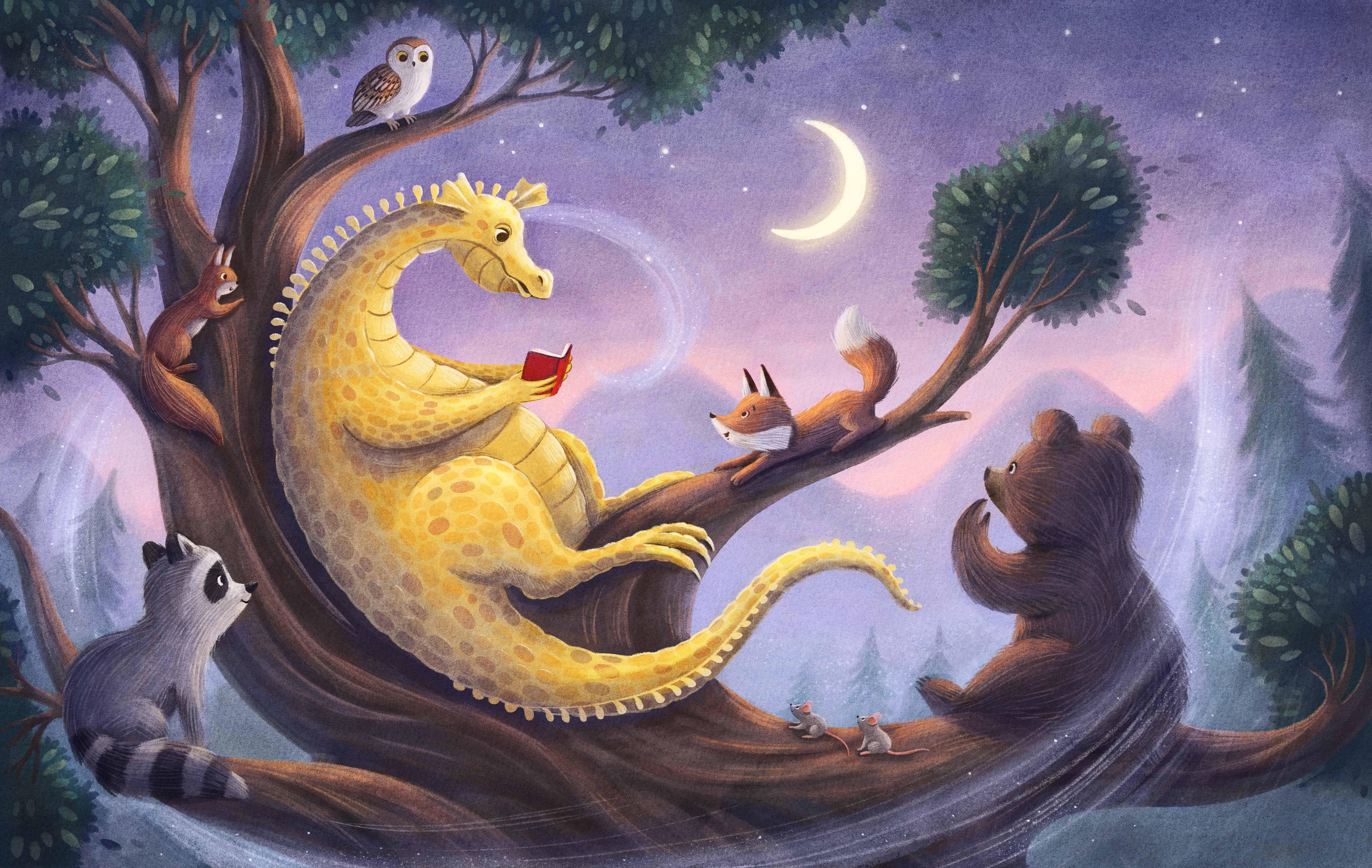
so many problems. A. After I experimented with different compositions
and layouts, I choose one of my thumbnails
and develop it further. I increase the size, reduce the opacity, and create
a new layer on top of it. When working analog,
you could either redraw the thumbnail or
photograph or scan it, print it out in a larger size, and work on top of it with a
light table or on a window. Now we can add more detail. I take the character
studies I've done earlier and use them as a
guide to draw my dragon. I decided to go with a
combination of them. As you can see, I've
added a little raccoon on the left branch to balance
out the image a bit more. Always keep attention that your characters and
main elements have the space they need and that your lines do not
create any tangents. Everything should be
clear and easy to read. A good test is to
scroll out really far or take a picture of your image and look at it at
the small size. Take a look if it
is still easy to understand and if it is clear what's happening
in your illustration, even at a very small size. Now I'm adding some
value to my drawing. It helps me to see if
the composition still works and also work out the lighting situation
a bit already, which is, in this
case, the moon.
12. Color Theory: Color theory is a cornerstone in the language of
visual storytelling. Colors are more than
just mere pigments. There are the emotional
orchestrators setting the tone and breathing life
into our illustrations. Color theory is the study of how colors interact with
each other and how they can be combined to create visually harmonious and emotionally resonant
compositions. The color wheel helps us understand the
relationship between colors and serves as a guide to create visually
appealing combinations. Let's start with
the primary colors. Red, blue and yellow are our primary colors and the building blocks
for all other colors. Secondary colors
are green, orange, and purple and are formed by
mixing two primary colors. Tertiary colors emerge by mixing a primary color
with a secondary color. We divide colors
into warm and cool. The colors here on the left side from green to purple
are cool colors. Usually, they recede
and are less prominent. They are great for
winter scenes or illustrations that take place
underwater or at night. On the right side,
from yellow green to red are our warm colors. They usually stand out more and are great to create a
strong focal point. A warm color palette is
perfect, for example, to create a luminous
tem illustration or for illustrations that take place in a cozy home environment
or in a hot desert. Let's take a look at
how we can combine colors and create
impactful color palettes. First, we have the complementary
color combination. This combination is made out of two colors that are on opposite
sides on the color wheel. They create the
strongest contrast and have a powerful impact. Together, they appear
brighter and more prominent. Then we have analogous
color combinations. These are groups of colors on the calorie that are
next to each other. Analogous color palettes create a serene and cohesive feel. And lastly, we have triadic
color combinations. These are colors that are
equally spaced on the rear. They create a dynamic and
balanced color contrast. When you want to create a
color palette for your image, you don't have to strictly
follow these schemes. You can also just follow
your intuition or let yourself be inspired by photographs or other
illustrations. Just keep in mind what you want to achieve with your image. What mood or emotion do you want to convey with
your illustration? I sometimes find it
helpful to write down a few keywords upfront and then make decisions
keeping them in mind. Colors are emotional triggers. Each hue carries its
own psychological rate, and understanding
these associations is key to effective
storytelling. Red attracts the most
attention and is associated with strong emotions such as
love, passion, and anger. It communicates strength,
power, courage, and danger. It is vibrant,
stimulating and exciting, so you should use it carefully. It is a great color to
create strong focal points. Blue stands for
calmness and serenity. Blue is often found in nature, such as a calm sea
and clear sky, creating a sense of peace. Blue also communicates
trust and stability. Yellow creates some
positive emotions in the viewer, including happiness, excitement, originality, enthusiasm, confidence,
hope and creativity. But there are also some negative emotions
connected to yellow, such as illness, caution,
egotism, and anxiety. From a colour
psychological perspective, purple communicates harmony
of the mind and emotions, contributing to mental
balance and stability. It can give a
feeling of mystery, luxury, and sophistication
or royalty. Orange is optimistic and uplifting, rejuvenating
the spirit. It is connected with warmth,
security, sensuality, fun, liveliness, happiness, creativity, enthusiasm
and vitality. It is dynamic and extra rigid. The color green evokes the
feeling of hopefulness, responsibility, wealth,
forgiveness, comfort, and energy. When we see green, we think of nature, growth and freshness. Keep in mind that colors are not universal in
their symbolism. White, for example, stands
for purity and simplicity in western cultures while it is connected with mourning
in some Eastern cultures. Black can create a sense of
elegance and sophistication, but it is also connected to
mourning in Western cultures. Let's look at a few examples. For this Wizard of Os cover, I've used an overall warm
color palette with reds, oranges, and warm yellow greens. My focal point is
the main character, and her blue dress creates a strong warm cool contrast
with the background. That's why our eye immediately goes to her when we
look at the image. And even though there's so
much red in this illustration, and red usually is
very prominent, since the girl is the
only cool element here, she remains the focal point. In this illustration, I
did the complete opposite and used an over cool palette
with greens and blues. Only the kids have
warm colors to them. The boy in the window with his red shirt is the
main focal point. His dark hair creates a strong contrast to the
yellow of the window, and the red of his clothing
attracts our eyes. And lastly, in
this illustration, we have a very limited
colour palette. I only used warm gray, yellow, and just a hint
of pink for her cheeks. With color, I think,
oftentimes less is more. You don't need such a
limited color palette, but sticking to only
two or three colors and using the different hues you can create with them helps to create a nice oval color
harmony in your illustration.
13. Final Painting: And finally, we have done all the preparation needed to create our final
illustration. This should be now really easy, since we have figured
out all the problems and created a clear plan to
follow to paint our image. This process is also
great if you're working with clients
because at this point, they know exactly what they can expect for the
final illustration. There are no surprises at all, and therefore, there should be almost no revisions after this. I start by painting
in the background, which is the sky here. My drawing is on a
multiplay layer, and I paint underneath it. I like to paint from
light to dark and always try to create some
interesting textures. I already have my watercolor texture on top of everything, and it gives the painting
a nice, cohesive look. Now I softly paint in the
mountains in the background, following my colo ***. You can see how I slowly
work my way up from the back to the front and keep everything on
separate layers. Make sure that the elements in the background don't
have too much contrast. Otherwise, they can distract the viewer's eye from
our main focal point. That means also
avoiding harsh edges. See how soft I'm
painting in the trees. I also don't add
much detail to them. I don't want them to be too
permanent in the image. Since the main tree
is in the foreground, I paint it much darker and let the edges be much harder than the trees in
the background. A I always block in the main color first and then add light
and shadow to it. For this, it is really helpful to have every element
on its own layer. Even though there are so many
characters in this image, I try to create a strong
silhouette for each of them, so they are easily recognizable. A I proceed the same way
with the leaves, first painting in
a rough shape in one main color and then locking the layer and adding
light and shadow to it. Always referencing
my colour camp. Now I'm starting to add some details and
painting in the leaves. Y varying the size of the leaves makes it look a little more
interesting, I think. And to save some time, I now start to copy and
paste groups of them. Just be aware if you do this, that it is not so obvious
in the final image. Changing the size, moving
things around a bit, or flipping them
helps with that. When you have an illustration
with a lot of green, I always try to use a
variety of different hues. It makes it look a
bit more natural. To draw the fur of the animals, I like to use one of the pencil brushes that
come with Photoshop. Try to adjust your strokes to
the fam of the body and use a lighter tone for
the light areas and a darker tone for the
parts that are in shadow. Here I'm starting to add
details to our drag. I put the scales on
a new layer so I can still change the
color and opacity. He looks a bit like a
giraffe to me right now, so I decided to remove
the gates from the belly. Y. Now I'm adding an overlay layer to add
some light to the scene and to make the silhouettes of the characters a
bit more prominent. It's also a good way
to enhance some are as of the image by increasing
the color saturation. At the end, I'm just changing some bits and
pieces here and there. And here's the finished piece. I've decided to add
this little wind swirl to give the image a bit
more flow and magic.
 Ramona Kaulitzki, Children's illustrator