Transcripts
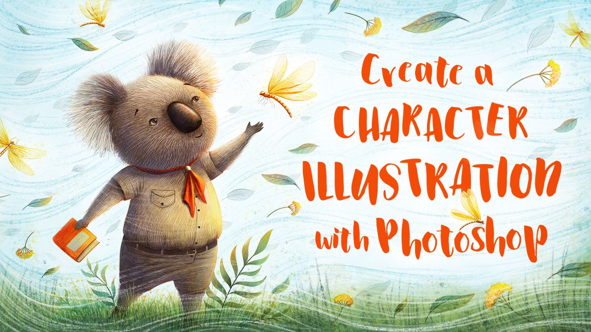
1. Welcome: what makes people like and share illustrations on social media, where there could be many reasons. Very often it has to do with emotion. Illustrations are ready to communicate stories and our concepts and the best way you can do this. As with emotion, conveying a particular emotion and our mood in your images, that's the beer. Connect with your piece. At least that should be the going. And this is really what makes illustrations so wonderful. In my opinion, if this is stone successfully, this is what we make. People hit the like button and share work with their friends. Hi, my name is Ramona Kolinsky and I'm an illustrator from Germany, specialized in Children's illustration and in this class, I reassure you, raised to convey emotions with your illustrations. By developing a sketch into four different directions, I assure you how you can make the view. If you feel calmness, sadness and joy, we will take a look at the impact that different shapes can have on your image, how to use values to achieve a particular mood, and we will talk about the meaning and psychological effect off different colors and the end. There will be a demo off How I take one off the sketches toe finished illustration. After taking this class, you will be equipped with various tourists to capture emotions and your illustrations, which will create a connection between your work and your audience. This ability remains your illustrations immediately more valuable. This cows is for everyone who is interested in telling stories where the illustrations, their principles that ever show you our dept. Ability on every have enough experience off course. Some drawing experiences what behaved food. But this class will be equally helpful. If you're a complete beginner, I work digitally on a drawing tablet on the illustration. I've a show you, but the topic office class are January design principle. It's so you can use any medium that you want to create your own emotional illustration. So let's get started and thank you so much for joining this class
2. Class Project: in this class. I would take this sketch and take it into four different directions. I re make it look anxious, Time said, and joyfully for the class project your country's any emotion that you won't and create your own illustration based on the sketch. You can find this sketch in the project section. Just follow me alone and modify the sketch with your own storytelling elements, lines and shapes, values and colors to create your own emotional illustration Off course. You can also use your own sketch and create your own unique illustration. I really can't great to see all your wonderful images.
3. Storytelling: here you can see my basic line drawing and it looks pretty neutral in this stage to take this into the four different directions and make it look anxious, Calm said. Enjoy, for the first step is to change her facial expression, and that is what you can see here. In the first run, I made her look very anxious, like she's hearing or seeing something scary. In the second run, I left her basically as she waas, since she's already looking pretty calm. And the 3rd 1 I am major, look really set. And in the 4th 1 I made her smile and look really happy. If you have a character in your illustration and you have to draw a certain emotion, it really helps to look at reference images. Just google the particular emotion that you want to convey and look at the different faces . What makes the face look said or happy? What are the eyebrows doing? And the eyes and the mouth? After I changed over the facial expressions, I added some storytelling elements and the first run I gave her a lamp I'm imagining at being night time and really dark and scary. I gave her this limb not only to emphasize that it is night time, but also to create some sort off light source in the image. This can really add some interest to your low situation, and it can create a really nice focal point. It also gives you the opportunity to incorporate some more colors. I didn't change anything in the calmness. Gedge. I think it looks already pretty time that she's taking the walk outside and enjoying nature . I don't think that it needs any additional elements for the sadness sketch. I gave her a letter. Maybe she is just received bad news or something and rent out into the woods to be on her own. And these are really just small additional elements that you can add to your illustrations . But they really help to keep the viewer look at your illustration just a moment longer to think about what is going on in the image. To emphasize the joy in the last illustration. I heard it a couple of butterflies around her, and like in the first illustration that can really help true, add some more color variety to your image. Okay, now always get just already and In the next lesson, we will take a look at values and how you can use them to underline the emotion that you have chosen for your illustration.
4. Values: I used just by changing the values off illustration, you can really change the mood off the whole piece. And that is why I always say that values are at least as important as color, so you should really try to take your time and figure these out before you go to color. So what exactly are values? Values are the degree off lightness and darkness and your colors. The difference in values are called contrast. You can darken the value of a color by adding black bridge, which is called shades, or lighten it up, but adding wide and that is cartoons. And here you can see how used values to create the different moods and emotions for this illustration to create a sense off fear in the sketch I rendering overall dark values. In addition to this, I included pretty heavy contrasts, meaning very light values besides very dark values, like the light off her skin and the black off her hair or the light off the lamp and the tree. The use off heavy dark grays and blacks in this image, plus the stark contrasts, create an uneasy fear, which is really what we want in this case to make this image. If you really calm and peaceful, I did the exact opposite. Instead of going with heavy contrasts, I ran was really little contrast and overall light values. This makes the image few soft and calm and peaceful to create a sense of sadness. And the third image I included almost no contrasts. The whole image is gray and die. It's really like a super rainy grey day, which mirrors her depression and sadness and to make the last catch look joyful and happy. I rent Ruth more contrast than in the sadness or calmness one, but less than in the few one. It's really a nice variety of values year, which creates a beautiful playfulness on this playfulness reflects on the joy and happiness off this image. In addition to this, the light makes it feel like a beautiful summer day. So this is how you can use values to create a certain mood in your images. Like I showed you. You can use contrast to do this or by the range of values that you choose. Just be rare off where you place your contrasts. Ideally, your starkest contrast should be where your focal point should be. In my case, this is the face off the girl. Next, I assure you what effects lines and shapes can have on the viewer and how you can use Thies to make the emotion even more present in your illustration.
5. Lines: lines. Obviously, you can not only use values to create a certain feeling in your images. You should also be aware off the lines and the former that you use. This can really add to the mood off. Year illustration. Truth read Collines appear strong, powerful, aggressive, courageous, dominant at Master Lean. To underline these feelings, you can even use a vertical for merge. In contrast to vertical lines, horizontal lines can create a sense of harmony in your image. If you very calm, peaceful, harmless and feminine. And lastly we have diagonal lines. They can so just perspective and make your image few active and dynamic. You can also use them to pull into an important subject or everywhere in your image. But be aware. Adding too many in different directions can make your image P chaotic and confusing.
6. Shapes: shapes are really important for everything that you want to design. They're connected to different associations and therefore communicate different messages, moods and meanings to audience. That means they can change how they're illustration fields. They can create a distinct mood and our way to communicate with the viewer. Using the same shapes over and over again in different sizes and variations can give your illustration of certain cohesiveness you can use. Shaved with cholera outlines and texture. They can be used to create your characters and your environment in the forms that are shaped by light and a shadow. And in your positive asbestos, your negative spaces. Shapes can be used very obviously almost chapter than your design and the following Ever give you an idea what effects the different basic shapes can have on your image circuits, circus rumors and completeness and unity and therefore perfection is relus harmony. There appear comforting, and because there are assembly for holiness, they give a sense of connection and community. The curves off a circuit appear grace for and feminine. A circuit does not have a clear beginning or an end, which is why they also represent movement thing. For example, off a well or a boy. That means they can appear very energetic, scratched and wrecked. Angers squares and rectangles are associated with stability, trust and honesty. Therefore, they represent solidity and reliability. They appear rational and very former. On the other side, they can also give a sense off rigidity. Try anger when a trying list sitting on a flat side, it conveys strength, power and actually and stability. On the other hand, when a drying the sitting on appointee side, it appears very unstable and is associated with conflict, tension and nervousness. This conflict is what makes trying is so energetic and powerful. The strength over triangle is associated with masculinity. It appears very dynamic and aggressive and always gives a sense of motion. Triangles can also be used as errors in your image to point to a certain element or area. So now you know what are these shapes are associated with? But how do we actually use this knowledge and our images? In this first example, I added a lot of spiky branches to the trees. They're not only add to the eerie and anxious feeling off the image, but some of them also function as a rose and point to my focal point with just her face. I even took some off the shadows and lights off address and made them try Angula. I also made the plans a lot more spiking, so the whole image in the positive as well as in the negative space is favorites trying goods. And this really helps to make this image few more dangerous. To make this image even more calm and peaceful, I drew some horizontal, slightly curved lines in the background, and this could represent wrench or just be decorative lines. I sometimes you with ease in my illustrations. I also made the mushrooms and the plants more curved, and I emphasized the plans and the background and made them were curved, so their curves throughout the hold image. And this gives it a really nice cohesiveness and makes us fear even more calm and peaceful . And to add to the sadness off this illustration, I decided to read rain and some plans and leaves that are falling down from the trees. So everything has a downward movement. The rain also give. This gives this image a bit more movement and dynamic, and it isn't aesthetic as it boasts before off course. Wayne can also be a metaphor for two years and therefore be assembler for sadness and depression. And lastly, we have our joy illustration. And here I tried to incorporate a lot off, sir Kurds and some curves. Like I explained before, circles represent movement and can make an image more energetic. And because here are so many off these little circuits in the light and the foreground and Esrey in the background in these flowers, this creates again a really nice playfulness which underlines the joyfulness and happiness off this image. Okay, now you know how you can purposefully use shapes in your images. Off cross. If you're creating an image from scratch, you can plan this out even better. I would suggest to choose one or two main shapes and used them throughout your image. This will create a really nice cohesiveness and make the emotion that you want to convey even more clear in the next Listen, we will talk about the psychology of cholera and the effects of the different colors can have on the viewer.
7. Color: like shapes, colors are connected to certain feelings and associations. Simply changing the color palette after illustration can change the whole mood off your image. Drastically, that is right is important to choose Cotto's not because of taste or trends, but based on the effect they would have on your audience. To achieve a color harmony in your image, it helps to stick to two or three main colors, use different shades and turns off these Qatar's to create your image. In general, cool colors like blues have a calming, relaxing effect and four back. On the other hand, warmer colors like red and orange appear more stimulating and therefore rose more attention and come more forward. Let's start with bridge. Read appears very energetic, passionate and dynamic, but it was so dangerous. It's a hot kado that is, associate it with activity, joy and strength, but also with anger and aggression. It symbolizes the pharaoh wildlife and is the color of warriors orange, orange distance for creativity, youth, vitality and and through the ASM. But it can also appear at efficient. There's no natural material that it's orange. It's a very loud color that is associated with joy Fund energy, warmth and activity. Next up, rehabbed yellow yellow is the heavy kara. It is the color of the sun and the light, and it stands for hope and spontaneity, but also for vanity, jealousy and envy. His symbolizes optimism and sensibility, but also inevitably and insecurity. Yellow can also stand for gold and therefore be associate it with worth and luxury. Green green is the color of nature and spring. It stands for growth, harmony, head and prosperity. Green symbolizes new beginnings, hope and life. Green combines the happiness of yellow and the calmness of brew blue Lucy Trunk e color that stands for trust, calmness, harmony and intelligence, but also for insensitivity, upright and severity. Lewis associate ID with truth, reliability, friendship, integrity and relaxation. Blue is the coolest color in the calorie and connected with it. Think off this guy and oceans. Everything that is far way appears more blue, and therefore we associate blue or so with transparency. Violet Violet is the color of luxury, mystery and spirituality. It combines the calmness of blue with the energy of red violet can appear magica, sensible and feminine, but also extravagant and vain. Black black, disassociated with strength elegance and perfection, but also with grief, death and eeriness. Black and appear intimidating, dismissive and melancholic, but also mysterious and dignified. It can stand for even and viciousness. It's a heavy color that always cards for more attention than watch right. White is the color off purity, innocence, light and new beginnings. White contains all the colors off the rainbow. It stands for simplicity, perfection, truth, modesty, wrist, um, and femininity. It is also associated with emptiness. The unknown and loneliness, besides from that white can give your image a very modern fear. Okay, now let's take a look at how we can apply this knowledge to our example to a nella in the eeriness. Off the first image, I went with our cool and muted colors. The colors have a high amount off black in it, which really emphasizes the fear and danger in this scene. As a contrast to this, I used a warm yellow and orange color for the light, and this creds a really nice warm for contrast and creates a focal point. So we have, ah, over cool image with a warm focal point. In contrast to this, I use very warm and light callus for the kindness illustration. The colors here have a high amount off white image, which makes them look really soft and add to the calmness and Peacefulness off the image. Too great a contrast to the warmth off the trees and the foliage. Here. I chose to make her dress and the sky blue, and this light blue not only adds to the softness off the whole piece, but it also again creates a warm cool contrast to the rest of the image. For our sadness illustration. I chose while the new tree and very muted colors, and these make the image look even more dull and gray as it was before. Here we have also a cool, warm contrast, like in the other true pieces, if you take a look at the trees and the foliage in this image, their muted greens and reds and yellows. But there are really, like I said, mute it and our warm. The only cool thing in this image is really hard dress and the flowers and every hair, and this is really something you should pay attention. True thes warm, cool contrasts are really a nice break to emphasize your focal point Enter created nice sense off color harmony in your images and for our joy illustration. I chose to include a lot off really warm yellow and orange tones to create a contrast to these. I chose to make this guy and the trees and a greenish blue tone this great to recognise contrast. And it really emphasizes the warmth off the yellow and the oranges, which really underlined the joy and happiness in this image. And here you can see our for color studies side by side. I really hope that shows you what different effects and moods you can create only by changing your color palette. In the next video. You can see me take one off these Qatar studies to have finished illustration.
8. Demo: you know? No way, - way , - way . - No .
9. Thank you!: way Have it finished? Illustration off course. If you're creating an image from scratch, you can make this effect even more prison but changing the format or using perspective and basically designing every little element in your image to convey the emotion that you want to express with your illustration. I really hope that you have learned something new in this class and that you can add the knowledge to your future illustrations to make them more emotionally so that your audience can really connect with your images. Thank you so much for joining this class.
 Ramona Kaulitzki, Children's illustrator