Transcripts
1. Introduction: Hey, guys. Welcome
back to another class. My name is Braden Messer. I am an artist,
author, YouTuber, and today, I'm going to be the one that
teaches you how to draw. Mastering charcoal drawing. This is a medium that
is pretty challenging, especially if you don't really
have a good basis for it. Now, I teach a method that I call the three layered method. This is a way of drawing
that I created myself. It's outlined very, very well in my new book,
drawing the portrait. Granted, the book is focused
specifically on portraiture. But throughout that book, method used is the
three layered methods. So I will provide a link in
the description of the class. So if that's something
that you want to pick up and check out, you
most definitely can. But in this one, we're
not drawing people, we are drawing a humming bird. I'm going to take you through,
and I'm going to show you the magic that is the
three layered method. So what to expect. In the class, we're
going to start off, and I'm going to show
you how you can easily outline the humming bird drawing so that you have
your contour lines. Once we have the
contour lines in place, I'm then going to show you
how you can use soft charcoal and smudgers to
start to lay down the foundations of the drawing. From there, I'm going to show
you the difference between soft meet them and
hard charcoals, and how we use all three
of them in tandem to build the values and thus bring out the dimension
of the drawing. And then I'm also going to be
showing you how we can use different erasers to
retrieve our high values. Each rating of charcoal is
used for different things. And this class is a
thorough examination of how all three of those different ratings affect
the drawing differently. Each lesson is going
to be broken down. And focusing on
specific sections of the bird as we progress. And hopefully, you come
to the end of the class with a very beautiful
humming bird. So that's the short and the sweet of what to
expect in this class. Now, I do recommend that because the method itself is
fairly elaborate, that the best way to
tackle it is to go through the class and watch
all the lessons first. Just sit back. Watch the m, enjoy it like it's a movie and really try to just
absorb everything. Once you've done that,
then follow along and create your drawing
step by step with me. Now, I'm going to be
providing links to all the tools used in the
description of the class. That way, if you
don't have them, you can pick them up, and
you can draw along with me. Once you're done
drawing, I would love for you to
upload your project. That way, I can look at it, and I can give you my feedback. And then if you leave
your review of the class, that allows me to
post your project in my monthly
newsletter that goes out the first half of
every single month. So this is an awesome way for you to be able to get
not only your name, but your art out there in
the community as well. Now, I have also just launched
my one on one sessions, which is a 1 hour consult
with me. For your art. So how those work is if
you go to my home page, you can book a one on
one session with me. Essentially what
they are, is they are a zoom meeting where
we get to meet each other. You can e mail me drawings and projects that you've
made here on Skillshare, and then I will be
able to consult you. Give you my feedback,
tips, tricks, pointers, basically allow you to elevate your art through my guidance. I'm pretty excited
about this because it's a way that I'll be
able to get to meet you guys and get to know
you a little better and really help you
develop as an artist. So that's it. That's all. And I hope to see you in class.
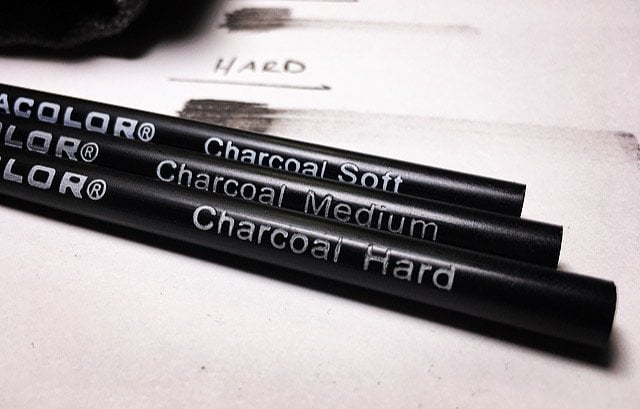
2. Draw your Contour Lines: The first tool up is
our HB graphite pencil. This is for doing the line. Then we're also going
to be using in a Hu Hu, a penal click, and
a mono zero eraser. We're also going to be
using a soft medium and a hard charcoal pencil. Yes. As well as a size 3/16, a number one and a
number seven smudger. And we have a sandpaper strip and an extra piece of paper. What I do is I grind my
soft charcoal onto this, and then I check
my tone onto this, and then I apply to the paper. And I got two brushes. I used to run only one,
but now I got this one. This is a little elf
brush that I pulled out of my wife's makeup bag. Then this is the old number six. Is a normal round number six. I'm going to be using
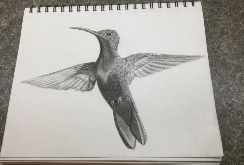
both of these today. Okay. All right. So we've got our reference
image in the corner, and as promised, I'm going to be doing
this one in real time. And when it comes
to the outline, you can start pretty
much wherever you want. But I like to try to bring out the basic shape of
the reference image, which is, of course, only two D space. And then through the build up of our lower values and bringing out the contrast
between high and low values. We can start to bring
out that illusion of that third dimension. And of course, that's
where we'll get form. But here I'm just going
to draw out the swing. And I'm pressing very lightly. I'm using a very,
very light pressure control here because
if I need to go back through and like say with
my model zero eraser and erase a line and draw
a new, I can do that. But if I press too hard
in this initial step, then what's going to
happen is that I might leave marks or scuffs
onto the paper. So just keep that in mind. The whole point here
is to just use a very, very light hand and
get a good idea. I check this out. Here's a little trick. You
just lay your pencil down, and then from the end of the pencil to the tip.
We can bring that over. And now we have a
really good idea of how long each wing is, and we can make sure
that those wings are in proportion to one another as far as them being the
same length, right? Because that's a quick little
trick that you can do. You know, your pencil is more versatile than you might think, yeah, that's all
we're trying to do. In this step, guys, we're only worried
about the shape. The shape is very
much the foundation, the framework, if you will, of all of the charcoal
that is still to come. So when you're looking
at your reference image, try to start to look
at it in this way, like visualize it and focus
only on the shape initially. Detail, that'll come later. That'll come later
with eraser work and smudger work
and all of that. But here we'll just
focus on the shape. Then here's the back side
of the abdomen the tail. I need to make sure that
we bring this together. When it comes to this outline, I'm not going to worry
about the feet right now. I'll draw the feet out
more in detail later on. That's the cool thing about
this initial step is you can out the framework of only
what you think you'll need. You can always make adjustments, as I like to call them
further down the road when it comes time to
focus on a specific area. Oh. Like here, what I'm trying
to do is when I'm looking at the reference image, I'm just trying
to identify where the contrast is between high and low values in
the reference image, because that is what
I kind of want to have a really good
idea of when it comes time for me
to go in there with my smudger and start to
build those low values. So that's the importance of
using graphite for this step. Okay. Okay, my body's
looking pretty good, and then right about well, right about here in the center this is what I call
a reference point. Go up to right about
there and that's about where roughly the end of
the beak is going to be. I'm going to start from
that point and then pull my line over to the
top of the throat. There we go. Because see now, I know
that my beak length is in proportion to the
reference point in the center of the
wing that I used. See that? It's a little proportion
trick that you can use. Like the trick I showed you with the length of the
pencil right using that to make sure that both
wings are the same length. One of the reasons why
the outline portion of any drawing is difficult is
because it's the proportion. If the proportion is
off in your outline, it doesn't matter
how much detail you put into it because
your proportions off. In fact, this is such a big
deal for newer artists. They've even developed
methods to help young artists with
their proportion with the grid
method, for example. But I like to draw a free hand, and that's just my preference. If you want to use
the grid method, that's totally up to you. But then here what I'm doing is this isn't so much detail work, okay, I don't want you to get confused here with
what I'm doing. This right here is
where I am drawing out all of the major breaks between a low value
and a high value. That's what I'm doing here.
Because if you look, yes, on the throat and the center of the breast and the
abdomen of this bird, it is a very low value. But if you actually look, it's multiple low values. So I want to make sure that
I have that called out in this initial step so
that when it comes time to lay that charcoal down and start building
those lower values, I'll have pinpoint accuracy. I'll know exactly where where
to put those low values. It's easy to go
ham, but honestly, when it comes to this step, you draw out as much of an outline for
yourself as you want. Every artist is different. Some people like to have very, very little outline and they'll just adjust as they go along, and others as much structure
as they possibly can. That is a personal preference, and there's nothing
wrong with that. Okay. And right about here
is where I'm going to start defining each one
of these longer feathers. Flight feathers. On
this humming bird. And that's one of the
reasons why I actually liked this reference photo so much
is because of how the wings. B the hummingbirds wings
move so quickly, right? The move so fast, they're
almost fluffy, right? They're far from defined. So I'm I'm excited. So I'm going to show you a
lot of cool tricks as to how we get that really
soft fluttery type look. And so here. This is
a prime example of why we wanted to use
a very light hand in this step is because
I'm taking my models. I'm just cleaning
up odds and ends, lines that I don't like or in places that I
made adjustments. I get cleaned up a little bit. I got some got some lines
up here, some lines here. Let's get it all dressed up. There we are. That's
looking good.
3. Establish your Base Layer (Head & Neck): So now the tone check paper. I lay that down, and
then what I've done is I've taken some
soft charcoal and I've grinded it onto my
sandpaper strip here. The reason why we use a
soft charcoal instead of a medium or hard
charcoal is because the soft charcoal has the
least amount of binder in it, so it spreads nice and smooth and evenly
across the paper. Grab a number one smoger
here roll it. Check my tone. Let's just dive right in here. I'm just going to take
my smudger like this, I'm going to stand up on end. I'm going to start
at the bottom. I'm going to start at the
bottom of the beak here. Because if you look at
the reference photo, what you'll notice
is that that's where the lowest value is on that beak because of how
the light is hitting it. What do I always
say? Start building your low values in
the drawing first. Target those first
in those areas. One of the reasons why is
because when you do that, you'll automatically start
bringing out contrast between low values and high values
and that's what you want. Because the thing
with charcoal is that the more and more
layers you put on it, the lower that value becomes. You want to start where it's going to be the lowest and then you can continue to
build and build and build because charcoal
is funny that way, You can put too on. It's always best to just put a little on at a time
and just slowly build. But in this step, another big thing
to keep in mind, guys is make sure that you are using very
light pressure control. Pretty much just to keep
this in the back of your mind for every step in
the three layered method. It's always best to
use a very light hand in every sense with every step. Then here what I'm
doing. I'm going to take a medium charcoal. I'm just going to run this line, run a defined line. That's what they call
this. Call a defined line. Run along the bottom there. You see how that line instantly gives that beak some prominence. That's what we want. Now
what I'm going to do is I'm going to take
this to fine line. I'm just going to pull it. I'll probably just
leave it there for now where the beak ends. Then I'm going to take my medium charcoal and pull it like this. You can push or your line, it's preference, but like here, for example, I'm
going to ph the line. A When you think of pushing
and polling, what I mean by that is when
you are pulling a line, the direction of your pole is going towards
your hand like this. This is pulling a line. And then when you push a line, that's the exact opposite. When you're pushing a line is when you're running that line, and you're a from your hand. Toward your hand, is going away from your hand.
So just keep that mind. Okay. Setting that medium uncal down. I'm swapping it out for 3/16 because I want the most control. I want to maximize
control here, guys. It going to pull this down. Run that right along
the bottom of that beak right up next to
that defined line. Then here what I'm
going to do I want to take my medium trical pencil, just because I want
pinpoint control. A 316 smoger will give
you more control, but the pencil itself, a sharp trical pencil gives you the most control as
far as being able to put those low values
precisely where you want them. Okay. The big thing here is
just pay attention to the reference photo
because we have a very, very low value right along
the bottom of that beak. Then here what I'm going to do. I'm taking my number seven. Smudger. I'm just
going to blend this. Just back and forth, just like this soften
it up, see that. Soften it up. What that does, that gives a nice blend
on that charcoal. Gives it more of a refined
look, if you will. Then he. I'm just taking my A Hu
Hu battery operator racer and I'm just retrieving
some high values, adding a little bit of
texture to that beak. Then I'm going to take
my number six brush. I'm just going to load it
up. Load this up here. I'm just going to very,
very lightly, very lightly. I'm not pressing hard on
the paper here at all. In fact, what I'm doing is I'm
barely touching the paper. I'm more or less gliding
across the paper. One of the reasons why
I'm doing this and I'm not pushing hard is because I want my soft charcoal to rest literally on
top of the paper. You know how paper is coarse. In the courser, a paper is, the more charcoal more
graphite it will hold. But I want my charcoal
to rest on top of the paper if I use too heavy
of a pressure control. What'll happen is that charcoal, it'll get pushed down into the paper and
that's not what we want. Because when we go to do
this, a nice sharp edge, this is called
retrieving high values. This is where we start to
bring out that texture and really at the same time,
bring out form as well, because Remember
how I always talk about how texture
alludes to form. So if it was pushed too hard, if I had used too heavy of a pressure control
with my number six brush when I was going to apply that charcoal onto the paper and pushed
it into the paper, when I would go to retrieve, I wouldn't have nearly
as high of a value in my high value retrieval
texture that I'm getting right now with
my mono zero eraser. So that was confusing. But that's really the
big thing is now I can go in and I can
retrieve these high values. I'm paying attention
to the length of my strike and
to the direction of my strike, length
and direction. Because I was light handed with my soft charcoal application,
my brush application, I'm able to really
get a nice high value and maximize on that contrast. Between high and low values. Then I'm just taking my
hard charcoal pencil here and st lining and
bringing out the si. Now I want to use
a hard charcoal here because hard charcoal has the most amount of binder in it from the
manufacturing process and because of that,
the tips don't break. When I need to run a
really nice light line. I can do that now
It to worry about my pencil tips breaking off, which does happen with medium charcoals every once in a while, and it always happens with
soft rated charcoal pencils, so keep that in mind. But what I'm doing
is I'm going in with my medium sharp medium
charcoal pencil, and I'm just targeting those low values and
bringing out the center of that eye and giving
it some detail, giving it some
life, if you will. There we go. Something like that. Now, remember when it comes
to eyes, just get in, get out guys, don't hang out, don't try to spend too
much time on an eye. Of all the areas on a bird, I would say that their eye is probably the one part of it that you really
don't want to mess up. Because plumage is plumage
in wings or wings even, but the beak and the eye, especially is something
that you want to make sure that you if you nail anything on
the bird nail the eye.
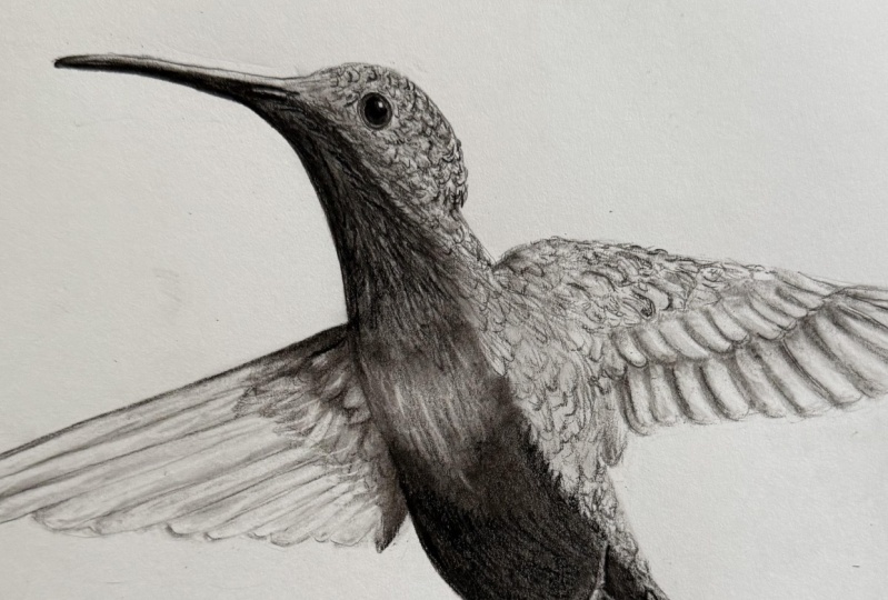
4. Layering & Detailing (Head & Neck): But now I'm just going
in with my 3/16 here and I'm just putting
a nice blend on this. And now I'm going to
take my whoo whoo. I'm going to run a nice high value line
right here and to try to give this eyelid
some body to it. Then here what I'm doing.
I'm taking a medium. I'm just trying to
beef up this line a bit and give it a
trying to beef it up. T. Here what I'm doing
is I'm just taking my model zer eraser and doing a little bit
more retrieval. That, that molded that
beak a little bit and gave it some form to
match the reference photo. Make it look a little
bit more realistic. Then here what I'm doing is I'm taking a hard charcoal pencil. I'm just bringing
out the edge of the top of the bird's head here, and then just the back of its
head and back of its neck, where it plugs in
to the shoulder. There's a line there
that I don't quite like, so I'm just going
to blast that real quick with my model zero eraser. Then here I'm just going to
unload my number six brush, to make sure there's
hardly anything on it, and just very lightly. Go in. T going to blend out
this texture a little bit. This is more or less
to bring out a form of gradation and cross my values. A nice gradual sion
between them all. Grabbing a little
bit more charcoal. Now what I'm going to
do is I'm just going to pull this down
just like this. And I'm more or less going to stick right right to
the edge because the nature of this
reference photo and how this light is
striking this bird, it's actually kind of unique. One of the reasons why I picked this reference
photo is because I really liked how the bird
was not only taking off, but he was also looking
off to the right. So his throat and his head
is like his head is at a different angle to his breast and his neck is twisted
at a three quarter turn. And so when we go in and do all of our texture
and our shadowing, this is where we can bring
out that twist in the neck. And this is how we do that.
It's all about the direction. It's all about the
direction that you pull. It's amazing what you or
you can see the eye into believing with just
a subtle change in direction of your poll, whether it's with your moles or as and your
retrieve a high value, or if it's with your
smudger and you are building up a low value. Now what I'm going to
do is I'm going to take a medium charcoal pencil. I'm just going to go into the eye real quick and
just round this out, make this eye look
a little bit more, a little bit more like
the reference photo. Yeah. I then I'm going to
take a charcoal pencil. This is where I'm going
to start bringing out texture in the plumage in the face feathers
of this humming bird. You would want to use a hard charcal for this step because just
like with the eye, you want to have a lot of
binder in your charcal, because that tip,
you'll be able to get super sharp and it'll
stay sharper for longer. Then you can go in and
you can start to really add that those thin lines. Now, I don't think
I've explained that, but line quality by definition, is the thickness or
thinness of a line. When you vary line quality, you can show form and something like what we've done
for the beak here. Then line weight by definition is basically used to describe the
strength of a line. When I say strength,
what I mean is, how light or dark that line
appears onto the paper. I just just keep that in mind. Yeah, we're just kind of
just bringing this out, man. We're putting these lines in. We're making sure that
they have anywhere from a light to like
a mid line way. They don't need to be too dark. If we make them too dark, then this plumage will
look like artoni. I mean, it won't look realistic. So that's something
that we want to We want to keep in
mind. We basically want this to be a mix of small defined lines with
a light to mid line weight, but at the same time,
we also want to leave room for implied lines as well. And then that way, we
have this contrast, if you will, be between our line weights and
our line qualities. Um, I defined line is
basically what we did when we ran that line along
the bottom of the beak. And that occurs when you basically continue a line
without any break, right? It a nice solid line. I implied lines are basically you can almost
think of it as like an elongated contrast between
a high and a low value where it looks like
something's in front of something else. That is an implied line. So basically all of the
work that we did on this texture with the smudger. That was all implied linework. And now when we went in with
our hard charcoal pencil, that is all defined linework. So Now what we're doing is we're going in
with a three 16th smudger. And what we're doing is
we're doing spot blending. Spot blending is what I call it. It's where you go in and
you continue to target the low values and
those transitions between high and low values. But at the same time, you
can also add to texture. You can make a certain
parts of the plumage of the bird ff or fluffier. O. But yeah, then here what
I'm going to do is I'm going to take a medium
truck and I'm going to run this defined
line down and then I'm going to lift up as I conclude. See that. Then what I'm going
to do is I'm going to take this medium trucal pencil, and I'm just going to
continue to pinpoint that low value right up
against that defined line. Now I'm not going over the
top of that defined line. I want that defined
line to to be my boundary for that side of
the humming birds throat. But then near what I'm
doing is I'm just going in and I'm referring to
the reference photo, and I'm more or less pinpointing those tiny little
spots of low value. A lot of times with the
way this plumage is like a feather will be laying out
on top of another feather, and then it makes it look like almost like the feathers are stacked on top
of each other. This is how we convey that. And then here with this step, again, nice light hand. But this is fun because this is really where
you can pinpoint exactly how those feathers
lay, which direction they go. But then here, I'm just taking that medium
charcoal pencil, and any subtle spots, but don't overdo it. You can overdo it
very, very quickly with this technique here
and all of a sudden, your plumage won't
look very realistic. This is a prime
example like the eye of where less is actually more. If you do it, you can
make it look like these feathers are just
literally layered, just layered on
top of each other. That's that's the
look we want to go for. It'll take time. This part of the drawing
is sped up significantly. But just take your time. Then here what I'm doing is
I'm taking my elf brush. I'm just more or less dabbing
right along this line. Pushing the charcoal
into the paper. As you can see, this sec
doing a couple of things. This is lowering the value, but it's also giving me
a form of gradation, and just overall
softening the look of the feathers and I'm giving
us just a nice blend. And if when you hit
it with your brush, if it gets a little
bit too low in value, don't worry about that
because you can always go in with your monozero
eraser and you can retrieve high values
and lighten it up. You can do that.
5. Establish your Base Layer (Chest & R Wing): Okay. And then here
what I'm do is, I'm taking my
number one smudger. And I'm just going to put
a nice blend on this. I probably using a mid to light pressure control on
this area of the bird. Okay. I've swapped that
out for my elf brush. Then this is how
you can start to pinpoint those really,
really low values. There we go. That's
looking good. Now, what we're doing is I'm
taking my model zero eraser, and we're just
going to retrieve. Some high values here. Basically, when it
comes to high values, there's two main ways
that you can do it. You can do what they call
saving your high values, which is where you
basically build your low values and your mid tones all
around your high values, but you never actually
touch your high values. Then the other way is the
easier way in my opinion, and that is where you simply
retrieve your high values, which is pretty much
what it sounds like. You go in with erasers and you hit the paper and you lift that charcoal off and what
it does is you go from a low value to a mid to
higher value in that area. Retrieving high values in my opinion is the perfect
way to bring out texture, like the feathers and the plumage that we're seeing
here on this hummingbird. But this is what I was
meaning by if you hit a certain area if you're
drawing with your brush, and it gets a little too dark. You can just go in and not only are you adding more texture, but you are having
a higher value. Here, what I'm doing is I'm
making sure that I have a very, very sharp pencil. This is a hard charcoal pencil. What I'm doing is
I'm just putting in another layer of texture for
the plumage of this bird. Again, these lines are a mid to lighter
line weight, right? And they're super super thin, so they have a very, very
thin quality about them. Then here I'm just
taking my brush and just softening and
blending these all up, notice how when I hit
it with my brush, I'm not losing the
integrity of those lines. They're softening up for sure and they're
blending real nice, but the texture is
still very much there. Then just notice it's just another application
of charcoal. If I want to go lower in
value, more charcoal. If I want to go higher
in value, less charcoal. Okay. So I just got a couple little quick touch
ups to this eye here. I was just looking at it again, and I didn't like what I was
seeing, but that looks good. Now it's around the
way I want it to be. I'm just cleaning up
the boundary here. Charcoal runaway on
you if you let it, so it's always good
to stay on top of it. Now I'm just going to continue
to do some high value and bring out this texture. Can literally spend hours on plumage when it
comes to birds, trying to bring out all
those little details. But the viewer's eye, they want to see that
texture and they will, and they'll appreciate it. You don't have to go ham on it. Even a lot of times if texture
is just simply implied, the viewer's eye will understand
what it's looking at. Okay, I'm just going to
run run a nice base layer, and I'm just going to pull
this charcoal down like this. See that? Just pulling it down. Oh. Again, nice and light, nice even distribution of
charcoal onto the paper. This is a soft charcoal, soft charcoal, no binder. It spreads nice and
nice and evenly and there's no binder in
it or little to no binder, which is why we're able
to get that even spread. But here, notice what are the first things that I'm
targeting with my smudger, where those lower values are. And all the areas that
have a high value. I'm pretty much
leaving those alone. That contrast is starting
to come out automatically. But this is the first wing. And then from here
what you can do. Just kind of pull it.
And you can either use your three 16th smudger or or your number
one, what I'm using. You could probably even use
your seven depending on how big your humming
bird drawing is, but I like either running
the number one or the 3/16, just because I want
to maximize control. I've said it before,
and I'll say it again. I'm a control freak. So especially when
it comes to drawing. I want that tuncal to go exactly where I want that
tuncal to go, right? So Okay. Then of course, if you go around a nice tight circles or back and forth in a certain area
over and over again, you'll get a nice blend and that value will
automatically lower. So just keep that in mind. But the cool thing
about this area of the drawing is
this will really test your ability to see
and bring out contrast. You know, even though
there's not a lot of detail in this part
of the drawing, just because of the nature of the reference photo
and what it is, there's still challenges that
you need to need to meet. Then here, I'm
just going to pull that defined line down
and see what that did. Pull this one then lift. What that did is that
that single line pushed that right wing back while at the same time bringing the breast
of the bird forward. Now all of a sudden, what we have is we have the illusion of depth from literally
a single line. Then here what I'm doing is I'm taking my medium
charcoal pencil, and I'm pinpointing exactly where I want those
super low values to be. You can do this with
a 316 Smet two, but I wanted to move fast here. But you see how I
can go in and I can really start to differentiate the different values
within this part of the drawing just by
using my pencil. Then here, I was going
to run the slide, but I wasn't going to
press very hard at all because I'm going to
hit this with a smoker and blend it and
make it real soft. And hopefully it looks good, but we'll see. Want
to lower this. If it looks great, don't worry about that because now
what we're going to do, we're going to go in
with our smudger, and we are going
to blend all this. And see how it just starts to soften everything up.
That's what we want. It's much more digestible
for the viewer's eye. You know that grittiness
throws the eye off. It goes, Oh, wait a minute, that doesn't look realistic. All right. That is why
we got our smudgers. I'm just going to blend all
this, soften it all up. See that? See how they
just softened it.
6. Layering & Detailing (Chest & R Wing): What I'm going to
do is I'm going to take my number six brush. It's going to put a
nice blend on this. What this does is this gives it that illusion of movement. It's moving so fast
that it's fuzzy, it's fuzzy to the viewer's eye, and that's the illusion that I'm trying to
convey is that movement. Just like this. Run your brush right along the
bottom. See that? And that gives us that
really nice aesthetic, soft, fluttery fairy type look. There we go.
Wonderful. Then here's another little trick you can do, can load up a little bit. If I'm looking at
the reference photo, we have a little lower
value almost like a shadow, if you will, right
here and right here. But when it comes to blending, if you want to move quickly, just get very comfortable with your brush work,
like this here. See that. I just
flipping that around and then all of a sudden we're starting to make it look more like
the reference photo. Now I'm going to
swap that number six out from my elf brush here and the elf brush, I like, because it is smaller, and because it's a diagonal cut, I can really do
some cool things. It gives me some versatility that I just simply don't have with the head on the number six just because of the nature. Of that brush tip. It's a little bit
too big, too bulky. But with the diagonal brush, I can turn on its side
like this, see that. I can run that brush along its side and get a really
nice thinner shadow line. Then here I want to
bring out some contrast and some definition, if you will, to the swing. See that with a couple
quick quick strokes. But I don't want this
to be too defined. So I'll go in with
the brush after this and hit it a couple
times nice and lightly. So that that gradation comes out and and we keep that soft look. I darken this up. Lower that value, right? Just like that. It looks something like the
reference photo. Yeah, and then just a nice
light blend. Nice light blend. That way, I still
keep the contrast. But I bring out that gradation. And then I'm just taking
my models or eraser and just run it along the
bottom of this wing. Then here, I'm going to
take my HB graphite pencil. What I want to do is I just want to really solidify exactly where the contrast is
between my different values, especially right here on the breast of Humber because if you look at
the reference photo, this is where there is a
lot of variation in value. And so I want to make sure that I know exactly where I need to build those low values with my brush when
the time comes. Then remember how I was talking
about making adjustments. Well, this is a prime example. When we were doing the
outline in the initial phase, I kind of wanted to wait on
this because like I said, you can go ham on the amount of outline that
you give yourself. But sometimes I like to
like to draw as I go. You know, I like to draw my outlines as I go
just like I did, so But then here's going to start from that line,
we're going to pull down. See that?'s going to pull down. Run it right right
along that side. A nice light blend.
I'm pushing hard. I want it to rest on top. But then see through this, what we've accomplished
is now we've accomplished a nice
gradient effect, if you will, between
super low value and then mid to higher values. Because we've applied
it with the brush, we already have a really
nice gradation effect. But I hear you just start from there and then you pull up. Pull up. Just like
that. Pull straight up. Then what we can do is
we can go back over this with our mono z or
eraser when the time comes and bring out that
texture on top of this underlying form that we're bringing out
with our brushwork. Then here, I'm going to take
a medium charcoal pencil. And I'm just going to start
to start to bring out that super low value right along this side of the breast
and the neck of this bird. But it's important to note here, light pressure control, light
to medium pressure control. You can use more of a
medium pressure control in areas where you want
to lower value. But for the most part, this
is to just help us bring out the actual underlying
form that is existent in the throat and
in the top of the breast, and then the abdomen as it
goes down towards the feet. But then you can just
take your brush like this and you can just dab along the line here
and just like this. You can use a culmination of dabbing and swiping techniques. Dabbing where you push
the paper with the brush, that'll give you a lower value. Swiping is more of
a blending effect than really hammering
home lower values. Just keep that in mind. Then here I'm
paying attention to the length of my strike and
the direction of my strike. And just like that, it's
absolute magic, man. Absolute, wonderful magic. I told you this was
going to be a magic one. All right. So just like that.
7. Continued Layering ( Chest & L Wing): Okay. Now here, I'm going to
take my three 16th smudger. And I'm going to do
some spot blends. Remember how it was
spot blending before. That's exactly what
I'm doing here. Then you can run your
smudger just like this. And you can start to bring out
the edges of that plumage. That's how you can convey
to the viewer's eye, hey, these feathers are actually
laying on top of each other. But pretty much
anywhere that you need to convey a
little bit of texture. This is how you
would do it. This is the initial step,
just like this. The cool thing is, you do
not have to press hard. We are not pressing hard. We're just making sure that
there's equal space between our low values that
we're implying here. I just want to kind of
darken that up a bit. Now I'm going to use a
hard charcoal pencil. I'm going to make sure that
my hard charcoal pencil is as sharp as I can get it because now what I'm doing is, I'm just
going to go like this. See on those edges, I'm going to define them
a little bit like this. Then for the actual texture
of each individual feather, I'm just going to
pull straight up. But this is another one of those areas with this
specific drawing, where less is more. You don't want to throw
out too many lines with two strong line weights
because that'll make it look really cartoony and not as realistic as it would be if you just used it with
the less as more approach. But just like this, here
just a couple of swipes. Establish the end, and then one, two, three, four,
and then move on. See that? One, two, and move on. See how we're establishing like the bottom of each
individual feather, and then we swipe up. That's the trick to the
texture on this humming bird. Okay. I'm actually running two
hard turcal pencils, so that one's tip was getting
a little rounded on me. So I grabbed a fresh one,
and I'm just going to continue here to do
the exact same thing. Building up the bottom of
the feather and then doing a couple swipes up
and boom, that's it. Then I'm going in here
and I'm adding texture. Nice mile to lighter
line weights. You know. Okay. So now I'm going to take my three
16th smudger and I'm just going to load it up here do a little tone check. Okay. And here what I'm doing is I'm I'm targeting the
low values, yes. But what I'm doing
is I really want to bring out the plumage
and the feathers that comprise the humming
birds shoulder here as it plugs into the rows of
feathers on its wing. But here I actually
don't like any of this. I'm just going to
blast this real quick. And what this is, this is
a prime example of what I call making an
adjustment in drawing. Remember how I've said, don't worry about perfection. Well, outlines are meant
to be a guide. That's all. They're not absolute. You could have an
absolutely perfect outline, but really wouldn't
matter because you're using that outline to build
the rest of your drawing on. If you need to make an
adjustment like what I did right here and clean it all up with your eraser so
that you can go in with your graphite pencil
like this and actually draw out exactly
where you need to have those lower values. Go ahead and do that.
It's not a big deal. It's just simply an adjustment. So I'm just going to kind
of pull down right here. Got that first row
first row of feathers. Yeah. That's good. Okay. So now I'm going to
take my number seven smudger, and I'm going to start
targeting the low values. Nice light pressure control. You don't need to press hard at all that charcoal actually rolls off of your smudger very easily. The only thing you really
have to worry about is exactly where are those low values in the
reference photo. That's it. The cool thing is because this actually is just a soft bird. A lot of times, the effects
that you're able to get from the smudger don't even
really need anything else. With the exception
of this, of course, I'm just taking
my heart charcoal and giving it that
variety of lines, just like what I
was doing before, like what I was doing before. But when you think about
it, some of these lines, yes, they are defined, but they're extremely small and they're extremely sh lines. The cool thing is, when you
vary your pressure control, I say when you really
want to put a nice, sturdy defined line
in the plumage, you press a little harder. Then when you want to have a thinner lighter looking line, you press a little lighter. Okay.
8. Layering & Detailing (Chest & L Wing): But the big thing is if you're getting frustrated or
overwhelmed with the plumage, which in my opinion,
is the hardest part of this bird, don't
worry about that. Just go take a break, maybe read a book or
something like that, and then just come back to it. You know, that that was one of DiVci's tactics
was when he would get overwhelmed
with something or if he just needed a fresh look, right? A fresh eye on it. He would literally just put it down and walk away and
they would come back a couple of hours later
and keep working on it. You know, keep drawing or
painting or whatever the work was at the time that
he was working on. So remember learned
from the masters. You know what were
things that they did? Clearly, it's proven, right? Yeah, just like this. See how when I'm building
out those low values, how the high values just
take care of themselves and that form starts
to show its face. That's what we're doing here. Then just with the wing
on the other side, I'm focusing on the
bottom of these feathers. I'm just going to take
this three 16th sbt. I'm going to pull it, pull it. Pull it and pull
it down and over. See, pull it down like
this, and then over. Down and over. One
nice long pull. That's all it takes. Then you can just pull out like this. See that. Pull that charcoal
from left to right. See the effect that
it starts to give us. If it looks gritty, don't worry because I am
going to be hitting it with my brush just like
we did to the other side, just like we did
to the other side. But this is starting to look pretty good. Look pretty good. I mean, because these
wings are moving so fast, they're not going to
be in focus anyway. So we're just going to unload
the number six brush like this and just start
blending this out. Real. T the brush do
the work for you. Let it do what it
was meant to do. And it will. It will. Here's a nice, subtle
light light blend. There I got some
runaway charcoal, so I was going to blast that real quick with my
pent click eraser. This one of the
reasons why I love the pentle click
eraser is because if you have a lot
of charcoal that she running all over the place, like blast it with the
pent click eraser. Okay. Now I'm going to take my elf brush just like
I did on the other side. This is where you
can really start to pinpoint exactly where
those blends are, right? You know, because with smudgers, yes, you have more control, but you can't move nearly as fast as you can with brushes. Just running that brush
right along the bottom. I just starting from left to right and
kind of pulling up. I'm just lending
blending all of these. Now I'm going to
take cerc here and I'm going to run
this along the top. I don't want to press too hard. I don't want to press too hard. There we go. That's
something that I can blend. But now what I'm going
to do. I'm going to take take this pencil. I'm just going to really
start to put in some very, very small defined lines. But at the end of the day, what this is this is plumage.
That's what this is. And so I want to be able to
speak to that and really show how these feathers
are laying on top. Laying on top of themselves.
Like to see that. I can start to add
some line work and all of a sudden it gives that that depth to
the wing as far as feathers being closer to the viewer than
feathers behind it. You can use your charcoal to solidify these lines and bring out and show exactly how many feathers
there are if you want. It's really up to you. Something just like
that. Then, of course, take your smudger. You can just blend some of these lines up a little bit because the integrity
will still be kept. The integrity of
the line in regards to its quality will remain. But it's just the texture of it. I'll look a little softer. Which on birds is perfect. That's what you want because
I mean, let's face it, feathers are fluffy,
feathers are soft. Yeah, then we're just
going to go through here and blend this all together. Get rid of that grittiness and turn that rough texture
into a soft texture. Just take the motel zero eraser and clean this all
up. There we go.
9. Establish your Base Layer (Abdomen & Tailfeathers): All right. Now I'm just going to take
my three 16th smudger and I'm just going
to kind of put a nice light blend
on these guys. Because when you look
at the reference photo here in these specific
areas of the wing, our values do need to be lower. And the sponge is the
perfect tool to do that, to be able to go in, pinpoint
something, soften it up. It's exactly what we need. Okay. But here, I'm just adding
more fluffy texture, right? So I'm going in just like
this. Just like this. The hardest part that people
run into with this step is that they press too hard and they put just too many lines
with not enough breaks. And their birds end
up looking cartoony. But that's honestly, that's
what it's all about, man. It's all about learning. I always say, always
be learning. So much. You could learn
something new every day for the rest of your life and you'd still have a lot
to learn at the end of it. That's why. Let's keep
learning, man. All right. Here I'm going to take my
battery operator and I re some high values here.
Bear in mind, guys. I am also drawing very quickly. I'm one of those
people where I could draw for days and days and days and I could spend hours
and hours and hours on the specific drawing, but I know that
time is precious. So I'm having to go at lightning
speed in this tutorial. But as long as I
can show you quick little tricks, that's
what it's all about. It's all about sharing
that knowledge. Making each other better. Better than we were yesterday. That's what we want.
All right, cool. Nice little blend on
this. It's looking good. All right. Now what
I'm going to do. Remember how at the beginning, I said that I didn't
want to draw the feet. Well, this isn't the
beginning anymore. So I need to draw those feet. I go to take my graphite pencil and get a rough estimate here of what these
feet look like. Something like that. Solidify
that, and that's good. Actually, I don't like this. This is actually out of whack. I'm going to erase that, and I'm going to redraw it. Again, this is what do we call
it? Making an adjustment. That's all this is. Okay,
something about like that. Okay, cool. So now what
we're going to do? I'm going to take my
trusty number six brush, and I'm just going to continue to kind of build
build up around this. Because if you look,
these areas, you know, the abdomen right around
the feet and the belly of this hummingbird are some of the lowest values in
the entire drawing. So Okay. So now I'm going to
take my number seven smudger I going to
pick up some charcoal. And this is a really cool trick. So notice how this area
is fairly small, right, so I need to have more
control than what the number six brush
was offering me. So this is how we
accomplish that. Nice and late. The biggest thing with
this part is just getting a nice even distribution of
soft charcoal onto the paper. If there's any areas where you need to have a lower value, you can press a little harder and spend a little
bit more time on that specific area and that value will get
lower and lower. It will get darker and darker. And then we'll go back
in for another layer. Another layer here, right along the belly is where it's
the lowest value in here. But you can see you can see how that value just keeps dropping and
that's what we want. That's what we want. Now what I'm going to do is I'm going to bring out these feet because by putting
a defined line around the feet like this. What this does is as the
viewer's eye looks at the feet, by putting these defined
lines around the foot, it makes the foot look like it's actually closer
to the viewer, that it's in front of the
bird, and that's what we want. That's why I'm putting these
defined lines in here. You'll see as we build
these up more and more and as we blend in
and around the feet, how the feet just become
more and more prominent to the viewer's eye and it looks closer and it
has this sense of, like T rex arms, being tucked up
against the body. Now I'm just taking my 3/16. I'm doing doing a little blend. Little blend on the feet easier. Okay. So now, what I'm
going to do is I'm going to grab my elf brush because I want a little
bit more control, little bit more versatility
than the number six offers, but we still need to blend, right? So that's what
we're doing here. Blending this charcoal. Something like that. Very nice. I hope you're starting to see that with each area
and with each layer, that value does just continue to build
just over and over. So Okay. So now what I'm going to
do is I'm going to run a defined line, that same line. I'm just going to run
it all the way down. Just going to pull it. Then I'm just going to lift up as
I conclude right there. Lift up as I conclude. And while we're here,
I think I'm just going to very lightly. This isn't so much a defined
line as much as it is just a targeted low value with
my medium charcoal pencil. So because this really
needs to be low in values, so I'm just going to
go ahead and blast it with my medium
charcoal, right? I can get a lot lower a lot
quicker than just going in with my smudger and just layer after
layer after layer. A lot of times if you
want to move quickly, and you don't want
to layer so much, this is how you go about it. You go in with your pencil, run a define line right here. Next, I'm going to push
that line right there. Wonderful. And then what I'm
going to do is I'm going to put a define line right here. There we are. I go to run
that down there. Wonderful. But now what we can do
is we can strategically place these low values and
notice what I'm doing. Notice what I'm able to do now. Now I can run that charcoal. And I'm running that charcoal literally right up
to those lines. But I'm also pressing very lightly because I want
the blend to come in after I've hit
it with a smudger. Okay. So as promised,
here's my smoger. And I'm just going
back and forth, back and forth and in
tight little circles, whichever one suits you. But watch the blend that I get. Pushes it into the paper, and blends it all together, gives me a nice gradation. And here I have almost
like a two tone look between my lower and my high values, and
that's what we want. See you takes that
grites right away. Just takes that grites away
and it gives us a very, very appealing aesthetic, and
a really, really nice look.
10. Layering & Detailing throughout the Drawing: Know what I'm gonna
do. I'm gonna do this medium charcoal. And I'm just going to
push just a fine line. I'm just going to run it all
the way up. There we go. And then I'm going to
go right up next to that line with my
medium charcoal, and just doing nice
tight little circles. Nice, tight little circles, right up next to that line. And I'll do the same
thing on this side. This is just so I have a
nice little two tone look going on in these feathers. Then here because the the tail of the humming bird is rounded. You want to run that low
value on on one side. And that'll give it
a nice rounded look. Then this is what I was talking about where we were
going to build up these defined lines right around the feet and sink them in. So it looks like
the body's actually farther back than the
little feets are. That's good. That's
what we want. Let's put in a real
nice layer on this. Because the greediness
isn't going to stay. The grittiness is
going to go away. As soon as I hit it with a
brush. You'll see what I mean. Right here, dab it. Take the elf brush and just
basically dab it or push it, push it into the paper. What that does is
that solidifies that low value in that place. But it also gives
you your gradation. Just like this.
Just Just dab it. And then if you
need to, just turn it sideways like that. See that? The other thing with with the dabbing technique
with the brush, is the longer you stay
on a specific part and just to push that
charcoal into the paper. Just continue to dab
the lower that value. We'll get and you'll get a real, really smooth gradation,
really nice blend. We've got runaway charcoal.
Runaway charcoal. We're going to blast this
with our pent click eraser. If you don't have one of these, get one, I have a whole box of these things.
They're amazing. Because that is the one
thing about charcoal is it gets everywhere. Even with a technique
as refined as the three layered
method, it's incredible. My charcoal still
gets everywhere. But yeah, it's got
to get cleaned up. Wonderful. Okay. And then up here on the shoulder and kind of the left left
breast of this bird, we still have some texture
that we need to account for. So I'm just doing the exact same thing with
it that we did before. You know, we're putting
in lines that have a really nice light line weight and a really really thin
quality about them, right? I just adding that texture. You know, birds are really a, true test of just, you know, what do you have in your arsenal
for bringing out a very, very, very finite texture. Then here I'm beefing up these, these lines here a little bit. And see how when I beef them up and they
get a little thicker, how it kind of kind of adds some heaviness to this
part of the wing. That's all we want.
And just kind of kind of clean up this
fluff ale bit here. But you can probably
start to see, like if you put too
many lines, you know, too many define
lines on plumage, how it can look,
look not realistic. It's definitely a
balancing act, man. But just go into it with
the approach of lesss, more and you should be fine. But then, I mean, look at
these subtle little touches, these subtle little strikes, little flicks of the paper. And this is what it does. These are the kind
of kind of looks that that it conveys. Right? Okay. Now here, I'm just
taking a three 16th smudger. I'm just going in and just
softening up some parts here in the wing that need to be softened. But
this is how you do it. Just a little three
16th smudger, one of the smallest smudgers
that that you can get. Take the number six brush and
very, very lightly hit it. Watch the blend, see that. That was the blend.
But did you notice how the integrity of a lot of those lines stayed there?
They just softened up. That's what we want. You know, you can
mess around with your total variations with your brush just by touching a couple of
parts just like this. The thing with the brush,
though is you have to be very, very careful and always
hit your paper very lightly because
you can literally destroy detail with a brush with one or two passes,
one or two swipes. So just just keep that in mind. But but we're just going to continue to do detail work now. And I don't know if
I've mentioned this, but when it comes to detail work with the
three layered method, you can use your medium charcal for certain detail tricks like in the plumage and whatnot, but for the most part,
your hard charcoal is going to be your detail
charcoal pencil. Think of it like that, okay? Hard charcoal will have a stronger tip due to having
just more binder in it. So it's the perfect
detail pencil next to your medium charcoal, but use your medium charcoal for much lower values, right? Then here what
we're doing as I'm taking my mono Zero eraser, and I'm just going in and doing some high value retrieval,
and as you can see, you can see the
kind of effects on the texture that the
mono as gives us. So we're just going to
continue to be conscious of the length of our strikes and the
direction of our strikes. It's absolutely amazing
what you can do and this is all high value retrieval.
That's what this is. Quite literally by definition. But I mean, if you don't have a model zero eraser in your toolkit yet,
definitely get one. Definitely get one.
I'll have links to all the tools that I use in description of this
video for you. So if you want to give it a
go, you're more than welcome. But here, and then you can
just pull it like this. See that kind of texture that it gives by pulling these
lines like that. Here's need to retrieve
some high value here. And messing around with the
different values and the, the fluctuation between
high medium and low values in the tail feathers
is actually fun.
11. Final Detail Work: So now I'm just going
to take medium. I'm just going to go in here
and I'm just going to start pinpointing where
these low values are. Of course, what this will
do is this helps us to convey the underlying
form of this bird. Then if you got some greediness, just go ahead and blast it
with your with your smudger. There we go. I'll get
a nice blend on that. Okay, then we'll take our
models or our eraser, and we'll just just continue
to add in some high, some high value
texture right here. But just always be
aware of how powerful your model zero eraser is with
that high value retrieval. Because if you strike
the paper one way, like let's say
everything's flowing to the right but that you
strike it to the left, it'll make it look like
it's flowing to the left, but it'll be awkward
because it won't be accurate and true to
the reference photo. Just keep that in mind. Let's see how here we
can go in and if there's any areas where we need to have a little bit
higher of a value, you just have to hit
it a couple of times. That's really it. Pressure control with
high value retrievals is something that you should
probably keep in mind. Of course, the lighter
of pressure control you use the less prominent
that high value will be, it'll be of a lower value, and the harder you push, the more prominent, that strike will be and appear on the paper. It'll be a high value. Just keep that in
mind. And here I want to go in and
lower this value. Just being very very pinpoint
accurate with the pencil. The pencil offers a layer of control that I thoroughly enjoy. Let's see this right here,
this is where we're lowering the value all around these feet. And I want to use
the pencil here because I really want
it to be right here, right? I want that control. And then here I'm taking my hu, and I'm just doing
some high value retrievals on these toes. You can move so fast with
a battery powered eraser. If you don't have one,
I would definitely recommend it because
they're awesome. Just like any power toll, makes your job easier, right? And I'm all about doing
things the easiest way possible. So I don't stress out. Yeah, now we're just
taking our smudger and putting a nice
blend on all of it. I do some finishing
touches on this. But I think one of the
biggest things with detail work is
that you can imply detail work and the
viewer's eye will pick it up and we'll try
to make sense of it. That's just an understanding and a principle of optics and. I don't know if
you guys remember the crocodile
tutorial that I did, but that was remember how we did the landscape method from
Da vinci or the head was, like, spectacular detail, right? And then the body that
was behind the head, we elongated it and we
hit it with our brush, and we didn't define anything. It's what they call like
steering the viewer's eye. Because when you
think about it, if you look at
something, like, say, the left wing of
this hummingbird, for example, your eye is probably not naturally going to spend a lot of time there. The reason why is
because there's hardly any detail,
it's soft, right? It's fluffy, it's out of focus, our eyes don't like it when
things are out of focus. So your eye naturally
would go to the bird, the main body of the bird. It would go to the eye,
I would go to the beak, it would go to the head, the throat, the
breast of the bird, the feet, even and even the other wing because
it's in more focus. That's what they
mean when they talk about things like
the landscape method or steering your viewer's eye. You're the artist at
the end of the day, so you get to dictate exactly where
your viewer's eye spends the most amount of time. A lot of times I
feel like drawings that are like this and drawings that are
like the crocodile, are actually the more interesting drawings
because they do have those very subtle techniques in them that I think
make them stand apart. But at the end of the
day, it's all preference. Some artists like to put every single part of their drawing in the most
detail that they can. But, yeah, it's up to you.
It's all about what you like. Sure art, aesthetic.
You do what you want. I've always said you draw
things that make you happy, you do what makes you happy. In here, I'm just putting some finishing touches
here, a little there. I mean, honestly, like, if this drawing was
for a client of mine, I probably would have spent, I don't know anywhere 12-16
hours in the chair drawing. Or this one, I think
it took took me a couple hours to
bust this one out. It's not nearly as accurate as I would
have liked it to be. But I feel like I really got to showcase you some you know, just different skills and just different
techniques, right? That's really that's
really what drawing is just it's a bunch
of techniques. It's how you do something, right? There's a process. There's a flow, there's a proper approach.
To doing something. As long as you understand that approach and you know
that you have to lay down a base layer
of soft charcoal before you can go in
and start to retrieve values and start to bring
out underlying form and set the foundation
for texture. That's really half the battle. That is really truly
half the battle. But here, for example, this one is pretty much done, but I don't like how I don't
have enough contrast between my high and my low
values here in the beak. I'm just going to blast
this just real quick with my monoero eraser and
bring some of this out. Here, this could be a
little higher of a value. I'm going to go ahead
and retrieve that. Yeah. Then here what
I'm going to do. I'm going to take my whoo whoo. I have extended that erase
tip out a little bit, but I'm just going to
pull parts of this and try to just elevate
the contrast. In certain parts of this
humming birds head. But I mean, you could spend
hours on detail work guys. You know, we've
already been drawn for you know, an
hour and a half. And here, I'm just
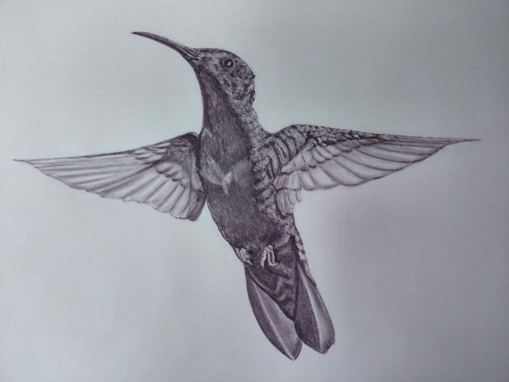
going to give it one last little reflection. P p right here in the side. And o There we go. I hope this tutorial helped. Say, Say and remember,
never stop drawing.
 Messer Creations, Artist | Author | YouTuber