Transcripts
1. Class Trailer: Apple UI Motion Graphics: You're about to unlock the
exact animation style used by Apple and creators
pulling millions of views. This isn't just motion design. It's what makes
brands feel premium and content impossible
to scroll past. Whether you're a freelancer, editor or content creator, this style makes your
work look like it came straight out of Cupertino.
And don't worry. Even if after effects
felt overwhelming before, you learn everything
step by step. This is not just another
after effects course. This is where you
learn to design and animate polished,
minimalist, Apple style UI motion graphics
that feel intentional, elegant, and
undeniably high end. Yes, we're using after effects, but we're using it like
the top content creators and visual designers do. In this class, you
will learn how to deconstruct Apple design DNA, clarity, spacing, layering
and motion principles. Build clean, structured
UI layout using Figma, Photoshop, Illustrator,
or even screenshots. Animate with nested nods, elegant easing and
subtle camera movements for natural create
liquid glass effect, transparent layers and realistic interaction
based motion. Use blur, masking, sound design, and light to elevate
your visuals. Package everything into short animations
ready for Tik Tok, reels, YouTube shorts,
or even client work. This course is for anyone who wants to master this aesthetic, even if you're
starting from scratch. I'll walk you through
everything step by step, from design prep to final
animation and Export. We'll build two complete
UI animations together. One inspired by real
Apple feature reveals. One focused on transparent
glass style design with three D camera movement. And if you're wondering who I am I've spent over a
decade editing videos, managing two of the biggest YouTube channels
in their niches, and building creative
systems that drive results. I've built editing systems that generate millions of views, and now I'm showing you how
to bring the same level of craft and polish to
your own animations. This course is everything
I wish I had when I start designing motion graphics
with professional edge. If you want to master Appletyle aesthetic, impress clients, and create motion design
that speaks for itself, this is the course to do
it. I'll see you inside.
2. Welcome! Start here: Welcome to the
ultimate after effects mastery course for Apple
UI Motion Graphics. My name is Vlad
and I'm excited to guide you through one
of the most refined, recognizable and in
demand animation styles in motion design world today, creating Apple style UI
animations in After effect. This course is
built for creators who want their visuals to feel premium with smooth
minimalist transitions, elegant layouts, and ultra clean motion
graphics that mimic the sleek, modern aesthetics you
see in Apple ads, perk showcases, and
user interfaces. We'll go deep into what makes these animations
feel so polished, and I'll show you how
to create them step by step using real workflows
and real project. This is the fourth class in my social media editing series. If you've taken my
previous courses, master short from video
editing, after effects, motion graphics, mastery, and premium viral motion
graphics and after effects, you've already laid
the groundwork. In this class, we take
things to the next level. You don't need any previous experience with after effects, UI design or motion graphics. Everything is broken
down in clear, structured step by step
format you can follow from scratch and actually finish
with pro level results, we'll walk through to
full short video builds, starting with static animations, then turning them into polished
animations with motion. You will learn how to ideate the visual concepts using HIGPT, how to structure your workflow, and how to export your
projects for TikTok, reels, shorts, or
client delivery. I recommend watching
every video in order. Every lesson builds
into the previous one, giving you a smooth, natural curve that compounds as you go. You can also control
the volume and the playback speed of each video to learn at your own pace. And if you get stuck,
you have any questions, be sure to drop them in
the Q&A section below. Make sure to check
the Q&A section first because there's
a good chance that the question
you want to ask has already been
answered in detail. At some point, you'll be asked to leave a review
of the s course. I ask that you wait
until you've had a chance to really
experience the material. Your honest feedback
helps me improve the course and better serve
you and future students. Thanks again for
joining this course. I'm genuinely excited to help you build the
skills to create beautiful professional
motion graphics and to give you the confidence to
use them in real projects, whether personal
or client based. Let's jump into the first video.
3. Master Mindset for Motion Design: In this video, I
want to talk about the mindset when it comes to learning motion graphics
or to be honest, anything. I'll cover some of the best
practices that I use as well as some of the
practices from this book. It's a great book
by James Clear, but we're going to talk
about it in a second. Now, the three
phases of learning anything is learn,
practice, and teach. First, you're going
to learn from me. This is straightforward. Secondly, it is important
to practice because if you learn and do not
practice, then trust me. It doesn't bring results. The important thing is
for you to practice. Then once you practice, once you have projects
that you've created, even if it's the absolutely exact replica of
what I've created, I will still recommend to share it with other students and tell what it is that you've learned, what it
is that you've done. Because when you teach, there's just something
absolutely magical happens in our brains and
you learn a lot better. Now, coming to this book, I want to show you a graph. It's this graph here,
1% better every day. If you become 1%
better every day, 1.01 to the power of 365, it's equal to 37.78. In simple words, it
means that if you become better by 1% in one year, you'll be 37 times better. If you become 1% better
every day, that's it. However, if you
become worse by 1%, you'll be almost equal to zero. 0.99 to the power
365 equals 0.03, which is basically zero. When it comes to learning,
just remember this. You just need 1%
improvement every day for one year and you'll be
absolutely next level. Now, if you really
want to dive deep, I'll give you a couple
of other tips as well. So I mean, you can
definitely read the book, but I'll quickly go through. Basically, you need to create
a new habit of learning. In order to create a new habit of learning, there
are four steps. First of all, make it obvious. If you want to learn, put reminders just
throughout your house. Put written reminders,
put your computer, make sure that you visually see it and that it is obvious, like it's easy to notice. Secondly, make it attractive. Do something you enjoy
right after you learn. If you like going for
walks, then go for work. If you like eating fruits, then go ahead and eat fruits, but make sure to give yourself some a gift so that it
is attractive for you. Now, sep number three
is make it easy. In other words, if you
don't learn usually and you all of a sudden
start learning for 4 hours a day, that's
a bit too much. Make sure you progress bit by
bit so little improvements. Don't just start learning
the whole day and then your brain explodes and you
don't want to do it anymore. And number four,
make it satisfying. You can track your progress. You can either mark days, you can mark the
number of videos, you watched whatever
works for you. And this is just a quick
overview of the four steps. In this book, James Clear gives so many more details as to
how to create new habits. So if you want to create new
habits and change your life, I really recommend this book. By the way he also talks about how to get rid of bad habits. So if you want, you
can take a look, but other than that,
let's start learning. If you have any
questions, let me know. Other than that, I'll see
you in the next video.
4. Download All Files & Resources: Welcome. In this video, I
want to show you how you can access your student
exclusive resources. Below this video, you will find the project and
resources section. If you open it up
and scroll down, you'll be able to see the
student Exclusive resources and the downloadable
resources link. If you click on that link,
it's going to take you to Google Drive or you will
find the templates, project files, sound effects, everything I used
and everything you need to use in order to
complete the scores. If you have any
questions, let me know. But other than that, I'll
seeing the next video.
5. Why Apple Feels Premium: Visual Design & Motion Principles: Welcome. In this video,
I'd like to break down why Apple feels
premium and expensive. Let's understand
their visual designs and motion principles. Okay, we have a
number of examples. This is the design
principles by Apple. If you take a look at
any of these slides that they have, everything
is minimalistic. It's very clear.
Everything is aligned. Oftentimes with
minimalist, less is more. So we are trying
to use as little as possible to get
most out of it. If we take a look
at their website, minimalism and
anything that feels expensive usually
has a lot of space. So they use space
to their advantage. It's not like it's empty, but it is expensive because
spacing means freedom. Usually, freedom and
premium expensive. It's like it's all
interconnected. So if we take a look
at their websites, a lot of free space. By the way, they also keep a
similar design everywhere. Lots of white, lots of space. Talking about latest updates and specifically about
the liquid glass, and this is the effect
we're learning how to do. Some people love it,
some people hit it. They keep the same principles. Just instead of it being all
colorful, they once again, trying to make it even more minimalistic so that
there's no colors. It's all the same
style instead of it being these many colors, it's just one minimalistic look. Some people love it,
and people hate it. And anyway, if you are here,
you'll know how to do this. If you take a look at
motion principles, then everything is intentional. A great word to describe
it is it feels tactile. If you ever used
Apple products, like, it's so different from any
other products that exist. I used to be a Windows PC user, and I switched last
year have Samsung, HDC, and other mobile phones, and then at some point, I
switch to Apple as well. The attention to detail is
just absolutely next level. So if you ever tried Apple products and
compared to competitors, everything is very tactile and it's just everything
feels expensive. Like, it's made to be expensive. Even Apple boxes are
absolutely amazing. And this is one of the
reasons why people keep their boxes because
the boxes themselves, even though it's just like a
piece paper, it is so good. So let's recap minimalism. Less is more. Generous spacing.
Everything is aligned. Things feel intentional
and tactile, and the latest
update liquid glass. If you have any questions,
let me know better than that. I'll see you in the next video.
6. Preparing Apple-Style UI for After Effects: Screenshot + Photoshop Workflow: Welcome. In this and a
couple of upcoming videos, I'm going to show
you how to create UI designs in advance. Now, something you can do is to create it straight
and after effects. But I found out, unfortunately, I found a hard that
it's actually a lot easier to prepare
things in advance, especially if you will
use it many times. And for this example, we're
going to use Instagram. And on top of that,
in this video, we're going to use
Screenshot plus Photoshop, and in other three
upcoming videos, we're going to use other
tools to create UI designs. So first of all, let's
take screenshot. On MacBook, it's
Shift Command three. Pressing that, I'm
creating a screenshot, and then I have to
come to Photoshop. Here I'm going to come to file new or I can just go ahead
and press Command N, and we're going to create
the custom 1920 by 1080 pixels because that's
usually the kind of videos that I create and we'll be
able to use the after effects. Now, we're going to just drag our screenshot here, press okay. Now we're going to have to right click on our screenshot
and click on RSR Layer. If we don't do it, I'm going
to show you what happens. For this specific task, we
will need a Marquee tool. We can activate it by
pressing a shortcut M, or you can press shortcut ads like the Move tool
or selection tool. Press M. And if I select and I select the
screenshot, I press and delete. We're not able to
do it because we need to first
rsturize the layer. At this point, it's
a smart layer. So if I double click on it, it's going to open
it in a new window. However, after we
rasterize the layer, by double clicking, we're
going to open the layer style. If I select anything here right
now and press and delete, we'll be able to delete
parts of the image, which is exactly what we want. So I'm going to select
and delete this part. By the way, we can
also press Shift and select other
parts of the image, but it's easier for me
to do it piece by piece. So delete this part, select and delete this part. Actually, let's make
a bigger selection. So. Now, let's also delete it up until here. Delete. Great. And if I click here and color overlay the background,
this is what we have. By pressing Command zero, I'm able to fit
it to the screen. By the way, on Windows,
instead of command, you just have to press control. Other than that
everything is the same. And in order to learn shortcuts, you can come to help, search for shortcuts,
keyboard shortcuts, open it, and search,
for example, for fit, fit on
screen, Command zero. Now the next thing we want
to do is want to make sure this is aligned and
it is in the middle. In order to do it, we
need to cut this space, this space from the top. So I'm going to select
the screenshot, set the Marquee tool,
make a selection. Roughly, and then zoom in by pressing on Option or Alt on PC, making sure I
select exactly what I need and nothing more. And now I'm going
to press on delete. Actually, we just cut
this part as well. I didn't actually notice that. So we need to cut a bit less. So let's cut a bit less to here. Zoom in Perfect. Present, delete. Command
zoo. Okay, great. So now we have the top
part cut precisely, we have the bottom
part cut precisely. Well, this part doesn't really
matter very, very small. And now we need to select the layer and the
screenshot together, and we're going to press here. The screenshot is going
to align vertically. Now, in order for it to align horizontally, we have
to do the same thing. We have to cut it from the
right and from the left so that it's precisely
here, cut till here. And it's cut until here. So let's do exactly that. Let's do selection over
here, move selection. By the way, you
can also move this selection with the keys. So by pressing right, it's
going to move the right. Left, it's going to
move to the left. Present delete. So we're going to select
the screen chart, present delete, do exactly the same thing on
the opposite side. Perfect delete, command zero. And now by selecting both
of these, by the way, make sure to deselect whatever you have in
the screen because it's going to just work weirdly. So make sure to
diselect or just press somewhere and then put our
screenshot in the very middle. The next thing we need
to do is we need to cut every single piece out so that if we want to animate
every single piece, we want to make sure
that we have access to every single piece instead
of just one huge screenshot. We're going to do it with the
Marquee tool as well, sir. Press on now we need
to make a selection. For example, this
part here, selected, and we're going to press
Command X or Control X. Sorry, we need to select
the screenshot, Command X. We need to press
Shift Command V, and we're going to paste it
in exactly the same position. If we press Command V, which
is something we can do, it's going to paste it, but in different location, which
is not something we want. So Shift Command V or Shift
Control V on Windows. Select the screenshot,
and now we have to do it for every single piece
that we want to animate. So we'll do it for this part. And this part. Just make sure to
select the screenshot. If you don't select the screenshot and
press in Command X, there's just nothing to paste. So make sure to select
the screenshot. Okay. And now, if I ds the screenshot, we're going to have every
single piece on its own. So what we can do is we can
actually go ahead and delete the original
screenshot because now we have every single
layer separately. The next thing we need
to do is we need to cut every single
layer precisely. I know it's a bit tedious, but this is something
we have to do. The reason for that is
because the ankle point is in the middle of each layer. So, for example, the ancho
point for this video, it's not going to be in
the middle of the circle. It's going to be around here. Like, it's going to be in
the middle the cut out. And the same for this part. So it's going to be around here. It's not going to be in
between these two letters. And in order to customize
it to how it should be, we do need to cut
every single piece. So for example, with
this one, once again, select the Marquee
tool selection, select select **** and do it. Now, if I make it bigger
and by pressing option, I can scale it like so. You can see the encapoint
is right around here. However, for this layer, the encapoint is over here. And for one to be in
the middle, once again, we have to cut out
every single piece. How Okay, now that we've
made these cutouts, whatever we scale is
going to scale uniformly. So it's absolutely good to go. Now, one important thing to
mention is that, for example, my name or any sort of text that is on the
screen, it's a picture. If we want it to be text, we need to create the text, and we need to match exactly. So, for example, if I want to animate this text specifically
here, like my name, I will have to click here, and I will have
to write my name. Let's make it white. Let's
search for Instagram font. What font does Instagram use? Okay, so they do use
some sort of sands, but which is a custom
built for them. So let's just choose
one of these. We just want to make
sure it is similar. It doesn't have to be
the exact ft. Okay. Like so now we need to make it now we need to
make the text black, and maybe move it a
bit lower. Like so. And now, if we select this one. Well, there are a couple of
things we can do with this. One thing we can do
is just overlay color and make a white
overlay pressure kay. And then once we have our text, we're going
to have our text. We are doing this is because we want to customize it
later in after effects. If we don't want to customize
later in after effects, we can just leave it as it is. An important thing
to consider as well, is if you want to reuse
this multiple times, it is easier to do it
in Photoshop first, then you're going
to have this file. You'll be able to
put in after effect. You'll have the
text layers ready. Or you can build text
layers in after effects. Whatever works best for you. I would say, if you
use the project once, you can do both, but if you are going to use
a project multiple times, then create these texts in Photoshop from
the very beginning. Okay? Now, we have to save this project
person come ad as, come to Desktop
and save desktop. Now let's open after effects. New project now
we'll find our file, and we will drop it over here. Now, these are a couple
of important settings. First of all, go for
composition retain layer sizes or composition. Don't use the footage because if you click on footage,
it's going to import it. It's one big image, and
we don't want that. The reason why we
did all the work in Photoshop so that we have
many different layers. That's the most important
now in terms of the layer options,
layer options, for example, in Photoshop, if I double click, these are your
options layer styles. And basically, it's
what it's referring to. So, for example, if we merge or if you want to
have it editable, to be honest, it does not matter in this case, because
we're not using any. So if you click on Okay, it's going to import
it as a composition. We can click and open it, and there you go. Now, if a person command
Y to create a solid, set a white background place it, so we can delete the black
layer and there we go. We have our Instagram page. Now, you will see that Vlad
Se tv, which is my name, if I click on it, create, convert
to editable text. If I click on it and
I press in command, I'm able to customize this text. This is the reason why we
created this text in Photoshop. But for my handle, for example, we cannot change it because
it's just an image. One thing we can do is we can
just write it, put it here, decrease the scale position
roughly like that, and then we just need to
actually, let's deselect. This is layer 13. So if we deselect it, enable this one this is our handle. We
can do it both ways. If you will work on a
project multiple times, then yes, go ahead and do it in Photoshop from
the very beginning. If not, you can do it once in after effects and
forget about this. Well, this is how you prepare your UI design in Photoshop. Now, let's get into
the next video, and I'll show you
another way to do this. If you have any
questions, let me know. But than that, I'll
see you next video.
7. Preparing Apple-Style UI for After Effects: Screenshot + Illustrator Workflow: Welcome. In this video, we're going to explore
the second option to create UI design. And in this case,
we're going to use a screenshot plus
in Illustrator. The way you do this is
you take screenshot, and then you come
to Illustrator. You can also press
Command like in Photoshop to create
a custom document. 1920 by 1080, create Illustrator does work slightly differently compared
to Photoshop, and I'm going to show
you in a second. I downloaded this picture
from the Apple website, and I'm going to press
over here at the end, and I'm going to press
Option and Shift so that it scales from the
middle and uniformly. Something like that,
select the selection tool, move it a little bit lower. Now, the way we're
going to do this with Illustrator is we're going to literally recreate
this thing by hand. And to do this, we're
going to create a new layer by pressing here. And now let's recreate things. First of all, pressing
a rectangle fill. Let's select something
of an opposite color. I'm going to zoom
in with option, and let's create
something like this, and we will customize it now. So I want to make sure it fits the edges exactly where
it's supposed to be. Now, we also don't
need the stroke, so I'm just going
to press here to make sure we don't
have any stroke. And the last thing we're
going to do is we can drag these layers to make sure we have the rounded
edges like soap, and here's for you to
see what's going on. Now, we also need to create
this whip at the very end, and we're going to
create another layer. We're going to press
on the pentel. We'll start around here, pull it down, and then I'm
going to do it, like so. Actually, let's do it like this. So by holding the cursor, I can actually stretch it
out and make it smooth. So we'll do it to this point, then we need to do
it to around here. And you can see that
we have this handle coming from the previous point. So we need to press
option and move it, like so let's move this
one a little bit as well. And now we're just
going to click here to finish the sweep
at the very end. Now, let's recreate the text by pressing T. This is a
shortcut to open the text. And now that's right here. I Apple uses SF Pro font. You can download it from
the official Apple website, as well. Let's try regular. Green press on command space to disable the editing the text. Now, let's move it here
and increase in size. I'm going to press
Shift, as well to make sure it scales uniformly. Now, I'm going to move
it with arrow keys. And now we also need
to make it gray. Perfect. And let's do the same thing with the
bottom text, as well. Actually, I just did
a little mistake. I put it into layer
one, the text. Let's put it to layer three, and let's create names. So actually, I put the
whip here as well. So layer two is
going to be bubble. This is going to be text.
So we have our text. Let's make sure it fits
perfectly as well. And let's put it. So you will also notice that they have different variations, and in this one, it's
probably not regular. It's a bit more than regular. So let's try medium. Actually, this could be regular, the spacing between the
words slightly bigger so we can increase it over here. To fit perfectly. Now we
just need to make sure it's a slightly different
color. So let's come to fill. Come here. Make it gray. Perfect. Now, let's
create N layer. Let's select our rectangle tool, and let's create
a huge rectangle. Roughly like so. Now let's
make sure it is perfect. Let's strike it to here. This is going to be our screen. Okay, now let's create our
super smooth edges like that. Okay? Let's also put it at the bottom so that
we can see things. And we'll call it
iPhone background. Now, in the same layer, we
can also create another one, and we can do it like so. And for this, we're
just going to need to change the color to
slightly different. We'll put it to red
for now, like that. We need to do exactly
the same thing. Now we need to drag it with
option to duplicate it, put it in exactly
the same position, and this one is not going
to have the rounded edges. We can actually
just lower it down. So now if we change the
colors, by the way, the way we can
change it is we can just drag this one to left. For this one, we are going to click here
for other rectangles. Let's click over here. For this one. Let's
click over here. Interesting, slightly different. So let's make sure it's
exactly the right one. Perfect. I'm going
to select this one. Okay, perfect. Now, we'll put it back into exactly
the same place. By the way, the
rectangle at the bottom, we can lower it down
just a little bit. And let's create text. This is what we have so
far. All I'm doing for this part is duplicating
the white background to create a black outline of the iPhone. Well,
you get the idea. For the sake of time,
I'm not going to go through the whole recreation. At the end, what we do is we delete the layer that we don't
need, which is that one. We put this layer to the bin. Now, if you want to
customize every single text, then you do need to create a
layer for every single text. So we can put this one
here, and this will be, can I call you
back? Okay, great. Now into pressing Command S and save it as
Adobe Illustrator. Let's save it on
desktop. Press okay. Now, when we come
to after effects, let's drag this thing in. Make sure to set the import
kind as composition. Once again, if you don't set this composition is going to be imported as one big image. So composition, layer
size or document size. This is important as well. Basically, if you set
the document size, then every single text, every single object is going to be the size
of the composition, which is going to be 1920 by 1080, which is not
something we want. We want it to be the size because if we use
the document size, and I'm going to
show you quickly. Ever I click, we
have the text today, but basically, it's the size of the composition. That's
not what we want. If I go back and import
it with layer size, now we're going to open
the composition now I can press on I message and
I'm able to move it around. And I can select actually
absolutely anything here. But if I didn't do
it, I would have to mess around with
pressing P and change the position of
every single thing this way because we would only be able to touch the one that's on the top because
it's the layer size. Now, the great thing
about Illustrator is, for example, the bubble. I can right click create great
shapes from vector layer, which means that it's now
a shape in after effect. And if I want to
let's say change it, I absolutely can change it. The only problem
with illustrator is that when the text is
imported into after effects, it's not actually text. Let me give you
better explanation. When you import the
illustrator file, it imports text and
all objects as shapes. If you want to
customize the text, we need to import
the Photoshop file because if we import
the Photoshop file, then you can convert
the Photoshop text into editable text
in after effect. One thing I showed you
in the very beginning is that when you create
an Illustrator file, I just went create
new and create a custom size 1920 by 1080. But here's the big problem. When we export this file as a photoshop file and then
import that into after effects, we have problem. We
don't have layers. It's just being imported as
an image. We don't want that. What we want is for it to be imported as many
different layers. The way we're able to solve
this issue is if we go to new and create a web large. So if you go to web, you can create a web large. And because it's
being treated as a different format because when we go into export, for example, let's export 15 and let's
use Porto shop Export. When we use this color model and potentially some
other settings. You can see it's being
imported and we don't have this pop up that would be
able to customize it with. And now, what we have
to do is we have to press on Command A
and press Command C, Command N to create new
weblarge and paste it here. Now, you will see that
we have just one layer, and we have all of our
stuff in one layer. And what we have to do is we
have to click on the layer, click on this burger, release to layer sequence. Now, everything
is its own layer, and we have to drag it
out of this layer and we can delete this layer because we didn't
need it anymore. Now, if we go into file
export as Photoshop, use artboards, and
let's do this 116. Okay? Now, let's import
it into after effects. You see, we have this pop up. We are able to choose
it and press okay. Double click, now we
have the text and something where we
previously slap is the issue with the
Illustrator files is that this is not a text. This is a SVG file. And right now, we
have this text. We've compressing Command C, come to the SVG file, and now we can right click
Create Editable text. Now we have this text, and
we're able to customize it. If you have any
questions, let me know. But than that, I'll
see you next video.
8. Preparing Apple-Style UI for After Effects: Figma + Illustrator Workflow: Welcome. In this video,
I'm going to show you the third way to
create UI designs. And in this video,
we're going to use Figma and Illustrator. Figma can be used for free. There are some pay plans, but we're going to use it
completely for free, so you can come to figma.com. Also, you can download
an app on your computer. So it's going to look
something like this. As you can see, it's
very, very similar. The experience on an application is a little bit smoother
than in the browser. So if you have an opportunity,
go ahead and download it. If not, you can use
it in the browser. But for the sake of smoothness, we are going to use
the application. So if you go to
Templates and Tools, we can search, for example, for Mac UI, and we can
go ahead and open it, and boom, let me zoom in. There you go. A
ton of stuff here. Which looks exactly like
the official McBook page. We can go and search
for different ones. For this one, for example, let's open it up. Okay, so a ton of things
here click here, click here. So it does look like
it is from Mac. Now, let me show you how to
actually work with this. So actually, let's
search for iPhone UI. Okay, so I just opened iPhone UI Los This is what it
looks like from both sides. Can even click on
special iPhones. Anyway, so what we're going to do is we're going
to click here, and we will just make sure that we've selected
the right thing, and we're going to right click
Copy Paste and copy SVJ. And now we're going
to open Illustrator, Command N web large, create, and here we're
just going to pay. Command V. And there
we have our iPhone. You will notice that the
wallpaper disappeared. That's totally okay
because that wallpaper is not an SVJ file. And what we did in Figma is
we specifically copied SV. In one of the future videos, you'll see me having
the same issue, and I'll show you
how to solve it. Now, we can also open layers, and we're going to
see all the objects. So from here to here. If we disable this group where all the
objects are located, then that's how
it's going to look. The first thing we can
do is we need to select all the objects and take
them out of the groups. Like so. Then we need
to select our layer click on the Burger
release layer sequence. And now we can select all the
layers and track them out. So now every single
thing is its own layer. And by the way, we can I'm not sure what these
were used for, but we can get rid
of them for now. Okay, so we can move every
single bit however we want. We can go ahead and
save this file. So command as to save. Let's save it over
here. Person okay. Now let's go to aftereffects and let's go ahead and drag
what we've just created. Make sure to set composition
and layer sizes. Okay, double click, and
there you go. Okay? Let's see what was this one. Okay, we can probably
get rid of this one. Let's press Command
Y to create a solid, put it on the background, and
let's create another solid. Let's make it gray. Press Okay. I'm just going to find which part we
need to track mat. So we need to track
mat we need to track MD degree to just parented it. So we need to track MD
degree to layer 26 in order to basically change
the background color. Or we can go ahead and just right click
create shapes from vector layers and disable this one and change the
color of the layer itself. So fill, we can change
its color like so. And there you go. Pretty
easy, pretty fast. Figma is really great. To be honest, I discovered
it not that long ago, and it absolutely just
changes everything. It's absolutely great. You can
search for any kind of UI. So, for example, YouTube, UI, let's open it. And there you go. If we zoom
in, this is what we have. We can just go ahead and select this, for
example, the channel. So this part, we can just
go ahead, select it, right click, do the same thing, and good to go. Now, one really
great thing about the SVJ files is that we can make sure that these
files rasterize. What that means is, for example, let's press and sim S
and we'll make it big. And you will see that
it's starting to lose quality as it's
getting bigger. But if we press on
this button here, even though we're
increasing it in size, it's staying the same quality. So this is the great thing about SVG files and about Illustrator because
we're able to do this. If you want to really zoom in, for example, or really increase
the size of something, we can do that with this, which saves just yeah, it just absolutely
saves the day. So if you want, you can
go ahead and select everything and click on this button here and
it's going to do. So that's how you
do it with Figma and with Illustrator
and with After Effects. If you have any
questions, let me know. But other than that, I'll
see you in the next video.
9. Preparing Apple-Style UI for After Effects: PDF + Illustrator Workflow: Welcome. This is
the last video of creating our UI designs,
and in this video, we are going to use PDFs into Illustrator
into after effects. Let me show you how to do this. Let's go to Safari, File, Export as PDF. And there should be a similar
option in Crombo Browser. But for this one,
let's go and save it on our desktop as YouTube. Then we're going to
go into Illustrator. There are a couple of ways
you can open this PDF file. You can either rect connect
open with Illustrator. And that's going to open the Illustrator page,
and there you go. This is our whole YouTube
page, and guess what? We have a big number
of objects here, and every single object can
be moved and customized, as you can see on the screen, which is exactly what we want. Another way you
might want to try this is you already
have a document, and then you try dragon
drop our YouTube here. However, you will find
that it is imported as an image and not
as objects or layers. And that's a bit of a problem
because we don't want that. So in order to avoid that, you want to make sure you
either go to file open and then you search for TPDFPreseno, close, and you can see it's imported the way we
need to be imported. We can move things around. If we don't do it, as you can see, we can move it as a large image. Or we can go ahead, right click open
with Illustrator. Now, unfortunately, as you
can see on the screen, the text is not in
the best shape. In order to solve
this, we will have to recreate every single text
that we have on the screen. Fortunately, we don't need
to have so many videos, so we can just go ahead
and delete them to, let's say about
here, everything. Then we can press on Shift O and drag this thing up to
make it a bit smaller, maybe not so small,
something like this. Then just press on scape. And a couple of
things we can do. Yes, we can go ahead and edit the text so that
it's the right one. We can go ahead and delete the text, put the right text in. By the way, you can just open
the PDF file make it huge. So okay, it's this one. So I can just go ahead
and copy the text. From here, let me
just select it. Control C, or command C, come here, paste it in. Boom. Good to go. We have
exactly the same text. Maybe we do need to
change the colors, so let's make it black. Okay, now we need
to go into file, save as it be Illustrator, save Then we come
to aftereffects, jag our Illustrator file, trobin position and layer sizes. Double click? Oh, I
forgot to do a big thing. We come here, release
layer sequence. Now, we need to
select everything. Drag it out of that layer, and now we need to save it. So let's come to After
Effects Command Z. And here, file, save
as Illustrator, YouTube, yes, replace
the previous one. Press Okay. Come here. YouTube. Now we open it,
and there we have it. Now if you scroll it
at the very bottom, click on layer one, and let's create a solid above
it by pressing Command Y. Let's make it Y,
just like YouTube. And there you go. We
have our Facebook page. There you go, we have
our YouTube page. And now, if you want to
change the text, yes, we can go ahead and just add our text on
top or once again, we can do it in Illustrator. And then we will have to export that as a photoshop
file important here. One thing I can recommend you
to save the headache with the text is if you're going
to reuse it in the future, actually, go ahead and save in after effects
file, like a template. And therefore, in the future,
when you need to use it, you will already have text from after effects or from Photoshop, whichever option
works best for you, and you'll be able to reuse it. The way you can save a
template for after effect, just save the after effects
file somewhere you will know, for example, I can
save it YouTube. I can close this
file by pressing Shift Control Option Command S, then open the after
effects file, and there you have it.
This is the template. In the future, you'll
be able to reuse it. So, for example, let's
close this file. Let's create new composition. So basically, a new
project was created. Now we'll drag and
drop our YouTube and then we'll open the YouTube and you're able to
use it like this. By the way, whatever changes
you do to this template, which was imported, the
original file stays the same. It's whatever changes you
do here, for example. Let's delete it like this
and close this project. We're now going to Okay, let's say this project. YouTube. Okay, we closed. But if we
go to YouTube, original one, everything is the same because we're not actually changing
the original file, we are just influencing the file that was inputted
into after effects. Okay, so I understand it wasn't super easy to go through
the last four videos. But now we know how to design UI designs with
screenshot and Photoshop, with screenshot and Illustrator, with Figma and Illustrator
and with PDF and Illustrator. You have 44 sorry, cannot count. You have four different
ways to create UI designs. Whichever works best for you, use that with your workflow. If you have any
questions, let me know better than that. I'll
see you in the next video.
10. Project Setup & File Structure: Welcome. In this and over
the next couple of videos, we can talk about the core
tools for Apple UI animations. In this video, specifically, we can talk about
the project setup and file organization. Let's open after effect, create a new project
in top left corner. First of all, let's
create composition. We can either click
here at the bottom, or we can click here to
create a composition. Or if we have something
already here, we can just drag and drop
it from the project onto our timeline here and it's
going to create a composition. Now, I do recommend creating compositions
yourselves in advance by either clicking here, clicking here and
customizing the settings. I do recommend working with
1080 by 1920 or 1920 by 1080, depending if you want to create vertical or horizontal videos, we're going to create both. And I recommend 30
frames a second. There are basically
three main frame rates. There's 24, 30, and 60. Sometimes you can see
online, for instance, on YouTube, like 50
frames a second, but it's a little bit weird. Most movies use 24
frames a second, for example, transformers,
it's 24 frames a second. If you use 60 frames per second, it is very smooth, but it doesn't feel natural. Most natural and of
course, by saying this, I'm sharing my opinion,
but in my opinion, 30 frames a second
is the very best. So I recommend 30
frames a second, 1920 by 1080 or 1080 by 1920. At the bottom, you can set a duration of
your composition. We can set, for example, 10 seconds and press on Okay. By the way, you can
also give it a name. Composition one works
perfectly fine for us. Secondly, I do recommend
customizing your workspaces. So for example, this is
a horizontal workspace, but as you can see, because we are working with
vertical video, it's not the most convenient. The most convenient would
be a vertical workspace. In order to do this, you need to go into the default workspace, then go ahead and drag
this thing at the top, drag it to the right,
and do it like so. Then we need to move
this around here. I mean, you will see actually the audio we
don't really need here, a line, we definitely need it, preview, don't really need it. Properties, we do
need properties. So let's put it here. We can
also put it to the right. Okay, and there
you go. There you have the vertical,
then just go ahead, right click Save this new
workspace, give it a name, and it's going to be located
here or at the top here. You can reset to save layout and it's going
to go back to default. In terms of file organization, I do recommend creating folders. As you might know or might not know, you
can create folders. You can create folders
by clicking on them, or you can create
folders by dragging something onto the folder and it's going to create folder. So, for example, let's
say we had comp one, then let's duplicate
a couple of times. Let's select all three, dragon drop it here, give it a name. Comp one, two, three. And by clicking here,
you'll be able to open it. It keeps things more organized. It's easier to access, especially when we're
working with UI designs. And there are hundreds, if not even more layers sometimes, and I just want to make sure you know where
things are located. Otherwise, it's going
to be a huge headache. You don't want that. Do that. Create composition, and
you'll be ready to go. If you have any
questions, let me know. Better than that, I'll see
you in the next video.
11. Shape Layers & Essential Animation Tools: Welcome. In this video,
we're going to talk about shape tools and essential
animation tools. Let's press Command and to
create a new composition. And by the way, the
settings that we created in the previous
video are always going to be default for new compositions unless
you change the setting. So if we change it to 1080
by 1080 and press okay, next time we're going to
create new composition, it's going to be 10801080. There's a number of things
that are important when creating APO UI animations. First of all, we need
to create shapes, and we can press on Q to
select the shape tool. We can also press Q,
and we're going to select a shape with
rounded rectangles. Sorry, a rounded rectangle tool. Then we're going to
select Ellipso circle, then this polygon
and a SAR tool. Let's create a rounded
rectangle tool. And by pressing shift, I'm going to make sure
it is a perfect square. Let's put it in the middle. By the way, we can also change the size of the composition. In the middle of editing,
it's not a problem. So another organizational
tool we'll use is naming. So, for example, for this one, we will read it red square. Okay. I'm also going
to press Command and double click on
this pan behind tool, it's going to center
the ancha point. The reason we want to center the ancho point is because if we create animations and
let's say path animations, it's going to be based
on the anchor point. And therefore, you want to make sure it's in the very middle, not somewhere on
one of the sides, which is going to completely
destroy the animation. Now, let's create
another rectangle. Make sure to select this one. I can either click here, but if have a ton of layers. Here you can just
press Shift Command A or Shift Control A. And let's create
another rectangle, put it in the middle as well, center the anchor point. And for this one, we are
going to change its color. Let's change it to Let's
change it to white. So this is going to be
a small white square. You can rename by
pressing Enter, and then you'll be
able to rename. You can also change the
colors of each layer. So for example, for the red on, we can actually select red, but for the white one
there's no white, we can either
select like a pink, yellow, peach, whatever
is the closest one. You can also edit the labels and set whatever color you want. For example, instead
of this dark green which I never use, we can actually set white, and we can call it white. And now we'll be able
to set white like this. Perfect. Because in the future, we'll be working with
transforming the shapes. We need to make
sure we know how to connect the shapes so that
we can transform them. So, for example, if I
increase the scale, we only increase the
scale of one of them. By the way, we need to enter
the co point for this one. Okay, so let's say we
increase the scale, but the small one doesn't scale. Hmm. Well, in order to scale the small one,
we need to parent it, and we do it by parenting
the small one to this one, just whipping it over here. If you don't see the whip,
icon for some reason, press on Control S
or Alt S on Windows, and you'll be able to switch
between the tools here. So now if I increase the scale, both of them will scale
exactly what we want. However, and this
is big, however, let's say we want to
change the rectangle. Let's say we want
to change its size. So for example, like that
or like that, right, we change its position, for example, here, or
change the roundness. Is there even a way to do
this so that the white one changes the same as the
right? Yes, absolutely. The way we do this is we open the rectangle, the
small white one. We have the size, the
position, the roughness, exactly the same as we
have for the rectangle. And now we need to
whip the size of the small rectangle to the
size of the big rectangle. You'll see it just
became one size. And now will be able
to customize it. So if I set the opacity of this one to 50% by going to
the property, for example, 50, you will see that
we have the red one behind and they're doing
it exactly the same. We know that it works because
these values are red. So 671, six, 71, and we have exactly
the same here. And if we change it, it also
changes for the other one. These values are red, it means
that they are connected. Good. We have the
same four positions. So if we change the
position, changes as well. And now for the roundness as well, let's connect
the roundness. Now if we change the
roundness of one of them, the other one changes as well. Now, we can go back and connect just the
roundness for instance. So let's connect the roundness. And by increasing the
roundness of the big one, we also changed the
rounds of the small one. Interesting, right? Okay,
in terms of the animation, you have a number of animations. You have your regular
transform animations. You have your animations here. Like, everything that
has this timer icon, everything can be animated. And there's really
good extension, which is animation composer, which is absolutely free. And it has a ton of
animations as well. So, for example, it
says transitions, but these are technically
like animations as well. So, for example, we
have a red square. We can take a look
at any of these. We can also increase
the size if we want. And let's say we click here, animation in, and
this is how it works. Let's say our ancho
point was somewhere on the side here and we
do the animation in, and you can see that it's
going from the ankle point. That's why it's
important to center the enc point so that when it's in actually it's symmetrical from the middle,
things are good. We can do the animation
out. We can do both. And this can save
a lot of time for us because instead of
animating this by hand, we can actually go
ahead and do it. For example, let's duplicate. And let's remove
from red square two. Let's change the
position of both. Okay, so we have one growing
and then decreasing in size. Okay, so we need to
do it with scale. Scale at one, we put
it to zero here, put it to let's
see how big it is. Anyway, let's
increase in size to about here, 120, probably. So instead of doing this
animation, and by the way, it's probably they pressed F
nine as well a little bit. We are off by one frame, but you get the idea. Instead of doing this manually
every single time, right, we can just go ahead and press this button here in,
and it's good to go. Saves an incredible
amount of time. In order to download
the animation composer, just go to Google
Animation composer. There you go. Go ahead
and try for free. There's no need to pay anything. You just try it
for free forever. If you have any
questions, let me know. But other than that,
play around with this, and I will see you
in the next video.
12. Graph Editor, Easy Ease & Easing Curves: Welcome. In this video, let's explore the graph
editor easing in, easing out, and let's jump in. Okay, so we have our
square in the middle. Let's create a keyframe. Let's press P for position, set a keyframe, move it further, and then set another keyframe. And we have a very
simple animation of the square going up. Now, if you select
both of these, we can press on FN F nine, and we're going
to easy easy out. So it starts slower
and it ends slower. Let me come to the graph editor by pressing this button here, or you can create a
shroc for yourself, and the shro for
myself is Control G. And you will see that we
have two keyframes here. If I press FN F nine
or just F nine, instead of it being rigid at 80 degree angles,
it's going to be smooth. So before and after. And when these keyframes turn
into this different shape, means that you are using
easing in, easing out. You can also press on
command and on keyframe, command and on keyframe
and going to go back to just linear motion. But we don't want linear. We want smooth animations. Okay, so let's come
to Graph Editor. With these handles,
you are able to control how smooth
the animation is. So it starts slow, it goes very fast, and then it becomes slow
again. So let's see. You can see it's
a different type of animations
compared to this one. Let's compare once again. This one is a more
extreme version of this easing in
and easing out. By the way, you want to
make sure that you're editing the speed graph, not in the value graph
in order to do this. If we come to value graph, it's a little bit more advanced. Usually, 99% of the time
I use the speed graph. If you come to the value graph, it looks something like this. And the reason it
looks like this is because it's a little
bit more advanced. We have two movements. We have the vertical movement
and horizontal movement. And you see if we don't have
any movement right to left. That's why the red one, which is the position X,
it doesn't change at all. But the position Y, it does change because
it's moving up and down. And one thing I can
do is I can right click on position and
separate dimensions. Therefore, I'll be able
to customize this one. So if I'm going to
impress F nine, it's going to become
a bit smoother. I can drag these
handles even more. This one just allows
more customization. They basically a very similar thing to what we did
with Let's Back. I went too far back. Anyway, let's put
the position here, a position here, a
little bit lower. Okay, so it goes like this. FNF nine, now it just goes
in the opposite direction. We can actually move it
from here as well so that the animation goes 0-1, let's say, 115, so that the animation is
a little bit longer. Now, one thing you can
also do is you can go ahead and double click
on the keyframe, you'll be able to
customize it precisely. You will see that each key frame has incoming and
outcoming velocity, and outcoming outcoming is for
this one because it's out, and this one is in. So if I double
click on this one, we will have basically, we have to ignore this part and only look at incoming
velocity for this keyframe. For this keyframe, we
need to take a look only at outcoming and
have to ignore this one. But, for example, if we had
a third Something like that. If I click on this keyframe, now we do have to pay
attention to both. So it depends if
the key frame has incoming velocity and
outcoming velocity. In simple words, it means
if there's animation on both sides of the keyframe or just on one side
of the keyframe. Basically, you're able to
customize the smoothness. For example, I can
put like 65 here. I can put double click and
I can put 65 here as well. And you will see that We have different sort
of animations. We can actually make
it very similar by dragging it, like so. Now, if you do have
a bit of a budget, there's one extension
called flow. It is this extension here. Let me show you
how to install it. So it costs $35 from AE
Script to select our shape, double click on whatever
animation we want, and it's going to created. Then if you want, you can
go ahead and customize it. But if you want, we can go
ahead and click on this one. So instead of even
clicking a buttons, you can just double
click on one of these and it'll be good to go. So this is how you
create smooth movements. If you have any
questions, let me know. But other than that, I'll
see you in the next video.
13. Null Objects and Camera Setup: Welcome. In this video,
we're going to talk about null objects and camera setups. Actually, we don't
necessarily have to use cameras,
but with cameras, you have a bit more freedom, creative freedom sometimes,
and I like to use it. I also like to use nos to animate the cameras
because with nos, we're able to do something we're not able to do with
cameras alone. I'm going to show you
that in a second. So, for example, let's create a background by
pressing Command Y. We are going to
create a background. Let's apply gradient ramp. Let's create a big shape
here at the bottom, center the anchor point, and let's create
another shape like, so center the anchor point
and put it in the middle. And let's like this one, put
it in the middle as well. Okay, so we have a
small crack tango, big crack tango and
white solid gradient. We have one and we have two. And let's create a camera, B pressing Shift
option command C or shift Alt Control
C on Windows. Let's create a K.
And it says that the cameras only affect
three D layers. That's true. And now we're going
to create a null, bupressing shift
option command Y, or shift Alt control Y. And we're going to connect
our camera to the null. We're going to press on Control
S to reveal other parts. Sometimes these buttons appear randomly and disappear randomly. I don't know if
there's a pattern of when these appear
and disappear, so just press d or Control S
to switch between these two. Now, we're going to make
our null three D. We're going to make both
rectangles three D as well. And actually let's
go to horizontal. By clicking here, I'm going
to press on New view. I'm going to search
for New view, so view New view. I'm going to press on this or this button here to
make it full screen. And I'm going to switch
between the cameras. I'm going to actually
switch to the top view, and now we are able
to see things. So we have our
background, which is not affected by the camera. We have our one and two, which are affected
by the camera. We have the camera and the null. So we can make the camera
and the null one color. Let's make it orange, and
let's make these two. Let's make them white,
both, actually. Now, what we're trying
to do is we're trying to create a parallax effect. We need to change the position of the big rectangle and
the small rectangle. So I'm going to change
the position of the small rectangle and
I'm going to put it back. And the position of
a big rectangle, I'm going to put it a little bit to the front so that
there is more space. You can see this
is the small one. This is the big one. There's
a bit of space between them. And therefore,
when, for example, we change the
position of the null, you can see that they change differently inside because if they were in the same position and we were to move up and down, you know, they would stay
in the same position. But because they are located
in different positions, let's do it again. We are able to you know, we have this interesting
parallax effect, just like in real life, because when you drive
in a car, for example, things that are further in
the distance will change its position less than things
that are close to you. Okay, so this is a good example. The clouds on the background change a little bit less
than the foreground. The foreground is
rushing very fast, but then the background
is not changing as fast. So this is the effect that we were trying to achieve here. Let's change the position. Camera. The reason we connected
the camera to the null is because if we want to have
very smooth movements, we need to control it
with nulls, for example. If I change the position of the camera and I time
it, for example, we come from here to here, press F nine, and we do
have the smooth movement. And let's say we wanted
to move, let's say, so you can see, because if we take a
look at this graph, we have this part here, which is like it's going down to zero and then has to
go and start again. This is not what
we're looking to do. Let's cancel all of that. What we can do instead is time
the position of the null. So it's going to go further. Okay, great. Fan of nine. It is going further.
At the same time, we can create another null, so we're going to
duplicate this one and comparing this one to null number two P and We're going to delete the position key
frames for this one, and we're going to click on position and click on
position here as well. And a fan F nine, once
again, to smooth it out. Now, the secret to
smooth movement is to start the next movement before the first
movement is finished. So as you can see exactly
what we have here, we have our first null
still in the process, and we have our second
movement already starting. And this is how you can create this super smooth movement.
So let's take a look. Okay, let's open the flow, and let's do it like that. Maybe not this hard like this. Okay, this is
already super good. Okay, great. So very,
very smooth movement. And this is something we were not able to achieve
with the camera alone. And this is exactly the reason why we're
doing it with null so that there's so that the movement is a
lot a lot smoother. Because once again with cameras, if we animate anything, we have to wait until that
keyframe is finished, and then we have to
go into the next one. Yes, technically, we can do it with easing in, easing out. It's not always that easy. It takes quite a bit
of back and forth, and it's just it
takes so much time. And for a fraction
of the effort, this is the way you can do this. So Nos, cameras, parallax. If you have any
questions, let me know. But than that. I'll see
you in the next video.
14. Masks, Alpha Mattes: Welcome. In this video,
we'll explore masks, mats, alpha mats, uma
mats, things like that. Might sound scary, not scary
at all. Let's jump in. First of all, let's create
a white background, and let's create a
purple background, so maybe not purple but pink. In not to create
any kind of masks, we have to use a shape tool. In this case, I'm
going to press on Q or I'm going to press just here, hold, and select
any kind of shape. Let's start with
the rectangle tool. By selecting our
solid background, I'm going to just draw shape and you can see that
it's creating a mask. If we have a layer selected
and then on top of that we're drawing a mask,
we're going to draw a mask. However, if I'm just
drawing a shape, without anything selected here, it's going
to draw a shape. Select draw shape, it's
going to create a mask. Dis select anything, create the shapes going to
create the shape. If we select a rounded
rectangle tool, you will see that we will
have our angles rounded. In order to control the
roundness of the edges, you have to use a mouse. So you can scroll up and down, and you can see it's
changing the roundness. By the way, we were
doing the shape layer. So let's disable, select it, and we're doing exactly
the same thing here. We're not able to customize the roundness of
the mask later on. However, we can customize
the roundness of the shape. So if I go into rectangle path, I can customize the roundness. But if we create a shape, we cannot customize
the roundness later. The way we can do it is we you
know, we can create shape. We have to select a mask. We have to select our points, and then we have to
customize them like that, but there is no sort
of way to just do it with the slider so that it
affects all the points. If we do it with a
circle straightforward, to make sure the circle is precisely the same on all
sides, just press and shift. It's going to make
it very round. For this polygon, as well, as you can see, it's
a triangle right now, and in order to change the number of angles
it has, once again, we can use the
scroller on the mouse and create more scrolls
or less scrolls. And the same thing
we have to do with this Tortol. Now,
this is a mask. What about track Mat? Track Mat works similar to mask, but it has more options to work with and
more customizations. So, for example,
let's say we create a rounded rectangle.
It's going to be black. And then we're
going to track mat our blue solid to the shape. I'm just going to whip
it to this shape. Mm. Interesting. So
it automatically disables the rectangle
and we can enable it. But what it does is it
only shows whatever you track mat within the shape
that you track mat it to. So, for example, we track
matted this blue or purple to our rectangle and it's just showing it
within the rectangle. What we can do is we
can invert the mat by pressing and it's going to
do exactly the opposite. It's only going to show everything that's
outside of the square. Right now, we actually
have a hole in the middle. And if we were to, let's add some text. Let's say we had our
text below this layer, actually, let's make
the text a lot bigger, increase the size
of it, like so. And if I press on P, it change the
position of the text, as you can see, we have
a hole in the middle. Now, there's also a
way to do alpha mat. Alpha Mt is even
more interesting. For this, we need
to create a solid. Let's apply a gradient. Gradient tramp. Now let's create a shape once again,
put it in the middle. And now let's track mat
our shape to the gradient. And now we have to press here. Instead of being
just a normal mat, it's going to be alpha matte. Now, this is interesting. Basically, what's
happening is whatever is black on the gradient, it's going to be transparent
on our track mat, and whatever is white is
going to be not transparent. So let me give you a
better example if we move start the starting
point of the gradient. So let's do it like this. And let's do it like this. Okay. Now I'm going
to disable it, and you will see
that the dark areas of the track mat
became transparent. So this part is
actually transparent. If I put some text behind, let me move the text lower. Actually, let's put it like so you can see that this
part is transparent, but this part is
not transparent. And this is the alpha mat. We can actually combine the two. So let's say we animate
the background, and we put the final position. Let's put it here, and then
we'll put this position here, so it will go like this, and it will reveal our
square in this way. We can also F nine it to
make it is in, is out. We can also track mat the
text the same way, right? So we can track mat the
text to this guy as well, and we can do the alpha mat and going to do
exactly the same. If you have any
questions, let me know, by and that. I'll see
you in the next video.
15. Brainstorming Viral UI Concepts with ChatGPT: Welcome. In this
video, we're going to brainstorm viral UI
ideas with HAGPT, specifically video ideas because our goal is to
create two videos, one vertical video,
one horizontal video. And the vertical video that we're going to create is going to be for social media, the horizontal video
is going to be actually for the
introduction of the scores. And I'll give you
a couple of tips that help me create the ideas. On top of that, boost
my inspiration. First of all, I always
like to come up with ideas on a piece of paper. I either have this big piece of paper or I have smaller ones, and I absolutely love
writing with a pencil. It's so great. It's something
that we forgot how to do. We oftentimes use our computers. And for me, in order to feel the inspiration
and fill the ideas, to actually, create
the ideas and put those ideas on a piece
of paper, this is the best. I like to do a combination
of my creativity with HGPT. HGPT knows everything
that has ever existed, but to be honest,
it's not creative. This is the biggest problem
with AI and why AI will not replace people because at least in the nearest future, because AI is not creative. Everything that AI does
is it's trained on models that are just
examples given by people. So AI just knows a lot of stuff, and that's how it's able to provide the answers and provide
the sort of creativity, but it's actually not creative. Although it's very good
at lot of other stuff, but creativity,
there is just none. There's zero creativity with AI. So, I am going to open CHADPT and let's
come up with ideas. So let's start brainstorming. First of all, we
need to come up with two ideas, two ideas. One, vertical video,
second Sonto video. Okay, for the vertical video, since we're talking about Apple, I think it would be actually, I just had an idea as I started writing something I did in one of my other courses is I did a video about Misty Beast
about Jimmy Donaldson. And I think since
we're doing Apple, I think we can create an apple animation
talking about Apple. Let's put this as an idea, video about Apple UI
animation about Apple. Anyway, it might look
messy. It doesn't matter. The goal is to get the results. That's what's most important. Okay, for the horizontal video, it needs to be a so let's
put something here, intro to the course. Okay, so we have two ideas, and I think we should explore and actually
talk to Cha GPT about this and then get his ideas because he knows a ton of stuff, and I think he'll be able
to help me with this. Now, in order to get the
best results with ha GPT, you should talk to him and name him whatever expert he is. In this video, he's going to be a professional ideation and script writer or
ideation idealist. Who knows? Anyway.
We'll talk to him. You are a professional
script writer who gets paid $100,000 to write the best
script on the planet. The script is for one script is going to
be for a vertical video, and one script is going to
be for horizontal video. So a total of two videos
and total of two scripts. I need you to help me with the vertical video
idea and the script. And then for the
horizontal video, you need to help me with the
script and not the idea. I mean, maybe a little bit of idea, but
mostly the script. Okay, let me walk you through. The vertical video,
I'm creating a course about Apple UI style animations. And in order to show
people how it's done, I'm thinking about to create an vertical video animation in Apple UI style about Apple. So something we did with you in the past is we create the video about Mr. Busin how much
he makes per second. I'm thinking something
along the same lines, something similar, but
something about Apple. So that can be how much Apple makes per second or
how much Tim Cooks makes per second or something about Apple because
it's Apple related. I think it would be interesting. Secondly, for the
horizontal video, we need to create an
intro to the course. It's the first
thing that students see when they open
the first video. Is it has to be a shocker, like, something that
will catch them, something that will want
them to complete the course, something that's going to
be super valuable for them. I mean, this AppLUI style
animation is super valuable. That's why they'll be
taking this course. You already know
about the course, so go ahead and actually
go ahead and answer. Vertical VAD idea
and script purpose. Actually, we did a
pretty fast job to come up with the video idea. So if you have any
questions, let me know. But than that, I'll
see you in next video, where we're going
to write a script.
16. Scriptwriting for Visual UI Storytelling: Welcome. In this
video, let's write a script for the two ideas
that we've just created. Okay, I have an idea. First of all, let's talk
about the vertical video, and I think we
should do something along the lines of how much does team cook or somebody who
gets paid the most at Apple? How much does that
person make per second? And we do a very similar setup to what we did with
the Mr. Beast video. Basically, just
go ahead and copy paste the script because
it worked out pretty well. Yeah, so go ahead and do
that now and then we'll discuss about the horizontal
video a little bit later. Okay, not sure what happened, but let's use a
very similar script to to the last script
that we used with Mr. Beast. So that would be how much does Mr. Beast make per second? Let's break it down. In 2024, Beast Industries
made $473 million. That's like month, week, hour day, second,
minute, and so on. And so, use that script. Don't try to change it a lot. Yeah, let's go ahead
and see what it does. Okay, I quite like
everything, but maybe not. Let's just go ahead and copy it. So let's do notes. Going to create a new note. And so, actually, the
text we had earlier is, let's break it down. Okay, so the stats
about Tim Cook, is that real stats from, like, where these
stats coming from? Find me an article that
supports these details. I also want to make sure
that everything is correct. Okay, are there any stats
about 20:24 or maybe 2025. Okay. I'm a little bit confused. In the script above, you gave me an
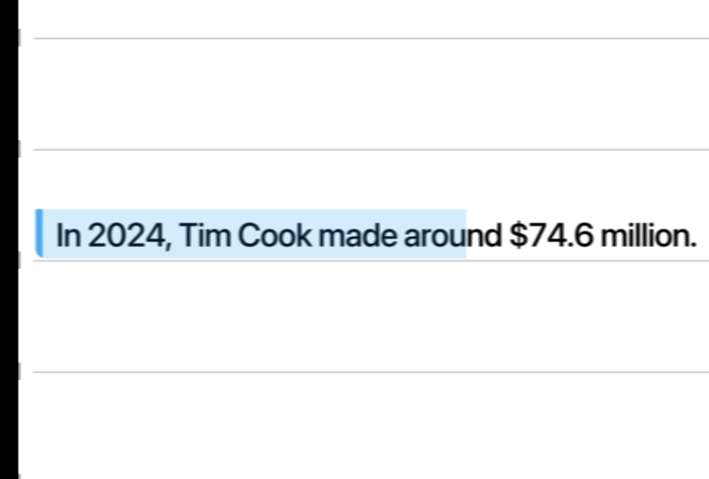
information that if he earned 63 million per year, then that's $6 every second. And now you are saying
that $74 million is 2.3 $7 per second. How that's just impossible. And now you are
saying that Okay. So TGPT made a mistake. How much does Tim Cook
make every second? Legs break down in 20 2040 I
want to get rid of the CDA. Don't think we're
going to have a CTA. We're just trying to
make a great video. Okay, this is the script. Get rid of the timings, get rid of the kind of
your comments, whatever. And make sure to use
the 2024 data about Tim Cook and make sure to double calculate everything because
before this message, you said that in 2023, he made $6 per second. Now you're saying he
makes $2 per second. Make sure the information
is relevant and up to date. Oh, no way. Mr. Beast
made more than Tim Cook. I mean, Tim Cook has a salary. Mr. Beast has his whole
industry. Like, Mr. Beast himself didn't
actually make that much. It was his companies
that made that much, but, like, sometimes
you can confuse Mr. Beast with his
companies, anyway, can you let me know, why are
you changing the script? I sent you the script,
like, Where's the words? Let's break it down? I'm
struggling to understand. Why is it changing this much? Okay, great, great,
great, great. This is exactly what we needed. Copy, Paste. How much does
Tim Cook make every second? Let's break it down. 24 Tim
Cook made $74.6 million. That's. Okay, great. Now, let's create a CTA
where share it with a friend and give a reason
to share it with the friend. Give me, like, ten
different reasons so that I can choose from. Share this with a friend who needs a raise. This
is a good one. Actually. Alright,
I think it would be so funny to say that's
why iPhones cost this much. Share this with a friend
who needs a raise. This is a really good
one, really good one. I absolutely love this one. Okay, so we have one
script. This is great. Sometimes I might write a
script on a piece of paper, but because I might change
things in the future, I like to keep it
on screen there, just a little bit
easier this way. Now, for the horizontal video, let's work on the
horizontal video now. Okay, great. So we're
finished with this. Now, let's work on the horizontal video and
specifically on the script. I'm thinking something along
the lines of actually, let me check the script first that you've sent to
give you some feedback. You're about to unlock
the exact style used by Apple. I like that. Billion dollar
startup sounds weird because startups. Apple is one. Why startups? Then
viral creators, yes, we can keep that. This isn't just motion
design. Yes, I like that. Whether you're freelance
edit or content creator, the style of make your projects
look like they came out of Cupertino. Oh, love this. Okay, we need to
shorten the video. I told you what I liked,
based on what I like, create a new script that's half the size of
what you've written. You're about to unlock the
exact animation style used by Apple and creators pulling
millions of views. It's what makes Brand
field premium and content impossible
to scroll past. Whether you're
freelance editor or content creator, don't worry, even if after effects fall over, overwhelming before, you'll learn everything
step by step. Let's get. I think
this is great. This is going to be our script. And let's do it like this. Why do you like this? Let me tell you a bit of my expertise. So it says what people
are going to get, and this is something
that people want. I'm just trying to
think as a viewer. This isn't just motion design. True. This is motion design. Most people are tired
of just motion design. We What we're trying to do is to is to make it feel premium and
impossible to scroll past. Exactly. We're talking directly to people who want
to take this course. So, for example, freelancers,
editors, content creators. And, of course, I can give a lot more explanations to what kind of people are
trying to learn this style. However, it's also going to take forever because a lot of
people are trying to learn. Mostly it's freelancers, editors and content
creators who want this. This line just sounds
unique and interesting. And this is talking about struggles and the reasons why people might not want
to take this course. And once again, this is kind of a quick
creation of the script. To be honest, you never know what kind of script will
work until you actually try. The best way to try is to
actually go ahead and do it, see what kind of
results you get. And if you don't
get good results, change it and experiment
and AB test AB testing is, you know, you create something, you test it with something else. Whichever performs best wins, let's say this one
wins, it goes up. Then higher, you compare
it with a new thing. You see which one works best. Still this one, keep this one. But then this one works
better. Keep this one. And so you just go up
and up and up and up, and that's how you
create great results. Well, we created two
scripts, which is great. This was our goal. If you have any questions, let me know. But ahead than that. I'll
see you in the next video.
17. Planning + Voiceover: Welcome. In this video, we are going to create a
voiceover and plan our videos. When I'm creating my own videos or videos for other people, I don't try to plan as much in advance because if I
plan a lot in advance, then I don't have much
creativity in the process. First of all, secondly, it's kind of easier
for me to create in the process rather than in advance because whenever I start working and gets into
this interesting flow, it just helps me to get
things done easier. Now, I will say that sometimes
I do run out of ideas, sometimes I don't have
ideas or I want new ideas. But I don't have new ideas. In that case, I'm
going to use ha GPT or potentially get
some creativity going. Oftentimes, I also just
take a pause, do something. While I do something else, I think about this and then ideas just start popping up in my head. That's my process. That's how it works. If it
doesn't work for you this way, I think it's the best
for you to create your own kind of creative
workflow around this. The best way to create
your own workflow is to just experiment and try. You don't know what
will work, you don't know what will not work. So the best thing for you to try and just literally
try to think, what on Earth can help you achieve whatever you
want to achieve. If you want to be more creative, what can help you
get more creative? Probably new ideas, how
to get new ideas and, you know, kind of
brainstorm it this way. I like to think of
brainstorming as association. So I'm just trying to associate
one thing with the other. And kind of creative ideas for me is also
about association. So if you ever played the game with associations
like, you know, table, wood, forest,
animals, zoo, water, ocean, sunset, space, you know, universe, particles, you know, things like that. So it's kind of interesting. If you've never played it,
try to play it in your head. I think it's really useful. And then this is kind of a part of my workflow is to just do something else, do these little
associations in my head, and then I'm able to
come up with ideas. This is how I come
up with ideas and can sort of plan
things in advance. And that's why I
don't necessarily like to plan things in advance. The way I like to plant
is I like to have, like, a general overview of
what I'm going to do. And Alred know what
I'm going to do. What we're going to
do is we're going to have these different templates. So, for example, one is going
to be like finder view. The other one is
going to be Safari. The other one is going to
be iPhone and like that. So we're just going to change different applications and then do animations in
different applications. And this is kind of my
general plan overview. And then as we go and actually
start editing the videos, I'm going to get
to more details. Now, we also need to
create the voiceovers. The way I create voiceovers is I use voice memos on a Mac. I have microphone connected
that I'm recording with, and I'm just going
to read the script. The way I like to
prepare my face muscles, and it's best to prepare your face muscles because if you don't prepare your face muscles, you might pick some of this
and it's not very good. I'll give you a couple of tips. I learned this from
a person called Vin. That Vin who is like a professional speaker,
you can Google him. Basically, he gives a
couple of practices. First of all, make your face
small, make your face big. So small and big. Small. And then I go like that
for like 30 seconds. Then it's imagine that you are eating a huge gum and
it goes up like this. So go like that for 30 seconds. I try to move my jaw, like that. Then I'm trying to
read this script as if I'm exaggerating, like every single word, so for example,
horizontal video. You are about to unlock the exact animation
style used by Apple. This way, you get your
pronunciation better, your words sound better. And then the last one, if you just woke up in the morning, you have this sort of,
like, Batman voice. If you want to get
rid of that and get this sort of ups and
downs in your voice, then it's best to do like this. That's it, so that's my five
step process to preparing my face muscles and jaw muscles to record the
videos. After I've done that. Which takes about 3 minutes. I'm able to record videos. This is actually
what I do before recording these videos for you. So every single time I do this. Now, let's create two videos. I'm going to read a script. I don't see very
well. That's why I'm going to wear glasses. Mm hm. You're about to unlock
the exact animation style used by Apple and creators
pulling millions of views. It's what makes
brands feel premium and content impossible
to scroll past. Whether you're a freelancer, editor or content creator, this style makes you work
like it came straight from. This Oh, this style
makes you work, look like this style
makes you work, look like it came
straight This style, makes you work, look
like this style, this style, this style, this style, this
style, makes you work, look like it came straight
out of Cupertino. This style makes you
straight out of this style, this style, this style.
And don't worry. Even if after effects felt overwhelming before,
and don't worry. You'll learn everything step by step. You'll
learn everything. Okay, that's one recording done. Let's record the second video. Also, I also get some water, and I keep water right
behind me, beside me. Otherwise, it's really
hurtful on the throat. How much does Tim Cook
make every second? Well, of course, the
neighbors will beep. In 2024, Tim Cook made 74 million What are
these neighbors doing? Yeah, that's what I have
to deal with every time. Share this with a friend
who needs a raise. Okay, that's done. I'm not sure if I'll
use this recording. I don't like the way my
voice sounds right now, so I might re record this. But this is the process. This is what I have
to go through. So we come up with an idea. We go through it with hATPT. We come up with scripts. We record an audio,
and after this, all we have to do is to go in after effects and
create these animations. If you have any
questions, let me know. But other than that,
I'll see in next video, we create the
animations. Let's go.
18. Congratulations!: Congratulations. If
you're watching this, it means you've made it halfway through the
course content. I know we've covered a lot, so congratulations to you for
making it to this point. And there's a lot more
valuable content coming soon. But before we get
to the next video, I want to simply ask
you if you found value in this program
up until this point, to take 60 seconds to
leave you honest review. Of course, I will
immensely appreciate this. A feedback will also
help hundreds of future students in deciding
the best program for them. So leave you feedback now. And of course, if there's
anything I can help you with, please let me know in the Q and section below.
You're doing great. Keep going. And
without being said, let's get to the next video.
19. Setting Up Your UI Layout from Figma: Welcome. In this video, we are going to prepare our assets. So we've already
created the scripts, we've recorded the scripts. Now before we start editing, we need to prepare everything
we have to work on. Because if we don't do that, it's going to be a bit of a headache to do
it in a process. So, let's copy this script, and let's come back to
hA GPT. Hey, ha GPT. Okay, so for this script, this is the final script
for the vertical video. We are going to use,
as I told you before, we're going to create
Apple animations, and we need to use
different Apple UI designs. You need to give me a list
of different possible ideas. So, for example, one
can be a finder view. The other one can
be iPhone view. It can be iPhone notifications. It can be iPhone apps. So instead of the notifications, it would be the text instead of the icons like under the icons, instead of the text,
they would be our text. Give me more ideas where
I can put text like this. Maybe we can do,
like, a browser. Maybe we can do search results on Google,
something like that. So give me different Apple UI
related ideas for designs. And yeah, just
give me a list of, like, 20 different ideas. Finder Window. Okay,
I message hat bubble. Great. IPhone
notifications banner, lock screen notifications,
app icons with labels, control center titles. Mm, can be great. Okay, let's count
how many we have. We can do this in advance and actually market
with different colors. So I think because of the speed, because this is going
to be very fast, we can market with one color, and it's going to be one scene. Let's do it like this. One, two, three, four, five, six. We have six different scenes. Just because of the timing
and because I already kind of have an idea of
what the video is going to look like, I
broke it down like this. That's it. There's no specific
formula I'm following. I'm just kind of
having an idea in my head and trying to
replicate in real life. We need six different scenes. Let's take a look at the
other ones. Apple Music. Ooh. This is going to be one. So I'm thinking
about notifications. This can be this part. So each notification
is going to be like, we're going to have a
notification animation, and then for each notification, we're going to have like month, week, day, hour minute. I think it's going
to be super cool. These are not in a
particular order. This is just what
we need to find. And in order for me to understand what kind
of how many we have, I just change the numbers. Okay, so now let's try to
go to Figma, Finder Window. Let's search for Finder Window
and see if we can find it. Okay, so let's zoom in, and we are going
to need this part. Okay, so you want to make sure you double click until there's, like, a specific
one that you chose. And as you can see, this
is the one that I needed. I don't need the whole
finder number one. We don't need the Header. So I was just clicking until I got exactly the one
that I was looking for, and I'm going to
right click copy as SVJ and let's go
into Illustrator, Newfle web, large, and Command
V or Control V to paste. Now, let's increase in size. By pressing Shift and option, I'm going to make
it bigger like so. Now I'm going to open until
we see all the objects. I'm going to go down
and shift with shift, select all the objects. And I'm going to
drag it all out. Now, you will see that some of these became a
little bit visible, so I'm just going to delete it because we don't
need it at the bottom. I think it will be really cool to kind of
create text here, for example, like, one,
two, three, four, five. We can have a whole
sentence here. Let's click here. Release two layer sequence, select all the
layers, 150 layers. That's a big number of layers and drag them out of the layer one. Okay,
this is great. Command S to save it. And let's call it
finder window. Okay. I'm going to add the text
straight in after effects, and for now, I can
just close it. I can actually close it by pressing Command W or Control W, and it's going to
close the window. And now let's just double
check that everything's okay. We're going to open
it. Boom, perfect. This one is ready.
I message chat. Okay, actually,
this looks great. And this is the one. Okay, let's right
click Copy it as well. Command N to create new one, webge Command V. Okay, so let's release two
layers sequence. Let's select everything,
drag it out, and now save this one.
We are going to call it. I I message bubble. I'm going to save
everything on desktop, and then later customize.
This one is done. IPhone notifications.
Quite like everything. Okay, so let's save
this one as well. Release layer, drag it out. Control as save it
on screen music. So we have the music. Okay, let's come back to notifications, and
let's search for it. All I'm doing here
is going through exactly the same process Figma Illustrator,
save the file. Instead of boring you with
exactly the same thing that you've already seen me
do ten times, I sped this up. Overall, it took me
roughly 45 minutes to complete and prepare
all the assets. Okay, great. So now
we have Find view. I message calendar
notifications, other notifications, as
well, music and notes. Great. In terms of UI designs, we have everything prepared. Now, we can put it into our there's going
to be a vertical video. So UI designs. We can put everything here to make sure things
are organized. So let's drop it there. Now, let's drop it into the vertical video
and into UI designs. Okay, so now we can actually
start working the video. We have our audio. We have our designs. Absolutely beautiful. We have everything prepared, and in next video, we are
ready to start working. So if you have any
questions, let me know. But other than that, I'll
see you in the next video.
20. Animating Hero Sections: Dynamic Intro + Text: Welcome. I am so excited about this video because we're
finally getting to edit. We've done through all the
preparation, boring work. Now, let's get and practice. Okay, so let me show you
what I've done here. I didn't do it on camera because
I want to take some time and I don't want you to bore with the boring stuff.
So here's what I did. We had our six different
designs, UI designs. And I just marked
them with color exactly as we have
descript so that I know, for example, for
this part, we're going to use the finder. I also move them around to
make it a little bit easier. Don't take a look
at these numbers, so we can actually just
Go ahead and delete it. Perfect. So we have this ready. Now, let's jump
into after effect. Okay, we create new project. We will create new composition. I'm not sure how
long this will be. Oh, actually, because
we have guys, I completely forgot we
have the audio recording. So we need to create
the premiere project first to cut the audio and then we'll add the
designs and after effects. For that, window open Premiere, create the sequence, cut it. You can definitely do
it in after effects. It's just a little bit
easier for me to do it in premiere because usually
after effects is more for, like, motion graphics design, and premiere is more for
putting everything together. New project. Let's call
it vertical video. And I'm going to choose a
location vertical video, okay, Shift command and
to create a new folder, and let's call it PR. Like this, in order to open a Mojes it's control
command space. Then create. Okay. And here, we're going to
create a vertical video game. Create the project. Let's drag our audio here. Let's create a sequence. We can kind of drag and
drop the audio here. But then if we take a look
at the settings, like, we don't have control
over the setting, so it's not something
I want to do. I want to create a sequence. Select this 30 frames a
second, 1920, 10800 Oops. Sorry, 1080 by 1920. The shortcut to open the
settings, first of all, we can open all kind of shortcuts
with keyboard shortcut. The shortcut is option
Command K on Mac, and it's old Control K on PC. So we can open these, and then
if I search for settings, and we can search for
sequence settings, Command K. You can
search you can put yourself the same
shortcut if you want. It's the same shortcut that's
used in after effects. Let's drag it here. I actually don't like
the way this looks, so I create the shortcut for myself to customize
the timeline. You can butch my other
courses on how to do this. Okay, now we just need
to cut everything. How much does steam
Cook make every second? How much does Team Cook make every second? Let's
break it down. In 2024, Team Cook
made $74.6 million. That's 6.2 million
dollar a month, 1.4 million a week, 204,000 a day, 8,500 an
hour, $141 a minute. And that's 2.3 $7
every single second. That's more than
most people make in an hour every second. Share this with a friend
who needs a raise. Perfect. Let's create
another folder called it AE, which is after effects. And I'm going to
set a tag as well. So I have this purple tag, which is Control three
shortcut on MacBook to create this sort of purple
so that I know that this color is only,
like, project related. We can also do, like, downloads. That's also project related, and then it's just easier
for me to organize. So we can do a dynamic link. However, if I right
click replace with after effect composition,
it doesn't work. In order for dynamic
link to work, we need to have some
sort of visual. You know, it doesn't matter. It can be the visual
itself can be super short, can be like this long, right
click, and now we can do it. However, instead of doing it right clicking,
I have a shortcut. So replace with after
effect composition. For me, the shortcut
is option A, and I just press on. Take a look at this
option A. There you go. And let's call it
vertical video. Tim Cook. Okay. And we'll put it
into after effects. We'll delete the graphic. And now we have the composition that's exactly the same as
we created in premiere. So we have the
width, the height, and 30 frame second. Everything is good,
although the time is the time is okay because
that's how long our audio. See this turned into red. We can press Command
set if we want to do it and be able
to put it after. I would say it would be better to export it from
After Effects first because otherwise it's going to have to render it in
real time in premiere. And instead of putting so much
pressure on our computer, we can just export it
from After Effects later. So I just press Command set. I can press Shift Command set to redo but I'm going to press command at pressing
command a to save it and command Q to quit. Okay, I'm going to select all the audio press Shift
Command C to precompose, and what will call audio. We have solids. Okay, so
we don't need solids. We can delete it. Graphic,
we can delete graphic. Delete. Audio. Okay. We can put it into
audio, like so, and we can put
audio here as well, because we don't need to customize the audio. We
can only customize it. I mean, we can, but we
don't necessarily need it. So how much does steam
Cook make every second? Let's break it
down. And for this, we're going to use
the finder window. Okay, so let's search
for our UI designs, and let's find the finder
window, composition, layer size, press noka
and let it do its job. Sometimes it does
take a little bit of time to load everything. Let's open it up. So what I'm thinking about
is putting text one, two, three, four, five, here. So we can select this, find it, and then let's find a text tool. What kind of text do we have? How much? How much? As a pro, regular. Perfect. This is the Apple font. Remember, in order to
stop editing the text, press on Command plus or Control plus and it's going
to just go back to the selection tool. Okay. Let's zoom in. I think my font is a
little bit too big. We need to decrease it. Let's make sure it's
the same height, P and H, so maybe 22. Okay, now P, let's
change its position, put it around here, and 146, we're going
to disable it. Okay, now, by
pressing Command D, I'm going to duplicate the text. We'll put it here,
duplicate the text again, P to open position,
put it there. Instead of how much does. And let's put it, so. By the way, let's
disable, select V, and Does Tim Cook, disable it's far away. Actually, let's keep
all the texts together. Like so annual report, this one. Okay. So here's what we have. How much does Tim
Cook make per second? And now, I was thinking
about putting Tim Cook here, like in this part, like an actual image of him. Hm. Let's search for PNG,
we have something. This looks so similar
to Steve Jobs. Okay, let's use this
one. Save image. And let's actually let's
not put it here yet. Let's find this layer. Okay, so we might need to disable a number of things here. Let's import Tim Cook image. I can open scale by pressing S, and I can open
position by pressing P. And if I want them to be
both open at the same time, I have to press shift
in between those. Okay, so there are a couple
of things we can do. We can either track mat him
and we should give it a try. So this is the one.
Can we track mat it? Yes. Like so perfect. S&P. Let's put him to 12. By the way, it should
be visible as well. Perfect. Put him to the bottom. Like, so, isn't this great? I think it This is beautiful. Let's go to the audio. How much does steam Cook make every second? Let's
break it down. Let's break it down. Let's break it down. Okay, we can do it here as well. So let's search for
duplicate this one. B move it here. Now, let's select these to
copy them and paste them here. Doesn't matter,
actually, we should probably paste it around
here so that we can here. Now we need to animate the text. There are a couple of
ways we can do this. We can either do it by
using what Adobe has, and I'm going to show
you how to do it. So, for example, how
much, by the way, you probably seen me
use this part here. This is a effects
console by video C palt. So you can go ahead
and download it, and then by pressing a shortcut, you'll be able to search
for different effects. So just come to this website, go ahead and download
it, install it. It's absolutely free,
and then you'll be able to press a combination,
search for effects. So, for example, for
fade up fed up words. And you will see that we will now have the text animated here. How much does steam? Then if we press you, we have the keyframes. So that's one way
we can do this, we can use a typewriter
effect like a fade up, like something else,
the text animations. However, one of my favorite ways to animate text is to
use a text evoscript. It's a paid script that
you have to pay for. It's $30. So if you don't
have this option, the use what you have
with after effects. If you do have an
option to spend $30, then go ahead and use it.
It's absolutely great. I'm going to show you what does. I'm going to press Shorca for myself once
again to run script. If you don't have the shortcut, you can just script run scripts and you can see there this
is the shortcut Command R, and I'm going to go to
desktop Scripts TextEvScript. And we're going to
have this pop up. Now, I'm able to, for example, up Opacity words apply. It's the process that
I created for myself, and the tax is going to go up. It's going to
increase with opacity because right now the
opacits is at zero. I'm going to person U and Okay. How much does how much do? Can you speed it
up a little bit? How much does how much
does how much does tip? By pressing L double
times on the audio, I'm going to open the waveforms
to see things better. How much does To see where
certain words start. So we can either move
it like this, the text. We can also just
press on a bracket. Like left bracket and
it's going to basically do the same thing as move
it in moving it here. We can also press Option bracket and it's
going to cut it. It's the equivalent of
pressing Shift Command D, making a cut, and
deleting this part. So I'm going to pression
left bracket to cut it. The tip. Option left
bracket, Tim C. Left bracket, it's
actually not per second. It's every second. Let's double check that we have
text with the audio. How much does steam
Cook make every second? Let's break it down.
Perfect. Now I'm going to run the script again. Actually, it's already here. So let's use up
opacity words apply, and we can select all of
these up opacity words apply. Does steam Cook
make every second. Press. Okay, so these are
supposed to start later. The steam cook
make every second. So we'll use the
same animation here. We'll use opacity words apply. You let's break it down.
Let's break it down. We are going to have
all text stop here, so once again shift command
and then press and delete or we can press
Option right bracket. It's just for me to see
where it ends. It down. How much does steam
Cook make every second? Let's break it down. Let's
leave it like this for now. Come to the project
finder window. How much does steam
Cook make every second? Let's break it down. Great. Okay, so for this part,
we have everything ready, and I'm going to cut
this layer to here. So we have the first 326 ready. Now, the next thing
we need to do is to come here Apple calendar event. Okay. Let's search
for Apple calendar. I think we'll use
iPhone calendar because that's what I liked. Composition, layer
size, import, open. So let's try to create
some text here. The font definitely
needs to be smaller. Know how we can frankenstein
this thing together. It's going to look
a little bit ugly. Okay, maybe we should go for
maybe we should go for 15. Let me copy this thing. Put it here and
then put it here. This is going to be a bit ugly, but people will not notice these little things
because on top of that, we're going to
animate the camera. This part is actually
like, it's good. Okay, so let's create a mask. Let's move it up, like so. Now, let's create a mask, so we just select this tool
and it's create to mask, but then we will
invert the mask. Lexual. Perfect. And now, what we can also do is we
can select a linear wipe. We will set -90 so that it
goes from left to right. So we will time the transition. And here it's going
to be complete. You can also press FNF
nine to make it smooth. Okay, Project, where was it? IPhone calendar. IPhone
calendar in. Put it here. In 2024. T ImCook
made $74.6 million. Let's open the audio,
copy this one, go into IPhone Calendar,
search for this, select, paste, go to
the very beginning. In 2024, Tim Cook made
74.6 million dollar. Maybe we should do
it linear instead. In 2024, Tim Cook
made $74.6 million. I'm going to disable the audio here because
we have double audio. T four. Tim Cook
made $74.6 million. That's $6.2 million. So we've done the first
two. I message Chad Bubble. Okay. I message Bubble. Trobin composition,
layer size. What do you? That's $6.2 million a month. 1.4 million a week, 204,000 a day, 8,500 an
hour, $141 a minute. And that's 2.3.
And to copy this, I message and paste it in here. That's $6.2 million a month? Okay, let's put our text here. Okay? So here, the
text needs to be a bit To fit the screen, I have to press Shift and
line that's sideways. I don't know what
it's called exactly, but it's this one here. This key, multiple
command, this one, here, Shift and that one, and you
shift back to this view. At this point, you
probably got the idea. We just need to customize every single piece that will be customized,
will be animated. And so I'm not going to speak. I'm just going to do
it. You get the idea. If you have any questions,
be sure it's live in below, but other than that, let me
just go ahead and do it. No bore you with this. And then once we get into the fun
stuff, I'll be back. Okay, here's the
interesting part. Now that I have
the text animated, I have the typewriter
effect on all the text. What I want to do now is animate every single
bubble pop up. For that, we can use a
couple of different things, but I'm thinking about
using a transformer effect, which then I'll be able to just go ahead and
copy in all of them. Or oh, yeah. Actually, we can
go ahead and try the animation composer, which
we have in front of me. So we have both of these. We need to parent
one to the other. So I printed the whip this
at the end to the big one, and let's try to start to
presets maybe this one. Okay? This is definitely
a bit too much, maybe bounces zero. I quite like everything, okay? Now, we need to open this to see where the
animation starts. I want to go to,
for example, here, and paste. Let's take look. That's $6.2 million a month, 1.4 million a week, 204,000 a day, 8,500 an
hour, $141 a minute. 204,000 a day, 8,500 an
hour, $141 a minute. Okay, great. Now, in terms of all this other stuff,
I'm not even sure. Potentially we could just
go ahead and disable most of the stuff 'cause
we're not using it. Mm hmm. Okay. This looks great. Make sure to save the projects. Okay, now let's put it in. So we have the I message bubble. That's 6.2 million
dollar a month. Okay, we did this animation now. Apple music. Okay. Let's go. And we need to break down this part here because right
now it's one big layer. We need it to be lots of small
layers. So it's this one. Let's take all of this out. Like, so layer Okay, now we should be
able, yes. Okay. Save this. Let's give it a try without closing
Illustrator first. Yes. Okay, now we're able to customize every
single bit, okay? So now we can close
the illustrator. We should have an icon here.
We don't have an icon. Mm. We should put Tim
Cook there. We should. Isn't it? Beautiful.
I think it is. Okay, now we need notes. In 2024, Tim Cook
made $74.6 million. That's $6.2 million a month, 1.4 million a week,
204,000 a day, 8,500 an hour, $141 a minute, and that's 2.3 $7
every single second. That's more than
most people make in an hour, every second. Share this with a friend
who needs a raise. Beautiful. Isn't it beautiful? Okay, now, let's do the
final touches here. So everything is good. Aside from here, we need to add a picture here at the top. Add a background here and
add a background here. Okay, let's quickly go
through everything. Let's create a circle. Put it in the middle. And now let's put a picture. Oh, yeah, let's put another
picture of Tim Cook here. And we will track
match this image. Like, so Okay. What
else do we need? We need background here, okay. Let's open this one. Okay, let's find a picture. IPhone screen. We just need to get
the dimensions right. Let's try to align these things so that
it fits perfectly. I think it does now. Now, we can create an outline ourselves. Let's create a rounded
rectangle shape, diselect everything by
present shift command. A, now let's create a big one and et's make sure it fits
vertically and horizontally. I'm also going to
open the transform to move it up and down. Okay, this is great.
Change the roundness to make sure we fit. Put it to the very bottom. Now, we can make it
whatever color we want. We can make it white so
that we can see stuff. But instead of white,
why don't we create? Let's do iPhone wall, paper. I'm going to press a shortcut Shift Option
Command H or G, and this is the
shortcut that allows us to fit a certain object to
the size of the screen, either vertically
or horizontally to the size of the composition. And from there, I
can make it bigger, smaller, doing to
make it a bit bigger. So let's put it to 35. Okay. And let's track
mated to this guy. Mm hmm. Great. Now, let's duplicate this iPhone,
make it visible. Let's only do the stroke, let's increase the stroke width. Like, so as let's make it. Let's make sure our anchor
point is in the middle. And now let's make it a bit
smaller, just a tiny bit, and let's make it
black. This is great. The only thing we need
to do is we need to change the position because
it's not very straight. So let's connect to this one and P move this one
a bit to the right. So now let's just copy
this thing, put it here. Let's put it to the bottom, P, let's move it a little
bit. To the left. Let's change the iPhone
background to something else. I love it. Okay, now we need to add just
a couple of things there notifications because
let's double check. Notifications, yes. So we do have some
sort of icon there. IPhone iPhone message. I can download. So let's drop it in, drop it in here. Okay, let's do it
like this for now, and then we might change it a little bit
later in the future. Let's see what we created. How much does Team Cook make every second? Let's
break it down. In 2024, Team Cook
made $74.6 million. That's $6.2 million a month, 1.4 million a week, 204,000 a day, 8,500 an
hour, $141 a minute. And that's 2.3 $7
every single second. That's more than
most people make in an hour every second. Share this with a friend
who needs a raise. Okay, I'm loving everything. We'll definitely have
to create something in terms of the background a little bit later
because we don't have backgrounds for any
of these things, but other than
that, I think it's looking super great,
super expensive. Maybe we will create a rounded edge here because it doesn't look
like an iPhone currently, but we can certainly do it. Like, it's not a problem.
We created it here. Super easy. We'll see what
we can do here as well. Other than that, I think
I want to stop here, take a little break, get some fresh
ideas into my head, come back with a fresh view and see what kind of results
we can get here. We are doing a great, great job. Thank
you for watching. If you have any
questions, let me know. But other than that, I'll
see you in the next video.
21. Transitions & 3D & Depth with Null Chains: It's been about two, 3 hours since my last session. I'm continuing with this edit. There are a couple
of things we can do. I'd like to walk
you through some of the options that you have
when it comes to this. Let's take a look
at the calendar, for example, a composition
doesn't have so many layers. I think it was this one. What we can do is we can create a camera and we can Zoom
in with the camera. If we zoom in with the camera, we're going to lose quality. Why? Because everything is going to stay the same
quality, basically. And we just zoom in
and we zoom in here, you can see the
quality is pretty bad. However, there's an interesting
workaround around this, and it has to do with the SVG files that were
created in Illustrator. For example, let's create a null by pressing Shift
option command Y. Okay, it's going to
stay at the bottom. We'll select everything
aside from the null, and we are going to parent
everything to the null. Like, so at the same time, we're also going to click on this button, which is Rustiz. And therefore, let's
say we press on S, and now let's increase the size. I can see that the quality is actually becoming better
than what it used to be. It used to be, you know, take a look at this part or
take a look at this part. We increase it in size, and it's becoming better. So that's what happens
when you rasterize. Okay, I'm going to go back
to cancel everything. So a couple of things we can do. So yes, we can definitely
work with the camera to create this Boca effect, basically the blur
in the background, the foreground, which
looks super expensive. Sure. And we can actually
do that for the background. We can also use the same effects with the Cashion blur, anyway. At the same time, what
we also did great is we have each of our sets, each of our scenes in a
different composition. And because we already
have the audio here, we can actually animate
every single one of them on its own.
Let's give it a try. I'm going to select everything, press A and A to
close everything. So now we have
everything closed, and I'm going to change
the composition of this to 1080 by 1920. So we're going to
make it vertical. And okay, let's start
with this first one. Let's close everything else. And I'm going to
select everything command to Oh,
actually, it's here. So rasterize every single layer. Now I'm going to
deselect everything. Shift Command A, select
the first layer, and here we're going
to create a null, shift option command Y. Now, we're going to
press Command A to select everything, and
by pressing Shift, I'm going to press on
null to diselect it, and now we're going to parent
everything to the null. So even if we drag one
thing to the null, we still are parenting
everything to the null. Okay, great. So now, we can control everything by
increasing the null, beautiful. This is actually going
to be the main nulls, use P and S. Actually, let's start from like this
position here roughly, put two key frames, really increase the scale. And let's put it something
like in the middle. We just increased this null, and because we want
super smooth movement, I'm going to select
this null and I'm going to create another null, and I'm going to
connect this null, the main null to
null number three, doesn't matter the names. And now, while we
are zooming in, we will already start moving
to the left, like so. And eventually, we
should finish here. Let's F N F nine, everything. How much does steam
cook make every second? Okay, this needs to stop here. Actually, I think what we can do is we can do it like this, so it will start very fast in the very
beginning and slow down. How much does steam
Cook make every second? And maybe we need to zoom
in a little bit less. Then going to smooth
this one out a lot. And while this one
is still moving, we're going to start
going down in this case, we can just duplicate
this one, then parent it. By pressing P, we will
delete these keyframes. And so we'll start
from this position. And we will go down. Like so select it, double click. Let's break it down. I
go. Let's break it down. Maybe we need a little bit less. What about this? So let's
take a look at this one here. How much does steam Cook make every second? Let's
break it down. Let's create another
null around here. So duplicate this one, P, connect this one to this one, delete the position
keyframes and start. And then and let's say here, we'll do it on our own nine, zoom in, and we'll
do it like this. Let's create a marker. Let's search for how to leave
marker. Do you remember? Okay, Control eight. So let's put the marker
here, Control eight. Okay, great. We
have a marker now. And Let's break it down. Okay, beautiful. Second. Let's break it down. Maybe we should start this
one a little bit sooner. Second. Let's break it down. Maybe it should go
o to bit lower. Second. Let's break it down. Maybe even lower. We second. Let's break it down. Okay, let's see. How much does Steam Cook make every second? Let's
break it down. So for the first one, we have item Cook make every second. Let's break it down. In 22. Let's open this one. Let's
make it 108 T by 1920. And we are going to do exactly the same thing
as we did previously. Let me select the top
layer, create a null, select everything,
select the null, parent everything to the null. And whilst we have
everything selected, we will click on Rasterize. It's already rasterized K
Ps rename it to main null. Okay, so we did have
our iPhone here. Let's select our iPhone, this one, this one, this one. Select our iPhone
and bring it to the calendar iPhone
and paste it in. Now, let's put everything
in the middle. Because we had it parented. That's why this thing happened. Great. Now we can
disect this background, and now we can
select everything, diselect the null,
and we can track mat everything to iPhone because
that was our track mat. So just select everything. Let's scale it down just a bit. Like, so 99. Perfect, so that we
don't cut the edges. Let's parent these two to the null as well so that
null connects everything. So now that when we scale, we do have our iPhone like this. How does this one end
goes to the right? Okay. So we can
actually have it come. This is going to be
the final keyframe, and we should
should do it, like, so this one is going to
go to the very left. This one is going
to come like this. In 2020? A bit more room because there's
literally no space. In 2024, Tim Cook made. Let's check what it looks like. Break it down. In 2024, Tim Cook made 74 point. Okay, let's take a look now. How much does Tim Cook make every second? Let's
break it down. In 2024, Tim Cook
made $74.6 million. That's 6.2 million Great. Okay, now we need to create our iPhone thinking
here as well. Let's take our iPhone, as well, copy, paste it in the
I message bubble. Is select this one, put it in
the middle, in the middle. And actually, we need
to change the size of the composition 1080 by 1920. Our animation itself on the background is
not perfectly in the middle because
we didn't put it in the middle in Illustrator, something that's better to do, but we didn't do it, and it's
not the end of the world. Let's create a null,
select everything. We will deselect these. We'll parent it to the null. Okay, rasterized, turned on, and I was thinking
about selecting the null and putting
it in the middle. Okay, we can just do
it with rulers then. So we have 1080 by 1920.
You can see the numbers. 1080 divided by half is 540, so I find 540, this is going to be
the very middle. This is going to be in the
very middle right now. Perfect. Let's turn
on these guys. Looks like our team
Cook is not in the middle, but whatever. Okay, now we will select
everything aside from the null and we will
track mat to our iPhone. Then deselect everything and we can delete this
iPhone as well. And to disable it, change the position of our null. Now we also need to find
the picture of this, and we need to track
mad it to the shape xl, let's search for where
we have these things. I want to pass on P and change their position so that
it's a little bit higher. Now, things are the
way they should be. Let's close these because we
already finished with them. So we finished with
the first two. Now let's work on this one. Min duplicate, parent
P and S. Actually, what we can do is
we can take a look. Let's create another null here. Parent this one, P,
select E position, and then we start going down
rapidly FNF nine, open, too. So $60 million. Okay. And let's start this. I need a background because I cannot see what's happening.
Let's enable this. Okay, so let's start from here. Let's do it, like so F nine. Okay, now we're doing exactly
the same thing once again, just going to get rid
of the background. Okay. Let's look at
what we have so far. How much does Tim Cook make every second? Let's
break it down. In 2024, Tim Cook
made $74.6 million. That's 6.2 million. That's $6.2 million a month, 1.4 million a week,
204,000 a day, 8,500 an hour, $141 a minute, and that's 2.3 $7
every single second. That's more than most
people make in an hour. Let's take a look at
everything put together. How much does Tim Cook make every second? Let's
break it down. In 2024, Team Cook
made $74.6 million. That's $6.2 million a month, 1.4 million a week,
204,000 a day, 8,500 an hour, $141 a minute, and that's 2.3 $7
every single second. That's more than
most people make in an hour every second. Share this with a friend
who needs a raise. Mmm, yeah, I think everything actually,
everything is great. Aside from maybe a couple of
zoomins like, for example, here, I think can
be a little bit better when to get rid of the backgrounds
and set a background. So let's try and do that. Okay, so for this background,
we're going to delete it. Okay, we are definitely
getting there. Okay, so for this background, let's search for.
This looks great. Okay, why don't we go here
into the fender project, download, drop it in, go to the very bottom,
and drop it in here. Okay, so let's try
a couple of things. Let's try this moving with
the rest of the image. L significantly bigger,
something like this. If you want it to be connected. Oh, no, we need to
be even bigger. Okay, so let's take a look. How much does steam cook make every second? Let's
break it down. Okay, the first one looks
great. What do we have next? Next, we have I think
for the next one, we should just go
for a gradient. So Command Y to create
a solid gradient ramp. Give me color code to use as a gradient for Apple animation. Actually, we shouldn't
just put a gradient. We should probably put like a four color gradient.
This is the one we need. Okay, let's actually, maybe we don't even
need to put it here. I think we can use a
similar background here, so we can just go
ahead and copy it. Let me just close everything I'm starting to lose
track of things. Control C, Control V. Actually, let's try to put this color
on the background here. Let's animate the opacity. Like everything except
for the transition here, I think we should do
something about it. I don't like the
way this one ends. Maybe we should change the
position to be like this. Million dollars.
Million dollars. That's six point
million dollars. That's 6.2 million. It's $74.6 million. That's 6.2 milli. Maybe this one needs to start higher. Let's
give it a try. How much does Tim Cook make every second? Let's
break it down. In 2024, Tim Cook
made $74.6 million. That's $6.2 million a month. I think it's great. I
might do a couple of other insignificant
changes in the future. But overall, I think this video is turning out
to be absolutely fantastic. So now let's export it. In the next video, we are going to work on
the sound effects. Let's go to export at
TornoQ give it a name, save it and render. Beautiful. Maybe we should also add a bit of motion
blur to everything, or maybe not we'll see, because right now there's
no motion blurr anywhere. So let's take a look
at the final video. How much does Steam Cook make every second? Let's
break it down. This looks great. I think we should
add motion blur, so select everything
add motion blur. I mean, this will probably
take a lot on the computer. We can give it a try and see
what kind of results we get. Especially on transitions,
it's going to be super useful because it's going to make it a lot
smoother on transitions. How much does Steam
Cook make every second? Let's break it down in 2024. Yeah, the transition is
a lot smoother this way. Let's decide the next video
which one we're going to use, a little cliphanger for you. Other than that, if you have
any questions, let me know. But other than that, I'll see you in the next video,
so see in the next video.
22. Sound Design: UI Audio + Timing Sync: Welcome. Okay, we've done some
incredible things so far. We've created the video, we've prepared the design. Like, we are so through
this video, which is great. And now we need to take
a look at the videos, and I organized it yesterday. So we have the Export one, which is without Motion blur, and this one is
with Motion blurr. You can even see
it in the preview. Let's take a look at
the motion blur first, and then we'll take a look
at the expert and one, we'll decide which one to use, and then we'll jup into editing
the audio and the music. How much does Tim Cook make every second? Let's
break it down. In 2024, Tim Cook
made $74.6 million. That's $6.2 million a month, 1.4 million a week,
204,000 a day, 8,500 an hour, $141 a minute, and that's 2.3 $7
every single second. That's more than
most people make in an hour, every second. Share this with a friend
who needs a raise. Okay, beautiful. Absolutely. Like,
super expensive. Let's take a look at this one. How much does Team Cook
make every second? Let's break it down. In 2024, Team Cook made 74.6. Yeah, like the one with
Motion blurr Moore. And I would like to take
a look here to make sure that we did
have motion blur. Interesting. So this frame, it's like we have
motion blur here, and then this frame it stops. And then it is like this
for like two frames. Everything is good
on this front. I think we might just cut this
part out, this one frame. I believe it's just
with keyframes to move the keyframe a
little bit to the left. But instead of
reanimating, exporting, which is going to take less
like probably 15, 20 minutes. So instead of doing that, we can actually just cut that out. Let's just double check that
everything else is good. Oh, I think the same issue here. Yeah. Interesting. Anyway,
let's open it in Premiere. So for this, I'm going
to create actually, we've already created
our premiere project, so I'm just going to open it. In order to open
anything on Mac, you can press on Command O
on Windows probably similar, something like Control O,
and it's going to open it. And then I'll show you
interesting ways to get the very good audio
for free, okay? So export too. Let's organize things. So let's create a
folder by pressing Command and this button. So command and make sure to
select the project folder. So command and that button, we create a bin. Or we can actually
select for example, this one, press Shift B, and it's going to create
a bin of this selection. So this is going to
be called raw audio. This is going to be
called sequences. This is okay, we'll just
leave it here for now. Delete the audio
and do it like so. How much does steam cook make let's see where things went. Yeah, we definitely need to
re export because we have, like, one, two, three, four. We have three frames
frozen. We can delete this. And now let's open the
After Effects project. Let's go AE. Command O, open it. We'll reexport we'll just make sure to solve
that issue there. So what I think that's
the key frames when we are moving it in the very
end must be this one here. So we still have the text, and Okay, let's take
a look here now. Os. That's. That's 6.2. Okay, this one is good. I can scroll in between
frames by pressing command, command and arrow keys. Otherwise, if you have
anything selected, you're going to move
it right and left. And why do we have it like this? So is it this one?
No. Is it this one? Yes. Okay, what's wrong?
What was wrong here? Why did we why did we do it? Okay, let's just double check every single frame in between. Export three, we're going
to use the Export three, and now we're going to render. It's gonna take some time.
This project is pretty heavy. In the meantime,
while it's exporting, let me show you how to get professional quality
audio for free. It's through a website
called Pixabay. You can search for
different stuff. You can search for
images, videos, gifts, three D models, sound effects, and music. Now, they have a great
library of sound effects. And if we search for UI, These are great UI sounds. Like, for this, there's
no sound on IOS, but okay, for this one, there's also no sound. But for message animations,
there's actually a sound. When you send a message
and when you receive, I'm not sure when
you send, but when you receive, there's
definitely sound. Okay, so for this,
we can just use a typewriter or like
keyboard supersimple. This one super simple as well. Okay, so basically need to
find the sounds for I message, and let's search for that. Notification. I'm creating a
video about Apple UI Design, and I need to find sound effects and double check with you about the
sound effects. Basically, it's iPhone receiving messages and sending
the messages. Are there any sounds when you
send and receive a message? First of all, secondly, where can I download them for free online? I message sounds. Okay. Let's take a
look at this one. Perfect. This is just exactly
what I was looking for. I'm going to download
it from here. I just copy link. I
come to this website. We need just the
audio for this one, so we don't need it in
good quality because good quality weighs,
actually, 3.21 megabytes. It doesn't matter. So we have this download. This is good. Control as command as well, so it doesn't take our memory. Our export should be here. Yes, let's put it
in this folder. Okay. Export number three, we can delay this one
because we're not using it. Then drop this one in. And let's start working
straightaway on iPhone sounds. So let's see which one we need. So we need this first one. No. This is Is going to be one. This is going to be another one. And let's see. So this is receive, and this is probably Sand. Sand receive. Okay, so this is going to be the first one. We'll mark it. Let's mark it to orange and
this one will be this color. The way I can mark
colors is I have to go into shortcuts option command K, Command one, so purple. Come on, two mango. So I search for mango,
this is the color. You can actually search
for Libel and you can put different shortcuts for
yourself for different keys. Okay, so this is
going to be one. Let's place it here. That's six colors. That's six That's six
foot. That's six point. Going to disable my voice
so that it doesn't compete. Now, let's do this one. Another this one. I'm able to copy these
by pressing option. No, no, no. And this one as well. So a drag, press option. I put it roughly doesn't
have to be perfect because people usually people don't even notice any of this stuff. So, oops we need to
use orange, as well. And that's it. Okay,
so let's take a look. No. No. L. L. This might be a
little bit too loud, so we need to lower it down
by pressing G minus ten. Let's listen with everything. Million dollars. That's million dollars.
That's six point? Maybe not minus ten, but let's put it to minus five. Million dollars.
That's six point? Yeah. This is great. Right away, I between all these transitions
fast Zoomins we need to add swooshes. So I'm going to use premiere
composer animation composer, the same one we used
in after effect. And I'm going to
search for swoosh. And I'm going to add it in. How much do? And probably need to cut it. Mute, the top one. Okay, so we have another
transition here. Let's add another one. Okay, maybe let's use different one because this
transition is a bit faster. We can probably lower
these down a little bit lower so that we keep swishes on one level and these guys
on the other level. I don't like the way
this one is too rigid, so let's try to use
this one here as well. A bit later. Mute these guys as well. It starts too soon. Okay,
something like this. Let's search for another
transition moment. It there. By the way, this
transition is so seamless. The reason is because we
have a very dark background, and this one is also dark. So that's why it looks so great. And let's use the very
last one around here. Let's drop it in a bit earlier. Okay, let's take a
look at transitions. Okay, great. By the way, here, I know that right away, I am going to use so
we can disable these. And let's work on
this track right now. So I'm going to press
S and it's only going to enable this track,
track number three. And we're going to add a
typewriter effect here. By the way, let's
keep this organized. So for this, we need Sex, and I'm going to search for
SFX folder and drop it in. You can find the same Sex folder in the downloadable
resources section, and you will have access
to all of the sound. At the bottom, you will
find a typewriter or potentially actually heavy
an apple keyboard here, which might sound even more expensive than
the typewriter. So let's find it.
And for example, let's select this portion, and let's And to click this. So let's listen.
Beautiful. For this, I'm actually not sure which
sound we should use here. Maybe we'll have none. But let's come to the very beginning now. And let's try to think what
sound should we use here? Maybe we should use
some sort of UI sound as something we wanted to do. I like this sound. Let's download a bunch of them, and then we'll figure out. Mm actually. Let's download this
sound as well. And then let's see what else. This is great. I'm looking
for expensive sounds, and I'm looking
for sort of, like, I don't know if there's a way to describe a sound like this, but for a tactile sound, something that feels super expensive and like an expensive feel
when you touch something. So this is something
I'm looking for. Actually, this one was
beautiful as well. Yeah. Okay, so we've
downloaded a couple of them. Let's see what we
have. For each of these words popping up, I want to have a
sound of some sort. So, let's actually,
let's open this and let's try all of
these. No, not here. I'm going to close this one and let's try all of it
here. And let's listen. So let's use these first
two for how W is it? For how long? Okay. We can barely
hear this one. Let's make it louder. It's -20. Let's increase it by 15. Okay. No, it doesn't
look sound good. Here's what we're going to do. We're going to use
this sound for every single text
because we want to keep the sounds
consistent, as well. Otherwise, it's not going
to sound expensive. Oh, here we should
do it like this. And here we might be able to use all of these
at the same time. Where does it start right here? Yeah, actually, I think it looks great, maybe
just a bit later. Okay, now let's take
a look at everything. Let's disable myself. Great. Okay, for this one, we're going to use a marker, and we can find
it in fax folder. Let's search for marker. We have two different markers. One marker like this.
The other one is longer. We're going to use a
longer one because I know this animation is pretty long, so actually, we have
to have it longer. Okay, we definitely
need to make this one -20 because it's too loud. Add a transition here, but let's go to fax
and do it centred cut so that it's invisible. Yeah, you can barely
hear it, but it's good. Okay, here we also need to
add a keyboard or Okay, and I'm looking for a sound
when you type on an iPhone. Let's use just a keyboard
that we used before. So let's see where
it starts here. Okay, for every single let's take a look at
what we've downloaded. Ooh. Actually, this sound might work for these words
appearing at the top. Something like
this? And for here, we need, like, a
switch of some sort. I think we have, like, plastic. If we cut it here, no, actually, the
opposite way, sorry. Like, so let's find when
it appears and drop it in. Okay. Okay we might use this one again. Still, you can clearly hear it. Okay, so let's search
for something else. Actually, let's delete this and search for
iPhone notification. Where do we use it?
Okay, let's see here. Oh. Sometimes also less is more, and that's why we can definitely use a
lot of sounds here, but I think this will work even better because it's
kind of simplistic. We're not using more sounds. I think it's simple, minimalistic, and
that's why it works. Okay, so this is what we
have in terms of the sounds. Let's listen from everything from the very beginning to
the very end without me, and after that, we'll
work with music. Okay, right away, this one
needs to start a bit later, like a split second later. Mm. This one starts too late. We need to move it a
little bit to the left. Okay, I think it looks great. These three, these are
definitely too loud, so we should lower
them by at least ten. Maybe minus five extra. Yeah. Hm. Let's
search for music. Okay, since I'm creating
a video about Apple, what kind of music
would Apple use in order to create a
video about Apple? In my opinion, it's sort of
something like minimalistic, like their UI designs. But how can I search for the kind of music
on pixabay.com? Actually, maybe we
should search for just minimalistic I know. One thing I know for sure is that we
will be able to use a song from Epidemic Sound
because Epidemic Sound, I've been using
them for the last, five, six years,
maybe even more. They are absolutely great, and they have an unbelievable
selection of music. If you want to check them out
in the resources section, you can find a link
for a 30 day trial. You can give it a try if you don't like it,
cancel it anytime. Don't worry about it, but
I really do recommend it. It is a small price, but
then the videos become like, like, not just ten, but, like, 100% better. And as you can see, what I'm
searching for these songs here it doesn't necessarily
work the best way. Why? Because, you know, because
this website is free. Epidemic Sound has
a bit of a budget. They have so many
professional artists like, really put their effort in, and let's try to find
a song here bush. Mmm. I absolutely love this song. Okay, so let's download
it and give it a try. So we've tried the free
options. Free options. Yeah, there are
some good options, but not the ones that
we're looking for. Epidemic Sound, we
found a song, How fast? Super fast. So let's
take a look at the song. I think the song will
work unbelievably well. We should start here. So I'm just going to
select a small portion, drag it to the very front, cut it until the music actually
starts, and drop it in. Okay. And then when a more
interesting beat starts, I'm going to use this part. This is sort of the
intro, the first part. And then for this
part, we can use a different kind of song to build up the tension,
the beat the interest. So let's put it here,
try something like this. Okay, we need to cut
it a little bit. Maybe, like, so but Okay, then for this part, I want to when the very interesting
part of this song starts. Potentially here,
let's drop it in. Okay, transition. And then I also
want to have, like, the very action to
build up around here. And then in the end,
it's going to slow down to this part,
which we can see here. Actually, let's start
from the end here because I think this is going to
be a very good ending to the song unless
it's better here. This is going to be our end, so we'll drop it in, like, so. So we can delete
this part for now. Beautiful. Now, for this part, yes, let's definitely use. I'm not sure which
we'll go about this, but I'm not sure
about the results. I'm just experimenting, seeing how things
work out or not. Okay, let's take everything
without my voice first. No it's unbelievably good. Unbelievably good. Now
we just need to lower everything by -20 decibels,
see if you can hear me. How much does Team Cook make every second? Let's
break it down. In 2024, Team Cook
made $74.6 million. That's 6.2 million
dollar a month, 1.4 million a week, 204,000 a day, 8,500 an
hour, $141 a minute. And that's 2.3 $7
every single second. That's more than
most people make in an hour every second. Share this with a friend
who needs a raise. Wow. Turned out to
be super great. Now, I can hear that
the sound effects here are a little bit too loud, so we need to lower it down. How much does Steam Cook make every second? Let's
break it down. So let's lower it by, let's say ten and
see what we have. How much does Steam
Cook make every second? Let's break it down. In 2024, Team Cook made 74.6. This one needs to be lowered
as well, by $5 million. That's $6.2 million. That's $6.2 million a month. Okay, this one needs
to be lowered as well, by something like minus $5. That's $6.2 million a month. Absolutely, unbelievable. Okay. That's how
you do the music. That's how you do the sounds
effect. The sound effects. If you have any
questions, let me know. Beside that. I'll see
you in the next video.
23. Exporting & Showcasing Project 1: We are about to finish this
video. We're almost done. And last thing we
have to do is to properly export this video. So whether you work
on the audio in after effects or you
do it in premiere, both ways work fine. It's just a lot easier to do it in premiere than after effects because imagine having these many layers
in after effects. That's a ton. So what we need to do
is we need to export. First of all, we need to select I and we select O in the end. If you do it in after effects, you don't need to do that. You just go ahead and export
your whole composition. Now, when we come to export, I do recommend you
setting these settings. So this is a preset
that I created. Basically, this is
matching the source. Then we go into render
at maximum depth. You use maximum render quality. Hardware encoding is just for faster export bitrate encoding. I set this one and
target bit rate to 19. Now, you can
definitely set it to maximum or you can go
for this option here. I found that these settings
work the best for me. If you want, you can
just go ahead and copy. So let me set it back. Now, one thing I will tell you, which is super
important if you want to export in Premiere, there's an issue with premiere
when you export the video because the video
that you export will not be as saturated. The colors will not be dark. So it's like it's it's as if the contrast was a
little bit turned down. And if you want to avoid that,
there's a way to do this. You will need to go into
effect and you will need to apply a QT
Gamma compensation lot. This lot actually makes
the video more saturated. And if we don't
do it, the videos will be a little
bit less contrasty, but if you do it,
you do it here. So you can select it,
find it on your computer. Let's see where we have it. QT Gama compensation should
be around, this is the one. Okay? So I just go ahead
and open it, and that's it. You can download this slot in the downloadable
resources as well. And then you can
save your preset. You can customize the headings. You can go ahead and
copy my headings. Then right click Save Preset,
and you're good to go. Now, let's go ahead
and press on Export. And you can actually see the
difference in the export. So this is with the How much Tips so this is with QT Gamma
compensation lot, and this one is without
even by clicking, you can see the
difference in saturation. This one is a lot less
saturated or less contrast, and this one is a lot more. And it's better to always use this one otherwise the colors are going to look a
little bit bland. Now, last thing we need
to do, watch the video, make sure things are great. And if it's good, then we'll be able to go ahead and
post it. Let's see. How much does Tim Cook make every second? Let's
break it down. In 2024, Team Cook
made $74.6 million. That's 6.2 million
dollar a month, 1.4 million a week, 204,000 a day, 8,500 an
hour, $141 a minute. And that's 2.3 $7
every single second. That's more than
most people make in an hour, every second. Share this with a friend
who needs a raise. Absolutely beautiful. Now, I'll give you
a couple of tips on how to properly post
these videos as well. If you post vertical videos, it's better to post
it from your phone. Why? Because you have a bit more customization,
especially in YouTube. In YouTube, in order to select a thumbnail on a
short phone video, currently, you have to
upload it from your phone. Or you can upload it
from your computer, but still you have to go into your phone and then choose
it from your phone. So we do recommend doing
it from your phone. It's just a little bit easier, a bit more straightforward. For example, Instagram also
doesn't allow you to change your bio or your links
from the browser, you have to do it through phone, stupid, but it's just how
these platforms work. Actually, I'm not
sure about TikTok if there are any disadvantages, but it just it's easier to
post it from your phone, so just go ahead and send it via, like, WhatsApp telegram, via airdrop, whatever option you want to choose
from your computer, to your phone, post it from your phone, and
you'll be good to go. So, this is the
first video done. If you have any
questions, let me know. But other than that,
let's go ahead and start the next video.
See you there.
24. Designing Your Glass UI Layout (Figma): Welcome. In this and over
the next couple of videos, we're going to work on
the horizontal video. We've worked on vertical. Now it's time to work
on the horizontal. And specifically,
we're going to create this new IOS 2026, this glass effect that's super cool, expensive,
transparent. And let me show you
a couple of things. So this is downloaded from
the official Apple website, and this is what it looks like. So it's transparent but not
fully, not 100% transparent. Some things are more
transparent than others. It has sort of like a
Gage and blur effect. But long story short, the
way this effect is done is we are going to create this effect that's going to
affect the whole composition. We're going to do that
with an adjustment layer. We create an adjustment layer, create all sorts of effects. And then we basically track
my this effect to a shape. That's it. That's
the short story. The longer story we'll
see in the future videos. But for now, we just want
to keep this in mind while we are creating
our UI designs, while we are preparing
our UI designs. So we have this script.
And the script, I think is already perfectly broken down because this is
going to be horizontal video. Instead of using more of iPhone, I think we should use more of MACUI because we're going to have more real
estate to work with, we'll be able to use
more text on the screen. And I think it's going to
play to our advantage. And I think the way this script
is broken down is great. I think we should
keep it this way. We shouldn't just break it, you know, into more lines. We will have so in this
video, had one, two, three, four, five, six scenes because we have
six different colors. And here we will have
four different scenes. So it's going to be
less less transitions, but more focusing on delivering the whole
idea and the value. I mean, the previous
video also did it, but in this video, we'll have a bit more
time to play with this. I already went into IgM and
started researching UI kits. And since we'll be
working with Mac, I found this search for Mac EY, Mac OS Big Sir UI kit. And I was thinking
about using maps. I think maps would
be very interesting. So I found this
specific light mode, basically open every
single one of those. Now, let's copy copies
SVJ open Illustrator, command to create new web
laarge. Let's paste it in. Let's see what we
have. I think there's going to be a ton of
different objects. Okay. So it's the same issue we had previously where the images. So let's check this background. Okay. So even though I
just pasted this image, it's still Shi let's
create new layer. Yeah, it's still transparent. Okay, what if we copy as PNG
and paste it in Background, copy, Illustrator, new
layer, paste it in. Okay, we were able
to paste it in. What we'll need to do
now is to make sure it fits 1,000% correctly. Let's select everything, take everything out of this group, put it below layer two, and then we'll put layer
two at the bottom. Maybe not at the very bottom. Like, so let's zoom in to see
that it's actually perfect. Okay, this looks very
beautiful. Command O. Now, let's do the same
thing with this image. So we need to copy paste, S P and G, paste it in, and let's try to put it in
exactly the same position. Okay. And let's copy this image as well.
Let's select it first. Okay, there you go.
Copy as Bing gi, paste it in.
Beautiful, majestical. Absolutely next level. So now we need to take all
of this, select all of this. Actually, we need to click click on our layer
one and click here, and now we can select
everything and drag it out. So now we'll be able to move
every single piece around. So I just selected everything. I'm going to increase
the size until we fit the whole screen. Shift O, and we can cut this thing to around
here and press done. This one is ready to go. Command S, and let's have it
on desktop and call it maps. Let's search for something else. What else do they
have? Nodes like this? Mm. Beautiful. Browsers
well super expensive. Mm. For browser, I think we
can put like a text here and then lower to have a text here
to make it pop even more. So I think browser
works super great. Safari, Safari light mode. Yeah, I like the
light mode more. So we'll select this
one copy paste SPJ, Command N and paste it in. By the way, we can resize it
from the very beginning to save ourselves a couple of nerves and shift O and cut
it from the right, like so. Now we need to copy the image. Copy as pingi, paste it in
Command V. There it is. Let's lower it down. Put it there, and
let's make sure it fits perfectly once again. Perfect fit. Oh, we had a
couple of icons disappeared. So we need to get these Zooming. This is the one we
need. Copy paste, PNG paste it in to make sure it's the same size as
the others place it in. Now, one thing is I
copied it as an image, and you can see SVG is
keeping a very good quality, and PNG is keeping
not the best quality. H. Let's take everything out of the group to
hear these guys also, so let's click on this layer, release, take everything out. Now, this is layer 22. It's this whole thing with text. Okay, we need to do a
similar thing here. Take it out. These are
there on layers now. Take it to the select
all the layers. Okay, now every single one
of these is customizable. Great. What about this text? So now we have the
text separately. Command S. Let's call it
Safari. This is pretty good. Let's come to Figma
and search for more. For this portion, I'm following
exactly the same steps. Go to Figma, going
to Illustrator, saving the project, and I'm
preparing two more designs. One is ap store. The
other one is messages. There's no need for you to see what you've already
seen ten times, so that's why I'm just
speeding this up. Okay, and let's save this one. Command S, call it Abstoe. Great. So now we
took like an hour to just find what we
were looking to find. We have our four UIs. We have abstore message. This one, this
one, and this one. Right. Well, if you have
any questions, let me know. But other than that, I'll
see you in the next video.
25. Animating Hero Sections: Dynamic Intro + Text: Welcome. In this video, we
are going to create our glass layers from the
layers that we've created. Let's do exactly the same thing. We will create EPR composition. Welcome horizontal
shift command N, and we'll do the same for AE. Now, let's create a horizontal
video in PR and then we'll put it into after effects because first we
need to cut out the Audio. New project. This is the
one choose location. We can put it here, horizontal
video, and let's create. Let's put our new
recording here. Let's create composition first. In this case, sequence
sequence settings, 1920, 30, let's do 30 frames,
second. Okay, great. Sorry, I forgot it again. 1080 by 1920 should
be like this. So we'll drop this one in, select or to match to make
it louder. Let's listen. Mills. You learn
everything step by step. Beautiful, beautiful, beautiful. Okay. Let's select everything. Option A, and let's put it here and we'll call
it horizontal video. So we can command Z, delete this Control S, Command Q, and we are here. Shift Command C, audio. Oh, by the way, yeah, we're doing it horizontally. So we can use this view as
well. So let's go to notes. Okay, and we have a
store, I message maps. I think Coppertino this
is going to be maps. So we will mark it with blue because I want to mark
maps with blue maps, Safari e message, Abstore. So this is going to
be blue, as well. I think we should
start with Safari. So we'll put it higher. So the first one is
going to be safari. Okay. Let's come
to after effects. Open safari. Don't need solids. We don't need graphic, delete, audio Okay main comp, select it like this.
Call it audio. And let's drop Safari in, and let's begin.
Composition layer size. Select everything, click on rest is from the very beginning, deselect everything, and let's decide where to put our text. So we have one, two, three, four, five, six, seven, 89. Okay, we'll use this text here. I'll just type it in like this. I'm going to select the
text. This is the text. Now, let's type everything. You. Let's also get
our fonts right. Actually, for now, let's write the word apple, make it white. It's definitely not bold. Probably regular size 14. Let's try 14. Bullet. Perfect.
Where's this Apple text. I just want to put it here. And then I'll put
this one on top. You. By the way, we should do it the way we
should put the paragraph in center so that we can match
every single word like this. And then when we type the word, it's going to start
typing from the middle. Now we can just go
ahead and duplicate it. P about about about Great. You're about to unlock you're
about to unlock the exact, the exact animation style used I think we
should put it here, in other words, too, unlock the exact animation
style used by Apple. You were about to
unlock the exact animation style used by Apple. Animation is not
perfectly in the middle. Let's move it a bit
to the right style used by Let's also
move it a bit. Mm. Actually, I have an idea. Maybe we should switch places of this one so that we
have apple here. Actually duplicate it. P, move it to the right. So we'll select both the
layer below and above. And let's put it so beautiful. You're about animation by Apple. I want to put Apple because
we have apple in the middle. So in the end there. We also
disabled text that was here. Let's double check. Yes. One of the texts is here. Let's mark this another color
suit that we don't forget. Let's mark, no, not red. Fuchia works great. Just to identify
which one this is and that we should
not hide it. Like so. I will use text Evo once
again to make the animations. I'll select all the texts, and we're going to go
up opacity Ws apply. Let's open U. And by the way, let's come to audio. You're about to unlock
the exact animation style used by Apple Inc. We're going to put it here. Maybe we should put it below. I just remembered
why we disabled this to add more text there. Anyway, we'll do it in a second. You're about to unlock
the exact animation style used by Apple and creator. Select everything
a A, the select. Okay, so this is the one win to change as well for this text. Okay, we need to
copy one of these, put it at the bottom,
change the position. Put this to the right for now. Okay, I do want to
select this thing. Right click T and make
the opacity a bit more. Like, so We'll put
it down somewhere. You're about to unlock the
exact animation style used by Apple and creators pulling
millions of views. Amazing. We'll do the exact
same thing now. Safari, and then we'll make it. I mean, we'll change it
in the future for now. We just want to put it
here. Millions of views. Let's see where it ends. Now we select the text option
right bracket to cut it. Now, let's find
where here. Perfect. You're about to unlock the
exact animation style used by Apple and creators
pulling millions of views. This isn't just motion design. This isn't okay, I message Mac. So we'll have to play around with this one because we have a bit more work to do. I'm going to disable, so let's call it pictures. I'm going to disable the
images here because they are taking a big space so that if I click
anywhere on the screen, we have them selected, as you can see, like so,
and we don't want that, so I'm going to disable them, and let's make a number of cuts. First of all, we'll
create a mask here and we're going to
mask this thing out, and we're going to
invert the mask to exactly the same thing here. So invert the mask. And we'll see about this here. This isn't just motion design. I want to put it here, and we need to make
it gray. This gray. It's definitely
something like bold. Actually, there's a shortcut
to move a layer to the top. I don't remember what it is, but what's a shortcut in after effects to move a layer to the very top or
to the very bottom? Command shift and bracket. So command shift, bracket. Okay, now it's to the top grade. Now we can disable it. Duplicate the text, P,
and move it to the right. Put the text in. Okay, this one is not bold. This one is regular
and it is white. And I believe it is
just a bit bigger. 15. And also, let's
put this one to 20. Like, so we'll
disable this text, and let's find this one, disable it, and enable this one. It's not regular. It's medium. Okay, where we'll leave
it for now. We'll see. Doesn't look that different,
especially if people see it for the first time,
they're going to be like, Oh. I creators pulling
millions of views. This isn't just motion design. It's what makes BransfelPremium and content impossible
to scroll past. Put it to the top to
the very beginning. I'm going to use text evo again and let's write
pasit plus words, apply this isn't
just motion design. For this one, actually, yet, let's use a typewriter.
For this one. What makes Brands fuel premium
and content impossible to scroll past to design? It's what makes motion design. It's what makes
Brands fuel premium and brands fuel premium. So premium is finished
already here, so I'm just spitting
up a little bit by 5%. It's what makes
brands fuel premium and content impossible
to scroll past. And speed up this one a bit. Scroll past. Great. So let's put it in. This isn't just motion design. It's what makes brands
feel premium and content impossible to scroll past. Whether you're a freak? And I did exactly the same
thing for the next two scenes, animating the text and aligning everything
in the main comp. You're about to unload
the exact animation style you used by Apple and creators
pulling millions of views. This isn't just motion design. It's what makes
brands feel premium and content impossible
to scroll past, whether you're a freelancer, editor, Bertino and don't worry. Even if after effects
felt overwhelming before, you'll learn everything
step by step. Okay, so we have
to text animation. Let me take a little
pause, and after that, we will create our glass look.
26. Animating Glass Layers with Depth: Okay, now let's create the
liquid glass animation. I'm going to create
a new composition to put everything
together there, and then we'll transfer it. 1920 by 1080, 30. To bonus doesn't
matter that much. I'm going to create
a shape first by pressing cue and shape
with rounded rectangles. Put it like so, center
the anchor point. Now let's create Jamar. Option Command Y. We're
going to call it glass. And let's search for an
effect called CC glass. Okay, we're going to
call this square. And one thing we
can do is we can create or we can
add a wallpaper. That you see what's happening. Okay, we're going to
put it at the bottom. So you can see if this
is the difference. This is basically the
liquid glass animation. We just need to change it. For the square, we need to use a nothing for stroke and
solid color for the fill. It doesn't matter
what color it is. Now, let's come to
glass, surface, light. Okay, so here we need
to select our shape. Let's put this one to 25. This one. So softness
25 height to 64 light. Let's use AE lights, and let's create a light, new light option shift command L. Option Shift Command L. Let's
create new light. Let's create an ambient
light with intensity 200. And we can put it at the bottom. The light only affects
the three D layer, so let's make our square
three D and let's track mat our glass to our shape. And there we have this glass. Let's duplicate it, and
let's call it stroke. And here, we're going to
enable stroke, non stroke. Let's make it white color, and let's make sure
this layer is visible. The stroke width to
something like two and the opacity to
something like 50%. And we can also change the
blending mode to overlay. We are getting let's duplicate this square again and let's
call this one shadow. What we can do, in this case, is at a black fill, enable it. Let's search for effect called fast Box Blur and let's increase the radius to
something like this. And let's track Mt our shadow
to the square and let's do invert mat so that we
have this kind of shadow. Can also play around with
these settings to make sure we like the way it looks.
Something like this. Let's live like this for now. Okay, let's also
add a Gaon blur, and let's increase this blur. Let's do 15, just to
make round numbers. And you will see in the example that we took looks very similar. So now let's pan the
stroke to the square, and let's pan the
shadow to the square. And now, if we move it around, this is what we have. The important thing
is that, let's say we wanted to change the rectangle, like, the path of it, and we will do some like this. As you can see, this
is not connected. And that's why we
learned previously to connect the size position and
roundness of each of these, so rectangle path and we connect the size to the size
of the rectangle. So, let's do size.
Let's do position, and let's do actually, we can bring it up a little bit, and let's do the roundness, and we can do the
same thing here, and we can connect the size, the roundness, and the
position, everything. And so now, let's say we
customize it to be bigger, smaller, the other guys
will follow as well. Perfect. Let's do it like this. Now we have all of our effects. We just need to bring it
out to other compositions. So, for example, for Safari, what's actually going
to be transparent here? So we can make this part
transparent at the top, and we can make this part
transparent, as well. I'm not sure if notifications
will be transparent, but I'm pretty sure, yes, the notifications
will be transparent. This part will be, and then we can go ahead and try to
do it at the bottom here. Potentially because it's
not going to be visible, we probably will skip
this part, but we'll see. So let's just select
everything and select the top part,
and let's find it. And let's make it, create create shapes from vector layer, and we'll put it
to the very top. Like, so so we need to bring our glass and come to
Safari, paste it in, and then we need
to track mat it to our so that it is like, so let's bring it down, but maybe not to
the very bottom, a little bit higher Okay, let's bring it even higher. I don't know. Let's put
it to here for now. So this is going to
be our glass shape. And now we have to do exactly the same thing.
We have to duplicate it. One is going to be stroke. One is going to be stroke. Sroke like this. And another one is
going to be a shadow. We'll close everything else
for now, aside from actually, let's rename this comb
so that we are sure it is glass example. Okay? So for the stroke, we can do exactly the
same thing as we did content. Let's find fuel. Okay. To put the stroke both, add stroke so we can disable the fill
and enable the stroke, and we'll do exactly that. Pass it to 50% and let's
to the mode overlay. To select everything, let's
add a shadow, as well. For the shadow, we can just
copy this fast box blur, put it onto the
shadow, enable it. We need to make it black. Feel let's make it black. We will see that it's actually affecting
this part as well, so we need to bring it down a
little bit for too high up. So layer 25 is
responsible for that. Let's track mat the shadow
to the glass, invert it. And potentially we need to decrease also let's decrease the opacity something very low. We are definitely getting there. Glass, let's increase
the blur. A bit more. And now let's compare. So this is what we have
the glass animation, and this is not a
glass animation. Glass, not glass, glass. Actually, let's see it here. Glass, not glass. Looks interesting but
this glass effect. And now, all we have to
do is literally copy paste the same thing
onto every single thing that we want to
look like a glass. Yeah, a bit time consuming. Let's see if we'll
be able to do this. And actually, let's see if
we even need this because we will probably zoom in
like this, maybe even more. So I'm not sure if we'll need
to see this part at all. Like, we can
completely disable it because we're not going
to use it. Mm hmm. Okay, for the shadow, as
well, I'll tell you this. So we have this layer 25. I want to create a shadow. Layer 25 will turn
it into shape. We'll put it to the
bottom, enable this layer. And we'll just copy the
fast box blur. Apply it. And I don't like the fact that it's doing
shadow at the top here. But if we lower, actually, we can lower
it down a little bit. Okay? So let's say we
do like this so that we still have the shadow
here coming from this one and from the bottom as well, so that we have shadow coming from all directions throughout. Yes, now it is beautiful. Also, we can try and
change this text here, and let's just apply a feel effect so that
it becomes white. And let's do the
same for this one. Feel, it's going to be a white feel just so that it's more consistent
and better visible. I mean, this style is not
finalized with Apple yet, so we're not sure how things are going to
look everywhere, but it should be
a good contrast. And let's see, maybe, actually
it was better before. What are your thoughts?
Maybe it's better now. I also wonder what this white line is maybe
it's better like this. I think it is. So
before and after, it's definitely better, like so. Okay, so this is the glass animation.
This is how you do it. Yeah, it looks great. Looks very expensive. See if we want to do it for
the others, as well. I definitely don't want to
mess with this one because I'm not sure how it's actually looking from the
apple themselves. The maps also don't want to touch this at this very moment. Maybe we should try and
do it at the top here, but other than that, shouldn't touch anything else. Here, maybe we should try
it here and here as well. Okay, let's do it.
I'm going to speed up this moment to not waste your
time, but you get the idea. If you want to make
something glass like, create shapes from vector layer, track mate the
adjustment layer with the glass effect to that layer, create a stroke and a shadow, and play around with
settings if you want to. Now, what we can also do if
we go into the glass effect, if we go into shading, we can actually increase
the brightness. So for example, here, it's going to look like this. We'll put it to, let's say, 100 and we'll put both to 100 because we need it
to be brighter. Like so. Alright, I absolutely love the way this one turned
out. Looks really great. This one looks, let's try to find this map thingy
troke and this one, and let's just move
it down, down, down, down until we
go below the map. Mm hmm. So it's around
here? Yes, this is the map. So let's take a look at
everything. Here's what we have. The first one, the second
one, third, fourth. Apple, glass. Animation. Oh, yes. Let's take a look at everything
and see what we have. You're about to unlock
the exact animation. I wish used by Apple. Big creators pooping. This isn't just boton design. It's what makes
brands feel premium and content impossible
to scroll past. Whether you're a freelancer, editor or content creator, this style makes your
work look like it came straight out of ubertino
and don't worry. Even if after effects
felt overwhelming before, you'll learn everything
step by step. Okay, let's take a
little pause here. If you have any
questions, let me know. But other than that, I'll
see in the next video, we're going to put
everything together. So, see you.
27. 3D Camera Movement & Transitions with Null Chains: In this video, we're going to finish up with the animations. We're going to create
three D cameras, and we're going to
animate everything. In terms of the camera
and the movements, you will see we're going
to use a combination of what we used in the
previous project, where we're going to use the
null to keep the quality, but on top of that, we're
going to use camera. Let's get started with this one. Shift Option command
Y to create a null, select everything
except from the null, parent everything to the null. We'll call this Snow main null. Duplicate this one, connect
this one to this one. This is going to be just
a just a regular null. S P, let's make sure
it is rising. Yes. Okay, where do we have the
text? Okay, there we have it. So let's increase the scale. I would like to start a little
bit higher. Maybe like so. Also, I'm going to
lower the resolution to half because I know the
quality is going to be good, but I also don't want
to completely destroy my computer because since we'll be using a
lot of stuff here, does take a lot of
computer power. Actually, maybe we want
to lower it even more. Third, you're about to unlock the exact animation
style used by Apple. Okay, so this is where
it's supposed to end? You were about to
unlock the exact animation style used by Apple. FN, F nine. You're about to unlock the exact animation style used by Apple. And Creators pulling
Apple create. Why is it so rigid here? Used by Apple. And creators No way. Every single one has a
position. I made a mistake. In the very beginning,
we have to go back to the beginning where I
created the first null and started animating things
because that's when I had selected all the layers, and that is when I created
position key frames. Okay? So let's see P, P. Is everything good now? Okay, great. Who. Let's
connect this one to this one. Okay, P and S, position scale. You're about to unlock the
exact animation style used by Apple and creators
pulling millions of views. Great. Create a null, select everything,
select the null, parent everything to the null, and let's do Man, null, duplicate, connect, no P and S. And now let's
animate everything. This isn't just motion design. It's what makes
Brands fuel pref. And content impossible
to scroll ask. It's what makes
brands fuel premium and content impossible
to scroll past. Actually, I'd like to maybe let's just try fan of Ni these keyframes
and see design. It's what makes
Brands fuel premium and content impossible
to scroll past. Great. Now, let's do
a similar thing here. Once again, you're about to unlock the exact
animation style used by Apple and creators pulling
millions of views. This isn't just motion design. It's what makes
brands feel premium and content impossible
to scroll past. Whether you're a freelancer, editor or content creator, this style makes your
work look like it came straight out of Kubertino
and don't worry. Even if after effects
felt overwhelming before, you'll learn everything
step by step. Ah, great. Okay. You're about to unlock the
exact animation style used by Apple and creators
pulling millions of views. This isn't just motion design. It's what makes
brands feel premium and content impossible
to scroll past, whether you're a freelancer, editor or whether
you're a freelancer, editor or content creator, this style makes your
work look like it came straight out of Kubertino
and don't worry. Even if after effects
felt overwhelming before, you learn everything
step by step. Great. I am absolutely
loving this. Okay. Let's create a three D
camera shift option command C. For aperture, we'll put it to zero for now because I'll explain
why in a second. Create a null as well, connect
the camera to the null, make the null three D. Now we need to make these guys three D because camera only
affects three D layers, and we need to
zoom in like this, and we need to change
the orientation slightly so that we have
this three D effect. Now, let's zoom in even
more, lower it like this. Let's not do such a big tilt. Let's do, like, five, maybe ten. Let's see what ten does. You're about to unlock
the exact animation style used by Apple creators. And here, so we all
do it like this. I do want to change
the orientation. You're about to unlock
the exact animation style used by Apple creators. Just return this one to zero. So we'll put zero here, F N F nine style used by Apple and creators pulling
millions of views. So let's do full. We can double click
on the camera and introduce the aperture. Let's do it like this.
Let's create a second view. You can there come as before. Search for viewer, new viewer, you're going to create one,
or you can just click there. And with camera, we need the
focus distance. Like this. Now you can already see the kind of video we're going to
get absolutely next level. We don't need aperture
to be this big because we want to see what's
happening on the screen. Let's do it in a way where we come back to third
camera options, and we need to animate
the focus distance. So we start from here, and then the focus distance
needs to be there. And then once we come here, we need it to be like this. You're about to unlock the
exact animation style used by Apple and creators
pulling millions of views. This isn't just motion design. I do want to get rid
of the camera here. Stick the full. You're about to unlock the
exact animation style. Animations used by Apple Okay, the quality is just
absolutely next level. The reason why we
have these black bars is because the MacBook, the ratio is not 16 by nine. It's slightly different ratio. And when you take a
screenshot on Mac if you fit it so that the top and the bottom part
connect to the sides, then you get these
black squares, and that's exactly
what we have here. So we do need to zoom
either zoom in slightly, so we can, you know, press Shift Option Command
H and fit it to the screen. Actually, I think it might
be the best thing to do. Okay, I would like to export it. Take a look at what we have, and if anything, we can
always make changes. But for now, I think the
beginning is really catching, and then we'll see
what we can do, okay? So, let's export
this you're about to unlock the exact
animation style used by Apple and creators pulling
millions of views. This isn't just motion design. It's what makes
brands feel premium and content impossible
to scroll past. Whether you're a freelancer, editor or content creator, this style makes your
work look like it came straight out of Kupertino
and don't worry. Even if after effects
felt overwhelming before, you learn everything
step by step. I think it's not
super in focus here, and we should maybe
do it like this. So before and after. Yes, this is definitely
more in focus. Now we need to turn
on motion blur. Each frame is going to
take like forever to load. Yeah, each frame
is going to take 2 seconds to load as
you can see here. Okay. Well, thank
you for watching. This will render we'll
see the final results in the next video where we're also going to work on the audio. I will see in that video. Thank for watching, if
you have any questions, let me know, but
other than that, I'll see you there in the next video.
28. Sound Design & Export for Project 2: Welcome. Today is
a beautiful day. It is currently 6:45 A.M.
On a Saturday morning, and we are at a final stretch at a finish line with this video where we just need
to put the audio, the music, put
everything together, export, and the video
is ready to be used. I will say that it's been incredible journey taking
you with me on this process, and I really hope
you found a lot of valuable things because I'm really putting a lot
of effort into this. One thing I want to say that if you are trying to
get to your dreams, you are following your passion, you do have to do some
extra for example, like working at 6:00
A.M. On a Saturday or at 8:00 A.M. On a
Friday, I'm with you. I know what parking a lot
means, and it's great. We should really
appreciate what we have. We have the opportunity
to do this, to learn new. And let's go ahead
and get started. So I created the
premiere pro sequence organized things over here. Now, we have our full video, which is absolutely great. I decided to use the video with Motion blur because it
looks more expensive. First of all, secondly, since we did two exports and the first you're about to
load the exp Actually, yeah, the first export is
slightly out of focus. We have focus over here. But in the second version. You were about to unload the. We have our focus over
here, which is perfect. And then with motion blur, it just looks more expensive. Once again, like this
blur, how good is it? Unbelievable. In
order to find sounds, I decided that I'm going to use epidemic sound for this project. We used pixel B for
the previous project. Let's use epidemic
sound for this. If you go into sound effects, you can find all sorts
of effects here. We can either search for them, for example, like UY, right, and we will find All
sorts of effects. Or we can go ahead and
click on one of these, for example, User Interface. Most of the sounds
I use every day are from epidemic sound
like 90 plus percent. Throughout the
years, I was able to create this sort
of library myself. And it's not only
epidemic sound, but most of the time
I do use this one. So let me not bore
you with this. Let me collect all the sounds, and then after
that, we'll go into Premiere and put
everything together. Once again, if you want
30 day free trial for epidemic sound in the
resources section, if you want, you can
click on Link LCUni bit. As I started researching, I was trying to
understand what exactly what kind of sounds
are we looking for. And to be honest, we don't need many sounds here. All we need is, like, music here because to be honest, it will be a bit
too much to create sound for every single word. We can only do sounds
for Wushes and swooshes. Example, here and here, we can add a keyboard
here, but we have it. Keyboard here as
well, even though it's not necessarily keyboard, but let's come here,
search for swoosh. And I'm going to put the
longest swoosh here. Creators. Amble. And we're going to put
it when the camera goes two D instead of
three D. By the way, we did have a
little hiccup here. So you can see this is
not motion blur, too. I just I just decided to cut this one frame,
and that's it. Use. This isn't Because
it's like one frame. It doesn't matter in
terms of the audio. It doesn't affect any of this. So let's put another
swish like this one here. This is views. This isn't just A bit later. This isn't just views. This isn't just motion
design. It's what makes? I think we can have
this big swoosh when it's moving significantly on the screen, but not
the transition. It's what makes
brands feel prim? This swoosh, as well. Whether you're Whether past.
Whether you're a freelance? We can do this huge
swoosh, as well. This style makes
content creator, this Peter, this style makes
it work, and don't work. Okay, now, come here
and let's search for our SFX folder, drag it in. And let's search for
keyboard once again. Oh, let's see where
we can use it. Not here. Yes, we can
start using it here. Makes Brad's fuel premium and content impossible
to scroll Pat. I think we can use a
different part of this sound. Whether you're a freelancer, editor or content creator, I'm going to use
another part for this part because I just want a bit variety with sounds and
now when the event starts. Even if after effects spell
overwhelming Before, okay? Before you learn
everything step by step. Okay, great. So I'm going to
lower this one to minus ten, all these wishes to
minus ten, as well. I creators pulling
millions of views. This is I'm going to
search for permit to Q and apply it to
one of the audios. Click on Edit and
vocal enhancer. To see the difference. You were about to
unlock the exact animation style used by Apple. I'm going to copy
this effect and paste it onto other voice parts. Mmm. Okay, so I think in
terms of the sound design, we can keep it simple like this. And then why don't we go to since we used Epidemic
Sound last time, let's try to find a
song on Pixel Bay. And let's search for
something minimalism. This is minimalism, but
not sure if I like it. By the way, I found this
creator, pika this guy. I even created like
bookmark for myself. Unbelievable music.
Unbelievable. You can go ahead and
find him, as well. I think I searched for
Marimba and I found him. So let's take, yes. I would like to use something
like Marimba from him. Okay, even though it's,
like, scary Sci Fi, I think we can use parts
of the song because it's just it's just beautiful.
So let's put it in. Okay, I'm really enjoying this beginning part,
so let's put it in. Maybe I can lower
down, by the way, I can lower down and up by pressing Option and arrow keys. So let's put it
here and let's see. You were about to
unlock the exact I let's cut the silence
in the beginning. Like second half
a second silence. You're about to unlock the
exact animation style used by Apple and creators
pulling millions of views. This isn't just motion design. It's what makes I would like to have this transition
pop here. It's views. This isn't just motion design. It's what makes
brands feel premium and content impossible
to scroll past, whether you're a freelancer,
editor or tempore. So we don't have any
song here, right? So I'm going to cut this one up, move it down by pressing option, and move this one to the left. And now just connect these two. You're about to unlock the exact animation style used by Apple. Mm. We can do a transition later. So we can start it from the
same the same way we decided, but, like, have a
transition here. Mm, not liking the way
it's turning out to be. Let's deal with that in the end. Now, I want to use this
bit somewhere in the end. Even if after a fact felt
overwhelming before, you'll learn everything
step by step. I'm not sure if this
song works here, but I think these beats really sell the transitions
and looks interesting. Let's figure out the
part in the middle, in the beginning, sorry. Mm, let me try to
do it like this. So let's see where it
starts, like, exactly. Okay, so you saw what I did. Just found the part.
Basically, it's like a loop in the
beginning of the song. So I just found where
it transitions, and then just put this end part of this loop
because it's like, so let's say it's
like, one, two, three. It's four different loops, this very beginning
part because it's like, the same keys are being played
and I can just hear it. So that's how I was
able to do this effect. Just lower everything minus ten. You're about to unlock the
exact animation style. Minus five and this
I will do minus ten. I'll also create another
transition here. Just by Apple and creators
pulling millions of views. This isn't just motion design. It's what makes
Brands feel premium and content impossible
to scroll past. Whether you're a freelancer, editor or content creator, this style makes your
work look like it came straight out of
Kubertino and don't worry. Even if after effects
felt overwhelming before, you learn everything
step by step. A lot of it is just
the personal taste. I very like the way
it's turning out to be. I don't think the
song is working the best with the kind
of video we have. I might change this
in the future. However, I think for now, specifically, I'm really
glad how it turned out. Really, really. Well, I
think we'll stop here. If you have any
questions, let me know. But other than that, I'll
see you in the next video.
29. Last step!: Congratulations.
You are nearly 100% done with the after effects
for Apple UI design course. There are just two small
steps you need to take. First, take action. As Kafuch said, a journey of 1,000 miles begins
with a single step. So if you haven't already, take your first step by
editing your first video. All the best information
in the world means nothing if you
don't act on it, and even small steps lead
to massive outcomes. Lastly, if you found
value in this program, I would really appreciate
if you could take 60 seconds to leave
you honest feedback. I will be immensely grateful to you and your feedback will massively help hundreds of future students in choosing
the best program for them. Although this
course is complete, your journey has just begun. I'm excited to see
you edit online, so be sure to keep me and
your fellow students posted. Remember, I'm here
for your success. So if there's anything you need, don't hesitate to reach out
in the QNs section below. Thank you again for choosing
me as your instructor, wishing you all
the best, and I'm looking forward to seeing
you in future courses.
 Vladislav Sateev, Video Editor