Transcripts
1. Class Introduction: Hey, they're affinity fans. Today, I'm excited to share
my newest course with you, where we'll learn how to edit raw images in affinity photo. Using raw images is the best way to improve
your photography. In this course, I'll
show you everything you need to make raw photos
look their best. Once you know how
to edit raw photos, you'll be able to take
an image like this, and turn it into this, or you'll be able to take
a photo like this. And turn it into a
photo like this. I'll also show you how
to do batch processing. With batch processing,
you can open multiple raw photos in affinity and instantly
edit all of them. But before we dive
into affinity, I want to mention that
this course comes with a few example files that we'll be using
throughout the lessons. I encourage you to use these files because
practicing what you learn is the best way to retain all of the new skills
that you'll be learning. You can download those
files in the next lesson, and then we'll jump right
into editing raw photos.
2. Download the Class Files: Before you begin this class, I recommend you download
the exercise files. These files will be necessary for you to follow along with the tutorials to
download the files, come to the Project
and Resources tab. Then click on the download link. The files will
then be downloaded to your computer and you'll be totally prepared to follow along with the
rest of the class.
3. Histogram: This chapter we'll learn the very basics of
editing raw photos. We'll start out
by learning about why raw photos are so great. Later on, we'll go through the process of
editing a raw photo. Let's get started by learning
about the histogram. Before we jump into affinity, we need to understand
how histograms work. Knowing how to
understand a histogram is vital to editing raw photos. When you take a picture, the
histogram will tell you all about how the lighting in
your picture is distributed. You can think about the
histogram like this. On the left side of the graph, we have the number of
pixels in your picture, and on the bottom of the graph, we have the pixel brightness. Let's put some bars
into this graph. If you have more pixels
in your ph that are dark, this part of the
histogram will be higher, and if you have more pixels in your photo that are bright, then this part of the
histogram will be higher. Let's take a look
at a real example. This is a photo
with good lighting. It has some dark shadows
and some bright highlights. Everything looks very
evenly distributed. Here's the photo, very nice and here's its
actual histogram. Just like with the
simple bar graph, you can see the general shape with some shadows
and some highlights, with most of the lighting
being somewhere in the middle. Here's another example. This photo is very
bright, too bright. It has no shadows and
a ton of highlights. In fact, because the
highlights bar is so large, we can assume that the
highlights are clipping, otherwise known as
blown out highlights. Here's the photo and histogram. When you have blown
out highlights, it means that the
bright areas of the photo have
become too bright, making them pure white. Once they're pure white, they no longer have any
detail left in them. In this example, you can
see that the skin has these pure white spots
without any skin texture. Here's one more example. This photo is very
dark, too dark. It has no highlights
and a ton of shadows. In fact, because the
shadows bar is so large, we can assume that the
shadows are clipping, otherwise known as
crushed shadows. Here's the photo and histogram. When you have crushed shadows, it means that the dark areas of the photo have become too dark, making them pure black. Once they're pure black, they no longer have any
detail left in them. In this example, you can
see that the background and hair are both so dark that
we've lost all detail. When a regular photo has blown out highlights or
crushed shadows, there's nothing you
can do to fix it. Affinity photo can't restore any details that
existed in those areas. Be now all that's left is a big globe of white
or black pixels, but with raw photos,
it's another story. Stay tuned for the next video.
4. RAW Benefits: Let's talk about the benefits
of using raw photos. The major benefit to raw
photos is that there's secret information outside
of the normal histogram. This secret information is only accessible when
your photo is raw. The main goal when
editing a raw photo is to get all of the
secret information inside of the histogram. Once all of the information
is in the histogram, there's no more need
to keep the photo raw. Let's start with a
dark raw picture. We have a very dark photo with secret information
in the shadows. The histogram looks really
dark and we need to shift the lighting to reveal the shadow
information again. Here's what this looks like
after. Pretty incredible. We were able to get so
much of the information back and the histogram
looks way better now. Raw photos are amazing. Let's do one other example
with a very bright photo. You can see that
the histogram is hiding the extra bright
details right now, and here's the after. We've recovered the highlights so that we can see all
of the detail again. Being able to access
that information is the whole reason why you should
shoot in raw formatting. It can make all of the
difference if you take a photo that's a little
too bright or too dark. Now that you know the
benefits of shooting in raw. In the next video, we'll talk about where to edit
these types of photos.
5. Photo Persona vs. Develop Persona: Let's talk about when
you should edit in the photo persona or
the developed persona. When you open up a regular
photo in affinity, you use the photo persona. This is where 99% of the work
is done in affinity photo. But when you open a raw photo, you are immediately taken
to the develop persona, which is a totally
different workspace. What's the difference?
Well, this new workspace, the developed persona can edit the brightness, contrast,
and saturation. But so can the photo persona? In addition to having
those same abilities, The photo persona also has many other features
like layers and masks, which are extremely
useful in photo editing. In general, you should do most of your editing in
the photo persona. Since the photo persona
can do so much more, why would you ever use
the developed persona? That's a great question. The main benefit to the
developed persona is that it can do one thing that
the photo persona can't do. It allows you to
edit raw photos and recover all of that
secret information that we talked about
in the last video. Here's the workflow. First,
open up your raw photo. This will take you into
the developed persona. Here you can unclip your highlights and
shadows, and that's it. Even though the developed
persona technically has the ability to adjust more
things in your photo. I suggest you only adjust the
lighting of the histogram. Then you can develop
your photo and do the bulk of your editing
in the photo persona. All right. That was a lot of information in the next video. We're going to see
all of this in action and jump into affinity.
6. Basic RAW Edit: Okay, that's enough
technical stuff. Let's edit a photo. Like we talked about, when
you open up a raw photo, we're brought into the develop
persona automatically. Now that we're here, let's take a closer look
at our histogram. This histogram has a pretty even distribution of
all of the lighting. I think this looks pretty good. But when you look at
the actual photo, you can see that it looks dark. That's because this photo
should have more highlights, especially because this is snow. We need to shift the lighting to make the photo have
more highlights. In the next few videos, we're going to talk through
all of these sliders so that you know what they do and how
they affect our histogram. But just to keep
things simple for now, I'm just going to raise the exposure to
brighten up our photo. You can see this
moves the histogram over toward the highlight side. I'm just going to raise this up. And that looks pretty good. Now that the histogram
looks better, we can go ahead and develop
the photo by coming up here to the top left
and clicking develop, now we're in the
photo persona and we can continue editing this
photo however we want. First, let's add a
little bit more contrast with the curves adjustment. I'll go to our adjustments,
I'll select curves. Then I'm just going
to add a little bit of an S curve by raising up the highlights and lowering the shadows to create a S shape. Now that we've
enhanced the lighting, we can go ahead and
enhance the colors. I'm going to go back
to our adjustments and apply an HSL adjustment. Then I'd like to
enhance the colors. I'm going to shift
the saturations lighter over to increase this. I like how this is bringing
out some of the blues and the shadows and the
yellows of the trees. But I wish this red house was
a little bit more vibrant. I'm going to go to the
red channel and then I'll increase this saturation so that that stands out
a little bit more. Okay. And with that, we finished the edits
in the photo persona. So I'll select both
of these layers by holding shift and clicking. And then I can turn
them all off so you can see the before and
here's the after. In the next video,
I'm going to show you some great tips for working with those sliders in the
developed persona.
7. Slider Tips: Let's learn some
tips for working with the developed
persona sliders. So just like we did
in the last video, to adjust any of the sliders. All you need to do is click and drag to raise it or lower it. Or if you prefer, you can always type in a number
right into this box, I'll type two, and
then I'll press enter, and now we have an
exposure of two. Another way you can do this is you can use the arrows next to it to slightly lower
it or slightly raise it. That way you have a
little bit more control, if you want to reset the slider, all you need to do is
double click on it, and now we're back to zero. Or if you've made a lot of changes to all of the
different sliders. You can always reset this
entire exposure section by clicking on this little
reset arrow right here. One other thing you can do, I'll just move these
around a little bit. Is you can turn
the entire section on and off to see
the difference. I'll just click on
this checkmark. Here's the Bo and
after of this section. That's how the sliders
work. This works with all of these
different sections, and we're going to go through
each one in the next video.
8. Slider Deep Dive: Let's take a deep dive
into each of the sliders. Let's start in the
exposure section. First, we have exposure, and we also have a slider
called brightness. Both of these affect the
histogram in a very similar way. By mostly brightening things up. You can see as I brighten this, the whole histogram
shifts this way, but we're mostly
affecting the highlights. The brightness lighter
does the same thing, but it just moves it
a bit les intensely. I like to move the exposure
slighter to a good point. Then I'll use the brightness
slighter to tweak it a bit to the right
or left. Okay. We also have a
black point slider, which does the opposite. It mostly focuses
on the shadow side. As I move this, you can see that the highlights over here
aren't really being affected. We're only really affecting the shadow part
of the histogram. In our next section,
we have enhanced. Let's go ahead and start
with the contrast. As you raise the contrast, the bright parts of
your photo will become brighter and the dark
parts will become darker. You can see this
in the histogram. We're stretching it out from both sides or bringing
it in from both sides. Next, we have clarity, which adds some
sharpening to your photo. Without getting too nerdy, it basically adds a type of
sharpening that can look good on textures like rocks, water, clothing,
tree leaves, clouds. But it doesn't really
look good on skin. You can see what it's
done to our model here. I tend to leave
this slider alone. I'll just double
click to reset it. I'd much rather do sharpening once we get to the
photo persona, where we have a little
bit more control, and we also have a filter
called the high pass filter, which looks really good on skin. Remember that the goal of
the developer Sona is to bring back the secret
information in our histogram. All of these extra sliders
that I'm about to show you, I usually don't use. I just want to let you
know that they are here. Next, we have
saturation and vibrant, which both increase the
intensity of your photos colors. Saturation makes all of
the colors more intense. While the vibrant slider only makes the dull
colors more intense. Use the saturation if all of the colors
in your photo need a boost and use vibrant if you just want
a little extra pop. Again, I generally don't use these sliders in this
persona, but there they are. The next section we'll have
to check on to open it up. This is the white
balance section, and these are the easiest
to understand sliders. You can add more yellow to
your photo or more blue, or you could add more
magenta or green. Green and magenta
are typically not needed for sunlit
outdoors photos. They're mainly used with photos that have strong
artificial lighting. As you might expect, the photo
persona can do this too. I generally wouldn't
use this section. Next, we have shadows
and highlights. Finally, a section that
deals with the lighting. I do use this section. You can see as I move
this shadow slider, we're only affecting
this part of the histogram.
I'll move this up. You can see that shift or down. This is really good
for some fine tuning. Once you're done with
that exposure section. For the highlights, it
does the same thing, but on the right side
with the highlights. You can see how that
adjusts things. Last, we do have another
section called profiles. This affects your color space. You could change
it from S RGB to something like Adobe
RGB if you wanted to. But unless you really understand what these technical terms are, you should just
leave this alone, I think. I'll turn that off. Now, you know what each
one of these sliders does. I think you're ready to learn more advanced tips and tricks, and we'll do that starting
in the next chapter.
9. Default Tone Curve: In this chapter, I'll
teach you some tips that I have that make editing raw
photos so much easier. Let's get started by talking about the
default tone curve. Let's start by coming up to the top and opening
up the assistant. You don't need to worry
about most of these options, but the most important one
is this tone curve option. By default, Affinity
applies a tone curve, which means that Affinity
will secretly add some lighting adjustments
when you open up a raw photo. These adjustments usually
look pretty nice, but I like to start
with no edits done to my photo so that I have
full control over my image. To turn off the tone curve, just click right here, and
then select take no action. You can close out of
this, and this will now be applied to all
of your future photos. You'll need to close
out of this photo. I'll click Cancel. Yes. Then we can reopen it. From now on, you'll have no
tone curve applied to all of your raw images so that you
can have complete control. I just wanted to show you a side by side. This is the difference. I know that the tone
curve can look nice, but remember that the goal of the developed persona is to bring all of our information
into the histogram, not to make the
photo look perfect. So with that turned off, I'm excited to show you
another great setting that you can adjust
in the next video.
10. Clipping Indicators: Learn about clipping indicators. Clipping indicators are a
way for affinity to tell you if you have clipped
highlights or shadows. This is super useful because sometimes an area
will seem clipped, but it's hard to tell just
by looking at your photo. Let's start by turning on the clipped
highlights indicator. That's the red one right here. Right now, I can't see
any clipped areas. I'm going to increase
the exposure to show you what
this looks like. As I bring this up, the sky
turns more and more red, telling us that those areas
have blown out highlights. You can see this really well on the histogram as I move this up, all of that information
disappears. This really is
just an indicator. When you develop and
export this photo, the red spots won't be there. It'll look like this. You can see that
when I turn it off, it can be hard to tell that
those areas are all clipped. Let's do the clipped
shadows indicator next. That's the second
one right here. Again, I'll need to adjust the photo to see some
clipped shadows. I'm going to bring
the black point up. You can see for this picture, I need to erase this
black point quite a bit for that blue to appear. But you can see that the
darker the image gets, the more clipped
areas that we have. Last, we have clipped tones. To be honest with you, I
never really use this one. Clipped tones is telling us where the colors
are being clipped, meaning that the colors aren't being accurately displayed. In this picture,
you can see that the colors aren't
accurately displayed, where we have our blown out highlights and our
crushed shadows. We already know those
areas are problem areas, because we already saw that with the other two indicators. I never use this one, just because I find
it repetitive. Plus, I only use the
developed persona to adjust the lighting,
not the colors. Feel free to ignore
that last one. To finish off this video, I just want to point
out that while clipping is technically
wrong or bad. I want you to remember
that you are the artist. Use the indicators as a
guide, not as a rule. A little clipping,
especially in areas that are supposed to be pure white
or black, isn't a big deal. On the other hand, stuff like blown out skin is a big deal. I wouldn't ever want
clipping on the skin. But in this picture, maybe you're okay with
just a little bit of clipping in the sky to show
what a bright day it is, or a little clipping in the trees will show some
nice darkness there. Whatever you think looks best. Okay. Go ahead and turn
your highlights and shadows indicators on
because in the next video, I'm going to show you a
really cool trick that will make editing the
lighting way easier.
11. Editing Trick: In this video, I'm really excited to show you
an editing trick. This trick isn't perfect, but it's pretty damn good. I want to show you
how this works. Step number one,
make sure you have your two clipping indicators on for the highlights
and shadows. Next, you're going to go scroll down to the shadows
and highlight section. Turn that on and then bring the highlights
all the way down. Then you're going to go back
up to the exposure section, and Here's where
we'll start working with the clipping indicators. First, you're going to raise
the exposure until you start to see the red clipping indicators for the highlights. I'm starting to see them right in here as I bring this up. I'll bring it back
just a little bit. And last step. We're going to do the same with the shadows. I'm going to raise
the black point until I see clipping
indicators for that. I'm starting to see
indicators down here, so I'll pull this back
just a little bit. And that's the editing trick. Why does this work so well? Well, remember
everything we learned. The exposure makes
everything brighter. But the highlight slider only affects this top
portion right here. By lowering this down first, we can brighten the
image even more, which makes it look really nice. Now, I do have one
warning or tip for you. This trick can skew your
colors in your image. You might need to desaturate or even change the
white balance, and this can all be done in the developed persona or in
the photo persona later. Go ahead and leave this picture open because we'll use it in the next video where we'll learn about seeing the before
and after of our work.
12. Before & After: Let's take a look at
the before and after. Unlike the photo persona, we don't have an easy
way to turn all of our edits or layers on and off. We could go section by section
to turn them on and off, but there's an even easier way. Go on up to the
top of the screen. Here we have a few options
to see the before and after. First, we have the split view, which allows you
to pull this back and forth to see the
before and after. Next, we have the Mr view. This one's nice just to see
it side by side like this, and it even works
if you zoom in. Very nice. If you want
to get back to normal, just click on this first
single view option. A nice. That was very easy. We've spent a lot of
time working with the default develop
persona workspace here. But in the next video, I
want to show you how to use another one of these
panels, the Lens panel.
13. Lens Panel: This video, we'll take a
look at the lens panel. But before we do that, let's do a quick edit of the giraffe
using our editing trick. Step number one,
make sure you have your clipping indicators on for the highlights and shadows. Then we're going to scroll down to the shadows
and highlight section. Check that on and bring the
highlights down all the way. Now we can go back up to
our exposure section, and I'm going to
increase the exposure. You can see we actually
have to bring it all the way up before we
see the red spot. I'll just back it
off a little bit, but that looks pretty good. Then I'll bring the
Black point up. I've brought it all the
way up and I can't see any blue spots for
our indicators. I think that looks pretty good. Now that we're done
adjusting that, we can take a look
at the lens panel. The main use of this
panel is lens correction. That's what I want to
focus on in this video. Affinity can typically detect what lens you're using
for your camera, and then it will correct
for that automatically. But sometimes you
want to give it a little bit of
manual adjusting. Here's how this works. First, we have the distortion slider. You can see how this blows your image up or scales it back. I find this really useful for selfie photography
because a lot of the time your subject
can look like this where their nose is really
close to the camera, so it looks a little
bit distorted. In those cases, I
like to pull it back. With this giraffe picture, I think it would be good to pull it back just a little bit. Next, we have horizontal
and vertical, which just tilts your image a little bit this
way and that way. This is really fun to do with buildings to adjust
their perspective. We can also do this
vertically to make the building look
taller or in this case, the giraffe look taller. Then we have rotation. Now, rotation and scale
are more for cropping, but you can see what
this looks like. And for scale, we
can bring it all in, so we no longer have
the transparent edges. You can do all of
these different edits in the photo persona, but I'll be honest with you. It's a little bit
more tedious to do in the photo persona because all of these different filters and tools are in different places. So I actually like using this in the develop persona so
that we can quickly just adjust the sliders and get the picture looking
exactly how we want it to. That's a win for the
developed persona. Go ahead and keep
this picture open, and in the next video, I'll show you how to clean up your develop persona
workspace. S.
14. Clean Up Workspace: Let's clean up our work space. Generally, in the
developed persona, I only like to use three
of these different panels. I like to use the histogram, the basic panel,
and the lens panel. All of these other
ones I never use. To clean up the work space, I like to click and drag on their name and then click
on the x to remove it. I'll just do that for all of
the ones that I don't use. All right now that
that's cleaned up, I think this looks a lot better. Now, if you ever want to use
any of those panels again, you can just go up to the top
of your screen to window, and then you can
click on the name of the panel that you
want to add back in, and you can also reset your
entire studio if you want by going to Studio, reset Studio. The last thing I want
to do to clean up our workspace is I actually want to remove
these numbers down here. They take up a lot of
space in our panels, and I don't even really
understand what they mean. To get rid of those,
just go up to the Hamburger menu and
then click on Advanced, and that will remove all
of those advanced numbers. We have a cleaned
up histogram and we have more room for
all of these sliders. This looks so much better, and I'm really
glad that Affinity lets us customize the
workspace this way. Every time you bring in a new
raw photo from here on out, your workspace will
look just like this. In the next video, I'll show you some options for
developing your raw photo.
15. Develop Options: Let's learn about
some options that you have for developing your photos. Before you press develop to
go into the photo persona. You can actually
change the output. I want to tell you
about all three of these output options because you might prefer
one over the other. The first option is the
default option, pixel layer. This is the simplest method. When you press develop, you're brought into the photo persona, and now you can make any edits that you want to your photo. The drawback to
this method is that your photo layer has been
converted into a regular photo. It's no longer raw. You can't go back into the developed persona to
change any of those sliders. Back in the developed persona, I'm going to show you
the other options. The next option we have
is raw layer embedded. With this option, when
you press develop, affinity will keep the raw file inside of your affinity file. I'll just select this
option and press develop. Because the affinity file now has the raw file
embedded into it, you can actually go back and continue to edit the
sliders at any time. All you need to do is double click on the Layer
icon right here, and you're brought right back
into the developed persona. You can see we still
have all of our changes active and we can
continue to edit them. The downside to
this method is that your affinity file
is larger now. When you save the affinity file, it will take up more
space on your computer. This will not change your file size when
you export to a JPEG. It's only going to affect
the affinity file size, and the last option
is raw layer linked. This option is very
similar to embedded. When you press develop, you can come into the photo persona and make any changes you want. You can always go back into the developed persona by double clicking on
the layer icon. This one seems very similar, but there's a little
bit of a difference. As a bonus, it allows you to come back and
continue editing this raw photo without making
your affinity file larger. It does this by linking to wherever you've saved the
raw file on your computer. The drawback to this
setting is because it's linked to wherever your
raw photo currently is. If you move or delete
your raw photo file, the link will be broken, so this affinity file
won't open properly. I have one last thing
that I want to show you. I'm just going to click develop on one of the raw layer options. Then I'm going to quickly
apply an adjustment. I'll do the black and
white adjustment. Okay, you've
developed your photo, you've applied an adjustment, and you decide that you
want to go back into the developed persona to adjust the lighting
a little bit more. Double click on the layer icon, and you're brought
right back in here. But your photo looks
a little different. It has the black and white
adjustment still applied. If you only want to
see your raw layer, you can turn off,
show all layers right here so that you're only
working with the raw layer. Or if you like seeing all
the adjustments you've made, you can check that back
on. All right, great job. Now you know how to edit
using the developed persona, and you even know some unique
settings that you can use. Now you're ready for
some practice projects that we'll do together
in the next chapter.
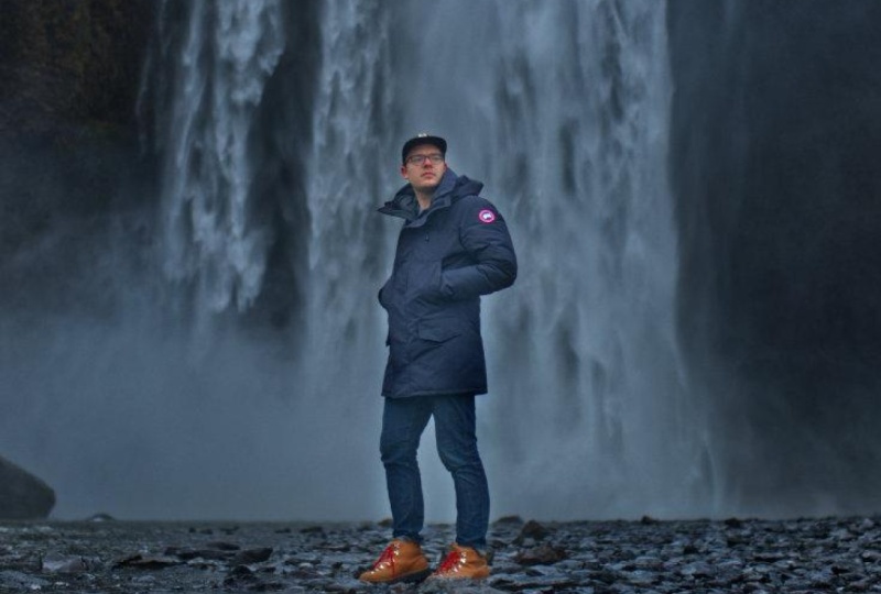
16. Waterfall Portrait: Develop Persona: This chapter, we'll do two
practice projects together, starting with this
waterfall portrait. To begin, we'll do our
editing technique, and you can already see, we need to bring down
those highlights. I'll just scroll down
to the shadows and highlight section and I'll bring the highlights
all the way down. Our histogram looks
a lot better now. I'll just scroll up to the
exposure and raise this up. You can see the red
starting to appear, so I'll back it up a little bit. And I'll do the same with the
Black point raising it up. And even with it
raised all the way, I don't see any of
those blue spots. So I think this looks
pretty good for this photo. That was super easy. So now that we have all of the information inside
of our histogram, I'm going to come up
here and press develop. All right. Now that we're
in the photo Persona, we can keep on
editing this photo, which we'll do in
the next video.
17. Waterfall Portrait: Photo Persona: In this video, we'll edit the Waterfall portrait
in the photo persona. There's 1 million
different edits that you could do in
the photo persona. But let's just review a few
of the most important ones. First, a very important
edit that you can do is cleaning up your image. I like to do this
at the very start. I'm just going to add
a new pixel layer by clicking on this
button right here. Then I'm going to go over here to select our in painting brush. And then I'm going to
change the setting up at the top to current
layer and below. With all of that prep work done, now we can go ahead
and zoom into our picture to remove
any problem areas. So up here, there are
a few birds flying, and I love birds. Don't get me wrong,
but they're so out of focus that they
sort of look like dust specs in this photo. So I am going to paint
over them to remove them. You can continue your
cleanup to clean up any other areas that
you find distracting. If you find these white
specks distracting, you can go ahead and
remove a few of those. Or if you see anything on your subject that
needs cleaning up, you can go ahead
and do that now. I think he looks
pretty good, though, and I'm not seeing
anything down here. That was very easy cleanup. Now that we have that step done. The next thing I like to
work on is the lighting. Let's go ahead and do that. I'll come over to
our adjustments, and I'll select a curves
adjustment. All right. First, I think this photo
looks a little dark and dull. I'm going to add an S curve with a little bit extra brightening on the
highlight side, and then I'll bring down the shadows a little bit like that. Okay. That looks pretty good. Now that we've adjusted
the overall lighting, we can go ahead and do
some targeted lighting to make our subjects
stand out even more. I'm going to add a
curves adjustment. And for this curves adjustment, I'm going to darken Then I'm going to
invert this layer by pressing command
or control I. Now this is applied to nothing. We can grab our
paint brush tool, and we can paint in white paint. Now we can softly apply this
darkness to the background. I'm just going to increase the brush size using the
bracket keys on my keyboard. I'll make sure I'm painting with 0% hardness and a nice low flow. Then I can go ahead
and begin painting. Just softly painting
this around the edges, especially on the
mountain here. All right. Now you can see by
darkening the background, our subject stands
out a lot more. I'll just paint a
little more right here. The lighting is
looking pretty good. But now that it's brighter, we can see that the
colors are way too saturated in this photo,
especially his shoes. I'm going to fix
this by applying an HSL adjustment In
the main color channel, I'm just going to
shift the saturation downward until it starts
to look normal again. I think around 25% for this
picture looks pretty good. I think this looks really good with all of
our adjustments. Let's just do one more
step to finish this off. I want to straighten
this photo since it looks a little tilted right
here in the horizon line. So I'm going to
select the crop tool. Then I'm going to select right here where it says straight in. Now I can just click
and drag across that backline and when
I release my mouse. You can see that
this straightens it out and it even trims it inward, so we no longer have
transparent edges. I'm just going to press apply. Then I'm going to select
all of the changes we made by holding shift and
clicking on the last layer, and we can see the
complete before and after of all of the work that we did
in the photo persona. And with the Magic of editing, I can also show you what
this picture looked like as a raw photo and what we
have now so much better. I hope you enjoyed taking a raw photo from
start to finish. In the next video,
we're going to do another practice
project together.
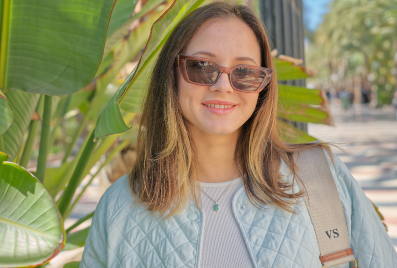
18. Sunglasses Portrait: Develop Persona: This video, we'll begin editing another portrait in
the developed persona. Once again, we'll use
our editing technique to adjust the histogram.
I'll scroll down. Check on shadows and highlights and bring the highlights
all the way down. Then we can go back up here
and I'm going to raise the exposure slider until we start to see those
red spots appear. This is way too bright. I'm just going to
back it off a little extra. There we go. Then I'm going to raise
the black point up, and very quickly, we can see blue spots in the
shadows of her hair. So I'll just back that down. Okay. Now that everything is in the histogram and our
picture looks good. I'm going to press develop, and we can continue editing
in the photo persona, which we'll do in
the next video.
19. Sunglasses Portrait: Photo Persona: Let's finish up the
Sunglasses portrait project. First things first,
I want to start with doing some cleanup to
remove distractions. Let's start by adding
a new pixel layer. I'll select the in
painting brush tool. Then I'll change our setting
to current layer and below. And now we can zoom in and begin editing away any
distractions we see. So I'm just going to start by removing some of the
dust on her sunglasses. Then I'm going to
start removing some of the flyaway hairs
that stand out. As I'm painting
away the blemishes, I just want to mention that
when editing people's faces, it can be a sensitive thing
to remove too much from them. I like to only clean up
things that are temporary. This model won't have these
exact flyaway hairs forever. I can remove them, no problem. Same with any little dots of acne or flex of
dust on her face. Those things might last a week, but they're not always there. For this model, she does
have a few mold on her face, and I think it would
be best to leave them unless she asks
us to remove them. I'm just going to
continue painting painting until I've removed everything that I
think is distracting. H. All right. I think that looks a lot better. Now we can go ahead and
adjust the lighting to make our subject stand out
more from the background. To do that, I'll start by
adding a curves adjustment, and I'm just going
to do an S curve to create more contrast. So Brighter highlights,
darker shadows. Next, I'm going to create a little more darkness
for the background. I'll add a curves adjustment. T. I'm going to darken
the background. I'm mostly looking at the
background over here for this. I don't want so many
highlight spots. I'm going to bring
this highlight node down to dull those, and I'll bring this one up to dull the shadows
in the background. You can see the background
looks a lot more dull. Now I'm just going to invert
this layer with command or control I and using
the paint brush tool. I'm going to paint
in white paint on this black mask to
reveal that darkness. I'll paint it over here
on the leaves as well. We want all of the focus to be brought in toward our subject. Here's the before and after
of bringing the focus inward. I think that did a good job
of darkening the background, but now our subject is looking a little bit dark and I
want to brighten her up, so there's even more contrast. I'm going to add another
curves adjustment. Just watching our subject,
I'll brighten this up. That looks good.
Then I'll invert this with command or
Control I so that I can paint it in white
paint just over our subject. Just making my brush a
little bit smaller with the bracket keys so I can
have more control here. All right. Now, I'll select
both of those layers, so you can see the
difference before and after. Now she's clearly the
star of the picture. Okay. That was a lot of
lighting adjustments, and I think it
looks a lot better. So now we can go ahead and finish this off by
adjusting the colors. Personally, I think
the background just looks a little
bit too saturated, especially right up
here with the blue sky. So I'm going to add
an HSL adjustment. Then I'm going to lower the overall saturation
just a little bit. Then to take care of the sky. I'm just going to go to
the Cyan color channel, and I'm going to lower
the saturation down. You can see that helped, but not all the way. I'm also going to go to
the blue color channel to continue to lower
the saturation, and I think that looks a
lot better for that area. Here's the before and after. All right. Great work. I'm just going to select all of our layers so that we can
see the difference we made before and after And that was just in
the photo persona. Here's a before and after of our photo from raw to finished. I think this photo
looks so much better, and I really like how
making the subject brighter and the background darker can help our subject
stand out more. It's a subtle trick
that I think really helps to make our subject
the star of the show. All right. Now that you're
finished with this chapter. In the next one, we're going to learn all about
batch processing.
20. Batch Processing: Preset Method: In this chapter, we'll learn about batch processing
raw photos. Even though affinity photo isn't really meant to do a lot
of batch processing. I still have two methods
that you can use for your photos to speed
up your editing. Let's start with
the preset method. For this method, just open one of the photos
from your batch. We're going to start by editing this photo to
get the lighting right. So I'll scroll down. Check on shadows and highlights and bring the highlights down. Then I'm just going to
increase the exposure. Even though no red spots
have appeared yet, I can see that we're already cutting off some
highlight information, which is a little strange. Affinity usually will tell
us when that happens. I'm just going to eyeball
it looking at the graph. Maybe I'll brighten it just
a little bit to fine tune. That looks pretty good. Then I'm going to bring the
Black point up. You can see pretty quick, we've lost some
shadow information. I'm just going to back that off. I guess this photo didn't need much editing because our
histogram looks pretty good. Now that I've made
those adjustments, I can turn those
adjustments that we just made into a preset. I'm going to go where it says preset at the top
of the basic panel. I'll click and then
click Add preset. Now I'll just rename
this and press. With that preset
made, we can quickly apply these four changes
to our whole batch. To do that, I'll just open
up another raw photo. Then I'll just come over
here to our presets and I'll apply the Alley photos
preset that we just made. And now you can see all of our changes have been
applied to this new photo. So with this method, you will have to do
this one at a time, but it still speeds up the work because you don't need to adjust the sliders for each one. And when you've finished
using this preset, you can go ahead and delete it. So go down to where it
says delete preset. Do you want to
delete Alli photos? Yes. And now it's gone. This method is best for editing a small photo shoot with
around two to five photos. In the next video. I'll show you a method that takes
a little more setup, but you can use it
with more photos.
21. Batch Processing: Macro Method: Let's learn the macro method
for batch processing. This is a great method, but there are a lot of steps. I'll walk you through it all nice and slowly, so no worries. It's definitely worth
it to learn this. Step number one, open
up your raw photo. Don't make any edits
to it quite yet. We just want to come up here and choose one of the raw
layer output methods. It doesn't really matter which
one of these you choose, but just know that all of the batched process photos will be processed in
the exact same way, whether you choose
linked or embedded. H Then go ahead and press develop so that we can
go into the photo persona. Now that we're in
the photo persona. We're going to set up a
few panels that will help us to record the steps that
we take for this photo. To do that, go to the top
of the screen to window. Then we're going
to add two panels. First, the library panel. I'll just click and drag on
the word library until it overlaps with the tools so that we can dock
it right there. Then I'll go back up to Window, and I'm going to also
add the macro panel. I'll just place this right
next to the library panel like that. All right. These panels will allow us to record a series of
steps for this photo. Then later we can apply those same steps to a
whole group of photos. The next step is to make a macro category in
the library panel. To make a new category, go to the Hamburger
menu and then click on Create New category. You can call this
whatever you want. I'll press. Later on, we'll use this category to save our macro into. We'll
come back to that. The next step is going to the macro panel and pressing
on the red record button. Now that we're recording, any action that we take on our photo will be recorded
right here as a step. The very first step we need
to take is we need to go back into the developed persona so that we can
adjust our sliders. Now, normally, because
this is a raw image layer. We could just double click and go back into the
developed persona. But sometimes when
you record macros, there's workarounds you need to do because it
doesn't always work. I just tried double clicking
and this error came up. It's not going to
allow us to do that. I'll press cancel. Instead, I'll come to the top of the screen, and I'll click on the
developed persona right here. Now that we're in
the develop persona, we can make the changes that we want to make for this photo, and I'll just do the same thing that I did in the last video. I'll bring down the highlights. I'll raise the exposure a
little bit and the brightness. Then I'll bring the black
point up just slightly. Now, with all that done,
I'll press develop. Over in the macro panel. You can see our first
step is recorded. We've made those changes
and developed the photo. Now that that's done, and we're back in the photo persona. We can make any
other adjustments that we want to this photo, and all of those steps will
be recorded right here. I'm going to add a
couple of adjustments, starting with a curves adjustment
to adjust the lighting. I always like how
an S curve looks. I'll just raise the
highlights and lower the shadows to create
more contrast. Then to adjust our colors, I'm going to use a different
adjustment this time. Let's use the color
balance adjustment. This adjustment allows us to affect the colors
in the shadows, mid tones, and highlights. I'll start with the shadows, and I'm just going to add a
little bit of blue to them. Then I'll go into the mid tones. I'm going to warm things up by adding a
little bit of red, a little bit of green
and some yellow. Now, I already
decided that I was going to make these
changes beforehand. That's why I'm
going pretty fast. But you can take your time with this making sure to get
the colors just right. Okay. Now that we've
warmed things up there. I think the colors look great, the lighting looks great. I'm done with this
macro. To finish. You're just going
to come over here and click on this Stop button. Then we can save
all of our steps by clicking right here to add
this macro to our library. We can choose which category
we want to save this in. Then we can give this a name. I'll press. Now we have this macro right here that we can use for our other photos. Now, to apply this to
multiple photos all at once, we need to create
a new batch job. Let's go up to the
top of the screen to file new batch job. From here, there's a few
things we need to input. First, we need to
add our photos. I'll just click and
drag like that to select them all and
then I'll press open. Those are all ready. Next, we can change where they're saved. I'll click on Save into. I'll click on these
three dots right here. I'm going to save them into this folder that I created
before this video. With that selected, I'll press. Then we can choose how these
are going to be saved. By default, it will save it as an affinity photo file so that we can go back and
make any adjustments, which I think is great, and we can also save
them as a JPEG. If you just want to see
them exported, Okay. Last, we need to
choose the macro that we want to apply
to all of these photos. I'll click here to change the
category to alley photos. I'll click on the macro
that we just made, and then I'll press apply. Now, all we need to do is press, Affinity will work super hard on these raw photos to apply all of those changes to all
of them at the same time. This will take a little bit of time because raw
photos are large. Once they're done, you'll see how worth it
all of this was. Here's how they all turned out. I think these all looks so
nice with these changes. Because we save them as a
JPEG and an affinity file, we can open up any of the
files and adjust the edits. In this folder, I'm just
going to select one of these. I'll double click to open it. Right now back in
affinity photo, we can make any
changes that we want. I think the lighting and
colors look pretty good. But we can always do our
little trick to make the background darker
and our subject lighter. Let's go ahead and do that. I'll apply a curves adjustment with the goal of making the
background look dark and du. I'll darken this. I'll
raise the shadows so that they become more gray and I'll lower the
highlights as well. I'll invert this with
command or control I. Then I'll grab my paintbrush
tool and I'll paint in white paint on this black mask to apply the darkness
to the background. Now, you might be
wondering why we didn't make this a
step in our macro. That's because our
subject is standing in a different location in
each of these photos. Painting on a mask
really doesn't make sense when you're doing
macros like this. With the background darker, let's do one more to
brighten up the subject. I'll just brighten
it a little bit. I'll press command or control. Then with a smaller brush, I'm going to apply
this to our subject. Like of that looks good. I'll just elect both of these
layers so that you can see the before and after of
our little editing trick. I might have made this
a little too intense, so I can always lower
the opacity to make it less intense after. Now I just want to
quickly show you the before and after of
all of the edits we did in the photo persona
before after All right. Very nice. With that done, now you have two strategies for batch processing raw photos and affinity photo. Great job.
22. Class Conclusion: Congratulations. You
finished the course. I know that was a lot to learn, but now you're
totally prepared to edit raw photos like
a professional. Thanks so much for
watching and I'll see you in the next Affinity
Revolution Tutorial.
 Affinity Revolution, Affinity Instructor