Transcripts
1. Introduction: Welcome to the world
of Gustav Clemt. In this class, we'll
be diving into a fun, creative process that
combines art prompts, mixed media techniques, and the unique artistic
influence of Gustaf Clemt. This class is an
excellent adder to the Clemt Master study class
I have Golden Insights, Exploring ClemsPatterns
for your artistry. Together, we'll
explore a selection of creative prompts that
will guide you to paint a large vibrant piece
of watercolor paper filled with rich textures,
marks, and designs. Once our piece is finished, we'll cut it down into artist
trading card size pieces, turning them into a personalized
deck of many artworks. On the back of each card, we'll write a prompt
to be inspired by creating a deck you can pull from anytime you need a spark of inspiration, future projects. Denise Love, an artist
and creative educator. And I'm excited to
bring you this fun and exciting dive into Art Prompts
inspired by Gustav Clemt. Whether you're a
mixed media artist or simply looking for new ways
to push your creativity, this class will leave
you with a set of unique cards to use again and again. So
let's get started. Okay.
2. Class Project: This class, we'll
be creating a set of personalized
artist prompt cards. You'll start by painting
a large sheet of watercolor paper using
mixed media techniques. Once your sheet is filled with vibrant clift inspired
marks and designs, you'll cut it into artist
trading card sized pieces. On the back of each card, write one of the prompts, turning your cards into a handy deck for
future inspiration. Don't forget to
upload a photo of your finished cards to
the project gallery. I'd love to see what you create.
3. Inspiration: Hello, everyone.
Let's take a look at where the inspiration for
this class came from. I did a master class on Gustav Clems last year
called Golden Insights, Exploring ClemsPatterns
for your artistry. It's my very favorite master
study that I have created, and it's been one of my most
popular classes to date. In that class, we studied
not the whole paintings of Gustav Clemt because doing a master study is an
overwhelming process. But we studied parts of his paintings and got in
close where we could see all the patterns and the mark
making and the elements in each painting to
see what part of that we could bring
into our own work. So, for instance, this is
the kiss by Gustaf Clemt. And what I did was
look in each painting. And if you need to see it a little bigger
because I do have the big version of this book by Tashen
there's a little version. You can take a
picture of a section and zoom in on it to really help you see what's going on in the different
parts of the painting. And so what I did was I
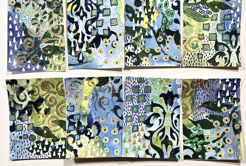
took different paintings in here and created little squares
of elements that I liked, the patterns that I could see
and the things that maybe I could take with me further
into my own art practice. And the further I
get away from having studied Clemt and doing
that master class, I get to where I forget some of the elements that maybe
I wanted to include, so that got me thinking, how can I dive back into using the
elements that I really loved? Which, you know, uses a lot of gold, and I use
a lot of gold. So that's not the
problem that I run into, but I do run into thinking, what favorite
elements did I love this little coffee bean
look with the dots, the little circle rope
line kind of thing. Like, which of these elements
do I want to kind of prompt myself into using in different
pieces going forward? And so I thought that a
perfect companion class to the original
master class would be the perfect way to remind you
of the elements that maybe you loved and maybe
you're forgetting or you just don't think
about it as you're creating. Then the other inspiration
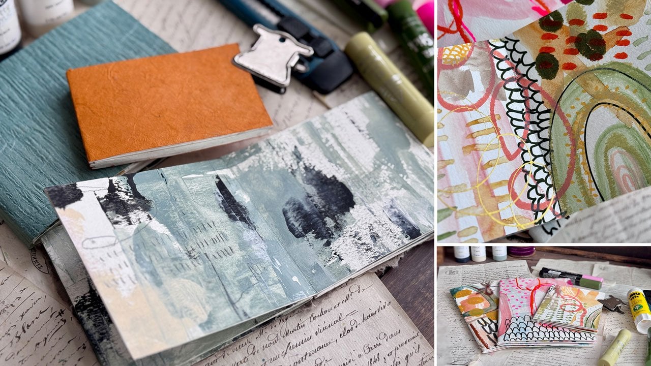
for this class is, I have a problem. I collect decks of cards, and I particularly love
art journal prompt cards. I thought, What if Gustav
Clemt was our teacher, and he wanted us to use the
elements that inspired him? What would he tell us to do? Like what would he teach
us to the elements. What could we pull
from his work to go forward so that Gustav
can still be our teacher? So, we can make, for instance, um Art prompt decks, giving you some
ideas on how you can use some of the stuff we're
going to do going forward, but you can make art prompts where this is the Get messy
art journal prompt deck. I've just got this recently.
I actually really love it. But it's where you
have something painted on here, which is
what we're going to do. We're going to paint a very
large sheet and cut it down into smaller pieces and
then put a prompt on it. This one, the backside is like
a piece of journal paper. The front side is a painting. The backside of all of these look like a piece
of journal paper, which I particularly
do love that. The front side is
different paintings and different prompts, and you can flip
it over and read more about what that
prompt is telling you. For instance, this one is color and you flip
it over and it says, red, blue, yellow use
only the primary colors. You see how pulling
a prompt could then give you a
direction in your art, and I love pulling prompts, and I love pulling colors, and the color cue
is a prompt deck. That's a particular favorite
of mine by Sarah Renee Clark because I find color exciting and frustrating and
infuriating and fun. I've studied it since
I was in college because I have a degree
in interior design. We learned some elements of color and how they work in your interiors and how
you live with color. So I find color interesting
and frustrating and so I have discovered in my own art
practice that if I start with a color card of something that I already
think looks rather lovely, or I pick something
completely crazy, which is what I tend to do, pick things that I
never put together, and I'm like, Okay, what
can I do with this? Then gets me started on my art practice for
that day rather than being stuck on what colors
do I even start with? What do I want to
make? What do I want to use in my piece? Then I end up if I'm starting blind and I don't
even know where I want to go, end up frustrated and stomping
away from my art table, wondering why I even make art. I've discovered to get
me over that hump, if I will pull a prompt
card or a color card, I've already eliminated that
part of the process for me that I find very
frustrating and I find much more enjoyment
from my art practice. And with the
creating of the art, that's why I like
different art prompts and things that kind of
gets you through a rut. That's why in this class, I want to make an art
prompt det based on Gustav, but you could also make decks that are more positive
affirmation decks, that kind of thing. These are really
beautiful from an artist, the wisdom of the forest and intuitive card deck that I had gotten a couple of
years back and I just thought her art was beautiful and hers are on a
bigger sheet of white paper with
a piece of art in it with the prompt
below on the back side, you could have written out
what you want for the prompt. That would be an
interesting idea for these if you
wanted to do something more like that
rather than the art covering the whole piece
in this inspiration piece, the art is the whole thing,
and the art is a square. So I'm just showing you
some that I've collected, giving you some ideas of other
things that are out there. This do it for the process deck is an affirmation card deck. I've always loved it
from Emily Jeffords. And again, it's the
whole piece of art, in this case, photography, and on the back side
is your affirmation or your clarity or your art prompt or whatever you'd like to do. This one is an Enquirer
within art deck. Which is rather lovely. It's just a design on the back and some fun
sayings on the front. Get out of your own way, gratitude, seeing things
for what they are. You can also pick out quirky fun sayings
and stuff that you want to do for a deck. This is who did I get this from Inquire within
Worthwhile Paper Company. So worthwhilepaper.com. Who knows where I
actually got that. Here's another color pilot deck, the Pilot Scout
that I had gotten earlier this year that I
thought was rather interesting, it's another way to work
with color and pull cards. So you can see my
intense interest already in cards and card decks and I
like to make my own. And I have showed off. I'm going to show you
the rest I got here. This is also from an artist. This is from who is this from? They came up in my
Instagram feed. Blair artwork.com,
and she just got solid color on the back
and then a fun prompt on the front of the card. That was fun. Hers also is a bigger sheet with a piece
of art in the middle. That's interesting. Hers go through what is your
substrate and maybe pick a color card and then maybe pick the material of art material that you're
going to work with. That's a fun, interesting
way to approach a deck. She had several, so I got
a couple of her decks. This was another deck that I had found last year and be brave. That's one of my own says that I use in a lot of
my art, be brave. To be an artist is
to be an adventurer. Encouragement. These are
encouragement cards, stronger, wiser
embrace adversity. These are just says, but again, another card deck
I felt I needed. And the collar meditation
deck. I love this deck. It is also another
art prompt deck that you go through
and pull some prompts. These are a little bit larger, so it's interesting the size, but you've got some type
of art on the front and then some art instruction
there on the back. That too is another fun
way to approach your art. I also have another deck That I particularly
love from an artist. Let me go grab it
because beautiful. And I love supporting
other artists, but this is the art poetry
deck by Alison Durant, and she has beautiful
affirmations and a lovely piece
of art on her deck, and then the back is
just all the same, which on printed cards, this is easy to do
because you can just pick that and have
them print that on the back except the meaning in the darkness
allow for abundance. So this is the kind of
card that you could pull and kind of just intake
before you create your art. So I just wanted to
give you some ideas. And so you can kind of see
where this is something that I would naturally gravitate to because I already
collect and make cards. And one version of this that
I have done in the past are my art prompt cards here that
I keep in a little dessert. Dish on my art table, and this is the exact idea that I'm going for
in this class, but in a little tiny
different format. But these are little cards
punched out of pieces of art that I didn't love
for one reason or another, on the back was some
lovely art prompts. This is where I'm
going with this class, but with the mind
of Gustav Clint. What I want to do
is explore with you different things
that I feel could be interesting for art prompt cards and spur us into a direction. I have come up with
60 art prompts that we can use on our cards, and I'm going to put this
PDF here in your class. It'll have a cover
on it, obviously. But this is 60 prompts
that I have come up with. And then I've also put just the main part of the prompt on a sheet that
you could cut these out. You could just cut the words out and collage them
onto the front of your piece of art that we end up with if you wanted to
and then you could also, in addition to that, you don't have to do either one of these, but I just giving you options. Um, but in addition
to that, I've actually got the art prompt card itself, like
circular repetition. Then it tells you what
that prompt means. These are open to
interpretation. I've tried to be as clear
and concise as possible, but at the same time, you
might interpret these in a different way than maybe
I would interpret these. So circular repetition, draw
concentric circles and fill each one with a
different texture or material like collage,
paint, and pastel. So that would be one
way to interpret that. You could also say
circular repetition. Maybe I'm doing a lot of marks, and those marks are, you know, circles and stuff. So maybe this is a circular repetition or this
is a circular repetition, so you can see how
you could go in different directions with
each of the prompts, and you might even read
the prompt and say, well, what does that even mean? And so it can mean whatever
you want it to mean. And if one of these
really doesn't resonate with you, leave
it out if your deck. I've given you 60
choices, which is a lot. So if you want to make a
deck of say, 40 cards, you could pick your favorite 40 or you could pick
your favorite 15 or your favorite 20 or your
favorite all 60, I don't know. But I've tried to be really mindful and giving
myself away that I could pull from Clemed inspired marks and get
back to my master study. This is something
that you could do for any artist that you've
done a master study on. If you've done,
Vangog and you want to remember some of the marks and elements that you
studied in his work, you could make yourself
a set of prompt cards that then pull that back out of you later as you
get further from the study and you forget
what you liked about it. And so I've also
printed these just as an experiment on
some translucent paper, and I'll try to find
a link to this paper, but it could be any
paper that you want. And I've got a
little cover here. I'm going to change the covers. That's why I didn't have
the cover out here. This is it could be
an onion skin paper or is it just says on it
clear translucent paper. I'm sure I got it off at Amazon, so I'll try to find this. For us, but it came
with 100 sheets, and I put it in my
printer to see, would this print
out, and it did. I printed out beautifully. And so the reason I
wanted to do that. So then if we collage
this down to, say, the B of our art that it
would kind of, you know, blend in a little better than a real thick piece of
just white printer paper. So I thought options. You could also maybe
print these on, you know, a colored card stock or any paper that
you happen to have, you can get creative with
what you print these on, but I just thought trying out a translucent paper might
be pretty cool too. This is the inspiration
of the class today. All the decks that I am already obsessed with buying
and collecting. In addition to my color decks, I like affirmation decks. I like art prompt decks. I love the different
creative things that people have come up
with to put on a card. I'm thinking artist
card size for these. I'm thinking that we
could put something on the back maybe,
something on the front, and then we would have a
lovely deck of cards to pull from as a bonus to a master study that
we might have done. I'm going to do it
based on Clemt. These are based on Clemt. We're pretending that
Clemt is our teacher, and what would he tell us
to do in our piece of art? I can't wait to
see what you guys do with this and I'll
see you back in class.
4. Supplies: Let's talk about the supplies that I will be using in class, and I want you to use
what you have on hand. You do not have to have any of the supplies
that I'm using. I created this class to be a fun companion to my
Gustav Clemt master class, golden Insights, but you don't have to have
taken that either. I'm simply taking
inspiration from some of Clemp's paintings
and being inspired by colors and
shapes and texture. And so lot of the paintings
that I've studied in class, we get in close. In the master class, we got in close and looked
at the different patterns and elements that he included
in a lot of his paintings. And in that class, I had gone through and done my own little mark making guide for some of the favorite
elements that I thought, oh, I'd like to take
that into my own work. So you haven't taken that
class, it's so good. We're studying a master without trying to paint
his entire pieces, but we are being very
inspired by pattern and elements that maybe we wouldn't have thought
to use in our own piece, and it's a way to grow your understanding of how
other people create things. That's why I like doing
master studies and I like to see the colors they
used and how they created. While I don't create portraits, I do like all of the overwhelming amount of pattern that he
uses in his pieces, and the portrait of
Adele Blackbauer and the Kiss are two of my
favorite ones to study. You don't even have
to have a book. This is the big Gustav
Clem book by Tashen. There is a smaller
version of this book which don't think I can see
as well because it's little, but I do like having
the bigger one. But you can pull these up on the Internet and look
and study and say, I love this mosaic pattern. I love these swirls. I
love his use of gold. Look at these little
triangles within these lovely art nouveau lines. I like this little
double circle thing that reminds me
of a coffee bean. I like the square on squares. I like how you have mosaic inspired patterns
in here, circles. I like how when you get into some other
pieces of his work, you will find flowers
and landscapes, and I'm just trying to oh,
I like this piece too. It's kind of dark, but I love the contrast
of black and gold. I'm pointing some of
these out because in our prompts that
I've got for us, me mentioning some of
these will help you recognize when we get
to those prompts, what inspired it and where you might could interpret
it for your own work. We've got flower gardens and flowers and I like how his
flowers are abstracted. They're not perfect flowers. They're more organic
shapes or circles. And so I use a lot of organic, abstract looking roses and such in some of the recent work that I've done and I'm pulling that inspiration directly
from the studying of some of the pieces that he
had done that I really liked. These are basically some
odd shaped circles with circles in the middle to make it the center
of the flower. You got little flower gardens. And so when we look at that, just blobs of color and circle. When we get to the prompts
and you're looking thinking, I wonder what that means, feel free to interpret it into however it's
going to inspire you. But they are different
elements that maybe that I gleaned from studying
the different things that Gustav Klemt did. So I love being able
to see the swirls, the circles with the flowers, see how you abstracted
some of that. A lot of flowy lines,
very art nouveau. That's his time period. I love the contrast of a vivid color in the gold
and the black and the white. The portrait of Adele Blockbauer and the kiss were my two very favorite to study because
they are just packed full. It's texture and layer because you've got
all this texture with the gold on gold, very much color on color. I like how much is
packed in there. You can't do too
much because it's just an amazing amount of stuff going on in there when you get
in close to really see, wow, look at everything that actually is
going on in there, but when you pull back and look, it makes a cohesive painting. So definitely check out the master study class if you
haven't taken that class, but it's not necessary, but it is where the inspiration for the prompts have come from. We are going to
need to start off with a very large
piece of paper. I'm using McCansnKanson, Excel, watercolor pad, it's 18 by
24 inch size, 140 pound. It's the student grade line, but in a project like this,
it doesn't really matter. And I like the size of it. Now, if you don't have a
big piece of paper and you got those nine
by 12 pads of paper, put several of those together, maybe tape it from the backside, so it feels like a big piece of paper that you're painting on and then you can cut those up just like
I'm cutting these up. I also decided to use a color palette from
Climps paintings. This was the kiss painting, and it was the colors that I had come up with as I studied
that painting and thought, Okay, what's this color palette? Let me paint a little
piece of that painting so that I incorporate that color palette coming
from that painting. I just pulled this back out from when I did
that master study. I was going to go
with a color card, which you'll see in class
that I pulled some out. But I decided if we're
going to be clemp inspired, why not use this color palette? You're welcome to look at
any of these paintings and pick a color palette
that inspires you, but this is the one
that I ended up going with and I'm using
these are not the colors. I just pulled a couple
down, but I'm using black matacrylic paints
for some stencil work. I am using for the
main set of colors, and I'll tell you what
those colors are in class. I am using the
Kurataki Watercolors. The KuratakiGenzi
Tambi watercolors. I pulled some from the 48 piece set and some from
the art nouveau set. I could have definitely
just used one set. The 48 set would
have been plenty. But I like some of the colors in here because I had it,
I pulled them out, and I pulled out
a nice selection of colors that matched
my color study. And that's what I ended up
painting my large piece with, and you can kind of see some
of those colors in here. And I'll be honest,
these are not colors I would have
put together myself. I never would have experimented and randomly pulled those out. But now that I've
painted this big piece, which even as
you're painting it, you're going to think,
oh, that's ugly. But when you're done, look
how amazing this looks. This is my leftover strip. But these are gorgeous. And now I'm like, now I
want to paint another one. So you're going to need
a big piece of paper. We're going to need some paint. That can be acrylic paint. That can be watercolor
paint with acrylic on top. I tend to now kind of like filling the page
with watercolor and then mark making and doing fun things with acrylic
paint on top of that. So that's the way I went
with the prompt cards. And then you're going to need a printout of the
prompts or you can look at them on your
electronic device and write them out if you
don't want to print them out. But I thought it was
fun to print these out and then I glue the
prompt on the back. And then I find
the matching piece in here because we've
got prompt squares that you can just cut these out. I just cut these out
of the big sheet, and then there are 60 prompts, pick the prompts
that speak to you. You don't have to do all 60, pick out what is
appealing to you. Then I had some little name
plates that match these, so what I ended up thinking was cool was having the prompt on the front just glued
down and circled with some crayon or whatever material you have that you want
to incorporate that in. Then if you flip it over,
you get the prompt. I did try to pick
pieces that I cut out. I tried to pick pieces that
had those elements on it. So what you might
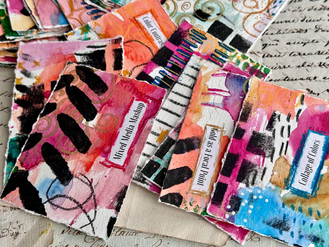
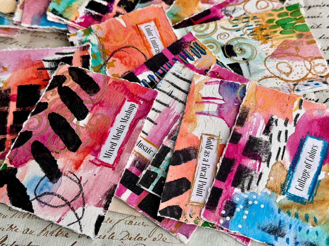
do to begin with, this is gold as a focal point, so you can see the gold
and then it gives you a little more information
on the back to spur you on. But what you might do
is take a look through all the prompts and read
what it is and then say, how many of these can I incorporate into the
Great Big piece? Whatever your interpretation
of the prompt is is fine. How many can I incorporate? Then when you cut
it up into these Artist trading size cards. These are 2.5 by 3.5 inch. Now you can pick and choose different pieces that
match the prompt, color contrast chaos and
it tells you what it is, a collage of colors. Now you're not just pulling
a random piece and thinking, Oh, what do I do with that? Now you've got a little bit of some painted inspiration to go with it, contrast in scale. We've got some different sized
elements. Lines of gold. I've got some gold
lines in there. You can see if you
pick a card that doesn't match what you
wanted to go with it, this one didn't have
any gold on it at all, I added the gold to it so then it did match what
the prompt was. I think that's fun to make
these more meaningful and actually match the prompt so you can cut it all up and then when you're
looking at the prompts, and you're like, what is
going to match each piece, and then how can I further
embellish it if I need to to make it really makes
sense to me as I go forward. Definitely printout or at
least be looking at these to be able to write or cut
out and glue on your pages. I've got just a random catalog
that I use as a glue book, you'll see that in class and I'm using as my glue my hu stick. A glue stick is all you need. You could use MP medium. This could be also
finishing piece on there and I do at the very end show you talk for just a
moment about finishing, so you might consider
having some fixative or some varnish available to spray your cards if you're
wanting to protect them. You could also have
self laminating paper, which I had a if you
want to laminate some of these because I did laminate a couple just to
see what that looked like. But I do not have a
laminating machine. I just used self adhesive
laminating papers. That is an optional thing. I like the feel of
these not laminated, I did a couple as a test
and it works out great. But I think I'm going
to leave mine like this and maybe just spray
them with a finishing spray. Just my personal
preference there. Also, a variety of
stencils is fun, so stencils that
are your favorite, it might be fun elements. You might look through
the different prompts and see if you have any
stencils that match. A lot of the mark making
stencils are fun and really fit well into a clempt
inspired piece. Any of those stencils, I liked these square
grid stencils I liked these brush marks, so you don't even
have to do stencils. You could do all your
mark making with a brush just ideas. I have a swirl stencil, which I don't know
where this came from, but you could probably
Google swirl stencils, or there are some clempt
inspired stencils on joggles. Have a look around at what you got and what you
might want to use. Then also any mark making
things that you might want. I like to have in the
neoclorT crayons available. Because that is how I circled the words that I've
glued down on the front, so it incorporated
that little piece into my art and it wasn't just
a little white piece of paper stuck down. Anything like that, I wanted to use something like the No
color to crayon versus soft pastel or oil pastel because this is not going
to smear and continue to get on my hands
and would need less finishing than other
types of pastel. You could also use
Stabil Woodies. I did not use those in class, but I'm giving choices here, just giving you some choices. But the little Woodies
would be fine. That's a good material for that. Pasca pins would be great. So if you got any colored
pasca pins, pull those out, and that would be a good
supply to be using in this. It's basically a great big sheet of chaos that we then cut into delightful little pieces
of art that are now our art prompt cards and I love these when
you cut them up. Look how lovely that is with the gold swirls
on it and stuff. It's like punching hearts. I love cutting stuff up and these are beautiful no
matter where they got cut, and they're perfect
for the prompts. Any supplies you
have that you like, I want you to get those
out and be using it, and that is the basics of class. It's not a whole
lot, a big piece of paper that you're
going to go crazy on. And then we're going
to cut that up. I do have a big ruler
because I did mine with torn edges where I tore the paper so you
had a fun edge on it. You could use that
with scissors, that's your choice.
That's basically it. Anything that you're feeling
that you like to use, I want you to get those out
and you'll be good to go. I can't wait to see what your lovely prompt cards
end up looking like. Definitely come back
and share those with me because this
is super exciting. You do not have to
do all the prompts. I've given you 60 prompts, which I've cut out one set for myself there to be making mine. But what I want you to do is find the ones that speak to you. If you read one, and
I've given you the word and then I've given you a
little information around the word so that maybe you
can look at it and think, oh, that's very interesting. I'm going to use that prompt
like organic geometry. You circles, triangles
and squares to construct an abstract landscape. I didn't do a
landscape, but I did a random triangles and crosses and different
things in my pieces. Interpret them, however,
it feels good to you and then look through. And if there's some
that you're like, that's not really
speaking to me, feel free to pick and choose the ones that
you like the best. You have 60 prompts to
pick from that I did, and then you could make some
more of your own prompts as your looking through and something inspires
you or comes to you. If you want to make a
deck of 30 cards and pick the 30 prompts
that speak to you, that would be a good
way to approach this. If you do that big
sheet of paper, you end up with 40
something pieces, 40 something prompts
would be good. So you could pitch out a couple
that you just don't love. But that's why I gave you extra. I took a lot of
brainstorming to come up with lots of Clem
inspired prompts. We're pretending like
if we were goosed off, clammed what prompt
would I give a student is where I was thinking and
what my mindset was there, maybe some of these speak to you and then they'll push you in a different direction in the art that you create on
a day that you're stuck. I can't wait to see
what you create in class. Let's get started.
5. Painting First Layer: So let's get started on painting
our big piece of paper. And depending on how
many cards you make, you may need to paint
more than one piece, but for class, I'm going
to start with one piece. And there's a different
ways that we can approach picking a color. So if you want to be true
in your artists study and pick something from
the color palette of the artist that
you're studying, then that's one way to do it. So for instance, in
this master class, I did the kiss as a
color palette study. And so this would
be an excellent way to be inspired by, for instance, Gustaf KlemtT was the kiss
that I was inspired by, so you can see where
I chose to pick a little section and focus on what are the patterns and
the colors in this piece? That would be an excellent
way to get started. Another good way
would be to pick a pilot card like I
generally enjoy doing. Now that I'm looking here at my pilot card that I was
actually going to be inspired by this is from
Color cube two card 293, I can see that most of
these colors are actually in this color palette thing
that I created from the kiss. So now that I've pulled
that out and looked at it, I think that's the
way I'm gonna go. So let's just pull
out the color palette that I studied from this
piece and go with that. I'll stick this in
here so I can find it. Easy when I come back to look at it again because
I'm sure I will. In this, I'm going to use a
lot of different techniques, and so part of
Clem's work that I admire so much is all the layers and the mark making that we find
in his pieces. So I want to be able to have a layer of perhaps
collage material. If you've got some
collage, old papers, jelly prints, old arch you're
no longer wanting to use, you could put those down first. I'm going to start with
paint or some mark making. We're going to cover the
whole layer the whole page with the collage if that's
what you want to do, the paint, if that's
what you want to do, some mark making, and
then come back on top of that and add more
marks and interesting things, maybe some stencil work until
the point that we're like, Okay, I think I'm
ready to cut this up. I'm starting with a very large
piece of watercolor paper. It's the largest watercolor
paper I happen to have, which is this Canson XL. This is the 18 by 24 size or
if you're doing centimeters, 45.7 by 61 centimeters,
140 pound. This is their
student grade paper, so it's not their cotton paper. But that's okay because
on a project like this, it's not really about the
paper you use so much as it is about covering the
entire surface and having fun painting. I've pulled out my
Kurataki watercolors, and I think for this, is there a color in here? I might go ahead and
just pull some of these out and have them ready.
So actually there are. This is the art
nouveau set that I've got that I'm pulling from here. I do like to just pull
colors out at the beginning so that I don't have to search
them out in the palette. This bright red
one maybe is this. Then in the end, if I end up with it correct
or not, it's not a big deal. It's not something
I stress about. I'm just giving myself a
direction and some fun. Let's do that. I'll tell you what these are
in just a moment. I'm just picking and choosing. Things that might be close
and they may not be close. We may paint that on
there and think, Whoa. Maybe I want this one instead. Green gray. Let's do that one. Then we've got gold, I'm
definitely going to be doing some gold as we
get further along. But let's just see
what we've got. I've got 55 ridian and I've
pulled Turquoise Blue number 62 out of the This is the 48 piece set and the art
nouveau set, 37 purple. That might be more
purple than rose matter. Let's see. Let's do, here's rose matter. Let's
pull rose matter. There we go. Instead of purple. Okay, this one is
36 Rose matter, and I was using acrylic paints, so these are not actually
going to match up exactly. This is three oh four
Lazar and crimson. This one is five oh
four green gray. Even though I had started on this sample with acrylic paints and you can do these
in acrylic paints. I choose to start with
watercolor because I like it. You could do this whole
thing in acrylic paint, if that is your go
to paint surface, you don't have to paint with
what I'm painting with. This is three oh two vermilion and four oh two Mars yellow.
I'm going to put these away. That's my color palette
for getting started. We may deviate from that, but that's where we're
going to start and then I'm going to save my gold and silver and stuff for maybe
the upper layers, but I just needed
something to get started. And the goal is to cover
the entire page with paint. And there's a little bit off of each side that's as far
up as my camera will go. But I thought we
would get started together and painting
the surfaces, and then we can let those dry, and we'll be ready to
go to the next one is my Princeton Neptune set that I really like
watercolor set. And it's got four brushes in it. It's got the Aquarelle
three quarter inch, which is u this one, which is a big wash
brush and it's got a round for around 12
and an oval wash half inch. I love this oval wash
one for mark making. I like the round ones for painting leaves and
things like that. I like the wash brush for
covering more space and stuff. The goal here and I
could have drawn on this paper before I even
started adding color, but the goal here is to paint the whole surface
and get us started. With our inspiration pallet. If you like acrylic
paint, do it with that. If you like acrylic inks, totally should have put out some acrylic inks, shouldn't I? That would have been fun. Yeah, you can do this
with any of that. I probably wouldn't
do it with oil paint my preference because
on a project like this, I want to go ahead and get it started and be doing
stuff with it, but um, just
whatever you've got, there is no right or wrong. Whatever brand of
watercolor you have, whatever colors you want to use, whatever your inspiration
is, it's all good. There's no wrong way to
do something like this. So to another thing real
quick before I move on before I continue painting
and speed this up for you. A lot of people ask me why I hold my brushes
when I paint like this Because I like the way that the paint
covers the page. And so in general, I'm using scrubbing motions and stuff because when you use the watercolor brush,
with just the tip, you're usually holding
it like this and maybe I'm painting stuff
like this and you see how very exact and
formulated that is. And when I paint like this, it's a lot more organic
and free flowing and you don't end up with those brush lines and marks like you did when you were holding it
up painting with the tip. I thought I would just
start mentioning, why do I do that? That's why. I'm not looking for rigid, square tipped things that
are painted when I'm done. I want it to be more organic. I want things to look a
little more natural and be less exact if I were painting
it like this, just FYI. I'm going to go ahead and
cover the page in color and I personally want it
to be splotches of colors, not one big swash of
color because remember, we're cutting these
into smaller pieces, and so I want there to
be a variety of color on each piece instead of the
entire piece being like, say that orange
or what have you. So lots of yummy, preferably smaller areas of paint or what I'm thinking of. This color is
gorgeous. Oh my gosh. Another thing that we could
do while we're going, don't be afraid to
start mark making, maybe I like this color enough to start doing some
markmking also. I want you to get creative
with your painting in your brushes and the
brush tips and things and start throwing some mark making in with some of these colors. So it's not just
swatches of color. There's also some interesting
bits of lines and dots and different things that you happen to think
of as your painting. Okay. And the goal here
for me is not to cover every inch because there's more layers coming. I want
you to remember that. Another thing that I want
to say white and black, I consider neutrals
every time I'm painting. So even though I didn't
pull white and black out, I'm going to reserve
white and black for mark making and such on top. I think what I'm going to
do for a moment is let this dry and then we will be ready to add our second
layer. So I'll be back.
6. Adding Mark-Making Layer: Alright. This is
not completely dry, but it is dry enough for me to continue on my
play journey here. And so at this point, I could start doing some
mart baking with pastels, which I kind of am thinking Neo color two pastels might be
a good way to go because they don't smear and such like like oil pastels or
soft pastels and I wouldn't have to I wouldn't really have to use any type of
fixative on it if I used something like Karin dash No Color two
crayon for some mark making. I could also use I could
use though because I do have if I did use
something like soft pastels, these are some that I hadn't
even really used yet. These are the mango
gallery pastels. If I were going to use
something like this, and I might as well now
that I pull it out. If I were going to do that,
you see how powdery they are, what I would do and in that is I would then
maybe squirt some water, maybe even move
some of it around. Keep in mind this is going to make your whole paper wet again, but that does tend to attach
the pastel to the paper, similar to a way that
a fixative does. It might not permanently fix it like a fixative
perhaps could. But it is one way to
maybe use a soft pastel if you're interested and that's one of your
favorite art tools. Nocolort crayons
are water soluble, so I could also use that in some water I could use it just to do some
interesting mark making. I might also because
this is Clemt inspired, I might even go ahead and look at some of my master
study things and think, Okay, what of the elements that I liked as I was
studying his paintings? Do I want to now?
Start showcasing here? This could also be
something that you start showcasing later in your piece as a top
layer when you've cut stuff down and you want to there's something
on the edge of this. I don't know what it is. That could be something
that you're like, as I go, what is on
the edge of this? Anyway, as a top
layer, there we go. It could be something
that we add to later and get the little
details of the things. But I really like the
coffee bean shape that he uses and I
don't know if it's a coffee bean that he
actually intended that to be, but it's an oval
with a line in it. I totally looks
like a coffee bean. So now is the time to
spend just spend time. I don't know what I got on
the edge of this crayon. I think I must have ran that through acrylic
paint at some point. Now is the time to start mark making and
getting creative here. So I like the coffee bean. I like his little
circles and circles. I like the squares and squares. I like the swirls. I like the different lines
with different shapes. I like the vine line with little circles or
leaves on each side. I love these connected ovals. I just wanted to maybe highlight a few things
I might be using. I love the triangles. I love the eye
motif that he uses, and later in class, I had discovered that
that eye is really in a pyramid, pyramid shapes. We got the little coffee bean and a square, so that's fun. Here's my inspiration that
I'm going to try to use little rectangles
with drawings in the rectangle, lines
with triangles. This one I'm trying to add
mark making wise to my piece. And he did a lot of
things with flowers, and so there are paintings
that I do now that are in acrylic paint that are stylized flowers and
I really like those. That could be something
too that I add on here somewhere some type of stylized painting
as an upper layer. Now I'm just pulling whatever color seems
to be interesting. And still thinking
of my color palette, but I don't feel like I have
to stay in the exact colors. I kind of looks like
it could be silver E, so I'm going to
claim it's silver, even though it's a
very light blue. That might be something even
in these lines that I made. They could be patterns
in those lines. I'm keeping in mind, we're going to cut these
into little pieces. So I don't want big
areas of nothing. I want all the areas covered in a way that maybe I might not cover it in other pieces of art. In other pieces of art, I may have sections where
it doesn't really matter, but it does matter on these, but don't get stressed about it. Once we cut these up, if it doesn't have enough
on it or you've got a specific motif or point
that you want to make on it, then you can add
to the piece after the fact with some very
final finishing touches. So keep that in mind too. If you don't want
to finish it off every square inch at this stage, we got more stages coming. So this is our let's have
some fun mark making stage. So let's get some little
concentric circles going. Just circles and
circles and circles. There's still some wet on here. I'm trying to be careful.
There's also a little bit of wet paint where I had some
extra thick wet paint. I think I'm going to
take some tissue and mop up some of this water and just make it a different
pattern on that. Since there's two spots that just aren't drying
fast enough for me. There we go. Because I'm just putting
my hand right in that. That is a neat pattern that that splatter created.
So I do like that. This is a great big piece
of graphite by Era. This one is the six B. So I like the softer lids, just because they
give me really nice, dark, strong lines because it's basically a gigantic
piece of graphite. They're just very bold,
and so I love them. I'm just doing some more
mark making in here. This is the perfect project to test out all your
different supplies. If you've got anything like pencils or markers or whatever it is that maybe you've got that you've never tried before
and you're interested in. These are the type projects
that are perfect for doing basically samplers of all your materials and
figuring out how to use them. And what they're
good for and how they react to other materials. Now, what I like about
these liver ones and they are water soluble, so I could wet these down and spread
them out a little bit. They're still going
to leave a line, but it's fun that we could
take a little bit of a paint brush if we wanted
and you can see how I can smear those around some. This is the perfect type of
project to experiment with all your supplies and all the different things that you've heard of
that they could do, but maybe you've never tried. Now is the time to try them. I like how bold that
is right there. Like, I like it a lot. Okay, once you like, Oh, I think I'm good mark making, because that's a lot
of mark making we did. Now I want to do something, another layer on top of that. Because I have a
lot of stencils, I'm going to play with
stencils and different colors of maybe acrylic paint
and add more to this. I know it's starting
to look very chaotic, which is the purpose. We want it to be a lot going on because when we cut these
into little bitty cards, they're going to be amazing
little pieces of art. I am going to get me some paint out and a few stencils and we are ready to add
the next layer.
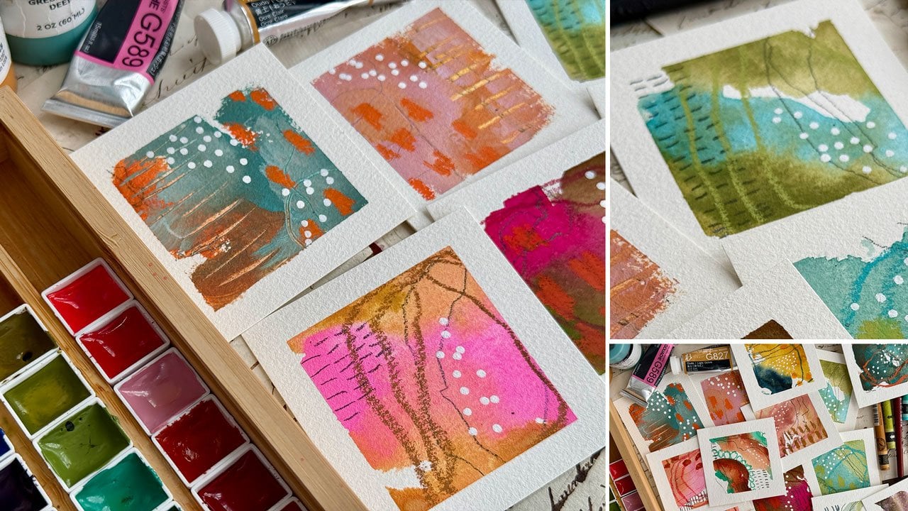
7. Adding Stencil Layer: Next layer, I'm going to
do some stencil work, and I got lots of random little stencils that
I've pulled out here. I'm not going to use
these great bigger ones, but I do want to point out
that they're really cool. These are some large
clempt inspired stencils from jogles by
Elizabeth St. Hilaire. And I wish this came in multiple sizes
because I truly love these patterns that she has created on these clempt
inspired stencils, which I could use it on here, but I'm trying to
keep in mind that, you know, I'm cutting up
smaller card sized items. And so this may or may not be the best scale for artists
trading card size denciling, but I did want to show them
to you because they are very cool and I will link
those in your supply PDF. But I have some others
that are very old. Some of these may or may
not be available still. I'm trying to see if this
even has a name on it, but it was in my stencil dash
and it was lots of swirls, which is very clumpty. I do not see any name
on the edge of these. I'm not sure where
this even came from. You might just Google
swirl stencils to see something
similar to that. Then I also have a lot of
stencils from stencil girls. This is Seth apter stencil from Stencil club, which I like. I like a lot of the
stencil club stencils. You have to be a member of
their club to get them. Um, but I like getting
a lot of those. And in the spirit of
our clemed cards, they're all about repetition
and different marks. And so I like that.
It doesn't have to be exactly what's
in his paintings. We want to take the ideas
and the thoughts of our study and into our work
in a way that works for us. Um, this one is a a really
cool one that reminds me of clemtT one is hanging circles from
the crafters workshop. That's cool. This one reminded me of maybe some clemt flowers, possibly, budding vase by
the crafters workshop. I just liked the writing here. Doesn't have anything
to do with Clemt, but I just liked it. Then I've got a bunch
of Tim Holt stencils that would be a good choice. I like these little Xs. This is stitched
layering stencil. This one reminds me of my punchonella that
I like so much, which I keep right here. This is a piece of
stencil ribbon, stencil sequin web
at ribbon where they cut the sequins out
and that's what's leftover. You can usually find this
at fabric stores or online, you can find it in spools. But really, you just
need a piece of it. This one is dotted, but
that looks just like it and I like the irregularity
of the dots on that. Then this one's got
some yummy lines. This one is dashes
layering stencil. I got a couple of the
Dina Wakeley stencils. I love how this looks like. Little windows and
doors, kind of. What is that called?
It's called bumps. And then this one is
called angled pink globs. But I like this right here, which we could have done that
on here, but that's okay. And then I like some of
these delusions by Ranger, stencils and this one is Betsy's block. I
like the blocks. And then I have some little tiny artist trading
card stencils from jogles which are the perfect size
because now this is about the size of these cards
that we'll be creating. Just to pull one of these out
to get a look at that size. And this one is itty,
bitty ATC, bumpy ride. But I love this. Look at that. And that's about the size of the cards that
we'll be making. So I like that size stencil. I wish there were more. There's a little
handful of stencils. And then here's one with
more of those dashy lines, and it's called seeds. So just to kind of give you some ideas, I
really like this. I think I'm going to
use that one first. That one was bumpy ride, joggles, artist trading cards. Um, so yeah, so that's just pull out some
of your own favorites. If any of these looked good. They may or may not be available whenever you watch this
class because, you know, Stencils update on
a regular basis, and it might have been available on the
day I'm recording, but not two years from now
when maybe you see the class. Who knows? So I have got some of our paints out that are in this piece
that we pulled out already. Just some random colors
of my blick matte paint, which I like to continue
working on here. I've got some green, blue, green deep, dark blue
light, yellow oxide. I may pull some more out. I've got silver metallic, I've got pale gold, and I've got black. I just want to start
by adding more layers. So that's what
we're going to do. Got some sponges here.
These are just dry sponges. Where did I just put that?
There it is. Here we go. And so I'm kind
of just thinking, let's just start with something. Apparently, I haven't
used this screen. This was my favorite paint to do stuff like
this with because it's nicer than a craft
paint more pigmented, less expensive than some
of your expensive paints. Oh, my gosh, I hadn't
used this one either. And so recently, I went to
the Blick and I'm like, Let me fill in with some
of the colors I don't have and put them in my
little paint rack I keep over here at my desk. And then I'm ready to go and I'll have whatever
color I want when I want it. Let's start with
these. Okay, I'm feeling like this funky
green. Let's just do it. Let's do it. I'm
just very lightly. I'm not worried about what
the stencil in the end, actually, how great it
is, but dry sponge, dry amount of paint will
give you a cleaner stencil, which sometimes I I do and
sometimes I ignore myself. So just a little tip there. Then I'm just going to
spread these out randomly. There is no rhyme or reason. There is no specific plan here. It is just fill the page basically with interesting
stuff because keep in mind, all of these are
going to be cut up into different little things. I'm going to try to make
sure I fill up some of the spaces that I've
left open also. Okay, so there's that one. And this can go pretty fast. I mean, you don't have
to spend a lot of time. I'm just gonna go ahead
and use that same sponge. You don't have to
spend a lot of time on any color, go at it. Okay, I really like anything
with lines like this. And you can do lines
like this with paint, a brush, any of
your art materials. It doesn't have to be a stencil. It just makes things go faster. Like, look at here.
I'm just like Woo who who all
around the piece. And I am trying to kind
of look too and see, is there any places
that I've left super obviously without
enough paint and stuff, I want to cover
as much as I can. Okay, so I think I want this
gold to actually be a gold. So maybe I'll get a new sponge. Kind of liking these s. So, this one is the Tim Holtz. Uh, stitched. This one's called stitched.
So I like the Xs. Feel like that's
something that lmptma used somewhere in his
pieces, possibly. Who. Yes. Okay,
that's a good one. That's a good one. Stitched.
Stitched is a good one. I'm just trying to keep
in mind, you know, Clem's work is more is more. His work is not less is more. It's all layers. What more can I do to it? What more can I
add? What layer on top of layer on top of layer
can we get into our piece? And so I'm trying not
to limit myself to, Oh, no, is this too much? No, it's never too much. Not when we're thinking
pattern and clemt. Okay, I love. This one. That could be a new
favorite stencil. Let me at least stick it back within the package
so that I don't lose. That was a clemty one. Now I'm thinking swirl. Again, I don't know where
the stencil came from, look up swirl stencil and
see what you can find. But I feel like let's
put that in water. Just throw these in
water until you're ready to do your thing, but I feel like I'm ready
to maybe do gold paint. I did pull out this gold here. I've got other golds that are my favorites like
my gold mica paste. I could do some of that on top, but I think I want
to save some of my favorite golds and I've got the ink here that
I like so much, the gold Kurataki ink, and I've got some gold in my fine liner that
we could come back, but I almost feel
like maybe those are the finishing touches to go on top of the cards,
individual cards. This is just the Blick mat gold. It's going to give
me some shimmer and maybe some blue since I just
tapped that in the blue. It's going to be a
little shimmery, but nothing like that mica gold. Maybe I'll just throw
a little in here. It's not even showing up
now that we've done that. I'm just going to throw a
little in here because we might actually see it on
individual cards, even if you're not
really seeing it here in the jungle of
overdoing that we did. I love it. And then I may hand draw swirls. Let's do this one right here. I definitely I am going to
hand draw maybe some swirls on some bits when we get to our little cards
that are cut out. Because once you get
to cutting these out, then you see how fun
this turned out. Okay. I almost feel like I want a
little black stencil work on top because black will
be super contrasty, and then I feel like
we'll be there. So, time to pick out
something interesting. I really like these. This is the Dina Wakeley
angle paint blobs. And I'm not sure, you know, how long they keep the different stencil
things that they keep. But you could do this with a paint brush if you didn't
want to do stencil work. Oh, I love that. Yes. I do love that. And
then, too, you know, I'm going up and down
with this stencil, but you can go sideways
in different directions. Don't feel like you got
to do everything in the same direction
we're cutting these up and different directions
might add interest in the marks on the cards that we end up
getting out of this. Oh, yeah, yeah, yeah. Good choice. This
was a good choice. I like this one. Okay. I think I'm going to change shapes now. Still maybe want to
do some more black. Gonna just kind of put that with the package until it's dry. I do like to keep my stencils
mostly in the packages. Okay, I really love the squares. I feel like this is very
clumpty with his squares too because he does a lot of
this is the Betsy's block. He does a lot of square kind of motifs like
a square in a square. This could be
something that we come back and draw something in it later when we've
got our little cards, I feel like we're gonna have some in here
with some squares. And maybe I'll kind of move
these around so that, like, one whole card
isn't all squares. We'll just here and there. Look at that. I love it. I love it. All right, we have any that are
just left wide open. I think we've done
a pretty good job here of filling a
lot of our space, giving us contrast, giving us some interesting
marks and stuff. Let's throw that in some water. Okay, so that's a good one. Could be a new favorite
Betsy's blocks. And the Ranger
Delusions. Stencils. All right, so I feel like now we're going to
let that dry and I feel like we might be
to the point we're ready to actually
cut this into cards. So I'm going to let it dry and I'll see you in the next video.
8. Cutting Out Our Cards: All right. I have let all
of this dry and now I'm ready to cut this up into
Smartis trading card size. I like that size, which is
basically 2.5 " by 3 ". What I did was I measured
out on this piece of paper, 2.5 " and this side is exactly 3 " because it's the end of a pad of paper that
I had basically. I thought what I could
do was easily mark along the side of paper or I could just measure
it out with the ruler. But I'm thinking that and we can measure
it with the ruler. I was just trying to
give you a visual of what the size is. But because it's 18 ", which now that I'm measuring it, I would say it's
not exactly 18 ". I would say that is more like
a 17 and one little line, a 16th of an inch shorter
than 18 ", but that's okay. Basically, what I want
to do is cut this into this size card, all this size right here. So when we're done,
we're going to have a whole series of this
perfect, lovely size. There's a couple
ways we can do that. We could do it with a pair
of scissors like I just did. We could do it with a
ruler and basically, I'm not getting it
straight obviously and basically tear and you
tear towards the ruler, and then you get a
lovely hand torn edge, and then just keep in mind along each of the
four big edges, maybe there won't
be a hand torn. That's a choice.
Another choice could be to fold the big piece of paper and squish those
down with a bone folder, which I don't have one
right here on my desk. But you can get those
nice and sharp, and then you can
take a knife or say, another ruler and pull it down and tear it
almost seesaw in it. If you had a butter knife, a dull knife, you could get that to tear the
edge pretty easily, and it would be easier on
a bigger piece of paper, but that's an easy way
to get a nice torn edge. I'm going to use the big ruler because I like the
ruler and I have it. Basically. And I
like the torn edge. And so I'm probably going
to do it like that, but I also have one of these
rulers and I'm wondering if this wouldn't be even easier because it's a quilting ruler with all these measurements
that are already on it, and I could very easily mark
these and tear much easier. I could almost even. This is 3 " wide, and so I could go ahead and tear the three inch wide side, which I had decided
was going to be this just because of the
way the paper measures out. And you do the same thing. You just tear it
toward the paper. But now that I'm
looking at that, I do think it'd be easier just to do it with
the metal ruler. So all I'm going to do is kind of make a mark
somewhere down here at the 2.5 inch mark and hope that I don't lose that in the middle
of all of this. Then it's the right
size already, and I'll just line
those marks out, line them up and then all
my weight on the ruler, and then I'll just very carefully
tear towards the ruler. Um What I like about this ruler, which I got this
at the art store, you can get them at
the office store too. It's got a little bit
of foam on the back, so it helps you hold
it in the right place. Then once you've got your
first one measured out, you could probably just
line this up very easily, get your ruler smacked
up next to it, and then you wouldn't
have to measure anymore. I'm going to go ahead and
tear the rest of our strips and I could just take my other
ruler and get it lined up. I'm trying to think of,
what's the easiest way? This is probably the easiest way because then I can just knock that ruler
right up next to it. I can see that it's straight because I
want it to be straight. I mean, if yours
aren't straight, it's not a big deal, but I
want him to be straight. I'm just trying to show you different options for doing this because you may have something already on hand that works for one of these options. Look how pretty that edge is
when you do that. So pretty. I just happen to think
I told you wrong. This is 2.5 by three. Artists trading cards
are 2.5 by 3.5. They're more elongated. So actually, just happened
to think I was misspeaking. It's more like this
size that we're doing by 3.5 2.5 by 3.5. So I just having to think so I thought I'd correct myself. Okay, now I got that one cut. I've got this extra piece
that we can save for collage work and stuff because it's only one and
three quarters, so inches leftover how
pretty that piece is though. Save that. Don't throw
out your pieces. We'll probably end up with
some scraps leftover too. Not really looking
at it thinking, Oh, what part of this
do I want or not want? I am cutting them at just
going from edge to edge. But because I know that
these are 3.5 and not three, I could go ahead and tear the edge so that all
four corners are torn because I know I'm
not going to end up I know I'm going to end
up with some scrap leftover. This is one way to go
ahead and get those started would be to tear
the edge and then 3.5 inch. So if I use this, I can put that right there. And then all four sides of my card have a lovely torn edge. If I had been
really industrious, I could have gone ahead and painted the back or done
something interesting there. I've chose to just go ahead and leave them plain and maybe
gluing my prompt on the back. But you could definitely spend a day or two
making these rather than just a couple hours and really perfect your cards
and make them amazing. But I want to give you
lots of different ideas. That's why we're
just going for it. Maybe the first set,
you just do it to get your feet wet. Okay. And in this piece, is that 3.5? Oh, my gosh. It is. Wow. Okay, so we got one, two, three, four, five,
out of each strip. So five, ten, 15, 20, 25, 30, 35, 40. So one piece of paper
will make 40 of these. If you just want to paint
one piece of paper, pick your favorite 40 prompts. Other than that, you could
do two pieces of paper. And I'm just using
this as a T square basically so that I don't
have to get all exact. Just bumping these
straight up so that each card is straight. You
don't have to do that. I just got it and
it's convenient. And I did drafting in school, so that's the way
my mind fought. Like, how can I make this easy? I don't know how
I magically tore off the right amount on
that first one that we tore 'cause this is that
end piece that I tore off, but how did I magically tear off the right size
on that first piece? That was crazy. But I
just magically did that, and it ended up the right size. All right. Once you get all these
strips cut into your 2.5 by 3.5 inch card size, now we are ready to think about. And mine are not all exact. So if they're not all exact, don't get upset,
wonder how I did that. Like there's some that
are actually shorter. Let's see. But now we are ready. To create our cards. I want you to get your printouts of your prompts and decide. Are you going to put see, these are the exact
size, perfect. Yay for that. We can separate these out and cut around the edge
and leave the edge there. We could also, and I'm
thinking it's what I might do because why
do it the easy way? I might do it with my ruler. Just like I did
with those pages, and I can just tear these like
this and have them ready. Because then what we could do is That did not want to tear. Glad I made more than one copy. I'm sitting down
instead of standing up. But what we could do is we can glue the prompt on the back or if you've got handwriting
that you don't mind, you could write the
prompt on the back and we can keep these as
pretty pieces of art. Or we could take the I need where I can
get my finger into that. Or we could take
the word prompt on the front with the other
pages that I made for you. B. I don't know about that.
I'll think about that. Anyway, how do we get
some of these out? And actually, I'm not talking at the same time that I'm tearing. We have some of these leftover, so we can glue this
to the back and that can just be the
prompt that's on the back. We could take the clear one and use some glue or matte medium and glue
that on the back, which in that case, I could cut it out and glue it on there. The matte medium will make it sink into the paper so that it was part of the paper and
make it more resilient. That could be an option for us. Then these pieces
that I created, even though it's got
a frame around it, you could just cut these
out of that frame. Um, you could glue this on the front somewhere
and draw a little hand thing around it so that we know that this prompt card
is waves of color. Then if we flip it over, we could have the waves of
color prompt card attached. And it'll tell us what to do so that we're not looking
at it thinking, What do we do with this? So waves of color on the
back could say, you know, paint flowing waves of
color that blend into each other and layer different
media to enhance the texture. So we could have
that on the back, and we could have the
little word prompt on the front is what I'm
kind of thinking. And if you use some type
of semi transparent color, that'll blend into the color. If you use white, they
will sit there on top. And look good that way because then you could have it really show up so it doesn't disappear because some of them
might disappear in there, especially if there's
some black on that card and then maybe draw around it with a little bit
of art material. So two different options there that we could
possibly do with these. So I want you to
get these printed out and I think I
might just cut mine instead of tear it
now that I can't get my big fat clumsy fingers on the end of those and
get your prompts ready. And however many cards that
your piece of paper made. If you're going to make all 60, you'll have to paint
more than one sheet. And if you're working on
smaller pieces of paper, you might paint several
of those and be ready. Then what I was thinking too
is we could look through the different prompts and see if any of them already lend themselves to that prompt
like the golden spirals. This one had spirals on it, without any extra
detail on here, that matches, so I could go ahead and
put that on the back. I could put the little word
one on the front if I wanted, or I could write it if you
like your handwriting, take a pen or a paint marker or whatever and you could
write that on there, and then you'd have
your finished card. So we're going to get
your cards cut out, and then we will move
on to this next step. I'll see you in the next video.
9. Adding Prompts To Cards: Let's take a look at
making our chopped up little pieces now
into our prompt deck. What I was thinking would
be cool would be to take the word page and match it up with the
prompt that goes with it. On the front side, you
could put the word part in our piece somewhere
and then just color around it with
one of your supplies. I chose to do it with the
Neo Color two crayons. I could pick any color I wanted and color around it
and that incorporated the words into our
piece so that they weren't just square
glued down in our piece, which I really, really loved. That's what I'm going
to do for my deck. And then the other part and I went ahead and just
cut all of these up from our page that
we had the big page. These are the clear ones. I
could cut one of these out and we could take a look at how that looks different, too. But if I had color
blocked marks, then I would find the
color blocked marks, word tag over here, and then I could
have the word on the front incorporated in and on the back what
that prompt means. And still, I might look at that and think, What
does that really mean? But it doesn't really matter
what it really means. It just matters how
you interpret it into your piece of
art going forward. So depending on how many cards that you made, if you make, say, 30 cards, pick 30 of your favorite prompts to
make your cards with. And if you make 60, go
ahead and do the 60. I think I ended up with maybe 45 or somewhere in there
from that one sheet, and I need to paint a
second sheet to get all 60. So you've got prompts that
you can pick and choose from. So if you see a prompt
that you're like, I just don't even know
what that means like this one, fragmented reality. Break up an abstract
image into fragments. Use collage or paint to
rearrange the pieces. What it tells me to do
makes perfect sense. Cut up a piece, rearrange it, glue it down in a collage
or what have you. But for whatever reason, maybe that doesn't
resonate with you. That would be a prompt
that you could say, Okay, let's see what
the next prompt is. I've got 60 to pick from. So that's what I like
about having so many. These are ones that I just
pick something similar, mix media mashup, so it's a lot of different
mediums on there. I thought that was a perfect
representation of that. That's another thing that I
am personally trying to do, maybe match what I did on the front to what the prompt is, or I'm going to add to that card so that
when I pick it up, the prompt doesn't completely
not match the card. I want it to match a little bit and then prompt on the back. And so mixed media mash up was different mediums,
watercolor, acrylic paint, some drawing with a graphite, some gold on there, so
that's a good one for that. Then this one was a
contrast in scale, which make a large sweeping
marks on one side of the page and tiny
intricate marks on the other this represented
that for me. I've got little
marks here and here. I've got the great big squares here and the big swirls here. I feel like that's a
contrast in scale. So that can inspire me by the painting on the front
and what the prompt is. I feel like that is probably the way that I'm
going to go with my deck. Um, on this one, I laminated it. So I have some self laminating
sheets of sticky paper, a pack of it that
I got off Amazon, and this is nine by
12 letter size sheets of paper that have a
white backing on it, and when you peel
the white backing, it's clear and sticky. And so I will give you a link to the self
laminating paper. But basically, I put a piece on the front and the
back of my cards. And if I'm doing a
whole bunch of cards, then I could just take, like, a whole sheet of this and laminate them all at the same time
after I've finished it. This would be after I've
glued the back on and put the paper and done
any finishing marks when I'm completely done, then I could laminate several of these all
at the same time, putting on the front, and then you would have a
second sheet that would go on the back and
you would peel that paper off and
stick everything down. And then the second sheet
would be the same way. Peel the paper off,
stick it down, flatten everything good,
and then you could take scissors and cut these out. That is an option. If you want to keep
these completely protected from your fingers
and your art materials, it is not necessary. I have highlighted the front and the back of one of these. You can see it's got
the shiny paper on it, and then I just trimmed
it real tight so that hopefully it wasn't obvious that there's a
something else on there. I mean, it is obvious,
but hopefully it's not detracting
from my card. I have a couple that I've laminated and I
have several that I have not laminated and
either way is fine. I do think I'm going to leave
my deck, for the most part, not laminated
because I don't mind if I get them a little
messy on top of that. The way that you use these, you'd probably be looking at
your art and pulling one out and maybe setting it to
the side and saying, Okay, I'm going to try for this prompt today and some contrast in scale and mixing up the mixed media and maybe
a few golden highlights. You'd pick your couple of
cards and then you'd say, Okay, here's the prompts
I'm working with. I'm going to set these
over to the side, you probably wouldn't be getting them extra messy on top of that, but I just wanted to tell
you that is an option. Let's just take a look
at some of these and see what we can find Vintage meets
modern, abstract animal. Let's see, organic grids, aged and weathered,
color blocked marks divide your page
into color blocks, layered mandalus some of these, they just may not
opulent ornate use intricate ornate patterns
and bold golds to create a luxurious feel
to your abstract art. That might be one if I
had a page with a piece with a lot of gold on it or I could add gold to the piece. That could be fun. I
want you to personalize each of these after you pick
a prompt mark making forest. See some of these, I don't know, some of these might not even
I came up with all of them, but then, some of them are not going to be
perfect for everything. Let's see, distressed
art nouveau lines, use flowing organic lines to divide your piece into sections, filling each area
with different media. Now, that could be organic with the circles and it's really
up to interpretation. It doesn't have to be exact. Then I look through, let's see what else I
got lines lines of gold. C definitely do
lines of gold, gold, and ephem color contrast chaos. We love that. Let's do that one. This one says, pick two bold contrasting
colors and then layer them with
random chaotic marks to create a sense of movement. Now, doesn't that feel like every single card
that we've created? I think it does. We've
got a sense of movement. We've got some
contrasting color. Random marks, I feel like
this is a good one for this. Let's do this one and then we'll find the
matching piece to it. So I've already cut some
of these out of here. We've got color contrast
chaos. There we go. And a pair of scissors, I'm just going to cut that out. I'm not being super neat. I just want to leave enough
white space around these. I'm not leaving the black
lines. You certainly can. I did that so that I had some
choices, but in the end, I actually liked cutting those off because I'm going
to color around it. Doesn't even matter
if you get them completely off because
I'm going to color around it with a color that
I like from our piece. Then I have a
random catalog here that restoration hardware you're sending me. I'm not sure why. But this last catalog, I decided to save it, and this is going
to be the catalog that I use as my glue book, and then I can get stuff all
over it and I don't even care because it was a free
catalog that came in the mail. I'm just going to glue
the back of that, and then we will put
that on the back of our piece, decide
which way is up. I think I'm going
to do that way up. And then right on the back, these are perfectly sized to 2.5 by 3.5
square. I love that. Then maybe just a card or well,
that one had color on it. I was going to say
smooth it out. That one had color on it. That's okay. So be careful smoothing it out. I've used a laser jet printer. Inkjet might be better, but that's the printer I
had that works right now. Then you can decide where
do you want this to be? Maybe down the side like that. There we go. Then what I did was picked a color that I thought was
pretty fun in here. Maybe for this one, this
orange with my No color two crayons and then
just color it around the edge and box
it in it's part of the painting and
it's coming in and then you have incorporated
that into your piece. You can do these
anyway that you want. You can handwrite the
words on your piece. You can glue those on
the back of there. You can write on
the back of there. You can laminate it, you cannot laminate it, some choices there. You can type these out
in a different set of prompts and collage of color. Cut up watercolor pages and reuse them in a new composition, adding marks and texture on top. We could pretty much use
this on any of these. But I want you to. It's
a collage of color. Just get creative here and you can change these up
any way that works for you. You can handwrite them
if you've got one of those little stamp collections that's got an alphabet.
You can do that. If you've got anything, any particular thing that
you love to use in your art, you're welcome to
use any of that. Let's just flatten that out
from the top side this time. You're just gluing them down, and then let's find
the collage of colors. Even if your little
piece is not perfect, it's long as it's close, you're looking for
just something to kind of inspire your
direction when you're creating. Doesn't have to be exact. Just interpret it in a
way that you're like, Oh, that sparks my creativity. That is the purpose of a prompt. Let's spark our creativity. Okay, let's glue
this. There we go. And where are we going to
put our collage of colors? Let's put that,
like, right there. I do think it's fun
to put these in different areas all
around our pieces. They don't all have to
be in the same place, going the same direction. That's what I'm doing as I do these different places
and different directions, I think it's just fun and
makes it interesting and then just color the edge that
makes that part of the art. And then if you're looking
at it and you're like, that needs more marks or
that needs more dots or color or maybe it
needs some gold or whatever it is
that you're thinking. Now is the time to then
come back and say, let me incorporate some of
whatever into my piece, or maybe I want some you know, pretty white pasca
dots in here somehow. Now is the time to either create that prompt on
the front of the card, like it was said, lots of gold on the card and
you had no gold on the card, add gold to the card. If it had swirls and circles, add swirls and circles. But now would be the time to add any extra marks
to really make that prompt make sense
to you as you pull the card and you read
it and you look at the back and you're like,
Okay, I'm inspired. So there we go. That
is what we are doing. Now I want you to cut up all
your paper that you painted, and I want you to start
matching up golden spirals. I've got some golden spirals
right on here and on here, I want you to start
matching up some of your prompts to the pieces
that you have painted. Got golden spirals there, and then I can add to this with more gold and
something to make it stand out. That's pretty fun. I think I'm use this one. Then I can put golden
spirals right there, and I can come back with
some gold and add to it, whatever gold that you have. But I could come back and really make the spirals stand out more and
put more in here. Personalize each of these so that the prompt
makes sense that it's not just a random prompt on a card and you're thinking,
what was I think in there? Because I've done that too. Maybe just some more gold
over here because I can. This is my gold pin that's
no longer available. I know you're going to
ask me what pin is that. It's my Zig acrylic liner, but in the United States, it is no longer available here. Sketch Box brought it
in as an exclusive with Kurataki and then they sold
out of it and it's gone. But since I have it, it is
convenient and I might as well still use it on
pieces that inspire me. So then I'm ready to pick my golden spirals and glue
these pieces on here. So I want you to
start lining up what you have painted with the
prompt you want to put on it. And if you painted enough
pieces of paper for 30 pump, prompts, pick out
30 that you like. If you don't have
30 in there that you love, make up
some of your own. You know, you can certainly
do your own thing on these. There's nothing saying you
have to use what I gave you, but I thought it
would be fun giving you a bunch of stuff to
at least get you started, and then you can go back and create prompts for any
artist that you loved, really, if you're a Van go fan, maybe look at his work and see what elements in his work
that you like and create yourself a set of
prompts that then spur you into using some of his elements that
you liked in your own work. That's basically
what I've done here. I have picked elements
that I loved, brainstormed for several days and come up with just
an interesting list. I had a friend that
I was brainstorming with and not all of them are going to be perfect or valid for maybe the
pieces that you're doing, but I thought it was
fun to have a variety. Wall, let's put that there.
Then we can cover that. Let's see. W I don't know. I'm wanting this teal. Let's do this teal. So if you're having trouble coming up with some prompts to add to your list or create
a deck of your own, brainstorm with a friend, say, Hey, go to dinner
with me and let's brainstorm some fun prompts. Now because I did this in a color that's not
actually in here, let's come back and add
this color up here so that it's not so odd that
I've added another color. There we go. Okay. There we go. Now, it looks like it
was meant to be in here. If you do that and you're
like, not the color I thought, add it in there and make it
part of it. Not a big deal. Now I want you to
cut up your pieces, start matching up your
fronts and your backs and decide if you're
just going to cut up and glue
these like I have, or if you're going to write them or how it is
that you're going to add your words and your prompts to the
front and the back. I can't wait to see what
you end up creating and I'm going to just do some more
of these matching them up. I'm not going to
laminate all of mine, but I did want you
to know that was a fun option that you could do. Look how cool those are. Can't you see how this
is now going to be a super cool deck to pull some prompts and be
like, Okay, let's see. Let's just pick a couple and here's what I'm
going to create today. I've got color contrast
chaos and golden highlights. I'm like, Oh, yeah, I can totally do that. I'm
feeling inspired. That's what this is
meant to do. Then I'm gluing these on
with a glue stick. You can use a glue stick,
you can use yes paste. You could use medium. I prefer glue stick because it was easy and pretty
clean and easy cleanup and these
papers are such that we could very
easily just go with it. You could, if you wanted, if you did not want to
thought of another idea. But let's say you did not
want to laminate these. You could take
some matte medium, which is clear and you
could do shack too. But you could take
the matte medium. I would be careful
doing it on the front. If you're going to do
something on the front, I would do a fixative. Um, but if you wanted
to on the back, you could spray a fixative. You could paint some
medium over here, and then the back
would be protected. You would need to then leave
these sitting for a while. Depending on your ink, I would definitely test these out with whatever
ink that you're using just to make sure that
it didn't smear the ink, but this is a way to finish
off and protect the back. And then I would spray fixative
the front before I would put medium on the front
like that because if you've got anything
that is water soluble, like these No coolor
two crayons, graphite, anything that you've used on the top that's water soluble, you'll smear it with the matte medium if you don't
spray it with a fixative. I have some fixative. Let me just grab one
and I'll be right back. Alright, so as long
as it took me to go look for a little
bit of fixative, so maybe a minute and a
half. That's already dry. That is an excellent
way to maybe protect the backside without it adding anything extra to it. And then the front side, you want to spray some type
of fixative on it. So I've got the crlons
that I like I've got workable fixative
and varnish, it might be just easiest
for the front side to spray it with a fixative
and then varnish it. Give it a protective top coat that you then don't have
to worry about touching. But you could spray it with a workable fixative and
then possibly medium, I would test it out first
because it really just depends on the supplies you're using as to if you're going
to have any smearing. I would definitely test
it before I committed. Just some options
there on finishing. I'll probably do a separate
video real quick on finishing in case you didn't
watch to the end of this video just in case. Options for us. I'll see
you in the next video.
10. Finishing Cards: Let's talk for a
moment about finishing your pieces just in case
you want to finish them. I did touch on it in the end of the last video where you're now
making your cards. But there's a couple
of different ways that you could
consider finishing it. You could leave it just like it is and not worry about it, which is probably
what I'm going to do, but some people want to finish things a
little differently. There are some options. Another option is laminate them and if you don't
have a laminate machine, which most people don't, I use self adhesive
laminating sheets. And then these would
be very easy to do a whole bunch at the same
time after you have finished gluing your pieces and putting the words on the front
and the piece on the back. You don't want to laminate these pieces you
haven't done yet. Then basically, what you could probably very easily do is take a sheet and line all eight up
that will fit on the sheet. Let's have an extra
one real quick. And then you can
have a second sheet. You peel this paper off. It's very easy. It's
got a little lip here. You peel that off, so
you're looking for the clear sticky paper, you stuck all these down
on the first sheet and you stick all of these
down on this side, smoothing all the bubbles out, and then take your scissors
and cut these out. Then that looks like a It looks like this one here
and I've got another one. Oh, this one, looks
like these two. I've highlighted. I've laminated both of these, and it's got a shiny card like finish on the
front and the back. That's one option, laminate it. Another option is
leave it as it is. Third option could
be mate medium, and some people
use mate medium as the glue that they're
sticking these down with. I'm not using matte medium
to glue these with. I'm using a glue stick, but if you wanted to
use matte medium, I would recommend just a layer painting just on
the back of that. I just took a cheap brush, had it on here, and I just
painted a thin layer on it, and then it dries,
and then that's protected from anything
that's going to get on there. You could maybe wipe it
off or I don't know, it might stick to it, it
might not do anything at all, but it is a way to protect it. I would not use MT medium on the front depending
on the supplies that you use because it will activate anything that's water soluble. In that case, I would use
either a workable fixative and then test the MT
medium possibly I would do a test on that
because depending on your supply may or may not do what you thought
or then a varnish. You could just varnish these. You can just take
them all outside and you could
varnish your pieces. Again, I would do
some test pieces because depending on the
art supplies that you used, it may or may not give you
the effect that you wanted. I personally haven't used
anything on these that will smear and keep creating
a mess like pastels, soft pastels or hard pastels. And so I feel pretty comfortable
creating these and then stacking them and being able to flip through and look
at it like I've got it. So I'm not going
to worry about it. But that's your choice. I just wanted to give
you some options and possibilities on finishing and get you thinking
in that direction. All right. I'll see you
guys back in class.
11. Project Using Prompts: Thought it would be fun
to paint a project, to see how can we work our
art prompts into our work? I'm going to be
working in my handmade journal that I made in one of the handmade
book classes that I have. And this journal has different types of
watercolor paper in it. I've been doing a lot of
mindful exercises in here. A lot of these inspired by the creative abstract
watercolor book by Kate Rebecca Leach.
I love this book. It's got lots of
really good ideas for watercolor practice
and mark making and ideas and to kind of teach you some new skills and get you playing with your different
watercolor stuff. And one of my favorite books, if you have not seen that one, it is really nice
for getting you to just show up and create in a way that maybe you
don't normally create. I just leaned right into doing
the exercises in the book, intermixing it with
some of my own stuff that I really love playing
with color palettes, doing all the stuff
that gives me enjoyment and creating
and showing up. Really love these. These are
very clump desk right here, trees and leaves, mark making, some concentric
circles and gold. I'm still trying to bring
elements of Clemt into my work. This one of my very
favorite little abstracts that I've done because
of the colors. But I thought that having
some art prompts might help to rejuvenate the ideas that we learned in
our master study, and if you didn't take the master study class, that's fine. It's still good for giving us some ideas in our work
and pushing us in a direction if we get
stuck or giving us some ideas and ways to
go as we're creating. So I've given you 60 prompts in class and I used about 40
or 45 on my own cards, and the way that
I'm going to use these look swirling motifs. Golden spirals. That's
always a good one. Now we can either just do a blind pull of our
cards and be like, Oh, I think I'll do this one. What have we got here,
aged and weathered. And then, of course,
on the back, I've put all of my prompts. So I did actually
go through and pull all the ones that I was going to use on the paper that I painted. I have a few more prompts left that I need to paint some more paper if I'm
going to use them, but I'm kind of
good. Muted marks. Oh let's use that one. So you can either
do blind pulls and just kind of go with
whatever you pulled. Or I kind of find it cool to look at the prompts and see which one has
jumped out at me. Like, muted Marks totally
jumped out at me. And so that's what I'm
gonna do for today. I'm going to just kind of look at the different
ones and say, Which one is calling
my name today? Mark making meditation. Oh, let's do that one. You can see how you
can get excited, let's do the organic geometry. You can get real
excited just because you'll see a prompt
and you'll think, oh, that's really
speaking to me today. Then if you were like,
Oh, what does that mean? Then you got the
prompt on the back to give you a nudge
and a direction, but they can also
be interpreted in any way that your
little heart desires. You don't have to use
the exact prompt. Organic geometry use circles triangles and squares to
construct an abstract landscape. I'm not going to
construct a landscape. I'm going to use organic
geometry in a way that reminds me of Clemt and I'm going to pull
the Clemt book over here. This is the Tahin
Gustav Clemt book and I like the big
one because then I can see the details. But you can see right here. This is right here, what
exactly what I was thinking. This little set
of triangles down here is what I'm being
inspired and moved to do. You can see all the
different things. We've got gold,
we've got swirls, we've got circles and concentric circles where
you've got circles in circles. That's a good one.
We've got squares, we've got pattern on pattern. We've got little
art nouveau lines. You can definitely see and
get inspired by the pieces. We've got little mosaic
work right in here. That's what I'm
thinking that is. When I think of that, we've got little circle motifs,
we've got triangles. We've got geometry
going right in there. We've got triangles here
on the top of her dress. See how that definitely you
can look into the piece of the work and the stuff
that inspired me the first time it's
coming back to me now. It's exciting. That's where I'm going
with some of those. Muted marks are create soft barely their marks
and neutral colors. That's going to just be detail maybe that we
see as we get closer. Markmking meditation is
focused solely on repetition, so dots dashes, something in big areas
or across the page. Then of course,
gold and spirals is very clem create
spirals in gold, blending metallic elements with watercolor or acrylic to
highlight their shine. Different ideas there.
Those are inspiring me. This book is filled with
hot press and cold press. Watercolor paper, it's
filled with some of my favorite papers to
work on and that's why this book has been just a delight to work
in compared to say, the ones that I made
with the Codi paper because I love the Cody
paper with mixed media work. I don't love it with
watercolor work. This book has become my
mindful book where I am taking deliberate designs
and market making and ideas and creating
beautiful pieces. And now that I've got the
book more than half full, I cannot even tell you
how lovely it is to look through all the
different things that I've painted in here. Like for reels. This is such a delight
to now go through. And there's other pages
that I can come fill in the back of a handmade paper
that looks incomplete. I could come and add other stuff to it,
but for the moment, that might be finishing details as I'm getting
to the very end, and you can see how fun it is to make your own book
and then to paint in it. Now every time I do something, I'm determined to do it in
one of these books that I've painted so that
eventually maybe they're full, and I can look at them and
show them off and share them. It's truly been a delight
to work in these. I'm getting further
back in the book, so I'm just pressing that
open a little harder. Yeah. Truly been a delight. Now, if you don't want to
paint on one of these, you might go ahead
and cover it up. I love to work with a color
palette because I have just found that starting with a color palette really makes things a whole
lot easier for me. Gets me past that blank page. It gets me creating in a
way that I don't know. I just wouldn't
create any other way. So let me pick a
color palette out, and then I will pick out some
colors for us to work with. And I think I'm going to
paint with Look at that. Let's do that one. That
is a crazy color palette. My goal, too, on these is to just pick out
something crazy. That I wouldn't even think of. I'm thinking that's pretty
crazy. Look at that. I've got the Kurataki
art nouveau set over here that I had out on my desk because
I was already using it. I'm feeling like we
should just go with it. I do feel like that is a bluer blue than what
I've got in here, but I do see some others. Now, not all of these colors, you have to be a
the same medium. If you get to the end and you're like, I
don't have this color, maybe you do in a
different medium, could be your mark
making and stuff. I could pull other paints, but I think I'm going
to go with this and this bright blue here, I could go with that or I could let that be something
that we do on top. I feel like that's
what I'm going to do. I've pulled 49 yellow brown
four oh two Mars yellow, five oh two BiliarGreen and
six oh two cobot Turquoise, and that is what I'm going
to be inspired by today, card 464 from Color Cube Volume
two by Sarah Renee Clark. It really has sped up my mark making
process and made it much more enjoyable because
now I don't get stuck at the very beginning with
what am I going to do? What colors? The colors I find are just the most difficult because I like too many things.
That's the problem. Then when you like too
many things, you're like, Oh, do I need to do to combine all these
things that I love. Okay, so I'm going
to do an abstract because I'm obsessed with
the abstracts lately, and we'll just go ahead
and get started painting. I think this is a
cold press paper. I've got Arches coal
press in this book, and I've got the Honamula
coal press in this book. This one feels a little stiffer. I think the Honamla
doesn't feel as stiff. So I'm thinking this
might be the arches, and it might be the backside. I don't know. It's got a different feel
as we're painting here. Look at that blue and green. I'm already in it. Do wonder if putting it next to the pink paper was
the right choice, but it is what it is. I what it is. We're not even going to second
guess it at this point. We're just going to go with
that flow and I'm leaving white space because that's
what I enjoy. Mark making in. Let's do this crazy orange
and hope that we like it. Blue and orange are opposites
on the color wheel. That's fun to be working with a contrasting
color palette. But when you mix blue
and orange, you get mud, you do have to keep that in
mind as you're painting. Are you going wet on
wet and creating brown? That's a lot of paint. Maybe maybe I need to stop or I could come in with
some mark making. Let's see. Now that I said that, I
almost want to come in, I'm using my Princeton
Neptune set, and that was the square wash
brush, three quarter inch. This is my oval wash brush, which I also like because
I like that angle. I feel like we could come in here with a
little bit of mark making with the orange just just because it
doesn't have to be a lot, could just be a little
bit here and there. Just some and then
we'll let it dry. Oh, my goodness.
Okay. I like that. Wondering do we need
some mark making in one of these colors. Do we need some mark
making was colors? Because I like making
this stiff and then we can get nice lines. So with the dark, maybe we could come in
here with some lines. Just to get us started. Oh, that's fun. I like it. Okay. I like that. So let's
let this dry and then we'll come Mart make on
top of this. I'll be back. All right, we are mostly dry and I'm keeping in mind
our cards that I pull, golden spirals,
organic geometry, mark making meditation
and muted marks. I love that muted marks one, and I'm enjoying a
lot of mark making. I'm almost wondering if we
could do a really soft, not quite white, not
gray as our muted marks. This is create soft barely
the marks in neutral colors. Let your media bleed and fade and forming a subtle background. Um, and I love these. These are the little
Artax markers. These are acrylic markers
like the posca pens, but I like all the colors. I got this set of 60 colors, and it's the anime
set or the manga set. I can't remember which word
they used as this set. There's also a bright set, but I like this colors and
this more kind of muted one. And I'm kind of thinking
that, you know, we could just come in
with the muted marks, maybe some dots, it's not white. You can hardly even
see it's there. But if you got closer, you're like, Oh, there's
texture in there. I like the idea of that. It reminds me on
limps paintings. When he did that gold, let me just show you what I'm thinking there's a little
tiny bit of wet right there. But when he did this kind
of background, very subtle, there's texture in
there on the kiss and on the other one back here, this very subtle texture,
there's something there. But if you're way back, you almost can't tell that it's a a lot of texture
and color in there. I really like that
look and feel. That's what I'm thinking. When I read that description, it's a little tiny bit different here in this piece the
way I've interpreted it. But I do like very subtle. You have to get in close
to even see that there was something else going
on and I love that. I do like it there too. And we could do marks
on top of Mark. It's very detailed and more is more with the pattern and the mark making in his
work, which I love. I just love all the ideas I get. When I kind of look at his work, I get so inspired. It's my favorite master study that I've ever done personally. And then I created
a class around. It is one of my most popular
classes that I've ever done. I love that. I love that so many other people wanted to study his stuff, too.
That's what I love. I love that got a little a little inspired there with all this stuff. I love all that. Okay, so got the
muted stuff in here. I want some organic geometry. I love that there's
pink over here. I kind of thinking, like, how can I incorporate that in there? I almost want to
pull out pastels. I have resisted on a lot of the painting in
here using pastels, but I like the vibrancy
of the colors and on the few I've put it on.
It's been gorgeous. I've got my mango, oil pastel. So once I use an oil pastel, I'll try not to do too
much of it in this book, but I will spray those
pages with oil fixative, it's generally
something I'll do last, but I'm going to set
this to the side since I've already
thought about it. And I kind of want some gold. I think I want to use it
now, but I want to hold off. I kind of want some
pink in there. I don't know why. I kind of calling my name because
there's pink over here. And I kind of want
some stencil work. So I might even do some
stencil work in gold. So let's pull the
stencil box out and see what we got because I remember there being
one that I really liked oh, yes, here. I've had
these out recently. I'm making the prompt class. Let's just see of these
ones I already had out. See, I like these
lines by Tim Holtz. That's the dashes
layering stencil. I like these circles, which is the dotted
layering stencil. That's not what I'm thinking. I do like this
little stencil here, which is a joggles artist
trading card stencil, 57487. It's got some fun marks. I might pull that one out. The one that I'm thinking
though has little Xs, there we go. I like that one. You can see I use
that right there, that little Irish traded
card, but this one, I really like, and this is a Tim Holt layering
stencil with little Xs. This is stitched
layering stencil. I feel like I need some
little Xs on here. Let's do the little Xs. It's going to be part
of our organic geometry or mark making meditation. We're still right
in there with that. I need to pull out
a paint color. What are we thinking? Gold, silver, a color, feeling like kind of feel
like it could be gold. So I've got my ink here. And I could just dip
into the ink, I think, and maybe have a little piece of some palette paper
to dip that on. So let's just do
that. Let's just let's just get it off the lid. I don't know if
we'll see it or not. It could just oh,
yes, we can see that. Look at that. And it shines. It's just a little bit, so that can be some of
the soft mark making. So let me get a little
more ink on the lid. 'Cause that was
lovely and subtle. Alright, here we go. A little
more on the lid there. Alright, let's do that down
here 'cause that was lovely. And of course, you can
take some gold and a paint brush and
make little Xs. I just like a little
bit of stencil work. It just speeds up the
speeds it up a little bit, and you get fun stuff. Okay, so I do actually
like this big circly one. Also dotted layer and stencils. It's got bigger dots, and I'm kind of wondering do
we want to do that in, say, black and really bring
forward some color? Let me just grab a
little black paint. Now I'm rethinking my
pastels, but that's okay. This could be some of
our geometry right here. This is just black mat paint. Um, I like using these little mat paints because they're convenient.
They're very pigmented. I'm gonna use the same sponge. They they're nicer
than, say, a, um, A craft paint. And you can certainly use craft paint, but I think when
you're doing art, it's nice to use artist
quality materials. Oh, that's fun. Which is why I tend to like this
black mat paint rather than the
little craft paints. Wh Now I kind of want
to come off this edge. Um, a little bit. There we go. Okay, that's fun. Let's just
throw that into some water. I don't know if I want to
do any more stenciling, or if I want to come in
now with some triangles. I need some triangles
because I thought of it. I was in that other
thing. I kind of like these a little bit. So maybe maybe in that tell kind of feeling like that
tell a little bit. I am kind of feeling that.
Let's pull that back out. For some reason, it's just
kind of speaking to me. And if that's speaking
to you, you know what? Ride that little
wave of inspiration. There we go. A little
tiny bit of paint here. That is dark green light. It's like Tiffany blue. It's rather lovely.
Oh, that's fun. Let's do that like right
here a little bit. W. That's very subtle. That gets in with our subtle
mark making again. I like it. That's that little
artist trading stencil from joggles five, seven, four, eight, seven. Set that over there. Now, I might have too much
going on for little triangles, but I still feel like
we're going to get a little triangle here somehow. I still want to conclude
maybe a little bit of pink weirdly enough because
we got pink over here. What if I do little
pink something with this ArtixPaint marker, C 21 is the color. Trying to do little triangles, but it's kind of hard
to do a triangle with a big clumsy nib. So I bet it was real
hard for him to do little triangles with his
big clumsy paintbrush. Fun things to think about
as you're creating. I do like that tiny bit
of pink in there, though. It's definitely where
I wanted to go. And we're getting our
geometry in there, which is not something I
would have normally done. It's all about playing
and experimenting and pushing yourself in a direction that you
just wouldn't go, trying things that you
definitely haven't tried before. If you've watched the hundreds
of videos that I've made, you can say, we try to do something that we haven't
done on most videos. I'm all about the
experimentation and the joy and the process of getting where we're going without knowing where
we're going when we start. I like that
serendipitous nature of creating without actually having a firm destination in mind. I do get the most
joy out of that. I'm liking that. I do feel
like we need some swirls. We got some golden spirals, might as well get our
Where did I hide it? Here we go. Our fine
line applicator. I might have did
too much on this, but you know what?
I'm still loving it. This is just got this ink. I just used a pipe that to put some of that ink
in a fine line bottle, and I like it because it doesn't get stuck in the tip because it's got a
little needle tip there. Okay, I'm feeling like spirals, so we can do little
spirals or big spiral, but it's real hard to
do a little spiral with this applicator, but we could maybe
get a couple in here just as little ones. I'm actually doing it. It's a little harder to
control than say a pin, but I like the
imperfect nature of it because I don't like
things to be perfect. I like the imperfection
and the layering. I do find if you hold this
almost parallel to the paper, you have more control
over how you can use this a lot better
than trying to hold it up straight up and down. You have way more control. Then of course, with a
little bit of practice, I'm sure that it gets easier. I mean, it does get easier.
I don't have to guess. Look at that. I also feel
like I need a big spiral. So let's just do a big spiral. Because I like the big spirals. I've done several of them in several pieces and I like it
on every single one of them. Okay, I'm filling that. There's a lot going
on in this piece. I don't know. Did we overdo it? Do we still need some more? I almost feel like we
could use some more. We've got golden spirals, we got some geometry, we
got some muted marks. We got mark making meditation. We'll call that mark making meditation because we got
a lot going on there. I did throw in a little bit of pink because we got a
pink page over here and I don't want
it to completely not match. Are we there? Feel like I've left
some white space. Maybe I want to color
in that white space. I don't know. Let's go ahead
and peel the tape and see. Sometimes you got
to peel the tape and see what you're left with. It's like magic
when you pull tape. All of a sudden, you
can see the finishes. Do I have the paper
that's going to tear? There's one paper in here, this is definitely a
cold press paper. I think it's the hot press
paper that does not like the tape, and it
tears the paper. I use my heat gun on those. Because even though
I usually try to play and see which ones
will tear the paper, I actually don't want it to tear the paper in this little book. I like the I like the book. I want it to be finished pieces. And then if there's a piece
in here that I love, love, I can scan it in and print it bigger for something
to hang on my wall. Somebody asked me that I
had What if I loved it, and they're painting
on both sides, then I'd scan it in
and probably print it. Look how pretty that
is. It's a super fun. Example of how we can
use our Clemth inspired prompts to take us
in a direction in a piece that maybe we wouldn't
have gone or thought of. And this came out super fun. Hope you enjoyed
painting with me today, and I'll see you guys next time.
12. Final Thoughts: Thank you so much for joining me in this creative journey. I hope you enjoyed exploring
new techniques and pushing your artistic
boundaries with these prompts. You'll now have your own
personalized deck of prompt cards ready to spark inspiration
whenever you need it. Remember, art is a continuous process of
exploration discovery. So don't be afraid to
keep experimenting with these prompts and create
more cards over time. And most importantly, have fun with it. I'd
love to see your work. So please share your cards in the project gallery
or on social media. I can't wait to see
how you've made these prompts your
own until next time, keep creating and stay inspired.
 DENISE LOVE, Artist & Creative Educator