Transcripts
1. Class Introduction: There is something magical
about autumn, isn't there? The golden leaves, the
crisp morning air, and those cozy afternoons
when all you want to do is curl up with a warm cup of tea and create something lovely. For me, autumn is always such
an inspiring time of year, especially when it
comes to illustrating little woodland creatures
and their whimsical worlds. And that's exactly what we
are going to do today. Hi. Hello and welcome to my
new Skillshare class. I'm Rina, the Illustrator behind the brand of
Busy May Studio, and I'm so happy
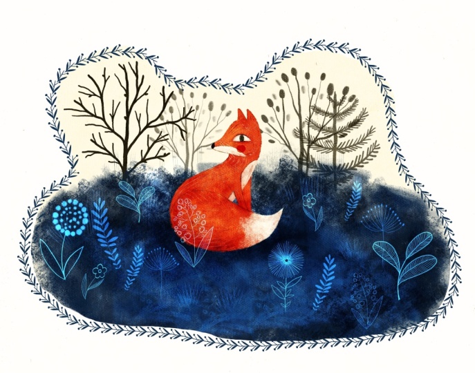
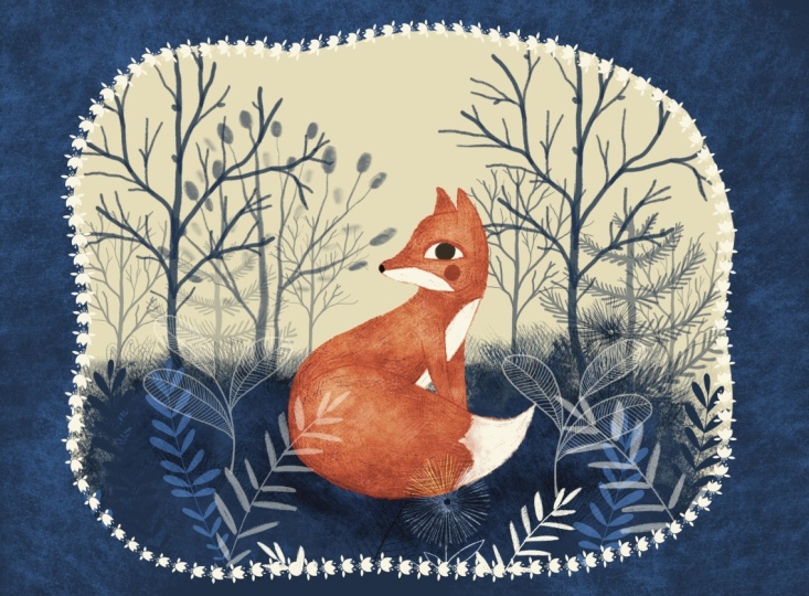
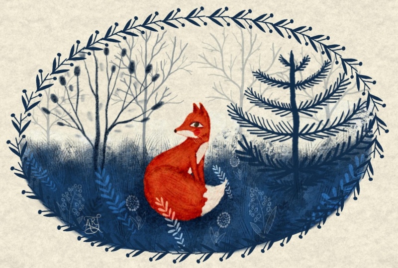
to see you here. Today, we're going to step into a wonderful little world of Woodland and create this adorable Fox illustration
together in Procreate. Whether you're starting
your illustration journey or feel quite confident
with Procreate, I hope this class will give
you some fresh inspiration, some new techniques to
try and most importantly, a lovely creative time. Throughout the class,
I'll guide you through my illustration
process step by step. We'll explore how to work
with a limited color palette, build up our illustration
using different layers, and add beautiful
textures, patterns, shadows and little details that bring our Woodland
character to life. We'll also pay special
attention to one of my favorite Procreate
features, blending modes. I'll show you how I use
them to create depth, introducing interesting
color variations, and make the most of
a limited palette without constantly having
to choose new colors. Of course, I've prepared a couple of lovely
extras for you. First, you'll get my Woodland
Tales Procreate brush set completely free
with this class. These are the brushes
we'll be using throughout our Fox Illustration
project and you'll be able to use them in your
own future artwork too. I've also created a handy
class guide where you'll find useful information to
support you along the way, including a special section
dedicated to blending modes. It's something you can keep nearby while you
are drawing or come back to whenever you need a little reminder of how
different blending modes work. My hope is by the
end of this class, you not only have a
lovely fox illustration, but also feel more confident
experimenting with colors, textures, and blending
modes and procre. If you're ready, grab your iPad, get yourself something
nice to drink, and let's begin our class.
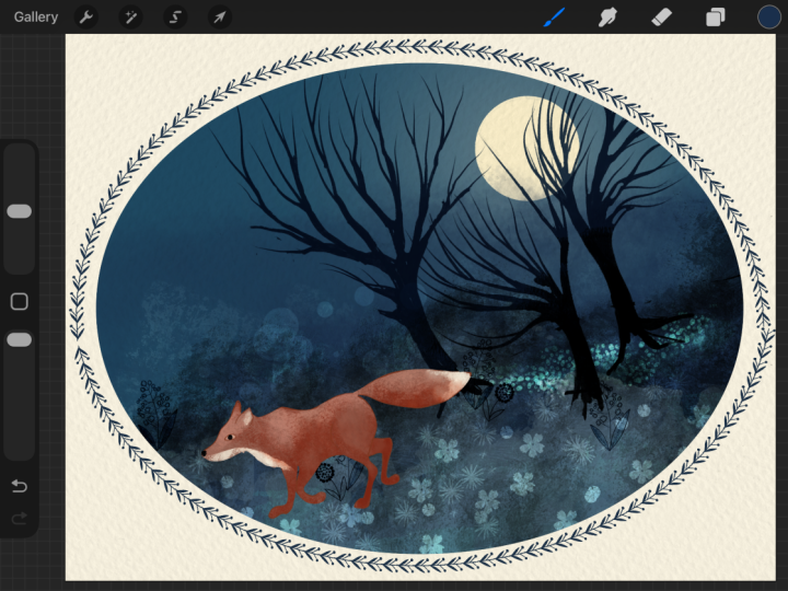
2. Class Project: For your class project, I'd love you to create and share either the daytime fox or the nighttime Fox will be
illustrating in this class. Or if you're feeling a
little bit more adventures, why not get even more
creative and choose your own three color palette
and illustration subject? By the way, I've included two additional color palettes in the class guide just in case you need a
little inspiration. And please don't forget to
share your illustrations. It's always so lovely
and inspiring to see your beautiful artwork here on Skillshare or on social media.
3. Tools and Materials: As this class is entirely focused on Procreate and
its wonderful tooth, all you need is an
iPad with Procreate installed and an Apple
Pencil or compatible stylus. I'll be using my brand
new Procreate brush set called Woodland Tales, which you can download for
free through the class guide. The guide itself is
also packed with helpful information to support
you throughout the class. You'll also find a downloadable
Procreate color palette, featuring three different
limited color combinations. The one we'll be using
in this class plus two additional palettes
that you might like to experiment with in
your own illustrations. Since we are not going to focus too much on sketching
in this class, I've also included
two ready to use folks sketch stamps to
help you get started. But of course, if
you'd prefer to sketch your own folks or come up with a completely
different subject, please go ahead
and get creative. The idea is to make
the process as simple, enjoyable and stress free as possible so we can focus
on exploring colors, textures, and the magic of
Procreate blending modes.
4. The Power of Three (Colours): Choosing your three
color palette. So you picture
illustration subject. Let's say it's a fox. You know it's going to
be set in the woods. Now comes the next step,
choosing your colors. But how do you
actually choose them? Sure, the fox is orange, but which shade of orange?
And the woods are green. But what if a completely
different shade of green made your illustration
look more interesting? You tell yourself, you
need a color palette. So you start browsing hundreds of ready made
palettes online and maybe even buy one
called something like Autumn Forest.
But now what? You've got dozens
of colors watches, five different shades of
orange and no instructions. Which color should
you actually use? Do you need all of them, and will they even look good
together? Sounds familiar. Well, in this lesson, I'm going to show
you how to choose just three colors and use
them to create beautiful, rich and interesting
illustrations. Why just three colors? The short answer is to make our creative process
as simple and enjoyable as possible without compromising the
quality of our artwork. When we limit our color palette, our illustrations naturally
start to feel more cohesive, harmonious,
and timeless. And here is another
wonderful thing about working with
just three colors. It encourages us to be more creative with the
tools we already have. As you'll see in this class, thanks to Procreate
blending modes, opacity settings, and
textured brushes, we can create an amazing
variety of colors and shades without actually adding any new colors to our palette. But before we get to that, we need to choose
our three colors. And I know choosing
just three colors sounds easy until you open Procreate's Color Wheel
and suddenly find yourself completely overwhelmed
by all the possibilities. The secret to creating a sophisticated
three color palette, rather than something
that looks like a primary school flag is understanding two simple
things value and saturation. Value is how light
or dark a color is, while saturation is how bright in tense or
muted it appears. And don't worry.
We're not going to dive too deeply into
color theory here. I want to show you
a much simpler, more practical way to
choose your colors. Giving our colors a job. Instead of getting lost in
the traditional color wheel, trying to work out
complimentary or split complimentary
color combinations, we're going to give each of our three colors a specific job. I like to think of
them as the canvas, the hero, and the
anchor. The canvas. This is our lightest color, usually with fairly
low saturation. Think warm creams, oatmeal, dusty blush, or pale sage. Its job is to give our
illustration some breathing space. It often works beautifully as a background color or as the lightest highlights
in our artwork. For our Fox illustration, I'm going to use this
lovely creamy shade called warm vanilla. The hero. This is our main character, the star of the show. It's usually a more saturated
color that attracts attention and brings personality and emotion to the illustration. For our folks, I've chosen this beautiful
Terracotta orange. It's warm and rich, and it stands out nicely
without being too bright or overwhelming.
The anchor. And finally, we need
our darkest color. The anchor provides contrast,
depth, and definition. It's the color that
helps bring everything together and make
our hero stand out. Think Midnight Navy, deep forest green or
rich espresso brown. For our illustration, I'm
choosing Midnight Navy. I particularly
love how this deep blue works with warm
terracotta orange. The two colors complement
each other beautifully while the creamy vanilla gives the whole palette a softer,
more delicate feel. So there we have it
our three colors, each with its own job to do. How to check if your
colors work together? Now, there is one
little thing we need to check before
we start painting. You see, sometimes we choose
three colors that look completely different
but actually have very similar values, meaning the role must
equally light or dark. And when we use them together, our illustration can
end up looking a little flat with not enough contrast between the different elements. Luckily, there is a
really simple way to check this and Procreate.
Let me show you. First, on a new layer, I'm going to draw three
large colors watches next to each other using
our chosen palette. Now I create another new
layer at the very top of the layer stack and fill
it completely with white. Next, I tap the little N on the layer to open
the blending modes, scroll down and select color, and look what happens. Our illustration turns
black and white so we can see the actual values of our color without being
distracted by their hues. Ideally, we want our
three swatches to look like three noticeably
different shades of gray, one light, one
medium, and one dark. If two of them look
almost identical, it means they have
very similar values, and we might want
to adjust one of our colors to create a
little bit more contrast. Of course, this
isn't a strict rule. Sometimes similar values
can create a beautiful, soft and atmospheric effect. But for our folk
style illustrations, where we want the shapes and textures to stand out clearly, having a good range of values is particularly helpful,
and that's it. Such a simple little trick, but it can make a
huge difference.
5. Blending Modes Magic: I know you're probably
looking forward to starting our cute little
fox illustrations, but there is one last thing I want to talk about
before we get painting, and that's the magic
of blending modes. Blending modes are an
incredibly powerful tool, especially when you
are working with a limited color
palette and Procreate. They allow us to create a
wonderful variety of colors, shades and textures without constantly picking new
colors from the color wheel. In this lesson, we're going to have a quick look
at how they work. But of course, the best way
to really understand and master blending modes is to experiment with them
in your own artwork. I'm going to show
you the ones I use most often in my
illustration process, and there are also the
blending modes we'll be using throughout our
forest fox project. Let's start with my
absolute favorite and probably the one
I use most Multiply. Multiply is fantastic
for adding shadows, depth, and darker accents
to your illustration. And then we have Color
Burn and Linear Burn, which are also brilliant
for creating deeper, richer colors and bringing out some interesting variations
in our original color. And look, I'm still using exactly the same terracotta
orange with my brush. It's a blending modes
that are changing, how the color interacts
with the layer underneath, giving us all these
beautiful new shades without actually introducing any new colors to our palette. Pretty magical, isn't it? Now let's see what happens
when we use some of the lighter blending modes
with our orange color. I'm going to try Screen
first and look how much softer and lighter
the same orange becomes on this new layer. I also really love
Color Dodge and add. They're wonderful for
creating lighter accents, glowing details, and highlights. You'll see me using
these quite a lot in our Fox illustrations, particularly when I
want to introduce a little extra light or create
a more magical atmosphere. Next, let's try overlay, soft light, and hard light. These blending modes can create some really interesting
color and texture effect. I find it particularly
useful when I'm working with lighter
and darker colors together as it can help
bring out the texture while adding more contrast and richness to
the illustration. Soft light tends to
give us it gentler, more subtle result, while hard light can create a
much stronger effect. And overlay is somewhere in between one of my favorites for adding an extra layer of texture without completely changing
the colors underneath. Of course, the results will depend on which colors
you're combining, so it's always worth
experimenting. Now let's switch from
our terracotta orange to midnight Navy and see what happens when we try the
same blending modes. And look at that, quite a different range of
colors and defects. This is something I really
want you to remember. The same blending
mode can behave very differently depending
on the color you are using and what's
underneath it. So rather than
trying to memorize exactly what every
blending mode does, I encourage you to
play around and see what works best for your
particular illustration. Sometimes the most
beautiful color combination happen completely by accident. And finally, let's
have a quick look at some of the slightly
crazier blending modes, a few of which we'll actually be using
in our Fox project. I'm talking about difference, exclusion, subtract, and divide. Now, watch what
happens when I use exactly the same orange
color with these modes. Suddenly, our lovely
terracotta orange transforms into something
completely different. Some of these effects
can look quite dramatic and sometimes
a little unexpected. I wouldn't necessarily recommend using them all over
your illustration, but in small doses and with a little adjustment
to the layer opacity, they can create some really beautiful and unusual
color effects. So don't be afraid to
experiment with them. One last little tip. Before we move on,
I want to share one little trick that
I use all the time. Whenever I'm not sure which
blending mode will work best, I simply create a new layer, add a few brush
strokes or stamps and scroll through the
different blending modes to see what happens. I like to think of it
as a little patch test. It's quick, it's easy, and sometimes you discover a color or texture combination you would never have
thought of otherwise. And remember, you
can always adjust the layer opacity to make the effect softer
and more subtle. That's really the beauty
of blending modes. You don't need to know
every single one by heart. You just need to be curious
and willing to experiment. And now that we've explored
our three colour palette and discover some of the magic we can create with
blending modes, I think we're finally
ready to start painting. Let's bring our little
forest fox to life.
6. Daytime Fox Part 1: Okay. We're going to begin
our illustration traditionally with a sketch. As I mentioned earlier, the goal of this
class is to create a simple stress free piece using a very limited
color palette, so we're not going to focus
too much on sketching. Instead, we'll use
the daytime fox stamp to place a sketch of the fox
in the middle of our canvas. Now, on a new layer, using a sketch
brush from the set, I'd like to add some
ground behind her on the hint of a few trees to indicate that our
fox is in a forest. These are purely guidelines, nothing set in stone. Once I'm happy with
my composition, now we are going
to move straight on to painting with
our three colors. The very first thing is change the background to
the creamy color which I've called warm vanilla. I make sure I'm on a new layer between the sketch
layer and the background. I'm going to start working
on the landscape first. For that, I select the moth wing brush from
the layering group. The color I'll use
is midnight navy. Using repeated tapping motions, I cover the lower half of
the illustration with color. Now I create a new layer on top and select the
fun guy bloom brush. Using the same tapping motions, I layer more taps in
the same blue color. Then I change the
blending mode to add and reduce the layer
opacity to about 60%. Now you can see
we're starting to get some lovely texture
on the forest floor. I create another
layer and select the decayed leaf brush
from the same group. Using the same color and
adjusting the brush size, I stamp here and there to create even more
interesting texture. This time, I leave the
blending mode set to normal. Now I'm going to start
adding the trees. For that, I go to the Woodland botanicals group in the set and select the
wishing Willow stamp. I place a tree on the left and adjust its size
and positioning. Then I reduced opacity
to around 60%. By the way, changing the opacity of
individual elements is another great way to create color variations when you are working with a very
limited color palette. Now on a new layer, I place another tree using
the gloom pine stamp brush. A and reduce its opacity
to around 50%. I continue stamping trees
using the gallo branch, one and two brushes, adjusting their size
and positioning. I'm still using the same
midnight navy color. You can use as many tree
stamps as you like to create the appearance of a thicker forest
in the background. Experiment with blending modes, opacity, scale and positioning. Now I'd like to unlock the sketch layer and reduce
its opacity to about 50, 60% to make the sketch less prominent as I'm about to
start working on the fox. To cover the main area
of my fox with color, I'll be using one of the filler brushes
called Mark and Meyer. The color I'll use is, of course, terracotta orange. I'm going to put all the
forest layers we've created so far into a separate group
to get them out of the way. Adjusting the size of
my brush is needed, I start filling in
the forks with color. Once the main shape of my fox is colored, I create a new layer on top. I select the ash brush
from the shaders group, and now I do a quick patch test. I apply some color to the layer and try different
blending modes to see which one brings out the best in both the color
and the texture. I like Multiply, so I clear the layer and start working
with the ash brush, lightly covering certain
areas with darker texture. I switch between different
brush sizes as I tap. Next, I create a new layer
and clip it as a mask. I pick the decayed
leaf brush from the layer stamps group
and select warm vanilla. I reduce the brush
opacity to around 67%. I change the layer
blending mode to overlay. I lightly stamp the brush to add a hint of
texture to the fox. Next, I create
another new layer, clap it as a mask, and
select the Merkemyer brush. Using the same warm
vanilla colour, I add the lighter patches
to the fox's fur. I create a new layer and pick the twig
and charcoal brush. Switching back to
the orange color, I do another patch
test by scribbling on the empty layer and trying
different blending modes. I opt for linear burn, reducing the opacity slightly. I start drawing the contour
around the fox's shape. It looks like the layer opacity needs reducing to otherwise, the strokes will be too intense.
7. Daytime Fox Part 2: Welcome back. We are continuing with our data and Fox Illustration
in part two. I create a new layer directly above the forest texture layers. I pick the sport cloud brush
and the midnight navy color. I change the blending mode of the new layer to multiply and start adding shadows on the
ground beneath our fox. Now back to the fox. I create a new layer at
the top of the stack, select the twig and
charcoal brush, pick warm vanilla and
fill in the eye shape. Next, I create a new layer
and clip it as a mask. Using the same brush, but switching to midnight navy, I draw a solid
circle for the iris. The eye looks good and blue, but you can push the
blending mode magic even further by changing
it to luminosity. This transforms the color
into a greenish amber, making the fox's eye
look more true to life. I go back to the contra layer. Pick the thickets, catch, brush, and do a
quick patch test. I select the orange
color and start adding a deeper hue and
texture around the eye. Now I switch back to blue
and draw the nose on a new layer at the top of the stack using the twig
and charcoal brush. Changing the layer
blending mode to linear light makes the blue much
deeper almost black, which is a better
choice for fox's nose. I add the blushy check on a new layer using
the orange color. Then change the
blending mode to line, burn to make it red. Now I create a new
layer directly beneath the fox's
light fur patch, changing the blending mode to multiply and pick the
blighted grain brush. Using the same orange color, I start building
up more texture, adding darker and brighter
looking variation to the fox's fur. Next, I select the
lichen crust brush from the fillers group. On a new layer with a blending mode
set to multiply, I subtly add even more texture. Next, I create a new layer above all the fox texture layers and change the blending
mode to subtract. Using the birch bark
brush and warm vanilla, I start adding little
strokes to the fox's face. I emphasize the eye area
to make the eye more expressive and add more for
strokes around the body. Now, on a new layer with a
blending mode set to multiply, I pick the cursed pollen brush. Using the orange color, I start tapping
over the forks to build up even more
complex texture. Oh I'm going to move this layer about
the lighter four layer to keep the text
stand out better. Next, I create a new layer, clip it as a mask and change
the blending mode to Screen. I add just a hint of
the same texture, but this time, it
appears lighter. Hopefully you can see
the subtle difference. Now I create a new layer at
the very top of the stack, selecting the birch bark
brush and warm vanilla. And change the layer
blending mode to subtract. I reduce the brush opacity and add more hair like
strokes to the fur. I select a short fur brush from the effects group and start adding tiny tufts
of fur to the fox. They're barely visible, but they add a lovely
fluffy texture. Next, I pick the pine needle
brush and start adding longest strands of fur on the same layer using
the same colour. I also add some
eyelashes and whiskers. Now I'm going to put
all the forks layers into one group to tidy up
the layer stack a little. I'll go back to the forest and create a new layer about
the forest layers. I pick the short fur brush. Select the blue color and change the layer blending
among to linear burn. You might want to reduce
the layer opacity a little. I start adding small tufts
of grass here and there. But next, I create a new layer and change
the blending mode to Add. I draw more blades of grass
using the same blue color, but this time, they appear much lighter thanks to
the Add blending mode. I create another new
layer, and this time, I go to the Woodland
botanicals group and select the round
front stamp brush. I changed the blending
mode to add and stamp the brush
somewhere on the canvas. You can play around with
the scale and positioning. You can also use
the same element multiple times by
duplicating it, flipping it horizontally, and changing its
size and depacity. Now I'm going to stamp
various botanicals here and there to create a lovely
busy forest meadow. No and our illustration
is almost ready. I'd like to show you
how to take one step further and give it that charming traditional
folk tape book look. To do that, I go to
the Actions menu in the top left corner and tap
copy canvas and then paste. This creates a flattened copy of all the visible layers on a single layer at the
top of the stack. I tidy up all the
separate elements by putting them into groups, then switch off the
visibility of those groups, so I only have the flattened
layer to work with. Now I'd like to cut an organic rounded rectangle
out of my picture. To do that, I select a free hand selection tool and draw a cutout shape
over my illustration. I then copy and
paste the selection to create a cutout
on a new layer. I'm going to change the
background color back to pure white so you can
clearly see what we've done. Now I'm going to add a Now I'm going to add our final extra
special decorative element, a border around
the illustration. I think I'll go with the Thorny Bramble border
and the midnight navy color. I drew a lovely
border around my cut out and digest it until
I'm happy with the result. And alla, our data Fox
Illustration is ready.
8. Nighttime Fox Part 1: We are going to
follow pretty much the same steps as we
did with the Tim fox. But this time will illustrate
a winter forest at night. Yes, using the same
color palette. I begin by stamping a walking fox somewhere in
the middle of the canvas. Then using a sketch brush, I'm going to roughly sketch
some woodland around high. The very first thing
I do is change the background color from
white to midnight navy. On a new layer with a blending
mode set to multiply, I select the crushed bone brush
from the layer sms group. I sparsely tap the brush above the ground level to create the effect of a deep
dark forest at night. Next, I create a
new layer on top and select the rotting
timber layer stamp. Using warm vanilla, I cover the ground with
tapping motions. Make sure not to make the
ground completely solid, so some lovely texture
remains visible. Now I pick the crushed
bone stamp and add some more texture on top using
the same layer and color. Then I change the layer
blending mode to Color Dodge, which makes the snow appear
white instead of cream. I create a new layer
on top and select the fungal bloom stamp
using midnight navy. I stamp some texture
onto the snow. I change the blending
mode to color dodge, which creates this
lovely icy blue effect. Now I grab the eraser tool and select the
blighted green brush. I adjust the brush opacity
and start tapping on the main snow layer to erase
small patches of color, making the snow look less
solid and more textured. Next, I create a new
layer at the top of the stack and go to the
Woodland botanicals group. I select the Gallow branch
two tree stump and use warm vanilla to stamp
the first tree. From this point, I'm
going to do what we did in the daytime
Fox illustration. I'll stamp various trees using either midnight navy or warm vanilla adjusting
their skill, apacity and blending modes to create a lovely
nighttime forest. I feel like adding a little
extra magic to the scenery, so I select the By
bouquet brush from the effect group and add a hint of fluffy
snow to the trees. Make sure to keep the brush opacity very
low for a subtle effect. I put all the forest layers
into one group to get them out of the way as I'm about
to start working on the fox. I create a new layer about the forest group and using
the twig and charcoal brush, start filling in the fox's
shape with the orange color. The I duplicate the layer to make the color
slightly more solid. This is completely optional and tidy up the outline
a little bit. Next, I create a new layer, clip it as a mask and change the blending
mode to multiply. Using the gloomy brush
from the shader group, I start tapping over certain areas to create a
darker texture overlay. H I switch to the cursed pollen brush and add some more subtle
texture to the fur. Next, on a new layer,
clipped as a mask, I pick the tangle undergrowth
brush and the blue colour. I do a quick patch test to
find the best blending mode. I think luminosity
works beautifully here, turning the blue into
a rich chestnut color. I use it to add the darkest
areas of the fox's fur. I create a new layer, clip it as a mask, and select the twig
and charcoal brush. Using warm vanilla, I add the lightest patches
of fur to the fox. Go Go. I also fill in the eye
area with the same color. I accidentally drew the eye on the same layer as the light fur, so I'm going to cut it out and place it on a
separate layer. This way, I can clip the
other I details to it. On the new layer, clip
to the eyes a mask. I add the iris using the same
brush and the blue colour. I change the blending
mode to luminosity to make the eye look more
ambernt than blue. Finally, I draw the nose and the new layer and change the
blending mode to luminosity.
9. Nighttime Fox Part 2: And. Welcome back to part two of our nighttime Fox illustration. Now I'm going to add some
definition to the fox's shape. I create a new layer and change the blending
mode to multiply. Using the twig and charcoal
brush and the blue color, I start outlining the fox
with short sketchy strokes, adding darker areas
wherever needed. Just like we did with the
daytime fox illustration, you can layer as many textures as you like experimenting with different brushes and
blending modes to create a richer, more
interesting effect. Next, I add some botanicals by stamping them
onto the ground. I duplicate some of the stamps, flip them horizontally,
and adjust the scale, positioning, opacity,
and blending modes to create a lovely variety
of shapes and textures. Now I add some glowing stars
to the midnight sky using the witch light brush from the effects group and
the warm vanilla colour. Using the Merkin Myre brush, I draw a crescent moon. And the final touch to our winter night scenery is
a gentle flurry of snow. Nothing too heavy. It's a
beautiful, bright winter night. Now let's turn our illustration into a proper folk
tale style piece, just like something you might find in a traditional
picture book. To do that, I copy
and paste the canvas, creating a flatened copy
of all the visible layers. I put all the
original layers into a separate group and switch
off their visibility, leaving only the flatened
illustration visible. Next, I use the free
hand selection tool to draw an organic cutout shape
over the illustration. I copy and paste the selection
onto a separate layer. Finally, I add the folk tales decorative border around the
cutout using warm vanilla. And there we have it O nighttime Fox
Illustration is complete.
10. Paper Overlay: This step is
completely optional, but it's definitely worth
exploring if you'd like to add some extra texture and character to
your illustration. In my Woodland Tales brush set, I've included a group of
brushes called paper. There are so many different
ways you can use them. But in this lesson, I'm
going to show you one of the quickest and
easiest ways to give your artwork that lovely
natural paper texture. So we've already created
the daytime Fox cutoff. Now I create a new
layer directly above. And clip it as a mask. I select the brush
called rainy night and the color I'll be
using is warm vanilla. I zoom out until my illustration looks almost
like a little thumbnail, then increase the paper
brush size to its maximum and simply paint over the entire illustration
in one layer. And here's what we've got. Now I'm going to experiment with different layer
blending modes to see which effect works
best for our forest fox. Hue looks quite
interesting and remember, you can always adjust
a layer opacity to soften the effect a little. There we go, we've muted those
bright colors quite a bit, giving our illustration a
lovely vintage inspired look. Now let's see what we can
do with our nighttime fox. I'm going to follow
exactly the same steps. First, I create a
new layer about our cutout and
clip it as a mask. This time, I'm going to try
the brush called vellum veil. Let's pack out
terracotta orange and see what interesting effects
we can create with it. Again, I zoom out until my illustration is about
the size of a thumbnail, increase the brush size and
paint over the entire image. Just like before, I
start experimenting with different blending modes to
find the one I like best. As you can see, we can get some rather interesting
and unexpected results. I think I'm going to go with the color blending
mode this time. It's transformed our midnight
navy into a beautiful, dark, muted shade of purple. While keeping the fogs
bright and saturated. Now let's try different color. I create another new layer on top and this time I
select midnight Navy. I paint over the
illustration again and start experimenting
with blending modes. I quite like the vintage
effect we get with exclusion, although I think it
works much better with the layer opacity reduced
a little there we have it just a few simple steps and we've given our illustration a completely different
feel without changing any of the
original artwork.
11. Final Words: And that's it. We've
reached the end of our Woodland journey
in Procreate today. I really hope you've
enjoyed this class and discovered some new techniques and new ways to
play with colors, with textures and with
blending modes and Procreate. I also hope that I managed to inspire you to use
limited palette and to see how much you can actually create using
just three colors, how much magic it gives you. I absolutely love
seeing your artwork. And remember, there
are some lovely prizes for three lucky students at the end of our five class Woodland Tales journey together. This is only the first
class in the series, so there is plenty more
Woodland magic to come. Thank you so much
for joining me. Happy creating and see
you next class. Bye.