Transcripts
1. Introduction Welcome to the Course: Welcome to the beginning
of an incredible journey, your journey into the
world of data analytics. If you're here, you're likely wondering, can I really do this? Can I change my career, start over, and succeed in a
field I've never worked in? I'm here to tell you,
yes, you absolutely can. In this lesson, you'll
learn about my story, how this course is
structured to help you and the unique
value it offers. We'll explore why focusing on Google Sheets is the
smartest way to begin, how practical assignments and a comprehensive project
will build your confidence. Let me start with a
bit about myself. I didn't begin my
career in tech or data. I started as a postal clerk and later transitioned
to finance, all while dreaming
of something more. Over 30 with no
technical background, I decided to take
control of my future. I started with just one
tool, Google Sheets. I focused, I
practiced, and I grew. Eventually, I became
a data analyst, turning my aspirations
into reality. But my story doesn't stop there. A close friend of mine was also stuck in a job that
didn't inspire her. With my guidance and
this very framework, she learned Google sheets, built her confidence, and
became a junior data analyst. Her success and mine inspired me to create this course for
people just like us, those ready to start
over and thrive. This course isn't
just about data, it's about breaking
through barriers, whether they're self
doubt, fear of failure, or the belief that
you're too old to start fresh or
worse than younger, more experienced candidates or won't stand out among
numerous applicants. You'll see how to take
your unique journey and make it your
greatest strength. This course is your
roadmap to success. It's designed to take
you step by step. Starting with the basics, we'll explore what
data analytics is and why your
unique skills matter. Mastering Google sheets from basic formulas to complex
functions like array formula, query, and index match, you'll gain confidence in
using this powerful tool. Real world practice. Through assignments and a
comprehensive course project, you'll solve real
business problems and build a portfolio
ready piece. Preparing for your new role, you'll learn how to
create a standout resume, ace interviews, and confidently apply for data analyst roles. By the end of this course, you'll be able to solve
business problems, create dynamic reports, and confidently apply for
data analyst roles, knowing you have what
it takes to succeed. You might be wondering
what makes this course different from the
countless others out there. Here's why. First, it's designed specifically
for people like you, those over 30 without
technical backgrounds, but with the drive to succeed. I know firsthand the
challenges of starting fresh and every part of this course is tailored to
make the process achievable. Second, we focus on one
powerful tool, Google Sheets. Unlike courses that overwhelm
you with multiple tools, this one teaches you to
master a single skill set, which is all you need to
land your first role. Finally, this isn't
just about theory, it's about real
hands on experience. Each lesson includes a
practical assignment designed to mirror
actual challenges faced by data analysts. What sets this
course apart is that every assignment comes
with detailed solutions, helping you learn not
only how to tackle tasks, but also why each step matters. The final project ties
everything together, showcasing your
mastery and giving you a polished portfolio piece
to impress employers. This approach ensures
you're not just job ready, you're confident and
prepared to excel. This is your time to
take that first step. By the end of this course,
you'll have the tools, confidence, and experience to start your journey
as a data analyst. I'm so excited to guide
you through this process. Let's get started and transform
your future together.
2. Understanding Data Analytics: Hi there. Welcome to our Lesson understanding
Data Analytics. Here's what we'll cover
today in this lesson. First, we'll explain
what data analytics is in simple terms. Then we'll talk about
why data analytics is so important in helping
businesses make smart decisions. Next, I'll introduce you to the key skills and tools
you'll need to get started, focusing on Google Sheets as
a beginner friendly tool. Finally, I'll tell you why now is the perfect time
to enter the field of data analytics and how this course will guide
you towards success. Whether you've heard about
data analytics before or are just learning about
it now, don't worry. You're in the right place and we'll walk through
everything together. So what exactly is
data analytics? In simple terms,
it's the process of examining data
to find patterns, trends, and insights that help people and businesses
make informed decisions. Think of it like
this. Every day, businesses generate
huge amounts of data from customer purchases
to website clicks, and even employee performance. But this data is just
numbers and information. What data analytics does is turn that data into
something meaningful, something that helps businesses understand what's happening
and what to do next. Why is data analytics
so important? Well, data is everywhere in today's world, and
it's growing fast. Companies rely on data to
understand customer behavior, improve their products, and
even predict future trends. Let me give you an example. Imagine a company wants to know why their sales
dropped last quarter. By analyzing their sales
data, customer feedback, and website traffic,
they can find out exactly what went wrong
and take action to fix it. That's the power
of data analytics. It turns data into actionable insights that can
make or break a business. Now that you know
what data analytics is and why it matters, let's talk about
the key skills and tools you'll need as
you begin your journey. One of the most important tools for beginners is Google Sheets. It's simple, powerful,
and will help you start analyzing data without being overwhelmed by complex software. You'll also need to know
about data cleaning, which is all about
organizing and preparing data so that your
analysis is accurate. Later on, you may explore
more advanced tools like SQL and Business
Intelligence BI platforms, but don't worry, you'll
build up to those gradually. For now, your focus is on mastering the basics with
tools like Google Sheets. Now is the perfect time to dive into data analytics
and here's why. First, demand for data analysts is booming across
all industries. Companies need people
who can turn data into insights and they're actively hiring those with
the right skills. Data is the future. Every business relies on it, and as data grows, so does the need for analysts. And the best part, you don't need a technical
background to get started. With this course, you'll quickly learn the skills that
businesses value most. The opportunities are huge, both in terms of career
growth and financial rewards. Data analytics is
versatile, too. You can apply these skills in almost any industry from
finance to healthcare. So if you're ready for a change, now is the time to start. Let's take this
journey together. See you in the next lessons.
3. Mindset Shift Overcoming Age and Experience Barriers: Hi there. Welcome to our lesson, mindset shift, overcoming
age and experience barriers. In this lesson, we'll
start by addressing the common doubts many have
when starting a new career, especially around
age and experience. You'll discover how your years of experience aren't barriers but powerful assets that can give you an edge
in data analytics. Next, we'll reframe your
non technical background, whether you come from finance, customer service
or another field, showing how it can
help you stand out and bring a
fresh perspective. Finally, we'll dive into the importance of
a growth mindset where you'll learn
to embrace learning and progress as a
continuous journey, building confidence
with each step. Let's address some common concerns you might
have right now. Am I too old to
start a new career or can I succeed in data analytics without
a technical background? These are completely
normal thoughts, and trust me, I've
been there too. But today, we're going to
reframe those concerns and show you how your age and experience can actually
work to your advantage. I understand how you feel
because I've been there too. When I started my journey
into data analytics, I had the same doubts. Am I too old for this? Will I be the least smart or the least qualified in a team
full of younger people? I had no experience, and I convinced myself that everyone around
me would be better. I wish someone had
told me back then, you're not worse than them. You just started later,
but you're right on time. When I finally joined my team, I realized something
that changed everything. They were just people like me. They made mistakes, and
that was completely normal. No one laughed at me, no one judged me for being older
or less experienced. All of my fears about being worse were completely unfounded. Here's what I want
you to take away. Your experience is your power. Think about all the years
you've spent solving problems, communicating with teams
and leading projects. Those skills don't disappear. They make you a perfect fit
for data analytics right now. You're not behind,
you're on your path. Your age isn't a barrier. It's what gives you a unique perspective that
others don't have. You've lived more, learned more, and that's exactly what sets
you apart from the rest. Trust your journey.
Starting this later doesn't mean
you're less capable. It just means you're on your own timeline, and that's okay. You're building something great with the experience
you already have. One of the most
important lessons I learned during my
journey is that you don't need to know
everything right away to succeed as
a data analyst. In fact, trying to
master all the tools at once can be overwhelming and
slow down your progress. The key is to start with just one tool and really
become proficient with it. For me, that tool
was Google Sheets. Google Sheets might seem simple, but mastering it allowed me
to solve complex problems. I believe that being highly
skilled in one tool gave me the confidence and ability to land my first data analyst role, even without
commercial experience. That's because what
really matters isn't how many tools you know. It's how well you can apply problem solving and
analytical skills. But remember, the goal
is to build gradually. Once you've mastered one
tool like Google Sheets, that's when you can move on to more complex tools like
SQL or BI platforms. This step by step
approach prevents burnout and sets you up
for long term success. Here's what you should not do. Don't try to learn
everything at once. It's tempting, but it'll
only slow you down. Don't underestimate the power
of a simple tool to solve big problems and don't think your non technical background
is a disadvantage. In fact, it's your
unique perspective that will help you stand out. To succeed, the most important shift you need to make is
adopting a growth mindset. This is the belief that you can learn anything with
time and effort. Start small, celebrate every win no matter how minor it seems, whether it's learning
a new formula in Google Sheets or completing
your first data project. Focus on progress,
not perfection. Remember, learning
is a journey and every step you take is a
step closer to your goals. The key is to believe in yourself and keep
moving forward. See you in the next lessons.
4. Overview of Google Sheets: There. Welcome to our lesson
overview of Google Sheets. In this lesson, we'll cover the essentials of
navigating Google Sheets. You'll learn how to work
with the basic interface, understanding rows,
columns, and cells, and how to enter data. We'll also explore
the menu and tool bar where you can format your sheets and apply basic functions. Additionally, I'll show you how to create a new spreadsheet, manage multiple
sheets using tabs, and understand key features
that make Google Sheets a powerful tool for data
organization and analysis. By the end of this
lesson, you'll have a solid understanding of how to navigate and set up your spreadsheets
in Google sheets, ready to move on to
more advanced features. Let's start by opening a new
Google Sheet, then name it. At the very top, there is menu bar which contains
various options. For example, with file, you can create, save or
download your spreadsheet. Right below that is the toolbar, which provides quick access
to commonly used tools. Here you can format text, bold it, change colors, or center align data. These menus and tools
make it easy to manage and organize
your data efficiently. In Google Sheets, the workspace is made up of rows and columns. Columns run vertically and
are labeled with letters while rows run horizontally
and are labeled with numbers. Where a column and row
intersect, we get a cell. This is cell A
one. Entering data in Google Sheets is simple. To add information, just click on any cell
and start typing. To resize columns,
just hover your cursor between two column headers until you see a
double sided arrow. Then click and drag to make
a column wider or narrower. You can add and rename sheets
here to organize your data. The formula bar shows
and edit cell content. Let's calculate total
amount by typing D, E two in cell F two. This multiplies the values. Press Enter, and the
result appears in F two. Google Sheets automatically
saves your work. You can view and restore
previous versions anytime. In Google Sheets, you can
easy freeze the top row so it stays visible as you
scroll down through your data. Just go to view, select
freeze and choose one row. This is especially helpful when working with
large datasets. You can also hide
grid lines by going to view and unchecking
grid lines. This can make your
sheet look cleaner, especially when
presenting or printing. Now that you're familiar with
navigating Google Sheets, it's time to put
it into practice. I recommend spending some time exploring the different tools
and features we covered, like entering data,
formatting cells, using basic formulas, and
customizing your view. Try experimenting with real or sample data
to get comfortable. The more you practice, the
more confident you'll become. Don't be afraid to explore. Playing around with the tools is the best way to learn
and master them.
5. Basic Data Entry and Formatting: Welcome back. Now that you're familiar with the
Google Sheets interface, it's time to dive into one of
the most important skills, how to enter data and format
it like a P. In this lesson, we'll cover three key things, how to input and organize
data in your spreadsheet, formatting tricks that
will make your data clear, clean and easy to read. Practical tips for creating professional looking
tables using basic tools. By the end of this short lesson, you'll be able to
transform raw data into something polished and
organized. Let's get started. Let's start with the basics,
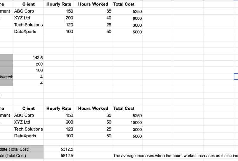
inputting service data. Imagine you're managing services provided to clients
at an IT company. We'll add some information
regarding service name, client, hourly rate,
and hours worked. Now that we've entered
our service data, let's make it easier to read. First, let's bold the headers
to make them stand out. Next, let's apply
horizontal align to the headers and vertical
align to all text. Then add a light
background color to the headers and change font. These simple motions give the
table a professional look. One common issue is when your data doesn't fit
neatly into the columns. Let's fix that by adjusting
the column width. Now let's create a title for
the table by merging cells. Select needed range, click
the merge cells icon, and we've created a
single large cell across the table for a title. Let's name it client
services overview. This will give your table a more organized and
professional appearance. To give the table
a polished look, let's remove grid lines. Then add some borders, making the data
easier to interpret. Next, let's apply
currency format to hourly rate column to
make the prices clearer. Great job. You've
just learned how to input and format service
data in Google Sheets. See you in the next lesson.
6. Using Basic Formulas (SUM, AVERAGE, COUNT, MAX, MIN): Welcome back. Now that you've
got your data organized, it's time to start using some of the powerful functions in Google Sheets to make
sense of that data. Today we'll be covering
five essential formulas. So for adding up totals. Average for calculating
the average of your data. Count for counting the number
of entries in a range. Max, to find the highest
value in your dataset. Min to find the lowest value. By the end of this lesson, you'll know how to use these
basic formulas to quickly analyze your data and get
insights. Let's dive right in. Let's start with
the sum formula. Imagine you're
tracking the hours worked by different
employees or teams in your IT company and you need to calculate the
total hours worked. In this example, we'll calculate the total number of hours
worked across all services. Here's how. Select the cell where you want the
total to appear. For example, D six, type sum and select range. The sum function quickly adds up all the numbers in the
range D two to D five, giving you the
total hours worked. Simple but incredibly useful. Next, let's calculate
the average hourly rate your IT company charges clients. The average formula
works like this. Select the cell where you
want the result, say C seven. Type average and select range. This will calculate
the average of the hourly rates listed
in cell C two to C five. It's a great way to
get a quick idea of what your clients are
typically being charged. Let's talk about
the count function. If you want to count numeric
data like hours worked, count helps you count how
many numbers are in a range. For example, select
a cell like D eight. Type count and select range. This counts how many numbers are in the range D two to D five. But if you need to
count text entries like services or client names,
use Counta instead. In B eight type Count and
select text range b2b5. Counta counts any
non empty cells, whether it's text or numbers, so it's perfect for tracking
services or client details. Now, let's find the
highest and lowest values in your data using the
Max and amine functions. These are particularly helpful when analyzing metrics
like performance, hours worked or rates. For MAX, select a cell, say C nine, type max
and select range. This will return the highest
hourly rate in your dataset. For, select another cell, say C ten, type Min
and select range. It will return the
lowest hourly rate. These functions give
you a quick way to identify the
extremes in your data. Now that you know how
to use sum, average, count, max and min, let's take it one step further. You can use these functions together to gain
insights from your data. For example, you can combine these formulas to calculate
total hours worked, find the average rate, and quickly identify
any outliers like the highest or
lowest hourly rate. Great work. You've just mastered some key formulas
like sum, average, count, Max, and Min, all crucial for analyzing
data efficiently. Now, it's time to apply what you've learned in
the practical task. Head over to the
task I've set up where you'll be analyzing
IT service data. Use these formulas to
calculate total costs, find averages, and spot key insights like the
highest and lowest rates. This will give you a hands
on opportunity to test your skills in a
real world scenario. Once you've completed the task, compare your results with
the provided solution to make sure you're on
track. Keep practicing. This is where your
confidence will grow. See you in the next lesson where we'll explore more
advanced techniques.
7. Sorting and Filtering Data: Come back. In today's lesson, we're going to cover
two essential tools in Google Sheets, sorting
and filtering. These are incredibly useful when you need to organize
and focus on specific data within
larger datasets. Here's what we'll cover. We'll start by
learning how to sort your data in ascending
or descending order, which helps you
spot trends easily. Then we'll dive into how
to filter your data, so you can focus only on
what's relevant and finally, we'll reveal sorting
and filtering secrets that will make you
look like a pro. These tricks will help you
work smarter, not harder. Let's get started. Let's
dive into sorting. A great way to
organize your data. We'll start with
sorting by one column, for example, hourly rate. Select the hourly rate column, go to data and choose sort
sheet by column C. Now, the rates are sorted
from lowest to highest, making trends easy to spot. Now let's sort by
multiple columns, for example, by client
and total cost. Select your data range, go to data sort range. Advanced range sorting options
and choose client first. Then add hours worked. Make sure to check data has head row so the
headers stay locked. This advanced sorting lets
you see which clients are busiest and which services are
generating the most hours. Sorting helps you
quickly organize data, uncover key insights, and
improve your overall analysis. Let's move on to filtering, which lets you focus on
the data that matters most by hiding
irrelevant information. There are two key approaches to filtering by value
and by condition. Filtering by value allows you to choose specific
values to display. Select your data range, go to data and click
Create a filter. In the service name column, click the filter icon and select only the services
you want to see. This is great for viewing specific items like particular
clients or services. Filtering by condition lets
you filter based on rules. In the hours worked column, click the filter icon, choose filter by condition
and select greater than. Enter 30 to display only services with more
than 30 hours worked. This makes it easy to
focus on data that meets specific criteria such as
high activity services. Filtering helps you zero
in on relevant data, whether by selecting
specific values or applying conditions
to narrow your focus. Now, let's take things a step further by combining
sorting and filtering. This is useful when
you want to focus on a specific set of data and
organize it at the same time. For example, let's say we want to view only the
services that have more than 25 hours worked and sort them by hourly
rate. Here's how. First, apply a filter to
the hours worked column. Set the filter condition
to greater than 25. This will hide all the services
with fewer hours worked. Next, sort the filter
data by hourly rate in descending order to see which of the remaining services
charge the highest rate. By combining both tools, you can quickly narrow down your data and organize
it for deeper insights. This is a powerful way to
manage larger datasets. Ready for some cool sorting
and filtering secrets, these tricks will make
you look like a pro. Did you know you can filter data based on the
color of cells? After creating a filter, click the filter icon and
select filter by color. Perfect for spotting
highlighted data or important rows instantly. Another cool sorting trick is
sorting by a custom order. Perfect for organizing
data like priority levels. For example, if you need
to sort services by high, medium and low priorities, add a helper column
where high is one, medium is two and low is three. Select your data and sort
by the helper column. Now your services are sorted by priority, not just
alphabetically. It's a simple way to
customize your data display. Now that you've learned
the key techniques for sorting and filtering, it's time to put your
skills to the test. Head over to a new assignment and apply what you've learned. Good luck and see you soon.
8. Sharing and Collaboration in Google Sheets: Welcome back. In this lesson, we'll explore how to share and collaborate
in Google Sheets, one of its most
powerful features. Here's what we'll cover how
to share a Google Sheet and set permissions for viewing,
commenting, or editing, how to manage access and
collaborate in real time, using version history to track changes and restore
past versions. By the end, you'll
know how to seamlessly collaborate with your team in Google Sheets. Let's dive in. First, let's look at how to share your Google
Sheet with others. Go to the top right corner of your Google Sheet and
click the Share button. Enter the email addresses of the people you
want to share with. Choose the appropriate
permission level. Viewer can only view the data. Commenter can leave comments
but cannot edit the sheet. Editor can view, comment, and make changes to the sheet. Once you hit Send, your
collaborators will receive an email invitation
to access the sheet. Now let's talk about
managing permissions. You have full control over who can do what in
your Google Sheet. If you only want your
collaborators to view the data but not make
changes, choose viewer mode. This is great when sharing
reports or final data. To allow others to
leave feedback but not alter the content,
choose commenter. If you're working on a
project together and want everyone to contribute,
use editor mode. You can also manage access by
clicking Share and going to advanced settings to remove people or adjust
permissions later. One of the best features of Google Sheets is real
time collaboration. Multiple people can work
on the same sheet at the same time and you'll see their changes
as they happen. Let's say you and a colleague are working on a
project together. As they enter data
in one section, you can instantly
see their edits and even leave comments. To add a comment,
simply select a cell, right click and choose comment. You can tag a colleague using a mention and they'll
receive a notification. It's a great way to ask
questions or highlight important data without making changes directly in the sheet. Sometimes things go wrong or changes are made
that you want to undo. Luckily, Google Sheets has
a version history feature that lets you view and restore previous versions of
your spreadsheet. Here's how go to file
Version history. See version history. You'll see a timeline of changes with the names of the collaborators
who made them. Select a version
and click Restore this version if you want
to roll back the changes. This feature is a lifesaver, especially when collaborating
on important projects. Now it's your turn to try. Share a Google sheet
with a colleague or friend and assign them
different permission levels. Test out real time
collaboration by adding comments and editing
the sheet together. To recap, we've covered how to share a Google
Sheet and set permissions. Real time collaboration
with comments and edits, using version history
to restore changes. Keep practicing and
you'll become a pro at working together
in Google Sheets. See you in the next lesson.
9. Essential Google Sheets Functions for Data Analytics Success: Welcome to the Advanced
Google Sheets Skills Chapter. In this first lesson, we're going to focus on a core set of Google
Sheets functions, essential for data analytics. While there are many
functions available, mastering a few key ones will make you a more
effective data analyst. Google Sheets has a vast
array of functions, but not all are critical
for data analysis. Instead of
overwhelming yourself, focus on those that truly add value in real world scenarios. Think of functions
like V lookup, H lookup, I, index, match, array formula, query as your roadmap to
mastering data analysis. These essential
tools empower you to retrieve data, build
dynamic reports, apply complex conditions,
automate repetitive tasks, and enhance data accuracy
with confidence. Mastering these functions
isn't about memorization. It's about understanding
how and when to apply them. By focusing on these
core functions, you're setting yourself up
for success in data analysis. As we move through this chapter, you'll build on this foundation with even more powerful skills. Let's dive in and get started on mastering the essentials.
10. Using Conditional Formulas (IF, IFS): There. Today, we're diving into some powerful tools
in Google Sheets, conditional formulas. Specifically, we'll look at
the IF and IFS formulas, which allow you to set
rules for your data. In this lesson, we'll cover how the IF formula works
and when to use it, how to use IFS for
multiple conditions, practical examples to
apply each formula, and a few powerful tricks to
take your skills further. By the end of this lesson, you'll be able to set
up custom responses based on specific
conditions in your data. Ready to see what's
possible, let's get started. Let's start with the IF formula. Think of it as a
simple yes or no test. The IF formula allows you to
ask Google Sheets to perform different actions depending on whether a condition
is true or false. The syntax is IF condition, then value if true, otherwise, value if false. Imagine you're
managing service hours and want to label anything over 40 hours as overtime and
anything below as regular. Here's what you
type in Cell D two. IFC two is greater 40 than
overtime otherwise regular. This formula checks
the number in C two. If it's greater than 40, sheets will display overtime. If not, it will say regular. Now we apply this
formula to other cells. A is set. This is one of the easiest ways to categorize your data with a single formula. Now, let's say you need more
than two possible outcomes. The IFS formula is
perfect for this. With IFS, you can set
up multiple conditions, each with its own unique result. The syntax looks like this. IFS, condition one,
then result one, condition two, then
result two, and go on. Let's expand our example
and add three categories. Low for hours under 20, regular for 20 to 40 hours, overtime for anything above 40. In cell C two, you
would type IFS, C two is less 20, then low, if C two less or equal 40, then regular, if C two is
greater 40, then overtime. With this formula, Google Sheets checks each condition in
the order you've written. So if the hours are below
20, it'll display low. If it's 20 to 40, you'll see regular and anything over 40 will
show as overtime. Simple and highly effective for organizing data into
multiple categories. Now, let's dive into some
real world examples where IF and IFS formulas can help with managing
IT services data. Example one, using IF to
categorize service hours. Imagine you're tracking
service hours for various IT support tasks
and you want to label any service over 30 hours as extended and anything
under 30 as standard. In CLC two type, IF B two is greater 30 than
extended, otherwise standard. This way, Google Sheets instantly categorizes
services based on the hours spent helping you quickly spot which
tasks took extra time. Example two, using IFS to
prioritize client requests. Let's say you need to prioritize client requests
based on urgency. You want to label high
priority clients as urgent if they require more
than 20 hours of support, regular if they need ten, 20 hours and low if
they're under 10 hours. In cell C two, type
IFS B two is greater 20 than urgent if B two
is greater or equal ten, than regular, if B two
is less ten than low. Now, sheets
automatically assigns priority levels based
on client needs. Now, let's explore some tricks that make these formulas
even more powerful. Tip one, using eyes Blank. Imagine you want to quickly
flag cells with missing data. You could use this
formula tar if Is Blank, B two, then missing data,
otherwise, data present. Quickly spot gaps without
scanning every row. Tip two using text
concatenation. Imagine you want to
build custom labels that update
dynamically. Try this. If B two is greater 40, then over time and
B two and hours. Otherwise, regular
and B two and hours. This makes formula
more informative. Let's apply formula
to other cells. That's all for today. Thank you and see you in the next lesson.
11. Advanced Lookup Functions (VLOOKUP, HLOOKUP, INDEX, MATCH): Welcome. In this lesson, we're diving into some
advanced lookup functions that can transform the way you work with data
in spreadsheets. Here's what we'll dive into. V lookup for looking up
values vertically in a table, H lookup for searching across
rows in a horizontal setup. Index for retrieving values from specific row and
column locations. Match to locate the position
of a value within a range. We'll walk through
each function, cover real world examples, and go over tips
and tricks to make your lookups more
powerful and efficient. Let's start with V lookup. V lookup stands for
vertical lookup and is perfect when you
need to search down a column to find
a specific value. Imagine you have a
list of products in Column A and their
prices in column B. To find the price of a
specific product, say tablet, you'd use V Lou tablet, A one B nine, two false. Here, tablet is the
item we're looking up. A one B nine is the data range. Two tells Lou to return the
value from the second column, price, and false means
we want an exact match. One mistake people
often make when copying the formula is not
locking the data range, which can lead to
incorrect results. Also, Vu only searches
left to right, so your lookup value needs
to be in the first column. Next up is H lookup, which works similarly
to V lookup, but searches across a row
instead of down a column. Use H lookup for horizontally
structured data. Let's say you have months
listed horizontally in row one and monthly
sales in row two. To find the sales for March, you'd use H lookup March, A one, G two, two falls. In this case, march
is the lookup value. A one, G two is the data range. To specifies the row
to retrieve data from, and false requests
an exact match. Just like V Lou, H lookup requires an exact match
or approximate match. Ensure you select the
correct match type, false for exact matches. Also, remember that holo up only searches
from top to bottom. Now, let's look at
index and match. These two functions are incredibly versatile
when used together and offer more flexibility than V look up or
H lookup alone. Index retrieves the value at a specific row and column
in a defined range. Match returns the position of a specified item in a range. By combining the functions, you can create powerful lookups. This combination allows you to dynamically find the price
based on the product name. Let's say you want to
find the price of laptop. Using index and match, you could write hash index, b2b9, match laptop,
a two, a nine, zero. Here, match laptop,
a two, a nine, zero finds the row number
where laptop is located, and then index uses this position to pull
the price from column B. Unlike V Lou, index and match
allow you to search left, right, or in any direction. The most common error
is mismatched ranges. Make sure the range
and match aligns with the lookup array in index. For example, both should have the same number of
rows or columns. Now is time for some tips and tricks to boost
your lookup skills. We'll start with using index and match for two way lookups. You can use Index and match together in a two
dimensional search. For instance, if you
have products listed in one row and months
listed in a column, you can use index and
match together to retrieve a specific value based on
both a product and a month. Now let's discover approximate
matches with V lookup. Did you know V Loup can
find approximate matches? Use true in the range
lookup parameter to find the closest value that's less than or equal to
your lookup value. This is useful for finding income brackets or grade ranges. You can also combine IF
statements with index and match to create conditional
lookups based on criteria. For example, you want
to find the price of smartphone and
check if the price exceeds 500 and return a custom message based on this condition.
Use this formula. If Index B two, B six, match smartphone A two, a 60 is greater 500 than
expensive, otherwise affordable. This combination is incredibly powerful for complex reports. Thanks for joining and I'll
see you in the next lesson.
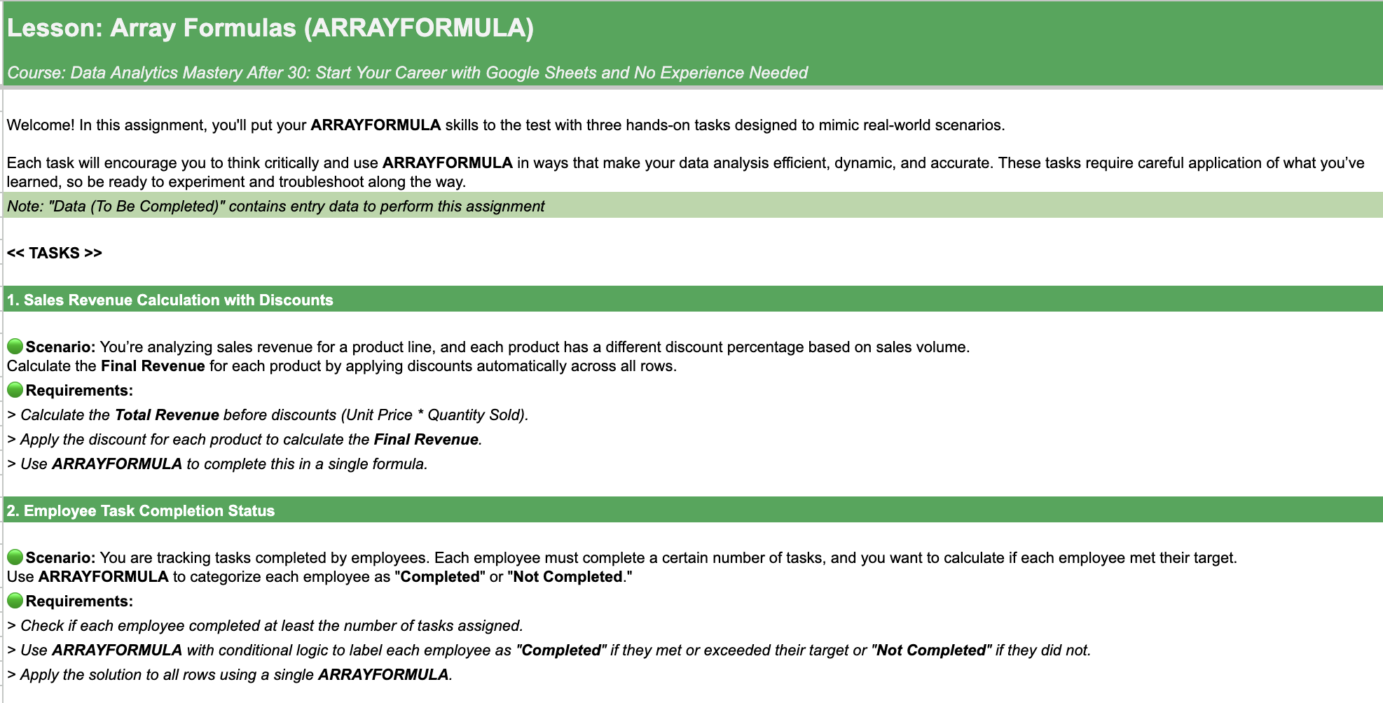
12. Array Formulas (ARRAYFORMULA): Welcome. Today, we're diving into array formulas
in Google Sheets, an amazing tool that
can save you time, streamline your work, and help you make the
most of your data. In this lesson, we'll cover
what array formulas are, learn the basic syntax, see examples in action, and even cover some
common mistakes to avoid. By the end, you'll be
able to supercharge your workflow and apply these
functions with confidence. First, let's cover the basics. Array formula allows you
to perform operations over multiple cells without having to type a formula for each row. Instead of writing the
same formula repeatedly, you apply it once and it
calculates for all rows at once. For example, if you want to multiply each value
in column B by two, you'd use x array formula B two, B, multiply by two. This formula applies to every row in column
B in just one step. Let's get another example. Say you have a list
of product prices in column B and quantity
sold in column C, and you want to
calculate total revenue. Normally, you'd
multiply each price by the quantity row by row. But with array formula, you can calculate
them all at once. Type array formula
b2b, multiply by c2c. With this, the total revenue for each product
appears instantly. RA formula isn't
just for numbers. Suppose you want to
categorize sales in column C based on whether
they're high or low sales. Here's how you do it.
Type this array formula. If B to B is greater 500
than high, otherwise low. This formula checks
every value in column C and labels each row as either
high or low automatically. Let's talk about filling empty
cells with default values. Suppose you want to fill in blanks in Column B with no data. You can easily do this with
array formula and Isblank. Type this array formula if
Iblank b2b, no data, b2b. This fills every blank cell
in Column B with no data, keeping your dataset complete. Array formula is
a powerful tool, but a few common
mistakes can lead to frustrating errors.
Let's go over them. When using array formula, it's crucial that the
ranges match in length. Mismatched ranges lead to errors or incomplete
calculations. Always ensure both ranges
cover the same number of rows like b2b5 and c2c5. Blank cells can
disrupt calculations when using array
formula across a range. Handle missing data
effectively with ice blank to avoid
unintended results. Remember, array formula
simplifies tasks across entire ranges, but only when used correctly. Keep these common
mistakes in mind and practice with the correct
syntax to keep your data clean and error free.
Great work today. We've explored the
power of array formula and learned how to avoid common mistakes that
can trip you up. Remember, array formula can save you time and
streamline your workflow, but it takes practice to master. Now, I encourage you to try out these concepts with
the practical task I've prepared just for you. This hands on exercise will help you apply
what you've learned, tackle real world scenarios, and solidify your skills. Dive in, give it
your best and see the difference array formula can make in your work.
Happy analyzing.
13. Complex Formulas (VLOOKUP, IF, INDEX, MATCH, ARRAYFORMULA): Welcome. In today's lesson, we're combining the power of multiple Google
Sheets functions. V Lou, H lookup, F, Index, match, and array formula to tackle real world data
analysis challenges. We'll cover advanced
lookups, nested searches, dynamic reporting techniques, and multi criteria filtering. Each example is designed to
show you how these formulas work together to answer
complex business questions. By the end of this lesson, you'll be ready to solve data challenges efficiently
and confidently. Let's dive in and unlock the full potential
of Google Sheets. Let's get started
with a scenario. Imagine you're working
for an ecommerce company and you need to pull data
based on specific conditions. For example, you want to find the sales of a
product only if it meets certain conditions like a specific product and
a specific region. Type this formula. Here's
what this formula does. Firstly, we combine the values from columns A and
B in each row. Then look for the combined text in the concatenated range. If found, match returns the row number of the match
within the specified range. Index uses the row
number provided by match to retrieve the value from the
corresponding row in c2c6. IfaR handles cases where
the match function doesn't find the combined text
in the concatenated range. This formula enables
advanced lookup by retrieving data based on multiple criteria and handling errors gracefully for
reliable results. Now let's combine V lookup and array formula to
automate data retrieval across an entire dataset. Suppose you have a list of
product IDs and want to pull corresponding
information from another table all in one go. For this purpose, type this. This formula applies Vu across the entire
range or column, searching for each
product ID in sheet two and pulling the
corresponding value from the second column. Here's the magic.
You only need to enter this formula
once in cell C three, and it'll populate the
entire range automatically. Now, let's use IF and
RA formula to set up a dynamic report that categorizes and highlights
data automatically. Imagine you're managing
employee performance and you want to label each
employee as outstanding, meeting expectations or needs improvement based
on their scores. Use this RA formula if b2b8 is greater or equal
90, then outstanding. Otherwise, if b2b8 is
greater or equal 70, then meeting expectations,
otherwise, needs improvement. Here's how it works. If and array formula evaluate the
performance score in column B. The formula labels each employee according
to their score. Combine this with
conditional formatting to highlight each category
in a different color, creating an instant
visual summary of employee performance. Imagine you're
analyzing sales data and you want to check
if each product met its target sales based on multiple criteria like
product ID and region. Our first task is to calculate
the actual sales amount by multiplying units sold by unit price across all
the range automatically. Next, let's use index and
match with array formula to retrieve the sales target for each product region combination
from a reference table. Here, match formula combines the values in
product ID, E three, and region F three, and matches them with
the combined product ID and region in columns A and B. Index then retrieves
the sales target from C three to C nine, based on the matched row. This combined formula
provides the sales target for each row based on the product
and region conditions. Remember to lock range
when coping formula. In the final step, we'll
use IF with array formula to check if the
actual sales amount meets or exceeds
the sales target. Based on the result,
we'll categorize each row as met target
or below target. Use conditional
formatting to make the report more visually
engaging and readable. Congrats. You've mastered
complex formulas. Now tackle the practical
assignment and put your skills to the
test. Happy analyzing.
14. Using QUERY Function in Google Sheets: Welcome. Today, we're
diving into one of the most powerful tools in Google Sheets for data analysis, the query function.
Here's what we'll cover. We'll start with query basics, then move into
advanced scenarios, including multi
criteria filtering, dynamic summaries, and even
merging data across sheets. By the end, you'll
understand how to use query to simplify
complex tasks, create powerful
reports, and take a huge step forward in your
data analytics journey. Ready to unlock Google Sheets full potential, let's dive in. Query in Google Sheets lets you perform database
style operations, allowing for easy
sorting, filtering, aggregating, joining,
and pivoting data. Data range is the cell
range you're querying. Query string contains the
instructions like select, where or group B to
manipulate data. Headers indicates how many
header rows are in your data. With this structure,
you can use query to pull out exactly the data
you need in just one cell. Let's dive into our
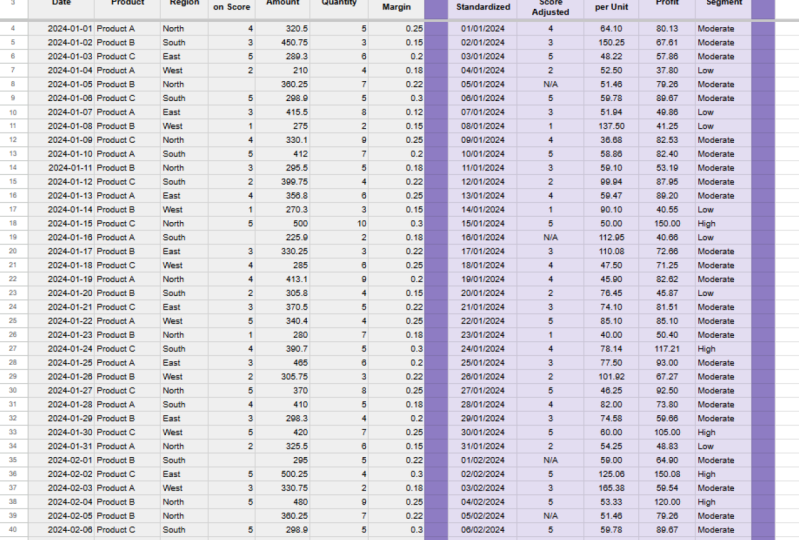
first scenario. Imagine you have a
dataset containing sales data across
different regions, time periods, and
product categories. The task is to quickly
find sales data for a product X in multiple
regions over this year. Here, query instantly
gives you a dataset for this product across two regions over a
defined time frame. Select all pulls
all columns where B equal product X
filters for product X, and C equal region one
or C equal region two, filters for region
one or region two. And A is greater or
equal date 2020 401, 01, limits results to dates
starting from 2024 year. Manually filtering
this data would take time and involve multiple steps, making it prone to errors, especially with large datasets. With query, you can filter this data by combining
criteria in a single line. This solution is
not only faster, but ensures you won't
accidentally miss any criteria. It also updates dynamically. So any changes to
your source data are immediately reflected
in the results. In this scenario, we're using the query function to create dynamic summaries of sales data. Imagine you have a dataset
with columns for dates, product categories, individual products,
and sales amounts. The task here is to find
the total sales for each combination of product category and
individual product. Doing this manually would be time consuming and error prone, especially as the
dataset expands. But with the query function, we can perform this aggregation
in a single formula. Let's walk through each part. Select B, C, S D. This
select columns B, C, and D. Column B is the category, like electronics or furniture. Column C is the product
within each category and sum D calculates the total sales amount
for each grouping. Group by B, C, here, we group the data by
category, B, and product, C. Each unique combination
of category and product will have its own row in the results with a
total sales amount. Label C product,
sum D, total sales, labels column C as product, and the aggregated result of sum D as total sales for
clarity in the output. In just one line of code, we've created a powerful
summary table that groups data by category and
product with total sales. Lastly, let's look at one of query's more advanced
capabilities. Joining data across sheets. Imagine you have
product details in one sheet and sales
records in another. You want a complete report combining relevant product
details with sales data. To join these tables, use the Dow's array
syntax along with the query function. Sheet one. A two, D, sheet two, A two D. This array notation combines sheet one and sheet two into a single virtual table, stacking them side by side. Select Cl two, coal three, coal four, coal six, coal seven, coal eight. This selects the desired columns where Cal one equal coal five. This joins the two datasets by matching product
ID in both sheets. Column one in sheet one, and column five in sheet two. This method
dynamically links data across sheets without
requiring manual copying, making it easy to maintain as data updates in either
sheet. That's all for today. See you in the next lesson.
15. Creating Dynamic Charts and Visualizations: Imagine being able to
transform raw data into visual stories that capture insights
at just a glance. Dynamic charts and
visualizations are essential in data analytics, and today's lesson will show you how to create them
in Google Sheets. We'll cover setting up
dynamic data ranges, adding interactive elements
like drop downs and slicers and customizing charts
for clarity and impact. By the end, you'll
have the tools to make your data
presentations more insightful and
engaging key skills for any aspiring data analyst. To start, let's turn our
data into a chart that updates itself automatically
as we add new information. Begin by selecting
your data range. Columns A through C, rows one to 11. Now, go to Insert
and choose chart. In the chart editor
on the right, set the chart type
to something that showcases trends
like a line chart. Next, try adding June's
data to see what happens. As you can see, any
new row of data you add will instantly
update in the chart. Great job. Now you can create
charts with Google sheets. Let's make this data
interactive with a drop down filter so we can instantly change what's shown in
our table and chart. First, go to data, then data validation and
select dropdown criteria. Enter Product A, Product B, to create a drop down
menu, then click Done. Now, let's create
a filtered table that updates based
on your selection. In Cell G two,
type filter A two, C 13, B two, B 13, equal E one. This will pull
only the rows that match your drop down
choice in E one. To link this to the chart, go to Edit Chart and set the data range to
the filtered table, G two I 13. Now, choose product A
or product B in the dropdown and watch your table and chart update automatically. Next, let's make filtering quick and seamless with slicers. Slicers allow you to toggle data instantly without modifying
the original table, a great tool for
dynamic reports. Start by selecting the full
data range from A one. Then go to data and
choose Add a slicer. This will add a slicer
control that lets you filter by columns like
region or product. To set up the slicer, click on the slicer control that appears and choose
region as the filter. Now, you can toggle between North and South regions to view specific data without
editing the table itself. Try adding another
slicer for product. This will allow you to filter by both region and product
simultaneously, giving you control over exactly
what data is displayed. Finally, link your chart
to this filtered range. Now each time you
adjust the slices, the chart and table will automatically reflect
your selected view. Let's make your charts
visually engaging and easy to read with
advanced formatting options. Customizing colors,
labels, and fonts can make your data stand out and
ensure insights are clear. Start by creating a chart
from the data in columns AD. Select the range and
go to Insert Chart. Choose a column or bar
chart to display sales, units, and revenue side by side. In the chart editor, click on the customized tab. Here you'll see
options for changing chart colors, fonts, and labels. First, update the
color scheme to make product A and
product B distinct. Choose contrasting
colors to help viewers easily differentiate
between products. Next, add data labels. Under series, turn on data labels to display
values directly on each bar. This helps your audience quickly see actual numbers
without hovering. Finally, update the axis titles. Go to Chart and Axis Titles
and rename the vertical axis as sales and revenue and the
horizontal axis as months. Adjust the font style and size to match your
presentation style. With just these few adjustments, your chart now
clearly communicates data and visually
engages your audience. Remember, the power of data
lies not just in numbers, but in your ability
to bring it to life. Each chart, each
visualization is a step closer to uncovering insights that can make a real impact.
16. Creating Powerful Reports with Looker Studio Directly from Googl: Welcome. Today,
we're diving into a powerful tool right inside Google Sheets, Looker
Studio integration. If you're looking to make
sense of your data and create insightful reports,
this lesson is for you. We'll cover what
Looker Studio is, how to access it directly
from Google Sheets, create dynamic
reports, and explore real world applications that make data analytics
more effective. By the end, you'll
have the confidence to turn data into
actionable insights, all within Google Sheets. So what's Looker Studio
in Google Sheets? Unlike the standalone
Looker Studio tool, this integration lets
you work directly within sheets to create rich
interactive reports. You don't need to jump
between platforms, just open Google Sheets
and with a few clicks, you're ready to start analyzing. Think of it as super
charging your data. Look or Studio in Sheets
allows you to visualize data, filter results, and
make quick updates, all without leaving
your spreadsheet. Let's get started with accessing Looker Studio
directly in sheets. First, navigate to
the extensions menu, select Looker Studio and
click on Create Report. This option pulls up a
window that lets you set up and configure your
report within sheets. Once you open the report setup, select your data range. You can also apply
filters, sort your data, and add fields if you need
specific metrics for analysis. This setup lets you tailor
your report exactly to your needs all within the
familiar sheets environment. Now that you're
setup, let's look at a few powerful ways
data analysts use Looker Studio in Google
Sheets to simplify complex tasks and make
data driven decisions. Imagine you're
tracking monthly sales for multiple regions. With Looker Studio, you can create different types
of visualizations. Go to the panel
and click Insert, then select what
visualization you need. Using filters, you can view
specific regions, products, or time frames, allowing for quick adjustments
and better insights. Let's explore how to create
a report in more detail. Imagine we're
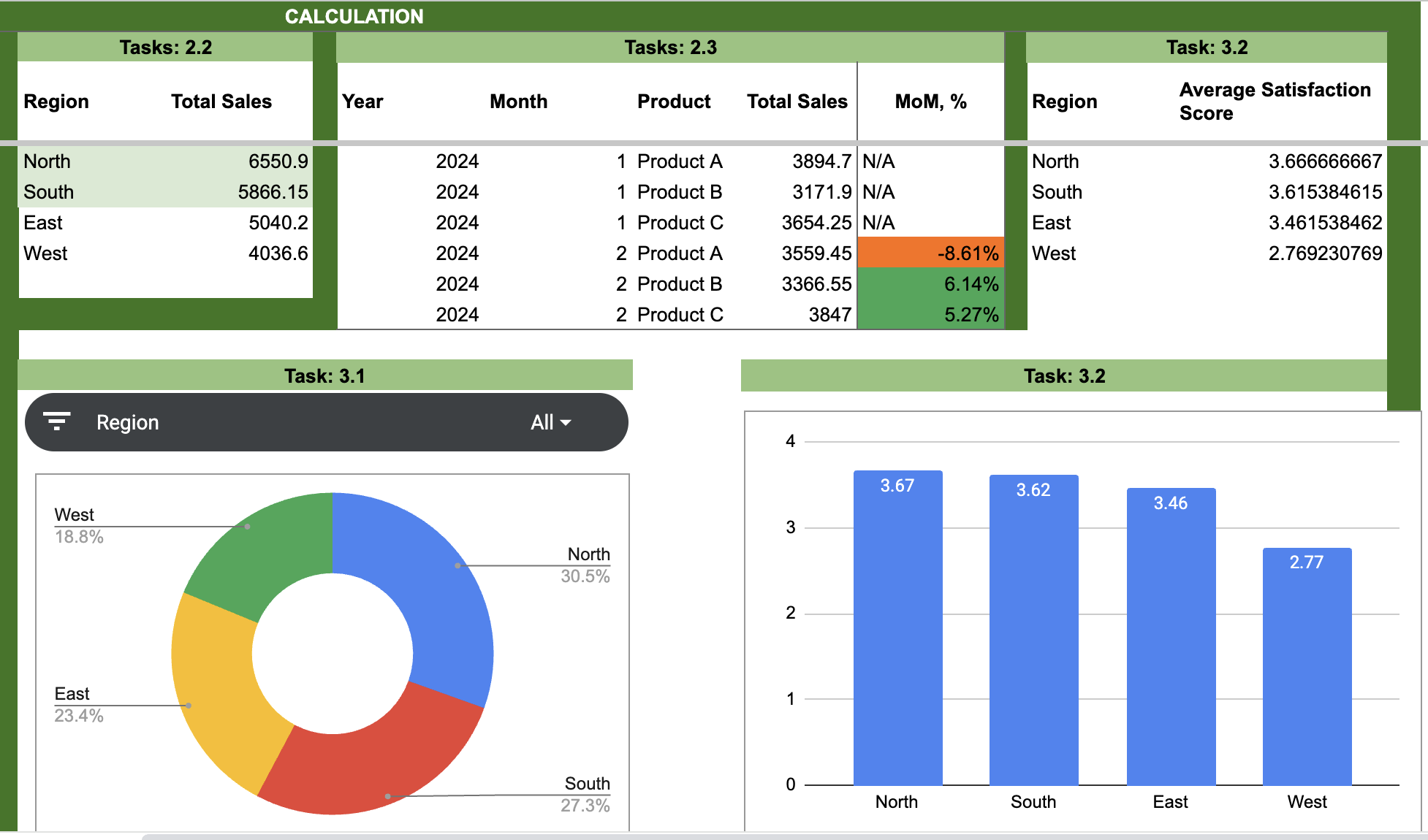
tracking feedback on services like technical
support and installation. Our goal to see satisfaction trends across
different services over time. First, we have our data ready in Google Sheets,
columns for date, customer ID, service type
rating 1-5 and feedback. Now, let's bring this
into Looker Studio. Go to extensions, choose Looker Studio and
click Create Report. Select this sheet
as the data source, covering our range
from columns A to E. Now we're
ready to visualize. For dimensions,
let's set date and service type to breakdown trends by time and service type. Now let's add a bar chart
showing average rating by service type to see which
services rank highest. Then use a line chart to show how satisfaction scores
change over time. To make it interactive, add a date filter to look at specific periods and a service type filter
to isolate categories. In just a few clicks, we've built a dynamic
satisfaction dashboard right here in sheets. Now you're ready to gain insights and improve
customer experience. In this lesson,
you learned how to access Looker Studio
directly in Google Sheets, set up dynamic reports and
explored real world examples. Remember, this tool gives you powerful insights without
needing to leave sheets, making it an essential
skill for any data analyst. Give it a try. Start building your own reports and see how Looker Studio can transform
your data analysis journey.
17. Using ChatGPT Functions Integrated in Google Sheets: Welcome to a game
changing lesson. Today, we're diving
into a magical tool, hat GPT right inside
Google Sheets. Imagine automating tasks,
getting quick answers, and transforming
your data analysis all through AI directly
in your spreadsheet. In this lesson, you'll learn
how to add chat GPT to Google Sheets and
we'll walk through real world examples that
will blow your mind. Ready to experience
the magic of AI? First, we need to bring Chat
GPT into Google Sheets. Open your Google Sheets,
go to extensions, click on add ons and
select Get add ons. In the search bar, type hat GPT and choose an add on
from the results. Click Install and follow the prompts to allow
necessary permissions. Once it's installed, you'll
see the Chat PT add on in your extensions menu ready to start assisting
you with tasks. Now, let's explore
how we can use it to transform our data in ways
that'll feel like pure magic. Let's start with
something simple but powerful getting summaries
and insights from raw data. Suppose you have
customer feedback or survey responses in a column. Instead of sifting
through it manually, use hat GPT to generate
a quick summary. First, go to extensions, hat GPT, launch Companion. Then go to Pop up Window. Choose datasheet by indicating your sheet name and
select range. C2c 13. After that, write, generate
a summary and execute. Chat GPT will scan the
responses and provide an overview of key
satisfaction items on a separate tab
just in seconds. This can save hours of manual reading and help you
see patterns immediately. Now, let's try some AI
powered data cleaning. Chat GPT can standardize
inconsistent formats, fill in missing information, or even correct common spelling
mistakes in your dataset. Let's launch our Companion, choose datasheet
and select range. Now we need to provide instructions to chart
GPT what to do. Let's instruct our
assistant what exactly we would like
to change like format, capitalization,
et cetera. Mm hm. Just like that, your data
is uniform and ready for analysis without the hassle
of manual formatting. Now let's identify the top selling products
across regions. After going to extensions
and launching hat GPT, just type which products have the highest
sales in each region. Chat GPT will analyze
your data and provide the top performers
by region like laptops in the North and
smartphones in the West. This insight helps you focus on high demand areas
for each product. H next, let's analyze
customer sentiment. Type in categorize
customer feedback as positive, neutral,
or negative. Chat GPT will quickly sort feedback into
these categories, giving you an at a glance
view of satisfaction levels. This saves time, helping you see if products meet
customer expectations. Finally, let's forecast
next month's sales. Type forecast sales for each
product for the next month. Chat GPT will use current
trends to predict sales, helping you prepare
for demand in advance. In this lesson,
you learned how to integrate chat GPT
with Google Sheets, from generating
insights and cleaning data to creating
dynamic content. This isn't just a tool, it's your AI powered partner, ready to enhance
your productivity and bring your data to life. Now, give it a try
and experience the magic of AI in
your own spreadsheets. Good luck and see you
in the next lesson.
18. Roadmap from Your Current Role to Data Analyst: Welcome to this final part of our course where we'll bring everything together
with a roadmap to becoming a data analyst. You've come a long way learning to harness the power
of Google Sheets, solve data challenges, and master techniques that are
invaluable to a data analyst. In this lesson, we'll cover how to leverage your unique
background as a strength, how to turn your expertise with Google Sheets into practical
career building projects, and the actionable
steps you can take to transition from your current
role into data analytics. This is not just a summary. It's a clear path
forward to help you move from where you are now
to where you want to be. You might look at your
current experience and think, how could this possibly
help me in data analytics? But remember, your
journey is unique and what might seem like
an unrelated skill now can be an asset. Whether you've worked in
customer service, finance, or even logistics, you've
likely had to solve problems, manage tasks, or
understand processes. These are the very skills that data analysts use every day. When you step into
data analytics, you're not leaving behind
your past experiences. You're retooling them. Look
at what you already know. Think of how it applies to analytics and carry it forward. Real value is about what
you bring to the table, not how closely your past
aligns with a job title. You've spent this course
focusing on Google Sheets, which is a powerful
tool on its own. By now, you're probably
seeing how you can use it in ways that go far beyond what
most people consider basic. This depth of knowledge in
one tool can set you apart, especially in a world
where people think success lies in knowing
a bit of everything. Instead of jumping to learn
the next tool immediately, I encourage you to
think about how you can push your skills
further within sheets. Could you automate a process, create an advanced dashboard, or find new insights
in datasets? When you focus on mastery,
you're not just learning. You're equipping yourself
with the confidence and expertise that come from
truly understanding a tool. Breaking into data
analytics from a different field is a journey of small
intentional steps. Here's a roadmap to
get you started. Step one, start by
identifying tasks in your current role
that can benefit from data analysis even
in small ways. Look for repetitive
tasks that could use automation or decisions that could be made with
clearer insights. Apply what you've
learned about formulas, filtering and
conditional formatting to simplify or improve
these processes. Step two, build a portfolio
from these projects. As you complete each
analysis or automation, document it in a way
that shows your impact. Write a brief summary of
the problem you tackled, the approach you took, and
the results you achieved. Over time, this will give you a tangible record of your growth and achievements
in data analysis. Step three, integrate
your new skills into your resume and
LinkedIn profile. Be specific about
what you've done. Don't just list tools. Describe the results
you delivered, like automated
reporting processes, reducing manual work by 30%. When you communicate
in terms of impact, hiring managers can clearly
see your potential. Transitioning careers
doesn't happen overnight. It's a marathon, not a sprint. Set yourself
achievable milestones and commit to meeting them. For example, by next month, aim to have automated
one routine task at work or complete an analysis that brings value to your team. Don't overwhelm yourself
with the entire journey. Instead, celebrate
each small win. This isn't just about adding accomplishments to your resume. It's about proving to
yourself one step at a time that you belong
in data analytics. As you close in on your goal, start preparing
for interviews by revisiting each project
you've worked on. Think through your approach and practice explaining your
methods and insights. Remember that
companies want people who can connect data
to business needs, focus on how you
solved problems. Show them that your journey wasn't just about
learning tools, but about understanding
data's value in making better decisions. This way, you're not
only showing skills, but demonstrating your
readiness to make a difference. Your journey to becoming a data analyst is
uniquely yours. Embrace each step,
apply what you learned and let your skills reveal the impact
you're ready to make.
19. Avoiding Common Mistakes on Your Career Path: Welcome to a lesson
focused on avoiding common mistakes
that can hold you back on your journey to
becoming a data analyst. It's natural to feel uncertain, but those feelings
shouldn't stop you. Today, we're breaking down common barriers like self doubt, age, and non
technical background, and how to overcome them. You'll leave this lesson with actionable steps to
tackle these challenges head on and keep moving toward your goal of
becoming a data analyst. It's easy to feel that age or a non traditional background
puts you at a disadvantage, but age brings
valuable experience. For example, when I started, I was older than most of my colleagues and I feared
being out of place. But I soon realized that my experience brought a new
perspective to our team. If I could start over,
I'd remind myself that age isn't a
barrier, it's an asset. Comparing yourself to others can be one of the
biggest blockers. You might think
others are smarter, faster or more experienced. But remember, each person's
journey is unique. Comparing yourself to others distracts from your progress. Focus on your own path because
you have your own pace, your own strengths,
and your own timeline. Every step forward is progress. Sometimes we wait for the
perfect moment to begin, but the reality is there
is no perfect time. If you keep waiting, you'll
always find reasons to delay. I could have told
myself that I'd start when I felt more
prepared or less busy, but that perfect
moment never came. The right time to start is now. Start with one small step today and take it
one day at a time. When I started, my goal
wasn't become a data analyst, that would have
felt overwhelming. Instead, I focused on
smaller steps like learning Google Sheets formulas and applying them
to my current role. Each small goal you achieve builds
confidence and momentum. Set yourself
manageable milestones that move you closer
to your big goal. You don't have to do this alone. Joining a community
of other learners and professionals can provide
motivation and insight. When I connected with
others in the field, it gave me perspectives I hadn't considered and
kept me motivated. Look for online
groups, meet ups, or Linked in communities
where you can learn, ask questions, and
share your experiences. Having a support network is
crucial for staying on track. Let's look at a few examples to illustrate what you should focus on versus what you
should avoid on this journey. Things to do, set small
achievable goals. Aim for steady improvements, not perfection.
Celebrate progress. Every small step
forward matters, acknowledge your wins, seek
constructive feedback. Reach out to someone
with experience to review your work
and help you improve. Things to avoid. Don't
wait to feel fully ready. Don't hold back until you feel you've mastered everything. Start now with what you know. Eliminate negative self talk. Replace icon't with I'm
learning and focus on progress. Don't isolate yourself. Find a mentor or community. Working alone can
amplify doubts. Remember, the
journey to becoming a data analyst is about embracing each step
along the way. You don't need to have it
all figured out right now. Just take the first step. This week, I challenge you to complete one small
action from this lesson, whether it's practicing
a data task, joining a community, or
reflecting on your progress. Believe in your unique
journey because every small effort brings
you closer to your goal. Data analytics is waiting for you and the best time
to start is now.
20. Building a Resume for Data Analyst Roles: Welcome to today's
lesson on building a standout resume for
data analyst roles. In this session, we'll
cover everything you need to make a lasting
impression on recruiters. We'll go over the
must have skills that companies value
most right now, show examples of
what to avoid and what makes a great resume
shine and give you step by step guidance along with professional tips to create a resume that truly
reflects your potential. By the end of this lesson, you'll have a roadmap for
presenting your experience in a way that sets you apart in
today's competitive market. Data analysts are expected to be more versatile now
than in the past. Beyond technical
skills like SQL, Google Sheets, and Python, companies want analysts who
understand business needs, communicate insights well, and make data driven decisions. Highlight your ability
to interpret data in practical ways
that drive results. If you've ever turned
a messy dataset into meaningful insights
that improved a process, say that and make it
clear in your resume that you're not just tech savvy
but also business minded. Now, let's talk about
what to leave behind. Generic statements like detail oriented or hard worker
no longer make an impact. Recruiters have seen these
words thousands of times. Instead, demonstrate
these qualities by describing actual outcomes. Rather than saying, I'm
detail oriented, show it. Reduced errors in
monthly reports by 30% through meticulous
data validation. It's about evidence
over adjectives. Also, avoid listing every
tool you've ever touched. Focus on tools you're
proficient with and have actively used
to achieve results. Here's how to build a resume that recruiters can't ignore. First, start with a strong
summary at the top, two or three sentences that
explain what you do best. Then dive straight
into accomplishments, not just job duties. Use bullet points
that start with strong action verbs and show
the impact of your work. For example, instead of
saying prepared data reports, try developed
automated data reports that reduced processing
time by 20%, enabling faster decision making. Numbers matter. They add
credibility and specificity. Let's compare some examples to see what works and what doesn't. Here's a line from
a typical resume, responsible for preparing
monthly reports. That's vague and doesn't
show any results. Now, here's a stronger version. Generated monthly
reports that led to a 15% reduction in operational costs by
identifying inefficiencies. Notice how the
second version shows the recruiter what you
achieved and why it matters. Now, here's a step by step
process to craft your resume. Step one, start with
a summary, two, three sentences that showcase your most valuable
skills and achievements. Step two, list your experience, focusing on impactful results. Remember, use
numbers and metrics. Step three, add a skill section, but only list tools and techniques you're
proficient with. No fluff, only what you'd feel comfortable discussing
in an interview. Step four, include
relevant projects. If you've used your skills to achieve something
significant, even outside of a formal
job role, add it. Step five, format
it for readability. Make sure your resume is
clear and easy to scan. Recruiters are skimming quickly. Make sure each section
answers one question. What value do I bring
to the company? Remember, your resume is a
reflection of your value. Focus on showcasing the skills and achievements
that set you apart. It's not about
listing every task. It's about showing how
you've made an impact. Approach your resume
with confidence and honesty and make sure every
line answers the question, how did this add value? Take your time with
it. Be proud of your journey and make
that value clear. You're already on
the right path, and this resume is your
next step forward. Thank you and see you
in the next lesson.
21. Interview Preparation for Data Analysts: Welcome to today's lesson on preparing for data
analyst interviews. In this session, we'll dive into key strategies for standing out and making a
strong impression. You'll learn how to
approach technical, behavioral, and scenario
based questions, showcase your skills with Google sheets and
data analytics, and confidently answer questions that highlight your
problem solving abilities. Plus, we'll touch on tips for negotiating salary and setting
clear role expectations. By the end, you'll feel
fully prepared to walk into any interview with confidence and present yourself
as a top candidate. In data analyst interviews, you'll encounter three
main types of questions, technical, behavioral,
and scenario based. Technical questions
evaluate your ability to work with tools
like Google Sheets. Behavioral questions explore
your past work experiences and problem solving skills. Scenario based questions assess your approach to
hypothetical challenges. Being well prepared
for each type will help you demonstrate
a well rounded skill set. Let's start with
technical questions. You've learned powerful Google Sheets functions like query, array formula, index, match, and complex
conditional formulas. An interviewer might
ask you how to create a dynamic report or summarize data using query or
index and match. Walk them through your
thought process from structuring your data to
choosing the best formula, emphasizing how these functions help solve real
world data problems. Another possible question, how would you handle large
datasets in Google Sheets? This is a great chance to
talk about array formula for efficient range
calculations or how using query simplifies data
filtering and organization. Show them how you use
conditional formulas like IF and IFS for
flexible analysis, making your insights both
precise and easy to interpret. Now, let's cover
behavioral questions. These questions give
you a chance to share experiences from
your career journey. For example, if asked, can you tell me about a time you solved a
complex problem? Share how you used Google
Sheets to streamline a reporting task or automated calculations
to reduce manual errors. Highlight your proactive
attitude and how you apply data skills to make
meaningful improvements. Scenario based questions are common in data analytics roles. An interviewer might say, suppose you're tasked with analyzing customer
trends over time. How would you approach this? Explain how you would
organize the data, perhaps using Google
Sheets query function to pull insights or create dynamic charts to
visualize trends. Emphasize the techniques
you learn to make data actionable and
easy to communicate. Mock interviews are an excellent
way to build confidence. Practice answering
questions out loud, explaining your steps as if the interviewer
were beside you. You could even record
yourself explaining a complex Google Sheets
formula or a past project. Reviewing your responses
can help you spot areas for improvement and make sure you're
communicating clearly. When it comes to salary
and role expectations, approach the topic
professionally. Research typical salaries for entry level data analysts and be ready to discuss
the value you bring even as a career changer. If you've completed this course and gained hands on experience, don't hesitate to emphasize your ability to hit
the ground running. Interviews may be nerve racking, but remember, you're ready. You've built a strong
foundation in data analytics, developed problem
solving strategies, and learn technical skills that make you a
valuable candidate. Go into your interview
with confidence knowing that you have what it takes
to excel as a data analyst. Good luck. You're
well on your way to an exciting career
in data analytics.
22. Your First Step into Data Analytics The Course Project: Welcome to the course project. This is where everything
you've learned comes together in a
real world scenario. Think of this as your first step into the role of a data analyst, taking raw data and transforming it into
actionable insights. This project will
help you showcase the Google Sheets skills and analytical thinking you've developed throughout the course. In this project,
we'll apply functions like query, index, match, array formula, and conditional
formatting to analyze, clean, and visualize data. You'll handle tasks just
like a data analyst, spotting trends,
creating dynamic charts, and calculating
performance metrics. Each step has been designed to reflect real business needs. So you're not only
practicing skills, but building
portfolio ready work. This project proves that
with just Google Sheets, you're equipped to tackle
meaningful analytics tasks. Let's review how you can
use what we've covered. Array formula to
streamline calculations, query for data organization, and advanced charts for
impactful visualization. Remember, this assignment
is more than just a task. It's an opportunity to
create something impressive that will demonstrate
your readiness for a data analyst role. As you work through, take
pride in each completed task. By the end, you'll
have a project that can be the foundation
of your portfolio, something to show
potential employers as evidence of your skills. This project is about
bringing everything you've learned together and
building your confidence. Thank you for choosing me and for bringing your passion and
dedication to this course. I'm thrilled to
have been part of your journey into
data analytics. Remember, this is
just the beginning. The skills you've
gained here are powerful tools that
can take you far. Keep pushing forward,
keep exploring, and let your work
inspire others. Now, let's finish strong
with this project and show the world what you're
capable of. Good luck.
 Tetiana Popova, Data Analyst | Investor