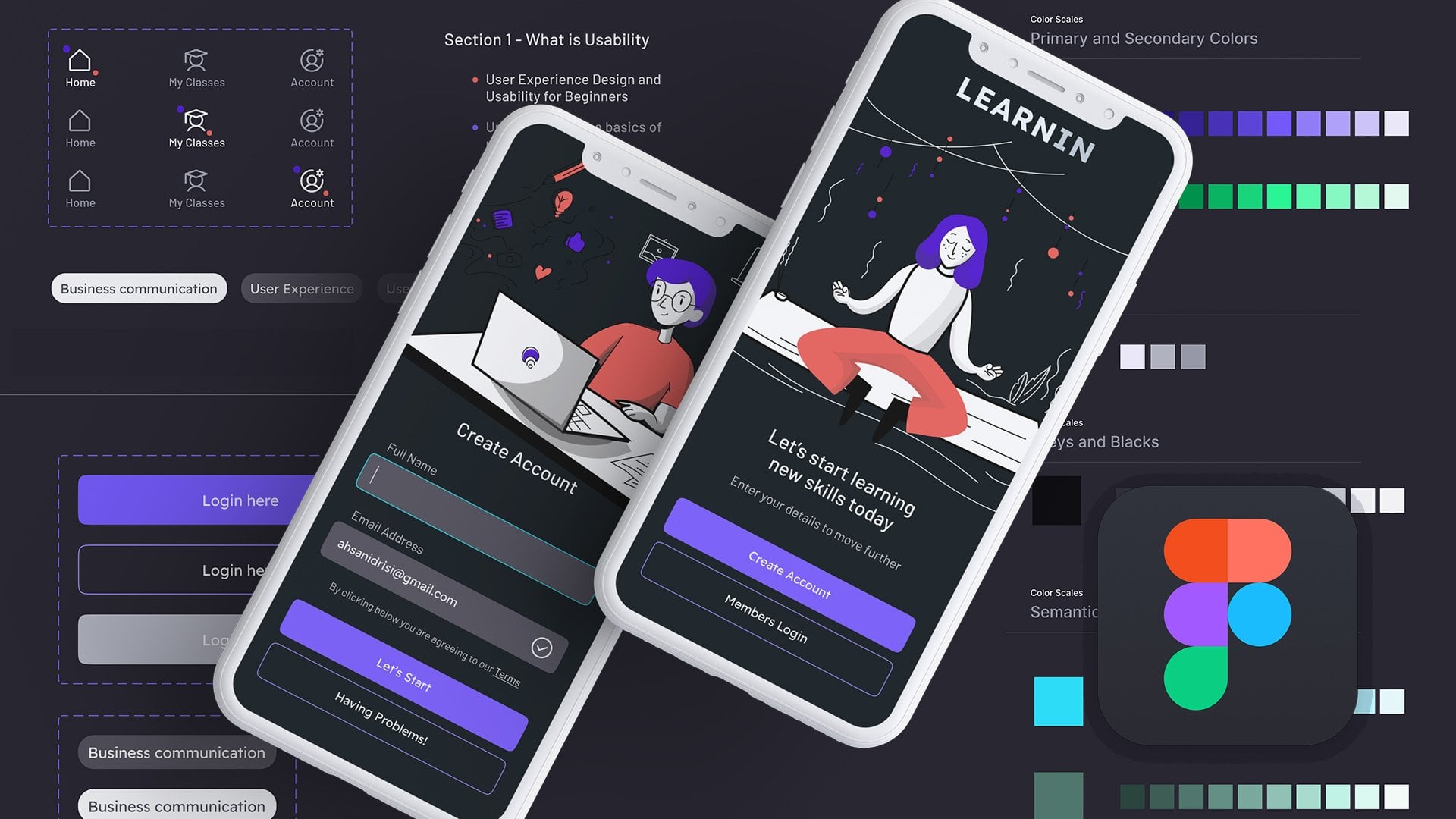
Transcripts
1. 01 AutoLayouts Figma Intro 19 8 24: Hello, junior designers or
medium level designers, UI designers, use
expense designers. I have been seeing a lot of problems with auto
layouts in Figma. So if you are using Figma
and having trouble how to efficiently use auto
layout for spacing, for layout, for components, how you are going to create whole sections,
just auto layout. So you can use them in UI cars, you can use them in whole web
design sections, headers, different featured
sections, for alignment, for spacing for a lot of stuff, for buttons, for top navigation
bars, a lot of things. But where you have to use
auto layouts and where you don't have to use auto
layouts. This is the question. So in this whole
episodes of videos, I'm going to share
with you all the tips, how I actually use it. I will go step by step on
different things from BGNer to, you know, next
level, next level, and how I actually
use aut layouts while we design or UI
design or an mobile layout. So let's get started
and see you soon in the next lesson where
we are going to create a button a
layout button first, and maybe some paragraph just to give you the
hint of au layout. So let's get started.
2. 02 Explaining all autolayout Controls and alignments: Now, let's get
started and create an order layout button first or maybe some headings,
just some spacing. So I'm going to give you
first order layout button. So let's press T for text, and let's call it button. So this is going
to be our button. I'm going to press now.
This one is selected. I'm going to press shift A. So now you can see
it is a frame. It has aud layout everything
enabled on the right. You can see here, here, we have a layout everything,
A layout controls. And you can see we have
a border around it. So you can see if
we hover over here, it says eight pixels padding at the top and similarly
eight pixels from here, similarly eight
pixels from here. You can increase the
space if you want to. But the problem is that there is no background
color in it. So first, we are going to
click over here, fill. And now you can see we
have a filled button. Let's fill a color like
something like this like this. Okay. So I'm going to change
the text color to white. Okay. So this is going to
be my frame right now, and there are a few
settings over here. This is x axis, y axis. This is actually
how the contents of this pattern are going to
expand or contract or behave. Okay? So this is basically horizontal sizing
and vertical sizing. We are not going to touch
this one right now. We are more interested in
these paddings right now. So just leave these on auto. And this is actually
horizontal padding, and this is vertical padding. You can see if I click or
who are on this section, and you can see here we
have both of them selected. So if I click over here, on the sides, we
have right and left. So if you want to
control all different, you can control them like this. So this is left padding. Let's increase the
left padding to 16. Let's use 24 over here, and on the right padding, I'm going to use 24 And on top and bottom,
I'm going to use 12. And oops, something. I think I clicked
something else. Frame. Click on
the frame and 12. So this is our button. Let's put rounded
corners over here, 16 pixels, and I'm
going to use IOS 60%. This is corner smoothing,
if you don't know. So here is a basic button. Okay. So y auto layout. So you can see here we
have different spacings. So Number one reason is spacing. You can easily control
spacing around it. You can easily control top bottom paddings,
right, left paddings. So this is very handy when you are designing
user interface. Second is that if I try to try to change the text
of the button, it is going to expand. So the reason is this
over here hug and hug. So this is the basics. Okay. So we have
covered these paddings. Now we are going to cover
this horizontal gap. So let's say I have this frame, and then I have another one. Let's replicate this command D. So now we have this frame, let's call it BTN one, and let's call it BTN. BTN two. Okay. So we have
now two buttons, and Now, what we're
going to do is, we're going to select both
of them both buttons. So now, both of them have
been selected, and again, we are going to
have nest them nest them into another
parent auto layout. So I'm going to hold
and press shift A. Again, now you can see
this is our frame, and I'm going to
call it container. So now you can see this
container is actually containing these two buttons that those
were also auto layouts. So this container and inside, we have button one
and button two. Now, if we click on the
container, you can see, we have this auto layout
feature top to bottom. This is actually layout, how we are going to
change the layout. So this is what I told you that this is going
to be the layout. So we are going to click
over here and over Hare, and this is how it will change. Now, this is how it
will change the layout. So if we have two or three
items, let's call it. Let's replicate this one again. So let's replicate this, and I'm going to press control
or command D to duplicate. Now you can easily see, I'm going to shrink it a bit, so I'm going to press K, and let's shrink it to 300. So this is a little batter. I am going to select
shift and select all of these and going to reduce
the typeface size. So here we have the container, and this is basically
to control the layout. So this is horizontal direction, this is vertical direction. Now, the spacing between them, so this is actually the spacing
between these elements. This is controlled over here. So if you have just
single item in a layout, it is not going to
help you at all. So this is how I'm going
to control, let's say, I'm going to have a 16 pixels spacing between the set
of buttons like this. Maybe I'm going to have like publish now or
let's call this. Save to draft. Now I'm going to
change the color of this button to be
a bit like this. I'm let's keep this button
to publish two word press. Okay. So these are three
sets of buttons, and although I am having
two active buttons, still, this is just to
understand the concept. Okay. So keep the
background white. So you can easily see
micro button over here. Okay. So that's
about the layout. No, this third option.
This is actually AP. This is very new
option in Figma. It's called AP and RAP means that you can set the
container and when you when you actually try to get a responsive view or
try to squeeze the container, it is going to wrap up. Okay? So let me show you. So if we have this wrap
up over here selected, and you can see this is align left where you want to align. So if I try to squeeze,
you can see now, if I try to squeeze
the width of this, so it is actually auto
wrapping in this container. So this is useful when
you are trying to create a responsive view or responsive button set where
when we have smaller screens, the button actually
wrap like this. On bigger screens, they are
going to be in this stree. So this is how you use
this wrap over here. Now, we have covered
all these on this side. Let's try to go to
this alignment now. Okay, so I'm going back to
switching back to this. And so for example, I have a bigger container,
let's say this one. Now you can see, let's
use something like this. So now I have actually
expanded my container. It happens sometimes we
have a bigger container than what we have
inside the contents. Okay, so Now, this is actually where is
going to be your content. So this is actually the
alignment of the content. So right now you
can see these are three buttons that
are aligned on the left and left and in the middle of this
whole container. So if I try to select top, it is going to be stick to top, bottom, middle bottom,
middle top, right. This is going to be in the
mid c, center of everything, a horizontal and other centers. So This is the whole
auto layout scenario. So let's try to complicate
things and move on to the next lesson where we are going to add more things
to this container. So let's move on to
the next lesson.
3. 03 Text alignment layout with autolayouts: Now, let's get back
to the auto layout, and we are going
to add and I will show you more trips and tricks, how I actually use
auto layouts for text. Okay. Here I have, this is actually the auto layout of the container of the button. So let's call it BTN container. So let's keep it at the bottom and have
a heading over here. So I'm going to press. This is going to be
heading for my blog, and let's type some
text over here. Try to use some
Lum Ipsum plug in, Laurum. Yes, yes Laurum. Here we have
something like this. I have to select something. Let's create a text layer
over here and then generate. This is great. We have
some sample text now. I am going to use regular over here and
16 for the typeface, and I'm going to
use auto height. Over here, okay? So we have
heading and then paragraph. Mostly, what I do is, sometimes we also
have heading and some subheading or line
above the heading, which is, I'm not sure
what you call it, but I call it
subheading actually. And let's have it 20, and I'm going to
have it in all caps, something like this,
something like this. Sometimes we have
arrangements like this. So how Auto layout is going
to help you in spacing. So this is all about spacing. Now, I want to have a separate spacing between
these two and these two. All these things, I'm going
to have a separate spacing. Let's reduce the size to 14, increase a bit of
spacing between these. I want to keep something like this and over here,
I'm going to use 20. Let's use 18 over here. So how I'm going
to achieve this. First, I'm going to
the rule of thumb is that you are going to auto lay out the things that
are closer first. So for example, these two, I'm going to select
these two shift eight. So now you can see
this is the spacing. They have spacing
of zero right now. Now I have this frame. I'm going to call it
heading plus subheading, something like this, and
this is going to be text. Now I'm going to select this
subheading and heading, and I'm going to shift click this to select
both of these. So you can see here, I have this out layout heading
and the text layer, and I'm going to
again press and hold Shift A to create
another layout. So let's call it
a text container. Okay? Now, the benefit
of this text container is that if I want to control
the space between these two, I'm going to have something
over here like this. And if I want to control the spacing between this
block and this one, I'm going to press
select text container. And right now we have 28, I can use 24 like this. So this is very, very common way which I use in my web design process all the time for layout of text layers. You can also have something
like this in the middle. If you want to move
something in the middle and if I want to move the
heading in the middle, I can use something like this. I'm not sure why it is not moving Oh, this is the problem. We have this auto width not
turned on for this one. Here we have auto auto height. This is going to be auto width. For single lines of text, I would always use auto width. Make sure if you have single
lines of text, use auto wit. Otherwise, you are going to have something like this,
problems like this. This is going to
be center align. If you want something like this, you can have a center
align text container. Now, the next step. We are going to make
this text container. Let's move this heading
somewhere else. So here we have a
text container. Let's move everything
on the left. Let's move this one to the left, and let's move everything
inside it to the left too. Now, let's make it responsive. Right now, if I try to
squeeze the container, okay? So it is working.
And the heading is not working like this, but this one is working. Okay, so why it is working
is the reason is phil. So whenever you are
using a text layer, which you want to expand and contract based on
the container size. So you have to use
fill for it, okay? So vertical resizing is hug and horizontal
resizing is fill. So this is going to be for
the text layer over here. So if I select this heading, you can see it is
not set to fill. It is sizing is hug. So if I click O here like this, and let's try to expand this
to fix to fill container. Let's try to Now, now you can see
it is responsive, now what I is a little
bit of complex things, but let me show you
what I actually did. So first of all, first of all, I have another you
can see over here, this one, this
frame inside this. And first, if I want this frame to be responsive
and the content inside it to be responsive
because the frame size should contract and expand. So first, it was set
to fixed like this. So if I try to, you know, contract, it is going to be fixed, remain fixed. So first, I need to set
it to fill container, so it is going to
fill the container, which is the outer
container text container. And the second
setting is you have to use fill container for
the heading inside it too. So now we have everything
responsive over here. So if I try to squeeze this, let's try to squeeze
it as much as I can. Now, if you want it to
be something, you know, like this and don't want it
to go beyond this size, okay. You want that whenever someone try to squeeze my, you know, featured layout or this heading section or this
card or whatever you want. I don't want someone to squeeze it beyond this
width, which is 220. We have another feature
selecto here and this is going to be the minimum
width is going to be 220. Let's try to do it now. Oops. I have been blocked. Okay. So this is how
you are going to lock the minimum width of your
container or your card. So if you want to now, now, the next step is, I am going to convert this whole section
into a card layout, okay in the next video. So let's move on to
the next video and create some more stuff
using auto layout. I hope you are enjoying this lesson if you
are enjoying this, make sure you thank to me by commenting or by
recommending this course, by reviewing this course, write something about it. That is all. Let's move
on to the next lesson. And learn something more
about order layouts.
4. 04 Card Design with buttons and icons in Autolayout: L et's create
something more like a car layout for this auto
layout tax container we have. Let's replicate this,
and we are going to keep it like this, replicate it. And what first we need is
actually a fill color. So let's fill it with
something electric blue. For this, I'm going to
change the background color, and now my container
is going to be white. Okay, as soon as I have added
the fill color over here, I have some problems, which is going to be
fixed with the paddings. Okay. So I am going to use
24 on left and right, 24 top and bottom like this. So here we have a
very lovely aayout. And I'm going to add an icon. Let's add an icon
over here at the top. Let's use this
Panda icon library. So let's let's use
something like, so I'm going to use something
like this or auto layouts. And so what do you think? We should add something over
here or in the container. Okay. So let's copy
it in the container. And right now you can
see it is at the bottom, so I'm going to move it
to the top like this. And, so I want this to have, you know, to control the
spacing between these two. So I'm going to
select these two, and I'm going to hold shift and to create
another auto layout. Don't worry about those
many auto layouts. I'm going to have
something like this. Oops. What happened
just happened? I'm going to click
over here and I'm going to increase
its size to 40. Let's use 32. 48 is
a bit, very big. And let's select some
color like this. Oops, Apple. Yes. Anyhow, so this is going
to be Apple library. And so this is our simple card. And you can see we have very
complex layouts over here. I'm going to call a top frame. And this is actually
our bottom text. Okay. So you can see this is
a very lovely card and let's use some 66 for this one. If you want a stroke, you can also add a stroke, and let's have a very
light gray color. Let's use this one. This is a bit heavy. Let's use a very, very light color for this. And for this container, I am also going to add some elevation for
this is actually. So I am just adding something
like some shadow around it. This shadow is a bit hard. Let's try to see what
they have added. So they have two shadows, one at 30%, ones. So let's reduce this to 10%. I don't want a
very heavy shadow. Increase the blur
to like 20 or 10%. Okay. So here we have it. Just a light shadow. Anyhow, I still don't
like this shadow, but I don't think that we should you know,
mess around with it. Okay. So we have a very, very lovely ub card
or text container, and we have top frame
where we have this icon, and then we have this
heading subheading, another auto layout,
and this one is text. And if you want to add a button over here, let's add a button. Let's copy this. This
is another auto layout. Let's paste this,
select this container, paste it inside it. Let's call it add to cart. Something like this. This is very, very big tias, so I'm going to use
medium 16 pixels. Okay. Now we have added
the button over here. The spacing between this one and this one is actually
controlled over here. So if I try to increase the 40, you can see, you can see
now, the spacing between. If I want to control the
spacing and I really want to control the spacing between this one and this one, so I'm going to select
both of these and let's Create again
another auto layout. Shift A. And now I want it
to be bottom frame. And I'm going to use 16
pixels between these two. This one, this one is
actually text container. Let's use 20 over here, and let's reduce the color of this one to be bit
light grayish like this. Great. So let's test this out if it's yes. Here we have it. Maybe we want it to be fixed
width to minimum width of, let's use 260,
something like this. I'm going to reduce the
size of this heading to something extra bold, and let's reduce it to be like this because I'm
thinking about mobile. So on a mobile, I'm going to use 15 pixels, and this is going to be my
minimum size 260 pixels. And also, I think we can reduce
the size on the left and right to have and also at the top and bottom,
I'm going to use 20. So no worries, if you are using top and bottom and left
and right different, you can either use
all of them the same. So if I can use, I can also use
something like this. I think I need more on the
left than on the right, so I'm going to use
something like that. Let's use the button to be six. Okay, great. So this is how we
are going to create a text container card
where I can change, the whole layout, control, the spacing between
all of these elements. This is really,
really amazing stuff. This is why I love Figma's
auto layout feature. When it came in the start, it was too difficult to use. Even I have two
junior designers. I'm training in my home office, and they have a lot
of difficult time, you know, using all
this auto layout. I think I forgot one
feature of auto layout, which is, so this one,
absolute position. Now, in STML, the absolute
position is that wherever you pin that element on
the STML layout or page, it is going to stick
on that place, so you can move it
around anywhere. Let's move on to
the next lesson and create more complex
layouts with auto lay. Take care Pay. See you
soon in the next lesson.
5. 05 Complex responsive Autolayouts with absolute position: In the last lesson, I think
we were trying to add a background graphic for this text container or we
can call it a card card now. This is our UI card, and let's replicate this. I'm going to add
something over here, maybe some background or some icon in the background
or something that is not going to be consistent with this at
layout. I have this image. Let's copy both of these from
here and move over here. I'm going let's
experiment with these. Let's oe this one.
I have an ellipse with a gradient and I applied
layer blur from here. Layer blur affects. If you don't know, you
can add layer blur and you can control
it to be like 2020. Let's use 100 over here, and let's use 30% over here. I want it in the
background of this. If I try to move it inside
over here, let's the card. Here we have card with back So if I try to move this
ellipse inside this card, let's move it inside. So you can see this is actually messing up my whole layout. So right now it is at the top, but I don't want it
to be on the top. I want it in the
background of this. So how I can achieve this, Ted. Okay. So We are going to
press this absolute position. As soon I have pressed
absolute position, you can see it has actually
shifted the whole layout, and now I can use
it anywhere I won. Let Let's move it at the bottom. And, so I think
it is at the top, so I'm going to move
it at the tops, and it is going to be
at the bottom, I think. Let's give this button a bit
of shadow just to check. Okay. So I'm going to
give my own shadow because I don't like That one. This one is good bit of shadow, and let's zoom in and see
where is actually the color. Now I think it is
at the background. So now you can see
how I have actually used this absolute position. Similarly, sometimes
I actually use like something like quotation
marks for a cote, I'm going to show you in a
design, something like this, I'm going to use 96 or
maybe 300 for this. And then I'm going to use
purple color like this, and I'm going to right
click and flatten it to create vectors out of it, and now I'm going to
use it as a background. Okay. So I'm going to
move it over here. Let's move it over here and make it 10% opacity, and that's it. Okay, so the text is above, so you have to keep these absolute positions at the top to have
them at the bottom. Okay. Let's hide this and
I have this background. I can increase the size by
pressing K to scale it up. Let's lock this first
and scale it to 250. Something like this.
This is too much. I think 150 is good. This is good, this is good. What is happening over here, I'm going to show you what
is happening over here. Okay, so you can see my content is visible
if I move it outside. So one setting is
this clip content. So if I click over here, you can see now it
has been fixed, and it is clipped, the
content is being clipped. Okay, I think this
is for the practice. If you can create
something amazing, you can always show me. And now you can see what
is the benefit of this? If I move this size, it is going to
automatically expand. If I add if I try to add
more text, over here, the layout is going
to be the same and I can easily easily manage all the spacing
between elements. This is the benefit of having some structure like this when you are using
order layouts in Figma. So we have used this
absolute position, we have used a lot of things. Now, with absolute position, you can also use
these constraints. Constraints is that if we try to expand this this container, where it should,
you know, reside. So this one where
it should be it is going to be it is going to be stick to
the left and top, or if you want to keep it
to the right and bottom, something like this, Uh, right now, I think we are
going to keep it to the left. No bottom, top and left. So it is going to take the
space from here and bottom. If I try to expand it, you can see it
stayed at the top. So this is how it
actually works. So if I try to move the bottom, now it will move with the
bottom because it is trying to maintain the constraint spacing from the bottom and the left. So I'm right now going to keep it to the top and the left. And we can also add
another button over here, Control D. Now you can
see this button set. I think it needs another
frame ho layout frame, and we are going to
call it BTN set. And we are going to have an or layout of something like this. And I'm going to let's call
it save to save to list. I'm going to have a spacing
between them of eight pixels. Let's keep it 12 12. I'm going to give it a
bit different treatment this not the button set. I want this button to have a
fill color a bit like this. This is how you are going to create the whole
layout and everything. Now. If I want to change
the layout of this, I can also change the layout
like something like this. Now, this is going to be, you know, this is
the another benefit. If I want to change something, if I want to change the layout, I can easily do that. Now you can see icon
is on the left, and everything is like this. This is another layout. So if you want to try something else, you can change the
layout like this. Now you can see the heading, the space between
heading and this one, I can keep it to zero. And if I want to
know now you can see the text is a bit on top, so I'm going to move
it in the middle like this just to
maintain everything. And for the minimum width, I'm going to minimum
width to 350. I think this is going to
be the minimum width. I don't want it to grow
a bit less than that. I can again increase a little bit of
spacing between these. I think two is good. And also if I want to move, I am going to move. Top. So this is how you can change the layout of
your card like this. You can change the
spacing between elements. And this one seems like 20, so I'm going to use
16 ops 16, not one. And then also, I think I need a bit more space between
these two sections around. I'm also going to change
the spacing around it. So let's use 20 everywhere. Like this, 20. I think at the bottom, I'm going to use 24. At the top, I'm going to use 24, and on the left and
right 20 is good. Okay. Now, let's try
to change the shadows. Let's remove this
shadow. Okay. Great. So this is another
one. Okay. So heading card with the background. So you can see how quickly I
actually adjusted my layout. I wanted the icon at
the bottom or top. And if I want to change
the layout again, I can have something like this. So this is how you can
manage your auto layouts. Now, another thing
is that I now you can see this is a bit wide card, and I want my buttons
to be equally, you know, touching
this whole layout. Okay? So I want it to be automatically spaced over here whenever I move the container. I want this button to be
on over here every time. Okay. So what I do
is, like you can see, now, this is actually horizontal gap between
these two buttons. I'm going to set it to auto. Okay. And now I have
set it to auto, I'm going to remove this fixed, and I'm going to let's
call it fill container. Now it is going to fill
the outside container. Have the buttons on the
left and right every time. Okay. So this is another
auto layout feature, which is horizontal carp auto, which I just remembered that I should tell
you guys because it's a secret sauce
to create create UIs. So now if I try to so I
have a fixed limit of 350, let's try to use 220 and
see how it actually reacts. Okay. So you can see now the
buttons are getting closer. So I think this is going to
be the minimum width 291. So I'm going to keep
it 290 and my blog is actually is not It
is not trying to, you know, fill container. I think it shod work. I
try to fill the container, but right now I'm not sure
what is happening. Oops. So, I think this is the height. This is the height problem. So we have fill container
for the height. I think it should work now. So this is actually messing
up the whole or layout. So I think we should keep
the minimum over here. I'm not sure why
this is not working. So this is set to fill, and this is set to
this is set to fixed. This is the problem over here. Okay great. So fill fill filled the container P fill filled the contain fil f filled the container,
fill the container. Okay, so we have got a very responsive auto layout
card, very complex thing. We have you can see over here. Buttons are dancing
wherever I want them to. The text is expanding and contracted wherever
I want it to. Spacing is consistent,
how I would like to. Okay, so anyhow. So you can see this is
how you are going to create complex layout card
layouts with auto layout. If you have any questions, you can always ask me, and I would love to answer them. So let's move on
to the next lesson and see if we can
do something more. I will give you more examples, how I actually use it in the real web design scenarios
and things like that. So let's move on to
the next lesson.
6. 06 Perfect Responsive Form Input with Figma Autolayouts: Now, I just thought that there
is one thing, UI element, which is used a lot of time
that is form input elements. So if you want to
input some text or, you know, something in the form, how you are going to create responsive input for the form. So let's create
something over here and let's in your e mail, shift A, and this is going to this is going to
be the starting point. Okay. And also, we also
need some icon. So what do you think that
We can have an icon, Let's Let's, let's use this one. Okay great. So I have a frame and I have
an icon inside that frame. Right now, I can just click
this and I can put a fill and then I can have something
like four pixel roundness. And right now eight, I'm going to increase
it to be 16. No. I think eight is good. I'm going to increase
the top and bottom. You can see the height is 48. So I mostly keep minimum
48 pixels for the height, and I'm going to use simple
regular font over here, Tyas 16, and I'm going to
use something like this. And this is called basical
trailing icon icon at the end of the frame, and now Okay, so I want that I want this to be at least the width of
fixed width of, like, minimum, let's say, I want
it to be 200 pixel wide. Minimum. So what the trick
is that I'm going to have a fixed width this layer. So I want it to be like 200. So what I'm going
to do is I actually increase the size of this
text layer inside it, okay? And kept the icon over here. So I'm going to call
it trailing icon. This is great, and now
we need a label with it. Let's type a label your e mail, and I'm going to select both of them shift A to
have another auto layout. This is too far away,
so I'm going to use two or maybe four over here. So this looks pretty good. Four, let's use five, six. Six is good. Six is looking great. So let's call it e mail at
domain something like this. Okay. This is good, and now what we need over here is we need more
space on the right. So we are going to select this and we need more
space on the right. Because we have a trailing
icon, this is going to happen. I'm going to increase it to 12 like four
pixels over here. Let's use four pixels over here, and this is good. This is good. This is looking great. Now
do we need anything else? I think this is looking great. Yeah, 50 pixels. Everything is looking great. The text and the icon,
they're both aligned. If you want to let's
call it content and if you want to change this pacing. This is eight pixels, you can change it
to something else. And also, you can
have, so this is good. If I try to expand it, let's try to test and expand it. Okay, this is a problem. So right now I want
it to be on the left. So I'm going to This content should be
on the left like this. This is the alignment issue and we want it to
be at. Like this. So now I have tested, and you can see this
is how it is working. So you can also have a
minimum bid set to this one. But right now, I wanted it
to have an icon over here. Any icon, you can use any icon, maybe something like this, and replace it with this control shift and our
command shift to replace. Let's replace this
over here too. This one is looking great. And also if you want
to have something like some border around it, you can also have a stroke, and I'm going to have a very light gray stroke around
it, something like this, and now I'm going
to copy properties, and I'm going to paste
the properties ops. Again, it happened. So we have to again change it layout to be on the
left and the middle. And also for this one, I
think we should also have this for the left and the
middle, not like this. This is a bit change now. Now, what we have to do
is what is happening. Let's see this content
is actually this big and the distance is the
problem. Here we have it. Maybe if we can reduce it, we need to have auto
layout over here at. Great. Now this is fixed. And also, we need to have
auto for this content, auto spacing, that's
going to be like this. This is the perfect use of your label field and
whatever you want to create. And here, I can have a
minimum width for this one set two add minimum w 200, let's call it 215. There we have it. There
we have the input field, and if you want to create
something or form or, always try to create
something like this. For single line text, I'm always going to show
that it's autow and also for this one auto wed. And if you want another line like
some explanation line, and if you want another
line like explanation line, you can command and you can
move the content above. And let's call it here we explain how to write
your e mail address. The helping text over here. I'm going to have different
color for this one, and also the size. I'm going to use 14 regular. This is how you actually
make auto layout. You can see this is going out, so I'm going to click
over here like this, and I think this is the
perfect input UI element. It took some time,
but this is how you actually use auto layouts
to create such kind things. Let's move on to the next
lesson and see some examples.
7. 07 Use of Autolayout for layout and spacing in Web Design: In today's lesson, we
are going to explore some of the practical
examples where I have used aer layout for spacing and managing things and components
and layouts in Figma. Let me show you this one. Here I have the design
of a landing page. You can see these
are two variations. If I go to this section, let's say we have this section. We have one row at the
top, we have the one row. Let me show you that
this is our first row. Next, This is our second row. We have two, two
columns in this row, and then we have the third row. This is the third row. We need to have three rows
where we have spacing, we can manage spacing
between these two separately and these
two separately. This one and this one,
they are going to be the same group. Let's color them like this, and this is going to be
a separate auto layout containing four items. Now, let me share with you
how I actually did this. Let's zoom into it, and that's too much zoom
Ahw Here we have it, and you can see this
is the section, it's in a frame
and then a group, and I think it's
not in out layout, but we can manage that. This is the content. Video
left and video right. You can see you
already have these. Once you have built these, you have two columns,
everything is all right. You can create shift and A. This is the frame, we are going to call
it video frame. Let's remove this group group. This is how I will
manage everything. This is a mast group, so let's get into it, and here I have the
inner auto layout. If you look at it over here, you can see it has an
horizontal gap of 40 pixels, and horizontal layout
is selected over here. This is how I'm
managing the space between these three
or four over here. This is the heading. This
is the heading at the top. Again, it is inside a layout, and we have two
rows inside it with separating with four
pixels and it's aligned in the
middle. Top center. This is how we have
three sections and once we have
these three sections, we can select, for example, we have headings, we
have masked group. This is basically
our testimonials masked group. One more thing. Never think that you can only auto lay out just
the auto layouts. You can also use some
groups. You can see here. Here, I have a group
in the middle, an auto layout at the top, and let's move it at the top and this is at
the bottom video frame. I'm going to select
all of these three. Again, I'm going to
press I think I should have heading and video
frame at the top. I'm going to call it top frame, and then I'm going to
have another one shift A. Have this whole d layout. Let's call it content
for this section. Now you can see this is how I
would space out everything. You can see now it's
24 pixels over here, if I go into this, it has an auto layout
in the middle. I can also enable shift G, my grids and column grades. If you don't know
about column grids, you can take my other
classes and other videos. I have talked about it a lot. This is 12 column grid, and you can see how I
have separated these two. We have almost one
column one gutter over here in the middle
and some space a bit more. So if I want to control the
space between these two, you can see it's 56. I can easily do that
with auto layouts. If I want to control the space between this
one and this one, I can go to the top content, and this is the space between. If I want to change it
to 40, I can do it. Let's go back to 24 because developer is now
developing this design. Anything else? Sometimes we have a left layout
and right layout. If we have one,
two, three, again, we are going to
have three column, three rows over here. One is this heading, second is this paragraph, and third is this line
which has separate, this bold line over here. Let's a bit. Let's hide these. This is how you will make an
auto layout for these three. Similarly, we have over here, left section, right section, then we have four spaced
out in an auto layout. This is again, we have
hot layout over here. These are all three
rows and three columns. You can see over
here space between this horizontal and
vertical both spaces I can control if I go
inside. Let's see. Here I have the card row
and the cards inside it. If I select one row, there is a distance
of 30 right now, I increase it to 48,
I can control that. I can also control the spacing between these three at
the top and the bottom. This row and this row. This can be controlled
from here 28. If I want something like
48, I can change that. This is how you
control the spacing in web design using Figma
and not layouts. Let's move on to
the next lesson.
8. 08 Responsive nav Bar design with Figma Auto Layouts: There is one more thing, I think I thought that I should create one more exercise that is responsive navigation
bar of a website. NA bar at the top, we have logo, we have buttons, we have text links. Let's create that using
auto layout in Figma, and we're going to set a
minimum maximum width for that. So we are going to start Let's
get logo from somewhere. Let's use this logo. Over here. I have this logo. Just this logo, and we are going to have
this is our logo, and then we will have some
text elements like about us, we are going to first create
an att layout for this. This is going to
be a link shift A. Here we have. Let's
call it link. And now we are going to have some settings around it
before we replicate it. I'm going to have let's use
16 pixel on both sides. And also I'm going to
use 12 over here or maybe 16 top and bottom,
something like this. Now we have this. You can change the
color to maybe white. Let's keep it like this black. Okay. So now we are
going to replicate this command D, sorry. I just command or control
D to replicate it, one, two, three, four. Let's say let's suppose
we have four links. A us pricing. Let's call it features, and then we have pricing, and then we have what
contact us Okay. Now we are going to select all of them and we are
going to press shift A to have them
into an auto layout. Now, this is going
to benx container. We have anx container,
and if you want, you can have one link to be
over or something like that. Anyhow. Here we have
the Link container, then we have the logo, and then we can have a button. Here we are going
to use a button. Let's get started as a button shift A to have
it something like this. I'm going to use something
close to 16 and 16, and I'm going to use
16 over here and 16, let's use 20 over
here like this. We are going to add
fill color to this, and we are going to
use a blue color, standard blue and
white for the text. Let's change the text to
maybe medium semi bald. Okay. So here we have the PTN. And let let's use some corner
radius like 16 or here. I think 16 is too much four, and I'm going to use
IUS four setting 60% and This is how my
whole section would be. This happens when I'm
recording something like this. A thief is actually stealing
my things over here, and he's going back
to what he was doing anyhow. Here is the logo. Let's call it logo. Now, what I want is I
want these two to have a container because I want to maintain the space between
this one and this one. For this one, we
can have let's see. It is not actually
working like this. It has fix Let's keep it like this, and
this is our burden. We are going to create another a layout for this
button and this one. Let's call it links
plus buttons. We have a spacing of 84. Let's call it auto. Now I would want to have a
minimum width for this one. Let's try to squeeze it. I think it should not
go beyond that. 689. I'm going to add minimum
width of 689690. Let's keep it like this
and I will show you what. I think we don't need an
order layout over here. We want at least, let's say 40 pixels on average over here. What was the minimum width, 690 right now we are at 90
is a bit smaller. Let's use What is the widths
right now, 690. Minimum width, I think I
should be adding 2,700, I think would be 710.
Something like this. Here we have it. I'm
going to click this to have it contained the sizing. This button is
actually resize to fit whatever the content is
it just fits to that. Now let's try to include
this logo into this section. Now I'm going to select
all of these, shift A. Now you can see it is aligned at the top and bottom in
the middle. You can see. This is actually and here we
can have auto set to auto. Now if you try to expand, so you can see, now it
is expanding like this. We can also have something like a minimum width for
this one, 860 46. Add minimum width, 850, let's call it 850. And maximum, we
don't need to have a maximum Maybe maximum should
be something like 1920. We don't care because right now our whole navigation is working. So let's add a fill color
to this outer frame. So this is going to be Nav bar, and let's zoom into it. And you can see we have
a small bit of problem. Need to add some
padding around it. On the left and right, we need some padding and also
at the top and bottom. You can see let's
squeeze this a bit. Let's use 70 64
pixels for the logo, and I'm going to add let's have some space at the top and
bottom and left to. I'm going to add 12 at the
top and bottom and on the left and right, let's add 16. 16 is looking great. Now you can see we
have a responsive bar. You can see. This is the minimum
weight and maximum, you can drag it
whatever you want to, but this is the minimum
weight for these. One more thing is that
if you want to control the spacing between
these links container, You can have them set to auto and we can hug contents
or the fill container. Let's see how it actually acts. I think we should not bother about changing the
layout for this section. I think this has been
spaced out really well. I think space is a bit too much, so I'm going to doc 24 and Here's the problem.
You can see over here. You can just click over here
and I think for this one. We need to have a hug container. No. We actually need
to have something like I think it has some
minimum width minimum width. It's 710. Let's move
minimum width from here. Now the problem is fixed. This is the problem, and I think you should not use
minimum width for this one. You can use this for this one, this bigger navigation bar. Now it is not moving
with the logo. We need to set it to auto. And we are going to Okay. Yes, we need a fixed weight for this container,
the inner container. And we want it to be
641. Now it will work. You can see still it
has a lot of problems. Don't try to aud out everything or you want everything
to be responsive. Some things you have to
be as a fixed width item. You can see here.
Here, this block is going to be a fixed width. Let's use a fixed
width over here and 641 is going to be the size, and this is how we are going to have a responsive
navigation bar. So maybe I think we can
go a bit lower than that. Minimum width should
be like 820, I think. It can go further
down to 820, yes. This is your responsive
navigation bar, and this is going to
be your assignment to. So this is how you
create a navigation bar. You can also have rounded corners for this
one. If you want to. This is how you create a responsive navigation
bar using im at layouts. Sometimes auto layouts are a
bit messy because you have to have elements that
need a fixed width. For example, like this section, I wanted to have a fixed width because now I know
that these are, four links I have. Let's add another
link over here. Now you can see it
started messing up. This is how you are going
to have fill container, sorry, hug contents
for this container. You can see this is
leaks container and I want the container
to hug the contents. Content were leaking outside. I want them to be
hugging inside. This is how we do it. So now you can see it should be hug contents and
everything is fixed. So Hug contents mostly
works with the containers. If something is leaking out of your container,
any container, just turn it to contents, and it is going to
fix everything. This is your responsive
navigation bar in Figma. Now I think minimum width
has been the problem. Let's see because we
have one more element. We need to change
minimum width 870. 870. This is responsive
navigation bar. This is how you
create a responsive navigation bar in Figma. I hope you have
enjoyed this lesson. I will see you soon in another video then
take care, bye bye.
9. 09 Design Step by Step a Web Design Section with Auto Layouts: Now, in this video, I'm going to take you step by step to create a whole section or block or a website or lending page just to show you how
I actually do it. First, we are going to have
select these two components, and we are going to
copy them over here. L et's base them over here. Now, you can see I have this heading and let's
ungroup everything. We don't need any
frames or anything. Maybe I can just remove this. We have just six
boxes over here, group, and again, we
are going to use group. You can see over here. Let's ungroup this frame two. We have few cards over here. One is this one, and again, this one and this one. We have one row for these three. Then again, we have another row, which is next cards over here. Okay. Let's build two rows just by aligning
these like this. Here we have the heading. Let's use another text to
have this is a subheading. Let's use regular quant, and I'm going to
change the color to something a little
bit lighter color. Here we have the subheading. Now, I think about this card, you can easily create
or produce this card. We have already done this. Here you can see again, I have this card and then
I have this content. If you click on the card, I have 20 pixels all around it, and this I think
doesn't work over here. Anyhow. For the content, you can see I have 32, if I click over here, it is
between these two elements. Then if I click
over here, again, we have this tex icon that is separate and
text is separate. If I want to control the
spacing between text layers, I can do that by using
something over here. This is how I have built this whole card and
all these cards. One more thing is, once
you have built everything, your whole card, if
you want to create a component out of
it, you can do that. But before that,
make sure your auto layout your responsiveness
of that card, if you want to extrand it or in vertical direction
or horizontal traction, you have to test it before that. Once we have all these cards, I want to have first, I'm going to select these two. Maybe I think I should have this turn on and
for this all ate. I'm going to select
these two shift A to have this at layout and I'm going to call it
heading subheading. You can call it heading
two, it doesn't matter. Now, let's select
these three cards by shift holding shift and clicking
these cards and shift A. And you can see we have 46. Let's use 30 because the spacing between
grids is almost 30. You can have more
space if you want to, doesn't matter 36
if you want to. Let's keep it 36. Again, we are going to
create another row by selecting these
three and shift A, and here we have
42, let's use 36. So now we have one row. This is going to be row one. This is going to
be row second or two Now you can see this
naming also matters a lot, so make sure you
name these properly. Now we have three rows, one, two, and three. Spacing between them, we can
control by clicking each row and but we also want to control the space
between these elements. First, we are going to combine
these two rows separately, shift A, and we want a spacing
of 56 between them or 48. Let's use 48 A. This looks much better. This is going to be content. This is going to be heading. Now we are going to
combine these two shift A, and this is going to be
our section text issues. Let's call it
something like this. Here we have a whole section
built with auto layout. Now, if you want to
go few steps ahead, you can have a fill color of, I think we had
something like this, or this. Yes, this one. We have a fill color now. But what is happening? We don't have any padding or
spacing around it. What I'm going to do is I'm
going to have a padding of like 130 on both sides. And what is happening? No. What is that? May container hug contents. Yes. I think this was happening. We have 120. I think you need to select it to hug contents
for the inner contents, and I think inside we are going
to use fill fill content. It is going to fill the container and the
container outside the content, it hug the contents. Hug actually means we use it on the outer containers to hug
the contents inside them. Because I think I haven't
touched the concept, so this is how the hug works. Okay. So if something
squeeze down, the hug is going to
be squeezed down, something you know pumps
up, it is going to pump up. Okay. So we have hug inside, and again, inside, we have fill. Inner rows have fill, outer container has hug, and this one also has hug. Hug for the section. 120, I've set over here. And on the top and the bottom, I'm going to have 60 foo at the top and bottom,
let's 60 foo. L et's use eight over here. Sometimes I use 80
pixels for the. This is our whole section of a web design or development
or whatever you are doing. You can build this whole section with just auto layout.
You can see over here. I have been controlling
everything. You can see if here we have
the spacing between 80, I think 80 is too much, so I'm confused six
over here like this. Okay. So this is perfect. Now this will be your
assignment in the coming video. So I hope you have learned
how I actually create spacing around a whole section
or block on a web design. So you can use the same
technique I have used to manage spacing
to manage layout, to create whole sections
based on auto layouts. Not everything should be
included in an auto layout just to so let me show
you one example. Here we have another
section and you can see I'm not using auto layout
or this section. I have a group over here. You can see this is
basically a group because these two were a
bit at the bottom. If I try to use auto layout between these
three, let me show you. They are going to align
automatically at the top. This is not what I want. I just kept them in groups. This is basically auto
layout because they were in the same direction and this
is basically a perfect role. This is how I actually used
auto layout and try to use groups when I don't
want the position of the things to move
around with auto layouts. Similarly, you can see I have auto layouts inside these,
but not everything. It doesn't work for everything. So this is how the auto
layouts should be used. I hope that you have
enjoyed this video. Let's move on to the next lesson and learn more
about auto layouts. Take care by. A
10. 10 Autolayouts and Components in Figma : When you are trying to create a component out of
an auto layout. Make sure that the parts of
it are also a component. For example, like we
have a button over here. First, you have to create a component which is
going to be this button. I'm going to drag it out. Let's let's create two
states for this one. Button, and I'm going to have a gray grayish button over here, and let's call it tan
secondary and BTN primary. Select both of them and we
are going to click over here, create component set, and
here we have component set. Once we click it,
let's call it BTN, and this is going to be the primary and this is
going to be the secondary. You can see here we have
the variant property. I am going to click over here. Let's call the BTN style. We have BTN style primary
and let's call it primary, and let's call this
one secondary. So now we have this component and rather than
using an a layout, something over here, I'm
going to go to assets, and we have this so here. Let's drag this over. This is what is
happening over here. I want this pattern to
be outside of this. This is my aay pattern
and this is my component. Now, why I use component because I can switch anything
over here to primary, secondary, whatever I want to. Similarly, you can also
have something like this. You can also create
component and different variants
of this one like Howard and normal Link and something like that,
and you can replace that. Similarly, you can
create components for the logo, logo Na bar, bigger logo, medium logo, small logo, things like that. You can replace them or you can switch to those over here. This is just a simple
tape that when you are confirm and you know that your component or your
order layout is perfect. You don't need to
change anything, then you can move to this. For example, if I want
to change this button, I can go over here and I can have something like I want
to change the settings. F four, you can see it can be
reflected easily over here. Similarly, I can
have 24 over here. So this is how you actually use components in
two auto layouts. You can create a whole
component for this one too. If you want to
create a component, you can create a component
of the NAB bar two. But then inner
components, elements, they should also be a component, so you can easily replace inner components or
change their states. This is how this whole
components and auto layouts, they actually work together. This is going to be
my last lesson for this video session
and this course. I hope you have learned a
lot about auto layouts and Figma variants and how to use components
and auto layouts, how to use auto layouts using
spacing and everything. Glad that we had this
journey together, learning together and
we learned a lot about auto layouts and how to create different stuff using
auto layouts in Figma. I think that's it. This is going to the end of the journey, or for some of you, it would be the start of
the journey in design. So if you have any projects
or any design website design, lending page design,
SAS product design, user experience design projects, you can collaborate with me. Some of my students, they were actually building
start ups and they actually contacted me and hired
me to design their, you know, running and whole
strategy and UX design and user interfaces for their SAS apps,
and lending pages. So You can contact me. You can follow me on
Instagram. You can contact me. You can also write
my name in the Google, Muhammad SN Purves, my name, and you can find the in contact
information about me. I have a tech design
agency called Pro design tech PRO
Prosign tech TECH. This is my website.
If you want to visit, you can always visit my tech design website and you can contact me from there to if you have
any project in mind. This is all if you
have any questions, anything you want to ask me, you can look at my
other courses too. There are many courses
about UI and UX design. You can learn them and I hope to see you soon then take care, Bey and see you soon
with create designs.
11. 01 Assignment Create Autolayout Figma buttons set: Now, this is the time for
your first assignment. So what you are going to give me is you want to show me
something like this. You can create a set of buttons and those buttons
should be auto layout, and you can have those stacked up like this
inside a button container. You can have them like
something like this. The layout should be
something like this, or you can have them auto auto over here and they
will space automatically, so you can have
something like this. I want your first
assignment to be a button container which
has three buttons. Show me, and share the image
with me that this is how I created this and I will comment on it and
share my feedback. This is your first
assignment. Let's learn more.
12. 02 Assignment Create an Autolayout UI Card with Responsiveness: Now, here's the time for
your second assignment, which is you have to
build a card like this and show me that
how you have built, the spacing between them, how you have managed these. This is the card I
want you to design. It should be responsive. And Share with me the screenshot
or the Figma file. You can share by here, click over here and make sure you set
the setting to view. I think it is better if you also share the screenshot
because sometimes I don't have time to look
at the Figma file and share your screenshot that this is the card I have designed using auto layouts, ok? So you can also share the
screen shot like this. Click on the card and share the whole screenshot like
auto layout panel two, so I can see what you have done. This is your next
assignment to create a UI card using auto layouts. Let's start creating and I will see you soon
in another lesson. Let's learn something more.
13. 03 Assignment Create a UI with absolute positioned background: Now, your next assignment
is that you have to create a card responsive card, which has some absolute
positioned element in it like I have
seen this background. You can create
something like this so you can create anything
you would like. Card with an absolute position. This is your assignment. Show me the picture of this and make sure you tested
that it is easily, it can squeeze or not. Responsiveness is a must.
Show me the screenshot. You can also share with me the whole
screen shot or you can also share with me
gift file screenshot. I think there are tools that can record gift animated
screenshots. You can find online
and you can share the GIF or gift file. That's it. Share with me your assignment, and I would love to review that. See you soon in the next
lesson and something more.
14. 04 Assignment Create Responsive Input field: Now your next assignment
is that you have to create an input element, input element or a field with the proper icon and
label and everything, and it should be responsive. It should be responsive
using minimum width. You can also set max width and let's set max width
for like we have 321. I'm going to use
a width of 32320. Here I have the input element where I have Mx weight and Mw. You have to use maxed width and minimum width and maximum
width for this element. It should be responsive too. You can share the screenshot. You can also share the
animated screenshot, gift screenshot, GIF screenshot.
15. 05 Create whole Featured section of website with Autolayout: Now here's the time for
another assignment, and you have to create
a se, whole section, using auto layouts and you can share your screenshot
and you can share the gift file by hovering
like this so I can see what you have done and how you have
created this auto layout. Create a whole section with
the proper spacing on top, bottom, left and right, and within the
sections, auto layout. This is your next assignment.
I have something like this. S.
16. 06 Assignment Responsive Nav Bar in Figma autolayout: I. Now, your assignment is that you have to create or show me something like this, navigation bar, a
responsive navigation bar with minimum width using Figma. So this is what I created or who created in
the last lesson, and this is what you
are going to show me. And you can also share
a screenshot by, you know, clicking over here. And you can also share this whole screenshot
so I can see how your at layouts have been laid out over here in
the left tier panel, and also what are the settings
you are using over here? So you can show me
the screenshot of your whole screen so I can get the more idea
of what you are doing. If you have any problems, do ask the questions, and I'm looking forward to
seeing your assignment now. Start designing and
start building, and I hope that you understand this complex concept
of auto layouts. Let's move on and
something more.
 Muhammad Ahsan Pervaiz, UI UX Visual Designer 15+ Years