Transcripts
1. Welcome: What if there was a manga course? They told you the foundational style rules that work for achieving an appealing, authentic, and believable manga style. Mean Assange, call Nietzsche one. My name is Scott Harris and welcome to manga art school. I'm really excited to introduce you to what I believe is the most clear, efficient, and practical way to learn general authentic Japanese manga and anime style characters. Whether you're working traditionally with paper and pencils or digitally, you'll be able to apply what you learned in this course. Manga art school is a complete and comprehensive manga and anime stylization course without the flood. And six in-depth modules in over 40 separate lessons and join demos to show you how to achieve an appealing and authentic Japanese manga and anime style. Using Manga stylization fundamentals, you'll no longer have fake looking or inauthentic megastar characters. Instead, you'll learn the root principles underlying true manga and anime look with integrated rewarding assignments, you'll be able to rapidly and efficiently Grosse the stylistic rules and the growing character OSCON community gives you a fast, efficient way to share your work, gain feedback, and if you so wish, interact with other, we're talking, there really is no other stylization course like this. And you'll be surprised at our foster skills grow in this particular style of drawing. In addition, regular updates, new drawing demos and resource points into take your skills further. While manga stylization is not overly complex, it is exceedingly nuanced. And I'll show you just how incredible and unique stylization principles are. If you've always wanted to understand how to draw an authentic and appealing mango enemy style. This is the course for you easily be able to create your own custom mega styles that remained consistent with enemy and manga authenticity. Whether you're learning to draw this stuff from scratch or you already have some experience, if you'll dream is to draw professional, appealing and authentic manga and anime style characters in the manga OT school will get you they put the essential stuff, very practical and in-depth knowledge, as well as coastal principles to get you to a professional level. And it won't take you in age to learn. Do you want to learn to draw an authentic and appealing Japanese manga and anime style. If your answer is height than I'm right here with you, Let's get started.
2. Introduction: Welcome to manga art school and welcome to the course. I'm really excited to see how far we can take your level of manga style drawing. And I definitely think that if you follow everything in this course closely, you'll easily and quickly grasp the fundamentals to achieving a believable and an appealing manga style. You've probably seen many, many, many examples of work that really just doesn't look like authentic manga or anime. And a lot of the reason for that is really that those artists are not understanding the proportional rules and the stylistic rules of manga style drawings, manga and anime do not have just one set style, but rather they have a few fundamental rules that they follow to achieve a particular look at its core, this course is really about learning those elements that define the manga style. And I'm going to teach them to you in a logical, clear, and coherent way that you can remember them and implement them very quickly. If there's one thing I absolutely want to avoid in this course is you drawing work that looks like a poor copy of manga style rather than authentic manga style. So in that same vein, let me encourage you to really learn a lot of the proportional work off by heart so that you can quickly and easily build out your own manga stylization. This course is taught as if you're in class with me. And as you move through the course, let me encourage you to watch the course in its entirety first, and then go through it again and do the assignments. And the reason I asked you to do this really is quite simple. When you have a macro view of all the theory, it's much easy on the second time through to go in and do the work in a logical and coherent way. Really, what we're doing is we're stacking theories and we're building stylistic and proportional rules on top of one another. Having the big picture view will help you to learn to draw manga and anime style much faster. While it may seem a bit of a chore to go through the course twice. It's actually going to make you faster in the long run. So definitely do that. I am absolutely thrilled to have you in this course. I'm really excited to see you creating manga style and enemy still works that look authentic, that do not look like read mimics or fake versions of NMR magnet. They look like real anime and manga. It real authenticity. If you want to taste of all the theory being used, feel free to go to the demos module at the end of the course. And then you'll be able to see demos being done from start to finish, along with some commentary time-lapse videos as well. All right, that's the end of the introduction. Let's get straight to the work. I'll see you in the next lesson.
3. Introduction: Manga Style Workflow and Roughs: As you begin moving through the course, I want you to keep in mind the two-stage workflow of a rough and refund. And what this really means is that you're letting go of all inhibitions and you were working roughly, you're being loose. You're focusing on correctness and not prettiness and fundamentals and not an aesthetic because you want to work on the rough and make sure the rough is solid first, and then you can go in and tidy and neaten and clean things up. So here is an example of a rough and refund workflow of a character cold each gioco which I've drawn. And you can see on the left hand it's pretty darn may seem pretty darn rough. And on the right-hand side we have the nice cleaned up lines with it cleaned up workflow. Now, as you move through the course, you will learn all the elements in order to do this top of refinement and addition, you will learn how to do this stylization. But I want you to move forward without fear. If you think about a kitchen, when someone is cooking, they do not cook neatly right there, throwing ingredients around and they're throwing flavors around and they're missing up the kitchen to get those ingredients in the mix, get everything correct in the right quantities, and then they bake the cake and then they asked the cake afterwards, right? Similarly with the building or construction sites, a construction site, it's a pretty dirty place. These tools everywhere there's sand and dust and concrete, and they're building the structure of the building that is the rough stage. And once the entire structure is done, then they go and lay the Grosse and paint the Bolding and put on the facades and so on and so forth. So I want you to always approach drawing with the rough and refund mindset. Drawing is not like something you may seen a movie we're in August just produces this brilliant piece of work instantly on a sketchpad out in the street in Paris. Typically on It's not really like that. And even when it doesn't seem to be like that, the oddest is always working from a foundational place, a rough place, a structural plays into a refund place. So there's always a refunding, refined, rough, and refund to workflow occurring is always a refund refund workflow occurring. And here you can see a few more examples of the rough and refund workflow here in a header drawing and then here just in some typical rough drawings as well, these are very much rough, it very much loose. And you can see the construction lines there and what heavy. And on that note, while you're moving forward doing this, feel free to be loose. Use your arm, your elbow, and your shoulder to draw quick loose lines. Don't be afraid to just keep recycling things in the rough stage. B RAF, be loose, be messy. Don't worry so much about aesthetic. I'm an artist. I know that you guys are honest and on no, what we worry about, don't worry about the acidic, don't worry about what things look like, especially in the rough stage. Focus on making sure that things are correct, that your proportions are correct, that uses your spacing and your locations of elements, so correct that your measurements are correct. So B RAF, be loose, be messy, and work in the two-stage workflow. I'm really excited to get started, so I'll see you guys in module one.
4. Module 1.1: Introduction to Manga and Anime Proportions: In this section, we're going to learn about fundamental manga proportions and really proportions on the fundamental measurements of any style. So when you're looking at manga style, comic style, or Disney style animated tops of styles, you'll notice that there are certain stylistic trends and those strings are usually underpinned by fundamental measurements, which we're gonna learn about in this section. The important thing to remember is that you really want to memorize this stuff. When you're memorizing these fundamental proportions, you're able to quickly replicate and draw different characters without having to constantly refer back to, well, what's the size of the head again? Where do I draw the arm again, et cetera. So really focus on memorizing the proportions. And of course, go through the section as many times as you need to to do that. And last but not least, that proportional drawings are designed to learn. So a proportional drawing 3D is a map of the measurements, a map of the proportions. So these are not meant to be pretty drawings. Your exercises shouldn't look beautiful. They should just look right? So when you are doing your sons in the section, make sure that you draw them in such a way that the measurements are correct. But don't worry too much about their visual appeal there. It just really maps and gods on the actual measurements themselves. That is the intro to fundamental manga proportions. And I will see you next in the first lesson.
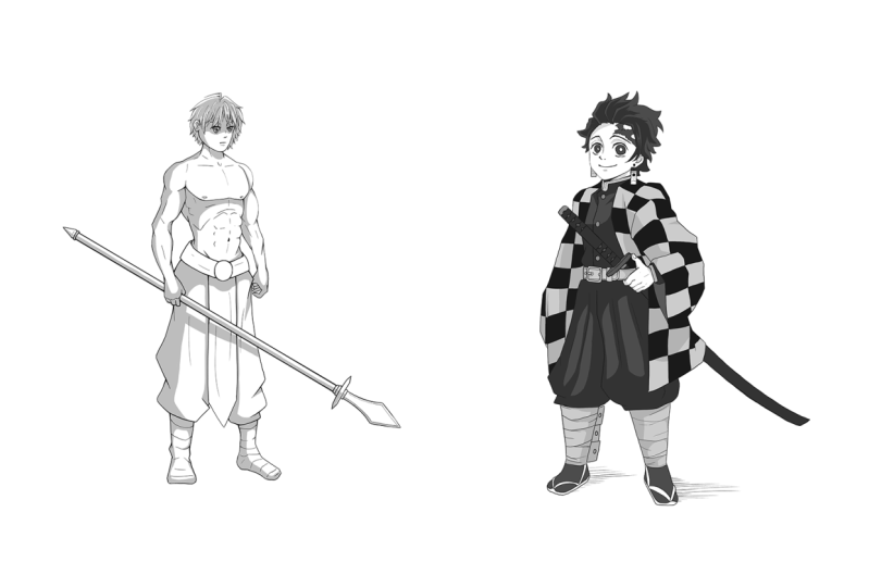
5. Module 1.2: Proportions of the Body: Welcome to this first lesson on proportions. And what we're going to be doing is we are going to be learning about the proportional rules that we need to follow in order to create a strong foundation for our manga style illustrations. Now what are proportions? Proportions really referred to the size, the spacing, and the location of elements in our pieces. So if you think about the eyes, the position of the nose and the mouth, the placement of the head, the size of the head in relation to the size of the torso. These are the proportions, in a sense, you can think of them as the stylistic rules for the size and the spacing and the location of the elements. Now, proportions themselves are extremely critical. They all the secret to pretty much all the styles. If you want to draw an American comic book style, there are some proportional trains that you will see in that type of work. Similarly for Disney styled work, you will see certain proportional style to trains, and the same goes for manga. Now, of course, manga has many, many, many sub styles and differentiating features from one manga artist to another, from one anime series to another. And so what we need to keep in mind is that these proportional rules are really guidelines. They're just a basis for us to work off of. But there are solid devices and they allow us to iterate and expand and grow our own stylization from these guidelines. Loss, but not least, and very, very important is I want you to remember that you need to really strive to learn these proportional rules, both by hot dried learn the rules of bots. And the reason for that is that once you learn these proportional rules of Bahasa, you'll able to very easily and quickly draw multiple manga characters without having to spend a great deal of time going back to a proportional God trying to say, okay, let me draw this here. Oh, I need to measure this thing here. Have it in your mind. It makes drawing much, much easier and it's pretty much essential if you want to get work done in a reasonable space of time. So learn the rules, both by hots. Okay, let's jump straight into the proportional rules. And we're going to work from top to bottom on each of these proportional gods. Now, in front of us we've got two different sets of proportions. Both of them are worked at using the HD size. And so we refer to the first one is the seven heads and the second one as eight hates. The head itself is used while you're drawing that you'll use your thumb and your forefinger, your middle finger too, measure out the head of the character you've drawn, and then copy those measurements down the rest of the figure as you're drawing in the rest of the body. And that's pretty much how we start measuring out the proportions. So let's start with the one on the left. It's a seven-inch proportion, feminine looking body. But this particular proportional system can be used for young males and females. And it is pretty much the most common type of proportions for manga, your seven heads proportions. Now generally speaking, when you have all the characters are more muscular characters, more strong characters. You'll be using the eight heads proportions on the right. This is also called idealistic proportions, and it's also used. Comic bookstore work. Now, manga proportions do vary between the sub-genres. So depending on the genre that you're moving toward, you'll want to use one or both of these systems as you're drawing your manga characters. But far and away the most common is the 17th system. So let's stop there. Our first head over here. It defines the head height, it's self. And from this head height, we start getting multiple points of reference and measurements. So as we move down to the bottom of the second head over here, you can see that we're able to now define a location, the nipples, which is about a third of the sick and hate. And this is our nipple line. And the nipple line is pretty important as a measurement tool. We don't measure it at the bottom of the second head for the breasts because that would limit us to the size of the brace we might put in a female character or the size of the pics we might put in a male character. We want the nipple line, which will help us to correctly position where the nipple should be. And then we can establish the breast size from whether they're bigger or smaller, braced, and so on. Moving down to the bottom of the third head, we get the crutch line. And the crunch line helps us define the V-shape that lets us kind of indicates where we are placing the crotch. Now it's an approximate location. These are guidelines. You can put the crutch directly on the line and put it a little bit lower. You can even put a little bit higher. It depends. Right? And it depends really on what you're going through in the body style you're going for. But typically the crush line is around the bottom of the third hit. And in addition to that, the naval line or the belly button mine is around halfway of the third head. So let's put that in naval line. And you can see here the naval little bitty buttons just a little bit above the line. It can go in this area, in this region, you can put a little bit lower as well. And then just slightly below the second head, around a third into the third head is the ribcage line. Right? Now doesn't get panicked when you kind of seeing all these lines and these sort of splits and divisions, it seems more complex than it is ready. Once you learn the measurements, it's very quick to iterate on this. And thus, I will reinforce once again, really strive to learn this stuff off by hot. And you kind of, once you've know what Obama economists, we get it and you just keep using it. And it's kind of a very automatic. And so the ribcage, lot of IA helps us define the bottom sort of V shapes of the ribcage. And at the same time helps us kind of figure out a good location to put in our elbows. And you can see our elbow line is kind of just below the SEC and head, maybe just above that sort of third of the ribcage line, yes. So I elbows are very similar in location to the ribcage. Bottom of the ribcage. All right. This can vary, obviously based on the character you're drawing. But this is the general zone in the general guideline. Right? Now, just taking a look at the arm length, the upper arm and the lower arm. The lower arm itself up to the hand, usually extends to somewhere on the fly, somewhere in the middle of the thigh. So this kind of region is where you'll want the hands to be. And it's very similar as well on the guide here. Alright. Then halfway through the fifth Haidt, we have the nylon. And this of course defines where we're putting our knees. And then lastly, the bottom of the seventh Head, the foot line. And this shows us where to extend our lower legs too. So things keep in mind, which is quite important to make sure that the EPA legs are a little bit shorter and the longer legs, the lower legs, Monday you are a little bit longer. And this gives the character a more of a manga lack look. When you take a look at a lot of manga and anime characters, they tend to have slightly exaggerated leg lengths and this is where it's from in terms of the enhanced model. Most of the time, we're fitting in the head up to the crutch in just three heads. And the remaining Haidt length is for the legs will rise. So they can actually just say he had torso in hand. And here we can say lakes, right? So that's pretty important to remember, and which is substantially different in the saints in the 800s model. All right, Now, looking at the shoulder width, the shoulder width is really defined by having 1 third of the space of the head on each side of it. This is for a female character. For a male character, you can extend this on the seven hands model to about a half on each side, if not a little bit more. Just keep in mind that you feel that the proportions look reasonably appealing, acceptable to you. Not too crazy and less crazy is what you're going for. So it's a third of space on either side of the head on the female model. And we do about a half for male, right? Looking at this, once again, this seven heads model, keep in mind that this is the most common top of proportional measurement for male or female, even though we've got a female figure drawn here and add a little bit later on in the lesson, I'll explain to you how to masculinize. We'll feminize your lines and some key differences between male and female when we're drawing out the figure, right? But the proportions really stay the same. Let's move on to the eight heads proportions in once again, more of the masculine bold characters, strong characters, older male characters. It's not to say you can use this full, strong female characters as well. Starting at the top, we have the headline. And that defines the top of the head to the bottom of the chin. The bottom of the second Haidt defines our nipple line. And once again, the nipples full roughly in this region, It's also allows us to kind of figure out where the bottom of the pics are. Bottom of the third HD helps us to find the naval line in place that in there. And you can see roughly halfway between this third Haidt, we have the bottom of the ribcage, which is our rib line. And that in this instance shows us the location of our forearm and rear upper arm split. So you can see the joint yeah. Halfway through that LAN and then that brings us down to the length which as I mentioned previously, it goes to around the middle of the fine. And then the bottom of the fourth head is the crunch line. The bottom of the, sorry, the middle of the sixth head here is the Milan. And then last but not least, the bottom of the eighth head is the foot line. Right? Now. The width of the shoulders. In a male form, particularly in the eight heads, is an entire heads space. And that gives you a good amount of space for a masculine bold. And now that we've done that, it's important to actually take a look at the key differentiating factor between a male bold and a female bold. And really what this is is that in males, males tend to have broader shoulders and narrower hips. This is a bit of an exaggeration, this symbolism, but it's good for remembering. And females have the exact opposite. They have narrower shoulders and I have brought a hips. And the reason for this, let's take a look at these two characters. The reason for this is that the pelvis of the female is wide. And the reason it's wide is so that it can accommodate childbirth, right? So it's there to accommodate childbirth. And you can see on these models, yeah, we have the female with a smaller shoulders and the wider hips and the male with the water shoulders and the smaller hips. And to take a quick look at the pelvic structure. Effectively, the pelvis itself in a female is wide. So this is the pelvis, very rough version of it. It's pretty wide across. And what happens is the great trow canter, which is at the top of the femur bone, which is at the top of the leg bone, I will draw hits the upper leg bone comes down like this. Fema comes down in the great trow, canter comes out of the pelvic bone like that. And because it's ydA, the great trow canter itself pushes the skin out further. And so women have brought a hips for that reason. That's the female over there. But in males, the actual pelvis itself is more narrow, something like event. So it's narrow horizontally and taller vertically, right? Once again, proportions are critical. There are anchor point, baseline fundamental for the structure of the elements in the figure, the size, the spacing, and the location of the elements. Please put in the Tom, learn these haunt. You have these resources as well. In addition, there is a demo would mean drawing out these exact proportions that follows this lesson. That is the end of the proportional lesson. And I will see you in the next lesson.
6. Module 1.3: Feminine and Masculine: In this lesson, we're going to take a look at feminine and masculine lens. And what we're gonna do is we're going to use core shape theory to help us understand this concept a little bit. On the left we have a circle and on the right we have a square. And below that we have keywords associated with these very basic flat shapes. Circles tend to be soft. They give off a friendly vibe. Something that is round doesn't seem like it's about to stab you. So it's seemingly kind of gentle that has connotations of gentleness and kindness as well. It doesn't seem like it could have hurt you in any way. Conversely, squares give off the impression of solidity. Strength. They're robust, they're sturdy, they don't look like, then can move easily, roll around. And so understanding this basic shape theory leads into how we can understand how to draw lines in a way that give the a static of femininity or masculinity. Looking at our proportional drawings here, where we have the girl on the left and the male on the right, the female and left and the male on the right. We can see that there are a lot more curvy around lines in the feminine full. And this is something that's very important to remember and is often overlooked when drawing characters. To get more of a feminine field in your female characters, you want to make sure you're using it a lot of C curves and s-curves and avoiding any harsh angles when things turn. Conversely, in the mail forms, you really want to bring out some of those angles, common places, we can see them on the jaw line at the points of articulation where the joints move, and in various other contoured areas where you can try to use angled lines to really exaggerate the robustness and sturdiness of the male form. In a nutshell, this is effectively the feminine and masculine lines. Keep them in mind as you move forward, drawing in manga style, catch you guys in the next lesson.
7. Module 1.4: Proportions of the Body Timelapse Demo: Okay. Okay. Okay. Okay. Hi. Hi.
8. Module 1.5: Proportions of the Head in Manga : In this lesson, we're going to take a look at the proportions of the head. And no matter how you stylize these proportions there, absolutely critical for achieving an authentic man gestalt look. They may look pretty straightforward on the surface, but there really is a lot of nuance to them. And there's a lot you can do with these proportions. Really, manga sol heads are one of the key identifying things about manga style. So unlike the body where you can get away with sort of bending the proportions a little bit here and there, creating some proportional deviation here and there, the head, you really want to strive to stick to these proportional rules. Otherwise, you veer into territory where it doesn't quite look like manga or it looks a little bit weird, a little bit strange, and it loses a lot of its authenticity. Will, right? Let's jump straight in to the proportions of the head. I'm going to start with the front view on the left. The first thing we want to know when we're drawing out this proportional god is, we want to start with really a circle, just a big, nice circle. Alright? Don't be afraid to work in your two-stage workflow. Be nice and rough. In the rough stage, you can see the rough lines that have done behind these cleaner lines be rough and we're going to start with a circle. And then what we're gonna do is define the eye line, which is really the top of the eyes. And this should usually fall around a third of the circle, if not half of the total height. But in this instance, let's go around a third of the circle. And we're going to define this island over here. And then we're going to add in our jaw line and chin. Now, this jaw line and chin can take a bunch of different Looks and appearances. But in this instance we're gonna go with a very sort of common look, which is the low cheek look. So we're going to add this in and ready. You can extend it longer, you can make it a little bit shorter, a little bit wider. It's not going to affect the proportions really. It'll change the eyeline if you do make it a little bit longer or a little bit shorter, but you can adjust that by checking that the online is falling between halfway between the top of the head and the chin. Right? And that's how you know, you're online is in the right place. Now, we need a sick in Ireland to help us determine the actual vertical height of the eyes. And that is then determined by around 1 third of the lowest section of the face. So if we mock out sort of roughly 1 third, we can find that we have the lower I learned in section and that gives us a good hunt. The eye placement in manga is pretty pivotal. We want to make sure the eyes are big but not too big. Because there really are, what are the key expression and mechanisms of manga stuff drawings. So we have the ASA at a third. And that is the island right there. And we want to remember, this is half of the space, and this whole section down here is half of the space as well. So that helps us to define. This island over here is the top of the eyes. Now the ears themselves, the ears are falling within that space themselves as well. So the is take the height of the eye. And if you've done idealistic proportions, you'll already see this quite a lot of significant differences, yeah, from the manga stylization of the head to what we would really do in a normal, kind of realistic top of stylization. Let's move on to the placement of the nose. The nose in this instance is really just a dot over here and it's placed just below the online, someone just below the island. Of course, it can take many different styles. It can be a little kind of an L shape or a little ridge, but we want to under-emphasize the nodes. Particular stylization is spatially from the front view. And then the positioning of the mouth folds itself around a third of the remaining space between the nose and the chin. So it's the top third over there. And that is the mouth line. Right? And then the spacing of the eyes themselves. You don't have to draw it in this neatly when you're doing your proportional diagrams. Just draw them as circles, but the spacing of the eyes roughly one eye with away, the roughly one with away from each other that if not 1 third even. And then the placement of the eyebrows is just above that online. Then when you're placing the NIC, this does vary depending on the age and the bulkiness of the character. But generally speaking, the NIC is within the little cheek bins on the outsides, yes. So you can just place in two neck lines there. Now, once again, these proportions may seem trivial and we're actually going to deep dive the proportions of the eyes, how to draw the nose is in depth, how to approach the mouths, et cetera, especially as well. B is, the key thing to remember is that the head proportions are much more strict in the body proportions really invest Tom and learn these hit proportions because moving elements slightly can really detract from that old thing. Tick look, let's move on to the sod profile of the head. And once again, we start with a big circle. And there's a particular technique we can do to really get this front of the face reading. What we wanna do is create a center line here down the circle, and then create a slightly angled line, just a bit greater than 45 degrees, maybe around 60 degrees and get bent line in lack of that. And that can extremes down to the line that's defining out bottom of the chin, which we can then pull in. And what we wanna do then is place the online, the top online and also around a third. You can see that these measurements are duplicated from the front of the face. So if you learn the front of the face, you'll really didn't have the same measurements for most of the elements on the side view. And you'll see that suddenly the nose takes on this three-dimensional appearance in the side view. And that is really quite strange when you think about it. And that is largely because manga faces and manga. Manga, the elements of manga faces, the eyes, the nose, the mouth are largely symbolic abstractions of. The real forms. So they're not actually forms. You can think of the eyes more like stickiness, right? And the strange changes that happened to the nose or just one of those things in manga, they're not really rooted in reality. Nor is the side view of the mouth changing because fronts and three-quarter views of the head really largely have symbolic mouth. So not really mounts based on realism, but rather a symbolic abstraction of realism. Nevertheless, we'll get more into it, but keep in mind manga faces. And the elements of the face is really more about symbolism and clear communication of expression, more than they're about super dynamic 3D forms that'll based on the high end anatomy. All right? But of course they are based on the anatomy, but they're an abstraction of that anatomy. Well, right. So then once we've placed this angled line down, we can then extend our nose shape out in this way, bring it down, and then begin to imply these lips shapes. And the lines stay the same. The mouth lens stays the same. The nose lens dot here stays relatively the same in that instance. And of course, the ear line itself as well also stays the same. Important to note, the ear gets placed behind the scene to line over here. And then we can extend the neck down and extend a nice reverse C-shaped curve there underneath action line. Once we've drawn in auction shapes. And in the instance of the side views, typically you don't use sod views that much, but being the answers of the side views really learn this particular contour. And you can then iterate from there once you really are used to drawing this particular contour in the side view, once again, it's very symbolic and so you want to learn this in a rotate fashion or a parrot fashion as they say. Now moving on to the eyes, something quite critical about drawing the eyes in profile view. And that is that you want to have a very sort of flat top shape. This one's curving a little bit, but you want to have a very flat top shape and then an angled bottom line. If you draw it in any other particular way, it's going to look wrong, it's going to look weird. You don't want to draw it sort of in this shape. You know, do something like this and try and bring it in. It just looks strange. It looks like a front. I, once again, it's symbolic. So we need a symbolic side view, right? And then you can simply just extend a C curve down the front and a little bit of an closing line there just to close the shape. But keep in mind this general shape, sort of flat at the top, angle at the bottom. Be, don't be afraid to be extremely the angle. And you can see that the bottom point of the angle hand the top are really within the islands area. And then you just add the C curve to it. What you can do as well. So here I've extended it a triangular view and just take a quick look, can see there's a try angled corner of this particular shape. So these essentially are our head proportions. And really you want to strive to get everything in the correct place. Go through this lesson as many times as you need to get these exact positional markings down. It's covered one more time. We have the first half of the head here. And the second half of the head defined by the bottom of the chin as giving us act taught online. And then I bought him eyeline is 1 third down of the remaining space. So we divided that remaining space and we get that third. And we get out bottom Online. And once we have this key online measurement, everything else is pretty easy to work out from there. The nose is just below the bottom island. The odds extend to the top and the bottom of the outline. The eyebrows fold just above the island and the ears are roughly the same height as the honest. And then 1 third of the space between the nose and the chin, we have the mouth, and that is a separate measurement there for that 1 third and then the NIC falls down. It's generally a thin neck and female characters in young characters, we can take the NIC, typical labels and all the characters. And those are essentially the proportions which we then duplicate on to the sodomy of the face. Going to the side view again, we don't want to forget Santillan and then sort of 50 to 60 degree angle coming off our circle, we bring it all fascicle down to the chin line, connected up just about halfway through. We can add in reverse C-shape if with Nick, extend on nickel on there. And then we want to learn the side view symbolic contouring. It might take some practice to get it to look right. But really just learn that one off by heart. I want to end again by saying this. These proportions may look simplistic, but don't be fooled. It's very tricky to get them looking authentic. Don't worry too much about the particular style of these proportional drawings. We can use the hidden proportional rules here to iterate on a multitude of manga styles. I'm really looking forward to showing you the meat of the in-depth level of these proportions that we can take when we hit Module 2. So before we get there, just know that you also have a demo of these proportions being drawn. So definitely look through that and I'll see you in the next lesson.
9. Module 1.6: Proportions of the Head Timelapse Demo: Hello. Hi. Hello. All right. Hello. Yes. Okay.
10. Module 1.7: Proportions of the Hands: In this lesson, we're going to learn about the proportions of the hand. Fortunately, the proportions are pretty straightforward and easy to learn, so let's jump right into it. The first thing that we're going to want to do is draw a circle to kind of define the measurements of the palm area. And what we will vain do is kind of measure out the length of this palm area and extended up that exact same length. We want to duplicate that length. And that will give us the height of the middle finger. And now we have some great reference points for drawing the rest of the fingers. Effectively, about 1 fifth of that middle finger down, you can draw a line and it gives you the relative heights of the full finger and the ring finger. Now the full fingers typically just a little bit shorter than the ring finger. So you can extend the ring finger just a little bit above that line. And then about a third down of the ring finger, it gives us the height of the pinky finger, little finger. And we can then extend that to down into the shape. Then when we want to draw in the thumbs positioning, we have horizontally have the circle. And then we can draw another circle, which is sort of indicative of the joint of the thumb, the big muscle that you can feel in your hand. And what we can then do is just draw out the thumb size from that shape and bring it down. And effectively, these are the proportions. The most important measurement is to duplicate the height of this circle. And that will give us the middle finger hunt. And really those are the proportions of the hand. You want to really learn this off by haunt, get it down. This should be the quickest proportions for you to learn. And these are essentially also the same as the idealistic proportions job basically I'll real-world proportions for drawing hands. The great thing with hands is that hands themselves are easy to reference because you have two of them right in front of you. So if you do find that you're struggling with the proportions, just take a look at your hands or anytime you're battling to draw hands and themselves. Let's move this to one side and take a look at some other key factors when considering drawing the hands. First of all, when you're contemplating the size of the hand should be on your characters. Typically, the hand covers the facial area. So if you feel that you've drawn your hands too big or too small, just check the hands against this facial area here. And that will give you a good idea of how big the hands should be. Now, in this particular proportion, your seven hands proportions, you may want to draw the hands just a little bit smaller. You may notice that there's a stylistic trend of small hands, especially in the female characters. When you're drawing the eight heads proportions, you can similarly use the same method to determine the size of hands if not making them a little bigger. Keep in mind that proportions are ready guidelines. And so it's up to you whether you want to style last slightly bigger hands or slightly smaller hands. Next up is just taking a quick look at the differences when drawing male and female hands, particularly in terms of how we have the line treatment. On the left we have female style hands, and on the right we have male style hands. And the key differentiating factor here is really bulk, but particularly our treatment of the tips. When you're drawing female hands, they tend to have a sharp point at the end of the fingers, and they tend to use longer curvier lines. The sharp point is quite critical. It's a way to imply shop all longer fingernails that female characters may have. But conversely, in the male hands can see that they're more stubby, not as pointy. And in even earlier characters, you can make them significantly Stevia if you want your character to have a really thick, bulky or brutish types of hands. This is essentially hand proportions in a nutshell. Once again, learn it off by heart and I'll catch you guys in the next lesson.
11. Module 1.8: Hand Proportions Demo : Okay. Welcome back. Welcome back. Okay. Hi there. Okay.
12. Module 2.1: Head Shape Styles: Welcome to this first lesson of module two. And in this lesson we're going to be taking a look at elements, stylistic elements of the head shape for manga style. And starting right off the bat, we're actually going to compare a manga style head to more of a West installed heads or heads that are based on idealistic proportions or you're super realistic Skoll, top. On the left, I'm going to do the Western-style head. And on the right I will do the manga style head. And I'll talk through what is actually different about these two as we go through it. So I'm gonna put down a center line here and our western style head and just follow the contour of that sphere. And I'm going to start implying with this little ridge. These are three-quarter views by the way. And start in playing with that little ridge, the eye socket. Move down into the cheek and start defining my chin in my jaw area. And then I'm going to pull that up. I can draw in my ear shape here and get the rest of my head. We'll keep things rough and loose. And because I've defined the ear that helps me already defined out the top of my eyebrows and the bottom of my nose. You can see already that this is significantly different from how we measure out our manga style. Moving into the manga illustration here, it's just neat in that circle up a little bit. I'm going to come down with more of a flat line. And I'm going to drop my cheek very low and come into the chin and then bring up that shape again. Almost have a cheap black line again and then come back into my head. Let me just modify that angle. We'll run it. And we know based on our proportions that Hoff about vertical height here defines our online. Right? Let's go back to the waist and style head. And I'm going to draw in some eyes, Let's keep it at a sort of a Western style cartoony design. Put in our eyes here. Drawing a nose. Put it into math. And get some eyebrows in here. And draw in a bit of a nick. And you can already see that the proportions of the West installed drawing, I'll significantly different to manga style, the number of ways to get back to a manga cell drawn here. And we're going to mock it out. Third, we'll draw in our eyes here just our eye indications. Couldn't Ono's put in our mouth? And draw non Nick. And we can indicate our ear here. Let's get a three-quarter view going. And then our eyebrows, we won't go into too much detail. Drawing the faces were really focusing on our heads design here. And when you look at waste and style in our manga style, and I just use Western is a contemporary term, probably change in the future, but really, it's just a style that's based off of the normal human skeleton. You can see we have massive proportional differences. But something critical and key that I want to point out here is how we handle the fonts out of the face. Three-quarter view and in a normal or a realistic based style, which is basically normal humans skull, we tend to indicate that there's a brow indentation going into the eye socket indentation and then coming around to a high cheekbone. But conversely, a stylistic trait of manga, and you'll see this in a lot of manga and anime illustrations. Is that the far side of the face in a three-quarter view and three quarter rotation, right. So we rotated the head just slightly three-quarters to the left or to the right. In this instance, it's to the right of the characters. We have a very sort of flat long line, not too much emphasis, and we don't really draw in this brown line area. And we have a very low cheek. Now whether it's a male character or a female character, you will notice this is a common trend. Can see that the cheek huts differ significantly here. And this is a key, key thing to remember when you're drawing manga hits, of course, takes on the manga style proportions, but you want to draw that very low cheek. And in fact on the near side of the side that faces us in a three-quarter view. What we tend to see is an angle that almost looks like a mirror of the cheeks angle on the near side of the face. Now this could be the jaw line. It could be a trick line, even though technically the Czech lands probably a little bit higher up. This is often unclear, can be quite unclear. And the reasons for this is that manga heads themselves are really the most iconographic part of the style. Of course, we do have the body proportions and the hand proportions to take into account. But the manga head itself is really about expressing very clearly, showing the character's feelings and expressions very clearly. And so it's not really based on a realistic head per se, but rather it's a symbolic abstraction of a realistic ID. And so it's largely symbolic. And you'll see this play out in how the nose is drawn, in how the eyes are drawn, in how we approach the eyes, and so on and so forth. Now if we take a look at a normalized sort of skull drawing and I'm just gonna do a quick rough version. You'll see that a normal human skull tends to have the cheekbones kind of fanning out in a wing sort of fashion. Just gonna kinda do a very quick version of a human skull here. It's probably a little bit stylized. It's not the end of the world. Drawing that lower jaw. The teeth would be around here. The main important factor that I want to point out over here is really this section here Over the normal type of skull where we kind of have the indentation coming around this wing of the heart cheekbone, which then kinda curls in. And then we'd go into this sort of half cylinder shape of the front of the mouth. That's pretty critical, but a manga skull would look significantly different. And manga skull would have a much bigger cranium area and it would have a much lower wing, if you will, or cheekbone. So the manga school would be something like this, significantly larger eye sockets for one thing. And a very low down cheekbone structure, something like this. And I know it's crazy to think, well. Manga really have a different skeletal structure. And technically if we were to draw manga skull, it would because it follows a completely different proportional rule set to the normal head structure, right? So the key thing here is to remember that we want to keep our bone structure really are cheekbone really low on our manga stalled faces compared to a westerner style, we're really emphasizing this overall shape on a three-quarter view on the far side. And also don't forget that sometimes this angle can replicate on the near side of a manga sad face in terms of that low cheek angle, that low cheek bend. All right, Now in addition to this, Let's take a look at how we can manipulate the shape of the head with the jaw section in the chin section and to achieve different looks. So what I'm gonna do is I'm going to just draw a very baseline head here for us to work on and duplicate this across a few times. And when you think to our feminine and masculine lines that we've learned in the previous module. We can start applying some of that theory here to get a very different look to our heads. So for example, if this were going to be a female character, we could bring a nice low cheek here, but keep the angle really round a point each and come back another round cheek and go up to the rest of the head. What we can do this if we wanted a young boy character, we can bring that same line down, keep things still a bit round, but maybe give this character a little bit more of a chin this time, keeping things soft and round these young low cheek and backup to the head. Let's take the character too, but a more of a masculine line level. What we're gonna do is we're still going to do I love cheek, but we're going to be much more harsh with that angle. And we're going to be a little bit broader and harsh with the angles of the chin. Still keeping the logic design and another harsh angle up. And if we wanna go even older, we can increase the width of that chin line even more to give us much more of a masculine look and a much more angled Julian. Now in addition to this, the masculine and feminine lines, we can also really utilize the power of the neck thickness to imply the age of the character or the strength of the character. Small week of characters tend to have thinner. Next big, burly, bulky characters tend to have thicker connects. Feminine characters tend to have thinner necks, and masculine characters tend to have a thickened x. So in this instance, we can add in a thin neck here. Not according to normal human anatomy in terms of a lot of the female characters is just a very much a thin neck. The neck typically in a real human anatomy connects underneath the ear, but in manga, it's not necessarily the case. The second one we can thick in the neck little bit more. Maybe it's a boy character and a young boy character. The third neck, we'll take it to even thicker level specs. It's a teacher or an older character. And then in the last one we can do a very thick neck. And this can be our burly characters are really big, strong, masculine characters. I'm adding in a little bit of the sternocleidomastoid there, which is really those muscles in your neck just to give us that feeling. And so really in summary, you can see how we use the feminine and masculine lines here, as well as some gentle curves to give us different effects in terms of interpolating the age of our manga characters. Right? So really just think about these widths and practice them out to do a few of these drawings and practice them out. In this lesson, we've really sought to take a look at how we approach our head designs. It's important to know the cranium doesn't really change much. Cranium really stays the sphere in main cell drones. And what we can do is we can really use our lines are feminine masking lines and the shape of our jaws and our trend lines to define the gender or the masculinity or femininity of our character's. Going back to these initial illustrations. Really keep in mind the absolute difference in proportions to westernized style or idealistic proportions, which you can learn more about in characterological complete character drawing if you want more character fundamentals. And the difference between that and the manga style proportions, which you can see are significantly different, absolutely significantly different. So really when you're drawing in a manga style, you have to put your brain into a different gear and really grab at its proportional rules and the way manga is done also, find me in ending. Keep in mind the symbolic nature of manga style hymns, really about simple, easy to read expressions that can appeal to young people, very young people, up to very old people, where realism is secondary to understanding the character's expression and their feelings and their emotions. That is it for this lesson. And I'll see you in the next lesson.
13. Module 2.2: Introduction to Manga and Anime Eyes: In the next few lessons, we'll be taking a look at a drawing eyes for manga and anime. And I'll be showing you a fundamental guideline on how to approach drawing these eyes so that you have a strong basis as you move to create molt sub styles or your own looks and feels. Now, there are multiple types of ways to draw manga and anime eyes. And if you're interested in manga drawing, I'm sure you've watched tons of enemy read tons of manga, and you have an understanding that different genres team to have different looks. In addition to that, different ages and different genders can have different Astar designs. And especially in some manga and in some enemy, the girl 99designs are completely different from the God is ans. And so I'll be showing you a fundamental guide on how to approach drawing all the eyes. But we can use that to expand into multiple sub styles. Finally, multiple style demos are included in this section. So really use that as a guideline to help you really get a good, strong feel of how to draw manga and anime eyes in a very authentic and appealing way. Great. I'll see you guys in the next lessons.
14. Module 2.3: Fundamentals of Manga and Anime Eyes: We're now going to take a look at the guidelines for drawing manga us. And as God lands, they serve as a basic rule set that allows us to create an innumerable amount of manga styled eyes from these basic rules. This is one of the most important modules in the entire course and one of the most important lessons in the entire course. So please do take notes here and let's get right into it. So the first thing we want to draw an, a drawing manga us and we've mocked at our allocation on the head, is we want to draw the upper lid line. And the upper lid line may curve to varying degrees. But it's important to note that it's typically darker than the rest of the lines of the eye and it's typically pretty thick. So I'm going to just draw this in and also drawing it in with multiple lines actually helps create the impression. If you're going for this type of look of eyelashes, speaking of the eyelashes, and they're typically more horizontal and vertical with Manga stop us. So here I'm just drawing them in kind of horizontally, not to vertical coming out and probably not too many of them. Vertical. I mean, we don't wanna do this type of thing. It's not to say you can't, but typically they're more horizontal than there are vertical. And once the upper lid line is in, we then add in the corner line. And this is the outer corner. And this does not typically connect around the whole form. We never typically draw manga ours with lines that kind of box. The I in, there is a lot of implied in detail as you'll see as we move forward. So in this instance and to create a nice little dynamic shape here. And it goes from thick to thin, thick at the top, then at the bottom. And keep it nice and loose and rough. And we're going to draw in that corner. On the note of the eyelashes again, do know that they are under emphasized when you're drawing a male characters. Whether you're drawing rounder style, large manga, anime style as we did during the shorter top. Whenever it's a male character, typically you want to under-emphasize the eyelashes unless there's some particular reason you want to have them in there. So we've drawn it at the top of the arlen, the upper Ireland, and we've drawn it in the outer corner line. Next up we're going to draw in the eyelid crease. Now, typically the eyelid crease is a short little line that appears the inside area of the eye. And normally in real life we draw the eyelid creases, something like that. And of course they are manga styles where you do have the eyelid crease fully drawn in. But by far the most common is to have a short little eyelid crease like this at an angle on the inside area of the eye. Next we can move to draw in the iris shape. Now the Irish shape and manga can be very long and abuela, very big and circular, smaller and circular. It can take on a bulbous shape as well. You have a numerous amount of options here. But effectively, you tend to want to draw a nice round and curved iris shape. So in this instance, I'm just going to put in an iris shape. Let's say something like this. Let's make it a little bit bigger. And depending on the style you're going for, you can either have this top section cut off a little bit or you can have the full roundness of the iris appearing underneath the upper eyelid line. And this instance, Let's leave a top section cut off a little bit. Once the iris is done, it's not a bad idea too often thicken the lines of origin that come from the eyelid LAN. So you'll see here, I'm going to just add in some thickness here. Just so that from a distance, It's very clear that there's almost an alluding to a shadow over the top of the iris. And of course there is, which is the upper lid shadow. We'll get to actually rendering that in just now. Now regarding the lower eyelid line, typically it's left out or if it is drawn, it's drawn in as just a short line. And this instance, Let's draw it in like this. That's not to say that you can't expand on the style, but typically speaking, it's generally a short line or it's left out, it's not even drawn in. And while we're talking about the lower eyelid line, we might as well talk about the tear duct area and the lower lids in a section which will also not really drawn in. If the analyte is indicated, it's usually by an inner line, something like this. In this instance, I'm going to leave it out, but you can put that in if you want to indicate the insulin. And what happens really is that this becomes an implied detail so that the view is brain kind of gets the information made up imaginatively. The differentiation between the skin area and the eye area have a wind manga is colored. The difference between the white and the skin is made clear with a color, but there was no actual line drawn me. Keep in mind once again, these are guidelines for a baseline foundation for drawing mega eyes. And you'll see in the demos how we can totally expand on this to create tons of great varieties of us. Continuing on. Once we've drawn in the pupil, sorry, once we've joining the iris, we can then draw in the pupil. And in this instance I'm just going to draw a normal sized pupil here. And I'm actually going to move ahead and do some shading on this pupil. Just do some quick crosshatching. And it's also shade in our iris. Typically we want the iris to be shaded in somewhat lata. Then the pupil I'm using crosshatching here. And of course you can use actual shading or you can use color falls. One computer. And the eyes being shaded is quite important. Even when you're dealing just with line ought with a manga style. You can decide to do this later in the coloring phase. But the eyes actually have a whole lot of depth to them. And they're really worked on in excruciating detail to make sure that they read well and they read a very clearly. So there really is a lot to Manga eyes. Once we've got the shading done, we then want to put in the shadow of the lid. Now this doesn't always appear in every style, but it is a common trait. And so what we'll do is simply mock out a location here and then shade this area in. And this creates the impression of an odd shadow over the iris and over the ball. Sometimes in some styles, the pupil itself will actually bleed into the shadow area. So something like that. And it will take on the same shading and they'll be shaded as one single unit. But in this instance we won't do that, but do keep that in mind. Next, we can put in our highlights. The highlights can typically appear anywhere. They can be partially in the iris and on the ABL, partially in the iris and on the pupil, just in the pupil itself, just in the iris itself. And it can take on pretty much any shape. You can have triangular highlights, circular, square, rectangular, et cetera, et cetera. In this instance, let's put a large iris and eyeball highlight on the outside. And then we'll go ahead and put a smaller one on the inside. Now, expressions do modify this basic guideline design. And once again, let me re-emphasize. This is a basic guideline that we're using as a foundation to work from, right? So you can certainly do this guideline, I, as your anime character or your manga caucus actual eyes. But I'd strongly encourage you to really take this guideline in stock binging the rules a little bit. Let's now go over a summary of each of the steps. Once again, mock out these regions in red. First thing that we want to do is to define our upper lid line. And then our lashes, keeping in mind that they're typically horizontal. Keep in mind that this upper lid line can be long and curvy. It can be very round. It can have this type of look to it. You can really mess with the proportions are locked with this appended line. We then move on and we draw the corner of the eye. This may extend shorter, longer, very long, but we do want to cornering. You may have also seen manga styles that have the upper lid line and the lower level and making this type of shape, that's totally fine as long as these two elements are in there. Once we've drawn that in, we then draw in the eyelid crease, typically at an angle. Remember once again, that's not to mean that we can't do normal eyelid lines. You certainly can. But it's very typical to have a short indication of the eyelid crease. Next, we draw in the iris shape. This is usually quite large, but it can take many types of ovular shapes, can be really big, it can be really small, can be partially covered depending on the expression. We draw in the iris shape. And sometimes we will cut off the top of the iris and keep it flat. And other times, depending on the style, you may keep the entire iris shape round. This is quite important to remember, depending on the style. We then move in and draw in the pupil. Pupil itself can be very small. It can be gigantically large. Again, depending on the look you're going for or your own custom style that you're Bolding. Keep in mind that insert and styles that people shape is linked to the iris shadow. Sorry, the upper lid shadow. So you can link it in there and you'll see in some of the demos that has been done. And then what we do is we move into doing the shading. And we want to make sure that the pupil is doc, is hopefully generally the darkest part of the inside of the eye. And the eye lid shadow shouldn't be pretty dark as well. And then the iris itself should be at least darker than the bowl of the eye or the white of the eye. And then we move on and draw in our highlights. The point to note, remember that the lower lid line is usually quite short. If not, uh, not appearing at all. That is up to you. Of course, you can extend a little bit longer. You can bend the rules. Take a look and see what you're able to achieve with the lower eyelid line. And if it matches look and feel that you're going for. And once again, expressions do modify the base, our design, which we will be looking at further in the expression section. I hope you've taken notes. This is your baseline foundations and step's for drawing convincing mangas where we can elaborate on this basic design by changing the size, the spacing. Of course, some of the locations of the elements. That's in the lesson and I'll see you guys in the next lesson.
15. Module 2.4: Manga and Anime Eye Stylization with Commentary: Welcome to this stylization, time-lapse end commentary and demo. I'm going through about ten different demos as we move through this video. Starting off here, I really wanted to go for a very simple look using those fundamentals and just drawing in a very simple style. In this particular instance, I also connected to the pupils, to the tub online with a bit of a shadow. Just to give you an idea of what that can look like when you utilize that technique. This instance, we're going for more of a solid shape at the top of the online. They're very short. Corner to corner Island jail once again really implying the ages of the iris leaving a little gap. They put some stylization and once again, blending in those pupils into the upper lid shadow. It creates a very appealing style, what abroad, what abroad on style vertically tool. In this instance, I wanted to go very, very round, almost blending the top eyeline and the corner to corner line together to create sort of a single shape which you can do. And making things very round and circular and more reminiscent of more old school and the main manga styles, but still very appealing. We're putting the very large pupil into this particular design, making sure that that pupil is darker than the iris. And then I do these. You'll notice that all the hints are the same. So there's a little bit of a similarity in terms of the character's face shape that I'll see you when you're drawing your actual characters. You'll make sure that your characters have their own unique face shapes per character, of course, based on the age of the agenda. And it's out of character that they are into our full demo here we have an extended bottom lid line with little bit of an indication of the lashes and the bottom lid and quite a lot of coverage over the top of the iris. Very small pupils with a lot inside that pupil. Some inner eye details. Just kind of hinting at the possible lines that sometimes occur in the iris. Changing those peoples to smaller dots in some square highlights. And then we have our upper lid shadow. Just adding in some eyebrow lines there to give a little bit more character to those eyes. In this fifth demo, going for a little bit more of a girly type of style of very soft round eye. In this instance, really just hinting at the lower limb line and not really drawing it in much. And a nice round version of the upper lid shadow there. Kind of a strange way to express it in a way, but it definitely works. So it's definitely something to keep in mind. And that's a very cute style of AI. Very common look into saints, but very appealing, very, very appealing. Now sixth demo him more of a male type of eye doesn't have to be. Now, this is a vertically shortest style of AI. The AI space still takes up its third, but we draw these eyes a little bit more horizontal and with less vertical height to them. In this instance, I definitely under emphasizes the lashes. Keep all the core elements still in there. And see it's a little bit more of a male style of AI. You can change that with less thickness though. And emphasizing that Ash's mom. And the seventh demo, the outer corner is almost like the bottom of a heart-shaped turned on its side. And this is also quite a typical and common style. You'll see also very appealing, great for younger characters, especially younger girl characters. It just ends up kind of softness to the app and no emphasis on the bottom line. With big, very round eyes in this particular style. And all Bueller shaped pupils. So in demo, save in here, what we're doing is we're creating the upper lid line and the outer corner line as a shake that we kind of let me full, and it's just a particular stylization. Another messing with the proportions, if you will, missing with what you can do with those basic fundamentals. We're creating an upper eyeline and a outer corner line that is really a shape that has a lack full in it. And these eyes don't have too much of an emphasis on the pupil area. You'll see that those people's will erased out at a point. And what you can do really is you can create eyes that largely have implied detail in them. Sometimes you don't even have to draw in the pupil, you can just enjoy and highlights over and iris and the pupil be implied that the pupil be shaded in very lightly with soft edges. Hopefully by now you're starting to see how you can really bend and stretch those basic foundational guidelines and really create any top of our style that you want. Every single art style that I've created here is a 100 percent original. I just made them up one at a time, thinking about different ways that I could manipulate those rules and bin, bin and create different looks and feels, sometimes leaving out elements, sometimes including elements, changing the shapes, starting with our shapes and so on and so forth. Here we have all Beulah irises with round pupils. And once again, really putting in those abolished shadows in a unique way. And in this last demo, doing a male type of, I can definitely be made female as well. In fact, all the i's can be made gender, male or female. It doesn't really matter. It all depends on how you decided to stylize the top of the on the island as well as the lashes. And I really enjoyed the designing this particular set of eyes. I added an extra ring almost around the pupil, which gives the eye a very particular look. You may have seen this done in some enemy or manga before. It's quite a nice effect. As we head to the end of the demo, please feel free to take those guidelines and rainy go ahead and make your own megastar eyes. It's really unlimited the amount of designs that you can create. So let me encourage you. You definitely can do it. Go out there and create your own custom, authentic, believable and appealing manga style eyes. This is the end of the demo, and I'll see you in the next lesson.
16. Module 2.5: Real Eyes vs Anime Eyes: In this lesson, we're going to take a look at the difference between realize and manga eyes. And there is a substantial difference that is going to change the way you approach drawing and understanding mangas. So let's get into it. Realize a fundamentally bolt on forms. And those forms are the sphere. And we've been put in our iris and pupil. We have convex and concave shapes for the iris and the lens that goes over the iris. Let's imagine a layman's over here. And then what we do is we wrap the eyelid forms around This bowl. So real I is built on foams. It's very much like sculpting, right? We imagine these forms when we're drawing a real eye. And then we can go in and add the anatomy. And here we've got an I and a three-quarter view. Probably have the tear duct and stuff on the other side of the bowl of the eye. And we can add in the lashes and so on, lower lashes. And what heavy. And so we have these 3D forms that the real AI is built on. But the scary reality or the shocking truth of mangas is that they themselves are not bolt-on forms. Manga eyes at a three-quarter angle would really look something like this. And I'm drawing it piece of paper here to indicate this particular trait of mangoes. Mango has a very much like stickiness. So let's imagine if you will, this was a piece of paper just adding in a paper fold line, are there. To help us imagine that when manga eyes rotate in space, they just get narrower. They're not actually three-dimensional. Their stickers on the three-dimensional head of manga characters. And so here I am drawing in this manga eye. But what happens is things just kind of gets squished in there, horizontal Saints as the eye rotates in space. So what is the really important thing that we're trying to say here? We're really trying to say that manga eyes are largely symbolic. They are effectively abstract symbolic abstractions of the real line. So they have elements like the real eye that had the iris. They have the pupil, the upper lid line, sometimes the lower lid line, and what have you. But for all intents and purposes, they're very much like stickiness. And when we rotate it in perspective even more and I'll just use a Photoshop technique kit to do this. As I keep turning the page more and more forward, the odd just gets more and more horizontally shorter. So really, the idea is that the difference between manga eyes is that end realize is that manga eyes or 2D, they're flat and they're very much sticker lack. Whereas realize our 3D. And they're both on forms. The form of the eyeball, the convex and concave shapes of the lens and the iris. And the eyelid forms, which are 3D thick pieces of skin that wrap around to the actual eyeball. So keep this in mind as you move forward drawing a manga us, recognizing that they are essentially iconographic, their symbolic abstractions of the real line. Or another way to think about it is that they are sticker like they're very flat, right? That's it for this lesson and I'll see you in the next lesson.
17. Module 2.6: Head Rotations and Focus: In this lesson, we're going to take a look at head rotations and what happens to the elements of the face when the head is rotated. In addition to that, we'll also take a look at autofocus off to widths. Talking about the head rotations. Let's start with the eyes. When we draw the eyes front on that, pretty symmetrical, but a lot of the time you won't really be drawing front on hints. Generally, typically be drawing these three-quarter view hits. And what happens to the eyes in a three-quarter view is that they get compressed. You may remember when we compared men guys to realize we talked about this type of compression because they're not actually built on forms and they're more next stick is what tends to happen is the more extreme the tone of the face, the more compressed the manga I gets. However, that's only up until your three-quarter and slightly posture three-quarter view. Because when the eye rotates to a full profile view, vein a completely different symbolic shape. Because and really it's important to remember that the look is really substantially different from the typical front odd or even a sod IV with three-quarter view. So keep in mind that you really want to design and develop a separate side view design for your character's eyes, as well as the front IV. And that in a three-quarter rotation, the eyes get really narrow and they get squished. And if you will, as the head rotates. Now the degree of the squish, of course, is determined on the degree of the rotation, right? In addition to this, what you can do to enhance the feeling that that is the facade I is you can increase the angle that the top lid line tilts down. So you can see here in this view, the angle is quite extreme. It's quantity vertical angle. This is the near side I, which is not that extreme. In addition, you can see that the nature of the pupil changes to be a little bit squished and the iris as well. So keep in mind this simple angle versus not so angled technique for correctly drawing the manga I in a rotated Haidt view. Let's move on to the nose. So I'm nose typically occurs under the outline. And in this instance we've stalled as the nose is dot. As the head rotates, that little dot can move further and further out. You'll see it's not quite at seemed to here. It's moved out in both sides. So keep that in mind. Have a when you hit profile view suddenly, magically, if you will, the nose suddenly has a form, a three-dimensional form, as you can see on these profile views. Yeah. So keep that in mind when you're doing direct profiles. Of course, this can change at times when you may see more full minute three-quarter view, depending on how you've decided to start with the nose. Let's take a look at the mouth. The mouth has a particular length, pretty symmetrical in the front view. But what happens in the side view is that it typically has a shorter side on the facade and slightly longer on the facade. Of course, this depends on the character's expression and other factors. In general, you'll have a shorter line on the facade and a slightly longer line on the near side. And of course, the line should be even shorter in the profile view. Something to keep in mind is to always try and keep the roundness of the head even in the profile views. So try and keep the roundness of the head in the profile views, as well as the three-quarter views. Typically, the spherical nature of the cranium shouldn't really change much no matter what the head rotation is. Right? Lastly, let's take a look at the ER. So from the front will see only a little bit of the ear protruding. But as the head rotates, we see a little bit more. And the side view, the three-quarter view, OK, typically kind of similar. The profile view really shouldn't be just a little bit horizontally longer than the side views. So do keep that in mind in the three-quarter view. So do keep that in mind. And then you can see that our neck here attaches with overlapping lines where it does connect to the back of the head in the profile views. So hopefully these are some solid foundations that you can help you go forward and rotate your character's heads left to right. Really grasping how the eyes in particular change with these rotations, as well as the nose. Let's move on to focus. When we're talking about focus, we're talking about how the eyes seem to be looking at something, how the azo focusing on something that they're doing. And what is common is that people tend to draw the pupils directly in the middle of the character's eyes. So in the image on the left where it says blank, we have the pupils drawn directly in the center of the iris. And this creates a blank look or a zombie font look in the character as if they're not real at the characteristics, personality. Now of course this has its uses. If the character is being knocked out, if the characters in a trance, et cetera, et cetera. However, typically, we want to make sure that we're bringing our pupil shapes in closer towards the, towards one another. Think more, slightly squint so that the eye, the pupil is sitting somewhat in the iris. And here you can see it's as if the character's kind of looking towards us like this. Whereas in this instance, the odds are just kind of blankly staring out into space. So focus is really one of the sort of subtle secrets in a saints of good character drawing. Whether it's comic books, manga, animated drawings, or what have you, because it's such a subtle technique, but it is very much reflective of the real-world of how we really look at things and how I asked him to focus on things. And it really adds so much personality and life to your Manga drawings into your character drawings. So don't forget to focus your pupils. Your characters typically are looking at something. They're not just zoning out or having a blank stare as to whatever they're looking at, unless of course, the specific reasons you want that. So keep it blank and focused in mind and try to draw your characters looking at something by focusing their pupils, bringing them a little bit in of a squint to each other. And that is the end of this lesson. I'll see you guys in the next lesson.
18. Module 2.7: Head Rotations Demo: Hello. Hi. Hello. All right. Yes. Okay.
19. Module 2.8: Effects of Eye Heights: In this lesson, we're going to take a quick look at the role that eyes and forehead hide plays in determining the gender and the age of characters. And we're going to start off with gender. The first thing to note is that typically we want to be shortening the vertical height of the eyes when we're drawing the male character's eyes and making the female characters eyes a little bit bigger. Of course, everything still fits within our eye guidelines. So do keep that in mind. Can see here that the male ours have just been slightly shortened a little bit. In addition to that, we want to overemphasize or exaggerate the eyelashes on the female character and make it very obvious that they have some beautiful fanning eyelashes. Don't forget that it's primarily horizontal. And in the male characters under playing or not even rendering in the eyelashes can be quite important in making sure we have more of a masculine look to the eye. Now, in addition to this, we may even take the approach of drawing completely different style as when dealing with male characters. And this makes a clear differentiation between female and male characters. This height is more akin to a normal scholar or realistic style. Hot. And it's a really a great tool to differentiating your mail from your female characters. Let's move on to age. When dealing with age, one of the primary tools we can use is reducing the forehead height of the characters. So whether their babies up to really old people, we will see a scale of a big forehead as they're younger and a smaller forehead as the characters get older. And what you can see here happening as well is that the eyes teams to move higher and higher up, slightly modifying the proportions of the face. You can see that the nose starts really close to the eyes, move slightly lower and lower and S such that then modifies the mouth line as well. In addition to that, the actual size of the eyes gets a little smaller as characters get older. And what some manga and anime artists do is they actually create a separate I designed for all the characters to stocky differentiate them from the younger characters. So the NBA characters, we usually have big, shiny eyes and the other characters may just have a very plain ours with dots and things like that. Of course, that is a stylistic choice. Do keep these important points in mind as you move forward creating a mega cactus. And I will see you guys in the next lesson.
20. Module 2.9: Drawing Eyebrow Stylization: Let's now take a look at how to approach drawing eyebrows for manga characters. Now, typically the eyebrows and manga character designs are usually underemphasized. They're not usually very thick, they're not usually very obvious. Now that's the general trend. That's not to say that you can't stylize them in different ways. And a lot of the times they'll appear just as a simple curved line, sometimes over the hair as well, just to reinforce the facial expression. You may also see designs with a very short front weighted operas. The great thing about eyebrows is that they're pretty straightforward to draw and you can really play with design of them a lot. So in this instance, we have some nice short opera designs. Sudden male characters may have very thick opera designs, whether they're just a single shape. Well, they have some waiting in the front of the ship. That type is a little bit Beck can see here that this really has a substantial effect on the look of the character, but giving them these nice thick eyebrows. Sometimes you will have nice curved front weighted eyebrows. In male or female characters, it's more typical to see thick eyebrows and male characters. They didn't female characters. This is very much a young boy, top of look. And you can of course do it on go characters as well. There's not really a hard and fast rule here, but the trend is really that the male characters tend to have the thick eyebrows and the female teams to have thinner. This instance here, we will just do some very short opera lines. Last but not least, we'll add some extra curvature to these ombre lands in this girl character and have him wrap around a little bit. This is somewhat atypical to see this particular angle to being in enemy style eyebrows where we have this band occurring here. But nevertheless, it's your drawing, It's up to you and should work out just fine if that's what you want to go for. But keep in mind that typically we're seeing very thin eyebrows and the characters and male eyebrows teams to be a little thicker. But it really is one of those things that this is more of a guideline than a rule. This is the end of the opera lesson.
21. Module 2.10: Manga Nose Stylization: In this lesson, we're going to take a look at some ways to draw manga style noses. And they really are a variety of approaches to this varying in-degree for more realistic to more simplified and symbolic. But to start off, we're going to take a look at a real-world knows design first. And we're going to take a look at the forms of a real-world nose. And so really we have this triangular top of shape occurring for our real-world knows, which gives us a few different planes here we have the bridge and the tip of the nose. And then to here we have the bottom of the nodes and then we kind of have triangular wing lack shapes coming off and on. Nostrils will typically be Hero underneath. And the wing will, on the opposing side as we draw through the shape, flare out on the opposite side as well. This is typically the baseline forms for a real-world knows. Which we can then turn that into various types of real-world knows designs, something like this. Where we're drawing in the nostril details, hinting at the nostril on the other side, et cetera, et cetera. However, these types of noses don't look too good in a manga style, which is aiming for simplicity and clear expression read. And so what we need to do is take this fundamental knowledge and really simplify it down into some manga style noses. And the first style is the manga dot switch to irradiate and do the dot. And this is one you've seen quite often in the course so far. And really it's just a dot that indicates the position of the nose. And especially in female characters, we really want to under-emphasize the nose as a point of the proportions of the face. They help to bring out the eyes. And in the female characters, a smaller nose seems more appealing and more feminine, been a Latinos. Moving on to the side view, this gives us our very typical manga upturned nose design. So really the dot is the most straight forward way of getting a manga nodes in there and is great for beef female characters. Next we have the manga angled line and you've probably seen this one and this is possibly the one that you tend to go for most often it's Quantic common approach to drawing the manga nose and it's really just an angled line or an angled fold in shape, right? Whatever angle the nose is occurring at. So we'll use the mental model here and we will put in our little angled nose shape. And it's quite appealing and definitely more suitable for malpractice. That's just a general guideline. And really what it is is an abstraction of the bridge of the nose. Moving into the tip of the nose and the front underneath section of the nose. Another approach is to do the soft angled nose. And the soft angled nose really is similar to the angled nose, but instead of having a harsh angle, we have a soft roundness to the nose shape. So let's do that on the female character here. And then another approach that we can take is drawing the angled nostrils really just two dots in a V-shaped type of angle. So just keep the V-shaped type of angle in mind. We'll do that on the male character. We'll leave that node is there. And you can see how we make the font Sadat a little bit smaller. And then he Assad one a little bit bigger in an angled view. Now of course we can mix and match between these. We can have the soft angle with a dot if we want to. We can have the triangle angle with the nostrils. If we want to. You really can take the style diversity quite fall. With regards to this. Also use a soft triangular shape to indicate the nose. Nice, soft Kaunas. Finally, for stronger earlier top of male characters, we can definitely add in more of a realistic top of no's. We were drawing either run over or under saved bridge, getting in the nostril designs, using some masculine lines to define these elements. And really getting more of a masculine design in manga, noses are essentially symbolic abstractions of the real nose. And while it's a great idea to go and learn the design of real Moses is really important as well to understand how manga noses are these iconographic symbols. As you move forward in the course, try to experiment with different styles and different nodes and designs. And keep in mind the differences between the front and rotated views to the sun views. That's the end of this lesson, and I'll see you in the next lesson.
22. Module: 2.11: Manga Mouths Stylization: Manga mouths are largely symbolic, just like the manga style eyes. And drawing them is fairly straightforward, as I'm going to keep a few things in mind. The maps themselves really any take form when we see the side views and we're going to take a look at both the front and side views in this lesson. Starting off, the most basic type of mango mouth is a neutral closed lift expression, which is really just a short line. Of course, you can make this even shorter or a little bit longer and it'll still look okay. In the three-quarter view, we usually have a longer line on the nearest side to the camera. And that is really just to emphasize the rotation of the head. In this instance, we've have a small little line underneath the main line. And that helps to imply the saints of form of a lower lip. It's a kind of a shadow in a sense. Also another common style of mango mouth is to draw two lines that do not connect in the middle. And really this is just like poetic license for poets. It's artistic lessons. It's really more done Fought stylistic effect and the real-world we'll typically always see completed line because we have an ambient occlusion shadow between the lips. And something we will deep dive more is how we can use mouths to create a multitude of expressions on with the eyes and the operas. Keeping in mind that the mounds on largely symbolic. So you want to treat them more like stickers are more like graphics and less like 3D forms per say. In this instance, we have just a simple shape with an indication of teeth and tongue, which is used to give us a wide open mouth smile. And on the left side, once again, we have a longest section on the side that faces us. Let's take a look at the side views. And then the side view drawing diagram here we can see two different versions of the side view. There is some contention amongst AT a man mega fans as to which type of sideview mouth is better because this is called Sida mouth. And I think it's really fading out of popularity. But it's very, very, very, very common in any man, man get to see side math, which is not technically possible in three-dimensional space. But that said, we have to keep in mind the symbolic nature of the mouth and in fact even of the profile view, ie. On the left-hand side, however, we have more of a three-dimensional form, mouth. And this looks a lot better and a general saints, but sometimes it's a little bit harder to express the same type of emotion that's being expressed more clearly with the SCID math. Effectively, you can see that expressing with the math is pretty straightforward, as long as you learn a few basic lines and a few basic shapes, which will help you achieve a plethora of emotions and that we will deep dive up in the expressions part of this course. That's the end of this lesson, and I'll see you in the next lesson.
23. Module 2.12: Eye Stylization Realtime Demo: No. Why? So that you have why? Do you think? Yes. Okay. Yeah. Hi. Hi. Hi. Hello. Okay. Hi. Hi. Hi. Okay. Hello. Let's see. Yeah. Spencer Cancer Center. Now we're going. Hello. Okay. Hi. So we have that data. Thank you. Yes. Okay. Okay. Hi. Hello. Hi. Hi. Yes. All right. Okay. Hi. Okay. Hi, size. Okay. Okay. Okay. Okay. Okay. Hello. Effective temperature of subtraction. Hello. Okay. Hi. See that. Okay. Welcome back. Hi. Right. Okay. Hi. Excellent. Okay. Right. Hi. Okay. Hi. Okay. Hello. Hi. Okay. Okay. Here. Hi. Okay. Okay. No. Okay. Okay. Okay. Hello. Hi. Okay. Okay. Hello. Hi. Yes. Hi. Hi. Hi. Hi. Hi. Hi. Hi. Okay, okay. Okay. Hello. Texture, temperature, function. Hi. Okay. Yes. See that? Okay. Good. Good. Okay. When Hi. Thank you. Hi. Hi. Hello. Hello. Hi. Hi. Hi. Okay.
24. Module 3.1: Facial Expressions Introduction: In this module, we're going to be taking a look at the facial expressions of manga and anime characters. And the key to grasping and authentic manga style is grasping that certain elements of the style, specifically certain facial elements by actually 2D symbols and not 3D forms. And the question is, why has this been done? Well, really simplifying certain elements, especially on the face, allows a universal level of understanding the character's feelings and emotions from their facial expressions, primarily allowing a broad reach across age groups and even cultures. The primary elements of facial expression, or the eyebrows and the eyes, and the mouth, and the eyes being the key focal point. In this module, we'll take a look at manipulating these elements to create a broad range of facial expressions. All right, let's get started.
25. Module 3.2: Expressing with the Eyes: In this lesson, we're now going to take a look at the elements of expressing with the eyes. And we're going to focus on focus dilation as well as eyelid coverage. We're going to start with focus. Now. We've already talked a little bit about focus, but focus itself also has a usefulness when we're discussing creating expressions with the US. Now, as has been mentioned, we typically don't want to draw the pupils looking directly at the viewer. This really makes the character have a blank or a dead top of stair. However, when we're talking about this blank stare in terms of expression, it can be useful. So that's something to keep in mind. Now, something that we do want to do is typically we want to make sure that we have a slight amount of squinting happening in the pupils so that they're slightly moved inwards, right on, inwards of the iris itself. And this creates the impression that the character is looking at something. They're not blank, staring. So keep this in mind as you move forward, creating your eye expressions. Let's take a look at the levels of dilation now. And starting off, the, the pupil itself can really be expanded really widely when the characters looking at something they love, something they like, or they're looking at very, very bright lights. And in a real human eye, out pupils expand when there is very little light in order to let more light in and they contract or dilate when there is very little let. Conversely, we can make the irises, I mean the pupils very, very small. And this is good when you're having your character express a very surprised feeling, well, they're under the influence of some kind of chemicals or their end or shock, or they've been taken over by some evil force or something like that. You can dilate the pupils as a way to express this with their us. So there's a lot of uses for expanding and dilating the pupil. So do keep that in mind. Next, let's take a look at eyelid coverage. And effectively, when we're wanting to combine all the facial expressions together, the eyes or the main focal point. And we can do a few things with the eyes taking into account a dilation, taking into account focus. And lastly, taking into account the coverage of the eyelid over the iris and the pupil. And in this instance, number one here we have a typical neutral style I, where we have most of the roundness of the iris being seen and we can see the full pupil. Then number 2, another example of a typical neutral ie coverage, where we have a partial coverage of entire iris, which is also very common. Either of these or both of your tops of neutral looks. Then when we move to shocked or amazed types of expressions, whether the pupil is dilated or expanded. We want to ensure that we are keeping space between the upper eyelid and the lower eyelid if you've drawn one in. And this is a typical characteristic of the shocked, Oh, very wide open eyes that there is spice running all the way around the iris. So let's call this shocked for now, or really open run, very, very open eyes. And then in our example number four, we have the half-closed or the partially closed on. And in this instance we can use this for indicating tiredness and the character or anger, certain types of anger or intensity, or also those sort of come to bait eyes as they say those lusty eyes, those look at me eyes. So that's what we can do by partially covering the, the iris itself and also ensuring also covering a large majority of the pupil. So do keep that in mind. You do want to cover the pupil when you're doing the closed partially lid closure for those expressions. And then an eye expression number five, we have the normal closed eye. And it's typical characteristic really is that it curves downwards. And that's just when the character's eyes are closed, or they're praying, or they're sleeping. And then conversely, number six, we have the eye shape design where the curve is the opposite way around. And in this instance, it's one of those heartfelt eyes being closed when the character is smiling or they really experiencing joy and they close their eyes and they looked to the sky. And in a nutshell, these six states, all I closure, help us to manipulate and expand on the character's emotions. We combine these states of eyelid closure with the pupil dilation with the focus in addition to the eyebrow movements and mouth to create literary knee innumerable facial expressions for our characters. That is the end of the lesson, and I'll see you guys in the next lesson.
26. Module 3.3: Expressing with the Eyebrows: Let's now take a look at eyebrows, which are arguably one of the most expressive features of the face. There's simple to draw, but there's a nuance to them and they can be seen very easily from far away. Even in reality, our operas are key indicators of our expressions. The first property that we want to take note of when we're drawing eyebrows is their relative height. So eyebrows can be low on the face in a mid-level hunt or very high on the face. And we can really manipulate and exaggerate this hunt. So we can have low brows, mid-rise, or high bras. In addition to that, we're able to manipulate the angle of the operas. So eyebrows can be rotated in various ways to create a different looks. Can rotate the eyebrow slightly clockwise to create better type of effects. More of a sad ombre. Well, we can rotate the algebra inwards to create more of an angry style. Ira, Let's take a look and see what we can do with just the eyebrows or learn on a neutral style face. And so here we have six heads and we're going to adjust the eyebrows and just draw in a bunch of eyebrows and see what we're capable of achieving with just the bronze alone. First up, let's do a very low brow. They reverse C curve. And our character looks quite focused, if not slightly angry. Student, more of an extreme curve. My character defending looks very confident and focused. Here. We reverse that C-curve. Suddenly our character starts looking a little bit. Said, this goop do a very high curve. Perhaps a look of surprise or wonder. Let's do a very low, sad curve. Character differently, looks quite distressed here. And if we do sort of a very high angled curve, perhaps our character is wondering or quizzical about something. So as you can see, you can really achieve a lot of looks with just the eyebrows alone. Now, typically, you'll go into one to follow up your overall expression by modifying the eyebrows, the eyes, and the mouth expression. And combined all of those elements together will produce hopefully a very convincing and very easily understood expression. And your characters have a keep in mind how powerful the eyebrows really all in showcasing a character's expression, especially from a distance. That's the end of this lesson. And I'll see you in the next lesson.
27. Module 3.4: Expressing with the Mouth: Just like manga eyes, mouths in manga characters are typically largely symbolic. They're not really built on forms, even though they are symbolic abstractions of real mounts. And they're either simple lines or lines with implied space details. Or they are solid shapes that imply the teeth or might imply the tongue as well. And in front of us we have a bunch of examples and these are available to you as a resource as well. And what we really have is just really a collection of shapes that are used to reinforce the expression of the character. And you can see that most of the time they're largely fairly simple with really the top line's helping to define the overall expression. So what do we look from top-left across all of these we have cheerful, just a slight smile. Ciofu with the lip line indication, unhappy, which is a typical way of displaying and happiness, neutral, which is a very small line. The big smile, which is really wide open and aligned to imply the teeth and the tongue. The last small with no internal indication details and really just a slight curve on the top lip there and then confuse the concern, implying the character's mouth of the jaw is slightly dropped, angry or stole Walt to indicate firm closing the lips while read or unhappy. Think of this in the context of a manga face because sometimes these do look very abstract, but the face, the character is sort of at that point of wondering what have I done wrong? Or I'm afraid I've done something wrong, afraid or confused. The character is about to get attacked by somebody, or they think they've just done something wrong. Disappointed or scared. The Grimm, or an arrogant kind of grin, that cheeky little green, you know, they have just beat that enemy or something like that. And then shouting more angered, curious or contemplated, or even whistling if you want. And then furious or gridding the teeth with a character is about to make a mighty attack against a foe. And the last one is embarrassment or fear. And they're afraid or they're embarrassed that they've done something city. The point to keep in mind here is really that the mouths are symbols and there are way more than this and you can do a lot with it yourself. Keep in mind the areas of learn waiting. Typically, we learn waiting the top line and then any types of areas where we have corners coming. So we tend to put an extra shading and corner areas. In addition to that. Keep in mind that you'll want to always squish the far side of the mouth in a three-quarter view so that it looks normal and looks correct. We don't want to put just these front views onto a three-quarter view or rotated View face. Now, let's do a few examples of these mounds and see the impact that they have on front view characters. So let's start off with character on the top left. And let's give her a look of wonder. Pretty straightforward. Keep things simple when you're doing mouths like this. Just keep things very, very simple. And perhaps we're going to do a afraid or slightly confused mouth. Maybe a big smile on this character. But let's not miss our map line too much. Their simplicity really is key. Let's just do a small one here for a neutral look. And a cheeky grin on this character. And loss. But not least, let's do an angry about to a tech face, perhaps about to defeat his nemesis. And they lacked indication of the teeth there. Now do keep in mind, we're really just looking at mounds in this lesson. But typically we'll have our eyes and eyebrows and following on from this, and there is a demo at the end of the module exploring all of the facial expressions working together to create really dynamic, appealing and clear facial expressions. Once again, the mouths are symbols, so see them as flat 2D symbols and feel free to iterate, explore, and create your own mouth designs as well. That's the end of this lesson. I'll see you in the next lesson.
28. Module 3.5: Expressive Symbols in Manga and Anime Style: We're now going to take a quick look at some additional elements that we can use to enhance the expressions and the feelings and the emotions of our characters. And these are things you may or may not have seen in enemy and manga, which really are graphic additions that helped to reinforce a particular feeling or emotion. The first thing we're gonna do on the first image, hips and lift, is we're going to add little lines to the cheeks of the character. And really this is a way to imply blushing. They can be lines, they can be zigzag shapes, whatever the case may be, really, you're just trying to imply that the character is blushing. And to enhance that even further still, I did go ahead and add in little hearts in the eyes. So the character seems to be in love, a common time for people to blush. In the second image, what we're gonna do is we're going to add a little teardrop. Can be a small drop, a big drop, and could even be a few drops if you want. And what this does is it helps to reinforce the feeling or the emotion of being stressed out or worried. And it really is quite an effective graphic tool. And then the last image, what we're gonna do is simply draw straight lines down from the closed eyes, indicate crying. And really this is also very common in Animate and manga. And you can just kind of extend this down in a particular way. With spikes, we can create little water type effects to show that the character is crying. But really, you want to be very clear in expressing these parallel lines coming down from the eyes to indicate that the character is themselves crying. Do take some time to go and research and look through manga and anime and see more of these additional elements that are used to enhance the expression. That is the end of this lesson. And I'll see you guys in the upcoming facial expression demos.
29. Module 3.6: Expressive Drawings Demo with Commentary: Welcome to this expressions demo. And we're gonna take a look at five different expressions in five different manga styles. And in this first one, just going for a cute look with the half-closed eyes. Maybe the girl is kind of in love and she showing off that she's interested in avoid or something like that. And that's kind of the look I was going for with this one. And you can see the slightly raised near eyebrow fall a little bit lower. Slightly open math. A light indication of liver. In this instance, more of a Actions up of character. More of a simplified style here, is about to engage in a battle spot, to start in a tech, something like that. His mouth was a little bit too Smiley. So actually change that. And really adding in slightly Hegelians just want to emphasize those masculine lens and this character a little bit of an older school manga style. And just getting those extra elements thoughts down. And in the snakes to one. Just going for a very kept kind of look. Young, keep character, very big eyes, very big iris is wanting to give her a little bit of a look of concern or worry. And I think I do end up changing the triangle just a little bit. Just see. But extreme to extreme for this particular expression that I was going for. These are of course all I need done in the rough stage. We will definitely be taking a look at some full rough and refund process, joins the head in the air. In the next module. We really wanna focus on the expressions here. And here, doing a female character, more of a modern style of manga drawing and a look of shock on her face, primarily being sold by the eyes and the hubris. And you could use a variety of different math styles to communicate this particular expression. But she's quite shocked by what she's seeing. And going into the loss expression yet decided to change it up while I was doing it's going for a very archetypal hero style character. More of a modern manga drawing style. Is expression is really that he's, it's a little bit nervous. Primarily being sold by the additional emotive elements of those teardrops shapes. But he's definitely worried the low eyebrows and the full roundness of the iris IS hope you've enjoyed this expressions demo. And I'll see you guys in the next module.
30. Module 3.7: Complete Real-time Expressions Drawing: Okay. Okay. Okay. Okay. Hi. Hello. The next lecture. Hi. Hi. Hi. You know, One. Good morning. Thank you. Hello. Okay. The truth. Okay. Let's see. Hi. Okay. Chapter This. Okay. Hi. Okay. Sorry. This. Okay. Okay. Hi. So hi. Hi. Hello. Hi. Hi. You know. All right. Good. Thank you. Hello. Okay. Okay. Okay. Let's finish. Hi. Okay. Okay. Hi, everyone. Okay. Hi. Let's do that. Okay. Hi. Hi. So hi. Hi. Right. Okay. Okay. Hi. Okay. Hi. Yes. Okay. And 11. Why? Yes. Hello.
31. Module 4.1: Fundamentals of Drawing Hair: In this lesson, we're going to take a look at the fundamentals of drawing hair. Now the good news is that drawing here is actually pretty straightforward and pretty easy as long as you follow a key few set of rules. And we're gonna take a look at these fundamentals right now. The first thing that we look at is looseness and flow. And looseness and flow. Rainy refers to us being very loose with our hands when we're drawing the lines for the hair. Whether we're working in rough or refined, we want to be loose and flowy. And really what this means is that we get very smooth lines with no kinks or any weird wobbles on them. And in addition, we get beautiful tapers at the end of the lines, which are great for implying hair strands. So looseness and flow are quite pivotal. When we draw lines slowly retained to get two things happening. We did a lot of strange kinks in the hair that just really ruin the effect of a smooth hair strands. And in addition, we also get really strange tips, sometimes very flat tips that just aimed and lack dynamism. So we really want to avoid drawing our lines for our hair slowly. It's really, really, really pivotal. The next thing that we're gonna take a look at is directionality and gravity. And what this refers to is the effect of how hair sprouts from the head. And then its pulled down by gravity across the face, the sides, and the back of the head. So here kind of comes out of the roots and the top of the head, kind of like a plant sprouting. And it really has a lot of directionality to it, where it's fanning out in a star-like pattern from a central route area or from their point of origin and being pulled down by gravity across the side of the face. So keep in mind directionality and gravity and the hair, you don't want all your hair coming from one single location. It's going to look very strange, right? Make sure that the hair is stemming from multiple points across the head and is moving around the skull. The important thing to keep in mind here is that the hair is definitely built on forms in manga and anime style drawings. It is not purely symbolic, it definitely is formed based. And on that note, we're going to move on to the third thing, which is hair volumes. So as the hair sprouts from the top of the head, what happens is the hair strands bold on top of one another. And what this means is that at the top of the skull, we tend to have a degree of volume. So we never draw the hair as if it's stuck to the sculpt like glue or that it's super wet or super thin and stuck to the skull. We don't wanna do that. We want to make sure that the hair kind of floats above the skull and that there was a lot of volume to the hair. And on that note, many female character designs in terms of manga style teams to have a very rounded tops of their heads. Now of course, this of course depends on the manga, depends on the stone, the sub style. But keep this in mind. It's a very common attribute that girls will have very smooth, round tops of their head before the hair goes into its stylization as it comes down to the side of the face. So do keep that in mind. Next, we're going to talk about messes and clumps and the overall shape. When we're drawing in a manga style, a lot of the tongue are particular mangers, enemy look or animate characters will have the similar set of 99designs. They'll have similar proportions of the face. And we have very few elements in a sense to differentiate one character from another. And so the hair becomes essential when we're thinking about the overall shape of the hair. To allow us to indicate that each character is different from each other character. Of course, we also have elements such as their proportions, their body tops, their clothing and their outfits, the colors of their hair and their eyes. But the actual shape, the overall shape of the hair, in a sense, the graphic shape of the hair is quantum pivotal in defining a character's look. Now, when we're building out the hair, we want to make sure that instead of doing many strains everywhere, we're Bolding out big clumps of forms. So in this instance, I'm going to build out a big clump of form here and another big form here, and another one here as well. And I want to imagine these as 3D forms, and I'm putting in these contour lines so it can help myself understand and imagine them as three-dimensional forms, just big masses. Don't worry about individual strands when you were just planning the overall masses and the overall shape. And while you're doing it, this is the right time to think about how does this overall shape look for this particular character? Is it a good to define the character that they are, that it's a clear indication of that character. And so we start with these masses in these clumps and we build an overall shape when we're doing the hair first, before we go in to detailing their hair lines. So on that note, we then don't want to overstrained. We wanted to keep our line overlaps simple and clear when we're doing the refined drawing of the hair, even in the rough stage. And so when we're rendering this out, Let's lighten this up just a little bit. We can start adding more strands as we're roughing in the shapes a little bit better. But we're Bolding these overlaps and these strands on top of those forms. And we want to make sure we're not putting too many lines in the hair. If we have too many lines inside the internal shape, it starts becoming very unclear. And unfortunately it also becomes a tens, a type of focal point in terms of the character's design. And we don't want that because the hair itself shouldn't be a focal point of a character. The eyes and the face should be. So you can see here in this very simplistic rendering of the hair, we don't have crazy lines coming down the hair everywhere like this. We tend to want to leave a lot of empty space inside here and really be very cognizant of our line overlaps. So wherever we create line overlaps, we're creating depth, we're adding depth to the image. So keep this in mind. It's okay to have a few strands in the hair. I'm not saying don't do it anywhere. But if you begin to overstrained, you lose stylistic look and aesthetic of manga stylized drawings. So keep things simple and don't over strand the hair. Right? Let's now take a look at just the rough and the refund workflow of doing the hair. And I have an example here of a sample RAF, which is a rough drawing that I've previously done. And we can see here the general messing a very similar hairstyle to what we've seen before. We have this general mass over here, another mass over here, something like that. And a third mass over here. And what has happened is we've made sure that there is that space between the skull and the top of the hair line as well so that we can give our character's hair some volume. And then when it comes time to do the clean lines, we want to be very loose, very flowy, and we don't have to stick exactly to the rough plan. We want to choose a natural look with a less control over a static look with more control. What I mean to say is, don't feel that you have to trace these lines exactly really slowly. You're going to lose looseness and flow. Rather, use your underlying rough as a guideline and then feel free to be very loose and flowy in how you render out these lines. So you can see here, I may not follow it exactly, but I get a very loose and natural look because I'm allowing the lines to just flow. And that's totally okay. You want that to happen because it gives the work a very natural and loose look to the hair. And in this instance, yeah, I totally didn't even follow the plan, but it's still looks. Okay. So this is how you keep a natural look in the hair. Make sure you are very loose and very flowy. Final, very, very important element of drawing here fundamentals is that we want to make sure that we are not creating a sawtooth look. So let's just move this image out of the way. I'll stick the point here is no sort2 thing. And I'll explain what that is now. So typically, when someone is new to draw an NMAI or manga styles, it's common for them to do what is called Sawtooth thing, where they're drawing these manga style blades, something like this. And the problem here is that the, these strands or each almost the same, that have a very similar repeating pattern, we have a lot of parallels, and this is very, very unappealing. So don't ever saw tooth makes sure that every strand is different from the next strand. And a key to doing this is understanding a particular area of composition in terms of shape, size, proportions to one another. And a good way to manage your flow is big, small, and medium. And what that means is instead of having a big strand and a big strand and a big strand, you can have a big strand and a small strand and a medium strand. And a big strand again, maybe even bigger and then a smaller strand and a medium strand. And you can see that not a single element or hair clump here is the same. And you can see that taking place in the example here, where we have this very big strand and a medium-sized strand, a smallest strand, maybe to a another medium-sized strand into this big strand over here. And we have a constantly changing size relationship between each of these clumps. So here we have a big strand and this one's sort of media mesh. The next one's bigger. And so as long as the flow is constantly different, big, small, medium, small, big, medium, small, medium, big, medium, big or small, something like that. You want to make sure that nothing is the same. And that is very, very important to achieving a natural look as well. So in ending using these six fundamentals of drawing here, you'll be able to create a massive variety of hairstyles and draw them in a fundamentally correct way. Even if you're not drawing anime and manga, these really are the fundamentals of drawing hair. In the next lesson, we're going to deep dive some specifics to the anime and manga style of hair in terms of stylizing the hair more for that particular look. That's the end of this lesson, and I'll see you in the next lesson.
32. Module 4.2: Clarity and Overlaps in Manga Style Hair: Let's now take a quick look at the idea of clarity and overlaps in our manga style here. Now when we're drawing out our hair, we're busy building our hair clumps. We're trying to get the overall shape. We really want to strive for simplicity and clarity in the 2D iconographic view of the hair. Now we're still building the hair on 3D forms, but we want the overall look to be unique, appealing, but simple. This is very useful, especially when we need to constantly redraw the same character at different angles, at different poses, in different comic panels or manga panels. It's very, very critical that we achieve a unique and appealing look that is simple. And then we can expand on the simplicity of the rough by adding more strands and more clumps and adding the details. So keep your manga style here and the designs unique, appealing, but also quite simple and very clear. In addition to this, we want to make sure we're being very careful with our line overlaps. And we want to make sure that our lines are overlapping, helping the viewer to understand what is in front and what is behind. When we fail to do line overlaps were taking away from the piece. We're taking away dimensionality and forms. We really want to be careful that we're not tangent, setting our hair strands together where it's very unclear to the viewer what is in front and what is behind. We simply cannot tell. Rather, when we have clear overlaps, we can see that this strand is in front, the strand is behind, and the strand is behind that strain because the overlaps of very, very clear. These are just two very important things to keep in mind as we move forward, drawing manga styled hair. I'll see you in the next lesson.
33. Module 4.3: Elements of Manga and Anime Style Hair 10: We're now going to take a look at some key foundational shapes we can use to build out some great manga and anime style haste cells. These do not represent all the possible options, but they do give you a solid foundation for Bolding out a lot of hair styles. So let's take a look at each of these elements one at a time, and we're going to build them out on this head model. So first thing is that we want to keep in mind just a general use of lines, lines themselves in our clumps. And typically these lands are used to give off a kind of a messy vibe. So let's get a basic hairstyle going here. Just get some big clumps down. We're going to add all of these elements to this particular hairstyle. So she's going to have kind of crazy hair where we're going to start with something basic first. So when we just add a single lines to the character's hair, it tends to make it look like their hair is scruffy or messy. You can just add a line in here and there. And it gives it a little bit of a roughed up look. The next very popular shape, something called flicks. And effectively, flicks are benign alike types of shapes that have very sharp tapers on both ends. So instead of a look like this, we have this type of look where the flicks come in many shapes and sizes and even can have super heavy waiting on one side and very thin on the other. And we can simply just add them to various ends of the hair. So we can just add a Flickr Just like that. The important thing is to make sure that the flick tapers on both ends and add a flick. So the top of every hair, they're put in another little one here. And we can have one, we can actually turn this hair strand into a flick right here. And they're great for adding diversity into the hair as well. Don't use too many of them. It will look very messy. But you can really do some fun things. And there are a lot of enemy and manga characters that have a big fringe flick, something like that, just popping ride off the fringe of the hair. So think about how you can use Flex dynamically. Next, I'm going to take a look at our sweeps. And sweeps really sweep over the hair. They usually have a space within them to indicate that they're sweeping over the hair. So in a smaller version model here, we would have the hair kind of coming down like this maybe. And a piece of hair coming off the main piece of hair with a space in between. And you can have sweeps running all around. So going right over the front to the back, the back to the front. So in this instance we're just going to add a crazy sweep to her hair. It's add an outer sweep, something like that. Just reinforcing that main line there. And here we've got the space in between that sweep. And we'll have a sweep coming from the front of her hair. Let's just pull a random one here, going to the back of her hair. So flick like in nature, although it doesn't have to be with a tapering ends. What our space there. And then in addition, we can have overlaps. So this is not in terms of line overlaps, this is in terms of hair overlaps and ready when we have a smooth section of the head, particularly the top and the sides of the hair. We can indicate an overlap by creating a shape that kind of sticks like a staircase to show that there is hair overlapping the base of the hair. So in this instance, it's just add an overlap here and an overlap here. And you can see it's a very effective technique for Bolding out volumes and heritable apps here and here really sell the three-dimensional entity of that. And you can do really awesome things with overlaps, including bolding Platts into them. We'll look at Platts in a moment. But it's a very, very cool technique, especially when used here at the root of the hair. And just Bolden a few overlaps. Don't forget the fanning out nature of the hair clumps themselves. But you can see how effective the overlaps really all really cool tool. And number five, we can do curls. And really what we're doing is we're just hinting at here that has been physically curled in one way or another. And so we have to really think about what the shape of this is going to look like. Because we're Bolding out effectively a circular type of form that repeats. So we have an ellipse at the top, a little bit rough here, and can build into smaller curls and eventually come out. So we can do these types of curls in many different ways. But effectively, we're building things in terms of a spiral and then bolding hair forms based on the spiral design. Making sure it's clear to the viewer where the overlap saw. So they can have a good understanding of how the corals are actually occurring. And then for number 6, we can have Platts, braids in the saints. And really this is based on a basic T-shape. It can be quite tricky at first when you're trying to do it. But effectively, we built out a T-shape like so. And we keep building this T-shape over and over and over. And you'll see how we can modify the edges of this to create a flat shape. So we can link these together like this. And we get a quiet, convincing looking plant design. Of course, there's many ways to do braids. You can group circles together in this type of fashion as well and just link them together. It depends, obviously on the top of braid. Try to avoid doing something where you're putting x shapes in. Unless you're going to go on the edges and really define each of the hair clumps more indepth with leaving them as egg shapes really takes away any overlaps, becomes a very tangent t and it can look very flat so differently outline those egg shapes. And here we can put in just a short break here. And we can pull that T-shapes down and then really go in and add in the outer edges to get a very convincing looking plants. Of course, there are millions of ways to create great hairstyles. Definitely go and grab tons of real-world reference for hairstyles and ask yourself how you can use the manga fundamentals you've learned to bring it into a manga style, because effectively, all the hairstyles and mango are informed by some type of real-world hair cell barring those crazy styles where, you know, some we had floaty things are happening with the hair is bending in strange ways. So I want to get this curl diagram in here, just so we get a general idea of it just for your notes. Now, in addition to all of this, when we're talking about generally drawing the lines of the hair. We can definitely take an approach of thinking about the curves of our lines. So I'm just going to take this sample and make it a little bit smaller. And when discussing the curves of my lens, you want to think about your lines in terms of S-curves and see coves as well as straight lines. So when a character has more wavy hair, they may have flatter here on the top. And as the head comes down and moves into AS curves, when you follow through with the S curves, you have a very nice wavy hair. When you're using C curves. On the other hand, you have straight to tops of hair. And a very common shape in manga cell here is to have a striped with a very weighted curve at the bottom, moving up into a tapering curve. So you can see there's a lot of weight and heaviness at the bottom of the hair strand here. And that is a very common shape to see. But of course, you can iterate and you can create your own types of hairstyles. Finally, something else we definitely need to touch on is that manga hair can sometimes do crazy things in terms of adding random straight lines into the curved nature of the hair. So for example, this character were to have a crazy fringe coming out. It's entirely possible that it starts as a dead straight line and then comes out in a way like that. But it's, it adds, we add the curve and we add the strands to that shape. And this is a common thing to see, where it adds a really nice stylistic age to the hair design. In fact, you can use these straight edges in many places. So if we assume that a hair came up very round here, it wouldn't be odd to have a very straight line here before the hair rejoined as a curve here. Now this is of course, bringing things into the more symbolic realm, into more of the abstract realm. But it's not unusual to see and it can add a great stylistic edge to the work. And you will see in the upcoming demos, I've done long hair strands of a girl character that just have a lot of straight edges in them. So do look out for that, but don't be afraid to mix up your curves, your s-curves, you'll see curves and strikes to create a various types of hay designs. That's the end of this lesson, and I'll see you guys in the upcoming demos.
34. Module 4.4: Hair Stylization Time-lapse with Commentary: Welcome to the hair drawing demos. We're gonna take a look at eight different hairstyles. And their focus really on the rough and the refund stages of drawing out these characters here starts. And this first character here, we'll call her. She has a very simplified style, a nice clear overall look. And really trying to be loose there, but using some strange straight angles in the hair to achieve that unique overall iconography of every hairstyle. Really just keeping the inner lines minimal. Moving onto neat. At the bottom, lift owner, He's your typical scruffy head, possibly a semi write-up of character. Very much a son or star based style. Top of here, There's a lot of spikes in it. And really drawing over, making sure those line overlaps, read and the rough. Trying to figure out some details. They, just to show a little bit of extra tufts of here. Moving into the refined phase. Keeping those overlaps clear. Thinking very carefully in these types of hairstyles about our variance of big, small and medium clumps of hair. And also mixing up some of those shapes. Getting some flip types of shapes in there. Some curve against straight shapes. Few S curves as well. Keeping the variance in hey style designs, especially in these tubs of very spiky hair designs is quite important. The minute you start sawtooth thing on the subs of hair styles, it looks really, really repetitive. It looks fake, it looks very forced. And of course, Hey, you want to be as natural as possible. Moving on to a more simplified style, more of a cutesy style. It's character sun. And she's got two little pieces of hair that come down the side of her face. She's also got a fair amount of beings know forehead. Really here I'm working small because I like to get the overall shape down in the shape read down before I move in and do the refined stage and just get the clean lines in. Keep in mind you don't have to stick exactly to the plan. You'll see in most of these were relative to the plan. But I'm not trying to trace over the rough when it comes to the hair. I'm really just trying to keep things loose and flowy. Just make sure that the masses read well and they make sense. With those line overlaps. Can see I'm changing the shape quite a few times there. It's making sure I'm getting the lines that I want to get. And just rotating the canvas. Same as turning the page just helps you get certain angles let easier because your hand is very particular natural Ox, no hand and your arm. She does have a headband accessory. And really you can say that this character's hair is primarily see coves, going to see many as curves, if any at all. And that is also another way you can define tops of here. Here with a lot of C code is really straight to the top of here. It's not very wavy. Whereas hey, with a lot of AS curves in it tends to be more wavy. In this character called yawn. Very showed you a top of style character. Young, kind of cute looking, very simplified style, and very, very spiky hair. Striving for variance, especially in these types of styles. It's very important because you can very quickly lose that natural look if you have too many repeating clumps and sharp points. So even in the fringe of the way the fringes is defined, here is an attempt at variance and every juncture. So really if you're constantly thinking about the sizing specifically, you'll be pretty much on the right track to getting a natural looking hair style. You can see there was some parallels there in two of those spikes. Moving onto goal is to establishing the big basic forms. Just go to front bangs. That's one separate form. And then she's got the rest of her hair, the sides of the back. And her hairstyle is primarily made up of C code with a few S-curves slot AS curves in here, and they still give it a bit more of a wavy look. Yes, she has a straight cut fringe. But again, even in a straight cut fringe, utilizing this big small medium and the variance of the shapes to keep things looking natural. Also emphasizing the line overlaps here for the banks so that they are clearly banks. They are coming in front of the character's head and in front of the rest of the hair. And then using a few overlaps, the top of the head, some straights to add some diversity to the overlaps day. She's got very long strings, very long swoopy kind of hey, strings. Once again, keeping interior strains minimal. Know any putting a few way you need them, but not going too crazy. Just putting thousands of lines in the hair can be very distracting for the viewer. And a little flick at the top of your head. More simplified style characters and Roku. And I decided off to the rough stage to add in additional hay strains coming out the front of her to give a bit more of a definitive look. So she has a lot of straight angles in her hair, a lot of right angles. Again, this is very much stylization. It's an exaggeration of the veins of the hair. It's not to say that it's not physically possible with gel. It's not something that you commonly see in normal hair. And very important to emphasize line overlaps in these types of hair shapes for a natural look. And to show the volumes of the hair. You can see some overlapping happening there at the back of the head as well, just to show that there is here messes, overlapping other methods. But it would be fun to give her ponytail is give her a little bit more of a youthful look. Also changed up our pupils to be stars. She some kind of magical girl type of character. And here again, using a lot of straight against curve gets some of these really dynamic, hey, shapes going. Once again, overlaps. Absolutely critical to have this work going from thick to thin, thin to thick. Never having too many parallel lines in here. And just replicating that design some extent. Some flicks, just kind of add some dynamism to the ponytail. Again, careful use of overlaps, very restrained use of inhalants, and also some more straight tops of lines and some 90 degree angle beings typically aren't very realistic that really match the style Nazi. Some overlaps. Characters, none up, force G seven. And it was going for a burly character type of look yet just doing the massing of the beard, keeping them very blocky, keeping the beard clumps very blocky, the mustache very blocky, speak overall shapes. And I gave this character a mohawk. So Bolton really a mobile shaped volume. And it really isn't too much of a strain d type of hastily. It's just a big volume. But in the small overlaps there, keeping that shape variance of big, small, Medium going. And just implying the smooth cut over here. And this big volume. And then once again size variants and overlaps. It's definitely very, very stylized, full facial hair. It's not your typical look, but it still looks. And it has a very appealing type of look to it. With the mustache overlaps very, very important. And then moving on to cheat, which is a character. Again, two big masses, the bangs and the rest of the hair, especially the front of the hip area. These two front strains that hang down and have a little bit of braids. And then you can see that there's really that bottom weighted hey style design. Something that can happen with strike but heavy here. There's just a lot of hair clumping at the bottom. Drawing a little headband or write it elastic or something like that. And then really defining the details of the forms of the hair here. Trying to be very careful with the sizing and putting an overlaps, additional overlaps when necessary. Looseness is absolutely critical. I know I've said it a few times already. It's absolutely critical. Digital gives you the advantage of really undoing your lungs. But when you're working traditionally on pencil and paper, you want to make sure that your roughs or to a much higher level of quality. Typically then you put a new sheet of paper on top of your rough. So using a lockbox and then you clean up your drawings. The very steady hand using multi-line of pins and more inks, India inks. So it's a little bit of a different workflow, but the theory is fundamentally the same. If you'd like to see the full length demo of these particular heads being drawn, that is at the end of the module. And I'll see you guys in the next lesson.
35. Module 4.5: Complete Head and Hair Drawings Demo: Hi. Okay. Okay. Okay. Hello. Hi. Hi. Okay. Hello. Hello. Hi. Hi. Okay. Hello. Okay. Hi. Hi. No. Thanks for joining us. Good morning. Okay. There it is. And so forth. Hi. Yes. Okay. Okay. Okay. Hi. Okay. Okay. The best part. Okay. Dr. Hi. Okay. Okay. Hi. Okay. Okay. Hi. Section. Hey, why? Okay. Hi, Here. Children. Okay. Okay. Okay. Okay. Okay. Okay. Hi. Okay. Okay. As part okay. Hi. Yeah. Hi. Thank you. Okay. Hi. Okay. Hi. Hi. Okay. Okay.
36. Module 5.1: Line Art Fundamentals: Welcome to Module 5 and welcome to this lesson on line waiting and the importance of land wedding in our work. Now, what our line weights? Line weights effectively refer to the thickness or the thickness of a line, or the darkness or lightness of a line. And really what we can do with the fictive line weights is we can indicate whether something is in the foreground, whether something is in the background. By making thinner, latter lands for background elements and thicker darker lines for foreground elements. And a line weights come, technically speaking, from something called atmospheric perspective. Atmospheric perspective is really this idea that the buildup of air between objects causes things in the foreground to be darker and things in the background and as they recede to get latter and eventually so light that you can't see them anymore. So really this is a fundamental principle, bold outline waiting from for us as artists, we really want to utilize this theory to indicate whether things are overlapping or under lapping, whether something is in front or behind. And we can build up multiple layers of things by thickening or thinning the lines on those objects. So if I were to draw a sphere and a cylinder behind it, and I wanted to indicate, apart from using the line overlaps that we see here, that the sphere is in front, I can thicken the lines of the sphere, especially at the areas where they overlap. When you're doing LAN waiting, you wanted to make sure that your line weights are clear. But of course within proportions, in terms of the line's thickness, you don't want to thicken a thin line by making it ten times the size. It'll look a little bit strange when your line waiting thin lines with hugely thick glands. But what you want to rather do is have areas where you build up the line to be a little thicker and darker, especially at the points of overlap. Utilizing not on the left-hand side of this image. We are going to point out some key areas where line weights have been used to show depth in the image. In this instance, we can see thicker lines on these areas of your hair here, which helps the viewer to understand that the hair itself is in front of the face. A key location for line waiting is the chin line going into the jaw line which overlaps the neck. This is pretty critical as well for showing that the head is overlapping the neck. We can see very thick lines on her braces here as they come in front of her arms. And more subtle and weights can be seen just below her ribcage, where her wrists are overlapping. And as well, we can also see thicker outlines on certain Overlapping Areas of these maple leaves. Because the maple leaves are significantly more in the foreground and are in front of the character. Effectively, learn weights allow us to add another layer of depth. We use forms to build 3D. We use line overlaps to show depth, and we can use line weights as well to enhance the depth that is being shown by the line overlaps themselves. This is effectively the fundamentals of land waiting in a nutshell, I'll see you in the next lesson.
37. Module 5.2: Treatment of Weighting in Manga and Anime Style : We've learned about LAN weights, but now we want to understand how we can use this knowledge in a manga and anime style to create an authentic, clean, finished drawing. And to help us with this, we have an adventurous Amanda character here in front of us. And the first thing that we want to take note of when we're talking about clean lines and our general learn weighting of the style characters is that the lines are typically very, very thin. You can see across this image they really navigate to thick, except for a selected areas where there are line weights. When we're speaking about adding LAN weight, we'd really tend to do it in a very subtle way. Generally speaking, you'll have some LAN waits around the hair area to begin for the head overlapping the neck and any other areas that really need some key differentiation so that there isn't confusion amongst the lines about what is in front and what is behind. So you'll see a few areas here where I've thick of the lands on his coat, of his shirt overlapping his pants, as well as the Age of his jacket, his cuff here overlapping the bag strapped and the jacket as well. And the most common location really is the hair as well as the head overlapping. Now, keep in mind, you want to have a restraint with line waiting. In a general sense when we're talking about manga style, it's very typical for the line waiting to not really be exaggerated or too thick. Some styles, of course, do have very thick lines featuring, and of course, that's up to you. But in a general sense, the trend is to have very thin lines. And also when you do work quite thin me, it's easier to draw some lines slowly, even if they are a little jagged and they'll still look cool from the normal viewing distance. Thus to look very smooth and very professional, can see when I zoom in here and see that not all the lands necessarily perfect. But in reality, nobody is going to be looking that hard and that close at the particular image from the normal viewing distance, which is the, a 100 percent size over here, everything looks pretty clean. Now something called a hook shading is used quite liberally. In fact, it's used even more than I've used it in this particular piece. And what is hook shading? You may ask. Hook shading is a technique where we emphasize the under lapping line, almost hinting at a type of shadow that is occurring from the overlapping line. And so what you can see here on the neck areas, we have the neck lines here that are being overlapped by the head. However, at the top of the line we have a triangular top of shape that fades into the thinness of the line. Once again, another hook shadow here. In a sense they're a type of occlusion shadow. Of course, that is related to lighting and I would definitely encourage you to research it. But in effect, they're a type of occlusion shadow. They hint that a small shadow is being cost over that area and making it darker. And when you start looking for hook shading, you start seeing it everywhere. Many, many manga styles use a lot of hook shading. It's a very effective way to differentiate between objects and also help show what is in front and what is behind. Like normal learn waiting. So try and use hook shading when you're testing your own versions of these styles and really consider it a very useful technique. You can see hook shading as being used in multiple locations throughout this piece. Thicker aren't alarms are sometimes used to really emphasize the outer contours of the shapes. And in that incidence, often thinner inner lines are used for inner details. Typically, you don't want to outline your entire work with a thick outline. That's not necessarily against any particular rule. That's just that it does teams to make the entire piece seem somewhat like a sticker. Finally, a technique called line softening is often used to soften very sharp and hard edged lines. And this is done over the entire piece to create a very smooth look to the work. And we be taking a look at land softening in the next lesson. In summary, we want to make note of the following. First off, that we want to use thin lines. In fact, very thin lines if possible, as thin as you need to go before the line can't be seen. So just draw the lines as thin as possible and allow yourself the freedom to thicken them up as needed with your line waiting. The second thing is that when you are doing line waiting, It's very subtle. Line waiting is typically only done on areas that absolutely needed to help differentiate whether something is in front or behind. If it is otherwise clear, then there's no need to add the line weight B. Thirdly, we use hook shading quite a lot when we're doing manga sold work in a general sense, that's not a hard and fast rule, but a lot of manga styles really use hook shading. And last but not least, we want to avoid thick outer lines because this can make our work look very flat and take away a lot of the three-dimensionality that we're going for. These are the core things we want to remember about how we approach line waiting when we're dealing with manga and anime style work. I'll see you in the next lesson to learn about line softening.
38. Module 5.3: Digital Line Finishing Technique: In this lesson, we're going to learn a digital technique that allows us to soften our lines. This makes him look less sharp, less digital, and gives them a very smooth and professional appearance. And it's looks especially not when you eventually decide to color the piece. So on the right-hand side of Photoshop here we have the lines layer and the line weights layer. And this is pretty much the workflow. You will approach your line waiting in, you'll do, you'll thin lines first and then you'll think aligns way you need them. Now, do keep in mind, you can do line softening in most major digital art software. So it's not limited to Photoshop, and it's pretty much done the exact same way in every piece of software. What we're gonna do is take these layers, duplicate them, so that they're going to be merged. So that's Control J to duplicate them and Control E to merge them. Or Command J or commodity, if you're on a Mac, I'm going to take the visibility away of the originals. And we now have our merged layer here. And what I'm then going to do is hit Control or Command J again, duplicate the merged layer and call it soft to indicate that it will be the layer that is going to be softened. Let's zoom in here for a moment so you can really get the full extent of this effect. And what we're going to now do on the soft layer while it's selected, is go to the Filter menu, blur, gaussian blur. And we're going to play around with the blur slider, which will literally blew everything on that layer. So we'd take the slider to 0. You can see that everything is a very crisp and sharp and maybe a little bit to digital looking. If we take it really far on the slider, everything is very puffy. Maybe two proofs in this instance, what we wanna do is blur it enough so that the lines that seem to be glowing in a good way when we're happy with that can hit, Okay? And what we wanna do is just slightly lower the opacity on this layer so that the softening effect isn't too harsh. Let's take a look at a difference between the soft layer and the standard lands without the softening. Let's zoom out a little bit as well. Now, whether you decide to do this or not is completely up to you. A lot of manga and anime do teens to do this, but it's not always used in It's not a general rule. However, it is a pretty cool effect and that is exactly how you do it. I'll see you in the next demos.
39. Module 5.4: Complete Line Art Demo: Hello. Okay. Hi. Hi. Okay. Hello. Hello. Okay. No. Right. Thank you. There we go. Yeah. Okay. Character. Hello. Okay. Okay. Okay. Okay. Chapter okay. Okay. All right. So okay. Okay. The tension, tension and the consumption. Okay? Okay. Okay. Hi. Yes. Okay. Okay. Hello. Yeah. Okay. Okay. And character. Let's go over this. Okay. Okay. Okay. Okay. Hi. Okay. Okay. Okay. Okay. Hello. Okay. Okay. Okay. Yeah. Okay. Okay. Okay. Okay. Yeah, you're right.
40. Conclusion: Congratulations, You've reached the end of the course. If it's your first time through the course, be sure to go through the course again and do all the assignments. You now have a macro view of all the fundamental principles for achieving an authentic and believable manga or anime style. Just second time through well-done, I'm really excited and looking forward to seeing your work in the character art school communities. If you have any suggestions for additional content related to animal manga style drawing that you'd like to see included in the course. Please feel free to contact me. You can get me via email or you can private message me, whatever the case may be. Let me know if you have any suggestions to improving the course. If you have any ways that you think I could add more value to this course, be sure to take a look at my other courses if you want to learn more in-depth fundamentals with either character drawing or character coloring and painting. That's it for me for this course. And I'll see you guys in the next course.
 Scott Harris, Illustrator, Painter | Character Artist