Transcripts
1. Introduction to the Course: Hello and welcome to character OT school, complete coloring and painting. My name's Scott Harris. I'm an art director desk and I'm also a total freak for character design, character painting, character coloring, character drawing. I loved characters and I think you're here because you love them as well. I'm going to take you through this course very much in the same way I would teach my actual students. And hopefully you're gonna get the feeling that I'm standing right next to you or that were side-by-side. When I'm teaching you the various concepts, I want you to learn a very, very well. Now this course is separated into three main sections. The first section really is the fundamental theory that we need to note, particularly on color and lot like being the most important part. Then we move on to the general painting workflow. This is how we're going to be applying all of that theory in a logical and coherent way. And this is going to be very important for you to memorize and take to hot law stuff. We then take a look at some coloring styles, and then we also have some demos, full demos as well this time lapse commentary so that you can see the painting process in granular detail. Now, this course is being designed to take you from a 0 level of knowledge to a very professional level of knowledge. And I think the course will achieve that. You may be approaching the course from varying levels. My advice to you is if you know digital off software like Photoshop or equivalence, to completely skip module 2. Otherwise modules 1, 2, 3, 4, and 5 are good for everybody and I would highly recommend them to you. I also advise that you go through the course twice the first time around. Just take a look through the course, watch all the videos, take notes, and try to gain a fundamental understanding of what is happening. The second time around. Do all of the assignments and really be diligent and dedicated in what you're doing. One of the driving factors when I was creating this course was to create a course that was clear, efficient, and extremely comprehensive. I do believe that this is probably one of the fastest ways to learn a high-end digital painting of characters, as well as coloring of characters very, very rapidly. I hate Tom wastage, I hate rambling, and I really, really don't want to waste your time. I want you to do this course, gets you a venue out of the course and then proceeds to continue to color and paint in a professional way, the characters that you wanted to present to the world. Let me also say thank you for buying the course. I'm sure you're gonna find immense value in it. I'm very, very excited to teach you, and I cannot wait to see what you're going to produce by the time you're finished. So let's get right into it and I'll see you guys in the lessons.
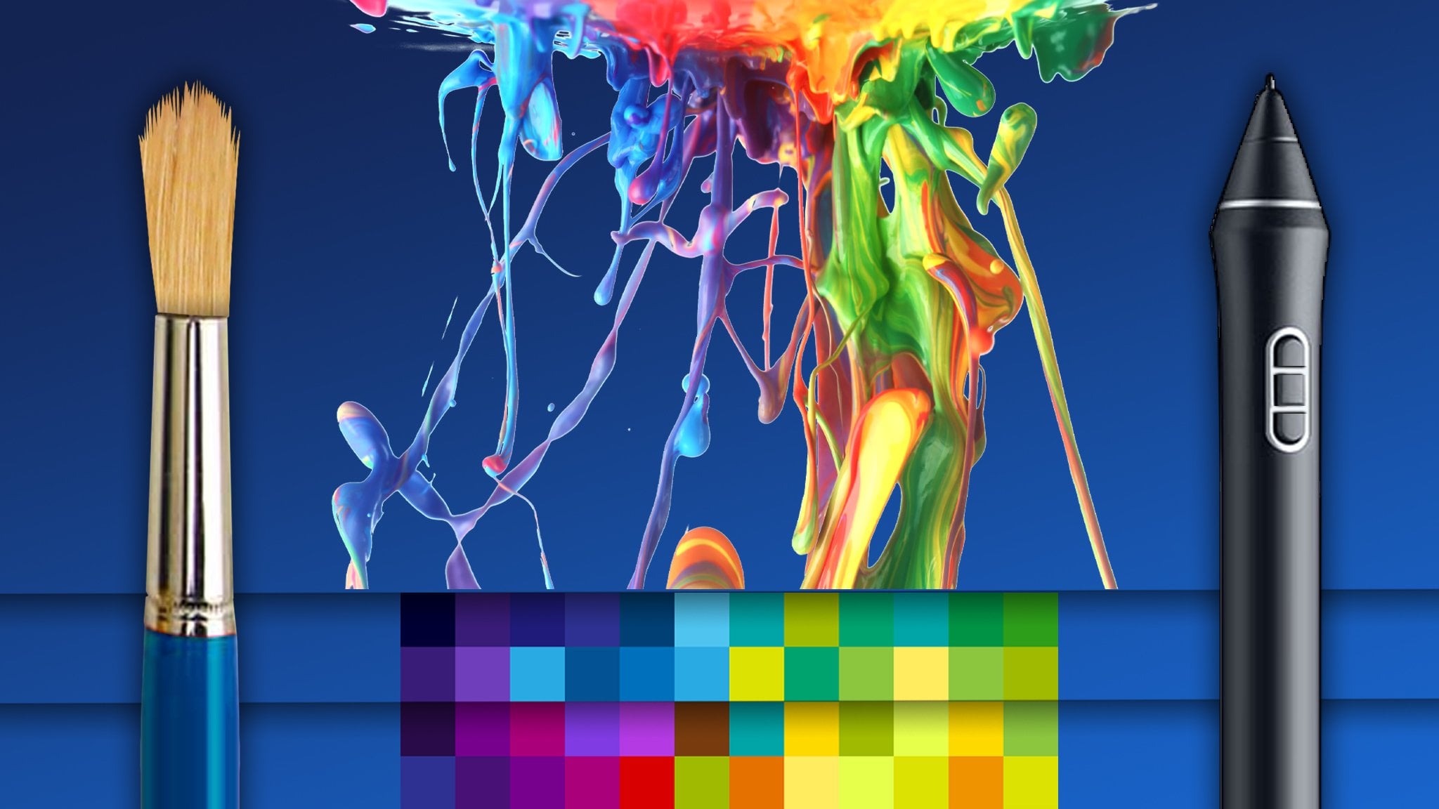
2. Coloring and Painting Tools: Before we get into the main lessons of the course, we're gonna take a look at the software and hardware that can be used to color your characters as well as draw your characters. Now, if you are already familiar with digital art tools, you can totally skip over this lesson. You really don't need to go through this if you're new, let's take a look at the tools available to you and let's get right into it. First thing is you want to make sure that your computer, whether it's a PC or Mac, has at least an Intel Core i5 processor. And really this is just to ensure great performance on your brushes. The capability to work on logic canvases with higher resolution images, and the RAM helps for that as well. You also want to have eight gigs of RAM. I would recommend a 1080 P screen if you can, if not a high resolution in that. So 1080 P is full HD or higher. And the reason is it gives you more screen real estate. And of course also want to mention that if you can get a computer or a laptop or a tablet with a high-quality display that would be better as well. A display that is capable of showing a broader array of colors. And you'll see when you go to the store, when you're shopping around, they'll mentioned the tops of displays and the tops of color capabilities of the displays. Rps is something that is favorable. The IPS display technology, it really does display very vibrant colors and really a nice broad range color accuracy. Something else you can look out for is the Adobe RGB color gamut of the screen Nano that might sound complex if you've never heard it before, really, it's just a little stat and it tells you how much of the Adobe color gamut the screen prescribes to. A lot of sort of mid tier to high-end have about 70 percent color gamut. And the very high end can have up to 95 percent, possibly even up to 99 percent color gamut coverage, which means you're gonna see more colors and more subtlety in the colors. Now, obviously, there's a process implication. So work within your budget and see what you can afford. Let's take a look at some of the software that you can use. A dog Photoshop really is the industry standard. I know the word photo is in its name, but it really is a very powerful application. The cost to use it isn't too high. It depends. You can no longer buy it outright. You can buy it on a dog Photoshop photography program for about $10 a month, I believe ten or $15 a month. And that will get you Lightroom as well. That's what photo editing, but you can then use that for $10 a month. You can use Adobe Photoshop and get access to all of its features. So it is the industry standard. It has perhaps got the highest level of tweaking that you can do it in terms of layer modes and in terms of brush settings and things like that. However, just because it is the industry standard doesn't necessarily mean it's the best. We will look at some other software that is quite similar and also fully capable. Something to also remember as we move through looking at the rest of the software is that most of the software can do 95% of the things we needed to do and we'll write. So Adobe Photoshop, you've probably heard of it before. It's kinda become a pop culture thing as well. And people that are going to shop this or shop that. But it is the industry standard end. I think it is very beneficial if you can use Photoshop. Learn the best right now and get it over and done with and then you can move into the other applications relatively easily. Another great application is Carl painter. Very similar features to Photoshop. Of course, less focused on photo editing in terms of the extra tools, and more focused on the paint tools, it's key feature really is that the paint and the papers in the application, that background's really with the papers as they say, act like the real medium. So you will get rough tops of paper, smooth subsequent, but you'll get watercolors that bleed like watercolors, oil paints that can kind of draw like all paints. You can even draw the paints in the app if you want to. And, and the paint looks quite realistic. Now of course, this depends on the type of style of coloring or painting that you're going to be doing. But Carl painter has everything from very digital tools to very traditional tools. So it's a good option there. Just to point to note with Carl painter, called painter does use a lot of CPU power. I would recommend going to an art save and model 16 gigs of RAM and maybe a dedicated graphics card if you want to use curl painter. It is very resource heavy, and it has been for many years. So it just takes a lot of processing power to do all those calculations of the paint moving and swishing and mixing together. So do keep that in mind with Carle painted. Next up we have Clip Studio Paint. Honestly, I cannot praise this application enough. I believe it's a Japanese made application. I'm not a 100 percent sure on that, but I think it is Japanese made. I've been using it for three or four years. I use a bunch of different software at Toms, I'll switch between. But Clip Studio Paint effectively is a off purchase. You can buy just the pro version they've got the Pro and the edX version. The pro version has everything that you need to draw and paint characters, no problem. It is great brushes, great brush mechanics. It has very similar features to Photoshop me developers are really constantly updating application and the best part is the software costs, if I'm not mistaken, 5999 US dollars. Of course, depending on when you're watching this course, that crosscut increase or decrease. But nevertheless, it's a once off purchase. And you have this very, very powerful, very awesome and extremely productive, efficient software in terms of system usage, it's very efficient. It can work on a lot of range of computers and the performance really doesn't degrade. I cannot recommend Clip Studio Paint enough, right? Let's move on to Procreate. Procreate is an iPad application, particularly for the iPad Pro with the Apple pencil. We'll discuss that a little bit later. Procreate is fantastic because it really brings the world of touch interaction of your canvas with the world of drawing on screen. And it has very powerful features. Like I said, most of these software packages share similarities between each other and procreate is no different. It has layers, it has layer modes, it has variable brushes and you can make your own brushes and great canvas sizes. And it's really is a fantastic application for the iPad Pro. It, it really is iPad Pro specific. If you're going to be drawing, painting, coloring on your iPad Pro, this is the application you want to use. The currently is no application. They can compete. Procreate. They're awesome alternatives, but they aren't even close to as good as Procreate. So that's it for the software side, those are my recommendations. Death neat. Take a look at those pieces of software. It's move into talking about the hardware. And the first thing we want to look at is drawing tablets. Now, these types of drawings habits do not have a screen on them. And there is a little bit of a disconnect when you first start using it. These connect to your computer. There are two brands yet wet on which has been really the biggest brand since drawing tablets kind of came into being. And more recently, a Chinese company from not mistaken, it's come up called Who ion. And they also produce really great quality tablets at a much cheaper price point. However, I am pro con, but that's really just because I've been using it for so many years and they really are sturdy and robust. I have very old habits that have lost a 1015 years. So I can really recommend like on, but who ion gets great reviews and you can look into that. These tablets are great. They come at a great price point there as accurate as onscreen displays, the pins work the same way. That wonderful. You may be worried that yes, there's going to be a disconnect because you have to stare at your computer screen and have your hand below. You're not really looking at your hand. But I can show you three to five hours on one of these, just constantly drawing and you really get the hang of it in it's, it's no big deal afterwards. The only area where these drawing tablets or weaker then onscreen drawing is when you really wanting to do clean, refined lines for your drawings. The very, very clean lines, right? The inks, if you will, or your clean-up Lindsay Refund lines. But other than that, it is achievable these days, especially in something like Clip Studio Paint, where you have the ability to turn on a feature called brush, brush stabilization. And brushed stabilization really allows the computer to calculate out all your little wiggles if you're managing to draw lines slowly. So you know, and it's really up to you. But if you want a more natural drawing experience, you'll want to look at something like an on-screen tablet. Here we have a webcam syntax on the left and Hawaii version on the right. These also plugged into your computer and they act as secondary displays, how you can actually move Photoshopped onto the screen and literally draw on the screen. It is a very cool, it is very awesome. It's not gonna make you better at drawing or painting or coloring, please keep that in mind. And in fact, for coloring, I would actually recommend just the standard orientation because your hand gets in the way, obviously when your hand is covering the screen. But nevertheless, you can't go wrong with these guys either. I can also recommend them and they are really great. Okay? So there's on-screen tablets. They vary in price. They are significantly more expensive than the non onscreen tablets, significantly more. And they also vary in size and style. So they go up and you get ones that can fold in different ways and ones that can stand really vertically or they can rotate. Do research them. But of course, consider your budget. I wouldn't go and spend too much on one of these. So think about it before you buy it. And then last but not least, we have drawing tablet PCs and these are fairly new. And maybe in the last three to five years they've been coming up. The epilogue bread Pro, is very new. I think it's only about a year and a half old novel 3D, but it does require a separate purchase of the Apple Pencil. And also that apparently the new Microsoft Surface Pros do not include the pain, but the older models do. And the other models are still Ansel. Nevertheless, the Apple iPad Pro runs on iOS. You'll be primarily using Procreate on there and perhaps a suite of other apps just to kind of complemented or maybe helped you with some edits or post-production of your work. But nevertheless, it is a fantastic, fantastic device. I have an iPad Pro, loved drawing onto the battery. Life is crazy and drawn it up, paint on it, I color on it all the time. It is a good device. It is very efficient and procreate can export to PSD, so you can move to your PC later and do some tweaks if you want to. And a lot of time you don't even have to. Microsoft Surface Pro Anya then is a full computer. It's a full tablet PC. As I said, the older models come with a stylus. The newer models apparently do not. You have to buy it separately. It's a $100 or here. It doesn't use WACC com technology. It uses different type of technology and the pin, but I have used these and it works perfectly fine. There is no, To me, there is no discernible difference in the drawing capability of the painting capability. It really is the same. And now when you're using a Surface Pro because it's a computer, you'll then want to use Photoshop or clips to your paint or another software suite to draw and paint in. And also great device as another point to note on the service that kickstand kicks back in a really nice way where you can rest it for a drawing kind of mode where the screen tilts up a little bit. The iPad Pro, you're going to need a laptop stand or something to prop it up if you want to use it in that way. But nevertheless, those are your hardware and your software options are just recommended. The products that I think are really good and will help you just get into it really quickly. Let me also say, Guys, we want to keep in mind. Odd is really about the theory and the practical. Don't worry so much about the tools. Donated stress you out, don't freak out about it. You can get by the mid-range computer a cheap whack on tablet or Hawaii on tablet, and a subscription to Photoshop or a purchase of clips, your pen or whatever you can get by just fun. Try to grow your skills. Don't worry about the hardware and software too much. All right, but those are my recommendations and I'll see you guys in the next lesson in the course. See you there.
3. Module 1.1: Light, Color and the Eye: Welcome to the first lesson in module 1, understanding lot and color. And in this lesson we're going to be taking a look at how the eye works. They'll ride. And in order to do this, I'm going to just do a small little illustration here of the side view of our eyeball and kind of draw in the photoreceptor sections here at the back as they go into the brain. And we're kind of going to do some theory. And this will actually be so useful to you because you'll understand why we choose one particular thing to focus on heavily in our AUC, which is value over another thing which is color, right? And so in your eyeball as lot intos, it hits a bunch of photoreceptors that I'll split into two tops. So it probably looks something like that in the ABA rule, right? It's a little spiky ones. And then there's kind of little round masses as well, because there's all these little spiky ones alleles will run masses. Probably looks like that from the side view. And effectively we have, I'm going to just kind of simplified here. We have rods that receive light information and then we also have cones receive lot information. All right, the rods and the cones. And these are very, very important in terms of how we understand how we see chloride. And so inside the surface when you're looking directly into the eye, there's kind of tons and tons and tons. I probably couldn't draw them fast enough. Or tons and tons of rods, about a 120 million rods in the eye. In fact, let's write that down there, a 120 million rods. And then there are about 6 million cones will rot in the average human eye. That's probably the distribution. And the rods all what detects brightness, brightness and darkness. Okay, So we'll just indicate it like this, darkness to brightness, right? So the rods detect broadness. And the cones pick up color, right? And you can see just by the split here of the 120 million to 6 million, that a lot of 3D vision is due to the rods because the rods can see the difference between somewhere that is lit and somewhere that is not lit. Rot can see the deaths of the shadows and the brightest highlights. And the rods are doing the heavy lifting in terms of our understanding of foam, right? Whereas the cones, they're primarily there to pick up color now from a scientific point of view, if I'm not mistaken, the cones also can detect degrees of brightness in a particular way, but the heavy duty lifting of that is the rods and the cones have it three types of receptor covenants, right? You have the blue receptacle, Owens. And the red receptor cones. And then you also have the green reciprocal ones. And now bear with me because I know that you've signed up for a course on how to color and paint your work. But of course, this is really pivotal and, and believe me, this will be very, very useful to you in very, very helpful to you. So bear with me as we go through this, but don't worry, it's not very long, it's not very complex. And I'm also extremely simplifying the process as well. Yeah. Alright, right, so this is what's happening, as in terms of the coins. Actually want to just turn it like this. And perhaps you've seen these colors before, maybe you've seen them on your TV, or you understand him in terms of pixels on LCD displays, that the individual pixels of your screen is made up of one little red light and one little blue latter one green light. And these three receptors combined is how we get our full spectrum of color, is how we see our full spectrum of color. But what's quite crazy, What's really interesting about this is that the brain kind of mixes the blue and the green. Oh should I say rather that you can detect all the things in between the blue and the green, right? As the blue and the green and mix. And you can detect all the things between the green and the red is the green and the red mix. So you can imagine green going into raid, you're getting sort of Brown's, you getting yellows and things like that. And then it's going into red. And then from the blue you're getting it, what you're sort of go cyan is going into land greens or took noises and that as you go into the green, however, your brain doesn't link. I mean that the, these particular receptors, sorry, do not link to each other, that blue and red they do not link. And so your brain just makes up the color in-between. Alright, and it's quite crazy, I know. So technically the made-up color would be magenta. That's sort of the base video. It's just made up in your brain, which means your magenta and mom again to could be completely different. And we would never know because whatever I call again to begin to or your pinky purples, you might call it that too, but it could be an actually completely different color to you, right? But nevertheless, it's a bit of a crazy thought. But this is how we get our spectrum of color and also add color wheel is derived from the system of red, green, and blue. And these are what we would want to really call the true primaries. Some people would argue that the true primaries or sign cyan, magenta and yellow. And that's more of a technical debate on the subject, but really just keeping things basic. Red, blue, and green are our primaries. And it's also how our computer screens and phone screens display the full spectrum of color to us by using RGB setups in the pixel structure. And that's kind of how we see. Once again, the big thing we want to take away from this very, very big thing is just how pivotal rods are, right? And just how important the value information is, right? The brightness inflammation is full. How we see we primarily discerning three-dimensionality and form in terms of the receptive part of it, in terms of lat via the rods, via the brightness or via value. And so value to us as oddest is absolutely foundational. It's absolutely core. And you will see how this ties in very, very heavily to professional level coloring and professional level character painting value is exceptionally important, of course, kinda plays a big role too. But the split of importance is something like 90 percent in potent value, 10 percent important color. Because color is really, of course, there's multiple uses of it, but color can really lead to mood, but value leads to true understanding of the foams. All right, that's it for this lesson. Let's move on to the next lesson. I'll see you there.
4. Module 1.2: The Scale of Light: In this lesson, we're going to now look at value. And as mentioned previously, value is very, very, very important. It really is. And the foundations and the fundamentals 2, coloring and painting well, and if you grasp this lesson really well, you're on a solid footing moving forward. All right, so first off, we're gonna take a look at the value scale. Right? Now in art, we obviously only have a sort of range of white being the brightest. We could represent an image and black being the darkest we can represent. If you look at the color picker on the rod side of the screen here, when we're talking about venue, we're really just talking about brightness and darkness. And in OT, we represent this brightness and darkness in kind of tin snips that start with the broadest being white, which I will just use a very light gray to represent that on the screen. Can barely see it, but it's there. And our next step would be a little bit further along. Step two, step three. Step 4, step 5, 6, 7, 8, 9. And let's grab these guys and just make them a little bit smaller so we can get 10 in there. And tin would be black, right? And this is what we call our value scale. Okay? And the reason we do this is in reality, what is the brightest you get? Who knows probably some star in the galaxy, right? It's extremely bright. What is the darkest you get? Is their blacker than black? Is there? What does a completely flightless area look like? You know, unless you're in there, I assume it's hard to tell, but it's probably for us, pitch black will write. But in odd in order to talk about value property. And in a more efficient way, we break down the brightest we can go. And the dark is we didn't even go into these 10 value steps or these 10 values stops, right? And, uh, depends who you're learning from, where, whether they go one to ten, where one is the brightest, 10 is the darkness, darkest, or vice versa. It doesn't really make a difference. But just knowing that we talk about these 10 steps with this tenant, value stops, right? And so this is how we will say that you want to make sure that when you're painting XYZ object, recoloring XYZ object that there is a big enough stop between two values, right, to brightness levels so that the viewer can see what is enlarged and what is in shadow. And we're going to go more into that. We're just taking a brief overview now a value, we're gonna go more into two something called the two value statement a little bit later on. But for now, we want to understand value in art. Is really brightness or darkness. It's got nothing to do with color, right? It's just brightness or darkness. Now of course, go back to the color picker here on the right, we can see that color can be brought a dog, so we can have a bright red or a doc rate. But that's got to do with the value of the color. And value forms the foundation of all of this. Okay, So that's the first big thing, the value scale, then the value scale of haunt did used to the idea of the venue scale so that you know, a one or attain has brought want. Or a one or attain is black depending on which way the scales moving. And that five is generally what we call a 50 percent gray or neutral gray. And that if we go from five, we paint with 53 and we call it with 53. That is one step away from the other values, right? Because there's a stop away. So we say separate something by one stop. Well, we'd separate 53 by the stopper for two stops, we'd separate 52 by the two stops of 34. Now, let me not make you feel like it's super complex. It's really isn't. We've really just got 10 values in a scale, brightest to darkness. And that is how we talk about, talk about it when we say, Okay, you want to keep the value more neutral or middle, you want to brighten it, or you want a darker value. Okay, so that is the value scale. But this some important stuff we want to talk about with values as well. And it's so obvious, but no one really States it. And so I decided, you know what, I have to state this so that you guys are pro rod in the beginning. Here we have a value only version if you want to call it a grayscale or black and white vision, although it's technically not black and white because these mini venue ranges in here. And it unless we have a grayscale version here of a piece of artwork that I've done previously. And the important thing I want you to realize is that different objects have a different inherent values, just like different objects have different colors. So, you know, if someone's city well, elif is green and the bark of trees brown, you'd be like hdr, that's obvious. But what is not so obvious is that different venues have, I mean, different objects have different values. That's not to say that some objects don't have the same values. But this is such a crucial point enough, never seen a torts EVA in anything. Different objects have different values. And so what I mean by that, and you'll character work and you use raid on the illustration here is her hair's value differs from his skins value, right? The eyeballs value differs from the skins value. The earrings venue difference from the skins value, the lips value slightly differs from the skin. The value of the earring differs from the hair and so on and so forth. And obviously on the skin, the skin has its LET value areas and then it's shadowed value areas. Well, right. And same thing with the hair. It's lit. It shadowed areas and it's lit areas. And of course, you will have some values that can be shade in a venue. Saints, for example, the highlights here on the hair, seemingly quite close to the skin, very well, right? But keep this in mind. Different objects have different values, just like different objects have different colors. And later on we'll go through a Value Check layer and just a simple tool you can use in Photoshop to check the value of your work and see, Oh, I see, I've made my hair venue in my skin value the same. Let me change it up because he has the key thing as well. If we make two values similar to the viewer, the object is the same object, even if you've made the colors different. Now, this may seem crazy because you're like That doesn't make sense. Like the color is different, but just saying the value can be the same. And it is true. The color can be different and yet the value can be the same. You could have a blue and a red that at the same value. And so while the viewer will perceive the difference in color, they Bryan will not perceive the difference in value. And so they'll lose one key thing, which is why we learned venue in the first place. They will lose the ability to distinguish in three-dimensions, the difference between those objects, as well as the planes and the shadows and so on. If the venues are the same. So value is pivotal and value is fundamentally important. All right, so that is it for venue for now, we're going to go through some more advanced topics on value, but learn the very skeletal jihad. Get used to this idea that different objects have different values and start asking yourself as you look around, what is the venue of this? What is the value of that? What is the value of this lacked that I have on in the room in contrast to the value of maybe my computer monitor or my pencils or what have you stopped looking for value? Because as we grow in our artistic ability, we learn to see better. And learning to see value is fundamental to being able to paint well, right? And color well. Awesome. I'll see you in the next lesson.
5. Module 1.3: Perception of Forms: When it comes to how we perceive things in the real-world. They're really sort of two big fields that help us to see 3D. And the one is perspective, and the other is light. And light is really where we're going to focus on is our concern when we're talking about character coloring and character painting. And one of the most important things we want to always keep in mind is that as human beings, we see shadows first and then we see the light. So that means we determine the three-dimensionality of an object by its shadows. Now that seems kind of weird because you're like, well, you need light to see things that is of course obviously true. But the shadows that form, the form shadows in factors are called help us to understand and distinguish what is in front, what is behind, what is around, what is turning, what is square, so on and so forth. So we see shadows first and then light. And so shadows are what essentially help us to understand 3D forms. And this gives rise to something called the two value statement or to value form lighting. And we'll get into that in a bit. But for now, let's take a look at this example image. On the left, we have this girl leaning against a wall or window with her cell phone. And what we're gonna do is first we're going to just break that image down into just plain value. And we can see there's a nice value split. Her genes are different from his shirt or shirts different or a jacket. Her hair is different from her skin, et cetera, et cetera. And even in the scene, we can see various different values or rights. And you can see I've brought her shoe value is compared to pretty much the rest of the scene barring the sky. And what we can do is we can simplify the values even further to maybe just two or three values. And we get something along the lines of this, right? Where we can still really understand what's happening in the scene. Can see a girl standing, She's wearing jeans, got sneakers, she's got a phone or something in her hands. We can see her face. We can see here. Here we can see the buildings, we can see the sky. And as you can see, everything is still funded mean to the understandable. And so we've broken down that vastness of complexity into really just two or three values. And what we're left with at the end of the day really is light and shadow. We're able to distinguish the forms by those shadows. All right, and so here we see a good example of the two value statement. There are around three values in this image, but nevertheless, the principle of having light and shadow a plants. I've painted this simple cube over here, just got two planes, the front and the side of the cube. And we can see, especially when you look at the thumbnail view, that we could easily perceive this as a 3D form. Yet we've only used two values, all right, and so the two value statement or to value formulating, leads us to a fundamental principle when it comes to how we want to color forward slash paint our works. And what this is, is really that we want our shadows and our light to read clearly, right? And what that means is that just the two basic values of shadow and light should make the object look three dimensional. All right, we should be able to achieve a 3D look with just two flat values. Okay, That's not to say that we're going to be starting any kind of workflow just using two values. No, that doesn't make sense, although you can certainly practice that and you'll have practice assignments on that. But it's to have that key understanding that if you're painting something or you're coloring something, you think to yourself, Well, this looks really flat and perhaps your intention is it for two, for it to look very 3D? Then you need to ask yourself, apart from all the other complexities that you're busy dealing with on that particular area of the painting or the coloring section of your drawing. Have I got the two values downright, do the two values, read clearly. All right? And so as we will learn as we move through the course, shadows becoming very big concern for us. Both form shadows in the ambient occlusion shadows which you will learn about because these are essential to creating a 3D look. And to end of this lesson, I just want to say again that a strong read of light and dark. Light and shadow is all that is needed for a strong form foundation. Hope this has been useful and I'll see you in the next lesson.
6. Module 1.4: Planes: We now understand that we can achieve a good form read, a good 3D read with just light and shadow, right, in having those things read clearly. But the key question is, where do you put those shadows, right? Where do you put them? And the answer lies in planes and learning the planes of the human form. I have these three heads here as an example. So the first head here on the left-hand side really is kind of just a very basic model of the head. And it's full with mountains and valleys of complexity. So if we go to head to the actual planes and planes really are just the different sides of things. Quite complex. So if I start drawing planes arrowed, imagine that would do something like this would go in and around the ABL, down, around the cheek, down in here and around. And you can start to see that, wow, they're alike seriously a large number of planes and they change. For example, here we go over the lip, the planes stop changing. And we can grid them out, right. So we can kind of get a grid view of all the different planes and the angles that they are facing. Now, light travels in straight lines and we're going to actually look at that in the next lesson. But we want to understand that OVS need different objects, have different sides, right? A 3D object has a multiple sides and lacked is going to hit some sides and not hit the others. So we needed to know the sides. And as you can see, planes are fairly complex. So how the heck do you learn them? And the answer really is that we'll see number three here is we want to study simplified versions of the planes. So for example, if you can imagine on number hit, hit number two here, we'd have like planes on the nose like this and then the underneath planes here. And they've just be so many planes of how the cheeks go and then the planes go in there and then around the eye and then out like that. It's just really complex, is so many of them, thousands or millions of them even right? We need to simplify. And so a simplified version of the planes would be something like this where we say, all right, what if we make this whole section of the forehead here just one plane, this just one plane. This one, just one plane here. We have one plane going in toward the eyes, right? One rounded plane for the eyeballs because they're circular. Another plane coming out below the eyes, right plane here for the cheeks, playing have those cheeks, et cetera, et cetera. And we split the nodes into just two planes. Bottom plane in a top plane here. And we can actually get a sod plane that comes down like that. And you can see we start to understand how we can get the general shadows in, in a general way. And as we're learning the planes more in depth, we can start bringing the level of detail up if we're going for a very realistic style of coloring or painting. Now of course, when you, when you talk about those types of Sonics, things that scale, sometimes you just want a very simple coloring and that's fun. Sometimes you want more advanced coming in, that's one I'm teaching you to be a professional and that means you know how to do everything from the most complex thing all the way down to the most simple thing, right? Going back to planes, planes are critical. How you learn the planes is you find models of simple facial planes. You look for reference images of simple facial planes. Now, usually these come in the forms of sculptures. So a, an, an artist would actually make a simplified it Plains a structure sculpture of the head. Now, I can't show you those because pretty much all of them are copyrighted images. And I don't personally sculpt, so I don't have one of those hits. Nevertheless, a simple Google search, planes of the face planes of the human body will give you millions of results that you can study and reference from. And believe me, when I say this, you want to go in depth in terms of your understanding of the planes. You want to do a lot of planes studies and really get a feel for the angle of the planes on the face. Now for example, this kind of points down, this kind of points up, this kind of points out. And so you have all these planes and when you understand the planes, and then we add a light source, for example, we say, okay, the light sources here, top left, where will the light hit? We can then see that it may not hit this plane here of the nose. So that would be in shadow, right? And it may not hit some of this plane, of some of this plane, but it hits this section here and we start to get that 3D form coming through. There was a plane, yeah, probably wouldn't hit there and might hit a little bit there, some here, but maybe not this section either. And so we start to bold form out of the understanding of the planes and the location of the light. That is the basics of planes. There will be more information in your assignments. I'll see you in the next lesson.
7. Module 1.5: Light and Reflection: In this lesson, we are going to be learning about light, light sources and reflection. Okay? The first thing we want to know about light is that no matter what the last sources, whether it's a light bulb or the sun, that light typically moves in straight lines. Okay. So light moves in straight lines. And a consequence of it moving in straight lines, it radiates out in straight lines, is that it reflects in straight lines as well. So if there was a surface here, very smooth surface, the light would reflect out in straight lines as well, right? No matter what the surface is, actually always reflects out of straight lines based on the plains of that surface. So our first big point in something we want to think about, particularly in regards to the planes, is that light moves in straight lines, okay? Very perfectly straight lines. And straight lines. This is how we want to think about how light moves. All right? The second thing we want to be aware of is the sources of light around us. So I'm going to draw a simple scene here. And we will have the sky and the ground. And then we can put in a son here. Let's say this is an outside scene. So in a typical outside seen when we think about light and you ask somebody, well, how can we see everything? Where does the light come from? People will obviously say, Hey, it comes from the sun and it's radiating from the sun. And while that is true in the majority of the light is coming from the sun in, on Earth when we're standing outside. The sky is also acting as a light source. Light waves move through the atmosphere and the sky and it's beautiful blue nature itself becomes the light source as well. And so the sky in itself also costs down its rays of light, right? It's blue light gets cost down into the world. And so we have the rays from the sun and the rays from the sky shining down into, onto the ground and onto the objects and so on and so forth in straight lines. And so we have two light sources already. But then what happens is everything that is accepting the light on the ground, the ground surface, and what have you then itself since light back up into the atmosphere, right? And of course to the objects around it. And you can see here that we actually typically have three major light sources going on. Now, if you are in a room, your bedroom, for example, in your bedroom light is on. Then you're really only having around two light sources. And that's kind of a style of interior lighting really, you, you know, someone is inside based on the light being a particular way right there, kind of lit from one light source, one main light source, the bulb. And then that light bounces all around the room and on all the objects. And then you have the secondary Latin coming issue, SAP reflected lighting from all those objects filling the room. Now, in this instance, we would technically call the sun the key light, because it's the brightest and it's the main light source. The sky would be our secondary light source. Or you could call it the ambient light source as well. But let's, let's keep it secondary for now. And then the ground would be the reflected light source. Okay, reflected light, which you could also call bound slat. And which itself depending on circumstances as well, generally speaking, would also be ambient light because it's contributing a sort of a sort of not as bright light to the scene. So the key light 3D is the brightest light and the secondary lighting and the reflected light and the ambient lighting is the other types of lighting. And we'll talk about three-point lighting later on, not too far from now. And three-point lighting is really critical for us when we want to color and paint out characters in a way that is super convincing, super believable, doing things that you wouldn't think you would do with paint color basically, to achieve a very believable in a very appealing effect. So our second over here is that generally speaking, three light sources are good, right? Three light sources are something we really want to have in our work if we can. And of course, based on the style of the work that you're doing, if you are doing more simplistic coloring, you, you may not even have distinct lot sources, right? If you're not going for a super 3D look, however, we want to know the extent of our capabilities when it comes to lighting and how light actually works right? Now, moving onto reflection and reflectivity, just going to make this stuff a little bit smaller. So there's some space. Imagine if you will, like flying from the sun in straight lines. It's beaming off and it's going to hit two balls, right? And we'll have a ball here. Let's call this ball the glass ball. And we'll call this ball the clay ball, right? So it's hitting a glass bowl and it's hitting a cable. What we're gonna do is we're going to zoom in with a microscope onto the molecular structure of these balls. So here's a zoomed in view. Okay. And when we zoom into the molecular structure of gloss, we see that the molecules are really close together and they're really tightly packed next to one another so that the surface of the glass is kinda really smooth. Okay? And when we come to the clay at this very closely zoomed in particle molecular level, we noticed that the particles are kind of Vary, both very randomly placed and they going all over the show. And so the surface of the clay at that level is kind of has all these little mountains and valleys and ditches and things going on. And so what happens is a lot still continues to move in straight lines, doesn't change that it moves in straight lines. But when it hits the clay, it hits at all these different angles and then reflects off in really crazy ways, right? And so that light particles in the light, the lines of the light particles, if you will, go in all these different directions and start overlapping each other. And because the reflection is not a direct bounce back, a straight bounce back, you get a sort of a hazy appearance when those types of surfaces, like clay type surfaces rocked up. So if this is met, surfaces are hit with light. They just do not reflect things very well. Sure they reflect their color, their reflective value. They don't reflect highlights very well. They than they do not reflect the environment around them very much. They also have very different top of bounce lighting ride, which is very hazy. You can imagine if these were little particle dots bouncing around here in the clay area of things are just like a kind of a hazing glow or glides, right? However, conversely, when the straight light beams with the straight light beams hit gloss, for example, as a surface top, it bounces directly back. And because of this directive bounce back. This gives gloss. It's nature of showing off highlights and often reflecting the world around it, colors around it, the things around it. And this applies to all highly reflective surfaces, gloss in middle and chrome and things like that, right? Very shiny plastic, et cetera, et cetera. And so knowing this, understanding how light works and interacts with these types of surface types helps us to understand how we would range or paint or color something that is plastic versus something that is perhaps cotton. This is something that is perhaps Chrome, right? So it helps us understand, Okay, maybe I should have really brought highlights on things that are metal, on things that are very shiny, but on things that'll cotton or wool, I wouldn't go too crazy with the highlights. And things of course go into various degrees of complexity where you really want to take time to understand why and how does silk reflect light compared to wind? How cotton reflects light? And so this gives us our third here, tops of reflectivity, right? Based on the material top. Okay, types of reflectivity. Now we are going to move to the form loading principle in the next lesson, the phone lining principle is really the hardcore lighting principle that all painting colorings based off of. But I feel that you should be now well-equipped, well equipped in your understanding of light planes and value to really grasp that in a rapid way. And I hope you do. So, that is it for this lesson. Last move in straight lines, generally want to strophe three light sources. That's a guideline, not a rule. And the tops of reflectivity based on the service material top. I'll see you in the next lesson.
8. Module 1.6: The Form Lighting Principle: Welcome to this key and pivotal lesson, the form lighting principle. The full lining principle really is the core foundational principle we as artists use to help us color and help us paint our work to varying degrees of believability. So we base all of our learning knowledge pretty much on the full learning principle foundationally. And then we add extra bits of information as we need it on top of this. So this really is our foundational principle for lighting. Now, I'm going to be doing this step-by-step. Don't worry too much about how I'm doing and how I'm using Photoshop or homie, using the tools that is covered later on in the course. For now focus on each of the individual elements of the form learning principle. Let me also say this and hopefully I'll remind you at the end as well. You want to remember every single element of this off by heart. And let me say that if you can remember it off by heart and how it kind of works and the formatting principle, you have a very, very strong foundation in painting already. Alright, so let's get started in front of us here. We have just a gray circle. This gray circle is going to become a sphere. So what we're seeing is the sphere without any lighting. And all we see is it's inherent value, which is about a five, and the value scale and its inherent color in this instance, we've gone with just a gray, so its color and its value are very similar. Okay, so it's a five on the value scale and its inherent color is gray. And what we need to do is determine or define a light source. Okay? So we are going to say, let's put the lot so top left. And we'll just draw in little kind of 3D arrow here, just indicating where the light is. So that's coming from the top lift. And now that we have a lot sources, something starts to happen, Right? We're going to start seeing form shadows occur with light does not touch. So I'm selecting this shape, this circular shape here. And I'm going to grab the soft brush and gently add in based on the plains of the form. Now obviously a circle is because zillion trillions of planes that list, we're going to kind of wing it, put in some form shadows, rush of document here on the areas where it gets pretty dark. And you can see immediately how, what we've learned about the two venue statement and just the power of light and shadow. What that can do to something so simple, like a circle. It has effectively turned it into a sphere already. And yet, we haven't even done all the other elements of the full 90 principle yet. So remember again how important the two value statement really is. But if you look at the thumbnail view, if you had to show this to some random person and say, Hey, what do you think this is? Well, it looks like a great bowl or maybe it's a great planet or it's a gray sphere, right? They wouldn't say, Oh, well it's just a gray circle. And that is the power of shadows and light in terms of the area here, that is our base local venue. Okay? So those are form shadows and they are shadows. That appear on the form once the form is lit, Okay, Before my shadows. Next, we're going to add ambient occlusion shadows. Now, ambient occlusion shadows, the name kind of hints as to what the purpose or how this shadow comes about. So first of all, ambient refers to the top of lighting. So these shadows are caused by the ambient lighting, not the direct lighting. So the direct lighting causes the form shadows that the ambient occlusion shadows are caused by the ambient lighting around the area or the environment of the object. And occlusion refers to latter being cut off so lacked not appearing some way. So when we we understand occlusion shadows, which we'll get into just now, which is kind of like a space between your fingers or the darkness underneath your shoes when you're standing the ground, it's almost pitch black. Occlusion just means to occlude to stop the light coming there and of course shatters just indicates that it's the ambient occlusion shadows. And any occlusion shadow is a kind of weird. I'm probably explaining it in a strange way. But what's important to know is that ambient occlusion shadows appear to us when the ages of a form tend to turn. So this sphere tends to go over around into the back sections of the sphere, right? There's a back and a front and a sodic cetra. And so what happens is in occlusion shadows are very subtle shadows that kind of appear around the edges of forms like this. And they help us to kind of get a sense of the turning of the form, right? The turning of the plane. And you can see it kind of enhances the overall spherical look. I just want to be a little bit more subtle here. And that's also a hint as well. You want to be subtle with him. They're not supposed to be overly harsh shadows. Okay. Let's just get that in there. Okay. That seems nice. All right. So those are our ambient occlusion shadows. The purpose of them once again, is to show the turning of the form. If an object or a shape that you have drawn does infect turn, or as a rounded form, even if it's a square form. If a turns or it has another side, you want to have a degree of ambient occlusion. It is, it is a shadow that is being formed by the occluded ambient lights. Okay, let's move on to the next element. What we're gonna do here is we're going to add just light and general level of additional let before we get to the highlight. Now, lot often is just formed automatically in this region, right? It's just formed automatically because Shawna lots was created the form shadows and you already kind of have a Latin zone. And you can see in the thumbnail, we already kind of have a lot so in there. But we're going to add the stages while because it's also very useful when we're painting, we're recoloring to think about light as a stage. Now, let me just reiterate once again. You don't want to think of painting as adding light, adding shadow. I want to really encourage you to think about get the right inherent value and inherent color and just add the shadow. And you've saved yourself a lot of drama and a lot of steps in trying to make it look 3D. Working on making sure your shadows read correctly. Anyway, let us add this lab. I'm going to select that local color there, and I'm going to increase the value, maybe by one or two stops. And we're just going to beam sunlight on to that section. And our bowl looks a little bit more 3D now. Okay? So that is the light, and the light is obviously coming from the light source. We're lacking a zone. Let's go to our next layer, if you will, or our next element of lighting, which is the highlight. Now, the highlight generally occurs at only specific points. Another way I want you to think about a highlight is think of a mountain range. And there is one mountain that is the total highest mountain. It's called it the peak of the mountain right there. The mountain peak amongst peaks. Think of the highlight like that. When you start putting a lot of highlights all over something, they don't really seem like a highlights anymore. They seem like really bright little markings on whatever you are doing. The term highlight really comes from the highest point of lattes, right? So if like the highest peak in the mountain range, so be very, so use highlights very sparingly. Okay, And what we're gonna do is now select that light color, increase its value. And we're going to sort of add a little bit of a smaller highlight here. One location with a lot is brightest. And even go a little bit, brought it in the cold day. All right, in the center over that little shape like I fund. So that is the highlight. But there is still work yet to be done. What I'm gonna do now is go behind our sphere. And I'm going to draw a cost shadow, right? It's do a cast shadow like this. Let's seems reasonable enough for an example. Okay? And cost shadows, important thing to remember with core shadows is cosh, shadows are transparent right there, pretty much transparent. You don't really want to do them opaque. It'll look weird having this we'd really harsh dark black shadow of a something. And this of course you're doing that for an intentional kind of a reason. That's important to remember, cause shadows all transparent, but they all usually quantum doc. And other points to note is that the age of the core shadow is shop in very clear, bright light. And it can be a little bit fuzzy when the lot is diffused. So for example, think of a fluorescent lighting, think of a very cloudy day. Shadows don't pertain to have very sharp ages when it's a cloudy day. Okay. When the light is diffused, but in shop right lateral general normal lighting circumstances, the cost shadows tend to have a sharp edge. Now the thing to remember with core shadows is that they are costing off from the foam. So as the light beams posited, the form areas where the light does not hit the cast shadow is formed, sort of pretty, pretty obvious in a way. The same time you want to think about how a core shadow might look based on how the light is moving past the form. And that is the cost shadow. Ruts, cost data. We've just put that layer underneath our sphere just for convenience sake, as we're working. Next, we want to talk about reflected or bounced lighting. Okay? So I'm just selecting our sphere again here. And we're going to grab a bit of the light here from this surface, which is now kind of a white table or our 1D environment. Because as the light shines down, some of the light shines down. Post sphere hits the table surface and then bounces up again to the back of the form, right? And this is our reflected or bounced lack, which we've already learned about a little bit already when we had done the elements of light, right? The sources, LED light sources. So what I'm gonna do is just do a gentle, soft whoops, wrong brush. Do a git pull. A very subtle Spray of this reflected light in that shadowed area of a. And the key thing to remember with reflected light is that it generally appears only in the shadows. So bounced lot forward slash reflected lead pertains to really show itself only in the shadows. Now why is that? Well, because it's reflected light, it is a lot less bright than the, than the actual light source itself. And so if they was reflected light in the light areas which there is, you simply cannot see it because the light areas are being overpowered and blasted with the direct light source. So our reflected light is firmly seen in the shadow areas. I'm going to add another lead element yet, which we will call our secondary lines. Okay? And I'll stick into relied is could be the sky if you're outside or it could be another globe if you have an orange globe in the room and then a red globe in the room. The red globe being a slightly less powerful, maybe a more distant light source, it would still shine, it's lats. Lat would still reach out object. This is our secondary lot source. It's secondary to the primary or the key lot souls. Here I'm just going to hint edit just a little bit on this asset age. All right, we're going to say that there's a secondary light source to the ranch. Now it's different from the reflected light because it can be brought in and secondary lot sources basically run as can also be seen in a lot. It just depends on the lighting setup. And as we do that, let's add our secondary light source in here as well. So that would kind of aware that there is a secondary light source coming from the right. Maybe it's really far away and a little bit distant. All right, a secondary light source, it's weaker. And I'll just put yet sick and so that we know it's a secondary lot source. And I'll just say primary here or key light source. Okay, We've got one more thing we need to do in our form lighting principle, and that is the occlusion shadow. Now, whenever an object touches another object, generally speaking, you get an occlusion shadow happening there where lacked just simply does not get to rot the blood is itself occluded. Just put that in there firmly occlusion shadows. And I'm going to select our sphere here. Just hiding the selection so it doesn't get in the way while we're working. I'm going to select a dark shadow color. Even I'll just even select the black. I'm going to be subtle with it because there is a lot of curvature happening underneath us via. So you'd only have a little bit of an area with the occlusion shadow, but it would be there something like that That's a little bit too lacking in subtlety. But there we go. All right. And that those infect are all the elements of the form lighting principle. And we use these elements when we're painting a particular thing to determine what elements we want to add and take away based on the lighting scenario of that particular object. Now when you're dealing with various types of OT, maybe you're going for a very cartoony look. You may not use all of the elements of lighting workflow, right? You may use none of them. You may just do completely flat color. But if you want to bring in more and more dimensions, you want to use more and more of the form lighting principle. So let's discuss this principle now with just some key notes on what's going on here. And we also want to start to try and see how a workflow, how we might work and implement coloring derived from this particular principle. All right, so what we wanna do first is kind of split the families here. And we have the light family. And we have the shadow fed me. And things from the Latin, the shadowed family do not cross into each other. Generally speaking, for example, we do not have values from the light family occurring in the shadow families areas. It just doesn't happen. The venues are completely separate y well, if we remember our two values statement, everything needs to boil down to the two values. Obviously, if we have values from the shadow zone in the zone, embeddings from the Latin zone in the shadow zone, everything becomes a blurry mess and we can't read the foams animal. So that is the reason these families are in effect at war, you could say. And in the light family, we have our base or local color and value. We have our lit area. And we also have our highlight, right? And we want to remember, we don't want to go crazy with highlights. That is almost at the instance son of an amateur or someone who really doesn't understand money principle. They just have highlights on everything like the character or whatever they're drawing a painting. It's just super glossy and stuff just looks really weird. Okay, so those are the elements of our large family and crazy thing is, you'd think the light family would be this crazy, huge family. They've only got these three members really. Everything else is part of the shadow fannie, once again emphasizing how important shadows all. And then in the shadow family side, although yes, we do have the ambient occlusion sort of occurring in the shadow family side. It's a little bit different, but nevertheless it's lotsa, it's part of the shadow family. We have our ambient occlusion shadows. Yes. Mind you also in the latch family would be the secondary light source as well, obviously because it itself is a lights. Okay. So we had the ambient occlusion shadows in the shredder family, we have the form shadows, which are really our base shadows. And when you're doing your shadowing, you mainly want to focus on your form shadows. I'll put a number 1 there and number 2 and your ambient occlusion shadows when you're just working with your base venue and base color. And you have the desire to create that 3D form, work just with your form shadows and your ambient occlusion shadows work those until it looks 3D. Don't worry about the other elements he hit. Okay, we have our occlusion shadows. And I'm reiterating this for your sake so that you're getting used to the idea of all these elements. And we're going to list it out and lift as well. That's not to waste your tom is because we want to derive a workflow from this. It's all good and well, learning the full length principle, but can you use it in actual piece of art? That's the real question. Will watch and just had a sip of water there. Okay, So this is our reflected latch, also called bound slats. And that's because the lats shines down and then it bounces off the surface and a back onto the object right at whatever angle it is in relation to the object. Key thing to note here is reflected and bounce light or part of the shadow family, right? Because these lots occur in the shed is you see them in the shadows. Even if son typically they are occurring the latch, you do not see them in a lot. So in the terms of an OT, we want to be mindful that they are occurring in the shadow areas, right? Just doing an arrow, the secondary latch holes. And then we have our cost shadows, which up cost by the full board. And to remember they are transparent. Right? So when you start looking at all of these elements in a list sort of fashion. We kind of have our base local color and value. Then we have our form shadows, our ambient occlusion shadows. Then our lights highlights, reflected lights. We can add secondary lots at this point as well. And the workflow, occlusion shadows and Our cost shadows. Let's make sure we've all got them all. 1, 2, 3, 4, 5, 6, 7, 8, 9. Okay, there we go. We've got all of them there. Now, something important to note is look at where the core shadows are. Look at where the occlusion shadows are, they're lost. And this is very important. You don't want to be painting in cost shadows somewhere in the beginning because you're going to end up painting will coloring over them. And that would be weird because core shadows cost over things. Usually if an arm is over a character's head, you wanted to have painted the head and vain do the cost shadow over that range. So it's very important. But in essence, this is how we get our general lighting workflow, okay, on general lighting workflow. I hope this has been a very useful and very to the point, form lining principle. Lesson learned well, learn all of these elements off by hot, get it over and done with, and you will thank me later. That's the end of the lesson, and I'll see you in the next lesson.
9. Module 1.7: Understanding Color : In this lesson, we're going to learn about the elements of color. In front of you, you see a pretty typical color wheel. This type of color wheel is called a year, MY color wheel, and you'll find out soon why it's called that. Nevertheless, color has a few properties to it. One of which you already know, which is a value, which is the brightness or the darkness of something. The next one we're going to take a look at is hue. Hue basically refers to all these different colored segments. Not necessarily the color itself, but rather the frequency range of the color range at the particular color falls into. And so in order we have yellow, red, magenta, blue, cyan, and green. And the way to urine B comes from the yellow, red, and magenta blue going back into the yellow section, don't know necessarily why they left at C and G. But something that is important to note is it's good to come up with a pneumonic for yourself so that you can remember all these segments. Because the color wheel, knowing the color wheel if by hot, helps you know what intermediary colors a color can move two in its particular range. So it was a yellow goes into oranges, oranges moves into reds, reds into pink reds and grids into sort of McCain says, and again doesn't pebbles and so on and so forth. Now, another important thing about Hughes is that colors are divided into warm colors and cool colors. And I'll split the wheel now to show you the warm and cool split which is around here. And woman cool colors tend to really contrast one another. Warm colors, as the name implies, feel warm and heated. Cool colors, feel cool and cold. And as we move through the course, you'll start to see how having a good interaction between warm and cool and also how we treat woman cool when we're lacking objects is a very important facet of understanding hues. So we have color, we understand Verdi was brightness and darkness, and we understand hue, warm colors, and cool colors as well. But there is a third element, and that third element is saturation. Saturation refers to the amount of gray in a particular hue. So if we look at this orange segment here, as it moves to the center of the color wheel, it gets less and less color rich, that has more and more gray in it. And this instance we call this neutral gray or the 50 percent gray. So saturation, you can regard it as the amount of gray or you can regard it as the color richness. So it either has a lot of gray or a little bit of gray essentially, and that will saturate or D saturate the color. Now when you combine this color wheel into the Information and the knowledge you have about value, you have a very broad range of colors to work with. Tons of different brightness and darkness labels combined with tons of different saturation levels, combined with tons of different hues. And obviously the color wheel is a simplification of the US because as you can see on the color picker here in Photoshop, the hue levels just quite crazy. Most computers support 24-bit color, which is 24 million colors. And in reality, the range is significantly higher than that I'm led to believe. Okay. But nevertheless, these are the core elements of the color wheel and the core elements of color. Now, there is some addendum information to be spoken off as well, and it's more about terminology. You may have heard these tone, these terms before, shades and tones. What is a shade? What is a tint? What is a tone? To be honest with you, day-to-day life, most people misuse these, particularly the word tones, but I suppose it does have a use in music as well. But nevertheless, shades, tones and tones are separate elements. Shade is when you add black to a color or degrees of black, right? You will start getting the shade or the shadow values of that particular here. Tenths, on the other hand, is when you add white to a particular here. And tones are the varying steps of saturation is when you add gray to a particular hue. So those are what's shades and tones are. And having this vocabulary under your belt and this understanding we very useful to you when you're painting and coloring your work. Right? So as an example, let's take this, let's take this red, for example. And I'm going to get a painting brush here. And what I'm going to do is slowly increase the darkness of it to give me different shades of that particular rate. You can see we get quite a nice spectrum of this RED, on the other hand, have us increasing the amount of white in the color. And once again, you see a very narrow spectrum. And last but not least, tones have us dealing with the saturation level. And so here we will move more toward gray on photoshops, particular color picker here. So we'll move to a 50 percent gray in a diagonal fashion, so saturated a little bit more. And those are variations of times. And that really is color in a nutshell. That is the lesson and I will see you in the next lesson.
10. Module 1.8: Color Shifting: We've learned about color theory. Now we're going to learn how light color a Fichte's surface color. A very common beginner mistake is to assume that when light hits an object, that the object is simply going to increase in value. And so what I'm gonna do here is I'm going to just give you an example of this on the red sphere at the top yet. And so the assumption is that okay, I've done my base color, I've done my local value, and my local color. I've added in some shadow and now a 12. Luck. So I'm going to select the base and I'm going to increase the value of the rate. And I'm going to quote some red here. While this is not necessarily untrue and asserting Latin conditions, what is more common is that the hue will change based on certain factors, will write the Q will change. So we won't just increase the value that brightness of the base rate, we're going to change the hue as well. Now, this means we need to go to our color wheel here i yr the color wheel, and do a nice line splits between the warm and cool colors, right? So on this side we have the warm colors, and on this side we have the cool. Now, generally speaking, as a general guideline, most of the time we fall under warm lights, whether it's globes and our house, whether it's even fluorescent lights in our house or our offices, or we're outside underneath the sun. Primary light source usually is warm or fairly warm. When it gets cool, things become a little cold and chilly and feels a bit weird to us. So I think in general, we opt for warmer types of lattes or more daylight like lights because it feels more natural. And when a warm light hits a surface of any particular hue, it tends to cause that surface whew to warm up as well. Okay, So when a warm light hits a particular surface, whew whatever the hue of that surface may be, it tends to cause the surface to warm up as well. Now there are many lining circumstances that are possible, but this is a very common one. And in general, this is the most natural looking way to do it. Also, before we go into the examples, is the opposite true? If a cool light hits a surface of a particular view, does that Hugh cool? And the answer is yes, of course it depends on the coolness of the light and the color of that particular lot. But lots are going to fall into a category of a warm or cool. And the sun is generally considered warm because it is yellow. So let's move over to our spheres and see what the correct approach would be to lighting them, which doesn't mean just increasing the brightness, but we're also going to warm up the huge as well. So I'm gonna switch to the soft brush here and we're going to start with the red one. Now, if we ask ourselves, what won't area or warm direction, will this RED move into this particular rate? It's probably going to be toward in the orange and the yellow, It's going to warm up towards the orange and the yellow. So we'll pick the base value here, base color and the local color increase the value because we're lighting this side so we can increase the value. There's going to be like there. But we also want to move the hue a little bit. And of course, the extent to which you move this is dependent on what you're actually trying to paint, but you want to get the general principle here. And so that would be a good way to let that particular surface, you're changing and shifting the hue of the local color, warming it up as the light hits it. Let's go to the blue. And the blue would warm from the cool here up into a cyan, right? So it's going to warm up into a cyan. So we will select it, will increase the value because we wanted to get brighter and will warm it up towards the cyan. And you can see how natural it looks to do a hue shift as well as a value shift, right? Last but not least, let's do this. Green sphere, once again will increase the value. And then we'll hue shift toward a lime green, right, going into this alarm area of the warm colors here. And it provides a fairly convincing, nice warmed here. It looks naturally lit. Now a question you might ask is, well, what about the shadow areas? What about the shadow areas on the dark side of these spheres over here? And the key to, the key that you want to remember here is that shadows themselves are effectively the absence of light, right? So that the absence of light, which means it wouldn't, it's the absence of that hue shifting ability of the light. So 3D shadows on just a lower value of the local color, okay? The shadows really aren't necessarily affected by any hue shifts. You don't want to go in and be like, oh, well, uh, warned the last so I'm going to cool the shadows though you could do that and you have creative freedom, generally speaking, shadows or the absence of light. And so you def neat will, you know if this is your base here, you would just really drop the value for a shadowed area and let the light in the hue shifts and the let do the talking. Okay? So that is in effect, how light color effects surface color or the local color of an object. And when you have warm lights, you want to hue up. That's the end of this lesson. I'll see you in the next lesson.
11. Module 1.9: Colour Schemes : In this lesson, we are now going to take a look at color harmony and color schemes, but we're not going to go too crazy extents with this, because color really is quite subjective. It doesn't really have a hard and fast rules and it has more guidelines. In front of us, we see the color wheel on the left and on the right, a bunch of different splits out from that wheel. And this is your typical kind of splitting of the wheel into various schemes, if you will, will kind of divisions. So at the top we have the primaries and the first one primary is just RG and B, red, green, and blue, which we build most of our wheel off of, which is how the cones in our eyes see color. And then we have next to the arguable primary. Why is this called the ovule prominent? Because it is argued in certain art circles that these could also holistically really be primaries as well. You look at printing and the printing industry, for example, alpha1 print in what is called CMYK, which is cyan, magenta, yellow, and black. And CMYK also produces perfectly legible and readable images when you're looking at your magazines or books and what have you. Then we have secondary. These are secondary colors that really just the colors next to the primaries. Hence why they're called secondaries. And you can derive a secondary color scheme, which is a color scheme using secondary colors. And then of course, you may have heard of complimentary colors before. Complimentary colors are directly opposite each other on the color wheel. And as we hit this point, you can start to see kind of some subjectivity already taking place. Because you may be saying, Well, isn't blue and orange complimentary on red and green complimentary, What's up with this color wheel? Why doesn't it work like that? Well, that's because there isn't really a perfect color wheel per se, right? Just kind of man-made color wheels. And if you look at Photoshop, doesn't even have a wheel older, you can download a particular wheel, but doesn't really even have a wheeled has this color strip. And how would color schemes look if we had to work with this strip, right? It's called, it can be very, very subjective. Then we have analogous colors. And those are really colors that are right next to each other on the wheel. So for example, yellow, orange, and red are considered an analogous, and so on and so forth. As you work around the wheel, you can just pick the colors that are next to each other. Split complementaries, really that you have a primary and then just sort of diagonally from it instead of directly across, you have a split complementary, which gives you a three color scheme. There have monochromatic scarlet color schemes. Monochromatic really just meaning single color. So you'd have a single color in this instance, we have the blue, and then you'd have various other colors being either higher-valued blues, lower vetted news documented blues, more saturated of that blue, less Azure AWS, you're really staying in that one hue range. And that really is an overview of the general splits you might see when it comes to color wheels and color harmony. However, I want to show you a great way to simplify this process where you don't really need to necessarily learn all of this. It's not going to make a huge difference in your life. And we're going to look. That right now. Okay, and so what we're gonna do is we're going to achieve color harmony using the rule of three. Technically, it's the rule of three plus one, what we're going to call it the rule of three here for this example. Okay, so let's put it here. Color harmony by rule of three. And with this system, you really can't go wrong. They may or may not be a U in the word color depends how you like to spell. It's just interchangeably use both, right? Color harmony by rule of three. And what you wanna do is you want to pick your primary color, whatever you think the main color in your character is going to be their main descriptive color. This instance, let's take a blue, Okay, we're gonna go to blue, pick its value, Pickett's saturation level, pick the hue as you prefer, and decide to yourself, what are your primary color is going to be. And so here we're going to have a single primary color. I don't like that. I wanted to be a little bit darker. So that will be a prompt and then pick a secondary color. Okay, So I'm just gonna go with whatever. Let's go with the yellow and orange. Okay, let's take that and it has its own hue and value and saturation level. And important to note, you do want these colors that we're choosing here to be different in value, right? So different in venue. And of course a difference in all the other elements as well. The more difference you can get between them, the bidder, because that way we were eliminating parallels in our value, eliminating parallels in color. And as a tertiary color, which we're going to be calling our accent color. I'm going to go for a red. Let's go for this top of rate of very warm red and warm and brunch rate. Okay? And so what we have here is we have a primary, secondary color, which we have just chosen based on what we feel like we're being subjective, Yeah. And then an accent color. Okay. You could also call your tertiary color, but let's keep it x n's and I'll tell you why when we have these selected, right? And let me just get the square Selection Tool here. When we have these selected, we want to arrange the percentage of color in our particular piece. Let's say it's our character outfit according to the status, all of these colors, so for example, the primary color, Let's use black for the notes are primary color. We will want to have around 50 percent coverage and communication to the viewer that this is the primary. So most of the color on that character, whether it's a sutta, they're out for the costume is going to be blue, this blue, all the primary colors. So 50 percent, you want your color split here to be 50 percent to your primary. Then when it comes to your secondary, you want your secondary to be the deepest aims, right? 30% The color used on your character to define their color scheme will be the secondary. And then last but not least, the x into the tertiary, tertiary color will be the lost 20 percent. Okay? So that you have an uneven splits, a asymmetrical split of the colors. Now, when your building a character, when you're painting a character and coloring a character, this does not mean that you only use these colors for the character. Rather, this is the color scheme of the character. The hair still going to be whatever they hate, color is going to be, the skin is still going to be the skin tough. They were in watches or accessories or bangles or what have you. You can choose whether or not you want that to be part of the scheme or not. But generally if they're holding something that simply cannot be part of the schema, for example, they're holding a golf ball. Golf balls are typically white, tennis balls are typically green. So you would still color things in the way that they are. But you want the overall vom feeling of your characters, clothing or their outfit, and their shoes and the general accessories, or they feel to be these three particular colors. So that if you were to put these colors down and say, Hey, what characters do you think fit this scheme? So let's take, for example, this particular color scheme I have here just occurred to me now that I used radio NGRI, but nevertheless, I would think something like X-Men, maybe cyclops, when I see these colors, right? It's got a blue suit. It's good yellow strips. He's got his rate of ASA. And actually he is a perfect example. In this instance, if you're not familiar with the X-men character cycles, that comic book aversion character. You will note that the color splits kind of apply to him in this way as well. The only thing that's rate as ready as his visor on his glosses things. And then he's got yellow stripes, but most of his suit is blue. So he's actually a pretty good example in that case. Obviously, we can't put an image of the dude here. Nevertheless. And I want to reinforce that you want the values between your colors to vary. So a simple trick to do this in Photoshop and we'll do and more advanced check a little bit later on is to just color pick and check the value level, right? Where is that blue or at maybe that's about a four. Where is that yellow? Looks like a three. Where is that red? It's like a 1.5 on the venue scale, right? Because you want that variation of value because the view is brain is perceiving that venue. Now, let me just add a little extra thing. Feel free. You heard me earlier say it's the color harmony by rule of three. And then I did mentioned plus 1, feel free to add in and additional accent of just a value, whether it's black or grays or watts. Because that can also help add to it, obviously, depending on what you are doing. Well, right? But the rule here is to strive to keep the color usage, the general scheme usage to three colors. Don't use more than three, don't use less than three. I mean, you can actually get away with using less than three to be honest with you, that means you're really just eliminate the accent color. But consider and contemplate this very simple way of really getting great color schemes by just using the rule of three. That is it for this lesson, I'll see you in the next lesson.
12. Module 1.10: Dynamic Lighting: We're now going to take a brief look at the concept of a three-point lighting. And on the right we have a wizard character girl that I created. And on the left we have a single point light sources. So here, now you already basically know a lot of the three-point lighting principles because we've kind of gone through it already. But I wanted to go over this again just a little bit of a different way and use the term three-point lighting to help you realize how important three-point lighting can be when it comes to creating a really believable in a really appealing 3D look in your work. Now, you're always going to have at least one lot source on your work, unless you're doing a very simplistic coloring style, really on any clear lot sources. It's more of a graphic style and less of a realist lighting or formed top of style. Okay? Now, beginners tend to generally always only use one lots of us at the start. They think to themselves, or at the 3D object is lit. So they must be an area that is lit and an area that has shadow. And that's all I'm ever going into. And whilst that's not necessarily untrue, if there is a single light source. When this is done in all the work, the thing, the object of the characters that they're painting or rendering seem to be very flat rock. They seem to be very boring. And this is where the wonder of three-point lighting comes into play. On the left-hand side, we have our sphere and it is currently lit from just one side, the top lift. What we're going to do is we're going to introduce a blue light on the right-hand side. And we're going to introduce a reflected light on the bottom. Like I said, nothing you haven't typically seen before that we're going to take a little bit of a twist and we look at this and we're also going to use was a character called me on the rights to illustrate how a fictive three-point lighting can be. Now three-point lighting is cold, Such it goes we have key light, which is our main lot, are sick and reload, which is going to be a blue lot. And then our reflected light at the bottom, which is going to be tertiary lot. And so we have 1, 2, 3 point lighting. So let's get into that and we're going to quickly add in these Lutz. So I'm gonna use a similar blue that is encore me. It's kind of a bright color to blue. Using the soft brush to do this. And we're gently going to add in this secondary lot source here. And note how I make sure that it's certainly a lot brighter near the edges. And I can actually increase the human value little bit there. At the very brightest points of the lats, right? And we have not introduced our secondary light source. And you can also see in the thumbnail view that it kind of increases that 3D read quanta significantly. All right, and now let's go ahead and add in our reflected light. I'm going to just make this maybe a very light bits, bit more dull color. It's going to be a high-value sort of gray in the greening kind of range. And the reason is we don't want to have Competing Value levels. We don't want to have symmetry, if you will, between the values of the secondary light source and the reflected light soils. Also keeping in mind that I reflected light generally only appears in the shadows, right? In our work. So we want to kind of keep it not too bright, it's not too light. In fact, I actually think we should take that shed a value, rapid steps up and little bit, but not too much. And being we can move into that greeny gray range, we can actually give it a bit of a taste GNC. And that seems, that seems reasonably good for reflected light source. We don't wanna make it too bright. All right? And so what we have is a significantly more three-dimensional looking sphere because we've lifted from a three points, because we can further enhance it with a highlight and so forth. That's not necessary for this particular example. Now, if we go and take a look at Kami and let's zoom in here a bit. Take a look at her face. For example. We will notice that she is indeed a victim, if you will, of three-point lighting making it look more dynamic and more three-dimensional, then she would otherwise look without the lining. And so we can see that on the left-hand side of her, she's got a key lights. It's just change the brush there. She's got a chillax and she's got a secondary lights on the left-hand side of it. A key lock shows itself here in the highlight of her nose. And the way that kind of in the value increases on her forehead in terms of her jewelry and the trimmings of her clothes, her scarf can see the impact of that key lot on the base value at the base, the local color of the objects that the light is shining on. And so it's the same on her gloves and so on and so forth. There is a definite key light in the scene, and that gives you a good sense of 3D. And of course, the shadows reinforce that key lat location. Next we have the secondary light, which shines almost in a repeating pattern, if you will, of dark black dog lot for the most parts where the Islamic than there isn't then there's lepton, there isn't on areas that that's secondary light is hitting. So for example, we see here it's hitting the top of the hat that it doesn't hit, then it hits again. Probably doesn't hit again and hits here, but it doesn't hit their hits here. That doesn't hit there and hits a little bit here. And we can't have going to reflect lighting there. And we can see here how that blue light is shining on her hair, on the side of her face, right? On her lip, a little bit in her eyes, even on the inside of her eye sockets. You can kind of see how that secondary lot is enhancing the three-dimensionality of her. All right, so three-point lighting is great for this dynamic effect here on the gloves. Now, keep in mind as well when you are doing security lighting, try to have it fade as naturally as you can from the edge into the form. And obviously be logical about the planes will so don't draw solid straight lines of the secondary latch, just kinda beaming in a solid straight line like this. Don't do something like this. We're just keeps going because you want to break the lineup. It looks more natural. If you look around you even right now, look at elements in your room. You will notice lack generally follows a pet and I'll let area, shaded area lit era area, shaded area, lit area, shaded area, whether it's in a macro sense or a micro sense. Nevertheless, moving on, we also then have a reflected light source shining up from the ground. And that we can see in this sort of more gray latch running up at the bottom of her chin, they're going into a Joel automobile is even the bottom of her hair picks up some of this reflected light. Any bottoms services that you feel would pick up this will get this bottom reflected lack treatment. That's secondary. This is bottom reflected light. This bottom reflect blood on her earring. You don't see the left-hand side secondary lot because it's very similar to the cutoff her earrings, but you do see the key lot in the form of that highlight. So there you have it more or less in a nutshell, three-point lighting with the example of Kami over here. And I do hope that this has been very useful to you. I'll see you guys in the next lesson.
13. Module 1.11: Atmospheric Perspective: In this lesson, we're going to take a look at what atmospheric perspective is and what it means in the real-world, in our drawings and of course in our character coloring and character painting. In the real-world, air builds up between objects and as they recede further and further back into the distance, there is more and more air buildup. And what this means is that foreground elements or DACA, clear a sharper and more contrasting. And as elements move back into the distance because of the buildup of air, their values are lighter. They have less detail, they're much less contrasting. And that means contrasts between one object to another and they overall less detail. And so this really is what atmospheric perspective is. Now, in a sense, at your typical kind of camera angles, or rather should we say, at the typical perspectives and viewpoints that you tend to draw characters at, you won't see an incredibly large amount of atmospheric perspective because the objects, for example, an arm on the other side of the body is pretty close to the body still, there's not a lot of air that can be built up there. But nevertheless, we use this as a tool for dramatization, right? So we're building in additional drama and an additional saints of depth and three-dimensional mentioned entity into pieces using the principles of atmospheric perspective. Now, on our drawing in the middle here, this is gor groin, he's an OLC. You might, may know if you know, drawing theory in London weights that we tend to draw thicker line weights on lines that are in front and thinner line, line weights on lines that are behind. And as the lines get through an infinite, we receding those objects into the background. So it's a way for us to create depth using atmospheric perspective by ensuring foreground objects have thicker lines and background objects have thinner lines. And that is how we typically use line weights. You can see in grow, grown over here, he's gotten significantly thinner lines on his hair braids compared to the line of his shoulder here going into his arm. And then once again, the lines are really thick on the foreground hand here, as well as the blade to distinguish it and create a sense of depth. Now you might say, well, there really isn't a lot of air between these things. And you just said that there's not a lot of in-between these things that is true. But remember, we'll creating images. We're not creating real things with creating images. And we're trying to persuade the viewer of the believability of the images. So any tools we have and can use that will help to persuade the viewer is good. We also want to keep in mind believability, Trump's realism, right? Believability Trump's realism. If something is more believable and not really realistic, it's still more believable than it is real, right? So believability, Trump's realism. Now, moving on to Charlotte on the far right. Yet, the elements in, in our particular sphere of interests, or her rear arm here, her right arm, as well as her right leg. And both of them have a lighter values compared to their foreground elements. And again, this is done to differentiate them from those objects and elements. And also to help the viewer understand that there is depth in the image. Now, it's generally a subtle effect of fairly subtle effect. But having it in ads so much extra depth to the peace, use it as you see fit. That is atmospheric perspective. And I'll see you in the next lesson.
14. Module 1.12: Edge Differntiation: In this lesson, we are going to learn about the essentials of ages, how that relates to coloring, how that relates to painting and the top of Cornerstone, They really are in art creation in general. But before we get to the edges themselves, it's important we learn about depth of field. Now want to do a practical exercise. Pick something up nearby to you and hold it as close to your face as possible where it is still kind of in-focus and just sort of focus on 1 of that element. And what you'll probably notice, and it's something you've probably seen before, is that once that's in focus, everything else goes out of focus. It becomes very blurry. In essence, you've created a shallow depth of field, a halting, it's so close to your face. Now, depth of field technically refers to the distance between the nearest and furthest objects that are in focus. That is the depth of field, could almost call it the depth of field of focus, right? So the distance between the furthest and the closest objects that are in focus, everything outside those areas is blurry, right? And out-of-focus. And so a shallow depth of field refers to an area that has only a small amount of objects in focus and then near or foreground objects. So kind of blurred. Bec, round objects are kind of blue. And a deep depth of field refers to not much blurred and foreground not much blurred in the background. A lot of things are in focus. For example, landscape photography. Generally speaking, a lot of things are in focus when you talk about portrait photography, generally only the person's head is in focus and the background is a beautifully blurred in that instance. Now why does this matter? Well, just as a start, if we take a look at the ages of these stars, they're pretty nice and we take a look at the edges of these stars, they're pretty blurry. And immediately to our vision, it tells us something to the likes of, Hey, look at me, I'm in focus and hey, Don't look at me. I'm not in focus. I'm not important. It brings objects forward when they have sharp edges and pushes them back. Now, how this relates to us and how we paint, It's a lot to do with the brushes that we using, the ages of the brushes that we're using. And most ought applications support multiple types of ages, right? If they haven't bunch of different brushes that do a bunch of different things. Now, here on the hostages side we can see what a nice, crisp hard edge looks like. And then similarly with the soft edges and the last stages. And in sort of your traditional, typical OT, theory on fundamentals. And you will be taught that there are three kinds of edges, hot edges, soft edges and lost ages edges that are more implied but not stated, they get lost. And it's simple enough to grasp this concept with some more examples here, just kind of showing what is happening between the edges. Now, once again, I want to reinforce that. You want to think about a hot edges almost as if they're saying, hey, I'm over here, Look at me. They create such a strong contrast between values and of course, the edge itself that they draw the viewer's attention to themselves. And soft edges, on the other hand, are very timid and they don't want to be noticed. And they're kind of like, Hey, don't really notice me. I'm a kind of not really here. Don't look at me. And that's the way you want to kind of think of soft edges. So we can use soft edges in the saints to push things back and hard edges to bring things forward. But we can also use edges in a compositional sense in our work's way, way we play hard edges, it draws their focus, right? So we can define focal points with edges and non-focal points with soft edges, right? So that's the way we want to think about edges. But what I want to do with edges as well is I think very much of edges as you would a value scale, except in the world of edges. And so we'd have, let's just say, argument's sake, ten steps. I'll do as many fit on the page yet. But we are going to take this particular brush. It's a hard edge brush and slowly lower its hardness. Now not all apps support this, but that's not the point of the exercise. What we wanna do is slowly soften the edge hardness. Actually wonder if this effect is even going to work. Okay, It is. Alright. So we're slowly but surely hardening the edge hardware. So you can see almost most of this bar is pretty hard edge. And what you want to do is think about edges as a scale of edges going from very, very hard to increasingly softer, softer and softer and softer and softer. So that you think of edges as a broad range of edges will go about this far and then I'll use a soft brush just to indicate even softer edges. Okay, so think about edges as a scale, going from very hard to sort of firm to kind of mediocre, kind of soft, softer. Let's make that a little bit softer. And then softest edges that are really, really, there's almost no edge there. It just looks like some kind of smoke or gas or air. So think about edges as an, in an age scale. Now we will elaborate on this more when we get to the style examples of the different coloring techniques and different painting techniques. And we were doing those practical examples. Think on the theory. Remember the theory and if you can please take notes, ages really are at a cornerstone of art that really a lot of artists pushed to the sidelines and only realized many as later, how much they really needed all of this edge theory. As a last example, we're going to take a look at the impact edges really can have when it comes to focus. So here we have a series of red dots in the background and a blue dot in the foreground. And the only reason we're going to say the blue dot is in the foreground of the moment is because it's overlapping the red dots. But when we start manipulating the edges, we can see how our eyes are immediately fooled, tricked by what's happening when we change the edge types. So here we've blurred the edges of the background and suddenly it appears like that blue circle jumps forward, right? But what happens when we then blue the blue circle and we keep the background shop. Now our focus is deferred to the back circles. This is the power of edges. And it's really as a simple thing to do, Like I say, to quote offered and neglected. Keep this in mind when you're painting. Be mindful of your edges, be very intentional. And what points you want to use hot edges, and what points you want to use, soft edges, why you are using those edges at those various points. That's it for this lesson and I'll see you in the next lesson.
15. Module 1.13: Observation: As we're leaving our core lighting and color theory, I want you to ask yourself the question, how, how did the mostest come up with all these crazy theories that we use today in realist top coloring and painting. How did they come up with them? And the answer is obvious. They really took the time in observing the world around them. And I want to encourage you as we leave this section to become an observer of the world around you. Look at the way light hits certain objects, look at the patterns that locked creates. Ask yourself, why does one thing on one surface and another thing on another surface? And while you're at it, start paying special attention to the subtle ambient occlusion and form shadows that occur on objects. Because as we've learned, as we've moved through this section, those two values, your white venue and your shadows, are really the foundation of your 3D forms when you're painting. Now, even if you're going to be doing more simplistic coloring and your characters, more cartoon style coloring. If you want to do something that is S8 cell shaded like a mango enemy style cel shading. Even so, those simplistic styles are derived from the fundamental principles. So I want to encourage you become an observer of the world around you. Be a little bit crazy about it. Be a little bit intense about it. Look intently at things. Be weird in the mall or when you're walking in the streets, when you're at school, or you're in class or in university where ever you are, be crazy about it. Observe the heck out of things you need to learn to see more than the average person is seeing, paying special attention and giving special value to shadows and lights and reflected lighting and bounce lighting and secondary lighting. And understanding how the lights and the shadows are working to create that view of three-dimensionality that we experience. So let me encourage you become an observer. Go out into the world, be more than you all when it comes to the visual world and be a little bit crazy, go overboard when it comes to looking at the world around you. That is the end of the section. I'm so excited to teach you more practical, more applicable things in terms of character coloring and character painting. So let's get right into it and I'll see you in the next module.
16. Module 2.1: Introduction : Welcome to Module 2 and welcome to the introduction to digital coloring Essentials. This module is all about learning the digital tools that you need in order to color and paint your character designs effectively. Now, if you are a beginner, this module is highly recommended for you. We cover some nuances and of course, the essential tools needed to achieve the coloring and painting that you desire. However, if you are already fairly familiar with digital art tools, you know how to use Photoshop fairly well, or Clip Studio Paint or anything similar. You don't really need to go through this module. For the beginners will be taking a look at the shortcut keys, the various tools, layers, modes, selections, and so on and so forth. And you'll also get this keyboard file, principal version of it in your resources. Photoshop will be used as a basis software example. But keep in mind that really the shortcuts and the general utility of the applications really remains the same amongst all the software packages, particularly when it comes to brushes, brush, editing, layers, layer modes and so forth. Most of the major software packages, these features. All right, let's get right into it. Let's get started. And I will see you in the first lesson of module two.
17. Module 2.2: General Tools Overview: In this lesson, we're going to take a quick overview of the general tools that are used in digital art applications. And to start off, we're going to talk about the canvas. And the canvas really is where we're actually going to be doing the drawing of the painting, the coloring and so forth. The Canvas really represents the output size of our work. We're going to print it or the screen resolution size about work based on options that we select when we create a new document. The next section we're going to discuss is the layers section. And the last section allows us to build up layers of transparency, basically the same proportions and size as the original canvas document here. And it allows us to do things on different layers. For example, if I were to paint a character's hair on layer 3, I could then, because I'm using the layer system, adjusted just the color of the hair. And usually we have our lines and our drawings on a top layer and we tend to paint underneath. Most of the software will allow you to create new layers in your layers section, as well as adjust the layer modes which we will get into later. Let's move on and talk about brushes and erasing. Now in Photoshop, the brush tool and the erase tool shared the brush library. Now, these brushes can be imported, can be downloaded. There are thousands of brushes at the particularly for Photoshop, Procreate and coral painter, you can make your own as well. They really do offer a broad range of sort of media type simulations, for example, watercolor and PESTEL and so on and so forth. But you'll find in most software applications able to create your own brushes, manipulate the brushes, tweak them and so on and so forth. And the brush tools as well, we'll generate, give you opacity control and flow control, which we'll go into a little bit more detail later as well. The next very important tool on to what is the selections tool. Now in Photoshop, when you click the selection tool and you hold it down, you get the rectangular marquee tool, which gives you rectangular selections and spherical selections are elliptical selections. And then you also have the free hand and the polygonal tool that they call it the lasso tool. Yet most people call it the free hand because you can just kind of draw out selections. And selections allow you to select areas of your piece and manipulate just that particular area, can move it around, you can change its size, you can transform it, and so on and so forth. The polygon version allows you to achieve more accurate selections by giving you a point-to-point functionality. If your hand is a little shaky or you have some really seriously tight curves that you want to select. Next is the color picker. I have the color picker here on the right and sort of a mini window that I brought up. But the typical Photoshop color picker looks a little bit like this, and it allows you to select a value saturation. And of course, the hue here. And you can see you have access to quite a startling number of color options when it comes to digital coloring. So that really is the color picker. Then let's talk a little bit about basic navigation. A lot of software includes a navigator window, Procreate does not, but you don't really need it because you can manipulate the page with your hands. But the navigator window lets you have a small thumbnail view. You can click the little red box and pen it around the page. And as you zoom in and zoom out, that little box gets bigger and smaller. Additionally, you can use the space bar, which will open up the Navigation hand. And it let's you drag and pan across the page. Last but not least, let's just take a very brief look at the top minutiae parenting most software and some of these you'll probably be familiar with the File menu, which lets you create new documents and export documents. The Edit menu, which will have you editing various elements and things that you're using in the actual document. The Image menu, which controls a lot of elements based on the actual page or the canvas. The Layers menu, which has layer options, top, which controls topping and text, and the selection menu, which controls everything to do with selections. The Window menu, which is also common in a lot of graphic applications, allows you to control a lot of the windows and a lot of these graphic user interface panels, you can really just drag them around. And if you see there's an interface here that I have that may not be on your particular version of Photoshop or the application you're using. Go and check that it's Window menu and just click the box that you want and move it to where you'd like to have it. Of course, the help menu as well, just having helped for that particular software application, the 3D menu is not often used. This is particularly only in Photoshop's to reuse for digital art very much. And the filter media controls a range of filters, but we'll go into those the right time when we're going to be using that to sort of functionality. It is important to note that pretty much most of the applications that I've named and a lot of the major graphic ought applications do have certain filters and things you can do such as sharpening and blues. So you'll see that really in general, if you learn one really well, you can't have a fairly broad scope of use in other software applications because a lot of things are shared, including the application shortcuts. That is it for this general tools overview, let's get into the nitty-gritty of it. I'll see you in the next lesson.
18. Module 2.3: Canvas Size and Resolution Guide: Let's now take a look at creating a new canvas, particularly as regards to size and resolution. The applications will generally give you the option of choosing a width and a height of the canvas that you'd like. And then the measurement tool. So whether it's millimeters, centimeters, pixels or what have you, a lot of artists will tend to choose pixels or millimeters and the indeterminate page size by that, the applications often offer presets. So you can see here photoshop is offering photo presets, print presets, illustration and so on. That's it up particularly use print presets. And I'd go for an A3 size canvas here, which is pretty big. When you convert it to pixels, you can see it's got a height of 4,961 pixels and a width of 3,508 pixels, which is really great for digital arts. Almost currently a perfect size page for you to use and the paper size is pretty, pretty much standardized. Next, it gives you an option for orientation. Do you want to start with page being vertical or landscape horizontal? Either way, it doesn't really make a difference. You can adjust this anyway in the documents by just flipping it or just doing a page rotation. Now, very important is the resolution section. When you're doing digital coloring, digital painting, you really don't want to do it at a low resolution or anything? I would say lower than 300. Now, if your computer's having performance issues, I would say look, go down to 150, tried to not go low within that. But generally speaking, the standard is 300. And if you have a beefy machine, why not go to 600 as well? Just know that it does require a lot of processing power and RAM to actually paint at that resolution. But it's going to give you the highest, one of the highest basically resolutions you can get for digital painting. But I pretty much paint on 300 pixels per inch. I found that to be perfectly fine, and I had a very powerful computer and I still find 300. And to be fun, and we want to stick to pixels and inch, okay? In terms of color mode, generally speaking, a lot of the old apps will automatically default to RGB color, which is red, green, blue color, which is digital coloring. A lot of people ask the question, especially begin as ask the question, should I be using CMYK, which is print cut it because, you know, maybe I wanted to print my auto it. Now answer to that would be no because you wanted to actually paint with RGB color and color with RGB color. And then when you want to bring it to print, you then convert the document to CMYK. If you were to paint or kinda ingest CMYK. The way And works in the software applications is it's going to limit your actual range or actual color. Engineers don't want to do that. Rgb color is 24-bit on most computers, most software these days. So stick to RGB. You can leave the Bhatia at eight, but you don't need to worry about that. And then this is simply selecting what you want the background content to be, just usually white, black, or a background color. And some applications will give you the option to make that background is transparent. Whatever it is, it doesn't really matter even if you choose transparent, you can just add in another layer and make it white. All right, and that is really the basics of the page size as a general guideline for the general resolution and not the actual pixel per inch resolution, tried to stay at a width of around 3 thousand and at least 3000 pixels at your longest side to get that good print resolution in your work. Other than that, there's not much more to worry about in terms of the canvas, really just ensuring your width and height are at a good pixel dimensions, your resolution is at 300 if possible, and you're definitely working in RGB color, and that is it for this lesson.
19. Module 2.4: Installing Brushes : Let's now take a quick look at how to install new brushes into Photoshop. And the process really is very similar for most of the other applications. I have the brush tool selected here, and I go to the brush tool settings at the top here and click this small gear icon. And when I click the icon, there is a section to the middle of this very large menu that says Load brushes. You can also replace brushes here as well as save brushes or reset them to the defaults of the software. This instance, I'm going to choose Load brushes, and then I will navigate to the brush file. So it will Photoshop the brush while usually ends with a B R. I'll select that, I'll click load, and it has loaded those brushes in. Now if you want to keep things fairly simple for the costs purposes, you can go and select replace brushes. Click the brushes that you've downloaded, click load. And it will replace all the vos number of default brushes with just these core essential brushes. This particular brush pack which is included with the course as my personal cold brushes, which includes a sketch of a drawing, an Inca flatter for doing flats and inking. A soft opacity with low-flow brush, which is good for doing soft shading and ambient occlusion shadows. A dual edge brush which is hot and one sudden hard and soft on the other. A squared top of paint brush, which is great. It's my default paintbrush. A round Style paintbrush that shares the same properties. A grainy brush for nice grainy look, a circular paintbrush for a more soft look. It's a very soft edge brush, a watercolor brush that really does work more or less like water. Kind of a rough square brush. That kind of works a bit like pastels. A rough round brush, which also looks a bit like pastels or chalks, and then a speckle brush we're doing freckles and other textural effects and a rake out, which kind of is a Harish type of texture brush. Ready, use that one, but I've included it anyway. So that is essentially what is in this brush back, and that is how you install brushes.
20. Module 2.5: Keyboard Shortcuts Guide: We're now going to take a look at some of the most common keyboard shortcuts in digital art applications. Now, we're not going to go comprehensively through every possible keyboard shortcut. As I've said previously, Photoshop and similar applications of very deep. And I would advise really playing around with the application while you're doing work, while you're doing your paintings, playing around with it, mess around with it and make mistakes. Obviously, have a backup file available for you so that you can mess around and actually experience some of the random tools and other elements of the software you're using. Alternatively, do consider looking for a deep, comprehensive education in the application you are using. Knowing your tool as well is always very useful because it allows you to be much more efficient and focus on the odd itself. With that said, let's get started and we're going to start with B. And B is our brush tool and it allows us to use our various brushes. So you press B for the brush tool. Similarly, you can press E for the eraser tool, and erase tool will come up and allow you to erase whatever you've painted. Now you may want to change your brush size. So I've switched back to brush there with a B, and I'm using square brackets right to go bigger and square brackets left to go smaller. The great thing about this, that it's a very easy and efficient way to change your brush size, which is something you will be doing a lot when you're doing digital painting and digital coloring. Additionally, you will want to know how to undo and redo some gonna put three dots here. And if I hit Control Alt Ed, I will undo and I can redo with control, shifts it. Now, depending on the application in your keyboard preferences, you can change this. Usually I have control zed states to undo and Control Shift Z. It sits to redo because Photoshop's version of undo is an undo redo in a single button. So when you go Control zed, it will only undo your last action. So you can see they're just constantly undo and redoes that action. All right, Next we're going to talk about the Marquee selection tool, which is M, and that is this icon over here. And it gives you the option of having a rectangular or an elliptical selection and oppress him there. And I'm going to draw out a selection and I will press Delete to erase the content on that layer that I just created. Next, we want to look at the move tool. So let's put a dot here. Let's change our brush. Can use a hard edge brush here. Change r dot and I'll hit V to get the move tool. The move tool can manipulate anything you've selected or whatever is on your layer at present, click and drag and I can move objects around using the Move tool. You also get the Lasso selection tool, which you can access by pressing L. And it gives you the option to use either freehand selections or a point-to-point selections. The point-to-point selections works by clicking points and giving you a selection that way when you complete it. And the free hand selection allows you to create freehand selection, so we just draw the selection that he would lack. Now, what you can do as well as you might find, particularly when you're painting. You really don't want to see these lines because they kind of mess with the ages of the area you're painting, notes on audit to hide them, you hit Control H. Now the selection is still there. You can see I can still paint inside that selection, but The selection lines or hidden and then it get in the way and they're not distracting when you're trying to paint. Now to de-select something with a keyboard shortcut, you would hit control D. Or Control D is the D selection button, okay? Now, what you can also do is you can select the Move tool if you wish, or the Marquee Tool, select an object and then hit Control T. In this gives you the capability of transforming the element. What you can do is you can scale the element around. You can squish it, can stretch it, and you can also move it in this particular mode as well. So that's Control T to hit the transformation tools. Now something important to note is you might say, well, I don't like how much control I have. Yeah, I want this object to stay exactly at the right size and proportions. And so Photoshop or has a built-in constrained proportions button, which is the same, generally speaking, across most of the odd applications, which is shift. So if I press shift first and then I click the little handlebar there, it will maintain the proportions. I can't go outside of the actual proportional sizing of the shape. Well, I can do is scale it proportionately. So that is Shift. And incidentally, shift also allows you to move things in perfectly straight, horizontal or vertical lines based on the original direction. So I hold Shift, I click, and if I move down, can see it's going to move perfectly done. It can also move it a 45 degree angle or perfectly horizontal, right? So vertical movement, whoops, vertical movement, horizontal movement, or 45-degree movement, you can constrain the movement by holding the Shift key. And that shift applies not just to transformations but to anything in general. Right? So that is the shift key for constraining proportions and keeping things aligned correctly. But you can also do, you want to select everything on a layer. You can hit control a, which then selects everything on the lab. And you can hit Control C to copy memory elements and Control V to paste. And so now we've actually pasted this element into memory as well. So now we've got two of them very similar to other applications, right? And what I've done here is I've used shift to select multiple layers and a delete both of these layers. Now, we can go through that again. So I'm prisoner B for my brush tool. I'll put that on layer three, and I'll put this on Layer 4. And if I move them independently, I only move one line, but if I want to move both of them to select both layers, I can hold Shift, click both layers, and I can move both elements around. That is using shifted to use a multiple layer selections. Let me show you another cool trick. If you've got an element that you'd like to duplicate and you don't want to use Control C and Control B and so on. A short way to do it is just to hold Alt, click the object and drag it in the direction of 12. And Photoshop will make a copy for you. This also works in most other art applications. And incidentally, you can hold Alt Shift to make sure that it is directly aligned below the original. Next, we're going to take a quick look at the text tool, which is t. Not all applications have text tools, but nevertheless, text tool allows you to type and you get your normal options of font and bold styling, alignment and so on and so forth. You can change the color and what have you. That is the text tool, which is T. And last but not least, we're going to take a look at the gradient tool. The gradient tool shortcut key is G, and we're going to be using gradients and we'll go into them in more depth later on in module 3. But nevertheless, when you start Photoshop up for the first time, it may be on the Paint Bucket Tool. Just click and hold the gradient tool and you will get a gradient tool here. Gradient tool allows you to a variety of gradients and it allows you to create a gradient to use. For example, here we have a pink to blue, we have a dark green to light green, or we have a red, too transparent. And the two transparent top of gradients is the one we mainly use. So we select an element and we just do a slight gradient from a location over another location. So that is the gradient tool that is G on the keyboard. And those are some of the most common OT application keyboard shortcuts. Hope this has been a useful lesson, and I'll see you in the next lesson.
21. Module 2.6: Brushes Opacity and Flow: We're now going to take a look at brushes, flow and opacity. And we're going to talk about brushes first. Just kind of discuss some of the brushes in the brush pack in a little bit more detail, starting with the sketchy brush. Now, the key thing we want to remember when it comes to brushes is we want to keep in mind our ages effectively. A lot of the time they brushes used is either to produce a certain type of texture, but fundamentally more so, it's to determine a top over age. So with the ages very hard, very soft, or a scale of ages in between, right? So generally selecting our brushes based on its age. So the sketch, a brush here really is a good brush for just doing drawings, right? You can draw well with it. It's also good for adding some nice hard edge highlights and things like that. And when we blow it up, you can see that the brush both has size dynamics on and what that refers to is that the SaaS changes based on the pressure as well as opacity dynamics. So the lightness or the darkness of the stroke is also determined by the pressure. And the great thing about this particular brush having these sittings built in is that it can be used like a marker of sorts. You can see when I start overlapping and it really has a market cap of effect as well. Whilst at the same time being very versatile as a pencil brush as well, because it will start to look very much like a paints. I went looked like a market at all when you're drawing things out. And okay, so that is the sketch of brush. The Inca fled brush, as its name implies, is a brush that doesn't have opacity, but it does have size changing based on the pin sittings. So it works kind of like a thick dark ink coming out of the brush. Now it's called Inca flooded because you can ink with it when you want to do nice, super clean, super smooth lines. When you're doing inked works. Every comic book or manga stalled works. But it's also great for doing flat folds of shapes because it puts out a consistent amount of paint that doesn't change based on pressure. So you can get a nice clean, solid flat fall with the Inca flatter brush. And that is one of the benefits of that particular brush. Now, when we go over to the soft up flow brush, it's just called soft upflow, just to indicate opacity and flow. The opacity and flow and this particular brush there sit over here and also a little bit in the brush, things that aren't mistaken. But this particular brush does not have a size for its pressure, right? It does have opacity. So when you apply pressure, you will get a darker stroke and you praise laser. Lastly, you will get a larger stroke, but the size does not change. And that's important because a lot of the time you're using this soft brush to do things like shadows, right? Your ambient occlusion shadows as well as your form shadows. And you don't want to have shadows that have these little sharp pointy tape. It aims at the end of them. You want everything to be very consistent. And so that is the purpose of this brush. And believe you me, this will be one of the most common brushes you use when you're painting the soft upflow brush, the deal edge brushes, a specialist brush. I don't particularly use it very much, but some artists do find this type of brush useful. It was based on the angle that you're turning the brush. You can get a hard edge on one side. Soft on another. And it kind of mimics something that can happen naturally with, in terms of how forms or bolt, where you have that occlusion shadow coming in on the inside, but a nice crisp edge on the outside of the shape kind of mimics that in that particular way. Give it a try, see how you like it. The squid paintbrush is both square for a very good reason and works like a painting brush. It has size dynamics on and it also has shaped dynamics on in terms of, I mean opacity dynamics. So when you press a lot in that you get a very large stroke and you press hard to get a hod struck. You might say, well this is kind of looks like a very weird random edge and that's quite intentional. The problem with digital tools, when you using a round brush all the time, dignity photoshops default brush. The brush strokes start to actually look quite digital. And the problem with that is it just looks a little bit fake, right? It looks a little bit fake and unbelievable. So this square brush, as being credited exists to kind of mimic the real look of paint, fairly wealthy effectively. And it's random edges kind of mimic the tops of random images. You tend to get sort of similar traditional types of brushes. So the circular shape was eliminated for a square and you get a brush with these properties. Great brush for getting a very painted the stroke E. Look your works, that is the script brush. Let's clear this content of this layer. Now, the round painter is effectively exactly the same as the square, except that it has a round shape to it. Now instead, very digital brush I told you about instances where you wants to have a bit of a round look or you're rendering particular surfaces. So it works very much the same way you can see. It's got a very sharp edge of this particular brush. Use it when necessary. Definitely try it out to get certain effects. It's great for highlights and things like that. It's not too dissimilar from the SketchUp. Grainy paint is a grainy as its name implies. We'll take a look here. It gives you a very short black effect, good for certain textured surfaces. Background elements as well. Circular paint gives you a very convincing, circular but not digital round effect. You could arguably paint an entire piece with just this brush as well, right? Because it has a very natural look to it. So it's a circular painting. And the water color brush, I call it the watercolor brush because it seems have watercolor like effects, even though I kind of implement them in a manual sort of way. So unlike Carle painted the watercolor brushes and the various traditional like a brushes do not really bleed on the page and seem Witt. If you do use Carle painted, you can get these very realistic watercolor effects in that software. However, is as hard as to control in that sense, as well as it would be on normal paper, so you don't use it at your own discretion. This particular brush gives very convincing and very nice watercolor like effects and great for the loose type of coloring, uncertain sketches. The rough square brush is a very thick and rough brush is good for blocking in certain things, especially if you want to start painting. Doing the structure of a painting with just paint, you don't do the structure of a drawing. You don't have a drawing as a basis. You want to just start with paint is very good for blocking and elements, blocking in environmental objects and so on. And you can use it for a particular particularly nice rough texture on a surface. All right, so that can vary. It's a very solid brush, a very nice brush and very natural looking brush. Of course, you'd want to draw with it. It gives you that fantastic choco look. This rough round brush, very similar to the previous brush. It's just a rounded version, little bit more streaky, a little bit less grainy texture, can use that way you find a need for it, to be honest, well, we'll go to the last two just now. I primarily stick to the Inca flatter. Well, generally speaking, I'll always use the sketch of that ink of Theta, always the soft outflow, generally the square paint and in the round painter. And depending on the style I'm going for, I might switch to the other brushes. Lastly, we have the sketch your brush here and the rake or brush that the speckle brush Monday, the speckle brush just puts a lot of dots on that seems kind of partially useless in the beginning. It isn't really, it's good for things like freckles, stony types of textures doing pause on skin and unhide detailed paintings and things like that. And as you get more adept at painting and coloring your characters, you'll find more and more uses for that particular brush. Last but not least is the rigger brush. It's effectively the same as the speckled brush with a few settings that have been changed, right? This brush is good for adding additional textures into already rendered hair. I don't use it to do here. Just, it's, you know, it's just seems like, you know, you think in the beginning while this is going to be a quick way to get that hair look out, it isn't really, it's good for sort of enhancing or 3D rendered already painted or colored here if you wanted to get that additional texture. So these are the brushes that are included in the course. And these are my personal brushes that are used for pretty much all my artwork, whether it's landscape paintings, drawings, character paintings, character coloring, and what have you. So these are the brushes that I use. Now in Photoshop. You can see the brushes and you can modify size and the hardness of certain Russia's if they allow that sitting with this window, all the odd applications will allow you to modify the size of the brush. The hardness sitting is something that is typically a Photoshop top feature. Now something that I wanted to show you is the advanced brush sittings here. And this is something that you will find in most of the art applications, including Procreate on the iPad, where you have quite a multitude of settings. And you can see as I go through every single window here, There's so many different settings that you can change on the brush applied to the brush. Now, these types of in-depth detailed sitting dynamics is really a subject in a sense. For another time. Brushes can be manipulated in countless ways, from their angles to the directionality to the speed that they push out ink and paint. So many factors, I would encourage you to check it out, play around with it. You can always replace any of the brushes if you mess them up by missing around with these settings, by just re-up loading and loading into Photoshop that brush file. But if there's DO take a look here and start getting used to the idea of creating your own brushes at some point, have I can assure you that the brushes in the pack, you can really trust them. They're robust and I've been using them for years and are actually custom Bokeh this to be sort of very much an all round brush kit for Photoshop that specifically, right? Last but not least, I want to talk about something very important, which is the opacity and the flow settings. Now, each brush on their own can have their own individual Opacity and Flow things built into their complex settings here, right? But this opacity slider here and this Flow slider here are solid as you will see in the other odd applications as well. Now, opacity obviously refers to how thick the paint is, how transparent it is. Level of transparency, is that opaque or transparent? And you can see that there is a brush setting to me with the scatter brush, where if I press harder it's, it's more opaque and where I pressed soft, doubtless opaque. Nevertheless, this opacity setting can override that even more. Now, depending on whether you're doing sorted certain more painterly styles of work, you will want to keep the opacity seeing not too high, maybe around 80 percent for more painterly work, because it gives you a lot of control, a lot of micro control over your hand movements as to how much opacity is being applied. Similarly, when we're doing shadowing and shading on our on our characters, paintings and character colors. You want to make sure that the flow is not particularly high. This sitting mainly applies to the soft upflow brush. Keep the flow low. This is one of the key secrets to blending. Now, we weren't really particularly looking at blending as a subject in the course. It was blending is not really a subject, has became a digital sort of soviet of like, how do I blamed colors? But to, to the base artists, you're, you're kind of historic. Oddest of blending was just a matter of putting two colors next to each other and smudging it with your finger to get a smoother flow out of it. For us, I want us to think about blending as edges. What kind of edge would enable one value or color to flow into another value or color. Nevertheless, having a low flow on the soft brush, you can play around with it on the other brushes allows you to get a smooth transitions from one value and base color to another value and base color. Opacity, once again, has got to do with the transparency or opacity of the paint is thick and you can't see through it or as it's semi-transparent and the flow has got to do with how much paint is coming out of the brush at a particular time, how much paint is being sprayed out at a particular time? And once again, keeping a low flow is advised for more painterly style works. And generally anytime you're using this particular brush, the soft airbrush, in all other instances, you can keep opacity and flow at a 100 percent, generally speaking, with most of the other brushes, because they have Opacity and Flow sittings themselves already built in. I hope that explains the opacity and flow to you. And I will see you guys in the next lesson.
22. Module 2.7: Blending and Color Picking: We're now going to take a quick look at the functionality and the importance of the Alt key. When you press Alt, it brings up the color picker and it's a toggle. So if you hold it, the color picker stays and if you let go, the color picker disappears. So it's not really a tool switch, it's more of a toggle switch. And of course, this is good for just picking the colors that you want to use from your piece and painting with those. But it's also a very useful tool for blending. So if I wanted to blend this blue into the purple, can pick the blue and start painting and then pick the middle color. Start blending with that to get a smoother blend. Pick the purple there and blend it in through. And as I constantly pick and blend, I can get a nice smooth transition. And that is effectively the utilization of the alkene and is really is one of the great features of digital, which means we don't have to have a set of paints on the side. Once we've laid down our initial colors and values, we can just pick off the canvas and work as we need to using the alkene. And that's that for this lesson.
23. Module 2.8: Digital Color Pickers: Digital color pickers represent one of the most powerful tools in digital art software today. And different software implements the color picker in a bit of a different way that they fundamentally all doing the same thing. In front of you. We have on the top left photoshops in digital color picker. On the top right we have coral painters, and at the bottom we have Clip Studio Paint. Regardless of how it looks, they all perform the same functions. All of them offer the ability to change the value. And they all also offer different methods of selecting a hue. Photoshop employees, it's vertical hue bar clips, to your opinion, coral paint using the circular bar to allow hue selection. Regardless, it doesn't really make much of a difference. Although I do know that a lot of painters prefer to use a circular hue selection ball and you can get plug-ins for Photoshop that will allow that. And then lastly, they all allow you to choose your saturation level. Now, on the topic of the color pickers with great power comes great responsibility. Just because you have every human the available color at your disposal doesn't mean you shouldn't use all the colors. Don't forget what we've learned in terms of our three rule of three color selection system, that's a great guide to help you. But also when you're painting, a general rule to keep in mind is that you don't want to use your base color, have your base color at a too high a value or to lower value. And why is that? What we want to make sure that when we're doing base colors, we tried to stay in the middle of the value range and in the middle of the saturation range, which allows us if we're lighting enough room to do adequate lights and enough room to do adequate shadows. So we have a broad range of value and also a broad range of saturation. As we are hue usage, that obviously depends on what you're painting. But keep that in mind. You generally want to start with your base value and your base colors around the middle area, a middle value, middle saturation area to be safe. And that's about it for the digital color pickers.
24. Module 2.9: Layers and Layer Modes: In this lesson, we're going to be taking a look at layers and discussing some layer modes. Now, 99 percent of good art software has a layers functionality and that's the capability to add additional layers where you can separate art elements and odd acids onto separate layers and continually add more as you need them. One of the common uses for layers is that we will do our flat coloring on a particular layer and do our shadowing and our lighting stages on another. We also put our lines at the topmost layer. Now there's a very versatile you can't just, you don't just put things on them. You can manipulate those things as well, using layer modes. And layer modes change how the layers work and how they display the pixel information that has been put on them. In particular, I wanted to mention the multiply mode and the screen mode. And these modes, or January also available in all the other software as well, also called Multiply and screen. I'm going to select this layer with this very reddish circle on it, and I'm going to set it to multiply. And as you can see, the effect that the circle has is it's almost as if the circle is become transparent and saints. But what the circles color now does is it multiplies the value of the underlying blue circle. And so what you get is a resulting new value which is significantly darker. The simple way to think about Multiply is that it tends to darken and saturate in some instances, the elements underneath. Conversely, screen does the opposite. Now you'll notice that the rest of the circle disappears. And that's because it can't Latin want any larger than it is. So that part disappears. And here we see a lightening of the resulting color of the underlying blue circle, right? Which is from that layer being on screen. When something is normal, it just displays as if it would normally display if you were using a particular paint on a particular Canvas, right? So hence why that lemma is just referred to as the normal mode. And as you can see, there are a multitude of land modes. Each of them do various things and a lot of them are more useful food photography than they offer digital art. Although I would encourage you to go and play around with them and just see what they do doesn't really damage the file. You can just pick something and mess around with it and see what happens, right? The ones I want you to pay special attention to, particularly multiply and screen. I'm going to sit those back to normal. We're going to talk about another feature of layers, particularly in Photoshop. This is also available in most other digital art software. And that is the ability to select the contents of the layer in Photoshop when you hold control and you click the layer thumbnail. Photoshop will then automatically select all the content on that layer, create a selection of that content as well. Whether you're on that layer, off that layer. So I'm on a new layer here, and I'm going to put some red into this circle over here. But you'll see that it is on its own separate layer, but it was constrained to the selection of that lab. So once again, how I did that was I clicked control and I selected that layer. Don't worry, we will definitely be going over this and you'll hear me doing these things while we're going through the digital coloring workflow in Module 3. Another very, very, very useful feature is the ability to Clip Layers. And what Clip Layers means is taking one layer. Let's take this circle over here and telling it, I only want this layer to display on top of another layer. So in Photoshop, when I hold the Alt key and I hover on the line between the two layers, can clip the layer they're in some other ATS software, this is called referencing the layer or similar terms are used, but this is called a clip and clipped layer or a clipping mask in a sense. And so what happens is you only see my red circle inside the blue circle. So the top layer is, the bottom layer is the reference layer. And the top layer is constraining itself only to the regions that have pixels in the bottom layer. So that is layer clipping. Another useful feature as well is called alpha locking of the pixels. I'm just going to unclip that circle over there. And what alpha locking is is on Layer 1 here we have our red circle and that's led one copy. And on the normal layer one we have the blue. Now let's say for example, you want to paint only on the areas that already have color. But you don't use a selection just in case you end up painting the thing on a different layer. You want to paint it on that particular layer. And what you can do is you can do what is called an alpha lock. And it's called alpha because it locks all the pixels that do not have any color information. All the transparent pixels in Photoshop, That's this little icon over here, this little checkerboard icon and applications, it could be called alpha lock or transparency lock. In Procreate particularly, you have to do a particular hand gesture to get that and you'll have to look at procreates help as to how to initiate alpha lock in that piece of software. Nevertheless, if I click Alpha Lock on our red layer here, I can see that there is no selection, but I can't paint outside the actual area that has full pixels have I can paint on the inside of that area. And that is what Alpha Lock does. It allows you to, for example, once you've done the flat fools and a character, let's say you've flat fold the hair and your flat folded skin to lock the, lock those layers to only the areas you fold so that you don't have to worry about accidentally going outside the lines. That's really the point of it. And it's a fantastic feature and it really allows us to work with very, very efficiently. So that is in a nutshell, layers, and those two layer modes multiply it and screen. And I'll see you in the next lesson.
25. Module 2.10: Understanding Selections: Let's now take a very brief look once again at the power of selections and what we can do with the selection tools. So the first selection tool I have here is the Lasso selection tool, or also known as the free hand selection tool. And it lets me make a free hand selections. I can just draw out the selection area that I went. And selections allow us to isolate the area in which we want to paint or draw. Let's not forget that we can also do this by clicking Control and then clicking on the layer thumbnail is very similar in all the other applications, it will select all the content on that lab. Now selection really is just a general thing. It's not layer specific. So you could have a single selection running across multiple layers. You could do various things within that space across multiple layers. But when you are on a layer and you have a selection, you can also transform that selection by hitting Control T. Transfer transformation tools are very powerful. They allow you to scale proportionately by holding Shift or without proportions by letting go of shift, they allow you to rotate. They allow you to distort the image by grabbing one of the middle handles and so I can squash it there or I can stretch it here. And they also allow you to do perspective warp when you hold control and you click one of the ends, It's almost as if you were building a piece of paper in 3D space. So it's very good for creating graphics on objects. For example, if you have some ticks that you've taught, that you've designed a 2D graphic that you'd like to put on a character's shirt or pants or something like that. So that is perspective war and Corel Painter, procreate and Clip Studio Paint all have this functionality as well as Photoshop. You also then have access to the polygonal selection tool. So varies between software. And, for example, if I wanted to cut out this sphere, pretend it was on a white background and they were not on separate layers and I wanted to cut it out. The polygon selection tool allows you to get very accurate selections by clicking a 0.2.2. And it allows you to select a point-to-point in this way, really great for getting those accurate selections where you may not be able to free hand these level curves. But in a nutshell, those are the capabilities of the selection tool and also how you can transform things and move things that you have selected. See you in the next lesson.
26. Module 2.11: Understanding Adjustments: In this lesson, we're going to be taking a look at Image adjustments, particularly brightness and contrast, hue and Levels Adjustments. And to help us with that, we have it grew India on the screen. And on this layer here called Art copy, we've got all of the artwork and all the different layers, the skin layer and the hair layer and all that merged into a single lab so that we can effectively do the adjustments on just this lab, particularly brightness and contrast and levels. Let's take a look at those first. We go to the Image menu and go then to the adjustments sub-menu can choose Brightness and Contrast. And this image adjustment allows you to adjust the brightness, as well as adjusted the contrast of the image, increasing the stops between the venue ranges, creating a more contrasted look. Now the reason you'd use this adjustment is perhaps if you have to close the values to each other between your lats, your shadows and limits. Or if you feel you've painted really Doc, and you want to brighten it up a little bit. You can just do a quick brightness and contrast adjustment. Let's move on to levels. Levels give you more granular control. And you have the three slot is a Shadows slider, a mid, mid values slider, and a bright values slightly or very highlight value sliders. And you can manipulate just the last value. So you can introduce just more like values or increase mid or decrease mid or increase your darker values. And this is kind of a more advanced version of brightness and contrast, which is a good way to think about it. And this will allow you to really get the most optimal output of the image. And you can use the previous slide he had to compare versions. Preview checkbox, right? So that is the Levels adjustment. Last but not least, we're going to take a look at the hue saturation adjustment. Just something you usually use when you're busy painting the piece out. So we're gonna go to the levels, to the layers over here. And in this folder and scroll down to her hair layer. It says here highlights, but they're both the hair and the highlights can see as I toggle this on and off, we just get the gray background of her hair. So I'm going to select just the hair there. Go to Image Adjustments and hue and saturation. And this box gives us three slide is a hue slider which will allow us to change the hue of the hair. Saturation slider, which will change the saturation and lightness slider, which will change the value. And let's say we want to do it here to be a different color. Let's say a darkish kind of blue. We can manipulate these sliders to easily and quickly change the color of any particular element in the piece. All right. And that is a very quick overview of the human saturation, brightness and contrast and Levels adjustment tools definitely take some time, fill around with them and you'll see they're pretty straightforward. I'll see you in the next lesson.
27. Module 2.12: User Interface Adjustments: Let's now take a look at common user interfaces and user interface elements across mainly the PC based software such as Photoshop, coral painter, you Clip Studio Paint. Now, generally speaking, Photoshop has set the industry standard. And so the other software packages generally have very similar elements, such as a navigation panel, Quick Selection, color area, brush presets menu, as well as a layers area, as well as the tools that top menu items and the additional options. The good thing to know is that all of this is customizable and you can click and you can tailor your workspace to something that you find very effective and efficient. A lot of these applications can be used in other ways. Whether they're strictly illustration are intended or they're being used for graphic design. And so you might want to customize your interface in a way that works with digital painting, with digital coloring. And the particular ladder have here is designed just for that, gives me my navigator, my color picker panel and access to my brushes as well as obviously the layers. Now, generally speaking, you will find access to these extra penalty if you don't see them in your application under the Window menu, you can see here in Photoshop lists all possible windows that I can open an excess little panels that I can open and I can drag them around. I can make them sidemen use here as well. If I wanted to pop them in or out, I can just drag them over the interface and reposition them as I feel is necessary. Another thing to note is that most of the software applications in their preferences menu gives you the capability to actually change interface elements, such as the size of text, the sides of the interface, fonts, and also enabled touch modes depending on the software that you're using. If you have a machine that is touched capable. So keep that in mind. But always know that you want to have the workspace that works best for you. And that is also quite efficient because what you will find is that digital coloring, digital painting, very similarly to traditional painting, traditional coloring does take a lot longer than the drawing process, the initial drawing in planning process. And that's mainly because you're applying multiple levels of color, obviously, depending on the style you're doing, have it so you want to be as efficient as possible with your tools. So definitely look at and fond and play around with and mess around with the interface to get the exact interface that works for you. This is the end of module 2, and I'll see you in the character coloring Workflow, Module 3.
28. Module 2.13: Software Adaptation: If you're new to digital art tools and digital coloring and painting, you may be feeling a little bit stressed out right now. What if I don't know how all the tools work? What if I haven't remembered half the stuff I've learned in this lesson. Don't worry about it. As we move through the rest of the course, you'll see these things brought up again and again as the tools are constantly used and implemented in an actual character coloring workflow. I don't want you to feel that you're ill equipped, but rather, I want you to feel that you will grow as you learn and use the tools more. There are of course, resources out there that you can get to grow your knowledge and experience with the particularly selected tool of your choice. However, let me say that the best way to learn is by experimenting, clicking random buttons and trying random things. You really can't break the software most of the time. And you can always reset everything back to defaults in the software's system settings and preferences. So don't worry, don't be afraid. Let me encourage you that if you are fresh and you're still in very, very new to digital coloring that I'm right here for you. Please use the tools to ask questions, get feedback, and I'm always here to help you. So don't get software stress. Just focus on your creativity, your designs, and a character coloring and painting that you wanna do. I'll see you in the next module.
29. Module 3.1: Workflow Overview: Welcome to Module 3 and welcome to the coloring painting workflow overview. Module 3 really is the core of the course because we're looking at the coloring painting workflow itself. And workflow really is how we apply theory in a practical way, in a logical order that is hopefully clear, easy to understand, and also easy to remember. In this module, we're going to look at three stages of production. Pre-production, production and post-production. Pre-production is really where we're going to be prepping ourselves for the main painting process. And we'll look at painting and context elements such as a Value Check layer, as well as the 50 percent gray canvas and also learn preparation. The production phase really is the bulk of our work. And here you will see something that should look quite familiar. Pretty much these stages of the form learning principle with a few little extra things as well at it in there. And then post-production looks at the things we will do to really finish our work very professionally. Something to keep in mind is that the production phase here really is the bulk of the work. It's pretty much 90 to ninety-five percent of the work. And you'll find that pre-production and post-production are really quick to do, quick to implement. As you're moving through this module. Keep in mind these four pillars of three-dimensionality. You know, there are quite a few stages to the formatting principle. If you keep these in mind, you'll be on a steady footing to always getting a three-dimensional look. Form shadows, ambient occlusion shadows, reflected light and highlights. And I've put light peeking in brackets there to remind you that you really want to have a single highest point of light per single element. For example, hair 1 of highest light, face 1 of our slide, and so on and so forth. So keep these four pillars of three-dimensionality in mind. Even if you are looking to create colored work of a particular style that may not implement all the stages of the workflow. And that brings us to the final point here, which is coloring styles. There are a wealth of coloring styles out there and this workflow is universal. So whether you wanna do very simplistic coloring or you want to do very high-end and advanced digital painting. Whether it's realist art, comic style art and emitted style or what have you. This workflow can scale up and scale down. You can learn one workflow and you can be efficient and effective at painting and coloring. Well, what's more? This workflow is universal, not just two characters. You can use this workflow to paint environments, backgrounds, creature designs, and so on and so forth. So don't worry about style for now. Let's get straight into the workflow and I'll see you in the next lesson.
30. Module 3.2: Digital Canvas Pre-production: In this lesson, we're going to learn about the great background layer and the value check layer. And to help us with that, we have a Commie, the major over here. Now when we are painting, we want to try to avoid painting on a white background or a black background. And the reason for that is that we perceive color and value and relative brightness in context. So when we're looking at Commie right now with his want background, we're interpreting her coloring and her lighting in the context of this white background. And she looks okay, her values and things are fun. That's because she was actually painted with a gray background. Now, to add a gray background, we simply create a new layer and then fill it with a fog value grey or a 50 percent gray, right? Which is really just a middle value gray. And when we do this, it is a much more balanced background and much more benefits context allowing us to paint within even hand, if you will, to ward off pillows and toward out values. So that's the first thing that we'll want to do when we're starting our clothes. Make sure that we're painting on a great background. And I've brought in Kami for another reason as well. And that is to discuss the Value Check layer. And the value check layer is exactly what it sounds like. I'm going to add a layer here. I'm going to quote VC for venue chick. And this layer sits right at the top of the layer stack, brought at the top of all the lands. And as its name implies, it's a layer we're going to use to check our values, right? To make sure that I let enough shadow have even stops, enough stops between them, that their contrasting and that the various elements that we're painting have different inherent venues. For example, the skin should be a different value overall to the hair. The hair should be a different value overall to the hat, for example. And also that the lights and the shadows inside the skin, the lightness shadows inside the hair, and the objects and elements do have enough venue difference so that the view is brain can see the difference between those values and as such then perceive the forms that 3D forms. So I'll create a new layer on top. What we're gonna do is we're going to go Edit Full and we're going to fill it in black. Now it doesn't matter what software you're using. Generally speaking, older recommended software will have the capability to do this. You simply select the entire layer you flipped with black, and then you sit it to the layer mode called saturation. The saturation mode. And as you can see, it presents you with basically a gray scale view of the work. Right? Now you want paint with this on. You use it just by turning its visibility on and off, just to trick your values and make sure that things are working in the right value sinks. Okay? So that is the value check layer, and that is the gray background layer so that we can paint in context, the good even contexts with the gray background. And we can check out values with a Value Check layer. Once again, it's a black filled layer, states to the layer mode saturation at the top of our piece. And that is the value check layer and the gray background layer. I'll see you in the next lesson.
31. Module 3.3: Illustration Preparation: When you finish the character illustration, you'll want to prepare your lines for coloring. And in this lesson we're going to look at some things to keep in mind in order to make sure your lines are ready for the painting or coloring process. And the first thing you want to keep in mind is to just go around the piece and try to clear up any edges, need enough the lines now there's something you want to get over and done with. Clear up any edges, any rough or scruffy pots, anything that is overlapping in a weird way, anything like that, go through the image and clear up those rough and scruffy edges. Now you'll also want to make sure that your line work is on a separate layer. You want to have the lines on a completely separate layer. This is particularly useful when you want to modify the lines. And it also helps in the general painting process to not have the lines on a single layer. So for example, by hold control and I click this thumbnail will give me a selection of all the lands of the lab. If I want to paint the lines, for example, modify them red or over paint them, I can do so. And you can see there that we have a nice clean line work painting. Now, what can happen is you may forget to actually draw your entire cleaned piece on a separate layer. If you've done that, we have an example over here. We have a lines on a background layer here with these lands were in fact on a white background. Don't worry, all is not lost. You'll see here that when the layer mode is set to normal and the lines on background layer is allowed. If I try to paint some arrayed behind the piece, you don't see anything. However, if we set the layer mode four lines on background to multiply, you're effectively telling the layer to multiply all the underlying color. And so you can then effectively colored the piece. The downside of this, however, is that you have very little control over your line coloring. So if you did have ambitions to change the lines in some way or to move elements or tweak elements of the lines. You're in a little bit of a tough spot. So always try to remember to draw your lines on separate layers, especially your final lines. All right, let's take these away and I'm going to show you another thing that you can do to prepare your lines for color. So digital is very sharp, It's very crisp, especially with the line ons. And when you think about traditional drawings, even inked drawings, the graphite or the ink will often it fall into these small little grooves of the paper at a very zoomed in level, creating a softer line effect that you don't see on digital. Digital just looks very, very sharp. What you can do is you can mimic this natural look in your LAN coloring by duplicating your lines layer, which I've just done. They're going to the filter menu, going to blur and Gaussian blur. And most software has a Guassian blur of some sort. Then manipulating the amount of blur on that second line's layer. So we're effectively duplicated the lines layer here. So we've got two lines lands. The top line's layer. We're adding a blurred too, and we're blurring all the lines. What you wanna do is get a good degree of blur. You can see if we blow too much, it looks kind of strange and groovy. And if we don't blur at all, it looks very sharp. Want to get a good degree of blur just to soften those edges. And then slightly modify the opacity of the blood layer so that the effect isn't too strong. And what this does is it creates a very natural, smooth looking lines. And it also allows the colorful is that you'll be doing to have a nice smooth transition into the line rather than this very harsh black line, flat color with a very sharp age between the two. And you'll see here as we toggle the visibility of the layer on and off, just how much effect the softening has on the piece. So this particular piece is the piece will be moving forward with through the workflow to indicate and do the examples of the entire coloring workflow. And so there you see the line softening effect once again, right? That is it for land preparation. I will see you in the next lesson.
32. Module 3.4: Stage 1- Local Color: Welcome to this first stage of our coloring and painting workflow, which is laying down the flats. Now, what do flats referred to? Flex, referred to flat color. We're laying down just single flat color, no gradients, no weird ages, just single flat colors. You can see here that we're using the anchor flatter tool or a equivalent brush in the current software you're using to just do a solid blob of color and full in a particular area. So that's what flats are. And we're going to fill in the flats for each region independently. So we'll label this layer skin, and it will progress throughout the piece. Doing a layer for hair, layer for the bubbles, allow for the shells and the tentacle and so on and so forth. So we're going to be laying down flats. Now, our fall has been prepaid for this coloring process. We have a Value Check layer here at the top. We have our lines in a group which includes our soften lines layer as well as our normal lens lacked, give it that nice soft edge. And then we will have our layers underneath the lines for building each of our flat layers up. Now we've also included the gray background because we want to make sure we're choosing values in the right color contexts or in a normal kind of color contexts where we don't have a white or black being two contrasting how we select the values. Now, on that note, when you're doing flats, you can flat in any color arguably, but I'm going to make a recommendation to you. So let's say that we want to do the skin. And we might be prone to choose something like this and say, well, that looks like a reasonable skin tone. The problem is, that's quite a lit skin tone. And when we're doing flats, we wanna make sure that here in the color area, we want to have a good range of high venues and a good range of low venues. So that when we're doing the shadows and the ambient occlusion shadows in the core shadows, we can use those lower valued ranges for those. And we were doing the highlights and the reflected light and the other labs we can use the higher valued ranges for those. So we wanna make sure we have a broad range of venues and art piece. So if I were to choose a value for the skin tone, I started what I would like it to be if it were true lighting and then kind of move it down into a bit more of a gray area. And just my hue a little bit warmer there. And that's about the value that I'd use for the skin tone and the color. And so moving onto the flattening, the way I personally do this as I use the Inca fled brush, It's got a hot edge and it's precious sensitive as well for sons. And I literally go in and color the surface by hand. And there are other ways to do this. But what you want to keep in mind is you wanted to keep in mind that you want to have accuracy of each of the regions. I'm gonna go ahead and color in the entire skin surface yeah. Over the face. And so what I'm doing is I'm paying attention to staying in the lines and not letting any of this skin value and this skin color bleed out onto the hair. But if it does, I'll just switch to the eraser tool and erase it so that I only have the skin on this layer. So I'm just going to come in here and full lists using the precious sensitivity to get into those little corners. And what I'll do is make sure that any area that I have gone over, it's going to tell you that shouldn't have that tone. I'll come over and erase out. So for example, the eyebrows are going to be part of the hair layer. And so what we'll just erase out the eyebrows and the eyes are going to be part of the eye layer. So I'll erase out the skin from the eye layer here. Similarly in the mouth. And so we've flattened out the face. Now there are other ways to do this. Let's go to my line's layer. One other way to do this is to use the magic wand tool or a full selection tools. So the magic one tool here in Photoshop will basically try to guess what area inside a shape you are selecting. Among the lines layer, the shop and lands layer. I'm going to click in this area and you can see the software has made an approximation of the space inside here. Let's create a new skin layer and see what happens when we fill in based on this selection. So to use the brush here, and I'm just going to brush over the selection. And we will deselect the selection. And as you can see, there are quite a few little gray areas that haven't been folding. Not if you want to use that selection method, you can go in and fill in those gray areas as well. What you can do as well as let's undo all of that. We've got our selection again. If your software supports it, you can go to the Select menu, modify, which will modify your current selection and select the Expand option. And you then choose the number of pixels you want to expand the selection by in this instance, Let's go with four. Let's do a full again. De-select it. And you can still see there are still some gaps. It's not, it's a little bit more accurate than the first selection, but there are still some gaps. And there's even another way you could approach this. Let's delete these skinless, not going to use selections. We'll create another skill and what you can do. And I know a professional artist that does this. It's just simply color the entire skin area in like this. Go throughout all the areas that our skin, right. Just do all the skin and then come in afterwards and actually just erase what is outside the areas. So you're not really focusing about staying in the lines. You're worried about erasing everything outside the lines, and that's certainly a viable method as well. You may be asking about the paint bucket tool. If you've used a paint bucket tool where you select a paint bucket tool and you then just full in area. The thing with the paint bucket tool is that it needs to read the information on the lines layer. So it doesn't really work for us because if I were to use the paint bucket tool here and do a full sure. It's folding. It's used the same technology as the selection tool to try and guess the area that you're trying to full. But we've placed that color on the lines layer and we definitely don't want to do because now we're kind of heading outlines and the skin on the same layer. And they would call it and modify things on the lines layer properly anymore because there are pixels being fold in on that layer that are part of the skin. The paint bucket tool is not really an effective tool for us. I would certainly recommend just using ANCA flooded brush going in and filling every region. And something to keep in mind is that flat folds do take quite a bit of Tom. The fled full process is one of the longest things to do. It's the easiest thing to do, the most basic thing to do really. And you're just coloring and flat color. But it does take quite a bit of time, especially when you want accurate flat folds. So I've gone ahead and flat folded the entire piece so you can get an idea of what the flat full step should look like. And yeah, I've given the right venues and the right colors to areas that I wanted. So I gave US and blue hair, skin tone. She's got pink shells, the blue bubbles. She's hiding enough behind their back or something like that. She has the tentacle with the little suction cups on the tentacles and the suction cups on the tentacles and the little patterns on her shelf, equity share the exact same color and value. And that's one of those examples where smaller detailed areas can often share a layer, right? They didn't even have to share a color, they can share a layer. Now, let's go over to our Value Check layer and see the values. And here we can see that though the colors all different, we also have differences in the hair to the skin, for example, the skin to the shells, the shells to the tentacles in the skin to the tentacles. And this is very, very important, almost more important. In fact, it is more important in the colors you choose themselves, right? You want to have these separate venues because when they viewer is viewing the piece that primarily actually viewing the values first and the colors second, okay? And that is the listen on flat folds. You have been provided this file so that you can work on this step-by-step as you go through. But I would also recommend, of course, using your own artwork, preparing it online's, doing the flat falls on your own artwork and moving through this workflow on your own artwork. Well right, that is the flat falls, and I'll see you in the next lesson.
33. Module 3.5: Stage 2- Variations: What we're now going to do is we're going to add a color variations to our existing flats. Now if you're worried about messing up your existing flats, you can just simply put them in a backup layer, copy all layers with them in their own folder. And I have a new layer, India called base flats backup. It's not a bad idea to do that. But generally speaking, when you have more experienced, you weren't really worry about it too much. Because what we're going to be doing is going to be selecting each of these separate elements that have got flat folds. And we're going to give them some color variations. And the reason we're going to introduce these variations, as you will see, is so that we get a more varied surface base color before we hit the lighting. And what it does is at the end of the day, it allows out work to be a little bit more vibrant, have a broader range of color and just look a little bit more appealing, a little bit more believable. Now something to remember as well is that whilst the flattening process does take a long time, as mentioned in the previous lesson. And adding these color variance module is going to be quite quick. The reward for doing this lengthy flattening process really is that you get to do the rest of the steps of the full nine principal relatively quickly. So once the flooding process does take a long time, you can actually do the rest of the lighting workflow quite quickly, comparatively speaking. Nevertheless, let's get to the color variations, which is what this lesson is all about. So what we're gonna do here is we've got the skin layer selected. I'm going to hold control and click the thumbnail and that's going to select all the layer contents. Alternatively, you can click the See, let me lock alpha Pixels button, which will lock all the invisible pixels on the layer. And what we're gonna do is we're going to grab the soft brush or a very soft airbrush in your application of choice, I'm going to click Ends. Color, pick this skin, a venue that we've used in the skin color. And what I wanna do is a wants to introduce perhaps a slight value change, just a little bit of a value change and somewhat of a different hue change, generally a hue that would make sense on that surface. So for example, I've moved into a sort of pinky orange. And I'm going to gently add in some extra soft areas of this sort of pink color. Now truth be told, you probably won't even notice these colors that much once the Latinx in. But the main purpose here is that we get a surface of variation going on in these flats. So the flats on so dull and boring. And so here I'll just add little bits of this sort of new kind of semi color into the skin areas just randomly. I don't really think too much about lighting necessarily when I'm doing this. And I'm just adding some variety to that flat. And I'll move through the piece doing this for all the other elements as well. We'll select the hair here, Control H to hide those selection lines. And I will just get a little bit of a different variant. We want to change the value so much. We definitely wants to change the hue, right? So we wouldn't play with the value too much because if we play with the value too much, we're moving into territory of doing the shadows and the lighting, and we don't want to mess with that stuff at this stage. We just want some variation in the flats. So here you can see I'm adding a bit of a turquoise into the hair. And this is quite a, I'm going to say it's a secret technique per se, but it's not used very often. And not many people know to do this to the flexor, just kinda proceed onto doing the rest of the lighting workflow. And it's a nice way, an extra professionalism into your work. Right? Let's head to the bubbles. And you can queue up a hue down when you're doing this. It's not the end of the world. Just make my brush smaller there. And I am using the soft upflow brush or a soft brush. And I'm just dabbing a little bit of variant of a bit of a gradient, if you will, will do the shells. And next, we'll move the shells into a perfectly range. And the effect really is quite subtle. Tentacles. And you can see while I'm doing this even now before we even hit the lighting, how quick it is to move between the elements now that they're all on their own separate layers. I'm, it really is something really good for workflow efficiency to have these separate layers, everything on a separate layer. We won't worry about those small details. We can do the blade handle for sure. I'm color picking that base value, giving it a slight venue adjustment, but mainly a hue adjustment. And just introducing just some extra types of color in there, some extra colors. And I think we weren't worried about the odds and the blade top that much. And that is adding color variations to our flats for the purposes of a richer and painting, right? So really this just enrich and enriches the aim to painting. See you in the next lesson.
34. Module 3.6: Stage 3- Forms: We're now going to take a look at the shadows, the stage of the workflow. And this is by far the most important part of the workflow. This is really the lesson. You want to take notes and you really want to pay close attention to everything that we're going to be doing regarding the shadows. Now you might notice that the characters irises had been painted green and the lips have got a nice soft aged lip color to them. And I've done that during actually rendering all the shadows. All the shadows have already been rendered. So that I can show you at the end of the lesson what that's going to look like. But you can go ahead and vote flat foil these areas as well. Just each on separate layers. You can put your irises separate layer or on the other layer, it's fine. And the lips on a separate layer. All right. So before we get into the actual process of it, we're going to just take a quick look at some notes as to what we're going to be doing per zone. So for the skin's own folder here, zone, for the bubbles, for the shells, et cetera, et cetera. First thing that we're going to be doing is we are going to be putting in general big shadows, okay? General, big shadows and emphasis on the word general. We're not gonna do any hectic crazy thinking about planes that much. Going to be doing general big shadows. Then we're going to do ambient occlusion shadows. And then we're going to do the form shadows. And then wherever we need to, we're actually going to plug in some occlusion and some cost shadows as well. Now we will do an occlusion stage near the end of the workflow and a cost shadows stage of proper CATIA stage, if you will, at the end of the workflow. But it's important that where we recognise areas that need additional occlusion or that needs some call shutters to read well, during our shadows stage, then we put it in now and it'll save us some time later. Let me reiterate again. This is the most important part of the workflow. That's the one thing. The second thing is the forms need to read at the stage. That means the work needs to look reasonably 3D, has to have a reasonable level of convincing 3D at this stage, stage two radii off to the flats and hit the shadows. Before we move on to the other workflow stages, we were doing lighting and highlights and so on. And the third thing is you want to really, really over-invest at the stage of the workflow. Over-invest in the shadows. You can underinvested in all the other steps off to widths. Because if this reads well, the foundation of the image is set. Okay? So you really want to work harder. Yeah. So let's go ahead and get into this. And I'm going to be soft shading this particular piece. That means I'm gonna use a soft brush and we're going to focus on a very smooth style of rendering. That is, the style of the piece is going to look quite smooth and gradient it nicely gradient. Now, that's not to say that this workflow only applies to that style. Once again, this is a universal workflow. If you wanted to have a rough painting or a watercolor look or what have you. We're going to cover those particular. And in Module 4. But really, you just want to focus on the workflow, right in the fact that we're doing shutter. So don't worry too much about style or the look of the workflow that can always be changed. Or it is a going to be a slightly longer lesson than usual. I'll do my best to keep things as clear and concise as possible. Let's get right into it. And what we're going to be working on in particular is we're going to be working on the skin here. And so what I'm gonna do is I'm gonna create a layer above the skin and I'm going to call it skin lighting. Now, when we say lighting doesn't mean light, it just means the entire form lighting principle that we want to apply. We're going to do that all on this layer. And what you can do is you can either click your skin layer and controlling the thumbnail and click to select the area. And so that we only painting on our new layer within the selection of the skin only you could do that. However, if your software supports clipping masks, which most of the software does, you can just hold Alt and hover between the lines here, between skin lighting and skin. And it'll say to the skin lining layer, only paint on the areas that the skin layer covers, right? Which basically locks all of our pixels to the skins. You can see here, it's only painting on the skin no matter where I move that cursor. Right? Now what we're gonna do is we're going to switch to us soft upflow brush or a soft brush of your choice, we want to make sure that the flow is quite low. Now, you will see when you look at the full demo of this painting from start to finish, that I actually started at a 100 percent flow and I had to make an adjustment about maybe 1 fifth, 1 sixth of the way through. And that can happen sometimes. So really pay attention to your flow, sit and keep it kind of low. 70 to 80 percent is fun. And what we're gonna do, we're gonna hold Alt and we're going to color pick base skin value here. Alright, let's skin color and it's going to vary. And we're going to drop the value down here on the color picker. We're going to drop the venue down. And if you want to, you can play little bit with the hue saturation. This is really just subject of creativity. You can do it as you feel and get a shadow value going, right? So we've color picked and we've got a shadow value. And what we wanna do is just spread as hard as we can on a spot. Go up to our Value Check layer and make sure that there's adequate contrast, that there's a clear distinction between the light and the shadow. And it looks like there is in this case. So that's great. And we're going to move on to that first step that I sit in the class notes, bring those up now but one general big shadows. And so what I'm going to do here, let's just delete that is I'm going to, um, I'm not worried about painting the lines because I've got my clipping mask. I'm going to say to myself, well, where is the light coming from? We're going to keep things simple. We're going to say there's a light on the left side, the main key, lots and Linux on her. And so what I'm gonna do is make my brush really big and just gently spray in some general big shadows. So the rod side of your body is probably going to be more shadowed and more in shadow vein, the lift. And so just some general shadows, get them down not too dark. I'm pressing very lightly and anywhere I think needs a little bit of a general shadow. Okay. You can see now we've got a lighter left-hand side and a slightly darker right? And these are just your general big shadows. Right? Next we're going to move on to our ambient occlusion shadows. Okay, and really ambient occlusion shadow is once again show the turning of the form. Sort of Beckett ask in lining layer, same value, we've got the same value there and the same color. And what we're going to do now is ask ourselves wherever a and B occlusion shadow may occur, usually at the edges of the shapes. So we will let least spray in an ambient occlusion shadow at the edges of the shapes. So the edge of the head here gets an ambient same thing at the edge of the ear. Don't be shy with a value. And you can see me adding it in here, the edge of the shoulders. And I play with the brush sensitivity, the pressure sensitivity of the brush to make sure that I'm keeping it nice and smooth as it gradients into the latter part of the skin. Right? And so I'm adding in these ambient occlusion shadows to the edges of objects, right? Wherever the forms turn. That is where if a form is rounded or returns to another side, it's a good idea to have an ambient occlusion shadow at its age. And I'd like to think that this is actually fairly straightforward. And so we're going to just add these in quite quickly. I'm going to move a little bit more rapidly, the sake of your time. And we're going to get these ambient occlusion shadows in. And you want to try and avoid having too harsh of an edge. So you don't want to have like an envelope, you'd shatter like that where you haven't been trying to control the gradient. Just trying to keep it nice and smooth. And if it isn't smooth, just go over it again a little bit softer and keep it in there. Okay, keep it nice and smooth. And this edge of the form here is going to get an ambient occlusion shadow here, the sod of the arm. Now, you'll want to do this a little bit more carefully than I'm doing it here. This is still correct. It's not incorrect. But expediting my speed for your sake. All right. So those are the ambient occlusion shadows. We've got them on the edges and that's really nice. And I do tend to use the term NB occlusion little bit more loosely than its strictest TA meaning. But I'm sure you understand what I mean when I say, Let's get those shadows on the edges. Rush. Now once those are in, we vein move. Doing our next shadowing stage, which is the form shadows. And this is the very important stage. Alright? This is also requires us to really have invested time and just having a good general understanding of the planes. Okay. And while you're working, always a SASE, do you feel the values dark enough our teams to go too dark, so I wanted to drop the value a little dark. Yeah, I think I'm going to just leave it as it is because I tend to go quiet dark, excuse me, and that is easy to fix digitally. That's the great thing with digital. You can re fix everything if you do make mistakes. But anyway, we'll keep that the same. Now what we're gonna do is the form shadows. The form shadows, the shadows that fall on the form in the areas with a light isn't touching. And so what I'm gonna do is we're gonna do the form shadows here on the face. And I'm going to start painting in shadows in the eye sockets. Lots coming from the lift. So I imagine the side of the nose would probably have a bit of a shadow there. I'm keeping it smooth, keeping the gradient smooth. And I wanted to have a darker shadow as we come to this right side of the face here. Because the lats not touching there. Excuse me, underneath the nose, we're going to add another shadow here. And here's where we can imply a cost shadow. It's one of those instances where we can actually get a core shadow going. So the nose is costing a bit down ending. We can put a little ambient occlusion shadow here on the age of the nose as it goes into the eye socket, shadow of the left eye. You can see we keep those edges nice and soft. And it's very important to do this. You cannot, it's beta to have very soft edges that you can haunt. And rather than trying to soften very hard edges, which can be very, very tricky. And since the head is really round, I'm thinking let's have more shadow here. And we will want to have a shadow under the bottom lip here, and a little bit more under the chin over here. Similarly in the ear, you can put some little core shadows. We want the holes in the ear to be quite dark and will stick to the face on that note there. And we're going to move into our adding slight occlusion shadows to the face. And what we wanna do is dark in that shadow value a little bit, because some areas needs to be a little bit darker. Jumble have other nostril, the most inner parts of the eye, the socket munging. And then these little areas under the hair, just with a hair connects, there's going to be a lot of exclusion happening there. So we're going to just enhance those shadows. This little death by the ear as it goes next to the head, and similarly by the ear lobe as it connects to the joel, we want that to be not some doc. And also these dark areas inside the ear itself. And really this is the process that you want to be working through, do the general shadows and then work the ambient occlusion, the form shadows. The caution is that you need in the occlusion shadows that you need in this area. And you may notice little areas of gray or whatever the background color you have is pure and don't worry about that. You can't sit and try to get those types of things super perfect. That's why we have the post-production which allows us to clean up some of this stuff. So don't worry about that. And so I can come in here and enhance some of these ambient occlusion shadows. And let's add in that Nick shadow, which is going to cost a little bit as well. We'll just add the shape of the costing of the shadow and keeping the age relatively harder here, so that it appears to be costing correctly. And so throughout the shadowing process, I'm thinking about where the occlusion the ambient occlusion shadow zone, where the form shadows are, where there is going to be shadow. So for example, here with the clavicle connects collarbone there, it's going to be a little bit of shadow in there. For example here, where the arm and the shoulder connect to the torso. We want the shadow to be darker. We want to make sure those edges are not too hard. So we'll add that shadow in Sunni with the breasts. Managing our brush pressure, right? Managing how we do it. And if you feel you've overshadowed error anywhere, just hit E for the eraser tool, make sure it's on the soft brush here. And you can just come in and erase it lightly. And so you want to work the shadows exactly in that order. General big shadows, ambient occlusion shadows on the edges form shadows and constantly working there, looking at it in assessing the surface area you're doing and making sure you're painting those shadows in. Going to enhance those shadows there. And so I would work on every single surface in this particular way. Right? Now. Don't worry too much at this stage if you feel like you're not grasping it, because there are plenty of demos in this course that you will see the exact workflow playing out, particularly the ones we've done so far, from the flats to the flat color variations, to the shadow stages doing the big general shadows in the age, ambient occlusion shadows, then the form shadows. So we're asking ourselves where on the form to the shadows fall. For example, here we might do a big form shadow there for this breast here we can put one here because there's nothing to be Latin, perhaps between the breasts, some shadows there. Maybe there's too much there. So we're going to erase that and keep things soft but accurate as possible much. And what do you want to end up with? Let's move over to those layers there. Is. You want to end up with a piece that looks something like this, right? And whatever piece that looks something like that. So all the shadows have been placed on every zone and it's fine if it's a little dark because that's we also have the lighting stage to help us lighten areas when we're adding actual lat to the piece. And you can see they had particularly requires a good number of passes of the occlusion stage where you really darkening the little shadows in the hair and note the general shadowing of the hair. Right, we've got a lighter area on the left and a darker and the right. Same thing with the skin larger on the left, darker on the right, and similarly applies to everything else. Okay. So that is the shadowing stage. Over-invest nitpick. Add the details that you want to add and make sure as you're adding in each of these stages that you're saying to yourself, Does it look 3D? And one of the big reasons why may not look 3D is you may be placing the shadows in the incorrect place. And the solution to that is to go back and study the planes. You really have to invest time in studying the planes. Will write, but it won't take too long. I can promise you that you only need a general planes understanding. And that really is the end of the shadows lesson. But let's just do a comparison between the flats and the shadows. So there are the flats. Those fats don't have color variants because we have our backup layer, if you remember from the last lesson. And here we have the shadows. And once the strong foundation has been laid, you will see in the following steps how easy it is, how easy it is to make it look great and super 3D. And really a nice example for mine principle, right? Butt work the stage, believe you me, work the stage, take my boss. Work the stage. All right. I'll see you in the next lesson.
35. Module 3.7: Stage 4- Light 1: In this lesson, we're now going to take a look at the general lighting phase. And if you've invested the time in doing your shadows, this phase will be relatively quick. You still need to think about the planes and we're still going to be working on our lighting layer, and we will do so throughout the rest of the piece. So let's get into it. Let's start with the skin. For example. We'll go to our skin lining layer here. And we will kinda pick the lighter value of the skin, so not the shadow value of the lighter value. And that will do a hue up. And then we'll increase the value. And we'll then check by doing a bit of a test. Check the value of that light and see if there's enough contrast to make it a viable light looks a little bit too light to me, so I'm going to drop the value down slightly. Undo that. Give this a try. And that seems reasonable. You don't want it to go too high because we still need some Vettii Room for highlights. So now we're going to move to the skin lining layer. It is of course, clipped to the skin layer, can also use a selection if you wish. And we're going to live any areas that need additional light. And we're going to use our understanding of planes to determine where the light would hit it when we're shining from the top left side. So I'm just going to move in here using a biggest brush. Light areas, pressing very softly and it bringing additional lines to the piece. So for example here, the left-hand side of the breasts are receiving additional lots. This front chest area can get a little bit more as well. Similarly here, but the stomach. And you'll find this stage is particularly quick. You just need to make sure you're not pressing too hard and not getting too harsh edges out of your brush. So you'll see I strive for subtlety and you should too. We want to just introduce lot where it's needed. And mainly this would be on the left side as well. So do keep that in mind. You want introduce much of this lot in a shadowed area or in the general shaded area. And this you really feel you need to add some lack of air, will bring up some additional loud in the arm here. Here as well. Let's move to the face. And so I'm very tempted with how I use the soft brush in this instance. And I'll ask myself, well, if there was light hitting the face-related for way, would it hit? And I imagine we'd have a spot here on the forehead. Some light on the nose, possibly on this top plane of the non-steroidal, perhaps not. So I brought a little bit like that differently on the left cheek. You can see I kind of stroke it very loosely, press very gently. And I build it up slowly. So you don't have to rush to build up any of these zones. Rights. And then the eyelids as well would receive a degree of lots. They tend to get quite lit, does depend on the lighting circumstance, but it get ads in AS degree of dynamism. And we want to be careful when we're doing this learning phase as well, not to eliminate our ambient occlusion shadows on the edges of the forms. That's a very common beginner's mistake. If you do that, it's going to make the form and not look three-dimensional animal. And that's pretty much it for the lighting, of course, the higher degree of accuracy you pursue in this stage, the more fidelity the image will have. And you're really playing with the scale of very realistic, down to a scale of very simplistic. We're gonna keep things sort of in the middle ground here. It's still doing the full workflow. It's hit the hair. Go to the hair layer here. Here, lighting. Select our base color with a warm it up a little bit in the hue. And we're going to increase the value. We want a nice substantial increase. And we're going to keep it very soft and laid the gradients work well. And we're going to do this once again with subtlety. And primarily in areas we behave would be lighter. We don't wanna go and, you know, that's lot, That's a lot. That's like that's like that's like that's a lot, etc. We just focus on where the light would be at a at where the light would be basically focused with a light wouldn't be. So I have to ask myself, what do I want to do with some of the gaps in the hair? Is it in shadow? If it is, I want to leave it unlit. If it isn't in shadow. I'll add a few streaks of light to it. We'll just let a few of these areas, but very subtly, you don't want to overdo it. And we would then move through each zone, gently applying light to areas where we feel need extra light that are getting hit by a general source of light. We're effectively, we're enhancing the existing light zones that were defined by us placing shadows in the correct positions. Right? So let's take a look at what happens when we've done this over the entire piece. We should have our flats in our shadows completely done. And then when we've applied the lights across the piece will have this type of effect where it's almost as if you're turning a light on and off from the left side and it's lighting the forms. And you'll move that across each of the layers, taking care to consider the plains and to use subtlety. And don't forget that you want your flow to be quite low in this instance or your capacity low. If your software doesn't have a flow sitting, keep your past it about 80 percent just gives you more control over how much paint you're using per struck. And that's that for the learning phase. Let's move onto the next phase.
36. Module 3.8: Stage 5- Light 2: We're now going to move over to our reflected lighting stage. And the thing we want to remember about the reflected light is that they generally appear in the shadows. They also generally appear from the ground. They're bouncing up from the ground and they're hitting bottom surfaces of things. So we're going to go ahead and use our skin lining layer here to do an example of then how you can paint that in. And of course, you'll move across all your layers, your lips letting their hair lighting there and so forth. Going in and doing the reflected lighting where it should likely to be appearing. So let's start here on the face. And what you're going to notice is that now that you've got your shadows down and your lats down and you've built up the bulk of that form. You're going to notice that when you add reflected light, it's suddenly brings a whole new world of dimensionality to the piece. And that is why reflected lighting is one of the four pillars of Latin. So what I've done here is, this is my typical color that I select, which is kind of a high ish kind of value in the green hue range gray. So it's really just a slightly greenish gray. And really you can use you could pretty much arguably use anything. But I feel that sort of a mixing of the lot comes to something like this sort of Lachish kind of gray. You can just go a kind of flat gray, high value. And that is the color that I'm using them. And what I wanna do is I want to imagine what planes, the ground lighting might be shining on in the shadowed areas. And one of the most common locations for this is at the bottom of the chin and the jaws. So we're gonna go ahead and we're gonna paint that in. And what you wanna do is make sure as you're painting in these strokes, that the gradient as it moves into the skin is very, very smooth. You want to avoid harsh edges, right? You don't want sharp edges in this instance. And so I'll start off just painting a very, very light smooth section. And then I move into a little bit of a bronchus section here. And I keep going over that edge to kill that line, right, that harsh edge. So that we get a smooth gradient moving into that area. Bringing a little bit more up here. And I'm going to add a little bit under the ear as well. And so I'm just asking myself, if there was a lot bouncing up from the ground way, would that lot potentially it may hit a little bit of the year here. And suddenly a place it definitely does tend to hit is the bottom of the nose. Just keep in mind, try to keep it in the shadow areas. And you can see already the three-dimensionality that you're getting from adding that reflected lining into the face. And so really you just move through the piece, painting it in, making sure those edges are really soft, really, really soft edges. Because if they're hard, it kills the effect immediately. Maybe there's some bounce and reflected lighting, sorry, in the eye area here then our lead top area below the nose here on the nostril even. And indeed even in the eyes, there will be some unloving, the odd layer at the moment. Of course, they'll also be on the lips and so on and so forth. So I'm going to move ahead and just show you what the entire piece will look like when you've added this reflected lighting in. So this is our peace without the reflected lighting. And very similar to when we added all the lots, you'll notice is that if you're turning a light on and off from the ground, Let's go to about this is even level. I can assume that it was fun. And let's turn that layer on with the reflected lighting. So it's on. And it's off. Once again on. Once again off on. Okay, let's keep it on and just explored a little bit. So you can see here generally bottom facing planes, planes that face the ground get this treatment to one degree or another. And what attains to do is depending on whether than areas and a focal point or not. I will kind of lighten it as we get to the top. So here, this area here you can see it's quite lot there. And, but here on this main piece of sweeping hair gets caught brought the value of that reflected light gets quite broad. We have it on multiple areas of the face, would have a little hint of it in the I got on the lips and the top lip, the bottom of the nose, the bottom of the shells, mainly bottom facing planes. The bottom of this arm here that on there and here on the tentacle areas that face at the bottom planes. And that is the reflected lighting stage. Gonna move on to the highlight stage. I'll see you there.
37. Module 3.9: Stage 6- Highlights 1: We're now going to discuss highlights and the highlighting stage. Now something to keep in mind is that a highlights appear in the lit areas. Also, you will want to restrain your use of highlights. Highlights sound really fun and bright. And so began as a common mistake is that they place highlights everywhere on everything and we wants to show restraint. We want to put highlights at, at where we believe is the highest point of light on a particular surface or on a particular element. So we're going to do the example on the skin layer. Once again, it's a very common layer. And we are going to pick our light zone color. One of our values within the light zone, somewhere fairly light. And we're going to heat up a little bit. And we're going to value up a little bit. And then do a test. Right? Let's check that on the Value Check layer. Seems good. Undo that, and go back to our skin lining layer here. And what we want to do is pick one or a few zones in the lit area, or a few elements that could have a potential highlight based on the planes. So on the face here, for example, that I see three very viable zones for a good highlight. The first zone would be a small little section just here on the forehead, which would be the highest point of light on that forehead section. And on the nose. I'll lightly spray in a bit of a nose highlights. Try not to eliminate my ambient occlusion age there. I'll start here the brightest point at the tip, and I will drag it up a little bit and kill some of the edges a little bit to make them not so sharp. Know, right. And maybe even as I do that, I'm thinking to myself, restraint. You want to show restraint with the highlights. So I'm not gonna have it extend all the way to the top. And then on the cheek care a little bit of a subtle highlights. Just on the cheek. Nothing too crazy. And that would be probably it for the face. Actually. Let's just add a little bit here to the eyelids, just the tips of them. Sort of a little trick I like to do because that area of the eyelids can catch lot just in the middle area there. Alright. And that would be it for the face. Now you can mess around with, and you can add subtle lights here and there on your highlighting phase. But you want to show restraint because the minute you start adding too many highlights are too bright highlights, you're ready, start losing the three-dimensionality of the forms. So for example, yes, we move to the chest area. Imagine it wouldn't be a spot probably like here that would receive a lot of lots more likely the other sides. And I've tried to stick to life zones here on the breasts may be a little bit of a section there and a section here on this braced. And to try, really try, keep things minimal and think about the planes. Do not go crazy with highlights, you'll regret it. The ohms you have, for example, cylindrical objects teams to highlight with a strip or a stripe. So I'll do a bit of a left stripe. They always adjusting my brush size as I need to. And we probably have a bit of a, a bold black highlight here, just there on the OEM. And kill the edges softening. Somebody here on the stomach, probably this left side would have a little bit of highlight because it's raised, its planes are raised. And so you can see you really have to show restraint when you're doing highlights. So go ahead, DO highlights. Remember you want to pick the lighter in color, hue it up and valued up quite substantially. And that is effectively our highlighting stage. You'll move through the piece doing this on each lining layer of the skin lining there, that lips lying there and so on and so forth. And once again, I've gone ahead and done highlights on the entire piece, just that we can save some time. So there is the work without highlights, and here's the work with highlights. And particularly on the hair. You want to kind of pick your zones of very wisely done go highlighting every way will really ruin the three-dimensional entity over there. Okay? So there we have the highlights on and the highlights off, on and off. All right, we'll leave those on. And I will see you in the next lesson.
38. Module 3.10: Stage 7- Hightlights 2: When we're painting highlights, there are going to be Tom's way suit and surfaces need to be more reflective. And the way we indicate the reflectivity is by hardening the ages of the highlights on that particular surface. And in this instance of this particular piece, these tentacles are actually going to be a little bit more shiny. And so what we're gonna do is we've moved over to the tentacles Latin layer over here. And we've put in our highlights and our lats. You can see this section of the tentacle. And what we're gonna do is it's using the soft brush. We're going to come in and we're actually going to harden up selectively some edges. Now, which ages do you pick to how? Well you really have to look at it and see what makes sense. But generally speaking, you can harden up with a bit of the edges and it will start to make the surface look a little bit more shiny. Now the hada, the age is on a particular surface in terms of your lats hating it is the more reflective that surface is until such a point where you can have a mirror reflection and it's really just reflecting everything around it. But in this instance, we're going to go for just slightly shinier. We're not going to go for a mirror reflection. So what I'm gonna do is just kinda pick this highlight here. Use my soft brush at a fairly small size. It was the smallest size means I get a tougher age, a harder edge. And I'm going to harden the edge of this highlight area here. Now I want to make sure things don't look super streaky. So I'll still change the brush size at times just to make sure the blending of the gradients still looks good, particularly inside this highlight area. And you can see immediately the change that it has to how we perceive that object. Now here I'm actually going to select the shadow. And I'm going to use the shadow to harden the edge inside edge of that particular highlight. And by doing so, I'm implying to the viewer that this thing has a greater degree of reflectivity based on it's hotter highlights. I'm going to go in and Honda and even mole just to get a little bit more contrast between the lit area and the shadowed area. You can see here we're getting quite a firm edge now. And let's not forget, we want to think about ages in a range of very, very soft, all the way up to very, very hard. So you wanted to get a nice range of ages when you're painting and coloring in general. Right? And so that area is done. And so the perception of the material, surface, material of this object has now been altered, right? It's more of a shiny surface. I'm going to do the same up here as an example. Now, typically the light age would be the hottest. The side that's facing the last and slightly softer at the side that isn't facing the light. And so here I'm coming in and once again I'm hardening the edges of these lights, the highlights here. And so on all surfaces that needs to be Shania, you want to hot enough the edge a little bit. That's not to say make it raise a shop. For example, if we use that ink fled brush, particularly on the surface, you could probably bring it up to a mirror finish, but that's what a very hard edge would look like. All right, so we're just putting in a very hot edge. And suddenly it is effective for very shiny surfaces. This is not going to be ultra shiny, maybe a medium degree of Sean, okay? And that's effectively what we'll do on every surface that needs this top of age treatment. So in this particular piece, the Ani areas, we're really looking at this happening on the tentacle and the handle of the knife, the top section, this gray section of the night. And that's for the bubbles. Technically, we could also do it on the bubbles as well. I've just not opted to in this particular piece because the bubbles are actually more of a background elements. So I don't want to put too much focus on them. But make sure you're haunting edges on services that all shiny or means to be shinier or more reflective. Its end? Yeah, Actually, before we move on to the next lesson, let's take a look at what this looks like when completed. So that's without the hardening, will look particularly at the tentacle. And that is with the hardening. And you can see how our perception of the surface material of the tentacle has changed quite significantly before. And off debt. So make sure you have a POS where you run through on your highlights and hot in those ages. If the material is more of a reflective top of material. All right, let's move on to the next lesson.
39. Module 3.11: Stage 8- Hightlights 3: In this last lesson on highlights, we're now going to take a look at adding a specularity or specular highlights to our piece. Now specular highlights really odd the brightest points of light. And usually there's only one single specular highlight per a particular zone. Similar in the way to highlights, but even less and more restrained than highlights are. So what we do with specular highlights, or at least what I'd like you to do as we're moving through this workflow is to put your specularity layer or your specular highlights layer above your lines. And what I've done here is I have the lines layer here, which I've combined are hotlines and our soft lines into a single lines lab and put it above the lines layer. And you will notice that when you're doing specular highlights, that you will be erasing some lines that you don't need because it's pointless if a specular highlight is underneath a line because the specular highlight is brighter than anything underneath it, right? So it has to be on top. And so we put the specularity layer above our lines layer and we'll write. And so we're going to move ahead in this piece and go and add some specular highlights. And the first highlights we're going to add, we're gonna take our incur fled brush which has a nice hard edge. We're going to add the specular highlights to the eyes. So I'm just gonna put a dot there and a dot there. And I'll put a smaller dot in the i as well. This is just a stylistic choice. You can put as many highlights as you want in these UNH, to be a particular shape. It could be square, it can be triangular. And we're also going to add a specular highlight to the lip here and another little one as well. And what I would like to do is add a single specular highlight to the nose. Let's just say, Okay, who knows? It's very shiny. So what I'm gonna do here is I could use white. I'm gonna use my soft brush for this based on the surface of the skin being not quite as reflective as the odds of the loops. And I'm going to just bring my value up the inner can hue up a little bit as well. I'm going to add just a small little highlight to her nose. And you run it. And that's pretty much what we do when we're doing the spicule is particularly the watts speakers are quite easy. Now you can see I've removed the circles mocking the highlight positions on the bubbles. And so what we do is we'd move into the bubbles. We can use, I think a flat brush or a soft brush as long as your age is hard. And add in those bubble highlights, which is pretty straightforward and we do move through the piece and do that. But there's something else I wanted to show you. As we know, this tentacle is quite reflective and I'm going to show you a fantastic technique for getting really hard-edged with smooth specular highlights in once you've done all your other lighting. So what we're gonna do here is we're gonna go to the Inca fled brush. And we're going to pick a much higher value. And we can even increase the hue here as well. And we're going to use the Inca fled brush and the soft opera, soft upflow brush in unison with each other, right? So first of all, we're going to lay down a stroke inside, right within our highlighted area like that. And we're going to hit the erase tool and use the soft upflow brush and erase the tips out until we get a nice smooth gradient into that area. Right? And immediately I'm sure you can tell it looks like a lot more glossy and a lot more shiny. Let's do it here. And do note that I do move the brush quite quickly to get these smooth strokes in. And do the same there. And the same here. And of course, if you feel that maybe you want this to be the single broadest point, we can just erase over it and low with a value as we're erasing that little extra specular there. It's due this point here. You can see I'll undo until I have the stroke exactly as I'd like it to be. And I would advise as well, don't take sick and base with yourself. Don't rush to get things exactly as you want them to be, right? And so here I'll do the same once again. And I'll just going to latch and most of the stroke. And voila, we have a very shiny tentacle with some spicules on it. So consider what material tops would have a specular lighting. This blade here, for instance, would certainly would this handle top of the blade or the hidden blade. So I'm going to do the very same thing. I'm going to put in a broad stroke. And because it's on a separate layer, there is no issue with me erasing those edges out. Right? And so you can see in certain instances, let's look at our old lines where they were lines, for example, the nose on the lines and the circles on the bubbles. I had to erase them. And this is common practice. Usually you realize you've put lines somewhere where you actually want a specular and so you have to go into your lines. Are there any raise those lines, just come back to the new lines. You can see they've been erased. And this layer, the specularity layer, the specularity speaking, there is one of a few layers that will be putting a bunch of the lands or right on top of things. But we'll get more into that as we move on. Right, that is the end of the highlights. Listen, here is my fully completed sprinklers for the peace. Not much different to what we just did, just a few extra levels. And I will see you in the next lesson.
40. Module 3.12: Stage 9- Dynamic Lighting: We're now going to take a look at adding secondary lighting to your piece. And the first thing you wanna do is think about what direction would the secondary lighting becoming from a primary lot on the left got reflected light at the bottom. So perhaps a good cigarette ladder location in this instance is from the right. That's it. It doesn't have to be from the right. It could also be from the left as well. And it would still look pretty cool. But nevertheless, with the light coming from the right, the secondary light source, we're going to approach this in a very similar way that we approached the reflected lighting state. So what I've done here is I've selected a very high-value blue. Now of course, you can select whatever color you feel works with the coloring scheme that you're working with. And what I'm going to do, we're going to use the skin lining layer again as an example for this is we're going to move in and lightly paint in this secondary light shining on any planes that face it. So what I do is I come in with the soft brush just to get an initial glow happening. And then I move closer in to add the secondary bronchus to the brightest point. All of it. Very, very similar approach to the way we do the reflected light. Now, also remember it's okay to overlap the reflected lighting when you're doing the stage, for example, security that's clearly going to be shining on this section of the arm here as well. And so on. Just overlap that reflected lighting and continue to paint in mind sick and reloading. Right. And it's a pretty straightforward process, but can be quite time consuming as well. It depends on many details. You have new piece here on the face. It's a little bit to the Jolla and try to make sure that you're not having to hot Ages. No one has to look like a line. It was just looked like light shining. We can add some to the ear here as well. I'm using the soft brush for this as well. Also take note that I've added a small blue specular dot on the specularity layer just to indicate that light source in the eyes as well. And so you work layer by layer section by section, adding this secondary light source. And when you're done, it should look something like this. Once again, you know, you're getting it pretty much correct when you can turn it on and off like a light switch. And as such, now that we have the ground reflected light, the key light on the left and a full out on the rod or AAS degree lots was on the right. We now have three-point lighting and it makes our work look very, very dynamic and very, very 3D. And that's it for the secondary lovingness. And I'll see you in the next lesson.
41. Module 3.13: Stage 10- Contrast: We're now going to move on to the occlusion shadows stage. And really we're going to be enhancing all the darkest tiny shadows in the piece in this stage. And first thing that we want to do is create an occlusion shadows layer below our specularity layer and above our lines layer. That's the very first thing we want to do. Then we'll want to set this occlusion shadows layer to the multiply layer mode. And what we're going to be doing is we're going to have this layer multiply the values of the colors underneath. And we're going to then use the soft brush and paint with black. So what we're going to do, paint on that layer, but we're going to use selections from our flat full lives. So for example, in the skin here on a hold control and select all of those areas they hit Control H to hide the selection lines. And I'm going to move back to my occlusion shadows layer, right? This one he has called occlusion shadows clause because of the finished equations have already been done. And just in case you're confused about that. And let's move into it. So if we unhide the selection, you can see that we've got all of the skin areas selected. But just be sure that you are on your occlusion shadows layer when you're going to be painting in the occlusion shadows. And so what I'm going to be doing has asking myself, Hey, where are they going to be? Shadows that are really getting close to black on the form, right? And one of those areas here would be in these tiny little crevices by the hair. So I'll kind of gently stroke in occlusion shadows. The hair meets the head with a hammer. I feel they may be really dark areas. And once again, you can see these little gray areas that do not have any full and once again, don't stress about them. We can clean that up when we're doing our final touches with any kind of areas we haven't fold or that didn't get valproate or you can clean them up. And so what I'm doing is I'm moving through the piece looking for areas that need to have more occlusion shadows or darker occlusion shadows. And I go through step-by-step and add them wherever I feel they need to be. So here under the ear, for example, could do with a little bit more the section of the neck here. And don't be afraid to use the erase tool as well to clear up edges. So for example, if I wanted to do an occlusion here and the input, which is a viable location. And I did something like that to enhance it. That's fine. I can then just use the erase tool and erase the areas that are not meant to be a polluted. And still keep my occlusion when run it. And that's the great thing about having it on a separate layer. I might want to enhance the small little gaps between the shells, in which case I'll have to go to the shells layer. Let's lay here and select them. Control H to hide that selection. And because I don't want to paint on my shelves layer, I'm gonna go back to my occlusion shadows layer. What that doc and just enhance these shadows here. These are more subtle occlusions. You can see the difference this makes to how the forms stand out. Right? And so we'd move through the whole piece, cleaning the hair, adding inclusions wherever we felt we needed to enhance the darkest of the dark shadows in our work. Now, here is the faunal occlusions for this. It didn't take too long. It's not it's not really a very long stage. You're really just trying to identify areas that are a little bit to lunch. And so here you can see as I turn it on and off is introduced contrast and you can see a few zones that have gotten the occlusion shadow, treatment, rash. And that is that for the occlusion shadows layer. Once again, remember above your lines, below your specularity layer. All right, I'll see you in the next lesson.
42. Module 3.14: Stage 11: Cast: We're now going to do the final part of the bulk of the form lining workflow in painting this character, which is cast shadows. And of course, car shadows are those shadows that are being caused by some object over another object. Another key thing we want to remember is that core shadows up typically quite transparent. And the ages of the core shadow is determined whether the light is very bright or if the light is very dispersed. For example, caution isn't a cloudy day. We'll have a softer edge and call shadows on a bright sunny day will have a harder edge. And this is of this piece, I think we're gonna go with a more of a normalized lighting. So I'm gonna stick with hot aged. And what we're gonna do is we're gonna create a layer above all of our other layers, is particularly above the specularity layer. And we can go to caution us and we're going to sit the mode to Multiply. We then going to use the Inca fled brush or a hard-edged brush in your software of choice. To paint in essentially black stripes of the core shadow. We want to try and mimic a CAUTI of effect with this pure black first. And then we're going to use the soft outflow Bhatia, a soft brush to erase the parts we don't need, as well as create the transparency in the shedder. But let me show you how we can approach this. Now before we actually get started. Generally speaking, depending on the piece you're working on, you may not have too many car shadows in the piece. Just think logically about what could be creating a car shadow over a surface or an object in the scene or in the piece. And that will guide you. In this piece. There are only a few locations for cross shadows. And one of the biggest locations is this big sweeping piece of hair over all the other here. So what I'm gonna do is I've got the Inca flat brush, I have black selected, I'm on, my caution is layer with multiply. And I'm going to try and mimic the shape of the shadow that may be occurring from this hair. Now, this can be as accurate or as simplified as you require it to be. And also based on the style that you're going for. I tried to get it as accurate as possible, but we need to keep in mind we're not computers. You're not going to get a 100 percent accurate core shadows. And so really do your best. Here. I'm using the Inca flatter and I'm just erasing the bits that I don't need that are coming outside of the hair there. Kind of guessing at that edge. And I'll raise this section here to just kind of imagine where that bottom piece of hair will be. And then I'll switch to my Erase tool, switch to the soft brush and lightly erase in the transparency. So I'm pressing lightly so I can get a degree of transparency over this core shadow. Now it looks a little bit dark, so I'll go over it again. And that is a very quick way to paint in the core shadows. Just going to smooth that edge up over there. And we have one cost shadow in. Now I'm going to jump right ahead to the crosshairs of already placed and we can take a look at them. And you can see that I extended this cost shadow here, around here, up and over through there just to give the impression that it's definitely in front of the rest of this hair. I added a small little 100 of this piece of hair here. And then I also added some cautious kind of mimicking the edge of the shell shapes as those shells cost down on the side from the light on the top left. So that's pretty much the only car shadows that are added into the piece because we had already done some of the key cost shadows at the beginning of the workflow. When we were doing our shadow steps, we added in nick core shadow and we had this very slight nose core shadow underneath the nose yet. And that's something we might want to enhance, which we can do when we're doing our final cleanup stage. And that is the cost. Shadows. Listen, so it really just look for clear, obvious places where if something would be costing, create your layer. Make sure it's set to multiply. Use black, use the brush edge that you think is necessary for the lighting circumstances. And then go and painted in, erase it so that we have the transparency. And that is how we create quickly create casts, shadows. Great. I'll see you in the next lesson.
43. Module 3.15: Post-Production Adjustments: We've now completed all the steps of learning workflow, but we've got some things to do still yet. But before we get there, this is a great time to stop and consider what we could change in terms of the levels and the hue and the saturation of the individual elements. And in order to do these adjustments digitally and efficiently, what we'll want to do is merge our layers together. So for example, over here we have the skin lining layer and the skin flats layer. What we can do is hold Shift, select both, right-click and then choose Merge Layers. And this works more or less the same way in most of the software. And now that the layers are merged, we can then go to the image and the adjustments menu and pick from a variety of adjustments he had to make to that section. I'm gonna go ahead and merge the ellipse layers as well. And I've gone ahead and merged every single day so that every separate element now has the lighting and the flats on a single individual layer. And this really just again, makes it easy for us to make those edits and adjustments. Sake the skin, for example. First, let's adjust its levels. Should be the value labels, the doc venues, mid-tone gray values, and the light values. And I'm going to add some additional lighter values in player under the midtones. I'm really just using my eyes to see what I feel, feels right in the context of the gray background and the piece overall. And then this preview box lets me see the difference between my changes and the previous version. And it was a little bit dark. So I'm glad we've increased the skin value there. Now be careful when you're using tools like that. Always do your venue check to make sure that the venue still read well, you want your lats and your shadows to be clearly contrasting against one another when you're making these changes. So just be vigilant on that. Let's take the hair for example. We'll do a huge change when the hair, Let's say just for argument's sake, we wanted they hate to be more green. Can add little bit more green into it there, increase the saturation a little bit. And then we could keep that change. And it changes the feel of a piece quite a bit. So what you'll do once you finish the lighting is take that moment to pause, merger layers together and go through and make the level adjustments so that you can achieve the contrast labels that you want. If you made something too dark, we made something a little bit of the wrong color. This is the Thom to change it before we move on. So make sure that you do have this sort of adjustments, stop off point along the way as you're working through your pieces. I'll see you in the next lesson.
44. Module 3.16: Skin Enhancement: In this lesson, we're now going to take a look at subsurface scattering on the character's skin. Now set subsurface scattering is a light effect that occurs when light enters an object, scatters around underneath the object and then causes a slight glow on the outside of the object. Types of areas to think about. This is, for example, on the ears when light is shining through a character's, is all the little pieces of skin between your fingers. You've probably seen that it glows quite read, sometimes depending on the lighting. Obviously. Another way to think about other objects, for example, our gun, eBay's gummy bears are a good example. And jelly, for example, of how subsurface scattering works with the light enters the object, bounces around inside and then causes a bit of a glow for what is underneath. Now obviously under our skin, a lot of blood vessels and blood. And so we get a woman rated below occurring. And this is one of the key things that makes a character that looks kind of day to maybe are kind of stale or maybe really pale, make them look a lab and we're going to do that now. And I'm gonna show you a very quick, easy way to do this, particularly in Photoshop. And the way you can mimic this in other applications is really just to create a normal layer and just put a light bit over raid or a very cherry raid with a soft brush. But in Photoshop, there was a great layer mode called soft lighting. So first I've created a new layer here and we're going to call it ASA essays for subsurface scattering. And we're going to sit the layer mode here to soft light. Then we're going to grab a very bright cherry red are softer brush here and gently put subsurface scattering paint as subscript is getting onto the areas where it would be. Now common areas for subsurface scattering generally tends to be the cartilage areas of the ear. Oftentimes the cheeks, very suddenly, sometimes the nose. And I'll show you an extra bonus effect for it as well. So let's do the ear area for example. I'm going to select the skin area. They actually don't want to paint on the hair or anywhere else. I'm going to let the sprite in some of that red and very bright cherry red. We'll do some on the cheeks here. Be very subtle with it. You don't want to overdo it. And so you'll see me undoing if I feel that it's gone a little bit too red. Is one cheek. There's the other. Now the beauty of the soft light layer is that it maintains the values that we've placed underneath. So the way to do this, if you do not have soft light layer and your software to really play with the opacity of the layer as well, just to get those values to shine through. And some on her nose. Got to be subtle with it. Right? And eight slat little trick that is quite appealing to do is to put some of this just on the corners of the eyes, the corners of the islands at the top right here of this ion. So I've left of that. And it kind of looks a little bit like makeup. And you can actually use this layer to bring in additional colors as well. If you want to give a character makeup look, let's go with purple for example. And we can actually spread and just very lightly there. And it allows the values to show through. Think, Let's go with the purple one naught. But generally going with this chair rate is also quite nice as well. So we'll stick with the purple way. Let's go back to the cherry red. Now. Areas where you would see this occurring at more of a richness than a subsurface scattering is at the joints of the knees and the elbows. So here I'll put a stay locked bit of pink there of this chariot mandu, little bit here as well. And it just enhances the look and makes the character look more alive, right? That they've got blood running through their veins. And if you feel the effect is a little bit too strong and just adjust the opacity of it. I think I'm going to do a preferred subtlety over very broad brush coloring. And of course do it as to what you feel looks best and workspace for you. And let's toggle this layer on and off and take a look. And what this does to the feeling of love in the character. But she seems kind of like a toy previously. It's going to use my soft erase it. Yeah. I just feel like it's a little bit to read on this cheek. It's going to let me erase some of it out, so keep it more supple. And that is adding in subsurface scattering onto your character using the soft lab. Lab will just using a soft brush in a normal lab and playing with the opacity of that lab grades. I'll see you in the next lesson.
45. Module 3.17: Secret hair Painting Technique: Hair painting can be a royal pain in the butt unless you know a secret, hey, painting technique that will make your life super easy. Now at this stage in the workflow, we've already got some nice light and shadow zones creating the bulk masses of the forms of the hair. So the hair has formed, but it doesn't really look like here. It kind of looks a bit like Plato or something, right? And this technique, you've seen me use it once before when we were doing the specular lighting on the tentacle sections. But what we're going to do with this technique is we're going to create two additional layers on top of our hair layer. We'll call one hair painting shadows on the other hand, painting lattes. And we're going to use the sketch your brush. The reason why we're going to use this particular brush, the properties of the brush really is that it's pressure determines both opacity as well as the size. So when we do a stroke with this brush, Let's just do a read example here. We get eight varying degrees of opacity along the stroke, and we get these nice sharp points at the end. Now, painting here is a process OVN looseness. You want to be loose and flowy just like the hair itself. And so what we're gonna do is we're going to enhance the existing light areas and the existing shadow areas with hair strokes. And then we're going to use our soft brush to erase back the tips, making it blend well and look really smooth. I'm gonna do a small section example, probably on this strip here. And then I will show you what it looks like in my versions that I've done on the entire hair, the process really is a rinse and repeat process once you've got all these base forms down. All right, once you've got all the base sliding down that we've already done. So I'm gonna do first is I'm going to pick my shadow value here. And I'm going to darken it just a little bit. I've clipped these two layers down to the head lighting there. If you don't have clipping your software, you can just put the layers on top and create a selection of your hair and just paint on those layers within that selection. So what I'm gonna do here is I'm going to work on the shadows first. And I advise doing it in the workflow of all the shadows first and then all the lights off to that. And as an additional note. And you will be able to see this full painting process in the full workflow of this video. So the full time lapse video of this particular painting, right? So let's get to it and rotate the canvas here. One of the reasons I'm writing rotating the canvas is because I need that flow and needs to flow correctly with the lines. And so what I do is I found the shadow areas and then I pull some strokes out from them. And right. So I'm pulling the shadows out if you will, from the shadowed areas. And I'm trying to get a nice variety of strokes here. It's pool a, another one there. Actually, you want to try and keep detail. The stroke detail. Don't think to yourself, Oh, it looks messy. It's okay. Have have a degree of stroke detail. Coming through of the overlap of the lawns and so on. And also change your brush size is no home and getting a few very thin stripes to come out as well and to cross through the forms and mirage. And it's pulled this one up a little bit here. You can see on the very, very strong key with the brush, I'm trying to be very loose. There's sort of a dog, sorry. I'm being a bit risky with it. But I'm pulling some of these threads in a rush. And once that's done, you press E to go to your eraser, use a soft eraser and then lightly erase the tips of the hair out. Maybe that was a little too loud or my plot. Let's just undo that. Right? We want, we just want to get the tips out. And you would do older shadows in this particular way. And you can already see how it's starting to look a little bit more like actual hair. Of course, in the universal general workflow version of the hair. Now let's move over to the painting, lets the hair painting lines. And we're going to do basically the same thing, the same brush. I'm going to select these very light value here. Taste it out, make sure it's not some branch. And we're going to go ahead. And particularly with the lights, we want to exercise restraint. Once again, we don't align every single section of the hair with one of these bright highlights. Only really the areas we've mocked as having the latter outlets. So there's only a few areas. Yeah, we, we've had this latter highlight. You want to put these brightest streets of hair into those areas only. Right? And so what I'm gonna do it again. So I'm going to try and be very loose here. I'm going to increase that value a little bit more. And I'm going to pull these threads out of that brought spot. Just like that. Let's get a few smaller strokes in there. We'll do the sod here as well. This piece of hair over here. Don't worry if you overextend some of the lines a little bit because that's what the erase tool is full. I'm going to use just a slightly smaller brush. Now, this particular technique can be scaled rod up to very, very realistic hair. You just really have to ask yourself, how detailed do you want the lighting workflow of the head to be? Okay, so you can scale this rod up to photo-real here if you want to. Works in the exact same way. And here I've switched to the eurasia. And I'm erasing those tips once again. And so we have a nicely rounded piece of hair. Yeah, quite convincing for the current style of the workflow. Right? Now let me show you what it looks like when it's all being rendered out. And you can see how careful I've been with the highlight zones, right? We don't want to have too many highlights urns, but as for the shadows, go crazy with the shadows, put them wherever you need them to be. They really bring in that extra feel of the threads over here and they running all across the piece, right? That is the secret hair painting technique, painting strokes with a brush with opacity and pressure on SES. And then using a soft brush to erase the edges, we work in a shadow and a lot phase on this. Remember two values. I'll pivot really important for pretty much everything we do when we're painting. And that is the end of this lesson.
46. Module 3.18: Adjusting Line Color: In this lesson, we're going to be taking a look at line coloring. But before we go to that, let's take a look at some notes about the line weights themselves. If you have thick lines in your piece, they are harder to hide. And so generally speaking, you want to then make sure that if you're doing thick lines, they're there for a reason and that they're actually part of the piece. So in this piece, for example, the lines are means to be here. We're not trying to paint out the lines at a later stage. Now if you want to have a more painterly look in your work where you don't want to see the lines at the end, then you'll want to opt for thin lines in your clean up loans because the thin lines can be easily hidden. Now of course, LEN weights vary. You may have learned weights that are very, very thick. Fur is a little more of a graffiti style line weight and obviously the lines of the NRA feature of the work. So you want to keep them, whether you color them or not, the lands or a feature and you want to keep them visible. But just keep in mind that if you were going for a very painterly style, look, thinner lines are better and you want to keep the line weights very small and minimal because you're going to let the painting and the coloring do the talking. But thicker lines will be prevalent in more illustrative work where you want the lines to be seen. So let's keep that note in mind. So going onto the line coloring, it really is quite a straightforward process. We're going to use the soft brush to do this. And we're going to create a layer above our lines layer. And if you're using Photoshop or software that allows clipping, you can clip it to the lines layer, which basically just creates a selection. Or you can control, click the thumbnail, create a selection, hit Control H to hide that selection, and then create a new layer on top. And then you can go ahead in and paint the lines. And so line painting is pretty subjective. You can kind of do whatever you want as long as your forms are still reading. Now, one common way to do the line painting is to select a darker value or a shadow value of the current area. So for example, in the skinny I'm going to click the skin shadow value and then make the lines of all the skin areas this shadow value. And you can see here, there's quite a nice softening effect to the piece. The piece doesn't look so harsh and so shop anymore. Very similar to what we do in the line softening when we're softening the lines using the blur tool. And similarly with the hair, I would select a hair shadow value here and go ahead and make all the lines of the hair that darker shadow value. And it really does soften the look of everything and makes it look a little bit more professional. Of course, this is stalled dependent. You may like black lines, and I personally use black lines a lot, so it all depends on your preference. Another technique that you can do is if the value of the area you're doing is five to 10, so it's a very dark valued area. The idea is to use a very light value for the lines. This is quite a modern ish. Top of look. You'll see a lot of modern animation and a lot of illustration will do this where darker valued zones have very light lines. And then conversely, values five to one, the lighter values or used on surfaces that are values five to one. You then use a darker line. So for example, the skin, we then use a darker line. And you can see it has quite a nice effect. It's obviously more of an illustrative effect because of course you're not hiding the lines as much. Last but not least, you can also do all the lines in just a single value. And a common technique for this is to use a lighter brown, which is quite nice. I'm going to just do it over the entire piece here. And this also has a very particular look about it. You may have seen this before. It also aids in softening the piece. I would advise to use just a slightly darker value for the eyes cuz you can see you can lose quite a lot of readability in the eyes. But it's softens the whole piece up really nice scene. And of course you can't really do anything you want with us just as long as your image is still reading. So use your creative vision and your creative subjectivity to decide what you like best. And that in a nutshell, is line coloring.
47. Module 3.19: Over Painting : We're now getting very, very close to finishing how peace. And so we're moving on to the over painting stage. I've created a layer here called over painting, and it sits above all the other layers. Now you want to do the other painting stage once you're ready, happy that all the values and the colors that uses saturations, all the adjustments have been made and you're really happy with the piece at this point, so that you can go in and use the other painting layer to change things, move things around, paint in the little gaps that you've missed, and so on. So you wanna make sure everything is right before you do this because the other painting last sits above all the other layers. And so if you had to do further adjustments, things would stop looking weird. Now of course you can go to those individual layers, for example, the skinnier and fix the skin or by hand. Generally the over painting layer is done right at the end. All right, so let's get into it. And what I'm going to be doing is I'm gonna be using the soft brush and maybe color picking a lot and literally painting over elements to clean up these areas. And so, for example, I'm going to fix these little gray areas there. And I basically just color pick and spray to get those gray areas out. And I've already thought about some things that I'd like to change on the piece, particularly on her left eye. She in the left eye doesn't read super well from a distance like there's not enough green. I feel there's not enough green. So the other painting there is a perfect chance for me to come in here, add a little bit of additional lights as if I were drawing right on top of everything and getting things to read a little bit. You can see the difference there before. And often it's going to look closer before. After, there's a little bit bigger, I read there. And so this effectively is 1 over painting is it's your chance to fill in all those little gaps before we move on to the final adjustments, overall adjustments and effects of the post-production phase. And so I'm going to carry on doing this. And by the time you get to the next lesson, all these little gaps will be filled and we'll be ready to move on. See you there.
48. Module 3.20: Post Production Effects 1: We've now reached the final post-production stage of the piece, and we're going to be looking at a few different effects we can do to the image to really finish it off. The first thing we're going to look at is the shadow gradient, as well as adding a color balancing overlay layer. So regarding the shadow gradient, what we need to do before we can work on these effects is we want to merge everything into just a single layer. So we don't have multiple layers anymore, we just have a single layer. And so what you should have at this point is an over painting near the core shadows layer, specularity layer, occlusion shadows, your line coloring layer, your lines themselves, as well as the coloring and painting group. I have a group yet which has all of our individual elements, layers on them. All right? And we want to bring these all down to a single layer. And what we can do is simply select all of them and then merge them all together. So let's, first, let's make a backup. I'm going to select them all here. We'll leave the Value Check layer out. I'm going to duplicate all of these layers by right-clicking going duplicate. And then I'm going to right-click and merge the duplicated layers together. And all my old layers. I'm going to just select them together, create a new group and put them in a group and just call them source, because that is the original source of everything. And then we will just de-select visibility. So now the entire image is just on a single layer and it's ready for us to do our effects. So I'm gonna call this effects one and we're going to do those various effects that I've just discussed. Okay, so the first thing we're going to do is we're going to hold control and select entire image. I'm going to hide that selection. We're going to take the soft brush and black. And I'm going to create a new layer on top. We're going to call it a shadow gradient. We're going to set that to multiply. Now of course, keep in mind that these effects that I'm showing you entirely optional. And they're just added extras and showing you some cool tricks and tips that I like to do on my work. So typically, most characters, most things are lit from the top right, which does mean we're going to have somewhat lower values at the bottom. And so the shedder gradient on a multiply layer with the soft brush set to black is really just a quick way to darken some of the lower areas and keep the upper areas lighter. So you want to just do it. You wanna keep it quite subtle. And that's pretty much what we do there. And one of the reasons we do this as in character work, the focal point number 1 is usually the head, generally always the head. And the focal point number two is the hands. And so generally, this section of the piece should be the lightest, the most contrasting, and so on to draw the attention to that focal point. So that's the shadow gradient. Next thing we're gonna do, keeping our same selection. We're going to credit layer and we're going to call this our overlay layer. And we're going to use this layer to create a color balancing effect where we're applying a single color. It could be any particular column and show you that we're going to use a blue. And what this does is it kind of brings all of the different colors into a more balanced family of that particular overlay color. But let's go into it and you'll see what I mean. So I'm going to do here is I'm going to take the Inca fled brush. We've still got our selection. And I'm going to just select a very bright blue, right? The highest value, brighter blue here. We've called the layer overlay, and this is what we will be doing. We'll just be doing sort of a flat hello it full over the entire piece. Right? And this is something I tend to do with all my work. And the value does change, but the color changes. But the idea, Robert, is the same. What we're doing is we're kinda costing almost think of it like you're costing a light on it. Grouping all the values and colors that you've used into a single family of sorts. And what we're gonna do is we're going to sit this layer mode to overlay. Alright, so the overlay layer mode. And then we're going to bring the opacity down quite significantly in this sort of five to 10 percent region. And you can adjust it as necessary. And so here let's toggle it on and off. It's a very subtle effect, but it kind of brings the entire range into a similar lighting cost, if you will. Right? So everything now seems more unified. Write all the colors seem a little bit more unified. And that is the shadow gradient and the overlay layer on top of our effects one now which is a Grouped layer, which is a compressed merged layer of all of our elements onto a single layer. Let's move on to the next lesson.
49. Module 3.21: Post- Production Effects 2: When light at different wavelengths refract at different angles, you sometimes get an effect known as chromatic aberration. You kind of see a few different colors on an object. And this can sometimes make the object look quite a bit more three-dimensional, just in a general sense. And so what we're gonna do is we're going to apply a chromatic aberration type effect to our work. And how are we going to do this is we're going to first select all of our layers, duplicate them, and merge them into one layer. We can disable our old overlay shed a gradient and Fick's law, because now we have everything on one layer. And then we're going to want to hold control and select the entire image space here. I don't know why that little area there's not selecting, but I'm going to edit as well. Right. Now. In Photoshop, this is primarily how you do this particular effect. If your software supports channels, you can do it there as well. I'm going to switch to the Channels tab in Photoshop, which is next to the Layers tab. And what the channels really do is they allow you to edit just all the red or the green or all the blue color information of an image. And here you can see that all of that information plus it combined is all visible, looks very similar to the last step. What I'm going to do is I'm going to hide my selection. I'm going to select just the radio channel. I'm going to press V on my keyboard, give me my move tool. And I'm going to use the keyboard to nudge or move the image by one pixel using the directional arrows on the keyboard. I'm going to move all the red pixels just once to the left. I'm going to select the green. Use the keyboard again. And we have all the green pixels wants to the right. And I'm going to select the blue. We have all the blue pixels once to the top. So I've gone FOR top, but you can do it any direction you like. And I personally wouldn't recommend moving at more than one pixel across the more you move it to the crazy as it looks. And so here you can see the effect of the chromatic aberration, right? Let's go and compare it to our previous layers. What I'm gonna do is I'm going to just duplicate them again, merge them again. All right? And the top layer here has our chromatic aberration. And this is just our merged color layers. Let's take a look at the difference. But obviously it looks a little bit more blurry. That's not necessarily a bad thing. There's our old version, and he has a new version with chromatic aberration. When you take a closer look at what's happening with the chromatic aberration. You can see that moving the pixels is caused these strange color changes happening, particularly at the edges of things, right? And the effect can be quite pleasing and you don't have to move all the channels. For example, you could move just the red and the blue, the red and the green or what have you. I would recommend playing around with the effect and seeing what works best for you. And that is how you implement chromatic aberration into your piece, given the view, a sort of sense of 3D because of the weird way we've made the light appear to be refracting.
50. Module 3.23: Conclusion to Module 3: We've now reached the end of module 3. And let's keep in mind the main form lining workflow, particularly in terms of the shadows that we did in the production part of this process. We want to make sure that the shadows and forms read well and look 3D because everything else is relatively straightforward after that. So make sure you really get that down. Learn it off by heart, learn the form learning principle and also over-invest in your shadows phase. Also don't worry too much about post-production effects because you can really just mess around in the software and forgot your own effects that you'd like to do at the end of the piece. Once all the bulk of the work has been done, a time-lapse of this entire process will follow this lesson and you can use it as a quick summary to guide you when you're painting your own work. So do take a look at that. In module 4, we'll be looking at a number of ways to scale the fundamentals of the workflow, which will allow us to do simplistic coloring as well as scale it up to more advanced painting. It's been great. I hope you've enjoyed this and learned a lot. Let's move on to the next module.
51. Module 4.1: Introduction to Character Coloring and Painting Styles: Welcome to Module 4, coloring and painting styles. And in this module we're gonna take a look at how we can use what we've learned about light, color, the full lining principle and our workflow and apply it in varying ways to achieve different styles of coloring and painting for our character work. Now, what we want to realize is with the theory that we've learned and the general idea of the workflow we've learned. We can scale up our knowledge to high-end paintings and scaled down our knowledge to simple coloring. And it obviously all depends on the style of work that you want to produce. Now, when we think about workflow, we want to realize that workflows can be flexible. It depends what your painting is. A comic book style workflow the same as a high-end digital painting workflow is a high-end digital painting workflow the same as a very simplistic cartoon style workflow. They really vary. And so the workflow we've learned in Module three is a solid grounding in a solid foundational workflow for us. But workflows can be flexible and really you can design your own workflow. The theory high of a remains the same. We still really are applying in different ways and to varying degrees and varying quantities. The foam lining principle and I've color and light theory. We pick and choose what we want based on the style that we're going for. And so when we scale up to high-end painting, we're using a lot of the theory in for not all of it. And when we scale down to simplistic coloring, we're using just a bit of it, a few bits and pieces. I'm really excited to show you what you can achieve with the knowledge you already know. So let's get right into the lessons and I'll see you in Module 4.
52. Module 4.2: Achieving Flat Coloring and Gradient Style Coloring: We're now going to take a look at our first coloring style, which is basically flat coloring with gradients. And one definitive aspect of this style is that you tend to use pastel colors were really, you tend to use only tense when you're doing your flats. Now, this particular illustration is one of a Celtic warrior princess, name is Gwen deer. And her style was always intended to be this flat kind of coloring style so that her lines get really shown off nicely. Now, if you color pick her flats, you'll notice everything is sort of light. It has a lot of white in it. And there were really no very dark colors. Even the brown of the wood is not very dark and rainy on the Color panel here, you want to stick in this top area here, in this top range here. So we're not worried about doing our general lighting workflows mid because with this particular coloring style, we don't really need to value range. It's not really that much about having light and shadow contrast. Per say. We want to stick around here and then we'll obviously just differentiate at Hughes and do eye color schemes and whatnot. But keeping a lot of white colors, we want to keep a lot of white there and use a lot of tenths. So that is the one thing I've gone ahead and pre flatted out this entire piece to show you how we take this very simple coloring style just a little bit further and amp it up just a little bit. And we're going to be doing two things. First thing is that we're going to be using the soft brush and the gradient tool just to gradient some areas and add in some different tones. And the second thing is that we're going to use the Inca flatter tool to add in some highlights. And so here you can already see a massive simplification of the general lighting workflow where we're only using flats were not really sticking to the rule. Value choices. Yeah, we're going to just kind of keep things simple and we're going to use the color we want the surfaces to be as the color we're going to pick. So not the color we hope it will be when it's lit, rather the kinda we want it to be as the color we will pick. And so here we have a flat separate into separate layers, like usual. It start with the skin and let's hit the gradients first. So you can use the gradient tool, you can use the soft brush. It doesn't matter. I'm going to switch the soft brush. I'm going to go to the gradient tool here. And this tool does a very particular software, different software and how it works, but it's generally the same, right? It's generally the same. And I think I'm not even going to clip a layer. I'm just going to select all the skin. How'd that selection with Control H? I'm going to use this little icon here, which is a radial gradient. And let's just do a demo. The radial gradient just creates a little circular gradient and also the horizontal gradient tail will create a horizontal gradient over the surface. Let's actually use the horizontal gradient. And so what I'm going to do. Is, I'm going to basically dress up these flats. We're not doing any hardcore lighting. It's a very illustrative, orientated coloring style. We were keeping the focus mainly on the lands related to the lines, do the talking of the forms for us with a line weights and the overlapping of the landscape and talking. And so I've selected a skinny, I'm going to just drop it just a little bit. Maybe change the hue just a little bit here. And we're going to just do a, just a lot gradient on her skin there. That's about that. It's about that for that. And just go to the soft brush here. And we can just kind of allude to some soft shadows on her. You ready wants to be subtle with you doing this. Let's just get a little bit of a darker value. Now. That seems fun. And I'm just going to just darken her skin a little bit there and just kind of pick some areas almost like the big shadow stage in a saints. But you really don't have to, you don't have to think too hard about it is to be honest with you. Rush. So that's that we can add some implied subsurface scattering course. Just be subtle with it. Right on her cheeks and paint in her lips, but just really lightly. We keep things very, very lot. We don't want to break the use of the pastel palette that we have here, right? Are very tinted pellet, right? And let's not forget tenths or effectively are hues with a lot of want to write a color with a lot of white added to it. Right? And so it move across the piece. For example, the alma here, select the AMA with my soft brush and really just dress it up a little bit, right? It's not a very intensive work plan. It's also very quick. It doesn't take as long as the normal workflow, right? And so I've moved through the piece and dress it up. And as you can see, it is pretty straightforward. I'm sure. Now that you know the full lighting replay, you can see how straightforward this radius. We don't put core shadows in, we don't put form shadows in. We don't necessarily put in reflected lining. You could, but generally you don't you don't need to. You can play around with that if you wanted to. And then let's just go and look at Highlights. Go back to the skin there. What we're gonna do here is I'm going to just pick a much lighter value of the base skin tone switched to the Inca fled brush. And I'll just pop in a highlight their little dots. Put one on the shoulder. You can go to pick the areas you want to hire lots. Maybe here on the knee. Since a very, very simplistic. And that's pretty much what we do across the entire piece until it was complete. Just very, very lot, very, very subtle. Colouring, focusing on the flats and making sure the scheme reads well. And yes, keeping them in PESTEL and the pastel range, we're going to the odds, yeah, we're going to just add the lats to the AWS. Characters looked quite did when you don't have the lot edits to the eyes. Even had a little highlight to the eye as well, just with a hard brush. And really that is the nuts and bolts of this. And this particular piece as well, I think would look a lot nicer. Let's merge the layers together. She will duplicate them and merge them. Let's piece would look a lot nicer with brown, brown lines. It would just soften it up a little bit. So I'm selecting all the lines there. And a, my soft brush and probably a fairly darker brown here. We don't want the lines to be too lots. It's there'll become unreadable and just go ahead and paint all the lines brown. And when it comes to surface rendering materials that was rendering, if you do want, for example, if you do want the metals to look a little bit moment and metallic rod because you don't want them to be too flat. And just take your flat brush. Let's go to the palmar area here. I'm just going to clip a layer down on that. That's just call it armor lot. I'm gonna just use one. It's going to do the same technique we do for certain highlights. And let's just say we've got a lot running across here. Rush. So I'm going to call it brush a lot in there. Could just go with that even that seems okay. And then what I can do is just soft erase. Oops. I'm on the erase tool and I'm not, I'm going to soft erase those edges. And they have just taken away one edge and then a Latin it up. And boom, we've got some nice reflective on and we can just rinse and repeat that, cross the surfaces. And you can of course, go ahead and just soft, soft brush in some highlights as well if you want to. But remember you want to keep the focus on the lines and on the flat folds, really, the flat falls and lands are doing all the work. If you start adding too many lighting layers, then you start moving into a different type of style, right? Because the more elements we use, all the lighting workflow, the more three-dimensional it's going to look. And then you start getting conflicts with the level of detail you entertained and the level of detail that you're rendering. And so there's just some highlights as well on the skin. But keeping things very simple and very flat. And that is a very quick and easy way to get a flat colored with gradients. Look to your work, which is very nice for well illustrated pieces where you're focuses on the lines, on the line weights and you're really letting the drawing do the form talking and the three-dimensional talking rather than the coloring itself. Great, Let's move on to the next style.
53. Module 4.3: Animation and Anime Cell-Shading Style 9: In this lesson, we're going to be taking a look at animation style or anime style cel shading in terms of how we come to the piece, we want to get an authentic cell shaded look as almost as if we were capturing a frame of animation. And so you might notice that we are using a very similar process that we used with India. We have very pastel colored flats going on here. And you want to approach in the same way, sticking to this very high value range with a lot of white based colors as your flats. And what we're going to do is we're going to dress up each of the flats the same way we dressed up the flats in the basic flat coloring. However, we're not going to imply shadows anyway. So here you can see I've worked a little bit on the face and I've added some soft sprays of some blush on her cheeks. And I've added some gentle lats into her eyes. And you can add lights across the piece and just general color variations, very similar to the color variation step that we did in the general universal workflow. And it will do that across the entire piece, just adding some color variations and adding a bit of time, but not touching the shadows at all. Because the way we do the shadows. So what's going to define that cell shaded look? And that is what we are going to get into now. So here we can see all the flat layers. And what we're gonna do is we're going to create a layer above the flats, and we're going to call this cell shaded shadows. It's going to be a bit of a tongue twister. So don't worry about it. And what do we have that layer? We're going to set the layer to the multiply mode. And we're going to sit the opacity of the layer to around 20 to 25 percent. Let's go and 21, It's fun. When to use our Inca flatter brush and asked hard edge brush and black. And you want to have that nice firm edge, right? And we're going to do the entire shadows, the entire piece on this layer. And what the multiply layer is doing is it's multiplying the values of the underlying flats. And it's actually creating an automatic value decrease on those specific colors. So for example, if we look at the skin here in the color picker, add color, pick the skin. And here we get the skins value and the skin's color. And then when I color pick the, oh, the cell shaded shadows layer with our black multiply 20%. You can see it moves down in value. So as I click it and see we're getting a value shift there. And it automatically does this across all the underlying flats. So the same thing happens with the hair. We have the hair at a higher value and then an automatic shutter at a lower value. And so we have a two-stage process when we're doing shadows in this way. The first processes we'd go in and we paint all the shadows in the piece. And then the second thing that we will do is we will apply a Guassian blur filter to kill the very harsh edges that this particular technique creates. And when you do that, you get a very, very authentic look to your cell shaded pieces. Now, you can do this with Disney style work, can do this for manga style work. It's just a particular look if you want to achieve that animation stills, top of luck in your work. Right? So let's go ahead and we'll do some of the shadows on her face. And feel free to make sure you're on Black. Feel free to use the erase tool as much as you need to and you'll probably use the hard erase tool. So make sure your erase tool is on incur flatter as well or whatever hard brush you are using. So let's go in. You can see I can stroke as much as alike because the Inca fled brush is just a solid opacity brush. You get no variation in strokes, so it's always, consistently the same. Will apply that shadow there. Will bring up a shadow here on her cheek. Just do that. Put a shadow here for her nose, face and we're just going to erase that should have out of it here. And definitely we want that all in shadow. The odds read super nasty. Can add some shadow here into her hair. And you can use the erase tool really as well to shape the shadows that you're creating. So we're just going to paint these in. Just erasing unnecessary shadow in the hair here. And if you want to, you can totally do this per layer and terms of you can do it. You know, you can do just the skins, shadows if you want, just the hair as etc. etc. But you'll find that it's actually really easy and really convenient to just do it very easily. Just on a single layer throughout the entire piece will give her top lip a shadow, just a little bit of a shadow there. And let's do her scarf as well. Just as an example of other surfaces as well. Now you can go ahead and make this as complex or as simple as you like. It's going to look great. Either way. If you get too many small shadows in the style starts changing a little bit. So just watch about getting too many little shadow shapes. So what you wanna do is think about the way the form shadows might appear. You're still using your learning theory in terms of planes and asking yourself, hey, where would some of these form shadows still appear in the piece? And how did they wrap around the various objects? And I'm sure you can see the effect is already starting to work. We really get that animation look that you're going to see it all come together really nicely when we apply that Gaussian blur to the shutters that we've applied. All right, so we have our cell shaded shadows layer here. What we're gonna do now is when apply that blur, filter, blur and Gaussian blur. And we want to soften the edges, but we don't want to make it a hyper blurry. So that's like ultra super blurry. We don't wanna go too blurry and we don't wanna keep it to shop. So ensure you soften the edges and you can just compare your preview, how much softening you've done to the edges. And once that's done, you will have a fully shaded piece. And so really the workflow, once again for this is we do our flats as usual on separate layers. We then make sure that we're sticking into that pastel color range with a color scheme for this type of work. We can then go and dress the layer, adding some lax if we want to feel a little light areas with a soft brush keeping things very, very subtle, nothing too hot aged. Adding in some effects like the subsurface scattering or the cheek blush here. And then we create our single cell shaded shadows layer set to multiply opacity of around 20 percent. We use a hard-edged brush on black on that layer to go in and then painting all the form shadows and get that cell shaded look into our work. And that is how you achieve the cell shaded style coloring. I'll see you in the next lesson.
54. Module 4.4: Achieving Digital Water-Color and Rought Style Coloring: In this lesson, we're not going to be taking a look at more of a rough watercolor styled kind of coloring. And in this instance, we haven't done any flats because we're actually going to directly apply the color as we go using a single paint layer to get all of the coloring and not the thing to always remember is that as long as you know the full painting workflow, you can pick and choose whatever you want out of it that you think is going to work to achieve the particular style you want to achieve. So I'm using the watercolor brush from the brush pack. It's not really a true watercolor brush. It's someone to work like true watercolors, but it does give a nice rough effect and allows you to get more of a rough top of look to your work and you want more of a traditional field. And so here we have this character that have drawn called Charlotte. And we're going to just start painting her as she is. Now. Your color choices again, are going to probably via more towards the light, more towards the pastel when you're doing more simplistic top of coloring. And you're dealing with actual watercolors, actual watercolors, you work from light to dark, building up layers of watercolor to build your shadows. And so starting latter is usually better. But of course it does. It does change based on whatever initial color you're choosing. So let's go ahead and start painting here with this brush. And let's just take a look at the texture of this brush again from an IT. And you can see it's got very soft edges and it builds on top of itself in a very natural and loose way. It's actually want to address to be a little bit darker. So this will be a little bit longer than the previous lessons, but hopefully it will be worth it for you. And what you wanna do here is be very loose with strokes. Don't worry about going outside the lines. Go ahead. Paint in the areas you want painted in. We're going for a more loose, natural look. As you work. Try to work from back to front. And what I mean by that is ask yourself, what would be in the most background layer, right? In some instances it's the skin habit. In, for the most part here, There's dresses, more of a background, and so we all work in one layer. We're not going to worry about layer management. We're just going to work on this single layer and try and paint from back to front. So from the background plane of elements to the foreground plains of elements. It's going to paint in her arm here. And we can clean up these kind of messy edges a little bit later. We won't worry about them too much. For now. We can come in later and clean them up. You get this color bleeding happening. Like for example, the skin hair running into the dress, even the dress running into the skin areas. And that's kind of a pod of the style in a way this rough watercolor on top of look, you will have some bleed that occurs. Let's try to keep things loose, keep things natural. I'd recommend this style primarily for more simplified works so that you don't have to spend forever painting in every different region. You can see she doesn't have a ton of zones. She's got skin shoes, dress, her hair, her as. Who microphone and your musical notes. And that's pretty much it on those zones. Effectively, I'm doing a loose kind of flat files. You could say. It's getting her shoes and be sure to when you are cleaning up the outside of the shape, be sure to erase and don't color, pick gray background. Otherwise, you will have random pieces of 12 grade paints when your work. And you, like I said, you you'll see areas with there is no perfect coverage. That is the way it's supposed to be, right? You want that natural look. So don't get too hyper-focused about worrying about coverage. Filling in all the details exactly as they should be, getting a little gray areas out. It's no big deal. Right? Give her a pink hat. If you've ever used watercolors before, you may know that they're pretty hard to control. They tend to bleed randomly in random directions. To applying too much causes the paper to crinkle and do weird things. And a lot of artists, traditional honest to do paint in watercolor tends to use those sort of random occurrences to, they'd benefit and send the same way when you make so-called happy accidents on the piece. Where you're having some bleed in a weird direction or something like that. Try to see how could you integrate that mistake or so-called mistake into the work, right? Versus trying to fight against it. And so I'm sticking to very high kinds of values here. So add the highlights in her eyes. So we'd continue to flat out every single element there, but loosely being very, very loose about it. And when it comes to shading, we're simply going to drop the value down. You can adjust the hue if you feel it's necessary. I like to sometimes have a overridden saturation in the shadows. And then come in here and just loosely paint in using a color picker to blamed where you feel the shadow shouldn't be. So i'll, I'll color, pick the skin, I'll color, pick my shadowed color. And you really don't want to work too hard with this. You want to keep the loose, natural look. So I really must emphasize that as well. You don't want to work too hard. You want to strive to avoid any edges. That'll two hall SH, keep things nice and loose and natural. Now the one area where you can start getting hard with your ages. Is when you're applying highlights, two things. And you'll see that in comic book coloring as well when we do the comic book stylization, that is something that applies there as well. That generally speaking, highlights help to have something read very quickly in so the highlights or where we will want to start using hada ages in our strokes. And so here I'm just kind of applying a little bit of implying a little bit of occlusion and blending the colors out. So it's pretty dark at the bottom. We'll bring it to a little bit. As we get to the top to keep things loose, keep those edges soft. I'm just softening those edges up. Who's going to clean up the interior of the eye here a little bit. We're just gonna do a nice big shadow here. And actually the lot in her eyes is coming from the lifts. So keep this a little bit lotsa. The top less and less. And you can do general lighting here as well. I'm going to do someone that here, here and just increase that value a little bit with some general lighting. The very top over here, keeping the Mohsen soft skin as well, 10 K. And if you wanted to to not look blotchy, just blend up those edges that everything has a nice soft edge to it. And I really just manipulate how I'm using the pressure of the brush to get those soft edges in there. Let's tidy that up just a little bit. Leaves some bleed there because it looks like it's bounced lat. Right? Now what we can do is we actually add a new layer to do this one to keeping the same brush. I'm gonna go in and add some really bright highlights to particular things we want to remember with highlights that they tend to appear only had the highest point of light or a particular surface. And we can go a little bit harder with the edges. But try not to go too crazy with the highlights. Obviously if we do that, then we see to lose that idea or form. Since a foam ones are but a hollow and a cheek, there. Was going to soften that a bit. Put 10 ohm. Here, we can use those hard edges. It's no big deal. But when their rights I'm just going to grab this light value, put the highlight on her lip. And let's bring her eye a little bit more or are as ready to a little bit more saturated. We can add in some shadows of the top to get that contrast in from the distance. Right? And you may have already noticed that we have the line colors and a brown sort of color. So we've made a kind of a darker brown lawns to keep the lines nice and soft. But in terms of the layering, we've got everything as usual, but the lines in the lungs softening layers. And then we have our gray background and our value check layer. Make sure we've got differentiating values of each of the flat zones if you want to call them that. So when we've done that, we can go in and you can use the Inca flatter brush if you want very accurate erasing here. And we can go in and actually clean up all of these scruffy edges. You might want to leave them that you really might want to just leave them for the look and the rough sort of watercolor restart look. Well, you can clean them up and you'll still have the look because of the way you've done the internal painting of the piece. So here you can see me just going ahead. And I'm just clearing up all of the outside, outside of the lines painting. And this, just like the previous two lessons, this is a very quick way to get some color down on a piece. Primarily once again, if you want your work to be more illustration, orientate it. So where the drawing is doing, a lot of the talking in terms of the forms, in terms of having the forums read. And so that means a lot of time investment in the line weights and the overlaps. And of course the form read of the actual illustration itself. And so this is almost like a halfway stop between very straightforward flat fold coloring and starting to get into more character painting. Just going to clean up between her fingers here. And I think let me just emphasize this point again, looseness. You really, really, really want to be loose looseness in your hand. Just being free with the strokes, not worrying too much. With the light or shadow is necessarily like super perfect though super accurately presented. You want a general idea when you're doing this sort of style. And you can see it's quite appealing. It's whip up a white background. They had to see what the presented view might look like. And I'll probably do some adjustments just to make the skin a little lighter. I do tend to make the skin a bit darker. But that is that particular workflow water colored stole more of a rough look. And I'll see you in the next lesson.
55. Module 4.5: Achieving Chunky, brush-stroked Style Painting: When we move into more painterly celled work, we need to start implementing more of our general lighting workflow. And the reason for this is because the lines get less emphasized and the paint becomes more emphasized. And so we have to communicate that form in that three-dimensional entity, primarily with the paint. And so we're going to do an example of a more chunky style painted the workflow here using bro bought this robot in front of us. We're going to start in a painting layer here. I'm going to stick to our mid-range sort of values here, that we have a good high value range and good low value range to get our shadowing and all that jazz it. Now, just like in our universal workflow, what is really important is that we get our shadows to read really well. And so I'm going to just kind of rough in some value here and just get this base paint in. I'm not worried too much about neatness for now. We can just clean that up later. We're probably focus on his hint section for this particular example. And so what I'm gonna do immediately as I start, this doesn't have to be flats by the way, on our flatted it a lot. It can just be really loose and rough. But what we're going to do is not really start immediately working on form shadows. We won't do initial big shadows or anything. We're going to just start on form, just getting those form shadows in its assume that light sources here from the right. And we're going to start working our form shadows. Now, our Value Check layer becomes extremely useful when we're doing work like this. Because we want to constantly be checking as the paints blending and what have you that the values are reading well. And so here are utilized the brush pressure to get me those varying degrees of darkness in the actual elements. And so what I'm going to strive to do is work with the shadows in such a way that we start getting an idea of the form of this particular robot. And the reason this is a chunky style we're using the square brush is that we're keeping the brush strokes quite visible. We're not trying to hide the brush strokes. We're not trying to have everything be super smooth, shaded. We don't mind the brushstrokes being quite visible. And so what I'll do is I'll proceed to just start painting all of these sections. Getting the shadow read in, getting some elements to read using just the light and the shadow. You can see I've already painted in my ambient occlusion on the edges. And I'm thinking about the planes. Whereas lot hitting whereas Latin not hitting. So we can get that form read. Now I'm going to move a little bit rapidly. Yeah, For the sake of the Tom, let's add in some lettering. Just a little bit of lunch. We can add a nice, highlight this up quite a bit. Keep it nice and hot. Maybe he's very shiny. Let's give him some eyes. We're going to, we're going to work every single element in this starting from our sort of mid, mid tone value is MIT, values. So key thing to remember is that whilst the full planning principal largely represents the strict rules, so to speak, of how we want to light the workflow application. Once we know the workflow, the application of the workflow can vary based on what we want to achieve. And that's quite important to remember because you can see that I'm not strictly following the exact workflow we've learned. But I do use a lot of my knowledge from that workflow to help me implement all of these stages. And I constantly ask myself, what have I not done? Have I got the occlusion shadows in all the all the ambient occlusion shadows reading well, does this highlighted makes sense at this zone? Using that alt picker there as well to blend things that don't seem to be working super well. Let's get some occlusion shadows going into the very dark. Inclusions can actually put a little highlight on each of these bolts. And you can see how STR loci, the look starts to become very traditional, starts to become when you can see those brush strokes. And nevertheless, as I work through this, I'm thinking about all of the elements of our learning workflow and putting them in as necessary. Just going to clean up the outside of the shape. You have to also keep in mind, you definitely want to be queuing up when the light is hitting the surface. Without a correct, he wept as vibrant as that one is there. The object will not look correct, the color will not look correct and it can mess with the lighting as well. Okay. And so you can see as well that I take a loose approach and you'll want to have more of a loose approach when you're doing soft shading lack we did for the general lighting workload and that was done to learn the workflow. There you really want to have a degree of subtlety and accuracy in your gradients. But when you're doing more painterly styles in the real-world with real materials, they does tend to be a large element of randomness that occurs, you know, Brush, little brush bristles, do this and that on their own. They do things you didn't intend to do. And so that is one thing that creates the natural look. The other thing that creates the natural Lucas. That if you want a stroke of yours, stroke of paint to look natural, that you implement that stroke naturally, right? You want to implement that stroke naturally, which means you need to be loose. What I'm gonna do here is I'm going to paint in some sockets for the Rs by putting a shadow around the eyes here. So we're getting sort of an indented shadow around these robot IS sections. And then I can bring in some of this ladder value to shine on the inside of the one side of the socket. And perhaps highlighted the rim on the outside of the socket. Thing is you want to remember that really the principles we've learned in our general line workflow, we can mix and match and play around with them and do crazy things with them to get a painterly look or any look that we want. And in fact, we can paint without lines at all, right, we don't need lands, of course, this course is focused on character illustration painting, but you can using that word flood paint with that lines at all. Alright, let's make this design a little bit cooler. Let's give him some more design flair. Thinking like maybe some kind of strop. Let's, let that stripes, it's darker on one side. Might have a whole lot on the other. Little bit of a highlight day. It's indent that as well. So here you can see, I'm effectively drawing in the saints with paint. It's at a slightly higher value into here, some lattice touching inside here. And so what you can see as I work on this piece is that I will implement different lighting principles at different times. I don't work in this very strict sense of, okay, I'm going to do flats, then I'm going to do color variants. Then I'm going to do XYZ and work through that workflow. Now as I'm painting, I really mainly work on, okay, what is the base value of base color here? What is the shadows, right? And get those in. And then everything else is just icing on the cake, is just decoration on the cake. Let's work a little bit more on this piece. Going to make these fuel pumps sections here, rid. Maybe that's a little bit too high value. Let's let this hydraulic section, some kind of a hydraulic section, can just use a little bit of a bigger brush there. You can see by loading it up almost automatically built in the ambient occlusion shadows. Just going to add them in additional ones there. And we're going to light these little red bits queuing up as well in our lats. You up too much. Added the holiday. Let's add a highlight here was picked from that highlights a piece. And I'm going to just put little shadows in there. We can let a little bit of them inside edge. We can have Aha lots creating a little bit of a rim light. When these guys actually it would be the other side Monday. Like that. Rush. We can make this section more gray and loaded up a little bit. When we want to remember shadows, shadows, shadows, shadow, shadow shadows. Shadows are everything. And you can see that we would continue throughout the piece like this section by section, right? Debiting the workflow as we need it, determining what is unlocked, what is in shadow. And really achieving that painterly look, that painterly style. And of course, the brush does help. This particular brush does help in this instance, because it's not round, it doesn't look Digital, looks very traditional. It looks very painterly, almost all painterly in a way. Remember your stages, remember your ambient occlusion, et cetera, et cetera. And that is effectively how you achieve a painterly style. We just say one last thing. You want to keep in mind that when you're working on more painterly style is you want to use more of the workflow. And you may be implementing things at different times as you're working through the piece. You don't have such a strict Workflow. The fundamentals don't change, the stages don't change, but the workflow doesn't remain a strict as it once was. Great. I'll see you in the next lesson.
56. Module 4.6: Achieving Smooth Painterly Style Painting: In this lesson, we're gonna take a look at a smooth painterly style. But instead of a demo, we're really going to look at a key principle that defines this painting style compared to say, the chunky painterly style that we've looked at previously, or compared to say, the smooth shading style that we looked at in module three. What we're going to take a look at here is we're going to be focusing on edges. When you want to move to a smooth Pentheus style or a painterly style. This moving more toward a realistic type of style or realistic type of painting. The edge consideration becomes one of your number 1 key priorities. If we take a look at this cast shadow over here on core me his nose, we can see that the edge that faces the light is hard and the edge that faces away from the light is quite soft. Similarly, we see a similar effect happening here, the core shadow of the neck. It's hotter at this point and yet it tapers at these points. And even when we talking about the highlights, look at the highlight on the nose. The edge of that faces the light is harder, needs that faces away is softer. This is a key principle and it does require some intentional thought in time investment to ask yourself, which edge is going to be hotter? Which edge is going to be softer based on the direction of light, based on the planes. Can see as well that here the plains of calm his nose to do something like this as it moves into her forehead area. And so we really can't put a hard form shadow here. It would look very strange to have a solid Hodge HOD form shadow line there. Yet we do have a hard edge here. And the reason being is because of the eyelid flap in the folding of the skin, it causes that form shadow that is generally soft to have a very hard edge on the one side as we climb into another plane, which is the plane of the island. So really when you're pursuing more advanced painterly top styles and you're using all the elements of the workflow. Occlusion shadows M in occlusion shadows, cast shadows, secondary lining, reflected lighting, et cetera. You'll want to be paying attention to how you manage your edges. That's the end of this lesson.
57. Module 4.7: Achieving Comic Book Style Coloring: Comic book style coloring really is a simplified top of coloring that is designed for efficiency. When you have a massive comic book project and you want to create color pages of every single block. It can take quite some time if you're going to be doing a high-end painting technique. And so efficiency underlies the general thinking behind comic book coloring. Now not too dissimilar from our flats in gradients style coloring, our simplified coloring style, we fill in flat layers, all of the colors we want. However, in this instance, we don't just stick to the pastel ranges and we can pick and choose where we want to do advanced sliding on any of the surfaces. So really it's up to you whether you want to add reflected lighting, whether you want that reflected light to be hard or soft or what have you. But really think about the underlying value of efficiency when it comes to coloring in comic book style work. Now one of those properties of efficiencies that generally speaking, obviously this is not true of every style, but generally speaking, comic books have an inking phase. So they go from pencils to inks where an Inca dedicated and Google Inc. it, and then it moves from inks into coloring. And the inking stage and the penciling stage both indicate generally shadowed areas so that by the time the, the final illustration comes to the colorist, a lot of the shaded areas are pretty much already there. And depending on the style, you may have, highlight areas indicated as well. So in the particular way that I've drawn coronal viper over here, we have the hunted areas as empty shapes and shadowed areas as strokes in shapes. And so that takes away a lot of the work of adding in detailed form shadows because the pen slow the Inca has gone ahead and done that stage already. And so in some sense, you know, in some sense of style, you could argue that, yes, maybe this illustration is fine as it is even in its colored form, as simple as it may be, because many things are already indicated and it kind of has a very finished look to it. And that's really just because comic book style work and more continuous Stella's work tends to have a very heavy emphasis on the lines and very much lighter emphasis on the actual coloring of the painting itself. So what we're gonna do is we're gonna go ahead and work on the suit. And we've got all our flats all separated on individual layers. I'm going to just put in here suitable lighting and I'm going to clip it down. So there were only painting on the suit. And what I'm gonna do first is just grab the soft brush, grab a darker value of the suits, and just gently brush in some shedder, just some general shadows. Now, really you can scale this. How hardcore do you want to go with the shadow is do you want to really spend tons of time on autos? You want to just keep it more simplified. It, it's up to you. We're going to keep it fairly simplified in this example. And I'm just kind of putting shutter in a very general way where I think they wouldn't be shadows. I'm not even going to worry about cost shadows or crazy occlusion shadows or anything like that. I'm just going to generally get some shadows in. All right. And I'm going to then use the Inca flutter brush and get a slightly higher value of the suit. And I'm going to go ahead and paint in all the areas that a mocked as the light areas. While I do this, I'll tell you a little bit about the character. So this is a character that I created called coronal Baba. And she's sort of a hero shooter style character where you could play her in a game. And she has three teleport pads that she can install across an area of a map or a location where the battle is happening, can teleport between the three of them so that she has a lot of variables, sidelines when she's snapping the enemy team or what have you. And so the character is built around that concept. She's very mobile. She can climb walls and whatnot and kilohm up obstacles. And that makes a quite a deadly enemy, although I would assume it would be a much lower health character in that particular game. Because you want to keep things balanced. All right, so here I've done these top suit sections. I've just started filling in some of those highlights. And you can see really, we're keeping things simple and straightforward and we're letting the lines do the bulk of the work. Now, I must say doing the flat falls is still takes as long as it usually will take. And that really is the longest part of the process. But once the flats are done, you can actually finish the entire image in a relatively short space of time. And the full demo of coronavirus start to finish coloring process is in the course in the next module. And so I would move through each of the zones doing this, putting in lots shadows and putting in a hard-edged highlights wherever they have been marked as such. And again, remember you have all the elements of the form nine principal at your disposal. Use what you'd like way you'd like to use it. I'm going to move straight through to the finished shading of this piece. So that's without the shadows and the lights, and that is with the shadows and the lats. And also included an added specular layer for the land and the lips and what have you unfold the white highlights. We can just compare versions. So you can take it quite far. You can take into quite an appealing level. This particular piece only has a key light in it and a shaded area doesn't have three-point lighting or reflected lighting or anything like that. And it's because I really wanted to have more of a comic book look and also to have a faster workflow. And I've gotten added in little extras like having painted this red section, just added a soft brush read over it So appears to be glowing. And similarly, I added a softer brush glow behind these gray shapes. So it appears that there's some kind of underlying light source on the teleport peds. Otherwise, the workflow is pretty straightforward. Nothing too complicated about it. And then let's move over to the final adjustments where we had done an overlay layer and done some tweaking to the image and made it a little bit brighter. And the reason I made it a little bit brighter in this instances, I tend to be a little bit dark in my values. And also I wanted it to stand out on a white background so that it still read quite clearly on a white background of that being too contrasty. And even not maybe still a little bit too contrasty. And I'm still deciding. So that is comic book style coloring. It is pretty straightforward. The key differentiators that usually the illustrations already indicating the form shadows. And also you're not just picking pastel colors. You're picking the, any colors that you'd like in the particular piece. And that is it for our overview of stylization. And I will see you guys in the next module.
58. Module 5.1: Intro to Full Demos: Welcome to Module 5 and welcome to the coloring in painting demos. In this module, we're going to be taking a look at commentator Tom naps demos. And then you're presented with a full demo of the entire workflow. Now it's important to note that the full demo is in fact also Tom lapsed and that is to keep a file sizes down for the platform, as well as to make sure that you're not going to spend up to ten hours watching a demo, not still at a pace that you can follow and see everything in granular detail. So don't worry about that. But do know that a higher end painting styles, particularly something like Kami or something that has a lot of edge control and is employing all the steps of the formatting principle will typically take a lot longer. And of course, more simplistic styles take a lot quicker. And I think on average, would average between around eight to 12 hours for very high end painting and between three to five hours for a sort of a lower or more simplified style of painting. So keep that in mind. I'm really excited for you to see these full-on workflows and hope you're going to get a lot from the demos. Do watch and re-watch them. This is how you really learn and how you ready Grosse some of the nuance. And I'll see you guys in the demos.
59. Module 5.2: DEMO 1: Carmi Timelapse with Commentary: Hello and welcome to the army. Time-lapse. And we're gonna take a look and I'm going to come and take through as we take a look at this workflow and that's running it quite a fast speed. But I'll pose along the way to discuss certain things. So you can see there that I'm in Photoshop, we just finished the flats and I've moved toward doing the all important shadows phase here. There were no color variants on this particular piece, but I tried to add them in later. And you're gonna see quite a stock change to what I decide to do with her as we move along. So here I'm following a typical soft shading workflow and going in, working the shadows. But I started to think to myself as it was doing this, that I didn't want this particular piece to look soft shaded. In fact, the project that I was working on for her actually had more of a painterly style. And while I can't achieve this in Photoshop, I decide to at some point move into coral painter and use some of its painted he brushes to give the piece more of a painterly look. So I actually start from scratch, but I did want to show you how things can change. You know, when you decide you want to get a different look or a different style or that a particular coloring style does not working on your drawing. It's okay, Don't worry about it. Don't panic. Just go ahead and make the changes that you want. So she was coming along fine. There was no issues with the stylization, but I just felt that the stylization wasn't suiting the project very well. And you'll see me switch to Carl painter. Sometimes when I'm conceptualizing a character and I'm drawing in the breasts. I know that in this particular instance, this character has quite large breasts. It's strange because I never actually entertain them to have large breasts. It's just the way that I draw them on trying to think about the masses. And I think sometimes I aimed up over proportion analyzing them. But we did have to turn down that area. So you'll see how true faunal of this piece, she's actually got a, a stripe over that area that I just painted in, didn't even draw it in. So here what I'm doing is I'm using the square brush in Photoshop. They briefly and I wanted to get a Photoshop top of brushed look, but I wasn't happy with it. So you can see immediately here we switched to Carle painted 2015. And really, let me say as well or to Matt Carle painted, you really need only one version of it. This is a 2017 piece. But Carl painter from about 20102011 onwards, didn't really change much. So if you have a version from then onwards, it's pretty much the same thing. And so here I go in and start doing the normal workflow of shadowing. I did some extra work on the face and that was because I wanted to test the entire workflow on her face just to make sure that I was happy with the way the stylization was coming out that looked a little bit more painted, a little bit more brush strokes. As I moved through. And so then once that area gets well-done, I've been going do the standard workflow through every other elements. So obviously here, I'm working on the here and we're doing the hay shadows. And I do jump around a little bit, making sure everything's working fine with face. And this is quite a milestone piece for me. This particular piece. Every now and again, I do a piece that it goes beyond my expectations of what I was personally capable of achieving. And you'll find is, well, you're hot journey that you're constantly growing. You'll have plateaus and then you will have times when you're reaching high peaks. And then you'll plateau a little bit in the origin of the peak. And that really is just the nature of art. And I think the nature of many things that are skill-based way, the more you work on it, the better you get. Just keep going. And so just again, doing the shadow phase and really, really, really investing time in the shadows, thinking about the modifying them, adjusting them as necessary. And then moving on to the light phase, looking at it now, I feel like there wasn't enough contrast and a lot of areas. But fortunately, as we know, we can use adjustments just to help us out. Bring in some extra shadows, bring in some extra occlusion. I'm as long as we've thought carefully about the placement of those shadows. And so they doing the reflected lighting. So hopefully by now, this isn't unfamiliar to you in terms of every particular thing that I'm doing in the piece, you could say, okay, well, he's doing specularity on the jewel. He's doing the lighting phase or he's doing the highlights phase. And that's exactly how you want to look at and see art. I would hate it if you were at this stage and you felt that, you know, there's some kind of inborn talent or something like that. I mean, there really isn't, I'm not actually naturally talented at odd all. It's really just learning, just learning, learning, learning. I'm pretty much more mathematically oriented, strangely enough. But I really, really loved art and I admired people who did it well, especially in my early 20s. And that's when I decided, hey, I really want to do this and I'm going to do whatever it takes to do this. Proving to myself and also proving to a lot of my students that it's not a talent based thing. It's a dedication and a passion based thing. If you've got the passion, if you have the dedication, you, you can certainly excel and be graded out here doing the material rendering of the gold and golden particular. And whether it's silky top of gold or actual gold, you already want to have very good contrast between the highlights, the lat and in the shadows. Because that strong contrast is what makes it look like a gold top of material. If the, if the contrast is too subtle, it looks kind of yellow or my study, it doesn't look right. You can see how sort of glinting the highlights on those gold sections. Moving it's a gloves and you can see, particularly looking at coral paint on the right. Not really much different from Photoshop. In fact, as I've said before, most art software, good art software is quite similar. You have layers, layer modes, and things you can do on the layers. You have a color picker, Color panel day with hue, saturation and value. And then you have the little navigator window. All the elements of course, with call me as well, She's been flattened out, so she has separate elements because if she was going to be truly more painted me and probably I would have done a less refined drawing for one because she didn't need to be so illustrative if she was going to be a painting. But also a probably would have just worked on a single layer and there's no problem doing that. Just make sure that you're applying in your mind, you're applying each of the elements of the full length principle to that section. And so just working on similar colored areas, the button, the belts, and the scarf. And then moving on to the specularity of the gloss, sort of potions and what heavy adding gradients, adding lots of shadows to them. They're actually transparent. The, there is really nothing there. I'm not painting the gloss any particular color. I'm just putting the highlights onto the shape ready and letting the highlights make the form read. And adding the reflected light area to the gloves. And once again, I'll emphasize that you really want to understand the planes. Think carefully about how the 3D object is rotating. And that helps you decide, well, should they be a reflected light here would let actually hit this area or not. And that's, you know, on the one hand I want to say that's all there is to it in a sense, because once you know the full mining principle, then you just determined where all these elements of full line principle going to hit on the form. And of course, when you do understand the edge control, which I'm sure you do by now. And you don't want to have things that look like brushstrokes. You want things to gradient and they can look like a stroke maps on spicules are areas that need hot ages. If you want to keep things kind of smooth and not very sharp, digital has a tendency to be way, way, way too sharp. And it's one of the very first things I'd learned about digital was don't get caught up in, in the sharpness of digital. Real paint is a lot softer and it makes it a lot easier for the viewers eye to move around the piece just like real paintings. And so here I'm back into Photoshop. Now I'm doing my post-production and Photoshop is excellent for post-production or production. It's also excellent for post-production. I couldn't do the level of finish I do without Photoshop. Can see I'm doing some actual adjustments on the design using the Warp tools and the warp selection tools. They and that is me checking out different designs. We decide as a team that there was a bit too much visible area for erased area, so it wasn't a problem. Just put an OS crossed design, then it actually fitted out that quite nicely and worked out well. And that is the end of the tongue lips. And hope that was useful, do take a look at the full demo and I will see you guys in the next demo.
60. M506 ChronoViper Commentary 8: Welcome to the coronavirus For time-lapse. And we're picking up really just after the floods have been completed. And I've gone ahead and started working on skin layer and adding in some soft shadows and little bit of subsurface scattering. And this piece is a very comic book style look. The illustrations are very comic book style. And so I want to keep things pretty simple, pretty straightforward. And a lot of the toms with comic book style work, the highlights and the shadows, as we've seen in the coloring styles section, are usually mocked out. And I think a lot of the time, the color is Tez limited freedom, particularly in a comic book workflow. They have limited freedom of way. They can place lots. A lot of the art direction in that regard is done by the comic book artist. Of course, it depends on the title, it depends on the honest. But a lot of the time they stipulate where the light should be, where the shadow should be. Because they're deciding how to form needs to read in the pencils. And so the incur as well needs to follow the direction of the pin SLA, which is basically the primary oddest and a code book. And so here, that workflow that I'll move through is really nothing you haven't seen before. We're working on the individual flat layers. And adding in the general big shadow stage, you could say, re keeping things simple and also making sure things read here on the hand, for example, the suit is really this gray color. That gun is also a dark gray. They can be a lot of confusion to the viewer if they can't differentiate the different shapes. And so what I did there on the hand is that a Latin, the values of the shadows. And really that's done purely for viewer understanding. It's not really even necessarily lat theory. It's more about manipulating that composition so that the image is still communicating clearly. And here I'm moving into doing the flat fulls of all the lit areas. Now has sued as probably some kind of glossy nylon or some kind of plastic base material. And so it has very hot aged highlights. Something to definitely keep in mind with the sorts of pieces is that when you're going for comic book style, if you want the lines to do the talking. And so you don't want. You're coloring your lighting, your painting to mess up all the time investment that you've given to the lines or too hard lines too much. And I've found quite often that when you're trying to do a very high-end painting workflow, maybe you're going for realism or you're going for very chunky painted these star that when you're doing that on lines that have got a lot of work put into them. Something's going to lose out. Either the painting styles are going to work well, read well, or you're going to have to over paint a lot of the lines. And so really if you want more painterly work, you tend to keep a lot of thinner lines, a lot less detail in the areas because you're going to be over painting that line detail. But when you're going for more of a line-based artwork, you want to keep things more simple. Keep the coloring slightly more simplified, and have your lines read. So here using hard-edged highlights, raising them to really just get that kind of middle look. Actually end up playing around with that a little bit more. On that blade area of the gun. There was actually trying to figure out what layer that blade at the end of a ponytail was on. And I eventually found it. I don't know what Lera put it on. It was showing a layer with something and I got totally lost. Now I'm doing these red sections, giving them some shadow. And I'll do a highlight POS as well, a lot forward slash Matlab pause. Also keep in mind, don't add spicules to things that just are not specular materials. And obviously that's going to change how the view is going to interpret that material top. What I was doing there is using a soft brush to kind of create an undue glow lighting effect on the teleport pads. Do it here on the gun as well, give it a bit of a highlight. And I go right on top of the layer gun base, give it a slight glow. So it seems like there's some light scattering happening. And then I realized pretty late in the game that the top lip shadow kind of needs to be a little bit darker than the bottom lip. That particular thing really makes lips read that the top lip is darker than the bottom lip is purely because of the planes. Not that we want to apply to hardcore lighting theory, but because of the planes, the top lips plane faces down, so it's usually a lot more shadowed and it'll pick up some reflected light from the ground. And the bottom lips plane OBC faeces up. So it's usually a lot more lit. It's actually a quick trick, even when you're just using pencils to get really good looking lips, but making sure that top lip is duck and the bottom lip is somewhat lifetime. Now it's, it's very likely that you've already done character art school, complete character drawing. But if you haven't, you can take that course and have a look at it. How to achieve multiple styles of drawing. Because of course, drawing itself has multiple styles all the way from realism all the way down simplified cartoons. Here I'm going into the overlay layer and then I just duplicate it. And I do some adjustments. And I'll do a little bit more justice because I know she was a little bit dock on the white background. It's also easier to lighten docs that it is too dark and lights. So it is better if you work slightly darker and bring up the light rather than working to light, and then you're kind of in trouble with the shadows. And that is pretty much the end of that workflow common tree. At the end there was just applying a Photoshop effect called struck, which was giving a gray border line to everything. It's really just a, just a little kind of a fix. An additive effect doesn't go with it. In the end of the day, I tried it, I didn't really go with it. And I'll see you guys in the next commentary.
61. M504 Your Call Commentary 18: Let's now take a look at this Tom labs for the piece, your call. And it's more of a manga styled piece. A little bit more of a manga style piece, just in the drawing style and, and also in the painting style. And you see a go here and I do a gray fled full of everything. And this really isn't actually necessary. It ends up not being necessary at all because when you're flat filling all the separate areas, you will really have this filled-in area. Sometimes I do this because I want to make sure that no matter how many effects I'm doing, everything is still staying within these initial bounds. But to be honest with you, I don't do this anymore. It's really actually as a waste of time for me what I would rather do now if I wanted this as I go and select all the fluid-filled areas, merge them on a layer, and just make it gray. And then I can have that as my, my shapes selection of my silhouette selection. If I want to move all the elements in one good. Think of it as a sort of a staying in the lines type of tool. But anyway, we do the gray flat full and then we go into doing all of our normal flat folds. And what I'm doing here is by using the layer ordering. And as long as I keep the background layers behind and the foreground layers in front, I don't have to be super accurate with false. That said, it's probably better to be more accurate with the fools Just in terms of more easily doing certain types of shadows on edges like the ambient occlusion shadows and some occlusion shadows. And this piece was a bit of a time pressure P. So I was taking some shortcuts. And honestly I don't recommend shortcuts. I mean, efficiency tools is one thing, shortcuts is another. But nothing unusual that you haven't already seen in terms of the workflow. Just going ahead and flat filling. Keep in mind that the elements you draw, the more individual elements you drawn, the more details you draw, the morphology are going to need to do. So sometimes it may be better to kind of Tempe or enthusiasm to add millions of accessories and things. Because of course, all those elements, if they are different colors or different values, they're going to require separate flat files. And there I was slightly playing with the opacity of the lens just to see if I could soften, soften the lines up a little bit. I do believe I go ahead and color the lines as we've been doing. And so you can see I've also added those details to the cards. And so they're going to need their own foals as well. I really don't like let filling. In fact, I'm sure that as you have, as you're working your pieces, you start to realize let filling is very time-consuming and it's not a very complex activity, so you get bored doing it. I usually listen to a movie while I'm doing it, or listen to some music and even music and get repetitive. So I'd recommend. Putting on some blue rays or DVDs or what have you stream from Netflix or what have you and just just get it done. I know it's a bit of a pain, but it does make the rest of the workflow ridiculously fast. I mean, so you could go and paint one thing at a time. You can totally do that. But if you get all your fulls done in the beginning, it's really as a time-saver. And so here I'm using the digital tools to actually help me figure out the color scheme. I didn't think about it beforehand. So I just use the hue saturation adjustment to see what works. See what colors I feel look good together. And on that note, color really does tend to be quite subjective. Mean they're awesome and major color groupings that generally look good together. But for the most part, it's quite subjective and think you can easily do it on instinct and not messed up as long as your fundamental drawing is good. And you've got a very solid understanding of color and light, which you know, hopefully by now you should have. And so there we go for the shadowing stage and some going for a soft shaded look. But you'll see that I'm trying to keep a lot of the workflow more simplified. I'm not doing crazy accurate shadows. Little bit of subsurface they and the skin. And a lot of soft brush usage, keeping things soft. Remember that a soft age really basically says, Hey, don't look at me, I'm soft, flat kind of maybe interpret me in a weird way. Whereas a hard edge shadows a bold statement, the soft edge shadows more ambiguous. So when you start using a lot more soft edges, things become a lot more implied. You have a lot more in detail then stated detail and imply detail can be very useful for gutting the viewer's eye to areas that are stated detail. So particularly in a character piece, the eyes, the face, usually those are your focal points. So you can kind of keep everywhere else a little bit softer and then harden up on the face there. And it was just changing some brushes, making a new brush. They modifying some sittings, putting in some core shadows here for the here. So those hard edge shadows. Another tip I would recommend is leave the actual eye detailing to last when you detail the US. And even in drawing, even in painting. When it comes to painting the eyes, if you paint them in early, the piece can feel finished before you're actually finished. Because that's how strong they are of a focal point in sac human nature to want to engage people by looking at their eyes. So try to leave the US flaws you can see I haven't really touched them apart from giving the Orissa color and the eyeball. It's base sort of light gray value there. But yeah, leave it for last. Even here, i'm, I'm doing the painting technique, but a very, very quick version of it, a more simplified version, not too heavily detailed in the hair. But each section really receiving its treatment of shadow lights. I don't think I've done highlights at the stage yet. And that's kind of where I start making stylistic choices because in this piece, it's not going to be a service soft shaded style with a lot of the formatting principle. We're going to, we're going to kind of simplify the highlights and simplify the reflected lights with just hot aged, thick color. So you'll see that happening shortly. Now always remember that if you have a good drawing that is badly painted, it's still a good drawing. If you have a bad drawing that as well painted, it's still a bad drawing. So you really want to make sure that your drawing is 100% as good as humanly possible, as good as it can be that you're completely satisfied with the drawing before you even touch color. Color and paint is really just another level on top of that structure. That's not to say that you can't inverted commas draw with paint of Sydney. You can, you can paint straight out. You don't need a drawing, but you wonder they wanna make sure that your fundamental structure is solid. And if you are going to just use paint, then what you're going to want to be doing is creating the forms with the light and the shadow, primarily focusing on the shadows and building up the structure like that. And then only later moving into detail as you're adding in all the elements of the formatting workflow. And so here you can see I'm starting to move into lattes and highlights. The here's gonna get pretty light. Once again on the here, you want to pick really one zone, maybe two, but generally one zone where there are going to be the lightest lights and just leave lots on that one zone. And in here you'll see a do these particular highlights just on sort of one section. And I keep my percentage of the form lining principle. So if you think about it, how much of the what percentage would the specular or the highlight of the full 90 principle be? It's a very small percentage, right? It's tame, sane, maybe even 5% of the entire form of that formatting sphere. You want to think about your usage of the highlights in that way. So here in the hierarchy, but very, very minimal. When you start overdoing it, you lose the effects. You have to show restraint with highlights. And so yeah, I'm, I'm playing with various styles in terms of what I'm doing with the lighting is some of it's soft agents, some of it hot, aged. Know what all these stones are. They James of the opaque with a transparent. And you can see they're pretty hard-edged. Speechless, still not touching the eyes. And I'm doing some lat stylization on the middle. And then we move into doing the lats and the IUD. You can see immediately the minute you do that, suddenly the piece seems finished and you know, arguably you could leave it at that. But I know that I've still got some work to do. I've got areas that need lasting. And you can see I've taken a very hard-edged approach there with the reflected light forward slash could possibly be secondary Lance. And this just goes again to kind of simplifying. We start simplifying certain elements of the form learning workflow. Then you get your more coloring. Top of styles, lists painting styles and really painterly style these days. You know, historically it was because they were using paint and brushes that things looked brush stroke in painting. But as we moved into sort of the 19th century and he started having airbrushing. And all of these other looks. And painterly style became a thing where it was a style. It wasn't just, well, this is how paintings look because of the brush strokes became a style. And so it really is a matter of seeing those ages and having gradients that are not smooth gradients but that are stroked gradients where you can see those brush changes. And so here, nearing the end of the workflow, adding in some sick relat day, just very hot aged. And it gives it a particular comic book style look, almost look more advanced in comics, but gives it that kind of look. It seems I went against my idea, or the blue skipped it white. I think I might bring in blue again, I'm not sure. Tasting out a lot there on the clothes. Here. We're just adding some extra soft lighting into a face. And it's quite hard. It can be quite hard to find a balance when you're trying to achieve a particular simplistic style. Because as you add those layers with full money principle, then you're moving up the realism expectations of the piece. The sudden cards needed more texture. So I just added these lines to give him bit more of a printed locust pose. And decided I wanted to go with this theme. The deck of cards theme. It's pretty subtle effect. And the rest was really just layout. The piece was pretty much done from here, I did some other changes are rotated on the page applied to the page composition. Nothing major, nothing formed from letting principle learning-related 3D. Just flipping the image, making sure she looks okay from both sides. And that's in the image menu. Image, Image Rotation, Flip Horizontal. And there's our overlay layer to balance the colors. So really just final adjustments and doing some over painting. Playing with the design. I'm never really sure where I'm supposed to put my signature. If I could, I just leave it out To be honest with you. Most people don't even know what that symbol is. So I kind of just put it in for copyright reasons to just say, Hey, that's my signature. But I hated it's a compositional, not me. I like pieces to really just speak for themselves. Using Liquify tool just to do some sludge shape adjustments. And you can see, I mean, this is just really in your post-production phase trying to get that final loud. What would look like if you printed it? Where should I put the logo or the signature, if you will, kind of graphics could I do to enhance the piece? And to be fair, I actually think the subs of things really detract from the work. And I spend way too much time fiddling around with those things where I should probably just do another piece of artwork to be honest with you. But effectively that is about it for this commentary, There's just a feudal touch ups that I do, but we've been through the bulk of the workflow and I think you get the general idea of how you can really manipulate the formatting principle to achieve varying degrees, varying scale degrees of looks in your work. And so you want to start with the most complex one. You want to learn the most complex one, which is that full learning workflow that we've gone through and understanding all of these principles of light in color. And when you know the hardcore crazy rules, then you can move to scaling it up or down as you need to. Looks like I decided there were actually some additional touch ups to be done. Particularly with the highlights on the clothing may just to show performs a little bit more. So what I'm doing is I'm actually doing the secret, hey, technique that I'm painting in those lats. And then I'm soft erasing them out. Give them a nice subtle look. And the lines, you can see some of the lines have a bit of brown on them just to soften that line look. It's quite strange actually. I'm quite convinced that it was done just now, but clearly I'm not. This does happen to me. Sometimes I'll probably put the piece down for a few days. Looked at it again and said, Hey, there's some stuff I want to change. Let me say that you don't have to do everything in one go you ready, don't. Adding in some shadows and the college there and doing some painting on the lips. I must say though, I don't feel like this extra nitpicking make too much of a difference. Overall. That's, that's one of the problems of the ages. When is a piece finished? Who knows? It's finished when you decide it's finished ready? And this was more of playing with a story. Maybe she was hiding cards. You know, she's cheating at the game or something like that. And that should be pretty much the end of the piece. Let's take a look at the Tom flow here, pretty much the end. So I will see you guys in the next time lapse country do take a look at the full workflow, show. You will find some nuances in there. And I'll see you guys in the next time. Lapse common tree.
62. M508 Hiding Somethin Commentary 18: Welcome to the hiding something demo. And we're picking up right off to the flats and going to color variations. And this is obviously a piece that you should probably be quite familiar with. This particular character was created specifically for this course. I wanted to have a very, very clear workflow for you guys. And so you probably already know all the phase of the workflow, but I wanted to include this demo as a nice long kind of overview of what you've learned in terms of applying the full lining principle, having all of the stages of the formatting principle applied in a piece. And so we've done color variations. We've moved to the skin there. And I'm going ahead and adding in the shadows. And we know that we want to do our general big shadows first. There are ambient occlusion shadows, form shadows, which I'm doing here. And then when wherever we can where you feel necessary adding in those core shadows and the occlusion shadows. I know by now you're probably tired of hearing me say this, but a really repeat myself just to emphasize how important certain things are. And the shadows radio everything. You want to really, really over-invest in the shadows. This entire piece is total painting. Tom was somewhere around 5.5 to six hours. You'll see the time lapsed. Full demo is a little bit shorter. I think it's somewhere around 2.5 to three. And a lot of that Tom is the shadowing phase, trying to make sure that the shadows are placed correctly. Asking myself, is the former reading? Well, does this seem to make logical sense in 3D space where I'm placing the shadows and also checking way. Do I need a cost way to I need occlusion. We don't need ambient occlusion is an agent ought reading was the ambient occlusion is to lacto to dock. And is the age of brush strokes to haunted some places or too soft? No doubt you've experienced throughout the course just how complex the theory itself is, really applying the workflows pretty simple and pretty straightforward once you understand the theory and you have a logical workflow to follow, applying it as it's not really hard, you just follow the steps. Just thought seeing how complex lot is and even how much further you could take the lighting in something. Moving light sources around the piece. And also considering different material types. And so here I'm just continuing to work the shadows. And I really just want to think about where I'm placing these things. Her stomach area. You may notice the shadowing looks more toward realism terms of the way that the London shot and move over the muscle area. And that really is me looking at reference images and looking and abstracting ready, the light and the shaded areas of the stomach region. And then I'll just kind of rinse and repeat those same shapes that I'd learned maybe a few years ago. And really talking about the topic of reference as well. Use it when you need it. Really use it when you need it. Obviously don't steal. But you want to take the core principles from the reference and then reapply them in your work. Another thing to note is really that real life reference, particularly when you're doing reference will painting, you're looking at light and shadow is substantially different from photographic reference. Cameras are not as accurate as our eyes, just in general, but particularly in terms of how our eyes handle contrast. Cameras don't have this sort of dynamic contrast capability that others have. And so whenever possible, you know, really observe the world around you and look at how light is working on certain surfaces, different skin types, different weather conditions, different lighting conditions. Start trying to memorize how that might look, what kind of brush you might need to achieve that effect all what kind of hue saturation or afflicted lighting colors and values you might need to pick. And so I'm moving through the PCI step-by-step. I'm going to increase the speed just a little bit to get us through it a bit quicker. And you can see immediately you add shadow, just simple soft shadow to a flat, and suddenly it's three-dimensional. And that once again, is a testament to the power of shadows. On that note, they all artists who actually flat to the shadow value, they fled to the shadow value. This might be right, it doesn't. Nothing changes about our theory that they fled to the shadow value. We'd been flooding to a midtone essentially, or a midtone local color. They fled to the shadow venue and they only paint in the lat. And perhaps, if you think like that, I don't know many people who do to be honest, but if you do things like that, It's nothing wrong with it. You've just been already done the shadows stage and you'll have to then over-invest in your lighting stage. So just gets reversed. But nothing will ever change that sort of fundamental rule of the two values. The two values have to read light and shadow have to read Latin shutter have to build the full. And no doubt if you've done character old-school complete character drawing and now you're doing character OT school, complete coloring painting. You might think, wow, there are a lot of rules. And that is realism. Realism has these rules. But the rules that we need to create things that look realistic or that can at least appear to be believable. In some saints there in space, they're in Tom. There have Mehta. They have lot. And what we do is we find our freedom and our creative freedom within the rules. But we, and there's plenty of freedom within the rules. You can effectively create any kind of creature. And he cried of being any kind of person. And you kind of world. It's unlimited. And that's one of the wonderful things about realism. There is really clear communication happening. This is this creature that lives in this world. It's this person with this personality, etc. And so we're moving on to the last stage yet. This is my full workflow. That lining stage, we're very careful to not go crazy. Mainly put it in the lit areas. Kfc consider way, does the lot belong? Once again on the here I've mentioned it before, mentioning again, feel segue, chill out with highlights on the hair. Really chill out with him. Keep it to one zone maybe to end, you'll have decent looking. Hey, moving onto reflected lining stage yet. Ray, this is just picking and choosing those reflected landing zones. It's going to speed it up a little bit. Thinking about the planes, which planes fly face downwards. And also making sure that that gradient age is not, doesn't look like a stripe. At least in this particular workflow that had gradients nicely into a color It's flowing into. So under the shells they pick up a little bit of reflected light. And now we're moving on to highlight stage one is giving us very broad lots in being even more tempered now than we were with the lighting stage, only a few zones are gonna get this extra latch. And using it there as well. Template on here, pulling up those forms. And going from elements, elements and really just following our workflow. And this workflow really has a lot of power. There's a lot of power in the workflow. And you've seen the capability to scale up, scale down, mean what college you do once you know the full money principle, it's not much you can do 3D. We move on to the stimulus on the eyes. And we'll go and put a few spicules on other areas as well. You can see me taking out certain lines doing the spicules on the sort of octopus leg there. She's not quite a mermaid. And the idea was really that she had lot of creepiness to her. She's got Elf is she's got enough behind it back. She's got octopus eggs, yet she still quite pretty. She's beautiful. And I was playing around with using a green psychiatry lot. Maybe I should have at the end of the day, but I want to keep things sort of standardize a little bit because that would have added to the Irina. So the piece you're not sure if you can trust her rho naught. And then sort of the color would have linked into her eye color. Green doesn't necessarily seem good in some circumstances, particularly on to water. In a forest, it's okay under water, It's a little bit weird, glowing green. So there we are adding the secondary learning. And really we're doing like a nice soft brush stroke first. And then we kind of go in to the lit area and kind of brought it up. And we do that obviously it was we wanna keep that edge nice and smooth. Considering all the areas way that light would touch, enhancing when necessary. Adding little, sit and relax, speak, listen to the eye, gives us a nice dynamic field. And then working on the costs and the occlusions. I think I actually want to go back and change that cost. I don't really I don't really like the angle of it. I think it's okay. It's fine. That drains to a reasonable level. That's just my sort of I suppose my subjective view that, hey, you know what, I'd like to give it a little bit more of a curve. The final one that we ended up with, given just a little bit more of a curve. I guess it's okay. And so here I move into our first adjustments before we start doing some of the finishing things. And I was playing around with possibly changing some of the use of elements in the end of the sodded for the sake of keeping everything standardized, let's keep it the same way into any crazy changes. Moving subsurface scattering, putting a little bit of makeup and IaaS, also using that soft light layer, which is above the skin layer and skin lining that. And then we go into the so-called secret, hey, painting technique. I wanted to call it the Scots secret HD painting technique because I do consider in mind, but let's just call it the secret, hey, painting technique and you guys can have it. And so here I want to just emphasize how flow you have to be. You really have to flow with the, hey, you can't have these strokes coming out at weird angles or anything like that. The hair flows, you need to flow with the hair. And of course it shadows. So they're very important, much more important than the lat. And so we really want to invest, over-invest, especially in here, depending on the fidelity you want, you can take this to good technique all the way up to very high and realism by using a range of stroke sizes from thick strokes to thin strokes representing single Hayes. Similarly in the lats that you want to really think carefully about what you're adding these elements and then of course, erasing those tips. And you get a very, very professional finish. The very professional look. Here we doing the LAN coloring. And I went with just sort of a Docker logo color most of the time. Just a doc, local colors softens the image a little bit, makes it look a little bit less. Illustrates the sort of comic book style. You generally want to leave the eyes is a DACA. Typically the airlines, the eyelashes want to leave it as a darker value. Because when you start making the lines too light, I'm, you lose contrast. And generally speaking, there's a lot of contrast in the eyes, even in real people, there's just a lot of contrast. And here I'm doing some over painting, filling in gaps, clearing up all of those sort of nasty little areas I didn't full in previously. And this is really going to be a testament to your level of dedication and professionalism in your work. Now some artists might leave this in the Enrique. You want to strive to be as professional as possible and use a white background day because I I was quite certain currently so that I wasn't seeing the full full in properly so quickly turned on a white background, turned off the gray and the watch on through to have a bit of a look. And you'll notice the bubbles are not perfect circles and they could be, but they don't have to be, rather don't have to be. The fund that aren't really necessarily isn't about precision in realism, but more about precision in theory. Are you applying allele elements of learning workflow? All you using perspective relatively well. In terms of how you're considering way to light elements, are you thinking about the planes? So they, we did the blue overlay layer and then we did the chromatic aberration, moving the channels around just by one pixel, suffering the look and giving us a nice professional finish. And that really is the end of that workflow. So I hope you've enjoyed going through hiding something again in a little bit of a foster time-lapse from the overview Tom apps that we viewed in Module 3. And Daphne gives us a nice solid view of each step, one thing at a time, getting each element done, one thing at a time. And that is the end of this workflow video. Thank you for watching.
63. Conclusion to the Coloring and Painting Course: Congratulations for reaching the end of the course. If this is your first time through, remember to go through the course again and now engaging the assignments, applying all the practicalities of everything you've learned for just second time through, please be sure to post your work. I'd totally love to see it. And I have a no doubt that you've seen a rapid skill improvement as you've moved through this course, please feel free to be in touch with me. You can ask me questions, leave me feedback, and I would love to see your work. I'd love to help you out and really have walk side-by-side with you to get you to the level that you want to achieve. Thanks so much again for buying the course. I truly appreciate it and I hope you found an immense amount of value as you can move through the course. That's all for me and I'll see you guys when I see you. Cheers.
 Scott Harris, Illustrator, Painter | Character Artist