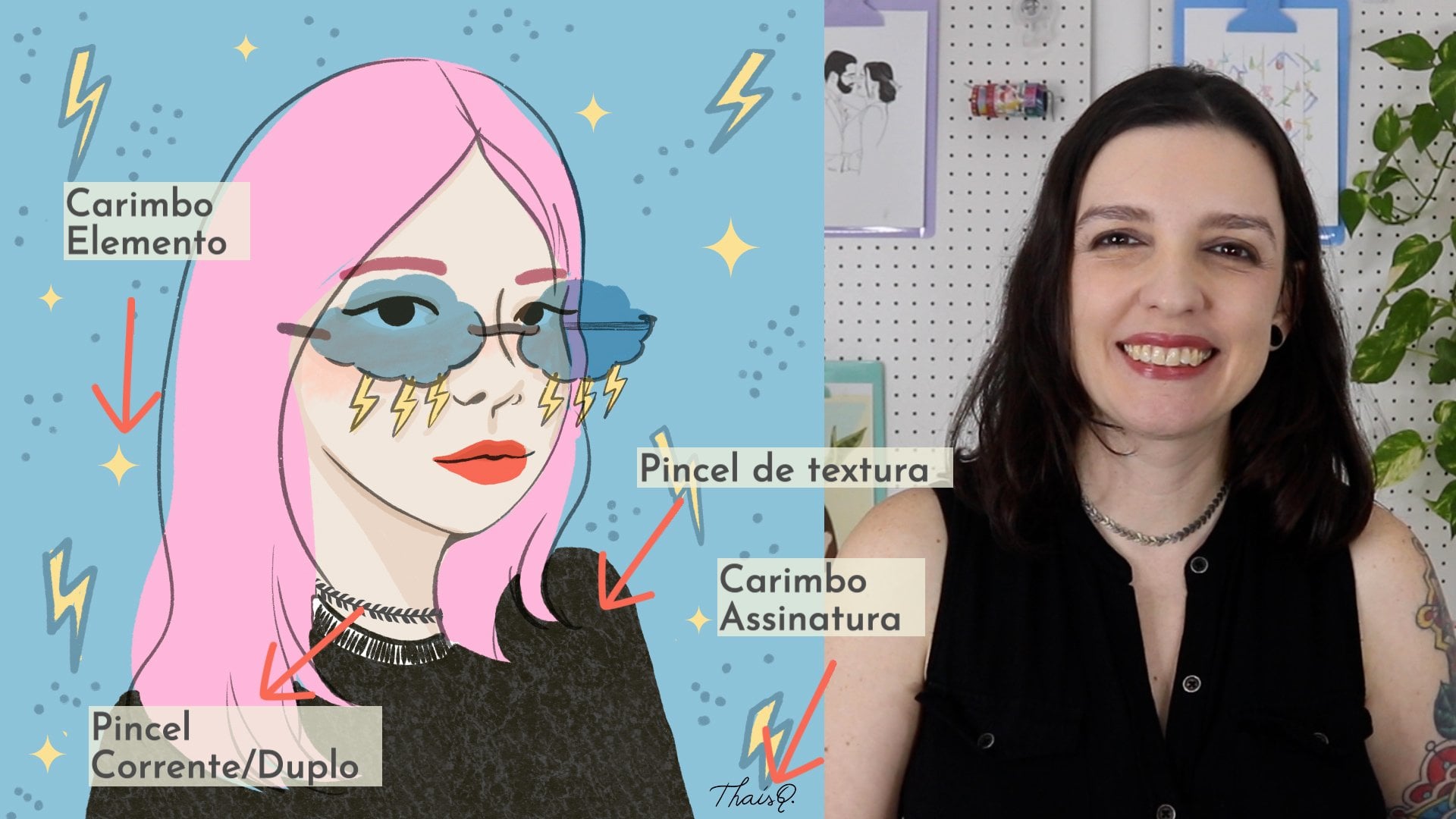
Transcripts
1. Class Intro: Have you ever tried to
make your own brushes in Procreate and then got overwhelmed with all
the different settings. I know just how you feel. I use Procreate for a long time before I actually start to
creating my own brushes. Just because there
were too many options that I didn't want to deal with. Someone who has
crossed that bridge. Let me tell you. It's totally worth it. And slightly addictive too. It's not only fun, but it's also a great
way to streamline your process while taking your
artwork to the next level. Creating your own
brushes will allow you to save time
by not having to redraw your most used
elements over and over again can help develop your style and make your artwork
more recognizable. In this class, you'll learn
all about the brush studio. I broke down the settings
into bite-size lessons. That goes straight to the point. You'll learn these
settings hands-on by making a variety of brushes, not just boring lectures. We'll start simple and
build up with each lesson. So I promise you it's not
as scary as it seems. Once you understand
these settings, you'll be able to
create any brush you like. The sky is the limit. By the end of this course, you'll have a custom
set filled with a unique variety of brushes
to share with your friends. Great give-away for
social media followers, or even some online
for some extra income. Lessons include different
settings of the brush studio. How to create a new brush set. Editing existing brushes, creating unique
brushes from scratch, and some procreate tips
and tricks some of the brushes will
create in this course include chain brushes, stamp, color changing,
pattern and texture. Brushes. And where our project will be to create a
custom brush set. It can include a mix
with different types of brushes or variations
on the same type. If you want to get
really creative, you can share an illustration
using the brushes you made. So make sure to share your
project in the class gallery. Know your way around.
Procreate is recommended, but all levels are welcome. While having some procreate
knowledge can be helpful. The brush studio is
kind of it's own thing. So even more
experienced students who haven't really explored the brush studio in depth can still benefit
from these lessons. And since this is
something that I wish I knew when I got started, beginners are very welcome to. I've even included a lesson, especially for my
beginner students, with a quick overview
of the brush tools. And I've tried my best to keep my explanations as
straightforward as possible. But if you have any questions, feel free to ask me in the class discussion and
I'll get right back to you. But wait, there's more. I've included some nice
freebies for my students, go to the class resources to download a free butterfly
stamp brush set. You can also download it from my website is an added bonus. You'll gain access
to a private folder with a growing
resources library. So make sure to check out this link on the class description. Are you ready to
conquer your fear of the brush studio and learn all about creating new brushes. Let's get started.
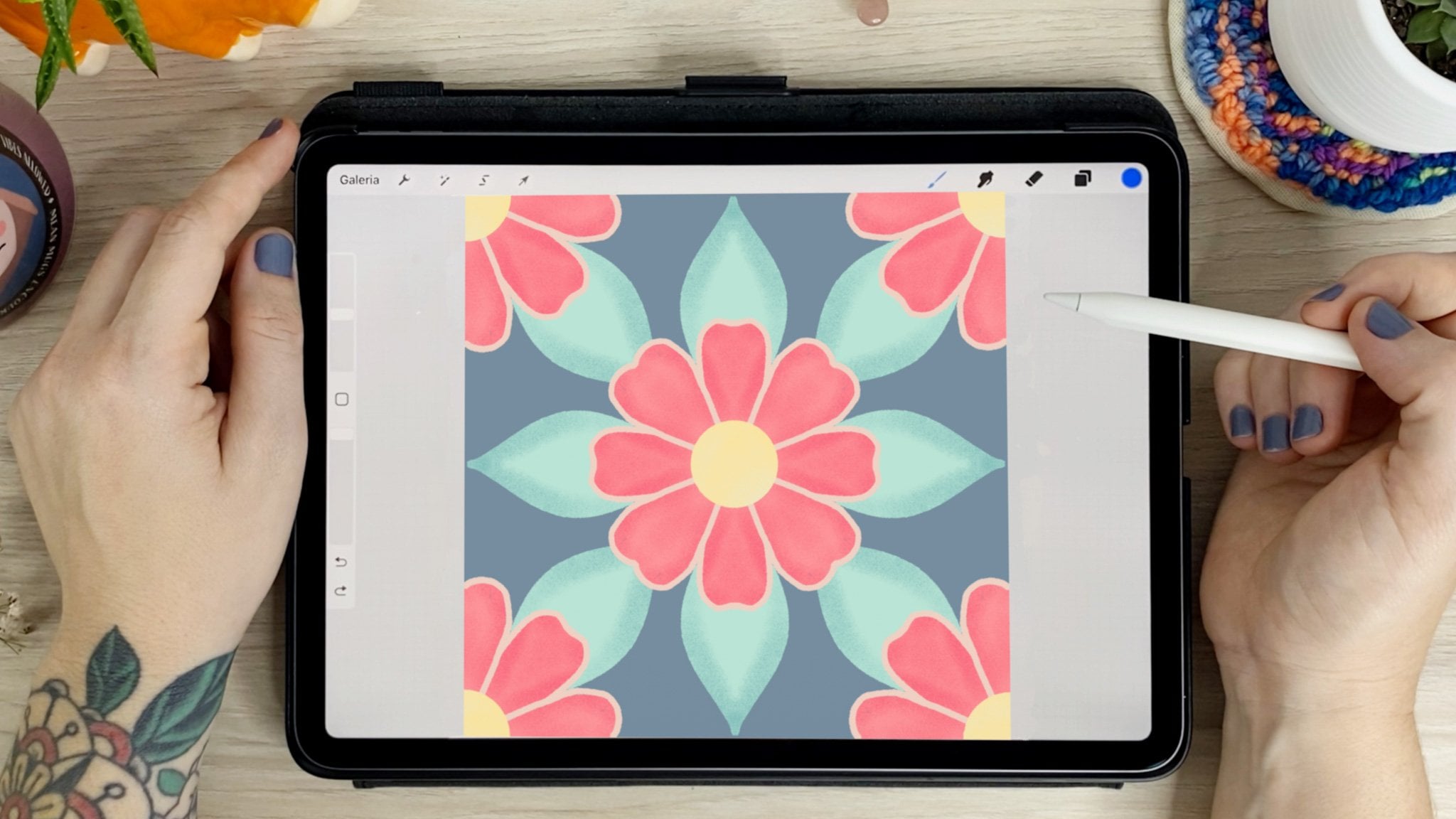
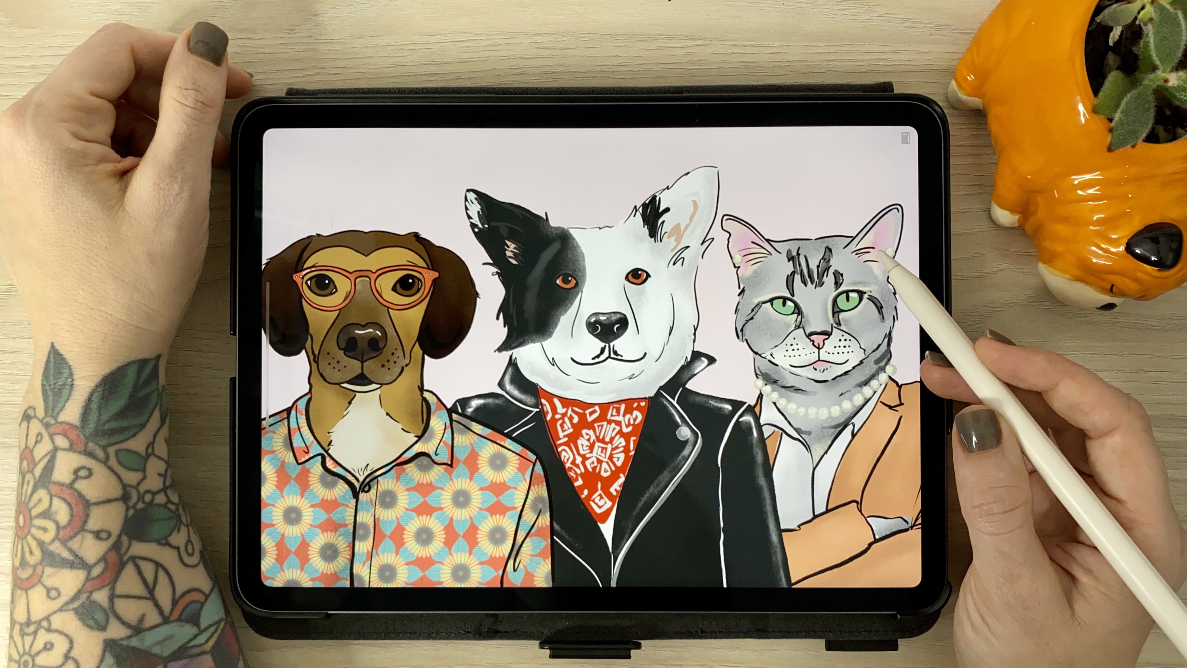
2. Class Project : Our project here is to
create a new brush set. So after watching
all the lessons, create a new canvas and draw
a line with each brush. Just to give us a sample
of what it looks like. You can share a little bit
of each brush created or do a deeper dive into one of the types and make variations
on the same type of brush, like a stamp group
or chain group, e.g. if you want to go even further, make an illustration with one of the brushes
you create it. You can go as simple as using a texture over any illustration. Or more complex, using
a variety of brushes. Your project, your roles. When you're done,
expert the image from procreate or simply
take a screenshot, then add it to the
class gallery. I can't wait to see
what you come up with.
3. Beginner's Guide to Procreate Brushes : Let's create a new canvas
here on this plus sign, and then on this
black rectangle, 5,000 by 5,000 pixels at 300
DPI is my usual setting. But feel free to
make your smaller, especially since it's just
to show you an overview of the menus and not for
printing and yard work. When you're done, hit Create. Let's take a look at
the brush library by tapping this little
paintbrush here on top. Here is where you can find all the different brushes and they're all sorted
in different sets. This list here on the left. Procreate comes with some
really great default brush sets like calligraphy,
inking, sketching, etc. And when you import
a new brush set, this is where it will appear. Select the brush. All
you have to do is tap it with a brush selected, tap the color menu
to change its color. On the side of your Canvas, you'll find two sliders. The top one, adjust the
size of your brush, and the bottom one adjust the opacity so you can make it look more or
less transparent. Here's a quick tip.
Drag three fingers sideways to clear layer. This size slider will save up to four different sizes
for a particular brush. To set that, just click
on the plus sign on the slider and a mark will appear to show you
the size you saved. This is really helpful when you're outlining something e.g. as it will help you keep
your stroke consistent. These settings are
saved with the brush. So even if you switch
to another one, once you go back, the
marketing will still be there. You erase the mark, just tap
it and hit the minus sign. These settings are also good
for the opacity slider. This square in the middle
is the eyedropper tool. Set it to pop up the eyedropper, which allows you to sample
colors on your screen. You can change its function
in Gesture controls, making it a shortcut
to a variety of tools. Back to the Brush Library. You'll find the last
eight brushes you used here on the recent tab. The first one under
Assets panel, the one with the little star. You can also save
your favorite brushes on this tab to keep them handy by swiping them to
the left and tapping pin. The pin brushes will have this little star and always
stay on the top of this list. To unpin a brush, you can slide it to the
side again and hit unbent. You see the rest of the set
for a brush on the list. Swipe to the left and tap fine. Brush set will appear in
blue on the Assets panel. And the brush will be
selected from the set. And finally, if you want to remove the brush from this list, Swipe and tap clear, and it will be gone
from the recent tab. But you can still find it
in the original brush set. To reorder your brushes, touch and hold to
drag it around. You can use a different finger to scroll while you
hold the brush. Procreate brushes have
two main components, shape and green. The shape is what
you drag around and the grain is the texture
that appears on your stroke. You can really see the
shape when I tap with the pencil and the grain
that's filled inside. Let's take a better look inside the brush studio by clicking
on the brush in the library. This is where all the
brush settings are. You can see the shape here and you can
see the green here. This shape works
similar to a stencil. Anywhere in white.
We'll let the colors go through and Blackwell blocket. But we'll go over this
again in the next lesson. This was just a little spoiler for you to get familiar with it. Other, the brush settings can
be found here on the side. And the adjustments
on these sections is what makes each brush unique. If you change any
of the settings on a brush and you want to
get back to the original, go to About this brush
and reset all settings. This will bring your brush
back to the original form. To exit the brush studio, just hit Cancel to delete any changes or
done to save them. And put your new brush set downloaded from the
class resources from a desk computer and save it somewhere you can
access from your iPad. As an alternative,
you can download it from my website
straight to your iPad. This will add you
to my newsletter which you can cancel anytime. I've added the link to
the class description. After you download, go
to Brush Library and click on this plus sign here on top to get to the brush studio. After that tap Import on
the top right corner. Your new set should
appear right on top on the sets panelist. So
we use these brushes. Just select the one you want in, tap it on the screen about
in different colors, and try using the Alpha Lock
to color inside the step.
4. Daisy Chain Brush: Let's create a new
canvas by tapping this plus sign and then
the black rectangle. We can rename the
canvas here on top. Mine is going to be custom
brushes because I'm going to use this Canvas for all
the brushes in this class. And I'll make it 5,000 by
5,000 pixels at 300 DPI. These settings
give me 37 layers, which is plenty
for this project. After that, just hit Create. When you open the brush library, you can find all the
different sets on this panel. I'm going to start by
creating a new brush set. And to do this, I
drag all this that's down to get this plus
sign on top of the list. I'm going to name this
set brushes by typhus Q. And As you can see, it's empty. On this first lesson, I'm going to use an existing
brush as a starting point. So let's go to the
airbrushing set and select the medium hard one. When you tap and hold the brush, it lifts off the panel
so you can move it. Keep holding it
with a pencil and use another finger
to tap the new set. This will make a copy of a
default Procreate brush. And you can tell
it's a duplicate because of this
symbol here on top. If you check out the
airbrushing set again, you can see the originals though there are duplicate
is in our set. Let's make this shape
for a daisy chain brush. I'm using the medium
heartland brush that was already selected and make sure you're using
the color black. So make this process easier. Let's use the drawing
assist in actions, canvas and then drawing
guide, edit, drawing guide. The drawing guide menu. We want to go to
symmetry than options, radio and turn on
rotational symmetry. What this means is that your drawing is going to
repeat on the next guy. If you don't have this on, it's going to mirror itself
from one guy to another. You can select either. It's just a personal preference. I just find the
rotational symmetry a little bit easier
in this case, I'm going to draw a petal
and keep the pencil touching the screen so the Procreate
smooth my shapes. Make sure you're not cutting
any parts on the side. To fill in my daisy, I'm
going to pull the colors straight from the menu
and drag it into my drug, but hold it in place
for a few seconds until threshold appears here and then drag it to the
side until it's just one step away from
filling the whole canvas. The reason to do this is because sometimes
when you color drop, you get a little fuzzy
area around the outline. So by adjusting the threshold,
we can get rid of that. I'm just going to fill
this little area in the middle and our
shape is ready. Now let's copy this
shape by going into actions ad copy canvas. Back to the brush library. Let's go to the brush we
copy to your customer, set an edit, tap it, and that will take you
straight to the brush studio. The studio is where you can see and modify any of
the birth settings. Let's click the shape tab, then edit and import. Here. You can import the shape
from a photo of file or from the source library
that comes with Procreate and has a
lot of cool shapes. We're going to paste to bring the flower that we
just drew and copied. Think of the shape as a stencil. The white parts are the cutouts. So any pardon white is where
the colors will go through. In any pardon block
will be blocked. If we continue from here, our brush would be a square with a weird Daisy
in the middle. So use two fingers
and tap the image, and that will automatically
invert the colors. That right now, this is
what our brush look like. The flower shape is
there as you can see, but that's still
not what we want. So up here in Stroke Path, Let's adjust the spacing.
You see this brush better. I'm going to clear the drawing
pad here on top to clear, reduce the preview size
or change the color. This is the Procreate
equivalent of those paper pads to test
out pens at a store. In spacing, the
higher the number, the more space between
the shapes you'll get. Decide whether you want
your daisies to be closer or further
from one another. So just a little
fine tuning here. And I'm pretty happy with it. So I'm gonna hit Done and
test out my new brush. I'm going to turn off
my drawing guide. And I'm going to hide my
layers since I want to use this Canvas throughout
the whole course. I don't want to
delete this layer in case I want to
make any changes. So I'm just going to hide it and create a new one so I
can test out my brush. So here it is little,
and here it is bigger. The last thing to
do here before we go is renaming your brush. Let's go back to
the Brush Library and take it out in our
new custom brush set. And let's tap it to get
back to the brush studio. Here we can go in
about this brush. And on top we can
change the name. Mine will be daisy
chain made by taste. And here you can even sign it. Done. And here's my
daisy Cambridge.
5. Shadow Brush + Daisy Chain Variation: Next on the list is
the shadow brush. I think this style works
really well for lettering. So let's take a peek
at the brush pen from the calligraphy tab, which
is one of my favorites. I wanted to take the shape here. I can give my shadow
brush a similar field, but with a twist. So
oval-shaped, easier. Now, let's create a
new layer and draw an oval like we did
with the daisy. Let's keep our
pencil on the screen for Procreate to adjust. This is called quick shape. Workspace. Snapping your hand-drawn
lines into perfect for it. Without lifting your pencil, you can scale and rotate it. If you touch one
finger to the screen, your shape will snap into perfect angles while you rotate. Here's another example, but this time before I start
scaling and rotating, Let's say I'm trying to
draw the circle here. If I keep holding my pencil, procreate will adjust
them to this shape. Once I touch one
finger to the screen, it adjusts again
this perfect circle. Same thing works with
squares and triangles. If you want to
make an adjustment right after you
release the pencil, you can click Edit Shape
and drag the blue dots. This way, you can
just move your shape. But this only works immediately after you release the pencil. If anything, it will disappear and you can
edit your shape anymore. If you tap with two
fingers to undo, it will go back to the shape
you drew before quick shape. After our shape is ready,
it's time to color drop, making sure that threshold is high, just like we saw before. I'm going to move it a
little bit further up, so I have room for my shadow. I'm going to duplicate
this layer by sliding it to the left
and hitting Duplicate. We saw in the previous lesson. The shape works is stencils
with black and white. For this brush will also use gray, which
will be our shadow. Using gray in your brush shape, we'll let part of the
color grew through, giving you a lighter shade. Here's something to take note. The color disk has
two components. The urine, where you can select the color base and
the saturation disk, which is this inner circle. You can pinch the
saturation disk to make fine adjustments
in the saturation. By double tapping, you can
snap into perfect values. If you double-tap near white, it will snap into pure white. Same thing with black, mid gray, half saturation and
full saturation. For the shadow brush, we're
going to use mid gray. So let's color drop the gray into the oval shape we created. Since I want my shadow
to be underneath, I'm going to hold its
layer and drag it down so that it sits below my
main shape and black. With the move tool,
I'm going to turn off snapping so I can move it freely and place it
on the bottom left, which is where I want
my shadow to be. Make sure it doesn't go over
the limit of the artwork. Otherwise it's going
to be cut off. Then I'm going to
select both layers by dragging it to the side. And this way I can move
both of them together. Now I'm going to
activate the snapping because it will help me center the shape
on the art board. You can see by these orange guides that it's
perfectly in the middle. Then I'm going to group
it and rename it. Somebody layer stays
somewhat organized. Now let's copy your
art board again and actions ad copy canvas. Since I want my brush to
be similar to a brush pen, I'm going to use that as
a starting point and drag it right into my new set in
order to make a duplicate. Now let's tap it to get
to the brush studio. Here we'll go into Shape. Edit, Import, Paste. Again, two finger tap to invert. And here's her shadow brush. This brush will be
most likely used for lettering or line work, as opposed to coloring. I want my brush to be stable so that I don't have to
worry about shaky lines. To do this. Let's take a look at
this stabilization tab. Here, you'll find three
different types of filters. Streamline will smooth
out any wobbly lines. The higher the percentage
on the slider, the more procreate will take
over and smooth your lines. You can adjust this
in amount which works overall and your line or
according to pressure, which kicks in as you put
more pressure on your stroke. Stabilization smooth
does your line by averaging your scope. It's almost like your lines stick to the art
board as you drop. This depends on the
speed of your stroke. If it's too fast, you
can see it won't stick. And it will give you pretty
much a straight line. Motion. Filtering deletes the
extremities of the wobbles. Instead of averaging, making
the lines super smooth. The expression slider
counteracts the motion filter. Back some controlled wobbles
in the motion filter, making it a little less strict. What I like to do
here is a bit of a combination of
these settings so that it helps keep my strokes steadier without
completely taking over. These settings vary a lot
depending on how you draw. So take a moment
here and test out a few combinations to see
what works best for you. So let's rename it
in About this brush. Shadow brush made by taste. Sign it. And let's test it out. I'm going to hide the shape
and create a new layer. Now that we're a bit more
familiar with the brushes, Let's make acute variation of our daisy chain brush
from the previous lesson. So I'll go back to
the daisy shape here. And then the layers.
I'm going to duplicate it by dragging
it to the left. Now I'm going to make
a new layer on top. And with the medium gray,
I'm going to make a circle. Oops, not what the shadow brush. I want the medium hard blend here from the
airbrushing tab again, which is the same we use
to make the daisy shape. So I'll make a circle and
holding my pencil down, I'm going to touch with
one finger on the screen to get the perfect circle
with a quick shape. Then I'll center of
my circle until I get the orange guide to make sure it's perfectly
in the middle. Then again, action
ad copy canvas. Now I'm going to duplicate my daisy chain brush by
dragging it to the left, just like we do with the layers. Tap it to go to
the brush studio, Shape, Edit, Import, Paste. Minds already inverted. But if yours isn't just tap
with two fingers again, I'm going to name this
one daisy chain Alt. Then group and rename the layers and make a new
layer to test it out. And here's a daisy
chain variation. A straight line with
the quick shape using the chain brush. Once you touch your
finger to the screen, you can adjust the spacing on this particular stroke by
dragging it to the sides. This won't make any changes
to the brush in the studio. Just this one line. So that's our shadow brush
or daisy chain variation.
6. Dual Color Brush: If you've ever
noticed the second rectangle on your color panel, this is your secondary color. You can tap it to change the color just as you
do with the primary. In this lesson, we'll make a brush that uses
both of these colors. I think this type of brush works really well with
a handmade feel, as opposed to the hard lines of the air brush that
we used before. So I'm going to use
the chalk brush from the calligraphy
tab as a base. So I'm going to tap to get
into the brush studio. And for this one, I'm going to change
the name right away because from
the brush library, it's going to look exactly the same way as the regular brush. And I don't want
to get confused. I love the texture
on this brush. And for this one, we're
not going to change anything in shape or grain, but we're gonna go
to Color dynamics. I'm going to lower the
size and add some color so we can see what's going
on in color dynamics. Let's scroll down
to Color pressure. Here, we can adjust the settings so that the brush changes colors depending on the amount of pressure applied
to your pencil. By sliding the hue, your colors will vary depending on the
pressure of the stroke. If you slide it
just a little bit, it will stay close to
the color selected originally as you go from
a light to heavy pressure. If you slide it to max, the stroke will transition through the whole
color spectrum. But I want more control over
what colors will alternate. So I'm going to slide
back the hue to 0%, and we'll slide the
secondary color to the max. This will make it
alternate between the primary and secondary color. Let's test it out. And I'm going to select
very contrasting colors so you can really
see it in action. So blue is my primary color. And you can see it really
shows when I press harder. And orange is my
secondary color, which shows when
I press lighter. If you don't want
your stroke width to vary as well
with the pressure, you can go back to
the brush studio and on the Apple pencil tab, go under pressure, then
slide the size to 0%. This way, only the
color will change, not the size of the stroke. Now you can get your
color variation depending on the pressure
while keeping the same width.
7. Scattered Leaves Brush: I want a bit of
texture in this one, I'm going to use the dry paint
brush from the Inking tab. So I'll draw my leaf
shape making sure it's closed so I can color drop
and adjusted threshold. Don't forget to do
this part if you're using this brush
because this one, since it has this
texture around, usually does leave a little
halo if you don't adjust it. I'll add in some
details in gray. But keeping it simple. As usual, I'll copy the canvas
to add it to our shape. This time, let's make
our brush from scratch. So in our custom set, I'll tap this plus
sign on top to create a new brush straight
in the brush studio. So again, Shape,
Edit, Import, Paste. You know the deal by now. Then two-finger tap to invert. Let's adjust the spacing and Stroke path so we can
actually see our leaf shape. And since we want
this to be scattered, let's also adjust the jitter. Jitter will offset your
shape by a random amount. A higher percentage here
will make your shape more scattered and the
lower percentage will keep it closer to the path. Although the leaves
are scattered, they're still all pointing
to the same side. So let's change this
to make it more random as if they were
blowing in the wind. So I'm gonna go back
to the Shape tab and under shape behavior, I can adjust the scatter slider. This randomizes the direction each time the shape repeats. Rotation will adjust
the direction of your shape according
to your stroke. But with the jitter and
scattered turned up, we won't see a big
difference right now. Count will set how many
times your shape repeats. It's best used
along with scatter, and each shape will
repeat randomly. Now let's go back
to color dynamics. And instead of the
color pressure, Let's take a look at
the stamp color jitter. Let me clear this drawing pad and change the color to green. Here, I'm going to
adjust the saturation. You can see how
there's a variation between the more and
less saturated leaves. You can also change the hue
slightly to get a little bit of color variation between
one leaf and another. Or go even crazier and make it Rainbow by setting
it to the max. So play around with the settings and find
something you like. And when you're
ready, just hit Done. Forgot to change the name. So back to about this brush
scattered leave made by TCS. And again, I'm gonna hide this layer and create a
new one to test it out. And that's it first
scattered leaves.
8. Pattern + Texture Brush: So this lesson is a
two-for-one deal. We're going to learn how to make a simple half-drop pattern and then we'll use it
to make our brush. So I'm going to
create a new layer and draw an element
for my pattern. I'm going to keep it consistent
with the garden theme. So I'm going to draw a flower. Quick tip over here. When switching between
the brush and the eraser, hold down the eraser tool
instead of just tapping. This way, it will mimic
whatever brush you're already using for drawing and keep
your texture is consistent. When your element is finished. Make sure it's centered on your art board and then
duplicate it four times. You have a total of five copies. The reason we do this is because for our pattern
to be seamless, it has to repeat perfectly
from every side. And so for that, we're going to have a quarter of the flower on each corner. And then one in the middle. You could just use the flower in the middle for the repeat. But look at how much nicer it flows when it's
stacked like this. I'm going to grab
this first flower and make sure snapping
is activated here. And I'm going to drag it to
the top right corner until these two data are aligned and the two orange guys appear. Then let's repeat that
for all four corners. Now when the pattern
is in action, all corners of the flower should come together and
repeat perfectly. Now, let's copy the canvas. Go back to the custom set
and make a new brush. This time instead of shape, we're going to go
to Grain source. Then let's go to texturize edit. And now we can import here. So I'm going to adjust the
scale a little bit here. And this is it as you
color the pattern chosen. So let's hit Done. And back to my layers. I'm going to group this and create a new layer
to test it out. Note that with this brush, if you want to edit the size, you have to do so in the
brush studio in grain size. Because adjusting it here only affects the shape of the
brush, not the grain. If you want to just that, just go back to the brush studio. Grain, then grain scale. So back to the brush studio. I'm going to rename this brush. And then let's go check
out the other variation. So let's go back to
the Brush Library and duplicate our last brush. Now I'm going to rename
this flower pattern ground in grain edit and
just double-tap. So we can see what
happens when it's inverted. And that's it. You can really see the
shape of the brush here, since most of the
patent is in white, so it's not transparent. Making it extra brush is very similar to making
a pattern brush, except that here we'll
use a photograph. Although you can create
your own textures with paint or anything
else as well, I can never resist taking photos of patterns and
textures around me, regardless if I'm traveling
or just taking a D on a walk. The one I'm using
for this lesson is a close-up I took
of marble floors, and it's already
saved on my iPad. So I've just created a new
brush and same as before. I'm going to Grain Edit. But this time,
instead of pasting, I'm going to import the
photo from my camera, roll straight into Procreate. When you import the
photo, procreate, automatically convert it to grayscale and crops
it two square. So if you want to make
your own adjustments into which part
you want to crop. Make sure to import it
already as a square shape. And since this image isn't in and repeat like the
pattern before. Now I can tap this Auto Repeat
button here in the menu. The Auto Repeat, as
the name suggests, puts your image into a repeat. By adjusting the edges. You can fine tune your
patterns settings down on this menu right here. You can adjust the
border overlap if you want it more or less. You can rotate your pattern. You can adjust the hardness on the edges. You can
change the scale. Here's another example using this photo I got from Unsplash. You can get a better
look at these settings. One more thing here is that
you can drag your image to change where the edges meet according to
your preferences. The grain scale and rotation can be used together
in patterns like this to help make
the transition from one tile to another
a lot smoother. Note that the green scale here will only
change the repeat, as opposed to the green
scale from the brush studio, which will adjust the overall
scale of the pattern. Can you see the difference in the border overlap and
mask hardness here? The mirror overlap button
works on the edges mirroring the pixels where your image connects
to the next repeat. Pyramid is a new
form of blending that stitches patterns to
help create a seamless green. And it's ideal for irregular
and organic textures. So play around with
this for a little bit because the settings here will vary according to your image. And remember that you can also invert your image to
get different effects. So still in green, Let's adjust the overall size of the texture and also the DEP, making it more or less subtle. Right next to the texture. You'll also find the moving tab. This is where you can decide
if you want your texture to roll when you draw or
if you wanted to drag. Think of this, like
dragging a stamp across the paper versus painting
the texture with the roller. Let me make this brush bigger
so we can see it better. Can you tell the brain
looks more defined when it rolled versus it looking like it's been
dragged when it's set to stamp this brush. I think the rolling work. You might want to give it a
shot depending on your image. This could work really
well for someone trying to get a
painted texture, e.g. like a real brush dragging
paint across the canvas. So let's test out our brush. Try it out on a few
different colors to see all the different
effects you can get. This is a really great way to get texture
into your artwork. You can use this in
parts of your drawing or to fill in a whole page
with a blending mode on top. One last note here. Did you notice that we didn't
use a stabilization at all? That's because I plan
on using this brush to fill in areas rather
than make strokes. So in this case, the streamline
makes it a lot harder.
9. Vine Brush: Now let's make a vine brush. This lesson will work well for any pattern that
repeats on a path, it needs to follow a direction
like braids or ropes, e.g. I'm going to start by drawing
a few leaves for the shape. But for this brush, I want
them to be continued. So makes sure the top and bottom of the shape
are compatible. This just means that
the pattern will be vertical as in the top
and bottom will meet. So keep this in mind
when drawing your shape. Then centered the shape
and copy the canvas. Back to my brush set. Then New Brush, Shape. Edit, input, NDP, invert
the colors and done. Now, let's adjust the
spacing in this rope path. As you can see, as it is, all the leaves are facing
the same direction. We'll adjust that in a second. But first, let's go
to stabilization. Set the streamline
all the way up because it's smoother line will help the pattern connect better. Now let's go back
to shape and scroll down to shape
behavior, rotation. Now slide it all the way to
decide until follow stroke. Okay, So we got the follow this rope, but now
it's sideways. Down here where you
see the circle. Drag the green dot to
match the top line. And now it follows my stroke as I draw from the
bottom of the art board. If you prefer, you can
set it at the bottom and then it will follow
your upstrokes instead. I would keep it at the
bottom for something like a rope and at the
top for braids. But these are just
personal preferences. So our vine brushes ready, and I could just stop here. But I want to add a
little bit of texture. So I'll go back to
the green editor and take a look at the library. After picking a texture and
adjusting the Auto Repeat, just like we did in
the previous lesson. I'm going to adjust the size and depth because I want the
texture to be very subtle. Now, let's head to
the Apple pencil tab and add a bit of size variation here on the pressure slider. Now you can see the size varies according
to the pressure. But I just wanted a
little bit of variation here called dial it down a bit. This way you can start with a heavier hand,
enlightened your stroke. Or just switch from light
to heavy as you prefer. The higher the percentage
on the slider, the more dramatic your
variation will be. Another thing I'd like to
adjust here is the opacity. I wanted a more uniform
than the opacity slider. You can remove it completely
or make it more subtle. And finally, something that's been bothering me
this whole time. It's how the first stamp on the brush keeps going
in the wrong direction. I've seen other Procreate users complain about the same issue. I'm not sure if this is
an update bug or not, but if you're having this
problem, here's how to fix it. Go to taper and add a little bit by dragging
the blue dot to the side. Now go to the opacity
slider and drag it to max. That awkward first
stamp has gone. Let's test it out
on the new layer. And there's our vine
brush and action.
10. Signature Stamp Brush: In this lesson, we'll
create a stamp brush. I love having my
signature ready to go for when I complete
an illustration. And having it as a stamp
is not only practical, but also allows me to
keep it very consistent. So I'm going to start by writing my signature with a pencil. I like to pinch the
screen and zoom out here. So it's about the size I would
write on a piece of paper. Then I create a new layer and go over it with a
more streamline pen, the brush pen from
calligraphy, e.g. once you're happy with it, you can delete the pencil sketch, make any adjustments,
center it in Copy Canvas. You should be pretty familiar
with these steps by now. Custom set, New Brush, Shape, Edit, Import,
Paste, then tap to invert. Now let's go to the
Stroke Path and center spacing all the
way to the maximum. Then after that, let's
go to Apple Pencil. I want the opacity
to remain the same. So here, under pressure, I'll slide it all
the way to zero. Now, no matter how much
pressure you apply, you'll get a consistent opacity. Now let's test it out. There are two problems here. The first and most obvious is the direction of
the signature into, you can see it's pretty small, even though the brush size here is all the way to the top. So let's adjust these issues. In properties.
You're going to turn on them Preview and
oriented screen. Then Brush behavior,
set the max size all the way up and keep the
preview size looking small. Since that is how it's going
to look on the brush menu. There it is. You can
change colors, sizes. The stamp preview that
we switched out before, it's this little preview that appears right before you touch the pencil to the screen to show you exactly where
this temp will be. Let the easy-peasy spent for.
11. Combining Brushes: I've considered whether or not I should include
this lesson here, just because there are
too many variables, but I think this feature
is too cool to ignore. So I highly encourage you
to explore it on your own as well and take
it even further. A few ground rules here. In order to combine brushes, they must be from the same set. This doesn't mean that you
can't combine them at all. You just have to
make a duplicate and add them to the same one. You can't combine
default brushes. But just like the Set Role, all you have to do is
duplicate it and combine away. And you can only
combine single brushes. So no combining already combined brushes
with that covered. Let's see how this works. First, I'm going to grab
the medium hard one from the airbrushing tab and drag
it to my custom brush set. And for the secondary brush, I'll use the soft airbrush
from the same group. I chose these two because they will be easier to
see the combinations then if they had a whole lot of textures and more
complicated shapes, but please do experiment
with different combinations. Now that they've been duplicated in place and to my customers, then I'm going to select both by dragging each
brush to the right, just as you would when
selecting multiple layers. The primary brush here will be the first one you
selected in darker blue, and the secondary brush
will be the other. In light blue. I like to use the
larger brush as the primary and the smaller
one as the secondary. Then select combine here on top. Now tap the new brush to
get to the brush studio. And as you can see, both brushes appear here in the
upper left corner. When you touch the dual
brushes, this menu pops out. Tap the secondary brush. If you want to uncombined. In both the primary
and secondary brush will appear back in your
set as single brushes. And right between those two, you'll find the combined mode, which works the same as
the layers blending mode. So different combination modes will give you different results. I really like how it looks
with the difference mode. So I'll leave it here. The rest of the
studio is the same. The thing here is that you'll adjust each brush
settings separately and you can see which
one is being adjusted at the time by the blue
line next to it. My best advice here is
once you get your result, you like press Done and then duplicate the brush to continue experimenting
with the settings. This way, you don't risk
overdoing it because you can just delete the copy and you'll still have the
brush the way you like. By the way, I do this for
illustrations as well. If I want to make big
changes to an illustration, and I'm not really sure about whether it will work out or not. I'll duplicate the file
And we're gonna copy. So let's try something
with our vine brush. I've already made a copy of
the original and dragged a copy of the medium heart
airbrush to combine. The plan here is to
have the airbrush going through the middle of the
vine brush as the stem. So the first thing I have
to do is make it smaller. In order to fit in properties. I'm going to change
the maximum size down. Now for them to move together, I have to make sure some of
these settings are the same for both brushes, like
the stabilization. I decided to add a bit of
paper to the end of the vine. And I can do so
on the taper tab, adjusting the blue dot
on top, the size slider. And then on the tip slider
dragging into sharp Instead of blood. That's it. Here's my updated vine brush.
12. Conclusion + Recap & Exporting Your Set: Thank you for joining
me in this class. I hope I was able to help you conquer your fear of
the brush studio. In this final lesson, we'll do a quick refresher of all the things we
saw in this course. And to finish it, we'll see
how to export and share your new brush set and how to upload it in
the class project. We started with an overall
look at the Bush Library and studio in the spoiler of the brush main component
shape in green. In our first lesson, we created
a new set and duplicate it the airbrush so we could edit it into a daisy chain brush. We covered rotational
symmetry and color drop threshold
to make our shapes. Then in the brush studio, we saw how to alter a brush shape and the
stroke path spacing. We've finished by naming
our brush in the About this brush tap, shadow brush. We started with a look at the quick shape tool and then some hacks around
the color disk. Then we experimenting using a gray tone and airbrush instead
of just black and white. After that, we explored this stabilization tab
from the brush studio. In the dual color brush lesson, we covered the primary and secondary colors in
the color panel. After that, we looked at
the color dynamics tab, more specifically to the
color pressure settings. And to finish, we added the pressure settings in
the Apple pencil tip. In this lesson we made
are scattered leaves rush from scratch instead of duplicating and existing one. Then we dug further
into the Shape tab to adjust the jitter
rotation and count, and finished by adjusting
the color dynamics. But this time in this
stamp color jitter, we had a quick lesson on how to make a simple procreate pattern. After that, we went deep
into the green tab, looking at both texture
and moving options. We came out of this lesson with two pattern brushes
and a texture brush. With our vine brush, we saw how to make
a pattern follow a certain direction on a brush by setting
the shape behavior, we added some
slight variation of pressure in the
Apple pencil tab, and we adjusted a
taper to troubleshoot a common issue where
our signature brush, we learned how to
make a stamp brush, which you can use to make
a variety of shapes, save time, and create
consistency in your work. After setting your spacing, we adjusted the pressure in Apple Pencil and then the
final settings and properties. And finally, we saw how to combine an uncombined
brushes and change the blending
mode to create a completely new dual brush. We also created new variation
for our vine brush. Now that you have
all of your brushes, exporting them as super easy, all you have to do is open your Brush Library
tab and hit Share. This will create
one procreate file with all the brushes
in your set, which you can now give
away or even sell online. So here's a reminder
for our project. Share an image of
your new brushes. It can be if all of
them or a variation of a specific brush you
really enjoyed making. Or if you want to go even
further sharing illustration you made with any of
these new brushes. To do that, go to Actions, Share JPEG, then back to Skillshare
in Project and Resources. You'll find a Create Project
button at an image or two. And tell me a little bit about
your process if you wish. Then hit publish. If you post it to Instagram, make sure to tag
me at beta0 skew. This way I can share it as well, getting even more
eyes on your project. Thank you again for
taking this class. I really hope you enjoyed it. If you have any
questions at all, feel free to ask me in
the class discussion. And if you can, please
leave a review, these reviews are super important because
not only they help more people find
this class and they help keep the class live
here on Skillshare. But they also helped me
improve as a teacher. Also, if there's anything
you'd like to learn, I'm always open for
new class ideas. So drop me a line
in the discussion and I might just make
your wish come true. See you next time.
 Thais Queiroz, Designer/ Artist/ Curious Creative