Transcripts
1. Intro for Procreate Brushes to Make and Sell: Hi guys, Welcome. My name is Phil, Earth-mass current and I'm coming to you from sunny, Manitoba, Canada. It's actually evening right now, but it was a gorgeous day today. So today I am bringing you a class called Procreate brush sets to make and sell. I've been showing you how to create a bunch of brushes in my previous classes. And I know I've been talking for a while about adding a bunch of brush sets to my Creative Market Store. So the last few days, I've spent creating these brush sets and packaging them up. And I wanted to share with you the entire process. After all, now that you have these skills, this is something you can do to make some additional money. Creative market can be great marketplace. And there are many others just like it. Creative fabrics, design cuts through so many. I can't even begin to mention them all. And don't forget Shutterstock as well. So these are ways you can make some additional money with these assets that you create. I'm going to take you through the entire process from individually creating the brushes, putting them into a set, exporting the SAT, then doing everything you can to really market the set that you've created. I'm gonna be showing you how to create the cover shots and all the other screenshots for uploading with your brush sets. Of course, the whole goal is to make it as attractive as possible. Once you've created one, you'll have the basis for creating many, many more. I truly believe that to make sure acid artists that you've always got some money coming in is to diversify as much as possible. So creating products for your POD, doors and sites like this can just add a little bit more to your monthly income is taken me several years to build up my income from POD. But now it's a really steady stream and I really recommend it for you. So if you haven't done so already, I'm going to remind you to hit that follow button up there. That way you're going to be reminded of anything that I put out, including my classes. And now of course, I'm going to be uploading these brush sets, The Creative Market website, but I'm also going to have them on my own website. And I'm going to offer a special discount to all of my students. You'll be given a coupon code. And when you visit my website, you're going to see that I have quite a few artists resources there. Make sure your units, my mailing list there as well. That way you'll be reminded if there's any sales coming out paper and if you might got that I put out. Are you ready to get started? All right. Let's get into it.
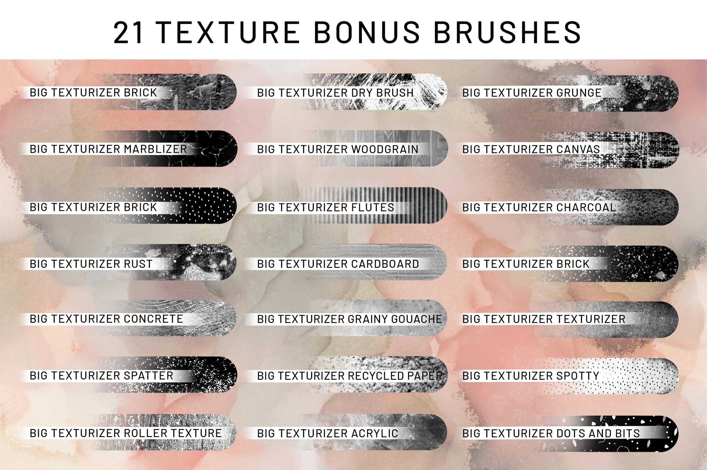
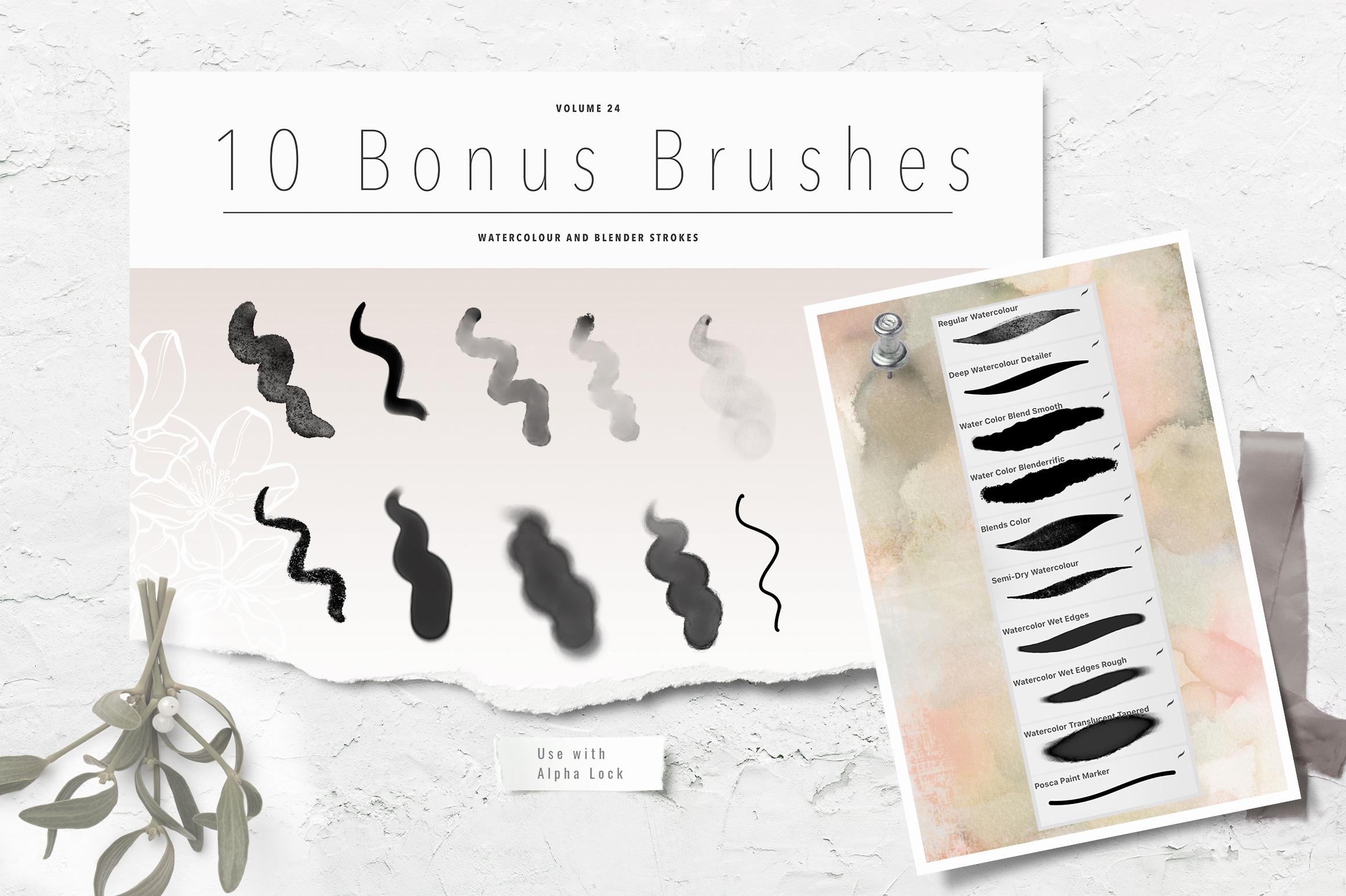
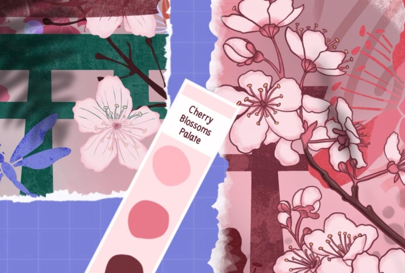
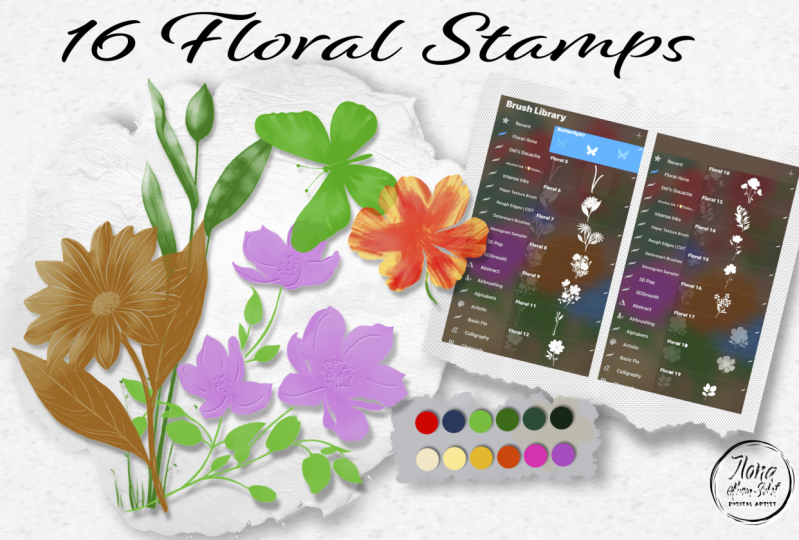
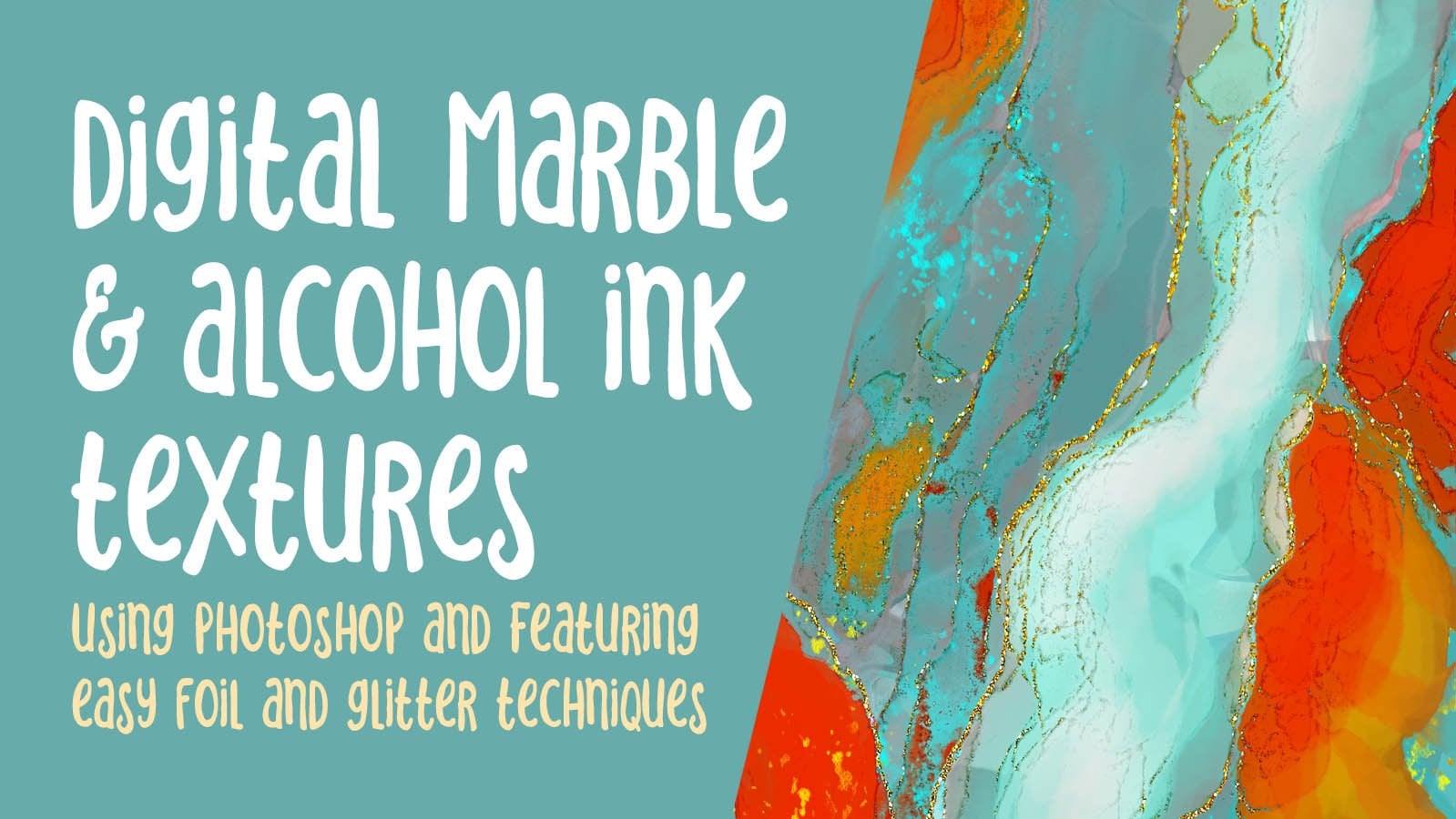
2. Overview and Examples: Hi guys, welcome to lesson 1 and less than one here I'm going to give you an overview of my process and show you everything that I've created so far to put together the package. Let's get started. So when it was planning out these sets, I wanted to create completes tests of both regular brushes and outline brushes. So what I did when I was drawing them out is I made sure that I had both versions available. So I did a line version and solid version. And I know I showed you this in a couple of classes back, I would like to show you as if you are going to be creating these sets for sale. So I'm going to show you the entire process because it's something I've been working on and I have been mentioned this in so many classes. I felt like, okay, I gotta do this now because I've got so many brushes that I could make into these sets. So I'm going to walk you through my entire process. This was the most recent wind and this is the one that I'll show you the actual creation of all of the, like, the complete listing, and I'll show it to you on Creative Market, I'm going to be selling them on Creative Market and then through my own website as well. So I've got a whole sort of process that I go through when I did the first one. It took me quite a bit of time because I was working out all the kinks and I'm now on my third complete fats, and this is the ones that I've been working on. So I've done three or four sets actually. And this set here was set number three. And that's the one that I'm going to go through and show you the complete production of. So like I said, I organized the document using of course, both the line art, like sort of contour drawing. And then the solid. And I've got them organized here all the way down in the same way. Just ignore this one here because that's just kinda the center I did for a flower and then I thought I'll keep it and then possibly use it again. But I've got 20th them here and they're organized really clearly and easily for me to be able to do copy and paste to create brushes. So maybe that's where we start, is just the creation of a flower. And I did these based on tracings of flowers that I photographed. I think I mentioned this in one of my other classes or maybe too. And so I have a bunch of photos that I will bring in, you know, close-ups of. And what I do is I stylized, so I simplify them. Quite a bad luck. I don't have all the detail that you would see on the photograph. So I'm kinda simplifying them. A lot of it is, I guess you'd call instinct. I've done so many of these bat, I've kinda figured out how many lines to put it in, that sort of thing. I don't overdo it. There's lots of different styles for this. I was just looking at a bunch of them online. And one of the artists that I love and I follow is Lisa glands and her stuff is a lot more organic looking at not solid ink lines. She's got kind of a textured pencil. Look her both of her inking and the way she does her shooting is completely different. So this is something that you should really do a lot of research on to decide how it is you want your overall technique to look. So that takes time. And really a process like this is probably the best way because you're going to take a lot of time to kind of produce all of these. And I got 20 here and that's just my suggestion. You can do sets of tan, you can do sets of 30. If completely up to you. I kinda landed on 20. I'm just too lazy to do more. I figured that I won't get sick of them if I'm doing the 20. And yeah, so technique is something that can only be learned through time and really repetitions. So a project like this is probably really perfect for this. I've done several sets here as you can see, and I've also got leaves, but snowflakes. I've got stems. This is the next seven minutes to after these flowers. And that was his part of the process. And so the other part of the process was deciding what did I want to put into my package. And I wanted to include some textures. So I created a texture sampler. These brushes are very easy to create. I'm going to show you a couple of those real quick. And then I also went through and illustrated with the flowers in a particular set. So this is one, the one I'm working on right now. So I did a vertical layout. I did a horizontal layout. Then I did one that shows the use of the textures. And I've left a lot of space here for labeling. So that's one of the things you want to keep in mind. And I created the chart. So this is a chart with all of the brushes from the set that I'm just working on. I'll show you how I went about and created that. And then I also have a really simple watercolor set that I have decided to include so much or whether the chart, I think I didn't Photoshop, but this is a look at the brush strokes for that sat, the watercolor sets. So that's going to be another thing that I set up. I've actually got it set up because I've done the three sets already, but I'll show you how I did it. You could do it all in Procreate personally, I found it faster to do some of these things in Photoshop. And same with these. These are the covers. So these are not perfect because I knew I was taking them into Photoshop. So my masking and so on, for the different components, I did really quickly and it really is something that I don't have to worry about too much. I was just doing it so that I could visualize how I wanted these to look. So you can see I've got that little vertical layout. I've got the horizontal layout that I use in here. This particular mockup that I bought has colors, color, swatches, built-in, and I thought that was really cool, so I just kept that and use that. And I'll show you that mockup and how I change those little bits. Alright, so we've got a lot to cover. I hope this isn't too long a class. By the time we're done, I'm going to show you how to create your brush from scratch so you can put your own logo and your own name on the sort of original master. And yeah, so if you look at these, for example, this is the other set that I did. Again, just kinda quickly outs here. And those were the two artworks. So that's what I used for my vertical. And I know it looks pretty crazy busy here, but I did make some changes to it when I was in Photoshop. Changes that could be done here in Procreate, and then that was the horizontal layout. So that's what I used for that particular collection. And then I did experiment with a couple of different ideas for showing the textures. I think it's in here. And then I've just got different groups here. So this is showing the flowers with different textures applied. So that's one way you can show your textures than I did. Kind of a weird them off where my God. So this was a different way to show the use of the textures. I did a quick, just a hard brush and erase some lines in between to give me the amount of squares that I needed to show my texture. So that's just another version. I didn't end up using this one. I use, I think this one here, but I want to be able to show you a few ideas so that you can come up with your own sort of method for doing this. All right? Yeah, That's enough. Overview. I think we're ready to get started, so I'll meet you in the next lesson.
3. Make and Label Your First Brush: Hi guys, welcome to lesson 2. Unless it to here I want to show you how to meet that first single brush and then how to organize your sets. And the most efficient way to do that. Let's get started. Alright, so first things. First, let's create the document. So I use for my brushes a 10 by 10 documents, 300 pixels per inch. Then I import the picture that I want to work with. Now it's really important that you do not use photos that are copyright protected. So see which one do I wanted to hear? So I think it's just a better idea to take the pictures yourself. If you don't have a lot of flowers, then visit a botanical garden. Or a rate. Now the garden stores are open and there are flowers that you can take pictures up there. Or you can search online for photographs as long as they are creative commons are available and you can use them legally. Okay, so I'm going to grab one that I haven't done before because of course I could always use this and I've done a lot of these already, but I think actually, I think I did do that one. Which one did I not do? I did a bunch of the petunia as we know for sure. You want to be here and see what else we can find a new I did this lily may do other petunia. I don't believe I did this sunflower when I was taking these pictures. The b's, we're going not around B. So whatever you've heard about, bees are disappearing over the world, come to my place. There are so many bees. Not even funny. The other thing that I have a plethora of right now is hummingbirds. I've got a hummingbird feeder outside my window. Bad ensure fun to see as they fight the bees for the nectar that my husband makes and fills them with. This is me just enlarging it as much as I can to fill the space. Then I reduce the opacity of the picture and grab my brush. And the brush that I use is my tapered pen pressure brush. And I think I've given that to you in several sets, but I'll make sure that I give it to you with this class as well. And then I go through and I do the drawing. Now, this center bit I've done on another flower, so I'll probably just find that and copy and paste it. But basically what I do is I go through and I make sure I'm on a new layer and whoops, little bit big. And I go through an ink. And a lot of times I'm kinda simplifying a little bit as I go along or I'll go through and add some of the veining right away so that I don't have to go back and do that. This one's going to be really great, kind of a band. So I put some of the veining in, but usually at the end, I'll go back and do a bunch more. So that's what I do is I basically go through and I traced the whole brush. I'm going to show you with an existing brush because this class is not so much about drawing part of it, which I have covered in other classes. This is more about what to do with it once you have the drawing. So let's go back into my gallery and we'll go into the document, one of the documents that I have here, so this is the most recent one. I'll show you another one just so that you're able to see something a little bit different here. So this one was the head of a tulip. And their heads are really go into my archives to find this because of course, I took pictures of tulips back in the spring, so I did find a couple of them. My daughter actually had sent me some. Has she had tulips in her garden. So I guess I'll have to ask her whether she gives me the right to to trace it out. Now that I have that drawing, what I wanna do is create the brush. So I would go into my brushes and add a new SAT. So I usually up to the top here and you see that plus sign hit the plus sign and there's been new set, I would strongly suggest that you name it right away. It's really easy to lose track of all the things that you've done and have just too many things going on. So I find that it's just easier to do this. Now, I usually copy a brush that I already have and then the settings are all okay. But I had someone asked me about creating them from scratch. And that makes sense because of course, you want to be able to put your own logo and information in here. So let's start with that. Now. I would call it whatever the brush is. So I just scribble out that word and I can just printed in. So our printed in the word tulip. And you have to hit this down here, not the done that's up here because then you'll just lose what you just did. Then what I do is I insert my logo so you can take a picture of yourself. I have a few brushes that had that, but eventually I switch to my logo. So I go into photos. I have an album with my logo in there. And basically as long as you click on it, you will position it there so it's a circle. So you might want to consider doing a logo that's a circle. Then again, I write my name in here an irate Dolores art. Almost every time that happens where I don't get the capital a, which is. The way my branding is. So I went back and change that real quick and hit Done here. Yeah, we're ready to go in and get our shape. What I do here is I made sure that my drawing, when I originally draw it, there is no background on it. So I make sure that I'll show you with this one. I make sure that I add a layer, fill that layer with white. And once I have the two layers close together than I pinch them so that it now has a white background. So that's important for this next step. So I'm just going to undo that because I want to keep separate. I guess it really doesn't matter whether I use Let's use this one because I really like this one. So this one was a little bit complicated to draw. I am going to select it. So now you can see it has the white background. If it didn't have the white background, it would look kind of grade, but it does have the white you can see around the image theorem. So three finger swipe down and I can copy. And then let's go into that brush. So click on the brush itself. What you're going to be changing the shape here. So you're going to hit Edit and you have to hit Import button and then hit paste. Okay. Why did that happen? Okay, let's go back. And wasn't on my layer, copy, edit, Import, Paste. And what we're going to need is to reverse of this. And I'll show you why and go into stroke path here. I'm going to put that at the maximum for spacing. And you can see here that we've got an actual square with our drawing on it. So I'm going to go back into shape. We're going to go into Edit here. And in order to reverse that out, just hit it with two fingers and then you get that solid hit Done. And you can see here that we now have the stamp the way we need it to be. Now, I'm going to also go in here. And this is who properties. I'm putting it up to the maximum and I'm going to also size the minimum up. So putting it at the maximum here is to have the best and highest quality full size stamp. Depending on the size of document you're working with, this would probably be two gigantic. So when you are working with the brushes, this is where you go in to make adjustments. And let's go in and also make sure that the count is at one. There's no scattering. I'm going to hit done here so that we can have a little bit of a test here up our brush. So I'm going to make a new layer. We can test it right here in this document. And let's just stamp in blocks. And we thought our first brush. So that's all there is to it. That's how you go ahead and create your stamp brush. Now your stamp brush has your own logo in here. And you know that if you want to adjust the size as we're using the brushes, this is what you would need to be changing. All right, so we've created the first brush. Now we can go on to the next step. So I'll see you in that next lesson.
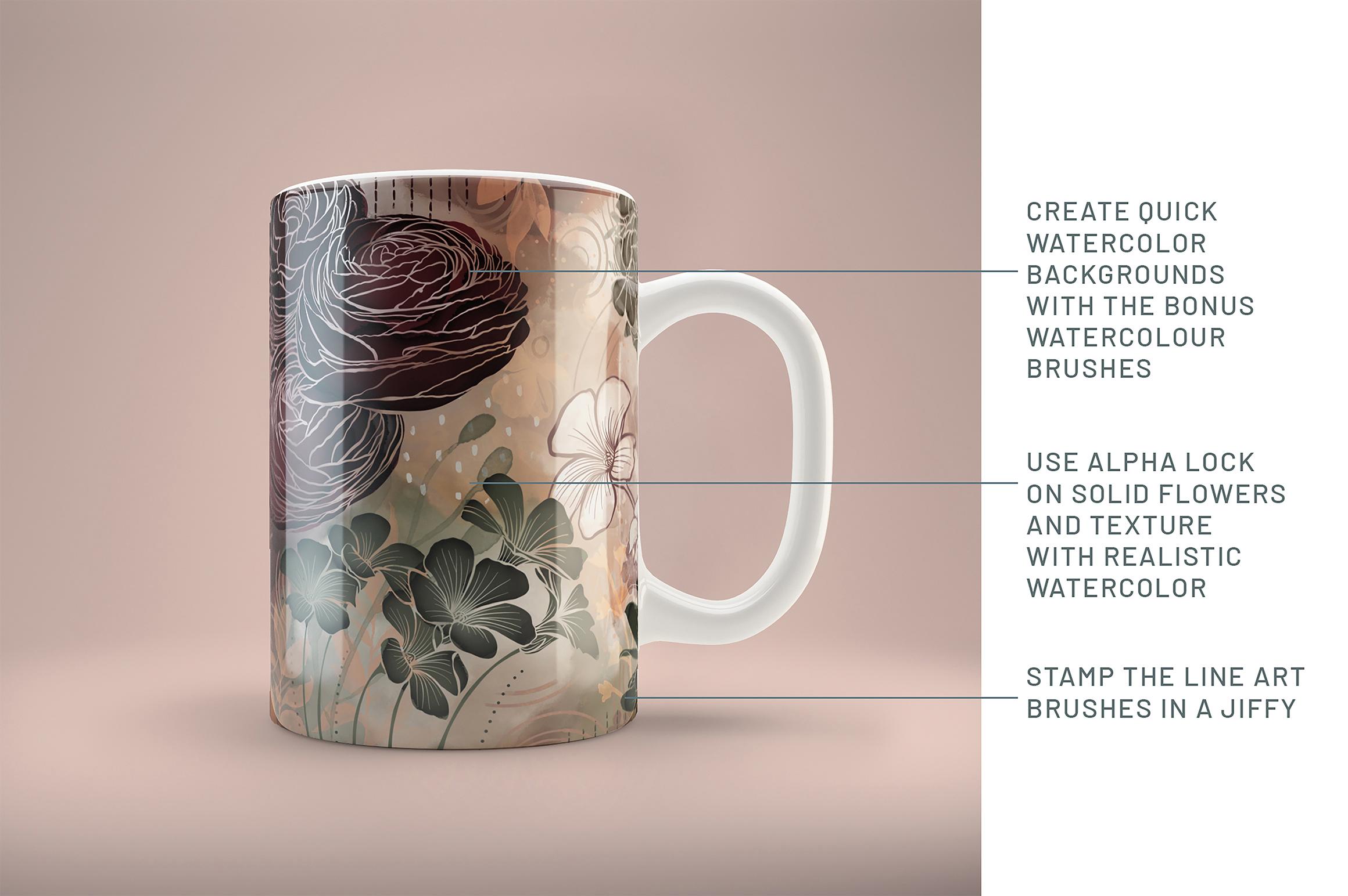
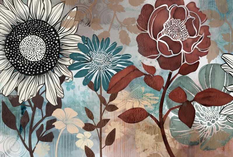
4. Show Off Your Brushes: Hi guys, welcome to lesson three. Less than three here is all about creating ways to show off your brush stamp. Let's get started. Okay, so at this point, let's pretend that you've got your whole set mean. So I've got my 20 brushes or whatever it is that I've decided is going to be my SAT. And that's in my line art, flowers for. And what I need to do is export this to be used for my zip file that needs to be included with the package for Creative Market or even on my own website for people to be able to download the brush set. So the full set here, if you click on sad, you'll get these options to the side. What we're gonna do here is hit share and then we just choose where we want to share too. So in my case, I usually share to my files. So I go save to files. This is where I've been working, so that's what opens up. And you can see that this is my custom brush sets. Most of the time. If I'm doing a project, I'm going to have a folder here where all of the stuff that I do on my iPad gets saved for that stat before I take it to my desktop. So I'm going to name it the name of the collection. So I'm going to have it flying or flower brush and hit done. And then now when I save it, it'll go right into that particular brush set. I'll have to go back and change that to say line art brush set for whatever it is. Now that I've got this folder selected though I can hit Save and it's going to export and it's really quick. I was actually really surprised the first time I did that, how quick it was actually did a gangs I thought it didn't work, but it did work. So now I've got that brush set saved. Now the next thing I do before I leave my iPad is to do a couple of illustrations with the brushes. So I'm going to just use the ones that I did that I'll show you kind of what I how I went through and did that. So I have to Laos know, I did seven inches by five inches, which actually worked out to be smaller than the document I was working with in photoshop. But it was all right because my document in Photoshop ended up that it was way too big. So that was the size of the mock-up I had purchased. And so I ended up, oops, adjusting the size of the document. And so this layout worked out really well. One of the things that I did notice though for myself was that the brushes were all too big, so I had to go back in and make them smaller. So if you wanted to, you can just create your document bigger. So here you would hit plus. And now the size of the document that I used was about double the size of that seven by five, give or take. Now if you wanted to be absolutely exact, the screenshots that you create for Creative Market or a specific size. So you could go in here and type in the size. So the size that has the right proportion is 23, 20 by 1544 pixels. Hit Done, and it's at 300 dpi. Hit Create. And now we've got the canvas at the right size. And hopefully my brushes are kind of better size for that document and it looks actually just fine. I did with all those other classes. Showing you the layouts that I produced with this type of brush set. I just went through and did an illustration and I just wanted to use a few of the brushes, of course, from the set to create the illustration. And I, of course had a color scheme, picked out a palette that I had. I just kinda went through and picked one for spring, one per fall, one for I don't even know why I named them spring, fall, whatever, but that's how I did it. So I'm going to hit the default here. Now if I go back to my disk, you can see that my new pallidus here and be clear that most recent and I'm going to actually drag this off because I found it was a lot faster for creating and I can hit the palettes here. My color palette is here and available for me so much in the same way as I have produced many of those artworks that have been in my most recent classes with Procreate large floral wall art for POD and fantasy gardens. I create the artwork. And of course, what you wanna do when you're selling a brush set is to use all the brushes or as many branches as you can, I guess, to compose something really interesting that will really help to show off the brush sets that you have for sale. I'm just gonna go for it. This is where I was telling you about the brush size being way too big for the artwork. And in that case, you go into the properties here and just reduce it down if you can't get what you want here. So this is your first line of defense, is going to this side here and laying down your first motif, make a new layer for each of your motifs, at least initially, until you run out of layers. And vary whether or not you're using the outline. And what I often do is stamp in the middle. And then I have a little bit more freedom to move it around without Procreate, propping up. And of course, it's always a bit of a challenge to figure out which ones you want to feature. And of course you have to think about the whole composition as well. So I'm just going to kind of create a layout here to use for putting together my package. They're in for Creative Market. And I find that almost all of the sites that you can sell, brushes and things on how the same basic idea for setting up your package. So you'll have screenshots featuring your product and then information about your products. I personally like to put in my screenshots as I can to really explain and show off what I'm doing. So it is kinda nice to create two or three different interesting sort of applications of your product because that's going to be what cells are in the end. Oh, getting smaller. This is like the first time I've used some of these and I really like them. This one is really cute. Now with this one was the picture that I got from the Internet that I traced, and I just made sure that I found one that was royalty free when I'm creating pressure sets too. I also tried to vary the shape of the motifs and the direction and all that sort of thing. So that I have a little bit of freedom when I'm doing this kind of design at the end to get my composition really interesting. So sometimes they'll do things like this where I have a single, that's the same flower basically as these, but it's thereby itself rather than in a group. So I'm going to add a leader for that. Maybe try this pink here. And another reason that I will stick it in the middle is that I can flip it and do all that kinda stuff because it hasn't been cropped. Yaks and play with the size is a little bit. And I know some of these things don't really work together at the moment, but I'm leaving my options open and having these all on separate layers so that I can make a lot of adjustments. And of course, there's all those things like blending modes and so on that will help to make this all work in the end, like I said, this is a really fun opportunity for me who try out some of these new brushes that I created the other day. Oh, here's one. Totally doesn't work right there at the moment, but that's because I haven't started playing around with my blending modes or anything. I'm going to add a layer for the background as well. And the technique that I've showed you, cosh, half a dozen times now is to just lay down a bunch of color as a matter what brush you use. Because we're going to be using the blending to make a really nice watercolor background here. Okay, so then I grab one of my blenders and then I'm just going to go through and do a bunch of the blending to make an interesting background here, remember that you can pull into the white or start from the white. And I'm not worrying too much about the color right now. I'm going to make some adjustments. Once I kind of have an idea of whether or not this works. One of the other ones I use a lot of his big field watercolor because I can go back in and add a little bit more color. And a lake which is kinda of washes out into a soft blend so that maroon color when I lay it down at first it's really dark but as I blend out because if I'm adding more water, so you can lend out as much or as little as you want. And a white works quite well here too, so you can grab a white or this is actually kinda back off YT beige color. And I think for this area here, I want a little bit more length and have a bit of green in here to my steam and blending things like adding just a little bit of that kind of grungy, dirty edge that I can get with the stain edge and you can blend it out as much or as little as you want. So I can start and have a really dark kind of edge there or blended rate out. I think they're going to try this one again. So I do get asked quite a lot, you know how, how to make the brushes and how to adjust them to make them work the way you want them to. And I have taken a couple of courses here, but one of them is with Jon Brommet. He's a Canadian guy and he's got a fairly recent course on the controls, the brush controls. So it's a great one to take. And then the other thing is to just take the time to do a bunch of experimenting because you don't really know how it's going to work until you've tried it. And it was really the experimentation that, you know, I might freakishly land on something. No idea exactly how by just, by experimenting and scribbling and what not. And I often came up with some really cool effects. And I find that every time I do one of these backgrounds, I get a different effect. And again, that's just a lot of experimenting. And I like these kind of smoky results that I get sometimes and it's hard to stop because you're having so much fun doing it. But at some point you have to just going to call it and say, Okay, I'm ready to go on. And I think I will add a bunch of details and stuff. I'll do that off camera because this is not a class about the composition so much as taking all of that stuff and putting it together at the end to create a really attractive package for buyers. So I'll do that bit of changes, corrections, whatever you want to call it. I'll finalize this and then we'll come back in the next lesson. And I'm going to show you how I start to put it all together. Now, a lot of it can be done in Procreate. I prefer working with Photoshop, so I'm going to be switching to Photoshop to put the finishing touches on my screenshots that I need for Creative Market. Alright, so I'll see you in the next lesson.
5. Gathering Your Relevant Content: Hi guys, welcome to lesson 4. So we want to create a bunch of screenshots that can be used to promote our products. We're going to gather our content and then we're going to review this. Let's get started. This is the one that I was working on in the other lesson. I imported it here so that I could show you the video of the time-lapse. So this will show you write from start to finish. So the beginning part, you did see which is just meat placing the flowers there and getting started. And here I'm starting that watercolor background. I've done Just a few things to kind of improve that. I do end up making a lot of changes later on. And you'll see that. One of the things I do too is I add a lot of my texture brushes and I've been working on a stem set. So here's a stem coming in, and I'll probably reference all of these other brush sets as I complete them. I don't have that stem of one done. Yes. So unless you're a ball, put that on there today, but I definitely want to show the use of the blender brushes for doing this watercolor effect. Now here I've added a bunch of my little textures and patterns. You can see that it's really starting to fill out nicely. I end up adding some of these little watercolor branches and things and a few watercolor hours that I have in another set, which reminds me That's another step that I need to somehow prepare. There. I duplicated that flower and kinda distorted in a little bit to make it look different. And yet, That's my finished piece. So I think we're ready to start working on the screenshots. So I'm going to close this video down, and yet There's my finished illustration. So I've got quite a bit to cover in this lesson. I'm going to try to do it quickly, but not so quickly that I lose you. Let's start with the cover design. Some of these I partly completed just to speed up the process. Now I'm not sure why Photoshop is suddenly running so slowly. What I'm gonna do is go to Edit, purge, and I'm encouraged all the histories in all the memory, everything that's on the clipboard. And hopefully that speeds things up a little bit. So this is a look at that cover that I've created for this project. Might replace this image here with that new one that I did because I really like it a lot better than the one I did originally. I wanted to give you just a quick run through here of the different documents that I'll be using. This isn't finished. Of course, I was just in the process of doing this when I decided, hey, why not create a class that it is? So that's one of the reasons I really have a hard time getting things done is because I'm easily sidetracked by side projects like this. Anyhow, I want to change the image size here. Remember I was telling you that the document was quite large. So I'm going to go into image size. So option command, I opened up this dialog box. I'm going to change it to pixels. And a correct proportion here would be 40, 640 by 30, 80. And that's based on that screenshots size that give you, which is I think 23, 20, by 1544. I mentioned that in the previous lesson. So this will make the document a little bit smaller. And the advantage to that is it'll make it a little bit faster as well. I think it'll also be a little bit closer match to the size of those samples that I created. Now my computer is running painfully slow here, so I think I will take a break and restart completely and I'll open up for shop again and continue going through these documents with you in a just so here's a look at that main screen shots that I'm going to be using. You can see that I've replaced the main artwork here with my new art. I'll show you this one in a second. I've got a color chart here that I've created. This was actually part of the package and it's really easy to make changes to the colors and so on. I'm going to show you all that in a sec. I'm going to take you into Creative Market just to show you how to find this kind of a mock-up. I just really like how thorough it is and how many different options you have. She's got several finished setups like this and then tons of little props that you can use to make your work look more interesting. And this was just actually something that was part of her mock-up. But I think I'm going to start including color charts or color swatches as part of the brush package that I'm selling. So there's that vertical layout that I did. There's the new horizontal layout. And I love this so much more than the one that I did originally. This was the original one and an indefinite can replace that in most of my layouts. So let's go into Creative Market here and I'm going to show you the templates and we're going to start by just doing a search. I would suggest that you search it out. As Scene Creator. The scene creators usually have a ton of additional things that can be used as props. To really make your images look great. So I'll show you the one I'm using specifically. And that's when by Andrea Kaiser, you can see that I buy a lot of assets. So if that's any indication as to the kind of market that's available to you that should give you a little bit of incentive. The hope is, is that whatever you're creating is something that there is a demand for and can of course then make you a few extra bucks every month. So you can see why screenshots here would be so important. Let's what these are, the screenshots. And it'll show you all the different things that are available in this package. And that's what we're actually producing. I'm going to go to my products and open up that first BRAF set that I've created. Actually I've got two here now I've got one m2. So let's go into this one here. This was I think the first one. I know this was the second one, but I'll show you screen shots that I have up here currently. So I plan to add a few more, but you can see that the screenshots will really help to sell the product. Let's check out this one. It'll be similar, but I think this one had a few more screenshots. So that was the main title then of course, the chart, a little bit of information about it, how these flowers can help save time, blah, blah, then a few really nice mockups, the bonus brushes, you've probably seen this one before. I use this one a lot, then the other bonus brushes than a nice big canvas has been created. So this is what we're doing, folks. We're getting all of these screenshots together. So let's go back into Photoshop here, and I'm going to just quickly showing you the different ones that I've got planned. So of course we're going to change this one because the color isn't right. This is that chart for the bonus set. And here are our two artworks that we're going to use. And then I'm going to talk to you about extra assets that I've got as part of the package. Okay, so let's go to this slide first because I want to change this lettering and possibly put in this new graphic. So to make the change, I'm gonna make this into a smart object so I can double-click on it and let's get our artwork, paste, fit it into that size and save. And I like that. So, so much better. I'm going to actually lightened this font here because I don't really like it. It didn't work with the other slides as well. So I think I was using just the regular wait for the headings. So now I can start to save out my different slides. Now just notice I've got a hard line here from this graphic. So I'm going to enlarge it a little bit more groups so I can get it kinda like it like this. I don't want to get it too big. So I'm going to rasterize this again. So I'm taking it away from being a smart object and that's so that I can feather the top of it here. Let's see if 44 will work and I think that it'll be less noticeable. Yeah. Looks fine. So I'm going to save out this one. So I'm going to show you at this point what I'm doing for my screenshots. So I've got the PSD file here. I'm going to move that actually and get it into the original screenshot Documents folder. But you can see here that I've got them, everything here named and numbered. I've got them numbers so that it's easier for me to have someone else upload these for me, but it also makes it easier for me. So I'm going to replace this one. That's the one I'm doing right now, make it into a JPEG, hit Save. It's going to ask if I want to replace it. And I'm going to say, Okay, and that's because that original had the wrong font there. I want to work on this one next. I'm going to probably change out these little props. So let's just get rid of those first. I've got that here in the folder called accessories. Somebody get rid of twigs like and, and eucalyptus, me believe that ribbon for now. And, and these are the smart objects for the things that are going on in the background. So that's the one. And then this is this one back here. So somewhere I have a hue and saturation adjustment here that's making the changes. And I think that's this one here. So it's making changes on everything below it, which is pretty cool. So let's double-click on that and change it to be sort of more into the rusty. And it's going to pretty I think this would work with what we've got, but we can change that later. So I think we'll leave that watercolor there, but I want to just change this flower here. And I can't remember if I did that here on the actual smart objects. I'm going to double-click on it and yes, there it is. So I've opened up my folder of brushes or the document that had my original brushes on it. And incidentally, this layer document here with all my brushes would be what I could use if I wanted to also make a Photoshop brush sets. So I'm not gonna do that of course right now, but I'm going to select this or an oculus and go back to the smart object. I'm going to paste that in there. I'm going to go into hue and saturation. So command U and make it pure white like this other one was. And I can get rid of that one. And let's just move this one into position. I'm not quite sure where, so let's just test it. So I'm going to save. And what this will do when I save it is updated here as just doing that. Now, by the way, I had to completely restart machines three times. There was something going on and I think it had to do with my QuickTime recording and it was just causing that really big slowdown in Photoshop. Okay, where are we? And now that positioning is alright, I could move it a little bit off, but it's so subtle that I think it'll work trying to decide what that color Let's look at one of the other ones. Wouldn't go that well with that. I think it would work with this. I'm going to maybe make it a little bit less yellow, adjust it slightly to be a little bit more into the kinda rusty, not so pinkish kind of a color. And I think that'll work. I might change that other one, the other chart color so that it matches a little bit better. So we'll save this out. And let's check that church. That's not it. Sorry. Scroll through. And I think that's going to match nicely. I think this is the one that I would rather change. They want to also show you adding that other little prop there. And I've opened up the mistletoe here. So I'll just select all and copy and then paste it into here. I think it's going to be really big. Yes, it is. So let's reduce that down. I think I want to desaturate it. I'll just do a hue and saturation adjustment for that particular item. And because I wanted to just affect this one here, I'm going to option click between the two right on the line, and that ensures that I'm not affecting everything else below it. So I'm going to desaturate it because I think that's going to help make it work. Let's see if we lighten it just to touch I mean, the hues. Okay, but let's, yeah, slide it over and make it a little bit more in keeping with the colors that are going on here. And I think this one I'm ready to save out now as a screenshot. So We're gonna do that now. Upload screenshots. I'm going to make this number four as a JPEG. So add the number four in front of the label. And you can see here about 23. And now for a took out those two PSDs and put them into the correct folder and click Okay. I also want to show you how to create the charts. So those two charts, I actually have three charts because we do a screenshot version of that chart as well. So we'll see what we can accomplish in the next lesson. I'll meet you there.
6. Finalizing Your Screenshots: Hi guys, welcome to lesson 5. Unless a five here we're going to just be finishing up those screenshots. Let's get started. So for this chart here, I'm going to show you how I went about creating it and getting it ready for fishing in Photoshop. Now there's nothing to say that you can't do this entire project here in Procreate. So if you don't have Photoshop, don't worry. I'm going to show you almost all of it here in Procreate. So to start out with what I need is these screenshots of my brushes. There are numerous ways that you can create a chart like this. And you could easily take and just stamp each of your brushes and then label them. But I think that would be a super time consuming process. So this is the way I've seen a lot of brush sellers do it. And so I've adopted this method for myself. So the first thing we need to do is to take screenshots of each of our brush groupings that fit into the screen at this time. So to do that, you're going to press the on-off button and one of the volume buttons there. So the two that are closest together. And that'll give you the screenshot. And what you're going to do is crop it as accurately as you can. Now this is going to enlarge it a second here, and it looks like I've done a pretty good job. So I'm going to hit Done and I'm going to save it to my photos. So then I move this up. I do the screenshot, move it up again, do the screenshot. And at the end of it, I've got the four screenshots. I'm going to eliminate this. I'm going to turn this off temporarily, and I'm going to bring in those four screenshots. So I'm going to insert a photo, and this is the first one. This is the second one, the third, fourth. So I've got the four of them here. I'm going to start repositioning them. And I've caught tapping on at the moment. And this is going to help me to make sure that they stay lined up. They don't have snapping on. No, I don't. I just lied snapping magnetics on and now I can just slide these one at a time into position. So this is my first 1 second, 1 third, 1, fourth, 1. So I've got them all lined up really nicely. And you can see that the space between the columns here is great. The only thing is I don't have these perfectly lined up, so I'm going to turn the snapping off and I'm going to select one at a time. And I'm just going to move them up or down by tapping on my screen here. I know it's hard for you to see here, but it's moving these up by one pixel at a time. That's what I found to be the most efficient way to do it. So hoops, you have to be directly above. If you're moving it up, don't go to the side or you're going to be moving sideways. So what I'm looking for is that I've got those lines lined up and it looks pretty darn good. So I'm going to pinch them all together. And now all I need to do is just kinda clean up that edge. So I'm going to use my rectangular selection, and then I will use my rectangular selection again at the bottom here. Again. And now I've got a perfect edge on the top and the bottom. Maybe did do that. Top one, very good. Let me try that again. Rectangular. Make the selection and delete. So this is going to be perfectly adequate for what I'm viewing. Remember that this is going to be a screenshot. So even if it was off just by a teeny tiny bit, it probably wouldn't show. So now I can turn that background flower on again, reposition this accordingly. Now, this ends up with a label that I do in Photoshop. Usually I do all my finishing there. You could do it all here. Like I said, you can bring in backgrounds, make adjustments, add texts, all that kinda stuff here. My habit is to do it in Photoshop because I find that adding texts is just so much easier there. And it's what I'm used to with these charts. I actually also created a layer with another rectangle that I've filled with, just a slightly darker gray just to give it a border. And now we are ready to take it into Photoshop to do that additional work. So don't be discouraged if you don't have Photoshop, you can definitely do all of your screenshots in here. Just remember to be saving them, are creating them at the correct size. And otherwise, you can create them just as creatively as you do in Photoshop. Okay, so let's save this out. So I'm going to go, you could do it either by going into your gallery and exporting it or just using the share here, I'm gonna save it as a PSD. So that's in layers. I'm going to go to my files and remember that brush set folder that we created there. I've got this saved as Version 2, since I had version one there, I've already done this. So I'm going to replace it. And now we can switch into Photoshop where I'm going to do the rest of my finishing. Okay, so here we are back in Photoshop and I'm going to open up that file that I created. So that is in my iCloud Drive. Custom brush sets. And here it is, here, hit Open, and it's going to open up as a Photoshop layered file here. This is where I start doing some natural design work. On this. I'm going to make sure that my size is correct first of all of those, so I'm going to go into my dimensions here. And the dimensions I'm going to use are the 40, 640 by 3088. And that's at least double size of what the market suggests that you create your screenshots at. So that just enlarge it ever so slightly from the document that I had there, I've been through of course, and done this process. I'm going to show you some of the things that I did amongst them would be to select these two layers and make sure that they're aligned properly. It looks to me like scientists side could use it a little bit larger. So I'm selecting it, holding down my option key so that I can enlarge it ever so slightly. Now if you look up here and it's 100.09, I'm going to change it to 10. And height-wise, I'm going to keep it at a 100 and it looks weren't even. So let's take a look at the actual finished one so I can remember the things that I did. Okay, let's open it up and we've got those original screenshots here. And this is the way I finished that. I kept it pretty simple actually. So I added a gray background here, colored those flowers at a little bit of text. So it's super simple. So let's just go through the steps. So this was the setup that I had from the other brush sets, which has that smart object. And that's this whole title document thing here. That's what it's called from the maker. And it had all of the text and everything already set up in this way. So I didn't make a lot of changes in order to keep it really simple. So all I had was a white block here at the top. So let's go ahead and do that. So I'm going to make a new layer, use my rectangular marquee and then fill it with white, which of course you can't see because there's no gray. So let me add a layer here. I'm just guessing here, but I'm going to drop in the gray color to that layer. Now, as far as the texts goal was, I could copy it from any of those other layouts. But you get the idea here. What I'm doing is I'm rebuilding it over here. Now this document I've made substantially bigger than the one that I ended up with, which was the smallest size, 23, 20 by 1544. Let me go back here and change this. And this really, you don't know it was super big advantage to having done it bigger. Other than sometimes when you have a lot of small detail, it just shows up better rather than be as complicated as it appears that I M B here, just pick one of the sizes and stick with it so that 544 would have been perfectly fine. I'm going to grab that the white box and that background layer and make sure that they're perfectly aligned. And see what else we've got going on here. We've got that to change. So looks like I did a white outline on the flowers and then I fill them with a kind of a cream color or beige color. So I'm going to use hue and saturation to quickly change the color of these flowers to wait. So all you have to do is Command U and then drag that one slider all the way over. And one of the other things I did was to change the color of my chart a little bit though I'm going to let you see it here. It's a lighter gray and I also lightened all of these because this does look a little bit muddy here. So I'm going to go to that chart. Levels is Command L will grab the white eyedropper here and then just click here on the image and you can see that brightens it up big time. Let's just change the color of this box here so you can do that again. Hue and saturation will work. Just slide the lightness slider over a little bit and that's lightened bad up. I also grabbed a drop shadow here. So that's a layer effects. And I knew it was going to go to that because I just used it recently. So I'm going to change the direction of it so that the drop shadow ends up on that side. And then I want to change my flowers to this color. So I'm going to use the eyedropper, which is I, and click on it. Go back to this one here. And in order to fill the flowers, what I wanted to do is select them. So I'm going to do the magic wand and select all of the areas that would be the surrounding part of the flower. And then I'm going to hit Select Inverse, which is Command Shift. I go to another layer. We're going to add a layer here, and now I can drop that color in there. So that's worked out great. And let's maybe change that gray in the background. And in this case, I'm just going to drop in the color mechanical to a little bit of ready and just use my paint bucket to drop that in. I think it's going to be fine. So I'm going to save that one out. So this one is going to be screenshot number three. I'm going to do Command Shift S or Save As and go into that Creative Market folder. And once I find myself going to the same folder three or four times, I use you take it and grab it and put it in here temporarily. I can get rid of it later, but at least it'll make it faster when I need to select it. So we're gonna go to upload screenshots. And this was the chart here. So I'm going to replace it. I'm going to go with JPEG. That's going to say, do you want to replace it? And I'm going to say yes. And one of the glitches of Photoshop 2020, one believe it or not, is that even though it's supposed to replace it and it asks you if you're going to replace that. It does a copy of it. And I've read a million forums on how to get rid of that. And it is just a glitch that you can't get rid of at the moment. So I just got rid of that original and the one that's copy here, I'm just going to the word coffee out of there. So now we've got a screenshot to and screenshot three. So it feels like we've been going for hours. I'm exhausted its separate times, so I'm going to take a break and I'm going to come back and finish off this lesson for you in a few minutes or maybe an hour, or maybe even tomorrow. They'll see you in a bit. All right. So rather than come back and record last night because I was so tired, I decided to just spend the time just finalizing a bunch of screenshots so I could get a little bit further along here. So that's exactly what I did. I went through and any of the files that I create, I did create. So there was this one I finished up and this one I saved out this cover shot. And I'll just show you real quick how easily I changed the screenshot. So here I just double-clicked on the Smart Objects in the document. And and that's just fine. That graphical or org select all and copy and pasted it in here I'm going to do my shortcut for Fitch, and I think it'll be slightly out of proportion. I would likely do complete custom artworks if I was doing smart phones and things like that. But I think for the screenshots, it works just fine. So that's saved. I can close that and close that. This is the document with all the brushes. So I open that up so that I could do a few of the things that I needed for screenshots. So here is one of the texture free shots I did. So I use that background that I showed you in one of the earlier lessons. And I thought if I put big flowers on it superimposed, then each section of the flower kind of shows different textures. So I've already seen that one else. So whenever I was saving it out, whatever do Command, Shift S and rename it, or number it and put it in here. So that's one of these here, the texture samplers. So I can actually close this document. I did this lovely canvas bag and this particular mockup. Same thing. I was able to just double-click on the smart object, PSTN, the artwork, and that would update it here on the mockup and then I saved it out. So Command Shift S and somewhere on here to make actually saved this one, I may not have. So this is perfect timing. I'll name this 11 Canvas bang. And sometimes I go nuts creating all of these screenshots for that. I don't necessarily use them all. And save that as a JPEG. I'm going to be resizing all of these screenshots at the ends or not worrying too much about the size. I know the proportion is correct. So it'll just take a little bit of work in resizing them proportionately and with a smaller resolution. So in a case like this, I can see that this is more like 16 by 9 results. So I would go into my counter size. So Command Option C, and this is a humungous file. And let's go into pixels, and we'll go 20, 320, and let's go 2320 is close by 1544. And this is going to chop off the sides. And I know that there's nothing to be lost there. So I'm just going to say, okay, save that and Command Shift S. Or really should have at the moment, this folder over here that would make it a lot faster for me to update that one, that one there since the right one. So if I wanted to get rid of something here, all I need to do is just pull it way off. This will be number 12 JPEG. And I can close that one down. Command W. And I've got this one saved. I'm pretty sure. Let's just check it out. Easy to use is number two, so I will close that off. And just a quick aside here at this chart, I basically use that same chart of flowers from the slide that I created and made this an 8.5 by 11 sheet at a bit of a heavy here. And my logo and just kind of add warning for people to not use it if they haven't paid for the extended license. And you can see here that there is extra space at the end of this line there. Now it looks centered. For this, what I do is I save it out as a PDF. So in Photoshop you can save a PDF. It's called the foreshore EDF. And in this case, I would be adding it to the assets to zip. So that's 25 here are assets to upload. So this would be what the customer would get 0. I've already added a few of the things from the previous sets, like the textured paper. So this, I'll call line art flowers one. I'm just going to call it line art flowers three in this case. And printable charge so that the customer, when they get the whole download, that this is a part of it and as a PDF, it can open in any PDF reader. So I'm going to save that out. So that becomes part of a package of stuff that I give away, or should I say cell with the download. So now I can close that one off. I already have the charts for the watercolor bonus brushes and the texture borns brushes. So I don't have to make a chart for those two amines can turn these off because I don't think I need them anymore. This cover we've done already so I can close it. And this one was one of the screenshots. And you've seen that before. I'm sure because I've used it quite a few times, but the same thing, double-click on the Smart Objects. It opened up. I was able to paste in my artwork. So you can see a couple of other ones that were done in the past. So I'm going to close that off Moses off. And this is one of my favorite mockups. Actually, I think you can get a lot of extra information here, and it just looks souls so lovely. And I think I forgot to mention here that you can change the handle color if you want. That's something that you can do if you wanted to. I'm just going to leave it white fluffy. That looks great and we'll close that one off. And then the last one I want to show you last night, I whipped up a quick pattern with the brushes, and I used several of the brushes to create the pattern. Necessarily my best work, but I just wanted to illustrate the fact that these flowers could be used for yet another application. So once I had that pattern, I added it here to my patterns preview. Then I replaced the smart objects. So that was just opened it. I just close, double-click on it here. And this smart objects, I've used a pattern fill layer, so I'll be able to use this again for other packages. You could also just put a giant picture in because I'll just show you that real quick. In fact, I probably will save the cell, but you'll see that this will update in a second. And this would be an example of a mural. So maybe I'll save that too, just as an alternate example of that was number 10. So I'm going to make it can be JPEG. And I labeled it here, create patterns easily with individual stamps. Actually, for this one, I probably should say create murals. That one says patterns. So this one could be murals. So I'm going to save it out again. I'm going to try and replace that and I'll, I'll show you what happens. So 10 B. And it's going to ask me if I want to replace it, and I'm going to say yes. But then when we go back to the folder, see there's 10 B and there's 10 be coffee. So this is the original I'll get rid of, get rid of the word copy. And so this is kind of a pain. I wish the width resolve that issue in one of the updates. So we'll we'll see what happens, I guess. Yeah, I think at this point, we've got all of the mock-ups that we need. So in the next lesson, I'm going to show you, amongst other things, I'm going to show you how to consistently resize them using that action that I told you about. All right. So I'll see you there.
7. Finishing Touches and Description: Hi guys, welcome to lesson 6. So in less than six here we're going to be entering in all of the descriptive texts and information needed for the Creative Market website. Let's get started. So we've got quite a few shots here ready to converge and prepare and see I've got the PSD file in here. I tried to stay organized, but sometimes it happens than I am not, so I'll just delete that one. And these are all of our screenshots. So we'll be ready to go into Creative Market as soon as I resize these and then we'll start working on things like the description. But anytime I want to show you here what happened in and I have did this on purpose just so I can show you, take a look on the screen. Down here, you can see the sizes of the different screenshots as I scroll through. So we've got quite a few of them at the 20, 320 by 544, but you can see that there are a few that are just not quite the same. So what we're gonna do is use a shortcut or an action that I've set out to resize them all. I do want to make them the small size of 23, 20, bye, and 144 because many times I've tried to upload a screenshot and I get the message that it is just too large, so there is a limit. So let's just open one of these up and I'll show you how quick and easy this was. So I've created this action here, resize to 23, 20 by 1544. And if I play the action, it resizes it, it saves it, and it closes it back up again. So it'll be really fast. You probably won't see anything happen and then Offset It'll be closed. Let me just play this action and that's exactly what happens. So it has been resized if we were to go and open it. Right now, you would see here is at Pat correct. Size. Okay, so let's set up that action properly for automating the whole batch, what that will do is allow us to change a whole folder full of graphics and resize them. So I'm going to add one thing to the action. First of all, let me just get rid of this one I'm going to open. Can you can definitely use your shortcuts to do this. Let's just open this one randomly. If you look at the image size here, you'll see that it's still quite a bit larger. So I'm going to the action, hit record and go to image size. I pick. I'm going to actually change the resolution of these as well to 150. That reduces it down even further. And I have used that proportion and it's fine. So you could do the 20th, 320 by 544 if you want to be consistent. I say choose something like this as your main size kid. Okay, so I've resized it. Now I would do Command Save and Command W. So the only thing I didn't save as part of this action was opening the file. So I'm going to highlight this again. I'm going to hit Record and I'm going to open the file. As soon as I hit open. I can then stop recording and move this open commands to the top of the stack. Now, we can close all of these files down and we're going to run the action to do that, what we wanna do is go to automate batch. We're going to choose our new action, which is resized from 23, 20 to 1544. And usually the one that you just created will be the one that shows up here in the list are source will be the folder that it's in right now, which is the upload screenshots folder. So here for the destination, I'm going to choose resized, which I created inside that other folder that had all of the screenshots. So hit OK. And now it'll go through and open each of the files individually and save them. And all of this is happening in the background. So we're not seeing anything happening here. But if we go and take a look at that folder, it was so fast that they're all in there already. So that really streamlines doing this. And especially if you save this action and you're going to be doing a bunch more packages. You've got that action. Are you set up the first time you do everything for creating these packages, it seems really time-consuming, but what you're doing is setting it up so that from then on, it won't be time-consuming. We're now ready to go and get into our vesting and start uploading vulvar screenshots. So let's just do that right now we're going to go into our browser Creative Market. Now if you haven't signed in to you or created an account yet, there is a bit of a process here on Creative Market. This is probably the best time ever to direct you to another class so that I have, which is a Creative Market class as well. And it's making and selling brushes. So very much like this course that we just did in Procreate. That particular one was creating illustrator brushes. But it's a great course for you to go and at least watched the first few lessons of, because it gives you a lot more information than what I've given you here. So I really broke down Creative Market listings and just a ton of other background information that I just can read regurgitate, add to this course because honestly the course would have been doubled the length and it's already long enough. So we're gonna go into my listings. So once you have an account, you'll see that you've got your sort of you buying profile and then your selling profile. So I'm going to go into my products here. You could hit Add new products, but I just want to show it to you here because. You'll have your full listing including earnings and so on. Now, I just posted these so they don't have any earnings yet. But here I can click on this spot and add products. Now, I find that the most efficient way to do this is to have a document already prepared. So I have in text editor should be one of my most recent. Now I'm going to apologize in advance because my husband's out kinda the graph at the moment. So there may be some times that that picks up on my microphone here. So this is the document that I've created, kinda have a running description that I use that I can just make changes and so on to just this helps me to stay organized and make sure that I get all the information in there that I want. So just imagine yourself as a customer and all the things that you might put in a search bar to try to find something like this. Now, I've got 12 and 24 here because that was the one I was working on last platoon checks 26. But other than that, that listing that I created for the other products are perfectly described. So in this case I'm going to be just doing a bunch of cutting and pasting. I've also at the bottom here added the Meta tags that I use to kind of describe my art. And again, think about somebody might want to search out if they were looking for whatever it is in your steps. I also put my name in there because sometimes people will search by name. I know I do for I'm looking for, Let's see, those mockups. I would search out anti-A Kaiser so that which need to be in your tags for me to find her. The important thing is that you've described what it is that you've got in your SAS. And here I have to add bonus texture, brush stamps, bonus watercolor brush set. So just try to be as thorough as you can with your descriptions. I'm going to copy this to put into the first spot for the title. So copy and then I go in here and paste. Now, if I hit Command tab, I get right back to that document again. And the next thing will be to copy this information. And I forgot here. Now this is a link for installing procreate brushes that have market has a listing that people can go read for the installing. So I didn't have to put all of that information but installation in my description. So the next thing which is the fun part, is uploading my screenshots. So you click here, I'm going to go into that folder. I'm going to go to the resized ones. And unfortunately you can't select them all. You have to do one of them at a time. So I'm starting with number one. So that helps me stay organized. Click again to, I'm not going to get a warning about the size because I've gone through and done that extra work to make sure that they are correct. So I'll just quickly go through this. I'll speed it up for you. But personally, I think that this numbering is the absolute best way to keep organized. Now here you can, instead of having to hit the upload button every time, if you keep your hand on the Return key, you can actually do it that way as well. So we'll select and hit return. And now I've got all of my screenshots here. You can reorder them, like let's say you decided, okay, I want to have something separating these two charts. Then I could say drag that mock-up of the tote bag up. And so after I've bought them all uploaded, I often take the time to, you know, just reorder it and we're not live here. So up in this left-hand corner here you can see that we have draft and we have live. And at the moment, you can't hit live because a bunch of information is still missing. So I would save all changes here at this point, and then I'm going to continue on with entering my information. The next thing is going to be to populate the rest of these fields here. And I think we'll start with the, with checking off anything that's missing. Sometimes happens that those two sit on top of each other and I'm not sure why. So that could be just a glitch in this particular browser. I'm going to select add-ons. And you can see as soon as I did that and a lot of this information was filled out. So this is the suggested range of prices and I think I left it here at 19 or I change it to 14 optical back to my other listing to see. Now here is where you're going to be dragging or uploading the actual products. So we'll leave that for a bit. No, you can add properties here like the dimensions. So what I've put in here is 10 by 10 or 3000 pixels shelf with 3000, the measurement is 10 by 10. That's correct. And it's the DPI that I would change here to 3 thousand or story to 300. And there are a bunch of other ones that you can choose to. I'll save changes there. And then this last part is adding the tags. And I am sure that at some point I had figured out how to copy and paste all of them in there. I thought it was as long as they were separated with a semicolon, but I do so much of this kind of stuff. I just don't remember from one type to another. Those other two listings I did. I ended up having to copy and paste them in there or you can of course, just take them from memory, whatever works for you. My memory right now is you have to hit return here. My memory lately I don't even trust some of them in rejects now, whether that's because it was too long, I don't know. I'm going to take out the word line and see if it accepts it, then I'm just going to ignore that one for now. You can definitely find out a lot more about this whole section here by going to the Creative Market blog, because the blog has a ton of information and this is something I just may have to go back to and send questions because it now seems like none of these are working. Not that one works. So Command V, Return and see that one didn't work, so it could be length. So let me just change this to brushes instead. So it maybe that's it. I just took a couple of letters off and that shortens the phrase, let me try this one again. Yeah, that seems to be the problem. So, you know, like I said, go through and put in as many tags as you can. Don't spam it, but don't put a bunch of stuff that isn't relevant. And you can actually go in here and adjust the way search engines are going to look for your products as well. So I'm going to copy this as a new product title that this is just for the search engines, but you can add your Meta tags here. So I'm going to copy what I have and drop them in here. I'm actually over here. 155 characters is all that's allowed. So I may to take out some word here in there to make it work so procreate, I'll put that first and it really saves a lot of time to have this already set up. So once you do, one chances are you'll be able to use a lot of that information for the next set that you do. So it's worth the time to do that text file. Now I'm going to save changes again. The next thing I wanna do here is make sure that my package is ready for uploading. So I'm going to export my brush set first. So I've already done this whole process, but I'll show it to you again. It doesn't matter what document your end. You don't have to be in the brushes document, but as long as you get, can get to your brush set, this is the set that I want to save out. So I would go to share here in the flyout menu, and I'm going to put it in the same spot as I actually have it in there already, but I'm going to put it in that line. Art thorough three brush set, main folder. I'm going to add my name to the front of this. I want it to be identified as one of my brush sets. And I need an underscore going to hit Done here and Save. And now I've got it available on my desktop. So we'll go back to the desktop here in a sec. I'm going to go to my iCloud Drive first and I'm going to go into my custom brush sets, line art, florals three. And the one I just saved is, well, I've got to there, but that's because I did it twice. So I'm going to drag one of those sets into my Creative Market folder for this particular brush sets. And so now I've got everything in here that I need. I may go back and add things later on, but for our intents and purposes today, I'm ready to go. So what you need to do is once you've got all of your content, you need to zip the file. So I'm going to Control click, I can compress here. And of course I'm showing you all this on a Mac. I don't know the exact method for doing it on a PC, but that's what you need to do is get that folder. And I've I recall, all I had to do was to also right-click or left-click or something. And I was able to do that when I was using a PC. So this is the folder that we're going to be uploading. So I want to name it exactly the same as I just named that brush set, which was his seat here in the background floor, assert our flowers. Three. So this will be a folder that I need to either drag and drop into that listing or personally I just find this just as easy and that's the compressed set. I hit Upload and I'm getting pretty close to the point where I'm going to be able to make this live. So depending on the size of your package here, there is a limitation. I don't remember what it is. If you are over the limit, you have to find a place to store that, maybe Google Drive or Dropbox. And you would supply your customer with a link instead. For now, I'm just going to leave these licensed prices the same. I may check it out and see what I did on the other two and make them consistent. And I'm going to save and then we'll see if I can make this live. So yes, Anakin now select this and click live. And I'm going to do that because I also want to take a look at the whole listing now. So this is going to be currently available in my Creative Market shop. I am going to be putting this on my own website. And like I said, I'll offer a discount to Skillshare students. Now that might take me a week before I can get around to doing it. But at this point we can check it out. I'm going to go to my products here. I could have gone to my shop, but now I can just click on this and here is my listing. I always find this so satisfying when I get to this point and I see it. And then I'm going to go through on these screenshots and just take a look to see if I like the order of the screenshots. Like I might take this one and move it in between those two. I like to think about whether or not I'm giving all of the information here that's necessary. And if you hit this, show more, you get actually the screenshots stacked up like this. So you can go through and take a look. So that's a nice way to look at it as well. On a Mac, once you're on this page, you can just hit the space bar and scroll through in this way. I think I did a good job in making all of this look good together as far as colors, I've got a good variety with my screenshots, everything from really small to super-large. So I hope that's given you all the information that you need. And I would like to, of course, encourage you to check out that other Skillshare class of mine. It's called Creative Markets to the stings, that cell. And it's a while ago that I did this course. And I've got a couple of other ones. This is mine, This is mine. This is mine. That if you check this one out, you'll get a ton additional information. So you will find that there are things that I did not include in this class. For example, research and planning of the package ideas. A lot more of an explanation here, planning the screenshots. All of this is additional information and I have a whole lesson here on writing the copy. Uh, kinda like the way my hair looked here. That's a while ago. So definitely check this course out as well, even if you only kind of skim through the lessons. All right, so I think that is the end of this lesson and I will talk to you in the wrap up.
8. Outro: Hey guys, thanks for sticking it out to the end. I know it was a bit of a long haul and it's a lot to be learned. My suggestion is that you do want a month or once every two weeks. That way it doesn't seem like so much work at the time. Once you've gone through the basic workflow a few times, it'll get easier. Remember their products can stay live on this site for years and years. And it's amazing how some of these really add up. I suggest that you go through the Creative Market. Website design cuts any of those other sites. And this gets some ideas for the kind of products that are needed. There are many places to look for ideas here. I'm going to list a couple of places to look on my course outline. Thanks again for being here. And if you haven't done so already, I would encourage you to hit that follow button up there. That way you're gonna get updates on anything I do on this site. Also, don't forget to add your name to you. My mailing list on my website, shop dot blur resort got CA and also follow me on Pinterest. I have two sites there, the loris art dealers and aspirin and teach a glorious Nasser. And I invite you to also take a look at my listings on Creative Market and check out my stores at 1000.com. Or if we're here in Canada, societies six. And you can definitely look me up because I saw in a lot of different places. So I guess that's it for now and yeah, take care. I'll see you soon. Bye.
 Delores Naskrent, Creative Explorer