Transcripts
1. Introduction: If you're looking to
improve your canvas skills and also create some fun and maybe a little alternative
vibe wall art, then this is a class for you. We are going to be making some vintage inspired
anatomy posters that are very fun to make and will also look
great on your wall. I've made up a
couple of examples to show you, so we'll
walk through those, and I'll talk
through the elements and design choices that I did, and then we'll
build one together. We are designing this at a size that you can print on
your home printer, but you can also have it
printed elsewhere if you're looking for a bigger or
even better quality. I think this would also make a cute gift if it was framed, so lots of potential here. The only materials you need for this class is a
free Canva account. We're going to be
using elements from the Canva Elements Library. Also doing a bit of online
searching just to get the reference information
for our posters. I had a lot of fun making
the samples for this class, so I really hope you like
them and feel inspired. And if you'd like to get
started on this class, then let's head on into
the lesson together.
2. Design Concept: Before we start designing,
let's take a look at a couple of example posters that I
made to get you inspired. Now, I'm working in Canva, and everything I'm doing is
done with a free account. The design that I've
made is 8.5 " by 11 ", and this is just the size of a standard piece
of printer paper. I did it this way so that I
could print these at home, and I do have a
borderless printer so it can go edge to edge. But you may want to make
this bigger if you're going to have it printed
elsewhere or outsource it. Totally up to you.
I'm just letting you know the settings
that I've used here. I've got three examples.
We'll just look over quickly, and then we're going to
create one together. The basic structure
of this design is I've used a paper
texture for the background. If you were printing on
actual textured paper, you wouldn't have to
do that, but typically you're printing on to white, so I've done this background. I did a border that
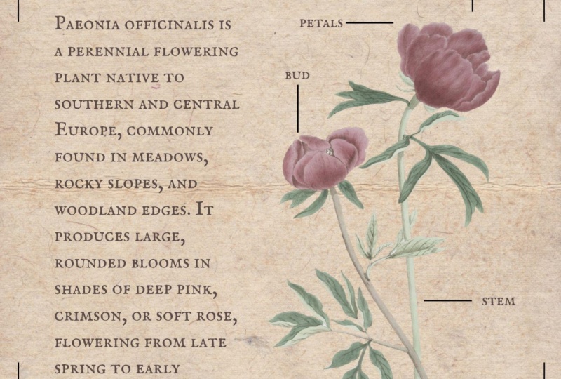
is two lines thick, and I've used some clip art of some roses here for just
a little bit of interest. It makes it a little more gothic and I don't know,
pretty to look at. As far as an anatomy drawing, this is very, very simple, but I think it's more
just about the look than actually the
practicality of the design. So I've used this
clip art of a moth, and then I've used the
line tools to identify different sections of the moth and labeled them accordingly. I created a heading with
the little genus below, and then this block
of text is just taken from Wikipedia about this
particular kind of moth. Terms of sourcing all this,
scientific information, I just went online and
searched in a search engine for anatomy drawing of a moth, and I just sort of borrowed some of the labels
from that just to know what the
pieces were called because I'm not a scientist. I'm a graphic designer
in this case. And like I said, this is
just text off of Wikipedia. This is fine for personal use. But if you are making
these posters to sell, I would make sure that this text is something that you
have the rights to use. So either you could write
some text yourself. You could use an AI
tool to generate the text for you or
just find a source online that is reference source that allows you to
use the information. The moth and the roses were just from the Canva
Elements Library. Font that I'm using here
is called awesome athuska. This is my first sample piece. The next one I did was
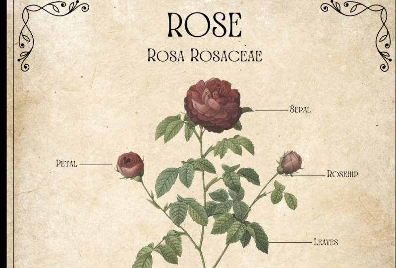
a little bit different. This is for a flower and
this is a hybrid tea rose. Again, I just went
through the Wikipedia, found a page for the hybrid tea rose
and found one variety, which was a black Baccara, put some information from that there, a little
bit of text there. I found this rose clip art in
the Canva Elements library, and I just labeled
it accordingly. I do think that plants are quite easy to label compared
to animals sometimes. The font for this one is
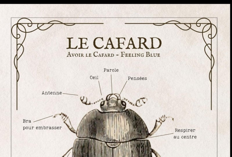
Art Nouveau letterpress. Finally, I did one
that was more like a classic anatomical design, again, using the paper
texture in the background. Then I did these
corners as a bit of a flourish just to make it look a little bit more vintage. This is just a corner
decoration from the Canva elements Library
that I used four times. I found this Crow anatomy drawing in the library
as well and then just searched on
Google for a Crow bones diagram and then was able to label
the different parts. This is definitely not all
the parts that are labeled, but just as much as I could fit in in an aesthetically
pleasing way. The font for this one
is EFCO Brookshire. There you go. That's the basics of how I've set up this project. So let's design one together and see how it's
done step by step.
3. Designing in Canva: I'm going to do another flower design for this one just because I think it is pretty and it is also fairly
straightforward, just for the sake of
making an example for you. The first thing I'm
going to do is look for a paper texture for
the background. So in elements, I
will search for paper and then go to photos just to get
the realistic ones. Now, if you have a Pro account,
you can use any of these. If you don't, then
this little crown icon means that's a P element. You can filter those
out just by going to the filters tool and
clicking on free. And for this project, I'll
just be using free elements. For this project,
I don't like to use the crinkled papers. I like using ones that
are kind of smooth. So I'm going to go
with this one here, going to rotate it and then just fill the
whole canvas with it. Great. Now that
that's there, I'm going to lock it so
I don't move it, and we're done with
the background. Next, I'm going to add
a border to the design. So I'm going to do one
with corner flourishes. So I'll start with just a rectangle to
give us a framework. Tapping R on the keyboard,
it gives us a square. I will change the color
of that to no color, the border style
to border weight one, just so it's really thin. And I'll leave it as black. I
will drag it to the corner. You can position this
wherever you like. There's no real set rules. I'm just going to make it most of the size of the design,
put it in the center. I will lock that as well. And now I'm going to look
for a corner flourish, and that is exactly what
I'm going to look for in the graphics tab.
Corner flourish. That gives us a ton
of examples here, and you can pick how you want it to look,
what kind of style. Like, this one is sort of like a wood block cut. I think
that's really interesting. I'll save that for now. I think this one is also
pretty cool looking, but maybe a little too busy. I think this one is
just right. It's sort of similar to the
one I used above. So we'll try this
one. And, of course, you don't have to do
the outside rectangle if you don't want to or
if it doesn't make sense. So you can do whatever makes
sense for your design. I'm going to copy this
and rotate it 90 degrees. And just use the guide
tools to position it in line with the
other. There we go. I'll select all of those,
make sure they're centered, and I will lock them as well. You don't have to
use the lock tool, but it does stop you from
accidentally moving things, which is very helpful. Next thing I'm going
to do is pick the item that we are putting
on display here. Now, if you wanted to draw your own, of course, you can do that. If you find one elsewhere
on the Internet that you have the rights to
use, then by all means. But there's lots of
things to choose from here in the ElemS library. For example, animal
skeleton drawing. When I search for
this, it does give me lots of cartoonish ones, but there's also
some realistic ones like this turtle is pretty cool. There's a fish here or
this kind of animal. I'm not even sure
what this one is. If you want to know
specifically what they are because I don't
know what that is, you can click on the three dots to more and then click on Info, and it will tell you what
the drawing is called. So in this case, lion
skeleton it's a lion. So I'm not going to do
any of those, but you can definitely find
lots of examples here. Instead, I will do
a flower drawing, and I'm thinking I'm going
to do, like, a daisy. There's lots of examples
here that I could use, but I'm definitely looking for something that's a bit more, like, true to life sketch style. Not quite detailed
enough for me. But this one is pretty good. And I like this one,
particularly because it shows the different
elements of the plant that are more easy
to label as opposed to just the flower because it doesn't have that
many pieces, really. So I'm going to go
with this one, and I think I'm going to position it sort of in the middle
but on the right hand side. Next, I'm going to start
labeling the different parts. Now, a Daisy is a pretty
simple composite flower, so all the pieces are kind of called the same
as other plants. Doesn't have anything
too particular, which is why I think flowers are kind of an easy example to work with for the
style of poster. So we're going to
start with some lines. I'm going to tap L
on the keyboard. And we have this
line to work with. I'm going to make
it a lot thinner down to one line weight just because that's the
kind of design style we're doing here, and I
will make it shorter. Now, I'm going to
place this around a few different places so that we can label the
different parts. And I'm moving these labels around so that from a
design point of view, they don't cluster
up in one section. If you are finding
that as you move these lines around the grid lines are really grabbing you, you can try using a
keyboard shortcut. I am on a Max, so holding down the command key releases
it from those boundaries, and you can kind of place
it wherever you like. I'm not sure what the
PC equivalent would be, but you may just
want to try pressing a couple of different keys
on your keyboard while you move this and see if it
makes the grid lines go away. Okay, I've just added
a couple of lines. Now, this plant, like I said, super simple, so there's
not that much to add. If you want to get complicated,
I would go for, like, a bird skeleton or something else with a lot of
different tiny bones. Now I need to choose the font, so I'm going to just hit T on the keyboard for a text box. I like to use fonts
that are like vintage looking or maybe
like letterpress looking. So you can try, vintage font or just look around for something
that kind of suits the vibe
you're looking for. Of course, you can use any of the ones that I used before, which just for a refresher, art nouveau letterpress, awesome thuska or
ETCO Brookshire. Those are the ones
that I've used so far. Alright, I'm going to go with
this IMF English S C font. I think it looks pretty cool. So we're going to start with
the title Common Daisy. Now I'm going to select A
and then make it all caps. Put it up near the top
and make it a lot bigger. Just going to reposition
the whole flower to go down a little bit just
to keep it out of the way. I'll copy this text box. I'm going to put
the scientific name below it in like a smaller font. I think that's a scientific
name for the right plant. Don't fact check me on this.
I am merely making art. Now we have room
for like a text box of information here,
which we'll put in last. I'm going to label these
different sections, just go to copy this
and use this box. I'm going to do it all
lowercase just so that it stylistically doesn't have
these large uppercase letters. So we'll label the petals, make that a little
bit smaller even. Okay, so I've labeled
everything stem, leaf, bud, petal, and bracts. Hopefully, that is
the correct part. Next, we're just going
to add a text box. So I'm just going to grab some
text about common daisies. I'll add a text box, and I will paste
that information in. It looks like it went to
the other font again. There we go. I'm just going to resize this to fit the
space that I have for it. And then I will make
the font bigger. Now, this is just text about
the appearance of the plant. I copied it off of Wikipedia. I'm just going to erase
the little citation marks because they don't
work in this document. And then everything
underlined is a link, so I'm just going
to click on them, click on the Edit link and
just delete the links. Okay, so this text looks good. You can also change
the alignment. So right now it's all centered. You can do left or right
alignment for your text, or you can choose justified,
which is this option here. And that just makes
it fill the text box. I do think that makes it look a little bit cleaner as a design. So I'm going to go with that. So you can play around with it. You know, if you
want those to line up there, that
could be good, too. And that's the basic design. So it's not overly complicated. It's just more about
thinking about the composition and how you want everything
to come together. I do think you can
get really creative in terms of other
things you could do. Put a poem here instead of
scientific information. Could make this like a
conceptual art piece, and rather than a plant, you could have a person
and you could label different emotions and
where you see them. You could do several small
illustrations on one picture, so it would be like you could do four anatomical sketches rather than just one and
print it really large. You could also move that up and put a little map of
the world here and just sort of highlight
or point out where in the world you can find
this plant or animal. In this case, it's
a common Daisy, so it's basically everywhere. So, I hope you
enjoyed this project and felt inspired to create
something of your own. As a class project, I would love to see the poster
that you create. So once you've chosen
your subject matter, please do consider
uploading the PNG or JPEG of it to our class
project so we can take a look. I'd be really excited
to see what you create. If you're looking for just
an easy starting point, I would say just pick a flower, like a rose or
something similar. But I'll put some
other suggestions in the class project section of this course if you want to take a look and get
some other inspiration. If you have any questions, please feel free
to leave them in the class discussion and I
will chat with you there. I also have lots of other fun, short Canva design classes, as well as courses
on things like entrepreneurship
and graphic design and selling on Etsy, et cetera. So please do check that out if you enjoy
learning with me. I would also really
appreciate it if you left me a review
for this class. I read every single one of them, and I really appreciate
the feedback. It also gives other students a good idea whether this
class is worthwhile taking, so I would appreciate if you
took the time to do that. All right. I will wrap up here. I hope you had fun with this. Good luck with your
project, and I'll look forward to seeing
it. Happy creating.
 Rebecca Wilson, Artist